Exercise: The French Hen

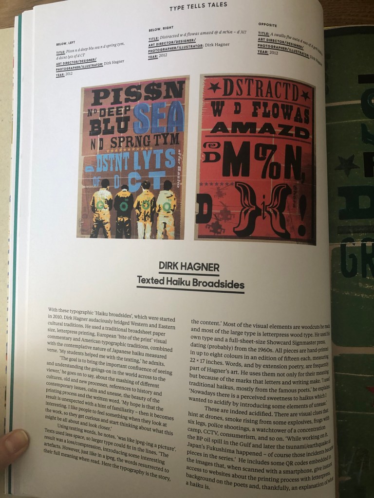
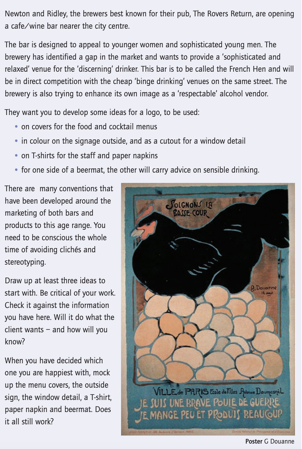
The final exercise in the Core Concepts course is based on the branding of the company, which consist of brief and special requirements from the customer. That exercise could potentially join some of the vital knowledge that was gained through that course, such as branding, logo identity, font, brief, colour and illustration. I quite like The French Hen naming itself, it has the creativity and also it giving some inspiration to produce appealing designs.

Researches

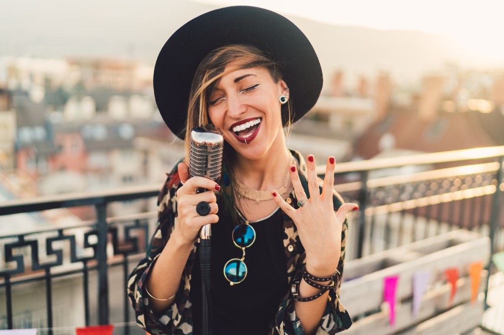
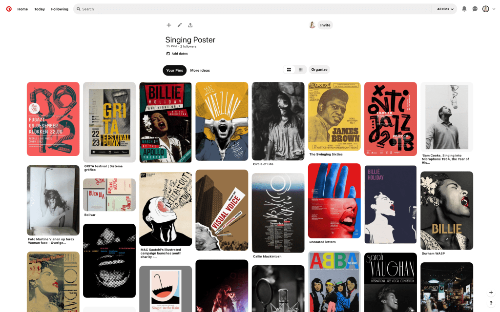
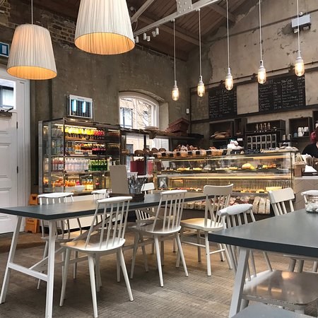
To start with, I went on the usual route by creating the Mood Board on Pinterest. I aimed to collect a few types of images that would help me to visualise the future brand. First of all, I searched for some pictures of modern pubs and restaurants, and it helped me to get that feel of a presentable place where young people would have the joy to visit. Also, I went through some ideas for the image of hen itself, as the brand has the determination to attract young men and women, I didn’t want to go cartoony with the images search. I tried to look for some images of the hen that would provide me with some ideas about how that hen could look like; however, I would still have to adjust it. I liked that idea of looking for some images of hen, and it should give some warm and welcoming feeling, and using it with some French accessorises could help to bring some style into it.

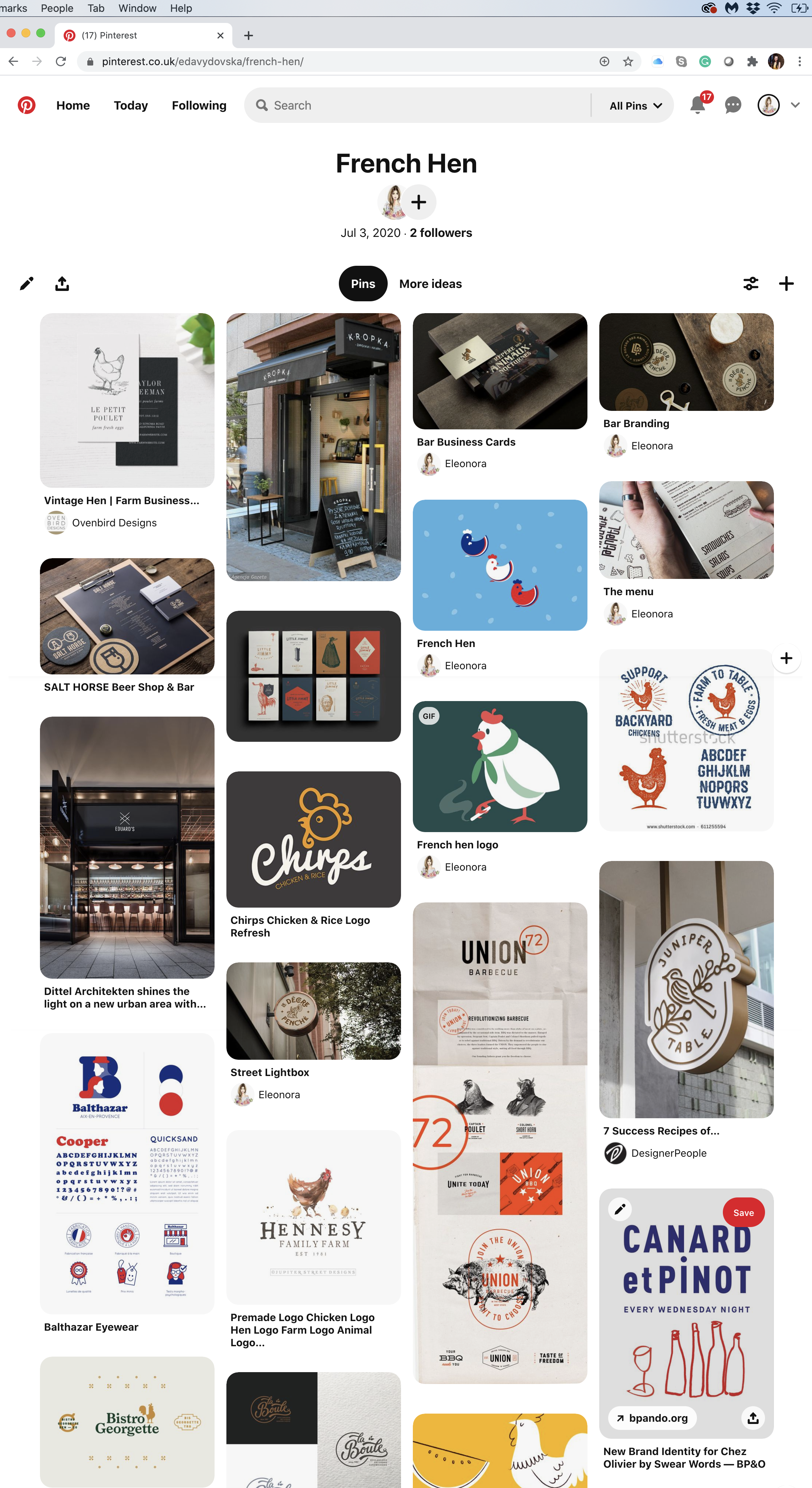
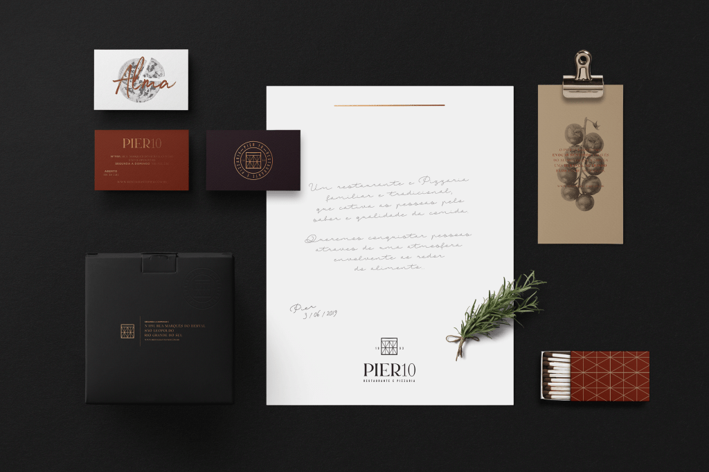
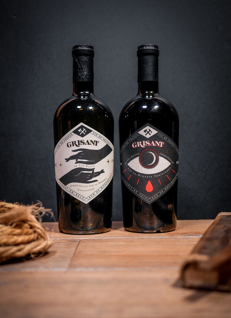
I noticed that many those kind of respectful places using dark and contrast colours for their branding, mostly shades of burgundy, dark green, dark blue, brown colours in addition to golden and metal patterns into it. I thought it creates the right mood for that kind of space. However, my Mind Map and sketches were not ready yet, so my ideas could lead me into the different rout.
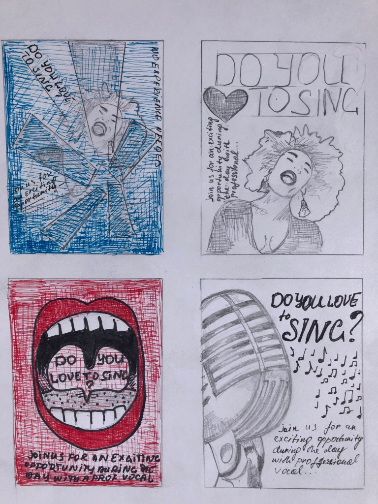
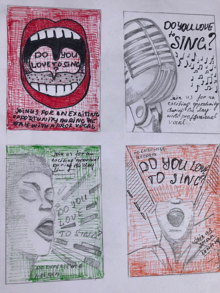
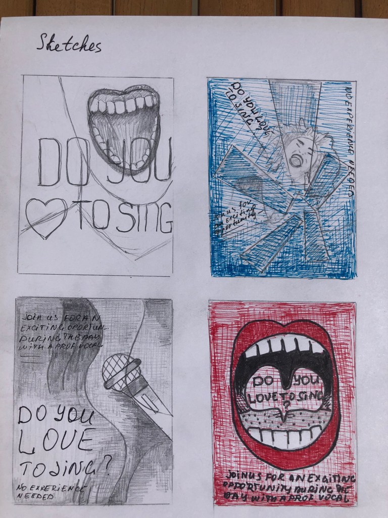
Sketches

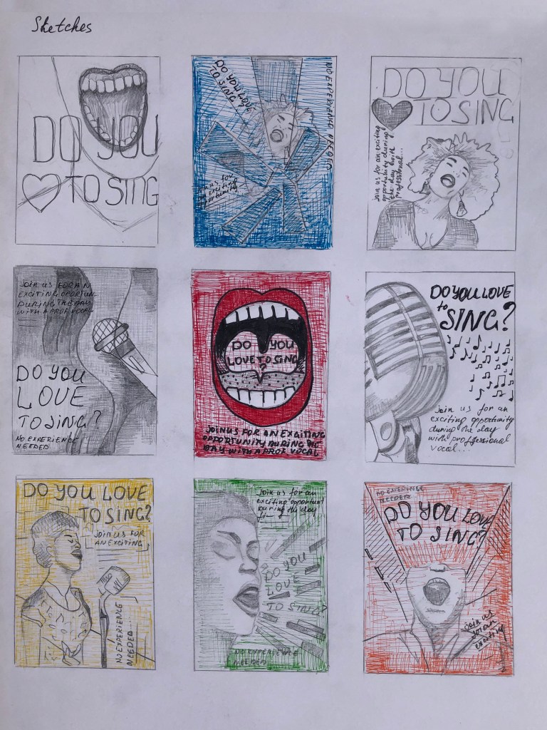
The next step was to produce the Mind Map with some keywords and sketches for my designs. I went through some ideas for future designs based on the principle of the more associative words is better for the final decision. The brand should attract sophisticated men and young woman, so the logo should bring the feel of elegancy, classy, style and contemporary mood. If I go back to my first ideas clearly, it can be seen that the image of Hen with French style could work immensely well for this brand. I imagined such key identity elements as French flag colours, accessories as a scarf or stripy clothes, plus a playful beret on the head of that Hen, could be the right addition into the brand. I didn’t know what shapes of form would be, so I desperately needed to proceed to the sketches.

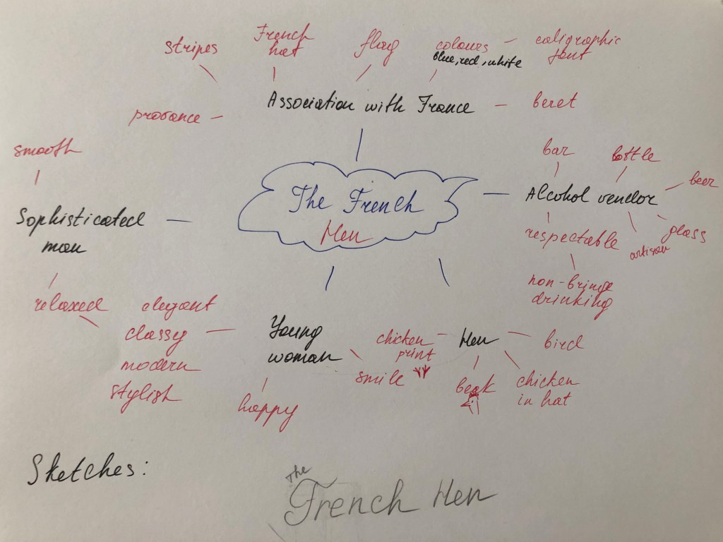
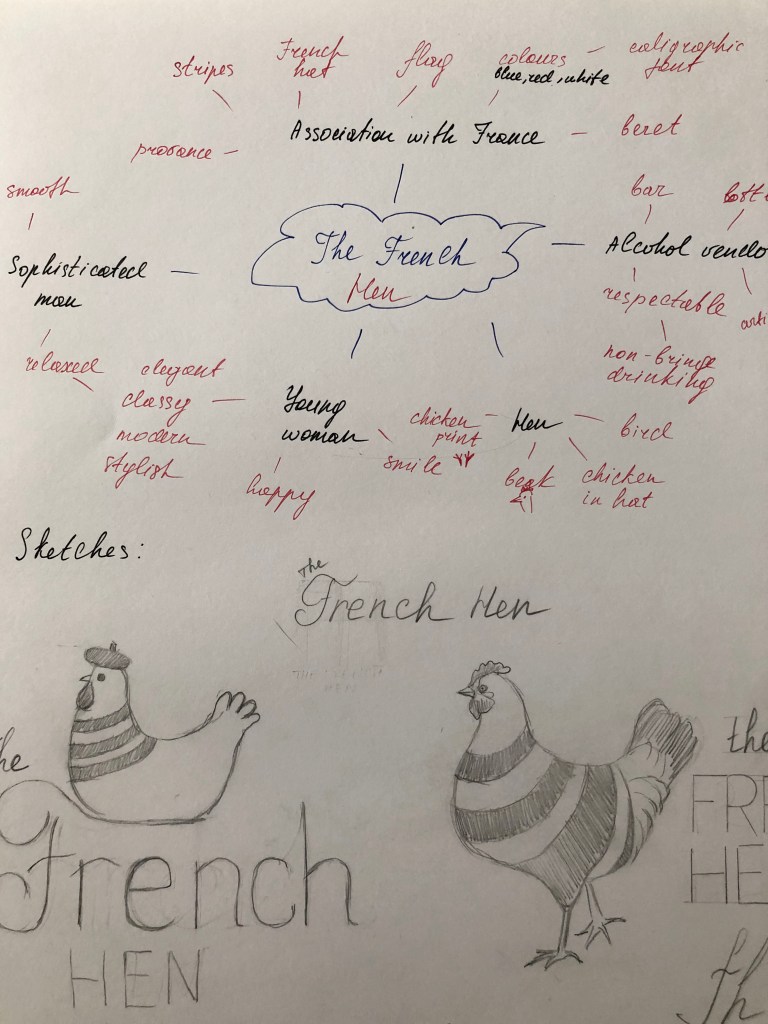
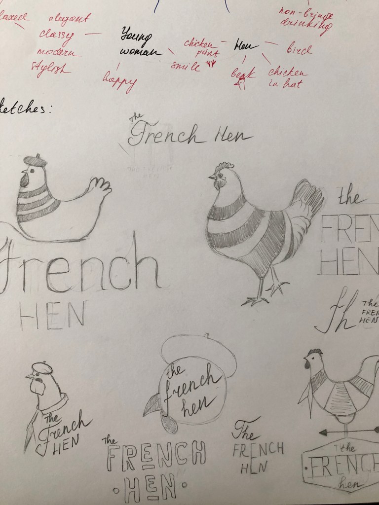
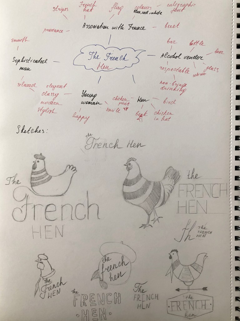
For the first sketch, I used the illustration of the sitting Hen on the letter “F”, where I tried to visualise the similarity with a bird on the nest. For the French, I used handwritten font, and for Hen just capital letters. I thought while I was making sketches for the Hen, would be useful to create some diversity of fonts as well, so I could choose which one works the best. Next design was just an image of the walking big proud Hen in the stripy French top, I liked the sketch itself but was not sure if it’s going to work for the logo, as it had too many details on it, such as feathers, fluffy tail etc. Clearly, from my sketches can be seen I tried to produce as many variations of the Hen as possible, that was the only way how to find the right bird for the logo.

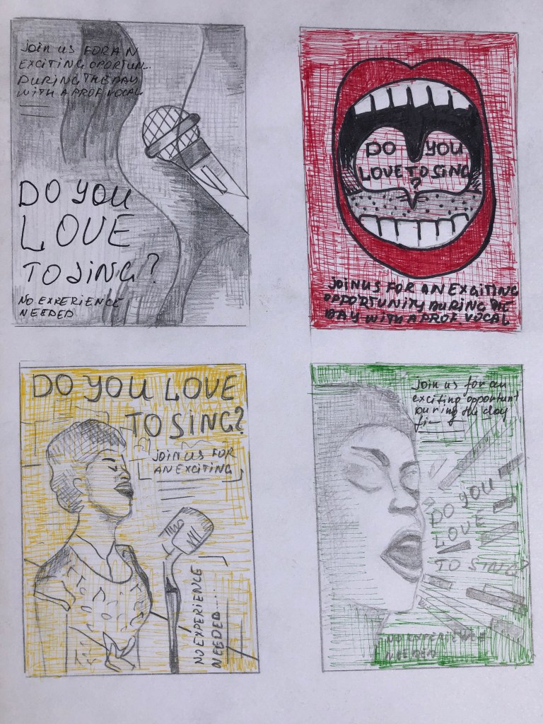
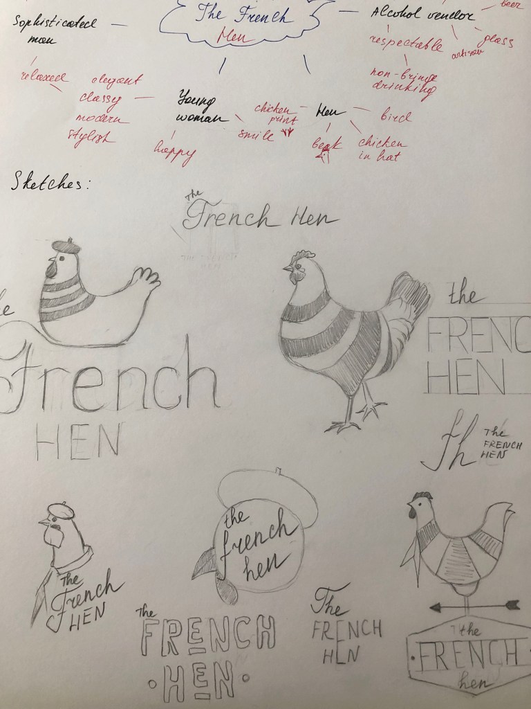
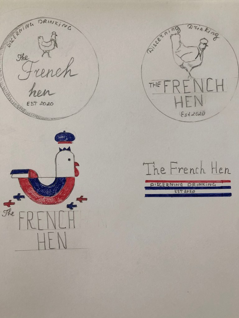
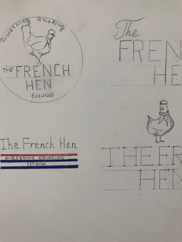
Also, I tried some options based only on the font itself. It could work in some occasions, but that to create the memorable image I would instead use the sketch of the Hen as well. For one of the drawings, I tried to use not the full body of the bird, but only some key elements, such as the beak and using only the top body, that how was born the idea of using the image of the Hen in the hat and little French scarf around her neck. In addition to my sketches, I created the kind of label placement of the logo and name, with some new words as ‘Established 2020‘ and the definition’ discerning drinking‘ around it.

On top of the emblem, I placed the image of the Hen with fewer details, just with an outline. That design helped me to picture the future light-box for outdoor advertising. For future adjustment, if the brand would want to use some stickers on their drinks, that could go quite well also. Some of my extra options had the colour combinations from the French flag, such as blue and red, with some white colour, but that was under consideration still, as full-coloured print could be tricky to design for the light-box or the outdoor signage. In regards to type selection, I was looking into the font combination option, like handwritten font with a saint serif font, or calligraphic font with serif fonts, depending on the design I was going to produce.

Logo Design

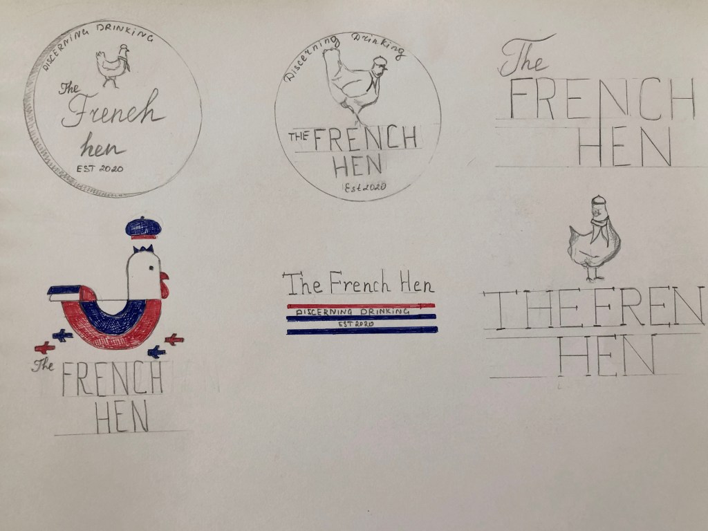
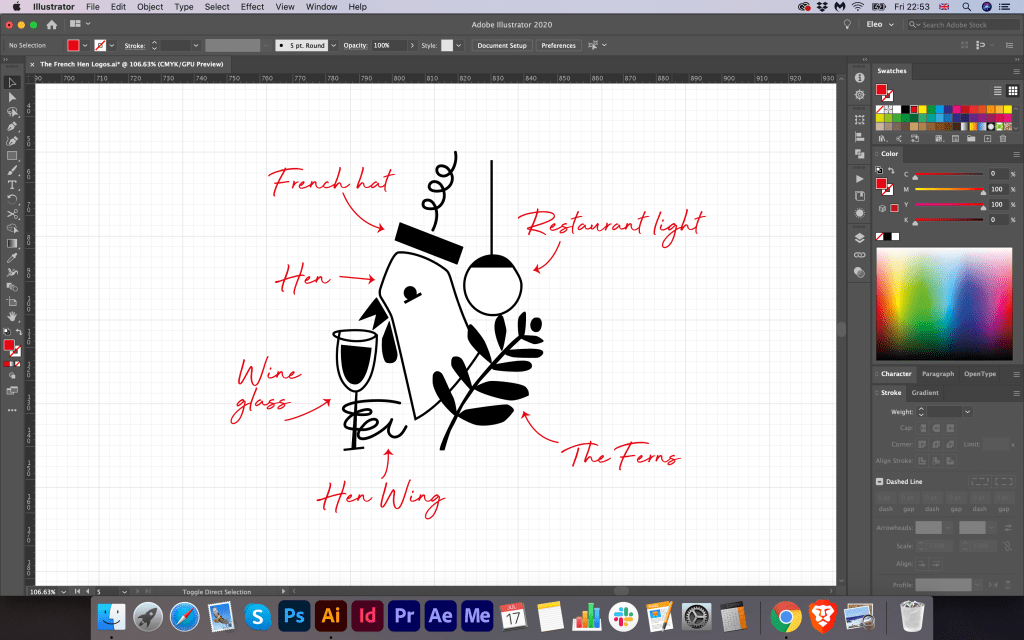
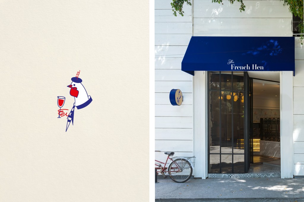
In the next step, I have already started developing the logo itself in Adobe Illustrator. I showed my sketches to my family, and after some consideration, they all agreed that the idea of the hen with beret and scarf could work for this logo brand. Therefore, first I traced this logo into the vector, keeping the angle of the hen and font ideas. But at the same time, I tried quickly to draw some images of the geometric hen with embedded letter ‘F’ inside of it. However, I didn’t think it could be suitable version, as the geometric based picture could provide the wrong impression of the brand, as I wanted to walk away from any sort of fast food association for that logo. I visualised that hen logo in the different colour variations, playing with the deep blue and red colours. Underneath my sketched hen, I designed some extra options for the hen shape. I think I had some genius idea which came into my head later, where I added some additional elements into the hen logo, such as little wing with a glass of wine, and the leaf of the ferns next to it. I was not sure about the shape of the head of that hen, as it slightly reminded me a pigeon, but I thought it would be great to join those two images together and create an upgraded logo for this brand.

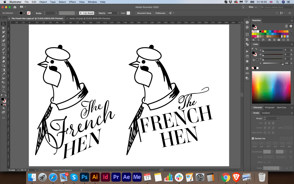
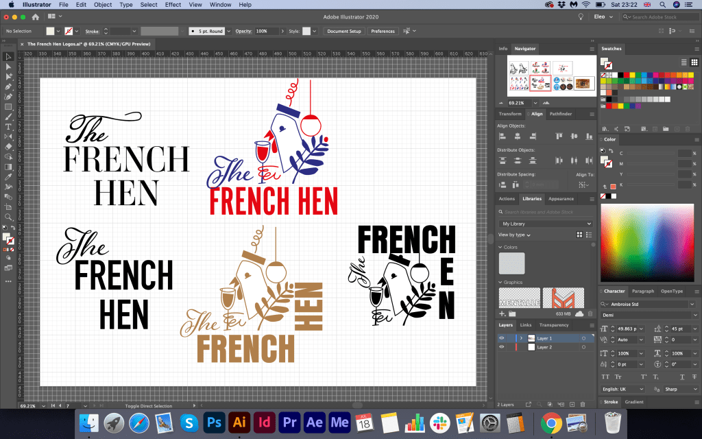
For the article ‘The’ I used neat calligraphic font AdornSPomander, for the name ‘French Hen’ I used serif font AmbroiseStd, and also for the ‘Est2020’ I chose narrow san serif font Avenir Next Condensed. From my point of view, this font combination created classy and elegant writing which I was aimed to achieve.

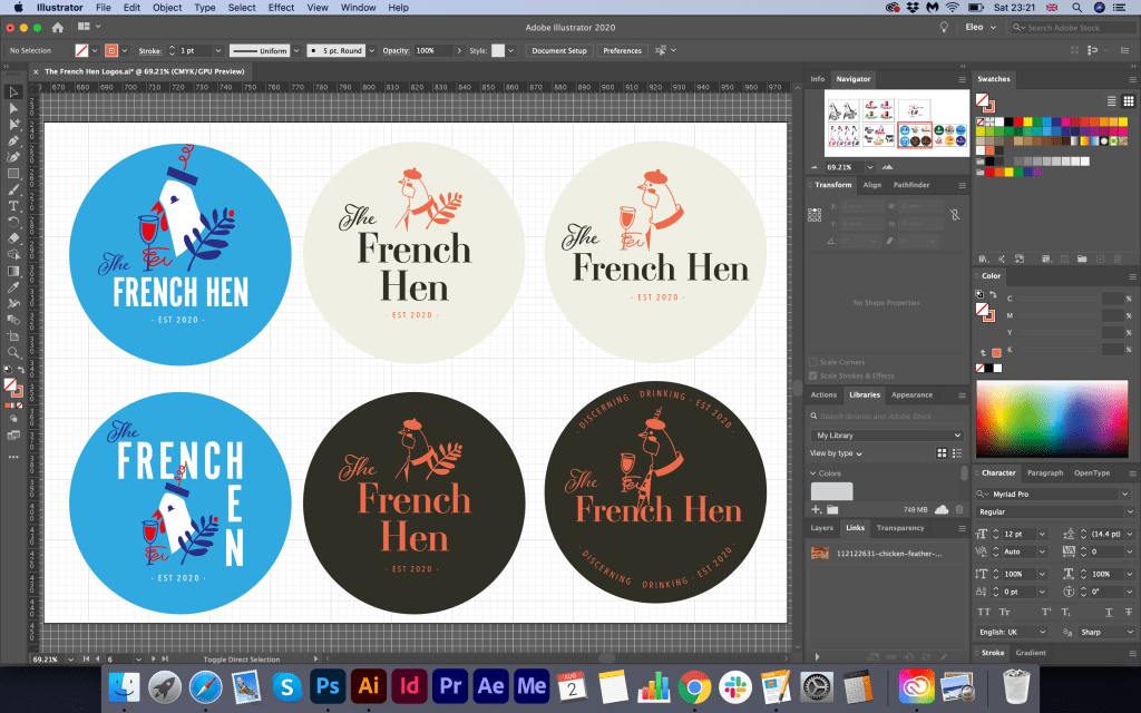
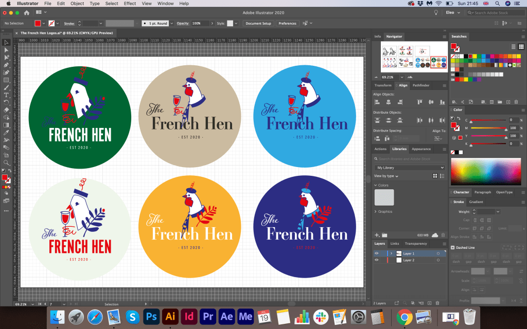
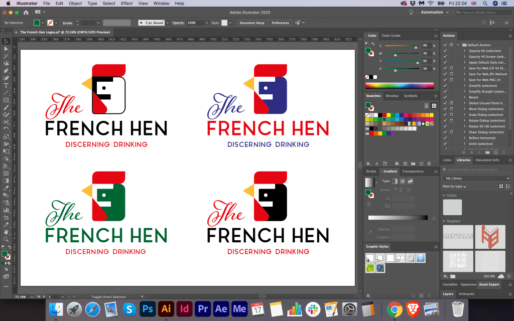
Further down from my logo design development could be seen that I tried to play around with some colours for this logo. I tried the combination of the full coloured logo on the blue background, dark green, also I tried to use just one colour fo the logo, naming and contrast colour fo the experience. I liked that full coloured option of hen on the blue background. However, I was not quite sure how I could implement it into the restaurant branding; therefore, I was considering whether I could use one coloured logo brand and contrast background for it. For example, I could still use my planned dark blue colour. For the logo, I decided that I would go for some variations, like salmon colour for the logo (I decided to go away from using solid red, as it could be too flashy) besides with blue colour, and alternatively some golden elements.

Ready Mockups

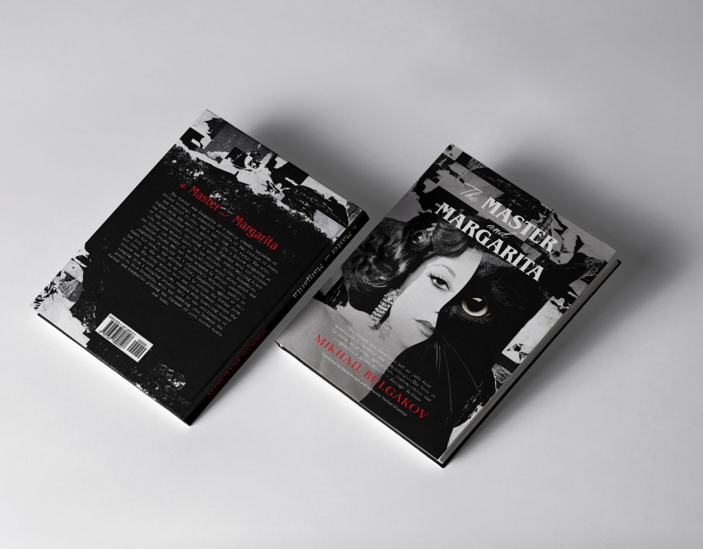
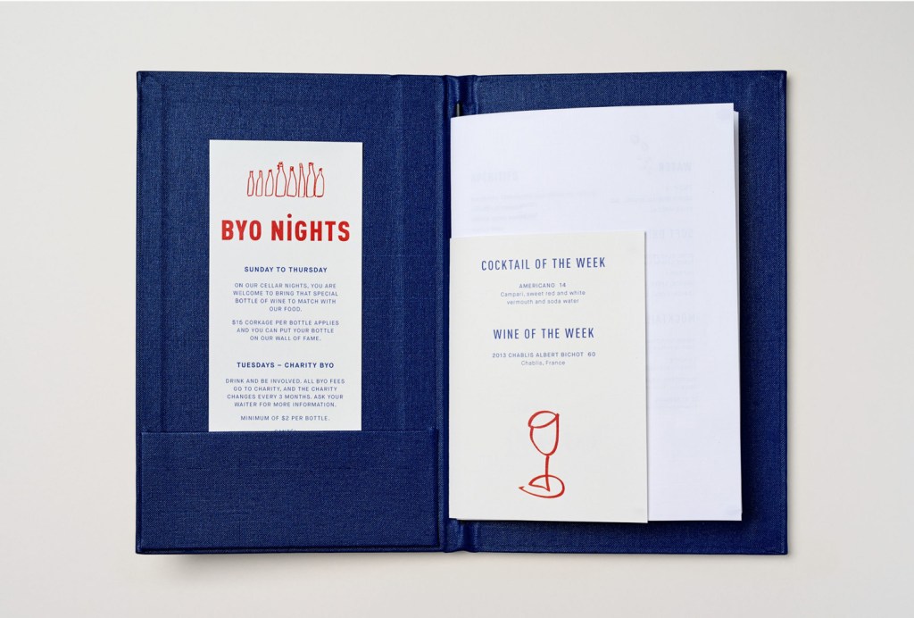
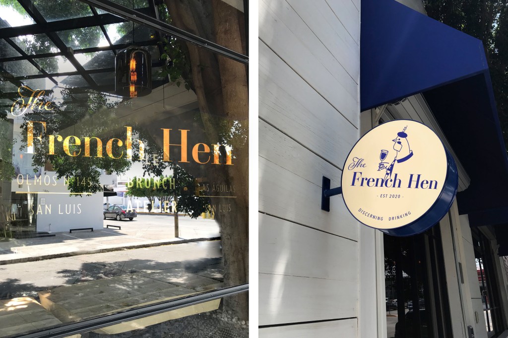
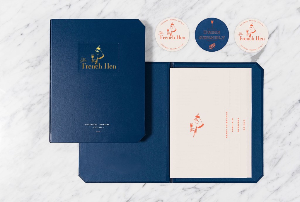
As I chose the essentials of the branding such as logo, font, and colour scheme, later I proceeded to mockup designs. Here I faced with the task of finding the right mood in the branding design for the restaurant. To begin with, I placed a full-colour copy of the logo on watercolour paper, a chicken in an elegant hat with a curl, a glass of wine and a traditional flag looked elegant and smart, which is what is needed for this kind of establishment. It is as if she raises a glass and invites visitors to taste the local drinks. So for the sign, I chose a blue rag roof, on which only the name of the establishment was spelt out in white, while on the light-box I placed the chicken logo in blue, taking as a basis a circular composition with the designation ‘Discerning Drinking.’

Since it was inconvenient to place the chicken logo on the ragged roof, I had an additional option to set the full version on the light-box. For this option, I have chosen warm shades of cream and have already used a dark blue on top for the lettering and logo. It seemed to me that this is the right colour combination for readable text.

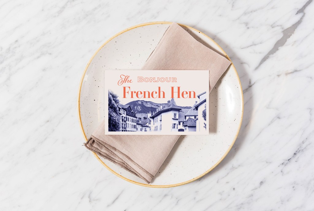
Also, I made a design for a business card featuring a cosy French village in blue shades with the word ‘Bonjour’. For the element on the window, I chose the name of the company in golden colour ‘The French Hen’.

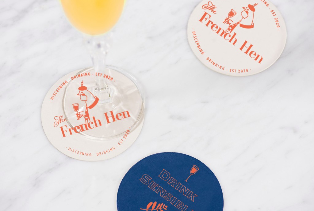
For the drink coasters, I also used a warm shade of red-orange for the logo, and on the back, I used a blue background with the fern leaf and a glass of wine. For the phrase ‘Drink Responsibly’ with decorative font Copperplate, I used just outline for this font, in the result this font created a kind of right combination with the logo. 

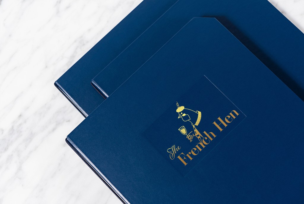
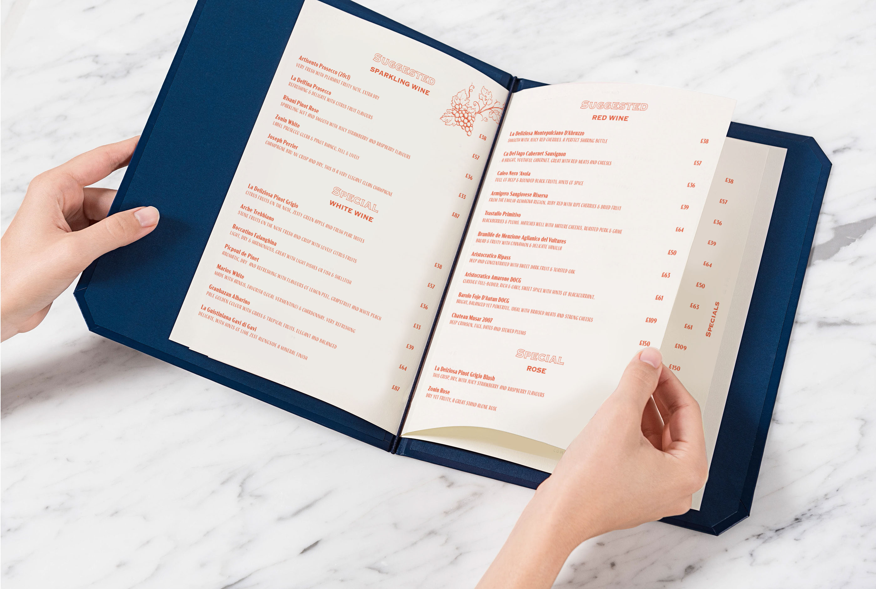
Then I tried to maintain a specific colour composition. In my subsequent branded products, I introduced additional combinations; for example, for the menu cover, I chose a rich dark blue colour. At the same time, I depicted chicken using golden foil using the embossing principle. Inside the menu, I made it according to the direction of a book, placing the text in salmon colour on cream sheets of paper. In the corner, I have put a small illustration of a vineyard. Text for the menu I used modern narrow sans-serif font in Acme Gothic Condensed Bold and Regular.

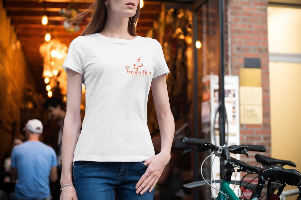
I chose a white T-shirt for the service staff’s signature clothing and placed the full company logo on the left side at chest level.

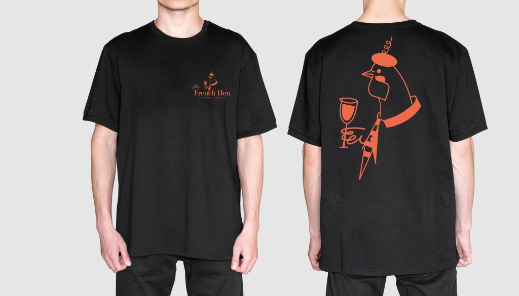
This is an additional version of the logo on the black background. Personally I would prefer white t-shirts, but as an option it could be as an alternative, for example black t-shirts for male staff. On the back of the t-shirt the bigger scale could be used as well.

For the napkin design, I followed the alternation principle, where I staggered four symbols:

  • the letter F (French)
  • Letter H (Hen)
  • The Ferns leaves
  • Glass of wine

I was pleased with the result.

Reflection

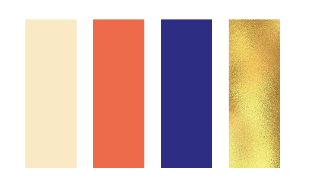
In conclusion, I would like to say that I enjoyed the process of creating the logo for ‘The French Hen’ and its branding. It took me longer to process the ideas and the brand style itself than I thought it would do, but the is a reason for it, as I wanted to create an impressive visual with unique colours and technics. In the result I got quite a strong identity for the restaurant, it has a feel of lively, young, open place, but at the same time with some elegancy and elements of chic into it. I made my choice based on intuition, like that place should have deep shades, where I chose dark and rich blue, but at the same time, I used some fresh shades of orange-red and creme colour. Ideally, it would be better to do more researches into colour combinations, maybe make some analysis how colour affect your wish for drinking or eating, or how to create a relaxing atmosphere by using just a colour. Still, mainly I concentrated at the general feeling of the place, to make it welcoming, open and modern, but with some classy elements. In the result, I think a potential customer would see in it the right direction for brand development.

Exercise: Chance Housing Association

The Chance Housing Association has been set up to try and help first time buyers get onto the housing ladder and they want you to develop a brand image for their stationery. It is important to them that the Association is seen as being different from the other local housing associations – more modern, more helpful and definitely welcoming to young people wanting to buy a house.
They want to use their logo on their letterheads and office stationery and it will also be used somewhere on the sheets that hold the property details. It also needs to be reproducible in the local newspaper and professional trade magazines.
What to do
• Research other housing associations’ and estate agents’ styles. Look at other publications designed for a similar audience. This information should help you identify as much what you don’t want to do as what you do.
• If this was a real job you would need to visit the housing association’s offices and website, if it has one, to see how many decisions they have already made – for example they may have painted their sign silver and dark blue and used a particular font. As the designer you may want to continue with and develop those decisions or change them.
• Using just typography sketch up some designs. You want to come up with at least three initial ideas to show the client. In this instance you can decide which one you think works best to further develop.
• Mock up a letterhead and business card using the logo and house brand. Look in you local newspaper and mock up an advertisement to fit in the paper. Measure the space carefully remembering to leave sufficient margins so your text isn’t cramped. Photocopy in black and white onto cheap paper – does your logo still work? Have any fine lines got lost? Are the differences between colours still discernable?
• Show your designs to your friends and family. What is their feedback?
• If you need to, go back and adjust your artwork. If all is well make up a presentation pack to show the client – in this instance your tutor. Keep all your work and record the process in your learning log.

OCA. Core Concepts

Researches

This time I had a new project with more in-depth market analysis and compiling a portfolio and brand book for Housing Chance Association. Here I have an opportunity to feel like a real contractor not only in design but also in marketing. The task is challenging to subordinate and includes several stages. I wrote for myself the critical points of the brief because here a challenge not only to develop a logo but also to understand how important the uniqueness of the brand is, to build up a recognisable corporate identity which will carry the main message to customers.

I made a mind map in my notes because here, it was essential to observe the structure and sequence of actions. The mind map helped me concentrate on the main factors, and decide on the keywords for the brief.

So, in the first stage, it is necessary to analyse existing companies, understand what unites them, and find the missing link in the market that would help distinguish the brand from other companies. To begin with, I found a collection of Housing Association logos in Google, because here it was vital for me to find existing companies, by far the first in the list were those that are in most significant demand through Internet searches. I had never before paid attention to the offices of a housing association, apart from charities; however, their mission is still quite significant, this is a real help and support for a young people who are just getting on their feet. I noticed that in most of the logos you could see the house symbol, a shelter, a symbol of a roof over the head, which gave me the feeling that the house symbol is the most used option. Some companies went to more non-standard ideas, let’s say the silhouette of people, or unifying brackets. Also, some logos resemble the collection of the missing puzzle, as the personification that we will help you feel complete. These are understandable, easily recognisable symbols for such field of activity. I also noticed that light, pleasant combinations of colours are being used, such as blue, green, or combinations of multi-coloured elements, thereby hinting that the brand is light and unlimited in some strict framework.

After that, I proceeded to the next stage of research. I have collected screenshots of real companies in the field of Housing Association. The first thing I turned my attention was the vibrant colours on the site, combined with smiling and friendly assistants. At first glance at the company’s website, it’s essential to show a potential client that we are glad to see you and want to work with you. The service menu is located in the top part of the screen. The company logo is in the upper left corner and then comes the banner. I also noticed that the list of services was highlighted in bright multi-coloured blocks with icons, which indicates that usability was designed for clarity and maximum availability of information, which talks about openness and a desire for cooperation. Let’s say companies like CHP, gateway, together housing are made in a similar style as if they are links in a single chain. But Hyde is an association of a more mature business, grey shades with a deep blue logo dominate here. I paid my attention to the company Jigsaw, which, compared to the others, was distinguished by a restrained style, an unusual shape of the logo and the unique structure of the website. It also focuses on family values.

Favourite Logos

For myself, I highlighted several logos of Housing Association companies, which, in my opinion, are distinguished by their originality. The Jigsaw logo had a non-standard symbol, with not just for the silhouette of the house, but according to the origami principle. Also, the website was designed on a modern structure. I also liked the Hyde corporate identity and logo, which hides a 3D image of the H. Platform logo stands out because of its bright and bold font, and precise reading.

Researches Conclusion

The main difference between Housing Association and estate agents is the difference in values. From my experience I can say that walking around the city centre I could meet property selling or renting companies, where the main entrance is covered with photographs of houses or apartments, with different price variations. At the same time, the Housing Association is located in more remote places. The working principle is more similar to charitable organisations, where it is essential to hear and understand each person’s story. While estate agents are exclusively commercial organisations, and the main target for them to lease or sell the real estate of their clients as much as possible.

Housing associations are a not-for-profit organisation that can be registered charities or focused on helping particular social groups such as over 60’s, disabled customers or young people as in our example. In comparison, estate agencies mainly run for-profit and therefore tend to use higher rates with no particular social group focus, offering very exclusive properties as well as basic living accommodation.

Sketches

After I researched housing associations and their corporate identity, determining the fundamental differences from commercial estate agencies, critical principles in the design for such organisations on the market, I started sketching the future logo. Based on the mind map, I also summed up what keywords can be used in sketches. For the future logo in my designs, I wanted to use such objects as building, the key, lock, ladder, window, door, roof, in general, the main components of the house. My goal is to reproduce bold, readable, transparent, bright, modern logo that would attract the right audience. Since this organisation is designed for the younger generation, I also wanted to create a colour palette, with fresh, bright shades, but at the same time observe the style and fashion trends. From my sketches can be seen that some logos were based on the image of the house, roof, key, all of them were interpreted in the very spelling of the logo. I understood that initially, the task was to use the company name “Chance” as a logo, and this is a more difficult task than drawing a different logo, as a house or any other graphic element. It was essential to show that the name of the company itself is already a logo and carries its message to customers, the principle of “Type Tells Tales”.

So from my sketches, I could see the design leaders, but I wanted to draw several options so that I could choose the most successful option from the drawn designs in colour.

Logo Design

Further, according to my sketches, I started designing the logo. For the beginning, I used the principle of choosing a font, then selecting a colour pallet, and after drawing the symbol. From my screenshots, it can be seen that I created a list of modern fonts, sans-serif mainly. I liked the thinner font options, but I was not sure that they would help me display the logo I wanted. I also created a list of colours for the corporate identity, as I wanted to show the freshness, freedom and lightness of the brand, a combination of green and blue shades became my favourite.

I still did not understand whether I would like to make a gradient or freestanding colours for the logo, but I thought that I should make that decision later. I portrayed the first options in black, but after I used full colours, as for me it would be easier to determine the mood of the brand. So there were bright orange-pink shades, as some shades of purple and blue.

In the first version, I portrayed a window with a curtain, an exciting combination, but I did not quite imagine such a trendy design in a charity type organisation. Next, I had an option with a suspended house in the letter “a”, which looked more like a keychain. I liked this version of the logo, but I thought that the font was too thin, I wanted to portray bolder font, have more prominent understanding. I also had an option with a key above the logo that came from the letter “h”, but again I was not quite sure of the clarity of this spelling. The roof variant is a bit outdated; such kind of logos was often used around ten years ago, mainly for construction companies. I tried to depict a curly roof for writing the letter “A” in the word “Chance”, and also dilute it with small four windows, a more modern version. However, still, I did not want any association with a building company. I wanted to show a symbol of housing, home. Therefore, I used the last option with the key in the letters “c”.

I showed the logo options to my family, and everyone agreed that the last logo with bold spelling and the key symbol is the most successful. I thought it would be nice to show the key as a symbol of getting into the property. For the logo, I used Coco Gothic Heavy font, in lower cases, but for the tag line, I used Beckman font all capital letters with some spacing between the notes. I wanted to add some kind of zest to this logo, so the idea came to move the letter “a” and “h” closer to each other, and mark letters “c” “a” “n” in one dark purple-blue colour, so the word “Can” clear could be read from it. For the letter “a” I added extra white outline, so it does not interfere with the letter “h.” I could probably use the slogan, “Yes, you can!”, with a special meaning that everyone can get your own home.

In the next step, I made a small presentation of the logo, which would look like a page from a brand book. I would very much like to create a more detailed brand book, but due to lack of time, I could only recreate only one page. So I determined the constituent elements of the logo, how the letter “c” was transformed into a key symbol. I also depicted in the cells the location and proportions of the logo, indicating the free field around. In addition, the colour gamut and gradient in percentages for CMYK, RGB, and HEX colour schemes.

Stationary Design

After I had chosen the logo and colour combination, I moved on to the next stage, creating a letterhead and business cards. From my own experience, I know that the logo, font, and corporate colour essentially set the style for the stationery design. If I go back to the mind map, clearly the client wanted to see the different, welcoming, helpful, open brand, which would attract young people, who have a hope of getting their own first home. Here was essential to keep that freedom and youth of the brand, I wanted to experiment with some turquoise, blue, and spacious designs, with some feel of modern association, but keep it less funky at the same time, as that is a charity organisation.

I played around with some colour font ideas and different variations of text locations. I wanted to use some modern tall font for the Blank A4, but in the result, I ended up with Coco Gothic variation font in the purple colour font, as it worked quite well the logo and the central concept. At the same time, I realised that option with a full coloured logo and text colour is only available if the coloured printer available, or that is an electronic version of the letter, mainly I think all would be printed in black. 

I thought it would be nice to see how the folder for documents would look like, so I created some idea with background gradient with some white circles around it, which seemed relatively fresh and eye-appealing. I thought that based on the principle with a colourful background, I could create a design for business cards. I had an option with a white logo, which looked quite lovely on the bright background as well. For business cards, I created a generic business card, without a name, it’s useful to have them for the company. Still, in terms of design, I decided to lose those circles around, as I thought they were the only disruption. In the result, I had a fresh, bright modern design, which was needed to mockup for the final touch.

Stationary Mockup

Also, I chose a bright background for modelling printed materials to highlight the freshness and youth of this design. I also depicted several examples of the A5 format and the Euro format, which can be used as envelopes, compliment cards, or payslip. Such a striking design only emphasised my idea of logo design.

Advertisement for newspaper

The last touch for these series of design is an advertisement for the local newspaper added some different variations I could bring for the brand. I’ve measured design of the Doncaster Gazette I had in my disposal, most of the advertisement places were just about 13×16 cm, vertical position. I’ve created a few articles, some of them looked like text with regular explanation what is all about, another option I made look like more property kind of adverts. But I thought would be nice to find some take care images and place it for the advert with a large and prominent text, so these designs creating the idea of a call to action, with a question mark, “Looking for your own house?” It could be another slogan like, “Looking for the possibility to buy your own house?”.

I’ve mocked up a few options of the advertisement, and I thought that my preferable option with a little house on it with big readable text, so it would be an excellent option to make this advert to stand out.

Reflection

In conclusion, I would like to say that I thoroughly enjoyed this exercise. During all process, starting from sketches leading to the advertisement design, I was asking my family to have a look at the progress, to ask what kind of ideas this branding brings initially. The challenge of this task was to create the logo inside of the Type letters “Chance” which was initially more complicated. Probably would be easier to concentrate just on the logo, however on this task I had to think about the logotype first. Another quite interesting fact is that housing association could be similar in the logotype to the construction companies, or locksmith, as they have identical direction, which is a house, or getting into the house. However, with the help of colour variation and font, I think I could create more charitable direction for this brand. Here I had to remember some of my previous Assignments and exercises, where I had to apply the principle of communicating type, at the same time closing a colour pallet which would bring the right mood as well. I think that the result of my work is quite good, the only my concern is that is it visible these key symbol inside of the letter “c”. I think I produced this logo big and bold enough to be able to see the details on the big scale as in the smaller proportions. Creating the brand identity of the company is one of the significant parts for the graphic designer. Even if the existing company has its logo, it’s useful to have some reviews in terms of design that to be able to keep up with the modern tendencies, and I’m looking forward to some more branding tasks in the future.

Research point

How many logos can you name? Macdonalds? Nike? Apple? All huge multinational corporations with millions to spend on building brand recognition. Have a look at logos and see how they work – pay attention to the colour schemes and simple designs. You will probably also find that, although you couldn’t recall them immediately when you see them you immediately recognise them – banks, shops and products. Can you immediately recall the OCA logo?

If I think about the most recognisable logos, they are companies you are surrounded by every day life. Some of them seen so many times, that they become a part of yourself much more, so services that are provided by some of the business goes straight into association with a logo brand. A logo is like the front door of a business. It’s a first impression. It’s a greeting. It’s got an energy. The world’s most iconic and famous logos have this down. If you think about delivery services, that is Fedex, Amazon, DHL, if you think about fast-food that is KFC, McDonald’s , Starbucks, also most iconic logos for drinks that I remember as long as I remember myself CocaCola and Pepsi, for technologies Samsung, Apple, and Nokia, and so may others more.

I would like to analyse some of the logos most iconic based on book Logo life: life histories of 100 famous logos.

Lego

The red, white, yellow, and black LEGO logo is synonymous with one of the world’s largest toy manufacturers, but it didn’t always look so familiar. The story began in 1932, when the carpenter and joiner Ole Kirk Kristiansen established his business in the village of Billund, Denmark. The word LEGO in translation from Danish “leg godt” means meaning “play well”. From the history of the logo creation could be seen how the logo from Black and white serif font transformed to the decorative and recognisable unique font with extra colour variations such as red, yellow and white with some black outline. The classic dog bone logo from late 1955 was the first time the logo was standardised in design and colour. From the logo transformation still can be seen that if we compare logos of 1973 and present time only minor change has been done, as extra thickness for the black outline.

British Petroleum

Another interesting logo example is the logo for the global chains of the petrol station BP, which as far as I know temped to be one of the most expensive logos ever made. A new marketing campaign costed BP a staggering 20 million dollars. BP was named among the most environmentally friendly oil businesses in the industry, that’s why they tend to keep fresh green palette in their logo. As it could be seen from the logo development it went from the very standard logo ideas into the complicated flower with symmetrical lines around it, where was applied the golden ratio. The oil titan cut its name to BP and launched an ad slogan “Beyond petroleum”. On top of that, the company started investing into the development of alternative energy sources. Inspired by Helios, the Greek god of Sun, the new logo supported the company philosophy. 

KFC

The company name “Kentucky Fried Chicken” was altered to the abbreviation “KFC” from the early 1990s an  attempt to retreat from the fatty connotation of the word “fried”. The KFC logo signifies the founder of KFC, Colonel Sanders. The company has maintained an outstandingly consistent visual identity by using Colonel’s face on the branding. On the earliest logo can be seen that they made the portrait much bigger and more prominent, with some extra black outline, which helps logo to stand out.

McDonald’s

The McDonald’s logo is symbolic of the arches that were the substance of the newly-constructed architecture of the first franchised restaurant in 1952 McDonald’s uses the Golden and Red as primary colours in its logo design. The Golden colour represents the famous arches of its first franchised restaurant, while the red colour represents the food industry of this company. The synergy of both of these colours creates a great brand identity of McDonald’s. The McDonald’s logo uses the McLawsuit font in its name. It is the simplicity of the fonts that make the name of McDonald’s look appealing to the eyes. I’m not a big fun of the fast-food, but in terms of graphic design whether it is the use of imagery or the colours, everything fits perfect in this emblem without making it look complicated. From my point of view both KFC and McDonald’s logos are one of the most iconic fast-food logos ever made.

Coca Cola

Coca Cola’s logo has changed over time with several historical examples that are nicely dated and frequently the designer or design company is named. Many of the designs run over onto the next spread with graphics of them in use. It’s a lovely jam-packed logo book of company logo history and inspiration. For one year only, the Coke logo gets a dramatic, swirly makeover, then we can see the progress of changing, where the company returned to their 1887 logo idea with calligraphic font. It’s easy recognisable and iconic logo example, however it was quite common scenario when others companies tried to borrow that calligraphic scrip for their logo, and after they could risk of getting the name of Coca Cola’s type of logo.

Google

Another interesting example when not only the logo had been changed but the name of the company as well. The very first name for the Google was “BackRub”, as the engine’s main function was to search through the internet’s back links. Luckily, by 1997 they’d changed the company’s name to the much less creepy “Google”. However the design itself was not the best one, first logo ideas looked like there were made in Microsoft Word text style. Later from 1998 could be see that the font for the logo had improved to the more recognisable one, but the developers still wanted to keep that bright all colours pallet in one logo. The modern version of the Google’s logo went from the serif font to the san serif with bolder writing.

Apple

Another significant logo in the logo’s history is Apple logo. I assume it is an important logo ideas for many designers, as the main purpose of this brand was to push design and modern outbids of the brand forward. So to start with, let’s look at the original apple logo from 1976. It featured a hand drawn image of  Isaac Newton under the tree where the apple fell and was designed by co-founder Ronald Wayne. It also featured the copy: ‘A Mind Forever Voyaging Through Strange Seas of Thought – Alone’. From the progress of the logo can bee seen who the rainbow logo went to the strict dark shades and after to the 3-D type of logos. Now, apple has gone even more minimal with the simplistic mono logo which is usually used. It is sometimes used on other products in various other flat colours as well. It goes to show the importance of simplicity in logo design as the same form has been reinvented with such success over so many years.

Starbucks Coffee

Starbucks legendary logo design is the brainchild of Terry Heckler, who pored over old marine books until he came up with a logo based on an old 16th-century Norse woodcut: a two-tailed mermaid. What everyone has noticed that the logo has changed with the years of becoming bigger, and coming closer to the edges, which looks like it has been completely stripped from the details. The Starbucks logo is circular in shape. The design also features the brand name in wordmark inside the circles with two stars on either sides. The newest logo design features an enlarged Siren with no stars and wordmark.

OCA

In regards to the UCA logo I can say that it is made in contrasting colour pallet, with painted letter “A” like by a piece of chalk on the red background, which is quite catching. It’s hard for me to say what is my impression on the additional information placed on the black square, but if I will try to recall the logo, it will be letter “A” coming as a main object.

Sources

  1. https://www.designboom.com/design/logo-life-life-histories-of-100-famous-logos/
  2. Logo life: life histories of 100 famous logos
  3. https://www.logodesignlove.com/lego-logo
  4. https://www.logaster.co.uk/blog/bp-logo/

Exercise: Poster and flyer

This exercise is about how you deal with two different spaces to work in. You have been asked to design an A3 poster and an accompanying double sided A6 flyer to promote a singing course run by an organisation called SingOut (all one word). They have very little money so want to print these posters on their black and white photocopier. You can use a colour paper if you want.

You may want to include an image such as a drawing or photograph, but be very careful with photos as they tend not to reproduce well on a photocopier particularly if they are colour photos. You will need to check by printing off your design and/or photocopying it.
The information they want to give is:

• Do you love to sing?
• Join us for an exciting opportunity during the day with a professional vocal coach.
Learn to sing different types of music, vocal techniques, meet new people and have
fun!
• 10.30 to 12.00 every Tuesday from 11 March
• The Community Centre, Charlotte Church Road
• £60 for the course
• No experience needed/no requirement to read music
• For more information call 011779 8765432 http://www.singout.com

The first thing you need to do is work out if you have all the information you need to fulfil the brief. If not what is missing? Work out the hierarchy of the information. How will you divide your information up to fit on both sides of your flyer? How will you link the design for the poster with that of the flyer? How can you make the poster eye-catching and effective with such a limited palette? Which typeface or faces will you use and why have you made that decision?

When you have finished pin your poster up and critique your work. What do you think? Keep notes and sketches in your learning log.

OCA. Core Concepts

Researches

To start with, I decided to find ideas for inspiration on vocal posters. In my opinion, the main argument for these vocal classes sign is to identify the singing person or singer/singer in action. I found some of the options that I saved in the mood board on the Pinterest page. My collection of posters are mostly concert posters, but they helped me to form an idea of how I would like to portray my version. The fact that the colour scheme had initially restrictive requirements, where I could use only one colour, was a kind of advantage. The main reason why I thought this was an advantage, because colour paper and printing in the same colour, in our version, black and white printing, could create the necessary style and creative layout. From my earlier researches about techno music, I noticed that artists rarely used full-colour image, mainly the idea is a restrained selection of colours. I thought in this design due to colour restrictions, I could achieve a somewhat non-standard solution.

Sketches

Next stage, I started sketching future designs. At the heart of my ideas for posters were such as a person singing full face and profile, I also wanted to depict the flying words from singer’s mouth, since it was vital for me to show the person in action. As an alternative, I thought would be good to depict a microphone, in several variations, a direct association with singing, as well as variations just with the mouth, a more radical design, which in my opinion was more bold and flashy, but as an option is entirely original. The text for the posters is very casual, open and welcoming, with a message: “Come to us, your experience is not important to us, your main desire and love for singing are important to us”, — so the design for it should also be light and playful.

Since the musical direction is also quite creative, I wanted to introduce some original solution into this poster, which would help me to highlight this poster against the background of other options.
Also, for the image of a vocalist, I wanted to pick up a girl with a bright and attractive appearance, and from the first sight, it would be clear that the poster carries a creative message. I was looking for some options, and the image the most suited my requirements, such as action (singing), a microphone, a vivid picture of a girl who looks casual, and I could later beat her wide-brimmed hat in the poster.

Designs

The next step I cut out the image because I did not need a background, I planned to put the vocalist herself on the experience of coloured paper. I collected some options of coloured paper from bright yellow, pink to green and blue, they all were successfully suited to my design format, I couldn’t decide which colour I preferred, so I thought I will try all of them for now. Next, I proceeded to the selection of the font. I felt that it would be worthy of experimenting with the font and choosing a decorative character, I looked for some new fonts on the site for posters, and I also went through the Adobe Fonts font library. My favourite fonts were the Font Art Plot Regular fonts I chose for the main headline. Do you love to sing? WetSlash as an optional font. I tried to place the font at an angle, but because of the rounded hat, which occupied most of the space, I realised that I needed to apply a curved arch shape that would repeat the form of a circle. 

So as I copied the text into a poster template, I gave it the shape of a hat with curved parts. I took out the address and contacts in the lower right corner, I did not have enough space on the hat, but I got the idea to place it separately.

After I placed the whole font on the poster, I realised that there was still a lot of space around. It would be interesting to apply the style from the Font Tells Tales book, and fill the rest of the room with musical notes (as an option, I could also place phrases about vocals or creativity around the vocalist). As an inspiration, I turned to artists like Warren Lehrer “I mean you know” with his play of voices, which his creative approach in lettering and characters. Also, I could relate my future design to such artist as Jonny Hannah “Hot Jazz Special” with her use of all kind of fonts and angles for them. Also Paula Scher works with her saying “Words have meaning and typography has feeling”. All these examples served as a kind of inspiration for the style chosen for this poster.

Flyer Design

After the design of the poster was outlined, I started designing the flyer. I placed all the information on the poster, including details such as an address, course description, and cost of the event. The main thing is that the main message is “Do you love to sing?” in large print, so he called the audience to his attention. On the flyer, I divided all the information into several parties, I thought that in general descriptive texts are not even needed on the flyer, it was also important to keep the whole message on it, join us, the cost of the course, contact details. The only thing that I divided the narrative into the front and back. Also on the reverse side, I decided to beat the font in a circular composition to support the tandem with the front side, and I also scattered throughout the area notes that attract attention with their style, at first glance, it becomes clear that this is a musical direction.

Final designs

This design was loaded with different elements. Still, I tried to compare it with a more spacious layout, it didn’t appeal to me like that, and judging by the reviews of my family, they would also prefer my final version with a bunch of texts and notes around, it has creativity and originality.

Conclusion

This exercise was an exciting task to follow the hierarchy of textual information. The main message “Do you love to sing?” was highlighted in the largest font. In this design, the question to the potential customer occupies the leading position, so it was necessary here to highlight the font in large letters. Further on the attractiveness of attention are the price, address and contact information. The descriptive part of the event in my design is much smaller, as I did not want to overload the layout with too large text. Probably I could make the price smaller, or delete it to make sure the price wouldn’t be a daunting symbol for the potential customer. But here what is essential is the SingOut company wish, whether they want to indicate the price on the main poster, or is this hidden information only for the flyer, and for a more detailed acquaintance?


Also, I mocked up a poster on different colours of paper. I liked the possible variation with colours. The yellow paper would always be brighter and more flashy, cyan or green for calmer shades for printing; it also depends on the customer’s desire. I printed the poster on white paper, and the potential of the sign was already visible. Overall, I enjoyed this task; it was fascinating to work in a new style, to follow the hierarchy of information and make the font a part of the design. As a result, the poster was quite playful and attractive. I think it would meet the wishes of a potential client.

References

  1. Source of vector image for musical notes: https://bit.ly/2LYvEMD
  2. Image of the singer: https://bit.ly/3bZYkiV
  3. Font download: https://elements.envato.com/ru/fonts/decorative
  4. Book Type Tell Tales. Steven Heller & Gail Anderson.

Research point

In this research point I was asked to make some research about poster design and their tendencies according to the time changes. I thought that is exactly the type of work I’ve been doing recently — making some researches about posters for the techno record label. The main fact that I’ve discovered about electronic music, as there are no rules in creativity. That was such a huge space for the self-impression, probably the biggest one I’ve every seen recently. The variety of styles was myriad, starting from cube angles for posters, black and white shades going to the fluorescent colours. 

Techno posters stands out as they are not scared of experiments. I’ve seen loads of posters wit glitchy effects, and contrast colours combinations, but I was quite attracted to the mood they brought up with them, which was quite obscure and gloomy, which doesn’t make this music genre less popular.

Birthday List

For this exercise you are going to make up a poster list for yourself. It is intended that you keep it pinned to a noticeboard or wall to remind you of the dates and, as it will be there a long time, it needs to look good.
Start by collecting all the birthdays of your friends and family. You’ll need their name and birth date, to decide whether or not you buy them presents or just send a card, text message or email.
When you have all this design a page to include all this information for example:

Introduction

Nowadays most of the people using social media platforms and reminders in the phone calendars to remember the birthday list of their families and friends. But I thought it would be ideal for myself to create a calendar with the birthday list of my friends and family, as being on a distance from some of my close relatives and friends, sometimes I keep forgetting important days. Though, I thought that is quite useful task, so I was all ready to complete this mission. For this particular exercise, first of all, I’ve decided to go through the content list for my close family and relatives whose I wanted to include in my annual birthday list.

Ideas

It turned out quite detailed list of 50 people, which I was planning to use in the design. Frankly, I got a little stuck at this point. I had experience in creating calendars, both desktop and wall samples, where all dates and holidays were mandatory, but I never wondered how footnotes for the holidays would look like, their description, or what if I create a universal calendar only on the one single sheet with fitting all the important information.

I looked for some examples of birthday reminders on Pinterest, most of them looked like girl diaries. I replenished the collection of inspiration boards with some examples of original calendars with an interesting layout and composition.

Despite the simplicity of the task, I was a bit stumped with ideas, maybe I wanted to create something more than a standard sheet with reminders of birthdays, and at the same time, I did not want to create a pun or rebus with all the memorable dates. In order to clarify the situation, I created some sketches of the future calendar. Most of my options were based on infographics and typography. The first option is quite an understandable infographic, with branches from each month. Here I risked overloading the space with names and arrows from each month, which in the end could lead to confusion. Other options were based on standard plates, which in essence I could add creative with unusual fonts. An option with a circular calendar and multi-coloured months from a design point of view could be an interesting idea, but there was a difficulty how to organise it correctly, so in practice, it turned out to be an impractical option.

I got the idea to create a circular calendar with dates, I found a source of inspiration from the new book I bought Typewriter Art, a Modern Anthology, by Barrie Tullett. I kind of liked that image presented in this book, organised into the circle, that gave me some thoughts wether it will be a good idea to create my calendar in the similar way. As I had a different number of people for each month, I could create sort of different sizes sunrises from the center. Therefore, I created a small sketch for this calendar, it could be still quite tricky to read all the names and dates, but I thought I’m going to try it. For reliability, I still had additional version of the calendar, which in its structure was more like a poster, I planned to scatter the months of the year over the entire area in different sizes, and after that, make descriptions for each birthday.

Design

Soon after I proceeded to design the poster. First of all, I drew a small form where planned to build the entire design. In the centre of the composition, I placed the characters HB (Happy Birthday) and 12 branches from them for 12 months. Next, I started drawing up a list of names in a circular motion, the first numbers were located closer to the centre, then in order to the dates further down of the month. To indicate the months of the year, I chose the first capital letter in the Chandler 42 font, similar to the font in the first typewriters which original had sort of defect in the paint. For names and dates, I chose the Ubuno Mono serif font, which also looked like a font from vintage typewriters. I scattered the months of the year in a more chaotic manner, as more dynamics were visible in the circle.

In the first version, I wanted to keep 2 colours in black and white, it looked like the trend of the first creative projects created on a typewriter. In order not to overload the composition with complex elements that act as a kind of cypher, I created a grid with notation, where 1 square is to send a message, 2 squares are to send the card, and 3 squares are a gift.

To finish the composition, I gathered in the circle the phrase Happy Birthday made in several types of Chandler 42 font.

My goal in this design was not only to create traditional Birthday Calendar but also to look at the option of circular composition for the calendar, to trace its practicality and the dynamics of perception of information. The result was quite interesting, maybe it is not the most convenient for reading, and I will have to consider to read it close, but the option itself turned out to be quite unusual. It prompted me to some variations, I decided to experiment with colour and add a contrasting dark background with stars. So, as additional versions I got a horoscope on the birthdays of friends and relatives. I took an experiment with fonts and tone, and in this way created a design similar to the night sky and stars lit on it. I tried using several shades, like scattered glitter and black background, as well as a much darker blue sky and a deep blue tint for my date range. I stated Birthday Calendar in a modern CocoGothic font with a set tracking between letters.

Conclusion

In conclusion I would like to say that I quite enjoyed that experiment with Circle Birthday Calendar. I started with idea of the round design for the calendar, then it lead me to the option with Typewrite Art, where fixed width fonts were used in terms of creating round image, which has an impression of turning around of the centre circle. From all of this colour options, I still thought that I preferred first black and white design, which was easier to read compare to other designs, as the main idea was to create something readable to be able to follow the notes. I’m looking forward to print this poster, I’m sure i will make a good use of it.

Option with Squared Composition

Another idea for this calendar was to create squared composition poster, with organised space in the own segments around the sheet. The reason why I went for another experiment because I wanted to compare the readability and impression from the design in the more traditional squared design. I thought that for this Birthday List calendar I can make it all the stronger by using different fonts and fonts around it. I imagined the space with all names and birthday around in dynamic composition, where each name of month placed closer to the birthday list. For this poster, I was inspired by book Type Tale Tales, which had lots of experiments with font placement and colour variations.

I wanted to try to make my font to be loud but still be supported by simple geometrical parts. I chose simple geometric figures, such as square and circle, with only to colours around it, red and grey. In case that to bring some deepness to this composition I applied multiply effects for these figures, so they were seen through each other.

After that, I proceeded to the placement of each month from the left to the right but keeping at the same time chaotic feel. I didn’t want to overuse it too much, as I still needed to follow which month for which list was there, so I placed next to each month additional symbols # with the number of the month. To be fair, once I created that skeleton with different shapes on it, I thought it will be a quite successful design, it doesn’t have a traditional structure, it had font experiment, so by adding names and month around, with different angle only gave extraordinary feel to it. For the name of the months, I used fixed-width font Source Code Variable Semibold. From the design, it can be seen that I used different sizes for this font, and different colour, for some month’s names I tried to cut this letters inside of the boxes, so it had cut through effect. For the list of people’s name, I used similar font Ubuntu Mono, as I liked that font style for that kind of the design. For the Numbers around I used big bold font of Coco Gothic, as those font selections create good combination together. That to determine what kind of birthday attention each person will have, I placed code in the right bottom corner, where * means text, §˚ card, and Ω≈ a gift, my little cypher for each day.

Conclusion

In conclusion I would like to say that I was quite please with design. It didn’t take me a few moments of creating it, and I had lots of hard work by completing it, but it helped me to widen my researches, and see some more potential, that quite simple task from the first side, as Birthday Calendar can bring some extra creativity on it.

Exercise: Giving information

Find some examples of information graphics. For example bus timetables, city maps, diagrams or representations of statistical data. Look at the way they are designed and try and work out the decisions the designer made. What can you learn from them and when. Would it be appropriate to use a similar design solution?
For this exercise, you are going to describe your immediate surroundings using information graphics; this could be a plan of your desk, the layout of your house, the arrangement of objects in your cupboards or your morning journey; anything will do. Before you start you will need to think about scale and about how you will break down the information for your design. Create a graphic that represents an aerial or front-on view of your location. Be mindful of the hierarchy of the elements in the composition and the dynamics needed to draw the viewer’s eye from one stage to the next. Use typography, numbers and colours to describe what is being represented. You may want to produce a key to help us understand what is being shown, as well as a diagram title to put things in context.
Keep all your sketches and notes in your learning log.

OCA. Core Concepts

Introduction

What is the main advantage of infographics? Of course, this is their laconicism, with the help of graphic elements and simple formulas, they convey the main information and solve the problem. From my experience, infographics are in high demand among many business and sectors. They are convenient when you need to place detailed information on a small space, for example, an Excel spreadsheet can be represented as diagrams or circles on a piece of paper A5. Infographics are used in statistics, presentations, magazines, social networks, cartography and interior design, and more. Infographics have evolved in recent years to be for mass communication and thus are designed with fewer assumptions about the readers’ knowledge base than other types of visualisations. Infographics have been around for many years and recently the increase of a number of easy-to-use.

The first step, I looked through my collections of maps and magazines, which I had collected some maps and guides from my travels. One striking example is the map of the Boijamans Museum in Rotterdam. Unfortunately, it is currently under restoration, but this map shows alternative locations for art exhibitions. Another example of a map of the Botanical Park in Menton, in the South of France. Zones are separated by different colours in the form of spots. The following is a schematic map of the Heit Nieuwe Instituut in Rotterdam. I also found interesting examples of infographics in Pictograms Icons & Signs collections, rather simplified statistics examples that show the number of cars produced and the number of strikes in Germany for the period from 1914 to 1928. In addition, interesting cartoon icons for EXPO 2002 in Switzerland attracted my attention. The signs themselves comprised pictures and texts, which together conveyed all the necessary information.

In addition, I decided to include a rather unusual approach to the image of my own world in the list of sources of inspiration. Since the task in this exercise is to depict your routine life or the organisation of workspace and time, this example of A World of your Own by Laura Carlin could serve as a rather interesting instance. The author asks how your world would look, how you would depict your home. This gave me the idea that it would be interesting to depict my own version of the infographic with the addition of animated objects. It is possible that as a style for infographics, it is too detailed, but perhaps I could emphasise individual elements for my design.

Also on Pinterest, I create a new board with all kinds of infographic options. While I was navigating myself through some ideas for my own design version, I created some ideas in my head, what kind of design and style I wanted to depict in my information graphic. I really liked that kind of design with cartoony images on them, maybe not just arrows and numbers, but more illustrative representation of design. Some of my sketches explanations are below.

Sketches

I was quite attracted to designs which would represent the map, of some sort of location, or my working space, or another option, my daily routine. Thus, I sketched for myself the basic ideas for design:

  • My daily routine
  • Journey to work
  • Time balance
  • The layout of my house

After I started sketching my designs. So I depicted a map of emotions in the form of a pie chart with intersecting areas, where I displayed a kind of separation of thoughts into emotional, wise and rational emotions. I also applied a diagram with the dominance of emotions. These are fairly simple graphics, they are most popular in statistics or for presentations, where conciseness and brevity matter. I used the same design for the design of the time balance graph in the form of a pie chart and a pyramid of priorities. In my next outline, I wanted to take a more illustrative approach. I created a parabola of my active day, which begins with a morning lift, and where it was at the peak of a working day, and then gradually descended down to time for bedtime. But I thought that such a schedule is probably irrelevant at the moment, due to our isolation of the house, and the amount of time we spend in the walls of our house, which is almost 24 hours a day, I decided to still depict the plan of my house. The layout of the house and its interior is quite simple, but it was interesting for me to re-analyse my home and its main components.

Designs

To begin with, I decided to create a house plan. In my archives I had a house rooms layout, but I needed a vector format, so I decided to redraw the design in Adobe Illustrator, which I could transform for the further design creation. In the end, I had a high-resolution plan of the house, which helped me move on with the filling of the rooms.

Next, I printed a plan diagram on thick paper, where I planned to make sketches for the house interior elements. I remember by heart the arrangement of furniture in the house, so it was not difficult for me to depict a layout of a top view of all sofas and tables. As a result, I had a detailed plan of the house, the first and second floor, with all its components. I decided to give colour to my sketches with the help of watercolours. I wanted to create the effect of hand-made designs, so my illustrations are characterised by a cartoon style, which I completed by layering with a black pen. In addition, I wrote down the name of each room by hand.

In the result I had cute scheme for the house, with each element of the interior placed at the right place. In addition I decided to go slightly outside of the borders, so I pictures partly the garden and some furniture around it.

Now the task was to present the work, as I wanted to bring more sense into the final design. I decided to use the mockup of the magazine, following the example of interior design. To complete the visual I created a map of South Yorkshire with small graphic elements, which I placed on the background. Its hardly can be seen, as it is almost hidden behind the house map, however it still created interesting tandem for both images. I also prescribed a slogan, instead of the usual “Stay home” to “Home, sweet home”, which in my opinion sounds more melodic and pleasant for the general perception. Also, I decided to ass some brightness with additional fresh orange colour. For the second floor, I used a photo of a house with a small text about housing as a zone of comfort and cosiness.

I was quite pleased with design I presented in the result, it had its own unique style. With the use of my own style for the watercolour, I feel that either could easily represent my persona through the graphic produced. However, thinking about the aim of an information graphic, I felt that I needed to go further in my researches, so I proceeded to another option for the House Scheme.

Additional Designs

My new house plan idea was to use only vector elements in Adobe Illustrator. As a basis, I took the same vector layout of the house plan. My key colours are: red, blue and blue. To designate the rooms, I chose different curly elements, from which there is an arrow indicating the name of the room. For texture, I chose a light and pleasant for the perception of parallel lines and cells, some of the rooms I left in white, so as not to overload space. To indicate the vegetation around the house, I chose figurines of trees. In this graphic, I used several combinations of fonts: the Abolition Regular bold sans serif font in combination with the fixed-width font Courier Regular, and for the main text Coco Gothic font, which gave the map originality and appearance of the finished work, which could also be used in my opinion in the interior magazine. The design turned out to be airy, light and concise, in my opinion, it corresponded to the task to create your routine in infographics.

Conclusion

I think I prefer the last design for the aerial view on the house scheme, compare to the first option with watercolored images. I have tried to incorporate different ideas of an information graphic, hierarchy or typeface as well and a unique theme to coincide with the idea behind the infographic of exploring my house plan. Despite the fact the second option design looks stylistically simple, and has clearness, and important elements of infographic, such as visual, the content and the knowledge, the insight into the data that this house plan is presenting.

Exercise: Judging a book by its cover

Choose a book by an author you are familiar with. You are going to design two different covers for it, one using illustrations or photography and the other using just type. Design the whole cover including the spine and back page. Include the title of the book, the author’s name, a brief description of the story and any other information you think is necessary. As you are working remember that your design is intended to help a reader know what the experience of reading the book will be. Is it a serious text book or an off-beat funny novel? Are the readers expected to be young women or older men and does this matter? Is it an ‘easy read’ or ‘literary’? Does the publisher have a house style you need to be partof? When you have finished critique your work – which of your two designs do you feel worksthe most successfully and why? Make notes in your learning log.

OCA. Core Concepts

Start

For this exercise, I chose a book that I am quite familiar with; this book is by the writer Mikhail Bulgakov, The Master and Margarita – a darkly comedic takedown of Soviet society, an audacious revision of the stories of Faust and Pontius Pilate, and a thrilling love story. The novel begins with the Devil’s arrival in 1930’s Moscow disguised as the distinguished Professor Woland. Together with his entourage of odd associates, including a talking, vodka-swilling black cat, Woland wreaks havoc on the societal elite. Meanwhile, the Master (an author of an unpublished novel about Jesus and Pontius Pilate who has been hounded by Soviet censors), languishes in despair in a psychiatric hospital, unable to share his story. His devoted lover, Margarita, agrees to sell her soul to the Devil to rescue the Master from his fate. The story weaves back and forth between current day Moscow and ancient Jerusalem, studded with sparkling scenes ranging from a dizzying Satanic Ball to the crucifixion of Jesus on Bald Mountain, with the enduring love between the Master and Margarita joining the strands of plot across space and time.

According to the novel of the Master and Margarita, there were many attempts to film the story, but mystical coincidences often arose around the filming processes. I thought it would be interesting to convey the atmosphere of the mystery of this story. There are several storylines in the novel, it is also filled with many characters and object, so the spectrum to depict the cover of this book is quite broad. The only challenge that I faced was the fact that the book is quite popular. Through Google search, I could find a considerable number of examples and samples of book covers that were full of variety and different styles.

I collected all kinds of cover options in small subgroups, so it was easier to navigate the designs that were already used earlier. The first fact, it was evident that the covers often used the image of Margarita, small frames from the book, then Margarita and the Master in pair. The next essential character is the cat Behemoth (hippo). He is an enormous demonic black cat who speaks, walks on two legs, and can even transform to human shape for brief periods. I also met several covers with scenes from famous paintings. Thirdly, I noticed that for modern publications, only a few colours were used for the book cover, such as the primary black background in the cat example, and the image of Margarita on a broomstick drawn in outline. Woland and his retinue drawn in silhouette on black colour and a version on a light purple background. I was able to trace that the style of the cover changed over time, from loaded full-colour scenes from the book to one character or quick sketches. I also found several options for covers in the style of pop art, cubism and art deco.

I noticed that it was possible to introduce a new style for the cover of this novel, and this is a design in the style of collage and juxtapositions. I collected collage-style cover images on my Pinterest board. I noticed that collage-style covers evoke mystical associations, create a mood for the presence of the supernatural, which I needed for my designs.

So the choice was justified by the mystical plot of this book, which in my opinion successfully fit into the concept of the book Master and Margarita. In addition, I decided to scroll through a collection of books on Collages, and such masters of collage and juxtaposition as Dennis Busch, Charles Wilkin, Ernesto Artillo and Adrio Verlarco. In their works, I found the right direction and inspiration, which I was going to portray in my works.

Mind Map. Sketches

After the research, I proceeded to sketches. To start, I drew a mind map with keywords that would help me determine the main characters that I would like to portray in my designs.

I analysed the brief and the main storylines, which helped me to forme the main characters that I could portray on the cover of this book.

  • The image of Margarita
  • Image of Margarita and Cat Behemoth
  • Cat Behemoth on its own
  • Margarita and Master

I imagined several variants of the composition, all of which are presented in sketches. My main goal was to create a new image that this book has not yet released, by hiding some features of the main character, like half-faced, upside down faced, combinations with animals faces could create effects that I was looking for. So I have selected for myself some favourite ideas, which after I later I started to implement in Adobe Programs.

Design Cover 1

As I needed an image of the classic lady, vintage style, I’ve googled some ideas, and I found some exciting photograph, that was available for download, website source: https://collage.cityoflondon.gov.uk/home?WINID=1584052701283

Also, I was looking for an image for Patriarch Ponds in Moscow, where the book plot has started from, so landscape, a bit gloomy, would help me to create some juxtaposition with Margarita’s face. Image of the Patriarch Ponds from Pinterest: https://hu.pinterest.com/pin/591590101024594911/

I was thinking about the size of this book cover, so one of the examples for this book cover was 170x250mm with book spine size 20mm. I thought it was quite an adequate size to start. I placed the portrait of the lady on the grey textured background, to give to it some interesting deepness, played around with the picture of the Patriarch Ponds, created a mask over it. I put the image in the centre of the lady’s face, so the tree branch came out the practically same place where her nose was. It helped me to create an effect that I was looking for. For fonts, I chose some classical fonts, which represented the plot quite well, classical font, with serifs all capital letters. Cover 1 Benguiat Pro ITC decorative font, bold with serifs, combined with script font Lavender for words “the”, “and”. For an intro on the book cover all capital letters font Alwyn New, that to highlight it slightly I used fine black lines on the top of the actress body. For the author name, I selected classical font as well with serifs Bentham, and for contrast, I chose some of the letters in red. In the result, I had an exciting design, which was a good start. I liked how that sort of this image of working together, the spirit of this cover, and colours, gloomy and dusk, created the mood of the story, which could represent the plot from the first look.

Design Cover 2

In the next design, I had the option to play around with the image of Margarita and the Behemoth Cat. To start with, I needed to decide on the background. I created an experience from pieces of black colour, and old paper, in black and white, on top I placed the image of the same actress, combining her appearance with a cat. I created a wavy transition from one face to another, trying to keep the proportions of the woman face and the cat. Fonts and their styling were used similarly as in the first design, only here I significantly increased the name of the book, and chose a new font for the intro, which had the desired typewriter effect, Chandler42. On the back of the cover, I created a similar background, and with the help of a brush in Photoshop, I made a transition to a black background from torn edges. Picture of the cat from Pinterest: https://i.pinimg.com/564x/e7/03/cf/e703cfec4f0ade97feade9f8778fdf93.jpg

In the result I had even more advanced version from the previous design, I like the effect of combining two faces in the one cover. It had the necessary spirit and artistic composition. As I analysed some book covers before, I was quite confident that I could combine a few fonts for each cover, in my design, I had practically four different font variations. Still, they helped to create the hierarchy of the priorities for this book cover.

Design Cover 3

For the final design using graphic images, I decided to go for a new experiment, and the basis was ready to play the shape of a magnolia flower. For the background, I needed to get a scene with depth, which I managed to get due to the overlapping of several images on each other, so two pictures of the Patriarchal Ponds and a standard idea of the sky with grass in muted shades create the necessary surreal mood. Next, I placed the girl’s torso in the lower part, and in the middle of the composition, I planned to place several magnolia petals with the girl’s face. In this performance, I managed to create a mystery. I put the hat of Azazello on top. I decorated Margarita’s face with bright blue butterflies, emphasising the tenderness of the image. On the back of the cover, I used a duplicate image of the Patriarchal Ponds but from a different angle, thereby combining both pictures into one. The result was quite enjoyable, it has drama and mystery, and mysticism at the same time. I liked the experiment with superimposing images on top of one another; the only thing I needed was a lot of ideas that I just collected on the Internet, transforming and changing their original form.

Font for the book name Abril Fatface Regular, and JaneAusten for words “the”, “and”. For the author name Aqua Grotesque.

Girl in the skirt https://www.greatinspire.com/surreal-self-portraits-by-flora-borsi/

Image of the girl cropped https://www.behance.net/gallery/34816101/Black-Butterfly

Book Covers Just Type

For the second set of covers, I had a new task: to depict book covers without photos and graphic elements. This task became quite challenging for me, as I couldn’t understand how I can lose all these images and complicated collages, as I still aimed to create a new exciting and eye-catching design. I understood that this was classical literature, and the cover examples for this book without photos and visual images were quite dull. But since the task was to do without a picture, I decided to experiment with the font itself. Yes, I understood that the fonts that I used earlier would probably be too dull, and they would not arouse the interest of the buyer. However, I still wanted to beat the cover on the favourable side. Here I came to the help of the font selection program in Adobe InDesign. From my past exercises, I remembered for myself some successful font combinations:

  • Serif font and Calligraphic font
  • Calligraphic font only
  • The decorative font in several combinations
  • Decorative font only (experiment with different letters)

Since in this design, I was limited in graphic elements, I decided to depict the covers of books in bright colours; this helped me to understand the accents and mood. Nevertheless, I tried to maintain a dark contrasting base, and the font on the top was bright. As different types of fonts and designs were applied, I realised that the book was taking on a new mood.

First Cover (top left)

In the first cover, I used fonts such as Blackadder ITC for the uppercase font, Bodoni 72 Oldstyle for the calligraphic font, for the name of the author I chose the sans-serif font Gilroy. I understood that this was only the beginning of the experiment, and this cover required some modifications. I was not entirely happy with the combination of fonts, as well as the slant of the letters.

Second Cover (bottom left)

In this book, I chose a dark purple background and a bright contrasting orange capital font GratitudScript Pro on top. I repainted the name of the author in the colour of the magenta. I thought the new design had a combination, I liked the intersection of the curls of the font with each other, and the writing angle. This cover evoked quite romantic associations, possibly earlier novels than this book, which was released in the middle of the 20th century. Also, it lacked a mystical mood, so I realised that this was not the final version.

Third Cover (top right)

In this cover, I chose a dark cherry shade for the background and a bright contrast font. Word ‘The Master’ I designed in Athene font with a serif typeface, and the sophisticated Riesling serif typeface for ‘Margarita’. Even though the font was sophisticated, this design shows more similarities with the moods in the book than the previous versions.

Fourth Cover (bottom right)

Finally, in the final version, I was able to convey the mood of the book. Here I chose a black background, and on top of it, I found an Alta California font with different letters, also for second M I used additional font Acier BAT. I could see so far that in such kind of font I could trace more frightening mood, because Woland’s entourage was a fear for the people around, and due to such a random arrangement of letters, I could convey the mysticism of the book more accurately.

Conclusion

In conclusion, I would like to say that I enjoyed the work was done and the results. An experiment with a collage is a rather laborious process; it takes a lot of time to search for images, matching the mood, as well as observing the rules with fonts, I always had to change the background to highlight the font in the main plan as well. However, I can see that each option as collage and only fonts version may attract the different target audience, which is both younger people and more mature age. I prefer the collage version as I feel this is more descriptive and generally more attractive; also it brings the mood of the book quite well. However, the text option looks more playful and slightly ‘wacky’ and unusual as I feel most of Michael Bulgakov’s stories have elements of this tone. It was an opening for me that the final design turned out to be so successful, as using only the font, I could still create an exciting and catchy design.

Research point

Many hundreds of paperback books have been produced over the years. Look at as many variations as you can find to see how different publishing houses designed their covers and how the covers fit together as a series. Select a particular publishing house and describe their design style in your learning log.

OCA. Core Concepts

In the 19th century a whole new era in publishing began. A series of technical developments, in the book trade as in other industries, dramatically raised output and lowered costs. Stereotyping, the iron press, the application of steam power, mechanical typecasting and typesetting, new methods of reproducing illustrations—these inventions, developed through the century and often resisted by the printer, amounted to a revolution in book production. Every publishing house has manufacturing, marketing, and accounts departments, but the heart of the business lies in the editorial function. This has changed in its mode of operation through the years and still varies from one country to another and between firms but not in essentials. 

When I went online to make some researches on the biggest Publishers in the world, I found out that together, these institutions dominate the publishing landscape, and many of the most beloved books come from their imprints. The “Big 5” publishers is a nickname given to the five power-houses in trade publishing: Penguin Random House, Hachette Livre, HarperCollins, Macmillan Publishers, and Simon & Schuster.

Penguin Classics

The task of analysing book covers seemed interesting enough to me. Before starting this exercise, I decided to do a little research in this area. I found a list of the most influential major publications in the field of literature. Each publishers website was overflowing with covers and designs that I was eager to arrange in a unique manner. The largest publishing house I needed to visit, Penguin Classics use vector illustrations, and 2/3 of the parts are occupied by a drawing relevant to the story. In the non-linear part the book is split, one part individual designed work coupled with corporate colours in black, orange and white, containing the globally known penguin logo, a rather cute design, but at the same time recognisable. In addition, on a black background, an orange sans-serif font, as well as an uppercase font for the book title. In the case of Penguin classics, the designers made the main emphasis on the design of the illustration itself.

Book Series

I was interested in following the course of designs for a series of books. In terms of Deanna Raybourn, Michelle West, Daniel Silva books here you can see bold decisions, vivid rich illustrations in a similar style and large fonts that cross the cover of the book at an angle. In the books of Michelle West, a triangular symbol is traced around which the illustration itself unfolds. Or in the version with Daniel Silva, having the author occupies almost half of the cover of the book, photographs are selected as images with text showing contrasting fonts are superimposed. It is interesting that by design of the shroud you can determine which direction the book is leading if it is a light classic novel, fiction, a modern novel, mysticism or a detective story.

Hachette Livre

The next publishing giant, Hachette Livre, was the exact opposite of Penguin Classics. I thought that from artistic point of view book covers below are not as interesting as the past company. It is noteworthy that cover designs are fairly standard, in which there is a peculiar set of fonts. For the most part, the names of books and their authors pass through the middle of the cover, or occupy half the area. In my understanding, these kinds of designs are not that attractive but nonetheless, they can also attract their audience.

HarperCollins

I compared several Book houses for myself, and in the end I decided to pay attention to the next publicist, HarperCollins. Here I have collected book collections from a series of women’s novels, fantastic adventures, as well as some examples of children’s publications. Joanna Shupe, what I noted for myself is that in the series they use similar compositions that differ in color. The plot of the pair on the cover for a female audience is in itself a win-win option. I also drew attention to the font solution, a light delicate font, with calligraphic elements, and a phrase in the upper corner, despite the load on the cover, the design itself is quite attractive. Also, a series of books by Maria V. Snyder, the upper part of the cover is occupied by the name of the collection, the lower part is the author’s name, and the illustrations are also repeated in the style, at first glance you involuntarily understand that we are talking about fantastic adventures.

Exercise: Magazine pages

Choose a magazine, newspaper or journal and work out the grid or grids they have used.
You will probably need to look at least four pages to get a feel of the layout.

Measure the size of the pages, the margins, the text columns and the gaps in between
them. How many columns do they use? Is it the same on every page?

Can you identify the fonts they use? Do you have it or one with similar properties?
How do they use photographs and illustrations? How much ‘white space’ on the pages is
there?

Draw up a two page spread using the same grid as the magazine. Indicate text using
Lorum Ipsum and indicate images by either filling a picture box with a 10% tint or using
a picture from your collection.

When you have done this see if you can develop the grid further.

Select a title and images and see how many variations you can come up with. What
happens when you alter the body font or headline font? Do different kinds of images
change the ‘feel’ of the publication? Do you think the readership for each of your
variations would be the same? Does the image you choose suggest a different design?
Which ones work best and why? Make notes in your learning log.

Design Principle: Guides, Gutters, and Grids

Margins are very important part of any publication design. To set up a type and leading sizes you have to set up columns, and to set up the columns you have to start with proper margins. Margins contribute to the effect of the overall design and the white space surrounding them creates a sense of comfort and belonging.

Setting up the margins

In this case we have to set up margins in a mathematical relationship to the page. Most famous relationship is the “golden section” in which the page proportions are 34:21 and the print area is as deep as the full-page is wide, with the margins in the proportions 2:3:4:6. This results in margin proportions 2:3:4:6. Inner margin should be 2 units, top one 3, outer margin should be 4 units and bottom one 6.

Golden section with 2:3 ratio.

This kind of margins setup is very elegant and very few magazines can afford it. Today’s modern magazine design is swapping the size of top and bottom margins. Quite differently than the “golden section” which is more common in book layouts.

Contemporary magazine margins. 

Setting up columns

The type area can be subdivided into columns. In setting up your columns, be sure that the text frames that will contain your body text are wide enough, either as a single column or in multiples, for the text to be readable. The relationship between type size and text frame width is the column measure.There’s no cast-iron rule for the size of column measure. Some jobs lend themselves to generous columns; often economy dictates narrower columns than are optimal.

Magazine Designing http://www.magazinedesigning.com/setting-up-types-and-description-of-page-margins/

Designs

For this exercise, I decided to take a new approach to the design of the magazine, here I came to the fresh Elle Decoration March 2020 issue, filled with all kinds of variations of modern trends in interior design. I flipped through some pages of the magazine, and the first thing that caught my eye was that in such magazines 50% -70% of the print space is occupied by images, a photo report. The magazine was literally filled with stylish and organically fitting images.

I selected several layout options for myself, but I decided to work with the article Head in the clouds, which outlines the design of one of the respectable hotels in Vietnam. I liked the title of this article, I realised that here I have a whole area for creativity.

I measured the magazine size, which was slightly bigger than A4 format, 220×280.5 mm, after that created a document in Adobe Indesign, double spread. I measured all margins, indents, glyphs, the width of the text, placing all notes on my magazine page. That to recreate the fill of the magazine I found fonts through the Adobe Fonts application. The font was used for the title with serifs Baskerville Poster PT 77pt, for the text bellow the header was used elegant handwritten font LTC Bodoni 175 16pt, for quotes I found similar font Futura Bold 15pt, for the main text was used same font as for header, but 12pt font size. Also I wanted to recreate the fill of the magazine by using similar images, that I found through the MGallery Hotel Collection website.

https://sofitel.accor.com/hotel/A5V2/index.en.shtml#origin=sofitel

Original Design

It was not particularly difficult to portray an identical design, it was interesting for me to follow the layout process, a combination of fonts, how one image is superimposed on top of another. I tracked an unusual font along the lines A, D, and also a combination of a font with a slope in the first line, and a direct font to the top. I’ve noticed that for intro and quotes text was lined up to center, and for the main columns text was justified without hyphenates.

Head in the Clouds Design 1

Now a more interesting task was coming up: to bring my mood and my idea into the design. I wanted to create more original option, experiment with contrasts, but here I also needed the images that I found through the Pinterest:

I started with a similar option, where the photo on the left side occupies the entire area of ​​the sheet, only I used without spaces on sides, the photo took up the entire sheet, on the right side created scheme with combination of photos and spaces for text. Here I made the design more loaded, added a black image with a pattern, as well as several font variations. A photo of a girl with clouds introduced a peculiar mysticism into this layout, I could present it in one of the art magazines. Here I liked the combination of sans-serif fonts, bold and fixed-width fonts. I also aligned the first block to the left, and the block below to the right, adding torn edges around the expression of the girl’s head in the form of a brooch.

Head in the Clouds Design 2

The following images of the head in the clouds, I chose a decorative font for the title. I repainted the right side in black. Here I also experimented with fonts. In the first paragraph, the font is Futura light; in the second, the font is in capital letters. I also added quotes in cursive. But I was not quite sure if I like that font combinations, they looked too random to me, and I had a lost of page balance on it, for example I could see too much white spacing below the header.

Therefore the solution was to move some text below the header, and change some fonts for titles, and columns. In my next design could be seen improvement in the page structure. I changed fonts for headers to the combination of handwritten Snell Roundhand font on the top, and decorative Broadway Regular bellow it. I think that title created a good combination with photo I used. Below the title I placed some text, as I thought that space was quite negative. I filled it with some wording. Font that I chose was all in upper cases Copperplate light 12pt, but for the columns I used Futura light font aligned to left. Also, for the contrast I placed quote in bold serif Elephant font. Here I decided to give for the columns more free space, also it looked less strict than justified columns.

I think the second attempt of this design was much more successful, I like the combinations for fonts, and their interaction with photos. I was not quite sure about yin and yang (black and white) page format, maybe it was a bit too much contrast, and was missing some smoothness. However as idea itself it could go life as well.

Head in the Clouds Design 3

My final version with designs where photos where placed around the page. I divided pages into few parts, specified where the center is. My idea was to create mix of photos and text around it. To make it easier I created a grid, with colourful boxes for photographs, and free spacing for text information. Over here, I found quite useful tool where I could change the number of columns and size of margins. I have never used it before, usually I would create designs based on the simples forms, but over here I could see more possibilities of creating harmonic grid.

When the skeleton was ready, I started to fill it with photographs and texts. In this design I wanted to create the fill of glamorous travel / design magazine, with just a few options of fonts, and lots of stylish photographs. Here I sued as photographs from Pinterest travel search, same as some images of hotel. I loved how they worked together, and their interesting harmony. I was surprised how useful this column tool could be. It would let me to see all possible grids I could apply over it. For some text boxes I chose central paragraph, for intro text I lined it up to the left side, but for the text boxes I chose combination of left aligned and justified. Jere I had practically 3 options for paragraphs, which I quite liked. I could see that on the right side I had some gaps between words, therefore for my final design I used hyphenates to avoid negative spaces between words.

Ready Designs

Conclusion

In conclusion I would like to say that each magazine has its own set of layout styles and fonts. And depending on which images are used, and which fonts, even small details such as aligning blocks to the left or right, carries a new character in the design. My ideas are more non-standard, creative, maybe they would fit better into magazines about exhibitions or art directions, even the very selection of photos affects the mood in the magazine. I think that as such there is no good or bad option, depending on the style of publication or it’s auditory you can create any design according to requirements. If the task is to make a design in such a style as to fit into the Elle Decoration magazine as much as possible, then this is certainly a more restrained version 3, with collage of images, san-serif font for header and main text. I think that the readability of my layout options is also quite good, however I would avoid printing on a black background, all the same information is more easily perceived on a white background. I would also stick with more readable fonts, this is a serif font, tearing to the left. At the same time if I had to go beyond the scope, create something unique, then you can show courage, and pick up decorative fonts, and mix them all together in one article.