In addition to the hierarchy in composition, learning to create a focus is a vital skill for an illustrator, also commonly known as a ‘space within an image.’
Traditionally, warmer colours require stronger focus, meanwhile colder tones get less visual interest. Attention can be also achieved by details and contrast in tone, shape or texture. Whilst creating the illustration, the designer should always reserve a space for the most important aspects of the artwork. In this exercise, I’m going to explore different formats, the sense of composition, and understanding the purpose of the focus on a particular object.
Mind Map
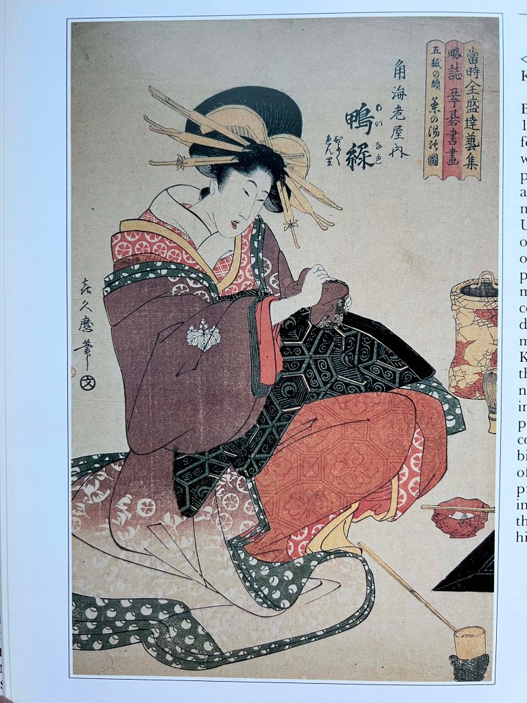
I started this exercise with a quick analysis of the brief, and the possible images I could use for illustration. As here I had the freedom to choose the artwork, I felt a bit lost between the possible variety I could work with. Originally, I looked predominantly at the artist’s work, such as Impressionist paintings, Renaissance, Japanese art, or fashion photoshoots.
My choice was quite broad, and I thought that would be best to go from the practical way here. I was looking to explore the artwork by Pierre-August Renoir, The Umbrellas. Still, later I had concerns about the composition I chose, as it lacked the foreground, mainly the accent on people and their emotions. To be fair, all images I added to my list had great potential for developing ideas, but at the last moment, I changed my mind and chose retro photography from the postwar advertising of the VW Beetle.
Images to choose
Collection of images I was considering to work for developing the idea of space, formats and focus.
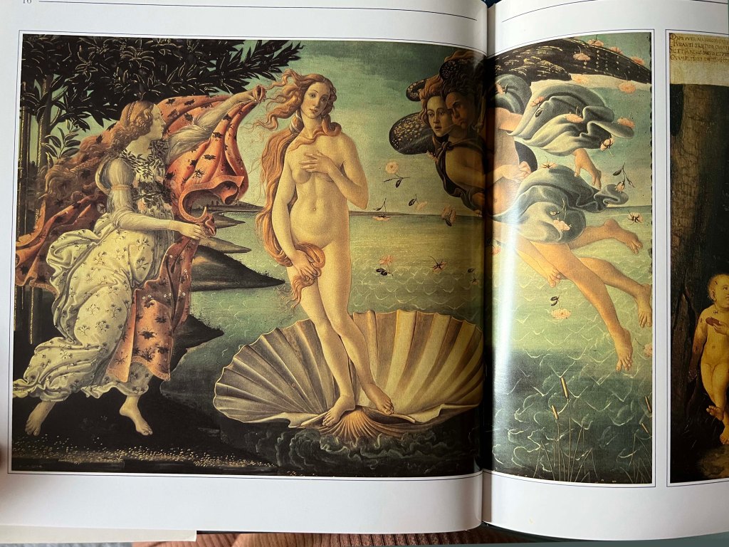
(c. 1484–1486).
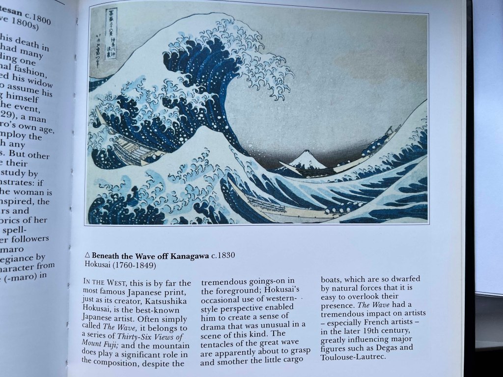
Katsushika Hokusai
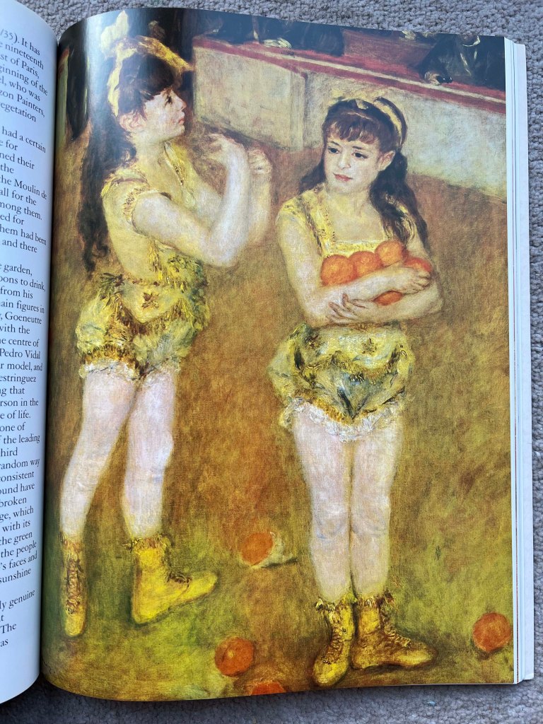
Pierre-Auguste Renoir, 1841-1919

Pierre-Auguste Renoir, 1886
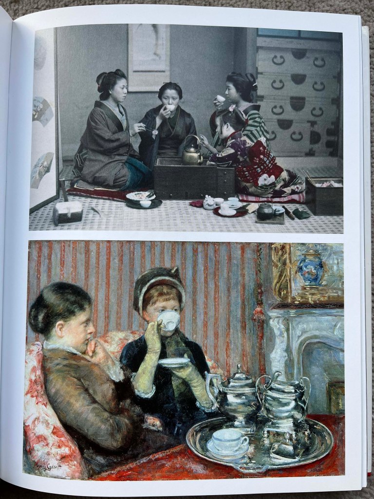
Bellow: Mary Cassatt’s painting, Le Thé or Five o’clock Tea (1880)
Chosen Image
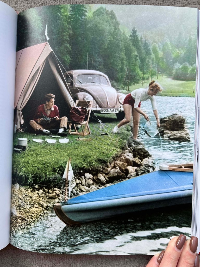
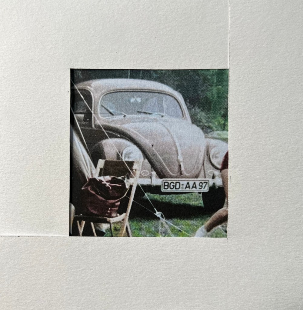
I’ve chosen this image of the couple in the countryside, that enjoys their time together. The image has a good spirit of freedom and positivity. The main action is happening in the middle plan, as in the foreground located a peaceful image of the water, for the background chosen rich colours of the green forest, and the couple and the car are in the middle. Basic engineering and mass production meant that the Beetle was one of the first affordable cars of the 1950s, and it immediately became associated with a free quality of life. Its popularity quickly spread from Germany to the rest of Europe and the USA, and today it vies with the Toyota Corolla for the title of the world’s best-ever selling car.
I printed an A4 Format colourful image and cut two ‘L’ shaped cards from hard watercoloured paper, that to create ten different format images, such as portrait, landscape, or square. That technique of working physically allowed me quickly adjust the frame for the image and helped me to determine the focus on images I wouldn’t normally think to work with. I quickly found seven different focusing objects to explore, I was missing three more for the full set, added them later for the full set.
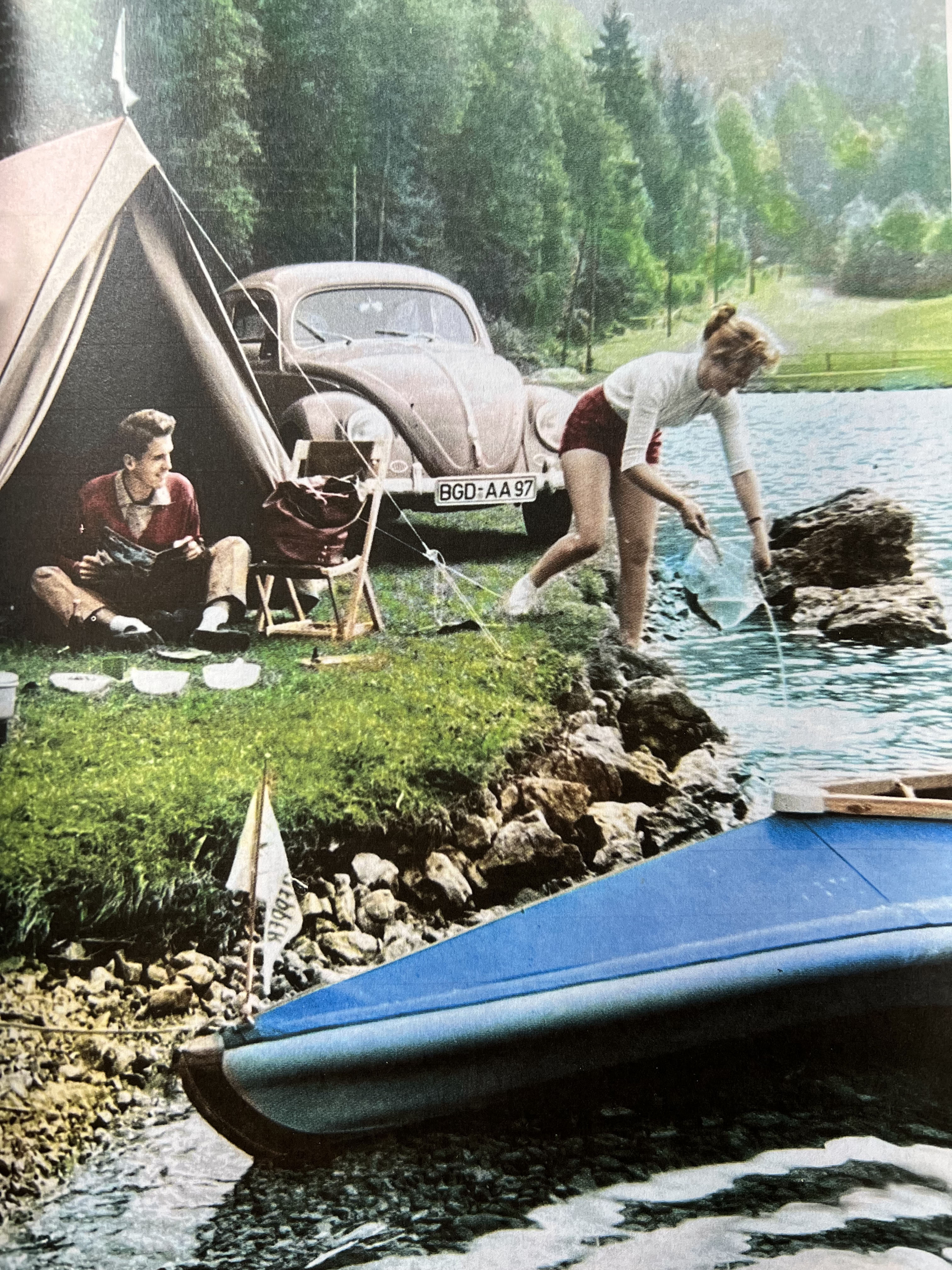
I think the reason why I have chosen this image was the feeling of space around us, the natural environment, attention to the details in people’s emotions, and nostalgia of simple times when our family trips to the countryside closer to the natural sources of energy were happening regularly. Also, the image has a delightful combination of tones, natural and neutral background in green and blue, but the car and the tent give away their vibrant and funky pinky shades. The image is filled with details for the observational drawings, I just needed to go through it and find the preferable one.
Observational drawings of this nature can be less formal regarding visual language, particularly when compared to the detailed scrutiny of subject matter required of pure academic objective drawing. A looser and more economic approach to mark-making will enable the associative and atmospheric nature of what one is visually recording to be a priority. Creative and ambient approaches can be developed. This way of working can often record the ‘soul’ and influence of a subject or location and goes beyond documenting surface features. It also goes beyond the ‘cold’ visual representation of people and there can start to be a capturing of human emotion, mood, character and personality.
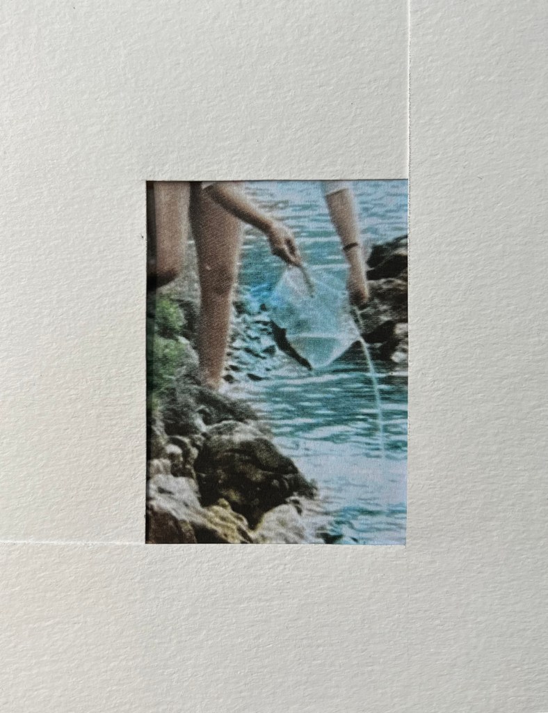
Merging (Union)
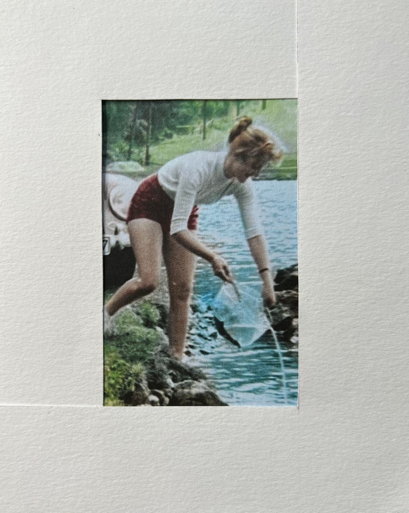
Merging water from the plastic packaging with a natural source of water. I think the author of this advert wanted to show the joy of unity with the natural source, bringing the vibe of action and flow in every movement of people around.
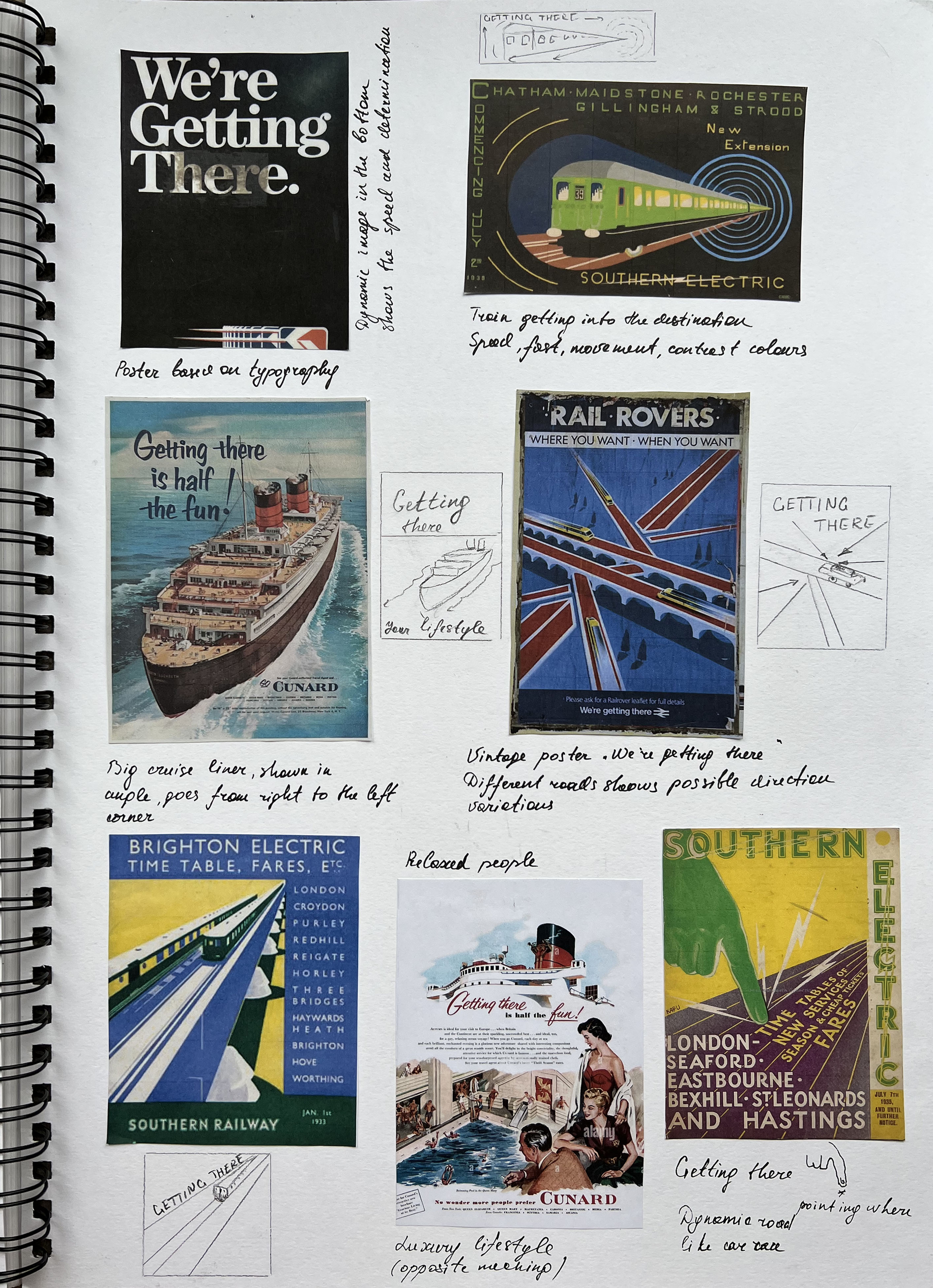
Lifestyle (Getting there)
The beetle is the centre of attention, the car is like smiling to us, as it brought people to an enjoyable destination, and having pleasure in being rounded with nature. I think there is a meaning of being these people outside, to show that this type of transport can help your family to unite, also, pale pink colour ideally contrasting with green surroundings.
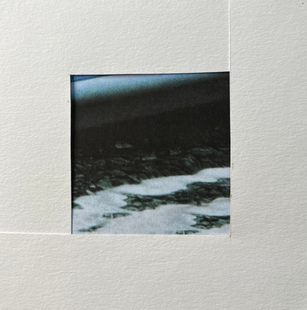
Tranquillity
An image of peace and tranquillity, a cold shade of water that shimmers from the sun and shows the cleanest bottom of the river, as a sign of honesty and sincerity, perhaps as a sign of brand loyalty to its customers.
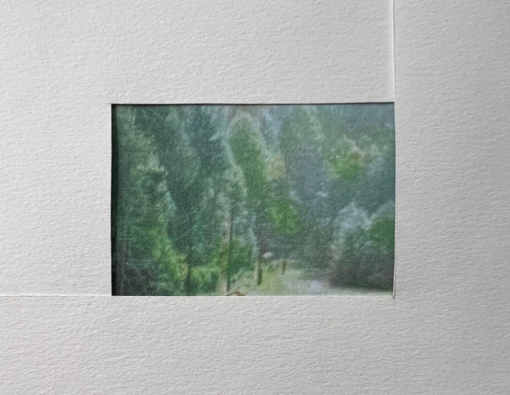
Essence
The first landscape format in the ‘L’ brackets, is the image of fresh morning wood, with juicy greeny colours, to symbolise the beauty of nature, and the great advantages of having a Beetle automobile. It will take you to the special sceneries to enjoy the peace and quiet.
Jazzy
Dynamic picture of the girl in action, I think the reason for that position is to show the rhythm and positive vibes that the environment should suggest as well. Overall, the photograph I’ve chosen is filled with happy details, like bringing the fairytale into regular or ordinary life. Same here, enjoyment in every little process, fast and energetic image.
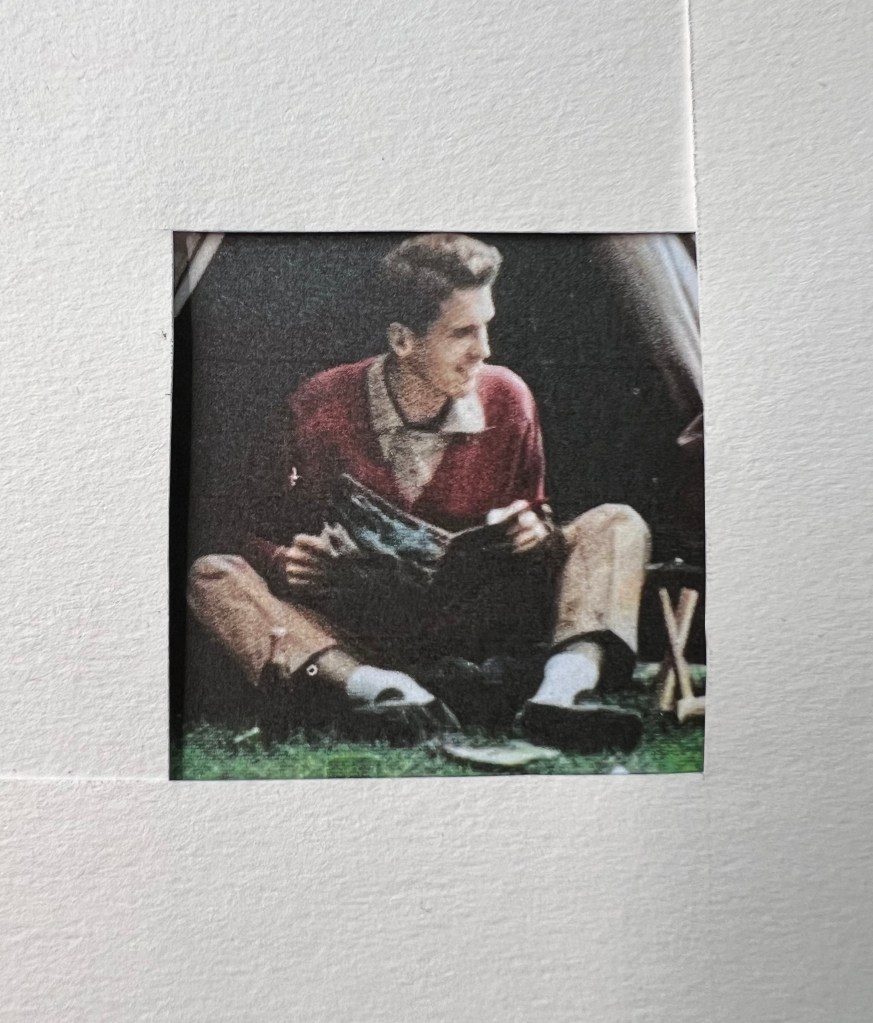
Distraction
Here is the young guy distracted from his reading and moving his head towards someone who grabbed his attention. He has a casual, relaxed pose, and the way he sat shows the informality of the environment. Most likely, another point to show the advantage of owning an affordable car. Also, I’ve noticed the connection between colours, the girl’s shorts, the backpack, and the guy’s jumper sort of match colours, the part of the colour composition of the photograph.
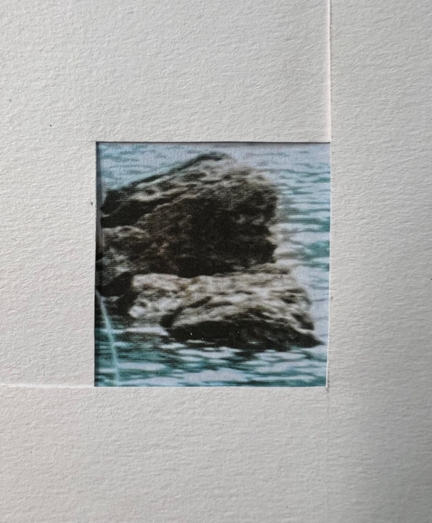
Solidity
A stone, a piece of rock located in the centre of the water, can also symbolise the reliability and strength of the brand, perhaps not without reason near the girl is not just an open source of water, but there is a strong and reliable object that you can rely or lean on.
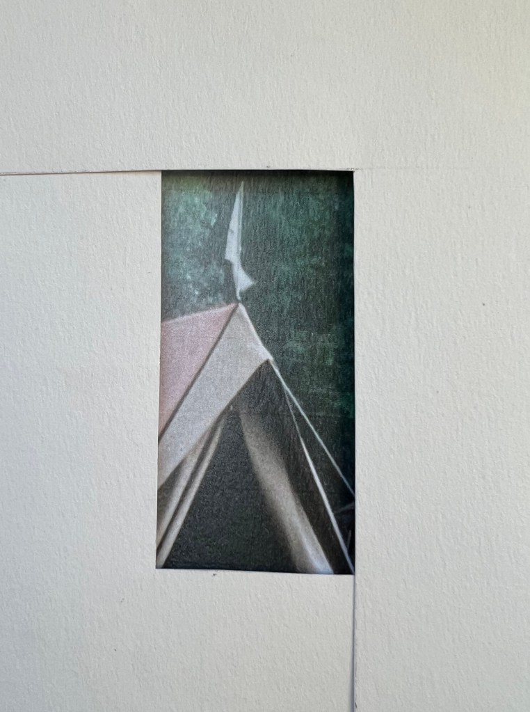
Pointy
This part of the image a framed in the long portrait format, to focus attention on the direction of the tent triangle. A feather at the top of the tent is also possible as the business’s determination always look up, move up, and have higher aspirations.
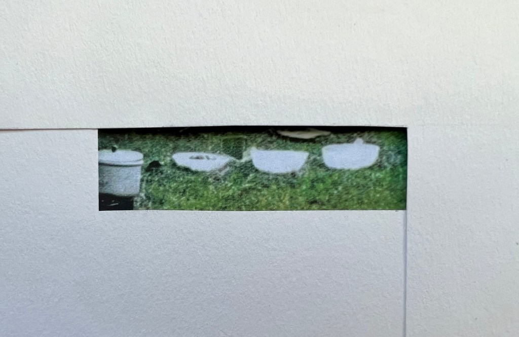
In a row
The kitchen dishes caught my attention because of the location in a perfect line. I framed those objects in the long landscape format. Inside the composition itself, dishes are located strictly in the centre, perhaps there is also a golden ratio here, all objects are subject to a certain order, and serve as a kind of accuracy and order in business. Yes, even the dishes should be lined up in a strict line, in order to avoid carelessness or untidiness in the composition.
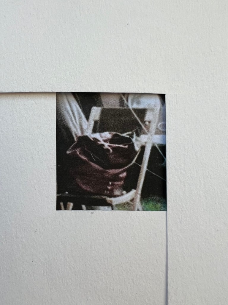
Packed
The last object I chose for the frame is a brown leather backpack, made of durable and reliable material. Also, the colour of the backpack is identical to the guy’s jumper, and the girl’s shorts, as I understand it, to maintain colour harmony. The backpack was placed on a chair, instead of just lying on the floor, I think this was done in order to keep the composition, the brown jumper a little lower, then the backpack slightly higher, and then the girl’s shorts.
I have to admit that was quite a useful part of the research and analysing process. It was good to see the meaning of each object within the composition, create the logic of individual objects, and as a part of the overall impression.
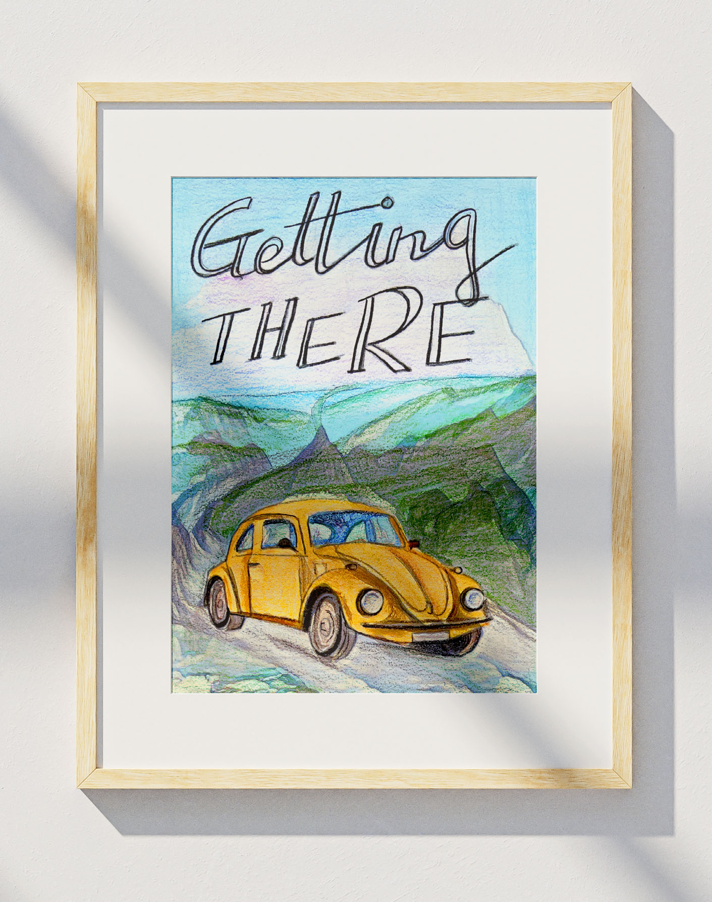
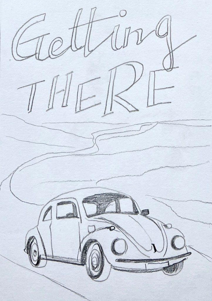
For the further development of design and illustration ideas, I have chosen the image of the car. The first word that came into my mind with this image of the VW Beetle was Lifestyle, but here I wanted to create the dynamic of the illustration, instead of just parked vehicle in the countryside, I’ve chosen the slogan ‘Getting there, that mainly was used for the railway companies, cruise liners, or air companies, to show the movement and convenience of owning your own transport. Also, I could design an object in action, with added energy and driving spirit in it.
Sketches
Here I’ve collected examples of posters with the ‘Getting there’ slogan. The first poster is based on typography, with a static font on the top of the plane, and a small dynamic object below. This is perhaps the only poster that is more static compared to the rest, which shows the direction of movement and dynamics to support the idea of the slogan.
Bellow are presented my original thinking and conceptualisation to show search and change regarding ideas, composition and content for the poster with automobile attached to the slogan ‘Getting there’. I mixed the photographic research of British landscapes and initial sketching processing within the sketchbook. Also, I used different angles of the car to compare what would work best for the chosen poster. I think, the idea of the faced to the reader car on the foreground with mountains and road on the background ticks all points. A wavy road behind the car can speak up to the potential customer, as this is the vehicle for a long-distance journey through beautiful surroundings. The completed image manifests the convenience and adventures approach to using the car for travel purposes.
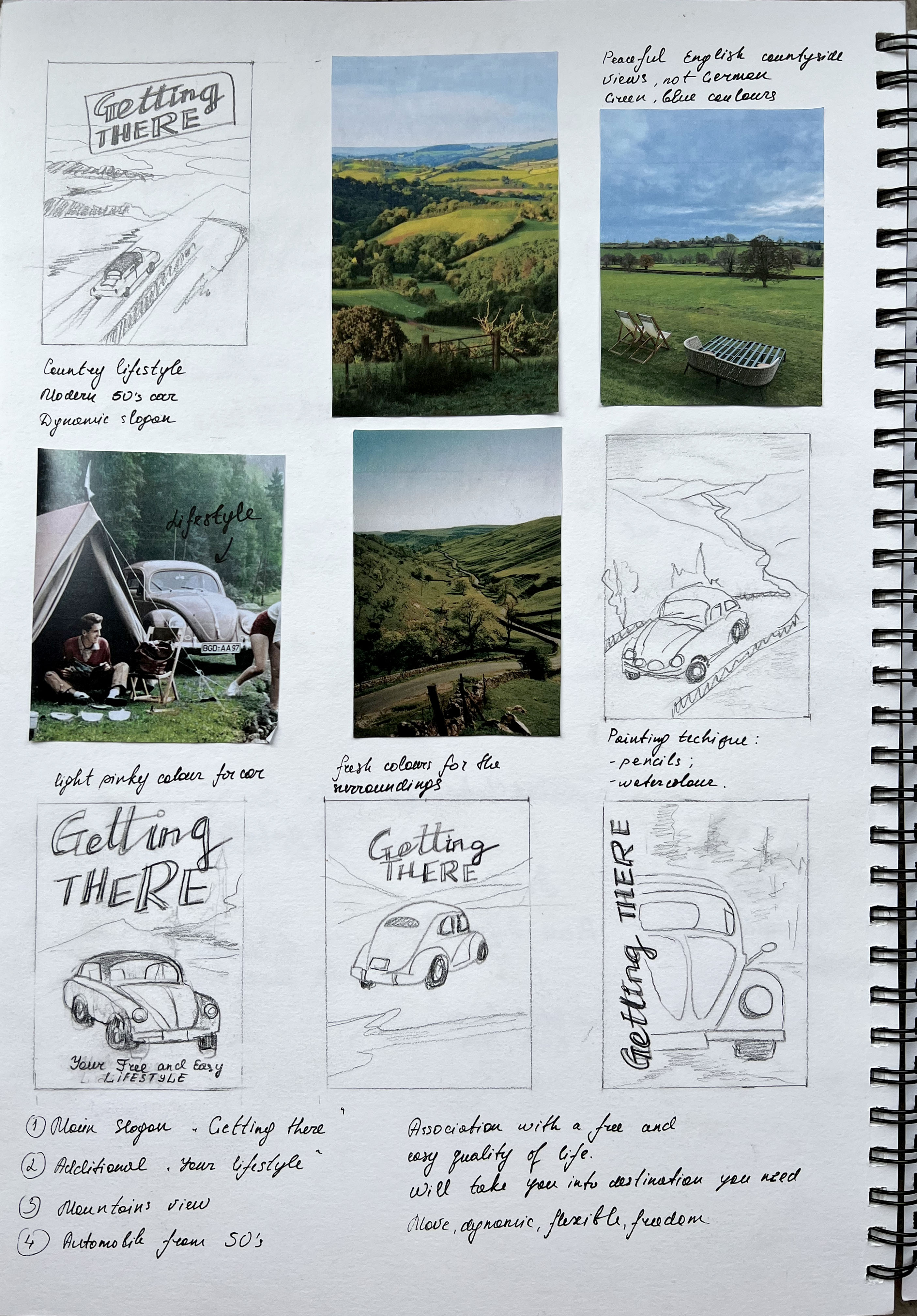
For the slogan, I used handmade font, combined with handwritten and italic typography. My view is that hand-painted typography draws even more attention to the poster, and creates a pleasant balance between the illustration of the car and the top part of the composition which is quite spacious.
Colourwise I decided to follow the rule that was briefly explained at the beginning of the exercise. As a generalisation hot colours demand visual focus, so the colour of the car was chosen warm orange, with a mustardy tint. At the same time, a predominantly cooler colour palette for the background, like cool green mountains and blue sky will demand the greatest visual attention, as generally, the receding visual elements are bluer and cooler.
The original sketch with pencil is quite faded, so I went to spruce it up in Photoshop, there are some great filters to elevate the colours of illustrations, or even textures. The viewer’s eye will focus more closely on areas where there are areas of tonal contrast – difference in lights and darks, or the contrast in texture.
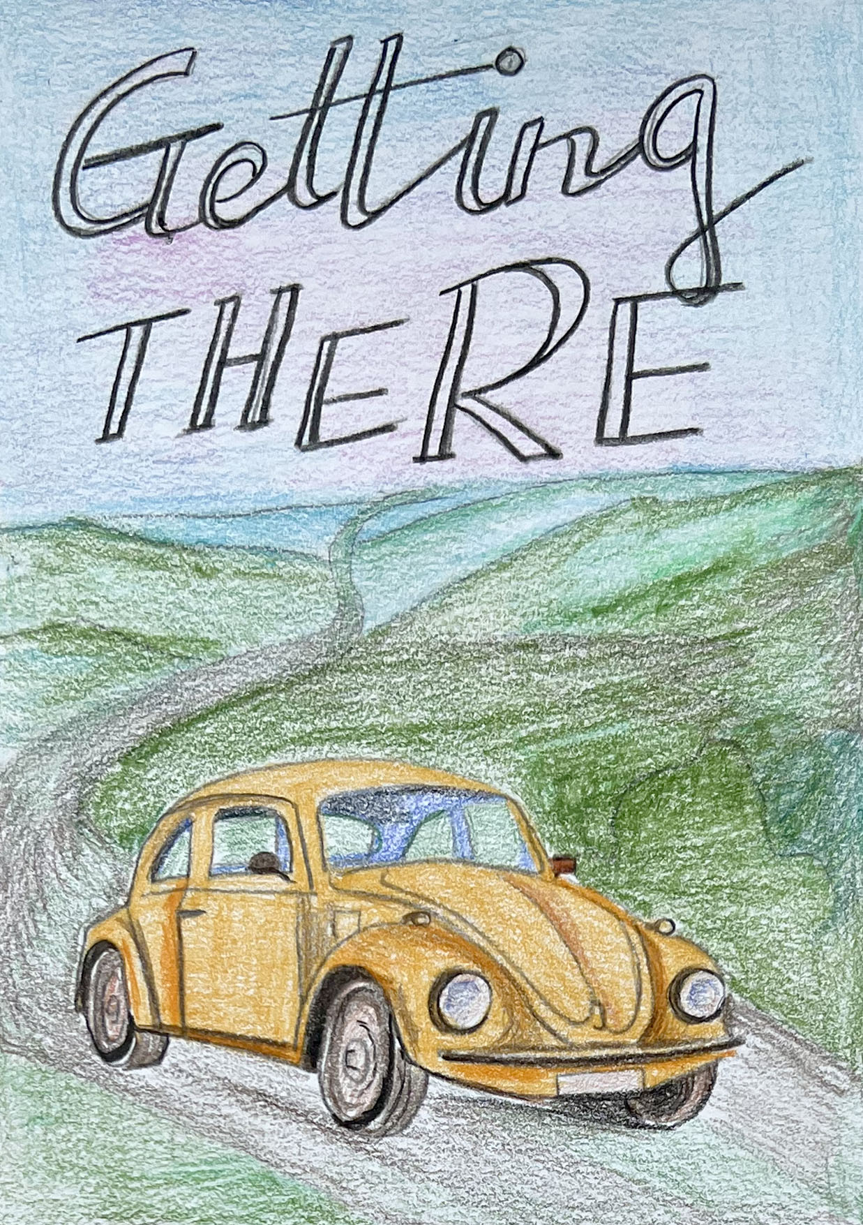
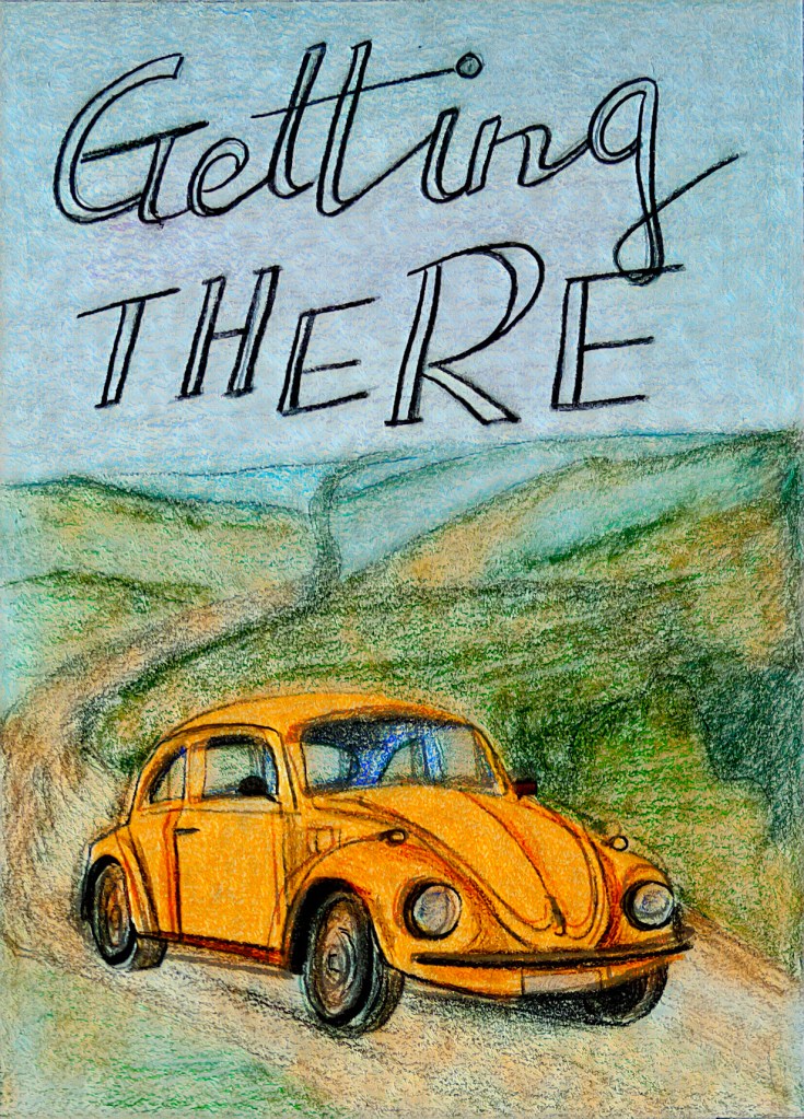
From the first illustration some saturation adjustments can be seen, the increased contrast helped me to bring the car even closer to the foreground, it does stand out and have some playful details in it. I thought would be useful to experiment with Neural Filters in Photoshop, so I created three more different images with the artist’s style filters. I thought that the last experiment looks the way I wanted this image to be finished. As the background doesn’t look as obvious mountains, it brought some creativity into the illustration and pleasant texture.

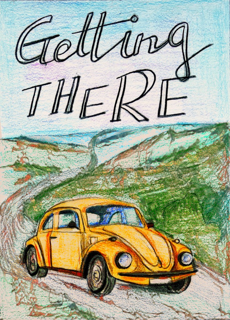
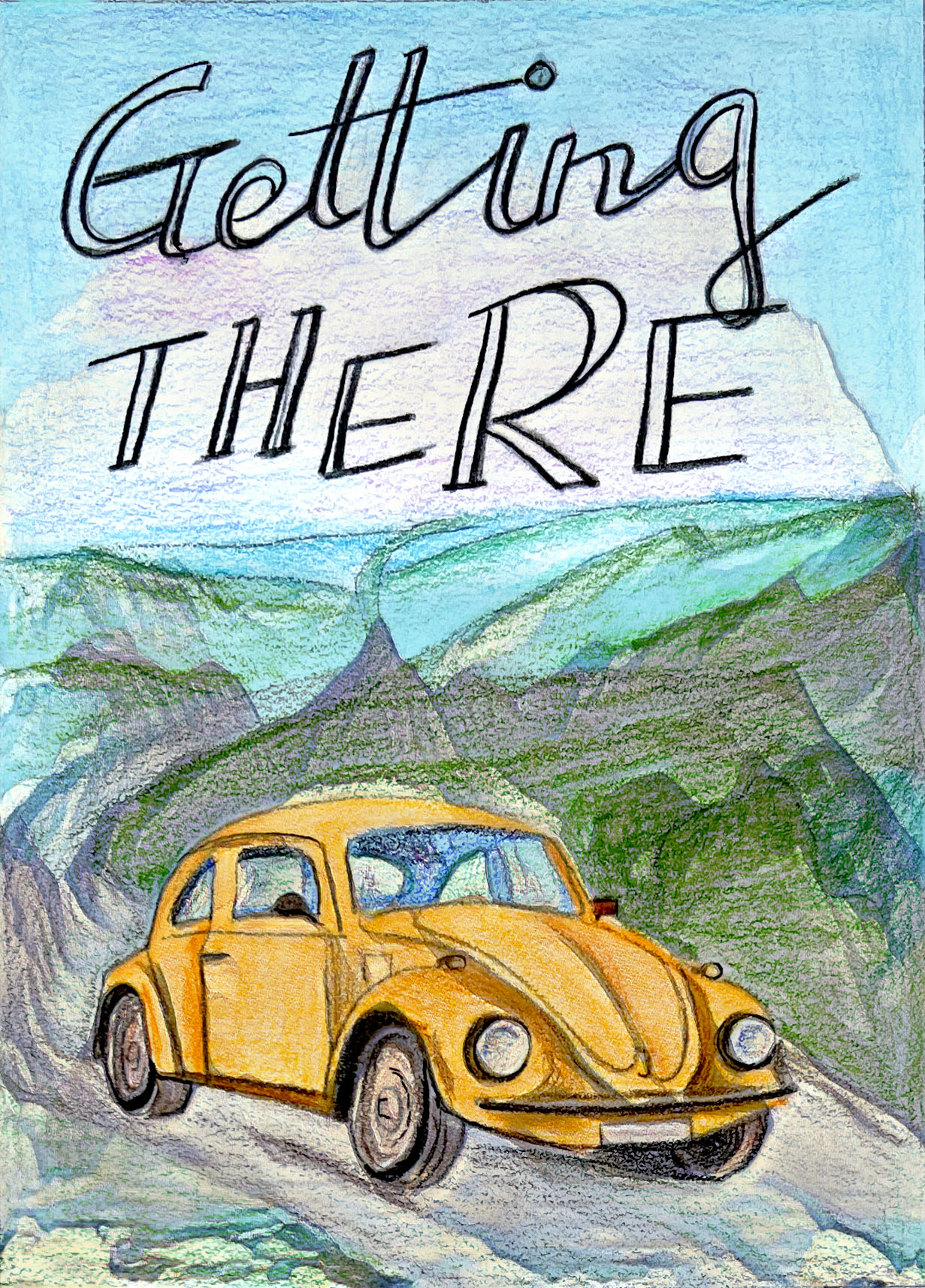
Final image mockup
