For this exercise, I was asked to design an illustration for use on the menu of a sophisticated, quality fish restaurant – one in a chain sited in major European cities. Also, one of the main requirements for any food depicted should be visually appetising.
The keywords for the exercises are:
- modern
- bright
- contemporary
- fresh
- sophisticated
- quality
- seafood.
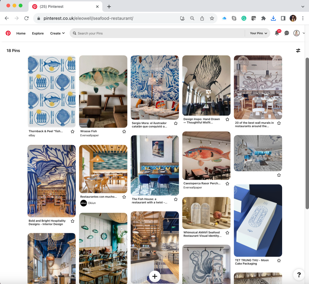
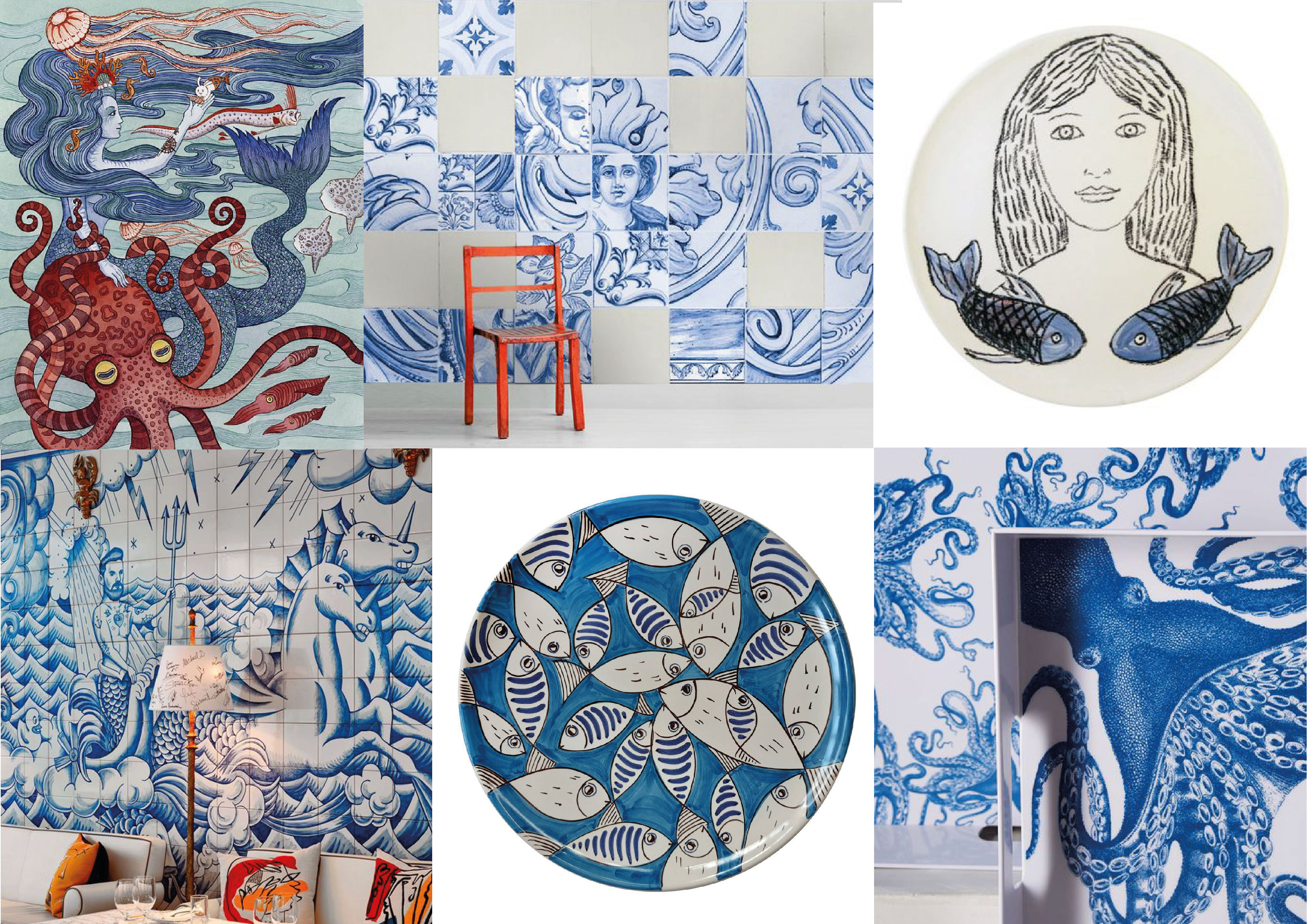
To start with this exercise I went on Pinterest to research the seafood and fish restaurant theme, I imagined it all would evolve around marine them and blue and white colours, but I thought it would be great to see something new and different, some unexpected solutions around that subject.
After doing a little research, I got the impression that most restaurants use blue and white tones, as well as a contrasting colour of pink. The rooms are filled with light and natural colours in the colour palette. One of the non-standard solutions is the application of marine themes on the wall, with images of fish and octopus, as well as installations of fishing gear and nets. I would say that the main purpose of those restaurants would be to bring the quality and freshness of the seafood, making the emphasis on authenticity, rather than posh and sparkly design.
In addition, I created a board with nautical elements that are used in the menu design. The main emphasis in these drawings is on seafood, fish and octopus. I concentrated my research around the ideas for the illustrations, rather than menu designs.
Illustration design for a fish restaurant plays a crucial role in creating a visually enticing and cohesive dining experience. With carefully crafted illustrations, a restaurant can convey its unique seafood-focused atmosphere and highlight the freshness and diversity of its offerings. The idea is to feature vibrant and colourful underwater scenes, showcasing various fish species or oceanic elements. They can also display skilful depictions of fishermen hauling in their catches or chefs preparing mouthwatering seafood dishes. The use of clever and imaginative illustrations helps create a sense of anticipation and excitement, enticing customers to embark on a culinary journey tailored to their love for seafood.
I created a mind map that helped me to organise thoughts and ideas together. By visually connecting various concepts and themes, I started to have the foundation to begin the design process.
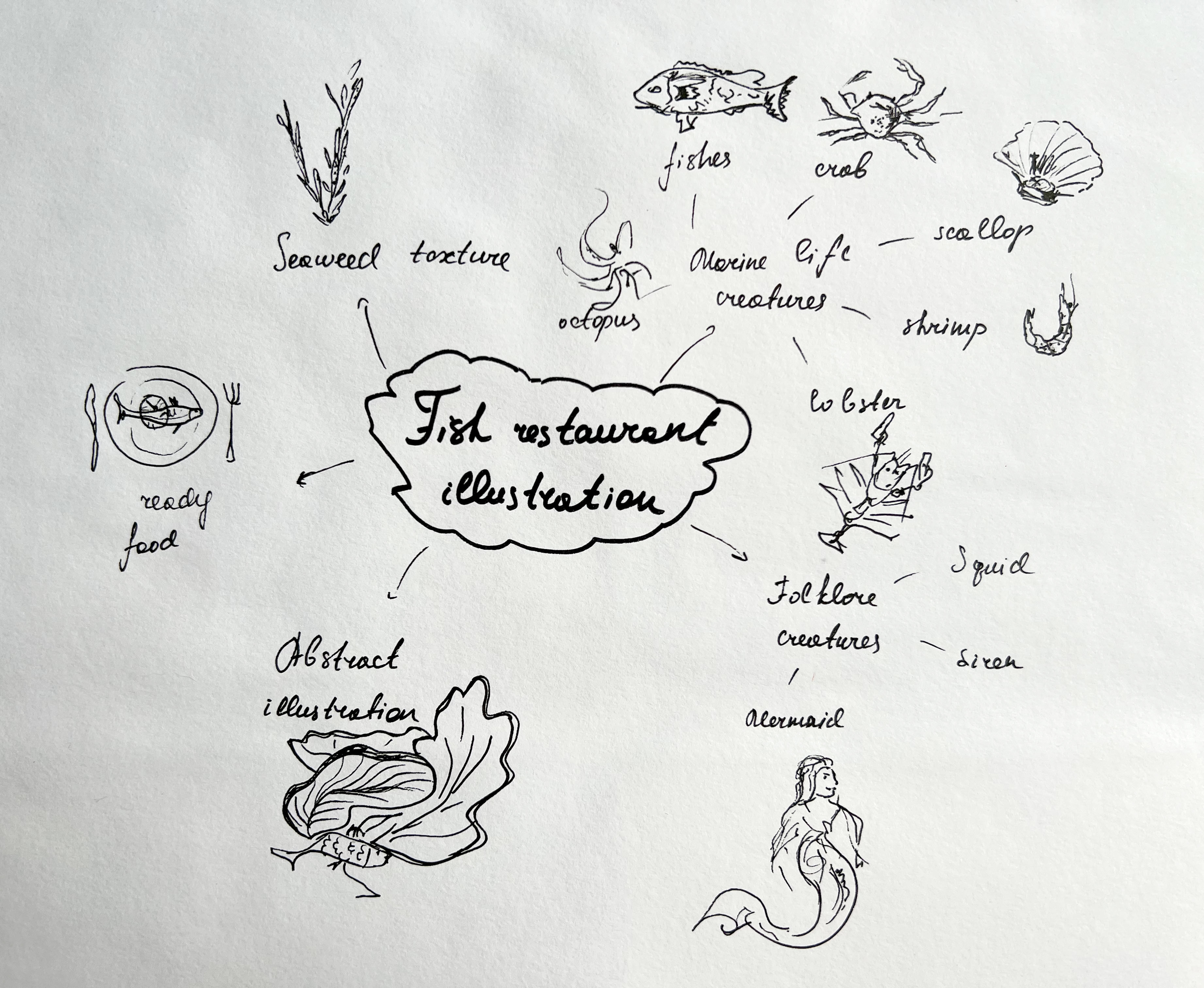
Also, I created a spider diagram related to the keywords for the illustration design. It helped me to create a clear overview of the essential aspects that should be incorporated into illustrations, following the rule of creating an image for the modern and sophisticated seafood restaurant atmosphere.

Sketches
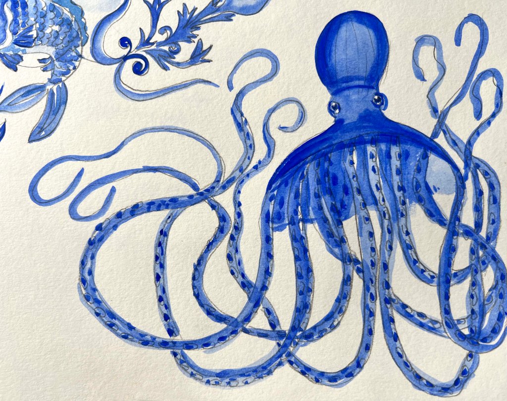
After general research and a mind map, I proceeded to the next step, actual sketches. I loved the idea of illustrating a big octopus with curly long tentacles, that dominates the space, like it owns the place. I made some sketches of fishes in the circular, with the idea of making them like Yin Yang. Also, I was thinking of showing curls and waves of the sea and making some dynamic image that represents the flow of the sea and ocean. The advantage of the octopus with curly tentacles is that it would look great in colour and just a black-and-white outline.
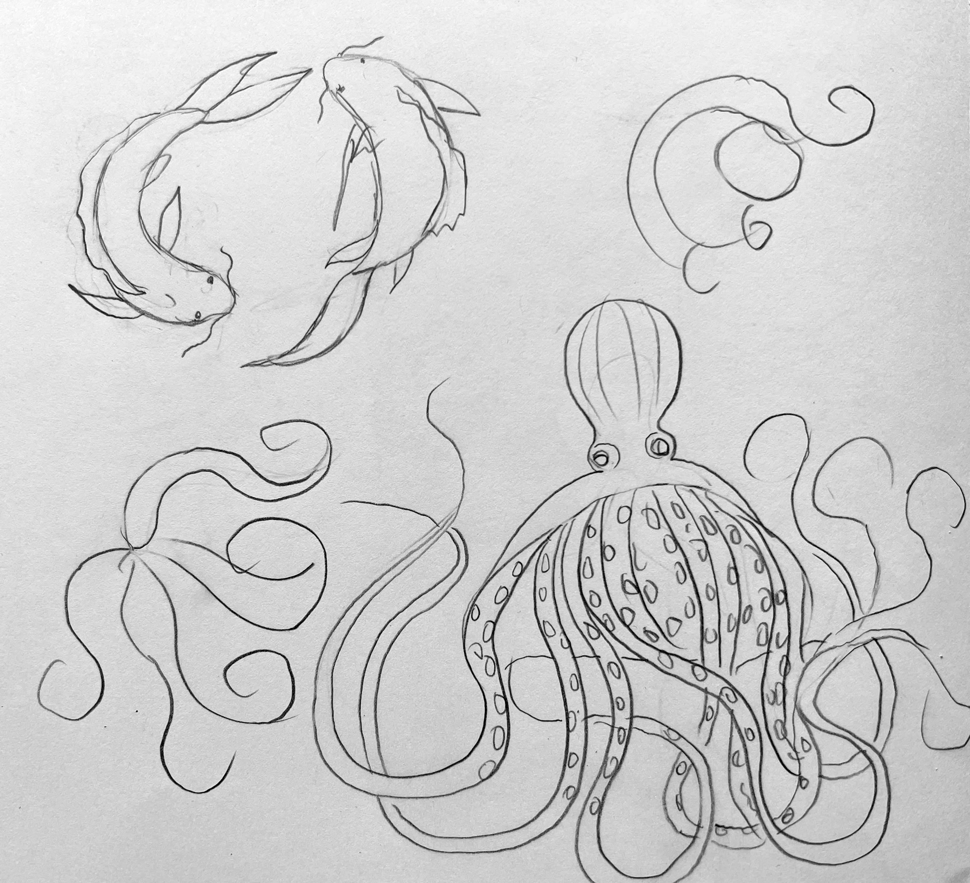
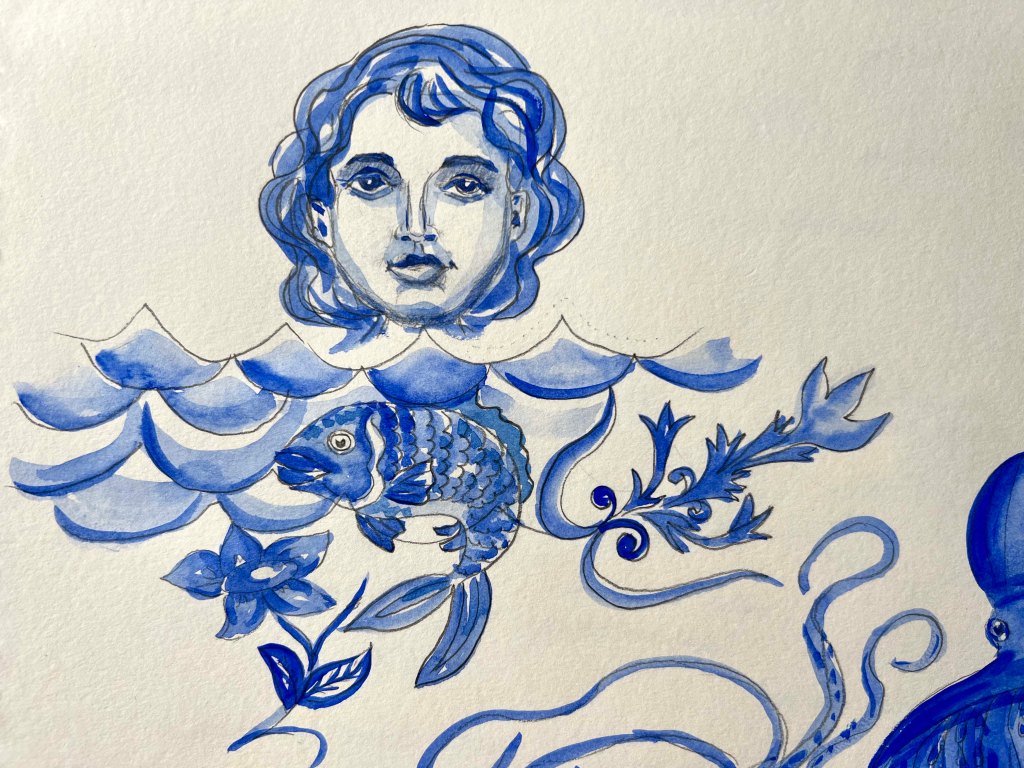
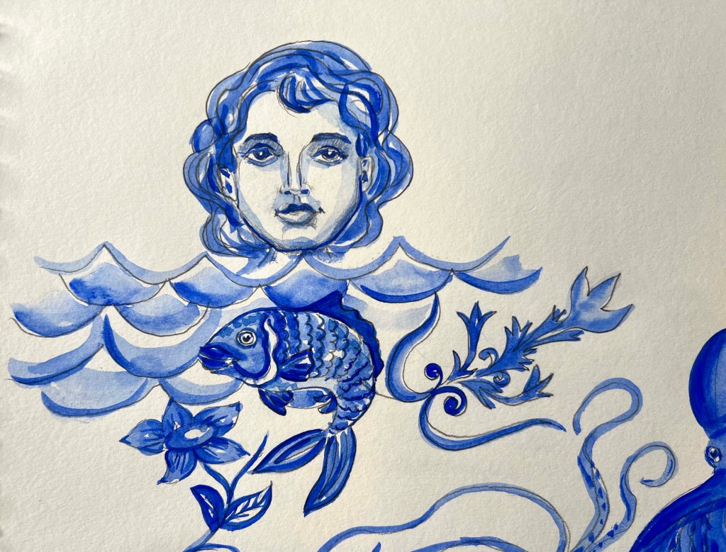
Another idea I had was to create a folklore creature for the illustration, like a mermaid or King Poseidon, the king of the sea, and complement them with marine elements. I wanted the illustration to be artistic and have a feel of mystery. Also, I was thinking, shall I use only one character for the illustration, or can it be collected, and contain several elements, like sea, seaweed, mermaid and fish, or fish, sea, decorative elements? Or shall it be only a singular object? Something to think about.
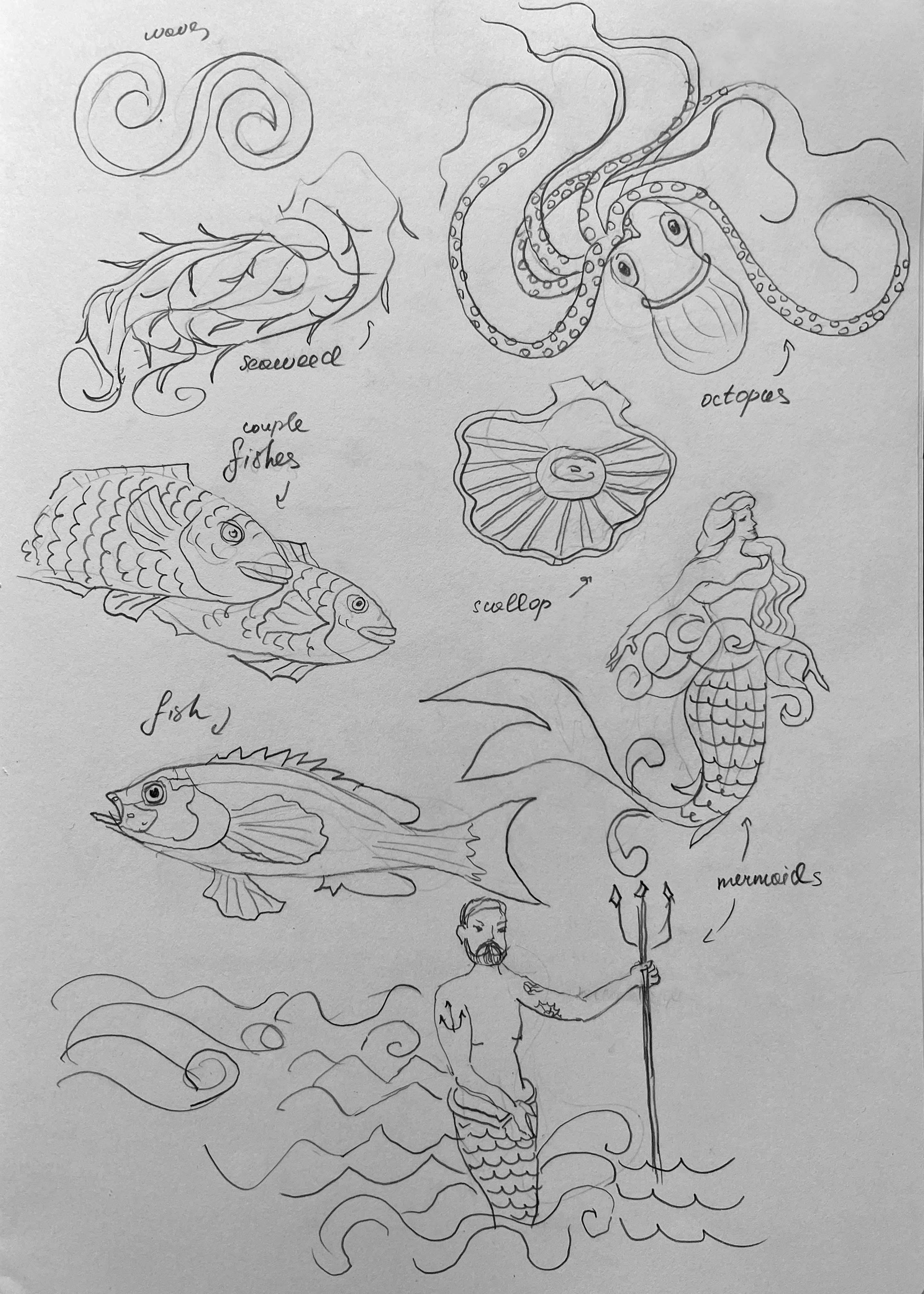
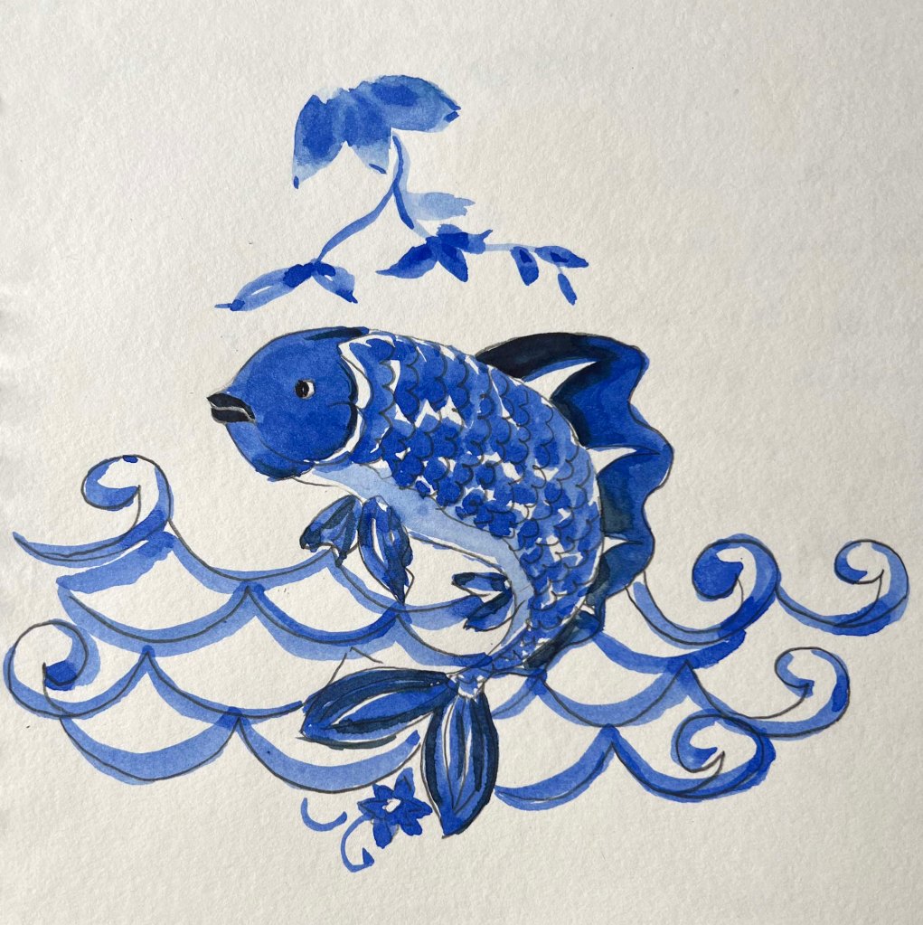
At this point, I started to form the idea of the feel and style I would implement for the illustration. The first illustration will include an octopus with curly tentacles, and another illustration will evolve around folklore marine creatures, with additional marine elements.
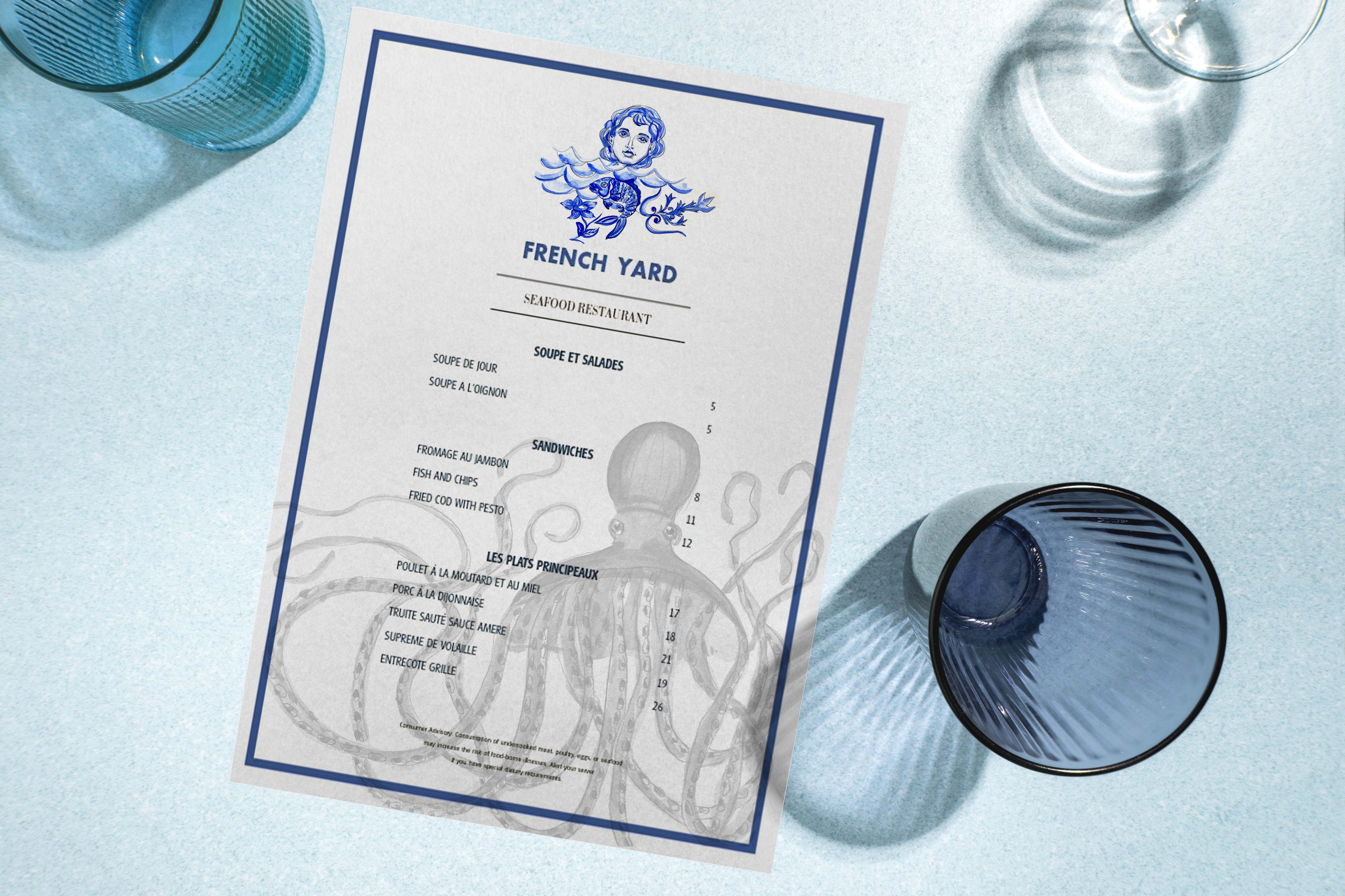
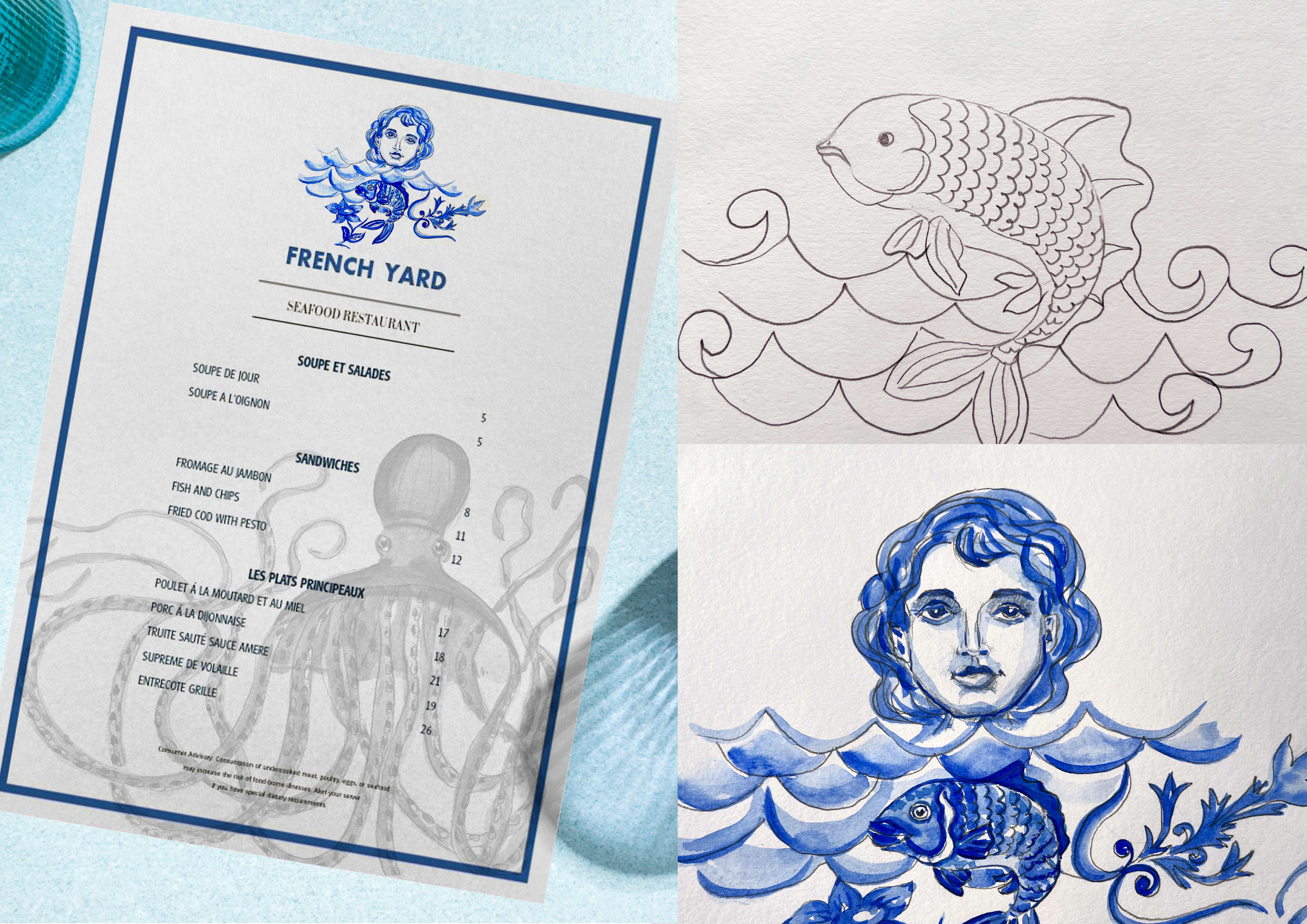
I created this octopus in the bright ultramarine blue colour, which would bring some freshness to the style of the restaurant. The advantage of this illustration is that it could be used on a wall, menu, transport, and business card, quite a versatile image.
For another illustration, I tried several options, with decorative fish with waves, and with a girl mermaid. The unique feature of the illustration is that it has additional elements borrowed from classical Italian designs, with plaster-like plant shapes and flowers. I think it creates an original assemble for the marine theme, and it supports the elegance of the design.
For the final touch, I tend to try my illustrations for the mockup, it helped to see how the image would look like in real life, on a smaller scale 40×40 mm, or like a printed version. The illustration itself turned out to be quite complex, but by adding some contrast I could highlight some main details that could create a logo feel. I tried both illustrations for the menu card design, and to place it on the car. I loved how those images worked together, the octopus and mermaid creature looked like a part of the one set, and those characters can be a running theme for several locations within the restaurant. I left both illustrations as a final choice, as I believe the image of the mermaid with fish and the image of the octopus could work as a part of the set. They are made in similar styles and colour combinations, and they have similar themes. I chose the image of the mermaid as a logo version where the octopus is played as a background image.
Overall, I truly enjoyed this exercise. As being illustrator with a graphic design background, it brings me utter pleasure to create unique illustrations and convey them into usable designs. That’s my unique experience, where handmade illustrations become digital objects, which is always valuable. I’m happy that I could experiment and do research on the fish restaurant theme, which is quite versatile nowadays. I think those illustrations have a good potential appeal to adults, they are made in an elegant style and also they meet the brief. I believe I created designs, that would attract the audience and could be approved by a customer.