Abstract illustration relies on colour, structure and texture to convey meaning. Abstract illustration may include elements which are recognised as a specific object or person. Still, they are not connected in any way to depict or reveal a particular scene or reality. It can resemble textile design or surface pattern in which symbols and icons are assembled – for instance, some wrapping papers, wallpapers and fabric.
The term ‘abstract has become synonymous with a number of 20th-century art movements: abstract expressionism, cubism, constructivism, and neoplasticism to name but a few. In order of need to counteract the sabotaging artistic or pictorial imagery, painters practised figurative imagery in photography. Artists basically worked with the colours and shapes of their own inventions. The language of the artist’s visualisation could be described as abstract, also, stylistically abstruse and non-pictorial, free from specific meaning.

‘Abstract: stylistically abstruse and unpictorial, free from representation’
Illustration. The Nature of Imagery
Modern-day commercial artists have been using abstract imagery since the beginning of full-colour printing. At the same time, promotional materials such as posters, point-of-sale displays, packaging and book covers were subjects of an expressive, decorative approach, accompanied by titles and titling as a part of the imagery. Those designs were often produced by way of a collaged technique, including flat colours, that could be tender or loud, and different shapes and textures, like geometrical, or flee-floating.
Artist to choose
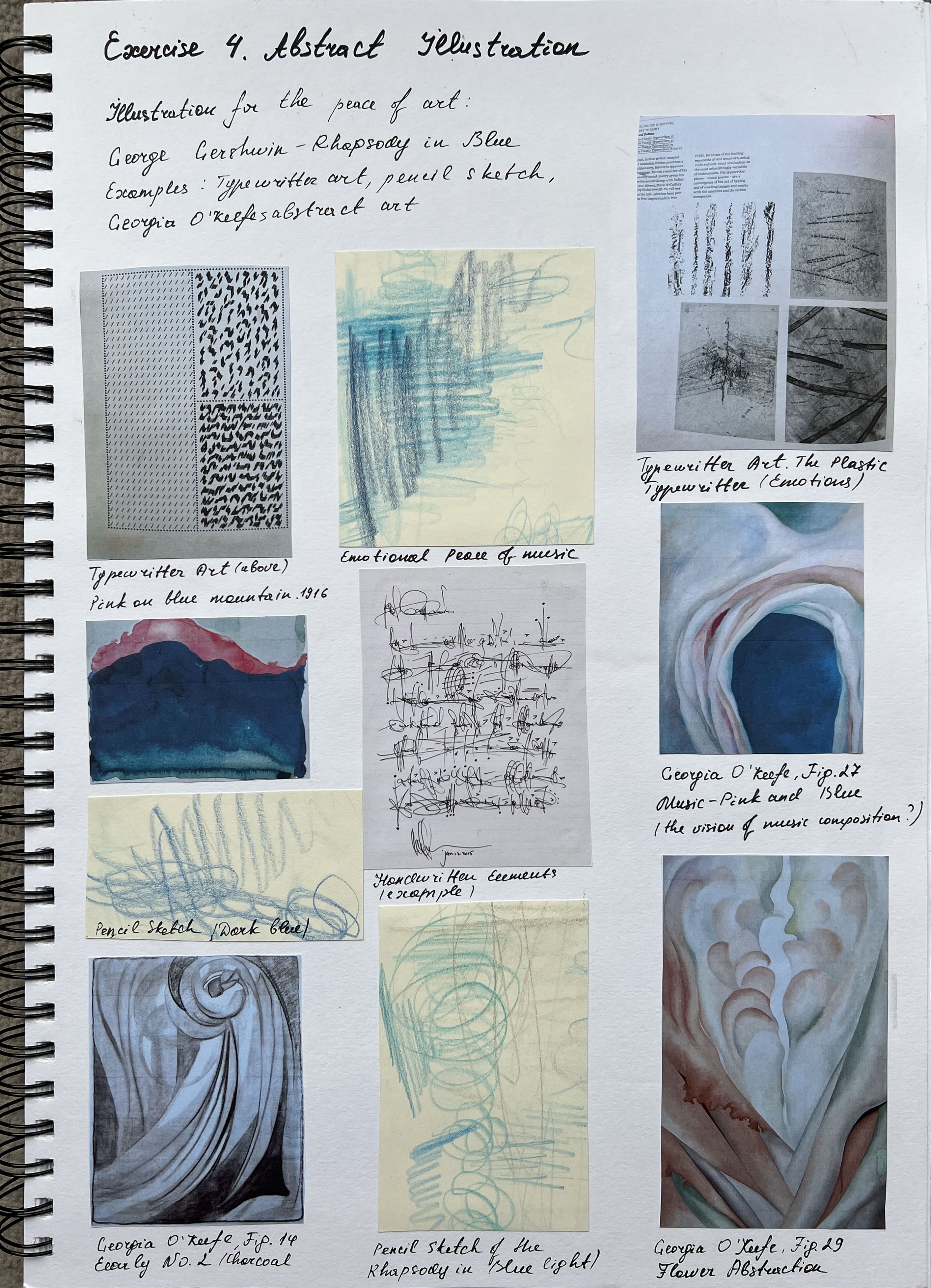
Between the choice of instrumental music, I picked the composition by George Gershwin ― Rhapsody in Blue. Rhapsody in Blue is a 1924 musical composition written by George Gershwin for solo piano and jazz band, which combines elements of classical music with jazz-influenced effects. I listened to the whole track from the beginning to the end and purely enjoyed it. It was the masterpiece that brought Gershwin fame. It entered the golden fund of musical classics and jazz, and, in various interpretations, is performed by musicians of various styles of music.
A rhapsody incorporates improvisations and irregular formats, which highlights the emotional contrast and exuberance of the tones. The greatest talent of the artist was the demonstration of ease at which melodies seemed to flow, but at the same time with added emotional impact. Also, the incorporation of jazz elements successfully transitioned artists into the classical setting.
The keywords that I highlighted during the listening of this rhapsody were:
- experimental;
- tranquil;
- elegant;
- emotional;
- spirited;
- enjoyable;
- dynamic.
Colours that come into association with this composition are:
- Azure;
- Arctic;
- Blue;
- Admiral;
- Turquoise;
- Pink;
- Rose;
- Flamingo
Also, as a part visual research process, I looked for some cover samples that have been designed for George Gershwin’s Rhapsody in Blue, the type of graphic design and colours associated with this artwork. Mainly, my research demonstrates the combination of the artist’s portrait on a blue background with some contrast colours for highlighting typography, like bright yellow, or orange. Dominant colours are shades of blue, from pale to navy blue, also, artworks include illustrations, photography and some abstract solutions for the compositions. I collected them all in my Pinterest mood board, where I could go back and refer to them later.

Inspiration
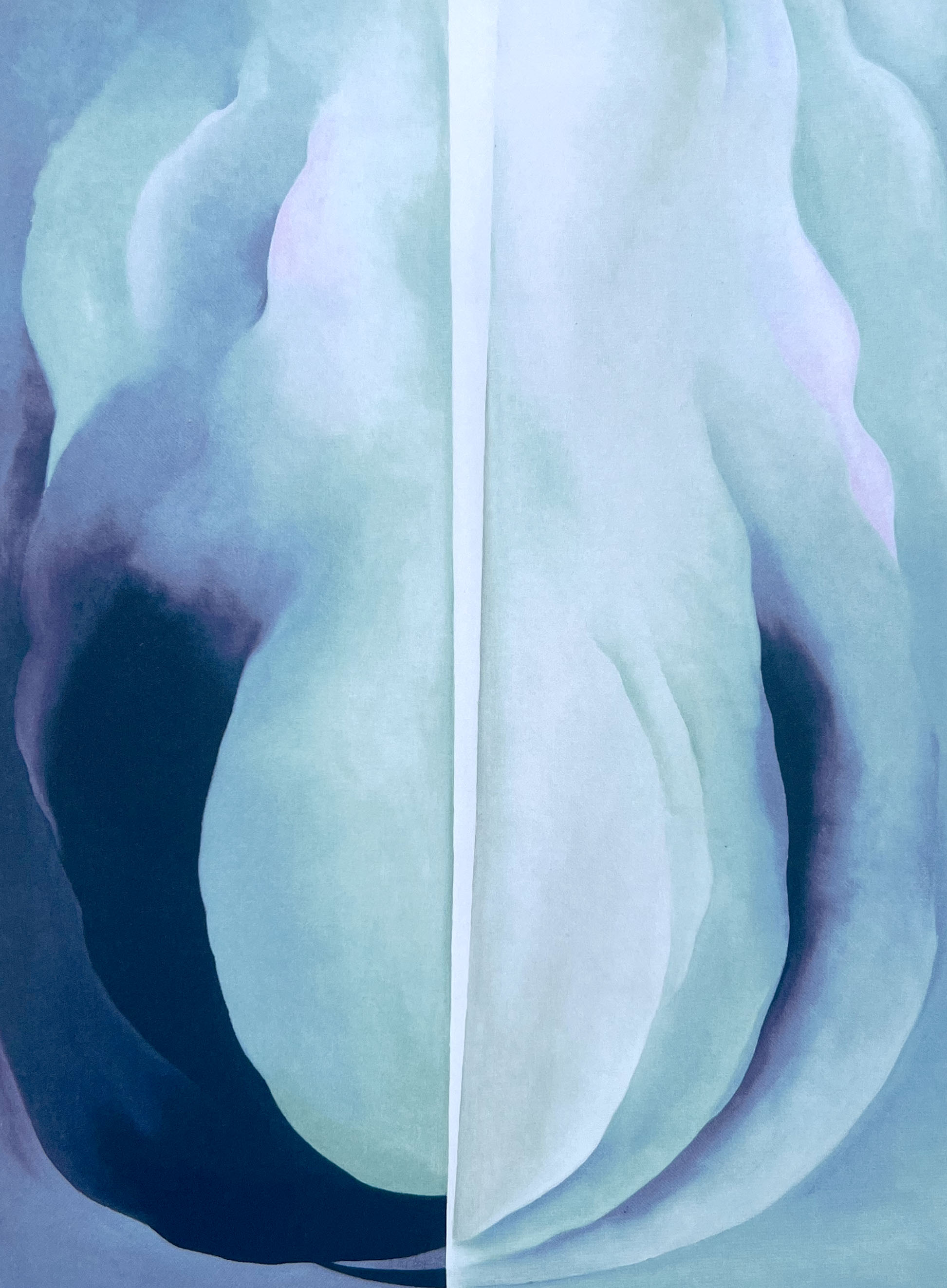
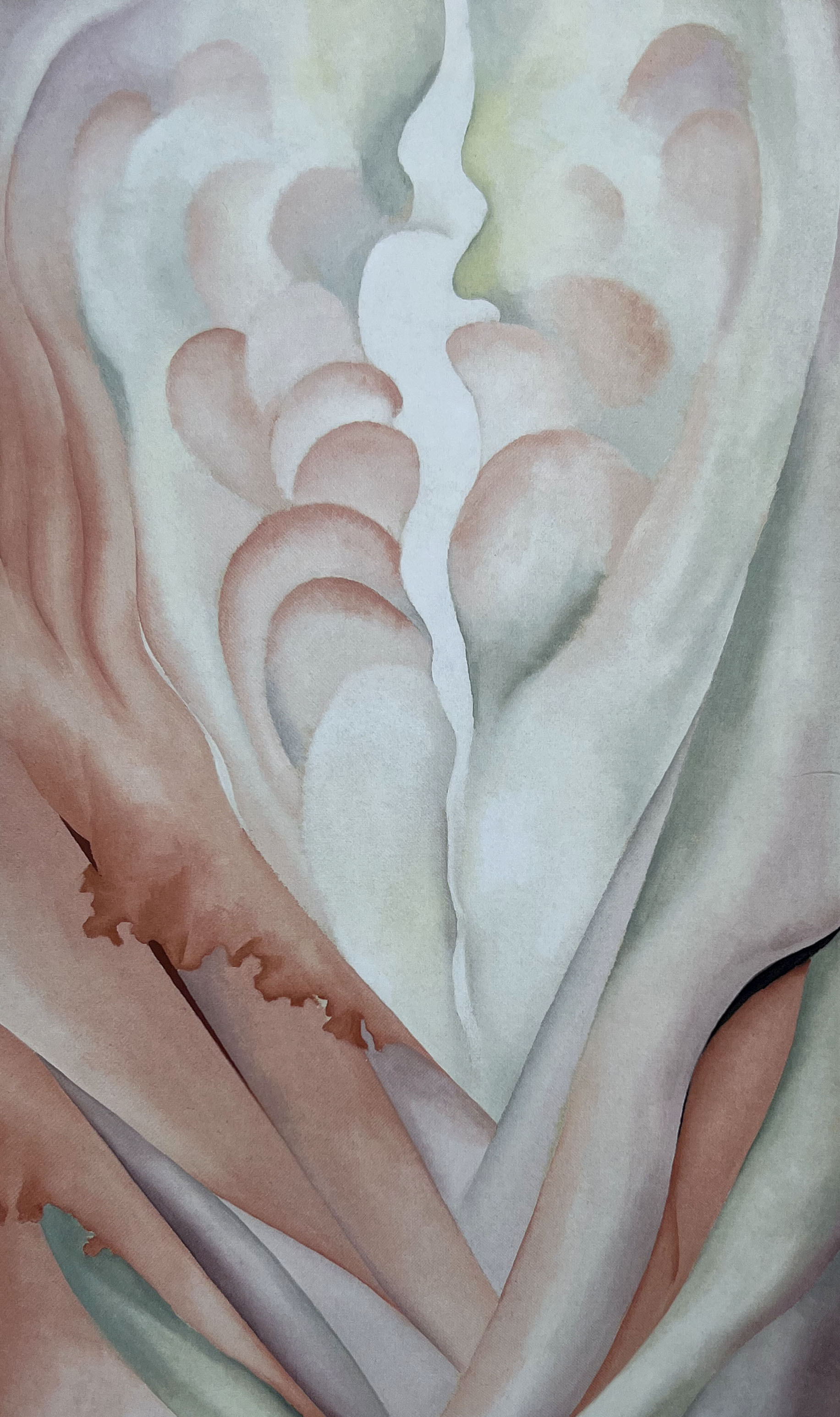
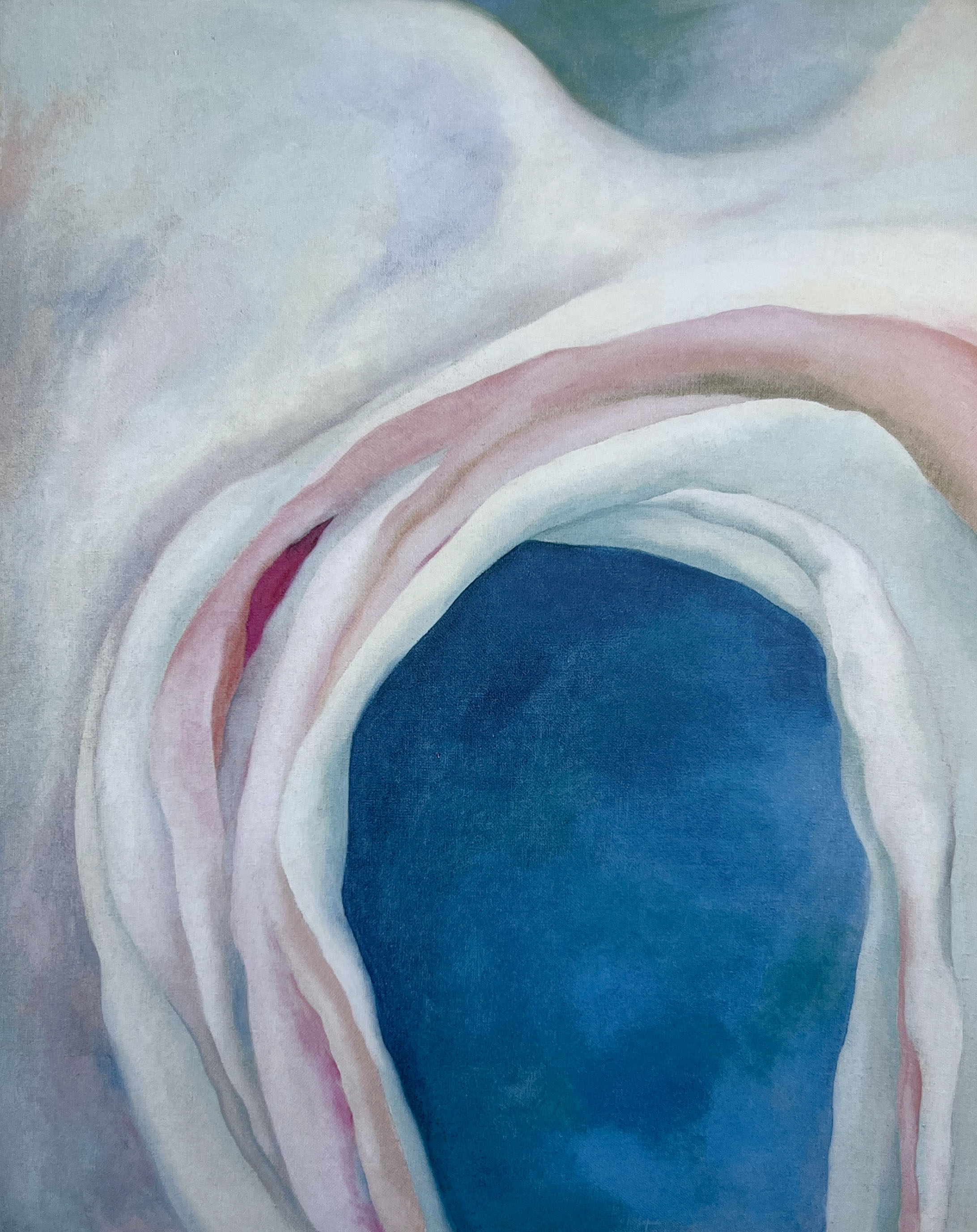
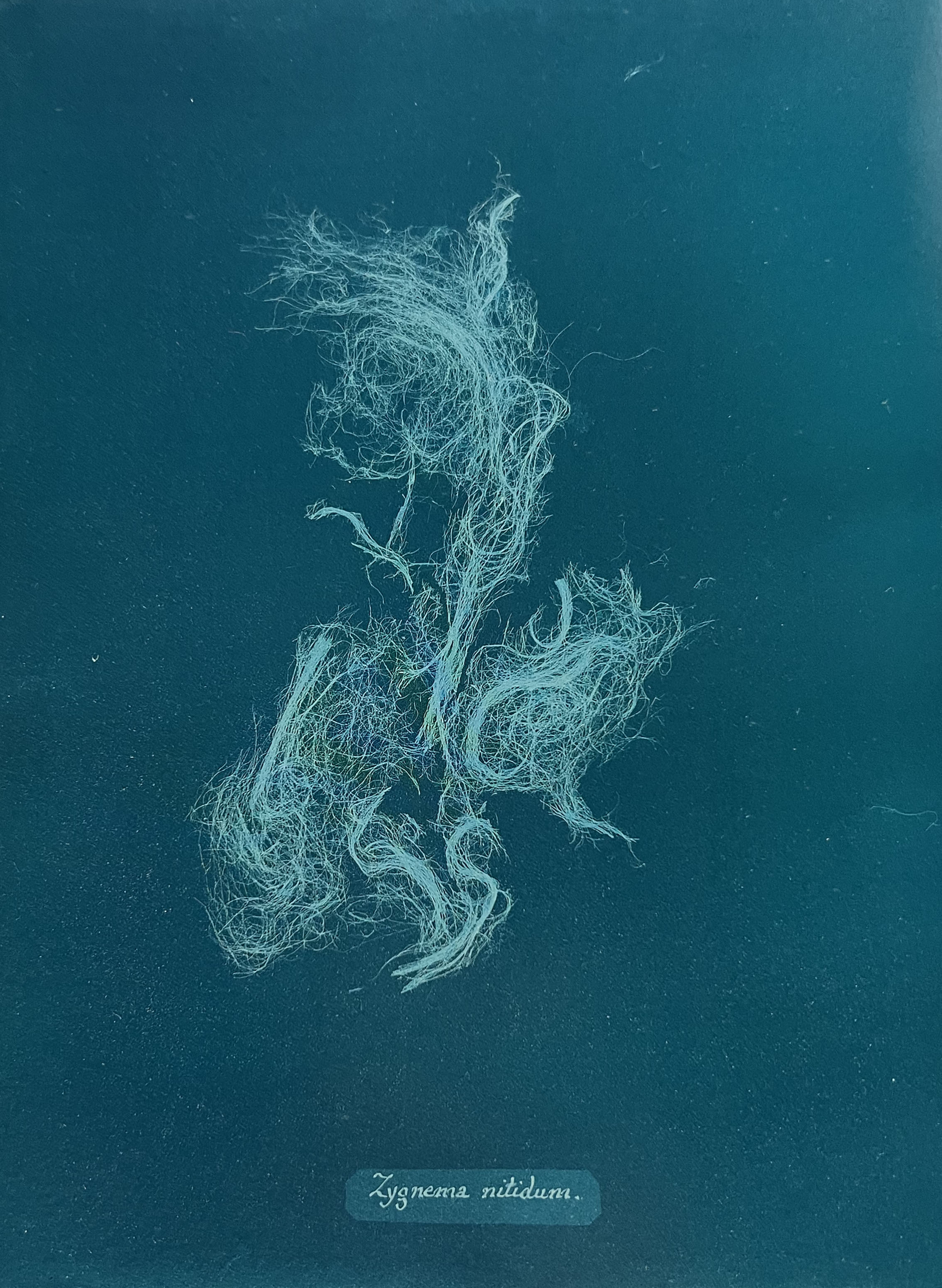
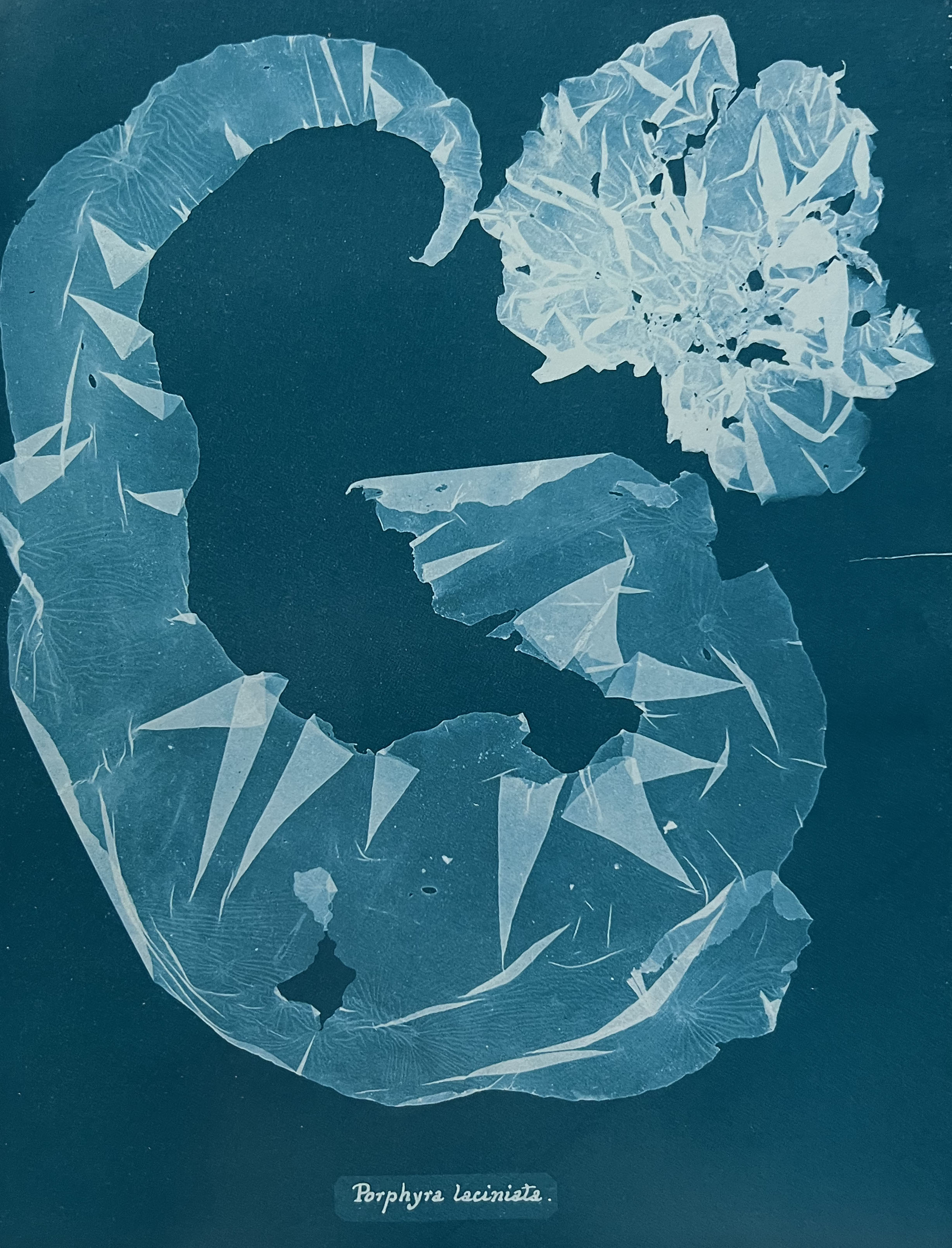
For these designs, I felt like I need to choose the leading artist for inspiration. As I’ve been recommended by my tutor to look at the artworks of Georgia O’Keeffe, it suggested to me that I can do some research on her works, and learn what skill I can contribute from her for my music illustrations. Georgia O’Keeffe is one of the most significant artists of the 20th century, renowned for her contribution to modern art. She was recognised as one of America’s most important and successful artists, known for her paintings of New York skyscrapers. But most often, she painted landscapes and botanical studies. The artist depicts close-up images of flowers, and their details, like petals, emphasised their shapes and lines and made them appear abstract. That was the way to establish O’Keeffe as an innovative modernist artist. I collected her works as inspiration for music art, as her works are filled with tender movements, elegant, and flexible, also, they have passion and intricate details.
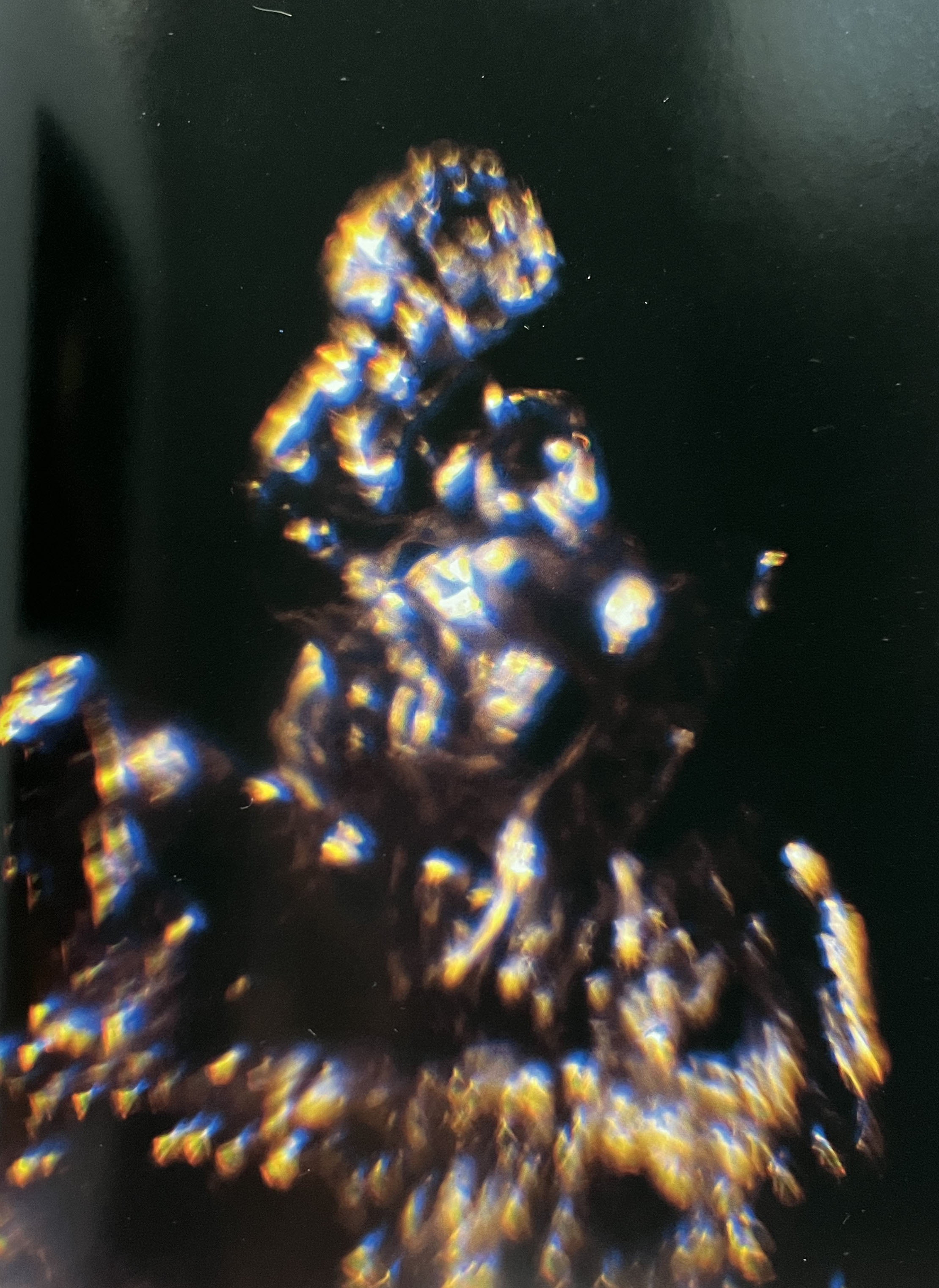
In addition, I collected some typography art and abstract ideas. I could use it as a direction for placing musical notes. Also, I found some abstract photography from the magazine that my family subscribed to, they always have fresh ideas of abstract art in photography, those images were similar in style and shapes to Georgia O’Keeffe’s, and also they had similar palettes I was planning use for my works. As we are speaking of abstract art, I wanted it to be floating, gentle, multiple layers artwork, with some objects being in the foreground and background also.
Illustrations
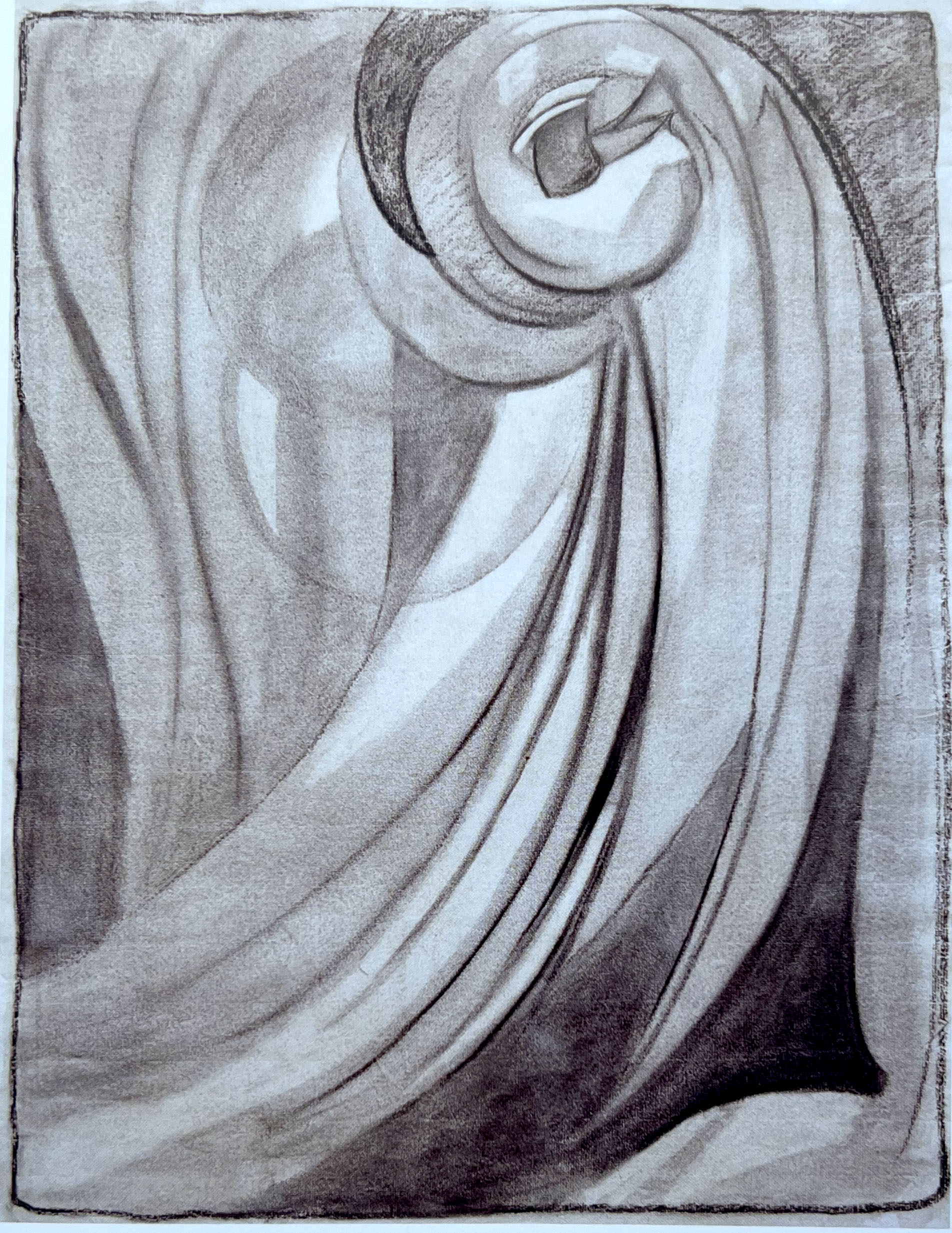
After researching a subject I proceeded to the creating a mood board in my learning log, documenting some sketches whilst listening to the piece of music. I enjoyed that composition so much, that I didn’t mind going back to it again and again, by adding some extra sketches. I tried to go with the flow and be switched into the music, I thought it will help me to find an original and creative solution, just trust my natural instinct and follow the path of the mood changing in music. It’s quite fascinating to create art, whilst you are listening to a particular composition. I definitely got inspired by it. I felt lots of happiness and a thoughtful mood in that music, so I thought would be great to merge those spirits, I wanted to reflect those elegant, classic and tranquil notes in the beautiful and abstract art that would have a close association with a composition. For the media, I used pencils, a black pen and watercolour. I planned to collect those artworks together, and later edit them in Adobe Photoshop, by adding additional filters, colours, and textures. The selection of words that were summarised by me for this particular piece of music was: rhythm, rhapsody, complexity, texture, emotion, repetition, spirited, ascending, diverse and dynamic.
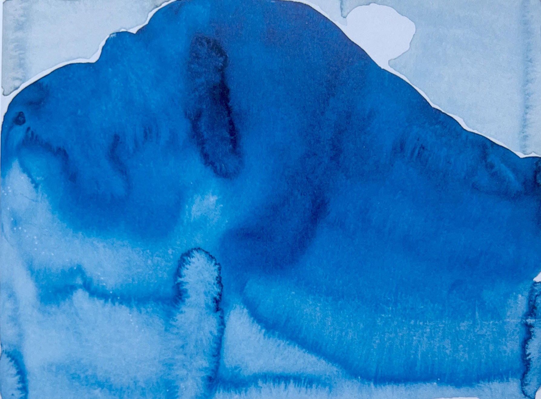
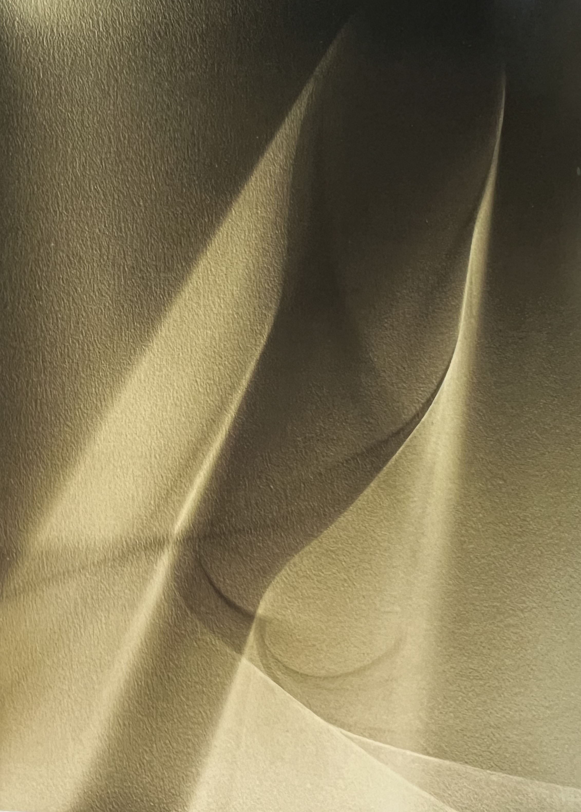
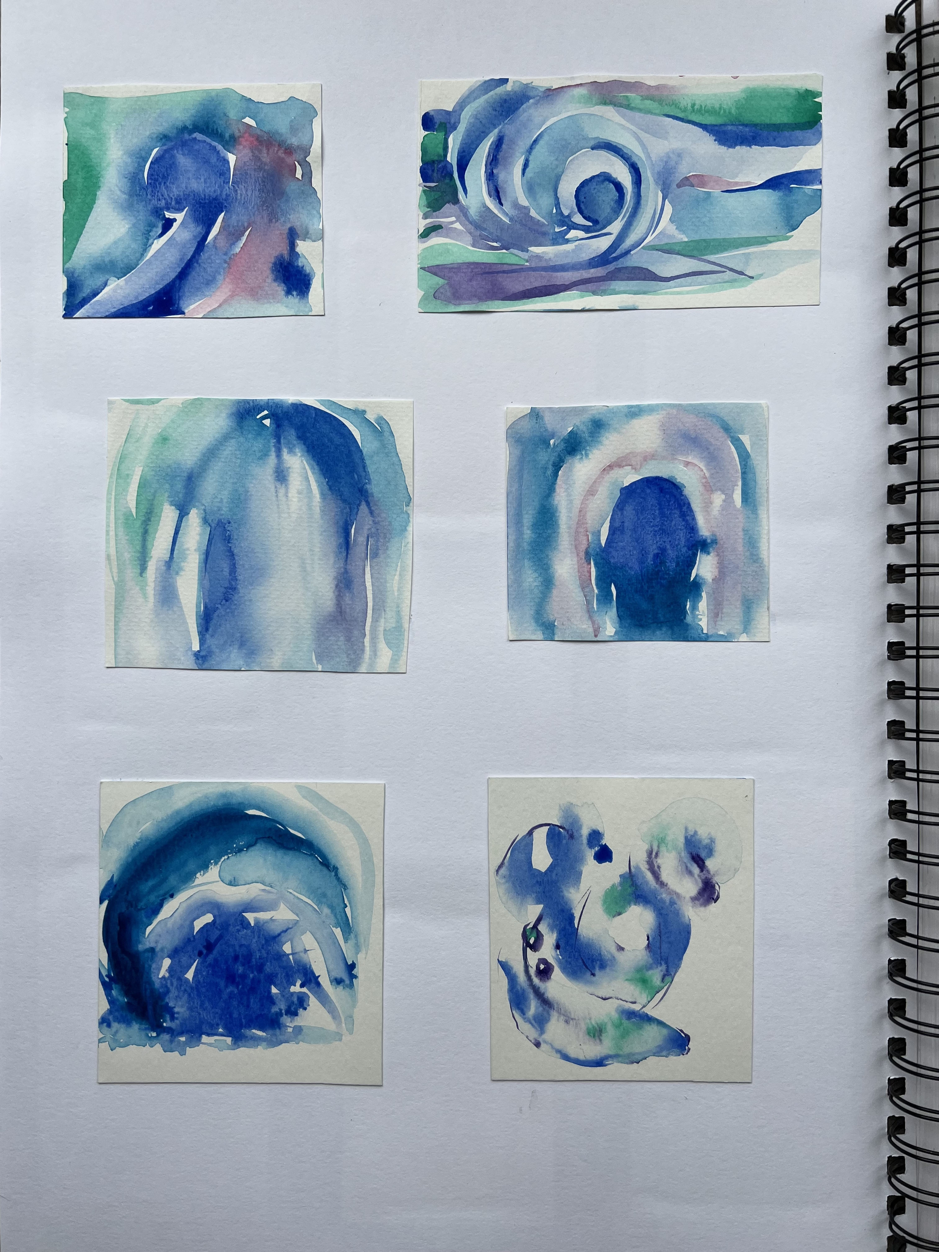
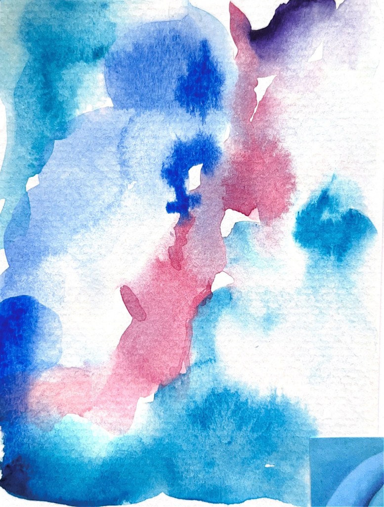
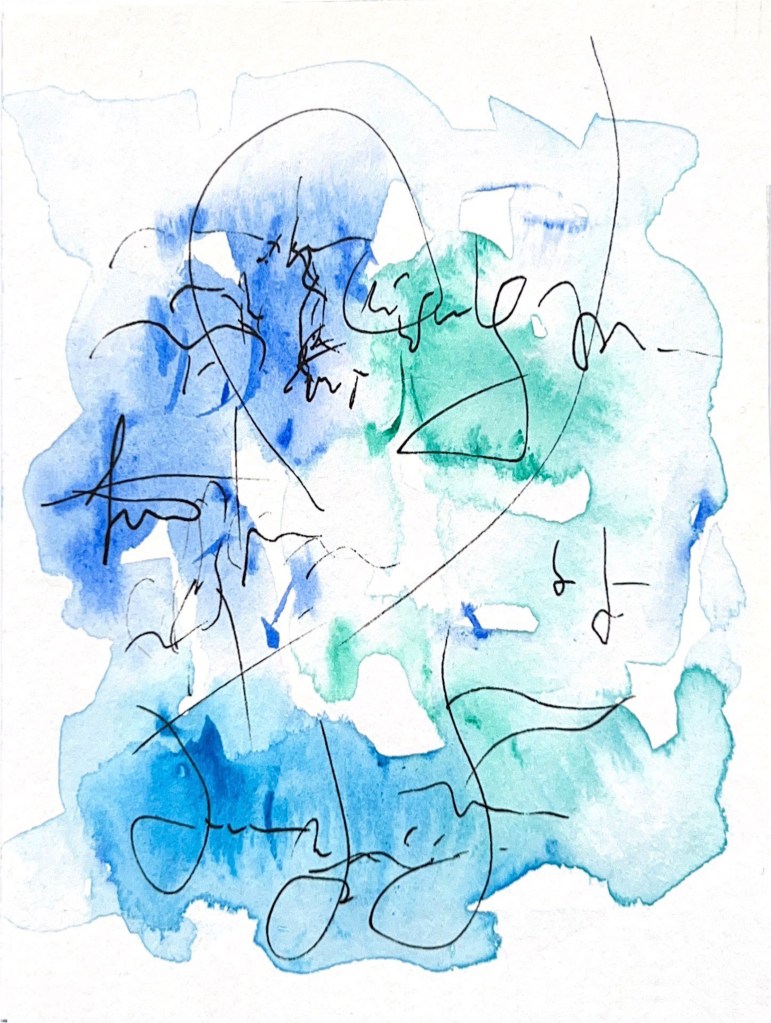
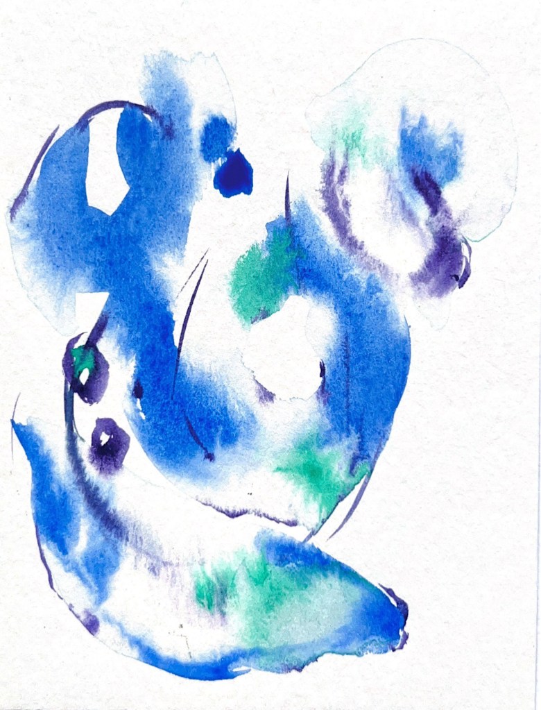
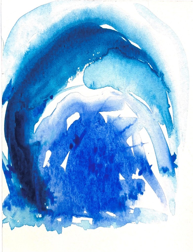
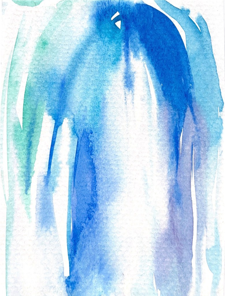
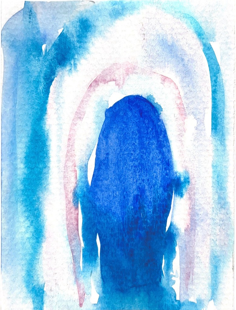
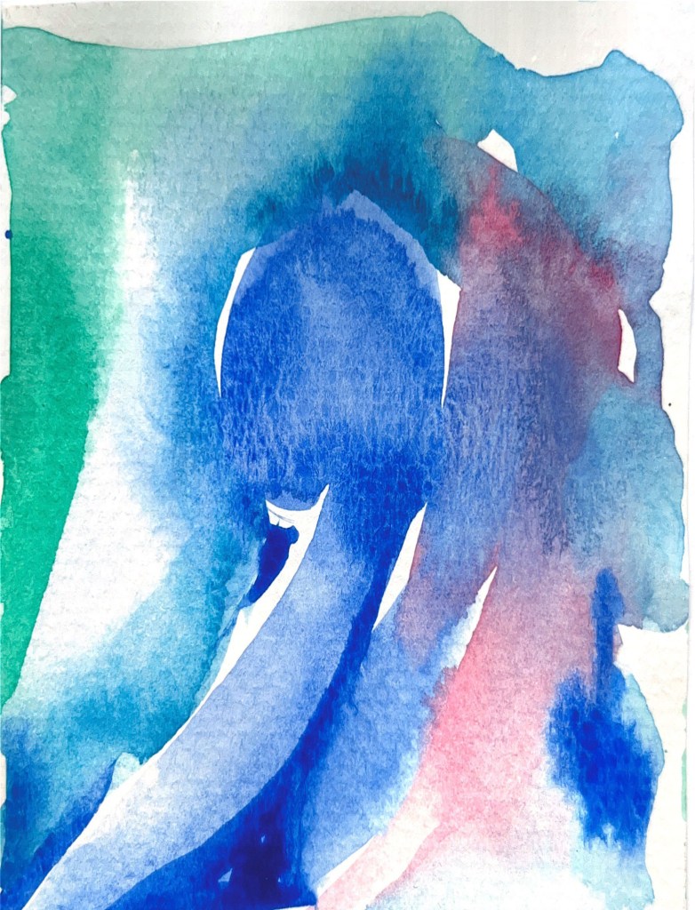
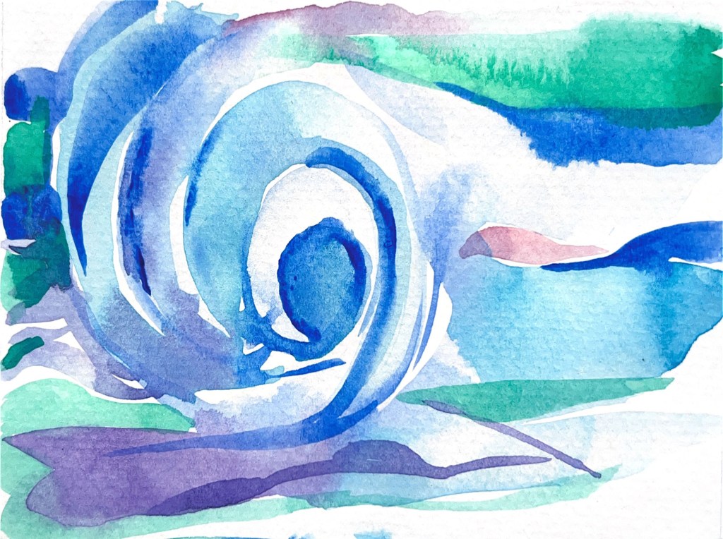
Below are presented some of my watercolour experiments. They are flexible, floating and light watercoloured shapes, with a smooth transition from blue shades to turquoise, pink and clear white. In these works, I wanted to support the idea of music as a model for expressing nonverbal emotional states and sensations. It’s quite fascinating that a piece of abstract art similar to music could convey powerful emotions independently of the subject matter. In those watercoloured, the swelling, undulating forms imply a connection between the visual and the aural, while also suggesting the rhythms and harmonies in nature. In some watercolours I added black pencil sketches, to highlight the rhythm and energy of the music, I wanted to show the path of going to higher notes and reaching the crescendo.
Gallery
Designs
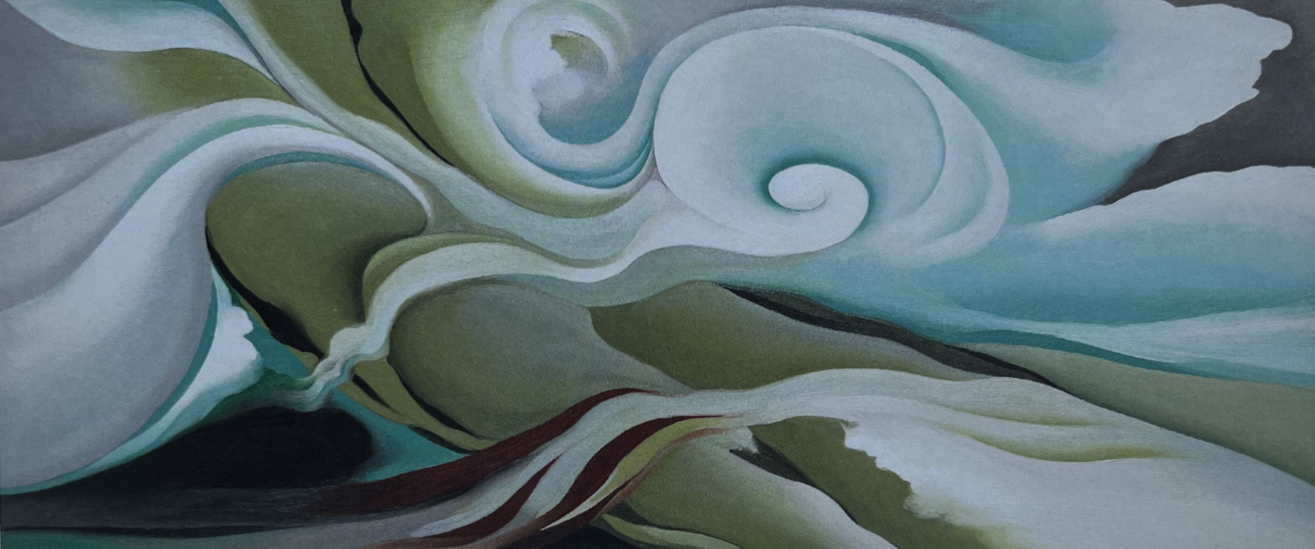
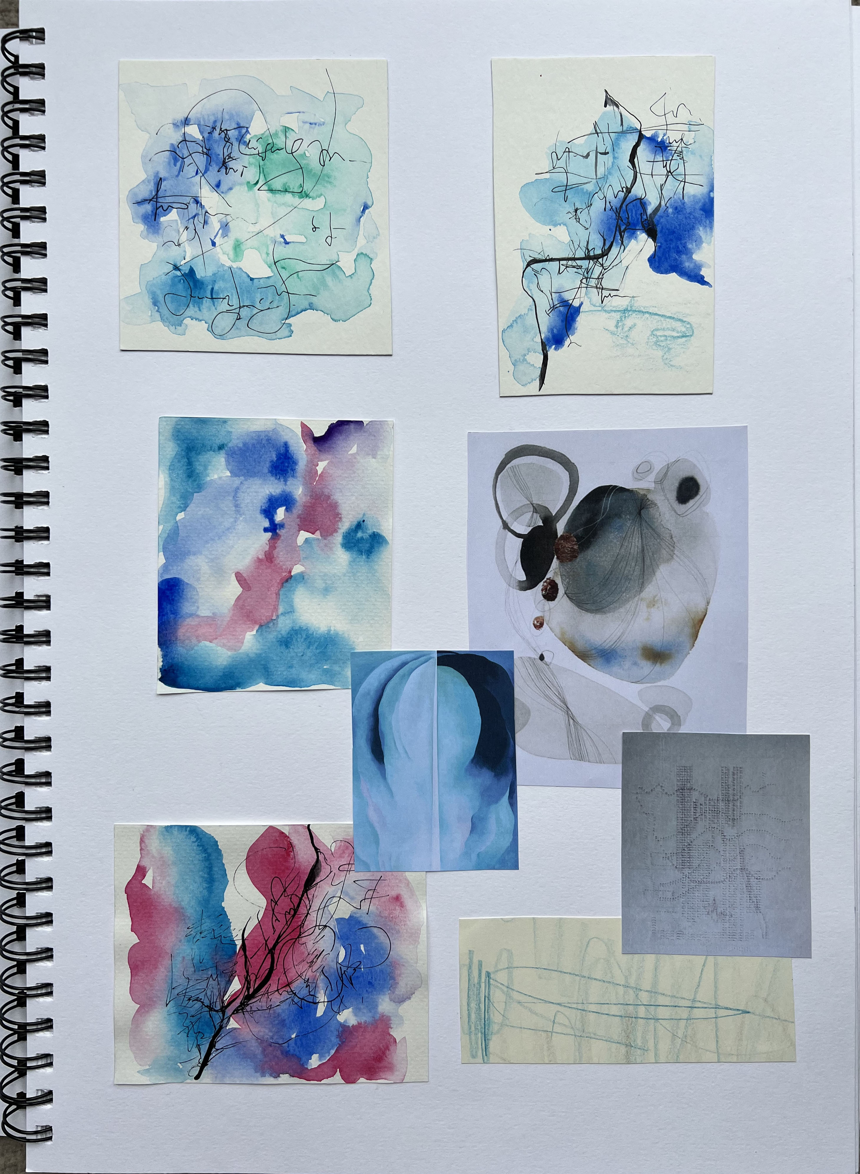
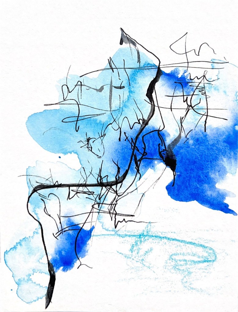
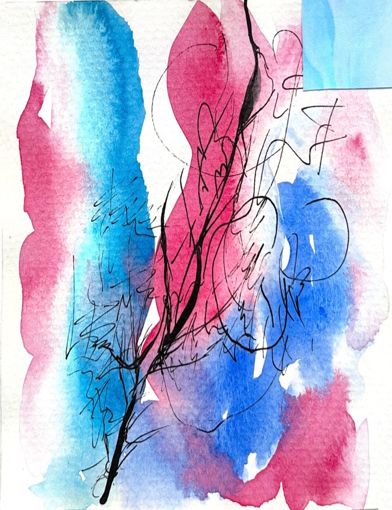
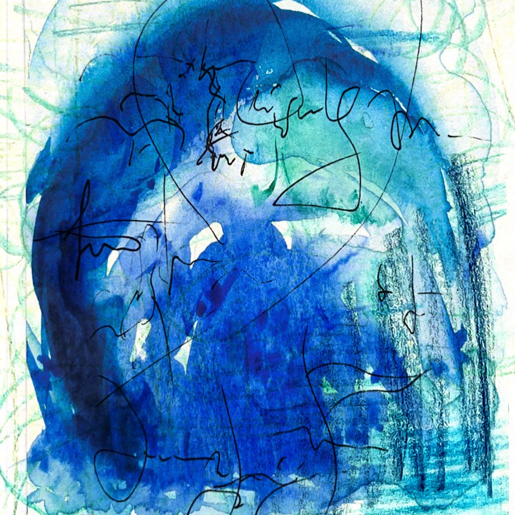
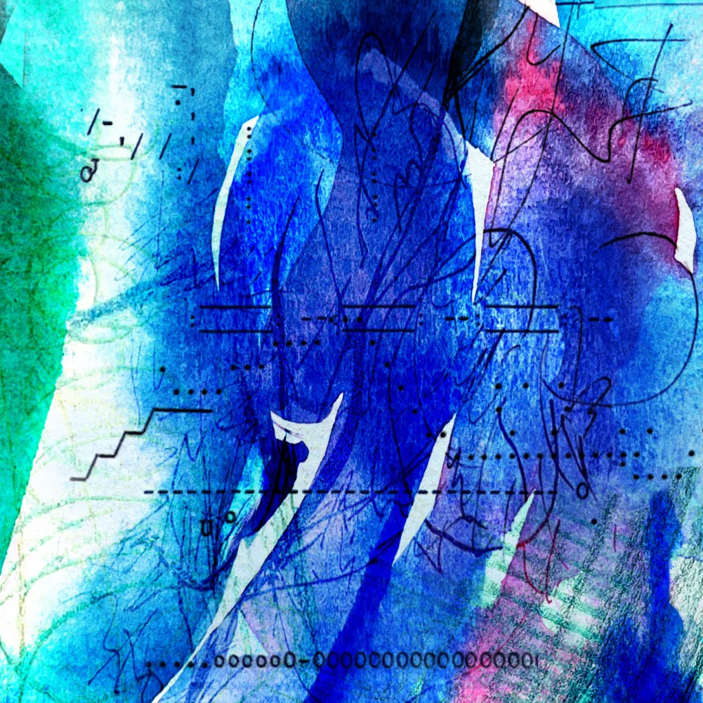
After physical experiments, I proceeded to the software designs, that were conveyed in collage style. Those are my takes on connecting different media such as pencil, watercolour and pen in a singular piece of art. From the brief, I was aware of one of the precautions not to overcomplicate the image, as excessive layering and experiments with tones can look messy and lose perfection. My challenge was to create abstract art that would catch an eye, would make the eye of the reader focus for further exploration, but, at the same time, have a simple, clear collage and pleasant fresh colours. My first outcomes definitely were not good to go, I was worried that I could potentially trap myself in the wrong direction, so the solution was to remember the rule of clear, readable images. Overall, I felt that clear transparent watercoloured illustrations worked better, giving the feel of the elegant notes in music.
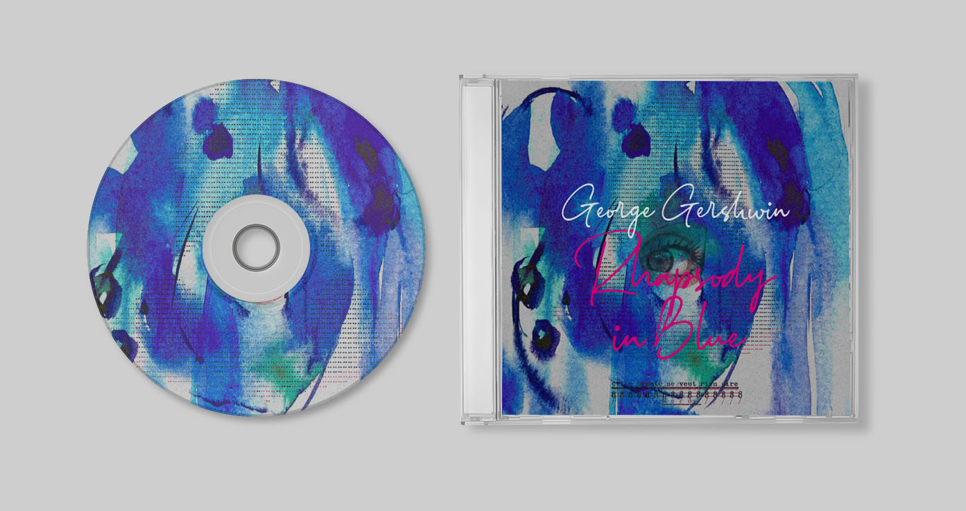
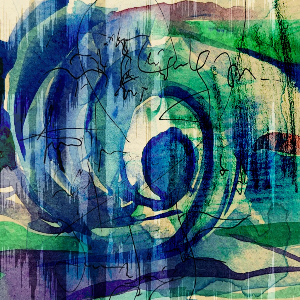
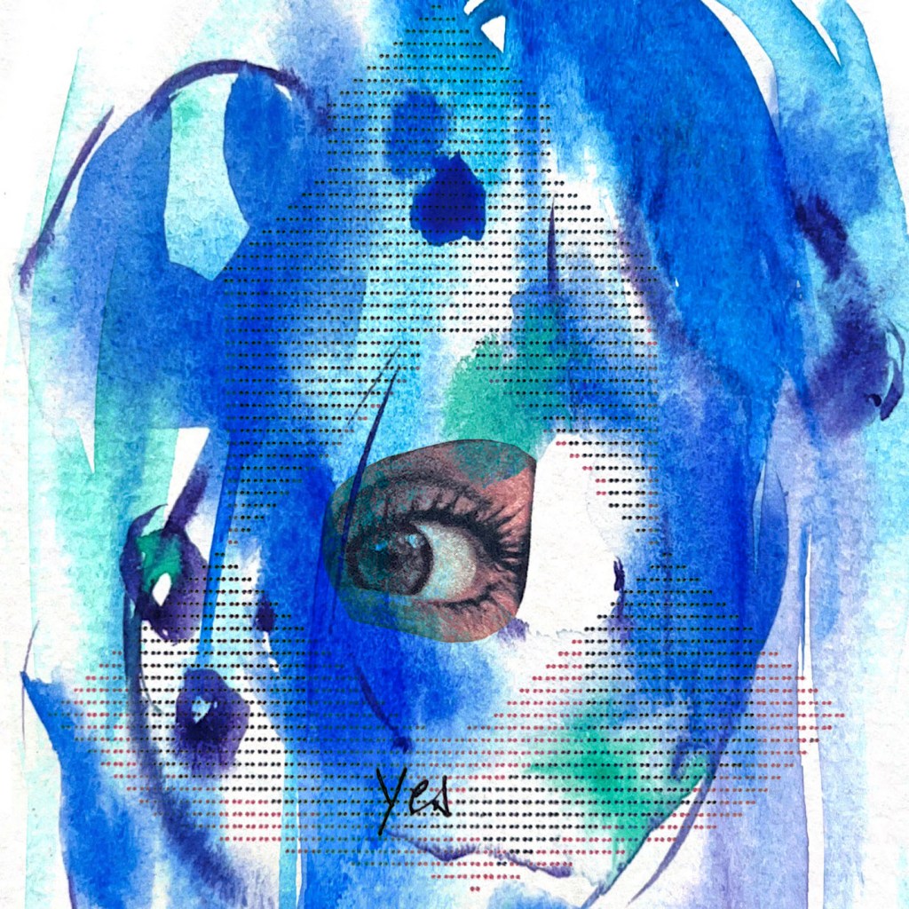
For the final pieces of Rhapsody in Blue I chose two illustrations. The first one with an eye in the middle and another one – with musical notes twisted around the centre. Girl with an eye and typographical art written in concrete poetry had a focus and helped to evaluate the artwork in order to create multiple layers for the cover, making the design more eye-catching and mysterious. At the same time, the design with musical notes swirling around the centre had another effect that made the reader follow the image from the outside into the deepness, which is a similar effect to the golden ratio. Also, I was planning to implement text into my design, like the name of the composition and author, to make it look like ready to be printed CD-disc. For the design with notes I chose the serif font Fiona Pro Regular placed at the top of the composition, which would match the typography from the 1920s, and combined it with the calligraphic font Braisetto. I think, that the typography combination with the artwork made the cover look classical, but at the same time a bit old-fashioned. That wasn’t what I was going to achieve, so I tried another take and used a more modern font for the girl with an eye. I used a calligraphic Stylish Classy Font in bright magenta colour, to create a contrast to the blue background. I thought the concrete typography texture, tender background and blue and modern calligraphic font brought the desired result for the final cover.
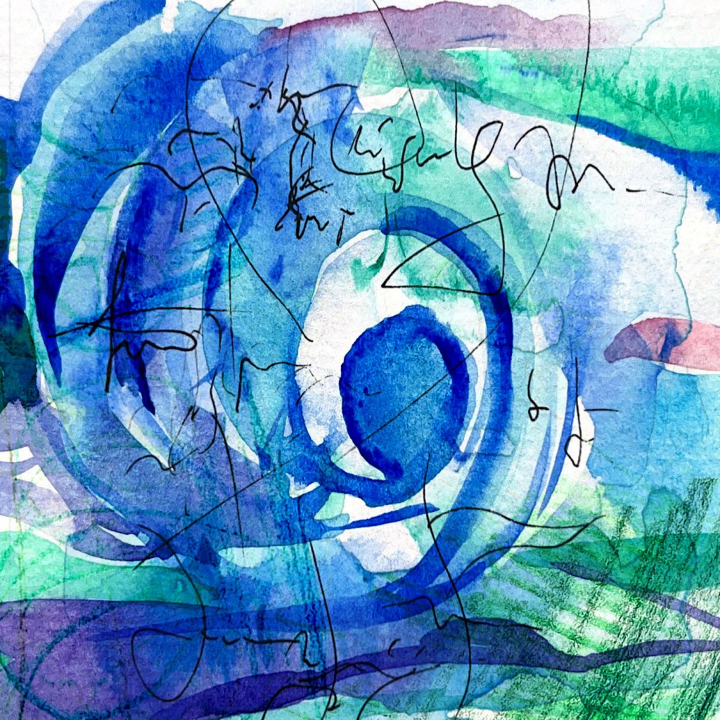


Final pieces


Conclusion
In conclusion, I would like to say that I found this exercise to be quite challenging, as I aimed to create a design that was both clear and creative. While I was ultimately pleased with the final result, it took me some time to discover the perfect solution that effectively combined the abstract illustration with the essence of music composition.
Following my usual process of sketching, creating mind maps, and conducting research on the subject proved to be beneficial in guiding me toward the right direction. However, I also realised that I could not simplify or restrict the design development process, as these elements are crucial in the creation of the illustration.
Nonetheless, I am confident that all the effort invested in this exercise will contribute to expanding my knowledge and discovering new approaches to creative illustration.
