Introduction
The fourth part of the course is devoted to the definition of ‘Style’. Style is an integral part of every illustrator, by which the artist can create their own unique and inimitable style. The majority of practising professional illustrators, along with many graduating student illustrators will have a ‘Style’ associated with their work. Also, the style allows the artist to be recognisable in the creative market.
What is meant by style? It is the distinctive visual language that identifies one’s ‘mark’ or personal iconography. It should also define one’s placement within a visual, illustration genre. Like music, literature and fine art. Some will represent an adherence to a contemporary trend or fashion and others will be more traditional.
Exercise
In this exercise, I was asked to find a range of illustrators who use a particular medium, and then catalogue them according to similarities in the way that they use tools and materials. I had a choice between traditional materials, such as paints and pencils, or chose digital direction such as collage or photography. I think, I’m going to analyse illustrators who use watercolour in their art, as that is something I know and love. Watercolour is a versatile and captivating medium that relies on transparent pigments mixed with water to create stunning artworks. It is such a versatile paint, that can bring traditional and at the same time modern vibes into the painting. I personally always been intrigued by the precision and artistry that watercolour requires. Unlike opaque mediums like acrylic or oil, watercolour is known for its transparency. When mixed with water, the pigments become translucent, allowing for layering and creating luminous effects. As I have known before, watercolour doesn’t forgive mistakes, once you used the colour, you can’t hide it, or change it on the piece of paper. Also, it is crucial to keep colours clear, making sure they aren’t muddy or turning into vague shades. One of the greatest artists I discovered during this course who uses watercolour was Georgia O’Keefe. I actually followed her path for creating some of the designs in the third part of the exercise ‘Abstract Illustration’. This time I would like to look into such artists as Emma Larson, and her beautiful watercolour paintings. Emma has evolved her practice to include expressive and organic watercolours, alongside paintings created with oil and acrylic.
Ever since my art classes, I remember that watercolour loves water and quality watercolour paper, which varies in price and can also be handmade. Thanks to the balance of water, it is possible to achieve different shades using the same colour. Watercolour paintings are characterised by lightness and purity, they can also be filled with depth and convey nature in all its glory.
From my observation, watercolour is most often used for depicting naturalistic landscapes, and portraits, also for children’s books and abstract paintings when it comes to spots and splashes. Such an example for children’s books is Kathleen Hale, who uses watercolour and pencil to depict her characters. In general, I have accumulated a small database of styles and ideas about watercolour painting techniques, and now it remains to collect everything on the Pinterest board. I also made a short trip to the local Doncaster Library where I saved watercolour examples from the book ‘Paint Yourself Positive’ created by British watercolour artist Jean Haines that are naturally airy, light, realistic, and imaginative at the same time.
Watercolours

According to the Alan Male book despite hundreds of styles of illustration, there are just two forms of imagery. All variations of visual language will be placed within one of these. Literal illustrations tend to represent pictorial truths. The second form of illustration can be described as conceptual. The images may contain elements of reality, but as a whole take a different form of being. Examples may include diagrams, composites, surrealism, extreme distortion or abstraction.
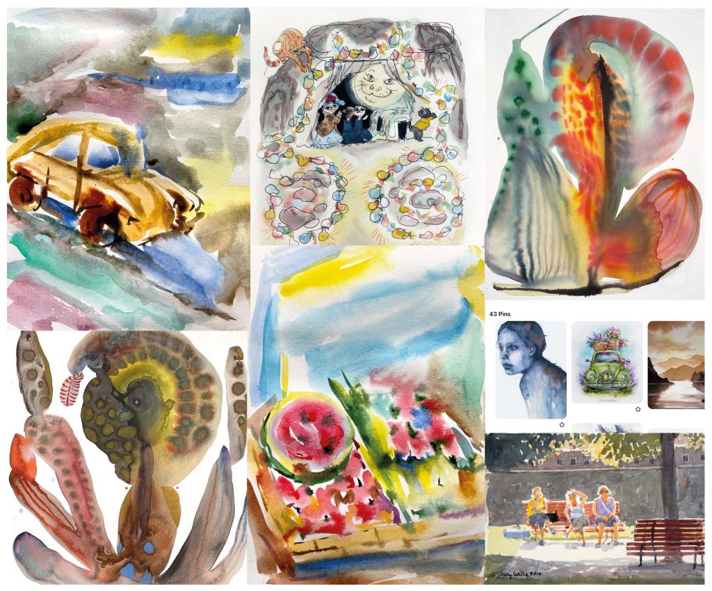
Looking at a large number of watercolour illustrations I collected for my Pinterest board, I catalogued the illustrators according to similarities in the way that they use tools and materials. It helped me to identify noteworthy authors, what connects them, and also to comment on the difference between styles.
I created the following subgroups:
- Pictorial Realism (literal illustrations);
- Picturesque (literal illustrations);
- Abstract (conceptual illustrations);
- Figures (conceptual illustrations);;
- Eccentric.
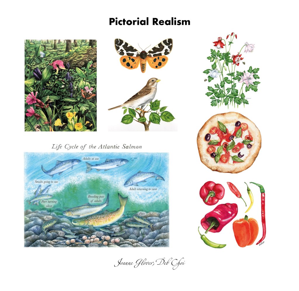
Nowadays we can find a profusion of pictorial illustrations scattered through various published mediums. Great quantities of drawings are used today in pamphlets, magazines, books, comics, billboards, posters, calendars, and on packaging such as book jackets. One of the purposes of pictorial truth illustrations is to stimulate interest. It is used in all forms of narrative fiction, the pictorial qualities ideal to create dramatic effect particularly when used in sequences, such as in graphic novels and comic strips. Stylistically, the visual language of literal representation can vary greatly.
I collected works of such artists as Joanne Glover, natural history illustrator, who uses her scenic images to portray nature. She paints a wide range of natural subject matter including plants, animals, birds, insects, fruit and vegetables, maps and landscapes. Also, I included in this board artist Deb Choi, who creates realistic food illustrations. She uses colour in a fresh way, also her works stand out because she elevates the ordinary and the everyday into something unexpected, fresh, and beautiful. Both artists communicate to the reader through realistic images, rather than metaphors or symbols.
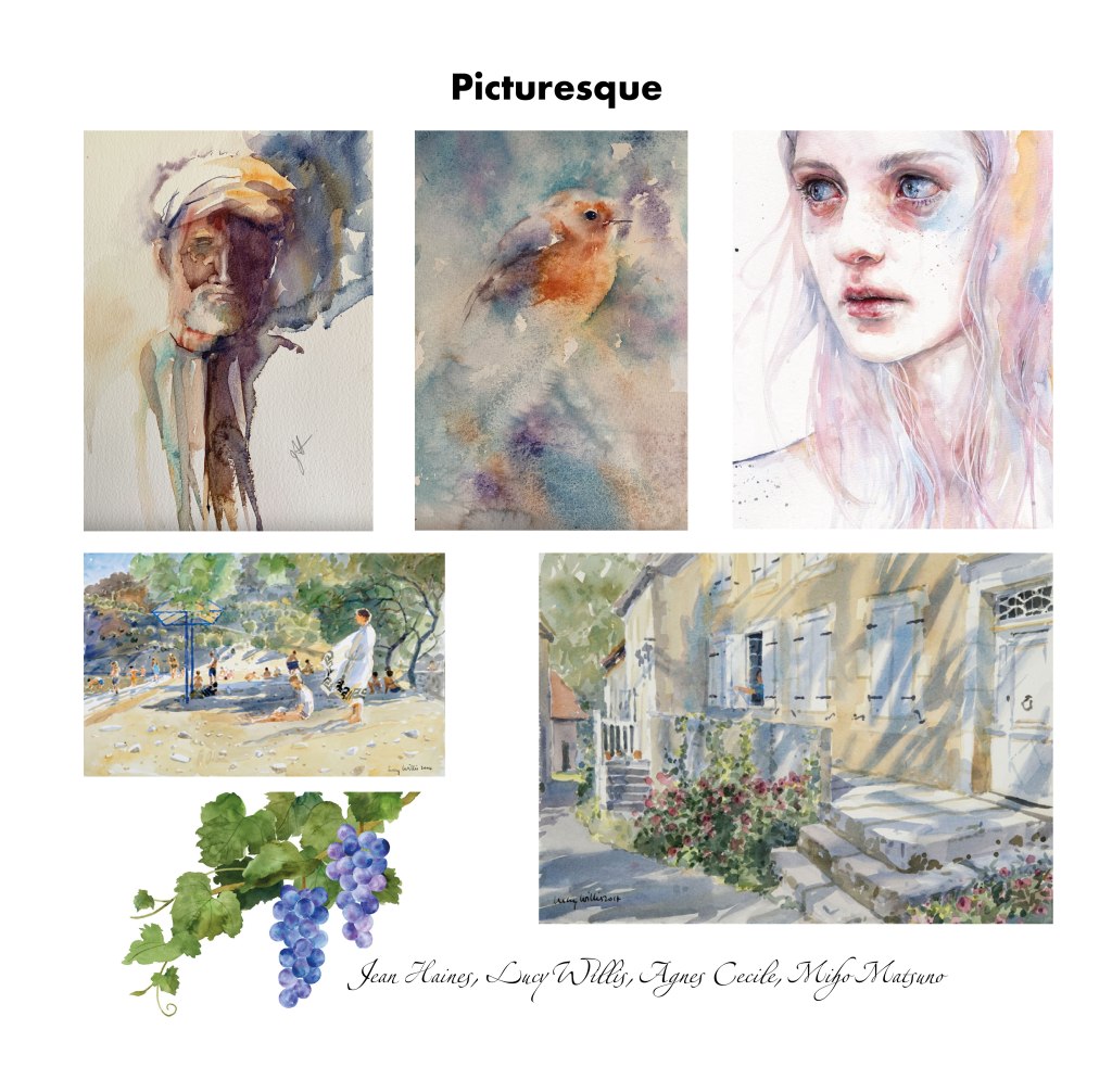
Another representative of literal illustrations, which manifests itself in picturesque portraits, correct proportions, inspired by nature and natural tones. Objects and portraits drawn in this style are recognisable, but at the same time, colours are characterised by lightness and airiness.
Looking at these images, one can assume that academic drawings and natural shades characterised those paintings. Lucy Willi‘s pictures are reminiscent of a photograph, only done in delicate watercolours. In this selection, the portraits by Jean Haines and Agnes Cecile have the mystery in the way they are presented, colours are different to the realistic colour scheme. Still, in the case of proportions and construction, they are believable and picturesque. I would say that the top three images are slightly distorted to be called realistic, and mainly that happens because of the colour scheme and slight mystery that is present in those images, compared to the pictorial truth art.
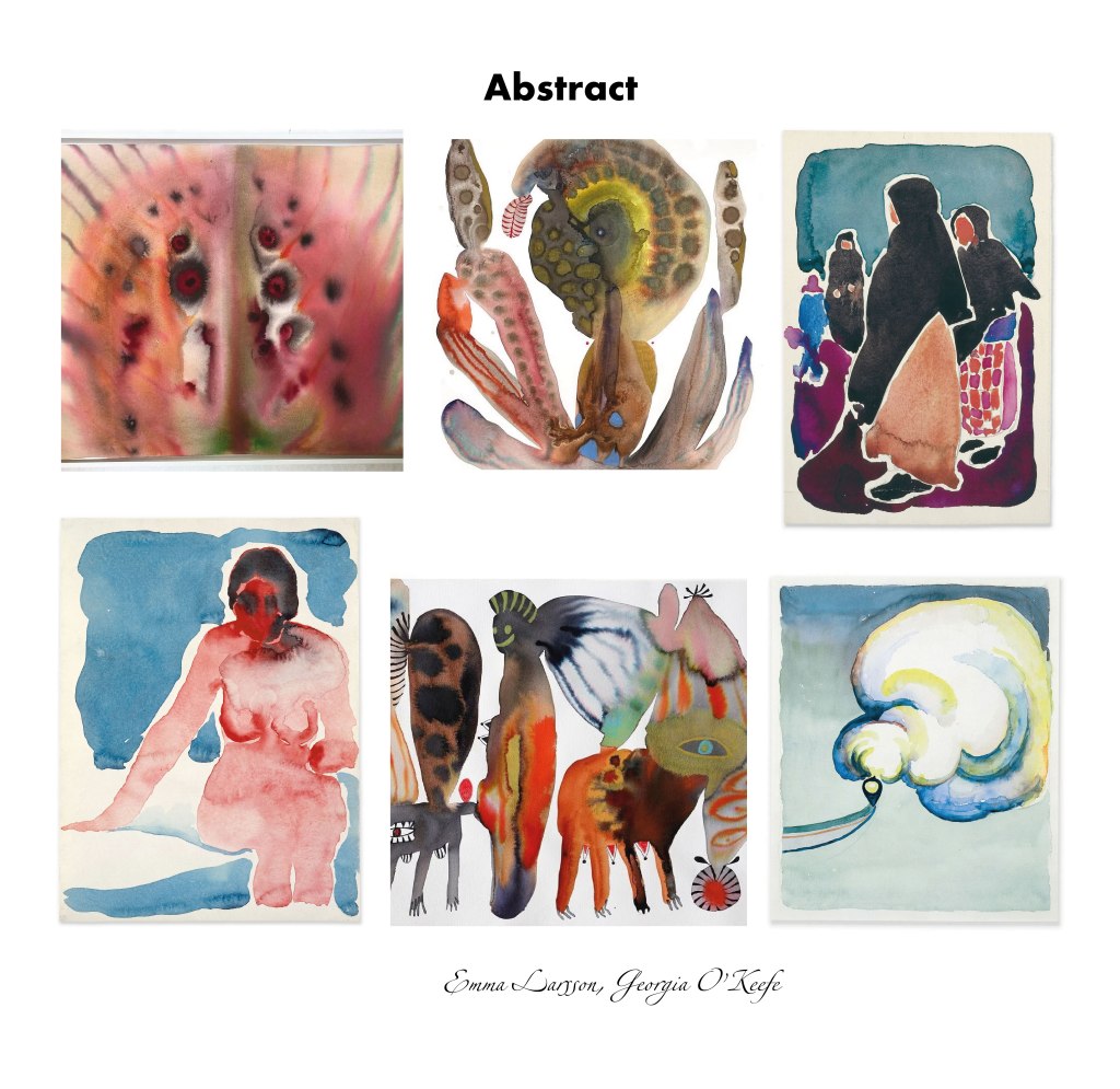
In this collection, I have added abstract images that are conceptual in nature and allow the reader to turn on the imagination and present their own interpretation of the images. You can also track how the author’s opinion coincides with the perception of the reader or the general audience. Emma Larsson is a Stockholm-based artist and illustrator. Her work strikes the balance between colourful dreamscape and in-articulable melancholy. Emma’s practice has evolved to include expressive and organic watercolours, alongside paintings created with oil and acrylic. She describes her work as an ongoing exploration without rules and conventions, continually generating new forms, patterns, and themes.
Also, I included the works of Georgia O’Keeffe that I analysed earlier in previous exercises. The abstract works she created throughout her career have remained overlooked by critics and the public in favour of her representational subjects. O’Keeffe sought to transcribe her ineffable thoughts and emotions. Her artistic style is characterised by both pictorial truth and abstract images. Georgia sends the viewer into a fictional world of sophisticated imagination, a kind of melancholy and peace. Her pictures are calm and light. Both artists communicate with the reader through the use of metaphors or symbols.
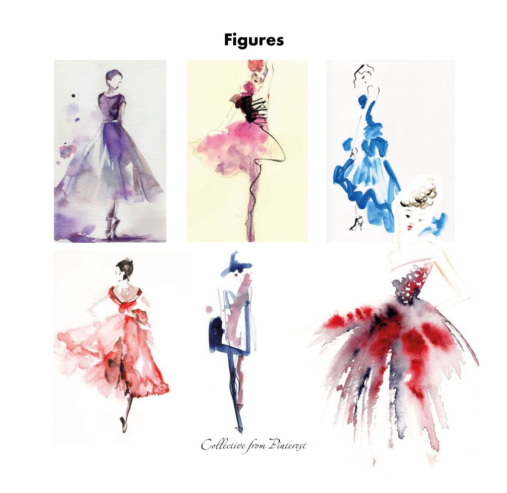
I have also added to the collection exquisite watercolours of miniature models, made with just a few strokes. They are watercoloured images are captivating graceful illustrations created by a couple of brushstrokes. Those figures embrace elegance and poise, with the silhouette emanating confidence and allure. These types of illustrations are more conceptual and are most often used as a demonstration of glamour and style, also for fashion industry shows. The choice of watercolour as the medium enhances the softness and fluidity of the image. Colour solutions are also characterised by simplicity and understandable combinations, they carry the meaning of conveying an idea or concept through symbols, or quick sketches, more than a picturesque character.
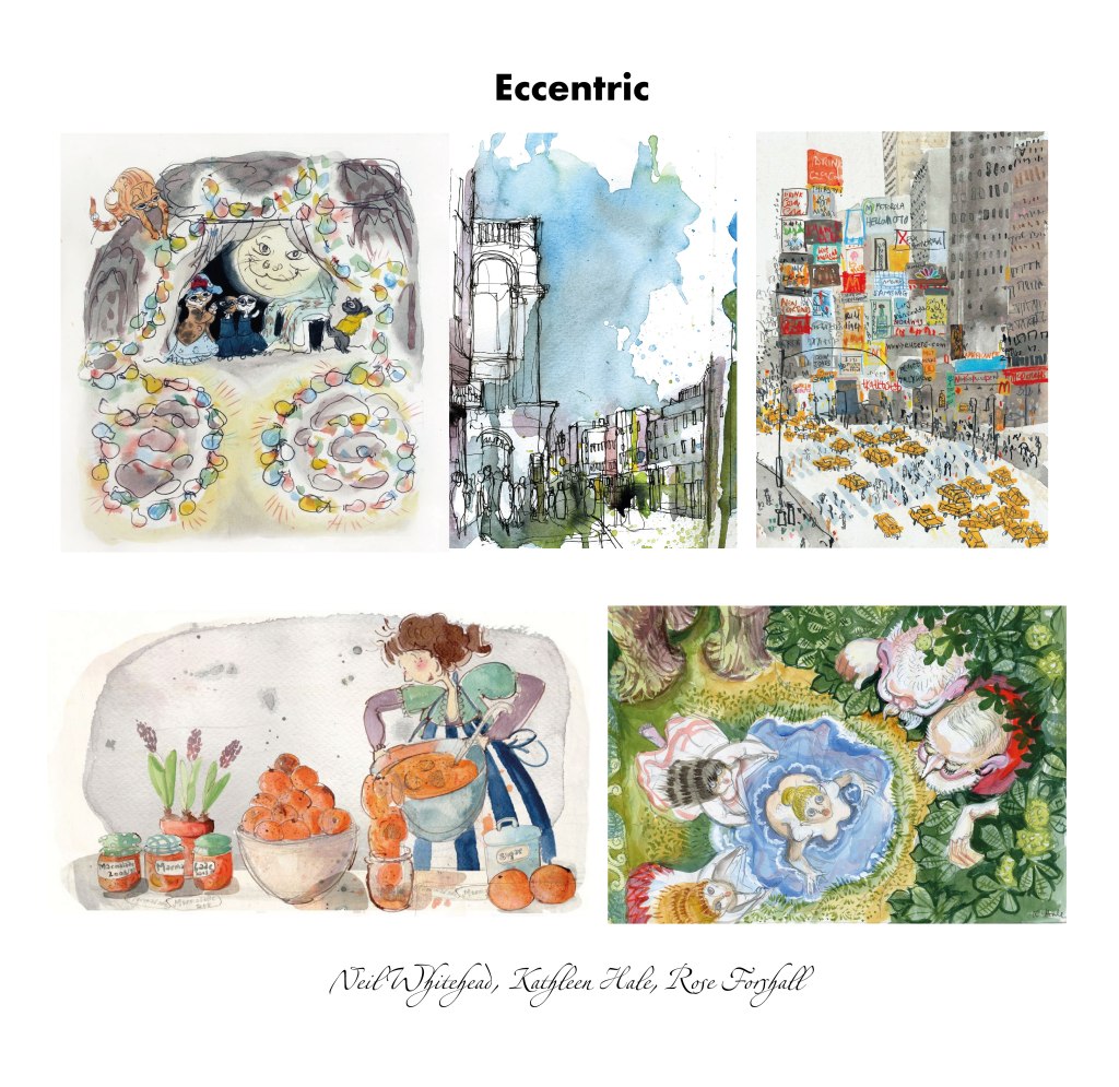
The latest selection of eccentric illustrations that are most often found in children’s books or gift cards. This style is characterised by quick sketches, emotional characters, or the transfer of a bustling city through a lot of swirls and strokes. Whimsical watercolour style refers to a particular approach to watercolour painting that emphasises spontaneity, imagination, and a playful sense of wonder. It often involves the use of vibrant and unexpected colours, loose brushstrokes, and imaginative subject matter. This style embraces the freedom of expression, allowing the artist to create dreamlike or fantastical compositions. The most prominent representative of this style is the author of the Orlando the Marmelade Cat character by Kathleen Hale. Overall, a whimsical watercolour style embodies a sense of charm, imagination, and a playful spirit. It allows artists to break free from rigid representational techniques and embrace the fluidity and spontaneity of watercolours, resulting in captivating artworks that transport viewers to a world of whimsy and delight.
My chosen art
Source: https://www.hugoandmarie.com/artists/emma-larsson/ Accessed: 29/06/2023
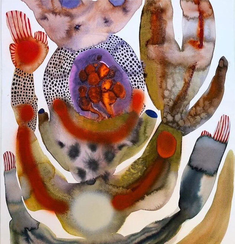
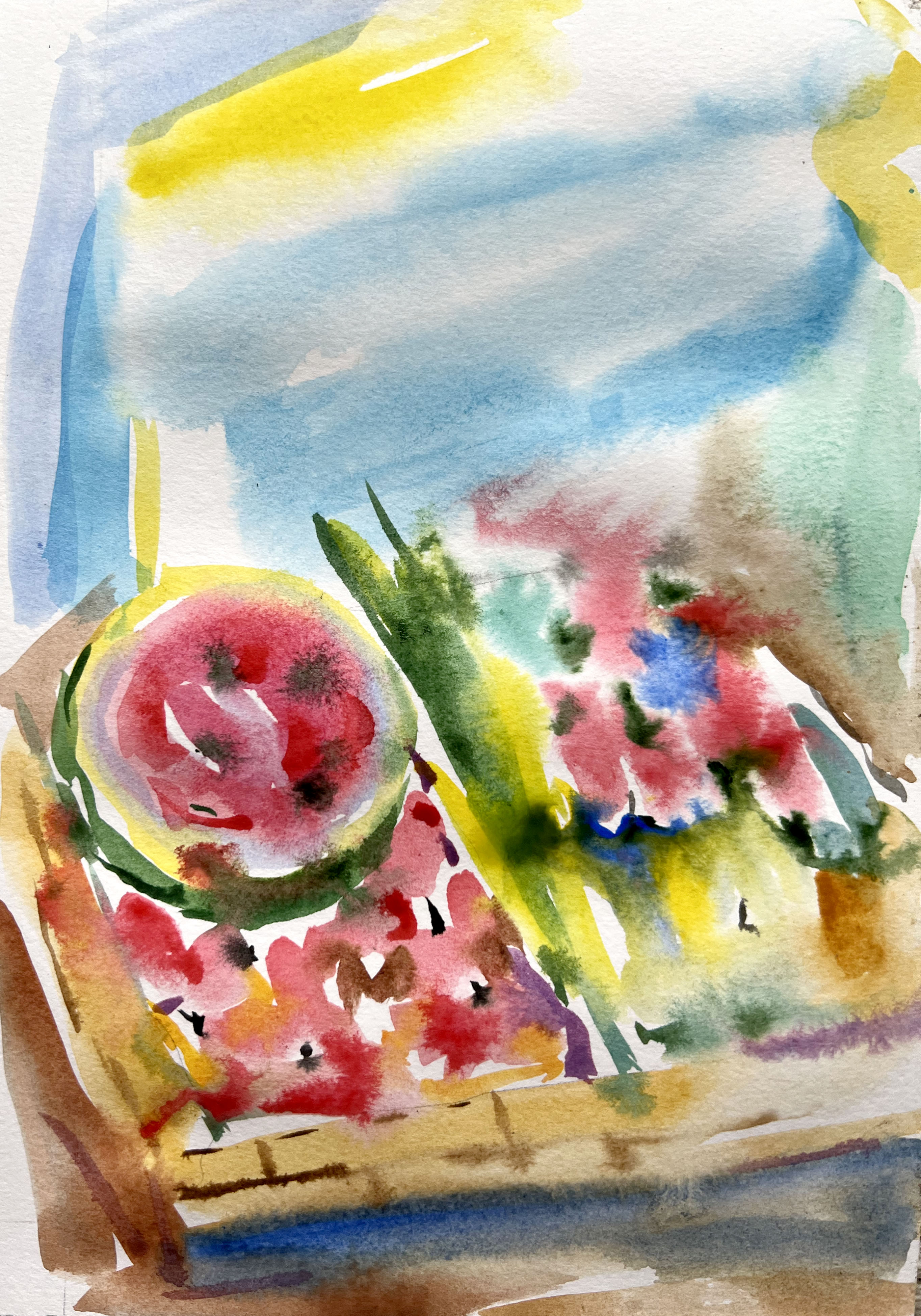
The first artist I’m going to analyse and try to recreate is Emma Larsson – a contemporary artist known for her unique and vibrant watercolour paintings. Her painting style often incorporates bold and expressive brushstrokes, creating a sense of energy and movement within her artwork.
How is the image composed?
This art has been composed manually, by using watercolours. The style of this art is abstract, the artist presents to the reader unusual shapes and figures that are not supposed to be direct. You can learn and examine the image for hours, and something new will be available to discover.
How are colour, tone, and texture used to evoke a mood or convey an idea?
The colour palette of this art is catching us with surprise and unpredictable solutions, there are monochrome shades present, with a mixture of bright red splashes and added texture on the purple colour. The shape of the figure is smooth and round, it doesn’t have sharp corners or angles, which helps to have the feel of the floating image, that can be read from the top to the bottom by moving the eye-site from left to right. The mood of the image is melancholic, like a psychological test, when every individual will see their own interpretation of the image. I can see nature that rose hands into the sky. I’m fascinated by this image.
Has the illustrator distorted the content within the imagery and how does this work for the purpose the image fulfils?
Definitely, this art was meant to be distorted, that’s the primary purpose of it. Emma Larsson uses distortion as the primary tool of communication, also, her art is filled with metaphors and second meanings. Larson’s artistic approach often focuses on capturing the essence of nature, incorporating elements of realism while infusing her own interpretation and creativity. She has her own recognisable and unique style, that is worth analysing and examining. Through her mastery of watercolour techniques, Emma Larson transforms simple subject matter into a captivating piece of art. That makes her art surreal, eye-catching and curious.
To replicate the style of Emma Larson I’ve chosen my earlier assignment for the ‘Point of sale display’. Here I tried the wet-on-wet technique which involves painting on a wet surface, producing soft, diffused edges and blending colours seamlessly. I wanted to create that abstract way of using watercolours, mainly splatters and stains, with lots of water and paint spreading from one colour into another. I like the experiment I received in the result, it is still recognisable that I tried to design some natural objects, but the style of illustration suggests a more imaginative way of painting. My artwork doesn’t look as abstract as Emma Larson’s illustrations, but it is still a good replication of the style. The outcome of the design is airy and light, and it helped me to visualise something I’ve done before in a new way, and compare both arts designs by using different techniques.

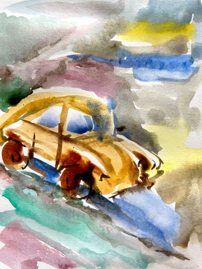
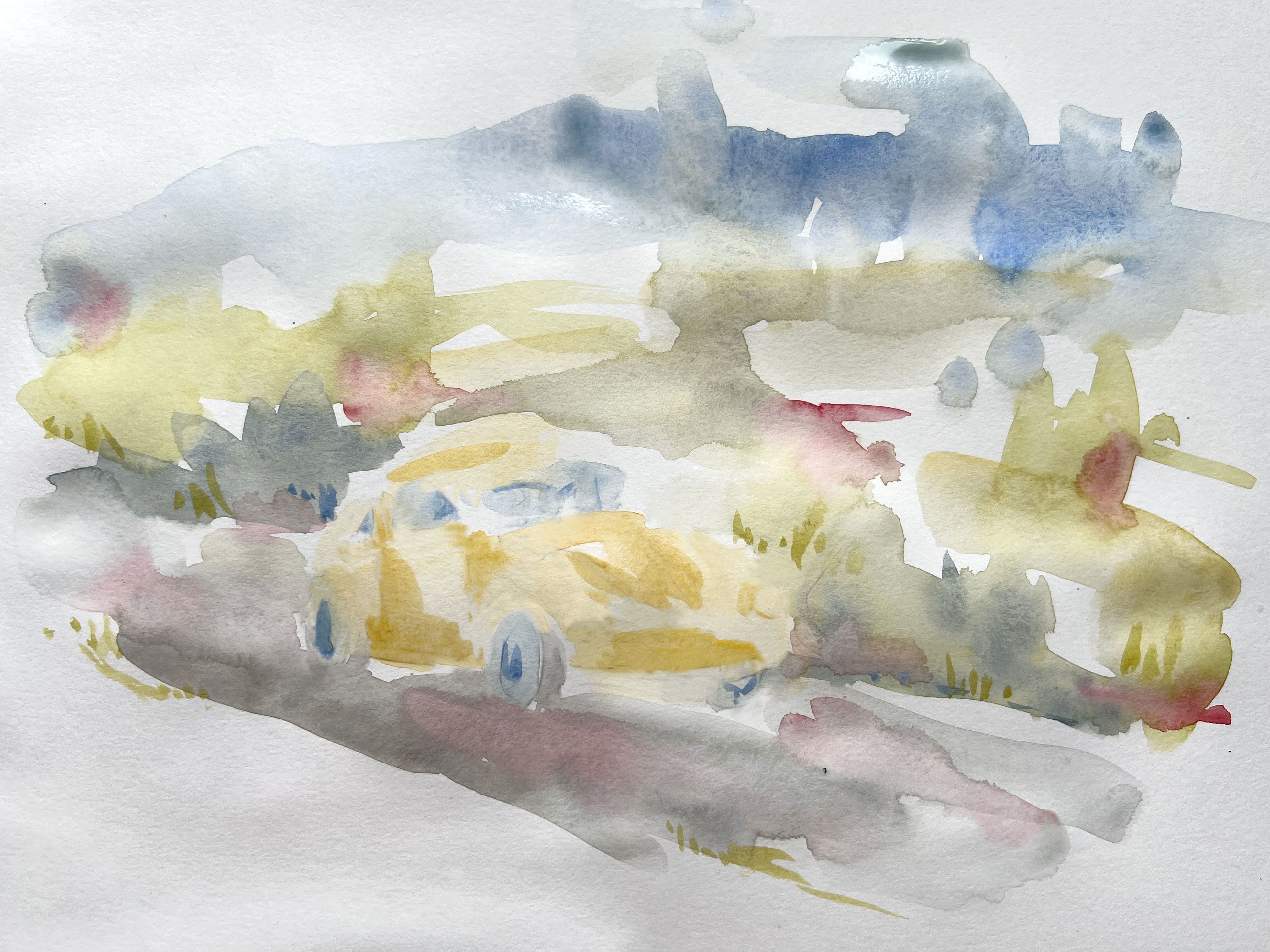
In addition, I created another image in the style of Emma Larson the image ‘Getting There’ from Part 3.
For this image, I tried to create another vibrant illustration using abstract vision. I tried to work quickly with this painting and capture the fluidity and movement of both the car and the surrounding environment. Like Emma Larson I used the wet-on-wet technique, where moist layers of paint are applied onto wet paper, allowing the colours to blend and bleed into one another.
Overall, the watercolour technique used in this painting creates a dreamy and impressionistic portrayal of the car on the road, emphasising the delicate interplay of colour, light, and movement.

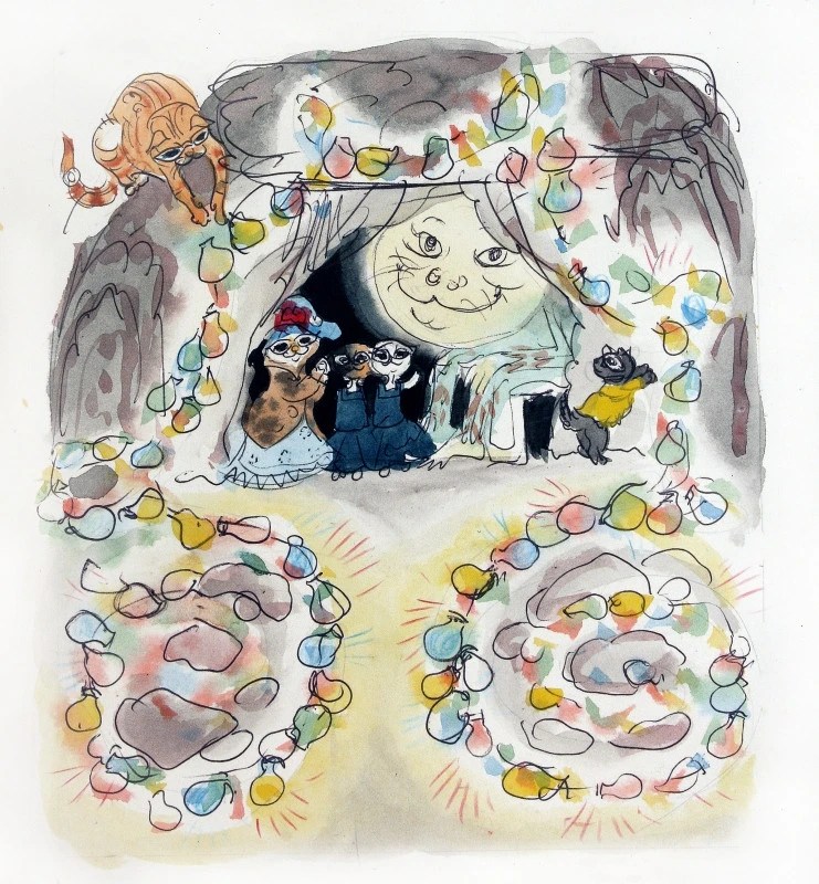
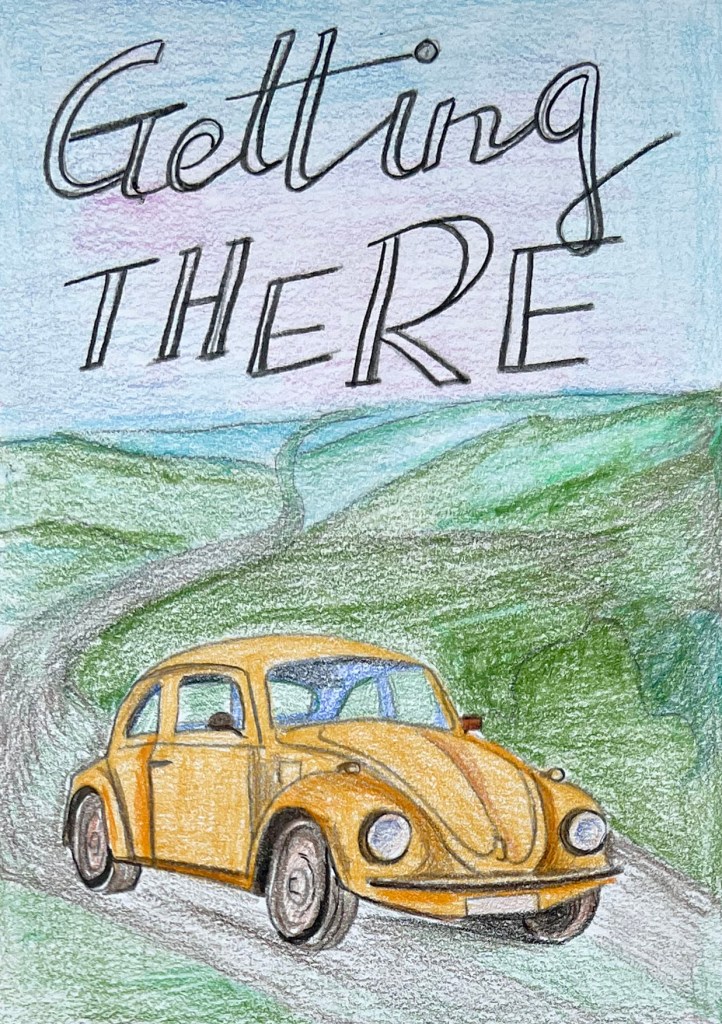
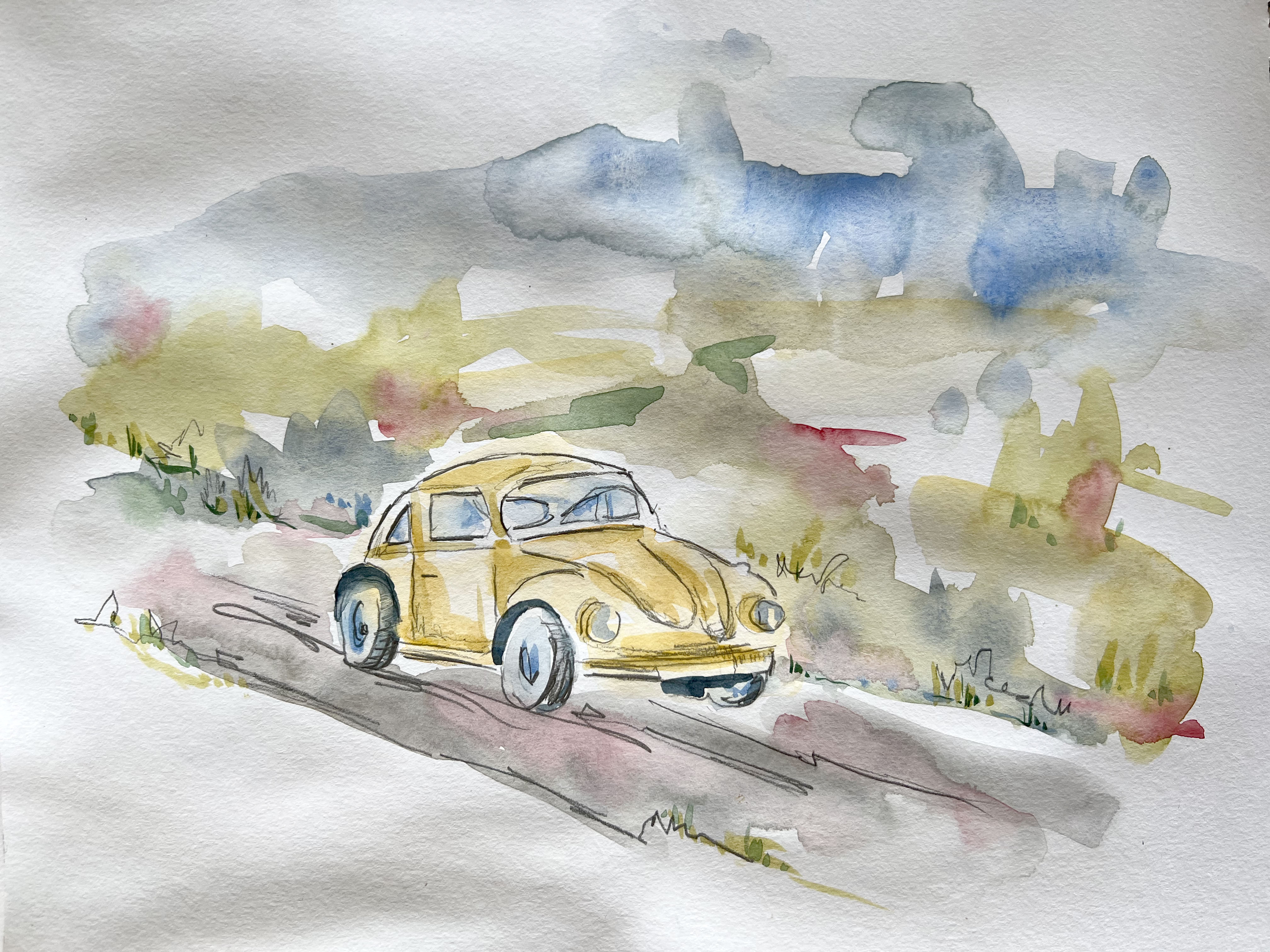
Because the exercise required repeating the experiment using a different piece of art as inspiration, I chose Kathleen Hale ‘The Bulbs Glowed with the Colours of Roses, Bluebells, Daffodils and Green Leaves‘ made in watercolour and pencil or black pen sketches on the top. Kathleen Hale was an English artist and writer known for her distinct and charming watercolour illustrations. Her painting style was characterised by soft colours, delicate brushwork, and attention to detail. For the image to adjust I selected the poster ‘Getting There’ from Part 3 made with watercoloured pencils.
https://www.chrisbeetles.com/artist/398/kathleen-hale-obe Accessed: 29/06/2023
How is the image composed?
This art has been composed manually, by using watercolours and pencils. The style of this art is eccentric and whimsical. The art that I’ve chosen to analyse is made by using gentle shades of watercolour with some quick sketches of the black pen. The image has warmth, and kindness in it, perfect for kids’ illustration, also the mood of the art is playful and holds some classical features of using watercolour techniques.
How are colour, tone, and texture used to evoke a mood or convey an idea?
The tones of this painting are transparent and smooth, and the colour palette is natural and consists of classical colours we will see in traditional watercoloured books, like gentle yellow, blue and grey tones. Hale had a fondness for portraying animals in her illustrations, and a cat would fit well within her repertoire. The cat would likely be depicted with delicate brush strokes, showcasing its fur texture and playful expression. In contrast, artists use dark shades to create deepness in the art. The cave might have natural-looking textures and shading to create depth and evoke a mysterious atmosphere. The mood of the painting is joyful and frisky.
Has the illustrator distorted the content within the imagery and how does this work for the purpose the image fulfils?
I would say that the main purpose of those illustrations is to bring an imaginative world, that is easy to understand for the younger auditory, like kids’ cartoons, or children’s books. Overall, Kathleen Hale’s painting style would bring a combination of elegance, imagination, and attention to detail to the watercolour drawing of a cat in a cave with Christmas lights. Through her expert watercolour techniques, she would bring this enchanting scene to life, captivating viewers with its beauty and charm.
To begin with, I sketched this painting in watercolour, without using a pencil. I marked the sky, the landscape around Volkswagen Beetle. For the colour palette I used similar shades as from the source of inspiration. Later I added a pencil sketch. I tried to create a contrast between the highlight and the shadow using navy blue and soft yellows. A watercolour painting in Kathleen Hale’s style is a vibrant and lively recreation compared to the original ‘Getting There’ illustration. I think those soft brushes of watercolour bring a sense of nostalgia, and quick sketching on the top creates whimsy, and perhaps a touch of unique flair.

References:
https://jeanhaines.com/pages/portraits
https://www.hugoandmarie.com/artists/emma-larsson/
http://www.joanneglover.com/
https://www.goldmarkart.com/blogs/discover/kathleen-hale-a-new-woman
