In this exercise I was asked to produce a line visual around one of these words:
Sea Extraordinary Building Journey
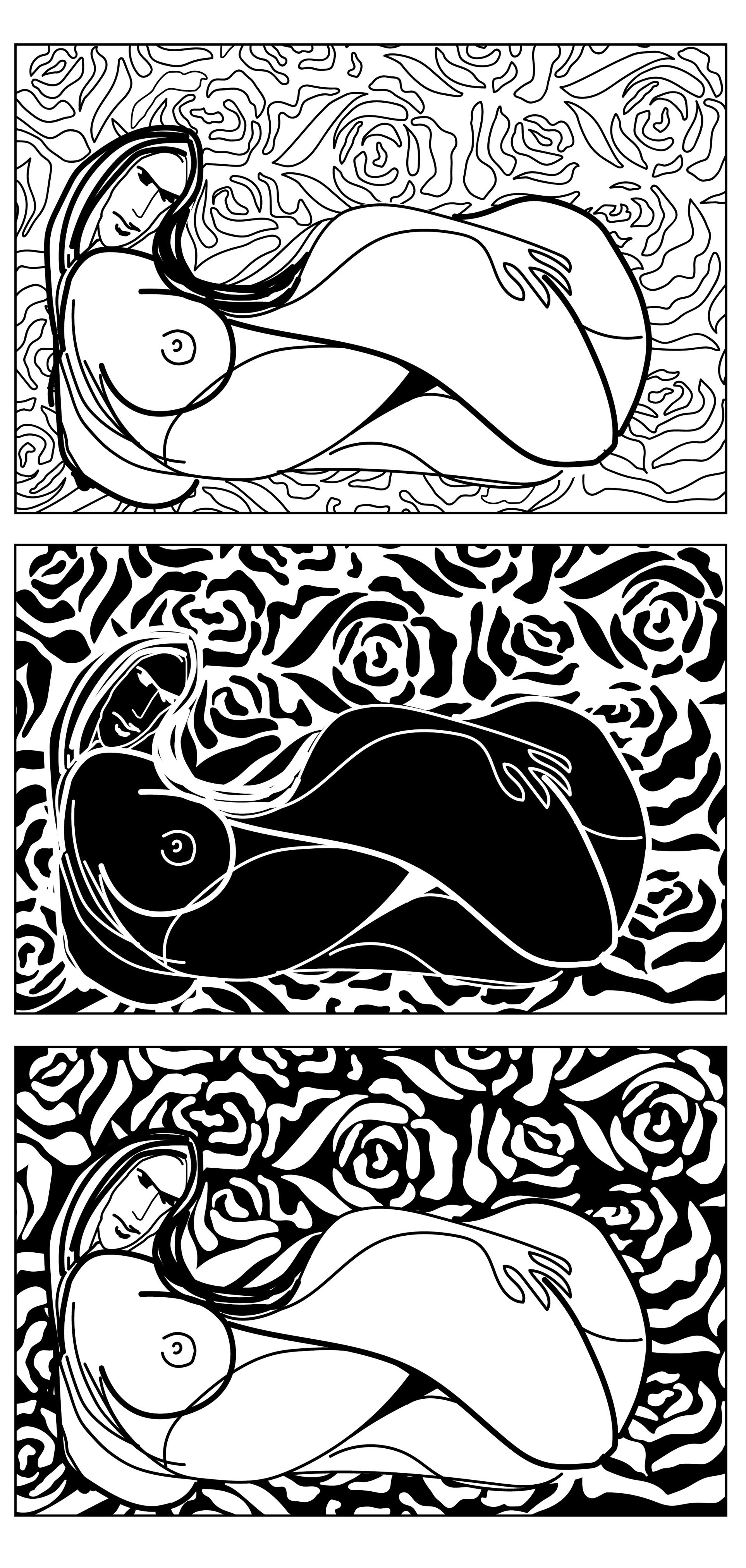
Also, the illustration should be very clear and give a clean edge. Using the invert function on the copier or computer I need to produce an additional copy where the line has been converted to white and the white of the paper has become black.
Keep standing back from the image to assess its readability – I should be aiming for visual legibility and need to avoid creating a disjointed piece. As well as physically standing back, visual distance can be achieved by looking at an image in a mirror, by scanning and looking at it on screen or by printing out a scale different from the original.
Research
From the introduction to this exercise, I’ve learnt that traditionally most illustration was commissioned in black and white due to the limitations of the printing processes. The illustration was ordered predominantly in newspapers and books. Digital technology made colour printing more accessible and possible. Black and white imagery became passé, associated with being old-fashioned and a poor person’s solution to a problem. In recent years, however, there has been a resurgence in the commissioning of black-and-white work, partly due to their uniqueness and hand-rendered imagery.
Understanding and using a black-and-white palette can help to focus on the actual structure and nucleus of a picture. If an image is successful in black and white or a tonal range from black to white, it can be easily translated into colour.
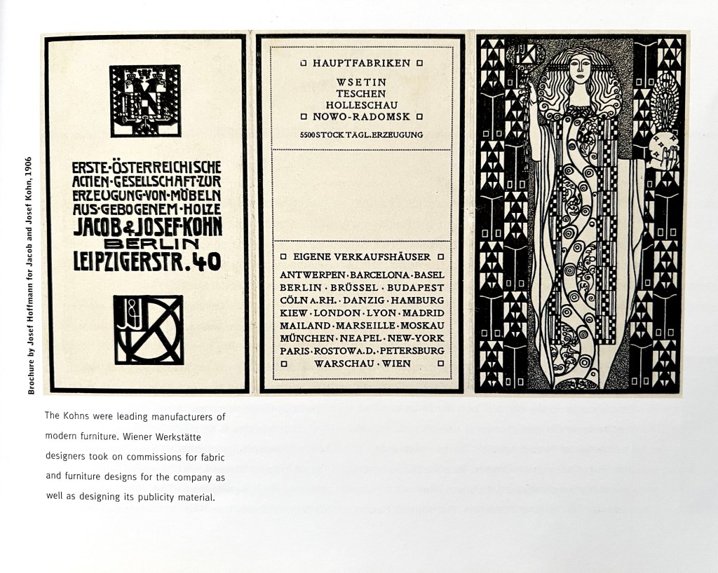
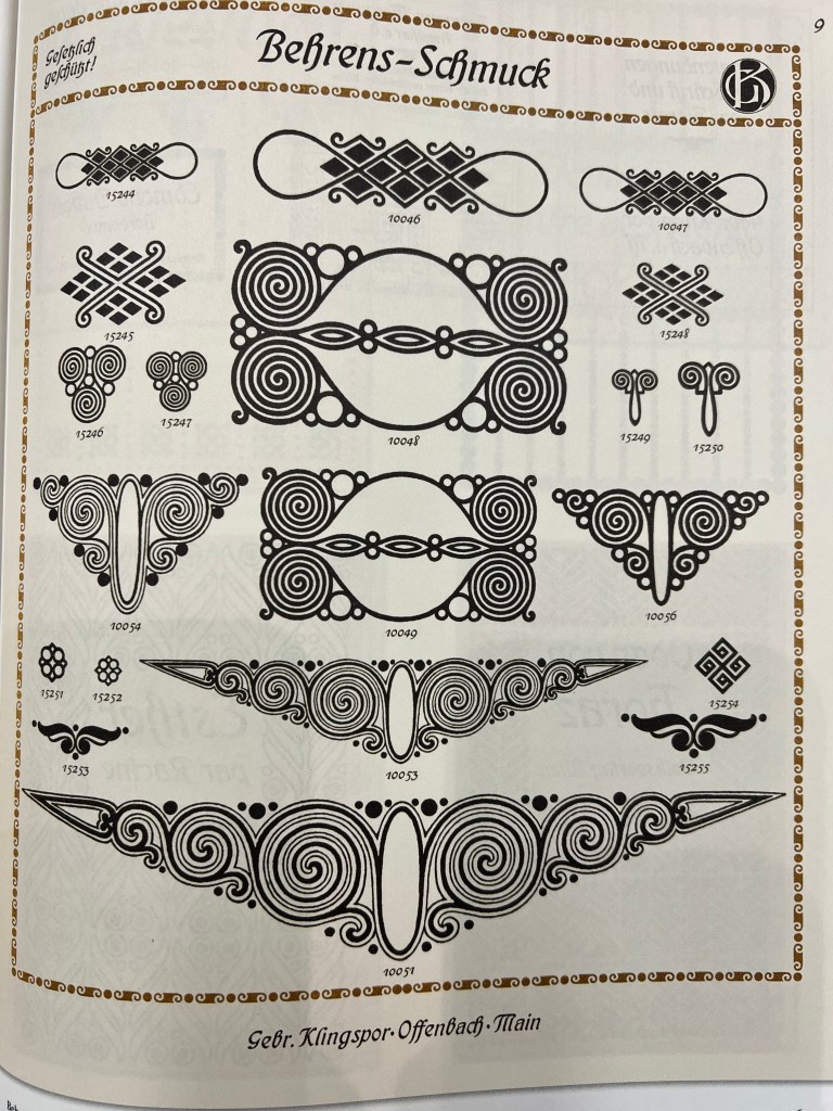
As my original background is in graphic design, I have a good collection of books from the Core Concepts unit. I tackled my Pioneers of Modern Graphic Design book, which has always been useful for general knowledge, as illustration and design were closely connected back day. I found out that art from the end of the XIX century beginning of XX was based on ornamental designs, with contrasting colours, like black and blue, white and black, etc., and the lines were sharp and accurate. An understanding of ornament was considered fundamental to all branches of design and the best way to reform the taste. That was the time of creating the connection between fine art and graphics.

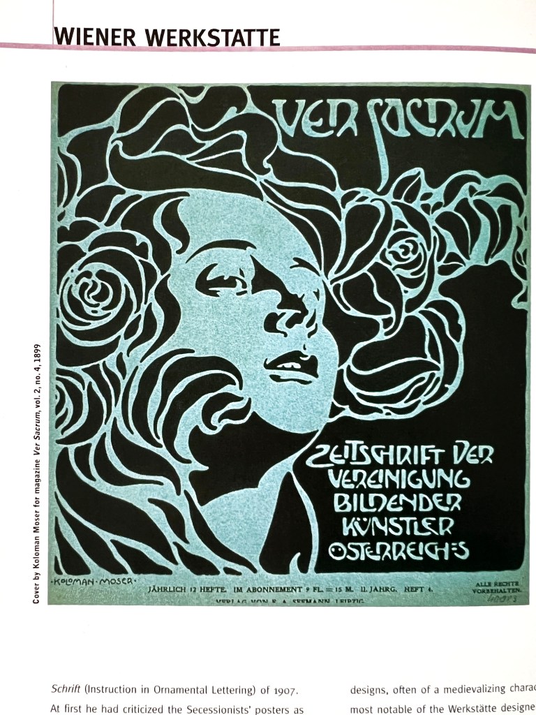
Koloman Moser
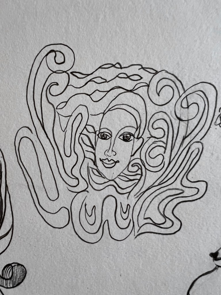
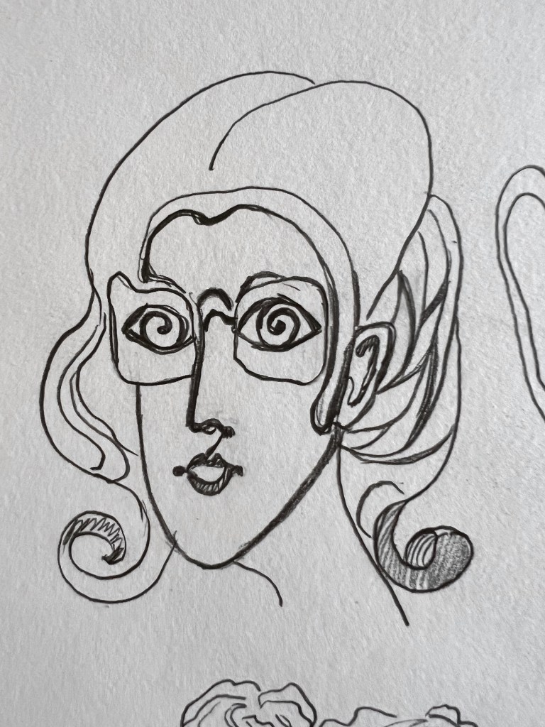
After some generic research, I wanted to explore in detail works of Koloman Moser, as his illustrations were based on abstract ornaments, sharp edges and minimalistic colours. Some of his designs look like they were cut and pasted from pieces of paper. That is a good inspiration for my direction.
Koloman Moser was a leading figure in the establishment of the Werkstätte, studying painting and design. Ver Sacrum (Sacred Spring) was the cultural magazine that promoted the Vienna Secession and the applied arts. A finely produced publication illustrated by members of the group, it specialised in poetry and aesthetic philosophy as well as promoting the new aesthetic way of life.
For my mood board, I collected some remarkable works of Koloman Moser and some extra images for the inspiration of line objects. From my research, I noticed that the artist admired woman’s beauty in his works, he developed various line designs around it, filling them with ornamental shapes and lines. That gave me the idea of creating an illustration from the word Extraordinary, embracing feminine beauty.
Some geometrical inspiration ideas from A Visual History of Typefaces and Graphic Styles book.

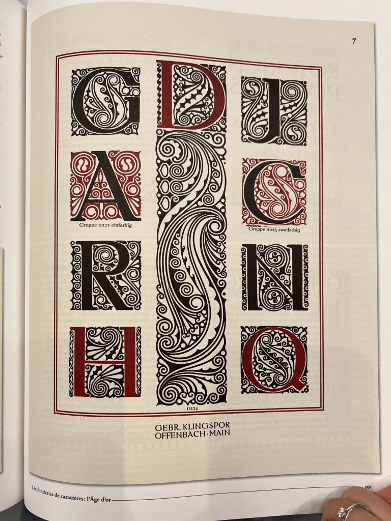
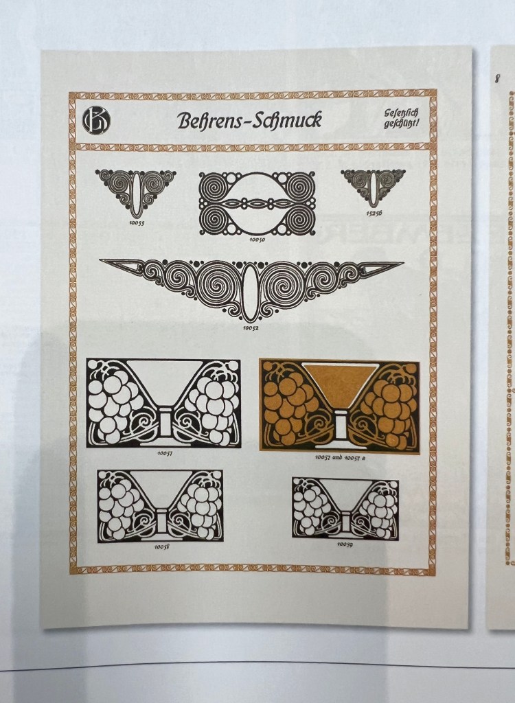
Book by Alston Purvis and Jan Tholenaar
Mind Map
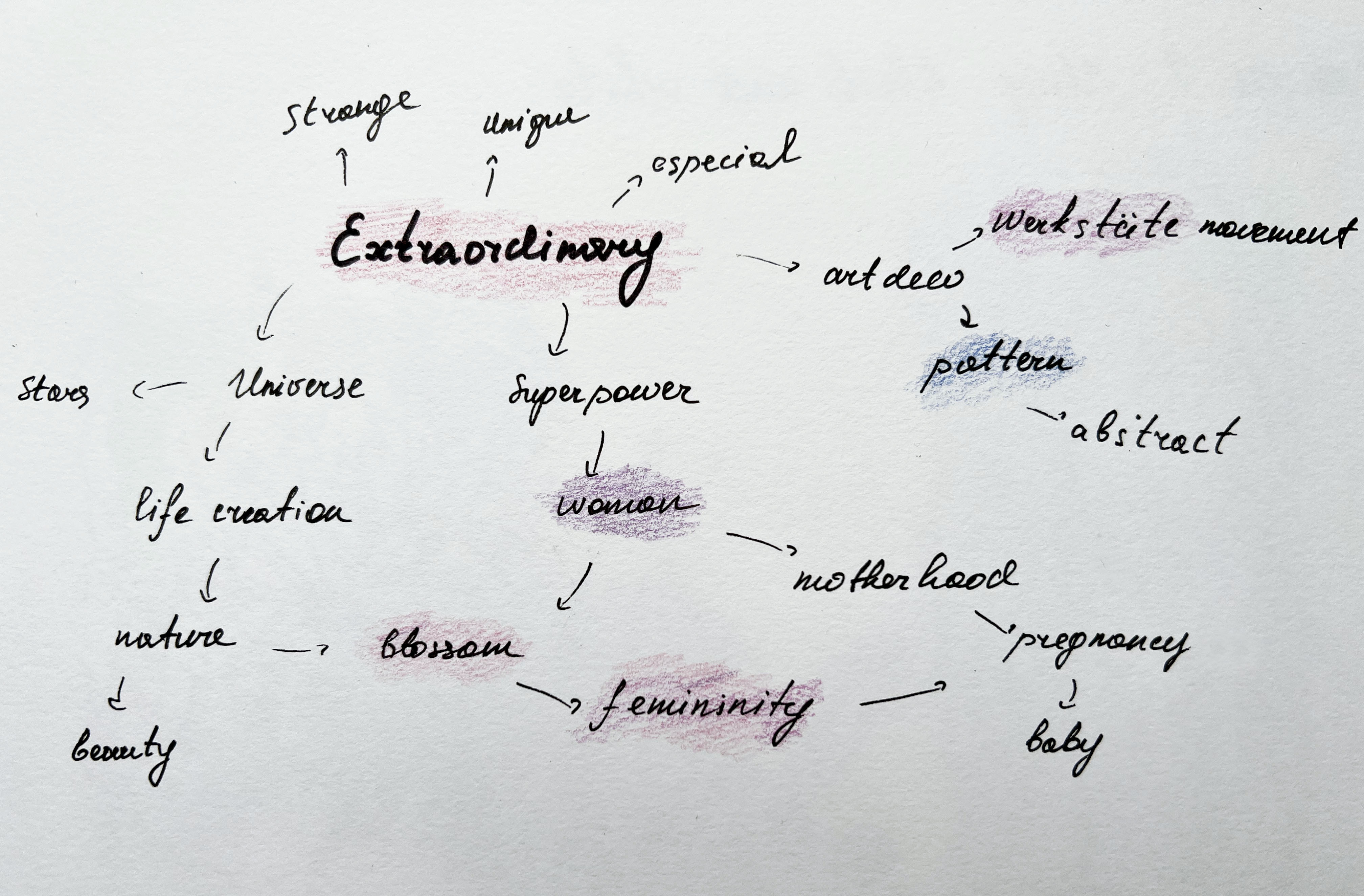
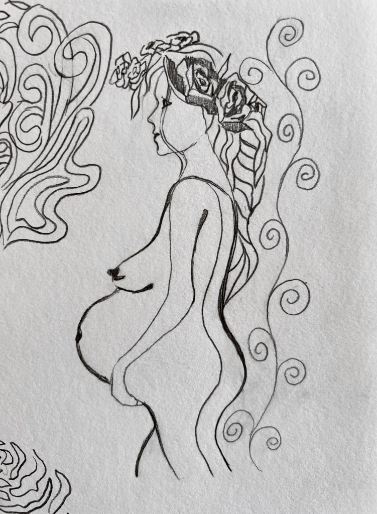
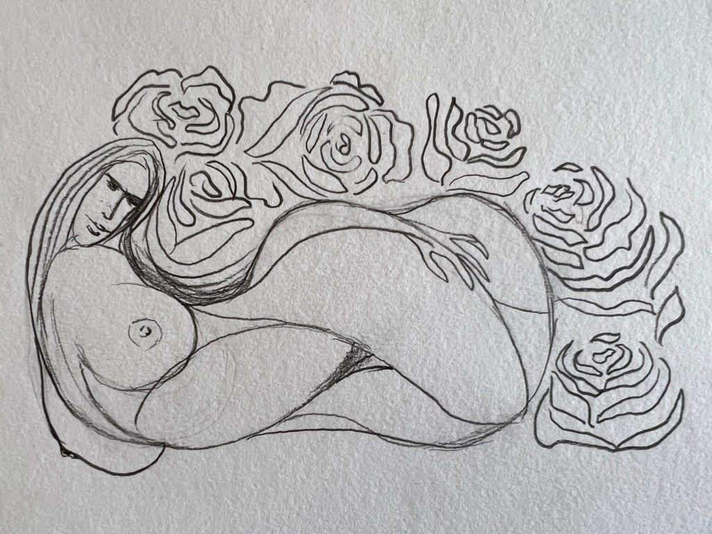
The next stage was to create a mind map around the word extraordinary. I thought with all my research I found a direction to work, but still needed to collect ideas into some kind of order. From that mind map can be seen that my ideas evolved around such words as woman, blossom, femininity, art deco pattern, and abstract. Also, I was thinking about the illustration of a pregnant woman, life creation, and the Universe. Those words that I highlighted helped me to determine the direction of the visual.
Sketches
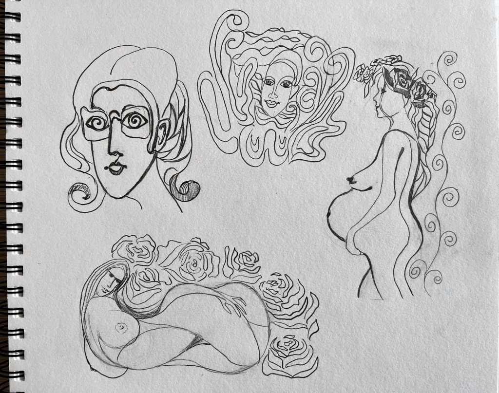
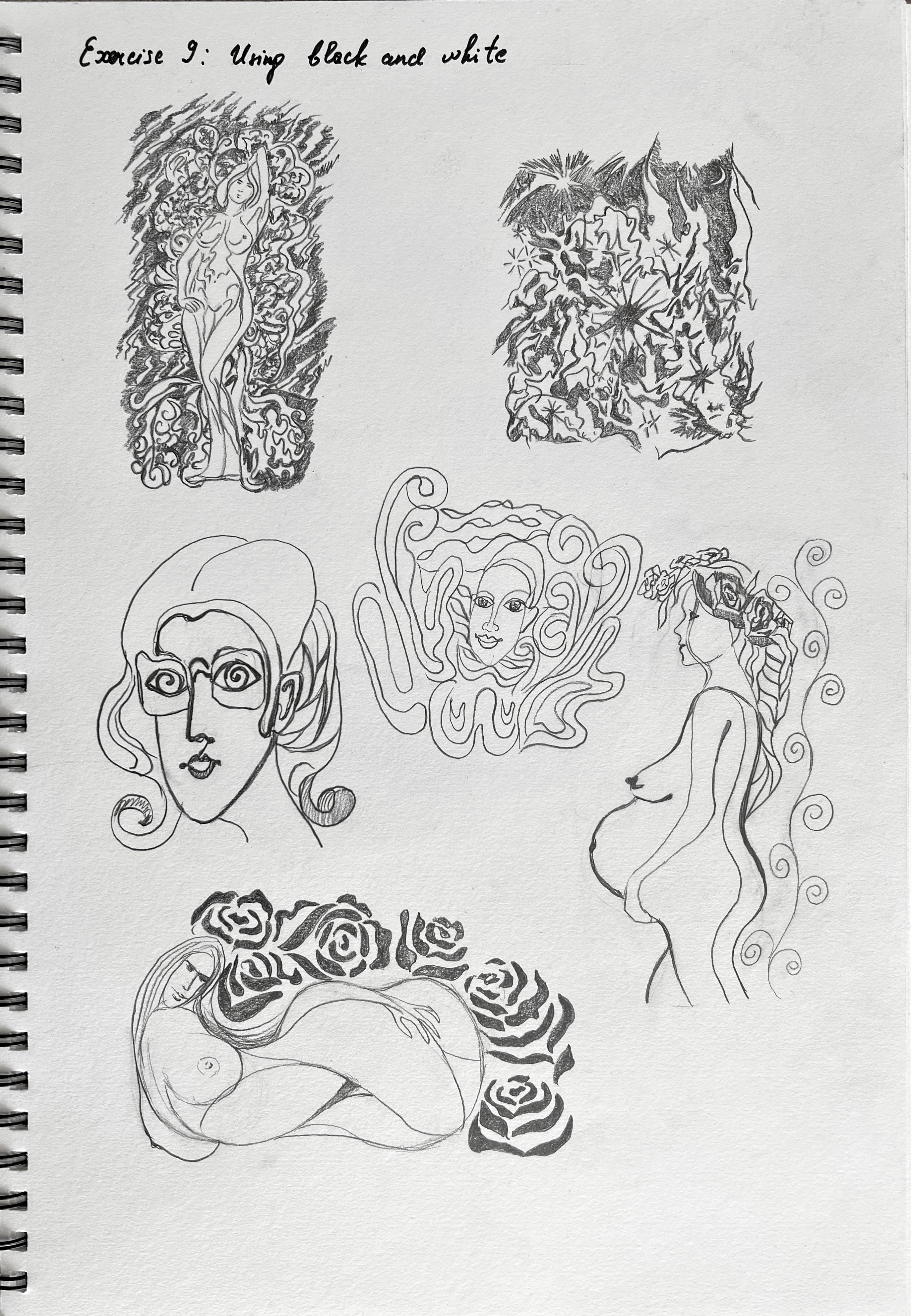
Illustration
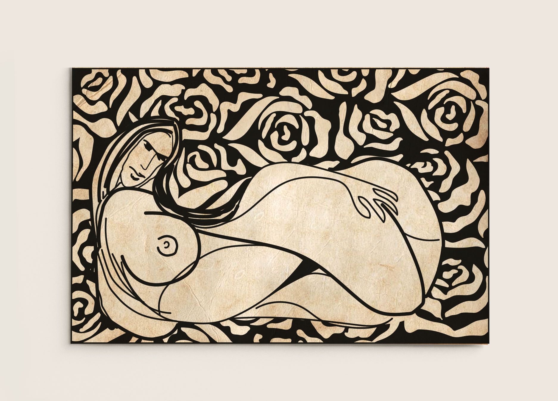
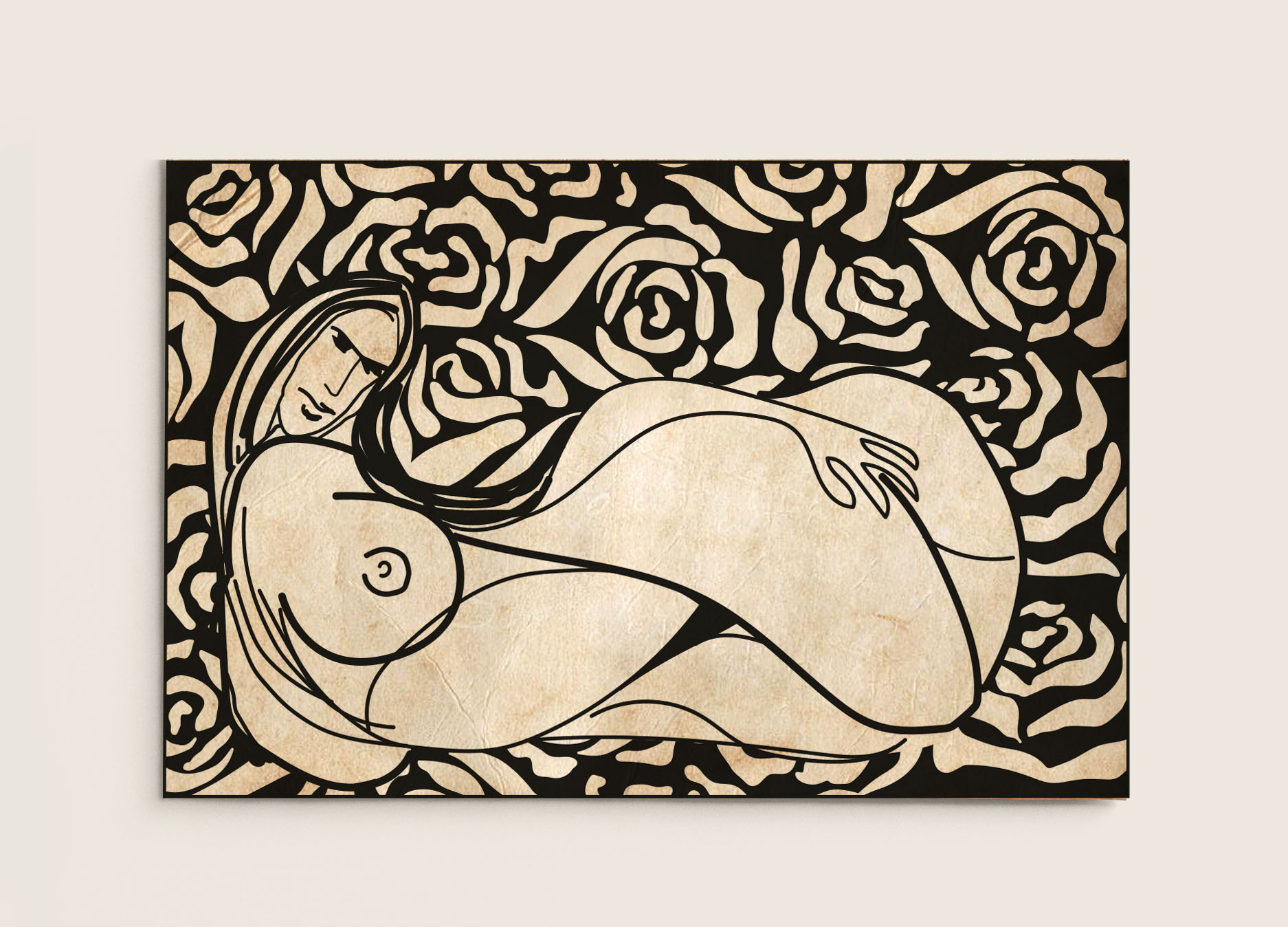
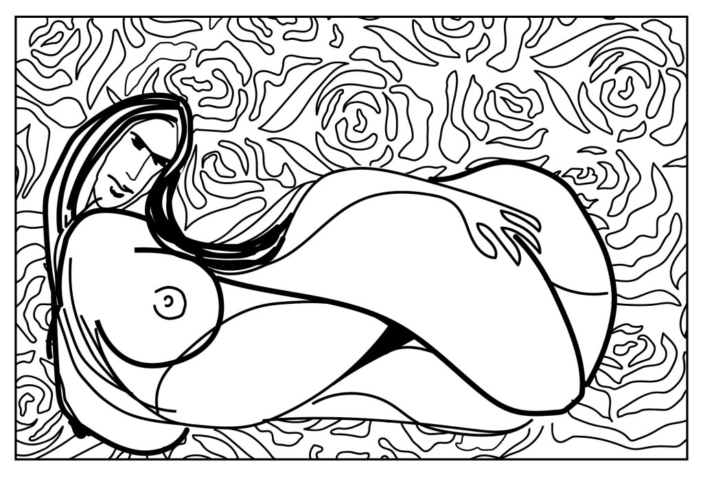
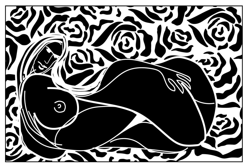
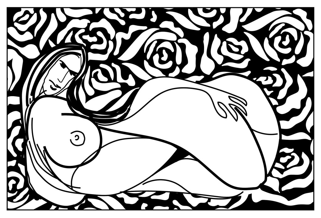
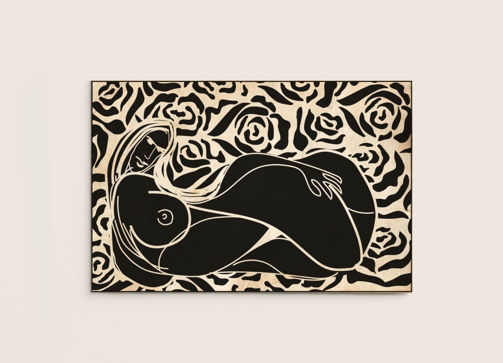
I tried a few sketches, as my direction of design was to create something unique and extraordinary, I’ve chosen the beautiful curvy shaped woman, inspired by the Art Nouveau masters, which also embraces natural forms such as the sinuous curves of plants and flowers. I scanned the sketch into the Adobe Illustrator program, and with some Pen and Brush tools created a vector copy of my illustration. It took me a bit of time to repeat all shapes and curves. Also, I filled the whole space with a flowery pattern, so it creates a joined piece altogether. Below can be seen my experimentation with inverted colours, where the line has been converted to white and the white of the paper has become black. The mood of the illustration changes with those manipulations. A woman in black colour and white outline looks like a negative image, where black background and white colours for the pattern and the woman looks more natural.
Mockups
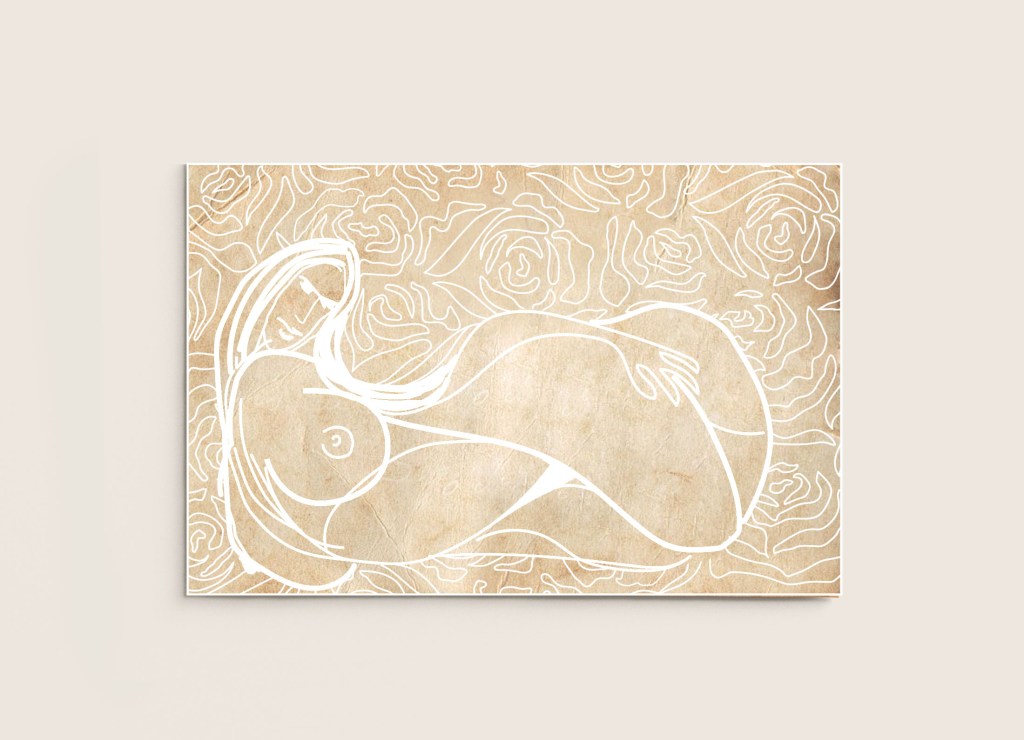
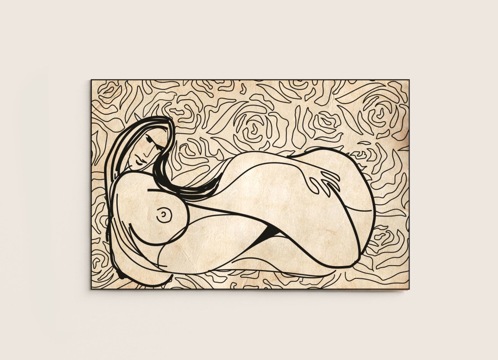
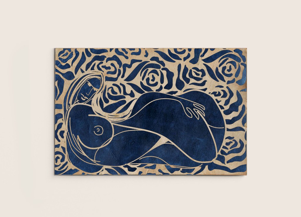
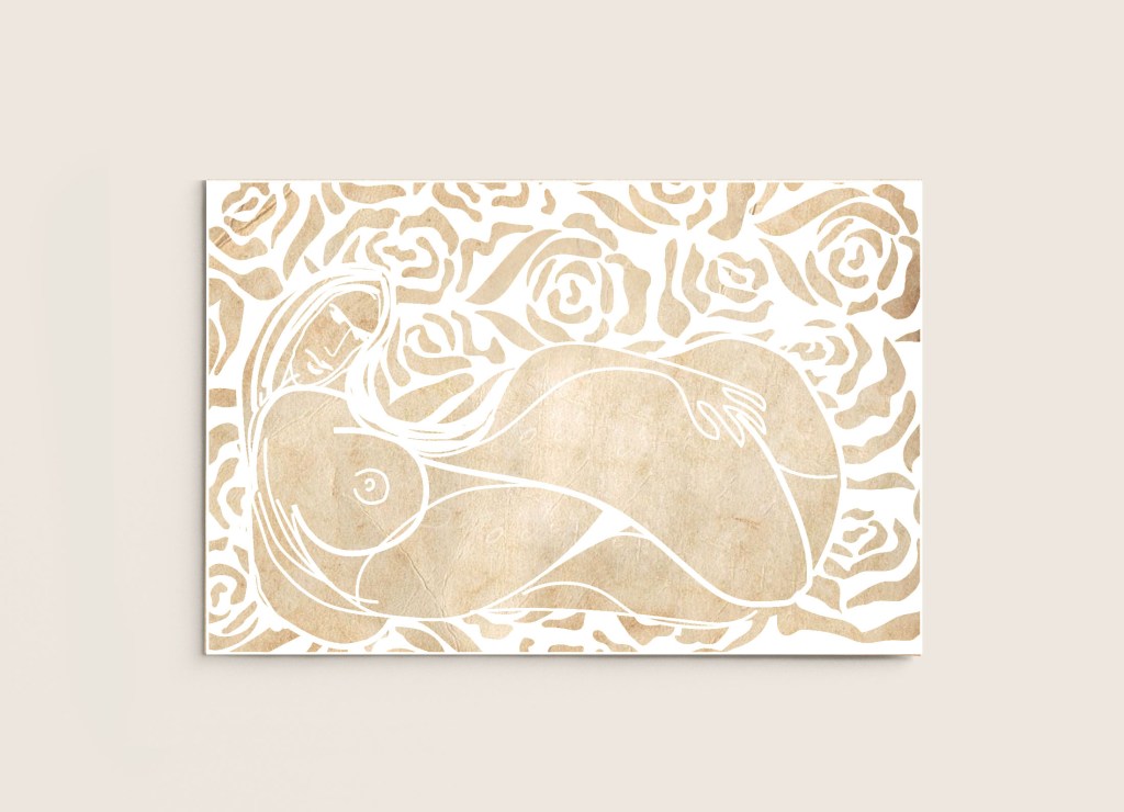
In order to choose the final piece, I wanted to test those illustrations on the vintage paper background, I wanted to bring that retro look to the artwork, which was achieved by using creamy colour, instead of bright white. From the line drawing, I can see that the main focus moved from the woman to the composition as a whole. She is still the centre of attention, but it’s more difficult to see her when there is no confident background on the back. I preferred a black pattern on the background and outlined image of the woman, as at least the composition has a background and foreground.
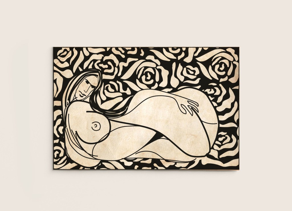
Chosen design
To start with, I was very nervous for this exercise, as it sounded a little confusing to me, but after reading it a couple of times, and breaking it into the stages, helped me to find right direction. I’m glad with the word I have chosen, and the style I applied in my design. That was very good experience for me, and I think the result worthed the efforts.