

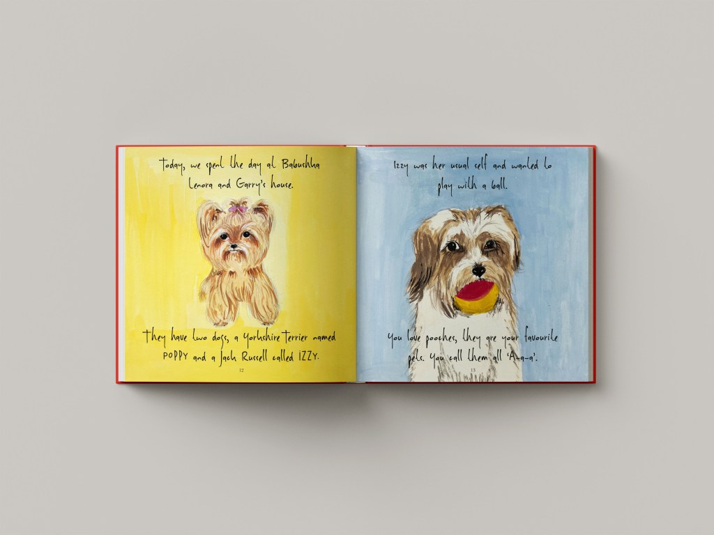
With this final assignment, I have a wonderful opportunity to showcase my strengths as the narrator, editor, and illustrator. When I asked my family which seven days of my life I could design, everyone agreed that it should be seven days of the life of us as parents. As a mother to a one-year-old toddler, my world revolves around my child. I thought that I could show my strengths through illustrations capturing memorable moments with Felicity. Our weekdays follow a routine, while weekends are reserved for family time.
This project offers a chance to create drawings of my daughter, possibly tailored for magazine illustration, brochure or picture book. I wasn’t quite sure what it could potentially be, so I went to do some research for inspiration.
I wanted to create something unique here. So, I looked through my book of artists and their artworks Type Tells Tales by Steven Heller and Gail Anderson. I stumbled on Maira Kalman‘s section with her illustrations for the book Max Makes a Million. I loved the whimsical style of that illustration, bold colours, the narrative within it, and the original way the text was placed. I went to do more research on this artist and found out that she made some other great illustrations for the books What Pete Ate (from A —Z), Fireboat The Heroic Adventures of the John J. Harvey, Darling Baby, etc.
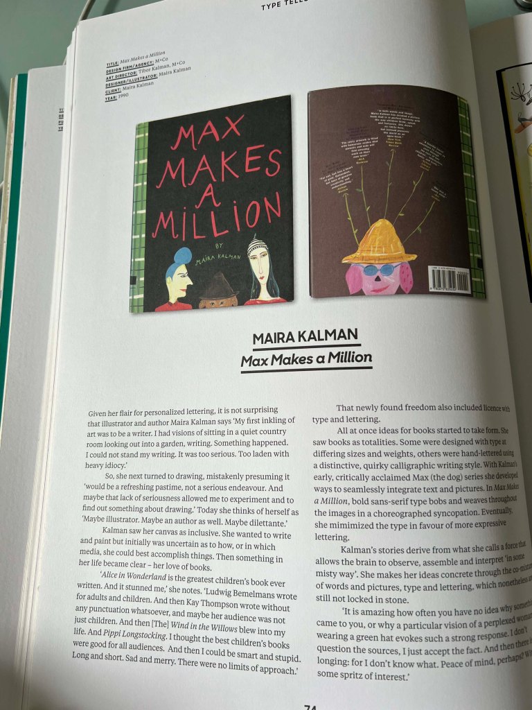
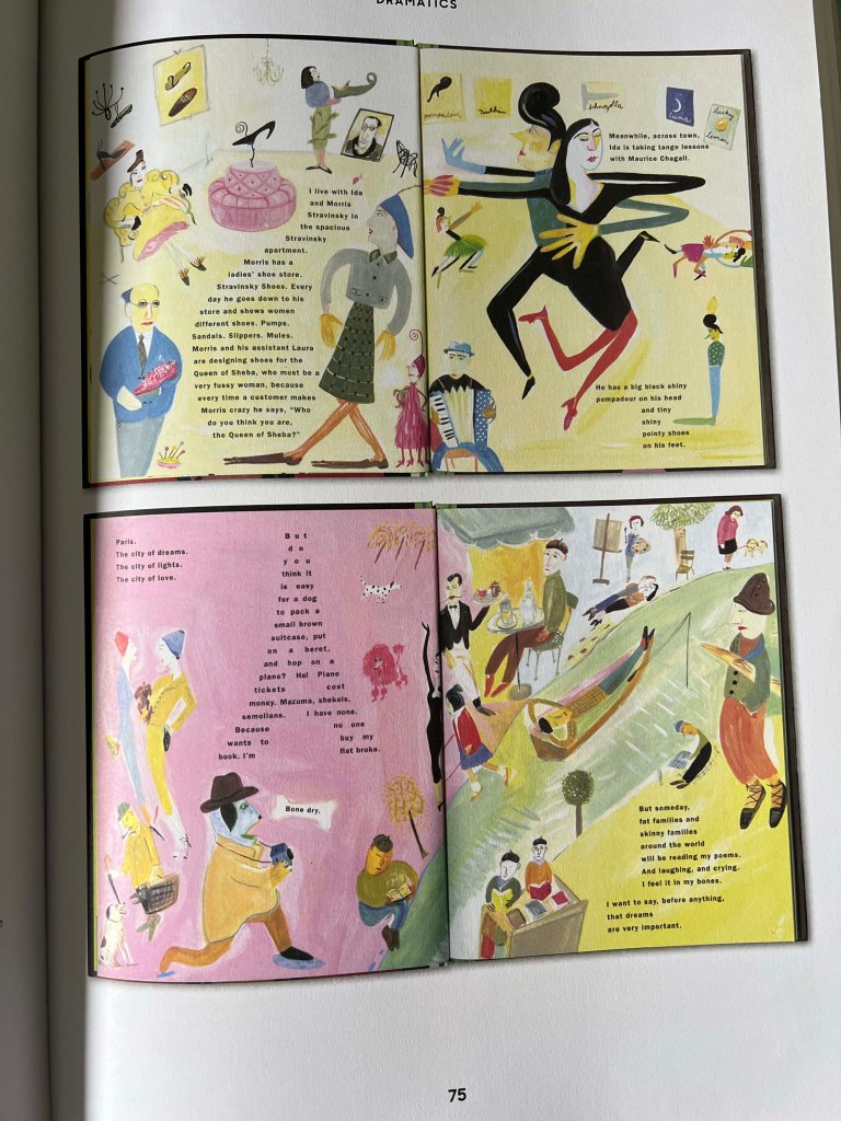
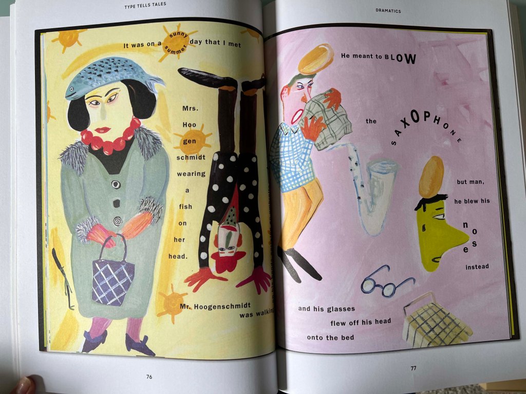
Maira presents quirky characters within surreal settings. Her illustrations are filled with a sense of charm and nostalgia. I loved Kalman’s unique approach to composition and storytelling. Her illustrations and visual language captured the imagination of audiences of all ages.
One book particularly caught my attention, the Darling Baby based on a journal Maira kept when her granddaughter was new. What a great idea to depict important moments with your baby, with the narrative from the parents’ words. I adore Maira Kalman‘s wonderfully quirky gouache and ink illustrations and the way she created the narrative.
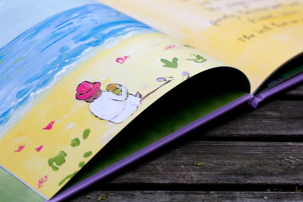

https://www.themarginalian.org/2021/06/22/maira-kalman-darling-baby/
The inspiration from that book motivated me to include my previous experiences designing illustrations for children’s books and creating editorial illustrations for magazines in this final assignment. I envisioned creating a book with seven spreads, with handwritten text to complement the visuals. I think it will be seven random days with Felicity to tell a story, but they will be recent events, in March-April 2024.
Whenever we go out, I love capturing moments through photos of our destinations, which I later print for our picture album. I have realised that some of these photos I could use for my drawings, infusing them with life and depicting that picturesque essence through painting.
Idea generation
Below, I created a mind map and brainstormed ideas on the direction I should take for this book. Since I planned to centre the story around springtime, most of the activities we did together were in parks, where we discovered the beauty of nature. Also, I was going to include some family time around the table, spending time with farm animals, and learning moments, such as reading books and practising first steps.
The audience for the book could be parents and their children. The book will be filled with colourful visuals and observational drawings done artistically. Also, thinking of the format of the book, I wanted it to be square size 21×21 cm with a hardcover. I’m planning to print it as well, depending on whether the printing company will allow me to do so with limited pages, as usually there is a certain requirement for the number of pages.

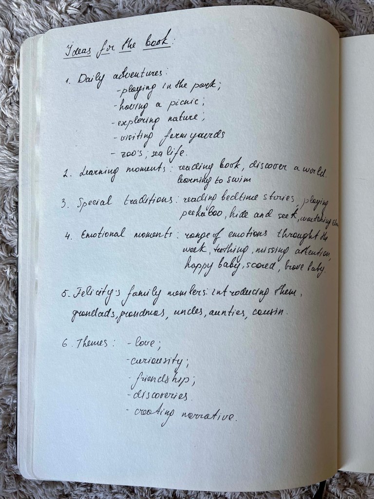
Sketchbook
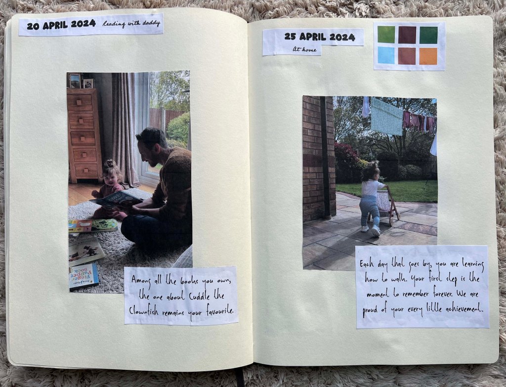
The next step was to collect events and make some sketches. I arranged them in order by date, thinking of the balance between outdoor and indoor activities with Felicity. I added some additional options, so I could choose between some events. I was going to include our ferry trip to Germany, but then I thought it doesn’t quite go with the rest of the content for the book, therefore I swapped it for the Easter time around the table with family.
I was thinking about the name for the book, I thought it would be something like Seven Days in Motherhood, Seven Days from the Life of a Mother, Seven Days in Seven Parks, or Seven Days of Joy, but then the name came to me naturally, Seven Days with Felicity, as it the best describes the content of the book and idea around it.
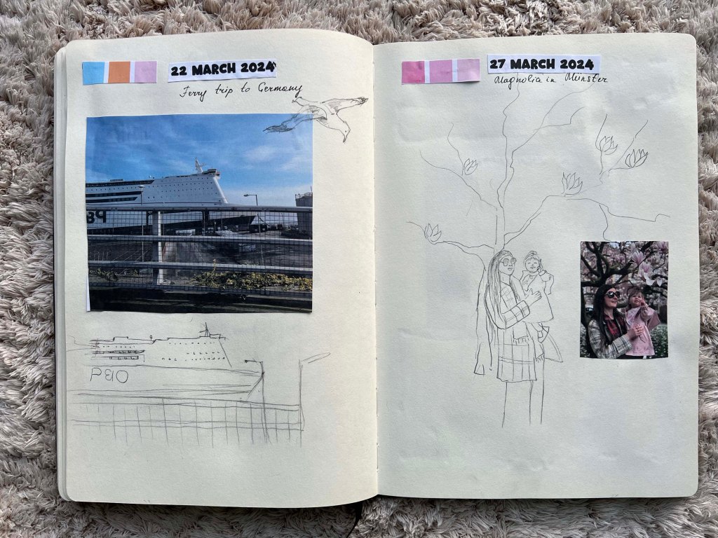
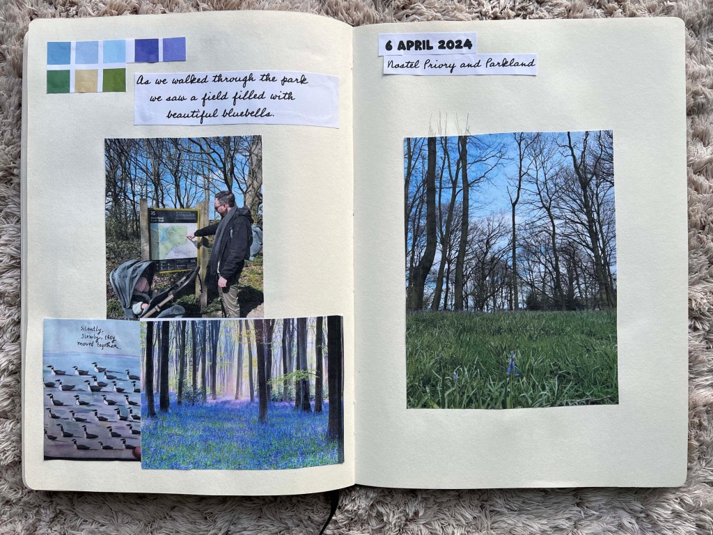


Thumbnails
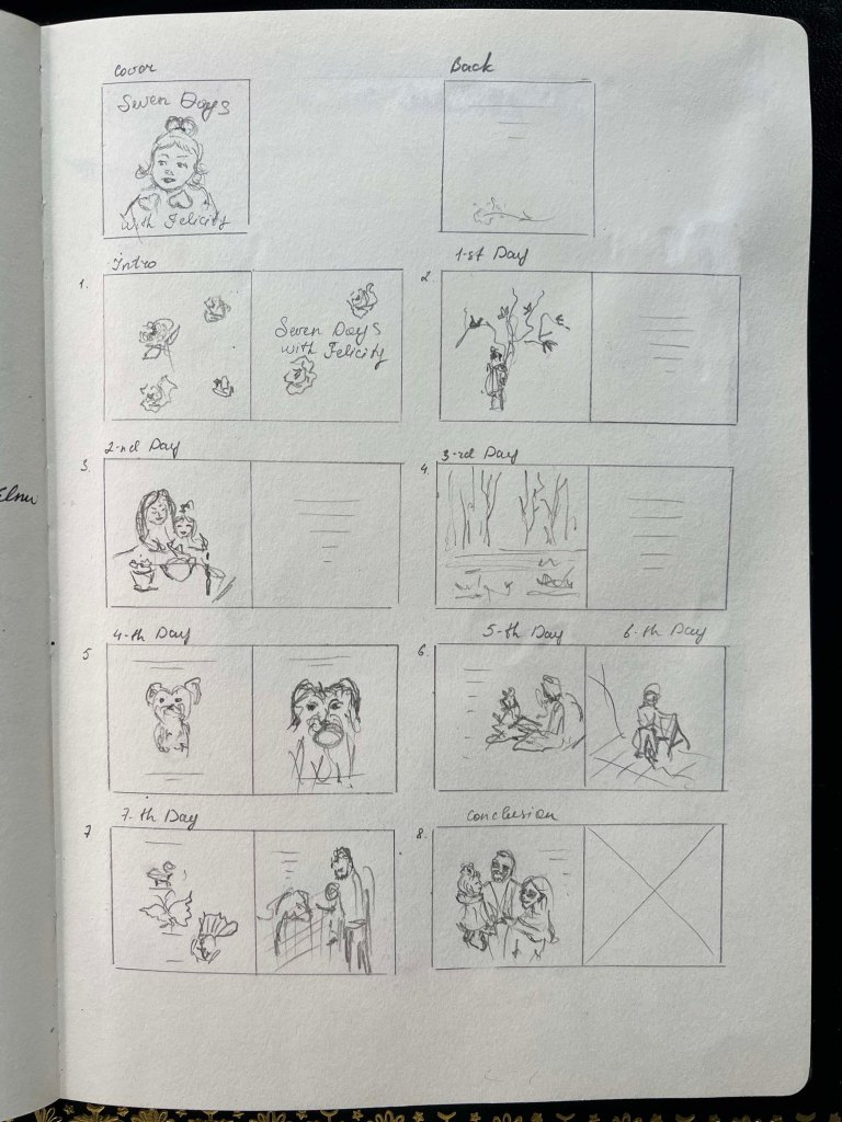
After gathering all the information for the book, I thought I needed to bring everything in order. The scheme for page arrangments helped me determine the best structure for the book. I started with a cover, and then I added a clean spread with the name of the book, thinking of placing the introductory word on the left side of the spread. Altogether, I had seven spreads and an additional page for the conclusion. Most of the pages will feature coloured visuals with a matching background palette for text on the right. Some pages will have text placed on the actual picture, creating a freestyle for the book, almost like a live journal meets the book.
I plan to use gouache for the paintings to achieve an opaque, impressionist feel. Looking at Maira’s works, she bravely makes illustrations caricatural, out of proportion, and cartoony. As the name of this final part is The Style, which I’ve been trying to establish throughout the course, I want to implement the style I used before, making bright, colourful, objective drawings.
Also, I challenged myself to add wording for each page, as I think the content is important too. The carefully chosen poetic language complements the visual and weaves a narrative. Transitioning from designer to illustrator and narrator, the visuals should be supported by stories, adding depth to the artistic expression.
In this book, I wanted to teach Felicity to look at this colour, this shape, and at the same time to remind all parents, to rediscover the world through your child’s eyes. Each page connects a young observer with the timeless wonders of nature.
Sketches
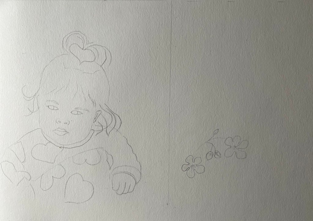
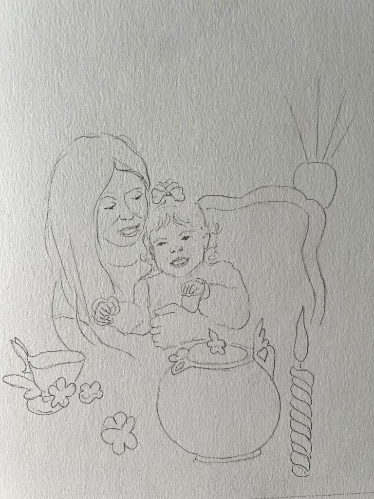
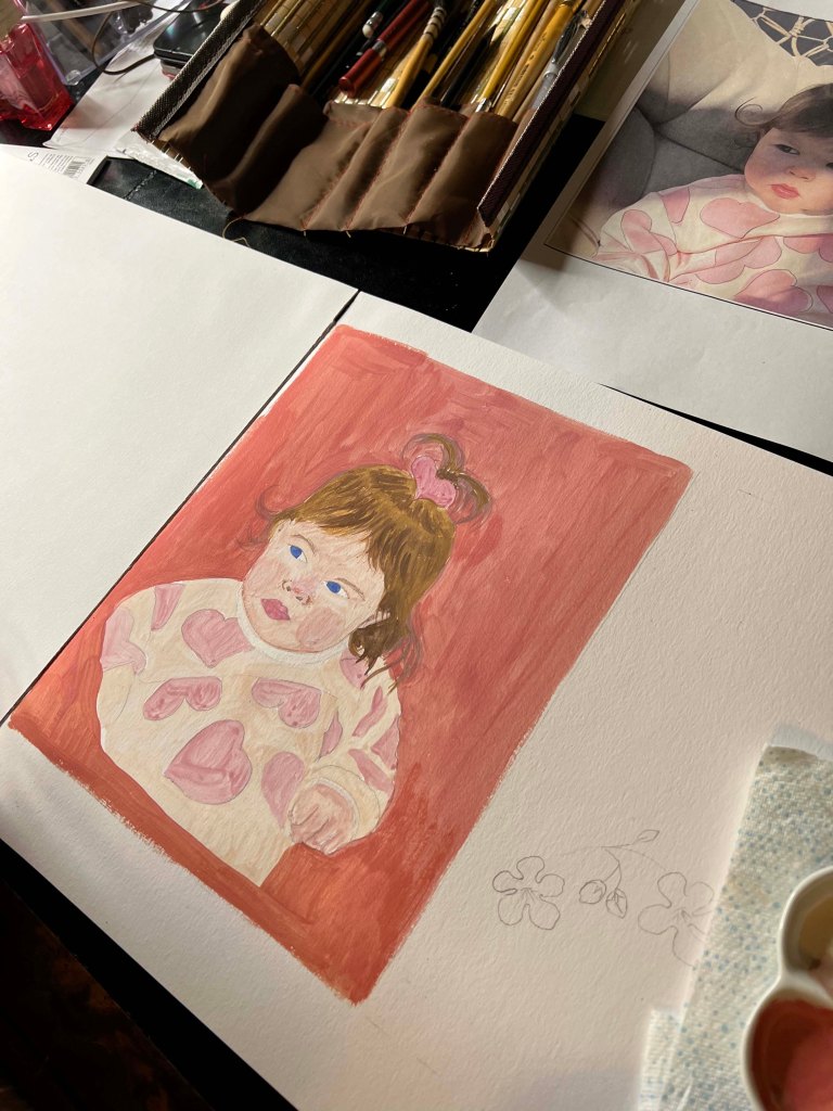
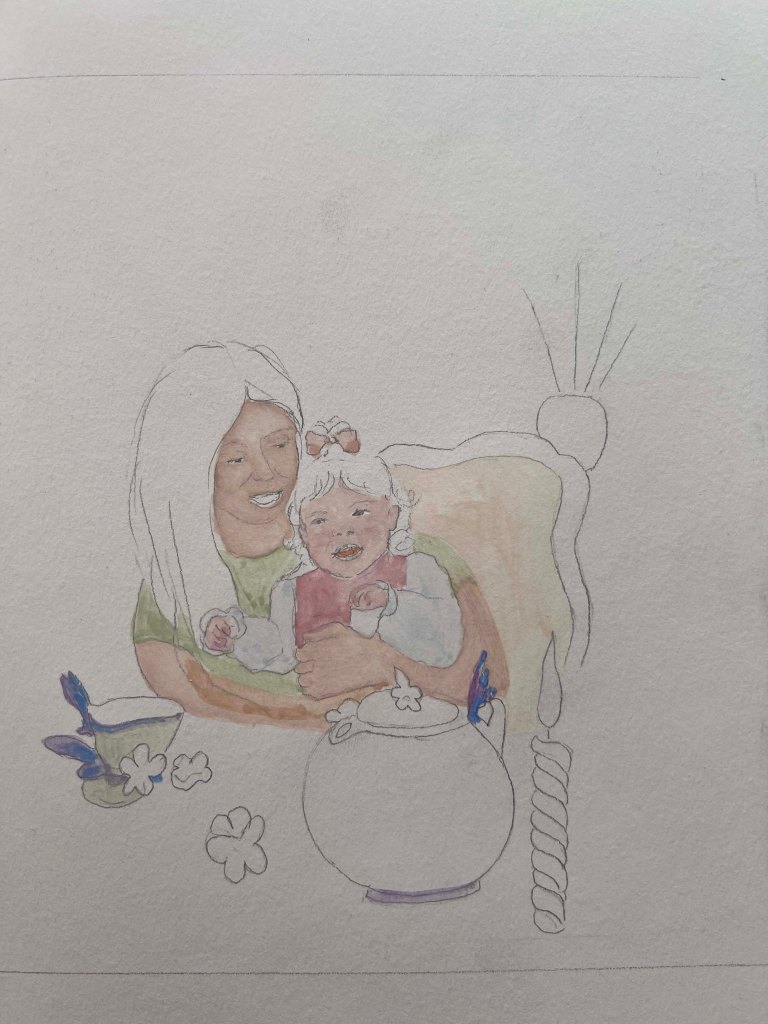
The next stage was to produce illustrations. I created a pencil sketch on watercoloured paper, matching the size to the book format, 21×21 cm. Also, I printed all photographs for illustrations in the actual size I would use for the book, which helped me to see the proportions.

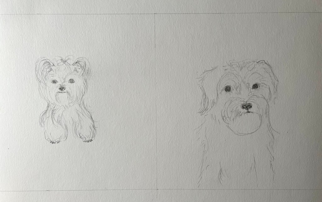
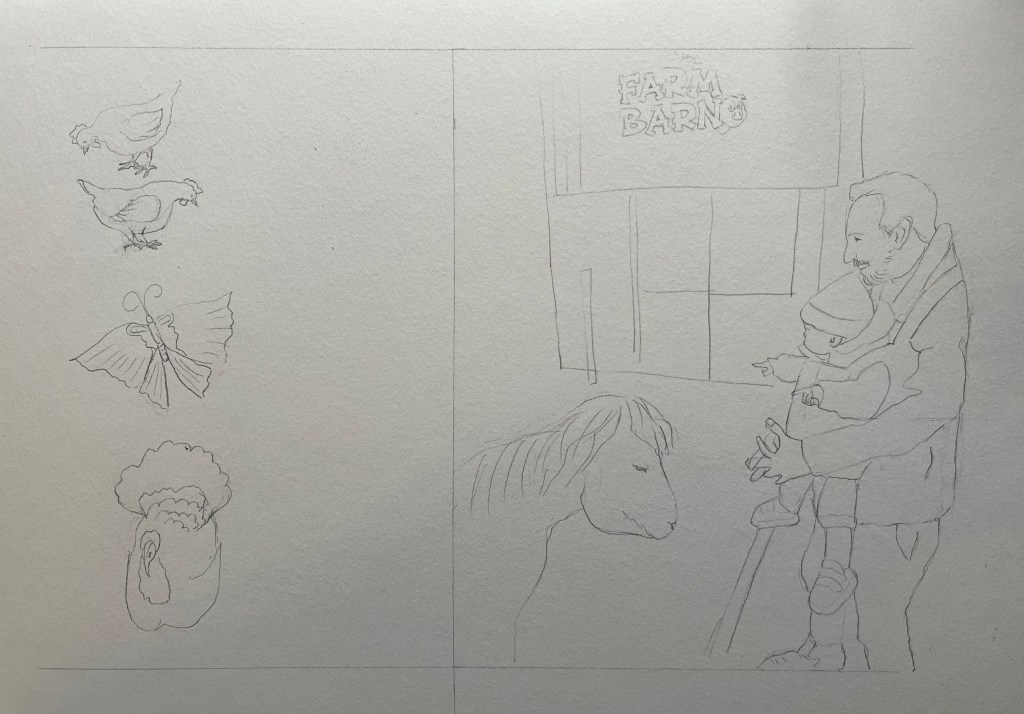
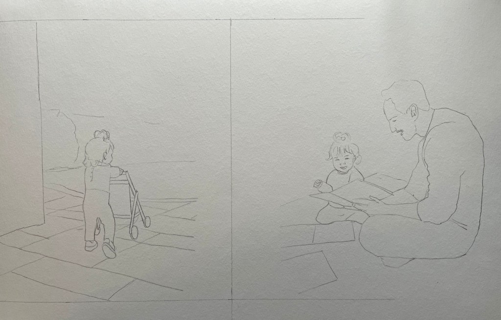
Coloured Visuals
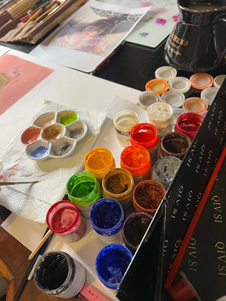
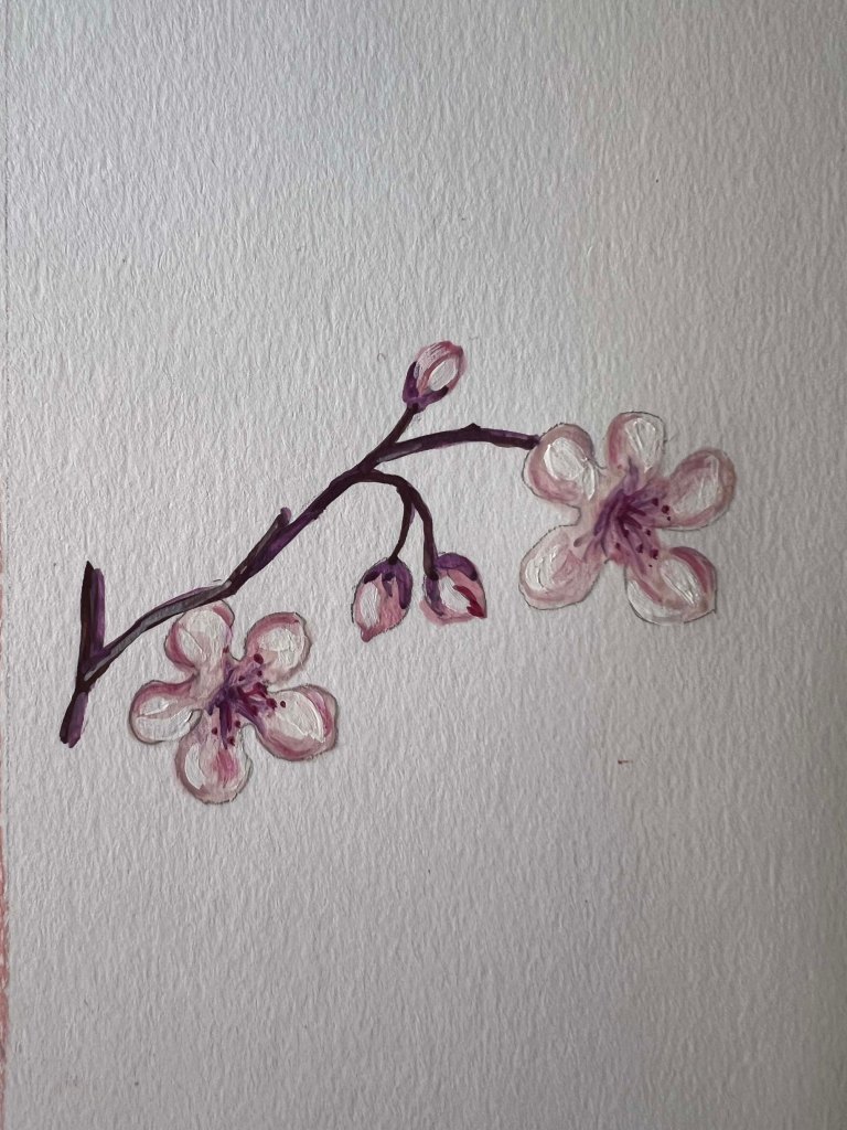
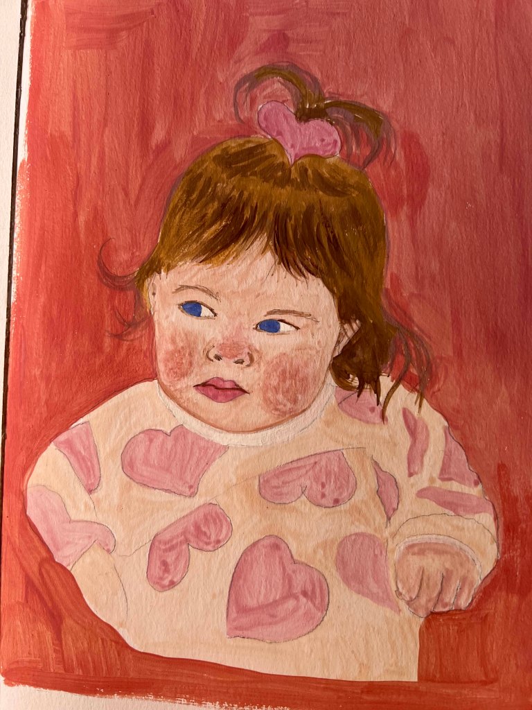
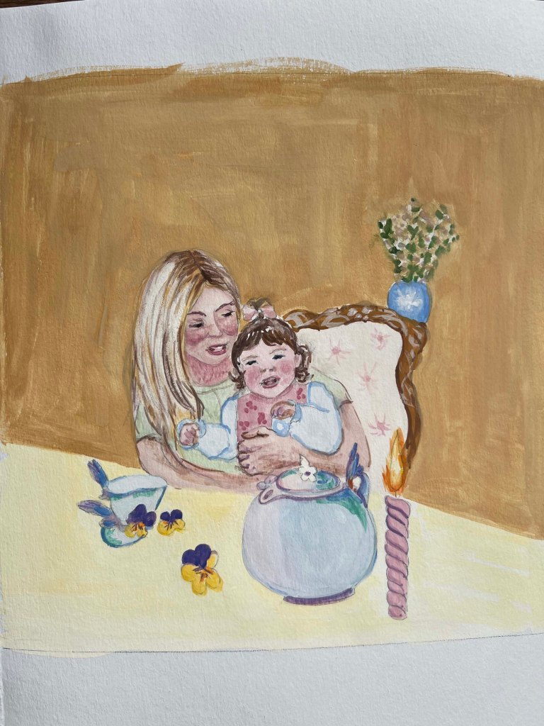
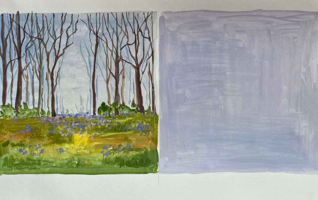
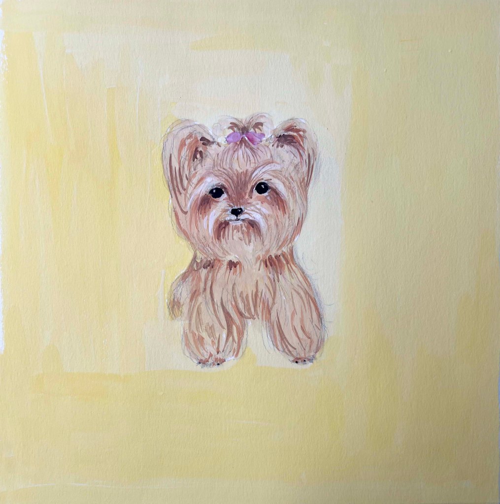
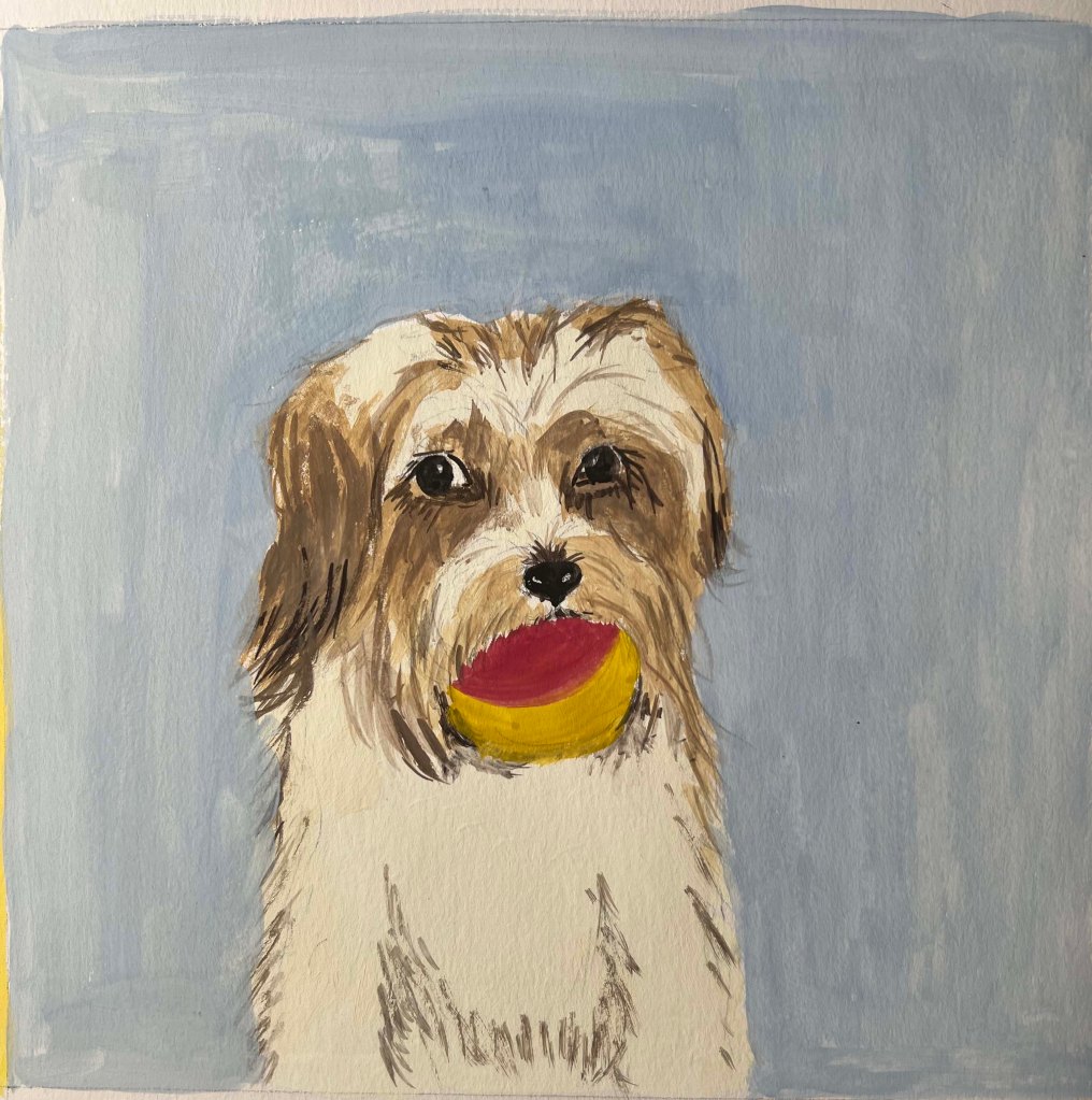
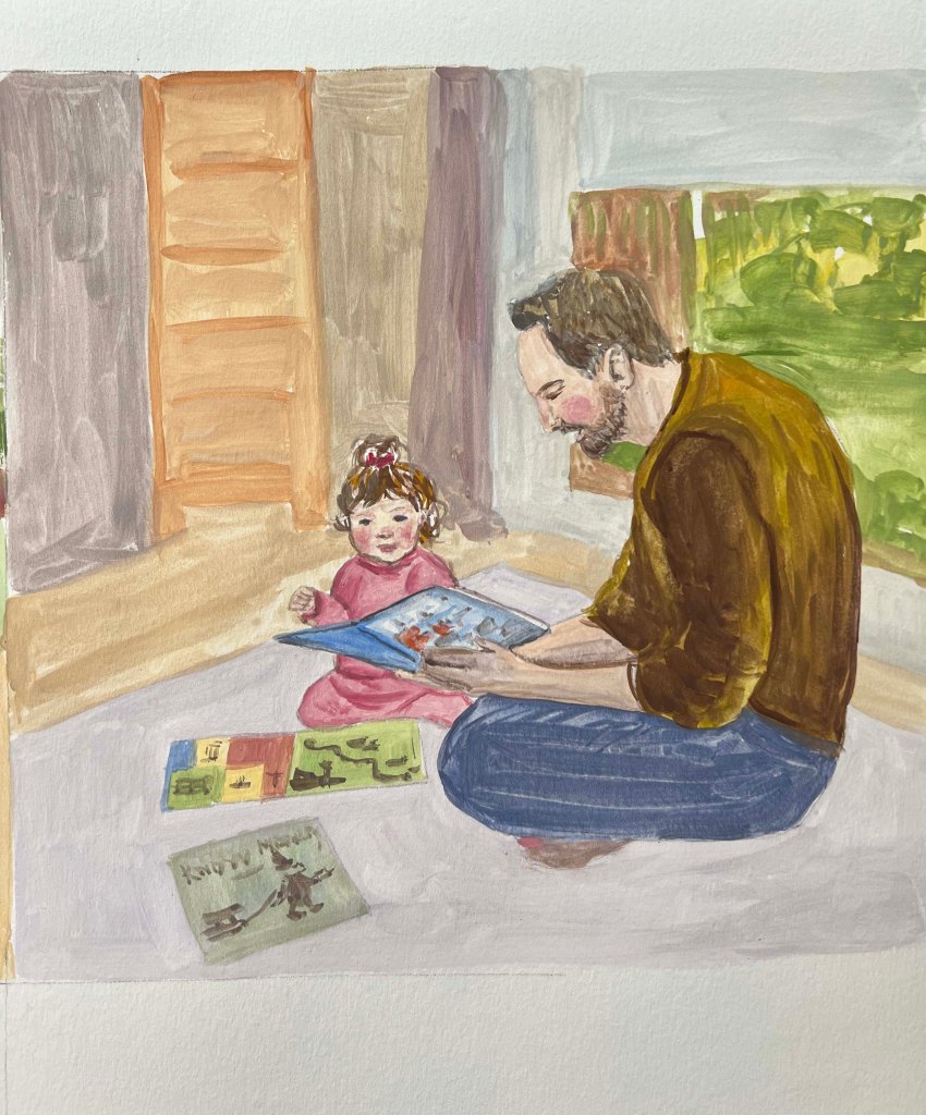
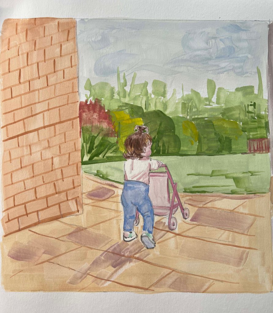
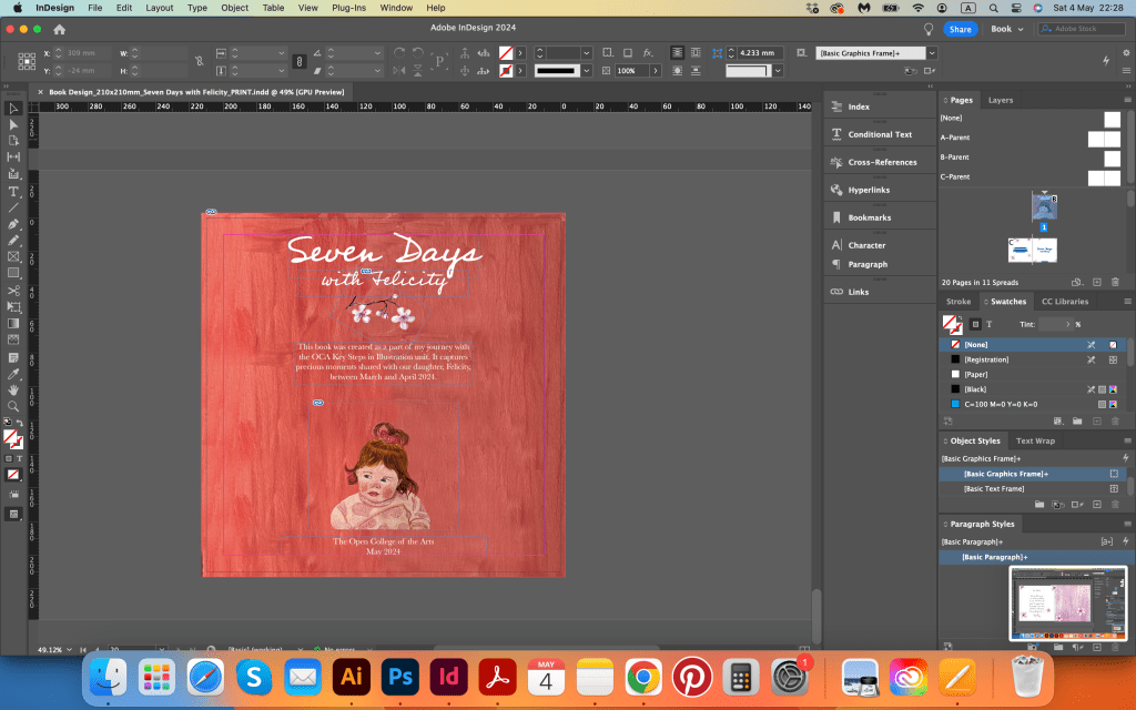
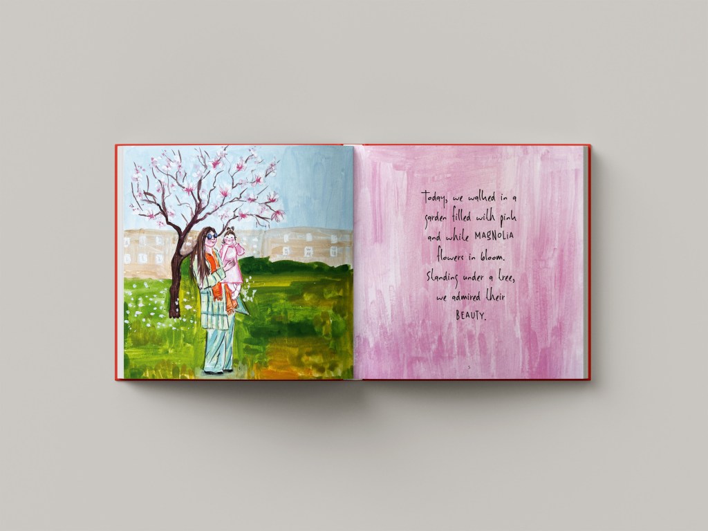
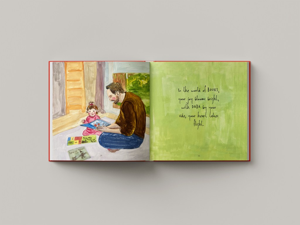
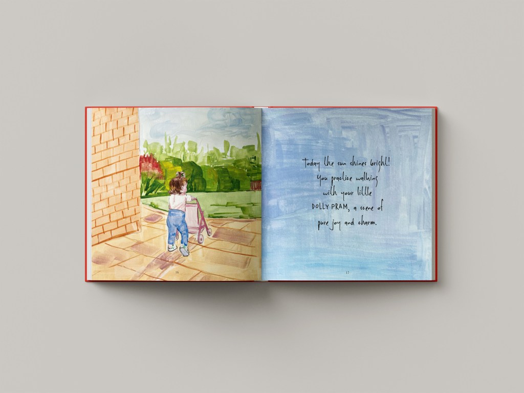
As mentioned earlier, I decided to use gouache paints for this book, and I believe it was the right choice. The paintings emerged with bold, vibrant colours while maintaining an artistic appearance. Most pages featured pictures of us, with a few spreads dedicated to our pets or the woods. This balance between portraits and landscapes, nature and people, added to the overall aesthetic. For the covert picture with Felicity’s portrait, I used a terracotta red colour. Originally I was planning to make the cover pink, but then I changed my mind toward rich and mature, so I was quite happy with it. I left a bit of space on the top of the cover, where I planned to place the name of the book.
Also, I made a couple of squares with just plain bold colours, like purple, pink, yellow and green, as I was going to use them for the right side of the book for placing text. I want to try to use the text on the picture as well, but that depends on how busy the painting is, as the text should be readable.
Creating those paintings proved to be one of the most challenging aspects of the entire project, requiring at least seven spreads for the book. In addition to this task, I challenged myself further by including two paintings per spread. Despite the difficulty, I could envision the end result, feeling confident that with some carefully crafted text and poetic language, I was on the right path to completing this book.







Book Design
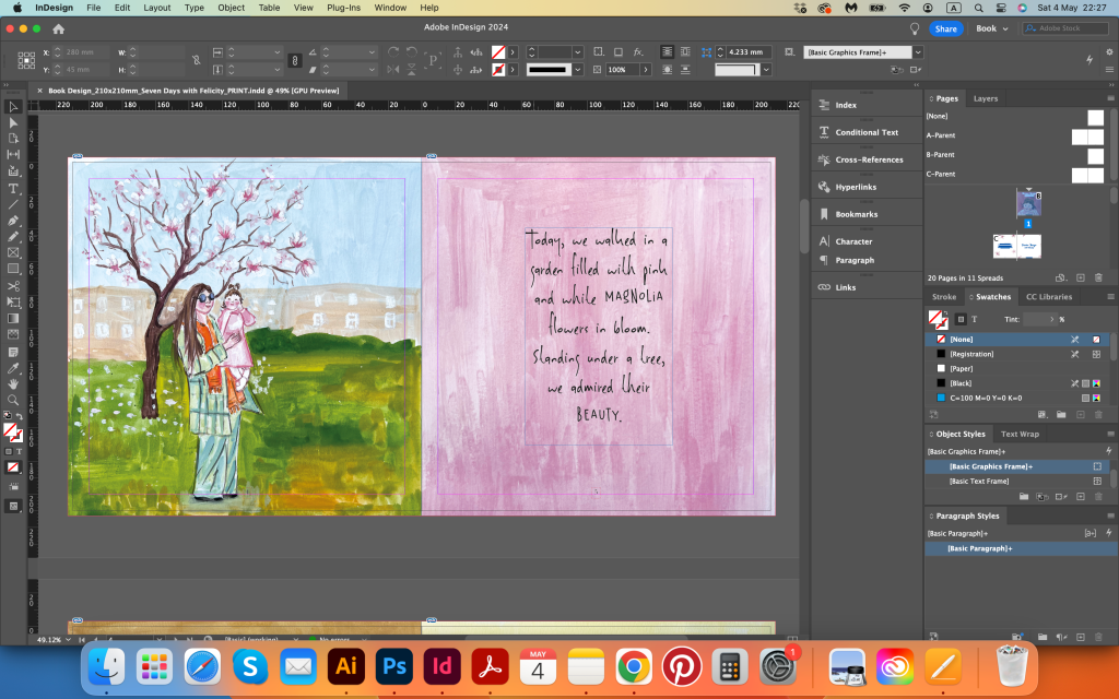
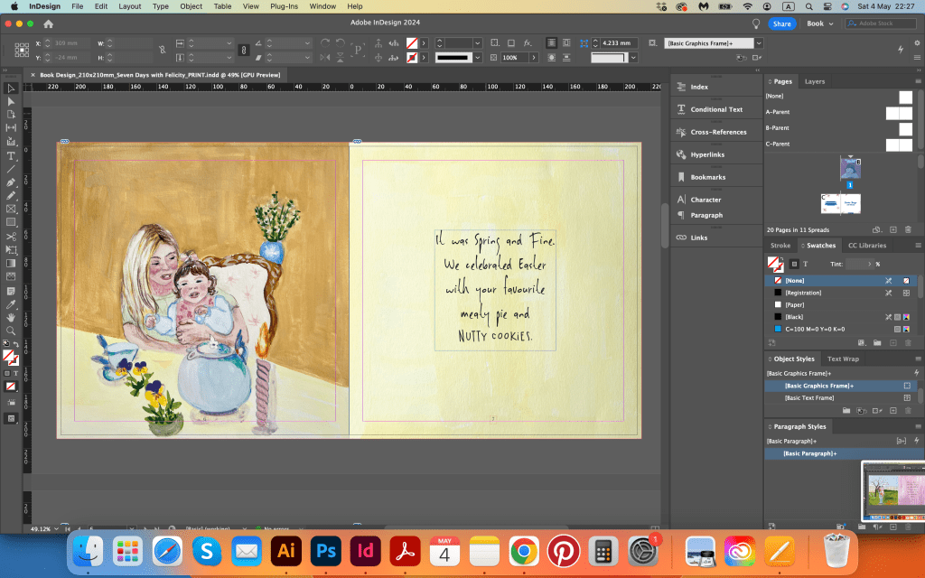
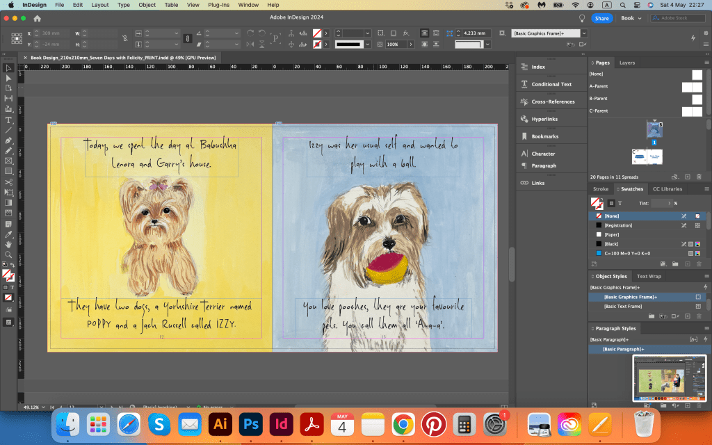
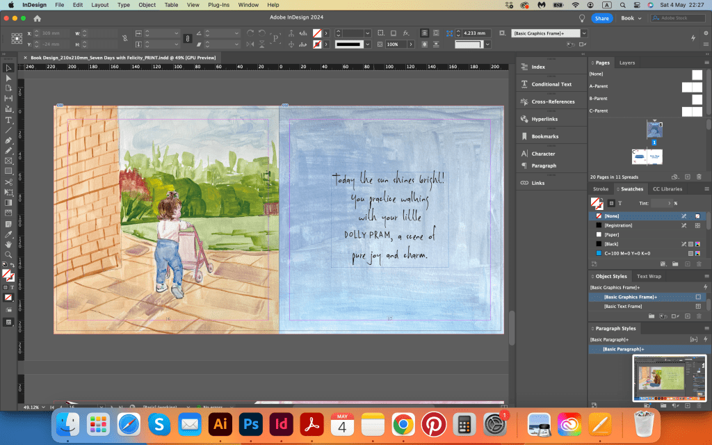
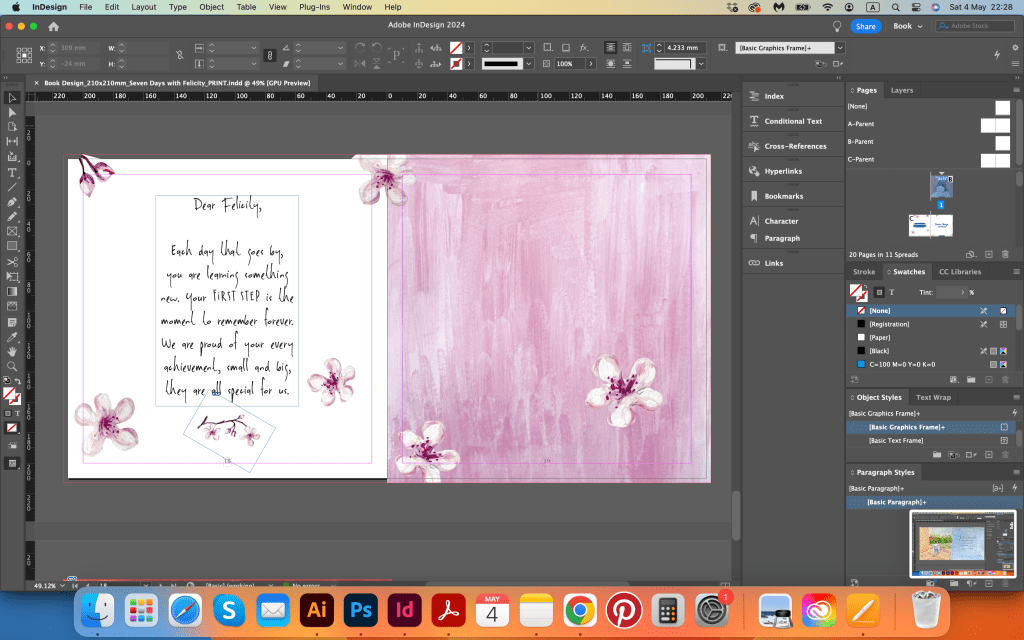
The final stage of the project involved slight colour correction of paintings, placing text, and arranging pages in order. Initially, I intended to use my handwriting for the text, but realising the need for additional practice to ensure neatness, I turned to online sources for original handwritten typography. I came across two fonts, DK Sheepman and Kermel, and decided to use both. I wanted the text to be quirky and playful.
I initially created the layout in Adobe Illustrator but later switched to Adobe InDesign for its precision. In total, I ended up with 10 spreads and 19 pages, including the front cover. However, I still had seven spreads detailing seven days, with an extra two spreads reserved for introduction and conclusion.
I tried to write some poetic captions for each image, focusing on brevity and clarity rather than rhyme. Some pages ended up with small rhymes, which I left unchanged, considering it an experimental touch. Below, I have attached screenshots with the descriptions.





Mockups






Conclusion
This is my final word for the whole unit that has taken me two years to complete, and 6 years to complete Level 1. While I wish I had finished it sooner, I believe it happened when it was meant to. Looking back to this project I’m quite happy with the final outcome. I feel proud of myself as the unit has been completed, especially as it revolves around my little daughter. I’m pleased with the gouache drawings, and the style I applied for them. I believe they complement my other works for this course nicely. I think, what I could have done, is probably use my own writing, instead of font, which would definitely add even more personal touch to this work. Additionally, I plan to print this book for assessment, aiming to have a physical version for review.