Assignment 5: Seven days

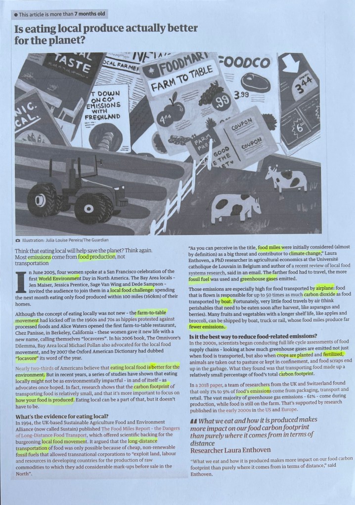
With this final assignment, I have a wonderful opportunity to showcase my strengths as the narrator, editor, and illustrator. When I asked my family which seven days of my life I could design, everyone agreed that it should be seven days of the life of us as parents. As a mother to a one-year-old toddler, my world revolves around my child. I thought that I could show my strengths through illustrations capturing memorable moments with Felicity. Our weekdays follow a routine, while weekends are reserved for family time.

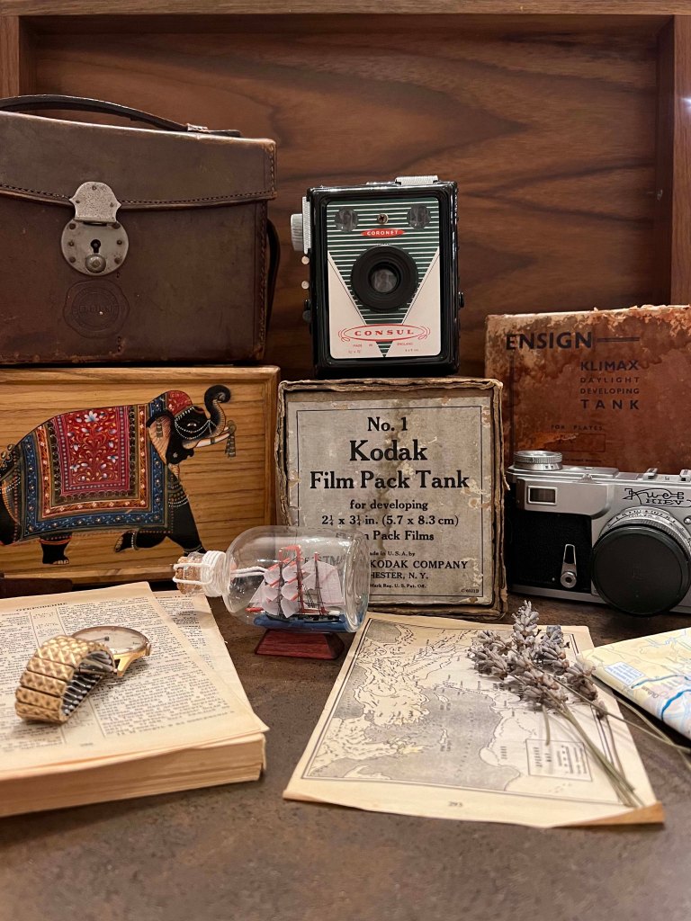
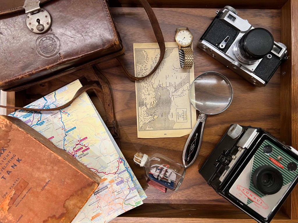
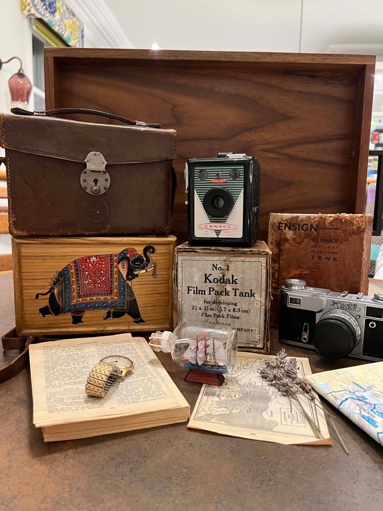
This project offers a chance to create drawings of my daughter, possibly tailored for magazine illustration, brochure or picture book. I wasn’t quite sure what it could potentially be, so I went to do some research for inspiration.

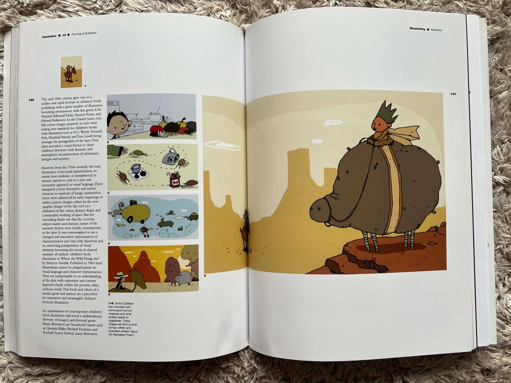
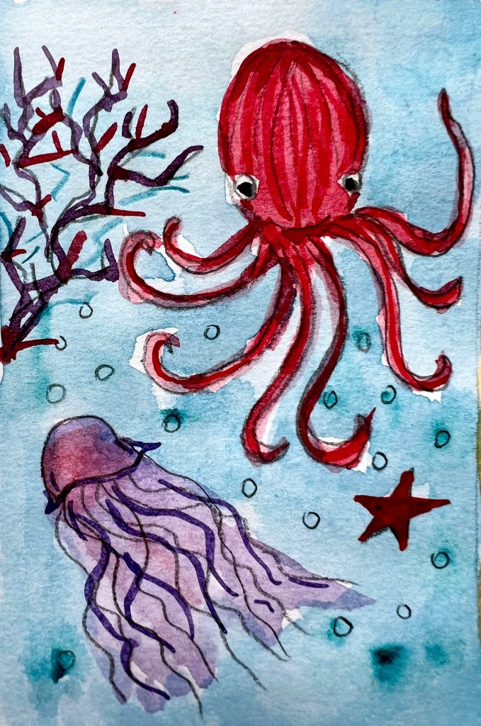
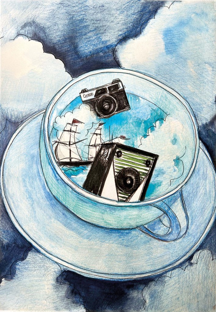
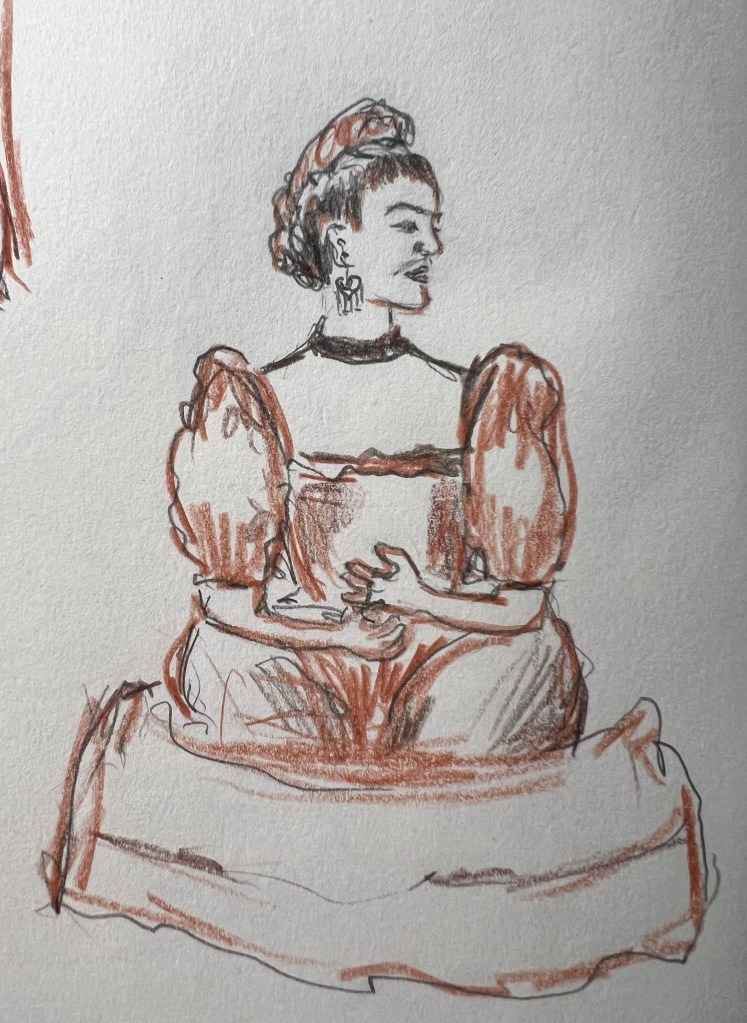
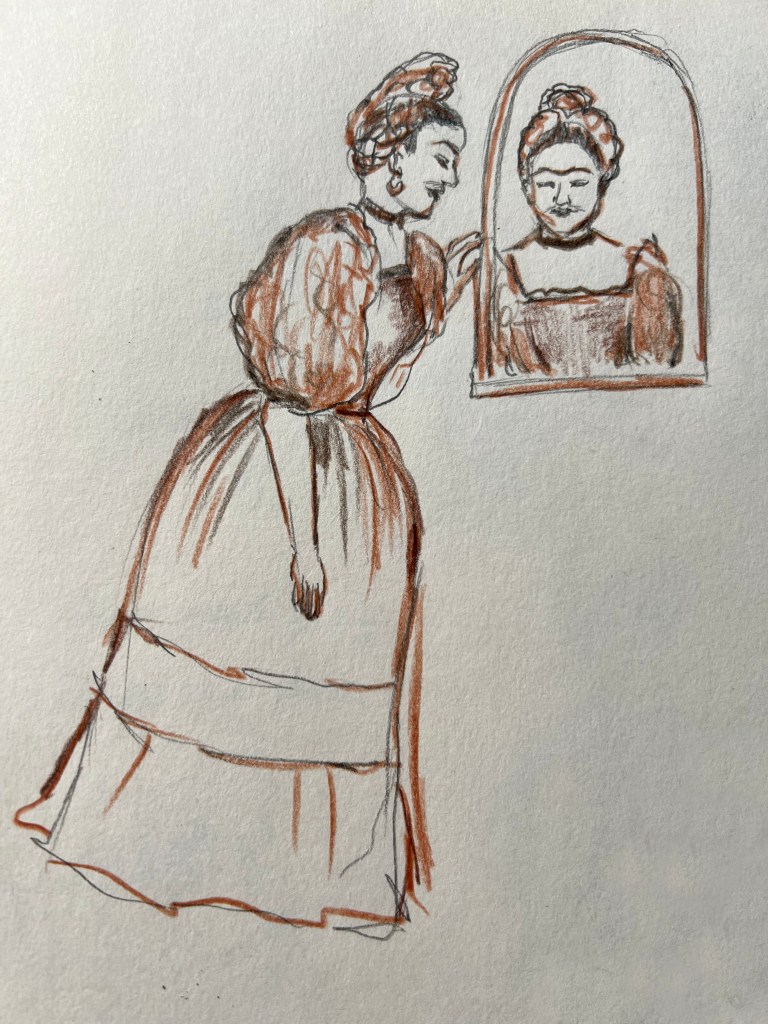
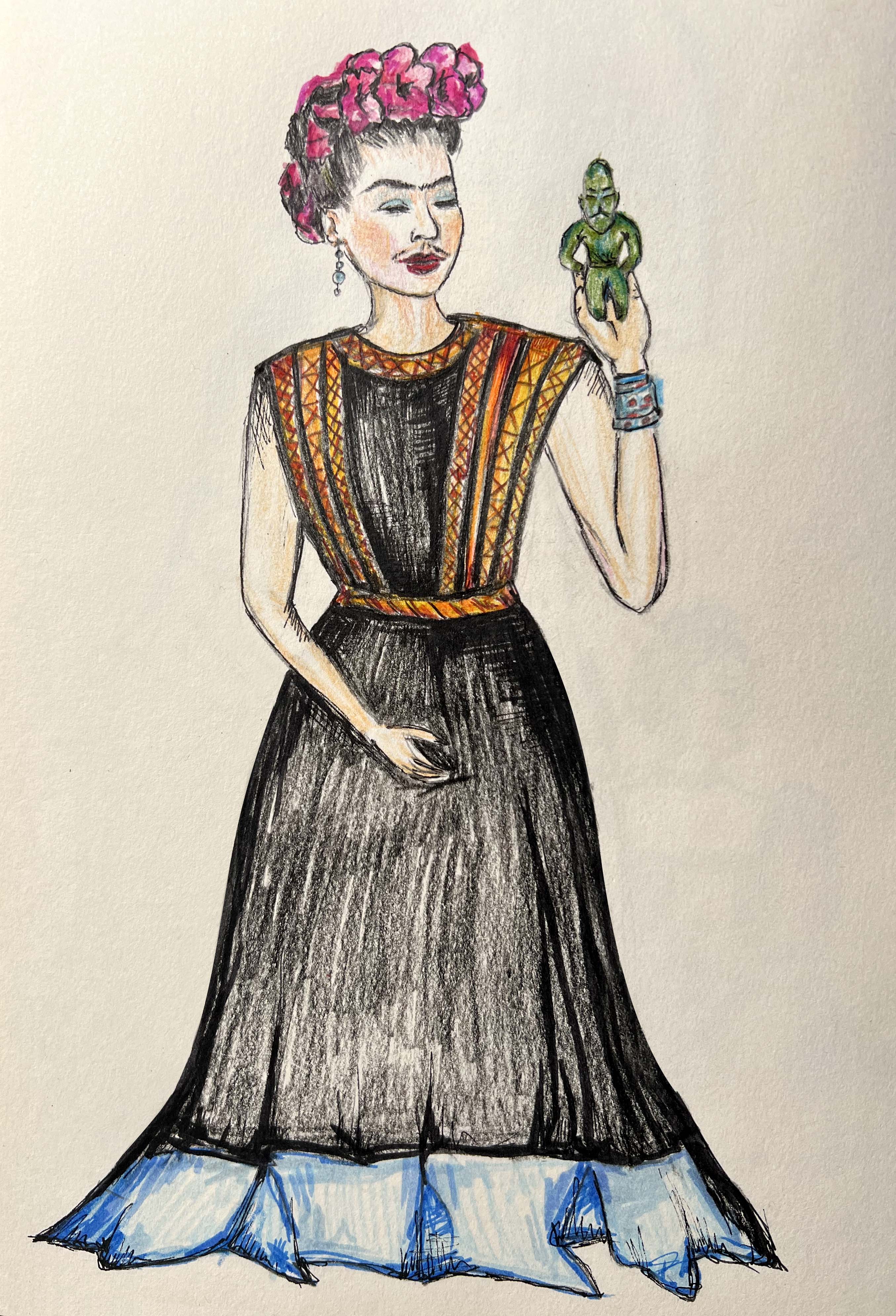
I wanted to create something unique here. So, I looked through my book of artists and their artworks Type Tells Tales by Steven Heller and Gail Anderson. I stumbled on Maira Kalman‘s section with her illustrations for the book Max Makes a Million. I loved the whimsical style of that illustration, bold colours, the narrative within it, and the original way the text was placed. I went to do more research on this artist and found out that she made some other great illustrations for the books What Pete Ate (from A —Z), Fireboat The Heroic Adventures of the John J. Harvey, Darling Baby, etc.

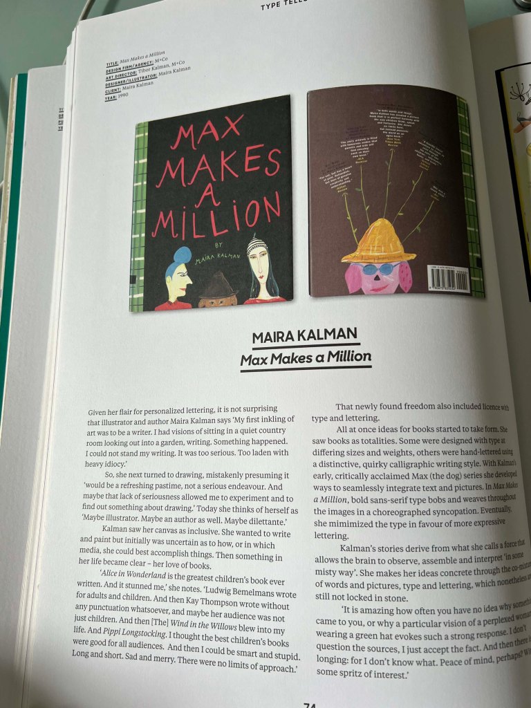
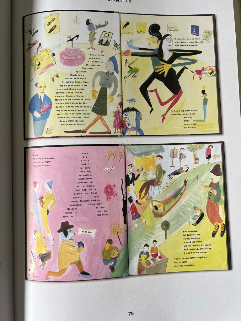
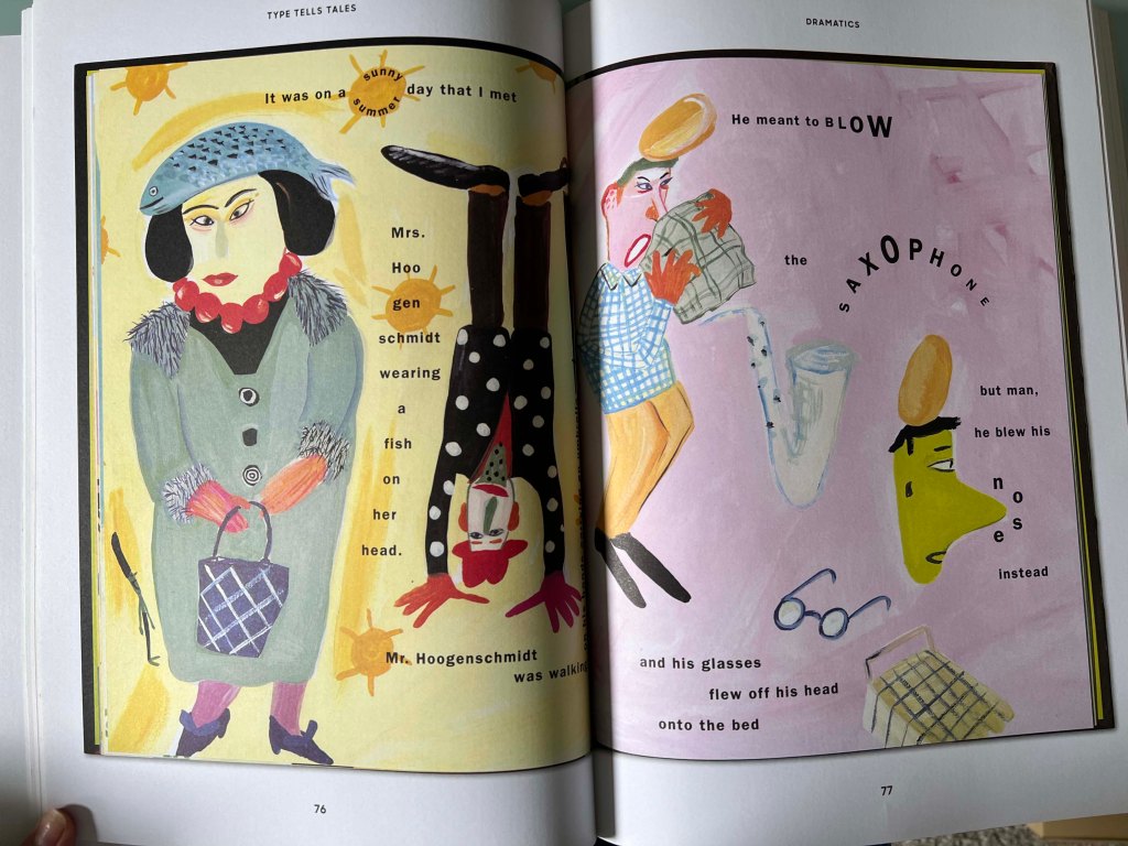
Maira presents quirky characters within surreal settings. Her illustrations are filled with a sense of charm and nostalgia. I loved Kalman’s unique approach to composition and storytelling. Her illustrations and visual language captured the imagination of audiences of all ages.

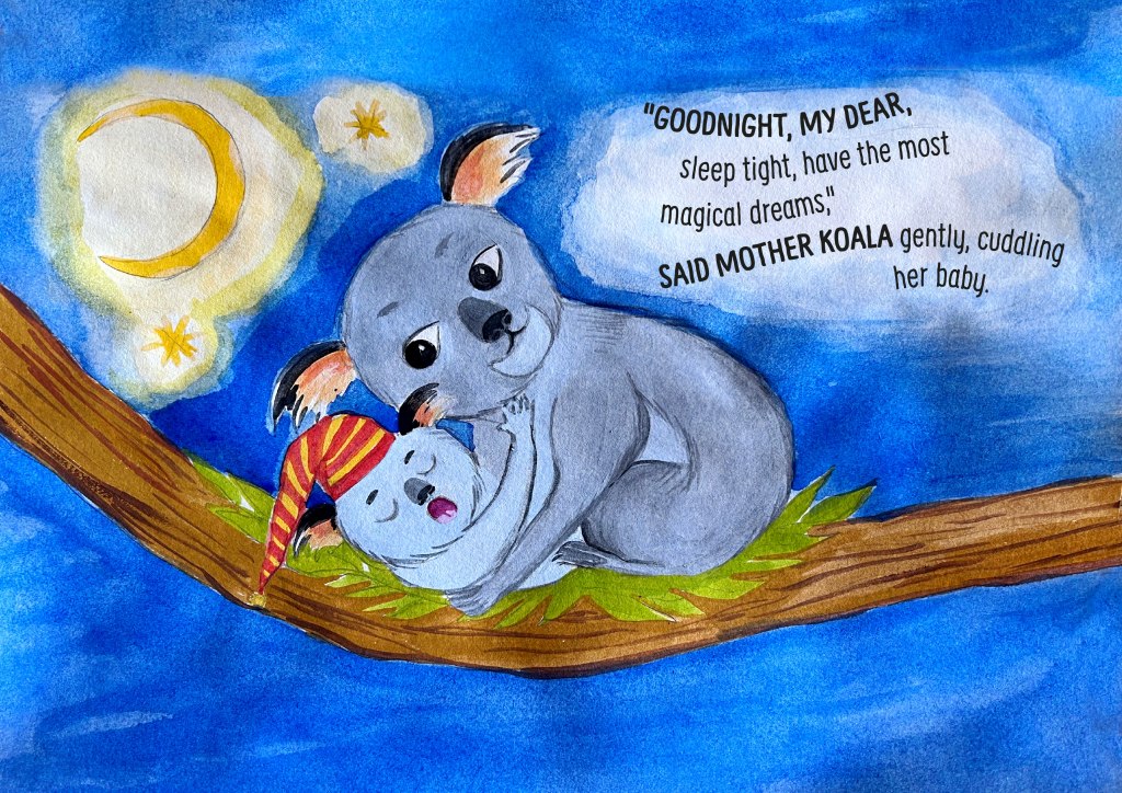
One book particularly caught my attention, the Darling Baby based on a journal Maira kept when her granddaughter was new. What a great idea to depict important moments with your baby, with the narrative from the parents’ words. I adore Maira Kalman‘s wonderfully quirky gouache and ink illustrations and the way she created the narrative.

The inspiration from that book motivated me to include my previous experiences designing illustrations for children’s books and creating editorial illustrations for magazines in this final assignment. I envisioned creating a book with seven spreads, with handwritten text to complement the visuals. I think it will be seven random days with Felicity to tell a story, but they will be recent events, in March-April 2024.

Whenever we go out, I love capturing moments through photos of our destinations, which I later print for our picture album. I have realised that some of these photos I could use for my drawings, infusing them with life and depicting that picturesque essence through painting.

Idea generation

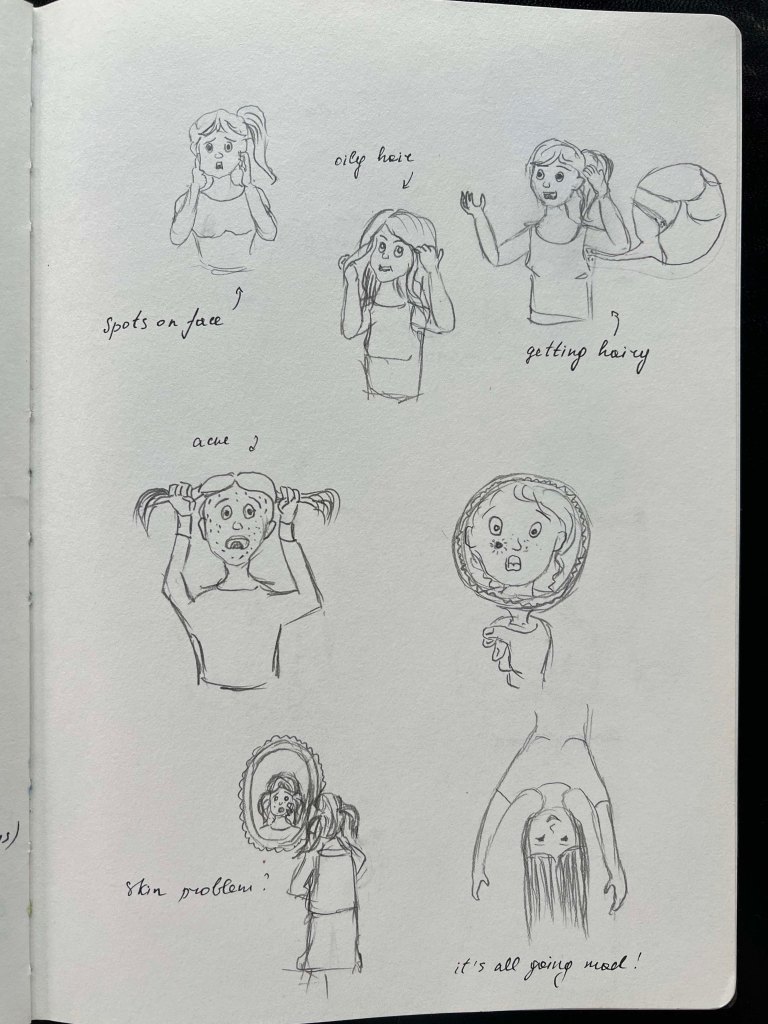
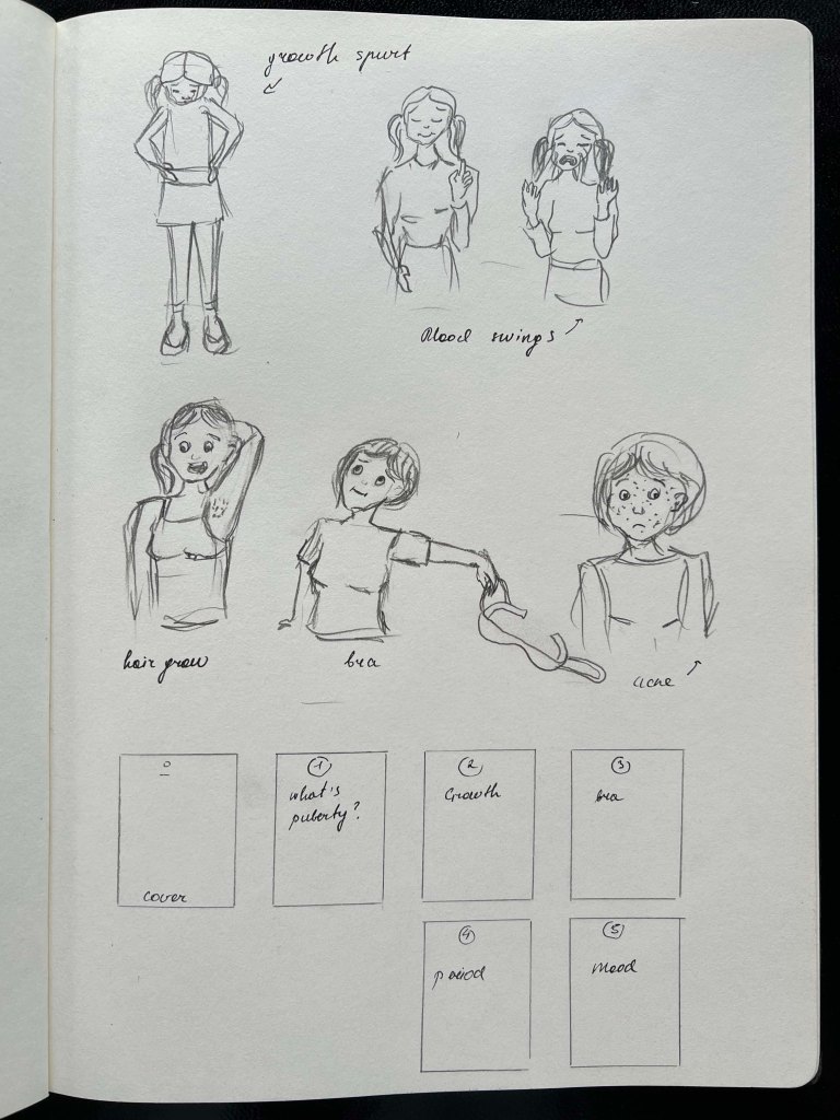
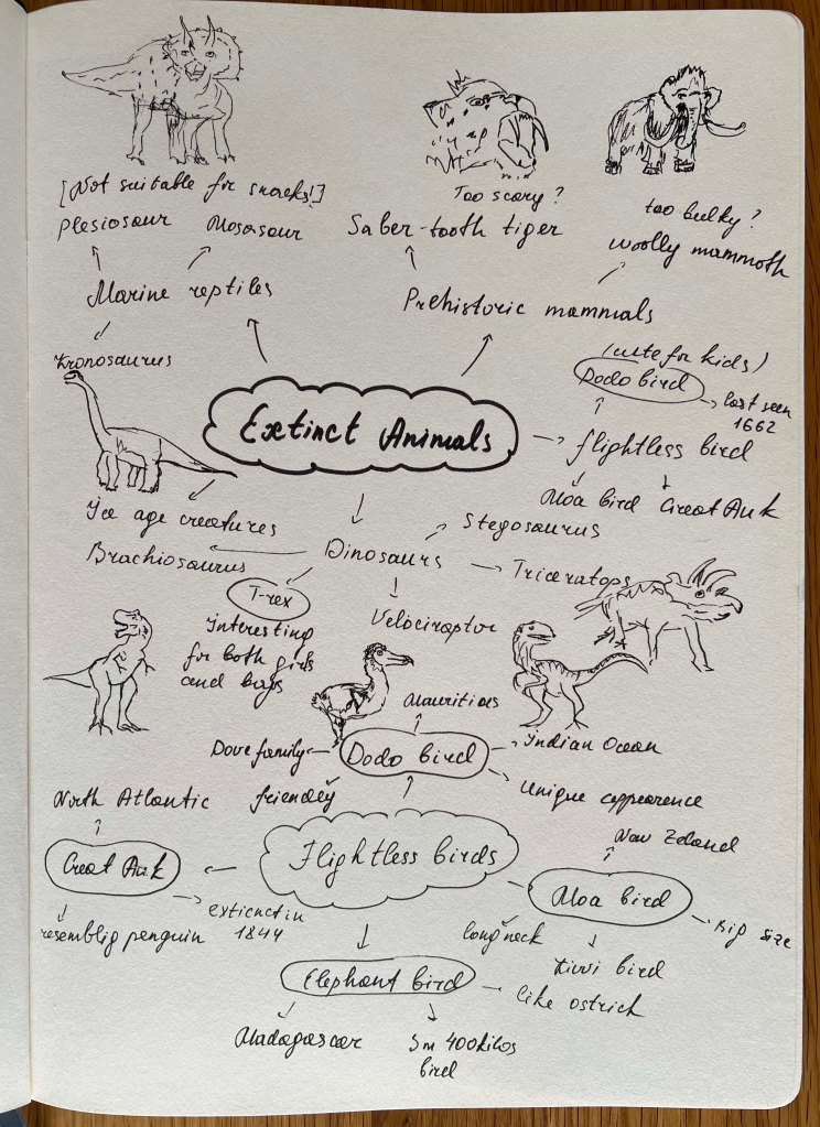
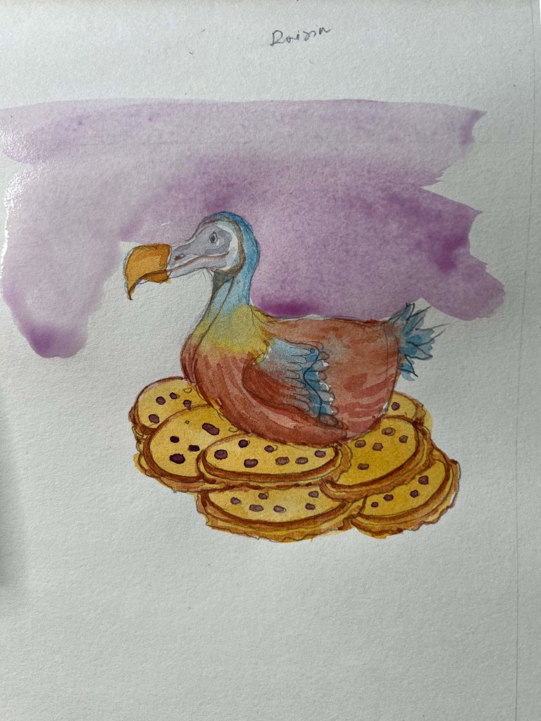
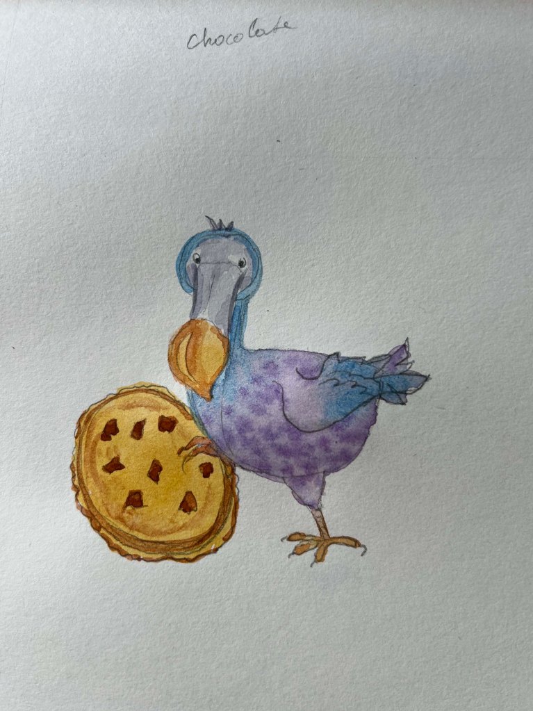
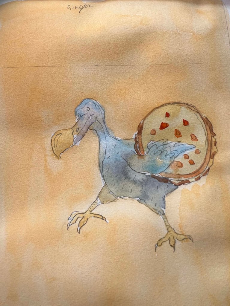
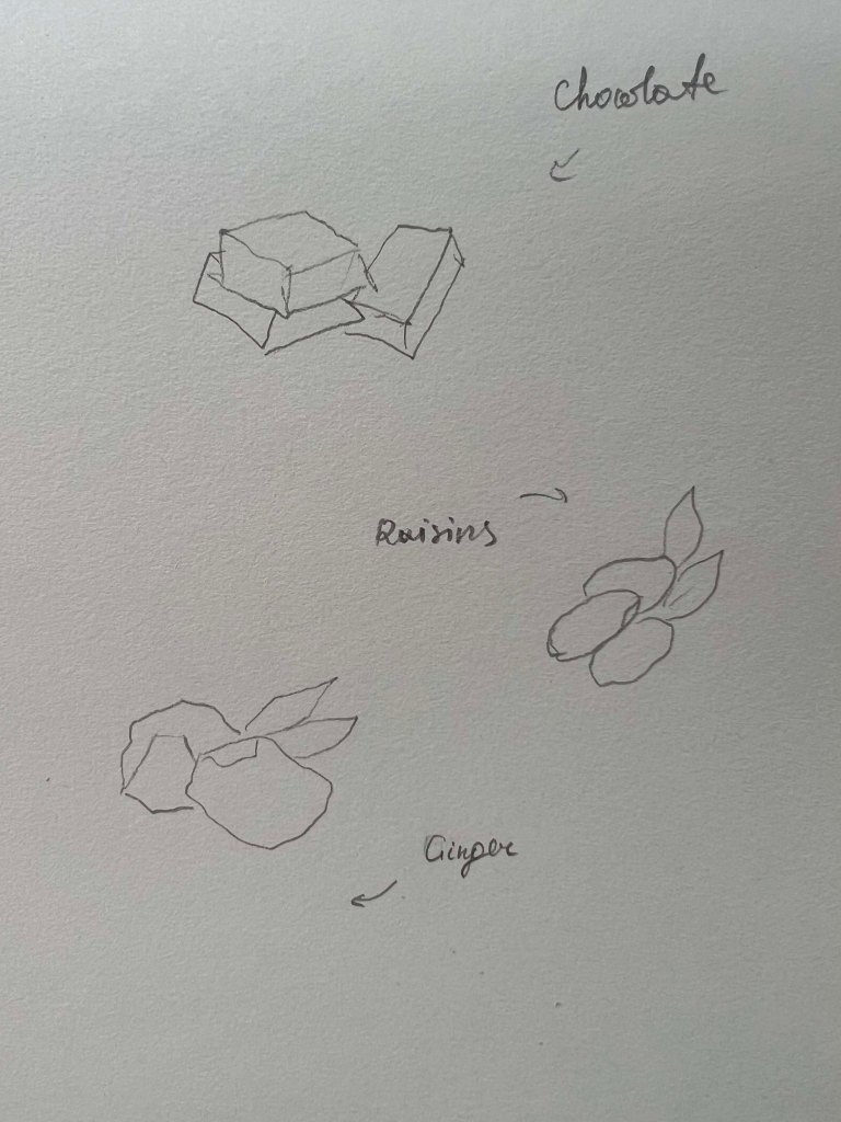
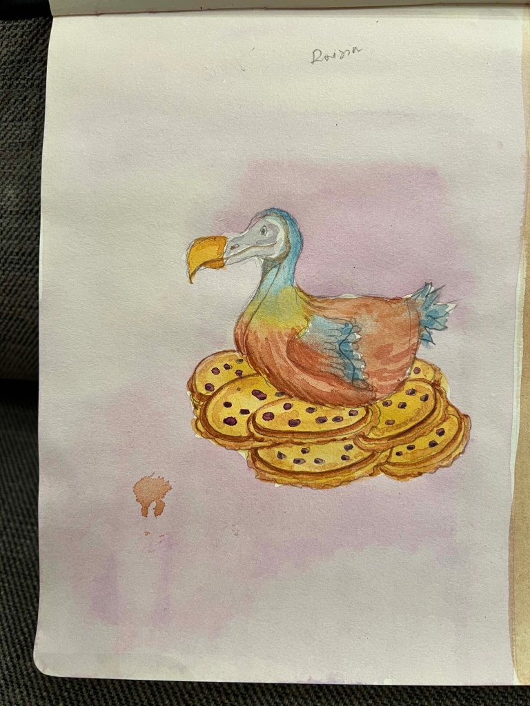
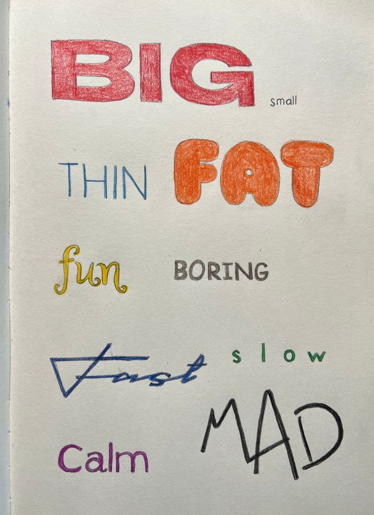
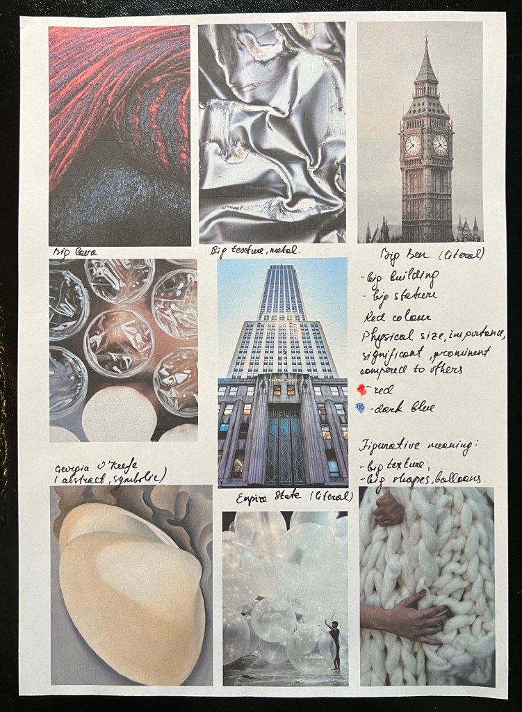
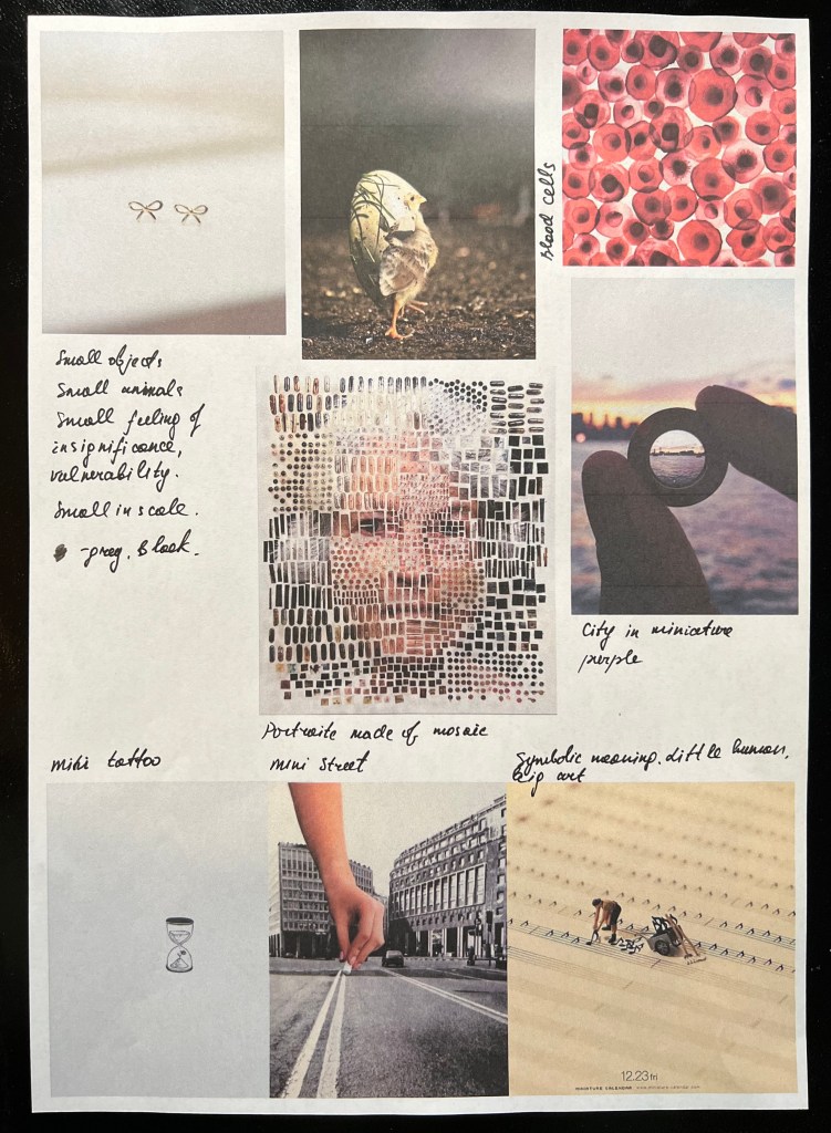
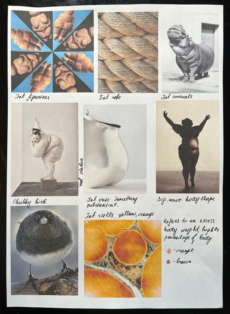
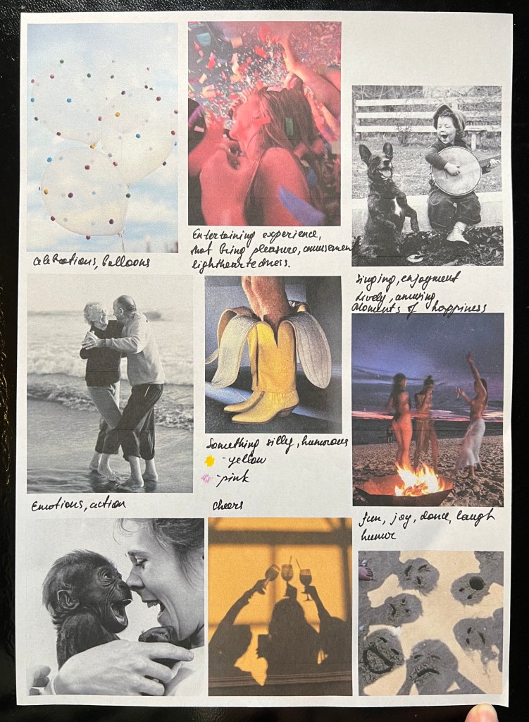
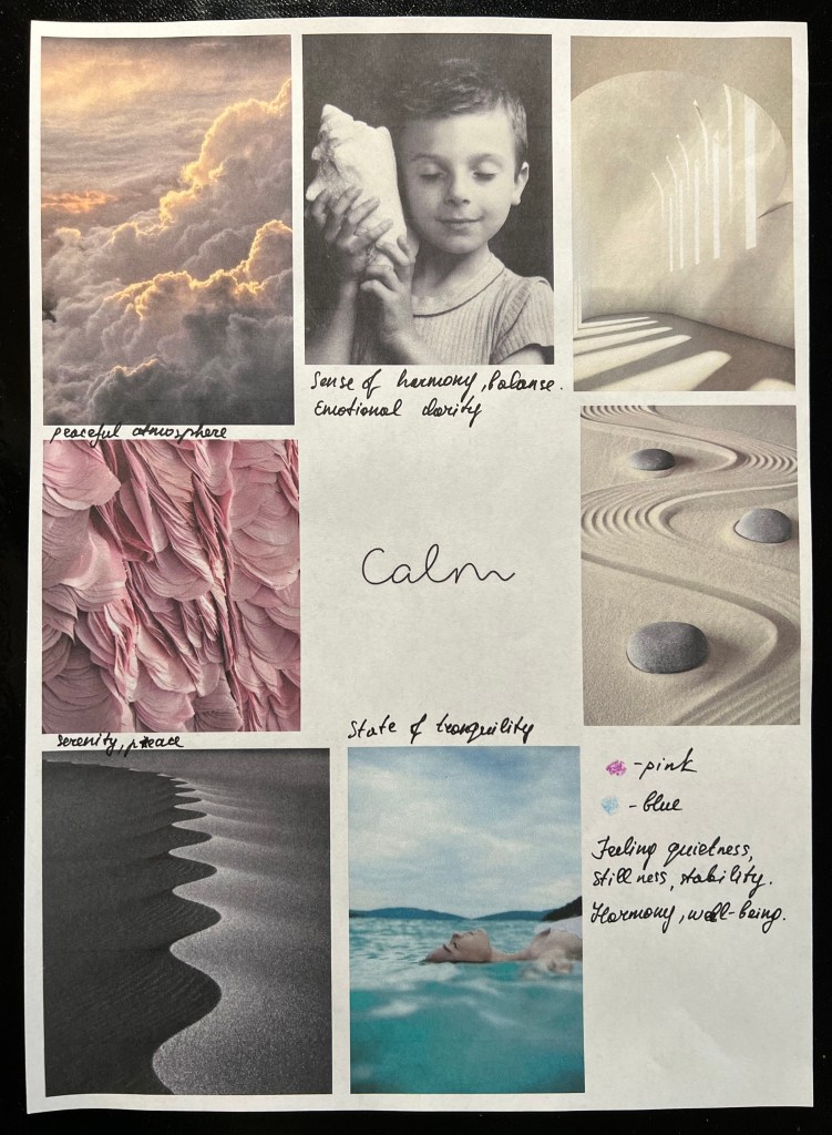
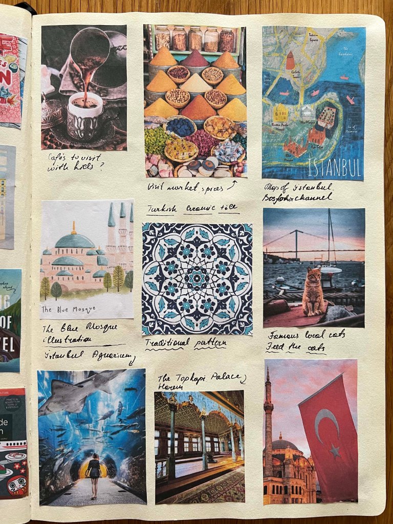
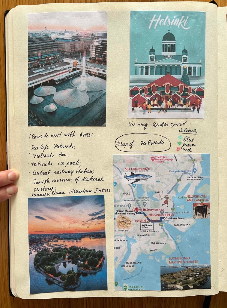
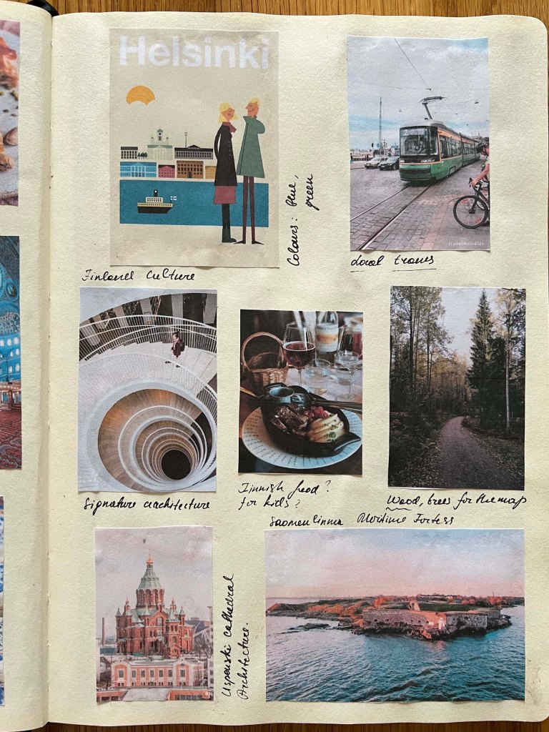
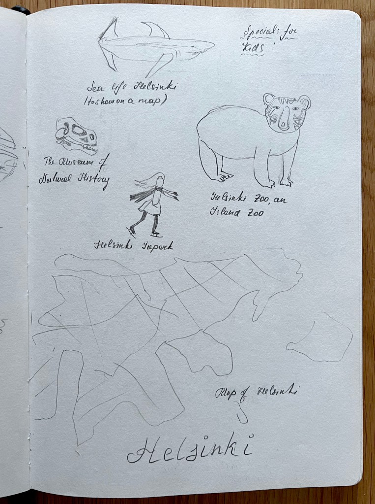
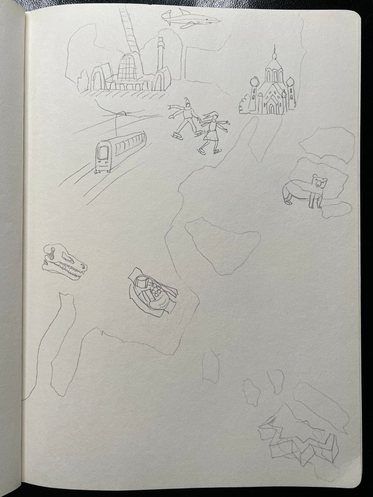
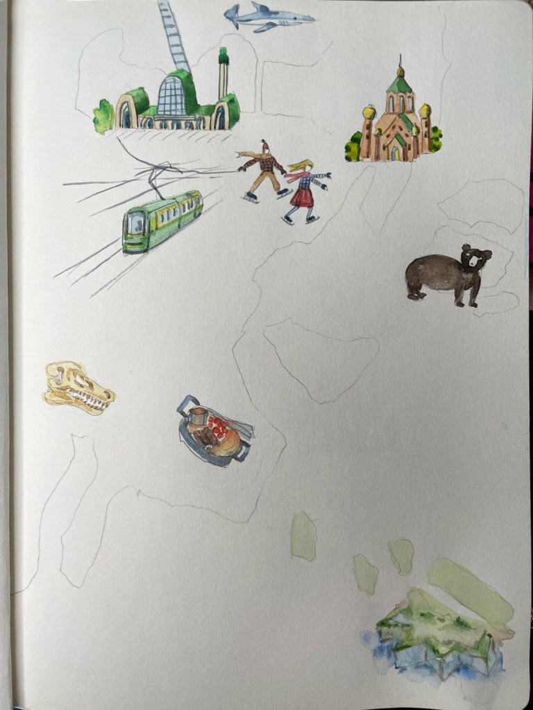
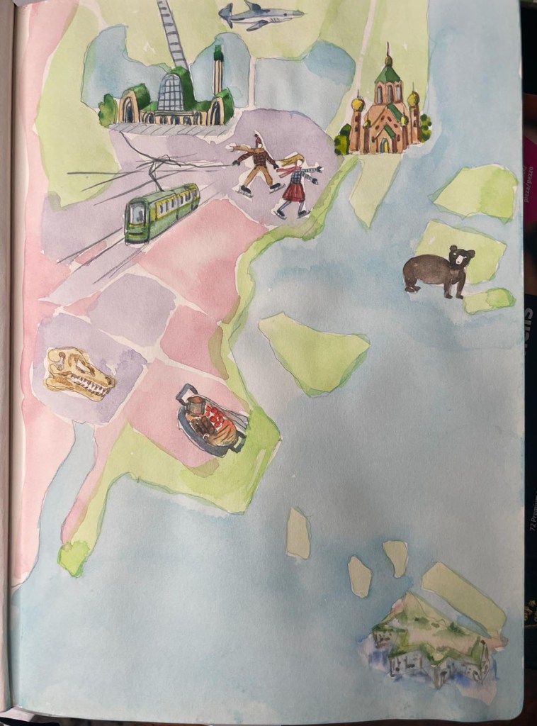
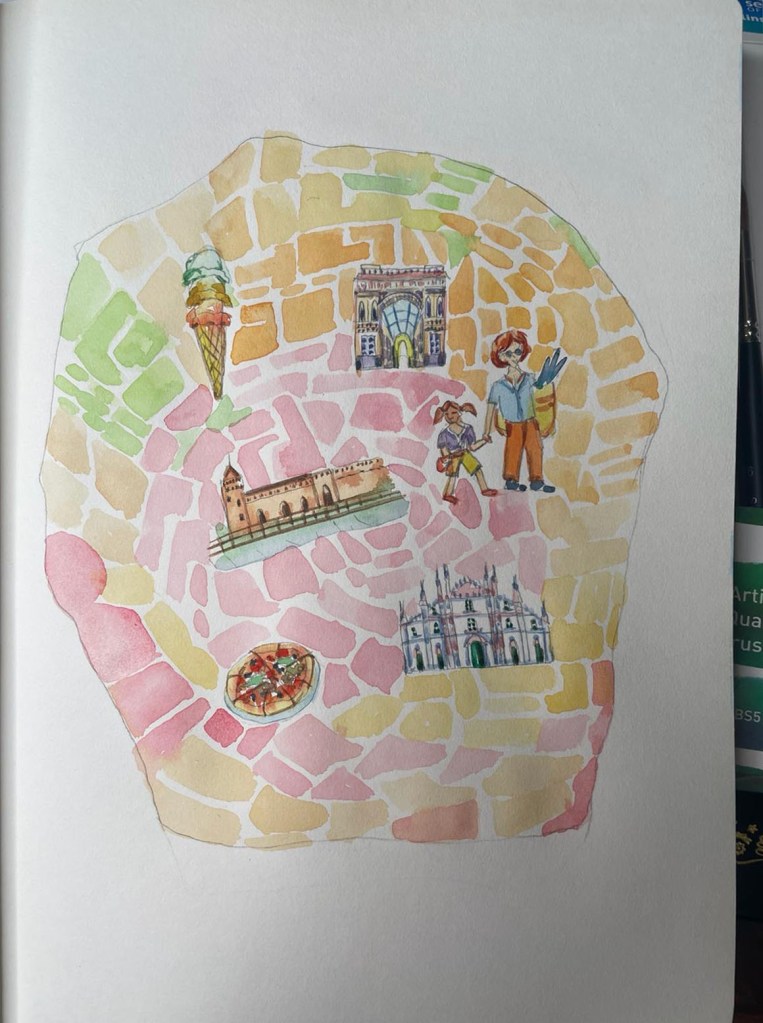
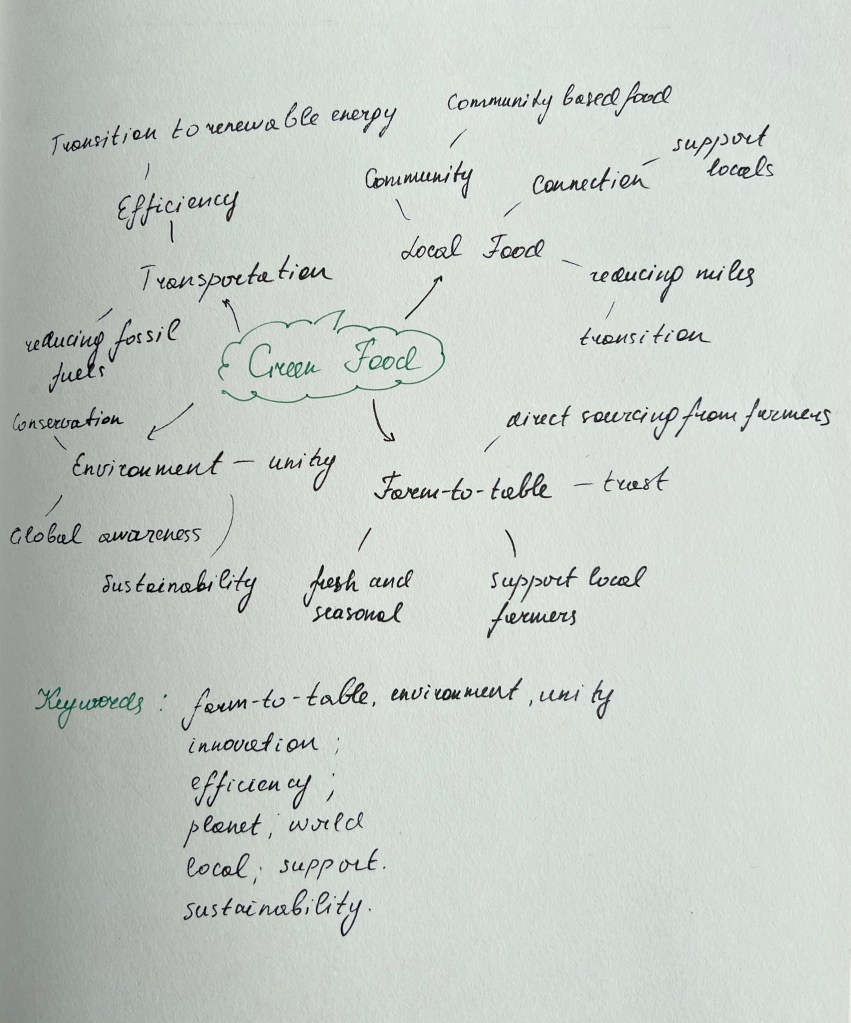
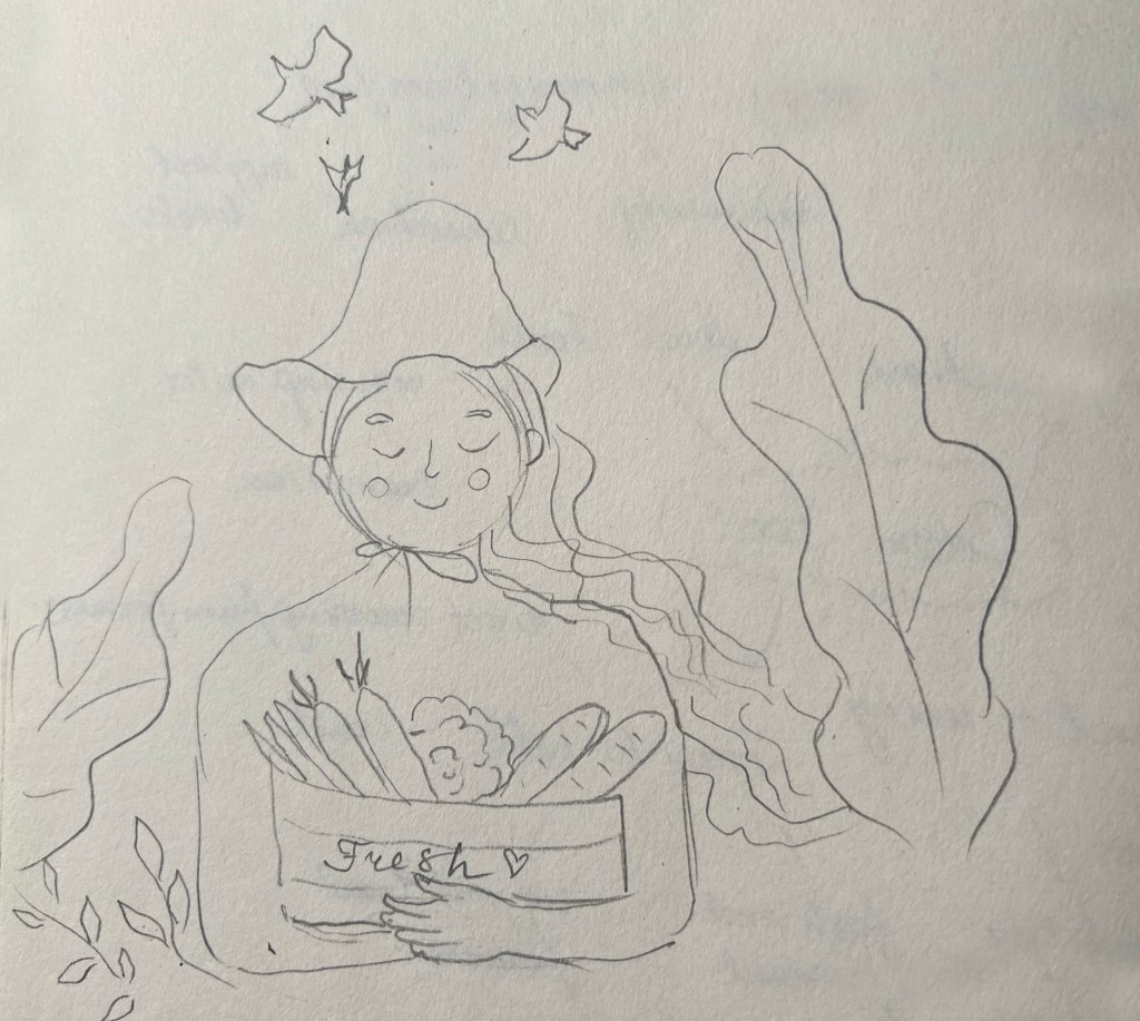
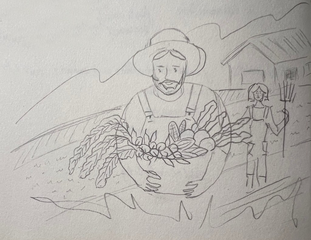
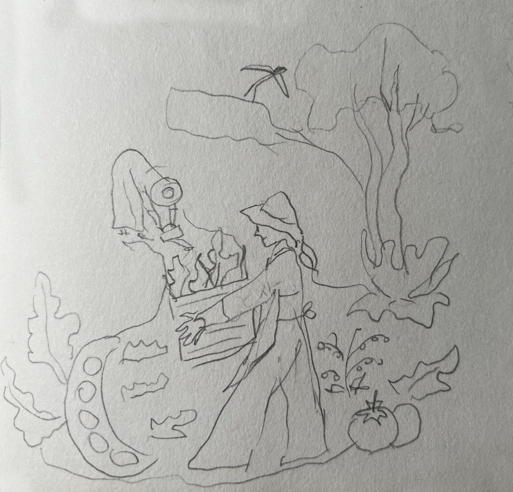
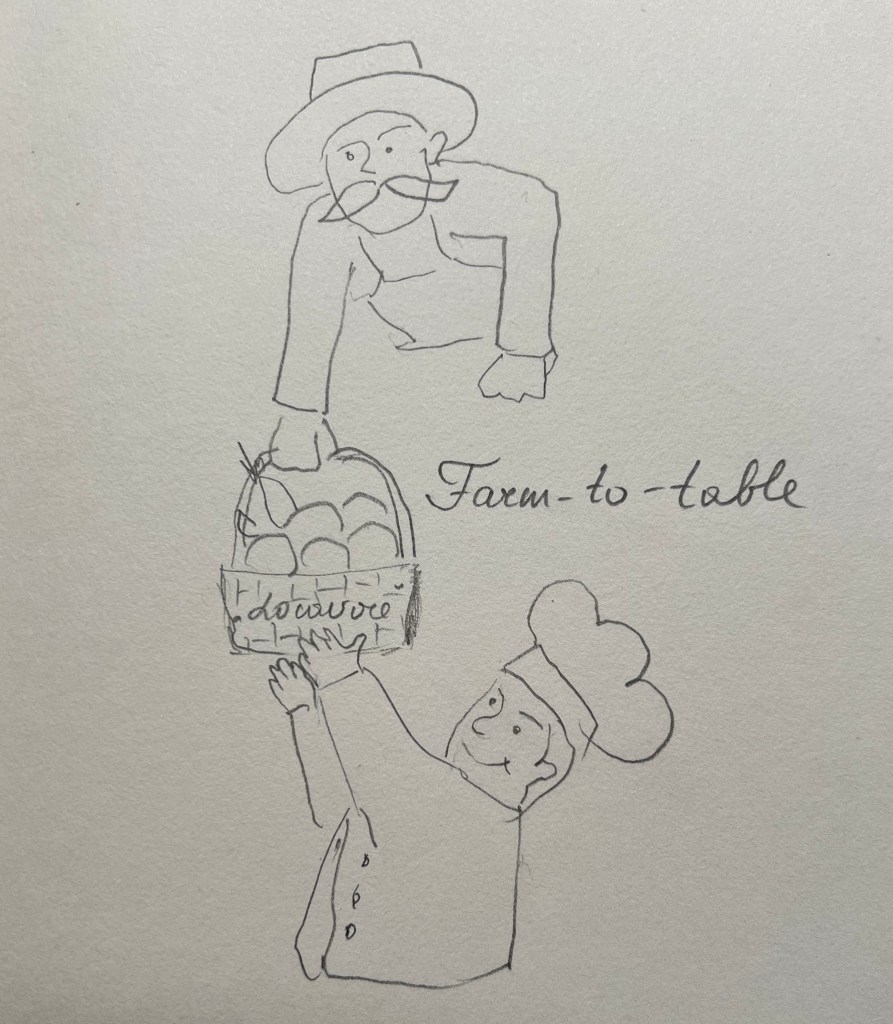
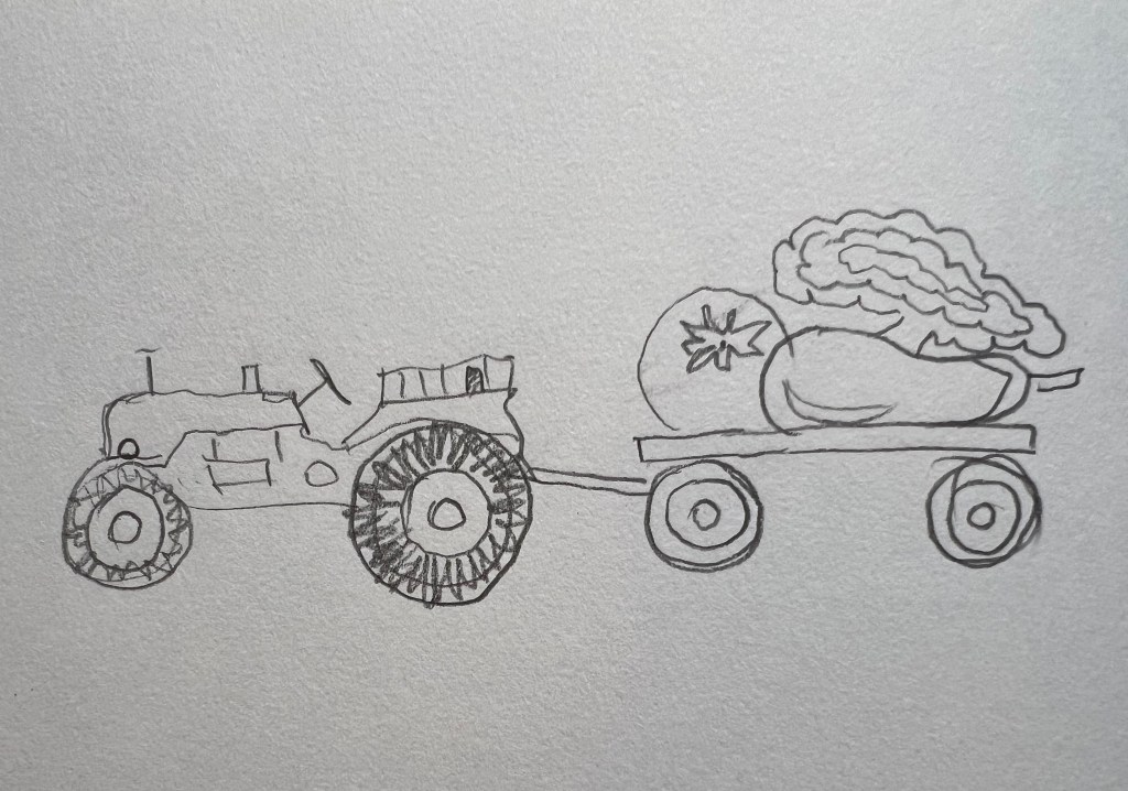
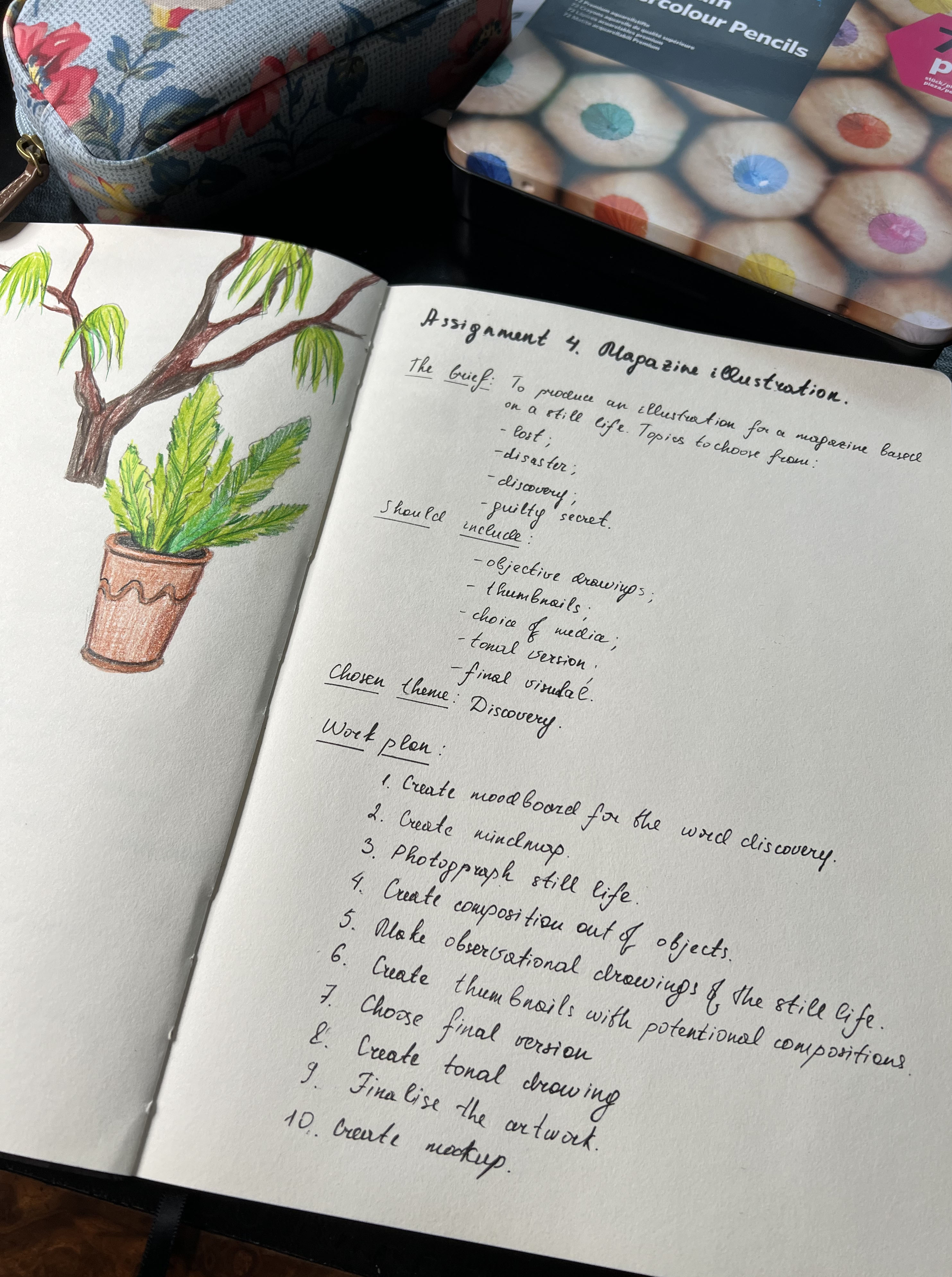
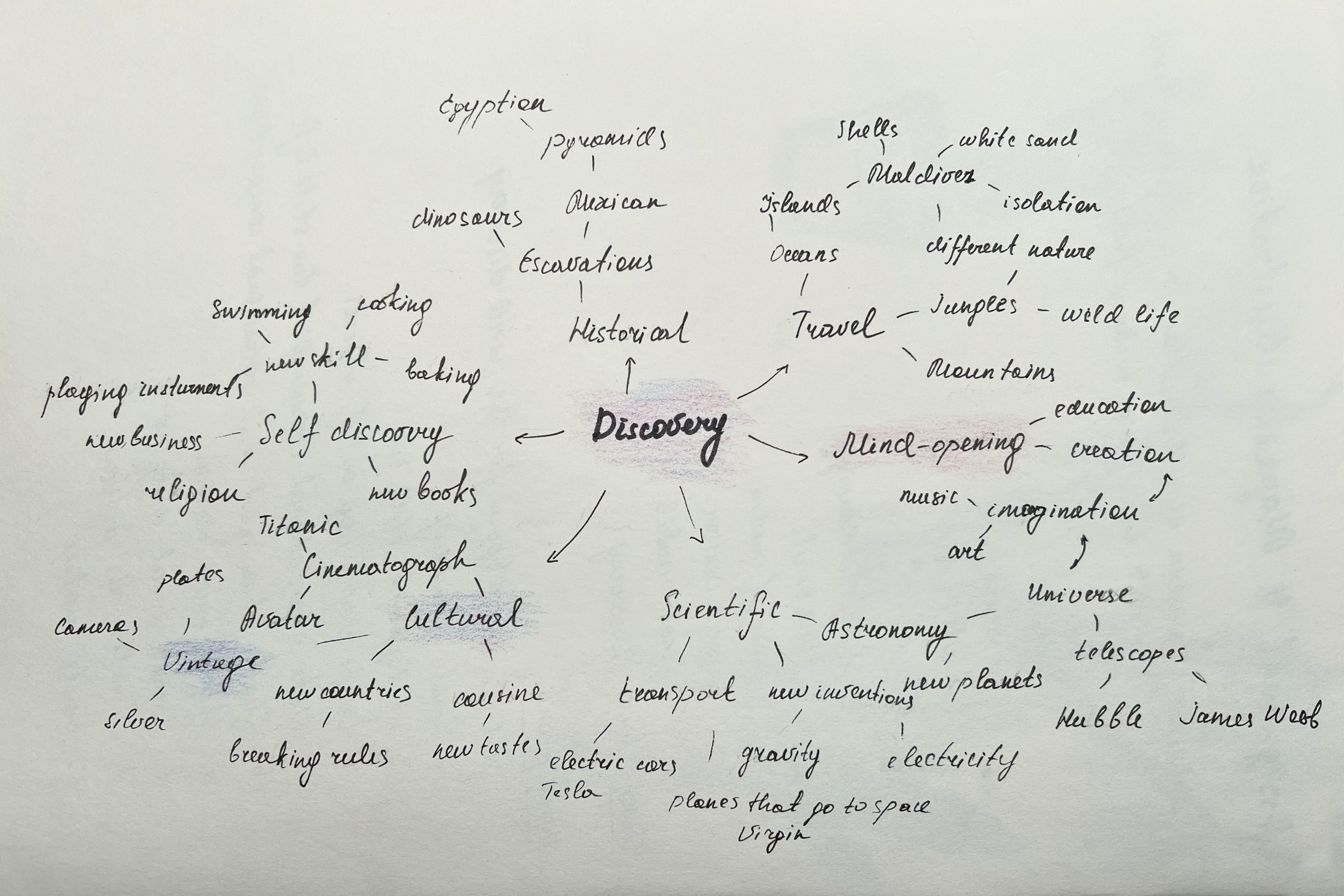
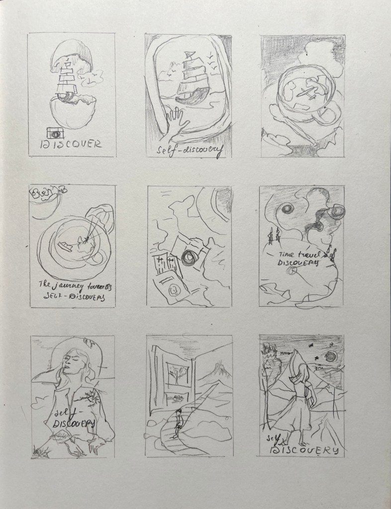
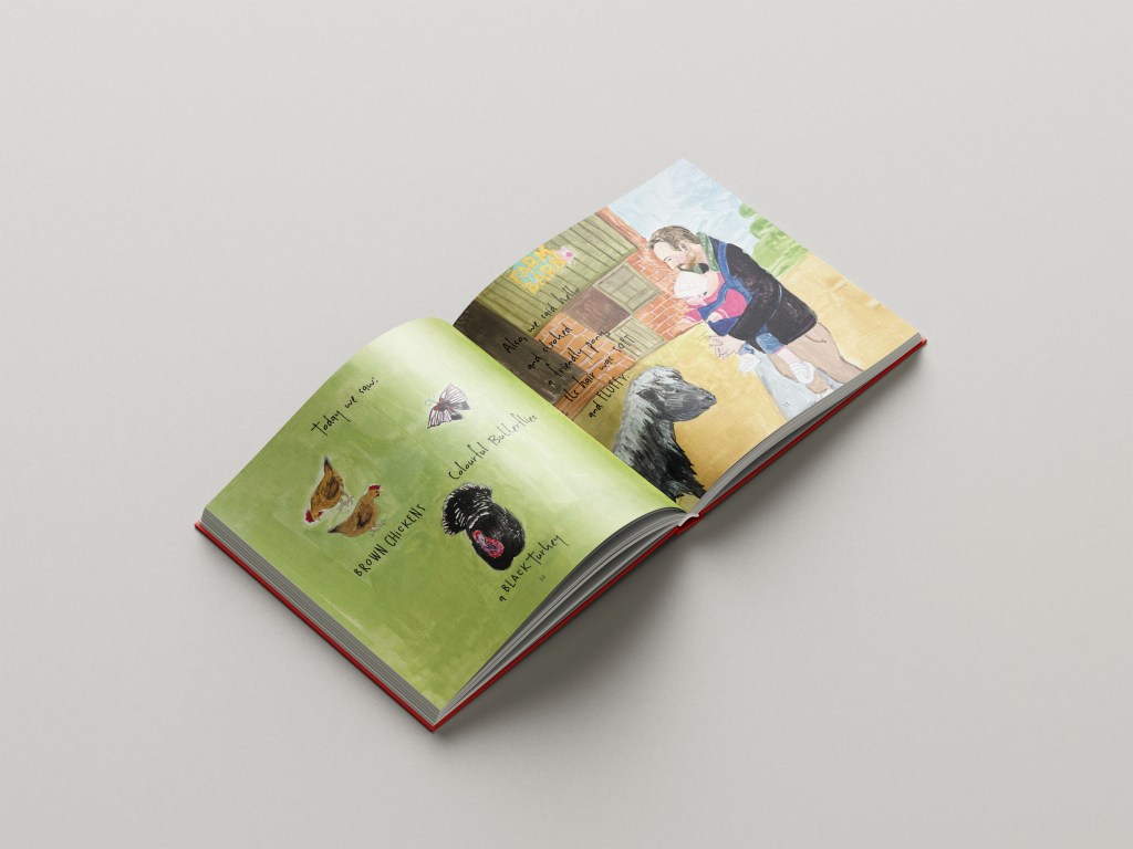
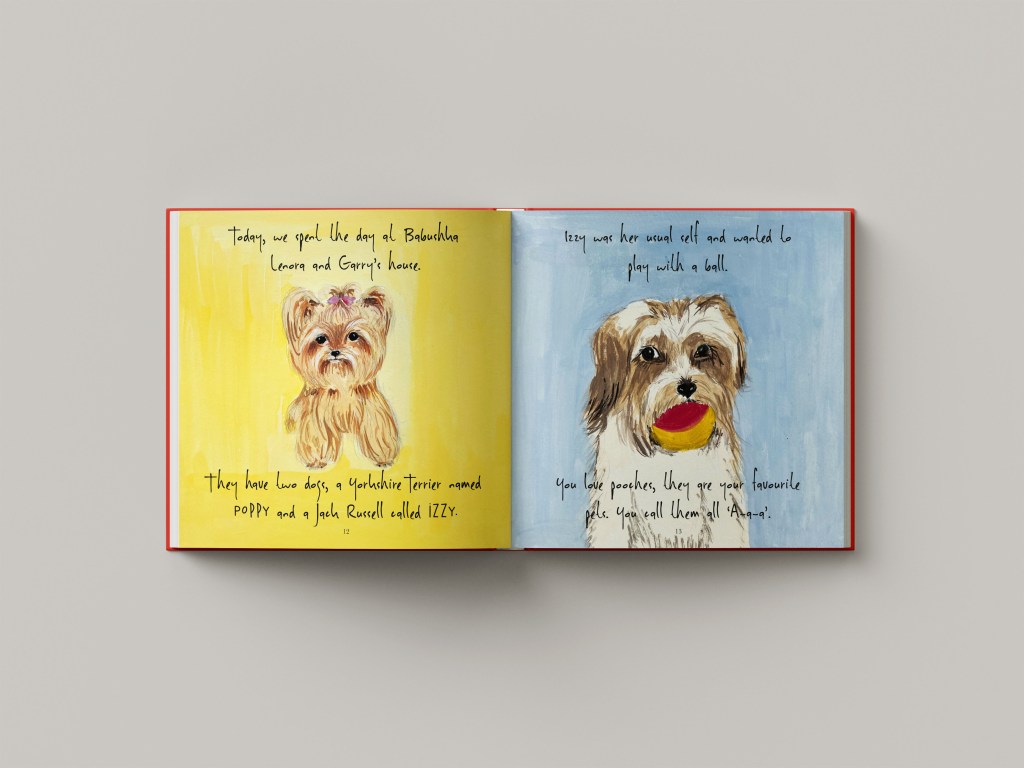
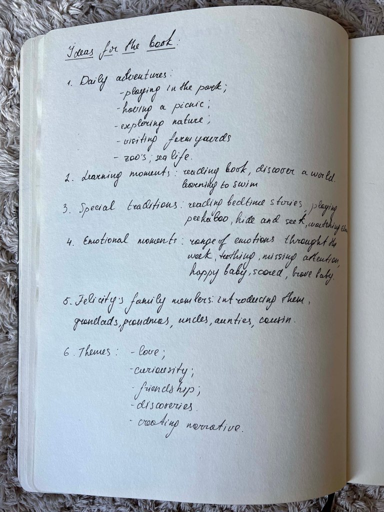
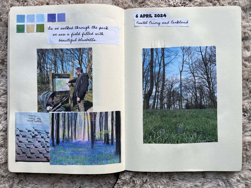
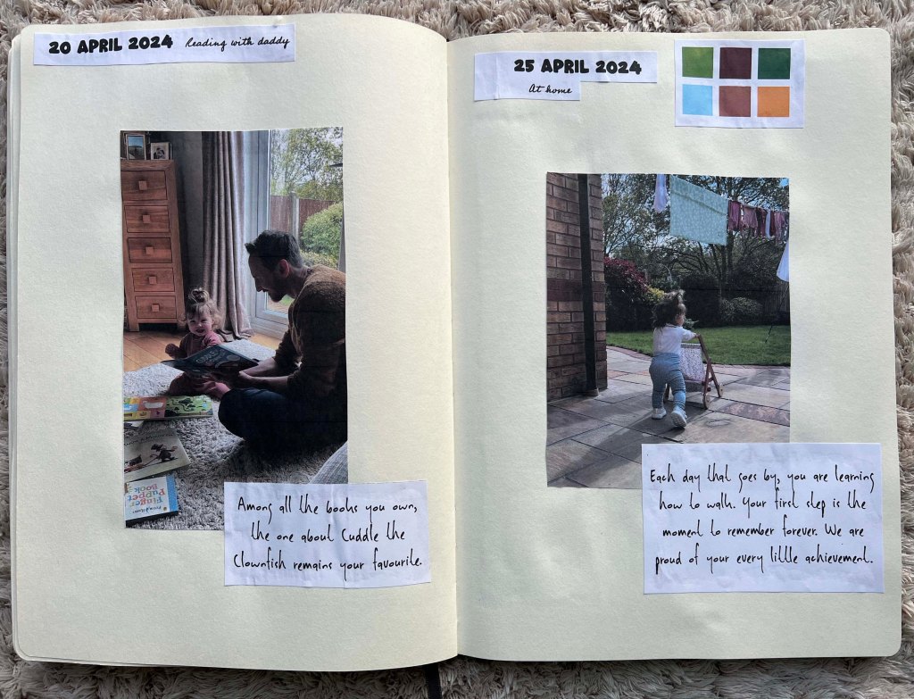
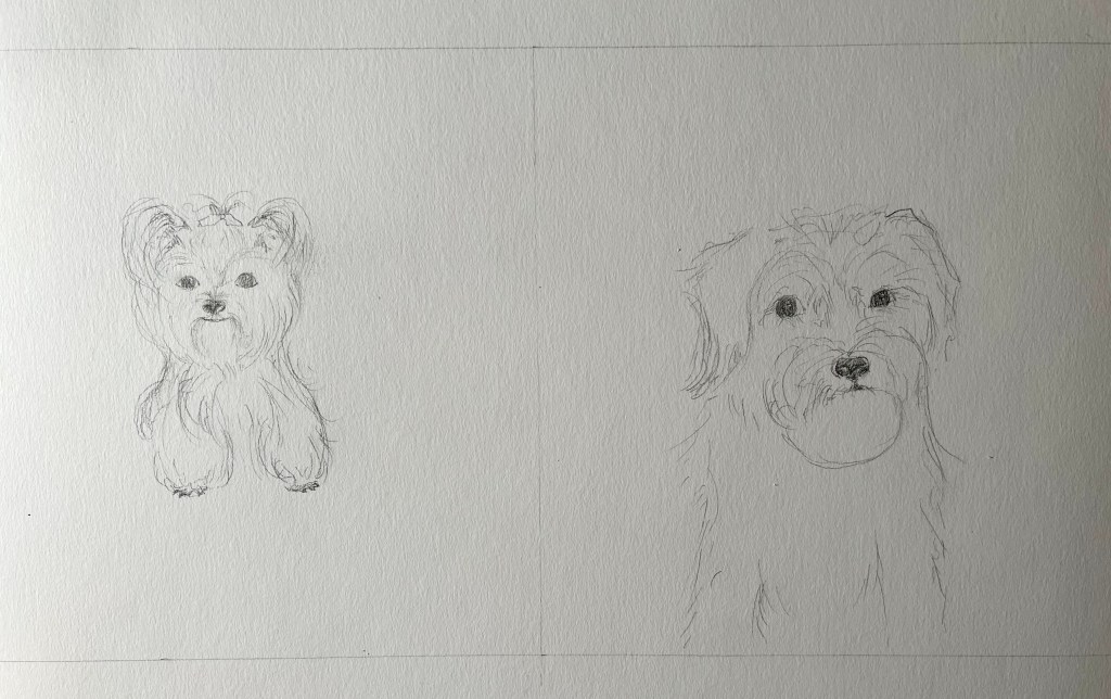
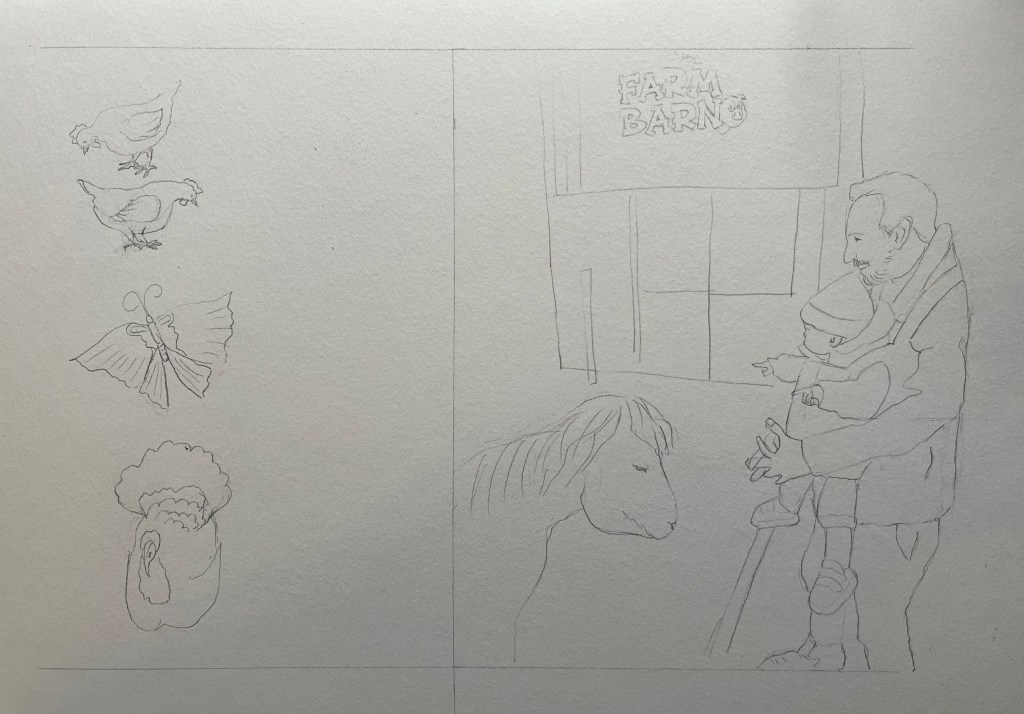
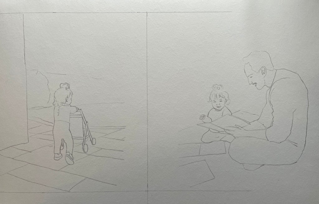
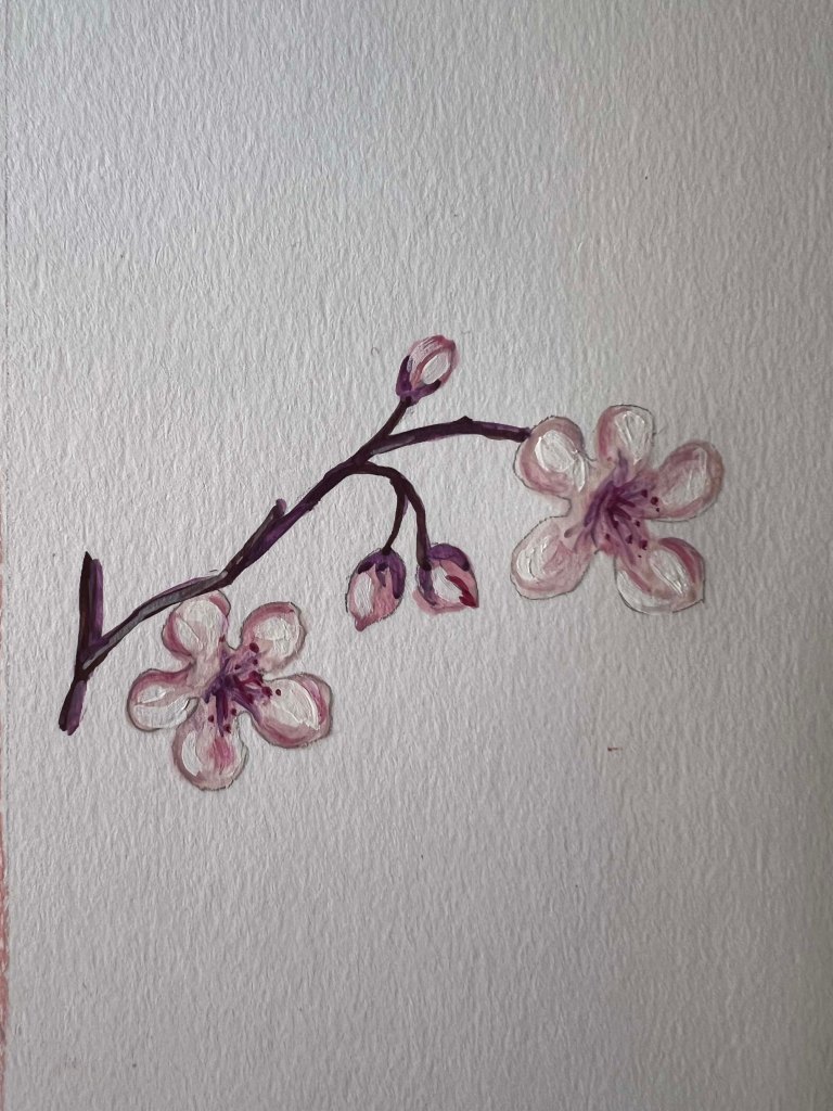
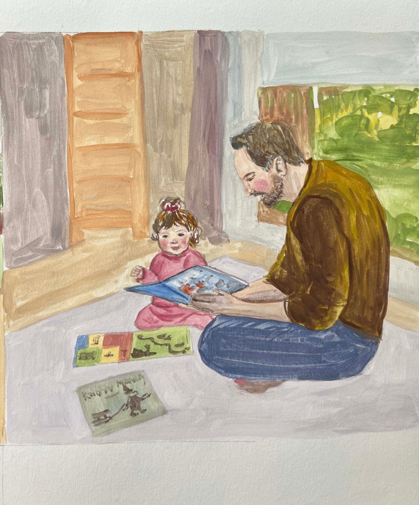
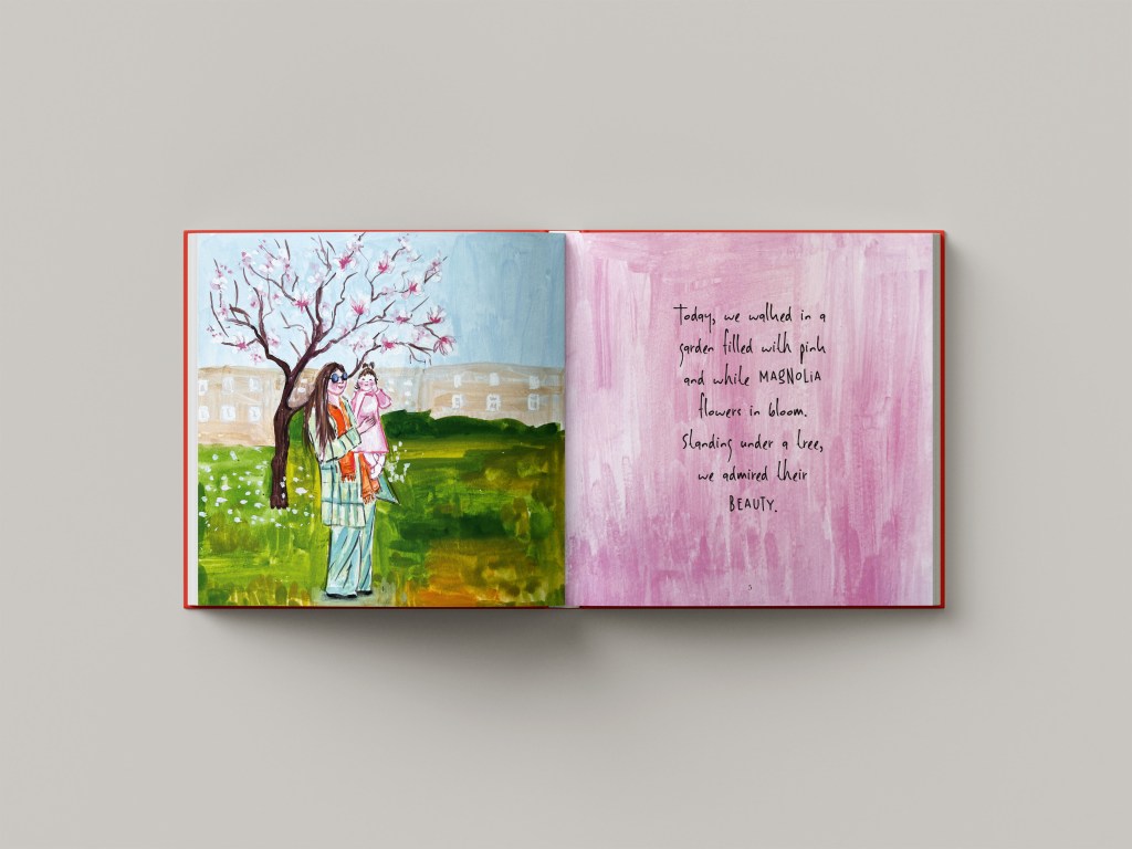
Below, I created a mind map and brainstormed ideas on the direction I should take for this book. Since I planned to centre the story around springtime, most of the activities we did together were in parks, where we discovered the beauty of nature. Also, I was going to include some family time around the table, spending time with farm animals, and learning moments, such as reading books and practising first steps.

The audience for the book could be parents and their children. The book will be filled with colourful visuals and observational drawings done artistically. Also, thinking of the format of the book, I wanted it to be square size 21×21 cm with a hardcover. I’m planning to print it as well, depending on whether the printing company will allow me to do so with limited pages, as usually there is a certain requirement for the number of pages.
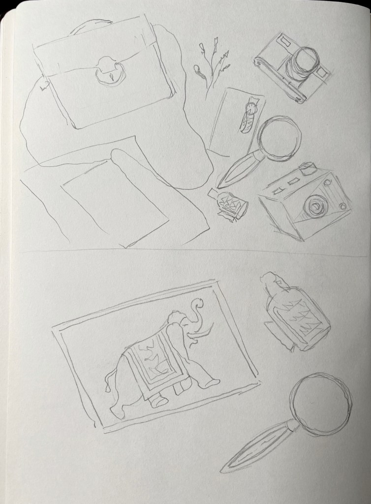
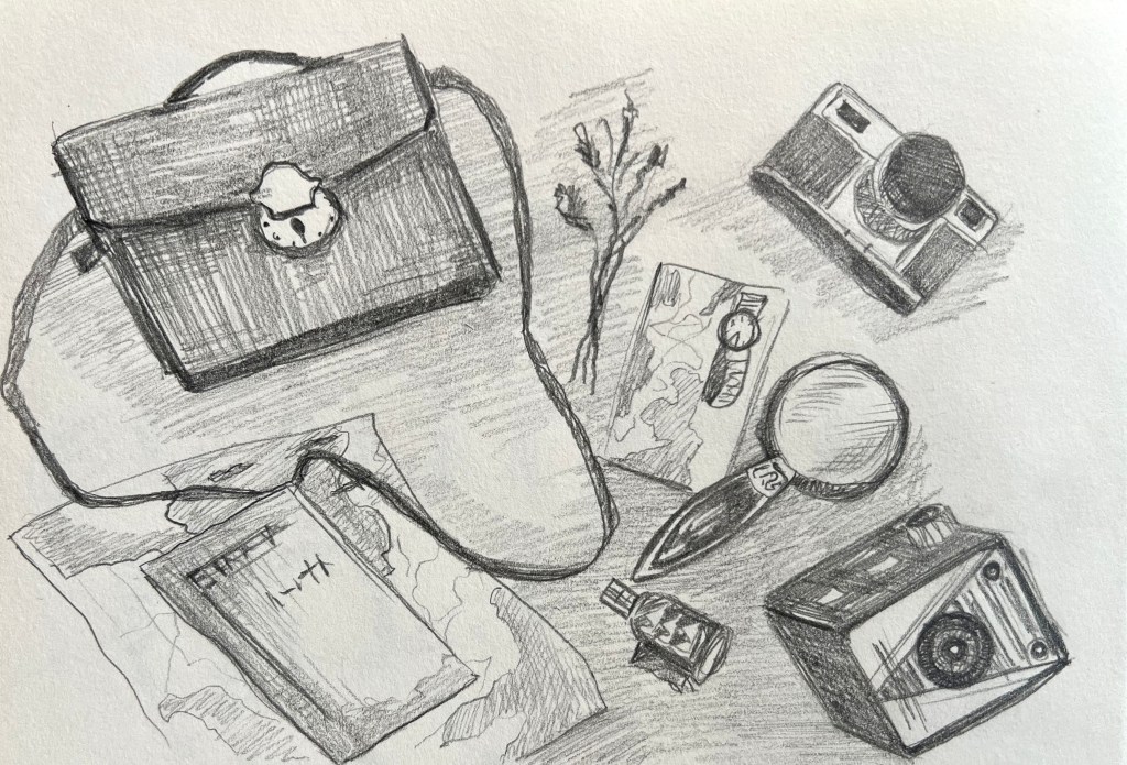
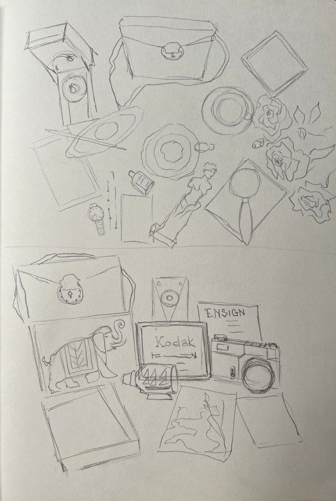
Sketchbook

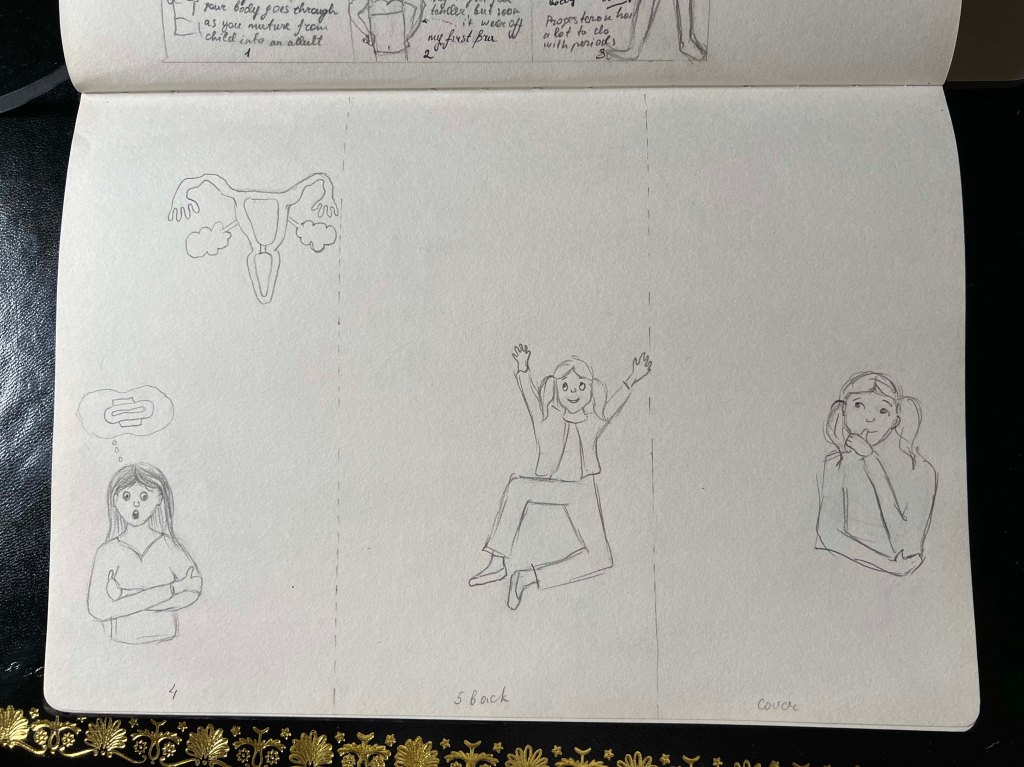
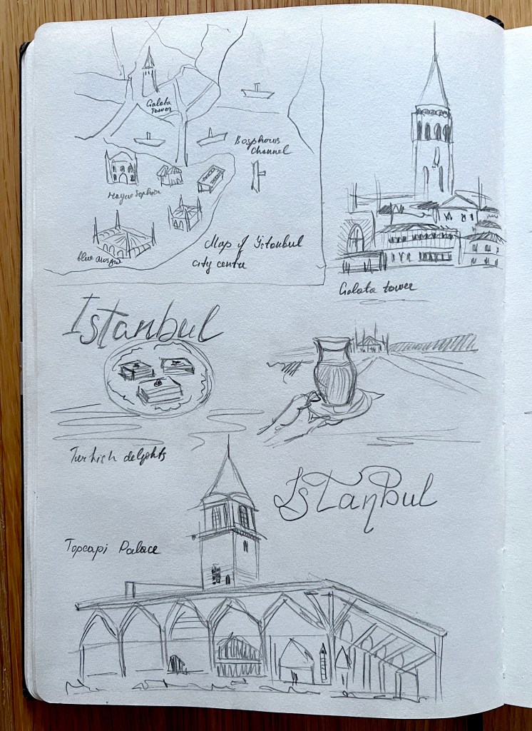
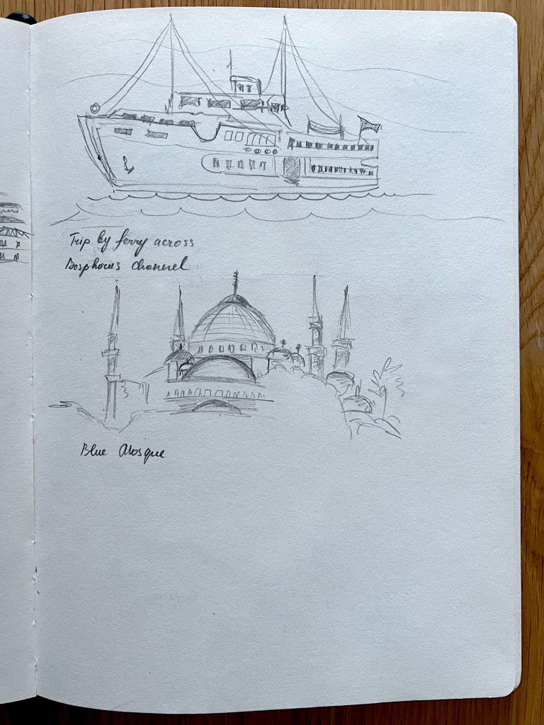
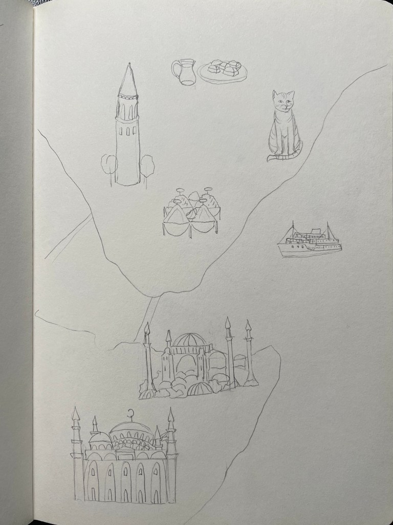
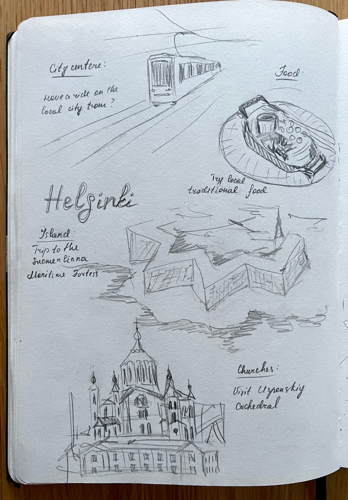
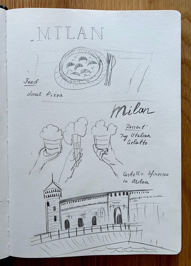
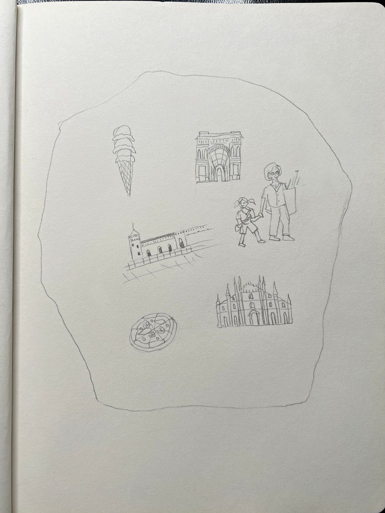
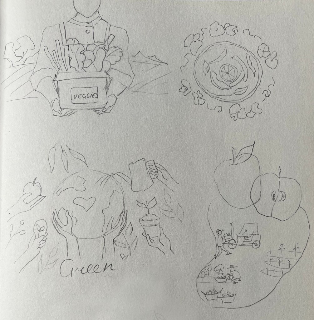
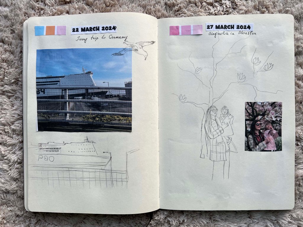
The next step was to collect events and make some sketches. I arranged them in order by date, thinking of the balance between outdoor and indoor activities with Felicity. I added some additional options, so I could choose between some events. I was going to include our ferry trip to Germany, but then I thought it doesn’t quite go with the rest of the content for the book, therefore I swapped it for the Easter time around the table with family.

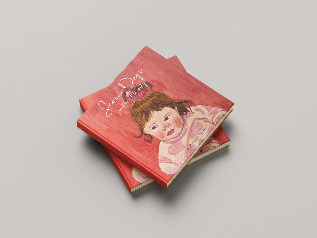
I was thinking about the name for the book, I thought it would be something like Seven Days in Motherhood, Seven Days from the Life of a Mother, Seven Days in Seven Parks, or Seven Days of Joy, but then the name came to me naturally, Seven Days with Felicity, as it the best describes the content of the book and idea around it.
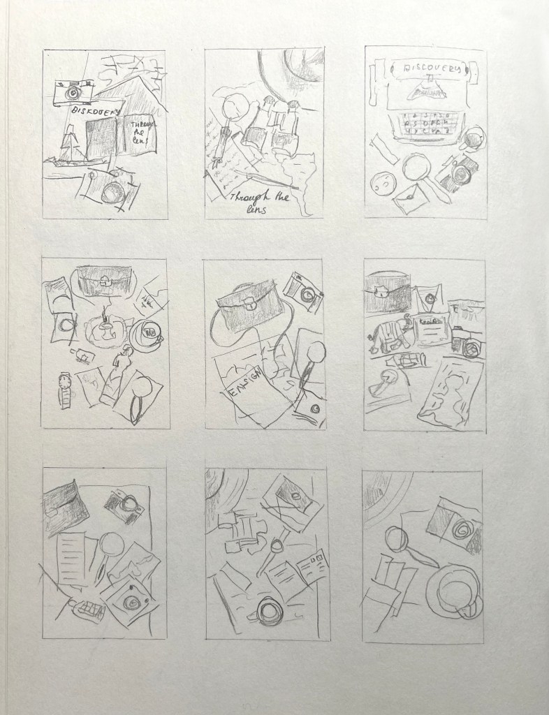
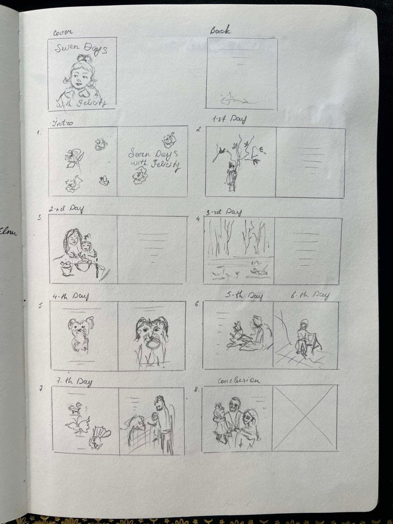
Thumbnails

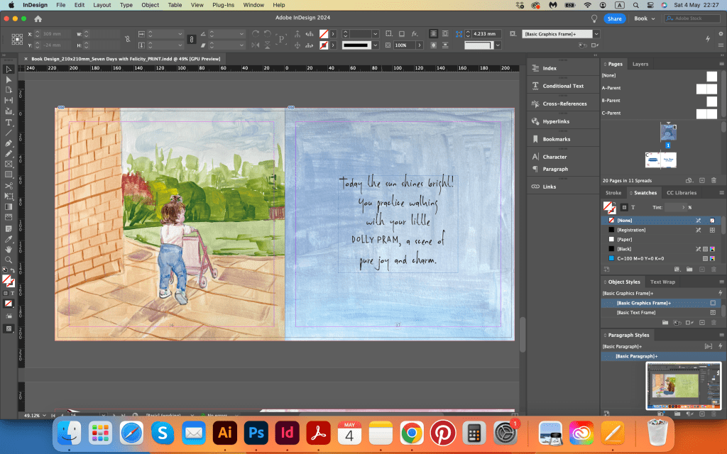
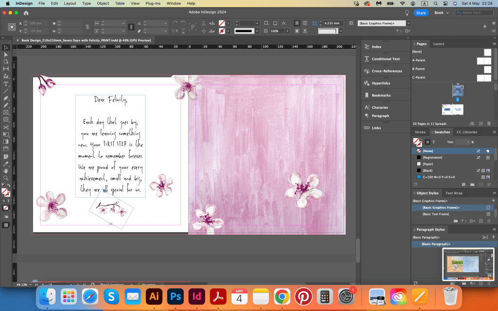
After gathering all the information for the book, I thought I needed to bring everything in order. The scheme for page arrangments helped me determine the best structure for the book. I started with a cover, and then I added a clean spread with the name of the book, thinking of placing the introductory word on the left side of the spread. Altogether, I had seven spreads and an additional page for the conclusion. Most of the pages will feature coloured visuals with a matching background palette for text on the right. Some pages will have text placed on the actual picture, creating a freestyle for the book, almost like a live journal meets the book.

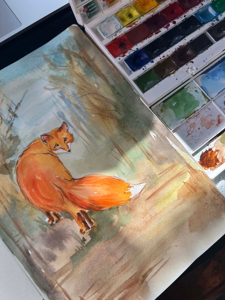
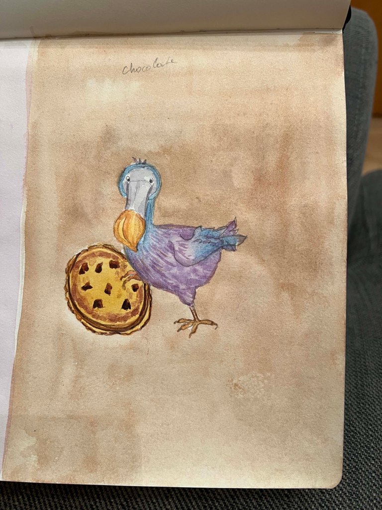
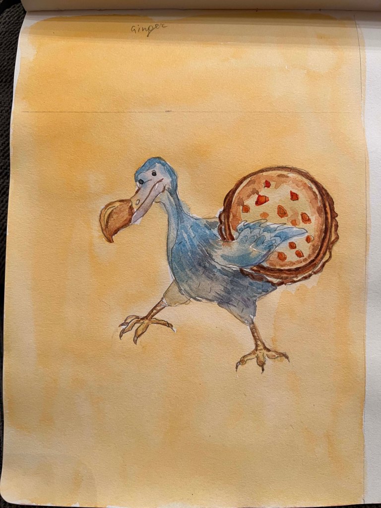
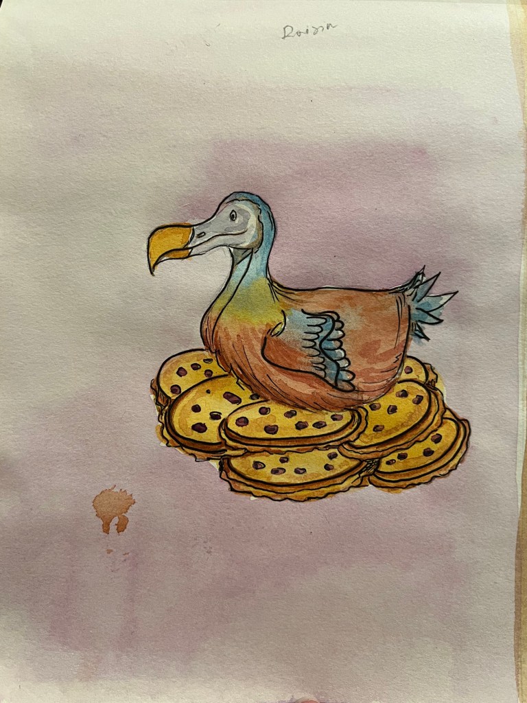
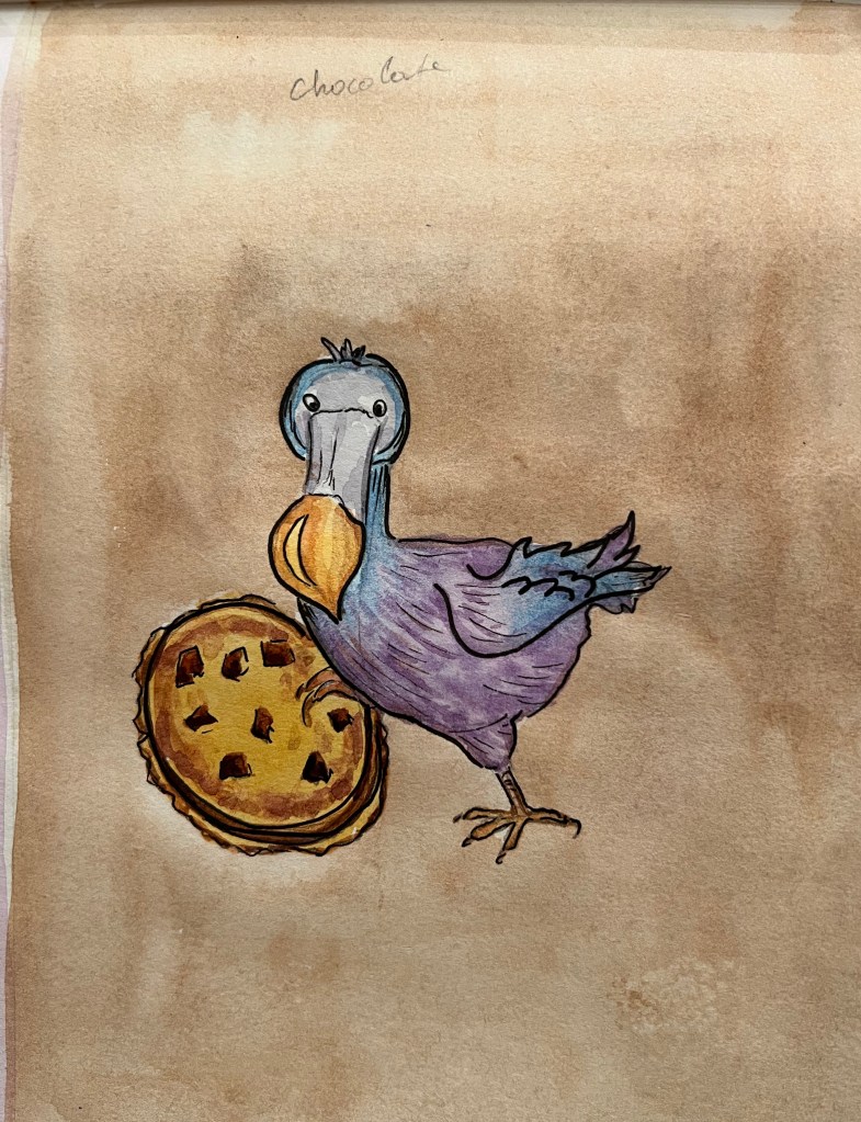
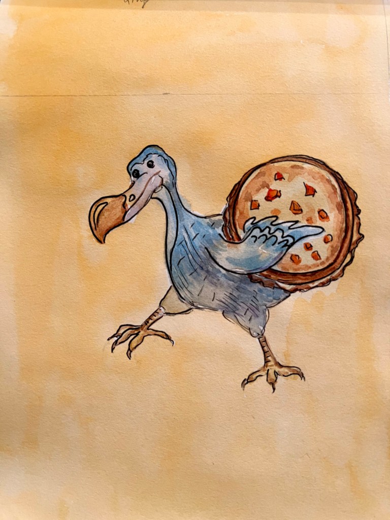
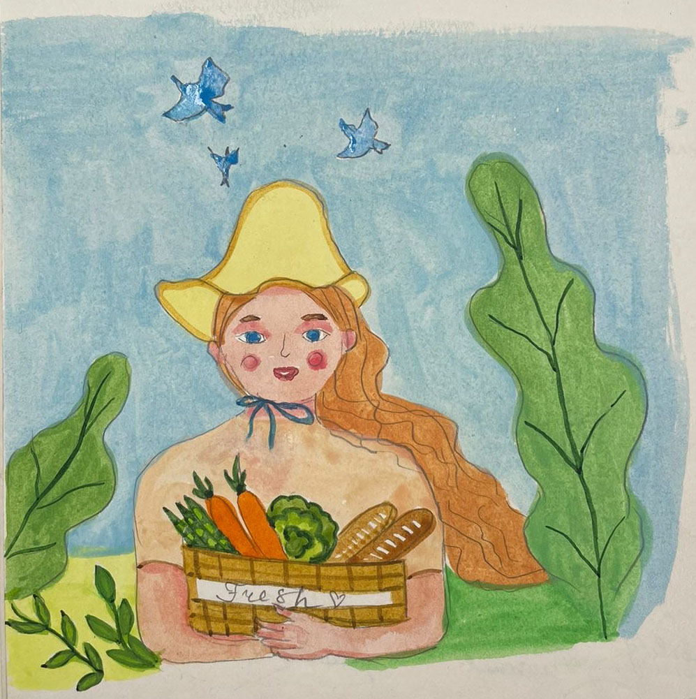
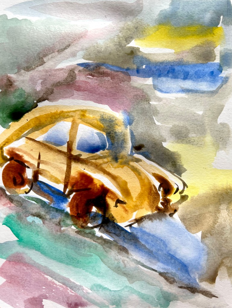
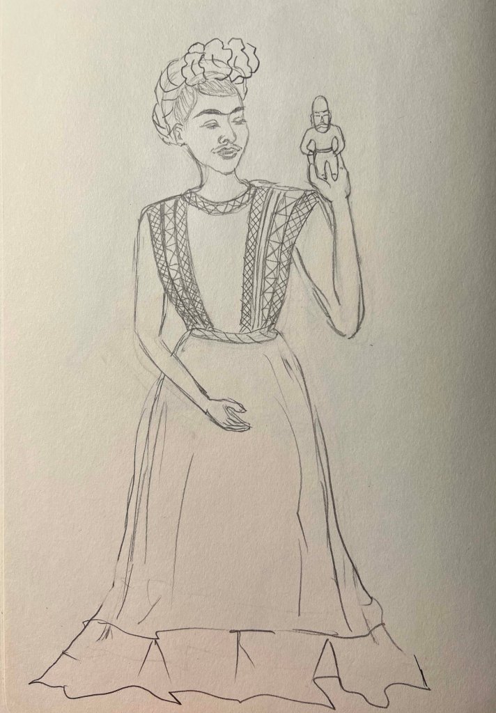
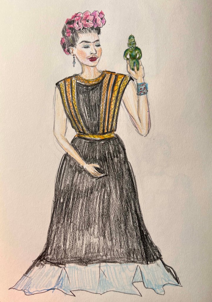
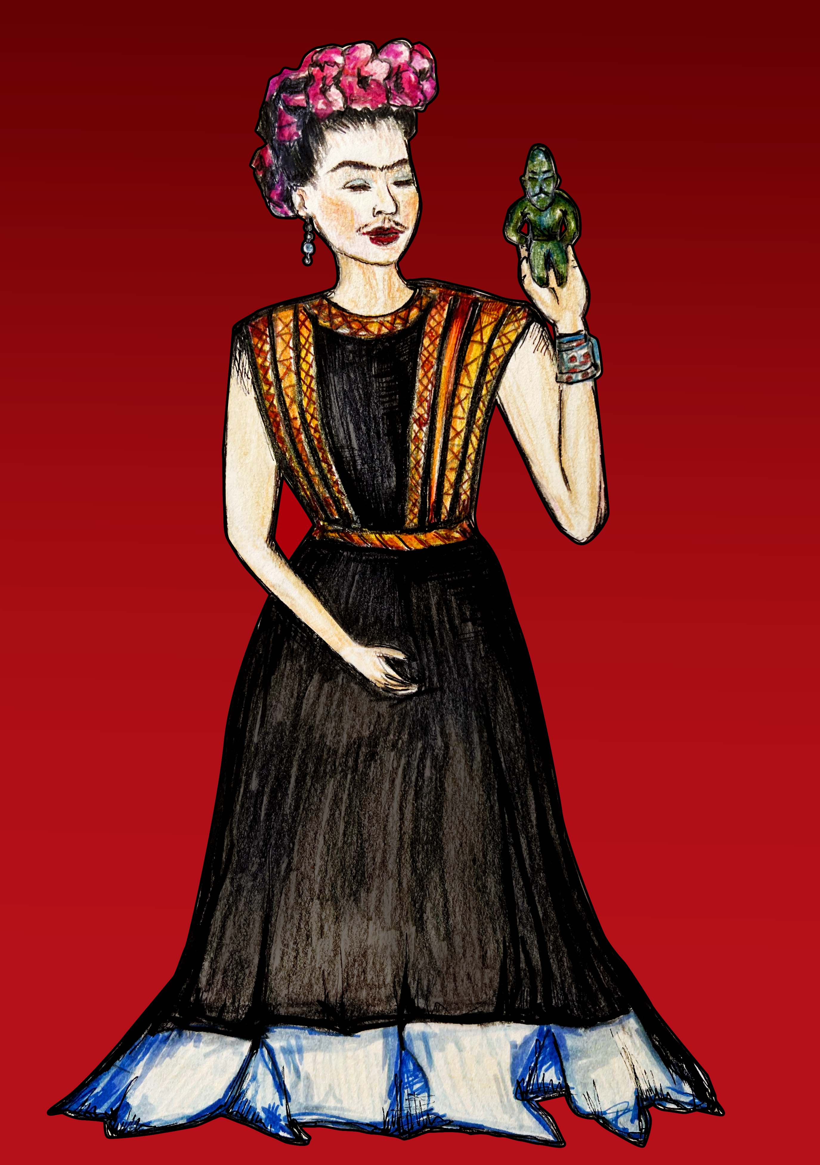
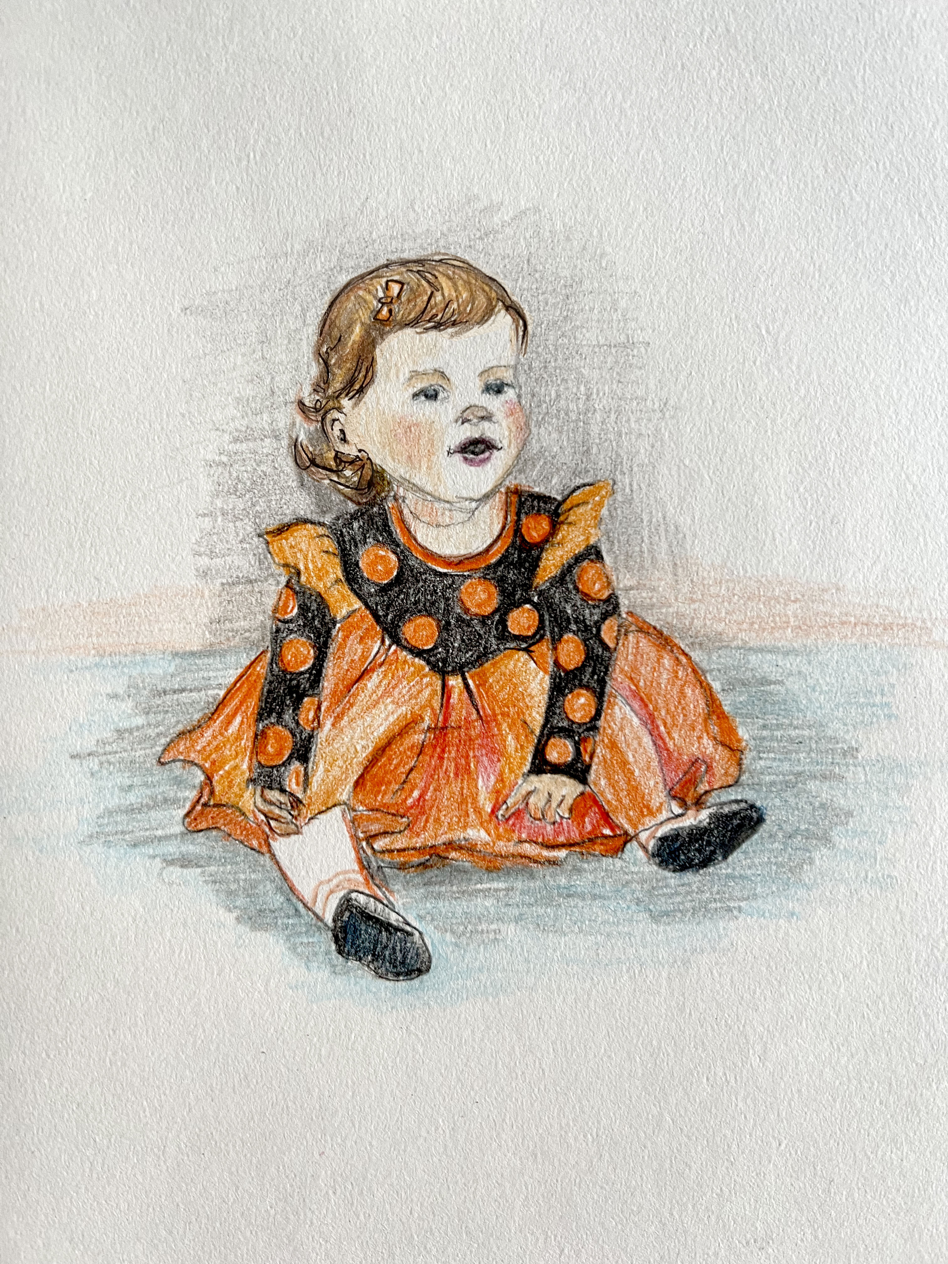
I plan to use gouache for the paintings to achieve an opaque, impressionist feel. Looking at Maira’s works, she bravely makes illustrations caricatural, out of proportion, and cartoony. As the name of this final part is The Style, which I’ve been trying to establish throughout the course, I want to implement the style I used before, making bright, colourful, objective drawings.

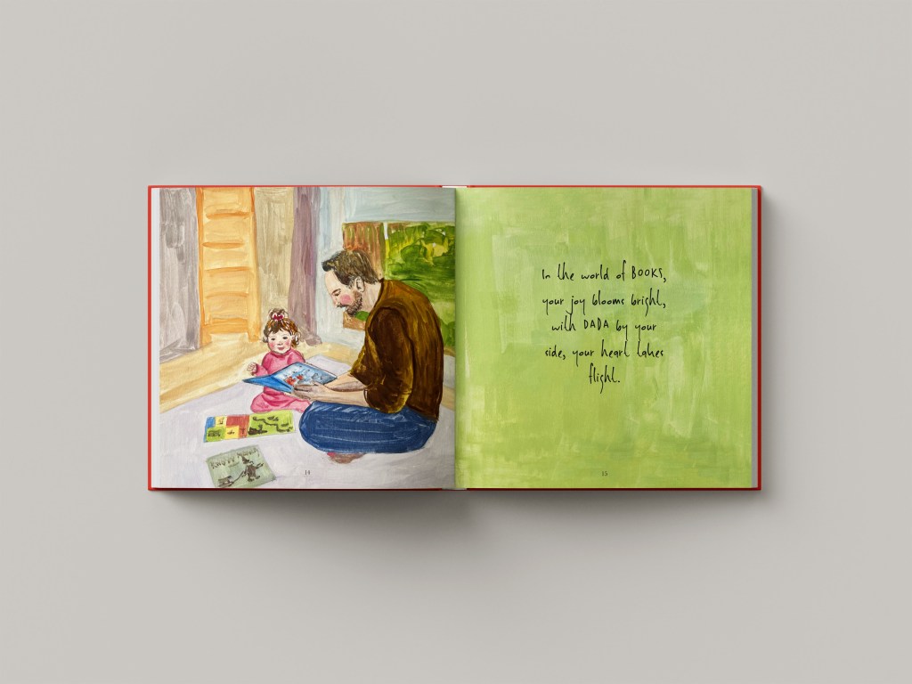
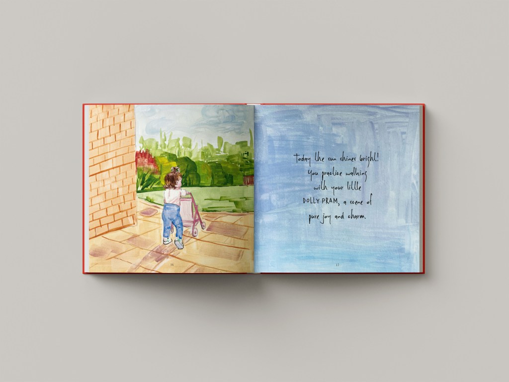
Also, I challenged myself to add wording for each page, as I think the content is important too. The carefully chosen poetic language complements the visual and weaves a narrative. Transitioning from designer to illustrator and narrator, the visuals should be supported by stories, adding depth to the artistic expression.

In this book, I wanted to teach Felicity to look at this colour, this shape, and at the same time to remind all parents, to rediscover the world through your child’s eyes. Each page connects a young observer with the timeless wonders of nature.
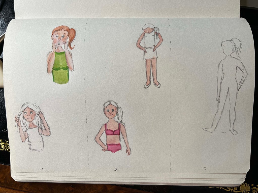
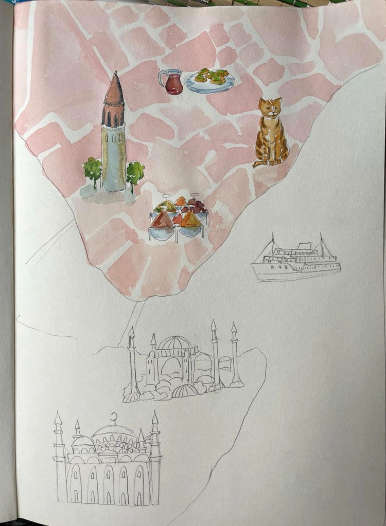
Sketches

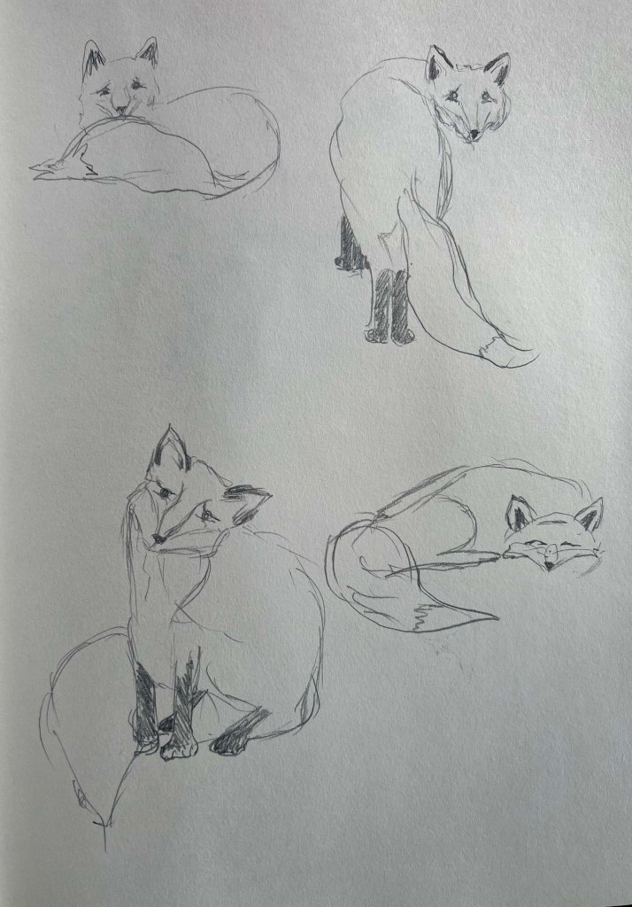
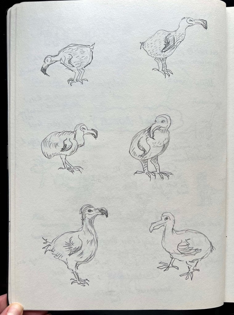
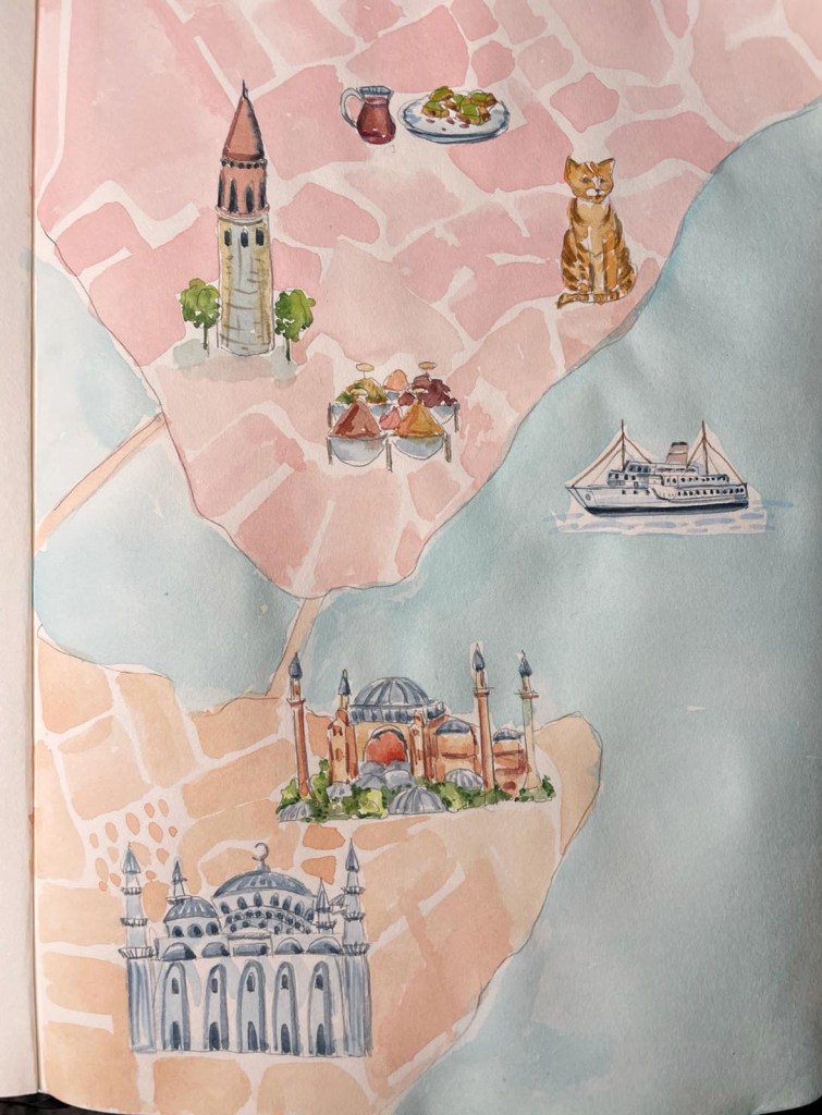
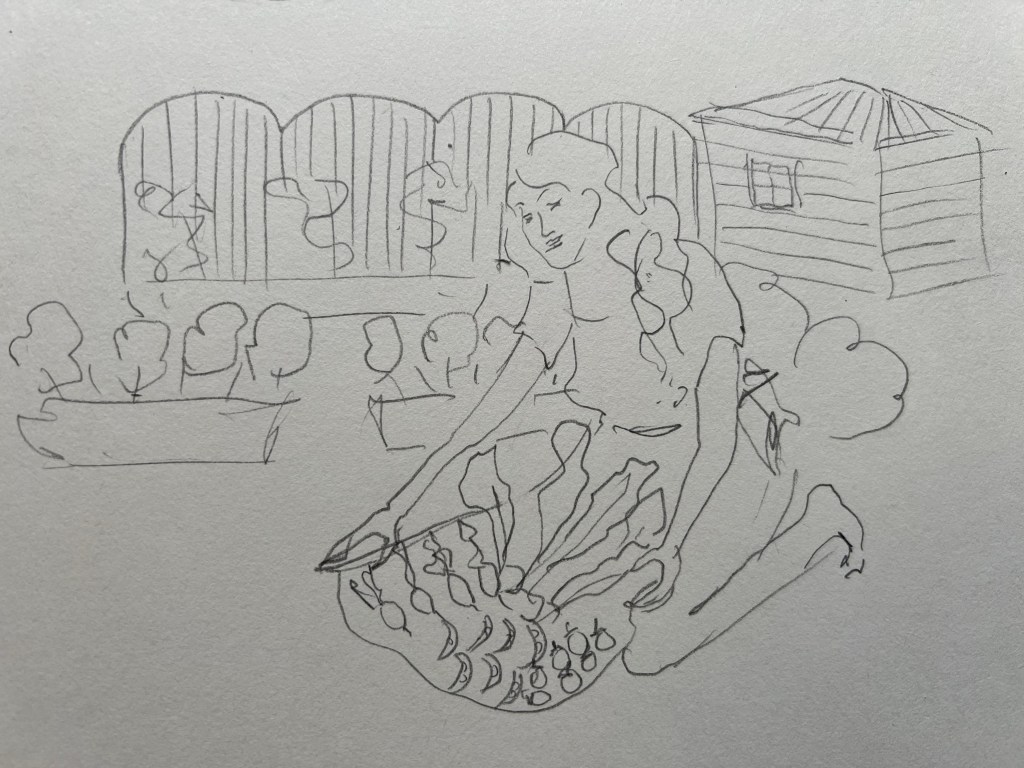
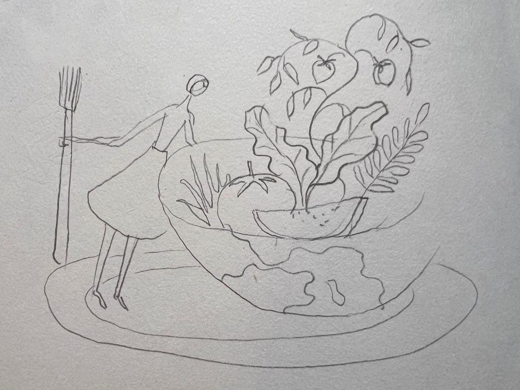
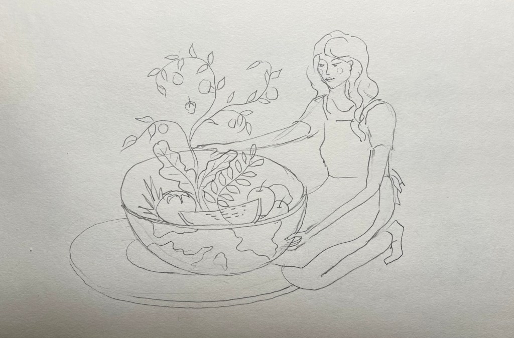
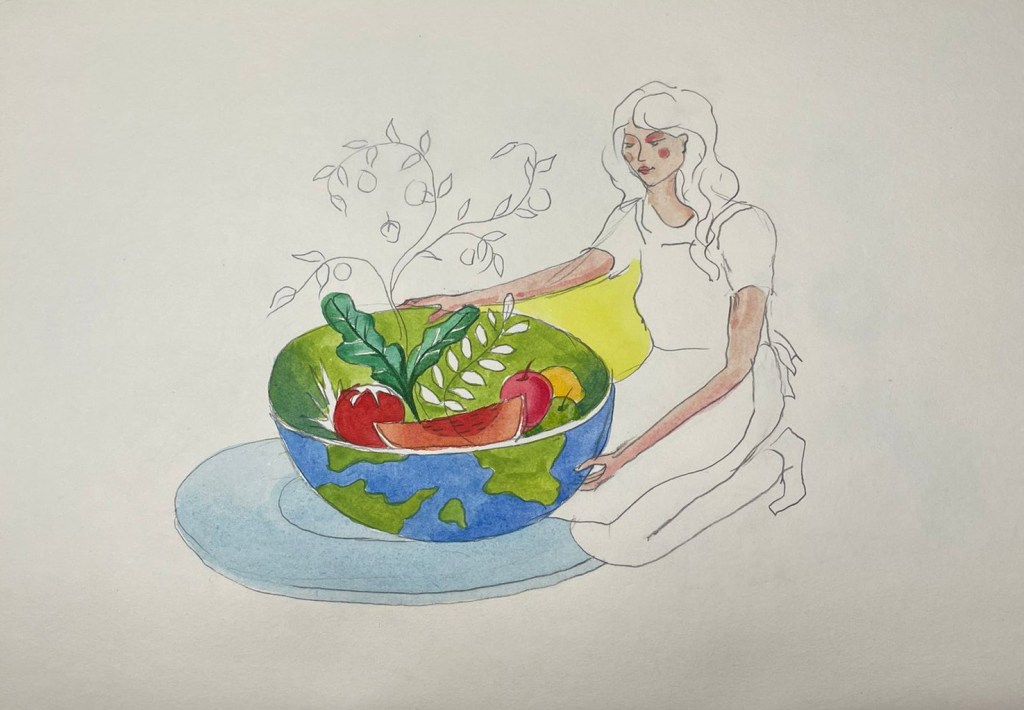
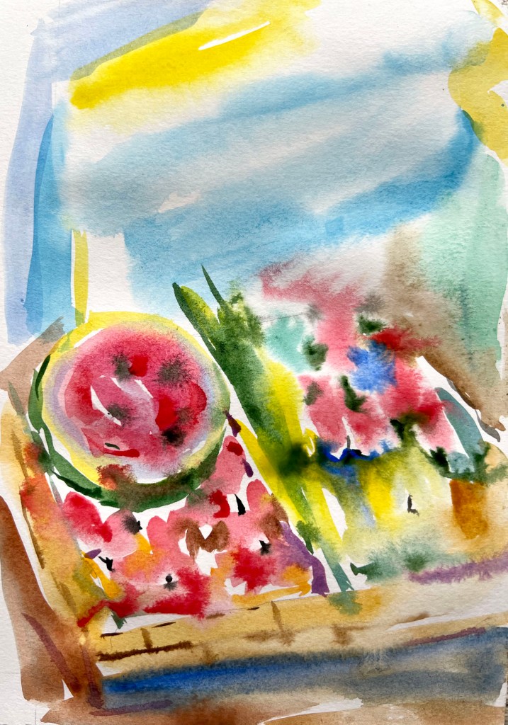
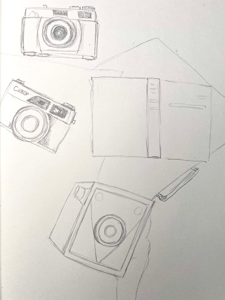
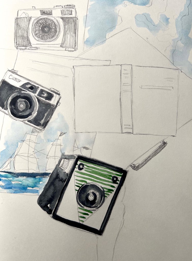
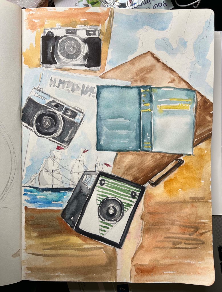
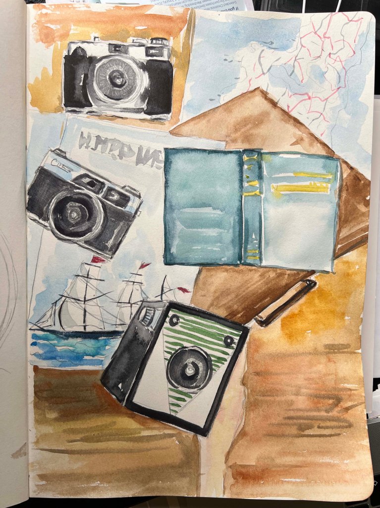
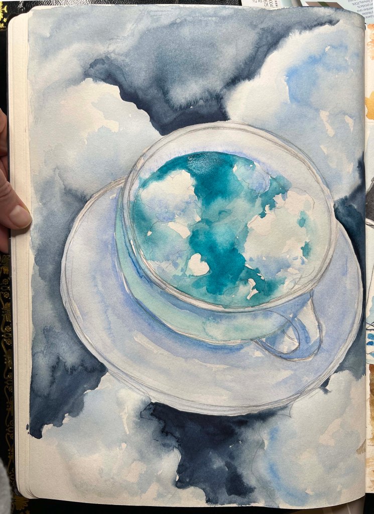
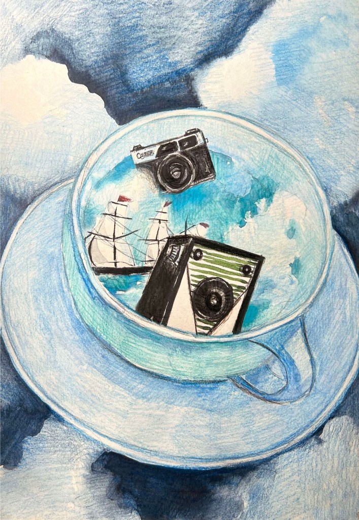
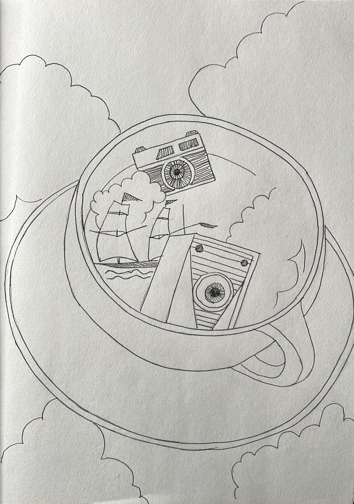
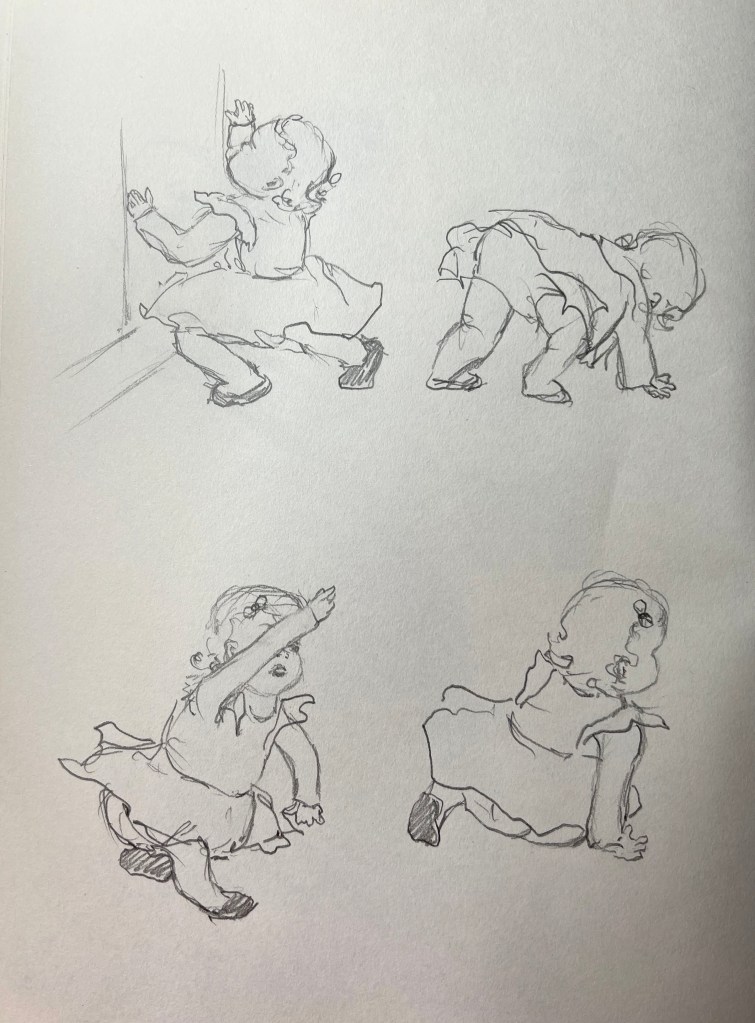
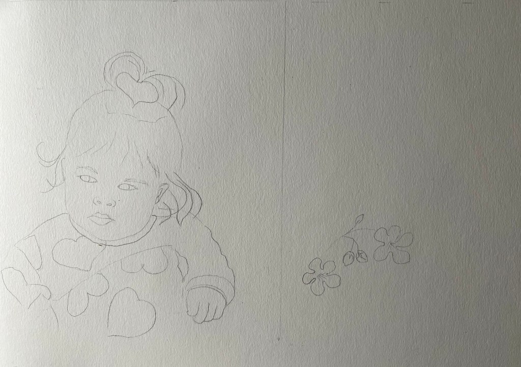
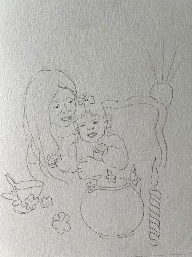
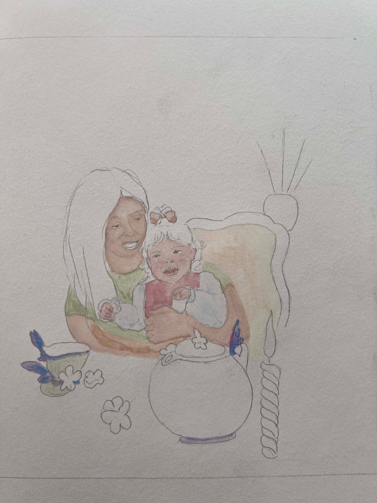
The next stage was to produce illustrations. I created a pencil sketch on watercoloured paper, matching the size to the book format, 21×21 cm. Also, I printed all photographs for illustrations in the actual size I would use for the book, which helped me to see the proportions.

Coloured Visuals

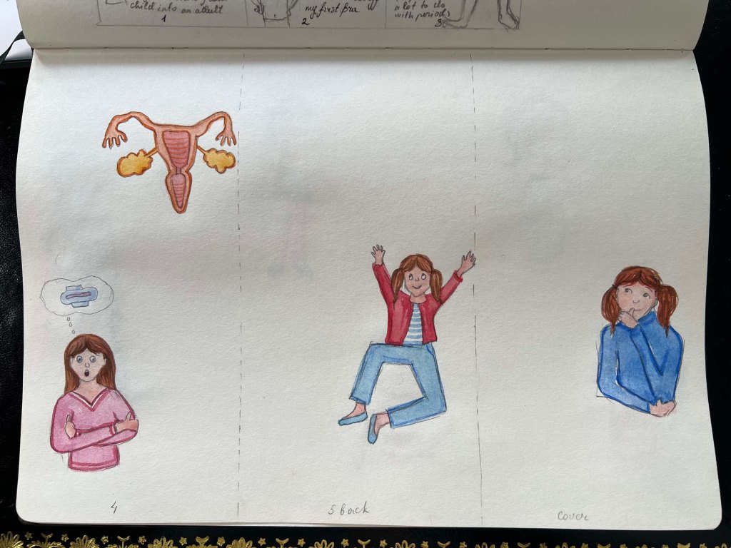
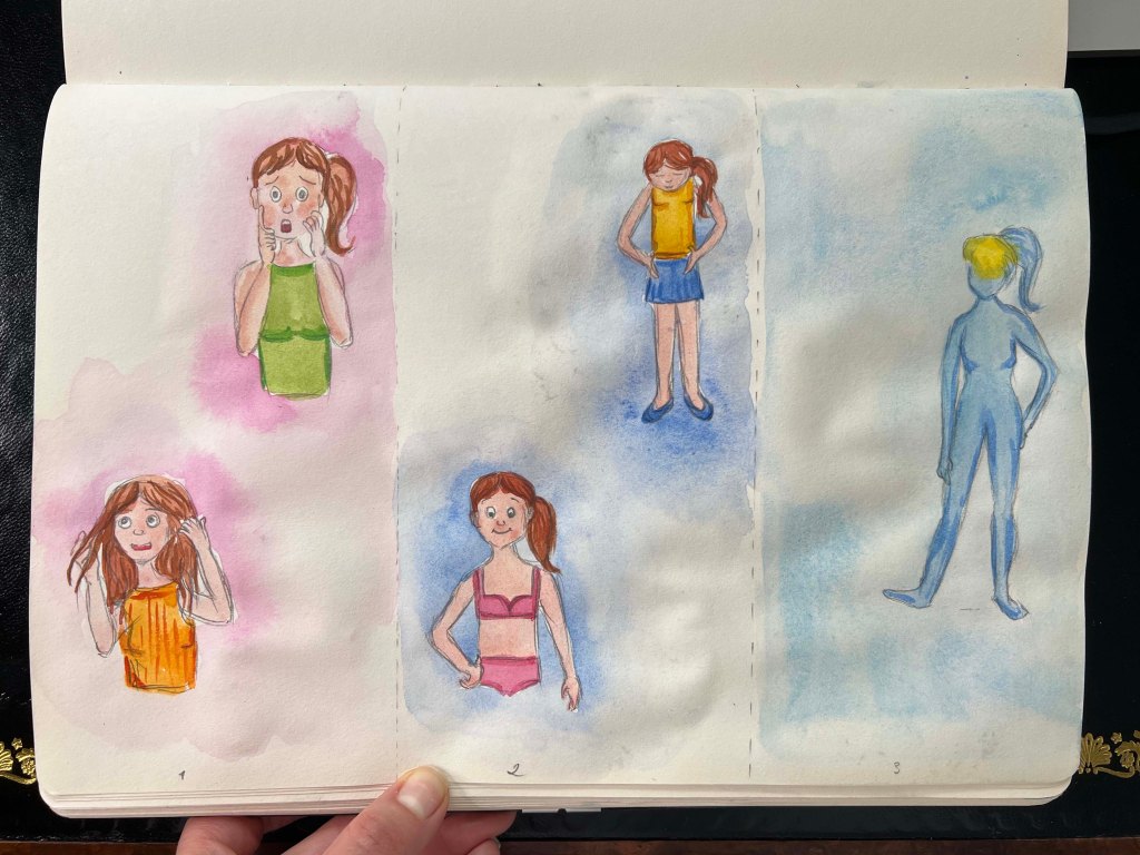
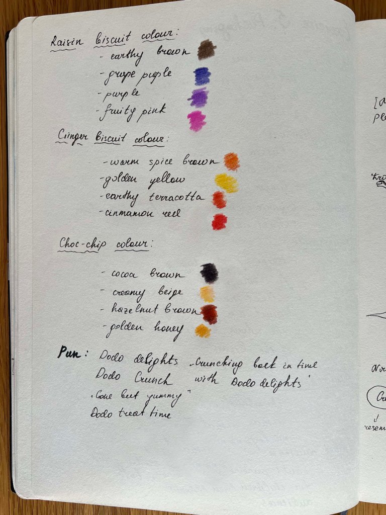
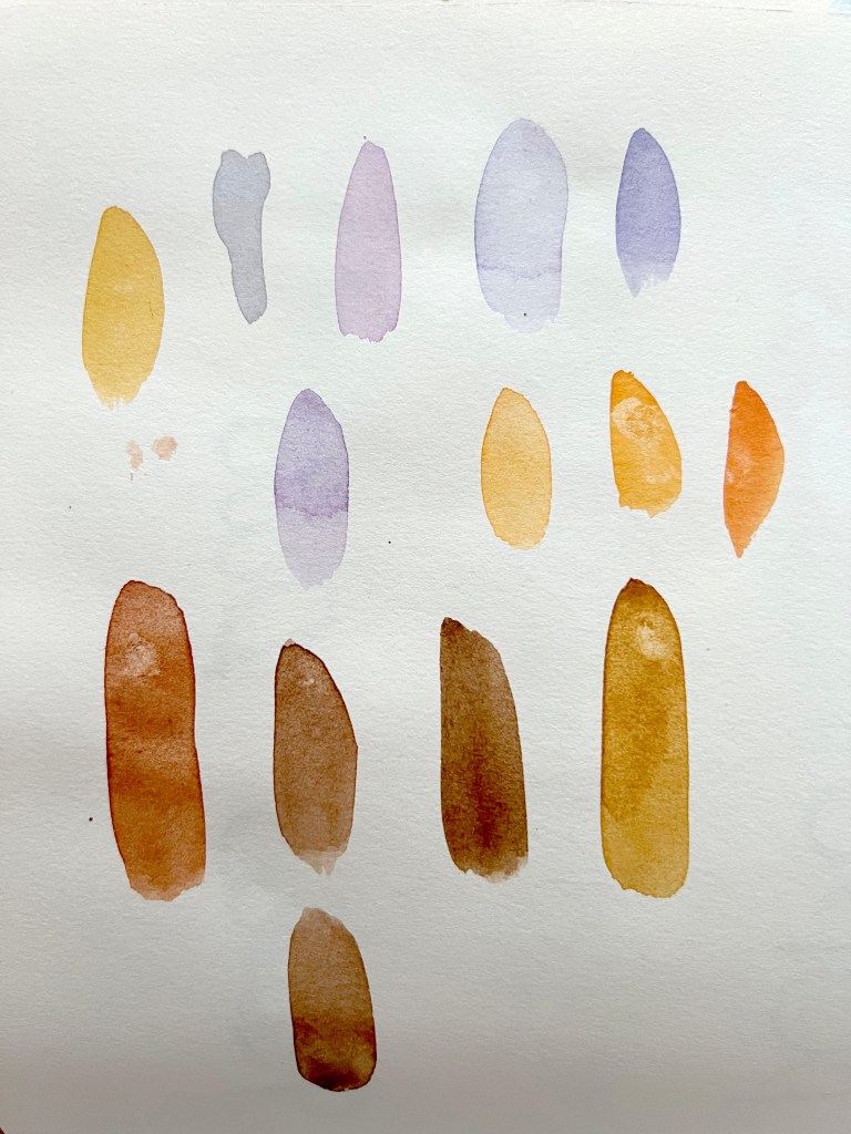
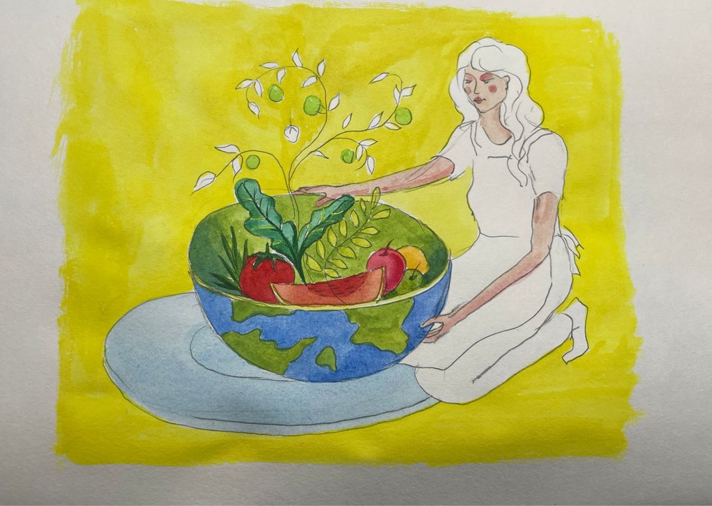
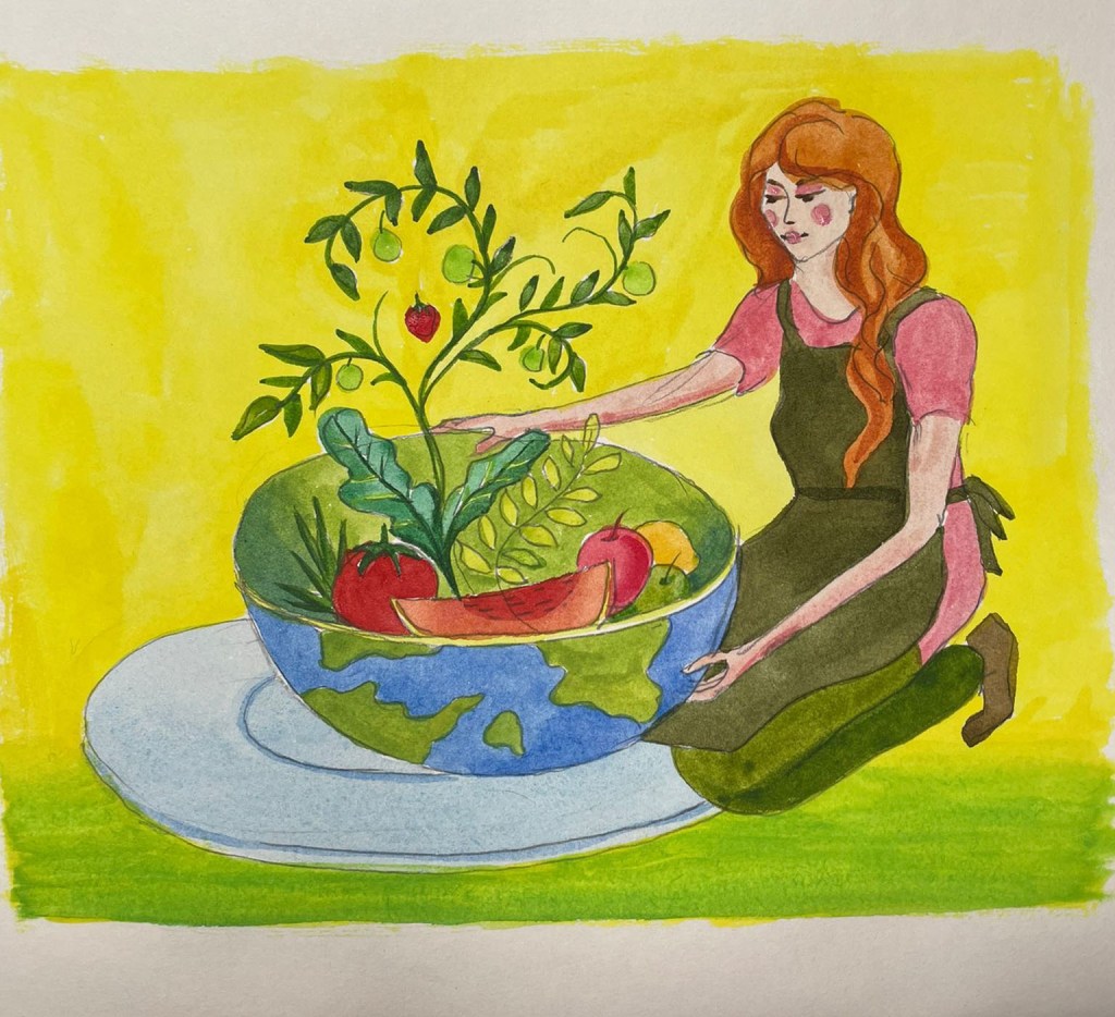
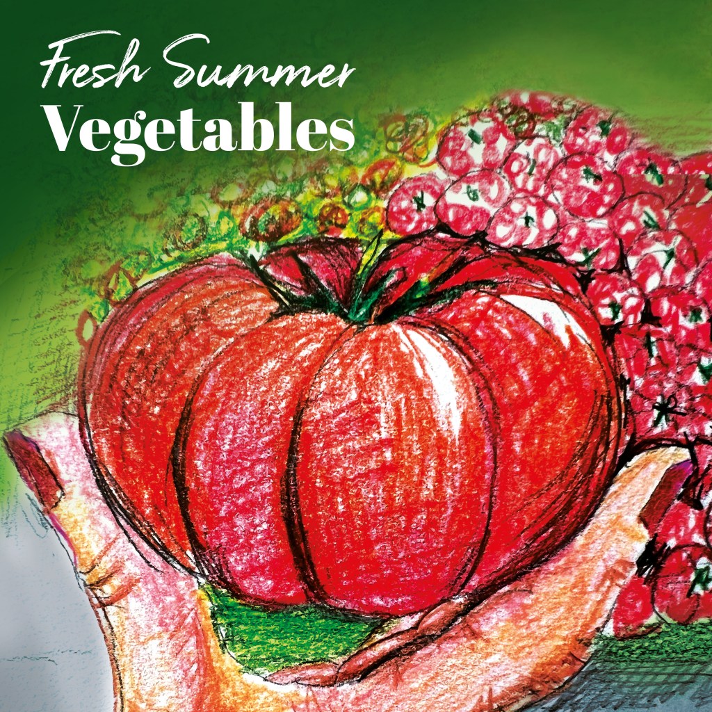
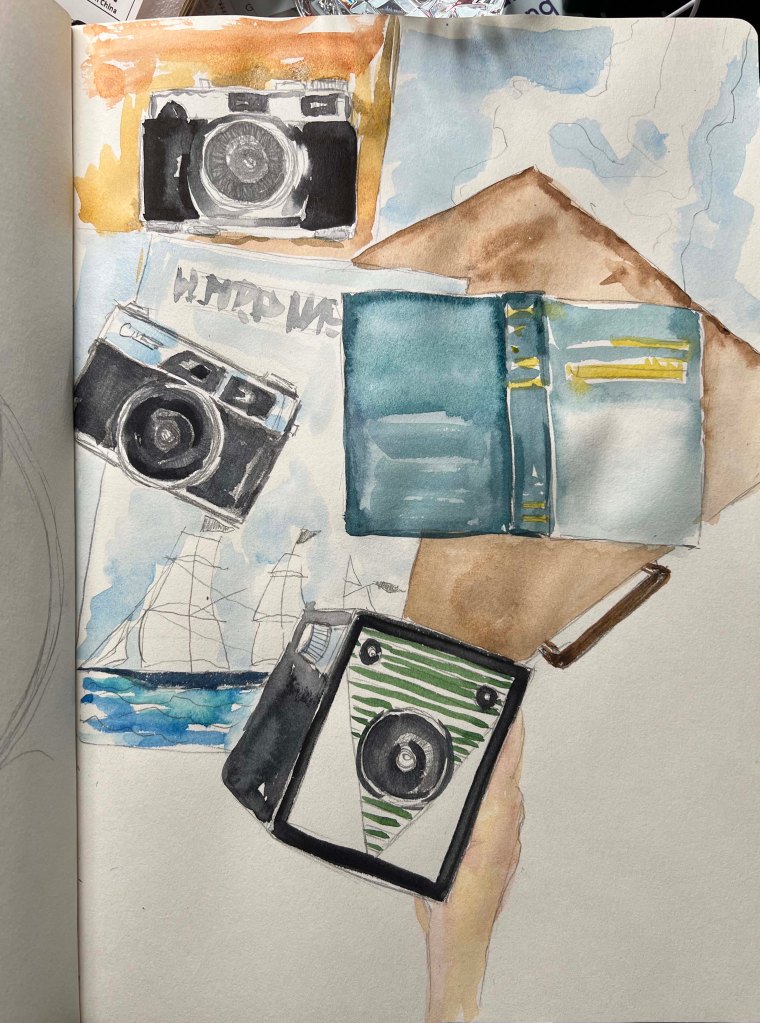
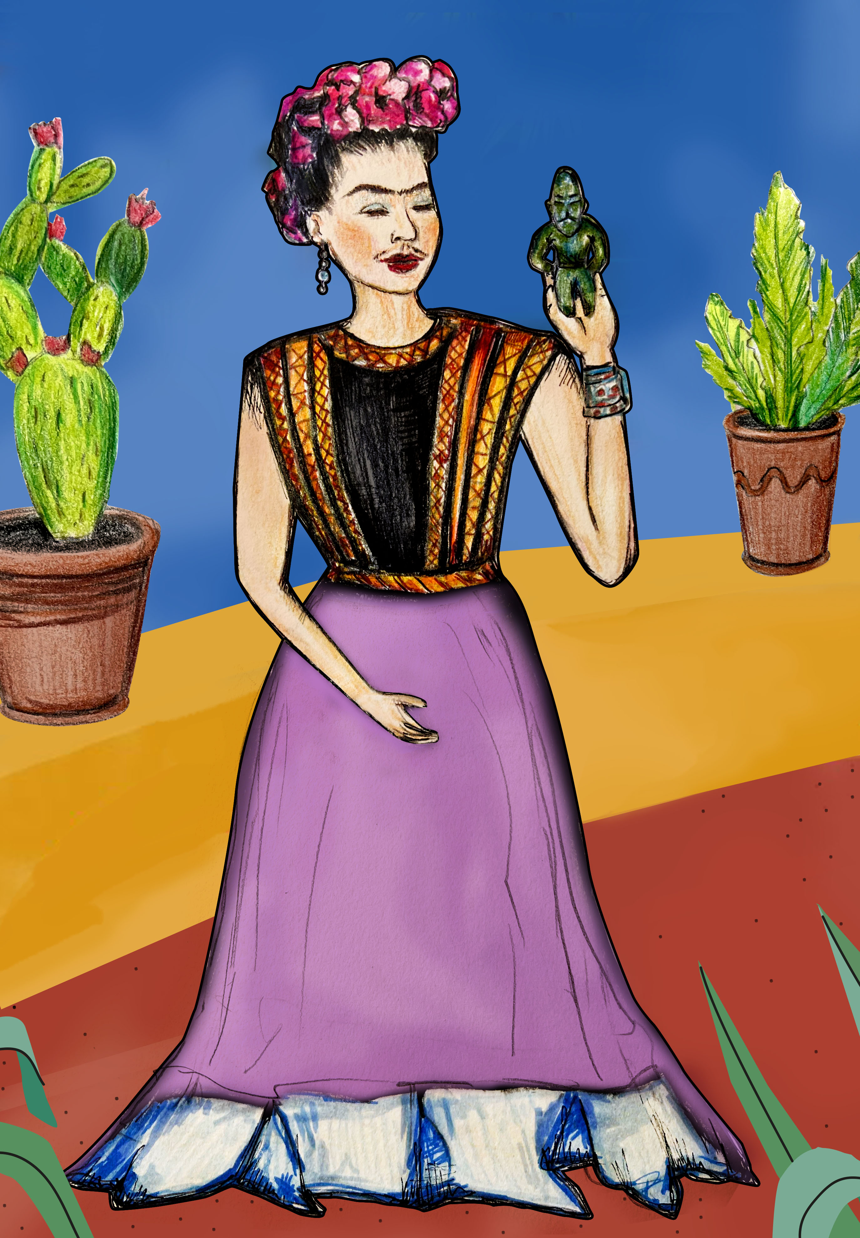
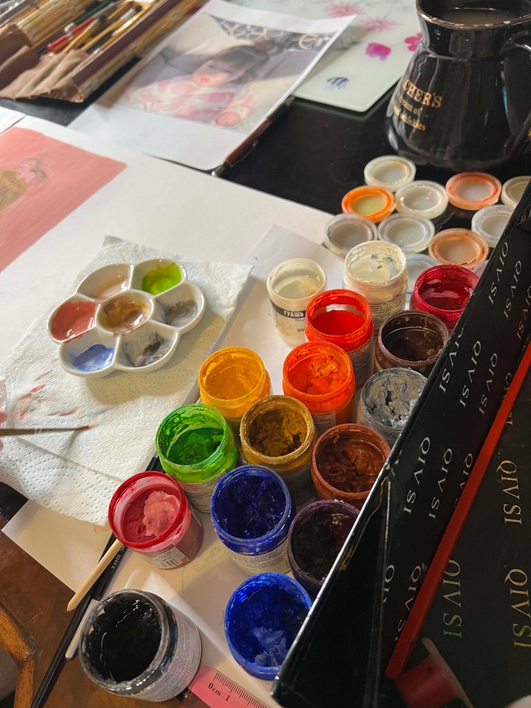
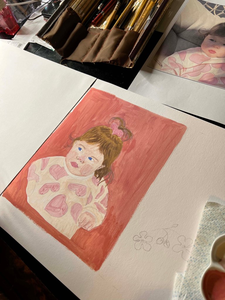
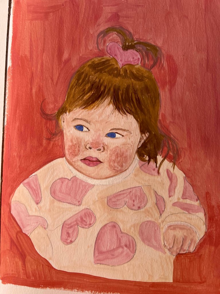
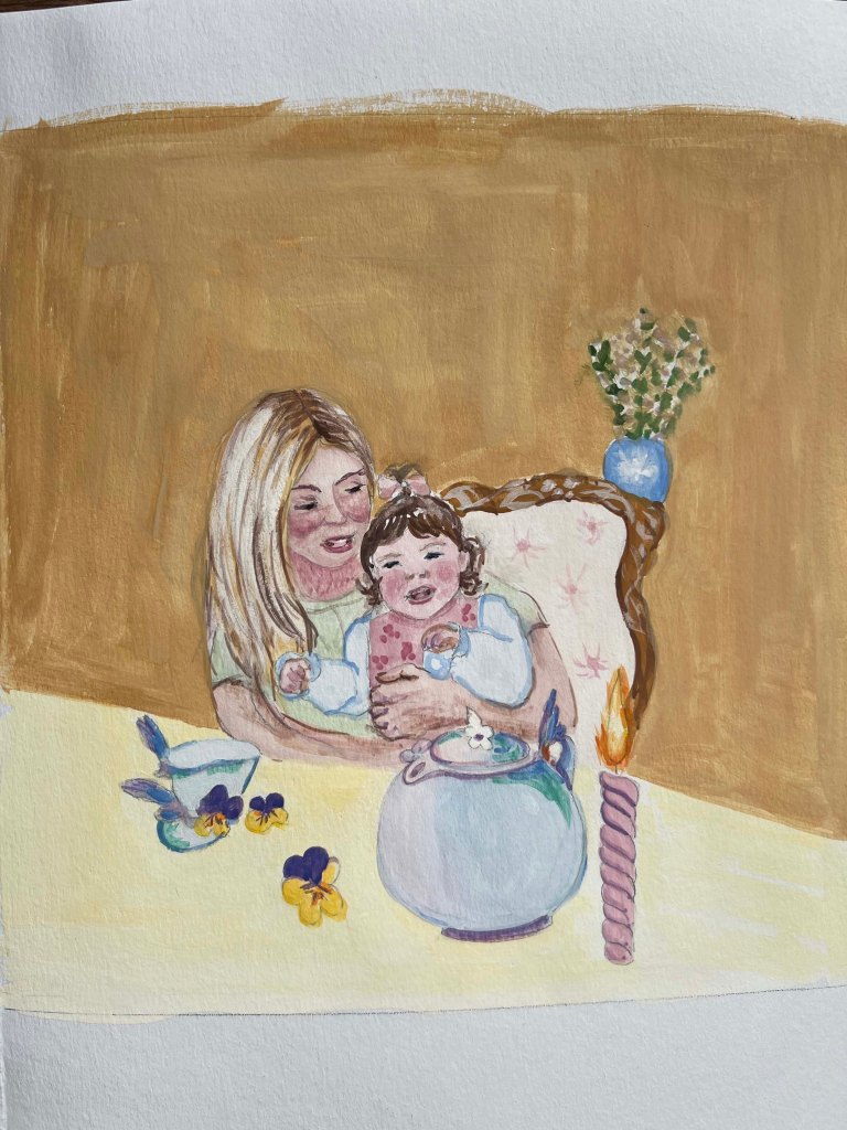
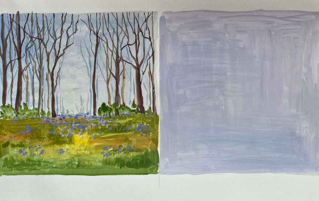
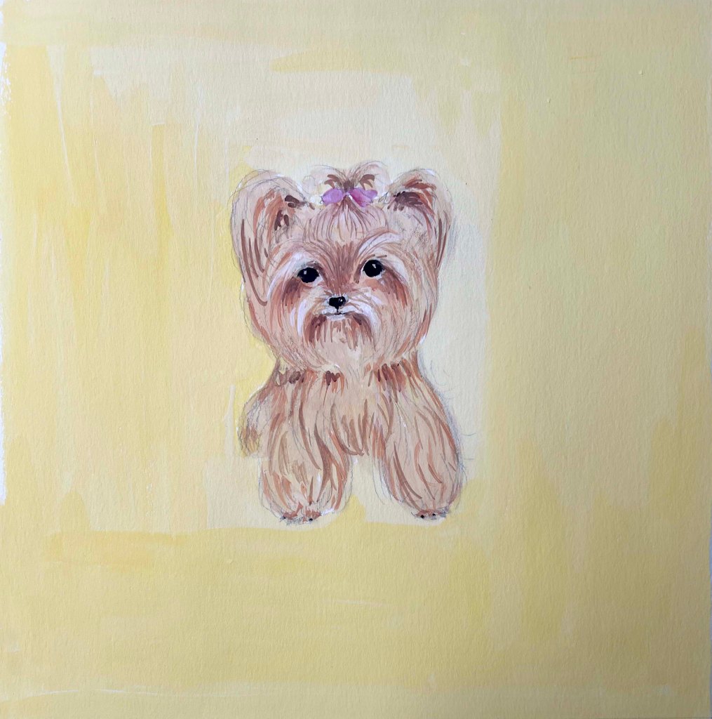
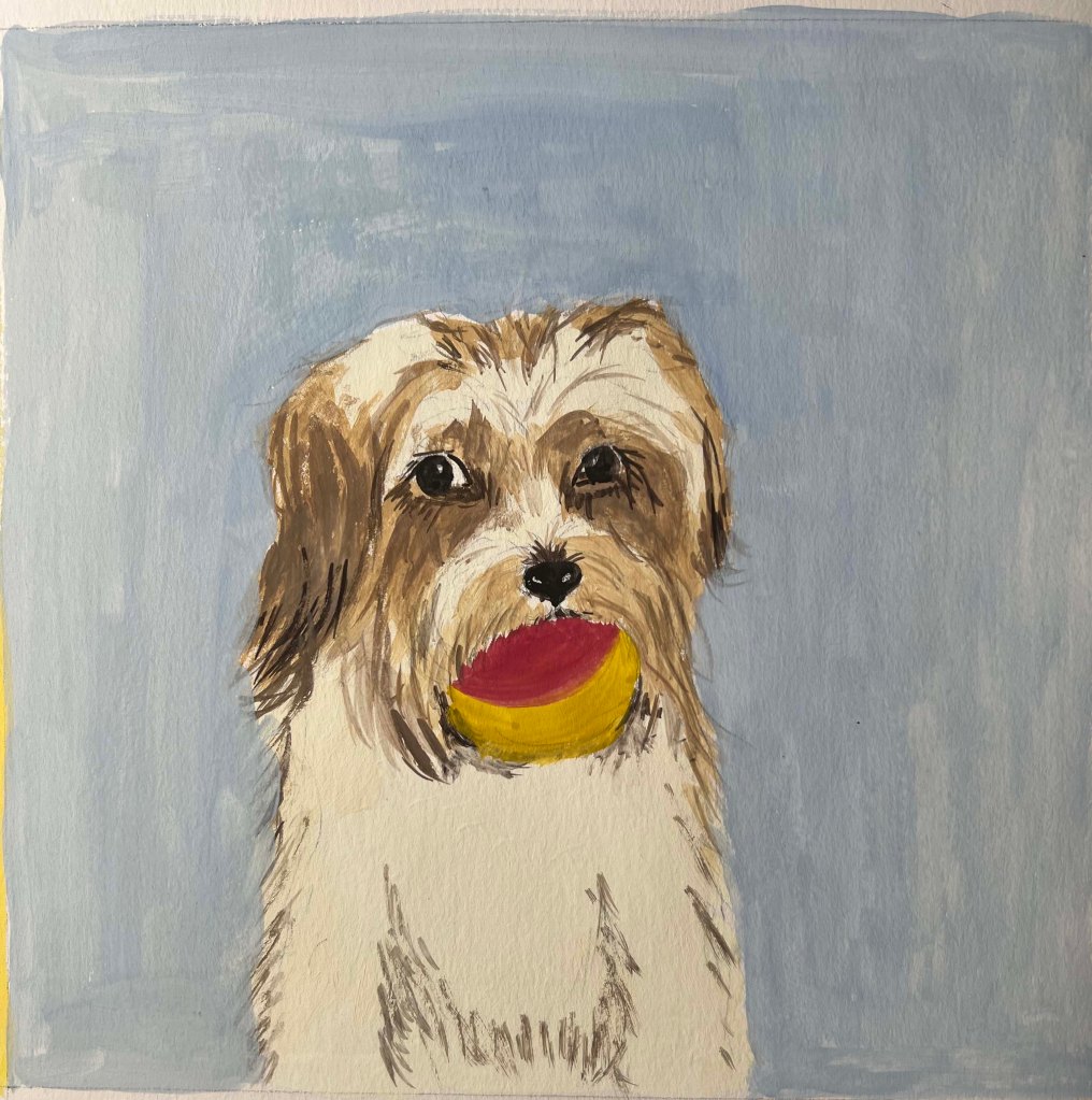
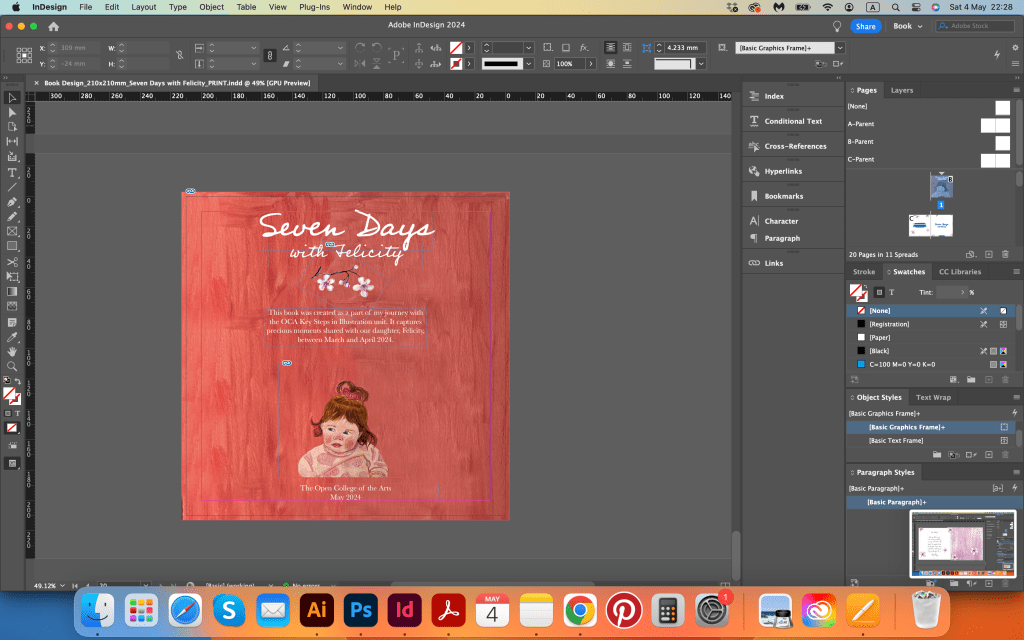
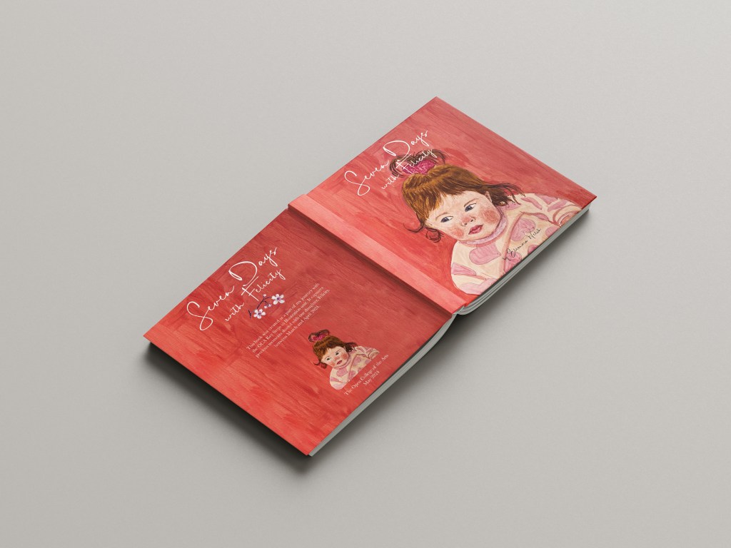
As mentioned earlier, I decided to use gouache paints for this book, and I believe it was the right choice. The paintings emerged with bold, vibrant colours while maintaining an artistic appearance. Most pages featured pictures of us, with a few spreads dedicated to our pets or the woods. This balance between portraits and landscapes, nature and people, added to the overall aesthetic. For the covert picture with Felicity’s portrait, I used a terracotta red colour. Originally I was planning to make the cover pink, but then I changed my mind toward rich and mature, so I was quite happy with it. I left a bit of space on the top of the cover, where I planned to place the name of the book.

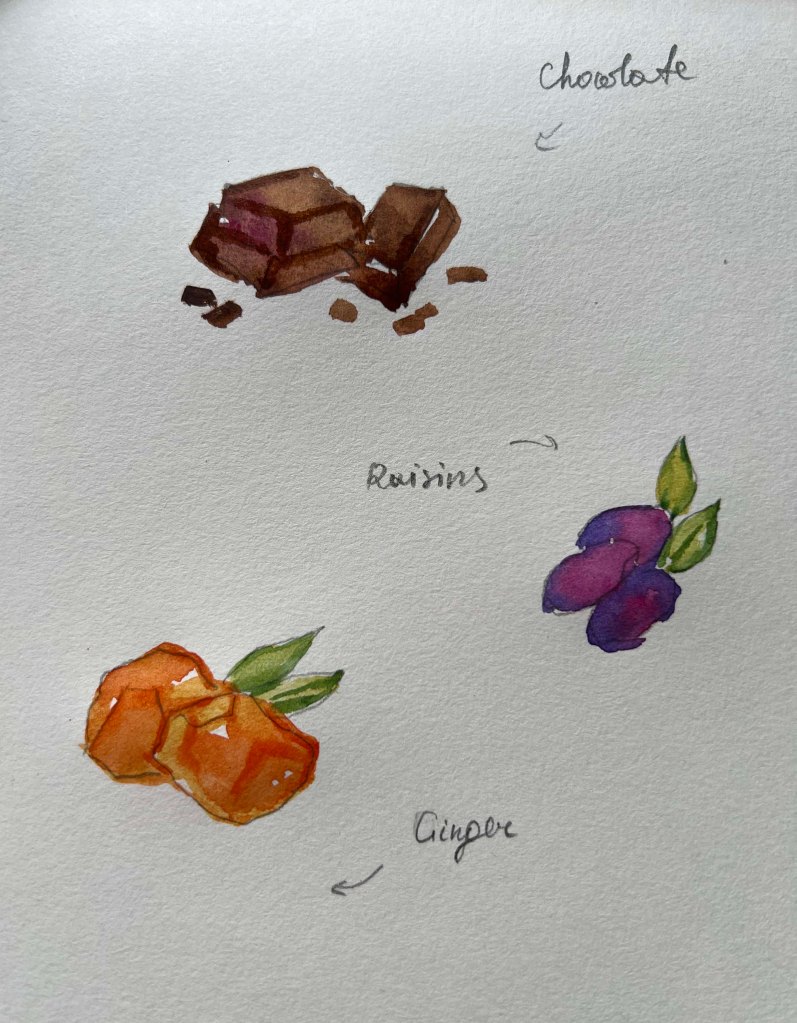
Also, I made a couple of squares with just plain bold colours, like purple, pink, yellow and green, as I was going to use them for the right side of the book for placing text. I want to try to use the text on the picture as well, but that depends on how busy the painting is, as the text should be readable.

Creating those paintings proved to be one of the most challenging aspects of the entire project, requiring at least seven spreads for the book. In addition to this task, I challenged myself further by including two paintings per spread. Despite the difficulty, I could envision the end result, feeling confident that with some carefully crafted text and poetic language, I was on the right path to completing this book.

Book Design

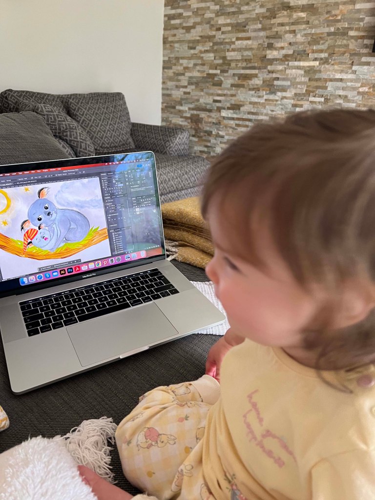
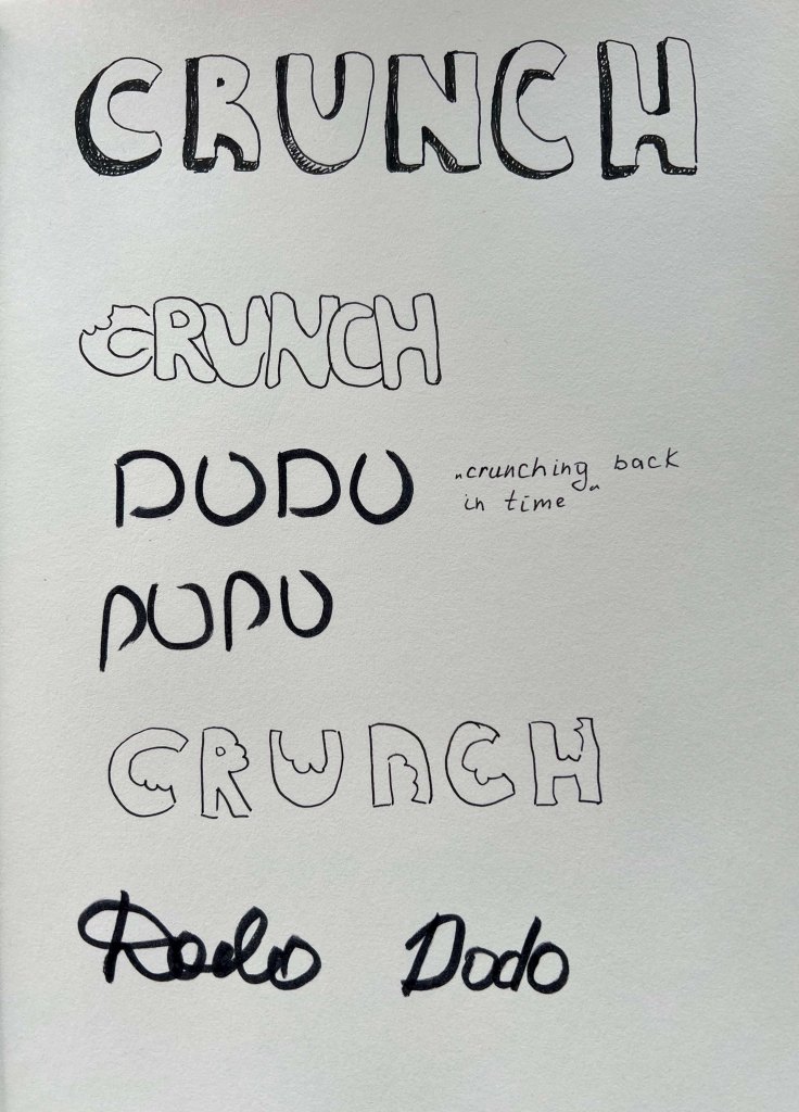
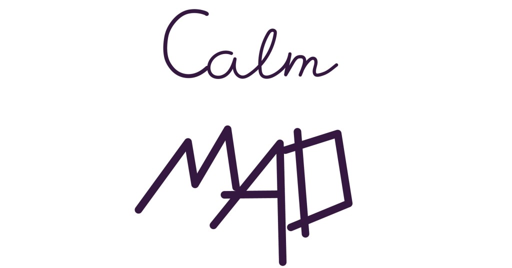
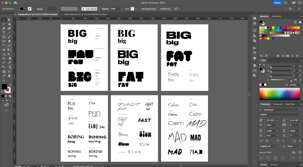
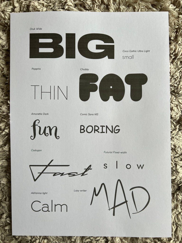
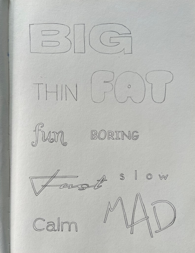
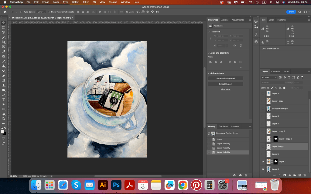
The final stage of the project involved slight colour correction of paintings, placing text, and arranging pages in order. Initially, I intended to use my handwriting for the text, but realising the need for additional practice to ensure neatness, I turned to online sources for original handwritten typography. I came across two fonts, DK Sheepman and Kermel, and decided to use both. I wanted the text to be quirky and playful.

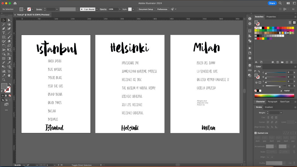
I initially created the layout in Adobe Illustrator but later switched to Adobe InDesign for its precision. In total, I ended up with 10 spreads and 19 pages, including the front cover. However, I still had seven spreads detailing seven days, with an extra two spreads reserved for introduction and conclusion.

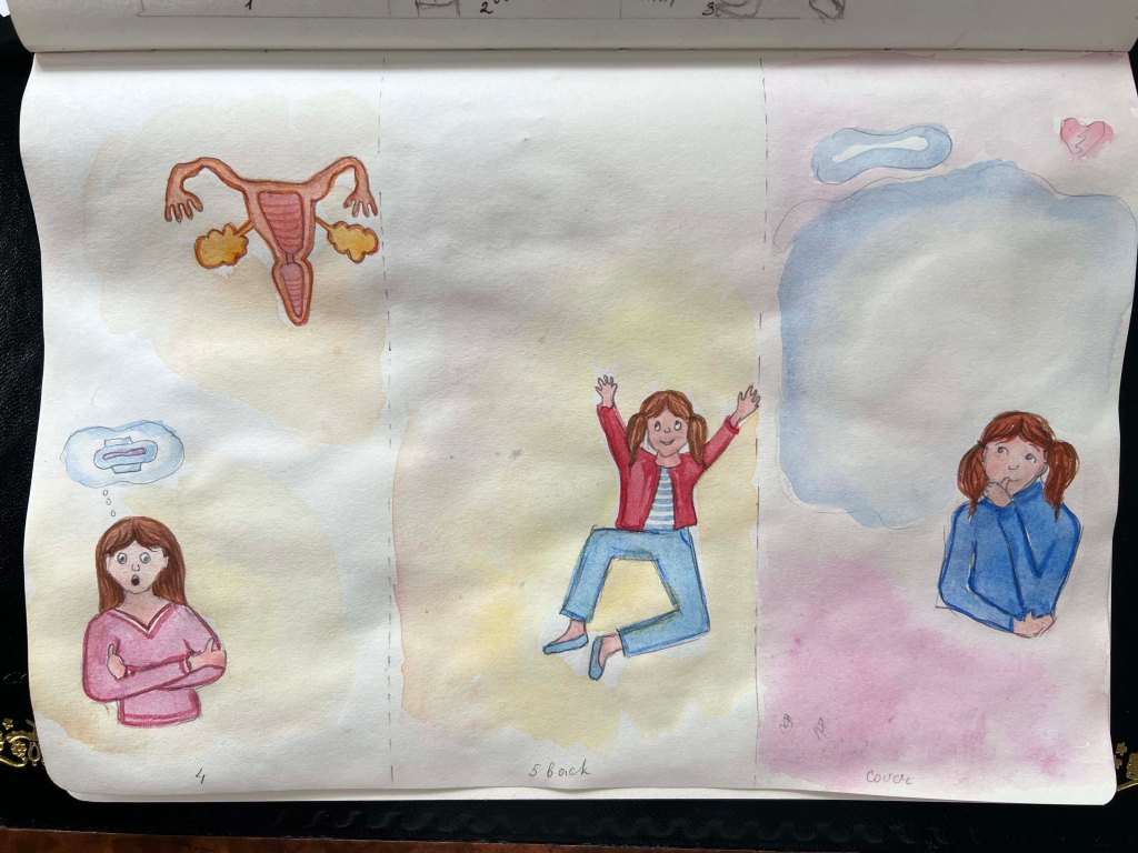
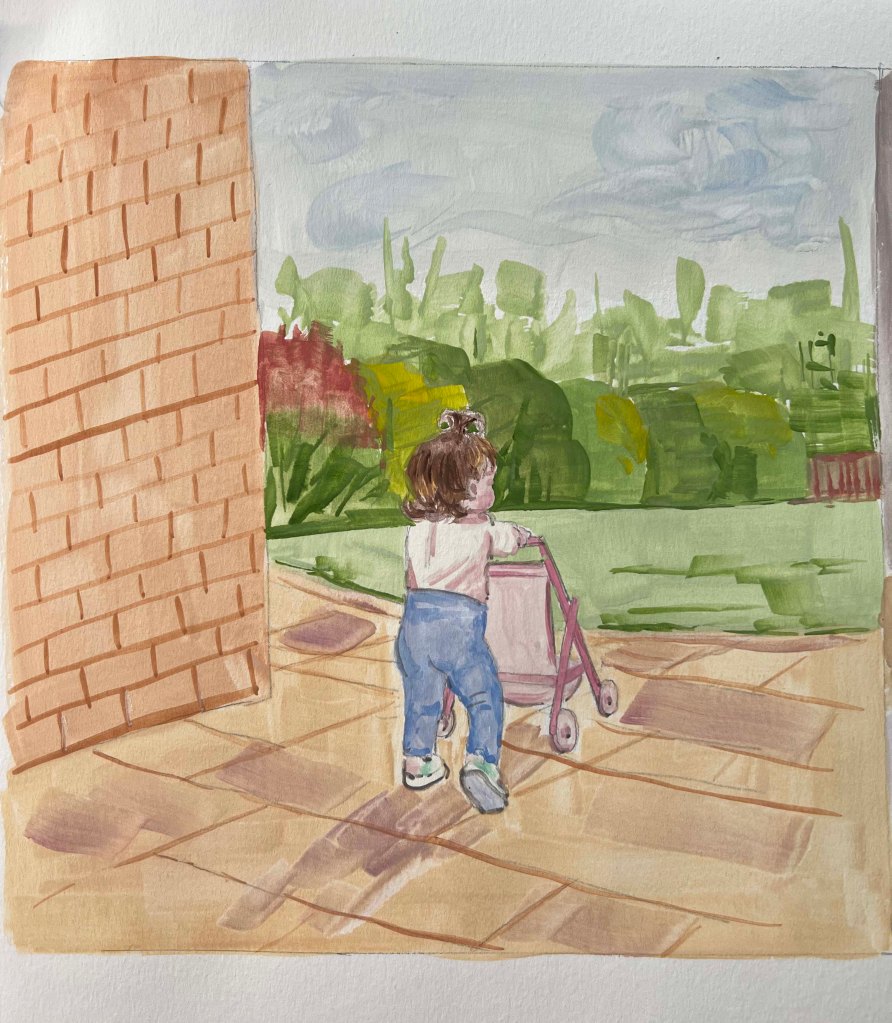
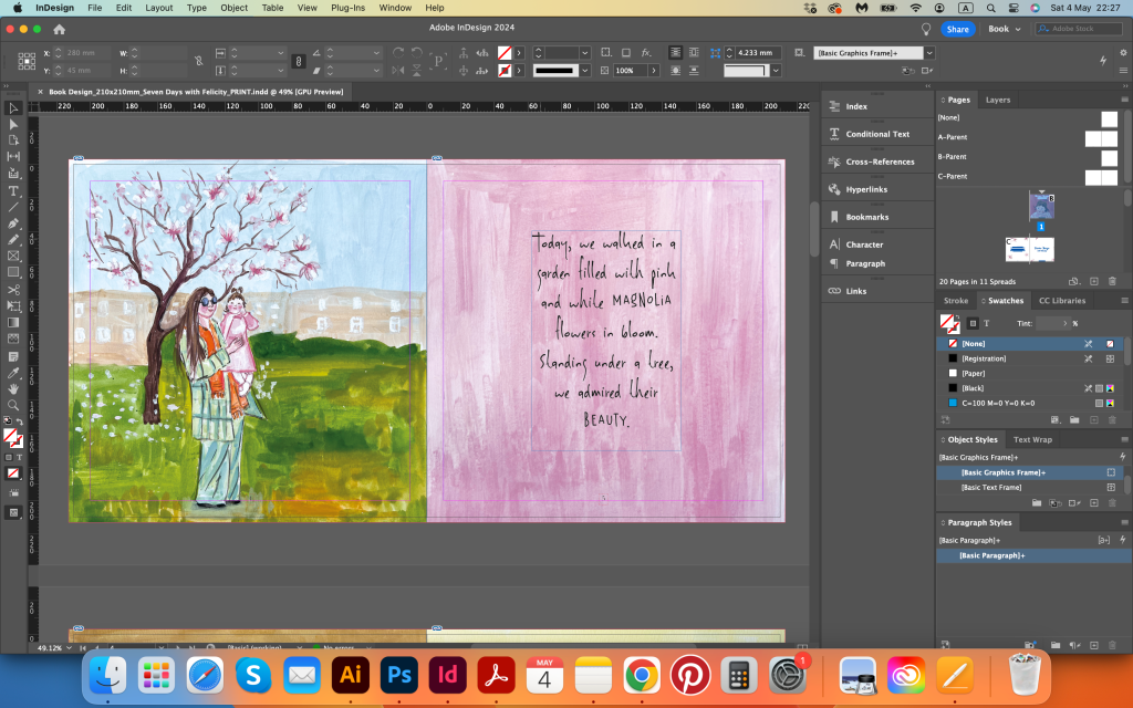
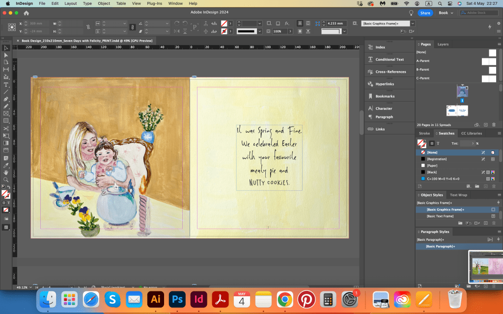
I tried to write some poetic captions for each image, focusing on brevity and clarity rather than rhyme. Some pages ended up with small rhymes, which I left unchanged, considering it an experimental touch. Below, I have attached screenshots with the descriptions.

Mockups

Conclusion

This is my final word for the whole unit that has taken me two years to complete, and 6 years to complete Level 1. While I wish I had finished it sooner, I believe it happened when it was meant to. Looking back to this project I’m quite happy with the final outcome. I feel proud of myself as the unit has been completed, especially as it revolves around my little daughter. I’m pleased with the gouache drawings, and the style I applied for them. I believe they complement my other works for this course nicely. I think, what I could have done, is probably use my own writing, instead of font, which would definitely add even more personal touch to this work. Additionally, I plan to print this book for assessment, aiming to have a physical version for review.

Reflection

After receiving my tutor’s feedback on this assignment, I decided to make slight alterations to the design based on the advice I received. Overall, the feedback on this assignment was positive, I was pleased to hear that the first impression from the cover was that the book is
excellent and immediately compelling and charming. Since the font inside the book replicated a handwritten, imperfect style, for contrast I chose the elegant handwritten font for the cover, however, it looked heavy and somewhat bulky. Therefore, I changed it to the sophisticated Mortdecai Demo font. Additionally, I rearranged the page with animals; when placed in one line, they looked too squashed in the space, lacking the necessary breathing room.

Printed version of the book

Just in the nick of time before submitting the assessment, the printed version of the book arrived, which I was particularly thrilled about. Having the printed issue helped me to highlight some of the imperfections that would change in the design, such as the font for the name of the book, I would make it the same size, rather than a small font for the line below. Also, I would make the font smaller inside of the book, on some of the pages it takes too much space. Other than that, I received a very positive review, my friend said if that was the book on the bookshelf, she would want to pick it up first, as the cover is very bright and vibrant. I think, it could make a good commercial product, where parents could order something similar about their kids, based on the pictures from their important events.

Exercise 7: Educational strip

For this exercise, I have been asked to produce an illustrated strip of up to five frames for use in schools explaining to young teenagers how to cope with the onset of puberty. Also, I need to provide a single illustration of the character for use on the front cover. The design for the final piece should be easy to read and humorous while conveying the message. Generally, I will have to submit all stages of the development process – thumbnails, visuals and client visuals for the cartoon strip and the stand-alone illustration.

The name of the leaflet What’s happening to my body? It’s all going mad!

That’s quite an interesting exercise for the end of the unit. It contains many parts, outlining some of the other exercises’ achievements, working on character, creating a narrative, and probably making our own font. I started to think about what type of leaflet it would be. Shall it look authentic and purposefully hand-drawn, done by pencil and watercolour? Or, shall it be more digital with bright and bold colours? I thought summarising this part would make sense to create a design that will look hand-worn, with cartoony-like illustrations. In regards to the text, I will think about it further down in the process, as I wanted to try to implement my handwriting as well.

Moreover, the subject can be tailored for both girls and boys or individual preferences. Since there are only five sections in this educational strip, I decided to focus on creating an educational leaflet just for girls, so I could delve a little more into a specific subject. Also, bringing up a little girl I believe I can think of some valuable information for the future.

The brief

I first analysed the brief, highlighted the main points, selected keywords, and identified the target audience. Also, the mind map helped me to gather ideas together. The goal was to create a Z-fold leaflet, with a folded size of 100×210 mm, containing 5 parts and a cover. This format is practical as it can be printed on A4 paper, making it easy to produce, even at schools.

Also, I considered the structure of the brochure, focusing on an introduction, the main content, and a conclusion. The introductory paragraph would cover puberty in general, followed by addressing puberty changes and providing a brief anatomy of women.

In addition, I researched other pamphlets and brochures targeted at teenagers. To be honest, there aren’t many available. This may be because such materials are often circulated within schools. Consequently, I believe I am creating something quite unique here. The pamphlets I did find share common elements: cartoony illustrations, the depiction of emotions through characters, and a positive approach to addressing issues that may concern children in this sensitive age group.

Sketches

When I researched, I stumbled on a series of books What and Why by Usborne Books publisher. They have released a few different types of books that contain all the important information about puberty. One book that caught my attention was What’s Happening to Me? (Girls Edition) illustrated by Nancy Leschnikoff, a children’s book illustrator and designer. I bought this book from Amazon and explored the “view inside”. I found this edition very useful, as I could see the prime example of illustrations designed purposefully for kids and how the information is written. Since it had been a while since my teenage years, I wanted to study the tone used in similar publications to find a balance between humour and seriousness.

I loved the varied characters the illustrator showcased in the book, along with their expressions and interactions with others and objects. She used watercolour to depict the characters, outlining them with a black pen for detailing. Also, the background surrounding the characters was filled with pale watercoloured shades. I found this style similar to mine, and believe it would be a great fit for the leaflet.

My sketches of girls in various puberty situations are below. I experimented with different characters. Initially, I planned to feature a different girl on each page, but later I chose to focus on one consistent character, the same girl throughout all the pages.

After sketching some ideas, I proceeded to create a mockup for the leaflet to ensure the perfect size for seamless folding. This step also aided in visualising the placement of each illustration on the final sheet.

Thumbnails

I had ideas for additional pages that I planned to keep in reserve. I was thinking about adding content on extra hair growth or skin issues, but after careful consideration, I decided to focus on a more important subject like hormones, and their role in the reproductive system. While many girls are aware of their upcoming period, the reasons behind its onset are not commonly understood. Structure-wise, I was going to use two illustrations for each page, deciding the space of each sheet in two parts. But for some pages, I was going to adjust by keeping a bigger size illustration with a text explaining the illustration.

For the cover, I was going to portray the same girl with a curious expression. I aimed to maintain simplicity, as I didn’t want to overload little space with too many details. With the leaflet’s name occupying 50% of one side, and the girl positioned in the corner with a cloud backdrop.

Design

With the structure for the final layout, I moved on to sketching illustrations for the leaflet. I chose to use the Quimbly handwritten font for the text. I thought it would go perfectly with the style of the leaflet, making it look like a diary for girls. I planned to vary the girl’s hairstyle slightly to suggest progression over multiple days in the leaflet while ensuring her features remained consistent for recognition throughout. I wasn’t 100% confident with the proportion of illustration before I placed the text, therefore I was going to adjust the sizing of each illustration in the final stage of design in Adobe Photoshop and Adobe Illustrator.

I considered using colourful pencils for the coloured visuals, but I thought that I could bring a brighter side to illustrations with the use of watercolour and outline them with black pen. It took me some time to arrange the text around the illustrations and convey their meanings effectively. Each paragraph was short and laconic, and I thought it helped me to deliver an essential message to girls.

Illustrations turned out gentle and floating, with some bright colours on the girl. It definitely required some colour correction in Photoshop. I was planning to make the page whiter and adjust the proportions to fit the text. I actually enjoyed choosing the content for the leaflet, as it helped to support the illustration and create a narrative. The first two parts of the leaflet are about the first stages of puberty, such as growing, and choosing the right bra, after I moved to explain hormones and periods, and the choice of sanitary towels. In the final part, I wanted to bring the conclusion about the importance of supporting mental health and feelings, with a short message addressed to the girls. I think the design turned out quite well. For the cover, I chose Handwriter-Regular serif font and added an image from the previous exercise Text and Image with the word Mad in it.

Overall, I enjoyed this exercise. I think it’s important to convey valuable information to girls through a simple message and a positive attitude. If I were to create another version of this leaflet, I might focus solely on periods, delving into their details and their impact on mood and skin appearance. However, I chose to describe puberty in general, mentioning factors such as growing and choosing the right bra, which is probably too different information for such a small amount of sections. But it has a structure, I mentioned all the important parts that can concern girls, and I believe I completed the brief successfully.

Overall, I found this exercise enjoyable. I believe it’s crucial to convey valuable information to girls through a simple yet positive message. If I were to create another version of this leaflet, I might focus solely on periods, delving into their details and their impact on mood and skin appearance. However, I decided to address puberty in its entirety, including aspects like growth and selecting the right bra. While this may seem like diverse information for limited sections, I ensured that all essential topics concerning girls were covered. I am confident that I have successfully fulfilled the brief.

Mockup

Printed Leaflet

Fortunately, my stepdad has a high-quality printer, allowing me to review printed versions of my designs. Seeing your work in print is beneficial, as it reveals adjustments needed such as colours, illustration proportions, or spelling errors. In my case, I noticed that the girl’s face on the front cover doesn’t portray the required surprise or shock indicated by the word MAD! Especially with the chosen font. I believe the girl’s expression needs adjustment to convey more surprise rather than curiosity, or perhaps using a simpler font for the word Mad. These are my observations. If I decide to submit this work for assessment, I will make these changes. Overall, the design appeared good, the illustrations were vibrant, the font was readable, and the chosen format of Z-fold worked well.

Exercise 6: Working for children

Illustrations for young audiences emerged in the late 16th century as woodcut prints in Germany. Initially focused on instruction, it was not until the 19th century that children’s book illustrations became closely associated with storytelling. The introduction of colour printing via lithography in that era revolutionised image production, leading to high-quality book products for consumers.

Today, young audiences encounter various cultural influences and visual styles, making it impossible to pinpoint a singular trend. Disney-inspired content still remains popular for its light-hearted entertainment value, contrasting with the deeper and more sensitive European approach found in works inspired by Hans Christian Andersen. Illustrators, especially those from Eastern Europe, explore themes of human suffering and desire with sensitivity and subtlety, prioritising the audience’s needs.

Understanding the distinct age groups and associated publication types is essential for creating meaningful and engaging content for children.

Six months to two years: interactive books such as floating bath and board, ‘shape’ books all with simple text, adult narrated.

Two years to five years: picture books, ‘pop-ups’ and novelties with early reader text.

Five years to eight years: chapter books – picture books of a more sophisticated nature with the associated text.

Eight years to twelve years: first novels.

Twelve years +: young adult material.

Picture books, intended for children aged two to five, prioritise illustrations over text.

Chapter books, aimed at older children (around five to eight years old), feature more complex subject matter, treatment, and language suitable for emerging readers.

Creating appealing characters is crucial, avoiding overly threatening features like distorted facial elements. Attention to detail in the eyes, nose, and mouth is key. Characterising animals in children’s books follows a similar process, emphasising visual development and the diversity of species within the narrative.

When I read this exercise, I felt excited and overwhelmed at the same time. I love working with kids’ materials at the moment, that is something I am personally interested in, there is so much I’ve learnt about books for kids, especially pre-readers and pre-schoolers. The variety of available books and developmental toys for children is impressive. Exploring these resources feels like a joyful learning experience, especially with my one-year-old daughter. The bright and diverse illustrations, along with engaging topics like bravery and curiosity, friendship, and love for nature and animals, captivate even the youngest readers. Although we haven’t reached the age range of some of the books with my daughter yet, I’m sure it won’t take me long to do general research on them.

Pre-reader

This is an age range where I feel most confident, having spent the last year researching materials for babies and toddlers extensively. The impressive variety reflects high standards in children’s books and toys. Many companies strive to be competitive by offering enlightening materials for even the youngest children and environmentally friendly and healthy toys made from eco-friendly wood and recyclable packaging. I discovered the importance of introducing black-and-white images to babies, stimulating brain development and supporting future reading skills. There is a subtle distinction between educational materials for babies and those for pre-schoolers. I have already read numerous toddler books to my daughter, and she enjoys repeating them after me and pretending to read them herself.

Next age groups, I created using an internet search, as most of the books I had were up to 3-5-year-old kids. Below, I left sources I used for my research.

Pre-school (3–5)

Pre-school books are specifically designed to cater to the developmental needs and interests of children aged 3 to 5. These books typically focus on simple and engaging stories, colourful illustrations, and age-appropriate themes that resonate with preschoolers. Pre-school books may also introduce basic learning concepts such as numbers, colours, shapes, and letters in a fun and engaging manner.

Early reader (5-7)

Books for early readers, typically targeted at children aged 5 to 7 who are starting to read independently, are specifically designed to support and encourage young readers in their literacy journey. These books feature simple language, repetitive text, and engaging illustrations to help build reading skills and confidence.

Established readers (7–9) and Older age groups

Books for established readers and older age groups, such as middle-grade readers and young adults, are characterised by more complex storylines and diverse themes, to stimulate older readers’ cognitive and emotional development. These books often feature deeper explorations of topics, intricate plot twists, and rich character development to engage and challenge readers.

Sources:

Mind map

The following task required selecting two age groups and brainstorming keywords to identify themes and visuals relevant to children within that group. Then I had to choose an animal appropriate for each age group and brainstorm to identify themes, images and ideas relevant to the age groups.

For my first illustration, I chose the pre-reader group to analyse the words ‘family’ and ‘growing’. I chose those subjects for the pre-reader category because these words are highly relevant to a child’s early development and experiences. ‘Family’ carries significant emotional weight and plays a crucial role in a child’s life, shaping their sense of belonging and security. ‘Growing’ reflects the constant physical, emotional, and cognitive development that toddlers go through as they transition from infancy to childhood.

My chosen word is ‘family’, where I wanted to illustrate the bond and connection between a parent and baby. I thought I could use some animals that show affection in real life, such as bears, or panda bears, known for being cute and cuddly. Also, elephants, penguins, rabbits, or lions. I thought that for small kids, the choice of animals can still be quite broad. However, from my daughter’s development at her age, I see that she mainly recognises pets like cats and dogs, as well as all the soft toy animals that she can cuddle, such as a bunny, monkey, or bear.

Those were animals of my choice. Bears are often associated with being nurturing and protective, making them a good choice to represent family bonds. Elephants are known for their strong family connections and care for their young, making them a heartwarming symbol of family unity. Bunnies are commonly used in children’s illustrations and can represent closeness and love within a family. There is a great choice of animals, but the main task is to depict them in action, which is not as easy when you think about it. It took me a while to make the final choice for the first chosen group, I was going for three different animals one after another, but then I thought that depicting a koala bear for the theme family was my best choice.

Sketches for pre-reader

Using a koala bear for a pre-reader illustration focused on the theme of the family is quite a charming choice. Koalas are known for their cuddly and affectionate nature, making them a perfect representation of warmth and closeness within a family.

I started to make some sketches of koalas cuddling her baby on the tree. That is what they usually do, cuddling their little koalas and eating the leaves of eucalyptus. I had in mind the idea of creating an illustration for a bedtime story. I thought that looking at animals cuddling their babies creates a good association of safety and security for little pre-readers.

In terms of media, I chose gouache paints as I wanted illustrations to be brighter. The style of illustration and colours is created in a cartoony, fairytale style to be more approachable for young children. Also, I added wording in the cloud, with the words love and care from the koala bear to her baby.

Using the research on typography from the previous exercise, I created some variations of fonts for the koala mum. For the goodnight message to the baby koala, I used Astounder Squared BB font and Supernett Cn, adding bold words to the sentences. I was going to add a line around my sketch, but then I thought that the illustration looked quite bright and prominent, as it was done in gouache paints. Additionally, I added the night sky after I completed the design, as I thought that if we were talking about nighttime, it would make sense to colour the background in ultramarine, which added a nice contrast to the illustration.

Night sky version

Early reader

For the second illustration, I selected an early reader group of children aged around 5-7 years old, focusing on more serious topics like feelings of being ‘scared’ and ‘sad’. I believe that at this age, children are exposed to deeper emotions and it is valuable to gently remind them that it is okay to feel sad or scared, emphasising the importance of discussing these feelings openly and timely.

For an animal, I chose a forest animal a fox. Foxes are often viewed as cheeky animals for stealing chickens from the farm, however, as children grow, their understanding of nature can become more varied.

Like many wild animals, foxes can experience fear for various reasons. In their natural habitat, foxes may feel scared due to potential threats, such as predators like wolves or large birds of prey. Choosing a scared fox character for an early reader group allows young readers to connect with relatable emotions, learn about courage and resilience, and witness character development. The scared fox can evoke empathy as it faces fear in a new environment, encounters threats, or feels insecure, showing a valuable lesson in overcoming challenges and finding bravery in the face of fear.

For the media, I chose watercolour as I wanted the image to look mature and more realistic. To convey the impression of fear, I used a more sorrowful expression for the fox, as foxes often appear aggressive and defensive when scared, which wouldn’t suit my audience. The idea was to depict a fox walking through a dark, unfamiliar forest, looking back in insecurity but with the message to reach a destination where safety lies, overcoming fear to grow and learn from the experience.

I quite liked how dark and moody the forest looked compared with the warm ginger colour of the fox. It created a beautiful contrast for the illustration, as my audience is still quite young, children aged from 5 to 7, the fox looks realistic, and I think it can create empathy for nature and feel of connection to natural life. For the typography, I chose a serif font from Adobe Family Mrs Eaves, which is meant to be good for reading for the young audience and it has a good gap between sentences.

Final illustrations

Are the target age brackets for children really as clear-cut as we’ve made them here?

After completing this exercise I would say that target age brackets for children are not always definitive. Every child learns at their own pace, and these age categories may not account for learning difficulties or unique challenges that can impact their reading skills, visual comprehension, interests, and preferred illustration styles. Children are unique individuals with diverse interests and abilities, transcending strict age limitations. Some children at a certain age prefer bright easy-to-read books, and some children go for more advanced reading, especially if reading is their main hobby, they can read one book after another, skipping such criteria as bright images or bigger and less text.

How did the function of image and text differ within the different age groupings?

When children are young they process the information through bright images and colours due to their limited reading skills. They perceive words not as a whole piece, but mainly like a puzzle that needs to join together. This is why, for younger age groups, the text is short and bold, with pictures taking precedence. Over time the role of text and images change, and text gains a significant role in gathering information, as it encourages and challenges them to engage with more complex language, improving their reading skills. As children become advanced readers, their reliance on images diminishes, and they rely more on their imagination. Books with vibrant illustrations may be viewed more as special gift editions.

What is your response to the idea that ‘all children’s illustration has bright colours’?

I don’t think that all children’s illustrations have bright colours, I saw plenty of examples when illustrators used a calm colour palette, for example, the series of Peter Rabbit books, but for smaller children’s books colours are definitely opaque, as children’s eye vision is developing for quite long time. When a baby is born everything is blurry, and contrast books are the best choice for them, but each month more and more colours appear in their vision palette. From my daughter’s experience, I could say that she would rather look through brighter books, with additional texture in them, like a velvety nose, rough feet or tufty tail. But over time colour palettes for children’s books became more complex, and some mature colours appeared to them.

Little bonus

Exercise 5: Packaging

In this exercise, the brief asked me to produce a series of illustrations for packaging to be used for a new range of organic biscuits for children. There are three varieties in the range Raisin, Choc Chip and Ginger biscuits. The client specifically wants three illustrations featuring extinct animals interacting in some fun way with a biscuit to be used on the boxes. The drawings should be in full colour, and the client would like the colours to reflect the ‘flavour’ of the biscuit.

The brief analysis

To start this exercise, firstly, I analysed the brief in detail, highlighting the keywords and the target audience.

Next step, I went for terminology to the handy book I always had near me for the duration of this unit by Alan Male’s Illustration. A Theoretical & Contextual Respective.

Packaging design involves the skilful use of illustration to distinguish products and create a unique brand identity. Through visual storytelling, illustrators can transform ordinary products into visually appealing creations that resonate with the target audience, as seen in the playful and engaging illustrations on children’s food packaging. Packaging design encompasses a wide range of possibilities, including vehicle branding, shopping bags, cosmetics, household items, and more. Food and beverage products rely heavily on illustration to evoke emotions and highlight their natural qualities.

Also, I wanted to explore the subject of depicting animals for the kids-oriented materials. Visual representations of animals range from traditional and charming portrayals to more modern and challenging interpretations, transforming familiar domestic creatures into fantastical beings. Anthropomorphism, a stylistic technique with roots in ancient art, has been prevalent in portraying animals with human attributes for centuries. From ancient depictions of mythical creatures to beloved characters like Beatrix Potter’s rabbits and Rupert Bear, animals have been endowed with human-like qualities, blurring the line between animals and people. This characterisation method remains prevalent today, as it can evoke empathy and spark imagination similar to child characters in storytelling.

Generally speaking, packaging design utilises illustration to create unique brand identities that resonate with consumers, while artistic portrayals of animals throughout history, particularly through anthropomorphism, continue to captivate audiences by blurring the lines between humanity and the natural world.

Food Packaging

I went to our Sainsbury’s to take pictures of existing snack packages for kids. Having a baby, I started learning about their variety about half a year ago, so I knew where to look. Surprisingly, I even found some snacks with a similar theme where illustrators depicted extinct animals such as dinosaurs, illustrated animals that engage with a snack playfully, and fictional characters that looked like they were made out of snack shapes.

From my research, I could see that the market is saturated with a wide range of snacks featuring characterised animals and creatures targeted at kids. The key objective is to ensure the brand stands out while remaining easily recognisable, creating a distinctive design that appeals to both children and adults alike.

Research on Kiddylicious

I thought that Kiddylicious characters are the closest to my brief, and it would be useful to go for a close-up analysis of their brand for kid’s snack design.

Kiddylicious audience

Kiddylicious brand was built on the strong belief that great taste creates a positive attitude to food in later life. They are a brand that produces various colourful treats that are suitable for children starting from 6 months to 3+ years old. These snacks are not only delicious but also free from artificial additives.

Kiddylicious packaging design

  • The Kiddylicious packaging features bright and playful colours that catch the eye, with fun illustrations of fruits and characters that appeal to children.
  • The logo is prominent and easily recognisable, usually placed at the centre or top of the packaging.
  • Nutritional information and ingredients are displayed clearly, emphasizing the healthy qualities of the snacks.
  • The packaging is designed to be user-friendly, with easy-open seals or resealable bags for freshness.

They have that range of 3+, and their brand characters like dinosaurs, pandas, monkeys and hippos are very interactive, dynamic, full of energy and joy, and attractive to parents and kids. Each taste has its recognised colour, like beetroot flavour burgundy colour, BBQ flavour is bright orange, and cheesy taste is done in a vibrant blue package. They are healthy snacks for kids, not only tasty but contain absolutely nothing artificial, are low in saturated fat and are suitable for coeliacs and vegetarians. My little daughter loves them. Also, the packaging is white, with some transparent pale coloured designs on the background, which makes them different on the market, rather than being all colourful packaging.

I loved the way how those characters interact with each snack like they are riding a bike, having a ride on a serving, or using it as a parachute. Some great ideas were integrated into it, maybe I could work around it as well, to make my character interact with a snack in some fun way.

Research on Bear

Another brand, that caught my attention was Bear fruit yoyos, which are made 100% from natural ingredients. They are tasty fruit snacks, have no added sugar and instead, have only natural sugars from fruit and veg.

I chose this brand as it aligns closely with a client’s organic biscuit range, using similar branding with distinct characters and colour schemes for different flavours. Also, it has a bright and eye-catching identity.

Bear audience

The audience for Bear snacks is primarily children, aged from four to ten years old. Also, they target parents looking for wholesome and nutritious snack options for their kids.

Bear packaging design

  • Each product from the Bear brand uses a unique, flat, and saturated background colour
  • The Bear logo
  • Text line: 1 of your 5 a day
  • A strapline: No added sugar
  • The product title for example: Real scrumptious Strawberry
  • Shape of the fruit flavour on the background

The vibrant and colourful bear design catches the eye, featuring a background of fruits positioned at dynamic angles. Fruits fly around the packaging, with a flat illustration of a bear and green leaf in the corner. These engaging designs emphasise the natural and sugar-free aspect of the product.

When we talk about both audiences, the animated animal character would be appealing to kids’ attention. On the other hand, the parent will look for the natural ingredients. I personally, have a habit of looking on the back and reading the ingredients. The ideal solution would be to incorporate animal characters, and at the same emphasise the natural essence of the product. For adults inclined towards organic options, factors like a natural colour palette, eco-friendly packaging, and a quirky and endearing character design hold more sway than a cartoonish and vibrant look.

Keeping that all in mind I intended to create packaging that would tick all points, like appealing animated characters, natural ingredients mentioned on the pack and eco-friendly packaging.

Mind map

Then I opened my sketchbook to create a mind map with a list of extinct animals. There were so many, that I had to divide them into subgroups, like prehistoric mammals, flightless birds, dinosaurs etc. As there were three packagings I was thinking about what extinct animals I could incorporate to create a coherent theme. I thought if I go down the line of dinosaur snacks, would make sense to use three types of dinosaurs, like T-rex, Triceratops and Brachiosaurus, as they belong to the same era, rather than mixing different era disappeared animals, like for instance dodo bird, that last was seen in 17 century. Also, I thought that I didn’t want to use any big bulky animals like mammoths, or the teeth of sabre tooth tigers were too scary for kids. The more I thought, the more I was inclined toward the version of one chosen animal that would interact with the biscuit in a different way, similar to the Kiddylicious brand, where they have three different flavours for one animated animal.

I thought I would leave the task of choosing animals for a little longer, whilst creating a colour palette for each flavour. Choosing actual animals was a bit of a task for me, as I didn’t want to look like I was trying to skip the brief by selecting one type of extinct animal. I wasn’t sure whether I wanted to use dinosaurs for my designs. So I thought for myself, I will go for the dodo bird, as I was quite touched by the way they disappeared, and will do my best to create some variations of the bird for each flavour. My intentions were to create a coherent theme, visually similar, but different in interactions with biscuits and in poses.

Dodo Bird

The dodo was a bird species that went extinct during the mid-17th century. It was originally mistaken as a close relative of several different birds, including the albatross, the vulture, and the ostrich. Scientists later determined that the dodo bird belonged to the same family as pigeons and doves (the Columbidae family).

The dodo bird is often used as a symbol of the lasting damage humans can have on the environment and animal survival rates. Its iconic status as a symbol of species extinction is due to how rapidly this species went extinct after first being discovered by European explorers. In a timespan of only around 100 years, the dodo bird ceased to exist in the wild.

The choice of the dodo bird character for kids’ biscuit snacks carries a whimsical and educational charm that resonates with young audiences. The dodo bird is known for its friendly and quirky appearance. I thought it could be a great character to capture children’s imaginations and spark their curiosity about the natural world and extinct species. This character choice creates a unique and memorable branding approach that entertains kids and fosters a connection to nature and conservation, making snack time fun and informative for young consumers.

Sketches

Next stage, I proceeded to sketches. Also, I collected some illustrations and images of the dodo bird for the mood board to see what the actual bird looked like. From my observations, the bird had a round body covered in soft, grey feathers. The feathers of the dodo were likely a mixture of light and dark grey tones, giving it a somewhat monochromatic appearance.

Its wings were small and stubby, rendered useless for flight. The most striking feature of the dodo was its large, hooked beak, which was of a curved shape and had a sharp tip. The bird had small, dark eyes and a noticeable gap between the beak and a prominent forehead. The dodo’s legs were stout and sturdy, adapted for walking and foraging on the forest floor.

In my sketches, I wanted to reflect a curious and playful side of dodo’s bird personality. I wanted the illustration to be somewhat in the middle between cartoony and realistic style. At the same time, I wanted to keep that natural look of the bird to underscore the organic ethos of the brand, while infusing a playful charm to appeal to children.

From those sketches, it is evident that the bird is depicted walking around, exploring various emotions ranging from feeling intimidated to being curious and playful. I considered incorporating some recreational activities for the bird, such as riding a biscuit bike or simply running around. Alternatively, positioning the biscuit in different locations, like the beak, wings, or feet, could capture a range of movements and expressions of the bird.

I created quick thumbnails for the packaging to visualise how the bird would appear against different background options. Initially, I considered using a tropical backdrop with exotic flowers and plants, featuring either pale, subtle hues or vibrant, bold colors. Another option was a solid-coloured background without additional elements. I decided that maintaining a clean design was essential to ensure the focus remained on the bird, as adding extra elements might divert attention from the main object.

Textwise I was going to place the name of the biscuit in the central top part of the pack and locate the slogan in the bottom. Altogether, I was going to include such information as:

  • the name of the biscuit Dodo Crunch;
  • slogan ‘Crunching back in time with Dodo’;
  • the age group 3+ years;
  • the flavour of the biscuit;
  • organic association logo;
  • organic biscuit line.

Another task I tackled was selecting typography for the packaging. I aimed to experiment with a handwritten font to showcase the biscuit’s name, ‘Crunch’. This was where the earlier exercise on ‘Text and Image’ proved useful. I envisioned creating a font resembling a biscuit or incorporating a small bite mark on certain letters. I liked some of the options and definitely will try them on the packaging. Also, applying a handmade font could establish a distinctive design identity when combined with the illustration.

Illustrations

After experimenting with fonts, I had to make a final decision about what activities my dodo birds would do with biscuits. I thought to myself, that for the raisin flavour, the bird is going to sit like on the nest made out of biscuits, for the chocolate the bird holds the biscuit in the leg, and for the ginger flavour the bird with a biscuit in a wing. Also, I wanted to sketch the bird from three different angles, so that some differences between them could be seen.

Finally, I moved to the exciting part, colouring my sketches. I chose watercolour as my medium, planning to highlight illustrations with some black pen strokes. However, before that, I needed to select a colour palette for my birds. I aimed to give them an artistic touch with soft, watercoloured hues, ensuring a slight variation in colours between each bird. They looked slightly different in style from each other, I intended to unify them in a cohesive look later in the software, making them resemble a series of themed biscuits.

I painted a lightly coloured background for my birds, intending to connect the colour with the flavour of the biscuit. However, I was unsure if this approach would be effective, as the background was too faint and did not maintain a cohesive feel. Therefore, I planned to cut my illustrations from the background and edit them in Photoshop.

Typography

Choosing typography took a bit of my time, as I thought it was important to choose the right font, as it could play an important role in the overall fill of the design. Initially, I was going to use my own handwriting for the slogan, but then I thought I could find a similar font, or find a playful font that would be readable and oriented for the younger audience. They were a good selection of fonts, and I felt like I was on the right track. For the brand name ‘Dodo Crunch’ I choose Crunch Chips font with some bitten pieces on the top. Also, I thought rather than writing the logo just simple straight, would be useful to place letters closer together, like they overlap each other and make them look like they almost dance.

With the slogan and biscuit flavour, I was going to experiment with the actual packaging, where I could see what works best depending on the colours and design style.

Packaging Design

At this stage, I felt that I was on the right track and approaching the final part of creating the actual design around the bird, selecting the final fonts, and choosing colours for each flavour. My task here was to cut the bird from the background and experiment with fitting it into different backgrounds to determine which one complimented the bird best. Initially, I planned to create watercolour smears in colours similar to the biscuit flavours, such as a purple watercolour smear for the raisin flavour, orange shades for ginger, and brown colours for the chocolate biscuits. However, I found that these designs with watercoloured backgrounds appeared overly complicated and drew attention away from the bird. Returning to the organic packaging theme, I had the idea to use a background that resembled recycled paper. This choice not only elevated the bird in the foreground but also created a focal point for it. Furthermore, the colour scheme could convey the eco-friendly values of the brand.

As I aimed to make the design look like a ready pack, I added some graphic design elements, that resembled illustration, such as waves, and text written on the curved line. They all added final bits to the design and created a playful design. Also, I added a little raisin pile in the right corner of the pack, which helped me to balance the bottom part of the package. Same I did with ginger and chocolate flavours.

I loved how they looked together when I placed those designs next to each other, with the edited backgrounds and birds. There was a coherent feel to them, the birds were bright and vibrant, interacting with a biscuit, and appeared happy and jolly, which is what I wanted to achieve for kids’ biscuits.

Mockups

In conclusion, I thoroughly enjoyed designing these packages. I was pleased with how the designs turned out and believe they have the potential to stand out in the market. The dodo bird looks artistic, the packaging conveys the organic nature of the product, and the additional graphic design elements create an appealing overall design that should catch the attention of both parents and children. I aimed to make each bird unique by varying the feather colours, reflecting their distinct personalities. To me, they resemble a series of biscuits, and I hope they align well with the brief.

Exercise 4: Text and Image

Illustrators frequently receive commissions to integrate their imagery with typography, ushering them into the role of type creators. Through their artistic vision and creativity, illustrators combine visual elements, hand-drawn motifs, and expressive lettering to craft a type that is both captivating and purposeful. An understanding of typeface terminology, including cases, ascenders, descenders, and serifs, is crucial for illustrators engaging with clients to ensure effective communication. Recognising the diverse contexts in which type is utilised, illustrators must possess the skill to analyse its functions and its relationship with surrounding imagery, emphasising the interconnectedness between text and visuals.

In this exercise, I was asked to write out a pair of opposites in my own handwriting, and then in a descriptive way by using the shape and size of the word to express the meaning of the word.

This exercise reminded me of one of the exercises I completed for the Graphic Design Core Concepts unit, where we played with words, and created their typographical representations that present both the word and a suggestion of its meaning. I looked back through this exercises to find some inspiration and ideas.

I wrote those words in my own writing and then created a visual representation of each of them. There were numerous exercises included in the Book Design Unit where we experimented with typography and its qualities. Even the previous exercise was about choosing the right typography for the name of the travel guide. The appearance of the font is an important component that creates a final touch for the design visually.

In the next step, I wanted to trace some of the fonts in software, so I could see the practicality of the fonts I sketched. After designing them in Adobe Illustrator, I could see what the font would look like as digital artwork. This helped me understand the physical differences between each font and how they communicate to the reader.

Font design in a descriptive way is presented below.

Big. The font is chubby, with large, heavy letters, a bit clumsy, and dominating on the page.

Small. The font could be any font, preferably sans-serif and handwritten, unnoticeable on the page, and a bit shy.

Fat. The letters are slightly overweight, with a little gap for the breathing centre, a heavy bottom, round letters, and decorative font with cute bellies.

Thin. Sans-serif font, features tall and thin letters with sharp edges, creating a sleek and elegant appearance on the page.

Fast. The fond conveys speed, urgency, and dynamism, with sleek, streamlined letters that suggest movement and efficiency.

Slow. My interpretation of the font for the word ‘slow’ can convey a sense of leisure, relaxation, and calm, with gentle, flowing letters that suggest a laid-back and unhurried pace. Big gap between the letters

Fun. Handwritten font, with swirls, and decorative elements. Sense of playfulness, energy, and excitement, with lively, whimsical letters that evoke a cheerful and light-hearted atmosphere.

Boring. Plain font, reflects a lack of excitement. Reminds me of the font Comic Sans MS, which was meant to be the easy, light font, that can be used for informal writing, but, I think it’s just overly overused, and it lost its purpose of being a funny font.

Calm. Handwritten font. Letters that are joined together, like floating across the cloud. Bring the spirit of tranquillity, serenity, and peacefulness, with smooth, flowing letters that evoke a soothing and relaxed atmosphere.

Mad. Decorative font, no serifs or smooth lines. Conveys a sense of anger, intensity, and explosiveness, with jagged, erratic letters that evoke a feeling of agitation and emotional chaos.

In the next stage, I opened the software and went through each font to find fonts that would match the chosen words. As it was said in the brief, I made a selection of fonts, which helped me to make a little comparison of the most suitable font.

Big and Small

For the word ‘big’ I made a choice towards Druke Wide font. Rather than choosing a decorative, hard-to-read font, I went for the bold and expansive sans-serif font known for its wide letterforms, strong presence, and modern aesthetic. The wide, spacious letters make a striking visual impact and are well-suited for attention-grabbing headlines and bold design applications.

For the word ‘small’ I chose Coco Gothic Ultra Light san-serif font, which is very sleek and compact due to its short distance between letters. Also, this font is suitable for the minimalistic, modern design, as it brings a clean appearance to the text.

Fat and Thin

For the word ‘fat’ I selected a Chubby font which sounds synonymous with the chosen word. This decorative typeface is characterised by its plump and rounded letters, giving a cute and jovial appearance to the text. This playful font style is often used for designs that aim to convey a whimsical and lighthearted tone.

For the word ‘thin’ I found one of the thinest fonts I had in my collection. The Poppins font is a versatile and modern sans-serif typeface known for its geometric design, clean lines, and friendly appearance. It is widely used for a variety of design projects due to its readability and contemporary aesthetic.

Fan and Boring

There are plenty of fonts that can be utilised for the word ‘fun’. As soon as the font is quirky, funky, and interesting, no matter whether it’s san-serif, decorative, or handwritten, it all can suit the chosen subject. I chose the Amoretta font for its stylish and decorative design, featuring playful swirls, bends, and angled letter positioning, adding a unique and artistic touch.

For the word ‘boring,’ I selected the font Comic Sans MS, known for its jovial and cheerful appearance. However, it has become excessively common, particularly in nursery and school settings, where it is often used for their announcements. Another font that could be a perfect match for the word ‘Boring’ and compete with the Comic Sans MS font is only the Arial Regular font. I believe you have never seen a more boring font ever created, even though it is a sans-serif font with correctly formed letters. However, it is simply too old and not very popular among graphic designers.

Fast and Slow

If you look through online sources on how the word ‘fast’ is written, it’s often an italic sans-serif font with little speed lines emanating from each letter. However, I personally would choose a handwritten font that gives the impression of fast-paced writing. Therefore, my preference went for a stylish extended script font like Cadogan, which exudes elegance and refinement.

Originally to present the word ‘slow’ I was going to choose the decorative font 1960s Hippie, which has the look of a chubby sluggish font, with a thiner top and heavy bottom. Bug later, I changed my mind, as I thought it was too repetitive and too similar to the font that could describe the word ‘fat’. I thought, I needed a bit of variety in my collection of fonts, and I didn’t look through fixed-width fonts, that could be a perfect match to the word slow, due to the spacious location of the letters. The Futurist Fixed-width font is characterised by its precise and uniform spacing between characters, creating a structured and orderly appearance. The typeface’s futuristic design enhances the idea of slowness by juxtaposing the concept with a modern and sleek aesthetic.

Calm and Mad

For the word ‘calm’ I liked fonts Aya Script and Adrianna Light, despite their difference in style both bring the feeling of calmness and tranquillity. The first font is hand-written, it has all letters joined, also, the font doesn’t have an angle, or sharp ages. The second font is san-serif, quite thin, has soft sides, and also looks modern, and relaxed.

For the last opposite, the word ‘mad’ I chose the decorative font Lazy Writer, which was designed to mimic the handwriting of someone writing erratically. It features irregular strokes, varying slants, and a casual appearance, giving the impression of careless writing.

Then, I printed off the words in the typefaces I’ve chosen reflecting the meaning by font sizes.

After that, I explored the visual qualities of each word that could communicate through their shapes, forms, texture, and colour. I contemplated which approach I should choose: a literal presentation to explain the word or a more figurative one with metaphorical and symbolic meanings. I opted for a mix of images.

For the next stage, I had to trace the chosen fonts and explore them in colour that would best communicate their meaning.

  • Big and small. For the ‘big,’ I chose the red colour, emphasising the significance of the word, I coloured the word inside, rather than keeping just the outline for it. For the word ‘small’ I chose the dark grey colour, as I thought the lighter one could be not visible. Also, grey means less attention to the word.
  • Thin and fat. Light blue is often associated with qualities such as calmness, serenity, and depth. When the blue colour represents the word ‘thin’, it evokes a sense of delicacy and lightness. The colour orange is often associated with warmth, energy, and vibrancy. To represent the word ‘fat’, orange can evoke a sense of boldness, vitality, and dynamism.
  • Fun and boring. For the ‘fun’ word I used happy, positive and energetic yellow colour. I thought that colour could create a good presentation of joy, playfulness and enthusiasm for the word. For the word ‘Boring’ I chose a shade of brown colour. I think, because the shade of the colour is quite plain, it creates a sense of dullness and monotony of the word ‘boring’.
  • Fast and slow. The dark blue colour of the word ‘fast,’ evokes a sense of reliability, control, and efficiency. Dark blue is a colour that signifies authority and precision, which can be linked to the idea of speed and quickness in a controlled and confident manner. For the word ‘slow’ I used dark green. I thought that could represent calmness, patience, and stability. Also, it symbolises nature and renewal, suggesting a steady and deliberate pace that aligns with the idea of slowness.
  • Calm and mad. Originally, I was going to use green colour for the word ‘calm’, but because it was occupied for the word slow, I thought, I could use purple colour. Purple, a colour often associated with creativity, spirituality, and luxury, can be a compelling choice to represent the word ‘calm.’ The colour purple combines the stability of blue and the energy of red, creating a sense of balance and serenity. And, for the final word, ‘mad’ I chose the ultimate black colour, which perfectly fits into the spirit and the way the word mad was written. The starkness of black can symbolise an overwhelming sense of turmoil and chaos, mirroring the turbulent and volatile nature of madness.

Moodboard

Then, I created a moldboard with different images associated with words, linking them to the size, shape, and texture that could represent. Also, I put some notes next to them, which helped me to analyse them even further down.

Final designs

In the final part, I had to draw my typed words freehand using a pencil and then render them using materials, media and colours appropriate to their meaning. I decided to go all manual for this exercise, avoiding using software, and mainly applying different illustrations associated with words.

For ‘big’ I created the visual of the multistory building, with loads of windows, choosing a blue, and grey palette, to convey the image of a towering skyscraper reaching towards the sky. For ‘small’ I used a thin black pen, with the little ladybird climbing up on the letter, to give the sense of the small scale of the word.

For ‘fat’ I used colourful pencils depicting fat cells magnified under a microscope, depicting their round and plump appearance in shades of orange and brown. The word ‘thin’ I visualised by using kitchen foil, highlighting its slim, lightweight, and flexible nature in a shiny silver colour.

For the word ‘fast’ I used rapid sketch, aiming to recreate the speed of the world in the dark blue colour. Also, I added fyrery orange and red lines, ephissizing on the movement of the word. For the word ‘slow’ I used brown pale colour with a snail moving slowly beside the word, emphasising its leisurely pace and deliberate movement in a natural setting.

For the word fun I used glitter eye-shadows and pink colour, suggesting a bit of party feel. For the word boring I used simple grey pencil.

For the word ‘calm’ I used transparent watercolour in the greeny shades. And, for the word ‘mad’ I used black gouache with sharp and rapid movement.

Conclusion

In conclusion, I found this exercise to be useful for practicing my own typography and reimagining the meaning of words. Working with words was engaging as it prompted me to consider their qualities and how they could be linked to materials, colours, and media. I only wish I had more time to explore different materials for each word. For instance, for the word ‘big,’ I could have used texture like bubble wrap to create the word in a large size, or incorporated a piece of fabric with close-up images. I’m quite happy with how words ‘calm’ and ‘mad’ turned out, but again, ‘fun’ was a bit missing of sparkle.

Exercise 3: Travel guides

In this exercise, I was asked to produce three illustrations for a series of book jackets, the size of an existing travel guide, for the locations Istanbul, Helsinki and Milan.

One of the client’s requirements is to create illustrations in which many elements are brought together in a diagrammatic way. Also, the type has to be hand-drawn in an appropriate style.

To start with, I wanted to do some research on the term diagrammatic illustrations. Diagrammatic illustrations are visual representations that convey information, processes, or concepts through diagrams, charts, or graphs. These visuals use symbols, shapes, and labels to simplify complex ideas, making them easier to understand and visualise. Diagrammatic illustrations are often used in educational materials, presentations, manuals, and infographics to enhance comprehension and provide a clear, concise portrayal of diverse subjects such as scientific processes, organisational structures, and data comparisons. Through their intuitive design, diagrammatic illustrations efficiently communicate intricate details and promote a better conceptual grasp across various fields.

One of the tasks for this exercise was to write my own brief. Points that I have to consider for this exercise are:

  • the audience;
  • keywords;
  • format of the travel guidebooks;
  • type of travel guidebooks (restaurants, ultimate travel guide, travel with kids, hidden gems, etc);
  • style;
  • media.

I thought to myself that the chosen destinations, with their rich cultural offerings and myriad attractions, are ideally suited for the culturally inclined traveller seeking immersive urban experiences. Those particular destinations we were briefed to make a travel guide more suitable for someone who expresses a passion for cultural discovery, culinary delights, and the vibrant essence of evening atmospheres. But, at the same time, having a baby personally, I was more inclined to do some research on a holiday with kids.

By analysing some of the designs from Lonely Planet guides, I opted for a format that reflects their well-received standard, ensuring practicality and familiarity for travellers. As the brief was to create diagrammatic illustrations, I adhered to a non-digital, hand-drawn approach, with a touch of whimsy while remaining true to representational storytelling.

I decided to create a travel guide tailored for families and parents travelling with kids, specifically targeting the mid-20s to early 40s demographic. This will streamline the research process for finding the best kid-friendly locations. As a parent, I’ve always found it challenging to discover places that are engaging for both adults and babies, especially when we are talking about city-type breaks. With this goal in mind, I began the initial phase of researching and creating diagrammatic illustrations as part of the guide.

Also, I did some research on the various styles of travel guides, not only diagrammatic but also collective representations of travel guide styles. There are several styles for cover designs for travel guidebooks, each with unique visual appeal and purpose. Classic covers often feature iconic images or illustrations of well-known landmarks or symbols associated with the destination. Photographic covers showcase stunning images of the destination, often featuring landscapes, cityscapes, or cultural scenes that encapsulate the spirit of the place. Vintage-inspired covers evoke nostalgia and charm, using retro design elements, aged textures, and classic travel motifs to create a sense of timeless allure and old-world elegance.

Those ones that I’m interested in are made in an artistic style, that features hand-drawn illustrations or paintings on their covers, capturing the essence of the destination with a creative and whimsical touch. These covers can convey a sense of creativity and individuality.

When considering the design direction for my book covers, I thought that the most logical approach for me would be to incorporate the city’s map, highlighting its most popular landmarks that would be appealing for families with kids to visit. To do so, I was planning to create a list of top destinations from each city to feature on the cover.

The challenge I faced was to depict most of the popular places to visit in one area, such as the central part of the cities. However, the most interesting destinations for kids are often situated in more remote locations, such as islands to explore, aquariums, and animal parks, which are rarely found in the city centre. Therefore, I had to gather landmarks that would be engaging for parents and kids to demonstrate in one location, such as the city centre. I compiled a quick list of activities for kids to enjoy while travelling abroad.

  • Explore child-oriented museums;
  • Go island-hopping;
  • Get close to animals;
  • Visit castles;
  • Go on an urban adventure;
  • Run around historic squares and streets;
  • Learn about authentic local food;
  • Visit adventure and amusement parks;
  • Explore modern and contemporary art.

Istanbul

Next step, I developed additional mood boards by gathering photos of pertinent landmarks and began considering keywords and colour schemes.

When I worked for a travel company in Ukraine, Turkey was one of the most popular destinations for travelling with kids. It has a mild climate, it is not far to travel, and it offers a rich variety of entertainment for kids. I was quite confident in my choice of theme for a family trip when I was collecting the moodboard for Istanbul. But, at the same time, I thought I would slightly struggle with other cities like Helsinki and Istanbul, as I didn’t know much about them. From my perspective, visiting cultural spots is still very beneficial for kids; it helps them see how diverse the world can be and expands their imagination from an early age. Obviously, to keep kids occupied, parents always have to consider child-friendly locations, as seeing only city sights can be boring. There are definitely myriad things to do with kids in Istanbul, but I couldn’t fit them all into my map. I felt a bit overwhelmed by the choice of places and the variety of locations scattered around the city. Therefore, I created a list of places I was going to include on the map for Istanbul. Unfortunately, I couldn’t include the Aquarium on the map, as it was too far away from the central part.

  • Hagia Sophia;
  • Blue Mosque;
  • Basilica Cistern;
  • Topkapi Palace;
  • Istanbul Aquarium;
  • KidZania;
  • Feed the Cats;
  • Wander through the Grand Bazaar;
  • Walk around the Galata Tower;
  • Taste Baklava, Turkish delights.

Source: https://mommypoppins.com/anywhere-kids/family-travel/best-things-to-do-Istanbul-Turkey-kids-itinerary

After, I began sketching the landmarks of Istanbul, listing captivating destinations such as the Galata Tower, Hagia Sophia, and Topkapi Palace. I also included cultural activities like visiting markets, tasting Turkish delights, and observing the city’s distinctive street cats. Additionally, I considered the possibility of a delightful ferry trip along the Bosphorus Strait, especially if the child is comfortable with boat excursions, given Istanbul’s proximity to the sea.

Next stage, I created a map of Turkey, following the shape of the city centre provided by Google Maps. The idea was to create a map painted in watercolour with some lightly coloured shapes of the Istanbul streets. For the land colour, I was going to use pinky and orangy shades, and for the see light blue. The landmarks I was going to make were full-coloured with a whimsical touch, slightly off-shaped, avoiding perfection. For the pencil sketch, I was working with my sketchbook format A4, but for the final piece, I was going to adapt the image to the existing pocket travel guide size, which was 106×153 cm.

In the brief, I was instructed to create diagrammatic illustrations. I chose a design based on the map, which seemed quite an obvious choice. However, I also recognised it as a powerful visual that establishes a direct connection between objects and the city depicted in the illustration, creating a narrative. Here are myriad places to visit in this city, it is filled with cultural spots, culinary delights, entertainment, and activities to keep little ones occupied throughout the entire holiday. The map design assisted me in portraying this narrative.

Helsinki

That was the city about which I was most concerned when creating a map, especially for travelling with kids, as I didn’t know much about it. However, when I began gathering information, all my worries started to disappear, as Helsinki seemed like quite an interesting and engaging city to visit, even with a demanding traveller in tow. What I liked about it was that most of the locations were in the centre, including aquariums, ice parks, and other main attractions. Even the distant zoo on the island and the isolated castle seemed to be in close proximity to the centre. The city’s natural environment of coastal beauty and lush greenery gave me the idea to use a green and blue mix for the dominant colours on the map. I felt quite excited about designing this map as it made me want to travel to Helsinki one day. I thought that following the example of Istanbul, I could include places such as churches and cathedrals in my list, along with some kid’s entertainment locations, and some places to eat.

  • Helsinki Zoo, an Island Zoo;
  • Suomenlinna Maritime Fortress;
  • Helsinki Ice Park;
  • The Museum of Natural History;
  • Sea Life Helsinki;
  • Helsinki Cathedral.

Source: https://fiftydegreesnorth.com/uk/article/things-to-see-and-do-in-helsinki-with-kids
https://www.visitfinland.com/en/articles/finnish-food-culture/

Helsinki is renowned for its fascinating architecture; even seemingly ordinary buildings, such as libraries and churches, are designed in unique ways. However, as I was tasked with making it more kid-friendly, I could not focus on that aspect. Instead, I sketched activities and locations that are likely to be enjoyed by children. I incorporated the Maritime Fortress in the shape of a star, located slightly away from the mainland on an island, boasting its unusual star shape. Furthermore, I included a zoo on the island, an intriguing experiment considering the placement of locations not on the mainland. I appreciated the opportunity to include such spots as the Natural History Museum and ice skating, as I felt I had selected more child-friendly locations. Now, I only needed to match them with the Istanbul maps to create a sense of continuity.

Milan

The last city I had to design a map for, was Milan, a completely different story from the first two cities mentioned before. Having visited Rome and Florence before, I found them to be delightful locations for travelling with kids. I thought I could follow a similar approach to when I travelled to Rome, considering the similarities with the Italian fashion capital, Milan.

While Milan lacks direct access to the sea, it is a bustling metropolis with a rich cultural heritage. I thought to myself, “This is going to be a challenging city to explore with kids.” However, I reminded myself that I could always follow the route I established for previous maps — cathedrals to visit with kids, foods to taste, and activities to do. I discovered the castle Castello Sforzesco in the centre of Milan, which I should definitely include for family travels. Additionally, the shopping mall is obviously a major tourist spot; when in Milan, you have to visit the well-known Galleria Vittorio Emanuele II.

Sources: https://mamalovesitaly.com/visiting-milan-with-kids/; https://monocle.com/travel

  • Visit  Piazza del Duomo with kids;
  • Have a snack in La Rinascente Cafe;
  • Galleria Vittorio Emanuele II;
  • Castello Sforzesco.

Lonely Planet Travel Guide:

I chose a couple of locations to sketch, and later I needed to find them on Google Maps to place them on my improvised Milan’s map. Italian city centre looked like a maze of streets that were quite difficult to navigate. I did my best to locate the main features correctly on the map, but I wouldn’t be surprised if they were slightly off-centre.

Coloured Visuals

The next part that was coming was the most exciting, colouring my visuals. As I mentioned before, for the media I was going to use watercolour, in tenter light natural shades. The idea was to make illustrations kids-friendly, playful and colour-pleasing, I wanted the background of the map to be a bit transparent, light coloured, so main features such as architecture and things to do were more visible on the map. To create some kind of foregrand and background.

The first map I started to design was Istanbul. I chose tender pink and orange colours for the map, light blue for the sea, and coloured visuals in natural colours for mosques, tower, and markets. Altogether it looked quite cute, this little map. I was going to add it with some writings of locations, as I didn’t want to have those actions unnamed. But that part I left for the software. I was going to select a couple of handwritten fonts and match them together on the map.

As I was colouring Helsinki, I realised the need to consider the potential season for the city depicted on the map. Is it winter or summer? Since I mentioned an ice skating rink, I needed to orient it more toward the colder months. However, I couldn’t make everything blue to indicate snow or cold weather. Therefore, I decided to use green and pink colours to evoke an early spring atmosphere. I aimed to depict the city with lush green hues, highlighting its parks and natural areas. Additionally, I included a railway station as a useful tool for navigating other nearby locations, such as the ice skating rink and aquarium.

For Milan, I chose the summer to early autumn season as well. I thought this is the kind of place people prefer to travel to in summer, late spring, or early autumn. I chose warm and bright colours for the city, such as pink, orange, and green. For the surrounding area of the city, I was going to use a pale purple-blueish colour. I depicted the streets of Milan with little squares and rectangular shapes, reflecting the busy nature of the city’s streets. Later, I felt it looked a bit too much like a mosaic, so I planned to lighten it up a bit so the background wouldn’t interfere too much with objects in the foreground. I thought about how I could highlight family adventures in Milan, and I decided that I could draw a little girl walking along with her mum, as a subtle indication of the adventures with kids.

The final part of the design was to choose typography for the names of each travel guide and the named locations so that objects such as castles and churches made sense. I created three pages with the name of the city and mentioned locations. I looked for some handwritten and calligraphic fonts and found ones that perfectly matched my map. This is the type of font I would choose if I were writing everything by myself; it looked very authentic and created the whimsical touch I was trying to achieve for the travel guidebook with kids. For the name of the city, I chose the Margins font, and for the locations, I chose the Poison Ivy font. Later on, I added Catnip font for the Family Adventures travel guidebook name.

Adding those names around the objects and locations added a little special touch to the map. I chose to tilt the name of each city at approximately 45º angle, adding dynamic to the name of the book.

The final touch of adding names of locations and subtle lines around the sea in the images enhanced the overall design, making it more immersive and captivating. By including these details, the visual representation became more interactive and evocative, drawing the viewer into the scene and creating a sense of connection to the locations depicted. The addition of location names not only provided context but also added a storytelling element to the design, inviting viewers to explore and connect with the city maps on a deeper level.

Overall, I am pleased with the final design and the coherence I achieved among the three concepts. I am grateful for challenging myself to create travel books for a niche audience like travellers with kids. The research proved to be valuable, allowing me to focus on a less conventional subject compared to traditional travel books. I hope that the visuals effectively convey the concept of travelling with kids. I believe there are numerous untapped possibilities within this theme, and I am eager to continue exploring and generating more ideas in the future.

Mockup Istanbul

Additionally, the final part of the brief mentioned including a mock-up for one of the travel guides. I selected Istanbul because I admired the city sights featured in it, such as the beautiful mosques and towers, and the colour combination used. I opted for a small book to showcase it, highlighting its compact size that is designed to fit in a pocket.

Exercise 2: Editorial illustration

The core essence of editorial illustration lies in its role as a visual form of commentary. Its primary purpose is to complement the journalistic content within newspapers and magazines.

The media industry is incredibly diverse, covering a wide array of themes and topics in daily, weekly, monthly, and periodical editions, catering to both general and niche markets.

Historically and in contemporary contexts, illustration holds a significant presence in publishing, despite facing competition from photography and experiencing shifts in trends and fashions.

To understand the industry that commissions and represents editorial illustration, it is important to first delve into the world of newspapers. The newspaper market, in its entirety, is a reflection of the societies it serves, particularly in the Western or ‘free’ world. It presents editorial viewpoints that align with mainstream, and sometimes non-mainstream, political beliefs and convictions, catering to readers and potential readers.

Many broadsheets and tabloids publish ‘colour supplements’, which are magazines that accompany certain issues on a regular, often weekly, basis. These publications contain a variety of commentaries and ‘lifestyle’ articles that clearly benefit from the visual enhancement provided by accompanying illustrations.

To complete this task, I engaged in the analysis of newspaper supplements, a practice I had never undertaken. All of my news comes from online articles, YouTube, and Telegram channels, providing a completely different experience. We live in a fast-paced world where things change dramatically every day, and I have gotten used to quickly scanning through the news rather than reading it thoroughly. I made a rare decision to purchase physical morning newspapers on a Saturday. I went through some newspapers in our local Morrisons shop. What was noticeable was that most of the articles contained photographic images, made from live reports, and only a few examples of illustration examples were featured in opinion columns. I decided to purchase The Guardian newspaper because it was the thickest and included some additions: The Saturday magazine and The Feast magazine, which I gave to my husband to learn new recipes.

For additional research, I borrowed some magazines from my stepdad’s library, as he has a monthly subscription to the Critic magazine, which is brimming with illustrations executed in various styles. One of the most prominent illustrations was featured on the front cover, linking to the article in the magazine, which I was going to analyse.

Illustration for the article ‘Britain: A Goner with the Wind’. The Critic magazine

This is a conceptual illustration that depicts a busy city in apocalyptic times. The name of the article suggests that chaos was caused by environmental changes and the lack of wind, as it says ‘When the wind doesn’t blow…The myth of cheap offshore power.’ The article title in the magazine “Britain: A Goner with the Wind” describes how important wind energy is for Britain, as it’s the only current growing source of energy generation, and how disastrous things can be if something goes wrong. The article’s heading uses a metaphor to convey an idea, as we all know that the wind in nature always blows, but here is the parallel, what if something goes wrong in the economy sector. The colour scheme of green and pink colours for the illustration, which is quite unnatural for the surroundings, suggests some kind of possible cataclysmic future with no energy or power. Transport doesn’t operate, people use bicycles and horses, and light candles in the windows.

Illustration for the article ‘Did I feed the cat?’ How to boost your memory – and when to worry. Lifestyle magazine for The Guardian

This is a conceptual illustration with elements of juxtaposition and collage. The illustration caught my eye because it is different and holds creative meaning. The cover image shows the profile of a man with half circles flying around his head, symbolising his thoughts, those little memories that we need to keep during the day. The author chose clear blue, pink, and purple colours to create a bit of a cold atmosphere, closely related to logical and analytical thinking. Inside the magazine, there is another illustration done in a similar style, but this time with more circular compositions, like thoughts dominating the person. Here, the author wanted to draw attention to the importance of training our minds to remember little things, as it can prevent diseases such as dementia in the future.

Illustration for the article ‘Honey, I shrunk the groceries: shrinklfation is now the norm.’ The Guardian

Here is a conceptual illustration with the element of character design. The article is titled “Honey, I shrunk the groceries: shrinkflation is now the norm.” The made-up word shrinkflation suggests that within the heading of the article was used metaphor. In the article, the author raised the problem of food packaging, which is getting smaller and the prices are rising, causing people to pay more money for less food, as the manufacturers attempt to keep prices affordable. In this illustration, a woman looks confused while holding disproportionately small groceries, adding an element of humour to the scene.

Illustration for the Greenpeace ‘Hope is on the horizon‘. The Guardian

As most of the illustrations I have collected reflect conceptual illustrations, I wanted to explore representational illustration with a more direct message to the reader. Representational illustrations aim to depict recognisable subjects in a realistic manner. I found this advertisement for Greenpeace, which looks like a photo of Earth taken from space with the sun rising in the corner. It could well be a picture of the ocean with plankton underneath it, or a picture of a mountain covered in greenery. What I liked about this image is the angle, which looks like the image was rotated, slightly off-centre composition, highlighting the dynamic nature of the Earth. Also, it has the narrative text ‘Hope is on the horizon’ to convey the idea, as the aim was to be clear for the reader and have a straightforward message, interpretation of ‘Save the Planet’. The colours of the Earth are green and lush, with a bright and warm sun shining above it.

Research

Now I have to imagine that I have been commissioned by the paper to create an illustration, based on the provided interpretations. To start with, I was confident that my chosen theme was going to be ‘Paris, still the best place on earth‘, but then I thought that my creative process for these subjects evolved around a particular visual, like a girl in the Paris, something around Paris city centre, drinking coffee, or looking upon the Eiffel tower, I thought that they were all cliché ideas. I wanted to create more conceptual illustrations and be more creative in my approach, therefore I decided to choose ‘How green is your food?’

Before gathering the mood board for the chosen subject, I wanted to do some research. The concept of green food goes beyond just the colour on our plates; it delves into the sustainability, ethical production, and environmental footprint of what we consume.

Actually, the article “Honey, I shrunk the groceries…” inspired me to create an illustration about green food. I loved the comic manner in which the design was done, as well as its simplicity and easy readability. The article has two columns positioned on the left side of the page, and the illustration is located at the bottom of the article in landscape format. That’s the size that I should consider for my design.

I found a couple of online articles related to the chosen theme from my research written by The Guardian. The first article had an identical heading, ‘How green is your food?’ it was more about food packaging, minimising waste produced by excessive use of plastic, and alternatives provided by eco-labels, such as getting people to switch to environmentally sustainable food options. https://www.theguardian.com/environment/2021/sep/22/green-food-eco-labels-study-environmental-cost-consumers

It was the right direction, but I found the information provided in this article a bit confusing for the highlighting keywords and some prominent materials for my illustration, so after further research, I found another article by The Guardian, about eating locally, and the difference that it would make. I found this article more straight to the point, and I liked some major points that they raised, such as supporting local communities, farm-to-table movement, and reducing carbon emissions. Next, I printed the article ‘Is eating local produce better for the planet?’, went through the article with a highlighter pen and identified sentences and words which I thought could be important aspects of the text.

The local, farm-to-table movement and the term “locavore” advocate for a shift towards sustainable food practices. Embracing local produce supports regional farmers, also, it means eating fresher seasonal fruits and vegetables. Apparently, research shows that the carbon footprint of transporting food is relatively small and that it’s more important to focus on how the food is produced. Eating local can be a part of that, but it doesn’t have to be. Overall, embracing the farm-to-table philosophy and adopting the locavore lifestyle contributes to a more resilient and environmentally friendly food system. There are many benefits to eating from local farmers, now it’s time for me to think about what sketches I can provide to cover my ideas. I gathered all the information from the article into the mind map, which helped me to see the connection between important components of the Green Food concept, such as sustainability, conservation, community, local food, etc.

After reviewing the mind map, I was able to identify the main points related to the keywords, which ultimately helped me establish a clear focal point and make more informed decisions about illustration options. Through my research, I have discovered that the concept of “green food” holds a wide range of meanings. It represents a commitment to environmental and planetary well-being, with an additional focus on community and local engagement. The keywords I have identified for illustration purposes are:

  • farm-to-table
  • environment
  • community
  • support
  • sustainability.

Sketches

In my illustrations, I wanted to embrace the idea of consuming healthy, green food from local farmers. As the direct association with the word “green” is linked to vegetables and fruits, I aimed to create a more literal understanding of the term, highlighting groceries rather than including dairy and meat products.

My ideas evolved around the concept of farm food, the farm-to-table movement, where farmers get fresh food straight to the consumers. Also, I was thinking about the idea of caring for the world and environment, where people are nurturing the planet and getting fresh and green food.

In addition, I created illustrations with personalities involved in them. In one, a joyful girl holds a basket filled with fresh green vegetables, exuding contentment and serenity. Another illustration portrays a man with a basket of groceries against a backdrop of farmland and a greenhouse, with a woman tending to the fields. I aimed to experiment with vertical positioning, but it wouldn’t work for the landscape format I needed for the newspaper. Additionally, I considered a chef pushing a laden trolley of food, possibly more fitting for the restaurant industry.

I thought I needed to add a quick splash of colour to one of the sketches to see how the concept would work for the newspaper. I chose the one with the happy girl in a hat that holds a basket of fresh produce. The main focus was on fresh and locally sourced food.

If this illustration is intended for a newspaper sketch, it could be associated with topics such as the benefits of eating locally grown foods, the importance of supporting local farmers, agriculture, or healthy eating habits. The image is warm and inviting, using a soft colour palette that evokes a sense of calm and positivity associated with the natural produce and outdoors.

The concern with these illustrations was that they looked too much like grocery products and I didn’t want to create confusion with farm food and sustainability. I need that perfect balance between fresh products, care for the world, and still have a connection to the farm-to-table movement. I still want to explore more options, as this particular illustration is missing conceptual depth.

Realising the need to focus on the conceptual aspects and incorporate suitable decorative elements, I decided to explore the work of the Guardian illustrator behind the “Shriklflation” illustration. For my further research, I wanted to explore R Fresson’s illustrations, the artist who created illustrations for The Guardian. Ruby Fresson is a UK-based illustrator with an interest in hand-drawn linework and early 20th-century graphic arts. She has worked for a variety of international clients, including The Guardian, Apple, The New York Times, History Today, Google, and many others. Her work is occasionally humorous, sometimes quiet, and thoughtful.

Learning about R Fresson illustrations gave me some ideas about exploring conceptual design with bold colours and outlines. I made two sketches with a woman, who cared about her vegetable garden, she was depicted in the farmland environment. In another sketch, I had a drawing of the globe, divided into half, and filled with fresh produce fruits and vegetables. The illustration had a conceptual and decorative flow. I thought that I could join those illustrations together and place the earth near the knees of the farm woman.

Here I adjusted the sketch to create a more balanced composition, creating the central point around the earth with fresh produce and women taking care of it. I wanted to create this connection of taking care of the planet, nurturing the environment, and the planet will give you back fresh products. The artwork promotes themes of sustainability, healthy eating, and the importance of taking care of our planet and its resources. I wanted to create vibrant and thoughtfully composed illustrations, using imagery that reinforces the interconnectedness of humans and nature.

I used watercolours for the media but opted for opaque colours, considering that newspapers typically favou r bold and vibrant colors due to paper and printing specifications. Newspapers tend to have pale prints due to the thin paper, which inspired me to use a bright yellow background with green and pink natural colors for the woman’s attire. To finalise the illustration, I planned to create outlines for each object in Adobe Illustrator, as I believed newspapers appreciate that decorative style.

The result was an eye-catching illustration with bright, vibrant colors, blending conceptual and decorative styles. I created a mockup for the newspaper, and it looked remarkably good in it.

Overall, I found the newspaper illustration to be quite successful. I enjoyed exploring the “green food” theme, as it prompted me to consider the importance of community engagement in the local area and how to represent that in the newspaper article. The prospect of creating editorial illustrations for newspapers gives me something to aspire to, as it’s a field I’d love to enhance my skills in. It’s about being creative and artistic, thinking outside the box, and understanding the nuances of different styles. I’m pleased with how I integrated the “green food” narrative into the illustration, connecting local farm produce with natural and healthy eating. I found this exercise to be valuable, and I’m happy I was able to generate interesting ideas in the end.

Exercise 1: Your own work

Authorial practice in illustration empowers artists to take full ownership of their creative output, allowing them to initiate and develop original content that reflects their unique artistic vision. This approach enables illustrators to explore diverse opportunities, ranging from children’s publishing and decorative illustration to fanzines, editorial work, artists’ prints, and fashion and accessory design. By embracing authorial practice, illustrators can infuse their work with personal expression, establishing a direct connection with audiences and creating tangible and marketable outcomes that align with their artistic identity.

I often find myself revisiting my previous work, approaching it with a fresh perspective. It’s an interesting practice to be able to distance yourself from your own creations and examine them from a different angle. This allows me to analyse their strengths and imperfections, and it provides insight into what changes I would make or keep the design in its original form. Here I need to examine my previous designs, choose the area I can classify them for authorial practice, and explain what I enjoy the most in these designs aesthetically or conceptually.

I went to my old works, trying to avoid finished pieces, I found sketches or raw unfinished pieces more captivating, they look quite creative and they leave the field for imagination.

Animals

I found images of animals that can be related to the few subjects of authorial practice, such as Children’s Publishing, also they would suit the Fashion and Accessories theme. More detailed images of animals from the earlier exercise ‘Animals around the world’ in children’s publishing provide a wonderful way to engage young readers. Furthermore, animals in children’s books create a sense of wonder and curiosity about the natural world, sparking an interest in wildlife and conservation.

On the other hand, the image of the cat based on five lines from the ‘Visual Distortion’ exercise captivates the mood of the character and can be applied to gift accessories. Depicting a cat’s face on a piece of paper could be a charming and engaging design for various souvenirs, such as mugs, t-shirts, postcards, or keychains, especially for cat lovers or those seeking a whimsical and endearing image. The drawing could be rendered in a minimalist, stylised, or realistic manner, depending on the desired aesthetic and the target audience for the souvenirs.

Artists’ prints and artworks

Authorial practice in the context of artists’ prints emphasises the creative process based on the artist’s unique vision and narrative. Artists employ various printmaking techniques such as etching, lithography, screen printing, and woodcuts to translate their ideas into visual form. By utilising symbolism, metaphor, and allegory, artists fill their prints with layers of meaning and depth, inviting viewers to engage with the artwork on intellectual and emotional levels.

I found those watercolours made in Emma Larson’s style, an artist who is well-known for producing expressive and organic watercolours. I thought those images could be used on artist prints and decorate someone’s wall with some nice big frames around them. The reproduction of watercolour paintings as prints also allows artists to share their work with a broader audience, making these delicate and evocative artworks accessible to art enthusiasts and collectors.

Another example of artwork that is quite versatile in style, is from the ‘Abstract illustration’ exercise. In terms of potential applications, these designs, when reproduced as prints, could serve as a captivating centrepiece for a modern, minimalist interior, or as a thought-provoking addition to a curated art collection. Its adaptability and expressive qualities make it suitable for a variety of creative projects, from home decor and personal expression to commercial design and artistic collaboration.

Editorial

The final aspect I wanted to explore pertains to editorial practice. I have gathered a substantial number of posters from various exercises, each reproduced in different styles. My intention is for many of these posters to be utilised as advertisements for commercial projects. For example, a poster featuring images of vegetables could serve as an advertisement for a related commercial purpose. Similarly, posters promoting a jazz concert or an exhibition at the Doncaster Museum could effectively capture the attention of audiences seeking opportunities to enjoy live music or engage in cultural exploration and learning.

The last collection of art is based on watercolours as well, but the theme is related to the actual print for the magazine. The illustration ‘Getting the gist’ with a regal and iconic scene featuring Queen Elizabeth II walking alongside her escort was specifically designed for the magazine article. Also, it provides a compelling visual representation of royalty and tradition, making it a captivating choice for magazine illustration, particularly for content focusing on the queen’s influence, legacy, and cultural significance.

The image portraying an Uzbek shepherd in the ancient city of Samarkand could be also a good representation of the culture and traditions of Uzbekistan for editorial practice. From an editorial perspective, this image provides an opportunity to explore and celebrate the cultural identity and heritage of Uzbekistan. It can accompany articles or features focusing on topics such as traditional Uzbek lifestyles, rural communities, and the historical significance of Samarkand.

Commercial projects

Transforming imagery into commercially viable or appealing objects is a multifaceted process that involves strategic decision-making, creative vision, and an understanding of market dynamics. In authorial practice, this transformation often revolves around visual content, such as photographs or illustrations, to create products with commercial potential. This can include developing merchandise such as prints, posters, apparel, home decor, and other items that resonate with a target audience.

Cost implications play a crucial role in the authorial practice of converting imagery into commercially viable products. Various factors contribute to the overall cost of transforming imagery into physical objects, including production expenses, materials, packaging, marketing, and distribution.

In my case, using a tea mug for the cat design is visually appealing, but the expenses of the cup could be quite high. As an alternative simpler version of the tea cup could be used, and then expenses could be reduced from £20 to an average of £10. I’ve noticed that when you go to websites such as Etsy, most of the products vary around £15, that’s the minimum you go to if the client would like the individual designs on their chosen commercial product.

Producing artist’s prints is a prominent and strong commercial project. The print itself doesn’t cost much, around £10 for the A3 print, but the most expensive part of it is the framing with glass, some of the orders can go around £80-£100, which could be too expensive for the majority of people.

From my point of view, producing the T-shirt could be the most effective commercial products, they can be used for the number artworks, full coloured or black and white, they are not expensive, usually around £6 — £15 depending on the complications of the design. The design I used for the T-shirt looks quite appealing, that is something I would probably wear myself.

I found VistaPrint printing company with some great variety of commercial projects. I chose women’s T-shirt in slim size white coloured with Abstract design that I produced earlier for the CD cover. I found those musical projects very versatile, they usually go quite nicely on the T-shirts, as they have those creativity in them. I had to adjust the image slightly, so also, all design imperfections could be seen there, as the T-shirt print are was much bigger then CD size.

It gave me some variety of suggested prints I could produce with my design, and I couldn’t resist but to order a tea mug with our cat’s portrait, that I was going to present to my husband. For that design I chose white tea mug with contrasting black hand, which worked quite well with this pencil sketch illustration.

Altogether it cost me around £19, £13.68 for the T-shirt and £6.58 for the tea mug, which was not bad. Not as cheap as I hoped so, but still a reasonable price. I looked on another website Gelato for T-shirt printing, they have a similar price range, around £12.12 for the unisex T-shirt, a slightly cheaper option, but still a similar price range. Also, I had a look at the local company, which is located in Chester, a.m. custom clothing, that specialises on sustainable and eco products. They are quite transparent with their pricing compared to the previous companies that gave me the price excluding VAT, here prices were specified next to the product. DTG Printing from £14.89 GBP, Embroidery from £28.51 GBP, No decoration from £5.89 GBP, which is again around the country market price range. I went for the printing with the first company VistaPrint, and probably rushed it a bit. The second company Gelato was slightly cheaper, but that is fine. That kind of product is more profitable to print in large numbers, which would help to shake off some extra expenses.

Printed cup and the T-shirt

The printed version of the T-shirt looked okay. I liked how the abstract design was placed on it, but the colours didn’t turn out as vivid as I had expected, so I think the design may need colour correction or colour proofing during printing. 

I preferred the mug design to the t-shirt. The mug looked great. My husband loved it, but he did point out that I forgot Howard only has four toes on his back paw, so that was a small detail I missed. Also, since my husband is left-handed, I made sure the car was facing towards him, which worked out well. Additionally, I found that the pencil sketch looked better in black and white, making it easier to work with colours.

Assignment 4: Magazine illustration

As a conclusion of part four, this assignment is the opportunity to demonstrate the style I’ve developed so far and the use of tools and materials. The assignment’s brief is about designing an illustration for the magazine, based on one of the themes of my choice. The topics to choose from are Lost, Disaster, Discovery, and Guilty Secret. What’s noticeable is that there were three themes with negative meaning and one with positive nature. I felt like I wanted to work with the word ‘discovery’, as I wanted to think of something inspiring and bring out all those positive experiences and emotions associated with this term.

I see great potential for this word, as discovery is about creation, art, design, innovation, construction and inventions, and basically about achievements, as personal and national matters. I started the assignment by highlighting the main points of the brief, also, I made a work plan, that helped me to break the assignment into the major points.

Next step, I created a mind map, based on the chosen word. I intended to provide as many as possible associations, to be able to visualise different objects that could be represented in the still life of the chosen theme.

The mind map helped me gather some ideas and possible directions for the illustration. At this stage, I still was not sure what the final illustration was going to be like, but the process of collecting still life and arranging it into the collage should help me narrow my research. I was thinking of word discovery from an exciting point of view, what possible feelings the individual could have when something surprising or desired has been discovered. For the reference, I collected some collages and images on Pinterest that would make a connection to the word ‘discovery’. My main valuable points that would be associated with this word are history, vintage, finding, travel, voyage, locating, and timeless.

I went around to my mum and stepdad’s house, they are collectors of unique pieces, so I always go there if I want to find some inspiration. My mum is a big antique collector, she loves that feeling of discovering new valuable pieces. My stepdad loves science, as he originally got a degree in biology, his hobby is photography and art, also he has been collecting some obsolete cameras, that represent different decades of documenting memories through the lens. The objects that I was going to use were maps, old books, vintage accessories, antiques, cameras, a magnifier, and dry flowers.

‘To-do’ list for the assignment:

  1. Photography
  2. Observation sketches
  3. Collage of the still life
  4. Sketch of the collage
  5. Try different backgrounds
  6. Thumbnails.
  7. Sketch with new position of objects
  8. Colourful design.

Individual objects around

As I walked around photographing all possible original items that I could implement in my collage, I was thinking of the narrative that I could implement within the word ‘discovery’. I believe that knowing the story of the illustration will add a deeper significance to the finished piece. I envisioned a tale of an adventurous soul, someone who loves adventure, travel, and the pursuit of the extraordinary.

This individual would be equipped with an array of tools, possess dreams of visiting different countries and places, and harbour a profound passion for culture and history, which all will be merged into the excitement of finding new

I photographed antique pieces, like vases, cups, candle holders and even pictures of wallpaper, that looked like Chinese ornament, which created one sub-group of objects around. Another group of images were old rustic items, old unique cameras, old world maps and document leather cases. I was going to experiment with compositions, like separating items by their qualities, and mixing them all, that would create an eclectic style. At the same time, I wanted to experiment with layering of the still life, like a top flat view, or arranging objects in a hierarchy, with foregrounds and backgrounds. I wanted to create that feel of a collector, that had his belongings gathered together, ready to discover more or present some pieces that the person values, and some references to travel and adventure. That the concept I wanted to present, now was up to me to create a solid narrative.

Still life

In the following step, I collected various objects and arranged them into flat-lay compositions and still-life displays. Additionally, I experimented with stacking objects on top of each other, resembling a tower block, but later I thought it looked too heavy, so I missed that option. To determine the most effective presentation, I tested different backgrounds, including dark wooden and marble surfaces. The dark background produced heightened contrast, whereas objects on the light marble exuded a softer and more subtle ambience.

Sketches

Following my experiments with compositions, I moved to creating sketches. I made a quick sketch outlining object placement and potential additional attributes to incorporate. I then produced observational sketches of the most successful compositions, capturing them from various perspectives such as the top view, and side view, and depicting objects stacked on one another. I aimed to ensure that the composition was clear and easy to read, I thought that the presence of more than five objects together could result in excessive distractions. My goal was to emphasise the concept of ‘discovery’, highlighting tools that have been integral to literal discoveries throughout the years, such as excavation tools, travel artefacts, magnifying glasses, note-taking materials, and ships with expansive sails, symbolising readiness for new adventures.

I stumbled upon a wooden box designed with an elephant, evoking thoughts of global exploration, particularly during the discovery of countries like India. Additionally, a small figurine resembling a goddess from Greece caught my eye. These symbolic representations resonated with the ancient era when people first began to comprehend the connection of the continents and seas through travel and exploration. These observations provided me with valuable cues for the concept I intended to convey in my forthcoming illustrations.

Thumbnails

Following this, I began creating various thumbnail compositions from photographs. I opted for the familiar A4 portrait format, as it is the most versatile for magazine layouts. My plan was to position the illustration on the right side of the spread, with dummy text for the article on the left. It became evident that certain compositions were overly busy and lacked focal points. I realised that the solution lay in simplifying the elements, paring them down to five and creating a dynamic placement for visual impact.

In addition, I decided to explore conceptual visions rather than creating observational sketches based on the gathered objects. My aim was to construct an imaginative world centred around the concept of ‘discovery’, inspiring creativity and fantasy among the audience. I envisioned discovery as a dreamlike landscape, where a boat floats behind an airplane window or a plane traverses a cloudy teacup. The core of my idea involved blending still-life elements with this imaginative world to evoke a sense of discovery and the idea of transcendence across boundaries.

Illustration

Moving towards the complete version of the illustration I proceeded to the next stage, of colouring sketches and creating some collages for the final piece. My aim was to create two independent artworks, that later join them together. I started with the objects arranged in the flat lay. I adjusted the position slightly, creating that round composition, coming from the bottom of the page to the top in a sort of wave. The heavy camera I placed in the bottom, and the smaller one went on the top, they looked more dynamic in this way and created some kind of moving feel. Underneath I placed the newspaper with the ship in it, as a reminder of the adventure theme for the illustration. For the media I chose watercolour, using natural colours, like wood for the background, and light transparent colours for the airy objects, like the sea.

On a separate sheet, I painted a cup with clouds in the sky and an ocean with clouds at the top. The visual was intended to depict the view from above, where the clouds create a 3D effect as they fade into the depths. With this illustration, I aimed to convey a narrative of imagination and the power of dreaming while engaging in everyday activities. I used contrasting colours to differentiate the dark navy clouds and sky at the top from the bright blue and turquoise colours of the ocean and clouds inside the cup.

Later, I combined these two visuals of the flat lay and cup using Photoshop. I experimented with various versions, attempting to seamlessly fit the images inside the cup. However, I found that this approach did not fully capture the effect of having nice blue water inside the cup. To address this, I tried different techniques where the water in the cup could serve as the background, but the objects would extend beyond the cup’s borders. I aimed to emphasise the translucent nature of the cup, so I isolated the objects from their original backgrounds and arranged them in a ‘C’ shape along with the floating boat. I believe that this adjustment would help draw attention to the vocal points and create a more meaningful composition.

I was quite satisfied with the illustration that resulted from my experiments. I felt that it successfully conveyed the essential points, had a clear narrative, and could evoke an association with the word ‘discovery’. I considered a few adjustments from an illustration techniques point of view, and then it would be ready to include in the article.

As one of the brief requirements was to experiment with the media, I moved to the next part, a pencil and outline sketch for the watercoloured version of my Dreamy Cup illustration. I printed this design on an A4 sheet of paper and did some pencil strokes, which helped me to create some texture on the image. I didn’t want the illustration to be just watercoloured, I aimed to see the signature style in that illustration. Also, on the new sheet I traced the cup, with just a black outline, to emphasise geometric lines on the cup and camera. Later I merged both images in Adobe Photoshop and made some colour correction, highlighting major points, such as dark sky and camera, and light cup and clouds.

Final Design

The final design turned out quite well. I was happy with the result of this assignment, as it had artistry and met the brief. It was the first time when I experimented with the printed version of illustrations and additional layers such as pencils and black pen on the top of printed version. I was pleased, that I didn’t stop just on the flat lay design, but pushed it further, and created a narrative with the cup, clouds and water, that could help me to design an imaginative world of discoveries. I could merge all ideas into one, and it turned out quite well. The design has earthy dark colours of the cameras, and a light airy feel from the clouds, sky and ocean. I wanted emphases on the inspiring part of the world discovery, that it is all about being adventurous, looking for new places and being brave to find something new, as it all could be a part of self-discovery.

Article Design

To draw the line for this assignment, I created the article, with lorem ipsum text, but the name of the article is like a statement: ‘Discovery. My purpose of life’. I created white borders around the image, which added additional space to the image. I liked how it looked at the magazine layout, it was dominating in the article but was quite gentle and subtle. The choice of colours, contrast, and shading could also play a role in conveying mood or emotion within the illustration. I believe that upon viewing this image, the reader should associate it with the theme of exploration or discovery, as cameras are commonly linked to capturing moments and experiences. Including the cameras inside the cup could be symbolic, conveying the idea of exploring new perspectives or capturing unseen or unexpected moments. Overall, the drawing could be seen as a depiction of curiosity and the potential for new experiences.

That was another assignment that helped me to push the idea further more, don’t stop on the result and pursue some more research, even when the design looks complete. That assignment was my own discovery, the discovery of new ways, styles and design methods, quite symbolic and meaningful for this stage of the coursework.

Magazine Article Mockup

Exercise 7: Character development

Character development is about bringing to life a character described elsewhere. To be successful at this the illustrator needs to be familiar with a character.

For the final exercise in this fourth part, I need to create two different characters of my own choice. Pinterest boards and magazines are always good references for collecting examples of images. I prefer combining digital and analogue materials and working from them. I had some collections of photographs, and illustration portraits, that are good for expressing common affairs, and people’s personalities. Following the brief, I created a few mood boards for the selected themes. For my boards, I went for several themes, babies, and influential people, which after some consideration, I changed to influential women and film characters. Some images I gathered from magazines and newspapers and the rest were made on Pinterest.

Famous people

From the magazines, books and newspapers, I created a board of famous people. I chose them, as they were done in a caricature way, that brought up the character of the person on the first plan.  

Frida Kahlo

I liked the idea of creating a board of famous women, women who changed the world, or had their impact on the art and science. I looked at that collection of portraits and images, and I realised there is a field of inspiration for me. Being quite familiar with the art and life biography of artist Frida Kahlo, I thought I could recreate my version of her character. She was an example of strength and determination, her artworks are filled with personal life challenges and creativity.

Magdalena Carmen Frida Kahlo y Calderón was a Mexican painter known for her many portraits, self-portraits, and works inspired by the nature and artefacts of Mexico. Inspired by the country’s popular culture, she employed a naïve folk art style to explore questions of identity, postcolonialism, gender, class, and race in Mexican society. Her paintings often had strong autobiographical elements and mixed realism with fantasy. In addition to belonging to the post-revolutionary Mexicayotl movement, Kahlo has been described as a surrealist or magical realist. She is also known for painting about her experience of chronic pain.

I created another mood board of just images of Frida Kahlo, that were taken during her lifetime. My idea was to depict her as a strong and happy individual. She was the person who embraced her culture and authenticity, the example of a person proud of the place where she came from, and her originality. 

Mind Map

I started sketching her from different angles. There were lots of pictures to see Frida from the front and side view, but not many from the back, so I had to imagine how she would look from behind. the idea was to depict Frida being strong and happy, when she was creating portraits, or was being able to walk freely around.

I imagined how Frida Khalid would look like while painting her portraits. She always sat with a straight back, with a long layered skirt. Her hair was always taken away on the top, with two French brides on site, and the top of that hair was traditionally decorated with bright colourful flowers. 

I found portraits of Frida where she was photographed in front of the arch-shaped mirror. I loved the philosophical part behind it, she was a woman who was trying to figure out herself, looking deep inside of herself, like she was looking for the answers from the deep inside. I found similarities with Frida’s self-portraits in those images, I love the graciousness and mystical energy in them. 

I loved that image of Frida with a traditional Mexican figurine, she is engaged with it, and she is proud of her culture and tradition. I wanted to highlight her graciousness and femininity in them. She had that look pointing down, and she was wearing brightly coloured traditional dresses. 

Final Illustration

For the final touch, I highlighted colours of the Frida’s portrait, which created prominent contrast for the illustration. Also, I placed the image on a bright red background, which helped me to elevate the passion and energy of the character. In that picture, she looks down, with some sort of playfulness and sophistication. I liked the fact, that she is in the movement there, kind of bringing her chest to the front. The only thing, it is probably lacking some sort of more prominent facial expression. But that is what was her personality all about, thoughtful eye-site and lots of bright colours and lots of philological signs around.

Felicity

As I’m a mother on maternity leave, the idea of creating a board with baby images was personal to me. For the second character, I chose someone little that I’m very familiar with, my daughter Felicity. After having my own child I started noticing all the different characters and developments that babies get during their milestones. I thought that I had quite rich material to work with, tonnes of pictures and memories that I could recreate on a piece of paper.

I gathered together pictures of Felicity I took when she was around 8 months old when she started to be curious about things around, crawled around at quite a fast pace, learned how to reach objects, and shared them with others. That’s the time when she properly started to engage with us, and I thought it would be important to depict that.

For the materials I used pictures of her moving around 360 degrees, she is an active baby, which is perfect for this exercise. For the final image, I chose an illustration where she sat looking all surprised, as her dad was pulling faces to distract her, our way to catch the baby’s attention for a second. She looks so adorable in it, with her little bow on the side and cute smile.