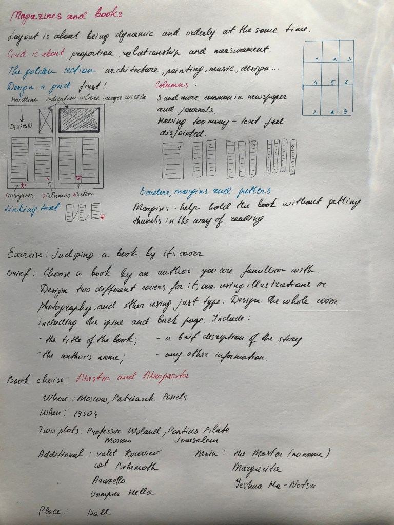
Choose a book by an author you are familiar with. You are going to design two different covers for it, one using illustrations or photography and the other using just type. Design the whole cover including the spine and back page. Include the title of the book, the author’s name, a brief description of the story and any other information you think is necessary. As you are working remember that your design is intended to help a reader know what the experience of reading the book will be. Is it a serious text book or an off-beat funny novel? Are the readers expected to be young women or older men and does this matter? Is it an ‘easy read’ or ‘literary’? Does the publisher have a house style you need to be partof? When you have finished critique your work – which of your two designs do you feel worksthe most successfully and why? Make notes in your learning log.
OCA. Core Concepts
Start
For this exercise, I chose a book that I am quite familiar with; this book is by the writer Mikhail Bulgakov, The Master and Margarita – a darkly comedic takedown of Soviet society, an audacious revision of the stories of Faust and Pontius Pilate, and a thrilling love story. The novel begins with the Devil’s arrival in 1930’s Moscow disguised as the distinguished Professor Woland. Together with his entourage of odd associates, including a talking, vodka-swilling black cat, Woland wreaks havoc on the societal elite. Meanwhile, the Master (an author of an unpublished novel about Jesus and Pontius Pilate who has been hounded by Soviet censors), languishes in despair in a psychiatric hospital, unable to share his story. His devoted lover, Margarita, agrees to sell her soul to the Devil to rescue the Master from his fate. The story weaves back and forth between current day Moscow and ancient Jerusalem, studded with sparkling scenes ranging from a dizzying Satanic Ball to the crucifixion of Jesus on Bald Mountain, with the enduring love between the Master and Margarita joining the strands of plot across space and time.
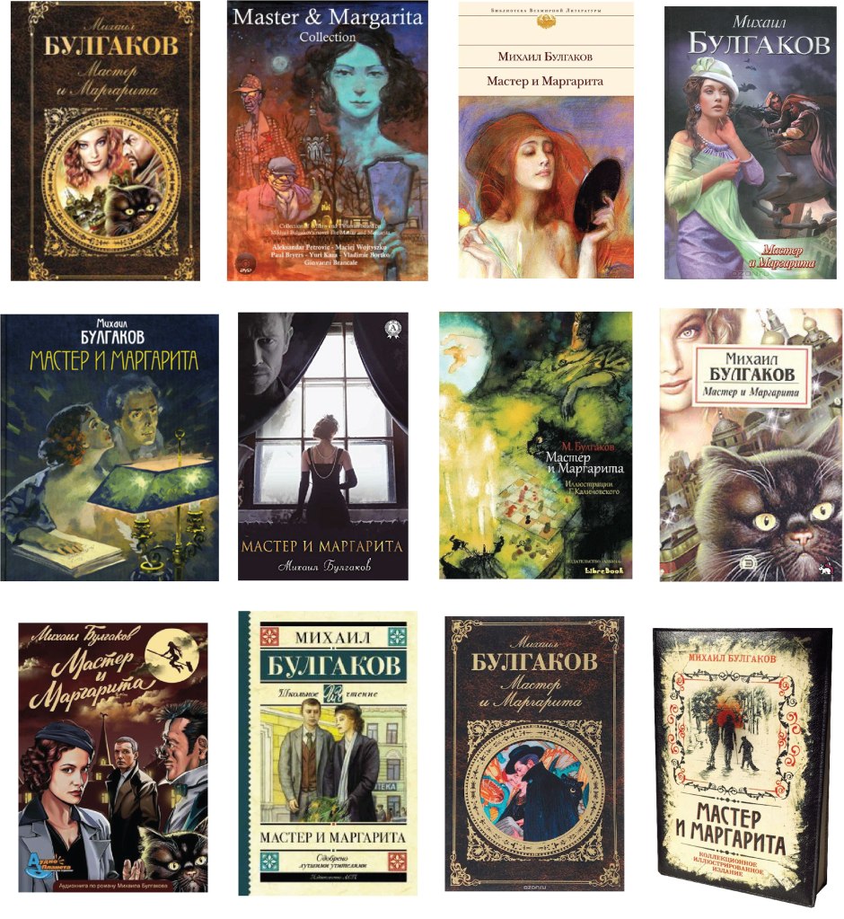
According to the novel of the Master and Margarita, there were many attempts to film the story, but mystical coincidences often arose around the filming processes. I thought it would be interesting to convey the atmosphere of the mystery of this story. There are several storylines in the novel, it is also filled with many characters and object, so the spectrum to depict the cover of this book is quite broad. The only challenge that I faced was the fact that the book is quite popular. Through Google search, I could find a considerable number of examples and samples of book covers that were full of variety and different styles.
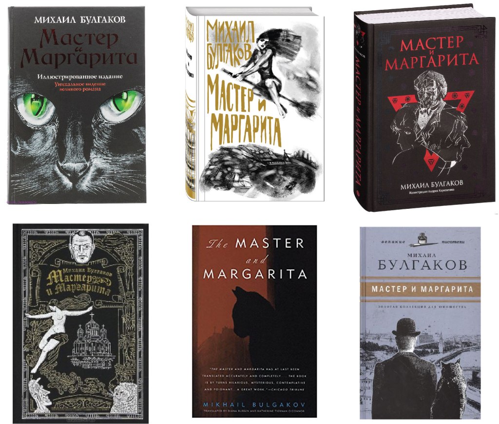
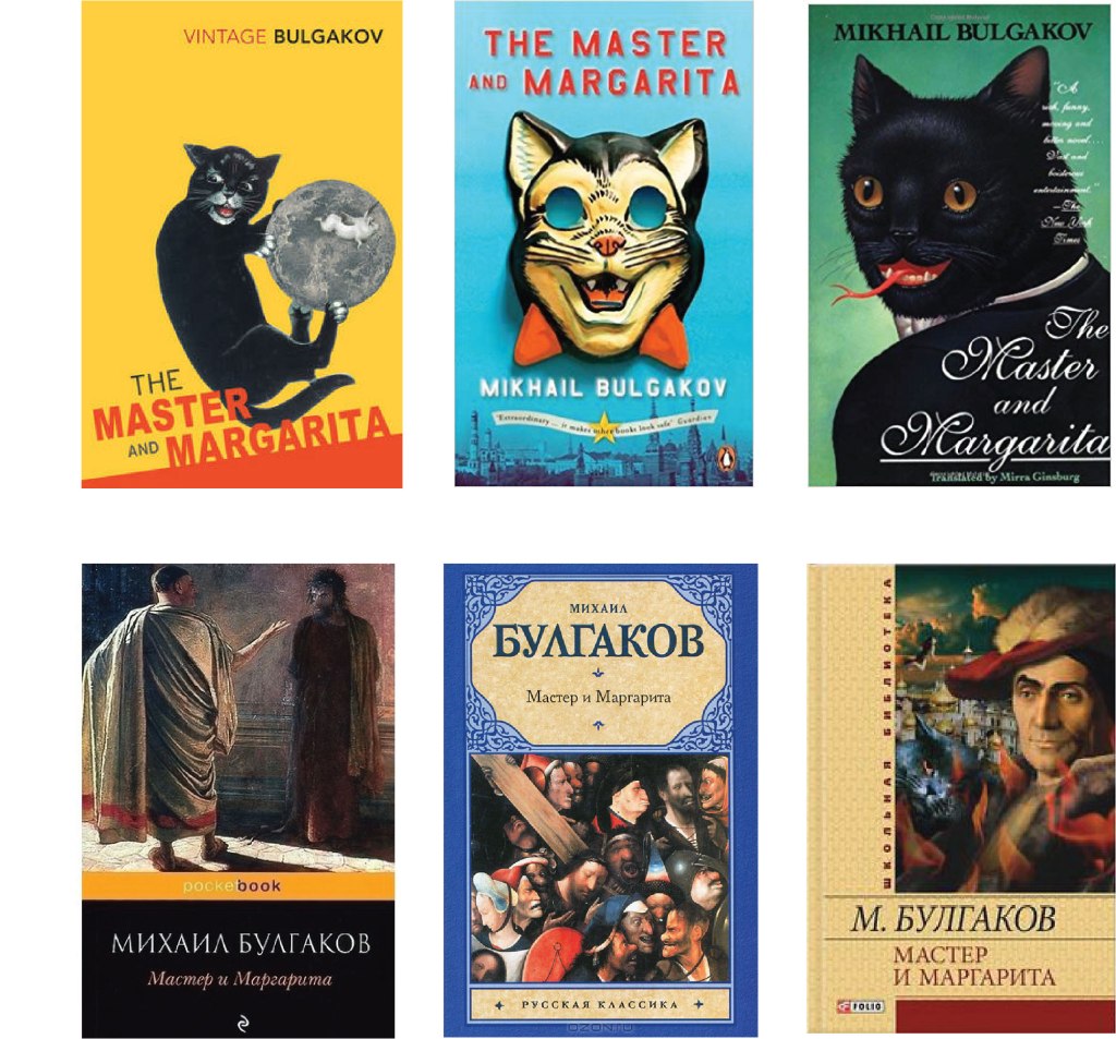
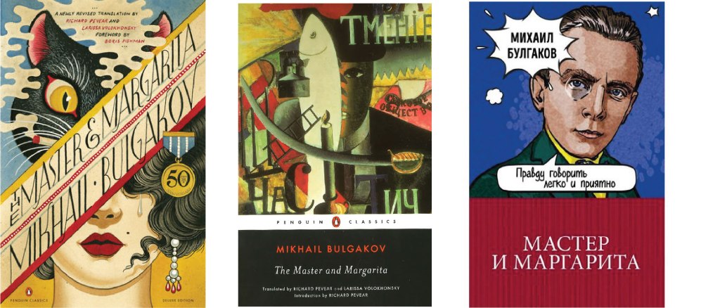
I collected all kinds of cover options in small subgroups, so it was easier to navigate the designs that were already used earlier. The first fact, it was evident that the covers often used the image of Margarita, small frames from the book, then Margarita and the Master in pair. The next essential character is the cat Behemoth (hippo). He is an enormous demonic black cat who speaks, walks on two legs, and can even transform to human shape for brief periods. I also met several covers with scenes from famous paintings. Thirdly, I noticed that for modern publications, only a few colours were used for the book cover, such as the primary black background in the cat example, and the image of Margarita on a broomstick drawn in outline. Woland and his retinue drawn in silhouette on black colour and a version on a light purple background. I was able to trace that the style of the cover changed over time, from loaded full-colour scenes from the book to one character or quick sketches. I also found several options for covers in the style of pop art, cubism and art deco.
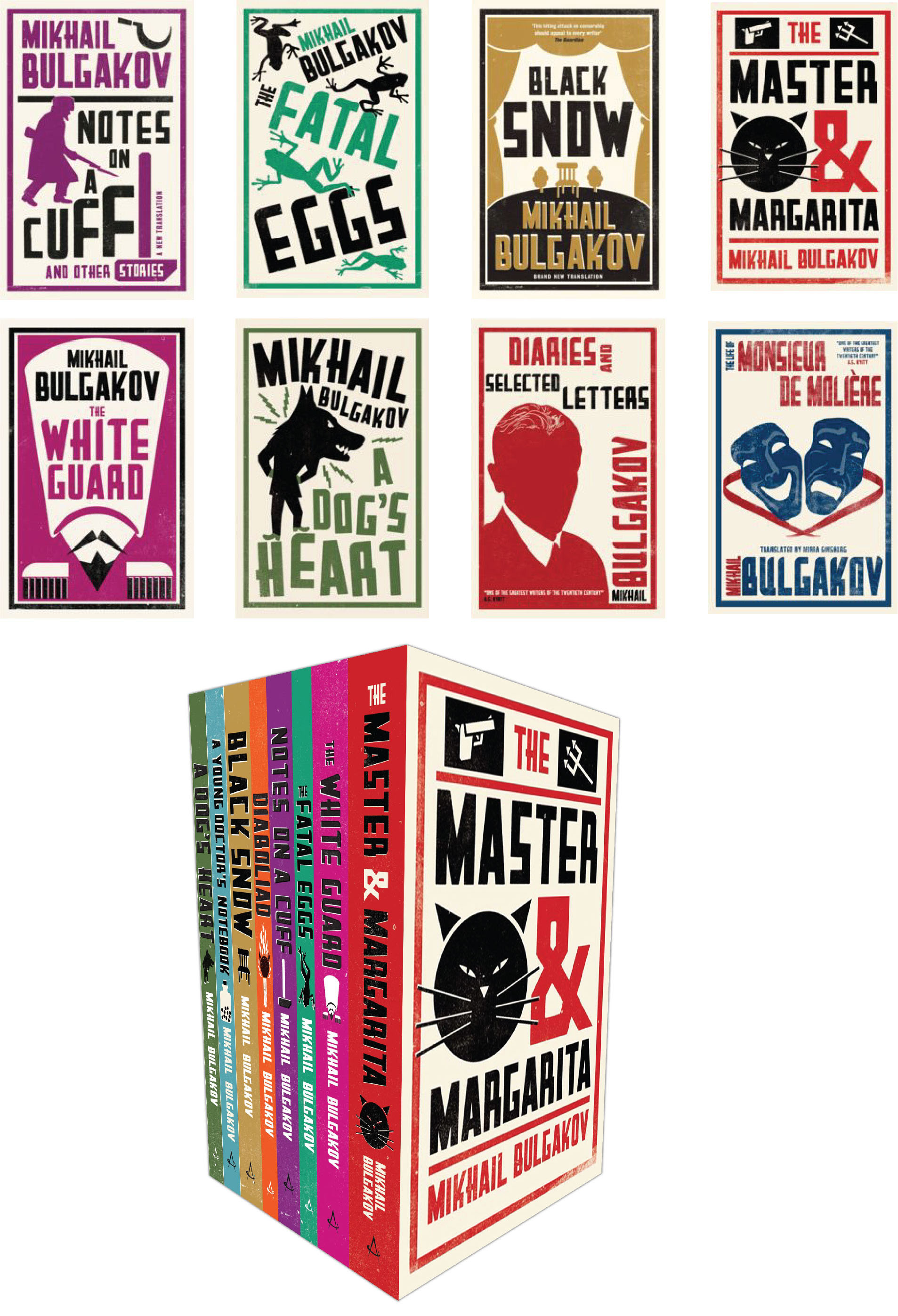


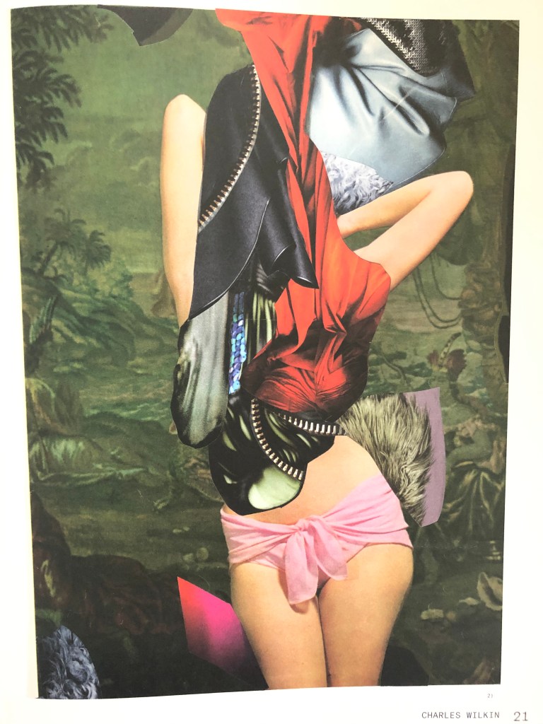
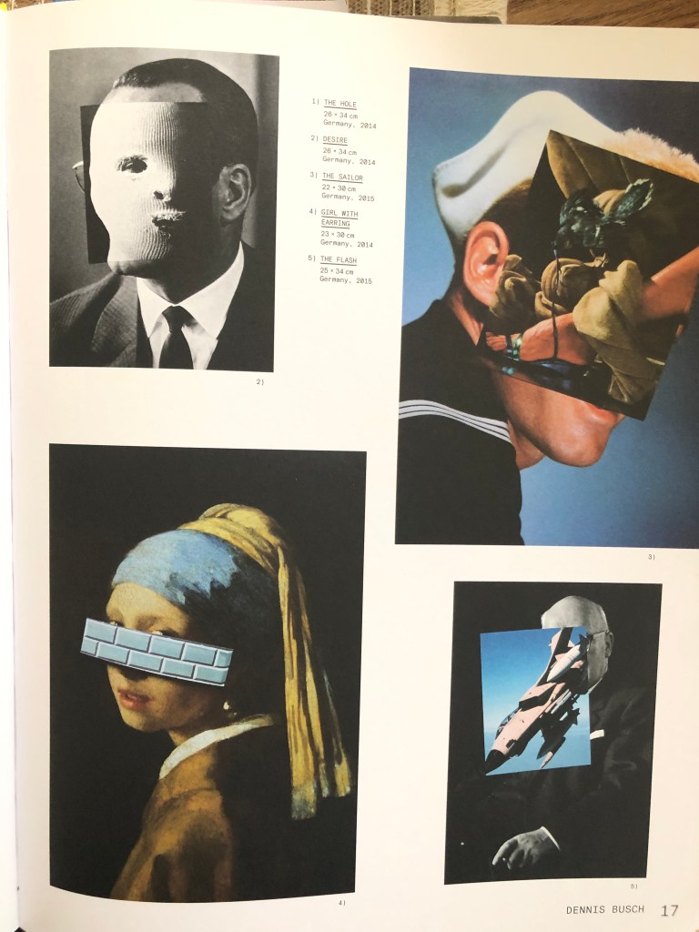
I noticed that it was possible to introduce a new style for the cover of this novel, and this is a design in the style of collage and juxtapositions. I collected collage-style cover images on my Pinterest board. I noticed that collage-style covers evoke mystical associations, create a mood for the presence of the supernatural, which I needed for my designs.
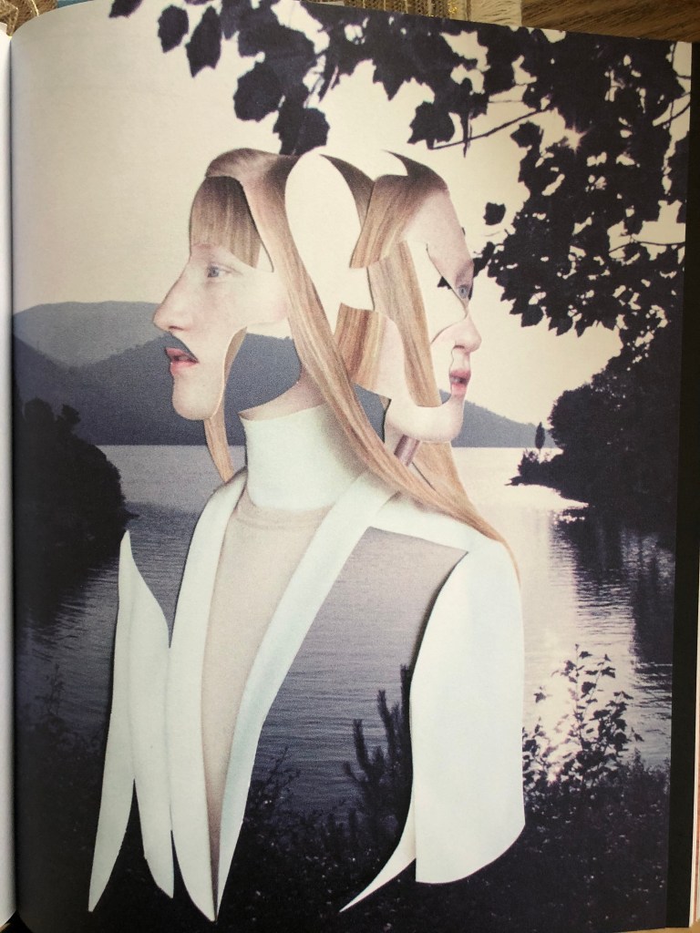
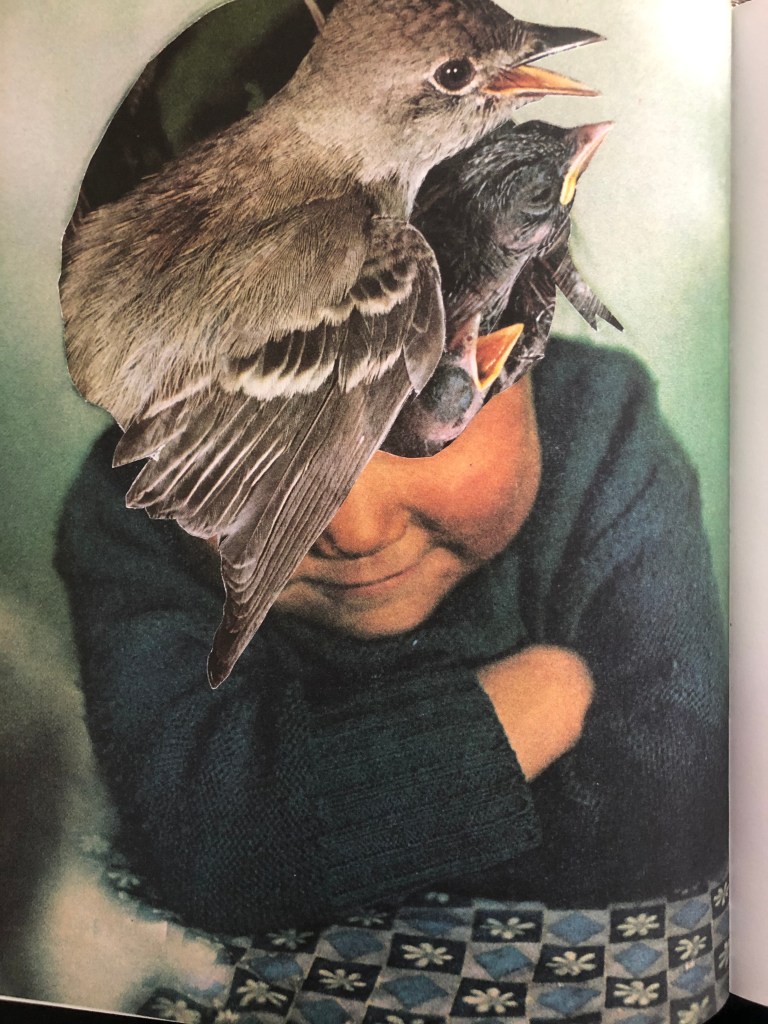
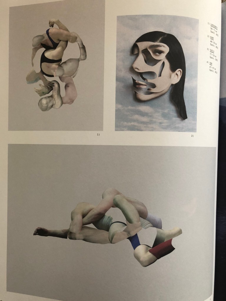
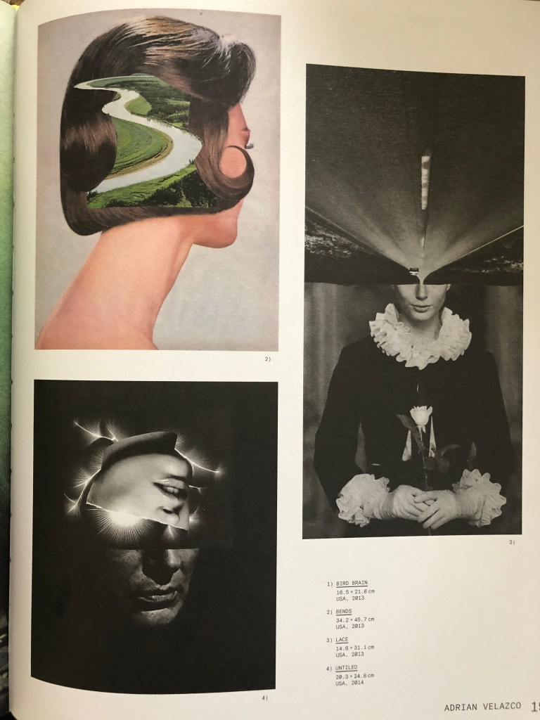
So the choice was justified by the mystical plot of this book, which in my opinion successfully fit into the concept of the book Master and Margarita. In addition, I decided to scroll through a collection of books on Collages, and such masters of collage and juxtaposition as Dennis Busch, Charles Wilkin, Ernesto Artillo and Adrio Verlarco. In their works, I found the right direction and inspiration, which I was going to portray in my works.
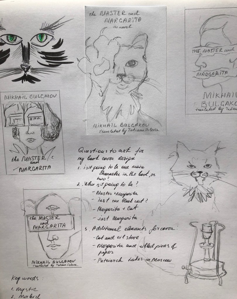
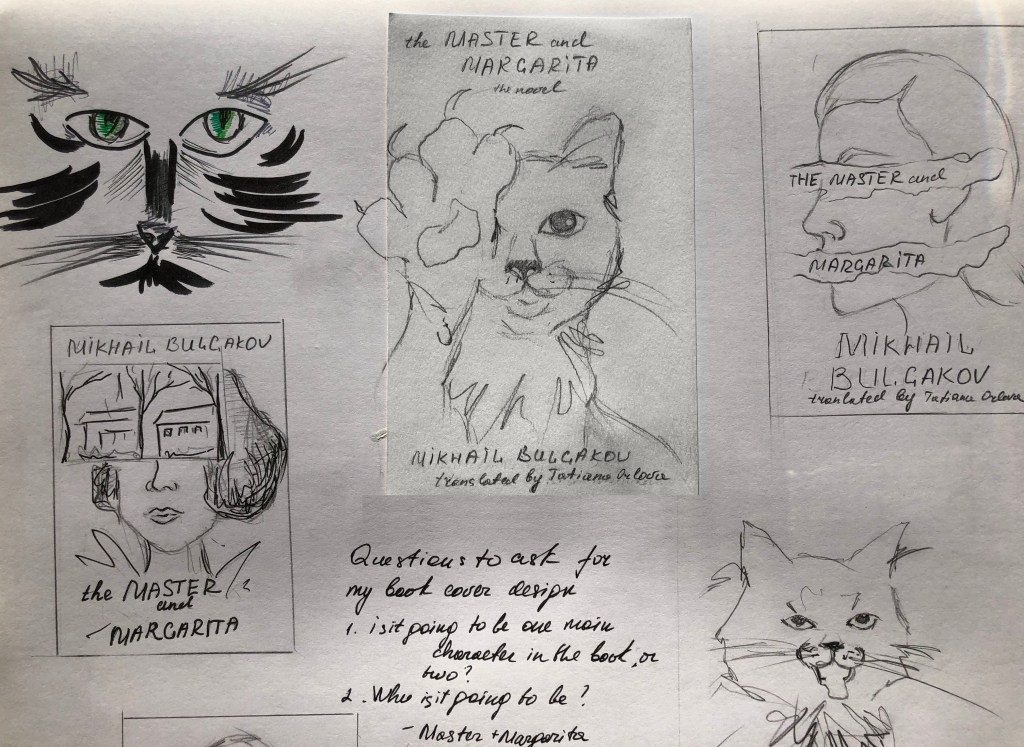
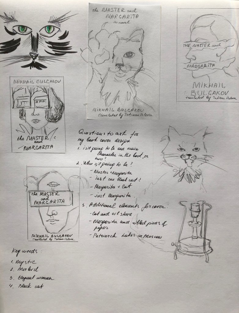
Mind Map. Sketches
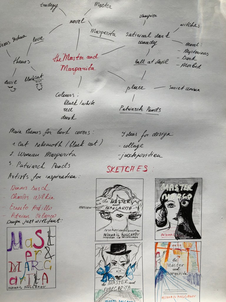
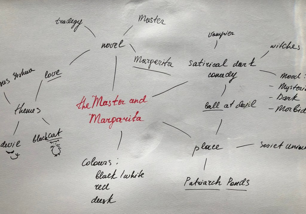
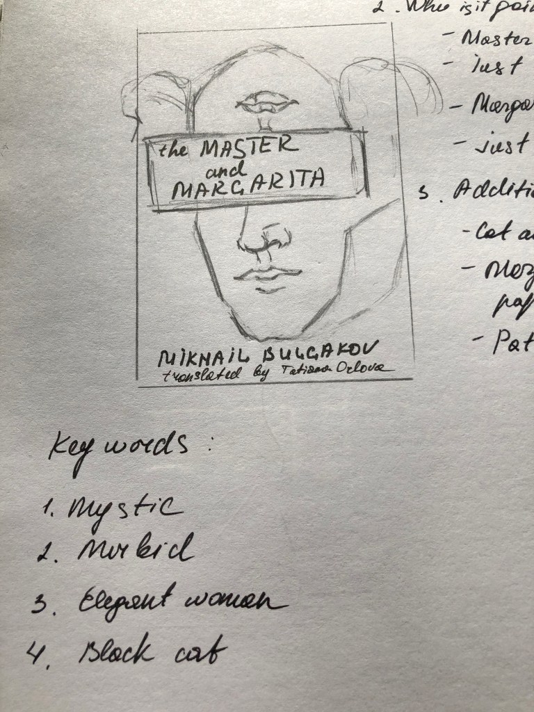
After the research, I proceeded to sketches. To start, I drew a mind map with keywords that would help me determine the main characters that I would like to portray in my designs.
I analysed the brief and the main storylines, which helped me to forme the main characters that I could portray on the cover of this book.
- The image of Margarita
- Image of Margarita and Cat Behemoth
- Cat Behemoth on its own
- Margarita and Master
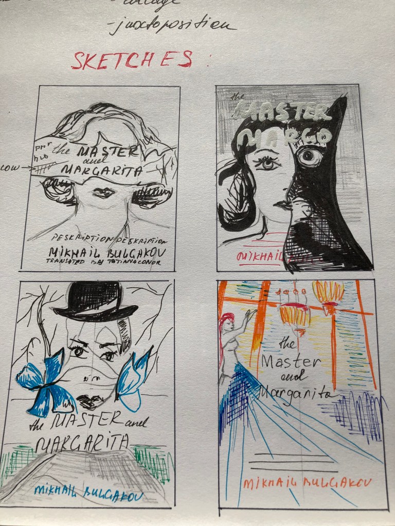
I imagined several variants of the composition, all of which are presented in sketches. My main goal was to create a new image that this book has not yet released, by hiding some features of the main character, like half-faced, upside down faced, combinations with animals faces could create effects that I was looking for. So I have selected for myself some favourite ideas, which after I later I started to implement in Adobe Programs.

Design Cover 1
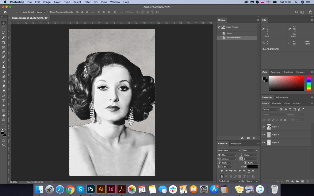
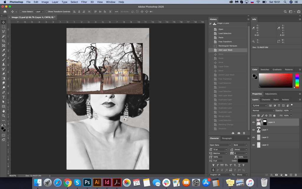
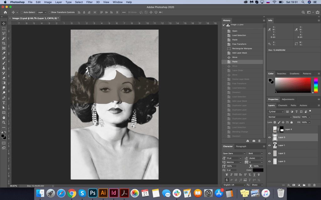
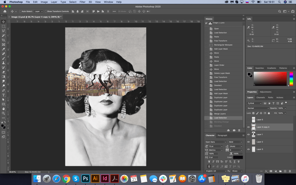
As I needed an image of the classic lady, vintage style, I’ve googled some ideas, and I found some exciting photograph, that was available for download, website source: https://collage.cityoflondon.gov.uk/home?WINID=1584052701283
Also, I was looking for an image for Patriarch Ponds in Moscow, where the book plot has started from, so landscape, a bit gloomy, would help me to create some juxtaposition with Margarita’s face. Image of the Patriarch Ponds from Pinterest: https://hu.pinterest.com/pin/591590101024594911/
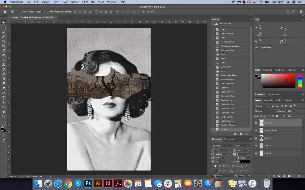
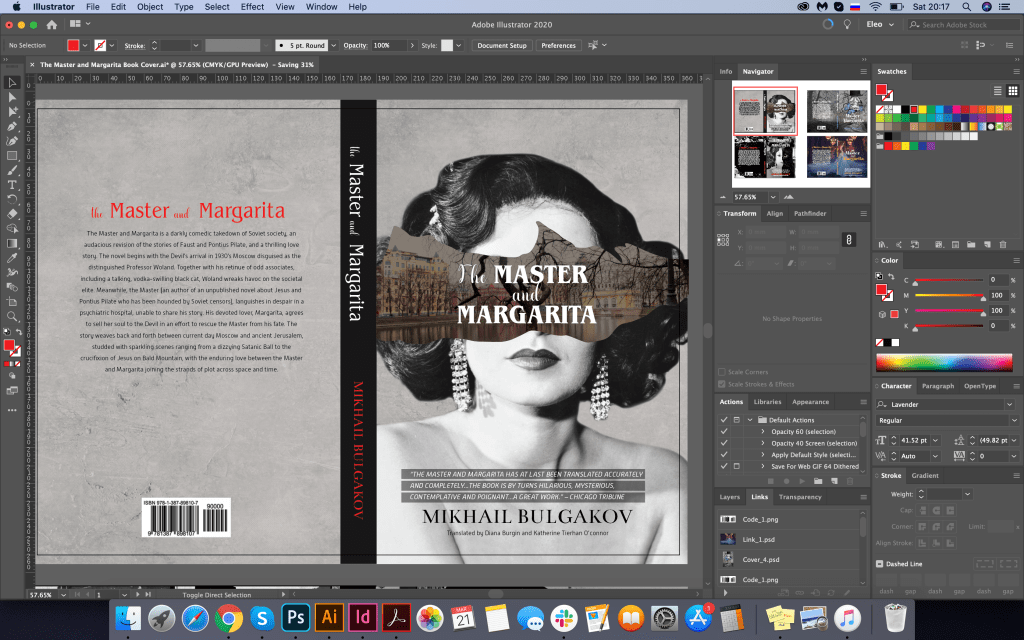
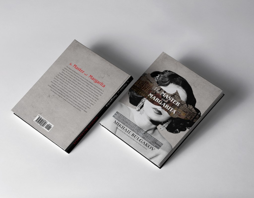
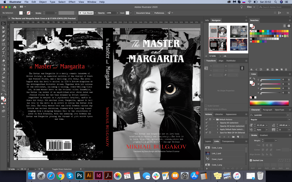
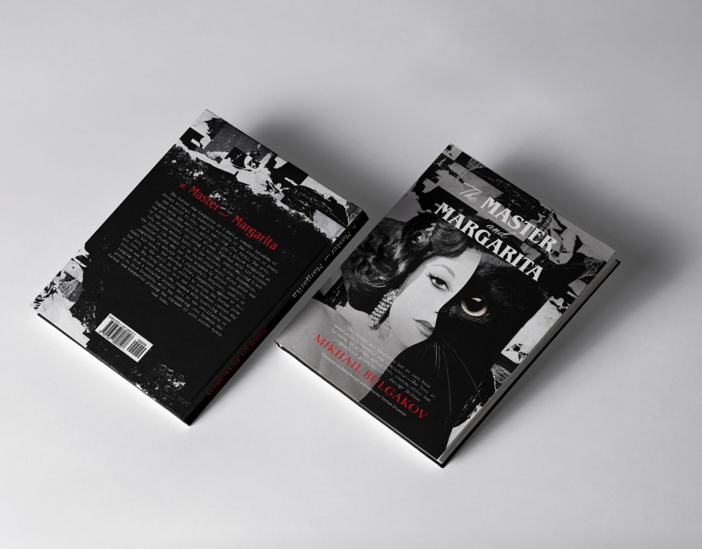
I was thinking about the size of this book cover, so one of the examples for this book cover was 170x250mm with book spine size 20mm. I thought it was quite an adequate size to start. I placed the portrait of the lady on the grey textured background, to give to it some interesting deepness, played around with the picture of the Patriarch Ponds, created a mask over it. I put the image in the centre of the lady’s face, so the tree branch came out the practically same place where her nose was. It helped me to create an effect that I was looking for. For fonts, I chose some classical fonts, which represented the plot quite well, classical font, with serifs all capital letters. Cover 1 Benguiat Pro ITC decorative font, bold with serifs, combined with script font Lavender for words “the”, “and”. For an intro on the book cover all capital letters font Alwyn New, that to highlight it slightly I used fine black lines on the top of the actress body. For the author name, I selected classical font as well with serifs Bentham, and for contrast, I chose some of the letters in red. In the result, I had an exciting design, which was a good start. I liked how that sort of this image of working together, the spirit of this cover, and colours, gloomy and dusk, created the mood of the story, which could represent the plot from the first look.
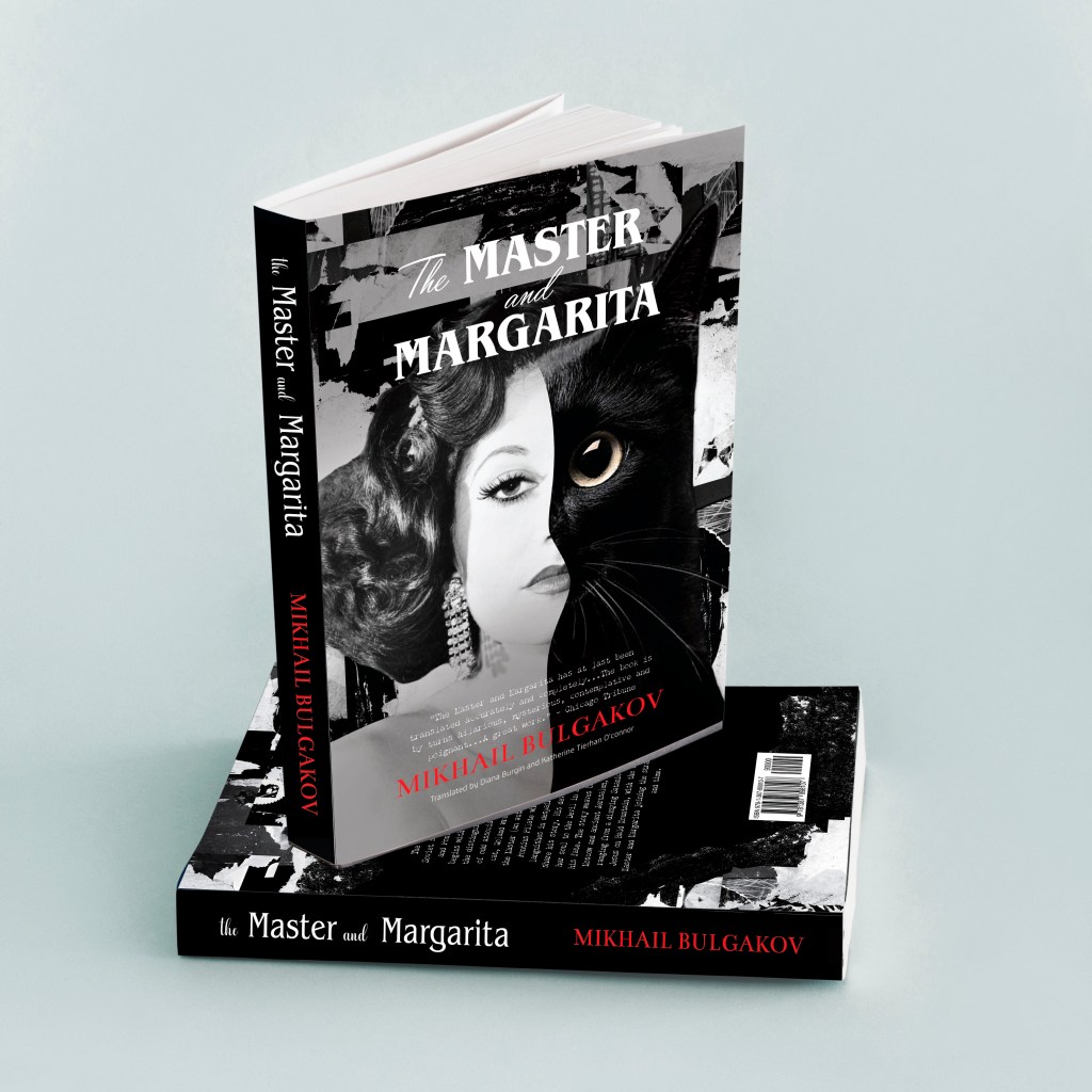
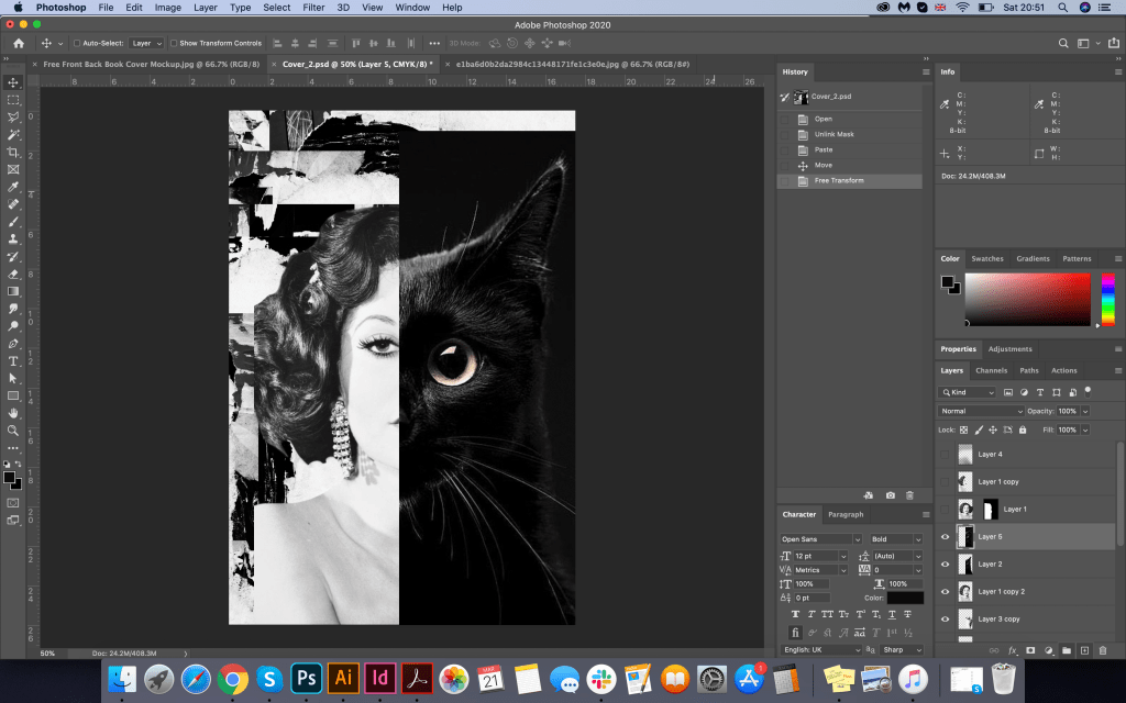
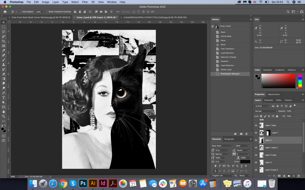
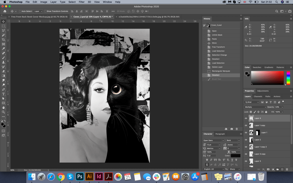
Design Cover 2
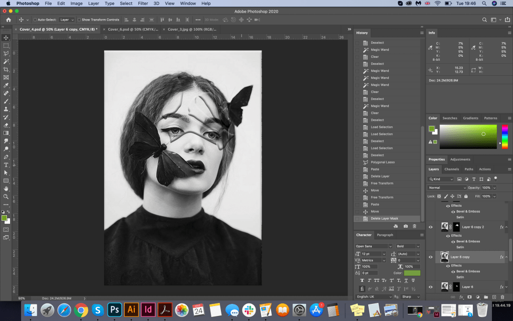
In the next design, I had the option to play around with the image of Margarita and the Behemoth Cat. To start with, I needed to decide on the background. I created an experience from pieces of black colour, and old paper, in black and white, on top I placed the image of the same actress, combining her appearance with a cat. I created a wavy transition from one face to another, trying to keep the proportions of the woman face and the cat. Fonts and their styling were used similarly as in the first design, only here I significantly increased the name of the book, and chose a new font for the intro, which had the desired typewriter effect, Chandler42. On the back of the cover, I created a similar background, and with the help of a brush in Photoshop, I made a transition to a black background from torn edges. Picture of the cat from Pinterest: https://i.pinimg.com/564x/e7/03/cf/e703cfec4f0ade97feade9f8778fdf93.jpg
In the result I had even more advanced version from the previous design, I like the effect of combining two faces in the one cover. It had the necessary spirit and artistic composition. As I analysed some book covers before, I was quite confident that I could combine a few fonts for each cover, in my design, I had practically four different font variations. Still, they helped to create the hierarchy of the priorities for this book cover.

Design Cover 3
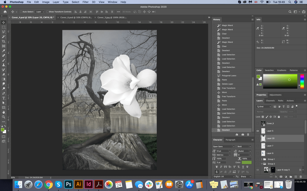
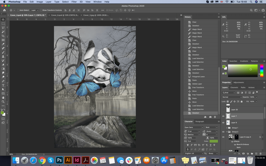
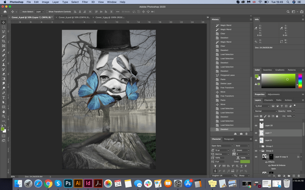
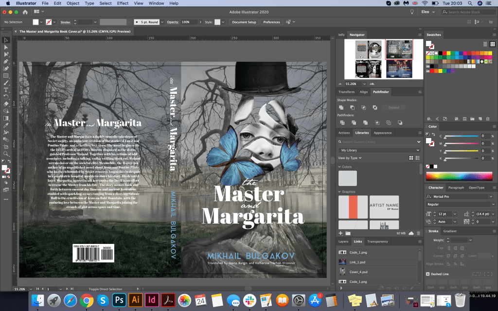
For the final design using graphic images, I decided to go for a new experiment, and the basis was ready to play the shape of a magnolia flower. For the background, I needed to get a scene with depth, which I managed to get due to the overlapping of several images on each other, so two pictures of the Patriarchal Ponds and a standard idea of the sky with grass in muted shades create the necessary surreal mood. Next, I placed the girl’s torso in the lower part, and in the middle of the composition, I planned to place several magnolia petals with the girl’s face. In this performance, I managed to create a mystery. I put the hat of Azazello on top. I decorated Margarita’s face with bright blue butterflies, emphasising the tenderness of the image. On the back of the cover, I used a duplicate image of the Patriarchal Ponds but from a different angle, thereby combining both pictures into one. The result was quite enjoyable, it has drama and mystery, and mysticism at the same time. I liked the experiment with superimposing images on top of one another; the only thing I needed was a lot of ideas that I just collected on the Internet, transforming and changing their original form.
Font for the book name Abril Fatface Regular, and JaneAusten for words “the”, “and”. For the author name Aqua Grotesque.
Girl in the skirt https://www.greatinspire.com/surreal-self-portraits-by-flora-borsi/
Image of the girl cropped https://www.behance.net/gallery/34816101/Black-Butterfly

Book Covers Just Type
For the second set of covers, I had a new task: to depict book covers without photos and graphic elements. This task became quite challenging for me, as I couldn’t understand how I can lose all these images and complicated collages, as I still aimed to create a new exciting and eye-catching design. I understood that this was classical literature, and the cover examples for this book without photos and visual images were quite dull. But since the task was to do without a picture, I decided to experiment with the font itself. Yes, I understood that the fonts that I used earlier would probably be too dull, and they would not arouse the interest of the buyer. However, I still wanted to beat the cover on the favourable side. Here I came to the help of the font selection program in Adobe InDesign. From my past exercises, I remembered for myself some successful font combinations:
- Serif font and Calligraphic font
- Calligraphic font only
- The decorative font in several combinations
- Decorative font only (experiment with different letters)
Since in this design, I was limited in graphic elements, I decided to depict the covers of books in bright colours; this helped me to understand the accents and mood. Nevertheless, I tried to maintain a dark contrasting base, and the font on the top was bright. As different types of fonts and designs were applied, I realised that the book was taking on a new mood.
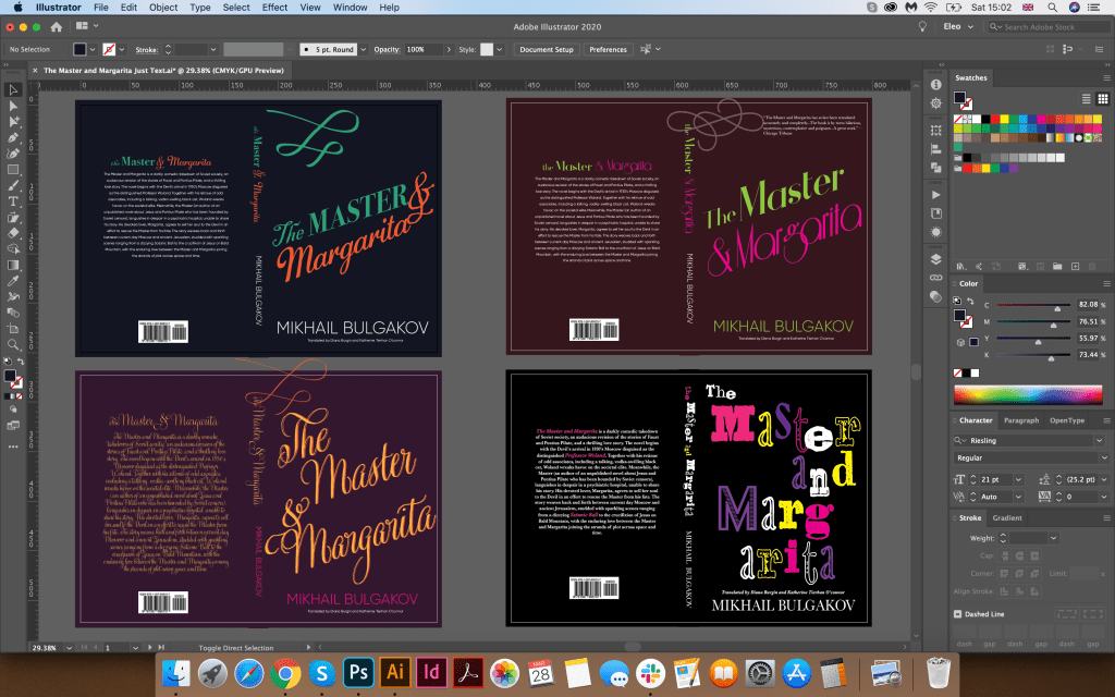
First Cover (top left)
In the first cover, I used fonts such as Blackadder ITC for the uppercase font, Bodoni 72 Oldstyle for the calligraphic font, for the name of the author I chose the sans-serif font Gilroy. I understood that this was only the beginning of the experiment, and this cover required some modifications. I was not entirely happy with the combination of fonts, as well as the slant of the letters.
Second Cover (bottom left)
In this book, I chose a dark purple background and a bright contrasting orange capital font Gratitude Script Pro on top. I repainted the name of the author in the colour of the magenta. I thought the new design had a combination, I liked the intersection of the curls of the font with each other, and the writing angle. This cover evoked quite romantic associations, possibly earlier novels than this book, which was released in the middle of the 20th century. Also, it lacked a mystical mood, so I realised that this was not the final version.
Third Cover (top right)
In this cover, I chose a dark cherry shade for the background and a bright contrast font. Word ‘The Master’ I designed in Athene font with a serif typeface, and the sophisticated Riesling serif typeface for ‘Margarita’. Even though the font was sophisticated, this design shows more similarities with the moods in the book than the previous versions.
Fourth Cover (bottom right)
Finally, in the final version, I was able to convey the mood of the book. Here I chose a black background, and on top of it, I found an Alta California font with different letters, also for second M I used additional font Acier BAT. I could see so far that in such kind of font I could trace more frightening mood, because Woland’s entourage was a fear for the people around, and due to such a random arrangement of letters, I could convey the mysticism of the book more accurately.
Conclusion
In conclusion, I would like to say that I enjoyed the work was done and the results. An experiment with a collage is a rather laborious process; it takes a lot of time to search for images, matching the mood, as well as observing the rules with fonts, I always had to change the background to highlight the font in the main plan as well. However, I can see that each option as collage and only fonts version may attract the different target audience, which is both younger people and more mature age. I prefer the collage version as I feel this is more descriptive and generally more attractive; also it brings the mood of the book quite well. However, the text option looks more playful and slightly ‘wacky’ and unusual as I feel most of Michael Bulgakov’s stories have elements of this tone. It was an opening for me that the final design turned out to be so successful, as using only the font, I could still create an exciting and catchy design.
