
Illustrators frequently receive commissions to integrate their imagery with typography, ushering them into the role of type creators. Through their artistic vision and creativity, illustrators combine visual elements, hand-drawn motifs, and expressive lettering to craft a type that is both captivating and purposeful. An understanding of typeface terminology, including cases, ascenders, descenders, and serifs, is crucial for illustrators engaging with clients to ensure effective communication. Recognising the diverse contexts in which type is utilised, illustrators must possess the skill to analyse its functions and its relationship with surrounding imagery, emphasising the interconnectedness between text and visuals.
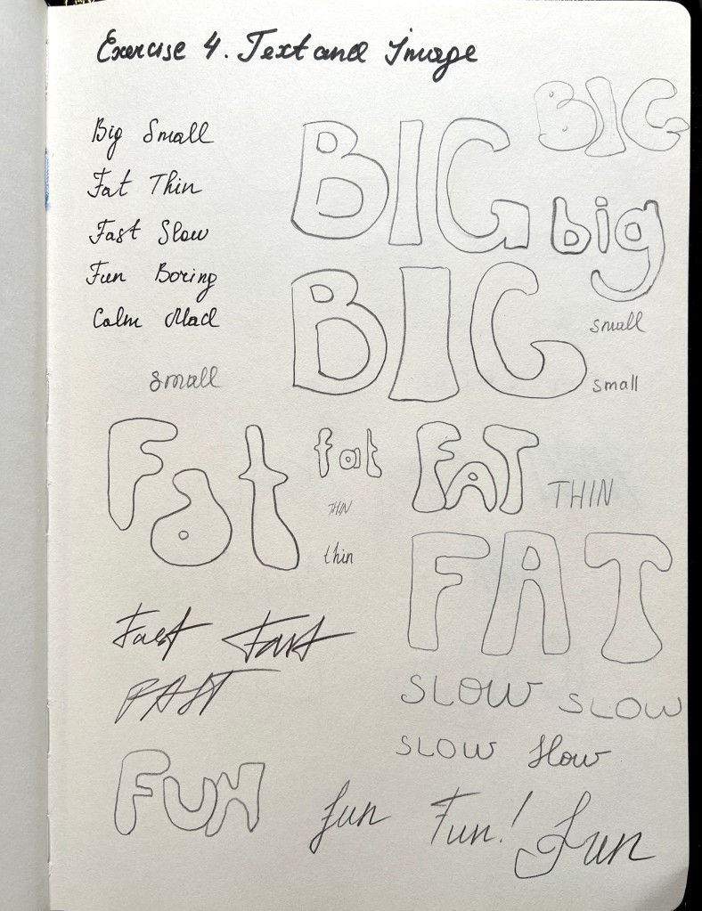
In this exercise, I was asked to write out a pair of opposites in my own handwriting, and then in a descriptive way by using the shape and size of the word to express the meaning of the word.
This exercise reminded me of one of the exercises I completed for the Graphic Design Core Concepts unit, where we played with words, and created their typographical representations that present both the word and a suggestion of its meaning. I looked back through this exercises to find some inspiration and ideas.
I wrote those words in my own writing and then created a visual representation of each of them. There were numerous exercises included in the Book Design Unit where we experimented with typography and its qualities. Even the previous exercise was about choosing the right typography for the name of the travel guide. The appearance of the font is an important component that creates a final touch for the design visually.

In the next step, I wanted to trace some of the fonts in software, so I could see the practicality of the fonts I sketched. After designing them in Adobe Illustrator, I could see what the font would look like as digital artwork. This helped me understand the physical differences between each font and how they communicate to the reader.
Font design in a descriptive way is presented below.

Big. The font is chubby, with large, heavy letters, a bit clumsy, and dominating on the page.
Small. The font could be any font, preferably sans-serif and handwritten, unnoticeable on the page, and a bit shy.
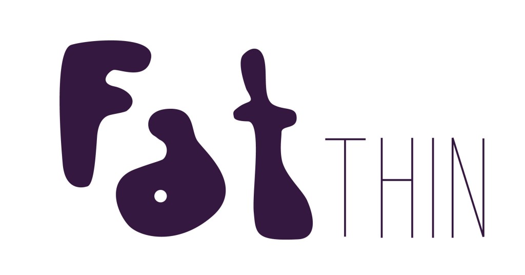
Fat. The letters are slightly overweight, with a little gap for the breathing centre, a heavy bottom, round letters, and decorative font with cute bellies.
Thin. Sans-serif font, features tall and thin letters with sharp edges, creating a sleek and elegant appearance on the page.

Fast. The fond conveys speed, urgency, and dynamism, with sleek, streamlined letters that suggest movement and efficiency.
Slow. My interpretation of the font for the word ‘slow’ can convey a sense of leisure, relaxation, and calm, with gentle, flowing letters that suggest a laid-back and unhurried pace. Big gap between the letters
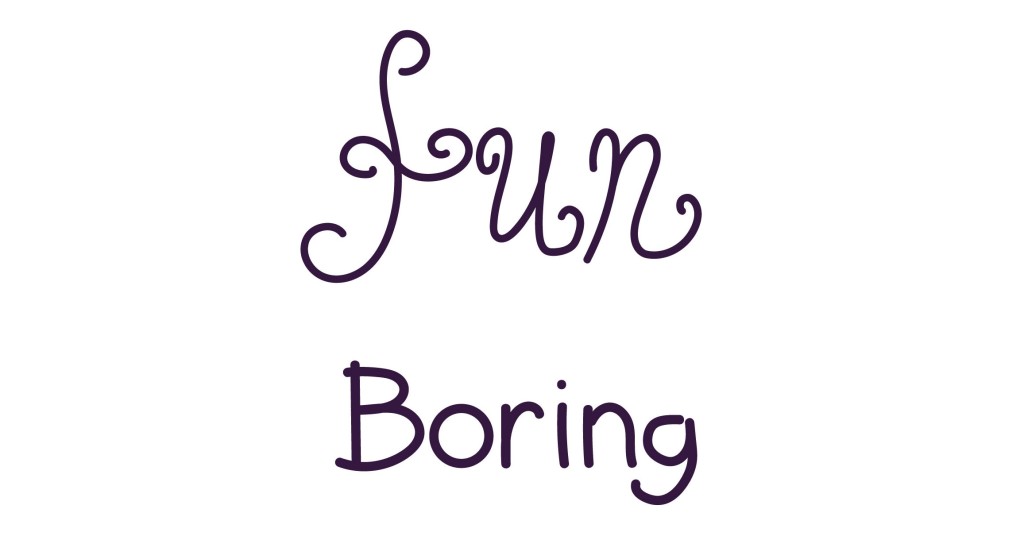
Fun. Handwritten font, with swirls, and decorative elements. Sense of playfulness, energy, and excitement, with lively, whimsical letters that evoke a cheerful and light-hearted atmosphere.
Boring. Plain font, reflects a lack of excitement. Reminds me of the font Comic Sans MS, which was meant to be the easy, light font, that can be used for informal writing, but, I think it’s just overly overused, and it lost its purpose of being a funny font.

Calm. Handwritten font. Letters that are joined together, like floating across the cloud. Bring the spirit of tranquillity, serenity, and peacefulness, with smooth, flowing letters that evoke a soothing and relaxed atmosphere.
Mad. Decorative font, no serifs or smooth lines. Conveys a sense of anger, intensity, and explosiveness, with jagged, erratic letters that evoke a feeling of agitation and emotional chaos.
In the next stage, I opened the software and went through each font to find fonts that would match the chosen words. As it was said in the brief, I made a selection of fonts, which helped me to make a little comparison of the most suitable font.
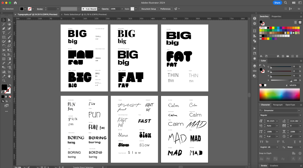
Big and Small
For the word ‘big’ I made a choice towards Druke Wide font. Rather than choosing a decorative, hard-to-read font, I went for the bold and expansive sans-serif font known for its wide letterforms, strong presence, and modern aesthetic. The wide, spacious letters make a striking visual impact and are well-suited for attention-grabbing headlines and bold design applications.
For the word ‘small’ I chose Coco Gothic Ultra Light san-serif font, which is very sleek and compact due to its short distance between letters. Also, this font is suitable for the minimalistic, modern design, as it brings a clean appearance to the text.
Fat and Thin
For the word ‘fat’ I selected a Chubby font which sounds synonymous with the chosen word. This decorative typeface is characterised by its plump and rounded letters, giving a cute and jovial appearance to the text. This playful font style is often used for designs that aim to convey a whimsical and lighthearted tone.
For the word ‘thin’ I found one of the thinest fonts I had in my collection. The Poppins font is a versatile and modern sans-serif typeface known for its geometric design, clean lines, and friendly appearance. It is widely used for a variety of design projects due to its readability and contemporary aesthetic.
Fan and Boring
There are plenty of fonts that can be utilised for the word ‘fun’. As soon as the font is quirky, funky, and interesting, no matter whether it’s san-serif, decorative, or handwritten, it all can suit the chosen subject. I chose the Amoretta font for its stylish and decorative design, featuring playful swirls, bends, and angled letter positioning, adding a unique and artistic touch.
For the word ‘boring,’ I selected the font Comic Sans MS, known for its jovial and cheerful appearance. However, it has become excessively common, particularly in nursery and school settings, where it is often used for their announcements. Another font that could be a perfect match for the word ‘Boring’ and compete with the Comic Sans MS font is only the Arial Regular font. I believe you have never seen a more boring font ever created, even though it is a sans-serif font with correctly formed letters. However, it is simply too old and not very popular among graphic designers.
Fast and Slow
If you look through online sources on how the word ‘fast’ is written, it’s often an italic sans-serif font with little speed lines emanating from each letter. However, I personally would choose a handwritten font that gives the impression of fast-paced writing. Therefore, my preference went for a stylish extended script font like Cadogan, which exudes elegance and refinement.
Originally to present the word ‘slow’ I was going to choose the decorative font 1960s Hippie, which has the look of a chubby sluggish font, with a thiner top and heavy bottom. Bug later, I changed my mind, as I thought it was too repetitive and too similar to the font that could describe the word ‘fat’. I thought, I needed a bit of variety in my collection of fonts, and I didn’t look through fixed-width fonts, that could be a perfect match to the word slow, due to the spacious location of the letters. The Futurist Fixed-width font is characterised by its precise and uniform spacing between characters, creating a structured and orderly appearance. The typeface’s futuristic design enhances the idea of slowness by juxtaposing the concept with a modern and sleek aesthetic.
Calm and Mad
For the word ‘calm’ I liked fonts Aya Script and Adrianna Light, despite their difference in style both bring the feeling of calmness and tranquillity. The first font is hand-written, it has all letters joined, also, the font doesn’t have an angle, or sharp ages. The second font is san-serif, quite thin, has soft sides, and also looks modern, and relaxed.
For the last opposite, the word ‘mad’ I chose the decorative font Lazy Writer, which was designed to mimic the handwriting of someone writing erratically. It features irregular strokes, varying slants, and a casual appearance, giving the impression of careless writing.
Then, I printed off the words in the typefaces I’ve chosen reflecting the meaning by font sizes.
After that, I explored the visual qualities of each word that could communicate through their shapes, forms, texture, and colour. I contemplated which approach I should choose: a literal presentation to explain the word or a more figurative one with metaphorical and symbolic meanings. I opted for a mix of images.
For the next stage, I had to trace the chosen fonts and explore them in colour that would best communicate their meaning.
- Big and small. For the ‘big,’ I chose the red colour, emphasising the significance of the word, I coloured the word inside, rather than keeping just the outline for it. For the word ‘small’ I chose the dark grey colour, as I thought the lighter one could be not visible. Also, grey means less attention to the word.
- Thin and fat. Light blue is often associated with qualities such as calmness, serenity, and depth. When the blue colour represents the word ‘thin’, it evokes a sense of delicacy and lightness. The colour orange is often associated with warmth, energy, and vibrancy. To represent the word ‘fat’, orange can evoke a sense of boldness, vitality, and dynamism.
- Fun and boring. For the ‘fun’ word I used happy, positive and energetic yellow colour. I thought that colour could create a good presentation of joy, playfulness and enthusiasm for the word. For the word ‘Boring’ I chose a shade of brown colour. I think, because the shade of the colour is quite plain, it creates a sense of dullness and monotony of the word ‘boring’.
- Fast and slow. The dark blue colour of the word ‘fast,’ evokes a sense of reliability, control, and efficiency. Dark blue is a colour that signifies authority and precision, which can be linked to the idea of speed and quickness in a controlled and confident manner. For the word ‘slow’ I used dark green. I thought that could represent calmness, patience, and stability. Also, it symbolises nature and renewal, suggesting a steady and deliberate pace that aligns with the idea of slowness.
- Calm and mad. Originally, I was going to use green colour for the word ‘calm’, but because it was occupied for the word slow, I thought, I could use purple colour. Purple, a colour often associated with creativity, spirituality, and luxury, can be a compelling choice to represent the word ‘calm.’ The colour purple combines the stability of blue and the energy of red, creating a sense of balance and serenity. And, for the final word, ‘mad’ I chose the ultimate black colour, which perfectly fits into the spirit and the way the word mad was written. The starkness of black can symbolise an overwhelming sense of turmoil and chaos, mirroring the turbulent and volatile nature of madness.


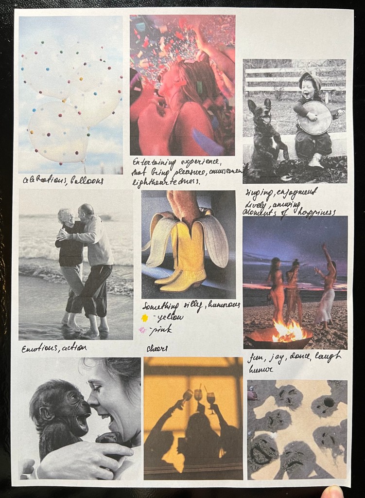
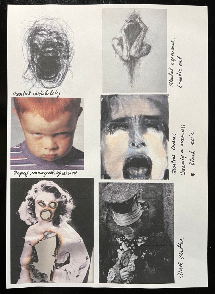
Moodboard
Then, I created a moldboard with different images associated with words, linking them to the size, shape, and texture that could represent. Also, I put some notes next to them, which helped me to analyse them even further down.


Final designs
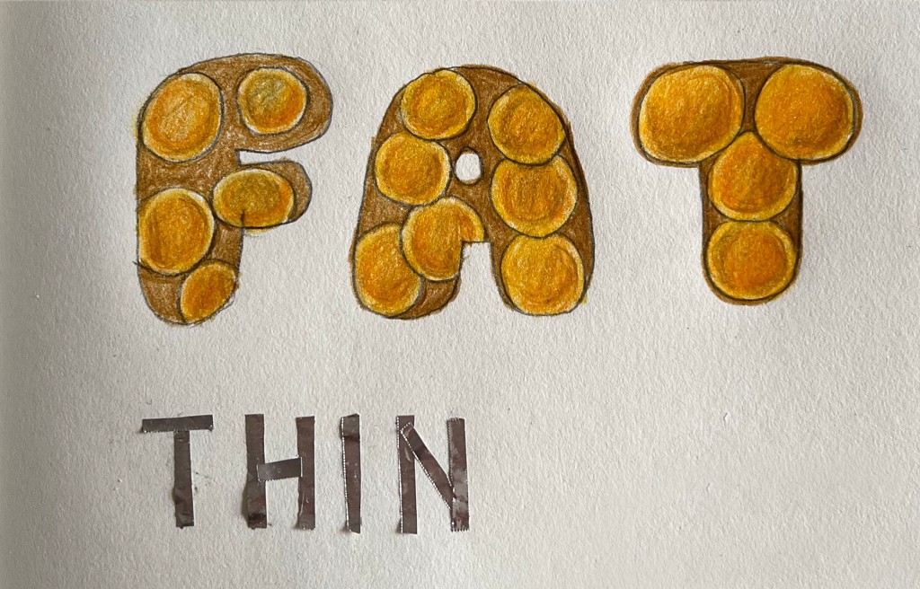
In the final part, I had to draw my typed words freehand using a pencil and then render them using materials, media and colours appropriate to their meaning. I decided to go all manual for this exercise, avoiding using software, and mainly applying different illustrations associated with words.
For ‘big’ I created the visual of the multistory building, with loads of windows, choosing a blue, and grey palette, to convey the image of a towering skyscraper reaching towards the sky. For ‘small’ I used a thin black pen, with the little ladybird climbing up on the letter, to give the sense of the small scale of the word.

For ‘fat’ I used colourful pencils depicting fat cells magnified under a microscope, depicting their round and plump appearance in shades of orange and brown. The word ‘thin’ I visualised by using kitchen foil, highlighting its slim, lightweight, and flexible nature in a shiny silver colour.
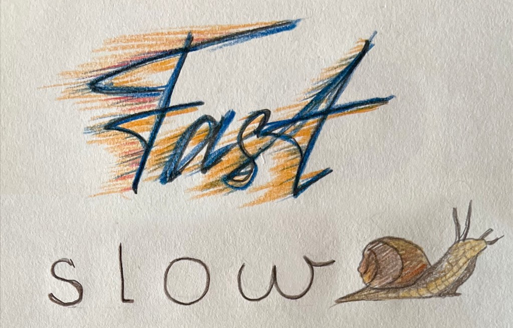
For the word ‘fast’ I used rapid sketch, aiming to recreate the speed of the world in the dark blue colour. Also, I added fyrery orange and red lines, ephissizing on the movement of the word. For the word ‘slow’ I used brown pale colour with a snail moving slowly beside the word, emphasising its leisurely pace and deliberate movement in a natural setting.
For the word fun I used glitter eye-shadows and pink colour, suggesting a bit of party feel. For the word boring I used simple grey pencil.

For the word ‘calm’ I used transparent watercolour in the greeny shades. And, for the word ‘mad’ I used black gouache with sharp and rapid movement.

Conclusion
In conclusion, I found this exercise to be useful for practicing my own typography and reimagining the meaning of words. Working with words was engaging as it prompted me to consider their qualities and how they could be linked to materials, colours, and media. I only wish I had more time to explore different materials for each word. For instance, for the word ‘big,’ I could have used texture like bubble wrap to create the word in a large size, or incorporated a piece of fabric with close-up images. I’m quite happy with how words ‘calm’ and ‘mad’ turned out, but again, ‘fun’ was a bit missing of sparkle.
