
The core essence of editorial illustration lies in its role as a visual form of commentary. Its primary purpose is to complement the journalistic content within newspapers and magazines.
The media industry is incredibly diverse, covering a wide array of themes and topics in daily, weekly, monthly, and periodical editions, catering to both general and niche markets.
Historically and in contemporary contexts, illustration holds a significant presence in publishing, despite facing competition from photography and experiencing shifts in trends and fashions.
To understand the industry that commissions and represents editorial illustration, it is important to first delve into the world of newspapers. The newspaper market, in its entirety, is a reflection of the societies it serves, particularly in the Western or ‘free’ world. It presents editorial viewpoints that align with mainstream, and sometimes non-mainstream, political beliefs and convictions, catering to readers and potential readers.
Many broadsheets and tabloids publish ‘colour supplements’, which are magazines that accompany certain issues on a regular, often weekly, basis. These publications contain a variety of commentaries and ‘lifestyle’ articles that clearly benefit from the visual enhancement provided by accompanying illustrations.


To complete this task, I engaged in the analysis of newspaper supplements, a practice I had never undertaken. All of my news comes from online articles, YouTube, and Telegram channels, providing a completely different experience. We live in a fast-paced world where things change dramatically every day, and I have gotten used to quickly scanning through the news rather than reading it thoroughly. I made a rare decision to purchase physical morning newspapers on a Saturday. I went through some newspapers in our local Morrisons shop. What was noticeable was that most of the articles contained photographic images, made from live reports, and only a few examples of illustration examples were featured in opinion columns. I decided to purchase The Guardian newspaper because it was the thickest and included some additions: The Saturday magazine and The Feast magazine, which I gave to my husband to learn new recipes.

For additional research, I borrowed some magazines from my stepdad’s library, as he has a monthly subscription to the Critic magazine, which is brimming with illustrations executed in various styles. One of the most prominent illustrations was featured on the front cover, linking to the article in the magazine, which I was going to analyse.
Illustration for the article ‘Britain: A Goner with the Wind’. The Critic magazine

This is a conceptual illustration that depicts a busy city in apocalyptic times. The name of the article suggests that chaos was caused by environmental changes and the lack of wind, as it says ‘When the wind doesn’t blow…The myth of cheap offshore power.’ The article title in the magazine “Britain: A Goner with the Wind” describes how important wind energy is for Britain, as it’s the only current growing source of energy generation, and how disastrous things can be if something goes wrong. The article’s heading uses a metaphor to convey an idea, as we all know that the wind in nature always blows, but here is the parallel, what if something goes wrong in the economy sector. The colour scheme of green and pink colours for the illustration, which is quite unnatural for the surroundings, suggests some kind of possible cataclysmic future with no energy or power. Transport doesn’t operate, people use bicycles and horses, and light candles in the windows.
Illustration for the article ‘Did I feed the cat?’ How to boost your memory – and when to worry. Lifestyle magazine for The Guardian


This is a conceptual illustration with elements of juxtaposition and collage. The illustration caught my eye because it is different and holds creative meaning. The cover image shows the profile of a man with half circles flying around his head, symbolising his thoughts, those little memories that we need to keep during the day. The author chose clear blue, pink, and purple colours to create a bit of a cold atmosphere, closely related to logical and analytical thinking. Inside the magazine, there is another illustration done in a similar style, but this time with more circular compositions, like thoughts dominating the person. Here, the author wanted to draw attention to the importance of training our minds to remember little things, as it can prevent diseases such as dementia in the future.
Illustration for the article ‘Honey, I shrunk the groceries: shrinklfation is now the norm.’ The Guardian
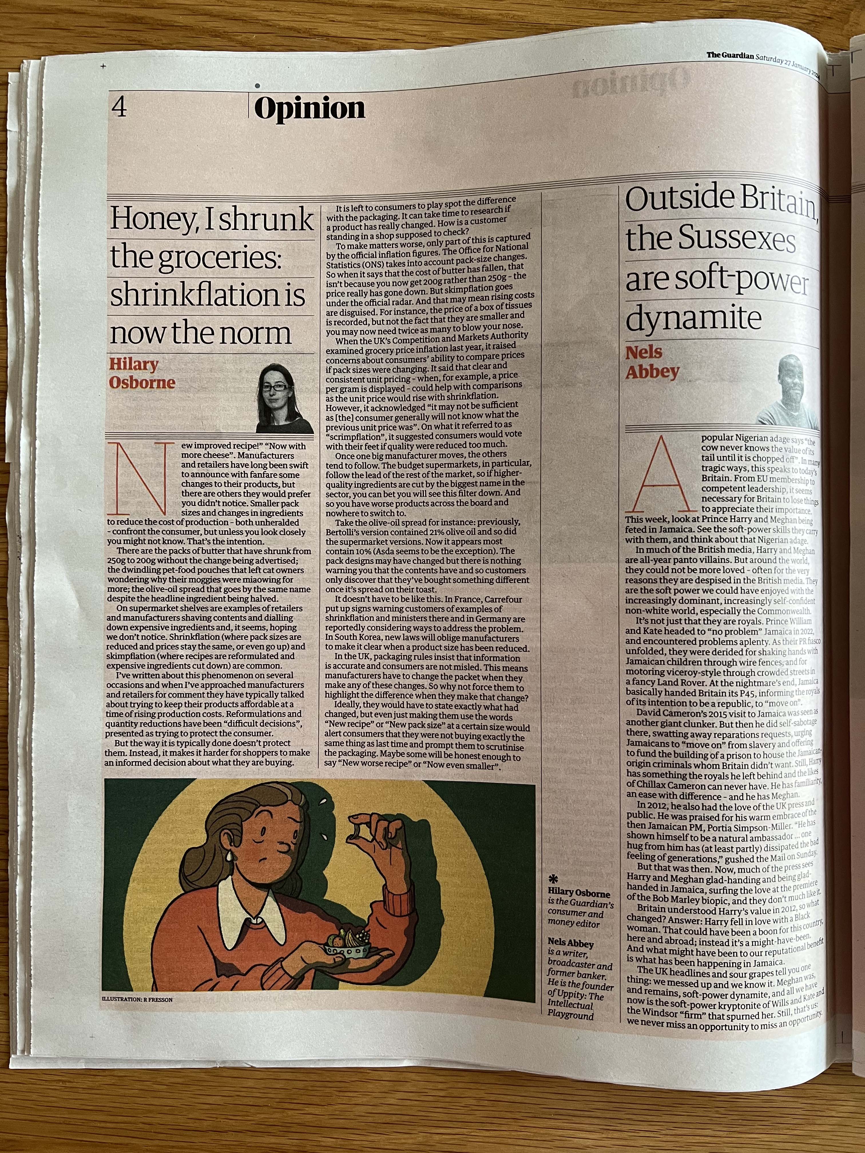
Here is a conceptual illustration with the element of character design. The article is titled “Honey, I shrunk the groceries: shrinkflation is now the norm.” The made-up word shrinkflation suggests that within the heading of the article was used metaphor. In the article, the author raised the problem of food packaging, which is getting smaller and the prices are rising, causing people to pay more money for less food, as the manufacturers attempt to keep prices affordable. In this illustration, a woman looks confused while holding disproportionately small groceries, adding an element of humour to the scene.
Illustration for the Greenpeace ‘Hope is on the horizon‘. The Guardian

As most of the illustrations I have collected reflect conceptual illustrations, I wanted to explore representational illustration with a more direct message to the reader. Representational illustrations aim to depict recognisable subjects in a realistic manner. I found this advertisement for Greenpeace, which looks like a photo of Earth taken from space with the sun rising in the corner. It could well be a picture of the ocean with plankton underneath it, or a picture of a mountain covered in greenery. What I liked about this image is the angle, which looks like the image was rotated, slightly off-centre composition, highlighting the dynamic nature of the Earth. Also, it has the narrative text ‘Hope is on the horizon’ to convey the idea, as the aim was to be clear for the reader and have a straightforward message, interpretation of ‘Save the Planet’. The colours of the Earth are green and lush, with a bright and warm sun shining above it.
Research
Now I have to imagine that I have been commissioned by the paper to create an illustration, based on the provided interpretations. To start with, I was confident that my chosen theme was going to be ‘Paris, still the best place on earth‘, but then I thought that my creative process for these subjects evolved around a particular visual, like a girl in the Paris, something around Paris city centre, drinking coffee, or looking upon the Eiffel tower, I thought that they were all cliché ideas. I wanted to create more conceptual illustrations and be more creative in my approach, therefore I decided to choose ‘How green is your food?’
Before gathering the mood board for the chosen subject, I wanted to do some research. The concept of green food goes beyond just the colour on our plates; it delves into the sustainability, ethical production, and environmental footprint of what we consume.
Actually, the article “Honey, I shrunk the groceries…” inspired me to create an illustration about green food. I loved the comic manner in which the design was done, as well as its simplicity and easy readability. The article has two columns positioned on the left side of the page, and the illustration is located at the bottom of the article in landscape format. That’s the size that I should consider for my design.
I found a couple of online articles related to the chosen theme from my research written by The Guardian. The first article had an identical heading, ‘How green is your food?’ it was more about food packaging, minimising waste produced by excessive use of plastic, and alternatives provided by eco-labels, such as getting people to switch to environmentally sustainable food options. https://www.theguardian.com/environment/2021/sep/22/green-food-eco-labels-study-environmental-cost-consumers
It was the right direction, but I found the information provided in this article a bit confusing for the highlighting keywords and some prominent materials for my illustration, so after further research, I found another article by The Guardian, about eating locally, and the difference that it would make. I found this article more straight to the point, and I liked some major points that they raised, such as supporting local communities, farm-to-table movement, and reducing carbon emissions. Next, I printed the article ‘Is eating local produce better for the planet?’, went through the article with a highlighter pen and identified sentences and words which I thought could be important aspects of the text.


The local, farm-to-table movement and the term “locavore” advocate for a shift towards sustainable food practices. Embracing local produce supports regional farmers, also, it means eating fresher seasonal fruits and vegetables. Apparently, research shows that the carbon footprint of transporting food is relatively small and that it’s more important to focus on how the food is produced. Eating local can be a part of that, but it doesn’t have to be. Overall, embracing the farm-to-table philosophy and adopting the locavore lifestyle contributes to a more resilient and environmentally friendly food system. There are many benefits to eating from local farmers, now it’s time for me to think about what sketches I can provide to cover my ideas. I gathered all the information from the article into the mind map, which helped me to see the connection between important components of the Green Food concept, such as sustainability, conservation, community, local food, etc.

After reviewing the mind map, I was able to identify the main points related to the keywords, which ultimately helped me establish a clear focal point and make more informed decisions about illustration options. Through my research, I have discovered that the concept of “green food” holds a wide range of meanings. It represents a commitment to environmental and planetary well-being, with an additional focus on community and local engagement. The keywords I have identified for illustration purposes are:
- farm-to-table
- environment
- community
- support
- sustainability.
Sketches
In my illustrations, I wanted to embrace the idea of consuming healthy, green food from local farmers. As the direct association with the word “green” is linked to vegetables and fruits, I aimed to create a more literal understanding of the term, highlighting groceries rather than including dairy and meat products.
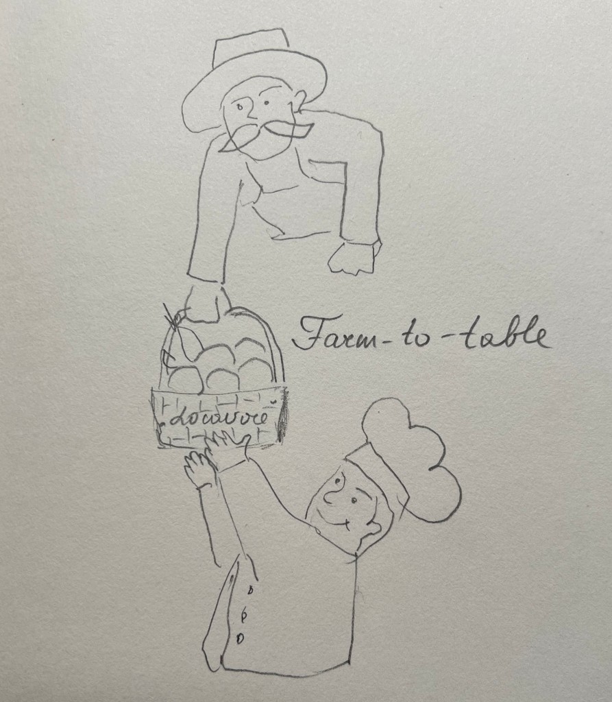
My ideas evolved around the concept of farm food, the farm-to-table movement, where farmers get fresh food straight to the consumers. Also, I was thinking about the idea of caring for the world and environment, where people are nurturing the planet and getting fresh and green food.
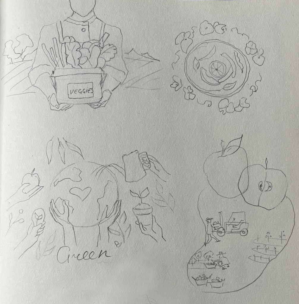
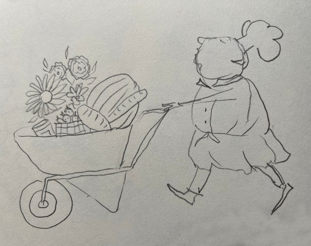
In addition, I created illustrations with personalities involved in them. In one, a joyful girl holds a basket filled with fresh green vegetables, exuding contentment and serenity. Another illustration portrays a man with a basket of groceries against a backdrop of farmland and a greenhouse, with a woman tending to the fields. I aimed to experiment with vertical positioning, but it wouldn’t work for the landscape format I needed for the newspaper. Additionally, I considered a chef pushing a laden trolley of food, possibly more fitting for the restaurant industry.
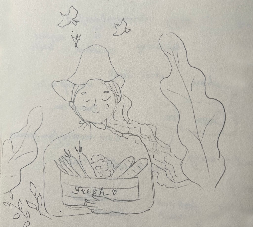



I thought I needed to add a quick splash of colour to one of the sketches to see how the concept would work for the newspaper. I chose the one with the happy girl in a hat that holds a basket of fresh produce. The main focus was on fresh and locally sourced food.
If this illustration is intended for a newspaper sketch, it could be associated with topics such as the benefits of eating locally grown foods, the importance of supporting local farmers, agriculture, or healthy eating habits. The image is warm and inviting, using a soft colour palette that evokes a sense of calm and positivity associated with the natural produce and outdoors.
The concern with these illustrations was that they looked too much like grocery products and I didn’t want to create confusion with farm food and sustainability. I need that perfect balance between fresh products, care for the world, and still have a connection to the farm-to-table movement. I still want to explore more options, as this particular illustration is missing conceptual depth.

Realising the need to focus on the conceptual aspects and incorporate suitable decorative elements, I decided to explore the work of the Guardian illustrator behind the “Shriklflation” illustration. For my further research, I wanted to explore R Fresson’s illustrations, the artist who created illustrations for The Guardian. Ruby Fresson is a UK-based illustrator with an interest in hand-drawn linework and early 20th-century graphic arts. She has worked for a variety of international clients, including The Guardian, Apple, The New York Times, History Today, Google, and many others. Her work is occasionally humorous, sometimes quiet, and thoughtful.

Learning about R Fresson illustrations gave me some ideas about exploring conceptual design with bold colours and outlines. I made two sketches with a woman, who cared about her vegetable garden, she was depicted in the farmland environment. In another sketch, I had a drawing of the globe, divided into half, and filled with fresh produce fruits and vegetables. The illustration had a conceptual and decorative flow. I thought that I could join those illustrations together and place the earth near the knees of the farm woman.
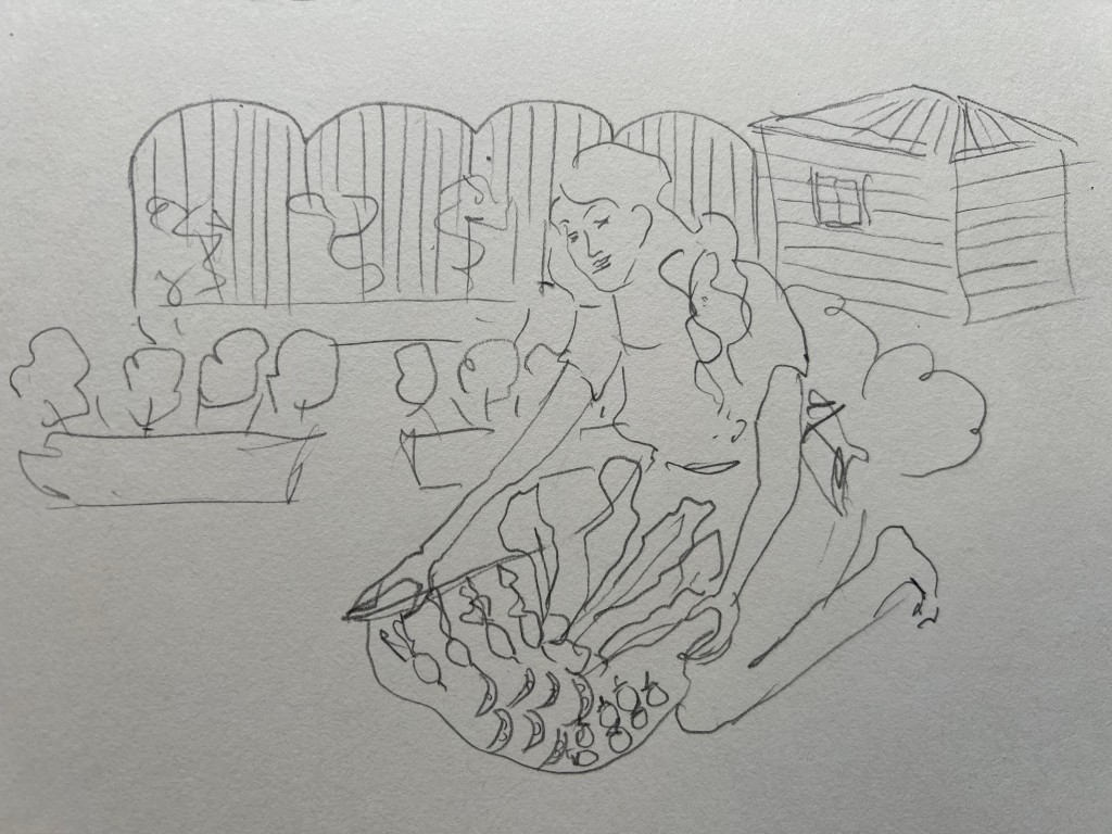

Here I adjusted the sketch to create a more balanced composition, creating the central point around the earth with fresh produce and women taking care of it. I wanted to create this connection of taking care of the planet, nurturing the environment, and the planet will give you back fresh products. The artwork promotes themes of sustainability, healthy eating, and the importance of taking care of our planet and its resources. I wanted to create vibrant and thoughtfully composed illustrations, using imagery that reinforces the interconnectedness of humans and nature.

I used watercolours for the media but opted for opaque colours, considering that newspapers typically favou r bold and vibrant colors due to paper and printing specifications. Newspapers tend to have pale prints due to the thin paper, which inspired me to use a bright yellow background with green and pink natural colors for the woman’s attire. To finalise the illustration, I planned to create outlines for each object in Adobe Illustrator, as I believed newspapers appreciate that decorative style.
The result was an eye-catching illustration with bright, vibrant colors, blending conceptual and decorative styles. I created a mockup for the newspaper, and it looked remarkably good in it.


Overall, I found the newspaper illustration to be quite successful. I enjoyed exploring the “green food” theme, as it prompted me to consider the importance of community engagement in the local area and how to represent that in the newspaper article. The prospect of creating editorial illustrations for newspapers gives me something to aspire to, as it’s a field I’d love to enhance my skills in. It’s about being creative and artistic, thinking outside the box, and understanding the nuances of different styles. I’m pleased with how I integrated the “green food” narrative into the illustration, connecting local farm produce with natural and healthy eating. I found this exercise to be valuable, and I’m happy I was able to generate interesting ideas in the end.
