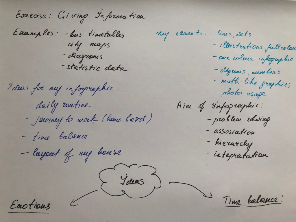
Find some examples of information graphics. For example bus timetables, city maps, diagrams or representations of statistical data. Look at the way they are designed and try and work out the decisions the designer made. What can you learn from them and when. Would it be appropriate to use a similar design solution?
OCA. Core Concepts
For this exercise, you are going to describe your immediate surroundings using information graphics; this could be a plan of your desk, the layout of your house, the arrangement of objects in your cupboards or your morning journey; anything will do. Before you start you will need to think about scale and about how you will break down the information for your design. Create a graphic that represents an aerial or front-on view of your location. Be mindful of the hierarchy of the elements in the composition and the dynamics needed to draw the viewer’s eye from one stage to the next. Use typography, numbers and colours to describe what is being represented. You may want to produce a key to help us understand what is being shown, as well as a diagram title to put things in context.
Keep all your sketches and notes in your learning log.
Introduction
What is the main advantage of infographics? Of course, this is their laconicism, with the help of graphic elements and simple formulas, they convey the main information and solve the problem. From my experience, infographics are in high demand among many business and sectors. They are convenient when you need to place detailed information on a small space, for example, an Excel spreadsheet can be represented as diagrams or circles on a piece of paper A5. Infographics are used in statistics, presentations, magazines, social networks, cartography and interior design, and more. Infographics have evolved in recent years to be for mass communication and thus are designed with fewer assumptions about the readers’ knowledge base than other types of visualisations. Infographics have been around for many years and recently the increase of a number of easy-to-use.
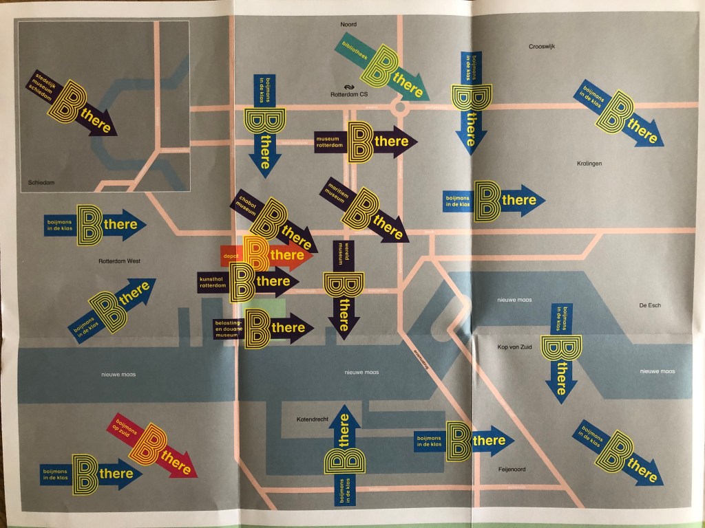
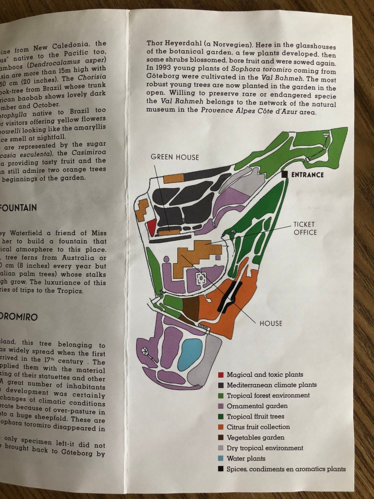
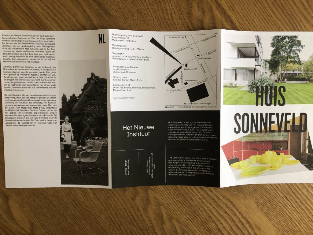
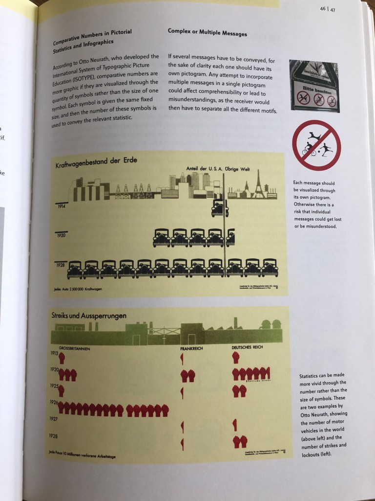
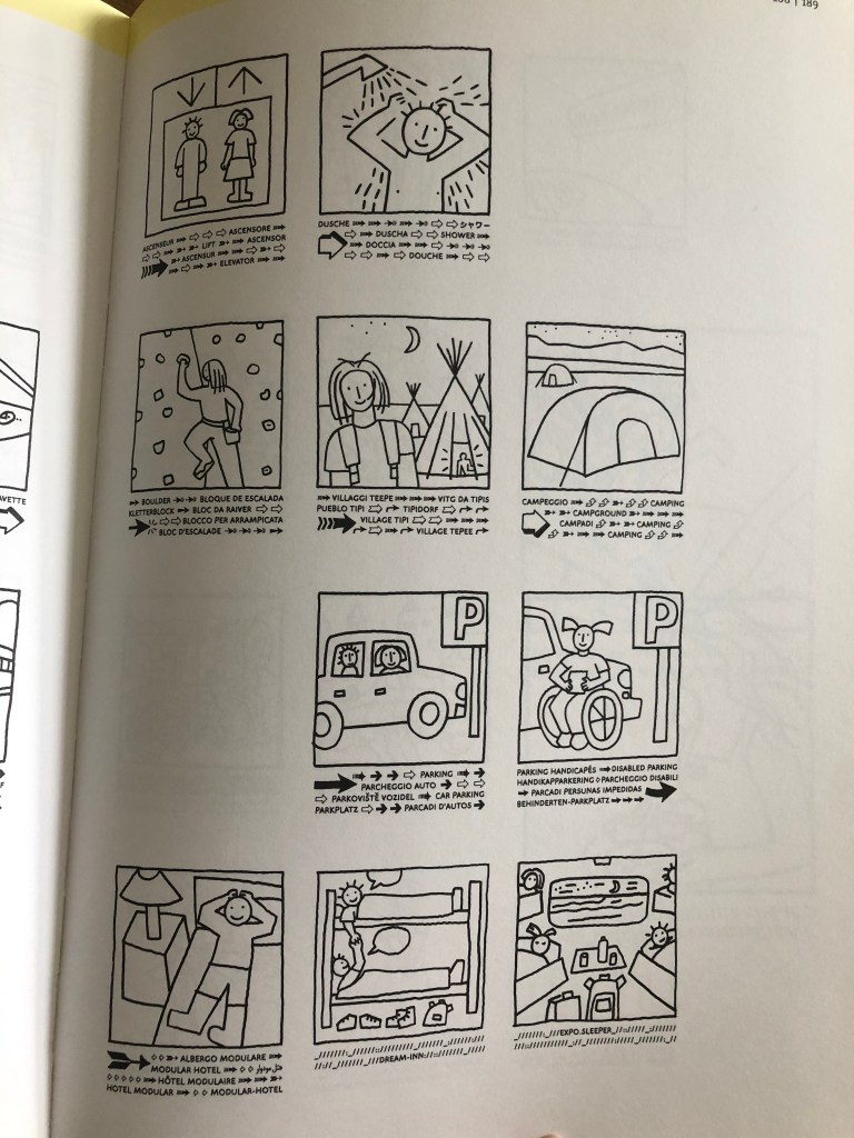
The first step, I looked through my collections of maps and magazines, which I had collected some maps and guides from my travels. One striking example is the map of the Boijamans Museum in Rotterdam. Unfortunately, it is currently under restoration, but this map shows alternative locations for art exhibitions. Another example of a map of the Botanical Park in Menton, in the South of France. Zones are separated by different colours in the form of spots. The following is a schematic map of the Heit Nieuwe Instituut in Rotterdam. I also found interesting examples of infographics in Pictograms Icons & Signs collections, rather simplified statistics examples that show the number of cars produced and the number of strikes in Germany for the period from 1914 to 1928. In addition, interesting cartoon icons for EXPO 2002 in Switzerland attracted my attention. The signs themselves comprised pictures and texts, which together conveyed all the necessary information.

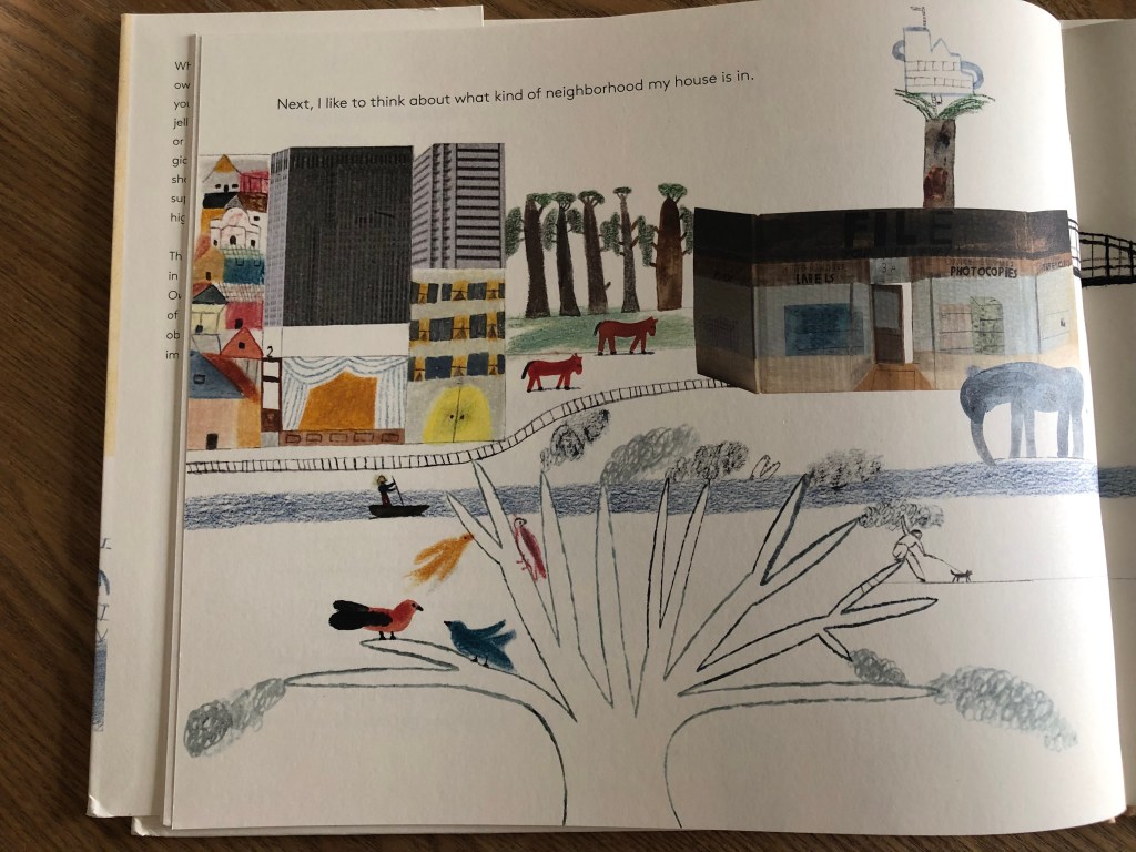
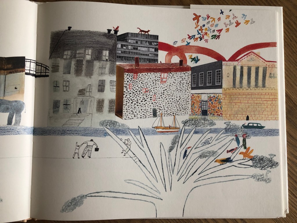
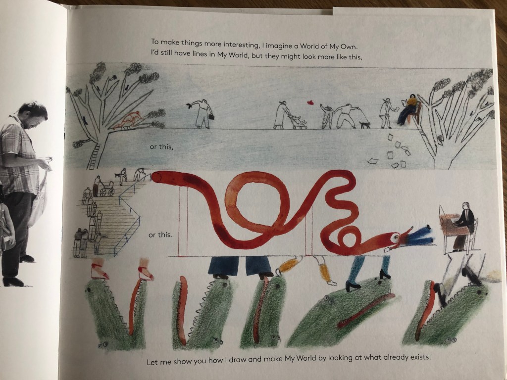
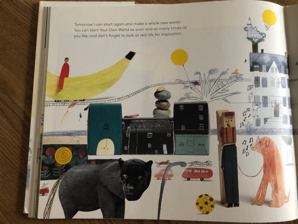
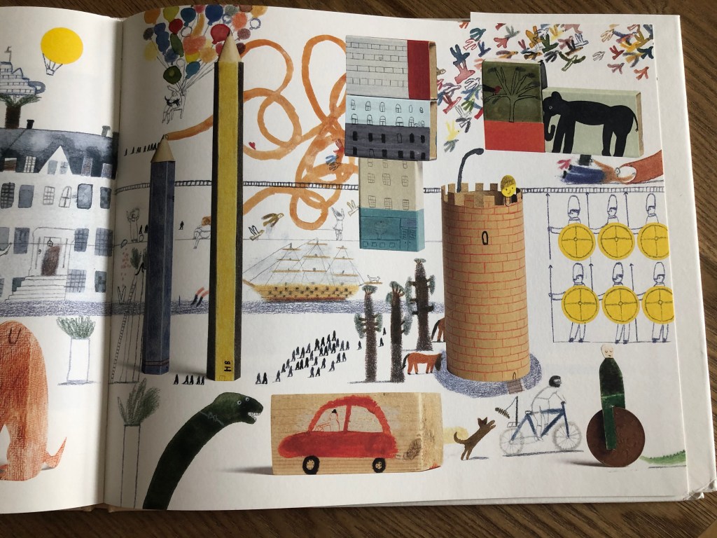
In addition, I decided to include a rather unusual approach to the image of my own world in the list of sources of inspiration. Since the task in this exercise is to depict your routine life or the organisation of workspace and time, this example of A World of your Own by Laura Carlin could serve as a rather interesting instance. The author asks how your world would look, how you would depict your home. This gave me the idea that it would be interesting to depict my own version of the infographic with the addition of animated objects. It is possible that as a style for infographics, it is too detailed, but perhaps I could emphasise individual elements for my design.
Also on Pinterest, I create a new board with all kinds of infographic options. While I was navigating myself through some ideas for my own design version, I created some ideas in my head, what kind of design and style I wanted to depict in my information graphic. I really liked that kind of design with cartoony images on them, maybe not just arrows and numbers, but more illustrative representation of design. Some of my sketches explanations are below.
Sketches
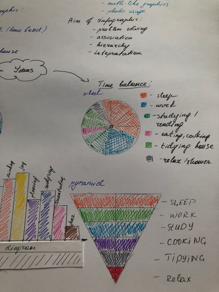
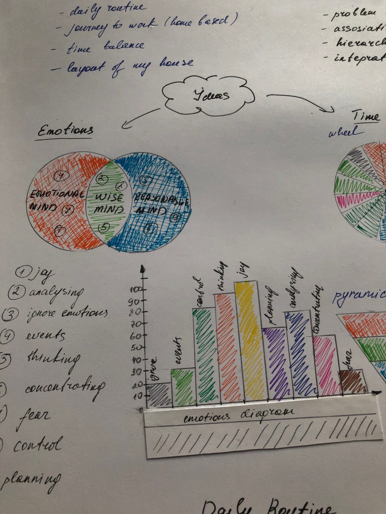
I was quite attracted to designs which would represent the map, of some sort of location, or my working space, or another option, my daily routine. Thus, I sketched for myself the basic ideas for design:
- My daily routine
- Journey to work
- Time balance
- The layout of my house
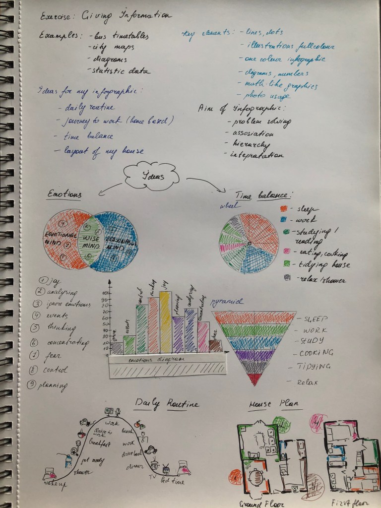
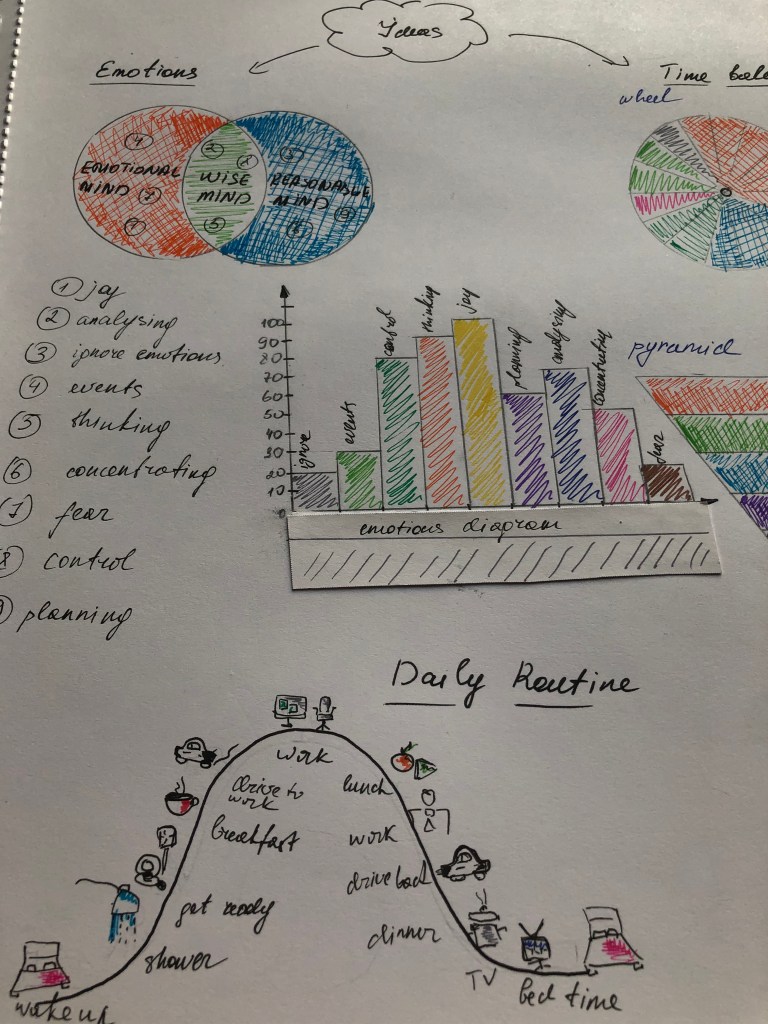
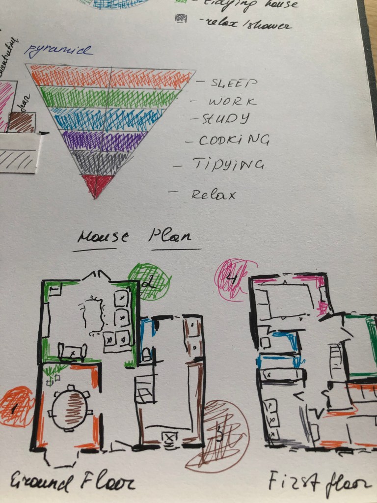
After I started sketching my designs. So I depicted a map of emotions in the form of a pie chart with intersecting areas, where I displayed a kind of separation of thoughts into emotional, wise and rational emotions. I also applied a diagram with the dominance of emotions. These are fairly simple graphics, they are most popular in statistics or for presentations, where conciseness and brevity matter. I used the same design for the design of the time balance graph in the form of a pie chart and a pyramid of priorities. In my next outline, I wanted to take a more illustrative approach. I created a parabola of my active day, which begins with a morning lift, and where it was at the peak of a working day, and then gradually descended down to time for bedtime. But I thought that such a schedule is probably irrelevant at the moment, due to our isolation of the house, and the amount of time we spend in the walls of our house, which is almost 24 hours a day, I decided to still depict the plan of my house. The layout of the house and its interior is quite simple, but it was interesting for me to re-analyse my home and its main components.
Designs
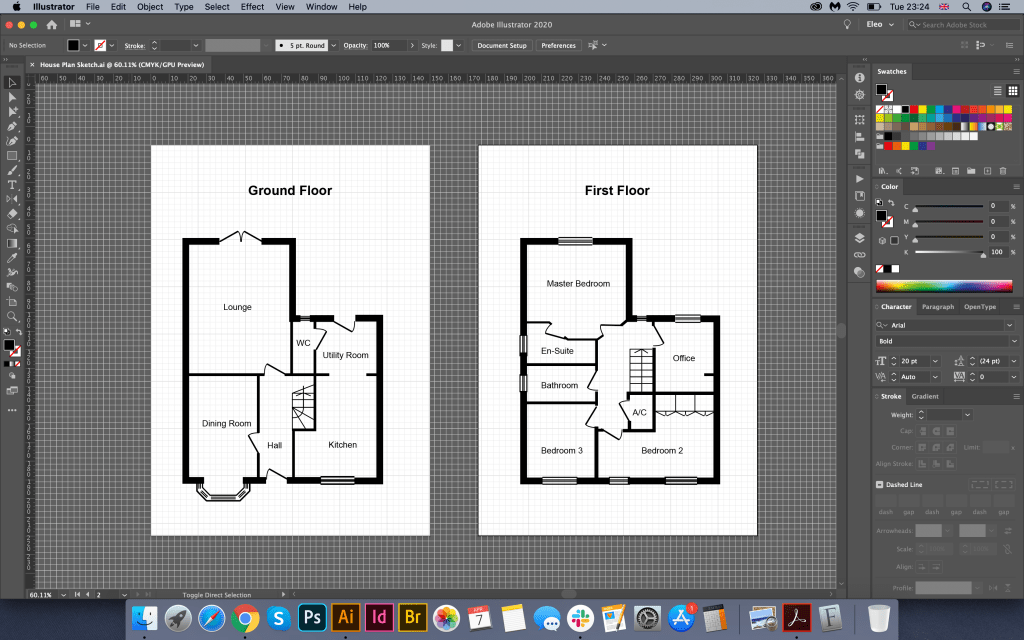
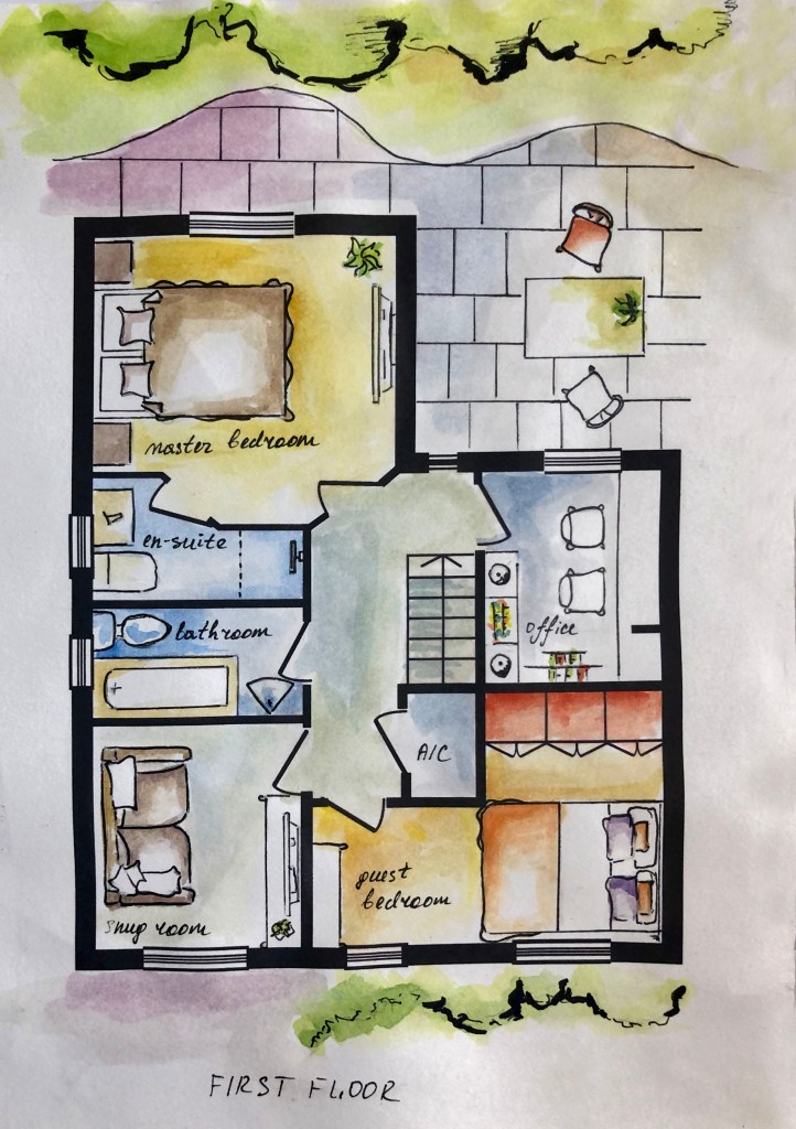
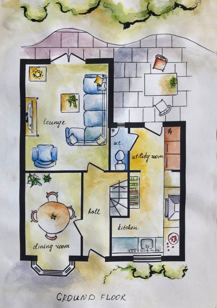
To begin with, I decided to create a house plan. In my archives I had a house rooms layout, but I needed a vector format, so I decided to redraw the design in Adobe Illustrator, which I could transform for the further design creation. In the end, I had a high-resolution plan of the house, which helped me move on with the filling of the rooms.
Next, I printed a plan diagram on thick paper, where I planned to make sketches for the house interior elements. I remember by heart the arrangement of furniture in the house, so it was not difficult for me to depict a layout of a top view of all sofas and tables. As a result, I had a detailed plan of the house, the first and second floor, with all its components. I decided to give colour to my sketches with the help of watercolours. I wanted to create the effect of hand-made designs, so my illustrations are characterised by a cartoon style, which I completed by layering with a black pen. In addition, I wrote down the name of each room by hand.

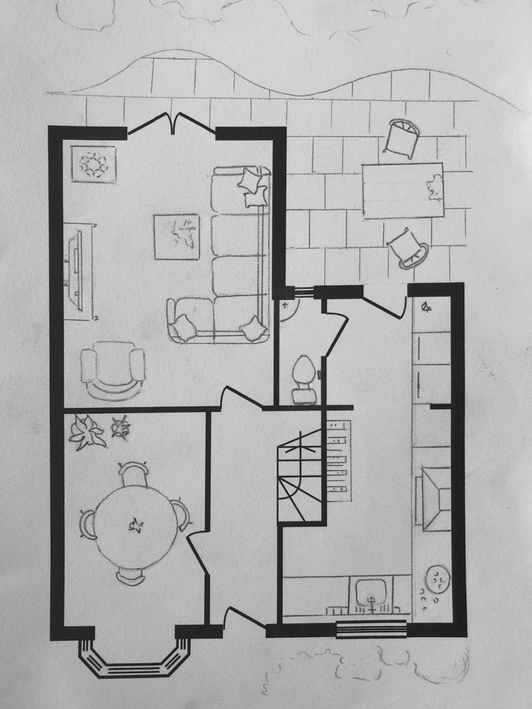
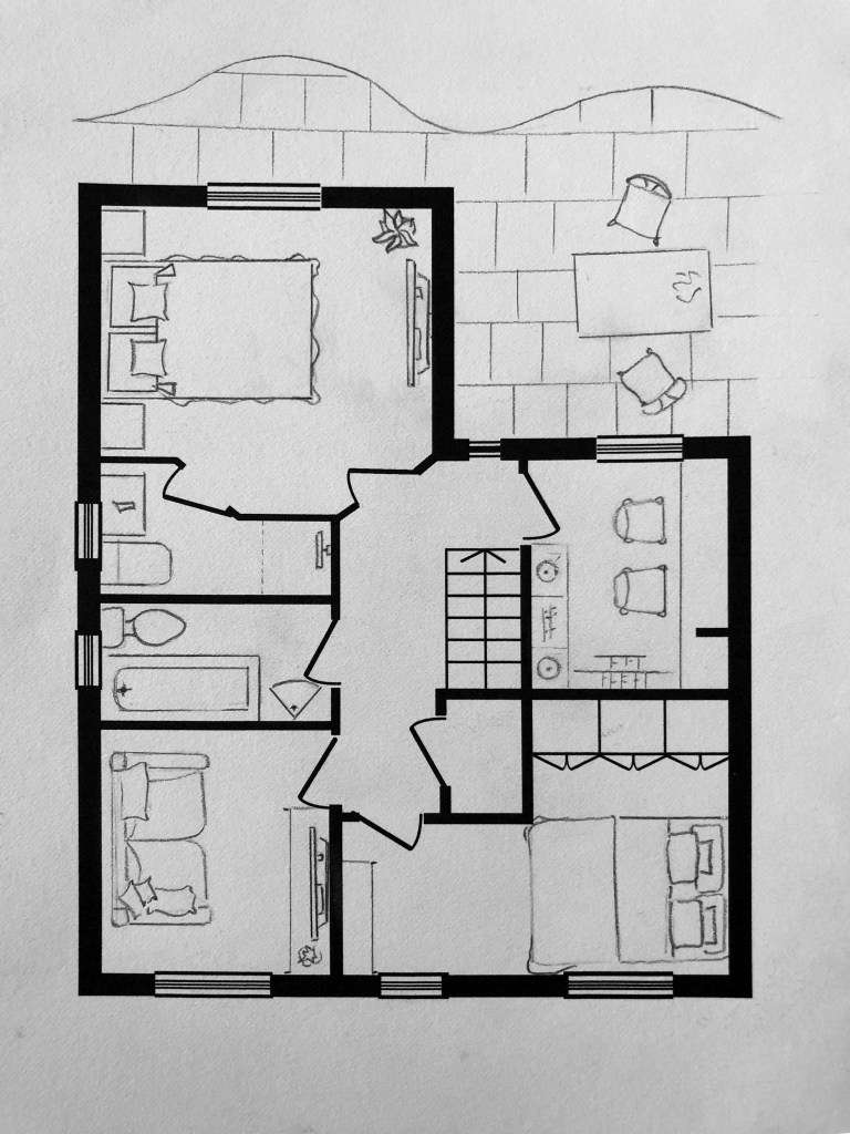
In the result I had cute scheme for the house, with each element of the interior placed at the right place. In addition I decided to go slightly outside of the borders, so I pictures partly the garden and some furniture around it.
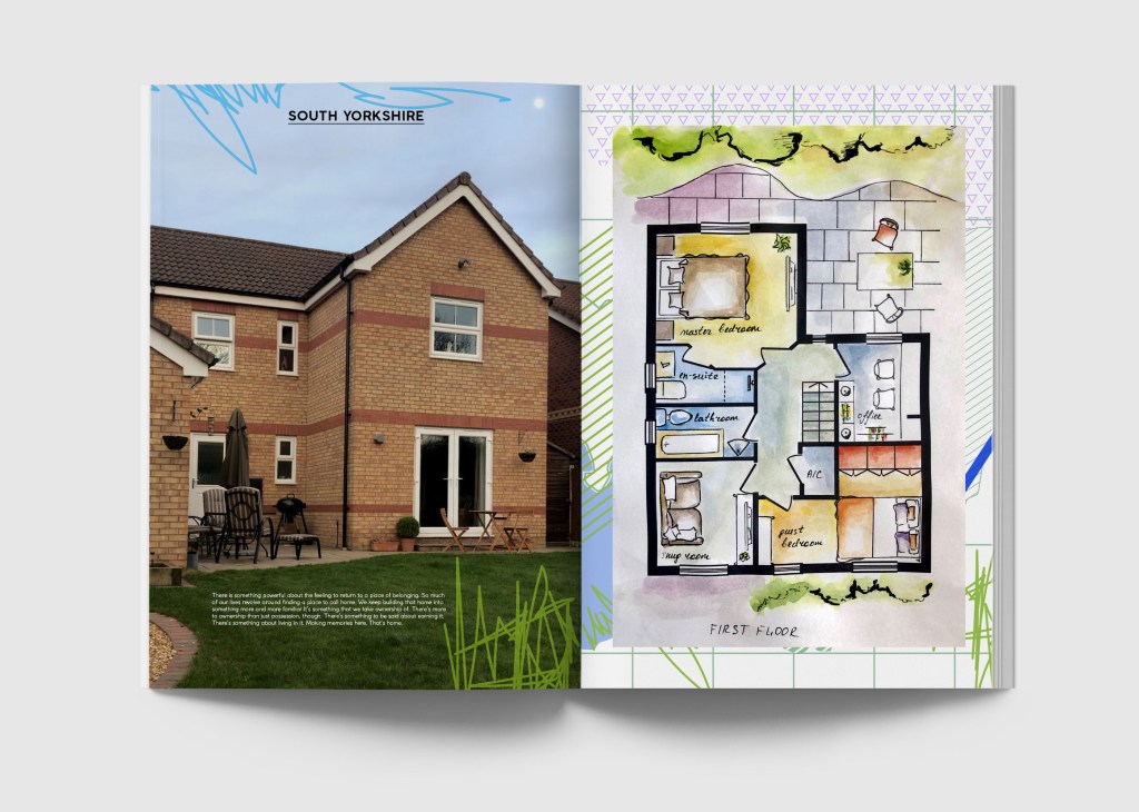
Now the task was to present the work, as I wanted to bring more sense into the final design. I decided to use the mockup of the magazine, following the example of interior design. To complete the visual I created a map of South Yorkshire with small graphic elements, which I placed on the background. Its hardly can be seen, as it is almost hidden behind the house map, however it still created interesting tandem for both images. I also prescribed a slogan, instead of the usual “Stay home” to “Home, sweet home”, which in my opinion sounds more melodic and pleasant for the general perception. Also, I decided to ass some brightness with additional fresh orange colour. For the second floor, I used a photo of a house with a small text about housing as a zone of comfort and cosiness.
I was quite pleased with design I presented in the result, it had its own unique style. With the use of my own style for the watercolour, I feel that either could easily represent my persona through the graphic produced. However, thinking about the aim of an information graphic, I felt that I needed to go further in my researches, so I proceeded to another option for the House Scheme.

Additional Designs
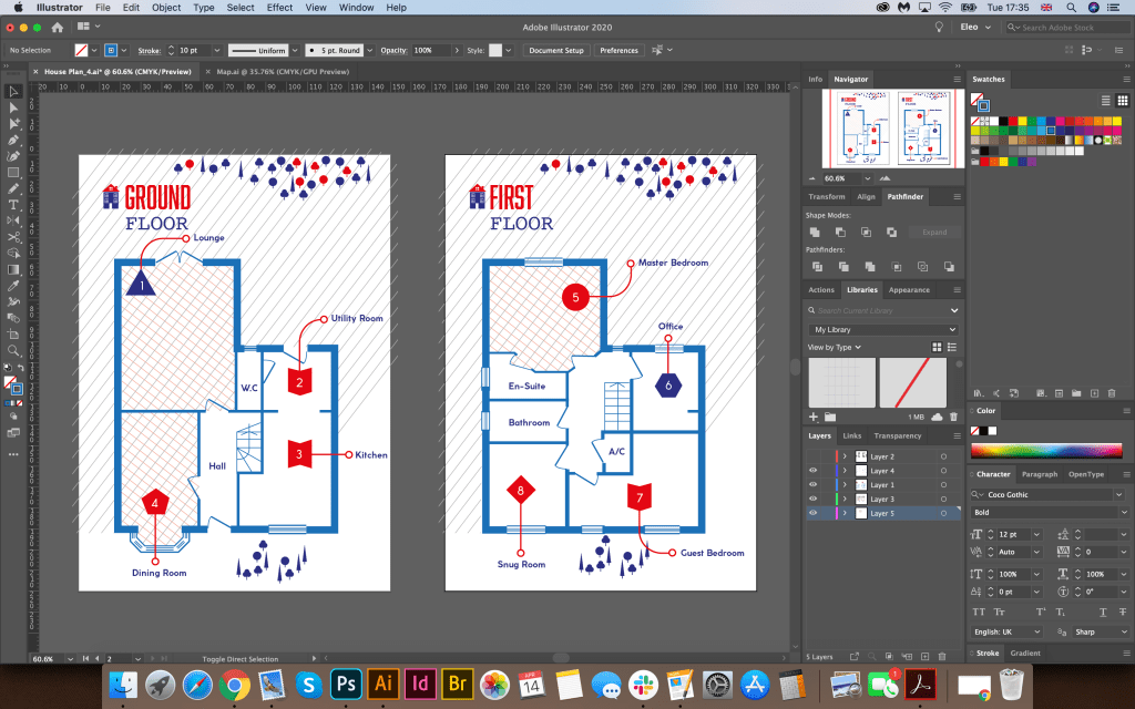
My new house plan idea was to use only vector elements in Adobe Illustrator. As a basis, I took the same vector layout of the house plan. My key colours are: red, blue and blue. To designate the rooms, I chose different curly elements, from which there is an arrow indicating the name of the room. For texture, I chose a light and pleasant for the perception of parallel lines and cells, some of the rooms I left in white, so as not to overload space. To indicate the vegetation around the house, I chose figurines of trees. In this graphic, I used several combinations of fonts: the Abolition Regular bold sans serif font in combination with the fixed-width font Courier Regular, and for the main text Coco Gothic font, which gave the map originality and appearance of the finished work, which could also be used in my opinion in the interior magazine. The design turned out to be airy, light and concise, in my opinion, it corresponded to the task to create your routine in infographics.

Conclusion
I think I prefer the last design for the aerial view on the house scheme, compare to the first option with watercolored images. I have tried to incorporate different ideas of an information graphic, hierarchy or typeface as well and a unique theme to coincide with the idea behind the infographic of exploring my house plan. Despite the fact the second option design looks stylistically simple, and has clearness, and important elements of infographic, such as visual, the content and the knowledge, the insight into the data that this house plan is presenting.
