Many hundreds of paperback books have been produced over the years. Look at as many variations as you can find to see how different publishing houses designed their covers and how the covers fit together as a series. Select a particular publishing house and describe their design style in your learning log.
OCA. Core Concepts
In the 19th century a whole new era in publishing began. A series of technical developments, in the book trade as in other industries, dramatically raised output and lowered costs. Stereotyping, the iron press, the application of steam power, mechanical typecasting and typesetting, new methods of reproducing illustrations—these inventions, developed through the century and often resisted by the printer, amounted to a revolution in book production. Every publishing house has manufacturing, marketing, and accounts departments, but the heart of the business lies in the editorial function. This has changed in its mode of operation through the years and still varies from one country to another and between firms but not in essentials.
When I went online to make some researches on the biggest Publishers in the world, I found out that together, these institutions dominate the publishing landscape, and many of the most beloved books come from their imprints. The “Big 5” publishers is a nickname given to the five power-houses in trade publishing: Penguin Random House, Hachette Livre, HarperCollins, Macmillan Publishers, and Simon & Schuster.
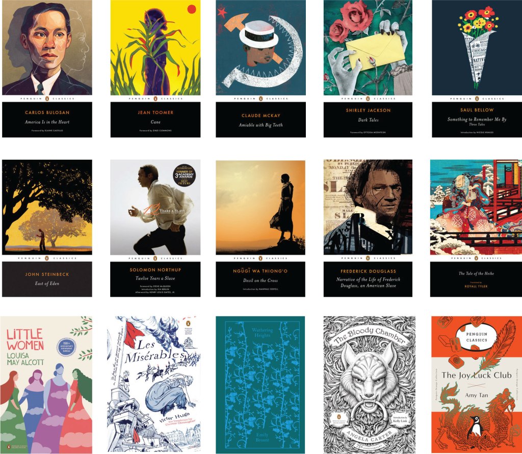
Penguin Classics
The task of analysing book covers seemed interesting enough to me. Before starting this exercise, I decided to do a little research in this area. I found a list of the most influential major publications in the field of literature. Each publishers website was overflowing with covers and designs that I was eager to arrange in a unique manner. The largest publishing house I needed to visit, Penguin Classics use vector illustrations, and 2/3 of the parts are occupied by a drawing relevant to the story. In the non-linear part the book is split, one part individual designed work coupled with corporate colours in black, orange and white, containing the globally known penguin logo, a rather cute design, but at the same time recognisable. In addition, on a black background, an orange sans-serif font, as well as an uppercase font for the book title. In the case of Penguin classics, the designers made the main emphasis on the design of the illustration itself.
Book Series
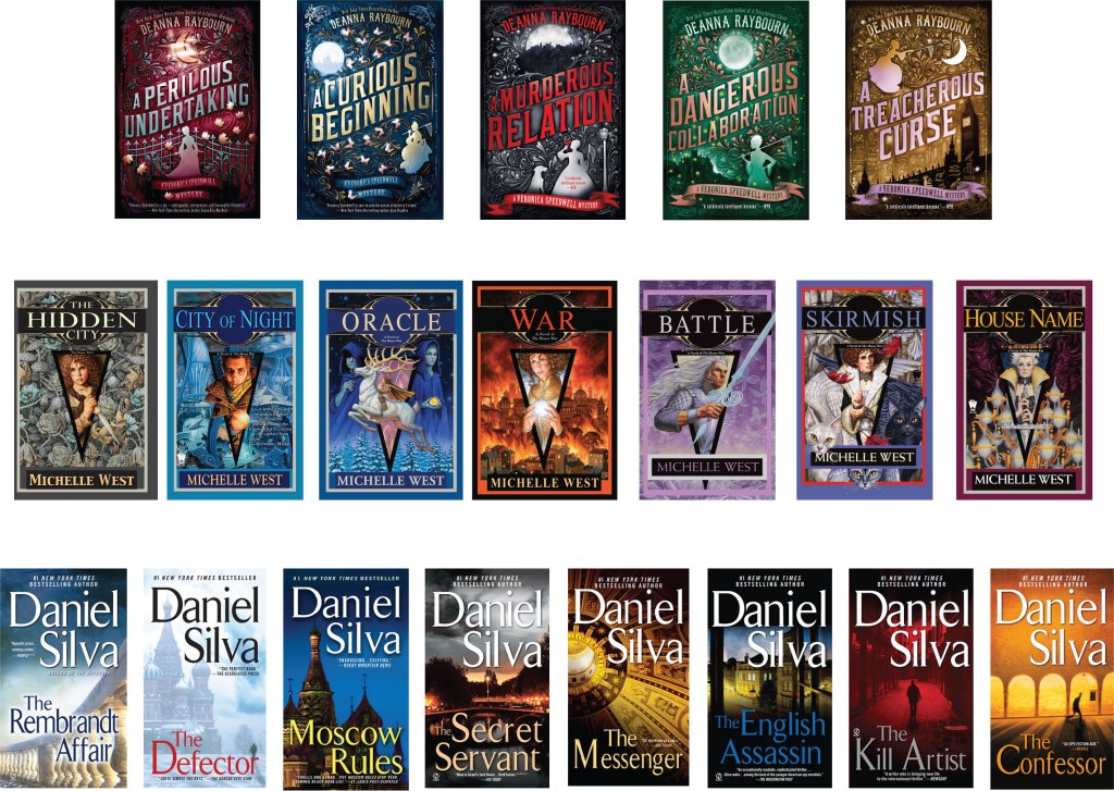
I was interested in following the course of designs for a series of books. In terms of Deanna Raybourn, Michelle West, Daniel Silva books here you can see bold decisions, vivid rich illustrations in a similar style and large fonts that cross the cover of the book at an angle. In the books of Michelle West, a triangular symbol is traced around which the illustration itself unfolds. Or in the version with Daniel Silva, having the author occupies almost half of the cover of the book, photographs are selected as images with text showing contrasting fonts are superimposed. It is interesting that by design of the shroud you can determine which direction the book is leading if it is a light classic novel, fiction, a modern novel, mysticism or a detective story.
Hachette Livre
The next publishing giant, Hachette Livre, was the exact opposite of Penguin Classics. I thought that from artistic point of view book covers below are not as interesting as the past company. It is noteworthy that cover designs are fairly standard, in which there is a peculiar set of fonts. For the most part, the names of books and their authors pass through the middle of the cover, or occupy half the area. In my understanding, these kinds of designs are not that attractive but nonetheless, they can also attract their audience.
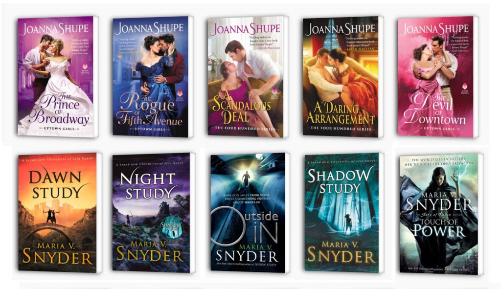
HarperCollins
I compared several Book houses for myself, and in the end I decided to pay attention to the next publicist, HarperCollins. Here I have collected book collections from a series of women’s novels, fantastic adventures, as well as some examples of children’s publications. Joanna Shupe, what I noted for myself is that in the series they use similar compositions that differ in color. The plot of the pair on the cover for a female audience is in itself a win-win option. I also drew attention to the font solution, a light delicate font, with calligraphic elements, and a phrase in the upper corner, despite the load on the cover, the design itself is quite attractive. Also, a series of books by Maria V. Snyder, the upper part of the cover is occupied by the name of the collection, the lower part is the author’s name, and the illustrations are also repeated in the style, at first glance you involuntarily understand that we are talking about fantastic adventures.