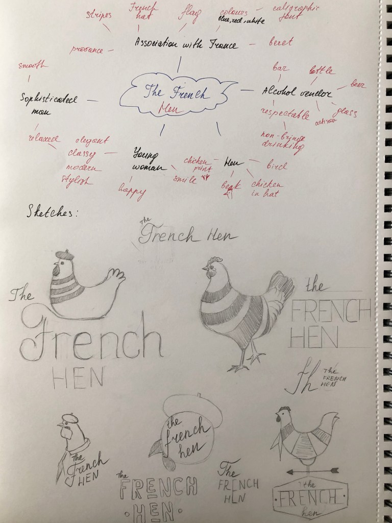
Firstly, review your visual ideas based on from the previous exercise through a process of critical evaluation. Which ideas are you drawn to? Which ideas have ‘legs’ – possible interesting outcomes which are worth pursuing? Often the ideas which are strongest are those which have depth, or many layers of association. Perhaps you are intuitively drawn to a particular idea. Select a few ideas you would like to push further. Use your learning log to record your thoughts.
Now, do you need to undertake any research to help move your selected idea on? The form your research will take depends on the individual elements of your idea. Find source material that helps informs your ideas. For example, by doing objective drawings or taking photographs, to understand your subject better, and to consider aspects of composition. You can use both primary and secondary sources of research in this way. Research feeds into the development of your visual work, informing and advancing your ideas. Document this phase of the work accordingly.
The developing your ideas stage is about building on your initial ideas by reworking them, adding the visual or other insights gathered through your research, and testing out different versions or possibilities. Spend 45 minutes developing the possibilities of one of your ideas. How many different ways can you visualise this?
If you want to develop a broader range of ideas, then repeat the previous exercise to generate more possibilities, potentially using a different phrase as a starting point. Use your learning log to document this process of review, research and development.
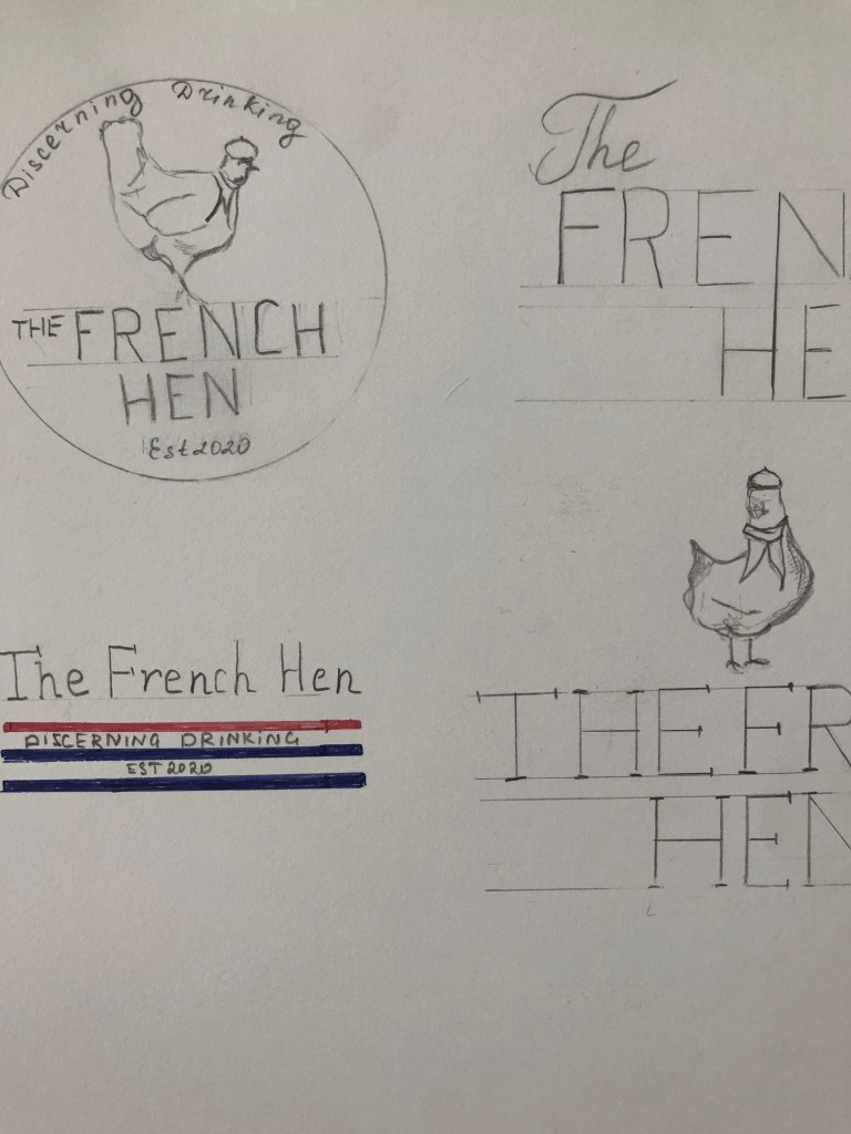
Visualising your ideas is the culmination of all your preliminary work in which you work up some more developed visual sketches and ideas. This artwork can be hand-drawn illustrations, photographs, and/or include typography. The presentation can be a little rough around the edges but should show the main elements of your designs. Select the strongest variation of your ideas from the previous research and development exercise to start exploring how you can visualise them within a mock-up. Use your learning log to document these research and development stages, and to reflect on the process and your results.
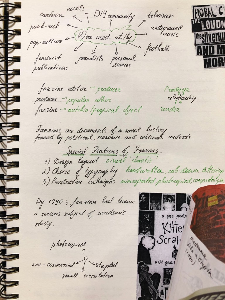
Researches
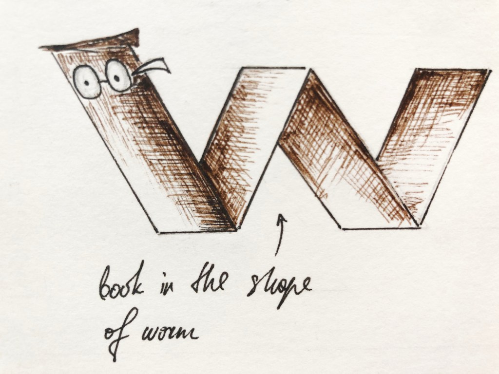
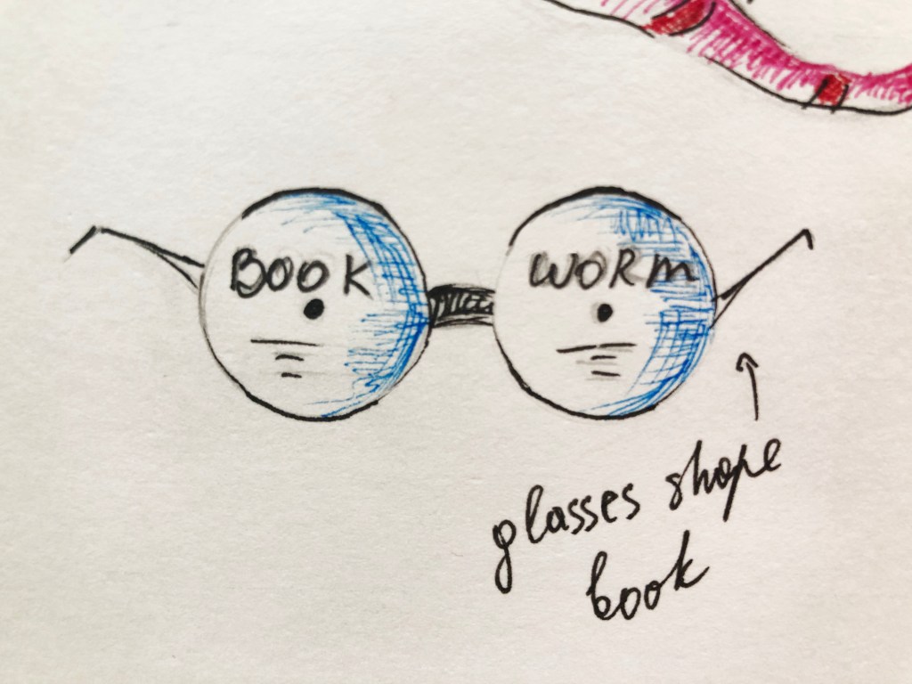
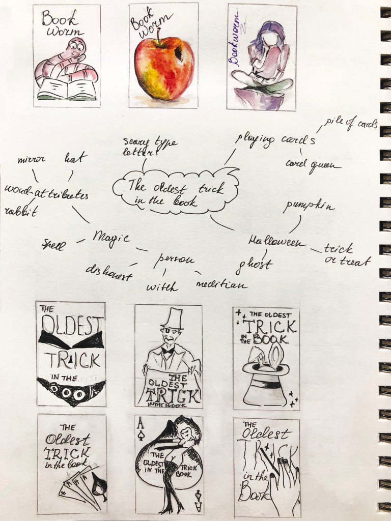
In my previous exercise, I developed a couple of ideas for British idioms like ‘Bookworms’ and ‘The oldest trick in the book’. Those sketches were done in completely different style, for the ‘Bookworms’ I tried to play with the shape of the book, I had a thought that I can produce 3-D kind book, maybe with a little worm sticking out of it, or create a book with a shape of the worm. But for ‘The oldest trick in the book’ I chose a different path, all book covers had the standard rectangular shape, but I thought that here I had more potential in discovering original ideas for the book cover.
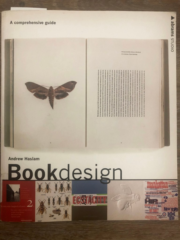
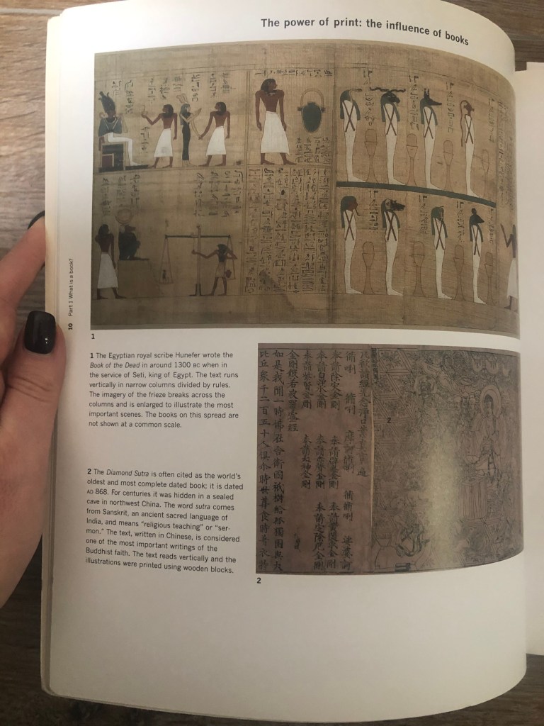
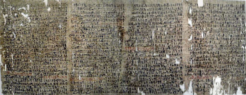
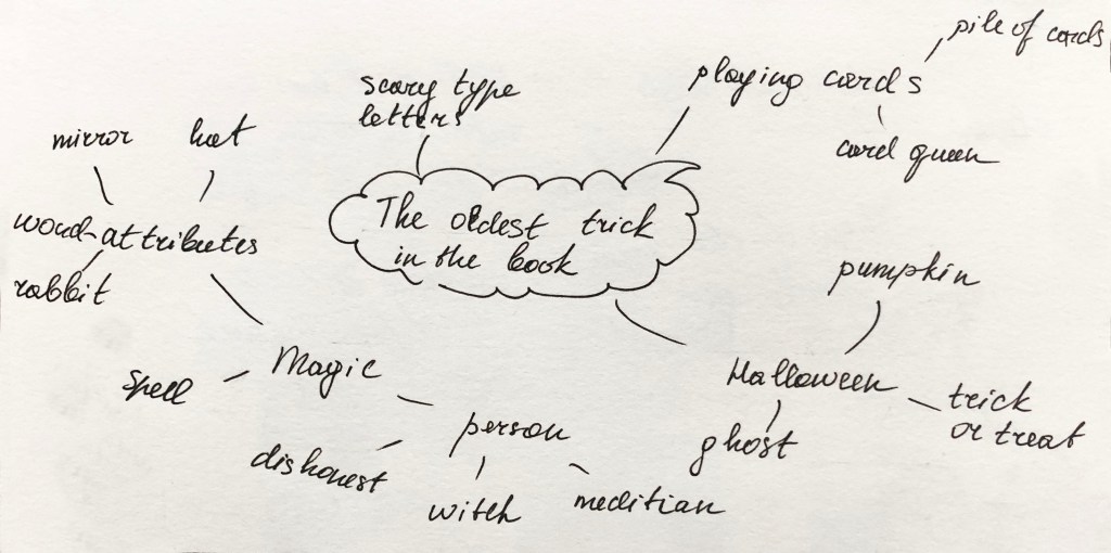
I had a wide range of different ideas for the old trick saying, ranging from the term illusion, card games, magic, Halloween tricks and others. I was thinking what if I try to make some researches for the most ancient sources tricks ever produced. It was the direction where I wanted to move on. I thought that I could do researches for the oldest trick in the world. A book by Andrew Haslam ‘Book Design’ became handy. The author described the most ancient book ever preserved by a human were the Egyptian papyri. Papyrus was used throughout the ancient world, with some samples of Egyptian, Roman and Greek writings.
Some answers to the question what could be the oldest trick in the book I found it this little video. Which sounds quite fascinating. Someone called Dedi a fictional ancient Egyptian magician appearing in the fourth chapter of a story told in the legendary Westcar Papyrus. He worked wonders during the reign of pharaoh Khufu (4th Dynasty). Magical tricks that show animals being decapitated and their heads being replaced were performed as recently as a few decades ago, though today they are rarely shown because of aesthetical and ethical misgivings.
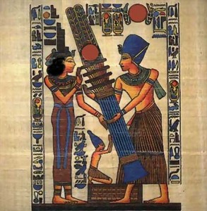
Some images from my researches about the oldest papyrus with Egyptian text containing stories about miracles and magic. Also the image of Egyptian magician Dedi.
I created two mood boards on Pinterest. One of them contains some objects and researches I had in Egyptian patterns and books in magic. For another mood board I created a selection of creative book covers. I hope that those major steps starting from sketches, then Egyptian mythology and creative book covers can lead me to the unique book cover design.
Pinterest Mood Board
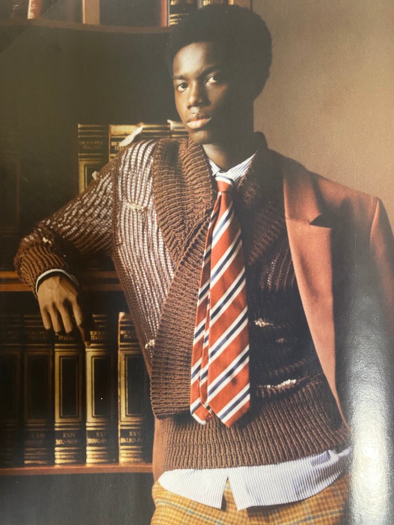
Vogue Man Magazine
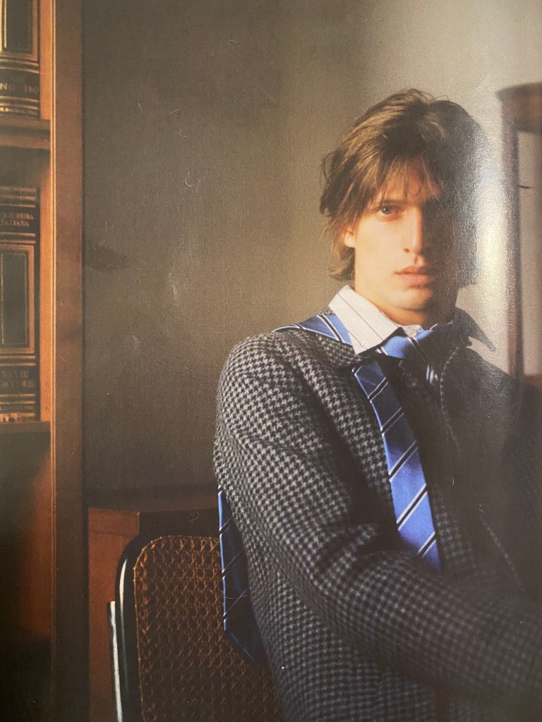
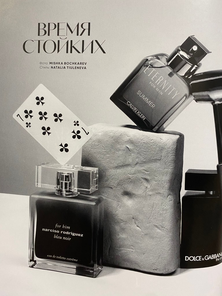
I remembered that in my drawers I had some Vogue Man fashion magazine with some interesting photographs made on brown, warm mood colours. I decided to go through it and took some snaps of pages that I could probably apply in my designs. I loved those wall colours, with some old book covers on them, they had a right colour direction for my book cover. Also I paid attention to the picture with old stone and playing card next to it. In addition I could probably use the pattern of the fashion bag, as a texture for the book cover. I thought I can paste some of the elements into book design and create original collage from them.
Designs
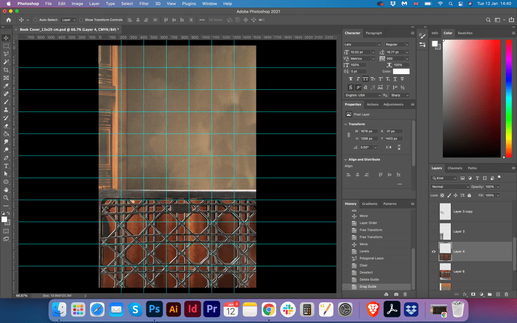
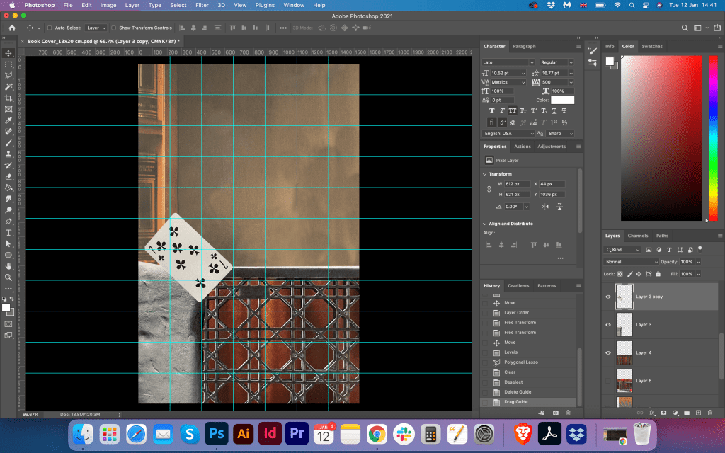
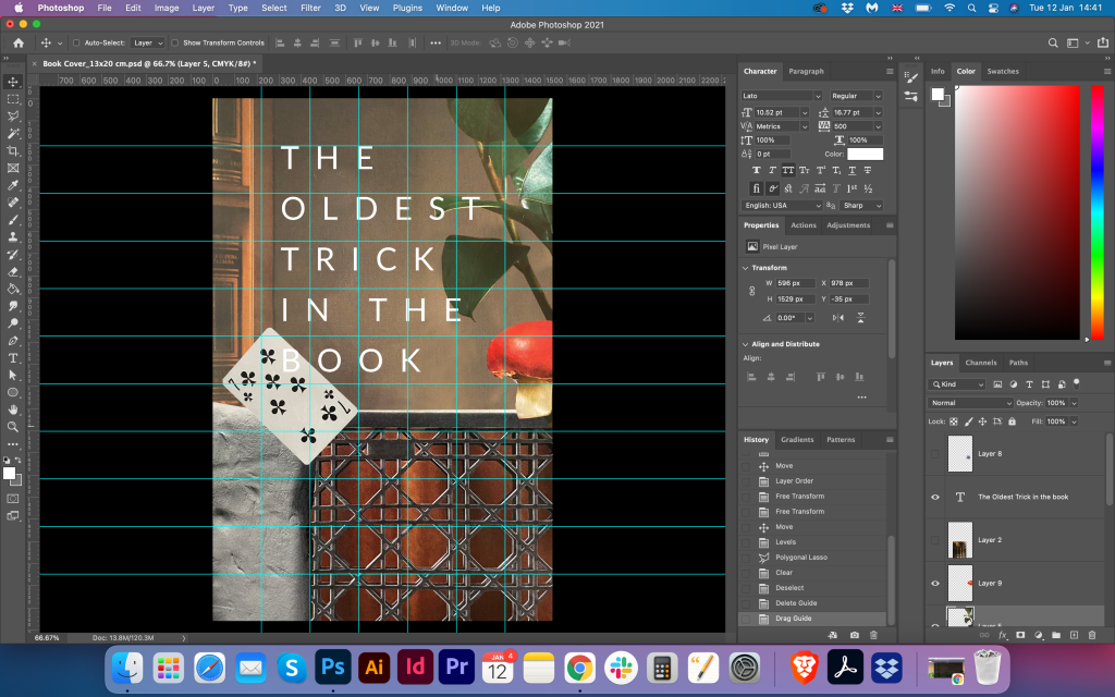
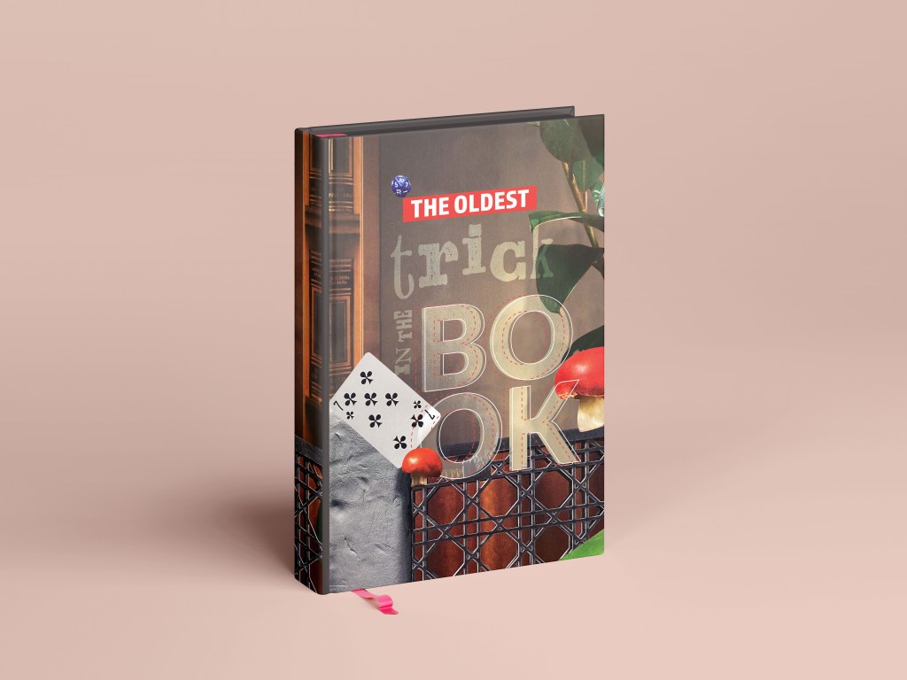
I created a grid for the image, so I could see where the centre of the composition, and how to align all the objects. I started from the main image for the background, going forward filling the space with different copy paste figures. My intention was to create the abstract cover with eye-catching elements on it, so the first reaction would be: “Wow, this looks fascinating! I wonder what is this book about?” I played around with some colours, adding to the corners red, green objects, and playing card in the corner. For the book cover name I placed the simple white type Lato regular, big letters. I thought that it was direction of design that I wanted to be, but I decided that would be good if I could play with the font, and combine some different types together. That experiment I pushed forward in the designs below.
Updated Fonts
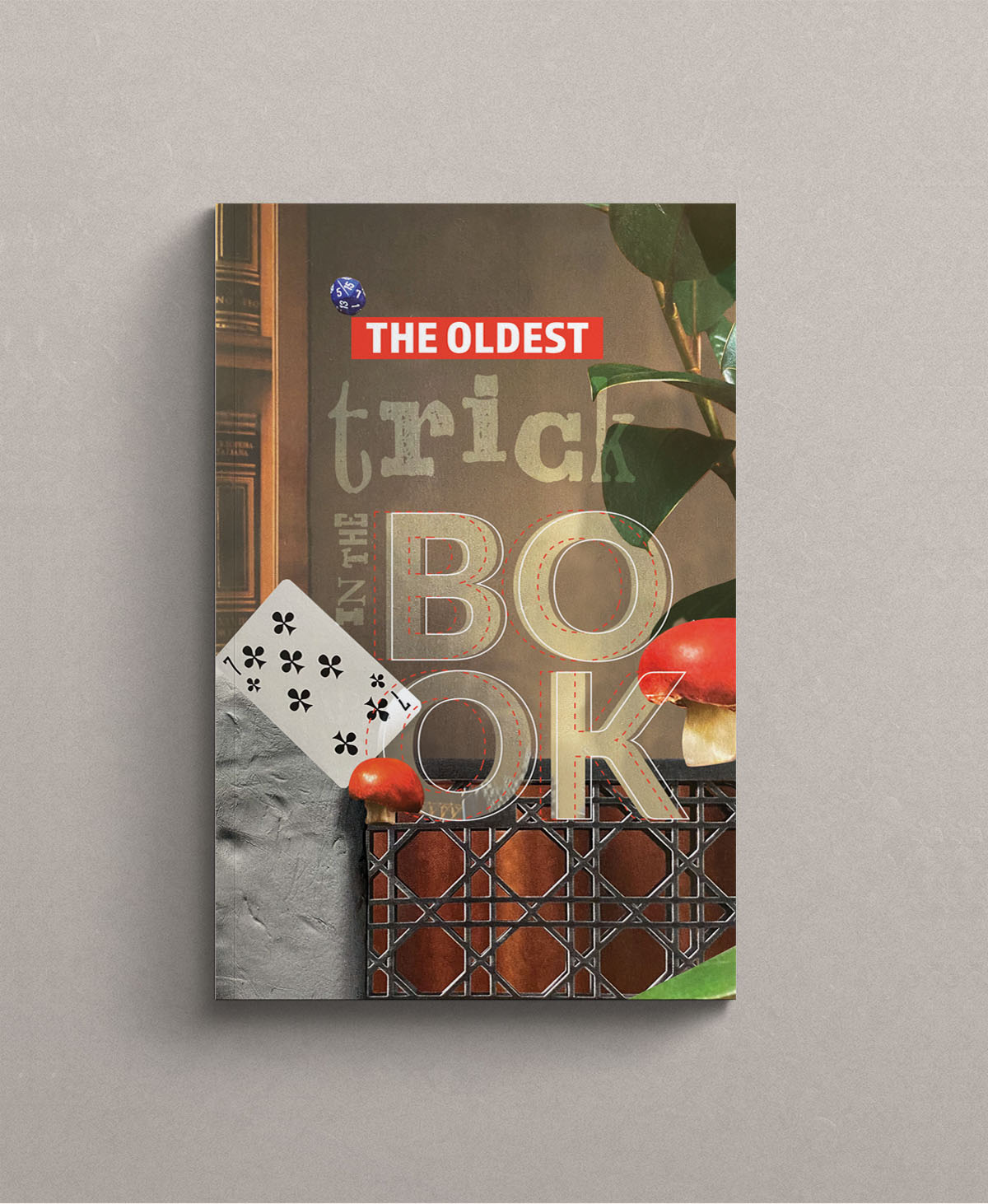
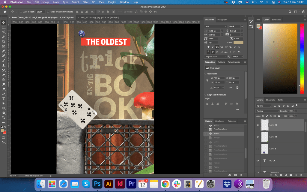
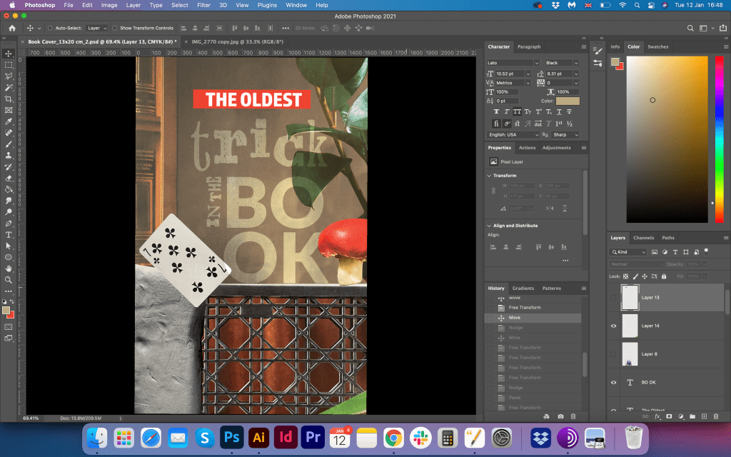
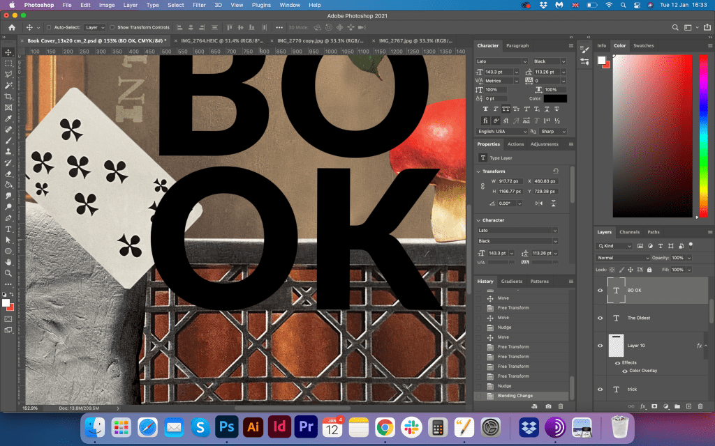
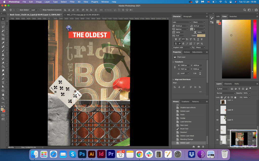
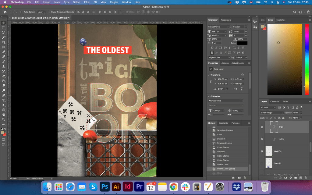
In this part, I felt like I could be more experimental with the font choice for the words at the cover. I wanted to create that playful mood between the words, make them different but at the same time to join them together in an unusual way. For the word ‘The Oldest’ I used Almaq Refined font all capital letters, also I highlighted it with the same red colour as the mushroom. On the age of those letters, I put a little playing cube. I thought that I can fill the design with little elements that would speak on behalf of the trick elements, magic mushroom, playing card, with some brown colour from Egyptian papyrus. Decorative font AltaCalifornia for the word ‘trick’, and big transparent letters ‘Book’ made in the font Lato. As I made letters transparent, I added thin stock around them. I thought that the final design looked quite eye-catching and innovative.
Conclusion
The most crucial part of these exercises was the researches part. From the first point of view, there were so many possibilities to explore, but when I choose one specific direction, I realised that it still can go into so many different ways. What is fascinating about this exercise that even when I tried to predict the design in the result all materials and researches can lead the designer into some unusual solutions. I’m sure there is some more work that could be done for this book cover, it could be much more various solutions, for example, I could produce more options related specifically to the Egyptian theme. However, the direction I chose was more related to the abstract collage, and I was quite satisfied with the outcome I got.
Use one or more of the following book related sayings as a starting point to generate visual ideas and responses:
● Bookworms ● A closed/open book ● The oldest trick in the book ● You can’t judge a book by its cover ● In someone’s good/bad books ● By the book
During this early formative stage, aim to be as wide-ranging and imaginative as possible in your ideas. ALL ideas are valid at this point, so don’t censor; this is not the stage to decide what is a ‘good’ or ‘bad’ idea – at this point they are all just ‘ideas’ with equal merit. Let one idea flow fluidly, intuitively and organically into another to make unexpected links and associations. Record your thought processes and ideas using thumbnail sketches, spidergrams and annotations. Thumbnail sketches are a way of recording ideas through quick pen or pencil line drawings. The quality of the drawing is not important; a drawing of a person does not need to be anatomically accurate, for example. The drawing serves as a visual reminder to you of a fleeting idea. Aim to make thumbnail drawings in the same quick way that you make short written annotations – keeping up with the flow of your ideas. Draw a range of visual and conceptual possibilities using the book sayings as your starting point. Aim to spend 45 minutes working on this, generating as much content, potential ideas, thumbnails, visual metaphors or imagined books as possible.
Thumbnails can give an indication of composition and art direction. For example, how does the subject sit in the frame? How is the subject lit? What particular attributes does that subject have? Thumbnail sketches, along with annotations, are a good starting point to begin exploring these aspects.
Researches
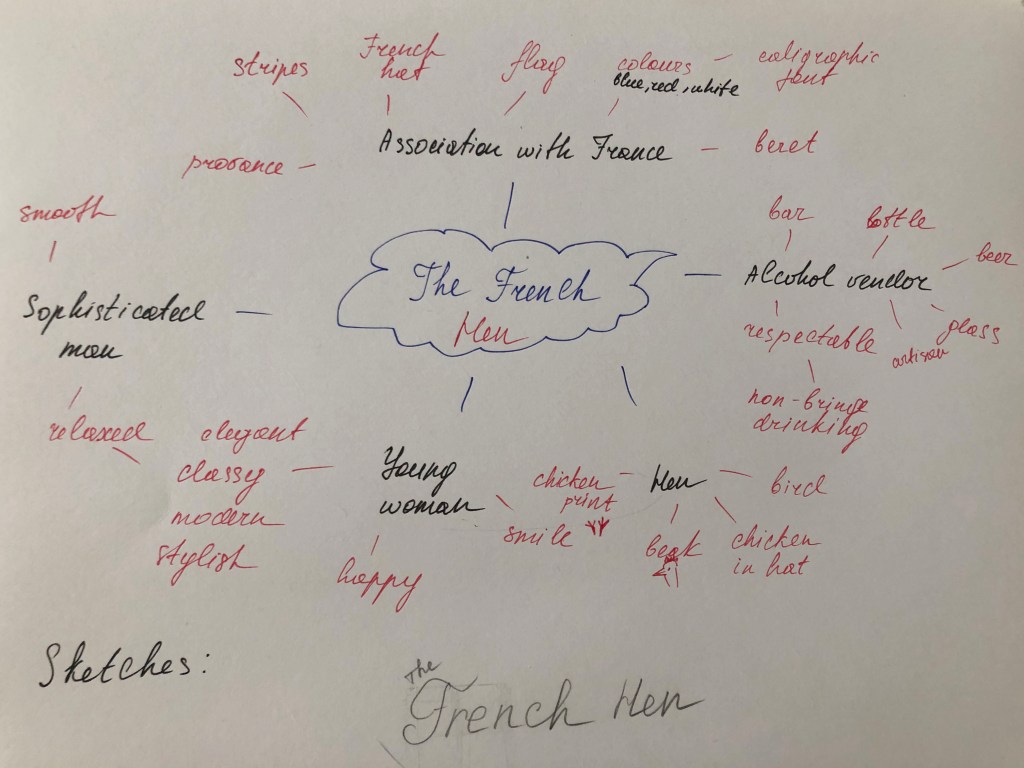
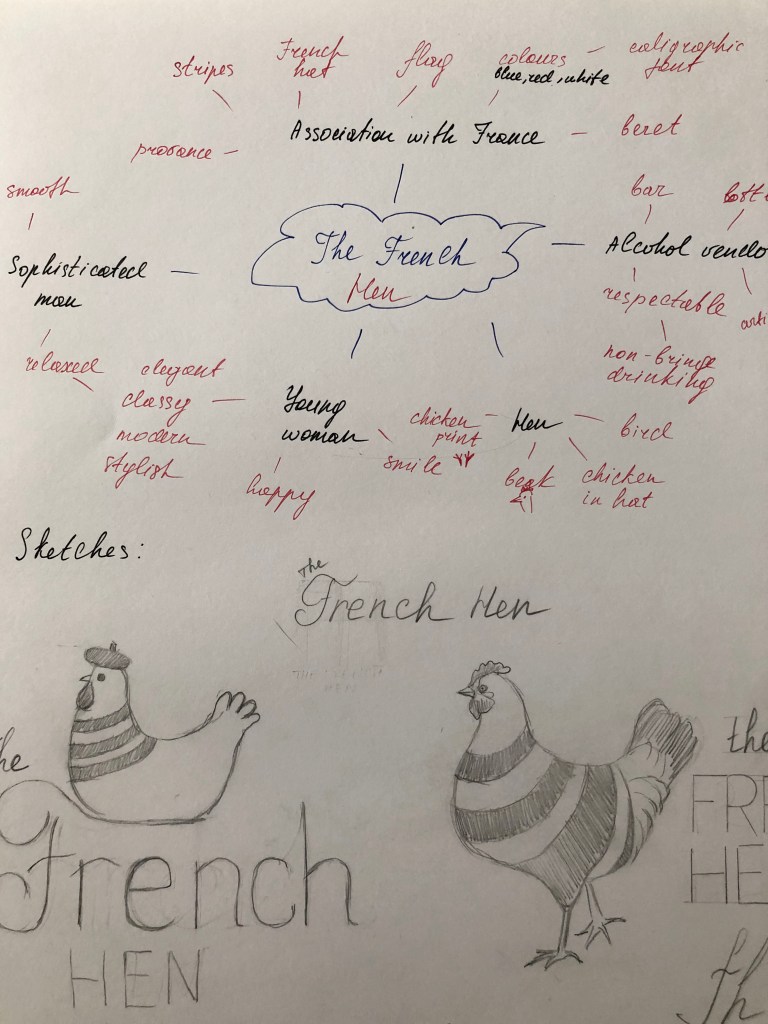
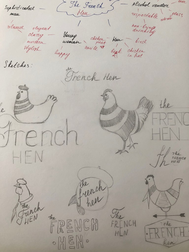
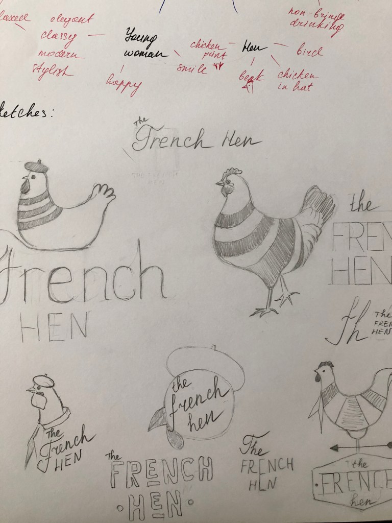
For this exercise, I decided to go with two choices for sketches ‘Bookworms’ and ‘The Oldest Trick in the Book’. I’ve heard some of those book-related sayings before, but for some of them, I had to do some researches. For example, the term bookworm was quite familiar to me, or open or closed book, as in the Ukrainian language we have identical meaning for it, for the rest, I discovered some new British idioms about books.
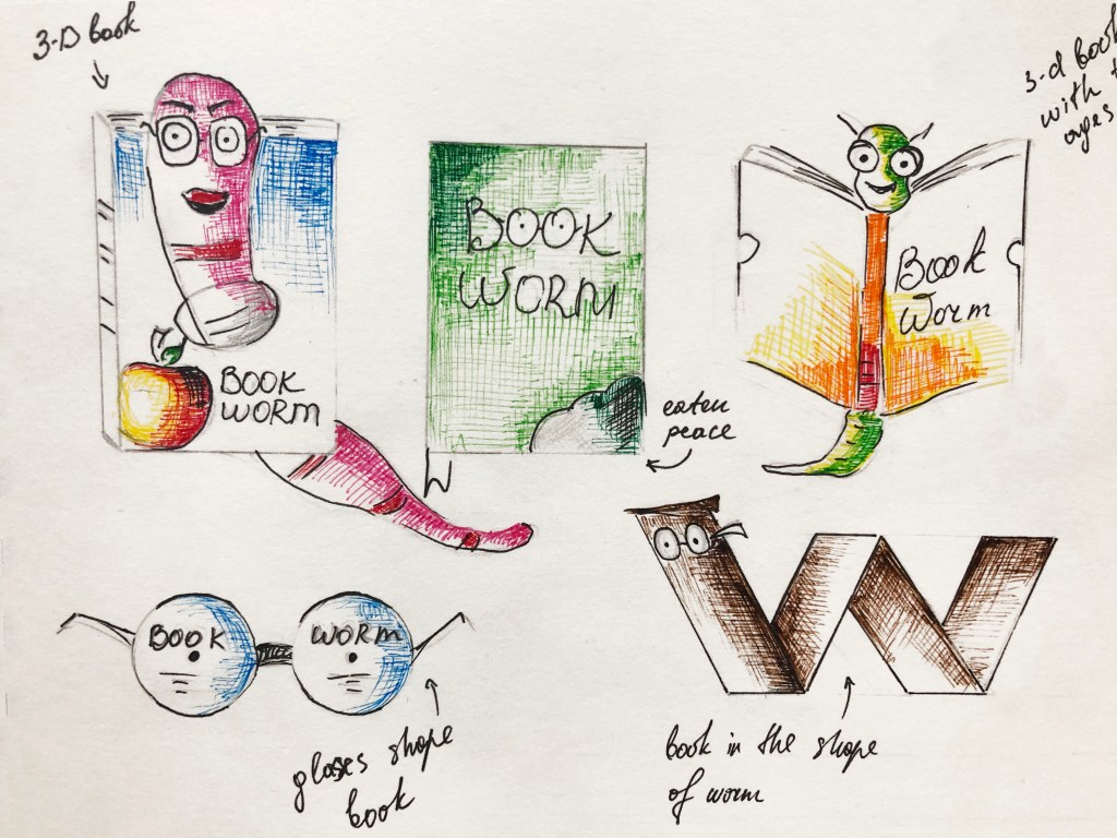
Sketches ‘Bookworms’
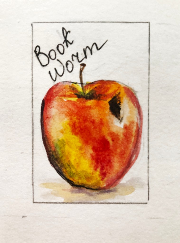
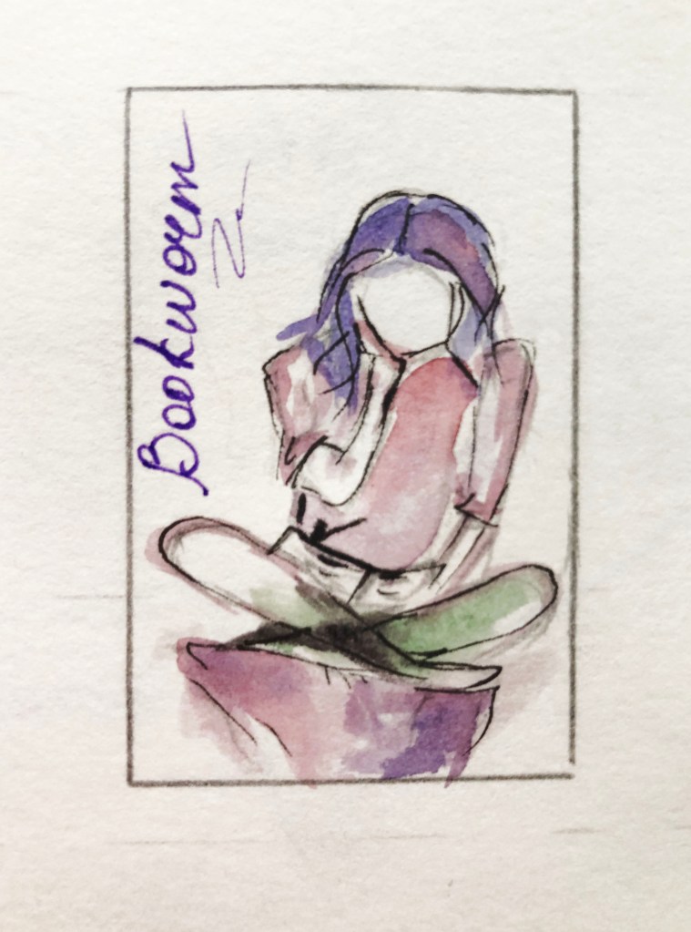
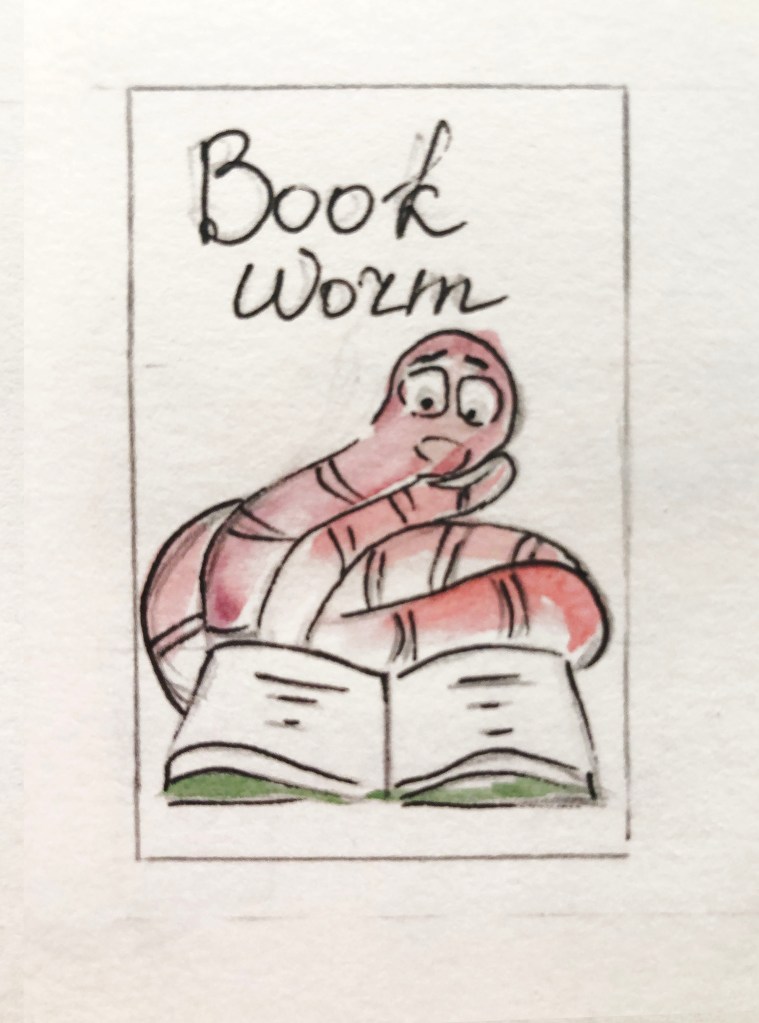
For the bookworms sketches, I thought it should be something cartoony with little friendly worms, the option as a 3-D book could work quite well, or eaten book. Also, I wanted to sketch something more serious, maybe like a thoughtful girl, who is a very attentive reader. I was thinking about designs made in the shape of the worm, it was more like a booklet look maybe, but that could work too. Some of my drawings didn’t look like quick sketches. I love the attention to details, so for some of them, I applied colours. The bitten apple, with a little sign of the worm, I painted in watercolour. I thought for the next book I could create more sketchy like designs.
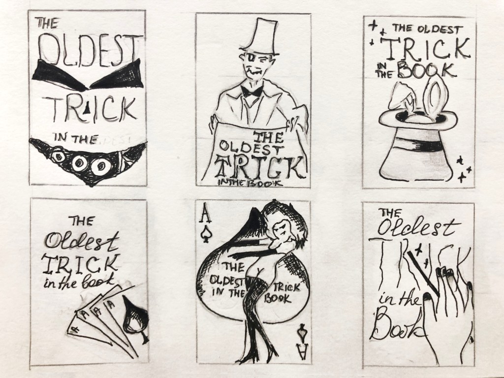
Sketches ‘The Oldest Trick in the Book’
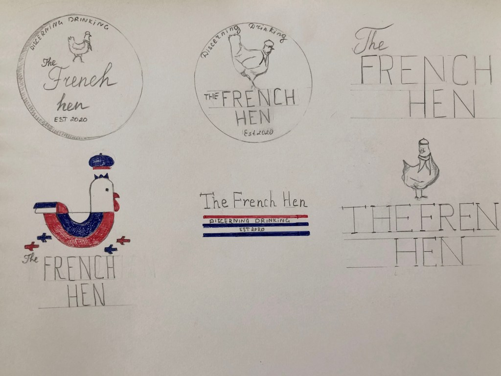
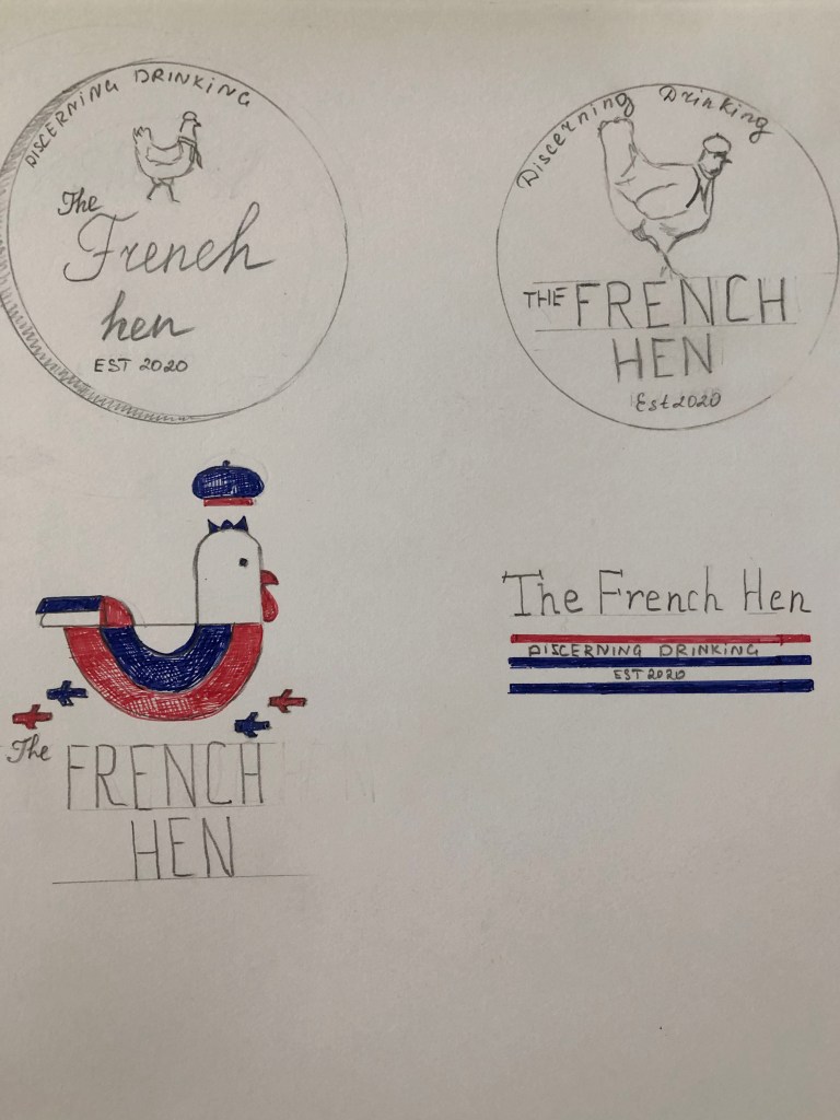
Here I experimented with different ideas for the term ‘The Oldest Trick in the Book’. I thought it all could be related to the magic, tricks, miracle, or playing cards, where wizards are tricking you. I tried to play with fonts, maybe make them all different look fonts, with some spooky details. I noticed, that we had that similar exercise with book covers, one I made as collage, and another one just font usage, probably I could apply similar principle here too. Anyway, they are just sketches, a first step to producing actual designs.
Conclusion
This one of those type of exercises I’m always trying to get better. Sketches and quick drawings are part of generating ideas skills, and they can help with the final design. Here I have a challenge of playing word and association’s task and cover them all into images. I like seeing the result because it gives me confidence that I can do more, and if I look deeper into each phrase, I can discover numerous different meanings and images. I love detailed sketches when they have colour and shape on them, but those 45 minutes sketches that is something I need to improve, as they are not as complicated tasks. I hope those sketches I produced will be useful in my first assignment.
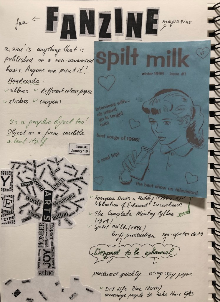
Using your research into artists’ books and fanzines as a starting point, think about their physical or design qualities, and creatively apply some of these approaches to your own designs.
For example, there’s a distinctive visual quality to many fanzines which comes from a ‘cut and paste’ approach to designing and through the use of cheap photocopying and printing. Punk fanzines in particular make a virtue out of having limited resources, no computers and little, or no, formal training as graphic designers. Use your sketchbooks to experiment with a similar ‘cut and paste’ approach by cutting and collaging magazines and other material. What does this approach offer you as a book designer?
Alternatively, you can find other ideas you would like to test out in your sketchbook. You don’t need to make any finished designs, just give yourself room to experiment and try things out.
Research
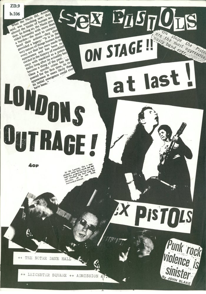
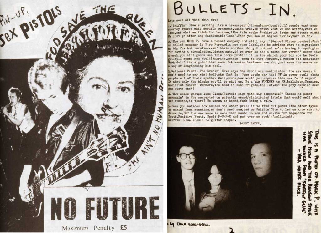
This exercise is a kind of continuation of my previous research in the field of the fanzine concept, and its role in modern culture and creativity. Here I have to analyse what are the main qualities and properties of a fanzine in terms of design. First of all, what catches my eye is the amateur design, the untidy look and the scattered, chaotic composition, the unthinkable selection of fonts, the feeling of bouncing text, and the complete impression that the design was created on the run, sort of in a hurry. What’s also noteworthy is that fanzines use inexpensive, lo-fi printing tools. Here I am reminded of my exercises from the Core Concepts unit where we created a poster for local vocal lessons, a budget version, printed on a black and white printer, as a variation on coloured paper. https://eleonoras.art.blog/2020/05/13/exercise-poster-and-flyer/
One of the reasons for creating those odd posters was the low budget, but another reason was the passion and creative thinking, to demonstrate that admiration of the artists is coming first, and only after that the budget could be invested in it. I think it’s a free spirit as well, not to be limited by higher expectations, something that goes against the norms. The world of marketing materials is replete with magazine models and perfect design solutions, so the opposite trend has come into fashion, the improvised material of an ardent fan. I think, in this case, enthusiasm won out over professionalism.
In my past experience, I only used professional software for designing images, but now it’s time to learn something new and replace it with improvised materials, clippings from newspapers, magazines, and so on.
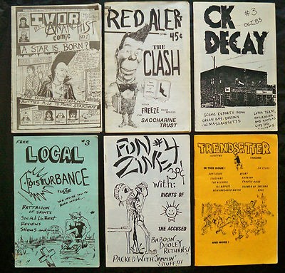
Mood Board Punk Fanzines
Using punk music fanzines examples, I would like to create a map for inspiration. When I see the location of the text in these designs, I recall another exercise from the past unit, where we needed to place words in such a position, depending on what association a particular word evoked. For example, speed is a slanted word, as if rushing forward, or silly, in a playful manner https://eleonoras.art.blog/2019/08/12/exercise-playing-with-words/ Also fanzines have a collage element that is noteworthy is the component that we went through in the 3rd part of Core Concepts too. So this specific exercises is replicated our previous experiences, and gather them together https://eleonoras.art.blog/2019/06/20/exercise-photomontage/
Here I have collected examples of punk fanzines that I liked. I noted a fascinating combination of fonts, amateur design, caricatures, and photographs taken in low quality, but all this together creates a unique style that is exclusive to this trend.
Mood Boards
Also, I would like to mention famous artists who work in a similar copy-paste manner. To do this, I again had to go back to my past notes on the Pinterest board. I noticed that I had several authors saved in my mood boards. There are Robert Rauschenberg and David Carson. Robert Rauschenberg uses more muted colours for his collages, with a vintage style, paints and brush strokes, while David Carson’s works are produced in a more modern way, and mainly with cut and paste objects. Nevertheless, both authors share a copy-paste style, and such a theme would be suitable for fanzines design.
Quite an interesting question, how could this fanzines-style collage skill be useful to me in Creative Book Design? I suppose I could apply this technique to a modern book edition. Even if the story was published a hundred years ago, and the publication wanted to reissue a new edition, perhaps collage techniques could work for the modern book cover design. Or, let’s say some art movement wants to publish a magazine book with some contemporary collages. Even if the designer works with different textures, in the end, everything can be photographed and printed in a brochure.
Another mood board I created specifically for this exercise. I created these mood board textures because they contained a lot of different materials that designers could work with. My aim was to see as many options as possible to create my own fanzine collage.
When I performed similar tasks in the previous unit, I always wanted to try working with different textures in design, use non-standard text, consisting of scraps from newspaper and magazine clippings, and try to combine the artistic part, and texture and design in one layout. While this exercise is mainly experimental, I would like to use as many different approaches and principles as possible in order to discover different variations of the creative layout.
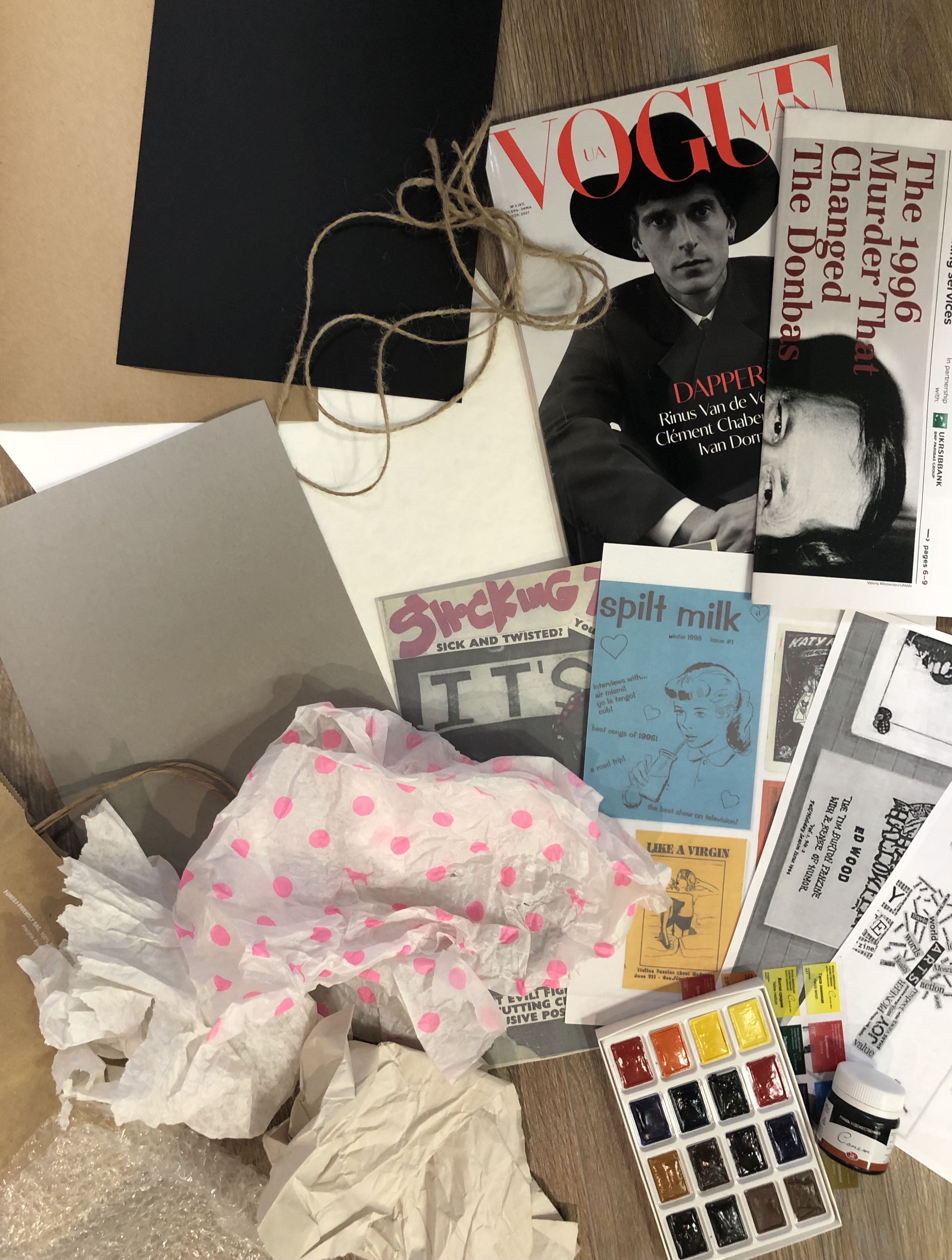
Materials at hand
To get ready for this exercise I collected as many different materials as possible. I did not know if I would need everything but I thought better to have more, and if I don’t need something, I throw it back. So, I had at my disposal a few sheets of design paper, a packing wrap, a bubble wrap, gouache black paint, a paper bag, watercolours, rope, Kyiv Post newspaper, and Vogue Man magazine. I wanted to experiment with all the textures to see the result and compare which one works best.
‘Cut and Paste’ Approach
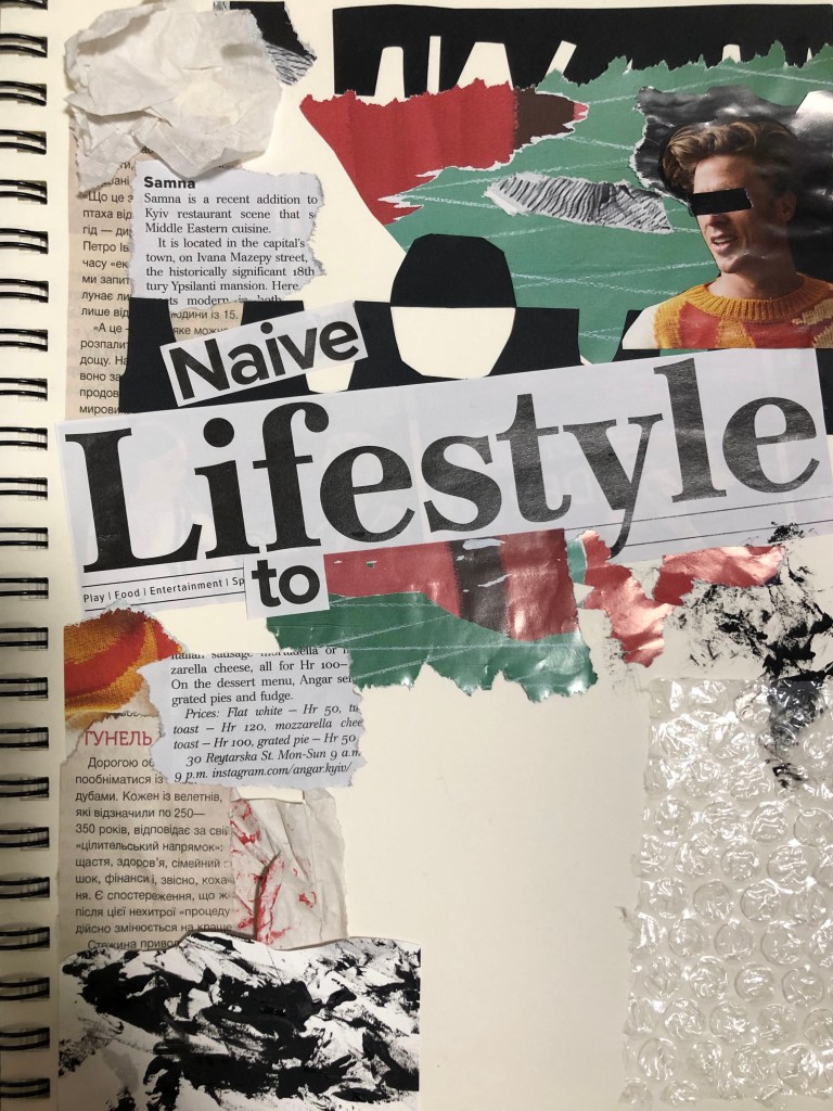
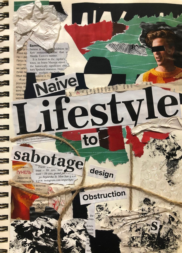
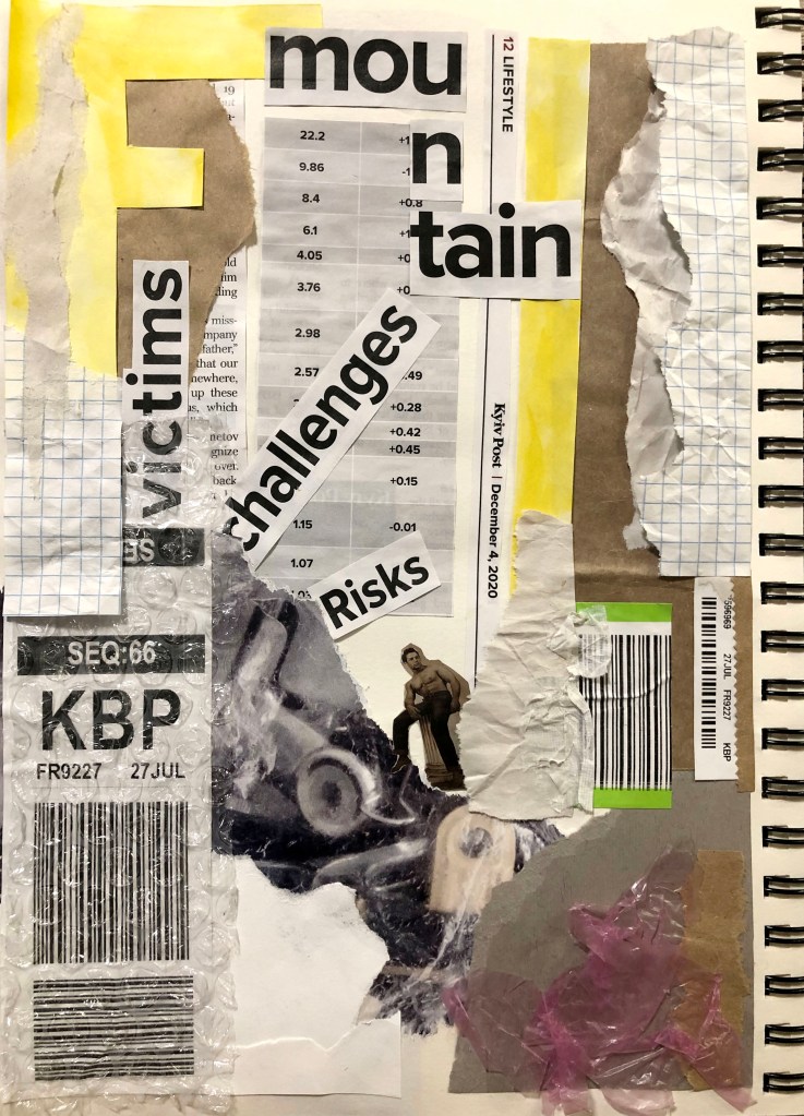
I created the first layout based on the principle of dividing the A4 size area into four even parts. The word Lifestyle was placed in the middle at a slight slope, and further around I filled the sheet with different objects. I wanted to create a layout inspired by the work of David Carson, who uses a huge number of different techniques in his work, which are later used in print. In this work, I used multi-coloured magazine clippings, so the design turned out to be full colour, mainly consisting of red, green, orange and black. Around I wanted to give some rigour to the layout, limiting it to black clippings. At the same time, I filled this collage with some smooth lines. I tried using small strokes of paint on paper, pasted one paper on top of another and tried to place the rope in the layout, all of this created a pretty interesting composition. I agree that it turned out to be a little overloaded, but since it was a test layout, I realised where I needed to improve. The process itself was entertaining. The conclusion was that even for such a chaotic composition, a strategy is needed, it was necessary to understand how to properly divide the sheet, and that here I got a square composition. There was little free air in it, but the layout itself looked confident and firmly in its foundation. I thought this was a good start for an experiment.
Naive Lifestyle to Sabotage Design Obstructions
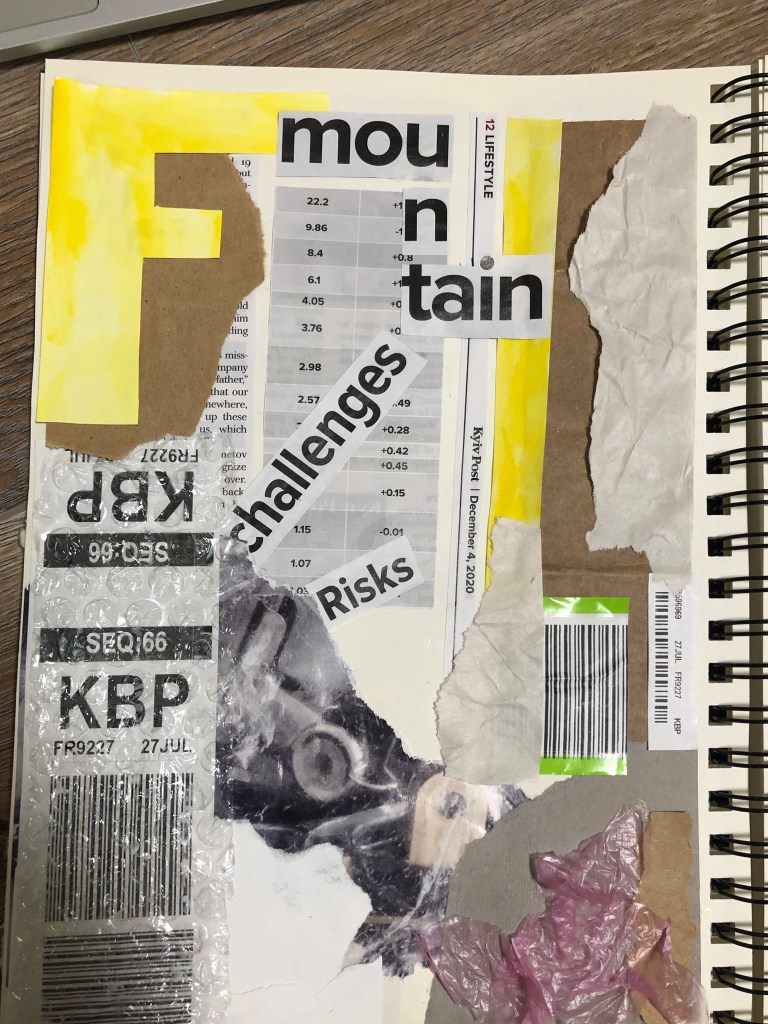
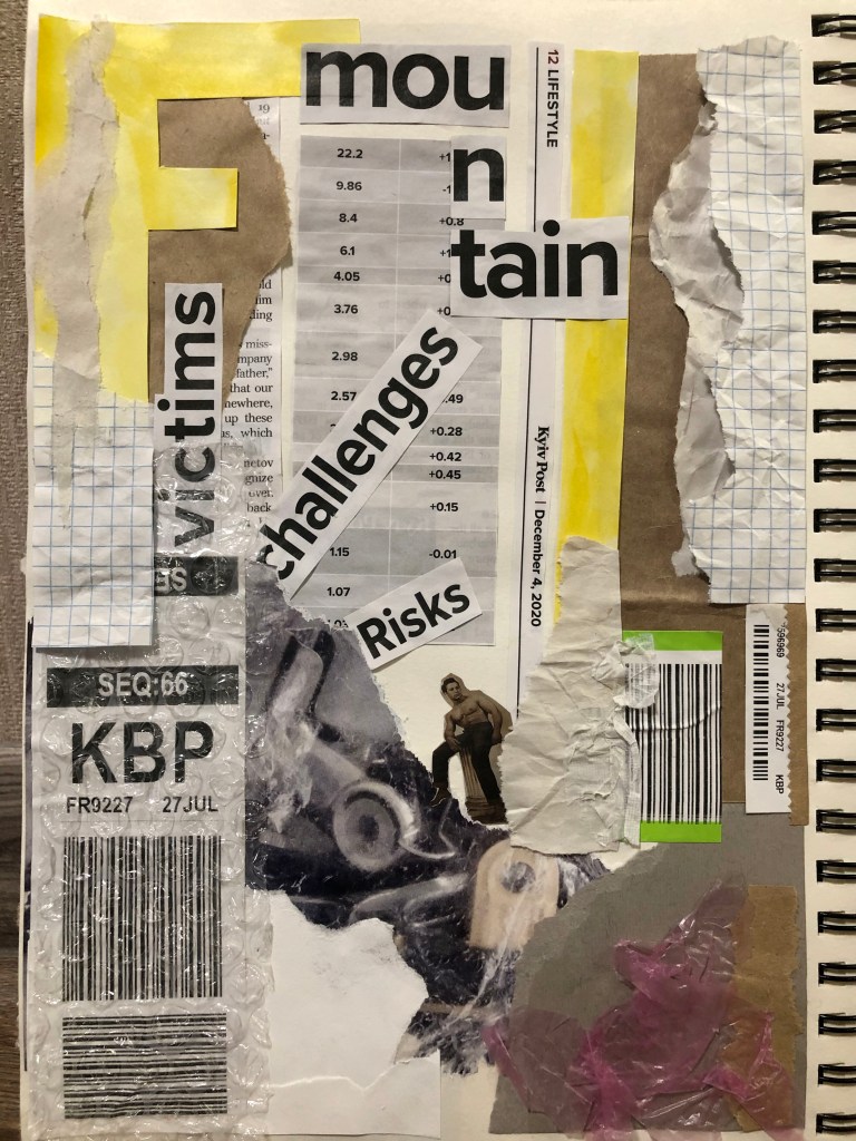
The next layout I wanted to do in the economic field, is to make an analogue with numbers and financial risks. Here I have used fewer colours, mostly black and white with a bit of yellow added. This layout was characterised by straighter lines, with angles and slopes. I wanted to add some rigour to this layout in order to compare it with the previous one. Nevertheless, the style itself and perhaps my style of work brought a casual look. I have signed the names of the layouts, they consist of various cutout excerpts from newspapers.
Mountain Victims Challenges Risks
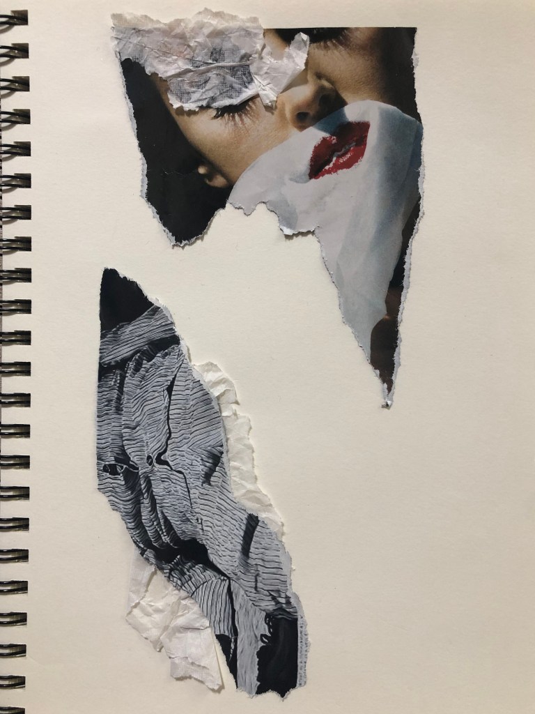
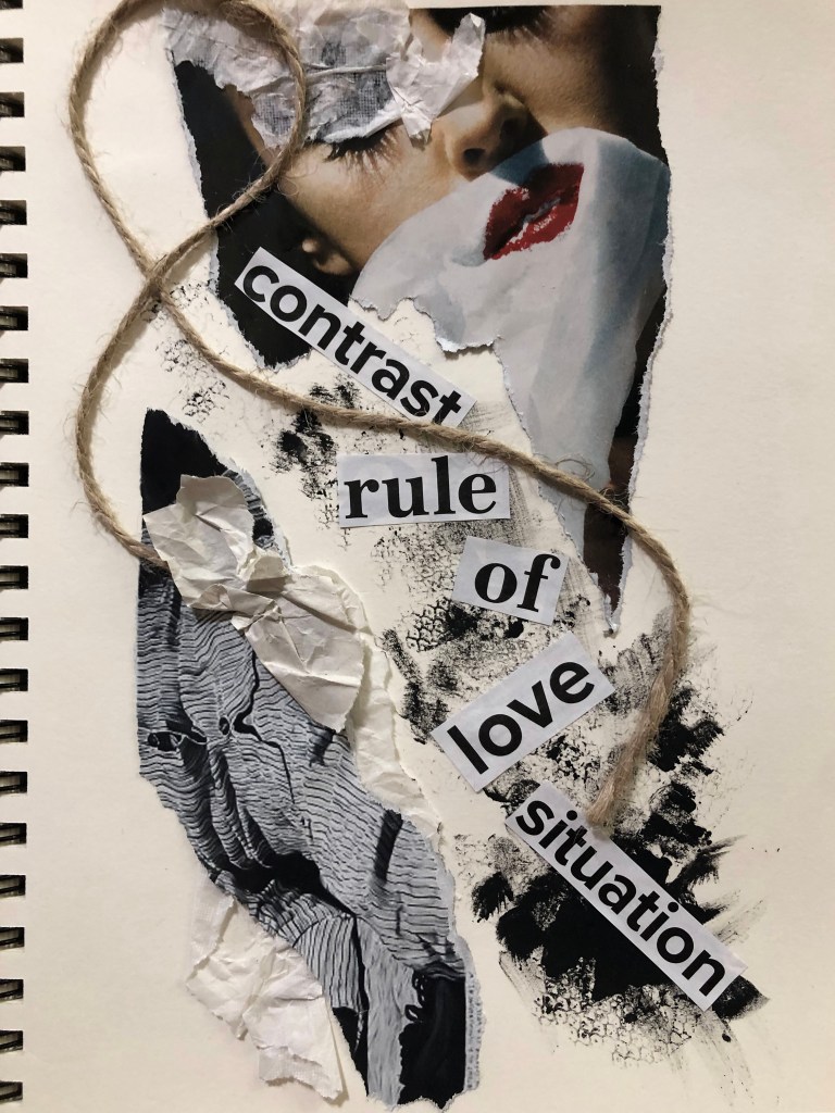
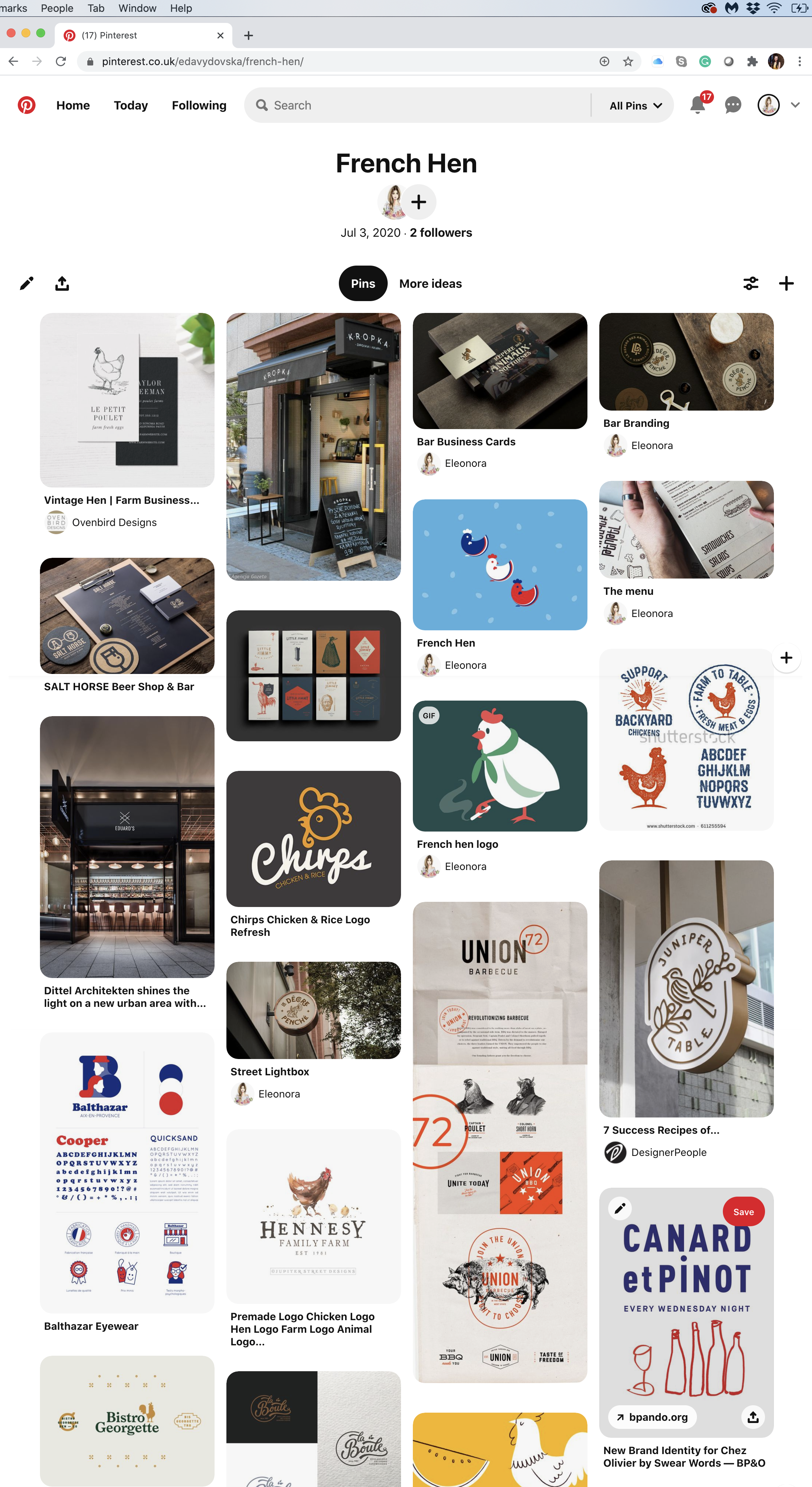
One more layout, in addition, I wanted to create lightness and freedom. Get rid of so many elements, bring in weightlessness, and a love line. I would like to say that perhaps this is my favourite experiment with collage and texture, the layout turned out to be so airy and delicate, there was something especially attractive about it. I used just a few scraps from a magazine, a bit of wrapping paper, a small piece of rope and strokes of gouache paints, with words scattered at an angle, and the layout is ready.
Contrast Rule of Love Situation
This exercise was an entry into the new world of hand-made designs, and the one I quite enjoyed. I could see first outcomes looked a bit mature, but I thought there is a potential in them for use in the future. Also, the software and special filters can elevate them to a new level. As a person accustomed to working exclusively with graphic software, I enjoyed the tactile process with texture, and collages as part of a fanzine, this is what I have long wanted to try, and now there is a reason for experimenting. Indeed, based on this principle, I could create postcards, magazines, brochures, illustrations for books and other materials, anyway it can be a great variety. Here, of course, was no reference to a specific topic, and we were free experimental artists, but I am sure that even if I had a given topic, I could still present it creatively.
Browse the American based Smithsonian Libraries’ Artist Book archive to identify books that you find interesting or questions the notion of the book in some way. https://library.si.edu/collection/artists-books Explore fanzines in more depth by reading Teal Trigg’s chapter Definitions and early days (pages 6–43) from her book Fanzines: A do-it-yourself revolution (2010). This chapter is available as a course resource on the student site. Document visual examples of work you find interesting with annotations in your learning log. You’ll be using some of this research in your first assignment.
Researches
In this research exercise, my task is to analyse non-standard designs for books and fanzines. As a term, I had never heard the term fanzines before, so here was the opportunity to discover some information about them.
To begin with, I followed the link to the Smithsonian Libraries ’Artist Book, which contains all kinds of book design variations. Here I see an obvious example of how you can go beyond and create a real work of art from everyday things, this is something that does not occur in everyday life, and also helps to see new facets of art.
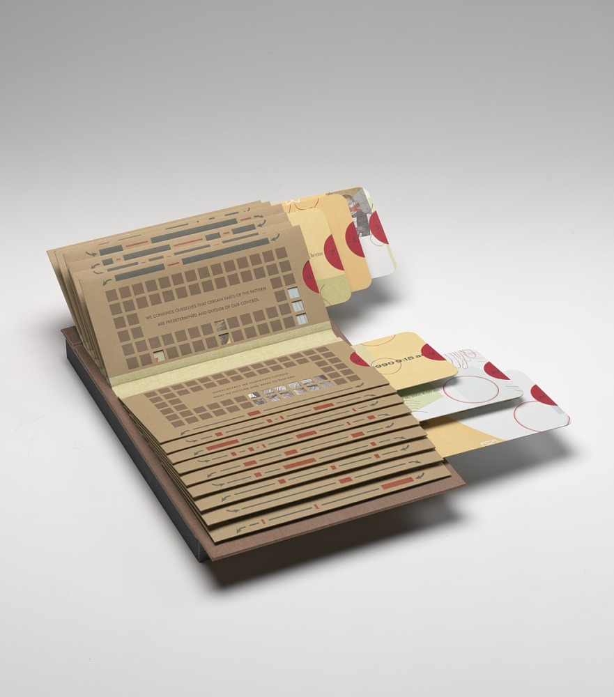
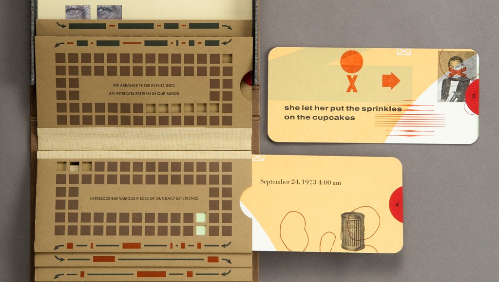
The first book I would like to highlight is Glimpse by two authors Barbara Tetenbaum & Julie Chen, who put their creativity into one project. In this project, the authors examine the idea of the creation of their biography. For the design of this book was used letterpress from hand-set type, wire, antique news cuts, dingbats and photopolymer plates. They gathered together their prominent events in some kind of photo album style book.
In this book, cards could be pulled out from each envelope. Cards contain some phrases, dates and collages. I like the sepia colours used for this book and vintage style of images. They gave a feeling that it could be a historical masterpiece. This is a unique example of seeing ordinary events in an original way. At the same time, ‘Glimpse’ is another example of how creative approach could make something unusual and artistic.
Gifts from our elders by Kerry McAleer-Keeler
Another book creation that paid my attention is the book Gifts from our elders by Kerry McAleer-Keeler. Visually it has a similar feel to the book described above, like vintage objects, similar colour pallet, but in this case book was folded into the box. It reminded me pop-up books I remembered from the childhood, which had 3-D objects inside of it, so I could read the information not through words, but through images.
I loved the key theme of this book, the celebration of femininity and the gift of life. Here, the author, through medical images of the heart and brain, reflected the favour of the intellect and love for art. I noticed that Kerry McAleer-Keeler has a whole series of similar works, where she combines her philosophical views and her attraction to beauty in the boxes.
“I’m an artist who wishes to tell you a visual story.”
I am impressed that the artist wants to take the viewer into a new imaginary world, and through symbolic elements creates a new perception of spirituality and life cycle, especially I like associations she created for objects and the way she folded it altogether.
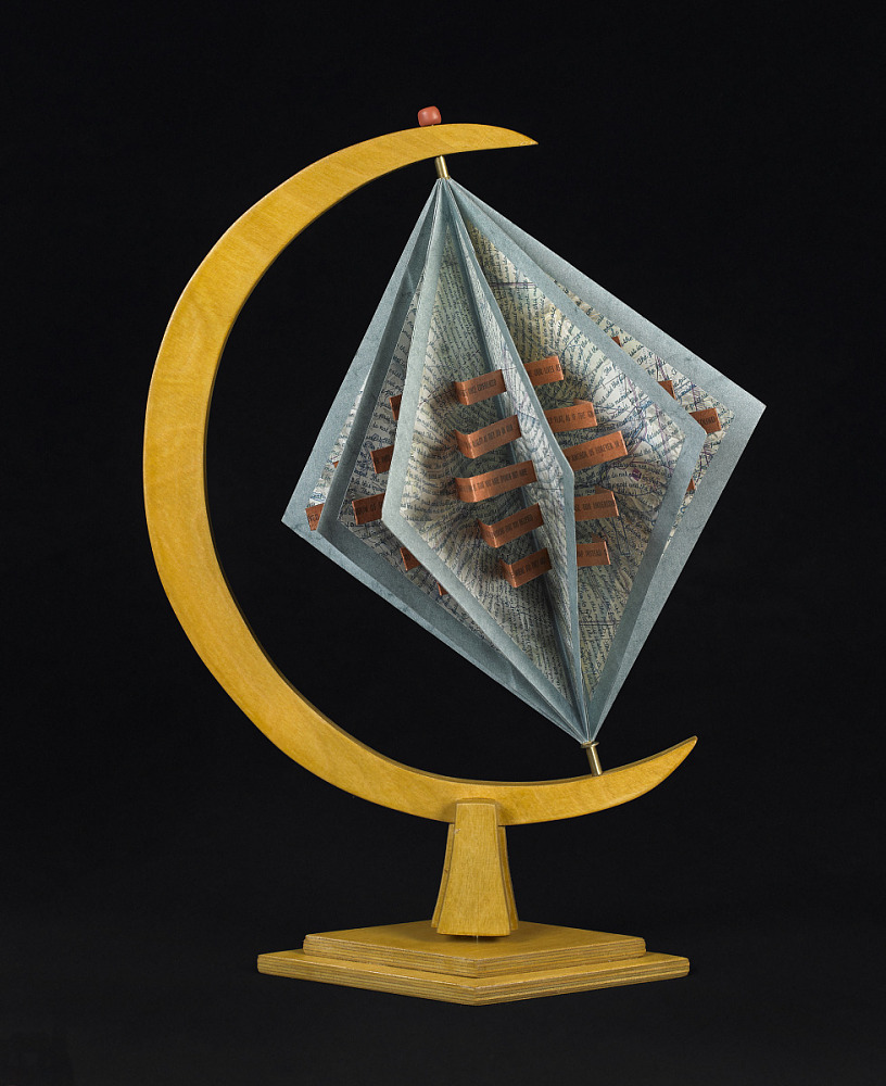
World without end / / by Julie Chen
Another example of artists’ book I would like to mention was designed by the same author of Glimpse, Julie Chen. I think this work stands out because of it’s unique and original shape. I really loved that concept of endless globe, but in the shape of rhombus and envelops. Overall I would like to mention that I loved to learn more about exploring the sculptural and interactive potential of the book form, and discover a notion of what a “book” can be.
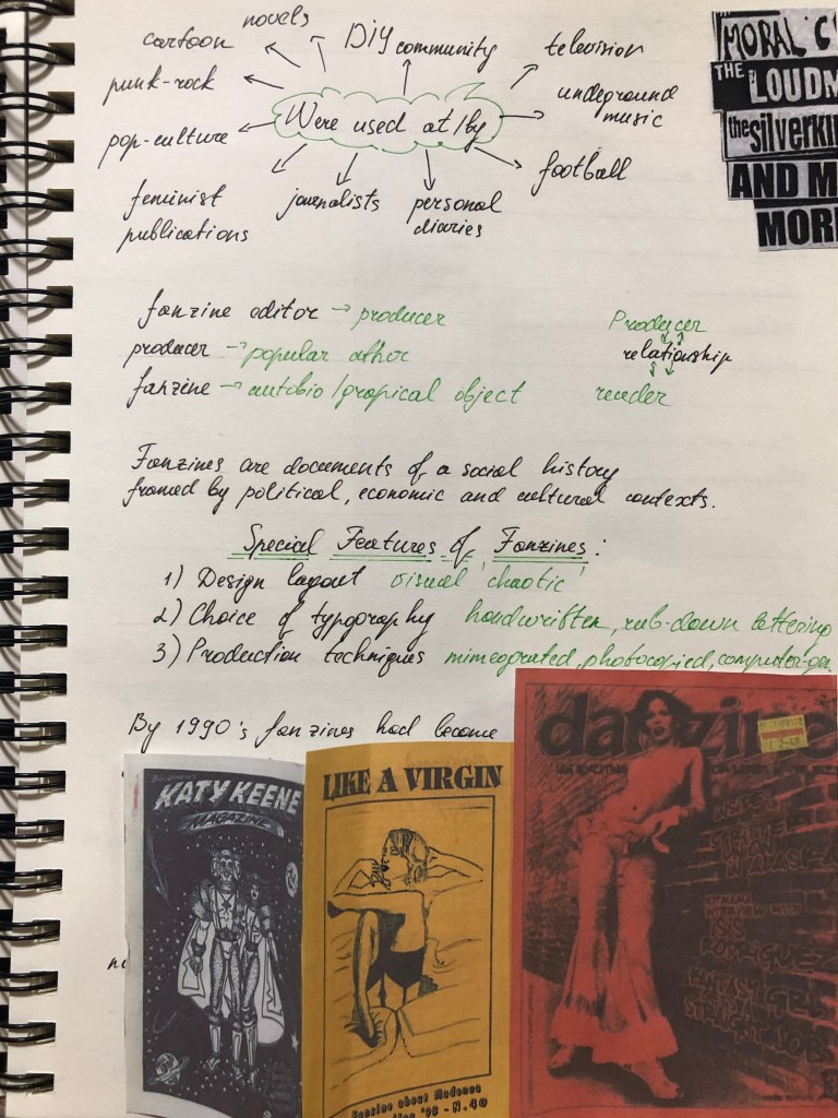
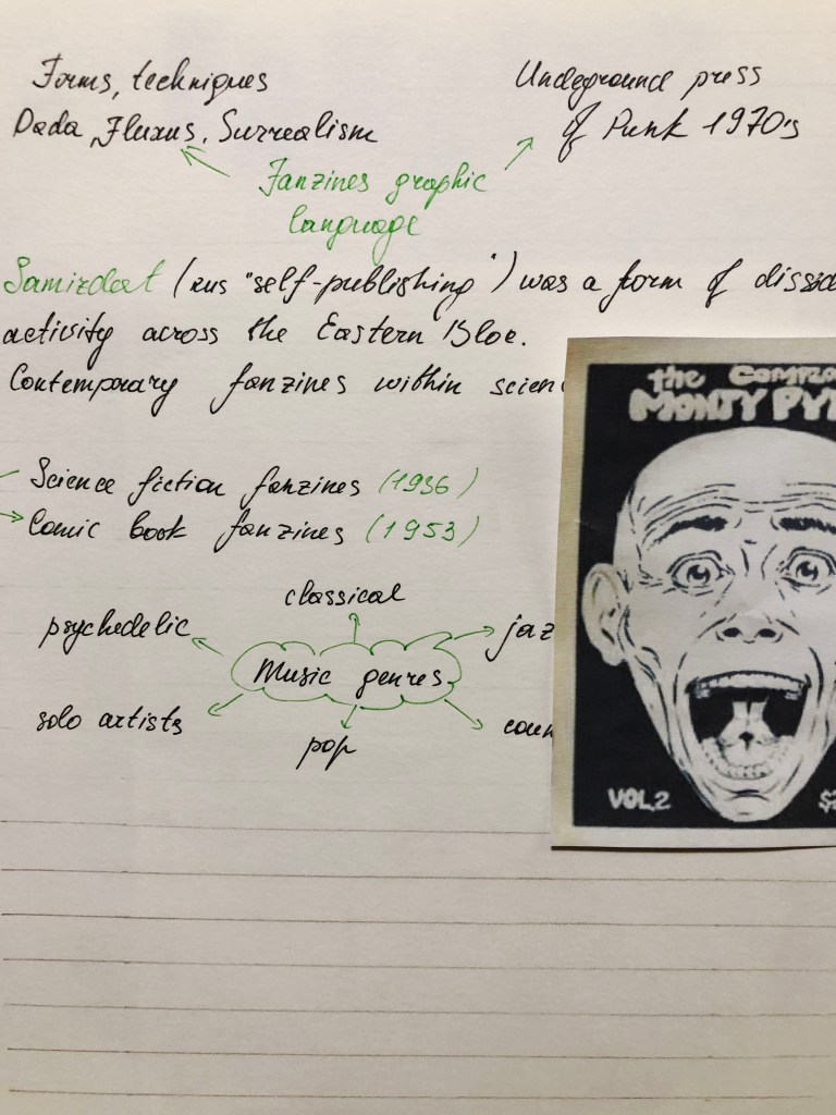
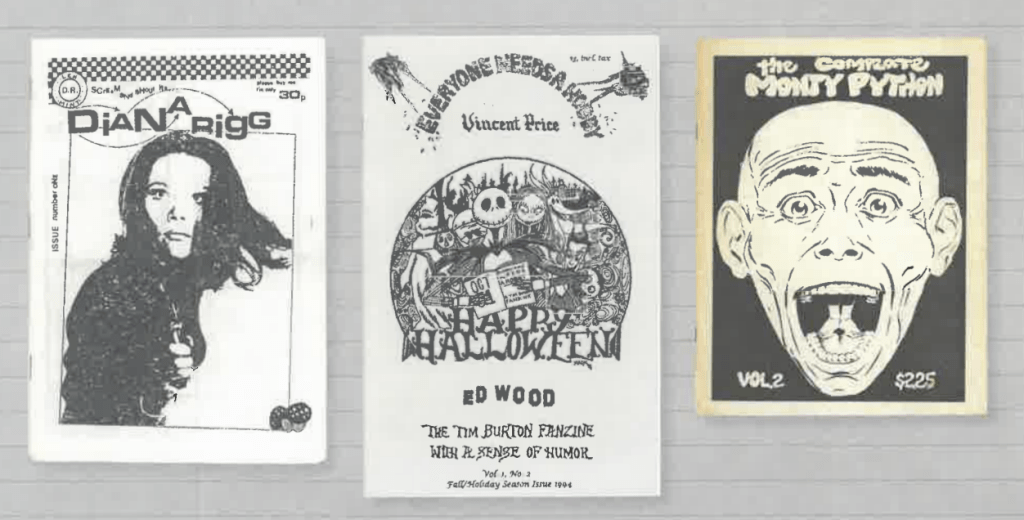
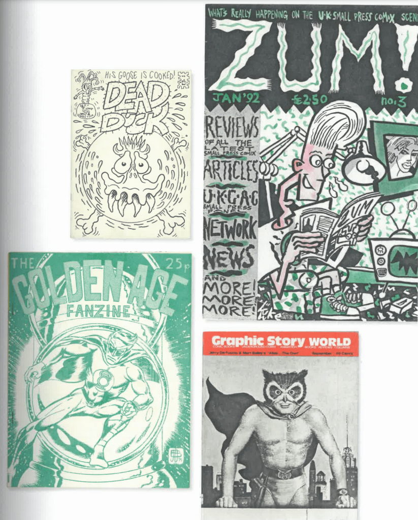
After researches some of the shapes and forms of creative books I proceeded to the next part, discovering the history of Fanzines. Overall, I found this article quite impressive, as here i could see example how something invented in the general publics, amateur and non-professional, but with a lot of passion and creativity could become an official term and implemented into the world of professional fashion industry, music, books, cinematographs and other forms of art. All important notes I gathered together in my learning log. I tried to create some mind maps, and graphics, highlighting annotations and dates, as these researches will be useful for my first Assignment.
Also, I’ve placed some screenshots of different fanzines from the article, so I could go back to them as a point of inspiration for my later works.
Diana Rigg (1986), Everyone Needs a Hobby (1994), The Complete Monty Python (1978)
Kitten Scratches (1999), DIY Life Zine (2010), Beer Can Fanzine (1999)
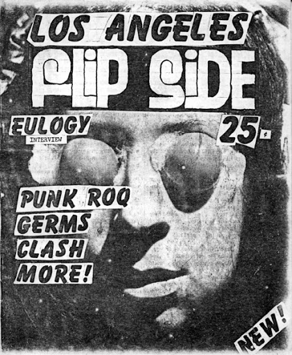
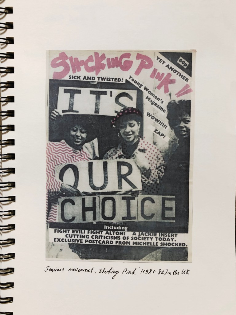
Shocking Pink (1981-82)
Dead Duck/Corpsment Comix 1991), Zum! (1991), Golden Age Fanzine (1970), Graphic Story World (1970)
That research task was quite entertaining for me, as I love analysing and learn something new about artists, art movements and influencers in the culture. I found useful that here I discovered some new terms not only in graphic design but in the art culture in general. The challenging part was not only to get myself familiar with this article briefly but to understand the purpose of it for my future designs.
Given the current development of the book from printed to digital technologies, what do you see as the future of the book, for readers, and book designers? Where do you see the book heading? Show and tell. Try and summarise your thinking into a series of short statements, quotations, images (collage) or ideas. Be creative in how you approach this. Use your learning log to reflect on the essay and your own thoughts and visual ideas about the future of book design. This research will feed into part of your first assignment.
Researches
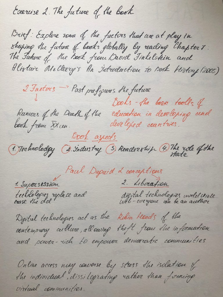
This task turned out to be quite complex in my understanding, as the requirement was to get familiarise on the article first, create my own views on the described topic, and later express my visions on the collage or design. To get started, I decided to reviewing Chapter 7: The Future of the Book from David Finkelstein and Alistair McCleery’s An Introduction to Book History (2005). This book contained from a lot of arguments, facts, figures and assumptions. First of all I decided to put some assumptions into my sketchbook, which helped me to highlight the main statements from this article. In the result I was able to summarise what requires attention in this article, what are the positions of publishing companies in the modern world, what changes have been taking place over the years and how the popularity of the printing business has changed. My mind map entries are presented below.
Mind Map
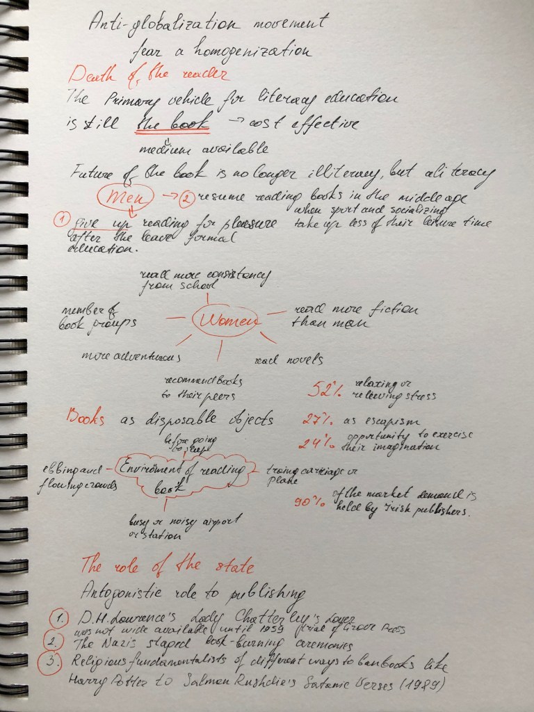
This article did not study the specific future that awaits books printing, but to some extent the factors influencing the formation of this future. The author believes that books will coexist with modern technologies, and will also play a role in storing information in the future. For the sake of fairness, it is worth noting the conclusion that, books are heading to the position of reading for leisure, because now there is no such need to go to the library to get this or that scientific information, electronic libraries have come to replace them. And these consumers of printed information are becoming less and less popular, this is what is called the term globalization. If we turn to the craft of writing books, then we can understand that all history, and the data that are available to us about the past of mankind, have been preserved on the pages of ancient books, papyrus and clay tablets. Now, when there are protests for deforestation, environmental problems, the paper industry, more and more people are leaning towards electronic devices.
From papyrus to pixels
From the article I read there was a clear statement that the web has transformed the publishing and delivery of knowledge and ideas and a book is now much more than papyrus or paper.
Books now come in many digital and analog formats.
eBooks
PDF Books
Kindle books
Hardcover books
Paperback books
Interactive books
iPad books
iPhone books
Tablet books
Nook books
I love the convenience of the Kindle but I find it inconvenient to not know exactly where I am up to or how far it is to the end of the book. I also miss the the texture of the paper that a Kindle cannot provide me. But at the same time if I want to read something at the present moment, I can have it ‘now’ and I don’t have to wait for the delivery or look for this book in the bookstores, I just can download it within a minutes online, and enjoy reading straight away.
I do not argue that there are aesthetes or book lovers, but mostly if I see some kind of reviews about books, or if my friends recommend reading this or that novel, these are people whose profession is associated with copywriting.
First storages of information
In my researches, I would like to review related to the development of the writing in the book Sapiens. A Brief History of Humankind. Noah Harari, particularly on the ancient storaging system of information. My goal is to create a parallel between the ancient system of keeping records, their practicality compared to the modern book.
Signature: Kushim
A clay tablet with a business record from the city of Uruk. The word “Kushim” can mean both the position of the official who accepts this tax and a personal name. If this is his name, then Kushim is the first person whose name has survived in history! It is characteristic that the first recorded name in history did not belong to a prophet, poet or conqueror, but an accountant.
Here the author mentioned a data processing system invented by an unknown Sumerian called “writing”. It took scientists a long time to understand the essence of this message. At this early stage, the writing was limited to numbers and facts. The great Sumerian novel, if it was ever composed, never made it to the clay tablets. The writing process itself was time-consuming, the readership was extremely small, so no one saw any point in wasting efforts on any other writing other than the much-needed bookkeeping. Perhaps our modern books in a few thousand years will seem just as impractical a way of storing information, something that will be perceived only as a valuable relic of the author’s communication with society.
Another example is the Andean writing, which differs in many respects from the Sumerian – so much so that not everyone dares to call it writing. First of all, these were not the signs usually used on clay tablets or other material: the Indians saved information using the kipu, a nodular writing system. A kipu is a bundle of coloured laces spun from wool or cotton. On each lace, knots were made in certain places, and one kipu, thus, could contain hundreds of laces and thousands of knots. The almost inexhaustible variety of combinations of types of knots, distances between them and the colour of laces made it possible to store large amounts of numerical data concerning, for example, taxes or property. After a long Spanish occupation, very little kipu survived, and now they can no longer be deciphered – the ancient art of reading kipu has been lost. Another example of the development of civilisation, probably when first Indinans invented these kipu system they didn’t know that that is not convinient or practival enough to be wildly used in the future.
I would like to sum up that he fact that the inventions of mankind, which were popular and in demand for thousands of years, eventually became impractical and lost their former significance. I know that it could probably be quite extreme comparison, as I still have to analyse what is the future of the book, I need to ask myself a question, how far that future is. If we speak about hundred years ahead, I don’t think there will be completely vanishment of book publicity, but if we speak about more distant future, I believe that books could be more a part of museum property, something that people used to have hundreds of years ago, and instead of paper books society will have only electronic or hologram version for reading the information.
In conclusion of my researches I would like to say that if compare a classic book edition with supposing an electronic version of a book in the distant future, books will be just a part of the humans history. For example book could be displayed in the form of a hologram in front of the readers eyes, or be just a flat electronic version with its own access to the global libraries and storages. I am leading to the fact that what seems convenient and indispensable now, in thousands of years, may seem just a heritage of the past because every invention needs progress. I would like to note that, in my opinion, books hold a strong position as an invention of mankind, but recently we see about the transformation of the book into an electronic version that takes up less space, is cheaper and more practical, so I think it won’t stop the developing and transforming.
Books themselves, however, likely won’t disappear entirely, at least not anytime soon. And there still will be some work for designers and publishing companies to do. For example, publishers looking for the new topics all the time to attract the readers. So the psychology book, or book how to respect yourself and become successful in 21 century will be more popular than book written by classical novel writer in the past century. Books meant not to be read but to be looked at – art catalogues or coffee table collections – will likely remain in print form for longer as well. I think, that print will exist, but it will be in a different realm and will appeal to a very limited audience, like poetry does today.
Design
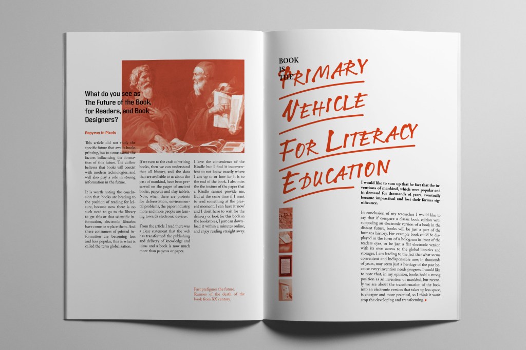
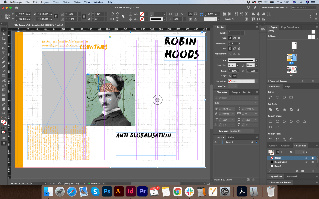
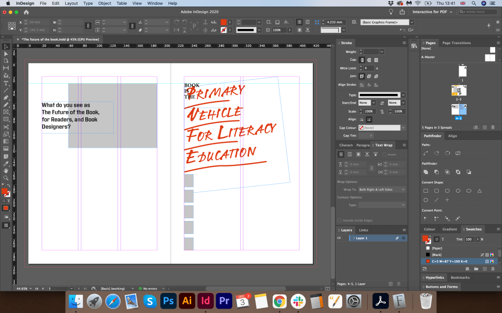
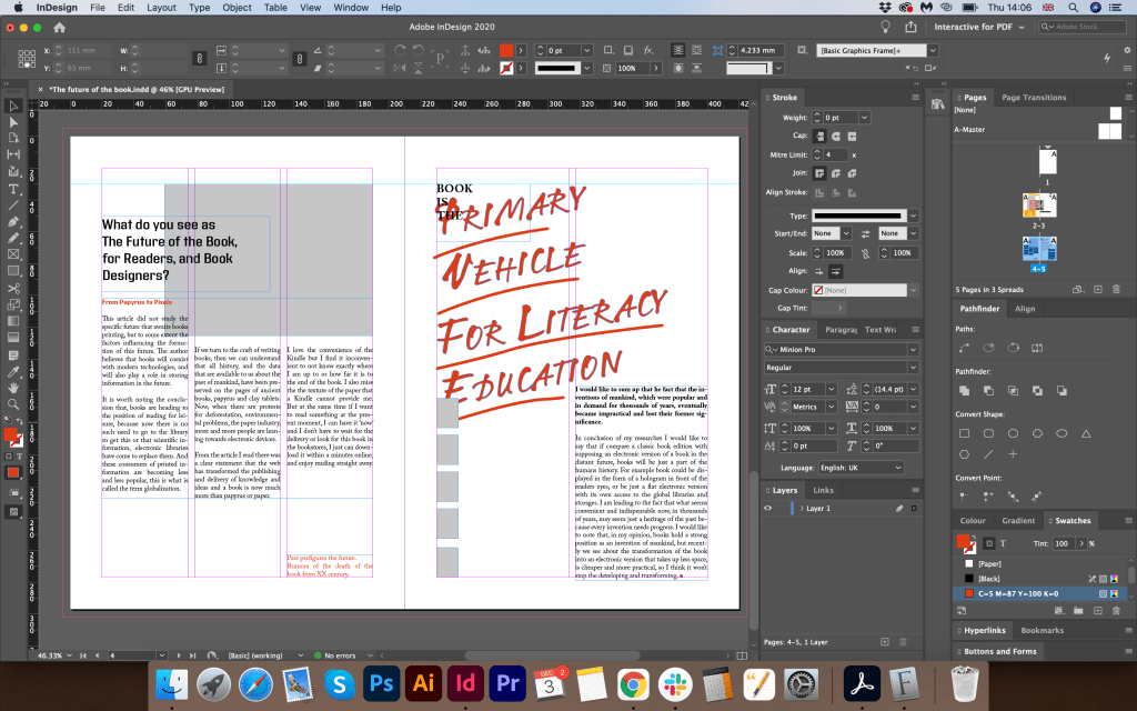
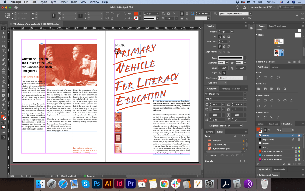
After I analysed the possible options for the future of the book and printed publications, I moved on to the design of the article. To begin with, I created a document in the Adobe Indesign program in A4 format and a spread. I wanted to create a collage of an article with my essay. I placed information around like for a magazine layout. The first option using yellow did not make much progress for me, so I decided to try a new option using large slogans around it, with a red colour palette. I divided the pages of the document on the left side into three columns, and the right side into 2. I wanted to create more air in this article, so I placed the text itself not on the entire page, but leaving a lot of free space at the bottom.
For the main image, I chose The Philosophers painting by Master of the Judgment of Solomon (fl. 1620-25). I put a red filter on top of all the images. In the result, I got a harmonious combination with the big slogan that I placed on the right side of the layout. For the slogan, I chose the phrase Book is the primary vehicle for literacy education from Chapter 7: The Future of the Book. I chose the typeface similar to handwritten LTNotec as if in a hurry, combined with the serif font Adobe Caslon Pro. I wanted to show an example of a modern layout, with the stages of development of mankind and books. So I created a grid of rectangles with a red filter on top, and inside I have images of a clay tablet, a book, an e-book, and an example of a print edition in the future.
In this collage, I wanted to capture the phased development of the book, as a source of information conservation, where it all began and how we came to the electronic book, today the most modern representation of storing printed information. Nevertheless, printed editions are still preserved in our time. Of course, there are significantly fewer of them, but they are still in demand among lovers of literature.
Conclusion
As a result, I would like to say that I enjoyed this exercise, in it, I was able to carry out my arguments and thoughts in combination with scientific publications about the theory of book development, and what the future holds for it. I think that in my article design I was able to summarise my researches. Also, the article colour scheme and composition identifies the modern view of book publishing. I liked the look at book publishing on a global scale, as a source of information, and which contains everything that happened in civilisation, various historical thoughts collected in the world library. I believe that the book will coexist with modern technologies for many years and will be in demand as one of the most important inventions of mankind.
Consider the importance of books to you both personally and within a broader global sense.
First of all, think back to the earliest books you came across as a child, through your teenage years and early adulthood to where you are now. There may be half a dozen books which stick in your memory or are important to you in some way. There may be many more than that. It may be an early reading book, a particular image or short rhyme which helped you recognise letterforms. It may be the distressed metallic silver cover of a Salinger novel you read as a teenager, or the book you bought on impulse after work one day, seduced by the tactile quality of the cover.
Identify these books in your learning log, use photographs and annotation to create an illustrated list documenting the books that are important to you, for whatever reason.
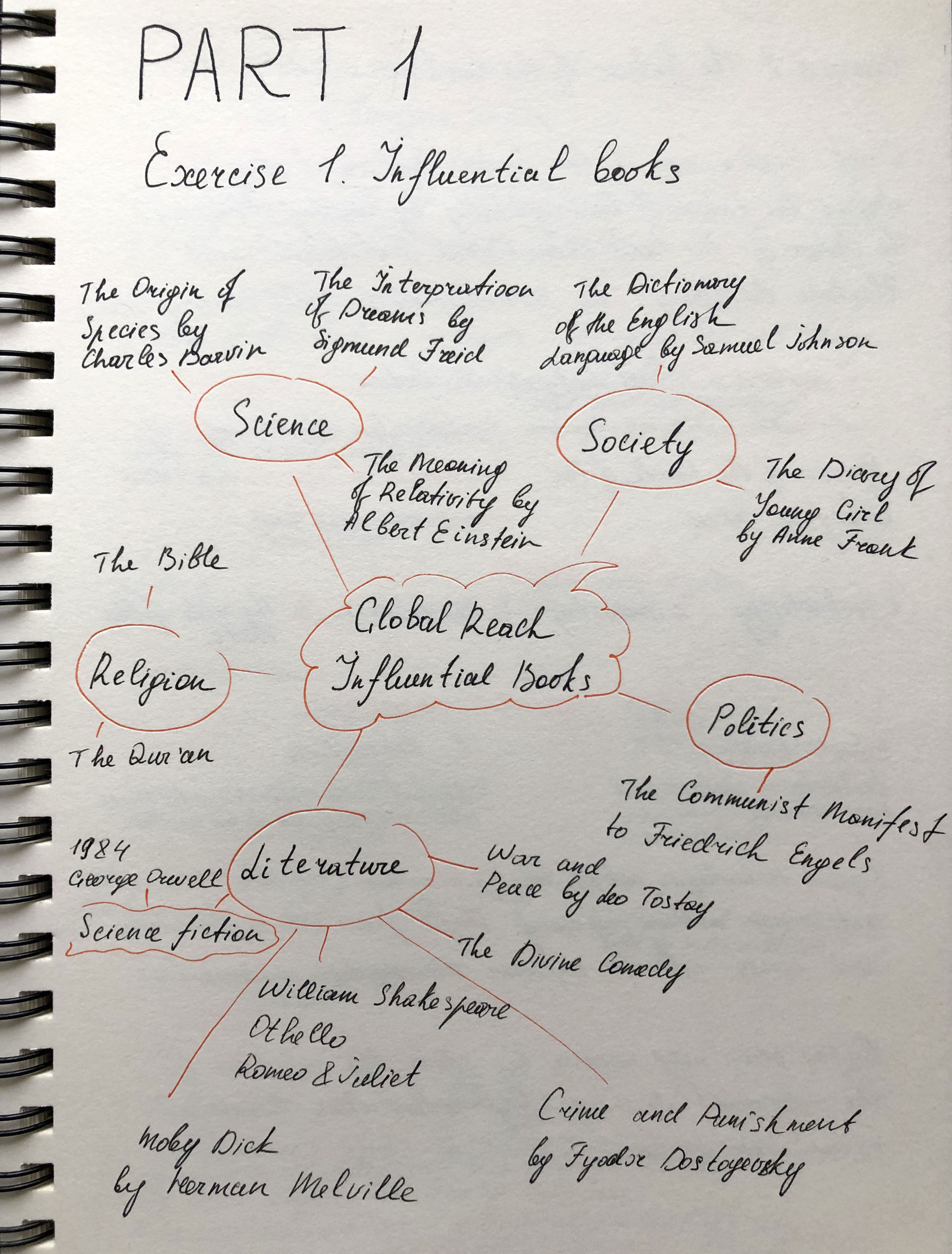
Now, connect your influential books to those with a more global reach. Identify seminal works that have informed or challenged some of the areas you have identified. These may be scientific, artistic, historical, political, geographic, fictional, poetic or religious texts. For example, a book from your childhood could connect to other seminal children’s books by association, such as Heinrich Hoffmann’s Der Struwwelpeter / Shockheaded Peter (1845) or Charles Perrault or the Brothers Grimm. Likewise a book featuring dinosaurs might connect to Charles Darwin’s Origin of the Species.
When we appreciate the breadth and influence of books, we begin to appreciate the extent of a book’s potential impact. Books carry and communicate ideas; powerful messages can be contained within seemingly innocuous bound paper pages. In your learning log, create another list of books, with accompanying images and annotations, which you believe to be more globally important, but connect to your first list in some way.
This activity will feed into your first assignment, so document your ideas in your sketchbooks and learning log to refer back to later.
Researches
Books have always played an essential role in my life. Once I even thought to connect my profession with literature, to engage in a more detailed study of classics and contemporaries that to analyse their works. But later my main interest was in drawing and design, reading become just a hobby. During my school years at the summer holidays, according to the program, we were asked to read at least 60 books on foreign and Ukrainian literature. After all, we had to analyse and write an essay or review for all these works, so it was important to get acquainted with each work personally. I found all the necessary materials in the local and school libraries, at neighbours, friends, or in-home archives, and I did not mind spending another hour reading the book. I enjoyed the tactile connection with the book, turning the pages, always paying attention to what kind of binding was in the book, hard or soft, the quality and colour of the paper, and the smell of book sheets. I read some of the books because I should have known them according to the program, but some books are etched into my memory to this day.
Over time, e-books began to replace printed publications, more and more services began to appear for listening to audiobooks or loading books into an electronic version, which is more economical and ergonomic. In the modern world, a home library is a rarer phenomenon than, compared to 20 years ago when each house had a separate chest of drawers for books. Many book lovers still prefer a printed book to an e-book, but even for myself, I noticed that my last literature purchases were books on design, psychology or recipes, which should always be at hand. New books I read in e- option, faster ordering and no need to store printed copies on shelves in the house.
It was interesting for me to go over the books that impressed me since childhood. Since the age of 6, I have enjoyed immersing myself in fairy tales and children’s stories by such authors as The Brothers Grimm, Hans Christian Andersen, Korney Chukovsky, Charles Perrault, Lewis Carroll. Over time, when I began to grow up, I switched myself to more serious novels, such as “Angelica” by Ann and Serge Gollon, “Robinson Crusoe” by Daniel Defoe, “Anna Karenina” by Leo Tolstoy, “Children of Captain Grant” by Jules Verne, “Notre Dame Cathedral” Victor Hugo, “Crime and Punishment” Fyodor Dostoevsky, etc.
Oddly enough, the modern editions, the books I read as an adult were not that significant or influential for me. The book was already perceived more as a source of information than an authority. Still, I found authors who caught my attention, “Sapiens. A Brief History of Humanity” Yuval Noah Harari, “Eat, Pray, Love” by Elizabeth Gilbert, “Shantaram” by Gregory David Roberts and many others.
Walt Disney Big Dictionary
This was my first book on English, published back in 1993. It mainly consisted of vivid illustrations of cartoon characters with numerous words in Russian and their translation. The book was hardcover, large and very pleasant to study, and I always wanted to return to it. As a child, I considered this book quite difficult, despite the easy-to-learn English words, in my understanding it was a separate science, and the first window into the world of a foreign language, which I did not know at that time. But still, I liked to scroll through it, study the illustrations, the emotions that it conveyed.
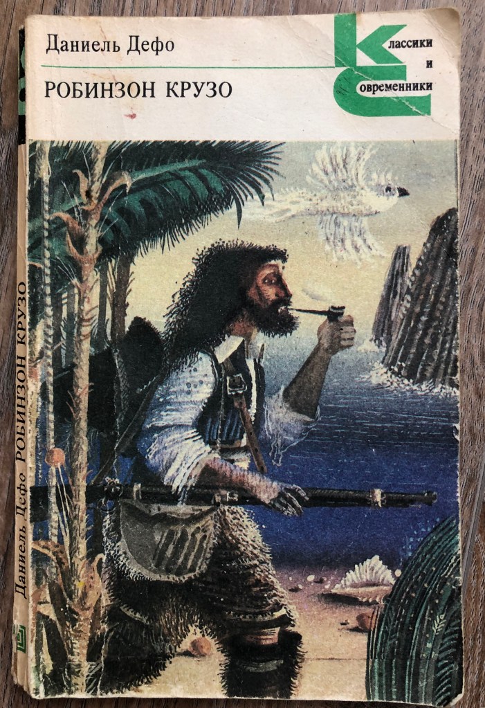
Why is this book important to me? Probably because it was the first discovery of the world of travel and distant islands. Many in childhood would dream of getting to a distant green island, overgrown with palm trees and the singing of wild birds. In my understanding, this book is a visual narration of how fortitude and a thirst for adventure can change a person’s life, the ability to find a way out of a situation. I think this story served as the beginning of my perception of the territory of the Earth, full of mysterious and exotic places, perhaps that is why I dreamed of getting to a distant island from an early age. At the first opportunity, I made a trip to the Maldives and Seychelles. Of course, this was all filled with comfort, compared to the tests that fell to the lot of Robinson, but I was still able to experience the very fact of being on a distant island in the middle of the ocean.
The cover of this book was soft and inside contained some black and white sketches of the work. Another example is that a book can be discreet in design, but the content carries some meaning that makes it memorable.
Fig. 2Robinson Crusoe. Daniel Defoe (1981) Book from home library
Anna Karenina. Leo Tolstoy
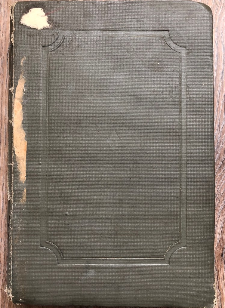
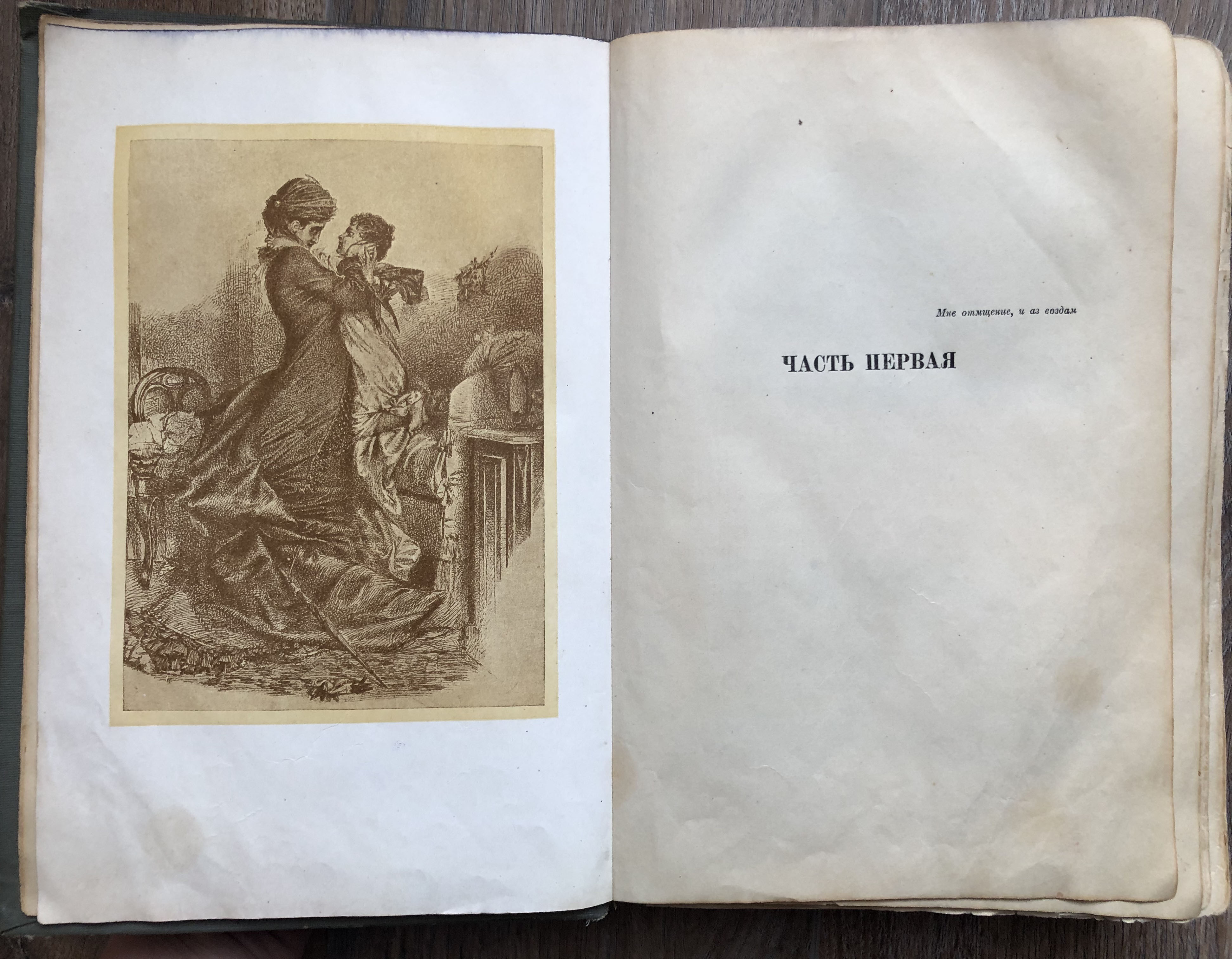
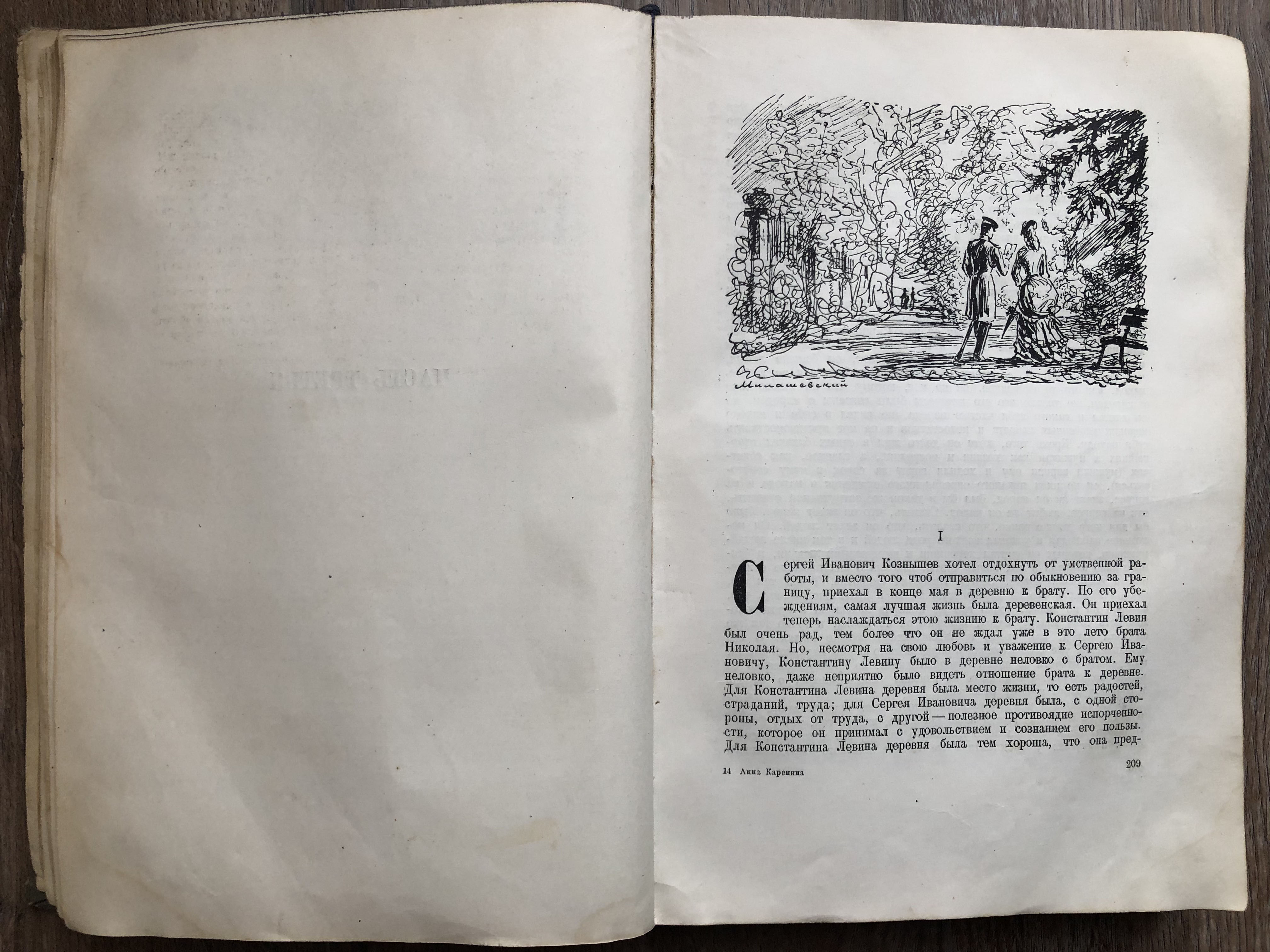
The peculiarity of this book is that I read it at a more mature age, and the publication itself dates back to 1939. The book is voluminous, similar to those that were previously stored in libraries, printed with some of the old printing technologies. The cover in it is hard and a little dull, but that is why this book seemed to be the most tempting to read, it seemed to me that this novel contains a part of history and culture, inside there were pictures in black and white, and in general, it tells a spiritual and tragic story, which will not leave anyone indifferent.
Fig. 3Anna Karenina. Leo Tolstoy (1936) Home Library
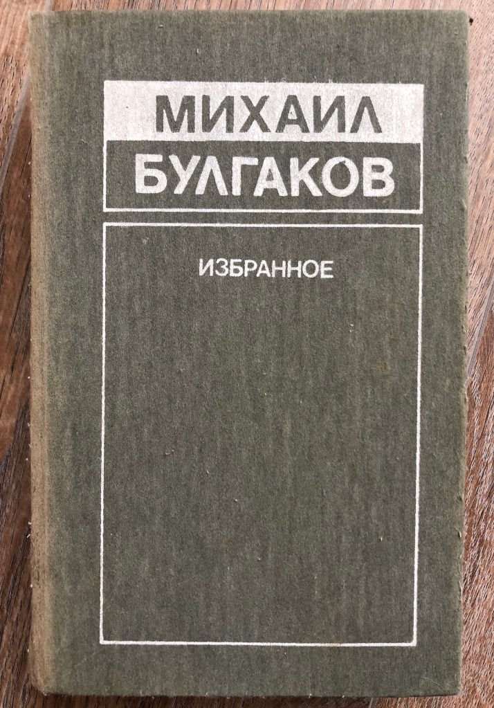
Master and Margarita. Mikhail Bulgakov
I read this copy of the Soviet Union Edition, when it was important to make the cover necessarily hardcover, with minimal decorative filling, and the colours of the covers also varied from dark green, burgundy, grey, the book was supposed to make a solid impression, without any tempting illustrations and registration. I confess I understood this novel only from the third run, the story is very deep and multifaceted, also thick, about 500 pages.
Fig. 4 Master and Margarita. Mikhail Bulgakov (1990) Home Library
Sapiens. A Brief History of Humankind. Noah Harari
This is one of the modern books that I read about 3 years ago. I was attracted by the title of the book, it describes the theory of the origin of man on Earth, how evolution developed, it touches on parts of psychology, history and geography, and human knowledge. If you look at the design and design of the book, then the cover already has a more modern look, a paperback with a small illustration of a fingerprint on a light background. Inside, the author has placed several pages of B history museums and sketches, and the paper itself for reading the pages is whiter and smoother than the books I read at an earlier age.
Shantaram. Gregory David Roberts.
Although in fact, the novel itself takes place in more remote corners of Bombay, in the slums, the book tells the details of the gangster part of India.
Also an example of contemporary literature, a soft, catchy cover with a contrasting print. In general, I noticed that modern authors prefer to place some kind of image or photo, collage on the cover of a book. Restrained and monochromatic thick bindings are no longer as popular as they used to be. It is interesting for me to analyse this book in the sense that when you look at the cover and the beautiful title, the cover exudes a calm and cultural part of India, the Taj Mahal.
To understand how the above books are related to books on a world scale, I first decided to look through the list of those very famous books. They turned out to be at least 100 works from the field of science, psychology, history, sociology and also classical literature. In the Mind Map, I introduced books that I was familiar with personally, with which I crossed paths in one way or another, according to the same school curriculum.
Walt Disney Big Dictionary translation of the famous American edition of Walt Disney Productions, 1971. One of the best picture dictionaries of the English language for children, based on the famous cartoons Disney characters speak English and Russian. The dictionary is compiled on a thematic basis and allows children to learn the words that their American peers master in the first years of their lives. I see the connection of this book with A Dictionary of the English Language by Samuel Johnson, considered the most influential dictionary of the English language. Credited as the foundational text for the study of the English language and lexicography, Johnson’s dictionary was not the first of its kind, but it was the most comprehensive and well-researched.
Robinson Crusoe. Daniel Defoe’s novel became a literary sensation and spawned many imitations. He demonstrated the inexhaustible possibilities of man in the development of nature and in the struggle against a hostile world. This message was very consonant with the ideology of early capitalism and the Enlightenment.
The name of the protagonist Robinson Crusoe has become a household name, a kind of “survivor symbol.” But was Robinson the first survivor of world culture? I can see the connection of this book with many films that were produced in modern times. But the origins of Robinsonade coming from the ancient story “Tale of Haye, the son of Yakzan”, which was written in the Middle Ages, in the XII century. Its author is the Arab poet Ibn Tufal. The book tells the story of a boy who has been living in the wild on the island since his birth. A lama helps him to survive, which feeds him with her milk. From the plot of this Arab story, we can conclude that the motives of “Robinson Crusoe” and “Mowgli” intersect in it. Many motives of “Robinson Crusoe” are intertwined with the story of Ibn Tufal.
Anna Karenina, novel by Leo Tolstoy, published in instalments between 1875 and 1877 and considered one of the pinnacles of world literature. Indeed, too many readers, including Tolstoy himself, it signalled a radical shift in the already impressive history of the novel as a literary form. With its sweeping and complex plot lines, subtle characterisations, and blend of romance and social commentary, Anna Karenina is often mentioned in the same breath as Cervantes’s Don Quixote (1605) and Laurence Sterne’s The Life and Opinions of Tristram Shandy (1759-1767), both of which have permanently altered and defined the novel. Indeed, these books reset the standard for novel writing. In the final and tragic act of Anna’s suicide, readers recognise the theme that Tolstoy has been building towards: Anna’s love, like that of Shakespeare’s Desdemona or Thomas.
The Master and Margarita is now recognised as one of the finest achievements in 20th-century Russian literature. Witty and ribald, the novel is at the same time a penetrating philosophical work that wrestles with profound and eternal problems of good and evil. By turns a searing satire of Soviet life, a religious allegory to rival Johann Wolfgang von Goethe’s Faust, and an untamed burlesque fantasy, this is a novel of laughter and terror, of freedom and bondage.
Sapiens: A Brief History of Humankind. The book surveys the history of humankind from the evolution of archaic human species in the Stone Age up to the twenty-first century, focusing on Homo sapiens. Harari’s concept of a “cognitive revolution” reminded me of he Origin of Species by Means of Natural Selection, Charles Darwin. This work by Darwin laid out the foundation for the theory of evolution. Since its publication, the book’s theories and observations have helped make life sciences what they are today. Darwin’s adaptation and evolutionary model still aid modern scientists as they build a better understanding of all Earth’s species, including our own.
Shantaram is a novel by Gregory David Roberts, in which a convicted Australian bank robber and heroin addict escapes from Pentridge Prison and flees to India. The novel is commended by many for its vivid portrayal of tumultuous life in Bombay.
Stepping away from stories about life in prison and instead focusing on books that have similar writing styles to Shantaram, The Alchemist by Paulo Coelho is undoubtedly a great book to read for lovers of Shantaram. The main plot is taken from European folklore: according to the classification of folklore plots by Aarne-Thompson-Uther – plot 1645 “Treasure of the House“. A typical representative is the English fairy tale “The Pedlar of Swaffham” (“The dream of a peddler”), as well as one of the episodes of “A Thousand and One Nights“.
Conclusion
The task in my understanding turned out to be very interesting and informative, I have always paid special attention to books and world literature, here you could find out the opinions of other authors, plunge into the research or fictional world of writers. So, thanks to a little research, I was able to draw a parallel of some of my favourite works with stories written in ancient times. So for myself, I was able to connect such works as Robinson Crusoe and Mowgli, or Anna Karenina with the works of Shakespeare, and in the bark of the book The Master and Margarita, there is a similar story of Faust. Hope my introductory research will help me with my first assignment.
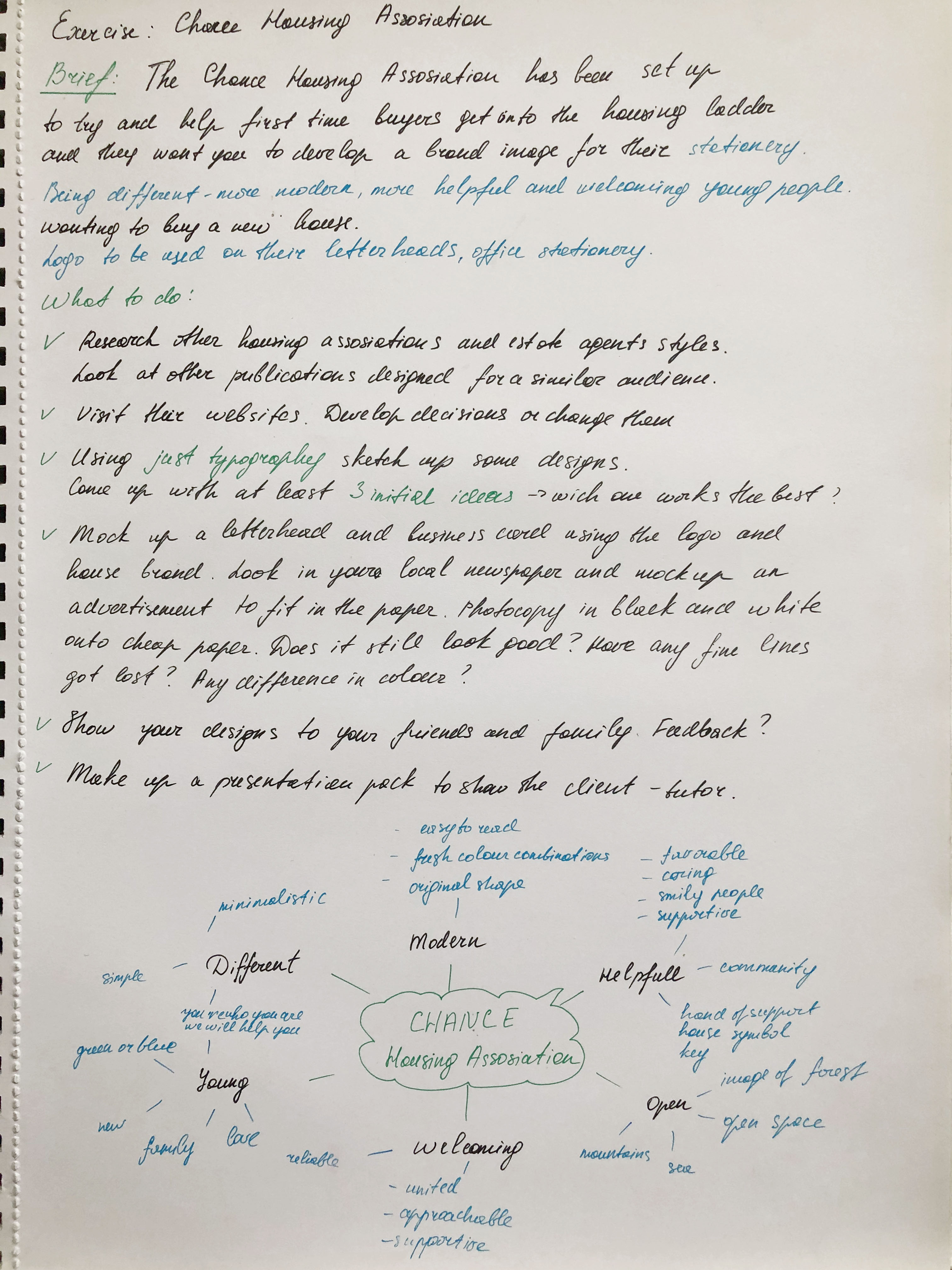
This final assignment is an opportunity to consolidate the understanding you’ve gained so far, reflect on the work you’ve enjoyed and your achievements. It allows you to create certain parts of the brief yourself so that you have the maximum capacity to show off your interests and talents. Choose one of the briefs below. Then work through the design process, researching and visualising a range of ideas before critiquing your work and choosing your selected design to present as print ready artwork.
Brief 1: Book design Penguin Books have asked you to design a new house style for a collection of books on design for children and young people. They are starting with three titles: Colour, Typography and Photographs. You will need to produce three covers (front, back and spine). The designs will need to be recognised by readers as a series and at the same time be appreciated on their individual merits. The book dimensions are 190mm wide by 225mm high. In addition they have asked you to produce the one on typography called A is for… It doesn’t have to be a conventional text book. Create an introductory chapter of at least 4 pages that is visually interesting and will entice young people into wanting to buy the book and read more about the fascinating world of typography.
Brief 2: Promotional design A youth theatre club is performing a production of Abigail’s Party. Mike Leigh’s tale of suburban taste is set in the 1970s and explores middle class aspirations and preoccupations. You will need to acquaint yourself with the play if you don’t know it already, as they are particularly keen for it to have a 70s feel. The play will be touring local theatres for a month, performing every Friday night and Saturday matinee. Produce a poster (A3 portrait), a flyer (A5 landscape, double-sided) and newspaper advert (A6) to promote this event. In addition they would like their A5 programme cover to continue the design theme. For the purposes of this brief you need to invent dates, times, places, names and any other information you think will be required. Use Lorum Ipsum text for areas of body text.
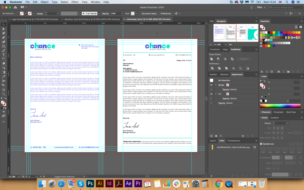
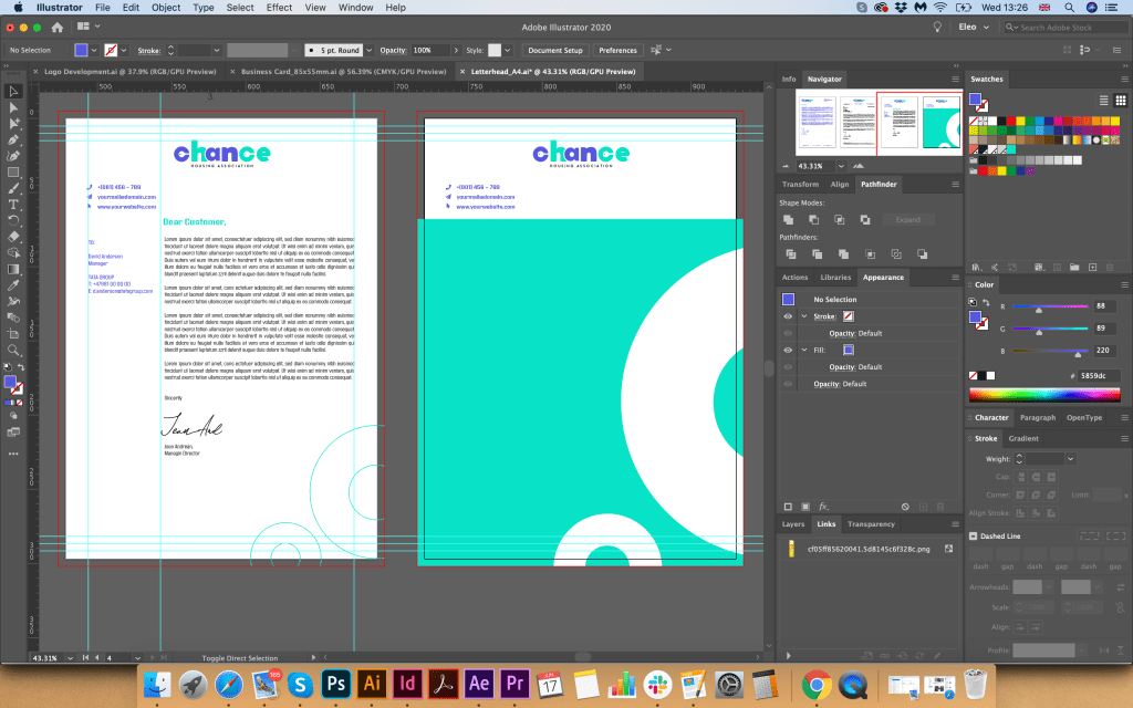
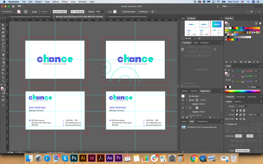
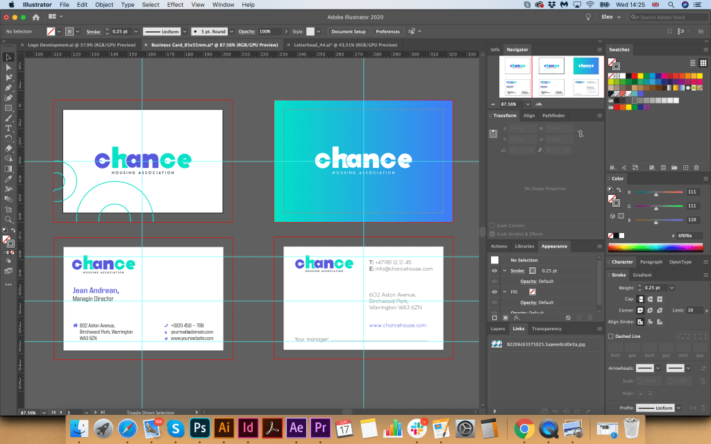
Brief 3: Charity work The Gerald Anthony Furniture Store is a charity that helps poor and displaced people furnish their homes with the basics. It has been running for over 100 years, staffed mostly by volunteers. They would like you to design a generic business card, letterhead, and paper mock up for the home page of their website. In addition they want you to design their 8 page annual review. The review will consist of: • front cover • inside front with a bit of blurb about their history (90 words) • the chair’s report (365 words) • the co-ordinator’s report (300 words) • the treasurer’s report ((260 words) • a graph or design to show the breakdown of income and expenditure Income Expenditure – local authority grant £48,927 – direct charitable expenditure £113,192 – grants from trusts £66,750 – fundraising costs £6,655 – donations £14,655 – management and administration £10,924 – other £4,032 • a page giving the names of the main grant funders (20 in total with each name about three words long) and a list of the management committee: chair, treasurer, co-ordinator secretary and five other members, • the back cover with an advertisement to encourage people to volunteer. Maybe the biggest challenge of this brief is to solve how to break up and lay out the text in the 8 page document. Photographs will need particular care as some people who benefit from the charity may not want to be identified.
OCA Graphic Design Core Concepts
Abigail’s PartyResearches
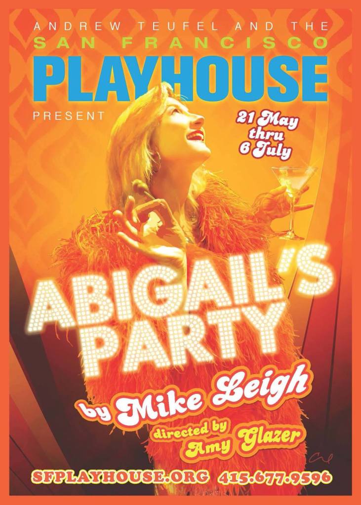
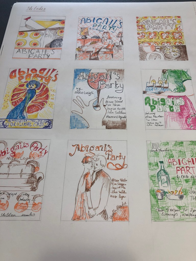
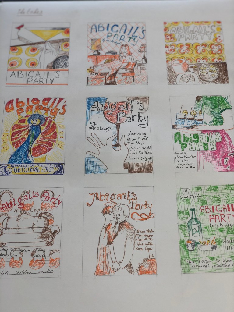
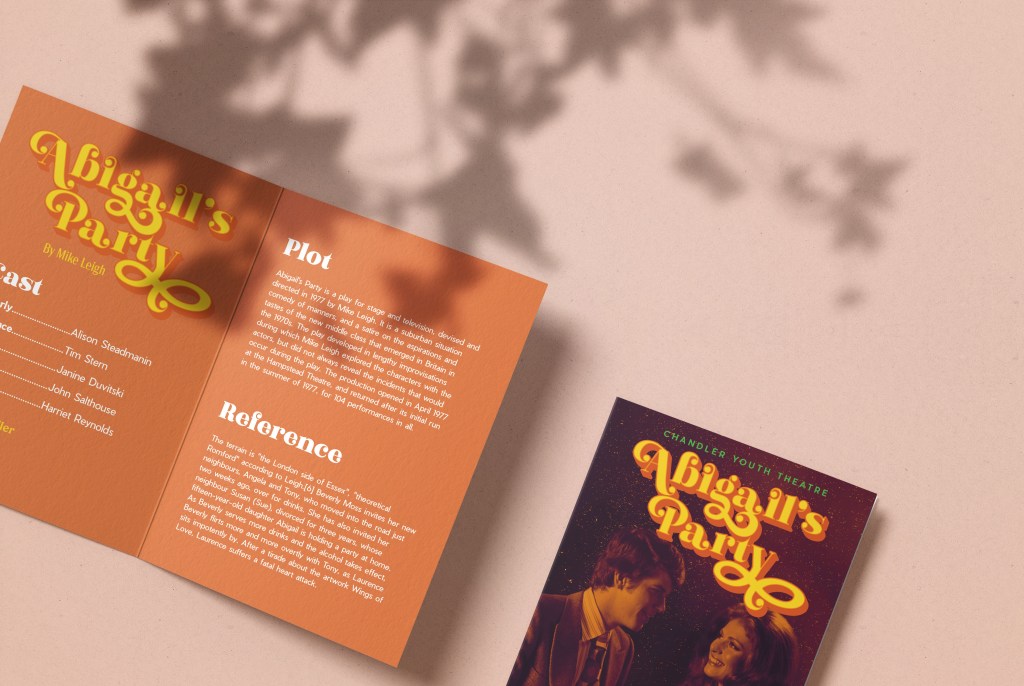
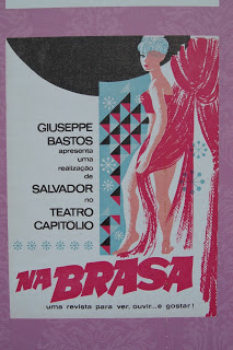
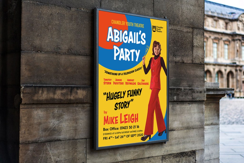
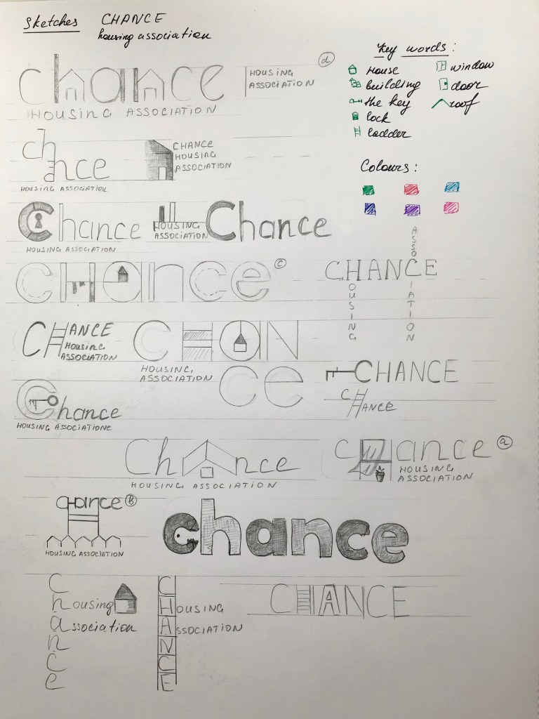
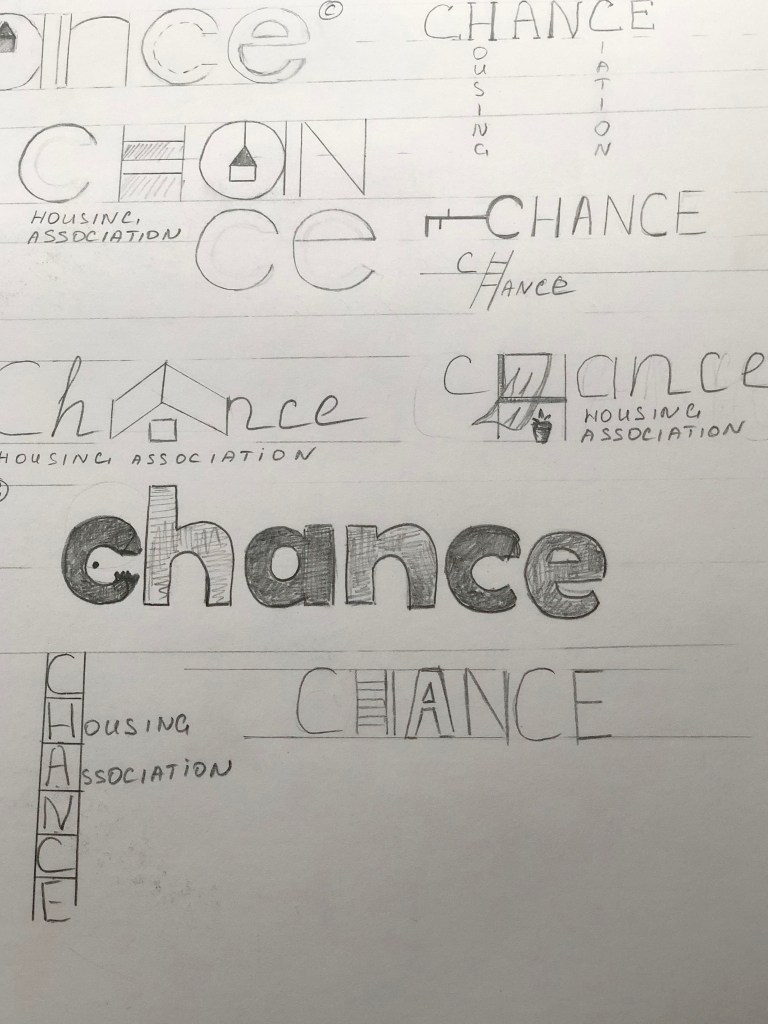
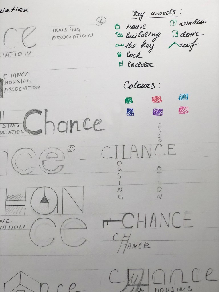
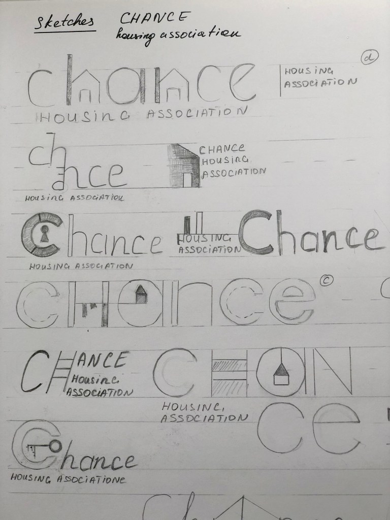
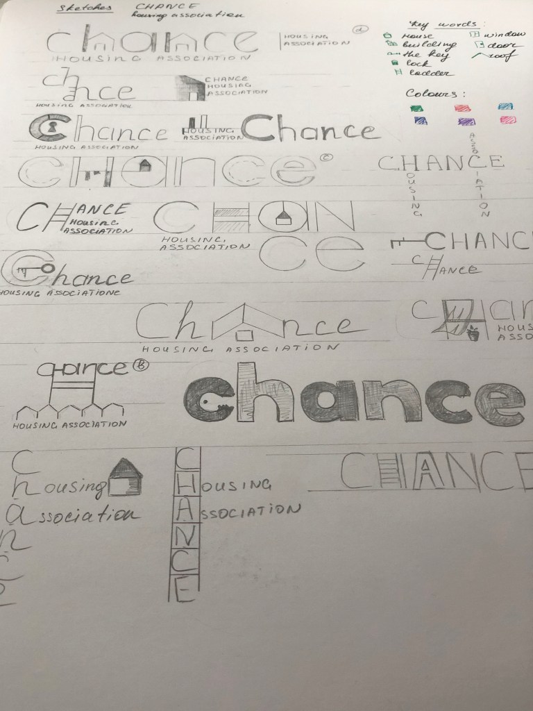
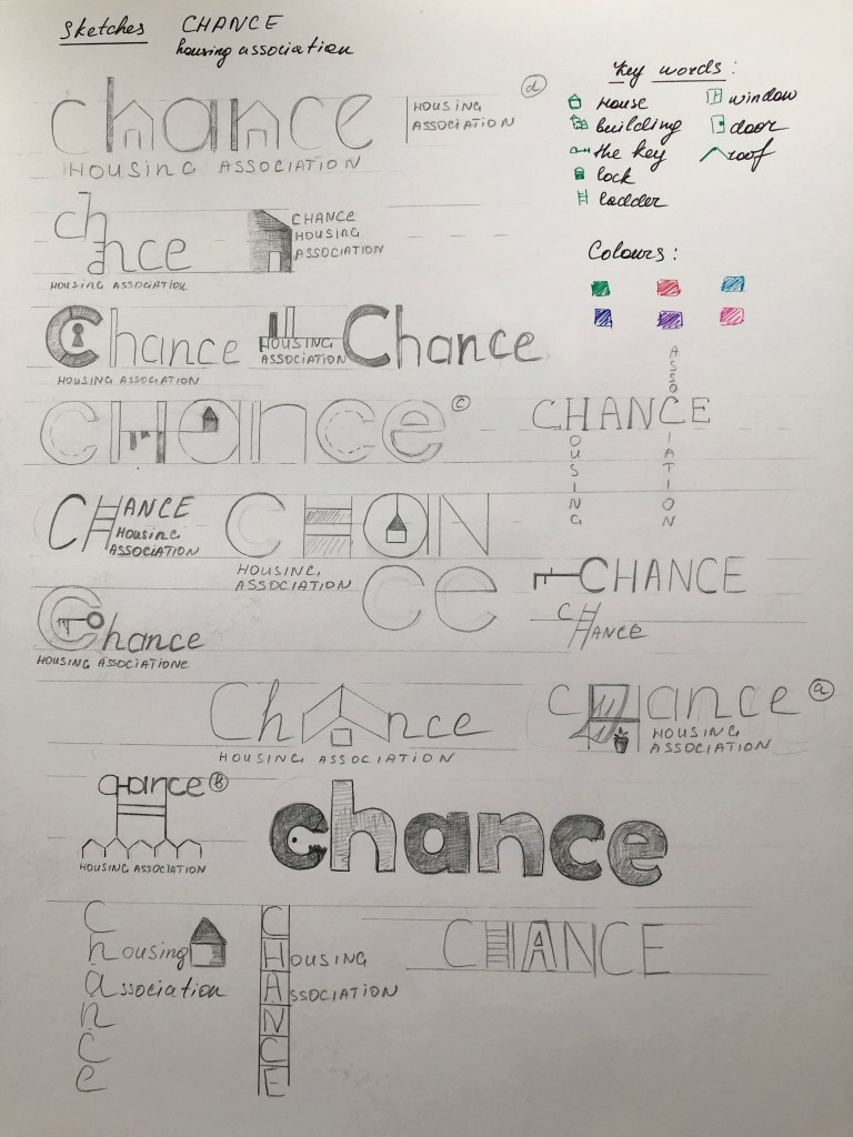
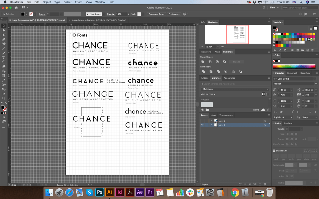
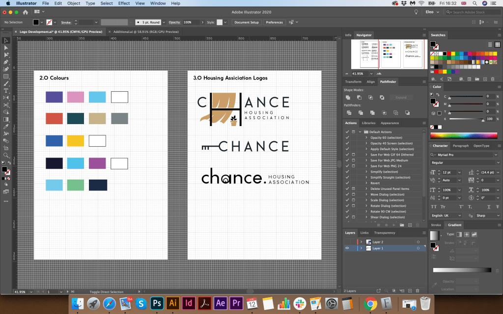
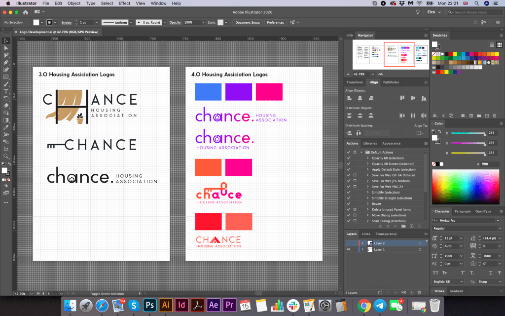
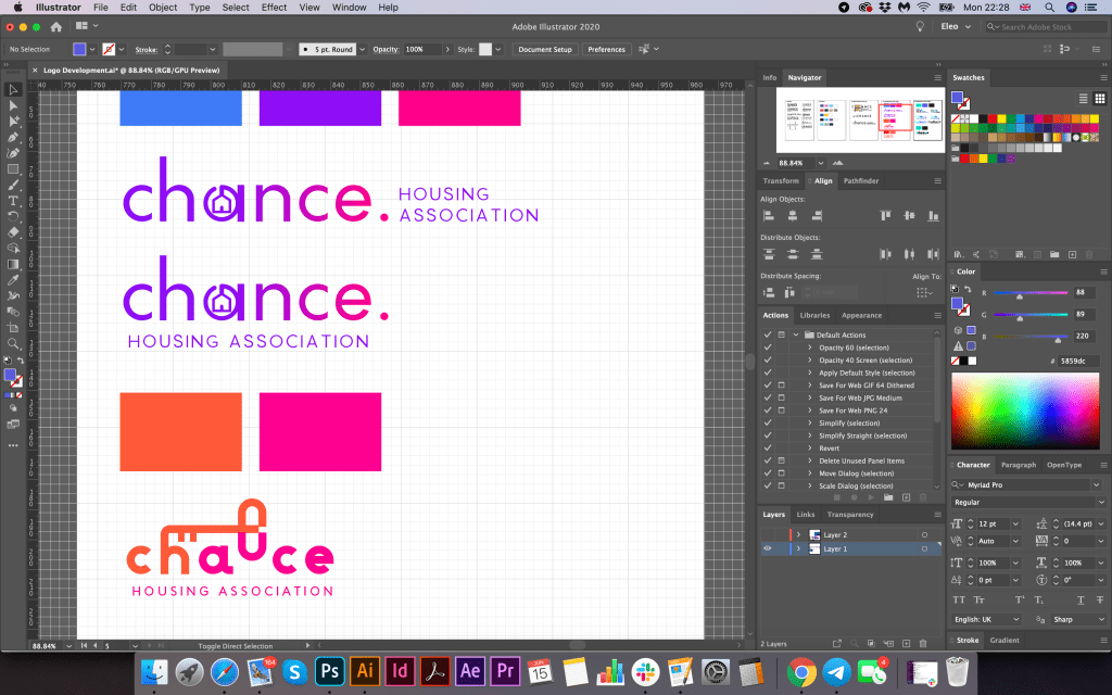
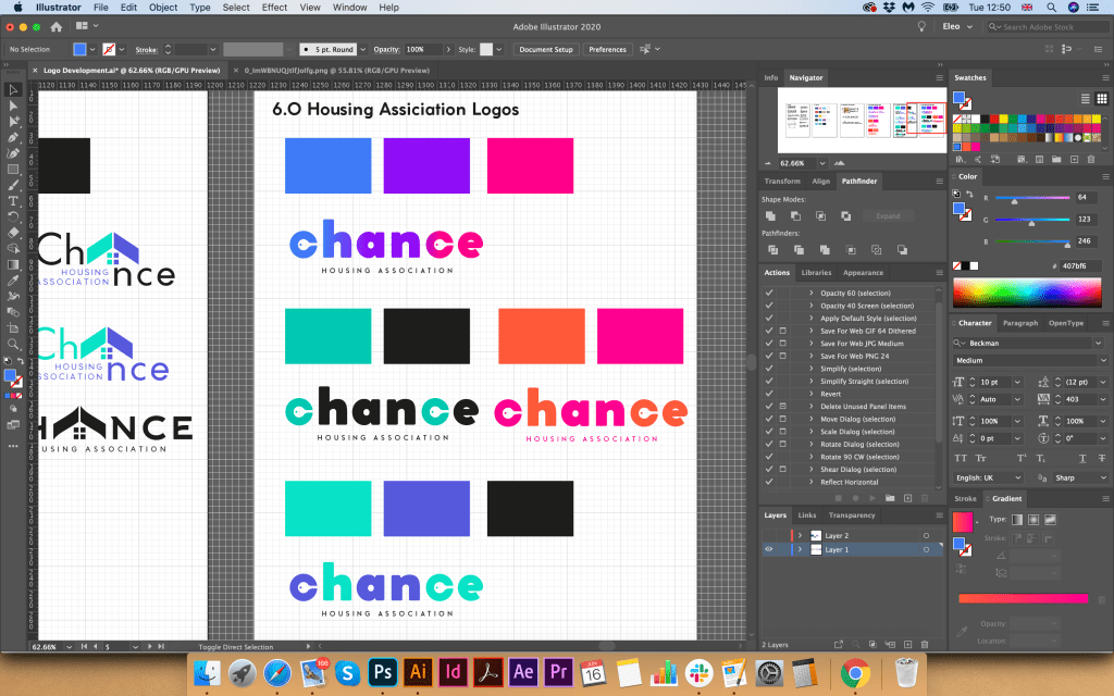
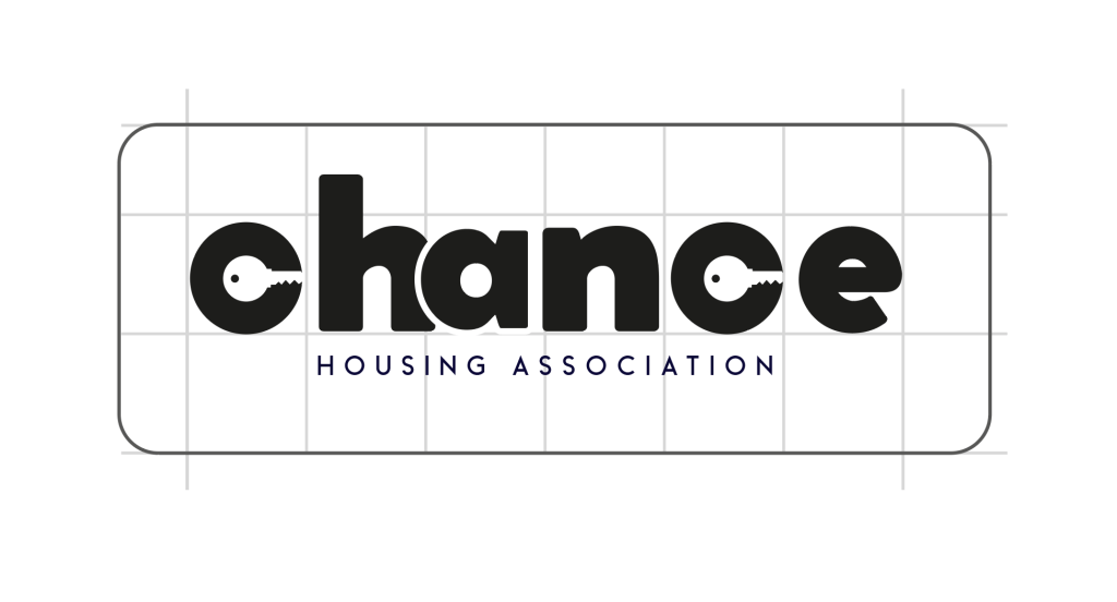
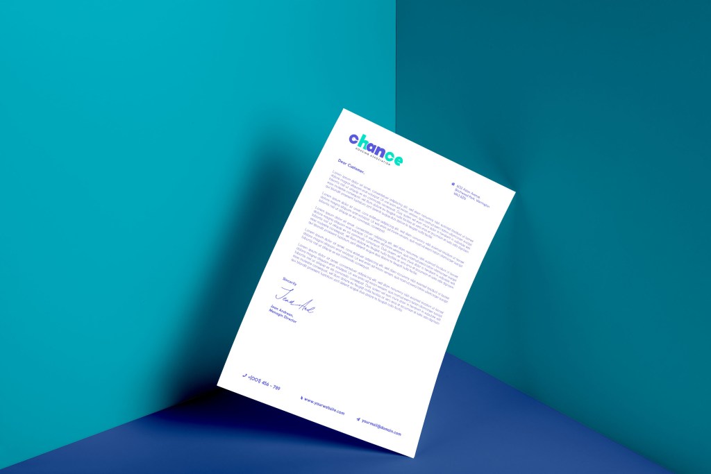
For the final fifth assignment I had a choice to decide which one of the brief is the most attractive to me. I would probably say that I went to the choice of the theatrical poster “Abigail’s Party” with no doubts. The reason why I’ve deiced to design “Abigail’s Party” poster because it has a feel of 70’s that my future design potentially could bring. It has some original themes, colours, and shapes, that I have not discovered before. My original thoughts were that I’ve done book cover design earlier, where I produced some designs for the Michael Bulgakov books, the branding for the charity organisation “Chance” was done recently as well, but in the case of “Abigail’s Party” I had an opportunity to create my own vision of the 70’s theme, something new to try. That style, starting from the colour shades of orange to brown, with some additional colours of pastel green and blue, the feel of theatre, acting and performance, the art-deco style in some design elements, was all that would catch my attention to produce designs straight away. The challenge that I had was based on the fact that I’ve never heard of those BBC series, or have never seen that performance itself, so first of all I need to familiarise myself with the play online.
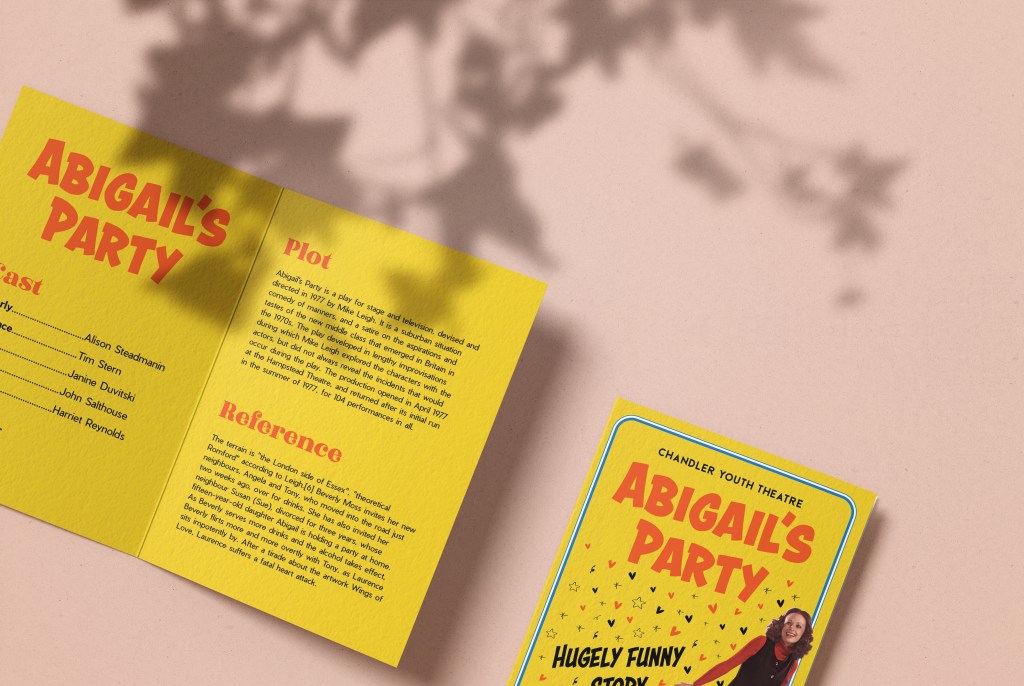
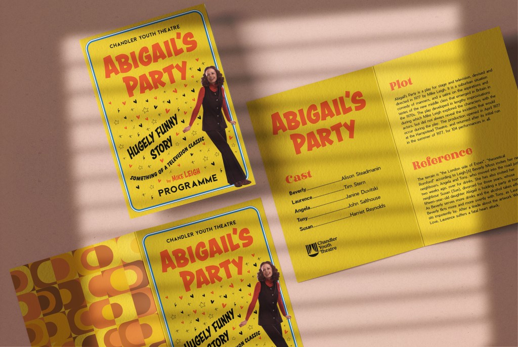
Abigail’s Party is a play for stage and television, devised and directed in 1977 by Mike Leigh. It is a suburban situation comedy of manners and a satire on the aspirations and tastes of the new middle class that emerged in Britain in the 1970s.
The story itself sounds like as satire, with aspirations and tastes of the emerged middle class families from 1970s.
I had some researches online, and I found that the story about woman calls Beverly Moss who invited her new neighbours, Angela and Tony, who moved into the road just two weeks ago, over for drinks. She has also invited her neighbour Sue, divorced for three years. Sue’s fifteen-year-old daughter Abigail was holding a party at home. The party starts off in a stiff, insensitive, British middle-class way gather. The tension escalates when Beverly and Laurence start sniping at each other, and some issues in their family could be seen. As Beverly serves more drinks and the alcohol takes effect, Beverly flirts more and more overtly with Tony, as Laurence sits impotently by. During the all performance could be see Sue’s anxiety over her daughter’s party. After a tirade about the artwork Wings of Love, Laurence collapses a fatal heart attack.
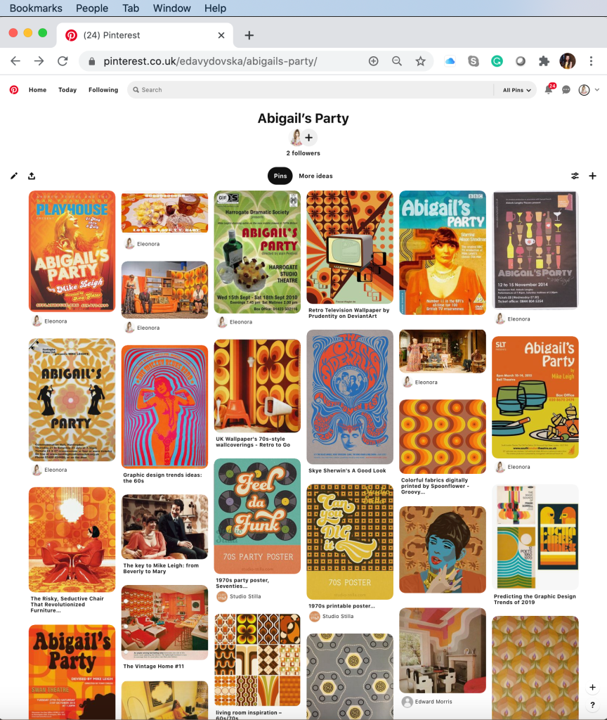
After my primary researches on the scenes, I proceed to the usual Pinterest Mood board creation. I’ve gathered all photos from the play, illustrations for the similar subject posters, also some geometrical parts from the ’70s. It helped me to pick up some inspiration and feel of the art from that decade. I really loved those warm colours that designs could bring, the dominating colour was orange, yellow and brown, with dynamic decorative fonts, in the style of disco. I tried to find some new ideas from the 1970s in general, where I found lots of psychedelic creative posters with unusual compositions and wonky fonts placed in circle composition or in angle. I’ve learnt lots of patterns that I could apply to my designs, and some cartoon style objects.
Examples for theatre poster
Further down in my researches I wanted to analyse closely how artists approached similar brief. As far as I could see there were numerous representations of original Mike Leigh’s version from 1977, and the performance was covered by different theatres on modern times.
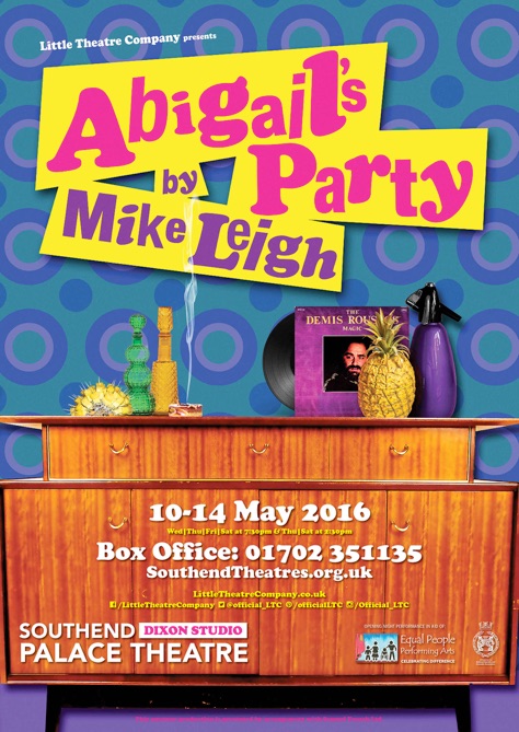
I could see how different designs were, and the way they stand out individually. For example, the feel that Southend Theatre brought was a visualisation of house interior from the ’70s, with some round shapes wallpapers and dynamic different angle font. In this poster, I really loved the brightness of the colours, and their contrast, I think it had a similar approach as magazine’s about gossips would do, to attract potential customer attention. Which was definitely achieved in this poster.
Another design with polaroid photos had the feel of film advertising, it had a more modern feel, the photos themselves looked quite modern, maybe because of the layout that they were placed, and font’s choice was quite modern as well, narrow and san-serif. Advantage of that poster was the clarity of reading the information.
Poster with vector illustration only is one of my favourites in this collection. I was surprised how those minimalistic elements, with an object in black outline, could work for the theatre poster from South London. Space was divided into two parts, and the elements of the still life are quite balanced in here. The name of the play probably as too small in my preference, maybe that composition itself looks too static, but I think that was the idea of design itself. Overall this poster works well from my point of view.
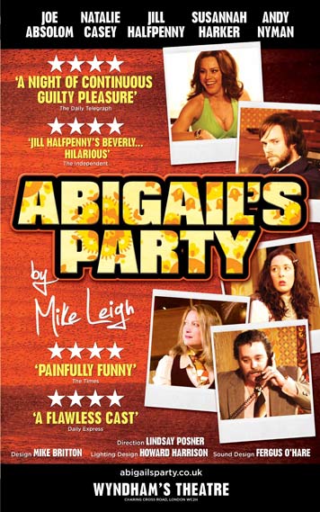
The fourth poster probably was made in the most professional way from my point of view. It has an original font for the name of the play, with some shiny light around it, it has needed background with traditional ‘70s pattern, the main character Beverly is cheerful and enthusiastic. But the main point of that poster is that it has that melting combination of the modern poster with the ‘70s feel, as we don’t want to go to old-fashioned, but we still want to bring the feel of the performance.
1970’s Inspiration
In additional to my researches about theatrical poster style I went to the Bridgman images for some famous art to catch up with original style of artists from the ’70s. I’ve noticed that mainly where used some of the warm brown shades with some original shapes. That image below was created by British artist of his generation Gerald Laing (1936-2011). His paintings of film stars, dragsters, and other icons of popular culture place him as a major figure in both the British and American Pop art movements.
Sculpture in the Landscape, 1973 (colour litho)
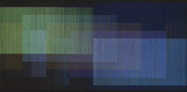
These are another interesting example’s from innovative Venezuela’s artists Carlos Cruz-Diez and Blue-Green by Mexican artist Gunther Gerzso. Carlos Cruz-Diez was an artist and member of the Op Art movement whose work focuses on the kinetic energy of color. I thought they are another examples of art that stands out from 20’s century, where could be seen that artists were experimenting with colours and shapes.
Physichromie No, 1970 (mixed media on board)
Blue-Green, 1970 (oil on masonite)
Another example one most influential 20th-century furniture and interior designers Verner Panton. During his career, he created innovative and futuristic designs in a variety of materials, especially plastics, and in vibrant and exotic colours. I love his experiment with vibrant colours and unusual shapes.
These are more recognisable shapes and colours from ’70, those colours and shapes were used mainly in the people’s interiors, like on walls, decorative elements, or sometime even on clothes.
Source Pinterest Images
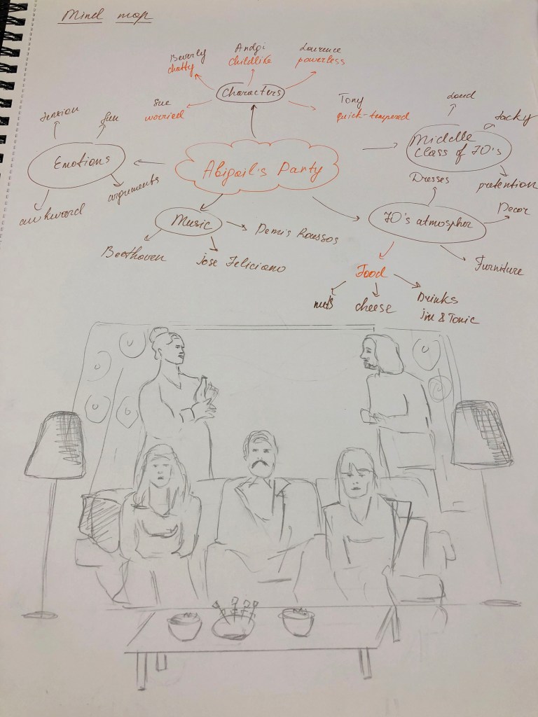
After my researches on the plot of performance, the characters, some examples of artwork that was used by other theatres, and influencers from 1970’s I felt that I’m ready to go to the next stage, creating mind map and some conceptual ideas for my poster.
Analysing the brief
Then I started analysing the brief. Here I followed the standard path, I needed to write out the keywords and tasks for this exercise. In total, I need to prepare materials such as:
Poster A3 (portrait)
A flyer A5 (landscape, double-sided)
Newspaper advert A6 to promote this event
In addition, the A5 program covers to continue the design theme.
Another important part of the brief was to understand the characters. I felt I needed to get inspiration from the performance, to get the feel and vibes that this play had. I wrote down all characters into my brief, and overall I had a visual portrait for each person. I’m glad I watched the play, as otherwise, I wouldn’t get the right impression from this performance. Logically, the word ‘Party’ would lead you to some kind of fun, relaxed comedy, with some conversations that people would have while they serve drinks and chat, but originally that play had some tension, some hidden personal issues could be seen in the characters. The atmosphere was quite awkward, and other features that could be seen from the performance. I’ve noticed that each actor brought there originality and personality, they were completely different kind of people gathered together. For example, Beverly, chatty, nosy, she used to get what she wants, quite insensitive, she enjoys herself and loves being in the centre of attention. While her neighbour Sue was not feeling comfortable in that environment, felt anxious over her daughter’s party, she can’t say no to something, even when she doesn’t want to do it. Angela is childlike, not confident, listens to her husband’s opinion, who has a sort of influence on her. Angela’s husband Tony is irritable, moody, annoyed with her wife, polite to other people, but quite aggressive to Angela. Laurence, Beverly’s husband have completely different taste on music, art with his wife, which is quite common in the families, but they tend to argue over it, and Laurence lost his temper about it, which affected his heart at the end of the play.
I have created few mind maps, one helped me to understand connections in the play, and some key factors in it, another one was main Mind Map with some ideas I could use in my sketches and future designs. I was thinking about what would I like to picture, wether it was to show some emotion in that poster, how many characters I want to use in design. I asked myself if I want to use some interior elements in my poster? What colours is this poster going to be? In the next part, with producing some sketches I was going to answer this questions.
Sketches
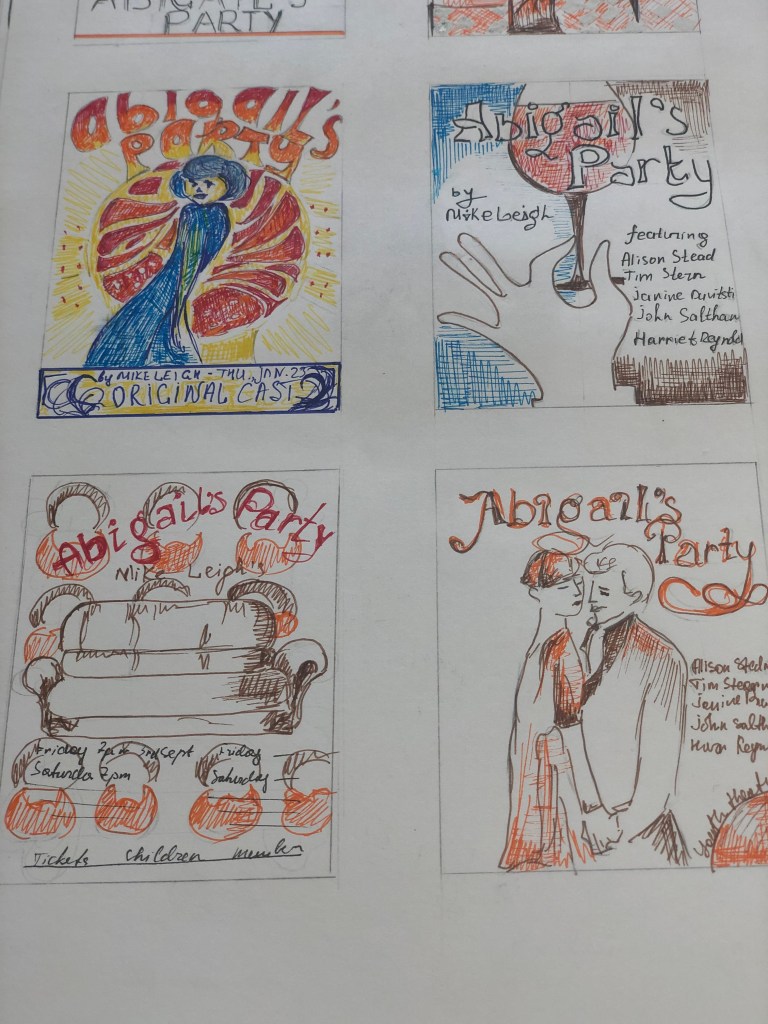
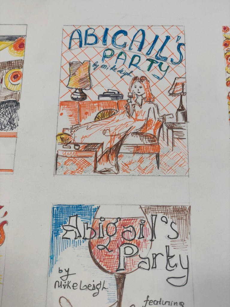
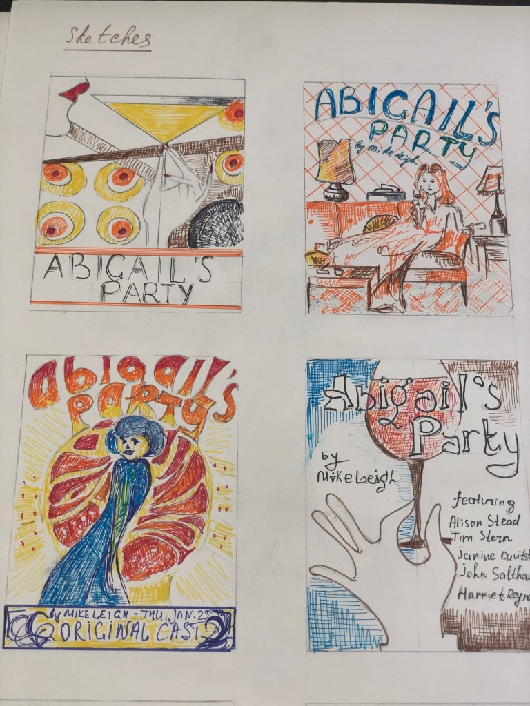
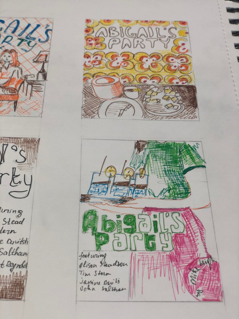
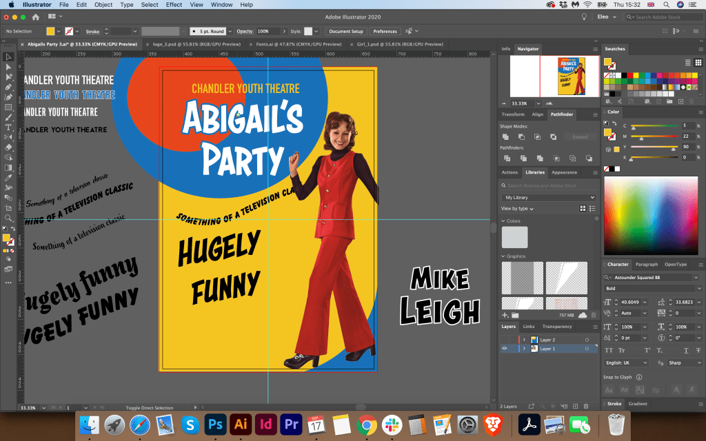
The next stage was to sketch my designs. I understood that they would help me to finally decide on the style of the future layout. I sketched some of my layouts using coloured pens. This technique helps me bring together some of the colour schemes in one layout, like yellow, orange combined with green or blue. I made the first sketch in art deco style, with straight lines and design elements from the ’70s, based on the image of an elegant girl with a glass of Martini. The composition itself is quite interesting, but it seemed to me that it does not reflect the spirit that was required in a brief. My next sketch is based on the image of Beverly sitting proudly on the couch, a full-colour image with a bold blue font for the title. But here I had a challenge if I could find a similar image, with the appropriate style. On the next layout, I depicted a table with appetizers and snacks, because so many details were given in the theatrical production to these appetizers, cheese, nuts, olives and gin and tonic. I also had an idea to portray a merry Beverly against a background of colourful elements in the style of the 70s, but perhaps here I would have needed to draw all parts of the design by hand since the idea was to display the design in vector. Also in my drawings, there was an idea to display a hand with a glass of wine, or an event guest with drinks. Also in this production, all the events took place around the brown leather sofa, which I thought to use in this layout. And lastly, a design with a dancing couple, as this production culminates in flirtation and sympathy between Beverly and Tony. I was not sure in what angle I would find the photograph I needed, but there was such an idea to display two people sitting in front of each other or dancing. I noticed that basically most of the posters from the internet showed only one girl taking in, I thought, what if I display a couple?
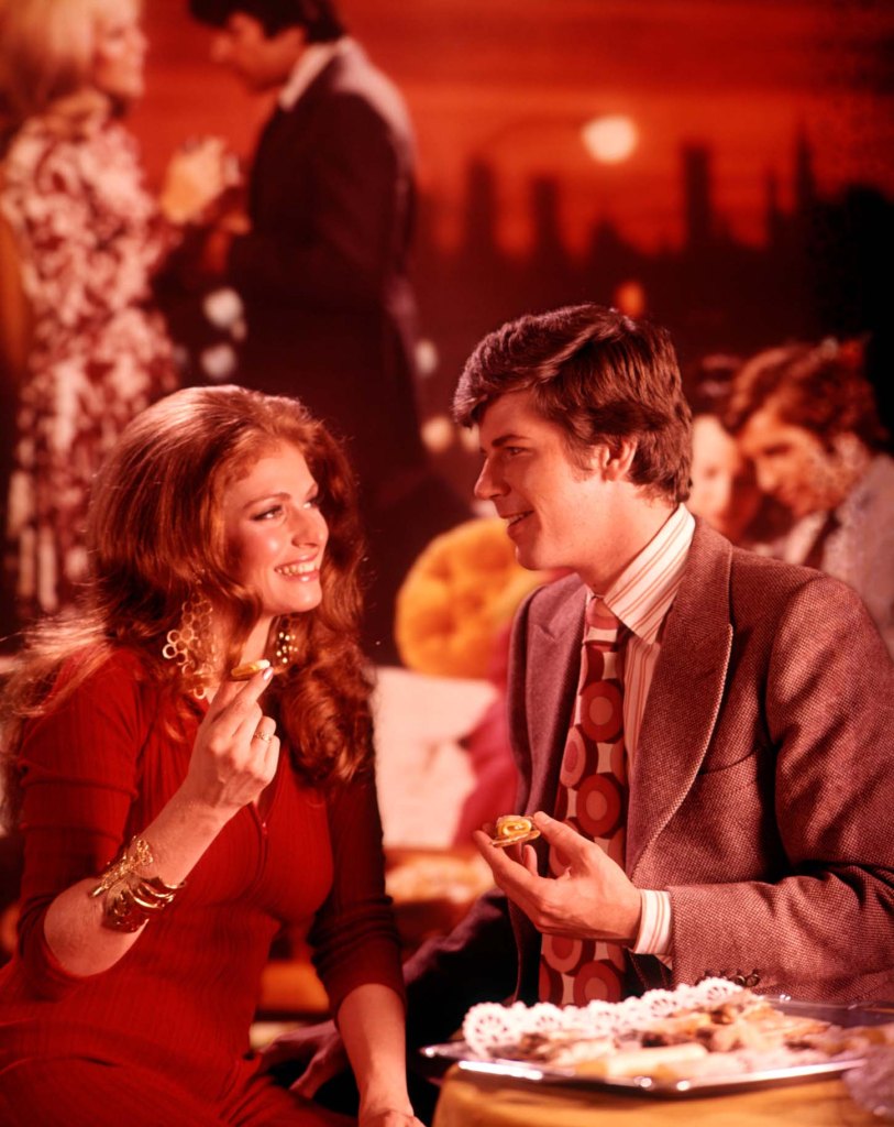
Then I was challenged to find the required photo of the couple. I recently discovered Alamy’s photo resource where you can find retro images. My attention was drawn to the photos of parties from the ’70s, where the girls were dressed in bright outfits, and the men were dressed in business suits and ties. I chose this photo for the future design, I liked the atmosphere in this poster, it is a little playful for this performance, but I planned to play this photo in colour to add more 70s style.
Then I was challenged to find the required photo of the couple. I recently discovered Alamy’s photo resource where you can find retro images. My attention was drawn to the photos of parties from the 70s, where the girls were dressed in bright outfits, and the men were dressed in business suits and ties. I chose this photo for the future design, I liked the atmosphere in this poster, it is a little playful for this performance, but I planned to play this photo in colour to add more 70s style.
G6A74X 1970s YOUNG COUPLE MAN AND WOMAN EATING FINGER FOOD AT A PARTY
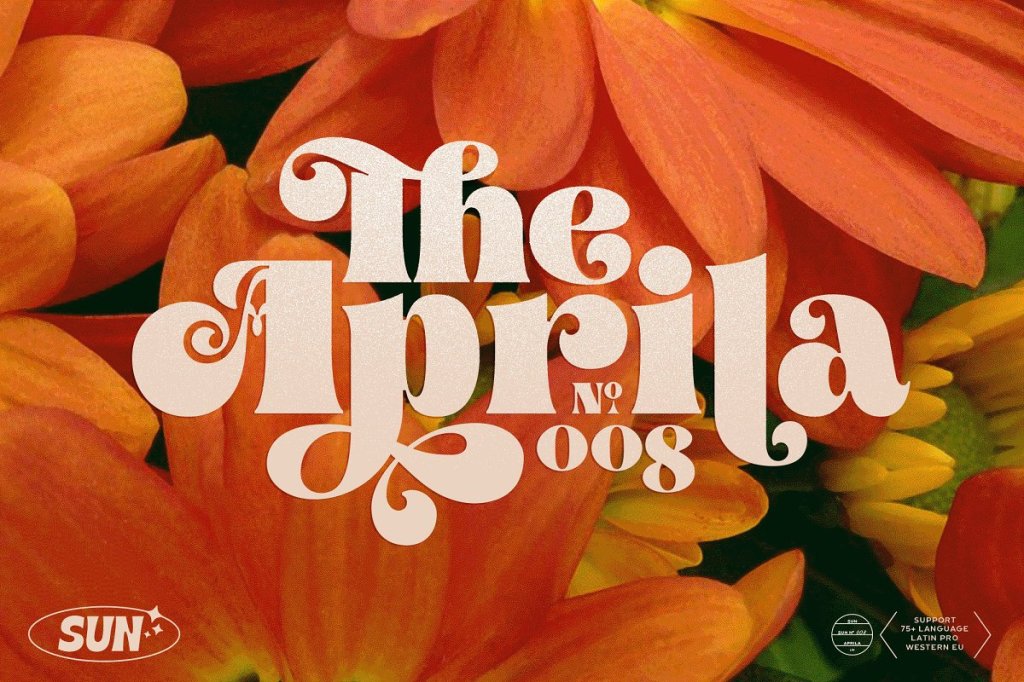
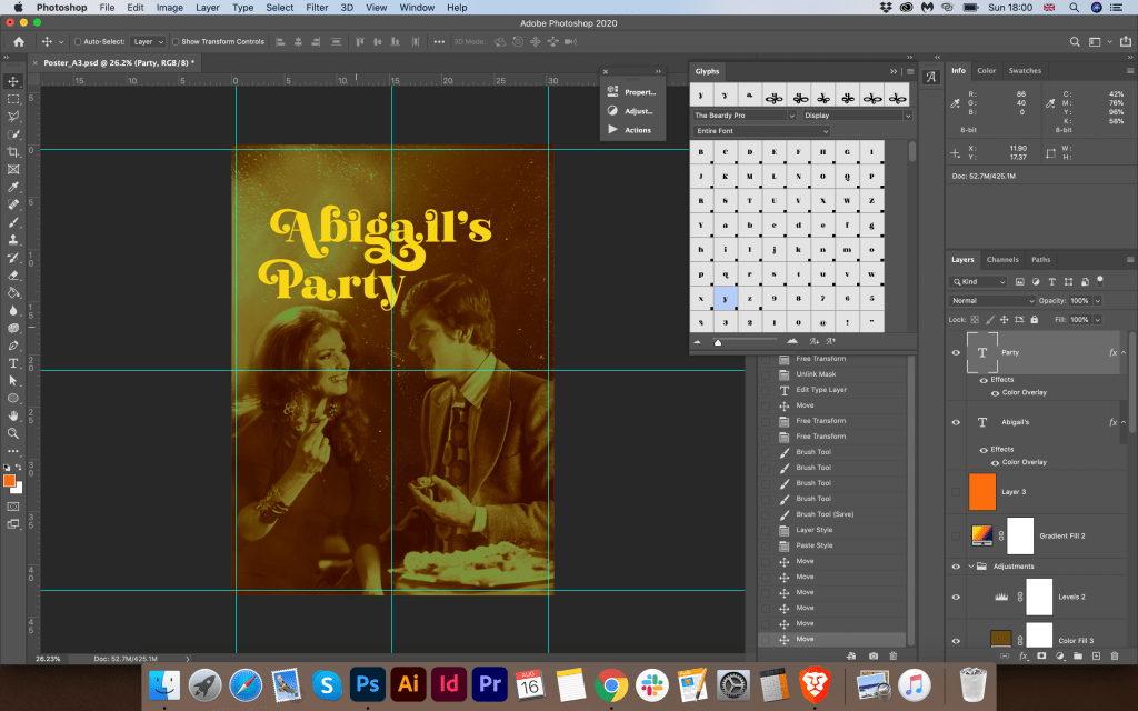
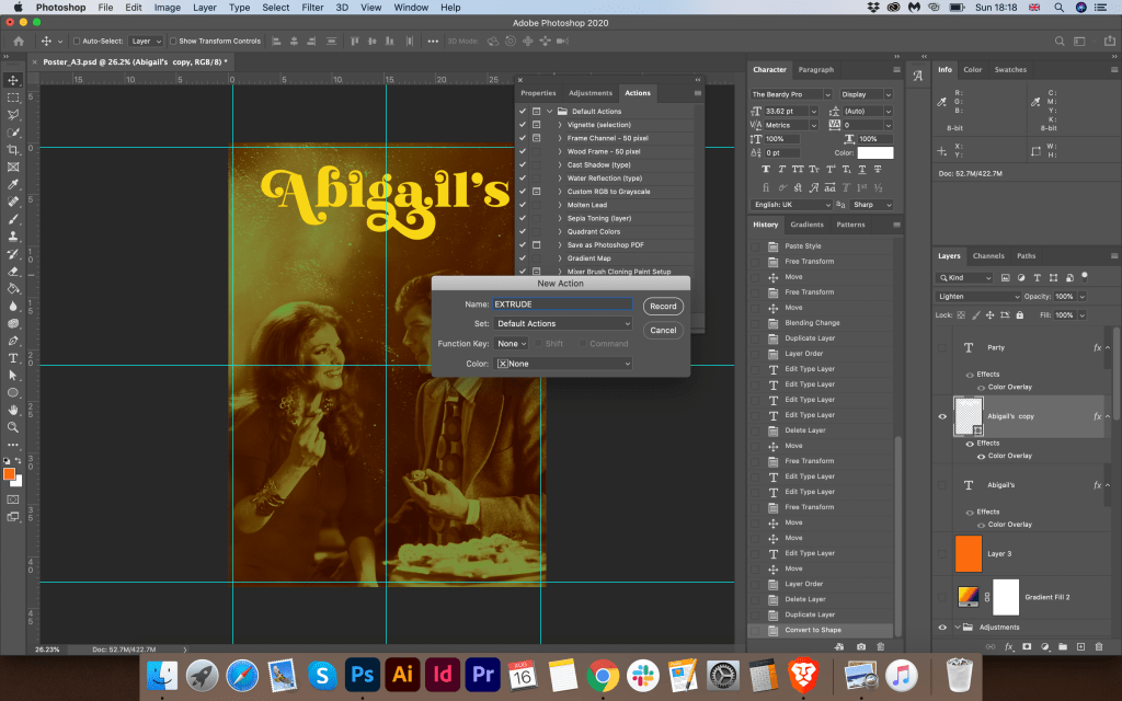
Before starting the poster design, I sketched the fonts that could be used in my design. I also drew a 70s style vector texture that could be used as a background for a poster. In my design, I wanted to focus on the font. I wanted to display such a beautiful ornate decorative font with bright capital letters in a yellow-red hue. I found such interesting fonts that I could not pass by. They seemed to be perfect for this poster. Their advantage is that, in addition to the standard spelling, there are glyphs in their properties, and there I could choose the required format for my poster. The font resource is Creative Market. Link to The Beardy Font:
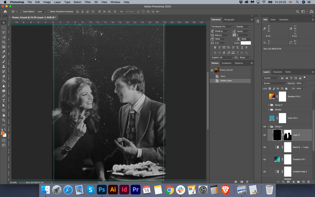
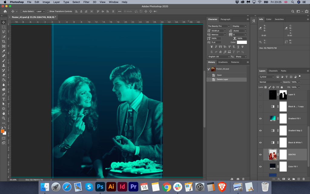
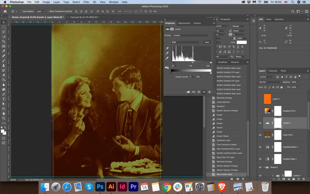
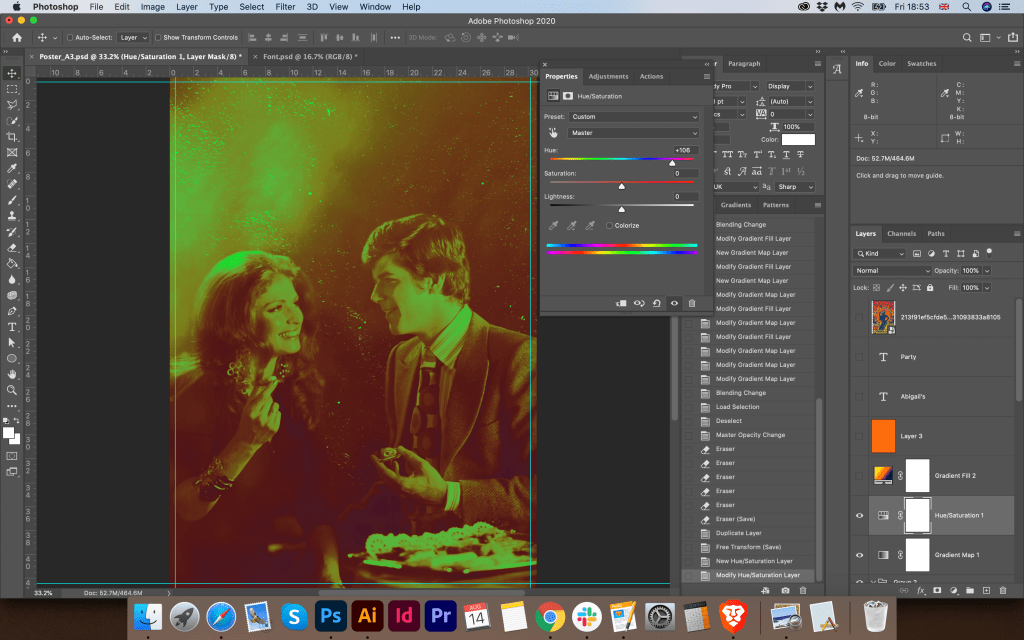
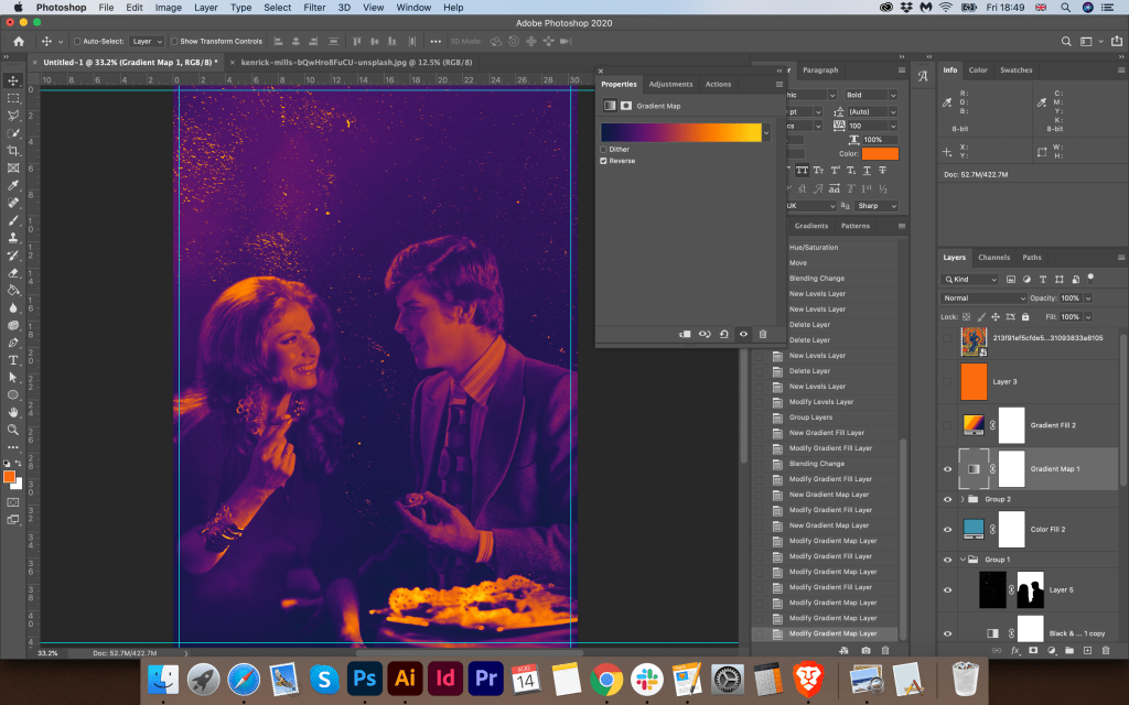
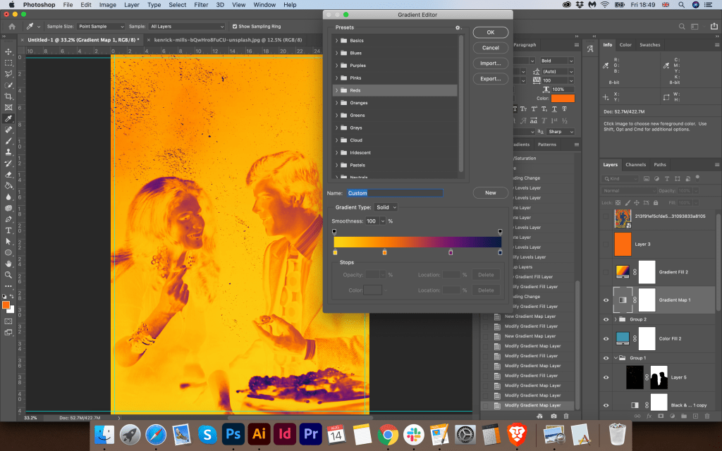
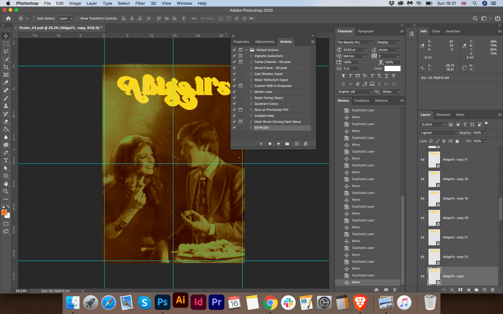
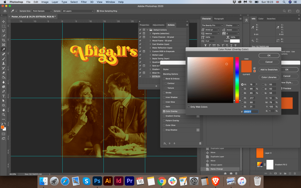
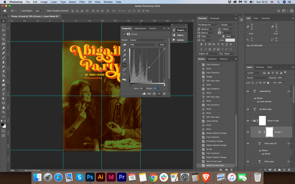
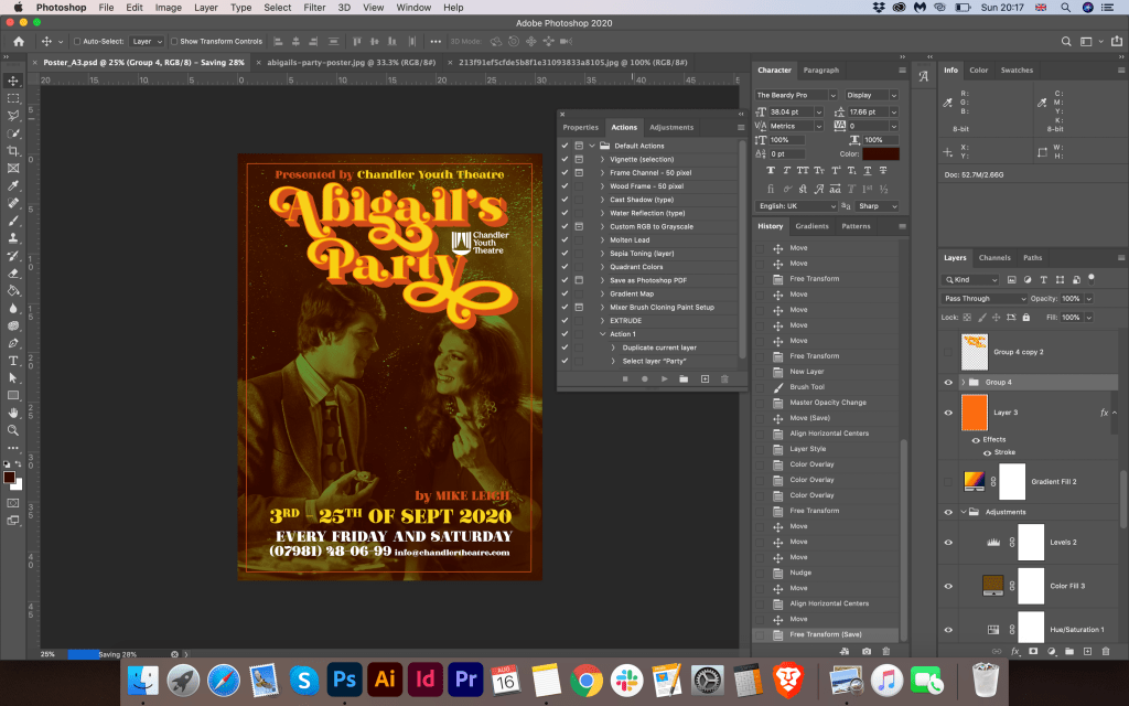
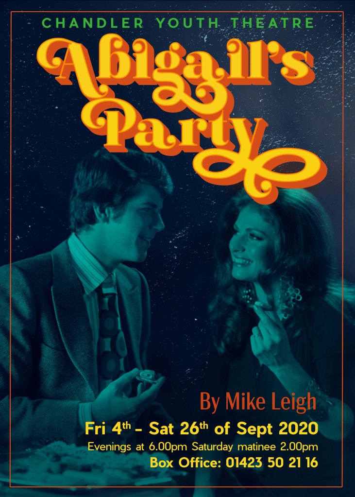
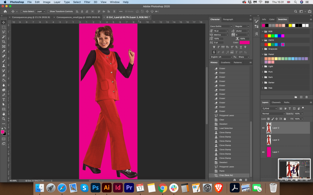
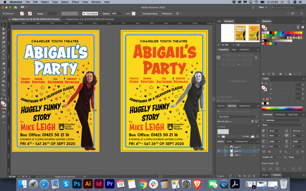
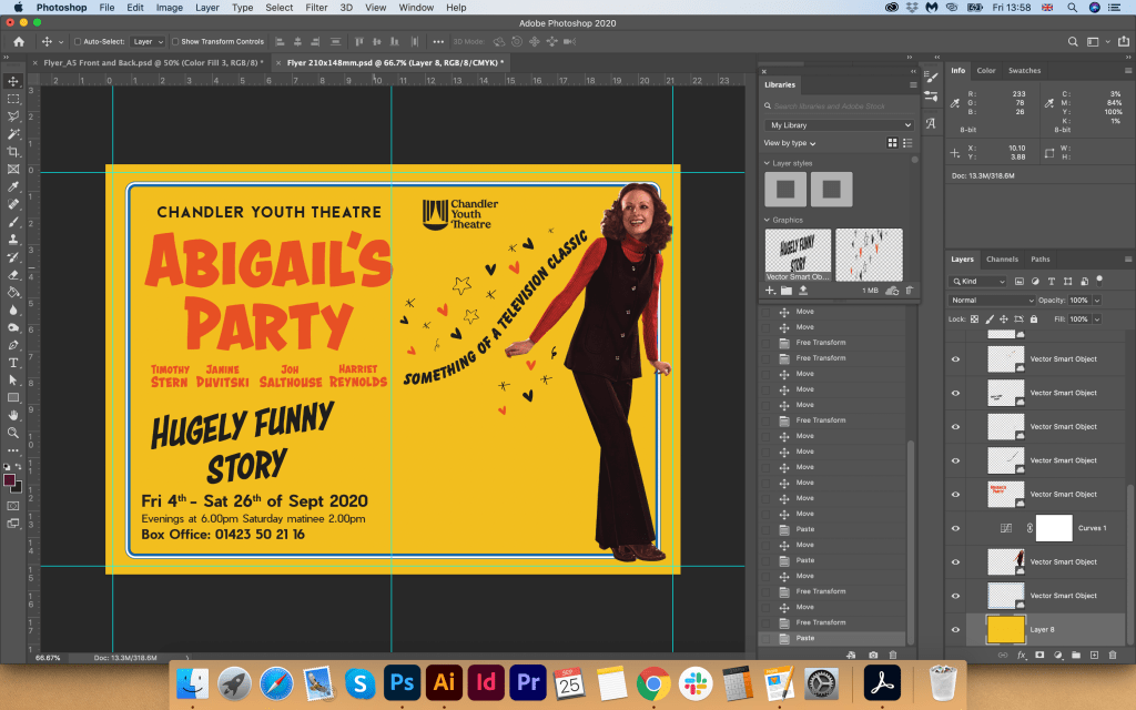
Then I started developing the design in Adobe Photoshop. First of all, I needed to process the photo in colour terms, and give it more muted tones, like sepia. The idea was that the more I dim the photo, the brighter and clearer the text information will be read from the poster. I have attached screenshots of the colour processing technique for a photographic image, with all the stages of applying filters, gradients and masks. In the process, you can see how I brought the photo from black and white photo to muted sepia. I also rendered the font, with a 3-D illusion, overlapping the font under each other.
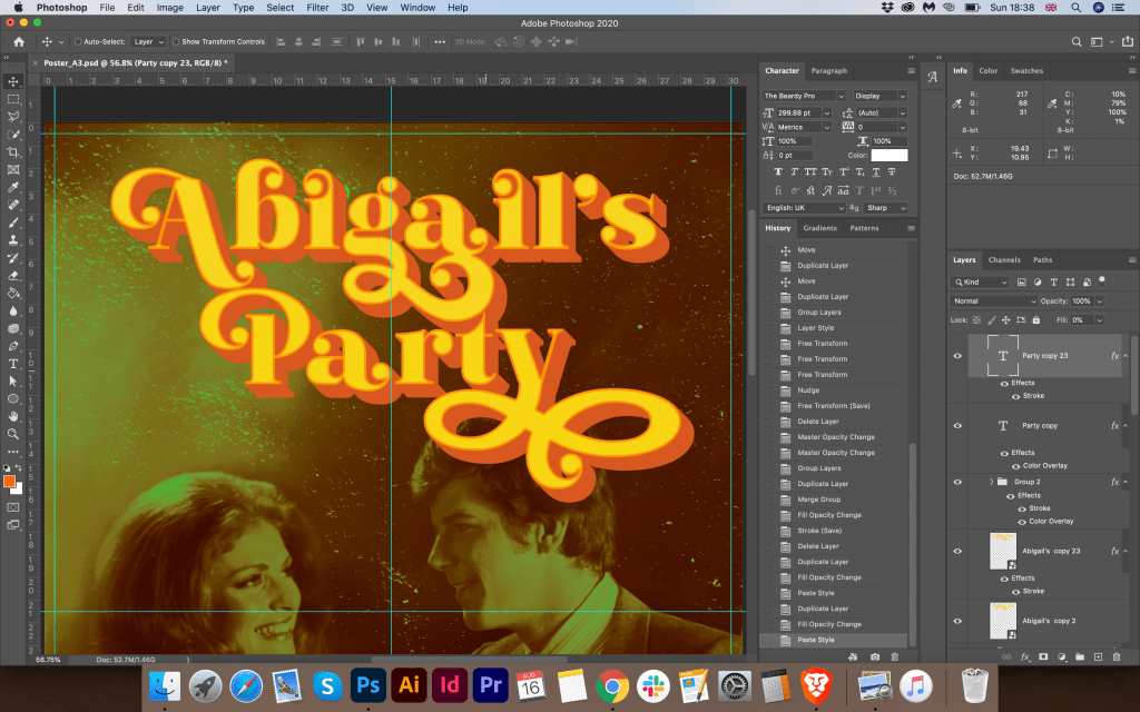
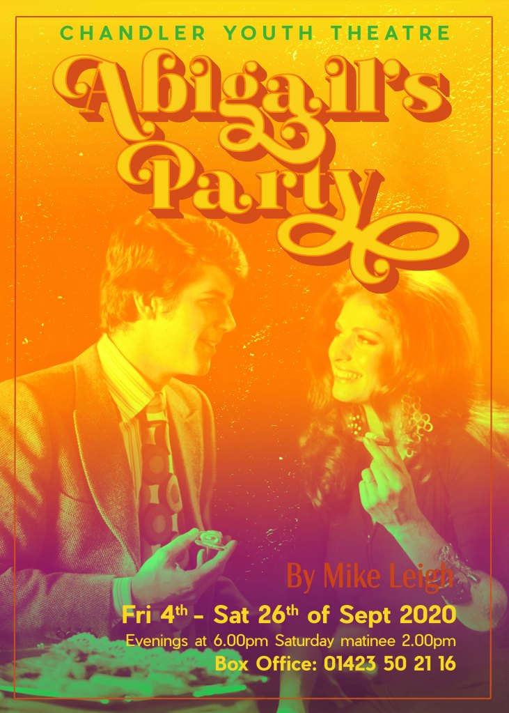
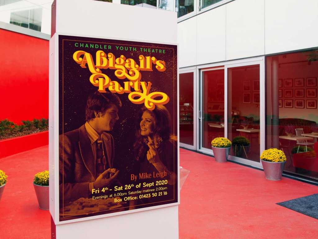
As a result, I got a poster in muted colours and a bright catchy title of the performance. I planned to use the same The Beardy font for the key information about the dates and times for the shows, but the font style seemed to me too heavy for the bottom of the poster. So I decided to use the lighter, more readable Pier Sans sans serif font in a bright yellow colour. For comparison, I decided to check which filter is more suitable for this photo, so I had four options, a poster in a blue tint, a bright gradient from purple to orange, a greenish sepia, and a sepia in red and brown shades. I showed to my family these options, and we all agreed on the last poster in red and brown. I posted the finished version on the Mockup room.
I was pleased with the result, I liked the combination of dark muted tones of the photo with a bright and contrasting font, which in general looked quite unique and bright. I think I managed to convey the atmosphere of the 70s. The only moment is that I could not apply the pattern I outlined in the poster. Combined with a bright font, the curly font completely overwhelmed the effect of the readable name of the performance. So I decided to keep my pattern for flyers, as I had an idea of how I could use it.
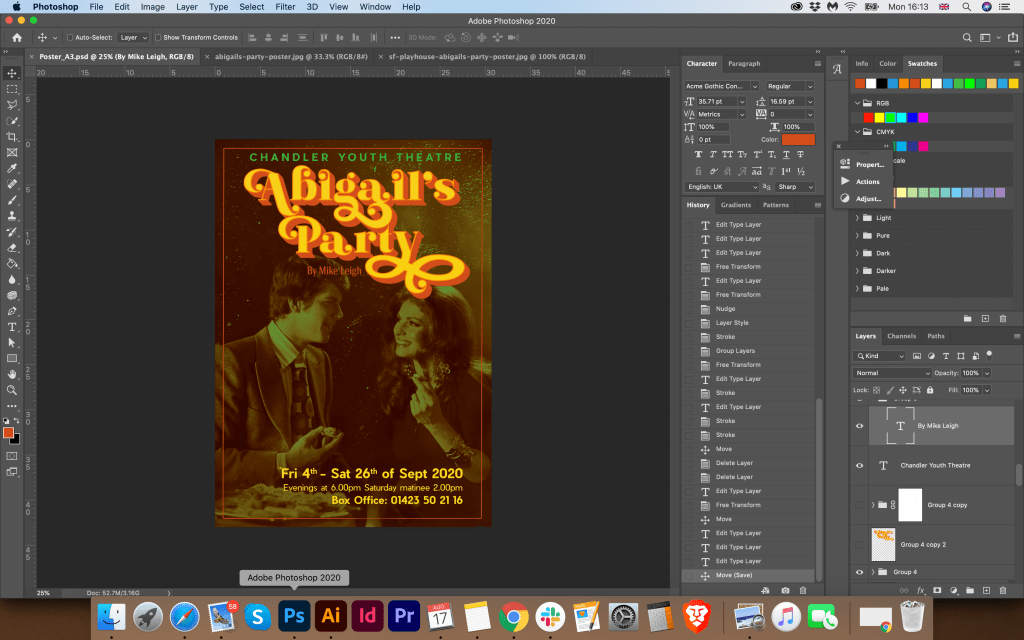
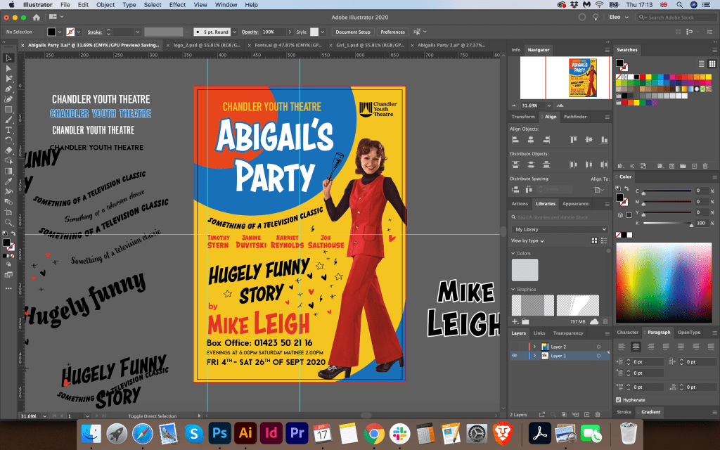
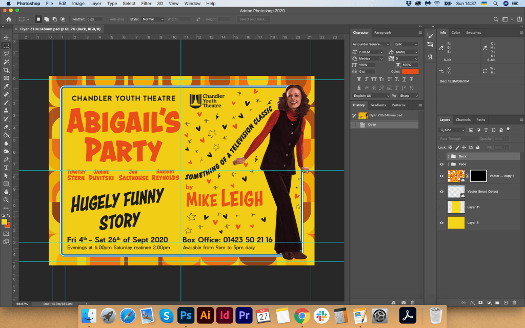
Flyer Design
Flyer Design I wanted to display more informational. I added the names of the actors and characters, as well as the logo of the Young Theatre. On the reverse side, I used the pattern I had drawn, but for the readability of the text, I used an orange background. Also on the reverse side, I duplicated the name of the production, and as information texts, I displayed a list of theatres and the dates of the performance. I made the font large and readable. At first, I thought of displaying the title of the presentation on the backside and making the text smaller, but after that, I thought that I could avoid overloading the backside of the flyer and made the main emphasis on text information and a bright pattern.
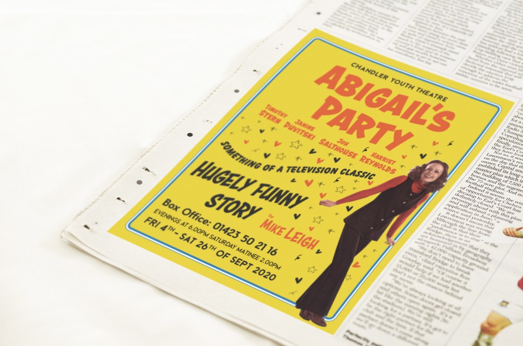
Newspaper Advert
For the newspaper, I decided to use a similar principle as for the poster, where the main focus is on the photo, the title of the performance, and contact details. I tried to list a list of theatres that will host the events, but the layout was overloaded, so I used the poster layout with less text information.
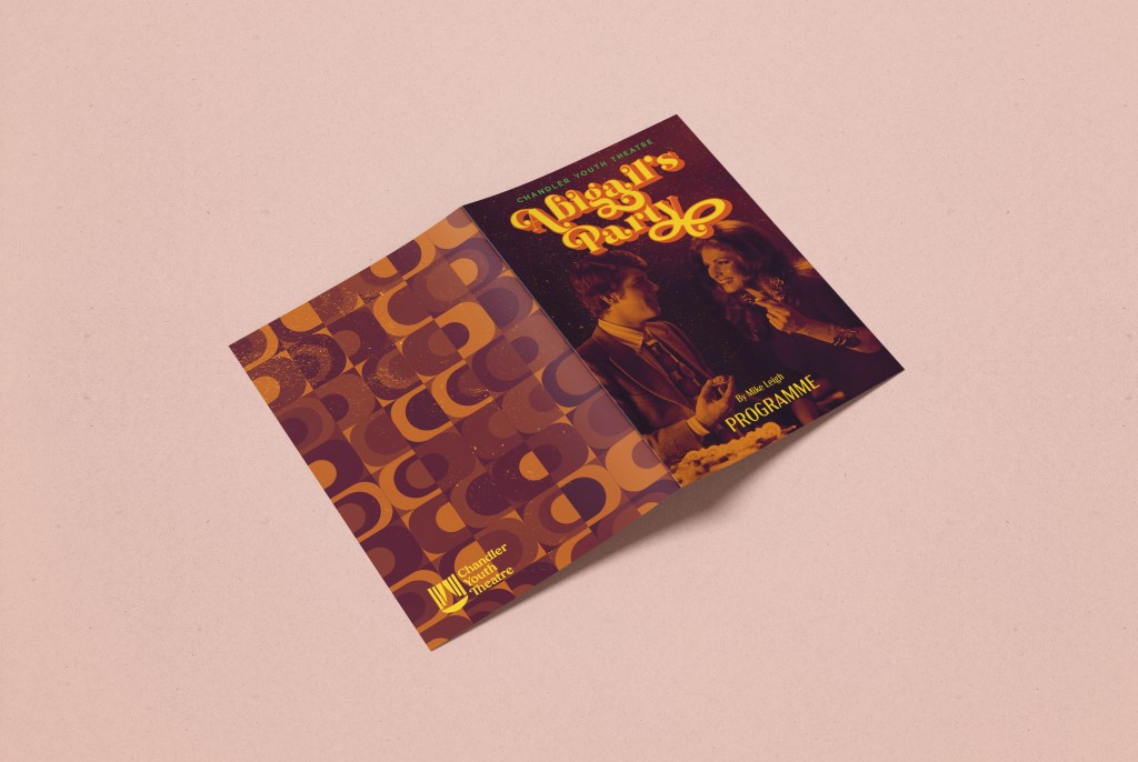
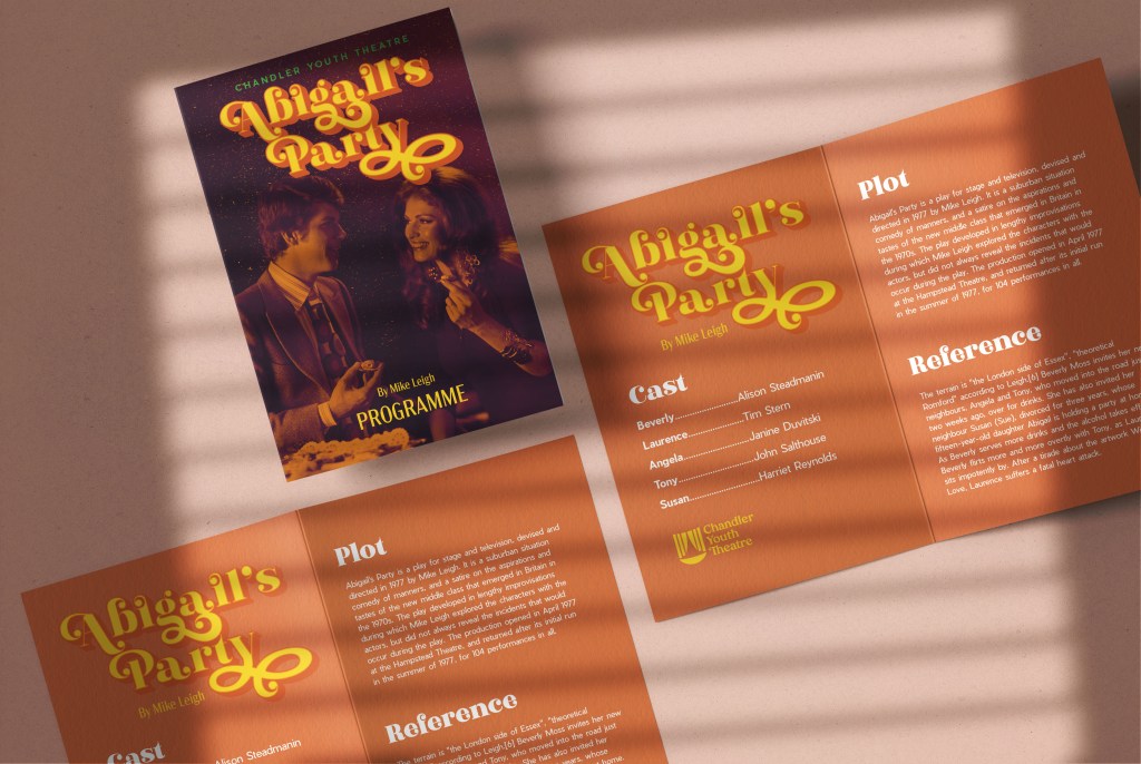
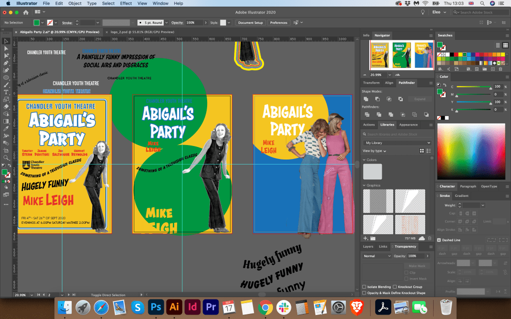
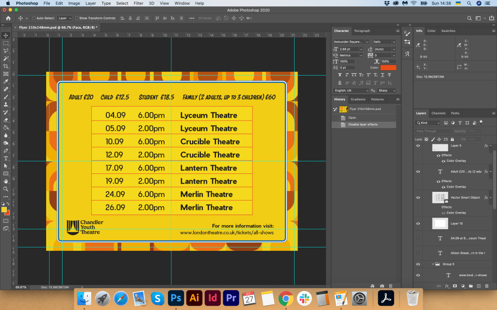
A5 Programme
For the design of the program, I created a new document in Adobe Illustrator A5 format plus a spread. For the inside design, I chose orange colour and put some text information on it. For the cover, I placed previously designed poster format, and for the back side, I chose a vector pattern that looked harmoniously with the front side of the program. I placed the finished designs on Mockup.
Reflection
Well, it has been a long journey for the Graphic Design 1 Core Concepts. I think this fifth brief was a good conclusion for the all work and experiences gained so far. Overall I enjoyed this assignment and I am pleased that I could expose learnt from this course some key design principles such as text hierarchy, typography, layout, colour and visual dynamics.
I liked the experiment with the type that I did on this task, and also the processing of editing the photo giving the layout a taste and style of the 70s. As I did not want to overload the composition of the poster with pattern elements, I am glad that I was able to use the vector drawing on other advertising materials such as A5 flyer and the A5 program. I think that this theme of 70s theatre performance is so vast and creative that there would be no limit to the design and variety of layouts. I settled on one choice, maybe I could go deeper and find more extensive options, but I’m glad I was able to experiment with text information and layouts on the rest of the promotional materials.
Additional Designs. Tutors Feedback
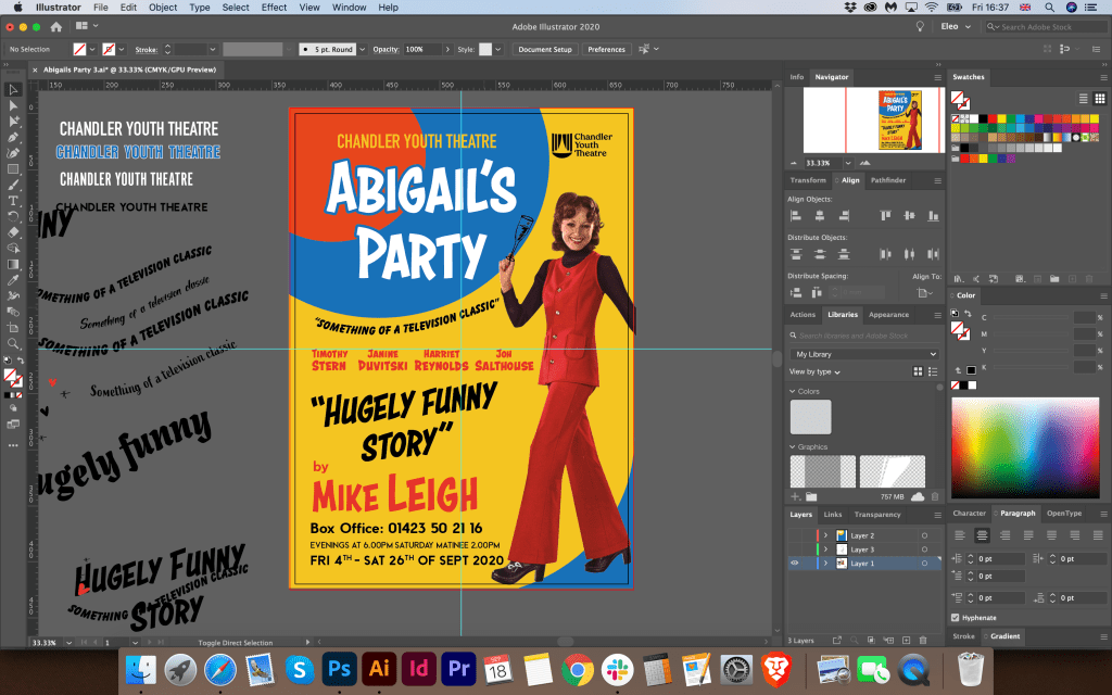
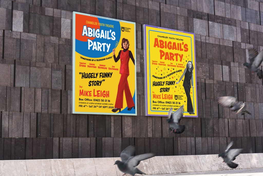
After I did the work for the final assignment “Your Choice”, wrote the conclusions and sent designs to my tutor for estimation, I had a feeling of unfinished business. I had the thought that the design should still be finalised, that I need to try to look for new layouts for the poster. In addition, after I received a response from my tutor that I could produce something more creative solutions, show my individuality and my corporate approach to solving the design layout, I decided that I had to try a few more poster options.
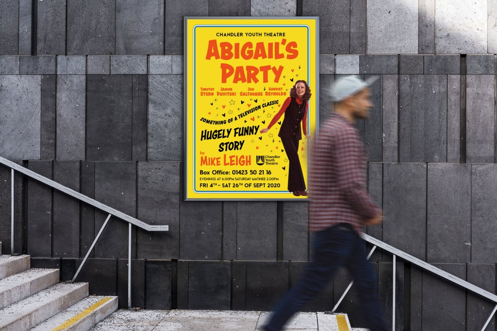
So I got down to business. First, I decided to look for an image of a girl in the style of the 70s. Perhaps it would be a smart girl who is planning a party, or who is dressed in evening dress. Since in the previous layout, I depicted a couple, here I wanted to display only one character. That all the attention was on one main person. I came across this image. I liked the mood of these girls and their dynamics in motion.
EXR7Y0 1970s UK Womens Fashion Catalogue/ Brochure Plate
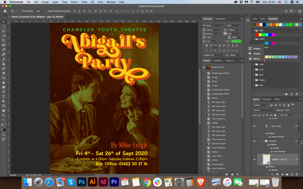
I already approximately understood how I could beat this layout. I wanted to add some movement to the design, give it dynamism, light flying objects around. My last poster for Abigail’s Party turned out to be very static, and all the attention was paid to the type and contrast photography. Here I wanted to create a bright and memorable design, apply a solid background, add slogans, some additional calls to action, in general, create a mood for attending this performance.
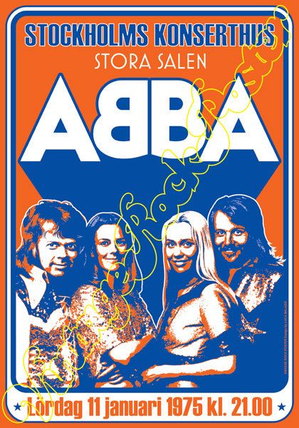
For the inspiration board, I additionally looked for some more images of 70s style posters on google, as an example, I chose posters from Abba’s group. In the layouts that I put together below, I liked the bright background solutions, the solid fill in orange and yellow warm shades, and the circular composition for placing the text, it all prompted me to design a new layout.
I started to sketch the poster design quickly. I also decided to replace the font for the title, here I liked the font in the retro style. The previous method of the poster had a too ornate and heavy font, but here I wanted to use a more direct type and at the same time playful. I chose Astounder Squared BB Bold for the name of the performance, DIN Condensed Bold for the theatre name and Beckman Black for contact DIN Condensed Bold for the theatre name. In my first screenshots, you can see that I tried to round up my composition, give it a shape. So I decided to try to depict one poster in transitional colours and circular shapes; in another poster, I wanted to play up with dynamic text. I planned to make the first poster in such a contrasting colour combination:
Warm Yellow
Intense Blue
Orange to match the girl’s outfit
Around I wanted to place slogans, these were reviews of the performance from famous publications, due to such phrases I wanted to create a dialogue between the poster and the viewer. I decided to place the phrase: “Something of a television classic”, – in the shape of a circle while choosing an easy-to-read font Balloon D Extra Bold.
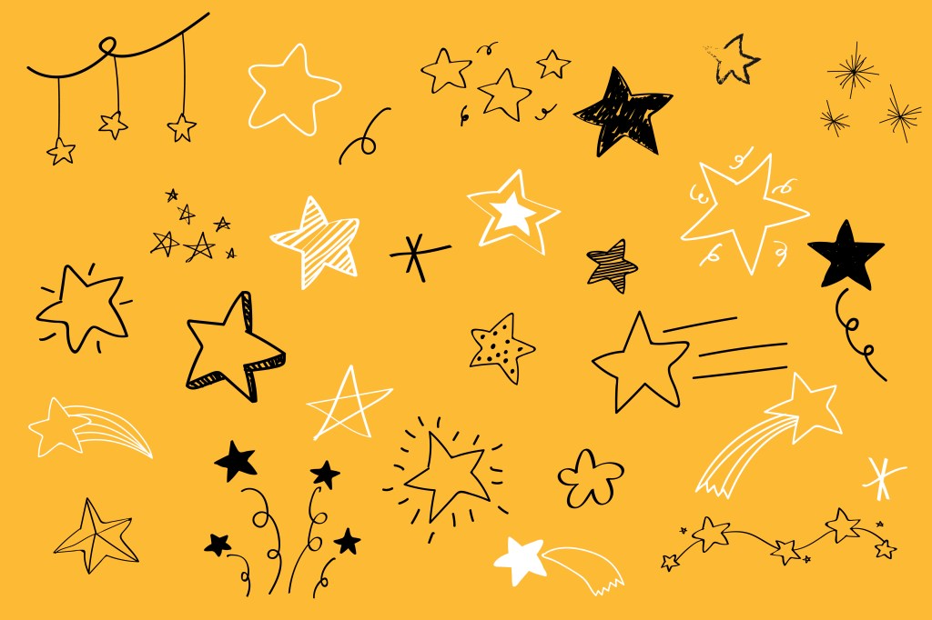
Next, I placed a list of characters, and under it another phrase Hugely Funny Story, which I needed to take up the free space between the top of the layout and the bottom where I placed the information block. For a little twist, I decided to add glass to the girl’s hand, vector layout. I was not entirely sure that the glass would be read from a long distance, but for now, I decided to leave it, as it gave some little accent at the mood of the performance. I tried to play around with some extra objects around the poster, like stars and hearts. I tried to fill with them the empty space around the girl, but I decided to keep two options for poster, so one poster I left with more free space around, and another option I made busy with flying objects. Vector image I found at Freepik.
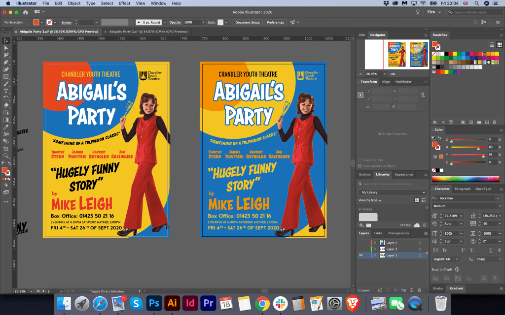
New option for the poster I used in the bright yellow background with a blue frame around it. Mainly I kept the same fonts for the poster, apart from the name of the performance in the bolder version of the Astounder Squared BB font. The idea was similar to the previous design, apart from to some details that I updated in the poster. For example, I used the different image of the igrl in colour and black and white used different colour variations and slightly rearranged the text. I liked both posters, so I couldn’t choose which one works better, so in the end, I’ve decided to go with the designs below.
Final PostersMockup
Flyer Design
In this format, I had a bit of a challenge. I needed to create a flyer at the landscape format. So I decided to divide the space into two zones, and placed images and text like from the right and left side at the face of the flyer. I decided to add extra details for the brochure, same pattern in 70th as I designed for posters from the first part of this assignment. I used this pattern at the front and back. My tutor respond was to minimise the amount of text at the from of the flyer, so I did it. Performances schedule and prices I placed at the back of the booklet too, but this time I created a readable table for the flyer, which worked quite well in here. I was quite pleased with the result. This flyer was an excellent addition to the poster, and its design idea helped me to create a programme design as well.
A5 Programme
Mainly for the programme, I used the same technique as for the first option of Abigail’s Party designs, with text placement, the pattern at the back of the program, and font choice inside of the programme.
Newspaper Advert
For newspaper advert I used same idea as poster design, but because of the different size I slightly rearranged text placement.
Reflection
In conclusion, I would like to say that I’m glad I could produce different designs for this final assignment. I knew that only one option for this poster wouldn’t be enough, as sometimes it’s hard to make the final decision based only at one design. The first option that I send to my tutor for estimation was not bad, but overall I felt that this assignment missing some depth in producing ideas and had a lack of my personal touch. Through this first unit journey, I created an original style, that I could apply in designs. I loved the experiment with the one colour background, and some dynamic text and objects around it, the image of the person used for this poster reflects the mood of the performance quite well as well. I’ve noticed that the main challenge in this assignment to find that perfect layout with the right composition and be able to arrange text around it, use appropriate fonts for the 70th style, also to make sure that all promotional materials have essential information on it and don’t look overload. I hope that I was managed to rehabilitate and provide more vital pieces of work for the final assignment.
The final exercise in the Core Concepts course is based on the branding of the company, which consist of brief and special requirements from the customer. That exercise could potentially join some of the vital knowledge that was gained through that course, such as branding, logo identity, font, brief, colour and illustration. I quite like The French Hen naming itself, it has the creativity and also it giving some inspiration to produce appealing designs.
Researches
To start with, I went on the usual route by creating the Mood Board on Pinterest. I aimed to collect a few types of images that would help me to visualise the future brand. First of all, I searched for some pictures of modern pubs and restaurants, and it helped me to get that feel of a presentable place where young people would have the joy to visit. Also, I went through some ideas for the image of hen itself, as the brand has the determination to attract young men and women, I didn’t want to go cartoony with the images search. I tried to look for some images of the hen that would provide me with some ideas about how that hen could look like; however, I would still have to adjust it. I liked that idea of looking for some images of hen, and it should give some warm and welcoming feeling, and using it with some French accessorises could help to bring some style into it.
I noticed that many those kind of respectful places using dark and contrast colours for their branding, mostly shades of burgundy, dark green, dark blue, brown colours in addition to golden and metal patterns into it. I thought it creates the right mood for that kind of space. However, my Mind Map and sketches were not ready yet, so my ideas could lead me into the different rout.
Additional images for inspiration
Sketches
The next step was to produce the Mind Map with some keywords and sketches for my designs. I went through some ideas for future designs based on the principle of the more associative words is better for the final decision. The brand should attract sophisticated men and young woman, so the logo should bring the feel of elegancy, classy, style and contemporary mood. If I go back to my first ideas clearly, it can be seen that the image of Hen with French style could work immensely well for this brand. I imagined such key identity elements as French flag colours, accessories as a scarf or stripy clothes, plus a playful beret on the head of that Hen, could be the right addition into the brand. I didn’t know what shapes of form would be, so I desperately needed to proceed to the sketches.
For the first sketch, I used the illustration of the sitting Hen on the letter “F”, where I tried to visualise the similarity with a bird on the nest. For the French, I used handwritten font, and for Hen just capital letters. I thought while I was making sketches for the Hen, would be useful to create some diversity of fonts as well, so I could choose which one works the best. Next design was just an image of the walking big proud Hen in the stripy French top, I liked the sketch itself but was not sure if it’s going to work for the logo, as it had too many details on it, such as feathers, fluffy tail etc. Clearly, from my sketches can be seen I tried to produce as many variations of the Hen as possible, that was the only way how to find the right bird for the logo.
Also, I tried some options based only on the font itself. It could work in some occasions, but that to create the memorable image I would instead use the sketch of the Hen as well. For one of the drawings, I tried to use not the full body of the bird, but only some key elements, such as the beak and using only the top body, that how was born the idea of using the image of the Hen in the hat and little French scarf around her neck. In addition to my sketches, I created the kind of label placement of the logo and name, with some new words as ‘Established 2020‘ and the definition’ discerning drinking‘ around it.
On top of the emblem, I placed the image of the Hen with fewer details, just with an outline. That design helped me to picture the future light-box for outdoor advertising. For future adjustment, if the brand would want to use some stickers on their drinks, that could go quite well also. Some of my extra options had the colour combinations from the French flag, such as blue and red, with some white colour, but that was under consideration still, as full-coloured print could be tricky to design for the light-box or the outdoor signage. In regards to type selection, I was looking into the font combination option, like handwritten font with a saint serif font, or calligraphic font with serif fonts, depending on the design I was going to produce.
Logo Design
In the next step, I have already started developing the logo itself in Adobe Illustrator. I showed my sketches to my family, and after some consideration, they all agreed that the idea of the hen with beret and scarf could work for this logo brand. Therefore, first I traced this logo into the vector, keeping the angle of the hen and font ideas. But at the same time, I tried quickly to draw some images of the geometric hen with embedded letter ‘F’ inside of it. However, I didn’t think it could be suitable version, as the geometric based picture could provide the wrong impression of the brand, as I wanted to walk away from any sort of fast food association for that logo. I visualised that hen logo in the different colour variations, playing with the deep blue and red colours. Underneath my sketched hen, I designed some extra options for the hen shape. I think I had some genius idea which came into my head later, where I added some additional elements into the hen logo, such as little wing with a glass of wine, and the leaf of the ferns next to it. I was not sure about the shape of the head of that hen, as it slightly reminded me a pigeon, but I thought it would be great to join those two images together and create an upgraded logo for this brand.
For the article ‘The’ I used neat calligraphic font AdornSPomander, for the name ‘French Hen’ I used serif font AmbroiseStd, and also for the ‘Est2020’ I chose narrow san serif font Avenir Next Condensed. From my point of view, this font combination created classy and elegant writing which I was aimed to achieve.
Further down from my logo design development could be seen that I tried to play around with some colours for this logo. I tried the combination of the full coloured logo on the blue background, dark green, also I tried to use just one colour fo the logo, naming and contrast colour fo the experience. I liked that full coloured option of hen on the blue background. However, I was not quite sure how I could implement it into the restaurant branding; therefore, I was considering whether I could use one coloured logo brand and contrast background for it. For example, I could still use my planned dark blue colour. For the logo, I decided that I would go for some variations, like salmon colour for the logo (I decided to go away from using solid red, as it could be too flashy) besides with blue colour, and alternatively some golden elements.
Chosen Colour Palette
Ready Mockups
As I chose the essentials of the branding such as logo, font, and colour scheme, later I proceeded to mockup designs. Here I faced with the task of finding the right mood in the branding design for the restaurant. To begin with, I placed a full-colour copy of the logo on watercolour paper, a chicken in an elegant hat with a curl, a glass of wine and a traditional flag looked elegant and smart, which is what is needed for this kind of establishment. It is as if she raises a glass and invites visitors to taste the local drinks. So for the sign, I chose a blue rag roof, on which only the name of the establishment was spelt out in white, while on the light-box I placed the chicken logo in blue, taking as a basis a circular composition with the designation ‘Discerning Drinking.’
‘The French Hen’ entrance mockup
Since it was inconvenient to place the chicken logo on the ragged roof, I had an additional option to set the full version on the light-box. For this option, I have chosen warm shades of cream and have already used a dark blue on top for the lettering and logo. It seemed to me that this is the right colour combination for readable text.
Also, I made a design for a business card featuring a cosy French village in blue shades with the word ‘Bonjour’. For the element on the window, I chose the name of the company in golden colour ‘The French Hen’.
Outdoor design mockup
For the drink coasters, I also used a warm shade of red-orange for the logo, and on the back, I used a blue background with the fern leaf and a glass of wine. For the phrase ‘Drink Responsibly’ with decorative font Copperplate, I used just outline for this font, in the result this font created a kind of right combination with the logo.
Coasters mockup
Then I tried to maintain a specific colour composition. In my subsequent branded products, I introduced additional combinations; for example, for the menu cover, I chose a rich dark blue colour. At the same time, I depicted chicken using golden foil using the embossing principle. Inside the menu, I made it according to the direction of a book, placing the text in salmon colour on cream sheets of paper. In the corner, I have put a small illustration of a vineyard. Text for the menu I used modern narrow sans-serif font in Acme Gothic CondensedBold and Regular.
Menu mockup
I chose a white T-shirt for the service staff’s signature clothing and placed the full company logo on the left side at chest level.
White T-shirt mockup
This is an additional version of the logo on the black background. Personally I would prefer white t-shirts, but as an option it could be as an alternative, for example black t-shirts for male staff. On the back of the t-shirt the bigger scale could be used as well.
Black T-shirt mockup
For the napkin design, I followed the alternation principle, where I staggered four symbols:
the letter F (French)
Letter H (Hen)
The Ferns leaves
Glass of wine
I was pleased with the result.
Napkin mockup
Reflection
In conclusion, I would like to say that I enjoyed the process of creating the logo for ‘The French Hen’ and its branding. It took me longer to process the ideas and the brand style itself than I thought it would do, but the is a reason for it, as I wanted to create an impressive visual with unique colours and technics. In the result I got quite a strong identity for the restaurant, it has a feel of lively, young, open place, but at the same time with some elegancy and elements of chic into it. I made my choice based on intuition, like that place should have deep shades, where I chose dark and rich blue, but at the same time, I used some fresh shades of orange-red and creme colour. Ideally, it would be better to do more researches into colour combinations, maybe make some analysis how colour affect your wish for drinking or eating, or how to create a relaxing atmosphere by using just a colour. Still, mainly I concentrated at the general feeling of the place, to make it welcoming, open and modern, but with some classy elements. In the result, I think a potential customer would see in it the right direction for brand development.
The Chance Housing Association has been set up to try and help first time buyers get onto the housing ladder and they want you to develop a brand image for their stationery. It is important to them that the Association is seen as being different from the other local housing associations – more modern, more helpful and definitely welcoming to young people wanting to buy a house. They want to use their logo on their letterheads and office stationery and it will also be used somewhere on the sheets that hold the property details. It also needs to be reproducible in the local newspaper and professional trade magazines. What to do • Research other housing associations’ and estate agents’ styles. Look at other publications designed for a similar audience. This information should help you identify as much what you don’t want to do as what you do. • If this was a real job you would need to visit the housing association’s offices and website, if it has one, to see how many decisions they have already made – for example they may have painted their sign silver and dark blue and used a particular font. As the designer you may want to continue with and develop those decisions or change them. • Using just typography sketch up some designs. You want to come up with at least three initial ideas to show the client. In this instance you can decide which one you think works best to further develop. • Mock up a letterhead and business card using the logo and house brand. Look in you local newspaper and mock up an advertisement to fit in the paper. Measure the space carefully remembering to leave sufficient margins so your text isn’t cramped. Photocopy in black and white onto cheap paper – does your logo still work? Have any fine lines got lost? Are the differences between colours still discernable? • Show your designs to your friends and family. What is their feedback? • If you need to, go back and adjust your artwork. If all is well make up a presentation pack to show the client – in this instance your tutor. Keep all your work and record the process in your learning log.
OCA. Core Concepts
Researches
This time I had a new project with more in-depth market analysis and compiling a portfolio and brand book for Housing Chance Association. Here I have an opportunity to feel like a real contractor not only in design but also in marketing. The task is challenging to subordinate and includes several stages. I wrote for myself the critical points of the brief because here a challenge not only to develop a logo but also to understand how important the uniqueness of the brand is, to build up a recognisable corporate identity which will carry the main message to customers.
I made a mind map in my notes because here, it was essential to observe the structure and sequence of actions. The mind map helped me concentrate on the main factors, and decide on the keywords for the brief.
So, in the first stage, it is necessary to analyse existing companies, understand what unites them, and find the missing link in the market that would help distinguish the brand from other companies. To begin with, I found a collection of Housing Association logos in Google, because here it was vital for me to find existing companies, by far the first in the list were those that are in most significant demand through Internet searches. I had never before paid attention to the offices of a housing association, apart from charities; however, their mission is still quite significant, this is a real help and support for a young people who are just getting on their feet. I noticed that in most of the logos you could see the house symbol, a shelter, a symbol of a roof over the head, which gave me the feeling that the house symbol is the most used option. Some companies went to more non-standard ideas, let’s say the silhouette of people, or unifying brackets. Also, some logos resemble the collection of the missing puzzle, as the personification that we will help you feel complete. These are understandable, easily recognisable symbols for such field of activity. I also noticed that light, pleasant combinations of colours are being used, such as blue, green, or combinations of multi-coloured elements, thereby hinting that the brand is light and unlimited in some strict framework.
Google Search for the House Association Logo
After that, I proceeded to the next stage of research. I have collected screenshots of real companies in the field of Housing Association. The first thing I turned my attention was the vibrant colours on the site, combined with smiling and friendly assistants. At first glance at the company’s website, it’s essential to show a potential client that we are glad to see you and want to work with you. The service menu is located in the top part of the screen. The company logo is in the upper left corner and then comes the banner. I also noticed that the list of services was highlighted in bright multi-coloured blocks with icons, which indicates that usability was designed for clarity and maximum availability of information, which talks about openness and a desire for cooperation. Let’s say companies like CHP, gateway, together housing are made in a similar style as if they are links in a single chain. But Hyde is an association of a more mature business, grey shades with a deep blue logo dominate here. I paid my attention to the company Jigsaw, which, compared to the others, was distinguished by a restrained style, an unusual shape of the logo and the unique structure of the website. It also focuses on family values.
Favourite Logos
For myself, I highlighted several logos of Housing Association companies, which, in my opinion, are distinguished by their originality. The Jigsaw logo had a non-standard symbol, with not just for the silhouette of the house, but according to the origami principle. Also, the website was designed on a modern structure. I also liked the Hyde corporate identity and logo, which hides a 3D image of the H. Platform logo stands out because of its bright and bold font, and precise reading.
Researches Conclusion
The main difference between Housing Association and estate agents is the difference in values. From my experience I can say that walking around the city centre I could meet property selling or renting companies, where the main entrance is covered with photographs of houses or apartments, with different price variations. At the same time, the Housing Association is located in more remote places. The working principle is more similar to charitable organisations, where it is essential to hear and understand each person’s story. While estate agents are exclusively commercial organisations, and the main target for them to lease or sell the real estate of their clients as much as possible.
Housing associations are a not-for-profit organisation that can be registered charities or focused on helping particular social groups such as over 60’s, disabled customers or young people as in our example. In comparison, estate agencies mainly run for-profit and therefore tend to use higher rates with no particular social group focus, offering very exclusive properties as well as basic living accommodation.
Sketches
After I researched housing associations and their corporate identity, determining the fundamental differences from commercial estate agencies, critical principles in the design for such organisations on the market, I started sketching the future logo. Based on the mind map, I also summed up what keywords can be used in sketches. For the future logo in my designs, I wanted to use such objects as building, the key, lock, ladder, window, door, roof, in general, the main components of the house. My goal is to reproduce bold, readable, transparent, bright, modern logo that would attract the right audience. Since this organisation is designed for the younger generation, I also wanted to create a colour palette, with fresh, bright shades, but at the same time observe the style and fashion trends. From my sketches can be seen that some logos were based on the image of the house, roof, key, all of them were interpreted in the very spelling of the logo. I understood that initially, the task was to use the company name “Chance” as a logo, and this is a more difficult task than drawing a different logo, as a house or any other graphic element. It was essential to show that the name of the company itself is already a logo and carries its message to customers, the principle of “Type Tells Tales”.
So from my sketches, I could see the design leaders, but I wanted to draw several options so that I could choose the most successful option from the drawn designs in colour.
Logo Design
Further, according to my sketches, I started designing the logo. For the beginning, I used the principle of choosing a font, then selecting a colour pallet, and after drawing the symbol. From my screenshots, it can be seen that I created a list of modern fonts, sans-serif mainly. I liked the thinner font options, but I was not sure that they would help me display the logo I wanted. I also created a list of colours for the corporate identity, as I wanted to show the freshness, freedom and lightness of the brand, a combination of green and blue shades became my favourite.
I still did not understand whether I would like to make a gradient or freestanding colours for the logo, but I thought that I should make that decision later. I portrayed the first options in black, but after I used full colours, as for me it would be easier to determine the mood of the brand. So there were bright orange-pink shades, as some shades of purple and blue.
In the first version, I portrayed a window with a curtain, an exciting combination, but I did not quite imagine such a trendy design in a charity type organisation. Next, I had an option with a suspended house in the letter “a”, which looked more like a keychain. I liked this version of the logo, but I thought that the font was too thin, I wanted to portray bolder font, have more prominent understanding. I also had an option with a key above the logo that came from the letter “h”, but again I was not quite sure of the clarity of this spelling. The roof variant is a bit outdated; such kind of logos was often used around ten years ago, mainly for construction companies. I tried to depict a curly roof for writing the letter “A” in the word “Chance”, and also dilute it with small four windows, a more modern version. However, still, I did not want any association with a building company. I wanted to show a symbol of housing, home. Therefore, I used the last option with the key in the letters “c”.
I showed the logo options to my family, and everyone agreed that the last logo with bold spelling and the key symbol is the most successful. I thought it would be nice to show the key as a symbol of getting into the property. For the logo, I used Coco GothicHeavy font, in lower cases, but for the tag line, I used Beckman font all capital letters with some spacing between the notes. I wanted to add some kind of zest to this logo, so the idea came to move the letter “a” and “h” closer to each other, and mark letters “c” “a” “n” in one dark purple-blue colour, so the word “Can” clear could be read from it. For the letter “a” I added extra white outline, so it does not interfere with the letter “h.” I could probably use the slogan, “Yes, you can!”, with a special meaning that everyone can get your own home.
In the next step, I made a small presentation of the logo, which would look like a page from a brand book. I would very much like to create a more detailed brand book, but due to lack of time, I could only recreate only one page. So I determined the constituent elements of the logo, how the letter “c” was transformed into a key symbol. I also depicted in the cells the location and proportions of the logo, indicating the free field around. In addition, the colour gamut and gradient in percentages for CMYK, RGB, and HEX colour schemes.
Logo Design
Stationary Design
After I had chosen the logo and colour combination, I moved on to the next stage, creating a letterhead and business cards. From my own experience, I know that the logo, font, and corporate colour essentially set the style for the stationery design. If I go back to the mind map, clearly the client wanted to see the different, welcoming, helpful, open brand, which would attract young people, who have a hope of getting their own first home. Here was essential to keep that freedom and youth of the brand, I wanted to experiment with some turquoise, blue, and spacious designs, with some feel of modern association, but keep it less funky at the same time, as that is a charity organisation.
I played around with some colour font ideas and different variations of text locations. I wanted to use some modern tall font for the Blank A4, but in the result, I ended up with Coco Gothic variation font in the purple colour font, as it worked quite well the logo and the central concept. At the same time, I realised that option with a full coloured logo and text colour is only available if the coloured printer available, or that is an electronic version of the letter, mainly I think all would be printed in black.
I thought it would be nice to see how the folder for documents would look like, so I created some idea with background gradient with some white circles around it, which seemed relatively fresh and eye-appealing. I thought that based on the principle with a colourful background, I could create a design for business cards. I had an option with a white logo, which looked quite lovely on the bright background as well. For business cards, I created a generic business card, without a name, it’s useful to have them for the company. Still, in terms of design, I decided to lose those circles around, as I thought they were the only disruption. In the result, I had a fresh, bright modern design, which was needed to mockup for the final touch.
StationaryMockup
Also, I chose a bright background for modelling printed materials to highlight the freshness and youth of this design. I also depicted several examples of the A5 format and the Euro format, which can be used as envelopes, compliment cards, or payslip. Such a striking design only emphasised my idea of logo design.
Advertisement for newspaper
The last touch for these series of design is an advertisement for the local newspaper added some different variations I could bring for the brand. I’ve measured design of the Doncaster Gazette I had in my disposal, most of the advertisement places were just about 13×16 cm, vertical position. I’ve created a few articles, some of them looked like text with regular explanation what is all about, another option I made look like more property kind of adverts. But I thought would be nice to find some take care images and place it for the advert with a large and prominent text, so these designs creating the idea of a call to action, with a question mark, “Looking for your own house?” It could be another slogan like, “Looking for the possibility to buy your own house?”.
I’ve mocked up a few options of the advertisement, and I thought that my preferable option with a little house on it with big readable text, so it would be an excellent option to make this advert to stand out.
Reflection
In conclusion, I would like to say that I thoroughly enjoyed this exercise. During all process, starting from sketches leading to the advertisement design, I was asking my family to have a look at the progress, to ask what kind of ideas this branding brings initially. The challenge of this task was to create the logo inside of the Type letters “Chance” which was initially more complicated. Probably would be easier to concentrate just on the logo, however on this task I had to think about the logotype first. Another quite interesting fact is that housing association could be similar in the logotype to the construction companies, or locksmith, as they have identical direction, which is a house, or getting into the house. However, with the help of colour variation and font, I think I could create more charitable direction for this brand. Here I had to remember some of my previous Assignments and exercises, where I had to apply the principle of communicating type, at the same time closing a colour pallet which would bring the right mood as well. I think that the result of my work is quite good, the only my concern is that is it visible these key symbol inside of the letter “c”. I think I produced this logo big and bold enough to be able to see the details on the big scale as in the smaller proportions. Creating the brand identity of the company is one of the significant parts for the graphic designer. Even if the existing company has its logo, it’s useful to have some reviews in terms of design that to be able to keep up with the modern tendencies, and I’m looking forward to some more branding tasks in the future.
How many logos can you name? Macdonalds? Nike? Apple? All huge multinational corporations with millions to spend on building brand recognition. Have a look at logos and see how they work – pay attention to the colour schemes and simple designs. You will probably also find that, although you couldn’t recall them immediately when you see them you immediately recognise them – banks, shops and products. Can you immediately recall the OCA logo?
If I think about the most recognisable logos, they are companies you are surrounded by every day life. Some of them seen so many times, that they become a part of yourself much more, so services that are provided by some of the business goes straight into association with a logo brand. A logo is like the front door of a business. It’s a first impression. It’s a greeting. It’s got an energy. The world’s most iconic and famous logos have this down. If you think about delivery services, that is Fedex, Amazon, DHL, if you think about fast-food that is KFC, McDonald’s , Starbucks, also most iconic logos for drinks that I remember as long as I remember myself CocaCola and Pepsi, for technologies Samsung, Apple, and Nokia, and so may others more.
I would like to analyse some of the logos most iconic based on book Logo life: life histories of 100 famous logos.
Lego
The red, white, yellow, and black LEGO logo is synonymous with one of the world’s largest toy manufacturers, but it didn’t always look so familiar. The story began in 1932, when the carpenter and joiner Ole Kirk Kristiansen established his business in the village of Billund, Denmark. The word LEGO in translation from Danish “leg godt” means meaning “play well”. From the history of the logo creation could be seen how the logo from Black and white serif font transformed to the decorative and recognisable unique font with extra colour variations such as red, yellow and white with some black outline. The classic dog bone logo from late 1955 was the first time the logo was standardised in design and colour. From the logo transformation still can be seen that if we compare logos of 1973 and present time only minor change has been done, as extra thickness for the black outline.
British Petroleum
Another interesting logo example is the logo for the global chains of the petrol station BP, which as far as I know temped to be one of the most expensive logos ever made. A new marketing campaign costed BP a staggering 20 million dollars. BP was named among the most environmentally friendly oil businesses in the industry, that’s why they tend to keep fresh green palette in their logo. As it could be seen from the logo development it went from the very standard logo ideas into the complicated flower with symmetrical lines around it, where was applied the golden ratio. The oil titan cut its name to BP and launched an ad slogan “Beyond petroleum”. On top of that, the company started investing into the development of alternative energy sources. Inspired by Helios, the Greek god of Sun, the new logo supported the company philosophy.
KFC
The company name “Kentucky Fried Chicken” was altered to the abbreviation “KFC” from the early 1990s an attempt to retreat from the fatty connotation of the word “fried”. The KFC logo signifies the founder of KFC, Colonel Sanders. The company has maintained an outstandingly consistent visual identity by using Colonel’s face on the branding. On the earliest logo can be seen that they made the portrait much bigger and more prominent, with some extra black outline, which helps logo to stand out.
McDonald’s
The McDonald’s logo is symbolic of the arches that were the substance of the newly-constructed architecture of the first franchised restaurant in 1952 McDonald’s uses the Golden and Red as primary colours in its logo design. The Golden colour represents the famous arches of its first franchised restaurant, while the red colour represents the food industry of this company. The synergy of both of these colours creates a great brand identity of McDonald’s. The McDonald’s logo uses the McLawsuit font in its name. It is the simplicity of the fonts that make the name of McDonald’s look appealing to the eyes. I’m not a big fun of the fast-food, but in terms of graphic design whether it is the use of imagery or the colours, everything fits perfect in this emblem without making it look complicated. From my point of view both KFC and McDonald’s logos are one of the most iconic fast-food logos ever made.
Coca Cola
Coca Cola’s logo has changed over time with several historical examples that are nicely dated and frequently the designer or design company is named. Many of the designs run over onto the next spread with graphics of them in use. It’s a lovely jam-packed logo book of company logo history and inspiration. For one year only, the Coke logo gets a dramatic, swirly makeover, then we can see the progress of changing, where the company returned to their 1887 logo idea with calligraphic font. It’s easy recognisable and iconic logo example, however it was quite common scenario when others companies tried to borrow that calligraphic scrip for their logo, and after they could risk of getting the name of Coca Cola’s type of logo.
Google
Another interesting example when not only the logo had been changed but the name of the company as well. The very first name for the Google was “BackRub”, as the engine’s main function was to search through the internet’s back links. Luckily, by 1997 they’d changed the company’s name to the much less creepy “Google”. However the design itself was not the best one, first logo ideas looked like there were made in Microsoft Word text style. Later from 1998 could be see that the font for the logo had improved to the more recognisable one, but the developers still wanted to keep that bright all colours pallet in one logo. The modern version of the Google’s logo went from the serif font to the san serif with bolder writing.
Apple
Another significant logo in the logo’s history is Apple logo. I assume it is an important logo ideas for many designers, as the main purpose of this brand was to push design and modern outbids of the brand forward. So to start with, let’s look at the original apple logo from 1976. It featured a hand drawn image of Isaac Newton under the tree where the apple fell and was designed by co-founder Ronald Wayne. It also featured the copy: ‘A Mind Forever Voyaging Through Strange Seas of Thought – Alone’. From the progress of the logo can bee seen who the rainbow logo went to the strict dark shades and after to the 3-D type of logos. Now, apple has gone even more minimal with the simplistic mono logo which is usually used. It is sometimes used on other products in various other flat colours as well. It goes to show the importance of simplicity in logo design as the same form has been reinvented with such success over so many years.
Starbucks Coffee
Starbucks legendary logo design is the brainchild of Terry Heckler, who pored over old marine books until he came up with a logo based on an old 16th-century Norse woodcut: a two-tailed mermaid. What everyone has noticed that the logo has changed with the years of becoming bigger, and coming closer to the edges, which looks like it has been completely stripped from the details. The Starbucks logo is circular in shape. The design also features the brand name in wordmark inside the circles with two stars on either sides. The newest logo design features an enlarged Siren with no stars and wordmark.
OCA
In regards to the UCA logo I can say that it is made in contrasting colour pallet, with painted letter “A” like by a piece of chalk on the red background, which is quite catching. It’s hard for me to say what is my impression on the additional information placed on the black square, but if I will try to recall the logo, it will be letter “A” coming as a main object.