Identify an example of concrete poetry and write a short critique of the content, design and the relationship between the content and form. How has the use of typography, layout, and space been employed to help generate meaning? Print out a copy of the poem and add notes directly onto the page. Write a brief summary of your thoughts, feelings and reflections on how concrete poetry creates new meanings.
As a starting point you may want to look at the following artists who practised Concrete Poetry:
Dieter Roth
Max Bense
Eugen Gomringer
Ian Hamilton Finlay
Henri Chopin
Öyvind Fahlström
Emmett Williams
Geraldine Monk
Mary Ellen Solt
Ilse Garnier
Visual task
Use one typeface to create a playful design for the Tango with Cows, 1914, by Russian Futurist Vasily Kamensky (poem shown below). Explore and experiment with the relationship between the meaning of the text and the form you present it. Think about what kind of typeface you choose as well, does it reflect the content of the text? How does the paper relate to the design? Decide on an appropriate scale and format for this page. Create a series of sketches and ideas, and chose one to develop into your final design. Print your design on one of the papers you have collected in the previous exercise.
Write a short paragraph reflecting on the relationship between the form and content of your design in your learning log.
Researches
To start with I go my usual route, that to establish some basics in terminology. What is Concrete Poetry, and where the therm is coming from? Concrete poetryis an arrangement of linguistic elements in which the typographical effect is more important in conveying meaning than verbal significance. Sometimes it is referred to as visual poetry. Concrete poetry relates more to the visual than to the verbal arts although there is a considerable overlap in the kind of product to which it refers. Historically, however, concrete poetry has developed from a long tradition of shaped or patterned poems in which the words are arranged in such a way as to depict their subject.
For this task, I’ve chosen work by the American-born poet and visual artist Emmett Williams First Love, parts 1, 2, and 3. The artist played a central role in the practice and dissemination of interdisciplinary art forms following World War II, particularly as part of Fluxus and the concrete poetry movement of the mid-20th century. I looked through other works of different artists, and I have to admit they are quite complicated to explain or understand. Those works are based on intuition and mostly guesses, as the meaning of the works could be various, depends what the viewer wants to see in it. However, this particular concrete poetry First Love gave me lots of different clues and inspiration to analise it.
This composition consists of three parts based on decorative letters and a number symbol next to each letter. When I tried to join those letters together, I noticed that the middle painting contain the word LOVE but left and right arts have geometric structure into them, like those paintings supporting the word in the middle. I’ve noticed the colourwise the artist went to the basic colours, blue, red and yellow, which are traditional symbols for the life on Earth. That gave me a connecting thread from the symbolism of the whole existence, blue, as air and water, yellow is a symbol of happiness and sun, and red as a symbol of passion and fire.
The little symbol next to each letter could mean a mathematical formula, a formula of love as well. Also, I thought about chemical threads in this artwork, like the artists want to portray the chemistry of love. I’ve noticed that the letters were made decoratively, they look like they were rushed painted by the brush, probably the way the letters were painted and their colours bringing a lead to the naive and the first experience of the First Love art. Also, the way how numbers were added, looked like some notes from the student at school, someone who just learning and getting first experience from life. Probably the artist wanted to show the very first experience, naivety, immaturity and innocence.
Quite an important part of this image is the movement and the dynamic that the artist has created. The right and the left painting has static letters, they are all in the correct angle, but the middle painting with the word love in it has some funny angles for the letters, which gives a feel of energy and movements of the love feeling.
I hoped one of my assumptions does make sense, and my attempt of explaining this work will be somewhere near what the author wanted to say. I digged through internet for some more clarification on this concrete poetry, and finally I found some interesting facts from the artist about the work. I was pleased that I was quite close to the understanding this piece of art, and it gave me some confidence in my intuitive understanding of this concrete poetry art.
The first version of “First Love” appeared in 1966 as a unique publication. Later in 1983, it appears as a poem with three parts and three languages. The poem is based, of course, on an old game that is played, like children, by following the numbers and thus arriving at the secret message. The involvement of different languages perhaps steals the innocence of infidelity from the game. Emmett Williams wanted to show the intentional coarseness of the characters and the desire to restore to the innocence of his illiterate childhood signify.
Introductionary
The typewriter is considered to be on of the creative tools of expressing more “thinking in the head”. The typewriter is designed to be used in a very simple way. In contrast to modern days we have the luxury of using our computers and programs for expressing the concrete poetry art, but back to those times there was little margin for error, which required concentration and designed could be produced in one go. The definition of typewriter art can really only be a personal one. For some artists, it is an object to draw, for others is a tool to draw with, which means making art.
Concrete poetry is perhaps the type of art that first off all appears to eye and to the ear. The definition for concrete poetry can be described straight forward, but what is quite clear, that works should not need to include letters, or complex texts to be classed as concrete poetry.
Jaap Blonk. Rhotic, 1991.Marcel Broodthaers. Un Coup De Des Jamais N’Abolira Le Hasard, 1969.Paul Dutton. The Plastic Typewriter, 1993.
Mike Weaver identified three types of concrete poetry: visual (optic), phonetic (sound) and kinetic (moving). Concrete poems could be read as vertically or backwards, or sometime reader should navigate through the same text twice.
I was intrigued with the meaning of this poem, as behind those designs and weird text combinations was hidden a special meaning. I really wanted to learn more about it, as I expected it will help me to open my vision for producing some interesting design ideas.
Design for this edition looked quite unusual, as it was not just printed on the white paper, it has some eclectic ideas in design and shape of the book was unique as well. The publication is classified as experimental. Printed on a yellow-flowered wallpaper, it has a discouraging title Tango with Cows and comes in the form of an irregular pentagon. The book was printed in the style of Dadaism: the cover and the entire text are typed using different-sized typographic letters, randomly located on the area of the printed sheet.
Tango with Cows is a square-format book (20×20 cm), the right edge of which is cut diagonally, that’s why Kamensky called it a “pentagonal book”. In order to break the symmetry and accentuate the dynamics of the text, it was not enough to cut the lines, words, letters, it was necessary to change the very shape of the book. The three drawings by Vladimir and David Burliuk placed in the book are typical examples of futuristic graphics with bouncing letters, inverted and scattered fragments of figures.
The poems were printed on the back of yellow wallpaper. Kamensky probably borrowed the idea from Mayakovsky’s famous yellow sweater, which often appears in his early poems as “A veil sweater” (“I will sew myself … a yellow sweater of three yards of sunset”). If a tango-coloured sweater was a metaphor for a yellow sweater, then the book Tango with Cows can be called a book in a yellow sweater.
Finally, the full title of Kamensky’s poem Tango with Cows was quite in the taste of the alogisms of the new art. Similar to the painting’s name by Kazimir Malevich Cow and Violin in 1913 or Mayakovsky’s poem The Spine Flute.
Logic always put an obstacle to new subconscious movements and in order to get rid of prejudices. A course of alogism was put forward, violins in a cubist building.
Those researches were quite useful for me, as I could learn some new ideas from the purpose of the alogisms, their influence in design, and detect some key words for my mind map and sketches process.
Mood Board
I created a mood board on Pinterest for better imaginations how these two opposite meanings tango and cows could be joined together. I had an idea of creating the shape of a dancing couple with the poem inside of it, but then I had the challenge of implementing the parts of the cow in it. Also, I was thinking of using cow’s hoove in it, or a dancing woman whose legs are crossed between the cow and human (weird combination, but why not?) Another idea was completely to go away from the theme of tango and implement just abstract design in a square or circle. That is quite a curious task to complete as it teaches the designer how to think outside of the box. I was hoping that sketches will help me to come up with some extraordinary solutions for this design.
The next step was to the examination of the actual poem, with some highlights for the words and their purpose in it. My mind map research process helped me to detect some key points, and look deeper into the details. From the first read, it seemed like this Tango with cows concrete poetry doesn’t make sense, like a set of disconnected sentences together. But a detailed breakdown helped me to find some good solutions for the design.
Keywords:
tango
dance
passion
cow
female
cattle
dadaism
futurism
Inspiration
For additional ideas, I referred to my time-tested source, a book call Typewriter Art by Barrie Tullett. I found this book as quite useful material, as it examines the history of concrete poetry in detail, some basics where it started from, also, I could look how typewriter or in my case fonts, could create 3D images. Some of those examples show how beautiful text could look if it is placed in an unusual shape, the movement of the letters can create the feel of floatiness. What’s so important as well, one of the examples shows that even a flat outline can create a recognisable shape of the human. I’ve noticed, that most of the time artists used white, or cream pieces of paper for their works, as concrete poetry mainly was printed on a white background, but in some cases, colours and vector images could be used as well. I thought, that maybe for my design I could implement some colour as well, as the original book had yellow wallpaper and flowery patterns. I could possibly try to create a poster out of it, with minimum design, but instead of using a white background, I could implement colourful paper and some layers into it.
Typewriter Art: A Modern Antology by Barrie Tullett. 2014
Sketches
With all that ideas in my head I moved to the next stage of sketching some drawings. I really hoped that some of those visuals will help me to generate a visual for design. I drafted some images of the cows, their body parts as hooves and legs. Also, I was thinking about how dancer’s legs could work for this design. Obviously that all was just a help to generate visuals, as design in the end of the day should be based on the usage of the fonts and typography. Practically, it’s similar task as we had before, creating book cover, or poster purely based on typographical symbols, which could be quite creative task as well, minimum colours or objects around can easily provide creative solution in graphic design.
Sketches
Designs
Before actual design I went to chose the font for it. I did some researches that to look how dadaist fonts looked like, also, original template from the Kamensky’s booklet was as an example for me too. I noticed that some fonts looks quite artistic, most likely decorative, bold, and with lots of personality in fonts, and another feature on them was typewriter type of fonts. I think, I could possible go with some of the fonts I have in my collection, and play around with them later in design. Fonts that I added into the list are:
AdaptiveMono OT (fixed-width font, often used in typewriter art)
American Typewriter (more classic font, with serifs, could be used for books as well)
Young Ones (decorative font that consists from different looking letters)
DadaDa (futuristic looking font, tall and bold san-serif letters, in some occasions for dadaists posters)
Futurist Fixed-width (quite odd font with big spacing between the letters. Could work well for my concrete poetry design)
Filena SemiBold (very thin all capital letters font, probably too modern for concrete poetry)
Almaq (easy to read bold san-serif font)
Heavy Falcon Condensed
Addison West Drop (Quite interesting font, has outline and stoned effect on it. Can bring some sort of originality into the poster)
Bearmen Regular (nice, easy to read, serif fonts, has decorative look, good for posters, or highlighting headers)
AltaCalifornia (odd font, all letters are in different style, not only visually, but some of them like were developed into the different century. That principle often was being used in posters for dadaism and concrete poetry in the beginning of XX century)
Alyssum Sans (fat type with narrow lines inside, decorative, good for the headers, have artdeco feel in it)
The idea for my design originally was coming from the tango dancing move. In my sketches, I had different solutions for designs, but during their analysis I came up to the idea of woman in a dance move. I created an outline shape of the woman in a long dress, with some passionate move in it. Inside of it, I placed the poem with Futurist Fixed-width type which has lots of space between the letters and visual gaps, and combined it with Addison West Drop type, which has some outlines, and a stoned effect on the top. I was keen on the idea to tied in several typographies as it creates a 3D dimension that I prefer to apply to flat images. I even liked the effects of some letters randomly placed in the corners, as I’ve seen that effect on other dadaist designers works. On the left side, I highlighted the shape of the woman with the repeated name of the poem Tango with Cows, the font for it I used quite odd AltaCalifornia, all letters don’t match together in style, but that is what dadaist designers originally had non-matching fonts.
I didn’t know if it was quite obvious, but I found this sketched image of the cow from the book Type. A Visual History of Typefaces and Graphic Styles. This book has a great collection of different types of specimens, and this cow was one of them. I thought would be good to apply a transparent effect on it, and place it on the top of the old paper background. I think both images worked quite well, even the shape of the woman on the front repeated the shape of the cow, so I kind of merged both images together.
I tried different variations of this designs, with some huge letters ‘TANGO’ on it, with red and black colours for fonts, different variations of the typography, few shades for the background, I thought the more I try, most likely I will peak the right one. I picked nice crimson letters, that didn’t look as sharp as black font. For the big tango letters I picked combined typography Charcuterie Etched and AltaCalifornia.
Before printing out the design, I adjusted the layout with the grid. It always helps to see where the particular letter should seat, and those millimetres are quite vital in design composition.
Printed version
For the printed version I chose the set of paper examples that I received recently in the curtesy of Pergraphica. I used High White Rough paper 150 g/m2 , good quality paper with some nice thickness in it.
Reflection
In conclusion, I would like to say that this exercise was a good learning process for me. I’ve learnt something new about concrete poetry, fundamental parts of it, and where the originalities are coming from. I think, the principle of text arrangement into the specific shape could be well used in posters and books in modern days, as it creates some unexpected design solutions. In my design, I came up with the idea of a dancing woman with some nice shapes and passionate moves. The background image of the cow is just a subsidiary part of the design, that I specifically chose from the book of typography specimen. The name of the poem and the original design from my point of view was based on two principles: juxtaposition and alogism, which teaches us to discover hidden sense in words and combine opposite meaning images together. Tango is a symbol of passion, fast, red colours dominating in it, there are feelings and emotions in it, excitement and intimacy. Where cows are related to the rural lifestyle, slow, trustful and careful female animal. In this case, tango with bulls could work more logical together, but the author was following the tendency that was popular during that time among artists and writers, using opposite meaning objects for creating unpredictability.
I hope in my final design could achieve some good solutions. I experimented with the font, chose some really eye-catchy typography variations, played with the shape of the text placement, tried a few colours for design, and as a result, I had a playful layout that represents the spirit of the dadaism culture.
Collect a wide variety of paper samples and other paper ephemera across a range of weights, textures and surface finishes. This builds on your previous paper sample exercise from Part Two.
This exercise is built on my previous researches from part two. In the first part I gathered together all possible examples I saved through my graphic design career, some of the examples are almost 15 years old, and it’s good to see that all this time subconsciously I was following the path of being the graphic design, archived paper examples in the library that to go back to them again.
Another point is collecting actual paper examples coming from paper production companies. The biggest variety of paper examples coming from the August Trade company based in Ukraine. They have a significant variety of paper samples and colours that are available for printing, such as matt, gloss, shiny, textured paper, that would meet the requirements for all possible graphic design needs. All specimens are organised in matching colours, and depending on the price of the sheet, the cost of the design may vary. I analysed their colour and paper palette in the Research Task below.
I wanted to go through some terminology to learn interesting facts about the paper. What is the paper? It’s a substance composed simply of the interlacing of fibres into a compact web. One of the finest and best-known scholars on paper of the 20th century, the American Dart Hunter, summed up paper as follows in his Papermaking, the History and Technique of an Ancient Craft.
To be classed as true paper, the thin sheets must be made from fibre that has been macerated until each individual filament is a separate unit; the fibres then intermixed with water, and, by the use of a sieve-like screen, are lifted from the water in the form of a thin stratum, the water draining through the small openings of the screen leaving a sheet of matted fibre upon the screen’s surface. This thin layer of fibre is paper.
Paper characteristics
Lots of printing materials owe their form to the remarkable qualities of paper. It is very important that graphic designers take an interest in its physical properties and are aware of the many different types that are available. Paper has seven key characteristics: size, weight, bulk, grain, opacity, finish, and colour. All of this must be considered together with cost and availability when deciding on an appropriate paper for book printing and binding. Another feature that the designer may wish to consider, is its absorbency, its pH value, and percentage of recycled waste content.
Paper weight is measured in two ways. Obviously, the thicker paper has more density and heavier than a light piece of paper. In North America, paper is measured and specified in pounds per ream (500 sheets), per sheet size. In the rest of the world, paper is measured in grams per square meter (gsm).
Paper weight and paper bulk are related, but it would be wrong to assume that heavy paper is by nature bulky, as paper density varies. Blotting paper is not very dense, having loosely bonded fibres, yet is relatively bulky, whereas some pressed millboards are very dense and heavy.
Opacity is a measure of how much light will pass through a sheet of paper. This is determined by the thickness of the paper, the density of the fibres, and the type of surface finish. No paper is completely opaque, allowing light to pass through. The surface finish of a sheet of paper determines its capacity to hold ink and its suitability for different types of printing. An interesting fact, that special surface finishes such as pitting, pebbling or pearl can be applied by running a textured roller over the paper during the calendering process.
Colour is generally added to a paper at the pulp stage. Some manufacturers produce consistently coloured paper, but others state that colour may vary between batches.
Collecting samples
Building up a collection of paper and board samples is very helpful when the designer has the opportunity to choose stock. It’s a useful feature reviewing the paper’s characteristics – size, weight, bulk, grain, opacity, colour in relation to the design feel, subject, content, etc.
In addition, I wanted to extend my researches that to find some more companies that produce paper for design. It took me some time for searching, but after a while, I stumbled on to the distribution company Double V based in Kyiv, which has the biggest choice of paper examples I have ever seen. What’s so special about them, that they are collaborating with a lot of companies over Europe, and depending on your need they can order a paper for you. I thought would be great to have a trip over there, that to examine some of the paper samples. They have original sets from the production companies, such as Fedrigoni Italy, Arena, G. F Smyth UK, Mondi, Fabriano, Reflex, etc. These examples are very expensive, and they all can be delivered individually. Below are the websites I found from the paper production companies, I thought would be useful to keep them in one place and potentially use them in the future.
I took pictures of them, to show that some of the books were made in a special way, with creativity and original presentation.
These are examples I bought for my collection. I think the distribution company collects them on site, so they are much cheaper compare to original sets. Also, I got some amazing sets from G. F Smyth, which do look like a creative book. The variety of paper is great. I have some textured paper, shine papers, all possible colours of tracing paper leather paper, velvet paper and so many more, that definitely should inspire me for some creations.
Now I have amazing spectral tracing paper, pure cellulose tinted tracing paper. Also, such made as Fabriano – uncoated environmentally-friendly wood-free papers and boards, with a special pearlescent effect on both sides.
I always updating my catalogue of paper samples. One of my favourite thing to do is to go around shops with different paper materials, to examine them, and go through different paper colours and their purpose. I’m a big fan of watercolour paper examples, as they are thick, has some bulkiness into them, and have a nice texture to feel. They are not usable for printing books but could be useful in artists’ books I assume, when there is a wider field for creativity and play with the form. I took a picture of some paper samples. Textured ones are purely artistic to me, some examples that could be widely be used in art. I like the variety of patterns each of them has, which is important if a designer wants to create a special mood for their designs. That kind of watercolour paper could be used for cards, or design invitations as well. When there is a grey, gold, brown colour in paper design I see them perfectly be used for such things as marketing materials cards or business cards, posters. most of them are quite thick and have around 300 grams density. Colourful paper, like yellow, blue, green pallets they remind me of my scholar times when we had to do applications from them, as I don’t remember using such bright colours for any marketing or printing purposes recently. Most of the prints done are regular colour pallets, like sepia, white black.
Collecting samples
I’m the kind of person who collects different printed samples, tickets, leaflets, flyers and cards, but not only for design purposes but for sentimental reasons too. I think that could be the habit of most designers to keep printed ephemera, as they help establish the taste and vision for the printed materials. Each paper is different and has its feature, and instead of memorising them, those pieces could be saved somewhere safely for creative purposes.
Those little tickets to Vatican Museum, and some Kyiv heritage architecture, zoo tickets as well are printed on similar paper, glossy, not too thin, approximate 150 grams, which makes them easy for cutting, also those papers not opaque, that makes them reliable for printing as they contain as about 85% printed images and text.
The little white and red museum ticket was printed on very thin coated paper, not very white colour, up to 80 grams, looked very old-fashioned, in matching design, but that is what makes it special to me. Little ticket to the past, which works well for the historical places.
Also, I kept those examples of paper from my first assignment about fanzines. It’s a good example of think magazine paper, glossy, and very thin, but good enough for colourful print. I’ve noticed that most of the magazines use glossy paper, as I think they are better for printing and cheaper than coated paper.
I’m saving all gift cards, as they have different features in the paper quality, and it’s good to see how designers use paint or gold foil on them, as that is a good way of seeing the use of paper in life. Also, I’m keeping some of the magazines with different paper combinations in one issue. For example, some of the companies use thicker paper for their adverts, as it helps to pay attention to the information, the work on contrast helps to make the product stand out.
Vatican Museum, and some Kyiv heritage architecture
History of theatre and cinema art museum ticket
Vatican Museum tickets
Zoo Tickets
Magazine paper
Thank you card
Card
Receipt
Burghley House Brochure
Combination of thin and thick paper in the magazine
Card
Jeans Tag
Overall, it was a great experience for me to expand the speciemens of papers for this exercise. Moreover, it gave me the push to do even wider researches, and discover some amazing paper samples, and top up y library with some great pieces of design papers.
Find two artists’ books that you feel demonstrate an interesting relationship between their form and content through the materials that the artist has chosen to use. Reflect on these books in your learning log.
Researches
For the first time, I’ve got familiar with artists’ books through the first part of the Creative Book Design Unit. There I explored some unusual books on Smithsonian Libraries Artist’s Book and Fanzines. I’ve learnt that book has a wider meaning than just an object to read and find out the information from. I discovered that artists’ book has a completely different interpretation, this is a piece to explore intuitionally, and have a feel of the book through personal emotions.
As I can’t have access to the libraries at the moment, due to my location, I had to go to browse them online. Not ideal, but still a great experience to go through some online collections at V&A National Art Library, Tate gallery, and, of course, Smithsonian Libraries.
In this research task, I wanted to find out the meaning of the term ofartists’ books. Artists’ books are books made or conceived by artists. Some fine artists make books and book artists who produce work exclusively in that medium, as well as illustrators, typographers, writers, poets, bookbinders, printers and many others who work collaboratively or alone to produce artists’ books. Here I can see that the creative field for the artists’ books is quite broad, and very often not much context could be put into that books, but mainly such things as visual expression. The purpose of that book is to bring emotion, whether it’s awkward or comfortable feelings. Many artists’ books are self-published or are produced by small presses or by artists’ groups or collectives, usually in limited editions.
I would consider artist’s books as a piece of art, which was organised in the booking form. Artists’ books that maintain the traditional structure of a book are often known as book art or book works, while those that reference the shape of a book are known as book objects. Other types of work produced by artists in book format include concrete poetry, where meaning is derived from the spatial, pictorial and typographic characteristics of the work, as well as from the sense of the words.
Some of the books remind me a scrapbook. They have old type paper, those books are big and bulky, and look like they would have some historical meaning into them. Below is example of the book made from the wood ‘Mapa ed veneiis’, by Genevieve Seill. The artist describes her intention as a
“Mixture of word magic, a strange mind geometry and a secret formal and esoteric architecture holding it all together”.
Another example of artist’s massive book with heavy objects inside – unique, multi-part book object, the title of which translates as ‘Daniil Kharms: love and death’, focuses on the life and writings of Daniil Kharms, an avant-garde poet, dramatist and children’s author born in St. Petersburg in 1905. This is a very peculiar reflection of love, despite that, the main purpose was to make sure that the reader has emotions, and I think the author achieved that.
Some of those artists books bring a special meaning, like the example below is symbolising reminder to conserve and respect the earth. Large enough to be cradled in both hands, The Mollusk has wispy pages in bright red, blue and purple that make up the animal’s filtering gills. In the centre, there is a small white letterpress book, like a pearl, bound with string, that reads a small poem. According to the artist, the piece is
“Intended to be held and read as a celebration of nature and a humble reminder of our own fragile connection with one another.”
These are more ordinary formats books, but they are based mainly on vintage images, such as a pistol pointed at a rocking horse, are juxtaposed to develop a feeling of oddness and discomfort throughout the book.
This book attracted me because of the beautiful cut pages inside in the shape of the butterflies. Half of the book looks pretty regular, but another part has quite a tender and creative style in it. Malone cuts away the blank parts of the pages, leaving the illustrations to really stand out. The drawings are exposed, and the book takes on a sort of flipbook quality.
This book reminds me the travel books I remember from the childhood, when you open books like a little accordion book, and make your journey through the pages. The photographs are an apparently random mix of colour and black and white images, something that increases the book’s sense of fragmentation and dislocated story-telling.
From that wide range of artists, I couldn’t stop only on two particular designers, went extra wild on the number of artists I researched. I would probably say that 3D books, with extra layers on them, that we could consider as creative objects are more attractive to me, than just a flat book with illustrations on them. Don’t know how these books were made, but as I remember as a basis for them could be used the layout for promotional boxes, and make sure that the right cut is made for all elements to stick around. Would be curious to try something like that me, and experiment with the shape.
The brief: Create two books explaining and exploring the typographic and layout principles you have researched in this section.
Book 1: My Little Book of…Good Typography
Using the reference material that you’ve gathered throughout the exercises and research tasks in Part Three, design a book which explores traditional ‘good practice’ in typography. What is readability and, as a designer, how can you aid it? Visually explain the typographic principles that we’ve touched on in Part Three, such as type size, leading and line length. For example, you could demonstrate kerning by creating a page which looks at letter combinations applying this principle. Equally, explore good layouts and use of grids to help support and frame your typography. This is an opportunity to develop carefully considered design layouts that feel easy and engaging to read, and look at. Be creative in how you do this, developing a range of options and possibilities. Show off your good typography skills as well as talking about what makes good typography in your text. To support this, find quotes and type rules by other typographers and designers – perhaps revisit your research into book designers from part two. Find examples of good typography within book design you can present and talk about. Your booklet should be a celebration of good typography, whatever you think that is.
Book 2: My Little Book of…Bad Typography
The rules surrounding what constitutes ‘good’ typography are entrenched in tradition and convention, as you demonstrated in Book 1. Having looked at ‘the rules’ surrounding readability and legibility, now is your opportunity to break them! Be inventive and experimental in how you explore what might constitute ‘bad’ typography. For example, negative leading, too-long line length and ‘inappropriate’ application of typographic principles may produce visually jarring and uncomfortable results. What does ‘bad typography’ mean to you and how might it manifest itself? Express your ideas in a visually imaginative way within your second book. This is an opportunity to be playful and push your design layouts, typography and ideas to the limits – celebrate bad typography through your designs and content. Again, find quotations you can work with or examples of bad typography to draw on.
Your books should each take the form of a simple eight-page booklet – folded, stapled or stitched. Design the cover and contents for each. When creating your content for both books, be aware of your audience, and how you might want them to engage with your content.
While both these books are about typography, make sure you also include images within the text. These could be your own illustrations, photographs, or stand alone typography pieces that accompany your text.
Use a flatplan to organise your content and indicate where important text and images occur, on a recto (right-hand) or verso (left-hand) page, or as a double-page spread. Suggest images by a crossed box, as in the example for ‘front cover’ in the diagram on the previous page. These crossed rectangles indicate image boxes in desktop publishing (DTP) software, and are used in drafts and sketches to signify image material. There is no need to go into detailed drawing regarding text or image material at this stage. Text can be indicated by a series of thick horizontal lines, with main headings sketched in. Use the flatplan to familiarise yourself with the structure of a booklet. Note the blank pages and how they are organised to complement the preceding or following page. Note the extent (number of pages) in the book and whether it has been printed in signatures, or sections.
As with previous assignments, see this as an opportunity to undertake a creative project that is more circular in nature than linear. Visualise initial ideas, assess them and return to your starting point to develop new starting points. Be experimental with your typography and take creative risks along the way. Focus on how you can visually document your creative journey as well as your reflections on what you are producing. Your notes should cover why you decided to portray what you did, what you included and what you omitted. Reflect on how do you feel about the two completed books. For example, are there comparisons you can make between them, has any interesting design issues emerged through the process of making them?
Primary research
To start this assignment I decided to refer to Andrew Hasslam’s ‘Book Design‘, as it contains valuable information that will help me to set up basics for my books. The author says that the most important part of the book design is documentation. It is fundamental to typography, graphic design, cartography, charts, tables – all of them are components of the book. So, here I realised that very important to include my creative process in those books. I want to construct the combined design from digital and analog materials, by documenting some of the creative processes stages.
Another part, is to decide what approach I would like to apply to those designs, Expressive or Conceptual? Expressive are rarely have some rational explanations into them, it is often lyrical, and, not intended to bring meaning. The conceptual approach evolves around “big idea”, and it is based on communication. Often it is clever, witty and entertaining. I’m more inclined towards the idea of the Expressive approach in design for the Bad Typography, it can be full of experiments and non-standard solutions. At the same time for the Good Typography book, the Conceptual design could work quite well, as it can be neat, organised and follow the guide type of design.
I think, that the Bad Typography book will be filled with experiments and different solutions for the distorted font, glitches, sentences lines all over the place. But Good Typography will be an example of a marketing brochure, where is important to produce pristine and neat design, so it serves to purpose to bring aesthetic pleasure from the reading.
I was thinking about whether I would like to design a pocketbook, or should it be a large format? Is it portrait or landscape format? I think I will go with the format 162×246 mm, which is kind of smaller than A4 format but still will fit nicely into the standard continental sheet size of 700 x 1000 mm.
Golden section, the Fibonacci series, and its derivatives
Those could be suitable components for the Good Typography books. I imagine well-balanced designs, with clean white space around, neat columns, all organised nicely and within the grid that was designed accordingly to the Fibonacci series table. In this third part Creative Book Design Unit, the whole research task was dedicated to the Golden Section, and I think this is the relevant direction for the Good Typography book. Nice proportions combined with readable accurate typography would create the right solution for the first book.
Here I wanted to go through some essential parts from the brief, and to determine some priorities from the assignment and key points that I need to pay attention to.
Grids
This is quite a significant part to include in my books. Grids are essential components for most of the book design. The format of the book determines the external proportions of the page when the grid explains the internal division of the page. Grid usage gives a book consistency and the look of a coherent template. I would like to use grids for my Good Typography book, as I believe it will help to concentrate on the content of the book. But for the Bad Typography book, I would like to challenge the template and not use grids in it, as some designers think that grids can limit the layout, and restrict it from creativity.
Another point is to consider is the text area where the information is going to be placed. The text area could be symmetrical and asymmetric. I think I could try both, and see what will work in the best way. Symmetrical text placements were mainly used in medieval manuscripts and considered to be traditional and based on natural proportions. Jan Tschichold was one of many artists from the beginning of the XX century who questioned those old types of grids, text placement, and layouts. The modernist thinking on book design was influenced by Bauhaus and Constructivism.
Using a modernist grid any number could create unites, but usually, columns of the grid are divided between two to eight. For example, if the page is four columns wide, a field with 24 units will be created, or 48 per spread. Once the grid is created, the next step is to think about folios, footnotes, labels, and annotations.
Multi-layered grids are something to consider as well. The system was developed by Swiss designer Karl Gerstner. The grid is quite flexible and can fit different-sized images depending on the number of images that need placing.
Karl Gerstner Matrix based on 58 unit fields
Avoiding Grids
Many great illustrated books don’t have a grid system in them. The book below is the example of composition only relating to the width of the spread. However, the layout has some magnetic feel to it, and the creativity of those illustrations can’t let the reader go by.
When we browse for books, we pre-read them by flicking through the pages. The potential reader creates the judgment of the book from the quality of the book and overall appeal. If the layout is messy, the print is poor resolution then the book is instantly devalued. Very important to create a right first impression.
Many editors start their work with a rough flatplan. The flatplan is a diagram that shows all pages of the future book drawn as a spread. This is an example of the flatplan for the David Haslam Book Design with codes such as green corners for part opening, for black for folios, red for pages with photographs, and blue for diagrams. Quite a useful technic when book design including multiple pages.
The rough flatplan for the David Hasslam Book Design
Pinterest Mood board
Here I collected some interesting ideas for my typography books. When I look at this collection of designs I can see that here I gathered different templates structures, most of them missing the grid system, and they are based on the creative, rebellion approach, they are bad typography examples. I think David Carson’s works are the prime example of Experimenting Typography, he brought the creativity of magazines to a new level, he purposefully didn’t use grids and avoided the rules. Also, I saved works of the book Chicks on Speed, fascinating format, and unusual combinations in textures and images.
If I look back to my previous exercise with experimental typography I created some glitch effects in them. I think I could use this approach for my Bad Typography book. I’m keen on the electronic type of digits, with some distortion. This approach is quite often used for techno music posts, the scene where designs should look purposely distorted. The idea of techno allows the computer to do what it wants to do. The computer is alive, and do noises, such as bleeps, clicks, it is a living machine. I have the concept of combining sound and typography.
I’m fascinated by how simple HTML font looks like design, for example of minimal design, this is the typography without any special appreciation. I’m intrigued by this is design point of view. At the same time, this is the most used font design and is under-appreciated. I also see the connection between HTML code and computer and technology. Techno is the scene where the computer meets sound. There is a symbolism of code and the relations of code to the computer and how some music within a techno scene is encapsulated.
Experiments
After some researches, I went to the next level of some experiments with typography around me. I had some examples of craft around, so I wanted to try some cut and paste approaches, similar to fanzines. These could be examples of experimental typography. In addition, I made my own writings with a white pen on the chalk board. At this point, I was not confident about what exactly I’m looking for but it was worth seeing whether those typography examples are going to work.
I had some fonts examples that were not my favourite, they mainly were used for posters, or signages, probably not for books or magazines. I wanted to stick them together in the similar way as I had from the Type Tells Tales book. These were examples of Lora Fosberg text Paintings. All her works hand-painted on small slips of paper adhered to panels. This is example of attraction to the what surrounds us: ‘old signage, vintage graphic design, pop culture’. I think I tried those examples mainly for experiments. I was not quite sure whether I’m going to include them, but it’s always useful to discover.
Another example that I could possible use, was my own handwriting. I always wanted to apply it for some designs, would be interesting to create some sort of juxtaposition with my own handwriting and some electronic fonts around. I thought it still needs editing in Adobe Photoshop, so I kept it just in case for later.
Mind map good and bad typography
I created a mind map of final parts that I was going to include into my booklet. Those were going to be for the Good Typography:
Golden Ratio
Fibonacci series
Le Corbusier
-em metal type
Quotes about typography
Fonts such as: Clarendon, Gill sans, Van Dijck.
Design-wise I wanted the booklet to look like a specimen catalogue, which would celebrate great book typographies. For the colour palette, I decided to go for red, black and white. Instead of photographs I wanted to create big illustrations made from letters, they would look like decorative parts of the design.
For the Bad Typography book, I was going to use a bright green colour pallet with some contrast dark backgrounds. Also, I wanted to combine art and glitchy fonts. Things to include:
Art or sculpture combined with hand written fonts (Ting Wallasse Hot and Sour Soup}
Messy typography with different bas spacing (David Carson}
Black background use with some paint brushes elements (Tomato, Mmm…skyscraper I love you}
Flying bits of typography (Mira Schendel}
Book 1: My Little Book of…Good Typography
As I decided on the format of the booklet 162 x 246 mm, I did sketches in similar proportion pages. The idea was to create a clean and neat brochure, which would look like a catalogue of fonts. As the navigation to the font choice, I wanted to refer to the Notes on Book Design by Derek Birdsall. He gives some recommendations on what fonts should be used in book design, depending on the set of symbols that will be used in it, whether there are numbers, or formulas, or just magazine text. From the first point, it looks like those fonts don’t have anything in particular in them, but when I looked at the examples of actual text, I could see that those fonts are readable, works good in columns and quite well balanced on the page. I see this as a valuable example of good book typography, and I think would be great to celebrate those fonts.
I did some sketches for the cover, that would reflect my initial thought about design. I was not quite sure about what pages should go, as I could have only eight pages, including the front and back cover. I didn’t want the brochure to look just like a magazine, I wanted it to look more like a bright catalogue and have the accent on the typography. I think the hierarchy should go on the decorative, and nicely designed letter, and then on the content. That second spread from Erich Fromm’s El arte de amar shows two-colour text running across the gutter gave me the idea that I can use a similar approach in my design too. The text goes out of frames, but despite that, it is big, readable, and play a decorative role on the page.
I created document in Adobe Indesign with pre-agreed portrait rotation of the page. On the page I made a grid that I was going to stick for the text columns. I started with Le Corbusier spread with some quotes and running texts from the side of the columns. I tried the experiment with rotation of the columns and some squashed fonts, it looked creative but I thought it was missing the celebration, so I decided to keep it on side, and concentrate on other pages where I was going to show the sizing of the letters according to proportions, I did page with the letter -a- in different variations on the top of each other, and combined fonts for the text columns. I used the principle of serif font for the header Clarendon Text Pro and san serif for the main body Gill Sans light and semibold, which is always works for the neat brochures.
Later I tried the spread about the Univers font, that would match to the first Le Corbusier spread, but they were missing some main point from the brief, they were nicely organised on the page, but I thought they were too plain for the typography booklet, so I decided not to use them. Referring to the spread I discovered earlier, I decided to create that page with big capital letters in red and black colours and some running italic wording under it, which was good addition to this brochure.
Also, I was still considering the design of the cover, I was not sure that lowercase letters -g-t- looked right on the front cover, therefore I decided to experiment more, and try capital letters instead. Also, I changed the colour of the background to dark red, on the front I placed bright red lowercase letters and black capital letters on the front, so it created unusual 3-d feel, and finally the cover became more eye-catching and had some depth into it.
When I look at those pages placed together, it gives to me the feeling of the completed project, and I can see I accomplished some aims some targets that I had for my booklet. The reference material that I gathered and my researches helped me to create traditional ‘good practice’ typography booklet. I discovered that choosing the right font is one of the fundamental parts of a good typography booklet. The font should be readable, have the right kerning, be traditional and serve the purpose of being clear on the page. My pages with the size of the letters is a good demonstration of the golden ratio applied to the font size, which should be kept for the printing materials. Another part that I included in my brochure are grids, which helps to organise images and columns into the proportional frames on the page, depending on the format. In addition, the booklet has some creativity in it, as the use of big letters or text running through the page still can look well-balanced and proportional.
Book 2: My Little Book of…Bad Typography
For the Bad Typography book, I was prepared in advance with all the ideas I collected earlier. I thought it is much easier to create bad typography, as the field is quit broad, but at the same time, I tried to think about the concept, as I wanted my booklet look cohesive. I just needed to recreate the ideas that I had in my head. To start with I wanted to go from the techno scene for the design, I wanted to go from the glitchy effect combined with art, have some sort of computerised typography, which would look like HTML code. Later I reorganised those thoughts in my head and decided slightly to lose the idea of HTML code font. Instead I could use fixed width font, which could be hard to read if it is not placed correct on the layout. In my book Type Tells Tales I found those amazing examples of typography designed by Walasse Ting Hot & Sour Soup. I loved how the author combined Renaissance art with handwritten typography, typewriter typography in the patterns, and the use of colourful and black backgrounds on the page. Also, my inspiration was David Carson, with his approach ‘out of the rules’. I wanted to play around not as much with ugly, messy fonts, didn’t want that look of obviously bad type, I wanted to see it as a creatively bad font, with some difficult to read, out of the space fonts, too busy, and staff like that. Which could be a challenge too.
I started the book design with an inspiring image of the Statue of Zeus at Olympia. I wanted to bring some distortion on it, that to apply the glitchy font with it, that in summary would bring similar result as I had in Experimental Typography exercise. The placement of the type I left for later. I realised that the image of the sculpture dominating here, and that is a very powerful and popular piece of art, but I wanted to highlight it with the necessary brief, which is bad typography.
For the first spread I went for the help of good typography, the one that I decided to lose with the Le Corbusier spread, I thought that I can add it with some extreme running typography, make it look creative, and make some fonts look awkward, so it would fit the theme. For the header, I chose LTNotec, the font I made it run on the top of the text columns in green colour. For the main text, I chose fixed-width Fira Mono, also for phrases around I had hard to read quotes Old Typewriter, squashed text in VanDijck, Amaryllis font in angle, and Courier New font on the boarders. Altogether I had six different fonts for one spread, which is a sign of bad design, the idea was to overuse the number of fonts, also some of them practically impossible to read, but at the same time I have the wording about proportions and golden ration, which is the kind of juxtaposition in here. I’m quite pleased with this design, as it has the creativity and nicely responds to the brief, as the spread has some visual signs of bad typography.
For the next spread, I chose another sculpture of Philopoemen, a skilled Greek general and statesman, I loved the way the sculpture is bend, I thought it would look great next to my handwriting, which I purposely made look like wrote in high speed, on the top of that I placed another layer of a pen stroke, together they created catchy 3-D look layers. Around the sculpture of I placed text in Courier New, but because of distortion around, it was hard to read it.
For the last spread I had inspiration from the David Carsons, Paul Dutton,Walasse Ting works. Here I have dominating big font Impact, with wrong spacing in it, saying Why this, Why that? with some text around it. I purposefully made some spacing wrong, the distance between the sentences. On the left side, I had the text looked like made by typewriter, all squashed as well, using font Fira Mono. I think those pages were good additions to each other and created good looking bad typography spread.
For the back cover, I used a zoomed-in picture from the sculpture as well, with some phrases about graphic design in stamp looking font Battery Park, again, bad looking distorted font, but works great with art as juxtaposition. Also, I did some text distortion for the front cover, applied an RGB filter in it, and made it look blurry and wavy on the page. That Courier New font is ideal solution for distorted images and looks like it was purposefully designed to be a bad looking font, which is great for electronic posters.
Conclusion
It was a great journey of creating two opposite brochures of Bad and Good Typography. I think, I was managed to create interesting looking and visually responsive to the brief booklets, that are completely different, but have some attraction to them. I realised that there is a thin line between bad and good typography, and only deep analysis helped me to determine some targets that I had to reach during this assignment. The first brochure with good typography was slightly easier for me to achieve than the second one. I think my Good Typography Book looks more cohesive, it has a running theme, colours are well-balanced and despite the different text structures, there is something in common between them. Keeping minimum fonts, and following golden rules was a massive help to me as well. Fo the Bad Typography Book I had more challenges, as I had lots of ideas in my head, however, I still needed the same running theme to throw the booklet. I think the Bad Typography Book reflecting Fanzine style, I enjoyed searching for the bad types and exploring them, but probably in some pages I was too careful with text, for example for the text with a sculpture of Philopoemen I could go wilder and create more glitches and distortions for the text, but the page with handwritten wording looks how I imagined it. I hope this assignment will bring some good results into my course.
“Typeface choices might be influenced by what is legible, what is available on a computer and by the nature of the text. Typefaces can also be chosen for historical reasons. While a novel set in Renaissance Italy or eighteenth-century Britain may benefit from the use of Bembo or Baskerville respectively, it is not a necessity. What matters is that the text is readable and attractive to its intended audience today.”
Phil Baines & Andrew Haslam, Type & Typography , 2005. London: Laurence King Publishing.
In Exercise 3, you have to choose a typeface for the text, but how do you choose a typeface? In Notes on Book Design, Derek Birdsall describes clearly how you can choose a typeface that is appropriate for your text. Read the section ‘ on choosing a typeface ’ in the book, Notes on Book Design , and use this as an approach in Exercise 3.
Notes on Book Design pp. 186-187
With the help of my students group I was managed to find this important piece of information on the choosing type from the Notes on Book Design by Derek Birdsall. The author explaining in details how he choses the font for his book designs, what is the main guidance in typeface, and how to chose the right font for different occasions. I thought that would be useful to create a spreadsheet with the list of fonts, and top up the library for the next exercise. I think for the Exercise 3 I could try to play around with all of them, serif and san-serif they all should work well. The author of the book suggested that Vand Dijck and Joanna ideal fonts for the poetry type of texts, which could be close to the subject I need for the 20,000 Leagues Under the Sea, Jules Verne. Not sure about Modern and Bell typography, as they are better to use for the text that contains many dates, dimensions or formula, as they have good numerals in them.
Visually on the example with 18 points can be seen that all fonts are slightly different in sizing, but Derek Birdsall recommends to use Poliphilus font as the benchmark for the settings.
Below is an extract from Jules Verne’s 20,000 Leagues Under the Sea. Using a single typeface of your choice, lay out the text in as inventive a way as possible. Experiment with the letters and words, using the typographic principles you researched in earlier exercises to significantly alter the arrangement of the text, its rhythm and readability.
Think about design group Tomato’s definition of typography – ‘Sound as form’ – and how this concept might apply to your own work. Use the content of the text to inspire visual ideas. How might you experiment with the type to communicate something of the essence of the descriptive content? Think about how the designers you researched in the previous section, e.g. David Carson and El Lissitsky, would approach the text – or artists like Marinetti and Schwitters.
It is important that you play with the text, with individual letters and words. How experimental can you be in making expressive typographic designs? Can you reveal something of the character and nature of the letterform by experimenting with scale and orientation, so a simple unassuming letter becomes a monumental, almost sculptural form?
Think about the sound of the words you are working with, how can your typographic decisions help to communicate these?
As a book designer, you might be more drawn to analog or digital ways of working. Whatever your preference, try to mix and match both approaches. Your work on paper might become a starting point for digital experimentation with this text, or print out your initial ideas, so that you can experiment with what happens when you start to cut, collage or physically alter your text in some way. This physical work can then be scanned to kick start a new digital stage.
Read the text through once before starting to manipulate the type. Make several designed versions of this passage, or parts of it, spanning several pages if need be. Feel free to focus on certain aspects of the text, or use the whole text within your designs. Use your learning log to reflect your creative decision making as well as sharing the various stages of your process.
20,000 Leagues Under the Sea, Jules Verne
The year 1866 was signalised by a remarkable incident, a mysterious and puzzling phenomenon, which doubtless no one has yet forgotten. Not to mention rumours which agitated the maritime population and excited the public mind, even in the interior of continents, seafaring men were particularly excited. Merchants, common sailors, captains of vessels, skippers, both of Europe and America, naval officers of all countries, and the Governments of several States on the two continents, were deeply interested in the matter. For some time past vessels had been met by “an enormous thing,” a long object, spindle-shaped, occasionally phosphorescent, and infinitely larger and more rapid in its movements than a whale. The facts relating to this apparition (entered in various log-books) agreed in most respects as to the shape of the object or creature in question, the untiring rapidity of its movements, its surprising power of locomotion, and the peculiar life with which it seemed endowed. If it was a whale, it surpassed in size all those hitherto classified in science.
Chapter 1, A Shifting Reef
Research
The best way to start this exercise is by exploring others artists fonts, to learn their technics and approaches in typography, layouts and composition. I wanted to explore works from Tomato Design Group first, so I could learn from their experienced view.
Tomato Design Group
Tomato is a multi-discipline design and film collective, founded in London in 1991 by Steve Baker, Dirk van Dooren, Simon Taylor, John Warwicker and Graham Wood, plus musicians Karl Hyde and Rick Smith of the electronic group Underworld and Colin Vearncombe. The collective includes a worldwide group of directors, designers, artists, writers, producers and composers, who develop cross-platform projects that are commercial, artistic and research-based. Bellow is presented their work for dedicated for O. Tomato 25th Anniversary exhibition. These posters attracted my attention because of the variety of layouts that were being used in one magazine, their complication, and with all the diversity there is a common style alongside pages. The first few pages reflect the personalised font, which consists of lines, the font is constructive and bold, it has square corners and lines. I can see the 80’s disco vibe in it. On the page with a mean with the speaker, the font looks like it was handwritten in the angle. The rest pages are black and white, they have displayed the usage of transparent layouts, contrasting angles for the text placement, broken looking fonts and fidgeting lines and waves around them. I think they all speculate on the fanzine like style, full of free creativity vibes and odd typography.
David Carson is a graphic designer, art director and surfer from the USA. His work for the magazines’ beaches culture and ray gun in the 1990s brought a new approach to type and page design breaking with traditional layout systems. David’s first education was in Sociology, he didn’t have professional experience in graphic design, and his works broke the stereotypes, as they never followed the rules, grids, or specific layouts. He is an experimental graphic designer, which I related earlier in my researches. David Carson continues to explore the possibilities of graphic design, particularly typography as a form of expression across print and video for both commercial and cultural clients. His approach in design is experimental, intuitive and personal. The similarity with the Tomato Group Exhibition book is a fanzine style. I think for this particular exercise I can use the experience of this artist from the layering fonts on the top of each other, the hierarchy of the typography, photomontage, cut and paste approach, using foreground and background for the text arrangements, and the freedom of wonky and handwritten type on for posters and designs. Clearly can be seen that designer approaches the text in the freeway, at the same time he doesn’t use waves or smooth lines, they are confident, direct and following the straight line texts, in some cases with angles.
El Lissitzky
El Lissitzky, an artist, designer, photographer, typographer, and architect, was a major exponent of Russian Constructivism, an art movement whose aim was mass communication connecting art to everyday life. He believed that books with bold geometric forms, clean layouts, and photographs could effectively connect to and transform the consciousness of the viewer. In my Core Concepts Part 4 Assignment I related to his works for my font development and magazine article. I was fascinated with direct lines, clearness, innovation the feel of the Soviet Union design approach, which was the discovery for those times. The author uses simple bold and bulky fonts and using them as objects to play around with the theme. For the colour pallet, it was mainly red and black on canvas. Also, I can see that designer gives the personality to the single letters, and make them dominant on the page. I think these works are slightly different to the brief in this exercise, but it is still useful to learn contrasting approaches in text formatting and typography design.
F. T. Marinetti
Les mots en liberté futuristes is a book illustrations designed by Filippo Tommaso Marinetti, the author of the famous manifesto for the Italian Futurist movement in 1909. This book is an ingenious typographic design example with a powerful technique for representing the noisy energy of 20th-century life. This book have different styles and sizes of its typefaces, which was all against traditional rules of structure and punctuation and created a revolution in modern visual communication. It was a pioneering example of what is known as visual or concrete poetry, in which avant-garde artists used typography and page layout for expressive purposes.
Kurt Schwitters
Kurt Schwitters was a German artist involved in both Dadaism and Constructivism. Schwitters is best known for his Merz and Merzbau works, which incorporated collage, found objects, typography, and sound poetry to construct unique compositions. In these works, the artist used magazine clippings, waste material, and other recycled items in an attempt to express the rapidly changing world. Schwitters influencer was El Lizztsky. He absorbed the experience from the source of inspiration and expressed it in Merz works and Ursonate poems. His posters mainly consist of the copy-paste approach, with sticking objects together in harmonious and sentimental arrangements. If I compare Schwitters with Marinetti exhibits both artists have a lack of order: in their artwork text are placed in unexpected areas. Schwitters challenged the organisational hierarchy of text and imagery, which was all against the rules in printing documents.
Typewriter Art
Whilst I was preparing to this exercise, I realised that I have a book that I bought last year, perfectly matching to the brief. The book was written by Barrie Tullet Typewriter Art. Modern Anthology. The reason why this book is stumbled into my head because it’s full of beautiful examples of typewriter artists, who used the keyboard as a ‘palette’ to create artworks. There are some imaginative examples of shapes and forms that can be used for concrete poetry. It’s a good fundament for creating an astonishing range of creative work. Some of them I would like to mention in my blog.
Panel from ‘Carnival’ by Steve McCaffery (1970–1975)Miroljub Todorovic. Textum 2 (1973)
This work by Steve McCaffery termed as typestract (abstract typewriter art) was released by small Canadian presses to represent the direction of North American poetry. The materials of writing are explored in a relationship to how poetry can be crafted and perceived at the same time. The design shows the typographic complexity, moving from the simplicity of red and black masks of a typewriter ribbon to the rubberstamped letterforms, carbon-paper frottage and holograph. This artwork is full of smooth lines, shapes and fascinating spins around. Specially organised “o” letters creating a floating feel pattern. This is perfect example of experimental typography, that each designer who works with book design should be familiar with.
Miroljub Todorovic was founder of the avant-garde artistic movement Signalism. His artwork Textum 2 has more straight and direct lines, all goes according to proportions, but what I like about is some unexpected wavy text lines in the bottom of the mountain and inside of the moon.
On the left side presented some works of Eduard Ovčáček Czech graphic artist, sculptor, lettrist, painter and professor at the University of Ostrava. In his work ‘Prazdniny Kruh’ (‘Empty Circle’) he experimented with the circle shape by arranging words to come outside. Also, the shape of words that inside of the circle giving to it a texture and the feel of 3-D object. The image which calls ‘Emanation’ with the text arranged in square with some line waves around it looks more like an experimental image, with artistic meaning in it.
Jeremy’s Adler ‘Typewriter poem’ is another example of beautifully organised concrete poetry, with elegant and smooth lines coming from bottom left corner and heading up to the right corner. This drawing is a part of British Museum collection.
Miroljub Todorovic. Textum 2 (1973)
Another stunning examples of experiments with typography from Paul Dutton, the series of works ‘Plastic typewriter’. This collection of typewriter poems was made with a disassembled plastic typewriter, an intact typewriter, carbon ribbons, carbon paper, a metal file and white bond paper.
Some additional examples I found from internet, they are all about the same subject, how to make the text to work in different shapes. I’ve noticed that even if there are straight lines between sentences there are some original executions for the text experiments.
These typography experiments I liked because of their 3D feel, like they were made by burning the ages, or special ice-cubes to give this convex shape. What I have noticed, that natural elements like iron fonts, burned letters, or shapes through the glass or water gives to the font natural bends, and appealing stains with the unexceptional gradients on them. Also, I saved as example the typographical text organised into the sea wave, as another way of expressing concrete poetry.
After detailed analyses of artists and their experimental typography works I went to the next stage of making sketches and looking for keywords. I wanted to understand all the details of that text fragment from the Jules Verne‘s novel. I wrote the text down, with some associations to it, it helped me to create some basic keywords to work with:
sea, marine, water sailors (blue, turquoise colours)
enormous thing, size, whale
peculiar, mystery, darkens (black, dark, black)
Also, I made some sketches for my designs, so I could decide what shape of the text I could potentially go for. I wanted to be investigational with my designs and see where they can take me. I tried different figures, angles for the forms, I had so many ideas in my head, but wasn’t quite sure where to start design from. Whether it will be tactical work with objects, or work with graphic thumbnails. I wanted to try a bit of all approaches, because that was the way of discovering finest outcome.
Notes on Book Design by Derek Birdsall. Some of those types I used before, but some of them were new to me, they are the classical font, and I liked how precise the author explains their use for the book design. Readability is a crucial part of the font, then the distance between the letters and their colour. Even such thing a bold font makes a difference, as some fonts don’t look right. I thought would be good to use something from this list of typography, but with some filters applied on top of them.
Experiments with the typography 1
My first design idea was based at the glitchy image under the water with some text with the distortion on the top of it. I converted the image into the black and white object with some RGB effect on the top of it. I wanted to create delusional effect for the background, which would associate with words deep, underwater, sea, ocean, etc. I placed the whole paragraph in Gill Sans font, I made the text all wonky and glitchy, with some RGB filter as well. I chose Helvetica Neue Condensed Bold font for the header, as I wanted to have bold outlined narrow font with some wavy effect in it, I think it all worked quite well together. It was the very first experiment, so I wanted to explore some more. I liked how the text looked like it was really under the water, and how it worked together with the underwater picture. I wanted to see dark, mysterious image, with some spooky feel in it. It was not completely scientific type of design, mysterious yes, but not marine type. But still worth trying.
Experiments with the typography2
For the second experiment I used different approach. I wanted to try spiral effect, which reminded me golden ratio kind of design. I organised a text in the spiral with some extra manipulations in it, as it was tricky to fit all paragraph in one go. For the background I used an abstract picture which reminded me the picture of the Earth taken from space, I applied some glitchy effect on it as well. For the header I used slightly different font, Gill Sans bold and combined it with the serif font Van Dijck from that book recommendation I read. It was good and readable font combination, but I think that san-serif font worked better in terms of readability. I made the text and the header all wavy and dynamic, so it looked like the water is swings those letters and makes them move. Also I think I preferred clear blue and gold tones on that image, I think it gave more association with the water and mystery.
Experiments with the typography3
For this part I took a new route. I wanted to be experimental as this is the exercise for some new approaches with typography, so here are some results with it. I had a text paragraph on my laptop, all flat and on the white background, and on the top of it I put a bottle of spring water, and looked through it on those fonts. And surprisingly I saw something curious, as it was like looking on it through the lens, I had RGB colours around letters, they were distorted all way around, they had natural 3D feel. I took a camera and managed to take a pictures of them, moving the water bottle around. Later I composed those collages on the Photoshop and sticked them together. I quite like those type experiments, especially when I arranged them on the A4 format and make them look like one poster, typography looked like it was deep under the sea, but the header was still on the top, I had similar to floating effect. I think it came up nicely. I enjoyed it.
Experiments with the typography4
The last experiment was just an addition, but as usually it happens it I had some extraordinary results with it. I was going to finalise my researches on the above three options, but I still had that idea in my head with the blue liquid inside of the sealed plastic bag. I wanted to create natural distortion effect with all curves and folds around the text. So, what I did, again, I had flat text on my computer screen, and on the top of it I put the plastic bag with the turquoise watercolored water. I flattened it, to avoid less air, but some little quite bubbles still were floating around. The experiment came out nicely, It had that juicy and fresh distortion, with direct association to the underwater, and natural text bends were amazing as well, much better than my trials in Photoshop. The conclusion is, work with tactical object can bring some surprises, and it’s alway great idea to explore. Last two options with the bottle of water and turquoise water are the best.
Conclusion
I think this was one of my favourite exercises to complete so far; it clearly can be seen from the wide range of researches and experiments that I put into this typographic task. The amount of analysis that I put into the artists work also made influence this task. I was inspired by numerous ideas that evolving around concrete poetry and texts. I know that I always felt comfortable with the software, also I’m aware of different tools that explore numerous distortions and glitches for my text, but the analogue route is a new zone for me, that requires some special preparations and processes for me. I enjoy comparing them, discover new solutions and bring some new vibes into my works. I’m intrigued to see how it’s going to help me with my third assignment.
This two-part exercise aims to understand the relationship between typography, the grid, and the page in more depth by analysing existing layouts and creatively developing alternative ones. Both of these activities will feed into assignment three.
Understanding layouts
Research into book layouts that you find interesting. These could be art or design books, or others that have more complex layouts that balance images, typography and other content across multiple columns. Trace the grid structure of your chosen double-page spread using tracing paper and a sharp pencil. Measure the margins, column width and depth, plus spaces between the columns. Transcribe the tracing onto a clean sheet of paper, drawing on the measurements. Compare your drawings to other double-page spreads within the same publication. Identify the similarities and differences – is there an underlying grid system and how does it adapt to deal with different content?
Now recreate the same double-page spread using DTP software. Use your traced drawing measurements as a guide.
There is no need to copy out all the text – you can use ‘dummy’ text or ‘blurb’ such as lorem ipsum. Lorem ipsum is Latin text which has a distribution of letters that make it look like readable English. You can download some from http://www.lipsum.com and incorporate it into your layout.
Similarly, there is no need to recreate the images – indicate images by a 10% shaded area, whether these are cut-out, full-bleed or within a box.
Try to match the typeface as closely as possible. It doesn’t need to be exactly the same, but try to retain something of the original – for example, make sure you use a sans-serif font if the original is sans-serif.
Experimental layouts
“These conditioned patterns of reading, from left to right or top to bottom for example, allow us to approach any form of printed material with some expectation of how we will navigate through it. This, then, is the starting point for the designer, who is able to build upon this familiarity within the layout and format of a project, often utilising the element of surprise or difference to confound the reader or user’s expectations.”
Russ Bestley & Ian Noble, Experimental Layout, 2001. Hove: Rotovision.
Extend the project by thinking about how you might radically change these layouts – what creative decisions around the grid would you make to improve these designs? Develop layout ideas that ignore the grid structure, challenge it, or offer radical alternatives to the existing layouts. Develop a range of ideas through thumbnail drawings and DTP layouts, in a similar way to the first part of the exercise. Use this as an opportunity to take creative risks, and find radically different ways to layout the existing content. This process might challenge any preconceived rules about how a layout should normally work. Reflect on the process in your learning log.
Researches
Here I wanted to examine some books layouts that I find interesting. This electric collection gives a voice to all possible forms of writing, from classic books to children fairytales.
Warren Lehrer ‘French Fries’book reflects American culture and character basing on the fast-food restaurant. Lehrer using typography to evoke voice; has personality in interaction; using different font combinations in one page, where each character has its individual typographic arrangements and colour. That book was the revolution in digital art. A good example of how experiments with shapes, numerous overlays and colour mix can show its technical achievements.
Warren Lehrer ‘French Fries’ 1984
Dylan McDonough’s INTGR reflecting a story of fashion as social mechanism. Here can be seen the presence of layout hierarchy, minimalistic style, pages don’t have numbers, the lack of headings. The book uses language, objects and images of fashion and can be experienced as traditional ‘book’.
Dylan McDonough ‘INTGR’ 2014
‘La Danse’ was a special issue for the Ballets performance from Paris, designed by Francis Picabia. Layouts included contoured text blocks, that wrapped around portraits, and leading caricatures of contributors. These templates are great examples of expressive typographical ideas.
Francis Picabia ‘La Danse’ 1924
Through this book ‘Linotype Matrix-Side-Being’ the author Damián Sena wanted to show how the character translates typographically. He thought that here he creates the typographic universe, his identity, his beliefs and ideas. Also, Sena insists that typography speaks itself. I liked how words and sentences go above and beyond lines on the pages, and some words falling down vertically, as there are no rules.
Damián Sena ‘Manuel Puig – Entre el cine y la escritura’
These designs caught my attention, because of the shapes typographer Brian Scott Bagdonas used for his Letterpress print. Designs remind me of concrete poetry when texts are organised into special forms, and some extra objects could be seen through the font. For example, if we look through Christmas Card Exchange with Santa, the red suit is made from border slide matrix, and his boots are made from foundry 60pt Corvinus cap “P”, and his face is made up of an 18pt Hand Tooled Goudy lowercase, etc. The author of that prints became popular because of his creative approach in print design for the hot-metal era.
Visionary Cities: The Arcology of Paolo Soleri, 1971 was written and designed by architecture professor Donald Wall. The author manipulated words and images, smashed letters to a new level of density and illegibility. The book consists of a maze of typography, presenting phrases by visual architect Paolo Soleri. Wall used in this book design predominately black pages with high contrast images.
Paolo Soleri. Visionary Cities: The Arcology of Paolo Soleri, 1971
These book designs ideas helped me to open the vision in the graphic design approach. Also, I could see that brave and experimental designs can create a revolution and new direction for the book design layouts. For this exercise, I want to try to be experimentative and see how various templates can change the feeling of design.
The Genius of Design
I found in my book library edition by Penny Sparke ‘The Genius of Design’. I think this is the first book about design I’ve had, and partly it helped me to establish my will to developing myself as a graphic designer. It doesn’t have a complicated grid system, but as a symbol that this is where my graphic design taste started from, I wanted to examine it closer. This book design is quite simple, with only two columns, a serif font for the main body and big caps letters in san-serif for the text of the quotes. But out of curiosity I thought would be great to learn this template. I took a picture of three different spreads, they all work at the similar principle, but for some spreads, the whole page was taken for images placement. I chose the spread with two columns on the left side and one column on the right, also with quotes on the right side.
That to measure the template I took baking paper (which was a bit slippery on the pages), a sharp pencil and a ruler. Firstly, I determined the size of each column and their location and spacing between them, and after that, I measured them in mm that to recreate a copy of it. It was hard to see the spacing in the centre of the spread, but I think the measurements I placed were quite right.
For the main body, I used the dummy wording, but in some locations, I placed original text. It helped me to see how the content looks compared to the original template. With the service ‘What the font?’ I found original fonts for the quotes, also I could see the same font was used for the cover of the book URWTopicW01-BoldItalic. For the main text, Baskerville serif font was used, and for the image caption in the button corner of the left page, I used Eureka Sans san-serif font. I’ve noticed that in this book not much attention was paid to the header, as it looks like mainly just columns of text one after another one, so I think it was purposely made to make the headline less visible. I followed the same path, that to examine the grid of the layout, I could see in this design was used grid of 7 columns, and with the space around the edges for 10 mm on each side. The spacing between the columns was 5 mm. I think what brought some originality to the layout is the extra-wide text for the image caption, spacious layout with lots of free space around, and big italic font for the quotes, which stands out compare to the rest of the text.
Alternative Layouts
For the alternative layout, I was going to use the golden ratio principle. Out of curiosity, I wanted to see how the template will look like if I arrange it into the golden ration circle. I tried a few approaches in the text arrangement, played with fonts, and moved the columns around, but I still kept the same font combinations for the body copy, pull quote and image caption.
Columns that spins around the golden ratio grid looked quite interesting, I have never seen the same principle used before, so that idea was just a new vision for me, to see the difference of the layouts. In addition, I wanted to play around with the large quotes on the side of the page, which I made in serif cap font, but I was not sure if it worked. It looked a bit out of space and didn’t have harmony with the rest of the composition. In that case, I decided to try another option, with the phrase going at the same shape as a golden ratio twirl.I changed the bottom block into the right side alignment, so it repeated the shape of the circle I had.I thought it looked quite refreshing, and attention catchy.
For the last option, I wanted to go beyond and be investigational with the typography chose and text placement. I wanted to try overlapping texts, and see how the difference in the size of the font will look at one spread. I implemented additional font, bold Helvetica, which gave a feeling of bulky, confident design, with lots of activities going around. For some columns, I used a colour underneath with opacity, which helped to place accents. The inspiration template was designed by Paolo Soleri. Visionary Cities: The Arcology of Paolo Soleri, 1971. I like to see the results of experiments, estimate them, and analyse them from a construction point of view. Sometimes I’m too cautious with my design preferences, but it is useful to be brave and try different and extraordinary designs, as they are helping to open the vision.
The purpose of the book ‘The Genius of Design’ was to inform the reader about the history of design material, their use and how the design evolves into different objects. I think, the reason why the layout of the book was quite straightforward to read, is because the main point was concentrated on the object of design. But my alternative design could boost the creativity of the layout even more. In some pages with bright images, it could be too heavy, but with small images in the corners, it could work in tandem.
Conclusion
In conclusion, I would like to say that this exercise was quite engaging to complete. I love that kind of experiment when using the existing template to see what possibilities it has and how far you can go with it. At the same time, I had the possibility to learn deeper about that unusual templates, see what the author wanted to achieve with them, and why those unique ideas were used for specific purposes. I hope this exercise will give me some basics for my third assignment.
“Though largely forgotten today, methods and rules upon which it is impossible to improve have been developed over centuries. To produce perfect books these rules have to be brought back to life and applied.”
Jan Tschichold, The New Typography, 1928
The Golden Section, or Golden Mean, has been applied by artists and designers over the centuries to create harmonious formats for their work. In his extensive research, Tschichold discovered that many book designs were based on theGolden Section. Based on a mathematical formula, and directly linked to the Fibonacci series, the Golden Section provides a method of creating and dividing space that is a useful working framework for the book designer.
“To form a golden section rectangle from a square, the square is divided in half. The diagonal of the half square is rotated to the horizontal, defining the length of the rectangle.”
Andrew Haslam, Book Design, 2006
The red dotted lines show how a rectangle has been created from a square using the Golden Section principle. It is then divided to form 2 facing pages.
Look into the golden section more generally, by exploring how artists and designers have used these principles, and more specifically in book design, by looking at J. A. van de Graaf’s Canons of Page Design, Jan Tschichold’s grid designs, or other grid systems for organising the page:
Earlier in my first assignment for Creative Book Design unit I did some researches about the Golden Ratio, following the publication of Andrew Haslam Book Design. I’m going to use this book as a guide this time again, but with some extra information about proportions, and their rules.
The golden ratio principle was discovered by Jan Tschichold in the beginning of XX century. The typographer noticed after some analysis, that many Western books and manuscripts were designed according to the golden-section format. We all know that the natural proportion was embedded in some of the greatest artworks created by artists, architectures, designers, painters. Designers believe that the natural proportion is source of the beauty of the nature.
Most of the books and magazines were designed with the use of golden ratio, which are the special proportions to make them pleasant to read. The golden ratio is based on the proportion 1:1.61803, which can be expressed in the formula as a:b = B (a+b).
Pic. 1 The consistent relation between square and golden section rectangle creates a spiral sequence Pic. 2 Fibonacci sequences, where each number is the sum of the two preceding numbers
An Italian mathematician from the late 11th century, Fibonacci brought Arabic numerical system to Europe and invented a combination of numbers that graduated from the sum of its previous two numbers (for example 1, 1, 2, 3, 5, 8, 13, 21, 34, 55, 89 etc). Clever and easy combination of numbers to remember.
Villard de Honnecourt’s diagram
The architect Villard de Honnecourt took Fibonacci scale even further, by inventing a method of dividing a space in hight and width by nine, creating 81 units. Each unit has same proportion as both format and the text box. This is practical grid that can be used for designing magazines and books spreads. The structure is based The Van de Graaf canon, but with useful grid in it. I thought would be quite convenient to have this detailed scheme placed into my blog, as a practical layout.
Art forms and Golden Ratio
The World of art has been influenced by Golden Ratio for years. There always been a strong connection between the nature and art. During the Renaissance times such artists as Leonardo Da Vinci, Sandro Botticelli, Michaelalgelo, and many others applied Golden Ratio technique into their works.
The uniqueness of Fibonacci sequence and the golden ratio, that many artists will utilise the aesthetic benefits intentionally when others through coincidence, so much so as that it could be seen in war photography or famous news coverage.
The well known shell-like shape was spread in many famous artistic pieces, one of the example is the Mona Lisa.
During the modernism decade, artists drifted away from the strict rules of the Golden Ratio. Strict lines and bold colours started to appear in paintings and graphics, creating a flow in Constructivism, Suprematism, and De Stijl.
Golden Ratio has always been that unique ingredient in the designs, that we know that it exists, but it is not been used often. I can see that most of the time golden ratio is used for publications or art paintings, but in simple promotion materials, it is usually neglected. I can imagine using the grids for designs, they still help to put a balance into the composition, but I think would be great to apply the golden ratio in my upcoming projects.
Find as many examples of type as you can from a range of sources, including newspapers, magazines, flyers, leaflets, online, and printed ephemera. Broadly classify them into serif and sans-serif groups. Explore your computer to see whether you have any of the typefaces mentioned on the previous page. Find other examples on your computer that relate to these classifications. Print these off and begin to create a collection of type samples.
Identify
Choose five different typefaces from your classification collection and now look for examples of how they can be used for reading in different contexts. For example, which typeface would be appropriate for a magazine, a science book or newspaper? Have you collected a typeface that might be suitable for all these subjects? As a way of testing out which typefaces might be appropriate for a particular job, also consider them as inappropriately as you can – find contexts in which they don’t work, look ugly or feel ‘wrong’ in some way. Do this by experimenting visually with your typeface choices.
Reflect
Consider and reflect on the nature of the type you are collecting. Examine and annotate printouts with your own impressions of the letterforms. Use descriptive words that express something of the form and character of the typeface. Follow the same process for your ‘wrong’ typefaces as well.
Develop
Trace some interesting, unusual and everyday letterforms onto clean paper. This will help you to understand the distribution of weight of line within a particular letterform. Draw over the tracing to enhance the line and fill in the letterform with an even dark grey tone – HB pencil is fine – to recreate the impression of print.
Document and present
The work you produce for this exercise will feed directly into your assignment, so collate your notes, printouts, traced letterforms and samples of type you have gathered. Consider how these could be inventively and visually integrated, and how your ideas could be creatively developed further for your assignment.
Researches
For this first exercise, I have been asked to collect some examples of type from different sources. Every day we are surrounded by different printed materials, and we are accustomed to seeing all types as the method of reading the information, however, as a graphic designer, I’m learning to analyse the information from the design point of view. Attention to the details teaches me how to identify unusual typography, the usage of fonts for different purposes, to see the misusage of the font and learn how to improve my typography skills. Below are presented some of the examples I examined around me.
I collected typographic materials from different sources, such as brand identity, logos, magazines, books, packaging for food and cosmetic products, etc. The variety of fonts is great, but that to summarise my point of view on the typography intake, I’ve noticed that for the magazines, and newspapers mainly serif and san-serif typography were used, thin and elegant, but for such promotional materials as logos, or brand advertisement companies goes for more experiments, here could be seen some big, bold fonts, or more decorative and hand-written.
Typography Analysis
I found the process of analysing typography quite detailed, I went a bit further with my researches, and tried to identify what fonts companies are using in their brands. Through the source WhatTheFont! I added some more typographies to my library. Some of them I could probably use for my designs and articles later. It’s useful to see what principles and technics established companies are using, and follow those rules that to developing my approach.
Uppercase letters in the logo with Script font
PARAMARIBO Light Condensed Italic
Wonder Balm font is classy and elegant, I think it’s a good play around the serif font, which has a bold design, all capital letters, and in addition the white line inside adding some uniqueness into it. The font has something quirky and girly, and also works well with handwritten text with the ribbon on the top of the logo. In addition, they are using simple and easy to read san-serif font with central alignment.
PARAMARIBO Light Condensed Italic is quite extraordinary handwritten font, each letter stands separately from each other, even though it is kind of hand-written font. Letters sits like uppercase would do, but they are written in the lowercase. This type good for posters, books design, using independently as a part of the design.
Arvo
Olivette CF
Arvo type if big and bulky, square serif font, very eye-catching and works perfectly for posters and big distance read promotional materials. Here is the example of contrasts for the typography, as it combined with difficult to read handwritten font, which looks like was written in the rush. I thought that is a good example how two opposite fonts can work in the team together.
Olivette CF for the Elle magazine headers. What’s so special about that font, that it looks like the hybrid between serif and san-serif font, it has a feel of serif font with combination thinner and thicker stems, but the serifs are missing. Useful font to have in the library for the magazine designs and headers. Modern, classy, elegant typography.
MartinGot Tonic
The last set of fonts I analysing here is from cosmetic products around me. I have noticed that some companies are experimenting with the font, they still keep them elegant and classic, but the shape is quite unusual. For example, how I can see with the hand creme from Yves Rocher, those typography selections of san-serif font, they look like fonts for the logo. Again, I could detect MartinGotURWTMed type combined with Tonic Bold. They are readable and not common for publishing materials, mainly those fonts that could be used for brands. The Sanctuary Spa candle had a combination of san-serif typography, there are all different, I can see around five different fonts in the little space, but they do look in harmony together.
Fonts Library
On my computer I have a big selection of fonts, I’m trying to add new fonts into the library for each purpose, whether I’m doing a new poster or online social media post, it’s useful to have the library updated, read some articles about trends in typography, and what new fonts have been released. But at the same time, I have a habit of using the most readable and tasteful fonts for the different promotional materials over again and again. I thought that is a great idea of creating visual examples of fonts, for some future projects I could relate to them, and it will help me to widen my fonts usage.
I printed the set of typography and placed them in the order. I tried to classified them into the groups, but also analysed what area could be appropriate for some of them.
Fonts for Fashion Magazine
For the magazine layouts I collected five different fonts combinations, to see how they will work together. To say ahead, I was surprised with the results, as fonts that I thought would be less readable, or appropriate for the context, had better impression than I expected. Bellow I mentioned the list of fonts I was going to use, mainly they were from the selected fonts that I picked through WhatTheFont?
Poppins for the header (san-serif), Georgia for the main text (serif)
Olivette CF for the header (san-serif, bold, wide), Orkney for the main text (san-serif)
Arvo for the header (square serif, bold), Lev Serif for the main text (square serif)
Antique Titul DcFr (serif, decorative font), News Gothic Std for the main text(san-serif)
Bickham Script Pro (handwritten, script font), Tonic bold (san-serif)
Poppins san-serif type gives a light feel for the header, it works well for the art and history kind of magazine, in combination with George serif font the magazine spread looks classic and elegant. For the main text I used tracking 8pt, with the spacing 11 pt, otherwise, the sentences were too dense. The disadvantage of this font combination, that it is too straightforward, and doesn’t have a creative or extraordinary feel. Also, that font combination doesn’t give the challenge to grab attention. But it is a great pair for the clean, easy to read layout. Intro word I made in Poppins font as well, but in bold and doubled spaces between the sentences.
Olivette CF font has more personality, it is eye-catching, wide and noticeable. For the body I used san-serif Orkney light font. ThrohandRegular serif font for the intro. In my designs I tried to experiment with different types combinations, so I could see which works better. Visually the main text font is slightly wide and round, it is readable, but I had to increase the font size to the 9pt, as the font was too small. Also, it was noticeable gaps between the words, I think that is something to do with the shape of the font. Altogether the article have the modern feel, and I think will be suitable for the contemporary magazine edition.
Arvotype has a strong, bold and straightforward impression, and it bold and noticeable font, which gives the article a strict feel. For the header, I used the wording about the music and art as for the previous templates, but in this case, this structure and font of the article will work also for the books review, newspaper, or publication about the technologies. For the body text, I decided to use Lev Serif square serif font, without much hope that the font will work for it, but surprisedly it was the most readable and coherent type I tried to use so far. I realised how important try different options because only in comparison the real results can be seen. Also, another Big John PRO for the subheads with bold and round writing was a good addition to this magazine template.
Antique Titul DcFrheader with decorative look serif fonts doesn’t work for the publications as it has too much personality, which is more suitable for logos, or marketing materials. Also, the white lines in the middle of the letters gaining too much attention. News Gothic Std medium serif font for the main body is too narrow and not easy to read.Arkibal Seriffor the subheads works fine, but not in this template and fonts combinations.
For the last version I tried completely different fonts combination. I used script Bickham Script Pro for the header. The header font looked fine, it didn’t look tike the type I would see every day for the magazines, but it could be acceptable font for the classic music publication. Sansumi-DemiBold serif font forintro, Tonic Bold main body, MartinGotURWTMed subhead, not something I would use, as the shape of the fonts conflicting and don’t work together. I can see that types mismatch in this template, so it’s still good to be considerable, when choosing appropriate typography for a magazine, a science book or newspaper.
Letterform tracing
For the last part, I tried to trace different typographies around me. The font selection is quite unusual. I was curious to see that for the type from the word ‘Really’ that look like the script, mainly consist of straight and parallel lines. Or the font that looks round, the word ‘Yoga’ has some angles in it.
Conclusion
This exercise helped me to make analysis of typography, see how fonts communicate with the reader and learn that there is a connection between types in publication. I believe this part will help me to establish first steps for my next assignment.
Assignment two provides a creative opportunity to put into practice what you have learnt so far, by exploring the physicality of the book in relation to its function and working through the design process in relation to a set brief.
Your brief
Design the book format and cover artwork for two different versions of Daniel Defoe’s classic 1719 novel Robinson Crusoe. The publishers, Viking Press, have decided to re-release this title as a new pocket edition for readers on the move that reflects the adventurous nature of the story within a contemporary setting. This paperback version should have a modern visual feel that can compete with new titles in the bookshop. They also want a deluxe edition for armchair readers and classic book collectors that references the historical nature of the story and its associations. Produce book design ideas and cover artwork to reflect the content of the story across both formats and contexts. Be creative and inventive with both the look and format of these books.
As a side project to accompany the re-release of Robinson Crusoe, Viking Press has also asked you to design a new book called Washed ashore: The ultimate guide to surviving on a desert island by Rik Bennett. This is a ‘how to’ guide that should reflect not only the practical advice it offers, but something of the adventure of being a castaway.
The scale, stock and binding of these publications are up to you. The pocket edition needs to celebrate the functionality of the book as a lightweight, transportable object, and to connect to the story’s travel or survival themes in a contemporary way. The deluxe edition can present the content in a larger, finer, more luxurious, considered or expanded way, that perhaps makes reference to the history of the book itself. Your designs need to be seen as part of a series across both versions, so think about how you adapt your designs to fit each format. The shipwreck guide needs to be seen as a separate genre, piggy-backing on the success of Robinson Crusoe. Develop visual ideas that can distinguish the survival guide from your Robinson Crusoe designs, while at the same time making some thematic connection between them.
Your design should include the front, back, spine and flaps of your covers – if you opt for a traditional book binding. You can also come up with alternative ways of binding, and therefore designing your books if you want to. Generate your own illustrations, photography or artwork for the covers, source copyright free images, or treat the covers purely typographically. This is an opportunity to be creative with both your design thinking and outcomes, so experiment, and test out a range of visual and physical options.
You may want to extend your project by also designing a number of sample pages from the inside of the book. When creating sample pages, try to make a link between the cover design and the design of the inside pages.
Present your ideas by mocking up each of the books and their covers, and by presenting the overall spec of your designs (what paper stock you are using, etc.).
Daniel Defoe, Robinson Crusoe , 1719. Title Page and Cover featuring engraving by John Clark and John Pine after design by unknown artist. Wikipedia. 82 Book
Work through the design process, documenting it in your learning log as you go. Use rough drawings, notes, diagrams, mock-ups of your books, photographs of what you’re working on, and by saving different stages of any digital work to show your process. Talk about your creative process through notes and reflections.
Research and ideas
Read the brief, identifying keywords, and do the same for Defoe’s text. You don’t have to read the whole book, but make yourself broadly familiar with the story and identify key themes, motifs and images. The full text of the novel is available here: http://www.gutenberg.org/ebooks/521
Identify the research you need to undertake. This could include researching existing versions of this cover, others of the same genre, or seeking inspiration elsewhere. The same goes for your survival guide. This brief requires some lateral thinking, so develop ideas that are unexpected, as well as the obvious.
Generate thumbnail sketches to document and explore your creative thinking process. Aim to come up with a range of different ideas from which you can select and test different outcomes.
Present visual outcomes
Develop your initial ideas through making, drawing, collage, photography or whatever other mediums you choose. Be playful and let new ideas emerge through your making process. See this as a project, rather than a linear journey, so you may want to return to earlier stages of the process to develop new lines of visual enquiry or to take creative risks and try new things out.
For the deluxe edition of the book, you may want to access the Bridgeman Library to source copyright free illustrations from previous editions of the book.
Think about how your choice of scale, paper selection, and binding can help support your ideas in visual and tactile ways. If you are unable to source particular materials, then find other ways of visualising or describing your choices.
Lay out the jacket using DTP software and incorporating text and image(s). Design a range of versions of the jacket to choose from. Print the jacket designs and make a mock-up of the jacket onto either an existing book, or find other ways of mocking up the scale of the books. Photograph both versions of the book jackets as your final outcome to the project brief.
Reflection
Reflect on your outcomes but more so on your creative process – what worked for you, and how might you adapt these approaches for future projects? Just a reminder to think about how well you have done against the assessment criteria and make notes in your learning log.
Analysing the brief
First edition
Robinson Crusoe is a novel written by Daniel Defoe over 300 years ago. It was published on 25 April 1719. The first edition didn’t mention Defoe as an author of the novel, the full first name of the book was “The Life and Strange Surprising Adventures of Robinson Crusoe, of York, Mariner: who lived eight and twenty years, all alone in an un-inhabited island on the coast of America … Written by himself”. Because of that everyone believed Robinson Crusoe was a real person and the book is a travelogue of true incidents.
The story has been thought to be based on the life of Alexander Selkirk, a Scottish castaway who lived for four years on a Pacific island called “Más a Tierra”, now part of Chile, which was renamed Robinson Crusoe Island in 1966.
The book blends many different genres. It is the escapist adventure of a young man who spends 28 years on a remote tropical desert island near the coasts of Venezuela and Trinidad; and braves shipwrecks, pirates and cannibals. But it also prompts us to ask ourselves how we would cope – alone ‒ in Crusoe’s place?
This is the first edition of the famous castaway tale. The iconic frontispiece shows Crusoe in his goatskin jacket and cap, with guns slung over his shoulders. The original image of Robinson has been used for numerous book covers in the future. I think that is the main visual to show the spirit of the book, and it’s vital to learn the history of this book design, as it can help to invent something new based on the original images.
Research
The first time I read this book was at the age of 10. I read it according to the school’s World Literature programme. I was fascinated by the story, as it brought a spirit of adventure into my mind, but at the same time, I was not old enough to see this story as a psychological drama, as Robinson was the individual who was lost in the middle of the ocean, but who despite all still kept social aspects in him, and implemented modern cultures around him, like making friends, and adapt his life with a new friend Friday, and battling enemies as wild culture. The story is very old, and it sounds very authentic compared to modern life, where we learn how to collaborate with different cultures, but at the same time, I think this book was like the start of the cultural development in different societies. Also, there are social values that were risen in that book. When I was little I saw the story only from the point of an adventure, I thought that the person who appeared on the wild island would start to battle for life naturally, adapting to the surroundings. But the main point here was motivation, the will to survive and having a clear mind despite challenges. I think, the modern-day it will be practically impossible to appear on the undiscovered island, as all lands and territories have been civilised by now, or owned by someone, but back 300 years ago, the story sounded like truth, as people wouldn’t leave their natural habitat as often as we do nowadays.
Earlier, in the first part of Book Cover Design Unit, Exercise 1: Influential books, I mentioned that book, as one of my favourite books, probably the story shaped my mind to dream about faraway islands to visit, that to feel myself like a Robinson, who discovers a world. https://eleonoras.art.blog/2020/11/23/exercise-1-influential-books/ That design can be classed as a pocketbook. Its size of it is 124×200 mm, which is similar to the 5×8 inches, but slightly smaller. The spine is only 1,5 cm. The book is light to take in the handbag. The spirit of the book cover is quite optimistic and easy-going, it’s a picture of a man wandering around a beautiful island, even though on the back cover they showed a shipwreck.
That cover was dated 1981 and has a similar theme to the covers I found from the Bridgeman photography source, illustrative style to visualise the protagonist and the full background around it, such as see, island, and landscapes. What’s so fascinating, the book cover was designed so many times, throughout all these years, so it has thousands of different illustrations, that are kept in people’s libraries. Most of the designs I would call a pocket edition, they all have an expressive approach, which illustrates the protagonist and the abandoned island. The painting of Robinson Crusoe is usually a beardy man, with heavy clothes, accompanied by a dog, parrot or Friday. On some covers, Robinson appears like a lonely person, surrounded by thousands of kilometres of water. All illustrations are colourful, with loads of details, painted in watercolour and gouache type of paintings. Later designs became minimalistic, I could see the presence of flat colours and outlined painted objects, like a palm leaf, or moons. I quite like the design with green leaves, which look like a jungle design by Pinguin. It could confuse Jungle Book design, but because it is so different to others Robinson Crusoe books, I think it stands out quite well.
I found all illustrations below from different sources, including Bridgeman photography bank. Also, I added some modern covers, that to compare the evolution of the book covers. Most of the covers look like a pocketbook, and only a few designs have a look of luxury additions. I thought it will be quite interesting to work on that design style, which was not used for this book often too, but at the same time have it in keeping with the pocket edition.
In the local bookshop, I found some interesting additions for Robinson Crusoe books as well. There were three different versions. The first book was on bookshelves for kids, the book had hardcover, and it was combined with Treasure Island adventure novel by Scottish author Robert Louis Stevenson. The book had illustrations inside, made in pencil technic. The second book was the one that I bought. It was located on the classical books shelves, and that was my favourite. It contained loads of watercolours in it, and the cover was designed by famous Russian illustrator Anatoly Itkin. One of the books was classed as a luxurious edition as it had a hardcover, lacquer on the top of some painted elements, and gold stamping for the font. The third book had a prime design, and it was twice more expensive as compared to the rest, and it was located on the gift section bookshelves. I couldn’t look inside of it, as it had a wrap around it, but on the main cover, it was said it has watercolour paintings inside made by Zdeněk Burian, who was a Moravian (region of the Czech Republic) painter, book illustrator and paleoartist whose work played a central role in the development of palaeontological reconstruction. The book itself had a golden stamping for the font, also the foredge of the book had a golden colour.
Here I found the inside world of the deluxe book design.
Mind Map
To organise the mind map I decided to go through the main points of the story again, trying to highlight the object that I could use in my book cover. I had the key points to work with, and they were: adventure, society, the look of the protagonist, nature as land and the sea, and borrowing some elements from the originals of the book in 1719.
Pinterest Mood Board
Some additional options for the book cover I selected in the Pinterest mood board. It helped me to visualise different compositions for my future book covers. Here I placed various genres of design, some colour combinations I could go for, the font selections, and a comparison of a modern approach to Robinson’s cover and classic ways of painting.
Sketches
The next stage was to make some sketches, I identified visuals I could use in my designs, and tried to recreate them in these little drawings. I painted many possible objects for pocketbook covers, starting from the different positions of nature, I created different scale portraits and abstract images. They helped me to shape the book cover I was going to design. I was thinking about visualising a lonely man on the edge of the island or creating a close-up portrait of Robinson and his ‘team’. Some of the options had just abstract lines for it, to visualise some gradient to go from sand to the water and then into the sea, like three main parts of nature. Also, I was thinking to design just a simple leaf on the book cover, to visualise the jungle theme in it or just a few leaves on the side of the book. In addition, I had some ideas about abstract design, like using symbols of Robinson Crusoe’s name, and some jungle elements inside it. For some modern versions, I wanted to experiment with a grid, and place the order of some elements from the book, flowers, leaves, and palms, and create a pattern from it. Sketches helped to understand the direction of my future design.
Book format
In this part I wanted to go through some book cover sizes, some points the designer should consider before designing a book, and what standard sizes for different types of books.
Standard book sizes can vary depending on the genre. If the publisher is planning to produce physical copies of the book, the size of the book is quite an important part. The choice of book size will not only affect how the designer typesetting the manuscript but the audience’s reading experience and potential profit margin.
The final size of the book calls the trim size, which relates to these dimensions, in Width x Height format. The importance of the trim size potentially can affect reading experience, marketability, and cost.
What are the industry’s terms for trim sizes?
Mass-market paperbacks: Compact and inexpensively produced, these books (also called pocketbooks) are around 4.25” x 6.87”. Can be found on the racks of grocery stores and supermarkets.
Trade paperbacks: Trade paperback sizes will range anywhere from 5.5” x 8.5” (a size that’s called digest) to 6” x 9” (also known as US trade). In today’s market, this is the go-to paperback size range for many novels, memoirs, and non-fiction books.
Hardcover: These are premium formats. Book sizes tend to range from 6” x 9” to 8.5” x 11”.
The size comparison I wanted to achieve
What are the standard book sizes in publishing?
Fiction: 4.25 x 6.87, 5 x 8, 5.25 x 8, 5.5 x 8.5, 6 x 9
Novella: 5 x 8
Children’s: 7.5 x 7.5, 7 x 10, 10 x 8
Textbooks: 6 x 9, 7 x 10, 8.5 x 11
Non-fiction: 5.5 x 8.5, 6 x 9, 7 x 10″
Memoir: 5.25 x 8, 5.5 x 8.5
Photography: Whatever you see fit!
Finally, I could identify book cover sizes for my designs.
Pocket book size 5 x 8 inches size, which is equivalent to 127 x 203 mm;
‘How to’ guide book 5.5 x 8.5 inches, 140 x 203 mm;
Deluxe version 6 x 9 inches, 152.4 x 228.6 mm.
Book cover design
In this section, I would like to go through some inspirations for my book cover design. I think I can identify my design style close to the doodling, or sketching. I like how painted covers look from the visual point of view, and experiment with them myself. Here for the inspiration, I went to look for Suzanne Dean’s book covers. I love all the details she is using for the covers, how she keeps the minimal colour pallet, and the contrast lines dominating the black colour. That gave me an idea of what I can develop for my book cover.
Also, I got inspiration from Fragonard brand perfumes, I loved how they are combining white objects with black outlines on the colourful background. I had an idea of using flat background colour, then on the top to go some patterns in white colour and black outline, and then on the top colourful object, like Robinson’s portrait. Similar to the design birds were used like three layers for design. In addition in my mood board, I attached water-coloured background with just white plants, or, usage of white background and some doodles on the top. For painted elements, I wanted to use nautical style, like the anchor design, with confident sketched lines.
In addition, I explored designs inspired by Coralie Bickford-Smith. She used the central part of the cover to place the name of the book, and around she filled it with different patterns, flowers, and ornaments, to bring the cultural feel of the book.
Before the actual design, I decided to make the final sketch for my book cover. The idea was to divide the space into a grid and use each segment for the purpose. The top part I wanted to use for the floral, jungle elements, like palm leaves, hibiscus flowers and some pattern outlines. Below I wanted to place the name of the book and the author’s name, and 3/4 of the book to use for the initials of Robinson Crusoe with letters “RC”, placed in the big squares, and fill the space with geometric lines, anchors and palm leaves. I sketched some main elements I was going to use for the design, that I could trace in Adobe Illustrator.
Also, I sketched Robinson Crusoe’s portrait in his traditional clothes, his hunting tools and some birds around. That design I was planning to use for the modernise book cover, with some very bright and contrast colours. The round shape frame I was going to use for the deluxe edition. I was thinking to design it in just simple black colour on the colourful background or apply like a foil effect on it. In the middle of that shape I was going to place the portrait of Robinson, but that part I’m going to explain later.
Some objects I traced in Adobe Illustrator are presented below. They all were designed with simple Pen Tool, and Arrows to navigate them. The round frame was a bit tricky, and I had to watch a quick tutorial, that to remind myself how to make a pattern out of the outline, that to organise them into the round shape.
Here can be seen the process of designing the first book cover. The original size of the pocketbook cover was 127×203 mm. I divided the space into equal squares for the grid, 6×9 pieces, but later I made twice more, 12×18, so I could have a more precise grid inside the cover. The colour pallet was natural blue, as a symbol of the water and sky, also I was thinking of a green book cover, but I thought I might keep it for the Deluxe version. As a result, I had three shades of blue, white and black colour within the design.
I was thinking of placing the portrait of Robinson in the middle, that to create a third layer on the top, but then I thought that the design could be too busy and loaded with staff. So in the result, I had only two layers, the background of flat colour and doodled elements on the top. For the initials “RC” I used serif font, Trajan Pro 3, with some black and white stripes on the top of it. Elemnts like leaves, flowers, anchore I doodled in Adobe Illustrator, apart from the rope, that I had to take from the Freepik vector elements. (Source: https://www.freepik.com/free-vector/vintage-sailor-naval-set_9586144.htm#page=1&query=vintage-sailor-naval-set&position=0)
After some experiments, this is the book cover I came across. I used classic Playfair Display font for the name but was not quite sure about the placement of the author’s name, I thought it completely disappeared in that little corner. Also, I had some doubts about the back and the spine, looked like it needed some work, and some final touches to see the completed book cover design version.
As some work needed to be done with the font, and Daniel Defoe‘s name placement, I found good solutions. I have to admit, it didn’t come up to me straight away, to be fair, I noticed that the back of the book cover and the font on the front cover isn’t exciting at all only after designing the deluxe cover. However, the improved version I was going to keep as it is. I made the stripe for the name higher, and it gave me enough space for the two lines and arrange the composition in a more balanced way. Also, I found this nice decorative font Adorn Copperplate, which created a nice tandem with the general feel of the book cover design. In addition, I changed the back of the book cover. I thought that would be great if the open book would create a mirrored design, and each side would go smoothly from one like to another. I created a grid on the back of the book as well and placed objects in a similar way as in the front, and I thought that finally, I could see some Feng Shui in this design. The spine of the book had some changes as well. I outlined it, and I duplicated floral elements in it as well.
The design fits well for a paperback book. It creates the impression of a modern and elegant design. Mockups for the paperback book cover are presented below.
Option 2
As I still was going to experiment with some design ideas, I wanted to see what the minimalistic design would look like for this cover. Just a simple sunset, in natural crimson, red, blue, and magenta colours. I thought that the design will not be successful enough to grab the attention of the reader. Generally, it looked fine, but not exciting enough to examine all the nice details. I’m going to leave them here, that to show the progress and different approaches in my work.
Painting of Robinson Crusoe
The next stage for me was to design a cover with a painting of Robinson Crusoe. I had an idea to picturise the image of the protagonist, with a self-proud. I found some different portraits of Robinson, some of them showed the tired man, all wrapped in clothes, looking tired and lonely, and some of the images showed a happy man, who looked like he loved his life on the island, but this image showed just proud man, quite calm. He looked a bit like the owner of the space and the land, maybe a bit too unrealistic, but I loved the spirit that that painting could bring. I started with a sketch, adding some colours to it. For the background of that portrait, I added just slight transparent colours with blue (water) and green (land). I was going to use it for the deluxe book cover, and for the pocketbook as well.
Option 3
This is another alternative to my design. Here I was going to use the watercoloured painting of Robinson on the colourful background. For inspiration, I looked for some works by Linda Huang. I loved her bright vector book covers, with some nice coloured contrasts on them. Also, she was experimental with the font chosen, and I thought I could try this approach for my book covers. Her designed looks perfect for the pocketbook, as the are bright and eye catching. I wanted to try this path as well, and it’s the king of designs I understand and like to work with. I loved the fact she uses this handwritten font, however my design was probably too organised for the pocket version.
For the background, I used the sketch of Robinson I showed earlier in my blog. It was outlined design, of the protagonist looking far ahead, with some hunting tool in his hand. On the central left side, I placed the watercoloured image in the circle, with a little robe frame around it. I experimented with the font and contrast shades, and I think red and violet colours with handwritten font looked quite nice, it was something unusual about this design. I tried different fonts variations, starting from Playfair Display serif font, then Beckman font for sans-serif version, Homemade Apple Pro font for handwritten text option, and Linotype Notec for the red book cover.
The only problem with this design was, I didn’t know how to join this image with the deluxe cover, as it just looked like a contemporary visual for the modern pocketbook. I thought I can keep this option as one of the ideas.
Deluxe version
Here are my researches on deluxe design cover. Associations that I had with that design, mainly about beautiful gold patterns, getting to design the clothbound. This is the book to keep in the library as an important part of the collection. I can say, that approach to the luxury book covers has not changed much since the very first book covers. They still have similar objects, frames, and fonts as many years ago, maybe books aren’t that huge, so if for example, the story is big, there would rather be a few volumes as a part of one set. Some of the modern book covers are presented below.
That book cover, with circles designed by Coralie Bickford-Smith spent lots of hours in the Reading University library, and she wrote a dissertation about the printed editions of Robinson Crusoe. I would happily have an access to those hundreds of book covers as well, designed through all those years. The fact that by the end of the 19th century, no other book in the history of Western literature had more editions, spin-offs and translations meant that it was a great way to study how the process of printing and illustrating books changed with the changing tide of printing processes.
As I had this nice watercoloured painting of Robinson Crusoe I wanted to try to apply it for the deluxe cover. I realised that I won’t be able to use it for on the clothbound, as it presupposes using only one colour, like gold or silver, or Pantone colours. I thought that I can try to adapt the design for the book with the box. My first option had a similar design to the pocketbook, but instead, I used a dark green with coloured leaves. That frame that I sketched earlier I used for the round frame, and in the centre, I placed the watercoloured image. Also, I experimented with colour, I was thinking of designing like an ochre book cover, with golden elements, but the cover looked pale, so I thought I should concentrate on the green, and it would much better than the blue pocketbook.
Here can be seen the grid for the book cover. The size for the deluxe version I chose was 153×229 mm, with a grid of 12×18 squares. It helped me to choose the right proportions for all objects. For the top part near the name of the book, I placed a silver ribbon. Also, I changed the font to Adorn Copperplate, matching the pocketbook version.
I placed all designs into the mockups with the box. It looked quite pleasing a modern deluxe version. Also, both books matched each other. The only disadvantage I could see was that it was not the distinguished difference between pocketbook and deluxe book covers. They look equally the same, and I felt like I needed some criticism to understand where I could improve. The green book cover looked quite confident next to the blue cover design, but I still thought of adjusting it.
Mockup for the pocketbook and deluxe cover design for Robinson Crusoe
Additional Deluxe Optionin Gold
Whilst I was making my research, I found a unique website with some rare books for Robinson Crusoe, starting from $5 and up to the thousands. The most expensive, original version of the book, priced $15k, printed in two volumes, dated back from 1719, London. That book covers were something I could achieve in my design as well.
This website gave me some inspiration on how I could adapt the existing design from my pocketbook version for the deluxe cover. Mainly for the cover was used clothbound in one spot colour, like deep blue, green, or brown. And on the top, the gold foil was applied, and some Pantone colours print. I thought I could do something similar.
Why not take my first design, with nice details I made and convert it into one solid colour, for the foil effect? It will go nicely for any colour and will be in tandem with the pocketbook cover. It took me a while, whilst I was trying to create a clever outline for each element, considering that design for potential printing, as printing houses don’t like thin outlines. I still had some thinner lines, but before the actual printing, I can always adjust it according to the requirements of the publisher.
The first test on the clothbound went quite well. I showed it to my designer colleagues, and I got better feedback on this book cover to compare to the green design with the watercolour. This book had a classic feel in it, like traditional books to print, but at the same time was modern. I was not quite sure how this light brown colour matched the blue pocketbook, and some of the golden elements became too faded. But the direction for the design worked quite well, therefore for the next option I was going to try a dark green book cover.
This is an alternative cover with a nice green book cover, similar to one of those luxury book cover designs I’ve examined before. I loved that deep green cover, and how nicely it worked with a blue pocketbook. I showed all the fine details in the close-up mockups, and I was happy with the design outcome.
The final design for the pocketbook and deluxe cover design for Robinson Crusoe
‘How to’ guideresearch
Finally, the time came up for the third additional book for Washed Ashore Survival Guide. Here I went down the usual path of collecting some ideas for the how-to survive guide. Designs mainly looked quite a standard way, with some warning signs, or useful tools on them. The colour palette was quite simple as well, green, red, yellow, or some shades of cream colour. I’ve noticed that it’s common the usage of sketched vectors and illustrations for that kind of survival guides.
Sketches
For the Washed Ashore book cover, I was going to divide the space into three sections, similar to the Robinson Crusoe design. Here I had the challenge how to combine my classic and elegant designs, with such style for a survival guide. This design needed to be bright, and catching, but have some similar elements. I was going to use some survival tools in it, like an axe, compass, how to make fire, and other tools, also, I could bring the jungle theme into this design. I planned to experiment with the font as well, I thought would be great to use the big bulky or decorative font, so I was going to make the name of the book the main point of attraction.
Design
For the word WASHED I used interesting font, which looked like washed font Battery Park (I discovered it from the Unit 1 exercise about fonts and their purpose) For the word ASHORE I used Bebas Neue tall sans-serif font, which looks similar to Battery Park font but just without washed effect on it. I wanted to show a big alert name on that journal, so the buyer will spot it straight away. Also, a nice addition to this cover was Jane Austen handwritten font, which I used for the author’s name. Here I decided to apply juicy yellow colour, which explained the genre of the book, and it was the contrast colour for my blue and green set. I thought that maybe something more natural would be more logical for this cover, and I would have a similar colour palette for the book set, but for the design style I choose, and the dynamic around it, the yellow colour worked in the best way.
I was thinking about how I can join all designs between each other. And apart from palm elements, a boat on the island, similar stripes, and have a similar spine, I could not think of anything else.
Blue cover to compare designs.
Final mockups.
Reflection
In conclusion, I would like to say, that this assignment was quite enjoyable for me to go through. I appreciated the research and analyses I made on that book, but from the final design pieces point of view I could see it need a bit more work. Would be great of course if I could go to some libraries to examine more book covers in person, but due to the lockdown, I had access only to the digital materials from online libraries.
I think my designs went more down the elegant and classical way, and they are not too contemporary or modern, but there is my style in those book cover designs I produced. Another criticism about my book covers is that the additional cover for the Washed Ashore is different from the Robinson Crusoe designs, as I could not implement a completely similar style into it. The last cover looks more modern because of the fonts choice and illustrations around it. I tried to play around with colours, that to use a similar colour palette as the first book cover, but for the final design I chose yellow, as I loved how the contrast worked with this design set.
Also, I like the experiment with the few book covers, where I used watercolour illustrations, and just one colour golden foil for design, it helped me to compare both works, and find the most suitable design for the set. I hope this assignment helped me to widen my creative horizons and helped me to keep close to the brief.
Upgraded version of conclusion
What’s noticeable in my book cover design approach, is the similarities in the style of the course. My first book covers were designed for the H.G.Wells, the exercise https://eleonoras.art.blog/2018/12/24/exercise-book-cover-design/ and I used similar vector elements and flat, bright colours. In this assignment, I definitely could see some improvements, but I still feel that I was missing a bit of the conceptual part. I think I was struggling to go beyond the boundaries and create something different. Maybe more handwritten text for the book name, or one footprint or one tropic leaf would be more in keeping with the brief. My designs were too careful, and too much within the grid, they are neat, well balanced, but probably don’t represent the feel of the free spirit of the book story as much as I wanted it to. I think, for the pocketbook version I got slightly stuck, however, the Delux version was quite successful, as in this case, my attention to the details and fine lines worked well.
I’m editing this conclusion after I submitted the work, and I feel like those book covers have so much more work and potential. I could do more playful and free design for the pocket version, bring into it more experiments, but as I look at it from the perspective of completing the one year unit, I’m glad that this book covers can be judged from the selfcritisim.
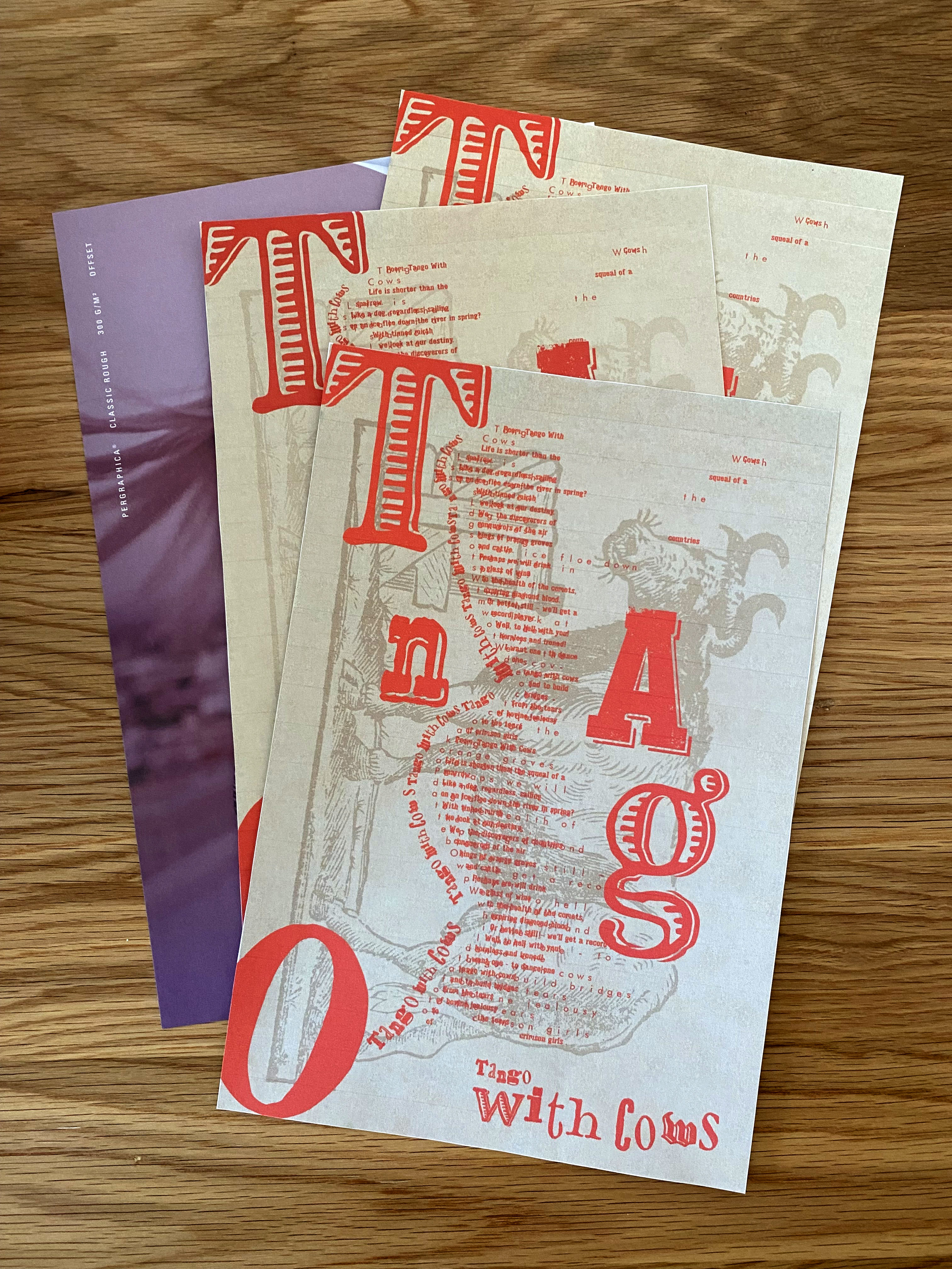
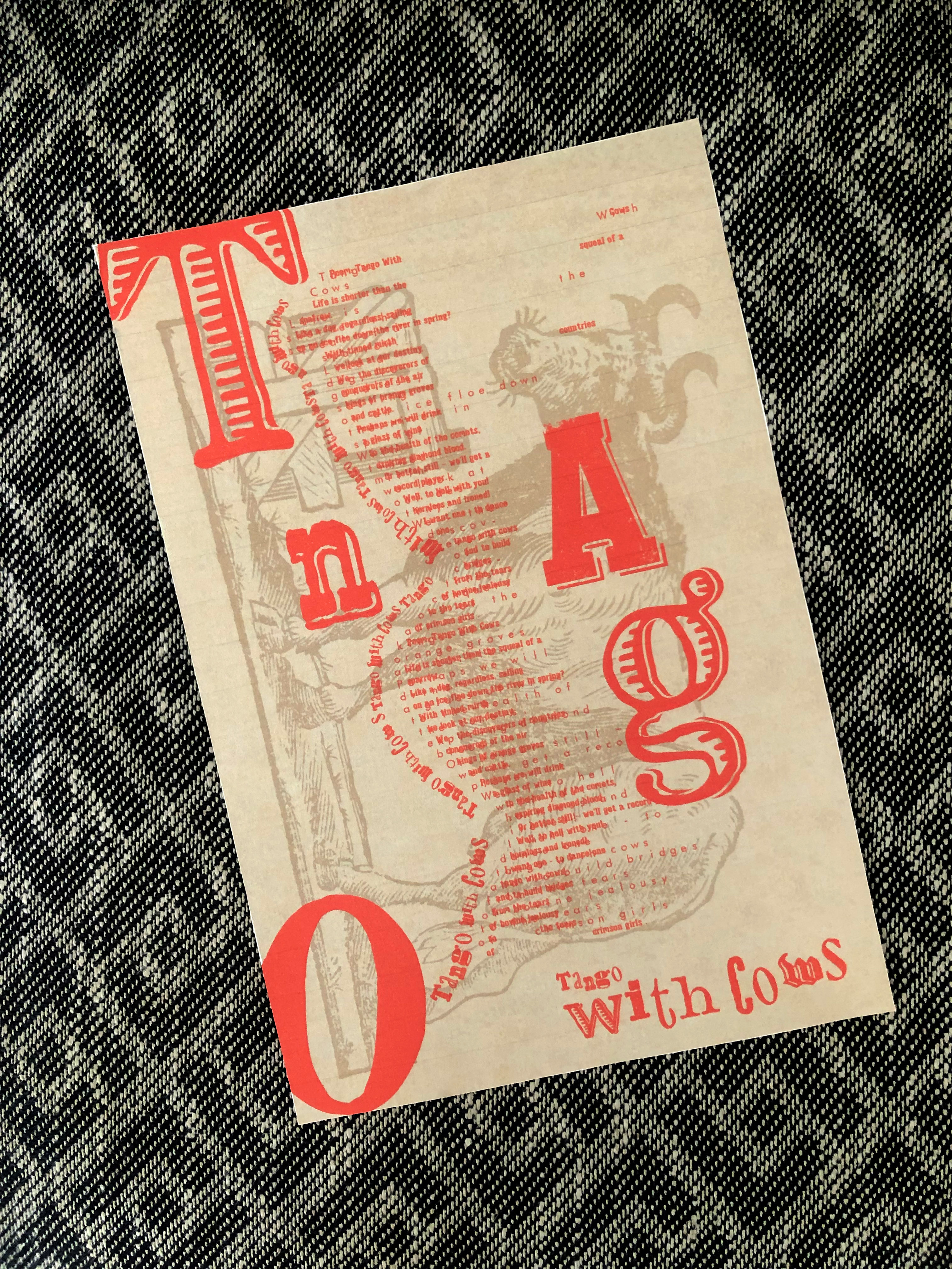
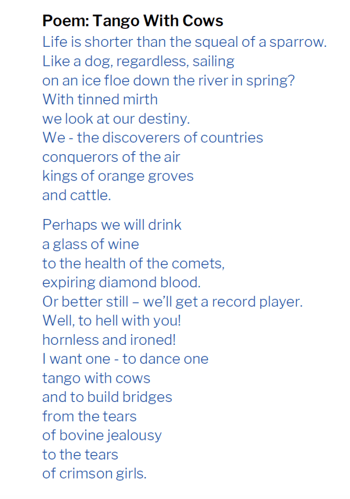
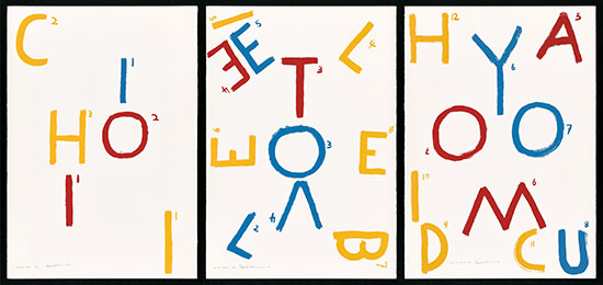
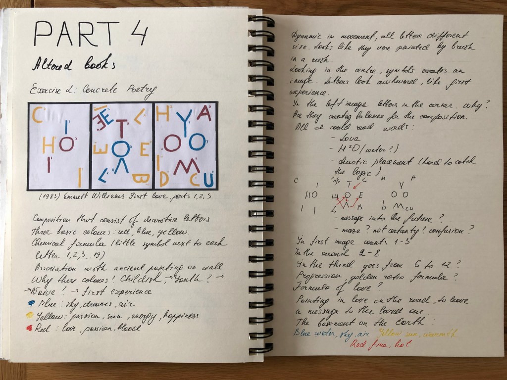
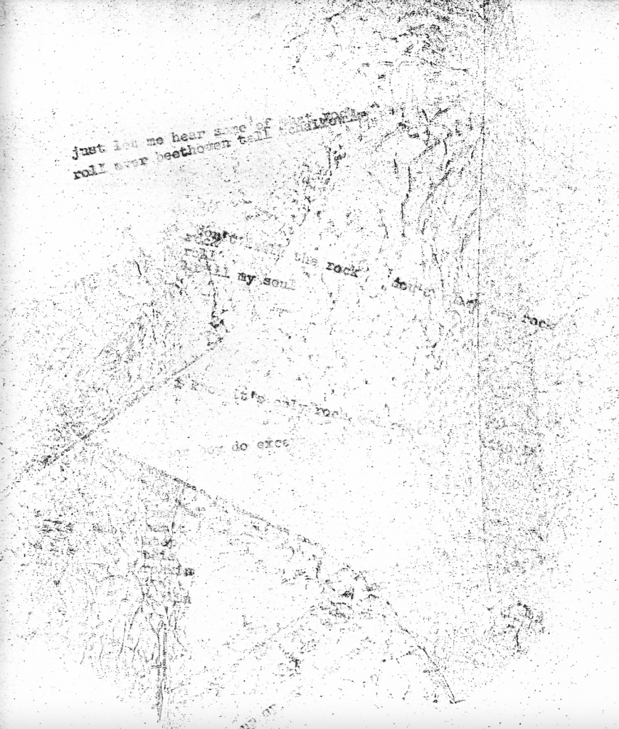
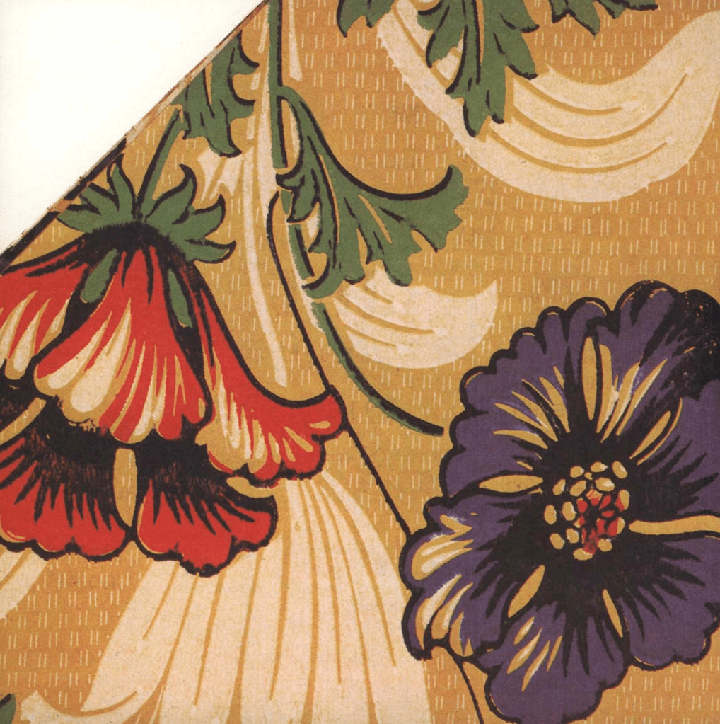
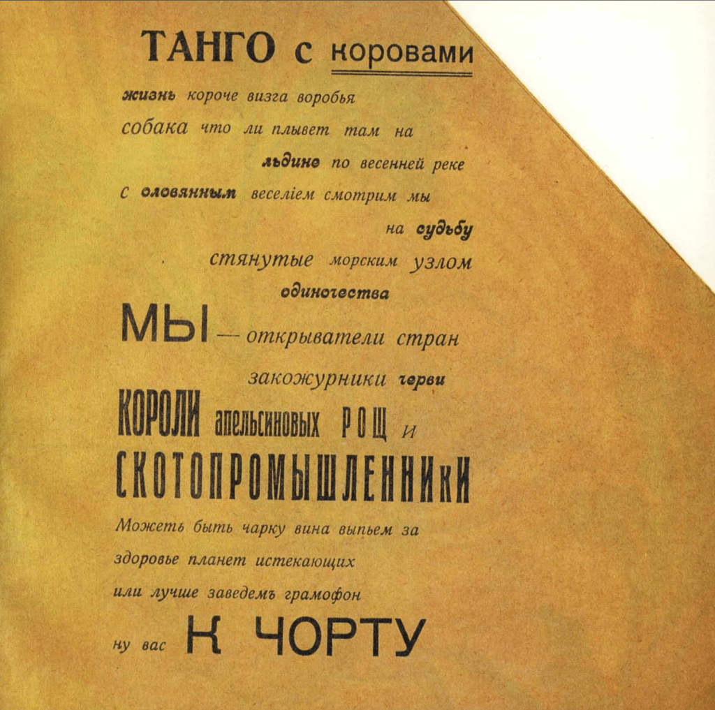
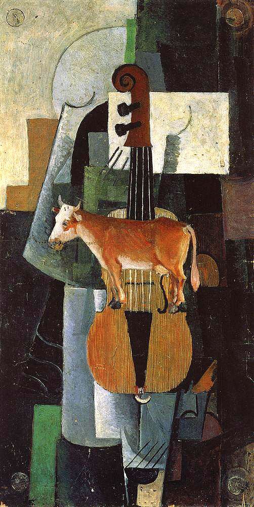

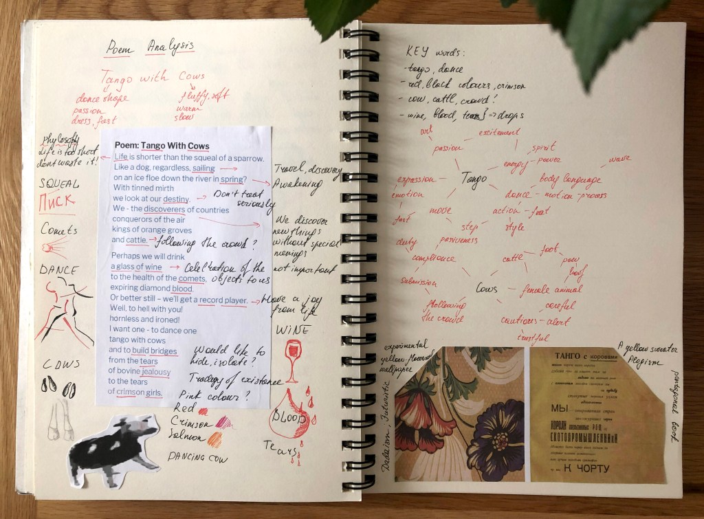
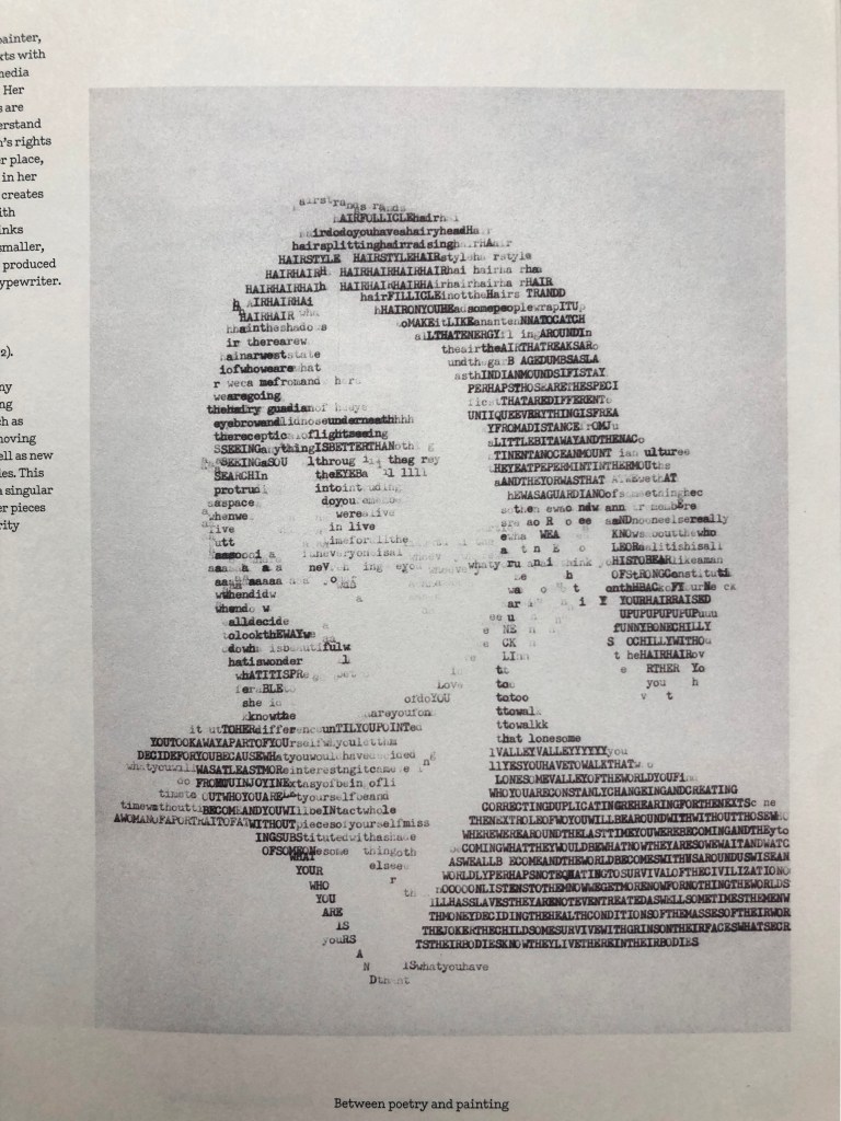
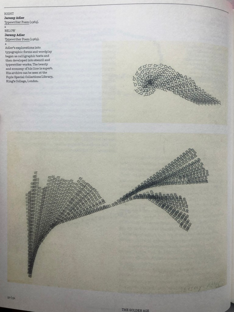
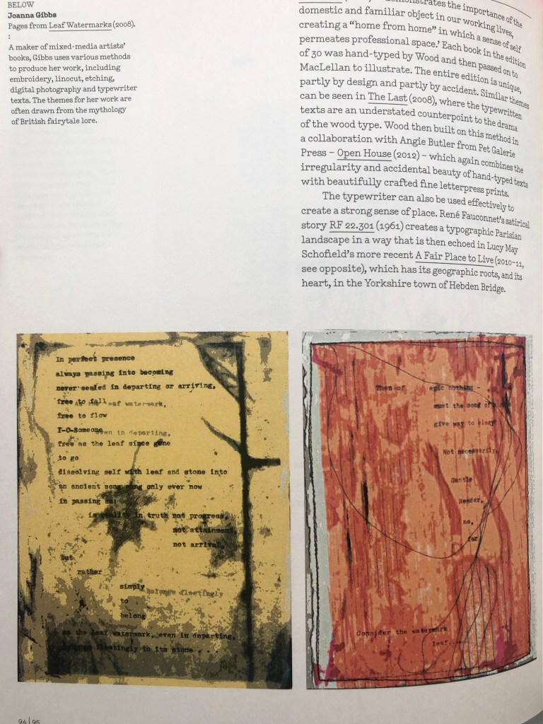
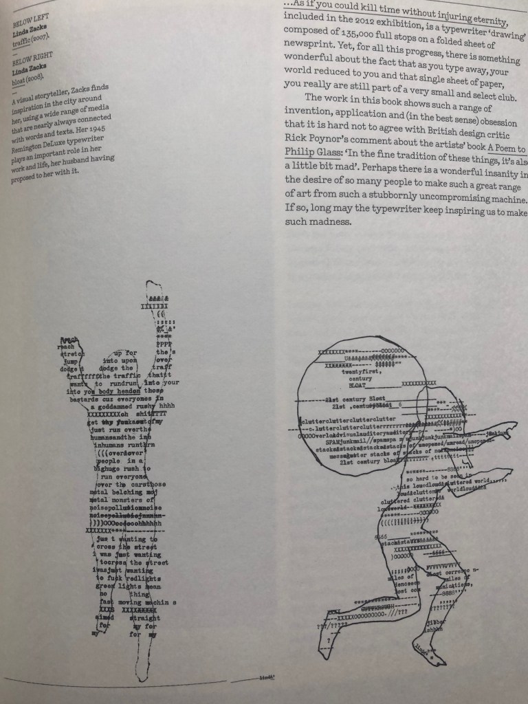
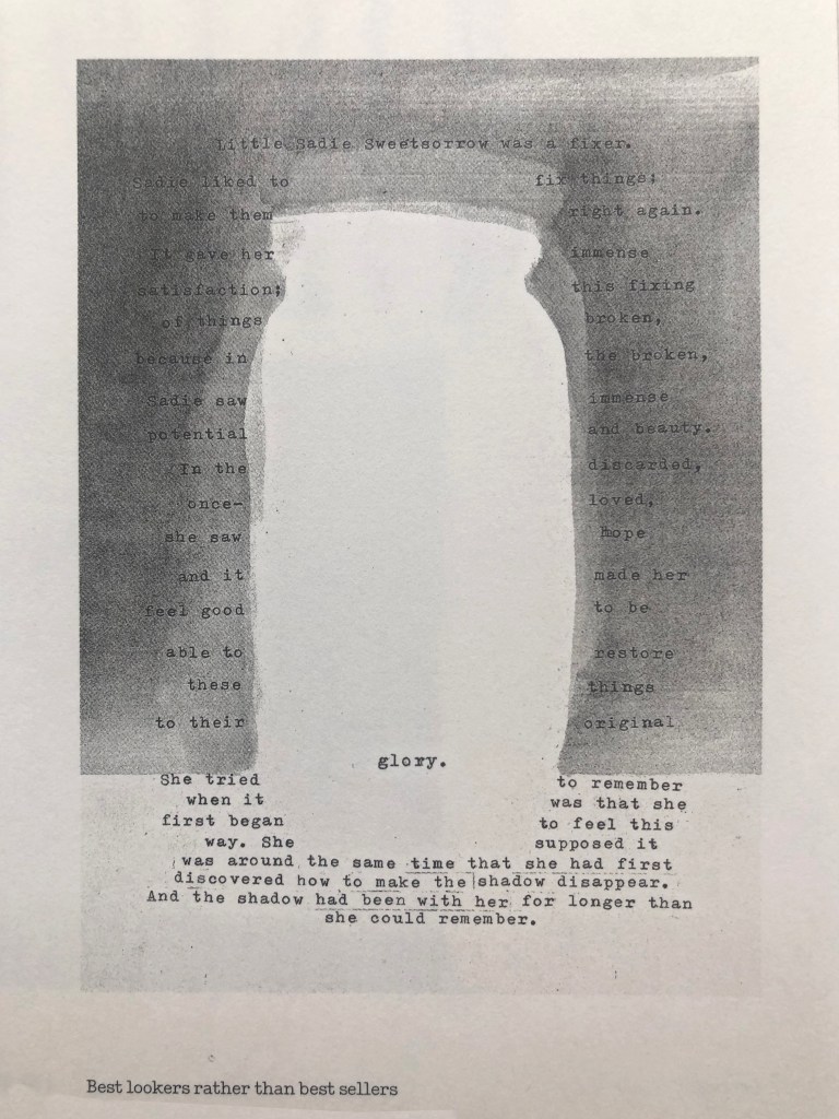
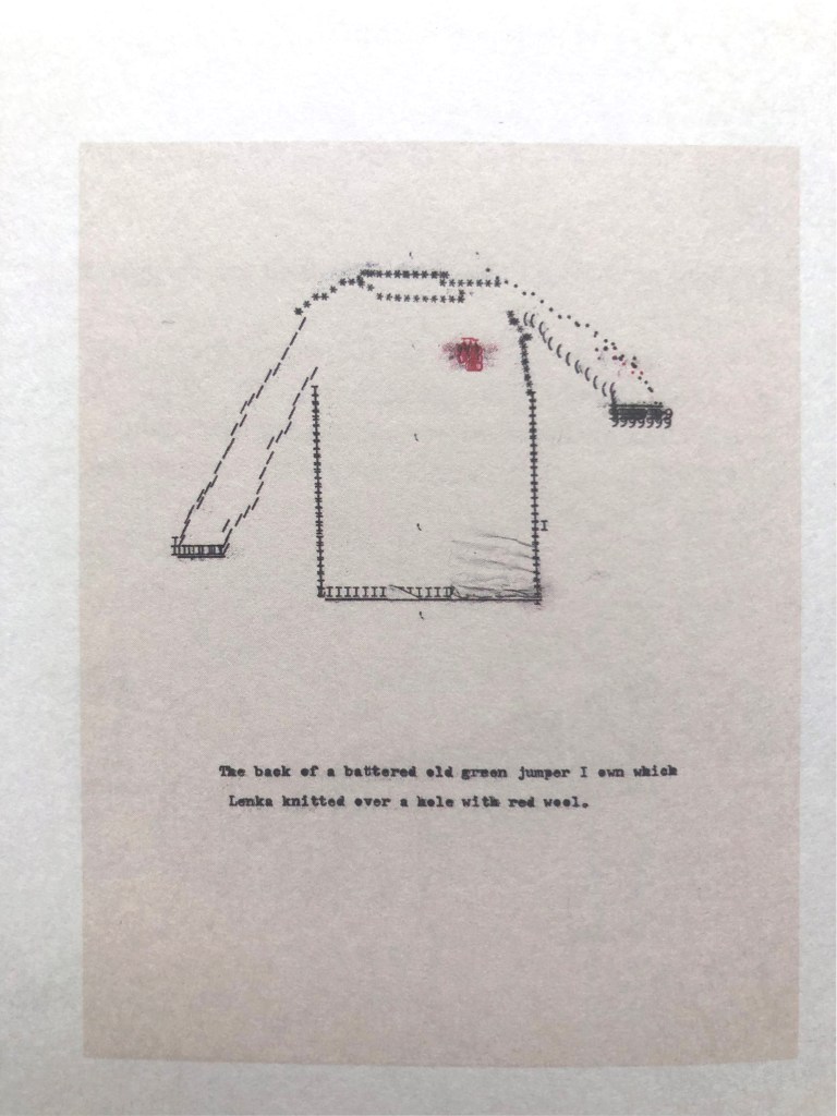
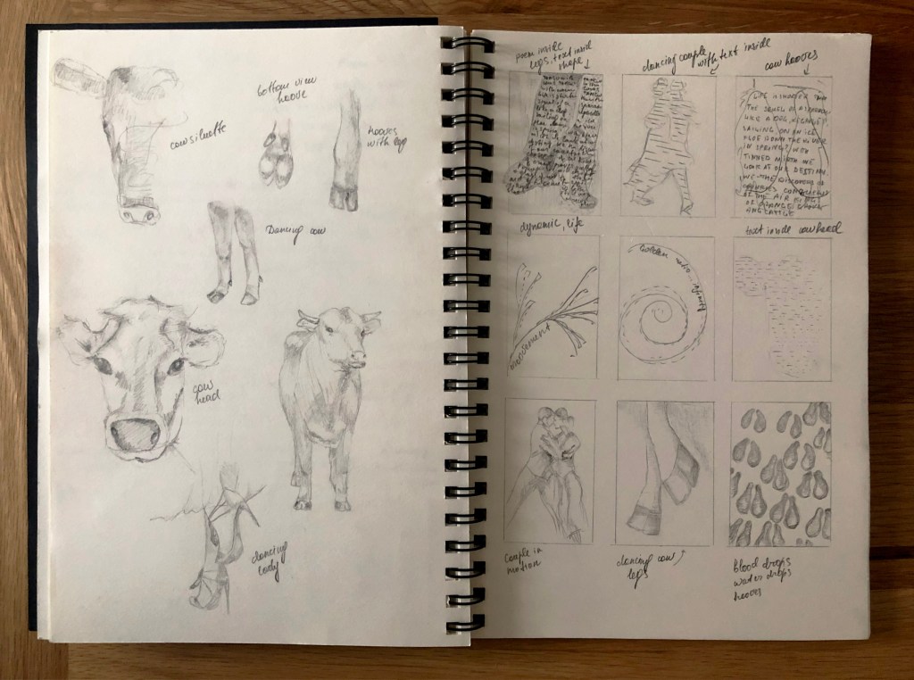
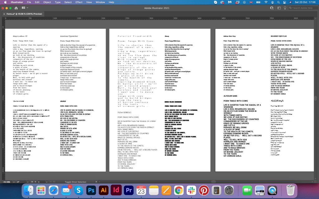
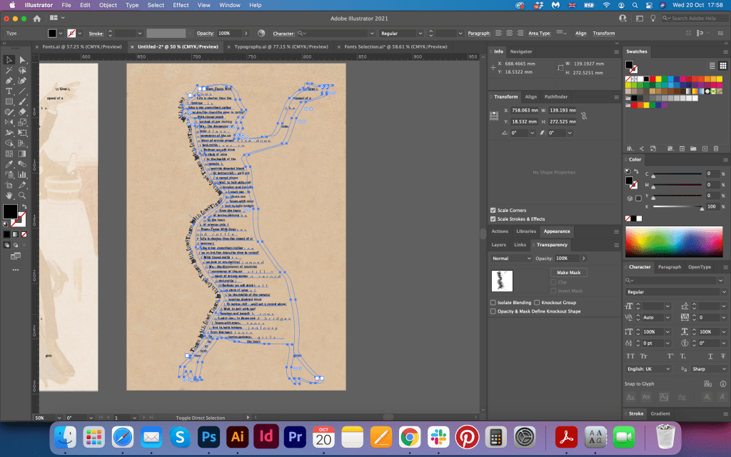
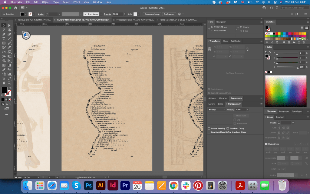
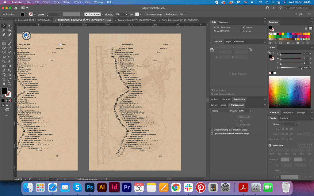
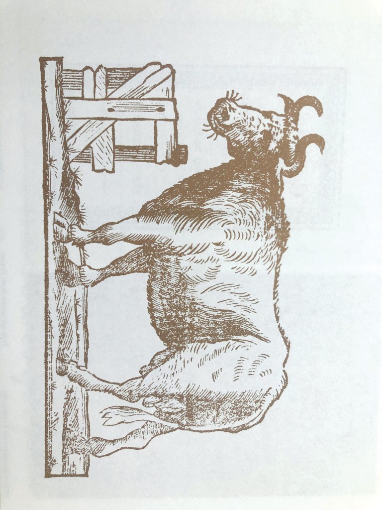
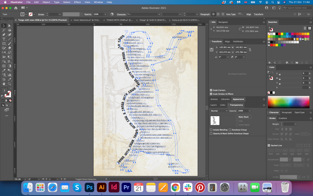
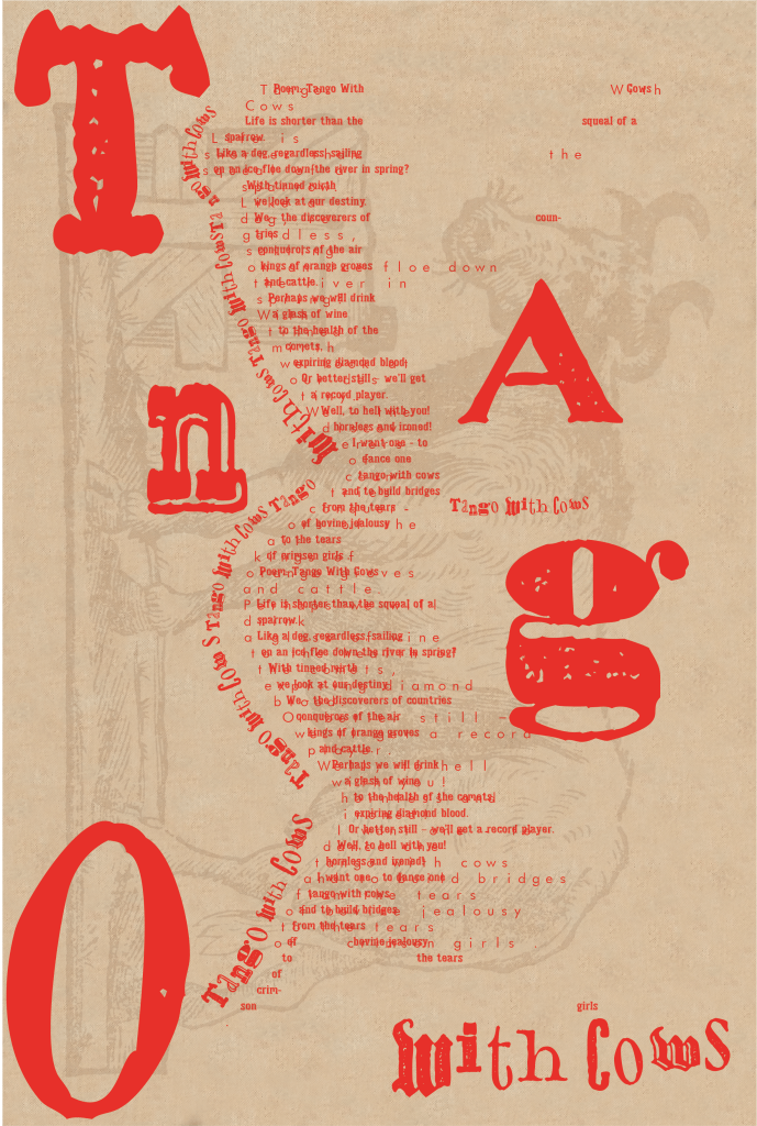
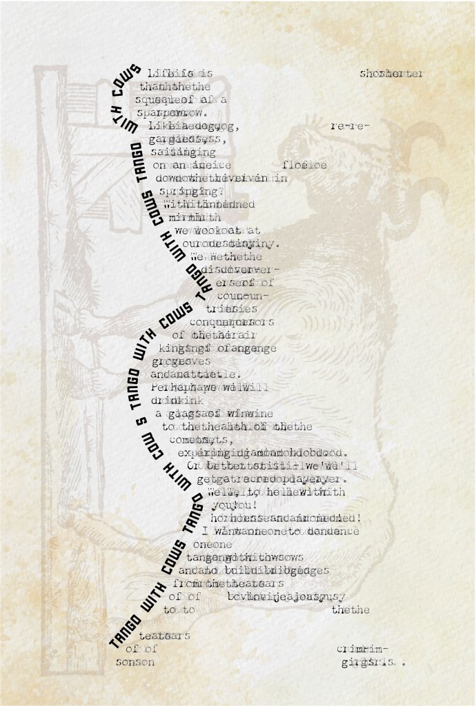


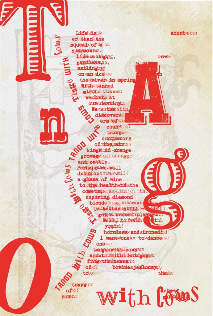
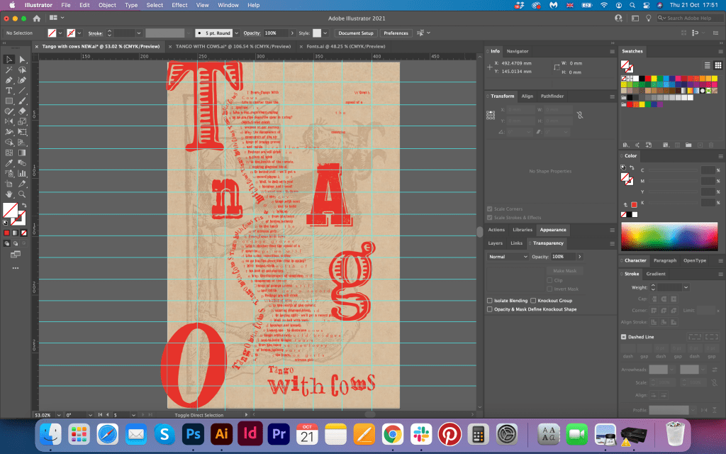

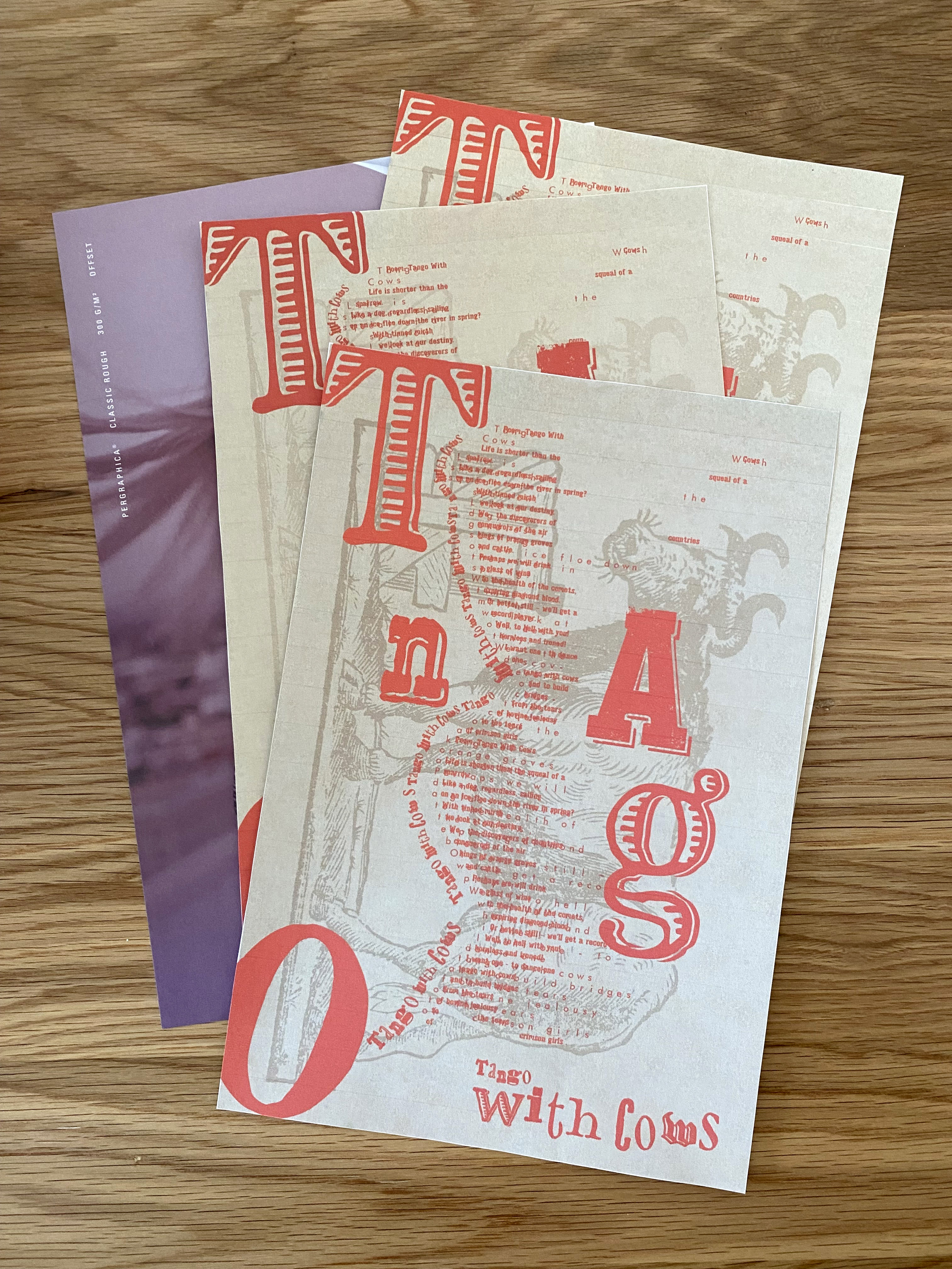
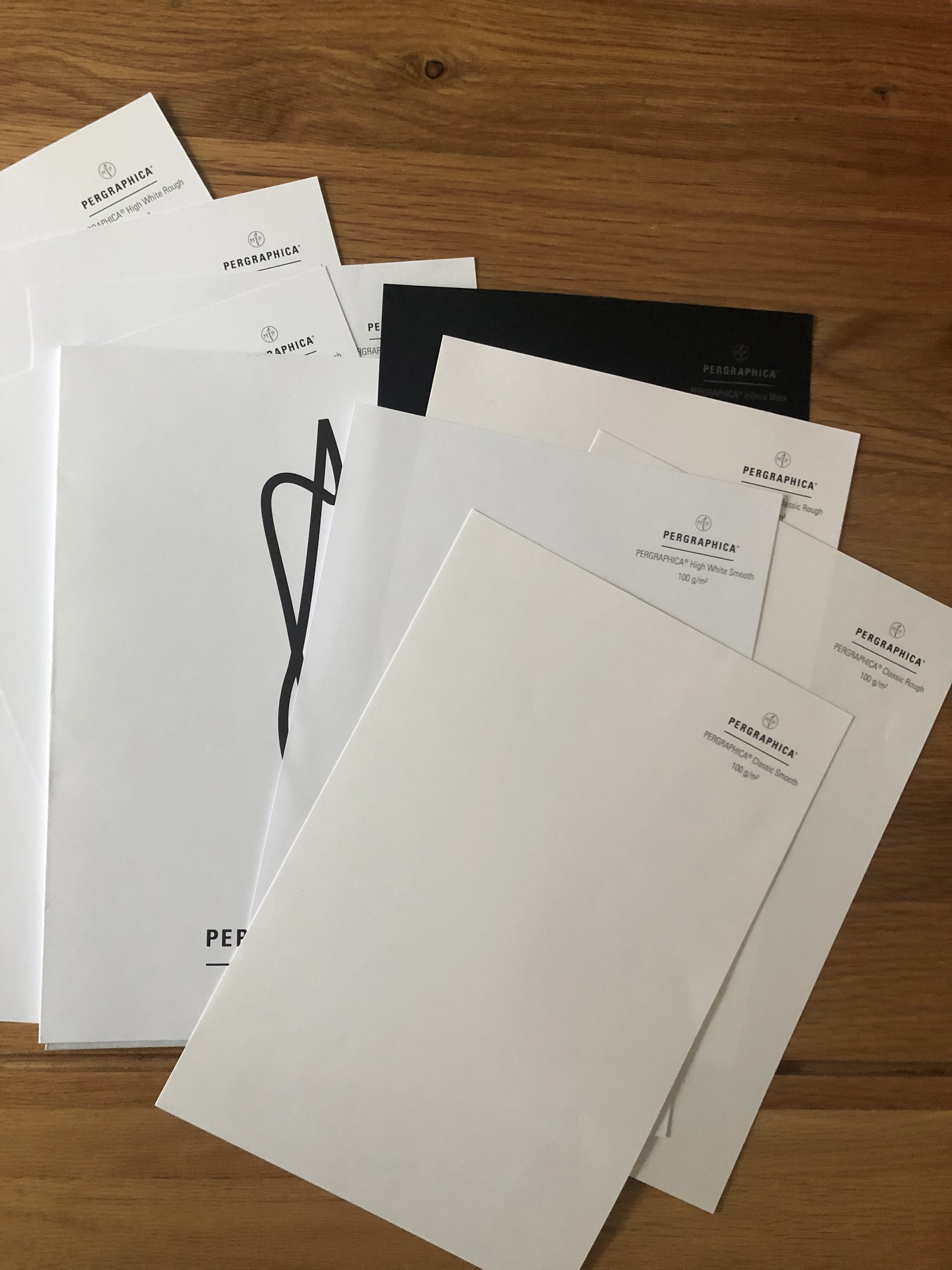
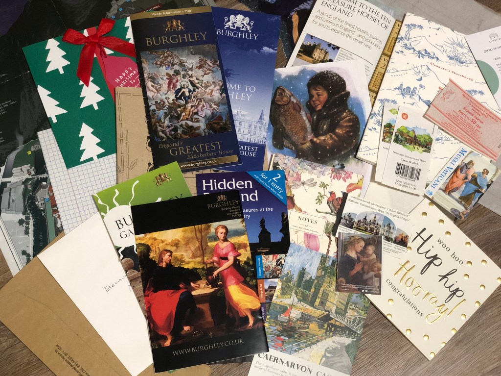
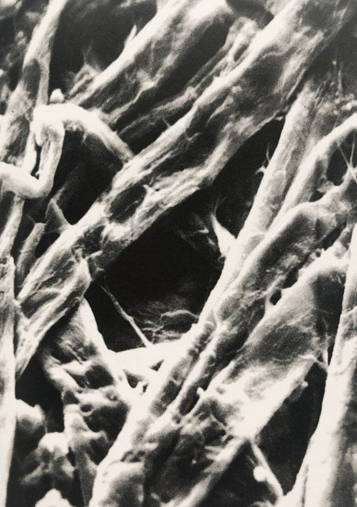
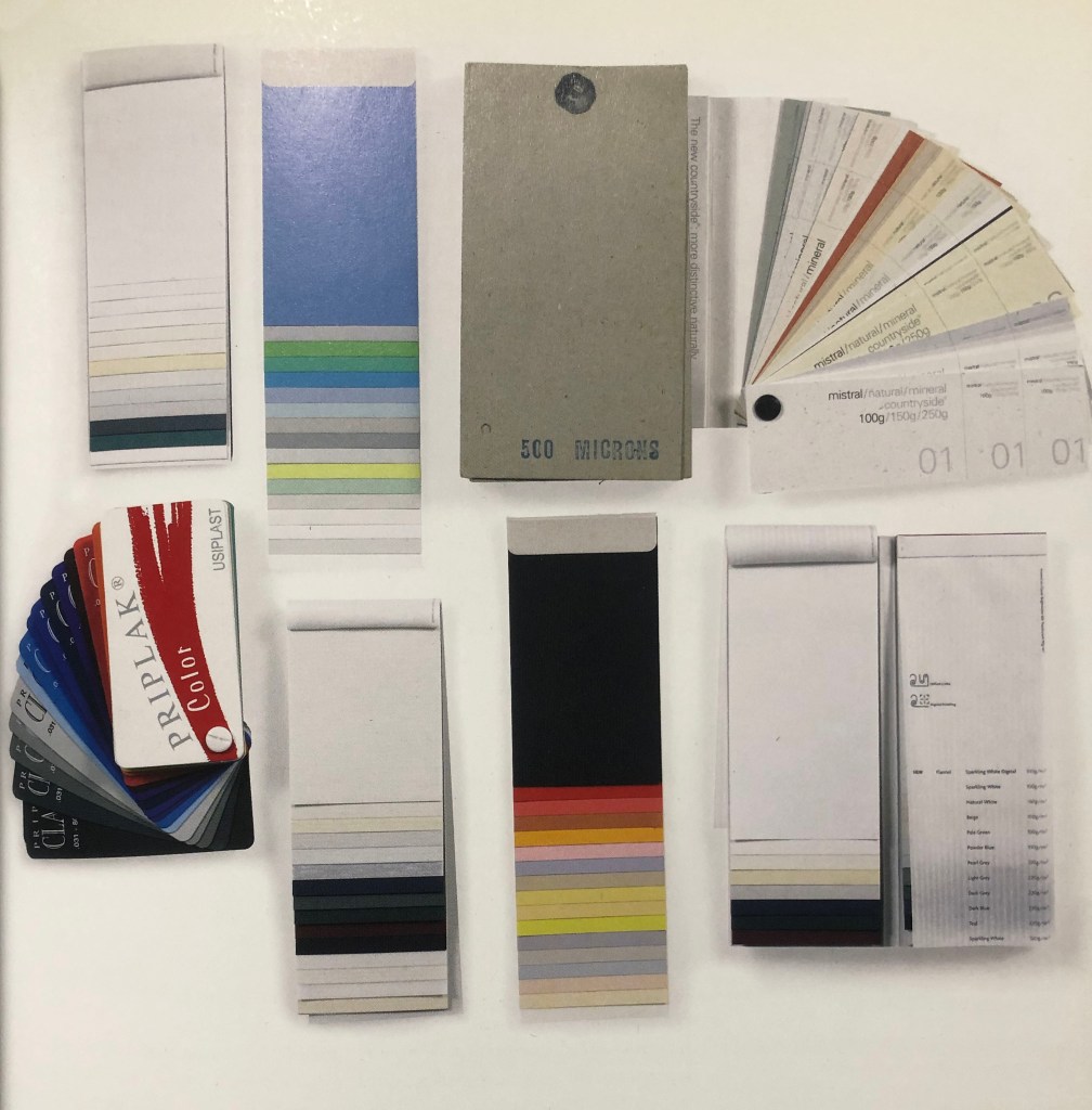
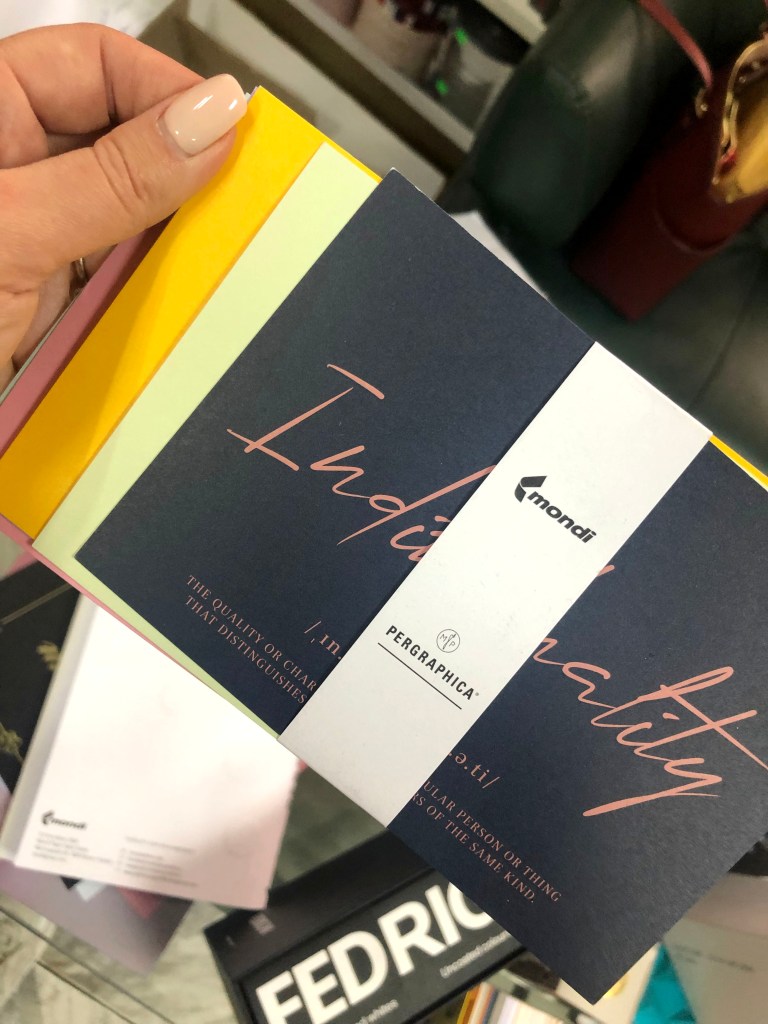
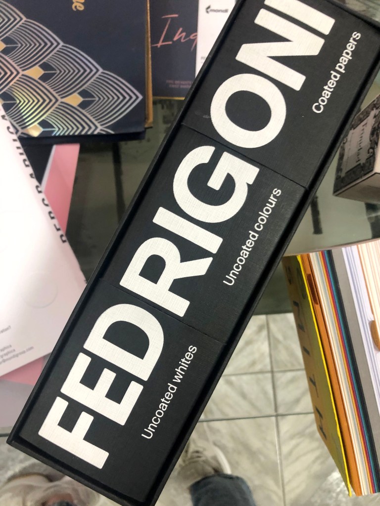
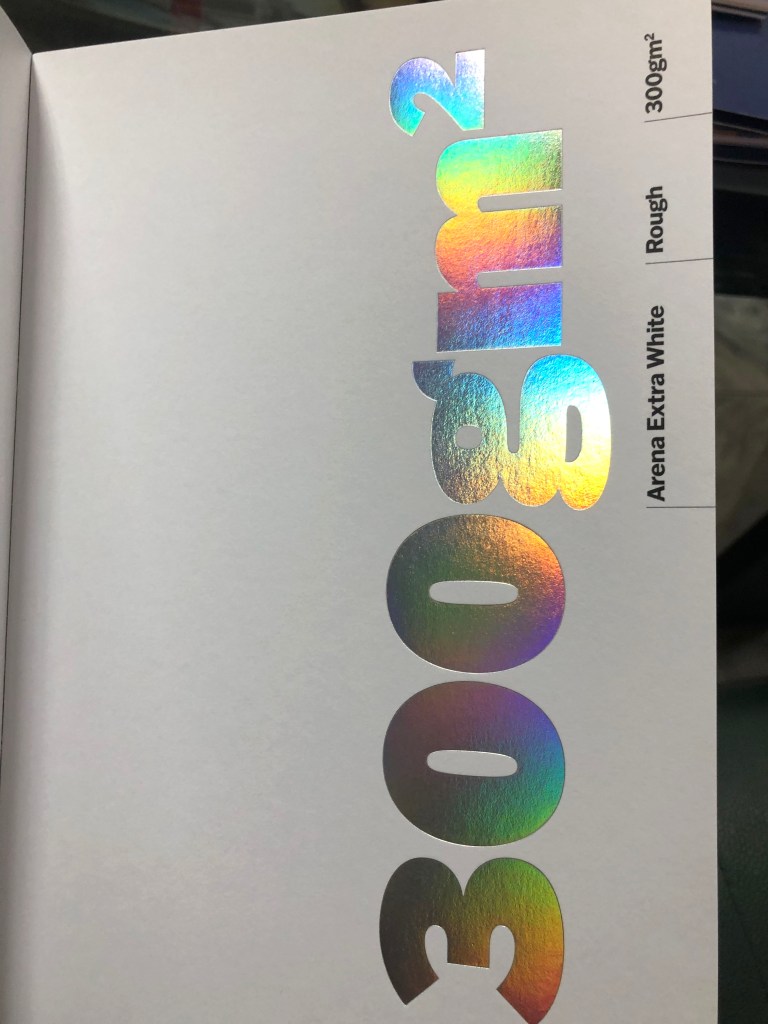
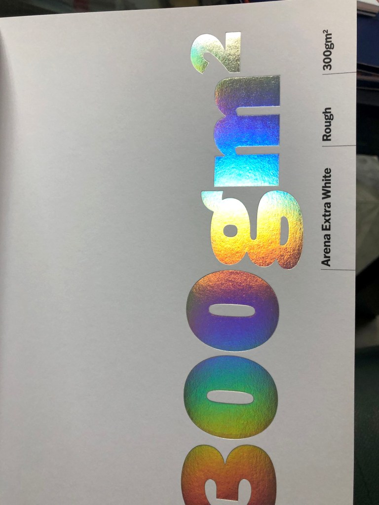
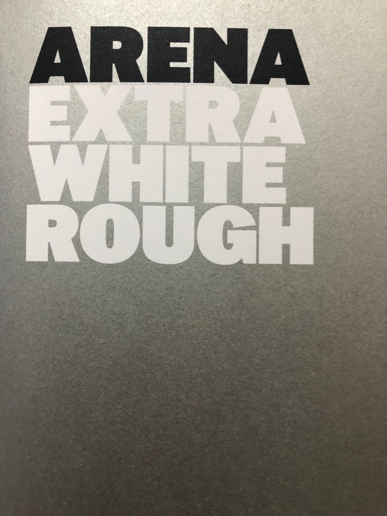
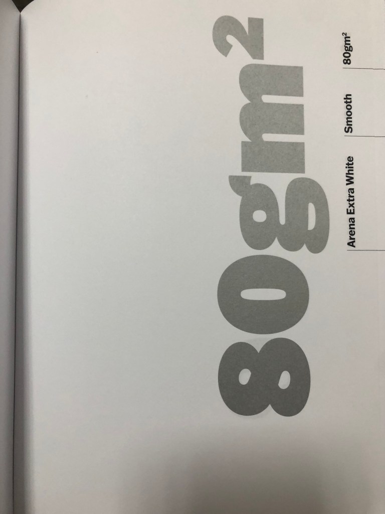
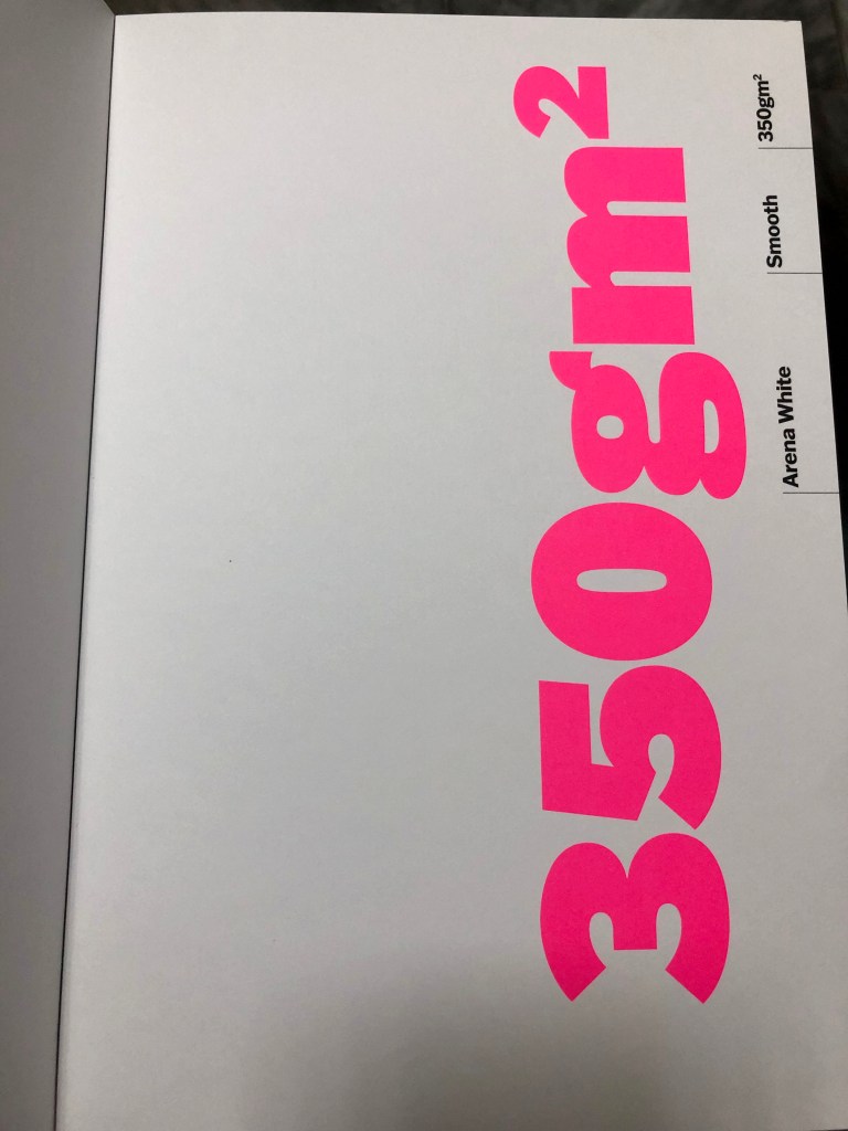
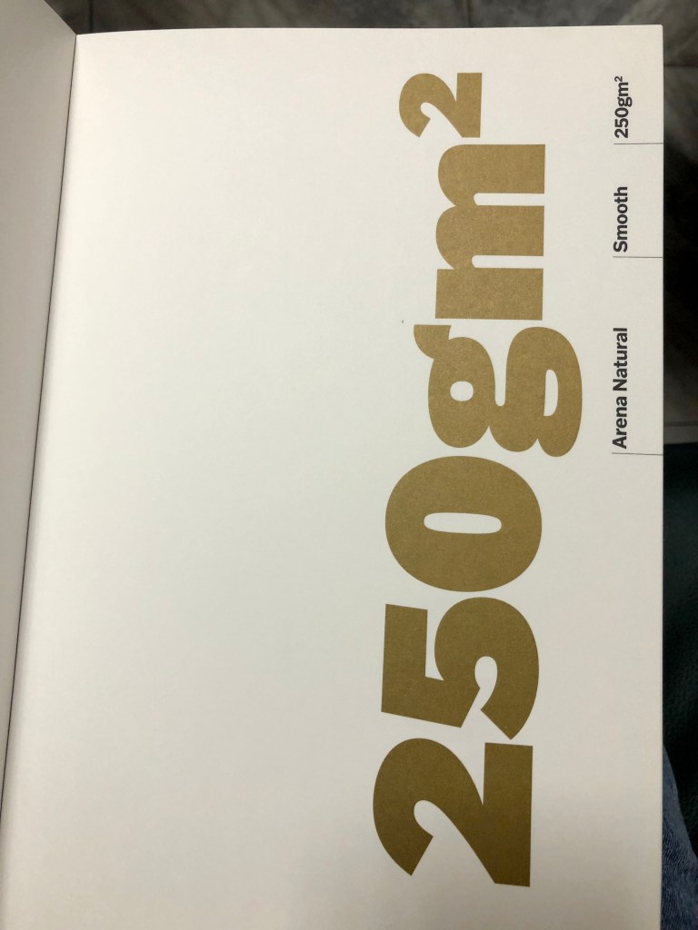
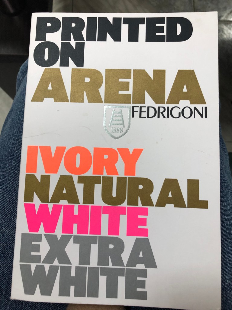
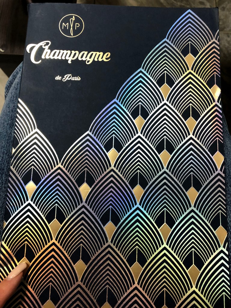
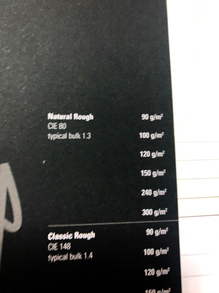
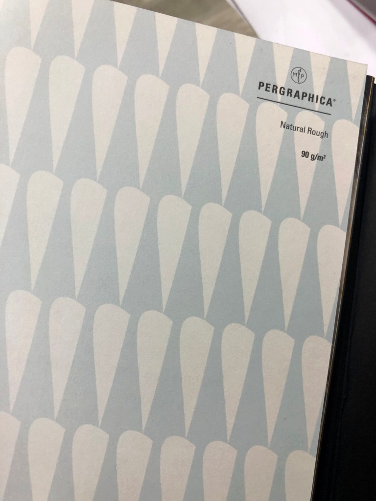
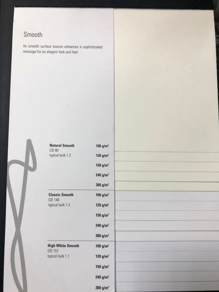
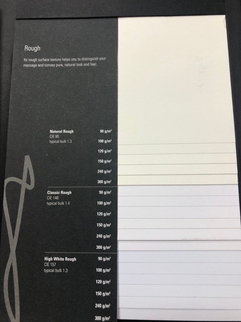
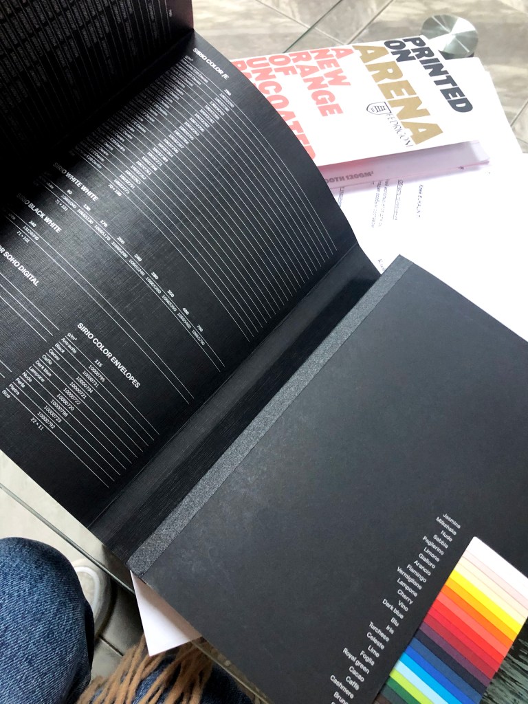
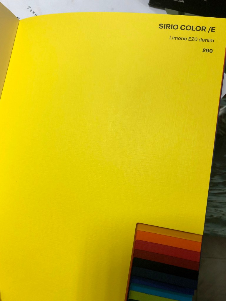
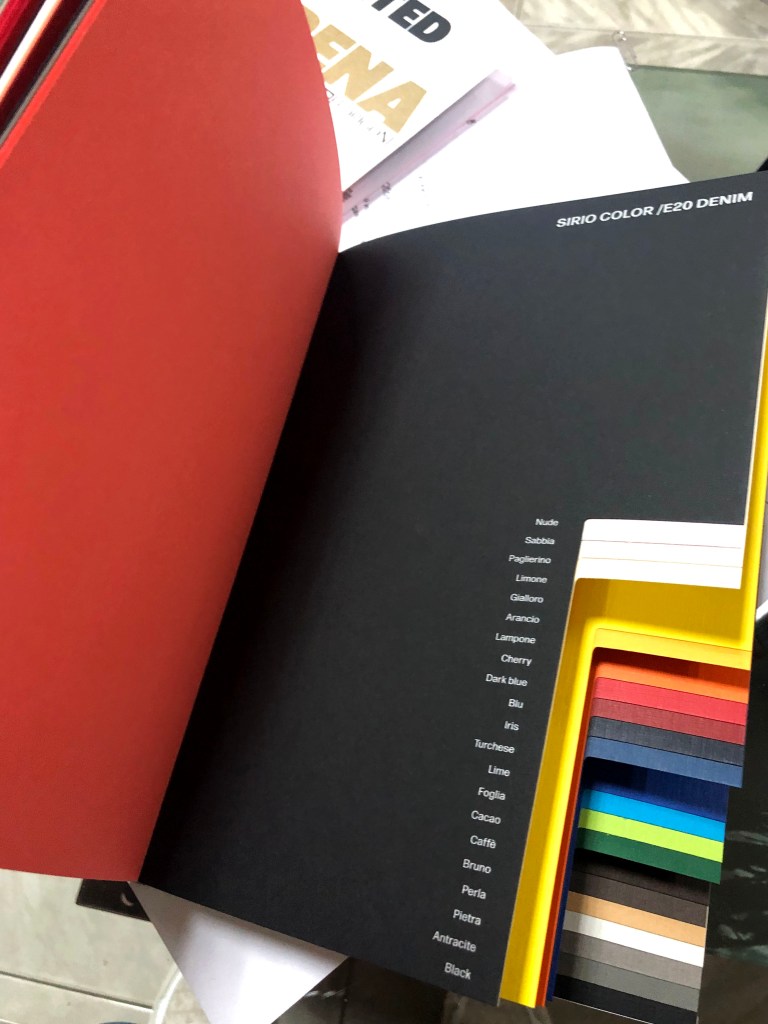
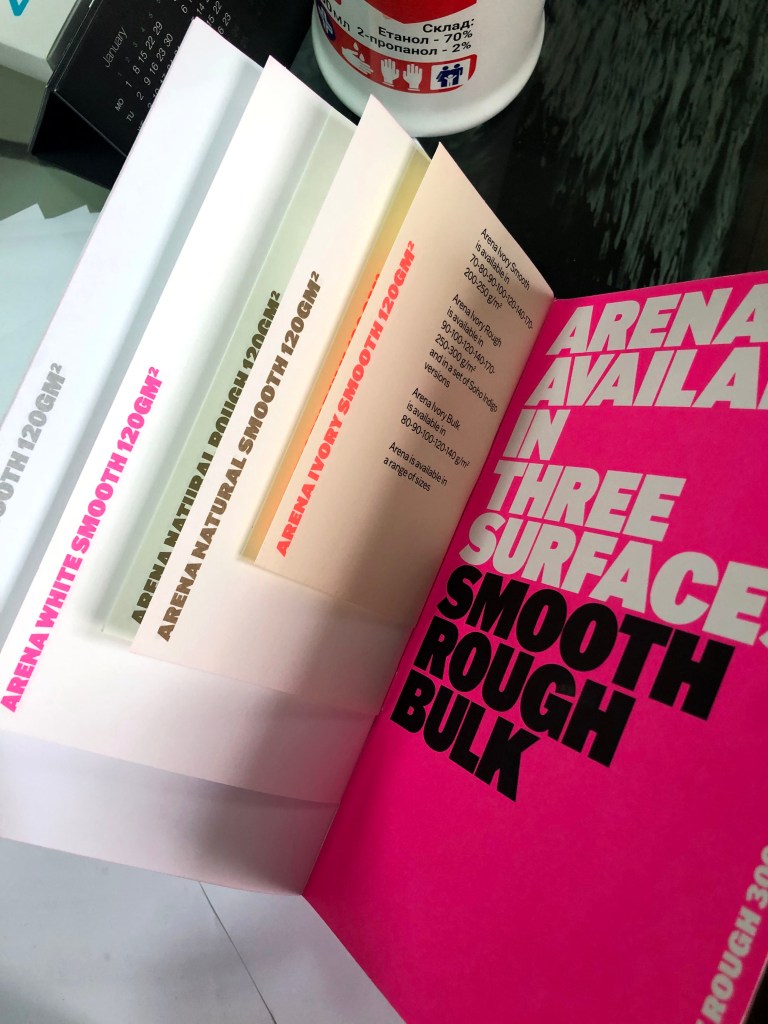
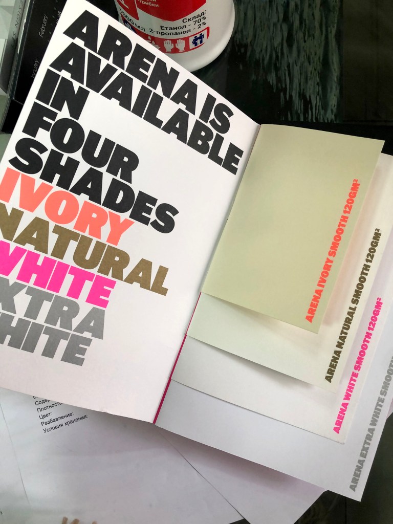
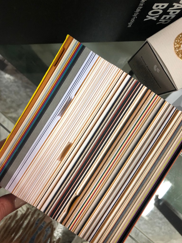
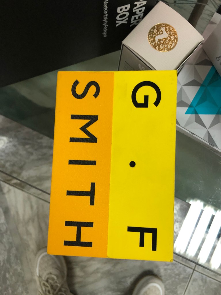
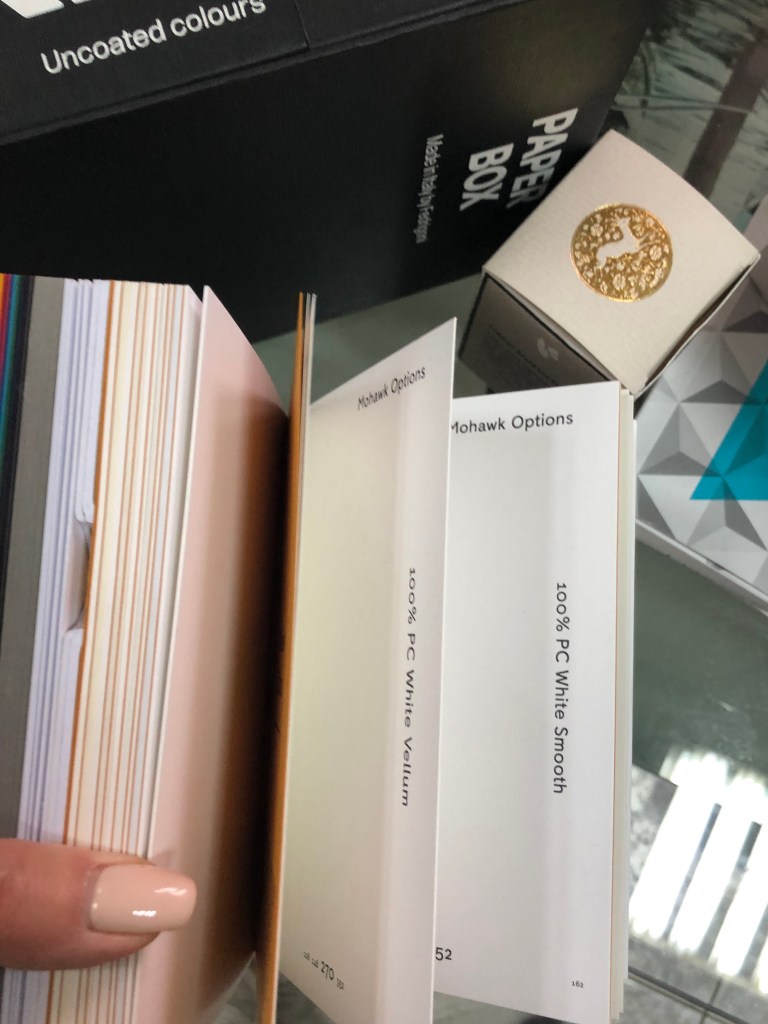
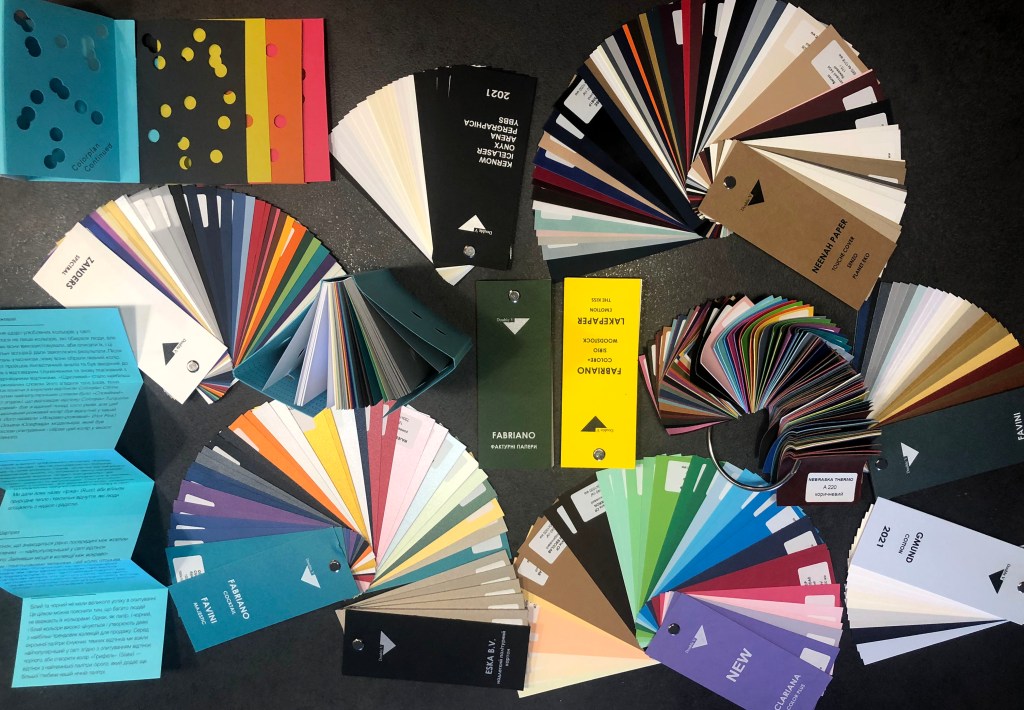
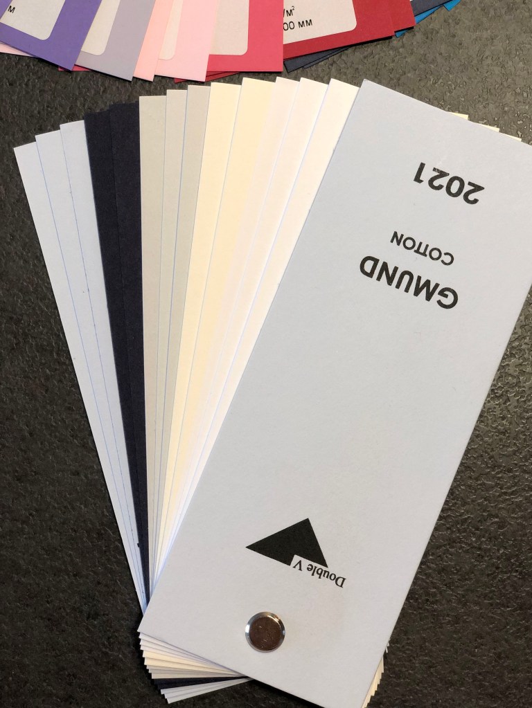
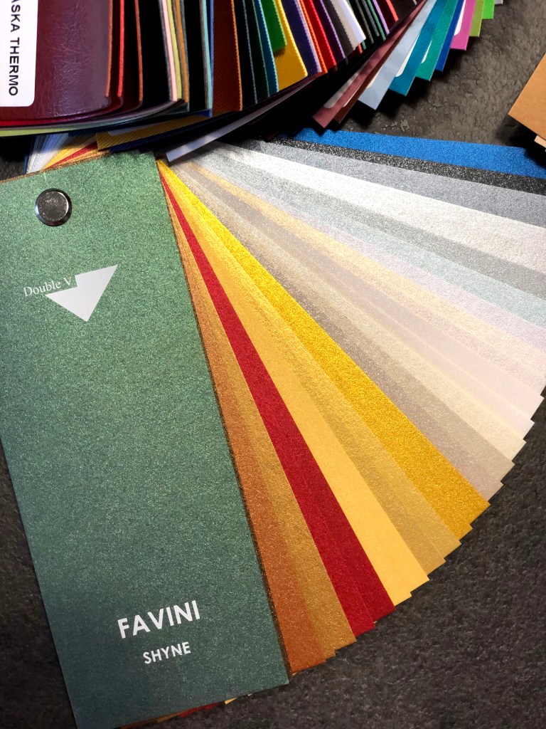
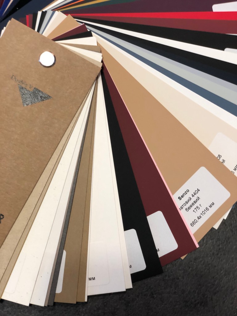
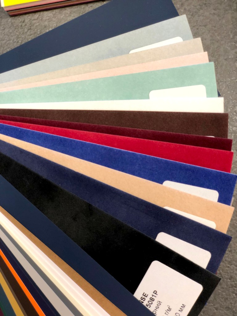
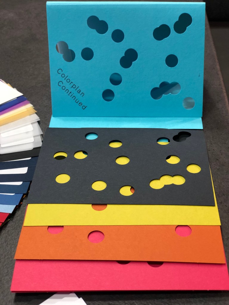
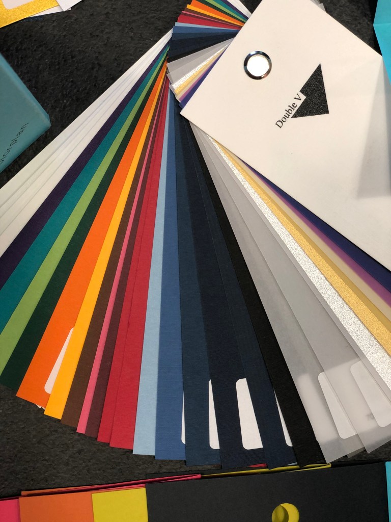
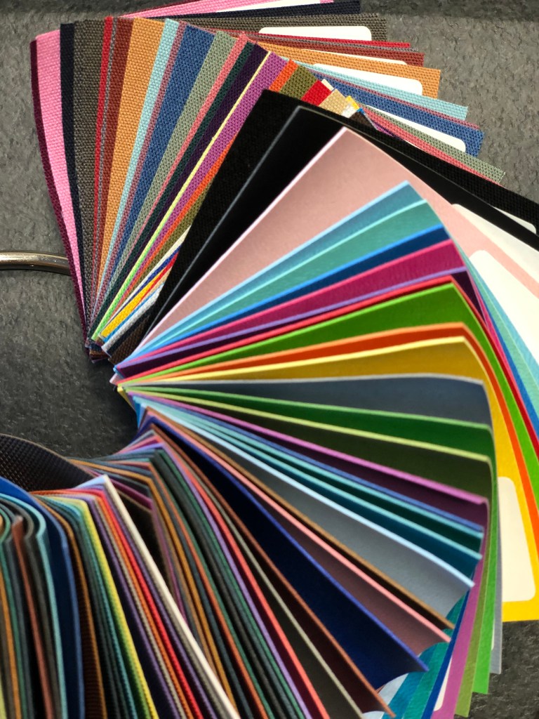
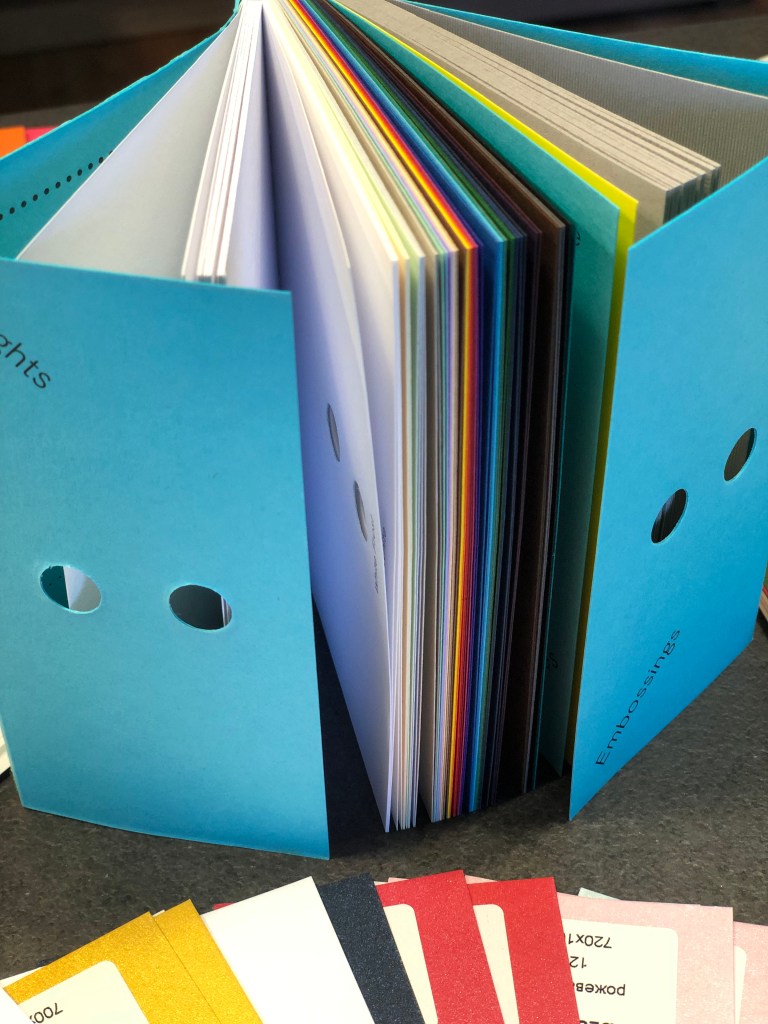
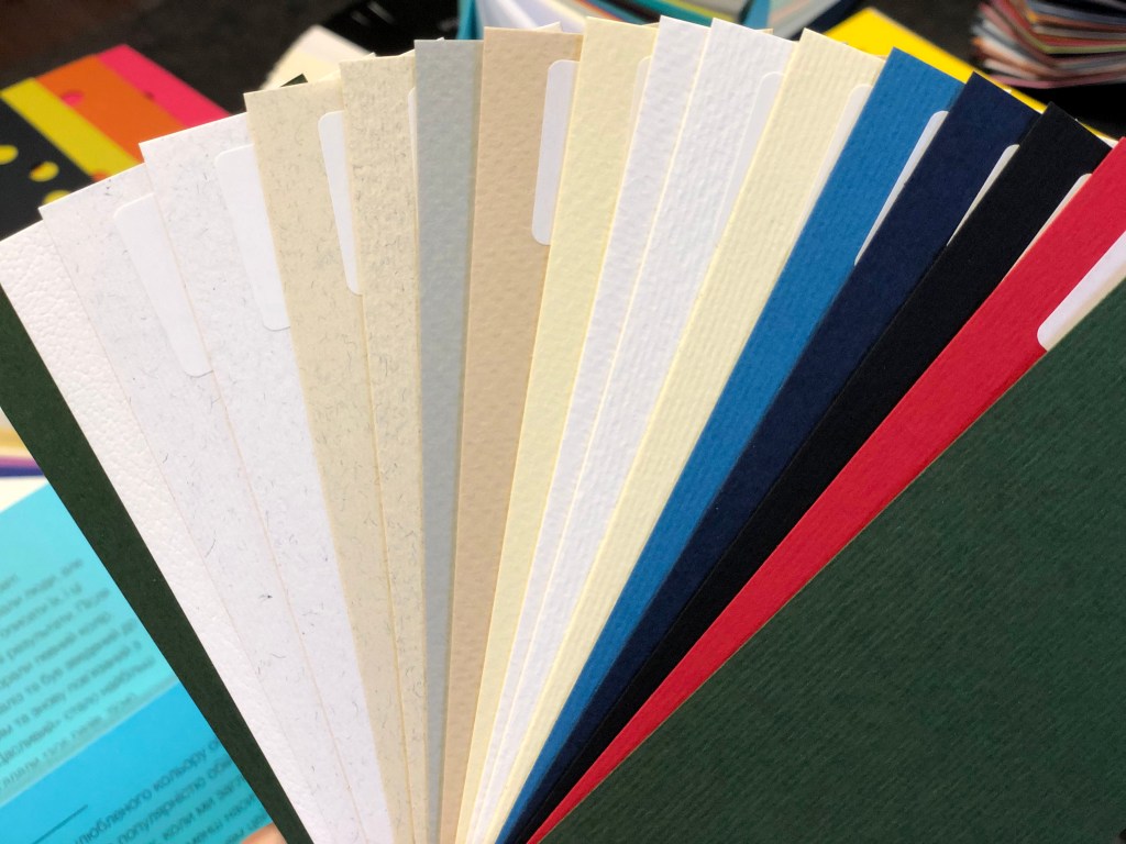
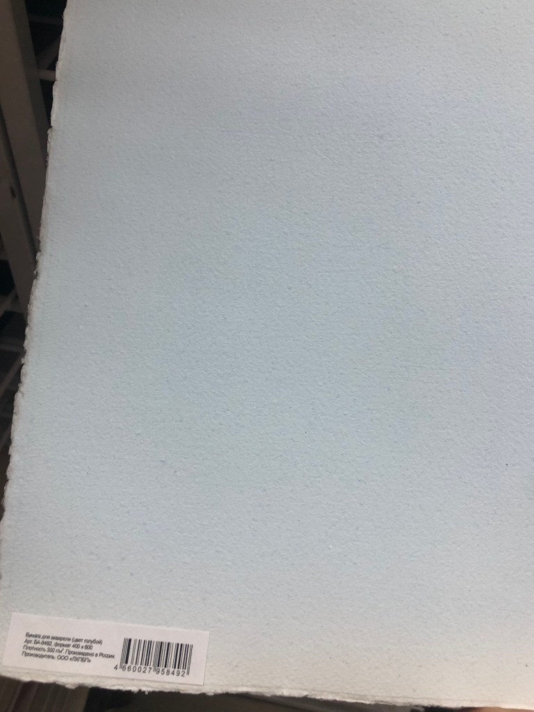
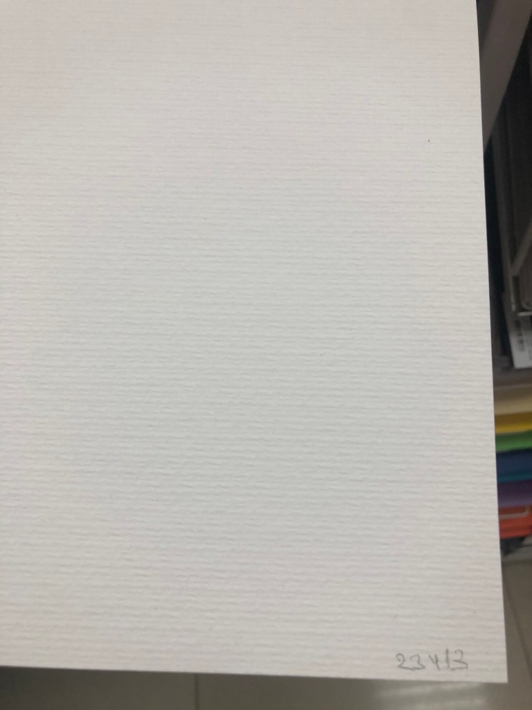
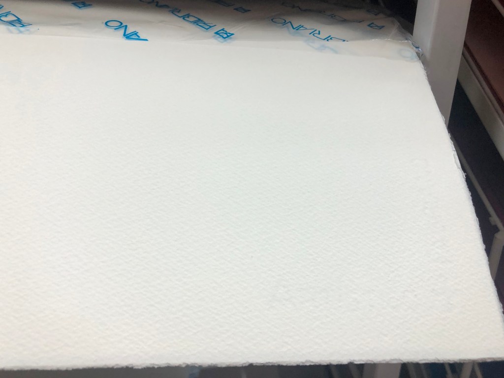
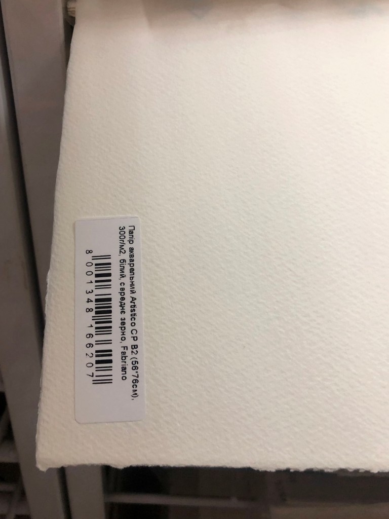
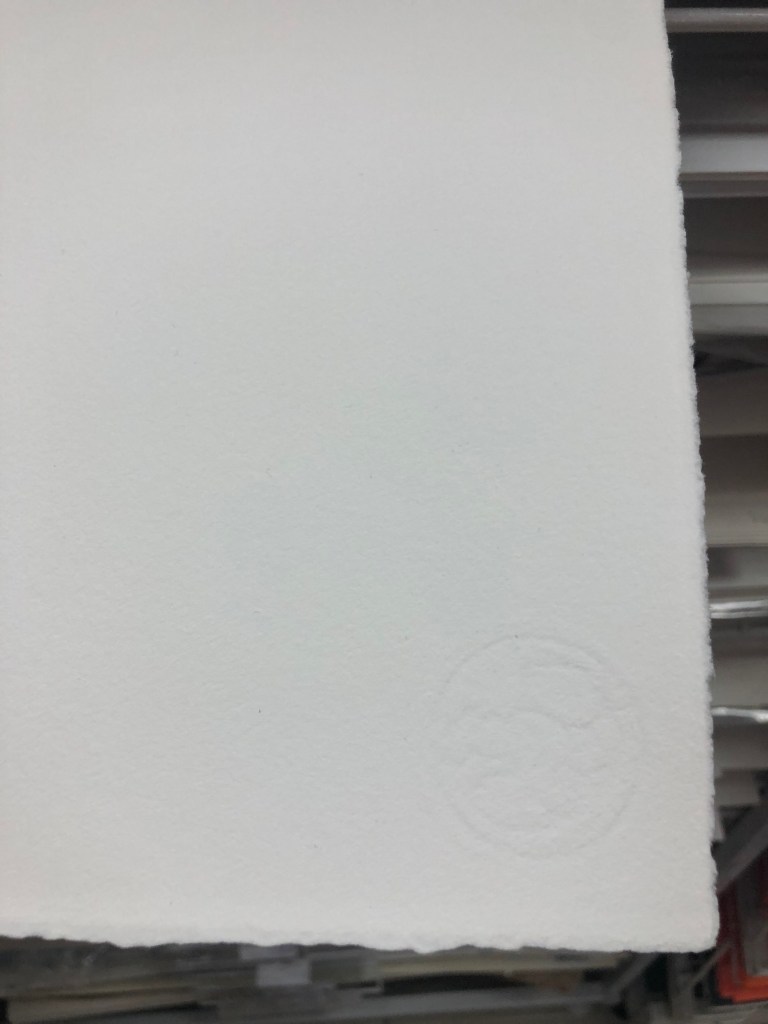

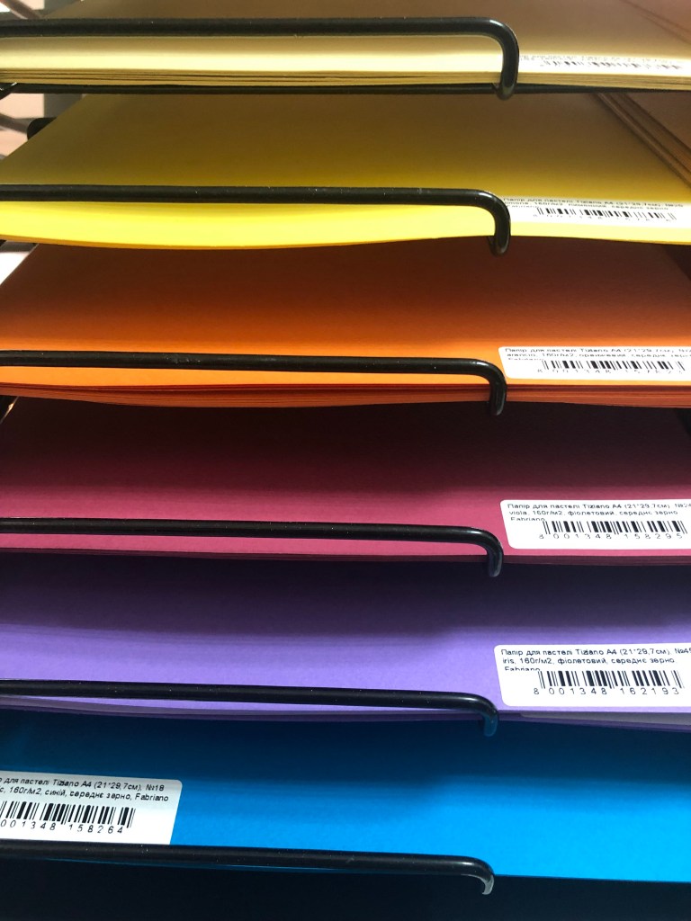
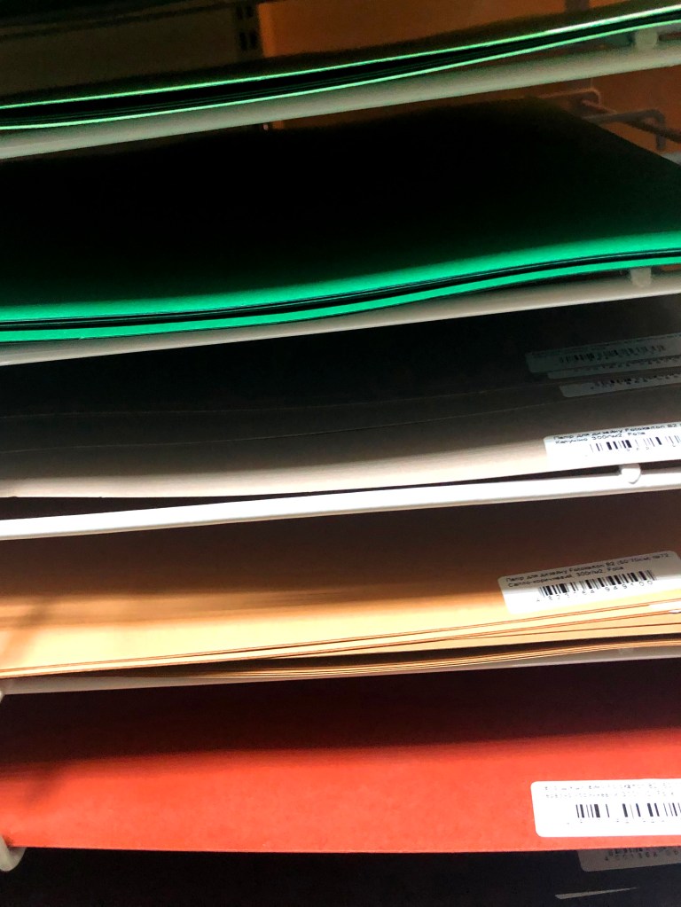
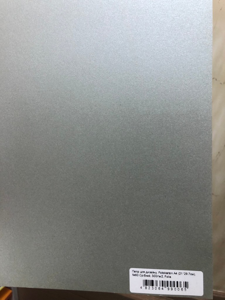

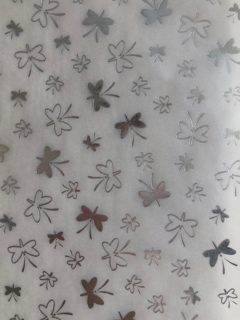
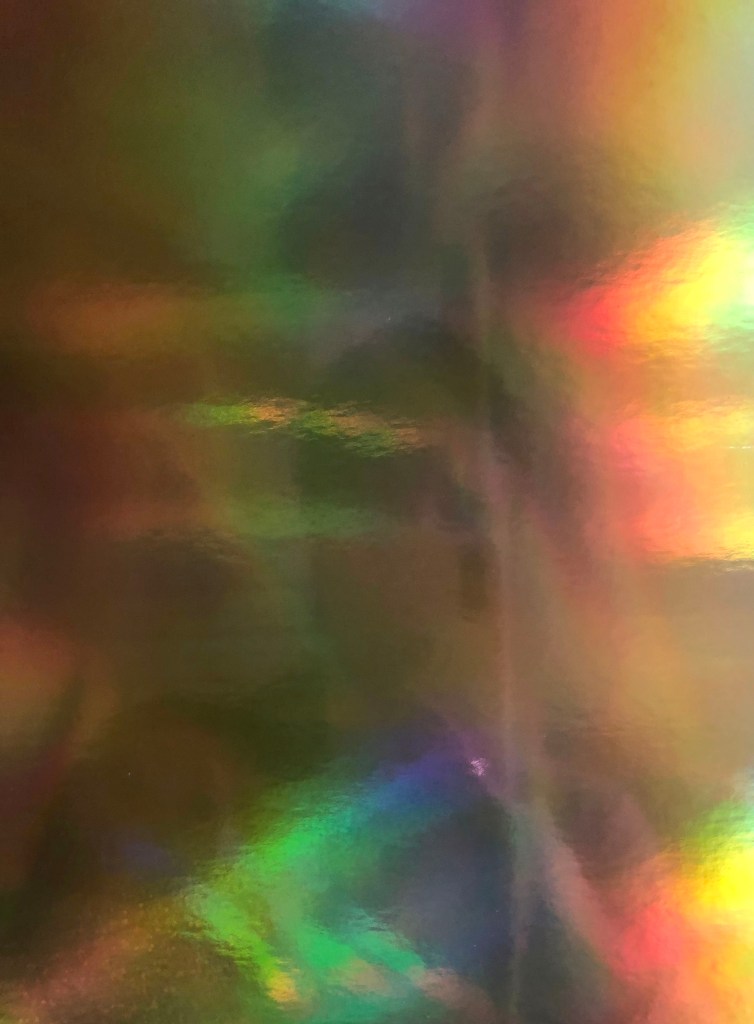
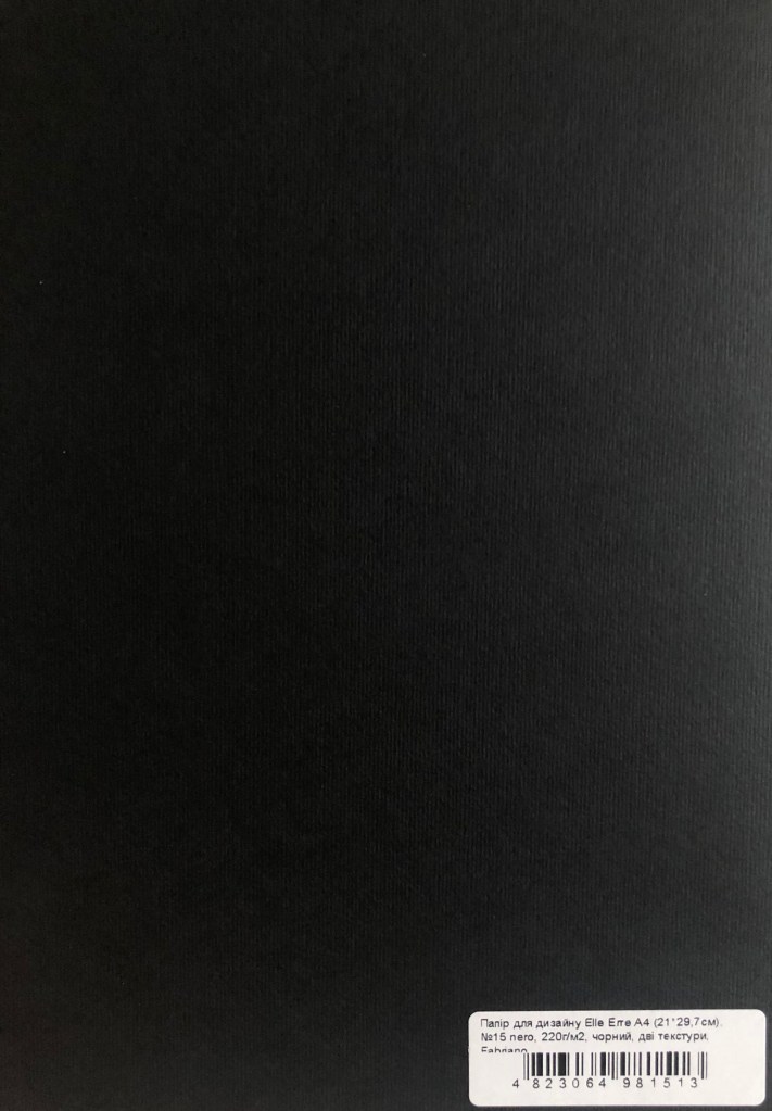

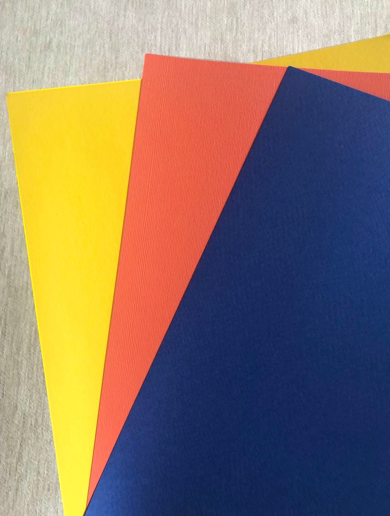
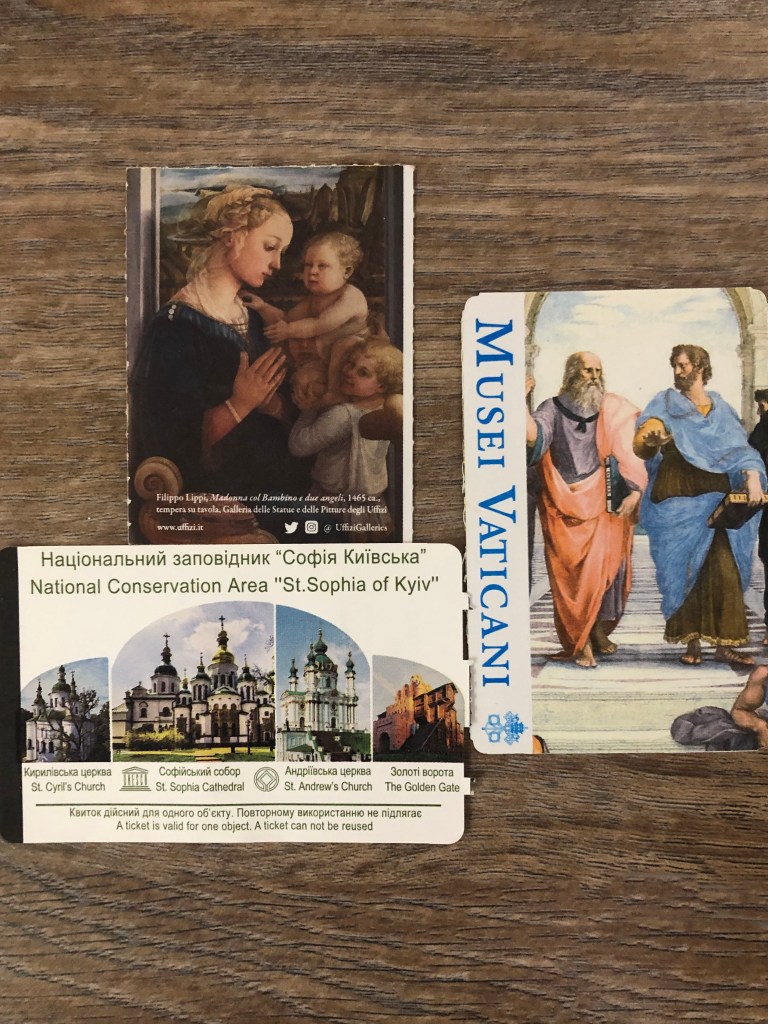
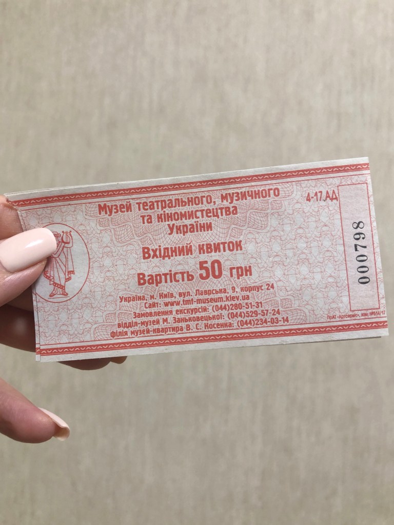
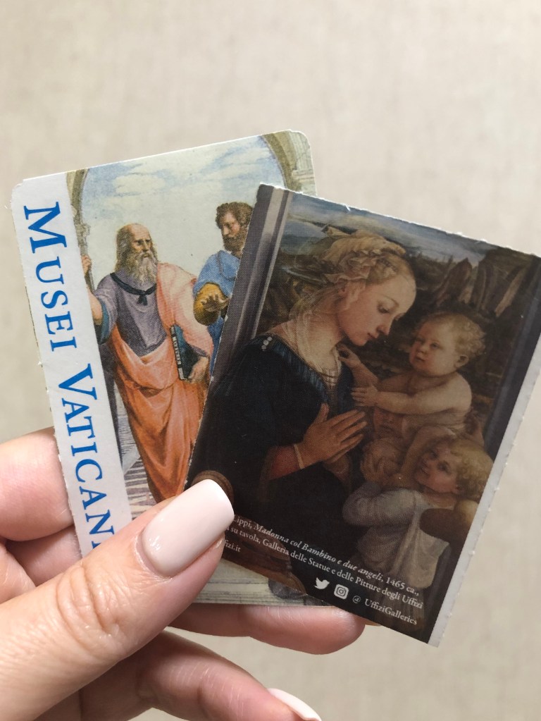
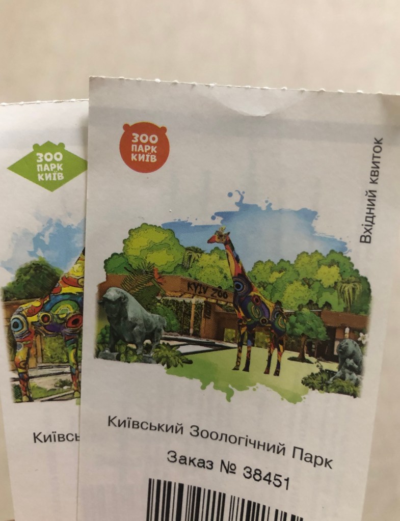

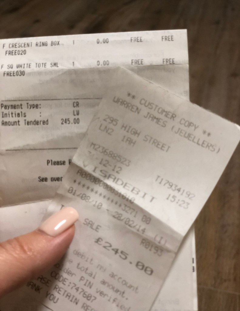
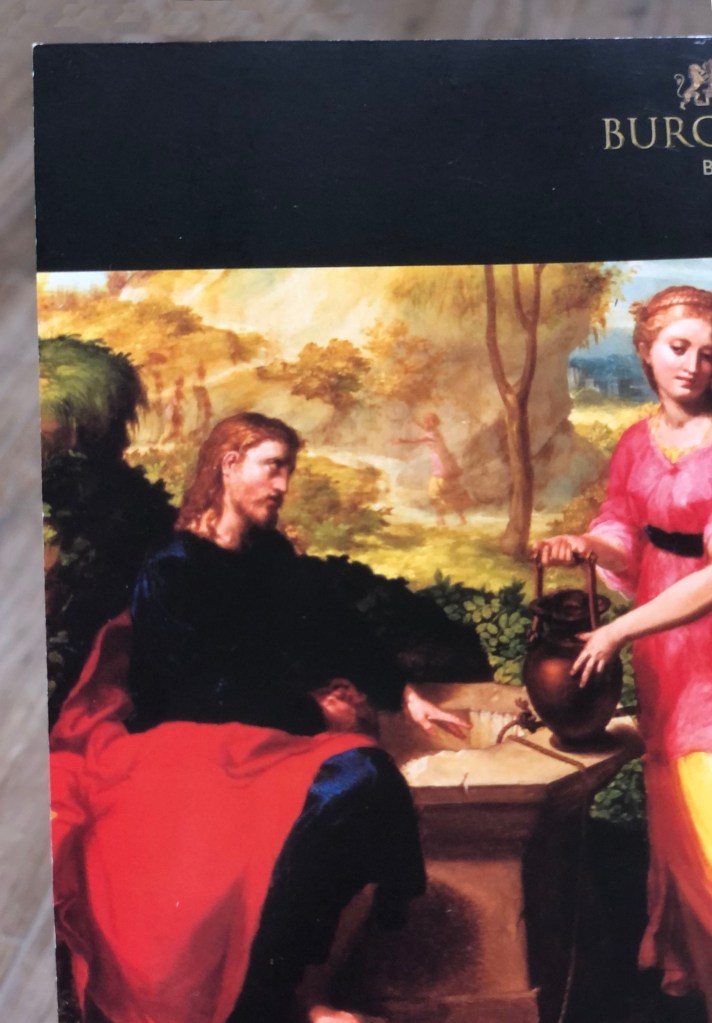
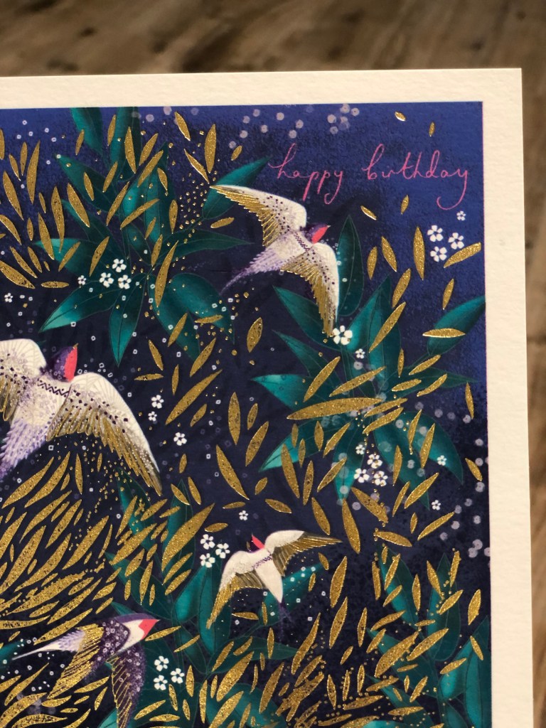
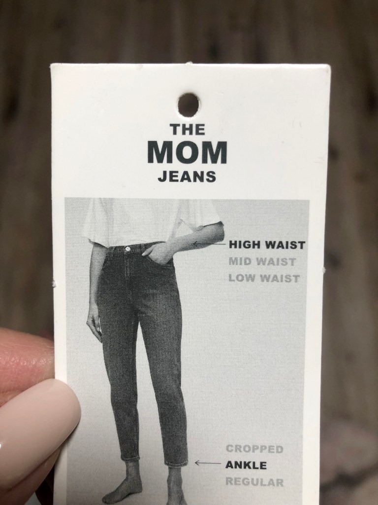

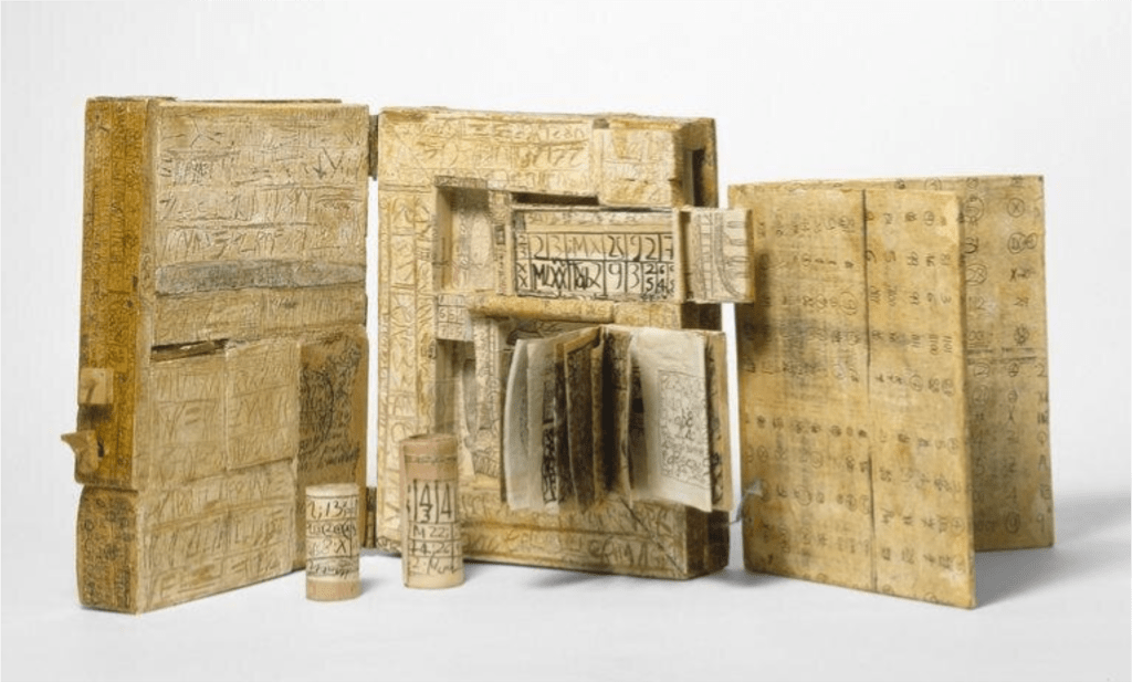
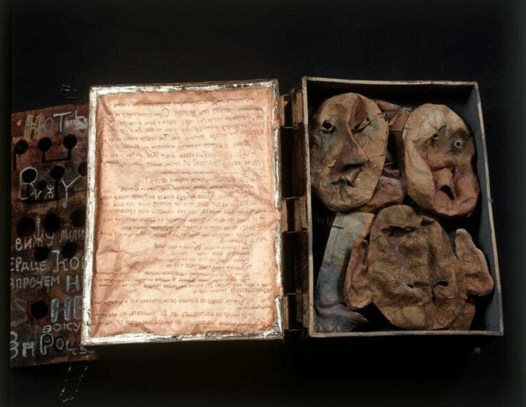
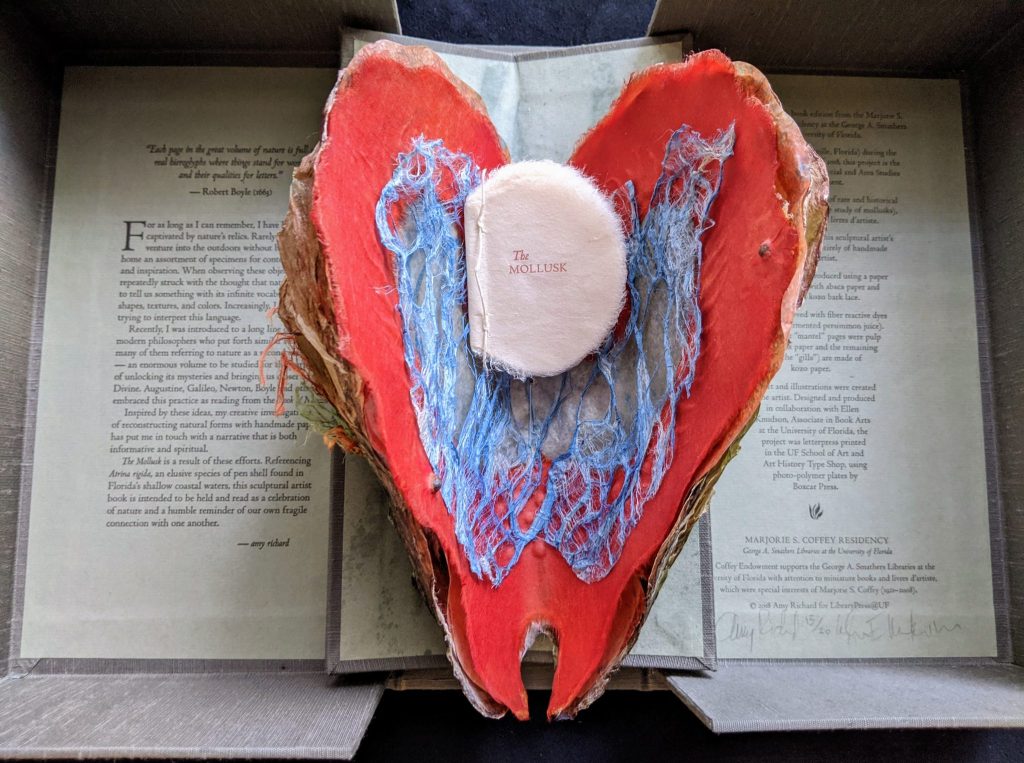
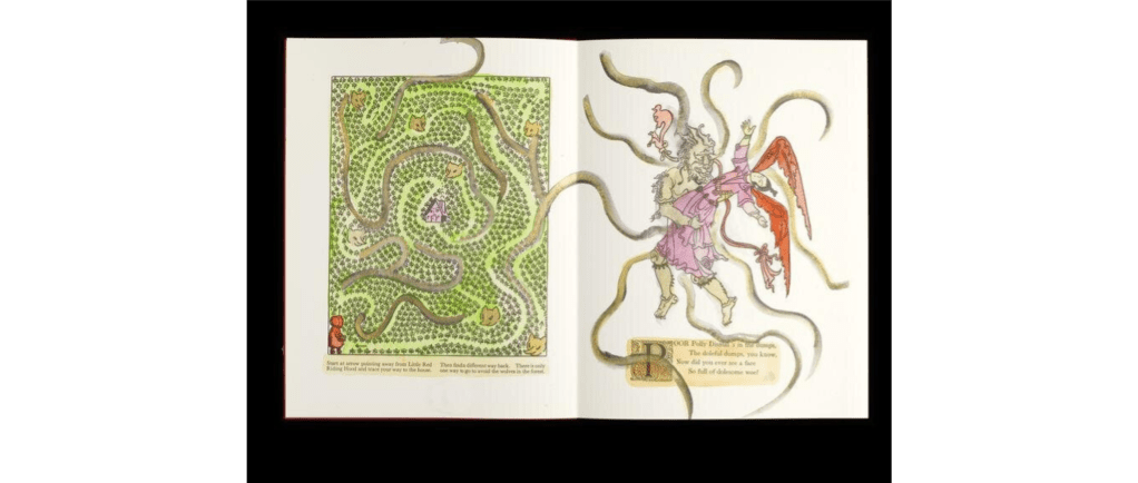
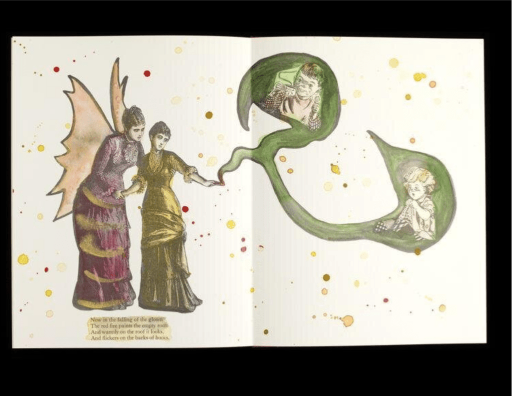

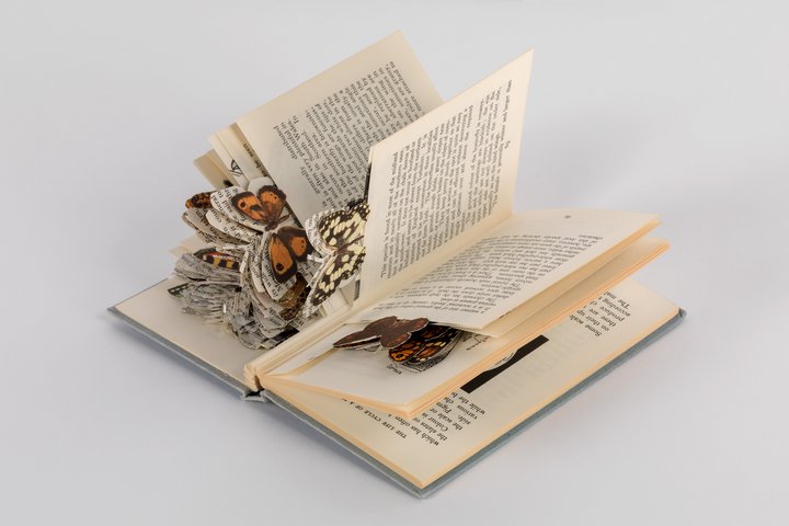

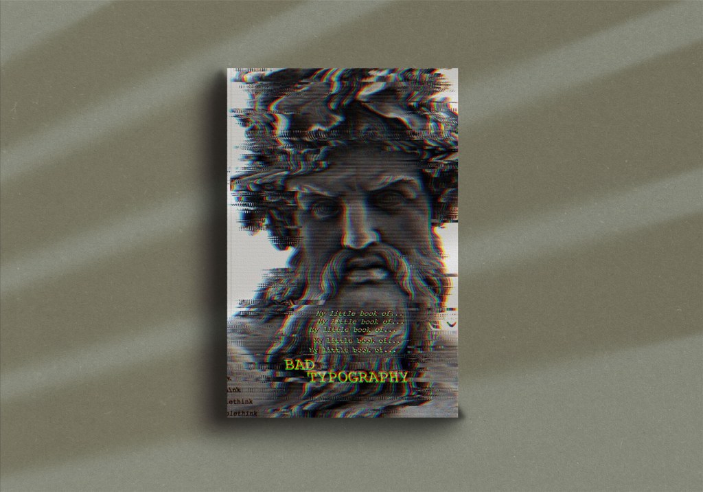
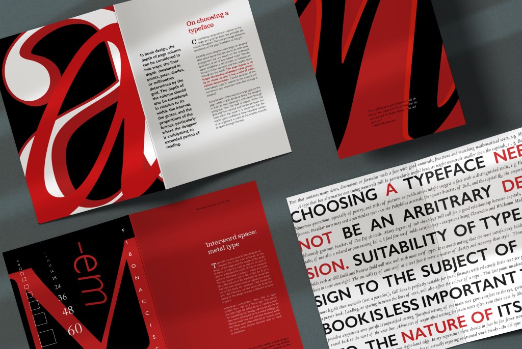


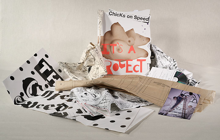
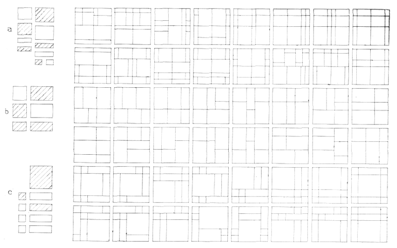

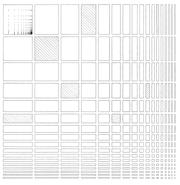
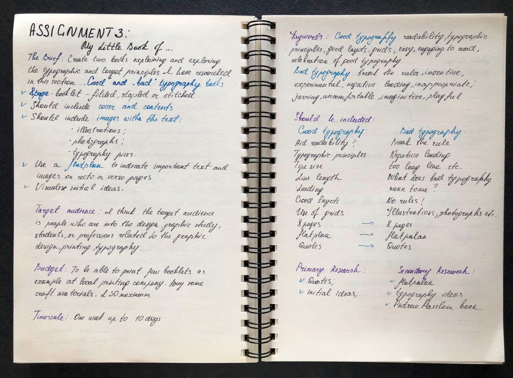

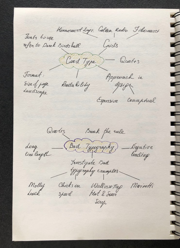
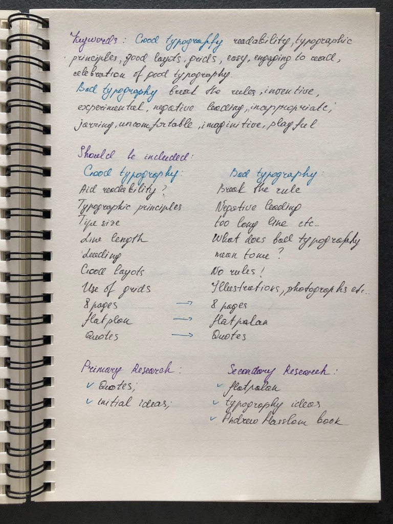
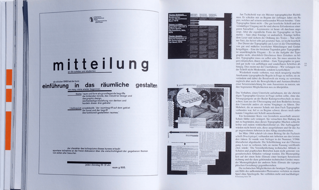

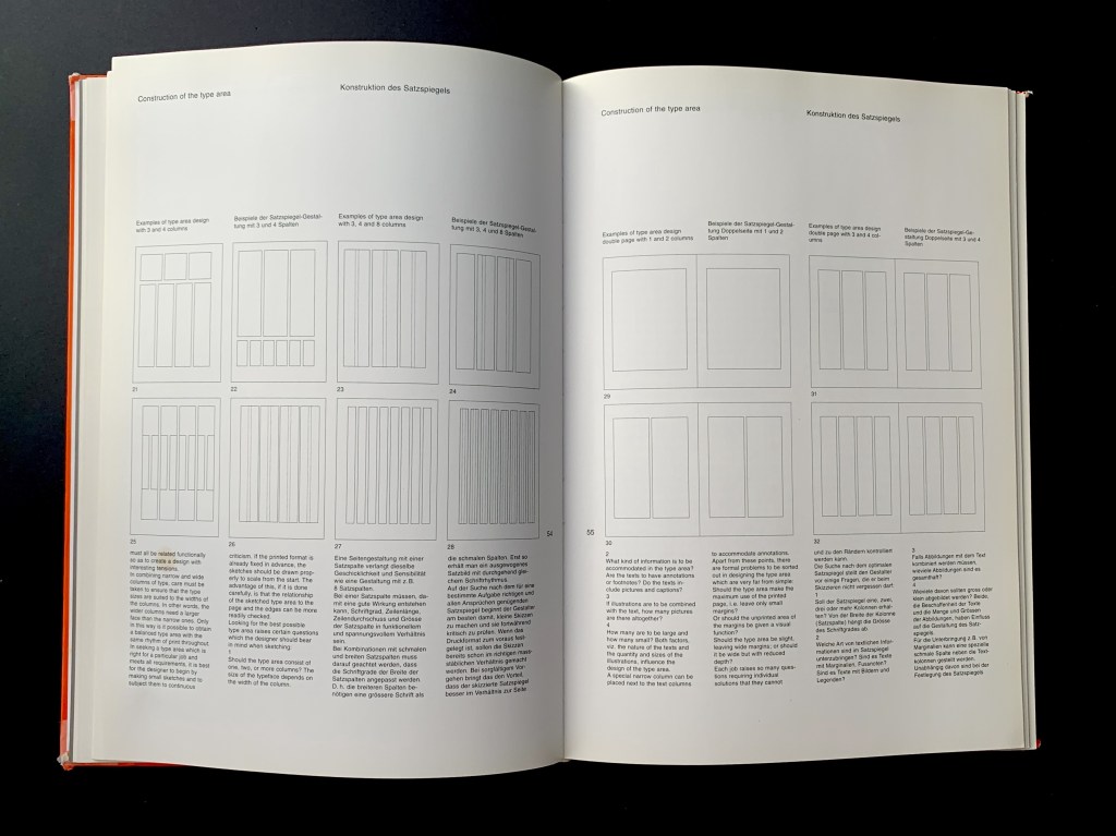
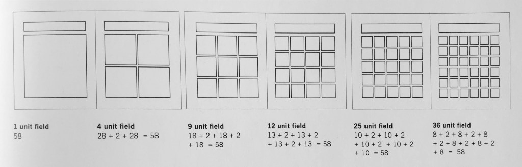
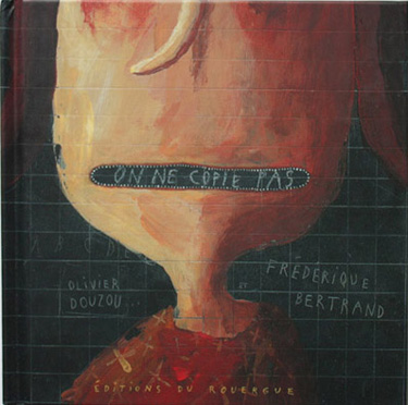

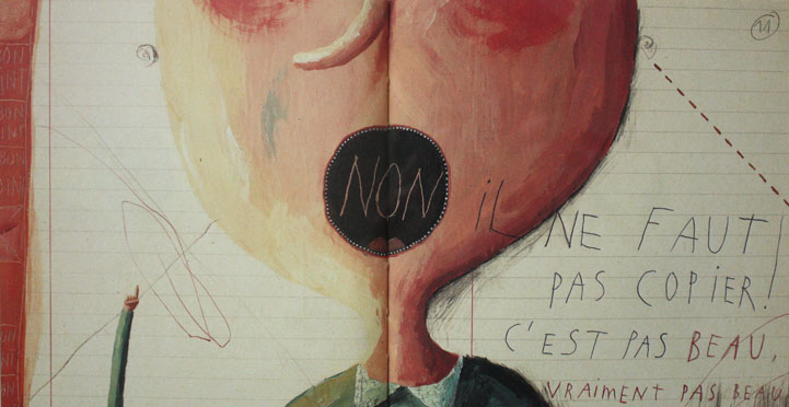

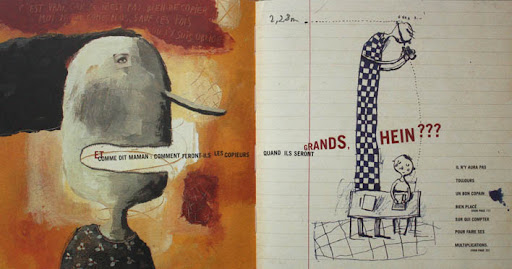


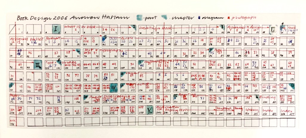
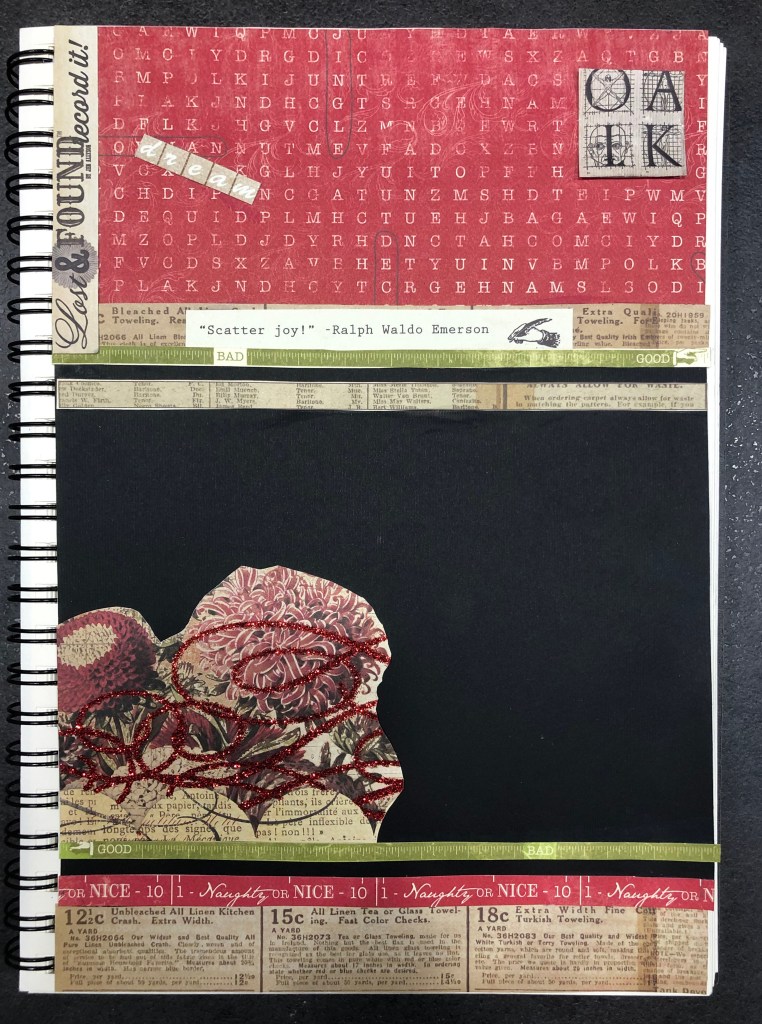
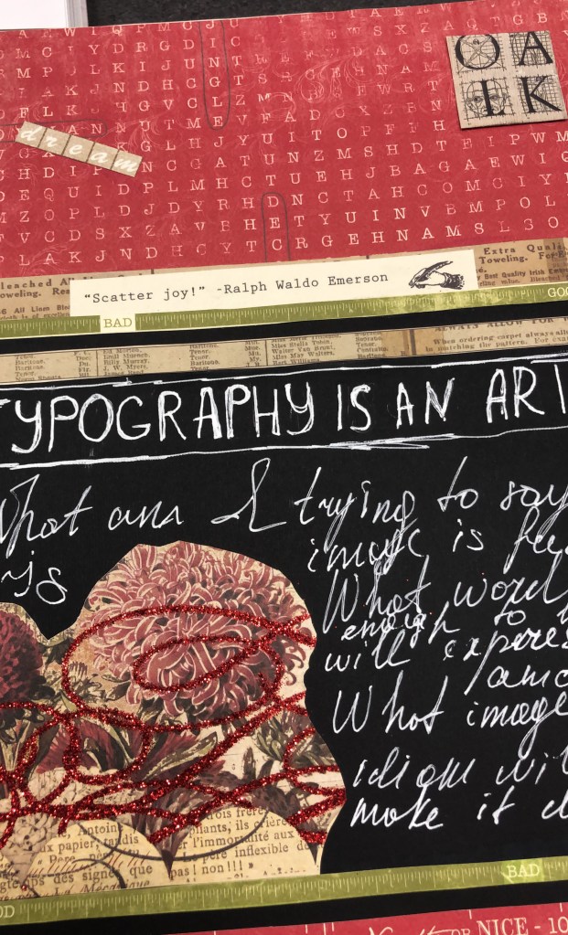
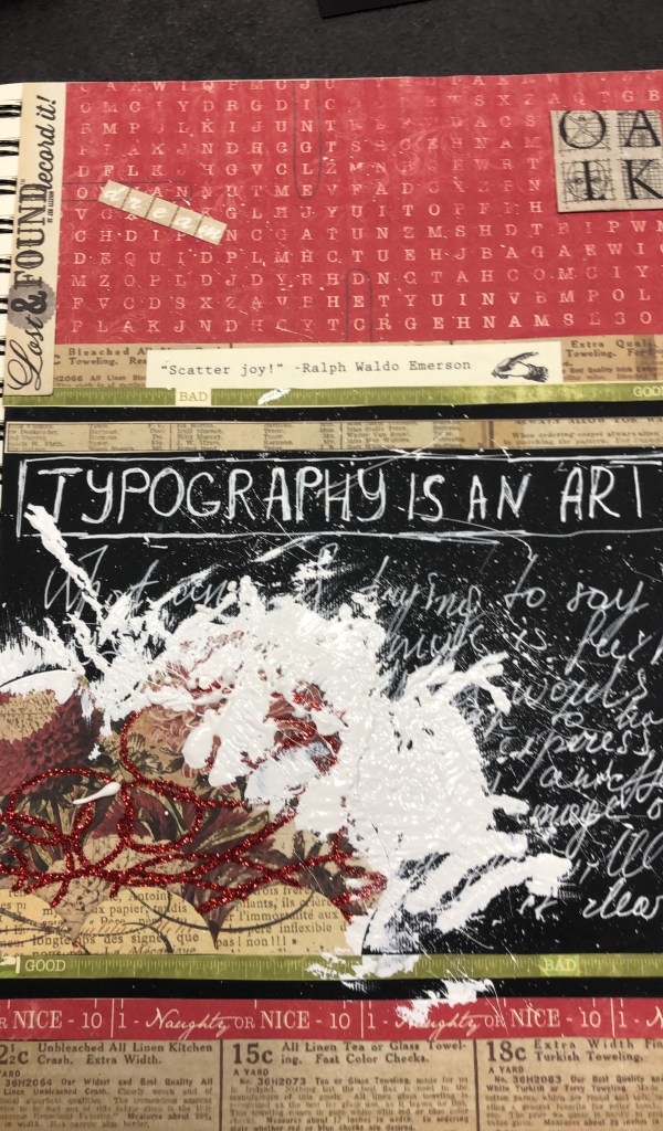

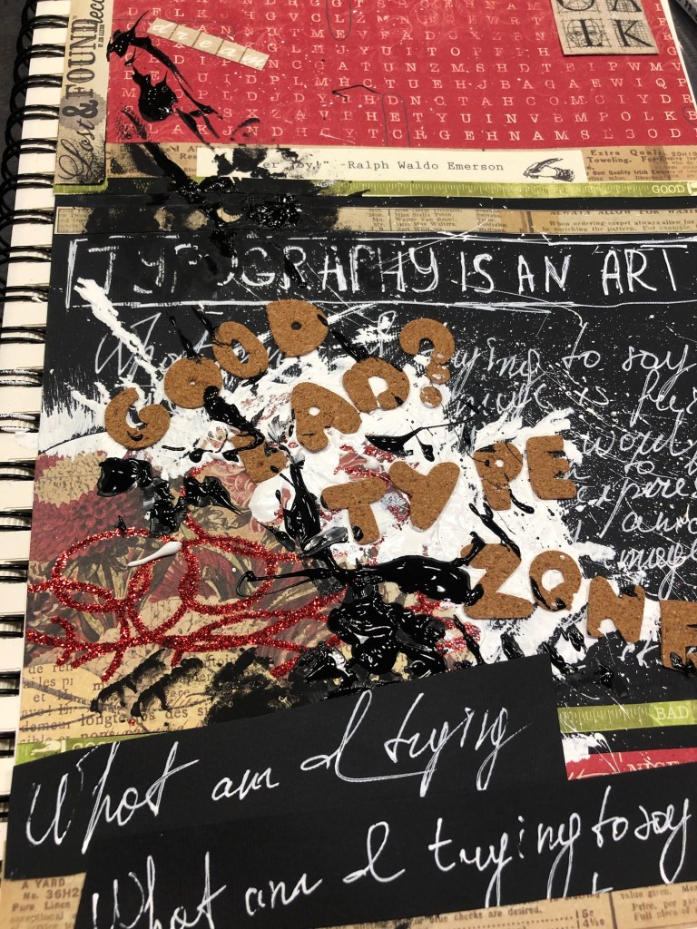
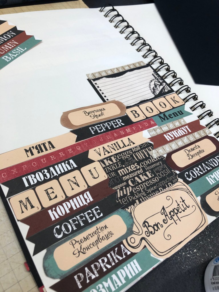
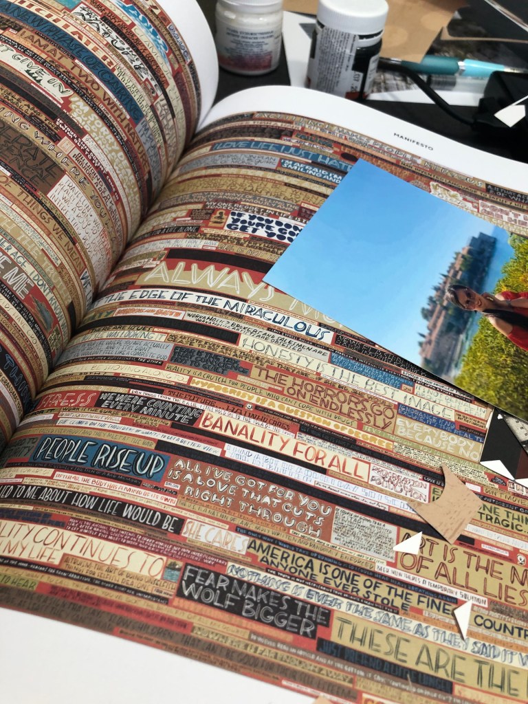


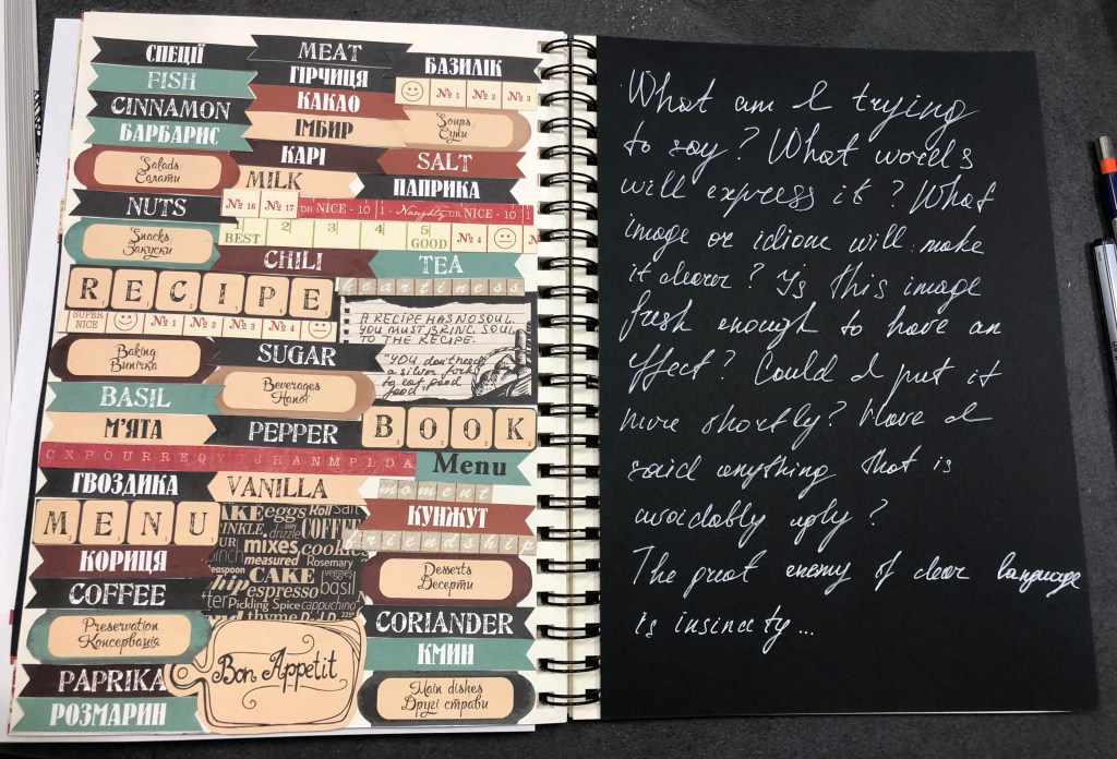
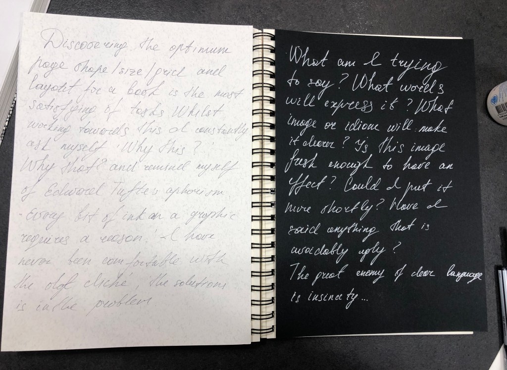
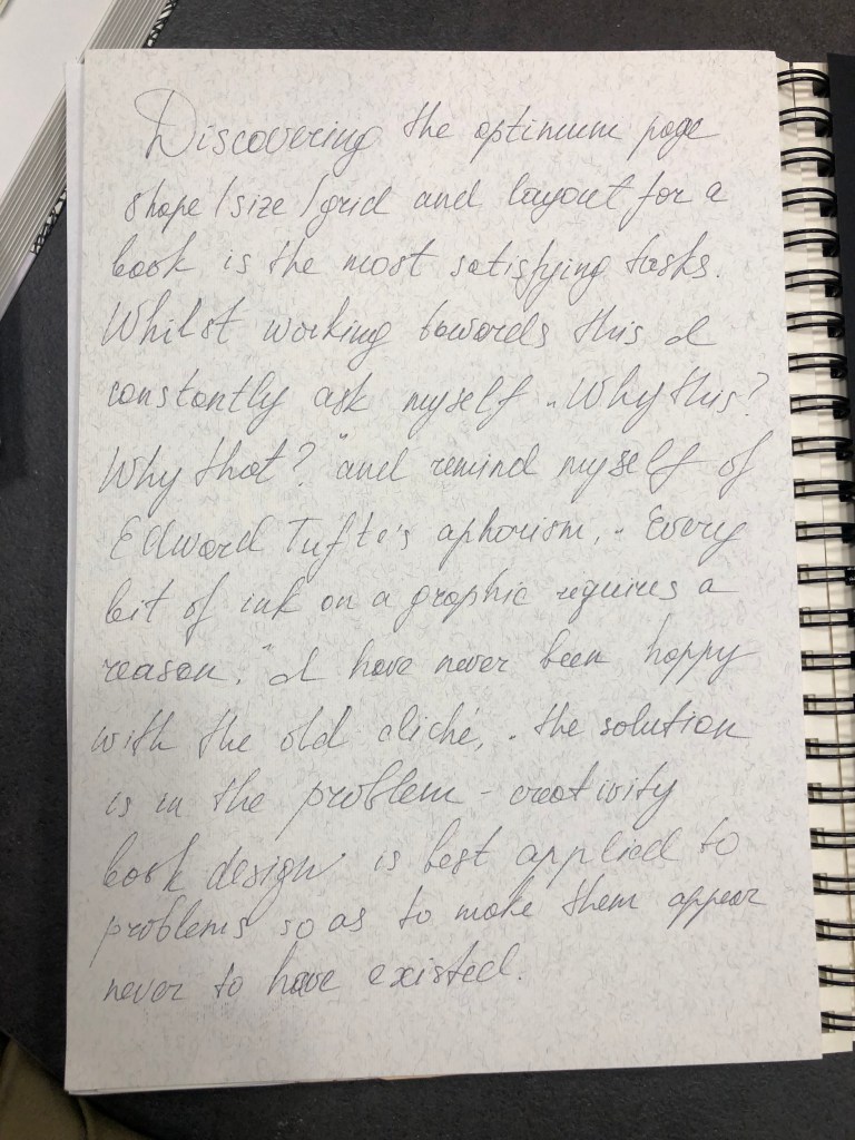
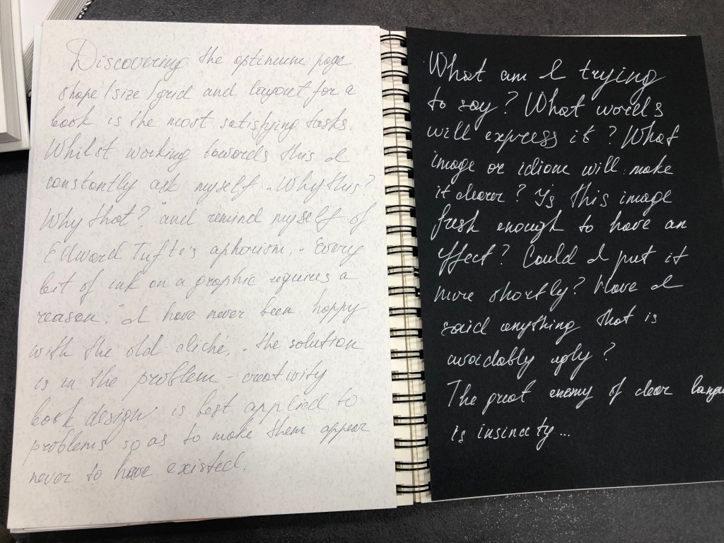
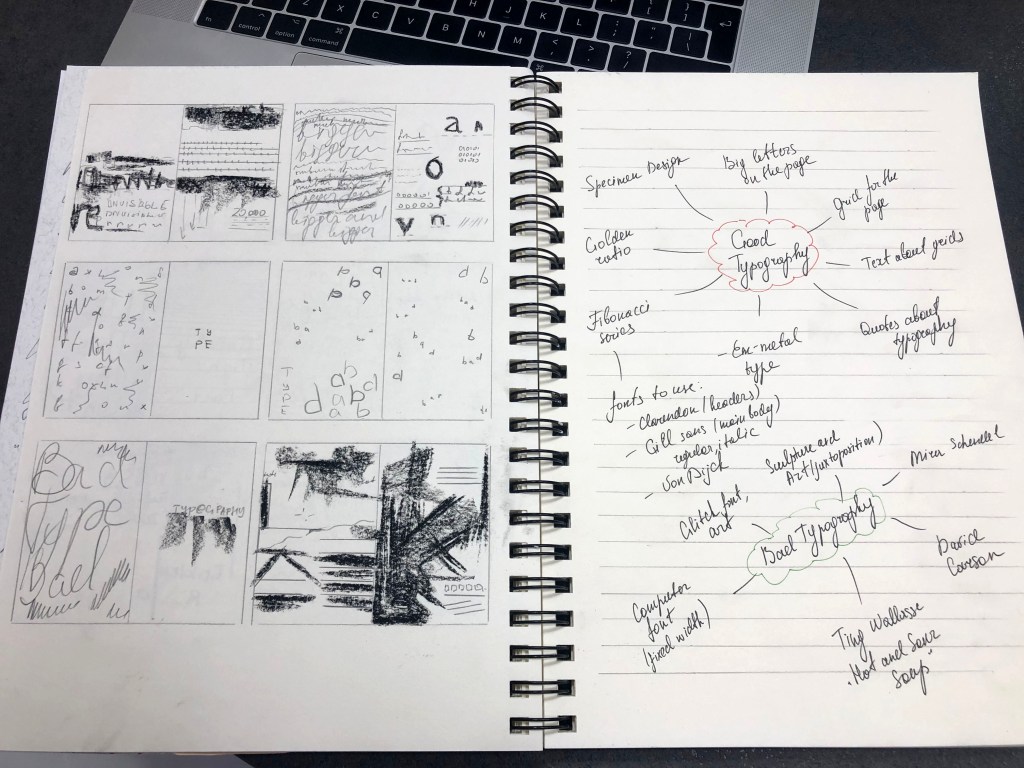


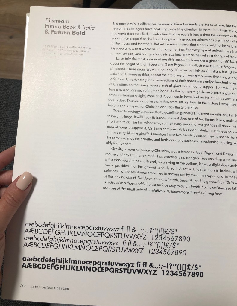
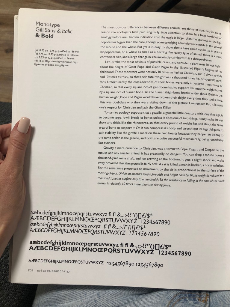
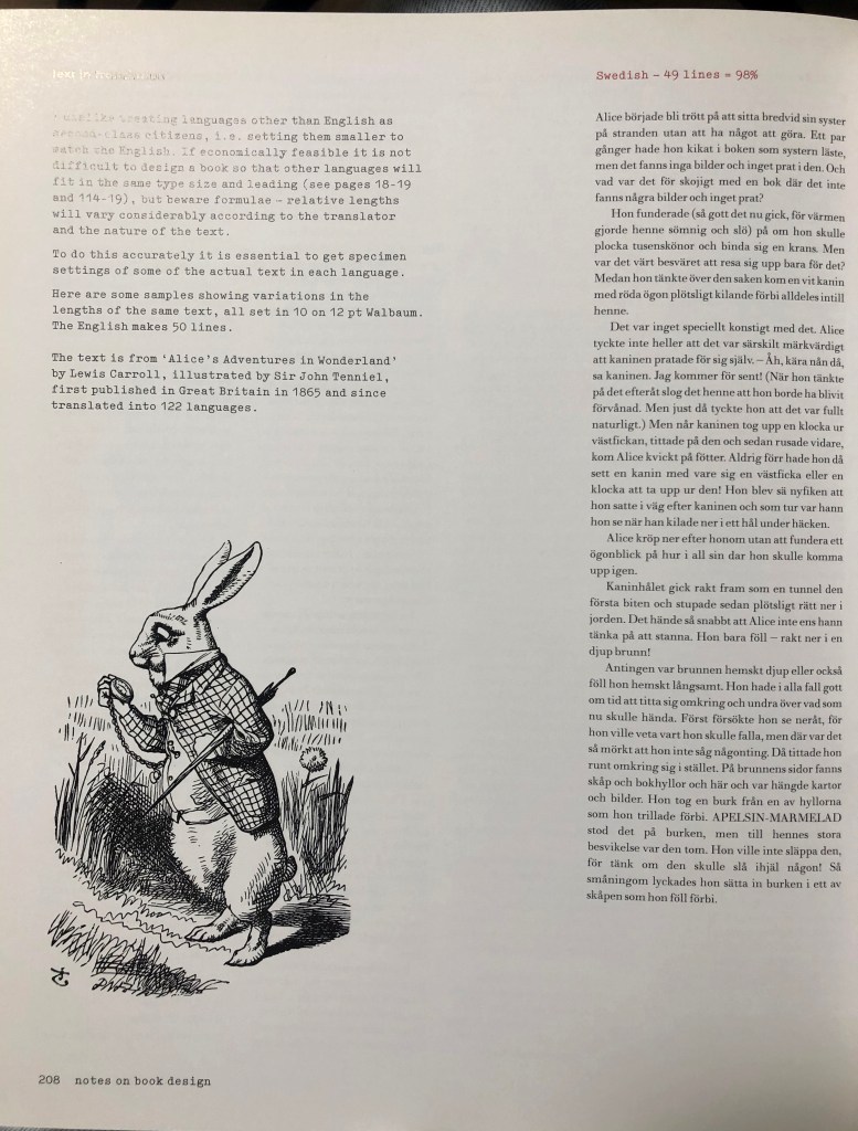
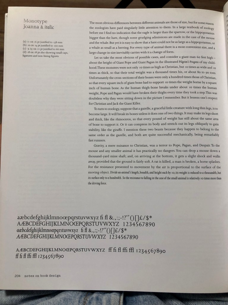
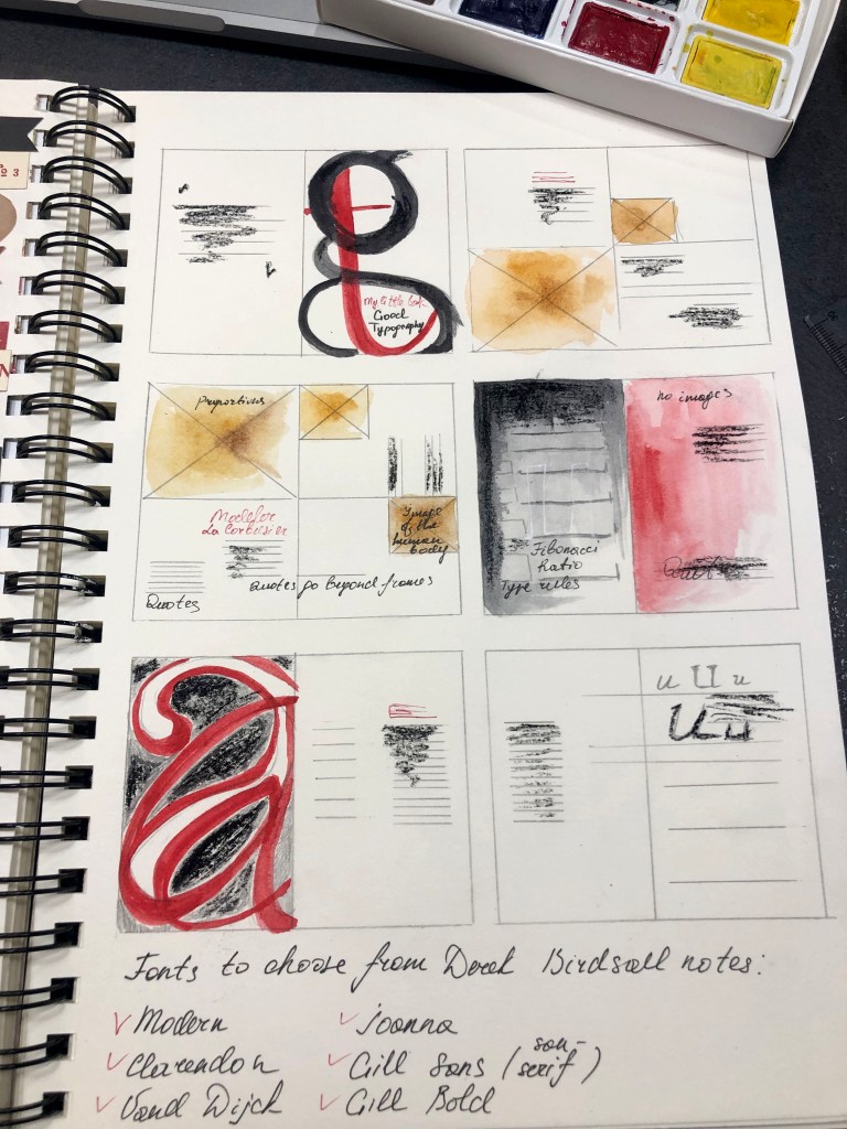
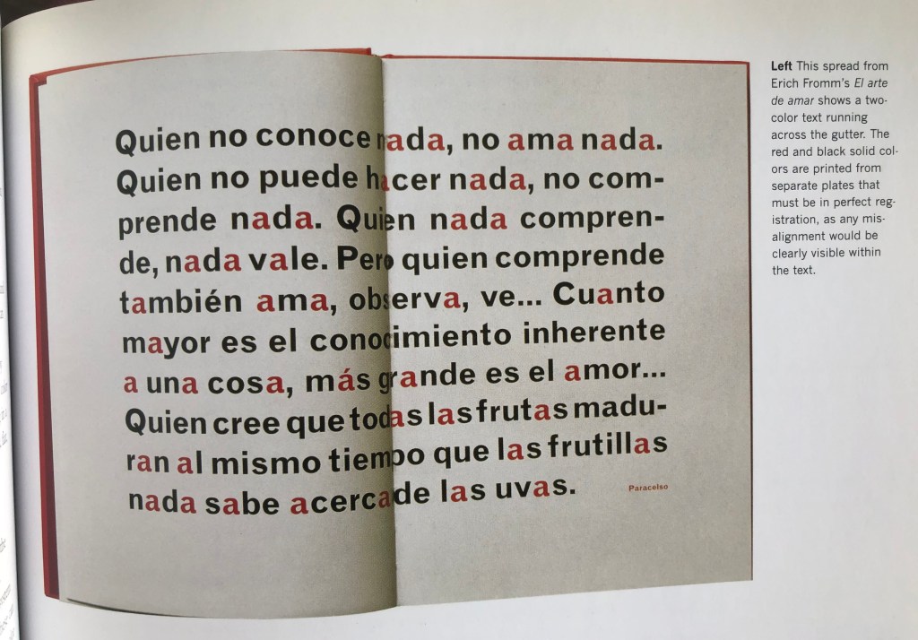
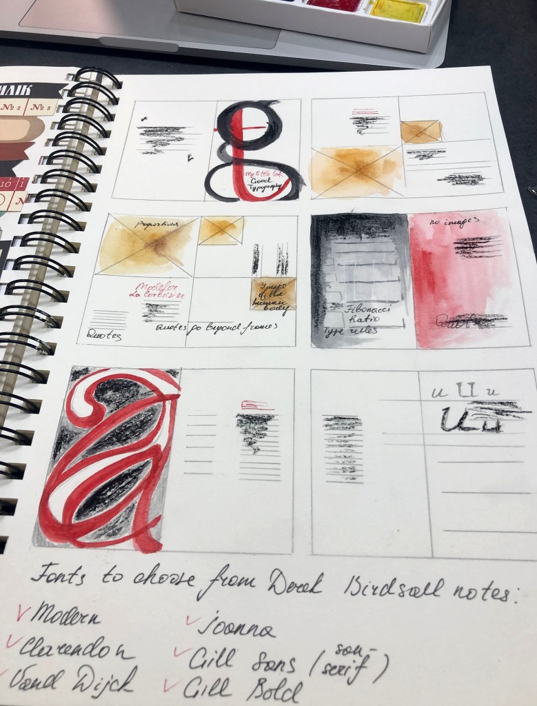

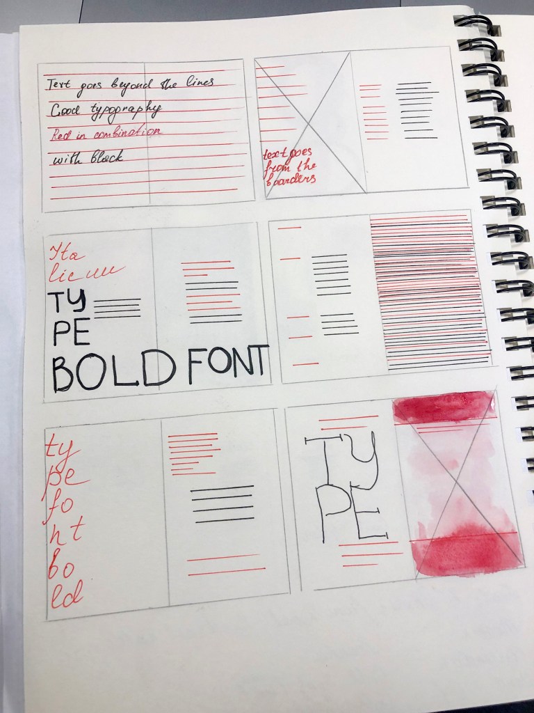

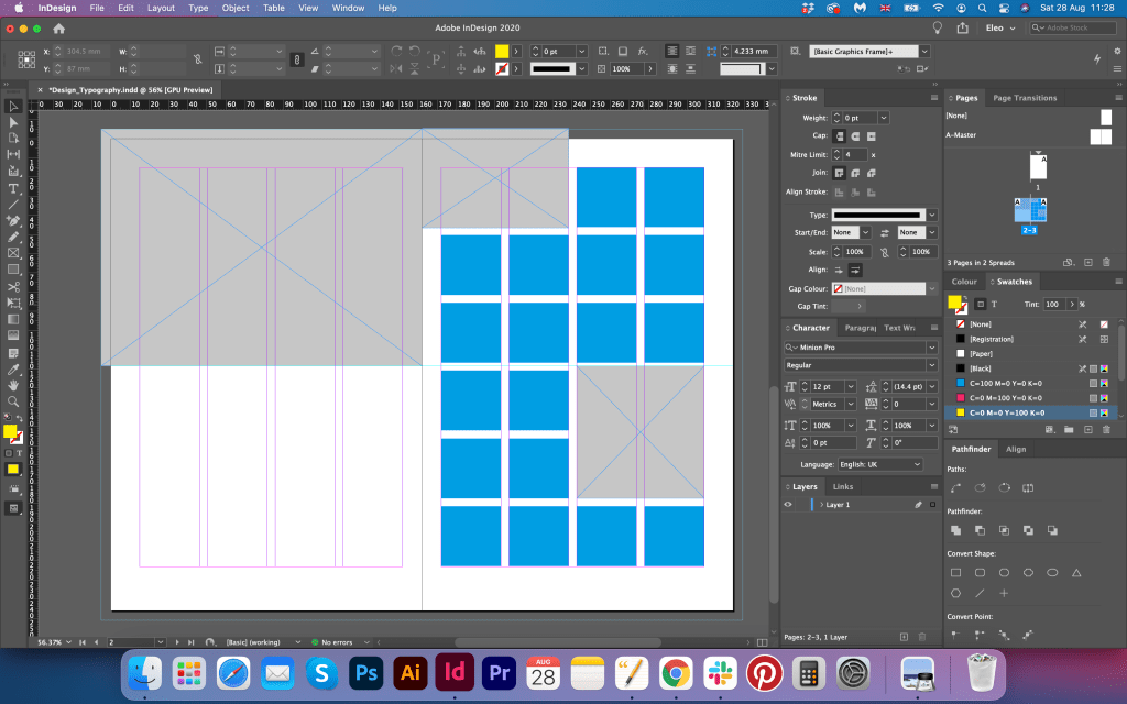
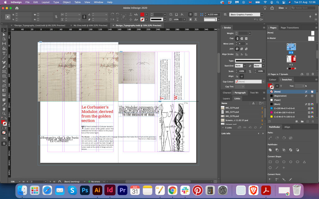
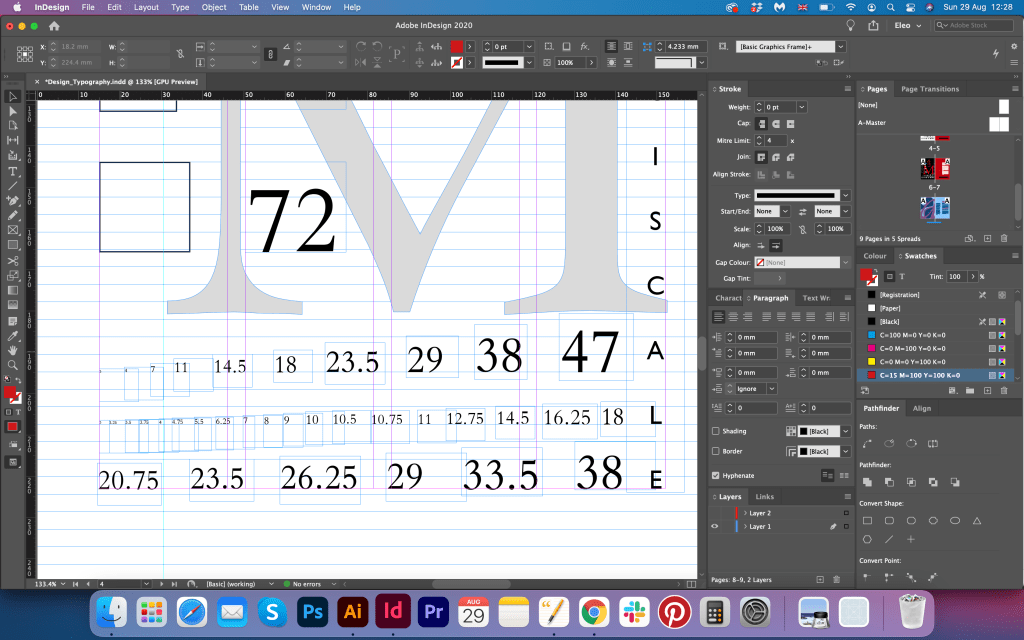
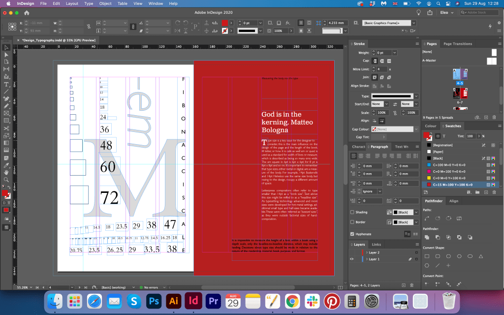
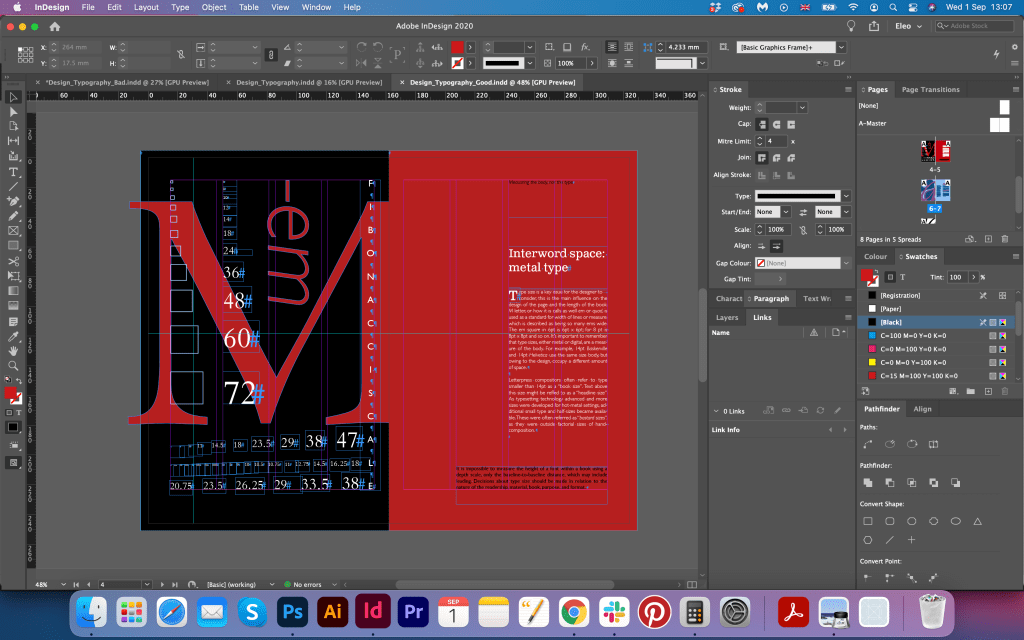
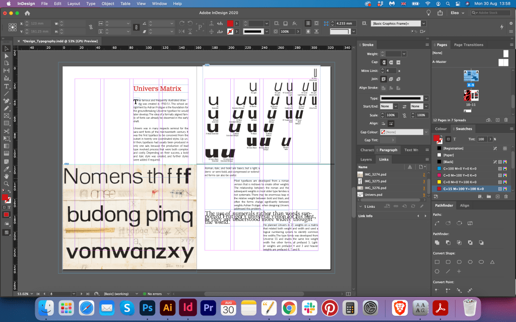
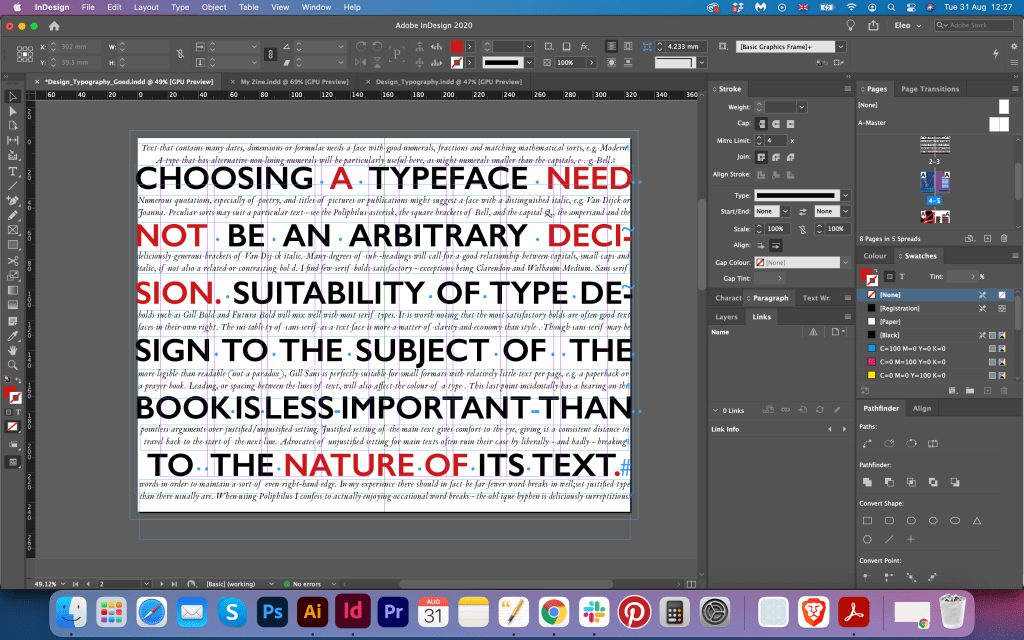
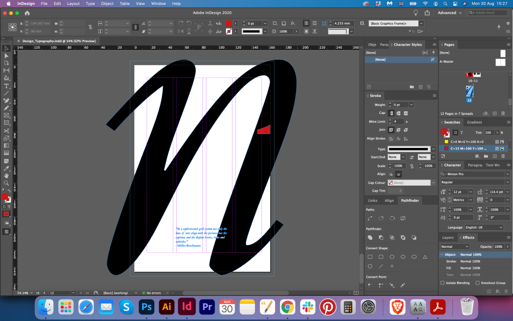
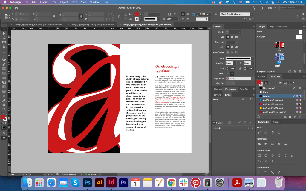
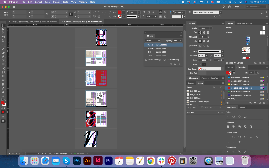
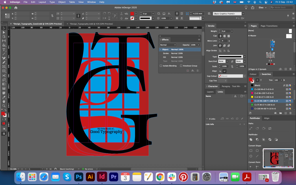
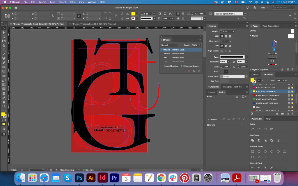
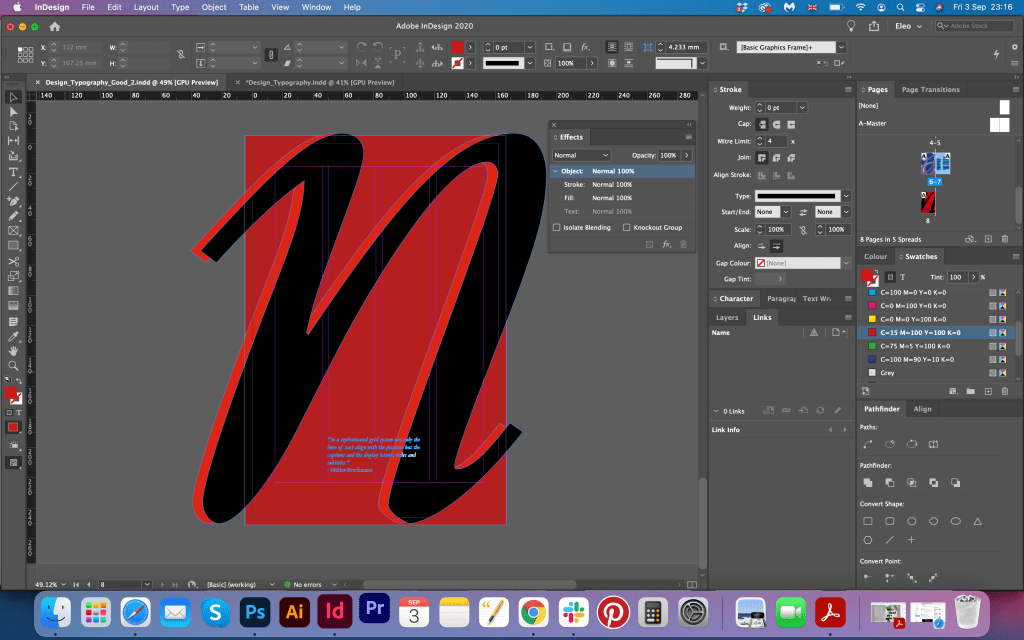
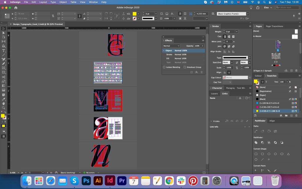
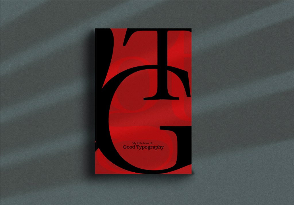
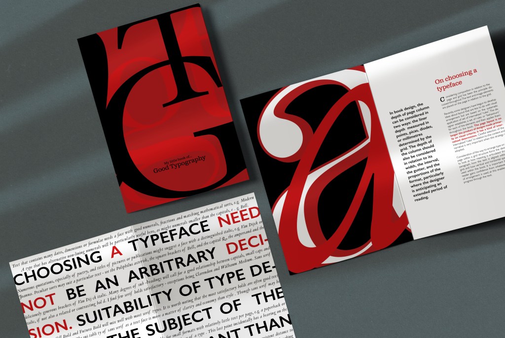

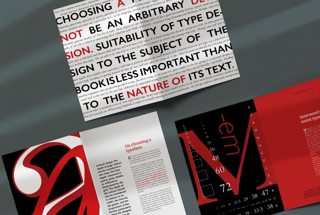
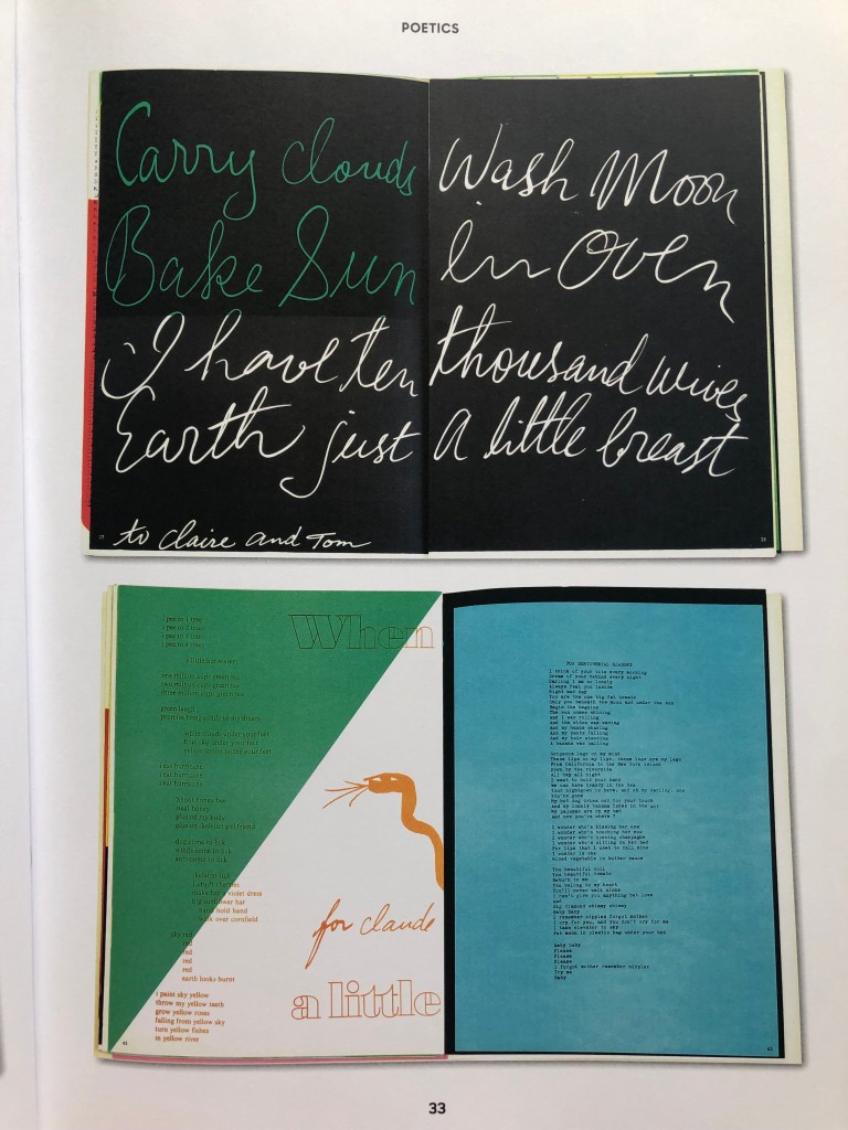
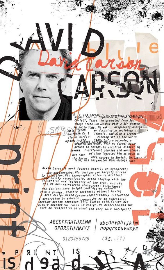
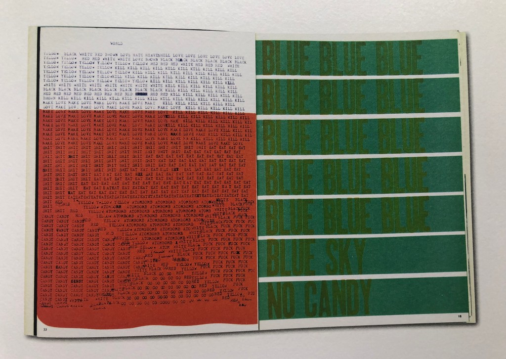
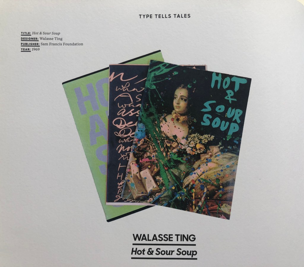

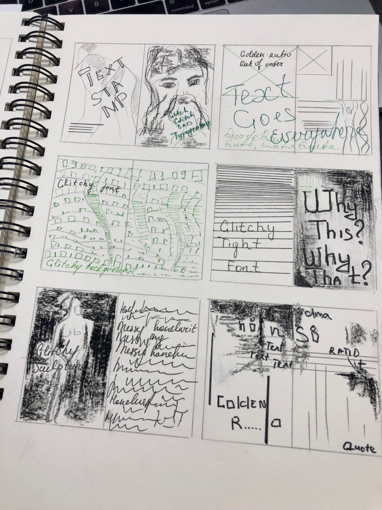
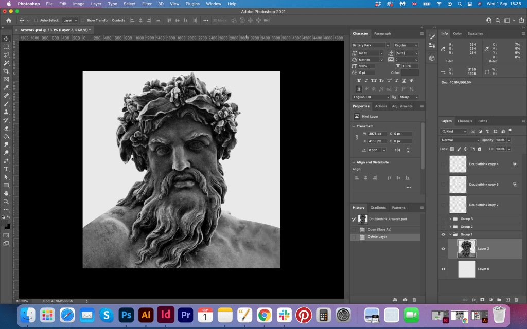
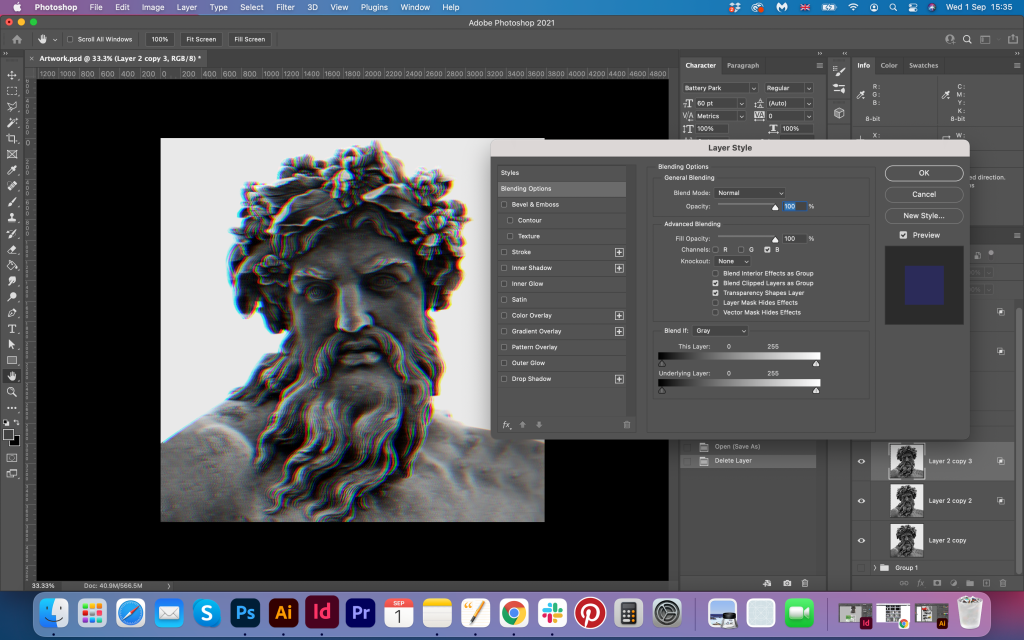
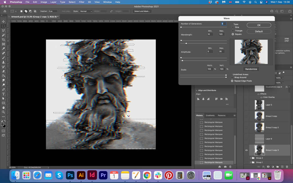
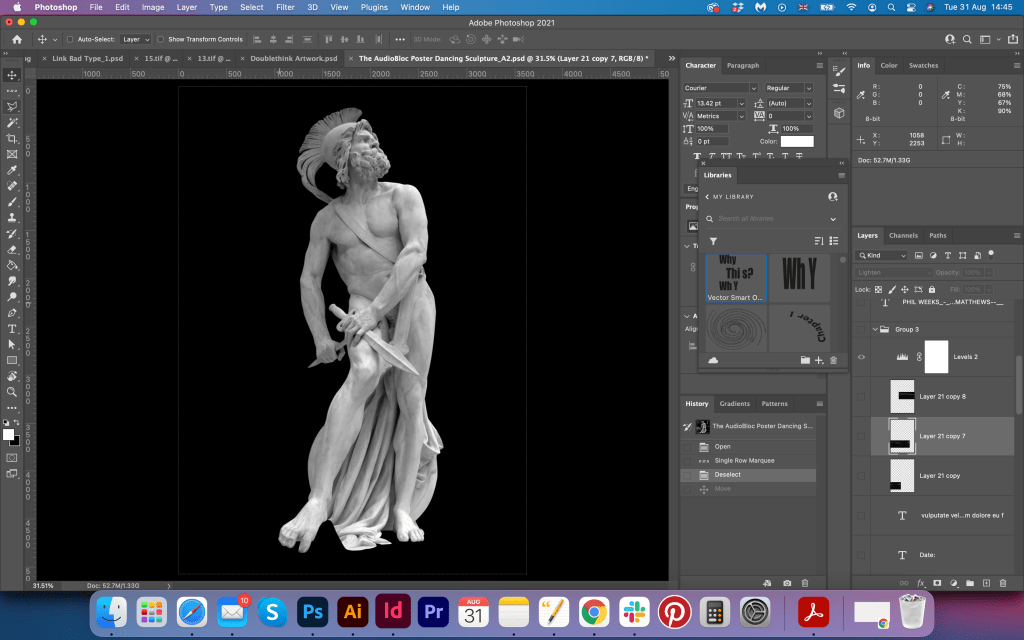
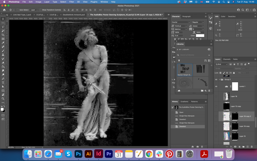
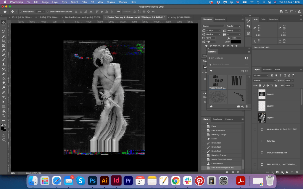
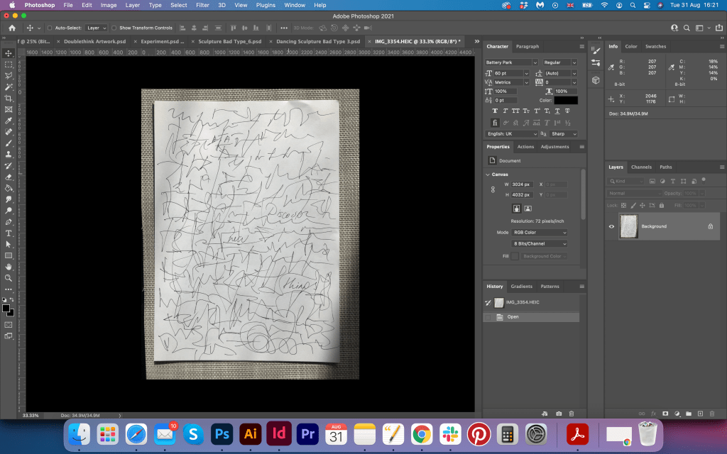
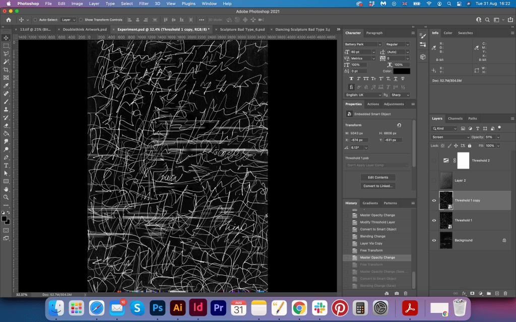
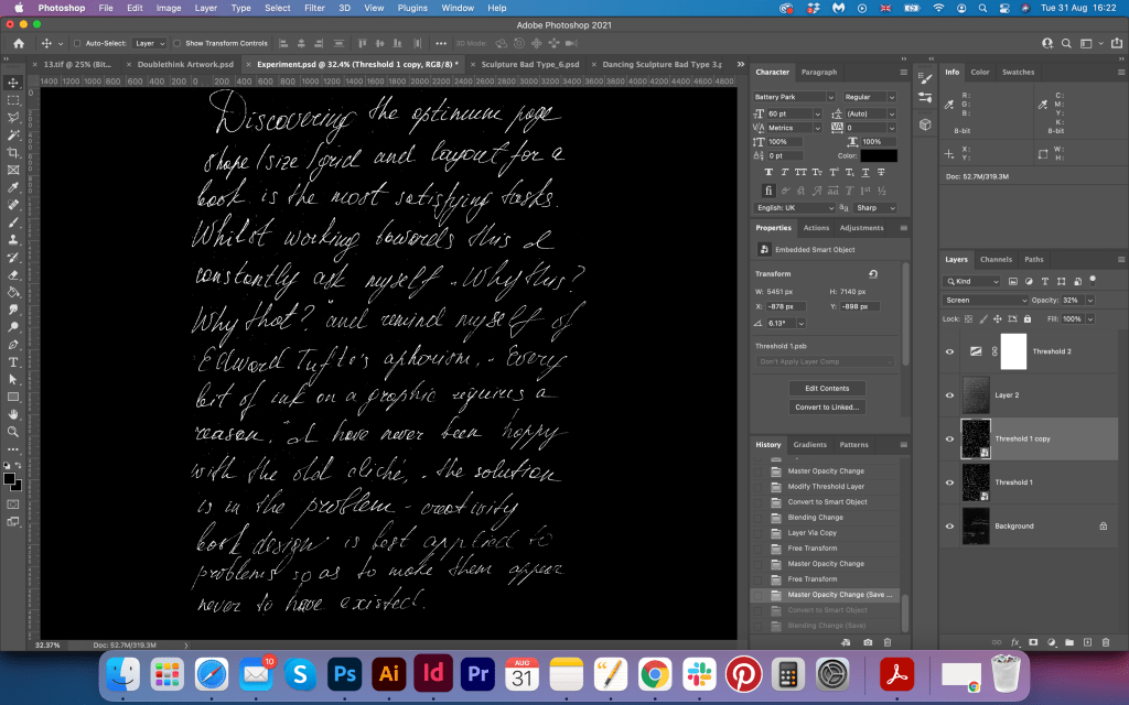
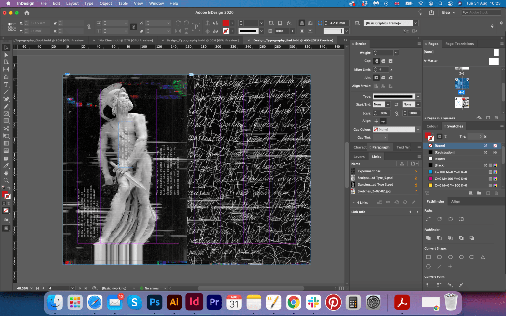
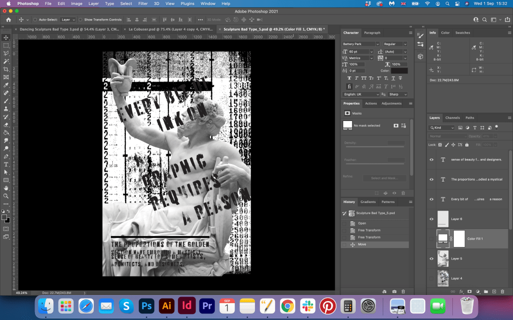
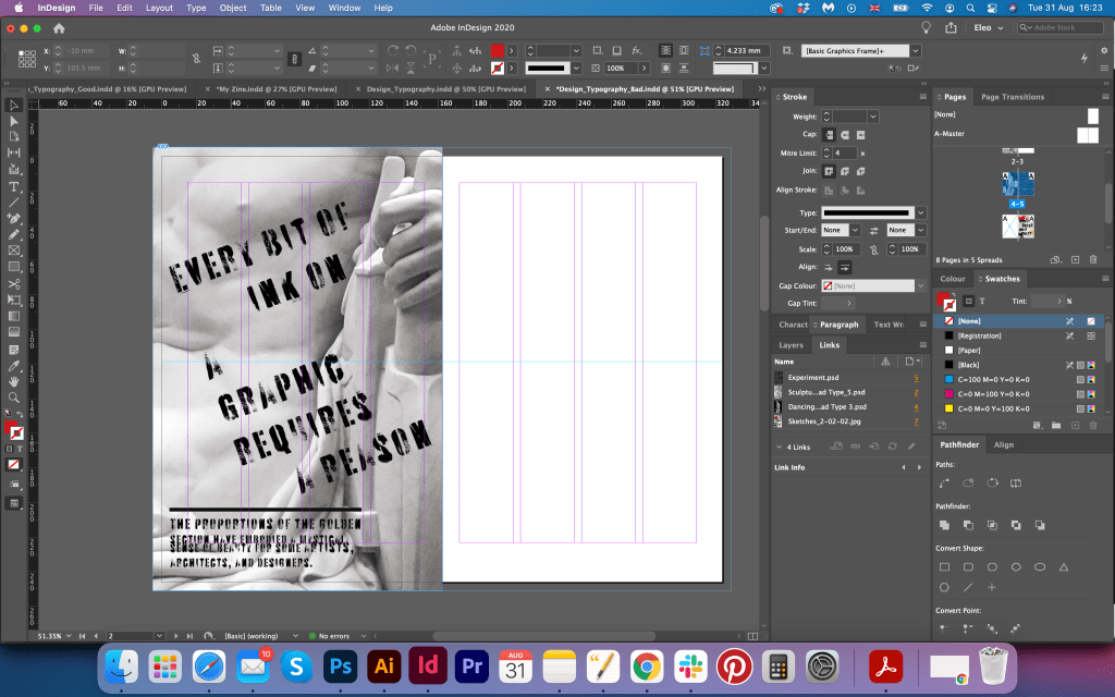
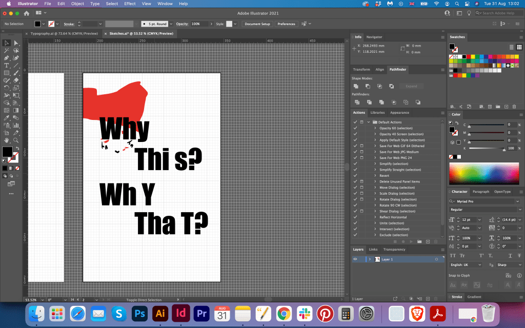
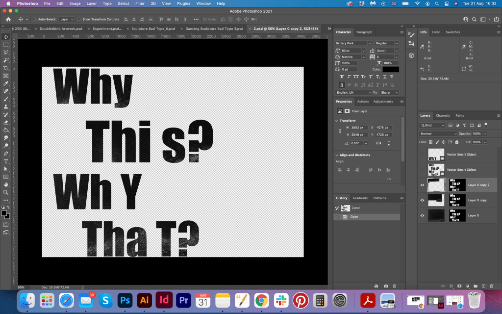
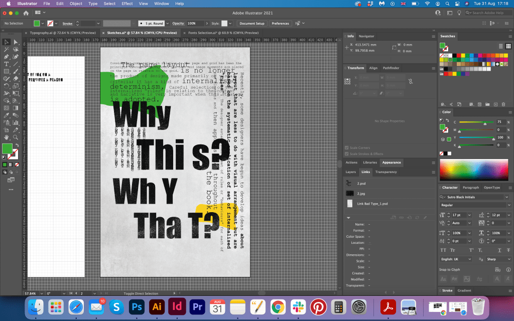
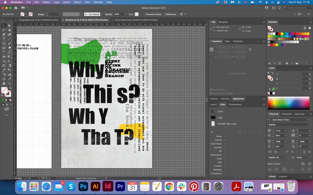
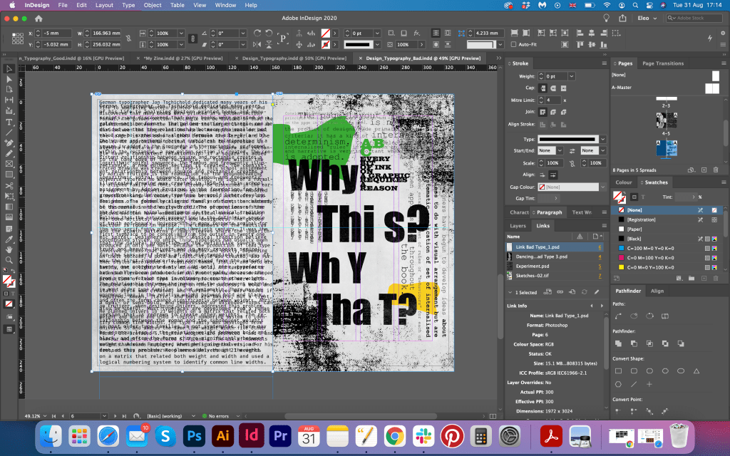
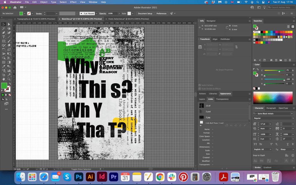
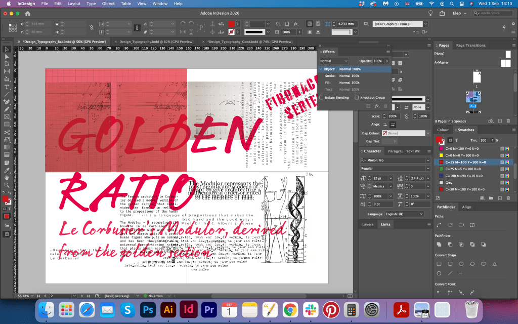
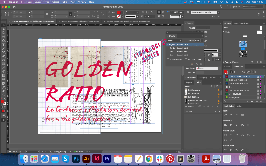
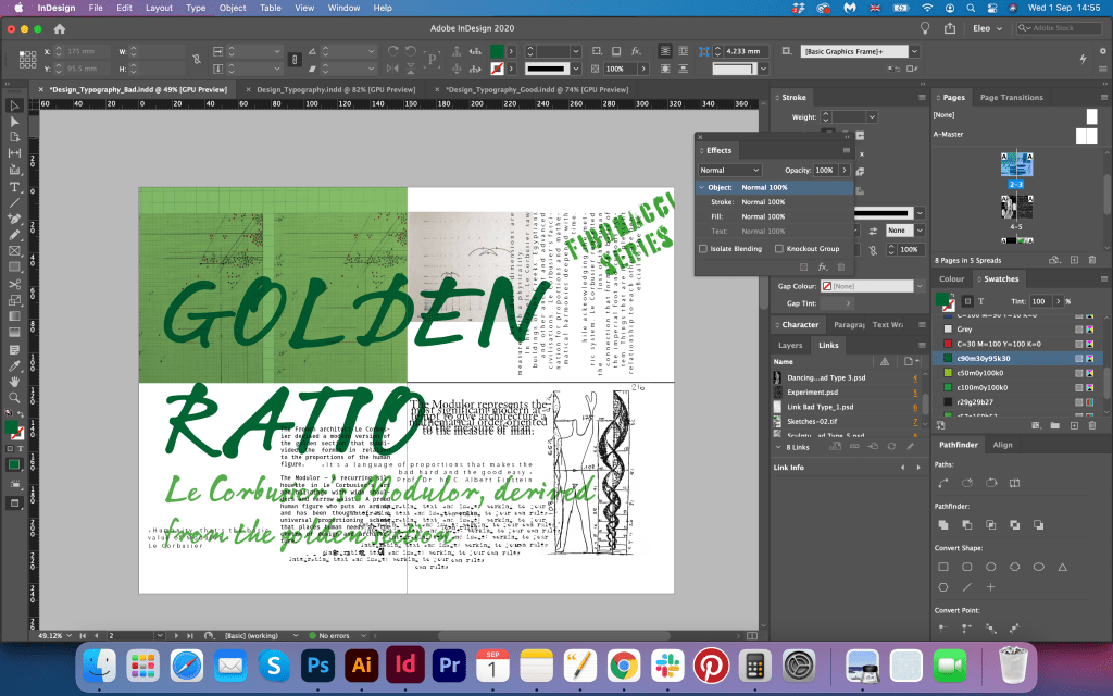
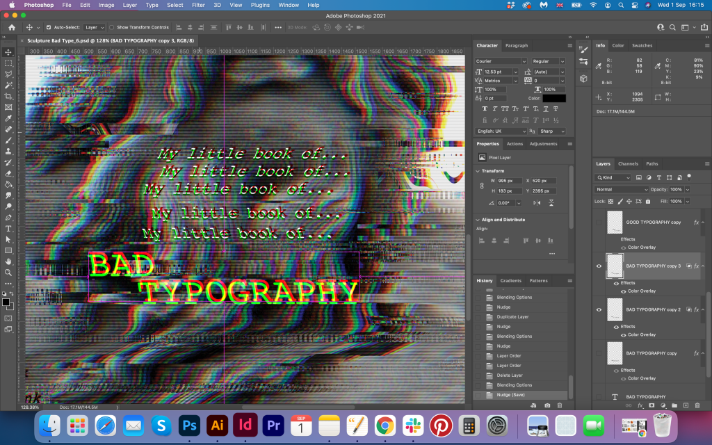
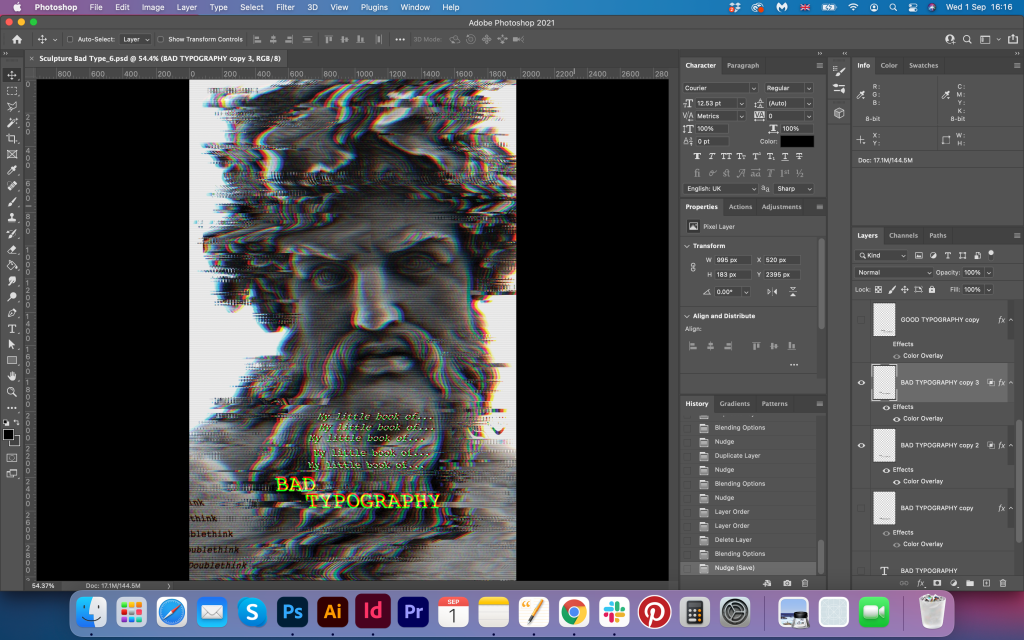

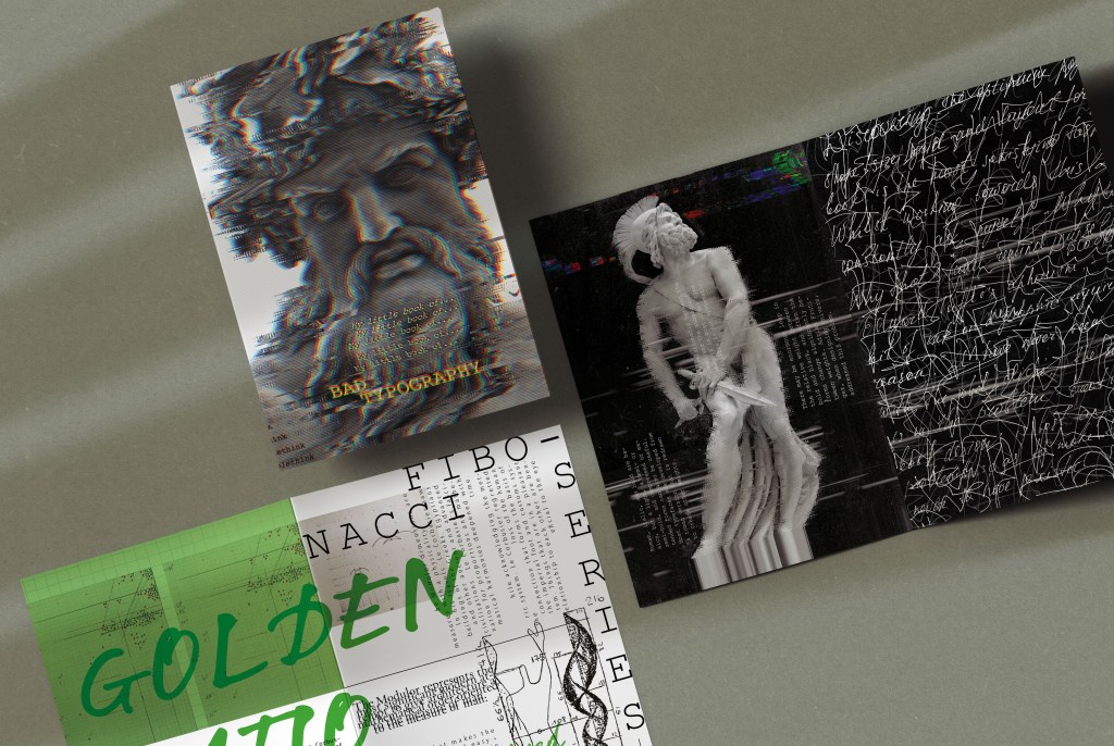
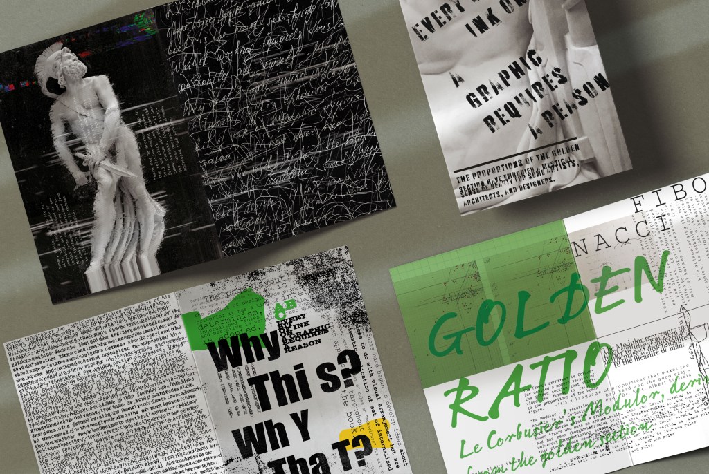

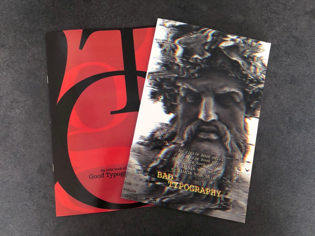

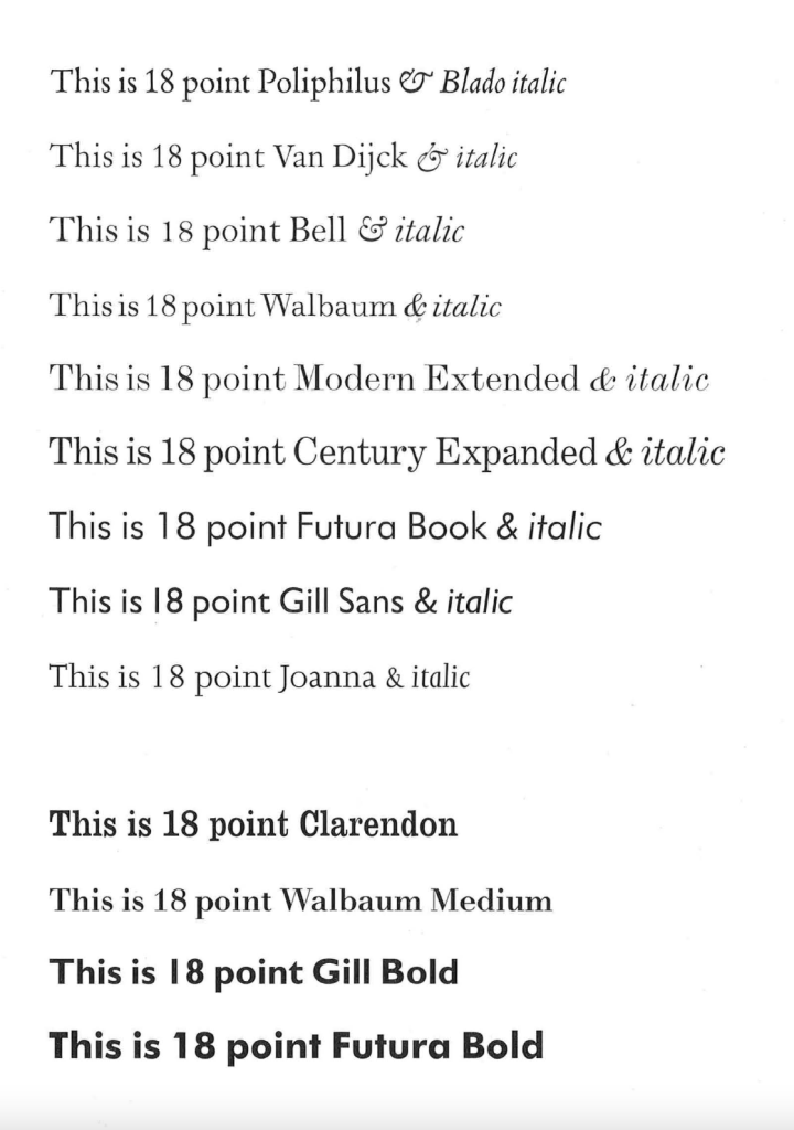
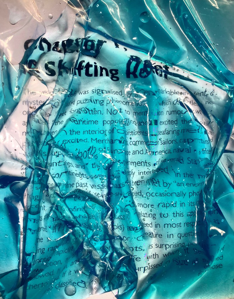


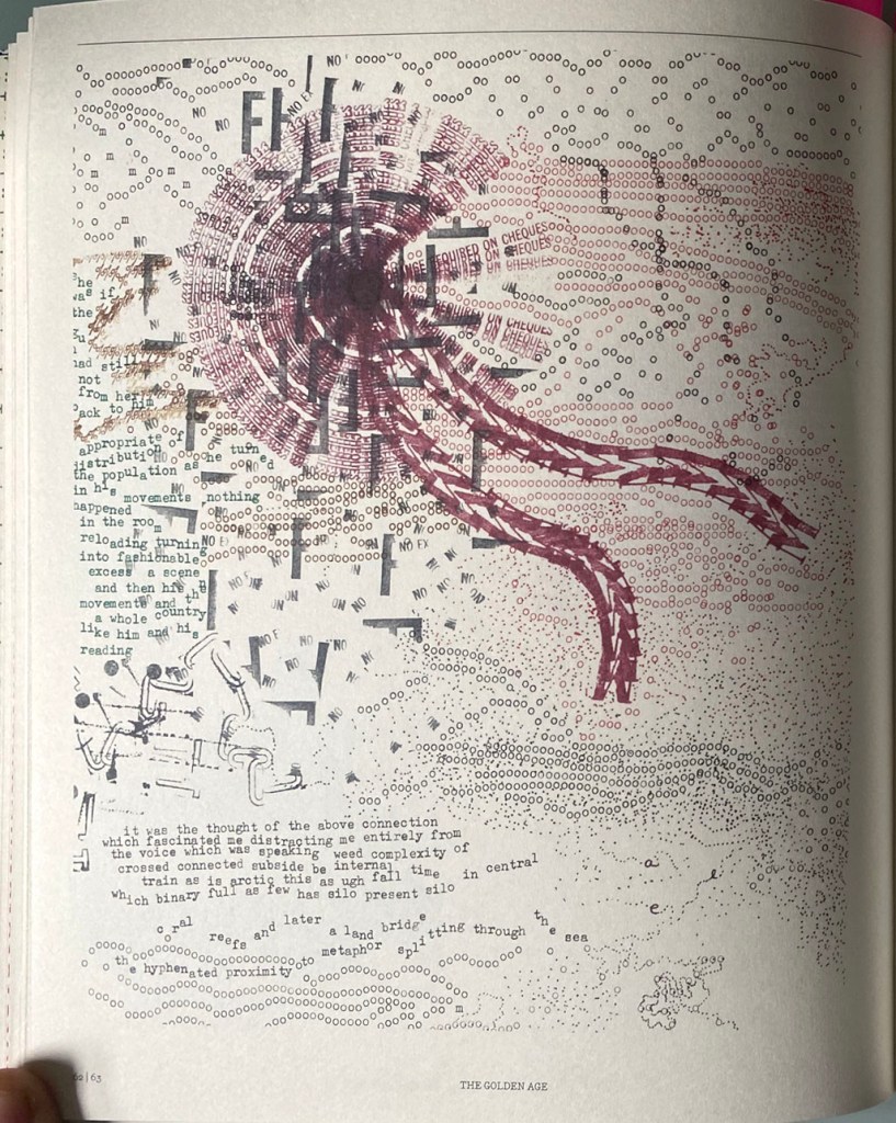
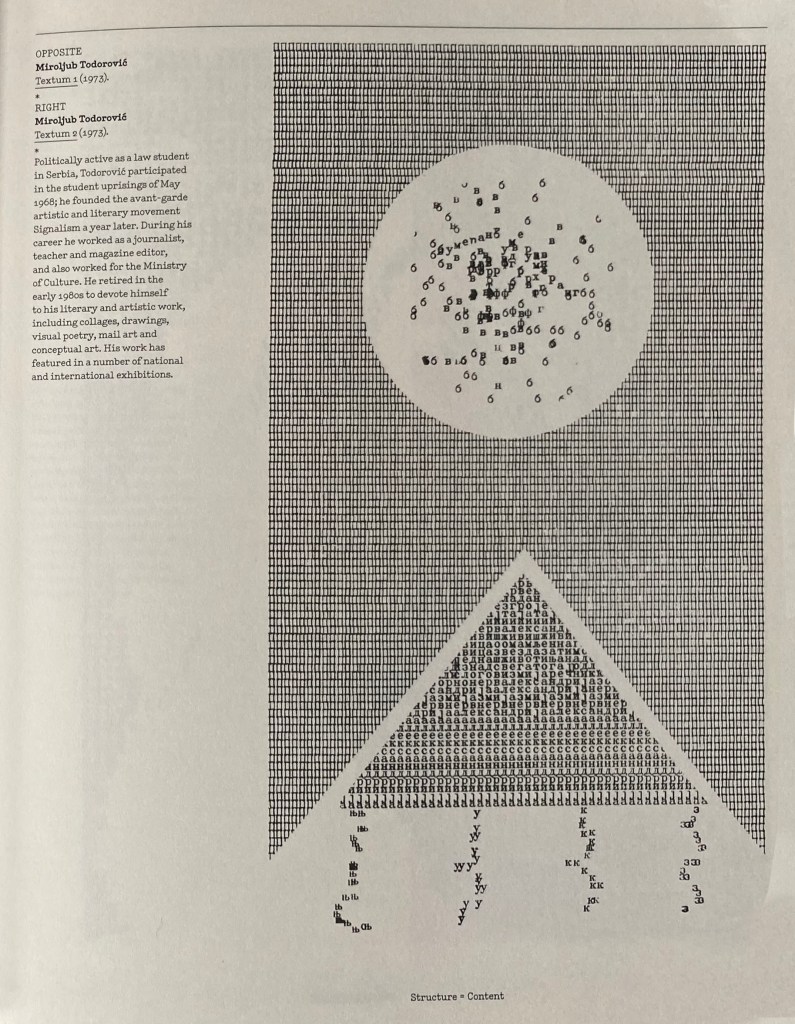
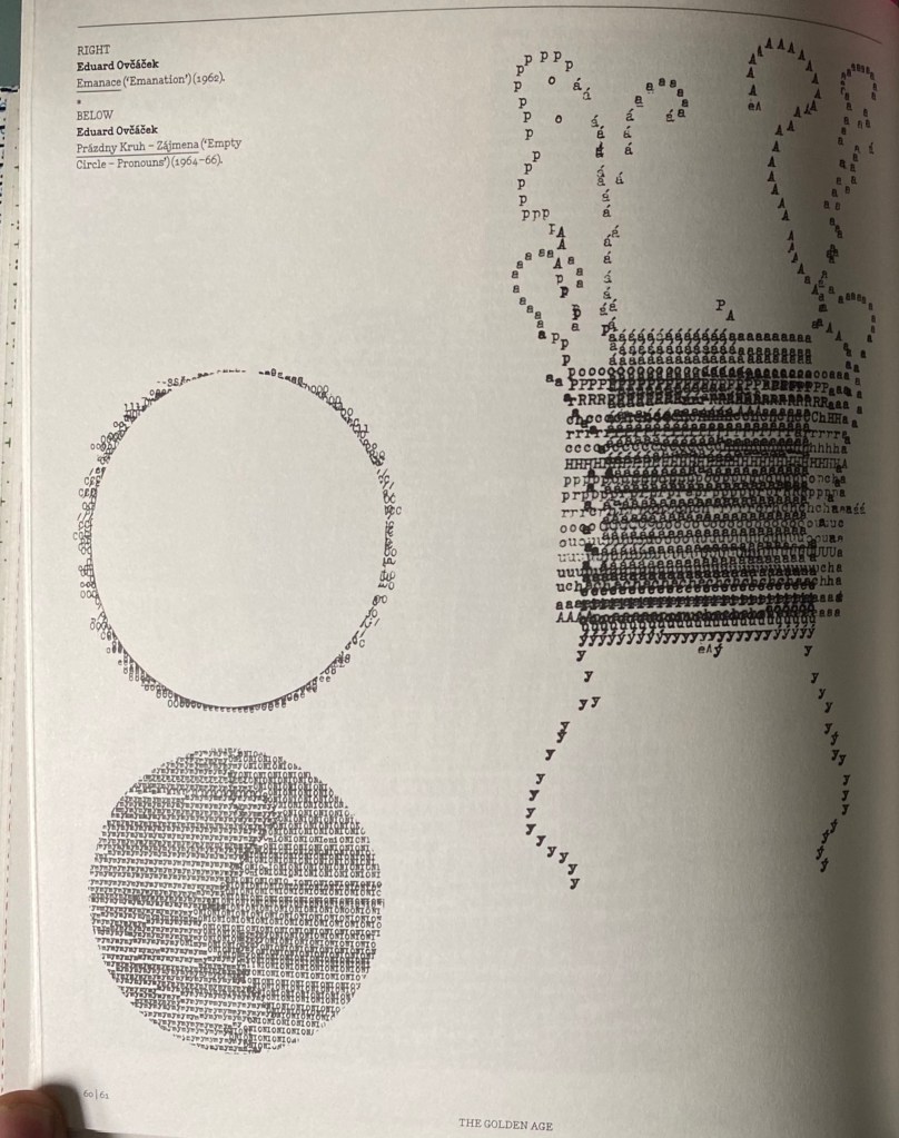
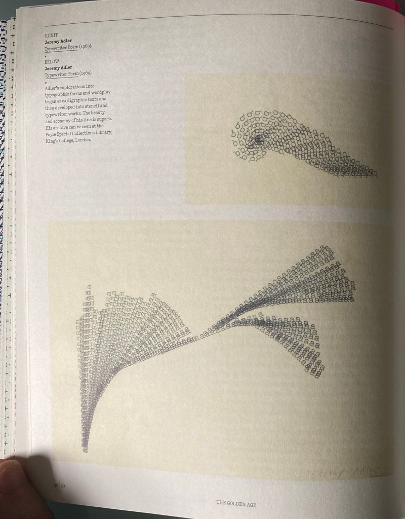
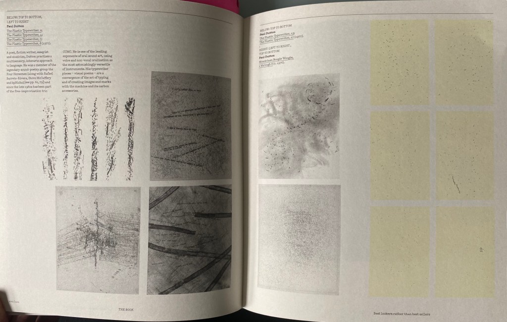


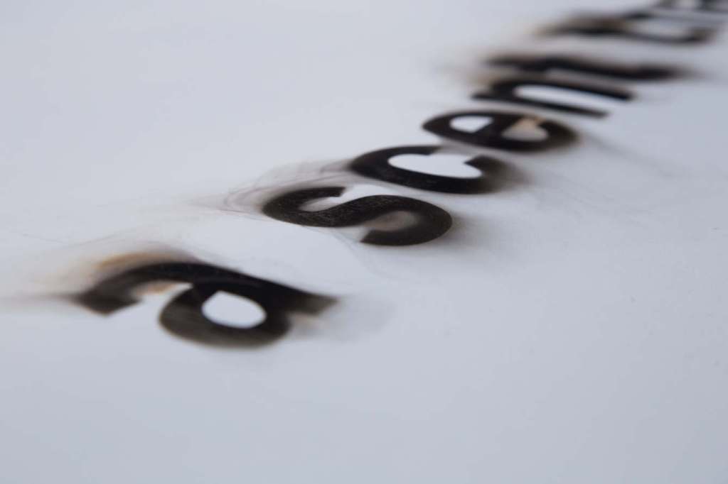


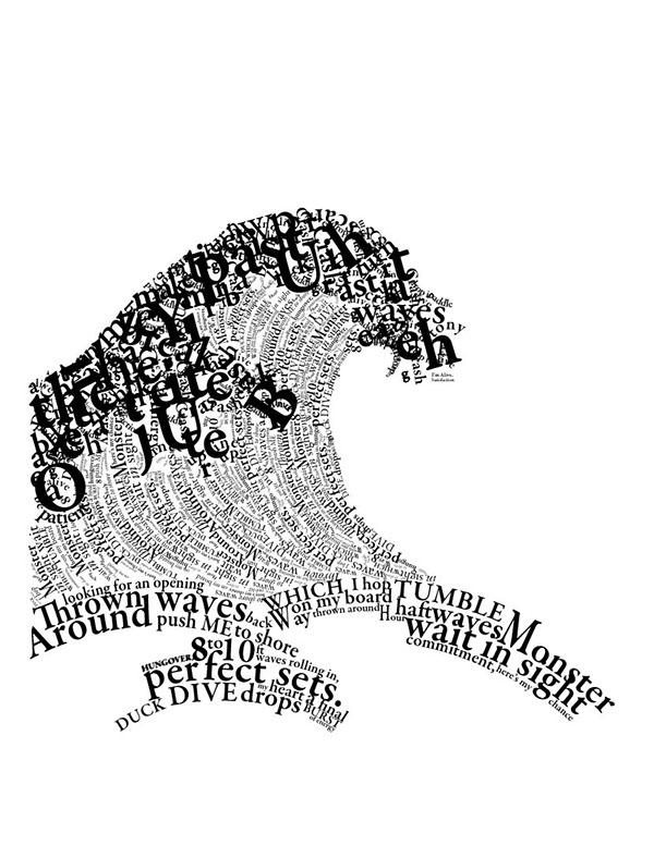

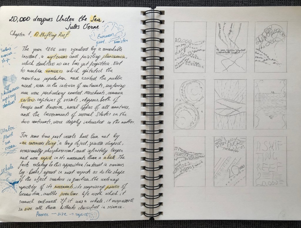
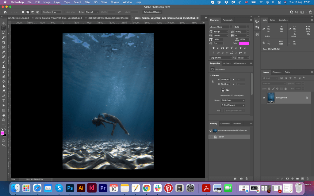
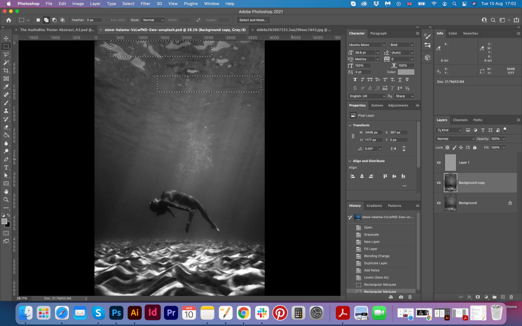
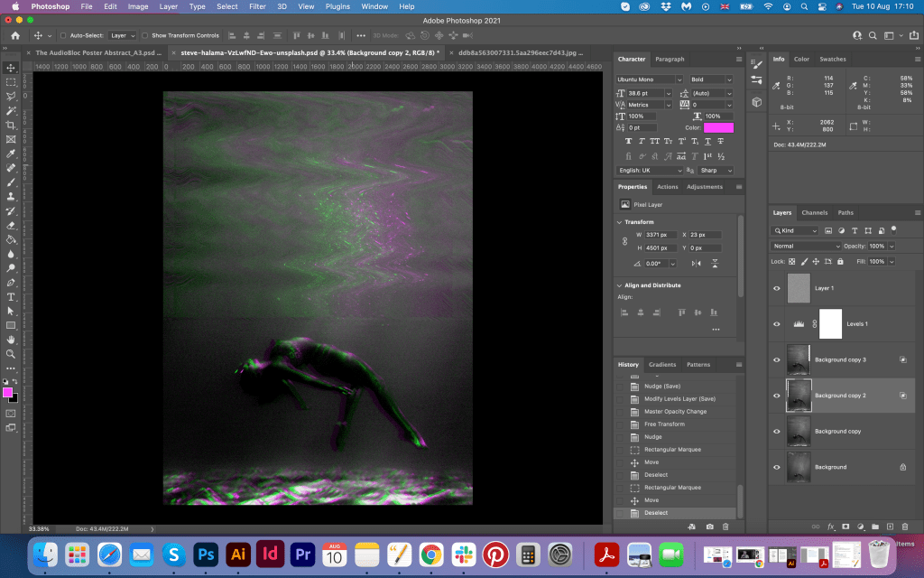
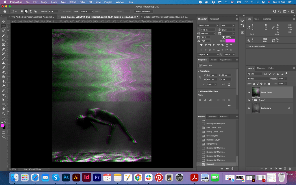
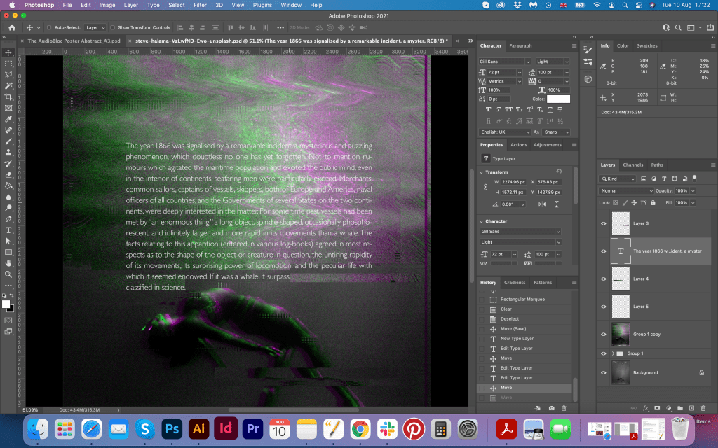
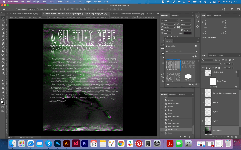

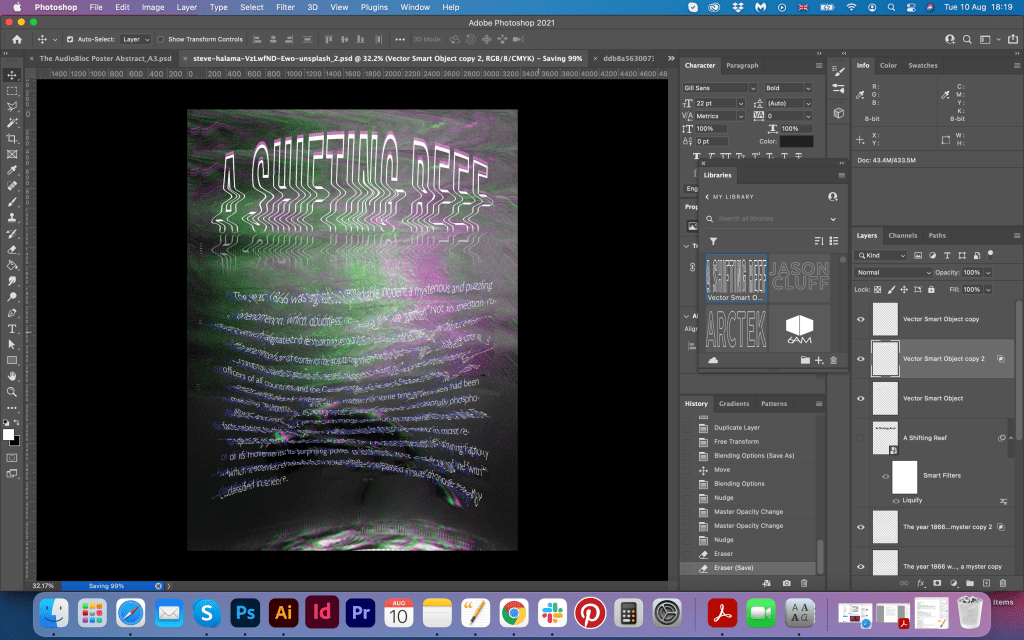
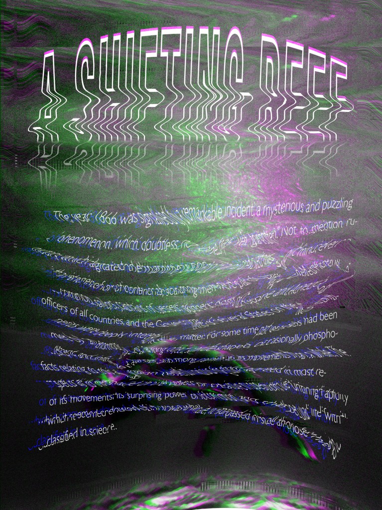

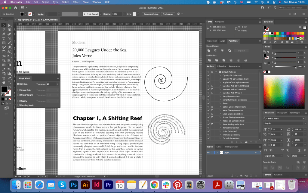
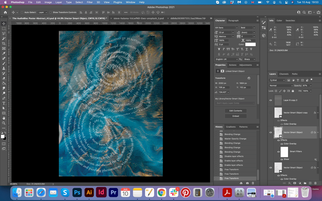
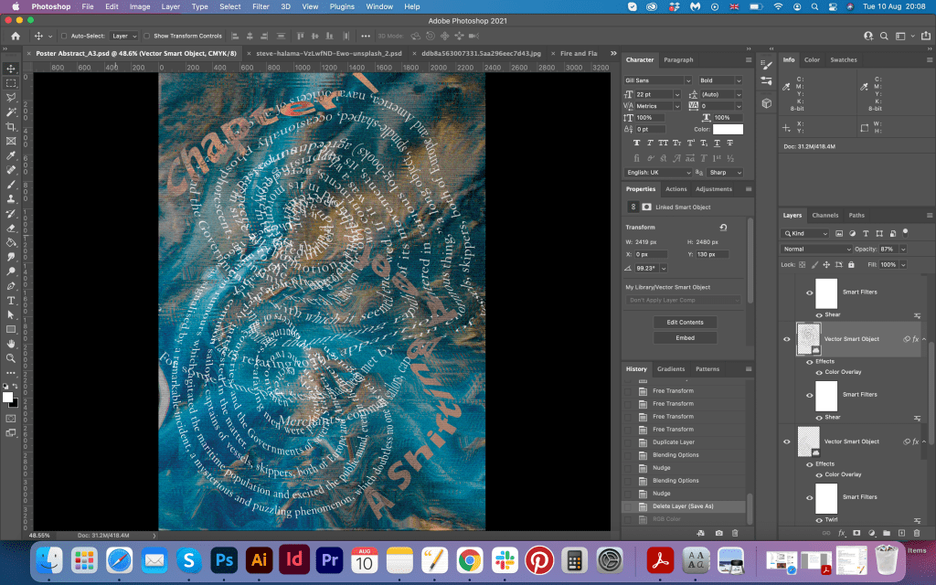
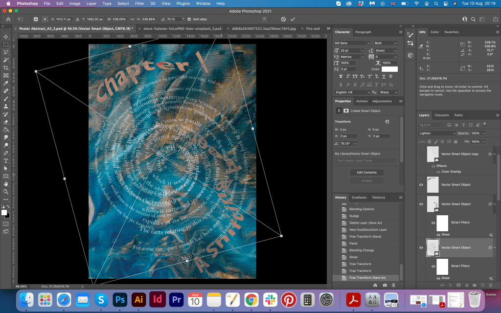
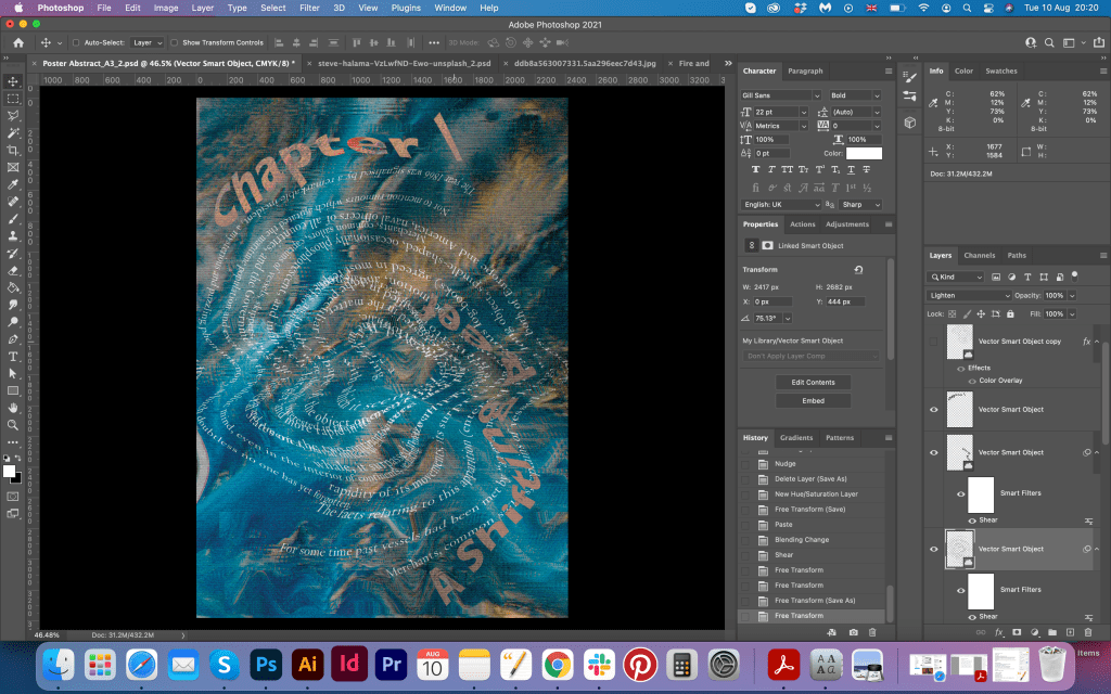
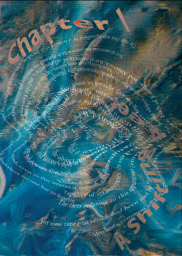
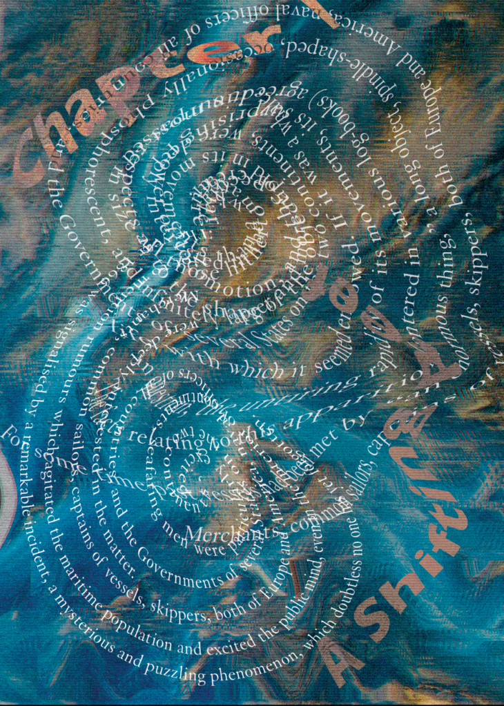
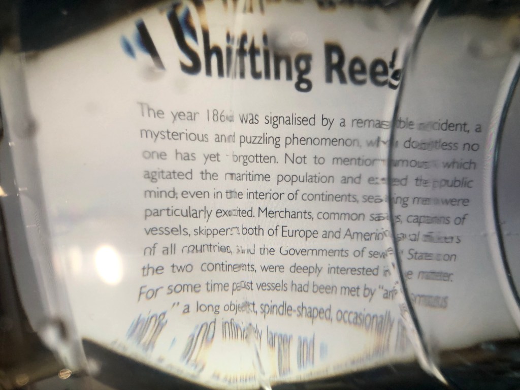
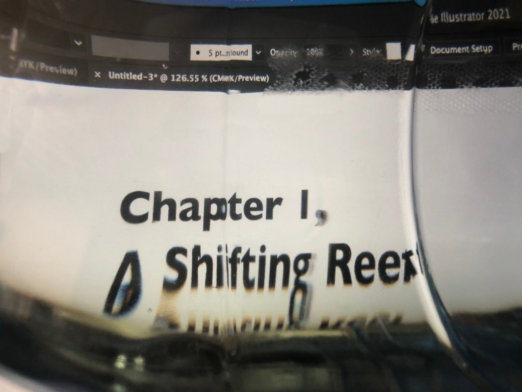
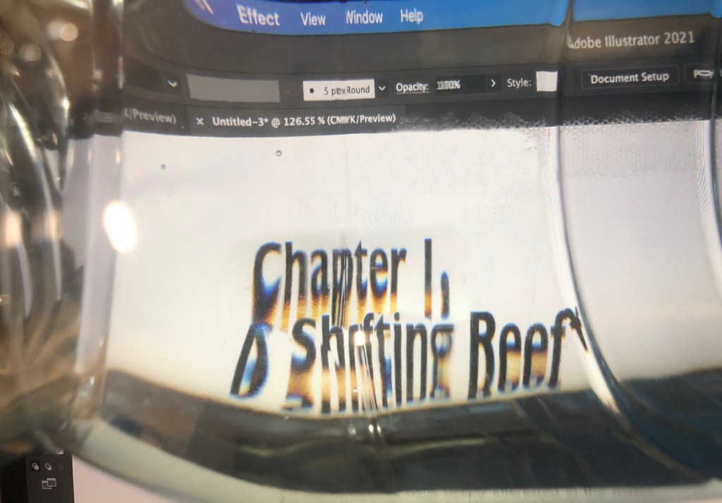
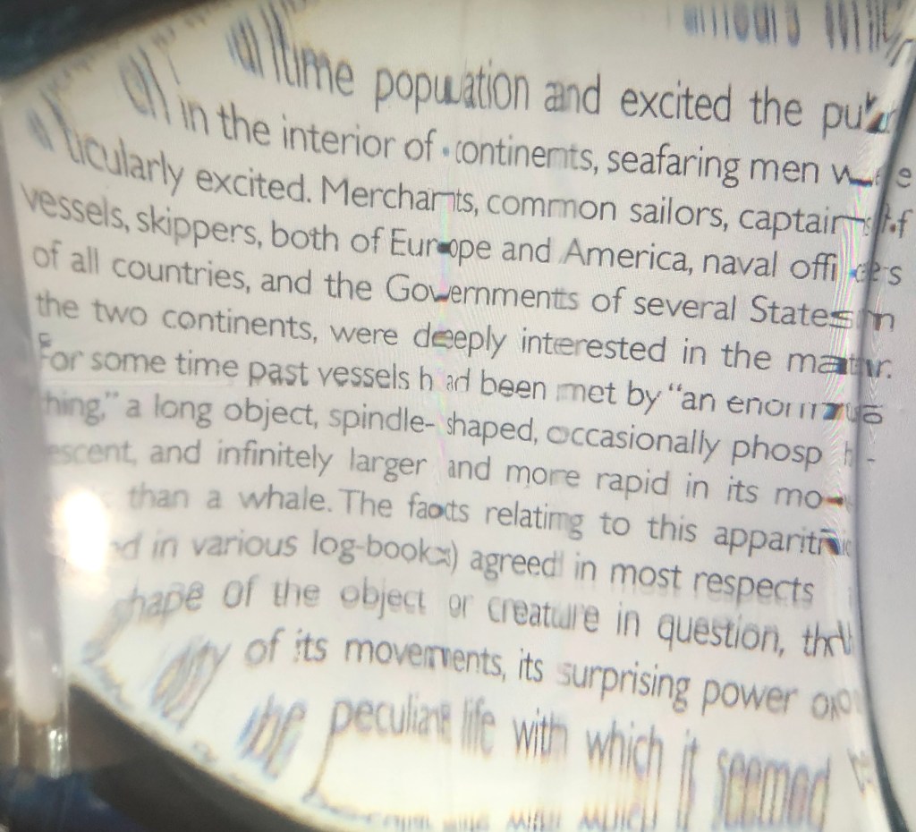

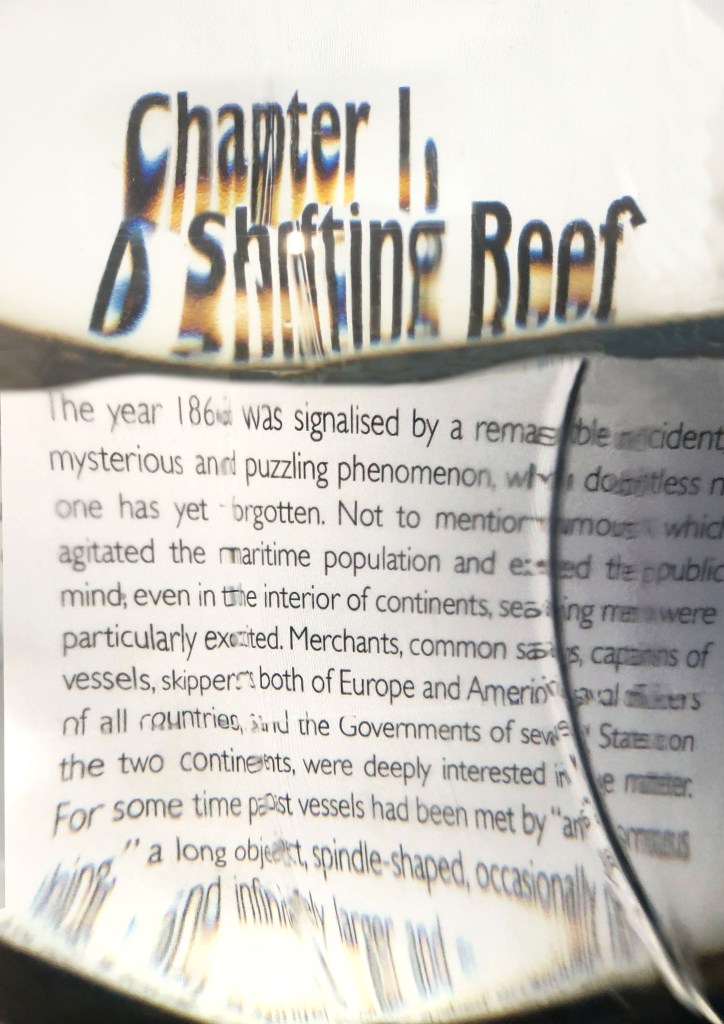
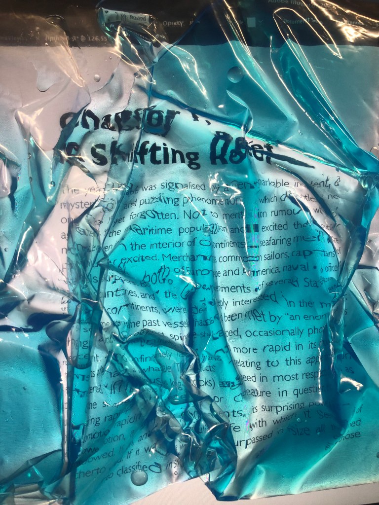
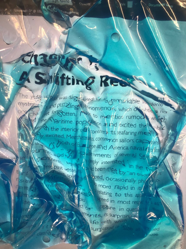
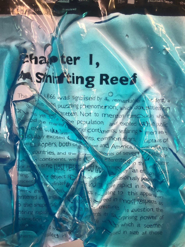
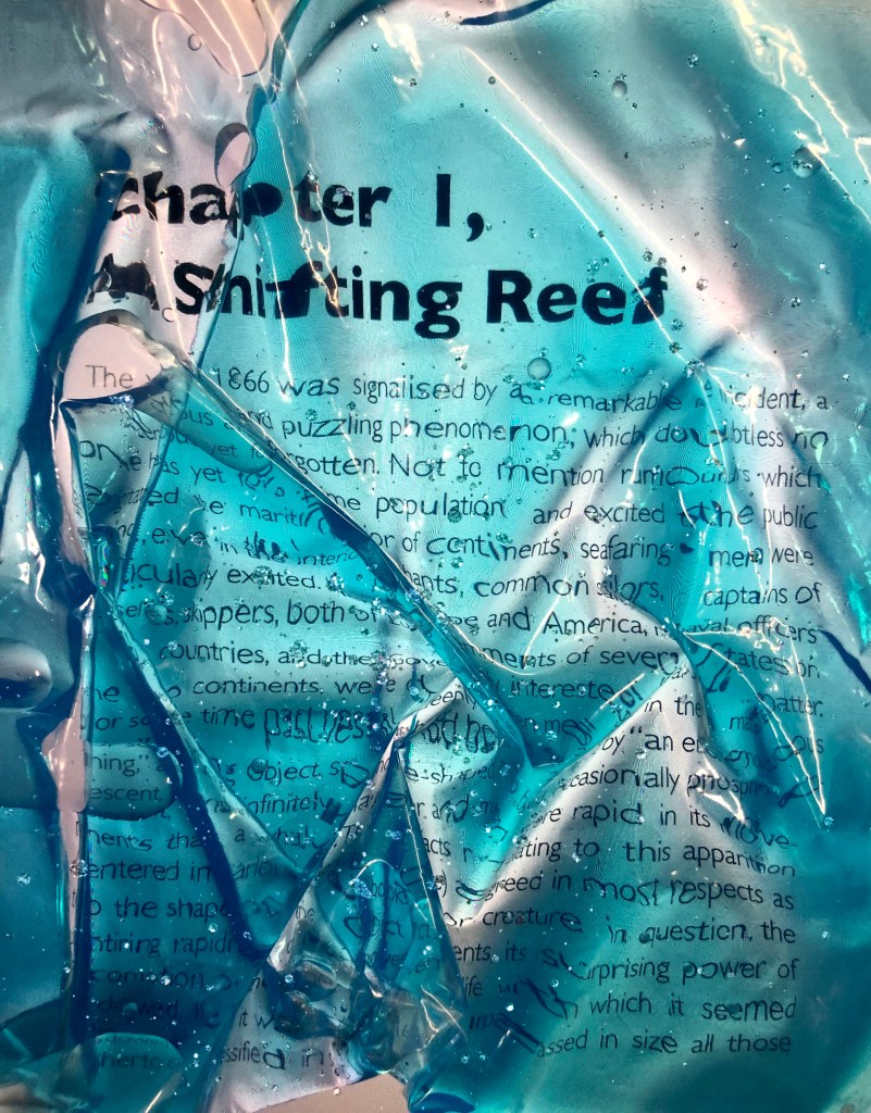
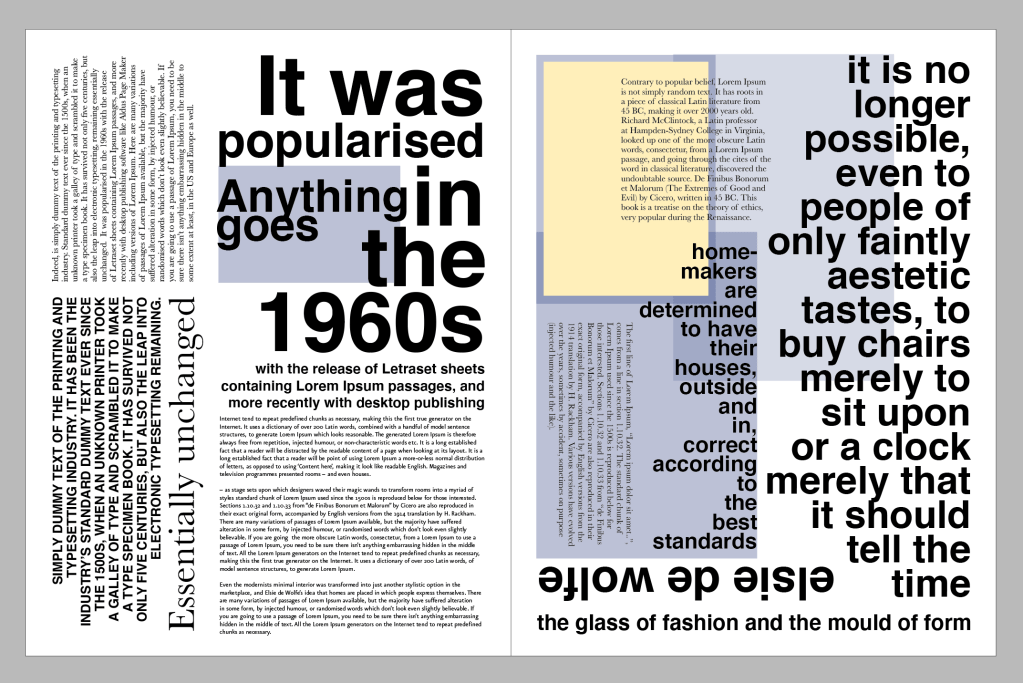
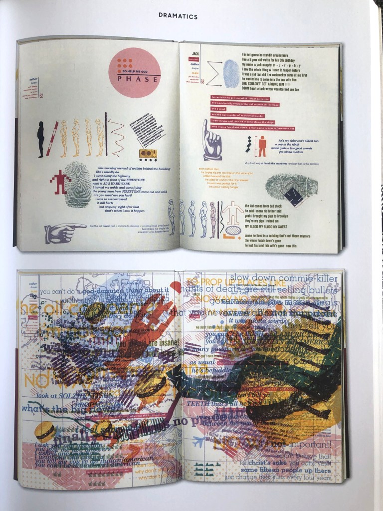
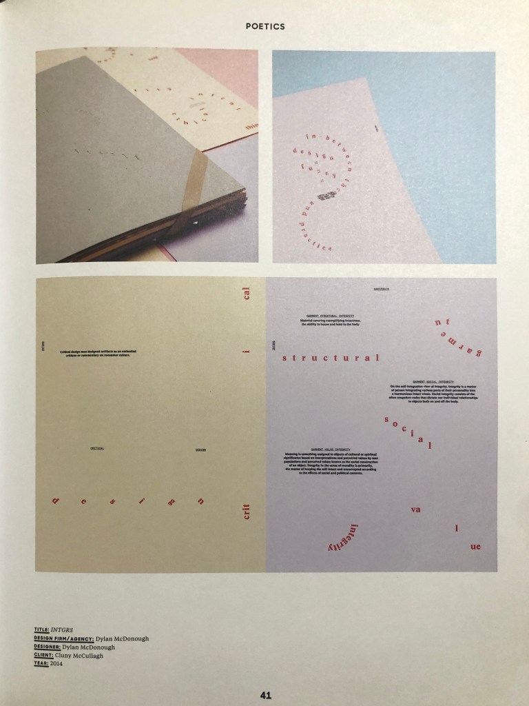
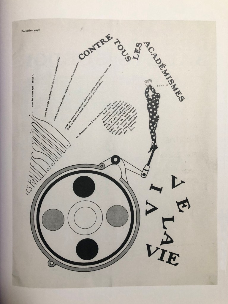
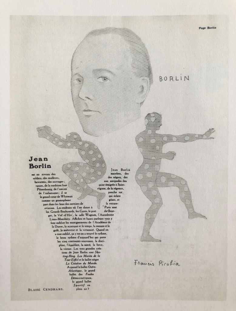
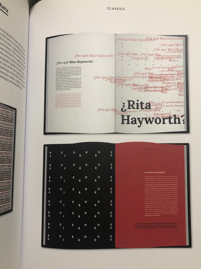
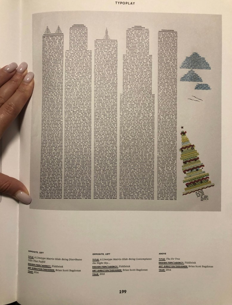
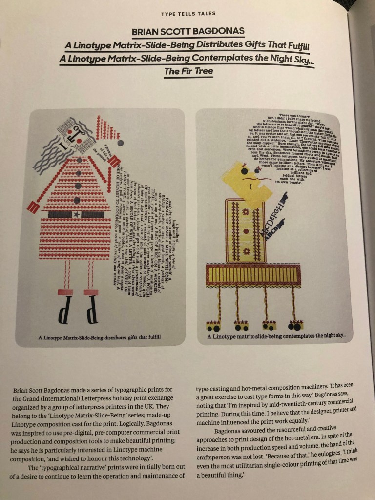
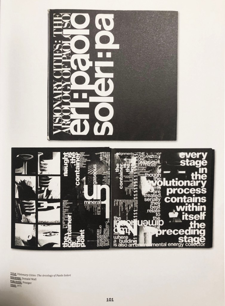

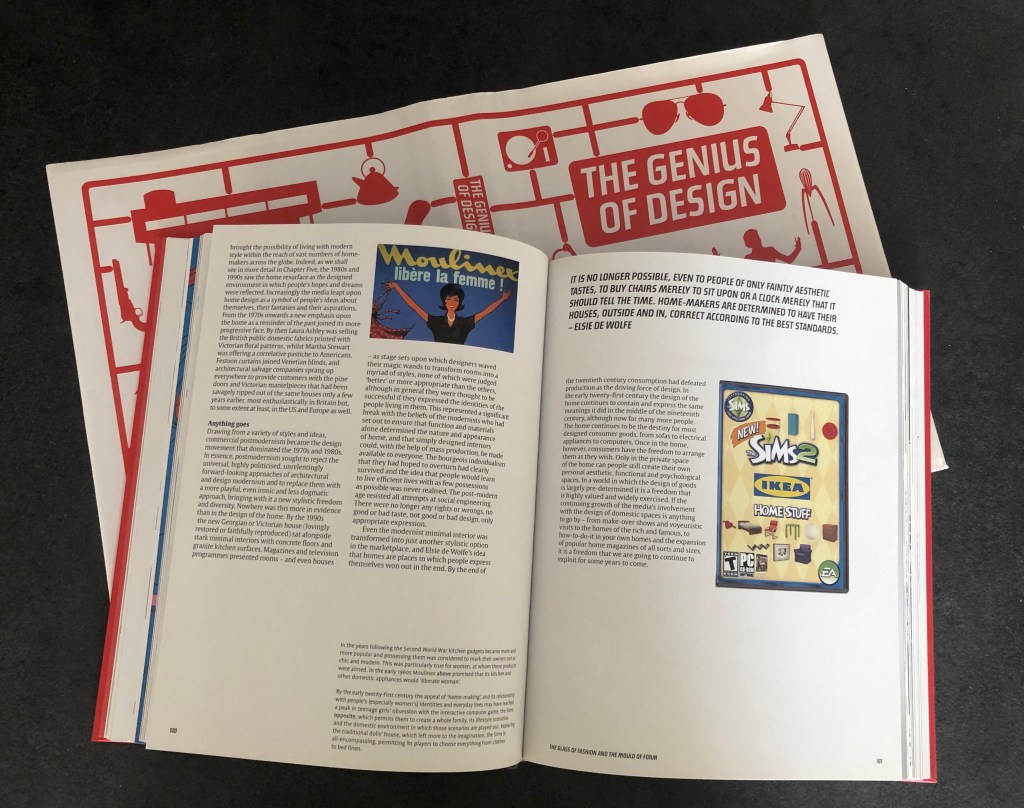
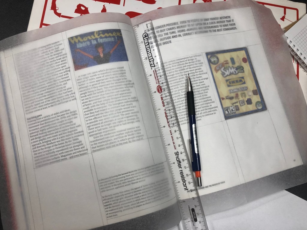
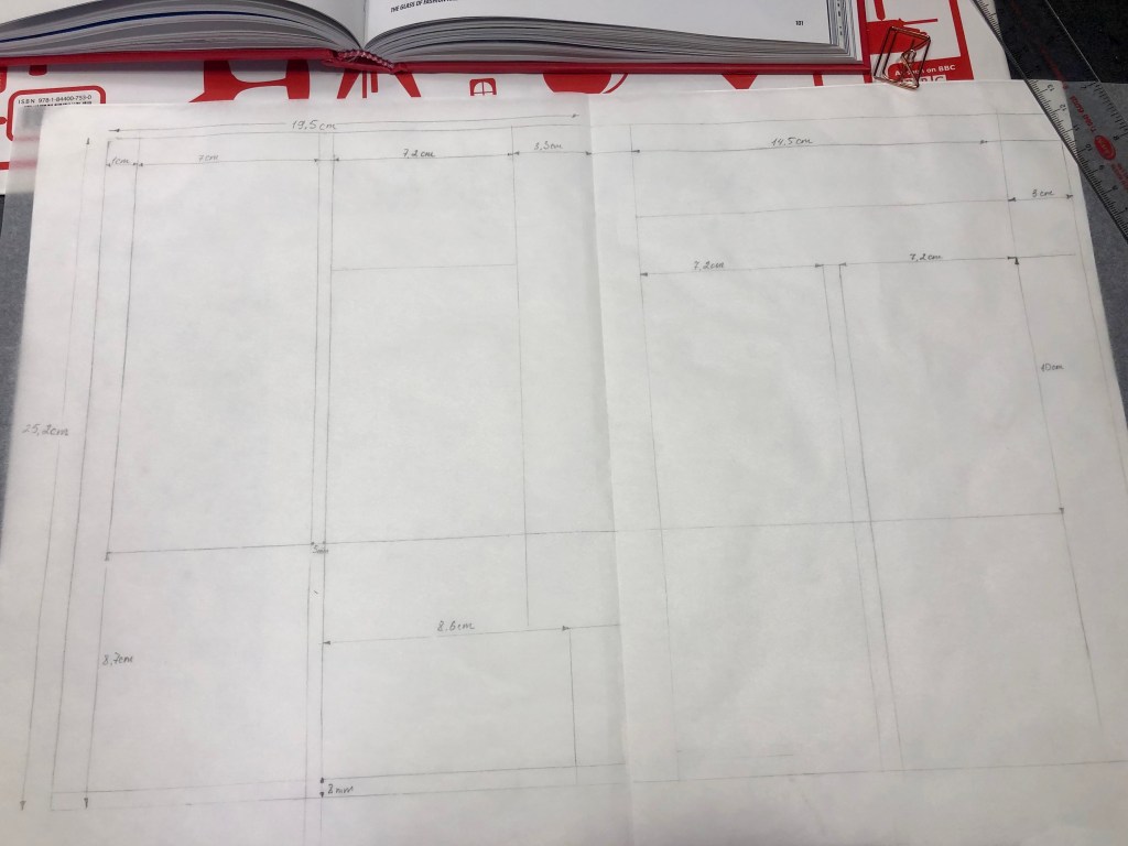
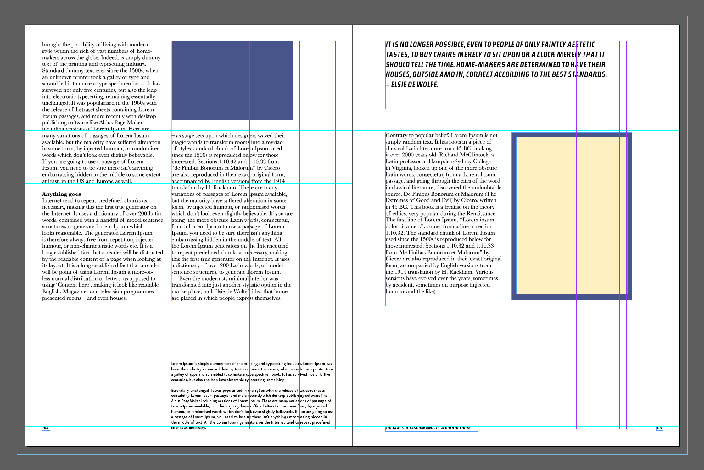
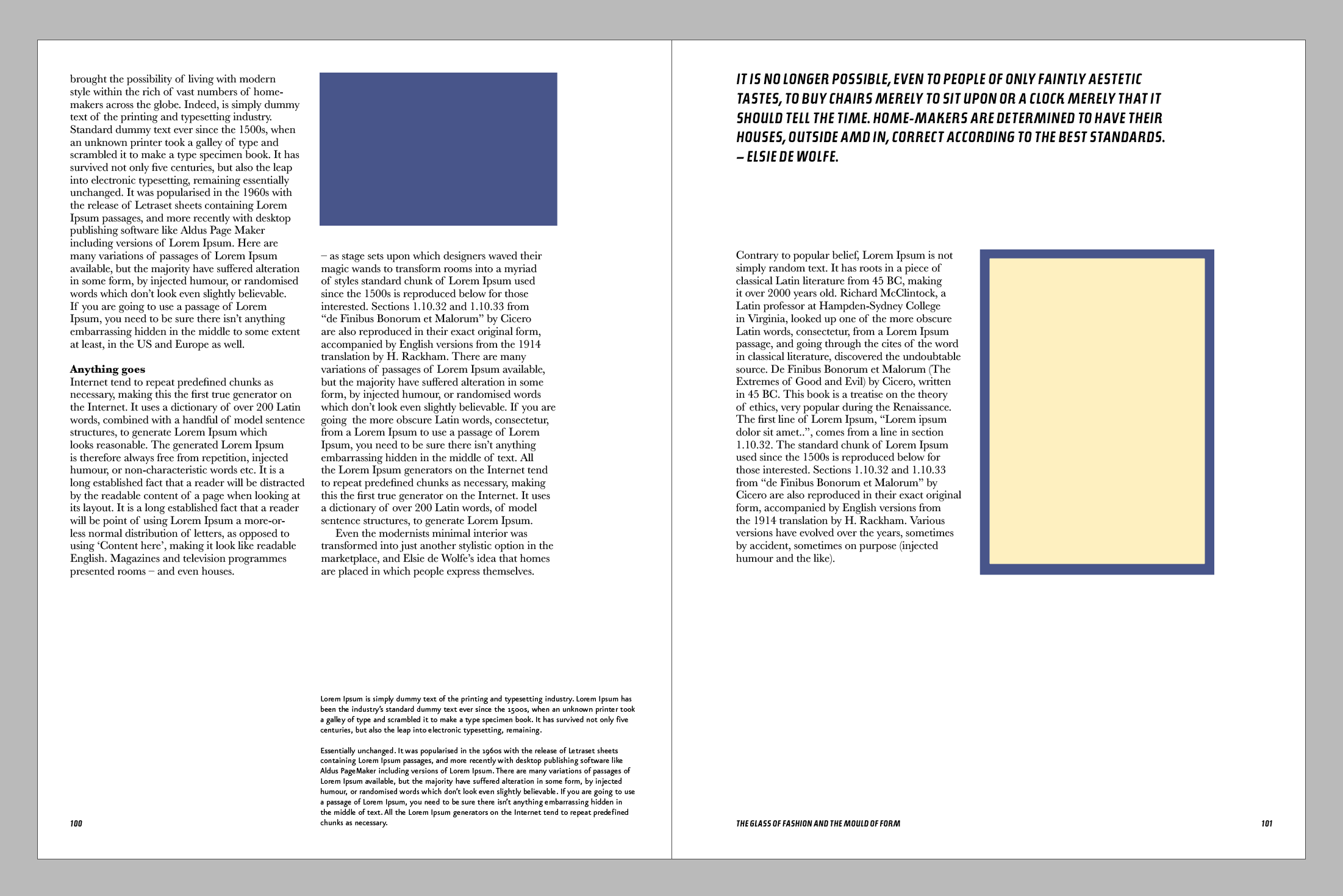
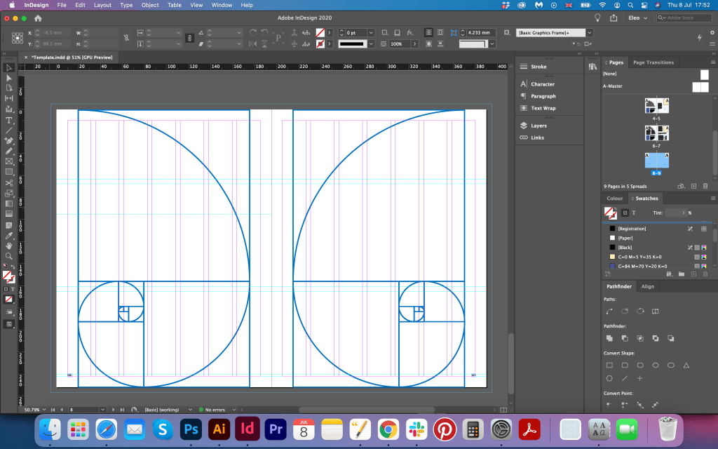
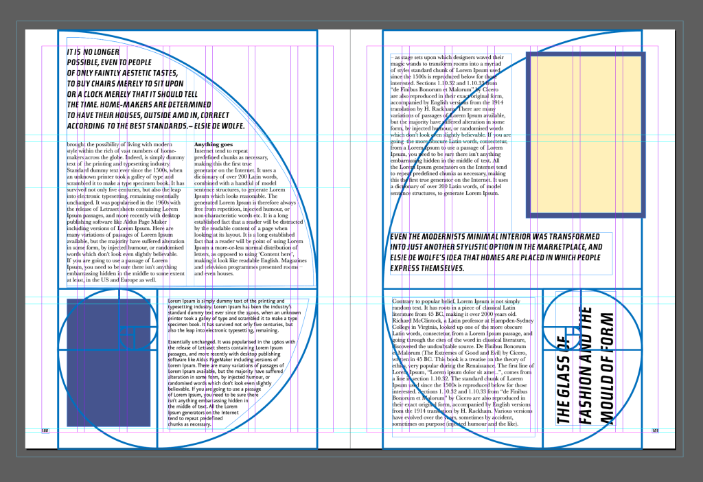
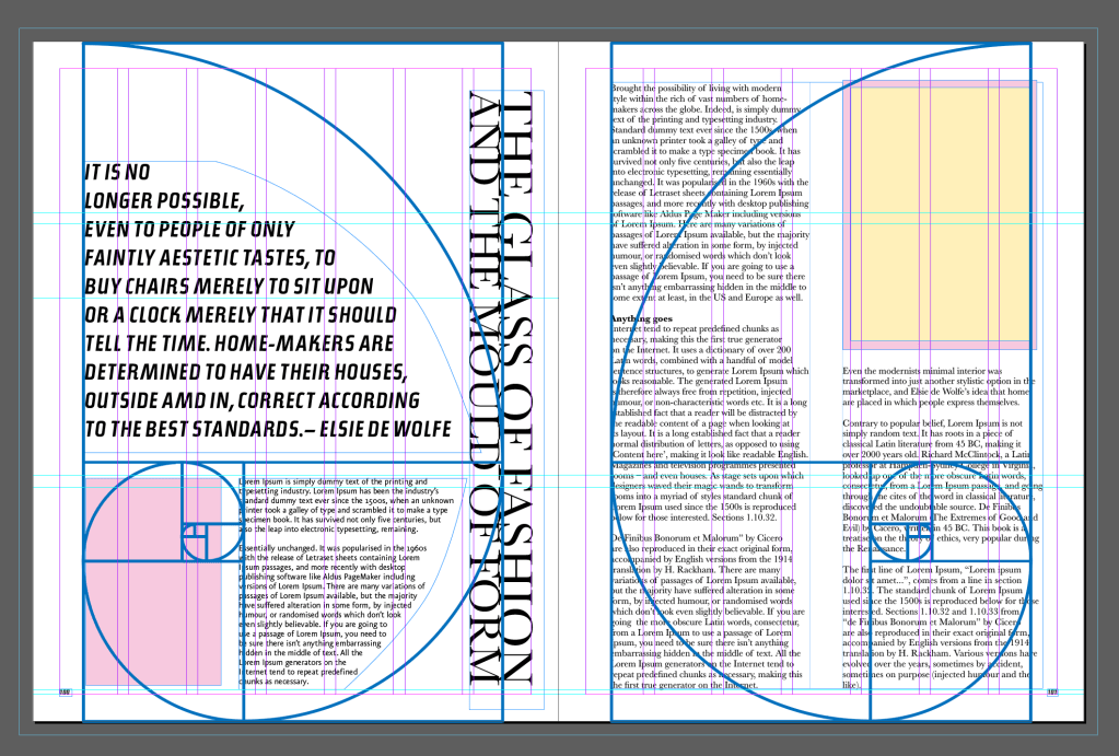
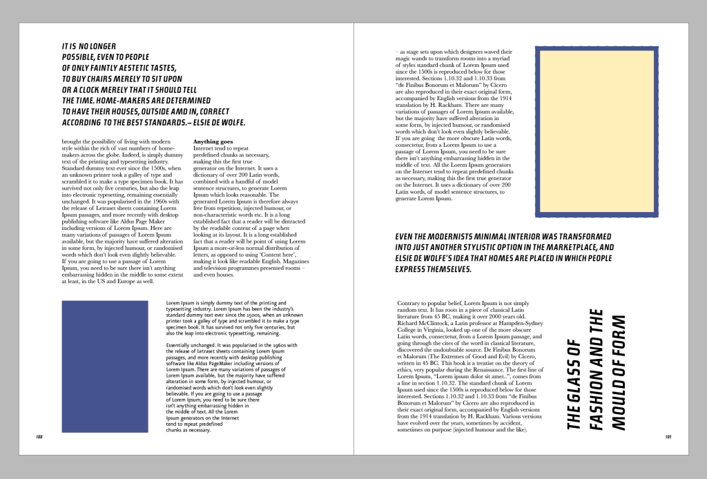

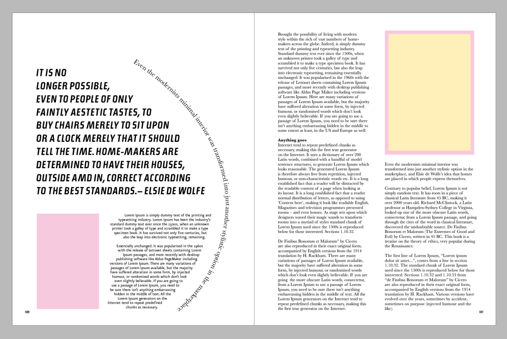
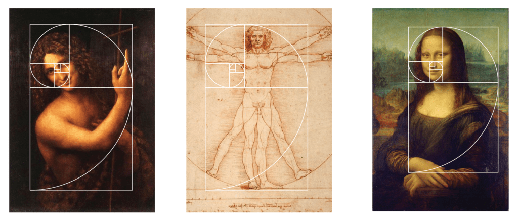
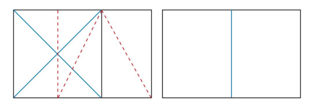
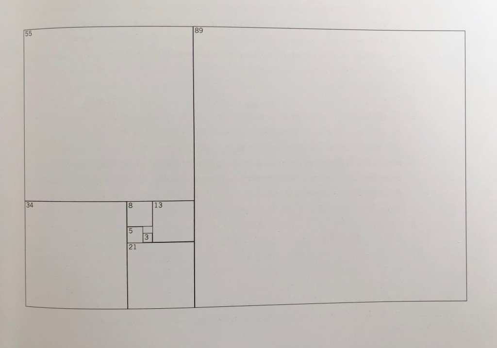
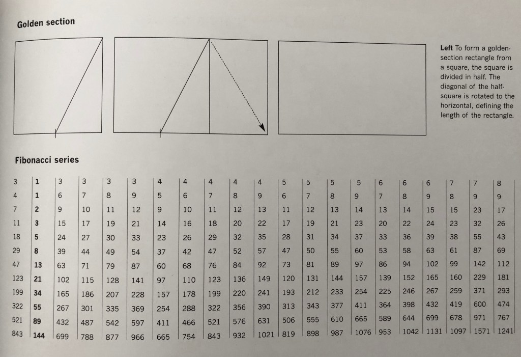
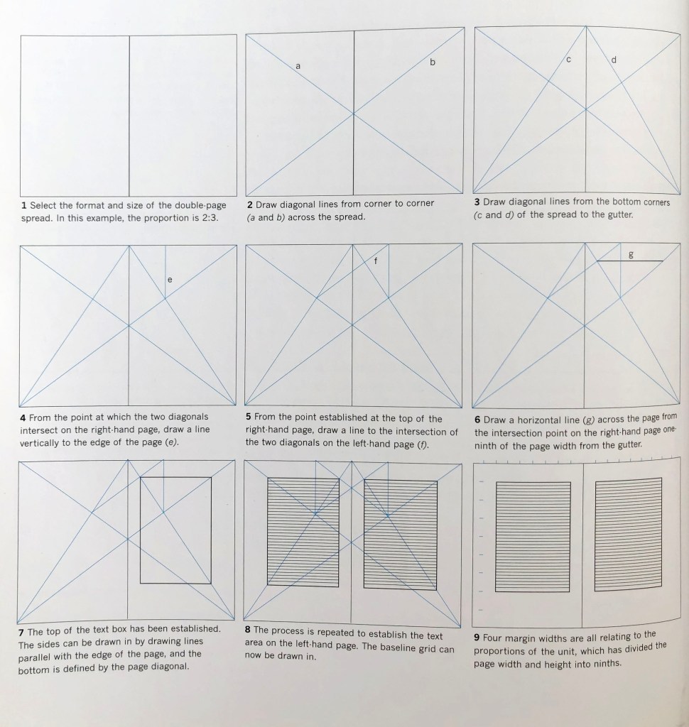


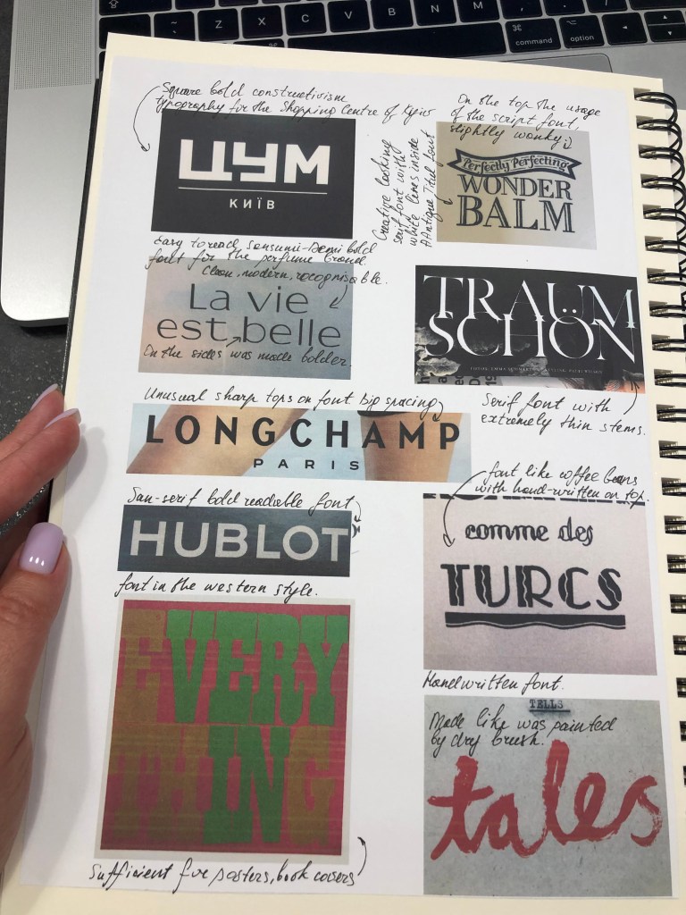
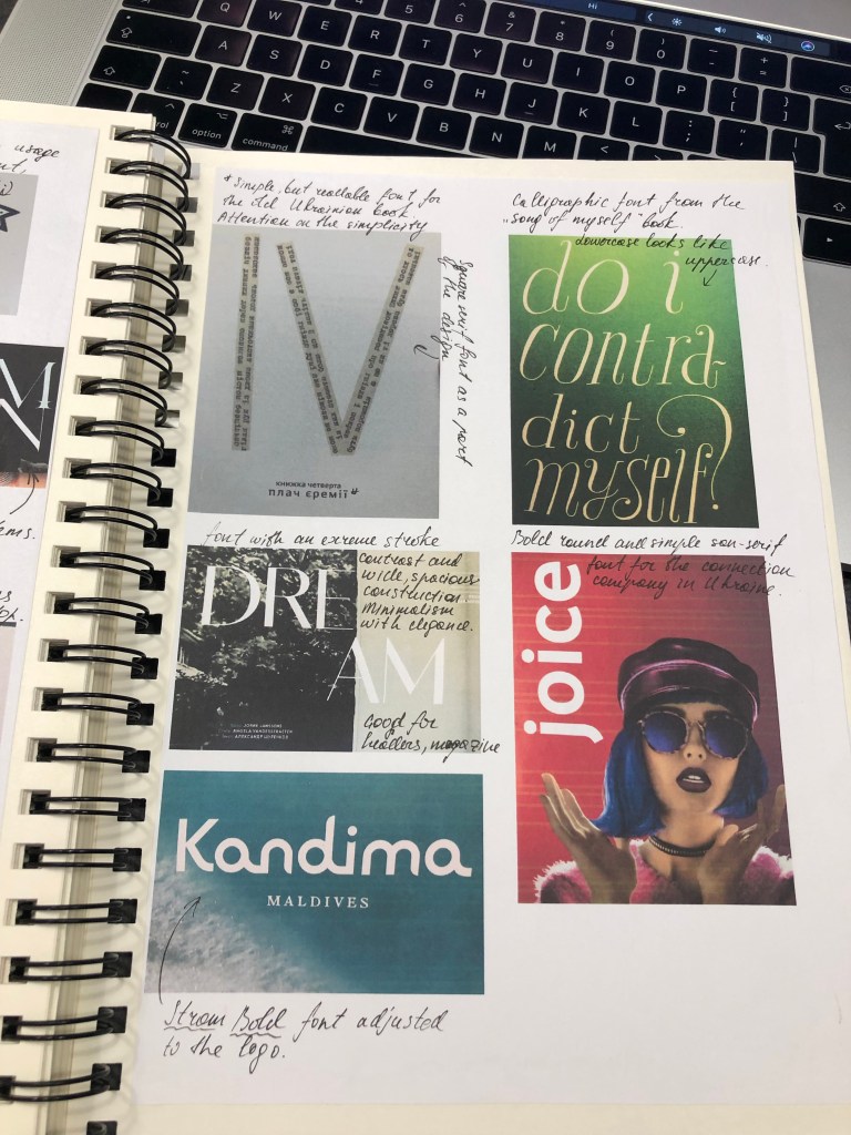
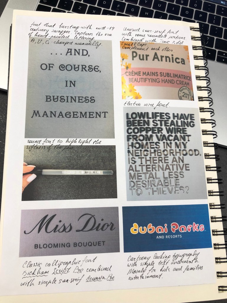
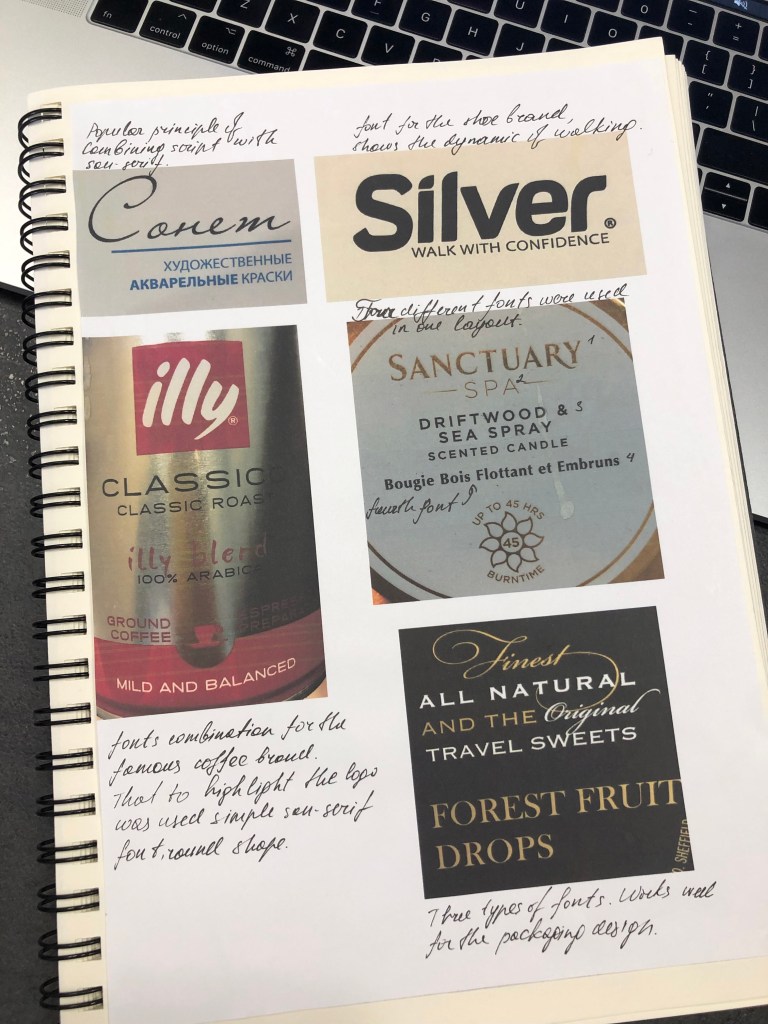
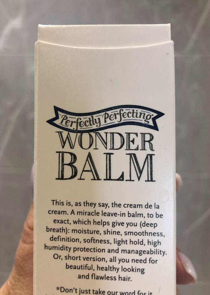
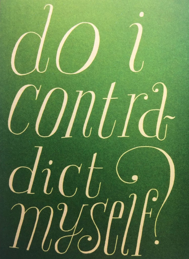
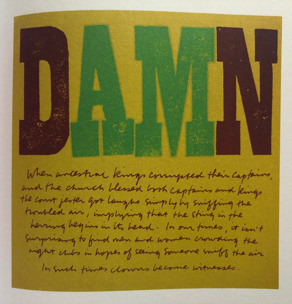

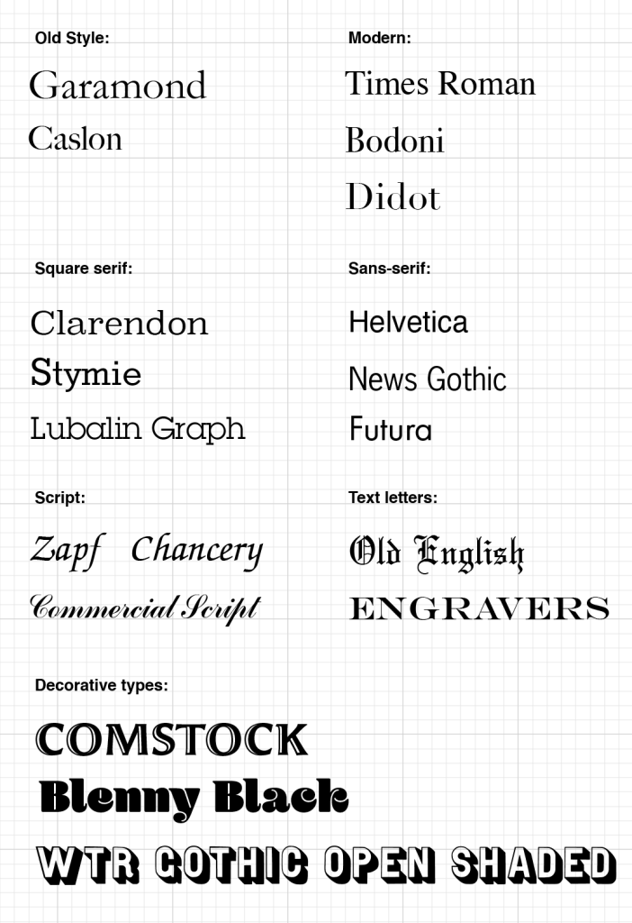
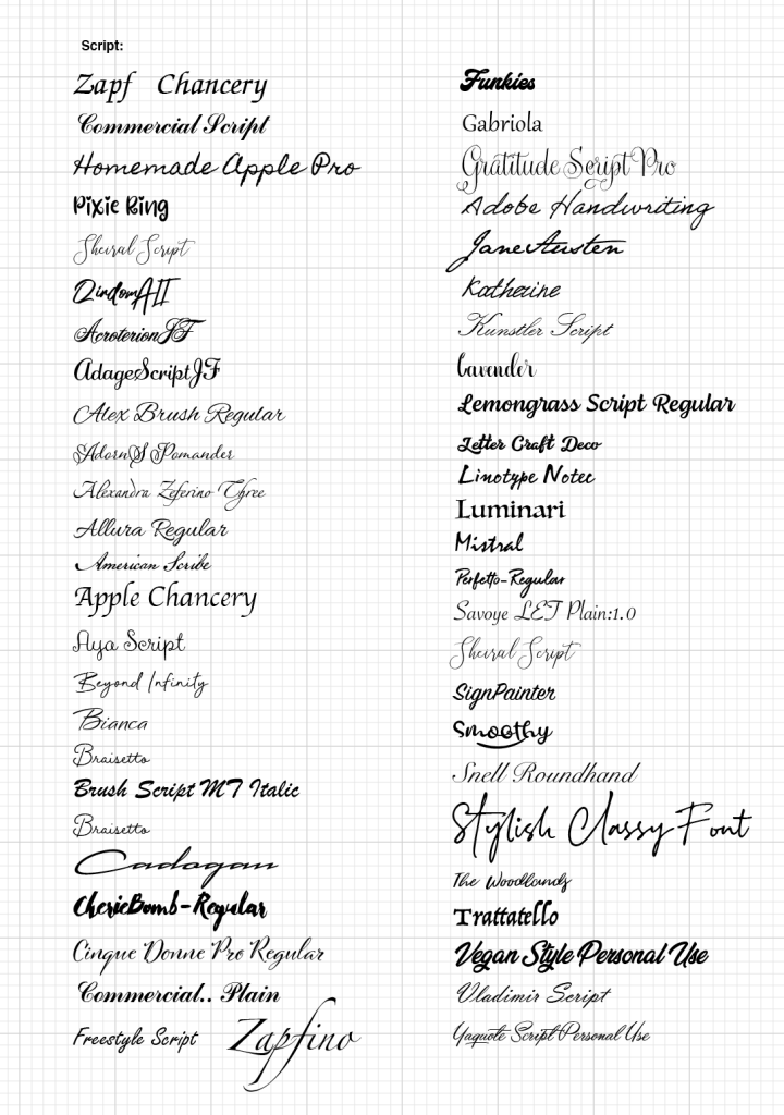
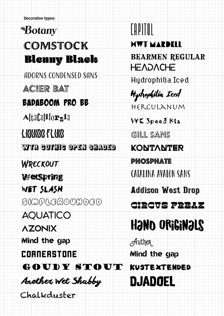
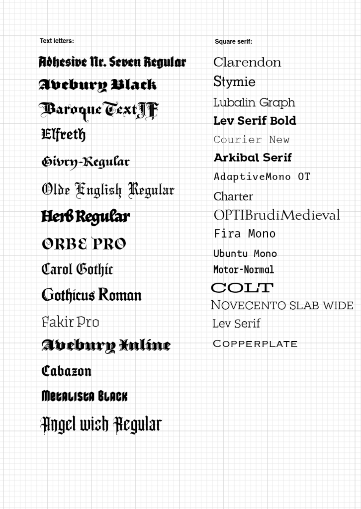
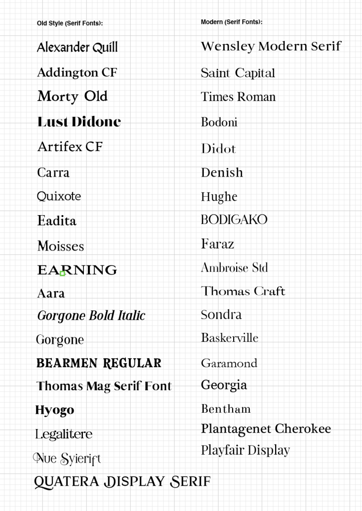
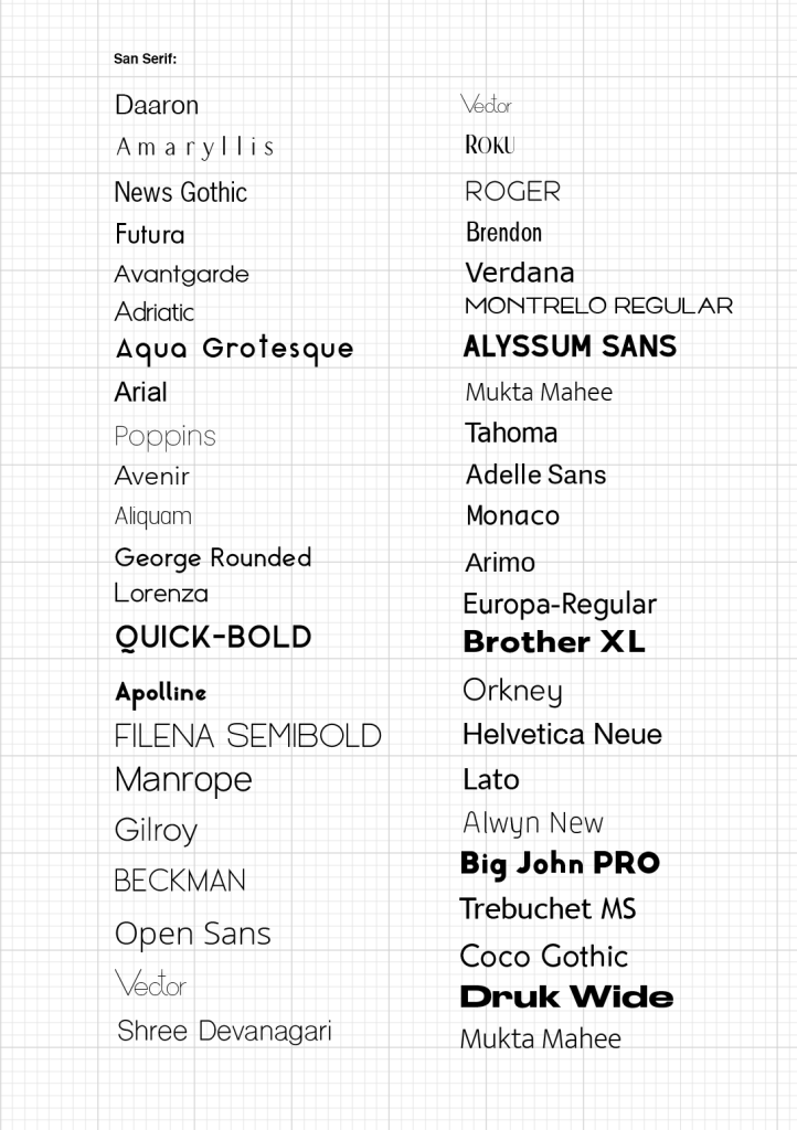


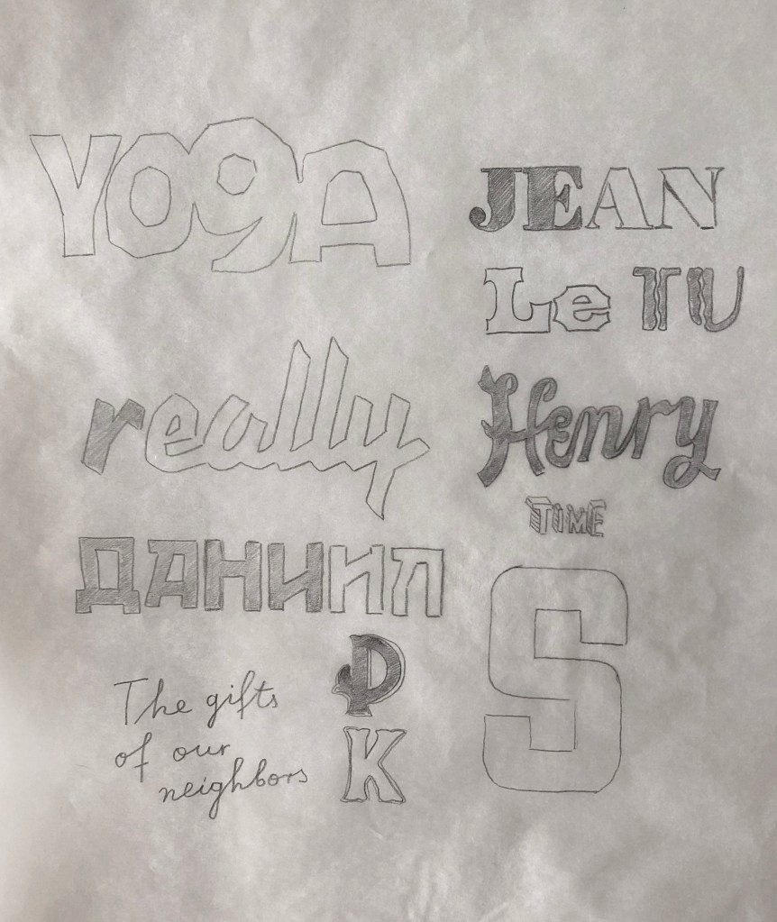
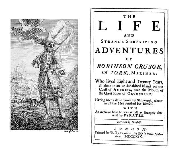
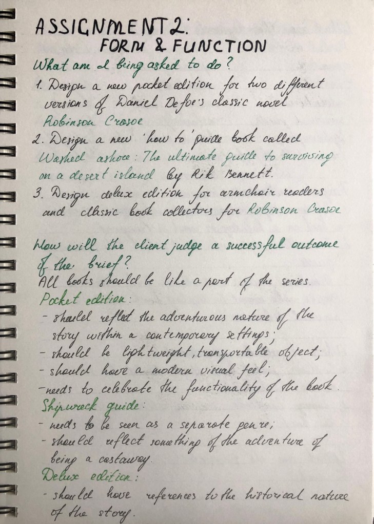
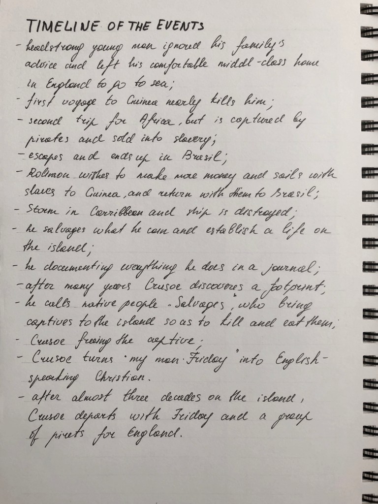

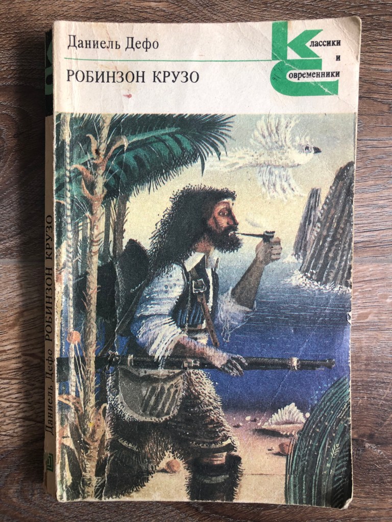
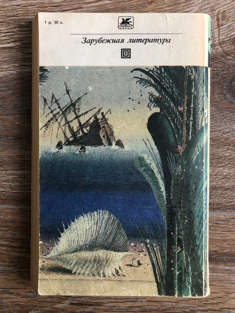
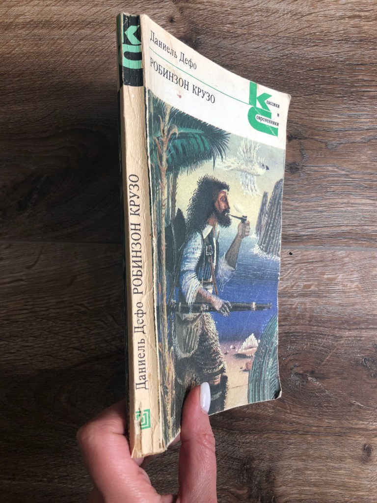


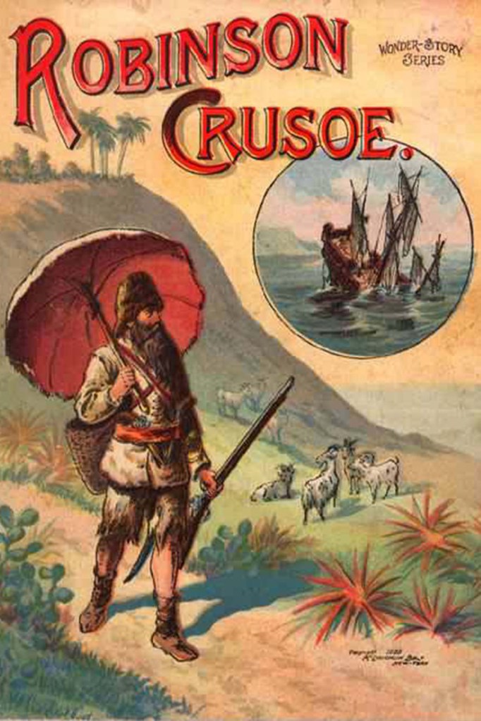


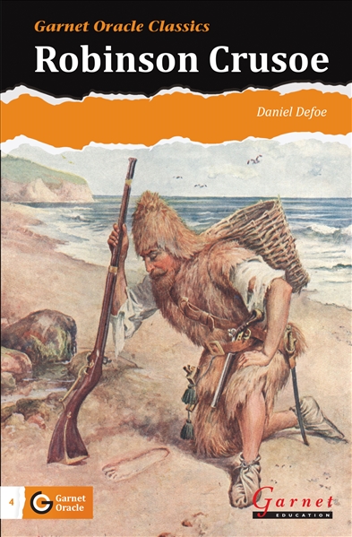


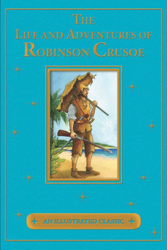
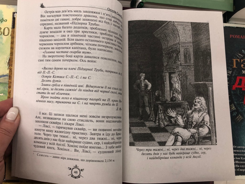
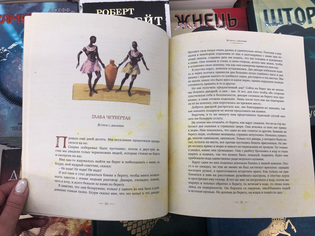


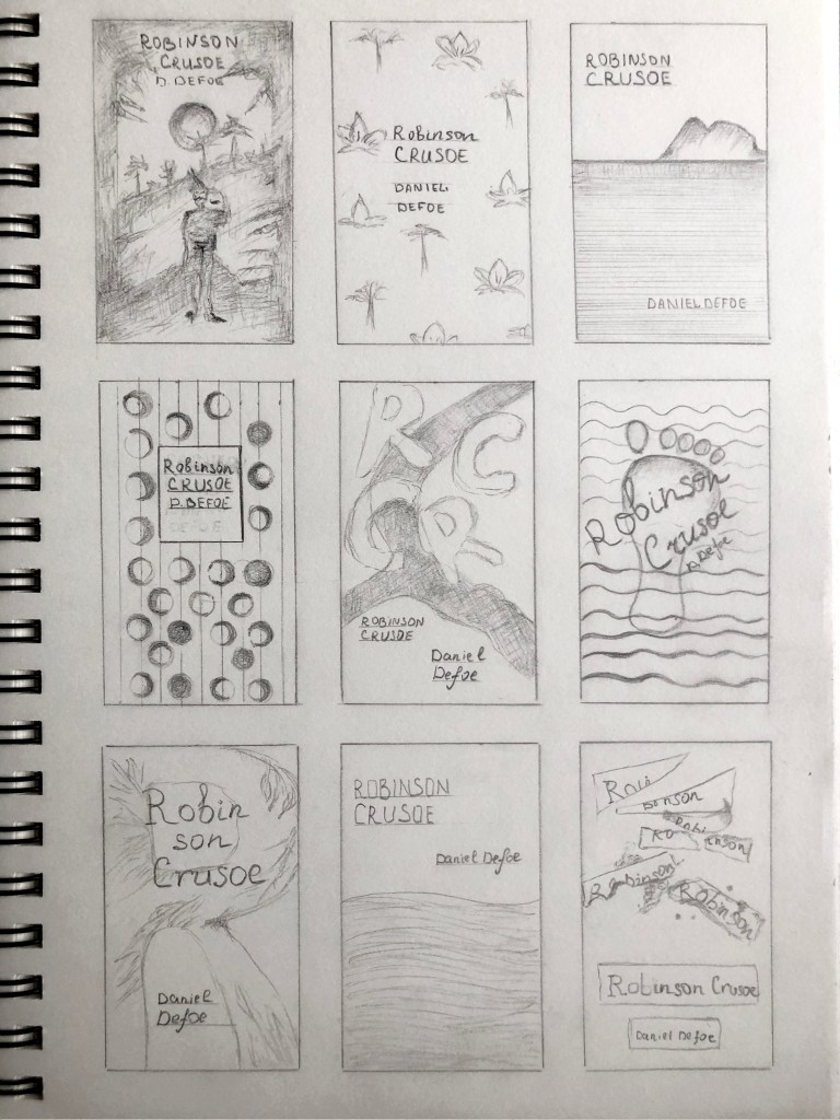
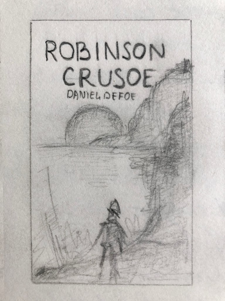
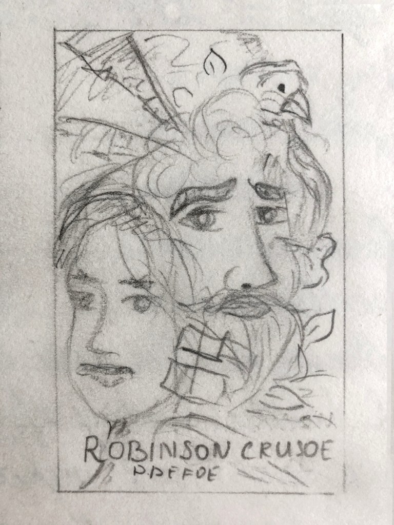
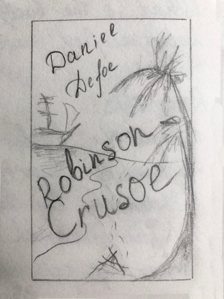
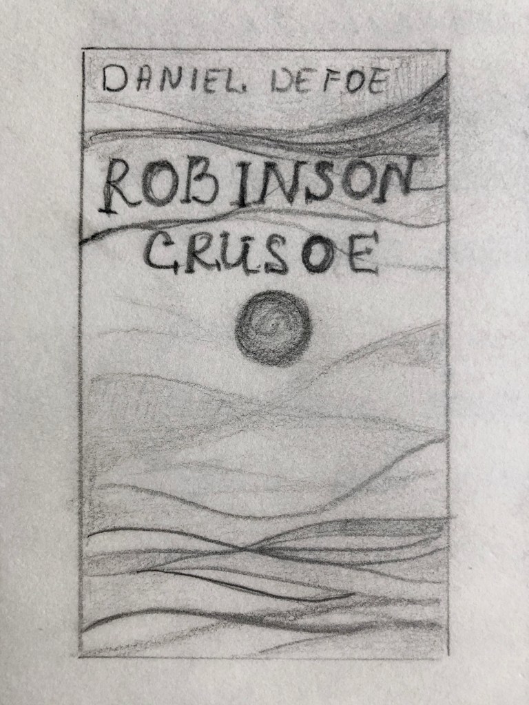
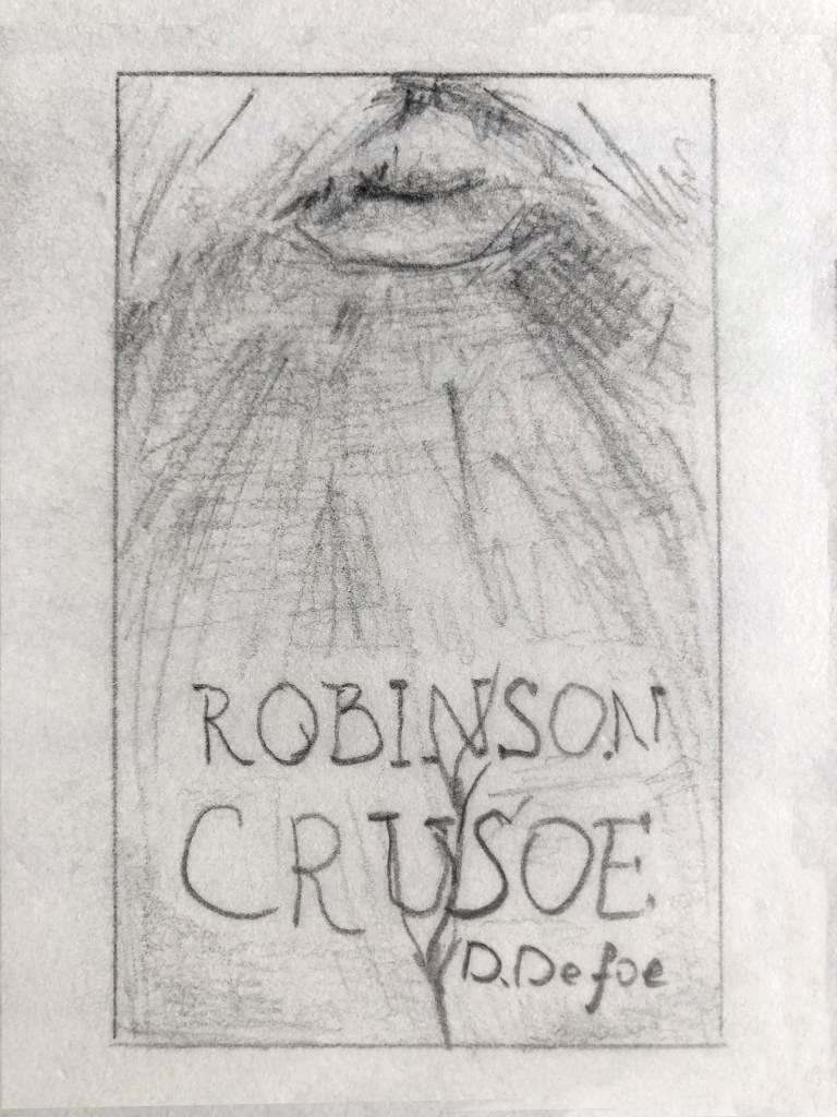
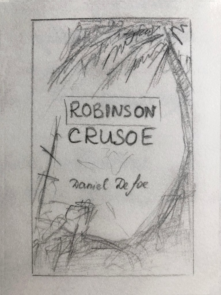
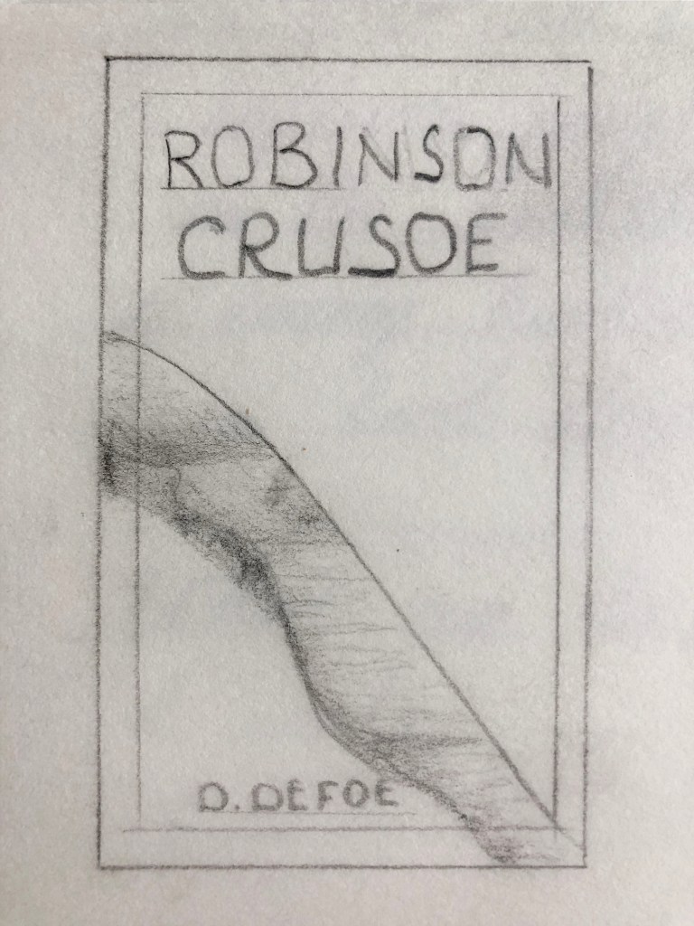
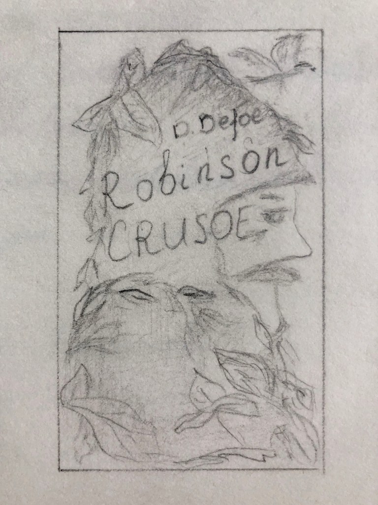

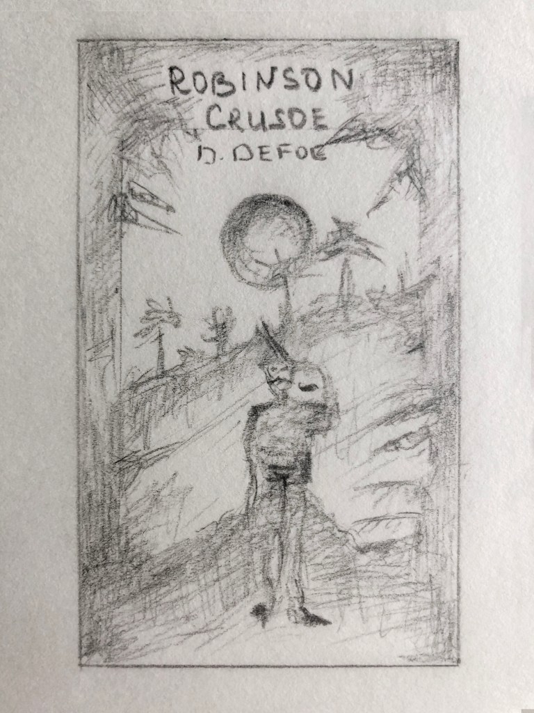
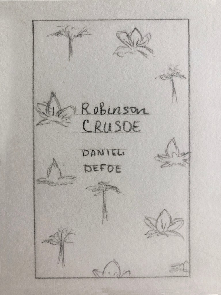
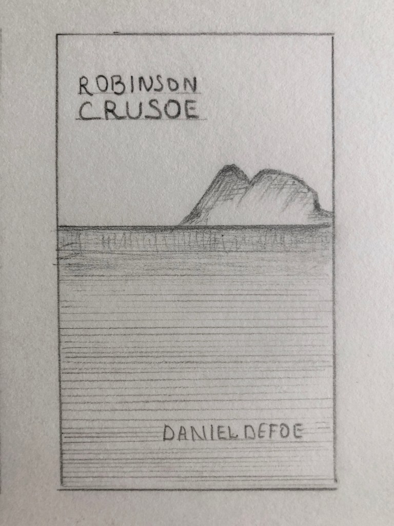
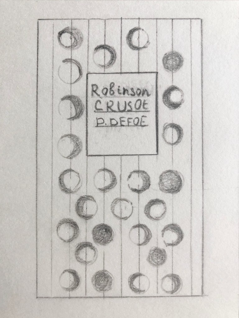
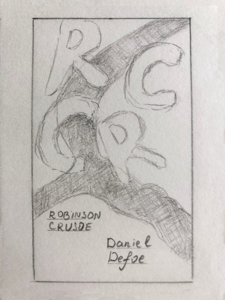
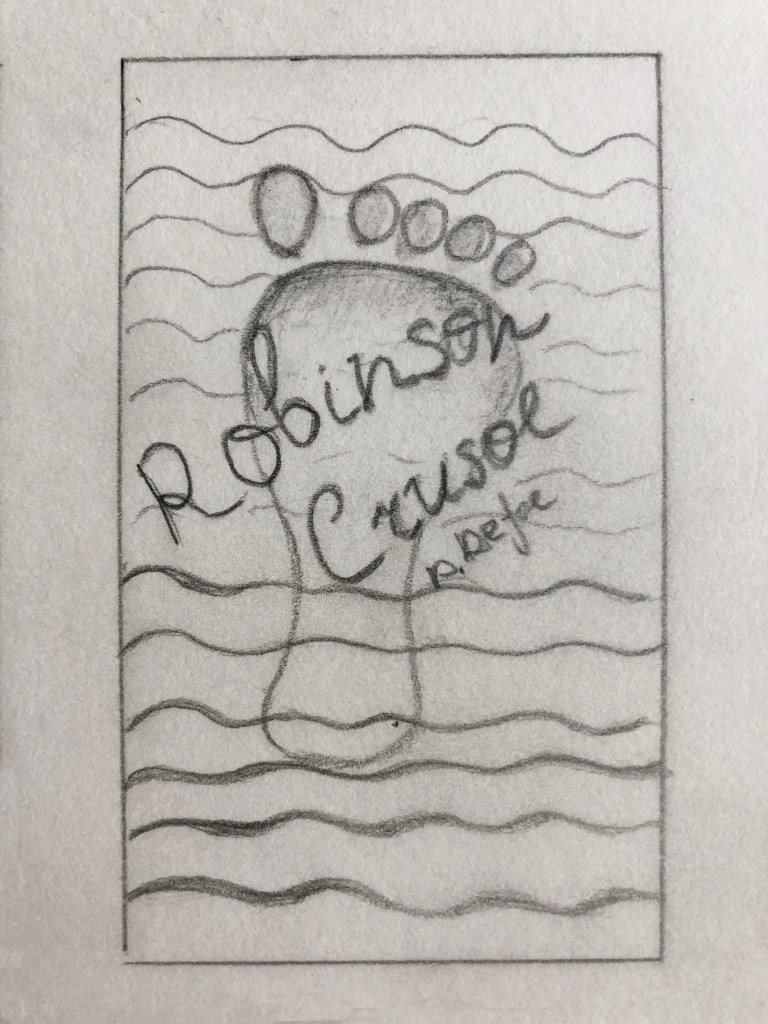
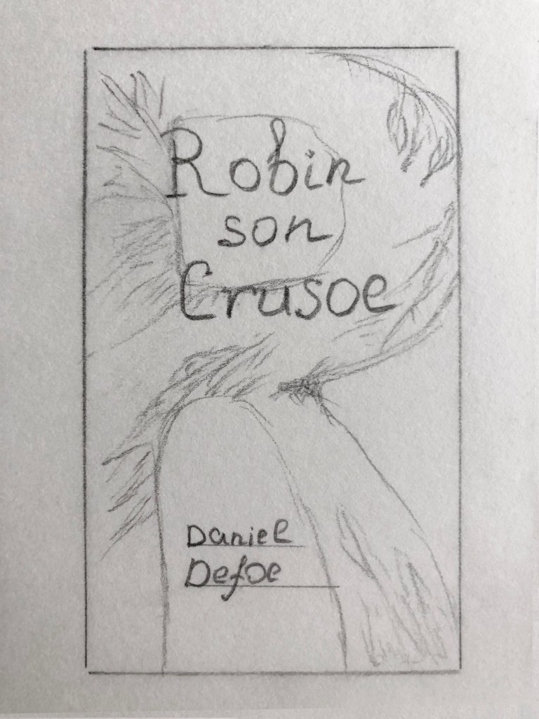
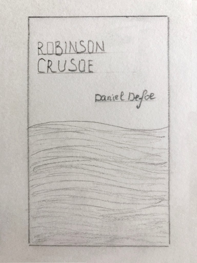
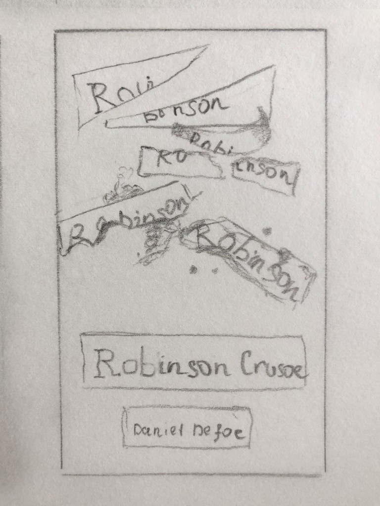


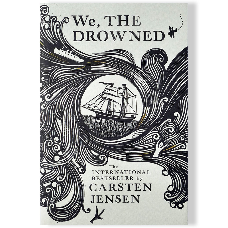


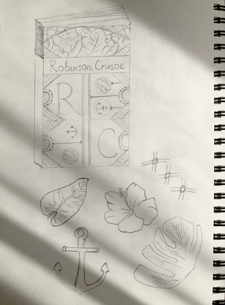
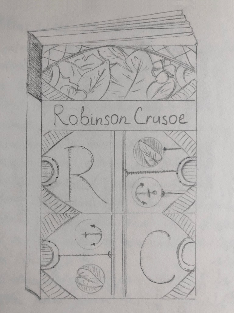
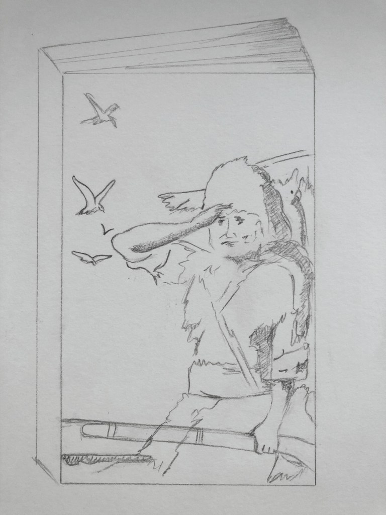
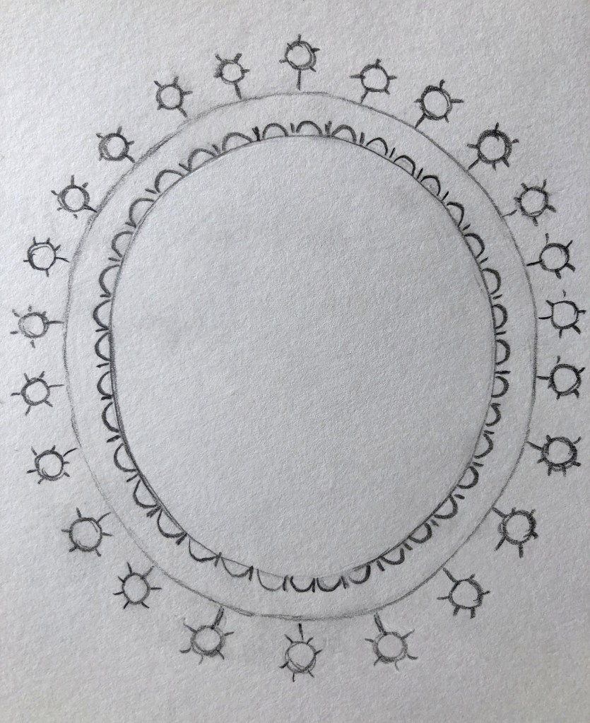
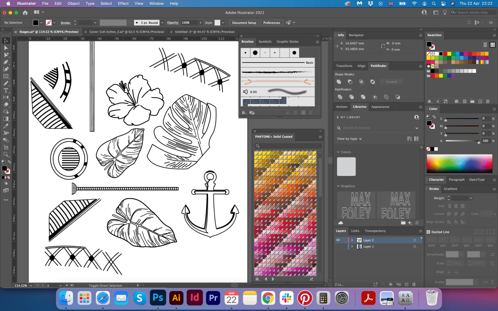
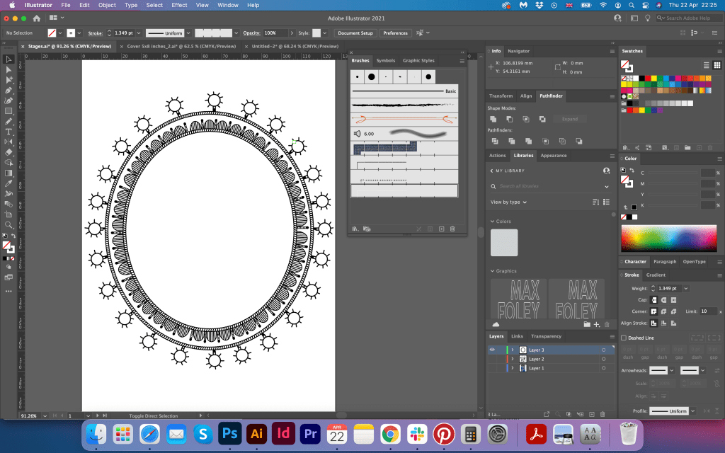
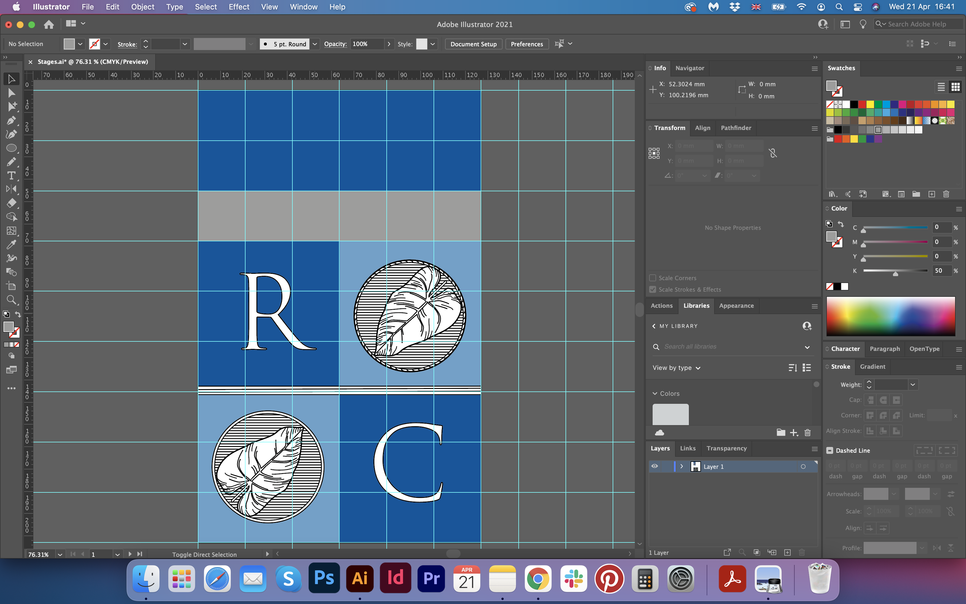
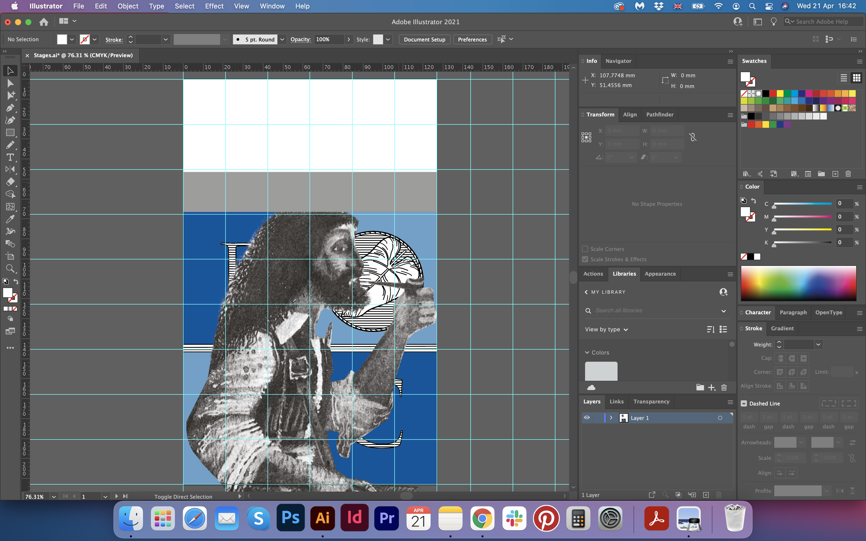
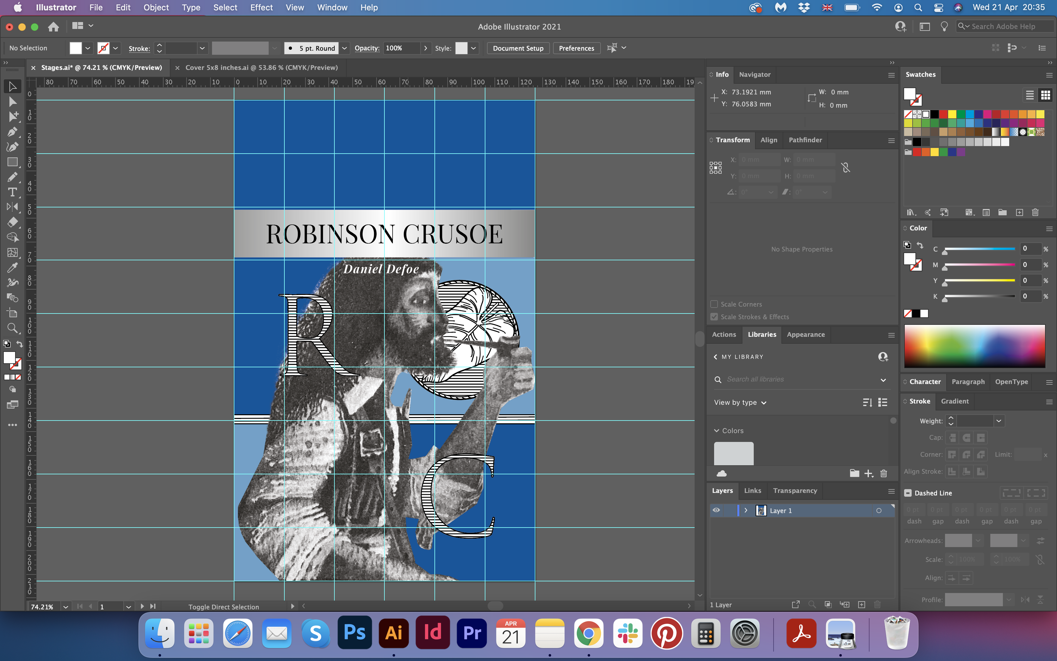

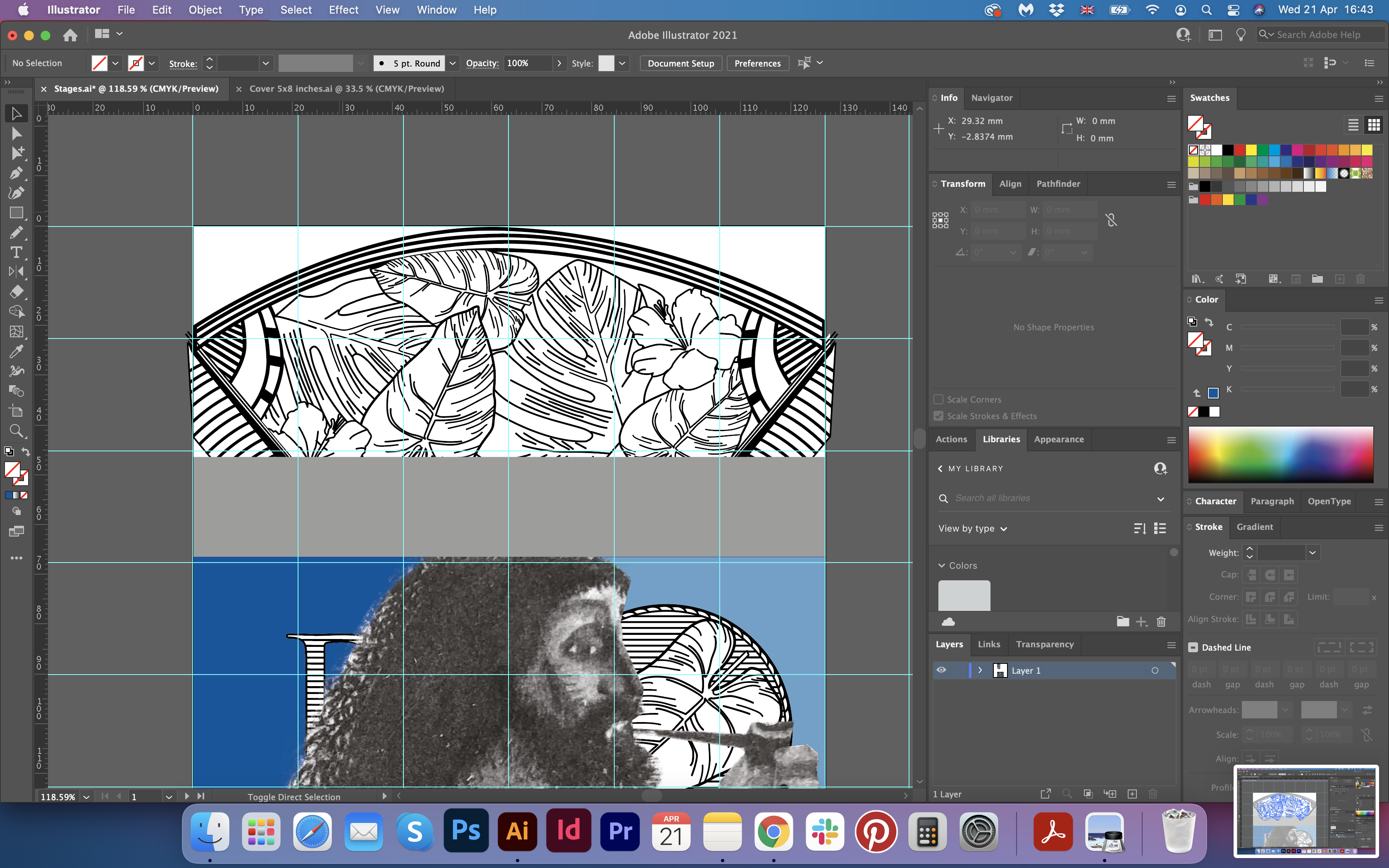
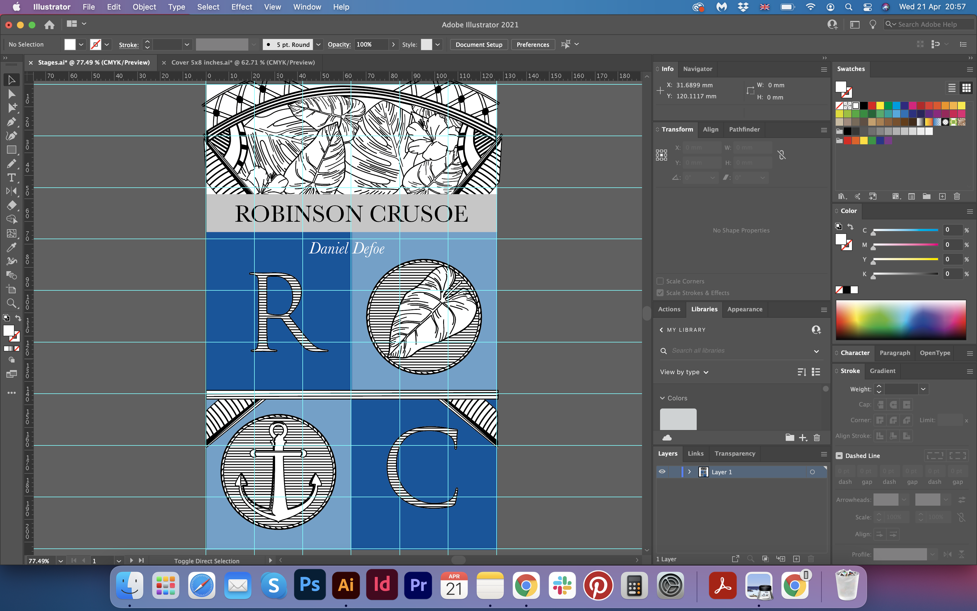
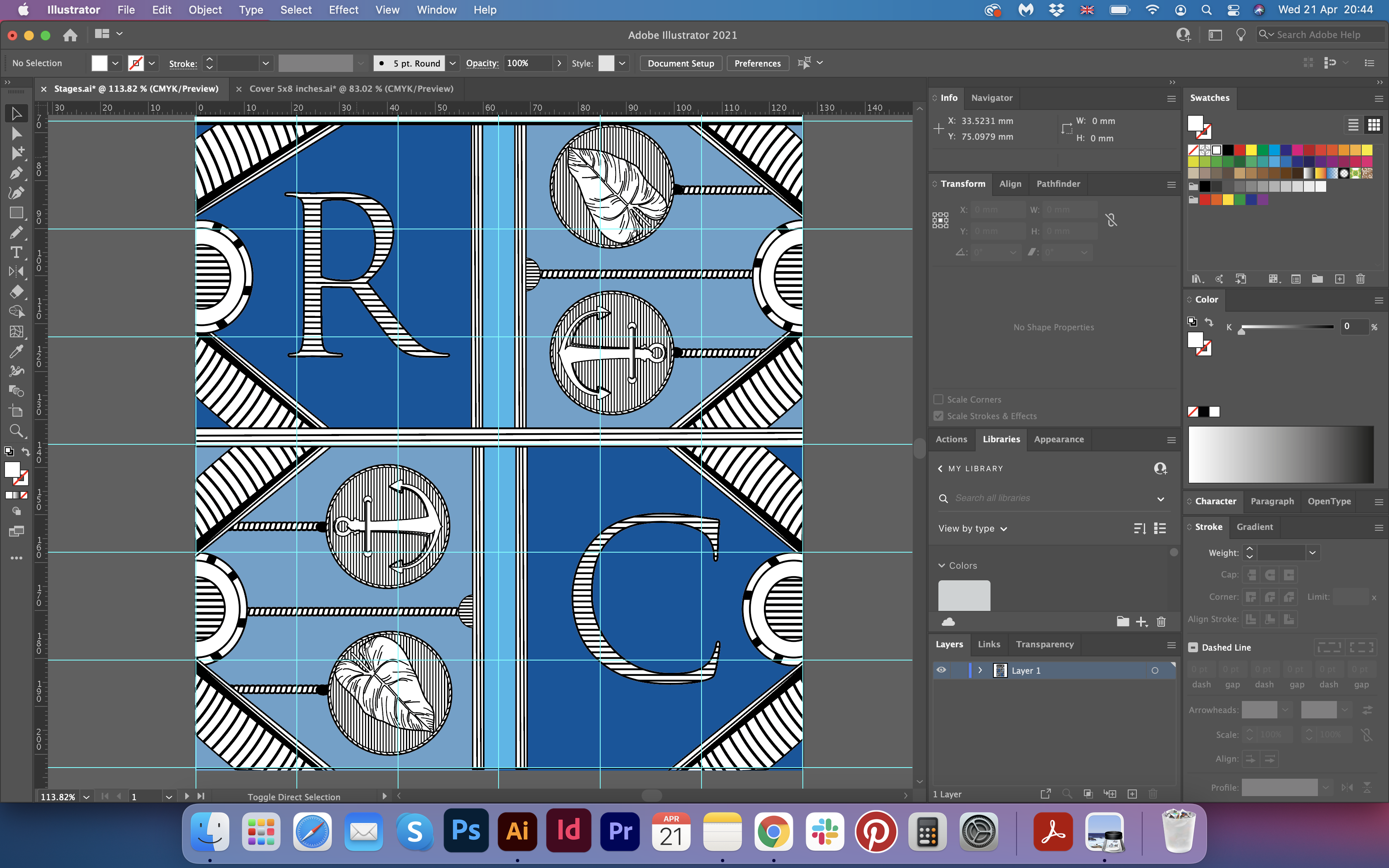

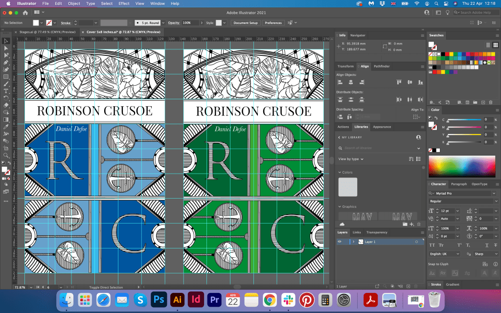
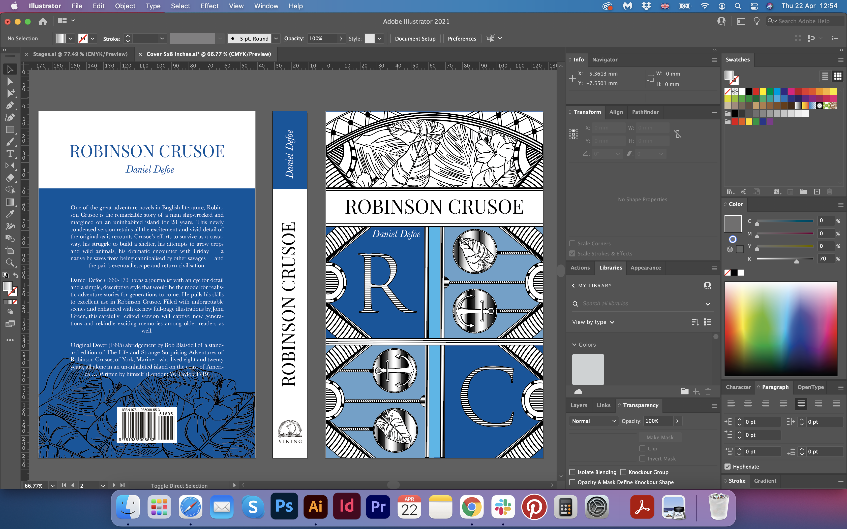
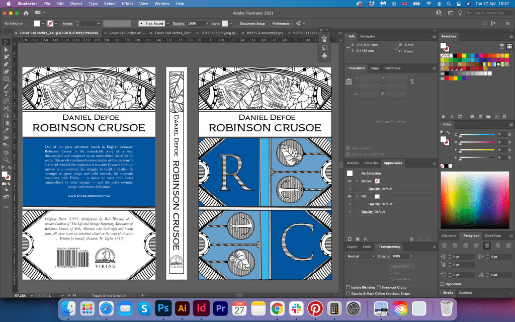
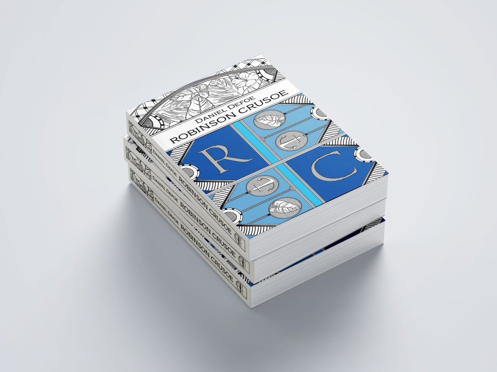
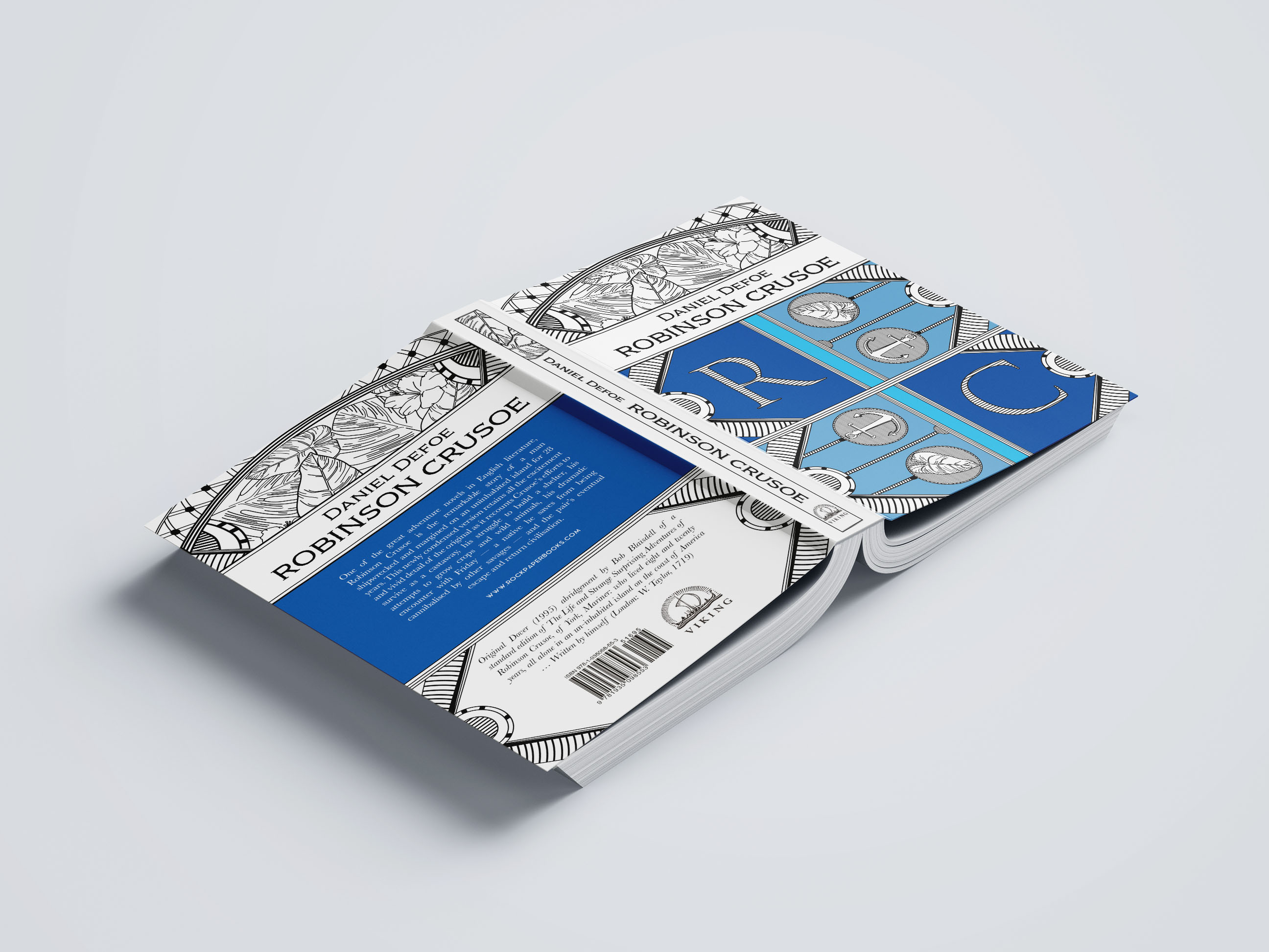
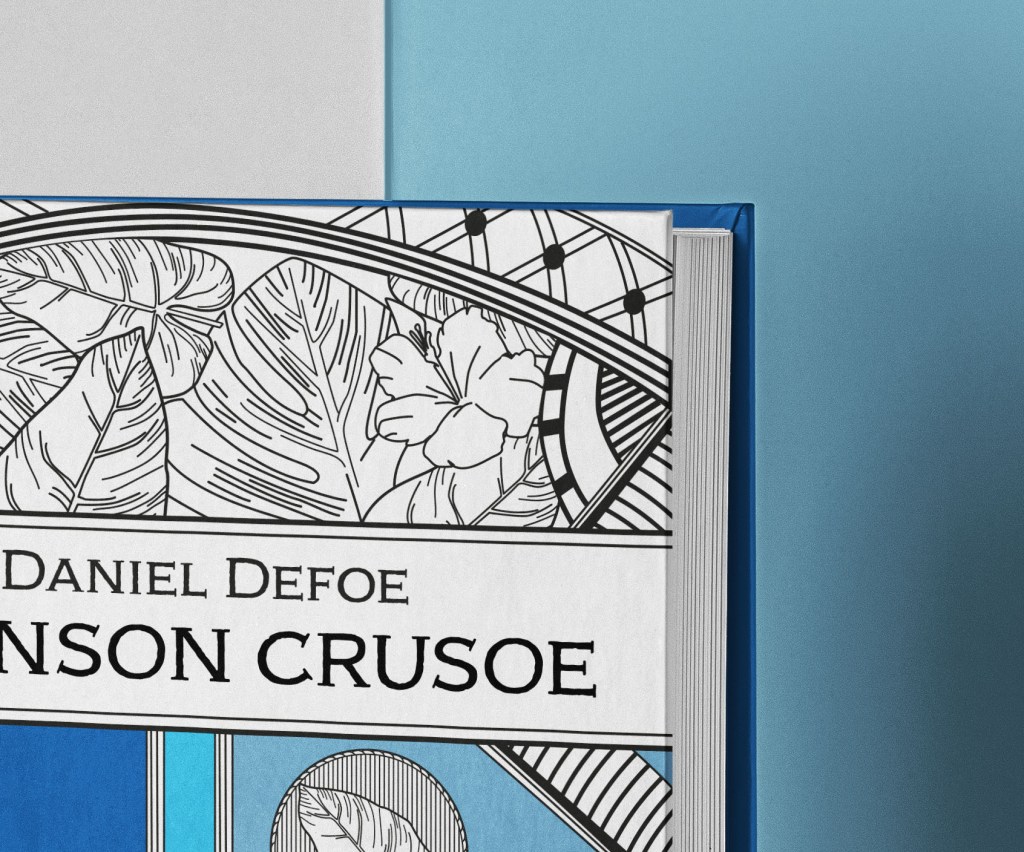

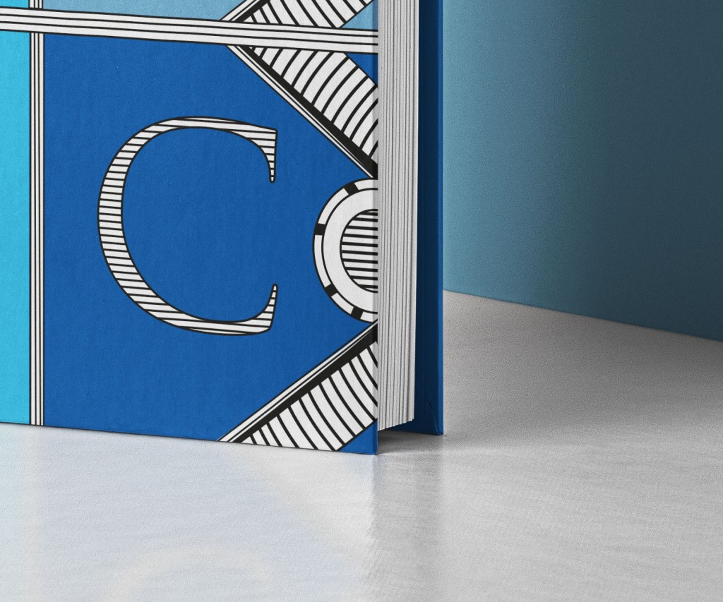
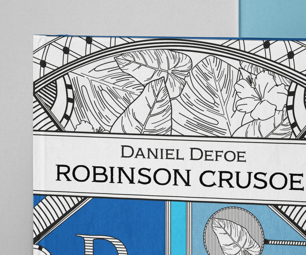
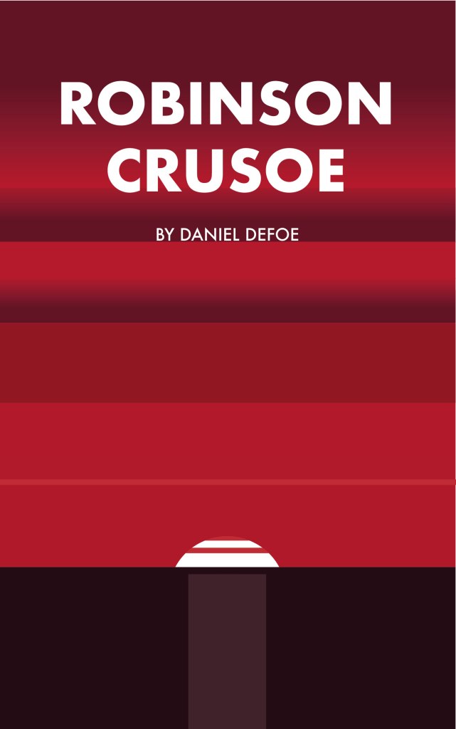
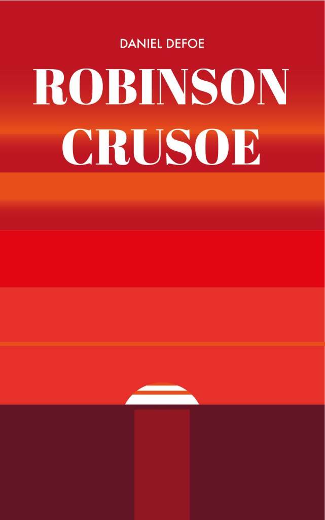
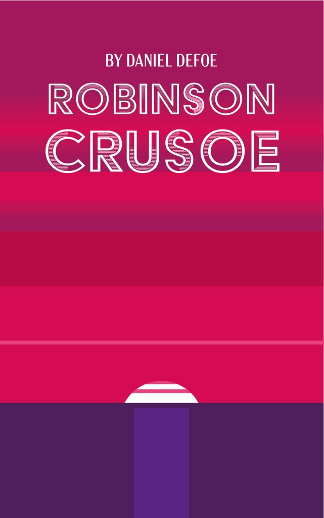

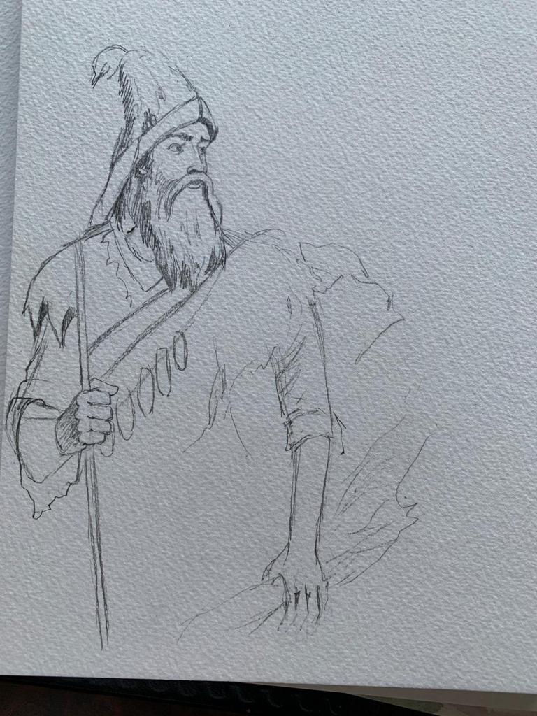

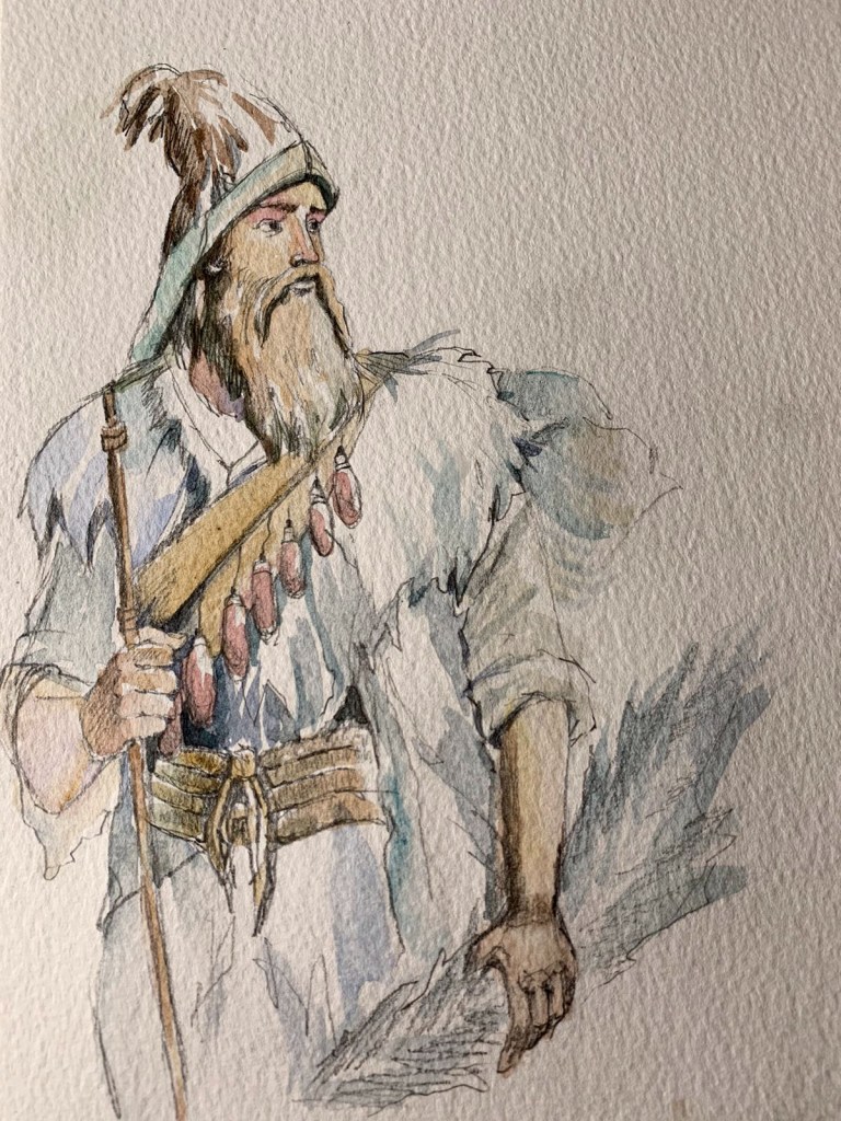

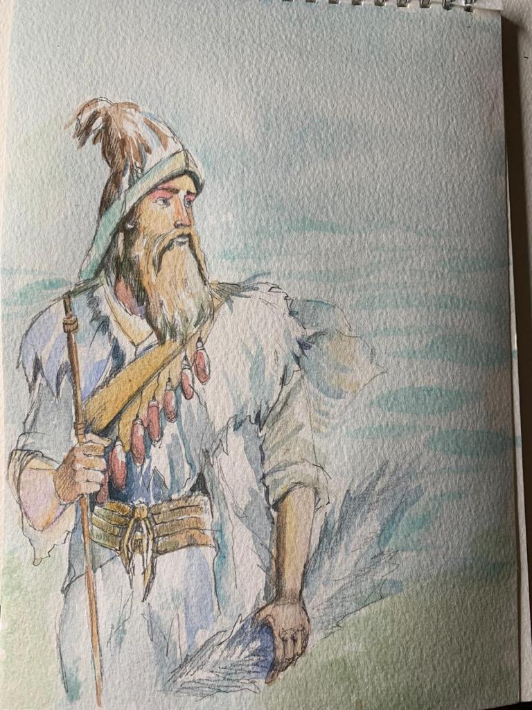


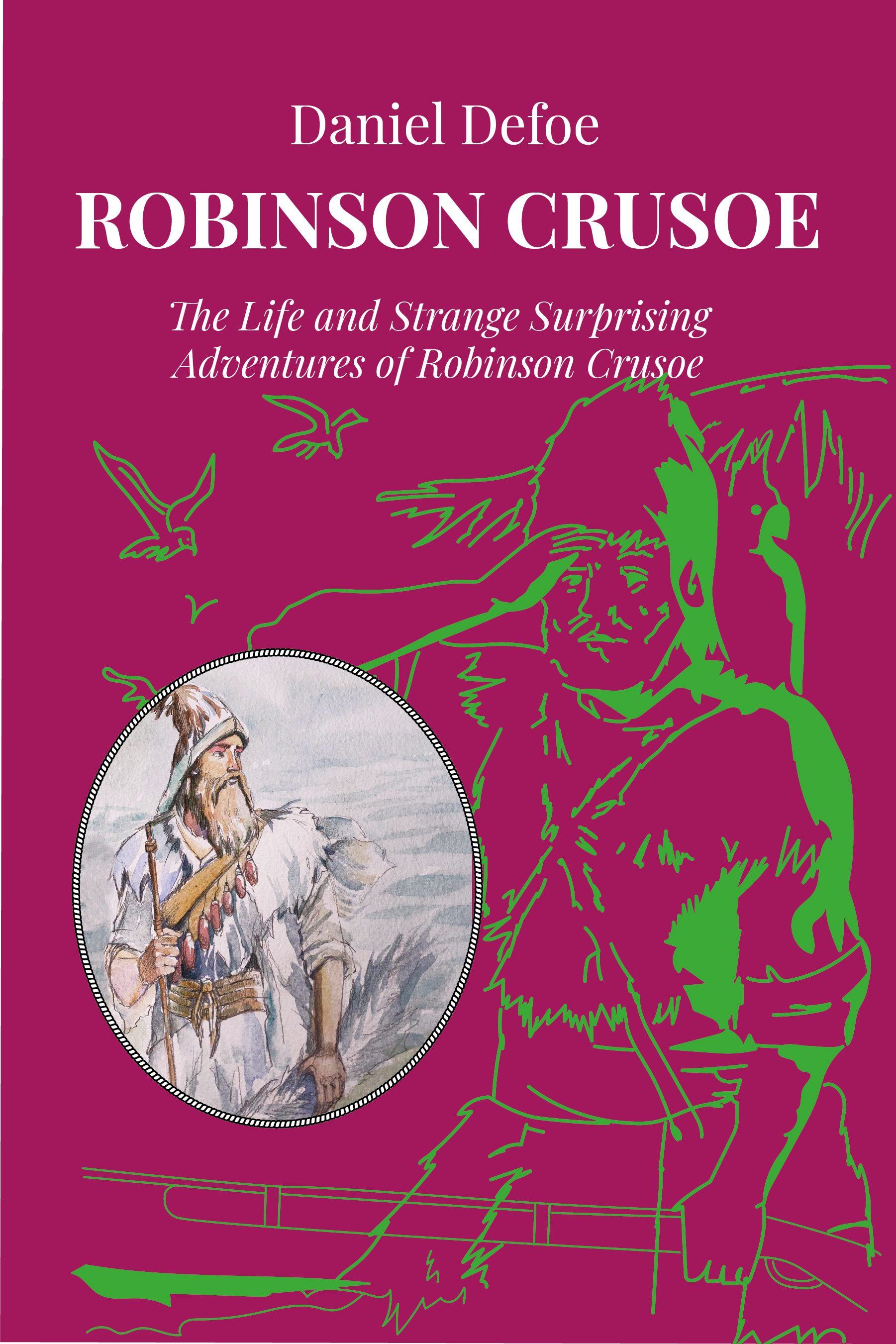
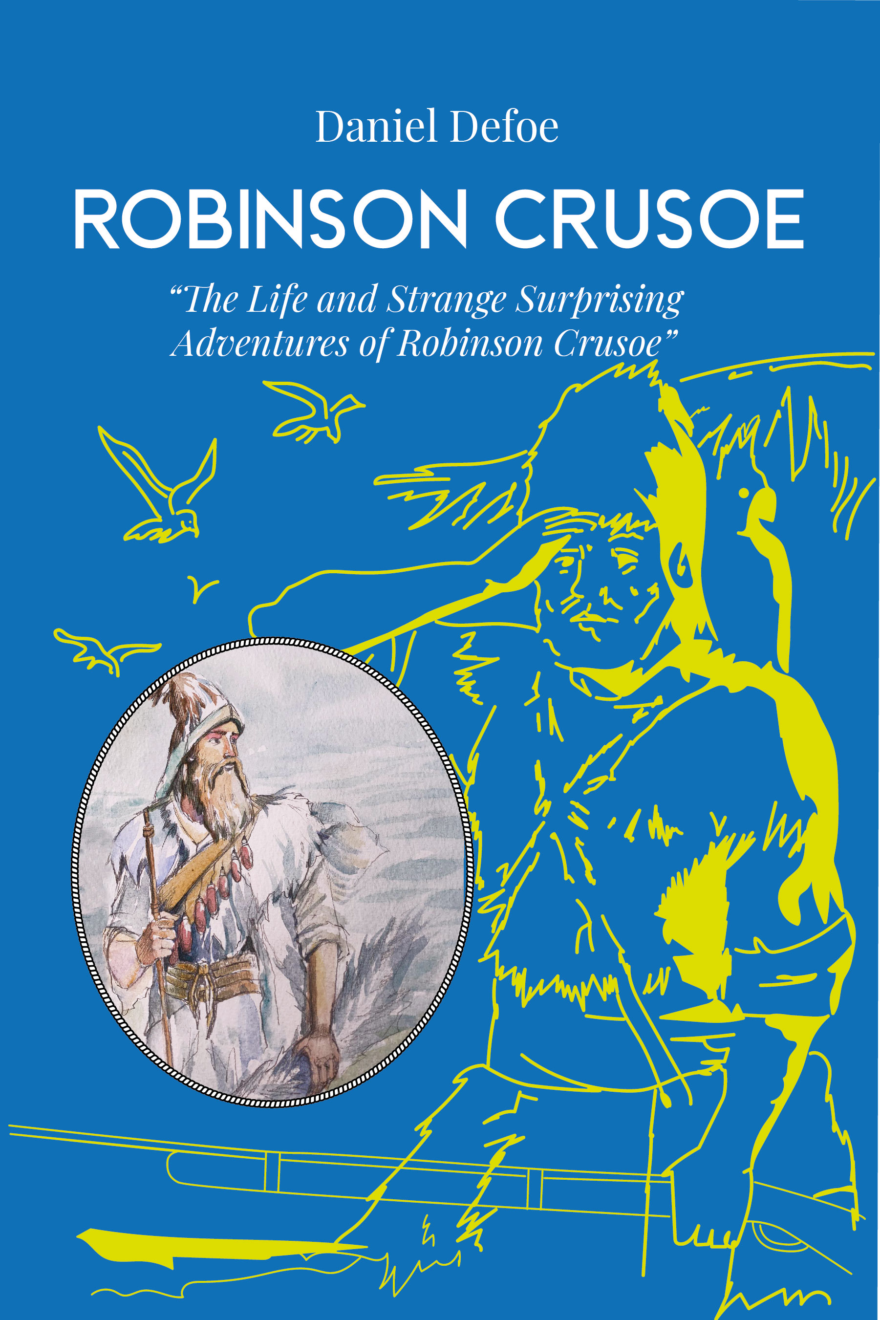
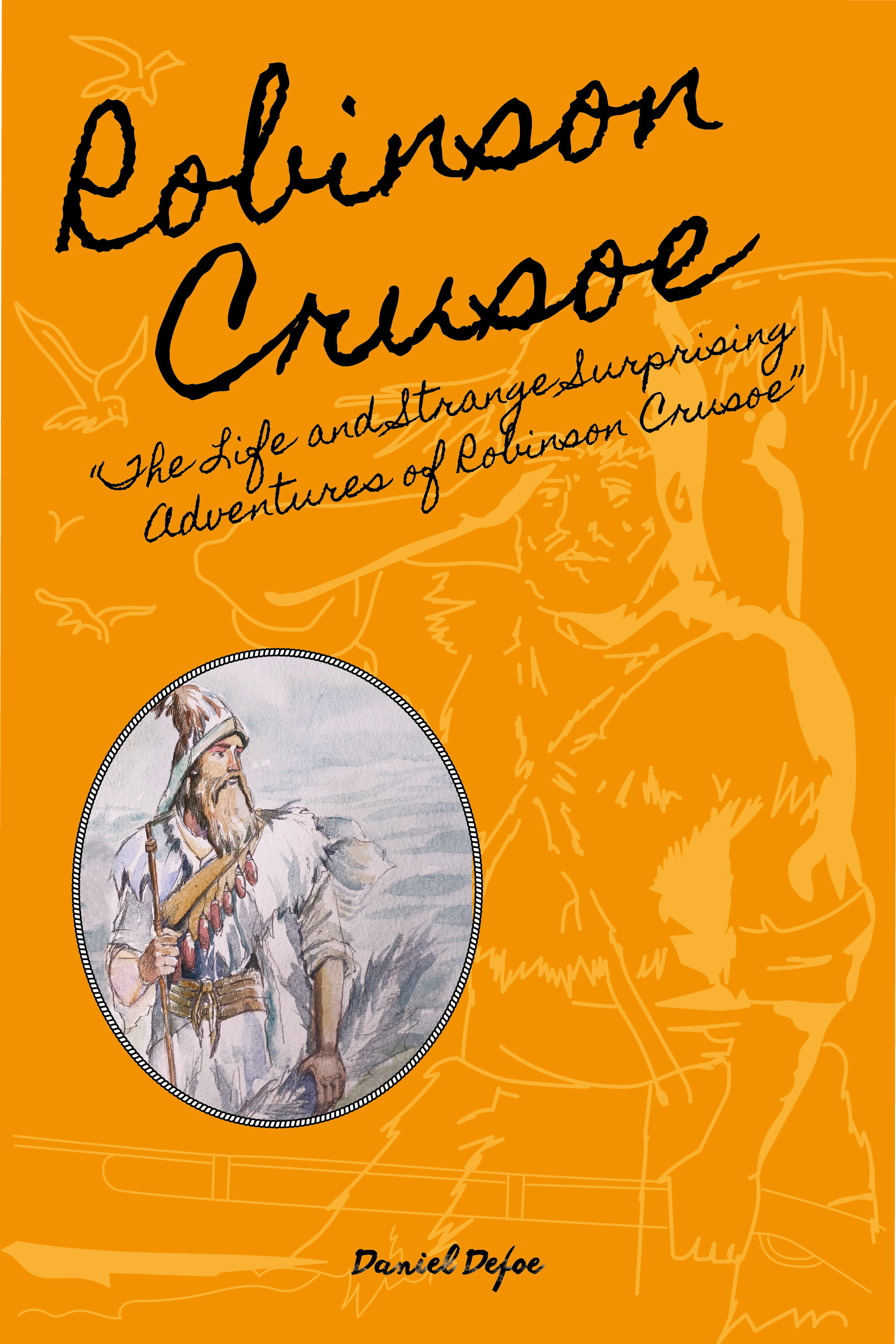
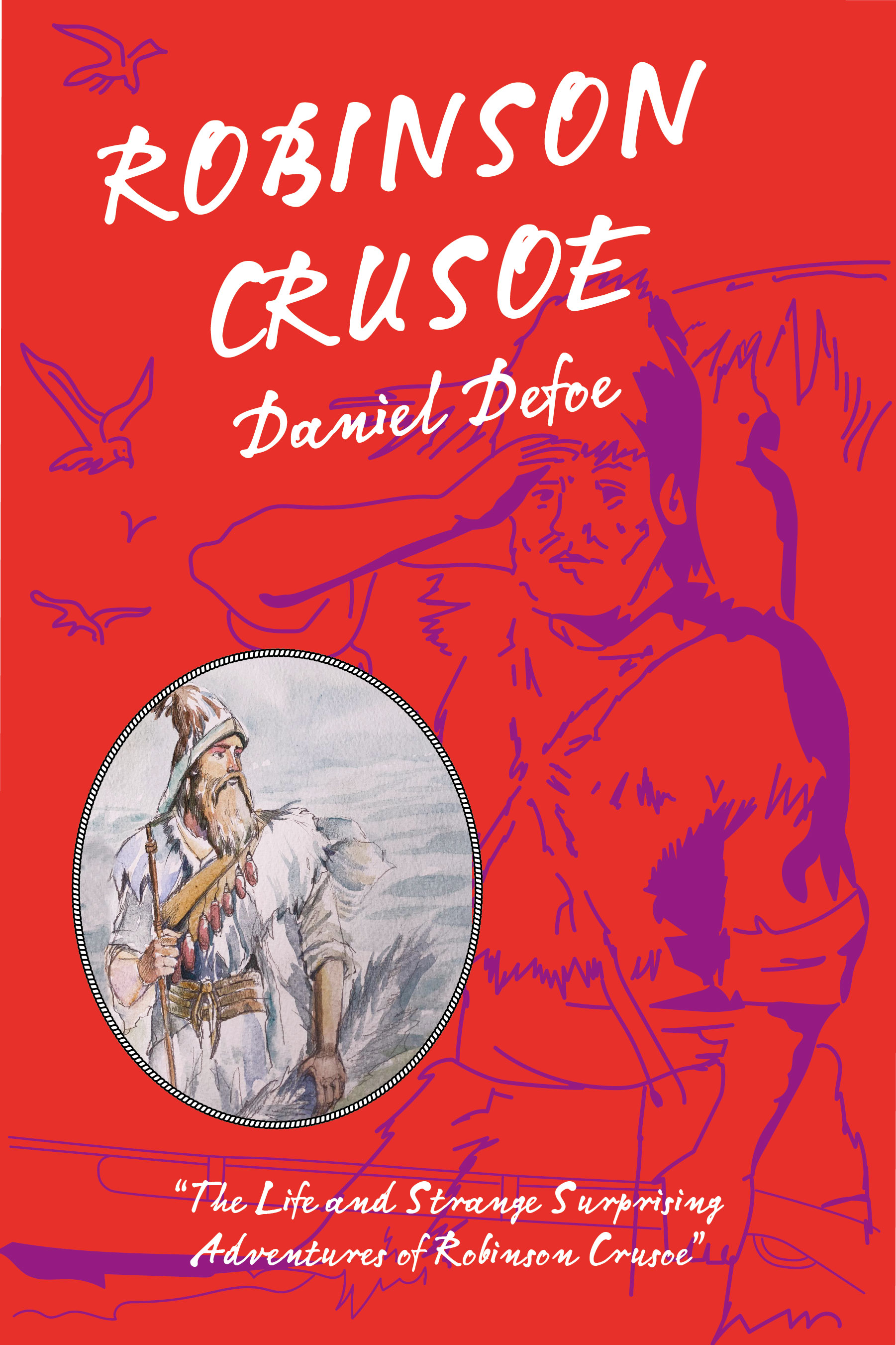


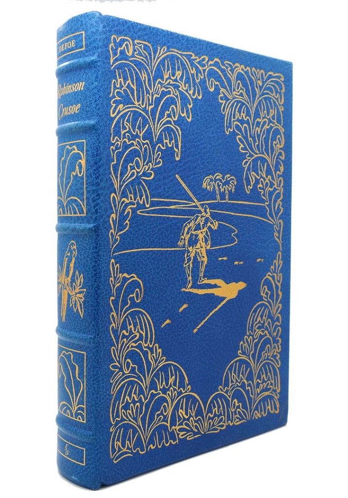

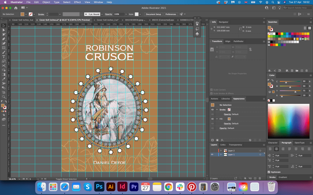
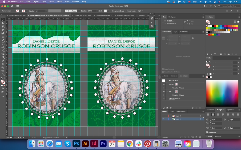
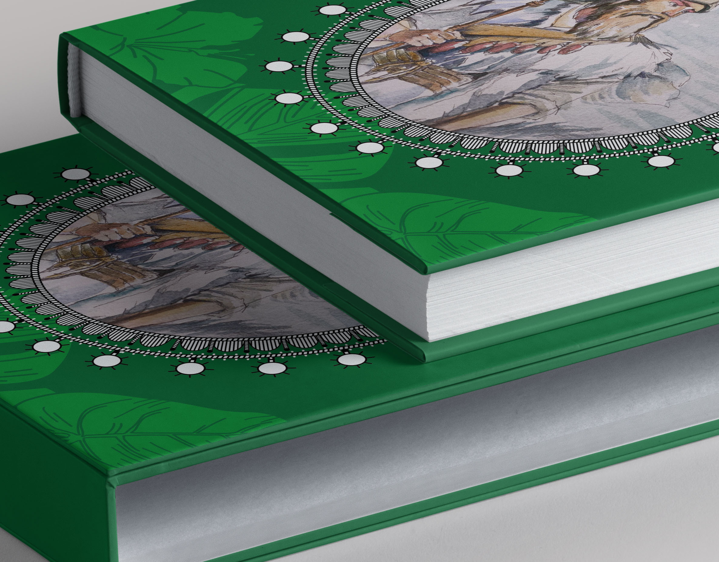
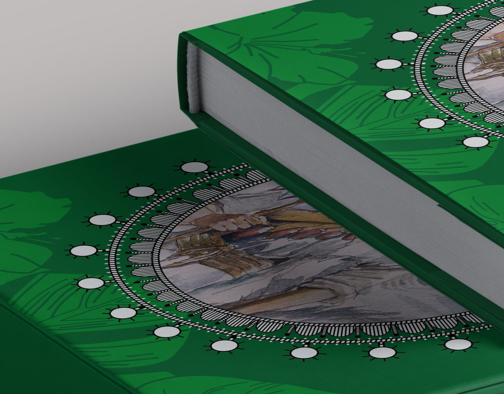
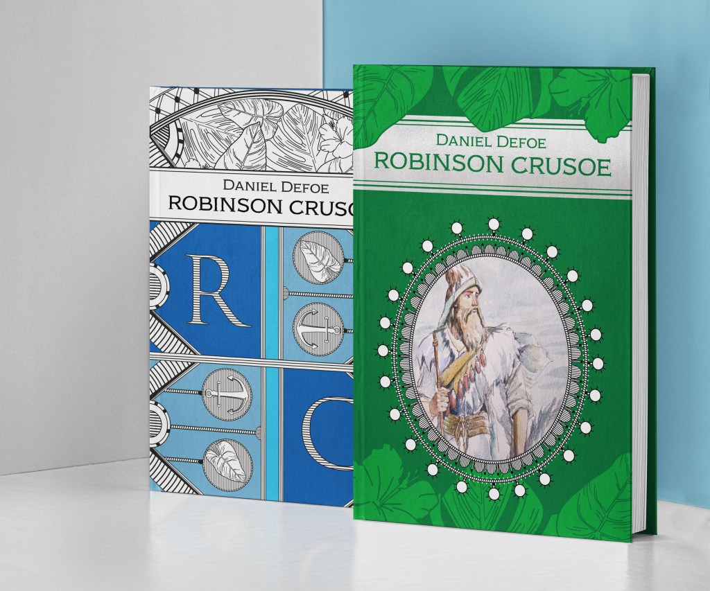

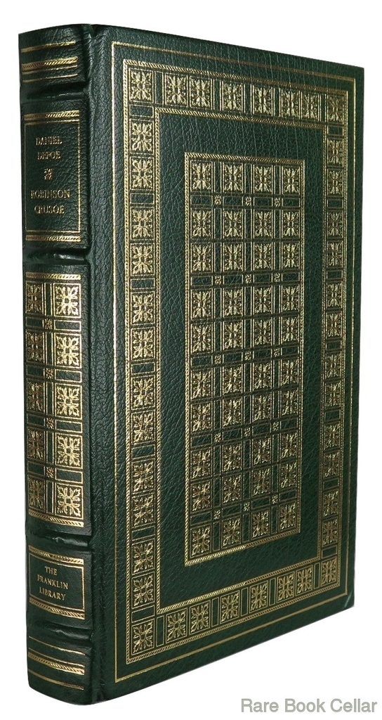
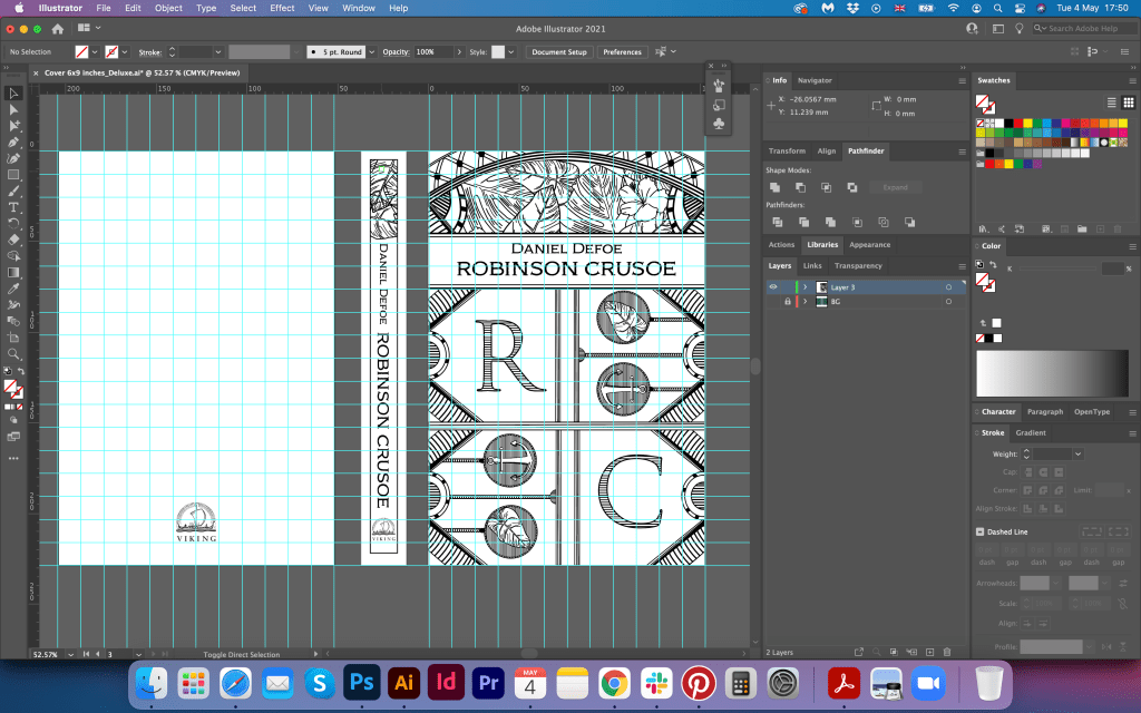
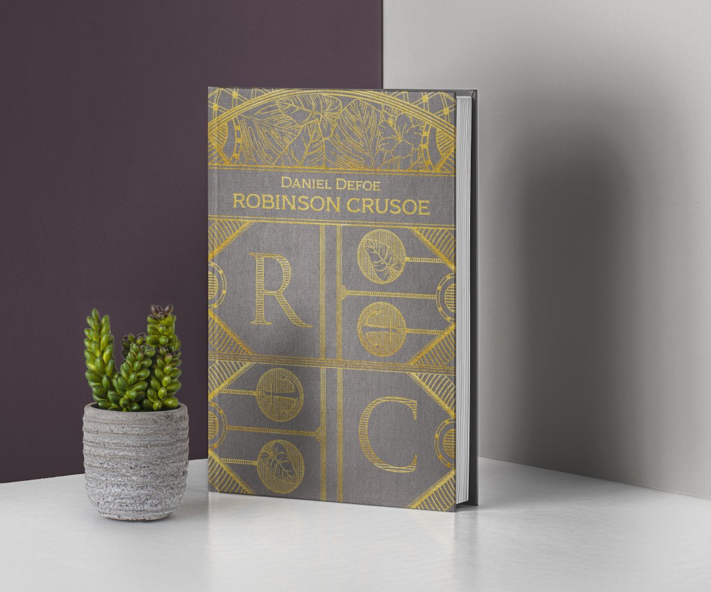
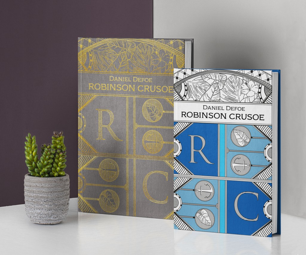
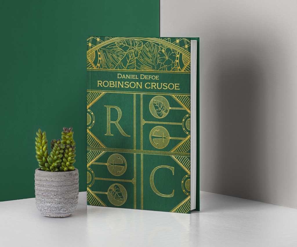
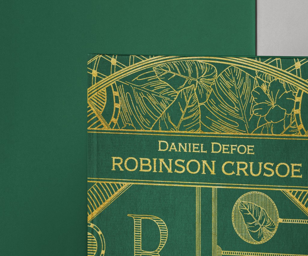
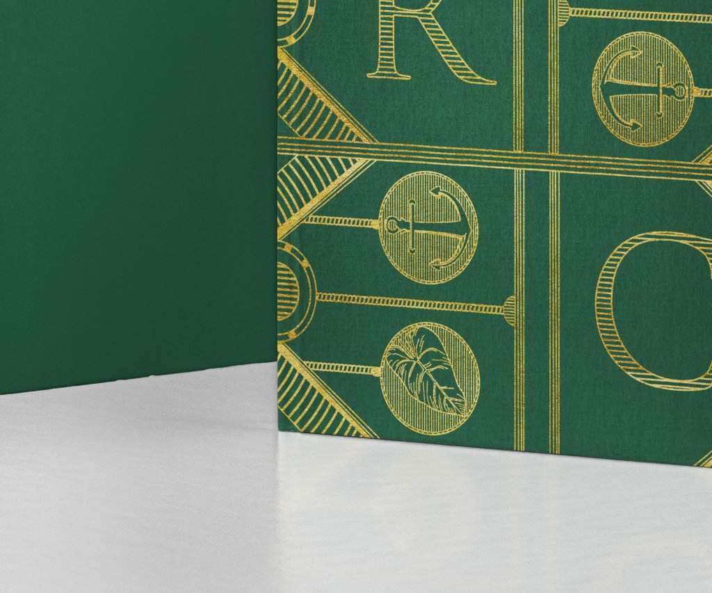
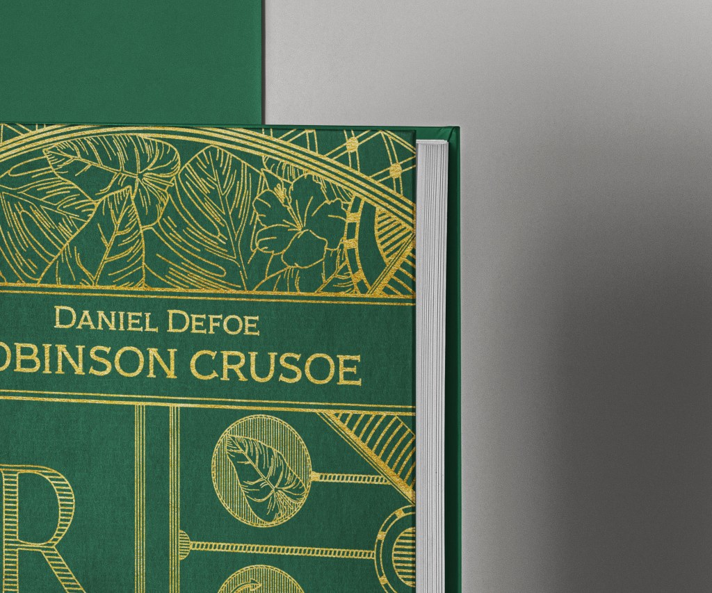


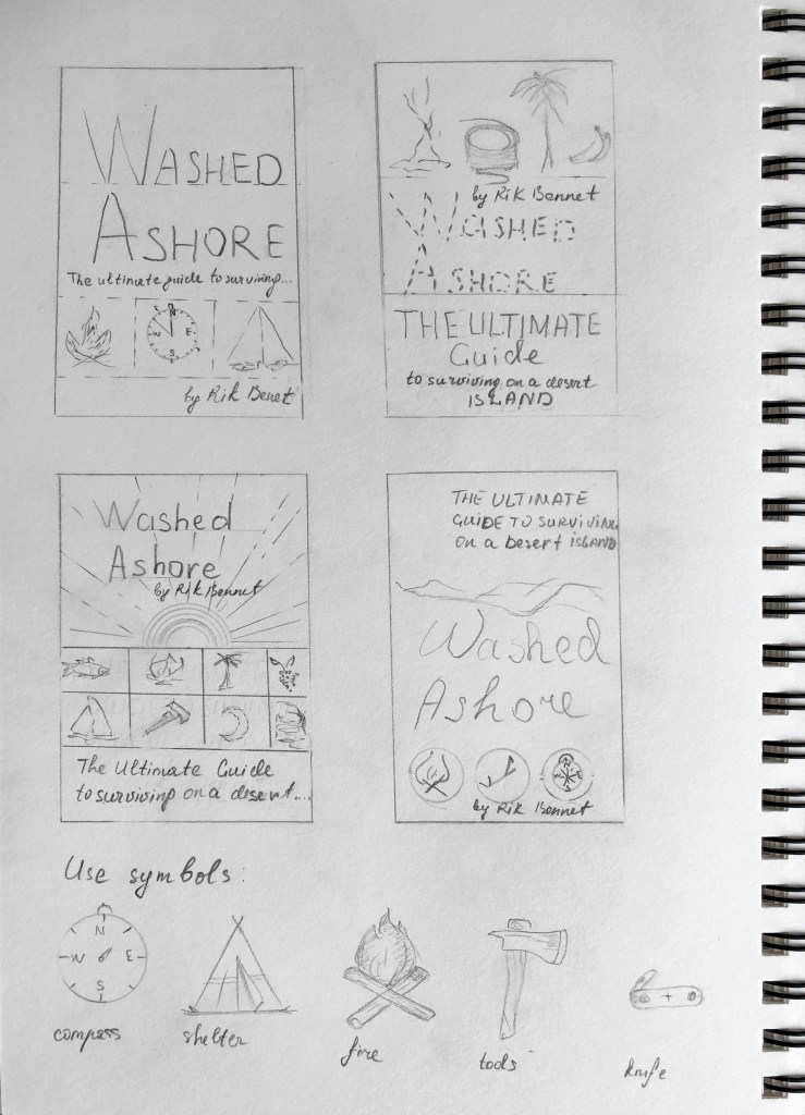
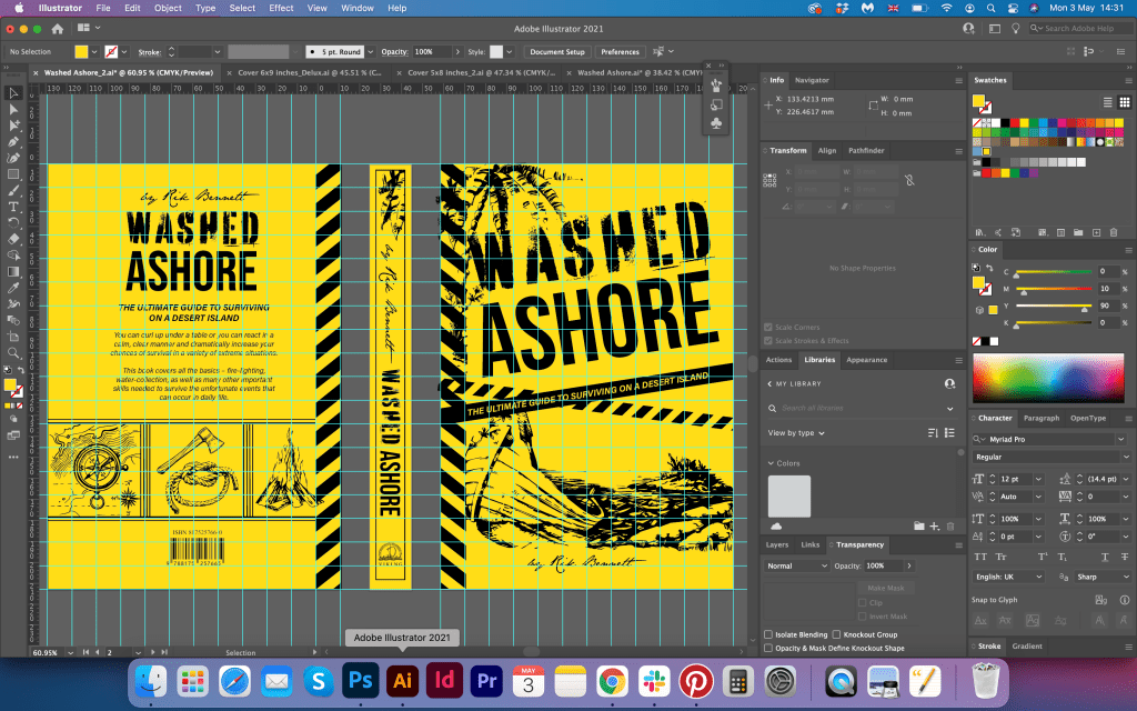

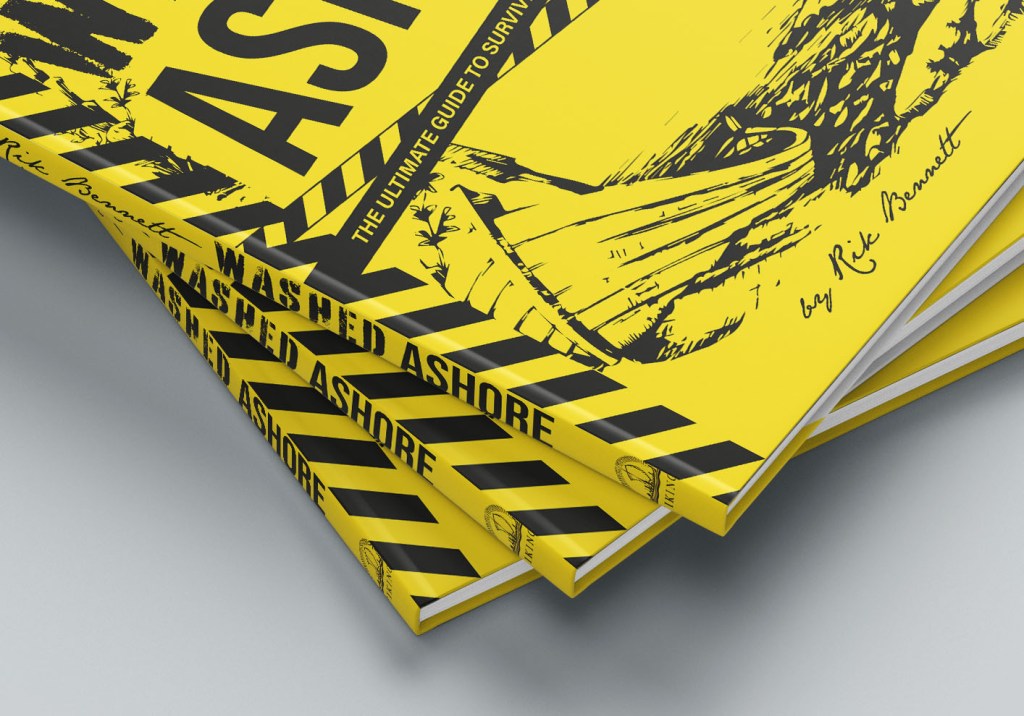

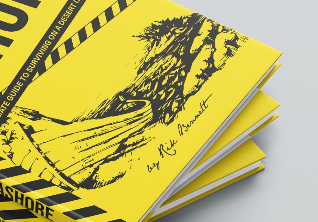
