From the list above I need to take an item and explore it visually to become aware of its textures, physical qualities and function. What is the item for – what does it do? Next, I need to create an objective drawing of the object on an A4 sheet using a pencil or fine liner. The aim is to achieve a drawing that has a high degree of visual accuracy and is technically controlled.
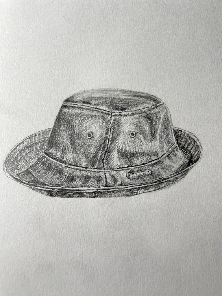
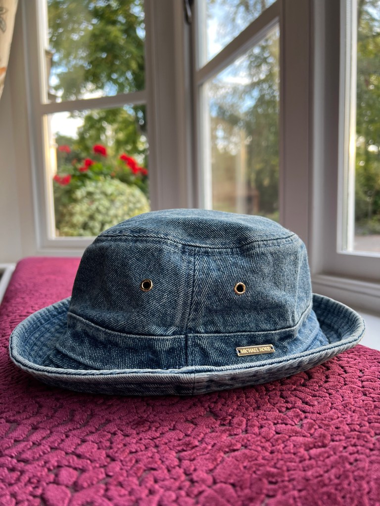
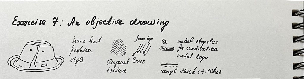
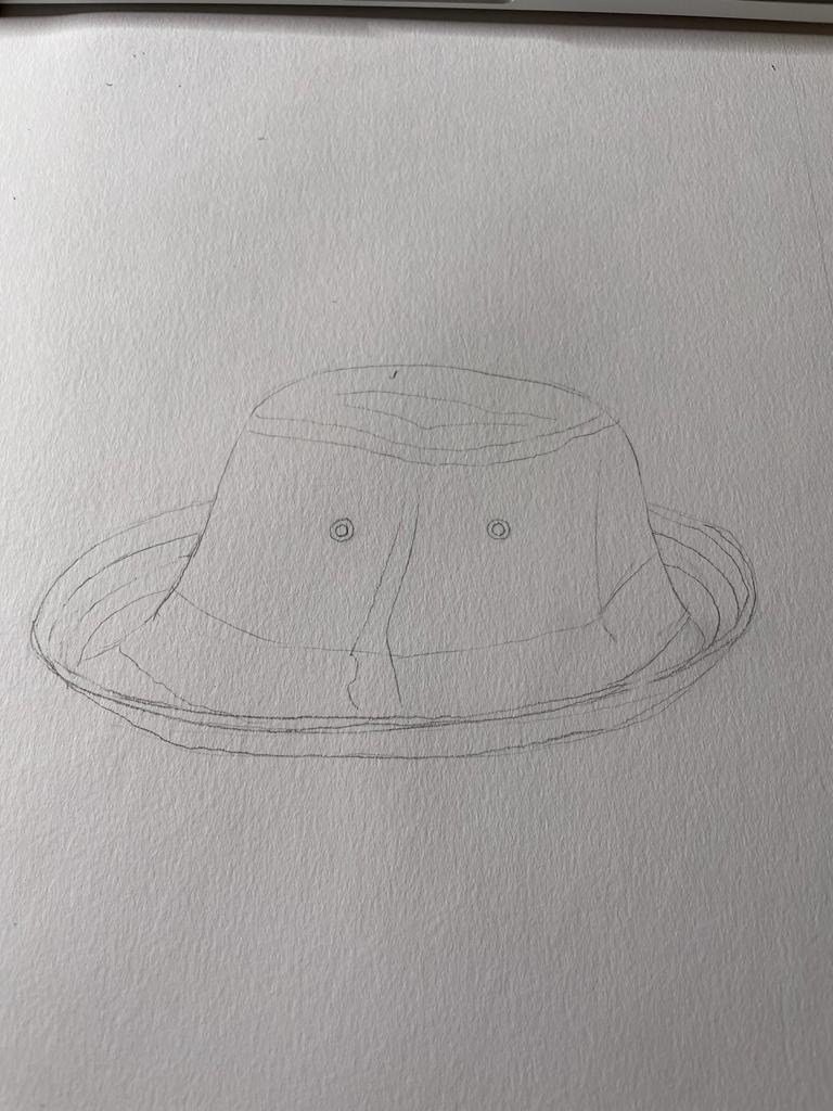
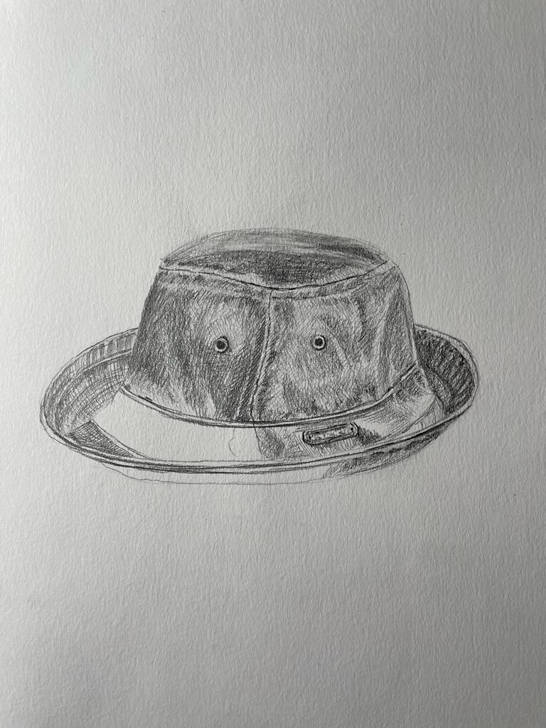
For an objective drawing from the list provided I’ve chosen my summer Michael Kors jeans hat. I took a high-resolution photograph of it to examine its texture. From that photograph, I could see that lines go from this right top corner to an angle to the bottom. Additional parts of the hat are the metal logo, and metal staples for ventilation. As jeans are hard material themselves, it has rough thick stitches on the lines where the fabric has been joined. Also, there are some cross lines, but they are more represented like dots. I’ve made a first sketch of the hat with a quick outlined drawing. After I proceeded with a pencil drawing, highlighting the details of the hat’s texture. As a result, I’ve got a quite precise and visually accurate drawing of my hat, with all fine lines and jeans texture.
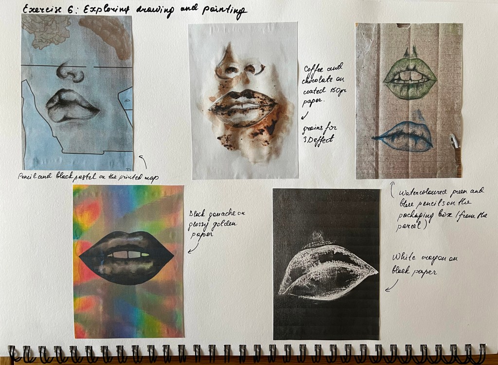
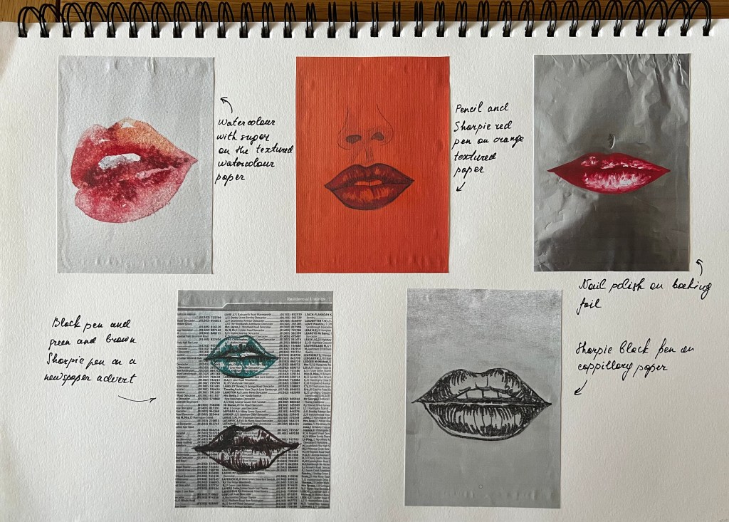
For this exercise, I was asked to create a sketchbook with different kinds of coloured and textured papers by using a variety of surfaces including rough textures such as sugar paper, heavy watercolour paper and smooth, shiny surfaces such as brown paper and cheap typing paper. Here I need to investigate painting skills of untouched materials, such as food dyes, ballpoints, chalks, oil pastels, and pots of sample decorating paints. The challenge of this exercise is to explore as many as possible unusual materials to paint with and paint on.
Each piece should be labelled with the media used and the combinations explored.
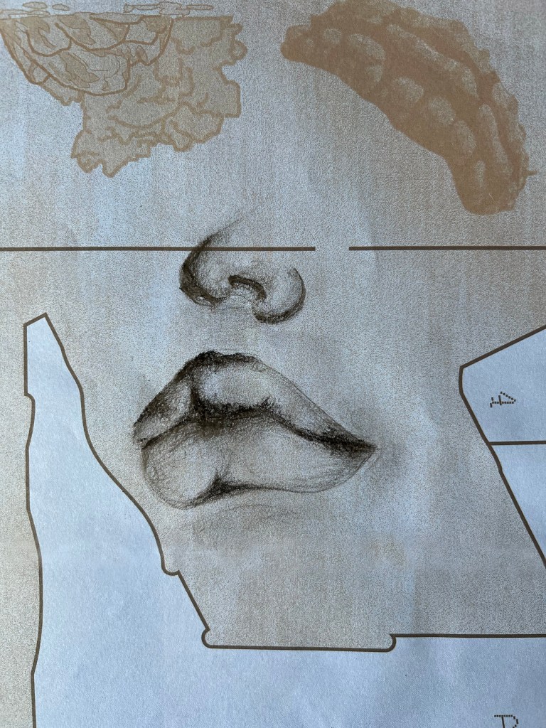
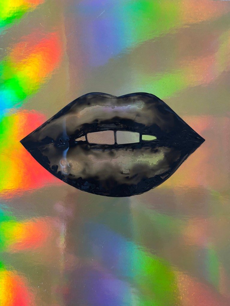
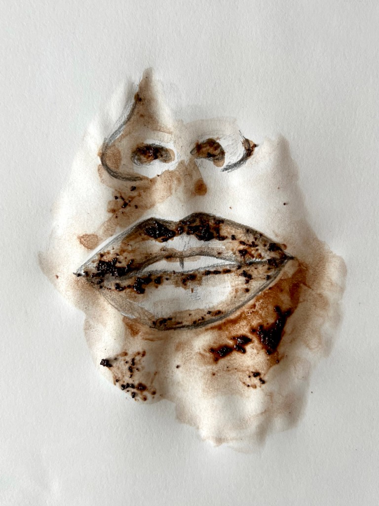
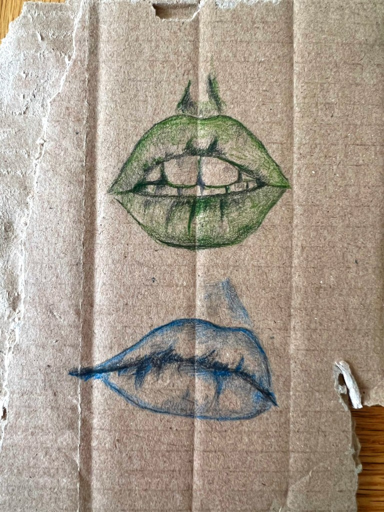
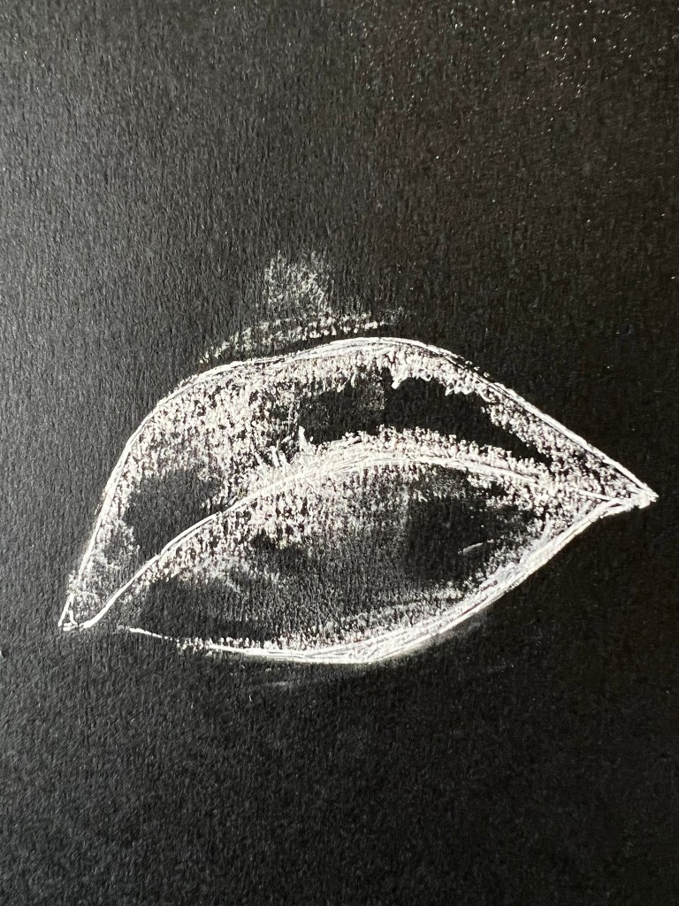
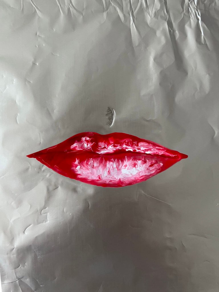
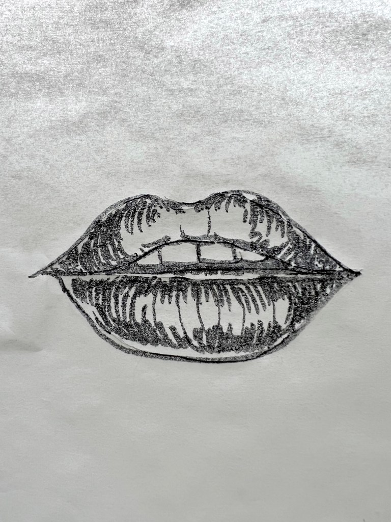
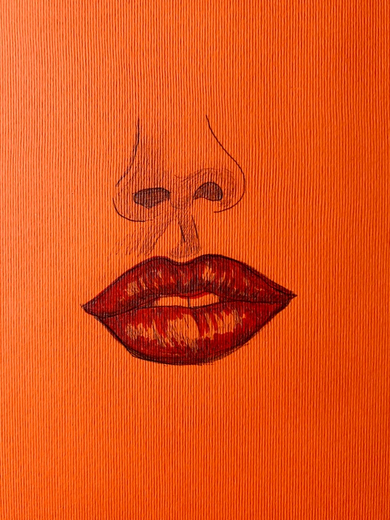
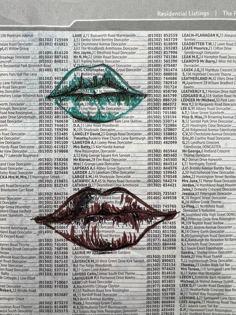
Pencil and black pastel on printed over thecoated paperBlack gouache on glossy gold paperCoffee and chocolate on the coated 150gr paperWatercoloured pencils on the packaging boxWhite crayons on black paperNail polish on baking foilSharpie pen on capillary paperPencil and Sharpie pen on orange textured paperBlack pen and Sharpie pen on a newspaper advertWatercolour with sugar on watercolour paper
Conclusion
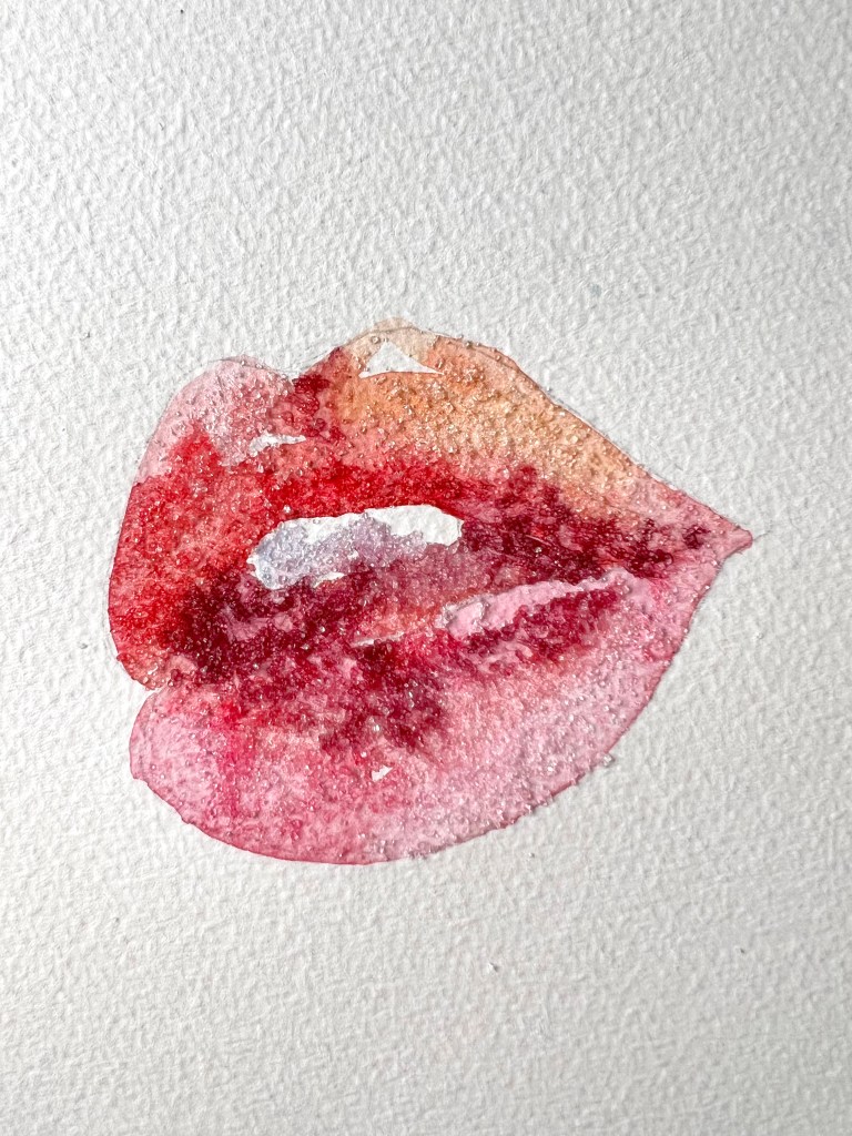
These are one of my favourite exercises to do, as they are purely based on creativity and freedom of choice. The beauty of it is that I can try all possible materials and textures, and not to get it wrong, as in the experiment we can end up with a great solution for the artwork. My favourite was gouache on foil gold paper, as it has unusual transparency and blends into the background. Also, I loved how the Sharpie pen looked on the colourful textured paper, some pencil shades on the top of it gave the design a complete look. Another textured solution that I enjoyed was the sugar with watercolour, it could be salt as well, the main point to make the illustration look appealing. The option I didn’t like much was the chocolate and coffee experiment, as the grains and brown effects looked a bit like sores on the skin. Maybe, because of the specificity of the illustration, lips, which I should be aware of, some colours and techniques wouldn’t work. I think, that all was a good creative task, and it helped me to discover some new approaches to illustration.
In this exercise, I was asked to collect as many references as possible, that related to the 1950s period. Catalogue the information that I find according to these categories:
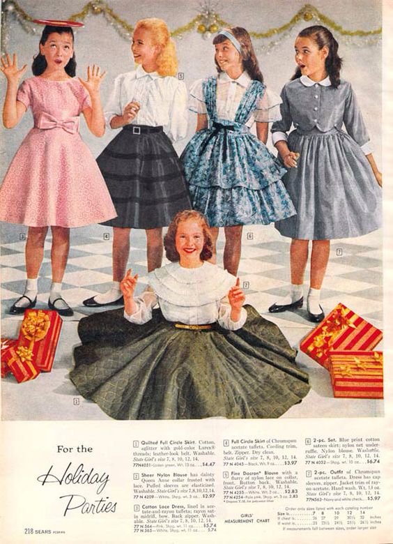
People and costume
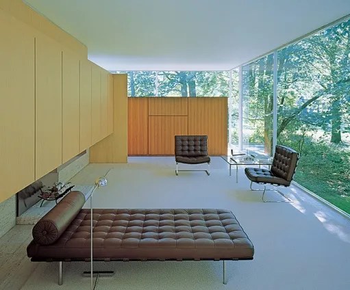
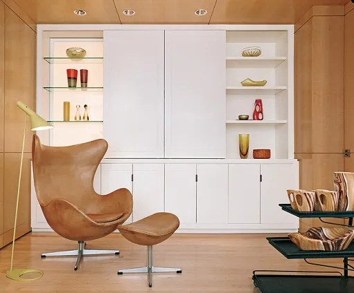
Architecture and interiors
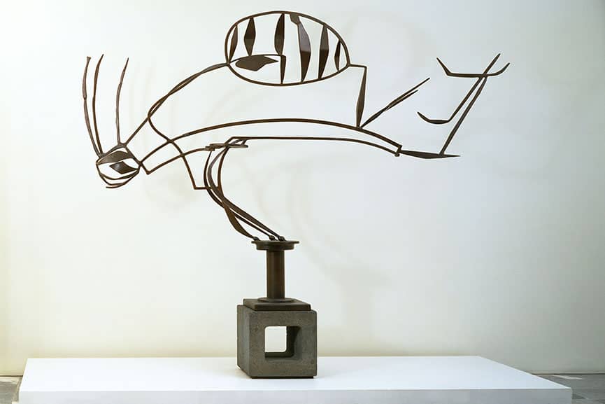
Art – painting, drawing, sculpture
Graphic design – posters, books, typography
Advertising
Transport
Film and TV
Surface pattern and decoration.
I should identify visual qualities within the categories – shapes, textures, colours, style and other features. Based on my notes I need to write a short review of the special features of the 1950s in my learning log. As a final task, I need to make an illustration of someone sitting in a chair surrounded by typical artefacts to give a teenager an idea of the 1950s.
People and costume
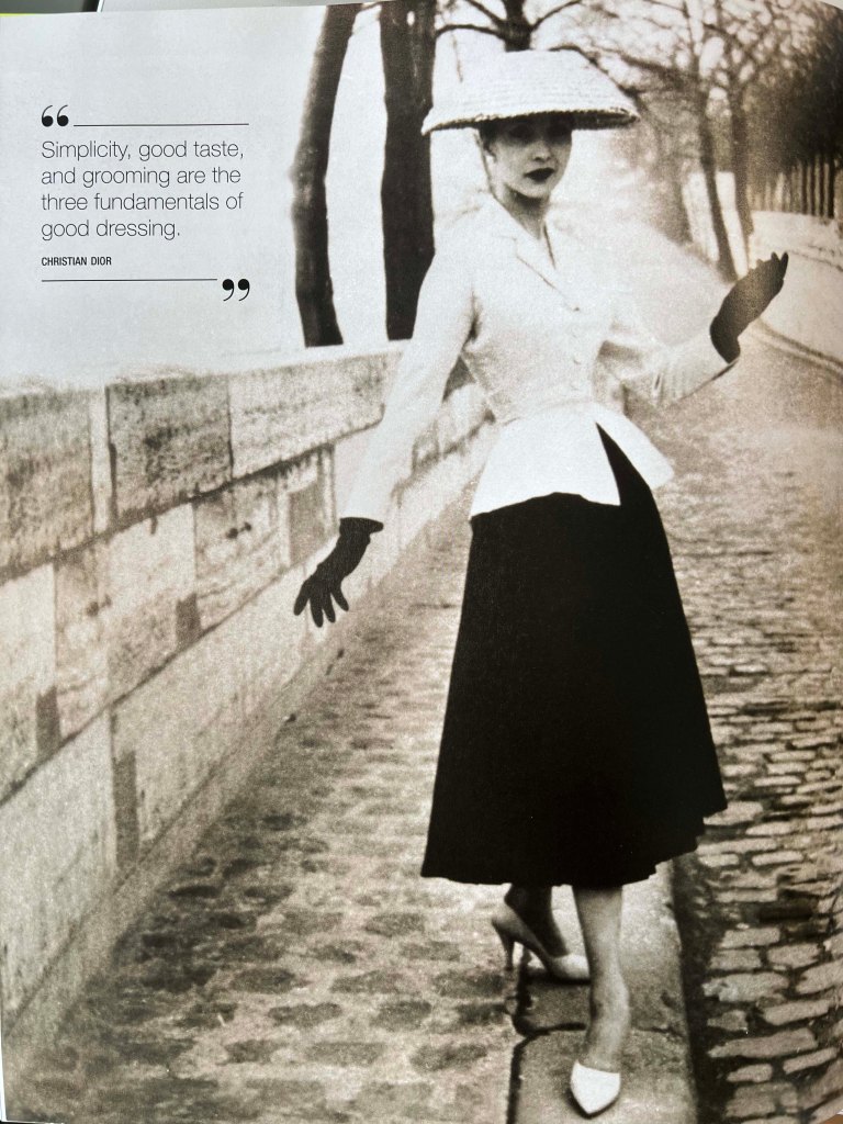
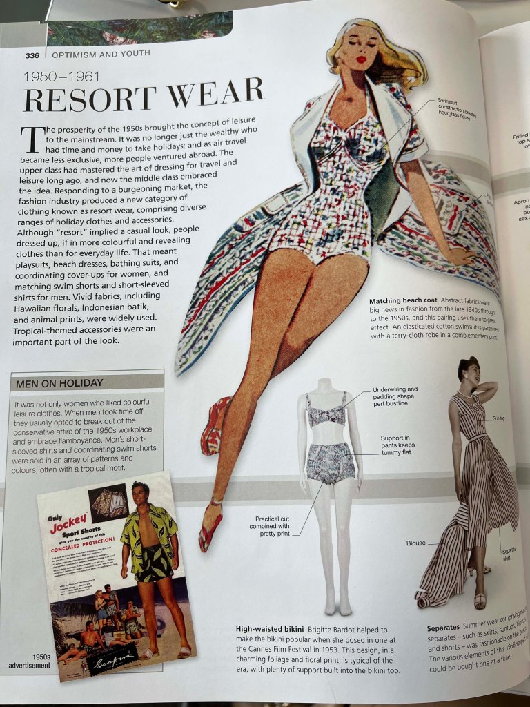
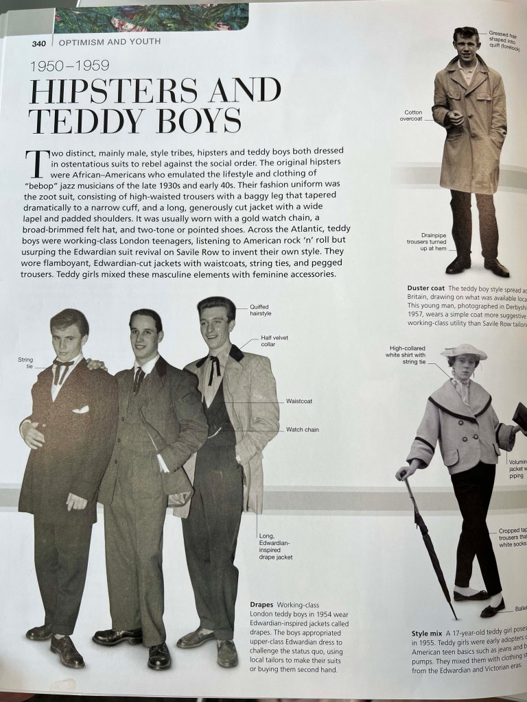
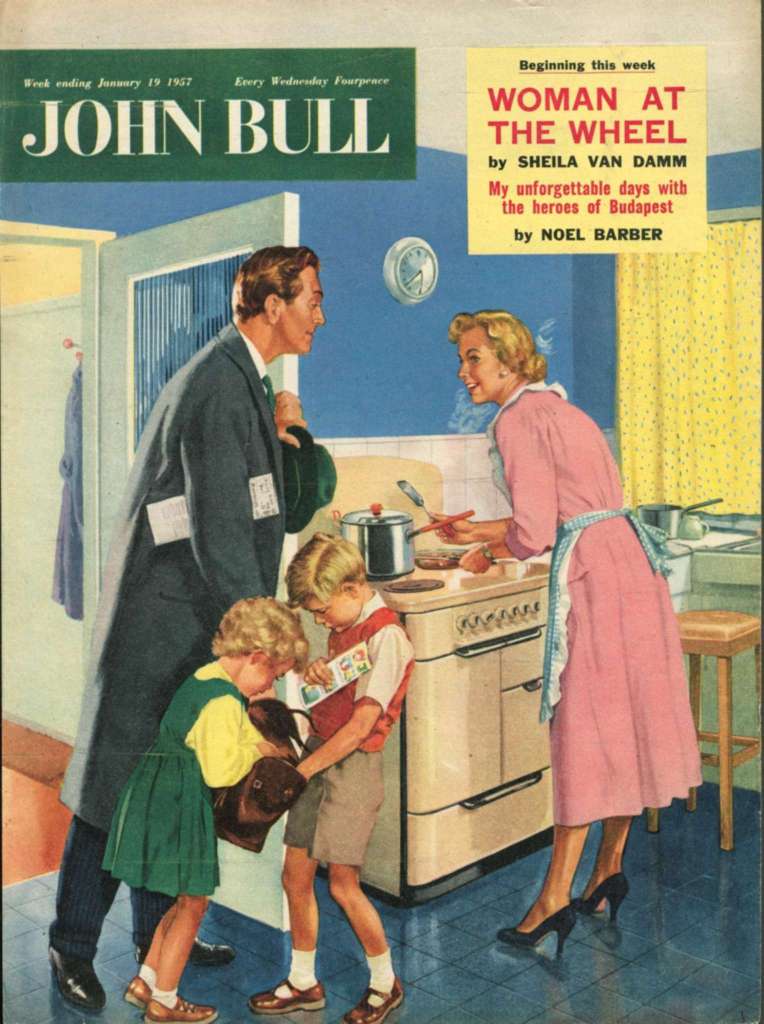
The 1950s were remarkable times, not only in their fashion but also in people, that remain to be recognisable nowadays. Whilst the world still was recovering from World War II, the 1950s saw the birth of teenagers and rock n roll. Previously teenagers would dress up like their parents, but now a new rebellious style was developed. Fashion in the 1950s saw a clear gender divide. While men’s and boys’ fashion moved towards a more casual day-to-day style, women’s and girls’ fashion prioritised elegance, formality, and perfectly matched accessories. The 1950s was not only about spending on luxurious brands but also the idea of being comfortable. The decade was influenced by new designers such as Cristobal Balenciaga, Christian Dior, Coco Chanel, and Hubert de Givenchy.
Fashion the definitive visual guide. Caryn Franklin. 2019
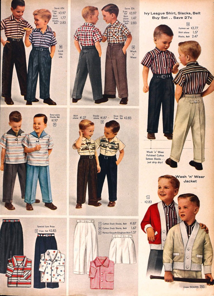
Children’s fashion in the 1950s was inspired by their adult counterparts. Young girls wore dresses with full skirts and perfectly matching accessories while young boys saw their clothing options becoming more casual. New synthetic materials, which were also being used in adult clothing, were increasingly used for children’s clothes as they were easier to launder.
Mid-century modern is an American design movement in interior, product, graphic design, architecture, and urban development that was popular from roughly 1945 to 1969. The Mid-century modern movement was an American reflection of the International and Bauhaus movements. It is typically characterised by clean, simple lines and honest use of materials.
The story of 1950s art begins at the end of World War II. Slowly world started to recover from the war, and new art movements started to appear, inspired by 1920s avant-garde movements, modernism, surrealism and abstract painting.
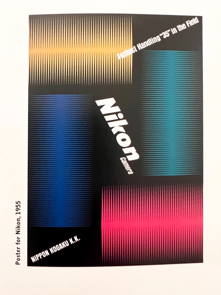
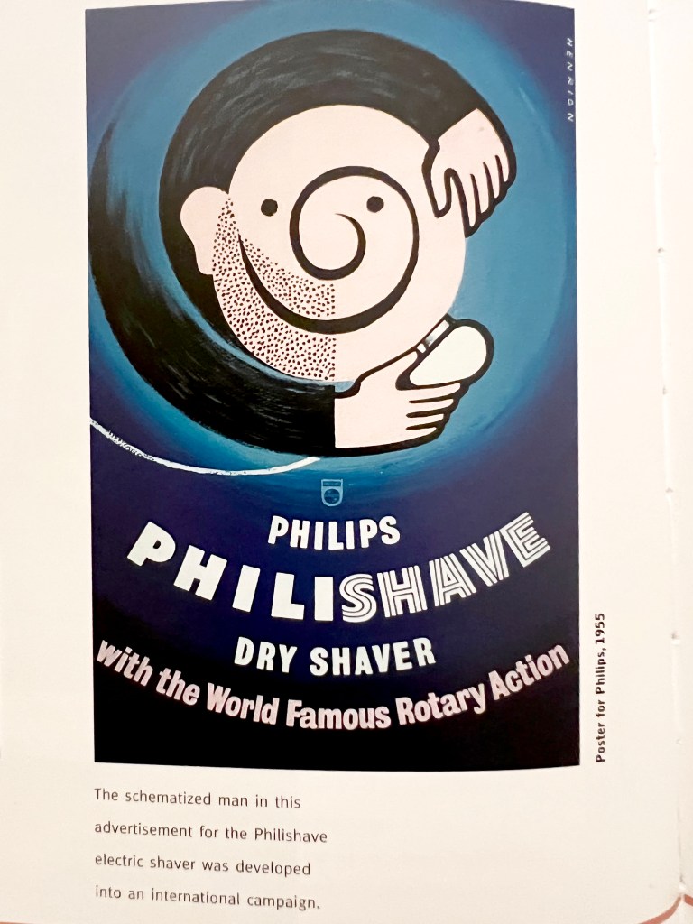
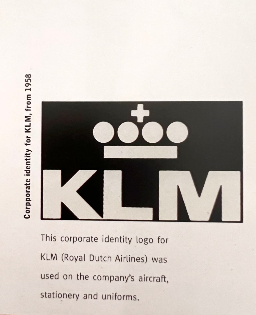
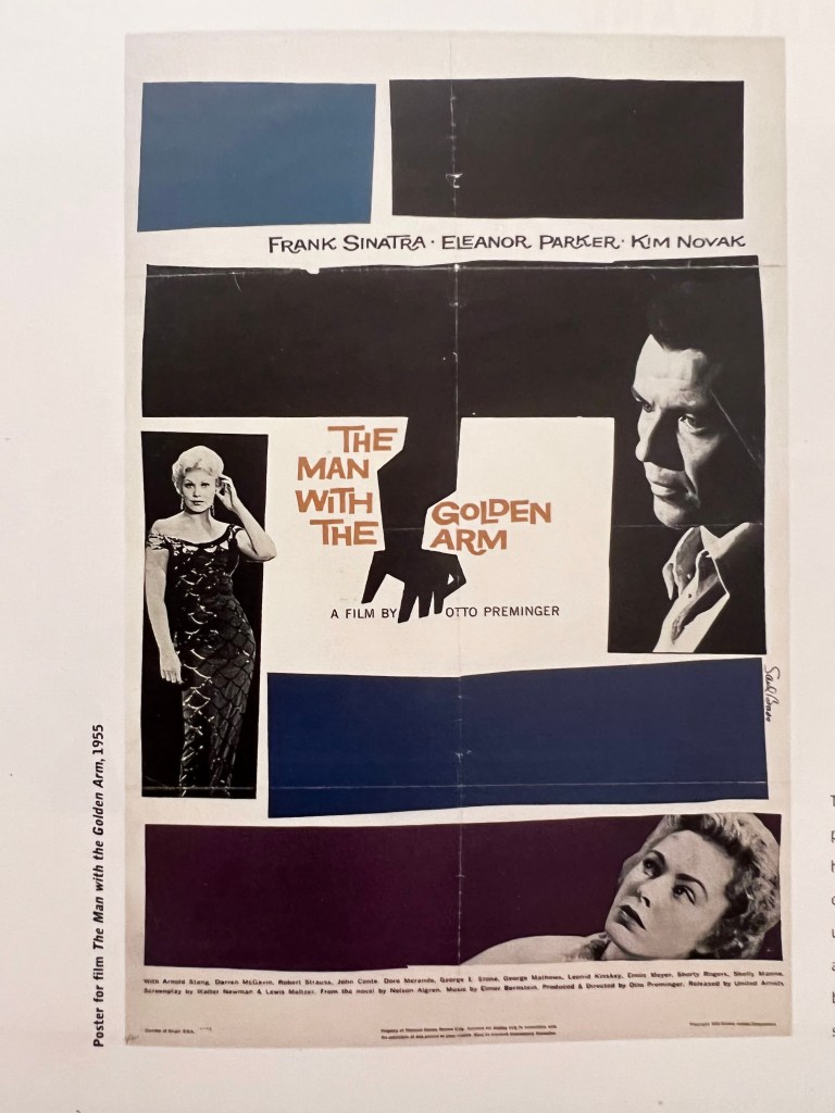
For this part of the research, I looked through my book Peeners of Modern Graphic Design by Jeremy Aynsley. It contains graphic design starting from the 1920s and up to the modern days. The section that I was looking for was called Mid-century modern, and contained design examples between the 1940s to 70s’. Towards the middle of the twentieth-century modern graphic design underwent a significant change of scene, largely brought by the immigration of the key designers. After 1933 it was extremely difficult for graphic designers in Germany, like many others they were forced to immigrate. Switzerland became an important focus for graphic designers from many countries. New York was home to concept-driven graphics, which came in particular from American advertising. Graphic design became a worldwide phenomenon, with an extreme exchange between U.S., Europe and Japan. From the visual point of view graphic design at that time was simple, but straight to the point, focusing the viewer on the key message, colours were basic as well, like black, blue, orange and red, and mainly designers used illustration rather than the photograph, as painting helped them to bring more creativity into the visual. Also, some of the posters were based on the cut-and-paste approach.
Books
Books, similar to posters and graphic design, were subject to the modern trends of those times. I found a few examples of book covers, with a rather expressive than conceptual approach to design. The colour pallet was straightforward as well, with mainly muter natural colour, the main accent was on the one glance of the image to understand the context of the book.
Typography exploded during the 1950s, leading to some of today’s most notable and common typefaces. And as with most exemplary type designs, many fonts from this decade aged particularly well and continue to have a massive impact on design today.
Helvetica is a classic, incredibly well-designed typeface that was created in 1957 in conjunction with Eduard Hoffmann for the Haas Type Foundry.
Univers is a realist sans-serif typeface designed by Adrian Frutiger in 1954.
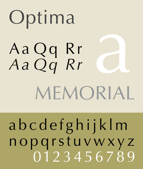
Optima is a humanist, sans-serif typeface designed by Hermann Zapf between 1952 and 1955 for the D. Stempel AG Foundry, Frankfurt, Germany.
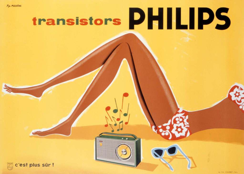
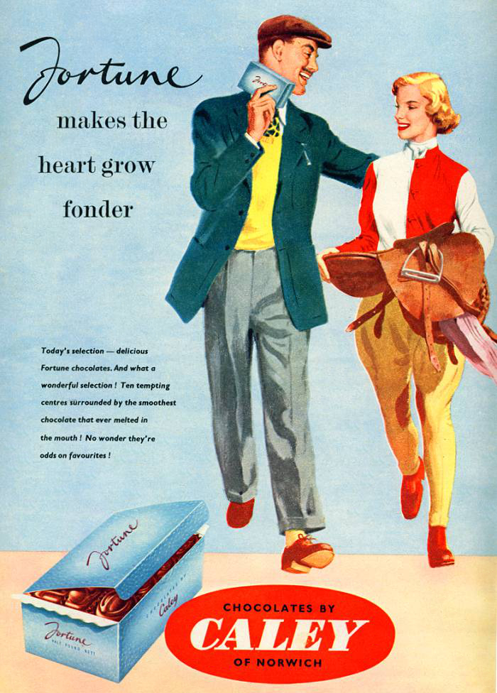
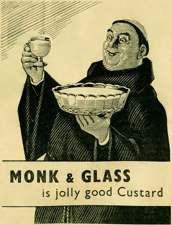
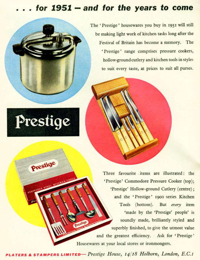
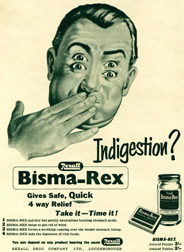
When it comes to advertising graphic design in the 1950s, the aesthetic is a rainbow of eye-popping pastels. Posters were filled with positive emotions, and bright colours and the main purpose was to make the viewer react to the product with the thought “This one is desperately needed!” Advertisements idealised the modern lifestyle, there was noticeable gender division in poster designs, where the man had a leading role, drives a car, goes to work to earn money for the family, basically the head of the family, and the woman was serving a purpose like ideal housewife, care about beauty, and children. From my point of view, they are remarkable poster designs, that brought some idyll to the after-war times, to comfort people and make accents on the major aspects of life.
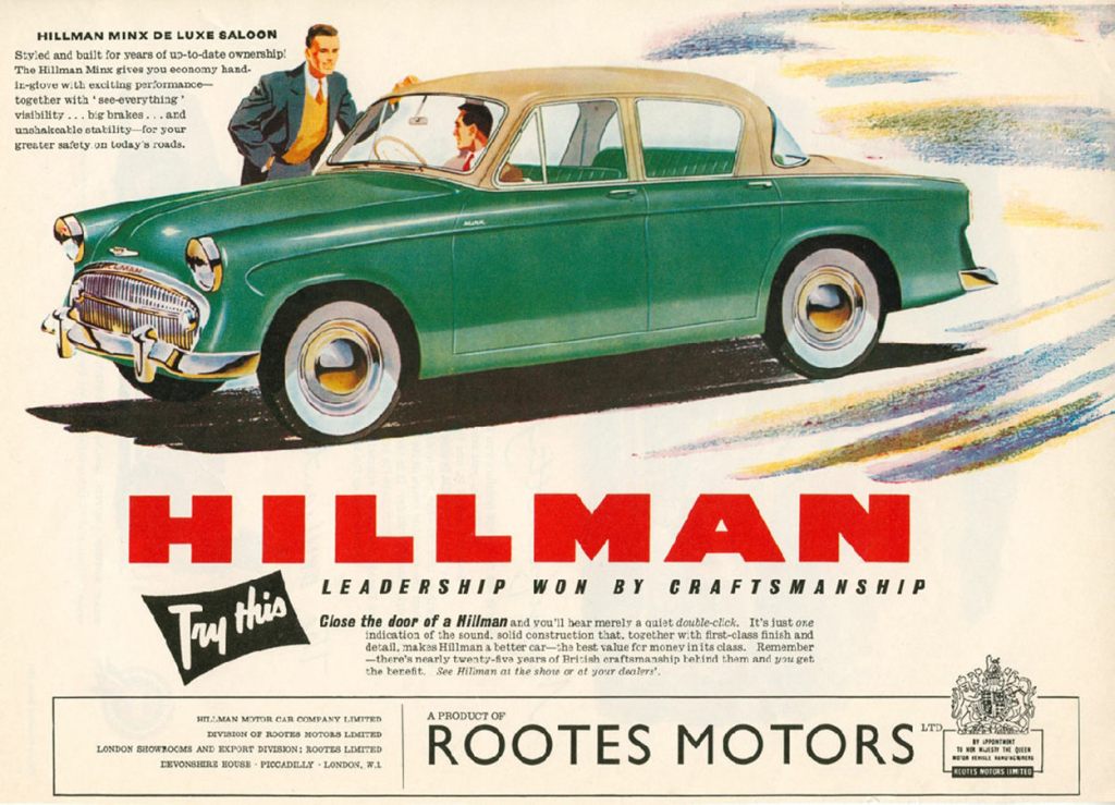
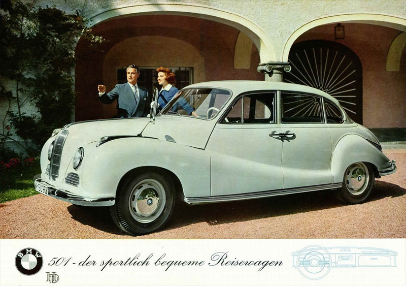
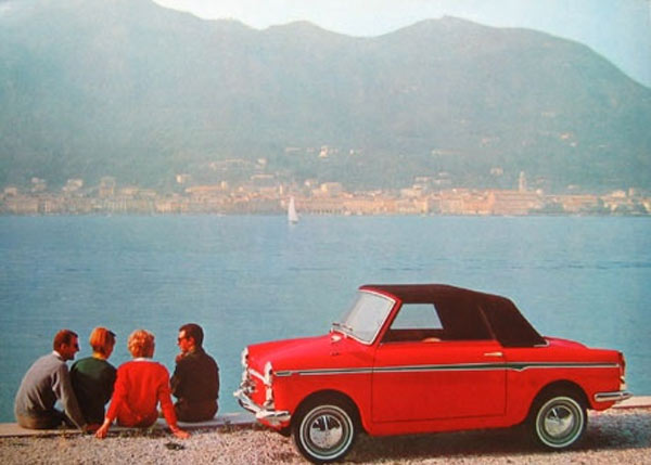
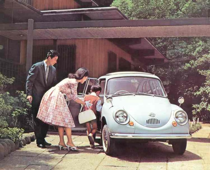
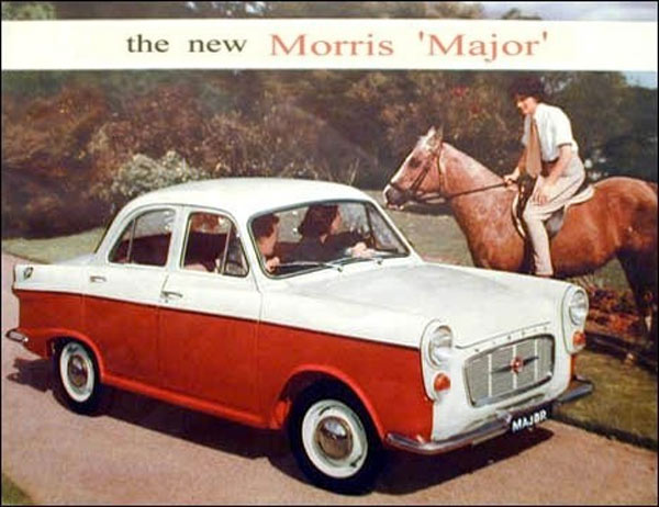
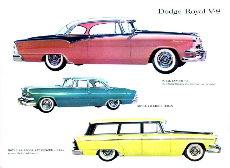
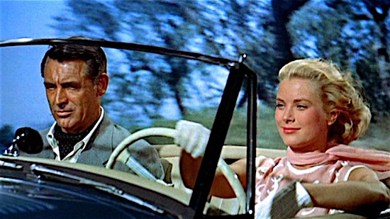
Similar to other industries, like fashion and design, car manufacturers had significant changes in the 1950s. They were some of the most classic, remarkable and powerful cars ever driven. Research and engineering teams worked hard at making the 1954 models safer, less expensive and easier to drive. The wrap-around window was a nice look though.
Most of the people in the UK used buses, as they were cheap and easy access transport, and they were convenient to travel around the country.
After 1950 the bicycle declined as a mode of transport in the face of competition from motorbikes and the private car.
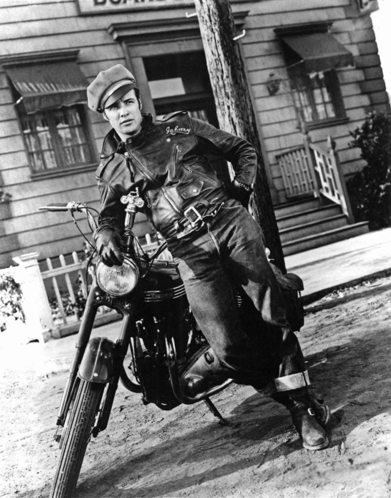
1699108 The Wild One directed by Laszlo Benedek, 1953; (add.info.: The Wild One (aka L\’Equipee sauvage)
With marlon Brando head of the gange Black rebels on his motobike Triumph Thunderbird 650cc
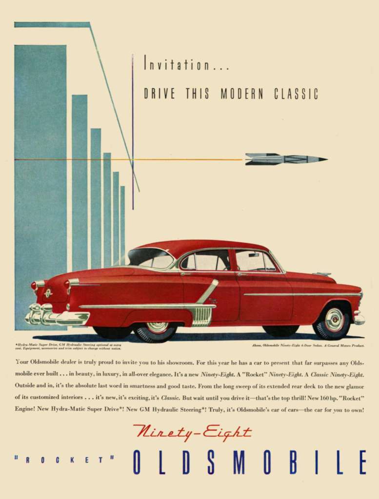
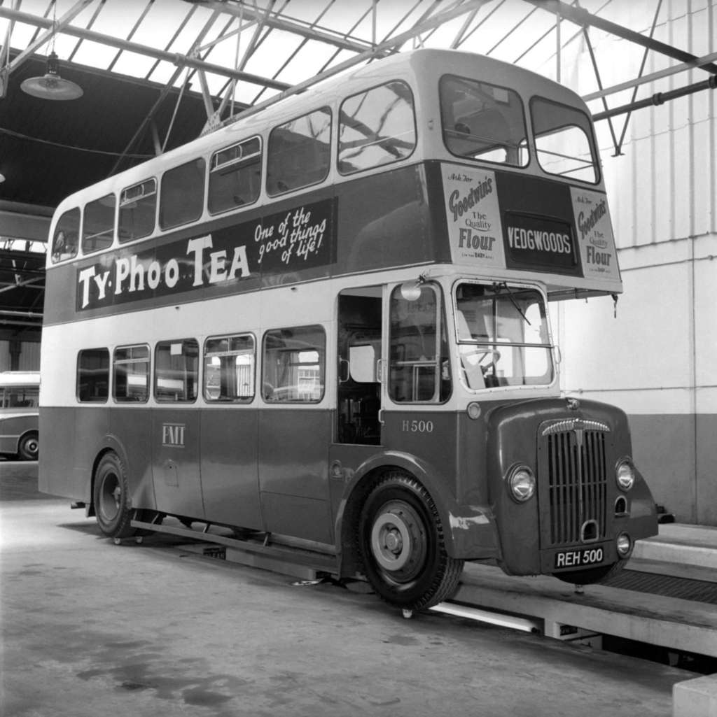
he is wearing a NYC Perfecto 618).2303412 Oldsmobile; (add.info.: 1950s USA Oldsmobile Magazine Advert); it is possible that some works by this artist may be protected by third party rights in some territories.5119984 Bus balanced on Cups from the Josiah Wedgewood and Son fine China company to demonstrate the strength of bone china, August 1958 (b/w photo); Source: Bridgeman Education Accessed: 19/08/2022
Like the postwar American car, the new fashion also fulfilled desires for lavishness, glamour, and certain shapelines. Chevrolet made striking changes to rear-end styling in their car models. Ford offered a full line of a luxury models. Italian carmaker Autobianchi made a supermini called Bianchina that got 40 miles per gallon.
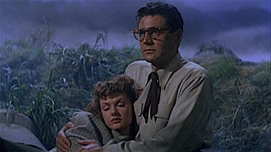
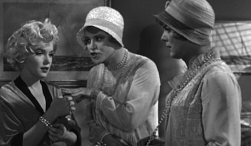
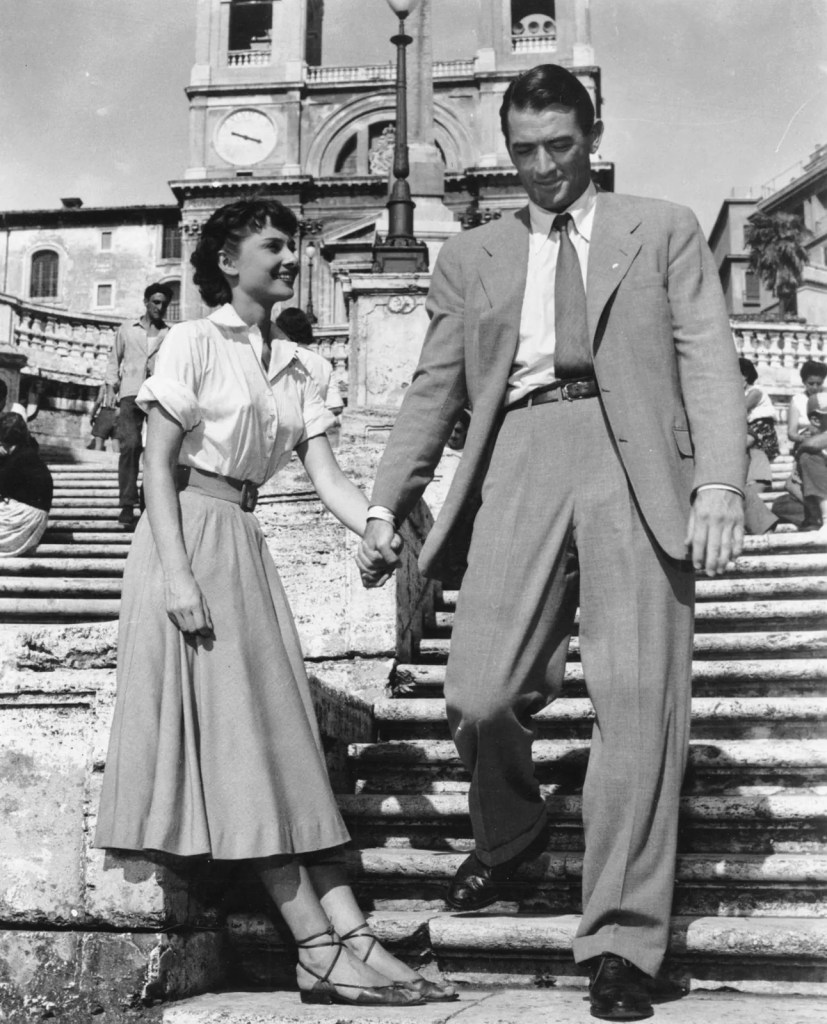
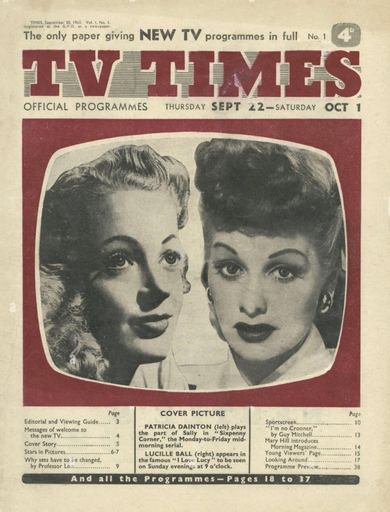
The movie industry in the 1950s was under attack by a new foe: television. Home theatre systems kept people in their homes and the cost of making a blockbuster movie rose sharply in the 1950s. In this case, the era of films from the 1950s is more difficult to pin down than the 1930s or ’40s. Still can be noticeable the influence of WWII. The most remarkable film plots from the 1950s evolved around relationships, and love stories, but at the same time popularised film noir and Westerns and the development of European neorealism.
There were three major colour trends in the 50s; pastel, modern and Scandinavian. Pastel colours that were particularly popular were pink, turquoise, mint green, pale yellow and blue. Modern colours were clean and bright and included vibrant yellow, electric blue, orange, red, black and white.
Bold designs such as stars, stripes, checks and polka dots came into vogue. Fabrics with fruit, flowers and abstract designs were everywhere. Characteristics of 1950s design are clean designs with a Scandinavian influence, space and atomic age-inspired shapes, also known as Mid-Century Modern. This now traditional style continues to be popular but is achieved today with new materials.
IllustrationPencil
After that deep research on culture from the 1950s, I felt like I have a valuable ground to visualise illustrations that would best describe that period. I could see that the 1950s are reflected in contemporary art and design with its modern approach to sculpture, house building, and even graphic design. I think the 1950s gave a decent ground for developing ideas and evolving modern culture around it.
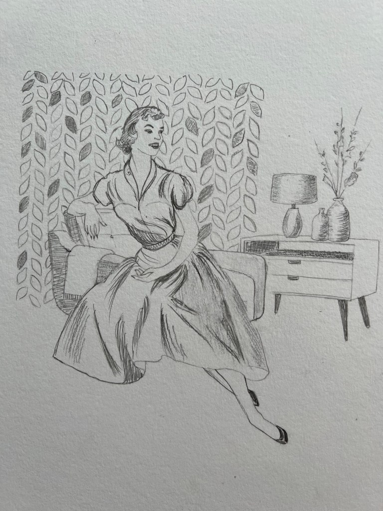
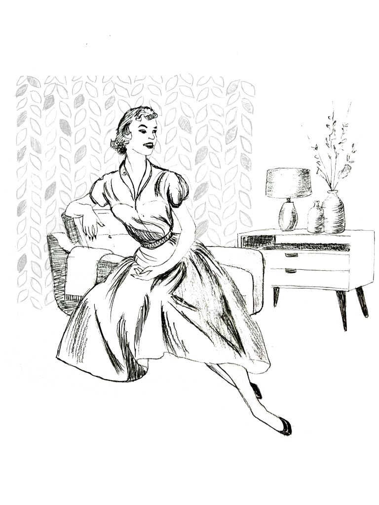
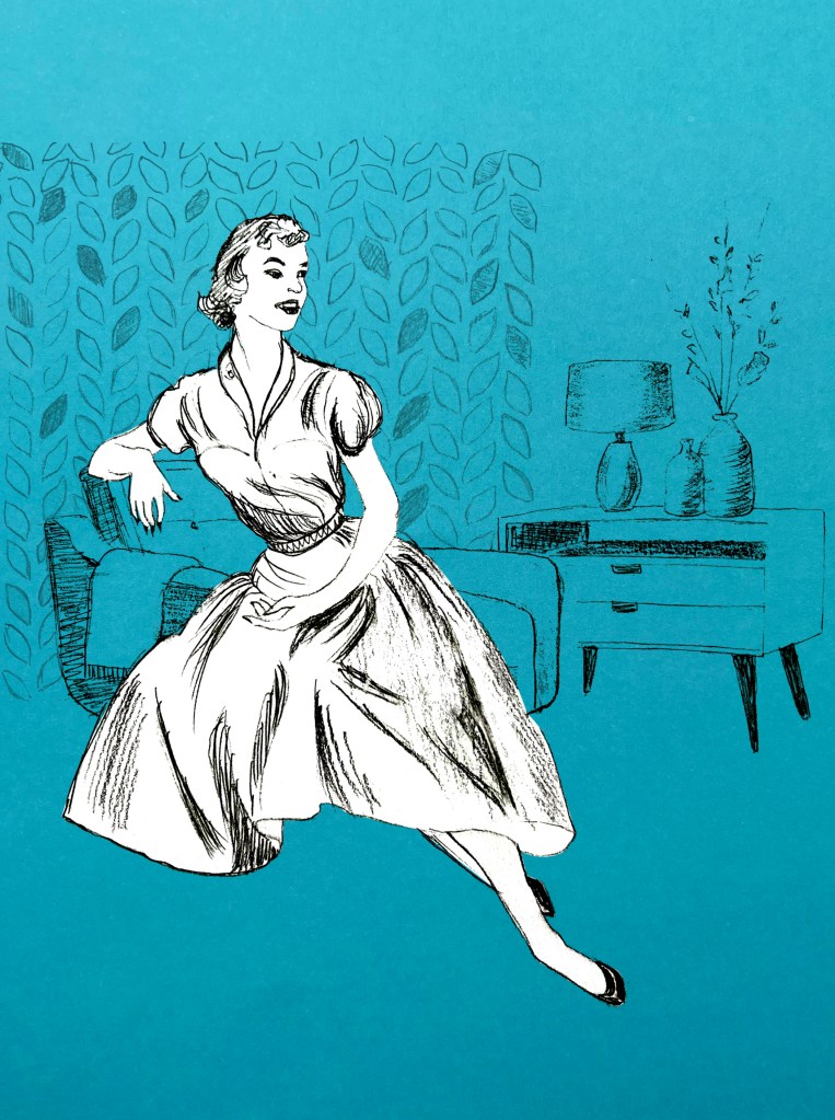
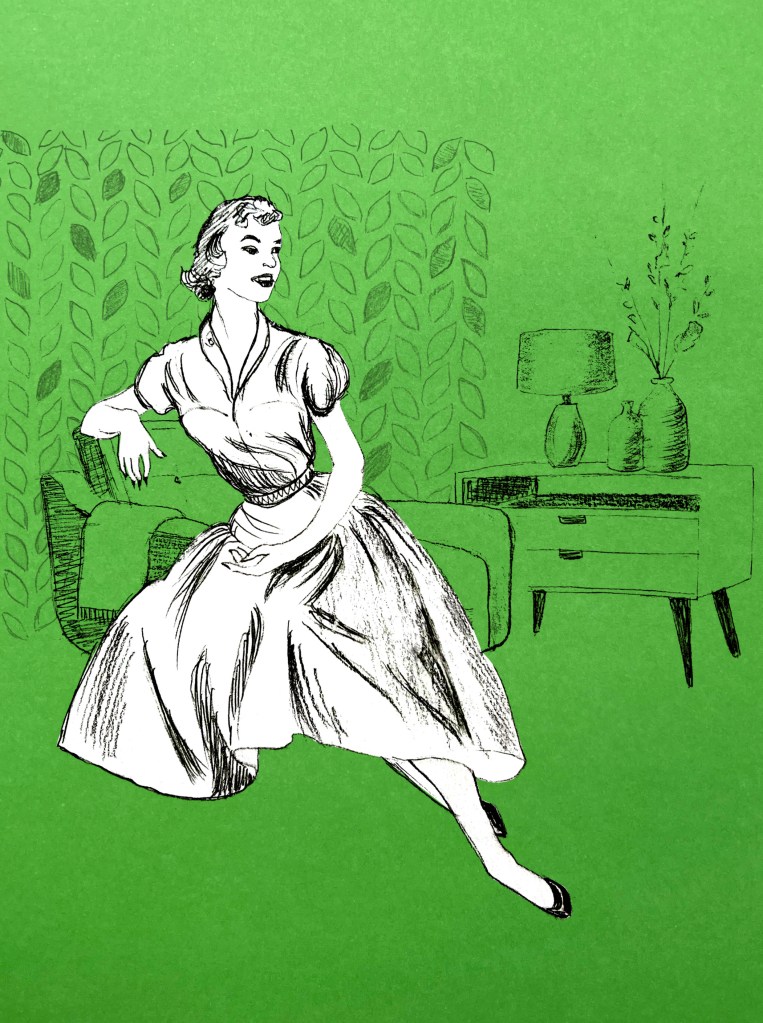
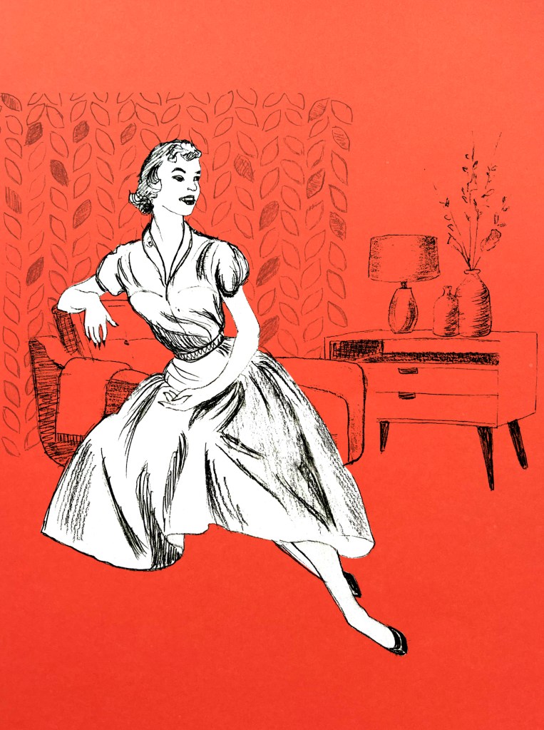
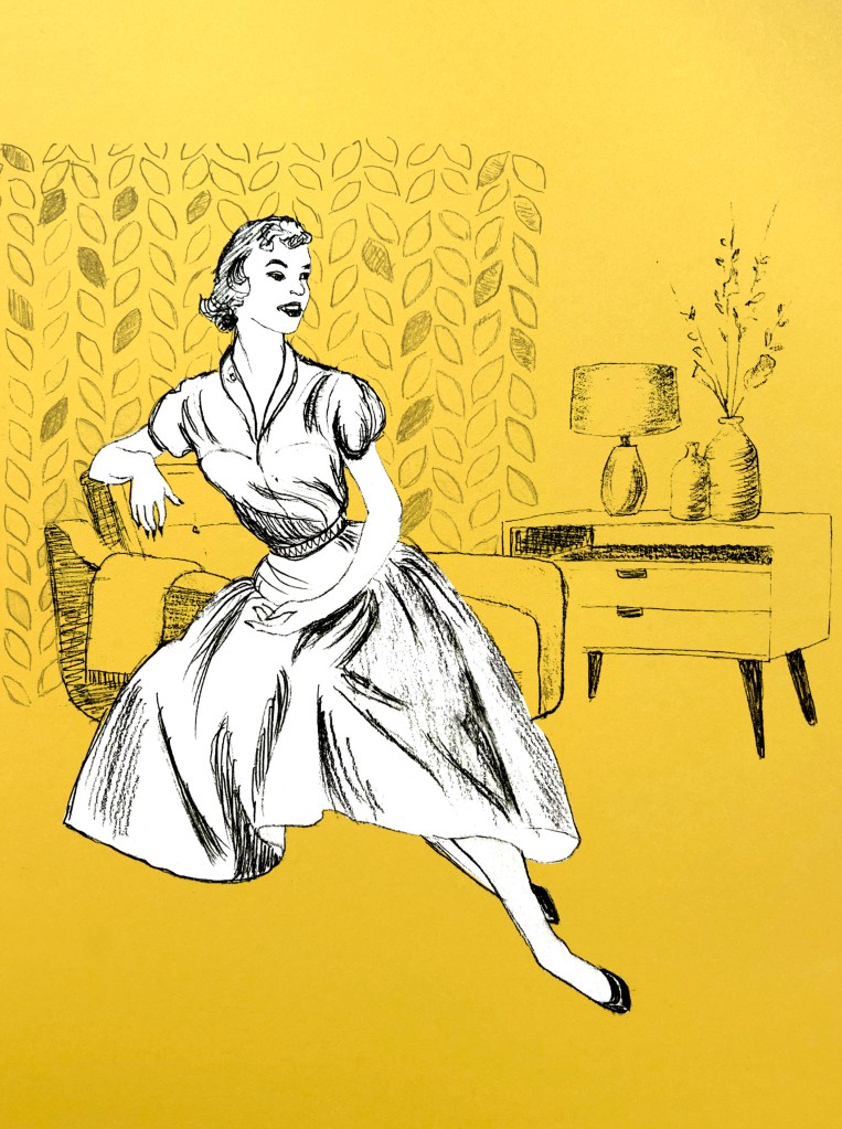
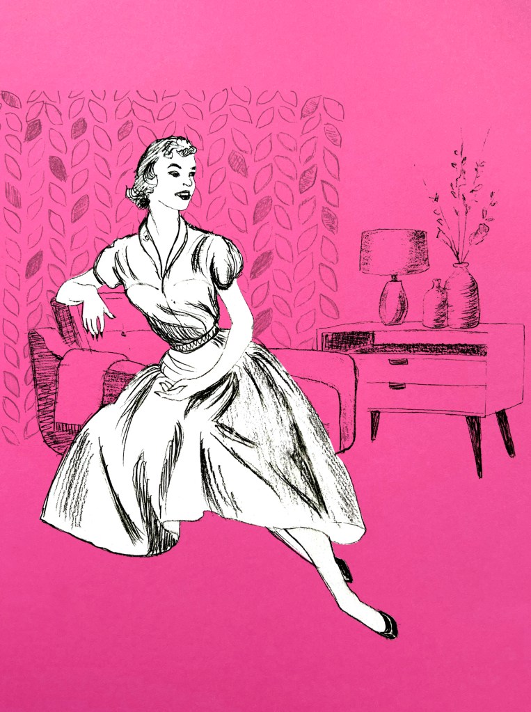
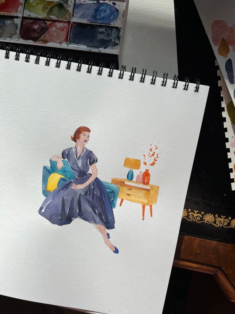
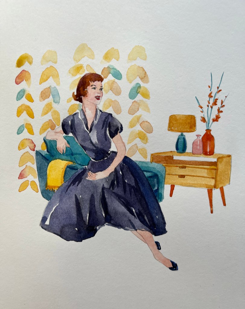
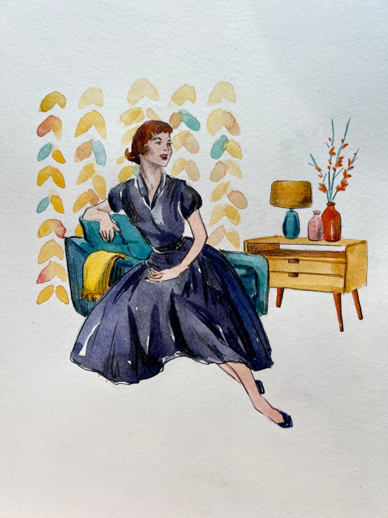
For my illustration, I decided to choose a classic and elegant lady in the traditional 1950s shape of the dress, sitting on a chair with decor from the 1950s around it. For the wallpaper, I chose floral patterning the pale shades.
For my illustration, I decided to choose a classic and elegant lady in the traditional 1950s shape of the dress, sitting on a chair with decor from the 1950s around it. For the wallpaper, I chose floral patterning the pale shades. Quite interesting, that even with all the Midcentury features around that illustration, it still looked quite modern. Probably it’s due to the circulating of fashion when they say it goes the circle and comes back to us again in the furniture, clothes, and sometimes house decoration.
Pencil sketch with the photoshopped final version
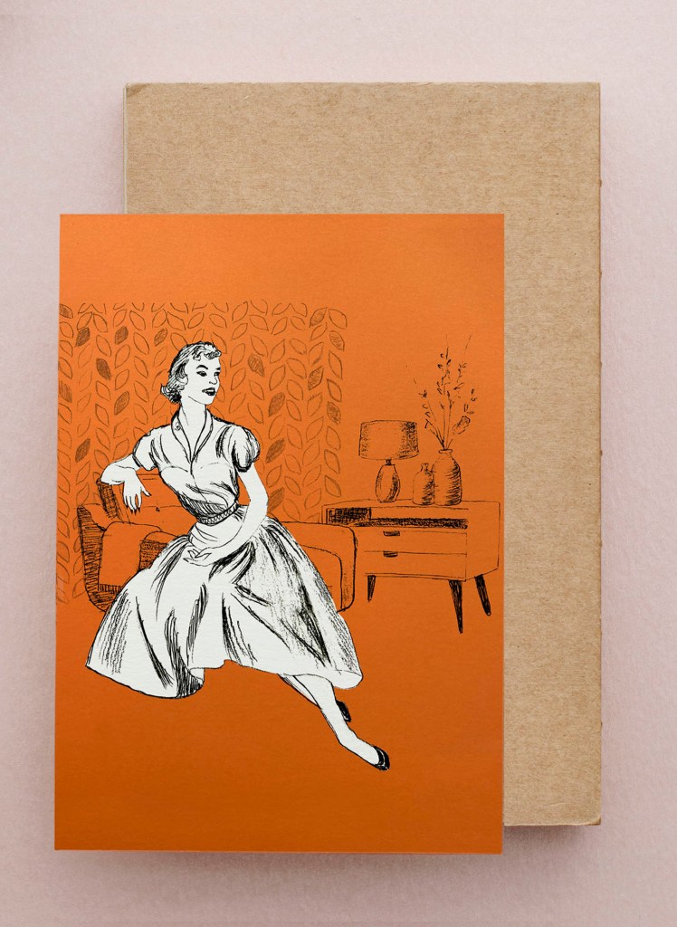
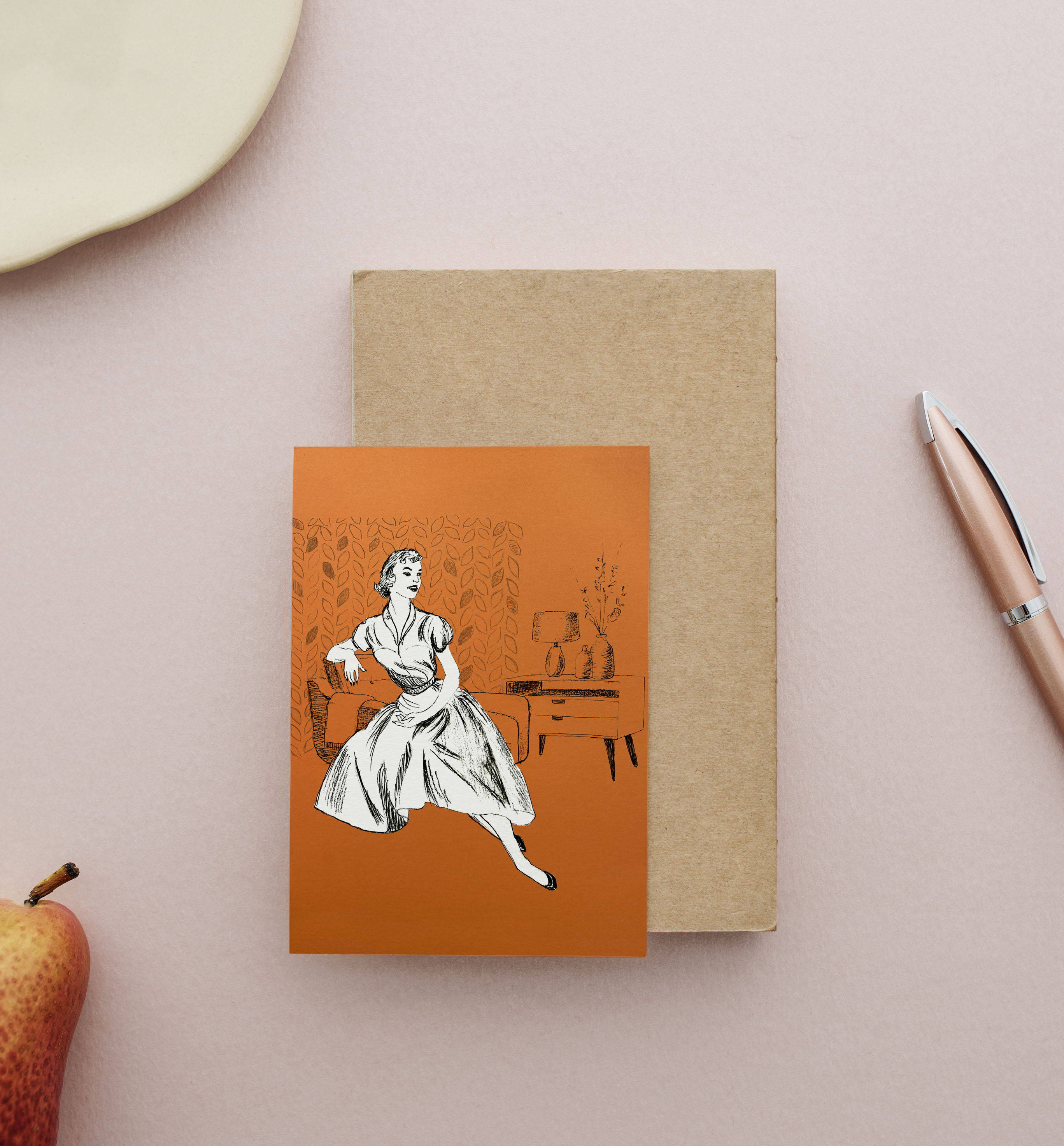
For the first illustration, I wanted to keep that pencil design with some sharp strokes in it. The girl turned out to be very happy and full of energy from the 1950s, she could be a traditional housewife or be a guest at someone’s house. I chose to make the girl with white colouring, so she could stand out from the decoration, and experiment with the colour of the background. I had colourful paper, so I took a picture of it and placed the illustration on top of it in Photoshop, to see which colour suit best to it. I went for the orange background because those were sort of colours that were modern around those days, like mustardy, orangy, and yellow tones.
Sketch on the various background colours Final mockup 1950s girl card on a pink background
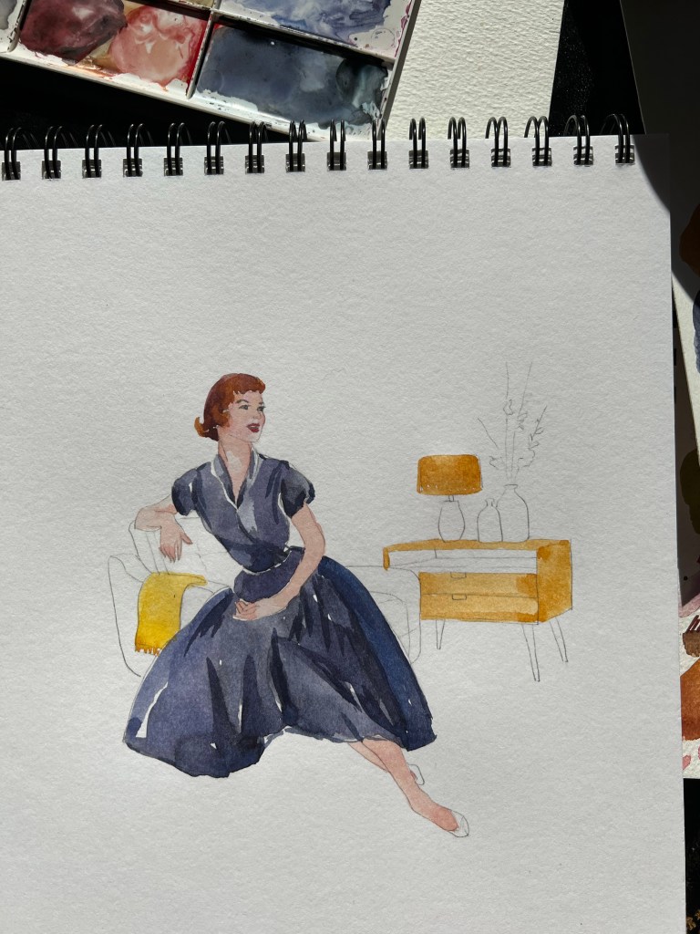
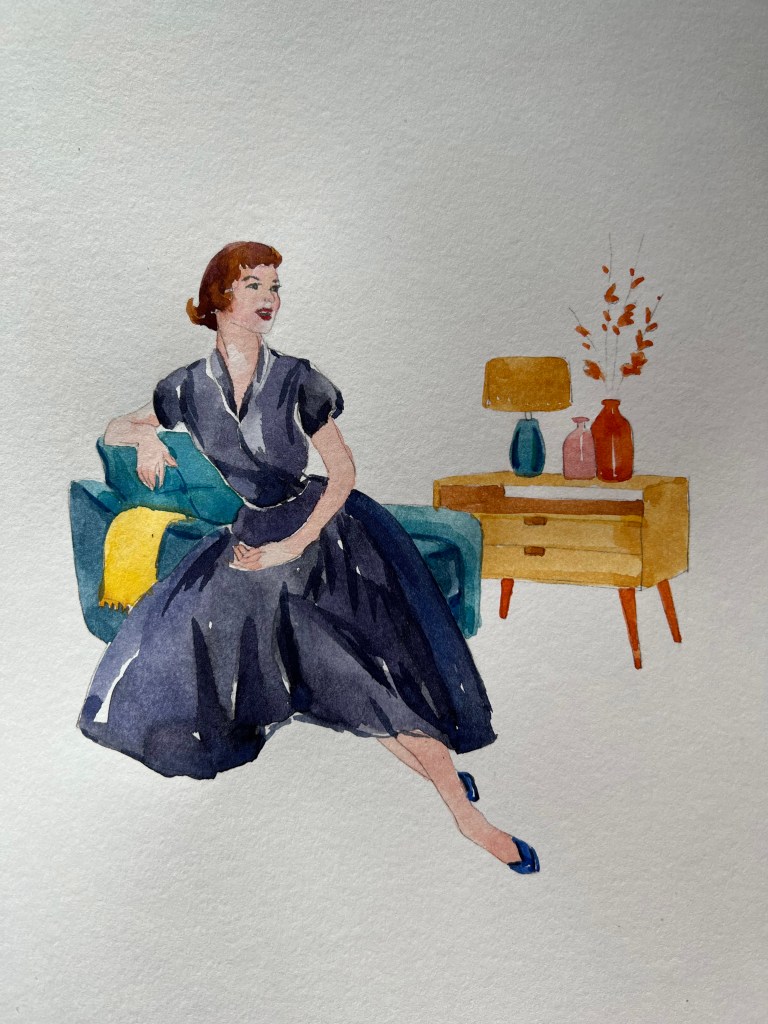
Illustration Watercolour
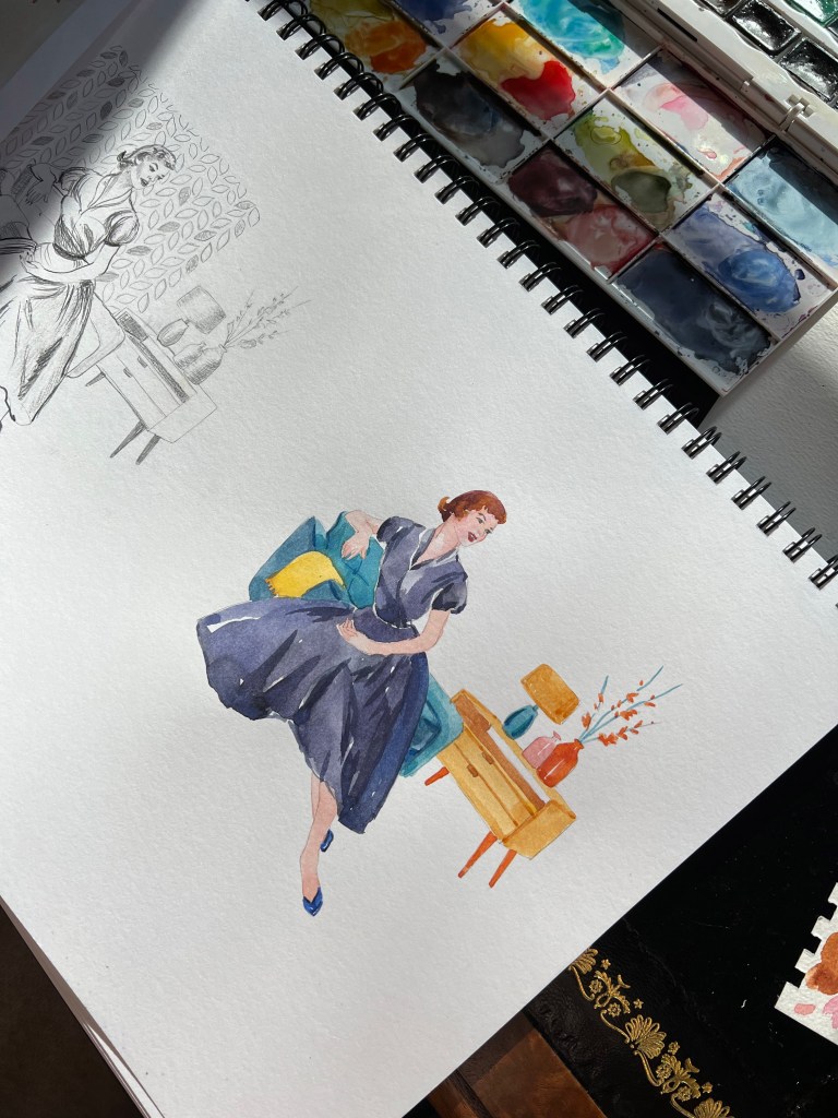
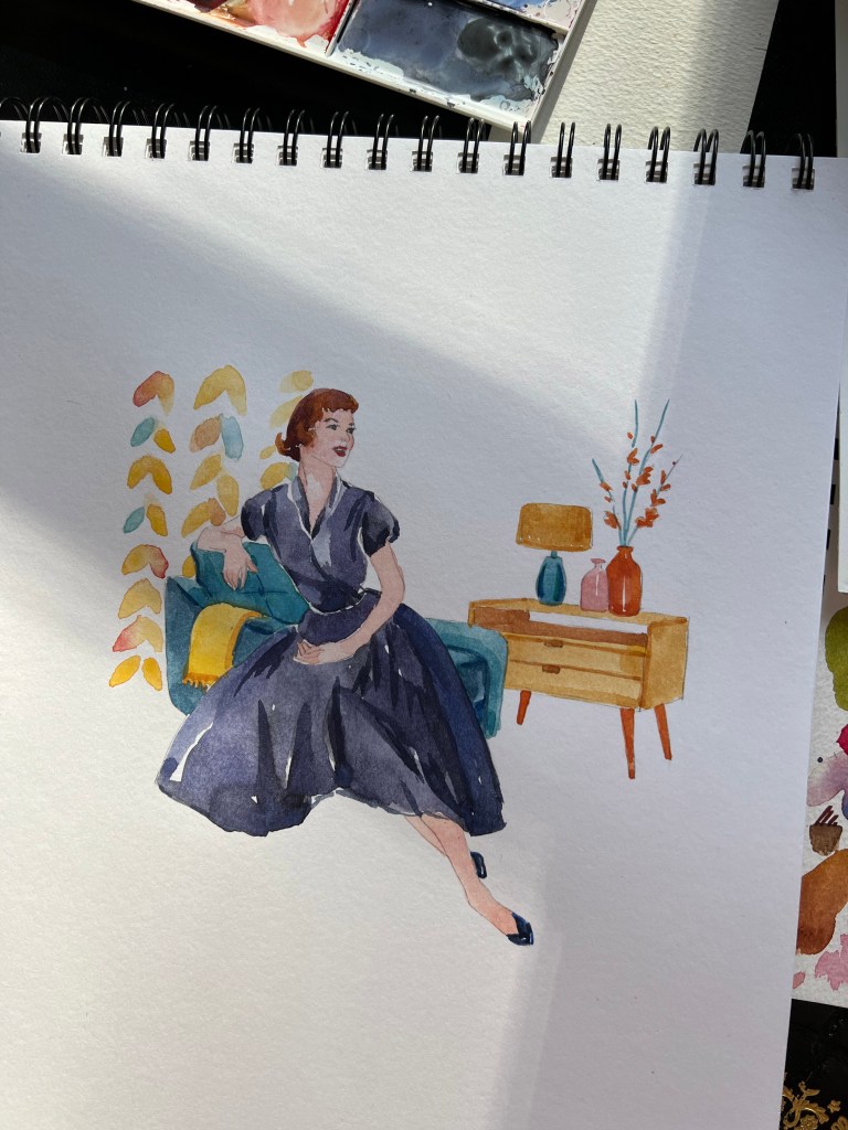
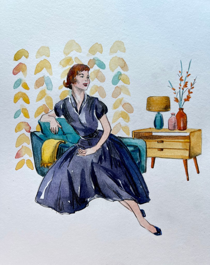
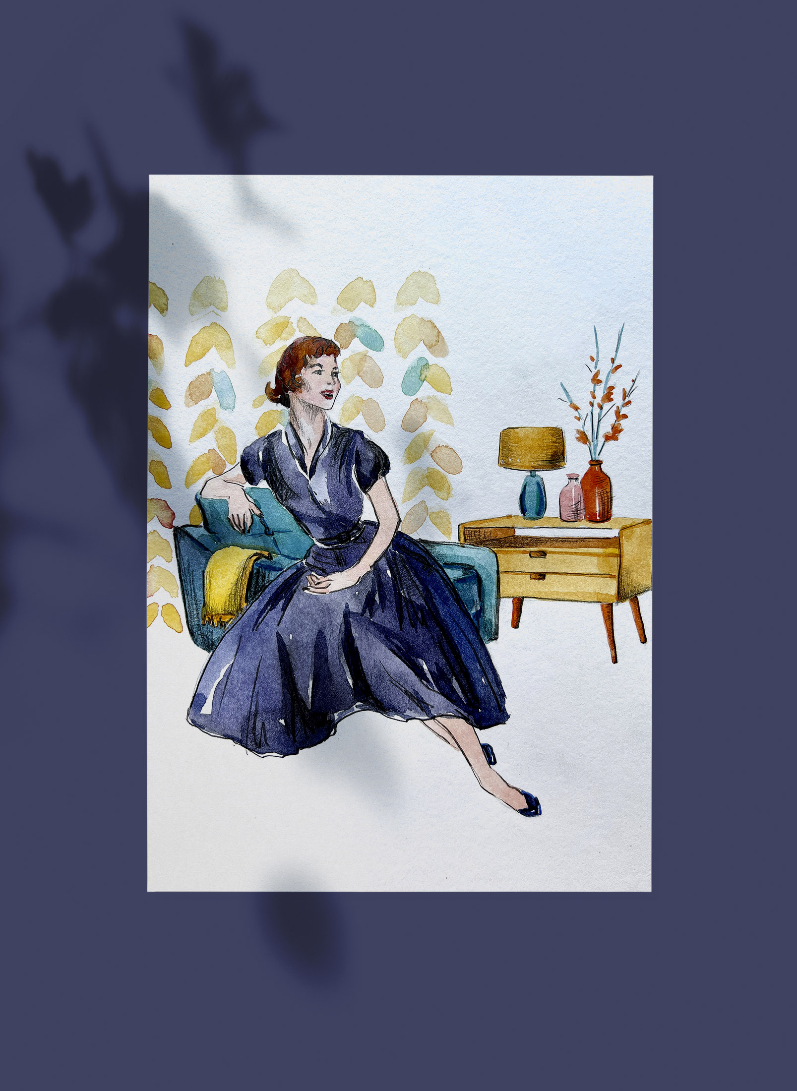
I was pretty happy with my sketch illustration, but I wanted to experiment with the colour and elevate the mood of the illustration through some bright patterns. I went for the dark blue dress for the girl, warm orange colours for the furniture and blanket, and the turquoise colour of the chair. For the wallpaper I went for similar shades from the furniture, to demonstrate the replicating colours in the decoration. On the top of the watercolour, I used pencil sketching, to highlight the shades of the illustration.
The progress of the watercoloured illustrationFinal mockup for the watercolour illustration
Conclusion
To me, it was quite a useful exercise to complete, as the 1950s were remarkable times, and we can see their reflection in our everyday modern life. I think we are still replicating the interior designs from that century, the approach to graphic design, and the elegant style that always will be in fashion. In terms of illustrations, I think I prefer the colourful version, as it looks more like a completed version, and colours do highlight major components of those times, when it was important a comfortable and welcoming house, with a woman being the hearth keeper. The character has charm and elegance, a classy look and joy about her. It took me a bit longer to complete this exercise than I planned to, as I went into the detailed research for it, but I hope it was all valuable knowledge I’m going to implement in this assignment.
Choose one of the words from the previous exercise and on a large sheet begin expanding on the themes and ideas that you identified. Collect swatches of colour and texture to or create your own to establish a palette of colours and repertoire of marks. Google some of the words and from the Images link, either print off or draw from some of the images that emerge. Go through other books and magazines and take snippets of images, which have associations with your words and theme. Assemble these elements on your large sheet. You are not creating a piece that is a designed artefact in its own right. You don’t have to include words but may want to selectively incorporate some words into your moodboards as an aide-memoire. If you organise your content according to visual connections you may find that links and some nice surprises emerge. This should lead to you being able to recognise or establish a hierarchy within your content. There is more on this concept in Part three.
OCA Illustration
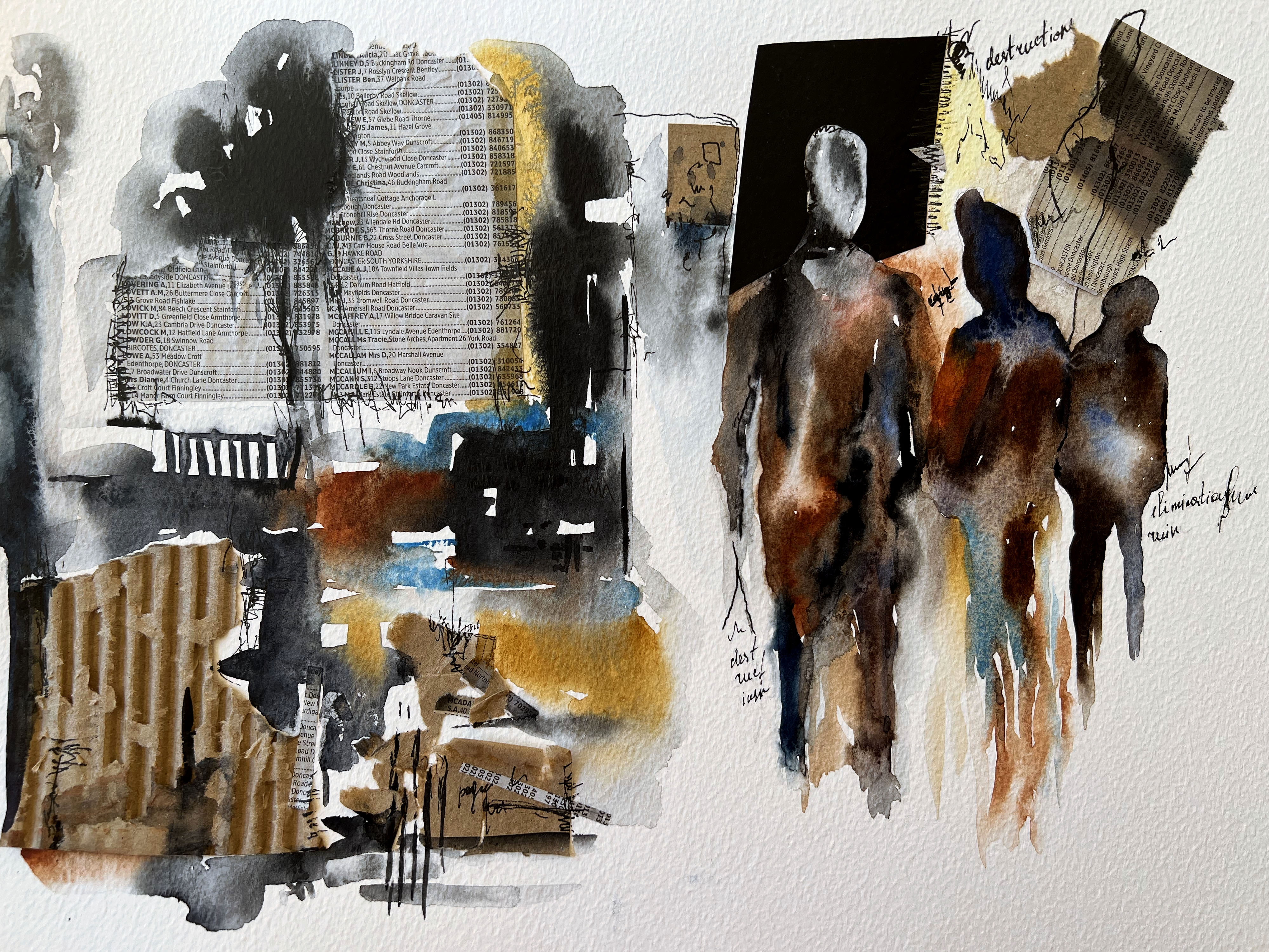
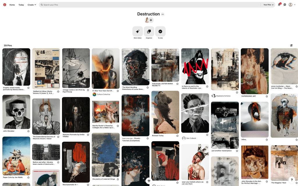
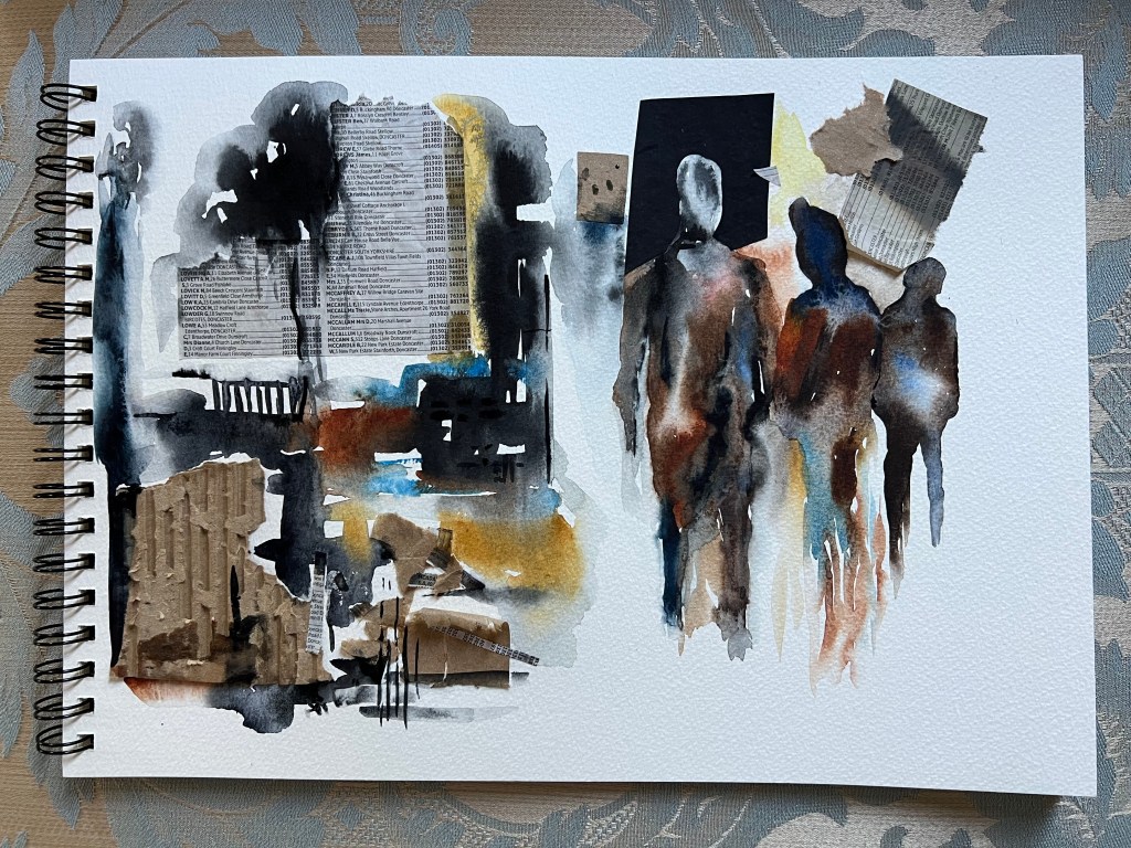
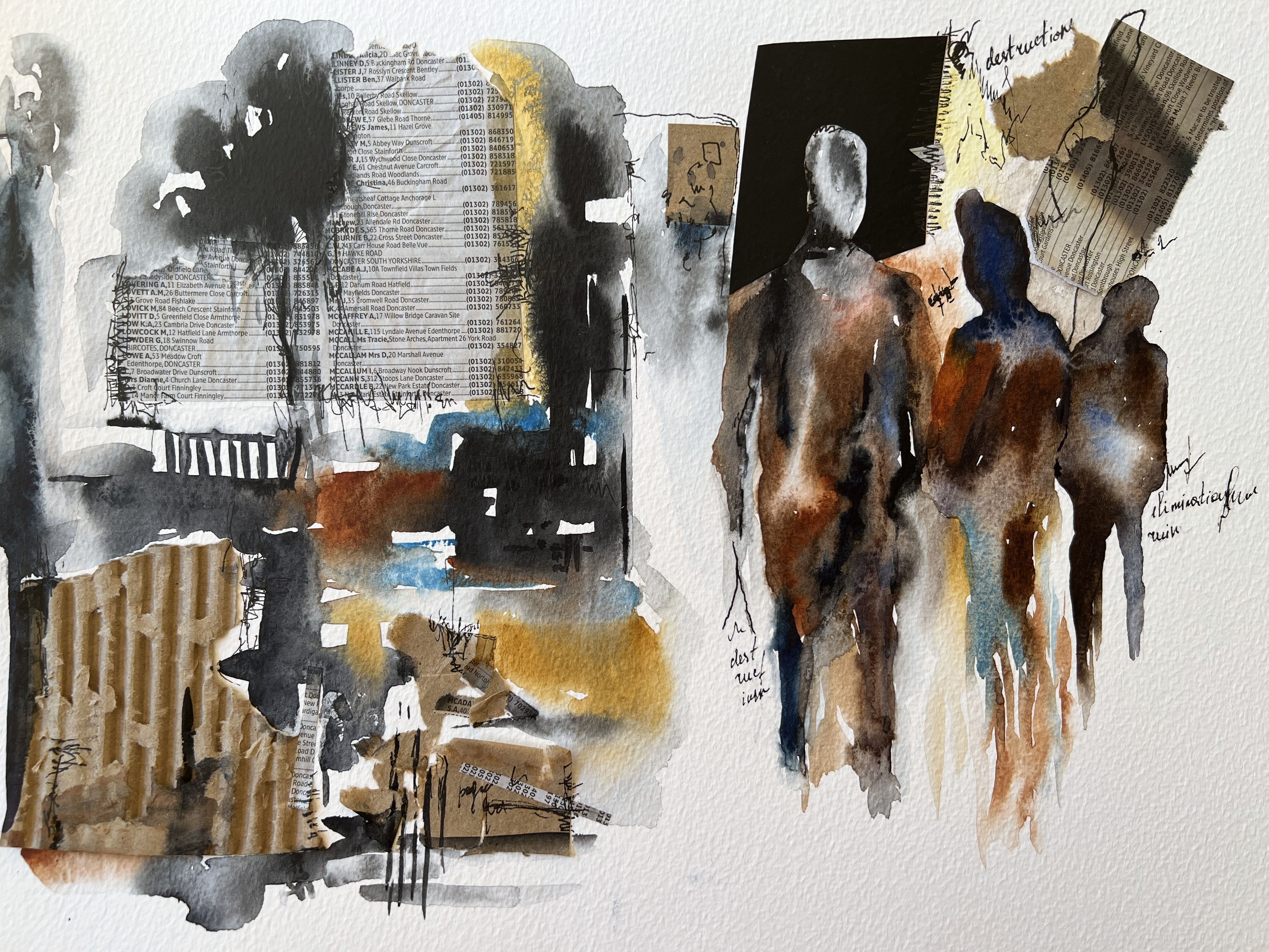
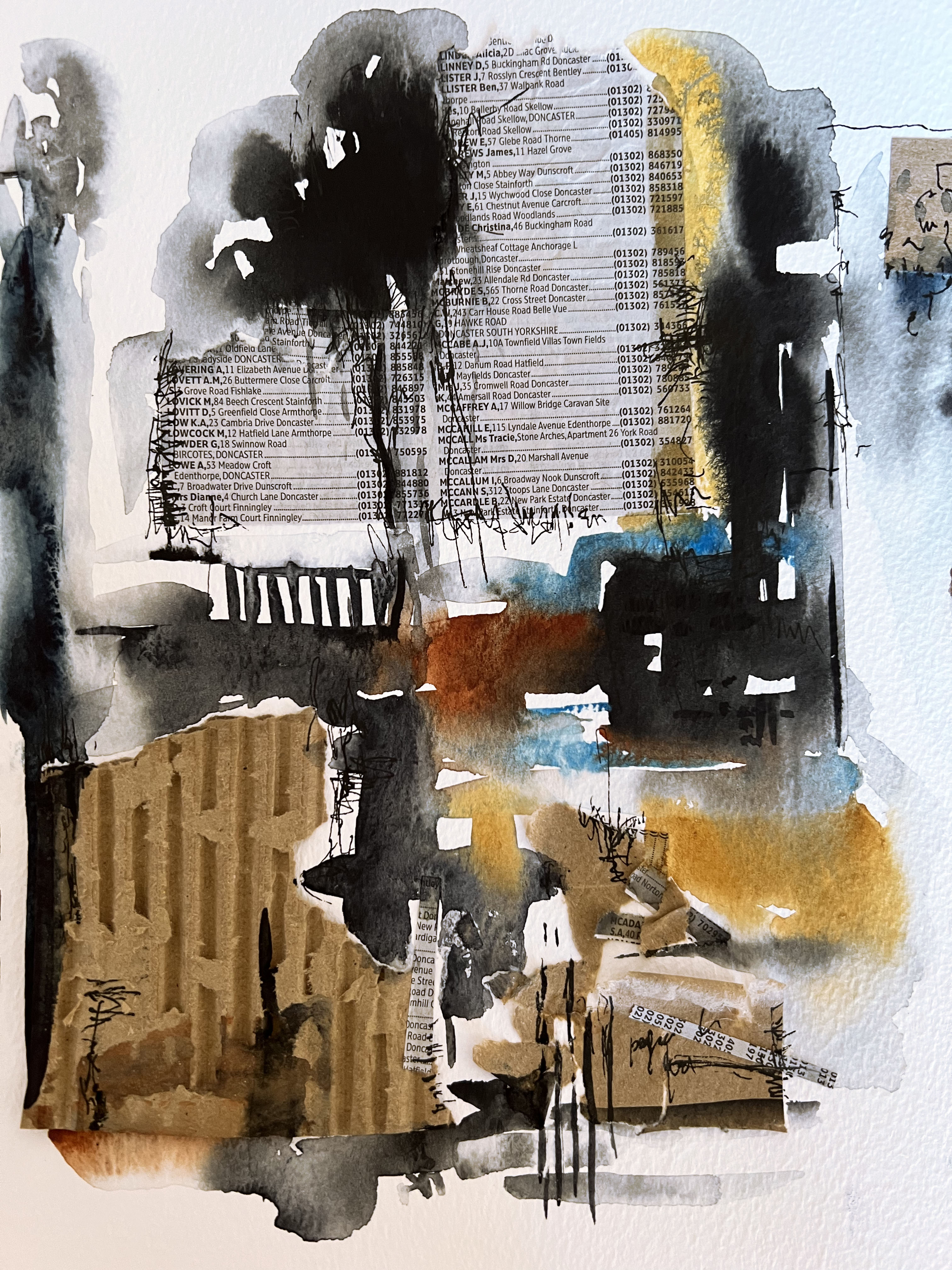
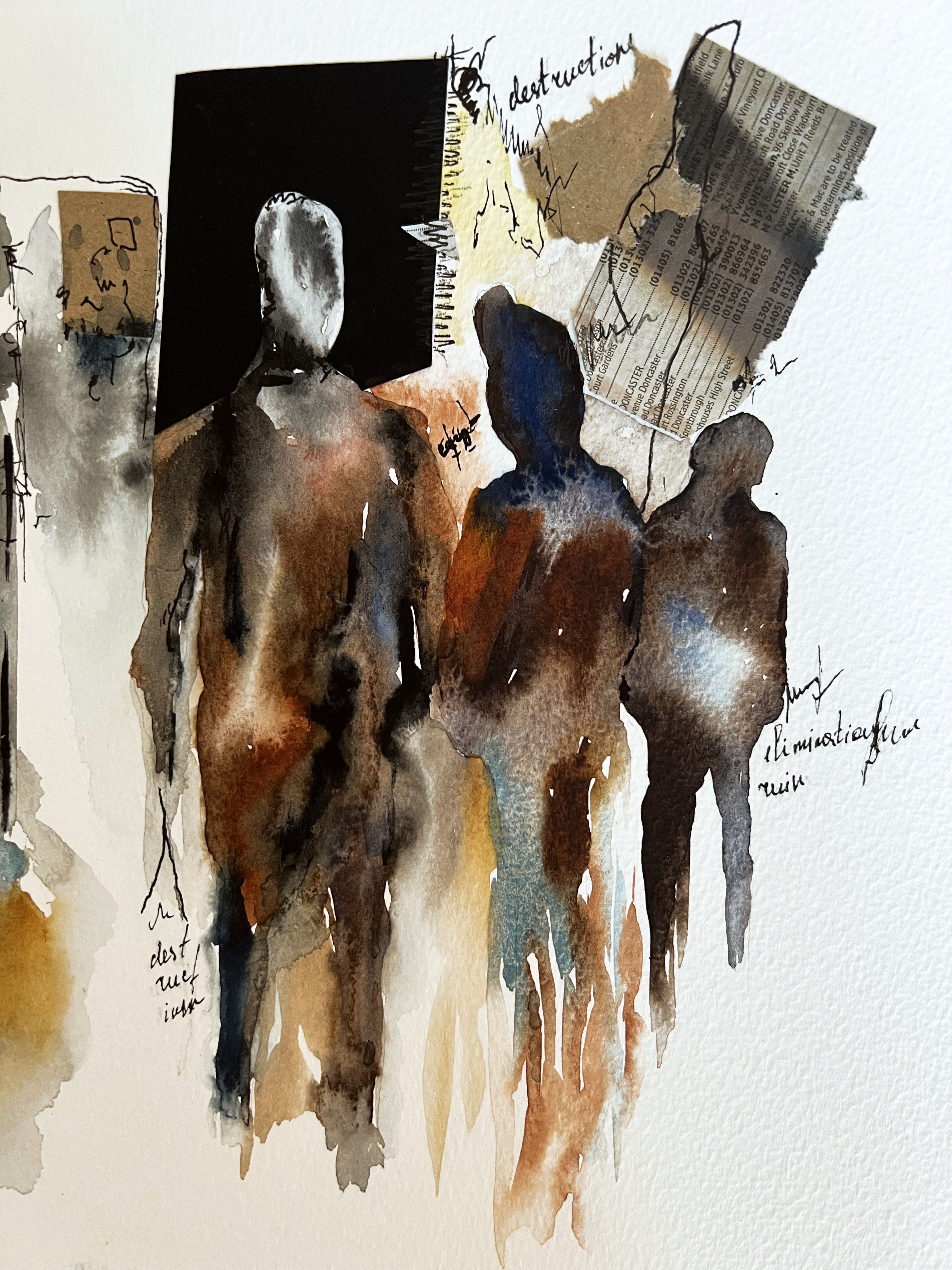
Destruction moodboard
For this exercise, I decided to go with the more abstract and visually creative word – destruction. Going through my previous experience I could recollect several artists and designers that took this word as a central part of creativity, it’s like a keyword for creating a mind map around it. There are great collages, illustrations, juxtapositions and photographs that could be applied to this word and the spectrum of its influence in our modern life are pretty high. To start with, I created a moodboard on Pinterest – a usual source of inspiration. On another board, I collected images with coloura that would associate with the word destruction.
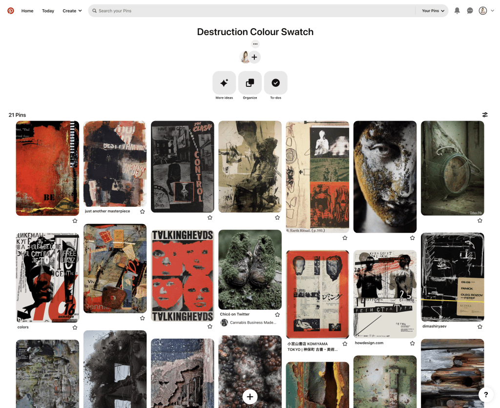
Destruction colour palette
The word itself is quite negative, dark, provoking and hard to absorb, and it can lead to aggression, conflicts, and wars. Still, creative wise it has a great potential for producing the most appealing and intriguing images. With this word I have an association with the shades of black, grey, red, and mouldy colours, it’s a part of our existence and the best way to use it is rather creative, such as art than in everyday life.
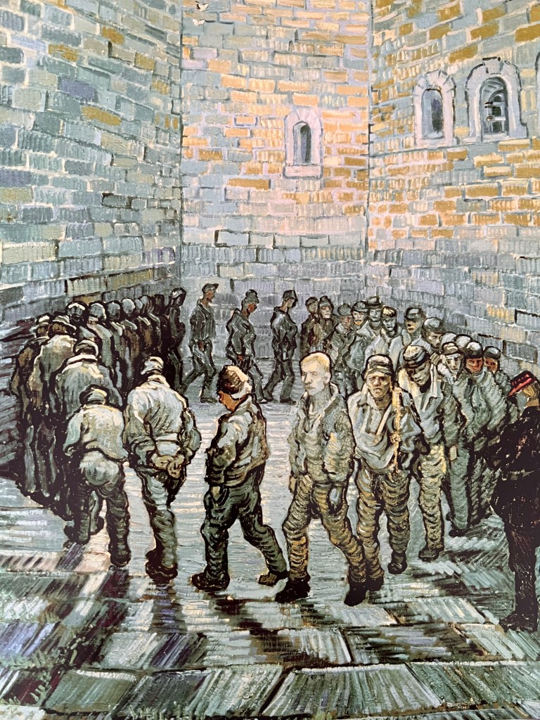
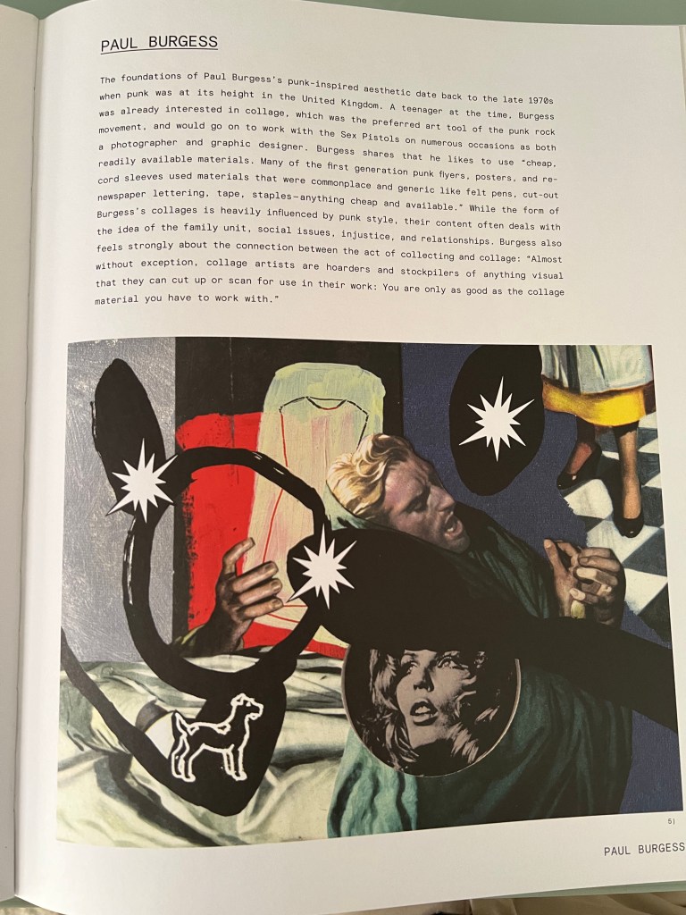
Books and magazines snippets
Also, I’ve been collecting some of the books and artworks from the time when I studied juxtaposition and collages. One of the best sources to look for inspiration, as it is filled with unexpected, expressive solutions, that reflect the artist’s visions. From those designs, I can see that artists were experimenting, using old catalogues, splashes of paints, and liquify tools in photoshop, to create some new unusual materials
Creating swatches
In my head, I started to imagine what kind of materials I could implement for the word distortion. I wanted to use little objects around me for using them in my own mood board, like pieces of newspapers, dark shades of watercolour, burned paper, card boxes and a black pen. I tried to place them chaotically, but organise them into the whole image. I think, that the impression from the final design is coming with some little details that are going to be used in its representation, like scratches, erratic movements, and weird shapes, which could be one of the signatures of the final piece.
Choose a word from the list and draw everything that comes to mind. Don’t be concerned about the accuracy of your drawing or the prettiness of it. Use your drawings as a form of visual shorthand. ChildhoodExoticDestructionKitchen Wild Fashion Travel Have a broad range of materials to hand and during your visual brainstorm add swatches of colour and texture associated with your word. If the word sums up a scene try to deconstruct it into its constituent parts. Imagine you are moving around the scene with a camera and recording each element to create a visual checklist a catalogue of images. Be conscious of the details and qualities of each subject or object you draw to communicate its qualities and function. Notice how you are developing a sense of visual editing and distillation of information. Adjectives are most difficult to draw. Be aware of the mental processes you undertake to generate subjects to draw in response to these less concrete words. Developing the ability to give tangible form of abstract concepts is important for illustration and is a skill that can be honed over time. Note how your drawing evolves when repeating this exercise. Can you see a flavour in the way that you are begin to document through these little drawings?
OCA Illustration
Kitchen
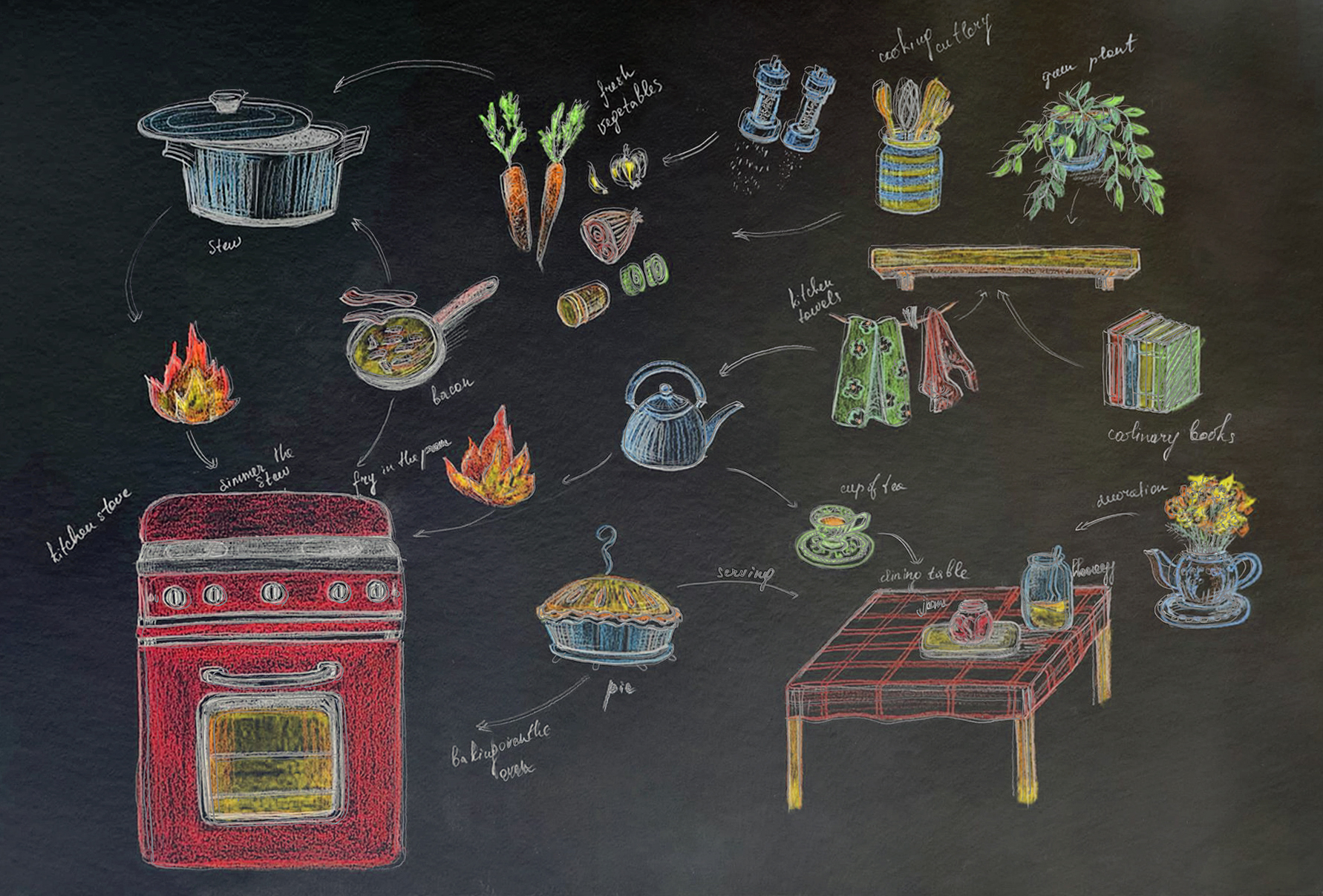
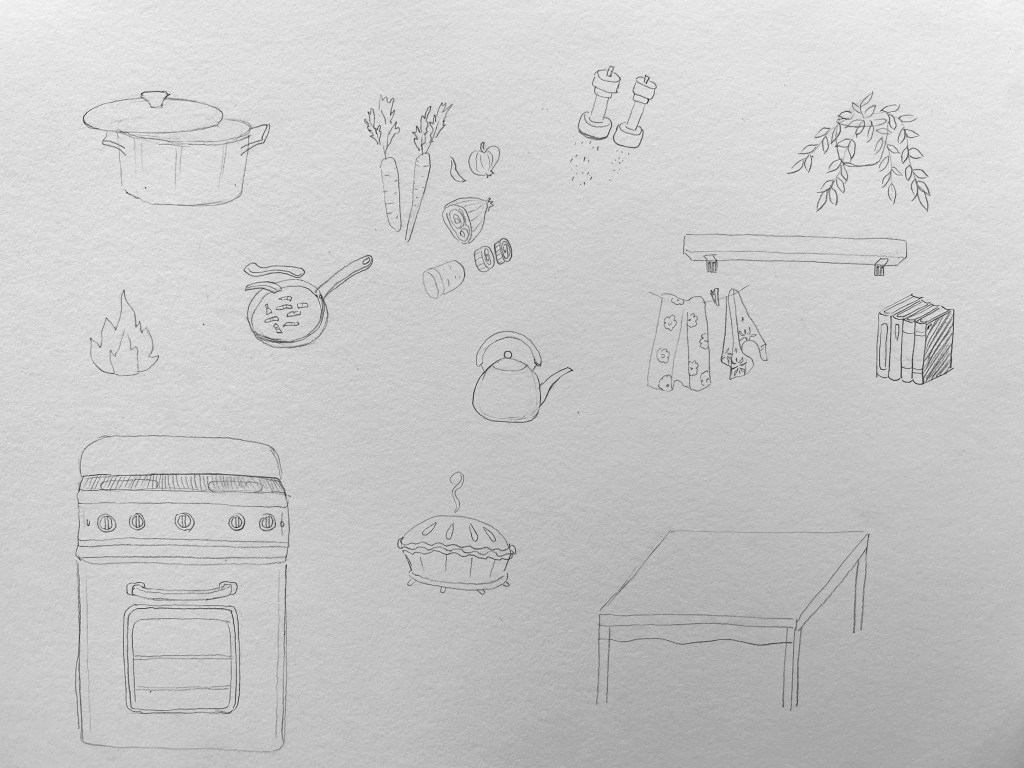
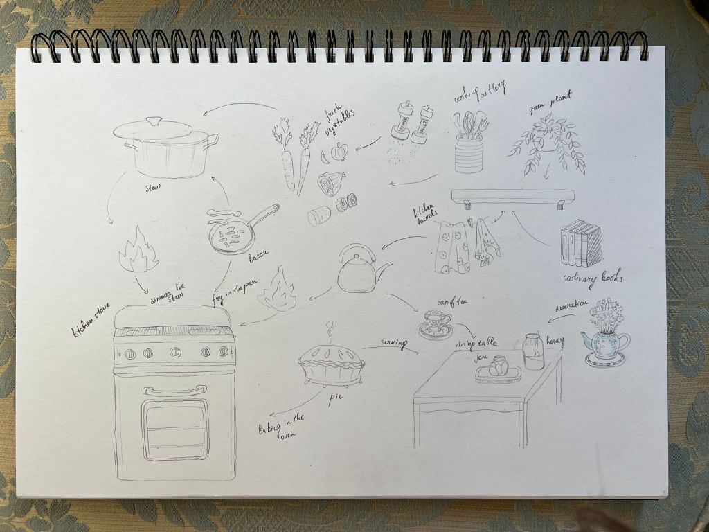
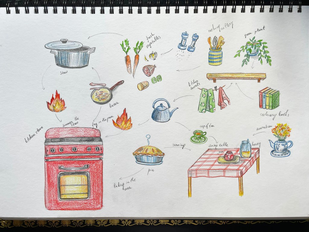
For this exercise, I choose the word kitchen. Here me and my family spending every day cooking different culinary receipts. In my head I could easily imagine the process of cooking, and the location of each component of the kitchen, and what tools are being used. I thought would be good to create a circle of cooking process, and the position of some of the cooking tools in it. I see cooking as a creative process, which is never boring or tiring for me, as by adding some creativity to it number of different masterpieces can be done. Also, I’m supporting healthy eating with a good combination of meat and vegetables, and as a treat some home bakery for the special occasions. I created a quick map where each element would be located and would go around the circle by adding some extra parts and ingredients. I started with vegetables, then a cooking pan, and then added elements going clockwise. Here I was making imaginative vegetable stew, and at the same time baked a sweet pie, which first should go into the oven and then be served on the table with some nice cup of tea. In our kitchen, we have a culinary books shelf, filled with receipts from around the world, an important part of a good cook. I added them too, with some flower pots and kitchen towels. I think I mentioned pretty much all elements I use every day.
The first sketch I made with a pencil, and then was adding some colour details to it. Also, I added some arrows and descriptions next to them, to explain the concept of the illustrations. For the colours, I chose basic colours, such as red, green, blue and yellow, as they are essential colours that any illustration can be based on, and also those colours are easy to digest, and they considered to be components of healthy meals. The images turned out cartoony-like, and quite neat, I’m assuming the reason for that, is because the illustration is quite a new field to me, I’m choosing the safe path of developing the ideas. I will keep on practising more, that to implement some new styles into my sketches, like expressive illustrations, try new approaches and bring my illustration skills to a new level.
Updated illustration
For the final design I used some of my Photoshop skills. I placed the illustration in the new layer with Exclusion filter. by making it look in negative colours, and then corrected the colour combination back to the natural shades, which made my drawings look like they were made by pastel or chalk on the top of the black board, that widely used at the restaurants for the meal description. I think that filter made my drawing more appealing from the design point of view, so I would keep those experiments in mind and keep on implementing and developing new skills.
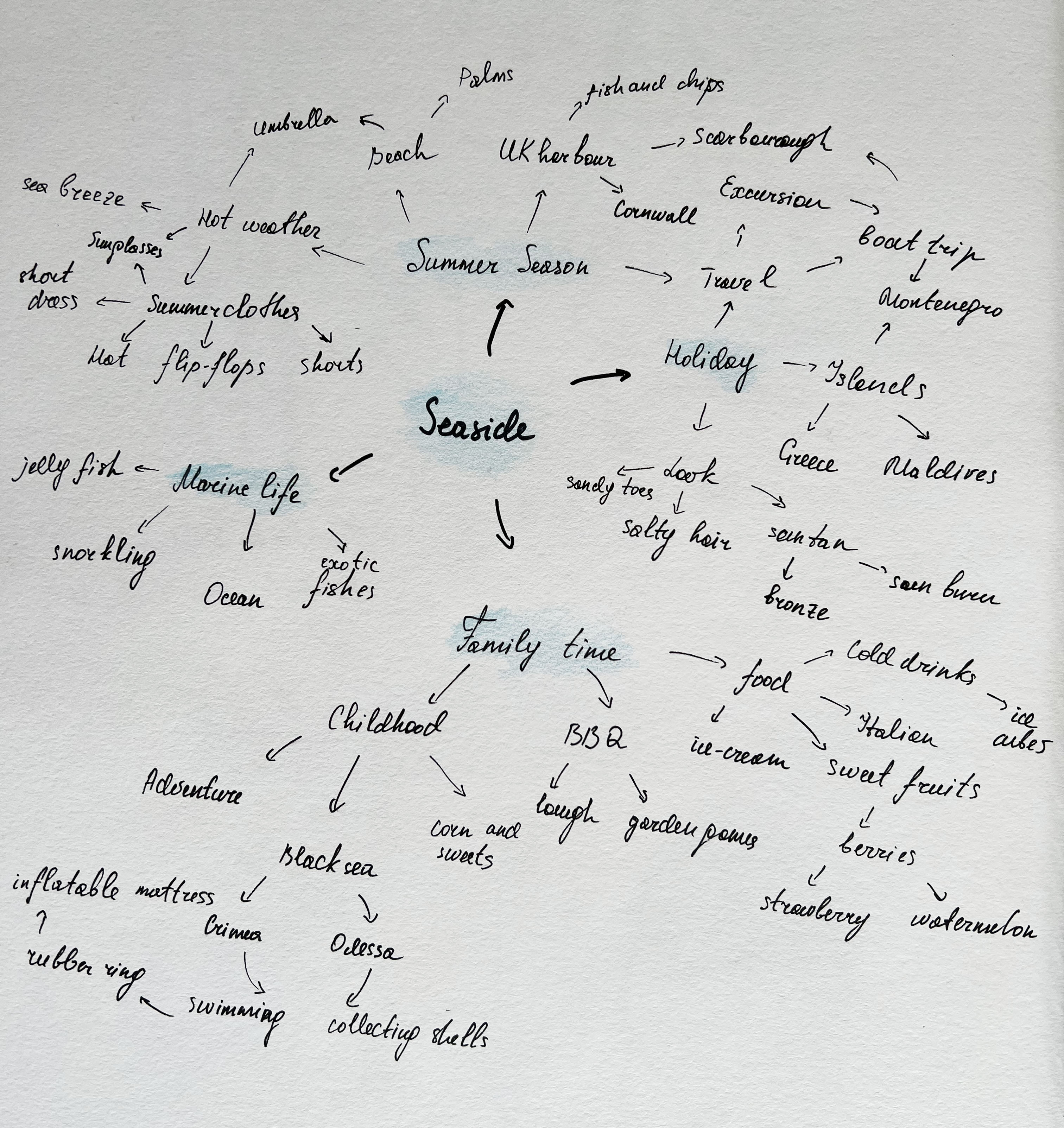
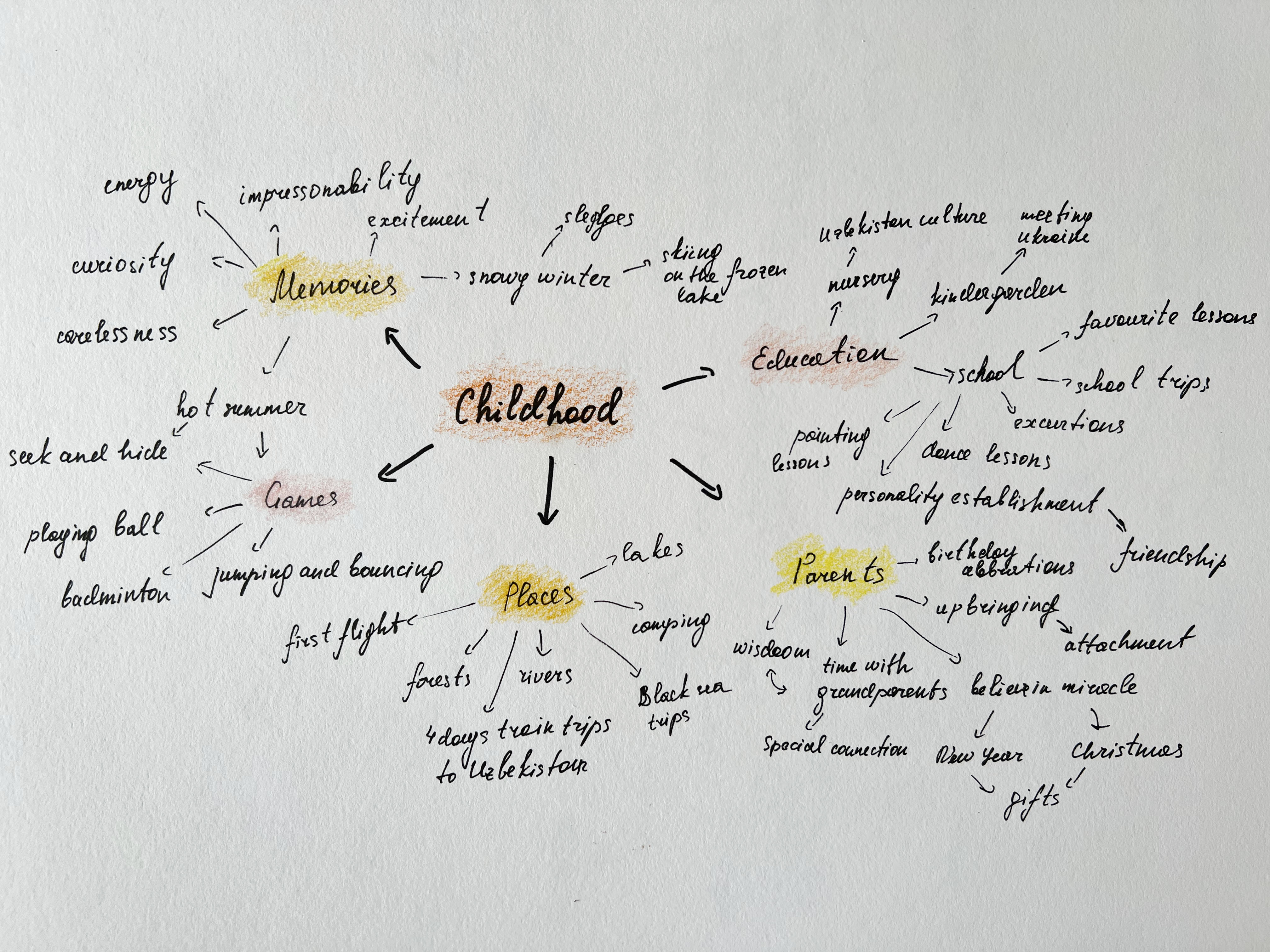
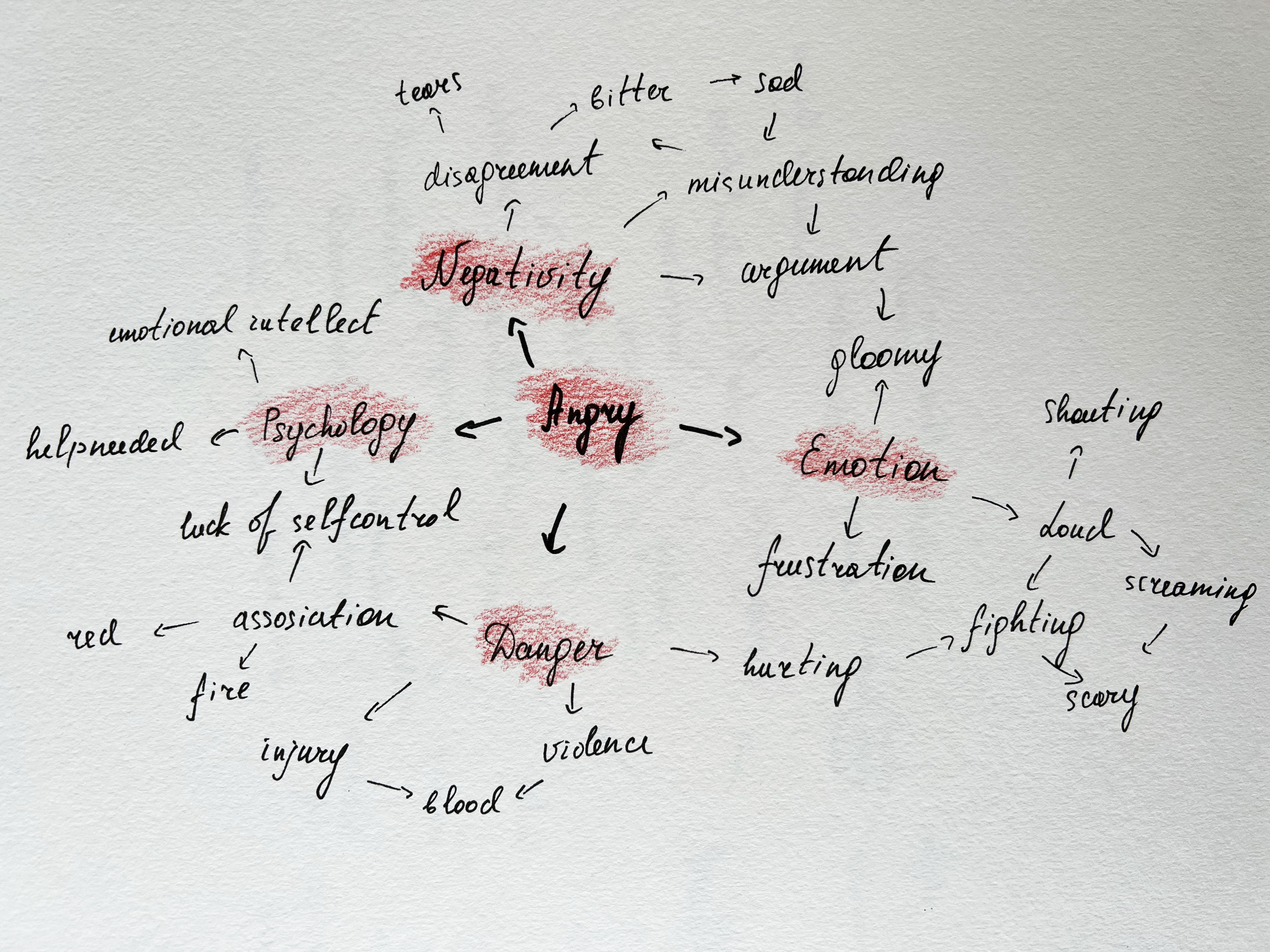
Create a spider diagram for each of these words: Seaside Childhood Angry Festival.
Try to remember your own experiences of these things even if you have only experienced them through TV, film or photos. Include a list of objects you associate with each word: list colours, use adjectives, textures, and subjects. If you get stuck use a dictionary or thesaurus to open up your word. If you do a Google images search you will find a vast collection of other people’s visual interpretations of the words. Take a note of anything that surprised you, or anything that was an unexpected addition to the list.
Test your spider diagram with at least one other person – use a different colour for each person you interrogate and tick words that were common and include any additional words. If the ‘joint’ brainstorm leads you to generate further words, add these as a separate colour.
In your learning log make a note of: • Which word was most difficult for you to work with • The strategies that suited you best to come up with more words.
OCA Illustration
This is classical exercise about mind mapping and generating ideas for the future projects. Personally, I discovered spider diagrams during Core Concepts unit, and they helped me to develop one of the vital parts of projects planning. Brief, mind maps, and key words, are those components that help to conclude designs into the sketches and then into designs. In the beginning of my Level 1 I found mind maps quite challenging, as I didn’t know the formula how they are created, but after 3 years of the coursework they started to appear naturally in my projects.
Brainstorming and spider diagrams (mind maps) are working in companionship. Brainstorming helps us to release many possible ideas that go through them again to estimate their usefulness. Spider diagrams are one way to think around an idea, or brainstorm, and it is a strategy successfully employed within many commercial, non-artistic situations to consider multiple approaches.
These spider diagrams for the given words to research were quite interesting to discover, as they were based not on a commercial project, but our experiences and memories from the past. Words such as seaside and childhood were the easiest to find several association words, and also they were purely based on my expression of the past and present. Those diagrams can go for an endless time, but at the same time need to make sure that we can control essential words from insignificant ones. The most challenging was word angry to work with, as that is first of all emotion, and also negative emotion, and it’s quite challenging to go into the negative space of words association. I was surprised that I couldn’t extend my research for the word festival, as that is quite a happy event, and it’s full of energy and versatility. With a bit of effort, it can be tens of times more significant, as the meaning of the festival is quite expansive.
Identify a piece of work by an illustrator whose work you find some connection with. You might, for example, choose a particular illustration because you admire its conceptual or narrative dimension. Now try to write the brief for the illustration you’ve chosen. Starting from the context in which the illustration is positioned, write the brief which would have led to the creation of the image. Direct the illustrator in terms of what content should be included. If the context has text, identify the connection between the image and the written content. Advise the illustrator about the role the image will perform. Consider whether it is extending the meaning of the text, decorating, informing or educating and potential ways this can be achieved. What colours? What flavour? Be clear about who you think the intended audience or the illustration is. Briefly indicate which stylistic aspects you admire. Describe the effects that you would like to see in the image, which aspects of distortion, and what use of tools and materials is appropriate to the idea.
OCA Illustration
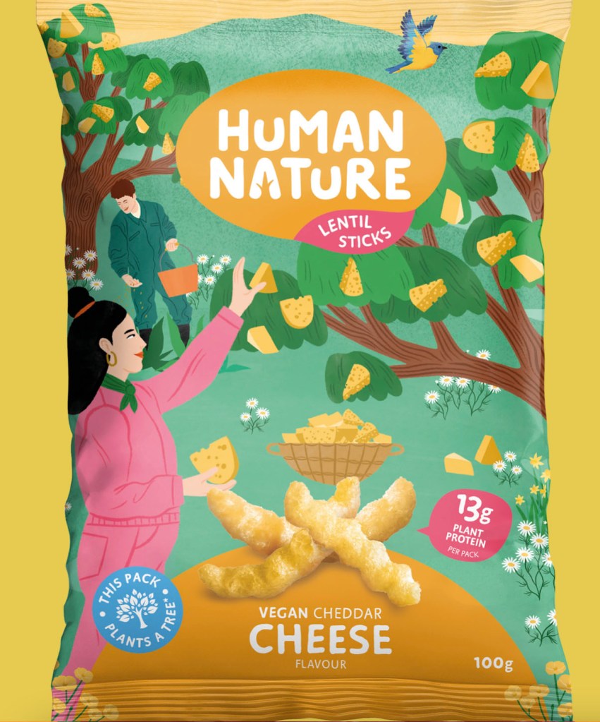
IllustratorBodil Jane
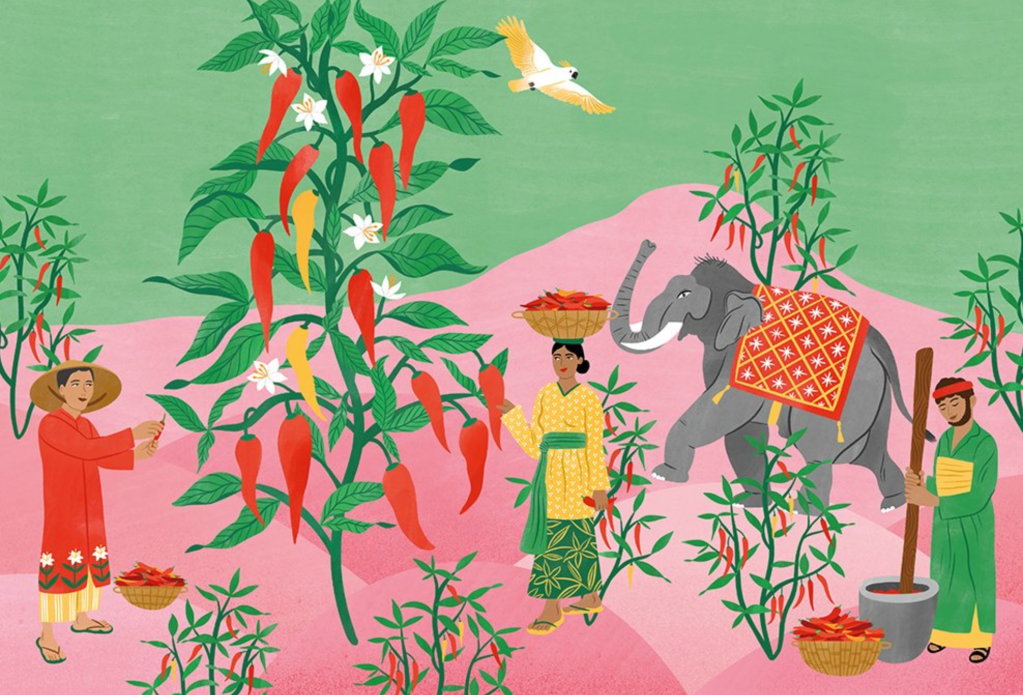
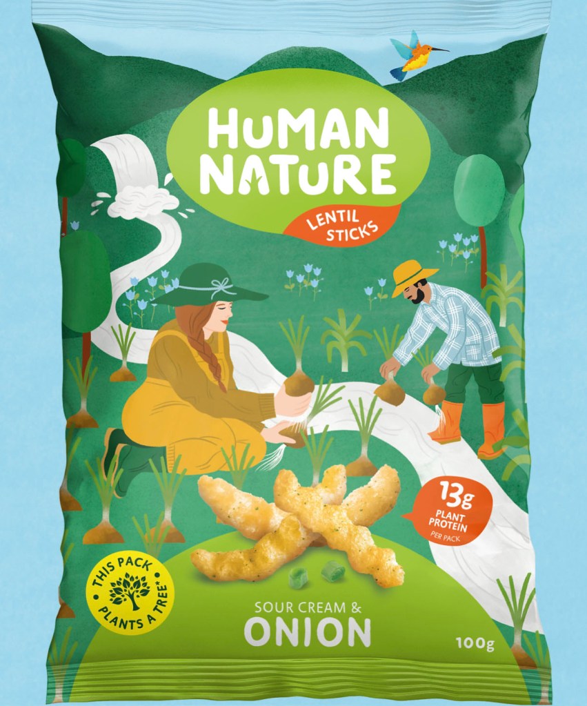
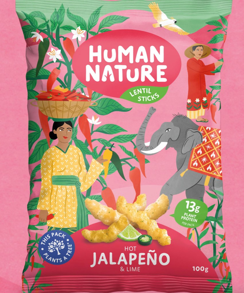
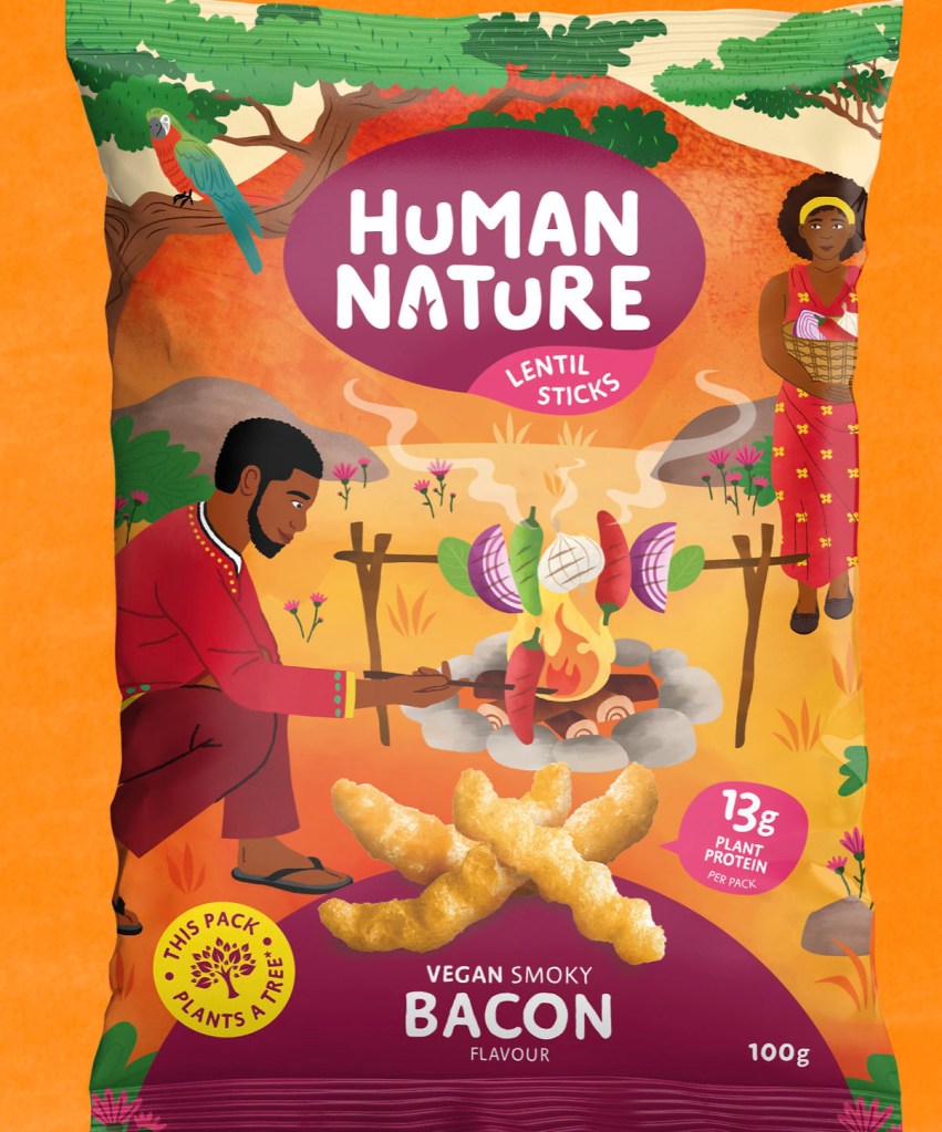
For this exercise, I researched modern illustrators and their roles in marketing campaigns for the most influential companies around the world, such as Nike, Harper’s Bazaar, Prada, Apple, The New Yorker and many others. I’ve discovered new names for famous illustrators, such as Jean Jullien, Bodil Jane, Sebastian Curi, Bijou Karman and some others. Their works are vibrant, lively, and full of energy and passion. I thought to consider examining close works of Amsterdam illustrator Bodil Jane, who has become renowned for her colourful portraits of “real” women, and her kind and friendly characters we can all relate to.
Bodil Jane’s works are often female-focused, featuring characters that are approachable. Some viewers even comment that they see themselves in her work, the way you’d recognise an old friend. Around these characters, Bodil builds a delicate level of detail through ornaments. For inspiration illustrators regularly visit busy environments such as flea markets or botanical gardens.
The Brief
After examining some of Bodil Jane’s illustrations I wanted to talk about the brief for the Human Nature project, that the artist produced in 2021.
Design four illustrations for the packaging of Human Nature plant-based lentil crisps. The British brand Human Nature is committing to be a net positive climate footprint and plants a tree for every pack sold. Four illustrations for the lentil crisps packs should work together and have a continuous and recognisable style across them all to create brand awareness. Designs should represent our main mission to make delicious, healthier plant based-foods that support social & environmental causes which look after our planet.
Why the client wants the illustration – what do they want it to achieve?
We plant trees on your behalf thanks to the purchase of our goods. We handle the digging, sowing of the seeds, watering and even the tree-hugging. The brand’s message to the audience is to choose us and empower disadvantaged communities to grow new forests worldwide! The product contains natural ingredients including vegetables seeds & pulses, like red lentils. The company wants to increase sales with their bright and vibrant illustrations, with happy couples on each of them, for the good of the planet. Our products are environmentally friendly, palm oil free, good for health, and contain fibre, and 50% more protein.
Who is your target audience?
The target audience is young people of any gender, who are altruistic, care for the environment and planet, students who prefer healthier nutritious snacks, and are willing to make some changes for the planet.
Where it will be reproduced and at what size
The artwork will be used on the packaging and printed across the pack, so the main image should be positioned in the centre of the composition and go around the back of the pack. The designer should be familiar with the requirements of the printing on the packaging and be aware of the technologies and type of printing on the foil package. Even though the packaging is a standard size, approx. 12×19 centimetres, each package contains 100 grams of product, illustrations should be represented in vector, preferable Adobe Illustrator format.
Whether there are any restrictions as to colours you can use
Each illustration should evolve around four colours represented by the chosen logo in each flavoured pack, like lime green for the onion flavour, raspberry pink for the hot jalapeño and lime crisps, burgundy colour for the bacon taste flavour, and sand orange for the vegan cheese flavour. The colours of the illustrations should be bright but at the same time natural for the eye, such as green for plants, red for fresh fruits and vegetables, and orange for the South American desert. Also, the outfits for the characters should represent traditional colours for the unique national clothes.
Whether it will stand alone or be used with text: if you are to include any words or if you need to leave spaces anywhere for text
On the front cover should be represented the brand logo Human Nature, which should be positioned in the centre of the pack, the additional information on the package should contain the flavour of the lentil sticks, grams of the products, and another valuable point that it should be placed the sticker with the message that This pack plants a tree.
When they want to see the initial ideas, the visuals and the finished artwork
Considering the amount of work that should be done for the illustrations, I would say that the first drafts should be presented in 2 months, and then it should be given one month for alterations and adjustments. I think those designs were made in approximately 3-6 months’ time, from first drafts to the presented final designs on the packaging. Also, I would say to start work around autumn, so packages are ready for sale for the spring season, a time when plants are ready for planting, so the brand has an association with planting green trees with the first spring warmth.
In this first assignment, I was asked to introduce myself to a tutor through a ‘greeting card’. This is my chance to share my passions, what drives me, the materials that ignite my creativity, and my aspirations for what I hope to gain from this course.
First and foremost, I need to carefully consider what I want to convey and make sure to document the process in my learning log. These notes will provide insight into why I chose to depict what I did, the elements I included, and even those I left out. The artwork can take any form and size, using drawing or painting materials, collage, or digital production.
Research
This is the third unit I’m completing for my degree. I’ve noticed a pattern in the previous units where the first assignment involves sharing about ourselves, our personalities, or our interests. In the Core Concepts unit, I created three postcards about the country I was born in, my hobbies such as art and ballet, and my travels. While I felt my postcards were okay, they didn’t turn out exactly as I had envisioned. I did my best, but being new to the course, they looked a bit amateurish. For the Creative Book Design unit, I designed a fanzine about my passion for books, and luckily, it looked more professional. I view these initial assignments in each unit as personal projects, where we have the chance to express ourselves uniquely. However, these assignments are also quite challenging as they require self-exploration and the creation of our own path. I find it a bit daunting to talk about myself and highlight my valuable points, which is akin to self-analysis. Nonetheless, I’m determined to make this assignment enjoyable by implementing the ideas I have in my head to introduce myself, and I hope they will work out well for my project.
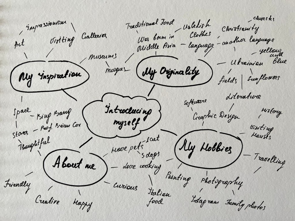
Mind Map
To begin this assignment, I first created a mind map focused on myself. Initially unsure about the direction for my project, I believed that the mind map would assist in generating ideas. As I explored the mind map, I began to identify potential solutions to incorporate into the design.
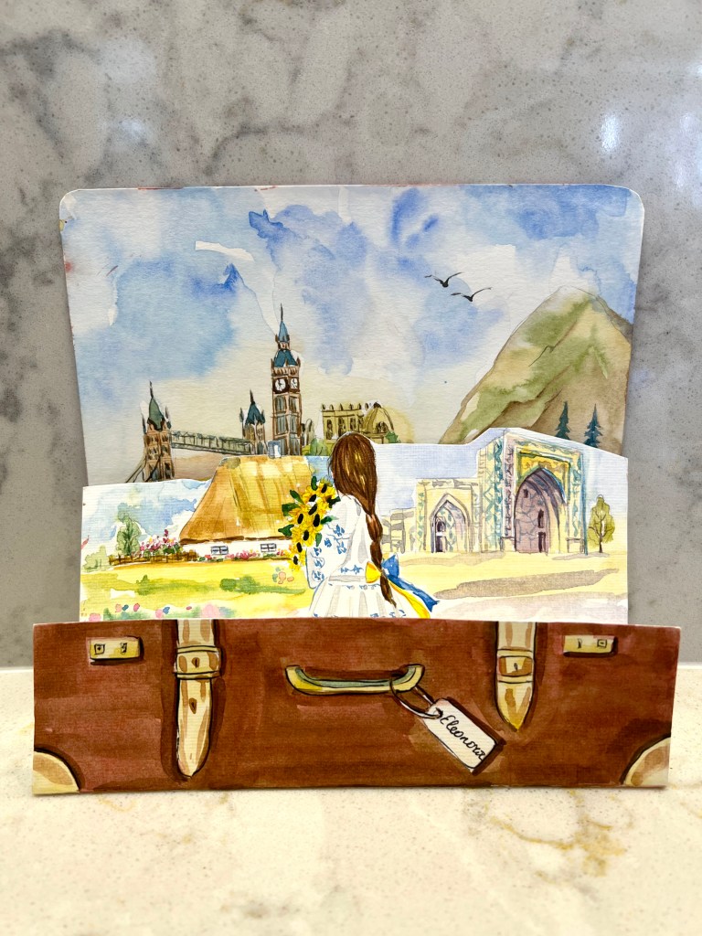
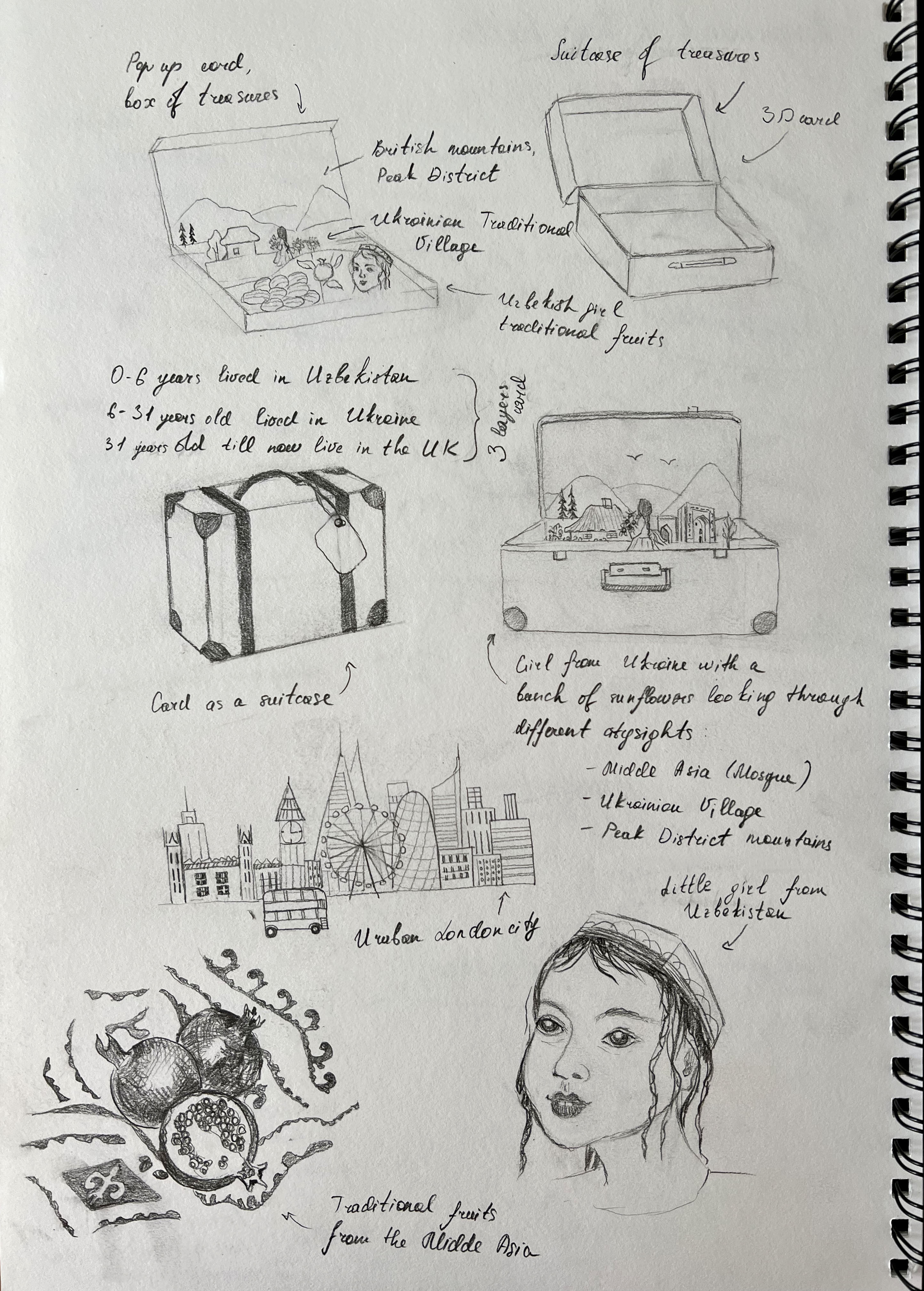
I consulted with my friend, who is an excellent creative director, and she suggested that I should create a card representing my multicultural background. I was thrilled to receive validation for my idea. Since I was born in Middle Asia, moved to Ukraine at the age of 6, lived there until I was 31, and then settled in the UK, I felt it would be meaningful to combine the different aspects of these places into one card. I identify with the cultures of these countries, having grown up surrounded by their unique features. For example, Uzbekistan with its distinctive language, history, traditional attire, mosques, and delicious summer fruits; Ukraine, where I spent most of my life, is known for its rich nature, including vast sunflower fields, the Dnipro river, city center churches, traditional clothing, and the Orthodox Religion; and the United Kingdom, where I currently reside and regularly explore new areas, such as London, museums, and the Peak District. I previously attempted a similar design for my first Core Concepts assignment but didn’t fully develop the idea. I aim to create a collage that encapsulates all these countries and truly reflects who I am as an individual. Below, I’ll outline some ideas for the card.
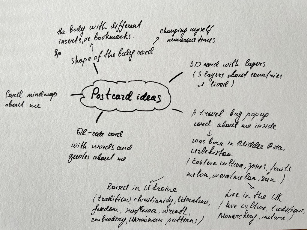
Card idea
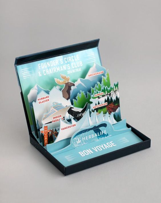
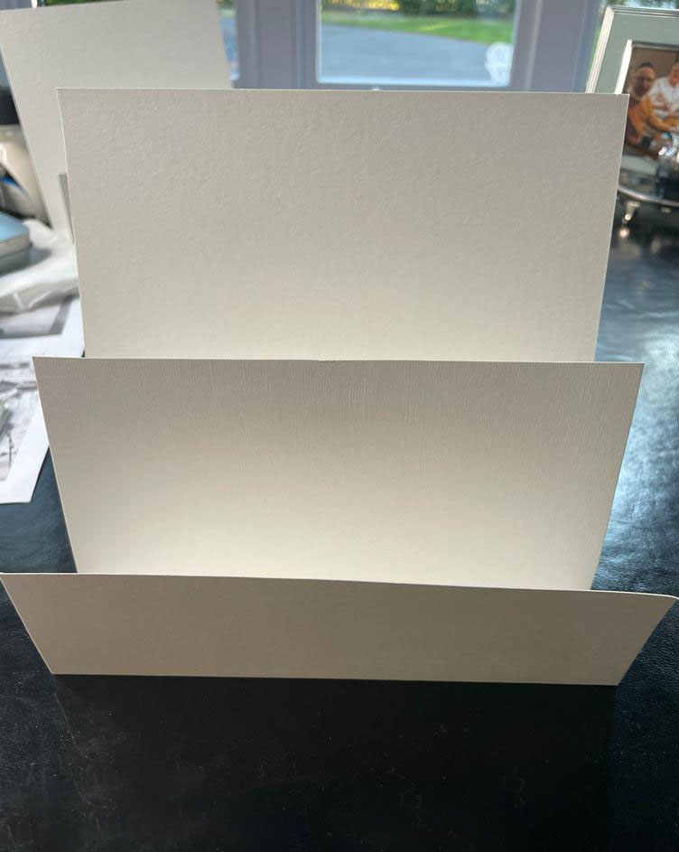
I’ve taken this card as an idea to play around with my pop-up card. I liked how complicated it was, with generous illustrations popping out of it, and was quite intriguing to examine this idea, I thought I can produce something based on this card, but probably not as multilayered, obviously, the amount of different images sticking out of it, the card becomes richer and more complicated, but I thought I will stick only to the few layers for my card.
Sketches
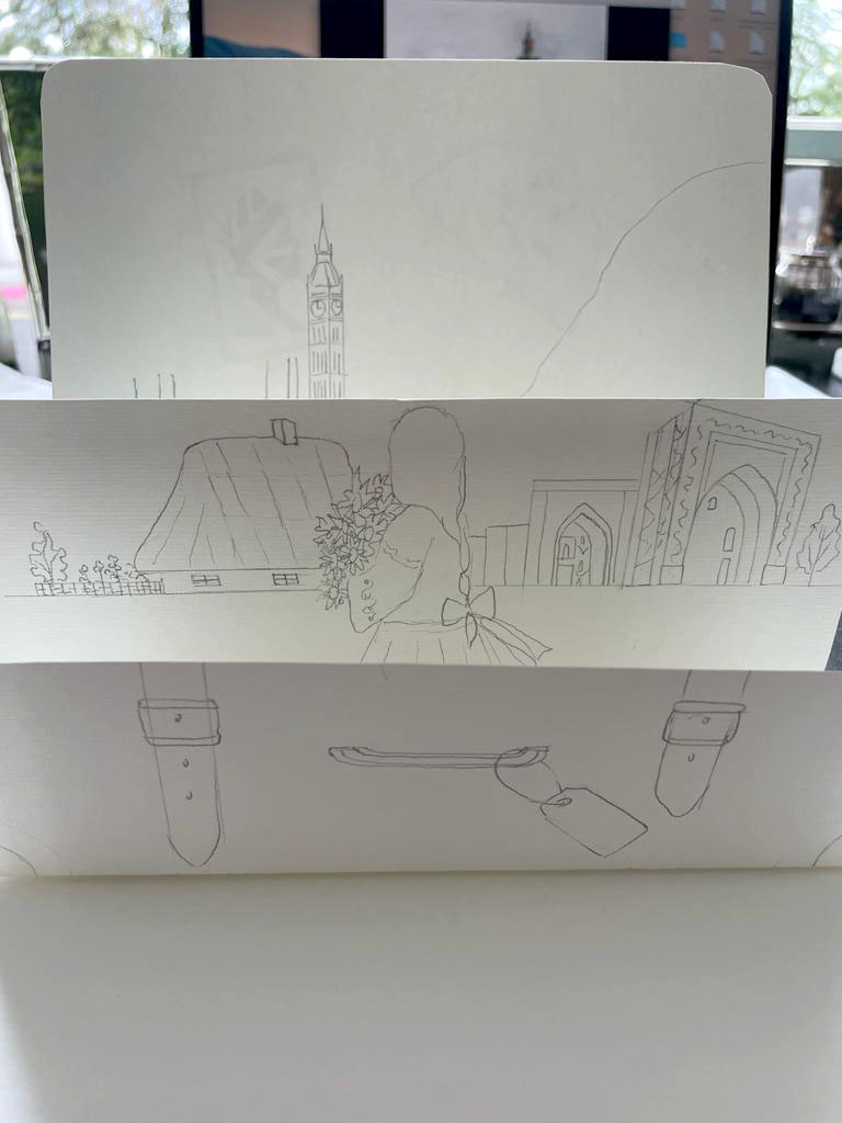
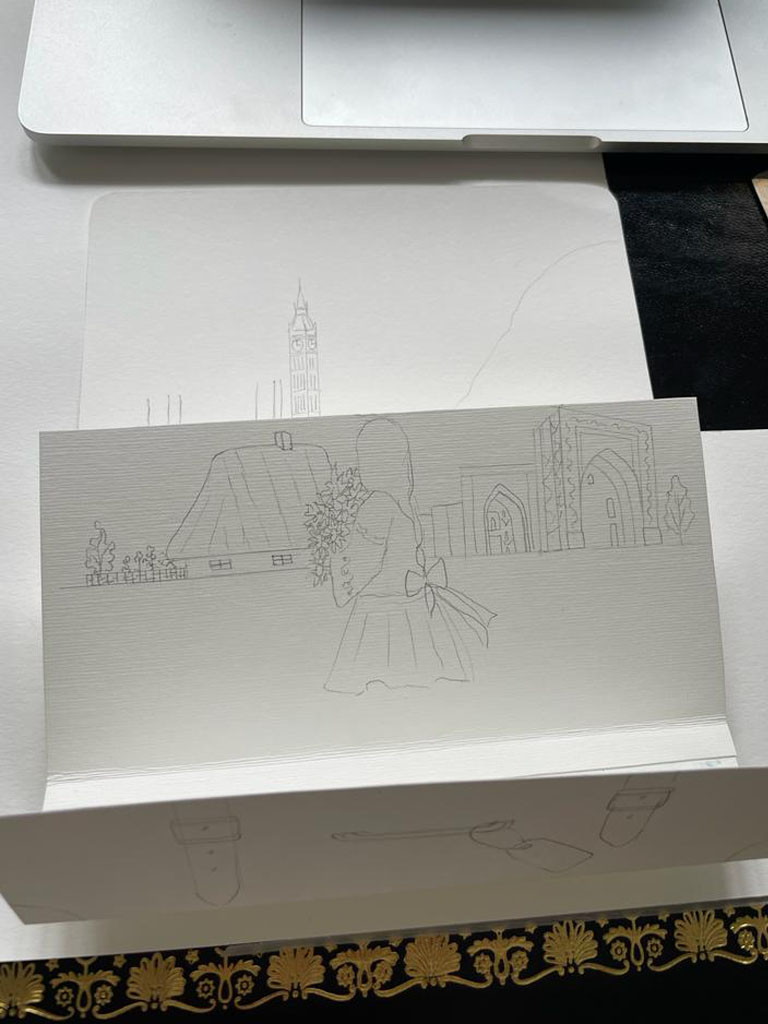
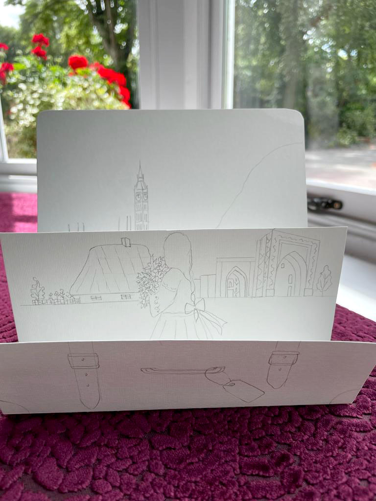
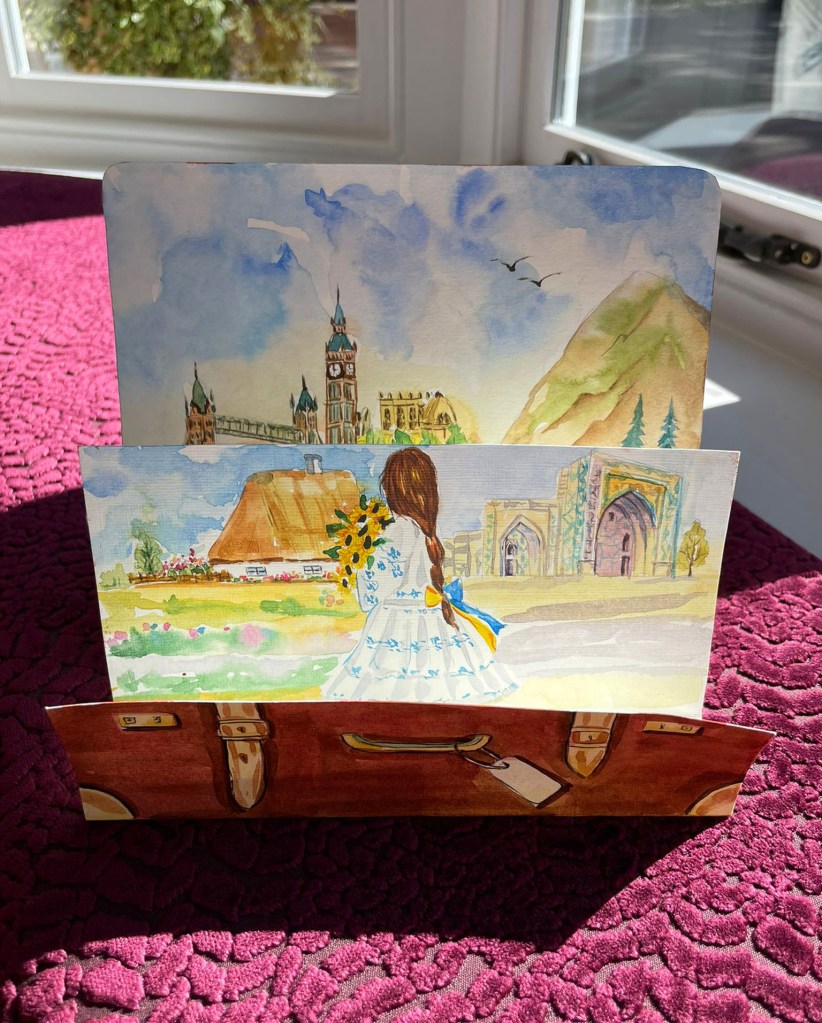
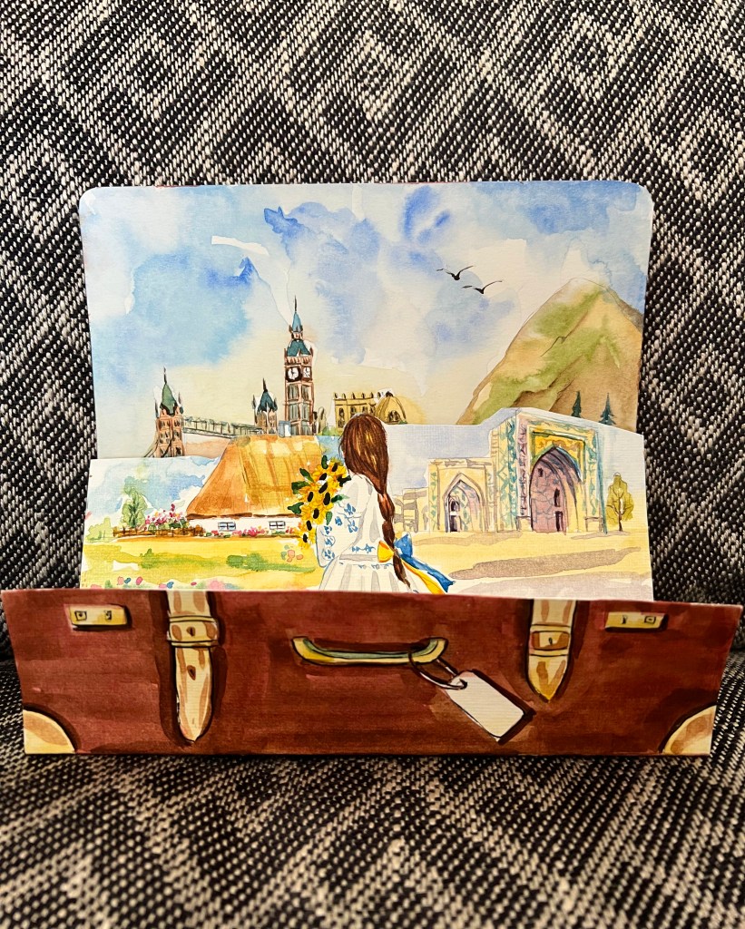
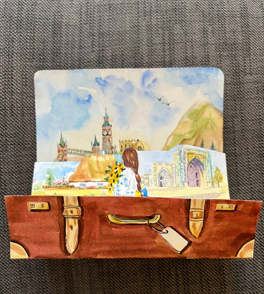
I have reached the stage of designing my card, and I have some sketches. I want to create a pop-up card in the shape of a suitcase, incorporating traditional features from the countries I’m from. The suitcase represents my life story and is significant to me. I have made notes next to each sketch. The main challenge is figuring out how to create the pop-up element. I am considering two options: making an actual suitcase and adding traditional features inside, or creating a foldable pop-up card that can stand on its own. I want to keep the design simple and focus on the illustrations. I am thinking of a card with three layers, representing Uzbekistan, Ukraine, and England. Each layer will showcase the landscapes and features that inspire me. The original ideas are presented below.
Card Mockup
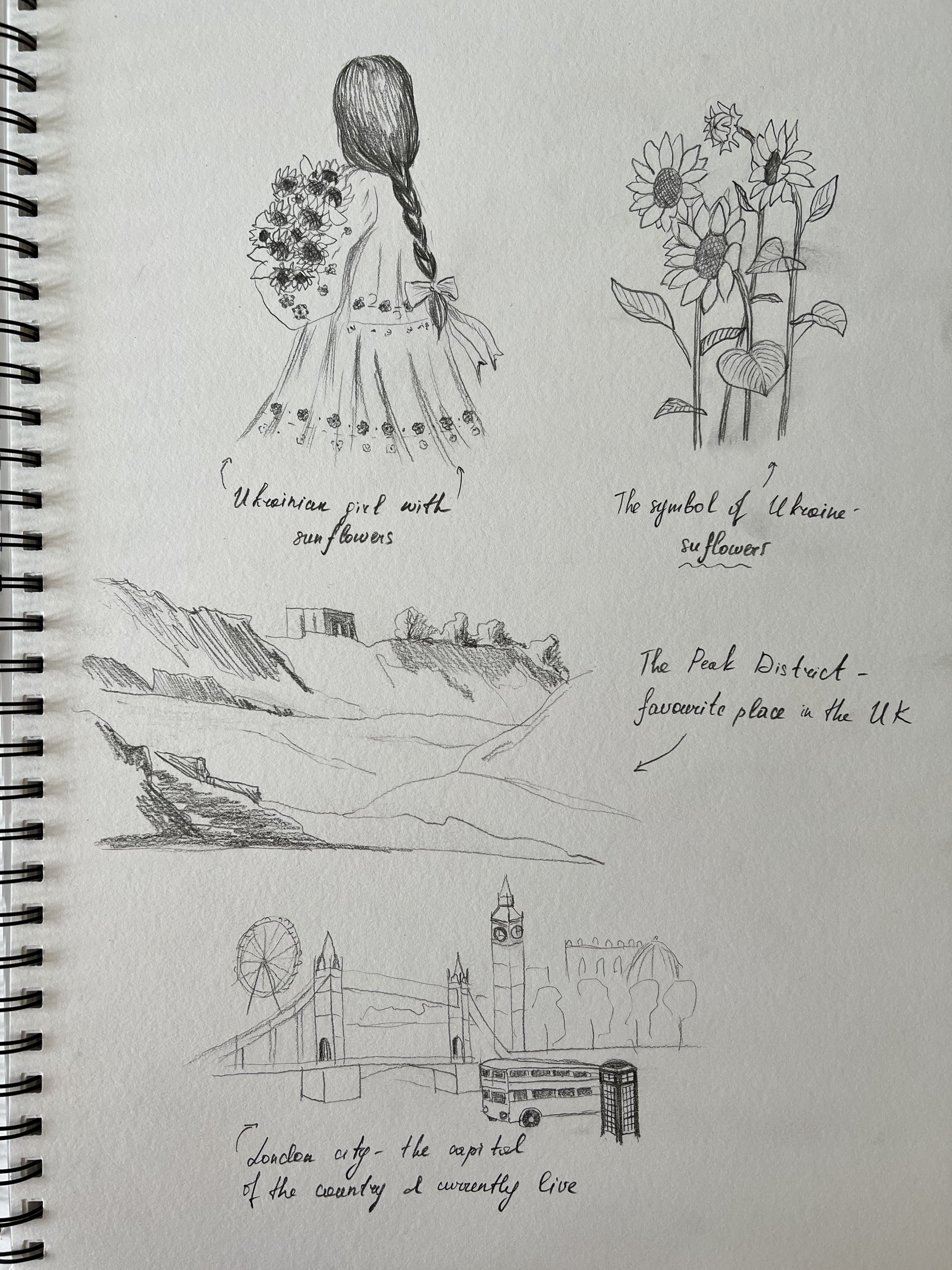
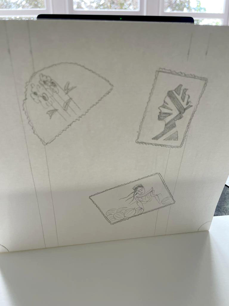
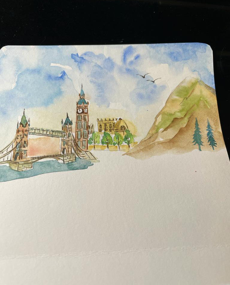
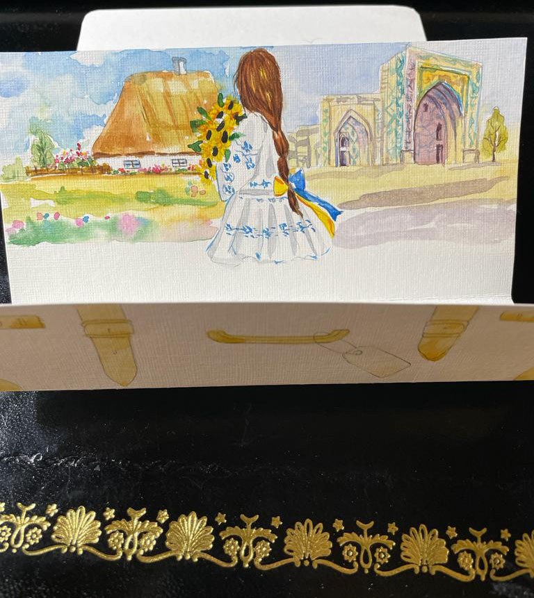
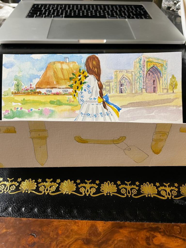
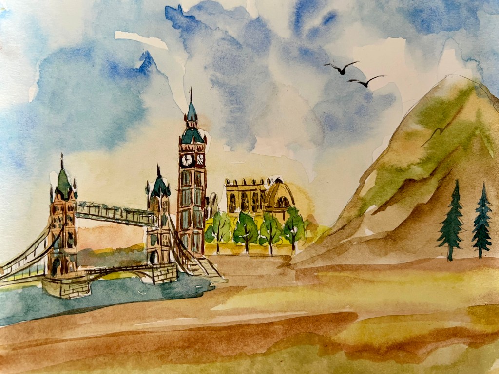
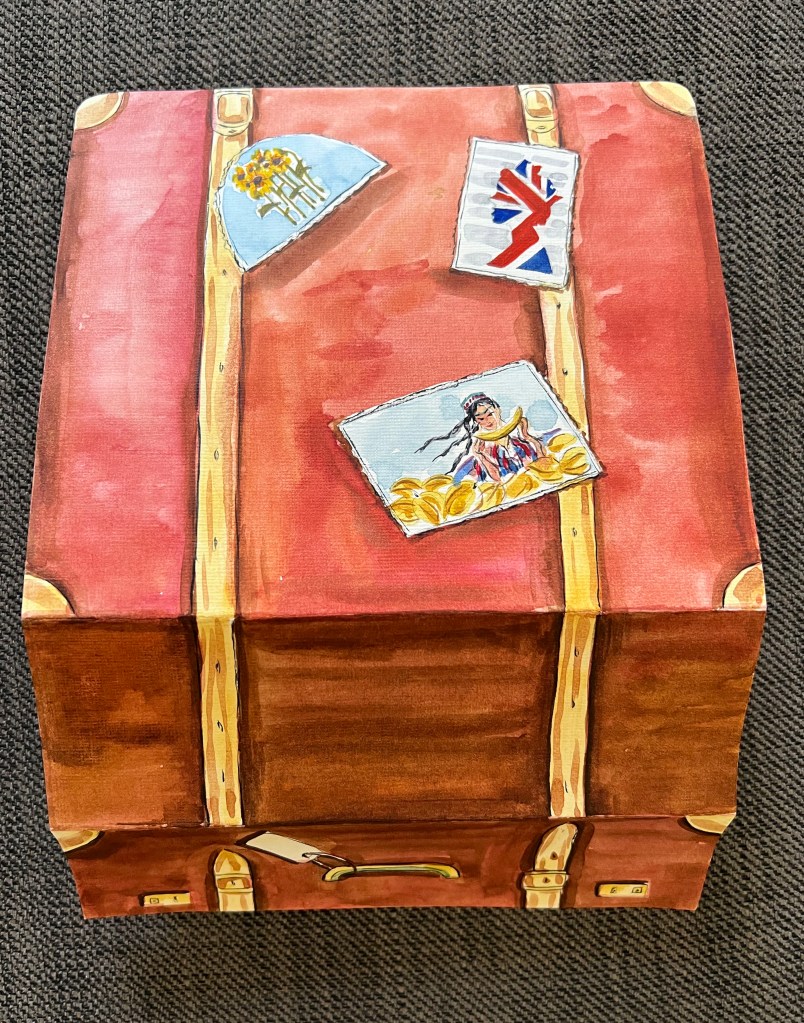
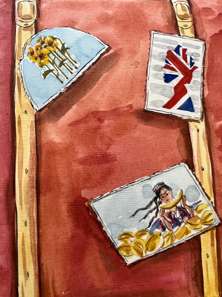
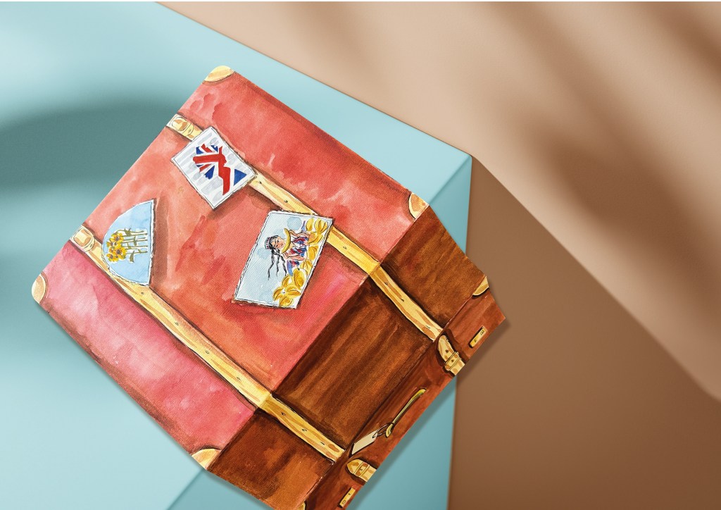
After generating card ideas I went to the next stage of designing the card. I created the body for the suitcase, which would be the base of the card from the outside. I stuck the sheet of paper in the middle, so I had three layers of card altogether. For the first layer, I was going to use the locker of the suitcase and hand, on the second layer I was going to design a Ukrainian girl who is looking ahead of her, through some traditional village of Ukraine, Uzbekistan Mosque in the city of Samarkand, and for the last layer, I was planning to place London city merged into the Peak District. That was an imaginative collage from me, with some features of countries that joined within me, and which are personal to me. I thought that the idea of the card is quite original and described me as a person. On the back of the suitcase, I placed three postal stamps, with original features from each country, like sunflowers from Ukraine, The Queen-like symbol of Monarchy from the UK, and a smiling Uzbek girl with sweet melons. Those images were joined into the vintage suitcase I’m carrying around me, if I could say, that suitcase symbolising my soul where I locked traditions and history of three different countries.
Card Design
I used natural watercolour shades for a colourful touch on the card. For the layer featuring Ukrainian traditional houses and the Samarkand Mosque, I mainly used yellow and sand colours, while I used colder shades with some blue and brown for the UK. The girl in the card represents me, holding a bunch of sunflowers as a symbol of happiness and hope, with yellow and blue ribbons in her hair, representing the traditional colours of Ukraine. The suitcase has a retro look, with some red and brown tints, reminiscent of vintage suitcases from the 80s, around the time when I was born.
I think the postcard turned out quite well. I loved the idea of the three-layer pop-up card, which best describes my multicultural background. The images are merged to show my admiration for different countries, their cultures, and traditions, shaping me as a person. This greeting card also showcases my love for creating original card shapes and forms, as well as my passion for traditional watercolour techniques. This assignment is just a small introduction to the course, and I’m glad I could demonstrate some of my skills. I hope I’ve taken the right direction, and I look forward to many new experiences and knowledge ahead.
In this exercise, I was asked to choose an editorial from a newspaper or magazine, and create an illustration for the text. To do so, I would need to read the article and highlight the keywords that dominating in the text. I need to highlight or underline keywords which in my opinion are important to convey the meaning of the piece overall. I was recommended to read the text a few times at least, as may find that my understanding of the text changes as I re-read it. I should aim for different variations of illustration, that would best describe the article I read.
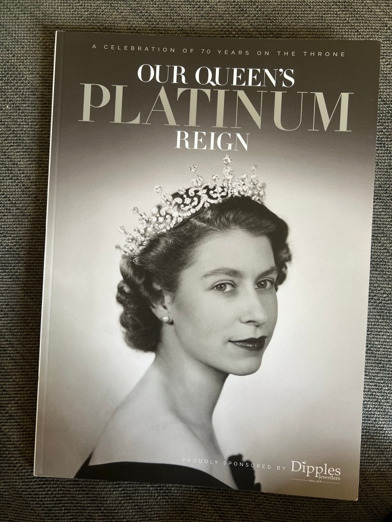
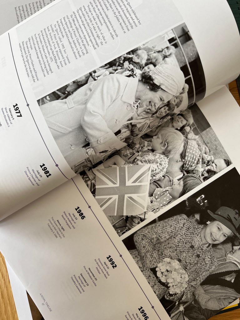
To start this task, I went to WHSmith to look for some magazines that I would be interested to work with. As my research was around the period of the Platinum Jubilee, all shelves were packed with different Royal magazines and newspapers. I saw it as a sign that would I need to create an illustration of one of the articles about Quen’s Reighn. I found it quite symbolic and inspiring, as that was such a rare occasion to celebrate the Monarchy Jubilee through the art.
On February 6, 2022, Queen Elizabeth II celebrated a record-breaking reign by becoming the first British monarch to reach a Platinum Jubilee. The whole nation has a plethora of reasons to rejoice in this historic milestone and express gratitude for her 70 years of service. The Queen has forged a commanding position in modern history through her royal duties, her position as head of the Windsor family and the way she touches so many lives through her speeches, public meetings and global renown. Her Majesty has also lived through tremendous changes around the world, seen highs and lows with personal elation and tragedy punctuated throughout.
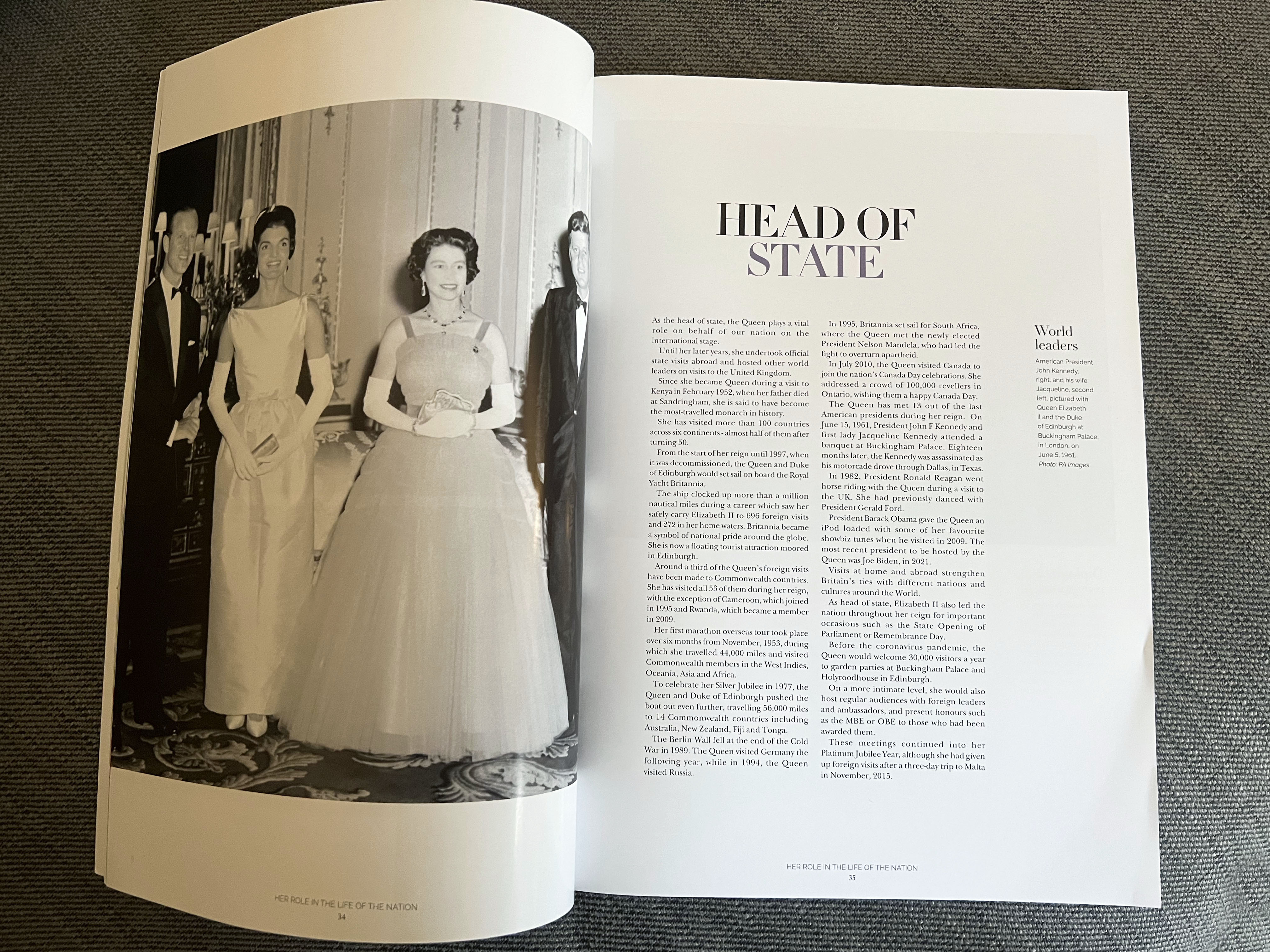
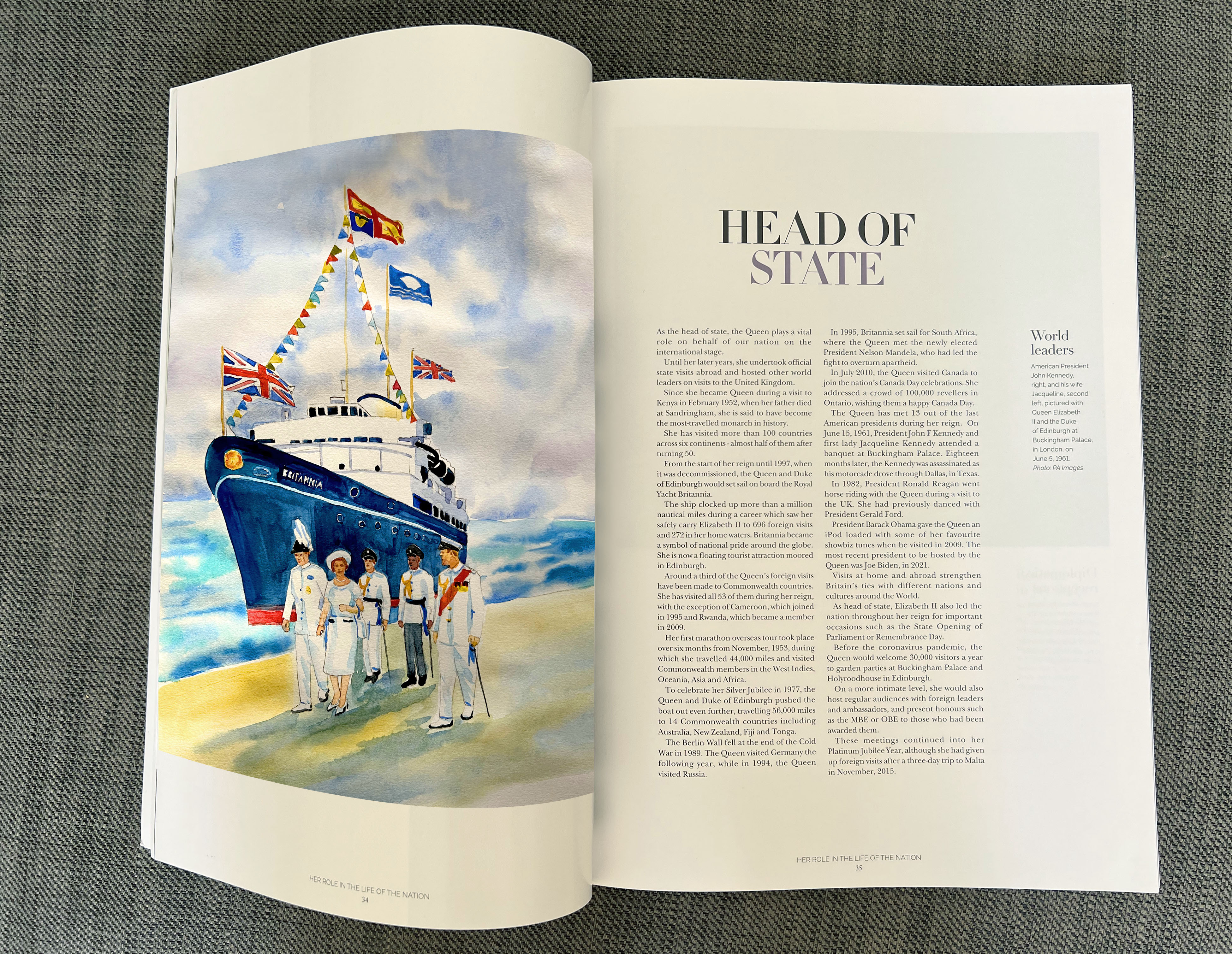
This magazine was filled with wonderful photos and stories from decades gone by, and I was inspired by some beautiful photographs and the history they preserved. In particular, I enjoyed the article called “Head of State” about the Queen’s travels around the world and meeting the most influential leaders.
A celebration of 79 years on the throne. Our Queen’s Platinum Reign. June 2022
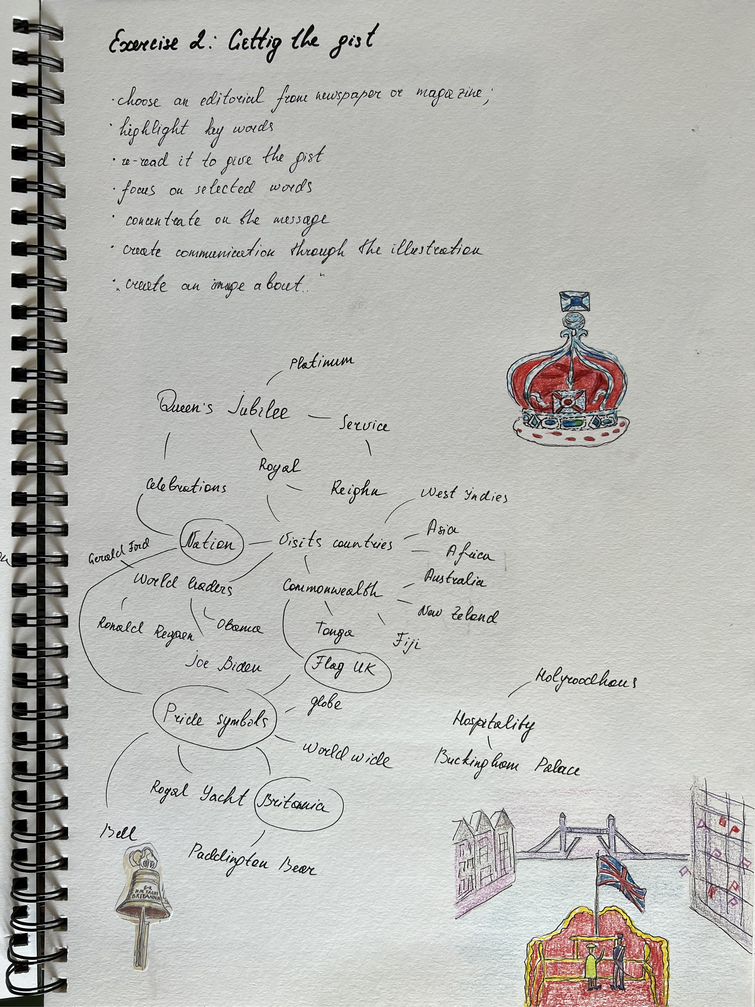
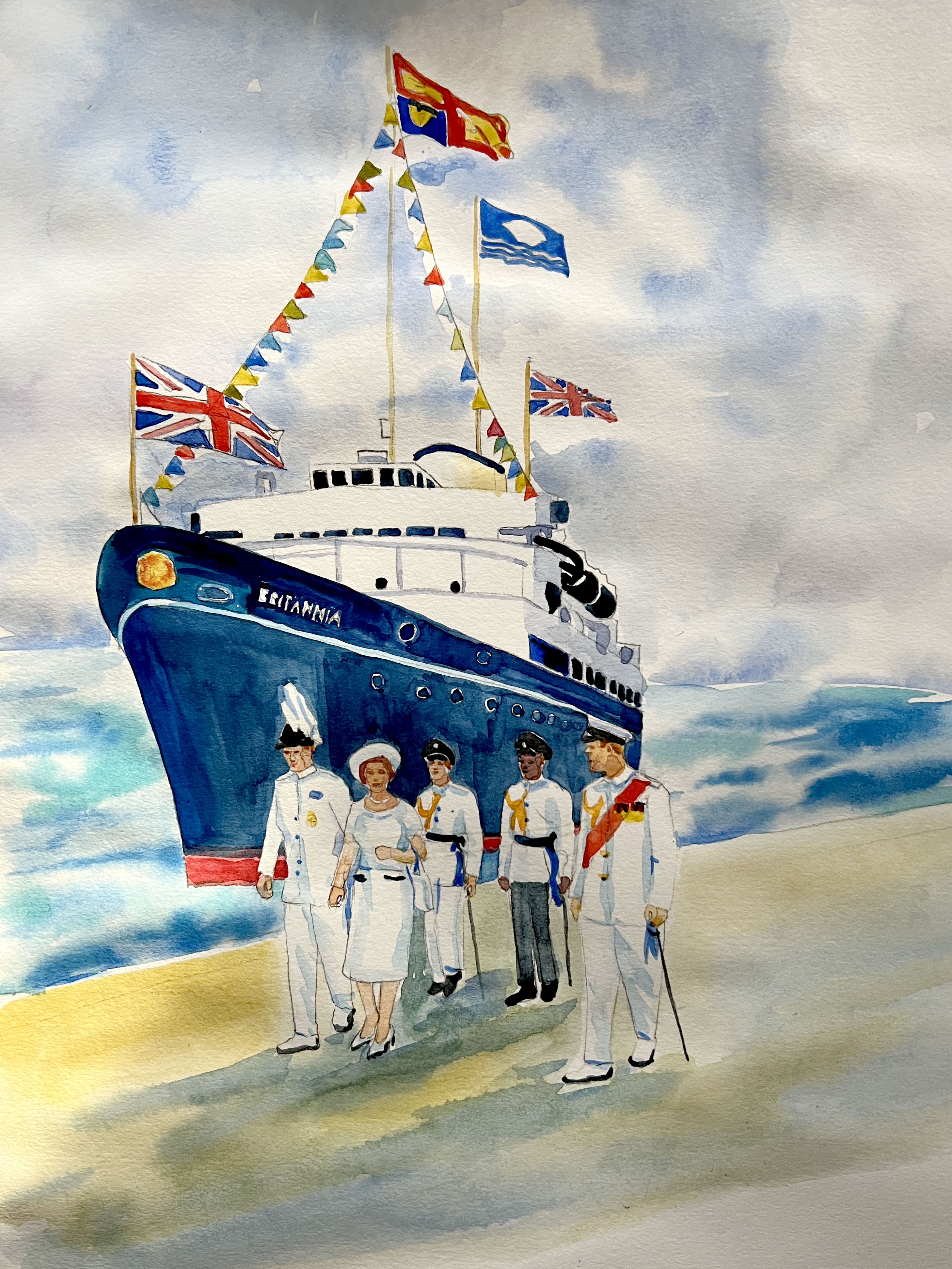
I scanned this article on my printer, that to highlight the keywords. As was predicted, after reading this article a few times I could open a new range of keywords. That article gave me the impression of the importance on the global level of the Queen’s visits abroad, and the role of the Royal Yacht Britannia, as a symbol of national pride in Britain and around the world. I felt that it was a fundamental part of establishing relationships with other countries, keeping ties with different nations around the world, and the gesture by the Queen of being recognised. As this magazine oriented around portraits, the original image showed Queen Elizabeth, the Duke of Edinburgh, and American President John Kennedy with his wife Jacqueline.
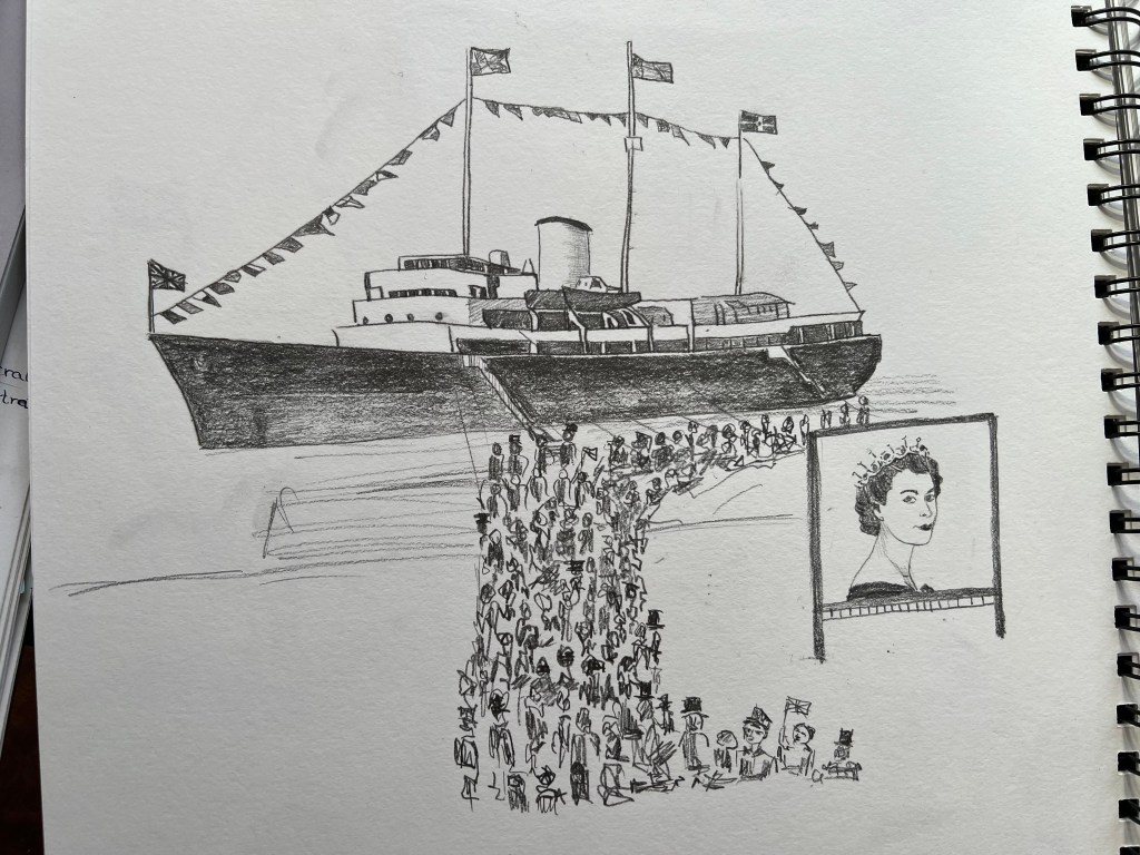
When I read this article, I imagined a prominent and prestigious Royal Yacht Britannia, surrounded by crowds of people, that are happy to meet their Queen. I thought that would be a great illustration to match the theme of the magazine article.
Pinterest Mood Board
Here I created a quick Pinterest Mood Board with some illustrations relating to the Queen and London. That helped me to create a vision of illustration I was going to sketch. I thought to use couple of medias in my final illustrations, such as watercolour and black pen on the top. I wanted to follow example of the traditional British illustrator we went through in the first exercises, such as
Here I created a quick Pinterest Mood Board with some illustrations relating to the Queen and London. That helped me to create a vision of illustration I was going to sketch. I thought to use couple of medias in my final illustrations, such as watercolour and black pen on the top. I wanted to follow example of the traditional British illustrators we went through in the first exercises, such as Edward Ardizzone and Edward Bawden, I liked their approach in illustration, of classical sketch with some sharp pencil strokes on the top of it.
Mind Map
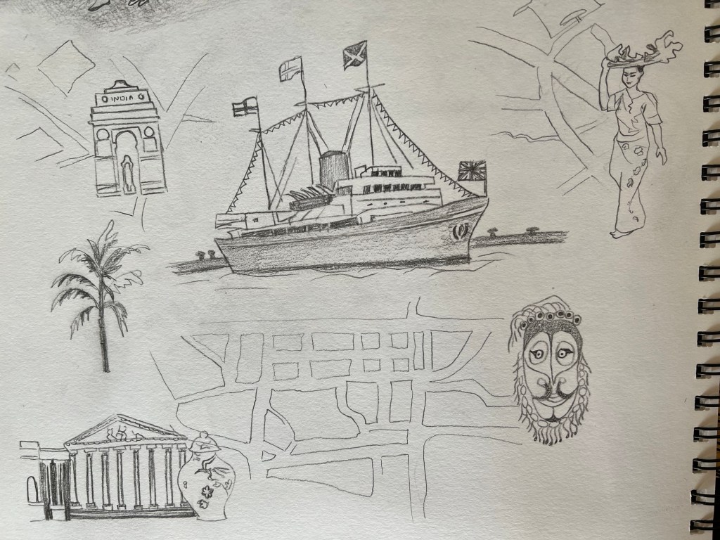
The article was oriented around two important messages, the Queen meeting people around the world travelling by Yacht, and greating 13 out of the last American Presidents. I created this mind map to specify key elements to concentrate my sketches around. I was thinking of creating two concepts, a realistic image of the Yacht accompanied by Queen, and creating the collage with the Britannia combined with traditional British symbols. I wanted to try different positions of the collage, to create a flat view from the top, kind of locating illustration on the map, and go for the image from the angle, the Queen walking alongside the Yacht. Also, I thought about showing traditional features from around the world and a Yacht going through it.
Mind map with the brief is below.
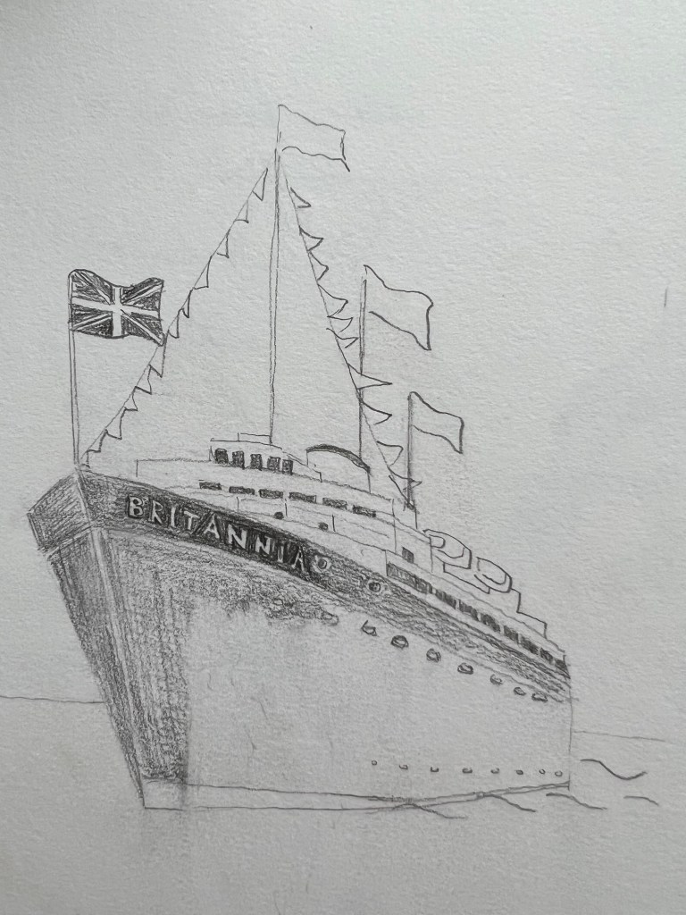
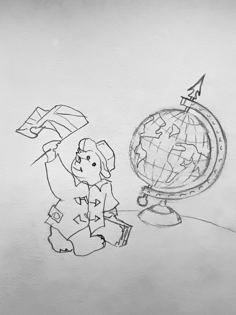
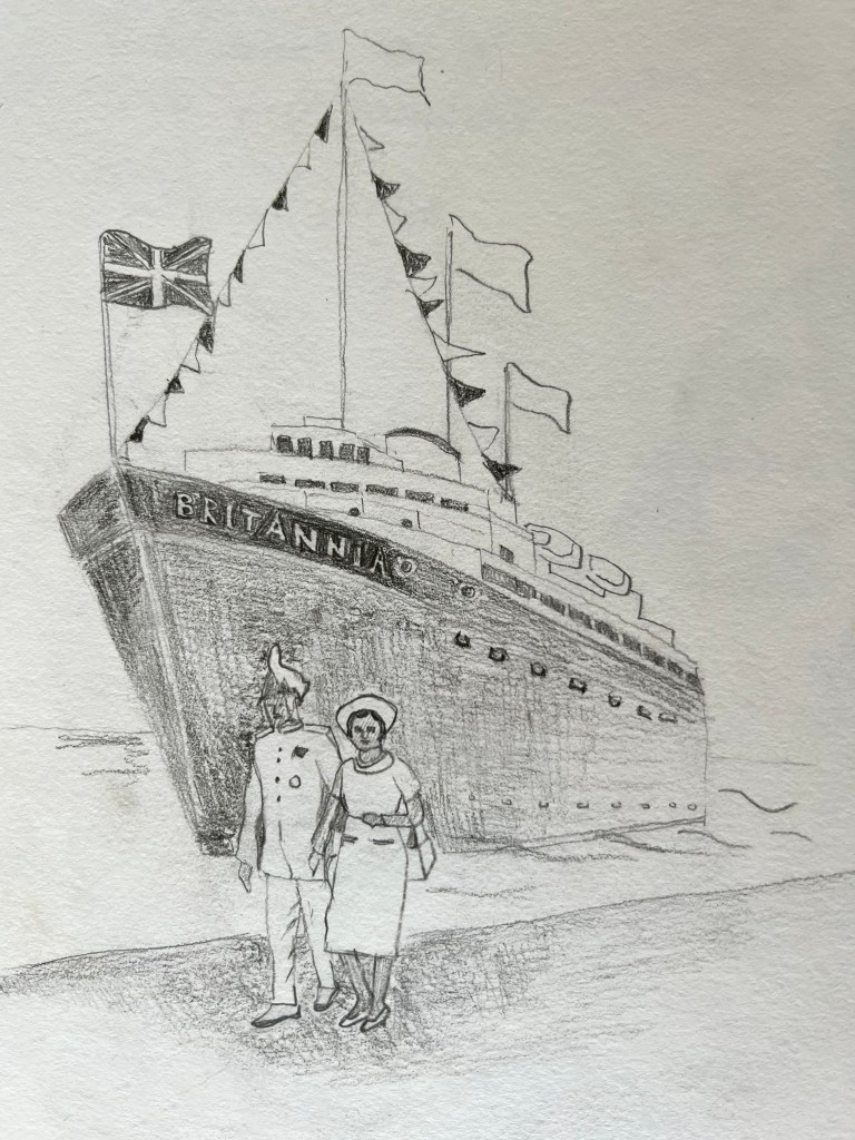
Specifying keywords and themes for the article, helped me to establish the vision of the future illustration. As I mentioned before, I wanted to try the different positions of the images, to see which one will work best for the format of the article. I started drawing the ship Britannia, solemnly moored by the coast. In this illustration, I had the boat itself in the background, and the Queen accompanied by the commander in the foreground. I wanted to depict the importance of the ship, and show it as a crucial part of the history and nation’s pride, that angle of the boat and flags around it helped me to reflect its greatness and significance. I was thinking to add Paddington Bear into the illustration, but then I thought that I wanted to keep a serious mood for the illustration.
Also, I tried to create a collage with some maps, roads and different nations around the boat, as a symbol of meeting and greeting new cultures. That could be quite a good composition as well, but probably more suitable for the travel magazine, where mine was a history of the Queen’s Reign.
Illustration of the Paddington Bear
Another idea I had, was to portray three important components, that would possibly match the context of the article:
Royal Yacht Britannia
A crowd meeting the Queen
A portrait of the young Queen with the banner next to it
I wanted to show the excitement of the crowd near the boat, like a big celebrations with Royal Yacht Britannia as a main point. For this illustration I was inspired by Edward Bawden’s works from “The Showboat at Baghdad” painted in 1944. I thought, as a sketch it the illustration had some great ideas, and it would look great with some watercolour painting, and some pen sketch on the top of it.
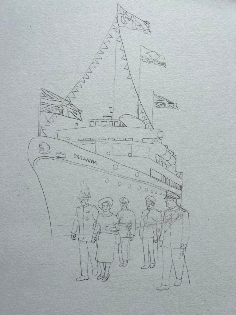
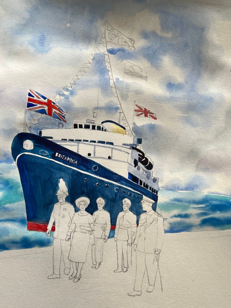
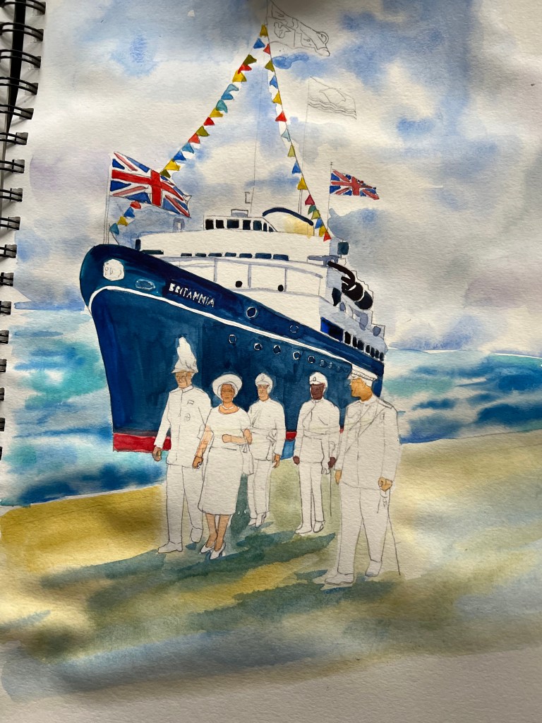
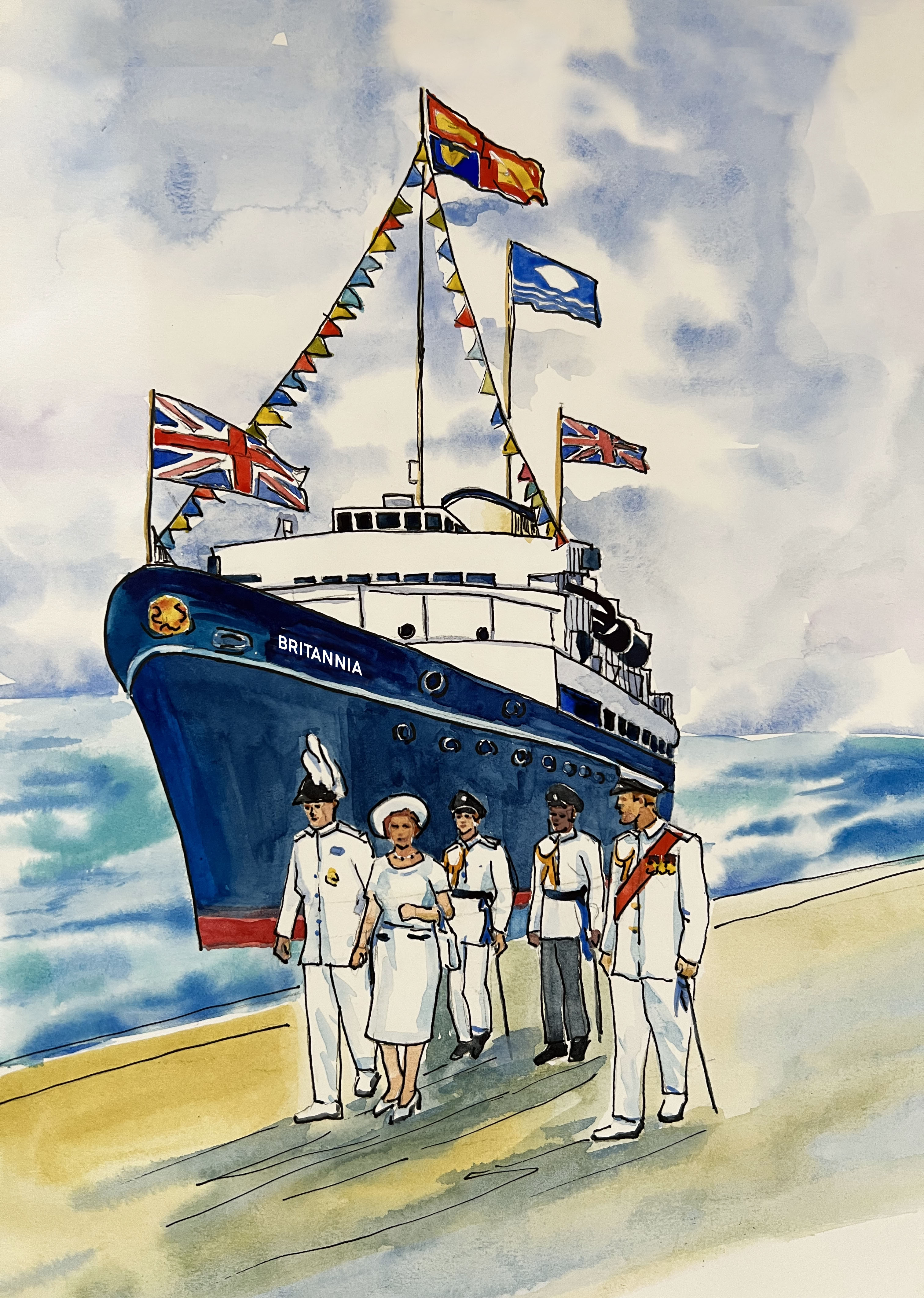
I compared all illustrations I’ve designed, I was hesitating between a few, but I have chosen an illustration I was going to perfect. I decided to go for the boat Britannia on an angle, with the Queen accompanied by her retinue. I added some more people around her, compared to the first sketch, which gave the composition a more complete look. For the illustration, I used traditional realistic colours, dominating blue, red and white. The painting itself looked very natural and light had a nice festive spirit and those colourful bunting and big British flags around the boat gave the ceremonial and traditional feeling of the whole event.
Final Illustration for the article “Head of State“
In addition, I made an option with a black outline around the painting, to highlight some details. Opinions between those two were equal, I liked the natural illustration with simple watercolour in it and a slightly sharper look with a black pen as well. But when I did a quick mockup for the article, I decided to keep the design without an outline. Also, I liked the format of the painting, which was vertical, matching the exciting photograph, so I placed the illustration on the left side of the spread with some white borders on the bottom and the top.
In conclusion, I would like to say, that I enjoyed this exercise and particularly the freedom to choose the topic for it. I think, that I met the brief, I sketched a few ideas for the article, knowing what kind of illustration I wanted to go for. I can see that my illustrations are quite realistic and artistic, maybe would be great to develop some additional skills and techniques for this course. I’m looking forward to the first assignment and introducing myself to the tutor.
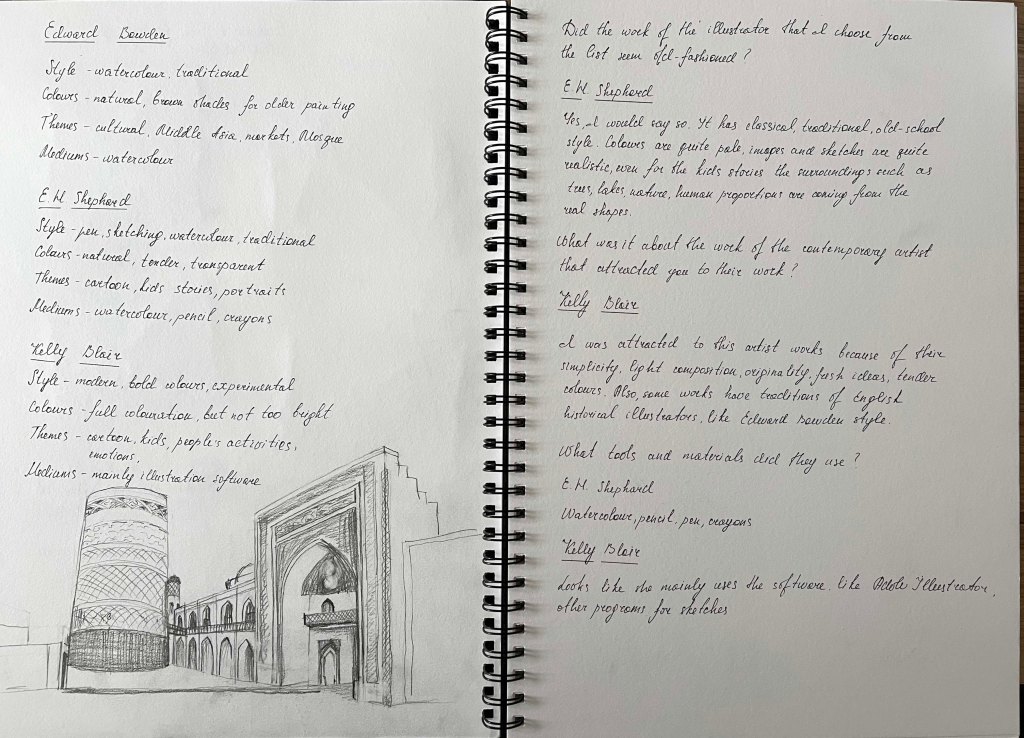
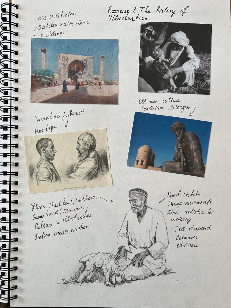
In this exercise, I was asked to explore how illustration has evolved over the past 50 years. I should start the exercise by familiarizing myself with one of the following artists: Edward Bawden, Kathleen Hale, Eric Ravilious Edward Ardizzone, John Minton, E. H. Shephard Then using books and the internet, find out about these artists’ work and the cultural context in which they created their most significant works. Also, I need to think about the modern illustrator I am inspired by. The final goal is to explore and identify the differences in style, context, production and imagery between the two illustrators. In the end, I will have to paint an illustration in the style of each artist, by choosing a similar subject and using a similar approach.
Research
To begin my very first exercise for the Key Steps in Illustration, I decided to do a brief research on all of the artists mentioned above. As illustration is a new field for me, I felt that is vital to do as much as possible exploration in the list of remarkable artists. Also, my personal feeling is that it’s vital to get to know the illustration in history, be able to track the significant changes in illustration development, its influence on modern-day art, In addition, to have a feel for the favourite artists, and what makes them distinctive to me. I wanted to go briefly through each artist mentioned above.
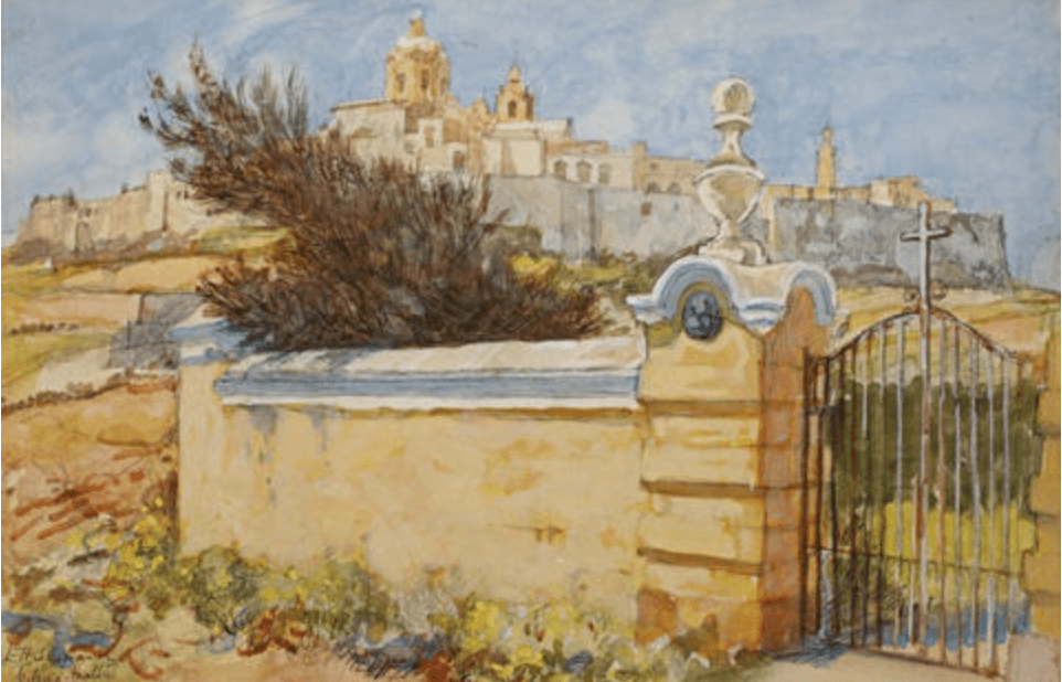
Edward Bawden
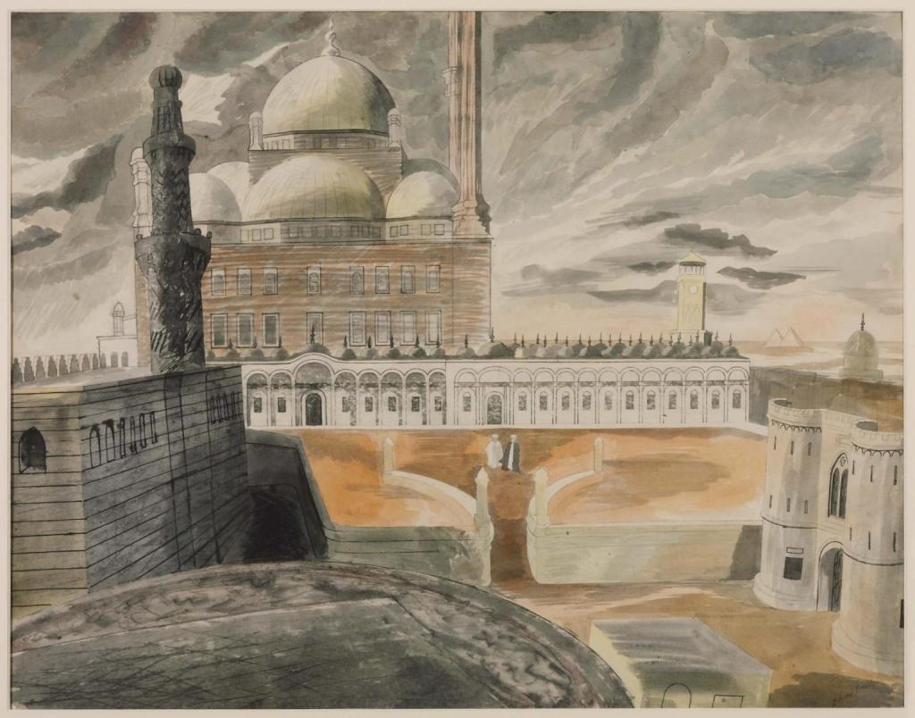
Edward Bawden was an English painter, illustrator and graphic artist, known for his prints, book covers, posters, and garden metalwork furniture. Bawden taught at the Royal College of Art, where he had been a student, worked as a commercial artist and served as a war artist in World War II. He was a fine watercolour painter but worked in many different media. He illustrated several books and painted murals in both the 1930s and 1960s. He was admired by Edward Gorey, David Gentleman and other graphic artists, and his work and career are often associated with that of his contemporary Eric Ravilious.
For this artist’s works, I could see traditions of watercolour paintings. Artist used calm, sand shades colours, with a dash of cartoon style. Some of his later works had sharper lines and had features of designing by the modern days’ software. I loved the feeling of this artist’s works, they brought a sense of nostalgia, and they reminded my early ages when I first time learned watercolours and painting.
Smithfield Market 1967 Edward Bawden 1903-1989 Presented by Curwen Studio through the Institute of Contemporary Prints 1975 http://www.tate.org.uk/art/work/P06024Cairo, the Citadel: Mohammed Ali Mosque c.1941 Edward Bawden 1903-1989 Presented by the War Artists Advisory Committee 1946 http://www.tate.org.uk/art/work/N05677Leadenhall Market 1967 Edward Bawden 1903-1989 Presented by Curwen Studio through the Institute of Contemporary Prints 1975 http://www.tate.org.uk/art/work/P06023(Assessed 25/05/2022)
His notable surviving public works include a tile depicting a foot ferry on the River Lea, commissioned by London Underground and located on the Victoria line platform at Tottenham Hale tube station. Bawden also produced the cameo-like silhouette of Queen Victoria located at Victoria tube station.
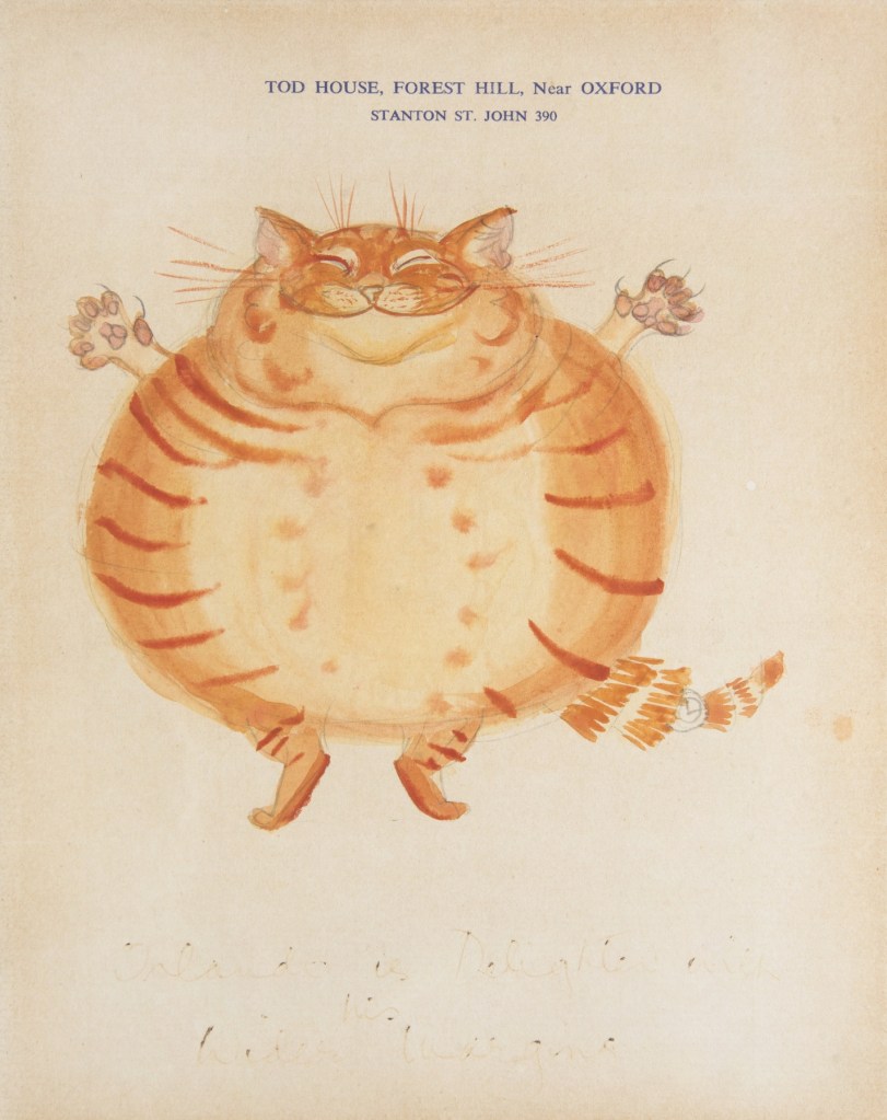
Precocious and versatile, Kathleen Hale established herself as a member of the artistic circle of Fitzrovia while still in her twenties. However, it was marriage and motherhood that engendered her most immortal creation, Orlando the Marmalade Cat, and his adventures – which were first told to her sons as bedtime stories. The artwork and its reproduction for the first published stories set a new standard for children’s illustrated books when they appeared in 1938.
Kathleen Hale was born on 24 May 1898 in Broughton, near Biggar, Lanarkshire, Scotland, where her parents had a holiday home. She was brought up in a select suburb of Manchester until the death of her father, a travelling agent for Chappell pianos when she was five years old. Her mother then took over her husband’s job, settling Hale and her brother with relatives.
From the age of nine, she was educated at Manchester High School for Girls. During her last year there, she was sent twice a week to life drawing classes at the Manchester School of Art. She won a scholarship to study art at Reading University, where she studied under Allen William Seaby (1915-17). The college farm of the university gave her many first-hand experiences of animals, and these influenced her later work as an illustrator.
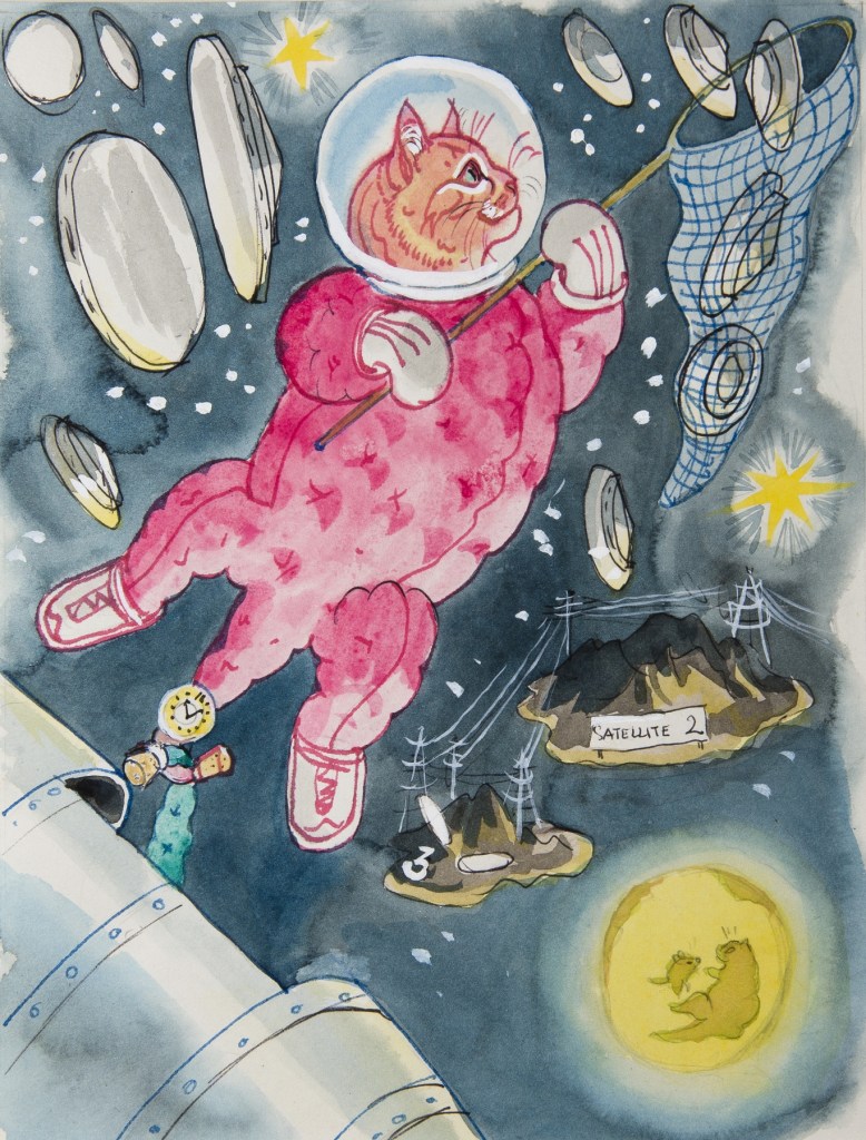
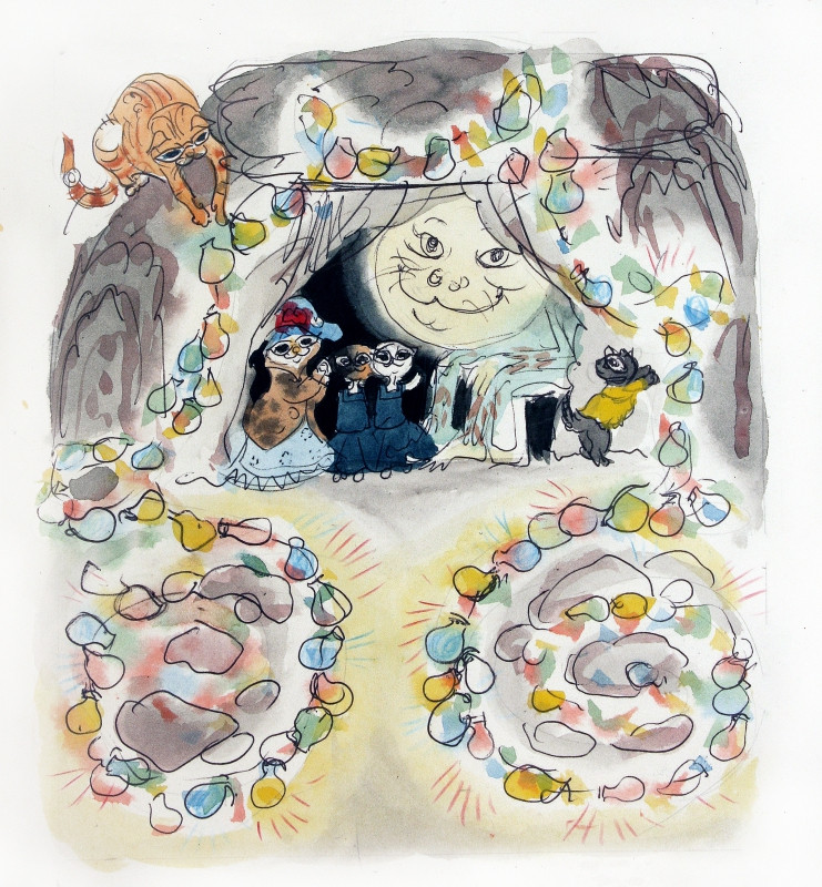
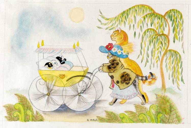
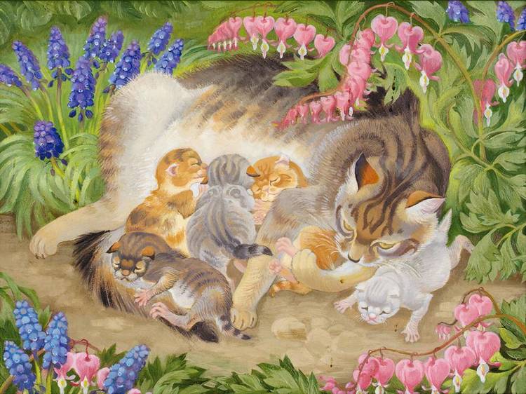
Kathleen Hales’s works are filled with tenderness and love for nature, especially admiration toward cats. She depicted them beautifully and softly. These are perfect illustrations for the kid’s stories and fairytales, the colours are delicate and aesthetically pleasing to the eye, and they have that distinctive vibe from the past century.
Eric Ravilious
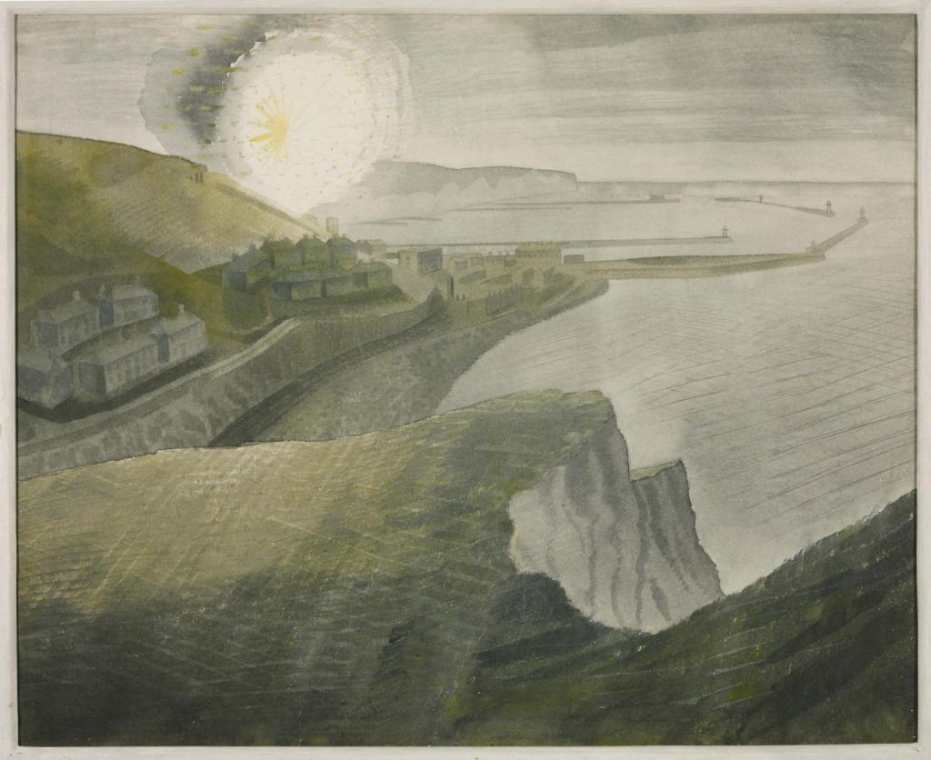
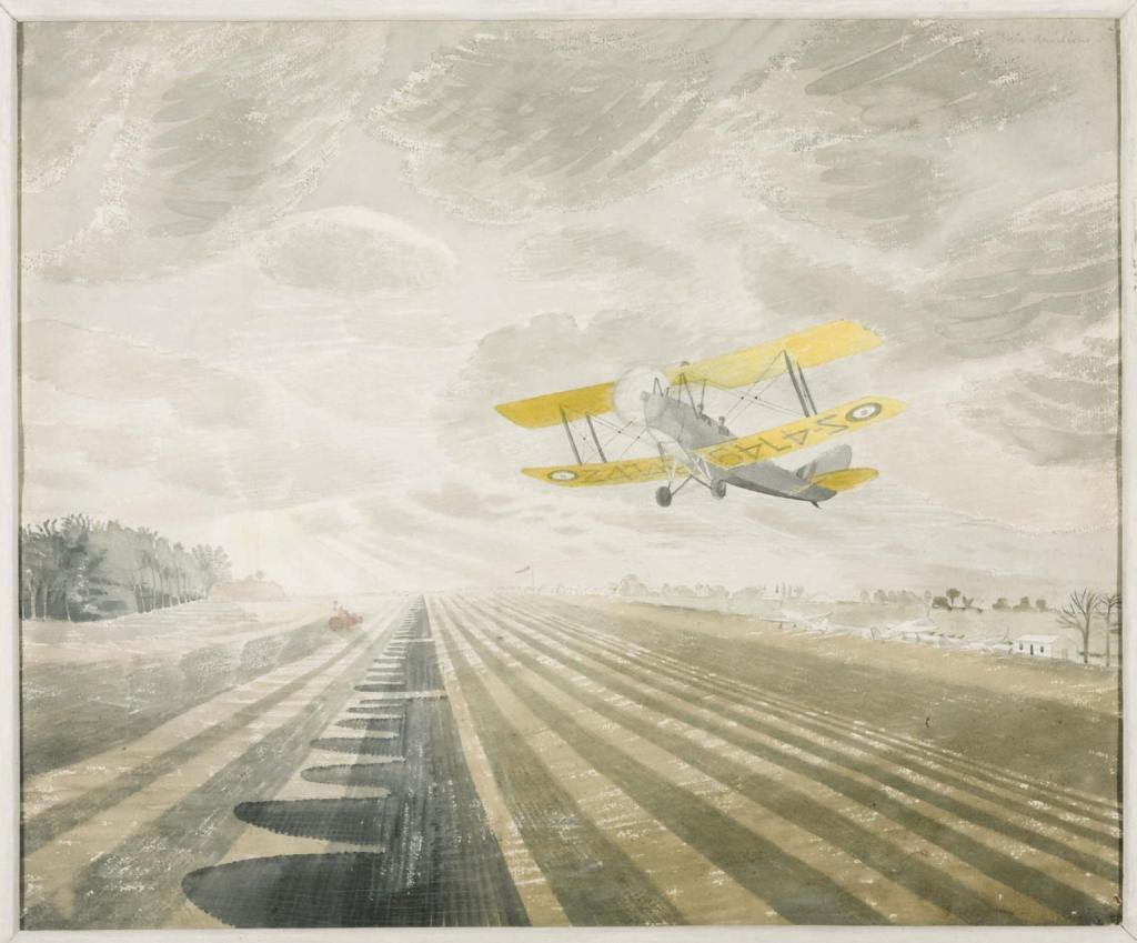
Eric Ravilious was a British painter, designer, book illustrator and wood-engraver. He grew up in Sussex and is particularly known for his watercolours of the South Downs and other English landscapes. In his works, the artist examines English landscape and vernacular art with an off-kilter, modernist sensibility and clarity. He served as a war artist and died when the aircraft he was in was lost off Iceland.
Eric Ravilious‘s paintings reflect a feeling of the war period, the colours are slightly dull and have vintage shades on them, deliberating the disturbing energy from the battle of the country against the nazism.
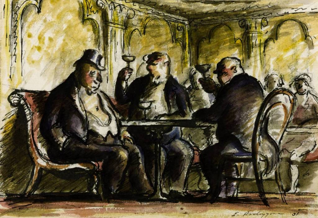
Edward Ardizzone who sometimes signed his work “DIZ“, was an English painter, print-maker and war artist, and the author and illustrator of books, many of them for children. He became famous for his illustrations for Tim All Alone (Oxford, 1956) children’s book, which he wrote and illustrated.
Ardizzone studied art at Westminster School of Art in 1920-1 under Bernard Meninsky. He was an official war artist during World War II, working widely in Europe and North Africa, and his illustrated diaries are notable records. After the war, he established a strong reputation as a book illustrator and writer. He had a retrospective at the Victoria and Albert Museum in 1974. I loved these artists’ works in particular, as they are a great combination of soft watercolour shades and sharp pencil/pen sketches on the top, to highlight the line. His first works were predominately dark and dulled coloured, but towards the ’70s I could see the movement towards bright and clear watercolours.
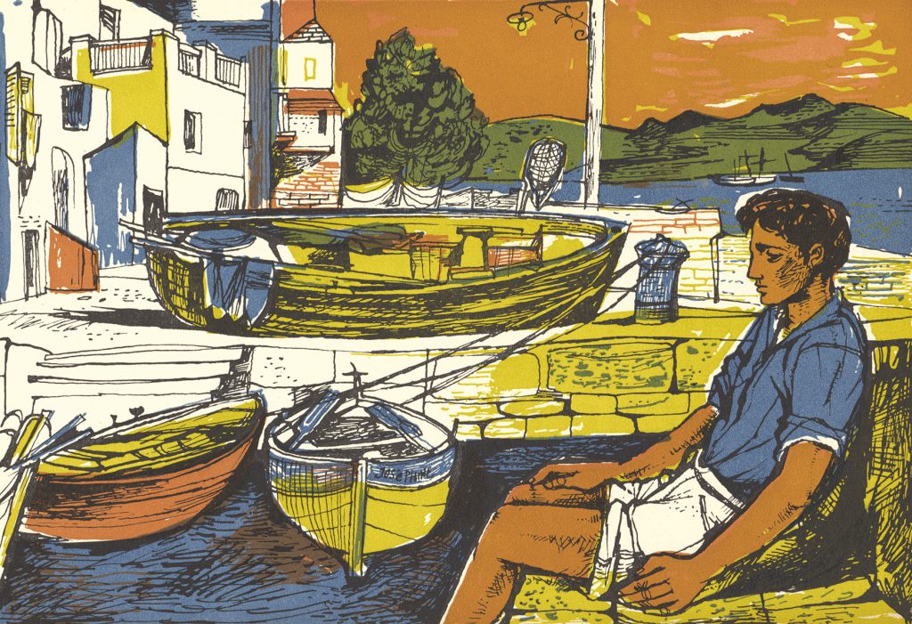
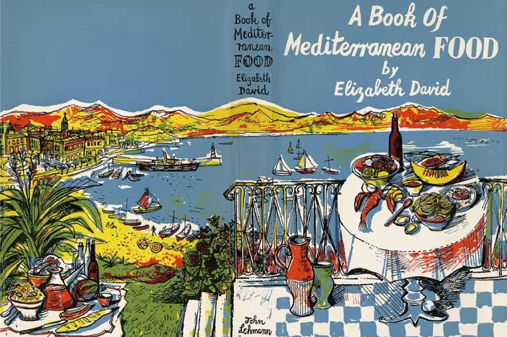
Francis John Minton was an English painter, illustrator, stage designer and teacher. After studying in France, he became a teacher in London, and at the same time maintained a consistently large output of work. In addition to landscapes, portraits and other paintings, some of them on an unusually large scale, he built up a reputation as an illustrator of books.
John Minton was part of a group of British Neo-Romantic artists. He is perhaps best remembered as the illustrator of Elizabeth David’s revolutionary cookery books on French and Mediterranean cuisine.
I like this artist’s works for their abstract trend and bold opaque colours for illustrations. Each image is filled with pen sketching on the top and creates a mood of being drawn in a rush. That is something I would like to learn and borrow for my techniques. My previous units still evolved around graphic design software, and my sketches were done briefly, without so much attention to the details of the illustrations. But I’m looking forward to learning some new skills and improving my drawings and sketches.
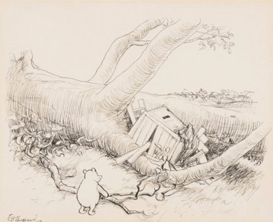
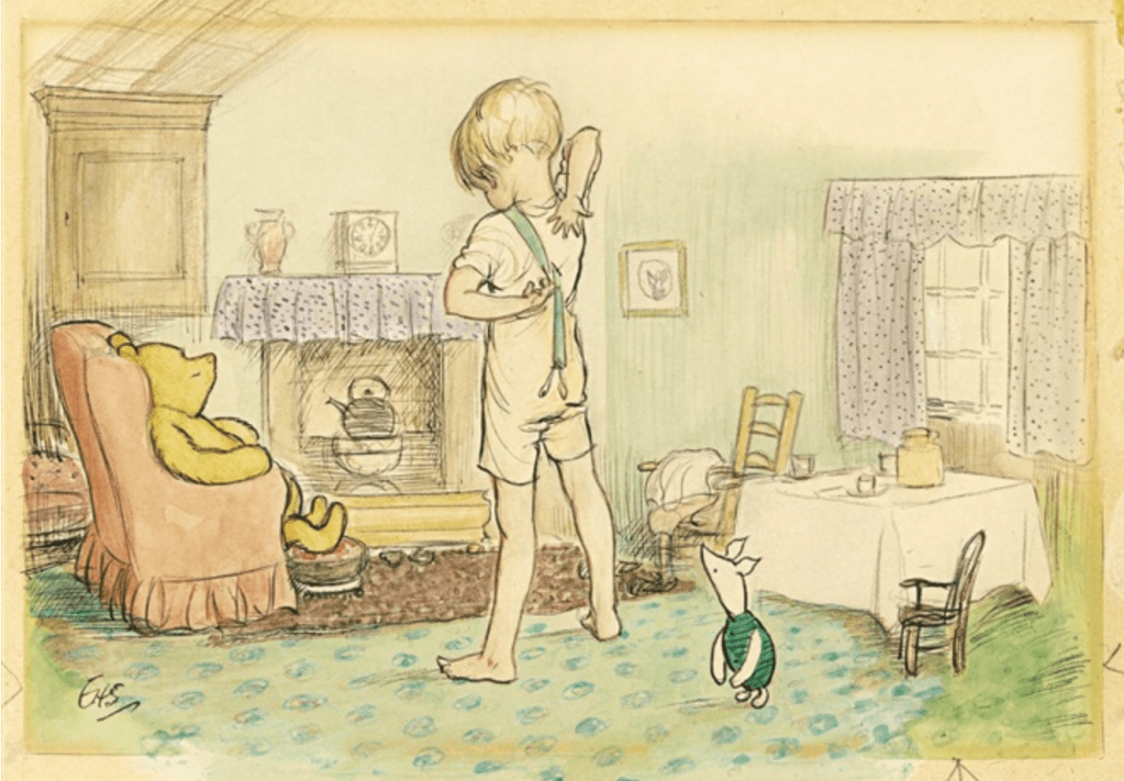
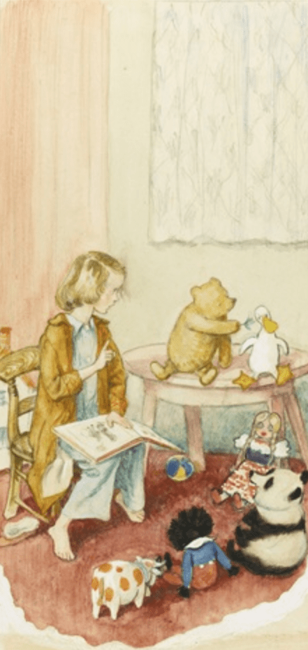
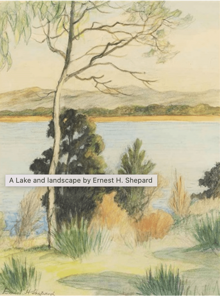
E. H. Shephard
Ernest H. Shepardwas a successful British illustrator and painter best known for his illustrations for The Wind in the Willows by Kenneth Grahame and Winnie-the-Pooh by A. A. Milne. His work, often created through a combination of watercolour and pen-and-ink, is characterised by light washes of colours and graphic, black outlines. Born on December 10, 1879’s in London, England to an artistic family. The artist developed an interest in drawing from a young age and went on to receive formal training from the Royal Academy Schools in London. After serving in the Royal Garrison Artillery during World War I, Shepard worked for the popular satirical magazine Punch, where he was later recommended to author A.A. Milne, who was searching for an illustrator for Winnie-the-Pooh. Shepard received national attention for his work on the popular book series and continued in literary illustration for 50 years, designing the covers of popular Victorian novels, including David Copperfield by Charles Dickens and Tom Brown’s Schooldays by Thomas Hughes. Shepard died on March 24, 1976, in Midhurst, United Kingdom.
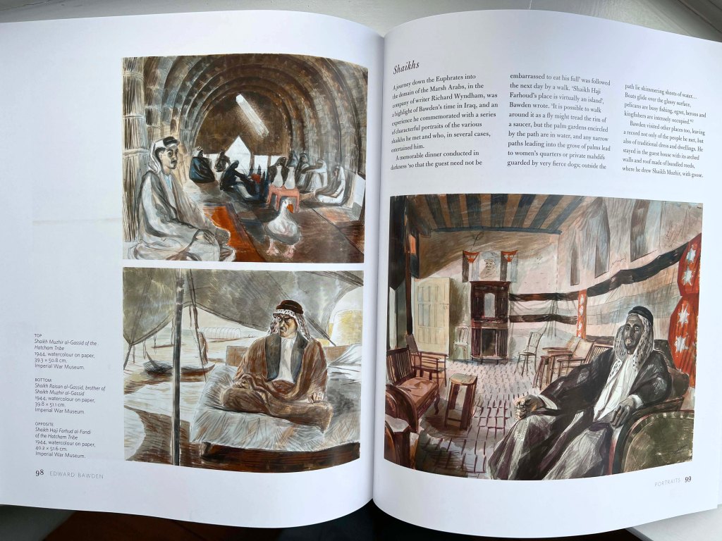
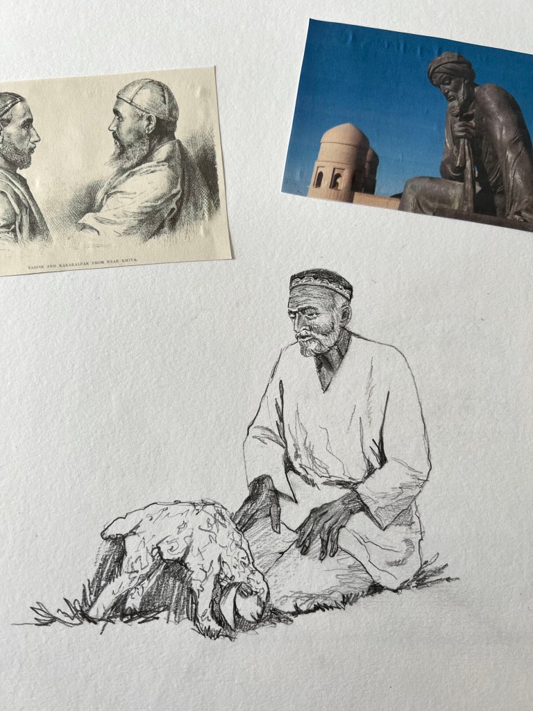
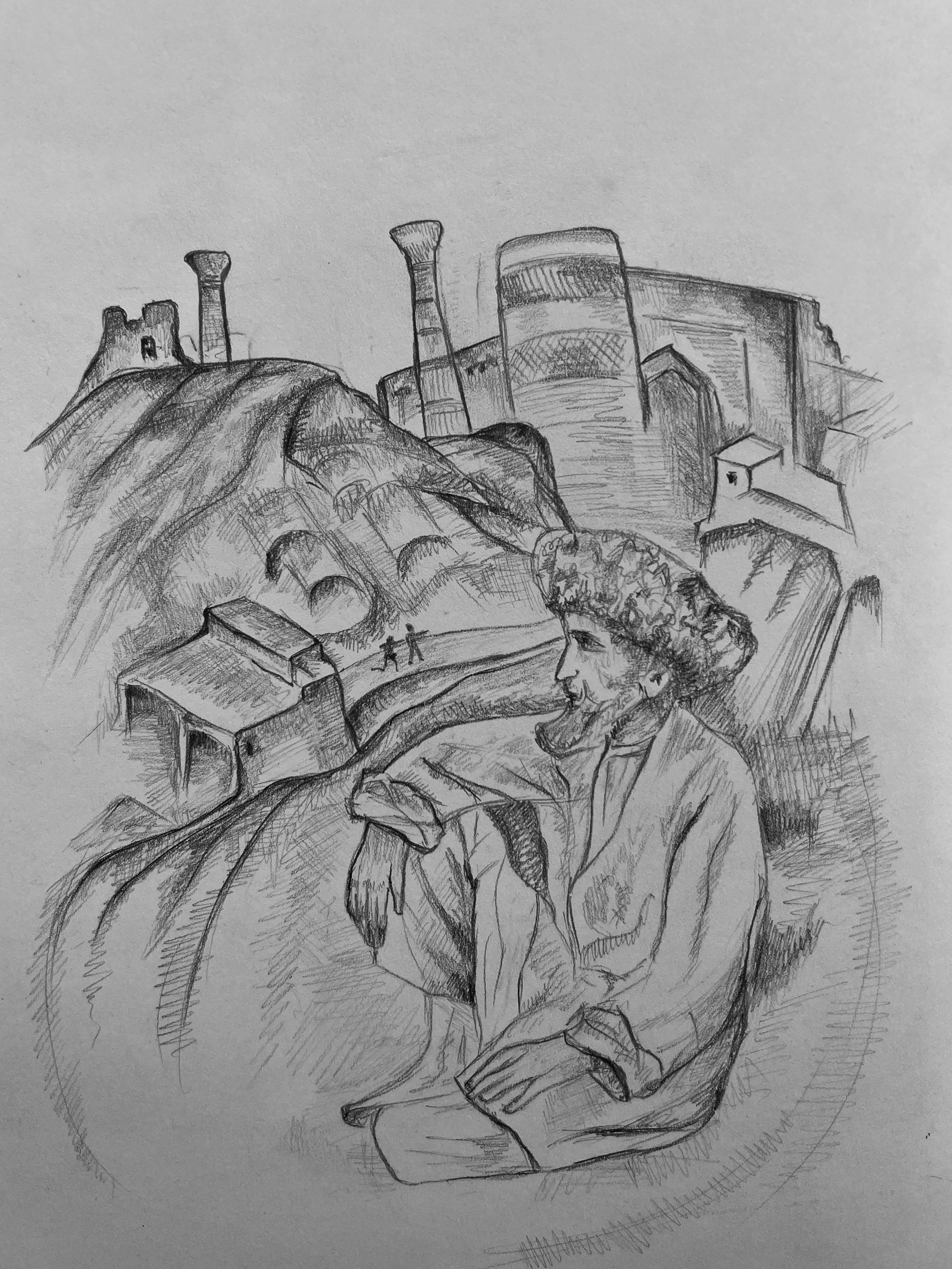
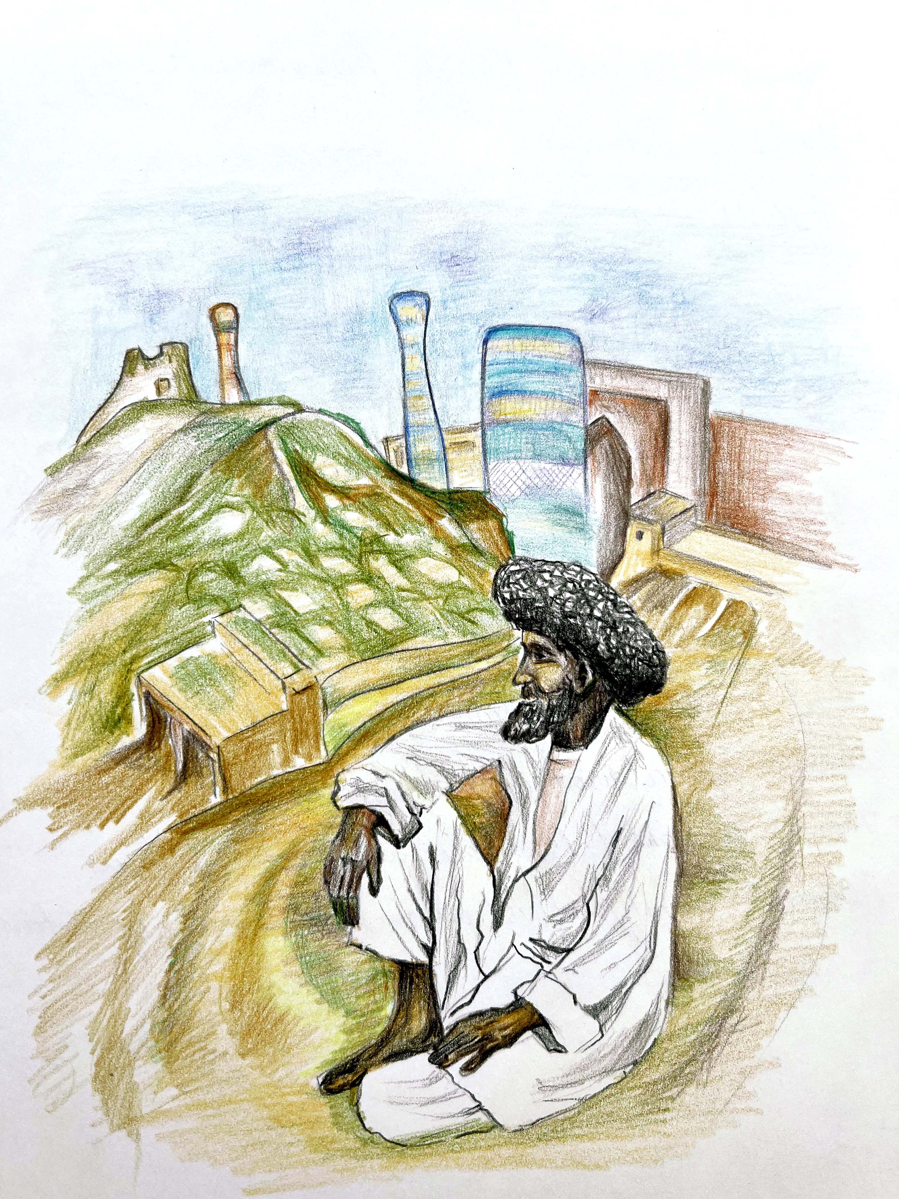
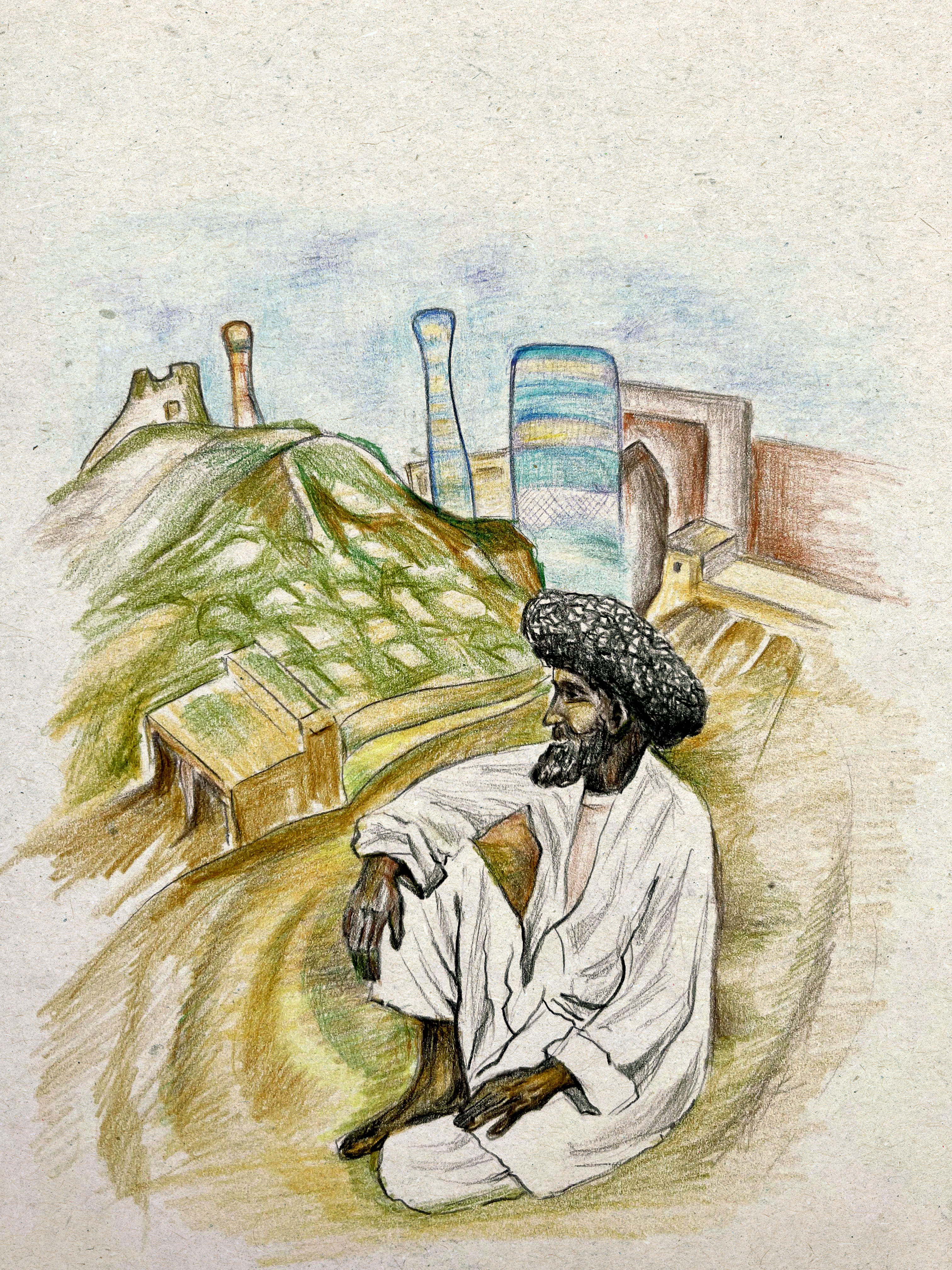
For my sketches, I got inspired by two artists. Edward Bawden’s motives of the Middle East gave me the idea to depict some sceneries from Uzbekistan, the country where I was born and spent the first years of my childhood. I loved the old traditions of watercolour techniques the artist used in his works, with dull shades, mainly sand colours and natural sceneries. Below is presented Edward Bawden’s book with portraits of Shaikhs. That gave me the idea of picturesque traditional people from Uzbekistan, with cultural background and Asia motives. I wanted to show the mood of the painting through colours and details around the central figure.
Another artist that I like his way of painting was E. H. Shephard with his great sketching style for cartoon characters such as Christopher Robin and Winnie-the-Pooh. The artist was practising a combination of pencils, watercolours and crayons. I wanted to create an illustration that would merge those two artists, where the image is realistic enough, with the presence of traditional sketching techniques. Below I highlighted some of the key elements I wanted to mention in my first sketches.
Sketches
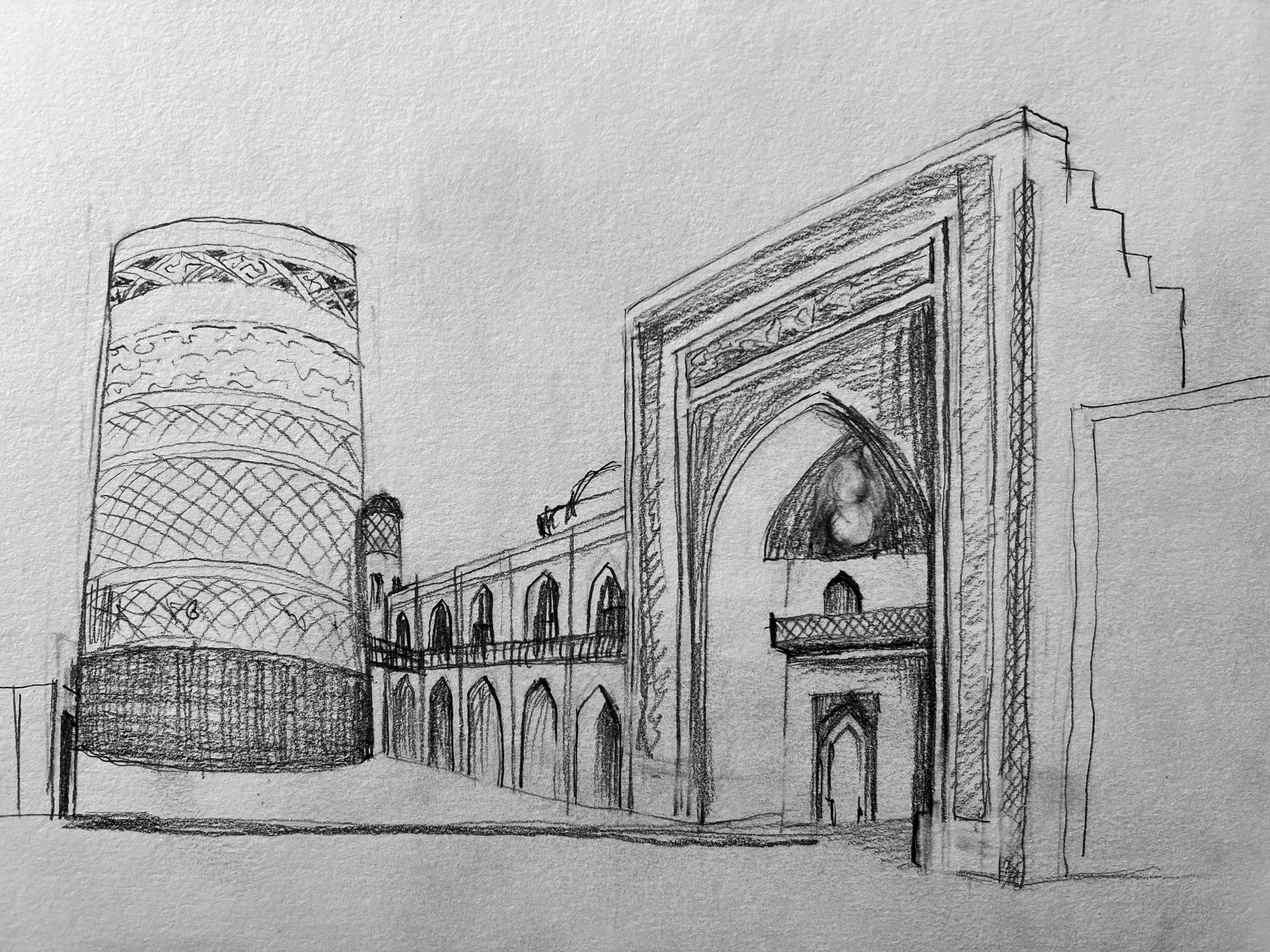
I was thinking about traditional mosques in Uzbekistan. During my research, I found there is one quite authentic Juma Mosque a 10th-18th century mosque in Khiva, Uzbekistan. Buildings could be challenging to sketch from the architectural point of view, so I decided to concentrate on sketching people in a traditional environment.
My first sketches with Uzbek shepherd around some key elements that I got inspired. I wanted to show traditional old-style sketching with some sharp lines and fast pencil moves in it. That images are unique and resemble the old times from the traditions of Uzbekistan. I would say that style of sketching could be characteristic of 1960-the 1980s.
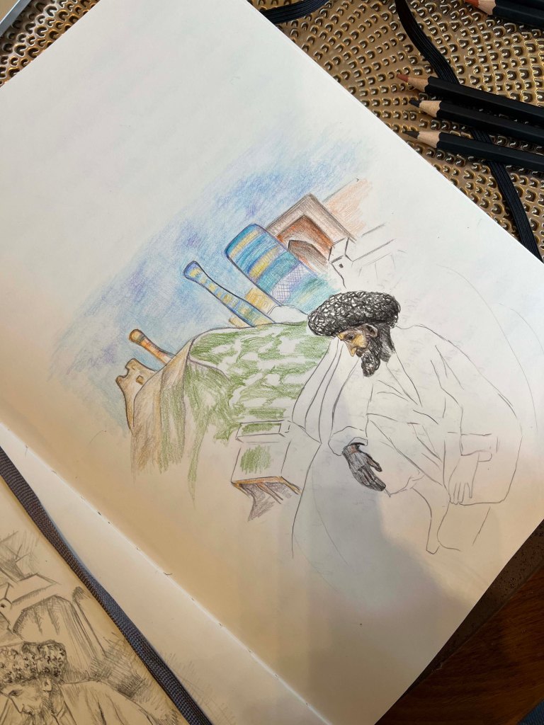
For this course I specially bought a good selection of colourful watercoloured pencils, to practice my drawing skills as well. I thought about showing the old Uzbek man in the background of Khiva, the man who is resting after some labour work, and behind him a beautiful Juma Mosque. I think that design is similar to the style of E. H. Shephard, with his naturalistic sketches of people. Also, drawings made in black and white techniques have some deepness in them and look more like serious works compared to colourful images. But for comparison, I still wanted to practice the image in the full colour.
I made the same sketch but with watercoloured pencils drawing. I was worried as it could look a bit flat with coloured pencils, but surprisingly the image turned out to be quite authentic and similar to the artists’ illustrations I was inspired by.
Kelly Blair
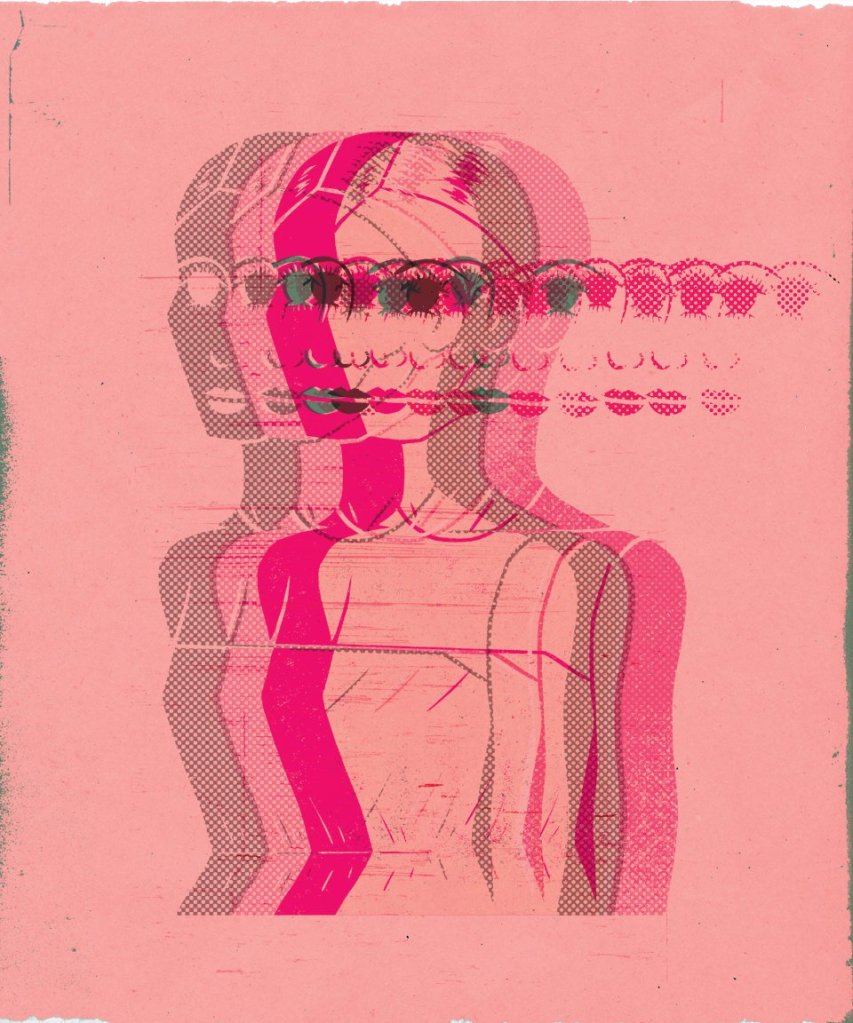
The second part will be evolved around the modern-day illustrator, that I like. As I mentioned before, illustration is a new field for me, but I’m glad we touched on that subject during previous units. Kelly Blair’s illustrations I discovered during the Creative Book Design unit. I analysed her works as a part exercise amongst the other book designers. Kelly Blair is the art director of Pantheon Books and a freelance illustrator from New York. Her designs have a strong feel of covers from the XXI century. She has her techniques, as mainly designs are clean, with the dominant colour in it, and one particular object being highlighted. Recently I discovered a series of illustrations she provided for a number of campaigns. They are distinguished series of illustrations, made in a cartoony way with some unusual body and face proportions, like big eyes, and bold colourful outlines.
The colours for those illustrations are still quite faded, she doesn’t use too garish colours, and most of the images have a strong presence of blue, and warm brown or cream colours.
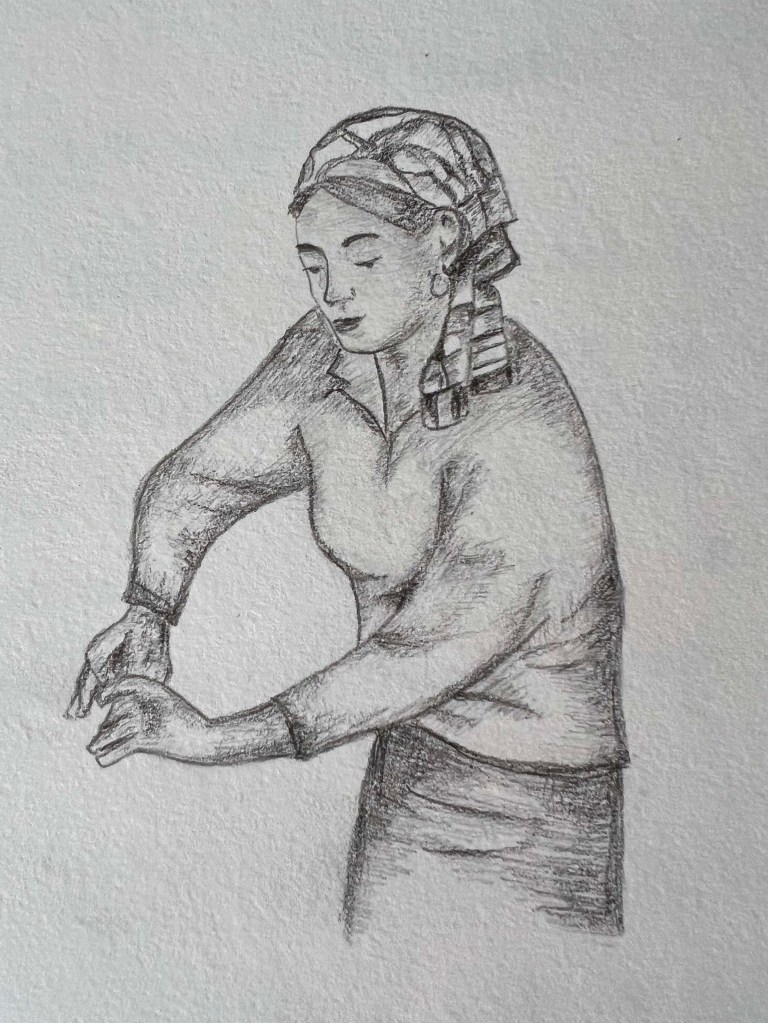
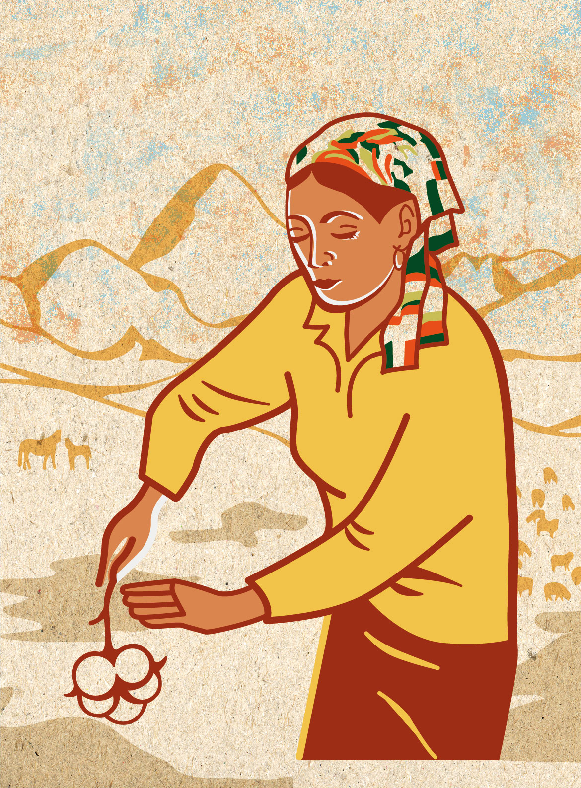
A mind map and some sketches are presented below. I sketched a woman in the process of working, she bend over and concentrated on her work. At first, I thought it will be a woman with embroidery work, but later I changed it to cotton-picking work, which was quite common in Uzbekistan back in the 70s. For the background, I chose mountains as well, as they give that far away Asian county feel.
After some sketches, I transferred these images into Adobe Illustrator, that to transform them into modern illustrations. I used similar bold outlines as Kelly Blair’s works, with some natural colours, like brown, sand, and yellow, some traditional colours that are inherited from that dessert Asian environment. Also, I made a canvas background with some grain in it to create texture for the image.
In conclusion, I would like to say I quite enjoyed this first entry into the Key Steps of Illustration course. I’m glad that during the design process I got in touch with my tutor, and got important tips about remembering to reach the brief and provide a clear idea of the sketch. My studying experience taught me that during my exploration and designs, not to forget the importance of the requirements of each exercise. Visually I like my sketches, and it was pleasing to see historical and cultural explorations in my first sketches. Also, I’m glad that I could represent similar background images but in different styles. I’m hoping it was a good start and I’m looking forward to some more illustration discoveries.