
What defines a diagram? It is usually an illustration that depicts the features of an object, a system, or a manufactured or organic process by way of an exposition that goes far from pictorial reality. The visual language contains graphical or symbolic representation, however, contextually it will not work unless the information or message is demonstrated clearly. Usually, diagrams are associated with educational textbooks, such as black-and-white line drawings with simple annotations. Also, a diagrammatic approach can be used for illustrations in many contexts including editorial, publishing and the decorative arts.
There has been a popular misconception that illustrations produced to convey information must be realistic and technical. It was considered dry and artistically sterile, avoiding creativity or innovation. Also, the complete visual language associated with information illustration can be considerably diverse: literal, pictorial representations, simple or complex sequential imagery, and conceptual and diagrammatic solutions. There are many ways to convey information, from black-and-white cartoony lines to creative full-coloured illustrations. It all depends on the audience, the client’s expectations, and the instructions’ purposes.
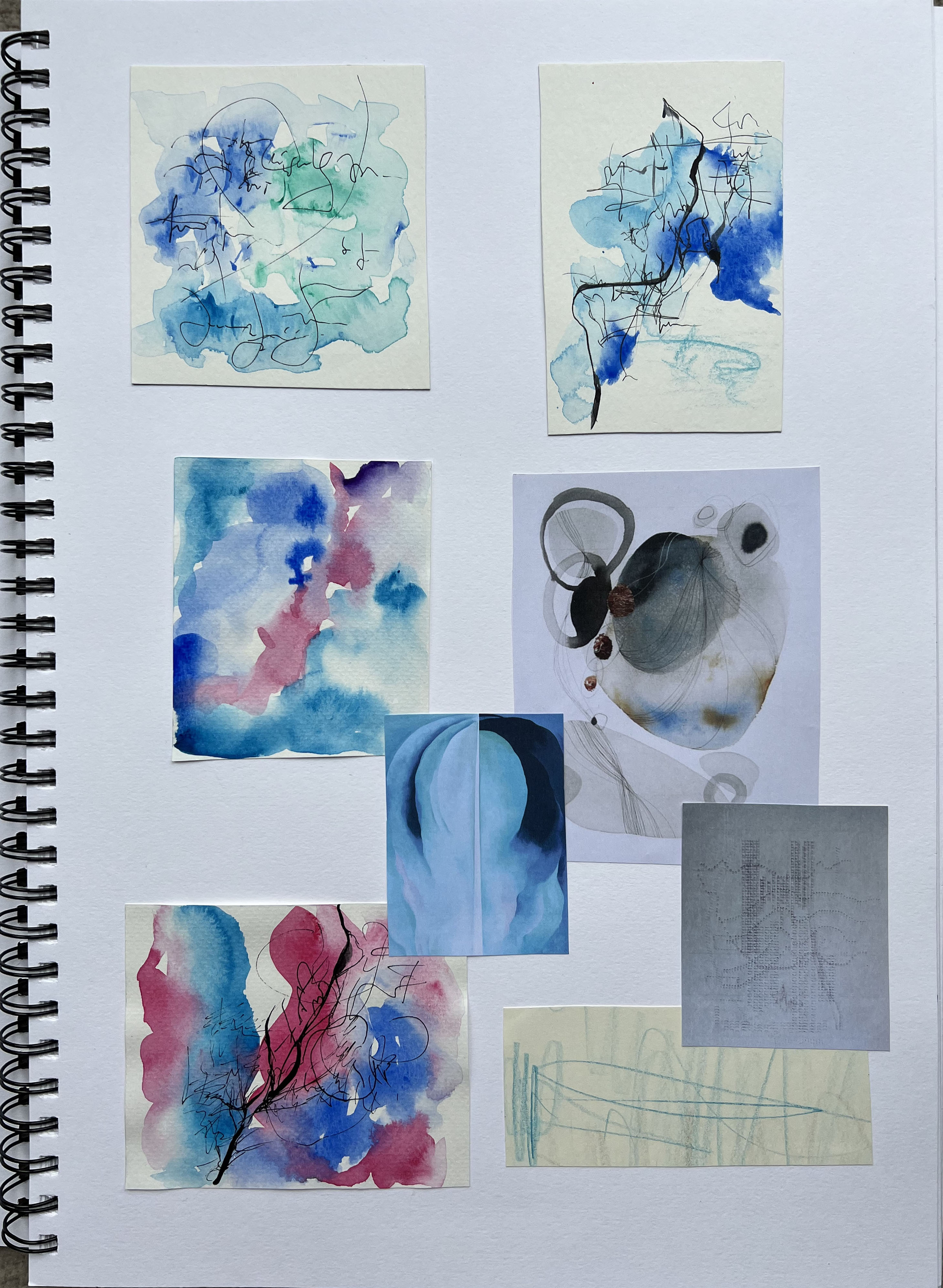
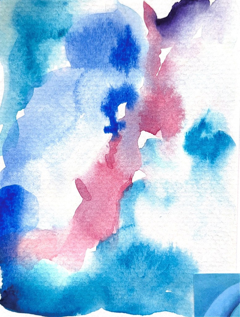
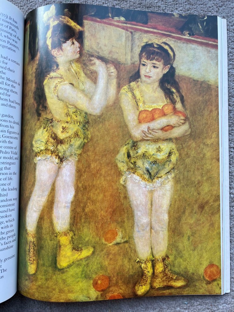
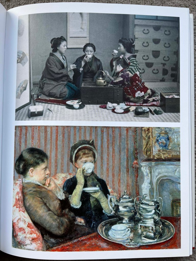
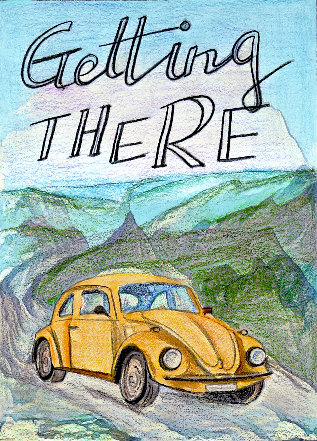
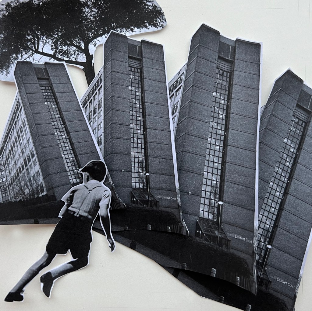
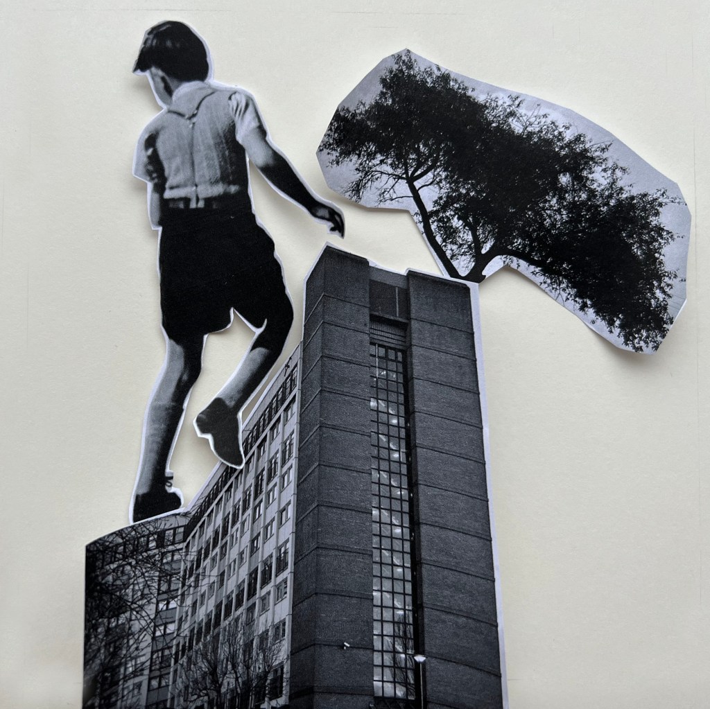
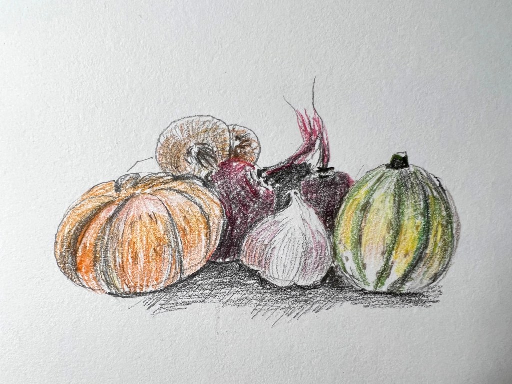
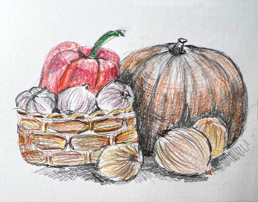
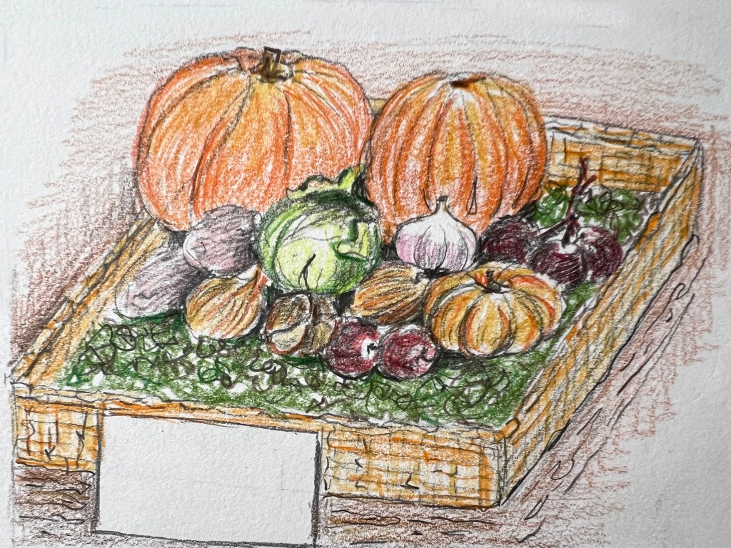
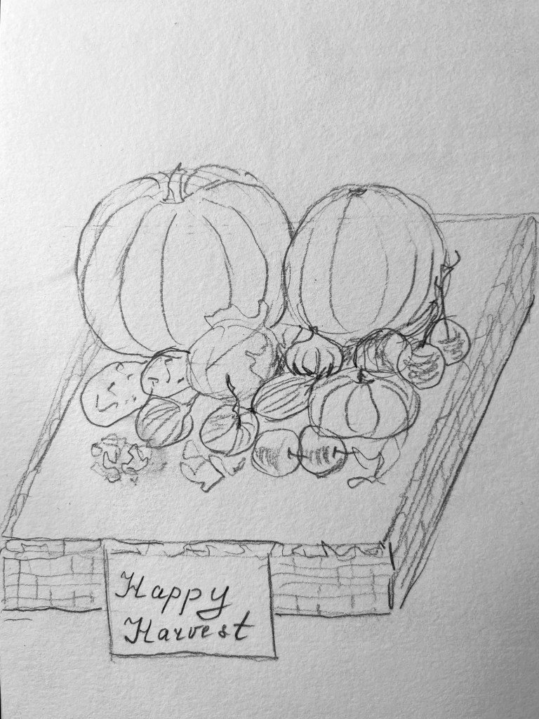
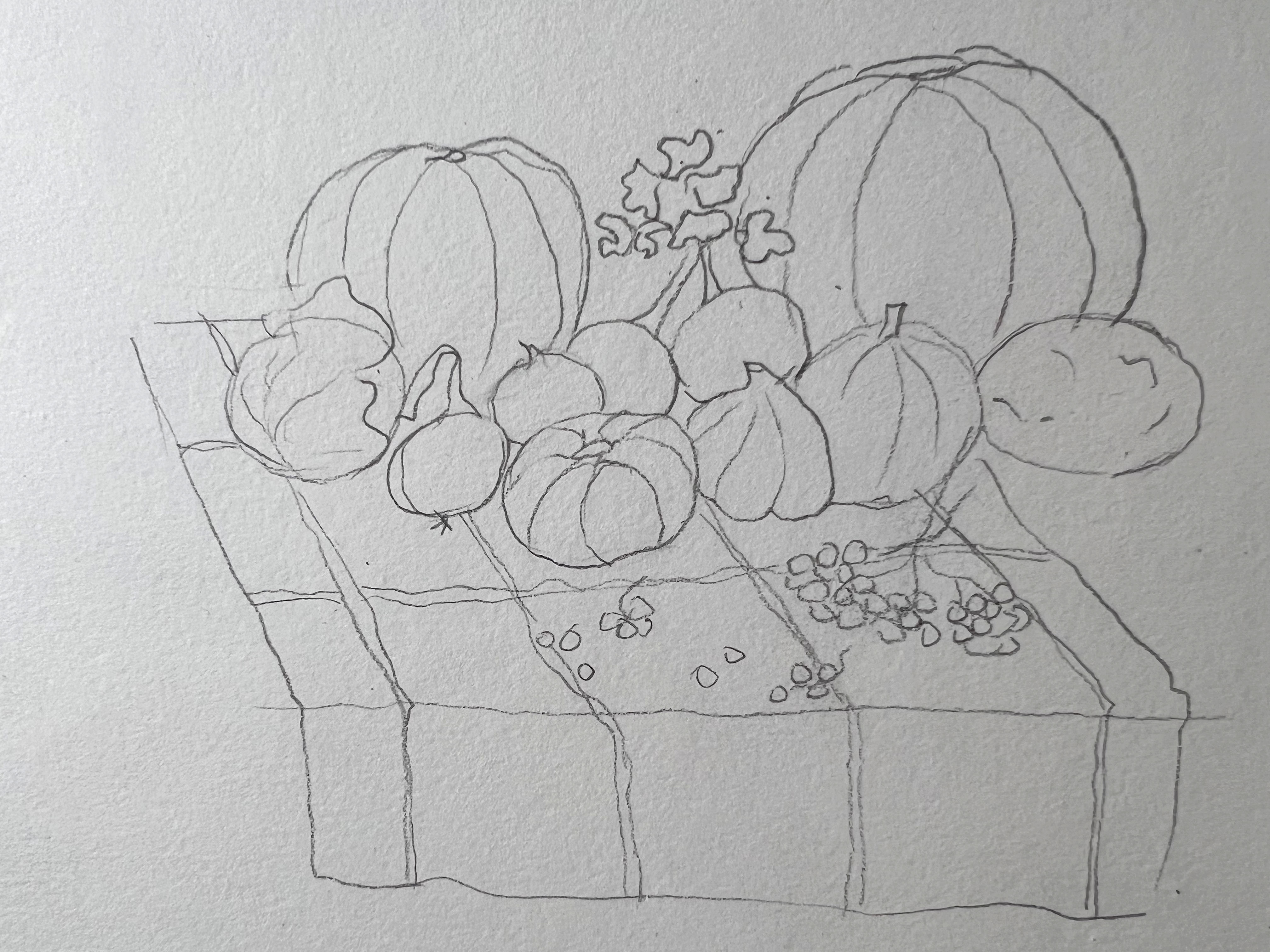
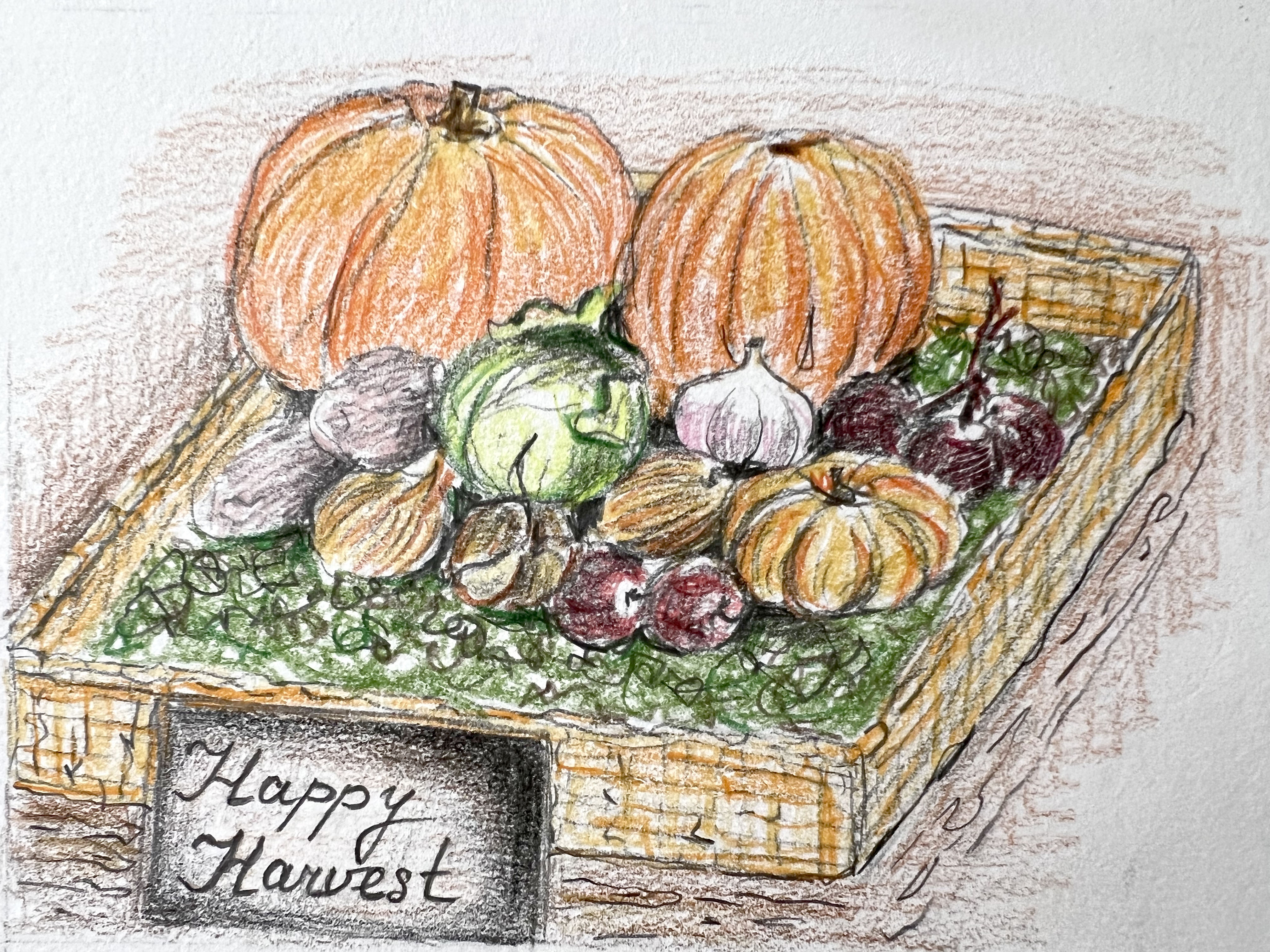
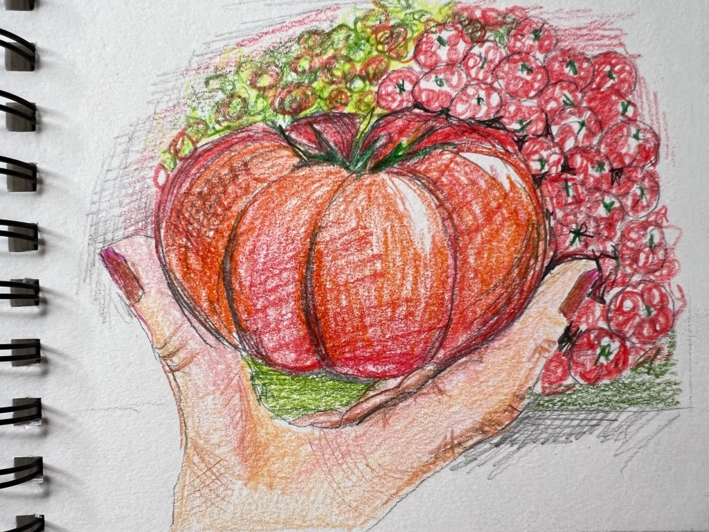
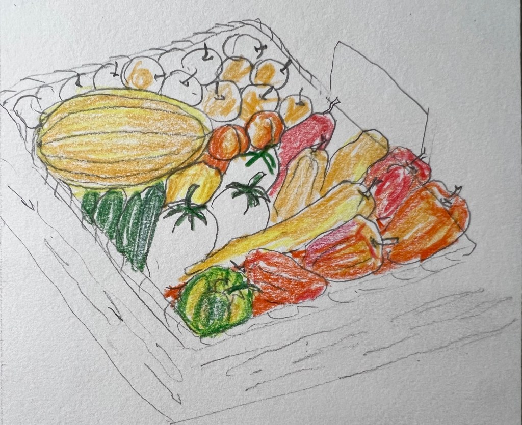
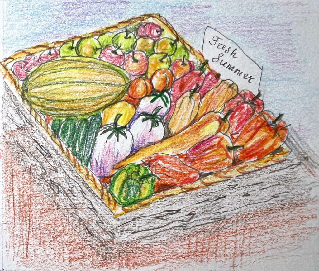
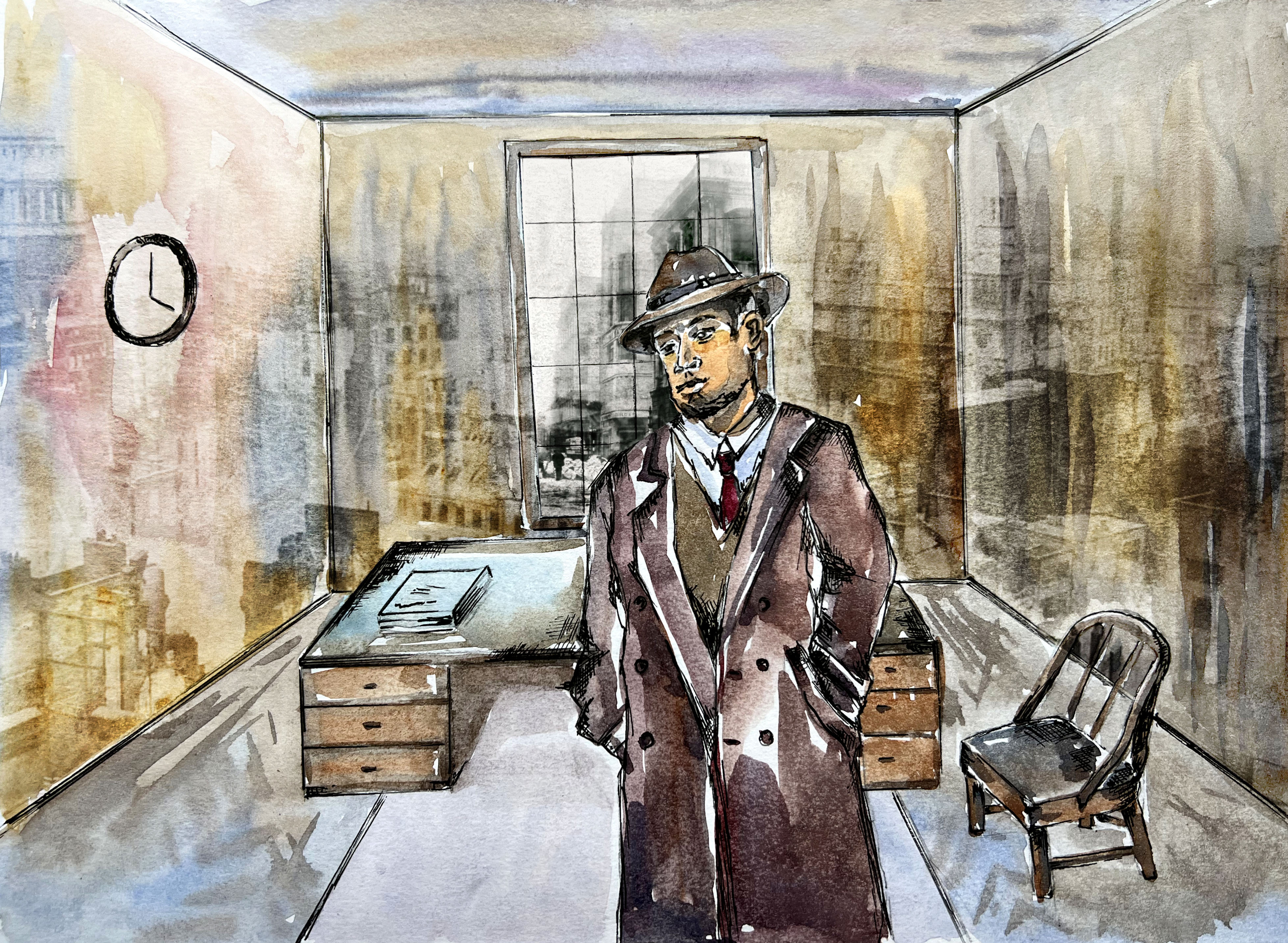
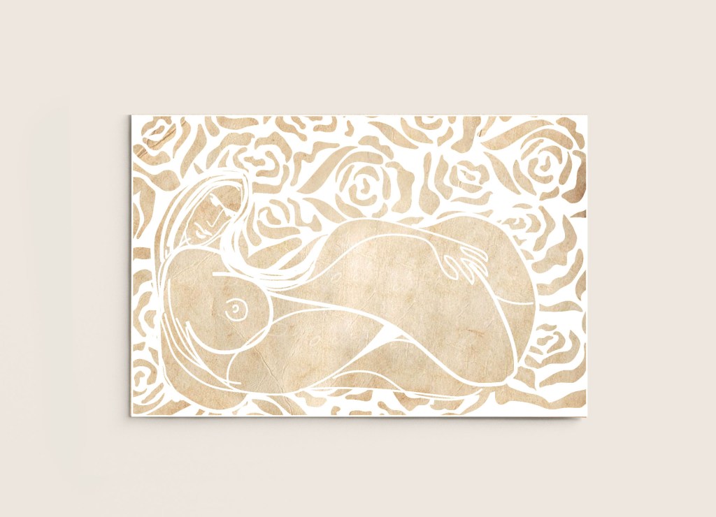
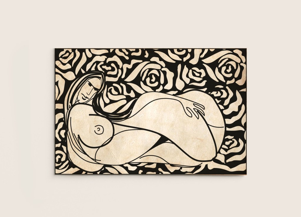
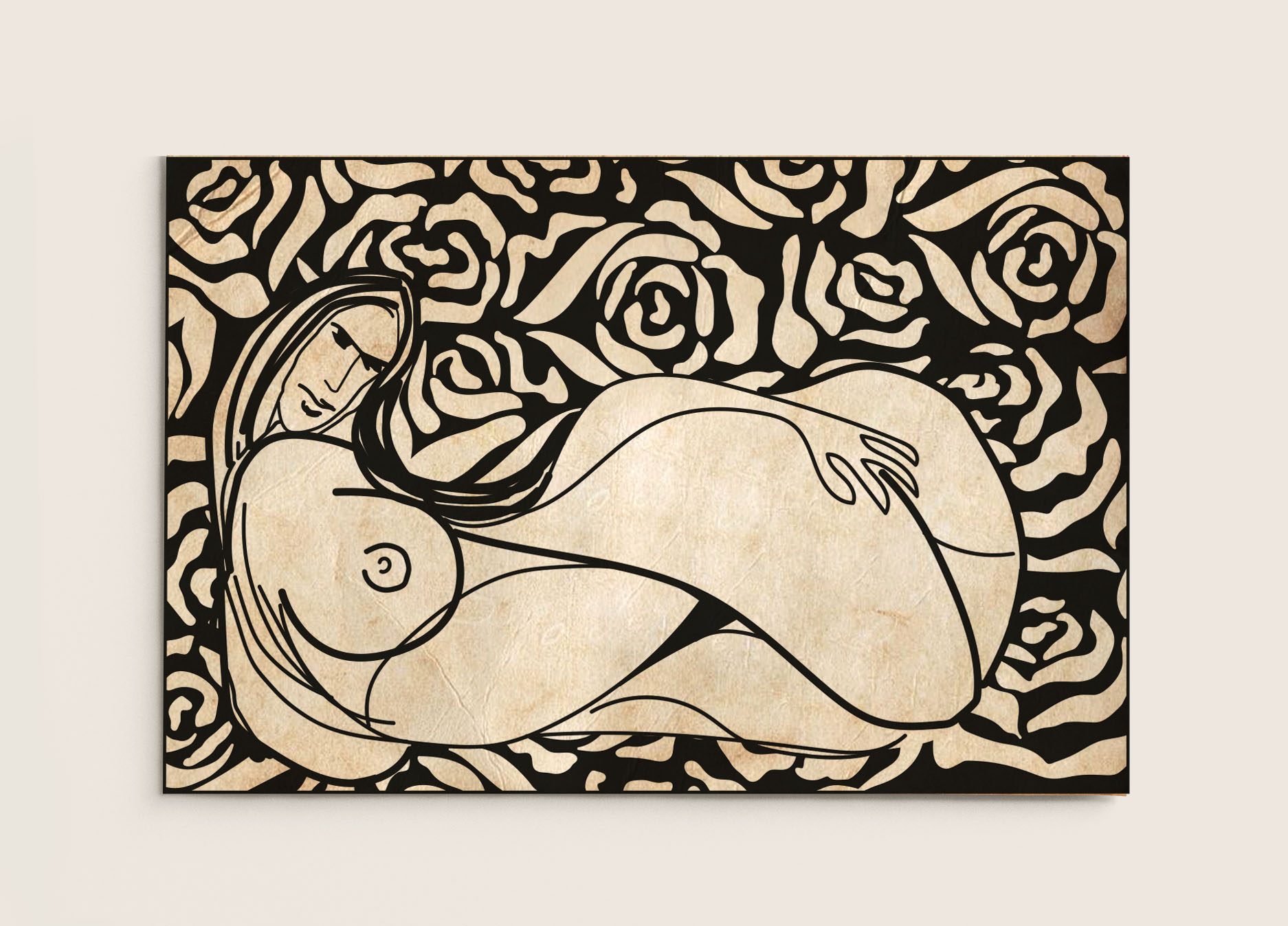
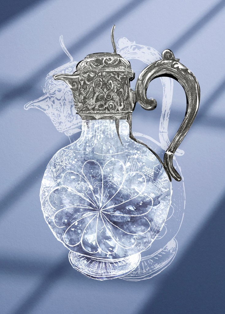
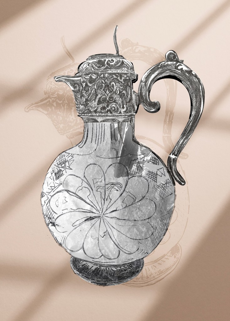
Books around me
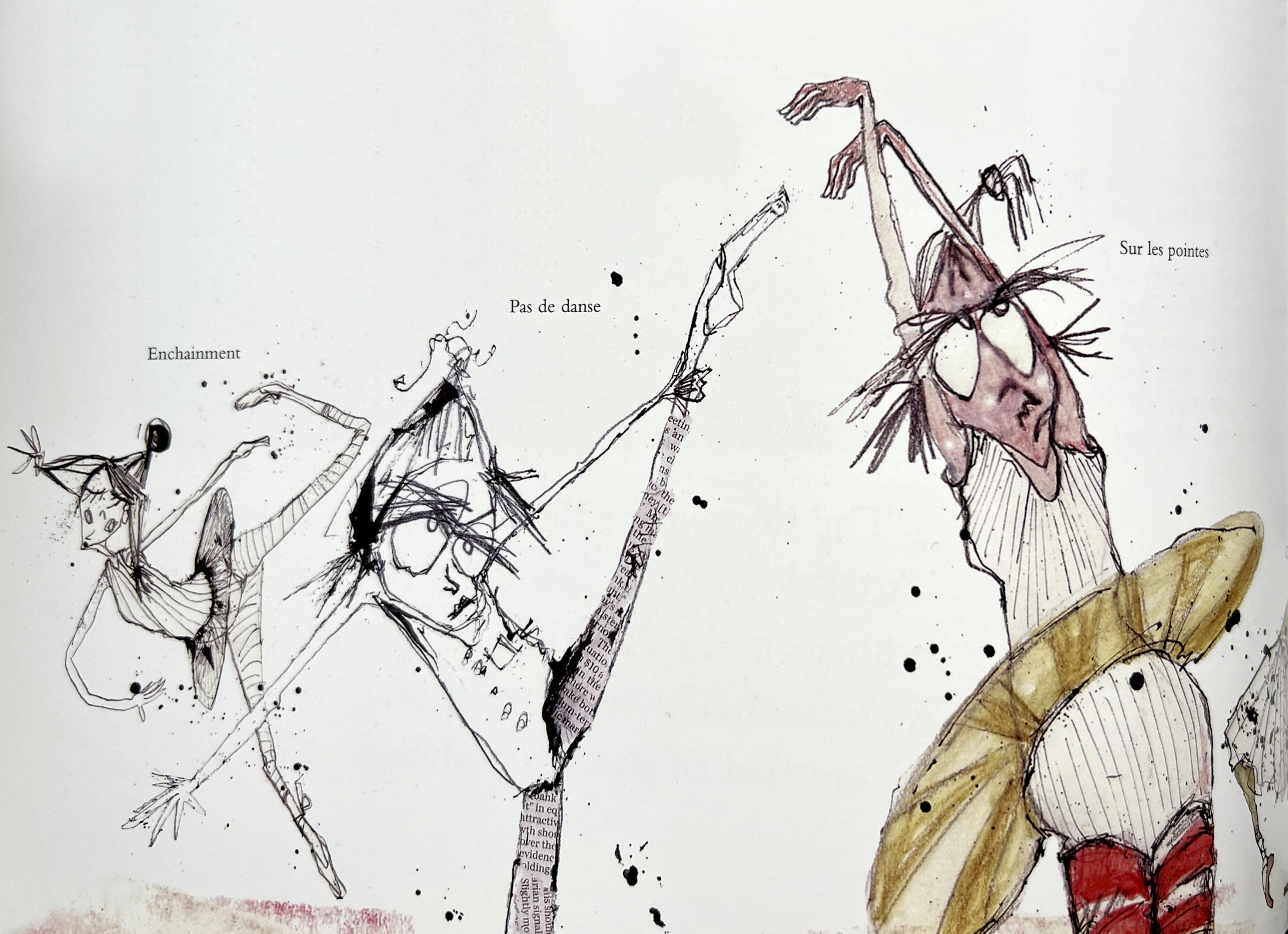
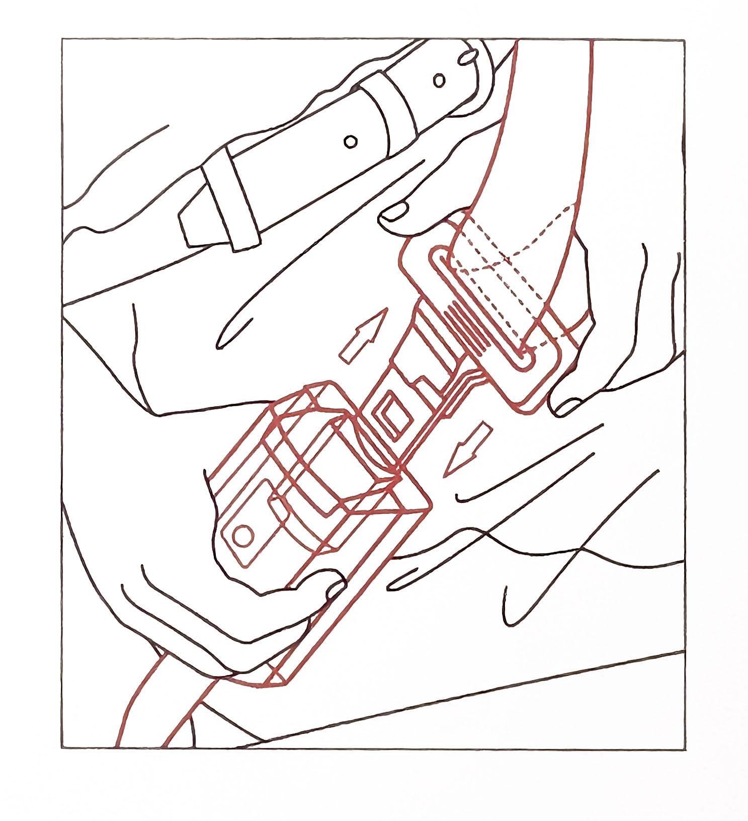
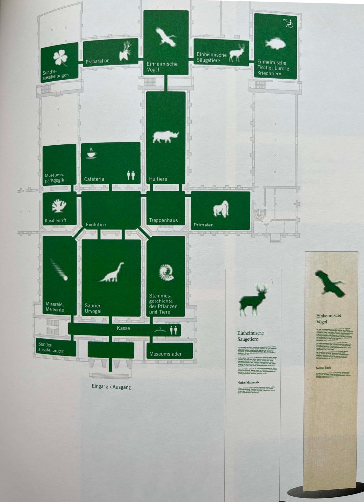
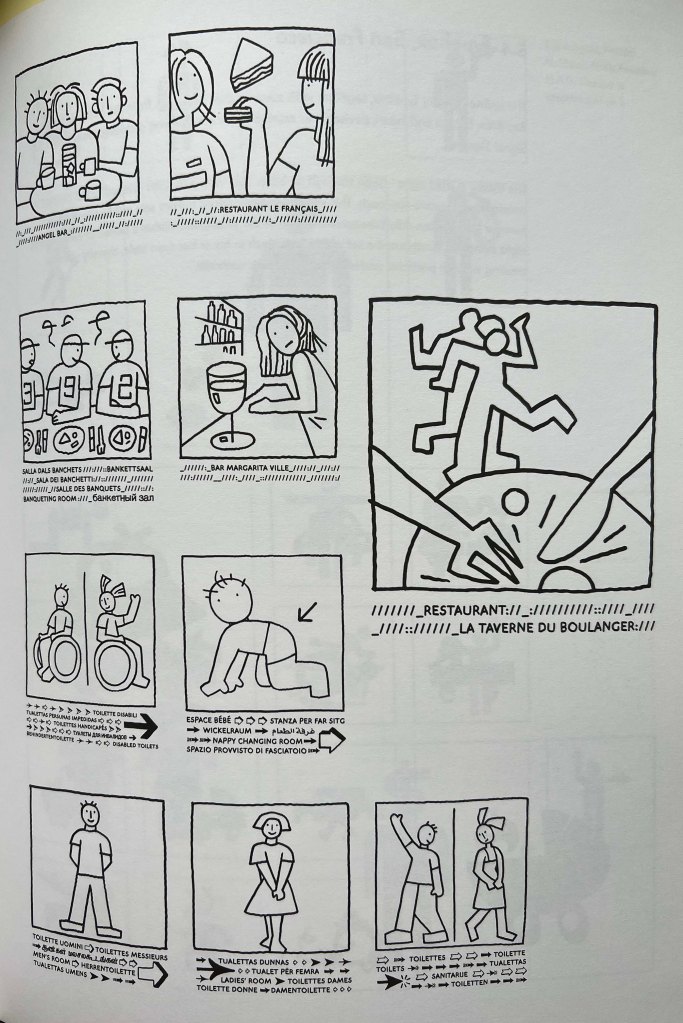
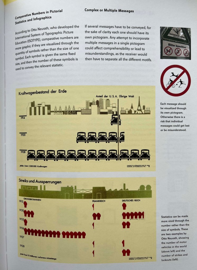
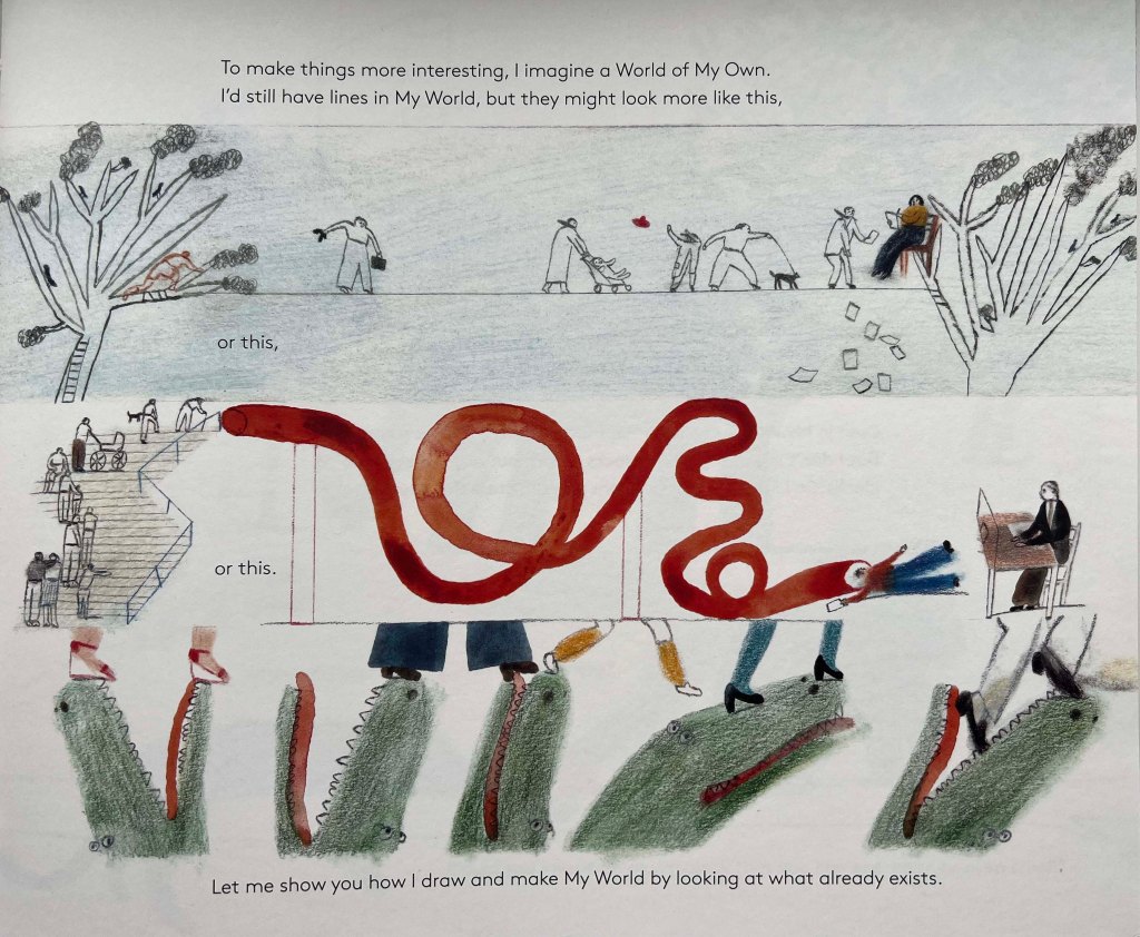
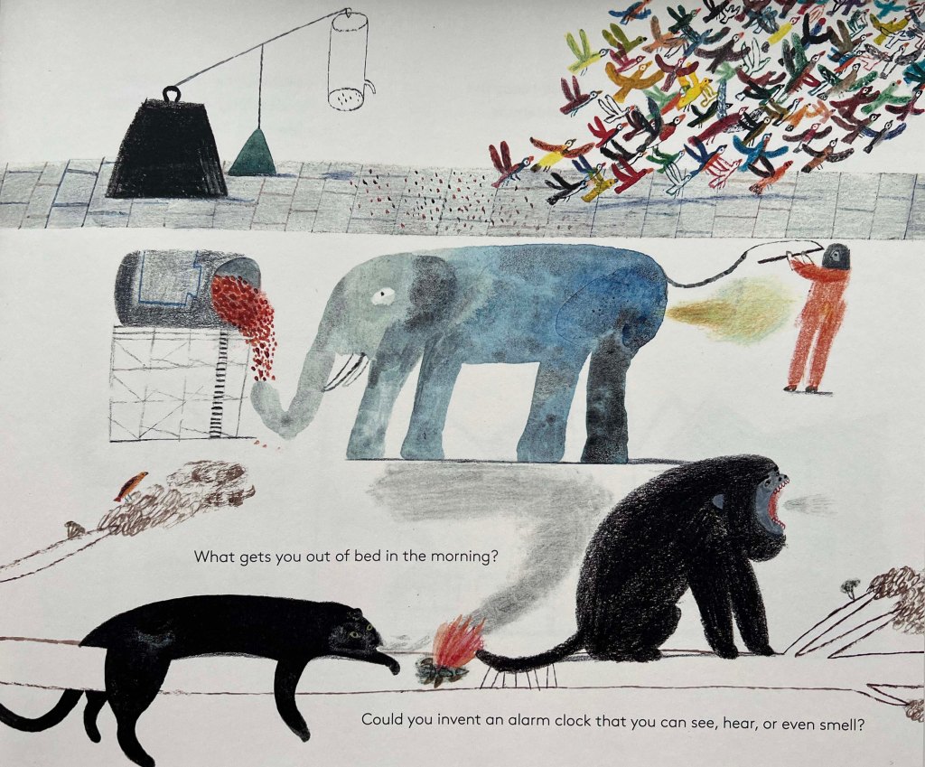
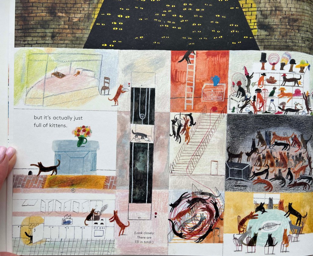
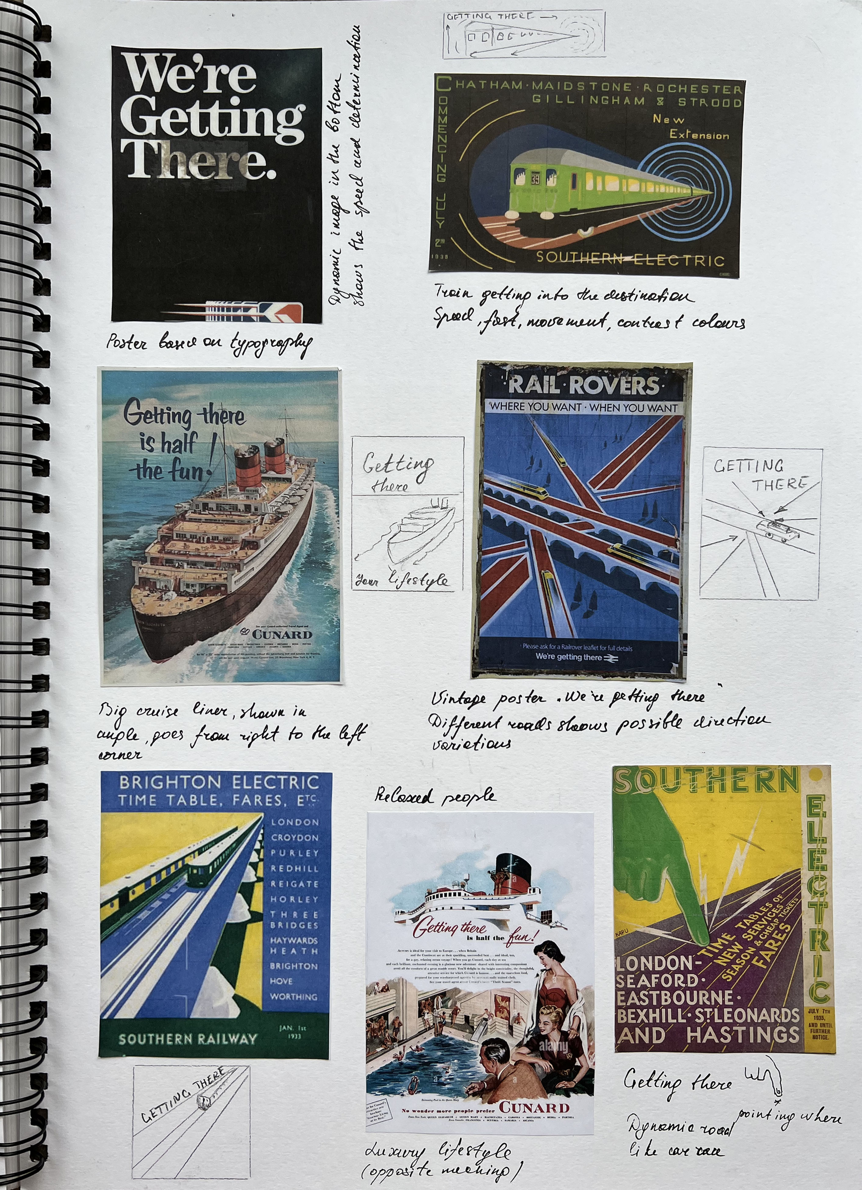
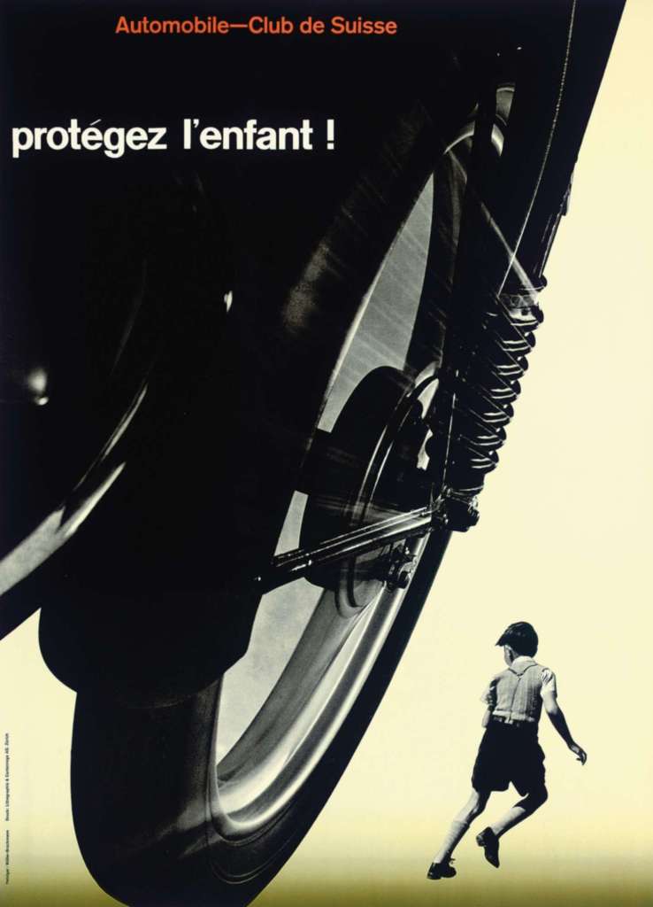
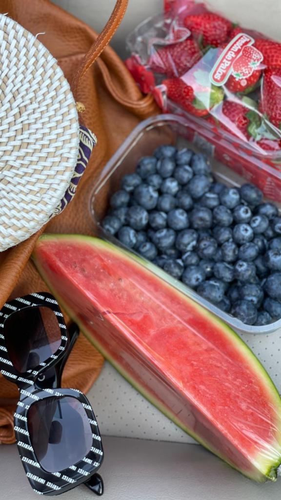
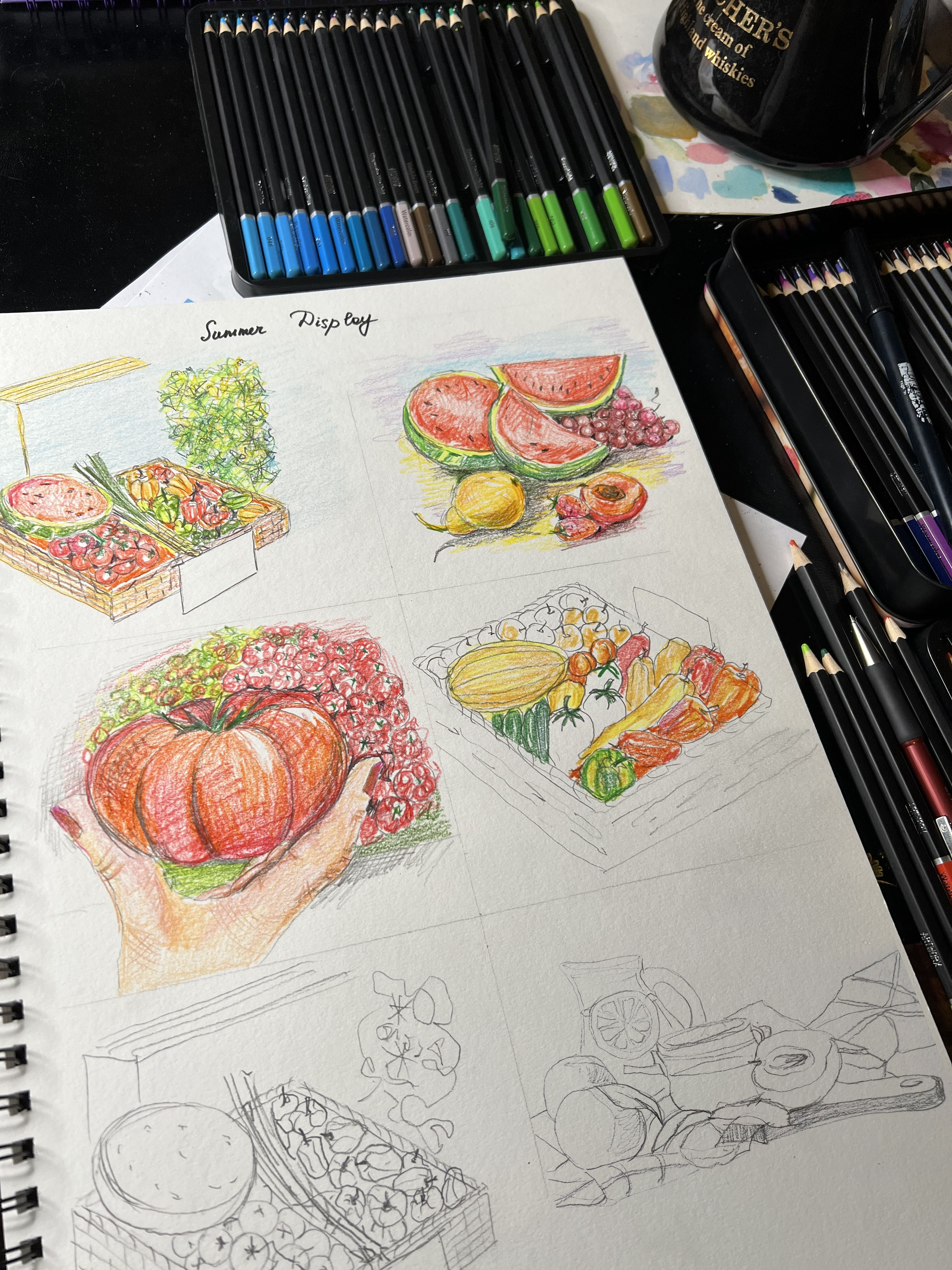
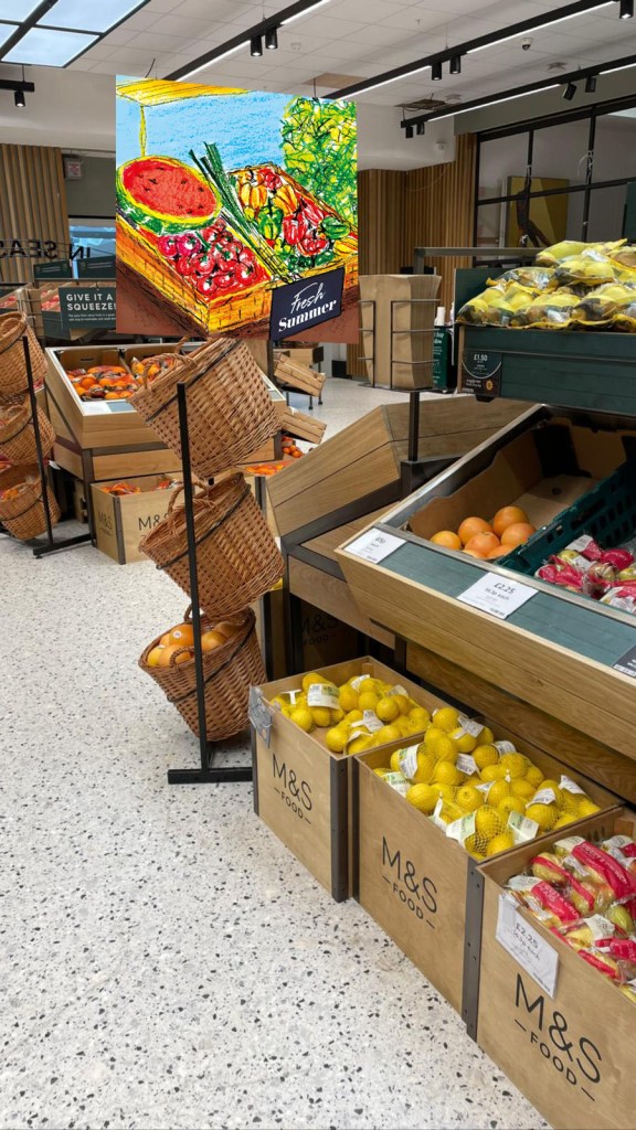
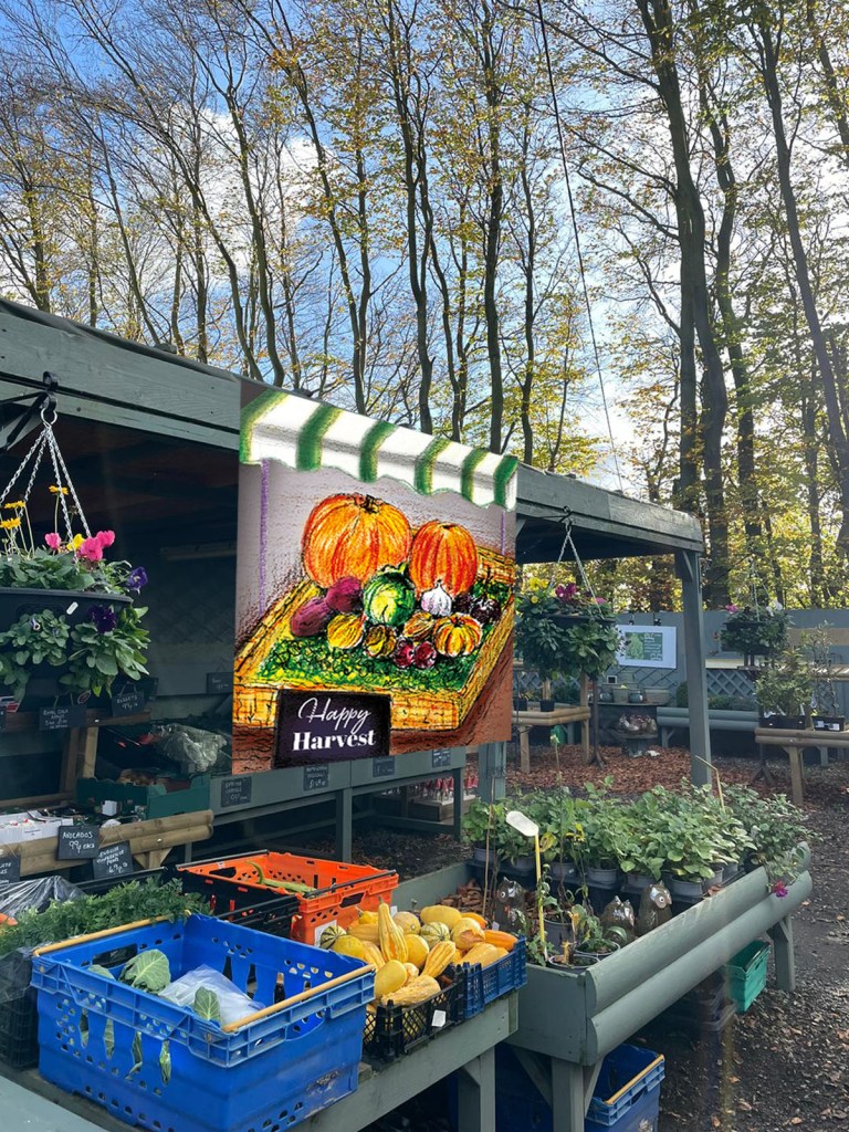
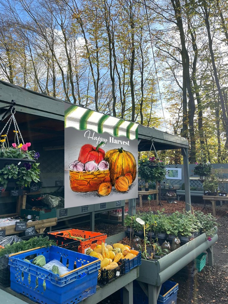
Bellow, I collected some instructions from my books, such as Pictograms, Icons & Signs: A Guide to Information Graphics, by Rayan Abdullah and Roger Hübner, and the book by Laura Carlin A World of Your Own. The first three examples are very informative, and straight to the point, with minimalistic colour choices, and infographics to bring the information directly to the reader. That is useful when the individual doesn’t have much time for analysing the instruction, goes by, or needs to get to the destination or catch the information straight away.
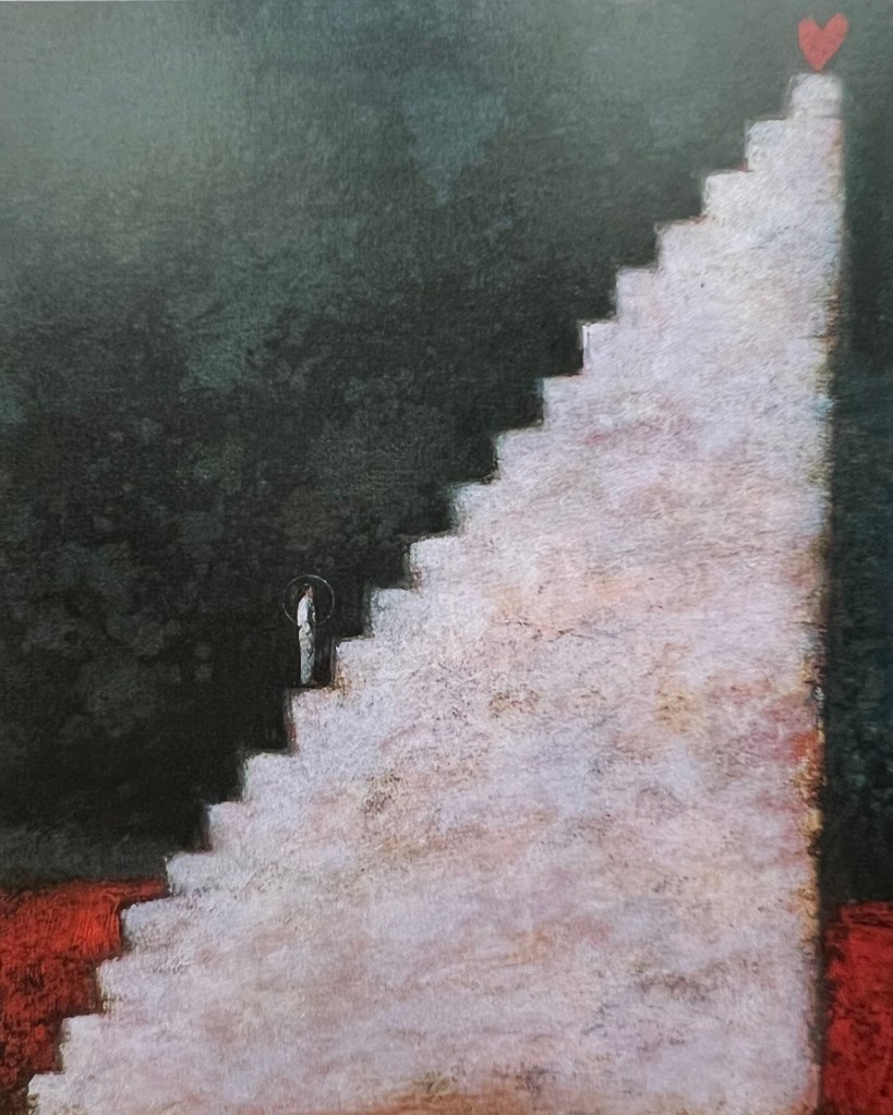
But, at the same time, when artists have freedom, the instruction, or infographic can be brought into the creative way, and the reader will have joy from a closer inspection from analysing it or creating their own experience from the information given. For example, Laura Calin’s book takes the reader on an extraordinary visual journey through her imaginative world. She shows that using the narrative of a day from getting up in the morning to going to bed at night can be illustrated in the wild and witty imagination, creating enjoyment from most everyday objects.
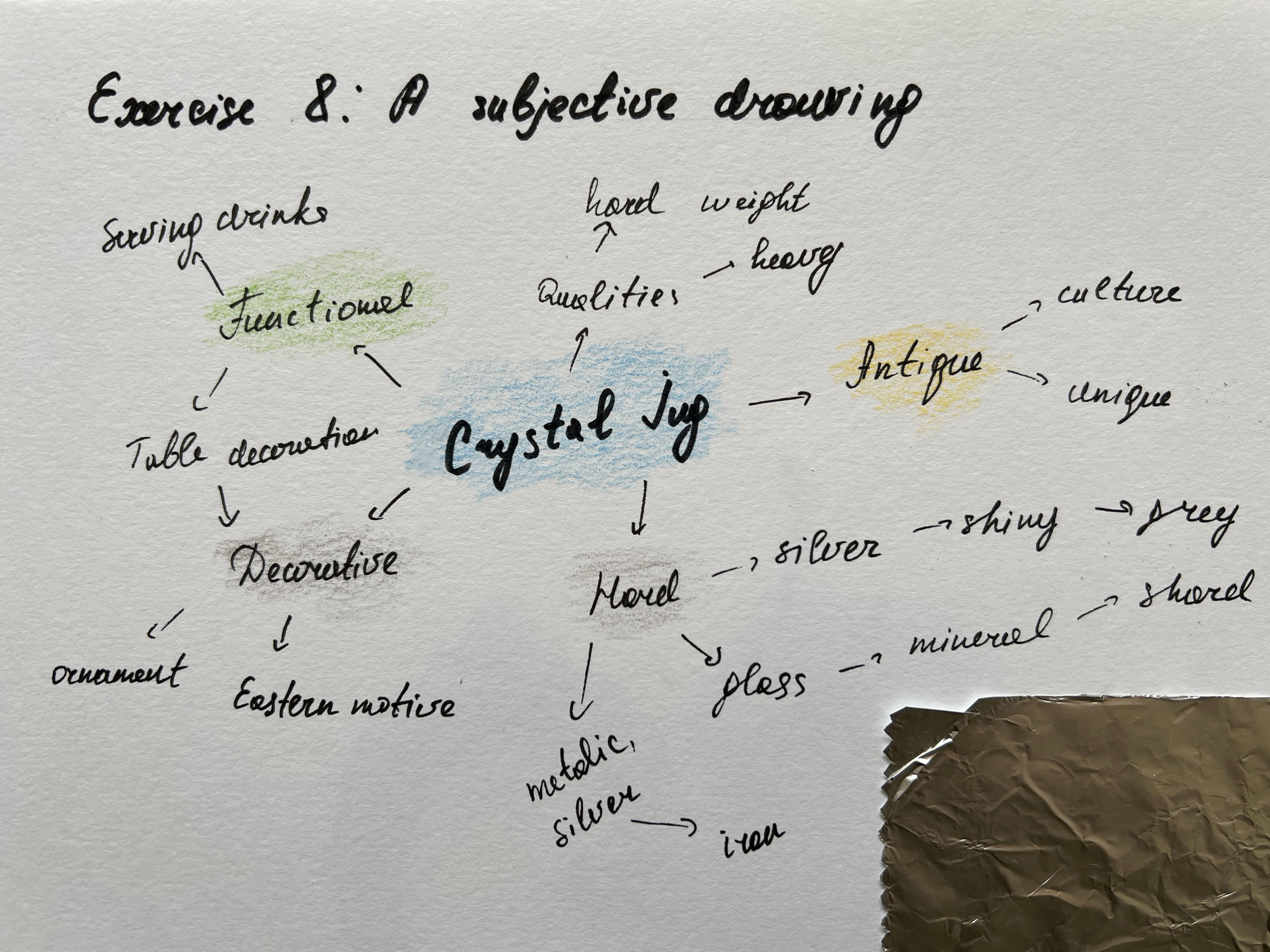
I wanted to try both approaches in my infographics. My chosen subject is ‘Making a cup of tea’. I thought it will be curious to see how different ways of drawing will impact the understanding of infographics, and what emotions they both can bring.
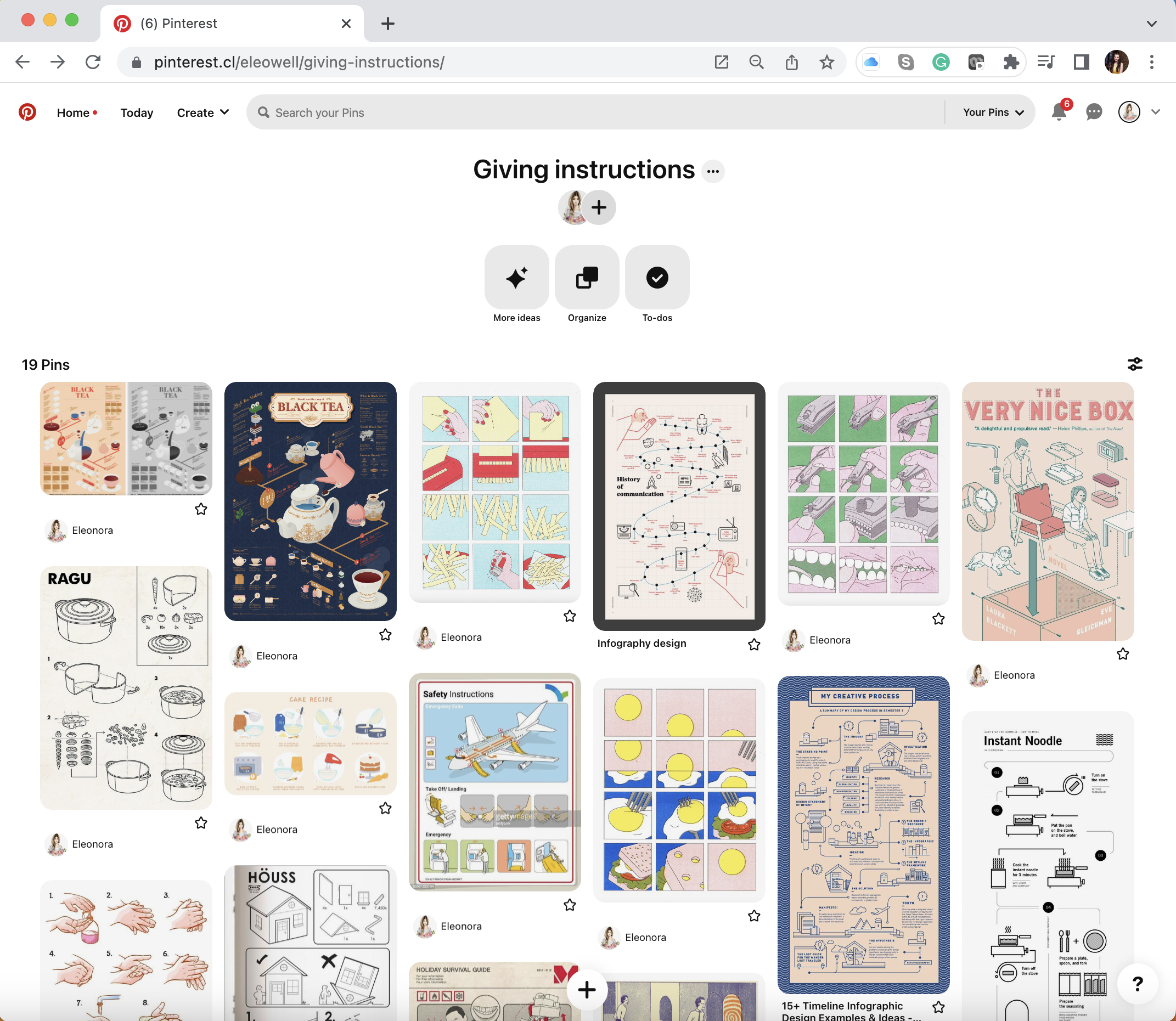
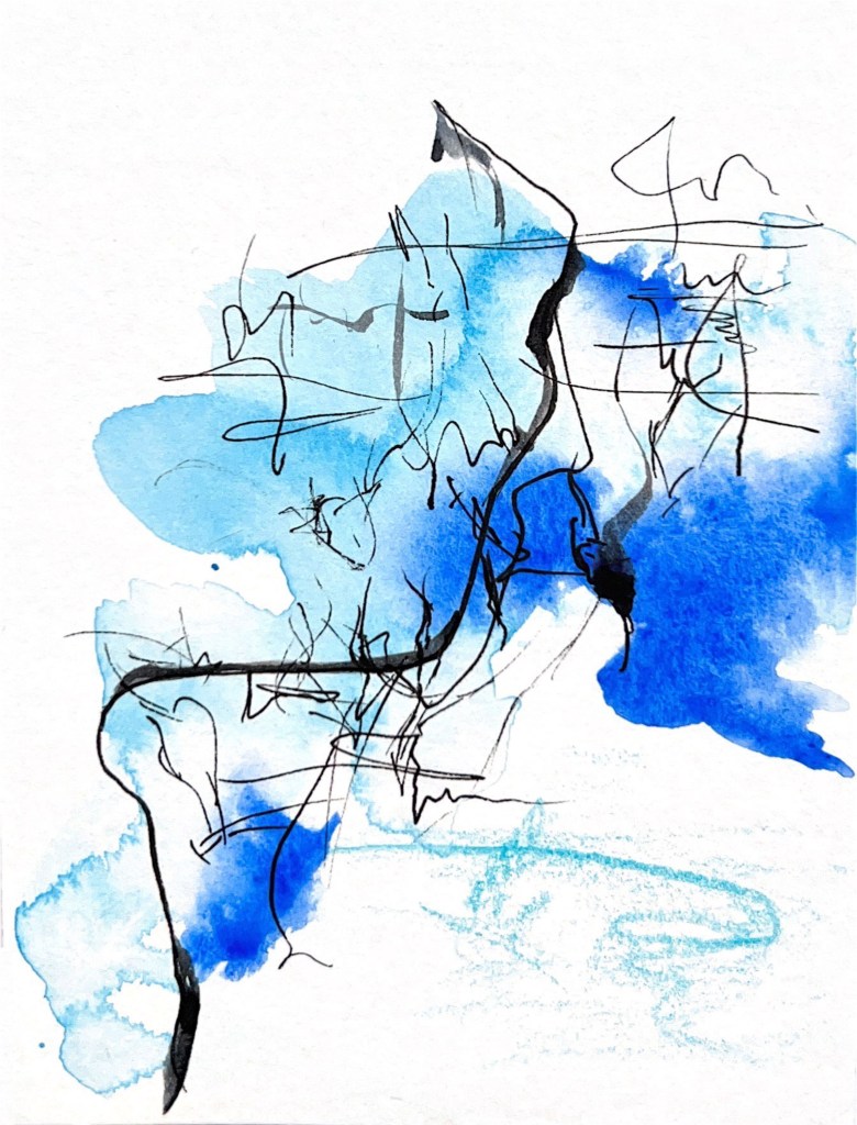
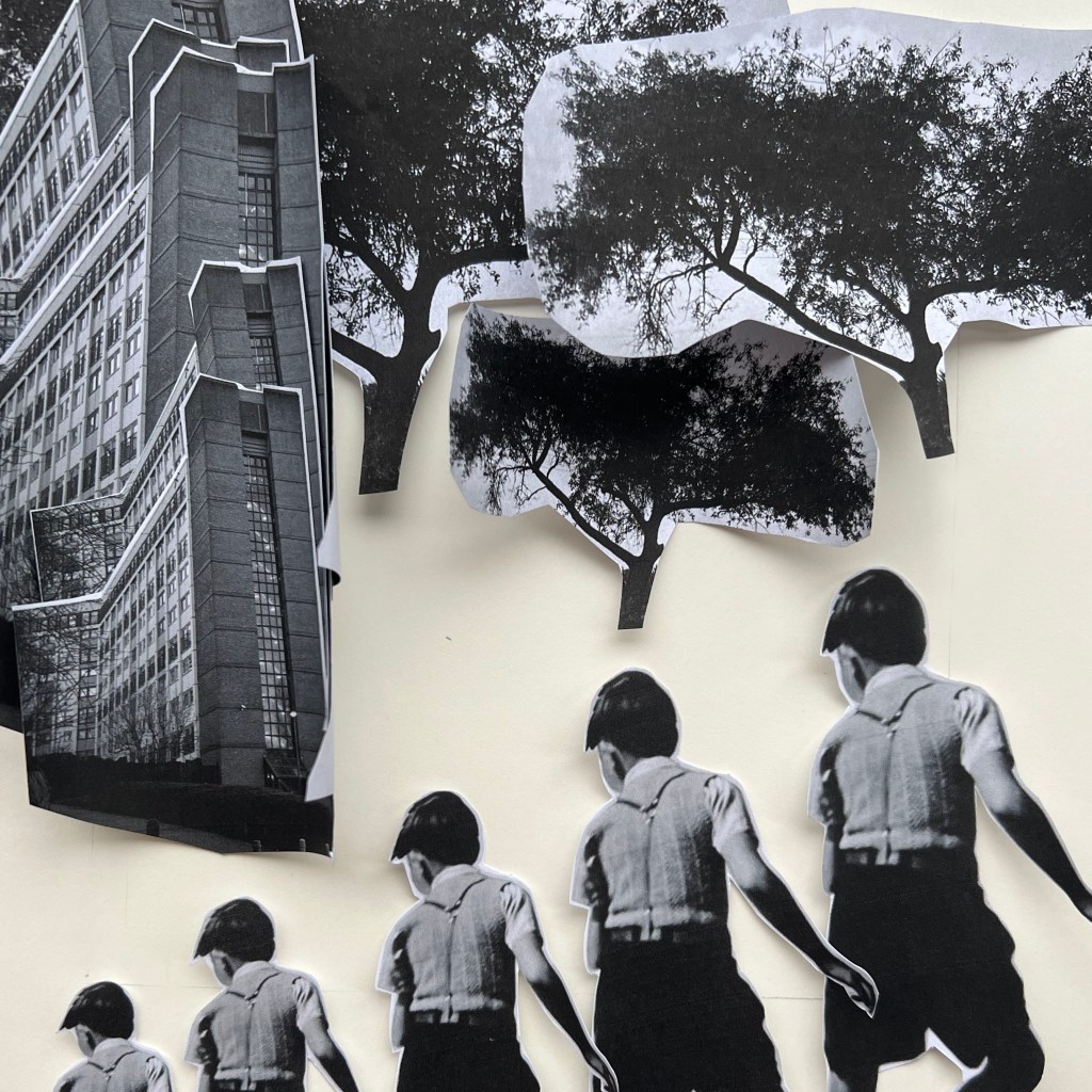
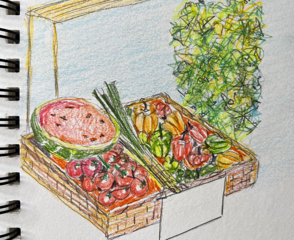
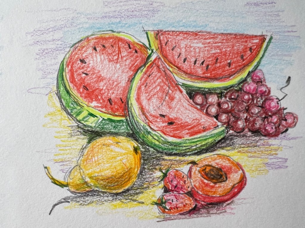
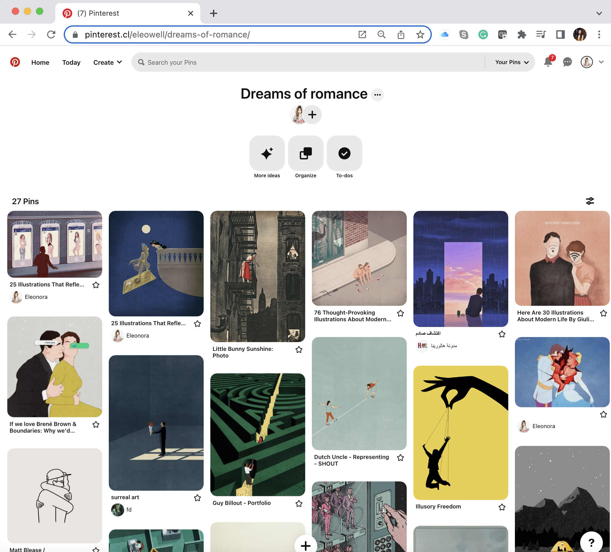
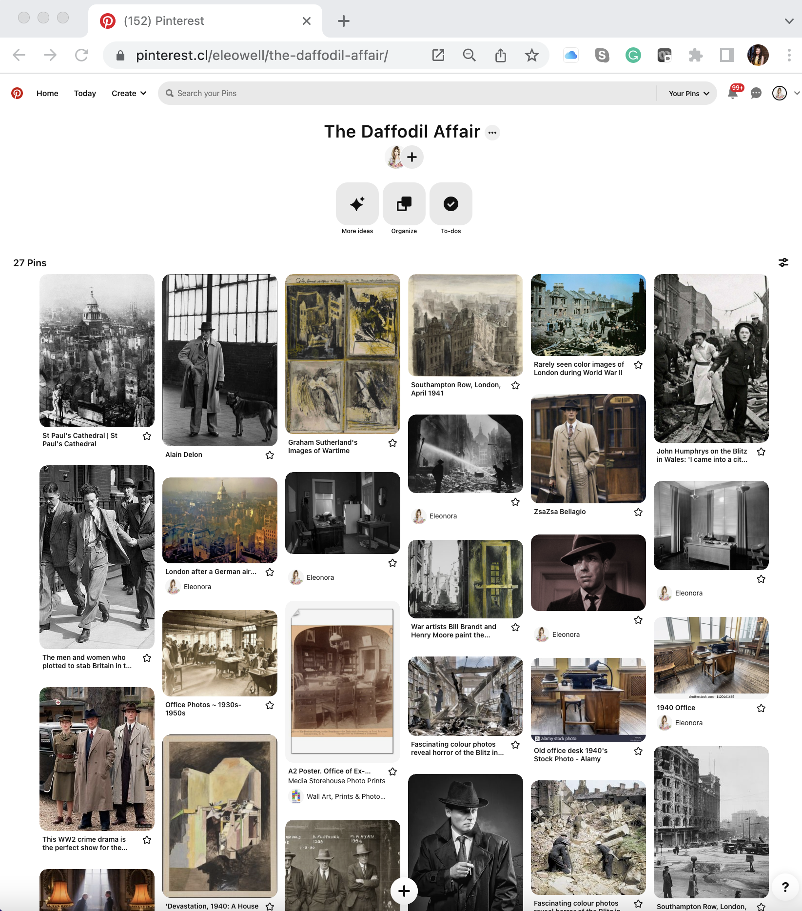
Pinterest mood board
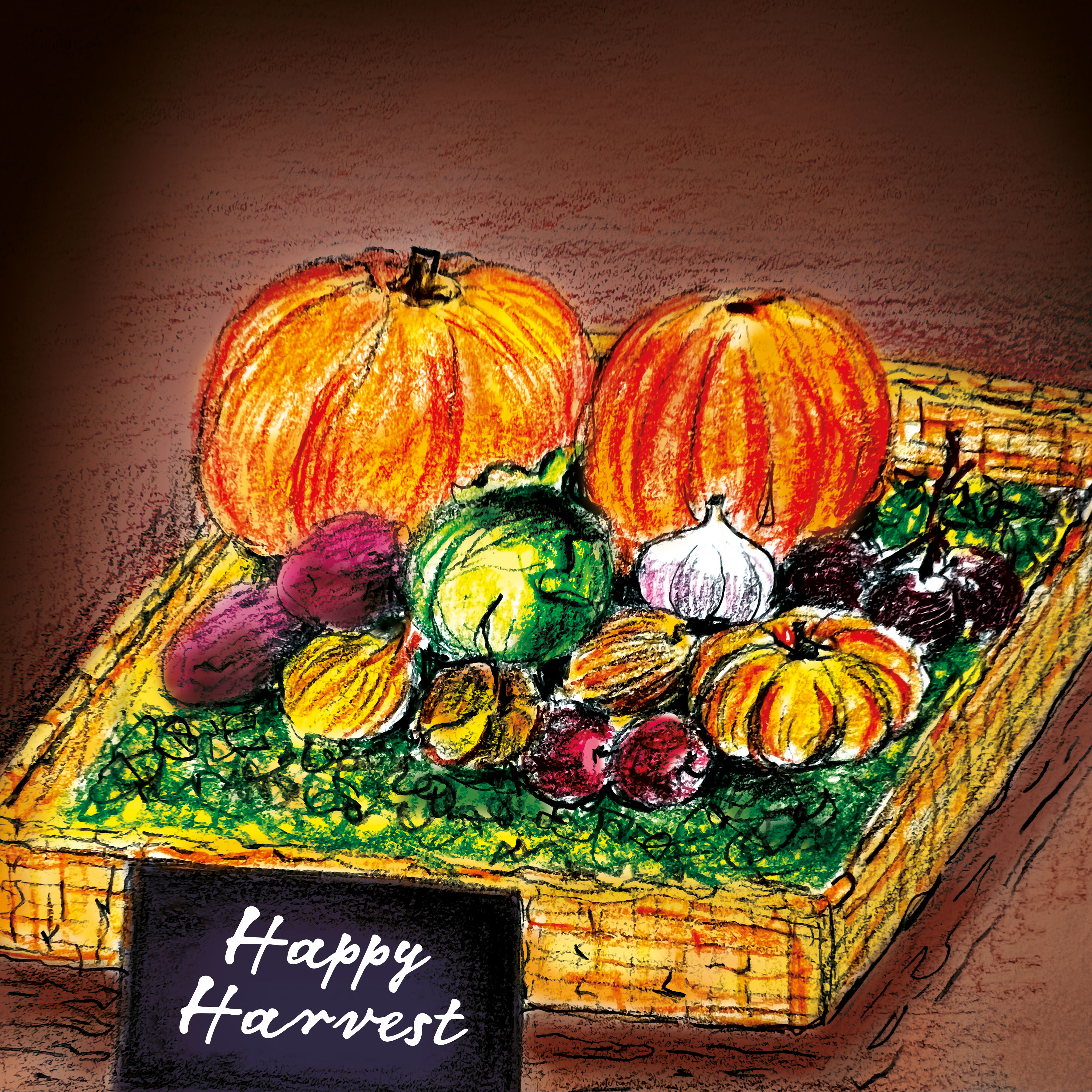
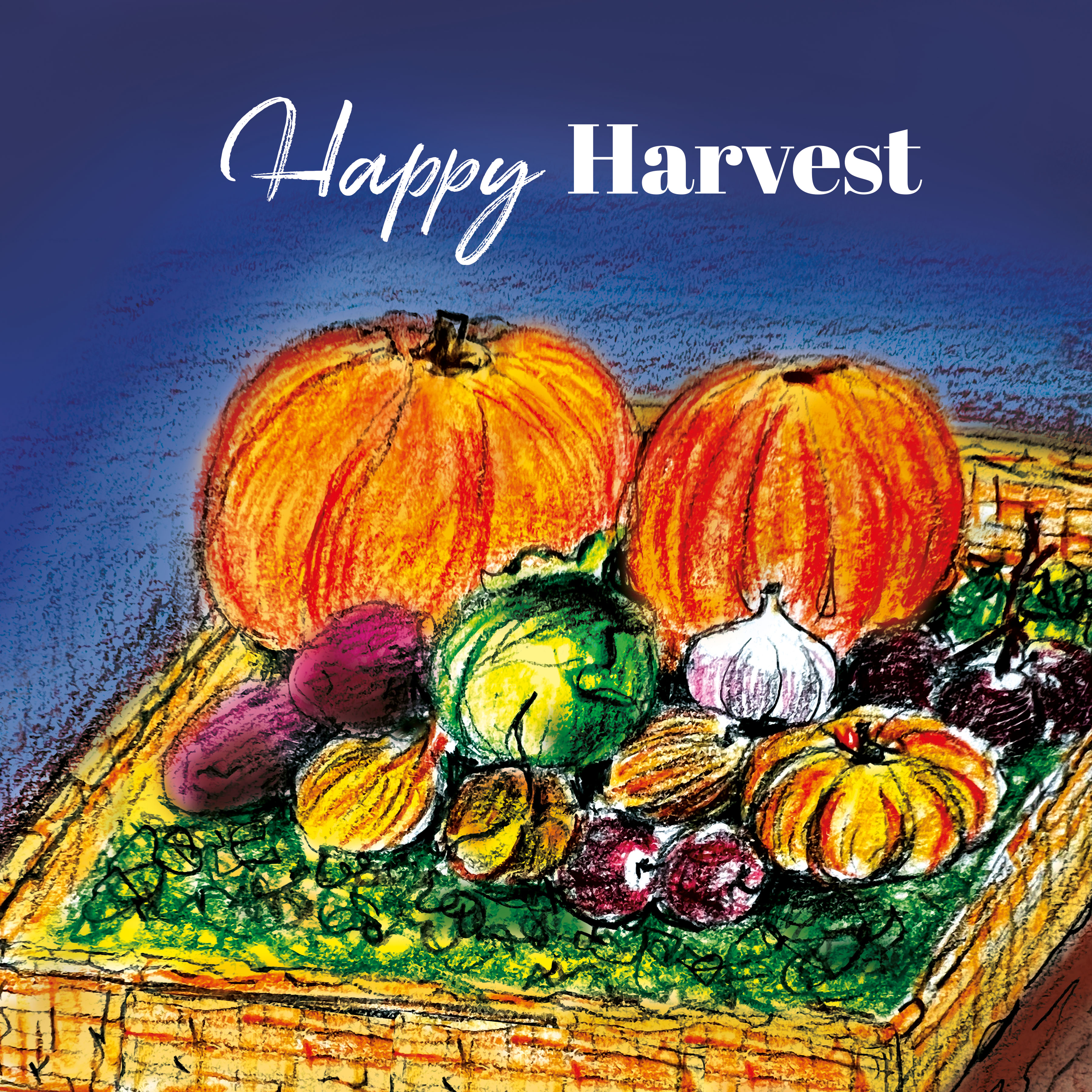
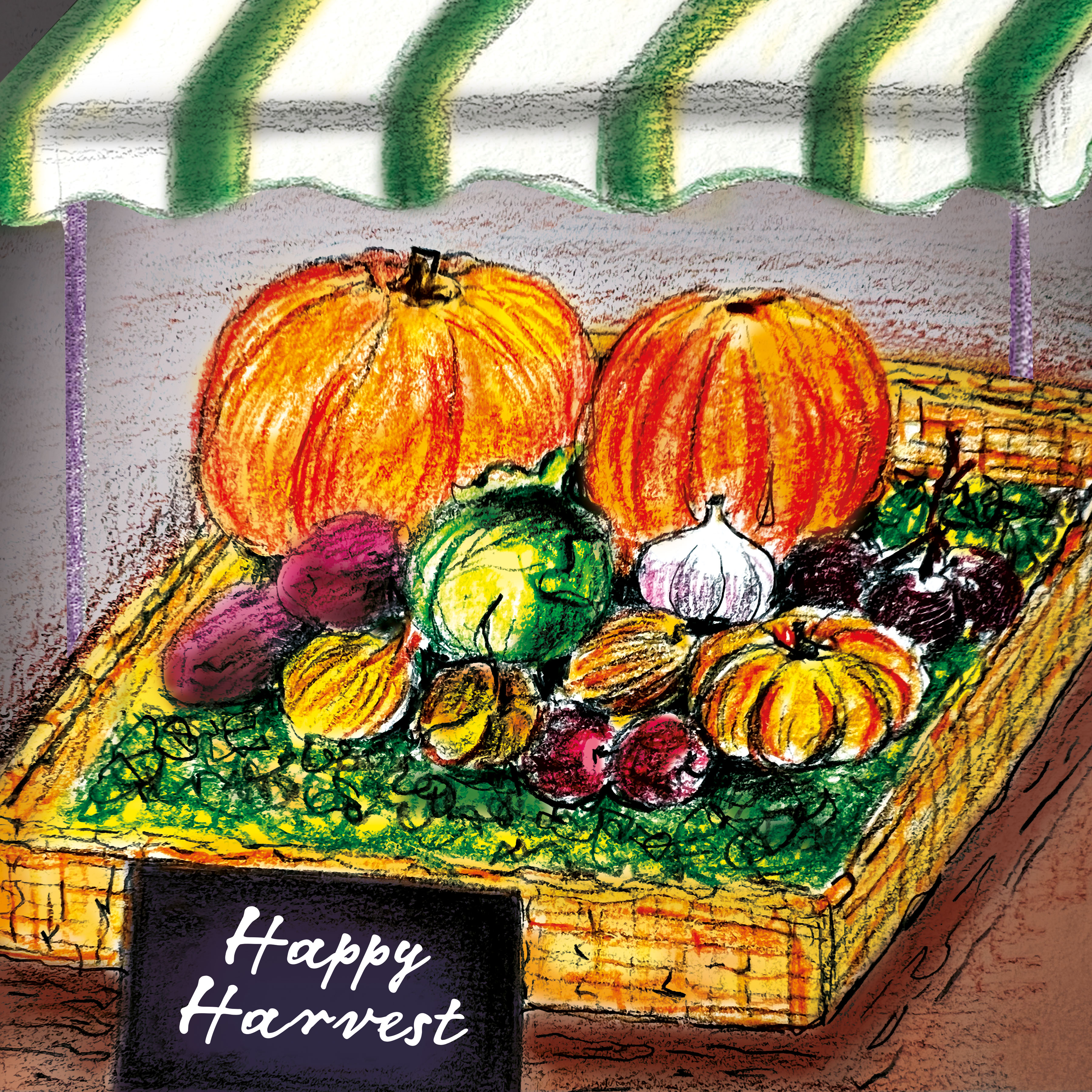
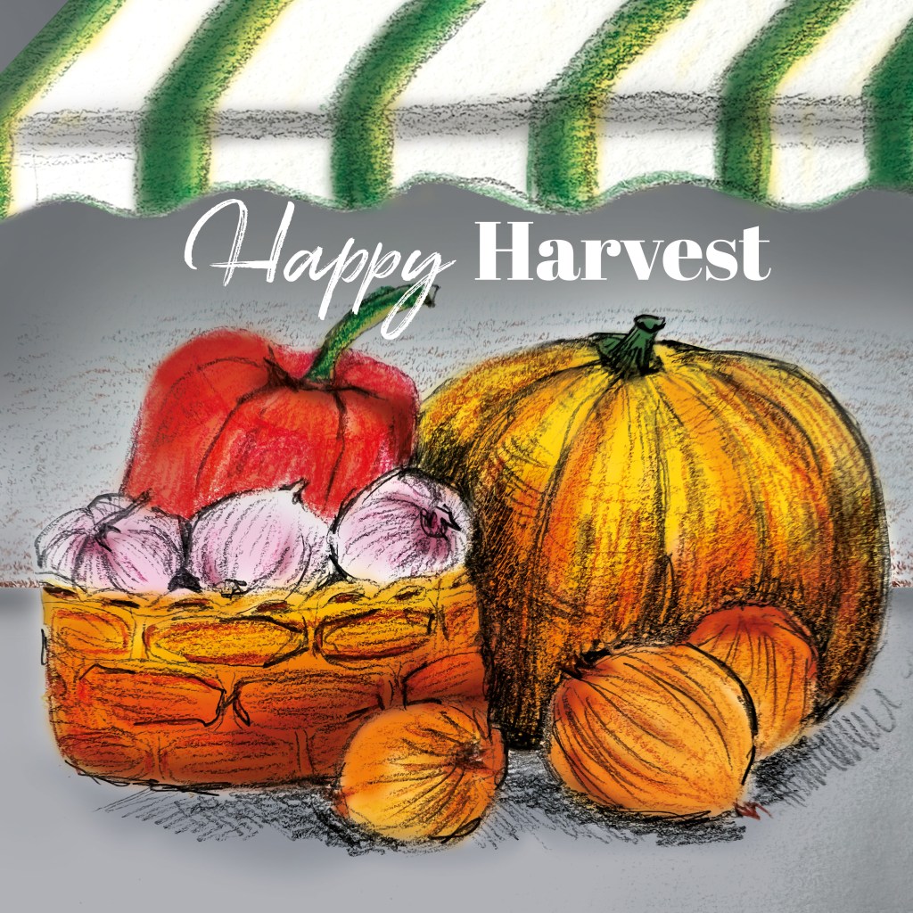
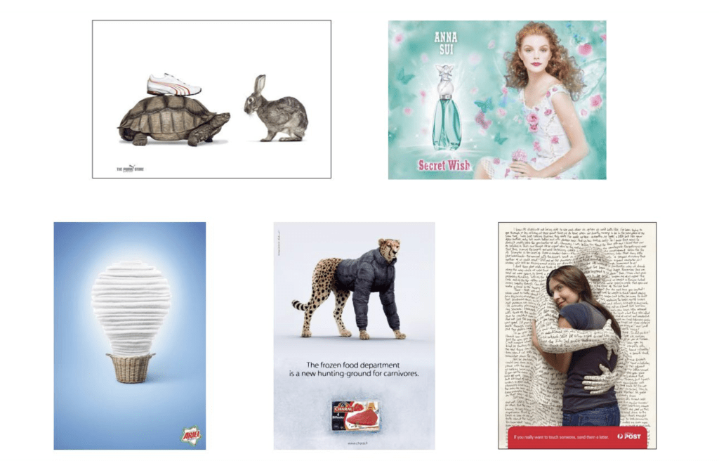
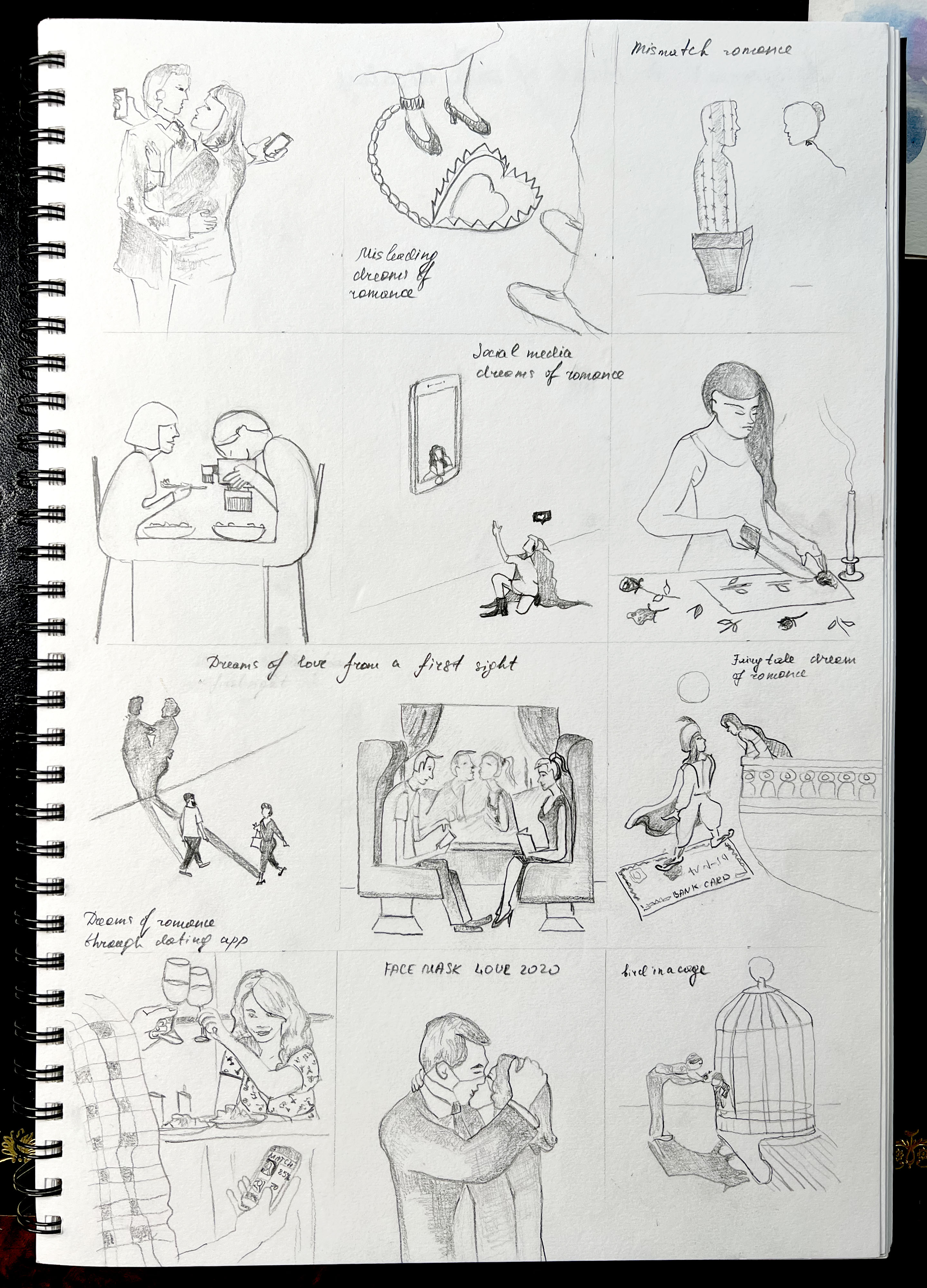
Also, I collected some examples of instructions from the internet, with different subjects and approaches. I can see that the information can be read in a different way, for example, in black-and-white clearer, direct and dry, but colourful creative illustrations have some sort of double meaning, making you think and have your own impression from the information provided. At the same time, some illustrators apply in infographics a humorous and ironic twist, highlighting the peculiarities of modern life.
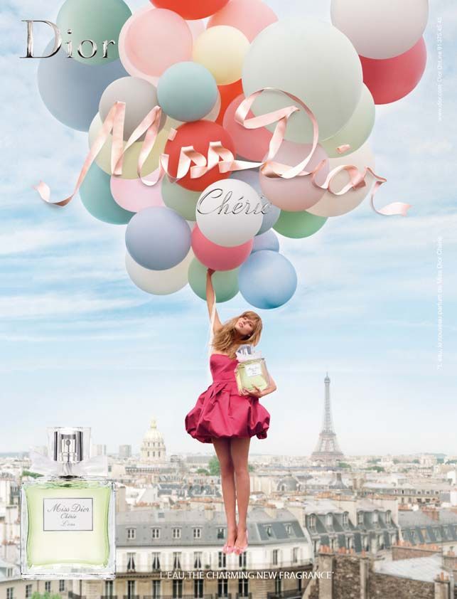
The advantages of minimalistic, or strict infographics are that they are easier to absorb and bring the meaning straight away, but full-coloured illustrations are more eye-catching and can be developed for different purposes, such as advertising, political campaigns, editorial, or easily demonstrate a care-free attitude. Some examples are below on my Pinterest board.
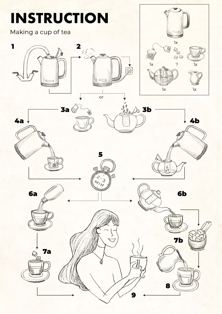
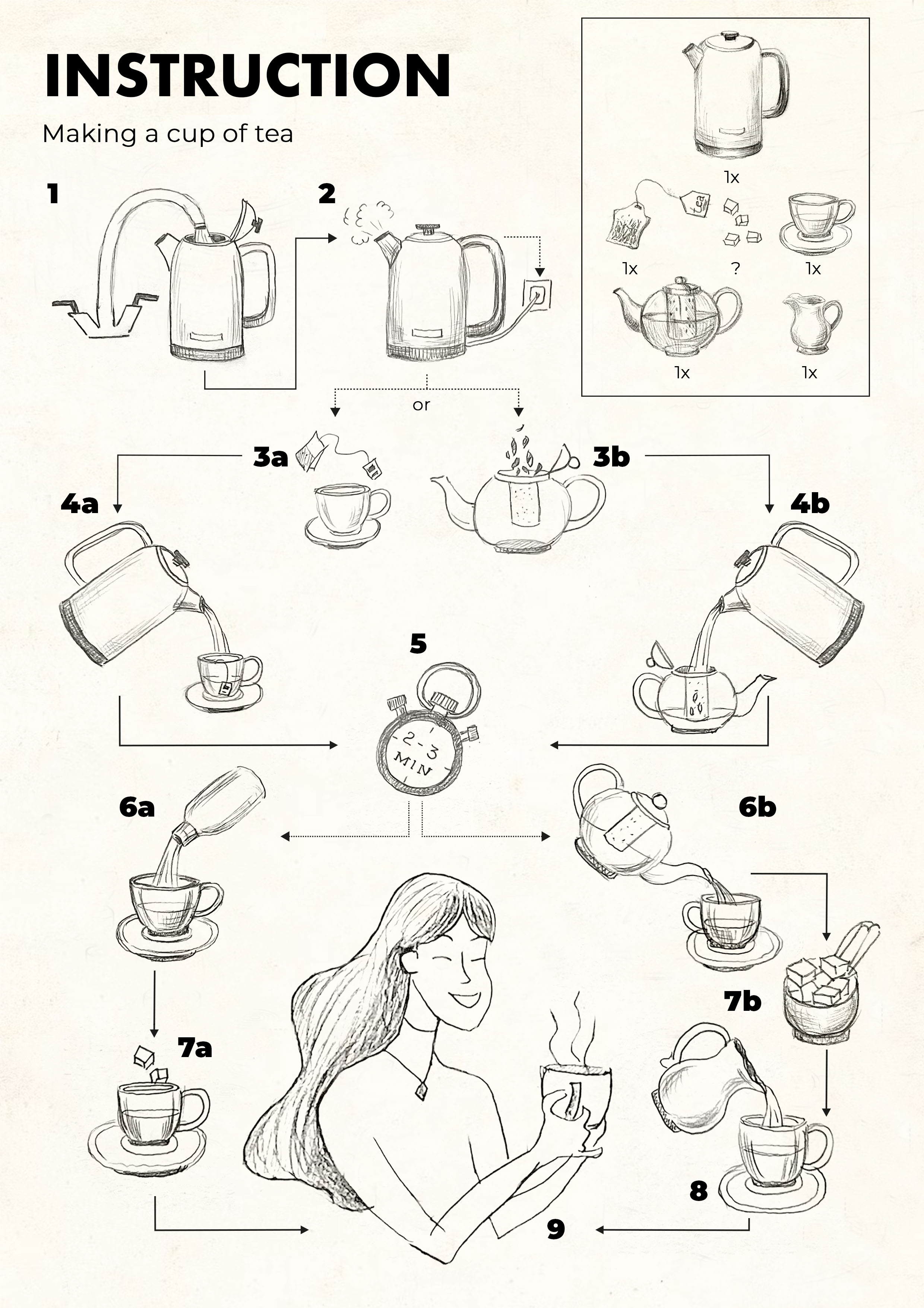
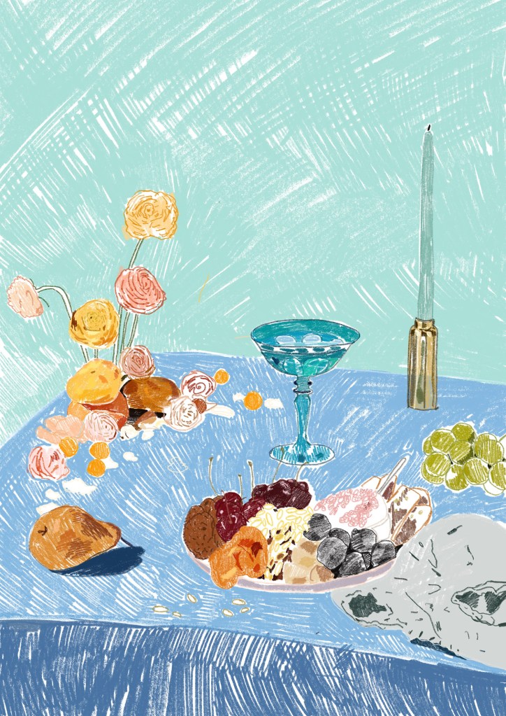
Making a cup of tea
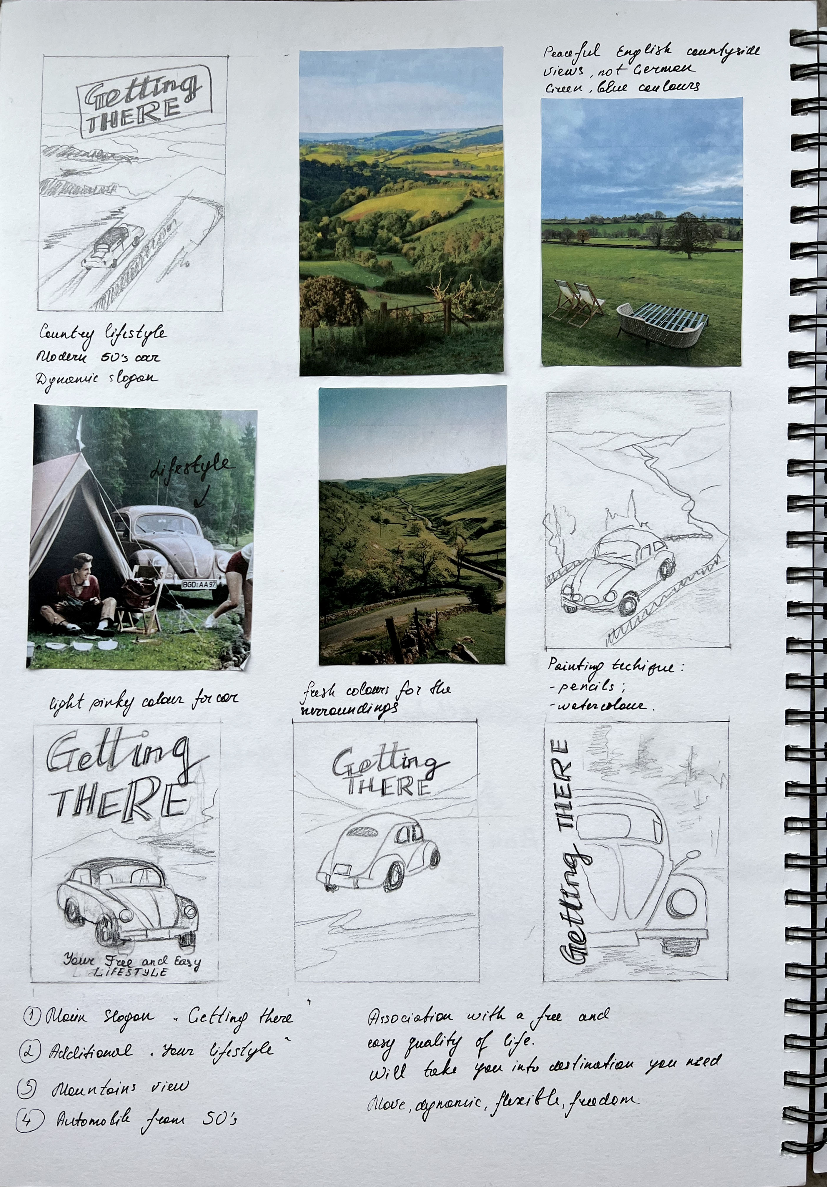
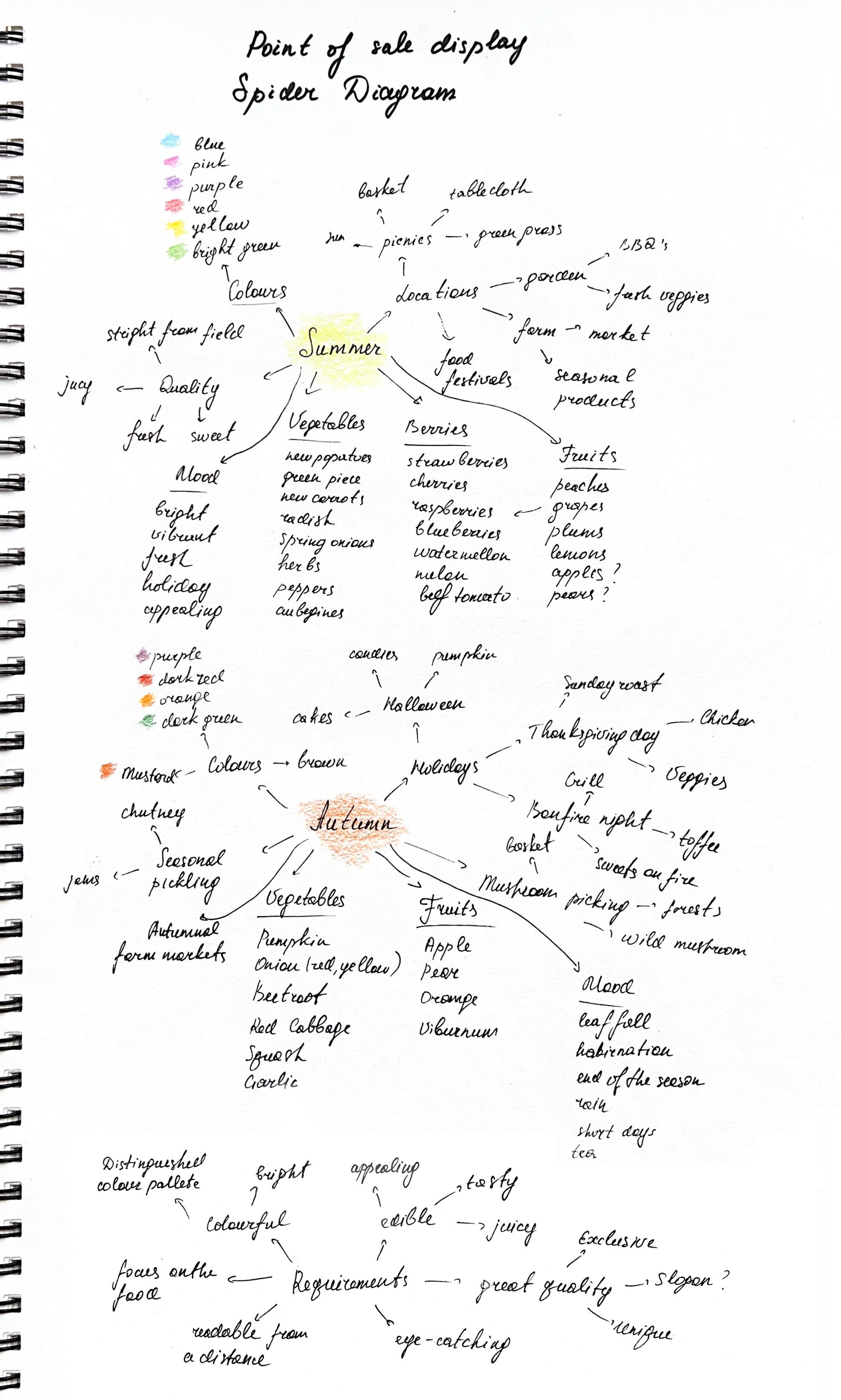
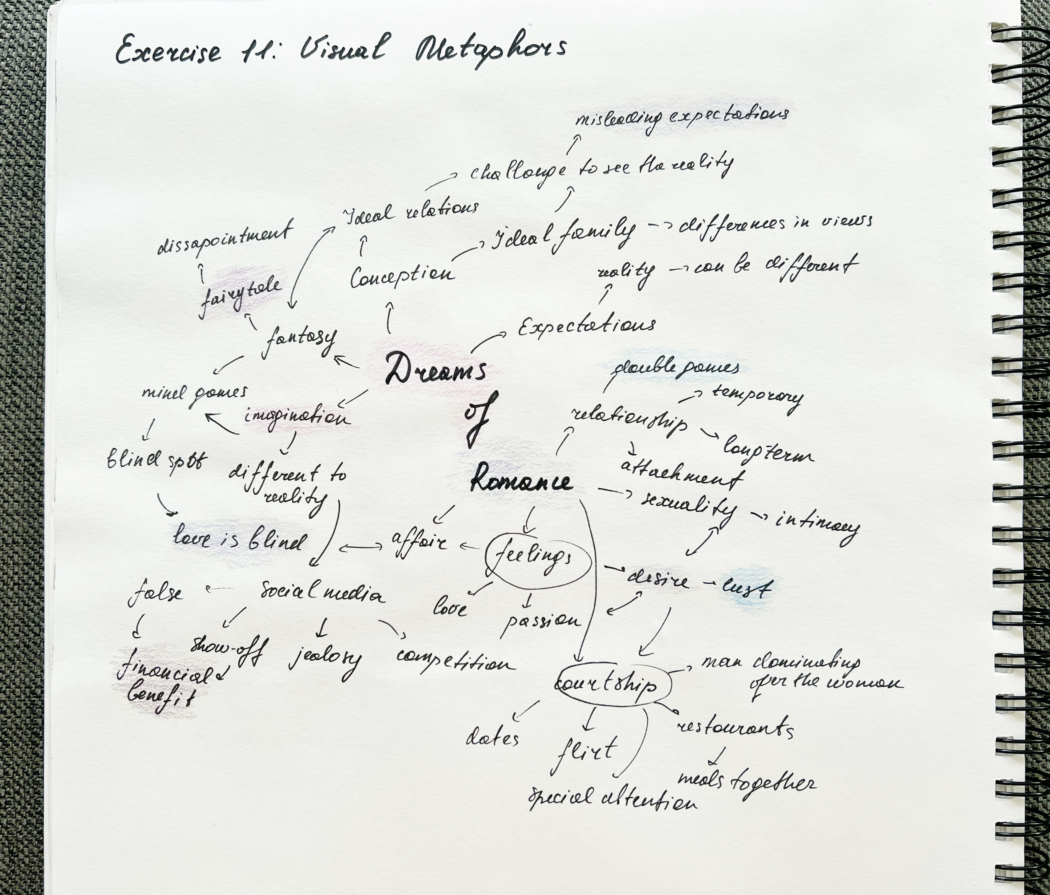
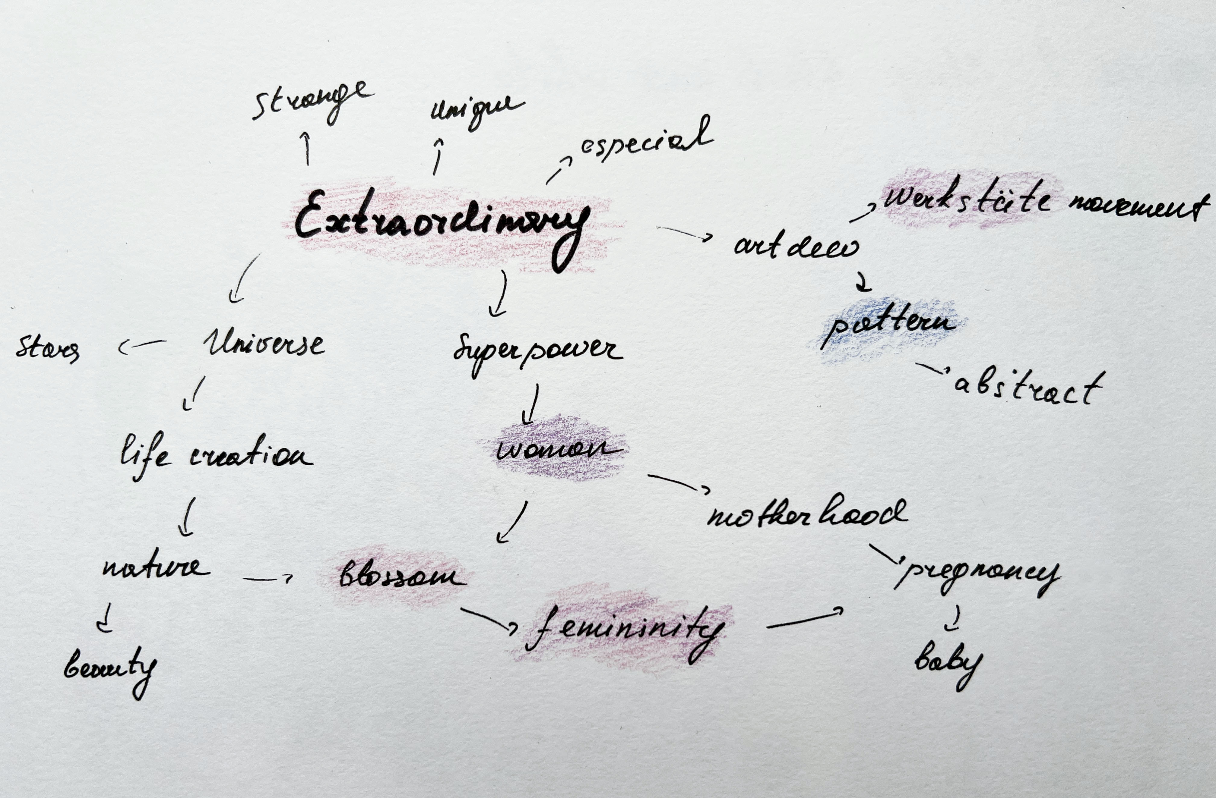
After collecting some research images I proceeded to the next stage of the exercise — mindmap. I was thinking about what kind of illustration I wanted to come up with. Should it be imaginative, full-coloured and illustrative, or should be purely informative, and thick outline black-and-white or limited coloured? I thought that I should make a start on sketching some possible routes for the infographic, and see where it will lead. I thought I won’t limit myself to a particular style, and it’s always useful to try different approaches in illustration, as experiments bring some new solutions to problem-solving.
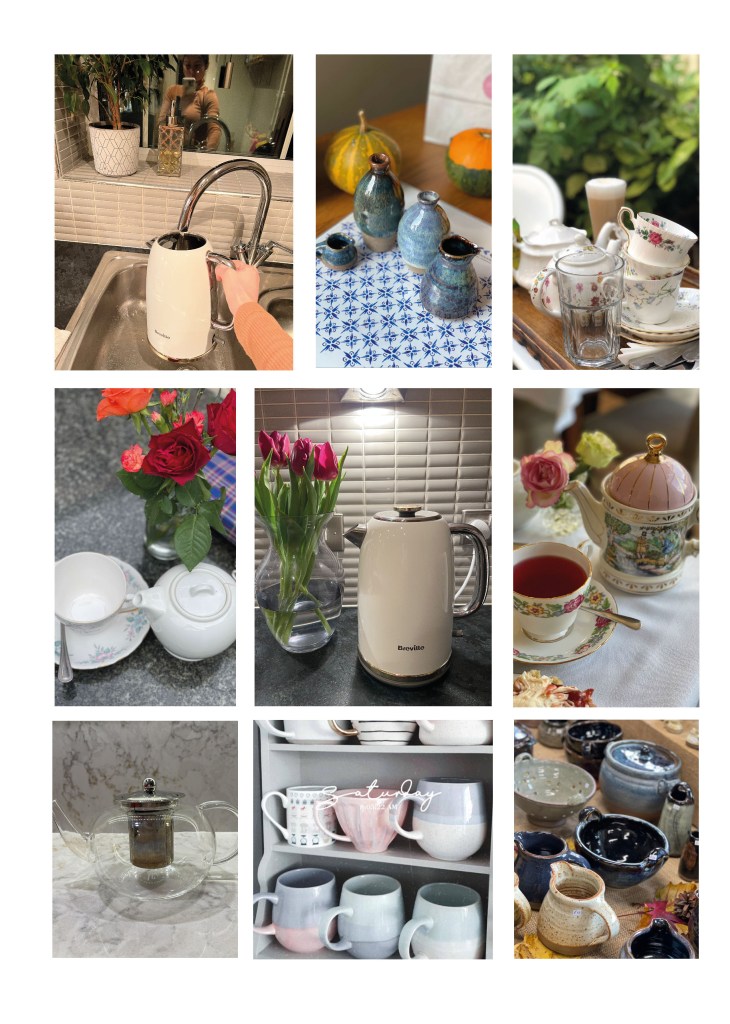
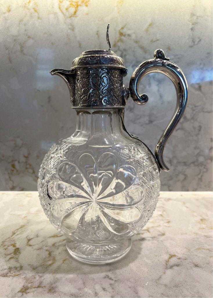
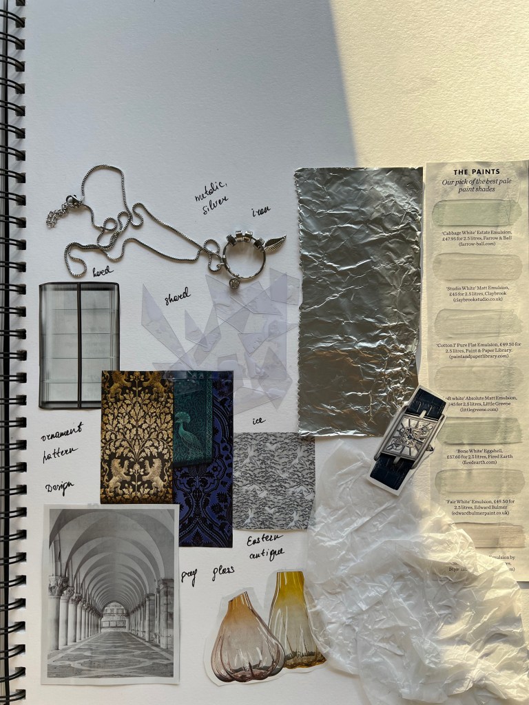
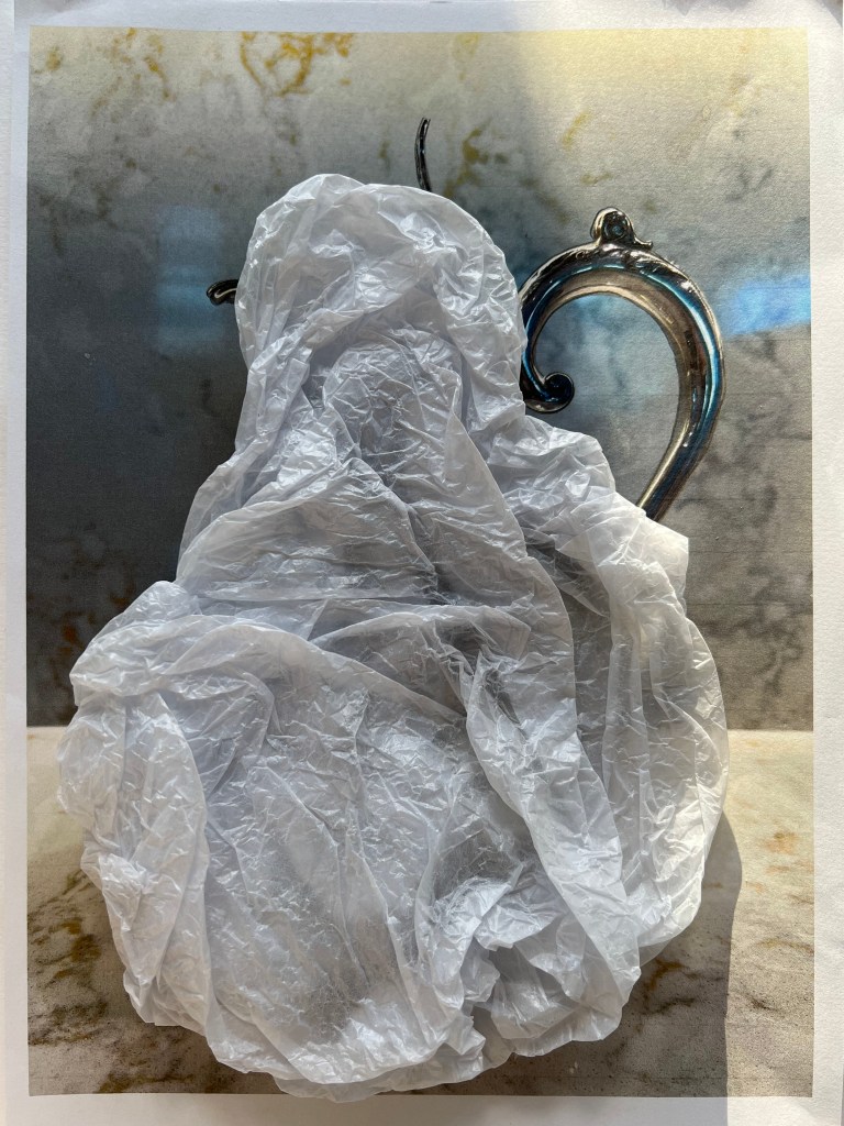
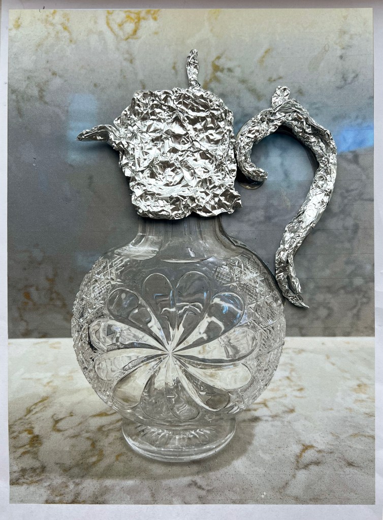
Below are some pictures that I and my friend collected around. I think, having that little break with a cup of tea is quite a symbolic ritual for most of us, we do not just have a drink, sometimes we can bring into it some beautiful details, such as decoration, antique tea utensils, presentation and other details. I was aware of the task to follow the guide of being informative, but I thought that some creativity, or intricate details only bring a special touch to the infographic.

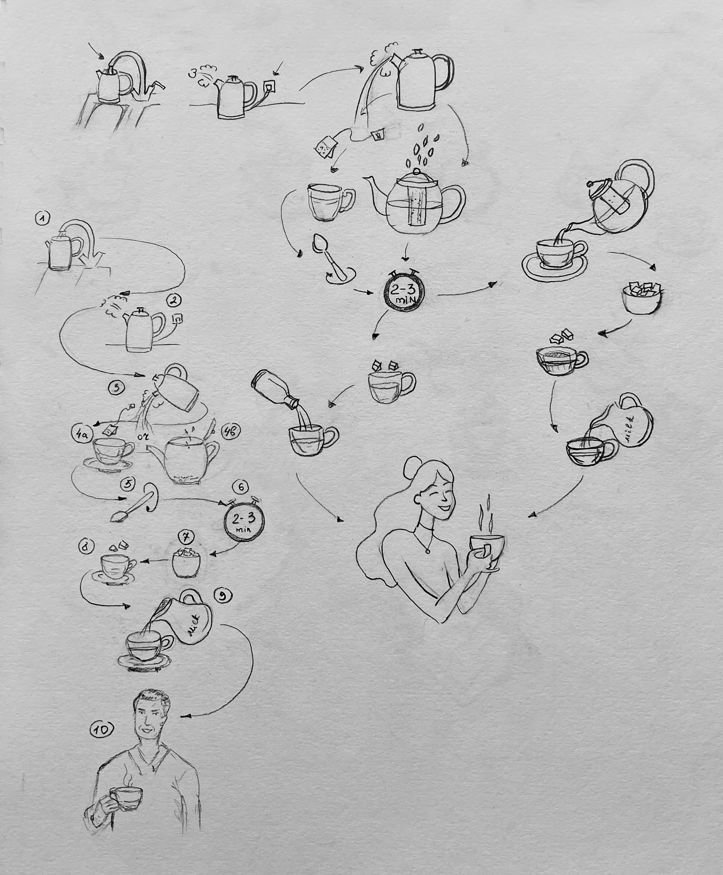
I was thinking about what steps I wanted to include in the tea-making process, starting from basic switching on the kettle to boil the water and leading to the enjoy your lovely made cup of tea, that’s why I decided to create a kind of literal approach to the tea-making process. But at the same time, concentrate on experimenting with infographic illustration ideas, colours and patterns of the steps. Will it look like a maze, or should it be easy to follow the arrow guide? Let’s see.
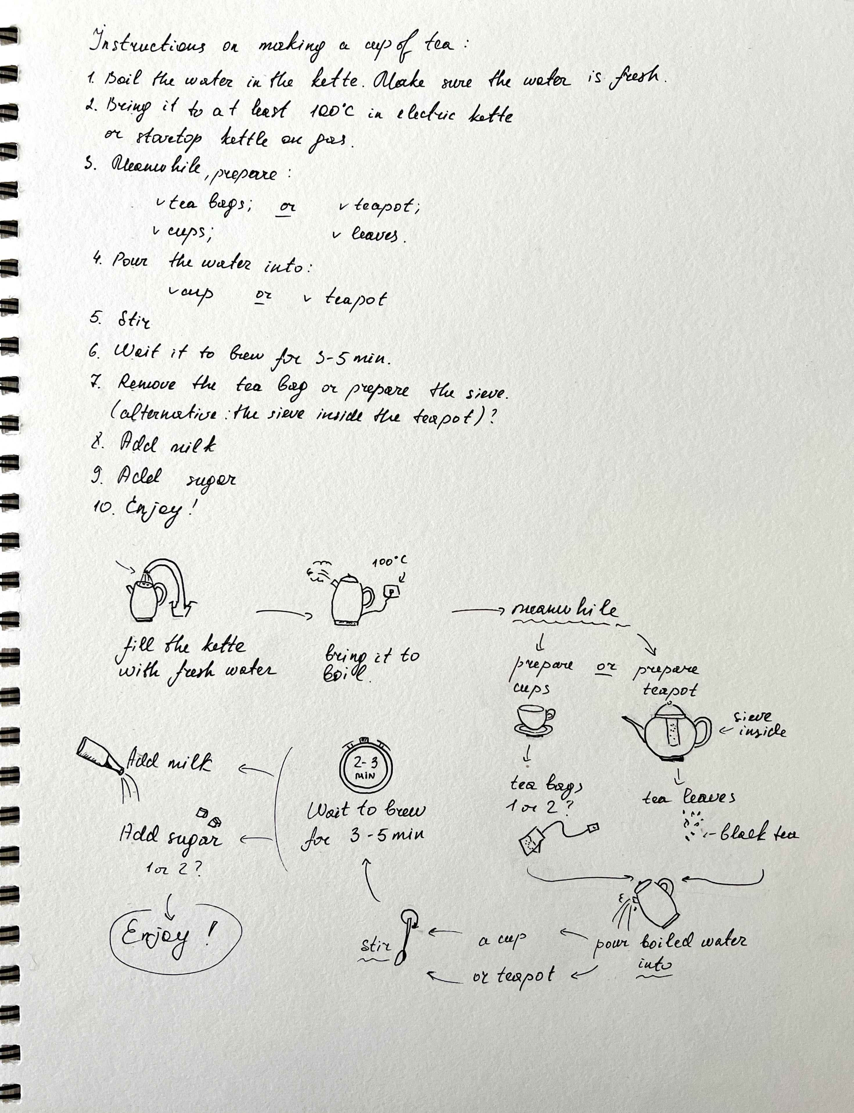
Steps:
- Boil the water in the kettle. Make sure the water is fresh
- Bring it to at least 100°C in an electric kettle or stovetop kettle
- Meanwhile, prepare the teabags and cup, or teapot and tea leaves
- Pour the water into a cup or teapot
- Stir
- Wait for it to brew for 3-5 minutes
- Remove the tea bag or pour tea into the cup from the teapot
- Add milk
- Add sugar
- Enjoy
Illustrations
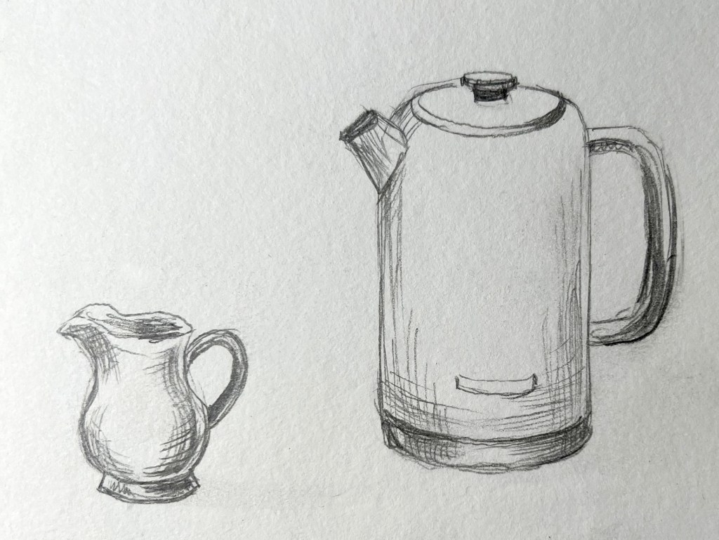
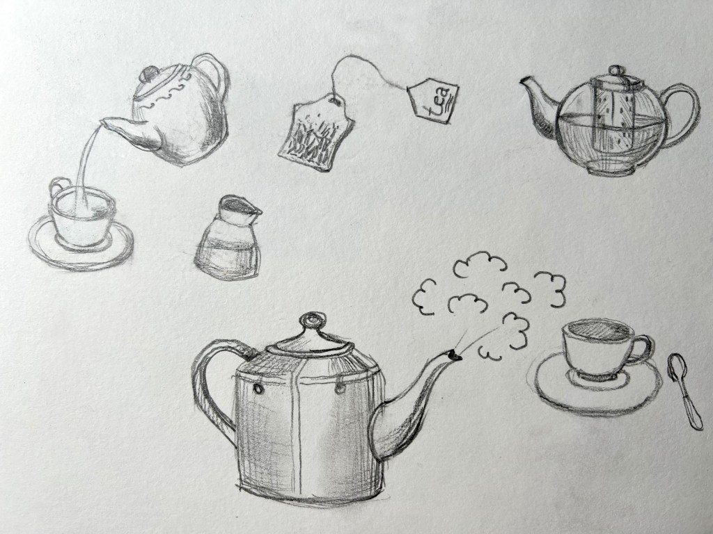
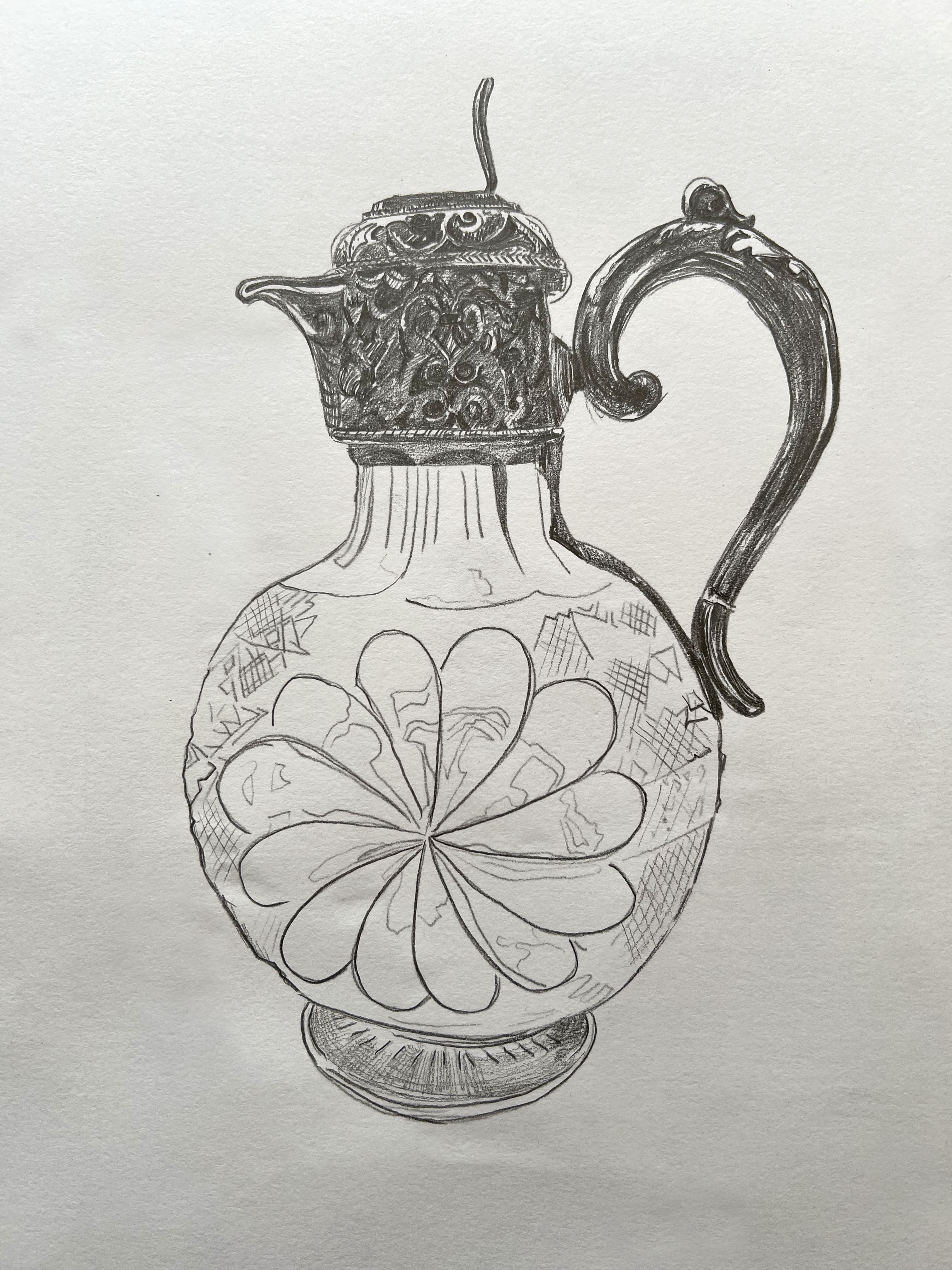
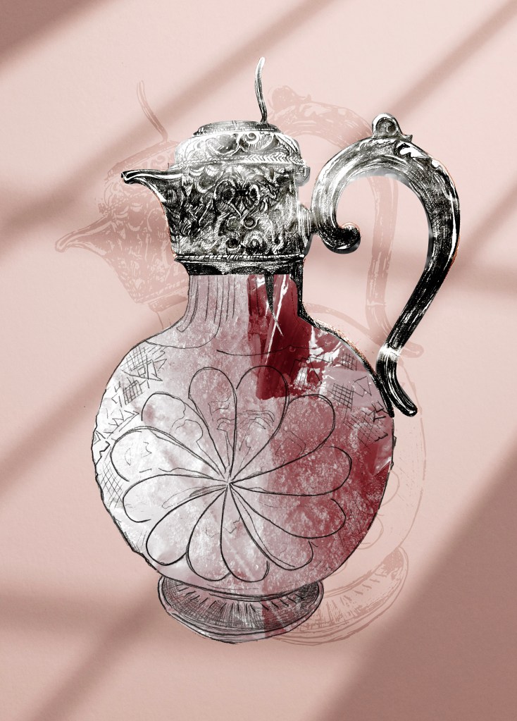
In addition to infographics, I made some observation illustrations in my sketchbook. That helped me to understand what shape of teapots and cups I was going to use, should they be all different shapes or forms, unusual looking, or shall they be more classic and simple shapes? I thought if I will specify my unique type of teapot, the final piece will be more unique and effective.
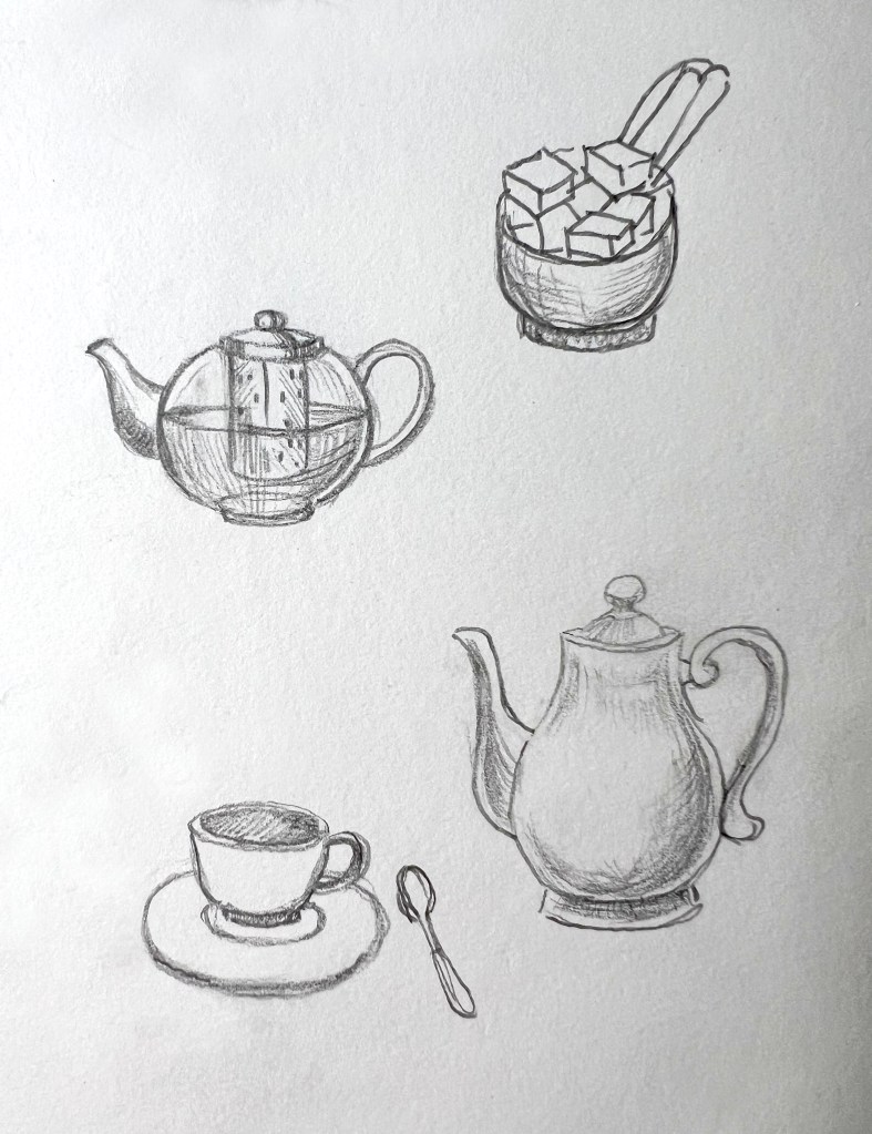
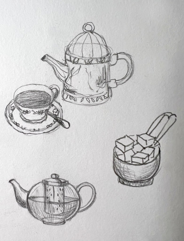

Once I gathered all materials and sketches together, I went to the next stage of incorporating illustrations into the organised process. Here the infographic could be developed through a couple of types, like a strict diagram, or playful illustration, with cartoony-style sketches of kettles, cups, and teapots. For the flowchart, I decided to use the electric kettle, the one I had at home, a transparent glass teapot, that we usually use for our different flavours of teas, as it has an inbuilt sieve inside, and traditional cups, avoiding complicated details or patterns on them. I thought that after step 2 I will need to separate the process into two routes, like for a fast version just a tea bag and a cup, and for a more complicated type, where the teapot and milk jar are involved, but in the end, join both sides in one result — ‘Enjoy’.
I felt like I was on the right path, therefore the next step was to repeat chosen illustrations in better quality images, so I could apply them in an infographic and neater them up for the final artwork. I still left them to look like a sketch, avoiding details, such as shadows or precise shape sketching, I purposefully wanted them to look like cartons, and be more playful for the reader. Using Adobe Photoshop and Illustrator software helped me to create that step-by-step structure, and also, I could combine straight arrows and illustrations together in one piece. In my point of view, the direct lines and angles for the arrows looked easier to follow compared to the shaped ones.
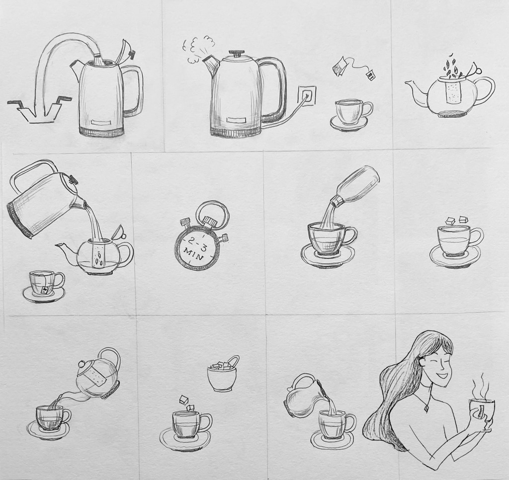
Final illustrations
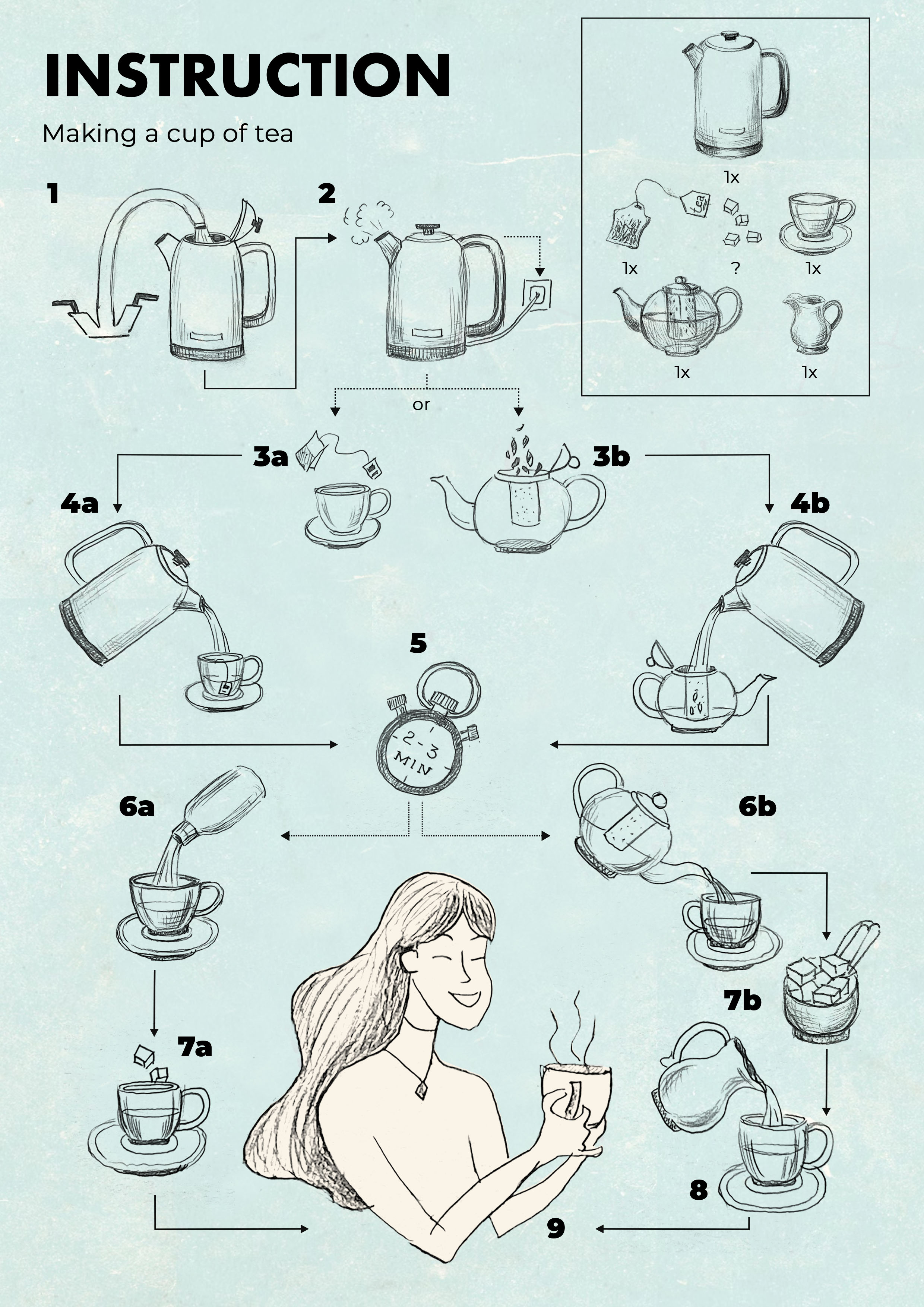
I placed the design into the textured-looking canvas, and it looked much better compared to the flat solid-coloured one. In the right top corner, I created a frame with key details that I was going to include in the infographic, making it look like genuine instruction in tea making. It was a challenge to create that well-balanced instruction straight away, as I didn’t want it to look like a maze, or be confusing for the reader. After a try-and-error approach, I managed to create that sensible order, placing the diagram in the A4 format. I was quite satisfied with the result, it took me a while to get to that point, as here I was joining the illustration and logical path of infographic design, however, I felt that it missing some creative touch, that would finalise the initial idea I was going to achieve. So, I rolled up my sleeves and went to the next stage, of colouring each illustration individually.
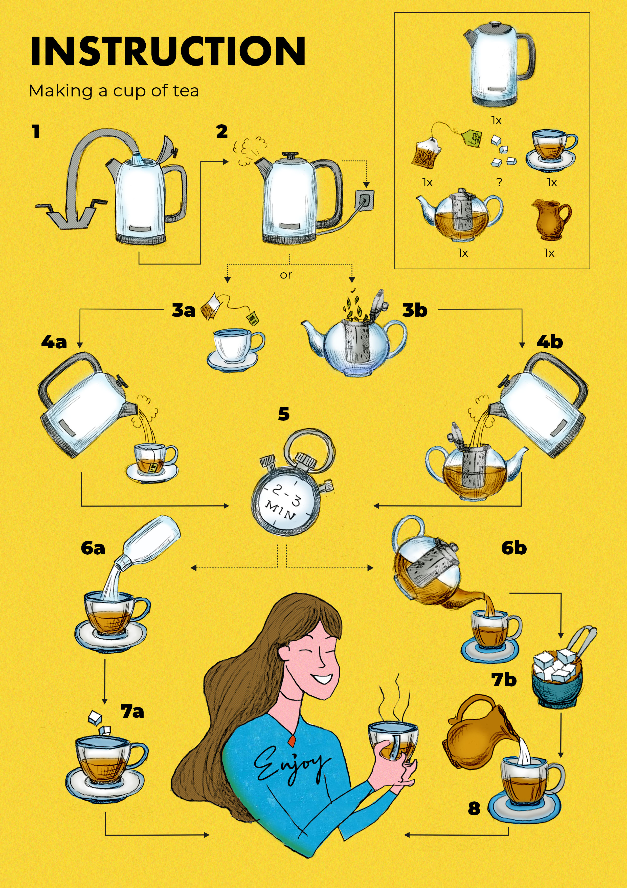
That was another time-consuming process on top of the existing work I’ve done, but the result was worth it. Here I changed the background into happy yellow with some grainy texture, and it helped me to bring the whole infographic up front. I followed the same diagram route, but as I added colour to this design, I had to make sure that the infographic is consistent and followed the logical path. For example, the girl holding the same cup design as the rest of the tea set. In addition, I added grainy and dots textures into the elements, such as the grey silver of the kettle and the girl’s hair, also, grainy blue colour for the shirt. From my notes, additional texture works well with illustration and creates that special touch and deepness for colours. Word ‘Enjoy’ I implemented into the girl’s shirt, making it look like a part of the t-shirt design.
Conclusion
I showed my designs to the family, and they said that it looks great, especially the coloured design, as it looked like a proper illustration. From this exercise, I learnt again, that there is always should be a place for experiments, I pushed my boundaries and went into the time-consuming mode of colouring practically every individual illustration, but I was placed that here I could achieve some new skills, that I can keep on developing and implement for future illustrations.


