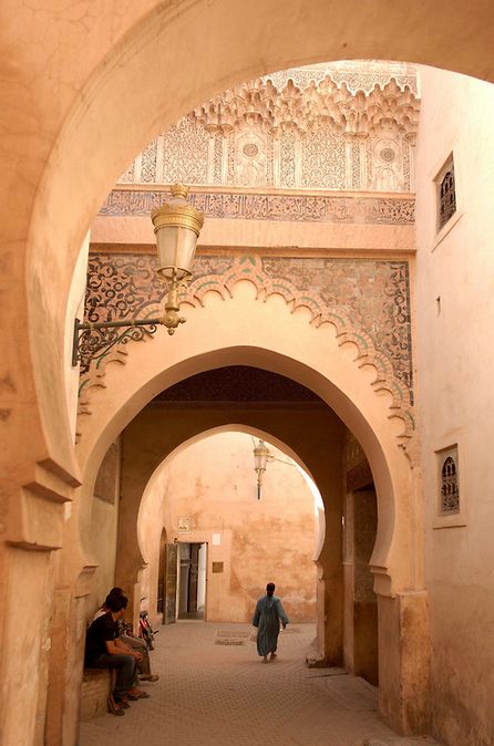
In this research point I need to anilise different layouts of magazines, publications and newspapers, to see which one is easy to follow, and which don’t. Bellow is collection of newspaper layouts and magazines that were appealing to my eye.
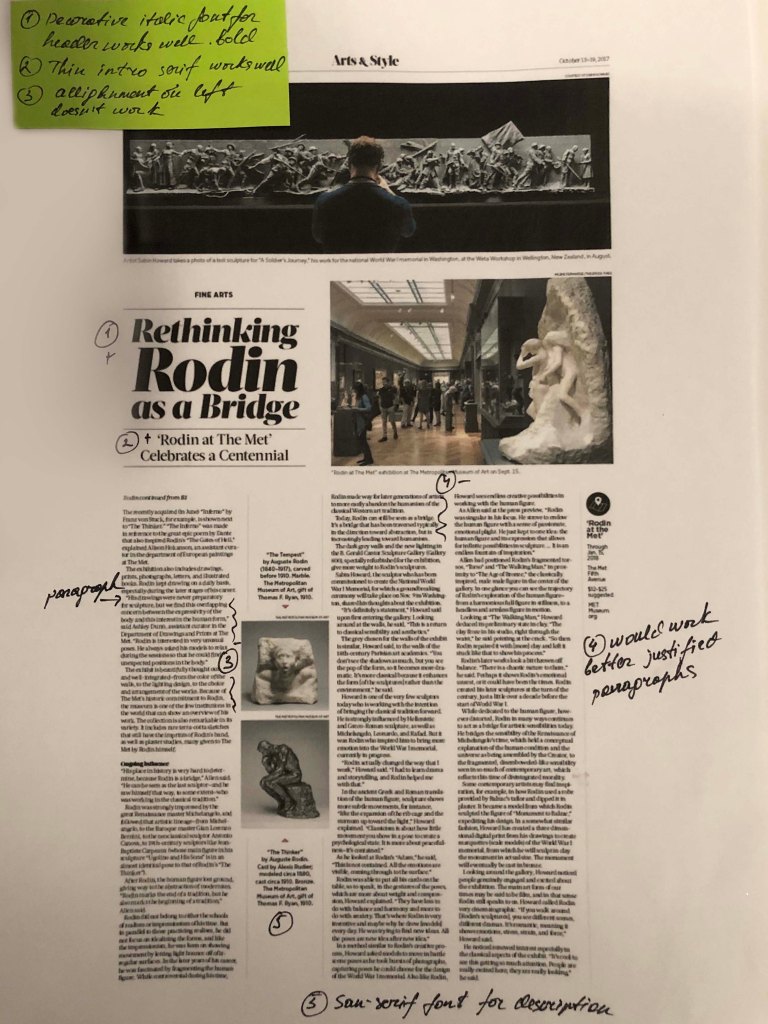
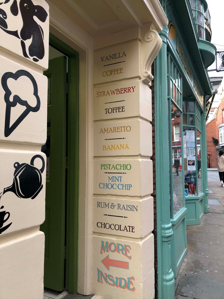
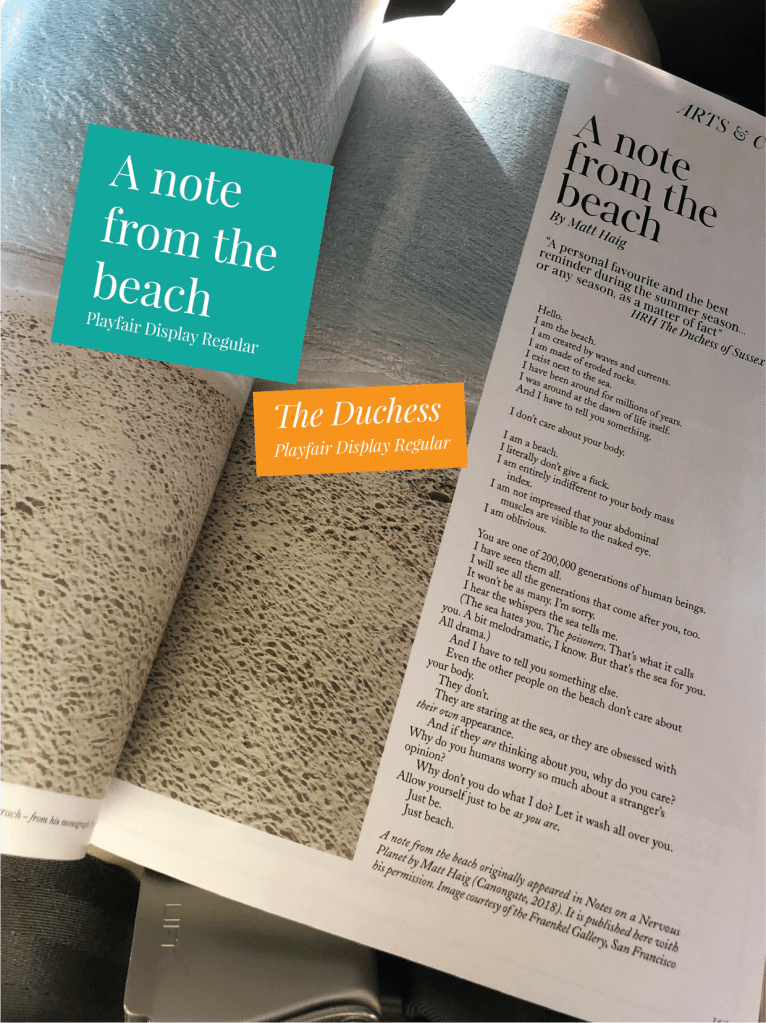
The example below is my favourite. For the header was chosen bold san-serif font all capital letter, and narrow font for the bottom word. Looks quite good together, combining opposite fonts. For the intro my favourite Playfair Display Italic font. The text was shaped nicely, the font is serif. All justified. For the initials Bold Narrow serif letter, good contrast.
During the article’s analysis, I noticed for myself that there are basic keys and methods that professional designers use in layout, but at the same time, perhaps free or cheaper publications are neglected.
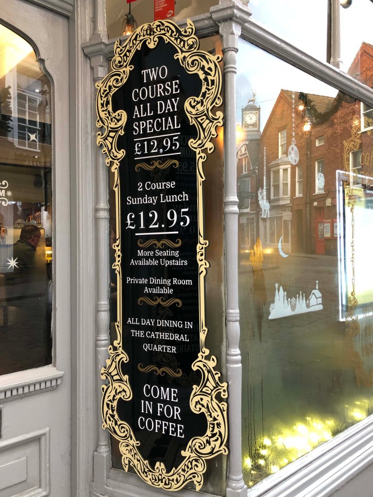
Properly organised space, photo layout and font selection play an important role in the readability and perception of the text. All of the examples below are neatly formed into blocks, serif text, a visible caption, large photographs and adjusted text for the long read paragraphs.
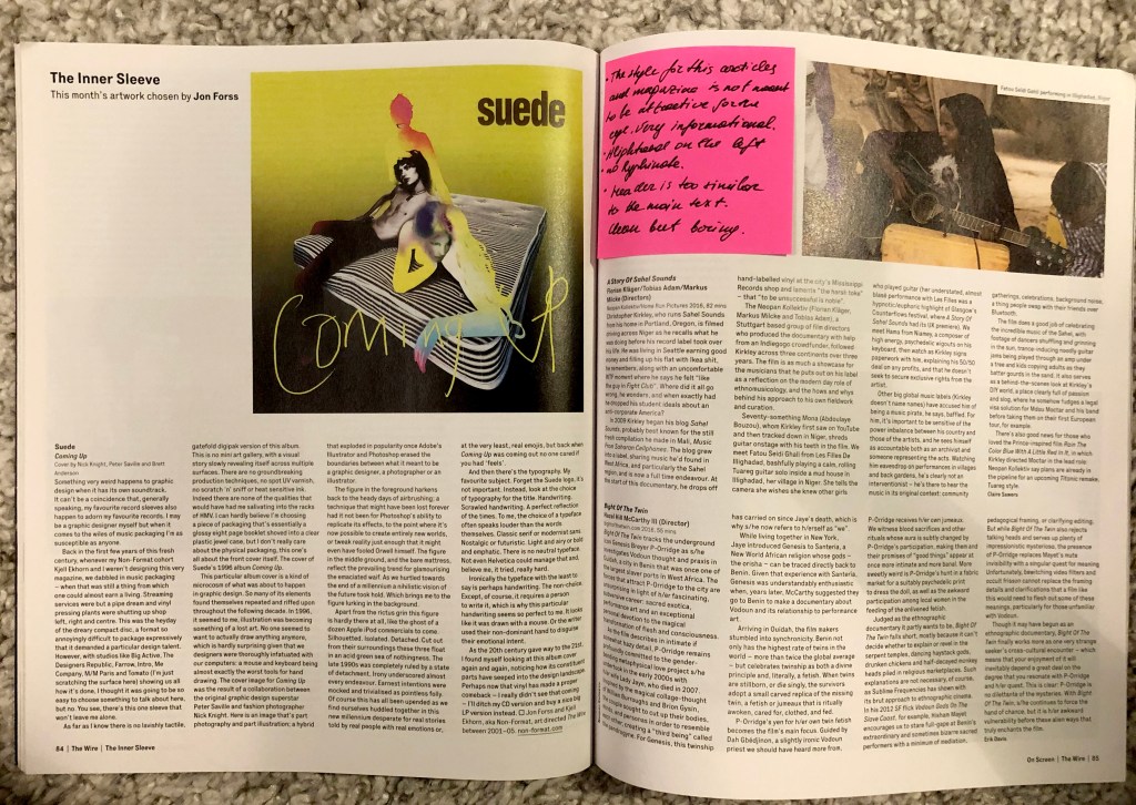
The examples below look chaotic and overloaded. Suppose the torn edges of the text look unsuccessful around large objects, such techniques should be avoided. Also striking is the long space at the end of the paragraph. For example, for small paragraphs, the text looks good when it is aligned to the left, but if it is a long text, then it is necessary to justify it on both sides of the column.
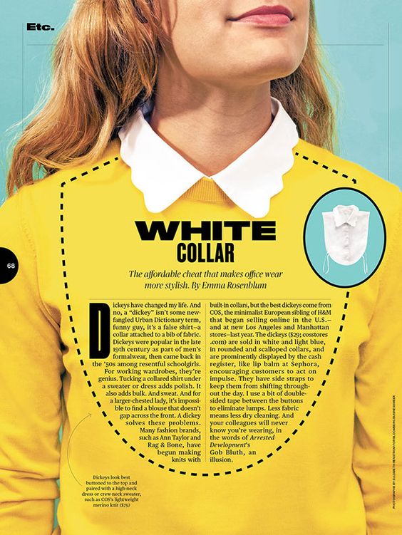
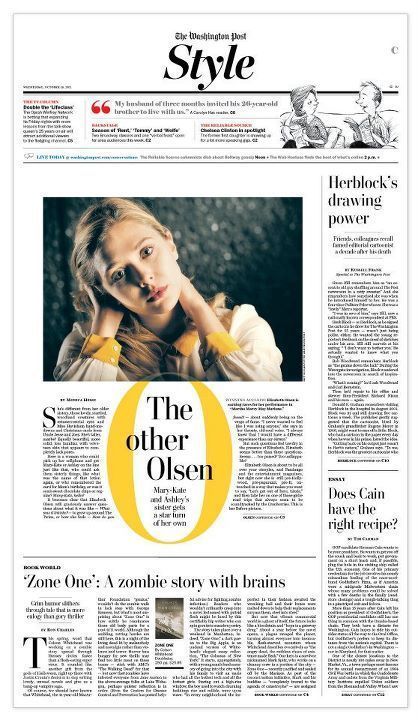
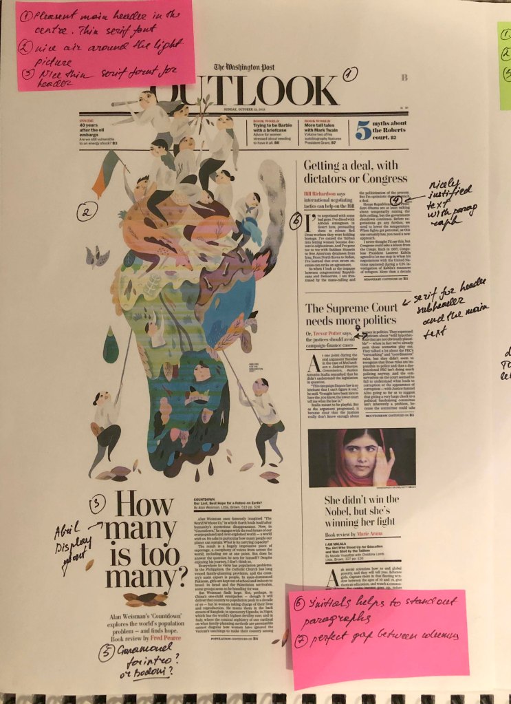
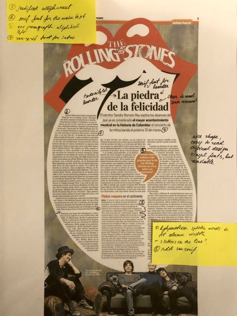
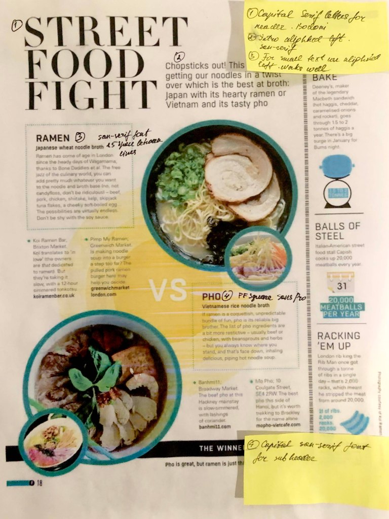
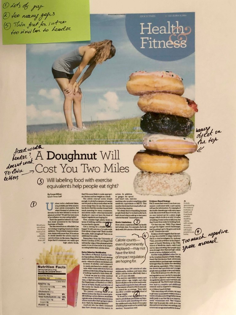
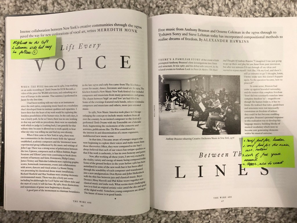
Example №1, in my understanding, is an example of a successful and professional layout, especially for a newspaper, where the quality of the paper is different, and coloгr images are duller. However, paragraphs and paragraphs are organiыed correctly. Headings go to the main background, the text is readable. Example №2, also of interest to the original layout, I was particularly impressed by the form in which the text was framed. Layout №3 with the culinary text, divided into small paragraphs aligned on the left side. Here sans-serif text looks good. And the main heading is large compared to the rest of the text. Layout №4 is an example of a poorly organised space. Also, the title is lost on the background of randomly scattered images. Despite the fact that the columns are aligned on the left and right edges, spaces are too wide between paragraphs. Similarly layout №5. The columns of the text are aligned to the left, which complicates the ease and readability of long text. Of the advantages, I would note a good title and location of the photo. Design No. 6, the text is aligned and revised relatively correctly, but because of the wide columns and the lack of photo images, the layout itself looks boring.
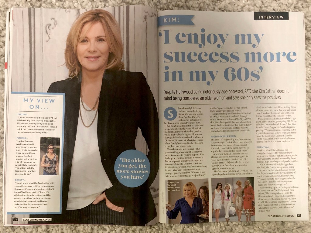
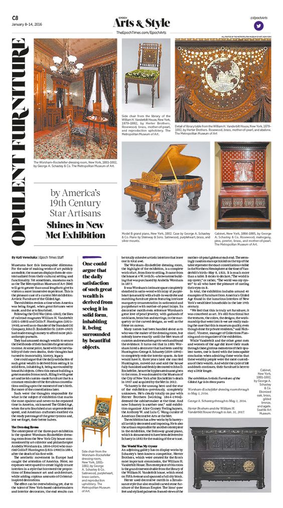
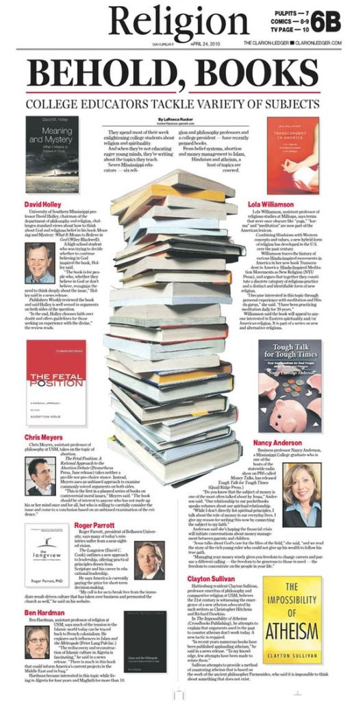
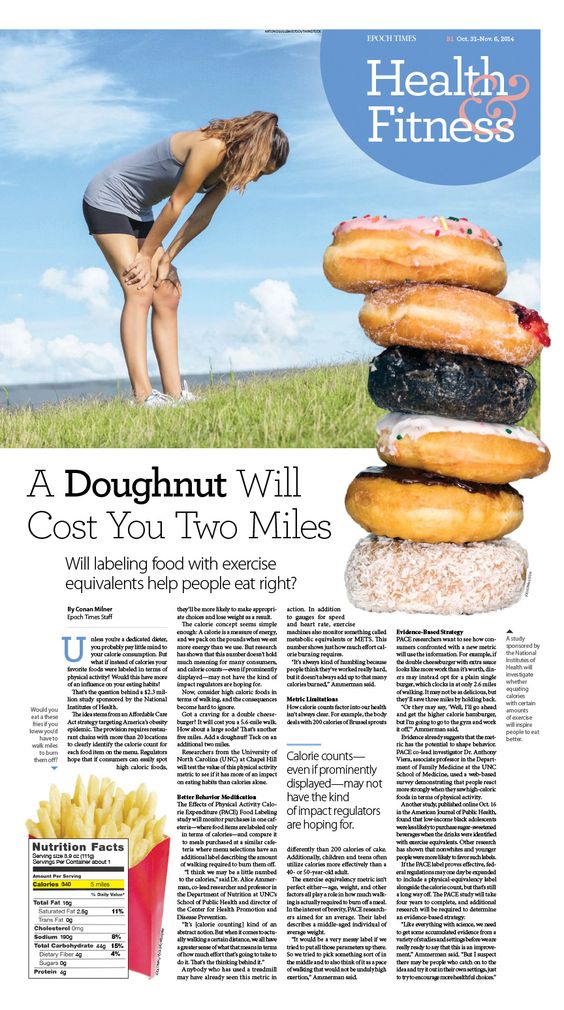
Example №1 Newspaper
Example №2 Newspaper
Example №3 Magazine
Example №4 Diet Article
Example №5 Newspaper
Example №6 Music Magazine
Example №7, it turned out to be noteworthy to me because it has a gigantic headline and plenty of space around. At the same time, on the opposite side is a photograph, which makes this design also catchy for reading. One last example of a hasty design, where there are extra spaces in each line, breakaway contacts (telephones, web address), has written off the last two designs, № 10 and № 11, as a layout that they didn’t have time to fix and subtract.
Example №7
Example №8
Example №8
Example №9
Example №10
Example №11
Conclusion
In conclusion, I would like to say that this task turned out to be more exciting and important than it seemed to me from the first. I noted for myself that for long readers it is better to use a serif font. I also noted that magazines mainly use two types of alignment, this is left-aligned and justified, should be careful with both choices, as they do not work for some cases. I also noted that if space permits, the layout looks interesting with large headlines, a more defiant and flashy sans-serif font, while a small serif font looks modest but neat. In the future I plan to collect magazines and newspapers, perhaps glancing briefly at the accuracy and correctness of the layout, I think this will affect the formation of my level of text design as well.
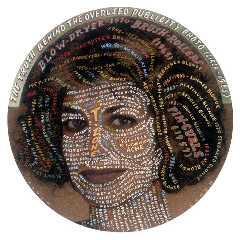
Self-portrait of Paula Scher created for the AIGA, 1992.
Create your own sample book of typefaces on your computer that you can refer to. Organise them into: • Serif for continuous text; readable at small sizes and those suitable for headings. • San-serif for continuous text; readable at small sizes and for headings. • Script fonts that look handwritten with a pen or brush. • Decorative fonts only suitable for headings or ‘fun’ uses. • Fixed width, techno and pixel fonts for use on the web or to give a computer appearance.
Identify which typefaces have bold, italic, black or light fonts.
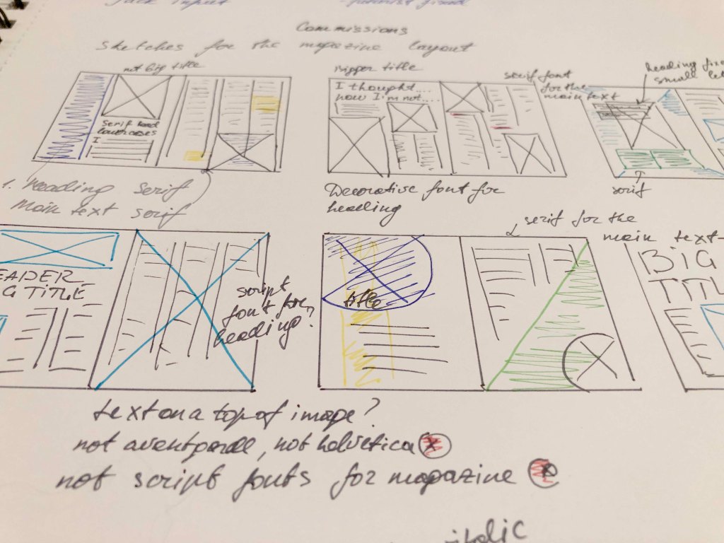
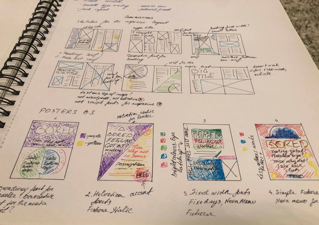
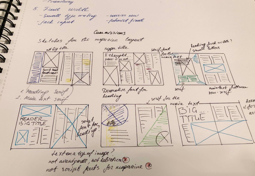
Now identify which fonts you might use in each of the following commissions:
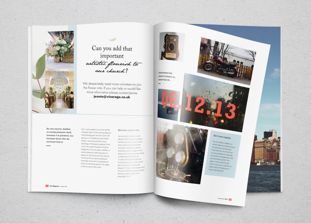
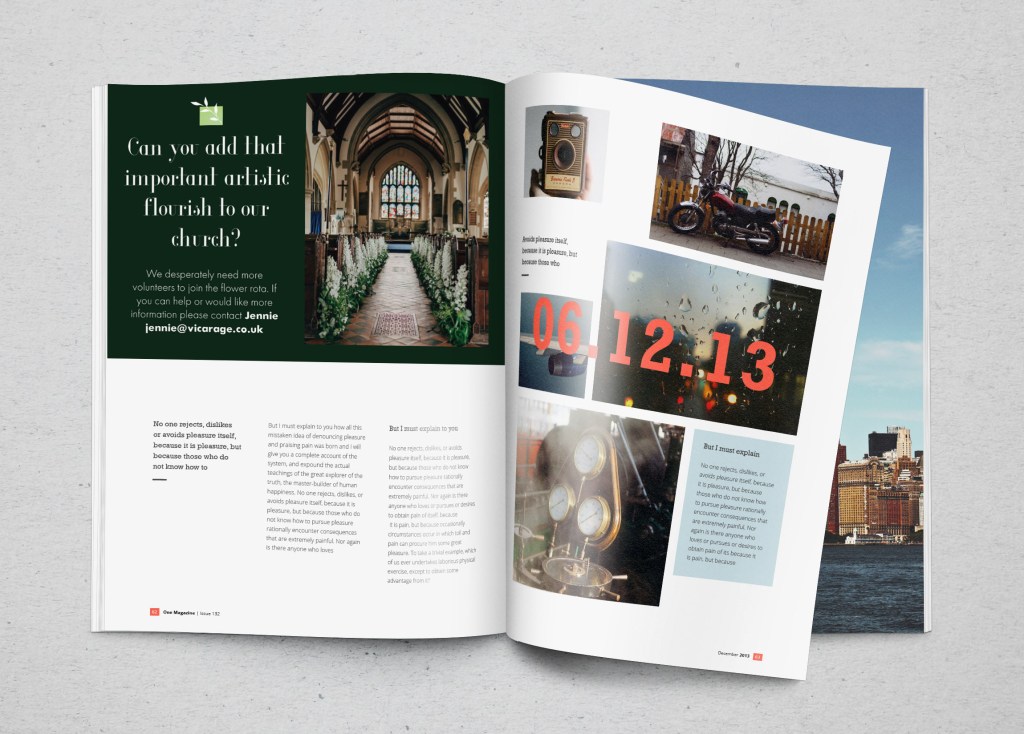
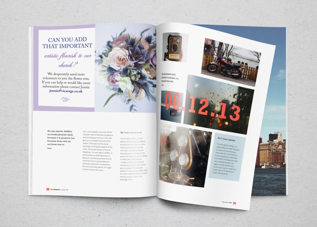
• A short story in a woman’s magazine entitled “I thought I loved him; now I’m not so sure”. The story is 1300 words long so you will need to identify a text font and a headline font. • An advertisement in a parish magazineasking for more helpers on the flower rota. The finished size is A6 landscape and the text reads: “Can you add that important artistic flourish to our church? We desperately need more volunteers to join the flower rota. If you can help or would like more information please contact Jennie jennie@vicarage.co.uk.” • A poster to advertise an after-school club for boys aged 13 – 14. The poster will be A3 size and the copy reads: “Bored? Feeling got at? Nowhere to go? Then why not come and join us on Tuesdays and Wednesdays after school in the Old Gym. We’ve got football, ping pong, table soccer, computers, Karate, cooking and lots more. All free just come along.” • Your friends’ engagement party. They want a flyer A5 size to send to their friends as if advertising a club night. The copy reads: “Mandy and Josh are finally going todo it…well almost!!!!! Come and join them on Friday 24 March from 8 pm at theGolden Calf to celebrate their long-awaited engagement… and yes lots of presents would be gratefully received particularly if we can drink them!!!!! Then have a go at mocking up each of these. Try different fonts to see how each changes the feel of the text and make notes in your learning log about which works best and why.
Start
This exercise turned out to be a task with two unknowns. When I just got acquainted with this task, I realised that I needed to break it into several sections to create for myself a general picture of font types, and only after using them in advertising and magazines. That was my first collection of fonts that I have ever created in my entire experience in graphic design. To get started, I turned to Wikipedia, which is more for the concept of a specimen book.
Specimen books (in full: type specimen books) are the printed brochures or catalogues of type foundries and printers, offered to advertise the range and quality of type available. They have been an essential part of the printing trade since soon after the invention of printing with movable metal type in the 15th century.
The ideal specimen book shows the typefaces in a range of sizes, using short sentences rather than A-Z strings (which are of little use for getting a feel for the type in use). Colour is sometimes used, but usually very discreetly, such as a red title. Samples in text sizes (6 to 14 point) typically show a longish block of text to help one judge readability, but would not be offered for decorative and display typefaces. It is quite common not to deliver a complete character set: foundries have always been concerned about piracy. Instead, a chart might be shown in an appendix where characters included in all the foundry’s fonts.
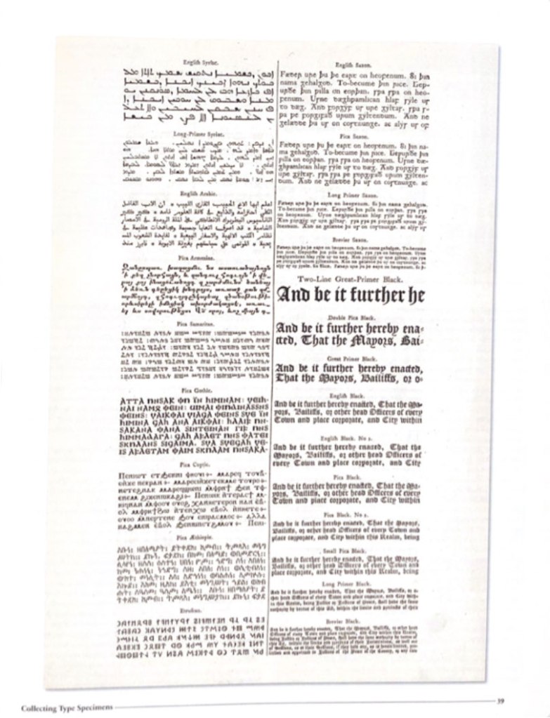
Collecting Type Specimens
The other day I bought a book with collections of fonts compiled by one famous collector, Jan Tholenaar. Specimen collections have become an inspiration in a passion for the history of fonts, and their unique journey through generations and centuries. But some fonts were invented hundreds of years ago, but they continue to be in demand among it for print advertising and printing. Between the dates 1830 and 1930, a collector that goes by the name of Jan Tholenaar assembled one of the most significant collections of type specimens in the world. It was incredibly diverse of ornaments, fantasy letters, also with examples of artistic printings—all the letters in all variety of colours. What he was doing, he was buying loads of old catalogues from antique shops around the world, from magazines, and then will organise them into the specimen.
In fact, not long time ago, the American poet Dan Carr designed his typeface for his poems and cut dies it himself. This specimen was included in Jan’s collection as well. Another fact that immensely impressed me was about the first smallest engraved font 2.5 points by letter engraver Henry Didot in the early 19th century.
Nowadays, it’s not easy to become specimen collectors; you have to visit antiquarian booksellers or auctions. Jan Tholenaar had one of his first collections from visiting the library of the Amsterdam Foundry, or from visits to the St.Bridge Printing Library in London. Type specimens are naturally were found in notable publications, such as in house magazines through ought the world. I was fond of his obsession with sample collecting; he would admire some of the rarest fonts collections. He would do everything that to get desirable one into his group, like type foundry Debney & Peignot with more than 400 rare specimens.
Type A visual History of Typefaces and Graphic Styles 1628-1938. Edited by Cees W. de Jong, Alston W. Pervis, Jan Tholenaar
After familiarising myself with the historical font sets and their lectures, I created a mood board on Pinterest. It helped me to visualise my interpretation of the type specimen, which I would like to implement in my style. These examples are quite eyed appealing, as for me, they look like a celebration of each font and its characteristics.
Typography Specimen Book
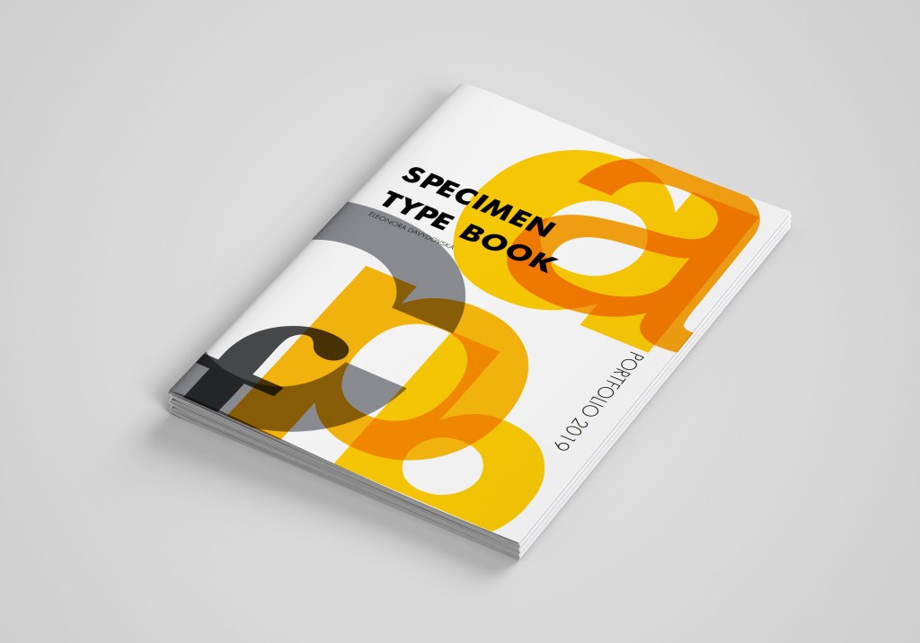
I was very excited to create my type specimen, where I could join them into the little font guide. I had thoughts about several styles for the typography layouts, so I needed to transfer them into pieces of paper in my learning log. I organised designs and put everything together in a single style. I intended to associate an exact, bright colour for each font. For the brochure, I chose format A4 in terms each font would have their spread with lots of air around and some examples of font usage, size, alphabet, and font history.
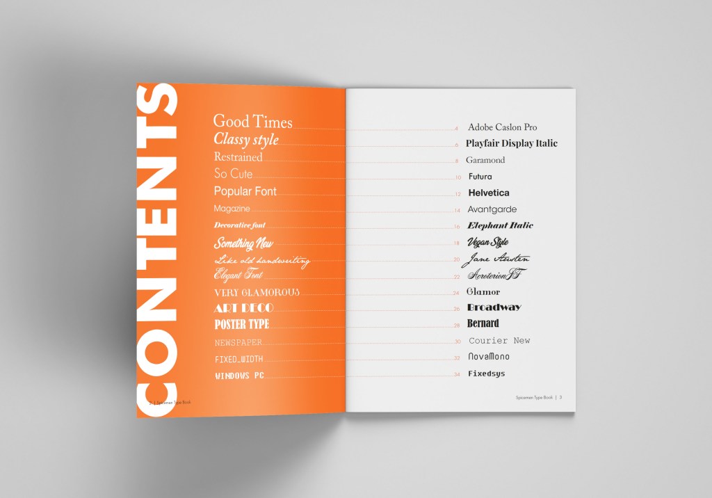
In my specimen guide, I have chosen particular fonts, as from my point of view are the best for reading, advertising, and experimenting at the same time. There 3-4 different fonts for each type, I thought it would help me with the font variety for the production of future design. Below is the list of my fonts selection:
Serif fonts:
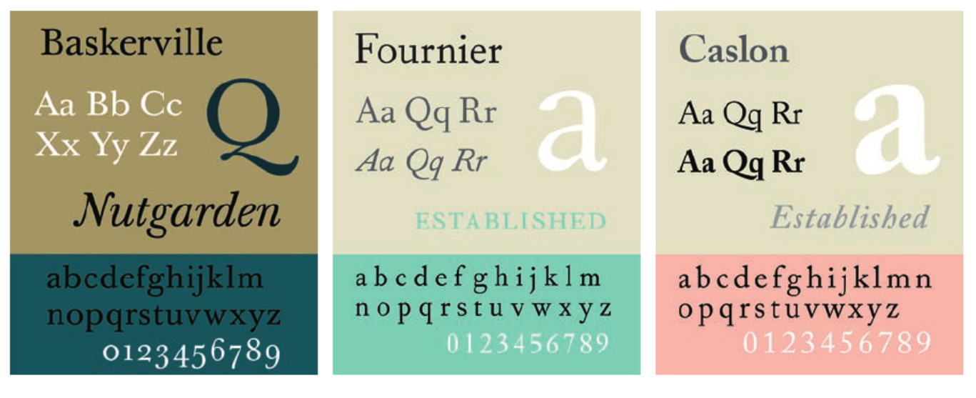
Adobe Caslon Pro
Playfair Display
Garamond
Elephant Italic
San-serif fonts:
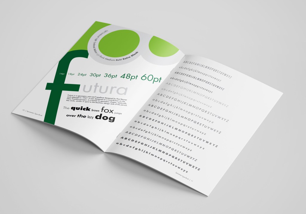
Futura
Helvetica
Avantgarde
Script fonts:
Vegan Style
Jane Austen
Acroterion
Decorative fonts:
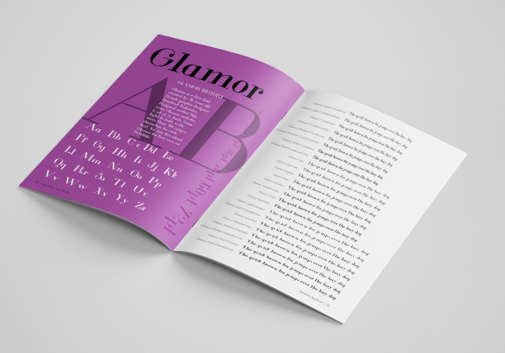
Glamor
Broadway
Bernard
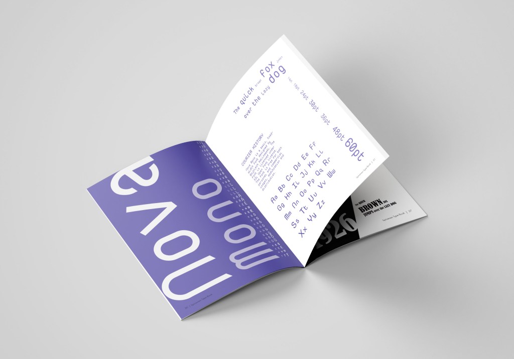
Fixed width:
Courier New
NovaMono
Fixedsys
Some of the fonts I had already installed on my computer, but for some of them, I had to browse various types of sources, where I could find some original fonts I could use.
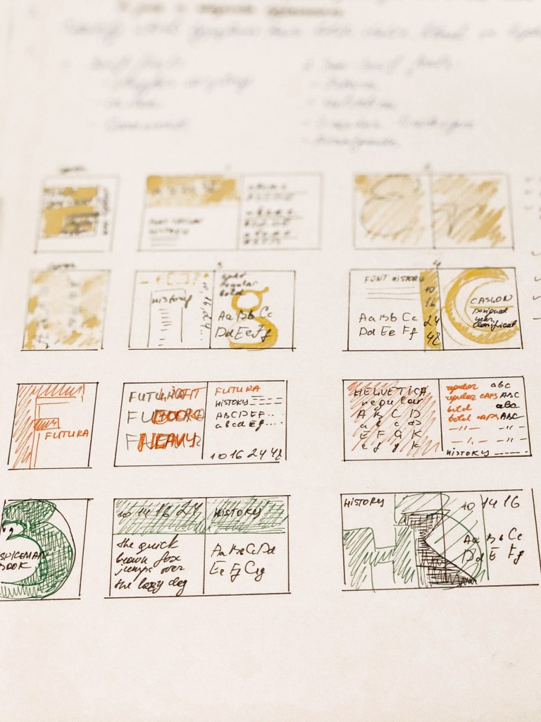
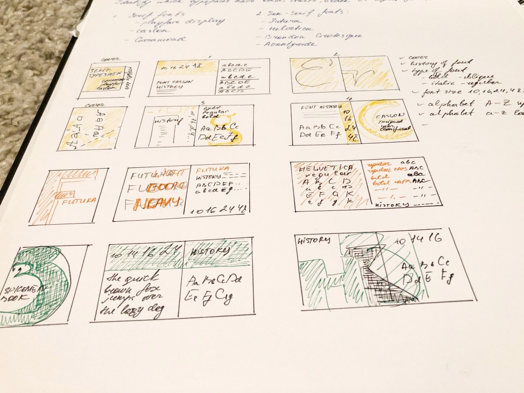
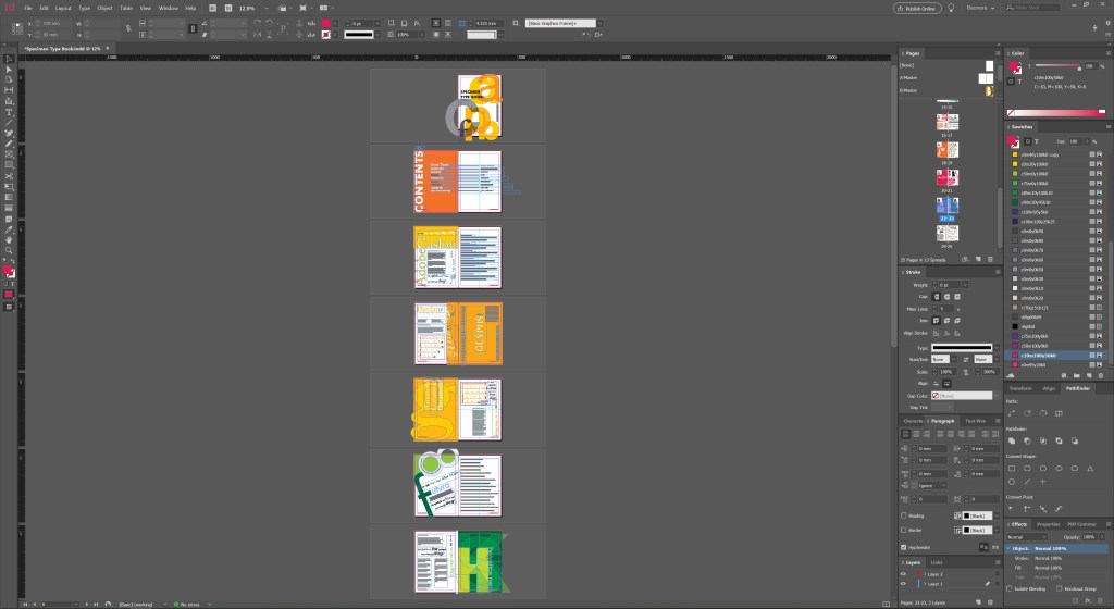
Sketches for Specimen Type Book.
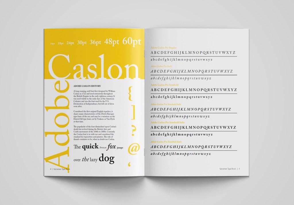
I must admit it took me a while to create as many as possible layouts for fonts but keeping them into a similar structure at the same time—the best program for the multi-page document in Adobe Indesign. I’ve created a quick style for pages, and some basics as Futura font for the main font in the catalogue. I played around with the cover for this brochure, and some interesting styles for fonts. I really enjoyed this part of exercises, as I had freedom in my style, and I could reflect my personal preferences in the designing brochures. I loved combining all these fonts into the singular material; also, I quite enjoyed the different font used for each page.
For some pages, I chose a rectangular layout, for fonts such as Playfair Display, Adobe Caslon, while I designed some fonts as a porter when applying layout at an angle, with a radical combination of fonts of different sizes. Font examples: Broadway, Futura, Helvetica.
Since all fonts are different, and in some, we see the presence of only one type of font, examples of Fixedsys, Jane Austen, in this case, I displayed only the one alphabet with capital letters and lowercase. But some fonts are full of various styles, such as Avantgarde, Helvetica, Glamor, with Italic, Bold, Condensed type of writing, then, in this case, we see all types of spelling of the font in the alphabet, that is, duplication of the alphabet on one sheet. I enjoyed this experiment with the layout of the brochure, in my opinion, it reflects the individuality of each font, but at the same time, it has a single style.
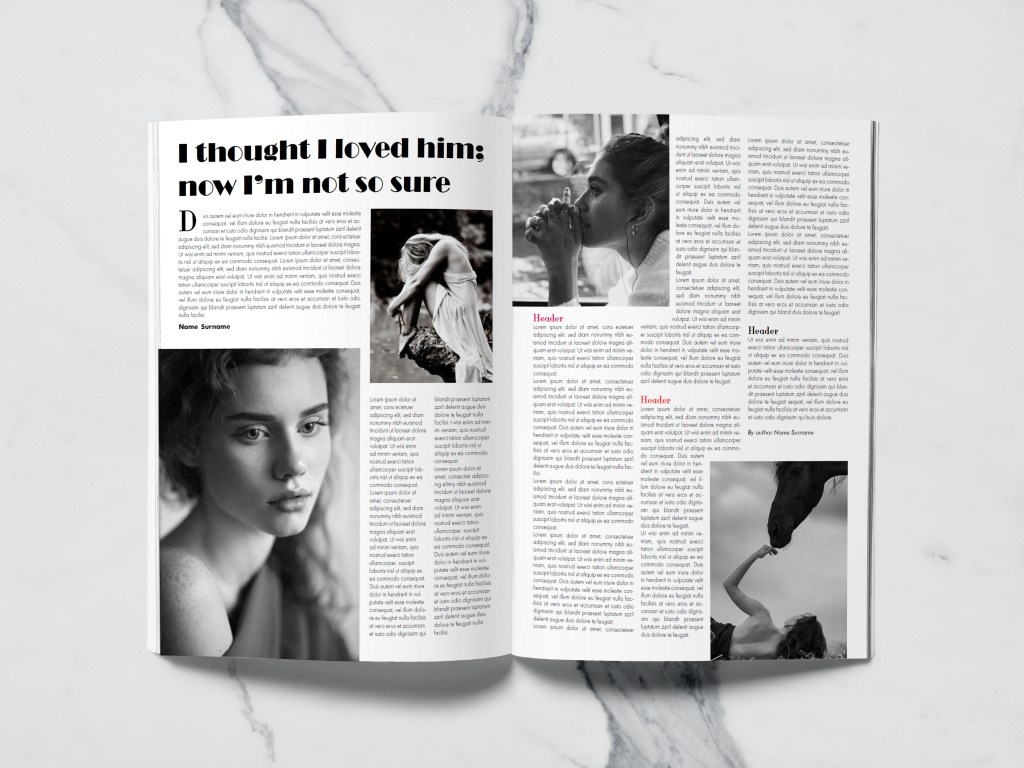
Now the crucial moment has come, the application of my font catalogue in design. The first design is a layout for an article of women’s magazine. The headline itself made me nostalgic when in my youth, I read magazines about the complexities of relationships, beat procedures and tips for caring for home flowers in one issue. I remembered magazines from the 90s, 2000s, when the more images, backgrounds and brighter the headlines, the better. I drew several layout grids in Adobe Indesign, which I planned to add images to the photo later. I found some stock photos of girls with sad emotions on Pinterest to use them for the design layout. Link to my Pinterest account is below.
Some of the screenshots for the magazine article design are below. I actually quite like to see designs in the small proportions. Usually, seeing smaller scales of the pages that gives you the feel composition and colours.
In design No. 1, I used the font that was my first on the list from the catalogue Adobe Caslon Pro; I experimented with it for the readable text, the main heading, and the subheadings between paragraphs. I finished the Glamor font for subtitles and initials before paragraphs.
In design No. 2, I replayed the layout, added more model photos, with dramatic overtones. But since the task was to use fonts in the design, I decided to use the Broadway decorative font for the main title. For the main text, I chose the neat font Futura, which has more spaces between sentences lines then Adobe Caslon Pro, but this font is a serif, which tends to be more readable for the articles. Here I could see a brighter contrast between the text and the title. In my opinion, in such a font combination, a more confident direction appeared in the magazine.
In design No. 3, I wanted to experiment even more with fonts, and in the third version of the magazine layout I used a new font, I was curious to see how the decorative NovaMono font fits into the title for the article, and also the font itself is small in size for the title; however, it is still well-read. Again, the design and overall impression turned out to be more modern style, in such a font the header seems to have been printed on the computer as a subject line. In the main text, I combined several fonts Futura and Adobe Caslon Pro, which, in my opinion, adds accents to the text.
I think that of the three options, I would prefer design No. 1, in my opinion, the font for the general text is well matched in it, as well as the standard title in the Adobe Caslon Pro font. This option is more classic, easy to read, although I would like to note that the font for the title could be selected more original than a standard serif font. In the second version, I liked the experiment with the font for the title, but I think that due to the large dominance of the photo, the layout itself turned out to be overloaded with images. In general, I was satisfied with the result. I realised that the main thing for the magazine layout is font readability.
Parish Magazine Advertising
Layout for advertising a florist in a church was given to me more easily than the previous task. In my understanding, it was important to convey the tenderness and lightness of the ad, which could be diluted with floral arrangements. In option No. 1, I used three different fonts. I decided to split the title into two different fonts, so the ad becomes more attractive. For the first part, I used the serif font Adobe Caslon Pro, then the title goes into the handwritten font Jane Austen, for the main text I used the font Futura. The result, in my opinion, was decent, pleasant to perceive, and easily recognisable.
In design №2, I used a new font for the title, Glamor, and a similar font for the body text. I can not say that I am delighted with this option. Probably, a combination of fonts was not quite well-chosen in it, and yet I still lack a handwritten font that would add tenderness to this work.
In design №3, I added the Acroterion classic script font, and for the title, I selected all the uppercase letters of the Playfair Display serif font. The main font is also the Playfair Display. I tried to use more fonts in this ad, such as Helvetica and Avantgarde, but somehow they were not successful in the two cases (magazine and parish florist). However, I realised that I needed to apply them as well because I included them in the list of fonts catalogue. Of all the three options, I prefer the option №1 the most, readable, straightforward text, and a right combination of fonts.
After-School Poster Design
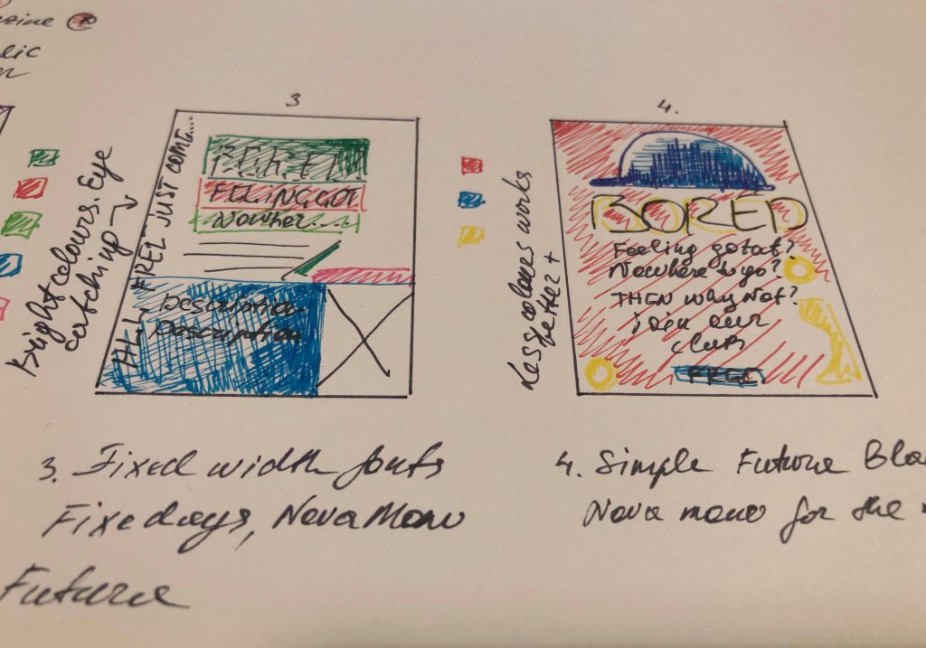
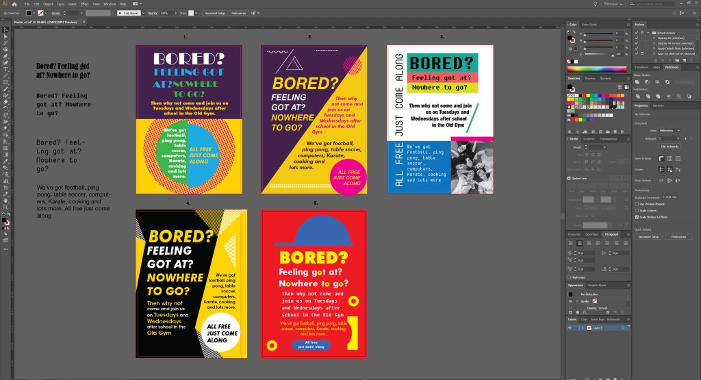
To produce a school poster was another challenging design, where I had to use more fonts for the schoolboys club poster. Even though in this task, it was essential to concentrate on font variations, in my understanding, there are 3 critical components of the poster design, such as composition, colour scheme and the font itself. The print screen below shows all the porter options that I worked on in the process.
Screenshot Poster Design
In design number 1, I used the font Broadway and Futura Bold. I tried to experiment with colour and curly elements, dividing the crawl into several parts, but something in this version the poster didn’t want to go to bed at all, so I had to reject such a design.
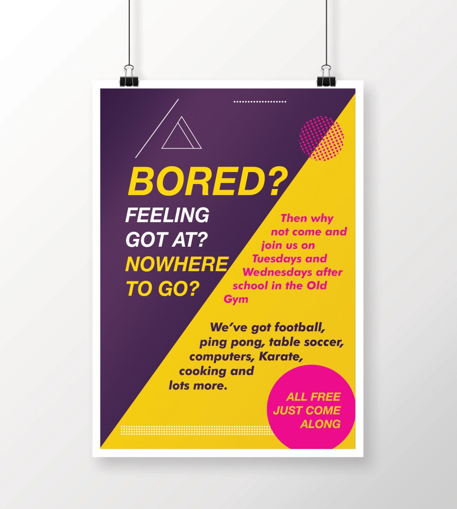
Design number 2, in my opinion, is more successful. I divided the area diagonally and used slanted fonts. The fonts were relatively simple, such as Helvetica Bold Italic for headings, Futura Bold Italic for the main text. In my opinion, this is a better option for accepting information and reading; however, because of the diagonal, I did not have enough space for a larger font for the title. So I started the next design.
Design №2
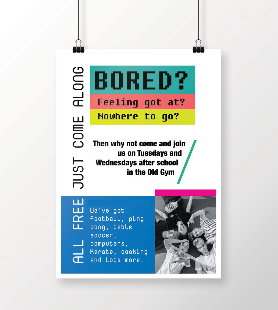
Design No. 3 turned out to be a new trend compared to previous versions. Here I used new fonts; they are unusual, modern and ideal for this kind of porter. Here I used fonts from the Fixed width: NovaMono, Fixedsys (for the title), I also diluted the main text with the Helvetica Condensed Bold font, in my understanding, this is an excellent solution to combine several fonts in one loss. Also, these fonts are unique in their way, and they still have a standard feature, they are tall fonts, sans-serif, they look fresh and pleasant to read. In the lower right corner, I filled the place with a photograph of a group of young guys, as a sample, although there may be options (the image of sports, competitions, etc.).
Design No. 4 (see on the screenshot) is an intermediate version with design №2. I first drew it for the sample, and I liked the solution with the fonts in the slope, but the background seemed boring to me, so I redid it in option №2. Although at the same time, the font for the title in design No. 4 of Helvetica Bold Italic is more successful than in version No. 2.
Design №3
And finally, my last version number 5, in my opinion, the most interesting. The idea to portray a cap came spontaneously. In this design, I like everything from colour to the selection of fonts. Who would have thought that a reasonable standard Futura Bold font could harmonise so well for both the title and the main text? In this design, for the additional wording, I used Fixedsys font, which works perfectly with other fonts around.
Design №5
In conclusion, I would like to say that I was quite satisfied with my designs. I used the spectre of fonts widely, however at the same time I’ve noticed that some fonts wouldn’t work for this kind of advert, such as Script fonts, and Decorative fonts, they would look too old-fashioned and out of place for this kind of designs. However, the preferred options of fixed-width fonts and san-serifs font, such as Helvetica, Futura Bold, worked quite right for these posters.
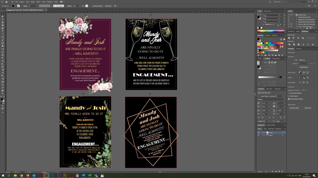
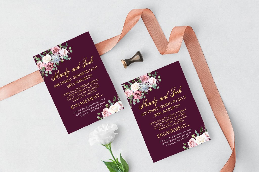
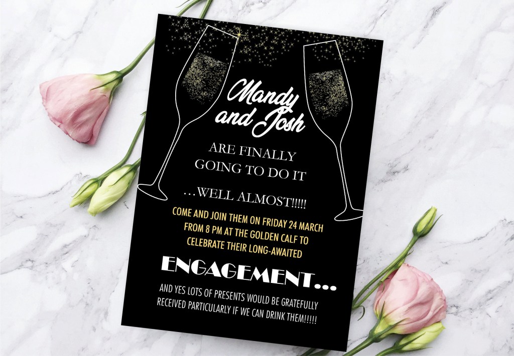
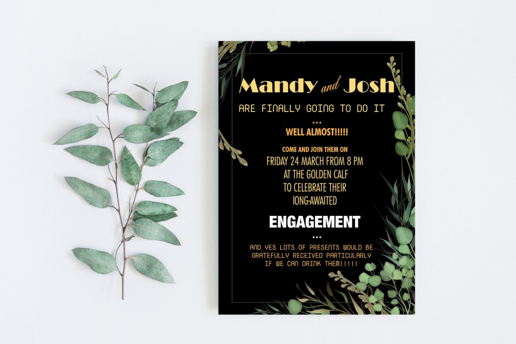
Friend’s Engagement Party
And finally, my last collection of designs in this exercise is an engagement party invitation. Below are screenshots of my final designs. I noticed that I still had fonts that I didn’t use earlier, but I could fit them well into the invitation design, fonts such as Vegan Style and Elephant Italic added a unique concept to the layout. Since this is an evening party, I wanted to portray all the invitations on the dark saturated background to make more association with the evening celebration.
In design No. 1 against the backdrop of burgundy, I used such a light and pleasant handwritten font Acroterion in combination with two different fonts, with serifs PlayFair Display and sans serif Avantgarde. In my opinion, a good option, easy to read and perceive information.
Invitation Design №1
Design No. 2 is also quite exciting and understandable, in it I used font variations to the maximum, it also has a serif font with all uppercase letters Garamond, a narrow font Helvetica Condensed, as well as Broadway font in the style of the 20th.
Also, this is the only design in which I finally managed to use the font Vegan Style, in my opinion, quite successfully.
Invitation Design №2
Design No. 3 is a kind of experiment, in it, I combined different fonts from the modern computer era of NovaMono and 20s style font Broadway, as well as the narrow font Helvetica Condensed, Helvetica Condensed Bold. There is a certain kind of originality in such a variation because at first glance opposite, and incompatible fonts are combined here. Nevertheless, the design turned out to be catchy.
Design No. 4 is unusual; the text goes at an angle. Still, the frame around me was a little embarrassed; it seemed to me that it squeezed the space, so I left this option only as an intermediate one since it contains an exciting variation of fonts, such as Elephant Italic, Glamor Italic, Adobe Caslon Pro. (see screenshots above)
Invitation Design №3
Conclusion
In conclusion, I would like to say that I am pleased with my final designs. I created a good variety of layouts and compositions to be able to compare different aspects of design. At the moment, I would say this exercise was the most comprehensive, but they still were made around printing designs and font solutions. I once again emphasised for myself how important the font choice for designs. That typography plays a vital role in the correct understanding of layout, especially the part of the clarity of the message. Also, for the first time, I created a specimen type book, which I can refer to in my future designs.
The combinations of type found on signage reveal a great deal about a city, town or specific area. They reflect the social, economic and historical development of the area and create their own, and unique typographic style.
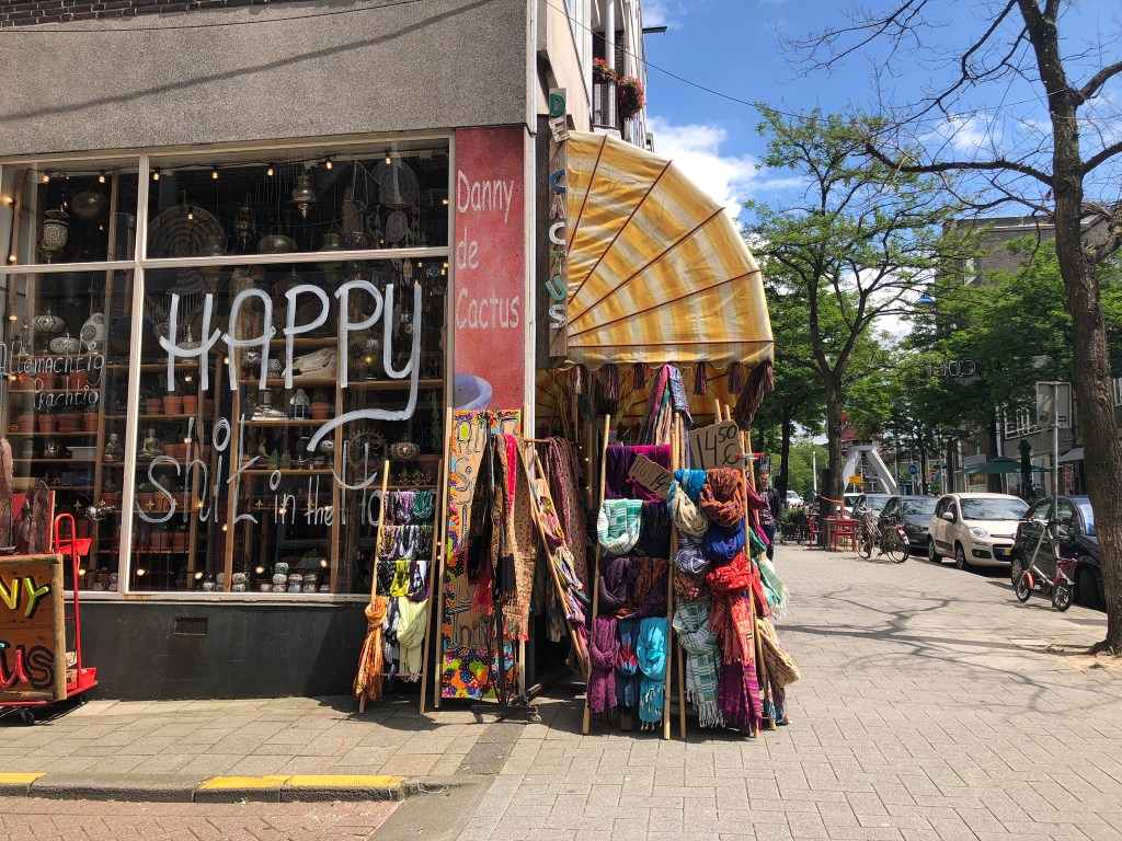
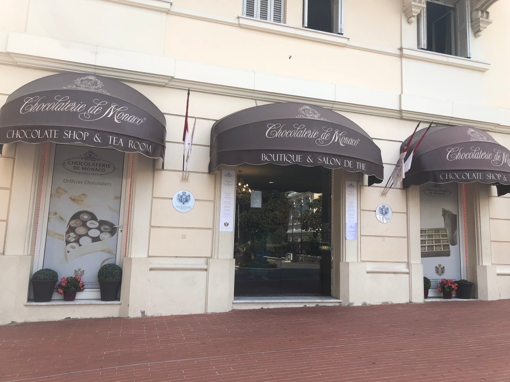
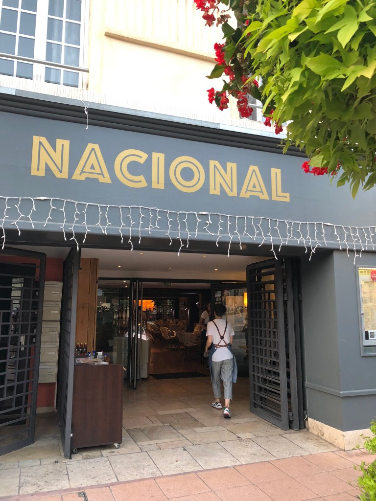
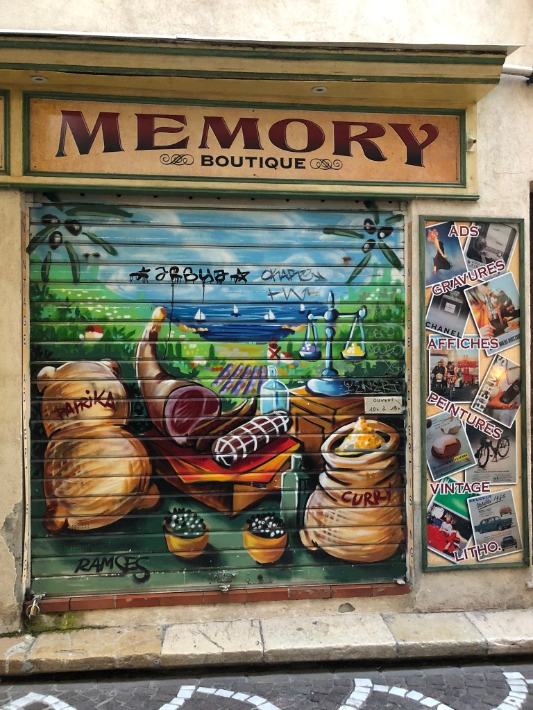
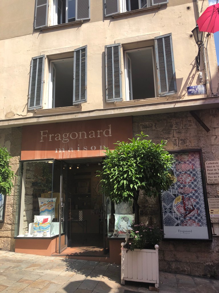
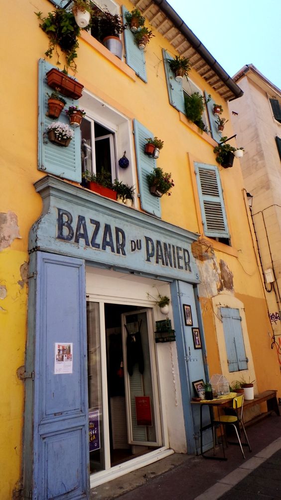
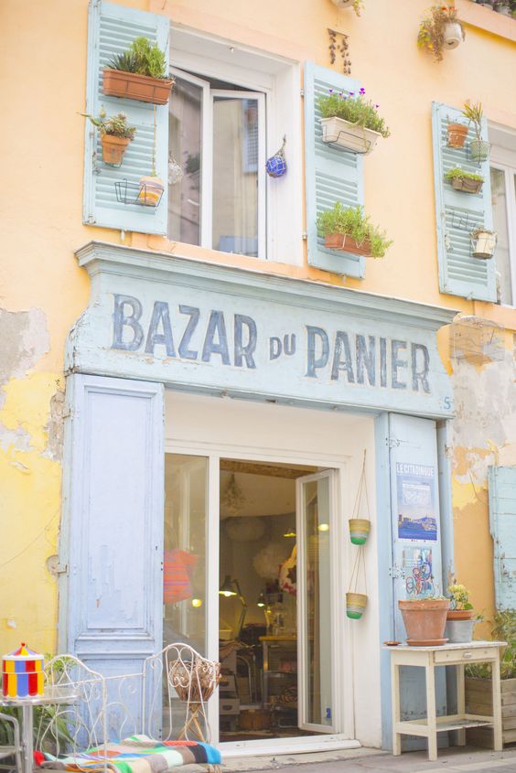
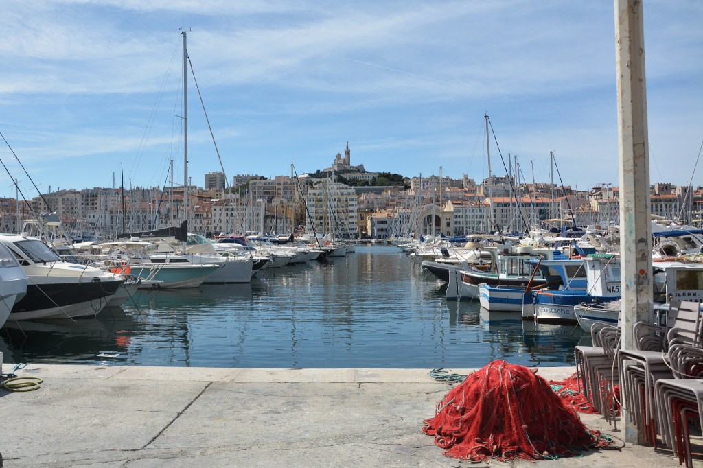
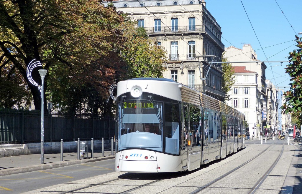
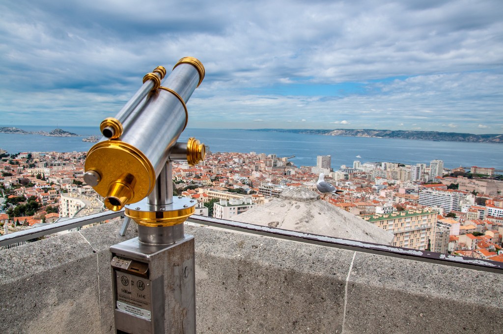
Below are presented a photoshoot of my walks exploring signages in the South of France.
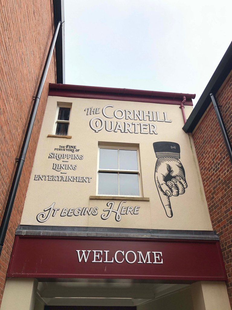
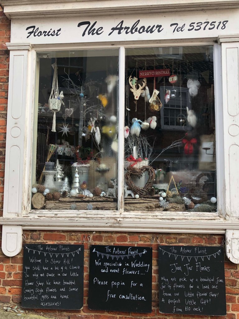
City of Lincoln
Official directional signs are generally easy to recognise, even if you are in unfamiliar surroundings. According to typefaces researches for directional signs there are three types: Clearview, Frutiger and Helvetica, as they are chosen for their clarity and readability.
We are all type consumers: we all interact and with a big variety of typefaces every day. Type influences what we read and what we see affects our choices, because that types communicating to us subconsciously. The main advantages of fonts are: fonts save your time, fonts help you to chose, fonts show you the way…and tell you where you are.
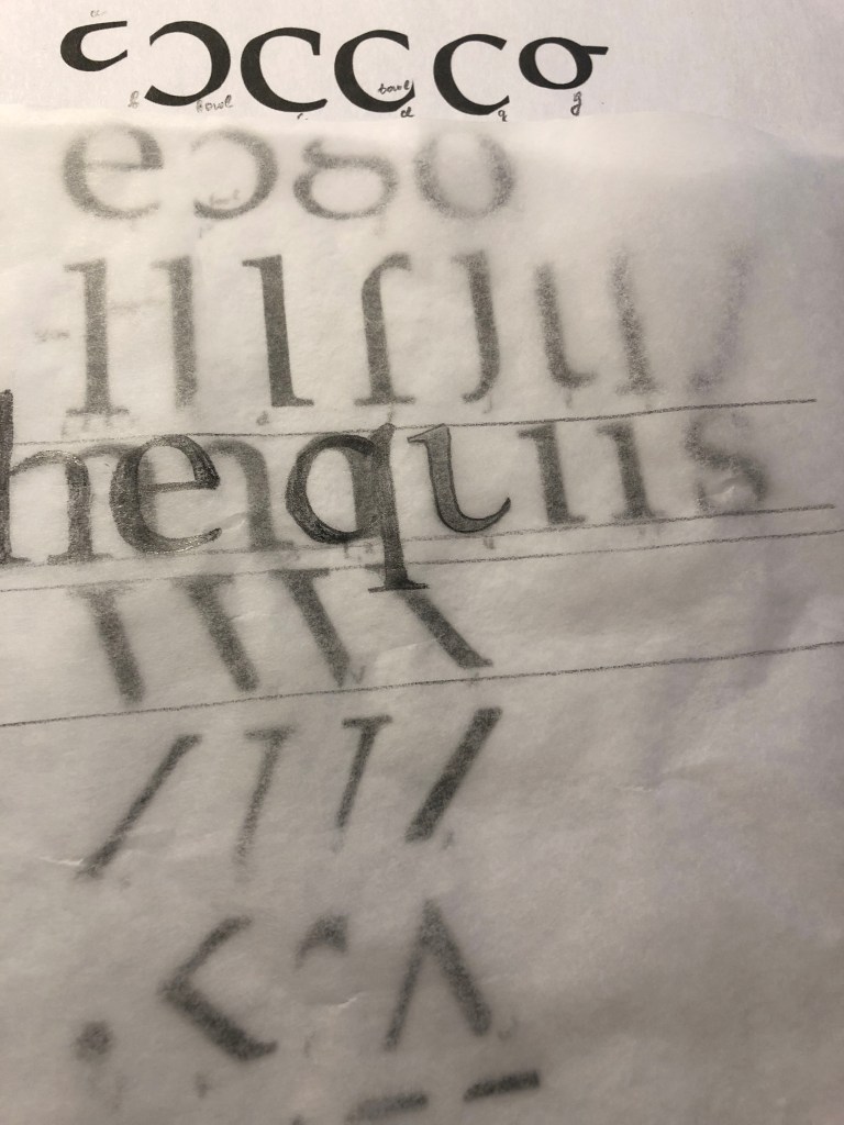
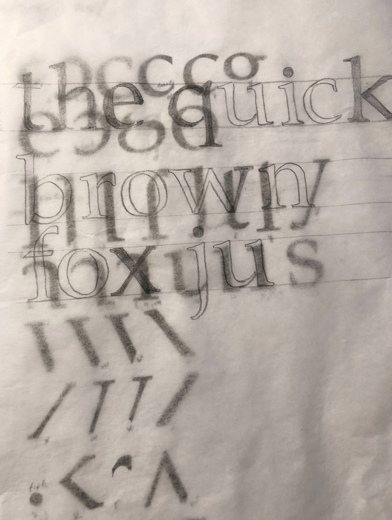
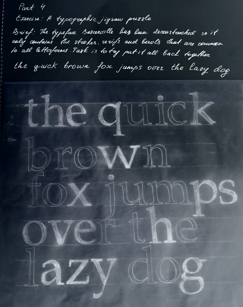
This exercise is designed to help you to look at typefaces more closely. You will need a sharp pencil, some tracing or thin paper and a ruler. On the facing page the typeface Baskerville has been deconstructed so it only contains the strokes, serifs and bowls that are common to all the letterforms. Your task is to try and put it all back together again to read
the quick brown fox jumps over the lazy dog
This is a pangram containing all the letters of the alphabet. It is all in lowercase. Start by drawing your baseline, determine the x height by identifying a whole letter such as x, e or n and draw your median line. This should provide a good starting point to try and piece together all the other elements. Remember that some parts will be used more than once, for example the same stem will be used in several letters. Try and account for all the parts without leaving any stray serifs behind.
Researches
So, continuing to research the theory of type, the new task brought a new experience. For me, a font has always been an all-encompassing component in the design, when you have a task to create a layout, in my understanding, a font has always been an addition to the message. But in the new chapter, the theory of typography opens as a separate part, which is also important for graphic designer attention, because it has the origins of the development of design theory, and writing takes its origins from ancient times, as well as paintings and drawings. Before starting the practical task, I decided to create for myself a small auxiliary layout of the anatomy of the text, in which I painted all the components of the font.
I’ve noted some of the names of letterform parts: aperture, ascender, baseline, cap height, descender, leading, letter-spacing, sans serif, serif, stem, stroke, x-height. Ascenders are an upward vertical stroke found in certain lowercase letters that extend beyond either the cap height or baseline. Descenders are the downward vertical stroke in these letters. In some cases, a collision between these strokes can occur when the line height (the vertical distance between baselines) is too tight. A serif is a small shape or projection that appears at the beginning or end of a stroke on a letter. Typeface with that have serifs are called a serif typeface.
In a detailed analysis of the font, I noticed that all composing letters have a logical explanation. If you look at the font as a live object, then each element can be compared with the nature that surrounds us.
For example, the tail at the letter Q, the shoulder at the letters n, m, h, the small ear at the letter g, the straight stem as the basis for the characters h, k, l, bowl resembles a cup handle with tea for symbols such as p, d, b, p.
When it came to analysing the individual elements of the font in the task, I realised that it is not so easy to recognise all the letters when they are fragmented into small particles. I had to spend some time analysing all the elements of the font. To make my task a little easier, I decided to start by designating for myself on a piece of paper to which symbol this or that element can be attributed.
I decided on the size of the letters 2 cm and the distance between the lines of 1.5 cm. Letters such as l, s, g, o, e were obvious. When I determined the letters h, n, I gradually began to see the boundary between the characters, literally a slight difference mattered. Suppose a serif on one side that would be suitable for the characters m, n, h, did not find its application, in my opinion, the serif should be on both sides. But over symbols b, p, d, m, v, w, p, q I had to sweat. Also, I never paid attention to the connection between the letters u & a, for me it could be said a discovery, until the last day I thought that I would have to finish the letter a by myself!
In conclusion, I would like to say that I had to spend a little more time on the task than I expected. In fact, it was important for me not only to draw letters and forget about this exercise, for me it was important to delve deeper into the analysis of the font and its components. Suppose now I can now determine for myself some differences in the font, and that one small serif, gives the font stability or dynamics. Earlier for me the theoretical font was an unknown Planet. Now I understand that after doing a little research, I understood the basic components of the font, and I began to think about creating my own font in the future.
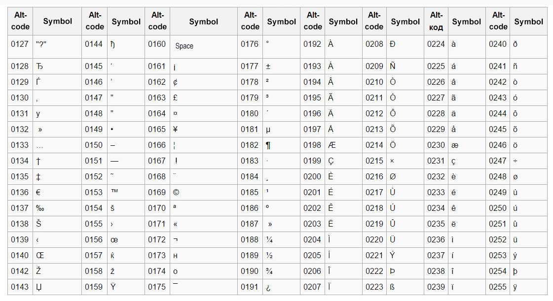
The alphabet is only part of a typeface that contains lots of different characters such as numbers, punctuation, mathematical and monetary symbols and ligatures. Ligatures are where two letters are combined together to make printing easier. Explore your computer keyboard to find some of the other characters. You will need to use your shift, alt and ctrl keys.
This was just random pressing of Alt+numcode, lots of funny and foreigh symbols came up. — ˜ ‘ Šٷ ، ኖ ʷ ᇢ،ٰٮ ƽ 뇫 Ӫ. When I work at my work computer, I sometimes use a list of characters from the code in the alt + numpad combination. My main symbols are • ° ²» etc.
I was interested in trying to practice with the keyboard on my Mac, it was more out of curiosity, because we are surrounded by many characters, the meaning of which we do not even suspect, but in the modern world we use a limited set of standard characters that are familiar to business correspondence.
Searching for new symbols on Mac
Searching for new symbols on Mac
Choose a magazine, for example the Big Issue or Heat, and look at the main typefaces theyuse for the body text and headlines. Go to http://www.identifont.com and use the programme toidentify the fonts. Look at the ranges of typefaces all around you and try to identify theirdistinguishing characteristics. Make notes in your learning log.
I wanted to try experimenting with this site, to find out what its essence is. At hand I had several issues of magazines, one of them was the British Journal of Photography. At first glance, the most common search engine, but when I disassembled this site in more detail, I discovered for myself you can say a new font selection system for professional work. As I often found it difficult to find the right font, when you come across something unusual in an article or poster, I sometimes had to look through all the fonts in my Adobe Illustrator program to find the right one. But here the search for the desired character resembled an exciting game. Frankly, at first I incorrectly selected the fonts, a small error could lead me to a completely different font, but the more precision in the selection of characters, the higher the likelihood that you will find a suitable font. I also had the release of the September Vogue magazine, I was interested in what elegant font was used in it. It’s easiest to use the Times New Roman Serif font or Baskerville, but why not discover something new.
Font researches of the British Journal of Photography
Font discover of September Issue of Vogue 2019
Conclusion
I found the first part of the task quite interesting for myself, it was interesting to find out where a symbol is hiding. For convenience, I would print myself a cheat sheet of the main signs and symbols that may be useful in design. The second part of the assignment turned out to be even more interesting, because thanks to her, I can now replenish an even more collection of fonts for my subsequent work. I will be happy to use this system in my future works for inspiration.
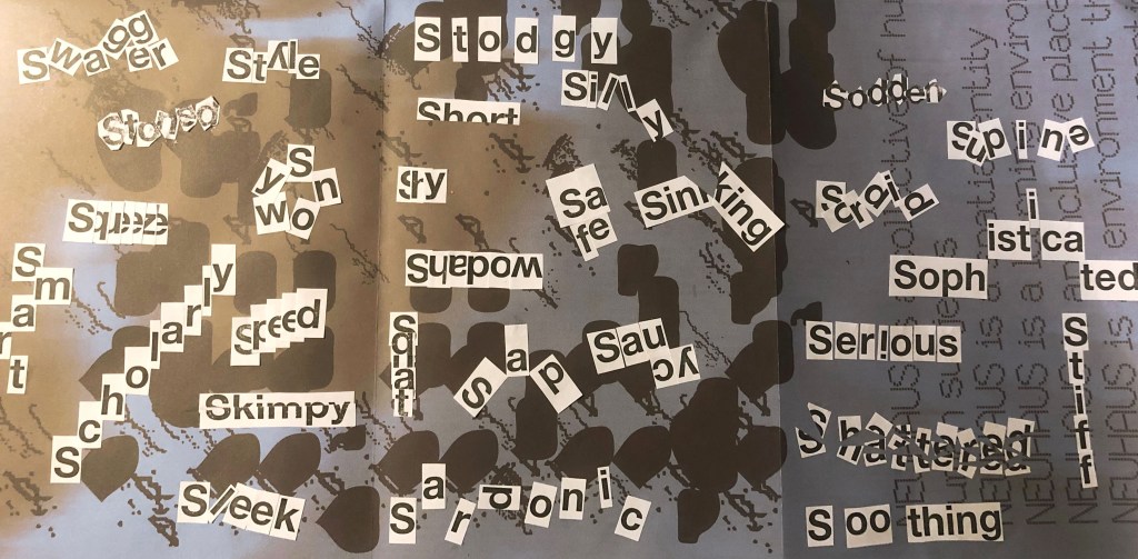
Start this exercise by working on A4 sheets of paper. Set the words in 48pt HelveticaBold, print and cut out the words and then arrange them and stick them to a sheet of paper trying to capture the meaning of the word visually. Think about the composition, using the white space of the page to help you construct your meanings.
Then work digitally using any of the software you have available. Explore how you can set text at a slant, at different sizes, in different colours and fonts. Try using filters in your software for other effects. Make notes as you work explaining your choice of representations and which ones youfeel that you were most successful with.
Practical Part
So, it’s time to start the first task of the printing section. Before I dive into the practical task, I made a small investigation into the history of type, I traced the evolution of writing for myself, it was interesting to follow the very origins of the development of type and writing, and how centuries-old inventions influenced modern typography. I left small notes in my Research Point.
At first glance, the standard pun-word exercise was very exciting. What struck me most was that how different the permutations of the letters in one word can be, and how this affects the visual perception of the word. I made sure for myself that the standard font, but the unique arrangement of letters can affect the character and mood of a person.
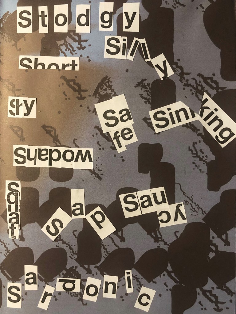
Paying with words practical part
When I imagined the word Sad I could see a sad smiley, and I want to place the word flowing down. When associating the word Safe, I presented a safe for keeping all valuables, and all the words are grouped into a cube shape. When associating the word Sardonic, I imagined something daunting when the letters want to scare so they scatter on different sides. For word Saucy, I imagined something playful and tasty. For word Scholary, this word which all strives to learn more is therefore directed upward. For word Serious, I imagined an exclamation point, so this is the emphasis, I am serious, and it is important! Word Shadow is a reflection, and it is read backwards. Word 8 is like broken glass, so it came to me to sweat by arranging small pieces of letters in a chaotic manner. Word Shy is hiding inside itself because it is shy to show itself in all its beauty. For word Short, the entire length of the letters is not enough, because it is small. Words Silly and Sweet are also playful and funny, so some letters do not want to stand in a row, but they want to somehow escape. Word Sinking, like the drowning ship Titanic, is broken in half, pulling to the bottom. And so all other words. I like the fact that they have no limits to play around!
Playing with words Part 1
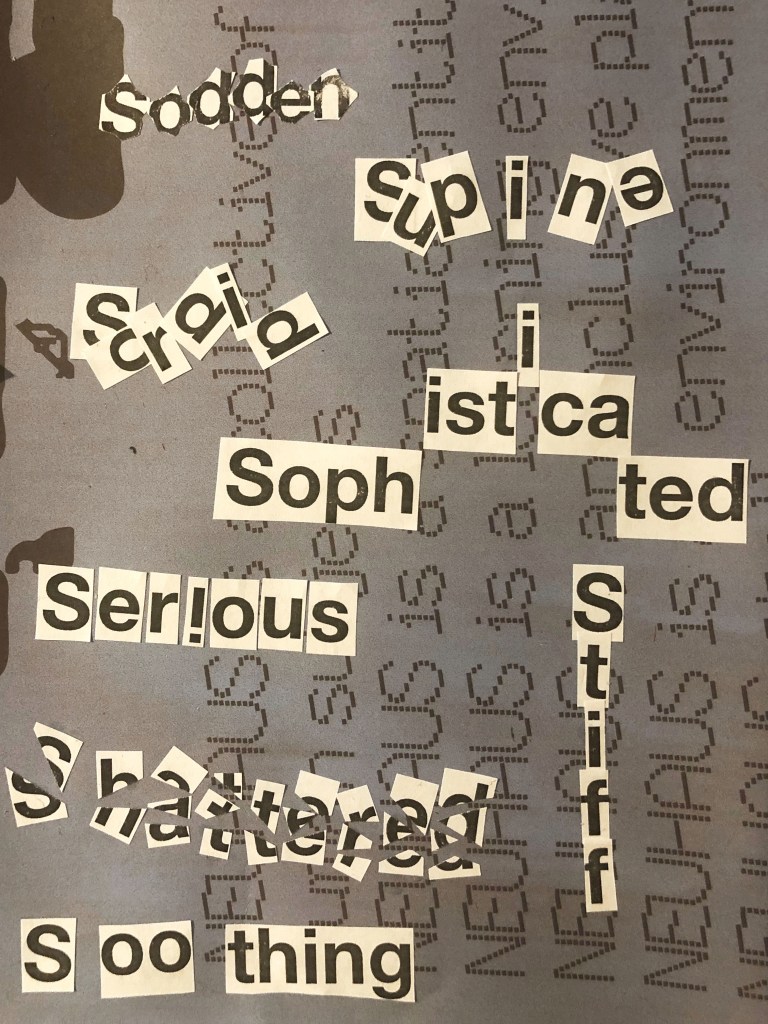
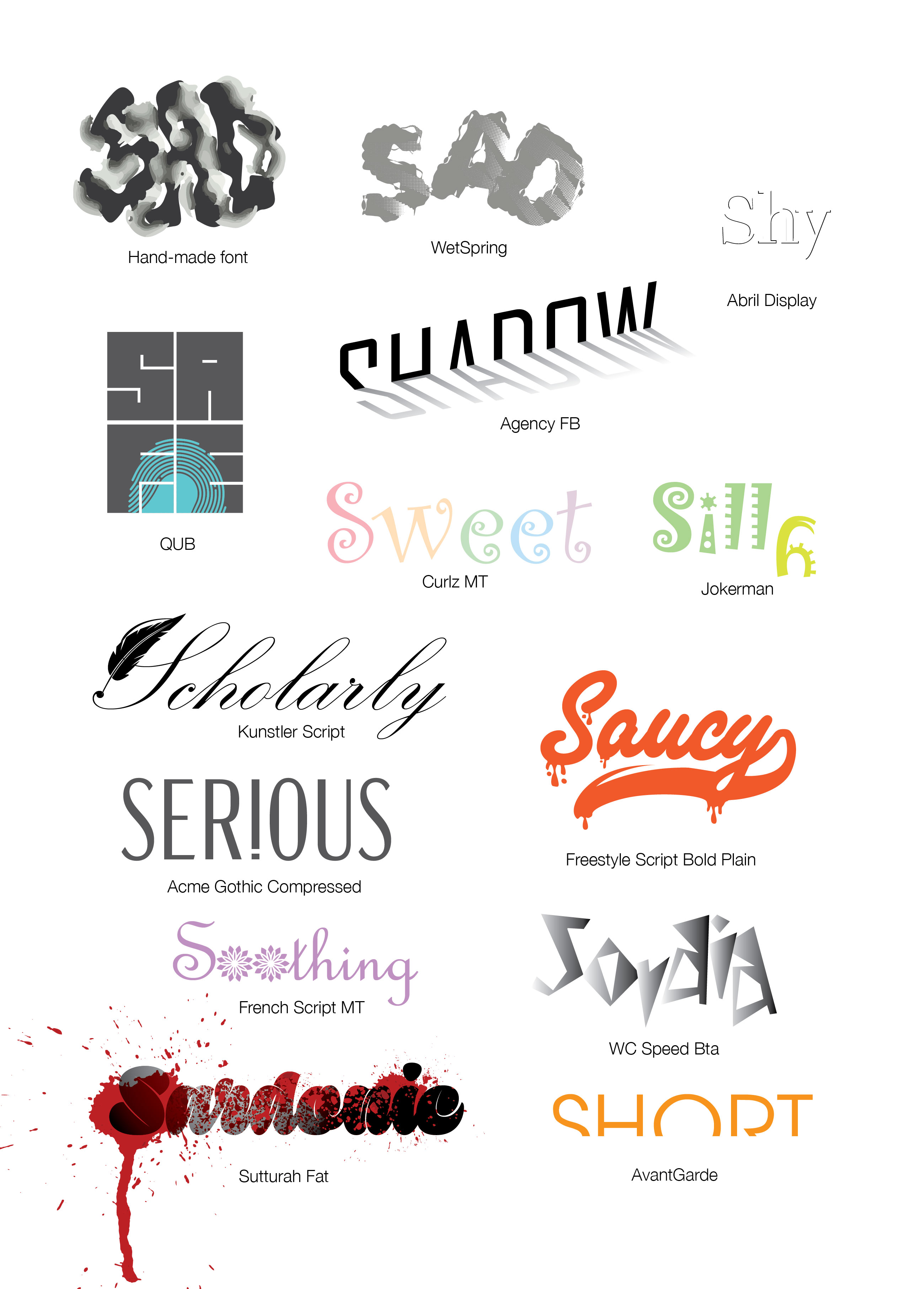
When I started the graphic part of the assignment, it was important for me to show the meaning of the word in addition to the unique arrangement of letters, but also through the form of the font and its color as an addition. In my opinion, the font itself can convey the meaning of the word and its orientation. For example, I discovered the new Sutturah Fat font, it is easy to read, and it really has something intimidating, but a couple of bloody spots added even more meaning to the word. Or let’s say the Kunstler Script font, in my understanding, a scientist often writes in a beautiful, wide-spread font, let’s say this is a real idea. The same applies to the words Sweet / Silly, in which I used light, playful fonts with cute, subtle hues. I was also inspired by the font Riesling, for the word Sofisticated, such gracious and elegant font, as I understand it, there is really something attractive in this word. But to make this ford even more visible I arranged it into the goes high style. Thus, I replenished the font database, and I tried to beat every word in the role of a logo, like a word that represents itself in shape, color, and the arrangement of letters. In this practical lesson, I indicated all the fonts that were used in the design.
Playing with words Part 2
Conclusion
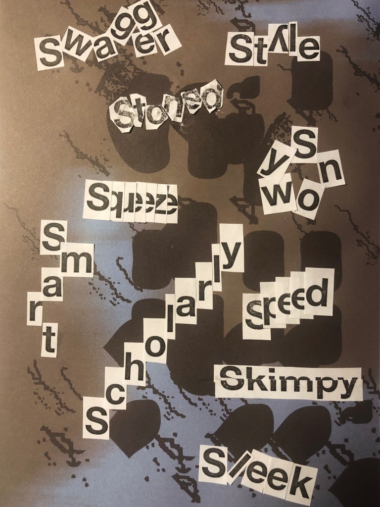
Based on my preliminary sketches of the font layout, I created words like Sad, Stoned, which kind of goes into the haze, relaxed and blurry image. With the word Speed, I had a desire to experiment, in which the letters e are depicted in the form of a speedometer.
In some words, I noticed difficulties, for example, such as Supine, Sleek,Soothing, I tried to add more tilt to them, convey the mood through color, and arrange the letters in a more chaotic version, but in my opinion they do not look as convincing as the rest fonts.
In conclusion, I would like to add that I enjoyed this assignment, it is painstaking work with fonts, and to some extent a separate chapter in the history of design, but it deserves a lot of attention, because the typography depends on the ease and correctness of the message, which the designer wants to convey to the viewer.
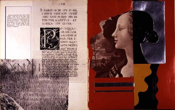
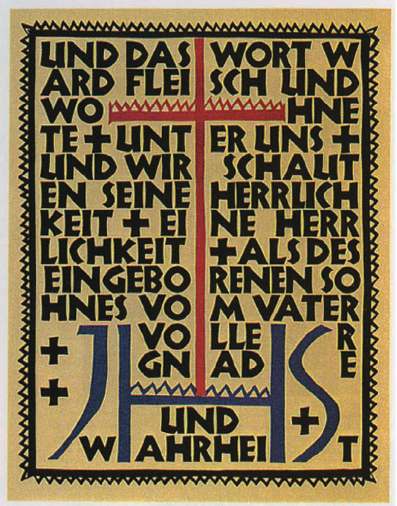
Double page spread including examples of Roman type and profile portrait, from `Mise en Page`, written, designed and produced by Albert Tolmer, pub. by Studio Editions, 1931
The history of type development has seen many exciting eras. The invention of moveable type, for instance, revolutionized our world, allowing the transmittal and sharing of knowledge, raising the level of the world’s literacy, and enabling civilization to progress and prosper.
Type History and Timeline of Typogrphy.
Ancient cave paintings that date back to 20,000 B.C. are perhaps the very first recorded written communication. However, formal writing is said to have been developed by the Sumerians at around 3,500 B.C.
Greek lapidary letters
Roman monumental capitals
As civilisations advanced, the need to communicate complex concepts grew—hence the development of Egyptian hieroglyphics. By 3100 B.C., the Egyptians began incorporating symbols or ideograms into their art, architecture and writings.
Fifth Century BCE.
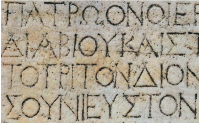
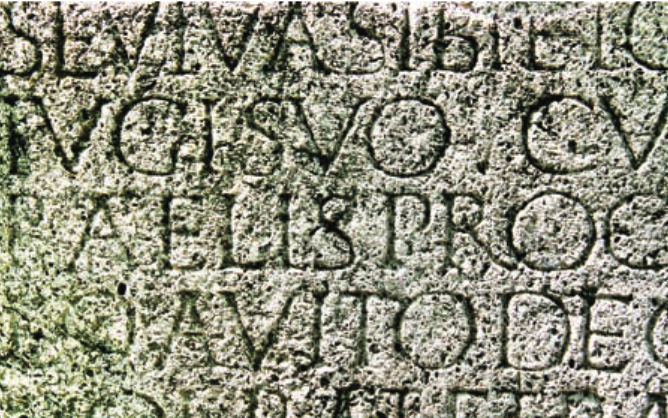
Greek lapidary letters, letters carved into hard surfaces, were one of the first formal uses of Western letterforms. The Greeks adopted the Phoenician alphabet for their own needs, and as a result, changed several letters and created the foundation for Western writing. Roman monumental capitals are the foundation for Western type design, as well as the ancestor of all serif typefaces Fourth and Fifth Centuries CE This time period saw square capitals, formal hand-written letters that evolved from Roman monumental capitals.
Fourteenth and Fifteenth Centuries
The Middle Ages were all about hand-written and well-illustrated manuscripts. It led to the evolution of a wide range of writing styles. Unicals and half unicals were prominent features, with rounded, elaborate lettering. The art of Calligraphy along with page layout and lettering forged new ground. Calligraphy masters travelled across the known world to share their knowledge with the educated elite.
Nicolas Jenson (77) (1420– 1480) was one of the first printers to cut and use fonts based on Roman rather than northern European Fraktur letterform.
Another fifteenth-century notable, William Caxton (1421– 1491), a man credited with introducing to England the craft of printing with movable type, was first a successful businessman and government official before beginning his typographic career.
Sixteenth Century
Garamond (74) (1500– 1567) was the most distinguished type designer of his time, perhaps of the entire Renaissance period. A true typographic innovator, he was instrumental in the adoption of Roman typeface designs in France as a replacement for the commonly used Gothic.
Seventeenth and Eighteenth Centuries
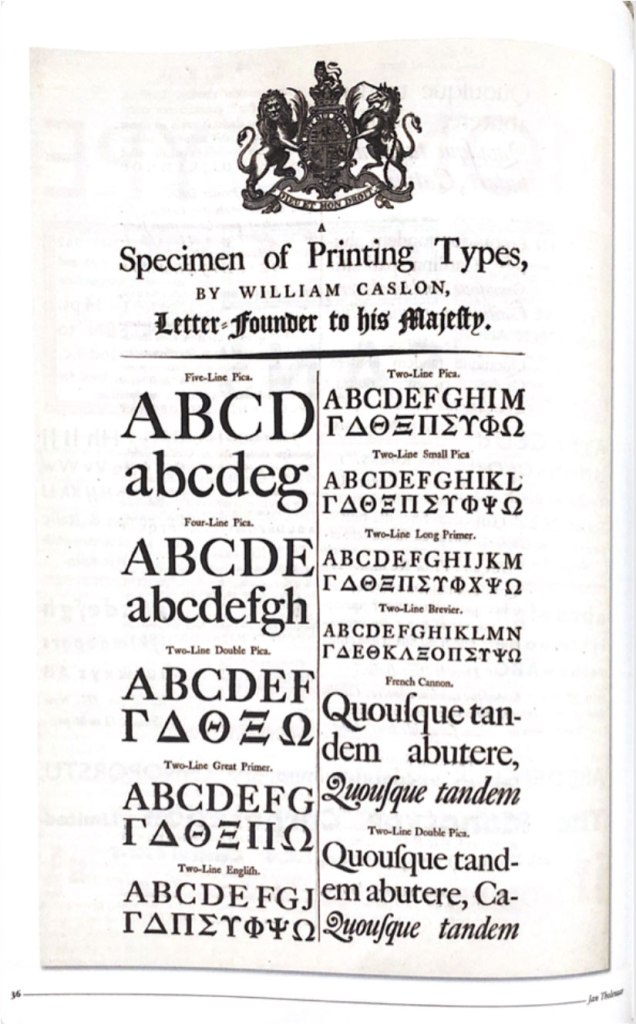
During this period, English gunsmith-turned-type-designer William Caslon I (72) (1692– 1766) founded the Caslon Type Foundry. He was one of the few wealthy type designers. His work, based on earlier Dutch designs, does not possess irreproachable perfection like that of Bodoni (156) or Baskerville (154) . Caslon’s strength as a type designer was not in his ability to create flawless letters, but to create a font that when set in a block of text copy appeared perfect in spite of the vagaries and individuality of each letterform.
Early Nineteenth Century
Early in this century, Lord Stanhope invented the first printing press. A few years later, in 1816, William Caslon IV designed the first sans serif font, creating the English serifed design. Many claim that the design for this sans is based on the Greek lapidary letters of the fifth century. Note how close they also look to the caps found in faces such as Futura (174) and ITC Avant Garde Gothic. In 1818, Bodoni’s (71) Manuale (completed by his wife after his death) showed the quintessential modern type.
Rudolf Koch, 1924
Mid Nineteeth Century
For many years, ATF had the greatest offering of typefaces in the world— an offering that Benton essentially built. Outside the United States during this period, Emil Rudolf Weiss, Rudolf Koch , Lucian Bernhard , and Paul Renner began designing type.
Koch was primarily a calligrapher and teacher, but his association with the Klingspor type foundry in Germany provided the opportunity for a number of his designs to become type fonts.
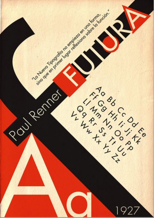
Renner created the first modern, geometric sans serif face: Futura . Although not a member of the Bauhaus, Renner shared its ideals and believed that a modern typeface should express modern models, rather than revivals of previous designs.
Late Ninetheeth
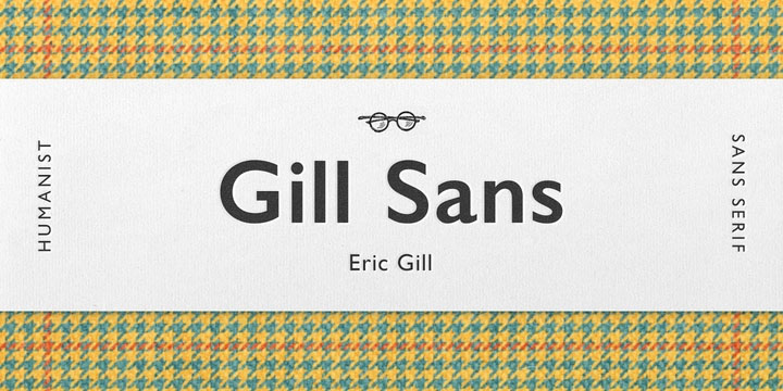
Eric Gill (1882– 1940) was an English sculptor, stonecutter, artist, and type designer. His most important work— and his only sans— is Gill Sans. His other designs include Joanna, Perpetua, and Pilgrim.
By the Industrial Revolution typography was all about communicating with the masses. Through signs, posters, newspapers, periodicals and advertisements, typefaces became larger and catchier, with bolder lettering and shading—as well as experimental serif and sans serif typefaces. Ornamental typography was another major highlight in this era. In the 1800’s, medieval art and hand crafted individual art has become commonplace, and international artistic styles developed considerably.
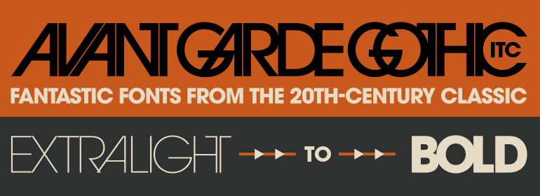
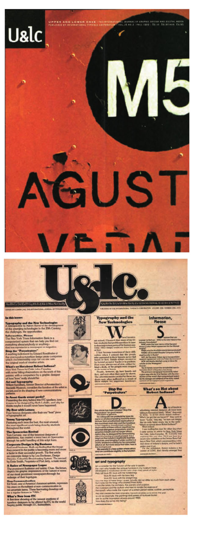
The year 1970 experienced the release of ITC Avant Garde Gothic and ITC Souvenir. ITC Avant Garde Gothic was ITC’s first typeface, initially drawn by Herb Lubalin (95) as the logo and headline face for Avant Garde magazine.
In 1982, John Warnock and Chuck Gerschke founded Adobe Systems. In 1983, Adobe PostScript was announced, one of the three most important technological advancements in typographic history.
U&lc was ITC’s journal of typography.
1990s
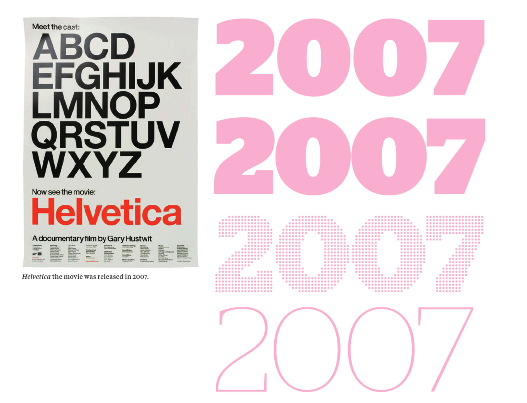
ITC released Tekton in 1990, possibly the ITC Souvenir of this decade. It was designed by David Siegel for Adobe Systems (124) and based on the hand lettering of D. K. Ching, a Seattle architect. The following year, Adobe introduced the Portable Document Format— what’s today commonly called PDF— to aid in the transfer of documents across platforms. Apple introduced its TrueType to compete with Adobe’s PostScript. Stag Family by Christian Schwartz.
2000s
In 2000 and 2001, Agfa purchased the ITC type library and created Agfa Monotype, a merger of Agfa Typographic Systems and Monotype Typography. The Gotham typeface family, by Tobias Frere-Jones (87) , was released. Apple introduced Mac OS X 10.0 code named Cheetah. Harvey R. Ball, who created the cultural and typographic iconic drawing of a smiling face on a yellow background, passed away.
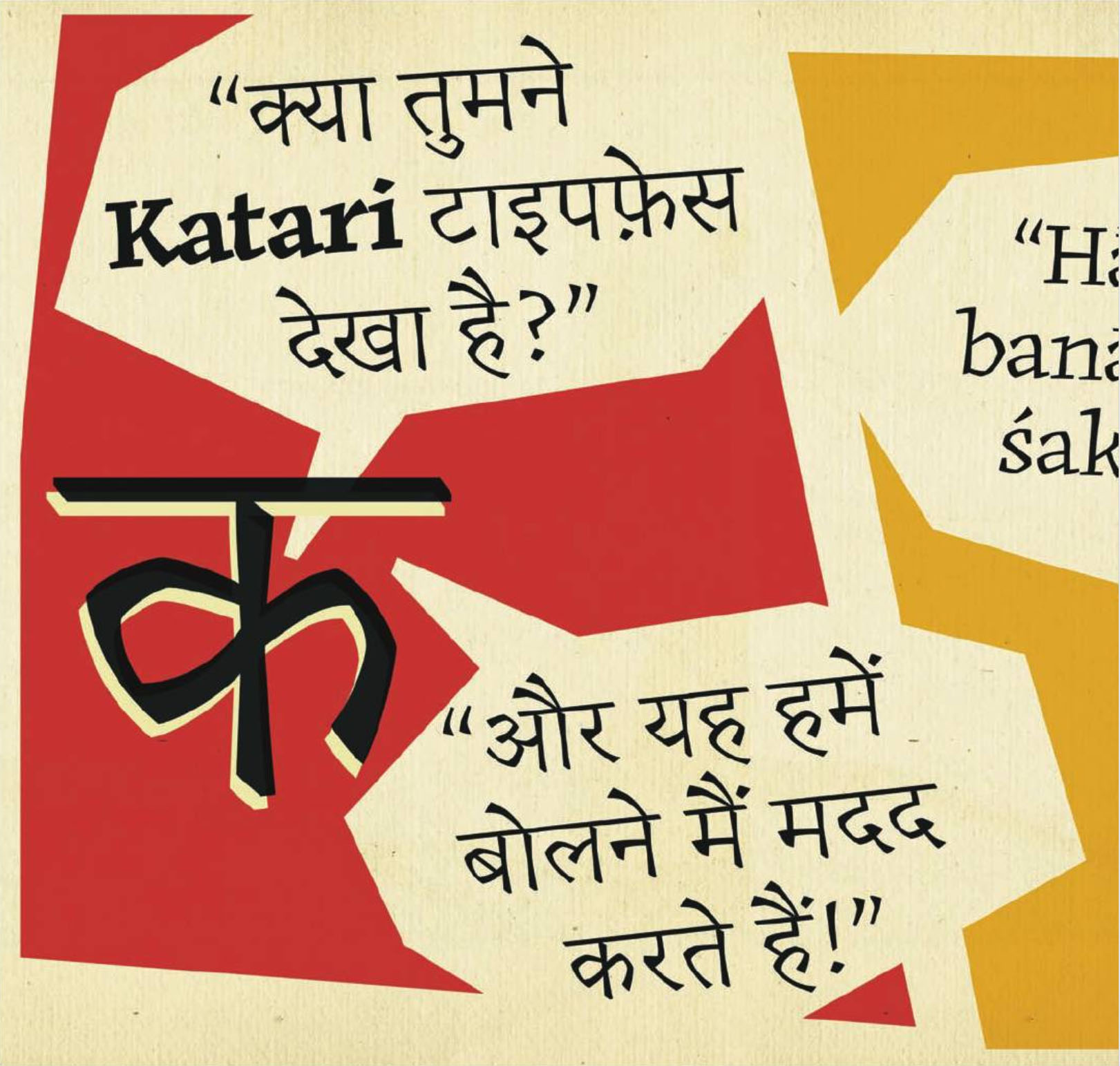
Stag Family by Christian Schwartz Erin McLaughlin’s Katari typeface combines a strong engagement with the writing of Devanagari, translating a pen-inspired structure into an incised style with both text and display variants.
Source: Tselentis, Jason, et al. Typography, Referenced : A Comprehensive Visual Guide to the Language, History, and Practice of Typography, Quarto Publishing Group USA, 201
To produce a poster (297mm x 420mm) that celebrates a colour of your choice. Choose a colour that has a meaning that you want to explore and celebrate. Think about what the colour you have chosen means both to you and to other people and create something that celebrates that meaning, for example, you may choose a golden brown because you like real ale, a vivid green because of a particular landscape, green to celebrate Irish identity or the yellow sandstone of Bath’s architecture.
Requirements
Work only with your chosen colour, its complementary colour and black and white. You can include text, collages, illustrations and photographs. Use black and white to help establish a range of tints and shades with your chosen colour. These limitations are to get you to work with colour thinking creatively about how to make a limited palette work for you. This project is as much about visual dynamics and contrast as it is about creating something with meaning. Make full use of it to show off to your tutor all the skills and processes you have learnt so far. You need to submit at least three variations of your poster as well as the finished artwork.
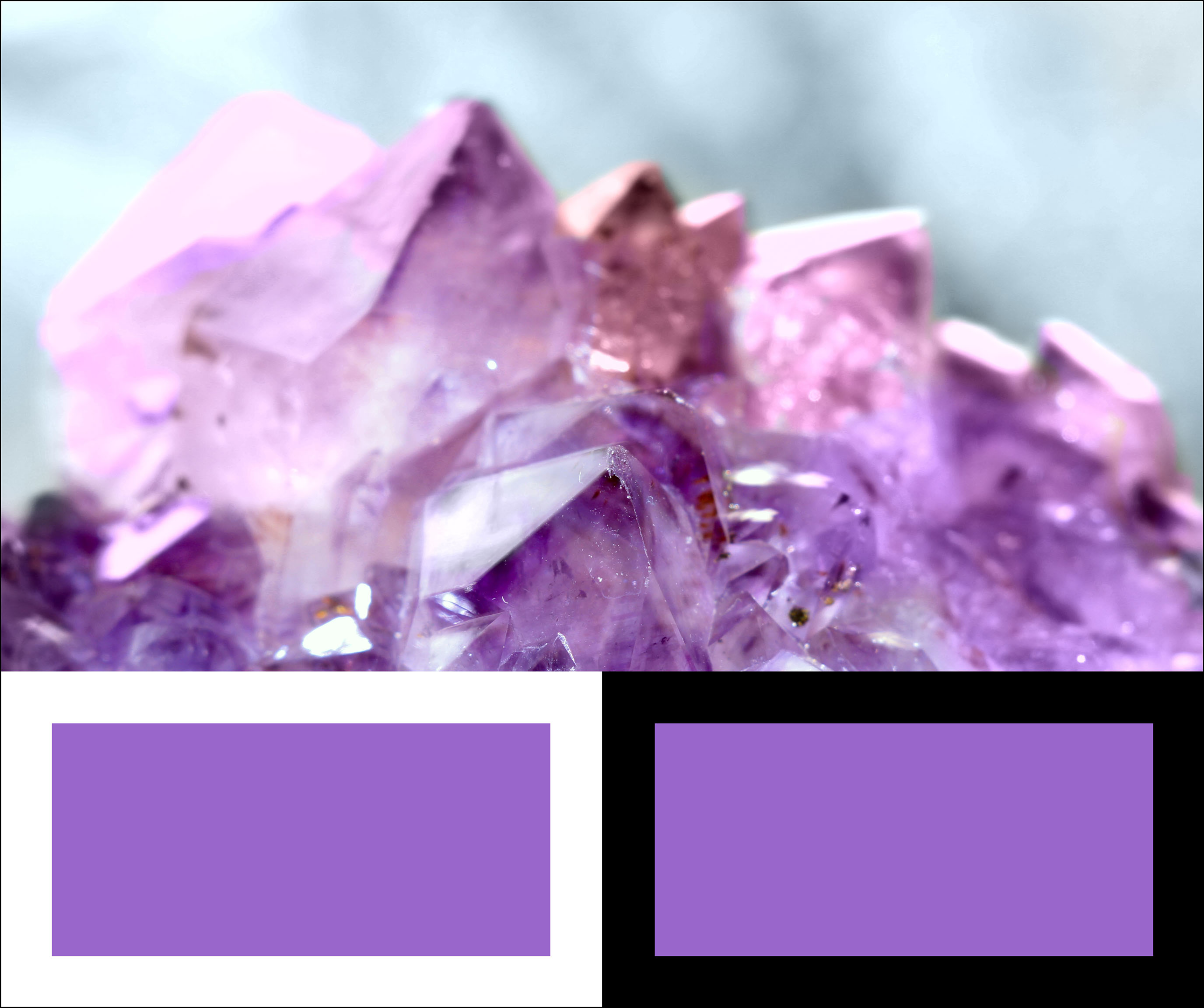
Chosen Colour
Despite its prevalence, amethyst has been one of the world’s most revered stones for many centuries. The was a belief that the amethyst crystal meaning was synonymous with luxury. As a result, it was widely used as part of their crowns, sceptres and rings. Christian bishops once wore amethyst jewellery in the form of a circle. Its colour was meant to symbolise royalty and allegiance to Christ.
Purple Amethyst has been highly esteemed throughout the ages for its stunning beauty and legendary powers to stimulate, and soothe, the mind and emotions. It always was associated with February, the month the Romans dedicated to Neptune, their water-god, and is the traditional birthstone of that month. It is the stone of St. Valentine and faithful love and signifies ecclesiastical dignity as the Bishop’s Stone. It carries the energy of fire and passion, creativity and spirituality, yet bears the logic of temperance and sobriety.
In RGB colour space, hex #9966cc (also known as Amethyst) is composed of 60% red, 40% green and 80% blue. Whereas in a CMYK colour space, it is composed of 25% cyan, 50% magenta, 0% yellow and 20% black. It has a hue angle of 270 degrees, a saturation of 50% and a lightness of 60%.
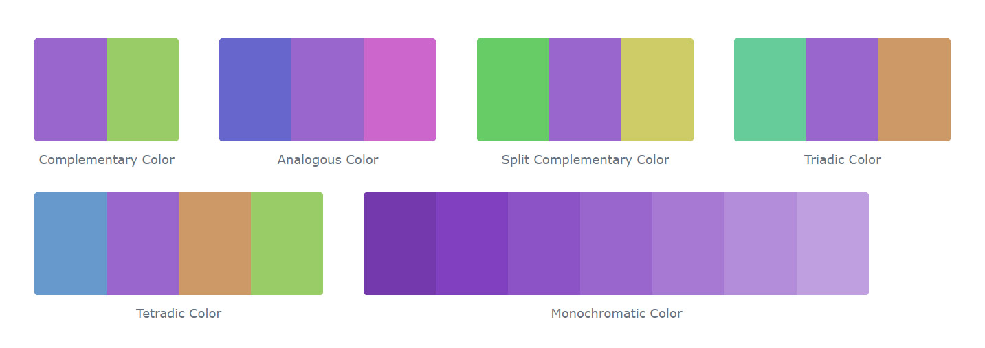
Colour Schemes with Amethyst
Below some colours close to #9966cc. Having a set of related colours can be useful if you need an inspirational alternative to your original colour choice.
Alternative Colours
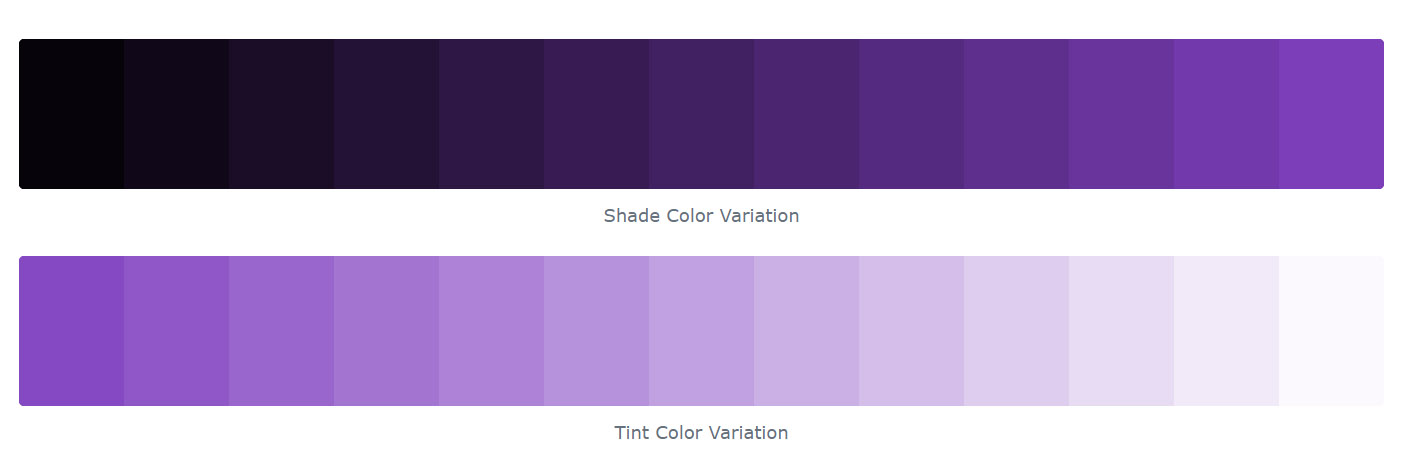
A shade is achieved by adding black to any pure hue, while a tint is created by mixing white to any pure colour. In this example, #060309 is the darkest colour, while #fbf9fd is the lightest one.
Violet and purple retained their status as the colour of emperors and princes of the church throughout the long rule of the Byzantine Empire.
While violet was worn less frequently by Medieval and Renaissance kings and princes, it was worn by the professors of many of Europe’s new universities. Their robes were modelled after those of the clergy, and they often wore square violet caps and violet robes, or black robes with violet trim.
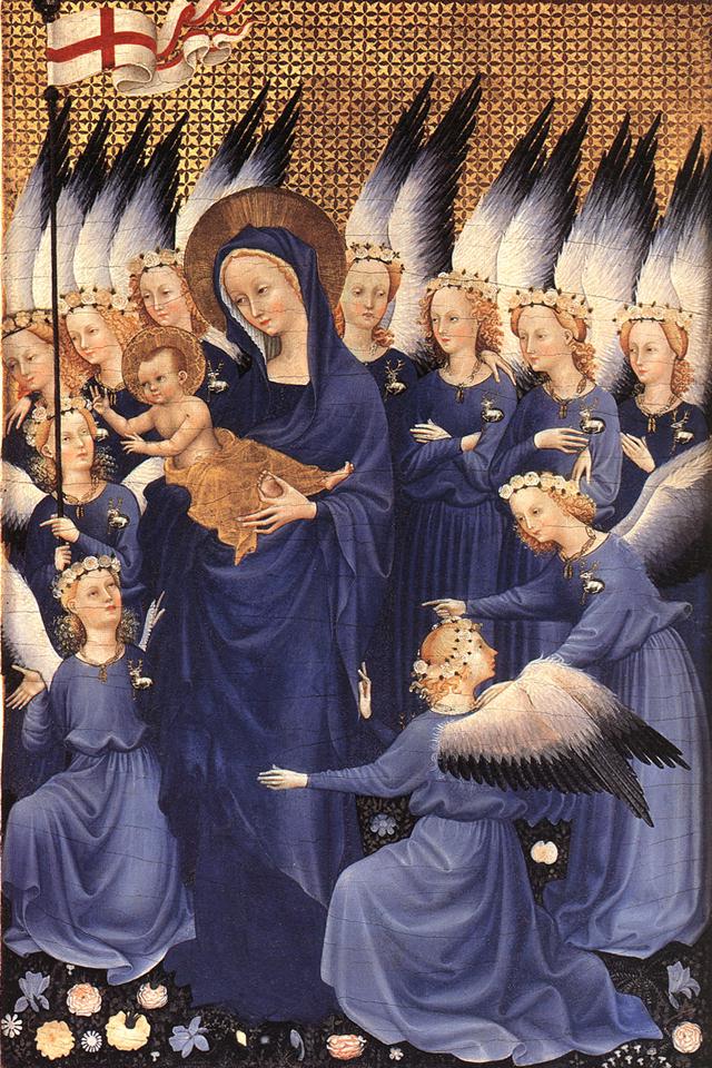
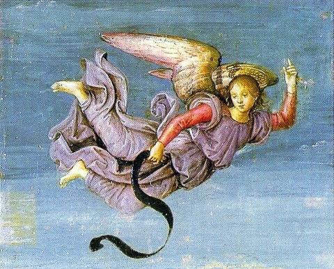
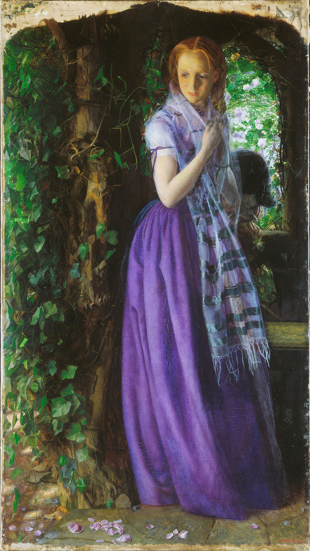
Violet also played an essential part in the religious paintings of the Renaissance. Angels and the Virgin Mary were often portrayed wearing violet robes.
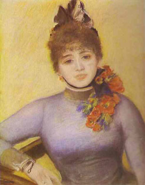
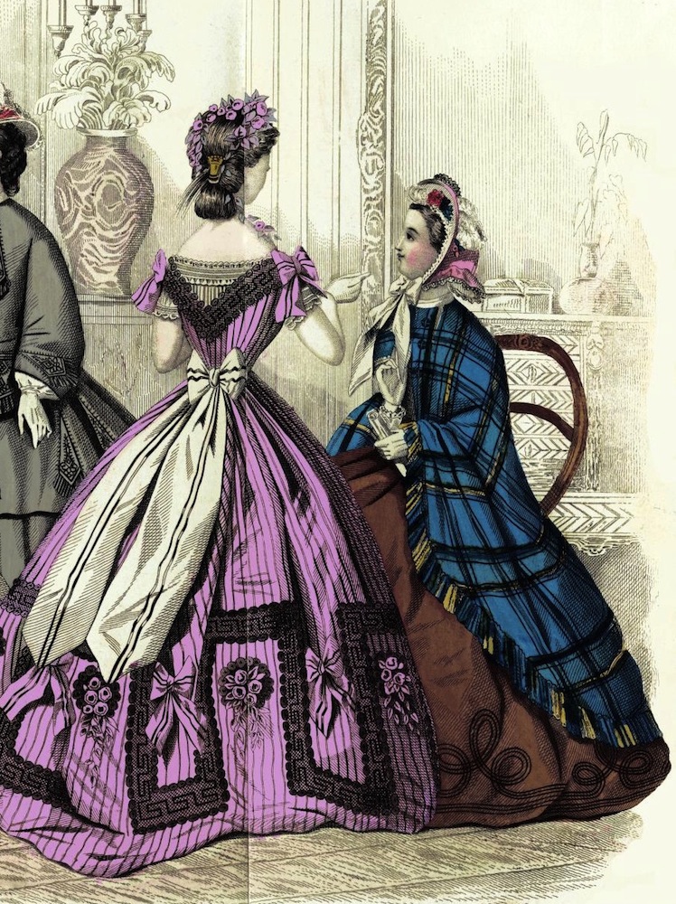
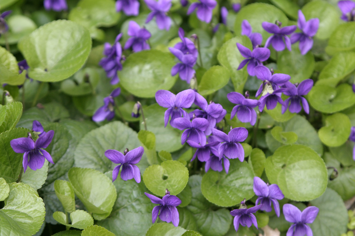
Portrait of Caroline Remy de Guebhard, by Pierre-Auguste Renoir (1841–1919). Mauve became a popular fashion colour after the invention of the synthetic dye in 1856.
In the 18th century, violet was a colour worn by royalty, aristocrats and the wealthy, and by both men and women. The good-quality violet fabric was expensive, and beyond the reach of ordinary people.
The first cobalt violet, the intensely red-violet cobalt arsenate, was highly toxic. Although it persisted in some paint lines into the twentieth century, it was displaced by less toxic cobalt compounds such as cobalt phosphate. Cobalt violet appeared in the second half of the 19th century, broadening the palette of artists. Cobalt violet was used by Paul Signac (1863–1935), Claude Monet (1840–1926), and Georges Seurat (1859–1891). Today, cobalt ammonium phosphate, cobalt lithium phosphate, and cobalt phosphate are available for use by artists. A colour similar to cobalt ammonium phosphate, cobalt magnesium borate, was introduced in the later twentieth-century but was not deemed sufficiently lightfast for artistic use. Cobalt violet is the only genuinely lightfast violet pigment with relatively strong colour saturation. All other light-stable violet pigments are dull by comparison. However, the high price of the dye and the toxicity of cobalt has limited its use.
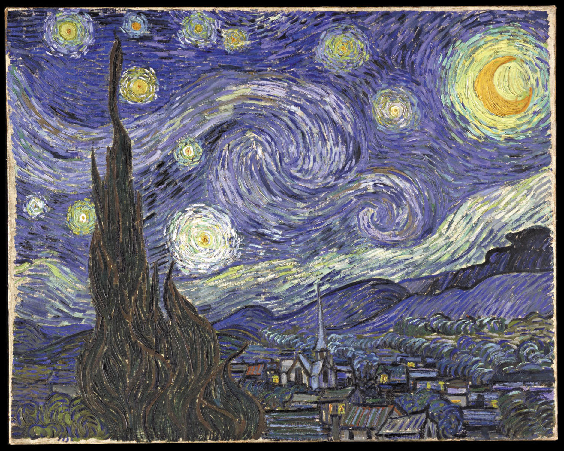
Vincent van Gogh (1853–1890) was an avid student of colour theory. He used violet in many of his paintings of the 1880s, including his portrayals of irises and the swirling and mysterious skies of his starry night paintings, and often combined it with its complementary colour, yellow. In the picture of his bedroom in Arles (1888), he used several sets of complementary hues; violet and yellow, red and green, and orange and blue. In a letter about the painting to his brother Theo, he wrote
“The colour here…should be suggestive of sleep and repose in general…The walls are pale violet. The floor is of red tiles. The wood of the bed and the chairs are fresh butter yellow, the sheet and the pillows light lemon green. The bedspread bright scarlet. The window green. The bed table orange. The bowl blue. The doors lilac….The painting should rest the head or the imagination.
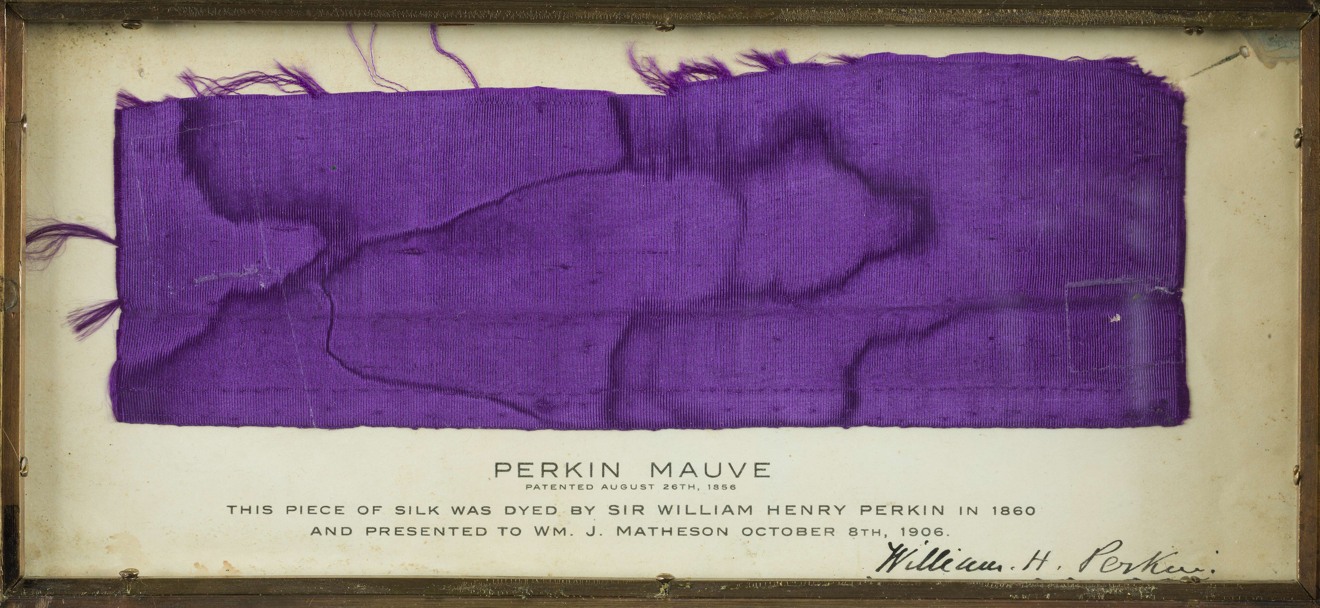
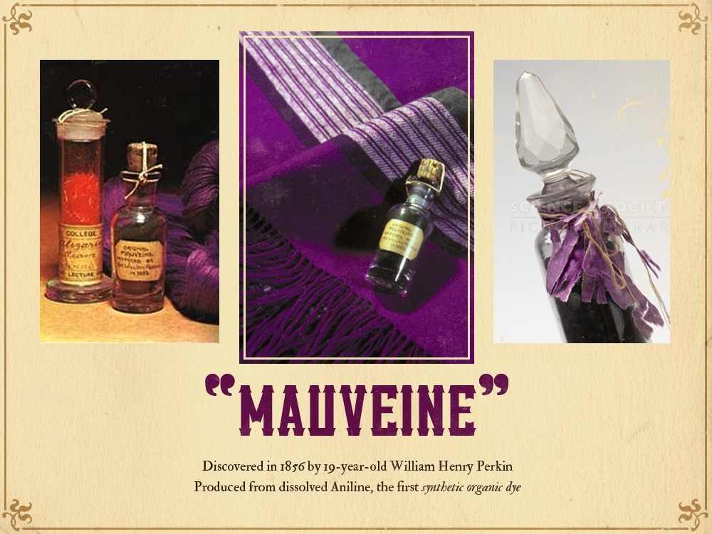
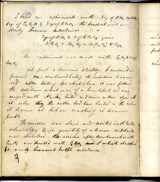
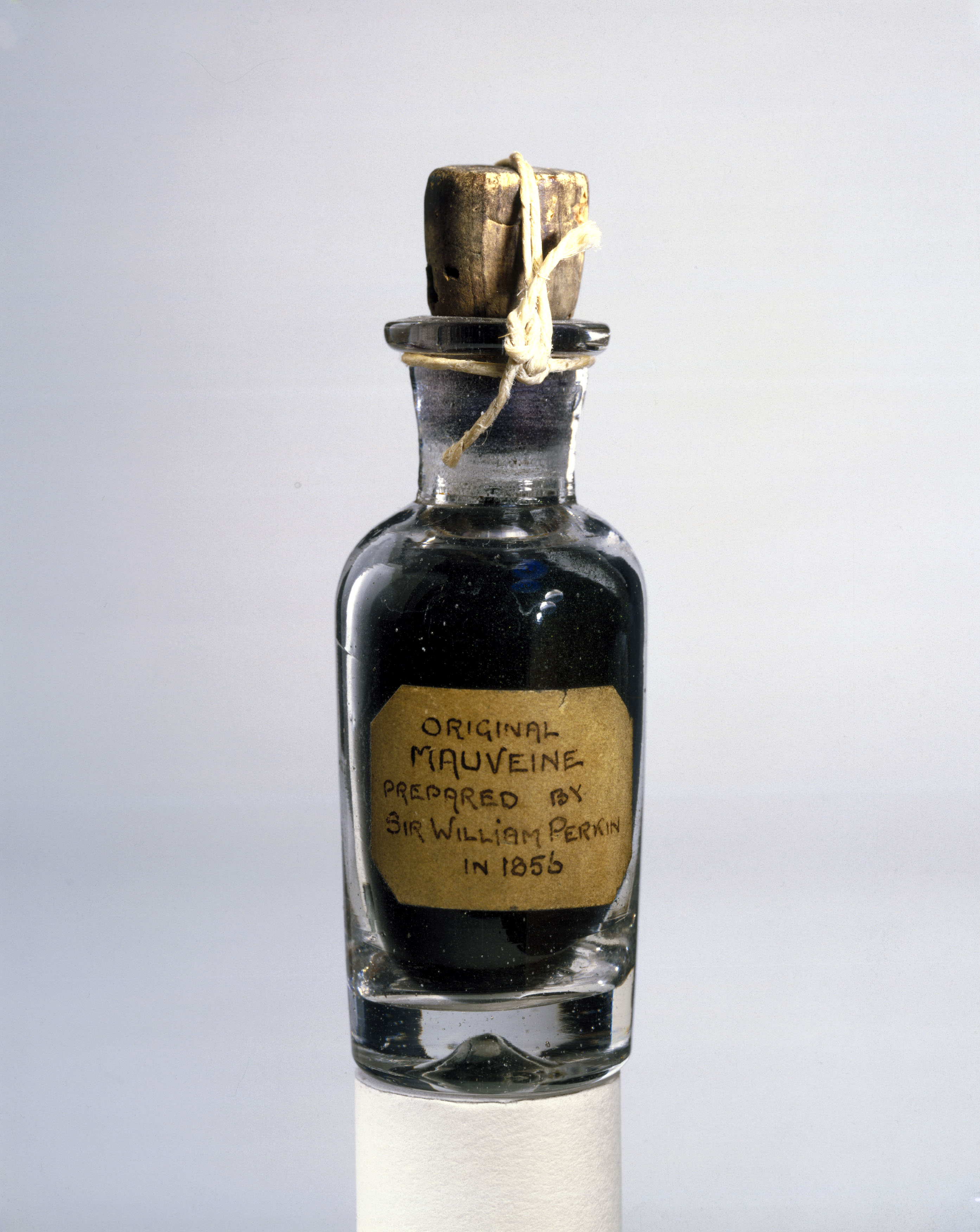
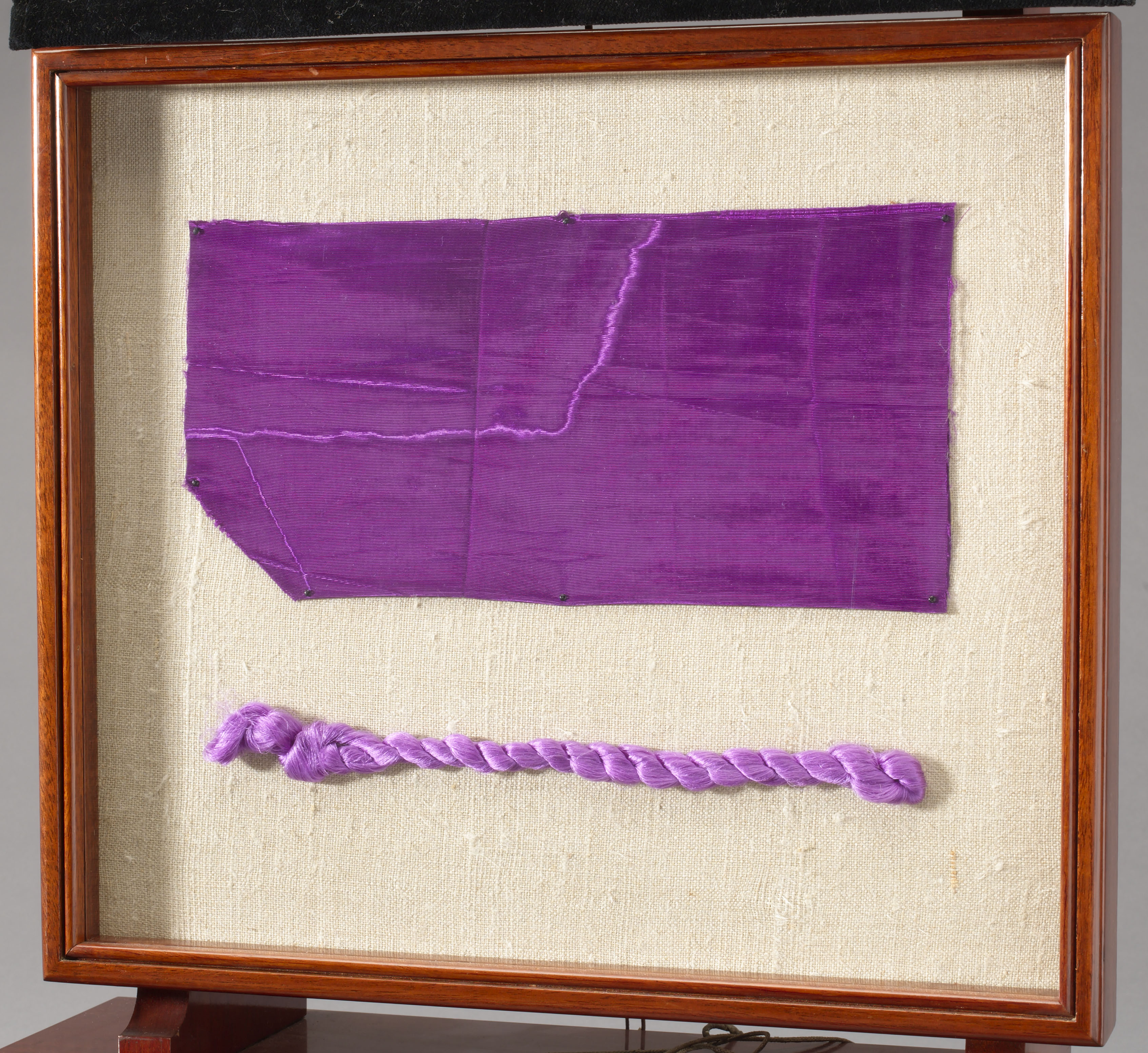
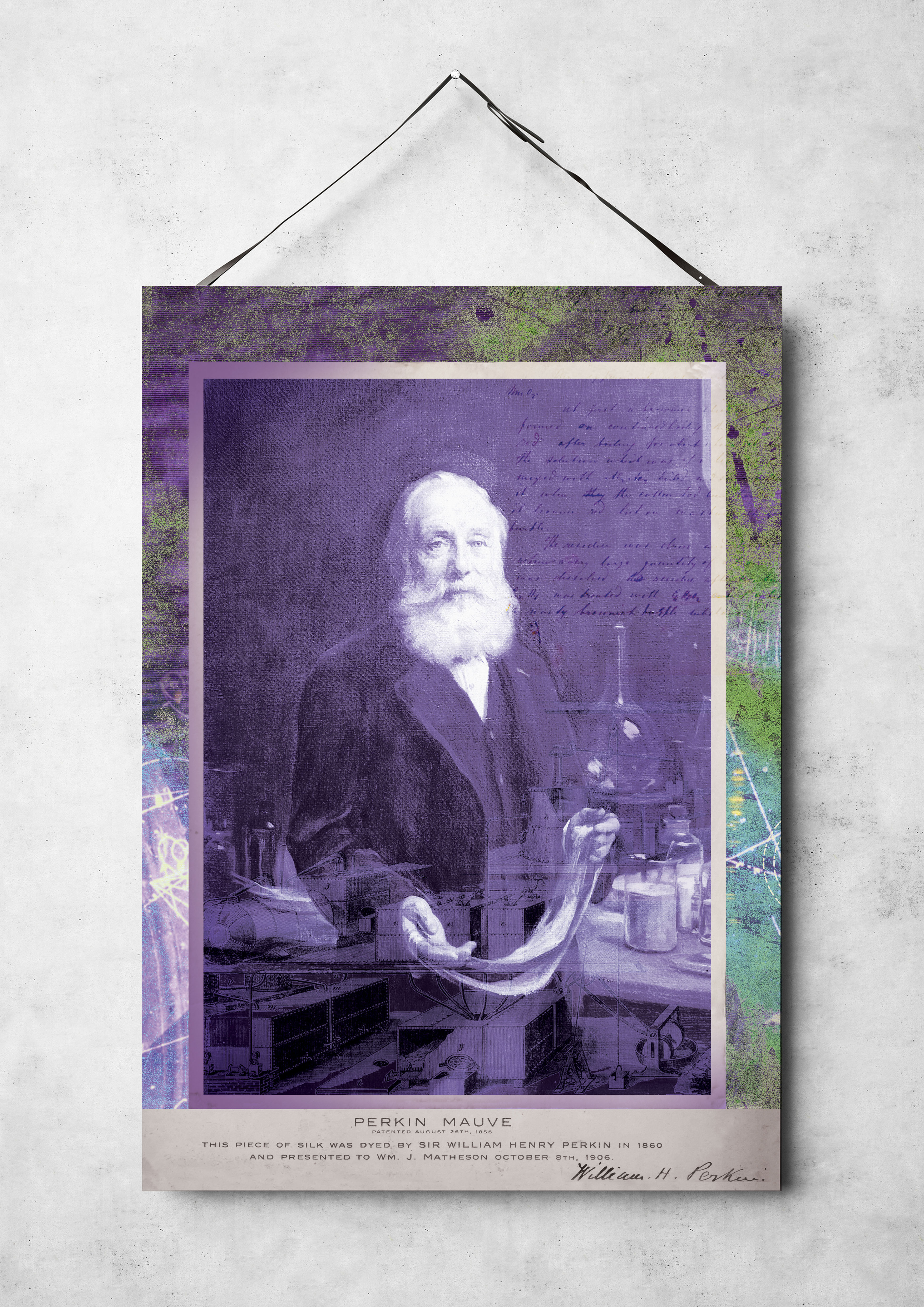
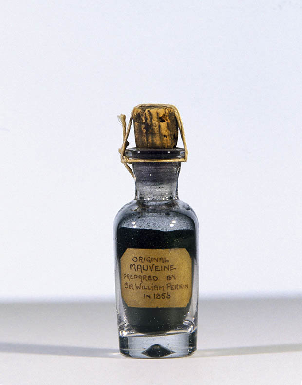
In 1856, a young British chemist named William Henry Perkin was trying to make a synthetic quinine. His experiments produced instead an unexpected residue, which turned out to be the first synthetic aniline dye, a deep violet colour called mauveine or abbreviated simply to mauve. Used to dye clothes, it became extremely fashionable among the nobility, and upper classes in Europe, mainly after Queen Victoria wore a silk gown dyed with mauveine to the Royal Exhibition of 1862. Before Perkin’s discovery, mauve was a colour which only the aristocracy and wealthy could afford to wear. Perkin developed an industrial process, built a factory, and produced the dye by the ton, so almost anyone could wear mauve. It was the first of a series of modern industrial shades which completely transformed both the chemical industry and fashion.
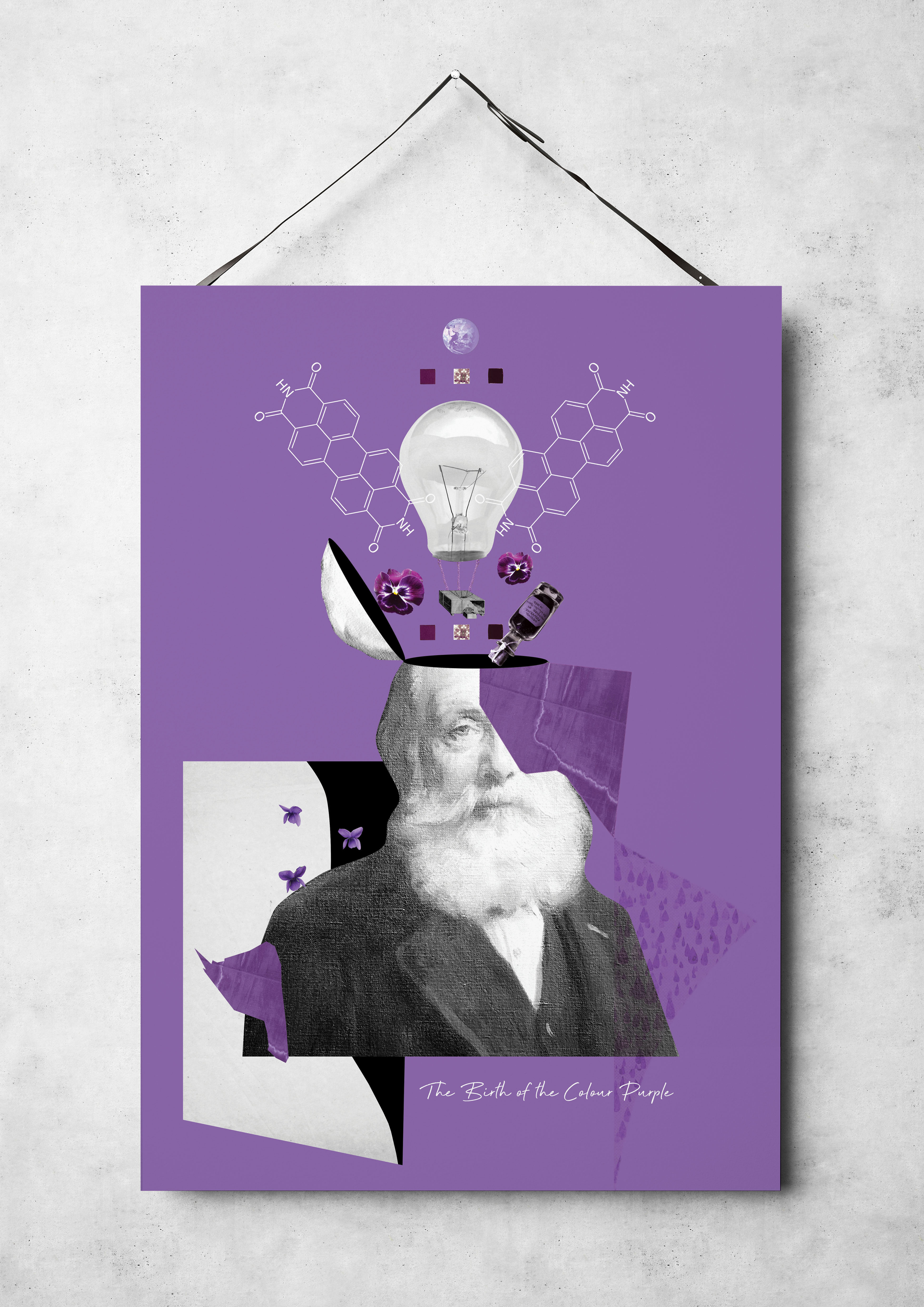
The next step in choosing my colour was the concept where I planned to work on the poster. The course of my thoughts led me in several directions. What if you imagine the space and atmosphere in remote, uncharted solar systems in bright purple or violet colour, or the birth of a new planet, which gives lilac radiation? I wanted to learn more about the existence of purple on our planet Earth; in the end, I came across this video. I liked the idea that the young Earth may have radiated a purple hue, which calls Purple Earth Hypothesis. That means that bacterias didn’t use the chlorophyll at all, instead of a simple molecule (Halobacteria) absorbed all green light and reflected purple colour. But according to research at the moment, scientists could not find a planet in such a non-standard colour in space, because that combination would indicate an early generation stage of life.
After analysing the first concept, I decided to move on and came across this video, which describes in detail why the purple colour was so rare and difficult to access? It became a discovery for me that this colour was officially registered only on October 8, 1856, by the English scholar Sir William Henry Perkin (by the way, October 8 is my birthday). The colour that was present in the birth of the planet was the last officially popularised in society. My design series are dedicated to discovering the colour that I wanted to call “The Birth of the Colour Purple“.
Why don’t country flags use the colour purple?
Secondary Research
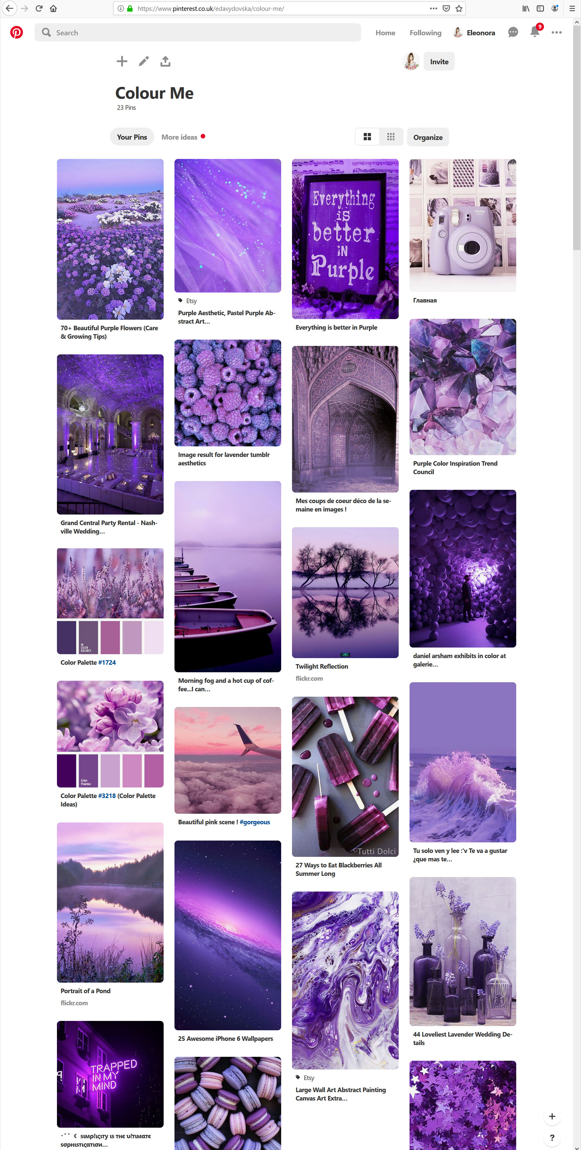
I went on Pinterest to collect some purple images for my mood board. All of those images looked creative, artistic and visually appealing.
Pinterest Board
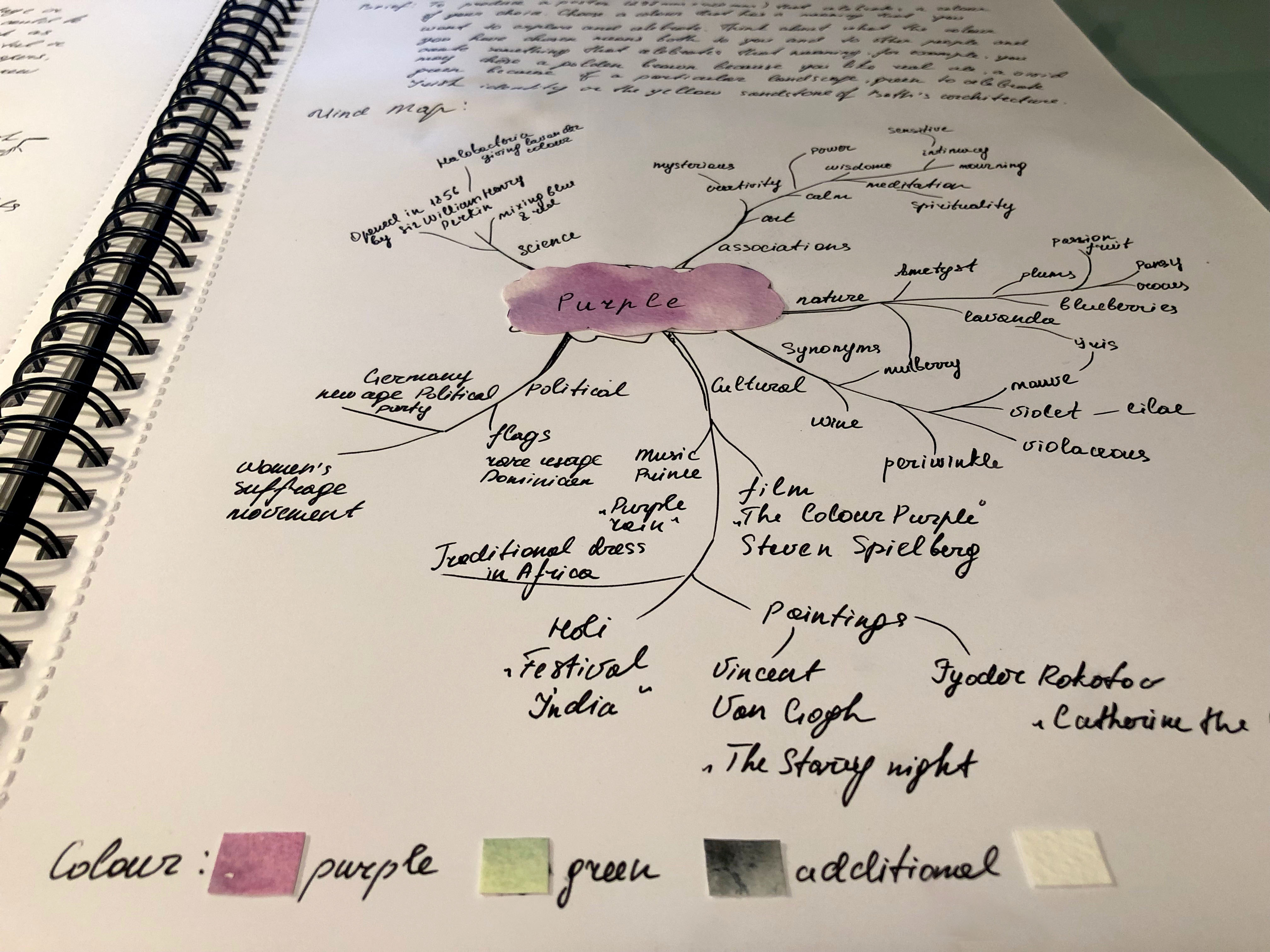
When I was browsing this collection of images, they gave me a feeling of peace and passion at the same time, and I described my researches of the colour properties of purple in my mind map. I made some sketches for the mind map and the collections of words around it, for such main ideas as Science, Associations, Nature, Art, Cultural and Political.
Mind Map for the Colour of Purple
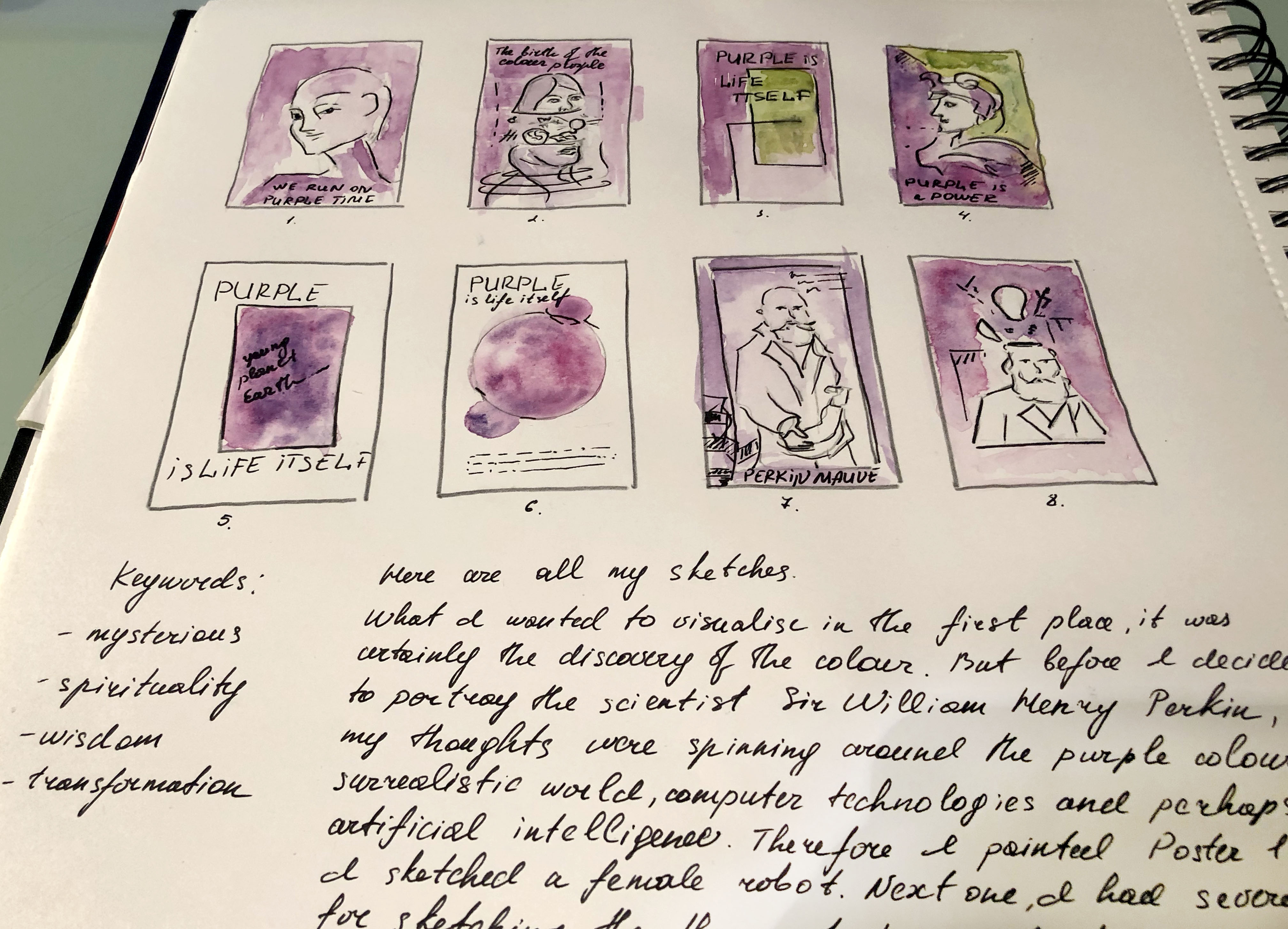
So, it’s time to start sketching. What I wanted to visualise in the first place was undoubtedly the discovery of colour. But before I decided to portray the scientist Sir William Henry Perkin, my thoughts were spinning around the purple colour, its surrealistic world, computer technologies and perhaps artificial intelligence. Therefore, I painted Poster 1, where I sketched a female robot. Next, I had several options for drawing the theory of the Birth of the Colour Purple, which I imagined as a woman with her head divided into several parts (Poster 2) with rotating objects around. I also had an idea to portray a poster in several hues, purple and green, as a theory that on planet Earth the purple colour was accompanied by complimentary green colour, as absolute proof that we live on the planet which continually changing and evolving (Poster 3). For Poster 4, I imagined this purple as a colour of the power, which could potentially be an idea for the collage with the sculpture head of the inflectional leader. Also, I had two main poster options — the discovery of purple by scientist Sir William Henry Perkin. I wanted to capture his achievement in several versions of my design, where the first version of the collage had the imposition of texture and objects of study, and scientist’s brain process (Posters 7 and 8). At the same time, in my sketches, there are geometric sketches, as an idea of how would a planet look like if we captured it from space (Posters 5 and 6).
Sketches
Poster 1
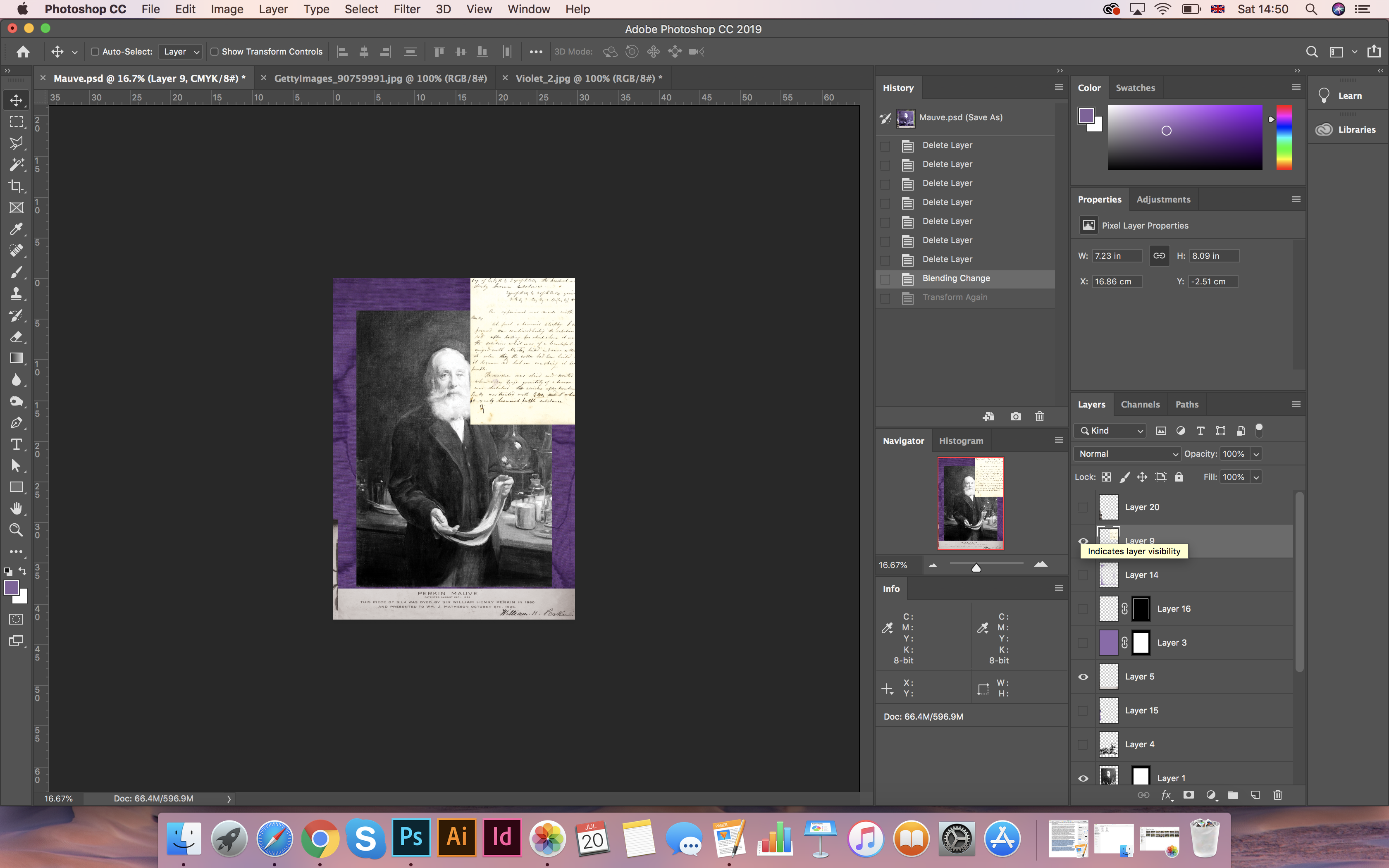
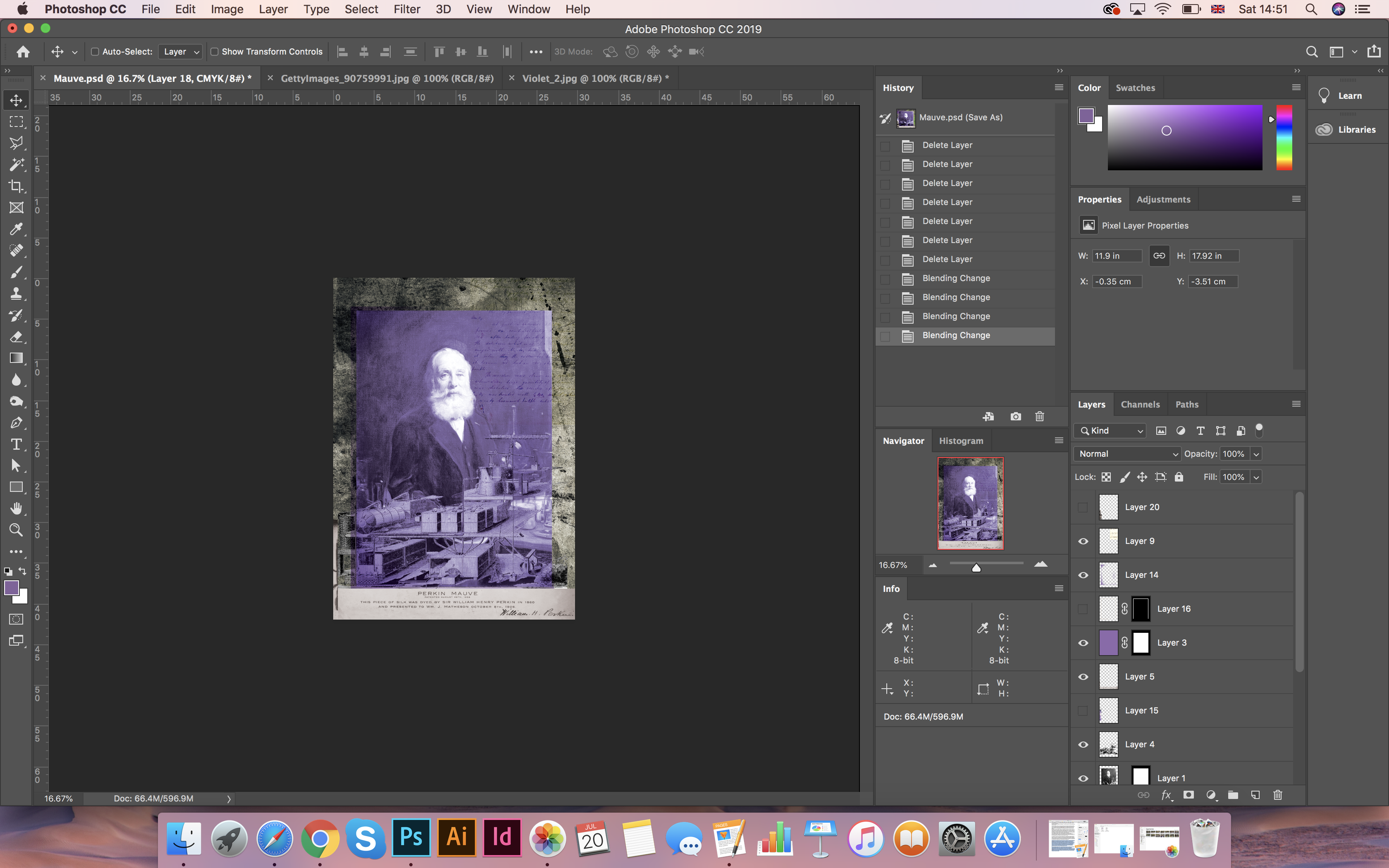
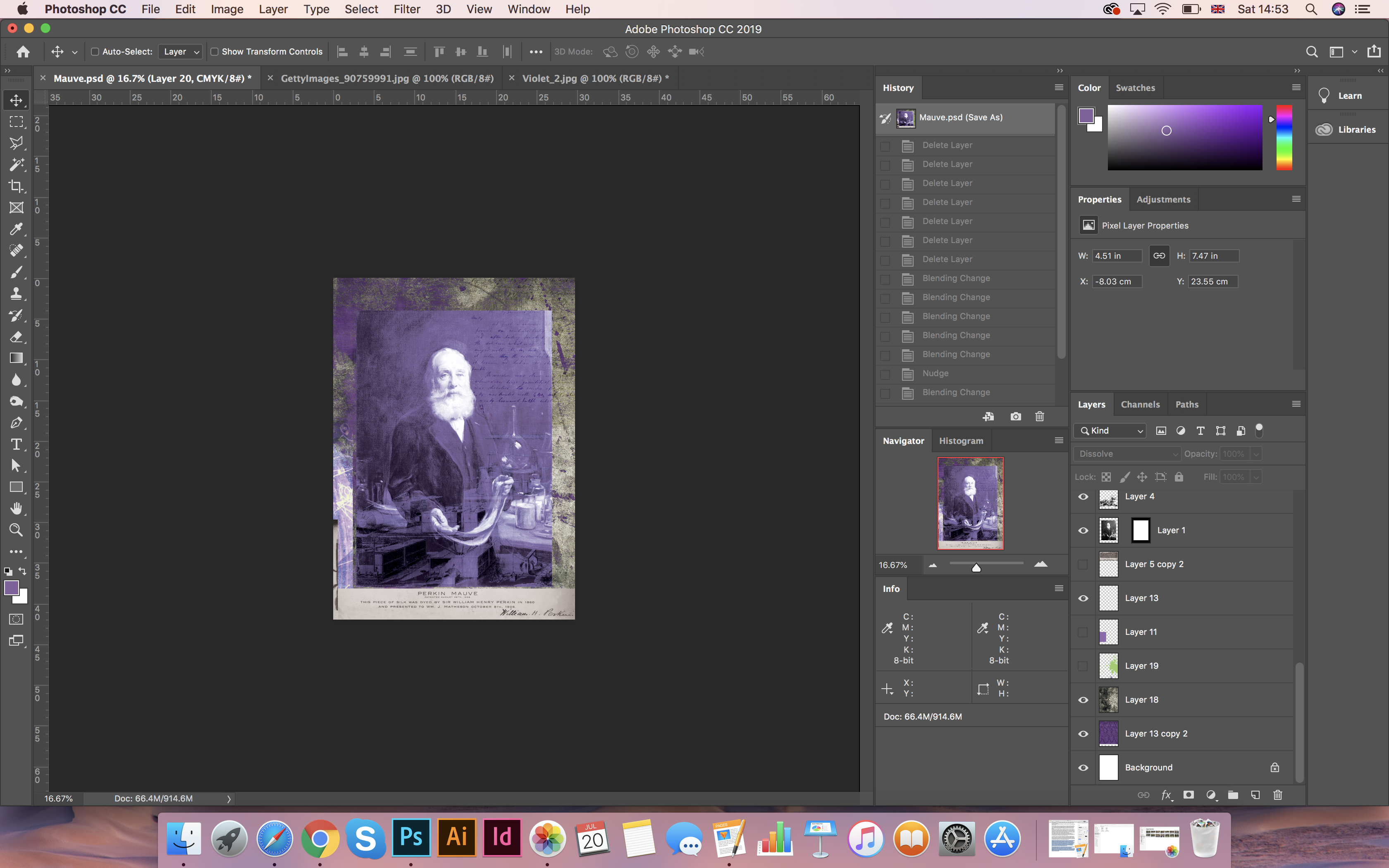
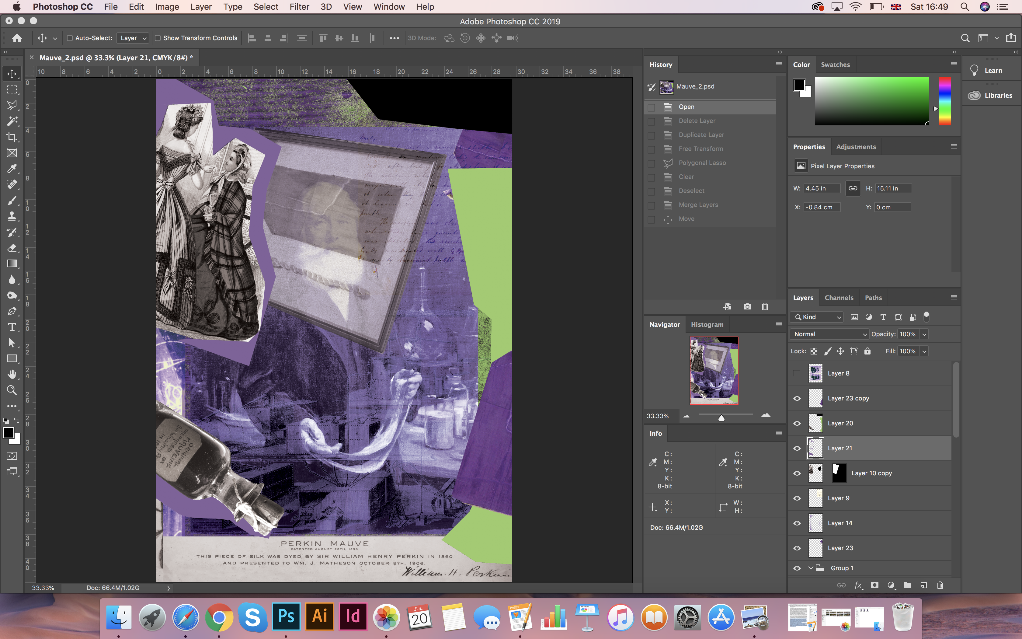
For the first poster based on the composition was made by the inventor of the purple colour Sir William Perkin. For the background image, I chose an enlarged photo of the fabric. Then my collage was consistently supplemented with various ideas that related to the invention, such as the scientist’s notes on the invention, the inventor’s mechanism-device, and also the photos from the bottle of mauveine dye collection. For the depth of the image, I found Grunge background. Also, in the process of work, I realised that in the chosen colour of the decision I was asking for an additional colour, which was made as lime green colour. Using the method of overlaying transparency, I managed to get a design that had at the texture and depth.
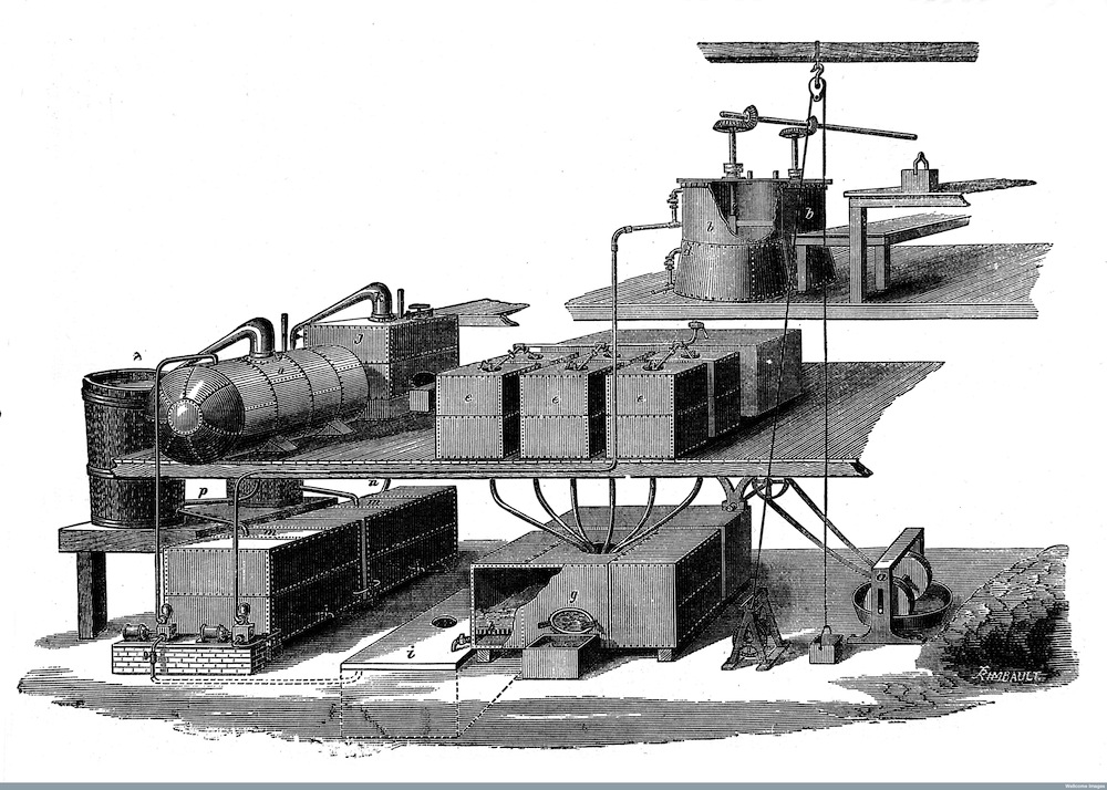
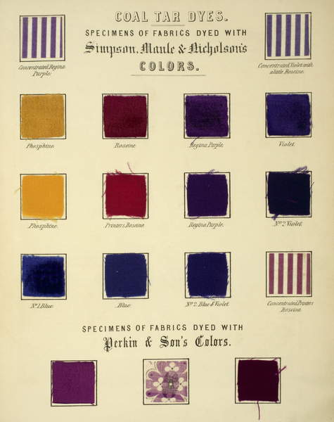
http://wellcomeimages.org Sectio of Coal Tar Colour Works at Greenford in 1858 & 1873. Plant belonging to W. H. Perkin and his brother, T. D. Perkin. 19th Century Journal of the Society of Arts Published: 1877-1879
The design that I got in the process of experimenting with transparencies and layers is provided below. Overall, I was pleased with the result in colour, the texture of the poster, and with the idea itself. However, I still had concerns about the static nature of the composition, all objects looked too straight and in too much order to me. This example was lacking the dynamics and chaos in the elements. And I decided to follow further in my experiments, I wanted to add more non-standard objects that would act beyond the frames of the composition, but at the same time were harmonious with each other.
Poster 1. The Birth of the Colour Purple 1
For inspiration, I turned to my early acquisition, a book The Age of Collage 2, which I bought at the Art Gallery in Germany. My attention was attracted by the designer Bill Noir, who struck me with simplicity and at the same time, a feature in the composition.
I thought what if I add torn geometric objects in my work in the same contrasting colours of purple and lime green, while, creating the illusion of movement? I scattered objects along with the entire sheet; in the end, I came to this decision. The phase of my new design in the same subject given below.
I liked the process of experimenting with shapes and pieces of different colours. As a result, I got a design upside down, but I had some doubts about the poster composition, I realised that in the end, I had to too busy space that didn’t have enough balance. I thought that such a solution would be more in a winning position if I try to minimise the background, i.e. remove the texture and try to experiment with the portrait of the scientist. More about this process, I will explain in the next poster.
Poster 2
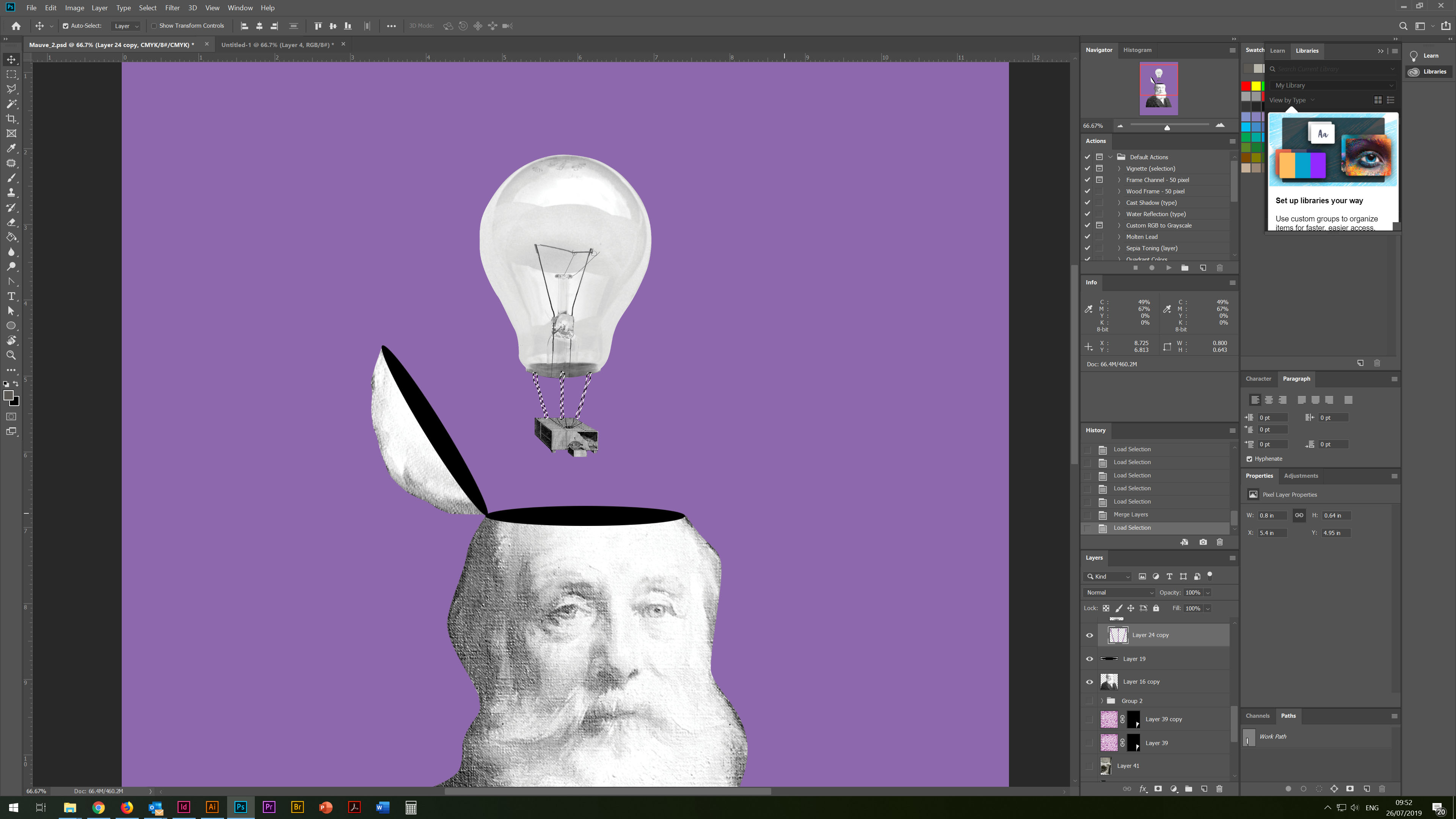
In this chapter, I would like to describe a new design solution for a poster, also based on the discovery of the purple colour by scientists Sir William Perkin. In one of my sketches above, I had a version with a forked head and rotating objects around it, but in this version, I decided to amend the design slightly and depict ideas that fly out of his head. For the background image, I used a solid purple fill and then followed to superimpose the objects on top of each other, arranging them in the composition I needed.
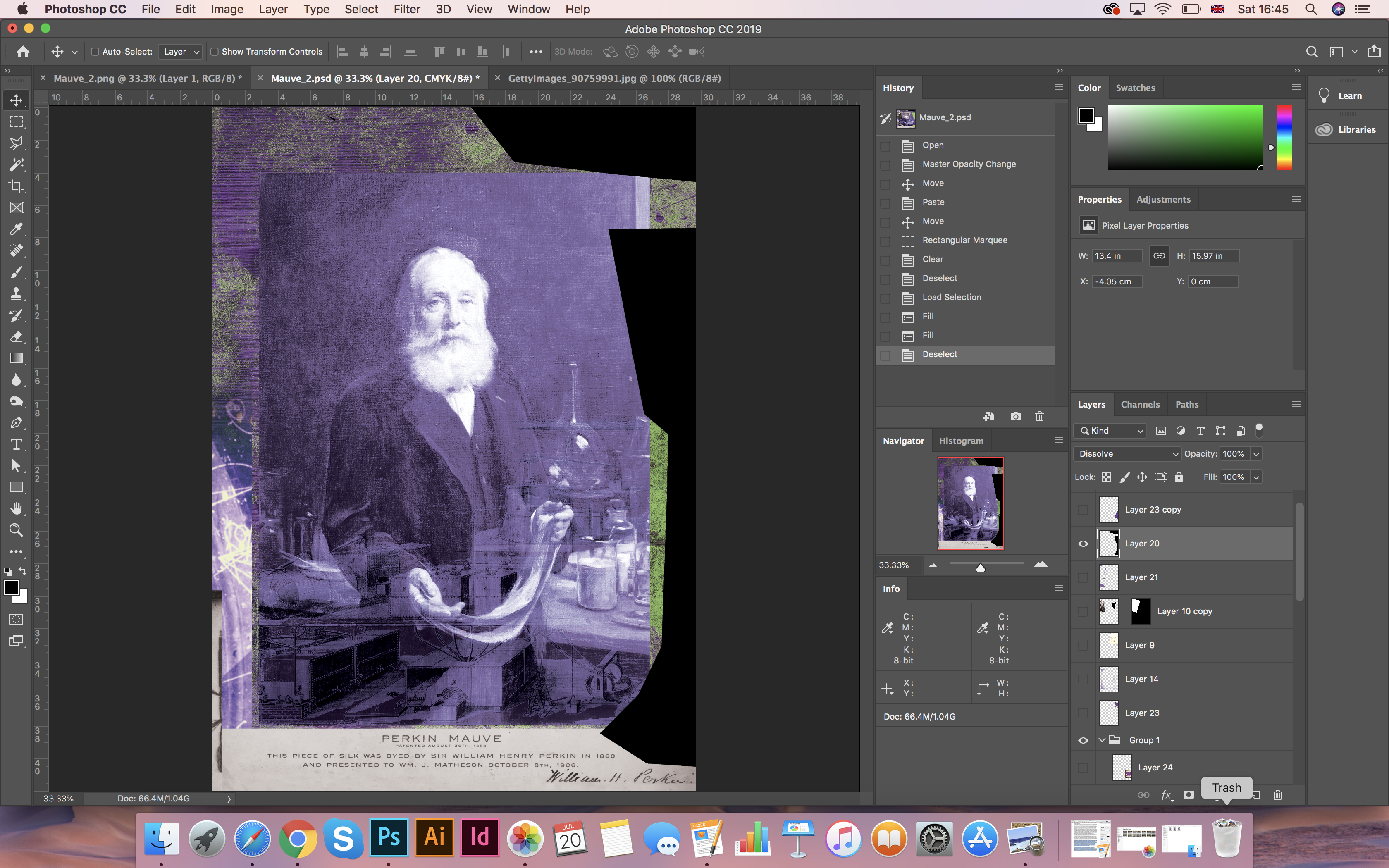
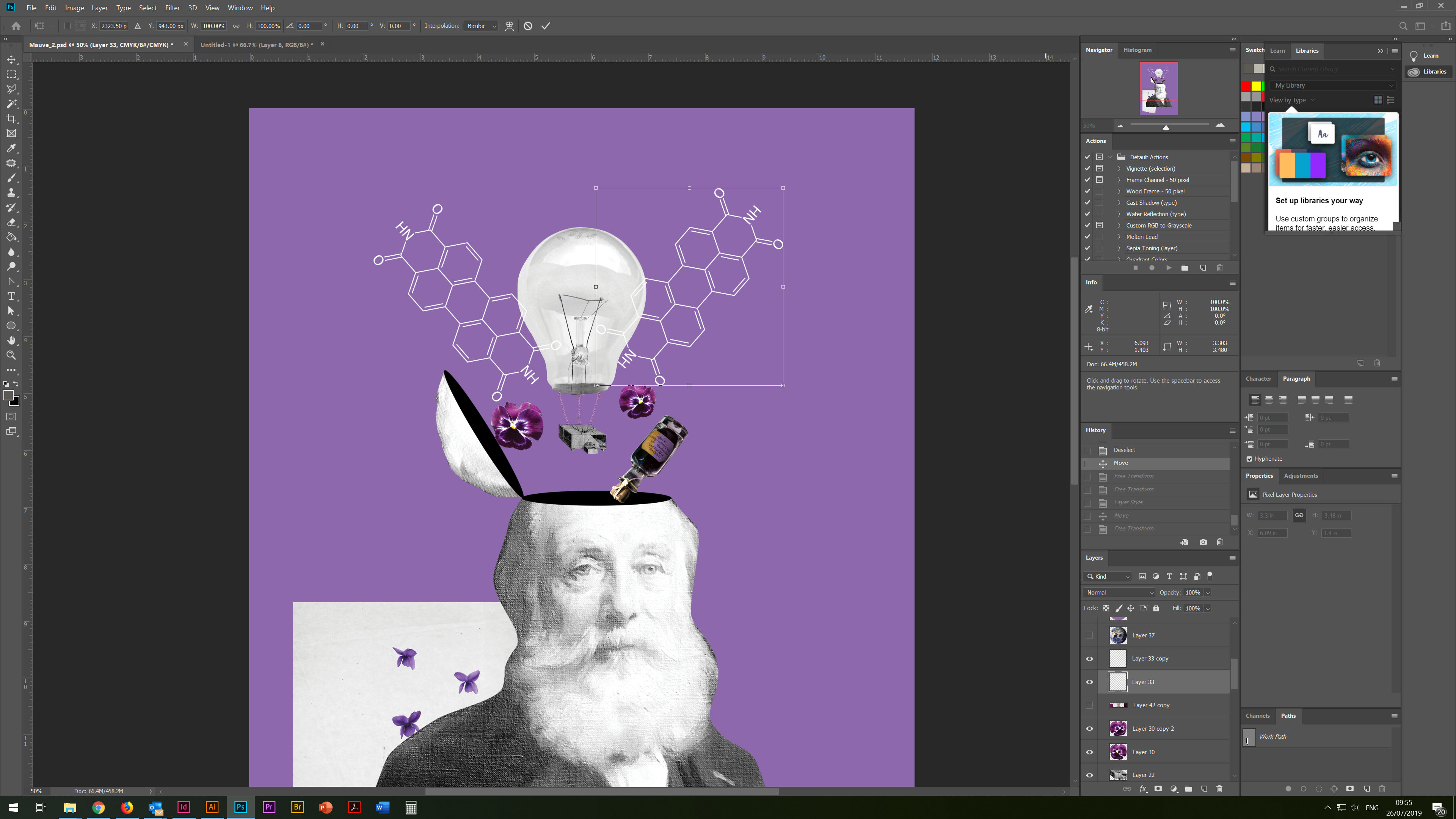
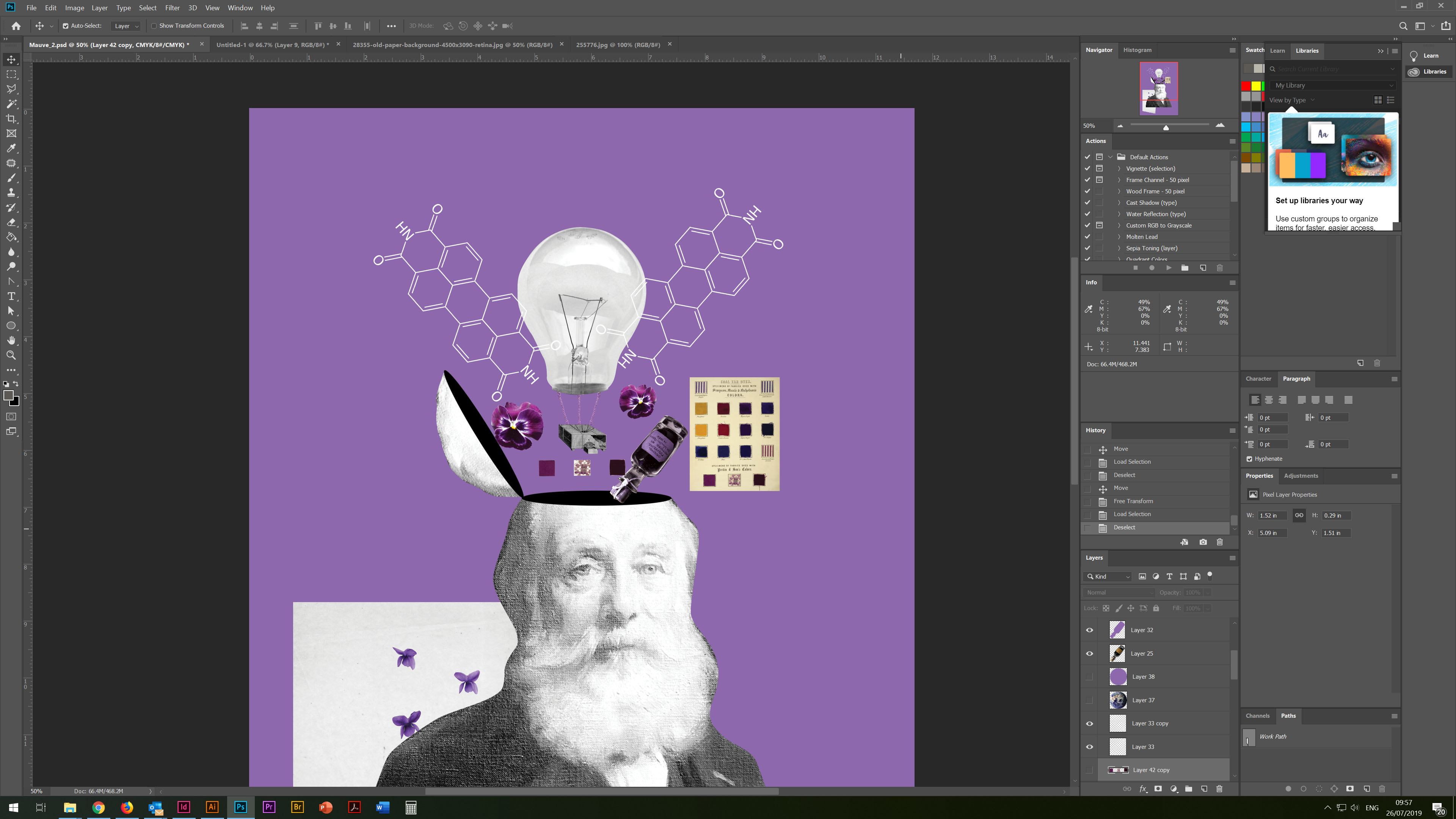
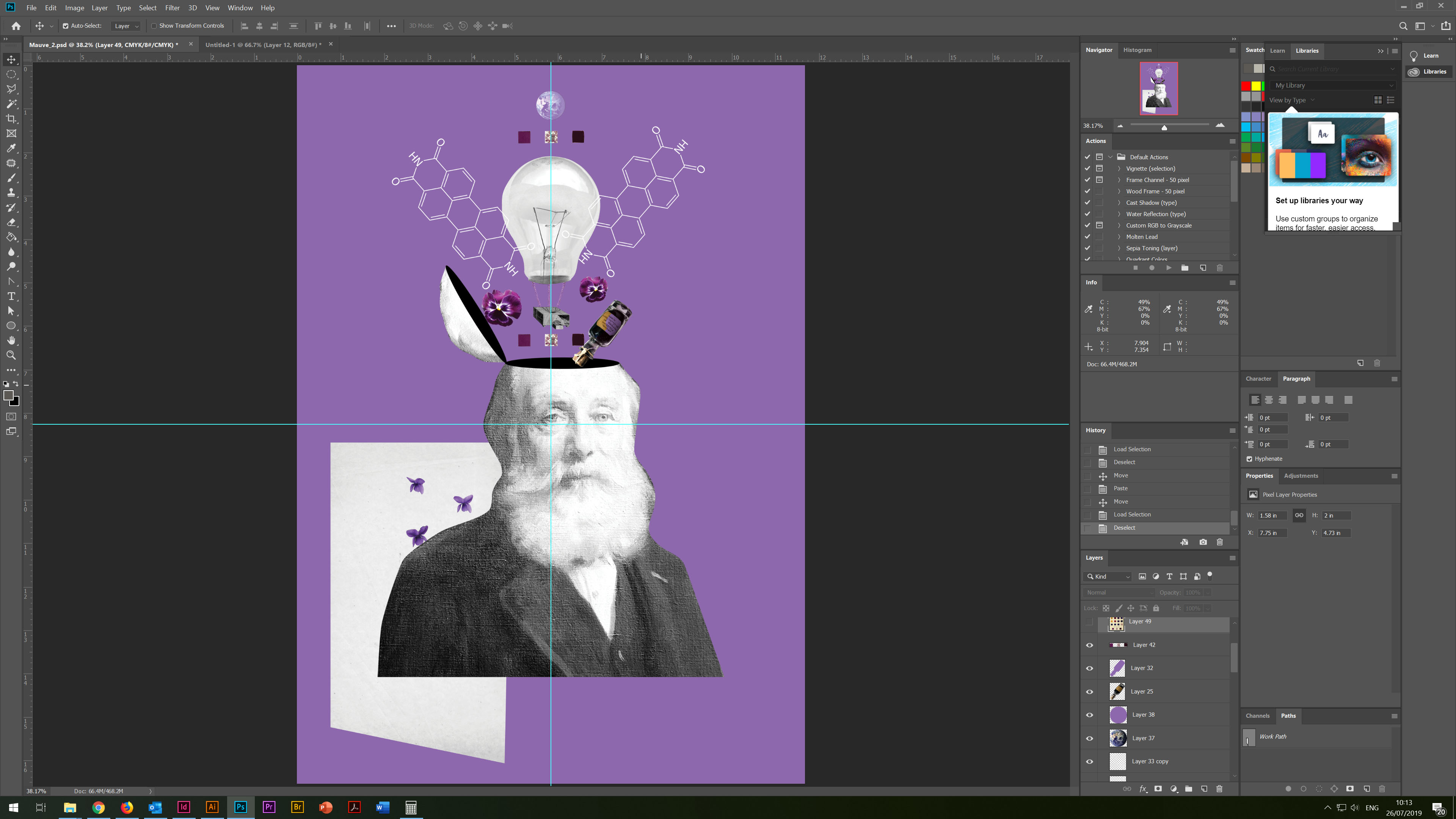
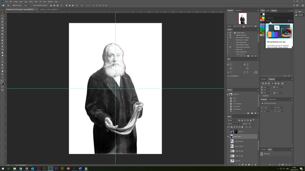
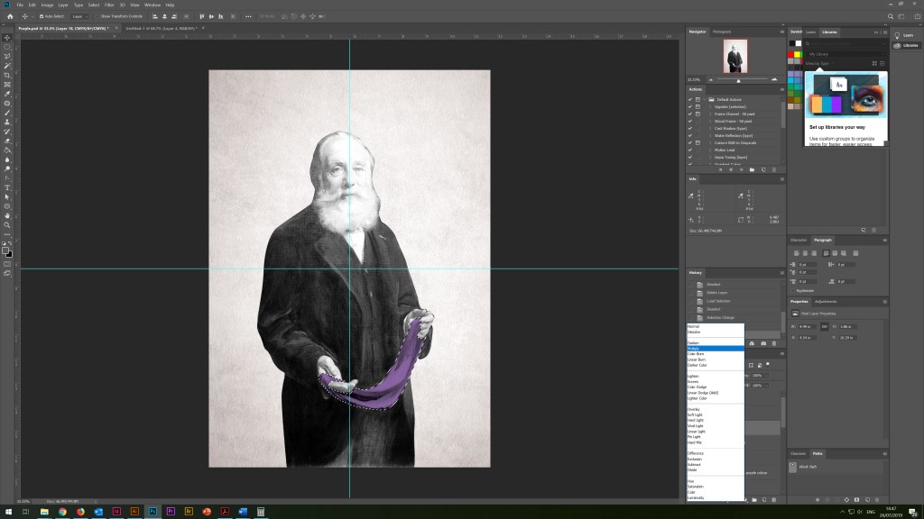
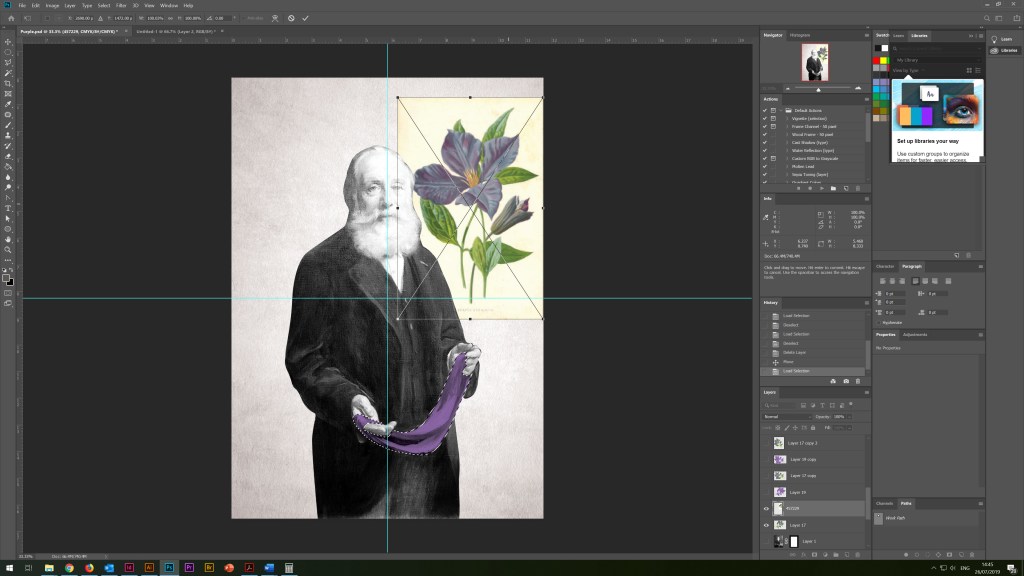
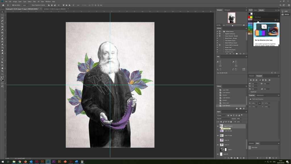
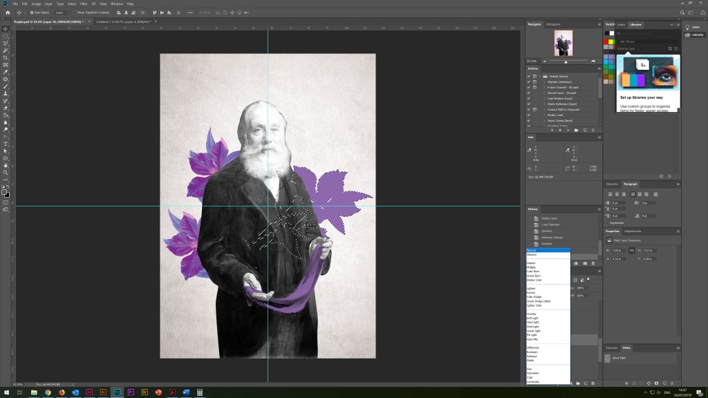
As a result, I had a whole collection of images that I found on the Wikipedia site and the Bridgeman Images. As a symbol of an idea, I used a light bulb, which by the way I designed in my previous exercise, I fixed the ropes to it from the collection of the painting called Perkin Mauve, and the scientist’s small box of the plant which reminded flying balloon. I scattered small colours around, added the chemical formula of purple to scientists, a jar of rasters, and tissue samples, and I placed planet Earth on top to show the global significance of the discovery. In the background of the portrait and around, I added pieces of cloth, black, white and purple, as auxiliary elements for the illusion of three-dimensional composition. In the corner for the brevity of the poster, I wrote the name of the poster, choosing a handwritten font Beyond Infinity – Demo.
I was pleased with the final design. I think this is one of my favourite work at the moment, it has an idea and an original composition.
Poster 2. The Birth of the Colour Purple 2
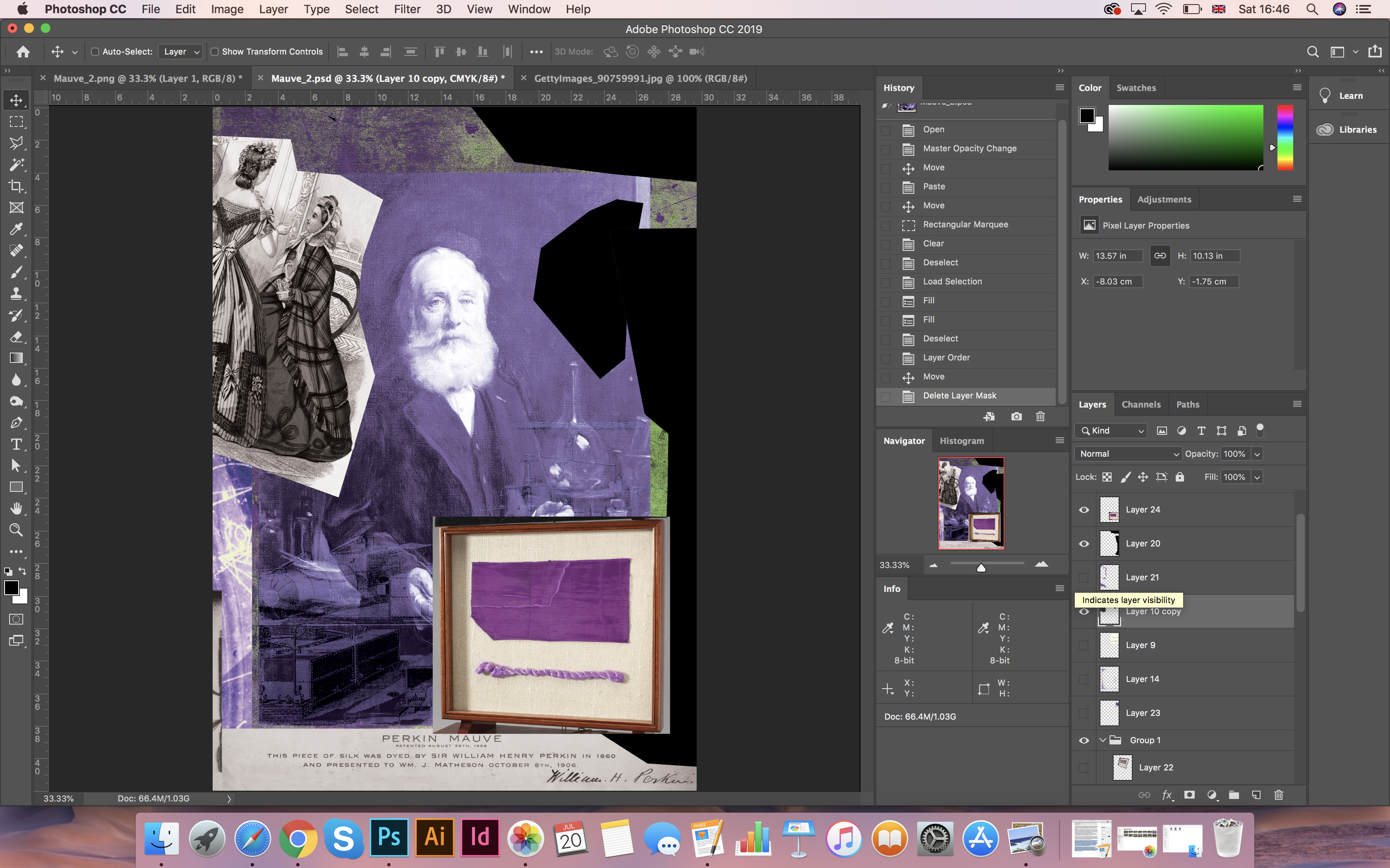
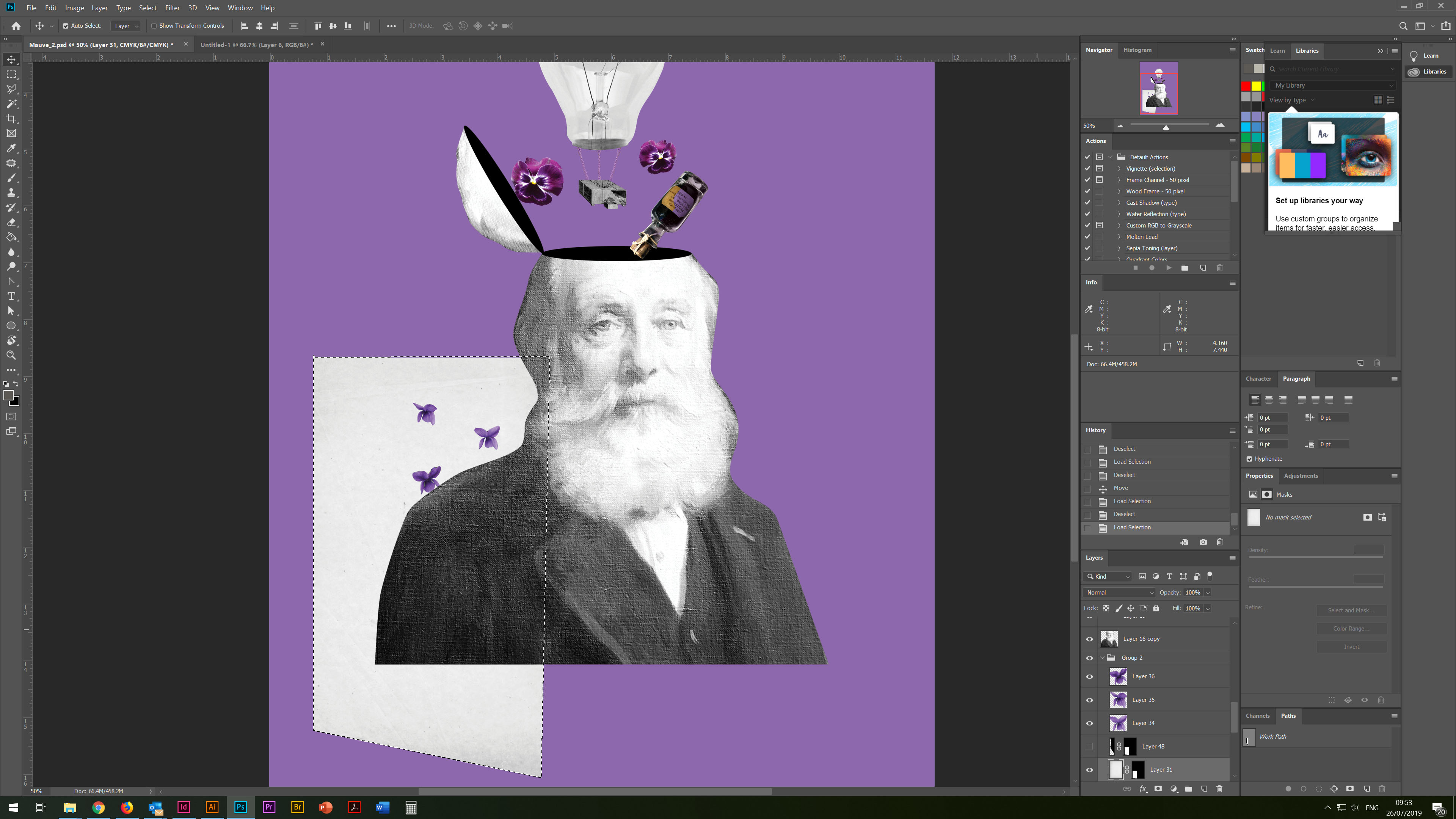
Poster 3
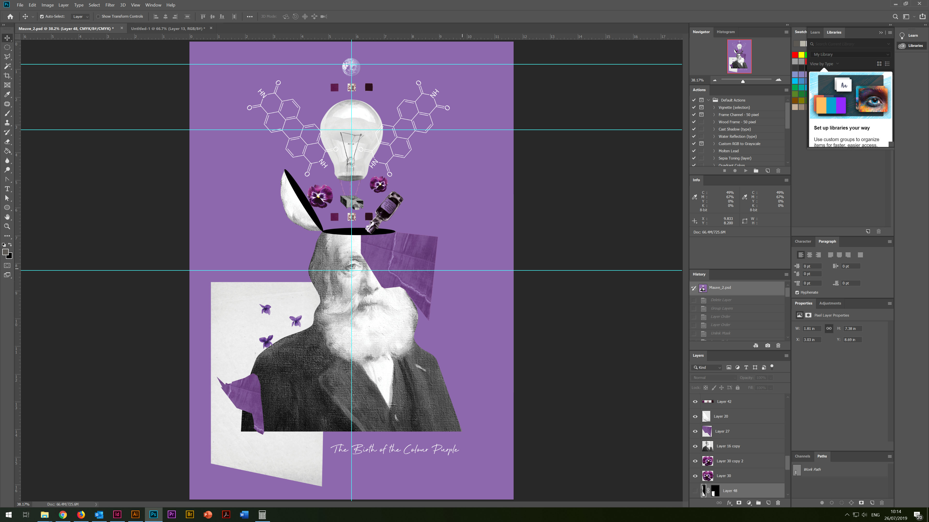
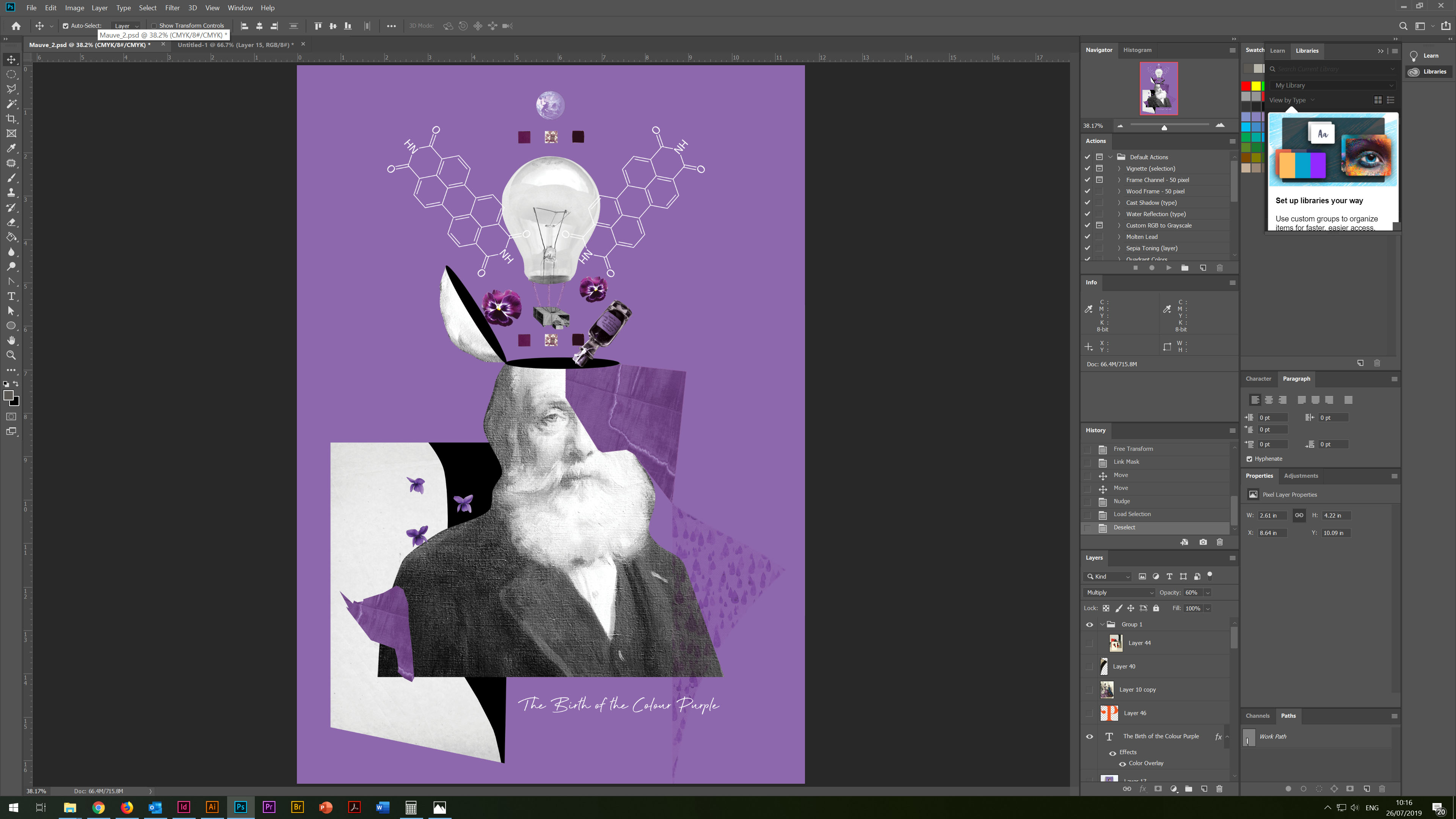
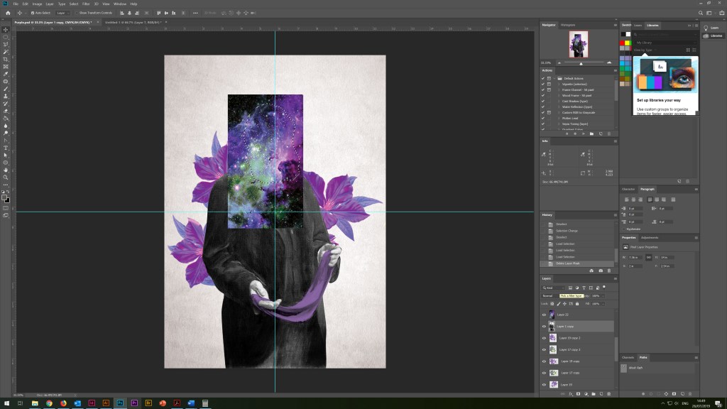
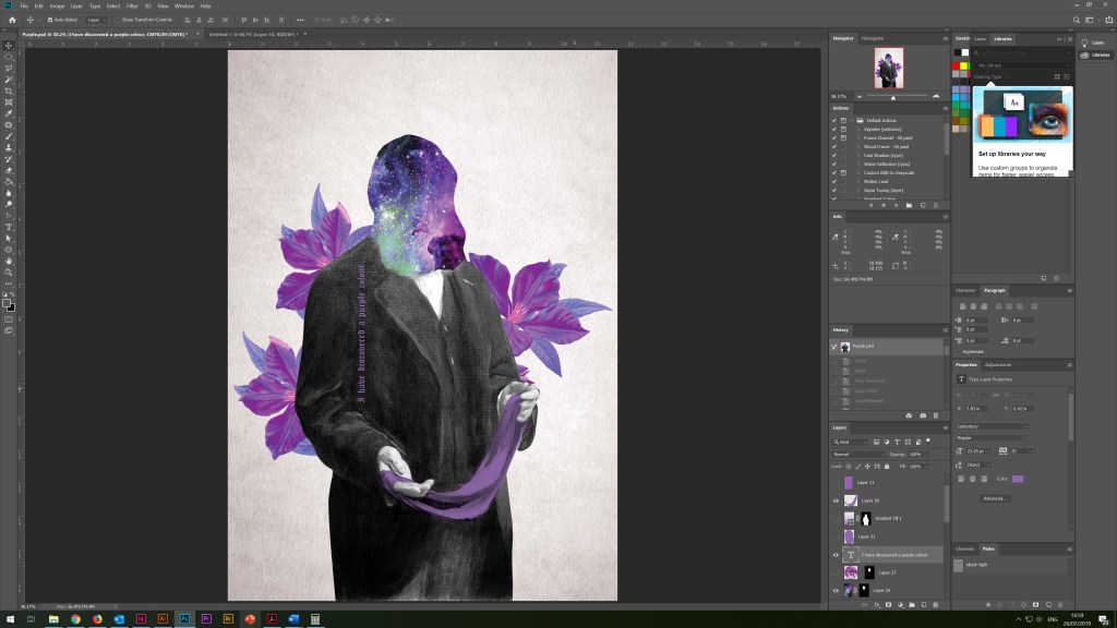
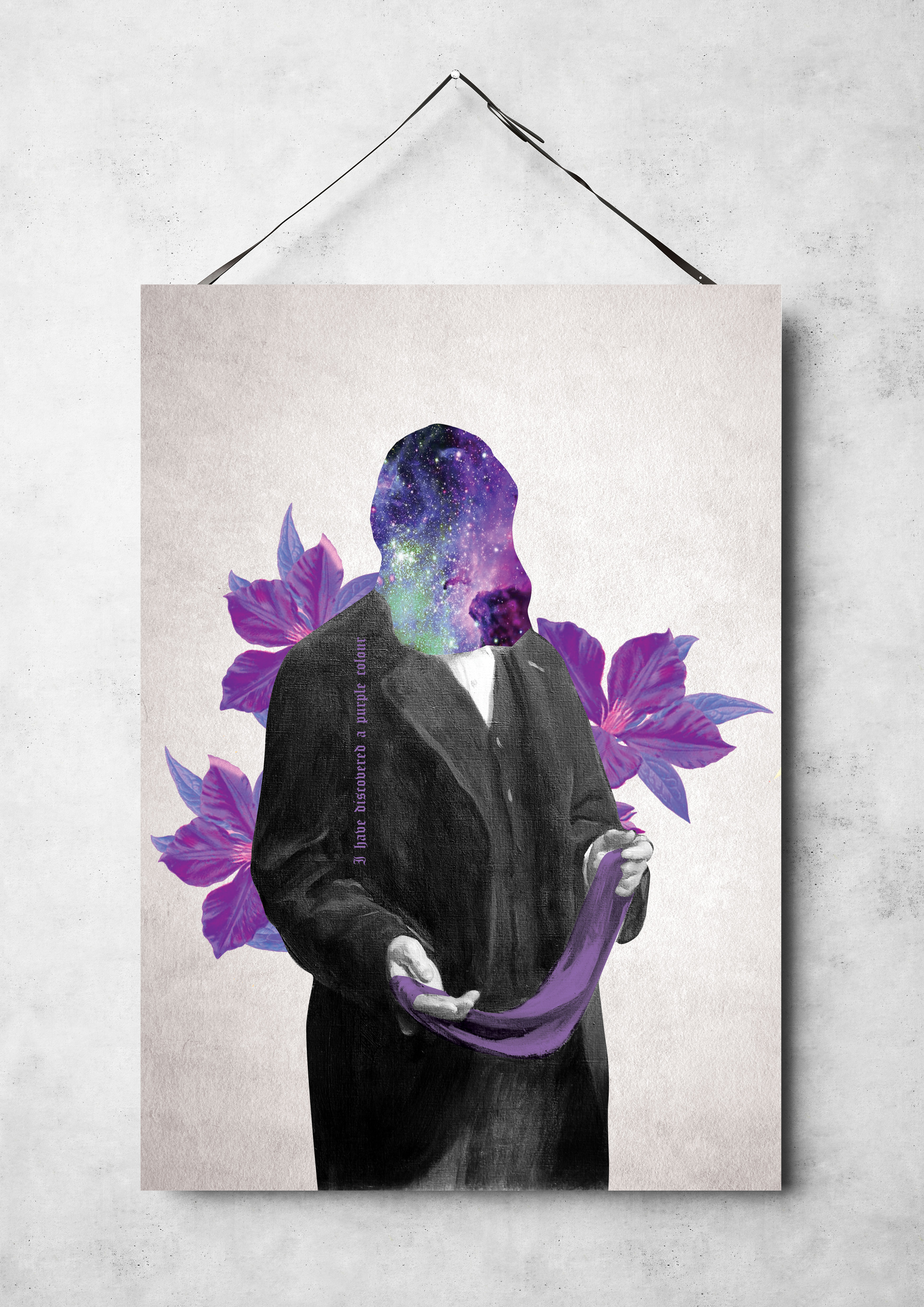
Additional poster idea was born in my design process for poster 3, is the unification of the concept of the presence of the purple colour in the universe and the invention of purple shades on planet Earth. Sir William Perkin, bright purple flowers and a piece of multi-coloured weaving acted as my main character again. But in this design, the main emphasis is on the face of the scientist; here, the main focus is on the space of the universe and bright colours. On the side of the suit, I wrote the phrase “I have discovered a purple colour” in the old Canterbury style. In this poster, I liked the combined idea of purple in space and the discovery of a new formula of colour on Earth.
Old Paper Image
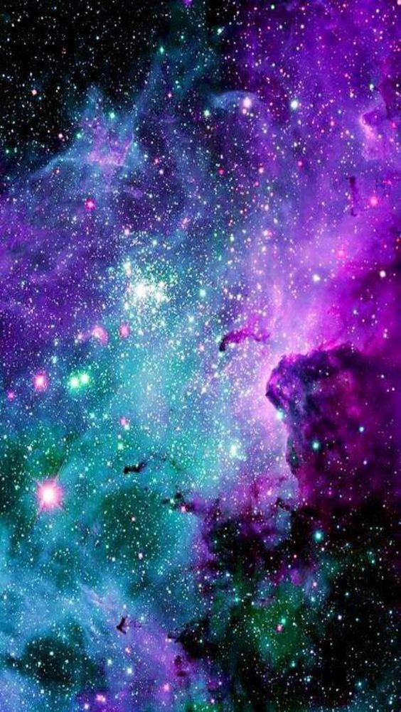
Pinterest Image of the Space
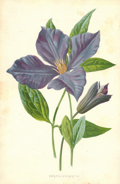
Brigment Images Purple Flower
Poster 3. I have Discovered a Purple Colour
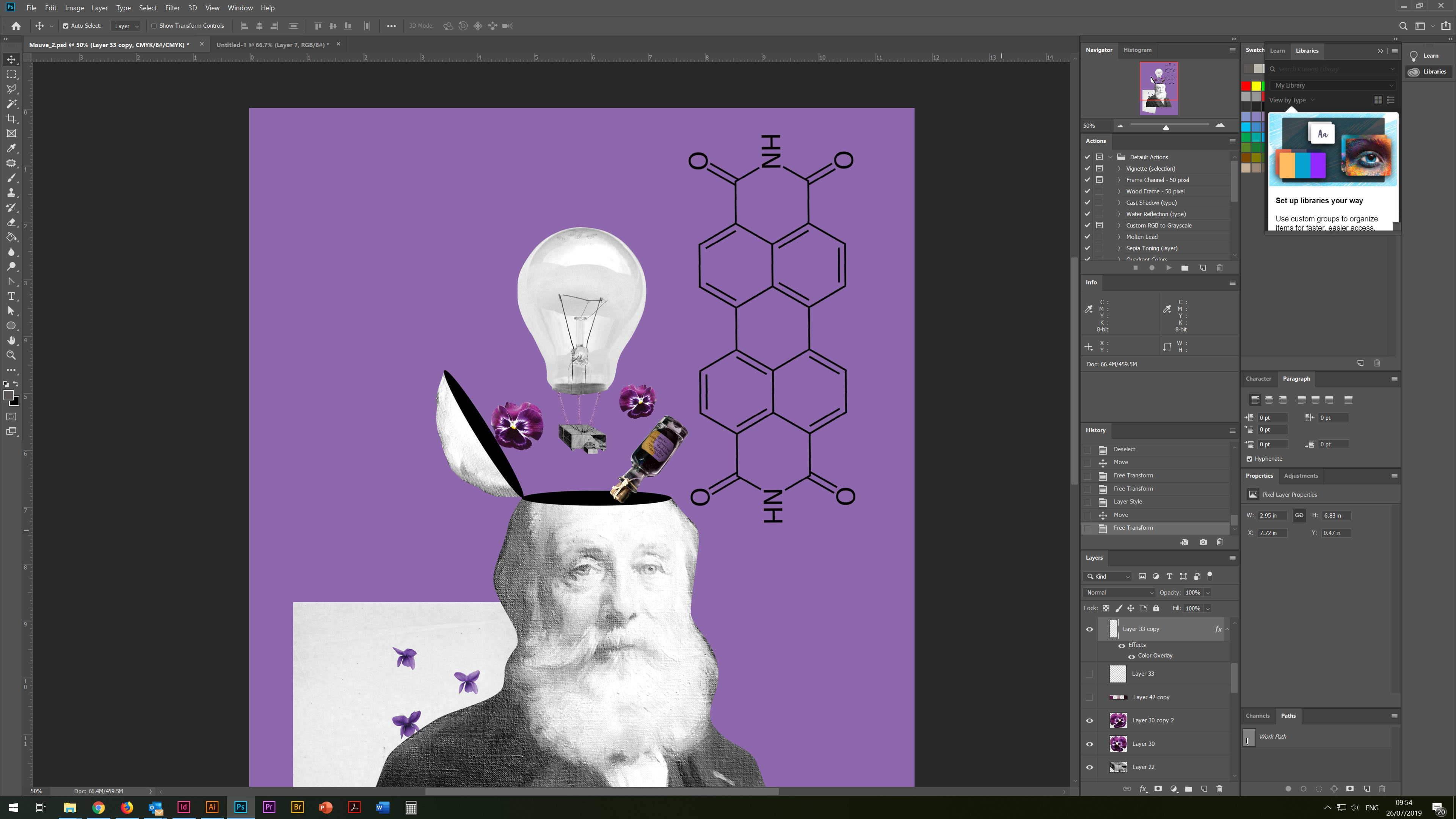
Poster 4
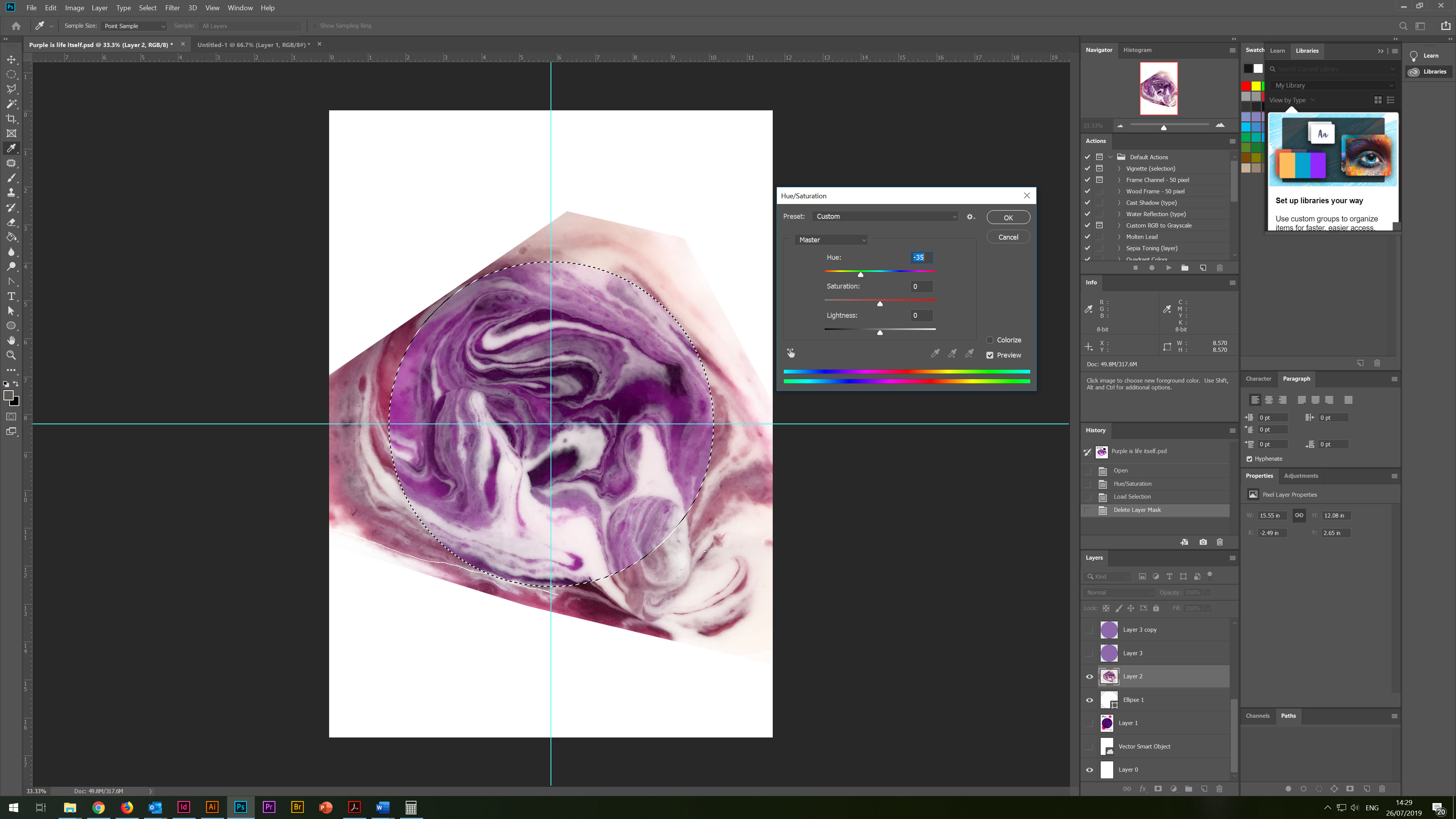
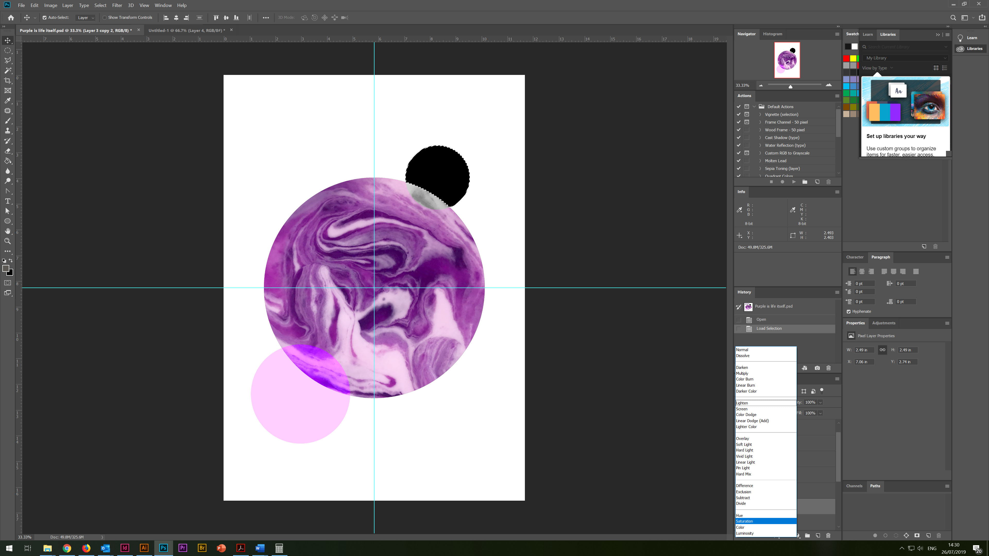
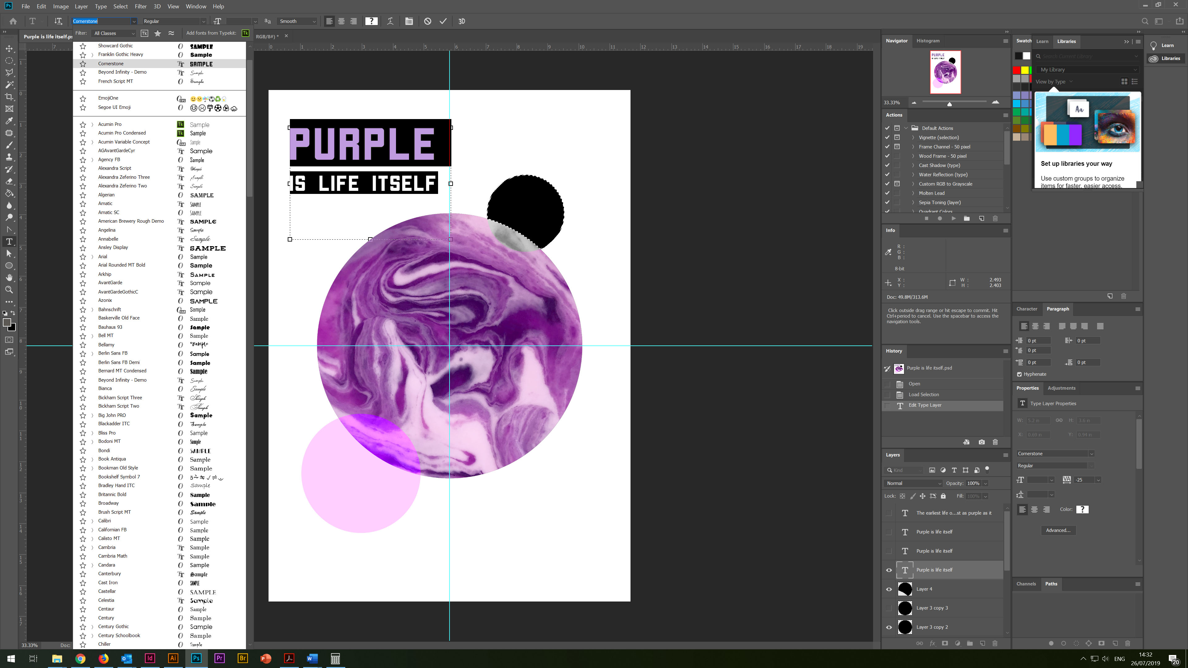
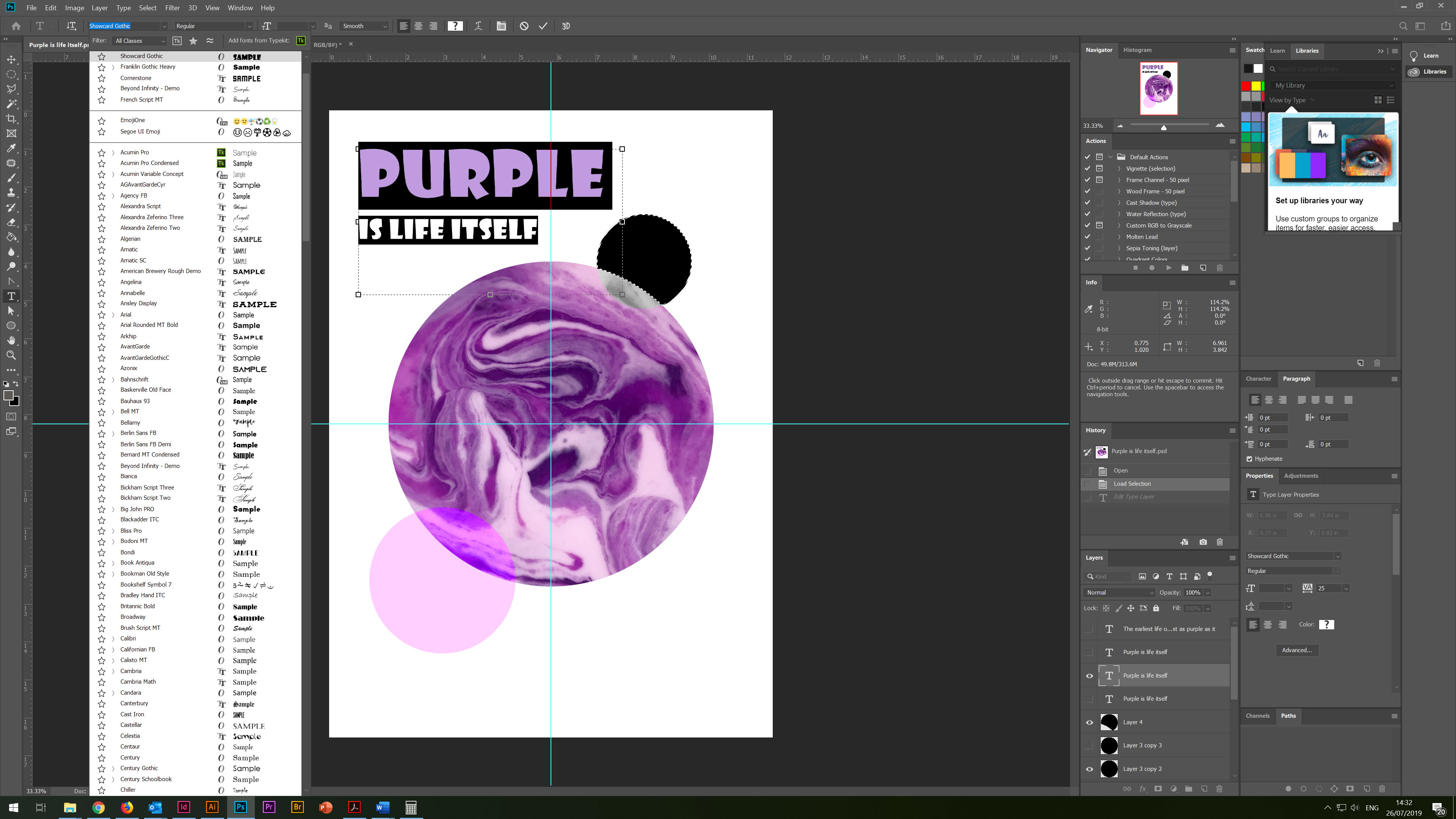
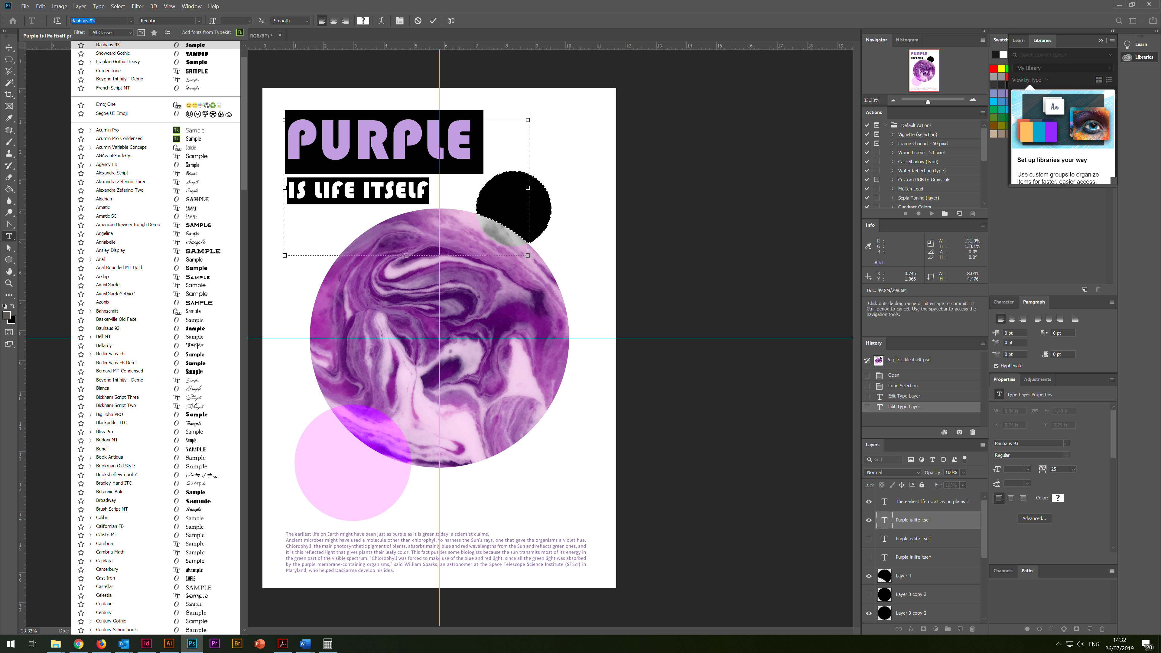
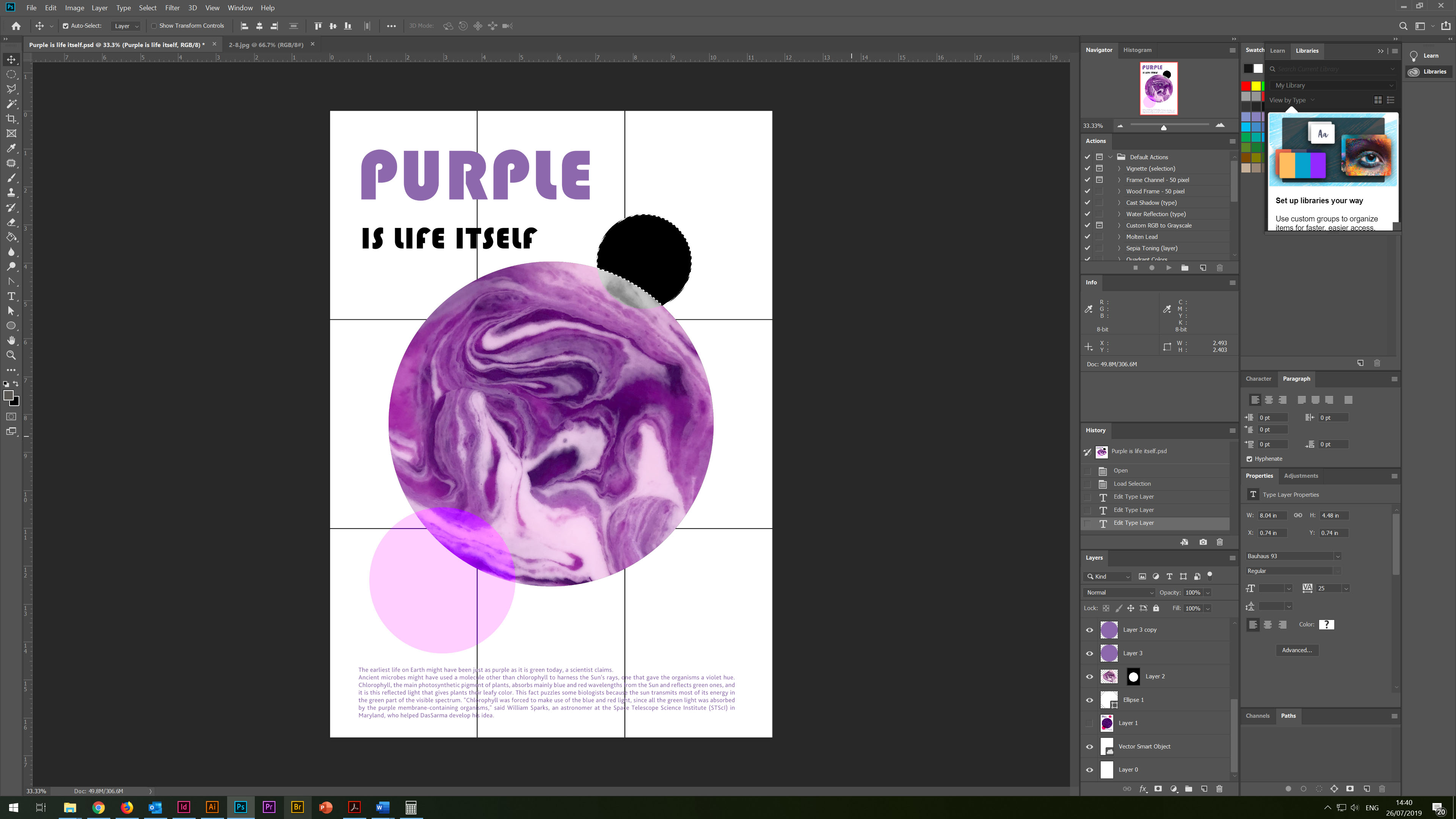
So, at the end of this task, an additional poster design, which was born spontaneously. Even though the style of this poster is different from other methods, I could not include this poster in my list of works. Here, strawberry yoghurt played the leading role. I noticed that when mixing jam and yoghurt, a gradient is formed as when mixing colours of several colours. I tried to impose colours on top of several layers, so I got an abstract image of the Earth, how it would look if we saw it from space, even at the very beginning. I tried several fonts; in the end, I chose a modern round font. Below to balance the composition, I added the conclusion about the purple hue on the Planet Earth.
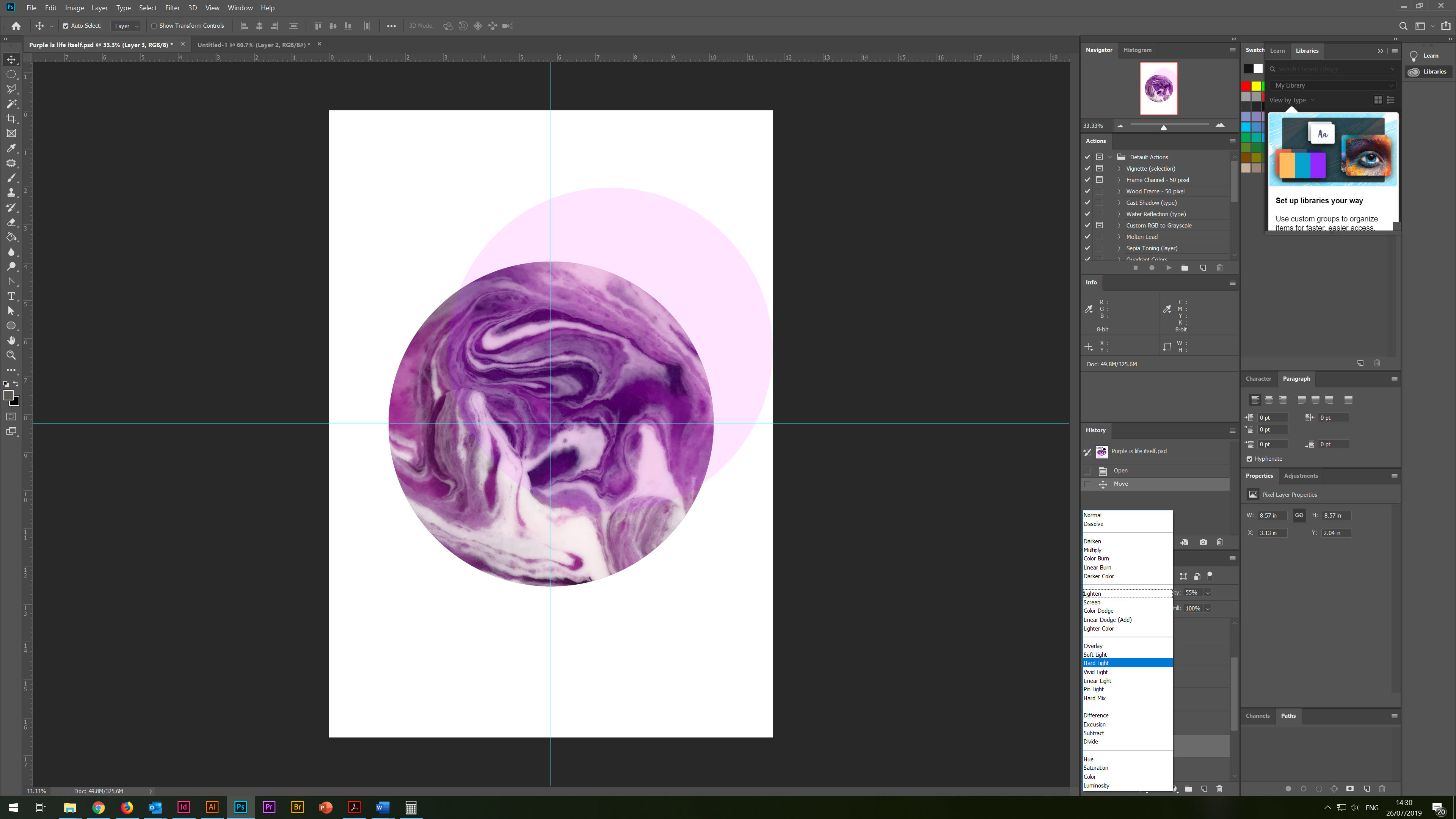
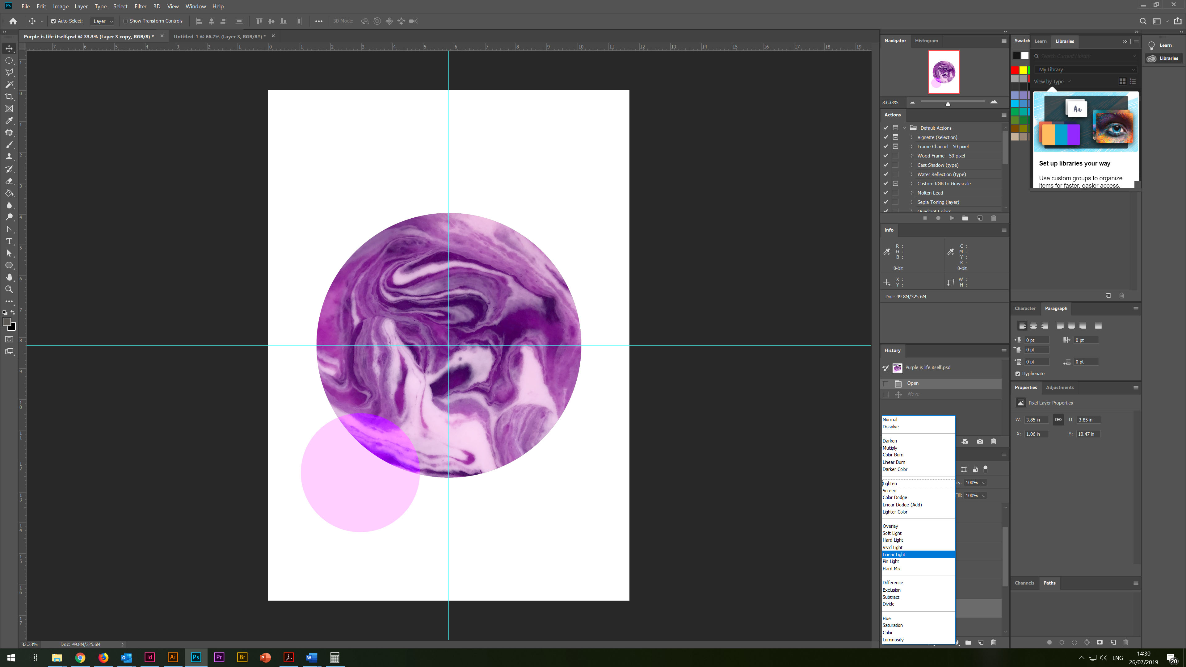
The black satellite is the Moon, and the bright purple circle, as an additional element for the balance of the composition.
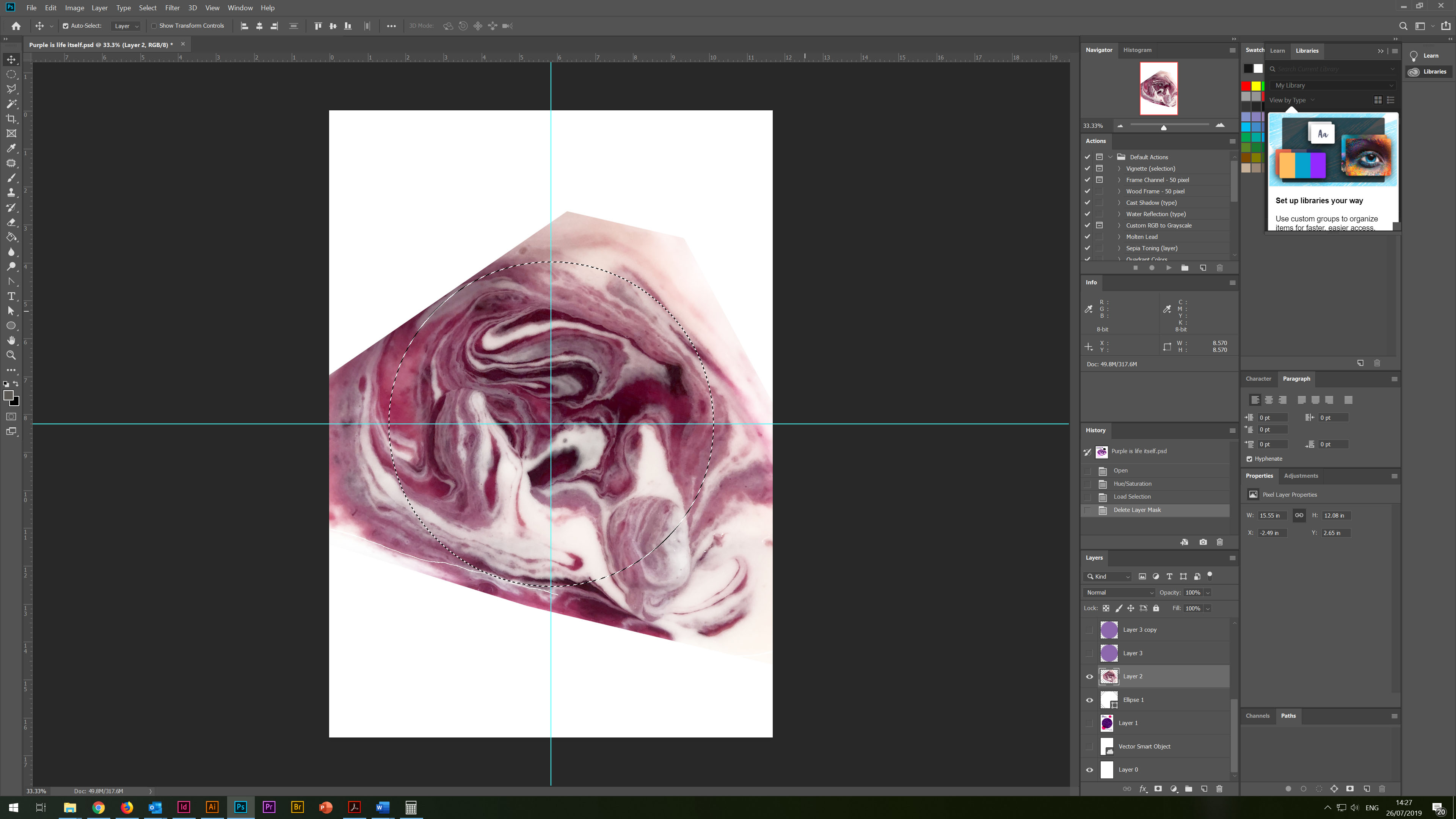
Poster 4. Purple is life itself
In conclusion, I would like to say that I was pleased with the work done, and with the results of my research. I enjoyed my journey in the process of studying the purple colour and its properties. I noticed that the more I practice collage style and colour theory, the more new facets and opportunities open up in my studying. However, I still come across a long approach to sketches and drawings, even when I get the idea of design, I can visualise in my mind how I imagine the visual. I want to proceed to the plan immediately, but I still insist on myself you need to practice more drawings, as they are an essential link between the idea and the design itself. I also try to approach carefully to the selecting images from Internet resources, while respecting the rules of copyright. I think that my favourite design is this one.
I prefer this work when I look at it, it gives me a sense of balance and calmness, and I am impressed by the purity and ease of colour perception in this design. In my opinion, this design has an idea and a composition that is pleasant for perception.
If I criticise this work, perhaps I would add more non-standard elements, maybe more torn edges, going beyond, but for now, I feel that I try to be neat with objects, and act within my feeling of the design.
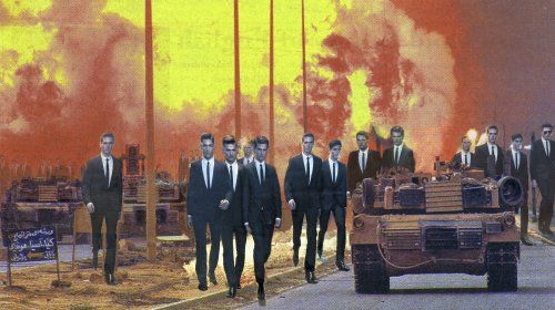
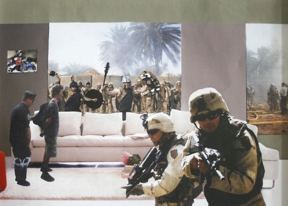
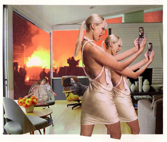
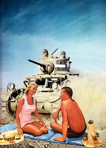
For this exercise you are going to make a montage or collage with a political message. Your subject matter could be a current issue, or something that you feel strongly about such as animal rights, the treatment of elderly people in hospital or images of women in the media. Collect images from newspapers, magazines, your own photographs or images online. Create new meanings out of these extant images by juxtaposing and contrasting them. Be imaginative, playful, provocative or humorous. If you have access to a scanner, then scan in your found images and create collages or photomontages with Photoshop. Try working with layers; exploring a variety of selection tools, such as your magic wand or magnetic lasso; utilising the cutting and pasting options – try and learn the keyboard shortcuts for these; adjusting the contrast, colour and balance of your images; and resizing elements of your photomontages. In your learning log reflect on the original meaning of the images and your subsequent college. Write a short evaluative statement.
Martha Rosler,House Beautiful: Bringing the War Home, New Series (2004-2008)
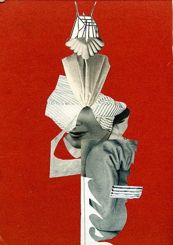
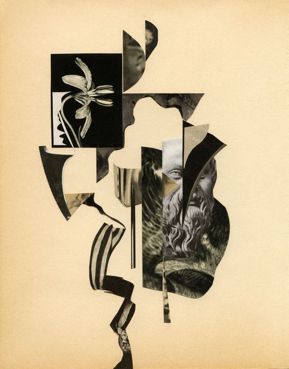
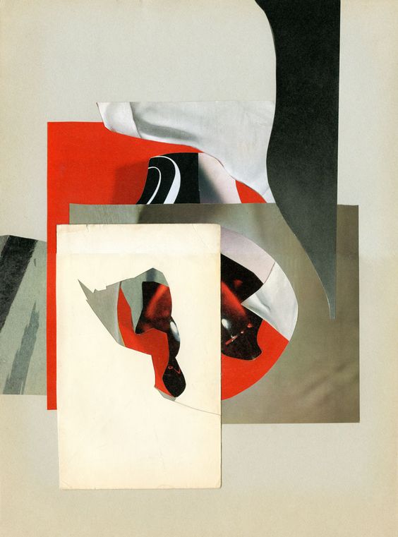
The Poetic Power of Collage
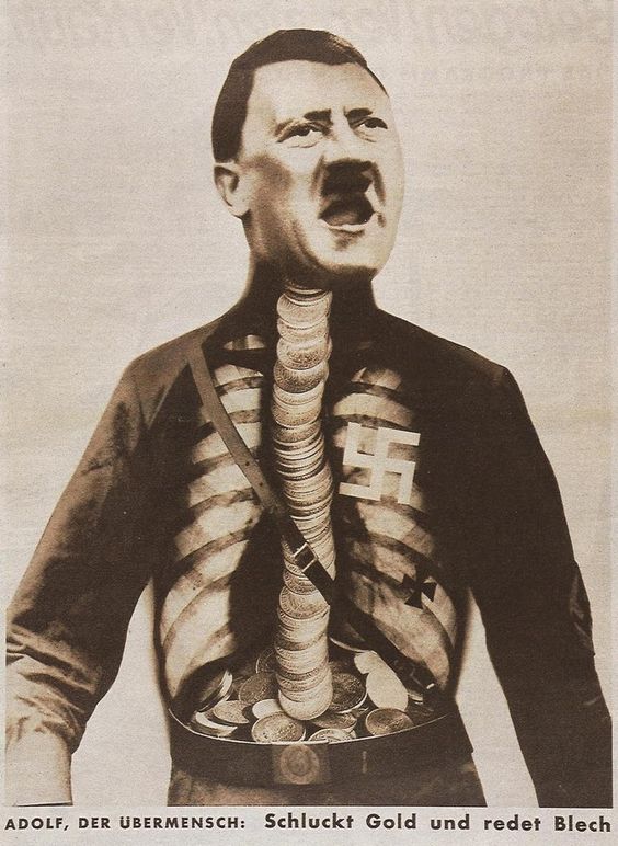
During this exercise, an exciting coincidence awaited me. On one of my walks through the Art Gallery Künstlerräume Grafiken aus der Sammlung in Bielefeld, I came across a book on collages, The age of Collage 2. This edition was the very source on the history of photomontage that I needed for this exercise. First, I got acquainted with the prehistory of collage and juxtaposition. The first thing that was mentioned in this book is that collage is based on Subversion. Photomontage was used by many artists as a rather daring form of protest, expressing their political thoughts. For example, John Hartfield openly ridiculed the Nazi Party and its ideologies in 1930, depicting an X-ray of Hitler’s upper body with a stomach full of gold and a swastika for a heart.
It is true as well of collage works that simply feature fragments from the artist’s everyday surroundings in unexpected arrangements. It was interesting to see how collage gives artists the ability to control the flow of images that we encounter daily while changing, distorting, and even ridiculing their original meaning.
John Heartfield, Adolf, the Superman: Swallows gold and talks tin, 1932
Another example from this book is the Dadaists reaction against the slaughter of the First World War. Their most important contribution to collage was photomontage, whereby printed photographs of their reproductions were sliced and pasted together to create farcical images with scathing political messages. Photomontage has become one of the collage’s most prevalent techniques.
One of the most salient qualities of collage is its distinctive capacity to tread the fine line between the tragic and the humorous like no other medium.
Keiichi Tanaami. Collage Book 7, 06. Japan, 1969
Martha Rosler is a prolific artist whose work spans several decades and various fields including performance art, installations, photography, video, and collage. She had been using the montage form to provide a collision within a frame of things we think about when we unconsciously position women as home appliances and passive objects of desire, and it occurred to make anti-war flyers in the form of montaged tableaux drawn from mass picture magazines.
“Invasion” | Martha Rosler, 2013
Martha Rosler. “Gladiators from the series Bringing the War Home: House Beautiful”, 2004, Photomontage.
Martha Rosler, Photo Op, 2004.
Memory you work for us but never obey / you mock us when we look at fading photographs / at bereaved women / putting on again colourful dresses
Julia Hartwig, Rebuke.
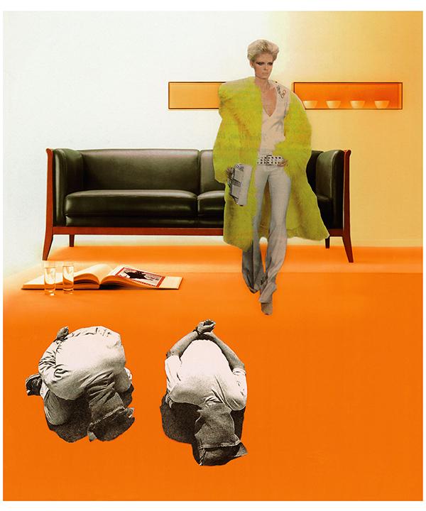
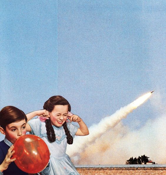
Later I came across for some of the examples of Joe Webb’s collages. They are often simultaneously visually pleasing and politically charged. He sources a lot of imagery from advertising, which is an utterly distorted and unattainable projection of reality designed to leave us feeling inadequate, unattractive, and consuming more. Joe Webb shows the extreme contrasts of the imagery to expose the crazy, messed up way we live, and how we are controlled through methods of dumbing down, distraction, and fear.
Joe Webb. Life’s A Beach 2014
Joe Webb. Bang! 2014
I juxtapose this glossy imagery with real life events: war, extreme weather events, poverty, corruption. In doing so the veneer of these adverts seems to peel away, exposing harshness of reality.
Joe Webb.
Source: The age of Collage 2
Analysing the brief
After analysing the history of collage development, I got a large portion of inspiration, which I could use in my designs. My thoughts for creating a new collage revolved around critical areas, such as environment, pollution, recycling and fast-developing countries. I wrote them down into my mind up, filling it with some additional points.
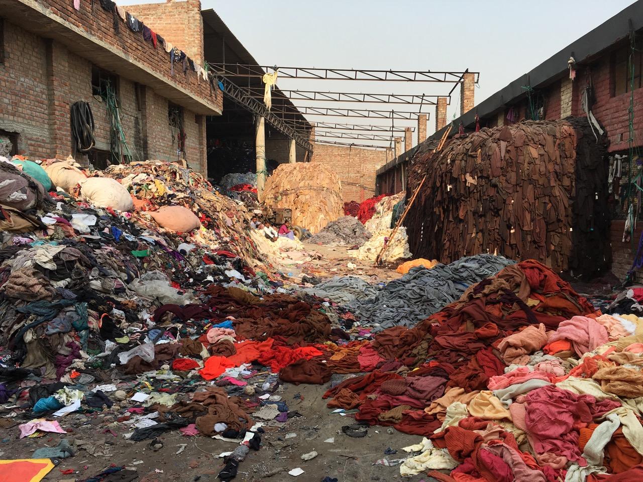
Recently, the issue of environmental protection and the issues of global overpopulation and high consumption are particularly acute in the modern world. Especially acute, along with environmental pollution, is the problem of the Fashion Industry. Fashion Waste, Pollution and the Environment – with each second that passes by, a truck worth of fabric is piled into a landfill burned. The average landfill is .76 cubic metres in diameter. A commercial landfill holds 10-14 cubic yards of dirt. That means, every second you’re reading this article 7.6 to 10 cubic meters of fabric is being dumped/burned, contributing to the 1.2bn in greenhouse gas emissions the fashion industry releases each year during manufacturing.
It all sounded quite shocking to me. But the data released about the fashion industry doesn’t get much better upon further reading. Clothing contributes to half a million tonnes of microfibre pollution into the ocean, the equivalent to 50bn plastic bottles.
Fashion isn’t not only impacting the ocean, either. This year, it was reported that Burberry burned £40m worth of merchandise in one of the biggest stories surrounding luxury fashion in 2018. The brand wanted to retain brand exclusivity while keeping stock scarcity high. The problem with this is the negative impact this has had on the brand and environment.
Fast Fashion goes beyond the season. No longer are there January or mid-season sales, but discounts based on influencer, key dates, affiliate marketing and more. You could say the industry has made fashion more agile. But realistically, it’s contributed to creating a monster that needs the latest item of clothing or accessory, and they needed it yesterday.
Fashion’s Crippling Impact On The Environment Is Only Getting Worse (HBO)
Pinterest Board
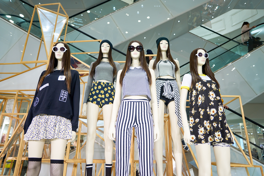
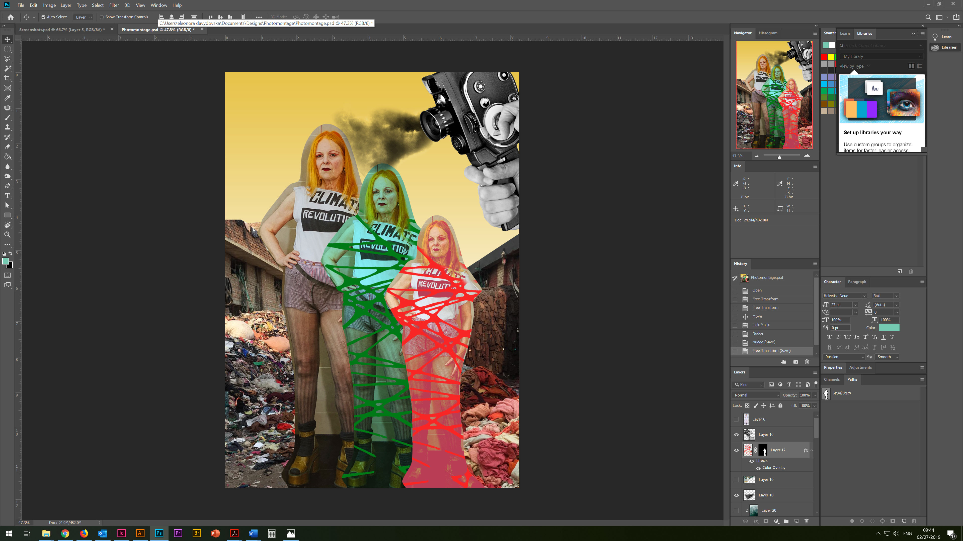
Time to start selecting materials for the design itself. I went through the collections on Pinterest, choosing remarkable images. In my inspiration board, I selected some retro posters from the Bridgman source, on ecology and the environment thematic. I also saved a photo session, which depicts respectable people on the background of rubbish and plastic. But I was also interested in images from the fashion industry. I turned to our home collection of magazines. British Journal of Photography Issue 7881, March 2019 was suitable for my investigation into the environment and its pollution. I was attracted by an image called Dame Vivienne Westwood, London 2012, by Martin Parr. On that photo, she is wearing in a Climate Change shirt. Then I decided to go into the investigation and concluded that it could serve as an interesting object in my collage.
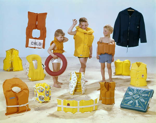
Three children in the midst of all kinds of yellow and orange life jackets, The Netherlands, 1964 (photo) / Bridgeman Images
Sources: Bridgman Images. [Accessed June 2019] British Journal of Photography Issue 7881, March 2019 [Accessed June 2019]
Westwood, 72, said she did not want to defend the fashion industry, although she regards “true fashion” as an important part of culture.
“Do I feel guilty about all the consumption that the fashion world promotes? Well, I can answer that by saying that I am now trying to make my own business more efficient and self-sustaining. This also means trying to make everybody who works in it happy, if I can.”
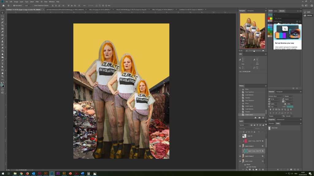
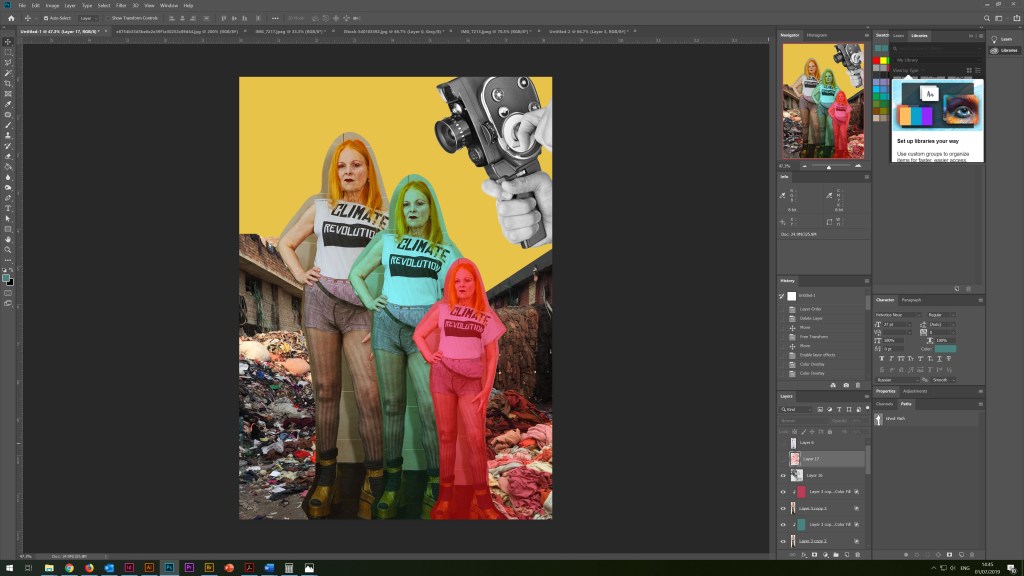
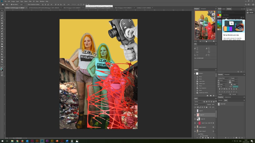
I scanned the photos, and then I started the collage in Adobe Photoshop. For the background, I used pale yellow hues as a symbol of a polluted atmosphere, as well as landfill of used clothes. In the right corner, I placed an image of an old camera with exhaust smoke. I tried to duplicate the image of Vivienne using some textures, with the effect of tied rope, which could identify the environmental problem and the way out of it. As the activist makes efforts to protect the nature, it is also obvious that we are all to some extent responsible for our environment, and it is important to remember that the rational use of clothing and natural fabrics is an important step in protecting the environment.
Buy less. Choose well. Make it last. Quality, not quantity. Everybody’s buying far too many clothes. I know I’m lucky, I can just take things and borrow them, I’m o, but I hate having too many clothes. I think that poor people should be even more careful.
Vivienne Westwood
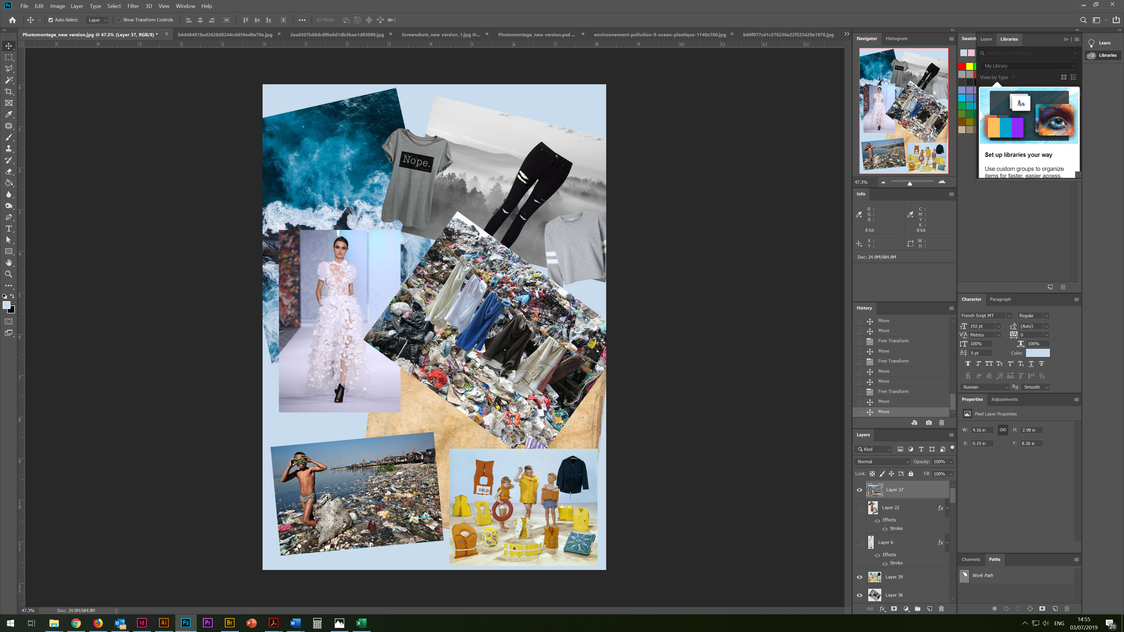
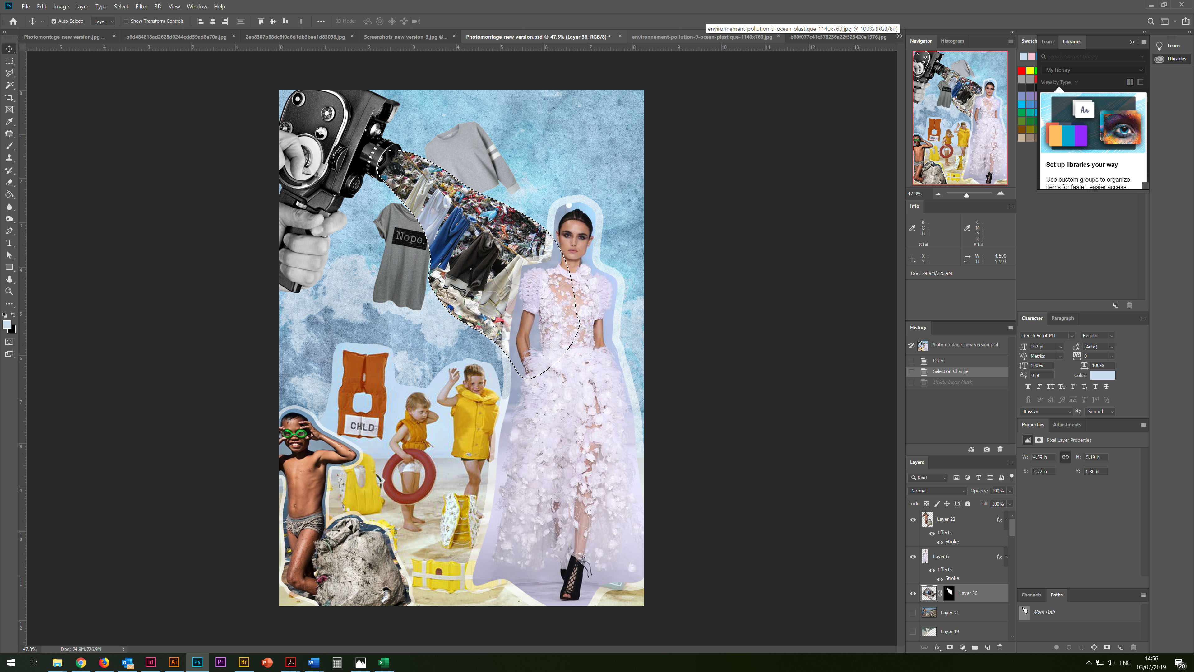
On the next stage, I wanted to continue the experiment with collage and juxtaposing in design. This time I had the idea to create a collage with the selection of photos and their combination. So I had at my disposal a photo of a boy Rodello Coronel, Jr., the second of nine children in his family, spends the morning picking through the trash onshore in Manila looking for recyclable plastic.
A Boy and His Goggles. BY KURT MUTCHLER. National Geographic
For contrast, I used the image of children on a clean beach, most likely in Europe, as a symbol of the fact that most of the pollution comes from developing countries. Also, I used the image of the glamorous model and small photos of stock clothes around. In the corner, I also placed an image of an old camera with piles of worn clothes streaming. Thus, in this collage, I touched on several topics, the problem of plasticity, pollution of water bodies, an overabundance of clothes, and the effect on the subconscious of the fashion industry intersect here.
For the background image, I used the overlay of several photos: light blue with an old canvas, as well as transparent photos of nature, which added depth to the background image.
In this collage, I liked the experiment with the contrast of colours in which blue and yellow dominate.
Conclusion
In conclusion, I would like to say that this exercise was very interesting and thought-provoking. I was introduced to the new unreal world of juxtaposing and collages, where different images can create a new meaning. However, I realised that I have to follow the prevailing rules about copyrights and licensing. I was enabled to work more with layers and transparency properties which have helped me to develop my understanding in manipulating found images. I have really enjoyed this exercise and feel that it has provided me with the opportunities to explore ideas for future exercises and assignments.
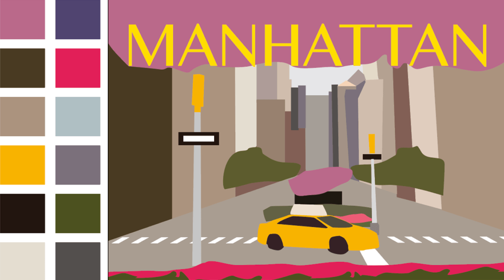
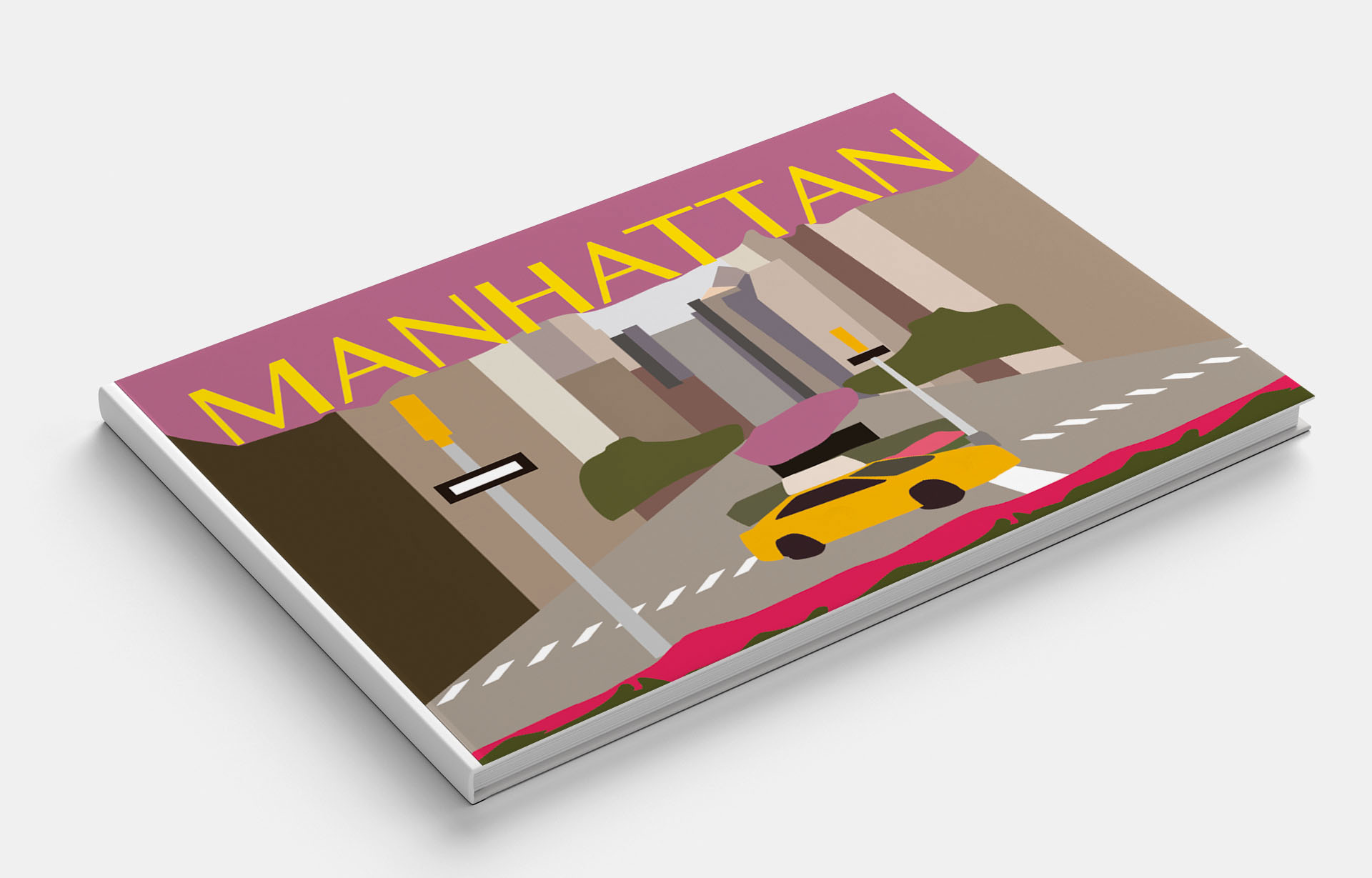
Brief: Create a series of 10 abstract designs in which you balance blocks of subordinate, dominant and accent colours.
These designs are going to be used as covers for guidebooks to the following cities:
Madrid
Malmo
Managua
Manchester
Manhattan
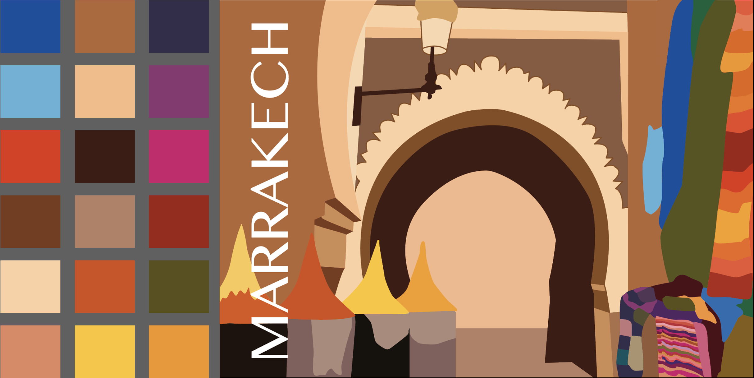
Marrakech
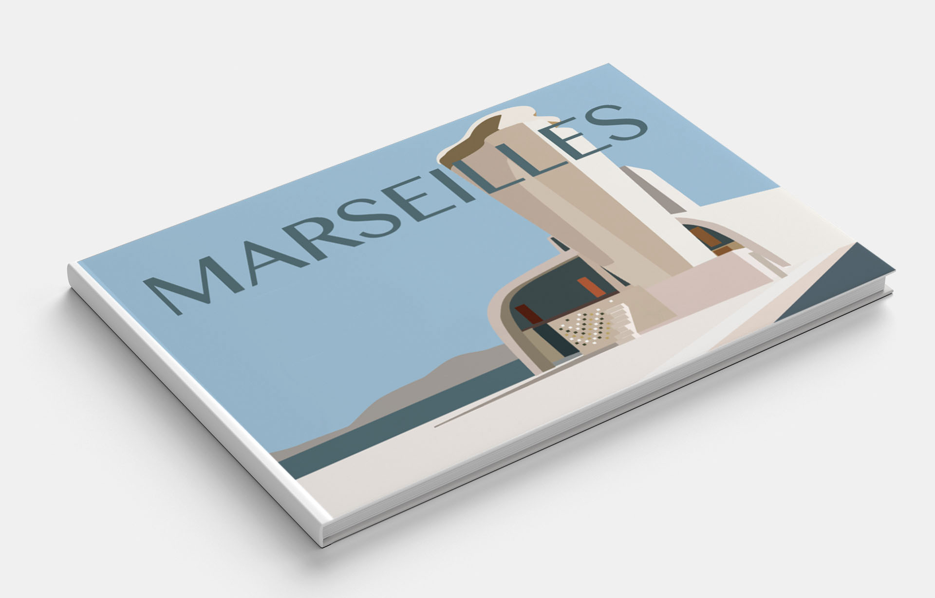
Marseilles
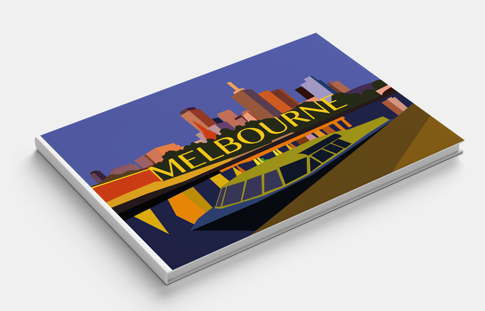
Melbourne
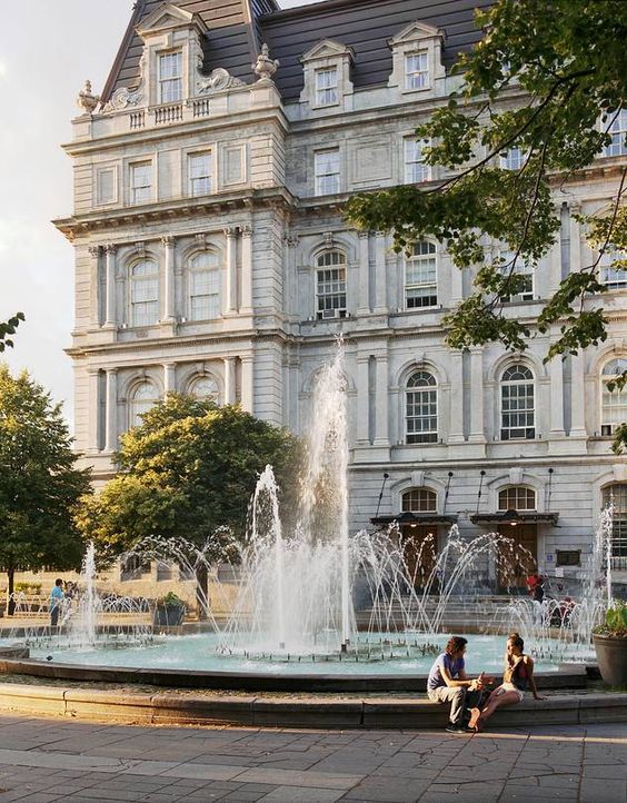
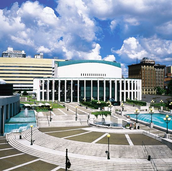
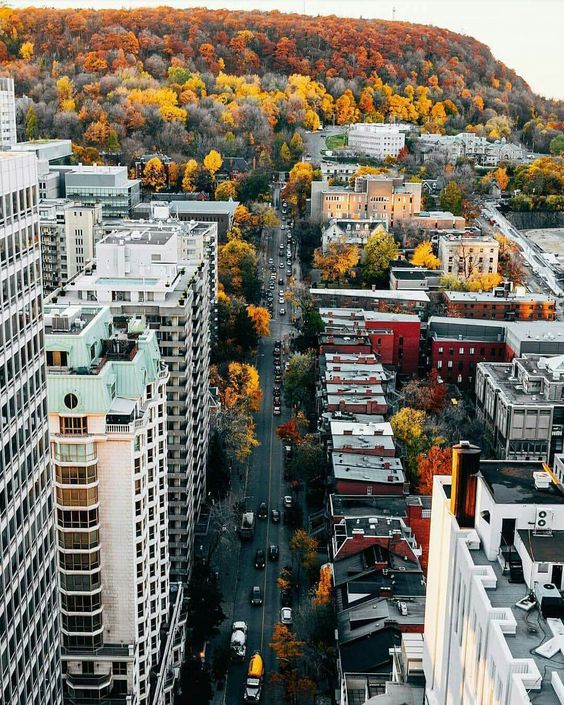
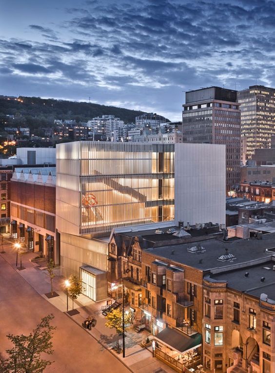
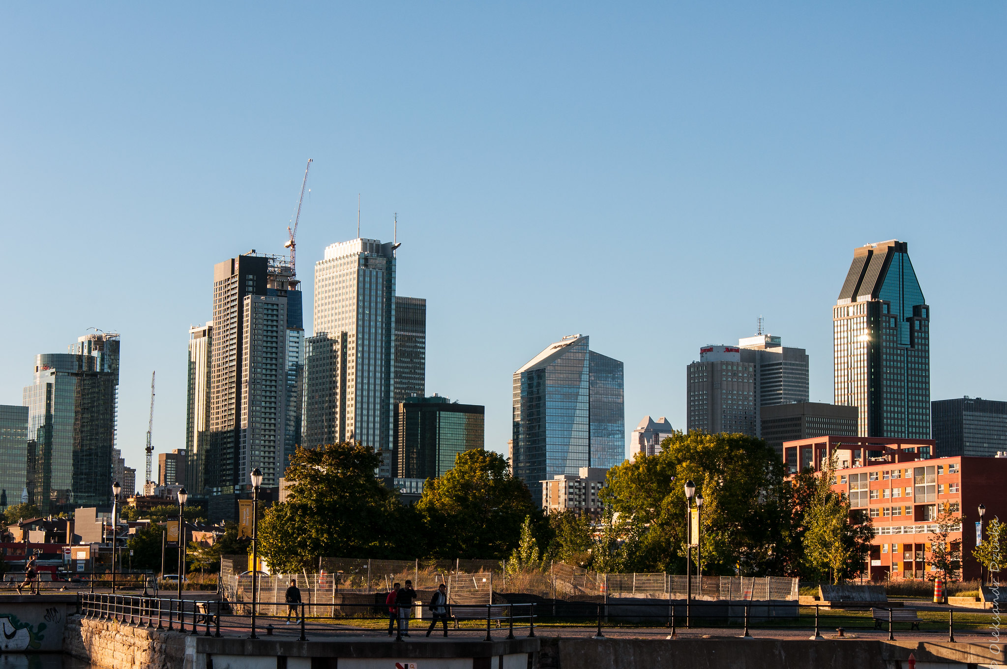
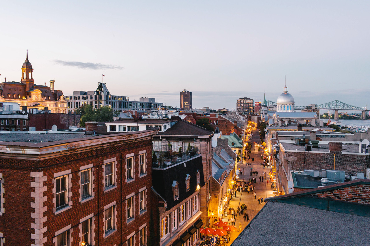
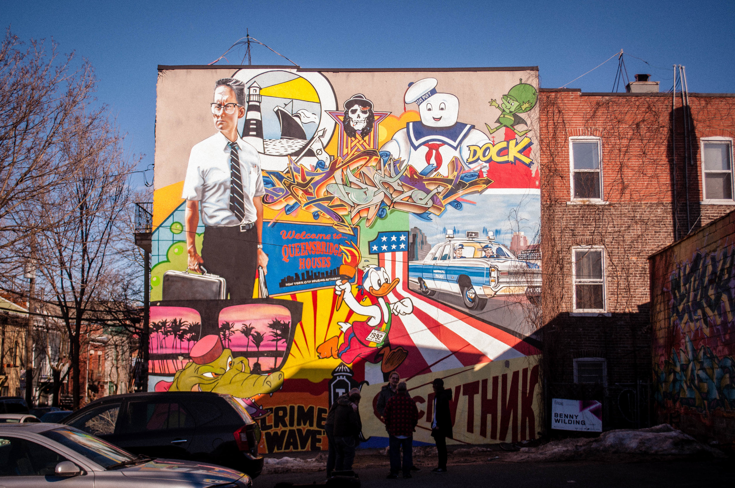
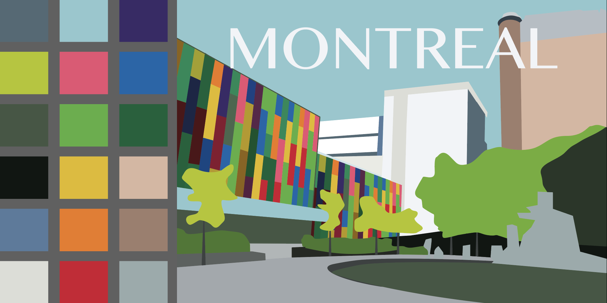
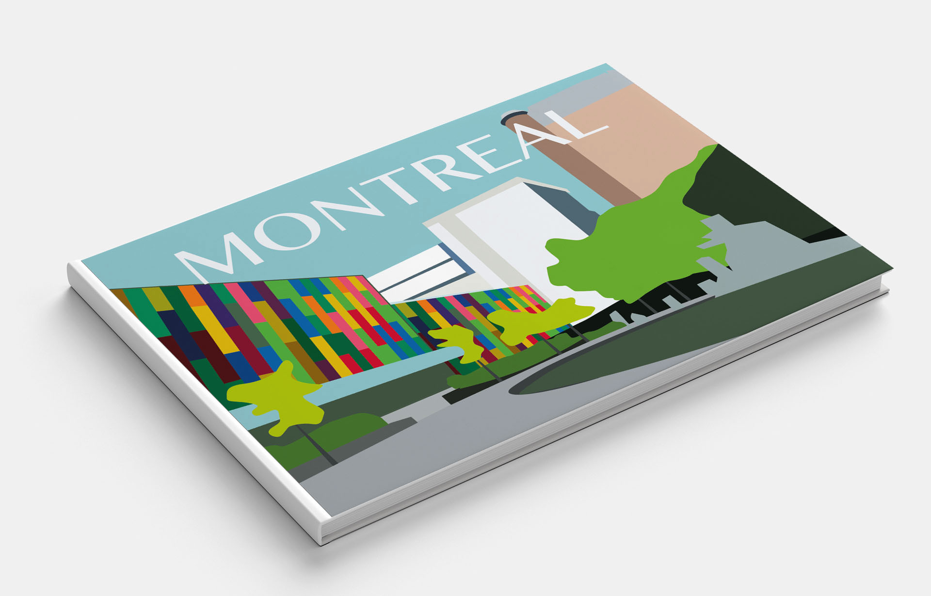
Montreal
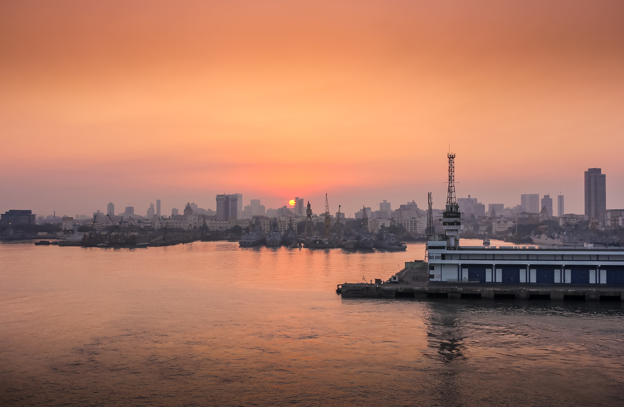
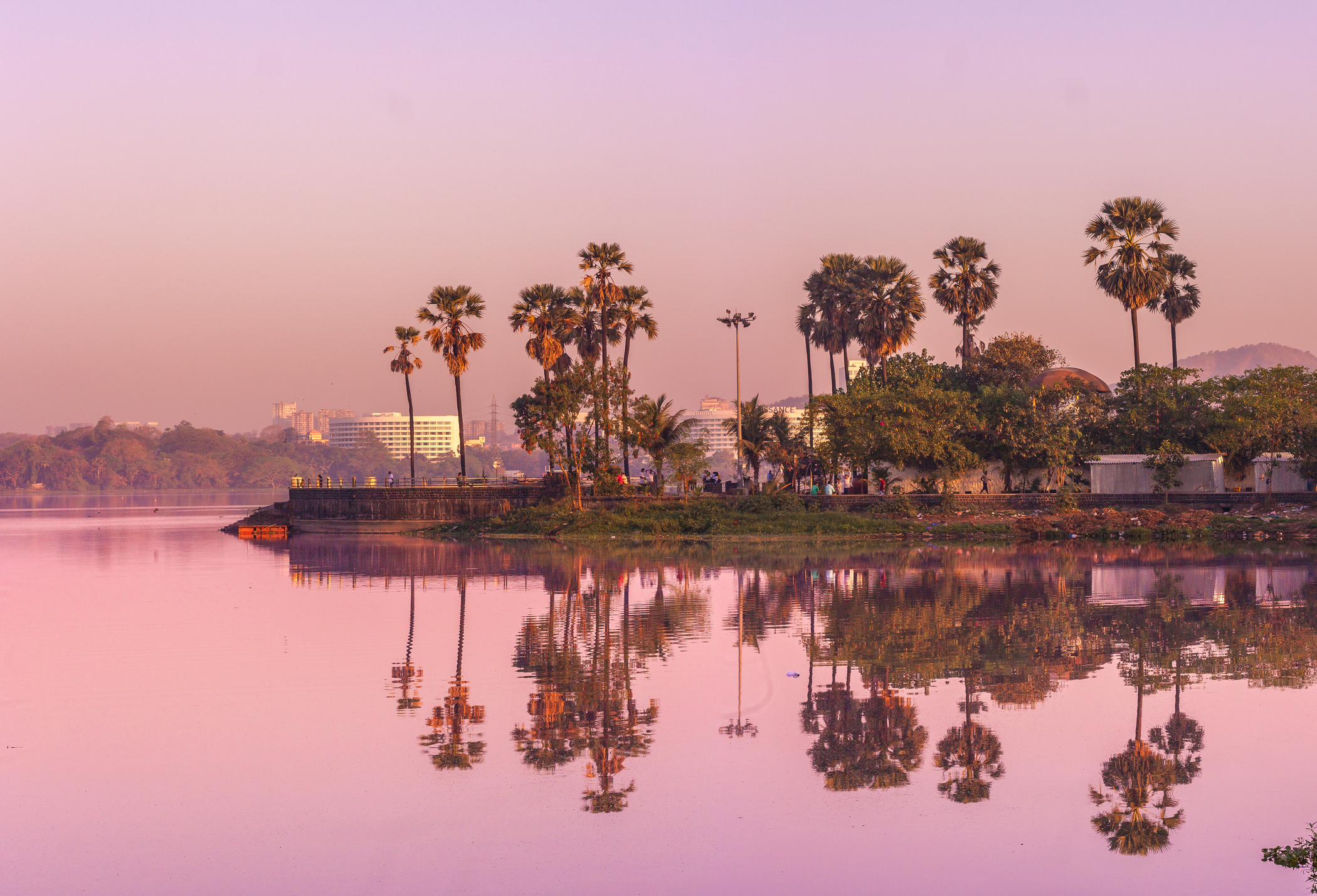
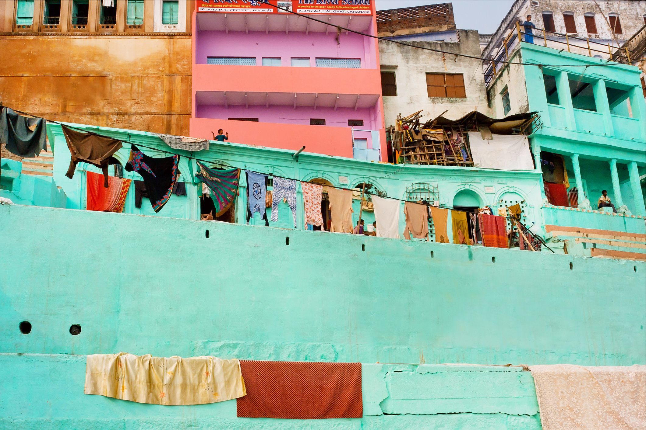
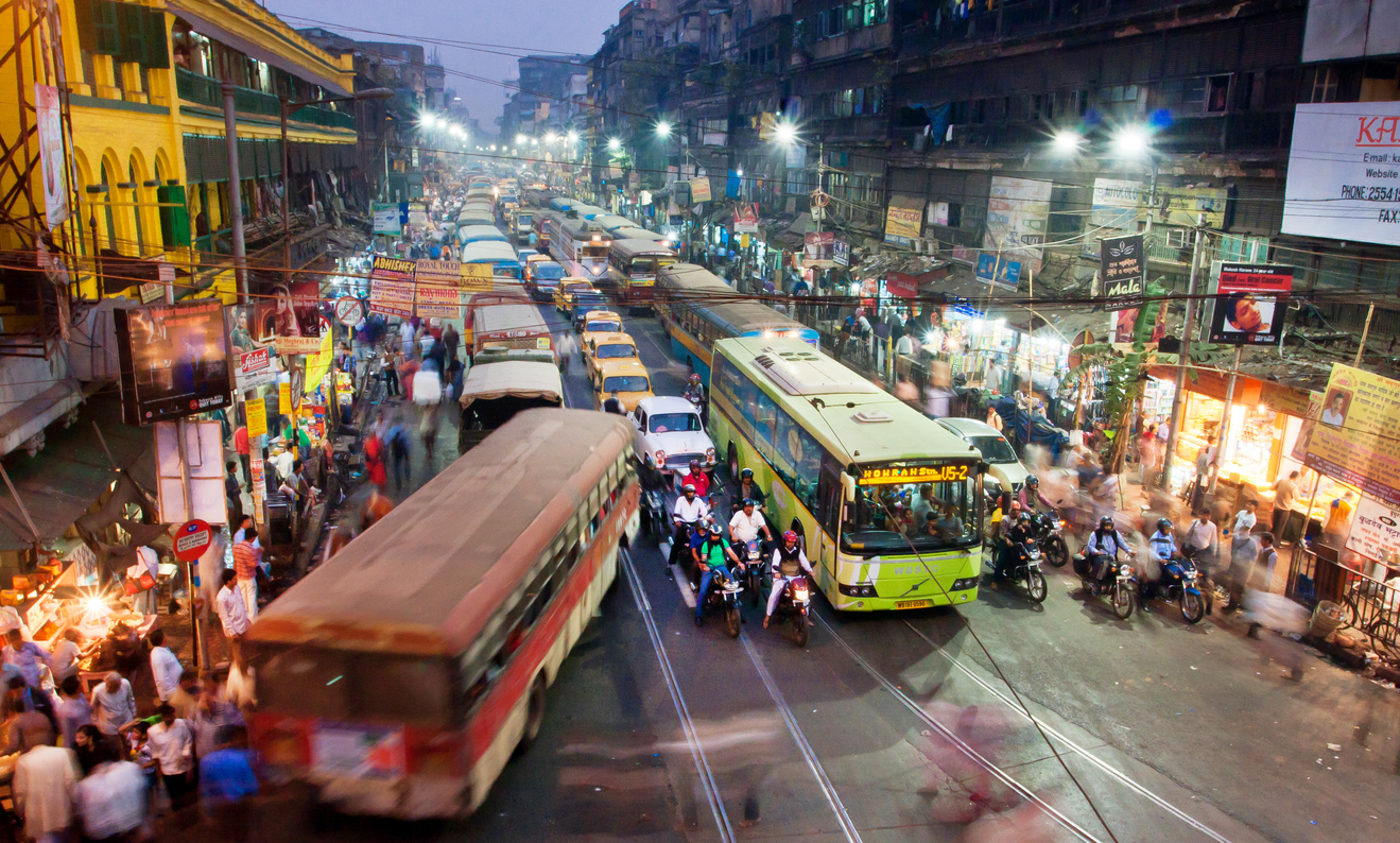
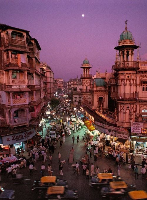
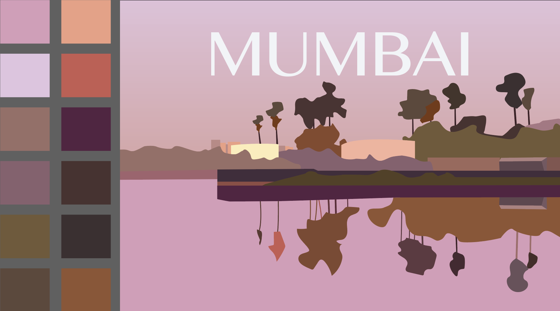
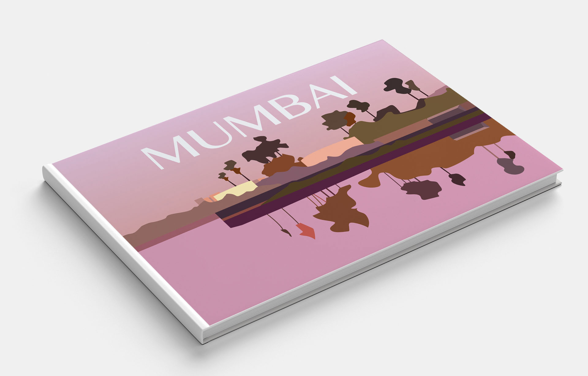
Mumbai
The books are going to be A5 landscape (210mm x148mm) size. You can use as many colours as you like and need to include the name of the city – where you place this and its colour are also important decisions to make. You may want to find out more about each city to help you develop your colour palette and also the size, shape and positioning of the colour blocks. Explore your DTP packages further by creating the artwork in the different software packages you have to experiment with the possibilities and ease of use. You can also do this exercise on paper using coloured blocks that you can cut and move about. Make notes in your learning log as you research and create your designs.
What? A5 landscape (210mm x148mm) size guidebooks
Target Audience: Travellers.
How will the client judge a successful outcome to the brief?
Original colour solution for abstract cities to familiarize tourists with the cultural features of the city.
Keywords:
Subordinate
Dominant and accent colours
Abstract cities
Secondary Research
For this task, I was building the idea following the main attractions that would be associated with a particular city. From the list above, I visited only one city, and this is Manchester, but this assignment served as an excellent motivator for me to discover the world’s places based on their colours and their main attractions. The goal of this exercise is to attract the flow of tourists to less popular cities. Because the list of cities was quite complicated, I could not immediately imagine what could be so unique in Madrid, Malmo or in Managua, the last one I had never heard of before. Therefore, to begin with, I needed to collect a series of photographs, where I could build a picture of the features of the city, colour solutions, due to which I could convert into geometric shapes. I e discovered images from Pinterest, stock photos, as well as photos provided by a travel photographer from personal photo archives.
In the process of selecting photos, I came across to posters with illustrations of cities. I decided to keep them on the inspiration board, even though these posters were made in a more artistic style, they looked at a kind of colour solutions that would be useful when analysing my assignment.
Polzeath poster from Pinterest
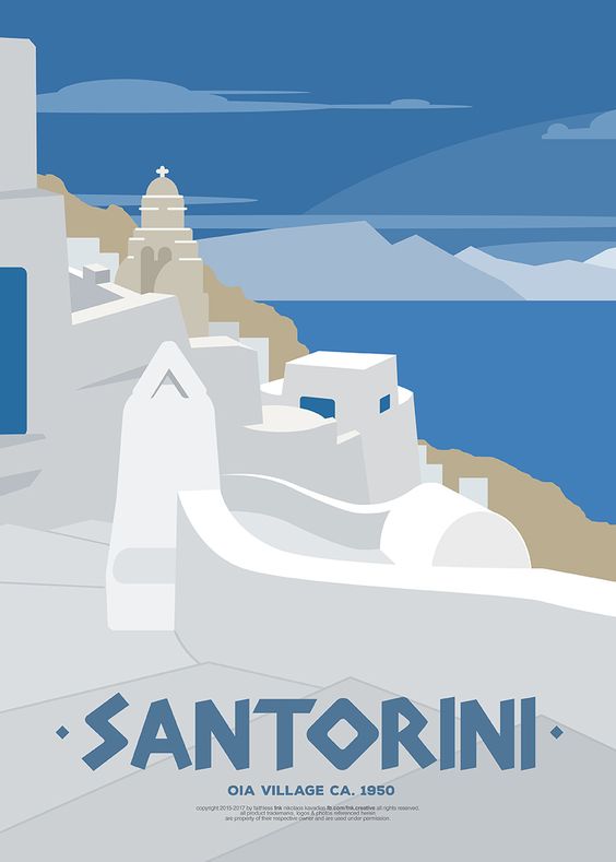
Santorini poster from Pinterest
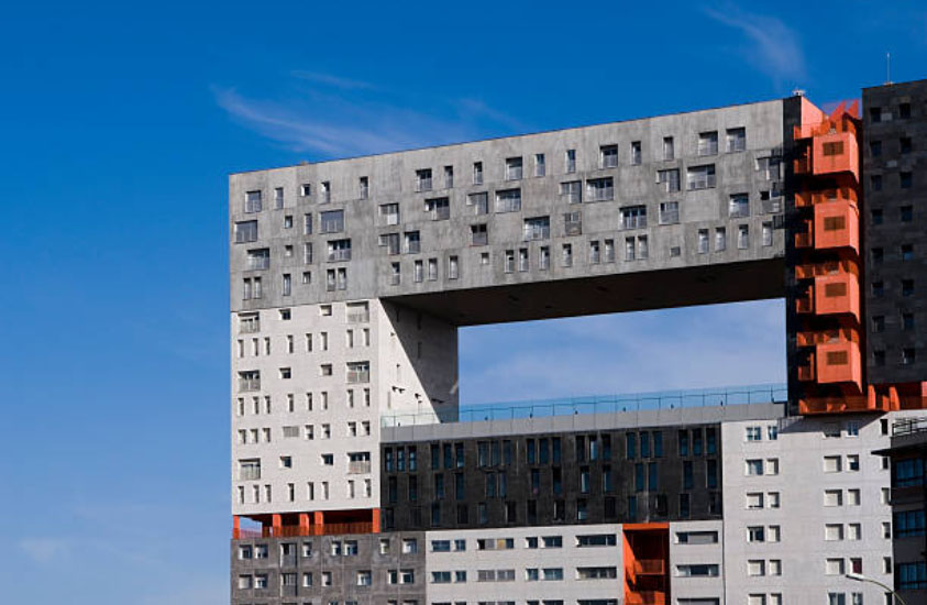
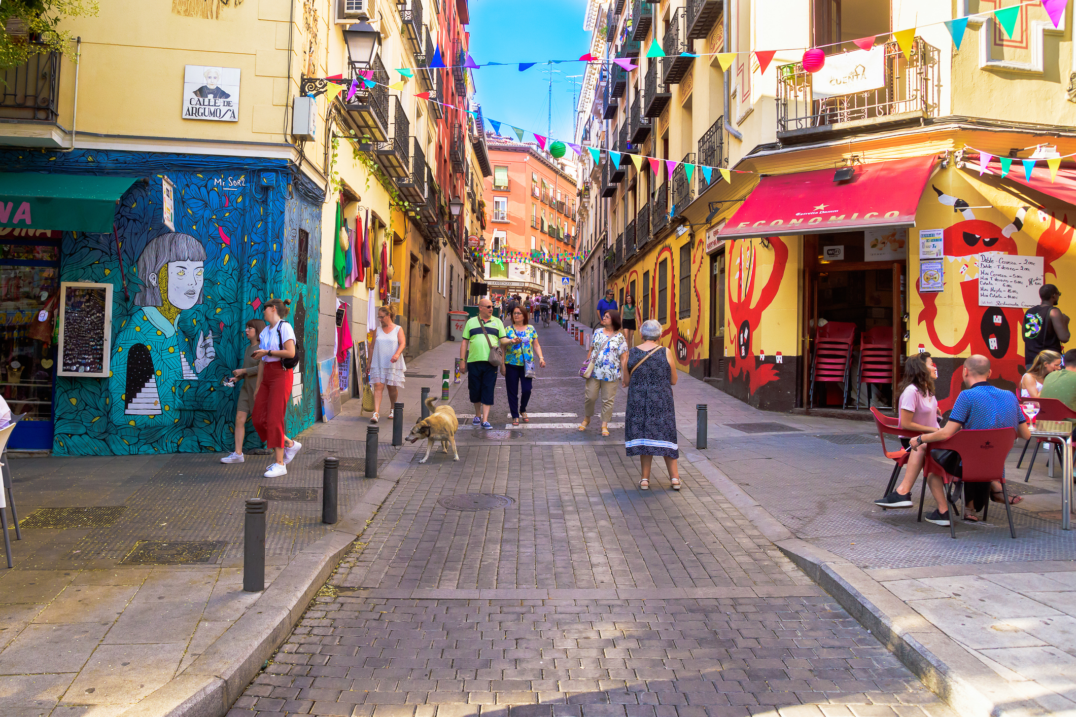
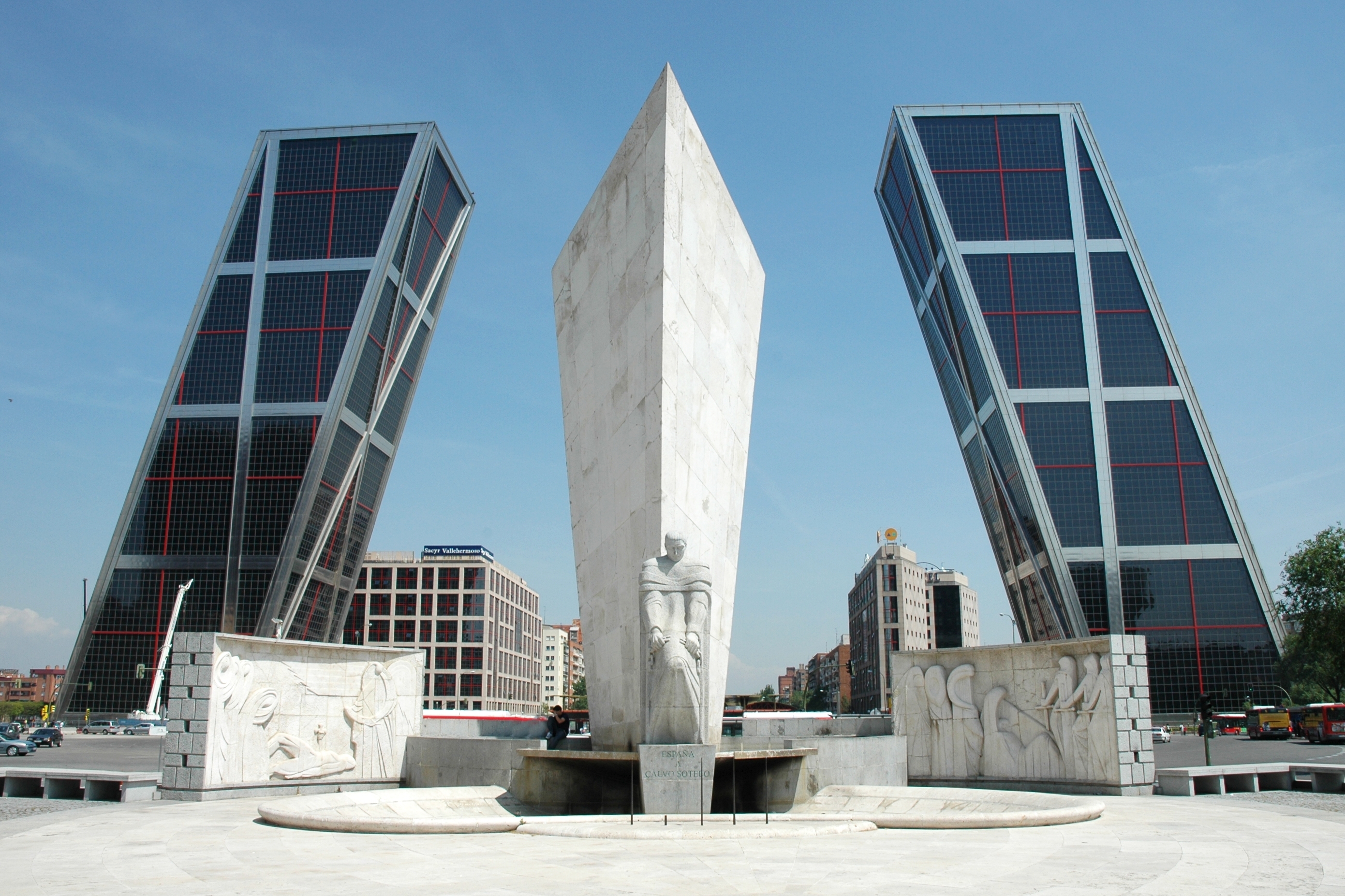
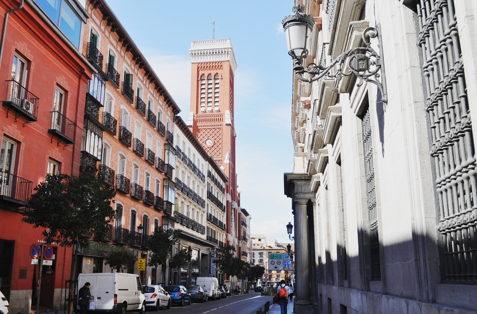
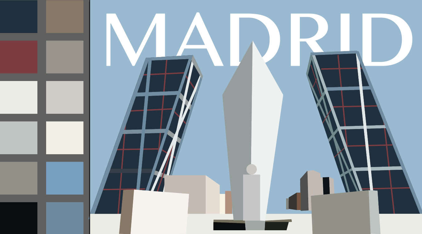
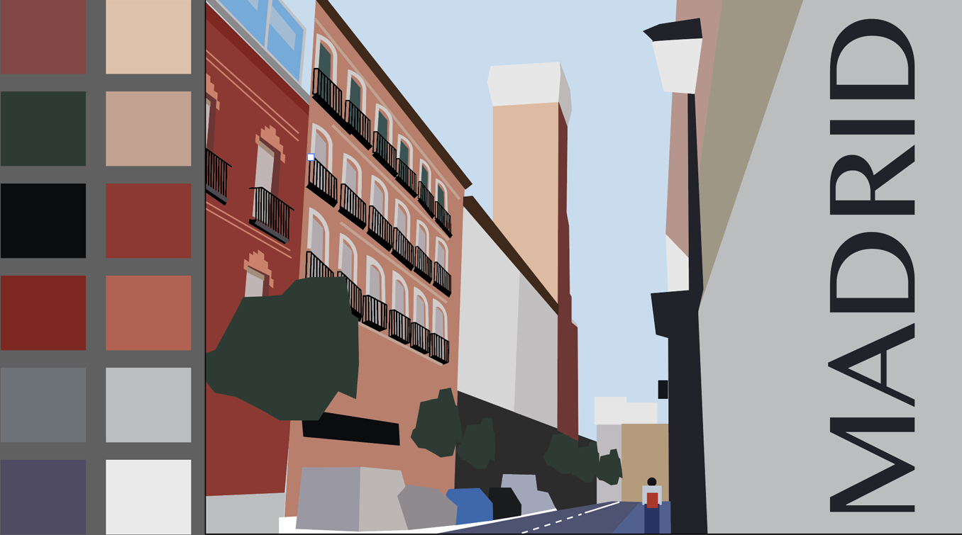
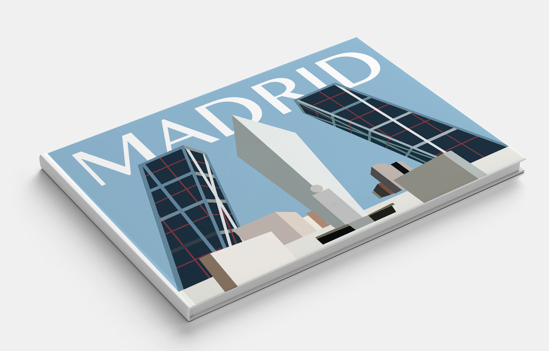
Madrid
Madrid is the cultural capital of fashion and style and shopping. My friends mentioned visiting Madrid city, so I knew there is a square in the centre of the town, the cathedral and the blue-grey colours. But my searches on the internet opened Madrid for me from a new angle. I noticed that architectural solutions are quite impressive in it. Madrid is an influential fashion centre with many international museums, including the Prado Museum, the Reina Sofia Art Center, the Thyssen-Bornemisza Museum and the Madrid Forum, which are among the 100 most visited museums in the world.
For the beginning, I analysed images that would describe Madrid in general terms. I was attracted to the modern architecture in Madrid, which could be popularised.
Just as an option, I decided to portray more traditional and recognisable street in Spanish style. I liked the variations of colour in which there were red, warm shades; in this image, the spirit of Spain was present. But still, I would give preference to the first version, made in cold tones, in my opinion, it is more urban and progressive for an abstract task. Options for Madrid picture and book cover are presented below.
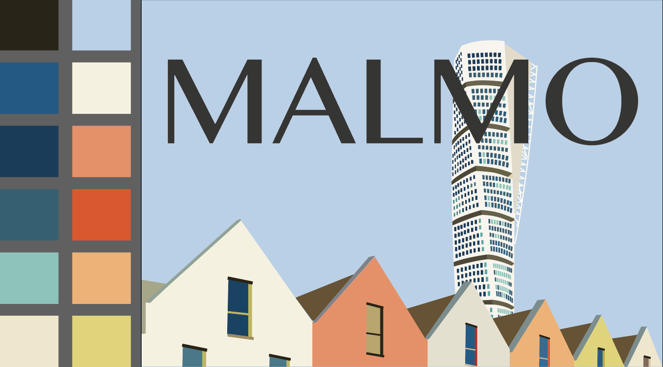
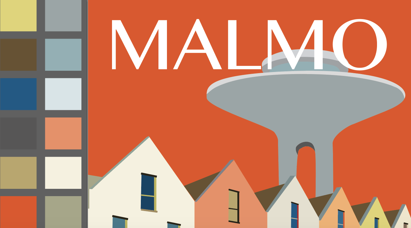
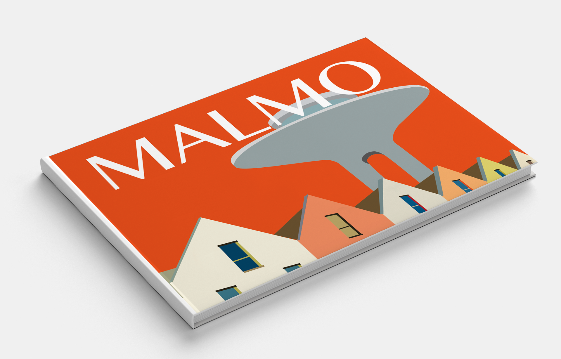
Malmo
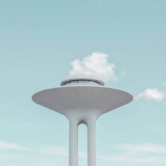
When I started choosing photos for the city of Malmo, I discovered the urban, modern, progressive city, which combines traditional architecture with modern buildings. From the beginning, my enthusiasm led me to the image of a tall building. But after analysing, I concluded that the design turned out to be too detailed, so I chose to depict another impressive building Water Tower, which I did in different colours of authentic buildings.
Pinterest Images of Malmo
Istock Images
Pinterest Images of Malmo
Pinterest Images of Malmo
Pinterest Images of Malmo
Pinterest Images of Malmo
Pinterest Images of Malmo
Shutterstock Images
Flickr Images of Malmo
Flickr Images of Malmo
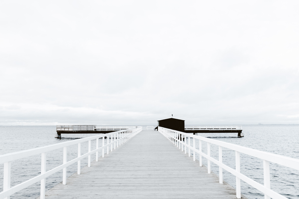
Sauna jetty in Malmö, Sweden
For contrast, I decided to try brighter colours for the background colour; in my opinion, the bright orange colour successfully emphasised the uniqueness of the area. Design variants are presented below.
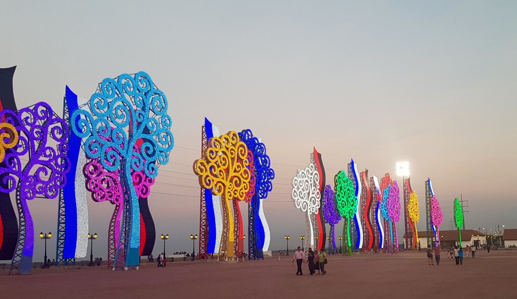
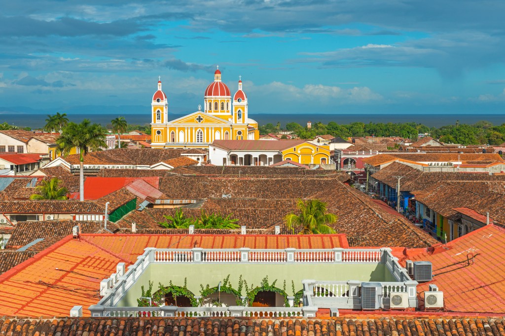
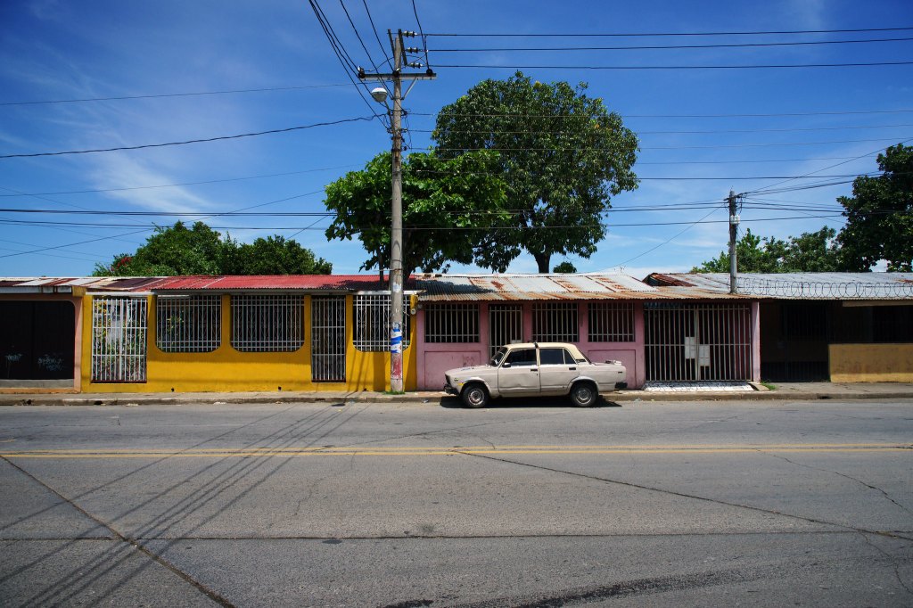
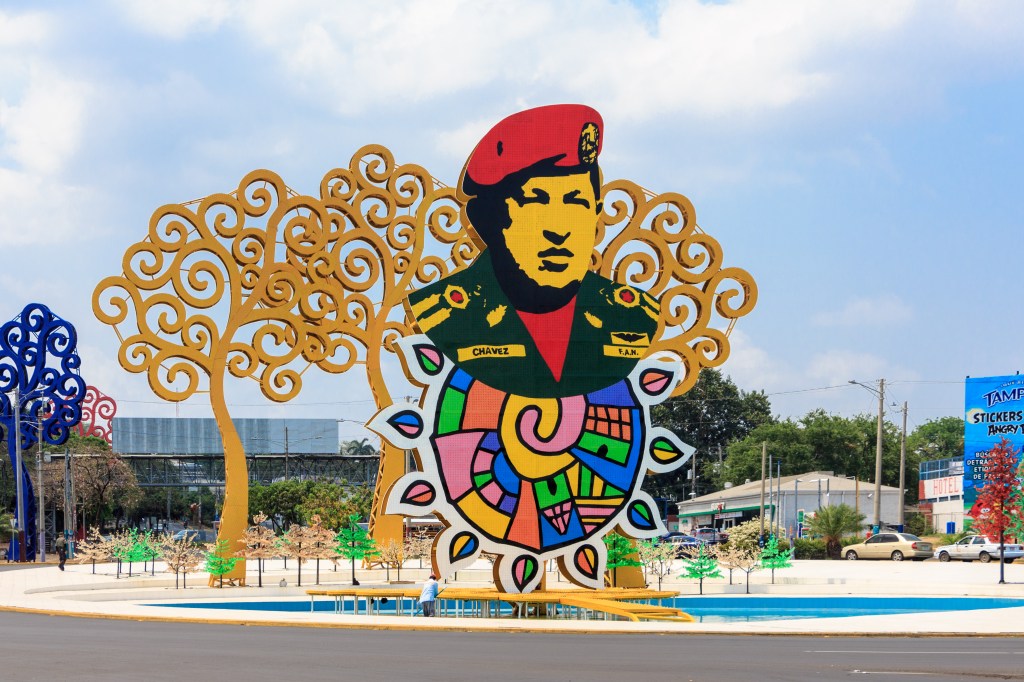
Managua
Managua for me turned out to be another exotic place. Colourful peculiar city, with its culture and features.
Pinterest Images of Managua
Pinterest Images of Managua
Pinterest Images of Managua
Shutterstock Images
Flickr Images of Managua Streets
Flickr Images of Managua
Flickr Images of Managua Streets
Flickr Images of Managua
I collected a small set of paintings that deserve attention, but as a milking abstraction, I wanted to portray nature outside the city. I liked the combination of green and blue shades; in my opinion, this could serve as an incentive to attract tourists to the original city of Managua.
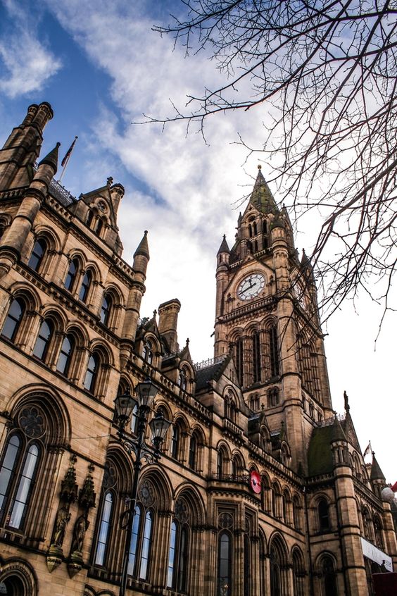
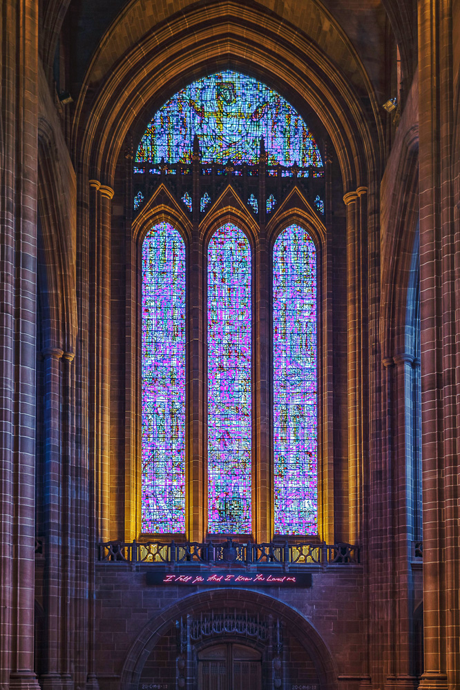
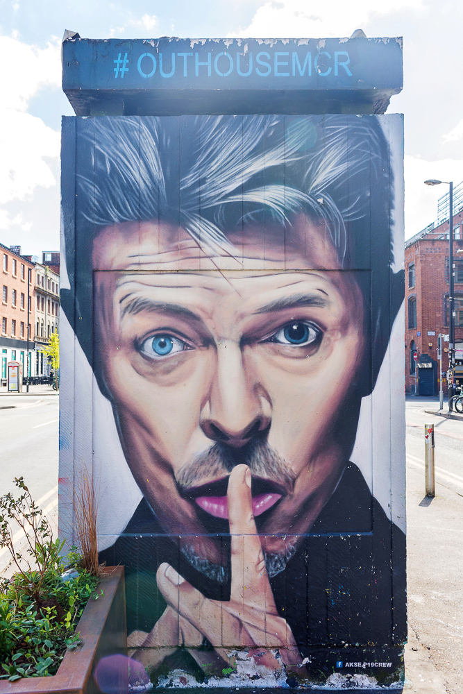
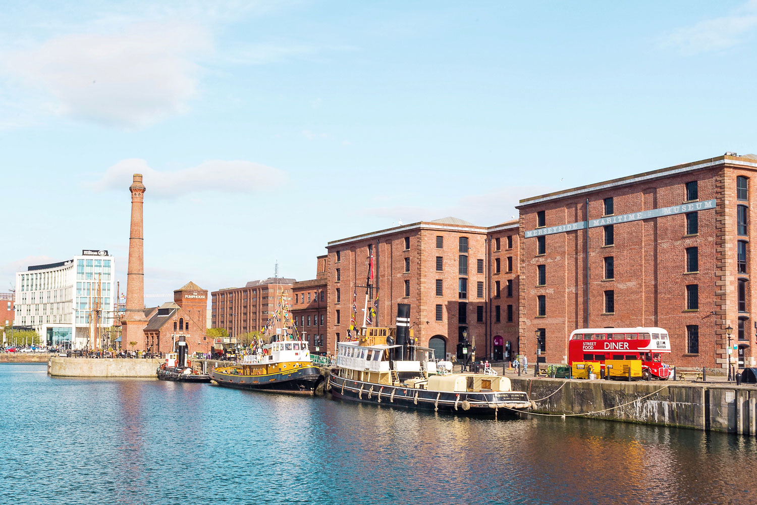
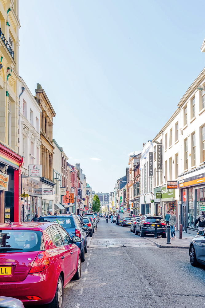
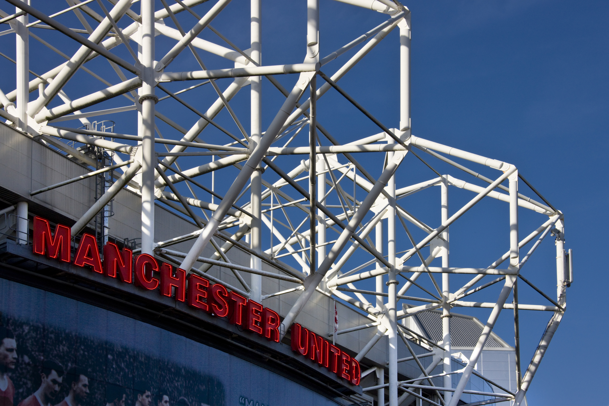
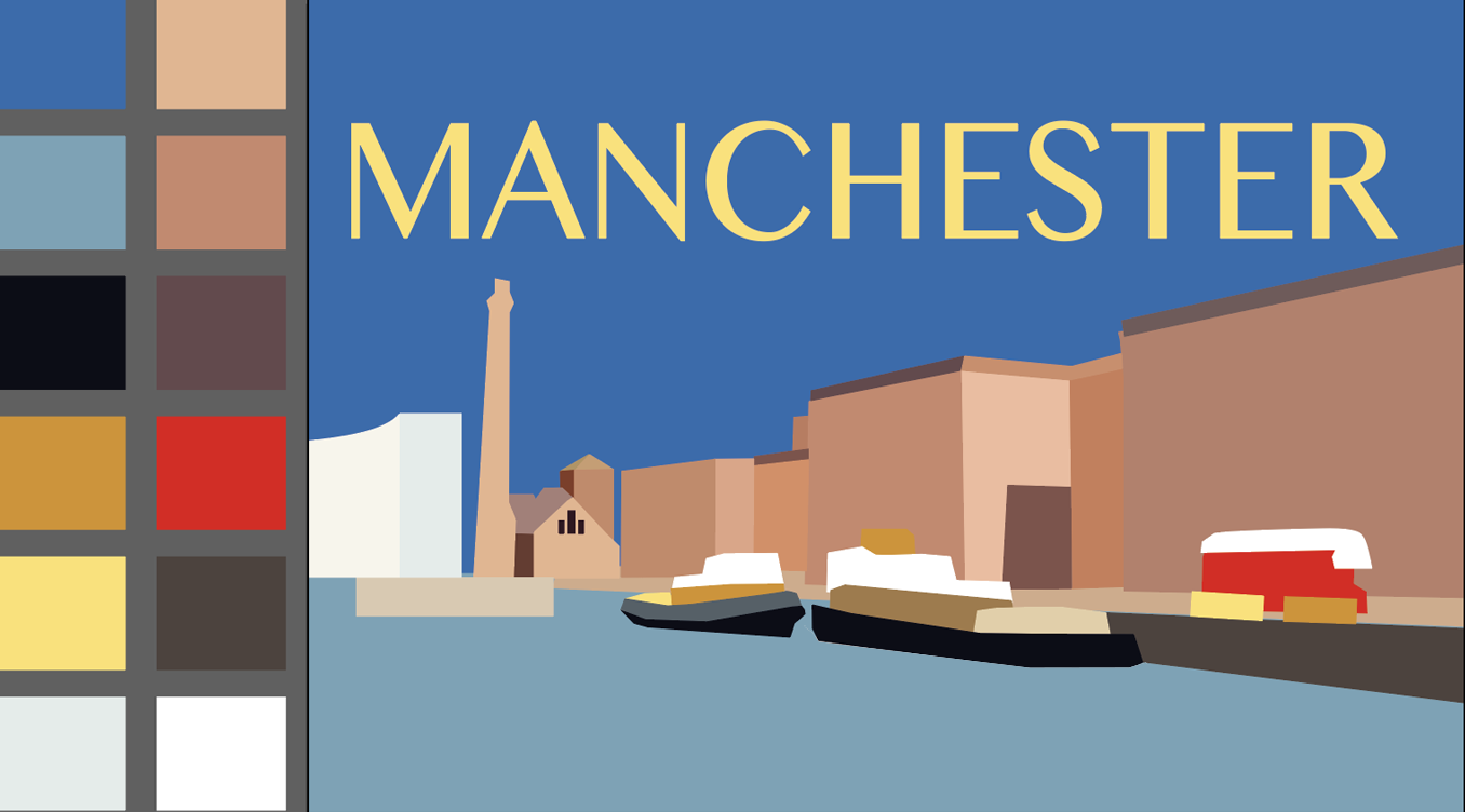
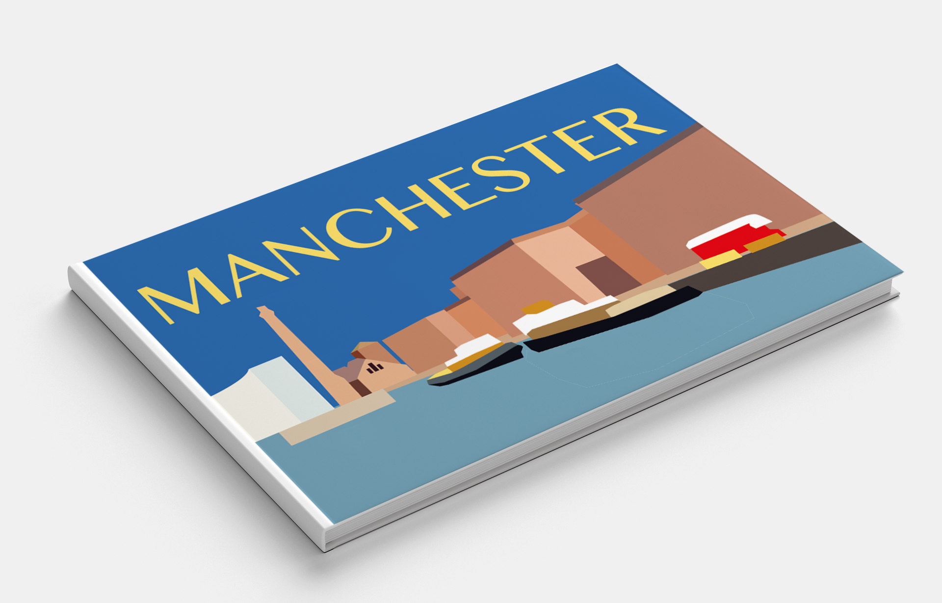
Manchester
Known for its football club and music scene on which such bands as The Smiths and Oasis performed, this centre of sports and the arts is a famous and friendly city. A modern progressive city filled with the spirit of freedom. I wanted to portray Manchester in contrasting colours, with a consistent style of architecture.
Pinterest Images of Manchester
Pinterest Images of Manchester
Pinterest Images of Manchester
Pinterest Images of Manchester
Pinterest Images of Manchester
Pinterest Images of Manchester
Pinterest Images of Manchester
Pinterest Images of Manchester
Pinterest Images of Manchester
Pinterest Images of Manchester
iStock Images of Manchester
iStock Images of Manchester
For the sky, I chose an unrealistic bright blue colour, which, in my opinion, created a unique colour feeling for this place. I think I was managed to picturise the traditional English city with modern features.
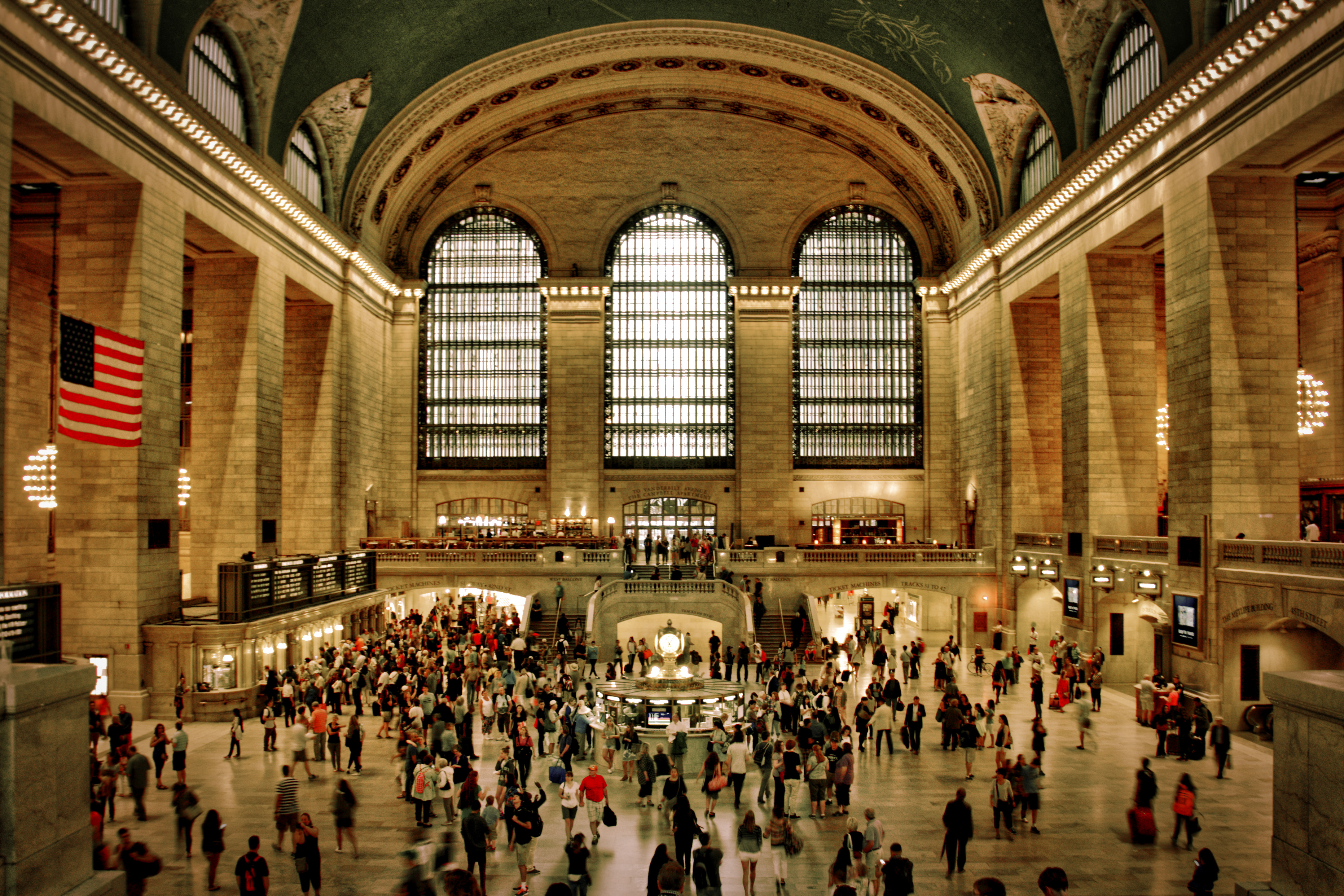
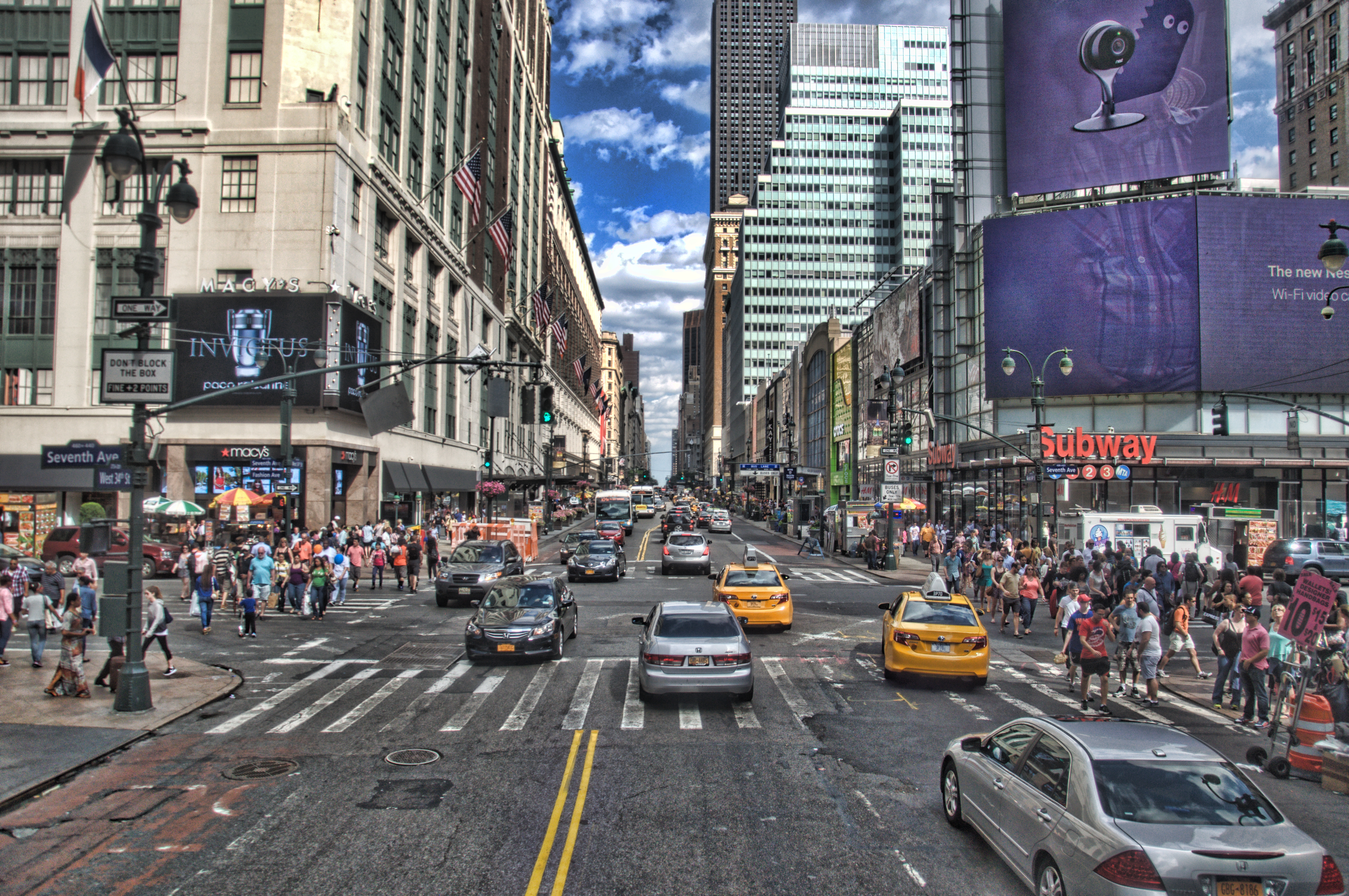
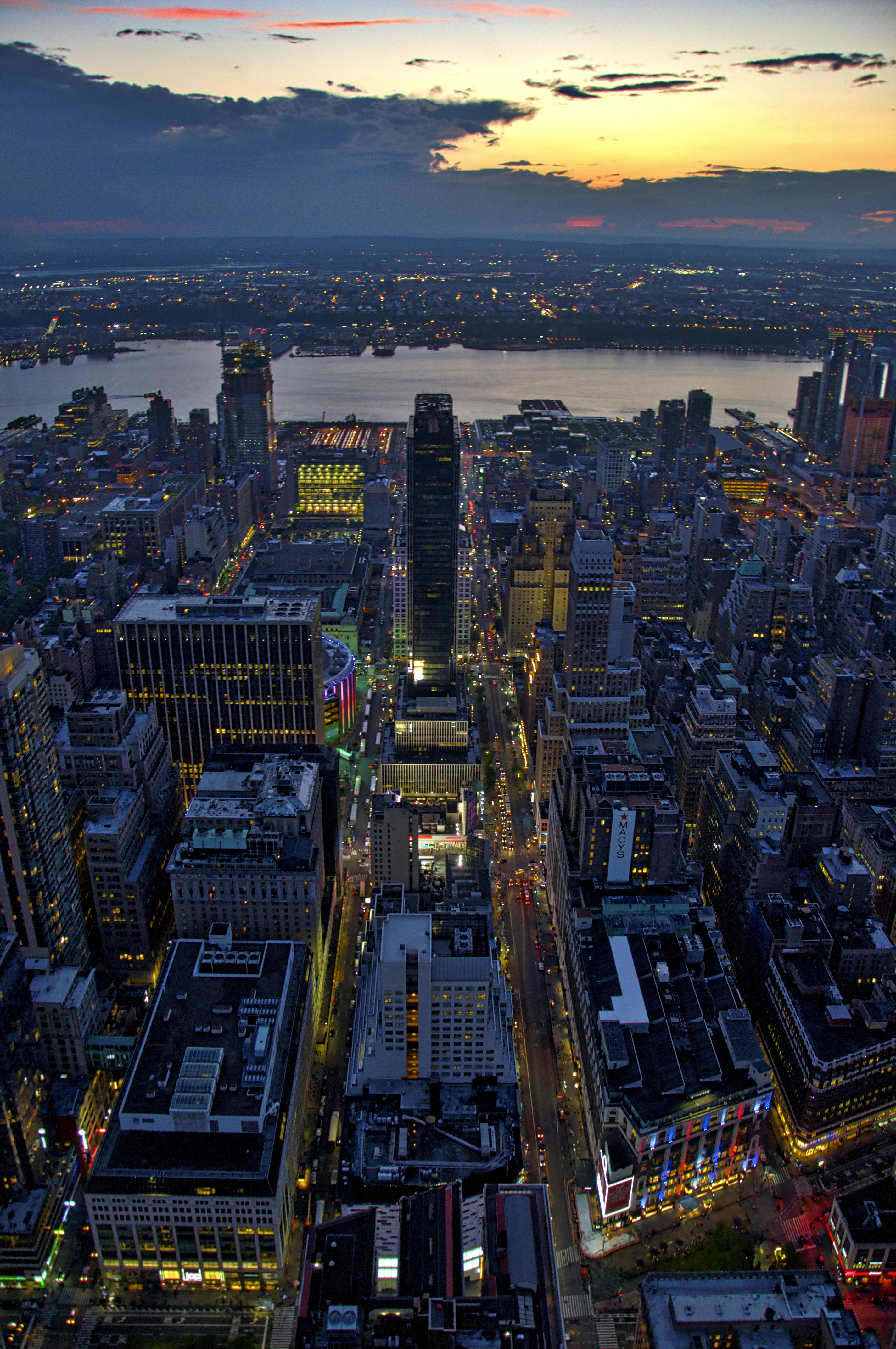
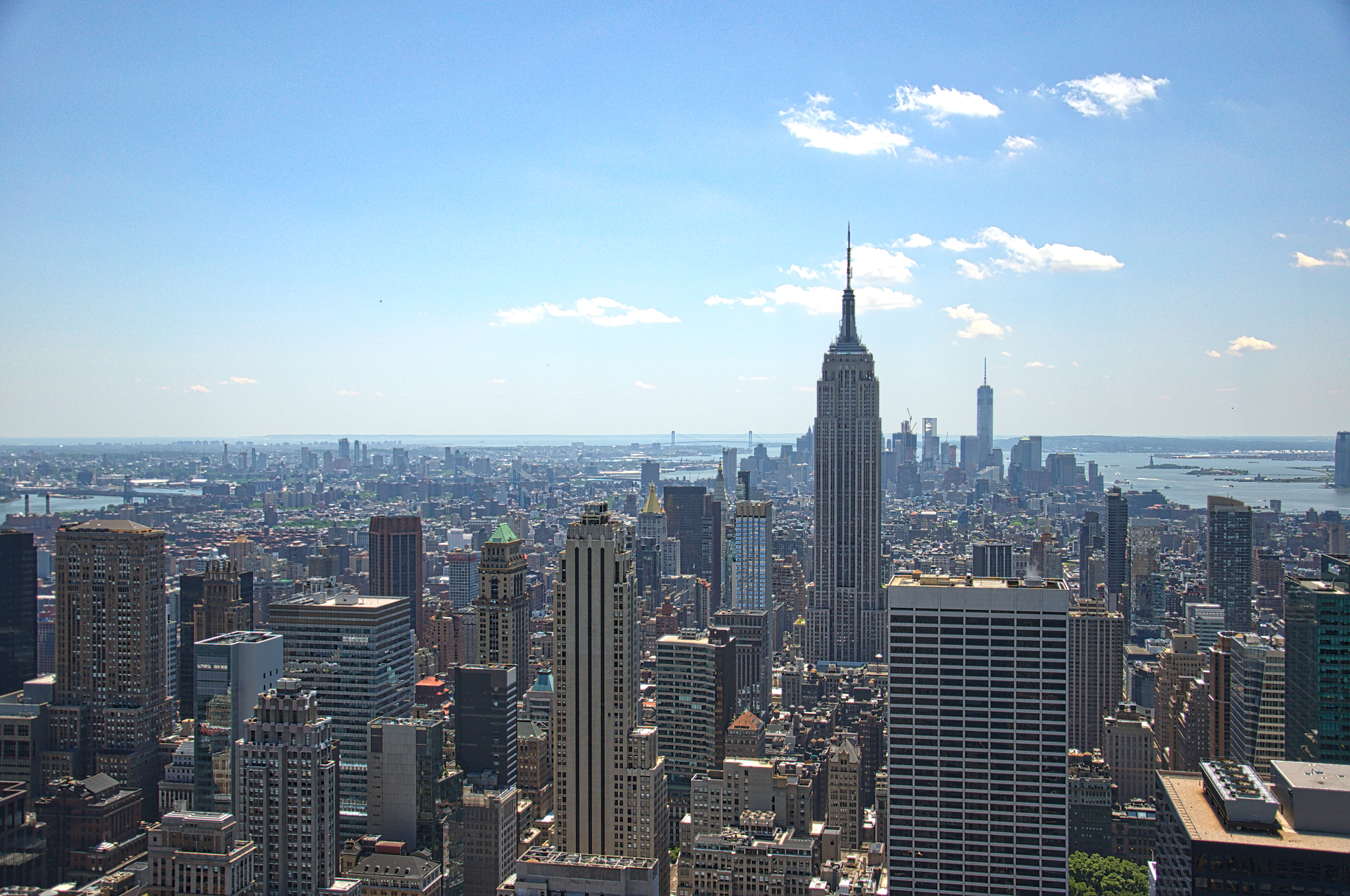
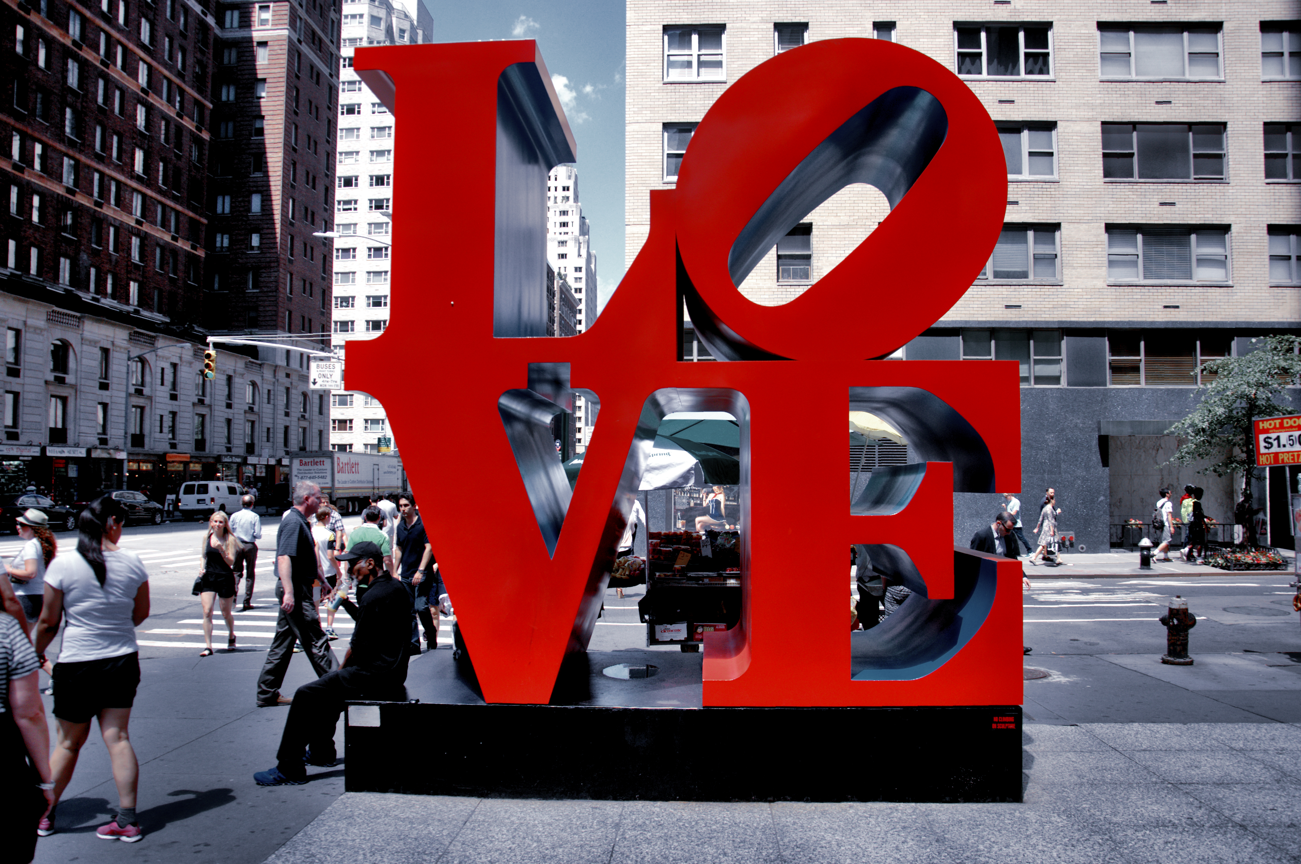
Manhattan
Manhattan is the historical core of the city of New York and one of its five boroughs. The city is primarily associated with tall skyscrapers, shopping centres, bright billboards and Broadway. The attitude towards it cannot be unambiguous, because achievements, history and modernity are intertwined together. To study and understand Manhattan is difficult, it is immense, diverse and unique.
In my collection of photos, there are images from personal archives. I portrayed the first abstraction in violet-grey colours, with high-rises and the main avenue of the city. But then I wanted to explore this city from the opposite side, in warm shades, in the flowering spring city, in the centre of the composition, there is also a bright yellow taxi. I think I prefer the second option, in my view the name of the city is more prominent to read as well.
Marrakech
This one of the largest cities of Morocco is rightly called the pearl of North Africa. When I went through all images, I realised that this place is full of different objects that worthing to picture.
Pinterest Images of Marrakech
Shutterstock Images
Shutterstock Images
Pinterest Images of Marrakech dessert
Shutterstock Images
Shutterstock Images
Shutterstock Images
Shutterstock Images
Shutterstock Images
Flickr Images of Marrakech Market
Flickr Images of Marrakech
Flickr Images. Such a beautiful building at the Medina in Marrakech
In my abstraction, I wanted to portray the colourful architecture of the city in warm colours in combination with the bright elements of local markets, in which there are spices, clothes, carpets and other products.
Marseilles
Marseille is the largest city in France after Paris. This city is the true pearl of France. Being a large industrial region, it managed to absorb a huge part of the country’s cultural and historical heritage.
Pinterest Images of Marseilles
Pinterest Images of Marseilles
Pinterest Images of Marseilles
Pinterest Images of Marseilles
Pinterest Images of Marseilles
iStock Images
Flickr Images of Marseilles
Flickr Images of Marseilles
Flickr Images of Marseilles
Marseille has an excellent location on the shores of the Mediterranean. In my illustration, I wanted to portray this feature of the city, the rolling hills in which houses are scattered, on the seashore. But after I realised that, I should go deeper in my studies of the city, and I decided to portray an interesting feature in terms of the architecture of Housing Unit – a modernist residential housing design rule developed by Le Corbusier.
In the design, I used palatal pastel shades of cream colours in combination with the blue sky. Design options are presented below.
Melbourne
Melbourne is a city that occupies a leading position in the ranking of some of the most favourable cities for life. Melbourne is a large city in southern Australia; its difference lies in the fact that it is unique for its distinctive architecture. This city can rightly be considered the sports capital of Australia. Also not rarely there are lots of holidays, carnivals and festivals.
In my abstraction, I wanted to portray this city from the vibrant night metropolis, in bright purple hues. For contrast, I’ve used bright yellow and orange reflection — the name of the city I placed in the centre on the black shades of bushes.
Montreal
Montreal is beautiful, modern and progressive, or as the locals would say: Montreal, c’est si bon! This French-speaking city is considered the cultural capital of Canada and is an example of a Quebec style in a multi-ethnic community.
Pinterest Images
Pinterest Images
Pinterest Images
Flickr Images of Montreal
Flickr Images of Montreal
Pinterest Images of Montreal
Flickr Images of Montreal
Flickr Images of Montreal
Flickr Images of Montreal
Shutterstock Images
Flickr Images of Montreal
When I looked through a series of photos, I noticed the similarity of this city with Melbourne, but at the same time, I wanted to portray the uniqueness of this city. My eyes were riveted on the image of a colourful building, whose windows were lined up in a specific mosaic. I think that I managed to portray the character of the city in this abstraction.
Mumbai
Mumbai is the largest and most prosperous city in India and the most populous in the world. Bom Bahai – these words, according to legend, were pronounced by the Portuguese, disembarking here, and this meant – “Good Harbor”.
Gurudwara Bangla Sahib Temple in New Delhi on February 24. 2018 in India
iStock Images. Kolkata, India – 21 Jan 2018
iStock Images. January 2016 – awesome sunset – Mumbai India
Reflection of Coconut trees at Powai Lake, Mumbai, India
iStock Images. Varanasi, India – January 1, 2013
iStock Images. Kolkata, India – January 17, 2013
Pinterest Images of Mumbai
Pinterest Images of Mumbai
Pinterest Images of Mumbai
Pinterest Images of Mumbai
Pinterest Images of Mumbai
Streets in the late evening, Bombay/Mumbai, India, 1994 Pinterest Images
When I was selecting photos, I traced that the city was full of various colours, but at the same time, brown shades dominated the surrounding elements of the town. I liked the image of the bay near the city, where peace and tranquillity were traced. In my illustration, I used violet and pink shades in combination with trees in the shade.
Conclusion
In conclusion, I would like to say that this exercise took me lots of image looking and researches before I could get the feel of the city. I love that kind of illustrations, made with a simple tool like Adobe Illustrator pen, and adding to each shape the vibrant colour. The only disadvantage that I had, that I really tried to design more detailed pictures, with some recognisable shapes, instead of using just a flat geometric objects, so in the result I have different vector painted images, instead of abstract compositions. I was impressed by the diversity and cultural differences of a single city. Also, I traced the uniqueness of colour combinations in each city, how the mood and peculiarity of cities, forms, and contrast colours are played. In my opinion, I was managed to collect unique designs that, in the future, could serve as a guide in the tourist direction of each city.