At: https://www.theguardian.com/books/2015/aug/07/10-books-that-shaped-the-world
(Accessed 23/11/2020).
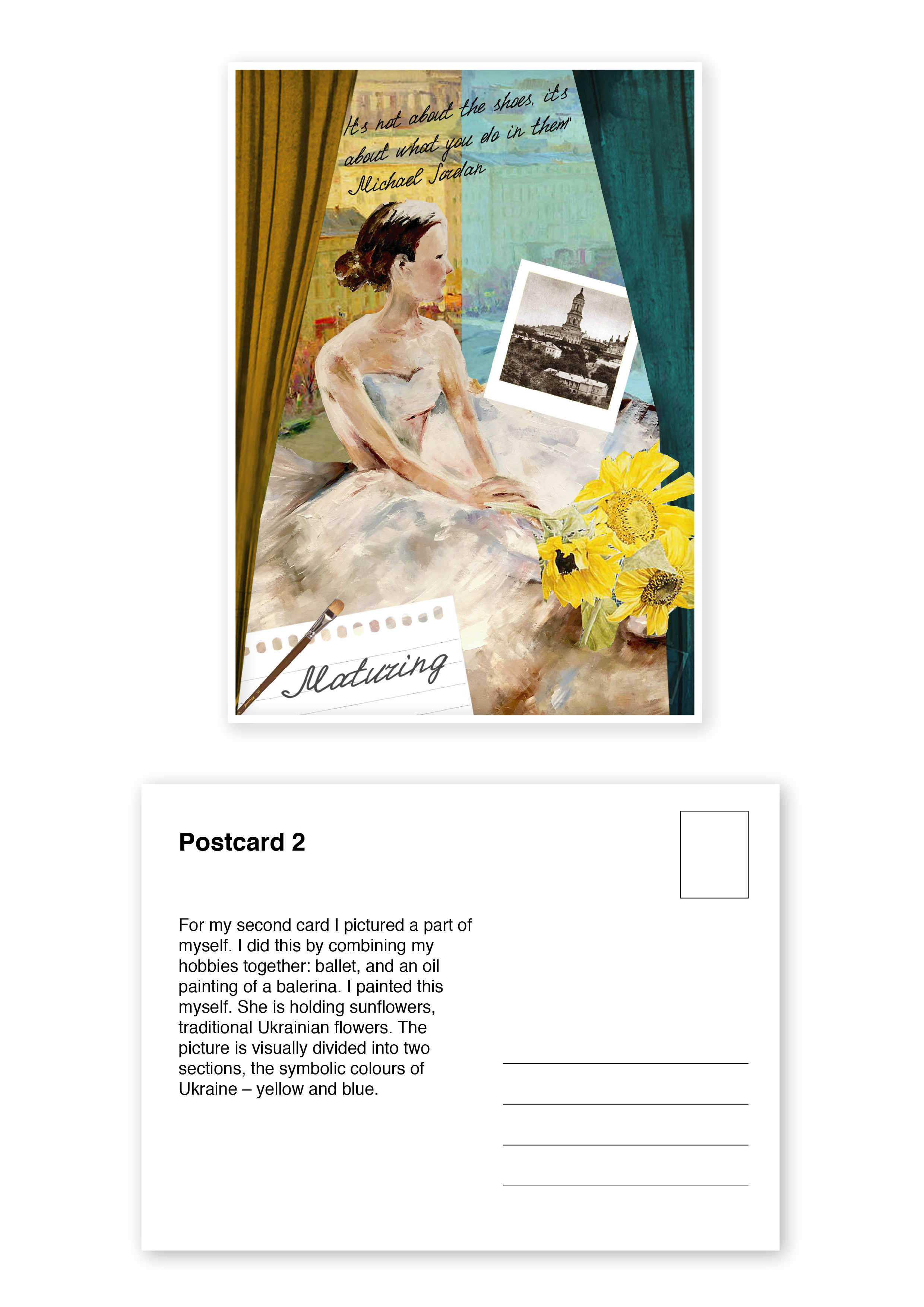
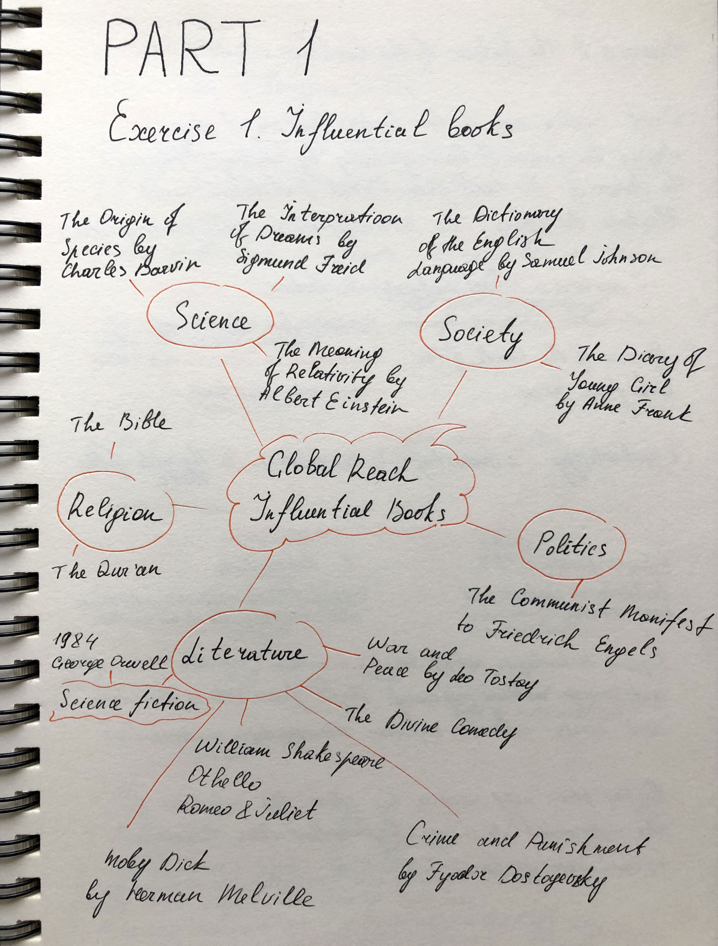
Consider the importance of books to you both personally and within a broader global sense.
First of all, think back to the earliest books you came across as a child, through your teenage years and early adulthood to where you are now. There may be half a dozen books which stick in your memory or are important to you in some way. There may be many more than that. It may be an early reading book, a particular image or short rhyme which helped you recognise letterforms. It may be the distressed metallic silver cover of a Salinger novel you read as a teenager, or the book you bought on impulse after work one day, seduced by the tactile quality of the cover.
Identify these books in your learning log, use photographs and annotation to create an illustrated list documenting the books that are important to you, for whatever reason.
Now, connect your influential books to those with a more global reach. Identify seminal works that have informed or challenged some of the areas you have identified. These may be scientific, artistic, historical, political, geographic, fictional, poetic or religious texts. For example, a book from your childhood could connect to other seminal children’s books by association, such as Heinrich Hoffmann’s Der Struwwelpeter / Shockheaded Peter (1845) or Charles Perrault or the Brothers Grimm. Likewise a book featuring dinosaurs might connect to Charles Darwin’s Origin of the Species.
When we appreciate the breadth and influence of books, we begin to appreciate the extent of a book’s potential impact. Books carry and communicate ideas; powerful messages can be contained within seemingly innocuous bound paper pages. In your learning log, create another list of books, with accompanying images and annotations, which you believe to be more globally important, but connect to your first list in some way.
This activity will feed into your first assignment, so document your ideas in your sketchbooks and learning log to refer back to later.
Researches
Books have always played an essential role in my life. Once I even thought to connect my profession with literature, to engage in a more detailed study of classics and contemporaries that to analyse their works. But later my main interest was in drawing and design, reading become just a hobby. During my school years at the summer holidays, according to the program, we were asked to read at least 60 books on foreign and Ukrainian literature. After all, we had to analyse and write an essay or review for all these works, so it was important to get acquainted with each work personally. I found all the necessary materials in the local and school libraries, at neighbours, friends, or in-home archives, and I did not mind spending another hour reading the book. I enjoyed the tactile connection with the book, turning the pages, always paying attention to what kind of binding was in the book, hard or soft, the quality and colour of the paper, and the smell of book sheets. I read some of the books because I should have known them according to the program, but some books are etched into my memory to this day.
Over time, e-books began to replace printed publications, more and more services began to appear for listening to audiobooks or loading books into an electronic version, which is more economical and ergonomic. In the modern world, a home library is a rarer phenomenon than, compared to 20 years ago when each house had a separate chest of drawers for books. Many book lovers still prefer a printed book to an e-book, but even for myself, I noticed that my last literature purchases were books on design, psychology or recipes, which should always be at hand. New books I read in e- option, faster ordering and no need to store printed copies on shelves in the house.
It was interesting for me to go over the books that impressed me since childhood. Since the age of 6, I have enjoyed immersing myself in fairy tales and children’s stories by such authors as The Brothers Grimm, Hans Christian Andersen, Korney Chukovsky, Charles Perrault, Lewis Carroll. Over time, when I began to grow up, I switched myself to more serious novels, such as “Angelica” by Ann and Serge Gollon, “Robinson Crusoe” by Daniel Defoe, “Anna Karenina” by Leo Tolstoy, “Children of Captain Grant” by Jules Verne, “Notre Dame Cathedral” Victor Hugo, “Crime and Punishment” Fyodor Dostoevsky, etc.
Oddly enough, the modern editions, the books I read as an adult were not that significant or influential for me. The book was already perceived more as a source of information than an authority. Still, I found authors who caught my attention, “Sapiens. A Brief History of Humanity” Yuval Noah Harari, “Eat, Pray, Love” by Elizabeth Gilbert, “Shantaram” by Gregory David Roberts and many others.
Walt Disney Big Dictionary
This was my first book on English, published back in 1993. It mainly consisted of vivid illustrations of cartoon characters with numerous words in Russian and their translation. The book was hardcover, large and very pleasant to study, and I always wanted to return to it. As a child, I considered this book quite difficult, despite the easy-to-learn English words, in my understanding it was a separate science, and the first window into the world of a foreign language, which I did not know at that time. But still, I liked to scroll through it, study the illustrations, the emotions that it conveyed.


Fig. 1 Walt Disney Big Dictionary (1995). At: http://samoe-vazhnoe.blogspot.com/2013/11/disney-english.html
(Accessed 23/11/2020).
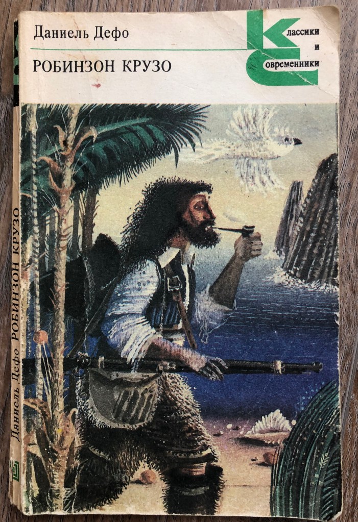
Robinson Crusoe. Daniel Defoe
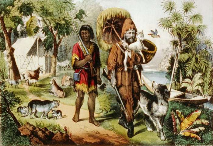
Why is this book important to me? Probably because it was the first discovery of the world of travel and distant islands. Many in childhood would dream of getting to a distant green island, overgrown with palm trees and the singing of wild birds. In my understanding, this book is a visual narration of how fortitude and a thirst for adventure can change a person’s life, the ability to find a way out of a situation. I think this story served as the beginning of my perception of the territory of the Earth, full of mysterious and exotic places, perhaps that is why I dreamed of getting to a distant island from an early age. At the first opportunity, I made a trip to the Maldives and Seychelles. Of course, this was all filled with comfort, compared to the tests that fell to the lot of Robinson, but I was still able to experience the very fact of being on a distant island in the middle of the ocean.
The cover of this book was soft and inside contained some black and white sketches of the work. Another example is that a book can be discreet in design, but the content carries some meaning that makes it memorable.
Anna Karenina. Leo Tolstoy
The peculiarity of this book is that I read it at a more mature age, and the publication itself dates back to 1939. The book is voluminous, similar to those that were previously stored in libraries, printed with some of the old printing technologies. The cover in it is hard and a little dull, but that is why this book seemed to be the most tempting to read, it seemed to me that this novel contains a part of history and culture, inside there were pictures in black and white, and in general, it tells a spiritual and tragic story, which will not leave anyone indifferent.

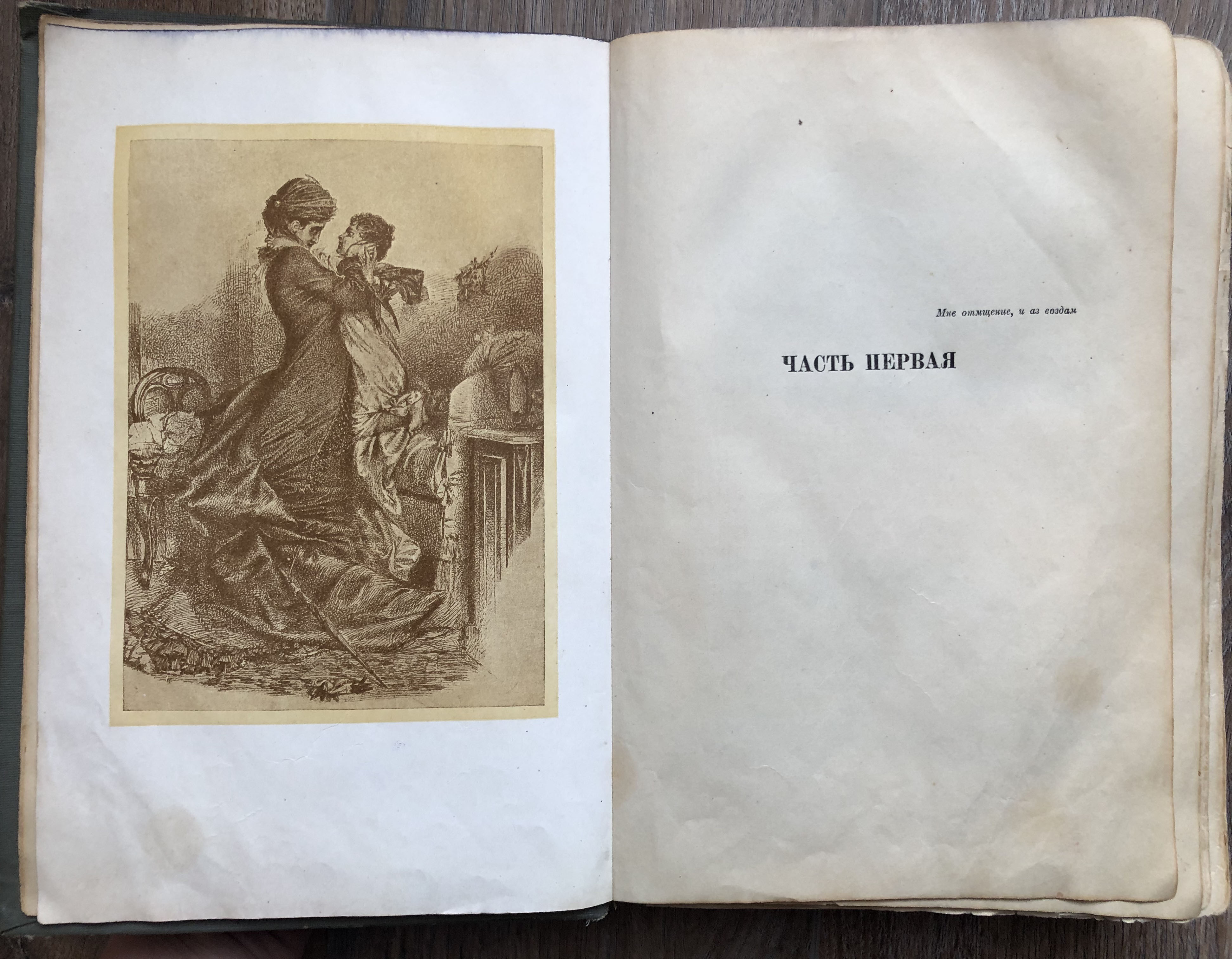
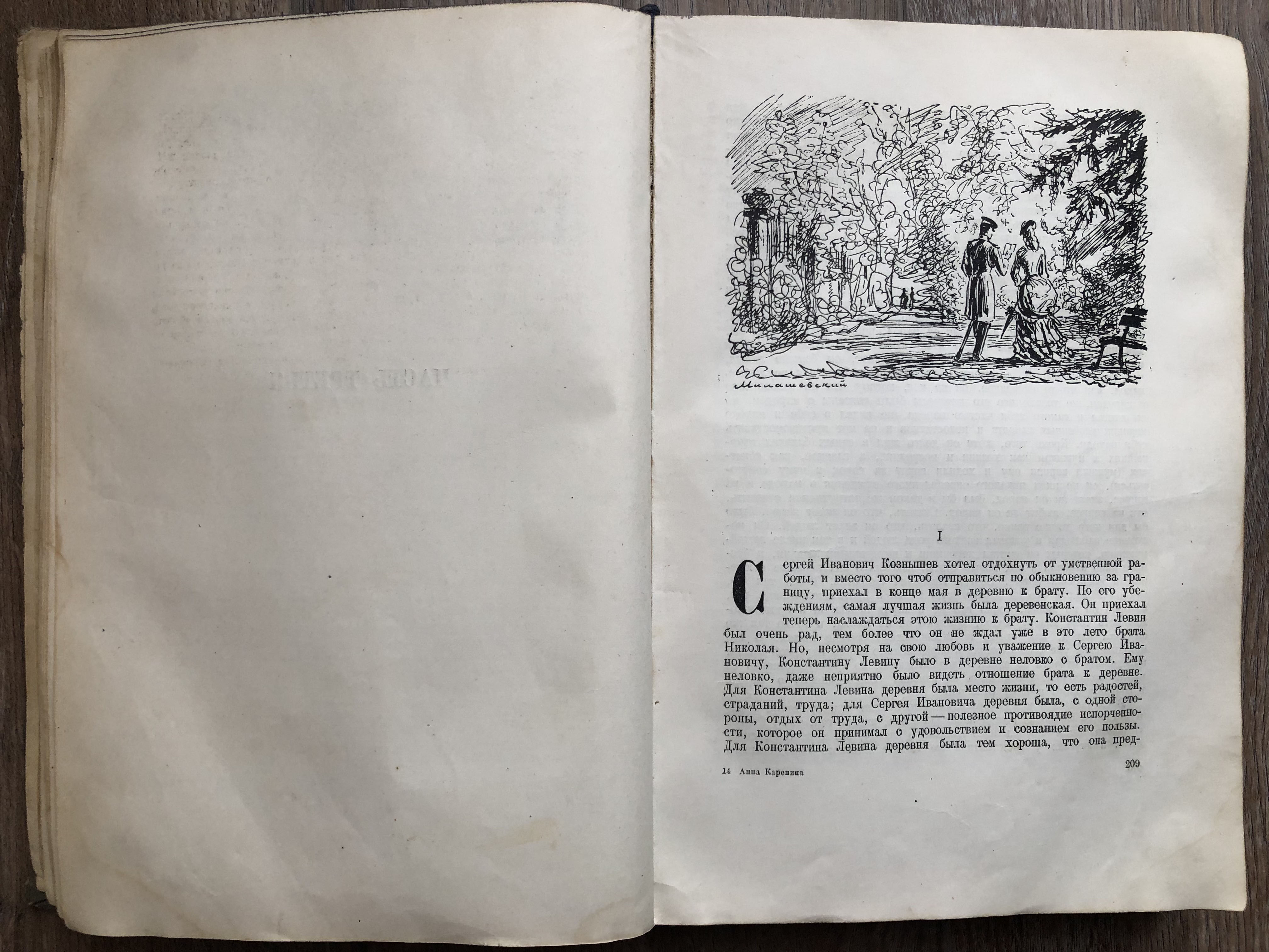
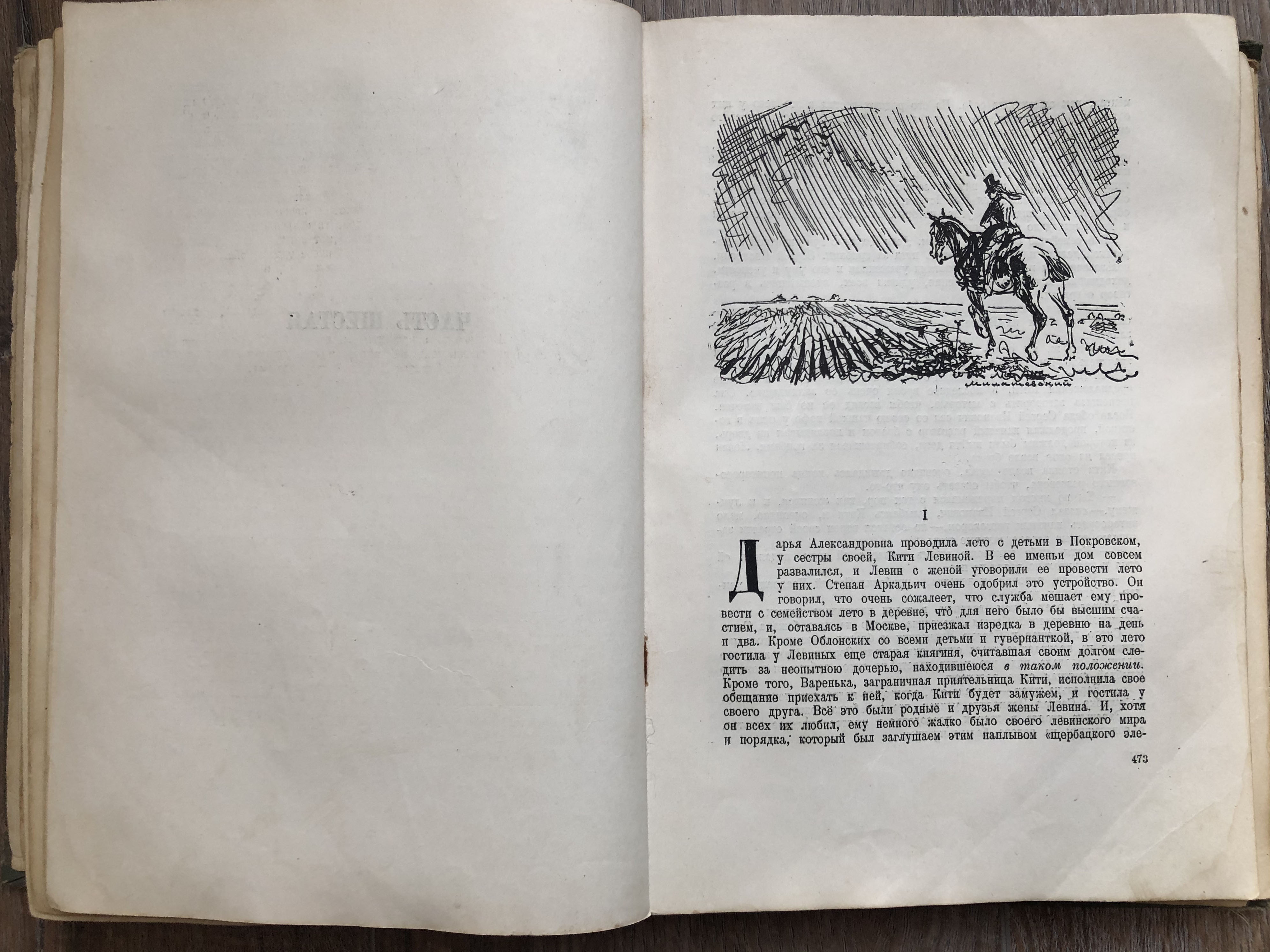
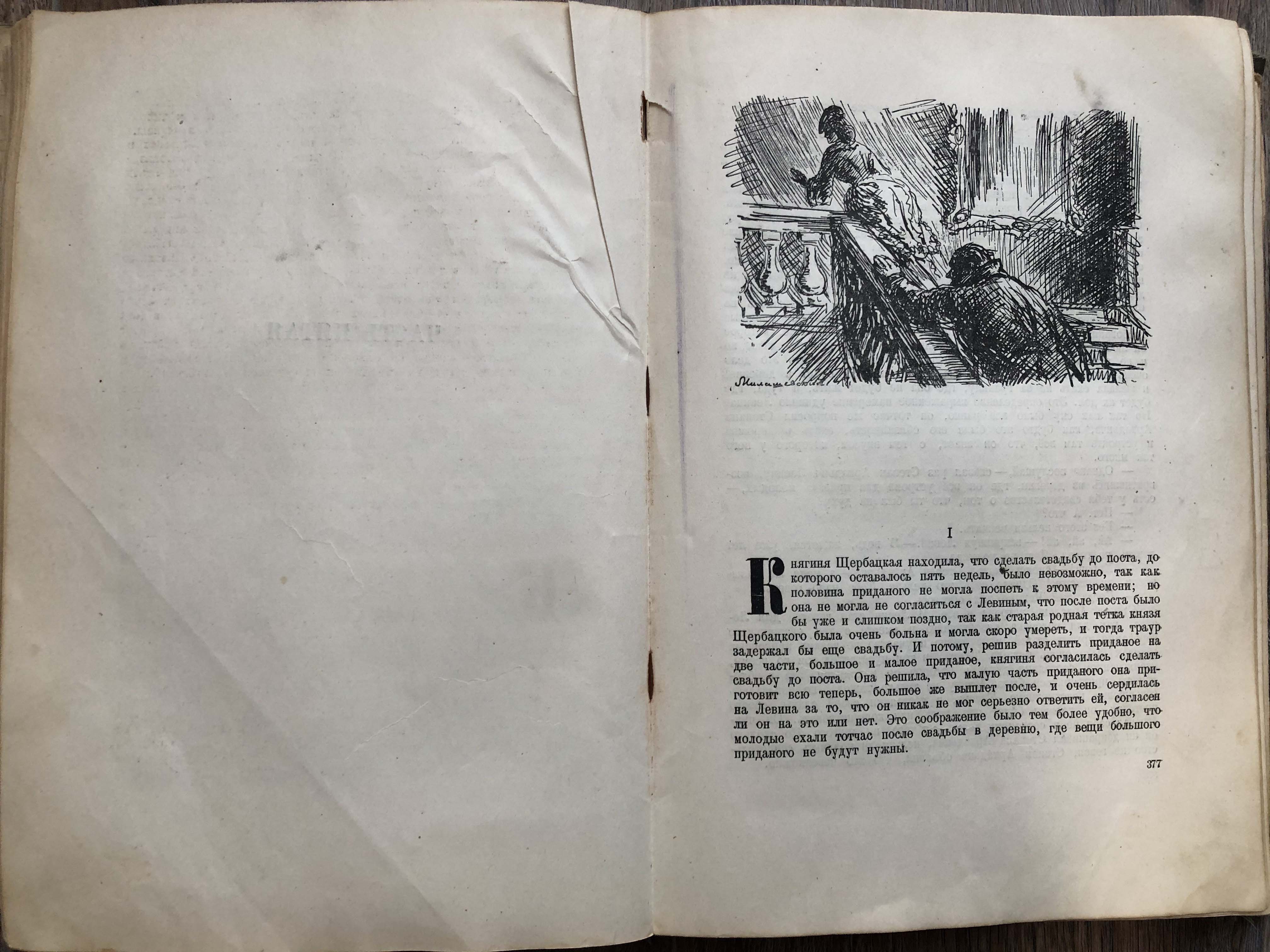
Fig. 3 Anna Karenina. Leo Tolstoy (1936) Home Library
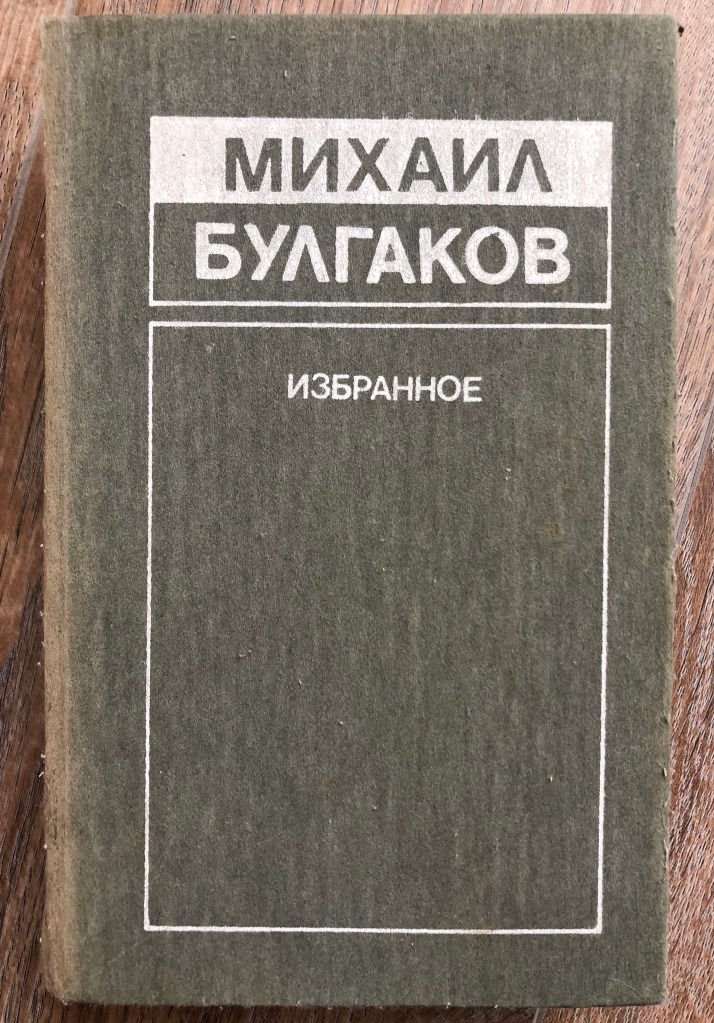
Master and Margarita. Mikhail Bulgakov
I read this copy of the Soviet Union Edition, when it was important to make the cover necessarily hardcover, with minimal decorative filling, and the colours of the covers also varied from dark green, burgundy, grey, the book was supposed to make a solid impression, without any tempting illustrations and registration. I confess I understood this novel only from the third run, the story is very deep and multifaceted, also thick, about 500 pages.
Sapiens. A Brief History of Humankind. Noah Harari
This is one of the modern books that I read about 3 years ago. I was attracted by the title of the book, it describes the theory of the origin of man on Earth, how evolution developed, it touches on parts of psychology, history and geography, and human knowledge. If you look at the design and design of the book, then the cover already has a more modern look, a paperback with a small illustration of a fingerprint on a light background. Inside, the author has placed several pages of B history museums and sketches, and the paper itself for reading the pages is whiter and smoother than the books I read at an earlier age.
Shantaram. Gregory David Roberts.
Although in fact, the novel itself takes place in more remote corners of Bombay, in the slums, the book tells the details of the gangster part of India.
Also an example of contemporary literature, a soft, catchy cover with a contrasting print. In general, I noticed that modern authors prefer to place some kind of image or photo, collage on the cover of a book. Restrained and monochromatic thick bindings are no longer as popular as they used to be. It is interesting for me to analyse this book in the sense that when you look at the cover and the beautiful title, the cover exudes a calm and cultural part of India, the Taj Mahal.


Fig. 5 Sapiens. A Brief History of Humankind. Noah Harari At: https://www.amazon.com (Accessed 24/11/2020) Fig.6 Shantaram. Gregory David Roberts. At: https://www.livelib.ru/book/1000329470-shantaram-gregori-devid-roberts (Accessed 24/11/2020)
Connection with global reach
To understand how the above books are related to books on a world scale, I first decided to look through the list of those very famous books. They turned out to be at least 100 works from the field of science, psychology, history, sociology and also classical literature. In the Mind Map, I introduced books that I was familiar with personally, with which I crossed paths in one way or another, according to the same school curriculum.
Walt Disney Big Dictionary translation of the famous American edition of Walt Disney Productions, 1971. One of the best picture dictionaries of the English language for children, based on the famous cartoons Disney characters speak English and Russian. The dictionary is compiled on a thematic basis and allows children to learn the words that their American peers master in the first years of their lives. I see the connection of this book with A Dictionary of the English Language by Samuel Johnson, considered the most influential dictionary of the English language. Credited as the foundational text for the study of the English language and lexicography, Johnson’s dictionary was not the first of its kind, but it was the most comprehensive and well-researched.
Robinson Crusoe. Daniel Defoe’s novel became a literary sensation and spawned many imitations. He demonstrated the inexhaustible possibilities of man in the development of nature and in the struggle against a hostile world. This message was very consonant with the ideology of early capitalism and the Enlightenment.
© Everett Historical/Shutterstock.com At: https://www.britannica.com/topic/Robinson-Crusoe-novel
(Accessed 24/11/2020)
The name of the protagonist Robinson Crusoe has become a household name, a kind of “survivor symbol.” But was Robinson the first survivor of world culture? I can see the connection of this book with many films that were produced in modern times. But the origins of Robinsonade coming from the ancient story “Tale of Haye, the son of Yakzan”, which was written in the Middle Ages, in the XII century. Its author is the Arab poet Ibn Tufal. The book tells the story of a boy who has been living in the wild on the island since his birth. A lama helps him to survive, which feeds him with her milk. From the plot of this Arab story, we can conclude that the motives of “Robinson Crusoe” and “Mowgli” intersect in it. Many motives of “Robinson Crusoe” are intertwined with the story of Ibn Tufal.
Anna Karenina, novel by Leo Tolstoy, published in instalments between 1875 and 1877 and considered one of the pinnacles of world literature. Indeed, too many readers, including Tolstoy himself, it signalled a radical shift in the already impressive history of the novel as a literary form. With its sweeping and complex plot lines, subtle characterisations, and blend of romance and social commentary, Anna Karenina is often mentioned in the same breath as Cervantes’s Don Quixote (1605) and Laurence Sterne’s The Life and Opinions of Tristram Shandy (1759-1767), both of which have permanently altered and defined the novel. Indeed, these books reset the standard for novel writing. In the final and tragic act of Anna’s suicide, readers recognise the theme that Tolstoy has been building towards: Anna’s love, like that of Shakespeare’s Desdemona or Thomas.
The Master and Margarita is now recognised as one of the finest achievements in 20th-century Russian literature. Witty and ribald, the novel is at the same time a penetrating philosophical work that wrestles with profound and eternal problems of good and evil. By turns a searing satire of Soviet life, a religious allegory to rival Johann Wolfgang von Goethe’s Faust, and an untamed burlesque fantasy, this is a novel of laughter and terror, of freedom and bondage.
Sapiens: A Brief History of Humankind. The book surveys the history of humankind from the evolution of archaic human species in the Stone Age up to the twenty-first century, focusing on Homo sapiens. Harari’s concept of a “cognitive revolution” reminded me of he Origin of Species by Means of Natural Selection, Charles Darwin. This work by Darwin laid out the foundation for the theory of evolution. Since its publication, the book’s theories and observations have helped make life sciences what they are today. Darwin’s adaptation and evolutionary model still aid modern scientists as they build a better understanding of all Earth’s species, including our own.
Shantaram is a novel by Gregory David Roberts, in which a convicted Australian bank robber and heroin addict escapes from Pentridge Prison and flees to India. The novel is commended by many for its vivid portrayal of tumultuous life in Bombay.
Stepping away from stories about life in prison and instead focusing on books that have similar writing styles to Shantaram, The Alchemist by Paulo Coelho is undoubtedly a great book to read for lovers of Shantaram. The main plot is taken from European folklore: according to the classification of folklore plots by Aarne-Thompson-Uther – plot 1645 “Treasure of the House“. A typical representative is the English fairy tale “The Pedlar of Swaffham” (“The dream of a peddler”), as well as one of the episodes of “A Thousand and One Nights“.
Conclusion
The task in my understanding turned out to be very interesting and informative, I have always paid special attention to books and world literature, here you could find out the opinions of other authors, plunge into the research or fictional world of writers. So, thanks to a little research, I was able to draw a parallel of some of my favourite works with stories written in ancient times. So for myself, I was able to connect such works as Robinson Crusoe and Mowgli, or Anna Karenina with the works of Shakespeare, and in the bark of the book The Master and Margarita, there is a similar story of Faust. Hope my introductory research will help me with my first assignment.
Materials:
https://en.wikipedia.org/wiki/Robinson_Crusoe
https://en.wikipedia.org/wiki/Anna_Karenina
https://en.wikipedia.org/wiki/The_Alchemist_(novel)
http://sonic.net/~rteeter/grtinfluential.html