Further inform your understanding of paper and bookbinding by reading pages 165–180 of Alan Pipes’ chapter ‘ On Press’ available as a downloadable resource at http://www.oca-student.com/ Collect lots of different paper samples, and assemble these into a standalone book, or integrate them into your sketchbook. See this as the start of an ongoing resource that you can add to, and refer back to. Add notes to your paper sample book/sketchbook identifying the paper source, stock, and any reflection on the paper’s qualities. You may want to extend this investigation by exploring how your paper samples can be folded, combined, stitched, printed on, or bound together. Explore your samples’ physical properties by working with them, testing them out, and visually documenting the results of your research.
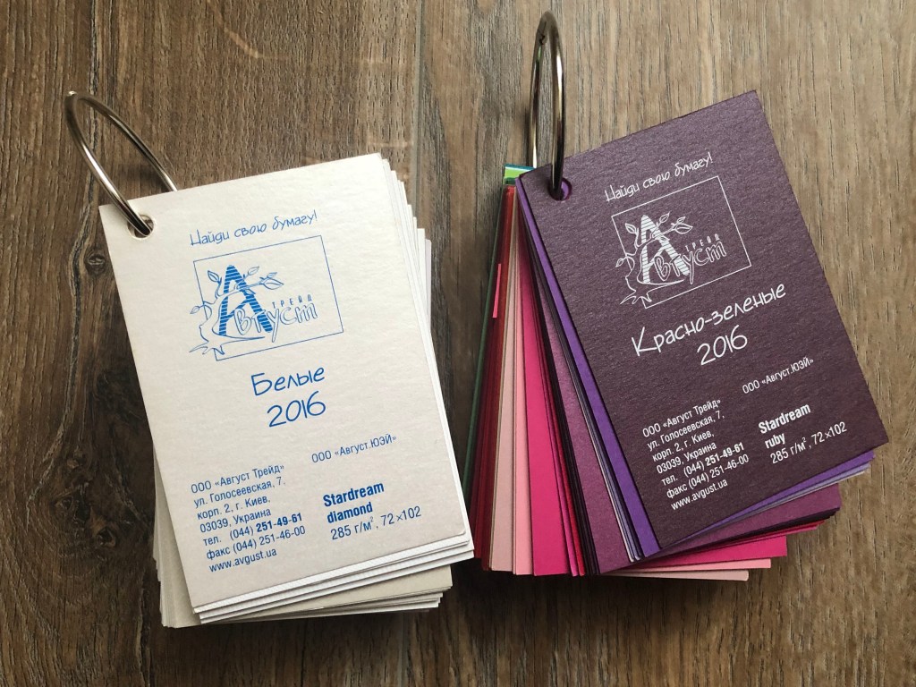
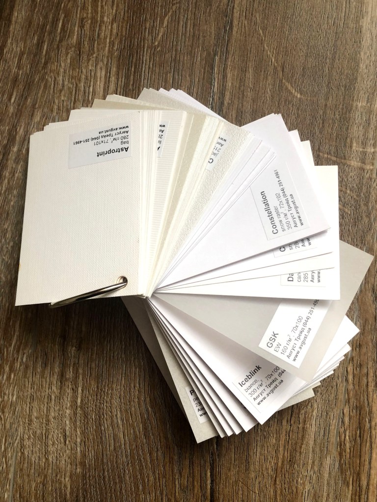
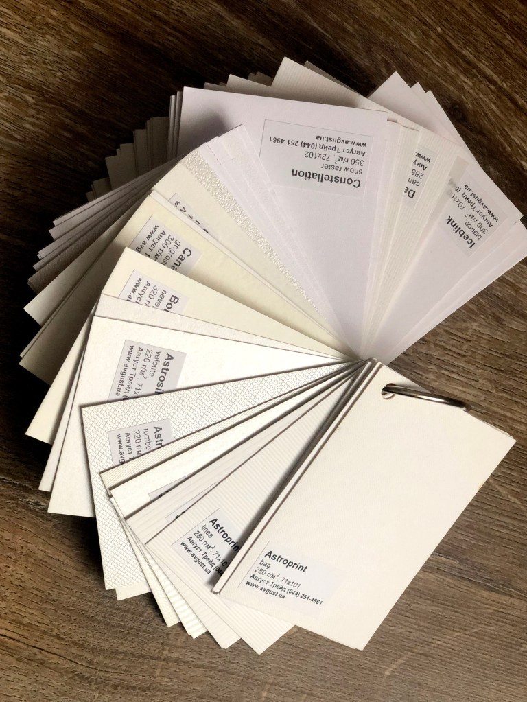
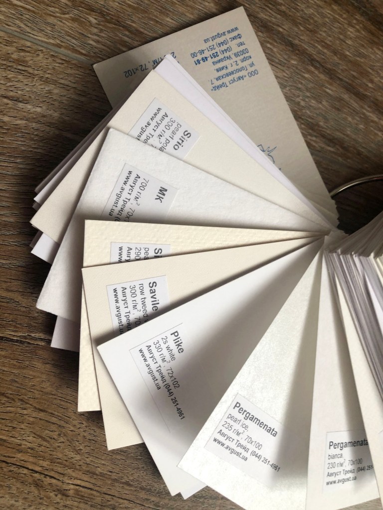
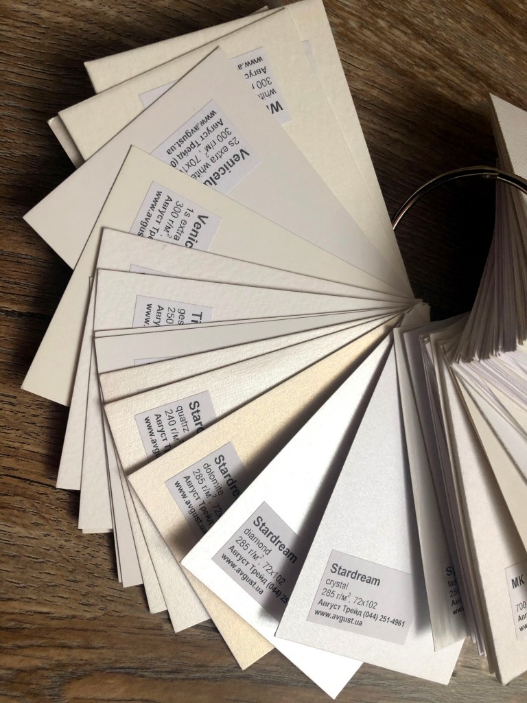
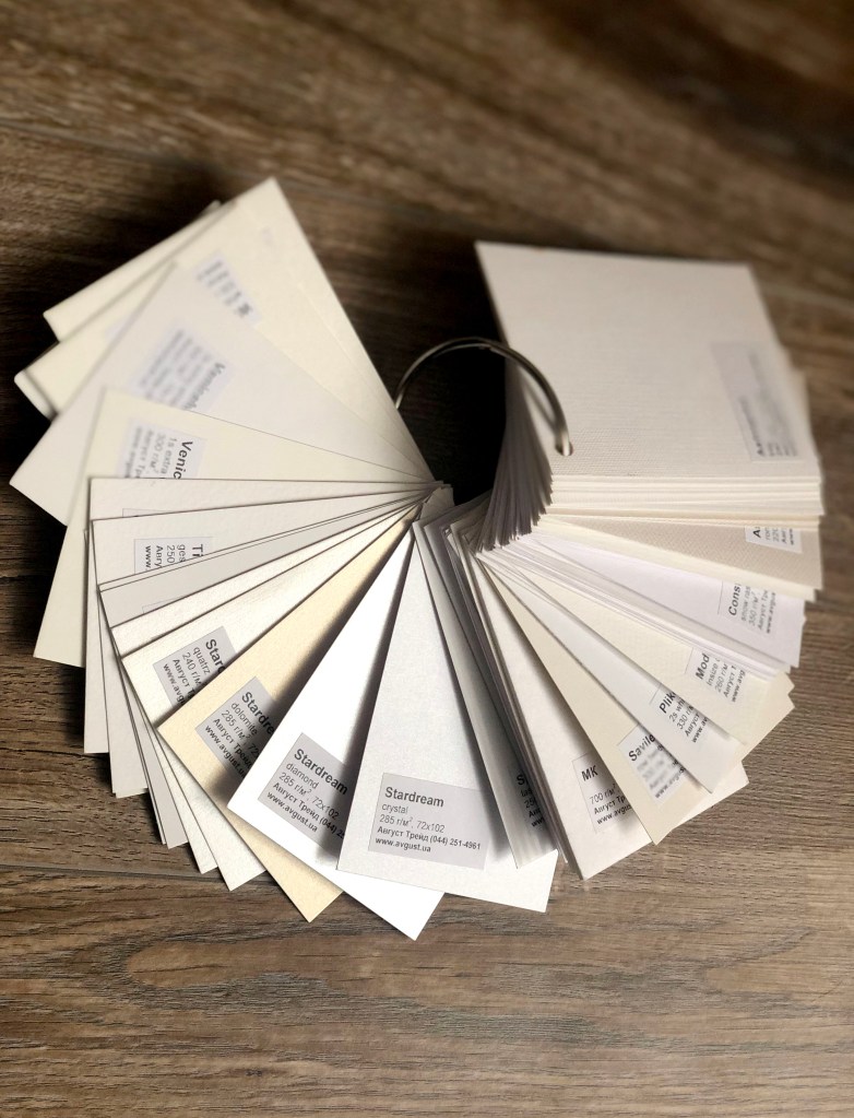
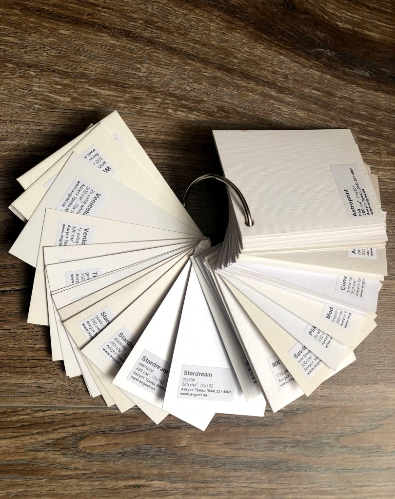
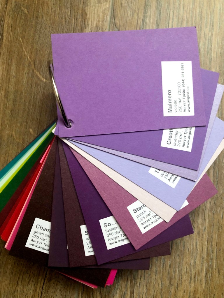
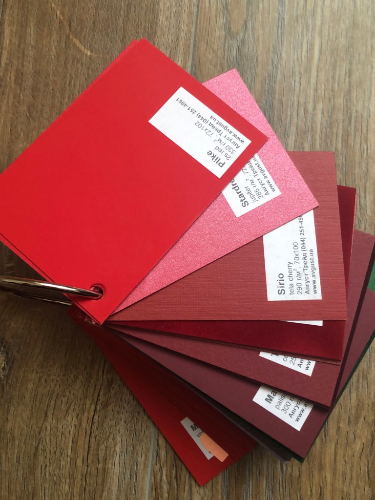
White examples of design papers
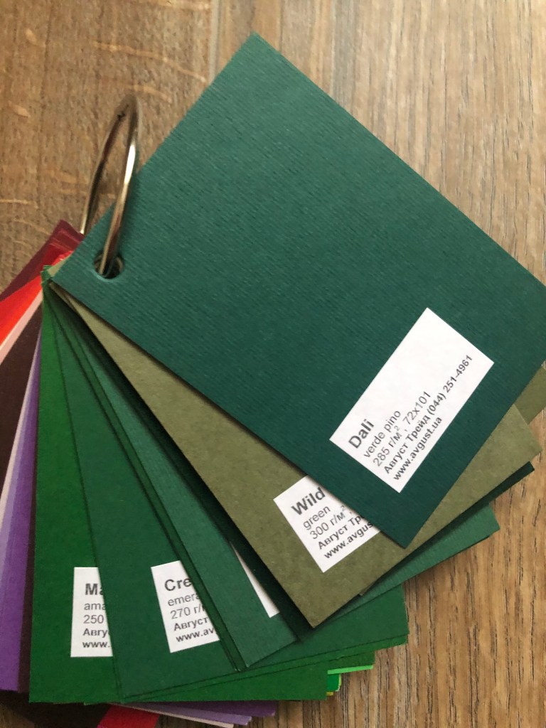
These are valuable examples of all possible textures of papers that typography market can provide. I borrowed them from my friend’s design department. I tried to take a picture of them in groups, that to see the difference between those papers. The density of designer papers is usually in the range of 80-350 g/m2, and for special purposes, factories produce papers from 60 g/m2 to 700 g/m2.
Most design papers are printing papers, and can be used in the common types of printing – offset, silk-screen, digital, letterpress, embossing – and all types of prepress and post-printing work. Each example has its unique texture and feel. Some of them I know quite well from my previous jobs, like wedding invitation cards, or events invitations. Design papers have so much texture on them, so printing is practically impossible on it, in a result I had to use a thinner layer of papyrus on the top of it, that to place a text on it. Some examples of paper have beautiful sparks on them and make them aesthetically pleasing to use that to create special moments.
From my experience the most commonly used papers usually were:
Stardream dolomite/diamond/quarz 285g/m2 (had beautiful shiny effect on it;
Splendor Gel EW 340g/m2 (very smooth and soft feel paper);
Plike 2swhite 330g/m2 (porcelain feel paper);
Pergamenta bianca/pearl ice 230 g/m2 (beautiful transparent paper for additional layer);
Constellation snow tela 340g/m2 (paper with some square lines on the texture);
Astroprint (have the widest variations for the texture, started from lines, honey comb, silk, sparkle types of paper).
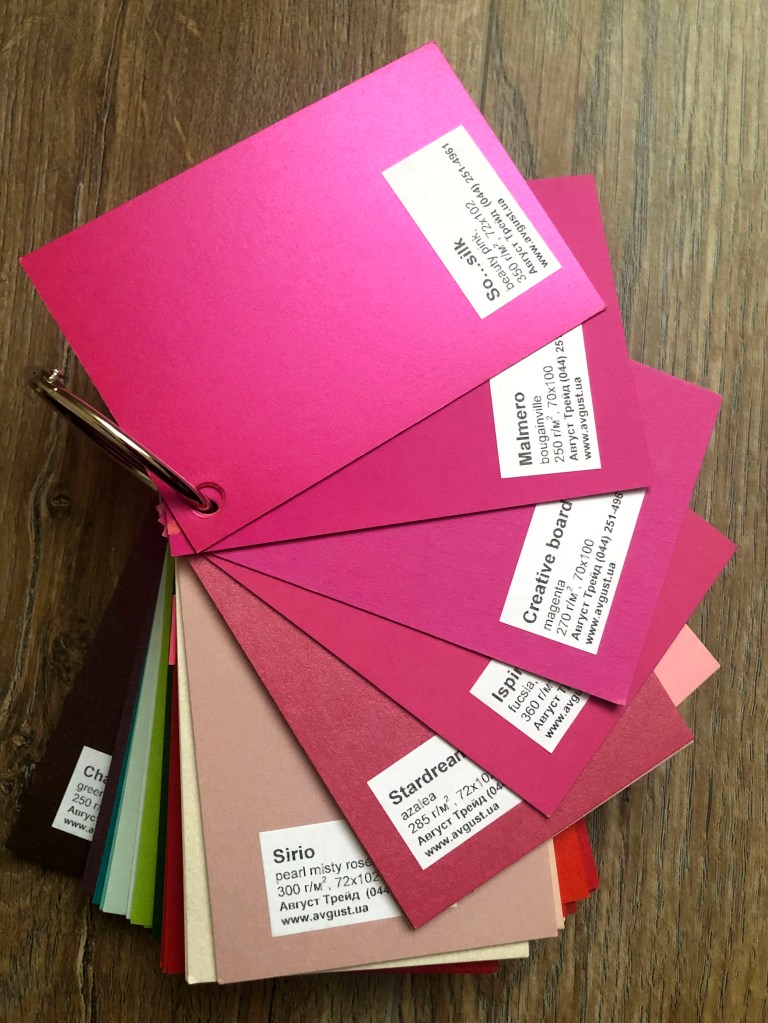
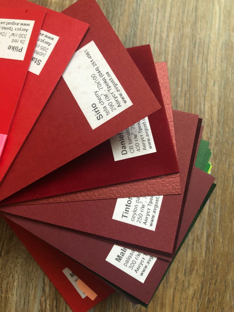
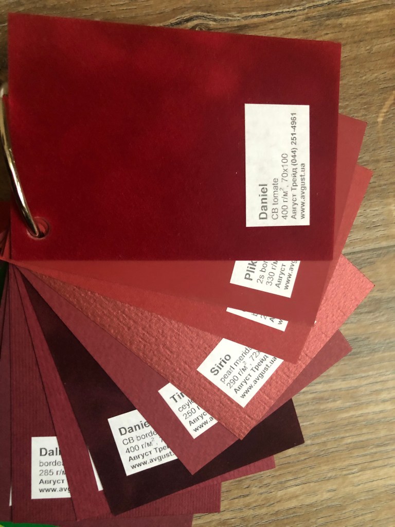
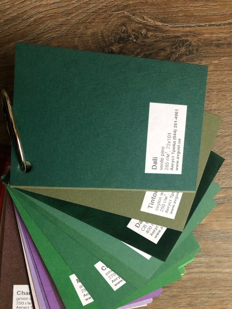
Colourful examples of designpapers
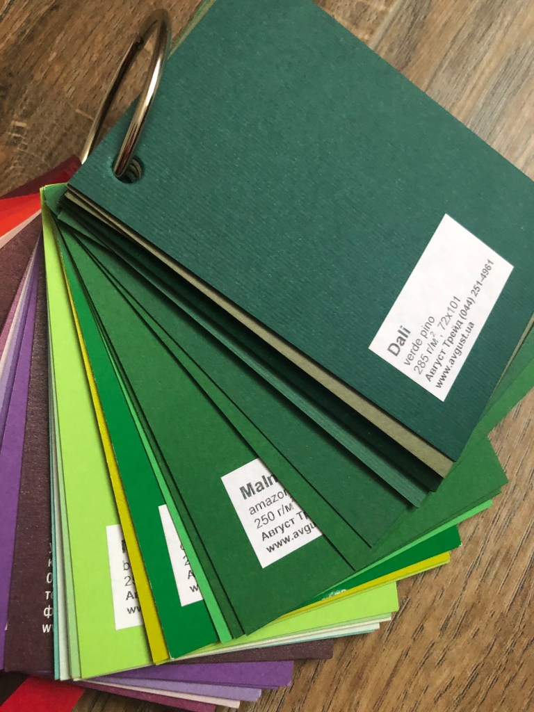
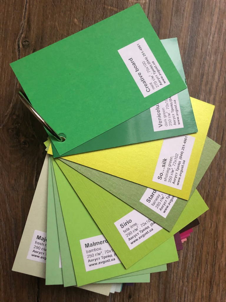
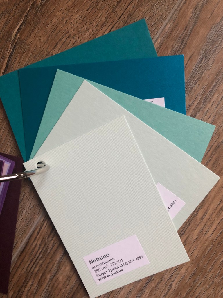
This colourful pack is quite valuable as well, as each paper had been coloured in a particular hue, and has a consistent colour for the creative designs. Most of the colourful paper samples coming from white examples, and even has similar names, but the difference is in code. Here is the example of Stardream paper in purple, pink, green, blue, ruby colours. Or bright and string colour of red Plike design paper. But at the same time, there are some unique examples that I’ve seen only in two colours, velvet feel Daniel design paper in red and green. Also there some pieces of So…Silk series of glamour green, pink, and green colours, – amazing samples.
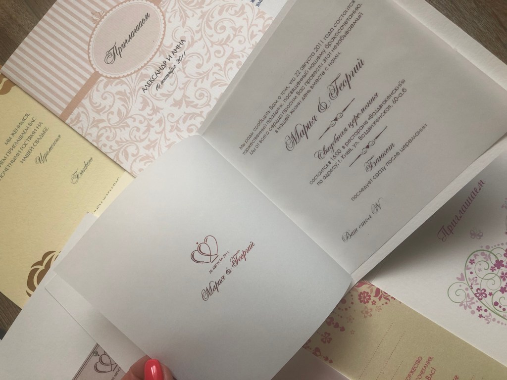
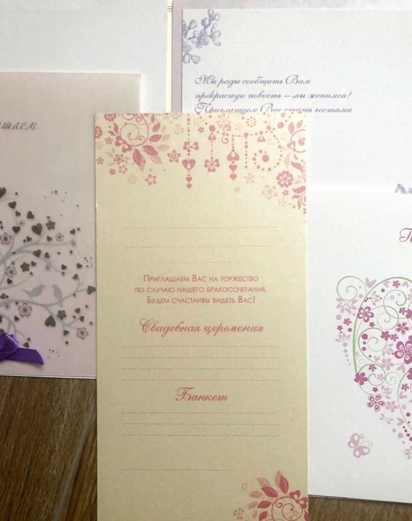
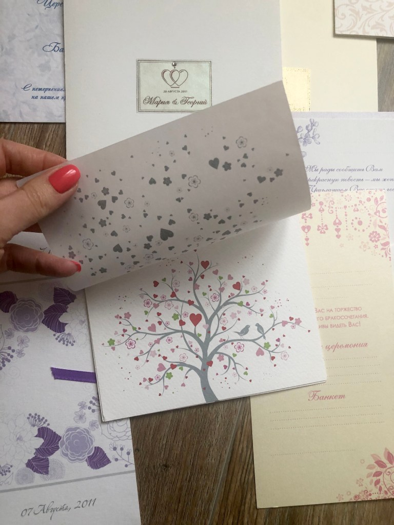
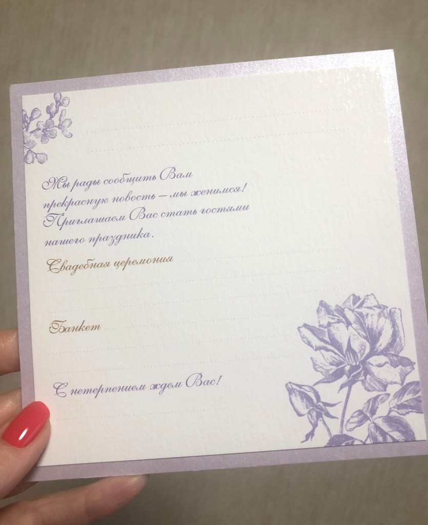
Examples of design paper
Here placed printed examples of wedding invitations I had in my portfolio. I keep them as a representation of how design paper can work together, what type of layers the designer can use. I showed that Pergamenta paper and thick cardboard paperwork quite well together. Some papers can be used only like a background or bottom layer for the card, like this dark blue sample, or some paper is sufficient enough, that to have a minimalistic design on it with only one or two colours.
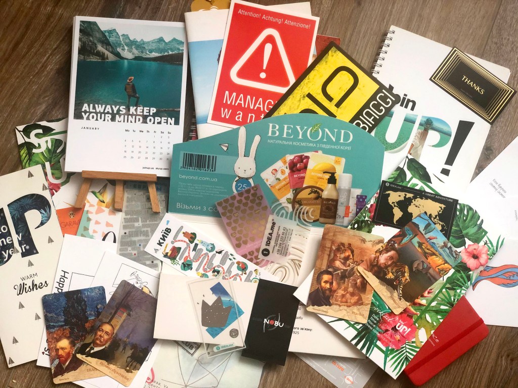
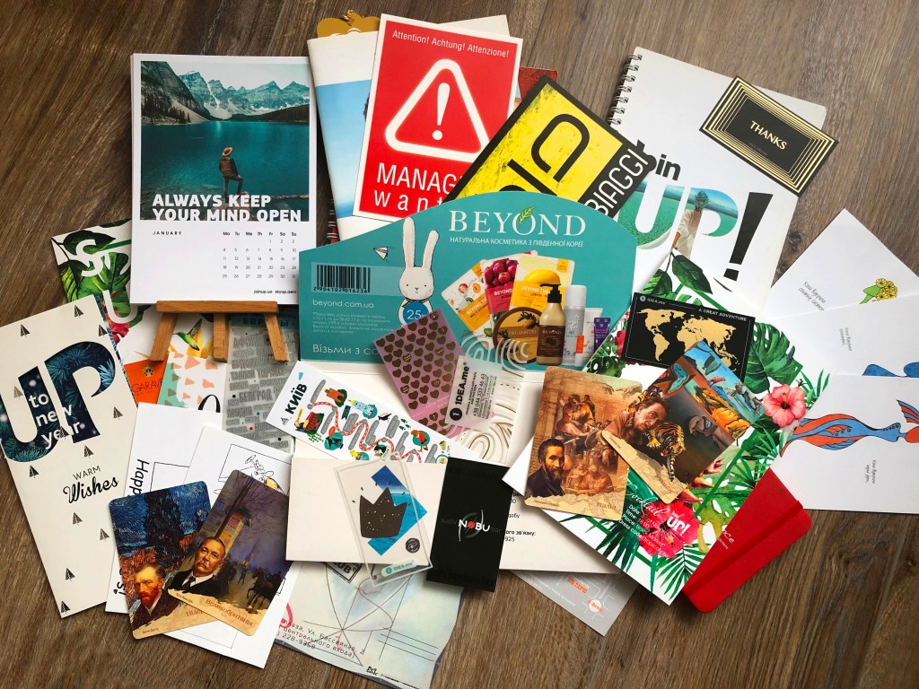
Printed examples
These are printed examples that I’ve been collecting for a while. It’s a small collection of different postcards, invitations, business cards, calendars and notebooks. This task gave me inspiration to collect even more works, as some of them could be out of time and I can relate to them in my future designs.
Hybrid printing from typography
Additional examples of typeof printing, when lacquer elements were used on the top of brochure paper.
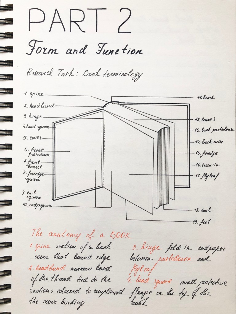
Familiarise yourself with the terminology used in describing the anatomy of a book and write some brief notes in your learning log on how the various structural elements could be modified to reflect the book’s function.
Identify a range of books that have fundamentally different functions in terms of how these books are engaged with – how they’re held, where they’re read, by whom, and for what purpose. Try to look at least six books, but you can extend this if you want to. The differences between these books might be determined by their genres. For example, you might look at a cookery book, a biography of a sports personality, a travel guide, a work of historical fiction, a teenage film tie-in like Twilight, this course guide – the choice is yours.
Think about how each book’s form reflects its function. The front cover is an obvious starting point (and the focus on your upcoming assignment) but try to look more broadly than this. Think about things like page extent, paper quality, typeface, the weight of the book, imagery and more. Is the book illustrated with photographs, reproduced images or drawings? Are these concentrated in one or two places or distributed throughout the book?
What about front matter and end matter? Historical novels like Hilary Mantel’s Wolf Hall may have family trees and/or a list of characters as part of the front matter. A scholarly biography will usually have many pages of end-notes and references.
Reflect on this in your learning log, with examples of some of the books you’ve selected. Identify how each book designer has reflected the genre and function of your chosen books in their final design.
The Age of Collage 2. Dennis Busch & Gestalten
The function of the book. A comprehensive collection of examples ranging from subversive to museum-worthy masterpieces. This book audience is people involved in art, graphic design, or photography. They could be students of art colleges or professional art experts to see the variety of juxtaposition and learn how this part of art developed, and who are the major influences in this field. When I saw this book in the art-gallery shop table with other art and design-related publications, it stands out for me, because of its size, a big heavy book full of images, and the paper is white and quite thick, so the images from another side of the page can’t be seen. I would say probably 70% of that book are pictures of collages. Book size slightly bigger than A4 24 × 30 cm, full-colour print, hardcover, 320 pages. The front cover. Hardcover with a slight texture on the top of it, so the feel of the cover is more similar to the matt surface. In terms of the naming, there is only a small name of the book on the side, all capital letters, san-serif font, even the name of the author of the book is absent, only the publisher name. The main point in this book is the collage art of the lady, which should attract a potential book buyer eye. Page extent. 320 pages. Front matter. Front pastedown and front flyleaf have joined a colourful image, made in red and white colours, just like a bright collage. The next spread has just white paper, on the right page the name of the book and the publisher name. The next three pages are introductory to the book, no such information as publisher details, logos or copyrights were not placed for the front matter. End matter. The same image as from the front matter, but with slightly rotated images. Flyleaf is quite thick, and I’ve noticed that pastedown pages like glued to the cover. I’m guessing it works like that for all hardcover books. The next spread has information only on the left page, it has the name of the book, editor names, type editor, the name of cover and book designers, and copyrights, with some certifications logos. The next spread has two pages of contents organised in alphabetical order with the name of the artists. Paper quality. High-quality paper, not transparent, so all images can’t be see-through on another side. Typeface. The typeface used inside of the book has distinguished difference from the standard books. It is a fixed-width typeface similar to Courier New font. The text columns are justified and have hyphens, also the space between lines is slightly bigger than automatic, which gives a free feel for the reading of the text, so it’s not a super strict traditional style book. The weight of the book. The book is quite heavy, so I have never could take it with me causally somewhere out of the house. It meant to be in the book library, or attached to the office. I think that caused by the card cover, the size of the book and the thick paper print. Imagery. The book is illustrated with photographs of collages and portraits. Images are distributed throughout the book, so each page has an image. The wording is not as important in this book, mainly it has a brief biography of each artist, but the main point here the artist’s works.
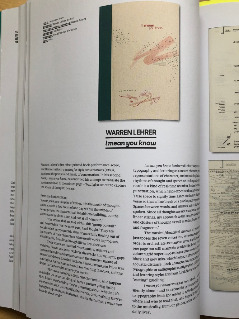
Type Tells Tales. Steven Heller, Gail Anderson
The function of the book. Type Tells Tales book that focuses on typography and the story that it’s expressing. This book orientated on graphic designers, publishers, and books related specialists for widening their knowledge in the design and purpose of the fonts used in art. Could be read at home, in student libraries for studying purposes, and for increasing the knowledge about the font as an independent object. The front cover. Softcover, paperback with flaps. On the cover page, only fonts were used for the name of the book, shown in different styles of typography, combined with the name of the publisher in the left bottom corner, and the authors’ name in the top central position. All design goes in the centre of the book, showing that font is dominant here. The size of the book 34 x 24 cm. Page extent. 224 pages. Front matter. This book have flaps on the front and back cover, so the designer placed book description text on that flap, which is quite wide, it has the prehistory of the book, and the number of illustrations (332). On the right side, there is a white page with only the name of the book in the black san-serif font. As the cover is soft paper, no such things as pastedown or flyleaf were used. The next spread is colourful, has the name of the book again, placed at the same position as the previous page, but also names of the authors and publisher name Thames and Hudson. The next spread is the page of contents, placed on the bright yellow spread. End matter. On the backside of the cover, the is a flap as well, and there was placed a description of the role for each author, and the list of books from the same writers, and the location that the book was printed in China. The next pages have such information as acknowledgements, copyrights, and website. For this kind of books, there are usually two types of contents pages, based on the chronology, and based on the name of artists in alphabetical order. Also, as this is a complicated design book, and had a page for the list of designers. Paper quality. Good quality clean white paper, more glossy on touch, not thin, all images can’t be seen through on another side. Typeface. Serif font for this book was chosen for this book. For each artist, there are descriptions in two columns, text block aligned to the left side with an indent on each new paragraph. No hyphens were used in the text blocks. The weight of the book. The book doesn’t feel too heavy, easy to take somewhere on the journeys, to have a casual read through. Probably that’s because of soft cover, and the number of pages. From my point of view, everything below 200 pages is fine to carry around. Imagery. This book as the previous one illustrated with printed examples of typography, mainly illustrations and drawings. As well as images taking most of the space in this book, on some spreads were used drawings and colours only. The purpose of the book to show the reader as many images as possible, with fewer descriptions, and that what I like about that kind of books, it is like self-analysis, and having a visual understanding of the subject.
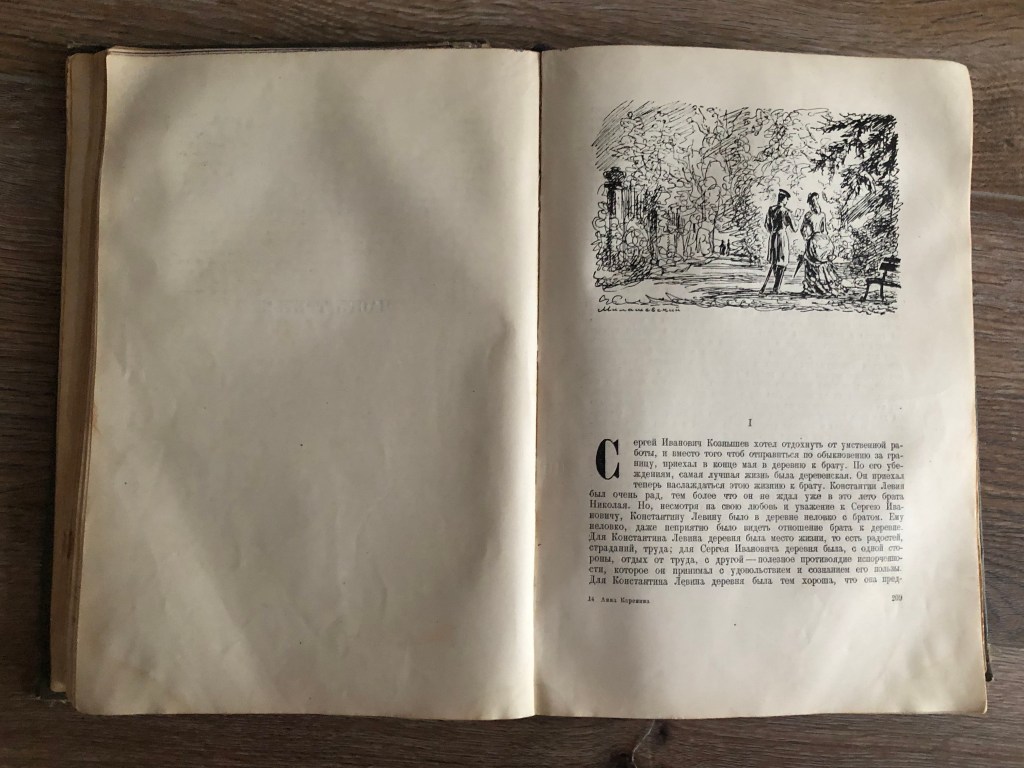
Anna Karenina. Leo Tolstoy
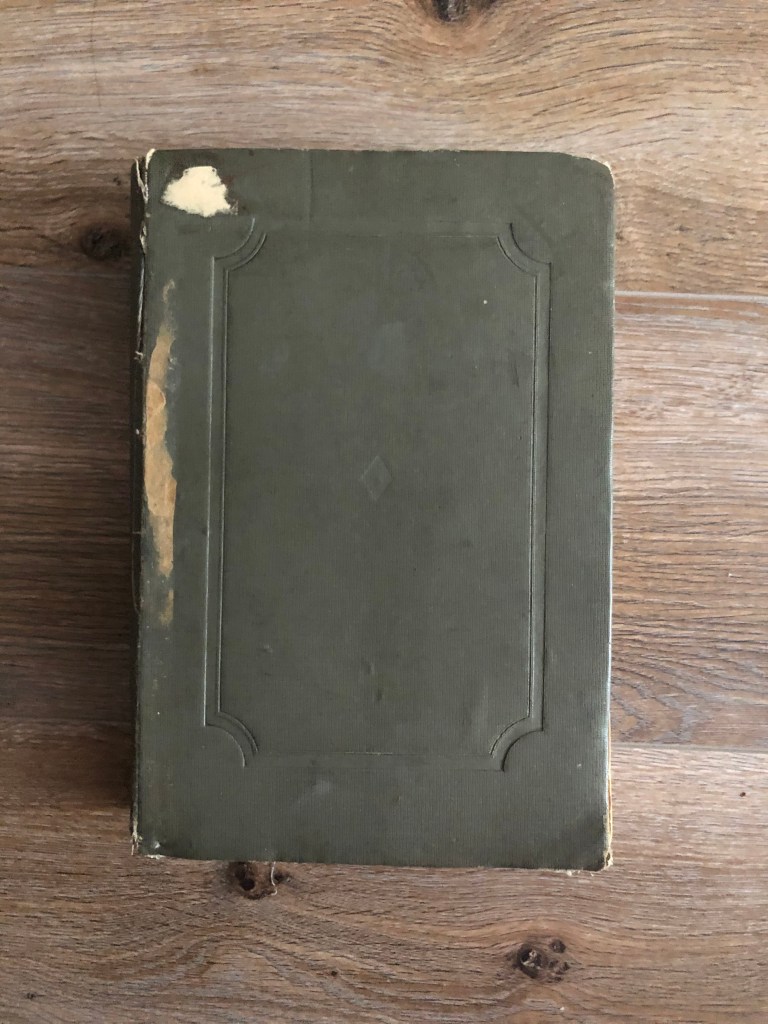
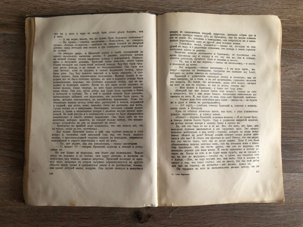
The function of the book. This one of my favourite book I have in my possession. Anna Karenina book published at 1936 with old-fashioned design and paper style. I think this book could be read by classical Russian novels admires, students at universities and colleges, mainly at library or for home read to learn the culture and history of Russia in the end of XIX century. The front cover. The cover of that book has the first association with older times publications. As this example is almost 100 years old, back in that times book was considered more like an object to read, but not to have a kind of marketing sales tool. Hardcover medium grey colour with some canvas texture on the top of it. No names of the book or name of the writer on it. That information was placed on the spine of the book, I think that is because that book was meant to be in the library, and didn’t have intentions to be eye-catchy, just a pure piece of literature for someone who loves reading. Page extent. 698 pages, plus 2 leaves in the end matter and 5 leavesfor the front matter. Front matter. The front pastedown page and front flyleaf paper are thicker but just blank. Next page on the right side the name of the publisher and logo, then again empty spread. The next spread has the name of the author, and the name of the book, years when the book was written, and the text editor name apart from the name of the publisher, and next spread is empty again, just with the name of the painter on the dust jacket. The next page is the pencil image by Mickael Vrubel of Anna Karenina and her son was placed on the left side and the number of the chapter. This book has the most pages for the front matter. End matter. Back pastedown and the back flyleaf are the thickest paper as well, blank white page, and next spread white too. But the next page I found quite interesting, as I have never seen it, it has the list of errors that the book have, with the name of the page, and line number for each paragraph. Also, on the left side of the spread, there is additional information with editor names, price, typography number, and other technical specifications. Also the page of content, with the name of the artist for the frontispiece. Paper quality. Can’t say for sure what kind of paper was used when it was first printed, but the colour of the paper turned into yellow colour, more like a vintage kind of shades. Some of the pages are falling, as they were glued to the spine of the book, but what’s positive about that, that book gives a feel of older times, that you can’t experience with modern books. Typeface. For this book was chosen classic typeface with serifs, looked like it was printed by a typewriter. The text blocks are justified, with an indent on the left side, obviously with hyphenations on the right. Those text blocks definitely followed the role of the golden ratio. The weight of the book. The book is very heavy, definitely, it was purposely made for the reading at libraries or home. Imagery. Practically no images were used here. I can say that approximately 10 drawings, one for each chapter. They all look like quick pencil sketches, but they are valuable images, that reflect the style of the book.
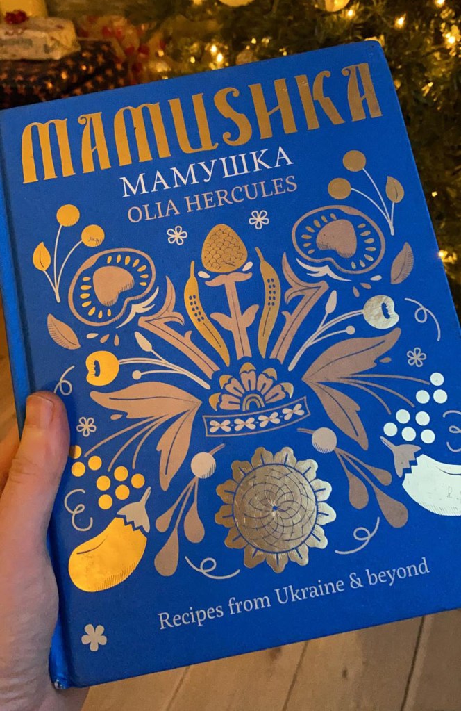
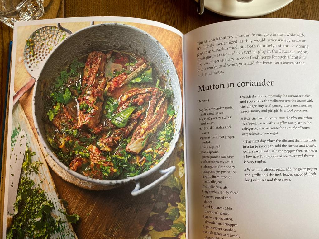
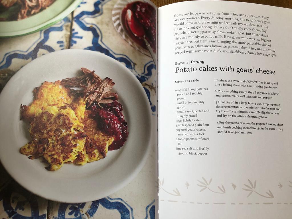
Mamushka. Recipes from Ukraine & beyond. Olga Hercules
The function of the book. Culinary book of recipes originated from Eastern Europe written by a London-based Ukrainian chef. Mamushka is a celebration of the food and flavours of Ukraine and the “Wild East”. I think this is a visual book for people who love experiments in cooking and high-quality book design. I really loved that book because of the professional images, good book design inside and obviously good food ideas. First time I discovered that book in the local restaurant, it was located on the shelfs, like a book to look through while people drink their coffee. Later we got that book as a gift, so now it takes place in our kitchen shelfs. The front cover. Hardcover made in beautiful blue colour with some traditional pattern printed in gold. The texture of the cover nice and smooth, with only some textural shapes around printed foil. On the the front cover the name of the book Mamushka was placed on the top centre position. Decorative font probably was designed specially for the cover, with the name of the author below. And some explanations to the book bottom centre. Page extent. 240 pages. Front matter. Has a beautiful spread for the front pastedown and front flyleaf with design on it, traditional Eastern Europe ornaments. Next spread has the name of the book with the same type of font as on the cover, but in the slightly painted cream colour paper and little photo image of sunflowers field on it. For the next spread on the left page all information about publisher, copyrights, web address, ISBN number, and on the right page again duplicated the name of the book with some family portraits on it. Additional spread for the contents, and extra family photos from around the countries. End matter. Has duplicated first beautiful spread with ornaments on it. And standard next spread with all information about copyrights, addresses, ISBN numbers, editors, designers. Paper quality. Paper has that nice textured feel, it’s not super smooth, more like deep coated paper touch. Typeface. The font for this book was chosen standard for publications, serif easy read font, aligned to the left, with free side on the right, no hyphenations were used in that text columns. The weight of the book. Not too heavy, but the hardcover definitely makes it heavier, than normal. I would say standard cooking book weight. Imagery. As that is a recipes book, it is full of food photographs for each recipe. Also on white pages were used some traditional grey patterns.
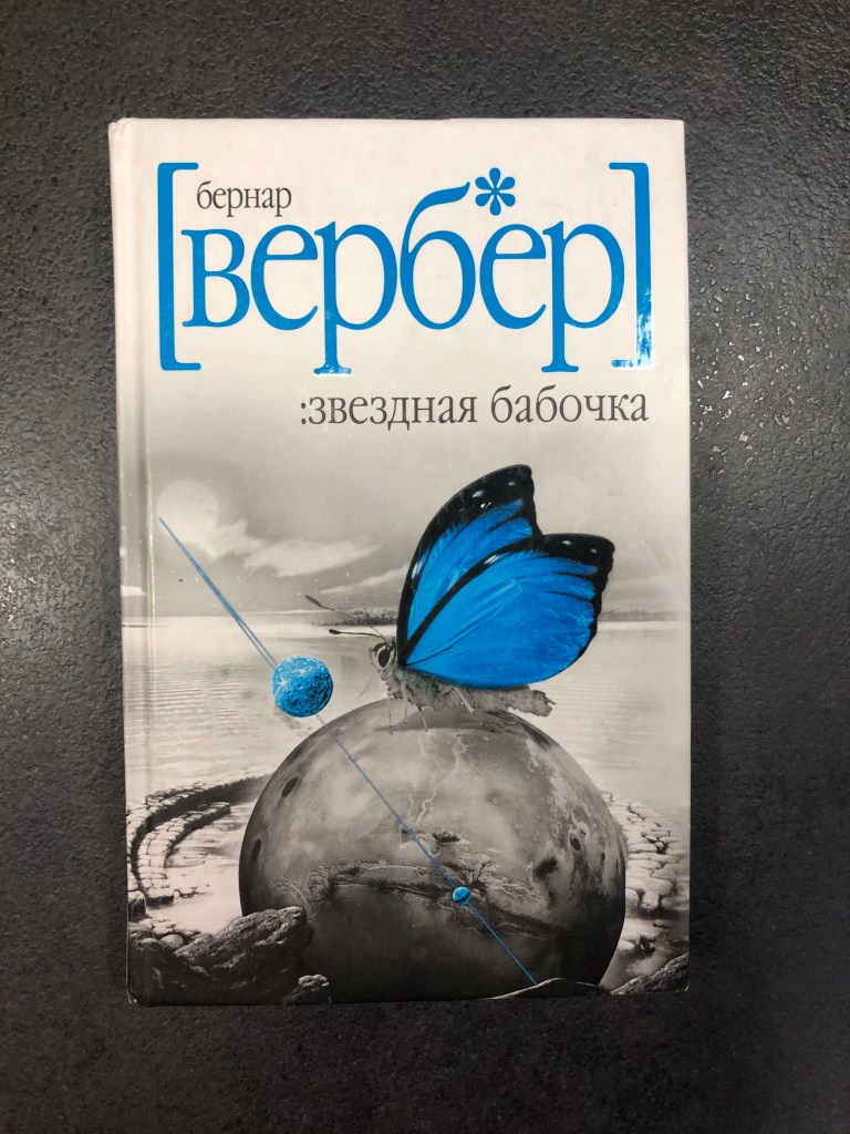
The Butterfly of the Stars. Bernard Werber
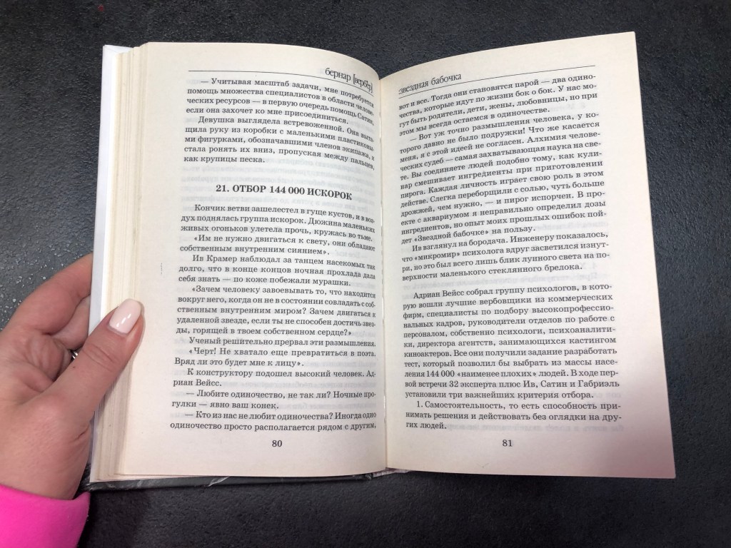
The function of the book. I think that is the kind of book that younger generations could read, or people who like fictions. It describes a generation ship under the form of a long rotating cylinder, with 144,000 people leave Earth to travel to an exoplanet. It has some clever philosophy ideas, but at the same time the story developing in the imaginary world. Ideal for people who loves fantasy stories. It doesn’t have any illustrations inside, just a plane text to read through. The front cover. White hardcover with grey and blue photo collage design on it. What’s interesting about the author and book name on the front cover, is that all letters are low letters, even the name of the author, which is like a part of font design. The back cover. Has the picture of the author, with a short story about the book, barcode, signature of Bernard Werber and publication logos. The dominant colour of cover is white. Page extent. 343 pages. For the front matter were used 6 leaves, for the end matter extra 5 leaves. Front matter. Front pastedown and front flyleaf are traditionally thicker paper than the rest pages, which are of the same quality. The second page has the logo of the publisher and city name. The next spread has the name of the book, in Russian and French languages, publisher name, and years published (different from French and Russian version). After on the left side page with ISBNs, copyright information, translator name, and for the right page the name of the book same as on the cover page, but with black and white colour was used. The next spread is blank, with some wording fo honour for the book, and the next spread is blank too, with the name of the chapter only. End matter. Same paper quality as from the front, thicker than the rest, next 4 pages with book adverts, some covers that has been released by the same publisher. The next 2 pages contain such information as the address where the book could be bought. After there is a page with the designer’s name, publisher names, web address and contacts. And next spread contains the list of books by the same author. Paper quality. Paper has that nice textured feel, it’s not super smooth, more like coated paper touch. Slightly cream-grey colour. Typeface. Standard serif font, column justified with hyphenations. The weight of the book. The book is quite light, because of it small size 13 x 21 cm, I could put in your bag that to read somewhere in the public transport on the way to work. Imagery. No images were being used, just a plain text.
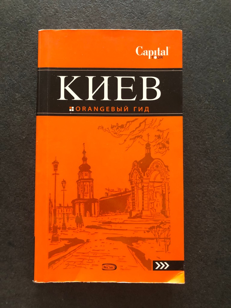
The Orange Gide. Capital Tour
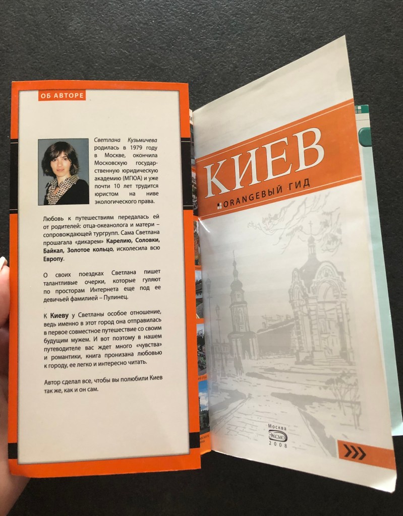
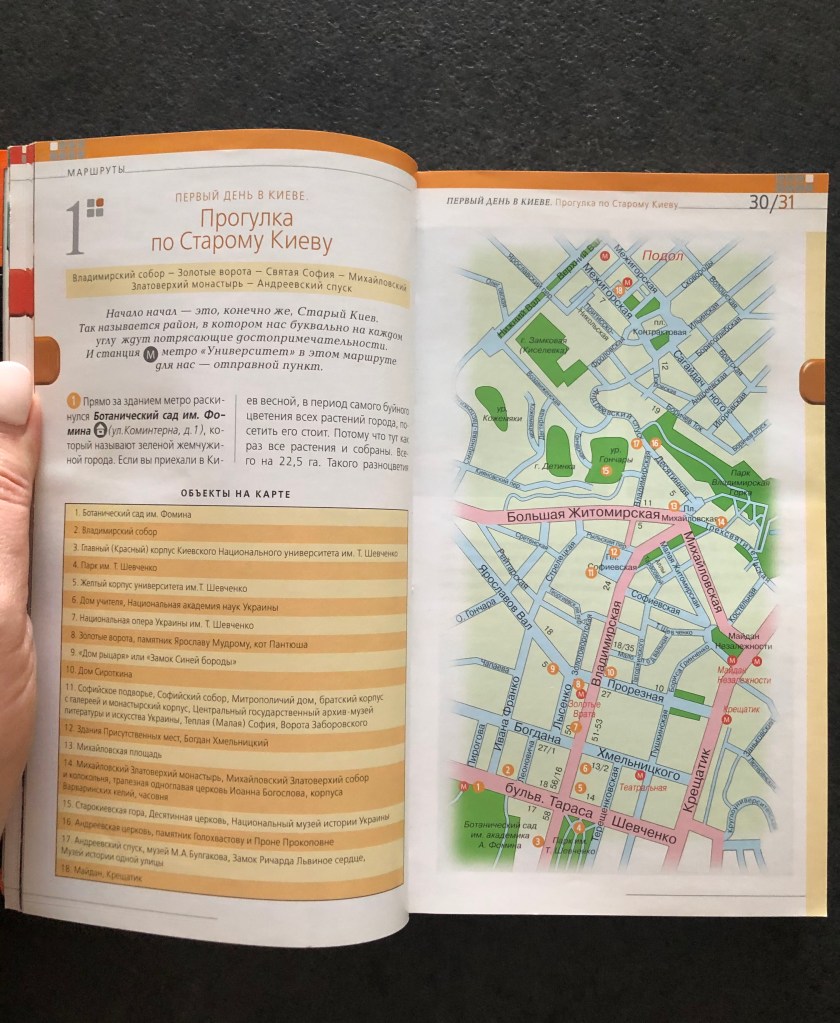
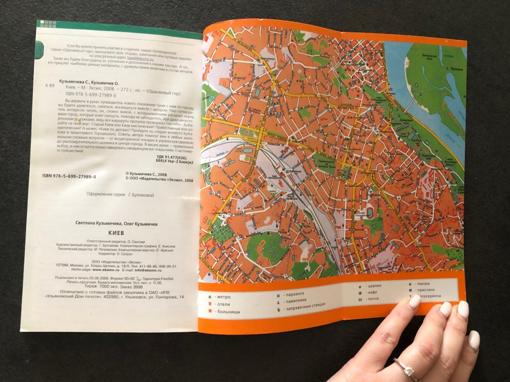
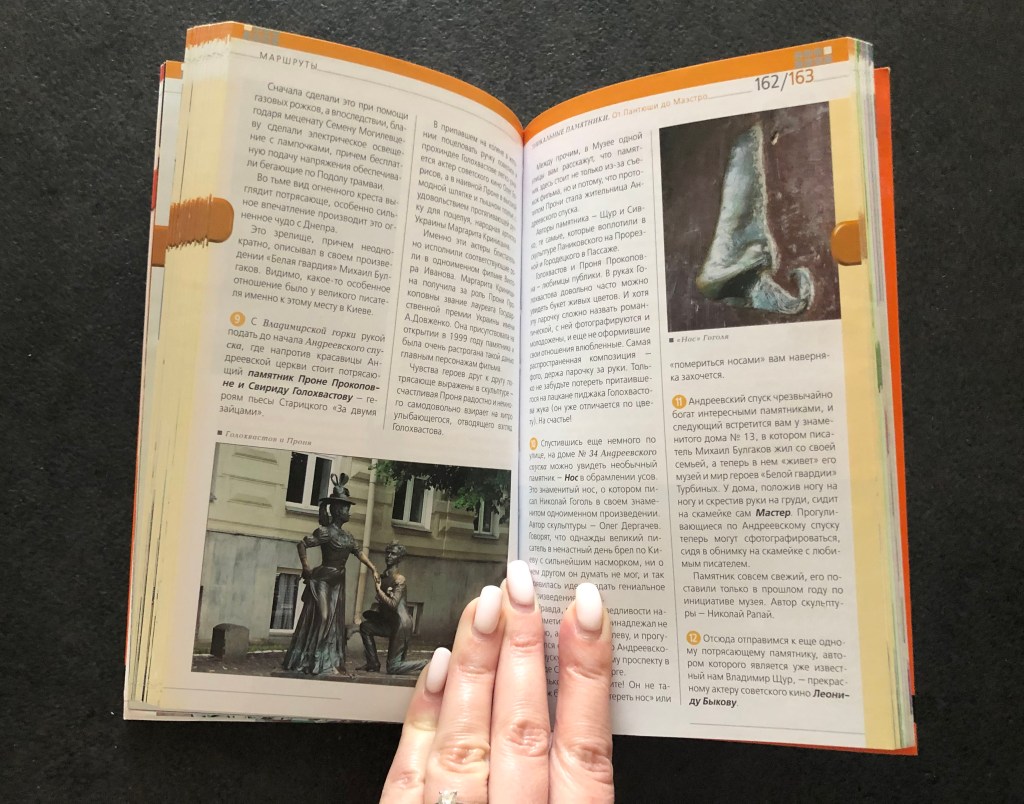
The function of the book.Travel guide book for people who visit Kiev city first time. The book is for Russian speaking travellers, it has all important city sites locations to visit, the list of the restaurants, museums and cultural spots, and underground map. Also it can be valuable for people who are interested in the history of Kievan Rus. The front cover. Orange softcover with flaps 9×19 cm, as big as the size of the cover 11×19 cm. On the front has lacquer design elements. Th front cover contain the name of the book Kiev, Orange guide, capital tour logo, and publisher Eksmo. The back cover. Has same flaps as the front cover. The back of the book has general description of the book, address of the project and barcode. Page extent. 271 pages. For the front matter were used 5 leaves, for the end matter extra 3 leaves. Front matter. First page has a duplicate of the cover page, but on the white background. On the flapper was placed the picture of the author of the book, and short description of her interest in Kiev as a tourist location. Rest pages has timetables for the places to visit and page of content. End matter. Inside of the cover was placed the map of Kyiv city, and for the flapper was used the map of the underground. So for the travel guide all space was sufficiently used, so even inside of the cover have important information for the tourist. As this is softcover, no flyleaf or pastedown. Only one page with ISBN number, the number of books that was printed, addresses, designer name, editor names and format of the book. Paper quality. Offset printing, coated paper. Typeface.San-serif font, 2 columns each page, justified with hyphenations. The weight of the book. The book is very light and handy, meant to be carried around the city in the bag, just in case for the tourists. Imagery.Has photos of the city sites and maps.
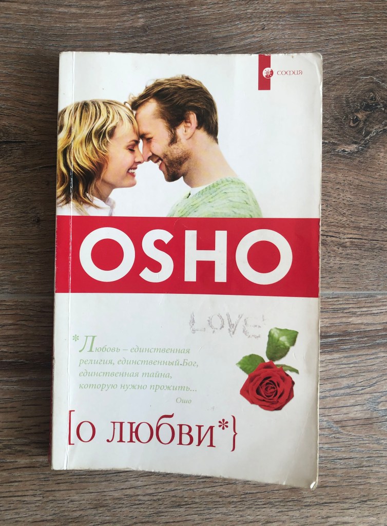
OSHO. About Love
The function of the book. Indian philosophy type of book for people who are looking for some answers about the love, and how to become free from negative thoughts, something crossed with meditation and yoga studying. This book was written based on the Osho’s conversations, so it doesn’t have a plot, the genre of this book reminds more questions and answers structure, similar to the interview. I think it was written mainly for people who are interested in Indian culture, to have some casual read to get distracted. The front cover. Softcover, with some gloss effect on the top of it. The dominant colour is white, but with it has some collage with it. Looks old-fashioned as to my taste, I had this book for almost 15 years. The main highlighted point is pseudonym of the writer, in addition to that cover has the saying from the book, and placed in brackets name [about love}. On the top right corner little logo of the publisher. The back cover. Mainly white colour for the back cover, with a small image of philosopher, but the name OSHO still was being used. Also some phrases and quotes around, similar to the front cover really. Page extent. 281 pages, with 3 leaves for the front matter, and 4 leaves for the back matter. All pages same quality. Front matter. The first page is the same quality paper as the rest, it has duplicated location for the name of the book About love from the front cover. No such thing as pastedown and fly leaf on this book. What’s interesting, on the next was printed black and white duplicate of the cover page, also it has logo of the publisher. And in addition standard spread with ISBN number, copyrights, explanations to the book and year printer. On the right side the page of contents. End matter. Only two pages for the end matter, with address, translator name, corrector name, designers names for the cover and book itself. Paper quality. The book is quite casual, so the quality of paper quite low, very simple paper, with see through pages. Typeface. Standard serif font, column justified with hyphenations. The weight of the book. Very light book, it is very small as well, only 12.5 x 20 cm, similar to the copybook, or notebook, that someone can carry around. Imagery. No images were used.
Conclusion
I would like to say that exercise was quite engaging for me, I have never examined books in such details before, there were some facts that I’ve learnt from it. For example, I’ve noticed that for the classical books, or novels designs there are lots of spare pages for the front and end matter, with copyrights, and regular commercial information. The quality of the paper isn’t the greatest, I can see that publisher tried to save up on the printing, as books on sale don’t go as expensive. But for designer books, which far more expensive than a classical novel, the best quality of paper was used, complicated designs, and unique fonts. Front matter and end matter organised into different ways I can see creative approach, some artworks printed from the very first pages, and mainly there is information such as a content page in chronological and alphabetical order. I’m sure some knowledge that I’ve got from these exercises, such as attention to each part of the book, will be useful for my next assignment.
Based on your work from the previous exercises, think about how your designs within the context of the book. For example, visually explore how your artwork sits within the format of your A5 pamphlet – how the page might frame the artwork, how different pages sit together or how you might begin to develop a narrative across multiple pages.
This process might suggest new ways of presenting or developing your work. Think about how you want to finish your artwork, whether this is through typography, illustration, photography, drawing or another format.
Critique your work – what has the format of the pamphlet offered you, how might your ideas develop further, and how has your understanding of creative book design changed through this exercise?
Production
As a designer, you need to have an understanding of the processes involved in creating a book. Some of these processes remain essentially the same as in early books, for example, folding paper to form pages and binding these together to form a spine. The spine, like our own backbone, is structurally significant in that it holds the pages of the book together and allows us to open and read the pages.
For the purposes of your first assignment, your book will be based on a simple, fanzine-like publication. For the production, you will need to consider how you print or reproduce your content, what sort of paper you can use, how you will bind it, and importantly, how many copies you will produce. Even with a very simple black and white photocopied publication, you will need to consider how your artwork, and the structure of your content fits, with this mode of production. In other words, what are the possibilities and limitations of photocopying, and how can your design approach and artwork accommodate these?
Critiquing my work
That was a quite interesting turn for this part. When I designed this spread I didn’t think I would have to go back to it again. I thought that from the design point of view it was a good layout, and partly I could have inspiration for the future My Zine booklet. I loved that font I’ve discovered for the headers, the combination of red images with it, and usage of different size columns in one spread. I’ve noticed some disadvantages on that booklet, that I was going to correct. For example, little images on the right side needed to be bigger, as they practically disappeared on that page, they were too small. And I didn’t like the white space on the left side of the page under the text columns as much, the text definitely needed to go more down. As I was going to use this pamphlet for the A5 magazine page, I thought I could make the font bigger, and naturally, it will go slightly down. Overall, it was a good template to work with.
I found a book in my home library, measured the size of it and printed like a super-cover for it. That cover design turns out to be so bright and colourful, didn’t expect that at all. The collage approach I used for this cover could be useful for My Zine design. I was going to borrow that style again, but with different objects. This book cover had a vintage feel, probably that was because of the dominant sort of dark green and brown colour. I was thinking about how to combine these two opposite styles in one piece, and I was looking forward to some interesting solutions for my future design.
There are two elements to this exercise – thinking about how you produce your publication, and making a smaller scaled down version as a mock up.
Creating a small mock up
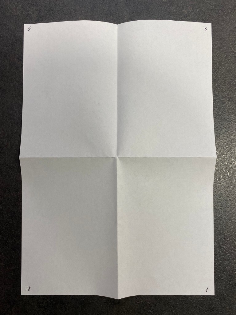
Printers use large sheets of paper to print multiple pages, which are then cut and folded. You’re going to use a simple A4 sheet to recreate the process of imposition and folding into ‘sections’ or signatures at a smaller scale.
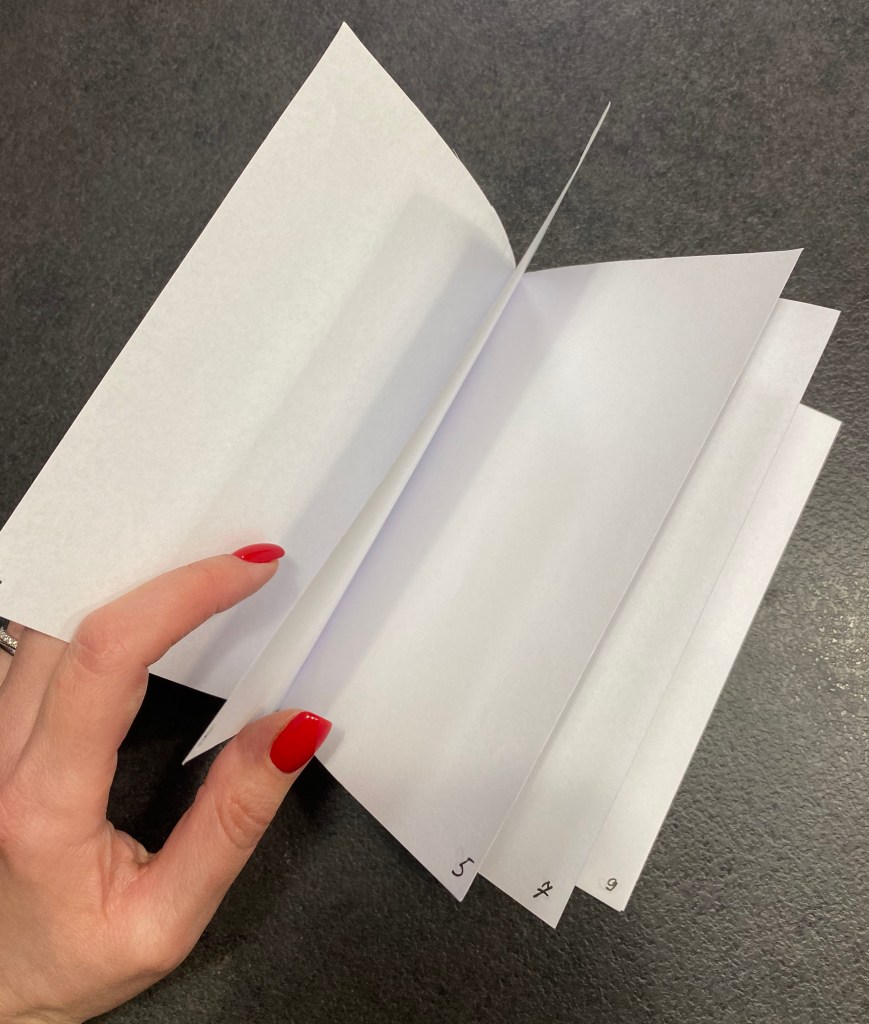
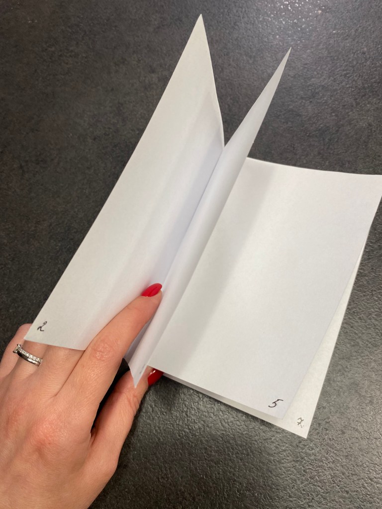
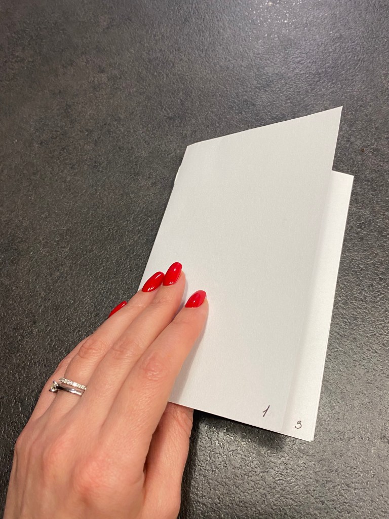
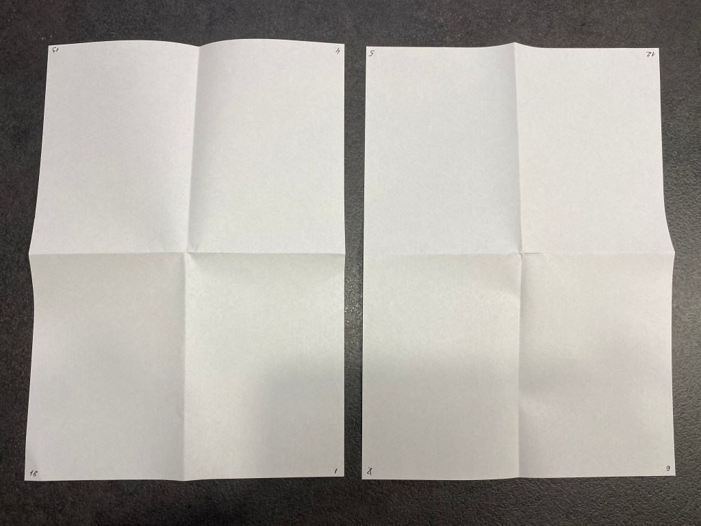
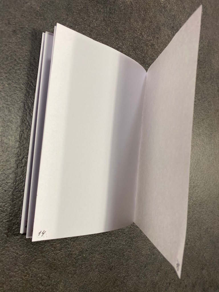
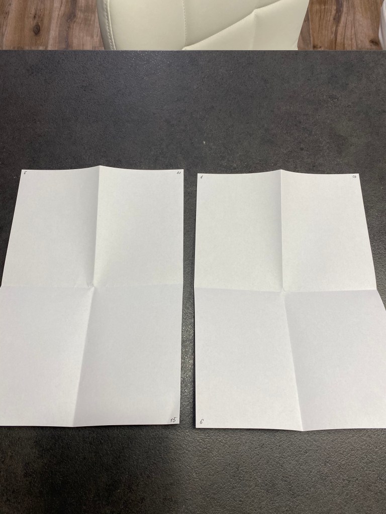
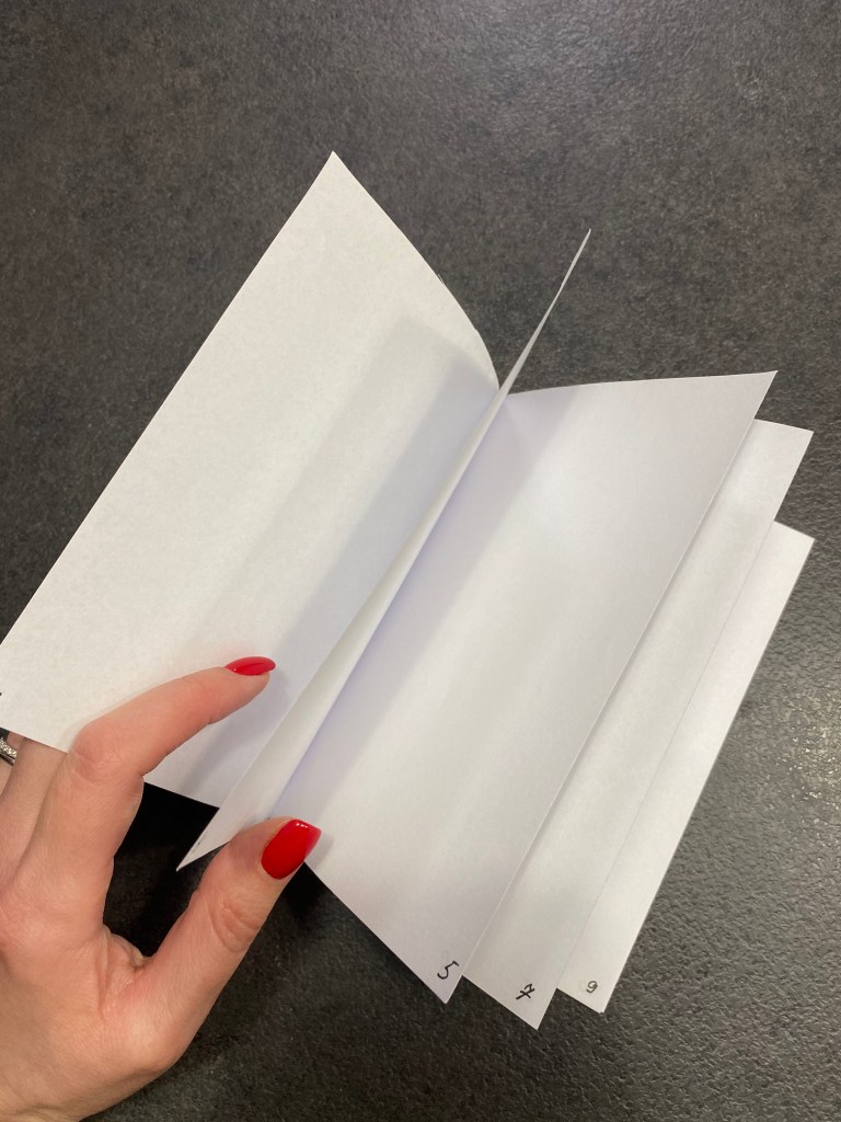
Fold an A4 sheet of paper in half, to create an A5 sheet. Now fold it in half again, so that you have an A6 size. This will comprise four leaves and eight pages. A page has a recto (facing) side and a verso (back) side. The terms recto and verso are also used to describe right-hand and left-hand pages in a double-page spread. With the sheets still folded, number the pages as they would read, from page 1, the front, through to page 8, the back. Now unfold the pages and notice how the numbers are distributed on the outspread sheet. This is a very rudimentary form of imposition, but the principle is essentially a miniature version of the same process within print production. By refolding your A4 sheet and then cutting the folded edges, you create pages, which can be stitched or stapled at the centre (gutter) to form a rudimentary book.
Books are constructed from folded sheets in this way, each one of which creates a signature. A signature is a section made up from a folded sheet which will create pages when guillotined. Signatures are built up in 2, 4, 8, 16, 32, 64 or 128 pages then stacked up in sequence and glued or stitched (or both) across the back edge to form the book block, which is then bound to the cover.
Creating a full scale mock up
To create an A5 pamphlet with 16 pages take four A4 sheets together, and with the sheets positioned landscape, fold in half. Stitching or stapling on the fold will secure the sheets and form your publication.
Additional pages can be added, but there is a finite number that can be slotted together before you notice how the folded pages start to stick out from the non-folded edge. This can be remedied by trimming the edges of your pages. For professional book designers working on large publications, this process needs to be taken through binding choices, and carefully adjusting page designs across the whole document.
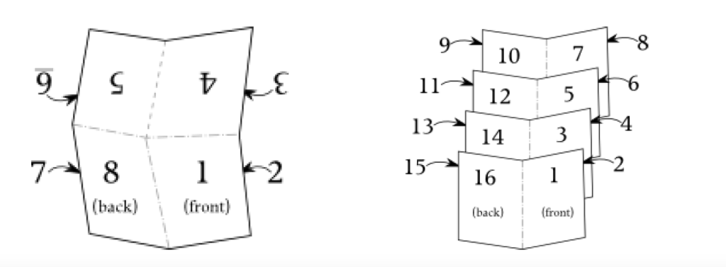
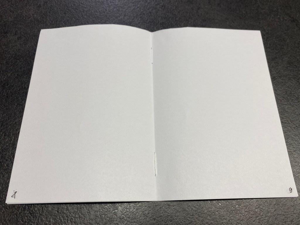
Number each of your sixteen pages from front to back cover. Unpack the document and notice how the relationship of the numbers on the front and back of each sheet. For example, 1 and 16 should be alongside each other, with 2 and 15 on the reverse. These numbers dictate where your content will go, and how this content needs to be printed, and are known as ‘printers pairs’.
Translating your DTP artwork, which has been produced in chronological order, 1-16, into the format needed to print your publication, is known as pagination. Commercially, printers often undertake this work, but as designers, it is also useful to understand how pagination works.
A simple way to approach this, is by taking the overall number of pages (often including the covers), and add one. So for your sixteen page booklet the magic number is 17. Go back to your mock up and add up your page numbers – each of your spreads should add to 17.
Critiquing and editing
Making decisions about which of your designs are the strongest is an important part of the creative process. Thinking about your designs within the context of a book can help spark new ideas, so the critiquing and editing of your work can initiate the start of a new creative process. With this in mind, don’t leave reviewing your work to the very end. It’s a good idea to test out your ideas within a book format as you go. This might mean seeing how your work is framed within a book’s borders, how content sits alongside each other on the spread of different pages, summarising your ideas down to essentials forms, or seeing how the turn of the page might start to build a narrative from one idea to the next.
Creating a small mock up
Following the instructions, I created small blanks of the book in miniature. Previously, I was present in the print shop, but mainly my role was to approve the design for the composition and colour correction of calendars and magazines. But in this task, I was able to see how DTP works with a small example. This task seemed to me fascinating because I was able to create mock-up books using materials at hand. Also, if I have to design a book, I could use this small layout for sketches.
Creating a full scale mock up
With this 16th pages book model I’ve got slightly confused. But once the puzzle was solved, from now and then I can see how multiple pages book can be created. What fascinated about book design, that pages in the middle of the book can be smaller than first and last pages, as when the book thickens, it can cause some pages sticking out problem. But designer should know from the technical points of view how to create the final products without errors.
Conclusion
This exercise was a good introductory into the internal printing process of the book. From that simple example clearly can be seen how printers creates multi-numbered pages products. For me, as a graphic designer, the structure of the InDesign software is only small process of the big process, and it’s vital to understand how the book printing works at all levels.
Firstly, review your visual ideas based on from the previous exercise through a process of critical evaluation. Which ideas are you drawn to? Which ideas have ‘legs’ – possible interesting outcomes which are worth pursuing? Often the ideas which are strongest are those which have depth, or many layers of association. Perhaps you are intuitively drawn to a particular idea. Select a few ideas you would like to push further. Use your learning log to record your thoughts.
Now, do you need to undertake any research to help move your selected idea on? The form your research will take depends on the individual elements of your idea. Find source material that helps informs your ideas. For example, by doing objective drawings or taking photographs, to understand your subject better, and to consider aspects of composition. You can use both primary and secondary sources of research in this way. Research feeds into the development of your visual work, informing and advancing your ideas. Document this phase of the work accordingly.
The developing your ideas stage is about building on your initial ideas by reworking them, adding the visual or other insights gathered through your research, and testing out different versions or possibilities. Spend 45 minutes developing the possibilities of one of your ideas. How many different ways can you visualise this?
If you want to develop a broader range of ideas, then repeat the previous exercise to generate more possibilities, potentially using a different phrase as a starting point. Use your learning log to document this process of review, research and development.
Visualising your ideas is the culmination of all your preliminary work in which you work up some more developed visual sketches and ideas. This artwork can be hand-drawn illustrations, photographs, and/or include typography. The presentation can be a little rough around the edges but should show the main elements of your designs. Select the strongest variation of your ideas from the previous research and development exercise to start exploring how you can visualise them within a mock-up. Use your learning log to document these research and development stages, and to reflect on the process and your results.
Researches
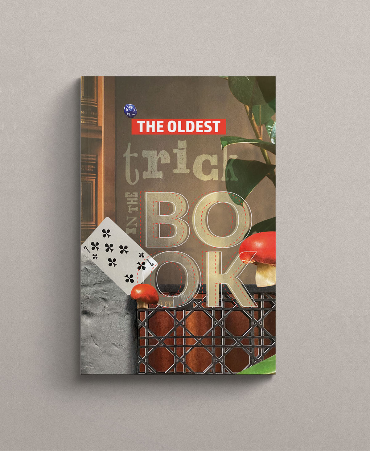
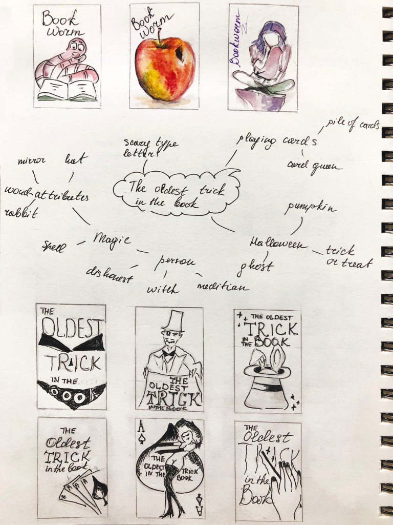
In my previous exercise, I developed a couple of ideas for British idioms like ‘Bookworms’ and ‘The oldest trick in the book’. Those sketches were done in completely different style, for the ‘Bookworms’ I tried to play with the shape of the book, I had a thought that I can produce 3-D kind book, maybe with a little worm sticking out of it, or create a book with a shape of the worm. But for ‘The oldest trick in the book’ I chose a different path, all book covers had the standard rectangular shape, but I thought that here I had more potential in discovering original ideas for the book cover.
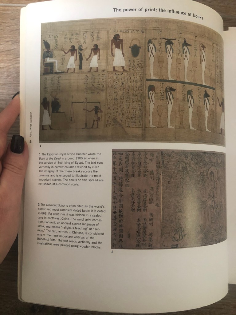
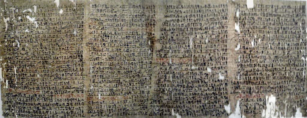
I had a wide range of different ideas for the old trick saying, ranging from the term illusion, card games, magic, Halloween tricks and others. I was thinking what if I try to make some researches for the most ancient sources tricks ever produced. It was the direction where I wanted to move on. I thought that I could do researches for the oldest trick in the world. A book by Andrew Haslam ‘Book Design’ became handy. The author described the most ancient book ever preserved by a human were the Egyptian papyri. Papyrus was used throughout the ancient world, with some samples of Egyptian, Roman and Greek writings.
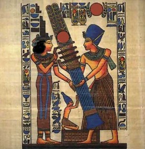
Some answers to the question what could be the oldest trick in the book I found it this little video. Which sounds quite fascinating. Someone called Dedi a fictional ancient Egyptian magician appearing in the fourth chapter of a story told in the legendary Westcar Papyrus. He worked wonders during the reign of pharaoh Khufu (4th Dynasty). Magical tricks that show animals being decapitated and their heads being replaced were performed as recently as a few decades ago, though today they are rarely shown because of aesthetical and ethical misgivings.
Some images from my researches about the oldest papyrus with Egyptian text containing stories about miracles and magic. Also the image of Egyptian magician Dedi.
I created two mood boards on Pinterest. One of them contains some objects and researches I had in Egyptian patterns and books in magic. For another mood board I created a selection of creative book covers. I hope that those major steps starting from sketches, then Egyptian mythology and creative book covers can lead me to the unique book cover design.
Pinterest Mood Board
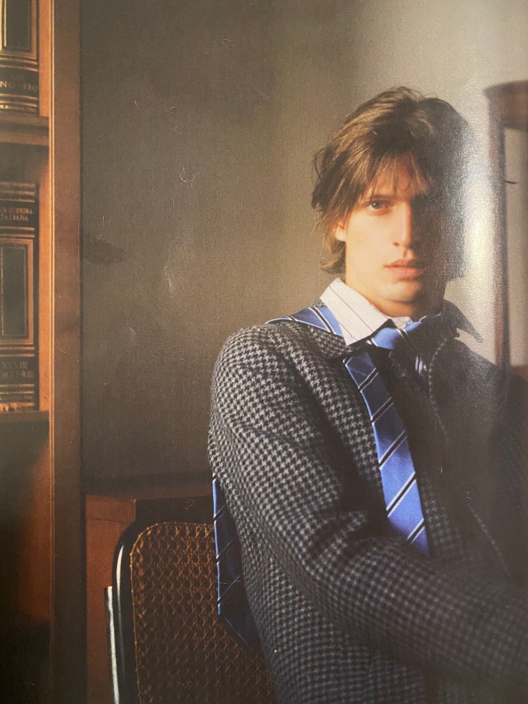
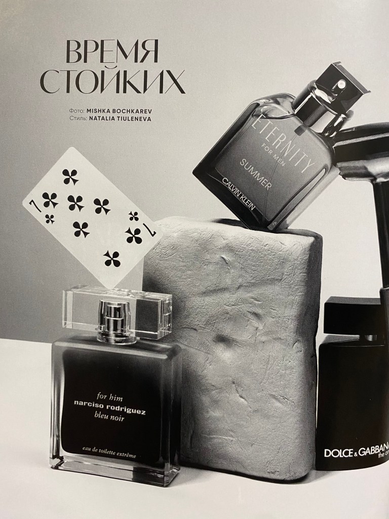
Vogue Man Magazine
I remembered that in my drawers I had some Vogue Man fashion magazine with some interesting photographs made on brown, warm mood colours. I decided to go through it and took some snaps of pages that I could probably apply in my designs. I loved those wall colours, with some old book covers on them, they had a right colour direction for my book cover. Also I paid attention to the picture with old stone and playing card next to it. In addition I could probably use the pattern of the fashion bag, as a texture for the book cover. I thought I can paste some of the elements into book design and create original collage from them.
Designs
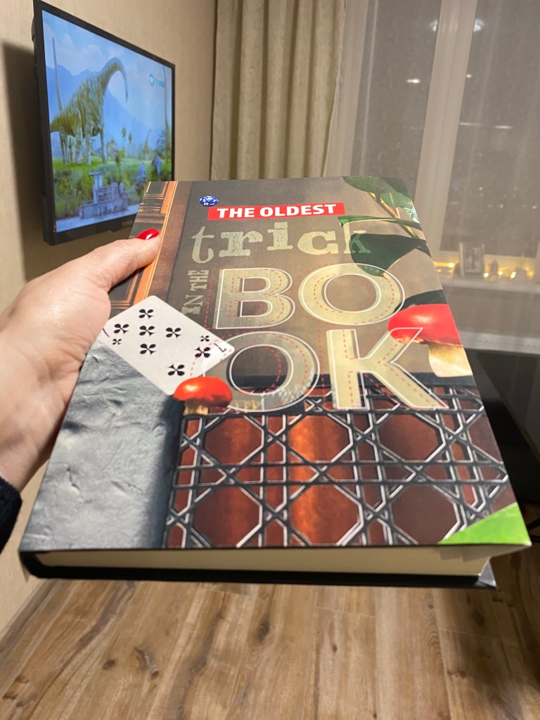
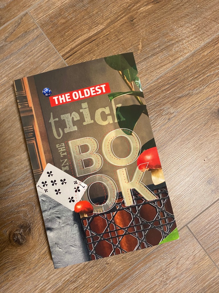
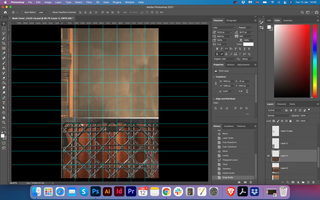
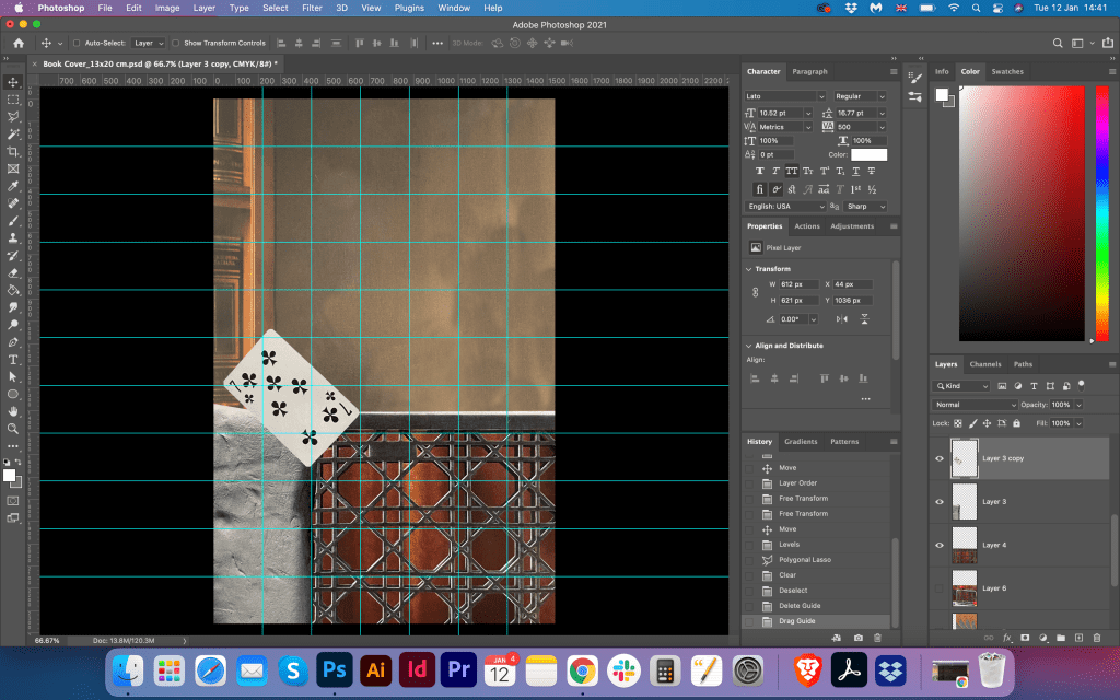
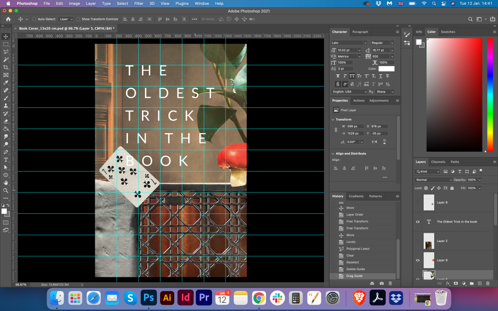
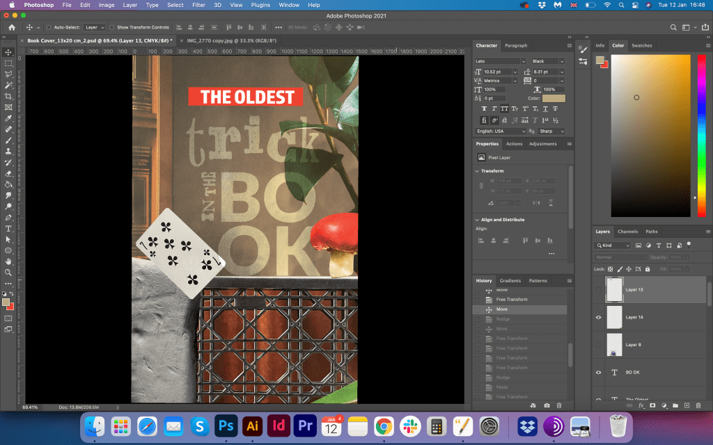
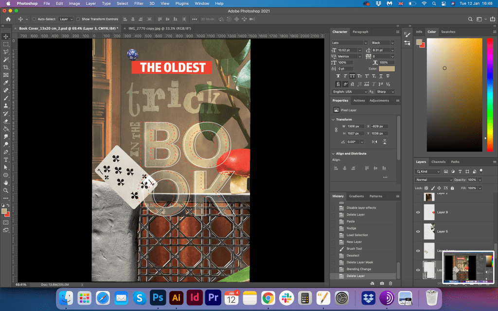
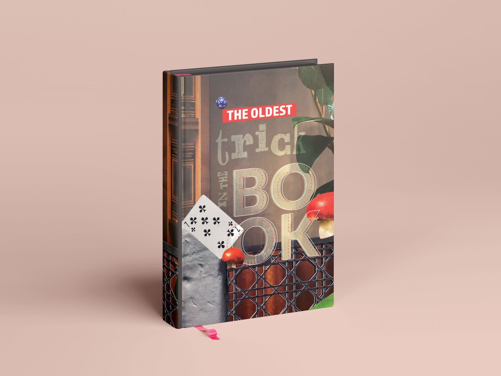
I created a grid for the image, so I could see where the centre of the composition, and how to align all the objects. I started from the main image for the background, going forward filling the space with different copy paste figures. My intention was to create the abstract cover with eye-catching elements on it, so the first reaction would be: “Wow, this looks fascinating! I wonder what is this book about?” I played around with some colours, adding to the corners red, green objects, and playing card in the corner. For the book cover name I placed the simple white type Lato regular, big letters. I thought that it was direction of design that I wanted to be, but I decided that would be good if I could play with the font, and combine some different types together. That experiment I pushed forward in the designs below.
Updated Fonts
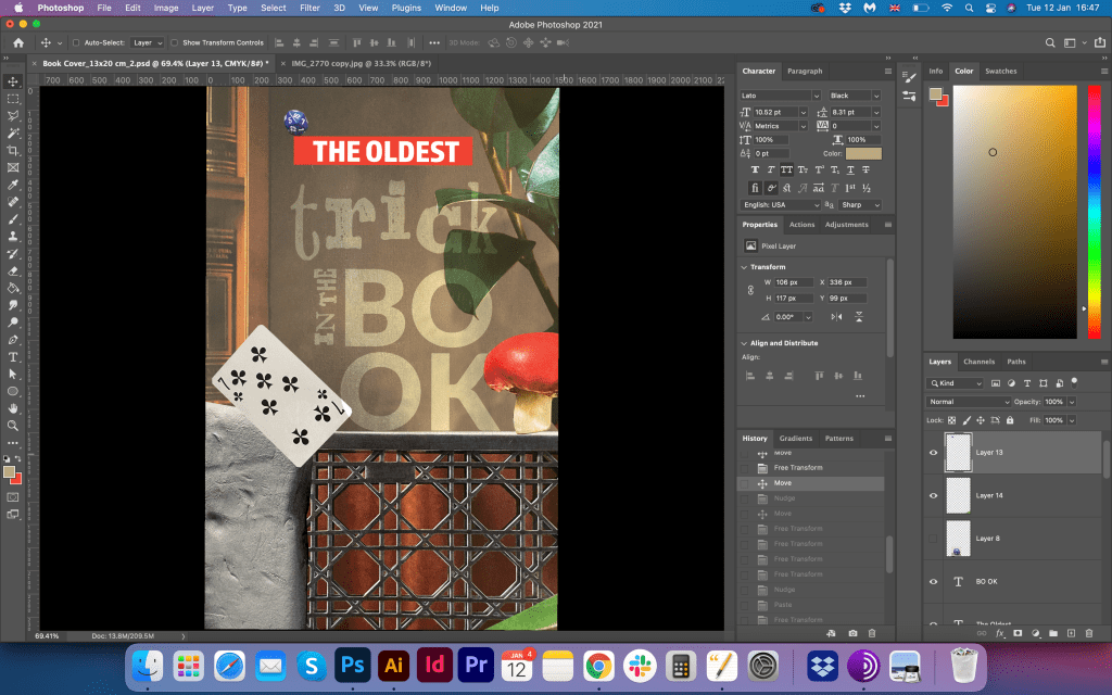
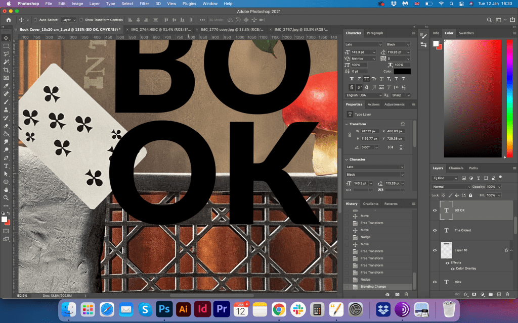
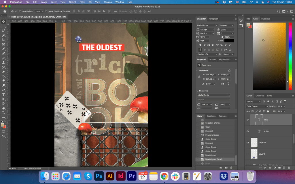
In this part, I felt like I could be more experimental with the font choice for the words at the cover. I wanted to create that playful mood between the words, make them different but at the same time to join them together in an unusual way. For the word ‘The Oldest’ I used Almaq Refined font all capital letters, also I highlighted it with the same red colour as the mushroom. On the age of those letters, I put a little playing cube. I thought that I can fill the design with little elements that would speak on behalf of the trick elements, magic mushroom, playing card, with some brown colour from Egyptian papyrus. Decorative font AltaCalifornia for the word ‘trick’, and big transparent letters ‘Book’ made in the font Lato. As I made letters transparent, I added thin stock around them. I thought that the final design looked quite eye-catching and innovative.
Conclusion
The most crucial part of these exercises was the researches part. From the first point of view, there were so many possibilities to explore, but when I choose one specific direction, I realised that it still can go into so many different ways. What is fascinating about this exercise that even when I tried to predict the design in the result all materials and researches can lead the designer into some unusual solutions. I’m sure there is some more work that could be done for this book cover, it could be much more various solutions, for example, I could produce more options related specifically to the Egyptian theme. However, the direction I chose was more related to the abstract collage, and I was quite satisfied with the outcome I got.
Use one or more of the following book related sayings as a starting point to generate visual ideas and responses:
● Bookworms ● A closed/open book ● The oldest trick in the book ● You can’t judge a book by its cover ● In someone’s good/bad books ● By the book
During this early formative stage, aim to be as wide-ranging and imaginative as possible in your ideas. ALL ideas are valid at this point, so don’t censor; this is not the stage to decide what is a ‘good’ or ‘bad’ idea – at this point they are all just ‘ideas’ with equal merit. Let one idea flow fluidly, intuitively and organically into another to make unexpected links and associations. Record your thought processes and ideas using thumbnail sketches, spidergrams and annotations. Thumbnail sketches are a way of recording ideas through quick pen or pencil line drawings. The quality of the drawing is not important; a drawing of a person does not need to be anatomically accurate, for example. The drawing serves as a visual reminder to you of a fleeting idea. Aim to make thumbnail drawings in the same quick way that you make short written annotations – keeping up with the flow of your ideas. Draw a range of visual and conceptual possibilities using the book sayings as your starting point. Aim to spend 45 minutes working on this, generating as much content, potential ideas, thumbnails, visual metaphors or imagined books as possible.
Thumbnails can give an indication of composition and art direction. For example, how does the subject sit in the frame? How is the subject lit? What particular attributes does that subject have? Thumbnail sketches, along with annotations, are a good starting point to begin exploring these aspects.
Researches
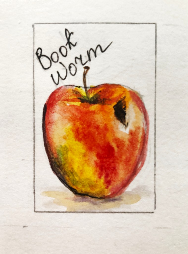
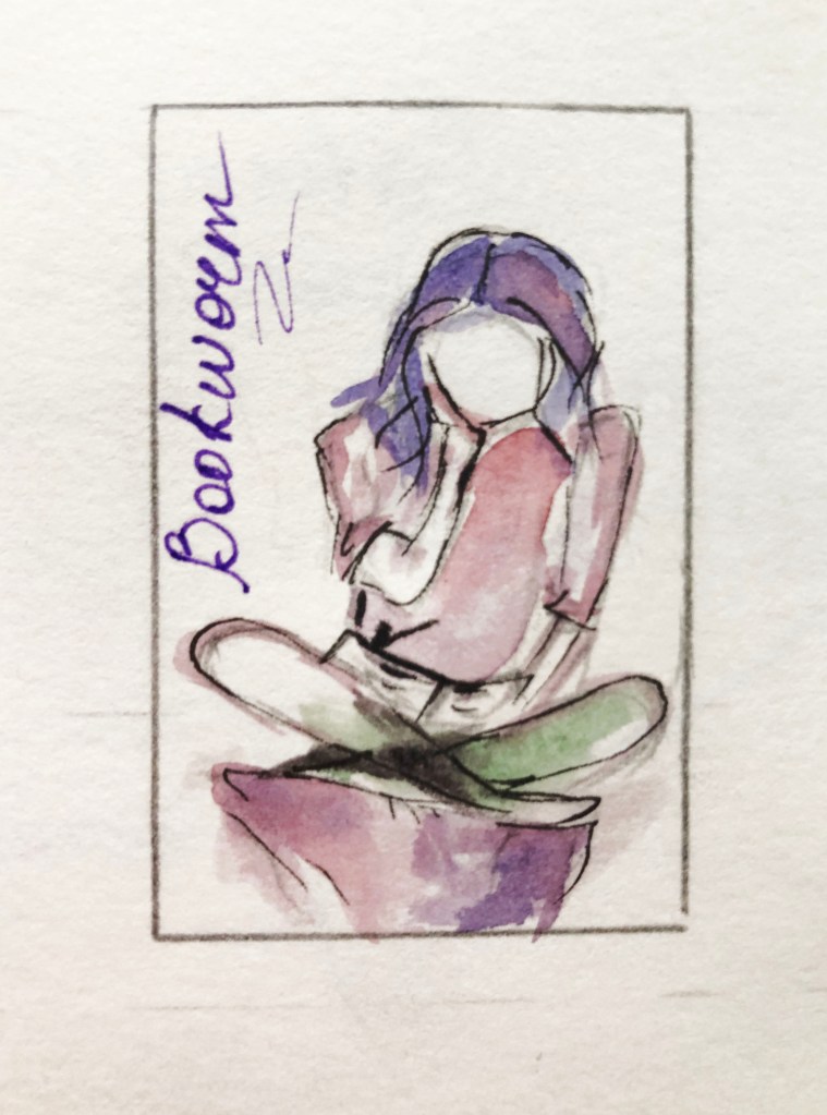
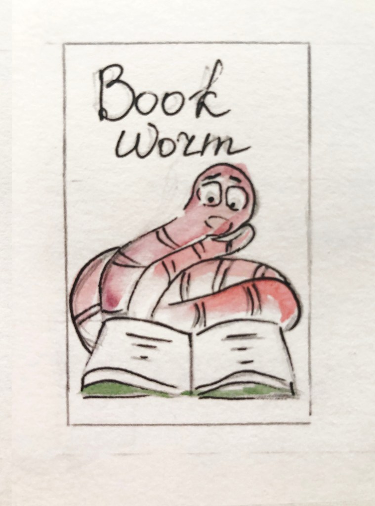
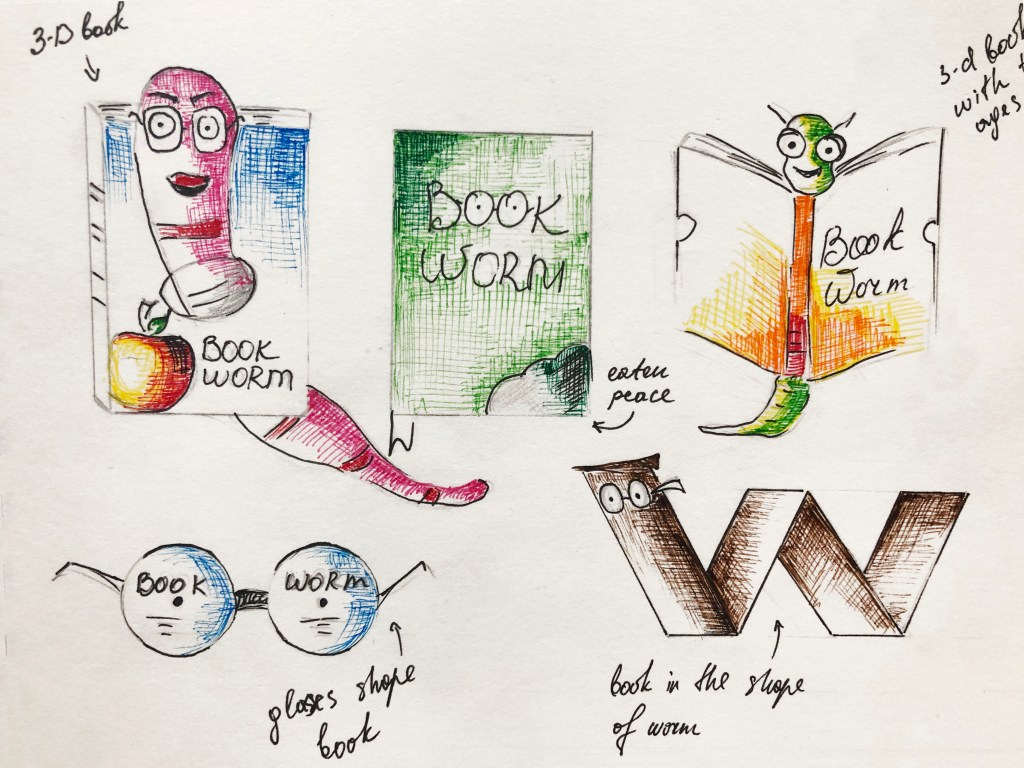
For this exercise, I decided to go with two choices for sketches ‘Bookworms’ and ‘The Oldest Trick in the Book’. I’ve heard some of those book-related sayings before, but for some of them, I had to do some researches. For example, the term bookworm was quite familiar to me, or open or closed book, as in the Ukrainian language we have identical meaning for it, for the rest, I discovered some new British idioms about books.
Sketches ‘Bookworms’
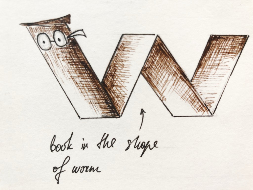
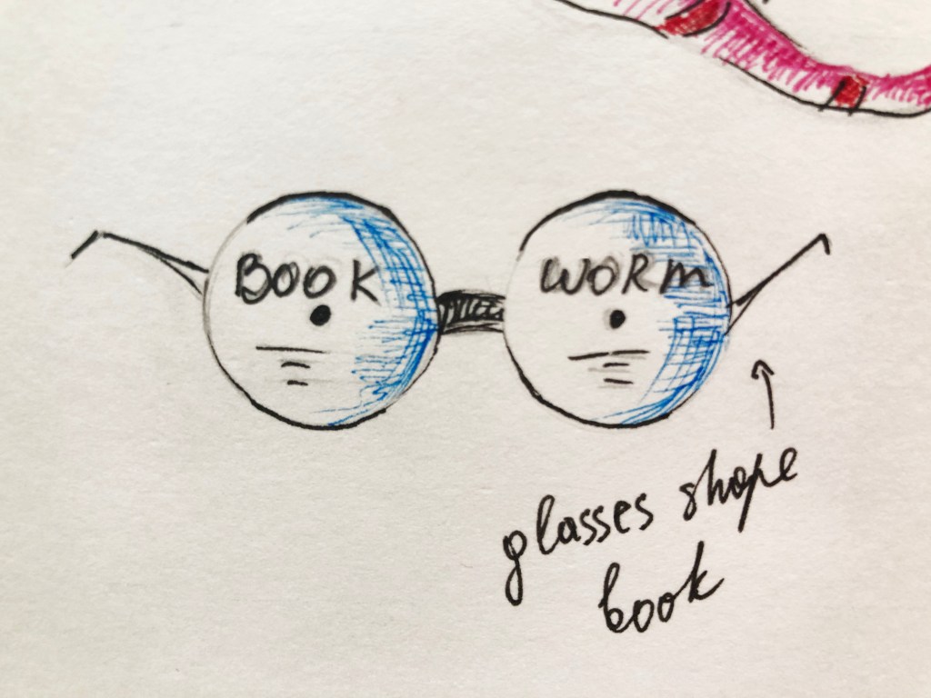
For the bookworms sketches, I thought it should be something cartoony with little friendly worms, the option as a 3-D book could work quite well, or eaten book. Also, I wanted to sketch something more serious, maybe like a thoughtful girl, who is a very attentive reader. I was thinking about designs made in the shape of the worm, it was more like a booklet look maybe, but that could work too. Some of my drawings didn’t look like quick sketches. I love the attention to details, so for some of them, I applied colours. The bitten apple, with a little sign of the worm, I painted in watercolour. I thought for the next book I could create more sketchy like designs.
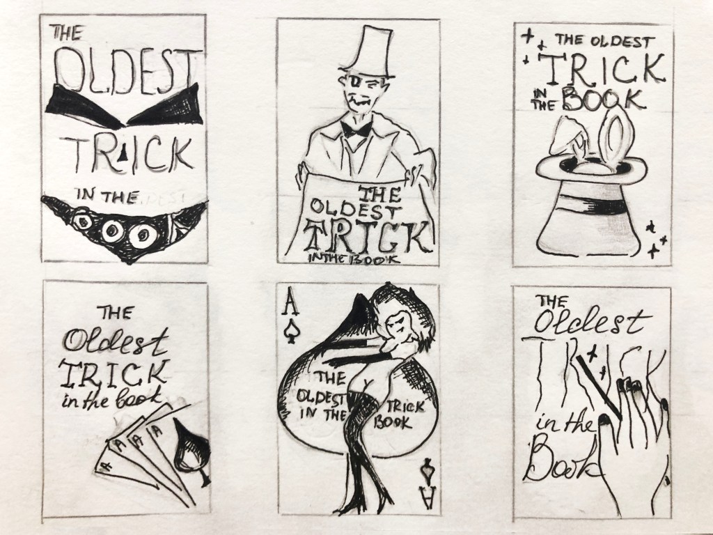
Sketches ‘The Oldest Trick in the Book’
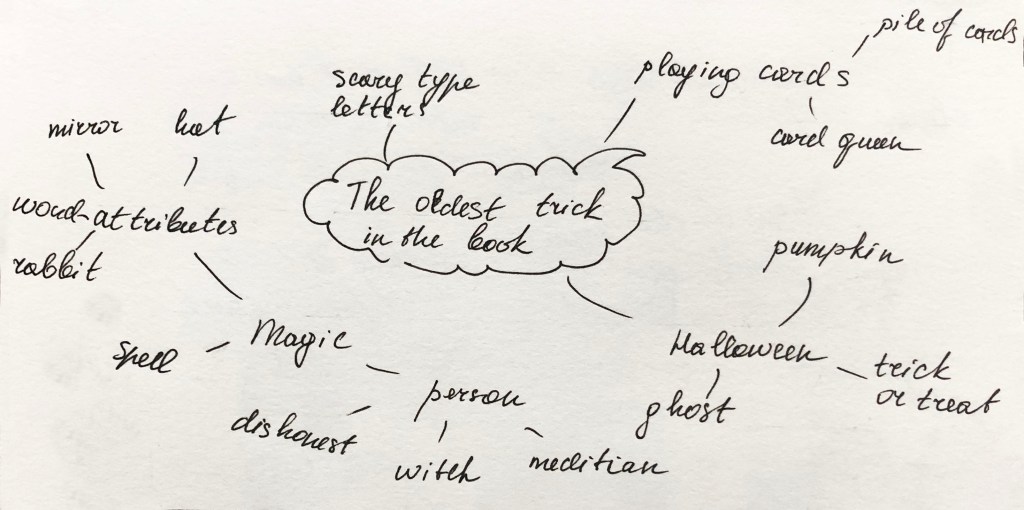
Here I experimented with different ideas for the term ‘The Oldest Trick in the Book’. I thought it all could be related to the magic, tricks, miracle, or playing cards, where wizards are tricking you. I tried to play with fonts, maybe make them all different look fonts, with some spooky details. I noticed, that we had that similar exercise with book covers, one I made as collage, and another one just font usage, probably I could apply similar principle here too. Anyway, they are just sketches, a first step to producing actual designs.
Conclusion
This one of those type of exercises I’m always trying to get better. Sketches and quick drawings are part of generating ideas skills, and they can help with the final design. Here I have a challenge of playing word and association’s task and cover them all into images. I like seeing the result because it gives me confidence that I can do more, and if I look deeper into each phrase, I can discover numerous different meanings and images. I love detailed sketches when they have colour and shape on them, but those 45 minutes sketches that is something I need to improve, as they are not as complicated tasks. I hope those sketches I produced will be useful in my first assignment.
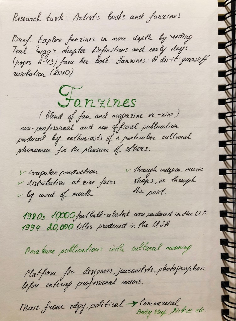
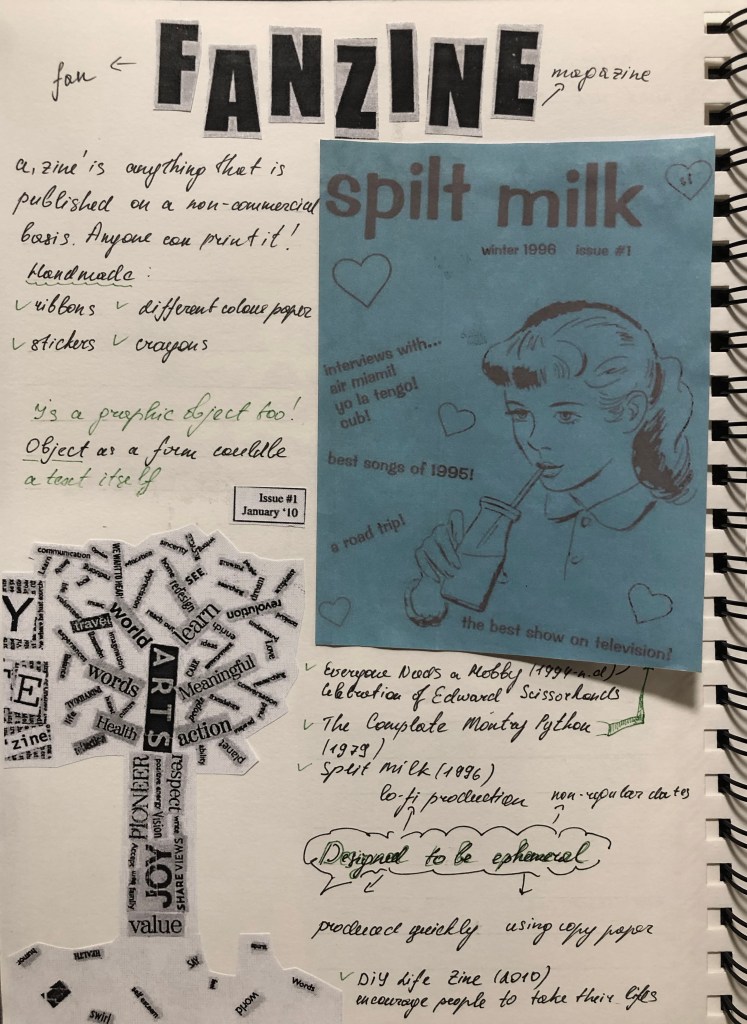
Browse the American based Smithsonian Libraries’ Artist Book archive to identify books that you find interesting or questions the notion of the book in some way. https://library.si.edu/collection/artists-books Explore fanzines in more depth by reading Teal Trigg’s chapter Definitions and early days (pages 6–43) from her book Fanzines: A do-it-yourself revolution (2010). This chapter is available as a course resource on the student site. Document visual examples of work you find interesting with annotations in your learning log. You’ll be using some of this research in your first assignment.
Researches
In this research exercise, my task is to analyse non-standard designs for books and fanzines. As a term, I had never heard the term fanzines before, so here was the opportunity to discover some information about them.
To begin with, I followed the link to the Smithsonian Libraries ’Artist Book, which contains all kinds of book design variations. Here I see an obvious example of how you can go beyond and create a real work of art from everyday things, this is something that does not occur in everyday life, and also helps to see new facets of art.
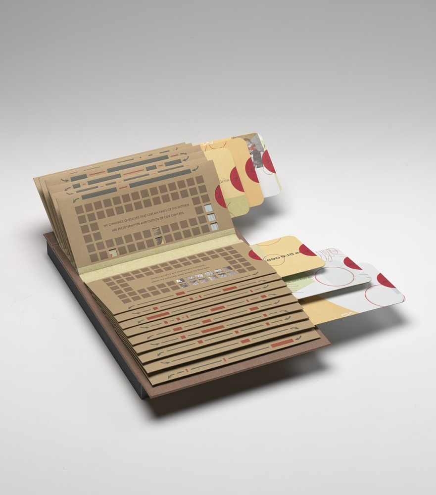
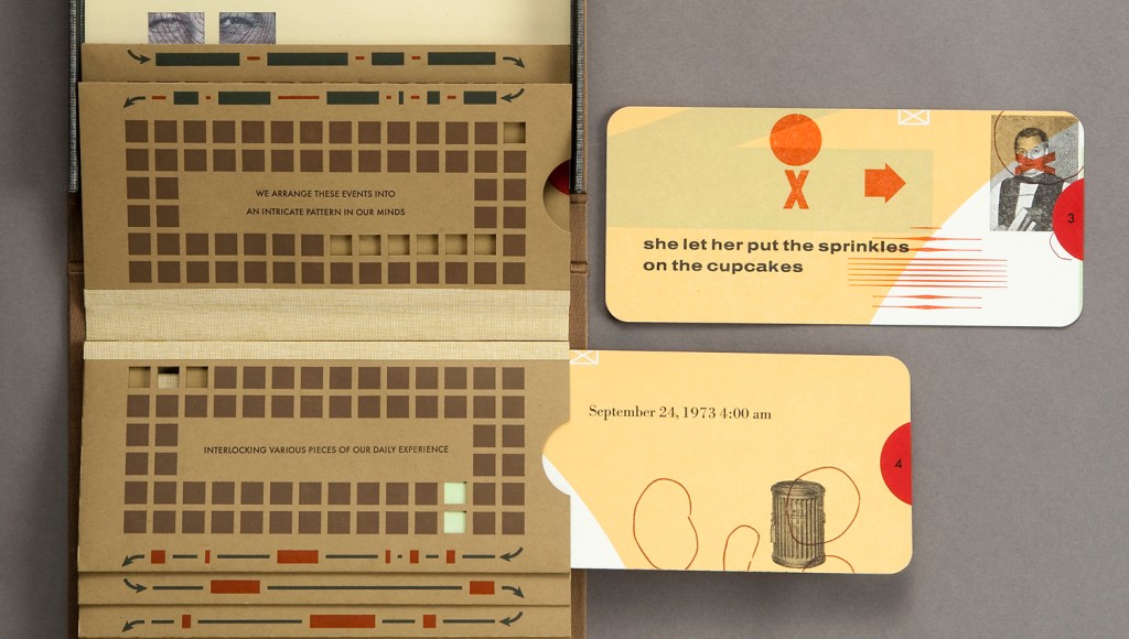
The first book I would like to highlight is Glimpse by two authors Barbara Tetenbaum & Julie Chen, who put their creativity into one project. In this project, the authors examine the idea of the creation of their biography. For the design of this book was used letterpress from hand-set type, wire, antique news cuts, dingbats and photopolymer plates. They gathered together their prominent events in some kind of photo album style book.
In this book, cards could be pulled out from each envelope. Cards contain some phrases, dates and collages. I like the sepia colours used for this book and vintage style of images. They gave a feeling that it could be a historical masterpiece. This is a unique example of seeing ordinary events in an original way. At the same time, ‘Glimpse’ is another example of how creative approach could make something unusual and artistic.
Gifts from our elders by Kerry McAleer-Keeler
Another book creation that paid my attention is the book Gifts from our elders by Kerry McAleer-Keeler. Visually it has a similar feel to the book described above, like vintage objects, similar colour pallet, but in this case book was folded into the box. It reminded me pop-up books I remembered from the childhood, which had 3-D objects inside of it, so I could read the information not through words, but through images.
I loved the key theme of this book, the celebration of femininity and the gift of life. Here, the author, through medical images of the heart and brain, reflected the favour of the intellect and love for art. I noticed that Kerry McAleer-Keeler has a whole series of similar works, where she combines her philosophical views and her attraction to beauty in the boxes.
“I’m an artist who wishes to tell you a visual story.”
I am impressed that the artist wants to take the viewer into a new imaginary world, and through symbolic elements creates a new perception of spirituality and life cycle, especially I like associations she created for objects and the way she folded it altogether.
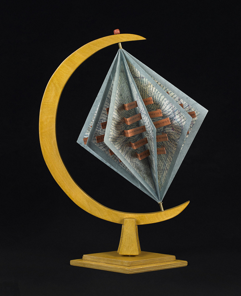
World without end / / by Julie Chen
Another example of artists’ book I would like to mention was designed by the same author of Glimpse, Julie Chen. I think this work stands out because of it’s unique and original shape. I really loved that concept of endless globe, but in the shape of rhombus and envelops. Overall I would like to mention that I loved to learn more about exploring the sculptural and interactive potential of the book form, and discover a notion of what a “book” can be.
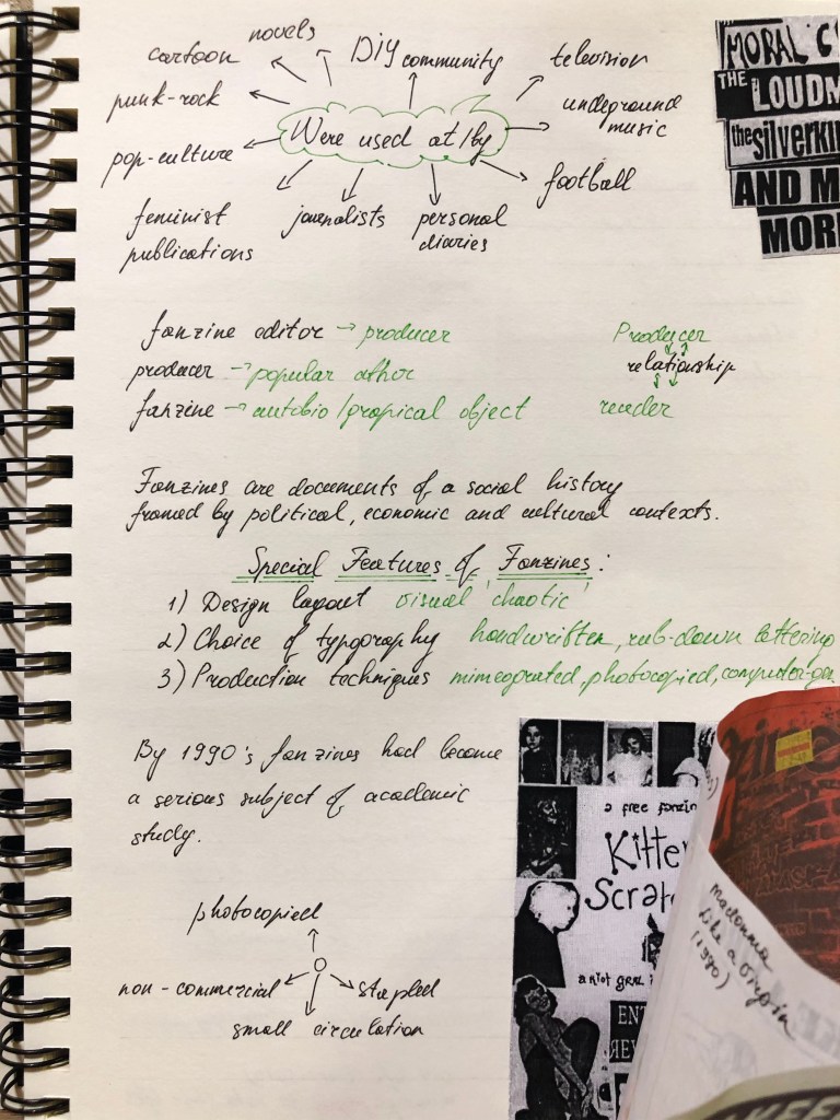
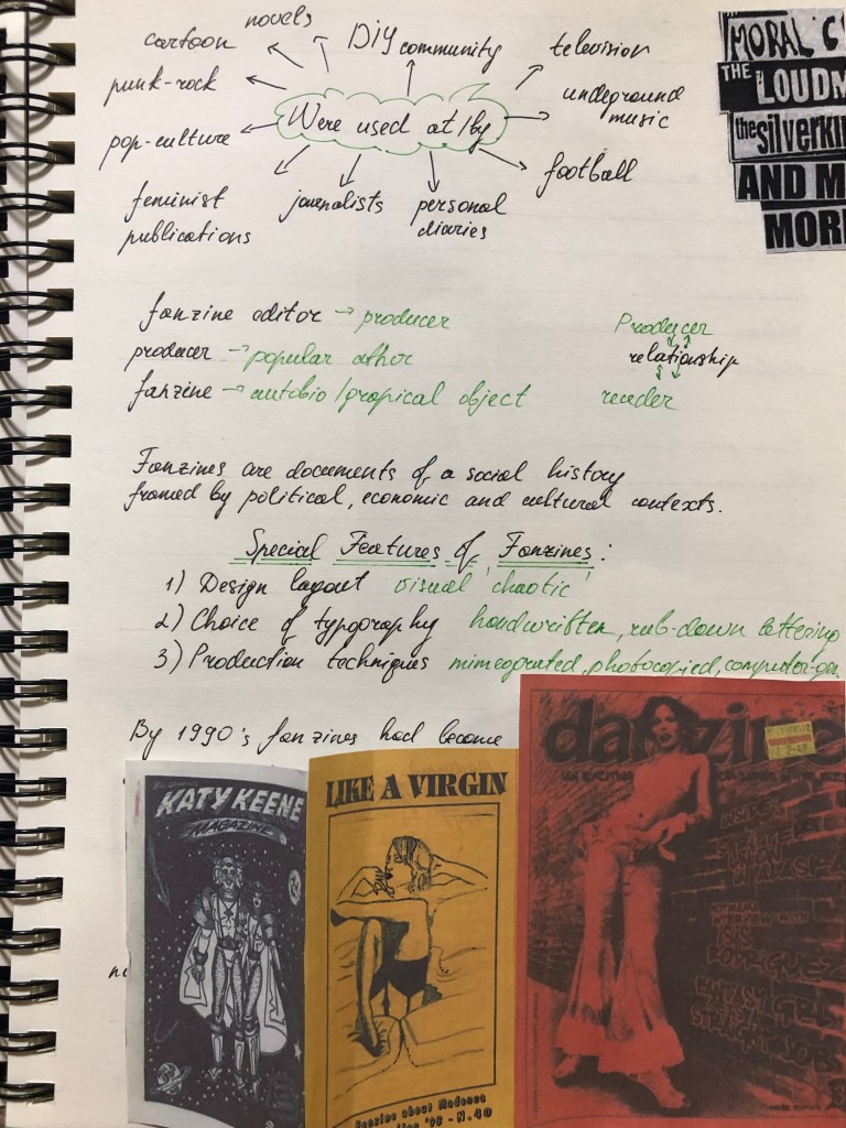
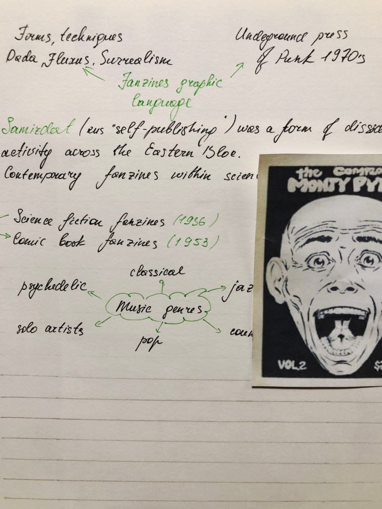
After researches some of the shapes and forms of creative books I proceeded to the next part, discovering the history of Fanzines. Overall, I found this article quite impressive, as here i could see example how something invented in the general publics, amateur and non-professional, but with a lot of passion and creativity could become an official term and implemented into the world of professional fashion industry, music, books, cinematographs and other forms of art. All important notes I gathered together in my learning log. I tried to create some mind maps, and graphics, highlighting annotations and dates, as these researches will be useful for my first Assignment.
Also, I’ve placed some screenshots of different fanzines from the article, so I could go back to them as a point of inspiration for my later works.
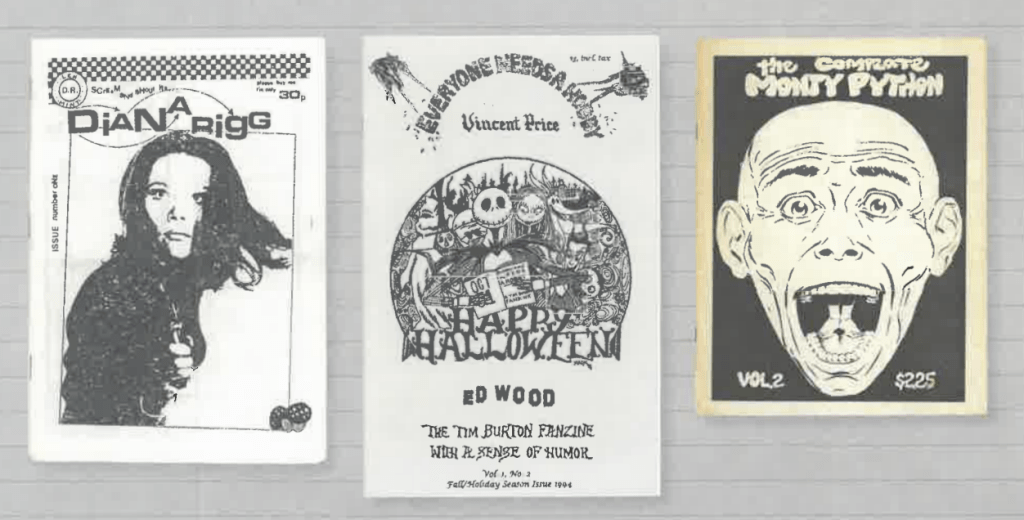
Diana Rigg (1986), Everyone Needs a Hobby (1994), The Complete Monty Python (1978)
Kitten Scratches (1999), DIY Life Zine (2010), Beer Can Fanzine (1999)
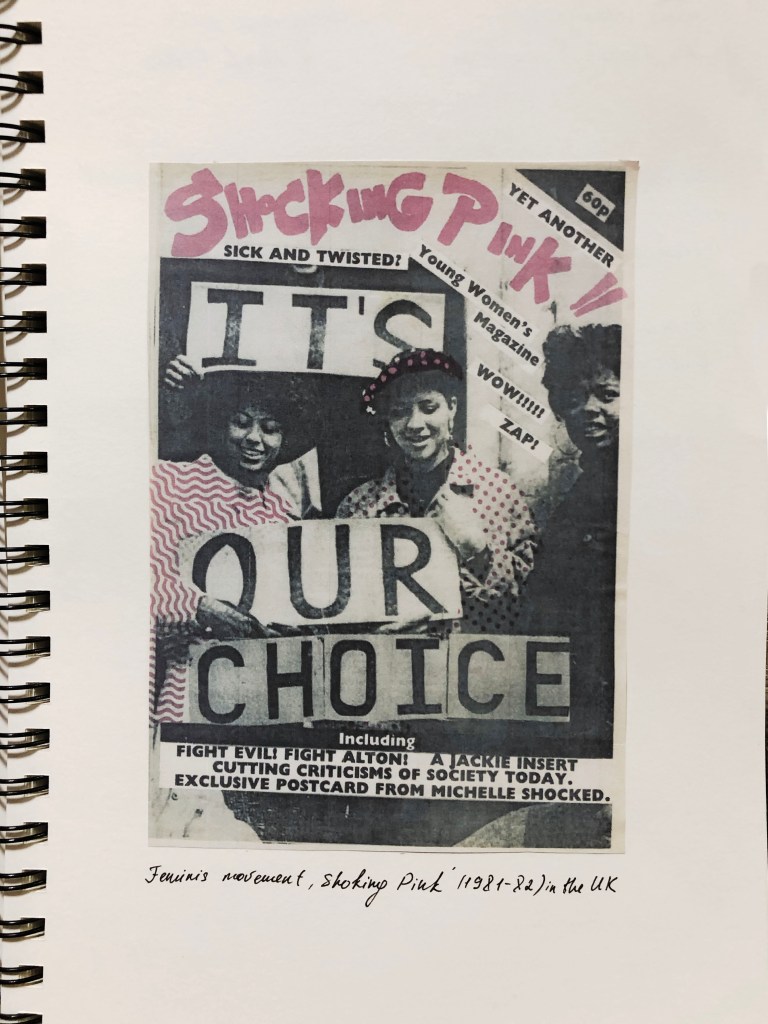
Shocking Pink (1981-82)
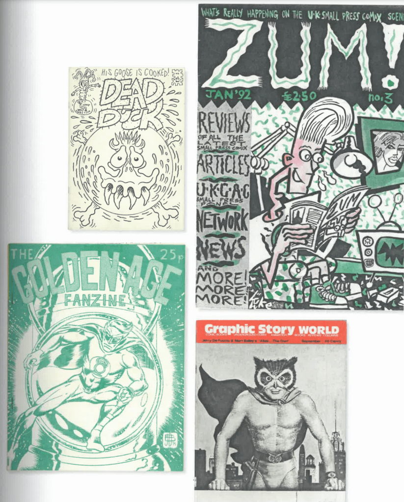
Dead Duck/Corpsment Comix 1991), Zum! (1991), Golden Age Fanzine (1970), Graphic Story World (1970)
That research task was quite entertaining for me, as I love analysing and learn something new about artists, art movements and influencers in the culture. I found useful that here I discovered some new terms not only in graphic design but in the art culture in general. The challenging part was not only to get myself familiar with this article briefly but to understand the purpose of it for my future designs.
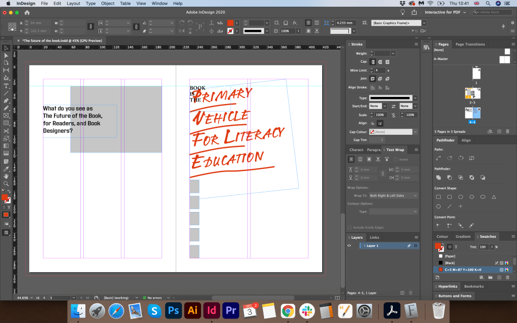
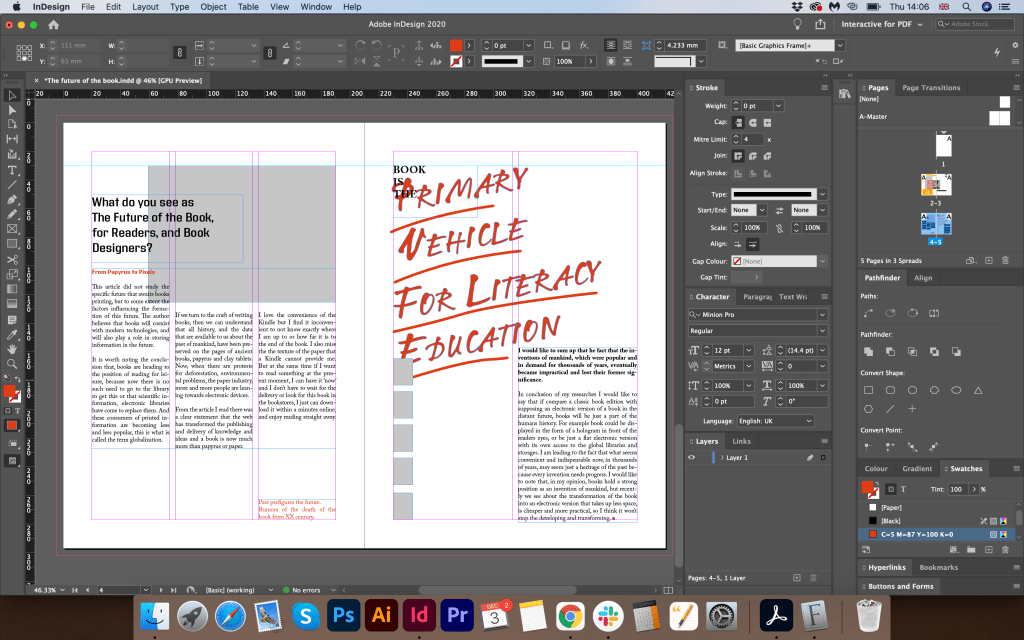
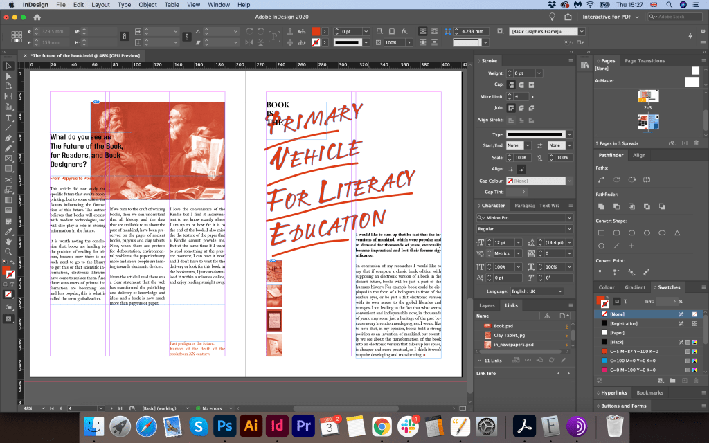
Given the current development of the book from printed to digital technologies, what do you see as the future of the book, for readers, and book designers? Where do you see the book heading? Show and tell. Try and summarise your thinking into a series of short statements, quotations, images (collage) or ideas. Be creative in how you approach this. Use your learning log to reflect on the essay and your own thoughts and visual ideas about the future of book design. This research will feed into part of your first assignment.
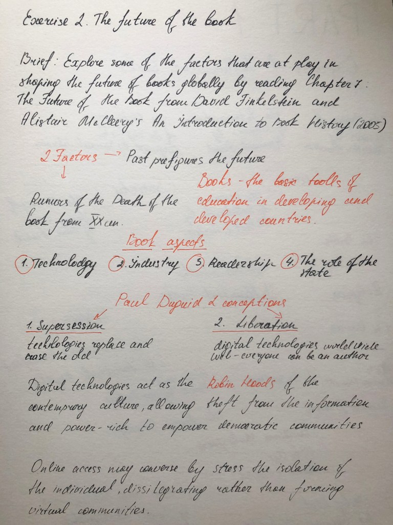
Researches
This task turned out to be quite complex in my understanding, as the requirement was to get familiarise on the article first, create my own views on the described topic, and later express my visions on the collage or design. To get started, I decided to reviewing Chapter 7: The Future of the Book from David Finkelstein and Alistair McCleery’s An Introduction to Book History (2005). This book contained from a lot of arguments, facts, figures and assumptions. First of all I decided to put some assumptions into my sketchbook, which helped me to highlight the main statements from this article. In the result I was able to summarise what requires attention in this article, what are the positions of publishing companies in the modern world, what changes have been taking place over the years and how the popularity of the printing business has changed. My mind map entries are presented below.
Mind Map
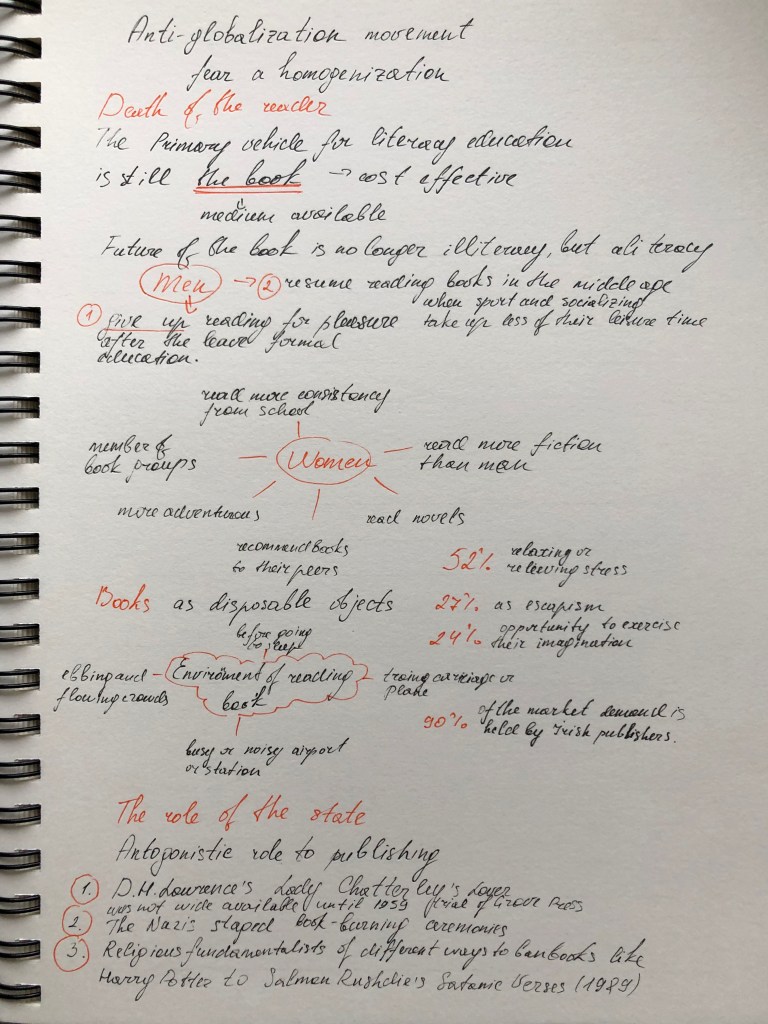
This article did not study the specific future that awaits books printing, but to some extent the factors influencing the formation of this future. The author believes that books will coexist with modern technologies, and will also play a role in storing information in the future. For the sake of fairness, it is worth noting the conclusion that, books are heading to the position of reading for leisure, because now there is no such need to go to the library to get this or that scientific information, electronic libraries have come to replace them. And these consumers of printed information are becoming less and less popular, this is what is called the term globalization. If we turn to the craft of writing books, then we can understand that all history, and the data that are available to us about the past of mankind, have been preserved on the pages of ancient books, papyrus and clay tablets. Now, when there are protests for deforestation, environmental problems, the paper industry, more and more people are leaning towards electronic devices.
From papyrus to pixels
From the article I read there was a clear statement that the web has transformed the publishing and delivery of knowledge and ideas and a book is now much more than papyrus or paper.
Books now come in many digital and analog formats.
eBooks
PDF Books
Kindle books
Hardcover books
Paperback books
Interactive books
iPad books
iPhone books
Tablet books
Nook books
I love the convenience of the Kindle but I find it inconvenient to not know exactly where I am up to or how far it is to the end of the book. I also miss the the texture of the paper that a Kindle cannot provide me. But at the same time if I want to read something at the present moment, I can have it ‘now’ and I don’t have to wait for the delivery or look for this book in the bookstores, I just can download it within a minutes online, and enjoy reading straight away.
I do not argue that there are aesthetes or book lovers, but mostly if I see some kind of reviews about books, or if my friends recommend reading this or that novel, these are people whose profession is associated with copywriting.
First storages of information
In my researches, I would like to review related to the development of the writing in the book Sapiens. A Brief History of Humankind. Noah Harari, particularly on the ancient storaging system of information. My goal is to create a parallel between the ancient system of keeping records, their practicality compared to the modern book.
Signature: Kushim
A clay tablet with a business record from the city of Uruk. The word “Kushim” can mean both the position of the official who accepts this tax and a personal name. If this is his name, then Kushim is the first person whose name has survived in history! It is characteristic that the first recorded name in history did not belong to a prophet, poet or conqueror, but an accountant.
Here the author mentioned a data processing system invented by an unknown Sumerian called “writing”. It took scientists a long time to understand the essence of this message. At this early stage, the writing was limited to numbers and facts. The great Sumerian novel, if it was ever composed, never made it to the clay tablets. The writing process itself was time-consuming, the readership was extremely small, so no one saw any point in wasting efforts on any other writing other than the much-needed bookkeeping. Perhaps our modern books in a few thousand years will seem just as impractical a way of storing information, something that will be perceived only as a valuable relic of the author’s communication with society.
Another example is the Andean writing, which differs in many respects from the Sumerian – so much so that not everyone dares to call it writing. First of all, these were not the signs usually used on clay tablets or other material: the Indians saved information using the kipu, a nodular writing system. A kipu is a bundle of coloured laces spun from wool or cotton. On each lace, knots were made in certain places, and one kipu, thus, could contain hundreds of laces and thousands of knots. The almost inexhaustible variety of combinations of types of knots, distances between them and the colour of laces made it possible to store large amounts of numerical data concerning, for example, taxes or property. After a long Spanish occupation, very little kipu survived, and now they can no longer be deciphered – the ancient art of reading kipu has been lost. Another example of the development of civilisation, probably when first Indinans invented these kipu system they didn’t know that that is not convinient or practival enough to be wildly used in the future.
I would like to sum up that he fact that the inventions of mankind, which were popular and in demand for thousands of years, eventually became impractical and lost their former significance. I know that it could probably be quite extreme comparison, as I still have to analyse what is the future of the book, I need to ask myself a question, how far that future is. If we speak about hundred years ahead, I don’t think there will be completely vanishment of book publicity, but if we speak about more distant future, I believe that books could be more a part of museum property, something that people used to have hundreds of years ago, and instead of paper books society will have only electronic or hologram version for reading the information.
In conclusion of my researches I would like to say that if compare a classic book edition with supposing an electronic version of a book in the distant future, books will be just a part of the humans history. For example book could be displayed in the form of a hologram in front of the readers eyes, or be just a flat electronic version with its own access to the global libraries and storages. I am leading to the fact that what seems convenient and indispensable now, in thousands of years, may seem just a heritage of the past because every invention needs progress. I would like to note that, in my opinion, books hold a strong position as an invention of mankind, but recently we see about the transformation of the book into an electronic version that takes up less space, is cheaper and more practical, so I think it won’t stop the developing and transforming.
Books themselves, however, likely won’t disappear entirely, at least not anytime soon. And there still will be some work for designers and publishing companies to do. For example, publishers looking for the new topics all the time to attract the readers. So the psychology book, or book how to respect yourself and become successful in 21 century will be more popular than book written by classical novel writer in the past century. Books meant not to be read but to be looked at – art catalogues or coffee table collections – will likely remain in print form for longer as well. I think, that print will exist, but it will be in a different realm and will appeal to a very limited audience, like poetry does today.
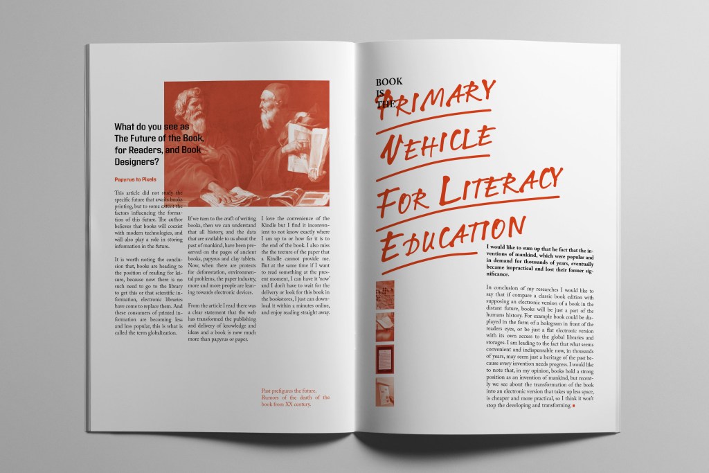
Design
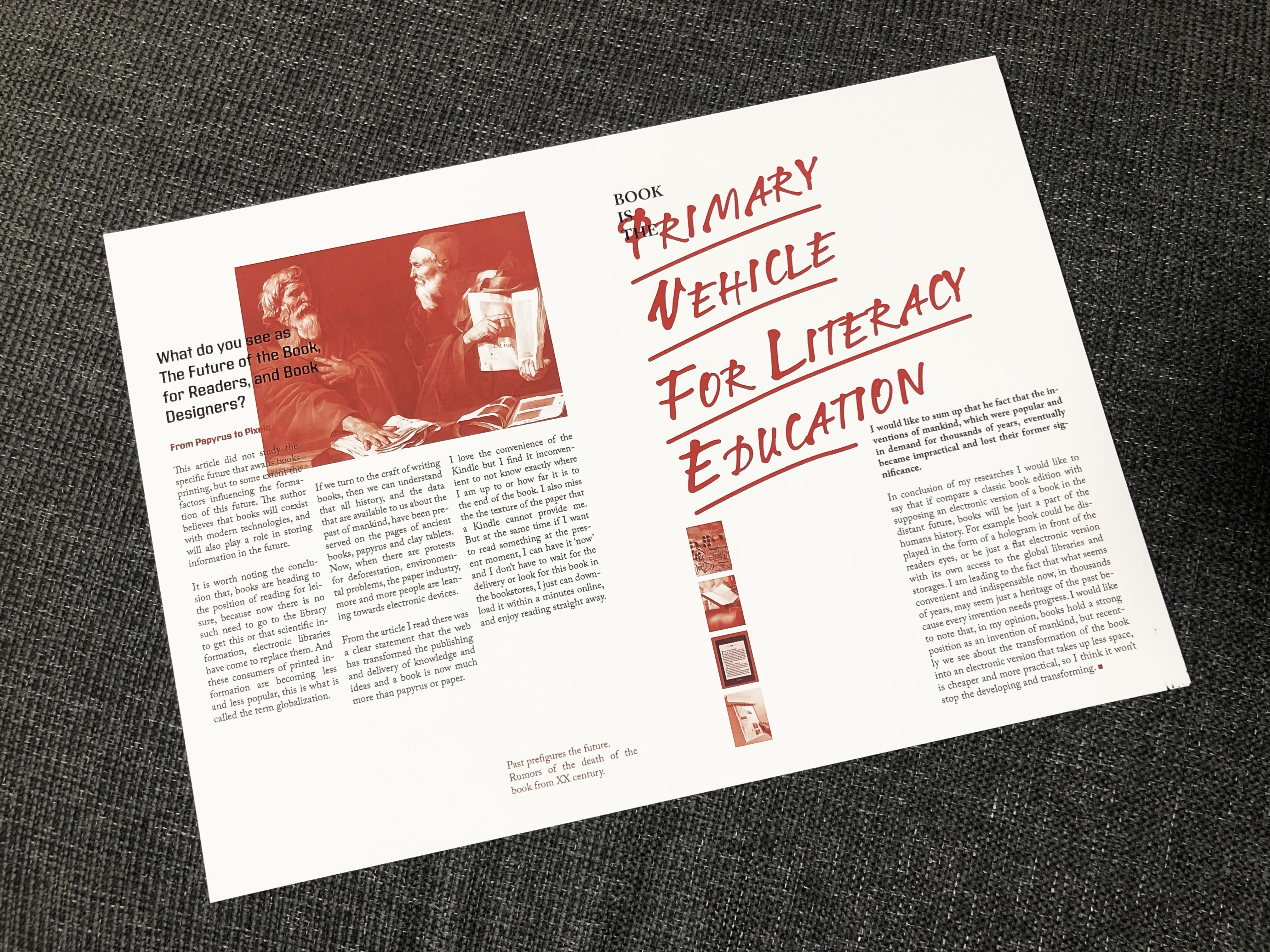
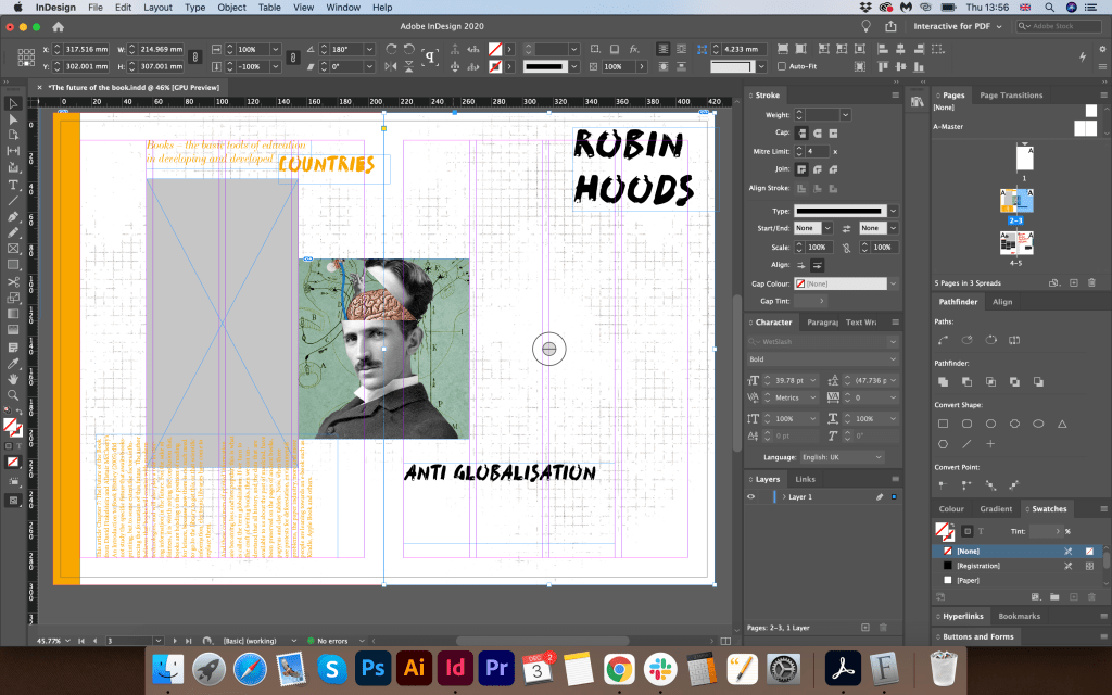
After I analysed the possible options for the future of the book and printed publications, I moved on to the design of the article. To begin with, I created a document in the Adobe Indesign program in A4 format and a spread. I wanted to create a collage of an article with my essay. I placed information around like for a magazine layout. The first option using yellow did not make much progress for me, so I decided to try a new option using large slogans around it, with a red colour palette. I divided the pages of the document on the left side into three columns, and the right side into 2. I wanted to create more air in this article, so I placed the text itself not on the entire page, but leaving a lot of free space at the bottom.
For the main image, I chose The Philosophers painting by Master of the Judgment of Solomon (fl. 1620-25). I put a red filter on top of all the images. In the result, I got a harmonious combination with the big slogan that I placed on the right side of the layout. For the slogan, I chose the phrase Book is the primary vehicle for literacy education from Chapter 7: The Future of the Book. I chose the typeface similar to handwritten LTNotec as if in a hurry, combined with the serif font Adobe Caslon Pro. I wanted to show an example of a modern layout, with the stages of development of mankind and books. So I created a grid of rectangles with a red filter on top, and inside I have images of a clay tablet, a book, an e-book, and an example of a print edition in the future.
In this collage, I wanted to capture the phased development of the book, as a source of information conservation, where it all began and how we came to the electronic book, today the most modern representation of storing printed information. Nevertheless, printed editions are still preserved in our time. Of course, there are significantly fewer of them, but they are still in demand among lovers of literature.
Conclusion
As a result, I would like to say that I enjoyed this exercise, in it, I was able to carry out my arguments and thoughts in combination with scientific publications about the theory of book development, and what the future holds for it. I think that in my article design I was able to summarise my researches. Also, the article colour scheme and composition identifies the modern view of book publishing. I liked the look at book publishing on a global scale, as a source of information, and which contains everything that happened in civilisation, various historical thoughts collected in the world library. I believe that the book will coexist with modern technologies for many years and will be in demand as one of the most important inventions of mankind.