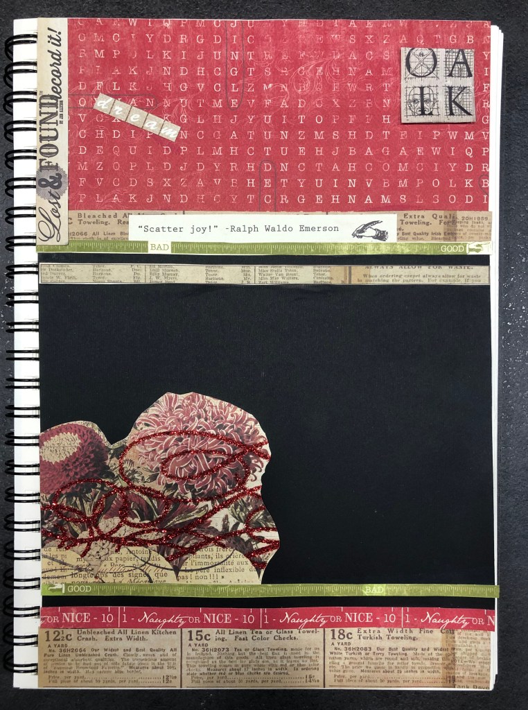
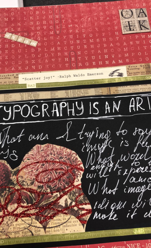
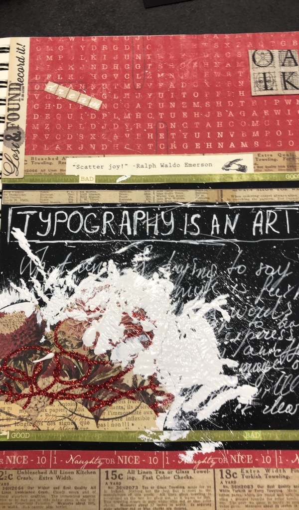
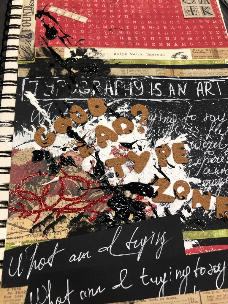
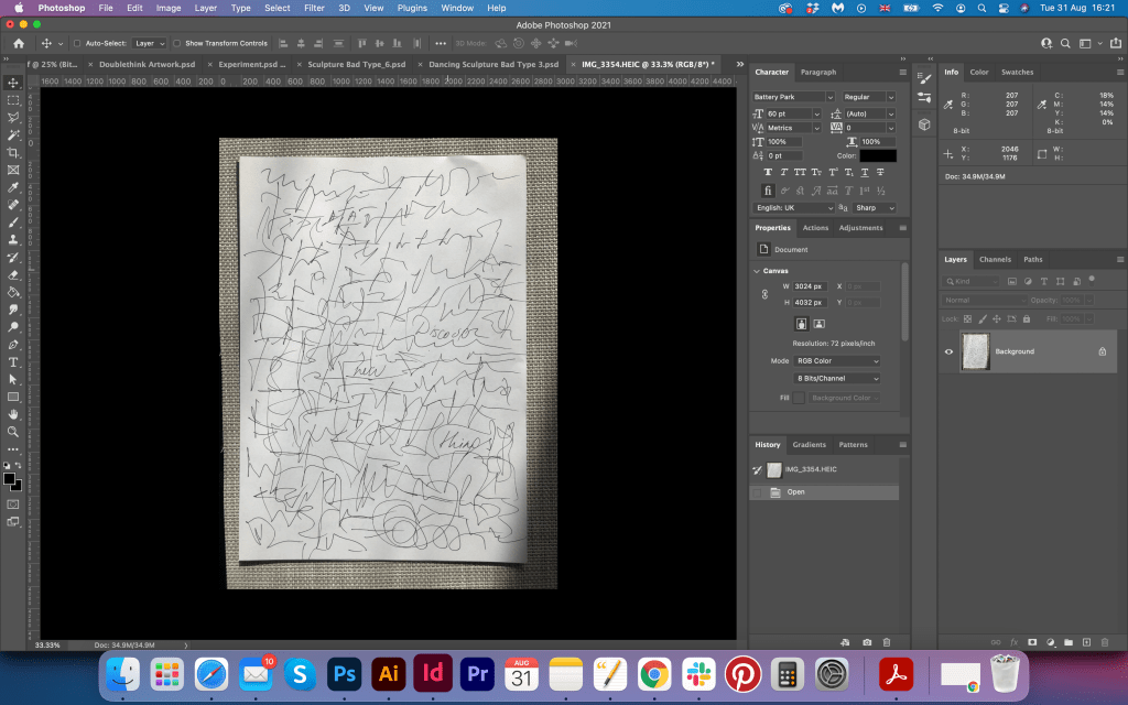
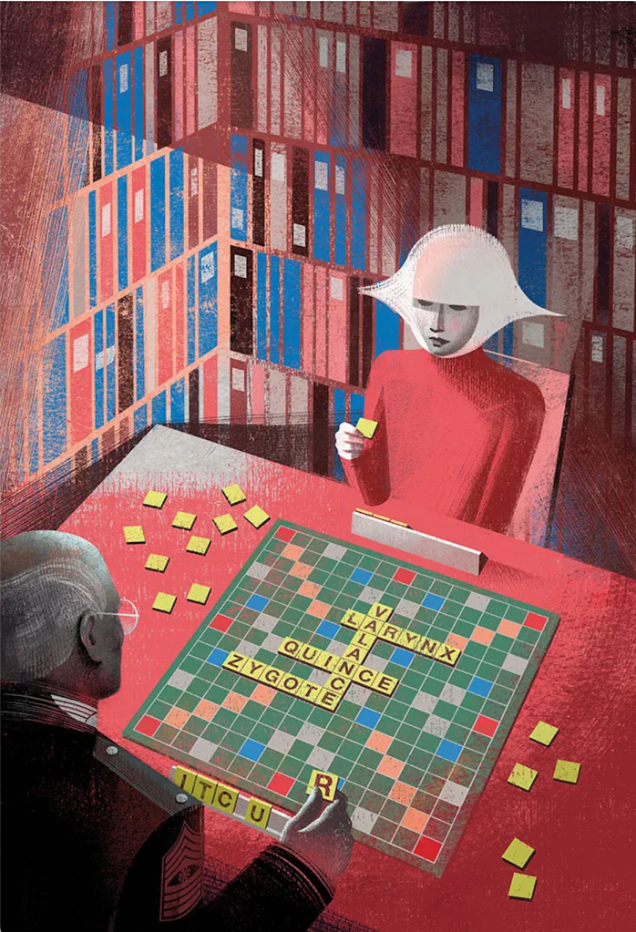
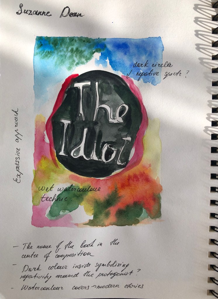
Critical writing task
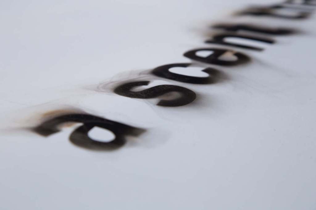
Identify an example of concrete poetry and write a short critique of the content, design and the relationship between the content and form. How has the use of typography, layout, and space been employed to help generate meaning? Print out a copy of the poem and add notes directly onto the page. Write a brief summary of your thoughts, feelings and reflections on how concrete poetry creates new meanings.
As a starting point you may want to look at the following artists who practised Concrete Poetry:
- Dieter Roth
- Max Bense
- Eugen Gomringer
- Ian Hamilton Finlay
- Henri Chopin
- Öyvind Fahlström
- Emmett Williams
- Geraldine Monk
- Mary Ellen Solt
- Ilse Garnier
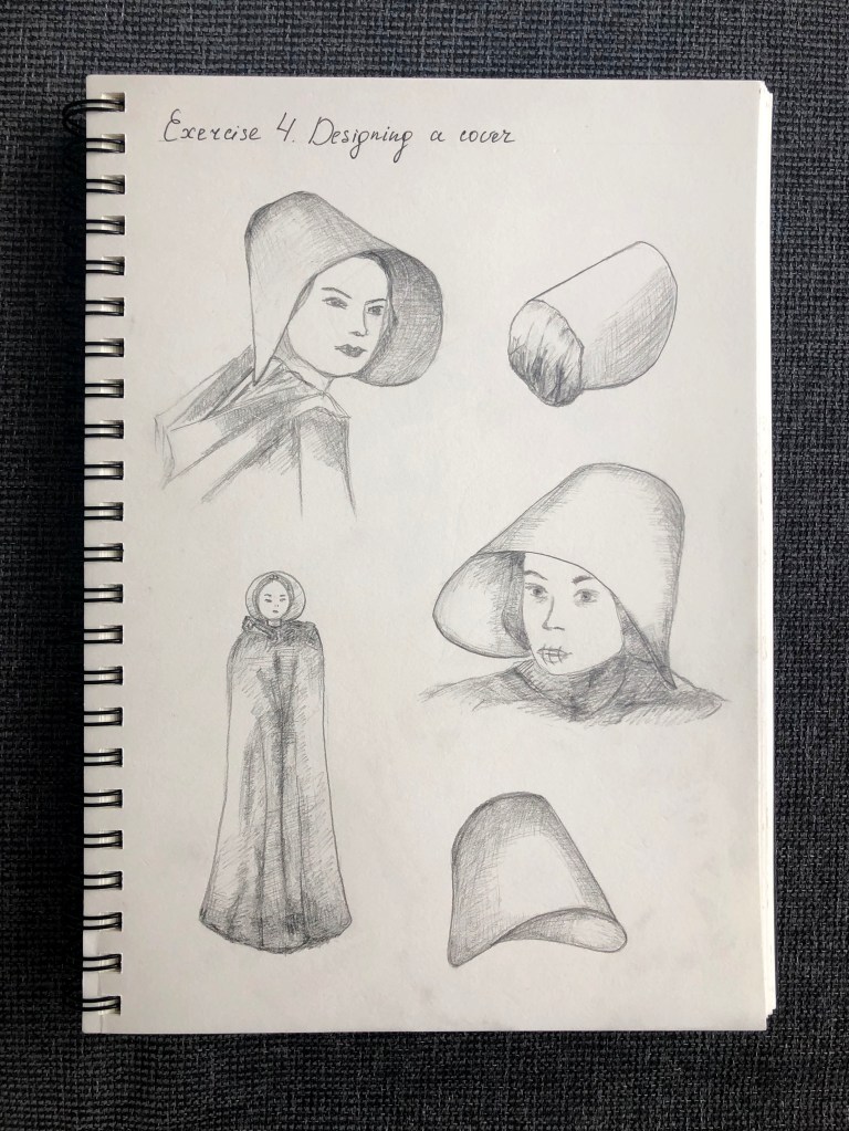
Visual task
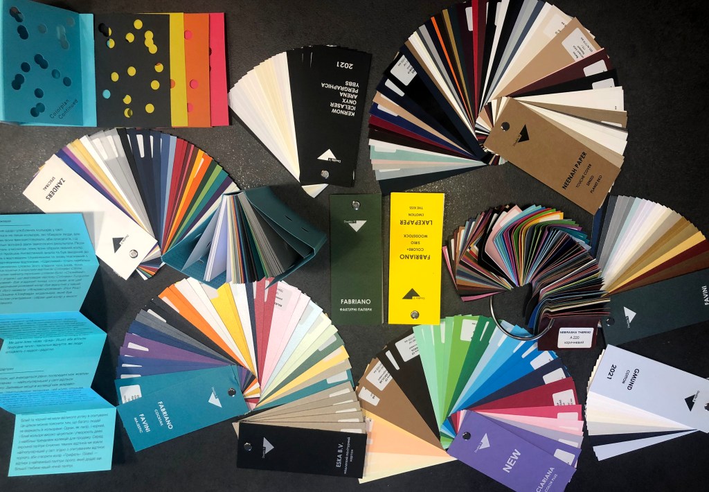
Use one typeface to create a playful design for the Tango with Cows, 1914, by Russian Futurist Vasily Kamensky (poem shown below). Explore and experiment with the relationship between the meaning of the text and the form you present it. Think about what kind of typeface you choose as well, does it reflect the content of the text? How does the paper relate to the design? Decide on an appropriate scale and format for this page. Create a series of sketches and ideas, and chose one to develop into your final design. Print your design on one of the papers you have collected in the previous exercise.
Write a short paragraph reflecting on the relationship between the form and content of your design in your learning log.
Researches
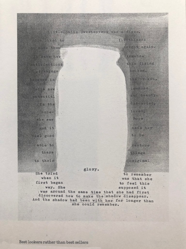
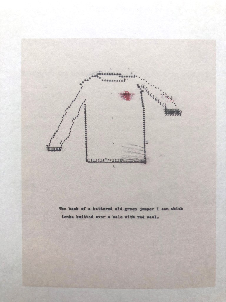
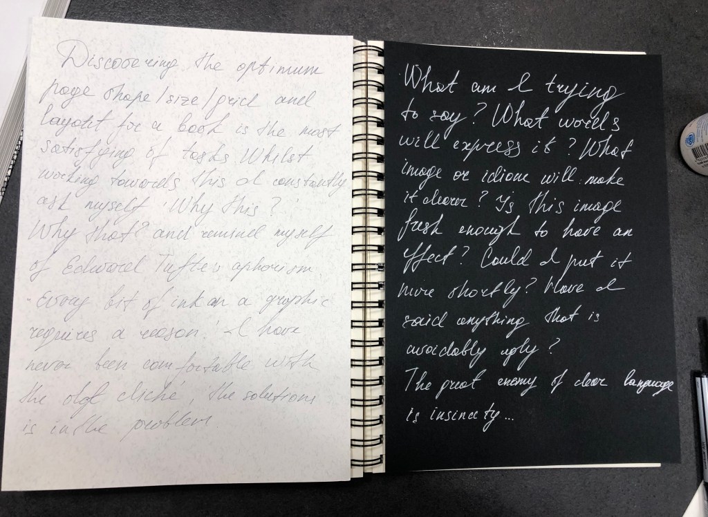
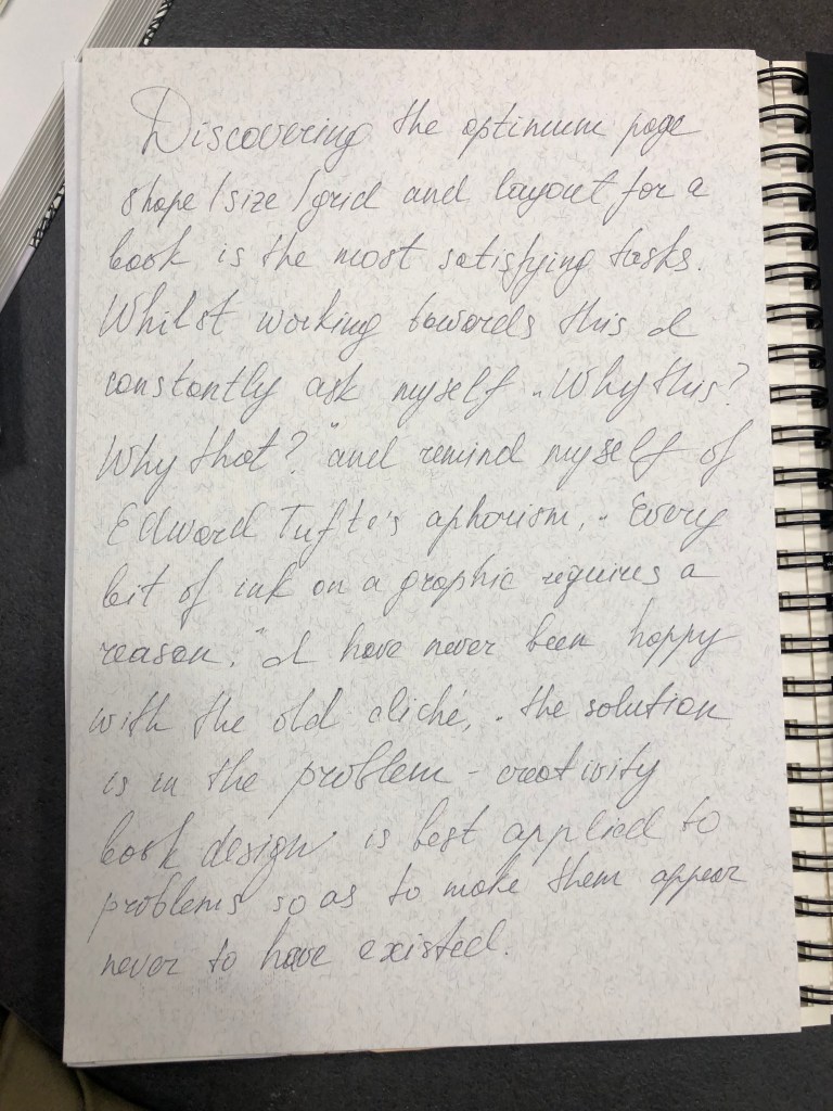
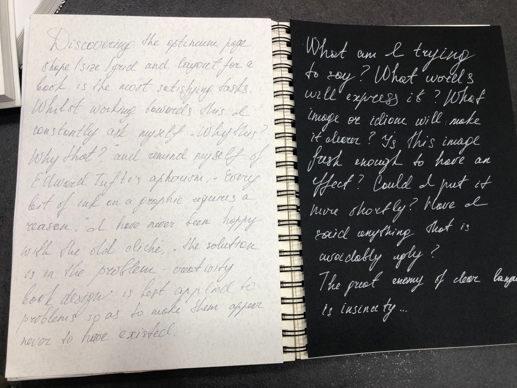
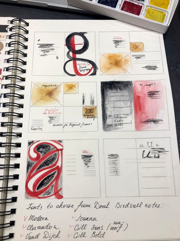
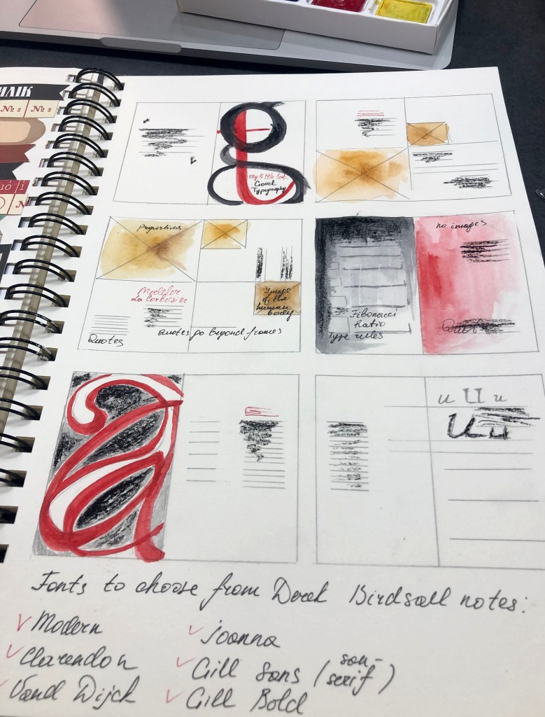
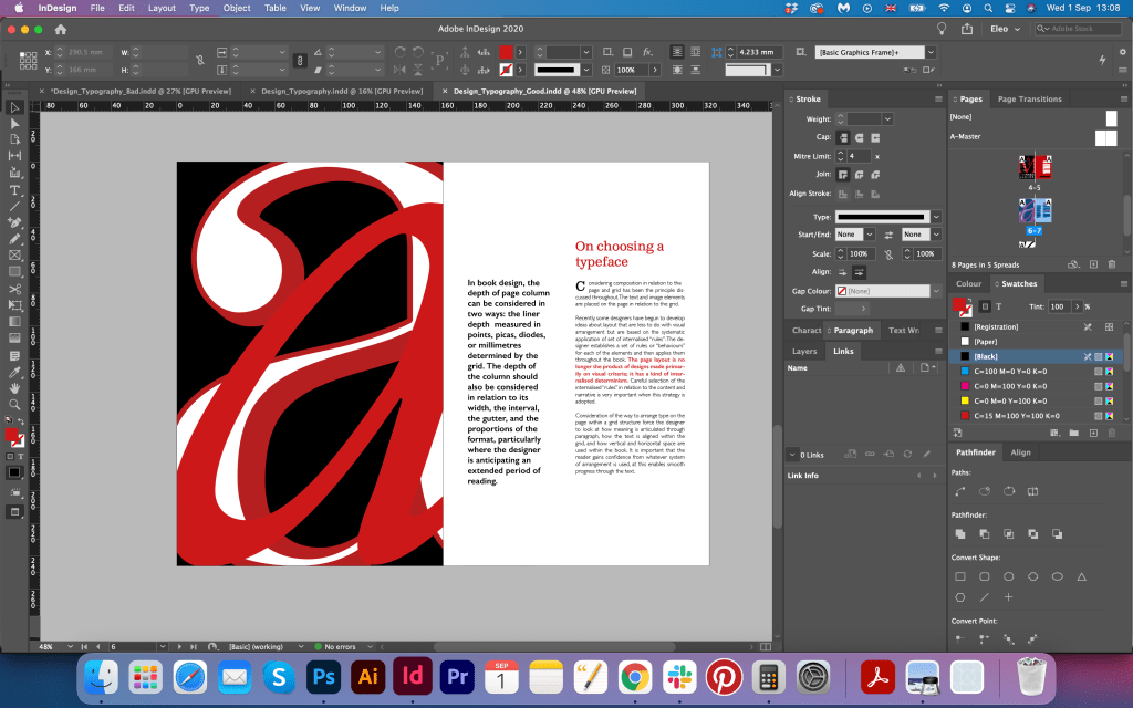
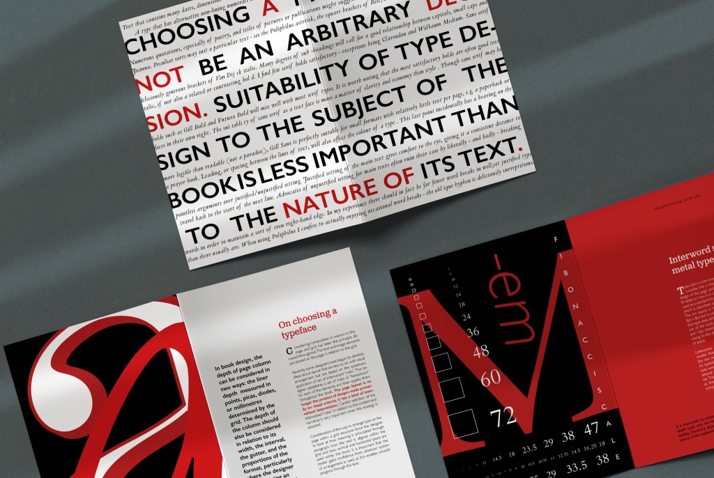
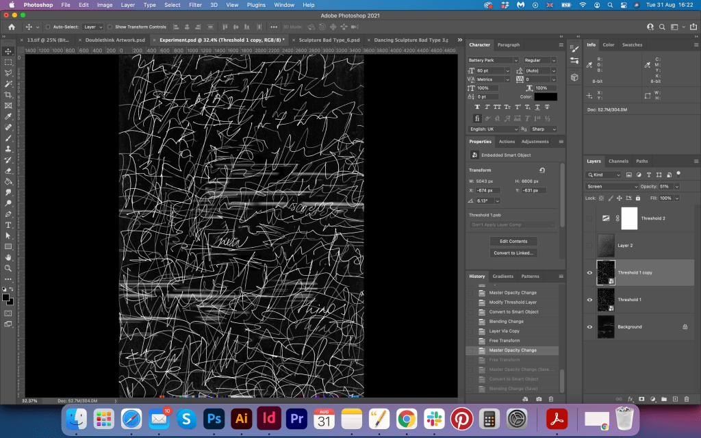
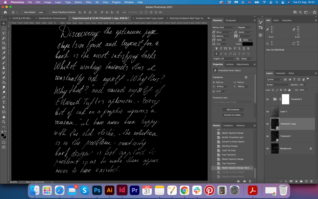
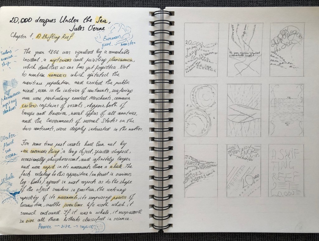
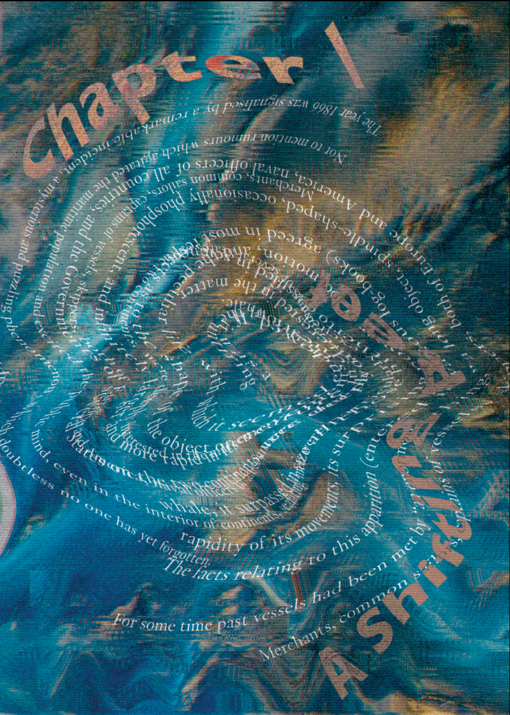
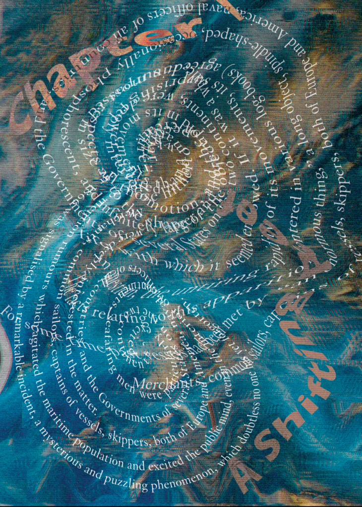
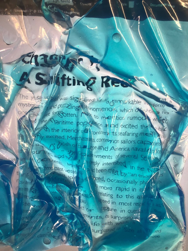
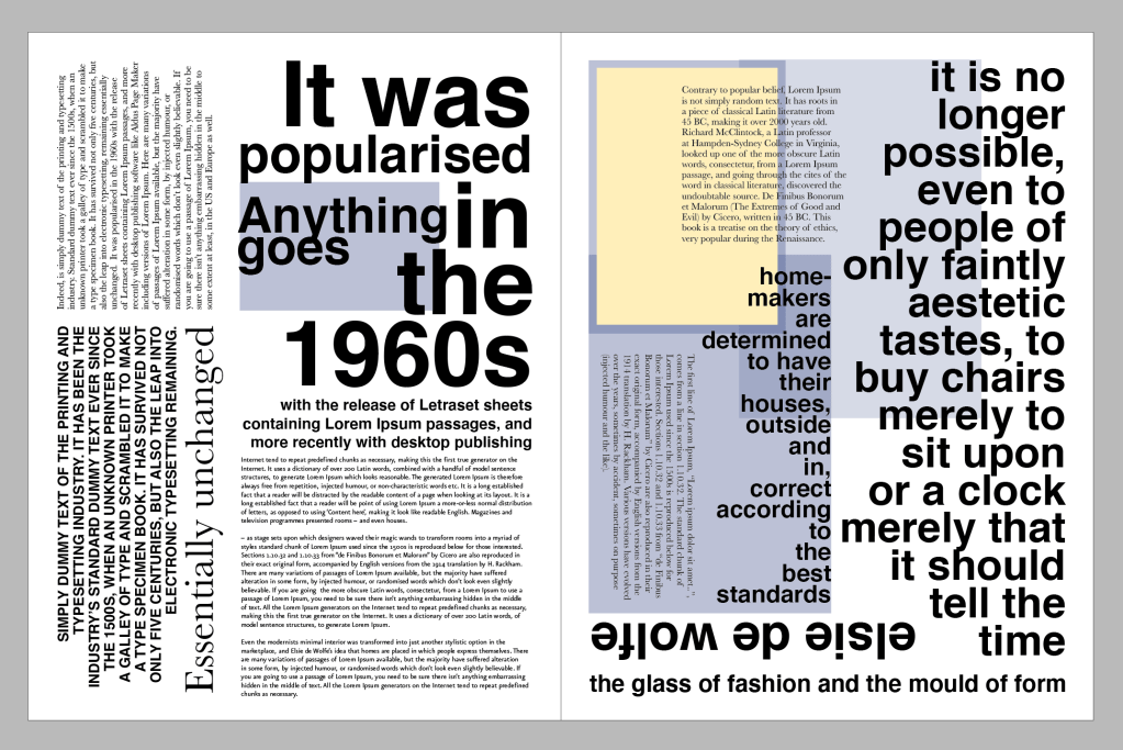
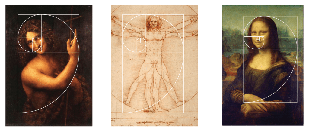
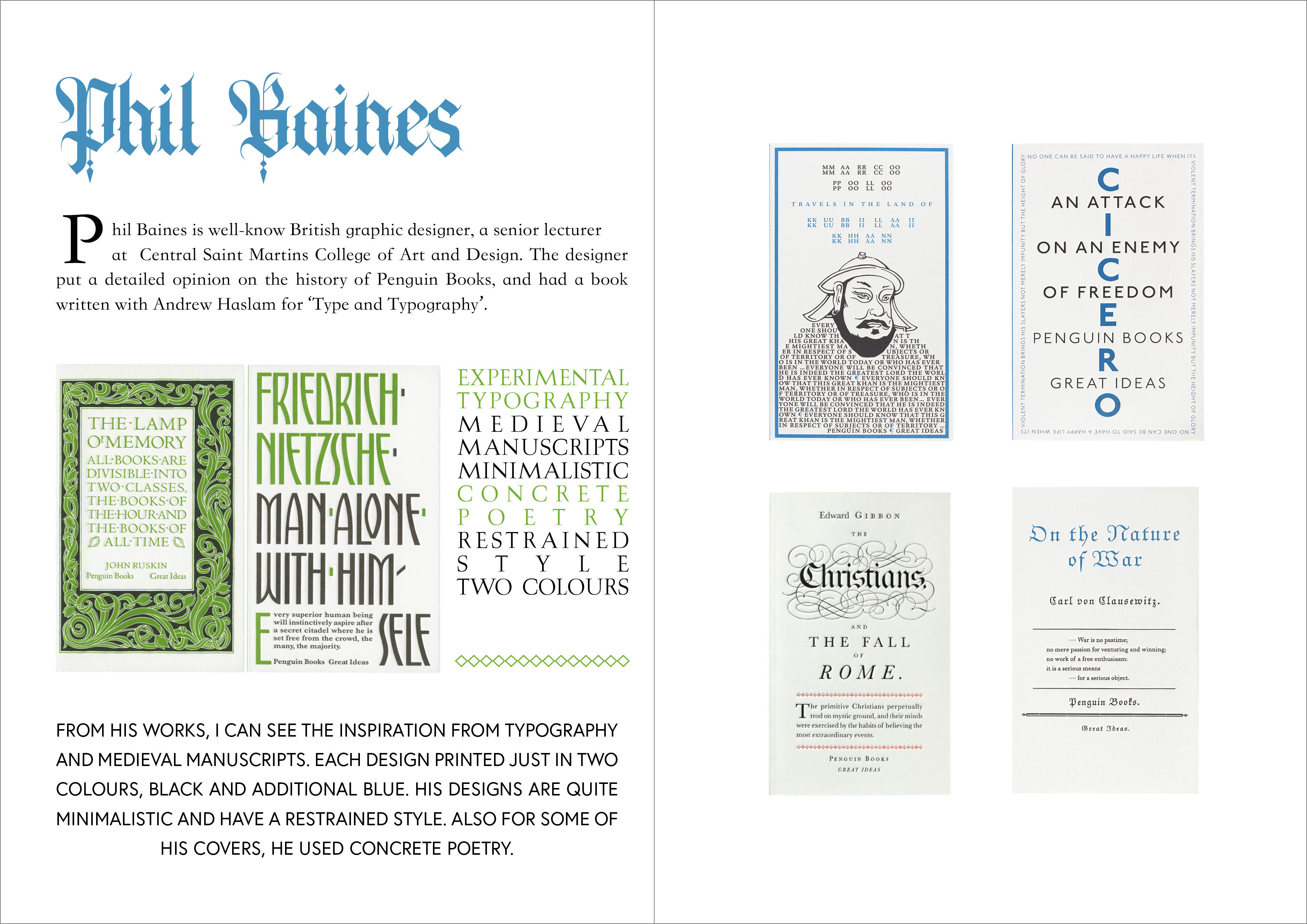
To start with I go my usual route, that to establish some basics in terminology. What is Concrete Poetry, and where the therm is coming from? Concrete poetry is an arrangement of linguistic elements in which the typographical effect is more important in conveying meaning than verbal significance. Sometimes it is referred to as visual poetry. Concrete poetry relates more to the visual than to the verbal arts although there is a considerable overlap in the kind of product to which it refers. Historically, however, concrete poetry has developed from a long tradition of shaped or patterned poems in which the words are arranged in such a way as to depict their subject.
Critical writing task
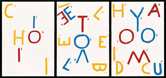
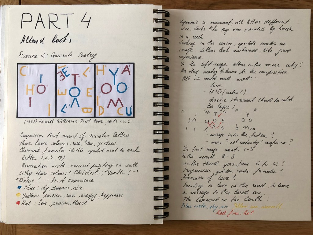
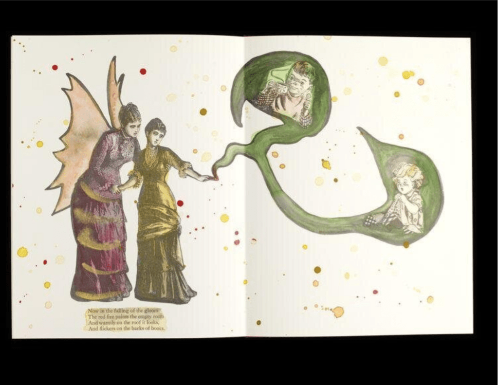
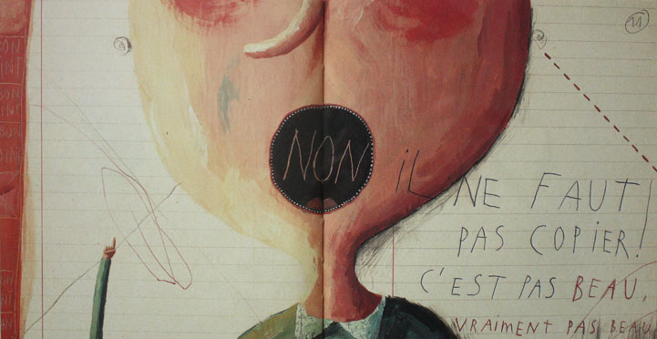
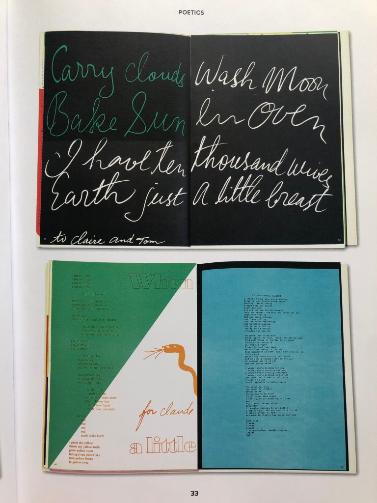
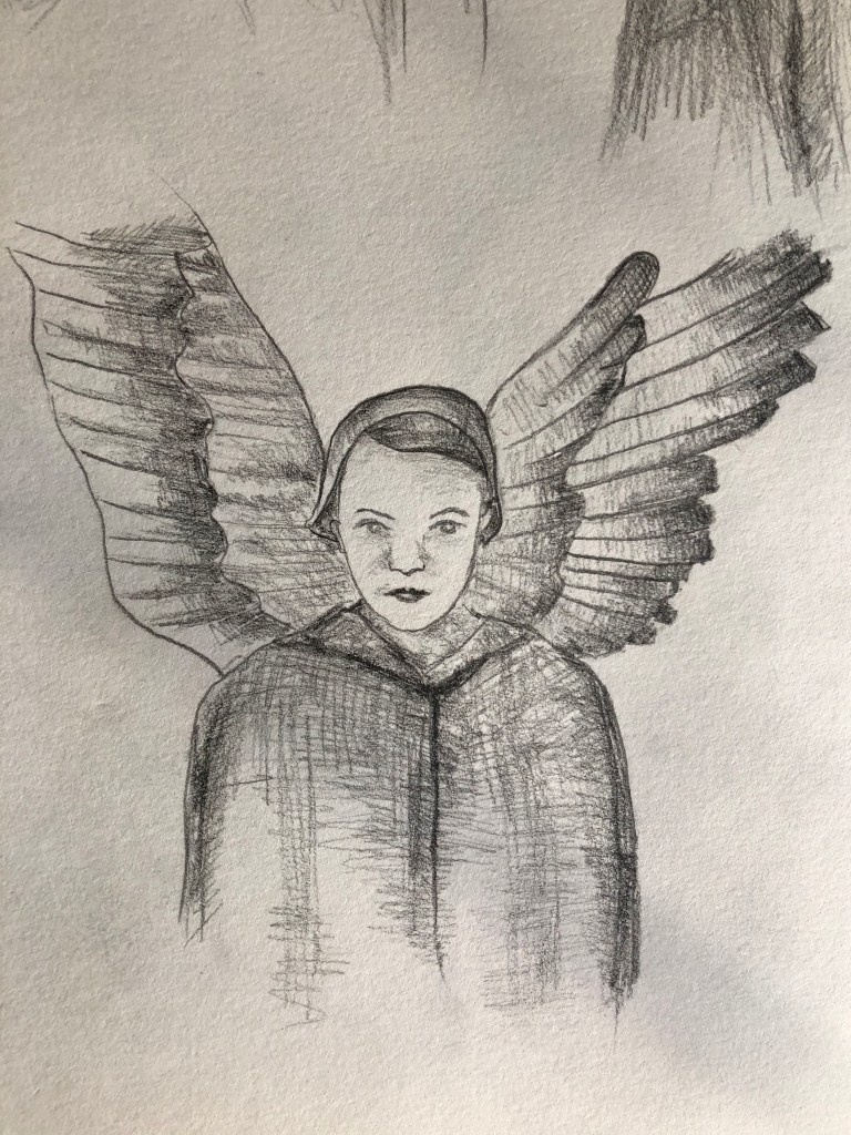
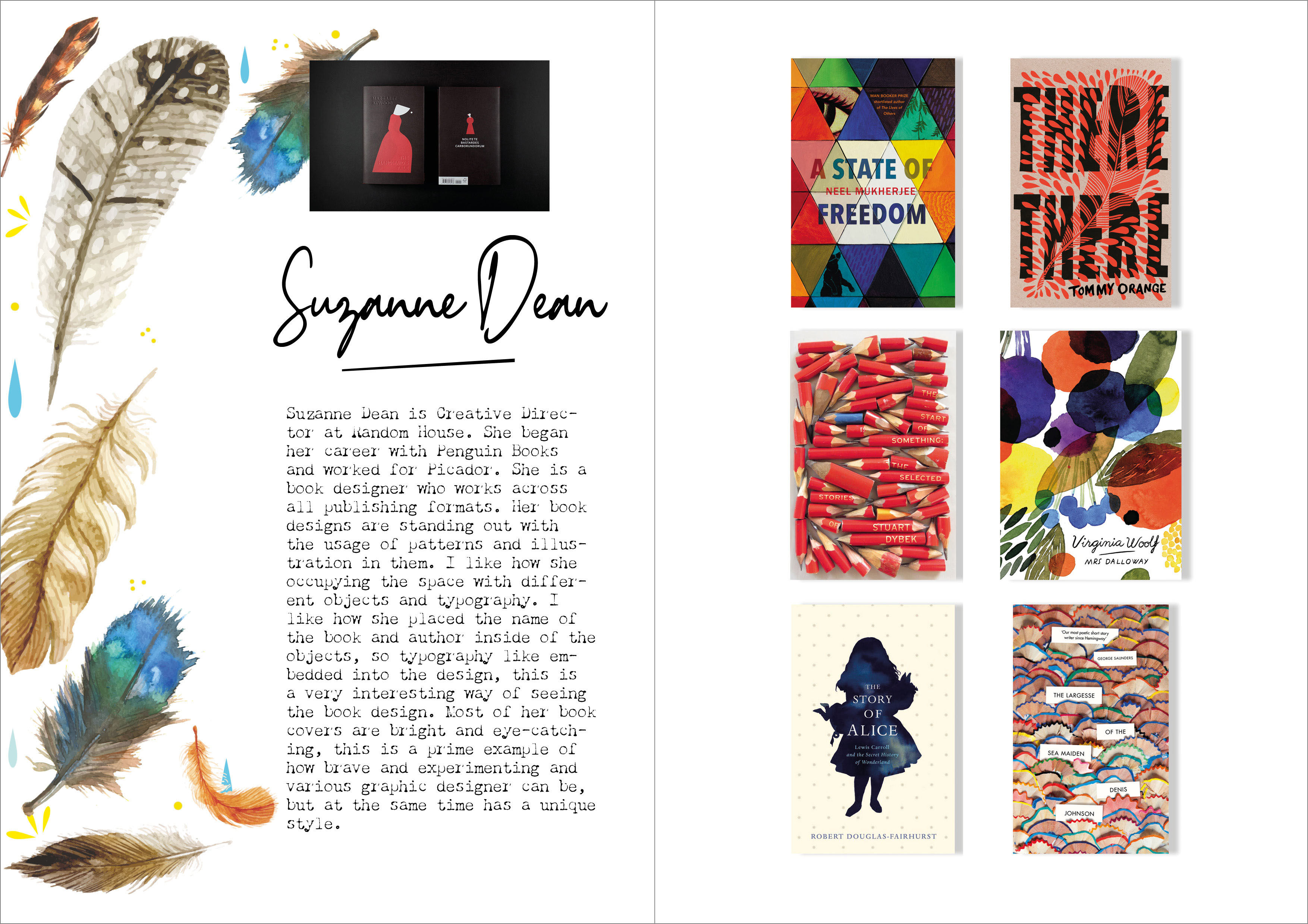
For this task, I’ve chosen work by the American-born poet and visual artist Emmett Williams First Love, parts 1, 2, and 3. The artist played a central role in the practice and dissemination of interdisciplinary art forms following World War II, particularly as part of Fluxus and the concrete poetry movement of the mid-20th century. I looked through other works of different artists, and I have to admit they are quite complicated to explain or understand. Those works are based on intuition and mostly guesses, as the meaning of the works could be various, depends what the viewer wants to see in it. However, this particular concrete poetry First Love gave me lots of different clues and inspiration to analise it.
This composition consists of three parts based on decorative letters and a number symbol next to each letter. When I tried to join those letters together, I noticed that the middle painting contain the word LOVE but left and right arts have geometric structure into them, like those paintings supporting the word in the middle. I’ve noticed the colourwise the artist went to the basic colours, blue, red and yellow, which are traditional symbols for the life on Earth. That gave me a connecting thread from the symbolism of the whole existence, blue, as air and water, yellow is a symbol of happiness and sun, and red as a symbol of passion and fire.
The little symbol next to each letter could mean a mathematical formula, a formula of love as well. Also, I thought about chemical threads in this artwork, like the artists want to portray the chemistry of love. I’ve noticed that the letters were made decoratively, they look like they were rushed painted by the brush, probably the way the letters were painted and their colours bringing a lead to the naive and the first experience of the First Love art. Also, the way how numbers were added, looked like some notes from the student at school, someone who just learning and getting first experience from life. Probably the artist wanted to show the very first experience, naivety, immaturity and innocence.
Quite an important part of this image is the movement and the dynamic that the artist has created. The right and the left painting has static letters, they are all in the correct angle, but the middle painting with the word love in it has some funny angles for the letters, which gives a feel of energy and movements of the love feeling.
I hoped one of my assumptions does make sense, and my attempt of explaining this work will be somewhere near what the author wanted to say. I digged through internet for some more clarification on this concrete poetry, and finally I found some interesting facts from the artist about the work. I was pleased that I was quite close to the understanding this piece of art, and it gave me some confidence in my intuitive understanding of this concrete poetry art.
The first version of “First Love” appeared in 1966 as a unique publication. Later in 1983, it appears as a poem with three parts and three languages. The poem is based, of course, on an old game that is played, like children, by following the numbers and thus arriving at the secret message. The involvement of different languages perhaps steals the innocence of infidelity from the game. Emmett Williams wanted to show the intentional coarseness of the characters and the desire to restore to the innocence of his illiterate childhood signify.
Introductionary
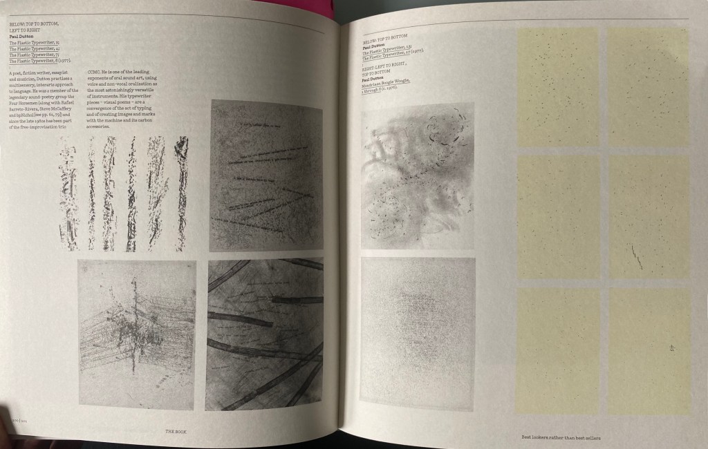
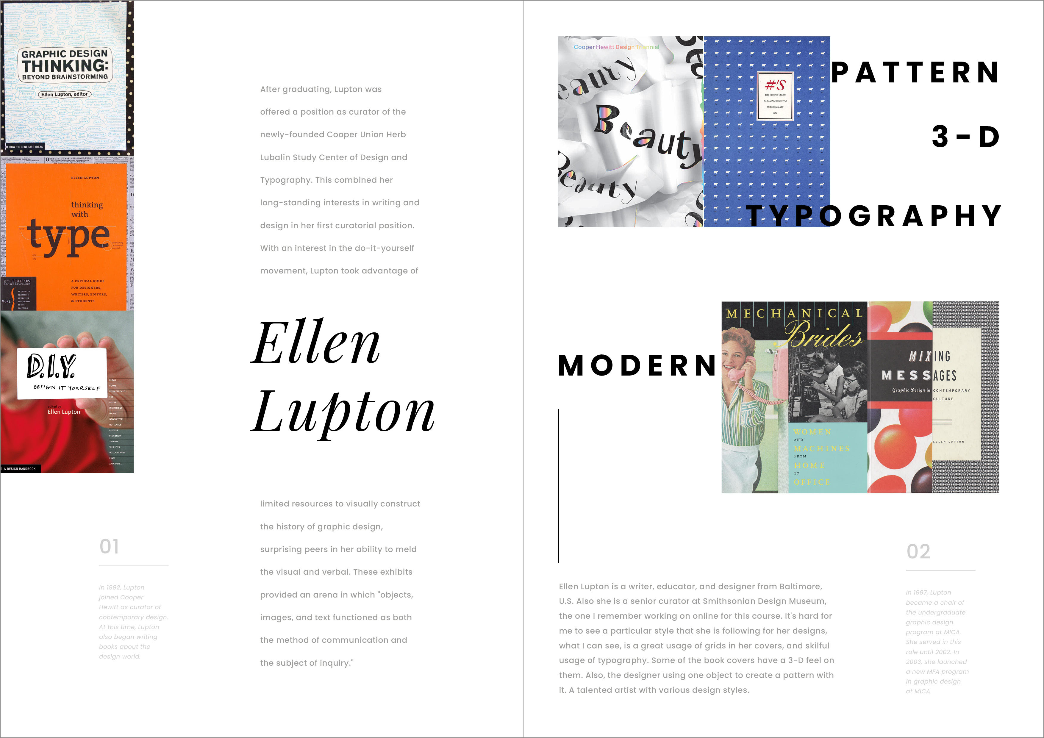
The typewriter is considered to be on of the creative tools of expressing more “thinking in the head”. The typewriter is designed to be used in a very simple way. In contrast to modern days we have the luxury of using our computers and programs for expressing the concrete poetry art, but back to those times there was little margin for error, which required concentration and designed could be produced in one go. The definition of typewriter art can really only be a personal one. For some artists, it is an object to draw, for others is a tool to draw with, which means making art.
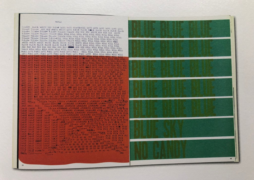
Concrete poetry is perhaps the type of art that first off all appears to eye and to the ear. The definition for concrete poetry can be described straight forward, but what is quite clear, that works should not need to include letters, or complex texts to be classed as concrete poetry.
Mike Weaver identified three types of concrete poetry: visual (optic), phonetic (sound) and kinetic (moving). Concrete poems could be read as vertically or backwards, or sometime reader should navigate through the same text twice.
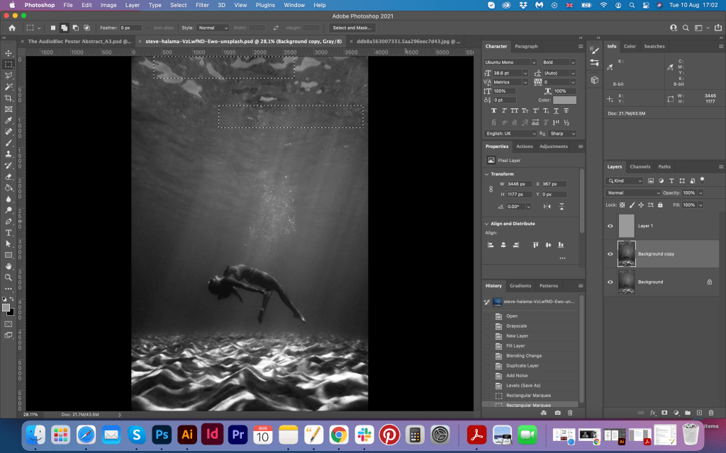
Visual task
http://www.togdazine.ru/article/2061
I was intrigued with the meaning of this poem, as behind those designs and weird text combinations was hidden a special meaning. I really wanted to learn more about it, as I expected it will help me to open my vision for producing some interesting design ideas.
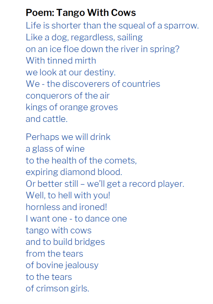
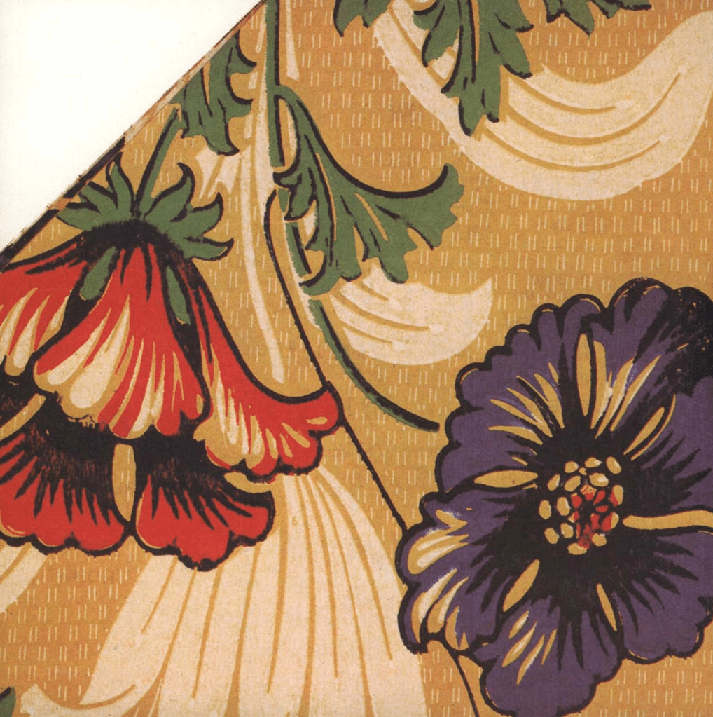
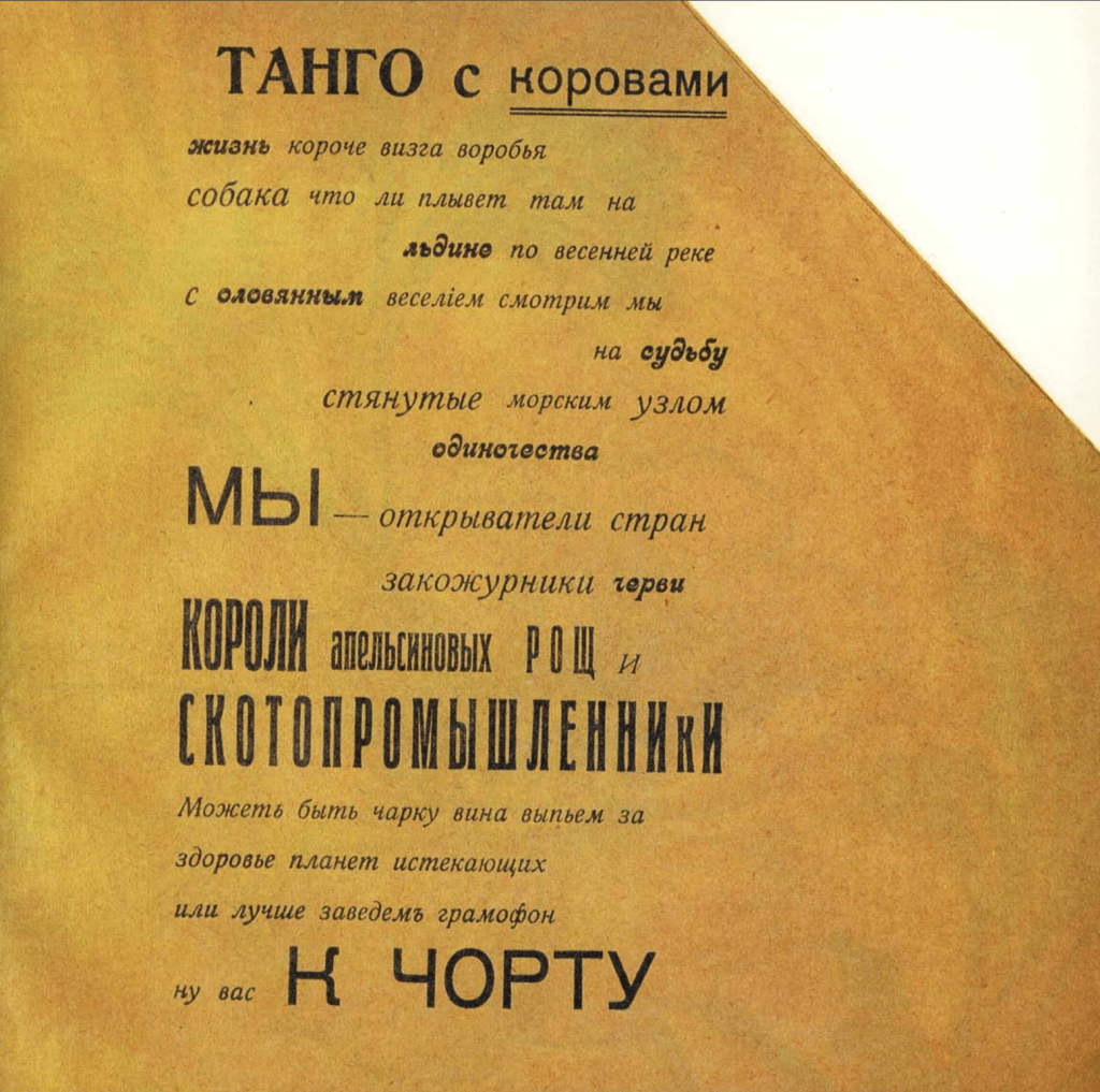
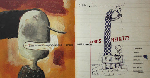
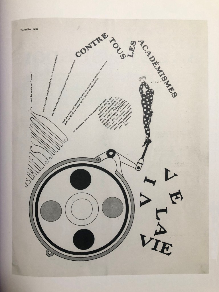
Design for this edition looked quite unusual, as it was not just printed on the white paper, it has some eclectic ideas in design and shape of the book was unique as well. The publication is classified as experimental. Printed on a yellow-flowered wallpaper, it has a discouraging title Tango with Cows and comes in the form of an irregular pentagon. The book was printed in the style of Dadaism: the cover and the entire text are typed using different-sized typographic letters, randomly located on the area of the printed sheet.
Tango with Cows is a square-format book (20×20 cm), the right edge of which is cut diagonally, that’s why Kamensky called it a “pentagonal book”. In order to break the symmetry and accentuate the dynamics of the text, it was not enough to cut the lines, words, letters, it was necessary to change the very shape of the book. The three drawings by Vladimir and David Burliuk placed in the book are typical examples of futuristic graphics with bouncing letters, inverted and scattered fragments of figures.
The poems were printed on the back of yellow wallpaper. Kamensky probably borrowed the idea from Mayakovsky’s famous yellow sweater, which often appears in his early poems as “A veil sweater” (“I will sew myself … a yellow sweater of three yards of sunset”). If a tango-coloured sweater was a metaphor for a yellow sweater, then the book Tango with Cows can be called a book in a yellow sweater.
Finally, the full title of Kamensky’s poem Tango with Cows was quite in the taste of the alogisms of the new art. Similar to the painting’s name by Kazimir Malevich Cow and Violin in 1913 or Mayakovsky’s poem The Spine Flute.
Logic always put an obstacle to new subconscious movements and in order to get rid of prejudices. A course of alogism was put forward, violins in a cubist building.
Kazimir Malevich
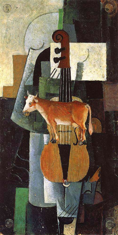
Kazimir Malevich, 1913

https://en.wikipedia.org/wiki/Backbone_Flute
Those researches were quite useful for me, as I could learn some new ideas from the purpose of the alogisms, their influence in design, and detect some key words for my mind map and sketches process.
Mood Board
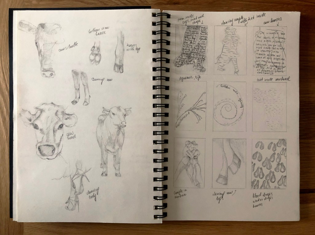
I created a mood board on Pinterest for better imaginations how these two opposite meanings tango and cows could be joined together. I had an idea of creating the shape of a dancing couple with the poem inside of it, but then I had the challenge of implementing the parts of the cow in it. Also, I was thinking of using cow’s hoove in it, or a dancing woman whose legs are crossed between the cow and human (weird combination, but why not?) Another idea was completely to go away from the theme of tango and implement just abstract design in a square or circle. That is quite a curious task to complete as it teaches the designer how to think outside of the box. I was hoping that sketches will help me to come up with some extraordinary solutions for this design.
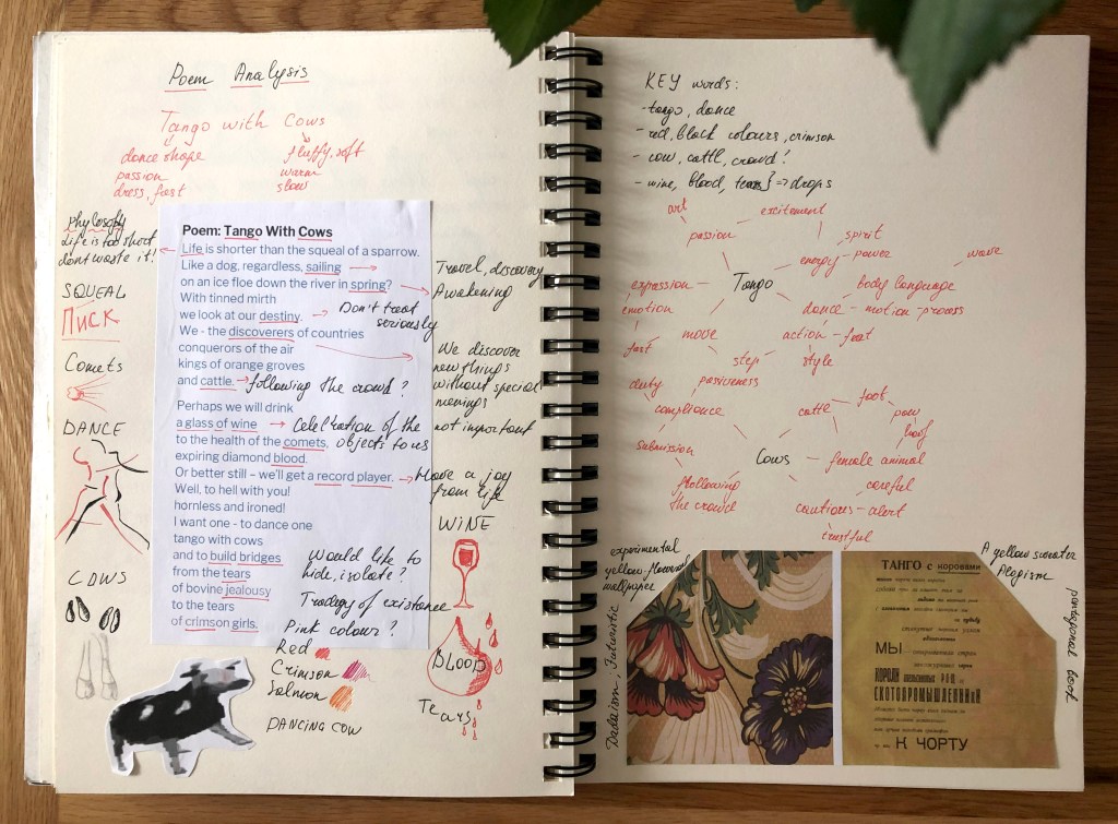
The next step was to the examination of the actual poem, with some highlights for the words and their purpose in it. My mind map research process helped me to detect some key points, and look deeper into the details. From the first read, it seemed like this Tango with cows concrete poetry doesn’t make sense, like a set of disconnected sentences together. But a detailed breakdown helped me to find some good solutions for the design.
Keywords:
- tango
- dance
- passion
- cow
- female
- cattle
- dadaism
- futurism
Inspiration
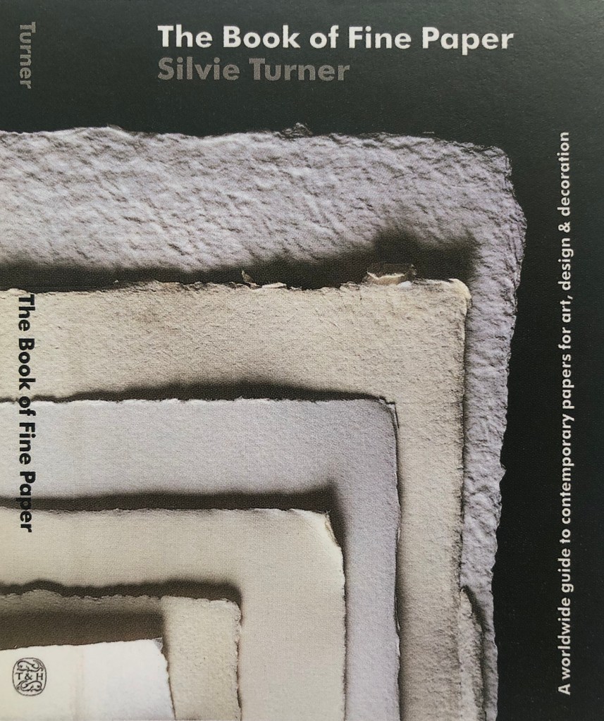
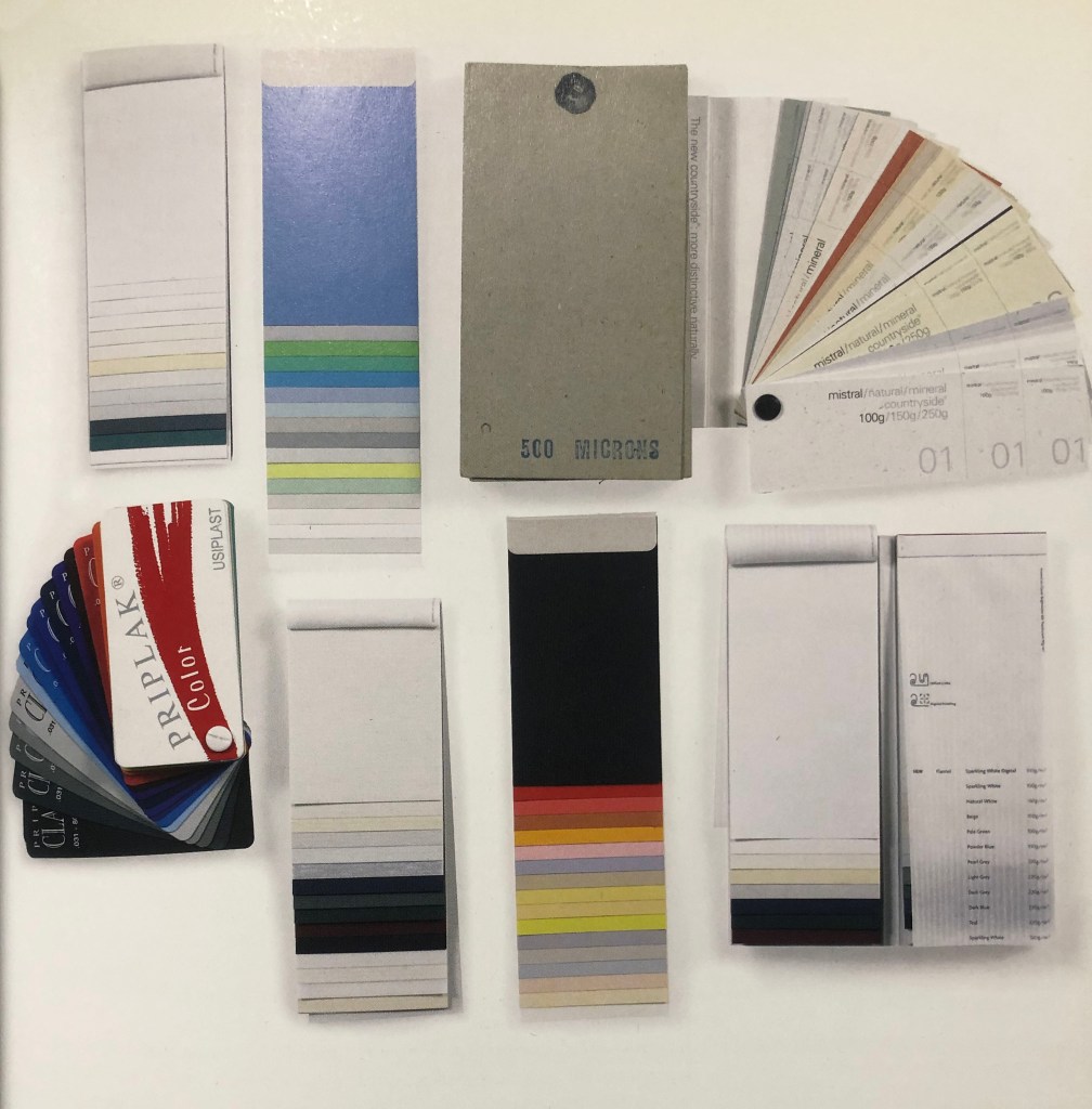
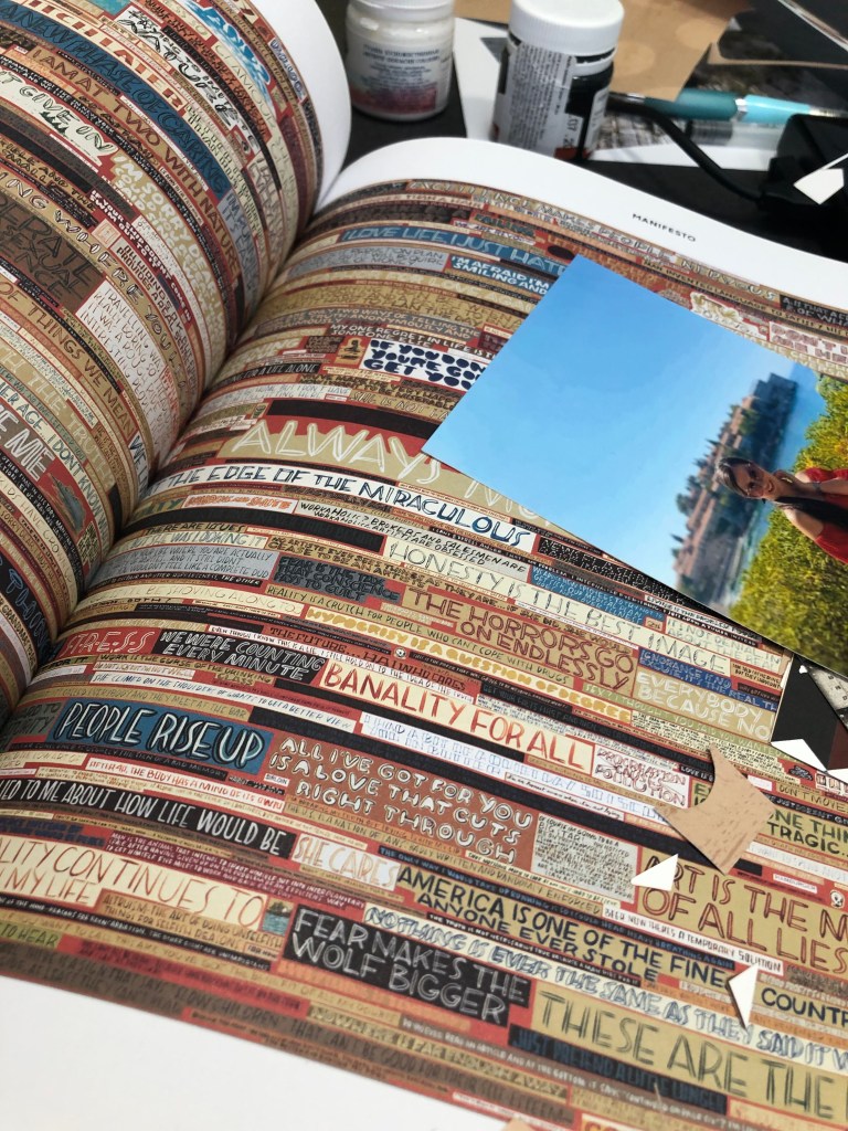
For additional ideas, I referred to my time-tested source, a book call Typewriter Art by Barrie Tullett. I found this book as quite useful material, as it examines the history of concrete poetry in detail, some basics where it started from, also, I could look how typewriter or in my case fonts, could create 3D images. Some of those examples show how beautiful text could look if it is placed in an unusual shape, the movement of the letters can create the feel of floatiness. What’s so important as well, one of the examples shows that even a flat outline can create a recognisable shape of the human. I’ve noticed, that most of the time artists used white, or cream pieces of paper for their works, as concrete poetry mainly was printed on a white background, but in some cases, colours and vector images could be used as well. I thought, that maybe for my design I could implement some colour as well, as the original book had yellow wallpaper and flowery patterns. I could possibly try to create a poster out of it, with minimum design, but instead of using a white background, I could implement colourful paper and some layers into it.
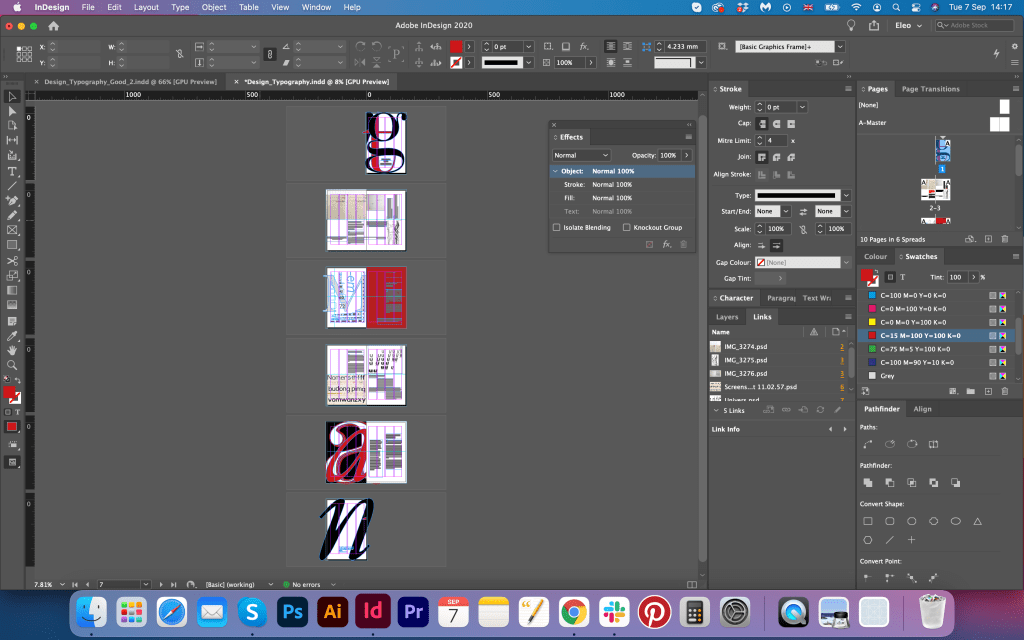
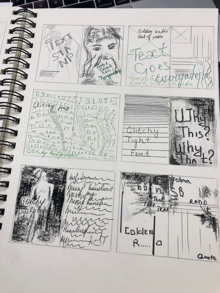
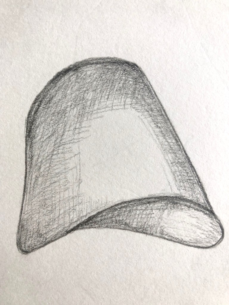
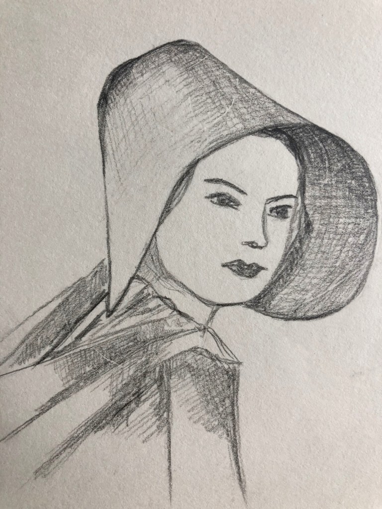
Sketches
With all that ideas in my head I moved to the next stage of sketching some drawings. I really hoped that some of those visuals will help me to generate a visual for design. I drafted some images of the cows, their body parts as hooves and legs. Also, I was thinking about how dancer’s legs could work for this design. Obviously that all was just a help to generate visuals, as design in the end of the day should be based on the usage of the fonts and typography. Practically, it’s similar task as we had before, creating book cover, or poster purely based on typographical symbols, which could be quite creative task as well, minimum colours or objects around can easily provide creative solution in graphic design.
Designs
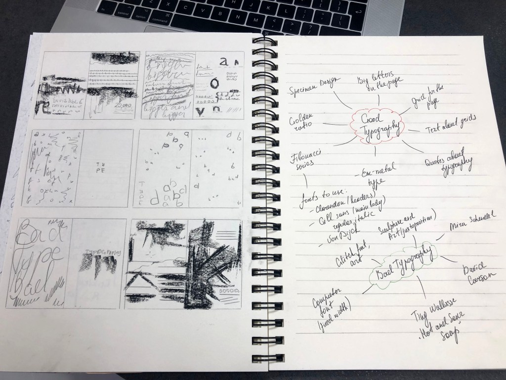
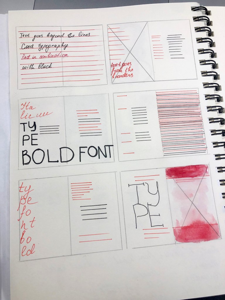
Before actual design I went to chose the font for it. I did some researches that to look how dadaist fonts looked like, also, original template from the Kamensky’s booklet was as an example for me too. I noticed that some fonts looks quite artistic, most likely decorative, bold, and with lots of personality in fonts, and another feature on them was typewriter type of fonts. I think, I could possible go with some of the fonts I have in my collection, and play around with them later in design. Fonts that I added into the list are:
- AdaptiveMono OT (fixed-width font, often used in typewriter art)
- American Typewriter (more classic font, with serifs, could be used for books as well)
- Young Ones (decorative font that consists from different looking letters)
- DadaDa (futuristic looking font, tall and bold san-serif letters, in some occasions for dadaists posters)
- Futurist Fixed-width (quite odd font with big spacing between the letters. Could work well for my concrete poetry design)
- Filena SemiBold (very thin all capital letters font, probably too modern for concrete poetry)
- Almaq (easy to read bold san-serif font)
- Heavy Falcon Condensed
- Addison West Drop (Quite interesting font, has outline and stoned effect on it. Can bring some sort of originality into the poster)
- Bearmen Regular (nice, easy to read, serif fonts, has decorative look, good for posters, or highlighting headers)
- AltaCalifornia (odd font, all letters are in different style, not only visually, but some of them like were developed into the different century. That principle often was being used in posters for dadaism and concrete poetry in the beginning of XX century)
- Alyssum Sans (fat type with narrow lines inside, decorative, good for the headers, have artdeco feel in it)
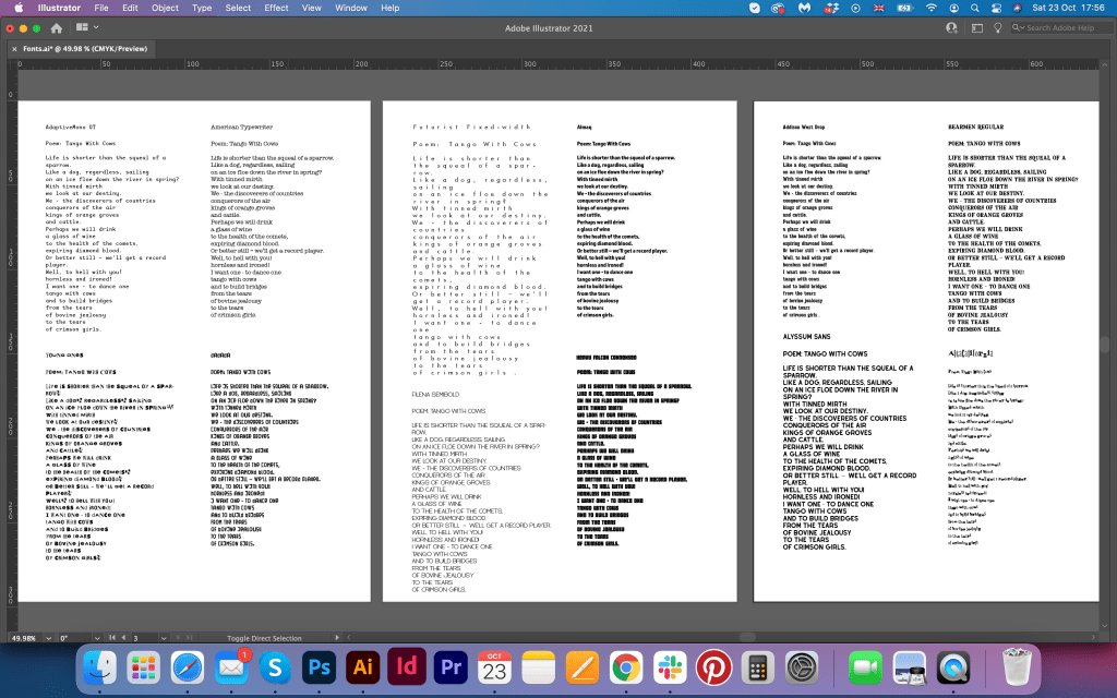
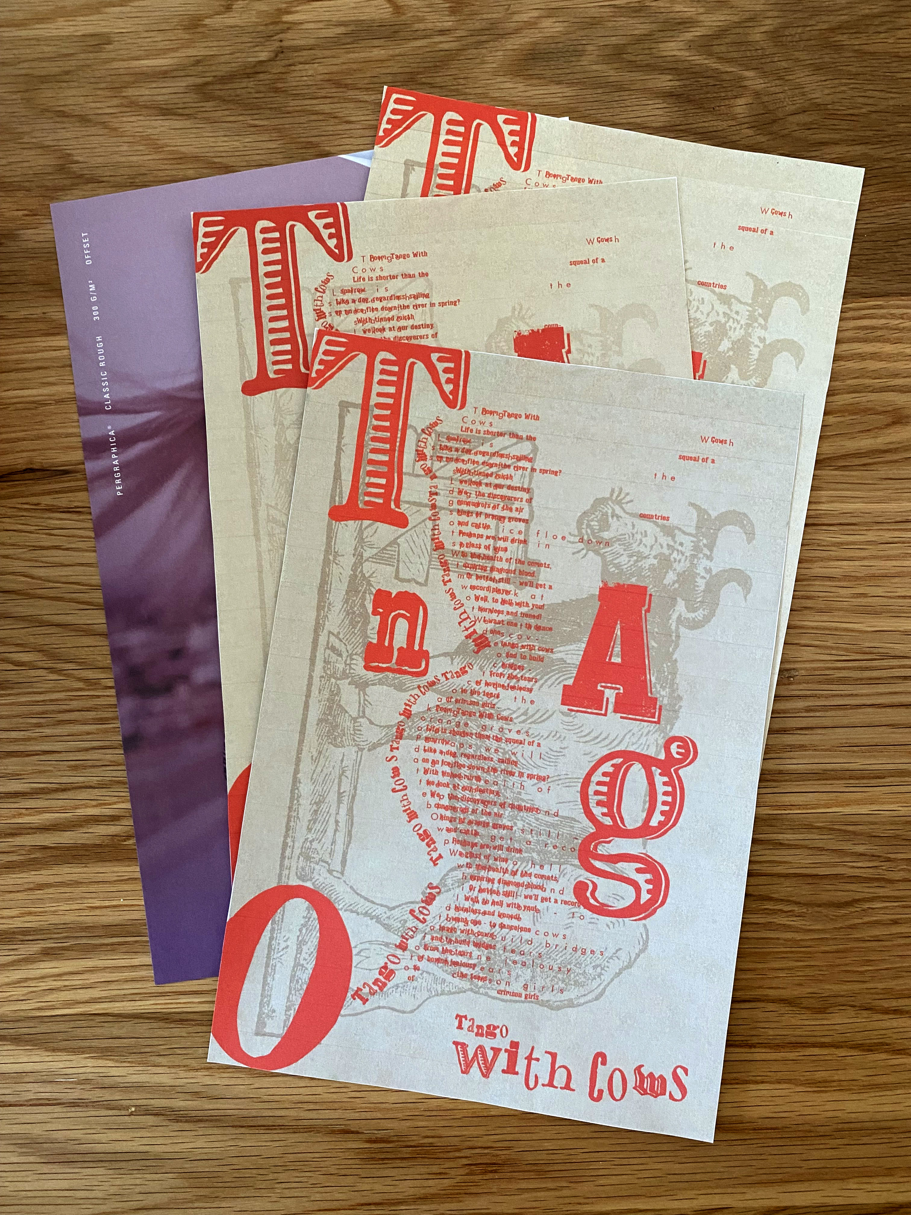
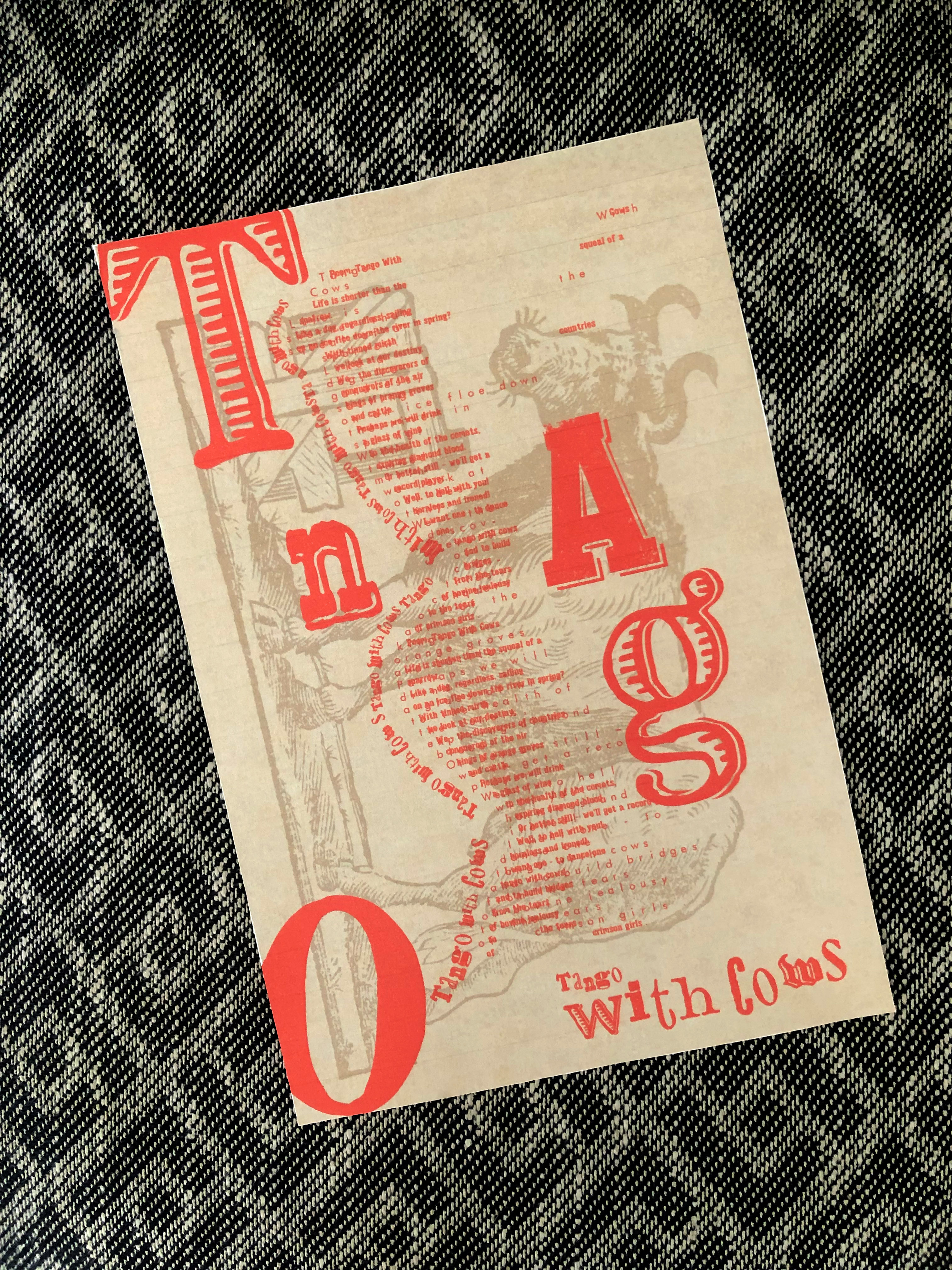
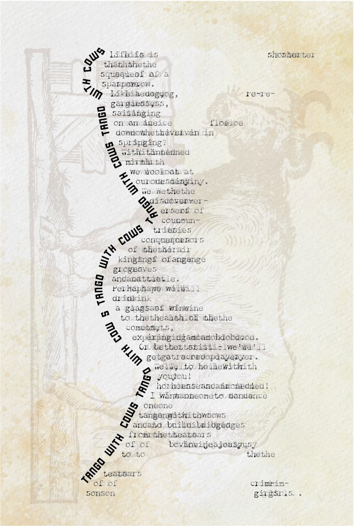
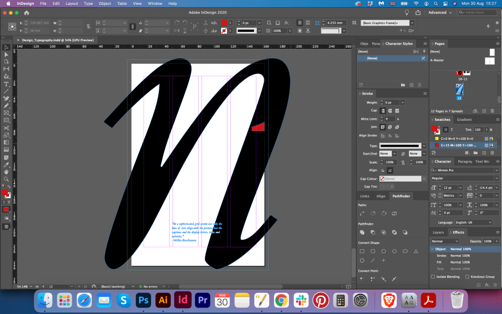
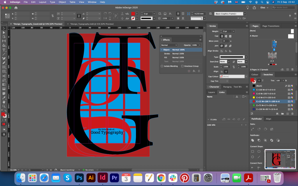
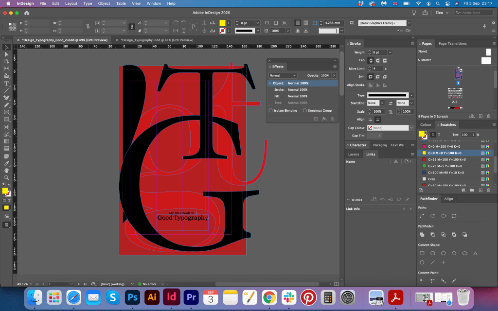
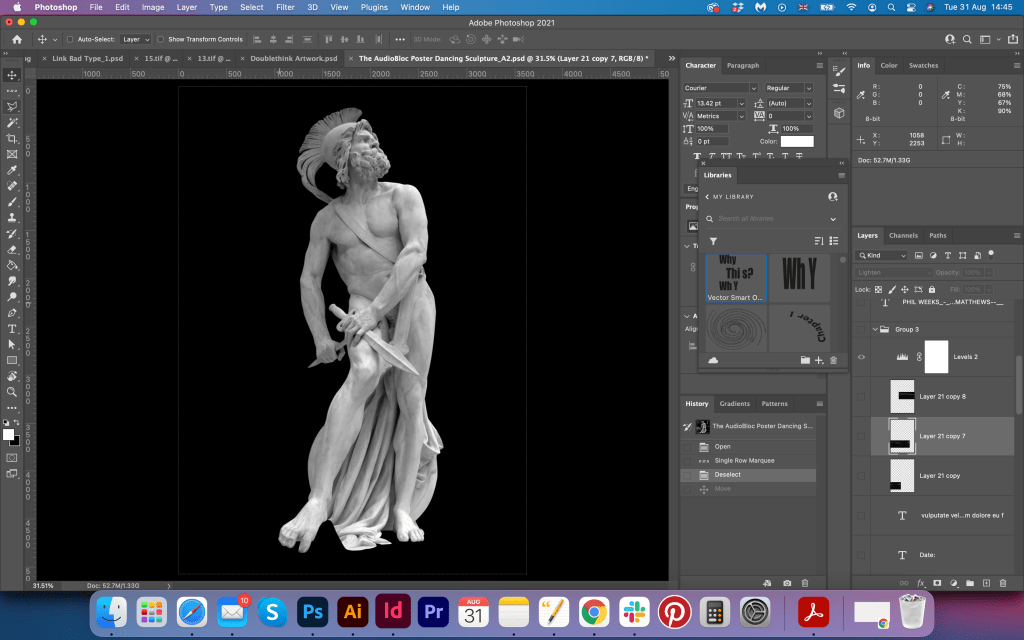
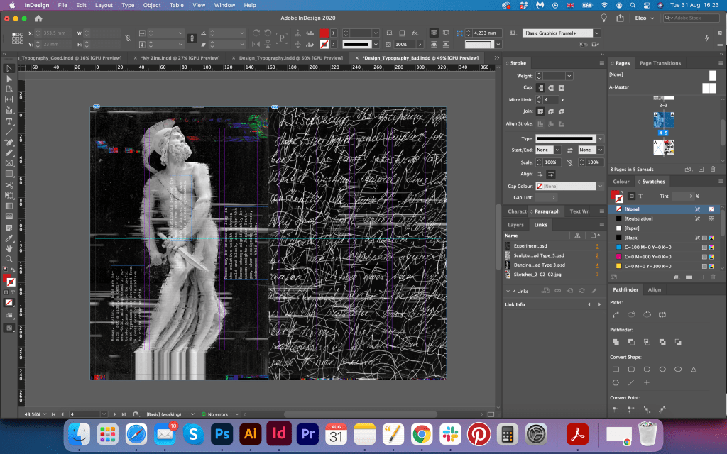
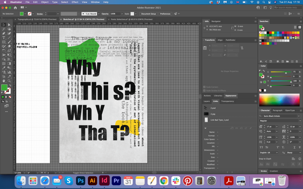
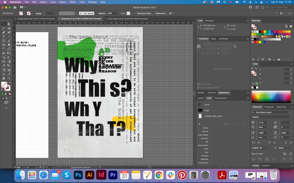
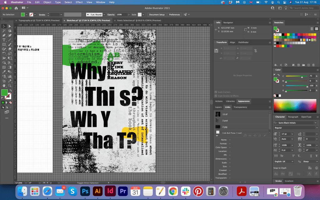
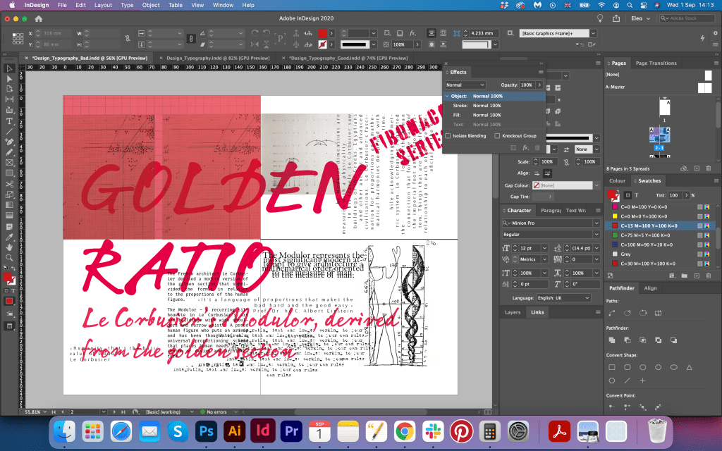
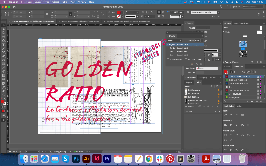
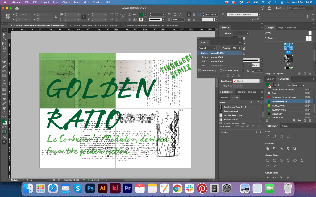
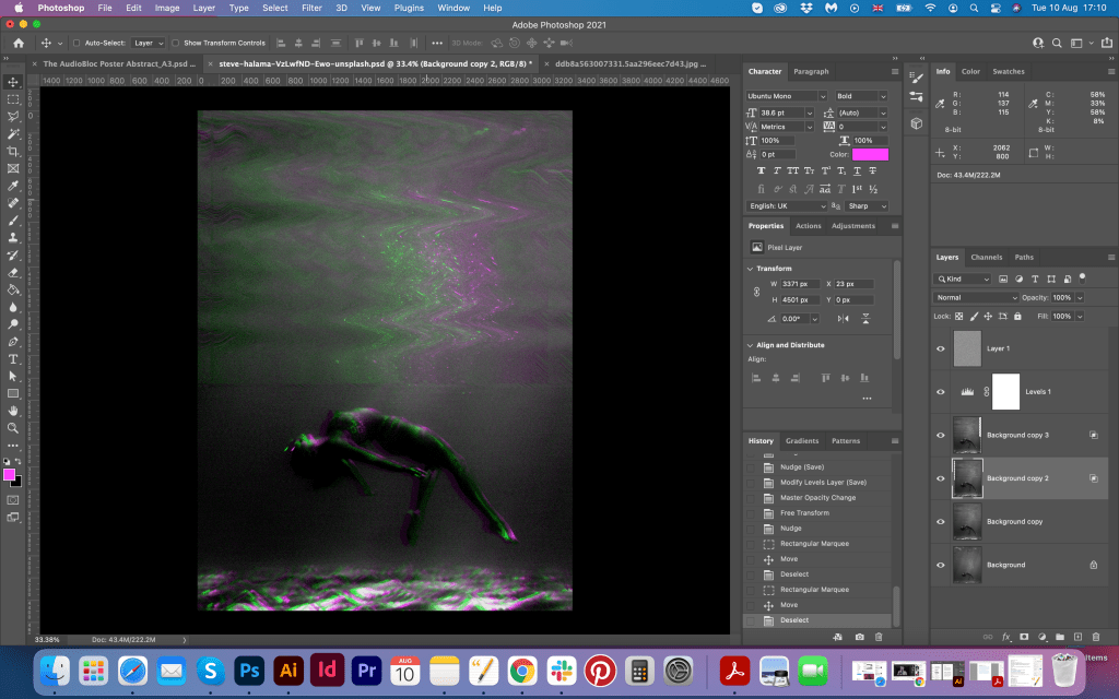
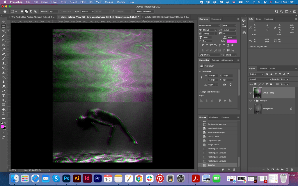
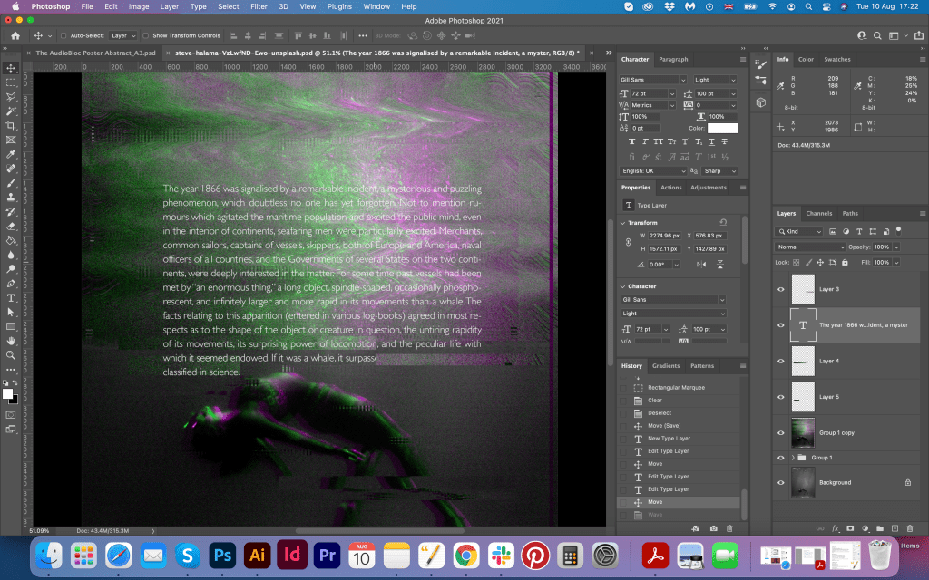
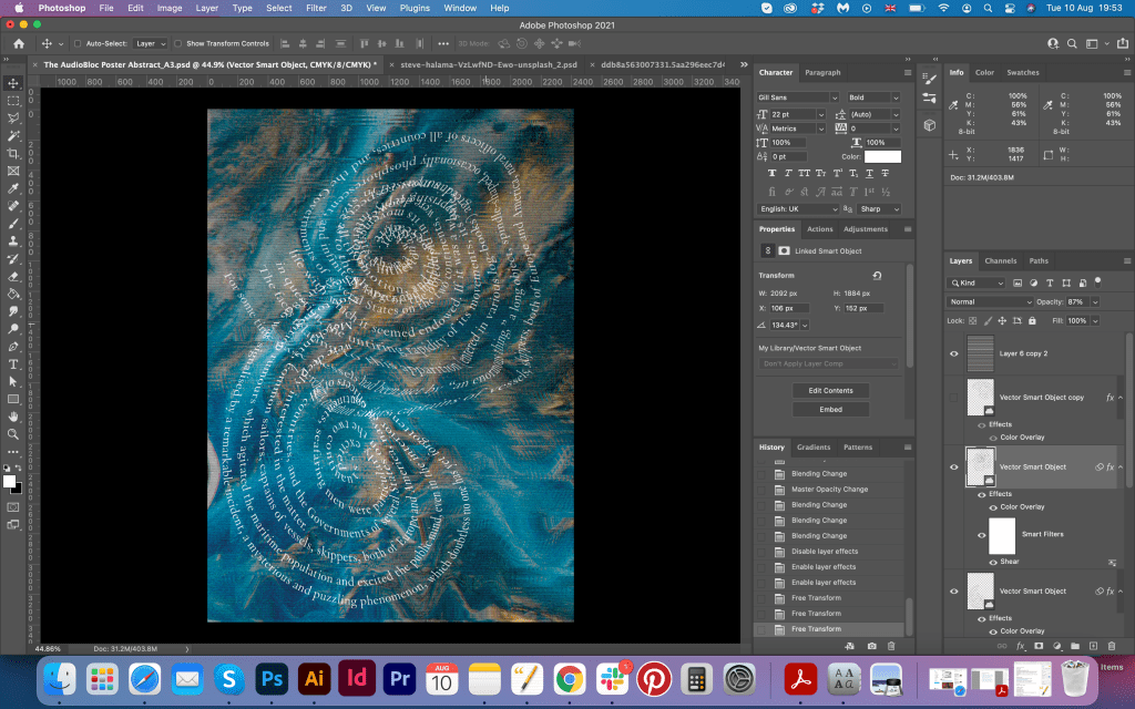
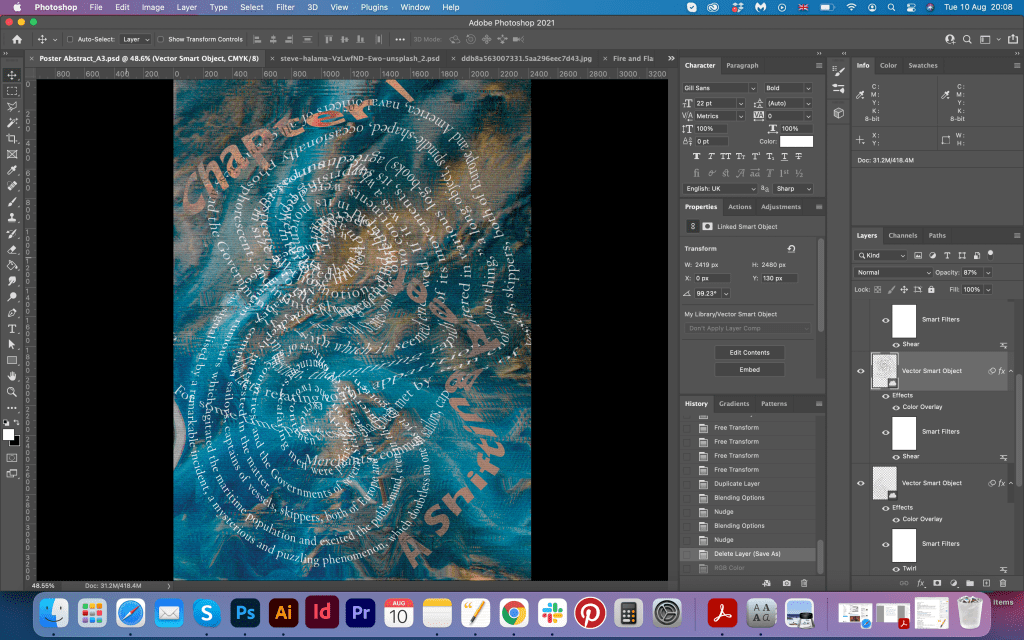
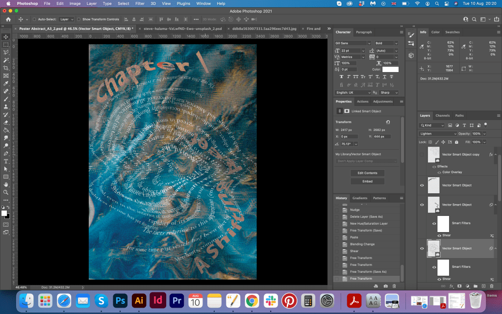
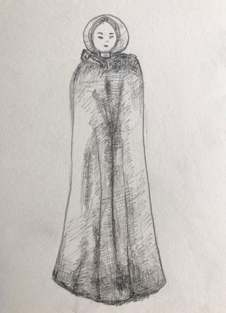
The idea for my design originally was coming from the tango dancing move. In my sketches, I had different solutions for designs, but during their analysis I came up to the idea of woman in a dance move. I created an outline shape of the woman in a long dress, with some passionate move in it. Inside of it, I placed the poem with Futurist Fixed-width type which has lots of space between the letters and visual gaps, and combined it with Addison West Drop type, which has some outlines, and a stoned effect on the top. I was keen on the idea to tied in several typographies as it creates a 3D dimension that I prefer to apply to flat images. I even liked the effects of some letters randomly placed in the corners, as I’ve seen that effect on other dadaist designers works. On the left side, I highlighted the shape of the woman with the repeated name of the poem Tango with Cows, the font for it I used quite odd AltaCalifornia, all letters don’t match together in style, but that is what dadaist designers originally had non-matching fonts.
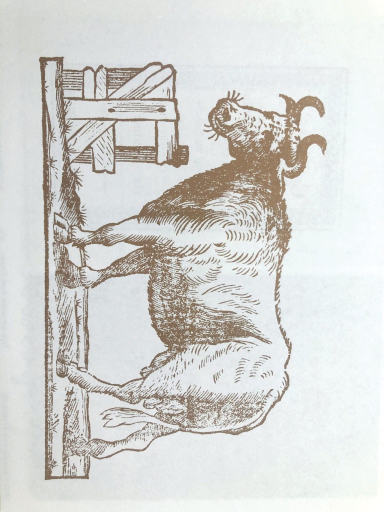
I didn’t know if it was quite obvious, but I found this sketched image of the cow from the book Type. A Visual History of Typefaces and Graphic Styles. This book has a great collection of different types of specimens, and this cow was one of them. I thought would be good to apply a transparent effect on it, and place it on the top of the old paper background. I think both images worked quite well, even the shape of the woman on the front repeated the shape of the cow, so I kind of merged both images together.
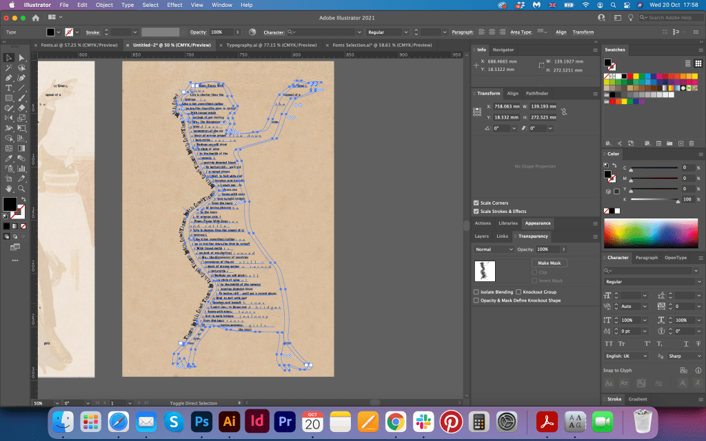
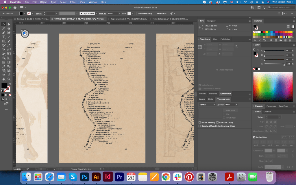
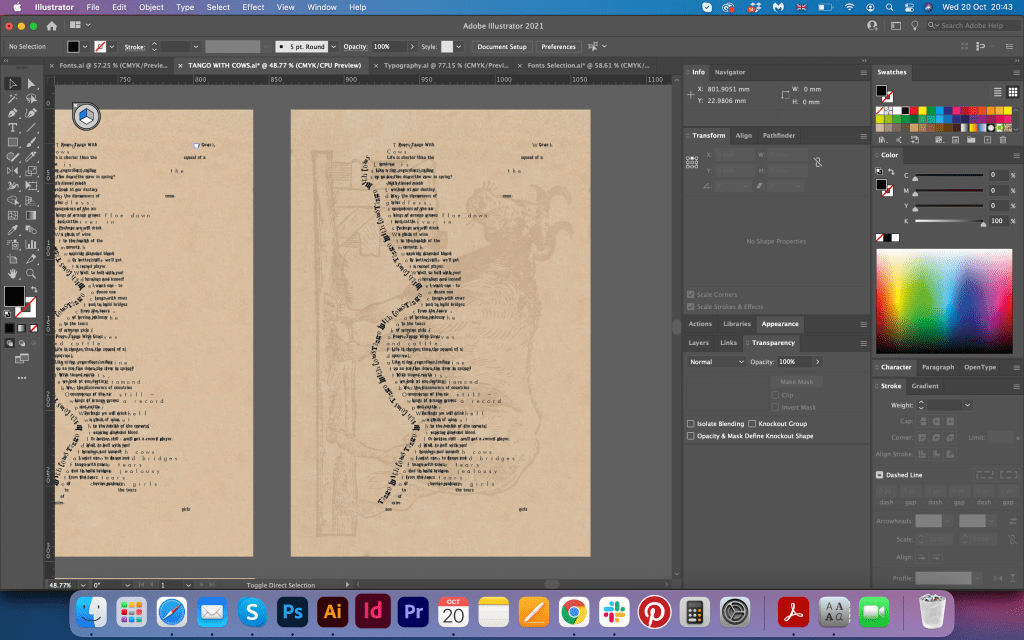
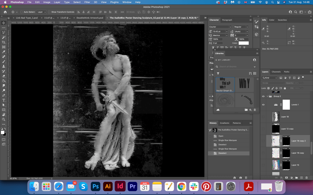
I tried different variations of this designs, with some huge letters ‘TANGO’ on it, with red and black colours for fonts, different variations of the typography, few shades for the background, I thought the more I try, most likely I will peak the right one. I picked nice crimson letters, that didn’t look as sharp as black font. For the big tango letters I picked combined typography Charcuterie Etched and AltaCalifornia.
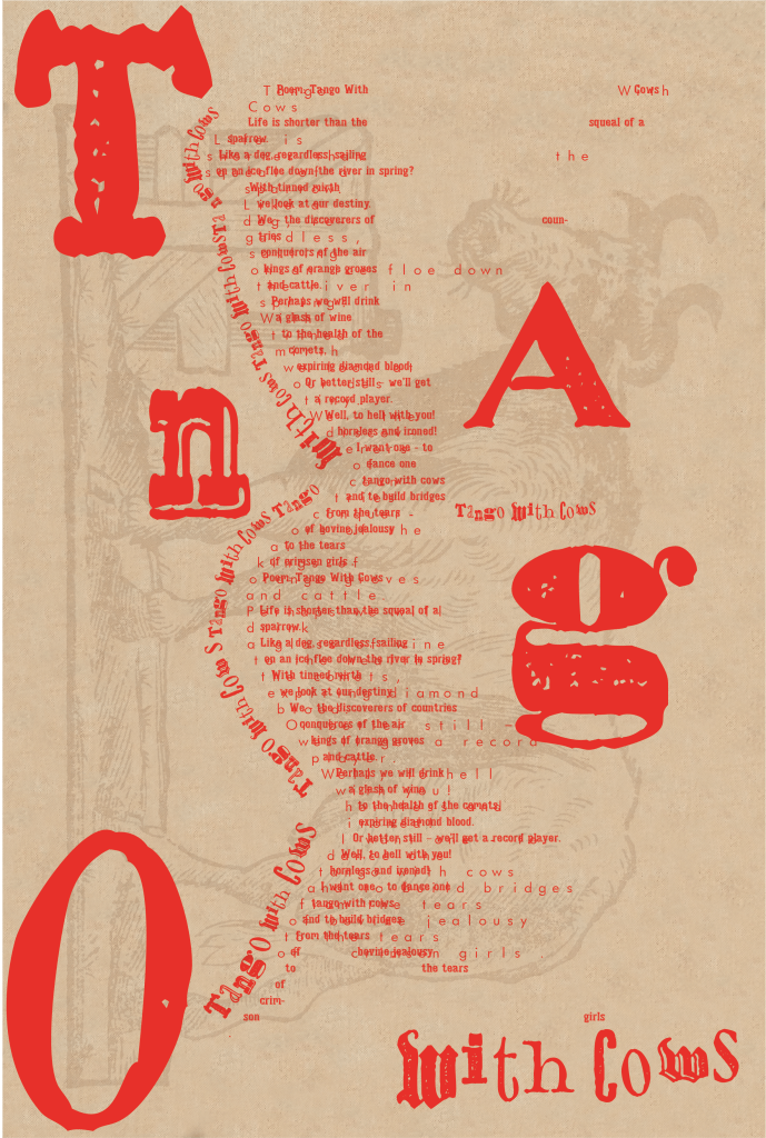
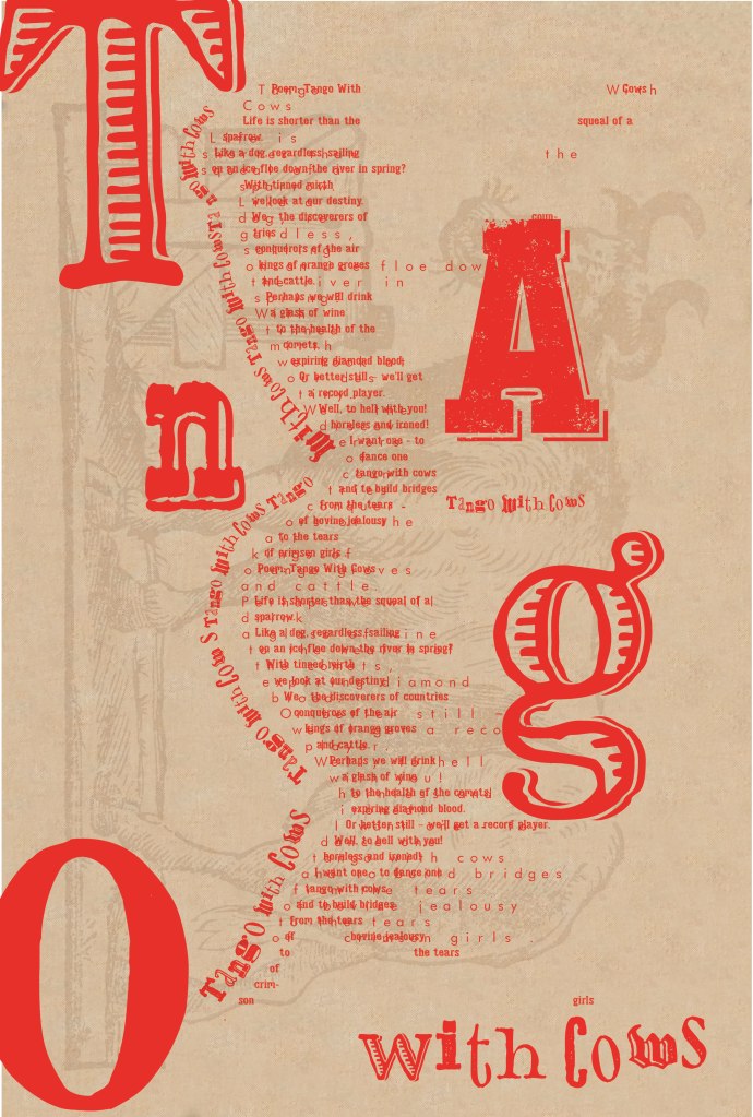


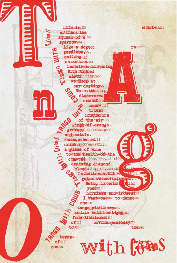
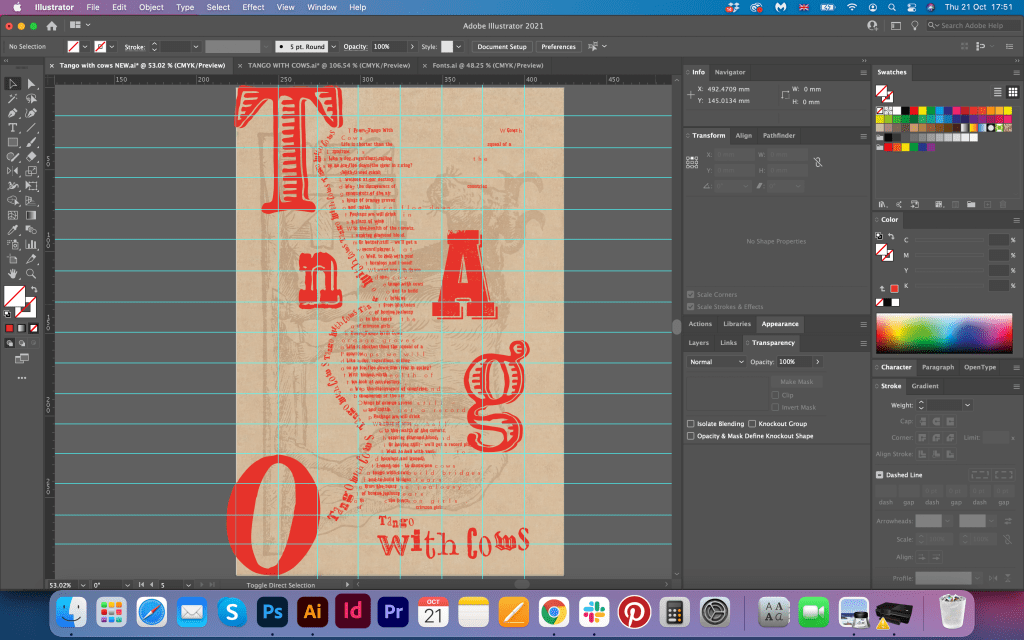
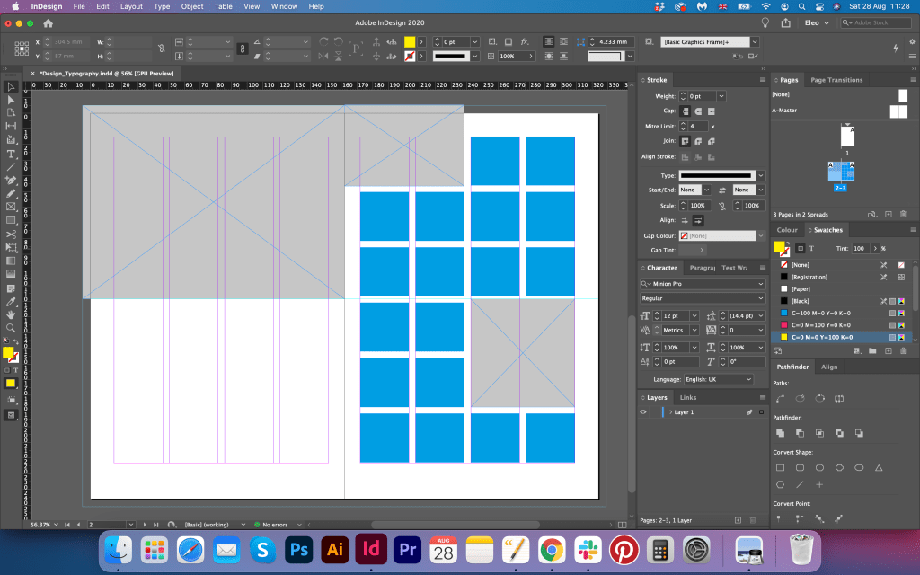
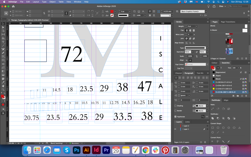
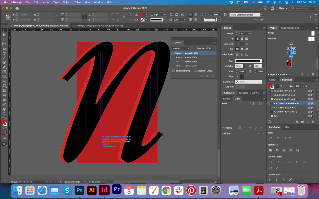
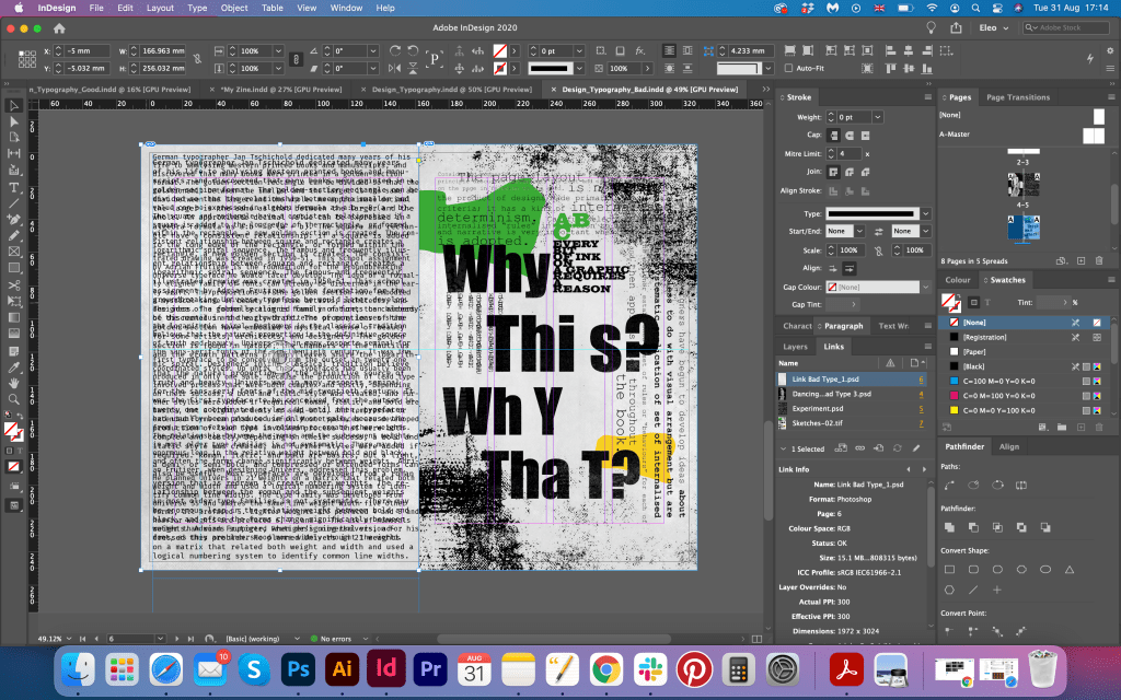
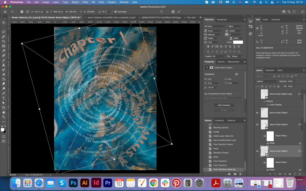
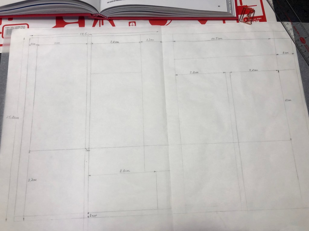
Before printing out the design, I adjusted the layout with the grid. It always helps to see where the particular letter should seat, and those millimetres are quite vital in design composition.

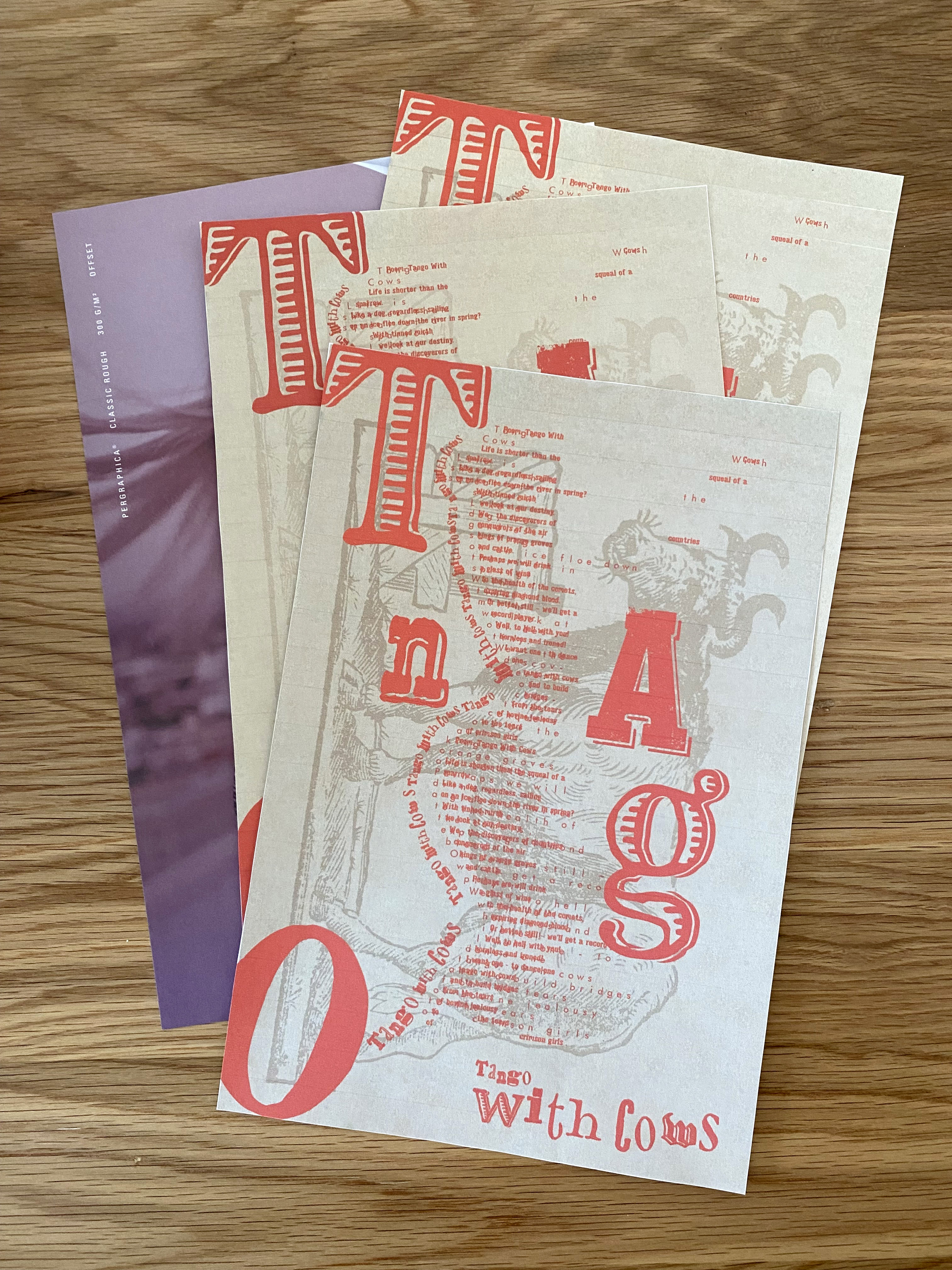
Printed version
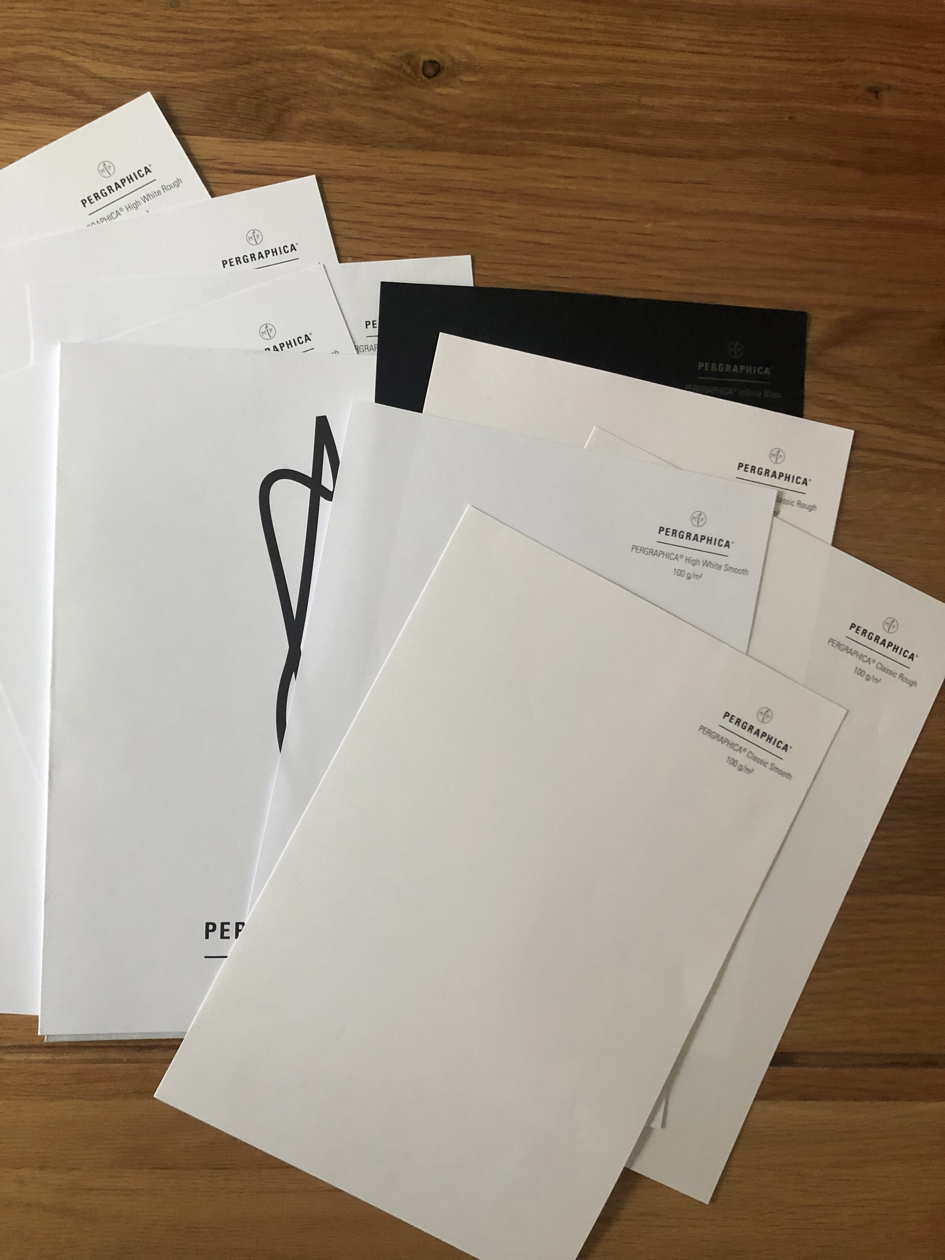
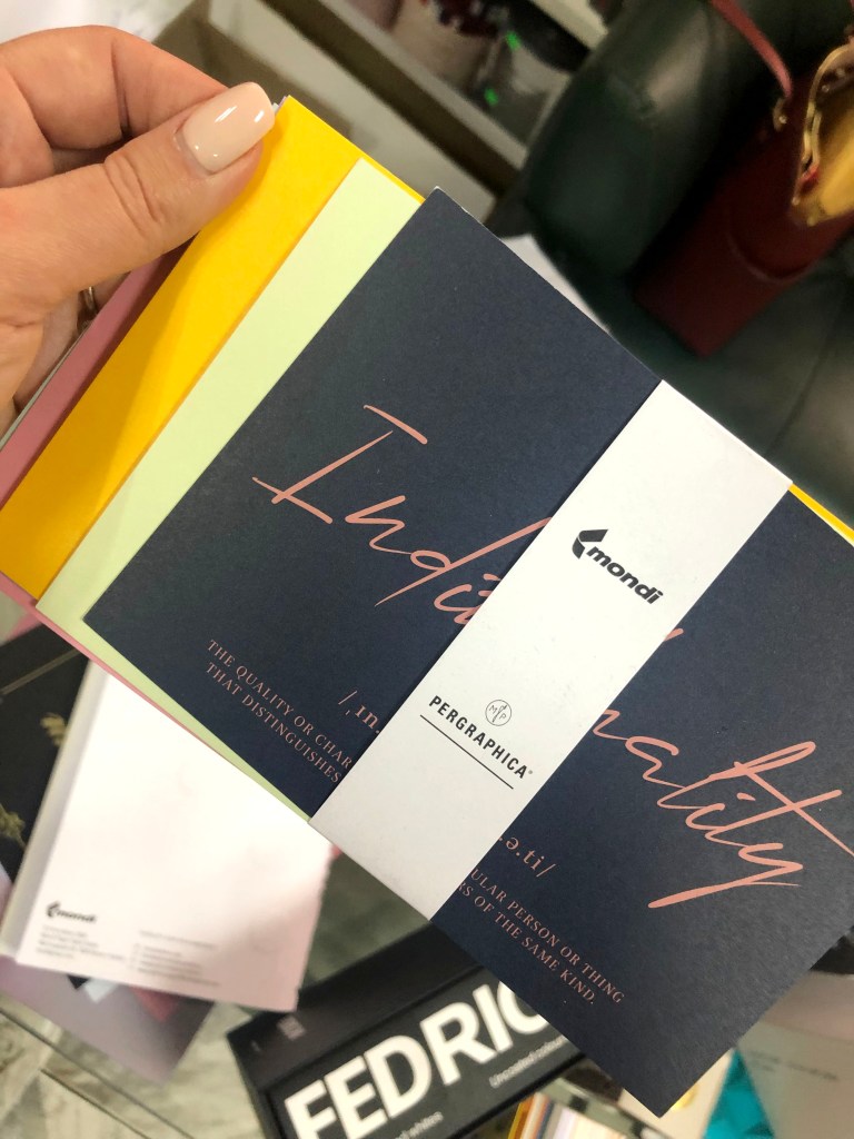
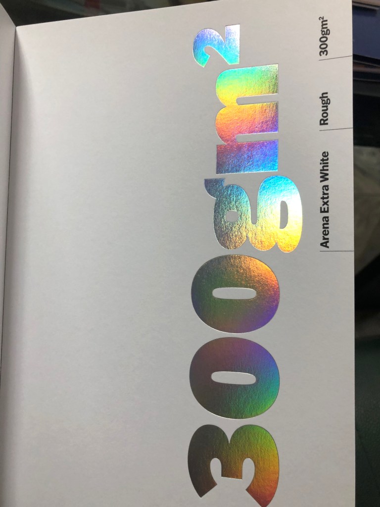
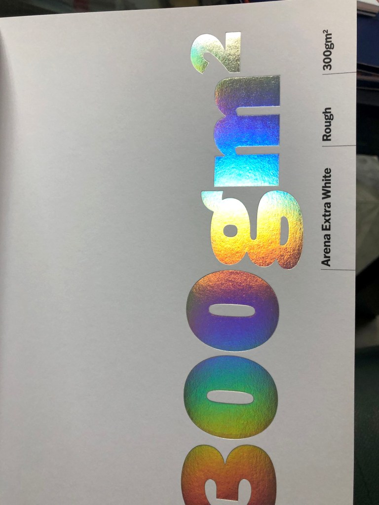
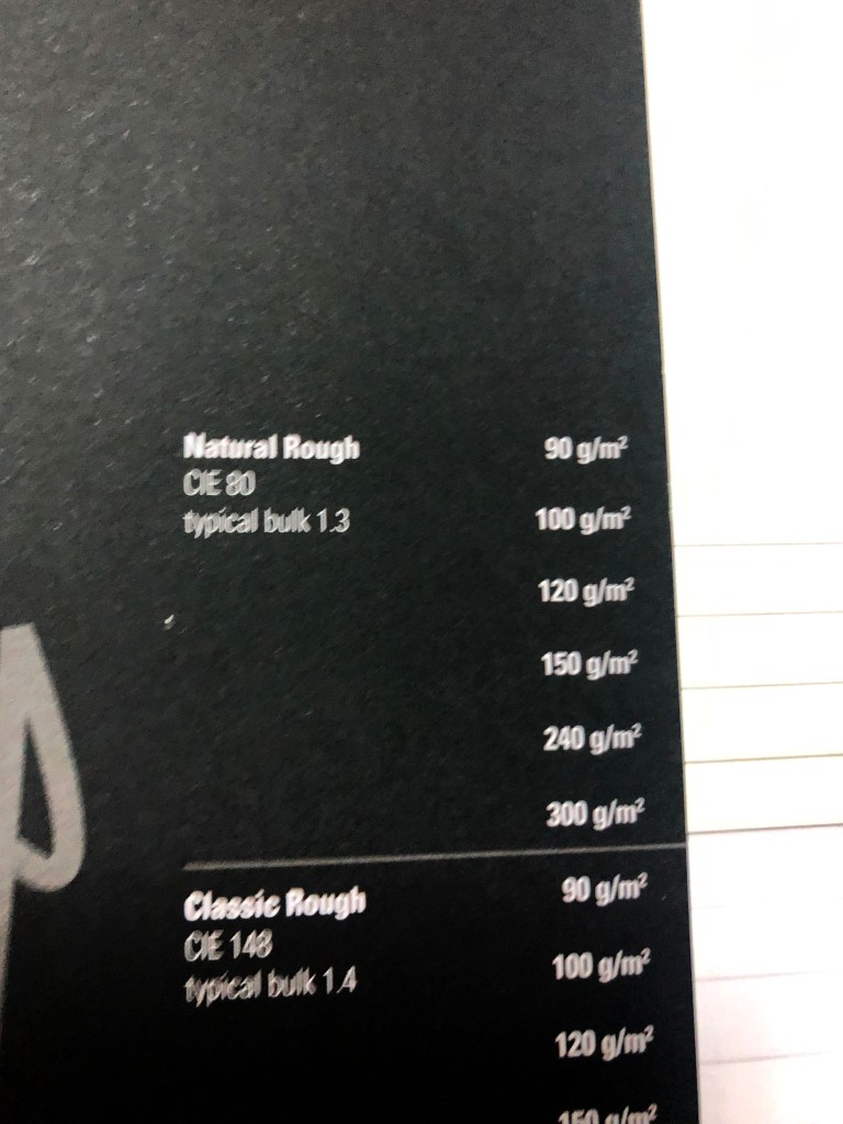
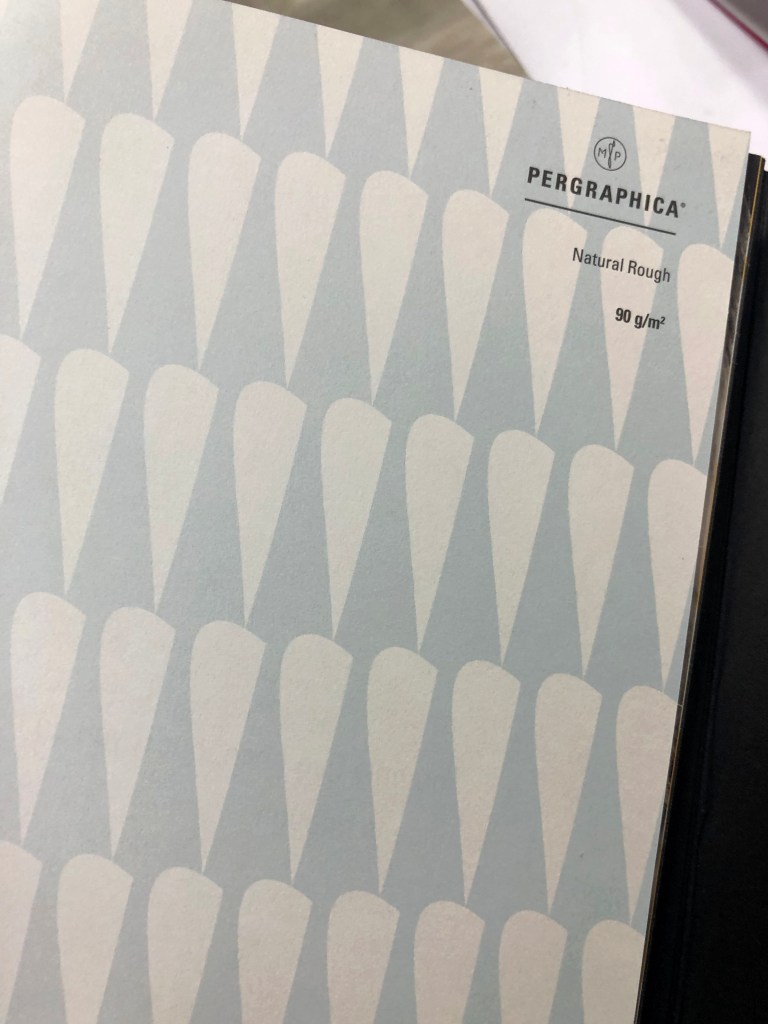
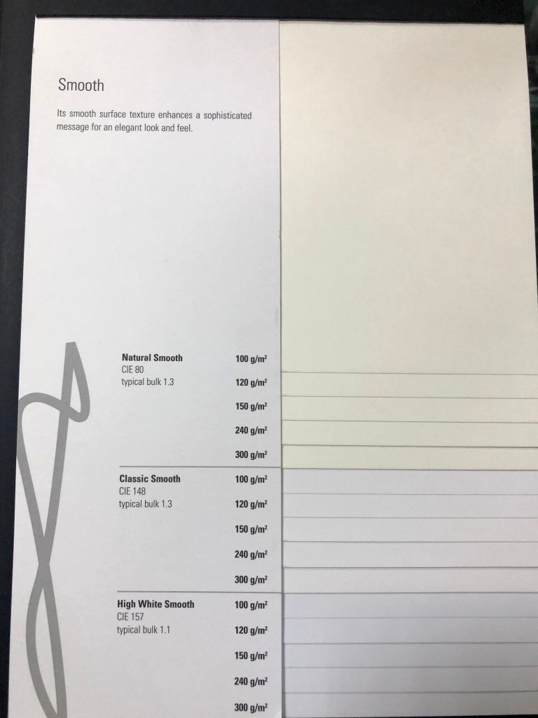
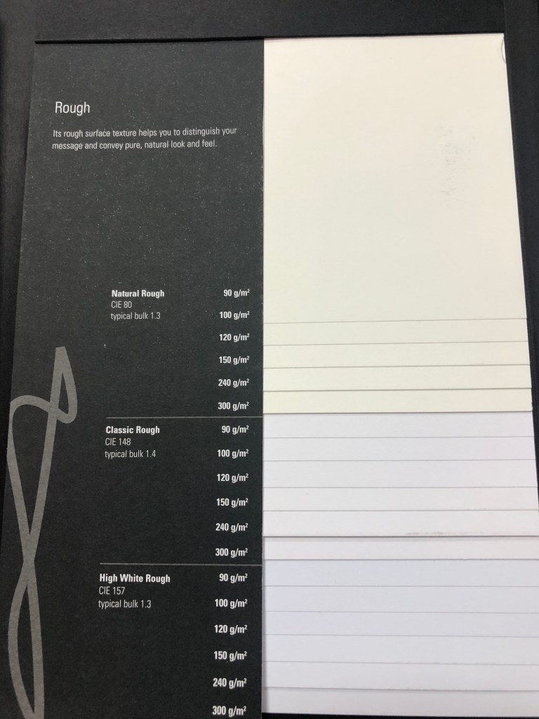
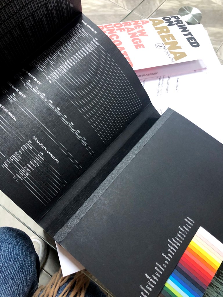
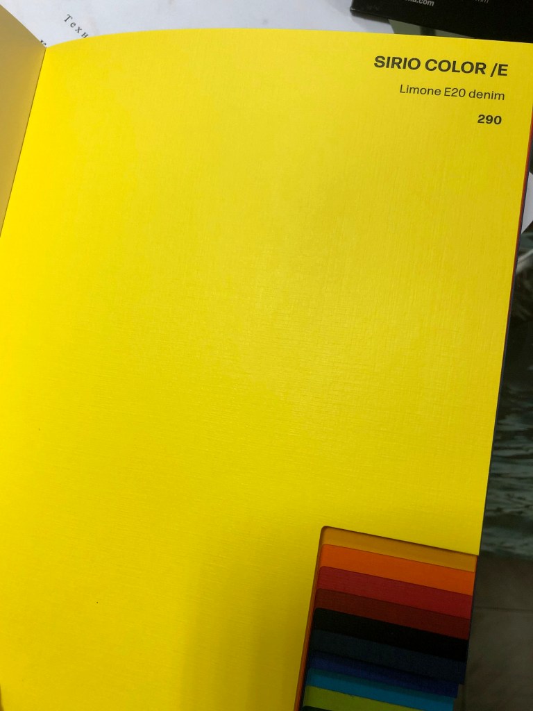
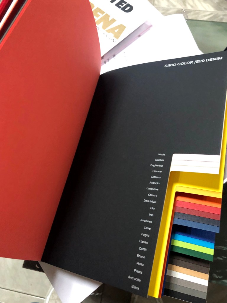
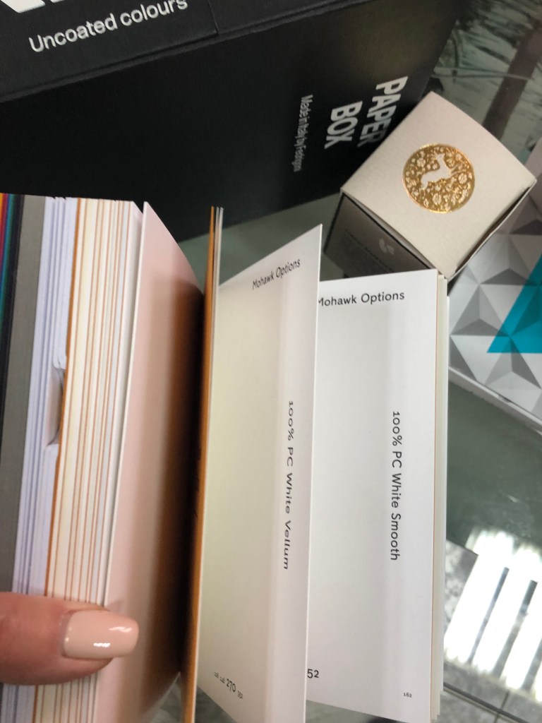
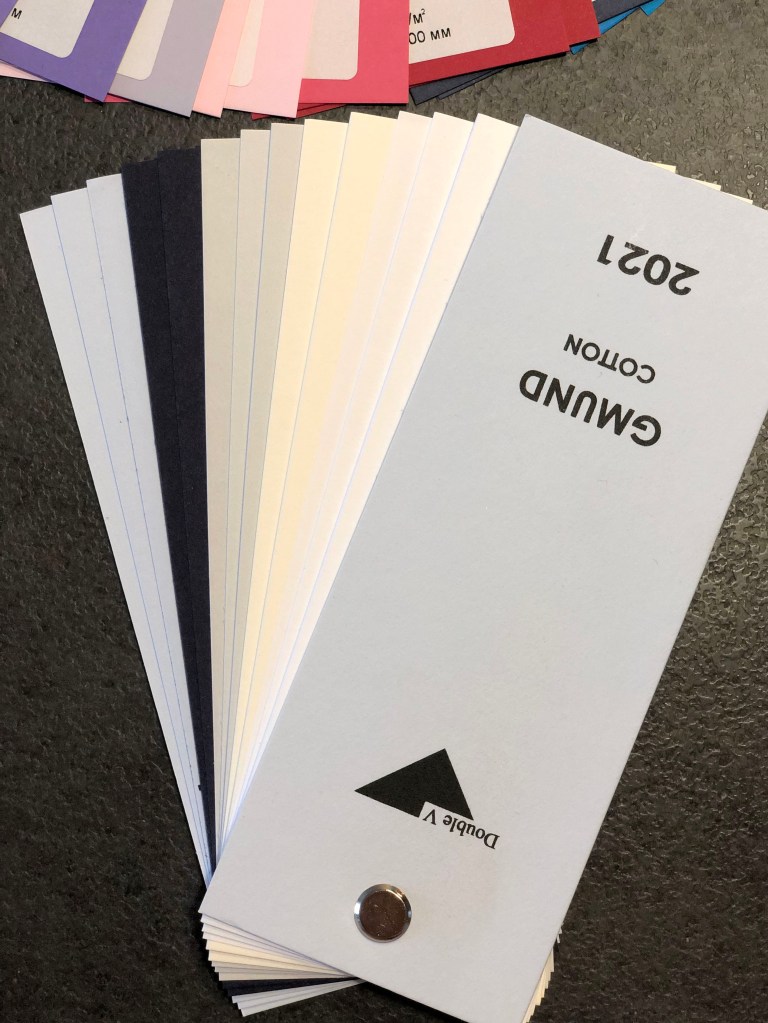
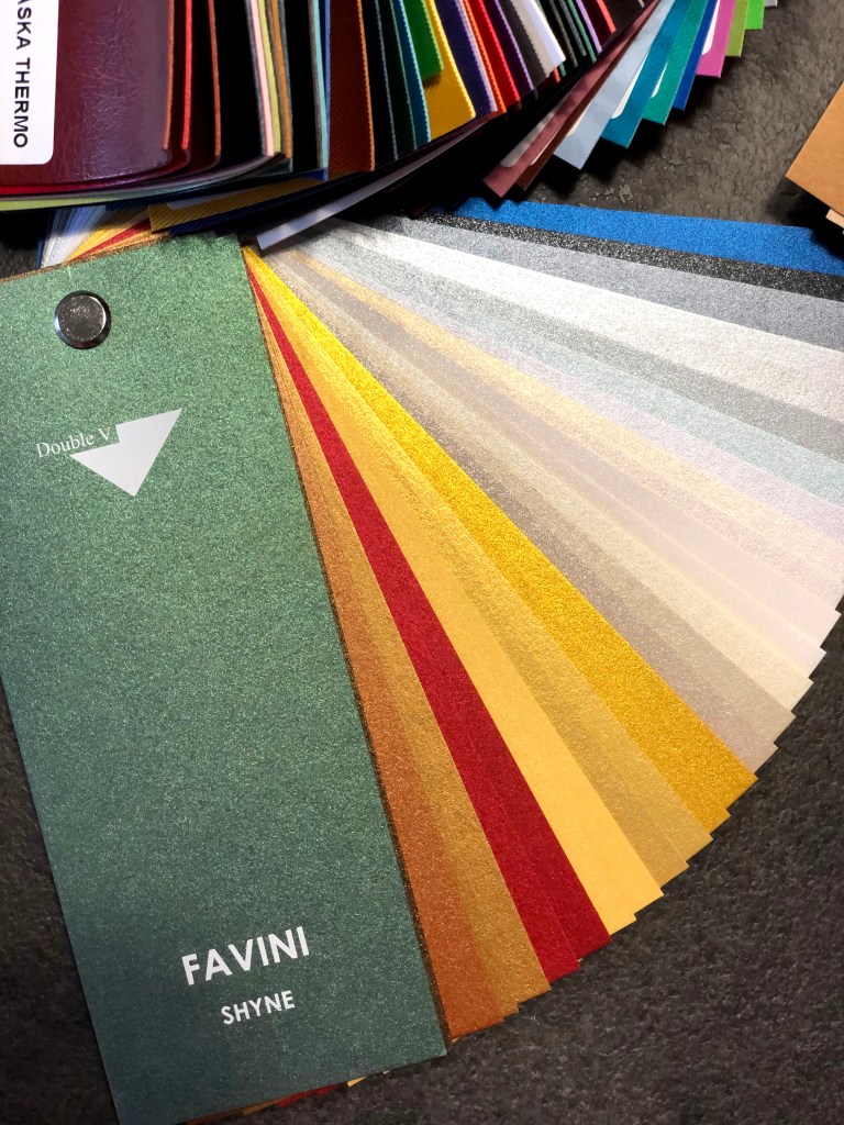
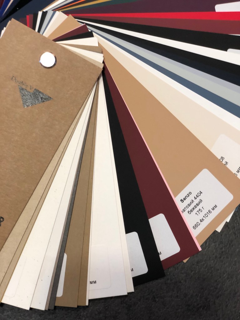
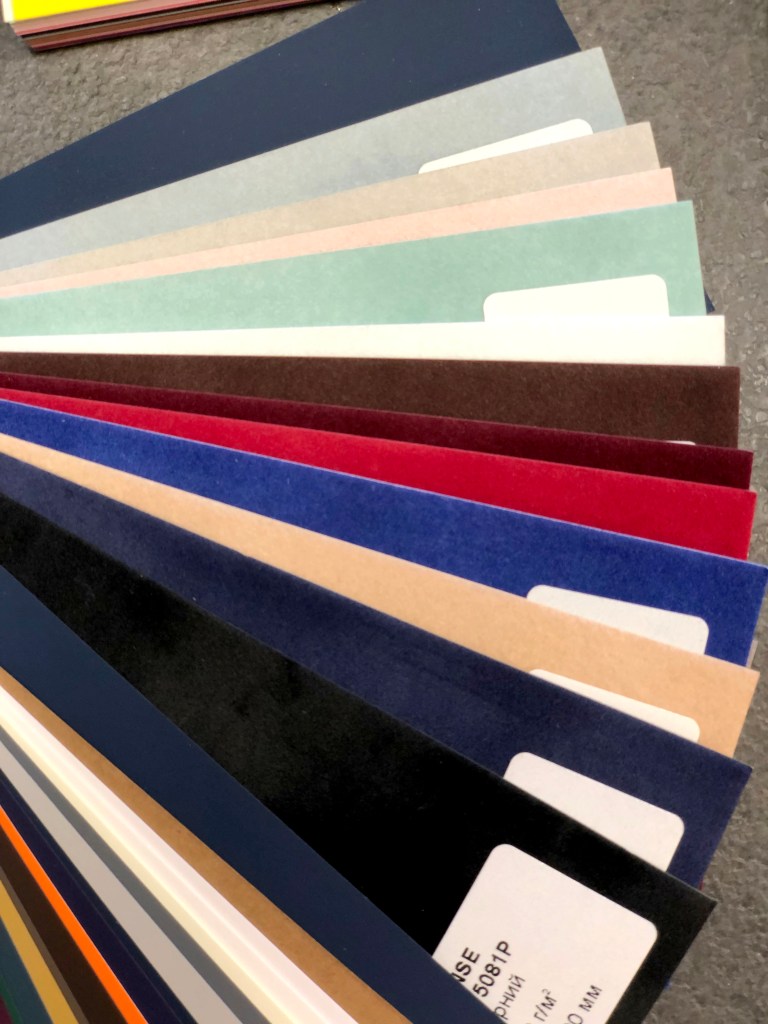
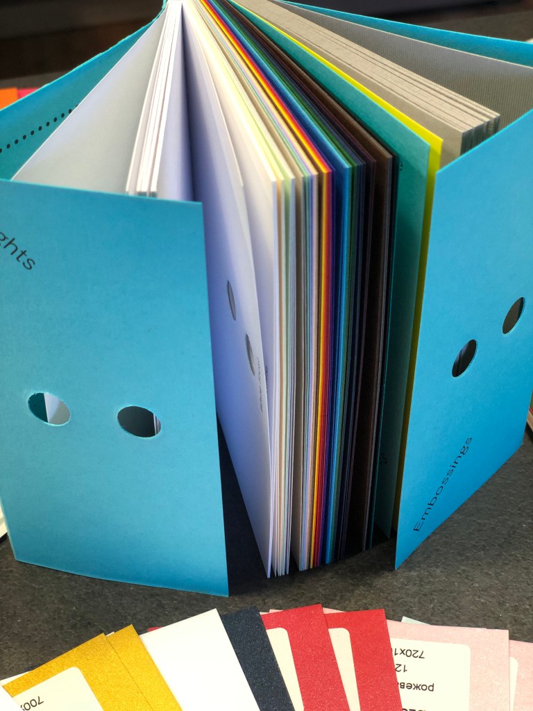
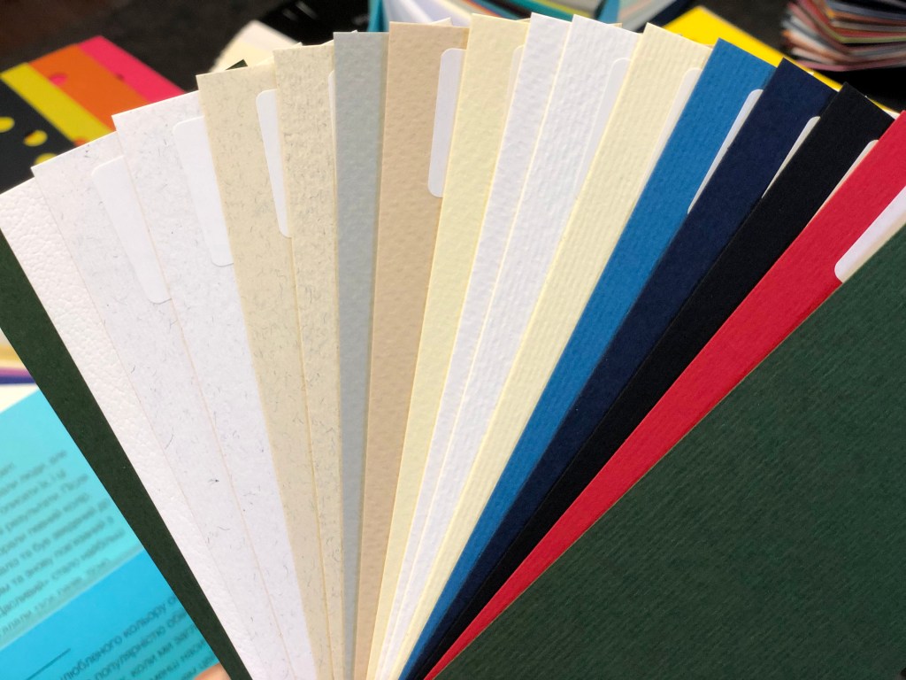
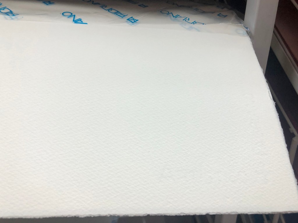
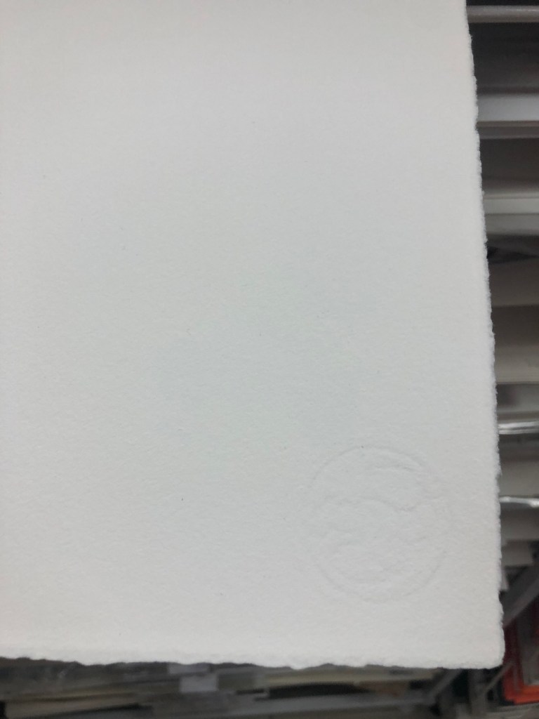
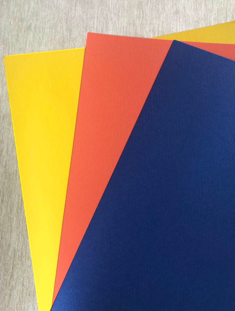
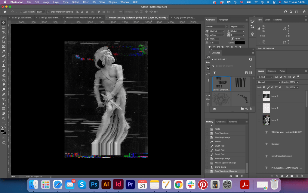
For the printed version I chose the set of paper examples that I received recently in the curtesy of Pergraphica. I used High White Rough paper 150 g/m2 , good quality paper with some nice thickness in it.
Reflection
In conclusion, I would like to say that this exercise was a good learning process for me. I’ve learnt something new about concrete poetry, fundamental parts of it, and where the originalities are coming from. I think, the principle of text arrangement into the specific shape could be well used in posters and books in modern days, as it creates some unexpected design solutions. In my design, I came up with the idea of a dancing woman with some nice shapes and passionate moves. The background image of the cow is just a subsidiary part of the design, that I specifically chose from the book of typography specimen. The name of the poem and the original design from my point of view was based on two principles: juxtaposition and alogism, which teaches us to discover hidden sense in words and combine opposite meaning images together. Tango is a symbol of passion, fast, red colours dominating in it, there are feelings and emotions in it, excitement and intimacy. Where cows are related to the rural lifestyle, slow, trustful and careful female animal. In this case, tango with bulls could work more logical together, but the author was following the tendency that was popular during that time among artists and writers, using opposite meaning objects for creating unpredictability.
I hope in my final design could achieve some good solutions. I experimented with the font, chose some really eye-catchy typography variations, played with the shape of the text placement, tried a few colours for design, and as a result, I had a playful layout that represents the spirit of the dadaism culture.


