Collect a wide variety of paper samples and other paper ephemera across a range of weights, textures and surface finishes. This builds on your previous paper sample exercise from Part Two.
This exercise is built on my previous researches from part two. In the first part I gathered together all possible examples I saved through my graphic design career, some of the examples are almost 15 years old, and it’s good to see that all this time subconsciously I was following the path of being the graphic design, archived paper examples in the library that to go back to them again.
Another point is collecting actual paper examples coming from paper production companies. The biggest variety of paper examples coming from the August Trade company based in Ukraine. They have a significant variety of paper samples and colours that are available for printing, such as matt, gloss, shiny, textured paper, that would meet the requirements for all possible graphic design needs. All specimens are organised in matching colours, and depending on the price of the sheet, the cost of the design may vary. I analysed their colour and paper palette in the Research Task below.
I wanted to go through some terminology to learn interesting facts about the paper. What is the paper? It’s a substance composed simply of the interlacing of fibres into a compact web. One of the finest and best-known scholars on paper of the 20th century, the American Dart Hunter, summed up paper as follows in his Papermaking, the History and Technique of an Ancient Craft.
To be classed as true paper, the thin sheets must be made from fibre that has been macerated until each individual filament is a separate unit; the fibres then intermixed with water, and, by the use of a sieve-like screen, are lifted from the water in the form of a thin stratum, the water draining through the small openings of the screen leaving a sheet of matted fibre upon the screen’s surface. This thin layer of fibre is paper.
Paper characteristics
Lots of printing materials owe their form to the remarkable qualities of paper. It is very important that graphic designers take an interest in its physical properties and are aware of the many different types that are available. Paper has seven key characteristics: size, weight, bulk, grain, opacity, finish, and colour. All of this must be considered together with cost and availability when deciding on an appropriate paper for book printing and binding. Another feature that the designer may wish to consider, is its absorbency, its pH value, and percentage of recycled waste content.
Paper weight is measured in two ways. Obviously, the thicker paper has more density and heavier than a light piece of paper. In North America, paper is measured and specified in pounds per ream (500 sheets), per sheet size. In the rest of the world, paper is measured in grams per square meter (gsm).
Paper weight and paper bulk are related, but it would be wrong to assume that heavy paper is by nature bulky, as paper density varies. Blotting paper is not very dense, having loosely bonded fibres, yet is relatively bulky, whereas some pressed millboards are very dense and heavy.
Opacity is a measure of how much light will pass through a sheet of paper. This is determined by the thickness of the paper, the density of the fibres, and the type of surface finish. No paper is completely opaque, allowing light to pass through. The surface finish of a sheet of paper determines its capacity to hold ink and its suitability for different types of printing. An interesting fact, that special surface finishes such as pitting, pebbling or pearl can be applied by running a textured roller over the paper during the calendering process.
Colour is generally added to a paper at the pulp stage. Some manufacturers produce consistently coloured paper, but others state that colour may vary between batches.
Collecting samples
Building up a collection of paper and board samples is very helpful when the designer has the opportunity to choose stock. It’s a useful feature reviewing the paper’s characteristics – size, weight, bulk, grain, opacity, colour in relation to the design feel, subject, content, etc.
In addition, I wanted to extend my researches that to find some more companies that produce paper for design. It took me some time for searching, but after a while, I stumbled on to the distribution company Double V based in Kyiv, which has the biggest choice of paper examples I have ever seen. What’s so special about them, that they are collaborating with a lot of companies over Europe, and depending on your need they can order a paper for you. I thought would be great to have a trip over there, that to examine some of the paper samples. They have original sets from the production companies, such as Fedrigoni Italy, Arena, G. F Smyth UK, Mondi, Fabriano, Reflex, etc. These examples are very expensive, and they all can be delivered individually. Below are the websites I found from the paper production companies, I thought would be useful to keep them in one place and potentially use them in the future.
I took pictures of them, to show that some of the books were made in a special way, with creativity and original presentation.
These are examples I bought for my collection. I think the distribution company collects them on site, so they are much cheaper compare to original sets. Also, I got some amazing sets from G. F Smyth, which do look like a creative book. The variety of paper is great. I have some textured paper, shine papers, all possible colours of tracing paper leather paper, velvet paper and so many more, that definitely should inspire me for some creations.
Now I have amazing spectral tracing paper, pure cellulose tinted tracing paper. Also, such made as Fabriano – uncoated environmentally-friendly wood-free papers and boards, with a special pearlescent effect on both sides.
I always updating my catalogue of paper samples. One of my favourite thing to do is to go around shops with different paper materials, to examine them, and go through different paper colours and their purpose. I’m a big fan of watercolour paper examples, as they are thick, has some bulkiness into them, and have a nice texture to feel. They are not usable for printing books but could be useful in artists’ books I assume, when there is a wider field for creativity and play with the form. I took a picture of some paper samples. Textured ones are purely artistic to me, some examples that could be widely be used in art. I like the variety of patterns each of them has, which is important if a designer wants to create a special mood for their designs. That kind of watercolour paper could be used for cards, or design invitations as well. When there is a grey, gold, brown colour in paper design I see them perfectly be used for such things as marketing materials cards or business cards, posters. most of them are quite thick and have around 300 grams density. Colourful paper, like yellow, blue, green pallets they remind me of my scholar times when we had to do applications from them, as I don’t remember using such bright colours for any marketing or printing purposes recently. Most of the prints done are regular colour pallets, like sepia, white black.
Collecting samples
I’m the kind of person who collects different printed samples, tickets, leaflets, flyers and cards, but not only for design purposes but for sentimental reasons too. I think that could be the habit of most designers to keep printed ephemera, as they help establish the taste and vision for the printed materials. Each paper is different and has its feature, and instead of memorising them, those pieces could be saved somewhere safely for creative purposes.
Those little tickets to Vatican Museum, and some Kyiv heritage architecture, zoo tickets as well are printed on similar paper, glossy, not too thin, approximate 150 grams, which makes them easy for cutting, also those papers not opaque, that makes them reliable for printing as they contain as about 85% printed images and text.
The little white and red museum ticket was printed on very thin coated paper, not very white colour, up to 80 grams, looked very old-fashioned, in matching design, but that is what makes it special to me. Little ticket to the past, which works well for the historical places.
Also, I kept those examples of paper from my first assignment about fanzines. It’s a good example of think magazine paper, glossy, and very thin, but good enough for colourful print. I’ve noticed that most of the magazines use glossy paper, as I think they are better for printing and cheaper than coated paper.
I’m saving all gift cards, as they have different features in the paper quality, and it’s good to see how designers use paint or gold foil on them, as that is a good way of seeing the use of paper in life. Also, I’m keeping some of the magazines with different paper combinations in one issue. For example, some of the companies use thicker paper for their adverts, as it helps to pay attention to the information, the work on contrast helps to make the product stand out.
Vatican Museum, and some Kyiv heritage architecture
History of theatre and cinema art museum ticket
Vatican Museum tickets
Zoo Tickets
Magazine paper
Thank you card
Card
Receipt
Burghley House Brochure
Combination of thin and thick paper in the magazine
Card
Jeans Tag
Overall, it was a great experience for me to expand the speciemens of papers for this exercise. Moreover, it gave me the push to do even wider researches, and discover some amazing paper samples, and top up y library with some great pieces of design papers.
The brief: Create two books explaining and exploring the typographic and layout principles you have researched in this section.
Book 1: My Little Book of…Good Typography
Using the reference material that you’ve gathered throughout the exercises and research tasks in Part Three, design a book which explores traditional ‘good practice’ in typography. What is readability and, as a designer, how can you aid it? Visually explain the typographic principles that we’ve touched on in Part Three, such as type size, leading and line length. For example, you could demonstrate kerning by creating a page which looks at letter combinations applying this principle. Equally, explore good layouts and use of grids to help support and frame your typography. This is an opportunity to develop carefully considered design layouts that feel easy and engaging to read, and look at. Be creative in how you do this, developing a range of options and possibilities. Show off your good typography skills as well as talking about what makes good typography in your text. To support this, find quotes and type rules by other typographers and designers – perhaps revisit your research into book designers from part two. Find examples of good typography within book design you can present and talk about. Your booklet should be a celebration of good typography, whatever you think that is.
Book 2: My Little Book of…Bad Typography
The rules surrounding what constitutes ‘good’ typography are entrenched in tradition and convention, as you demonstrated in Book 1. Having looked at ‘the rules’ surrounding readability and legibility, now is your opportunity to break them! Be inventive and experimental in how you explore what might constitute ‘bad’ typography. For example, negative leading, too-long line length and ‘inappropriate’ application of typographic principles may produce visually jarring and uncomfortable results. What does ‘bad typography’ mean to you and how might it manifest itself? Express your ideas in a visually imaginative way within your second book. This is an opportunity to be playful and push your design layouts, typography and ideas to the limits – celebrate bad typography through your designs and content. Again, find quotations you can work with or examples of bad typography to draw on.
Your books should each take the form of a simple eight-page booklet – folded, stapled or stitched. Design the cover and contents for each. When creating your content for both books, be aware of your audience, and how you might want them to engage with your content.
While both these books are about typography, make sure you also include images within the text. These could be your own illustrations, photographs, or stand alone typography pieces that accompany your text.
Use a flatplan to organise your content and indicate where important text and images occur, on a recto (right-hand) or verso (left-hand) page, or as a double-page spread. Suggest images by a crossed box, as in the example for ‘front cover’ in the diagram on the previous page. These crossed rectangles indicate image boxes in desktop publishing (DTP) software, and are used in drafts and sketches to signify image material. There is no need to go into detailed drawing regarding text or image material at this stage. Text can be indicated by a series of thick horizontal lines, with main headings sketched in. Use the flatplan to familiarise yourself with the structure of a booklet. Note the blank pages and how they are organised to complement the preceding or following page. Note the extent (number of pages) in the book and whether it has been printed in signatures, or sections.
As with previous assignments, see this as an opportunity to undertake a creative project that is more circular in nature than linear. Visualise initial ideas, assess them and return to your starting point to develop new starting points. Be experimental with your typography and take creative risks along the way. Focus on how you can visually document your creative journey as well as your reflections on what you are producing. Your notes should cover why you decided to portray what you did, what you included and what you omitted. Reflect on how do you feel about the two completed books. For example, are there comparisons you can make between them, has any interesting design issues emerged through the process of making them?
Primary research
To start this assignment I decided to refer to Andrew Hasslam’s ‘Book Design‘, as it contains valuable information that will help me to set up basics for my books. The author says that the most important part of the book design is documentation. It is fundamental to typography, graphic design, cartography, charts, tables – all of them are components of the book. So, here I realised that very important to include my creative process in those books. I want to construct the combined design from digital and analog materials, by documenting some of the creative processes stages.
Another part, is to decide what approach I would like to apply to those designs, Expressive or Conceptual? Expressive are rarely have some rational explanations into them, it is often lyrical, and, not intended to bring meaning. The conceptual approach evolves around “big idea”, and it is based on communication. Often it is clever, witty and entertaining. I’m more inclined towards the idea of the Expressive approach in design for the Bad Typography, it can be full of experiments and non-standard solutions. At the same time for the Good Typography book, the Conceptual design could work quite well, as it can be neat, organised and follow the guide type of design.
I think, that the Bad Typography book will be filled with experiments and different solutions for the distorted font, glitches, sentences lines all over the place. But Good Typography will be an example of a marketing brochure, where is important to produce pristine and neat design, so it serves to purpose to bring aesthetic pleasure from the reading.
I was thinking about whether I would like to design a pocketbook, or should it be a large format? Is it portrait or landscape format? I think I will go with the format 162×246 mm, which is kind of smaller than A4 format but still will fit nicely into the standard continental sheet size of 700 x 1000 mm.
Golden section, the Fibonacci series, and its derivatives
Those could be suitable components for the Good Typography books. I imagine well-balanced designs, with clean white space around, neat columns, all organised nicely and within the grid that was designed accordingly to the Fibonacci series table. In this third part Creative Book Design Unit, the whole research task was dedicated to the Golden Section, and I think this is the relevant direction for the Good Typography book. Nice proportions combined with readable accurate typography would create the right solution for the first book.
Here I wanted to go through some essential parts from the brief, and to determine some priorities from the assignment and key points that I need to pay attention to.
Grids
This is quite a significant part to include in my books. Grids are essential components for most of the book design. The format of the book determines the external proportions of the page when the grid explains the internal division of the page. Grid usage gives a book consistency and the look of a coherent template. I would like to use grids for my Good Typography book, as I believe it will help to concentrate on the content of the book. But for the Bad Typography book, I would like to challenge the template and not use grids in it, as some designers think that grids can limit the layout, and restrict it from creativity.
Another point is to consider is the text area where the information is going to be placed. The text area could be symmetrical and asymmetric. I think I could try both, and see what will work in the best way. Symmetrical text placements were mainly used in medieval manuscripts and considered to be traditional and based on natural proportions. Jan Tschichold was one of many artists from the beginning of the XX century who questioned those old types of grids, text placement, and layouts. The modernist thinking on book design was influenced by Bauhaus and Constructivism.
Using a modernist grid any number could create unites, but usually, columns of the grid are divided between two to eight. For example, if the page is four columns wide, a field with 24 units will be created, or 48 per spread. Once the grid is created, the next step is to think about folios, footnotes, labels, and annotations.
Multi-layered grids are something to consider as well. The system was developed by Swiss designer Karl Gerstner. The grid is quite flexible and can fit different-sized images depending on the number of images that need placing.
Karl Gerstner Matrix based on 58 unit fields
Avoiding Grids
Many great illustrated books don’t have a grid system in them. The book below is the example of composition only relating to the width of the spread. However, the layout has some magnetic feel to it, and the creativity of those illustrations can’t let the reader go by.
When we browse for books, we pre-read them by flicking through the pages. The potential reader creates the judgment of the book from the quality of the book and overall appeal. If the layout is messy, the print is poor resolution then the book is instantly devalued. Very important to create a right first impression.
Many editors start their work with a rough flatplan. The flatplan is a diagram that shows all pages of the future book drawn as a spread. This is an example of the flatplan for the David Haslam Book Design with codes such as green corners for part opening, for black for folios, red for pages with photographs, and blue for diagrams. Quite a useful technic when book design including multiple pages.
The rough flatplan for the David Hasslam Book Design
Pinterest Mood board
Here I collected some interesting ideas for my typography books. When I look at this collection of designs I can see that here I gathered different templates structures, most of them missing the grid system, and they are based on the creative, rebellion approach, they are bad typography examples. I think David Carson’s works are the prime example of Experimenting Typography, he brought the creativity of magazines to a new level, he purposefully didn’t use grids and avoided the rules. Also, I saved works of the book Chicks on Speed, fascinating format, and unusual combinations in textures and images.
If I look back to my previous exercise with experimental typography I created some glitch effects in them. I think I could use this approach for my Bad Typography book. I’m keen on the electronic type of digits, with some distortion. This approach is quite often used for techno music posts, the scene where designs should look purposely distorted. The idea of techno allows the computer to do what it wants to do. The computer is alive, and do noises, such as bleeps, clicks, it is a living machine. I have the concept of combining sound and typography.
I’m fascinated by how simple HTML font looks like design, for example of minimal design, this is the typography without any special appreciation. I’m intrigued by this is design point of view. At the same time, this is the most used font design and is under-appreciated. I also see the connection between HTML code and computer and technology. Techno is the scene where the computer meets sound. There is a symbolism of code and the relations of code to the computer and how some music within a techno scene is encapsulated.
Experiments
After some researches, I went to the next level of some experiments with typography around me. I had some examples of craft around, so I wanted to try some cut and paste approaches, similar to fanzines. These could be examples of experimental typography. In addition, I made my own writings with a white pen on the chalk board. At this point, I was not confident about what exactly I’m looking for but it was worth seeing whether those typography examples are going to work.
I had some fonts examples that were not my favourite, they mainly were used for posters, or signages, probably not for books or magazines. I wanted to stick them together in the similar way as I had from the Type Tells Tales book. These were examples of Lora Fosberg text Paintings. All her works hand-painted on small slips of paper adhered to panels. This is example of attraction to the what surrounds us: ‘old signage, vintage graphic design, pop culture’. I think I tried those examples mainly for experiments. I was not quite sure whether I’m going to include them, but it’s always useful to discover.
Another example that I could possible use, was my own handwriting. I always wanted to apply it for some designs, would be interesting to create some sort of juxtaposition with my own handwriting and some electronic fonts around. I thought it still needs editing in Adobe Photoshop, so I kept it just in case for later.
Mind map good and bad typography
I created a mind map of final parts that I was going to include into my booklet. Those were going to be for the Good Typography:
Golden Ratio
Fibonacci series
Le Corbusier
-em metal type
Quotes about typography
Fonts such as: Clarendon, Gill sans, Van Dijck.
Design-wise I wanted the booklet to look like a specimen catalogue, which would celebrate great book typographies. For the colour palette, I decided to go for red, black and white. Instead of photographs I wanted to create big illustrations made from letters, they would look like decorative parts of the design.
For the Bad Typography book, I was going to use a bright green colour pallet with some contrast dark backgrounds. Also, I wanted to combine art and glitchy fonts. Things to include:
Art or sculpture combined with hand written fonts (Ting Wallasse Hot and Sour Soup}
Messy typography with different bas spacing (David Carson}
Black background use with some paint brushes elements (Tomato, Mmm…skyscraper I love you}
Flying bits of typography (Mira Schendel}
Book 1: My Little Book of…Good Typography
As I decided on the format of the booklet 162 x 246 mm, I did sketches in similar proportion pages. The idea was to create a clean and neat brochure, which would look like a catalogue of fonts. As the navigation to the font choice, I wanted to refer to the Notes on Book Design by Derek Birdsall. He gives some recommendations on what fonts should be used in book design, depending on the set of symbols that will be used in it, whether there are numbers, or formulas, or just magazine text. From the first point, it looks like those fonts don’t have anything in particular in them, but when I looked at the examples of actual text, I could see that those fonts are readable, works good in columns and quite well balanced on the page. I see this as a valuable example of good book typography, and I think would be great to celebrate those fonts.
I did some sketches for the cover, that would reflect my initial thought about design. I was not quite sure about what pages should go, as I could have only eight pages, including the front and back cover. I didn’t want the brochure to look just like a magazine, I wanted it to look more like a bright catalogue and have the accent on the typography. I think the hierarchy should go on the decorative, and nicely designed letter, and then on the content. That second spread from Erich Fromm’s El arte de amar shows two-colour text running across the gutter gave me the idea that I can use a similar approach in my design too. The text goes out of frames, but despite that, it is big, readable, and play a decorative role on the page.
I created document in Adobe Indesign with pre-agreed portrait rotation of the page. On the page I made a grid that I was going to stick for the text columns. I started with Le Corbusier spread with some quotes and running texts from the side of the columns. I tried the experiment with rotation of the columns and some squashed fonts, it looked creative but I thought it was missing the celebration, so I decided to keep it on side, and concentrate on other pages where I was going to show the sizing of the letters according to proportions, I did page with the letter -a- in different variations on the top of each other, and combined fonts for the text columns. I used the principle of serif font for the header Clarendon Text Pro and san serif for the main body Gill Sans light and semibold, which is always works for the neat brochures.
Later I tried the spread about the Univers font, that would match to the first Le Corbusier spread, but they were missing some main point from the brief, they were nicely organised on the page, but I thought they were too plain for the typography booklet, so I decided not to use them. Referring to the spread I discovered earlier, I decided to create that page with big capital letters in red and black colours and some running italic wording under it, which was good addition to this brochure.
Also, I was still considering the design of the cover, I was not sure that lowercase letters -g-t- looked right on the front cover, therefore I decided to experiment more, and try capital letters instead. Also, I changed the colour of the background to dark red, on the front I placed bright red lowercase letters and black capital letters on the front, so it created unusual 3-d feel, and finally the cover became more eye-catching and had some depth into it.
When I look at those pages placed together, it gives to me the feeling of the completed project, and I can see I accomplished some aims some targets that I had for my booklet. The reference material that I gathered and my researches helped me to create traditional ‘good practice’ typography booklet. I discovered that choosing the right font is one of the fundamental parts of a good typography booklet. The font should be readable, have the right kerning, be traditional and serve the purpose of being clear on the page. My pages with the size of the letters is a good demonstration of the golden ratio applied to the font size, which should be kept for the printing materials. Another part that I included in my brochure are grids, which helps to organise images and columns into the proportional frames on the page, depending on the format. In addition, the booklet has some creativity in it, as the use of big letters or text running through the page still can look well-balanced and proportional.
Book 2: My Little Book of…Bad Typography
For the Bad Typography book, I was prepared in advance with all the ideas I collected earlier. I thought it is much easier to create bad typography, as the field is quit broad, but at the same time, I tried to think about the concept, as I wanted my booklet look cohesive. I just needed to recreate the ideas that I had in my head. To start with I wanted to go from the techno scene for the design, I wanted to go from the glitchy effect combined with art, have some sort of computerised typography, which would look like HTML code. Later I reorganised those thoughts in my head and decided slightly to lose the idea of HTML code font. Instead I could use fixed width font, which could be hard to read if it is not placed correct on the layout. In my book Type Tells Tales I found those amazing examples of typography designed by Walasse Ting Hot & Sour Soup. I loved how the author combined Renaissance art with handwritten typography, typewriter typography in the patterns, and the use of colourful and black backgrounds on the page. Also, my inspiration was David Carson, with his approach ‘out of the rules’. I wanted to play around not as much with ugly, messy fonts, didn’t want that look of obviously bad type, I wanted to see it as a creatively bad font, with some difficult to read, out of the space fonts, too busy, and staff like that. Which could be a challenge too.
I started the book design with an inspiring image of the Statue of Zeus at Olympia. I wanted to bring some distortion on it, that to apply the glitchy font with it, that in summary would bring similar result as I had in Experimental Typography exercise. The placement of the type I left for later. I realised that the image of the sculpture dominating here, and that is a very powerful and popular piece of art, but I wanted to highlight it with the necessary brief, which is bad typography.
For the first spread I went for the help of good typography, the one that I decided to lose with the Le Corbusier spread, I thought that I can add it with some extreme running typography, make it look creative, and make some fonts look awkward, so it would fit the theme. For the header, I chose LTNotec, the font I made it run on the top of the text columns in green colour. For the main text, I chose fixed-width Fira Mono, also for phrases around I had hard to read quotes Old Typewriter, squashed text in VanDijck, Amaryllis font in angle, and Courier New font on the boarders. Altogether I had six different fonts for one spread, which is a sign of bad design, the idea was to overuse the number of fonts, also some of them practically impossible to read, but at the same time I have the wording about proportions and golden ration, which is the kind of juxtaposition in here. I’m quite pleased with this design, as it has the creativity and nicely responds to the brief, as the spread has some visual signs of bad typography.
For the next spread, I chose another sculpture of Philopoemen, a skilled Greek general and statesman, I loved the way the sculpture is bend, I thought it would look great next to my handwriting, which I purposely made look like wrote in high speed, on the top of that I placed another layer of a pen stroke, together they created catchy 3-D look layers. Around the sculpture of I placed text in Courier New, but because of distortion around, it was hard to read it.
For the last spread I had inspiration from the David Carsons, Paul Dutton,Walasse Ting works. Here I have dominating big font Impact, with wrong spacing in it, saying Why this, Why that? with some text around it. I purposefully made some spacing wrong, the distance between the sentences. On the left side, I had the text looked like made by typewriter, all squashed as well, using font Fira Mono. I think those pages were good additions to each other and created good looking bad typography spread.
For the back cover, I used a zoomed-in picture from the sculpture as well, with some phrases about graphic design in stamp looking font Battery Park, again, bad looking distorted font, but works great with art as juxtaposition. Also, I did some text distortion for the front cover, applied an RGB filter in it, and made it look blurry and wavy on the page. That Courier New font is ideal solution for distorted images and looks like it was purposefully designed to be a bad looking font, which is great for electronic posters.
Conclusion
It was a great journey of creating two opposite brochures of Bad and Good Typography. I think, I was managed to create interesting looking and visually responsive to the brief booklets, that are completely different, but have some attraction to them. I realised that there is a thin line between bad and good typography, and only deep analysis helped me to determine some targets that I had to reach during this assignment. The first brochure with good typography was slightly easier for me to achieve than the second one. I think my Good Typography Book looks more cohesive, it has a running theme, colours are well-balanced and despite the different text structures, there is something in common between them. Keeping minimum fonts, and following golden rules was a massive help to me as well. Fo the Bad Typography Book I had more challenges, as I had lots of ideas in my head, however, I still needed the same running theme to throw the booklet. I think the Bad Typography Book reflecting Fanzine style, I enjoyed searching for the bad types and exploring them, but probably in some pages I was too careful with text, for example for the text with a sculpture of Philopoemen I could go wilder and create more glitches and distortions for the text, but the page with handwritten wording looks how I imagined it. I hope this assignment will bring some good results into my course.
Below is an extract from Jules Verne’s 20,000 Leagues Under the Sea. Using a single typeface of your choice, lay out the text in as inventive a way as possible. Experiment with the letters and words, using the typographic principles you researched in earlier exercises to significantly alter the arrangement of the text, its rhythm and readability.
Think about design group Tomato’s definition of typography – ‘Sound as form’ – and how this concept might apply to your own work. Use the content of the text to inspire visual ideas. How might you experiment with the type to communicate something of the essence of the descriptive content? Think about how the designers you researched in the previous section, e.g. David Carson and El Lissitsky, would approach the text – or artists like Marinetti and Schwitters.
It is important that you play with the text, with individual letters and words. How experimental can you be in making expressive typographic designs? Can you reveal something of the character and nature of the letterform by experimenting with scale and orientation, so a simple unassuming letter becomes a monumental, almost sculptural form?
Think about the sound of the words you are working with, how can your typographic decisions help to communicate these?
As a book designer, you might be more drawn to analog or digital ways of working. Whatever your preference, try to mix and match both approaches. Your work on paper might become a starting point for digital experimentation with this text, or print out your initial ideas, so that you can experiment with what happens when you start to cut, collage or physically alter your text in some way. This physical work can then be scanned to kick start a new digital stage.
Read the text through once before starting to manipulate the type. Make several designed versions of this passage, or parts of it, spanning several pages if need be. Feel free to focus on certain aspects of the text, or use the whole text within your designs. Use your learning log to reflect your creative decision making as well as sharing the various stages of your process.
20,000 Leagues Under the Sea, Jules Verne
The year 1866 was signalised by a remarkable incident, a mysterious and puzzling phenomenon, which doubtless no one has yet forgotten. Not to mention rumours which agitated the maritime population and excited the public mind, even in the interior of continents, seafaring men were particularly excited. Merchants, common sailors, captains of vessels, skippers, both of Europe and America, naval officers of all countries, and the Governments of several States on the two continents, were deeply interested in the matter. For some time past vessels had been met by “an enormous thing,” a long object, spindle-shaped, occasionally phosphorescent, and infinitely larger and more rapid in its movements than a whale. The facts relating to this apparition (entered in various log-books) agreed in most respects as to the shape of the object or creature in question, the untiring rapidity of its movements, its surprising power of locomotion, and the peculiar life with which it seemed endowed. If it was a whale, it surpassed in size all those hitherto classified in science.
Chapter 1, A Shifting Reef
Research
The best way to start this exercise is by exploring others artists fonts, to learn their technics and approaches in typography, layouts and composition. I wanted to explore works from Tomato Design Group first, so I could learn from their experienced view.
Tomato Design Group
Tomato is a multi-discipline design and film collective, founded in London in 1991 by Steve Baker, Dirk van Dooren, Simon Taylor, John Warwicker and Graham Wood, plus musicians Karl Hyde and Rick Smith of the electronic group Underworld and Colin Vearncombe. The collective includes a worldwide group of directors, designers, artists, writers, producers and composers, who develop cross-platform projects that are commercial, artistic and research-based. Bellow is presented their work for dedicated for O. Tomato 25th Anniversary exhibition. These posters attracted my attention because of the variety of layouts that were being used in one magazine, their complication, and with all the diversity there is a common style alongside pages. The first few pages reflect the personalised font, which consists of lines, the font is constructive and bold, it has square corners and lines. I can see the 80’s disco vibe in it. On the page with a mean with the speaker, the font looks like it was handwritten in the angle. The rest pages are black and white, they have displayed the usage of transparent layouts, contrasting angles for the text placement, broken looking fonts and fidgeting lines and waves around them. I think they all speculate on the fanzine like style, full of free creativity vibes and odd typography.
David Carson is a graphic designer, art director and surfer from the USA. His work for the magazines’ beaches culture and ray gun in the 1990s brought a new approach to type and page design breaking with traditional layout systems. David’s first education was in Sociology, he didn’t have professional experience in graphic design, and his works broke the stereotypes, as they never followed the rules, grids, or specific layouts. He is an experimental graphic designer, which I related earlier in my researches. David Carson continues to explore the possibilities of graphic design, particularly typography as a form of expression across print and video for both commercial and cultural clients. His approach in design is experimental, intuitive and personal. The similarity with the Tomato Group Exhibition book is a fanzine style. I think for this particular exercise I can use the experience of this artist from the layering fonts on the top of each other, the hierarchy of the typography, photomontage, cut and paste approach, using foreground and background for the text arrangements, and the freedom of wonky and handwritten type on for posters and designs. Clearly can be seen that designer approaches the text in the freeway, at the same time he doesn’t use waves or smooth lines, they are confident, direct and following the straight line texts, in some cases with angles.
El Lissitzky
El Lissitzky, an artist, designer, photographer, typographer, and architect, was a major exponent of Russian Constructivism, an art movement whose aim was mass communication connecting art to everyday life. He believed that books with bold geometric forms, clean layouts, and photographs could effectively connect to and transform the consciousness of the viewer. In my Core Concepts Part 4 Assignment I related to his works for my font development and magazine article. I was fascinated with direct lines, clearness, innovation the feel of the Soviet Union design approach, which was the discovery for those times. The author uses simple bold and bulky fonts and using them as objects to play around with the theme. For the colour pallet, it was mainly red and black on canvas. Also, I can see that designer gives the personality to the single letters, and make them dominant on the page. I think these works are slightly different to the brief in this exercise, but it is still useful to learn contrasting approaches in text formatting and typography design.
F. T. Marinetti
Les mots en liberté futuristes is a book illustrations designed by Filippo Tommaso Marinetti, the author of the famous manifesto for the Italian Futurist movement in 1909. This book is an ingenious typographic design example with a powerful technique for representing the noisy energy of 20th-century life. This book have different styles and sizes of its typefaces, which was all against traditional rules of structure and punctuation and created a revolution in modern visual communication. It was a pioneering example of what is known as visual or concrete poetry, in which avant-garde artists used typography and page layout for expressive purposes.
Kurt Schwitters
Kurt Schwitters was a German artist involved in both Dadaism and Constructivism. Schwitters is best known for his Merz and Merzbau works, which incorporated collage, found objects, typography, and sound poetry to construct unique compositions. In these works, the artist used magazine clippings, waste material, and other recycled items in an attempt to express the rapidly changing world. Schwitters influencer was El Lizztsky. He absorbed the experience from the source of inspiration and expressed it in Merz works and Ursonate poems. His posters mainly consist of the copy-paste approach, with sticking objects together in harmonious and sentimental arrangements. If I compare Schwitters with Marinetti exhibits both artists have a lack of order: in their artwork text are placed in unexpected areas. Schwitters challenged the organisational hierarchy of text and imagery, which was all against the rules in printing documents.
Typewriter Art
Whilst I was preparing to this exercise, I realised that I have a book that I bought last year, perfectly matching to the brief. The book was written by Barrie Tullet Typewriter Art. Modern Anthology. The reason why this book is stumbled into my head because it’s full of beautiful examples of typewriter artists, who used the keyboard as a ‘palette’ to create artworks. There are some imaginative examples of shapes and forms that can be used for concrete poetry. It’s a good fundament for creating an astonishing range of creative work. Some of them I would like to mention in my blog.
Panel from ‘Carnival’ by Steve McCaffery (1970–1975)Miroljub Todorovic. Textum 2 (1973)
This work by Steve McCaffery termed as typestract (abstract typewriter art) was released by small Canadian presses to represent the direction of North American poetry. The materials of writing are explored in a relationship to how poetry can be crafted and perceived at the same time. The design shows the typographic complexity, moving from the simplicity of red and black masks of a typewriter ribbon to the rubberstamped letterforms, carbon-paper frottage and holograph. This artwork is full of smooth lines, shapes and fascinating spins around. Specially organised “o” letters creating a floating feel pattern. This is perfect example of experimental typography, that each designer who works with book design should be familiar with.
Miroljub Todorovic was founder of the avant-garde artistic movement Signalism. His artwork Textum 2 has more straight and direct lines, all goes according to proportions, but what I like about is some unexpected wavy text lines in the bottom of the mountain and inside of the moon.
On the left side presented some works of Eduard Ovčáček Czech graphic artist, sculptor, lettrist, painter and professor at the University of Ostrava. In his work ‘Prazdniny Kruh’ (‘Empty Circle’) he experimented with the circle shape by arranging words to come outside. Also, the shape of words that inside of the circle giving to it a texture and the feel of 3-D object. The image which calls ‘Emanation’ with the text arranged in square with some line waves around it looks more like an experimental image, with artistic meaning in it.
Jeremy’s Adler ‘Typewriter poem’ is another example of beautifully organised concrete poetry, with elegant and smooth lines coming from bottom left corner and heading up to the right corner. This drawing is a part of British Museum collection.
Miroljub Todorovic. Textum 2 (1973)
Another stunning examples of experiments with typography from Paul Dutton, the series of works ‘Plastic typewriter’. This collection of typewriter poems was made with a disassembled plastic typewriter, an intact typewriter, carbon ribbons, carbon paper, a metal file and white bond paper.
Some additional examples I found from internet, they are all about the same subject, how to make the text to work in different shapes. I’ve noticed that even if there are straight lines between sentences there are some original executions for the text experiments.
These typography experiments I liked because of their 3D feel, like they were made by burning the ages, or special ice-cubes to give this convex shape. What I have noticed, that natural elements like iron fonts, burned letters, or shapes through the glass or water gives to the font natural bends, and appealing stains with the unexceptional gradients on them. Also, I saved as example the typographical text organised into the sea wave, as another way of expressing concrete poetry.
After detailed analyses of artists and their experimental typography works I went to the next stage of making sketches and looking for keywords. I wanted to understand all the details of that text fragment from the Jules Verne‘s novel. I wrote the text down, with some associations to it, it helped me to create some basic keywords to work with:
sea, marine, water sailors (blue, turquoise colours)
enormous thing, size, whale
peculiar, mystery, darkens (black, dark, black)
Also, I made some sketches for my designs, so I could decide what shape of the text I could potentially go for. I wanted to be investigational with my designs and see where they can take me. I tried different figures, angles for the forms, I had so many ideas in my head, but wasn’t quite sure where to start design from. Whether it will be tactical work with objects, or work with graphic thumbnails. I wanted to try a bit of all approaches, because that was the way of discovering finest outcome.
Notes on Book Design by Derek Birdsall. Some of those types I used before, but some of them were new to me, they are the classical font, and I liked how precise the author explains their use for the book design. Readability is a crucial part of the font, then the distance between the letters and their colour. Even such thing a bold font makes a difference, as some fonts don’t look right. I thought would be good to use something from this list of typography, but with some filters applied on top of them.
Experiments with the typography 1
My first design idea was based at the glitchy image under the water with some text with the distortion on the top of it. I converted the image into the black and white object with some RGB effect on the top of it. I wanted to create delusional effect for the background, which would associate with words deep, underwater, sea, ocean, etc. I placed the whole paragraph in Gill Sans font, I made the text all wonky and glitchy, with some RGB filter as well. I chose Helvetica Neue Condensed Bold font for the header, as I wanted to have bold outlined narrow font with some wavy effect in it, I think it all worked quite well together. It was the very first experiment, so I wanted to explore some more. I liked how the text looked like it was really under the water, and how it worked together with the underwater picture. I wanted to see dark, mysterious image, with some spooky feel in it. It was not completely scientific type of design, mysterious yes, but not marine type. But still worth trying.
Experiments with the typography2
For the second experiment I used different approach. I wanted to try spiral effect, which reminded me golden ratio kind of design. I organised a text in the spiral with some extra manipulations in it, as it was tricky to fit all paragraph in one go. For the background I used an abstract picture which reminded me the picture of the Earth taken from space, I applied some glitchy effect on it as well. For the header I used slightly different font, Gill Sans bold and combined it with the serif font Van Dijck from that book recommendation I read. It was good and readable font combination, but I think that san-serif font worked better in terms of readability. I made the text and the header all wavy and dynamic, so it looked like the water is swings those letters and makes them move. Also I think I preferred clear blue and gold tones on that image, I think it gave more association with the water and mystery.
Experiments with the typography3
For this part I took a new route. I wanted to be experimental as this is the exercise for some new approaches with typography, so here are some results with it. I had a text paragraph on my laptop, all flat and on the white background, and on the top of it I put a bottle of spring water, and looked through it on those fonts. And surprisingly I saw something curious, as it was like looking on it through the lens, I had RGB colours around letters, they were distorted all way around, they had natural 3D feel. I took a camera and managed to take a pictures of them, moving the water bottle around. Later I composed those collages on the Photoshop and sticked them together. I quite like those type experiments, especially when I arranged them on the A4 format and make them look like one poster, typography looked like it was deep under the sea, but the header was still on the top, I had similar to floating effect. I think it came up nicely. I enjoyed it.
Experiments with the typography4
The last experiment was just an addition, but as usually it happens it I had some extraordinary results with it. I was going to finalise my researches on the above three options, but I still had that idea in my head with the blue liquid inside of the sealed plastic bag. I wanted to create natural distortion effect with all curves and folds around the text. So, what I did, again, I had flat text on my computer screen, and on the top of it I put the plastic bag with the turquoise watercolored water. I flattened it, to avoid less air, but some little quite bubbles still were floating around. The experiment came out nicely, It had that juicy and fresh distortion, with direct association to the underwater, and natural text bends were amazing as well, much better than my trials in Photoshop. The conclusion is, work with tactical object can bring some surprises, and it’s alway great idea to explore. Last two options with the bottle of water and turquoise water are the best.
Conclusion
I think this was one of my favourite exercises to complete so far; it clearly can be seen from the wide range of researches and experiments that I put into this typographic task. The amount of analysis that I put into the artists work also made influence this task. I was inspired by numerous ideas that evolving around concrete poetry and texts. I know that I always felt comfortable with the software, also I’m aware of different tools that explore numerous distortions and glitches for my text, but the analogue route is a new zone for me, that requires some special preparations and processes for me. I enjoy comparing them, discover new solutions and bring some new vibes into my works. I’m intrigued to see how it’s going to help me with my third assignment.
This two-part exercise aims to understand the relationship between typography, the grid, and the page in more depth by analysing existing layouts and creatively developing alternative ones. Both of these activities will feed into assignment three.
Understanding layouts
Research into book layouts that you find interesting. These could be art or design books, or others that have more complex layouts that balance images, typography and other content across multiple columns. Trace the grid structure of your chosen double-page spread using tracing paper and a sharp pencil. Measure the margins, column width and depth, plus spaces between the columns. Transcribe the tracing onto a clean sheet of paper, drawing on the measurements. Compare your drawings to other double-page spreads within the same publication. Identify the similarities and differences – is there an underlying grid system and how does it adapt to deal with different content?
Now recreate the same double-page spread using DTP software. Use your traced drawing measurements as a guide.
There is no need to copy out all the text – you can use ‘dummy’ text or ‘blurb’ such as lorem ipsum. Lorem ipsum is Latin text which has a distribution of letters that make it look like readable English. You can download some from http://www.lipsum.com and incorporate it into your layout.
Similarly, there is no need to recreate the images – indicate images by a 10% shaded area, whether these are cut-out, full-bleed or within a box.
Try to match the typeface as closely as possible. It doesn’t need to be exactly the same, but try to retain something of the original – for example, make sure you use a sans-serif font if the original is sans-serif.
Experimental layouts
“These conditioned patterns of reading, from left to right or top to bottom for example, allow us to approach any form of printed material with some expectation of how we will navigate through it. This, then, is the starting point for the designer, who is able to build upon this familiarity within the layout and format of a project, often utilising the element of surprise or difference to confound the reader or user’s expectations.”
Russ Bestley & Ian Noble, Experimental Layout, 2001. Hove: Rotovision.
Extend the project by thinking about how you might radically change these layouts – what creative decisions around the grid would you make to improve these designs? Develop layout ideas that ignore the grid structure, challenge it, or offer radical alternatives to the existing layouts. Develop a range of ideas through thumbnail drawings and DTP layouts, in a similar way to the first part of the exercise. Use this as an opportunity to take creative risks, and find radically different ways to layout the existing content. This process might challenge any preconceived rules about how a layout should normally work. Reflect on the process in your learning log.
Researches
Here I wanted to examine some books layouts that I find interesting. This electric collection gives a voice to all possible forms of writing, from classic books to children fairytales.
Warren Lehrer ‘French Fries’book reflects American culture and character basing on the fast-food restaurant. Lehrer using typography to evoke voice; has personality in interaction; using different font combinations in one page, where each character has its individual typographic arrangements and colour. That book was the revolution in digital art. A good example of how experiments with shapes, numerous overlays and colour mix can show its technical achievements.
Warren Lehrer ‘French Fries’ 1984
Dylan McDonough’s INTGR reflecting a story of fashion as social mechanism. Here can be seen the presence of layout hierarchy, minimalistic style, pages don’t have numbers, the lack of headings. The book uses language, objects and images of fashion and can be experienced as traditional ‘book’.
Dylan McDonough ‘INTGR’ 2014
‘La Danse’ was a special issue for the Ballets performance from Paris, designed by Francis Picabia. Layouts included contoured text blocks, that wrapped around portraits, and leading caricatures of contributors. These templates are great examples of expressive typographical ideas.
Francis Picabia ‘La Danse’ 1924
Through this book ‘Linotype Matrix-Side-Being’ the author Damián Sena wanted to show how the character translates typographically. He thought that here he creates the typographic universe, his identity, his beliefs and ideas. Also, Sena insists that typography speaks itself. I liked how words and sentences go above and beyond lines on the pages, and some words falling down vertically, as there are no rules.
Damián Sena ‘Manuel Puig – Entre el cine y la escritura’
These designs caught my attention, because of the shapes typographer Brian Scott Bagdonas used for his Letterpress print. Designs remind me of concrete poetry when texts are organised into special forms, and some extra objects could be seen through the font. For example, if we look through Christmas Card Exchange with Santa, the red suit is made from border slide matrix, and his boots are made from foundry 60pt Corvinus cap “P”, and his face is made up of an 18pt Hand Tooled Goudy lowercase, etc. The author of that prints became popular because of his creative approach in print design for the hot-metal era.
Visionary Cities: The Arcology of Paolo Soleri, 1971 was written and designed by architecture professor Donald Wall. The author manipulated words and images, smashed letters to a new level of density and illegibility. The book consists of a maze of typography, presenting phrases by visual architect Paolo Soleri. Wall used in this book design predominately black pages with high contrast images.
Paolo Soleri. Visionary Cities: The Arcology of Paolo Soleri, 1971
These book designs ideas helped me to open the vision in the graphic design approach. Also, I could see that brave and experimental designs can create a revolution and new direction for the book design layouts. For this exercise, I want to try to be experimentative and see how various templates can change the feeling of design.
The Genius of Design
I found in my book library edition by Penny Sparke ‘The Genius of Design’. I think this is the first book about design I’ve had, and partly it helped me to establish my will to developing myself as a graphic designer. It doesn’t have a complicated grid system, but as a symbol that this is where my graphic design taste started from, I wanted to examine it closer. This book design is quite simple, with only two columns, a serif font for the main body and big caps letters in san-serif for the text of the quotes. But out of curiosity I thought would be great to learn this template. I took a picture of three different spreads, they all work at the similar principle, but for some spreads, the whole page was taken for images placement. I chose the spread with two columns on the left side and one column on the right, also with quotes on the right side.
That to measure the template I took baking paper (which was a bit slippery on the pages), a sharp pencil and a ruler. Firstly, I determined the size of each column and their location and spacing between them, and after that, I measured them in mm that to recreate a copy of it. It was hard to see the spacing in the centre of the spread, but I think the measurements I placed were quite right.
For the main body, I used the dummy wording, but in some locations, I placed original text. It helped me to see how the content looks compared to the original template. With the service ‘What the font?’ I found original fonts for the quotes, also I could see the same font was used for the cover of the book URWTopicW01-BoldItalic. For the main text, Baskerville serif font was used, and for the image caption in the button corner of the left page, I used Eureka Sans san-serif font. I’ve noticed that in this book not much attention was paid to the header, as it looks like mainly just columns of text one after another one, so I think it was purposely made to make the headline less visible. I followed the same path, that to examine the grid of the layout, I could see in this design was used grid of 7 columns, and with the space around the edges for 10 mm on each side. The spacing between the columns was 5 mm. I think what brought some originality to the layout is the extra-wide text for the image caption, spacious layout with lots of free space around, and big italic font for the quotes, which stands out compare to the rest of the text.
Alternative Layouts
For the alternative layout, I was going to use the golden ratio principle. Out of curiosity, I wanted to see how the template will look like if I arrange it into the golden ration circle. I tried a few approaches in the text arrangement, played with fonts, and moved the columns around, but I still kept the same font combinations for the body copy, pull quote and image caption.
Columns that spins around the golden ratio grid looked quite interesting, I have never seen the same principle used before, so that idea was just a new vision for me, to see the difference of the layouts. In addition, I wanted to play around with the large quotes on the side of the page, which I made in serif cap font, but I was not sure if it worked. It looked a bit out of space and didn’t have harmony with the rest of the composition. In that case, I decided to try another option, with the phrase going at the same shape as a golden ratio twirl.I changed the bottom block into the right side alignment, so it repeated the shape of the circle I had.I thought it looked quite refreshing, and attention catchy.
For the last option, I wanted to go beyond and be investigational with the typography chose and text placement. I wanted to try overlapping texts, and see how the difference in the size of the font will look at one spread. I implemented additional font, bold Helvetica, which gave a feeling of bulky, confident design, with lots of activities going around. For some columns, I used a colour underneath with opacity, which helped to place accents. The inspiration template was designed by Paolo Soleri. Visionary Cities: The Arcology of Paolo Soleri, 1971. I like to see the results of experiments, estimate them, and analyse them from a construction point of view. Sometimes I’m too cautious with my design preferences, but it is useful to be brave and try different and extraordinary designs, as they are helping to open the vision.
The purpose of the book ‘The Genius of Design’ was to inform the reader about the history of design material, their use and how the design evolves into different objects. I think, the reason why the layout of the book was quite straightforward to read, is because the main point was concentrated on the object of design. But my alternative design could boost the creativity of the layout even more. In some pages with bright images, it could be too heavy, but with small images in the corners, it could work in tandem.
Conclusion
In conclusion, I would like to say that this exercise was quite engaging to complete. I love that kind of experiment when using the existing template to see what possibilities it has and how far you can go with it. At the same time, I had the possibility to learn deeper about that unusual templates, see what the author wanted to achieve with them, and why those unique ideas were used for specific purposes. I hope this exercise will give me some basics for my third assignment.
“Though largely forgotten today, methods and rules upon which it is impossible to improve have been developed over centuries. To produce perfect books these rules have to be brought back to life and applied.”
Jan Tschichold, The New Typography, 1928
The Golden Section, or Golden Mean, has been applied by artists and designers over the centuries to create harmonious formats for their work. In his extensive research, Tschichold discovered that many book designs were based on theGolden Section. Based on a mathematical formula, and directly linked to the Fibonacci series, the Golden Section provides a method of creating and dividing space that is a useful working framework for the book designer.
“To form a golden section rectangle from a square, the square is divided in half. The diagonal of the half square is rotated to the horizontal, defining the length of the rectangle.”
Andrew Haslam, Book Design, 2006
The red dotted lines show how a rectangle has been created from a square using the Golden Section principle. It is then divided to form 2 facing pages.
Look into the golden section more generally, by exploring how artists and designers have used these principles, and more specifically in book design, by looking at J. A. van de Graaf’s Canons of Page Design, Jan Tschichold’s grid designs, or other grid systems for organising the page:
Earlier in my first assignment for Creative Book Design unit I did some researches about the Golden Ratio, following the publication of Andrew Haslam Book Design. I’m going to use this book as a guide this time again, but with some extra information about proportions, and their rules.
The golden ratio principle was discovered by Jan Tschichold in the beginning of XX century. The typographer noticed after some analysis, that many Western books and manuscripts were designed according to the golden-section format. We all know that the natural proportion was embedded in some of the greatest artworks created by artists, architectures, designers, painters. Designers believe that the natural proportion is source of the beauty of the nature.
Most of the books and magazines were designed with the use of golden ratio, which are the special proportions to make them pleasant to read. The golden ratio is based on the proportion 1:1.61803, which can be expressed in the formula as a:b = B (a+b).
Pic. 1 The consistent relation between square and golden section rectangle creates a spiral sequence Pic. 2 Fibonacci sequences, where each number is the sum of the two preceding numbers
An Italian mathematician from the late 11th century, Fibonacci brought Arabic numerical system to Europe and invented a combination of numbers that graduated from the sum of its previous two numbers (for example 1, 1, 2, 3, 5, 8, 13, 21, 34, 55, 89 etc). Clever and easy combination of numbers to remember.
Villard de Honnecourt’s diagram
The architect Villard de Honnecourt took Fibonacci scale even further, by inventing a method of dividing a space in hight and width by nine, creating 81 units. Each unit has same proportion as both format and the text box. This is practical grid that can be used for designing magazines and books spreads. The structure is based The Van de Graaf canon, but with useful grid in it. I thought would be quite convenient to have this detailed scheme placed into my blog, as a practical layout.
Art forms and Golden Ratio
The World of art has been influenced by Golden Ratio for years. There always been a strong connection between the nature and art. During the Renaissance times such artists as Leonardo Da Vinci, Sandro Botticelli, Michaelalgelo, and many others applied Golden Ratio technique into their works.
The uniqueness of Fibonacci sequence and the golden ratio, that many artists will utilise the aesthetic benefits intentionally when others through coincidence, so much so as that it could be seen in war photography or famous news coverage.
The well known shell-like shape was spread in many famous artistic pieces, one of the example is the Mona Lisa.
During the modernism decade, artists drifted away from the strict rules of the Golden Ratio. Strict lines and bold colours started to appear in paintings and graphics, creating a flow in Constructivism, Suprematism, and De Stijl.
Golden Ratio has always been that unique ingredient in the designs, that we know that it exists, but it is not been used often. I can see that most of the time golden ratio is used for publications or art paintings, but in simple promotion materials, it is usually neglected. I can imagine using the grids for designs, they still help to put a balance into the composition, but I think would be great to apply the golden ratio in my upcoming projects.
“A rat in a maze is free to go anywhere, as long as it stays inside the maze.”
Margaret Atwood, The Handmaid’s Tale , 1985
Following on from the discussion of George Orwell’s novel 1984, look at the covers for Margaret Atwood’s equally dystopian novel The Handmaid’s Tale (1985), in which a woman finds herself surviving inside a harsh American fundamentalist society, that sees women’s roles as subservient cooks, matrons, and mothers. Alternatively, you can pick a different book to respond to, but it needs to be one with more than one cover design, so avoid recently published books.
Are there key conceptual motifs being used over and over again within different cover treatments? Can you identify more expressive versions of the covers? Check the date of each version and try to speculate about the historical, political or social context for each one. (Don’t spend long on this but it’s important to realise that creative design doesn’t happen in a vacuum.)
Using one of the main motifs you have identified (such as the uniforms that feature the book), the title of the book, author’s name, and no more than three colours (including black and white), generate as many different layouts of the cover design as you can. Think about how you can dynamically layer, organise, frame, clash, or balance these elements. Work quickly and come up with lots of different visual possibilities.
This is a similar exercise to the Lightbulb Project in Graphic Design 1, which aims to generate quick design possibilities by arranging your typography, motif and colours in as many, and as varied, ways as possible. Examples of students’ responses can be seen here:
Use thumbnail drawings or DTP layouts to achieve at least ten fundamentally different layouts. This is a warm up exercise that will help you with your approach to designing a cover for assignment two.
Research
This is quite a good exercise to work with, as the previous project The Light Bulb was easy and creative and I leant how the same objects can respond differently depending on the position in the space.
Margaret Atwood’s The Handmaid’s Tale, is a beloved Canadian novel and the covers brought it to life. The hit TV series sparked some serious conversations about feminism, politics, and the state of our world.
I wanted to find out more about this book, as I have never read it before. So, what I have learned, is that Handmaid lives in a religious totalitarian state in what was formerly known as the United States. She is placed in the household of The Commander, Fred Waterford – her assigned name, Offred, means ‘of Fred’. She has only one function: to breed. If Offred refuses to enter into sexual servitude to repopulate a devastated world, she will be hanged. As she recalls her pre-revolution life in flashbacks, Offred must navigate through the terrifying landscape of torture and persecution in the present day, and between two men upon which her future hangs.
The Handmaid’s Tale book cover has been redesigned numerous times. The marine visual that comes to mind when I think about this novel is a hidden faced woman in red clough, wearing that unsettlingly sharp white cap, dwarfed by an enormous wall.
The true first edition, 1985 (Canada) As a rare book dealer who has handled first edition copies of this book. The very first cover ever published has this old painting look, with the theme of European traditional art from the 17-18th century, made in the icon style.
Those book covers went through all possible variations, I could see that the image of the particular dressed woman was heavily used for most of the covers. For example, the third cover has only a silhouette of the woman wearing a white dress, she looks like a ghost, I’m guessing that relates to the story itself, the woman whose personality was patronised. Also, most of the covers have an expressive approach, with strong sad and desperate emotion into it, and only a few the conceptual (Vintage, 2017; Vintage Classics edition (“Vintage Futures”), 2016; German edition, Claassen, München, ca. 1985).
The woman hidden behind a white veil in the McClelland and Stewart edition of 2006, has proven that tender colours can be presented for this book cover as well. But mainly, of course, white, red and black colours are dominating, I think that is the way to show the power of the story through these colours. Around the world, too, there are some great covers: a cover published in Russia, as a visual of burnt matchsticks. Also, another example of the cover, which is completely different to others closeup of the face of an old-school Hollywood noir woman, with some pink colours implemented in it for a cover published in France. The German edition looks completely different as well, with red flowers with green leaves and made on a pure white background, those covers are definitely different to others.
I quite liked a few book covers from the set, especially Vintage Classics, 2016 book cover, with the back of the woman with beautiful flowers on them, I think there is meaning into it, that despite the desperation, there is still some beauty (hope) inside to grow. Also, I liked the modern cover Vintage, 2017, I think it was designed by Suzanne Dean, Penguin publisher, the illustrative silhouette of the woman on the plain dark background, the simplicity of it is quite attractive and eye-catching too.
The true first edition, 1985 (Canada)The first American edition (1986)Vintage Classics edition (“Vintage Futures”), 2016Bloomsbury edition, 2009Vintage Classics, 2010McClelland & Stewart edition, 2006Vintage Classics, 2016TV tie-in editionAmazon E-bookPenguin Random HouseEmblem Books, 2011Vintage, 2017 Vita Sleigh DesignThe Handmaid’s Tale (Movie Tie-in)McClelland and Stewart, 1998Russian edition, Эксмо [Eksmo], 2006Seal Books, 1986Spanish edition, Ediciones B, 2008Vintage Classics, 1996Heinemann, 1993Vintage Classics, 2005Kindle EditionGerman edition, Claassen, München, ca. 1985French edition, Editions 84, 1998German edition, Verlag Ullstein, 2006French edition, Robert Laffont, 2015
Also, I wanted to highlight beautiful iconic illustrations by Anna and Elena Balbusso. The visuals, originally created in 2012, are influenced by Soviet propaganda posters and have a constructivist style that appears to have been echoed in the anticipated TV adaptation, which follows the story of a totalitarian, post-revolutionary American society.
To start with, I decided to try to identify the image that I wanted to use in the book. I went through some keywords that I wanted to use for the cover, and that helped me to choose the direction for researching the image to express.
Uniforms that feature the book
Silhouette of the woman
Desperate
Emotional
Expressive and conceptual
I made some sketches of ladies, looking from different angles. I had ideas to design the image where the whole face was seen, or the face pointing down, so only the top of the hat could be seen, also I sketched different shapes of hats. I found the process of looking for the right sketch I could work with quite useful, I went through as many options as possible, and I found a few solutions I could use for the book cover. I wanted to use the hat of the woman, with her uniform, on the hat itself I could design a face only like an outline, as the details of the face were not necessary at all for it, as I wouldn’t be able to manipulate with it through possible options. All my sketches are presented below.
I’ve noticed, that the full face didn’t show the desperation of the story, it was a more suitable illustration for stories like, for example, Pride and Prejudice. But the image of a woman with stitches on her mouth showed pain and sorrow, which was closer to the plot. The image of a woman with wings had a power in her sight like despite everything she is ready for the challenge and the wings on her back are a good symbol of the holy spirit of the poor woman.
Designing the cover
After my sketches, I created a standard book cover in Adobe Illustrator and started the illustration painting process. I tried different shapes for the hat and chose the second option to develop different designs. I chose the middle option for the book design, and I like the idea of showing the elegant face line in it, to highlight the feminity of the protagonist, despite the complicated destiny.
Sketches of the hat
The first cover was a test, I thought I could use that hat shape with the steached mouth woman, but then I could see that option could only work in more illustrative design, but not for a limited colours vector image I was going to produce. Also, I couldn’t use just only three colours in it, as it needed more shades to illustrate the lady’s face.
I went through as many options as possible for my book cover. I specified colours I wanted to work with, so they were red, white and black, for some covers I tried to see different shades of red and experimented with cream shades instead of pure white, the feel of the cover changed with that slight adjustments as well. What’s so interesting I noticed about my designs, is that I tried not only different locations and scales for the hat, but I used different styles for the cover, like depending on the font, dominant colour and hat location, the feel of the book changed as well. Also, with the location of the objects, with different styles for the cover, some book covers look more like classical novels, some of them have a feel of a dark story, and some of them are lighter and easy-going. For example, an option with little scaled hats, that look like polka dots looked like a girly novel, and the dark cover with huge font in it brought a feeling of the dark side of the story.
I preferred the option of the woman in front of the brick wall, I loved the texture that the background had, and the san-serif font with the image of the girl looked in harmony together. Also, for inspiration, I used similar techniques following the works of Phil Baines, concrete typography and white background for the cover. Also, I had inspiration from artists like Suzanne Deann for her skilful use of illustrations, Ellen Lupton in the option of using little objects for patterns, and Peter Mendelsund for using the handwritten font in the name of the cover. I quite enjoyed comparing different design options for the book cover and the feel that they gave depending on the dominating colour use and object scale. My favourite design option I placed in the mockup.
Book Cover Designs
Conclusion
I enjoyed this exercise and experimenting with different book covers for the same story. What is useful to learn about this part, is the understanding of how the same objects can respond differently, depending on their scale, proportions, colour and font use. From my previous exercises, I learned that font could change the whole feel of the book, but in this case, the size of the object and its location can play a role too. Now I’m excited to see what I can use from the knowledge I’ve got in the second assignment.
This exercise hopes to broaden your understanding of other book designers’ work by looking at their cover designs. Start to identify the kinds of book covers you are drawn to, and critically assess why you think these designs are successful.
1. Undertake a combination of library and internet research into the following designers, identifying a number of book cover designs for each. Reflect on their conceptual and/or expressive approaches to design. Write a very brief description of your selected cover designs and a brief overview of the designer – try to focus on keywords rather than long descriptions. Do this in note form, using the designer and the chosen example design to visually inform how the information appears in your learning log.
Phil Baines
Coralie Bickford-Smith
Derek Birdsall
Kelly Blair
Irma Boom
Suzanne Dean
Julia Hastings
Linda Huang
Jost Huchuli
Ellen Lupton
Peter Mendelsund
Paul Rand
Paula Scher
Jan Tschichold
Wolfgang Weingart
2. Compare and contrast some of the cover designs. For example, how does the cover of Peter Mendelsund’s Kafka series compare with Coralie Bickford-Smith’s gothic horror series for Penguin? Are these expressive or conceptual in nature? Are they both conforming to genre expectations, or are they challenging them in some way? Do Jan Tschichold and Ellen Lupton’s cover designs have anything in common? Make a drawing, sketch or tracing of the covers you’re comparing to help give you a better understanding of the imagery, typography and arrangement within the design. Use your learning log to reflect on your comparisons, identifying which covers you think are the strongest and why.
3. Now, select three or more designers from the list that you are particularly drawn to, either because you like their work or because you don’t understand their approach, and research their design careers in more depth. Think about how they’ve responded to very different design challenges, whether they have an underlying conceptual and/or expressive approach, and how their work has evolved over time. Continue to use your learning log to record their work visually, explore these covers through drawing, and your responses in note format. See this as a quick-fire activity rather than a long essay.
4. Finally, identify at least three different book designers you find visually engaging. To do this you might want to visit a library, or bookshop, or browse online. Identify who designed these covers and find out more about them. Try to work out why you are drawn to them. Is it to do with genre or their approach to design? What is it about the design that captures you? What sort of imagery, if any, is used on the cover? How does the text relate to the image? What atmosphere or style does the cover evoke? Summarise your thinking in your learning log – focusing on the kinds of book covers you are drawn to and why – and continue to document what these covers look like.
Part 1
Phil Baines
Phil Baines is a well-known British graphic designer and a senior lecturer at Central Saint Martins College of Art and Design. The designer put a detailed opinion on the history of Penguin Books, and had a book written with Andrew Haslam for ‘Type and Typography’. From his works, I can see the inspiration from typography and medieval manuscripts. Each design is printed just in two colours, black and additional blue. His designs are quite minimalistic and have a restrained style. Also for some of his covers, he used concrete poetry. This book covers based on the conceptual approach.
Coralie Bickford-Smithis an in-house designer at Penguin Books. Her designs won awards among famous publications and magazines. Refinement and painted details are inherent in her works. Also, she designed a series of Conan Doyle’s original Holmes stories using the compositional techniques of the film poster. She uses a lot of illustrations on her book cover, pictured in only a few colours. These designs have an expressive approach.
Derek Birdsall is an internationally renowned British graphic designer. He is famous for designing covers for Penguin, a series for Penguin Education. Also, he redesigned the Church of England’s prayer book, Common Worship. The designer applied a conceptual approach to the Penguin Education covers. The breadth of the series content was held by two elements: the use of a single typeface (Railroad Gothic), and a cover arrangement that reflected the content of individual volumes. I loved how clever the font was used in his book covers, that he created a series of designs based just on big bulky fonts and one coloured background. His works show a skilful way of using minimum graphic design imagery, but at the same time, they are professional and have a strong representation in book cover design.
Kelly Blair is the art director of Pantheon Books and a freelance illustrator from New York. Her designs have a strong feel of covers from the XXI century. She has her techniques, as mainly designs are clean, with the dominant colour in it, and one particular object being highlighted. There is a very clever approach to the font hierarchy in her covers. These designs have an expressive approach.
This is a designer that everyone related to graphic design should be aware of. Irma Boom is an Amsterdam-based graphic designer widely recognised as being one of the world’s most inventive, creative and experimental book designers. She is an inspiring, clever artist with one of the most valuable works. She started her creative path as a painter but found herself in book cover design. Some of her works are like an encyclopedia for a graphic designer, she has innovative ideas, and she thinks out of the box.
I was impressed with the company history book she did for SHV Holdings, which took her 5 years to complete. At the foredge of the book, she illustrated the colours of the tulip’s field. Also, she designed a book with the word inside and outside on the foredge of the book. One of her creations has a book only with colours in it, and it has torn edges. From Van Gogh, Dürer and Rembrandt to Warhol and Fontana, the paintings are translated into colour diagrams which are in turn translated into vertical stripes. She has lots of ideas that I have never discovered before.
This is the interview of Irma Boom I stumbled on earlier through the Discord student group. Was nice to see where the artists’ inspirations are coming from, and listen to the author’s ideas about design development.
Irma Boom interview
Suzanne Dean
Suzanne Deanis Creative Director at Random House. She began her career with Penguin Books and worked for Picador. She is a book designer who works across all publishing formats. Her book designs are standing out with the usage of patterns and illustrations in them. I like how she occupies the space with different objects and typography. I like how she placed the book’s name and author inside of the objects, so typography like embedded into the design, this is an exciting way of seeing the book design. Most of her book covers are bright and eye-catching, this is a prime example of how brave and experimenting various graphic designers can be, but at the same time has a unique style. These designs are representing an expressive approach as well.
Julia Hasting is Zürich based graphic designer from Bremen, Germany. She has been contributing illustration work to The New York Times and The New York Times Magazine. I’ve noticed a rule of the golden ratio in her book covers, she has some kind of grade that she using, and most of the elements are placed parallel or according to line with each other. She doesn’t experiment with colour much, she uses a clean, light pallet, or mainly a few colours only, but her designs bring calmness and a Feng Shui feel. Her covers are based on conceptual thinking.
Linda Huangis a graphic designer based in New York. Her works have been recognised by The Type Directors Club, Print Magazine, The New York Times, and It’s Nice That among others. She is currently an Associate Art Director at Vintage & Anchor Books, an imprint at Penguin Random House. This book covers another example of how experimenting with the front cover of the book can be, I think the designer speaks to the reader and tell the brief story of the book through the first impression of the cover. Her works are modern, bright, and colourful, and have combined techniques with collages, experiments with typography, and illustration.
In this little article https://spinemagazine.co/articles/linda-huang she explains where the idea for the design with an egg in the book cover came from, and I found this path explained very useful, as that is the prime example of critical thinking.
Jost Hochuli
Jost Hochuli is a Swiss graphic designer known for his book designs and typography. He is a person who explains how books should be designed, and he is an author of Designing books and Detail in typography. Below represent a fine example of his design style and Aesthetic. Jost Hochuli applied a conceptual approach to the book covers.
Ellen Lupton is a writer, educator, and designer from Baltimore, U.S. Also she is a senior curator at Smithsonian Design Museum, the one I remember working on online for this course. It’s hard for me to see a particular style that she is following for her designs, what I can see, is a great usage of grids in her covers, and skilful usage of typography, collages and illustrations. Some of the book covers have a 3-D feel to them. Also, the designer uses one object to create a pattern with it. A talented artist with an expressive approach to cover design.
Peter Mendelsund is the creative director of The Atlantic, but he is the person who made his career from the very basic jobs, up to a professional designer. His works are easy, strange, abstract and creative. Peter has his vision for the objects and experiments with different shapes and forms for the covers, and he is not scared to be provocative. He has a big variety of fonts on his book covers, but at the same time, he uses classical motifs for his design. Also, I think his designs are eye-catching and have fresh ideas in them, a prime example of expressive book covers.
Paul Rand was an American art director and graphic designer, best known for his corporate logo designs. This artist has a recognisable style in his colour combinations, geometric images he used to picture particular objects, also the usage of handwritten fonts. In his portfolio works, I could see how his style has evolved from the early ’20s up to the modern days in graphic design. I think these designs have a mixture of conceptual and expressive approaches.
Paula Scher is one of the most influential graphic designers in the world. She is famous for her conceptual ideas, creative designs and collaborations with such companies as Microsoft, Bausch + Lomb, Coca-Cola, the Museum of Modern Art, and many others. She has developed her recognisable voice in graphic design, and for book covers, she uses complicated schemes developed from fonts. Her colour schemes for book covers are simple coloured, but her solutions are very powerful and strong.
Jan Tschicholdwas a calligrapher, typographer and book designer. He played a significant role in the development of graphic design in the 20th century. His designs are very simplified and conceptual. He uses mainly a few colours, like cream, black and red, or blue, white, black and red. Also, he uses simple fonts, and his designs are very minimalistic, but I think anyone familiar with the book printing industry, will recognise Penguin Books’ design, which becomes iconic.
Wolfgang Weingart is an internationally known graphic designer and typographer. His work is categorised as Swiss typography and he is credited as “the father” of New Wave or Swiss Punk typography. I think his conceptual covers demonstrate the clever usage of typography, dynamics and deep knowledge of graphic design.
Documenting book designers works in fanzine design
All book covers artists I documented in my learning log and created each template in InDesign. For convenience, I made a flip HTML brochure, with all pages gathered together in a pdf file. The link to it is below. Open in the new tab, please.
In the beginning, I wanted to clarify the difference between conceptual and expressive covers as a term. Conceptual covers that are based on conceptual thinking attempt to represent a book’s content through visual allegory, paradox, or cliché in an amusing fusion of image and title. Also, conceptual book covers have the name “a smile in the mind”, so the potential buyer will think, “oh, this book has a witty cover”. But an expressive approach to cover design is often used in novels and short stories, the aim is to communicate visually and conceptually. Drawing, mark-making, and symbolism are often used in expressive covers.
Below I compared Peter Mendelsund’s Kafka series and Coralie Bickford-Smith’s gothic horror series for Penguin. From this book’s covers, I could see similarities in the conceptual approach. Both book covers had illustrations in them, and both of them used a grid. But if to look deeper designs were different as well, for first covers was used hand-written font, for Penguin covers was used san-serif font aligned to the centre.
I made a grid for both designers’ examples, and I could see that their illustrations and book names fit into that grid frames. I think because of that it gives an aesthetical feel as well.
Here I’m comparing book covers of Jan Tschichold and Elen Lupton.
In this case, I went down the line of looking at designs through Villard de Honnecourt’s diagram and devised a method of geometrically dividing space. I think both designers used this method for their designs. But not only do proportionally those books look similar, but also they have similarities in the colour pallet and the feel of the design. For example, both use typography for the book covers, minimal colour scheme, orange and cream, orange and grey.
Looking at both designs I would assume that Elen Lupton, who is a modern book designer took inspiration from Jan Tschichold’s works, who established the first style for the Pinguin’s book covers. Ellen Lupton navigated herself by the simplicity of design, limited colour pallet, and proportions in book covers, which made the book covers aesthetically pleasing, simple and clean.
In these covers, I looked at the relationship in the arrangement of geometric objects according to proportions and a grid, which designers actively used for Penguin and Pelican books. In my case, this is the cover art by Derek Birdsall and Julia Hastings. I’m looking at who first invented the design, so I think Julia Hastings followed a similar principle, sans serif fonts, left-aligned text, and geometric objects in a solid grid.
In these designs, I saw similarities in performance. Both book covers have used the sketch to show an important figure, and the main background is a bright colour. The name of the book used calligraphic handwritten font, written in the freestyle. Both book covers didn’t keep the grid or golden section for design, they are more artistic and done in a creative, expressive way.
A set of covers where the photographic portraits have been manipulated to evoke the nature of the content. Images are designed as minimal posters. On the first and third posters, the text is centred. And on the second post, the font is minimal, slightly on the right of the cover.
This page shows three covers that make use of patterns. The first cover used a grid for the little animals in them, all aligned and strictly parallel to each other. The second cover has pencil shavings in chaotical orders and text hidden in it. And for the third cover little lines were used, the simple pattern colour makes it look special, as it has bright blocks for the text on the top of it.
This part has been quite complicated for me to go around. From the beginning, it looked like all covers were too different to compare them, and even when I saw similarities, it was not easy to explain in which way. That part of the exercise gave me an understanding of book covers, I learnt how to see them deeper and see each part of the book cover design as a vital role in the general feeling of the final design.
Part 3
For this part of the exercise I wanted to go through some artists that I found quite interesting, but at the same time, I tried to learn their approach to the design.
Susanne Dean
For example, the first artist Susanne Dean is the closest to my understanding of book cover design. She uses floral, watercolour and painting techniques in her book covers. She transports the mood of the book into the cover, so the potential reader could feel the book from first sight. I found her works quite inspiring and artistic. I tried to replicate some of her designs in my learning log, using watercolour and colourful pens. I made some notes in my sketches. I’ve found out that Susanne Dean was the author of the book for Yuval Noah Harari. Sapiens. A History of Humankind, where she used similar design techniques as Howard Jacobson’s book cover, with free space around the name, where she places a little fingerprint in the centre, and big font for the name of the book. Also, she designed the series of books for Michail Bulgakov, the cover with a cat on the bright yellow background has a feel from the ’60 book cover, but in modern performance. Her later covers were influenced by modern approaches, she became rather a conceptual book cover designer than an expressive.
Julia Hastings.Peter Mendelsund
I found Julia Hastings designs very professional, simple and complicated at the same time. And the reason for that is, that she uses very minimal elements of design, but her works are very deep and pleasing for the eyes. She has loads of free, light space around, she uses grids, and she experiments with shapes, but she is mainly the conceptual designer. I found it is quite a complicated form of design, to create something minimalistic but powerful. In my sketches I wanted to try to play around with red round shapes for the book cover, that to have a feel for that book cover design, and experiment with the transparency of the red. I painted those beautiful red stains, they remind blood, flowers, and something floating. I can see that Julia Hastings has inspiration from Japanese style in her book design, and I think that is the culture you need to learn, that to understand that way of thinking.
Also, I admire Peter Mendelsund’s works, as his designs out of my understanding of the book cover design approach. He has this unique style, of abstract images, his works like from the different reality, animals, people and objects look surrealistic. He uses watercolour, photography, arts, collages, sketches and drawings in his works. In those examples below I tried to perform some of his book covers that I found interesting. That is the stencil portrait of the man, with a pencil sketch around the mouth. Interesting portrait. Also, I used watercolour to replicate Peter Mendelsund’s experiment with shapes and forms like Salvador Dali’s art. No one did it before for the book cover, and it looks quite innovative.
Part 4
In the final part, I need to identify different book designers you find visually engaging. To do this, I visited my Pinterest board, and went through some articles for the best book covers, that to learn for myself what book covers I found the most interesting and why. It is quite an exciting process to bring the appreciation of the book covers to a new level now, as I’ve learnt so much about book cover artists, the components of the book, different techniques and styles in book covers, that I see them into the completely new way. Below I presented book covers that I found the most exciting and interesting from my point of view.
Jamie Keenan
Jamie Keenan London-based designer, started his career at the BBC weather channel, leading into graphic design, branding, and identity, but eventually lend his skills to book cover design. Jamie’s designed beautiful covers for works of fiction and non-fiction, including the reinvention of the cover for Lolita – a novel that has sent numerous designers into panic spirals, this is the book cover that no one has ever seen before. These book covers are a combination of collages, experiments with fonts, and objects, but mainly they are expressive.
Jamie treats book cover design as great fun because. He doesn’t see it as only a book cover, but as a piece of packaging, a mini-poster, corporate identity, something to use illustration on, or photography, the designer can be purely typographical, figurative or conceptual with just the right amount of type to play around with, have complete ownership. That is what I like about this book’s covers presented below, they have freedom and personality at the same time.
Laura Carlin’sbook covers what I remember from the Core Concepts course. Laura Carlin is an award-winning London based ceramicist and illustrator, whose eye-catching designs and quirky sculptures have developed a cult following in the UK and abroad. She is famous for her imaginative illustrations. She designed not only book covers, but she is the author of the book that I’ve bought recently “A world of your own”.
Laura Carlin’s vessels and decorative pieces are full of surprises. Laura applies her playful aesthetic to paper, ceramic and even household items turning the mundane into the whimsical. That is quite complicated for me, I think to do that kind of design the artist should have a great imagination and have the vision coming from inside. That’s why I admire her works.
Jaya Miceli is a book cover designer, illustrator, and the art director for Scribner, an imprint of Simon and Schuster. I found her works interesting as she use a book cover as a canvas, and created her designs like a picture in oil. She is working with her hands, using a paintbrush and starts her design from the painting first. Also, she uses stitches for her books, or wrapping them with rope and then taking a picture of them for the book cover.
Jaya Miceli‘s brief interview about her inspiration for book cover design is below.
Joan Wong
The last designer I wanted to describe in the exercise is Joan Wong. She worked at Penguin Random House where she designed covers for Chimamanda Ngozi Adichie, H.G. Wells, Samantha Irby, and Jonathan Lethem. She’s also a frequent collaborator with the New York Times, the New Yorker, and The Atlantic, helping to illustrate current events and think pieces about the world as it is today.
I’ve noticed about my preferred book covers that there is something that joins them together, whether it’s similarities in style, imagination and colours, or whether that is an expressive approach that I’m attracted to. Also, I’ve noticed that most of the book covers that I see as beautiful examples of the creative part, they have collage style, eye-catching performance and unusual font choices.
I think this exercise has been the hardest for the Creative Book Design part. I’ve challenged myself to make deeper research as possible, and I’ve leant how to see details in the covers, that I’ve never noticed before. I’ve learnt that behind famous book covers stand famous designers, it was a vital part that understanding the book cover as an important component of the whole design system itself. I found the process of learning them in such detail very effective and vital for the upcoming Assignment.
Further inform your understanding of paper and bookbinding by reading pages 165–180 of Alan Pipes’ chapter ‘ On Press’ available as a downloadable resource at http://www.oca-student.com/ Collect lots of different paper samples, and assemble these into a standalone book, or integrate them into your sketchbook. See this as the start of an ongoing resource that you can add to, and refer back to. Add notes to your paper sample book/sketchbook identifying the paper source, stock, and any reflection on the paper’s qualities. You may want to extend this investigation by exploring how your paper samples can be folded, combined, stitched, printed on, or bound together. Explore your samples’ physical properties by working with them, testing them out, and visually documenting the results of your research.
White examples of design papers
These are valuable examples of all possible textures of papers that typography market can provide. I borrowed them from my friend’s design department. I tried to take a picture of them in groups, that to see the difference between those papers. The density of designer papers is usually in the range of 80-350 g/m2, and for special purposes, factories produce papers from 60 g/m2 to 700 g/m2.
Most design papers are printing papers, and can be used in the common types of printing – offset, silk-screen, digital, letterpress, embossing – and all types of prepress and post-printing work. Each example has its unique texture and feel. Some of them I know quite well from my previous jobs, like wedding invitation cards, or events invitations. Design papers have so much texture on them, so printing is practically impossible on it, in a result I had to use a thinner layer of papyrus on the top of it, that to place a text on it. Some examples of paper have beautiful sparks on them and make them aesthetically pleasing to use that to create special moments.
From my experience the most commonly used papers usually were:
Stardream dolomite/diamond/quarz 285g/m2 (had beautiful shiny effect on it;
Splendor Gel EW 340g/m2 (very smooth and soft feel paper);
Plike 2swhite 330g/m2 (porcelain feel paper);
Pergamenta bianca/pearl ice 230 g/m2 (beautiful transparent paper for additional layer);
Constellation snow tela 340g/m2 (paper with some square lines on the texture);
Astroprint (have the widest variations for the texture, started from lines, honey comb, silk, sparkle types of paper).
Colourful examples of designpapers
This colourful pack is quite valuable as well, as each paper had been coloured in a particular hue, and has a consistent colour for the creative designs. Most of the colourful paper samples coming from white examples, and even has similar names, but the difference is in code. Here is the example of Stardream paper in purple, pink, green, blue, ruby colours. Or bright and string colour of red Plike design paper. But at the same time, there are some unique examples that I’ve seen only in two colours, velvet feel Daniel design paper in red and green. Also there some pieces of So…Silk series of glamour green, pink, and green colours, – amazing samples.
Examples of design paper
Here placed printed examples of wedding invitations I had in my portfolio. I keep them as a representation of how design paper can work together, what type of layers the designer can use. I showed that Pergamenta paper and thick cardboard paperwork quite well together. Some papers can be used only like a background or bottom layer for the card, like this dark blue sample, or some paper is sufficient enough, that to have a minimalistic design on it with only one or two colours.
Printed examples
These are printed examples that I’ve been collecting for a while. It’s a small collection of different postcards, invitations, business cards, calendars and notebooks. This task gave me inspiration to collect even more works, as some of them could be out of time and I can relate to them in my future designs.
Hybrid printing from typography
Additional examples of typeof printing, when lacquer elements were used on the top of brochure paper.
Identify a range of books that have fundamentally different functions in terms of how these books are engaged with – how they’re held, where they’re read, by whom, and for what purpose. Try to look at least six books, but you can extend this if you want to. The differences between these books might be determined by their genres. For example, you might look at a cookery book, a biography of a sports personality, a travel guide, a work of historical fiction, a teenage film tie-in like Twilight, this course guide – the choice is yours.
Think about how each book’s form reflects its function. The front cover is an obvious starting point (and the focus on your upcoming assignment) but try to look more broadly than this. Think about things like page extent, paper quality, typeface, the weight of the book, imagery and more. Is the book illustrated with photographs, reproduced images or drawings? Are these concentrated in one or two places or distributed throughout the book?
What about front matter and end matter? Historical novels like Hilary Mantel’s Wolf Hall may have family trees and/or a list of characters as part of the front matter. A scholarly biography will usually have many pages of end-notes and references.
Reflect on this in your learning log, with examples of some of the books you’ve selected. Identify how each book designer has reflected the genre and function of your chosen books in their final design.
The Age of Collage 2. Dennis Busch & Gestalten
The function of the book. A comprehensive collection of examples ranging from subversive to museum-worthy masterpieces. This book audience is people involved in art, graphic design, or photography. They could be students of art colleges or professional art experts to see the variety of juxtaposition and learn how this part of art developed, and who are the major influences in this field. When I saw this book in the art-gallery shop table with other art and design-related publications, it stands out for me, because of its size, a big heavy book full of images, and the paper is white and quite thick, so the images from another side of the page can’t be seen. I would say probably 70% of that book are pictures of collages. Book size slightly bigger than A4 24 × 30 cm, full-colour print, hardcover, 320 pages. The front cover. Hardcover with a slight texture on the top of it, so the feel of the cover is more similar to the matt surface. In terms of the naming, there is only a small name of the book on the side, all capital letters, san-serif font, even the name of the author of the book is absent, only the publisher name. The main point in this book is the collage art of the lady, which should attract a potential book buyer eye. Page extent. 320 pages. Front matter. Front pastedown and front flyleaf have joined a colourful image, made in red and white colours, just like a bright collage. The next spread has just white paper, on the right page the name of the book and the publisher name. The next three pages are introductory to the book, no such information as publisher details, logos or copyrights were not placed for the front matter. End matter. The same image as from the front matter, but with slightly rotated images. Flyleaf is quite thick, and I’ve noticed that pastedown pages like glued to the cover. I’m guessing it works like that for all hardcover books. The next spread has information only on the left page, it has the name of the book, editor names, type editor, the name of cover and book designers, and copyrights, with some certifications logos. The next spread has two pages of contents organised in alphabetical order with the name of the artists. Paper quality. High-quality paper, not transparent, so all images can’t be see-through on another side. Typeface. The typeface used inside of the book has distinguished difference from the standard books. It is a fixed-width typeface similar to Courier New font. The text columns are justified and have hyphens, also the space between lines is slightly bigger than automatic, which gives a free feel for the reading of the text, so it’s not a super strict traditional style book. The weight of the book. The book is quite heavy, so I have never could take it with me causally somewhere out of the house. It meant to be in the book library, or attached to the office. I think that caused by the card cover, the size of the book and the thick paper print. Imagery. The book is illustrated with photographs of collages and portraits. Images are distributed throughout the book, so each page has an image. The wording is not as important in this book, mainly it has a brief biography of each artist, but the main point here the artist’s works.
Type Tells Tales. Steven Heller, Gail Anderson
The function of the book. Type Tells Tales book that focuses on typography and the story that it’s expressing. This book orientated on graphic designers, publishers, and books related specialists for widening their knowledge in the design and purpose of the fonts used in art. Could be read at home, in student libraries for studying purposes, and for increasing the knowledge about the font as an independent object. The front cover. Softcover, paperback with flaps. On the cover page, only fonts were used for the name of the book, shown in different styles of typography, combined with the name of the publisher in the left bottom corner, and the authors’ name in the top central position. All design goes in the centre of the book, showing that font is dominant here. The size of the book 34 x 24 cm. Page extent. 224 pages. Front matter. This book have flaps on the front and back cover, so the designer placed book description text on that flap, which is quite wide, it has the prehistory of the book, and the number of illustrations (332). On the right side, there is a white page with only the name of the book in the black san-serif font. As the cover is soft paper, no such things as pastedown or flyleaf were used. The next spread is colourful, has the name of the book again, placed at the same position as the previous page, but also names of the authors and publisher name Thames and Hudson. The next spread is the page of contents, placed on the bright yellow spread. End matter. On the backside of the cover, the is a flap as well, and there was placed a description of the role for each author, and the list of books from the same writers, and the location that the book was printed in China. The next pages have such information as acknowledgements, copyrights, and website. For this kind of books, there are usually two types of contents pages, based on the chronology, and based on the name of artists in alphabetical order. Also, as this is a complicated design book, and had a page for the list of designers. Paper quality. Good quality clean white paper, more glossy on touch, not thin, all images can’t be seen through on another side. Typeface. Serif font for this book was chosen for this book. For each artist, there are descriptions in two columns, text block aligned to the left side with an indent on each new paragraph. No hyphens were used in the text blocks. The weight of the book. The book doesn’t feel too heavy, easy to take somewhere on the journeys, to have a casual read through. Probably that’s because of soft cover, and the number of pages. From my point of view, everything below 200 pages is fine to carry around. Imagery. This book as the previous one illustrated with printed examples of typography, mainly illustrations and drawings. As well as images taking most of the space in this book, on some spreads were used drawings and colours only. The purpose of the book to show the reader as many images as possible, with fewer descriptions, and that what I like about that kind of books, it is like self-analysis, and having a visual understanding of the subject.
Anna Karenina. Leo Tolstoy
The function of the book. This one of my favourite book I have in my possession. Anna Karenina book published at 1936 with old-fashioned design and paper style. I think this book could be read by classical Russian novels admires, students at universities and colleges, mainly at library or for home read to learn the culture and history of Russia in the end of XIX century. The front cover. The cover of that book has the first association with older times publications. As this example is almost 100 years old, back in that times book was considered more like an object to read, but not to have a kind of marketing sales tool. Hardcover medium grey colour with some canvas texture on the top of it. No names of the book or name of the writer on it. That information was placed on the spine of the book, I think that is because that book was meant to be in the library, and didn’t have intentions to be eye-catchy, just a pure piece of literature for someone who loves reading. Page extent. 698 pages, plus 2 leaves in the end matter and 5 leavesfor the front matter. Front matter. The front pastedown page and front flyleaf paper are thicker but just blank. Next page on the right side the name of the publisher and logo, then again empty spread. The next spread has the name of the author, and the name of the book, years when the book was written, and the text editor name apart from the name of the publisher, and next spread is empty again, just with the name of the painter on the dust jacket. The next page is the pencil image by Mickael Vrubel of Anna Karenina and her son was placed on the left side and the number of the chapter. This book has the most pages for the front matter. End matter. Back pastedown and the back flyleaf are the thickest paper as well, blank white page, and next spread white too. But the next page I found quite interesting, as I have never seen it, it has the list of errors that the book have, with the name of the page, and line number for each paragraph. Also, on the left side of the spread, there is additional information with editor names, price, typography number, and other technical specifications. Also the page of content, with the name of the artist for the frontispiece. Paper quality. Can’t say for sure what kind of paper was used when it was first printed, but the colour of the paper turned into yellow colour, more like a vintage kind of shades. Some of the pages are falling, as they were glued to the spine of the book, but what’s positive about that, that book gives a feel of older times, that you can’t experience with modern books. Typeface. For this book was chosen classic typeface with serifs, looked like it was printed by a typewriter. The text blocks are justified, with an indent on the left side, obviously with hyphenations on the right. Those text blocks definitely followed the role of the golden ratio. The weight of the book. The book is very heavy, definitely, it was purposely made for the reading at libraries or home. Imagery. Practically no images were used here. I can say that approximately 10 drawings, one for each chapter. They all look like quick pencil sketches, but they are valuable images, that reflect the style of the book.
Mamushka. Recipes from Ukraine & beyond. Olga Hercules
The function of the book. Culinary book of recipes originated from Eastern Europe written by a London-based Ukrainian chef. Mamushka is a celebration of the food and flavours of Ukraine and the “Wild East”. I think this is a visual book for people who love experiments in cooking and high-quality book design. I really loved that book because of the professional images, good book design inside and obviously good food ideas. First time I discovered that book in the local restaurant, it was located on the shelfs, like a book to look through while people drink their coffee. Later we got that book as a gift, so now it takes place in our kitchen shelfs. The front cover. Hardcover made in beautiful blue colour with some traditional pattern printed in gold. The texture of the cover nice and smooth, with only some textural shapes around printed foil. On the the front cover the name of the book Mamushka was placed on the top centre position. Decorative font probably was designed specially for the cover, with the name of the author below. And some explanations to the book bottom centre. Page extent. 240 pages. Front matter. Has a beautiful spread for the front pastedown and front flyleaf with design on it, traditional Eastern Europe ornaments. Next spread has the name of the book with the same type of font as on the cover, but in the slightly painted cream colour paper and little photo image of sunflowers field on it. For the next spread on the left page all information about publisher, copyrights, web address, ISBN number, and on the right page again duplicated the name of the book with some family portraits on it. Additional spread for the contents, and extra family photos from around the countries. End matter. Has duplicated first beautiful spread with ornaments on it. And standard next spread with all information about copyrights, addresses, ISBN numbers, editors, designers. Paper quality. Paper has that nice textured feel, it’s not super smooth, more like deep coated paper touch. Typeface. The font for this book was chosen standard for publications, serif easy read font, aligned to the left, with free side on the right, no hyphenations were used in that text columns. The weight of the book. Not too heavy, but the hardcover definitely makes it heavier, than normal. I would say standard cooking book weight. Imagery. As that is a recipes book, it is full of food photographs for each recipe. Also on white pages were used some traditional grey patterns.
The Butterfly of the Stars. Bernard Werber
The function of the book. I think that is the kind of book that younger generations could read, or people who like fictions. It describes a generation ship under the form of a long rotating cylinder, with 144,000 people leave Earth to travel to an exoplanet. It has some clever philosophy ideas, but at the same time the story developing in the imaginary world. Ideal for people who loves fantasy stories. It doesn’t have any illustrations inside, just a plane text to read through. The front cover. White hardcover with grey and blue photo collage design on it. What’s interesting about the author and book name on the front cover, is that all letters are low letters, even the name of the author, which is like a part of font design. The back cover. Has the picture of the author, with a short story about the book, barcode, signature of Bernard Werber and publication logos. The dominant colour of cover is white. Page extent. 343 pages. For the front matter were used 6 leaves, for the end matter extra 5 leaves. Front matter. Front pastedown and front flyleaf are traditionally thicker paper than the rest pages, which are of the same quality. The second page has the logo of the publisher and city name. The next spread has the name of the book, in Russian and French languages, publisher name, and years published (different from French and Russian version). After on the left side page with ISBNs, copyright information, translator name, and for the right page the name of the book same as on the cover page, but with black and white colour was used. The next spread is blank, with some wording fo honour for the book, and the next spread is blank too, with the name of the chapter only. End matter. Same paper quality as from the front, thicker than the rest, next 4 pages with book adverts, some covers that has been released by the same publisher. The next 2 pages contain such information as the address where the book could be bought. After there is a page with the designer’s name, publisher names, web address and contacts. And next spread contains the list of books by the same author. Paper quality. Paper has that nice textured feel, it’s not super smooth, more like coated paper touch. Slightly cream-grey colour. Typeface. Standard serif font, column justified with hyphenations. The weight of the book. The book is quite light, because of it small size 13 x 21 cm, I could put in your bag that to read somewhere in the public transport on the way to work. Imagery. No images were being used, just a plain text.
The Orange Gide. Capital Tour
The function of the book.Travel guide book for people who visit Kiev city first time. The book is for Russian speaking travellers, it has all important city sites locations to visit, the list of the restaurants, museums and cultural spots, and underground map. Also it can be valuable for people who are interested in the history of Kievan Rus. The front cover. Orange softcover with flaps 9×19 cm, as big as the size of the cover 11×19 cm. On the front has lacquer design elements. Th front cover contain the name of the book Kiev, Orange guide, capital tour logo, and publisher Eksmo. The back cover. Has same flaps as the front cover. The back of the book has general description of the book, address of the project and barcode. Page extent. 271 pages. For the front matter were used 5 leaves, for the end matter extra 3 leaves. Front matter. First page has a duplicate of the cover page, but on the white background. On the flapper was placed the picture of the author of the book, and short description of her interest in Kiev as a tourist location. Rest pages has timetables for the places to visit and page of content. End matter. Inside of the cover was placed the map of Kyiv city, and for the flapper was used the map of the underground. So for the travel guide all space was sufficiently used, so even inside of the cover have important information for the tourist. As this is softcover, no flyleaf or pastedown. Only one page with ISBN number, the number of books that was printed, addresses, designer name, editor names and format of the book. Paper quality. Offset printing, coated paper. Typeface.San-serif font, 2 columns each page, justified with hyphenations. The weight of the book. The book is very light and handy, meant to be carried around the city in the bag, just in case for the tourists. Imagery.Has photos of the city sites and maps.
OSHO. About Love
The function of the book. Indian philosophy type of book for people who are looking for some answers about the love, and how to become free from negative thoughts, something crossed with meditation and yoga studying. This book was written based on the Osho’s conversations, so it doesn’t have a plot, the genre of this book reminds more questions and answers structure, similar to the interview. I think it was written mainly for people who are interested in Indian culture, to have some casual read to get distracted. The front cover. Softcover, with some gloss effect on the top of it. The dominant colour is white, but with it has some collage with it. Looks old-fashioned as to my taste, I had this book for almost 15 years. The main highlighted point is pseudonym of the writer, in addition to that cover has the saying from the book, and placed in brackets name [about love}. On the top right corner little logo of the publisher. The back cover. Mainly white colour for the back cover, with a small image of philosopher, but the name OSHO still was being used. Also some phrases and quotes around, similar to the front cover really. Page extent. 281 pages, with 3 leaves for the front matter, and 4 leaves for the back matter. All pages same quality. Front matter. The first page is the same quality paper as the rest, it has duplicated location for the name of the book About love from the front cover. No such thing as pastedown and fly leaf on this book. What’s interesting, on the next was printed black and white duplicate of the cover page, also it has logo of the publisher. And in addition standard spread with ISBN number, copyrights, explanations to the book and year printer. On the right side the page of contents. End matter. Only two pages for the end matter, with address, translator name, corrector name, designers names for the cover and book itself. Paper quality. The book is quite casual, so the quality of paper quite low, very simple paper, with see through pages. Typeface. Standard serif font, column justified with hyphenations. The weight of the book. Very light book, it is very small as well, only 12.5 x 20 cm, similar to the copybook, or notebook, that someone can carry around. Imagery. No images were used.
Conclusion
I would like to say that exercise was quite engaging for me, I have never examined books in such details before, there were some facts that I’ve learnt from it. For example, I’ve noticed that for the classical books, or novels designs there are lots of spare pages for the front and end matter, with copyrights, and regular commercial information. The quality of the paper isn’t the greatest, I can see that publisher tried to save up on the printing, as books on sale don’t go as expensive. But for designer books, which far more expensive than a classical novel, the best quality of paper was used, complicated designs, and unique fonts. Front matter and end matter organised into different ways I can see creative approach, some artworks printed from the very first pages, and mainly there is information such as a content page in chronological and alphabetical order. I’m sure some knowledge that I’ve got from these exercises, such as attention to each part of the book, will be useful for my next assignment.
Based on your work from the previous exercises, think about how your designs within the context of the book. For example, visually explore how your artwork sits within the format of your A5 pamphlet – how the page might frame the artwork, how different pages sit together or how you might begin to develop a narrative across multiple pages.
This process might suggest new ways of presenting or developing your work. Think about how you want to finish your artwork, whether this is through typography, illustration, photography, drawing or another format.
Critique your work – what has the format of the pamphlet offered you, how might your ideas develop further, and how has your understanding of creative book design changed through this exercise?
Production
As a designer, you need to have an understanding of the processes involved in creating a book. Some of these processes remain essentially the same as in early books, for example, folding paper to form pages and binding these together to form a spine. The spine, like our own backbone, is structurally significant in that it holds the pages of the book together and allows us to open and read the pages.
For the purposes of your first assignment, your book will be based on a simple, fanzine-like publication. For the production, you will need to consider how you print or reproduce your content, what sort of paper you can use, how you will bind it, and importantly, how many copies you will produce. Even with a very simple black and white photocopied publication, you will need to consider how your artwork, and the structure of your content fits, with this mode of production. In other words, what are the possibilities and limitations of photocopying, and how can your design approach and artwork accommodate these?
Critiquing my work
That was a quite interesting turn for this part. When I designed this spread I didn’t think I would have to go back to it again. I thought that from the design point of view it was a good layout, and partly I could have inspiration for the future My Zine booklet. I loved that font I’ve discovered for the headers, the combination of red images with it, and usage of different size columns in one spread. I’ve noticed some disadvantages on that booklet, that I was going to correct. For example, little images on the right side needed to be bigger, as they practically disappeared on that page, they were too small. And I didn’t like the white space on the left side of the page under the text columns as much, the text definitely needed to go more down. As I was going to use this pamphlet for the A5 magazine page, I thought I could make the font bigger, and naturally, it will go slightly down. Overall, it was a good template to work with.
I found a book in my home library, measured the size of it and printed like a super-cover for it. That cover design turns out to be so bright and colourful, didn’t expect that at all. The collage approach I used for this cover could be useful for My Zine design. I was going to borrow that style again, but with different objects. This book cover had a vintage feel, probably that was because of the dominant sort of dark green and brown colour. I was thinking about how to combine these two opposite styles in one piece, and I was looking forward to some interesting solutions for my future design.
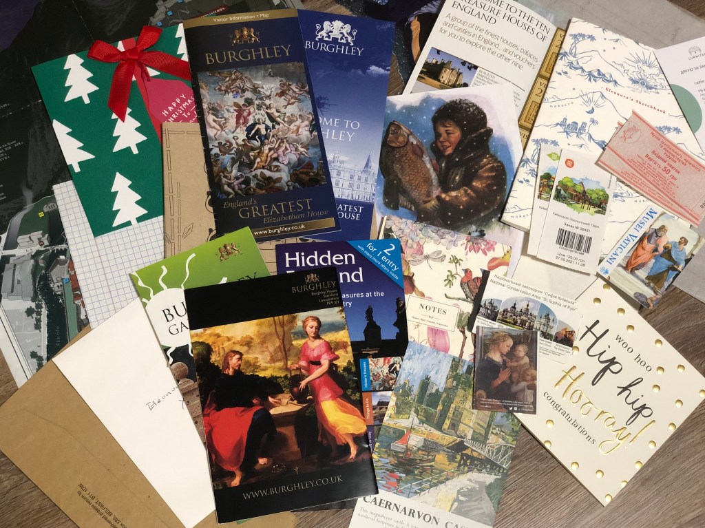
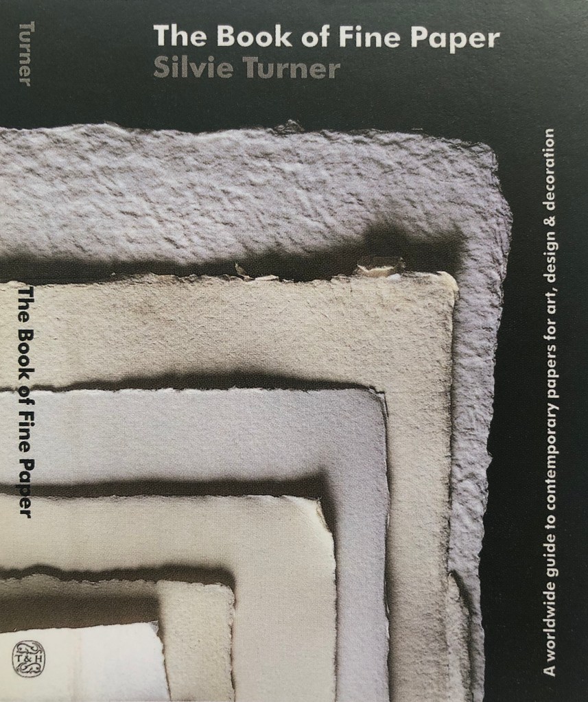
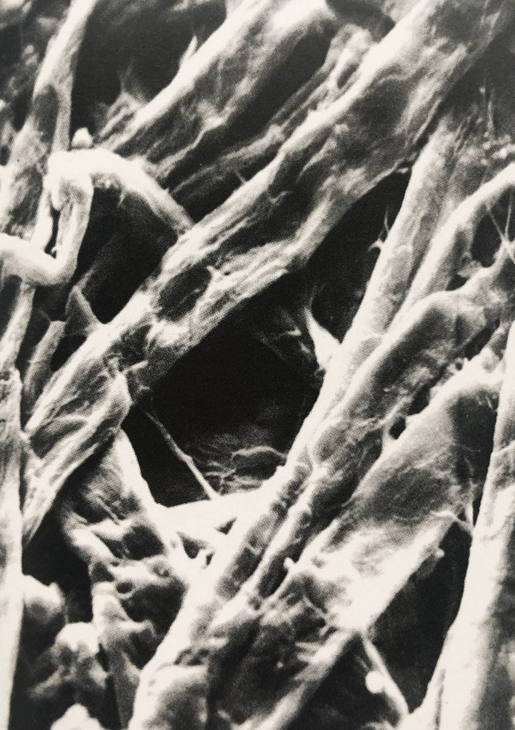
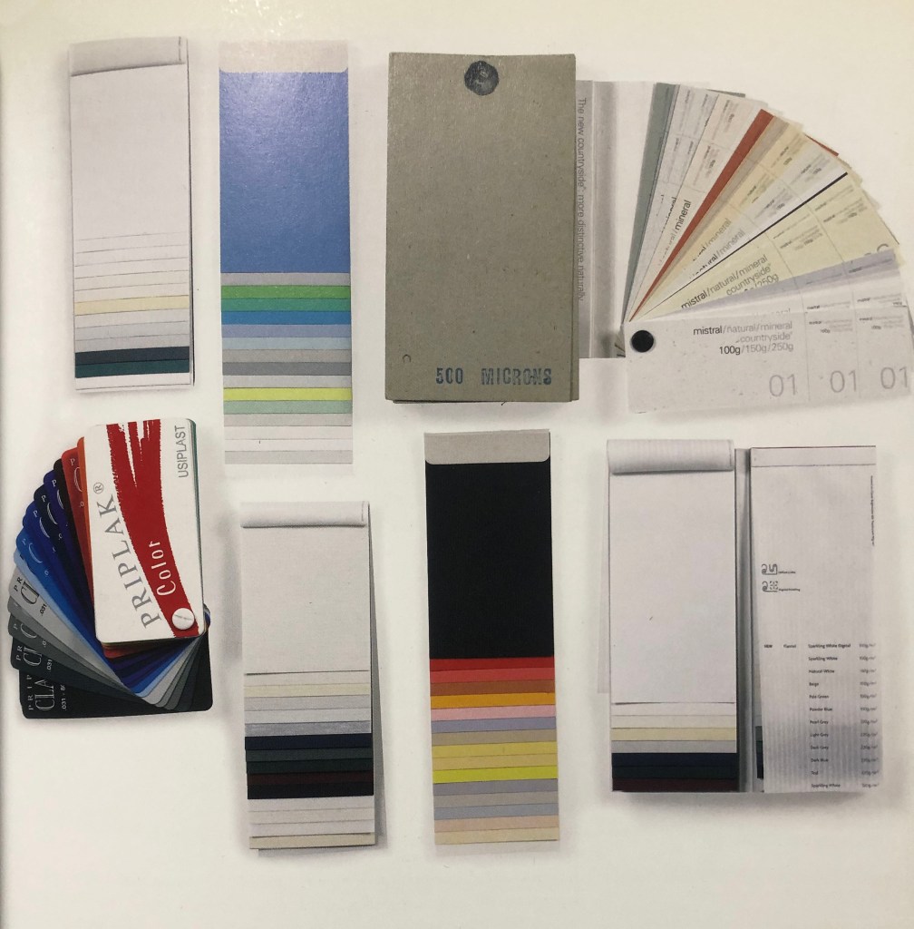
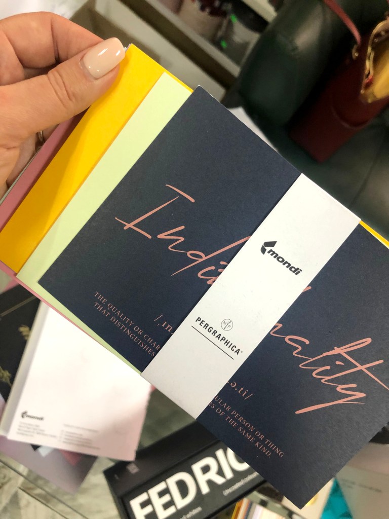
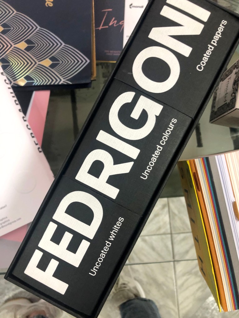
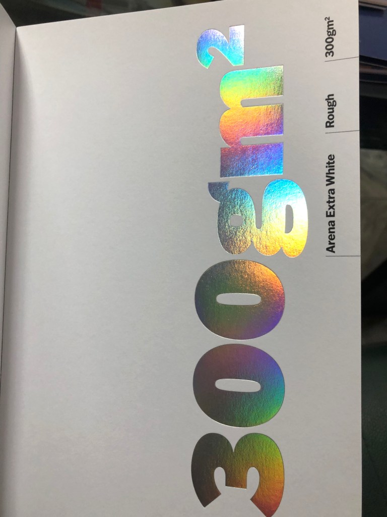
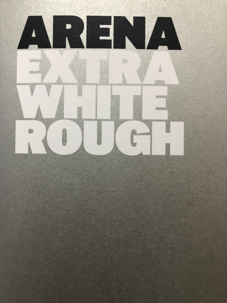
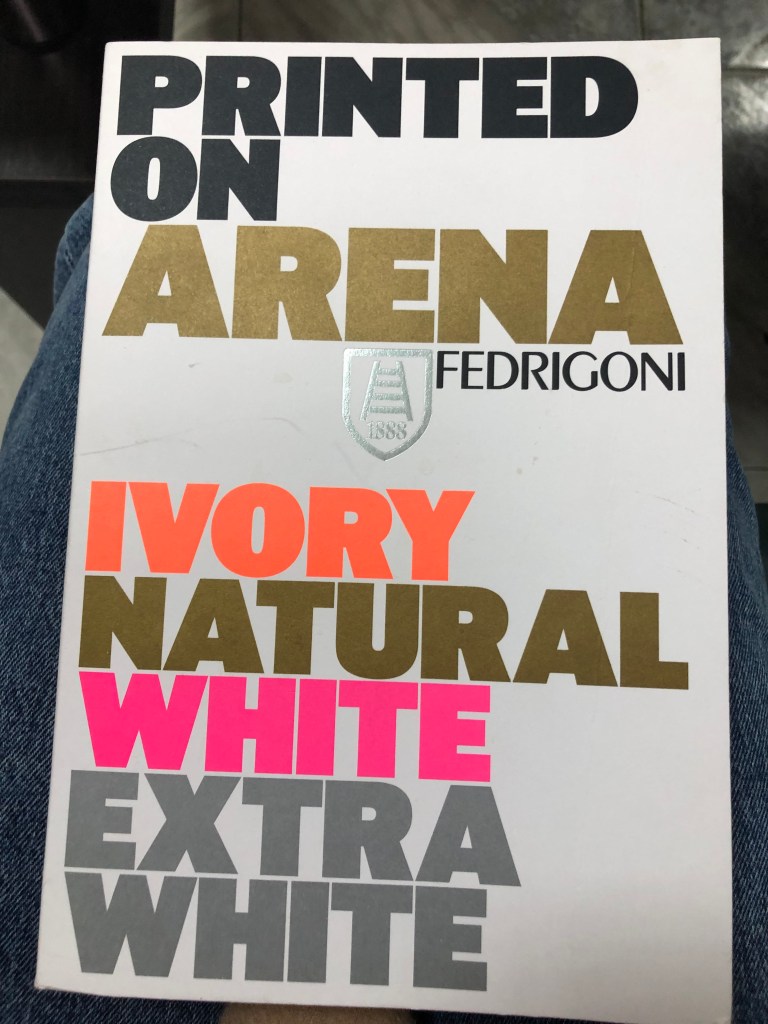
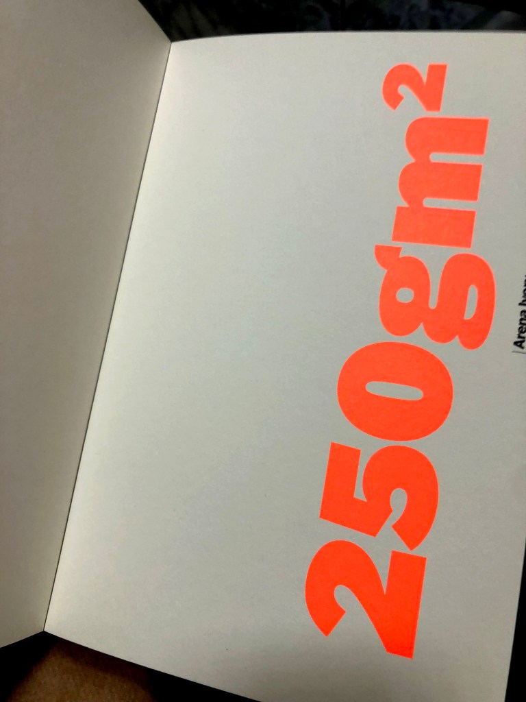
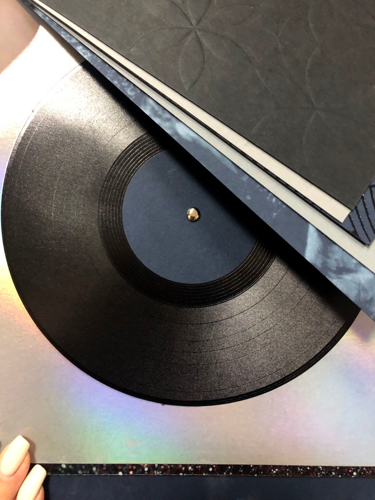
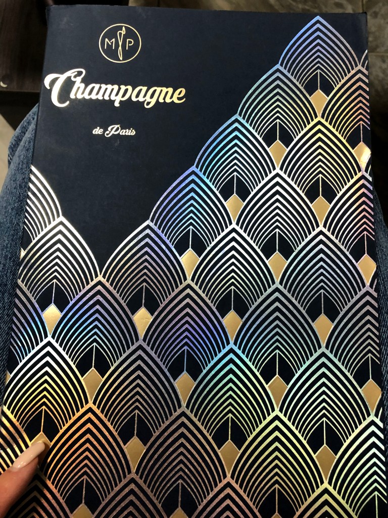
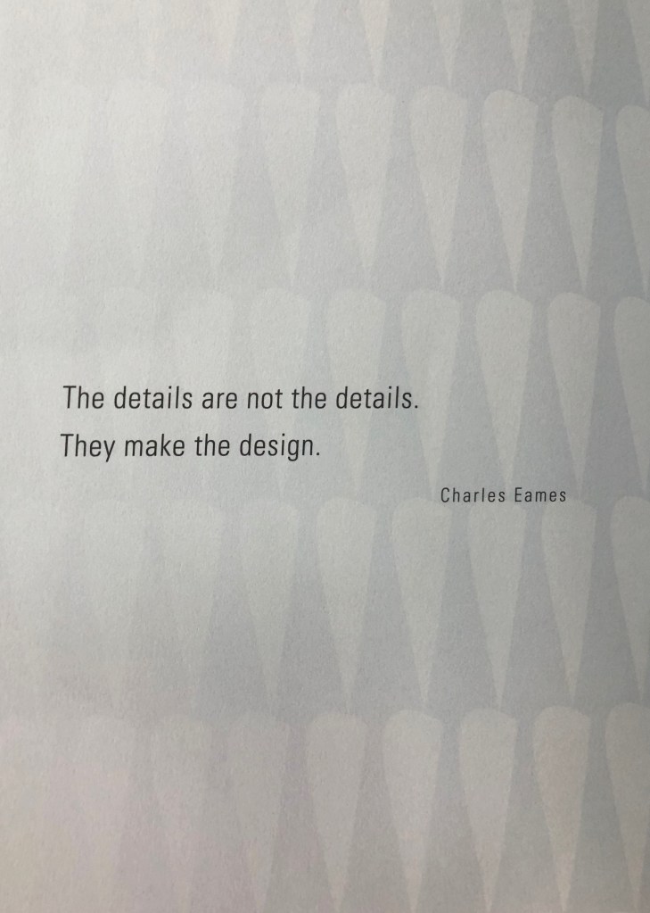
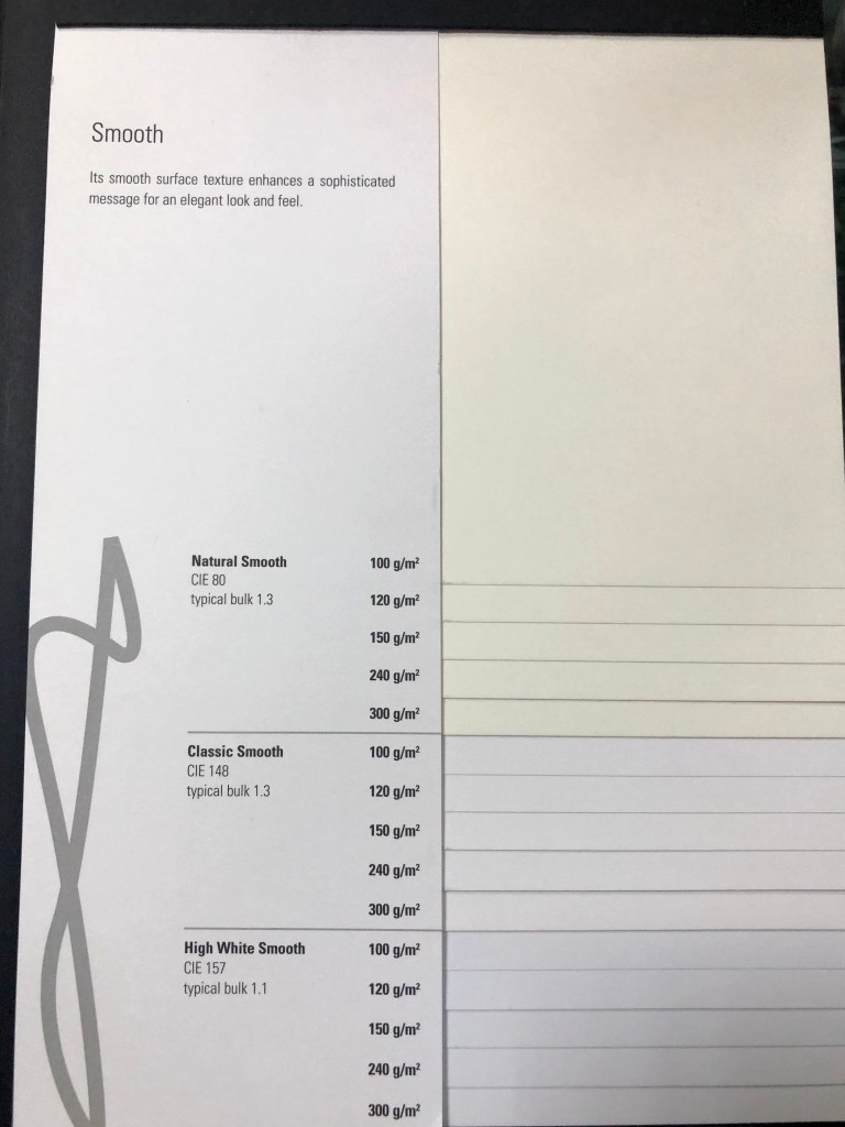
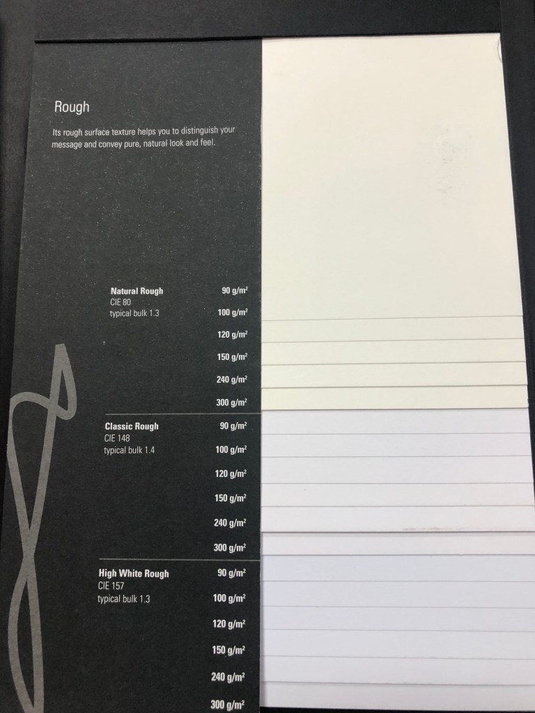
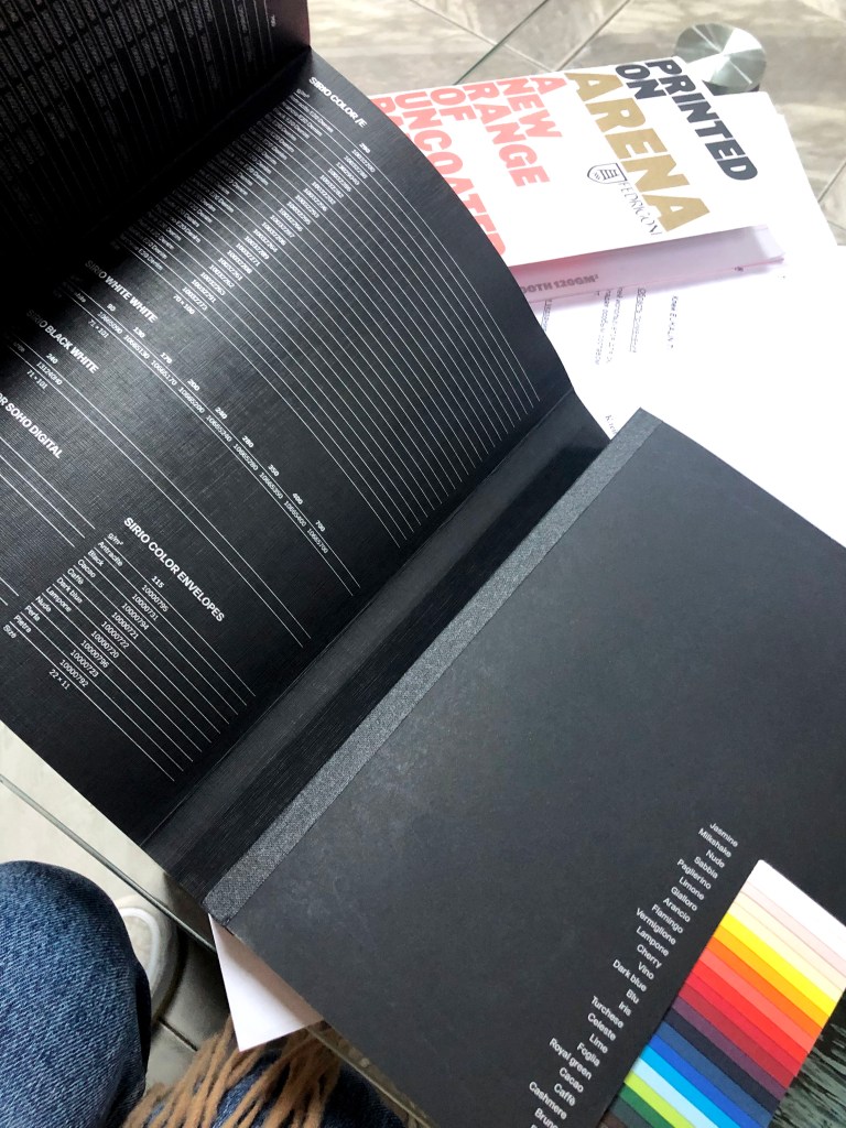
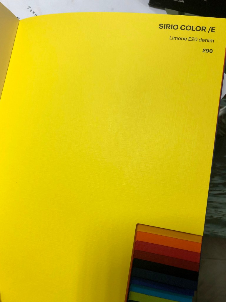
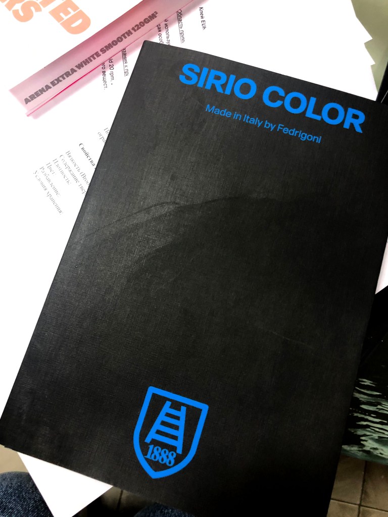
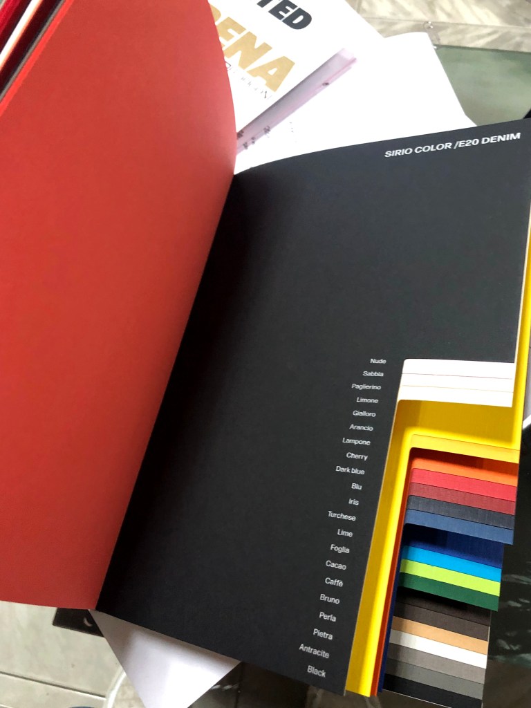
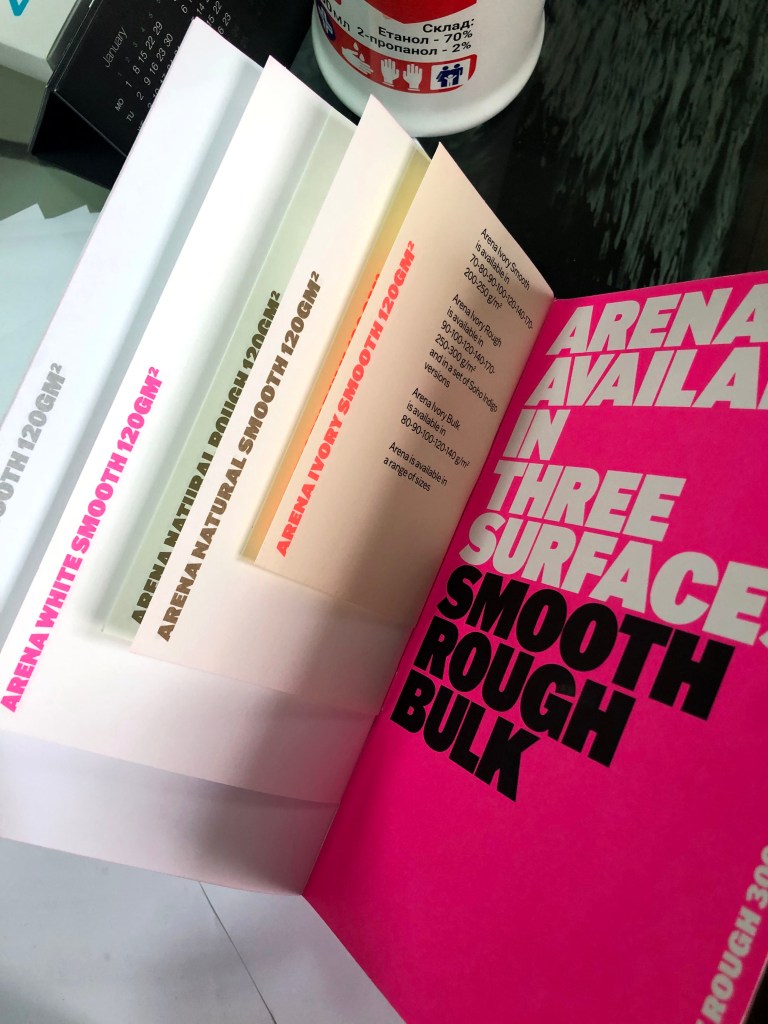
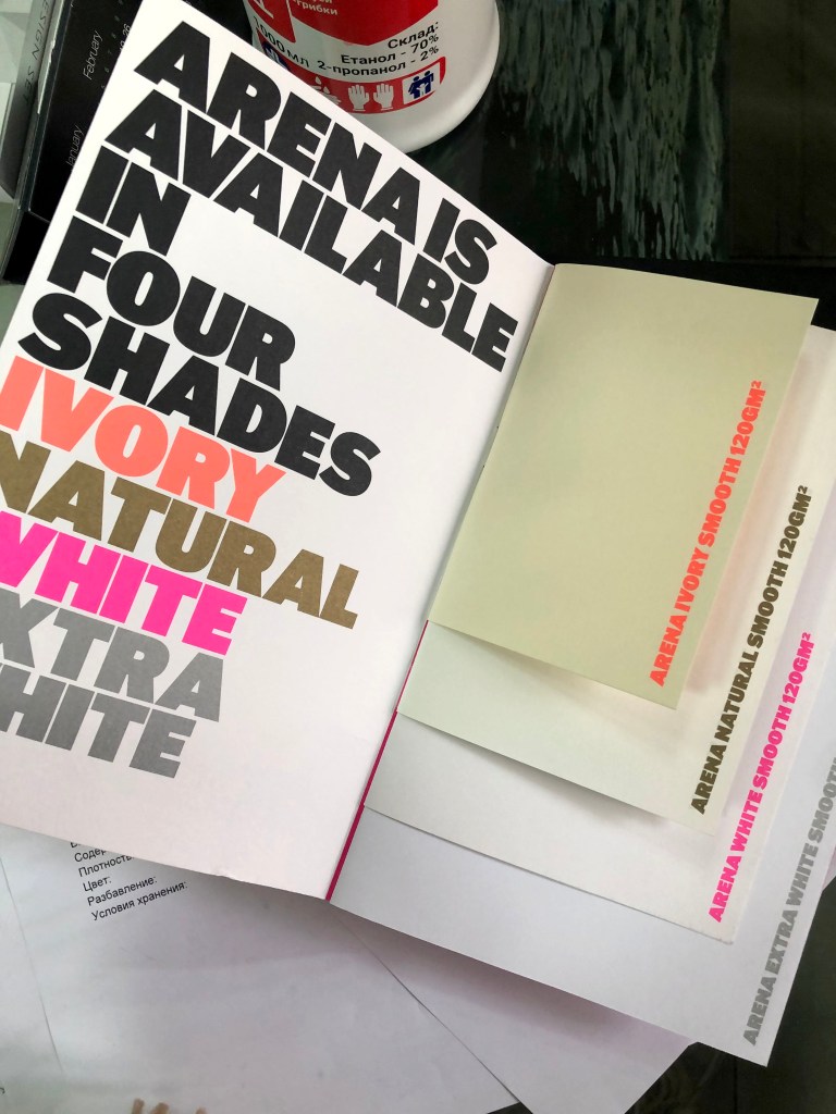
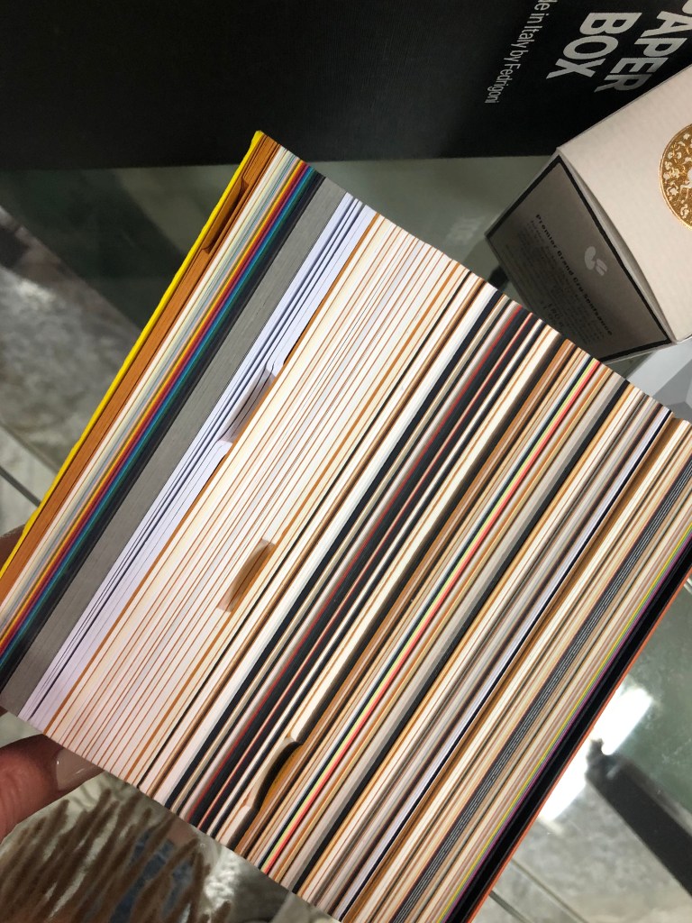
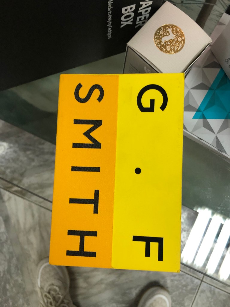
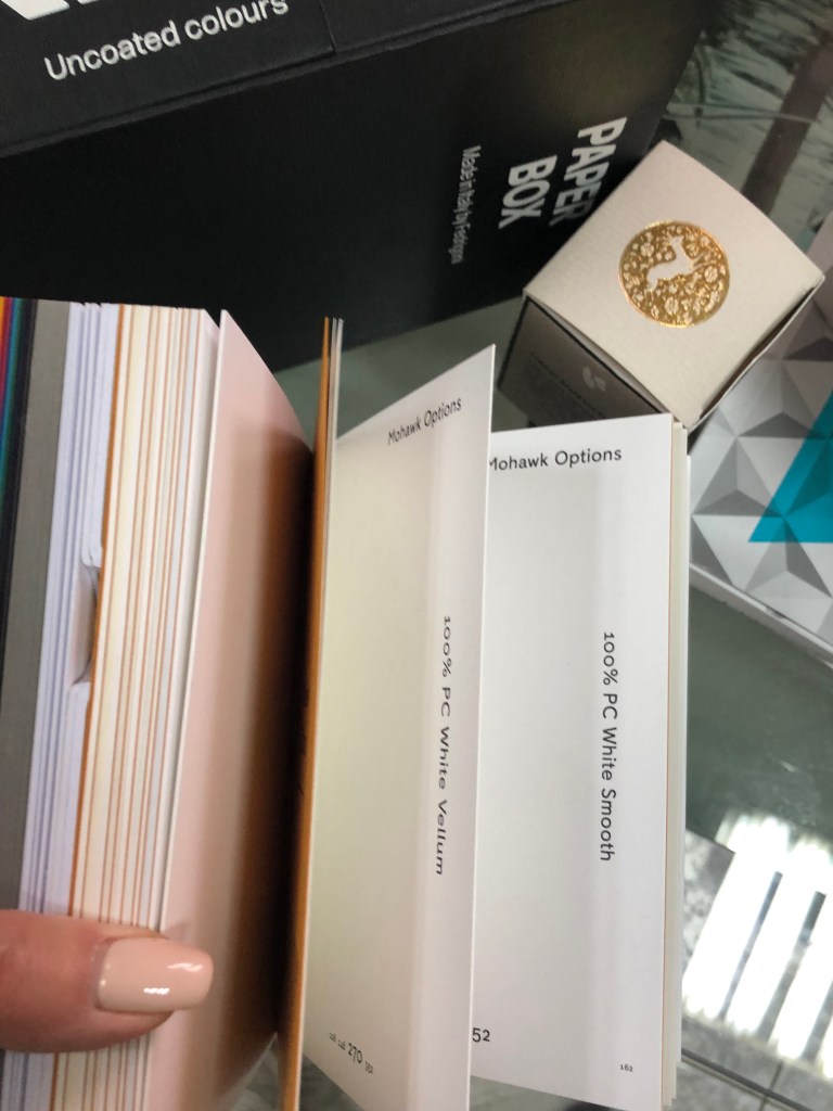
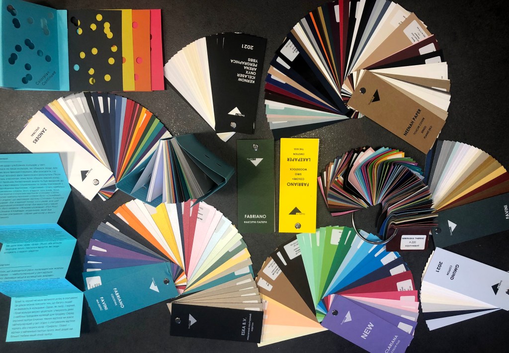
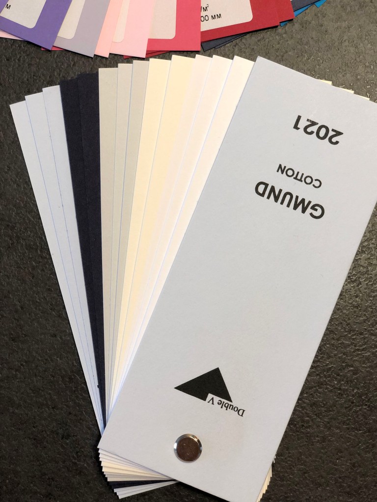
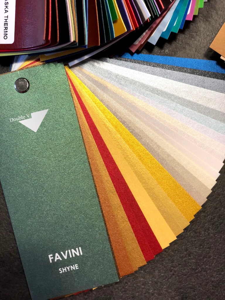
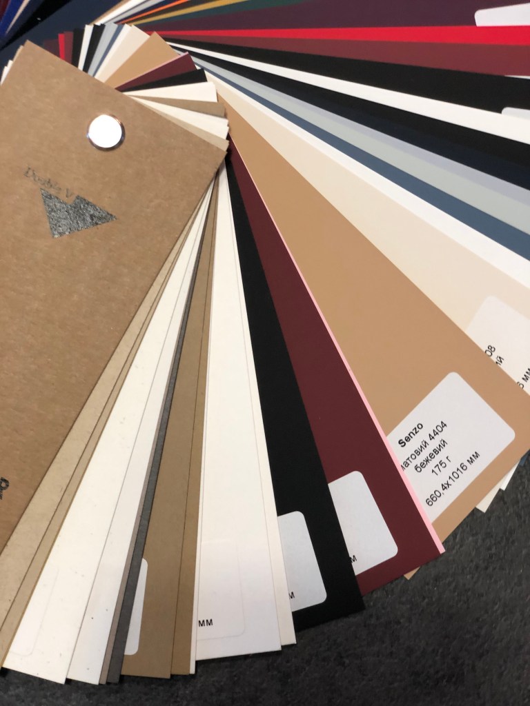
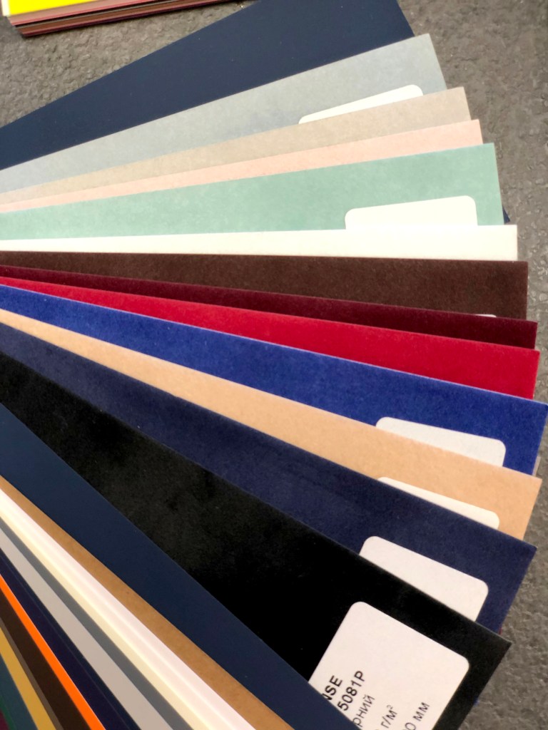
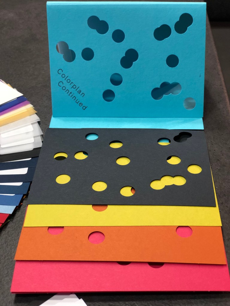
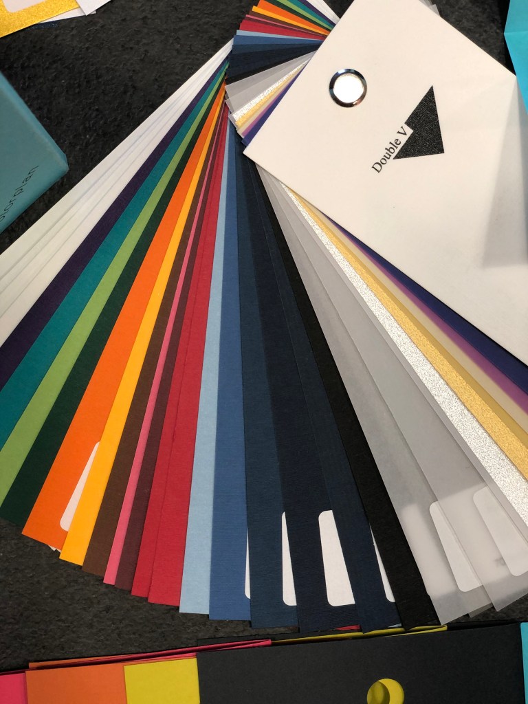
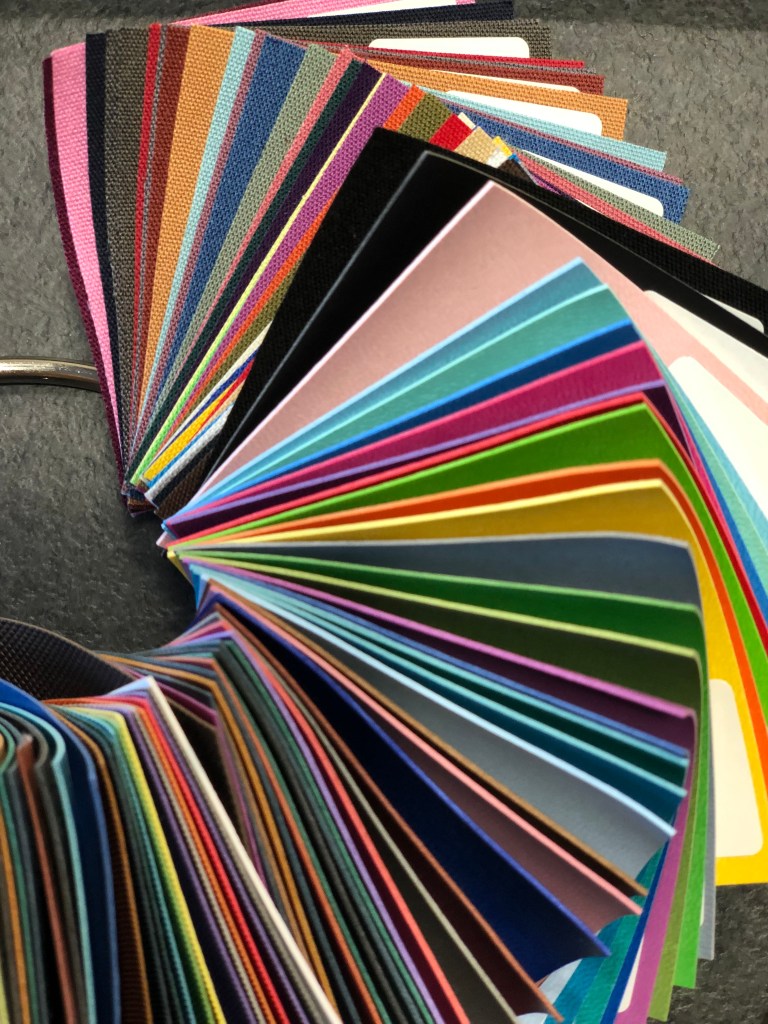
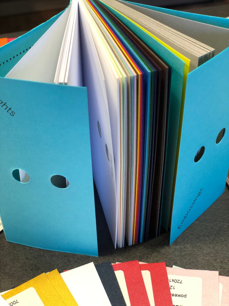
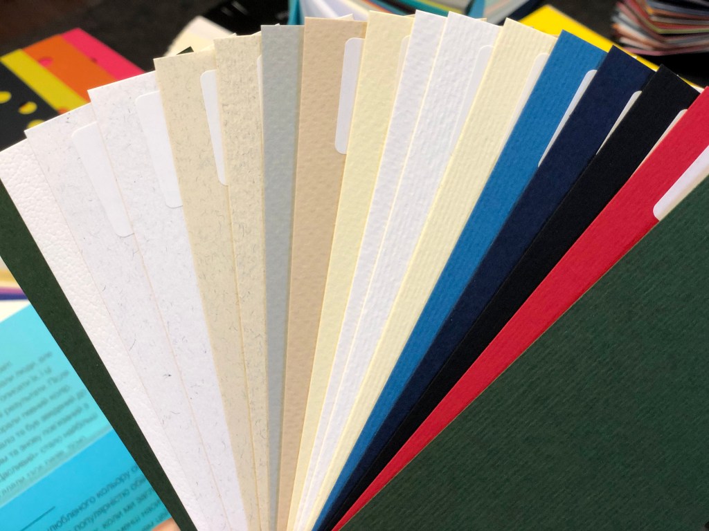
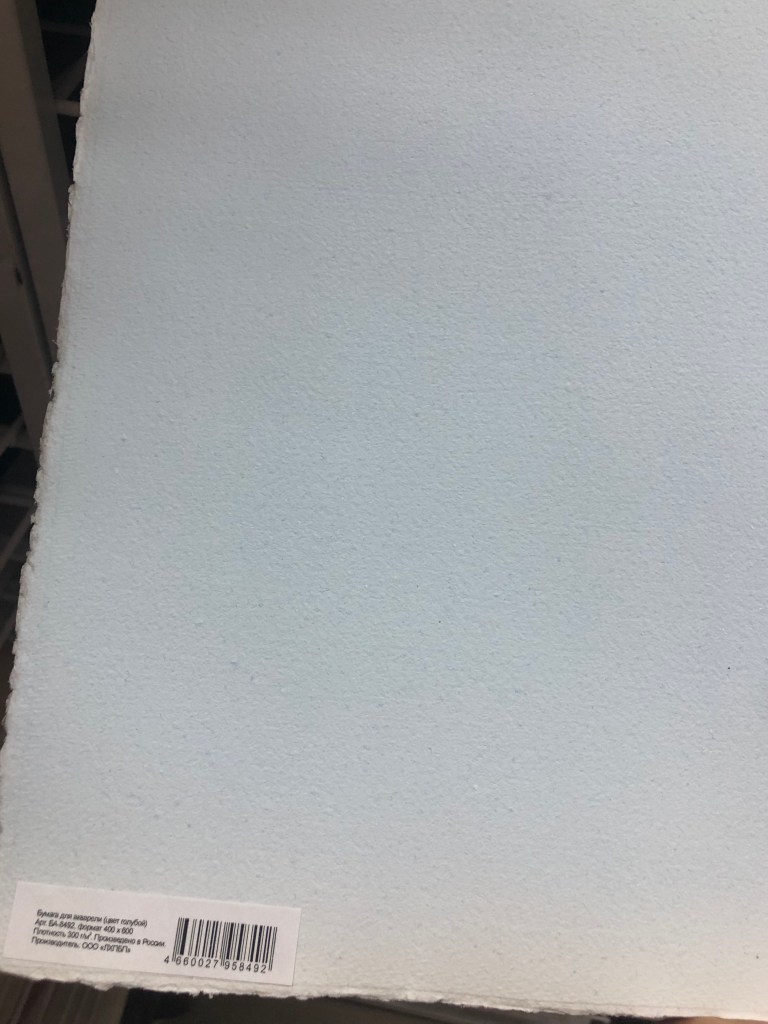
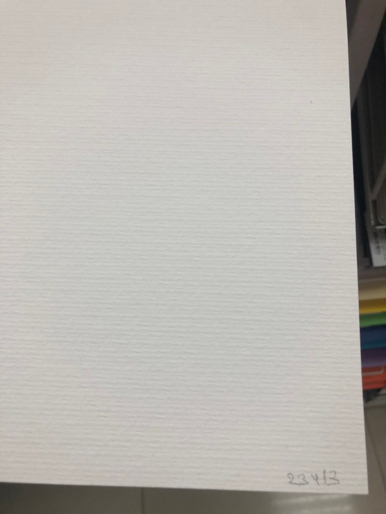
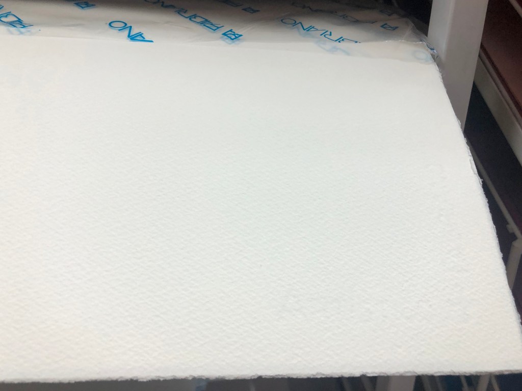
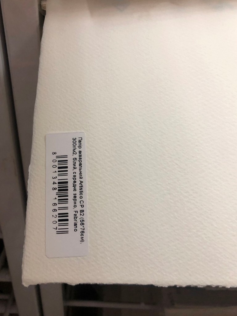
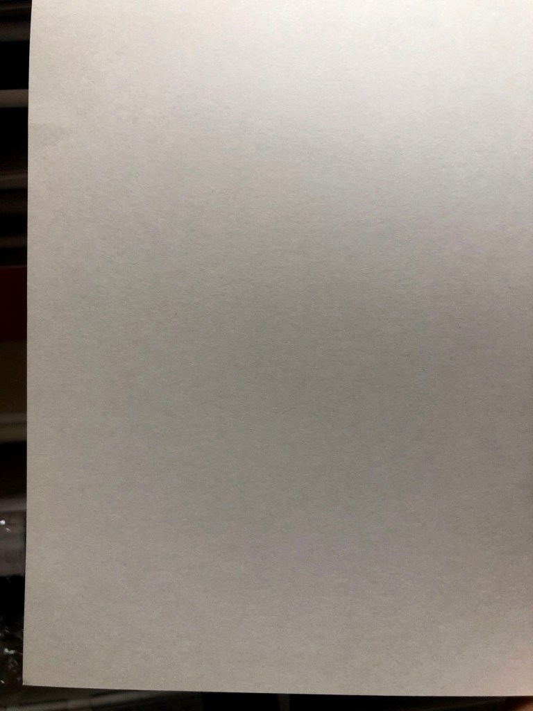
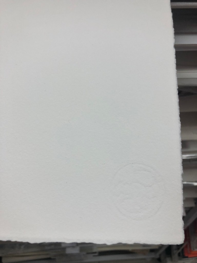

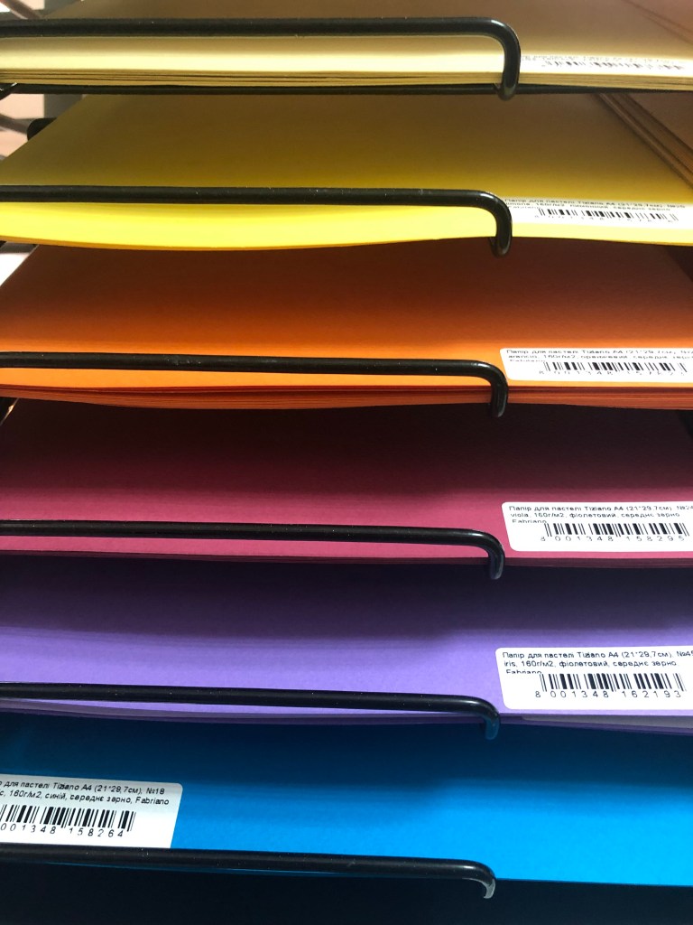
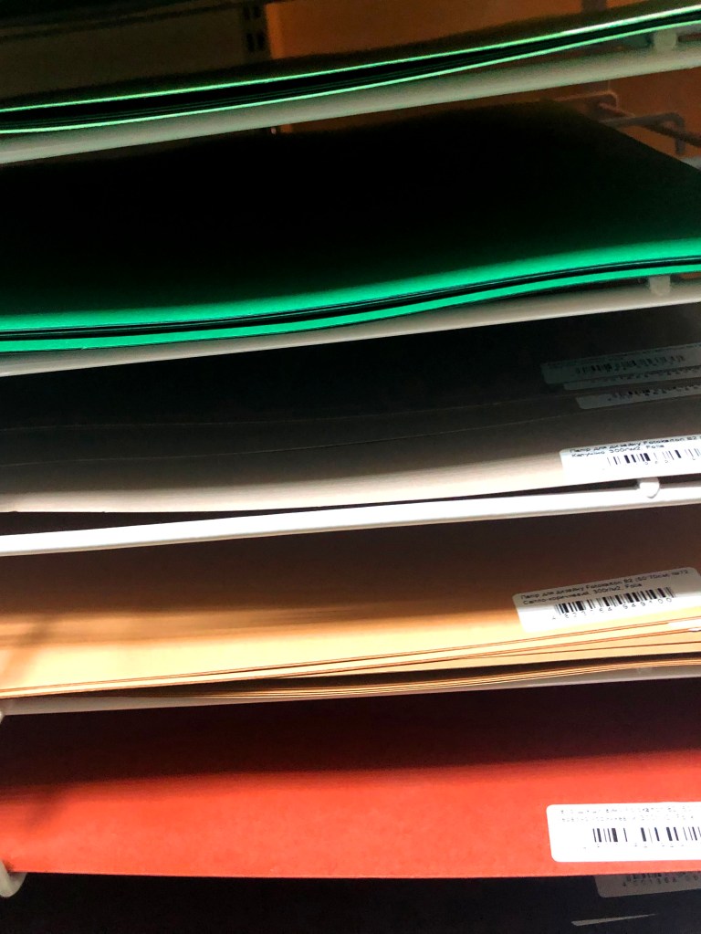
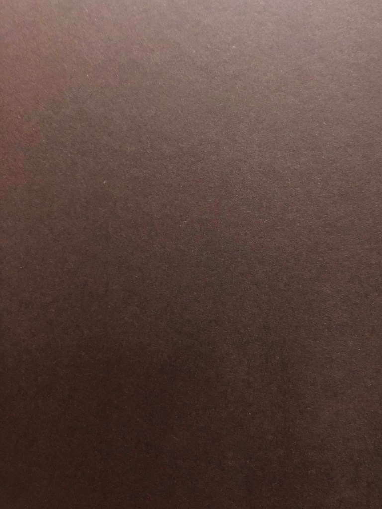
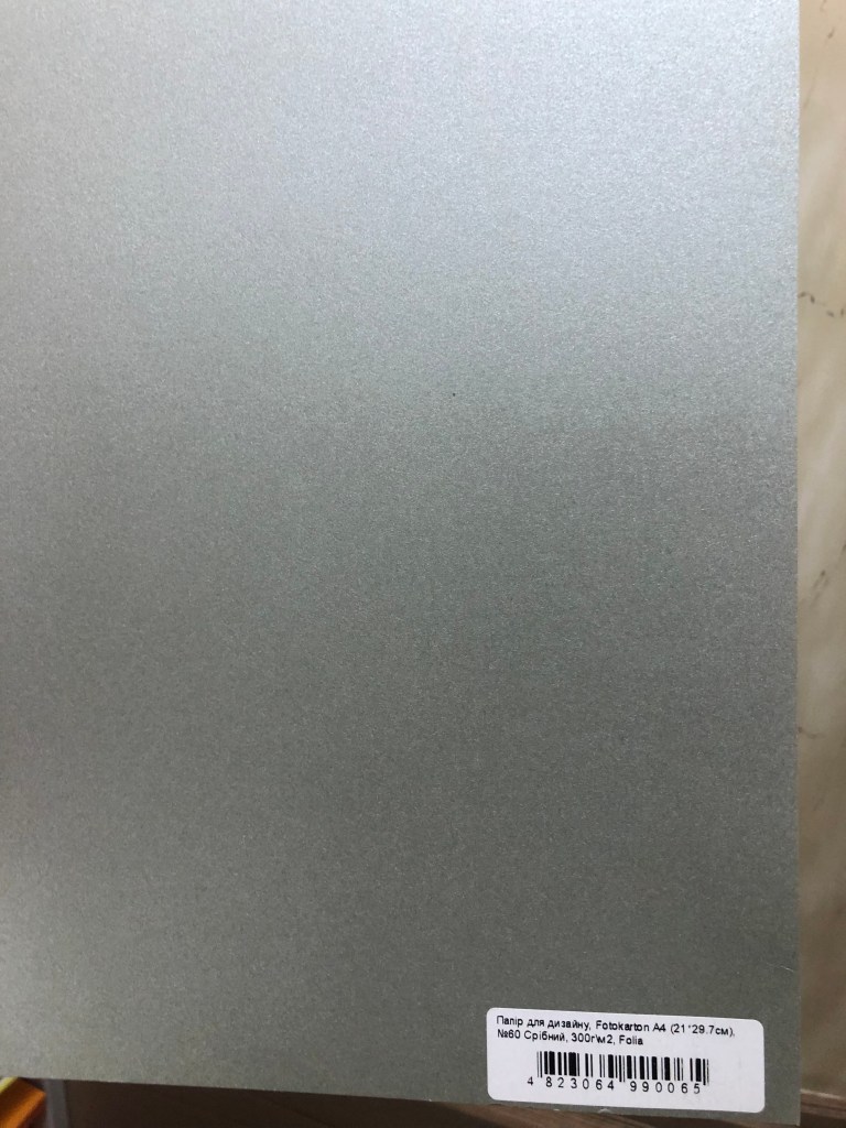

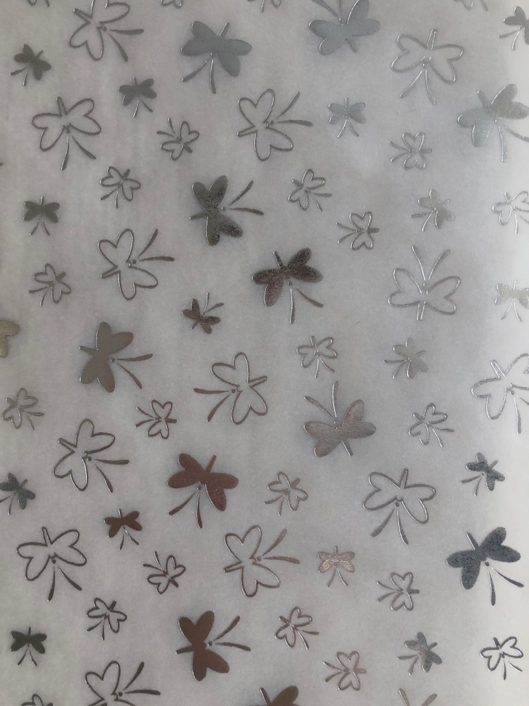


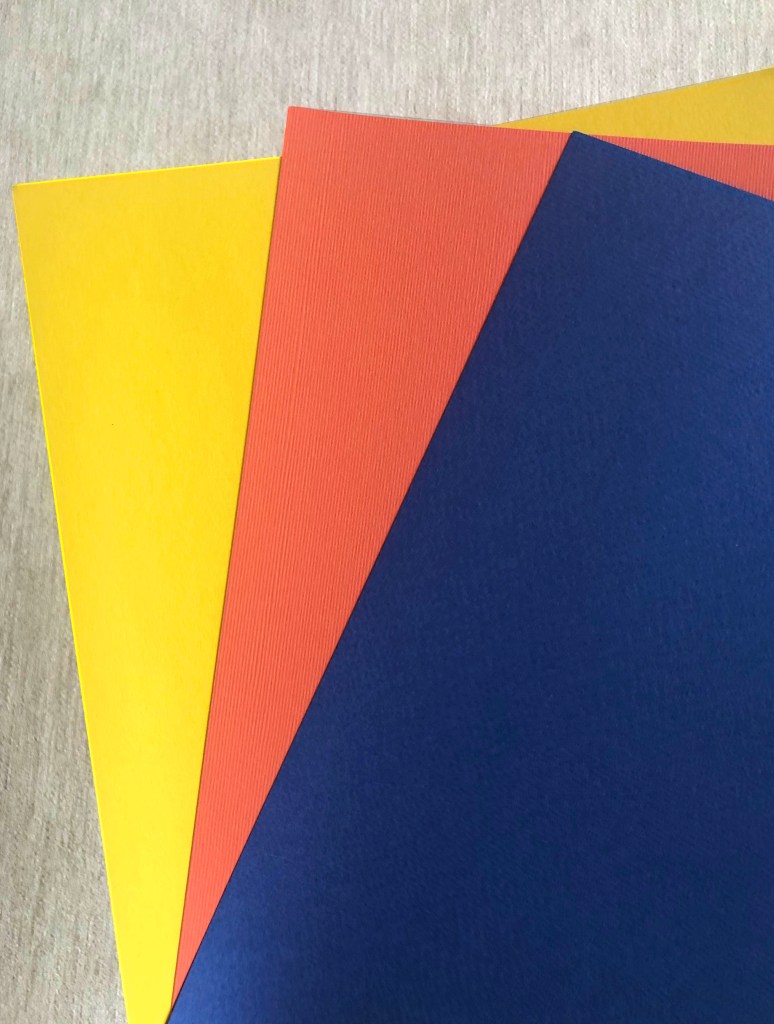
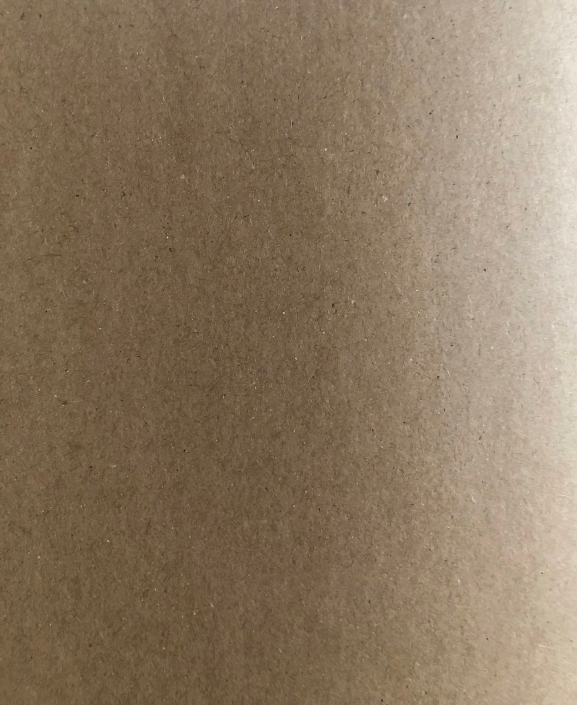
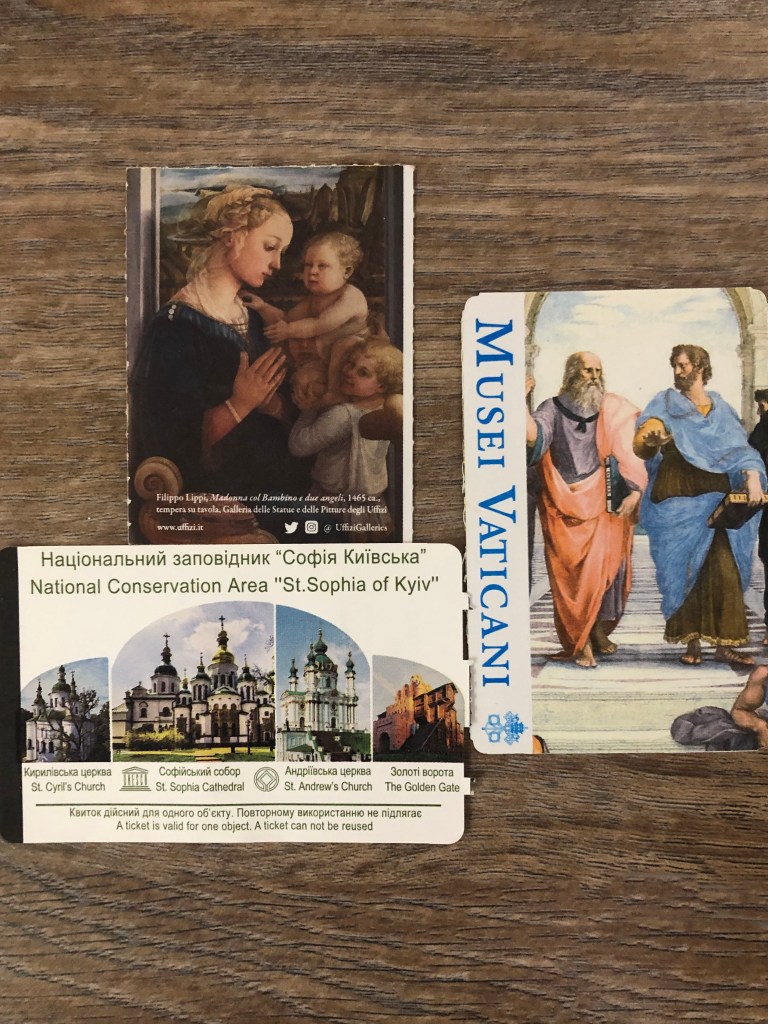
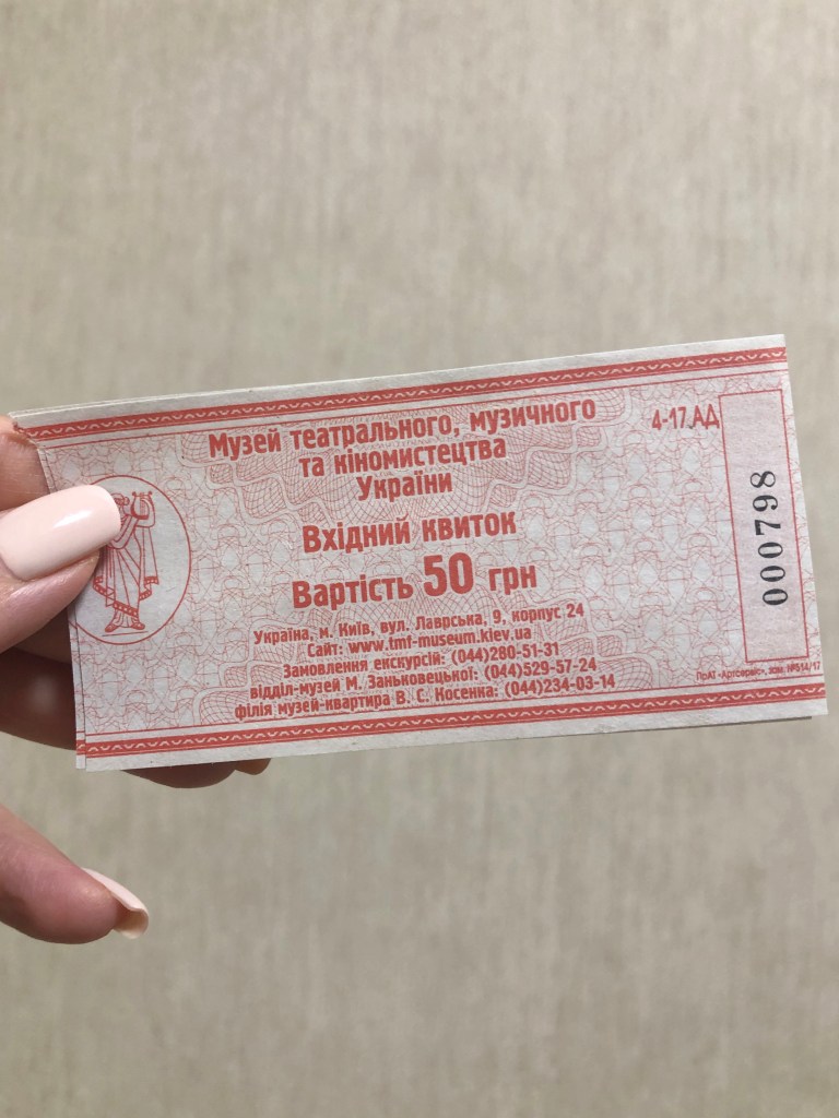
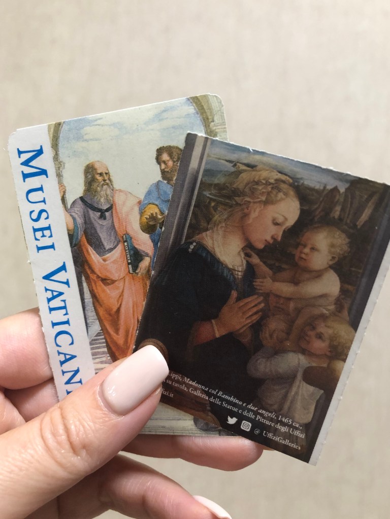
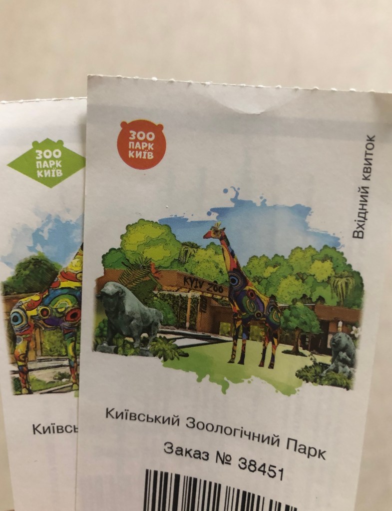

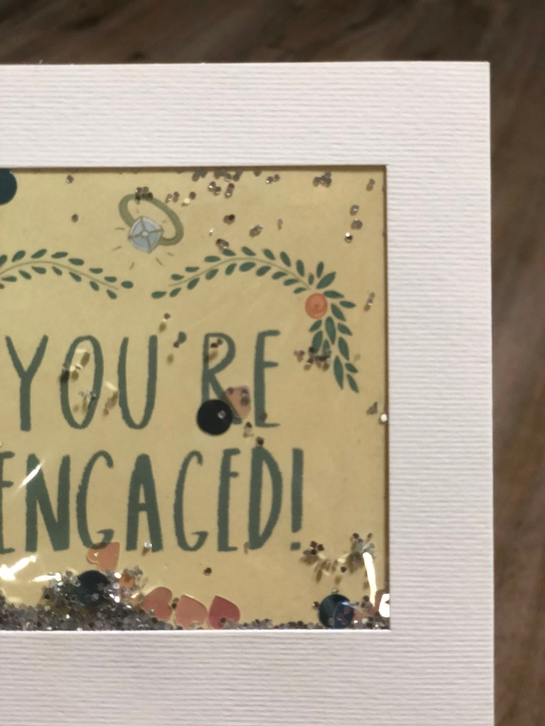
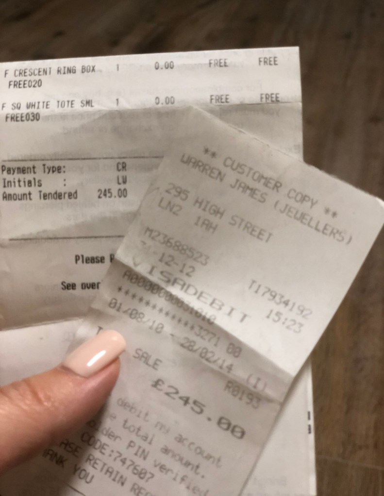
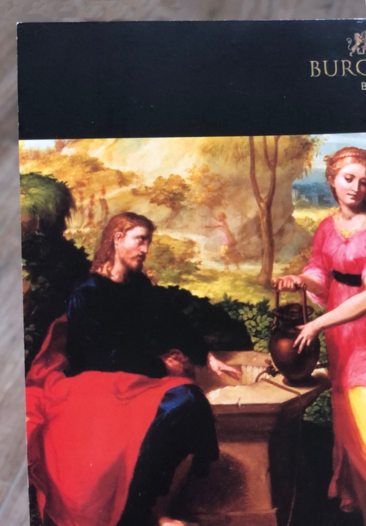
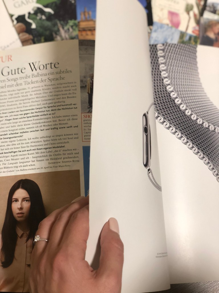
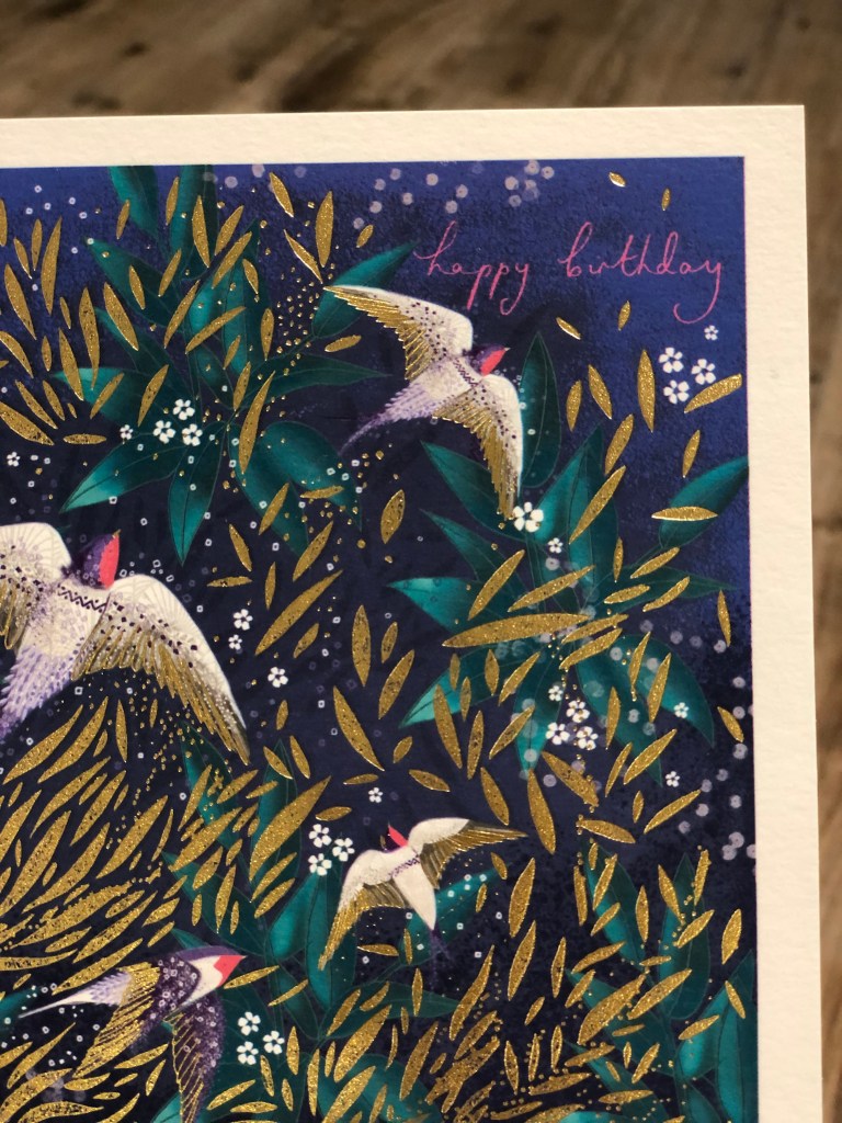
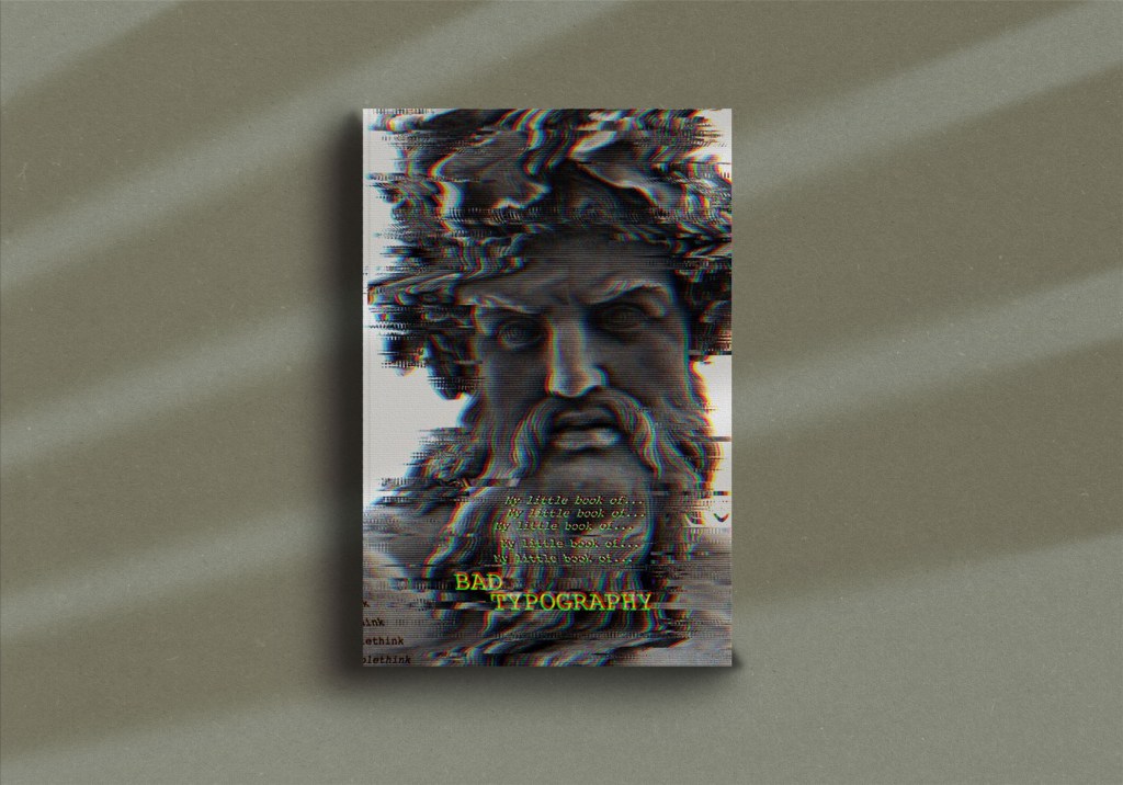
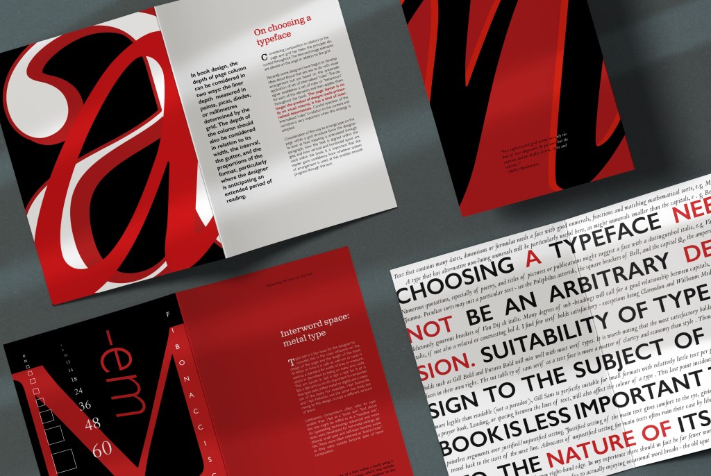


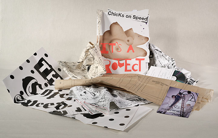
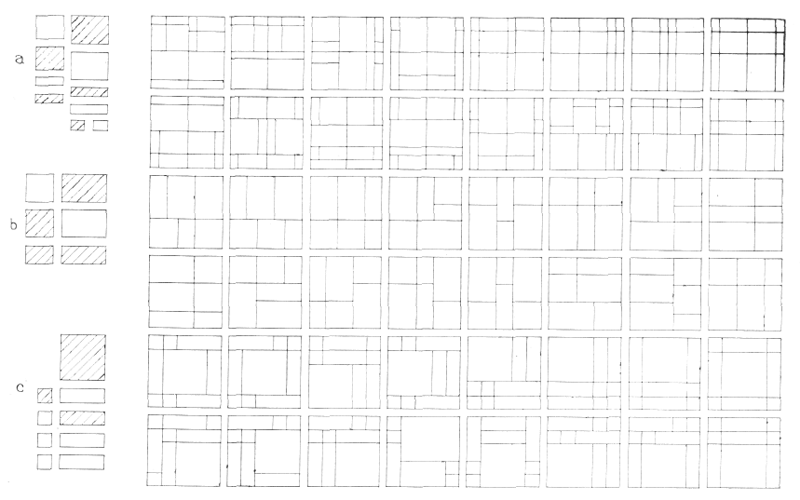

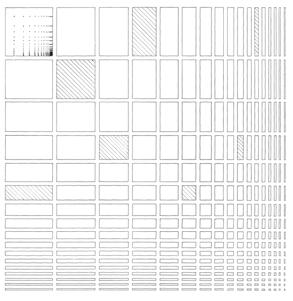
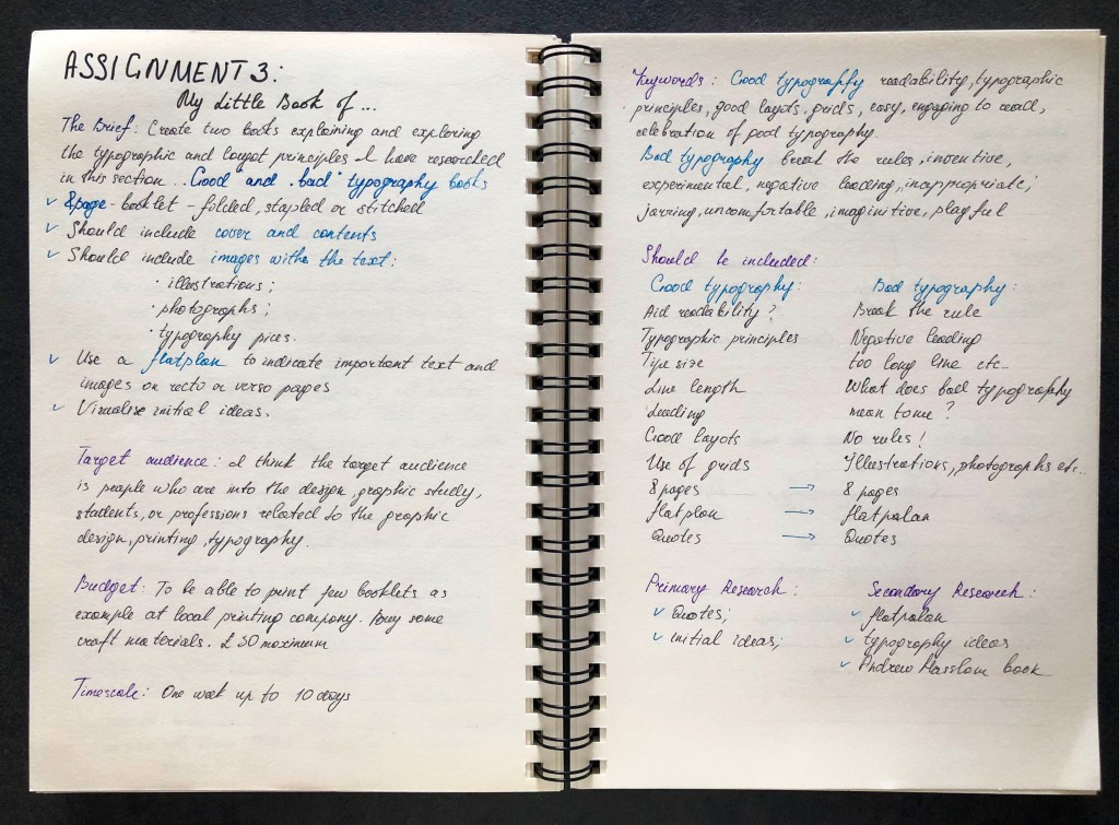

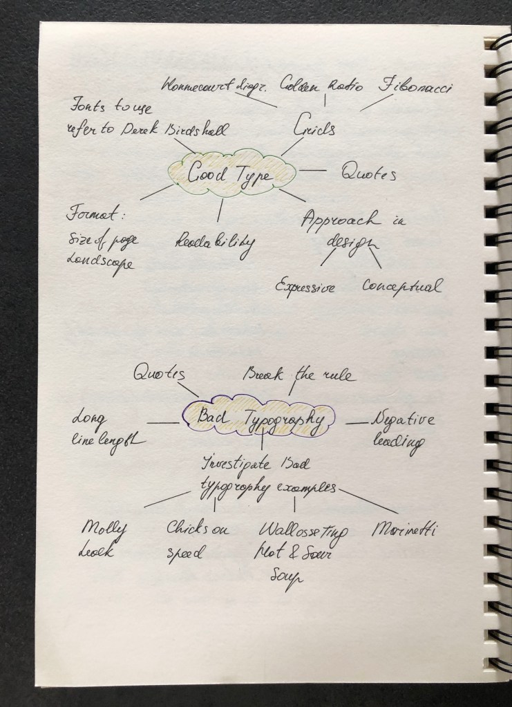
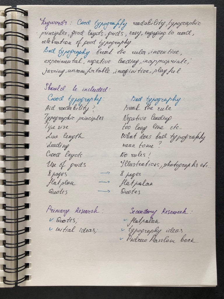
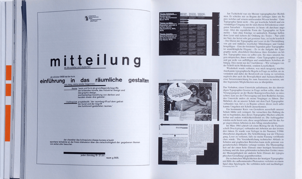

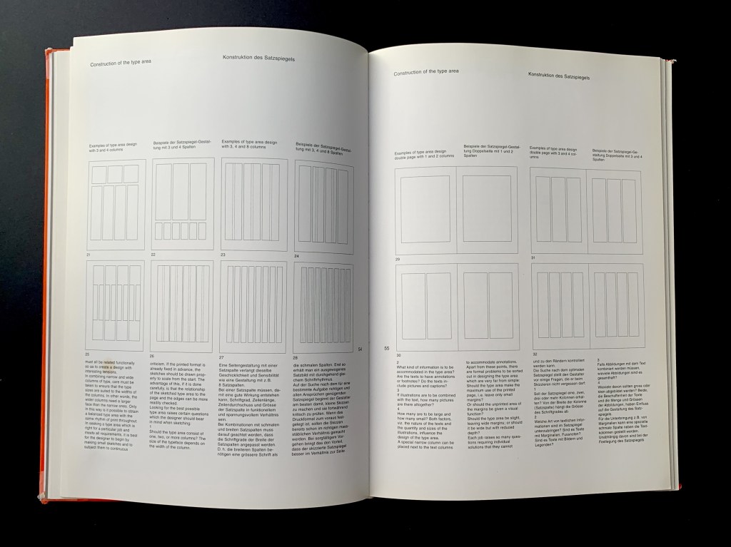
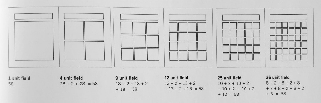

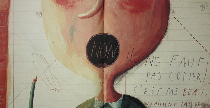

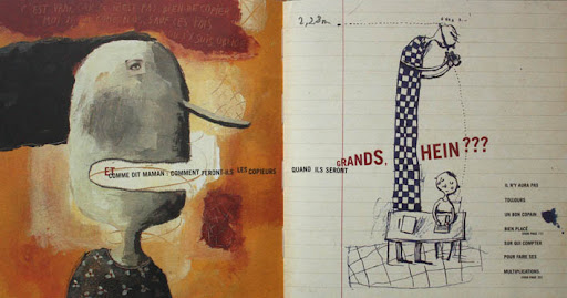


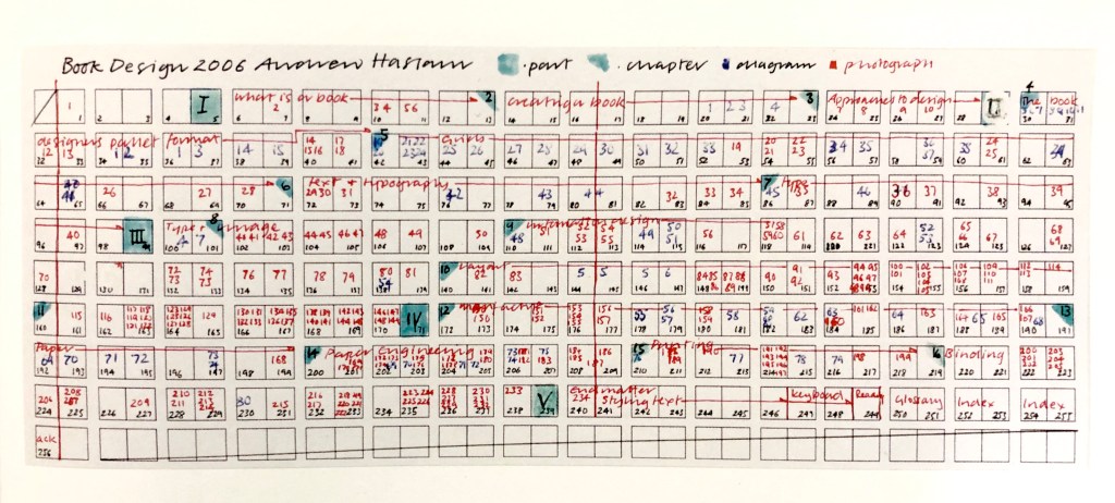
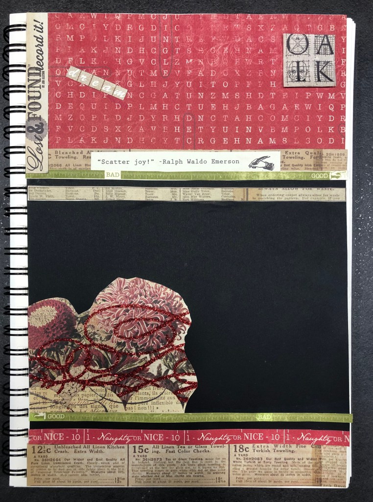
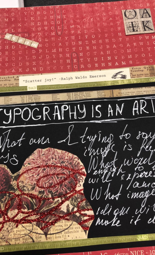
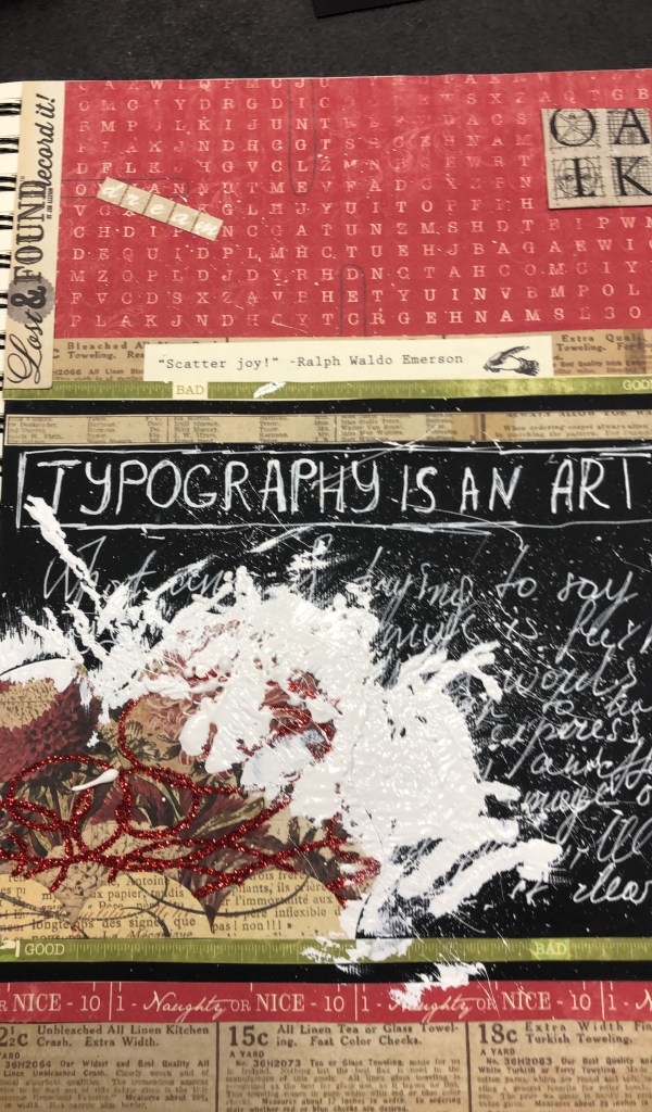

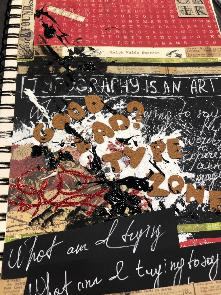
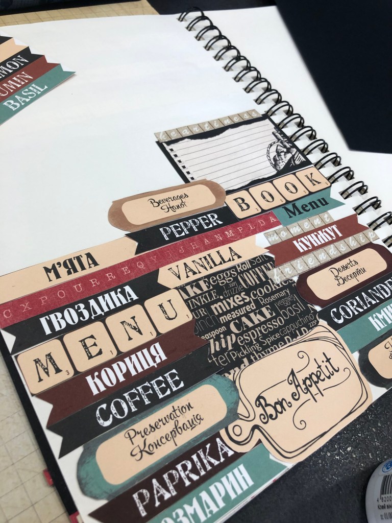
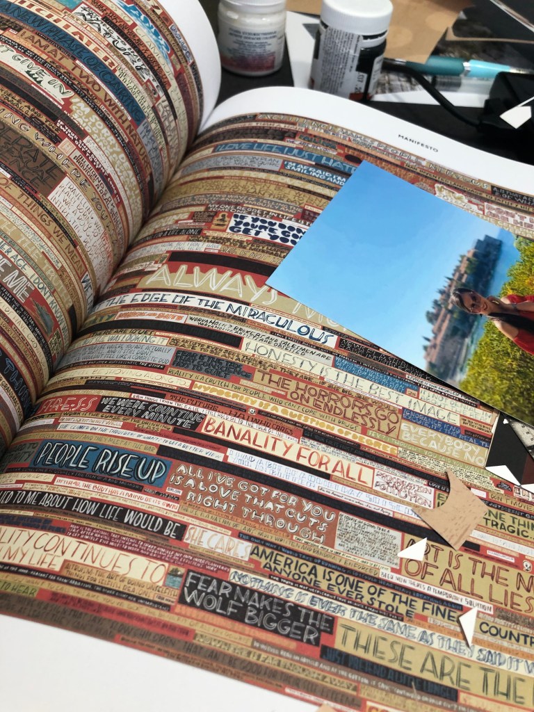


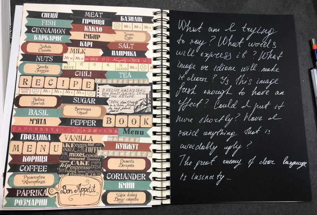
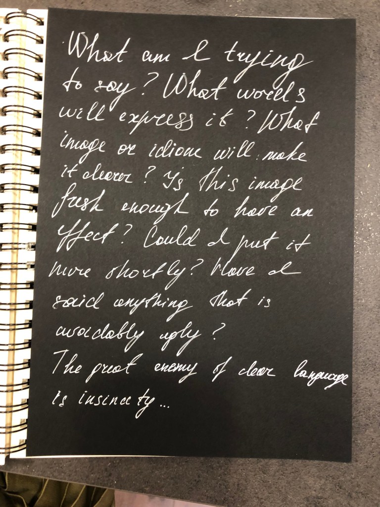
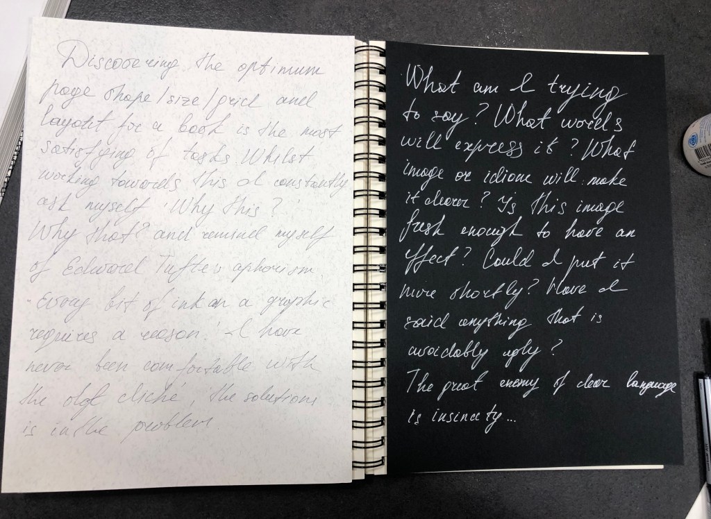
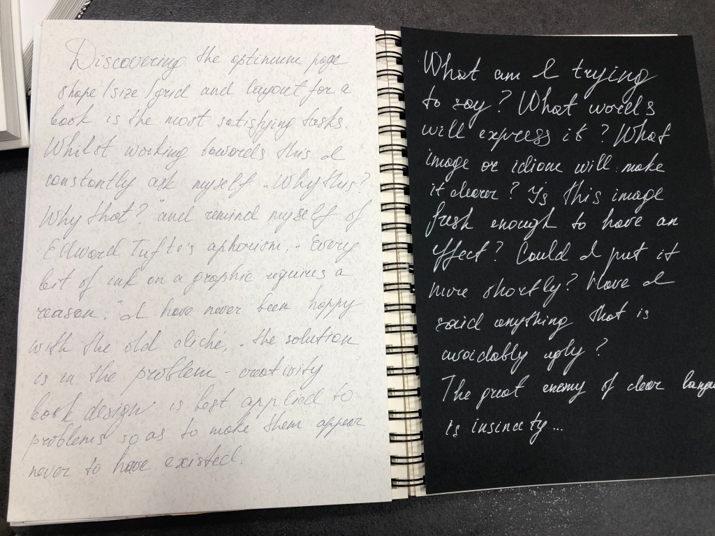
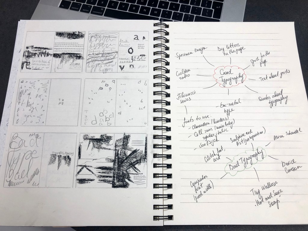


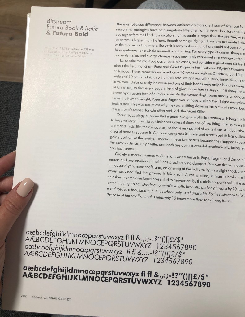
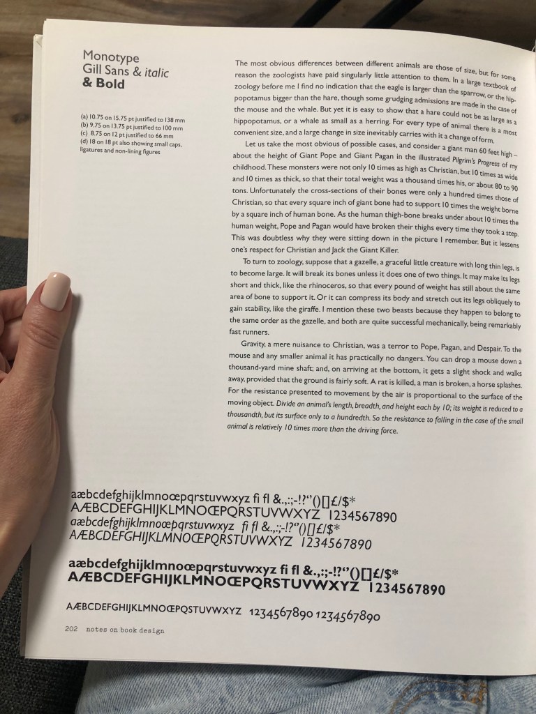
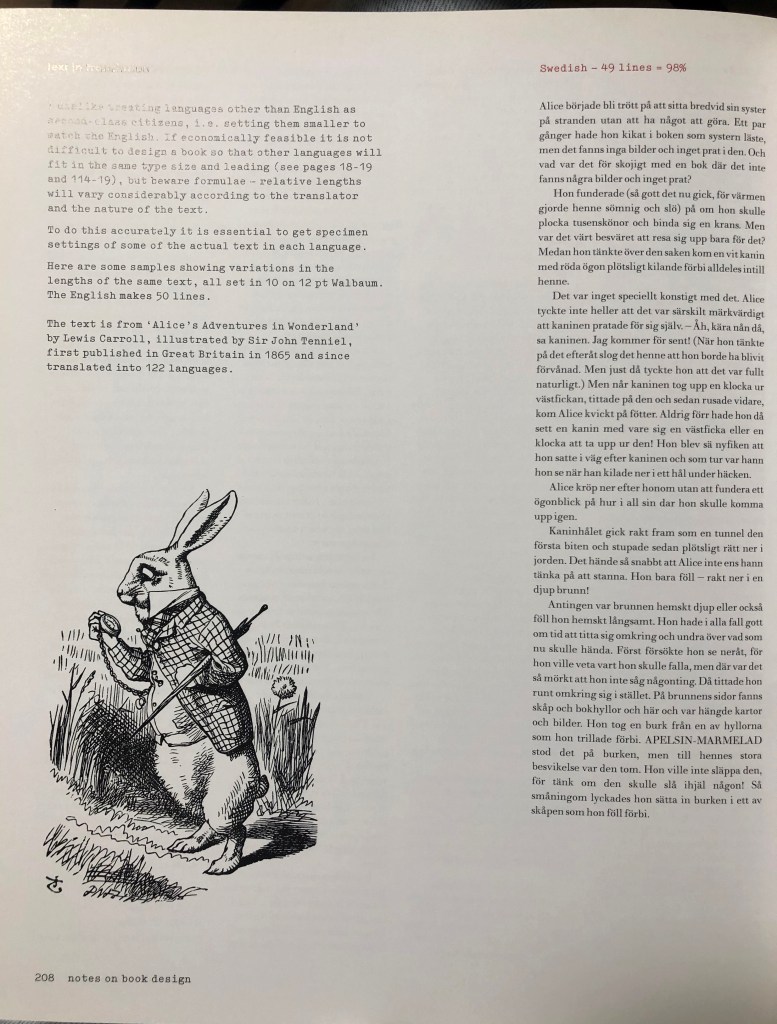
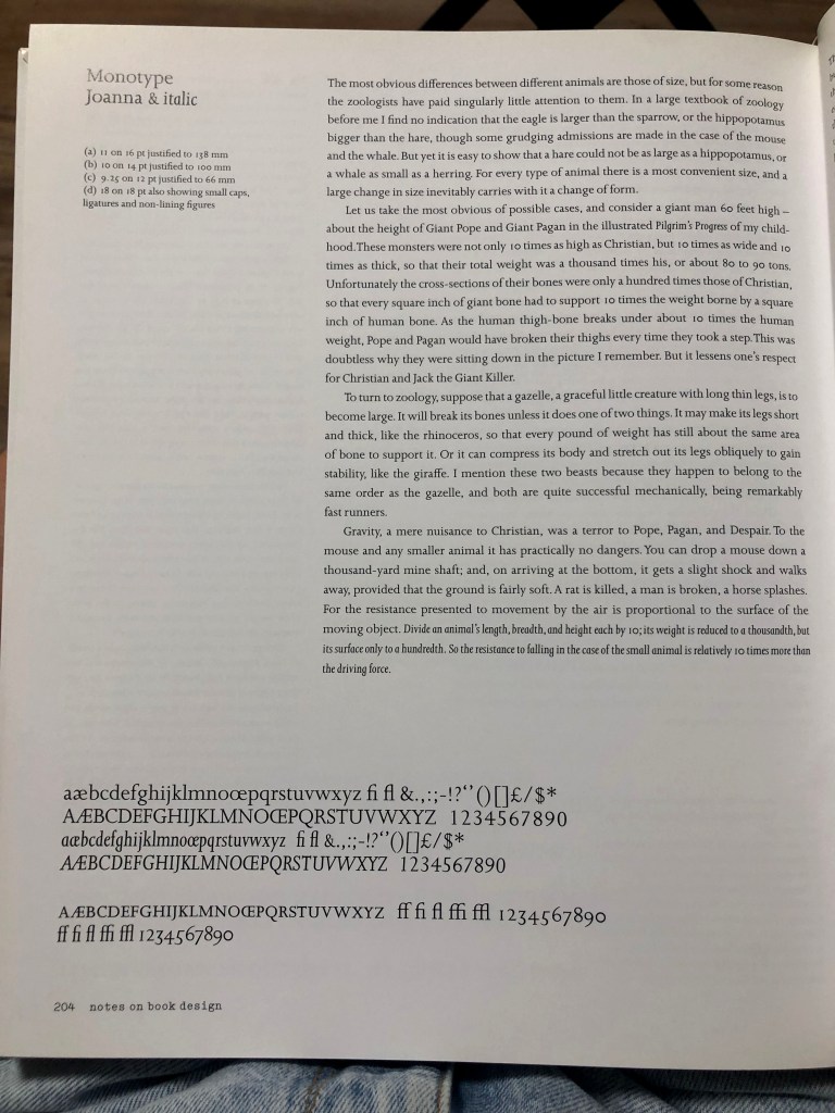
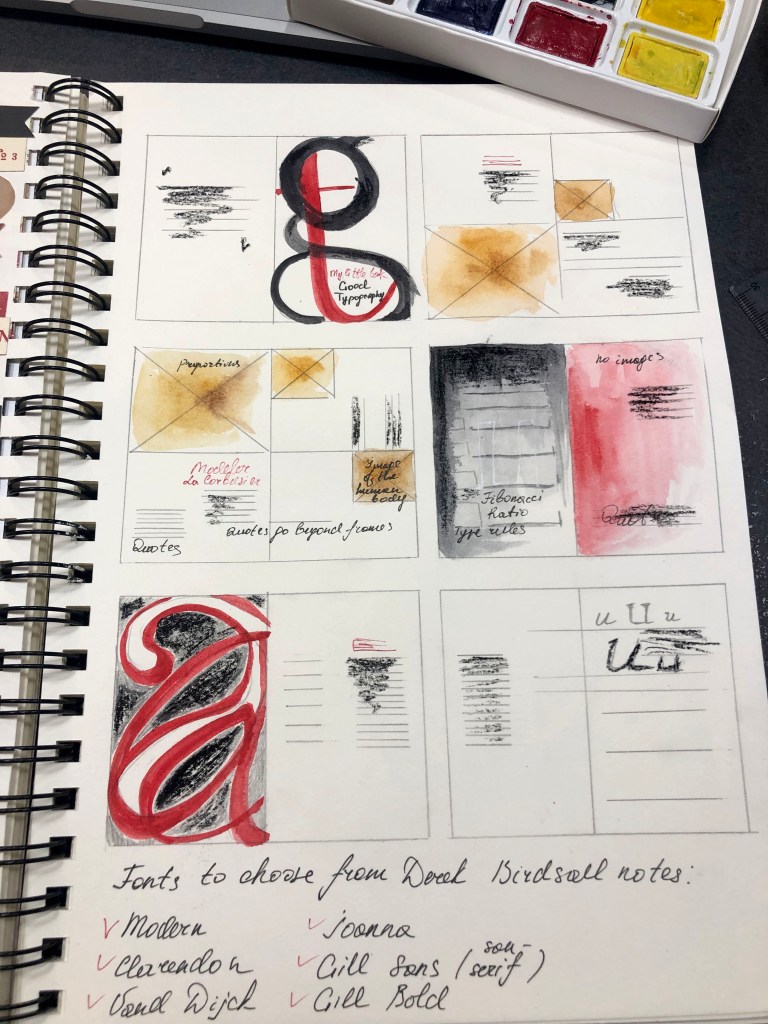
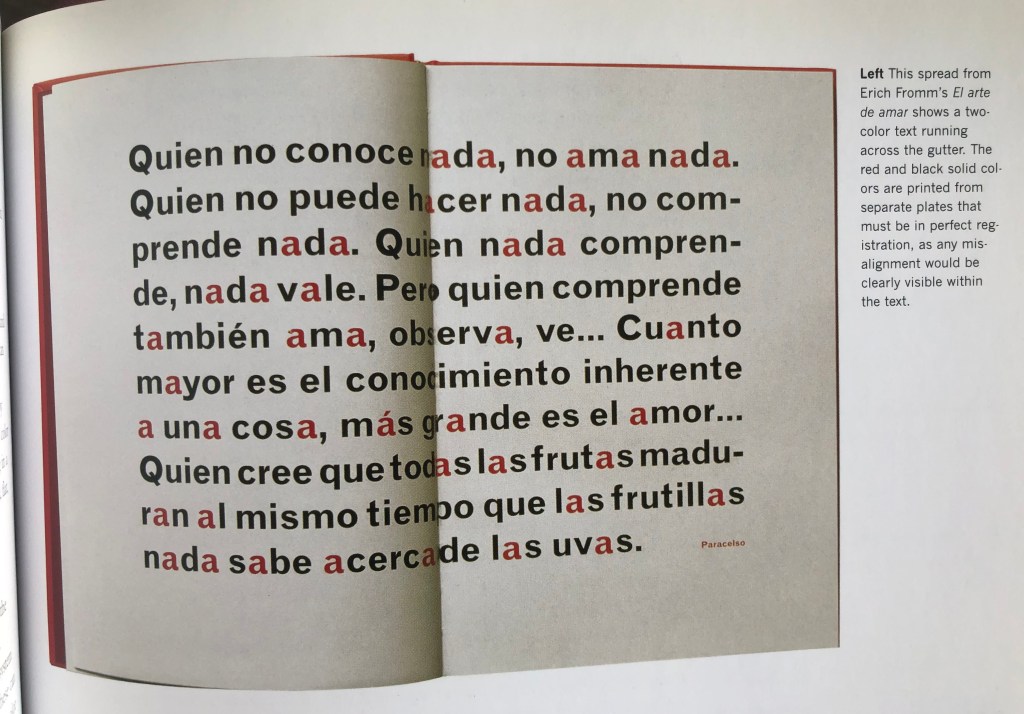
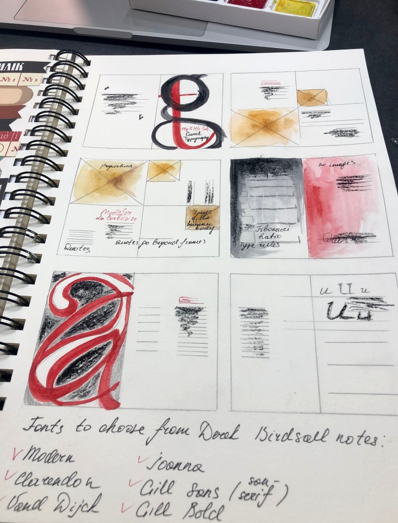

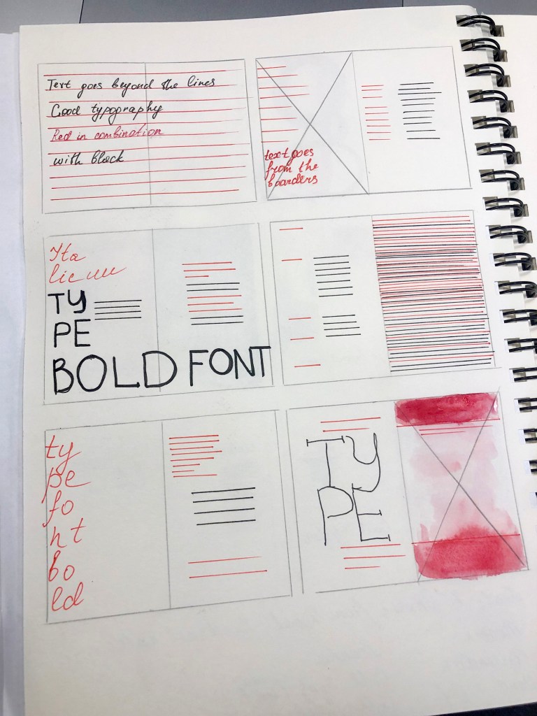

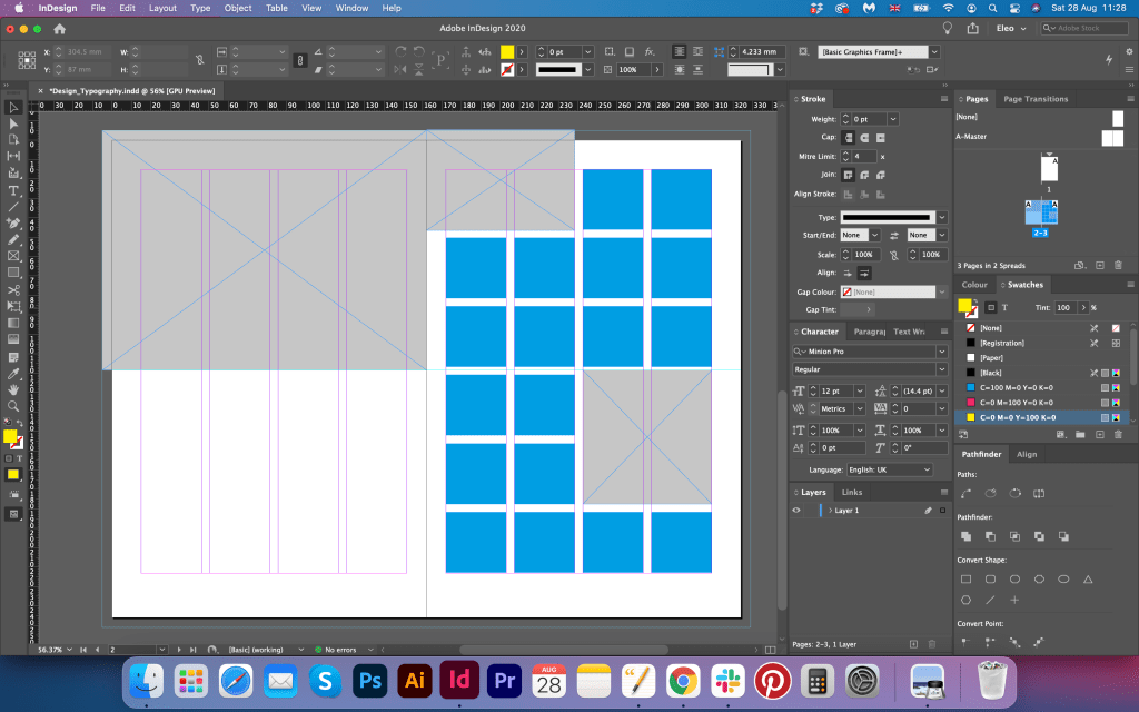
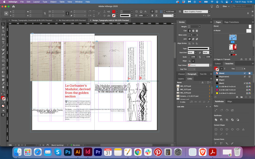
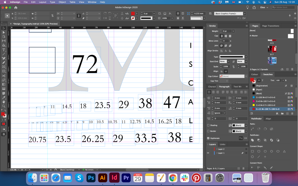
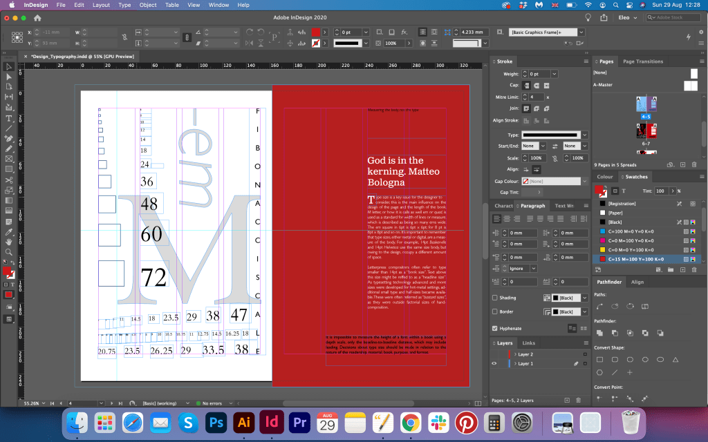
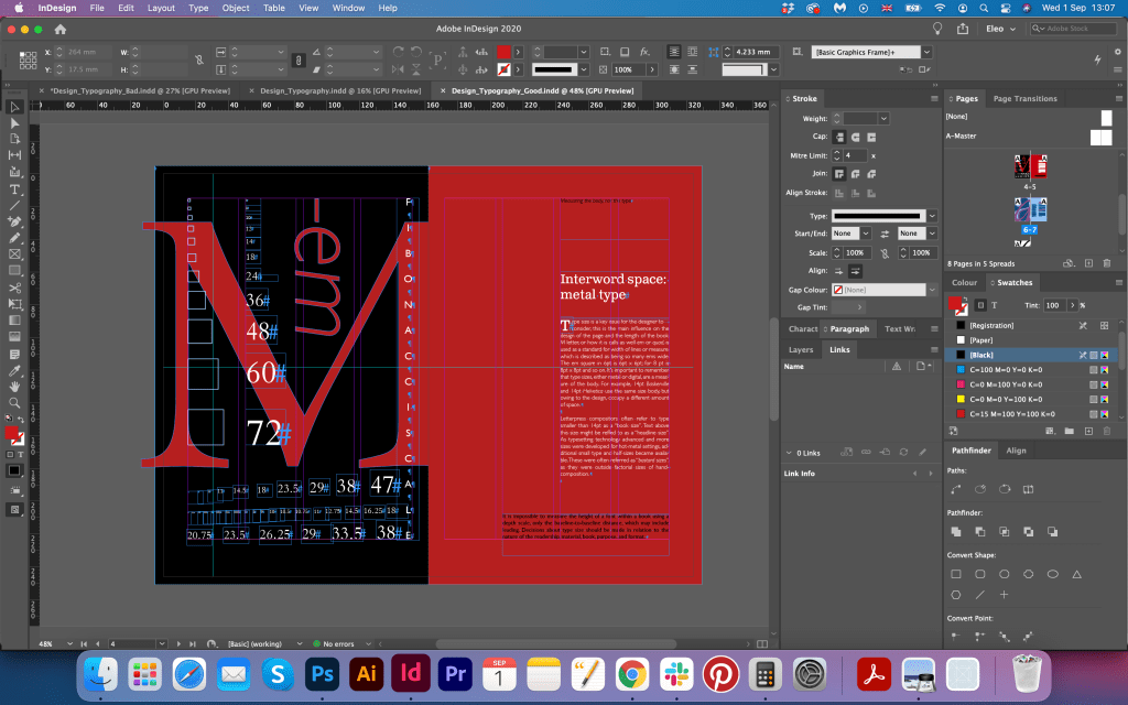
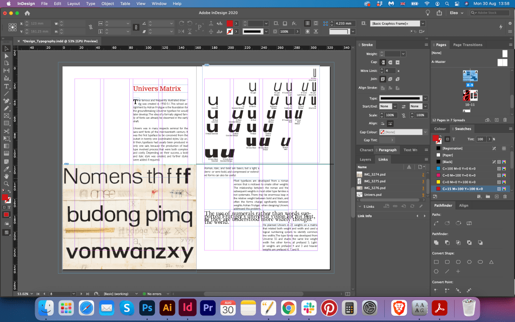
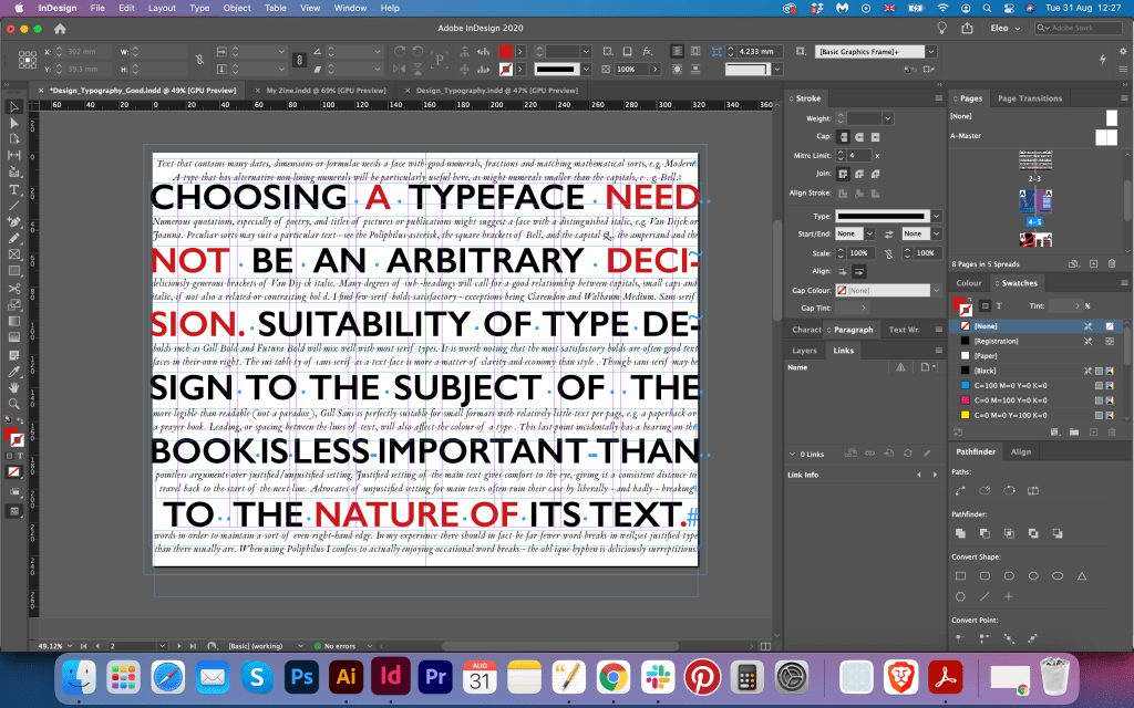
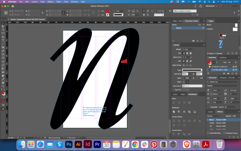
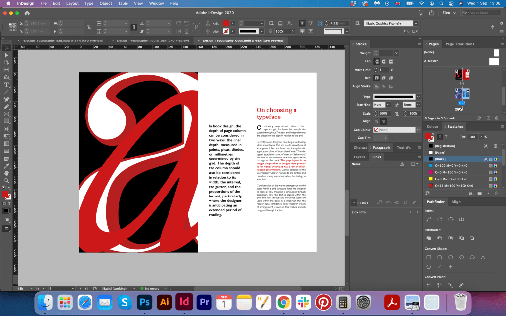
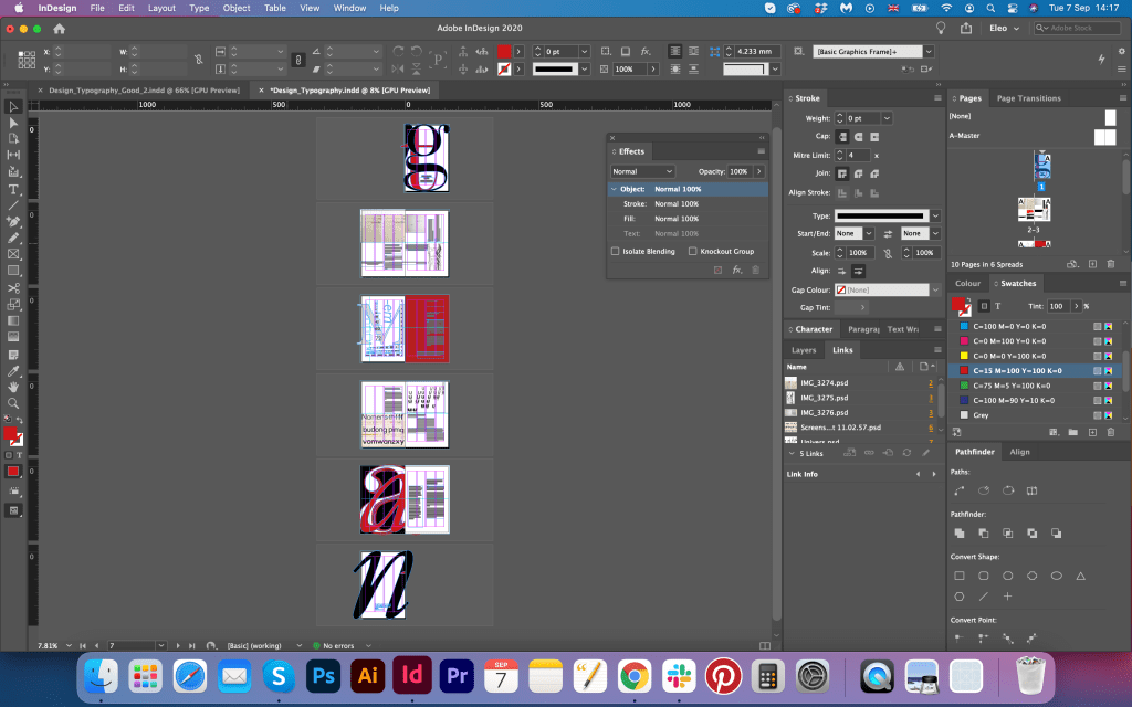
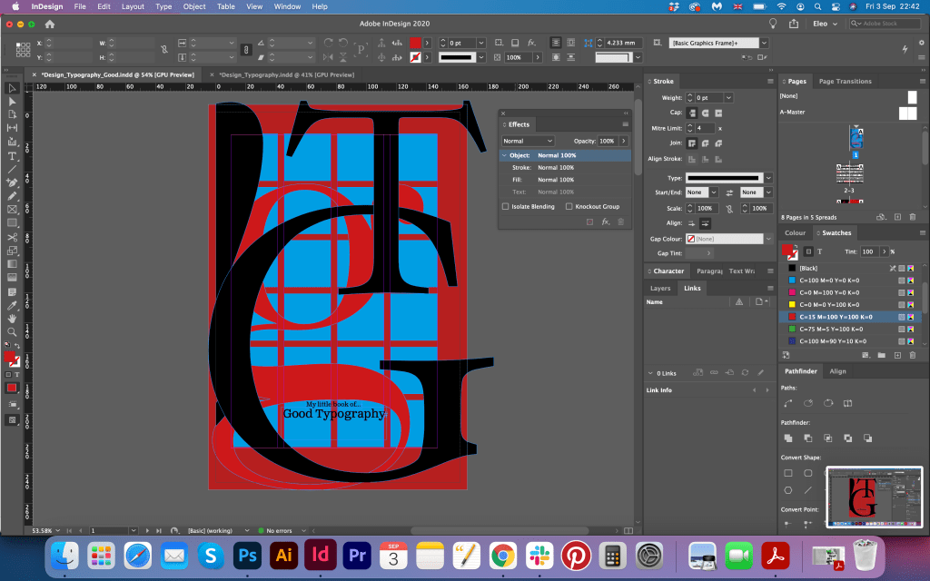
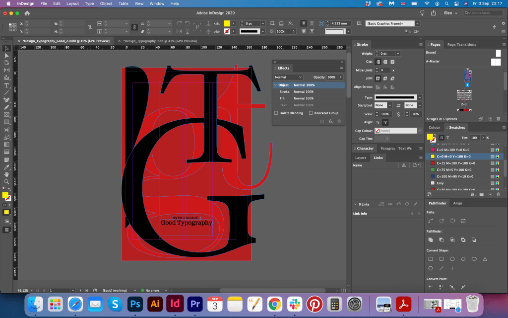
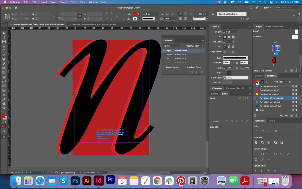
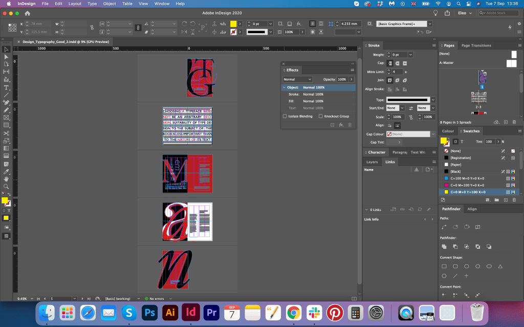
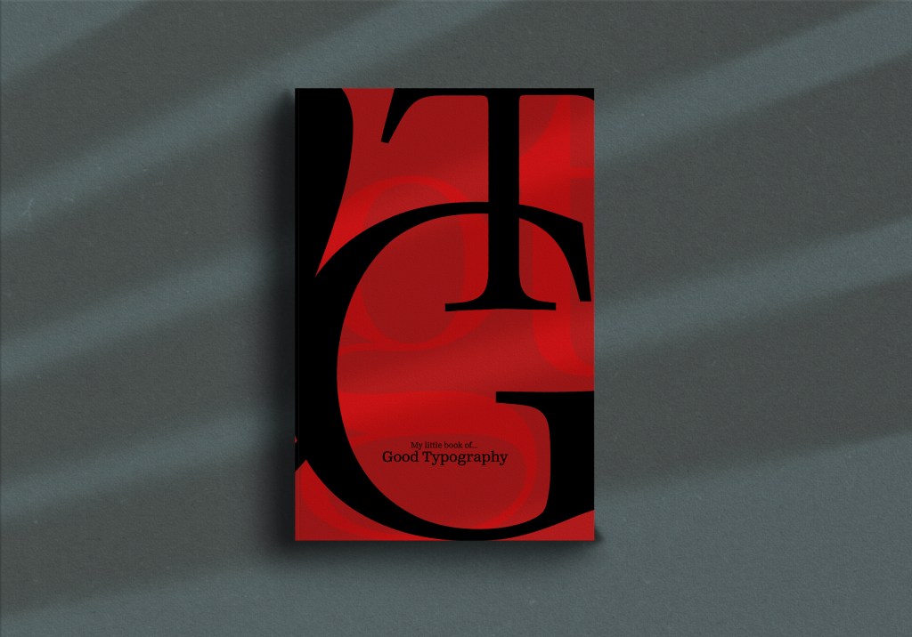
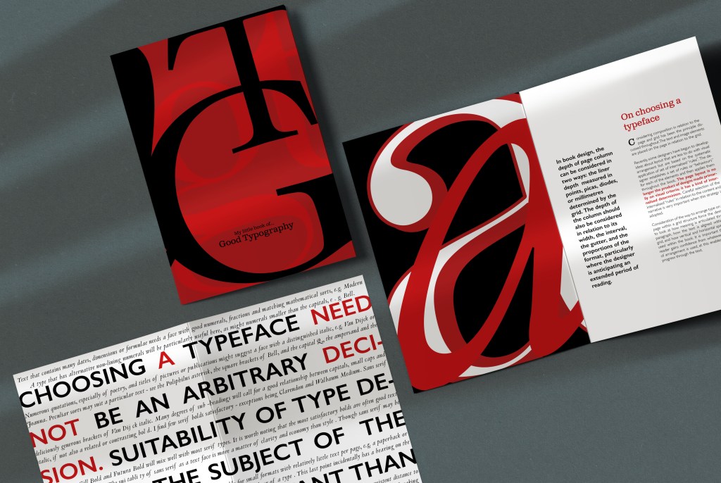

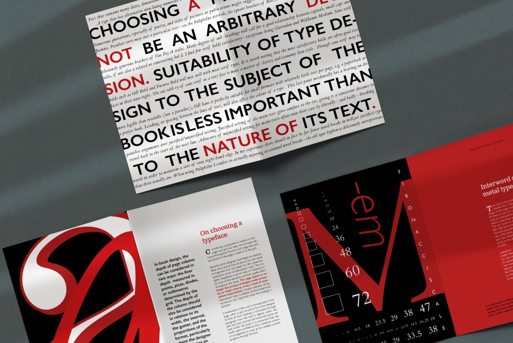
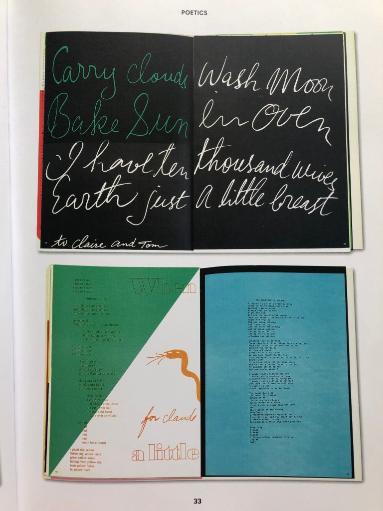
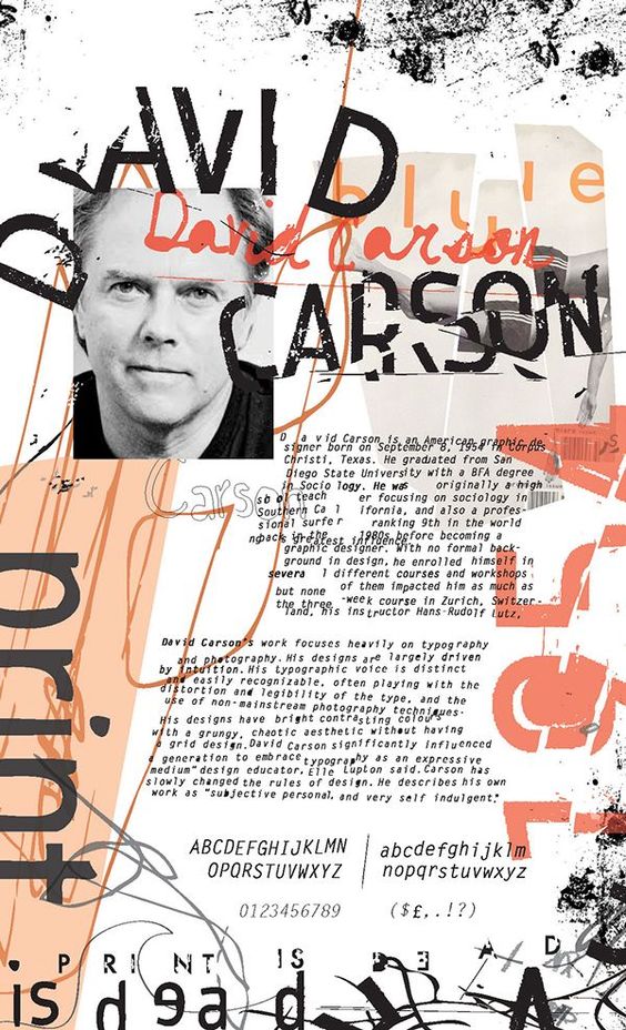
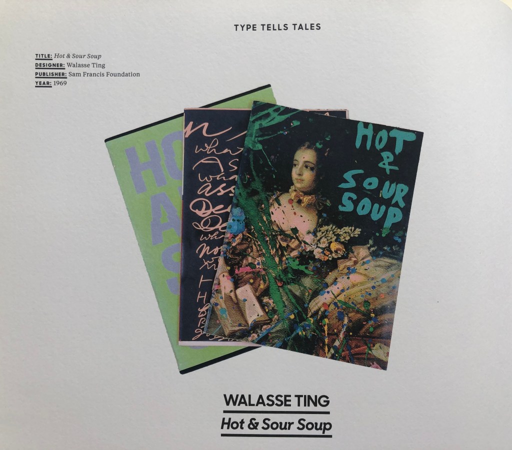

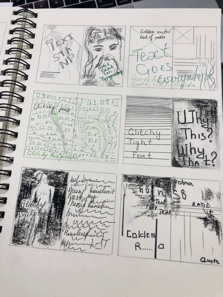
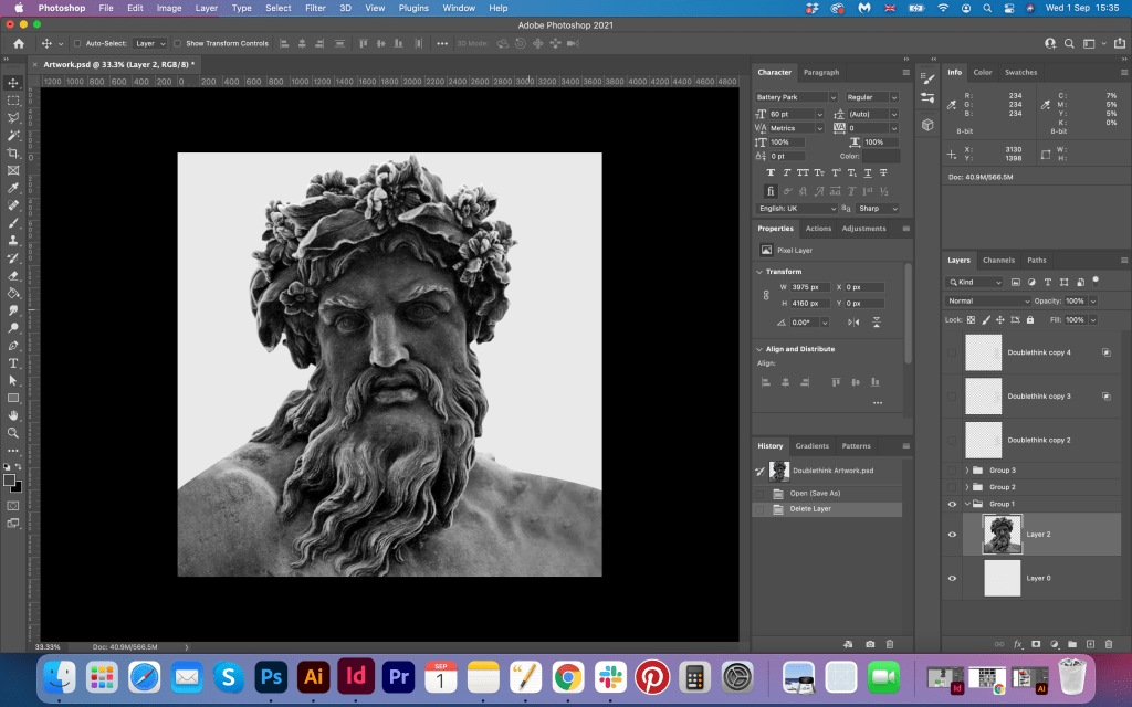
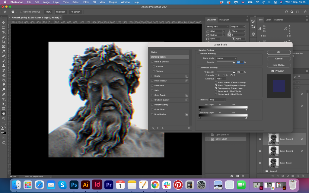
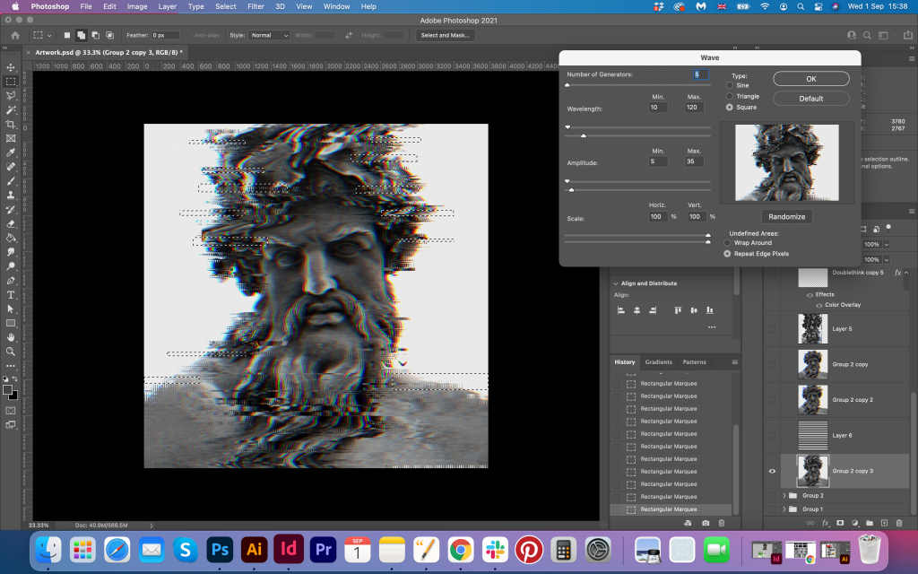
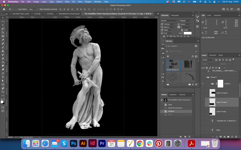
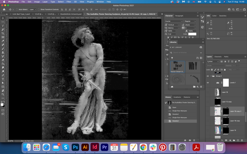
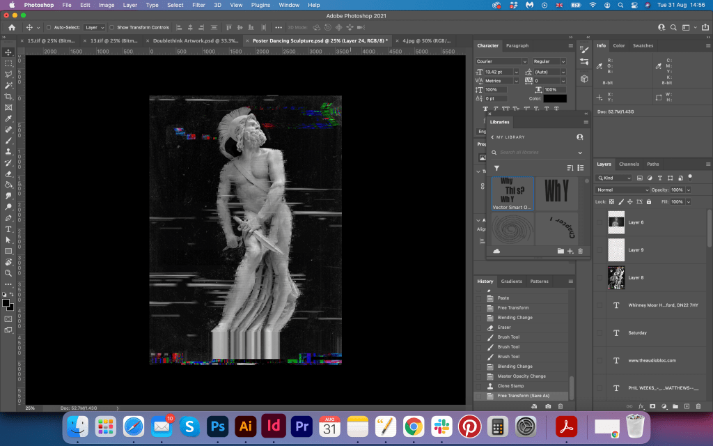
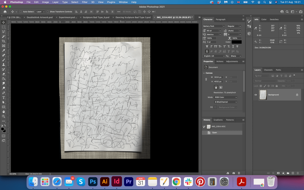
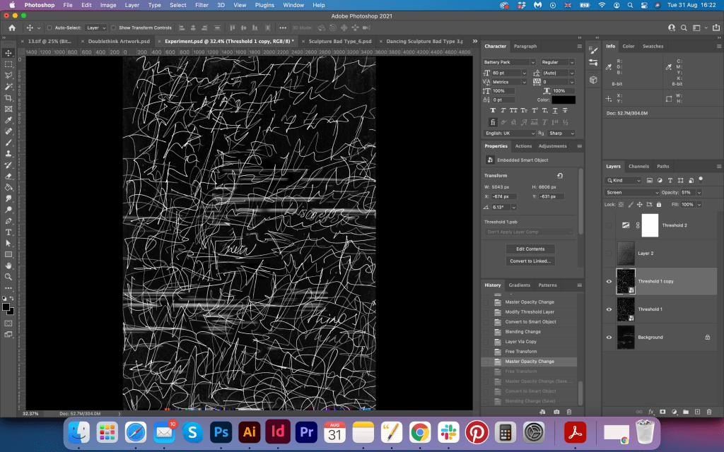
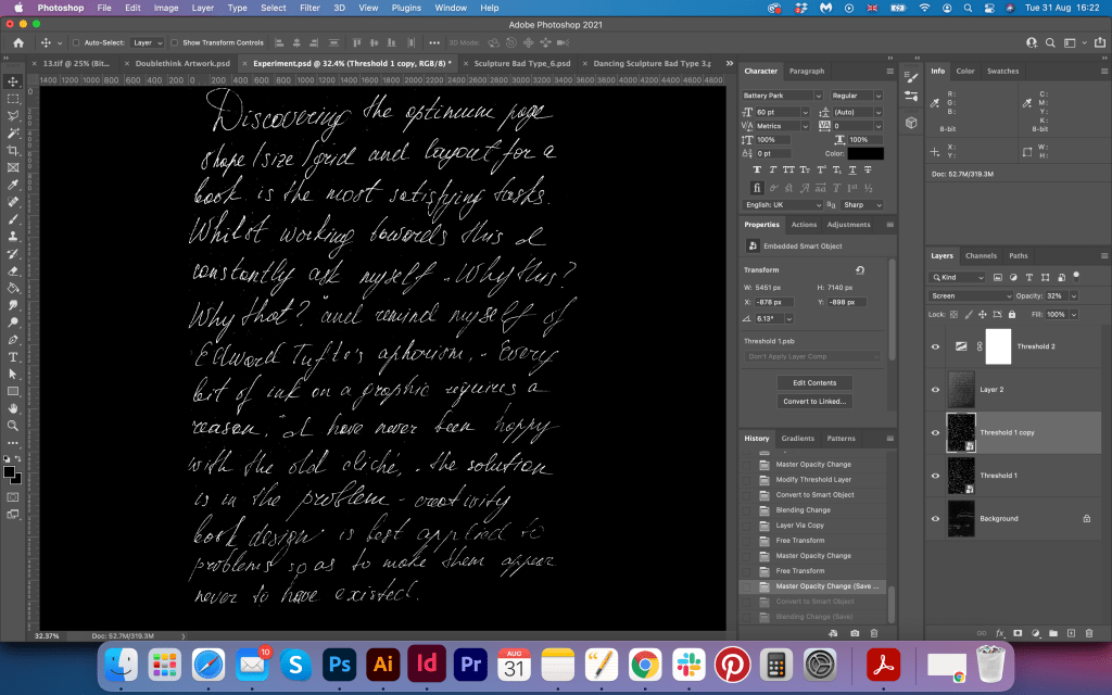
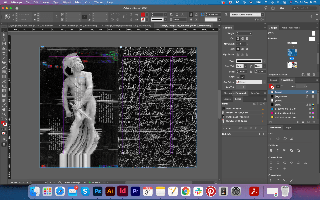
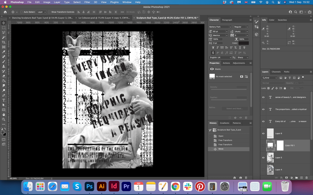
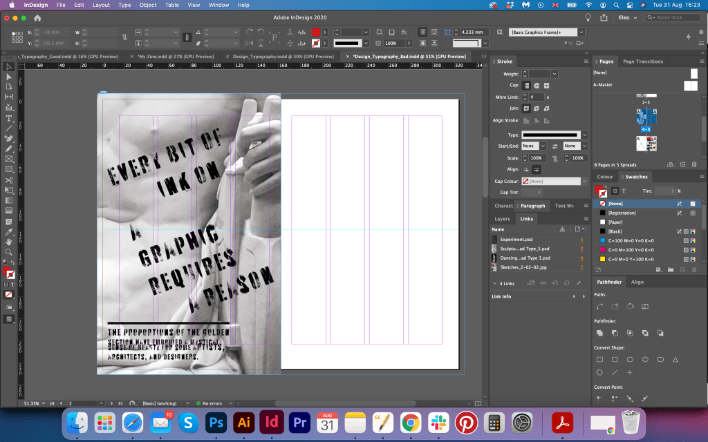
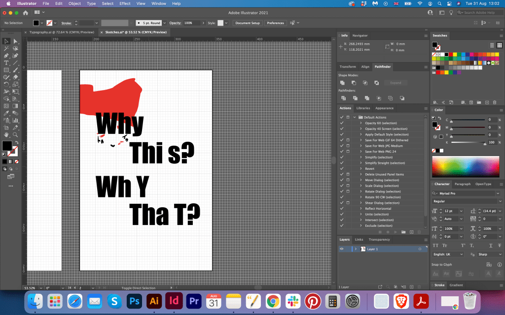
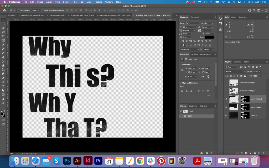
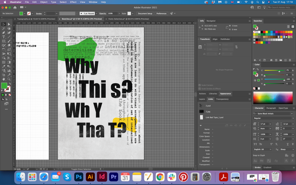
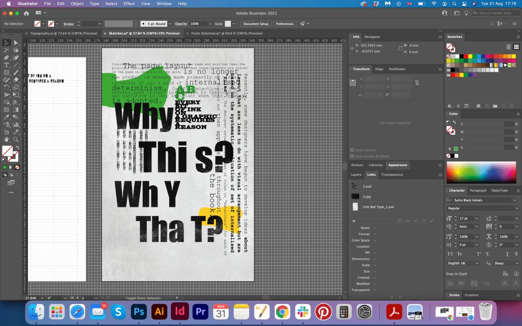
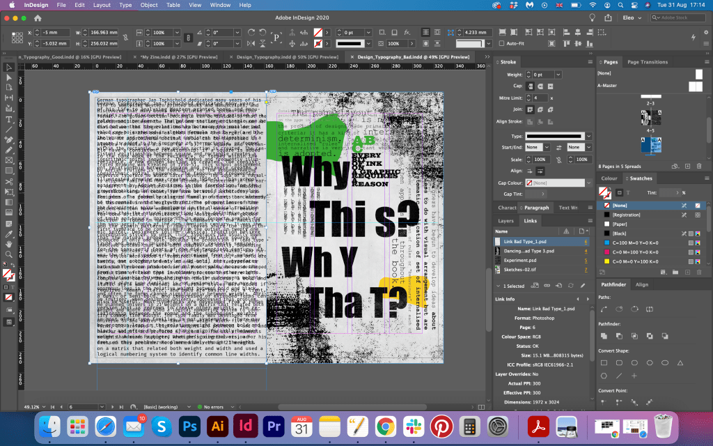
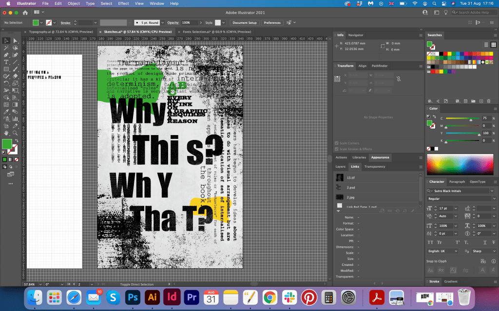
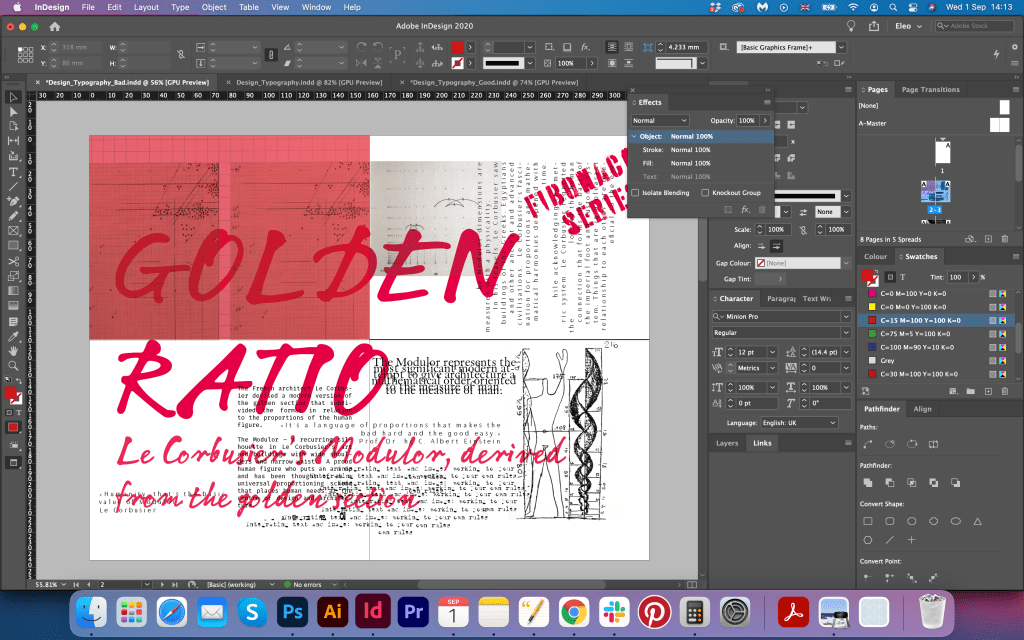
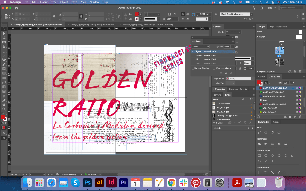
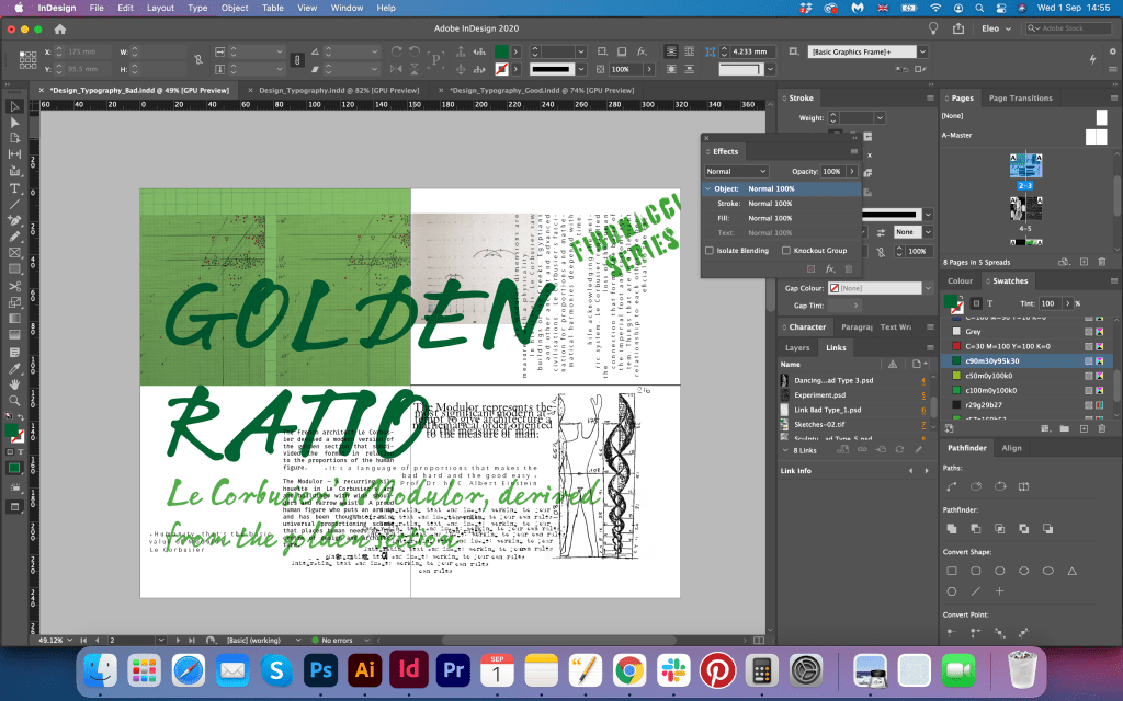
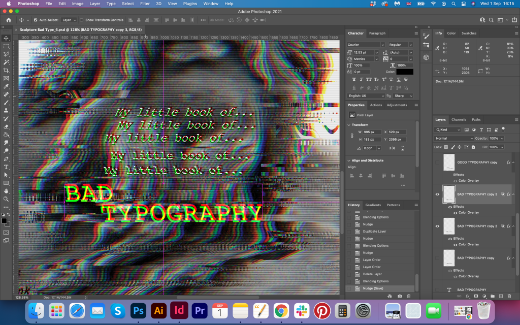
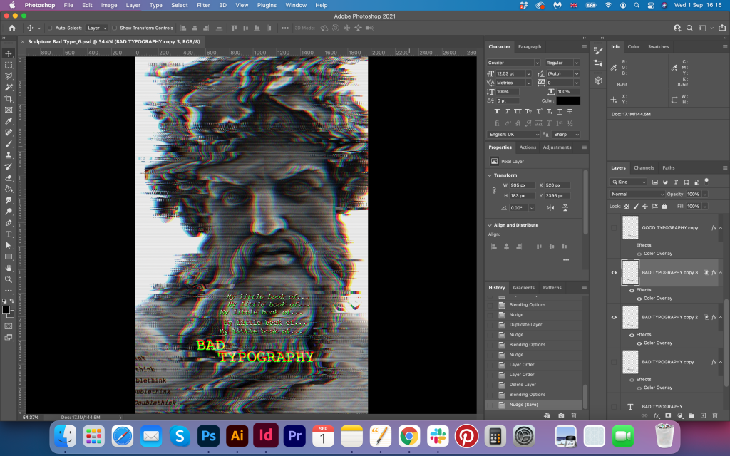

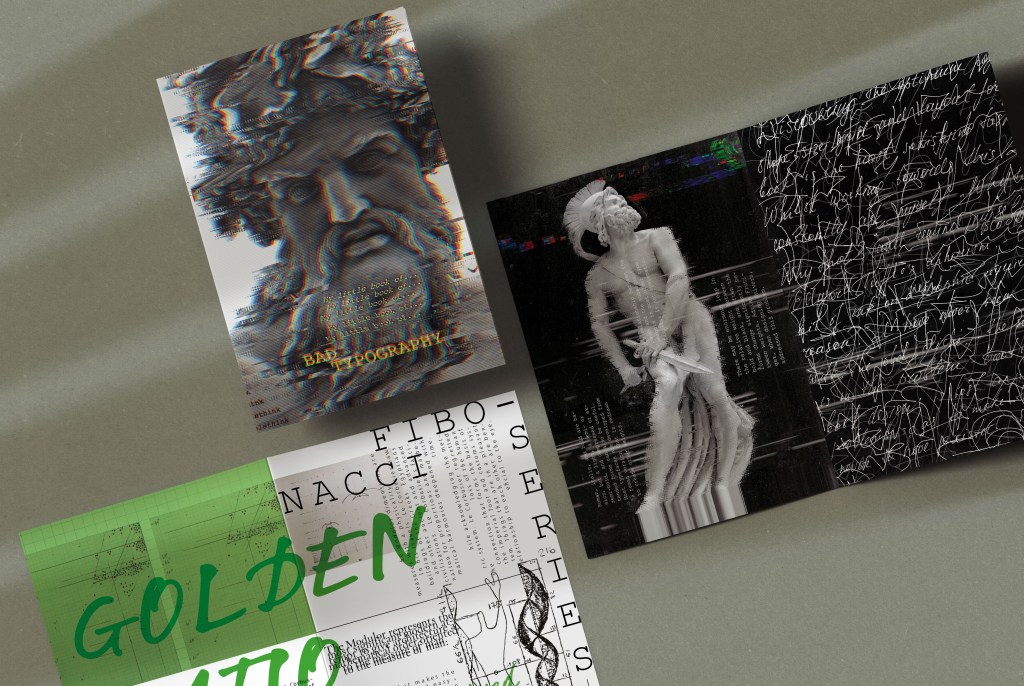
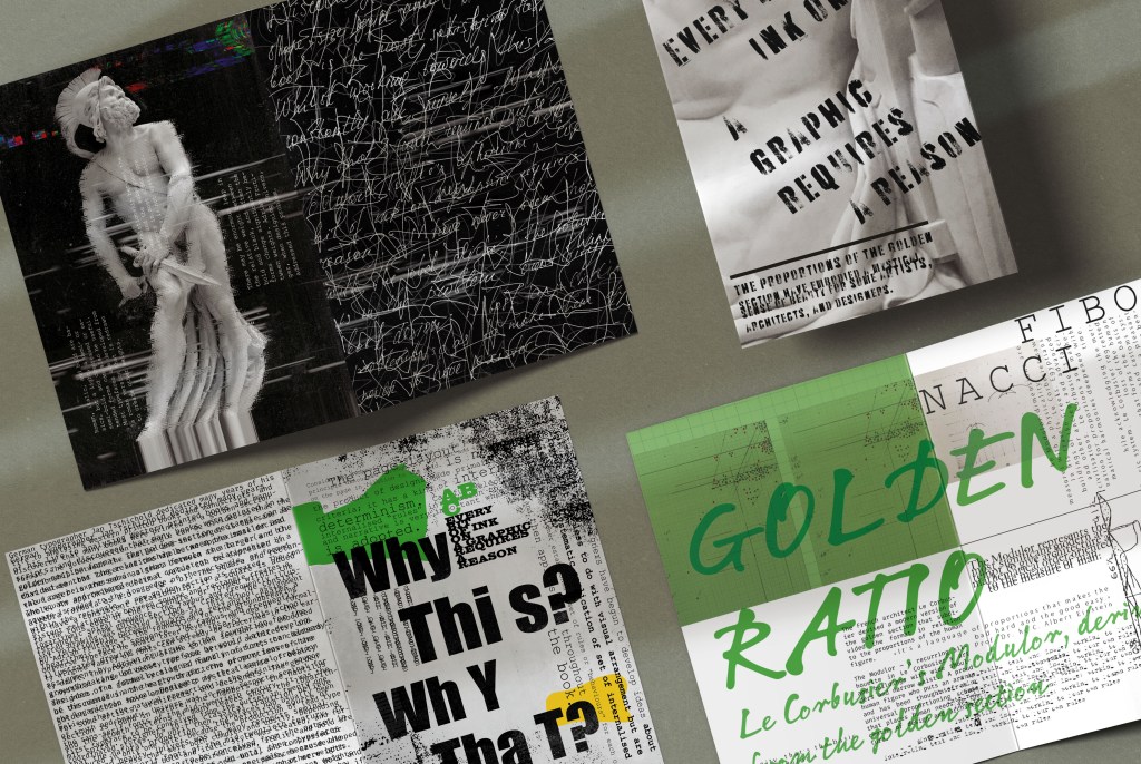

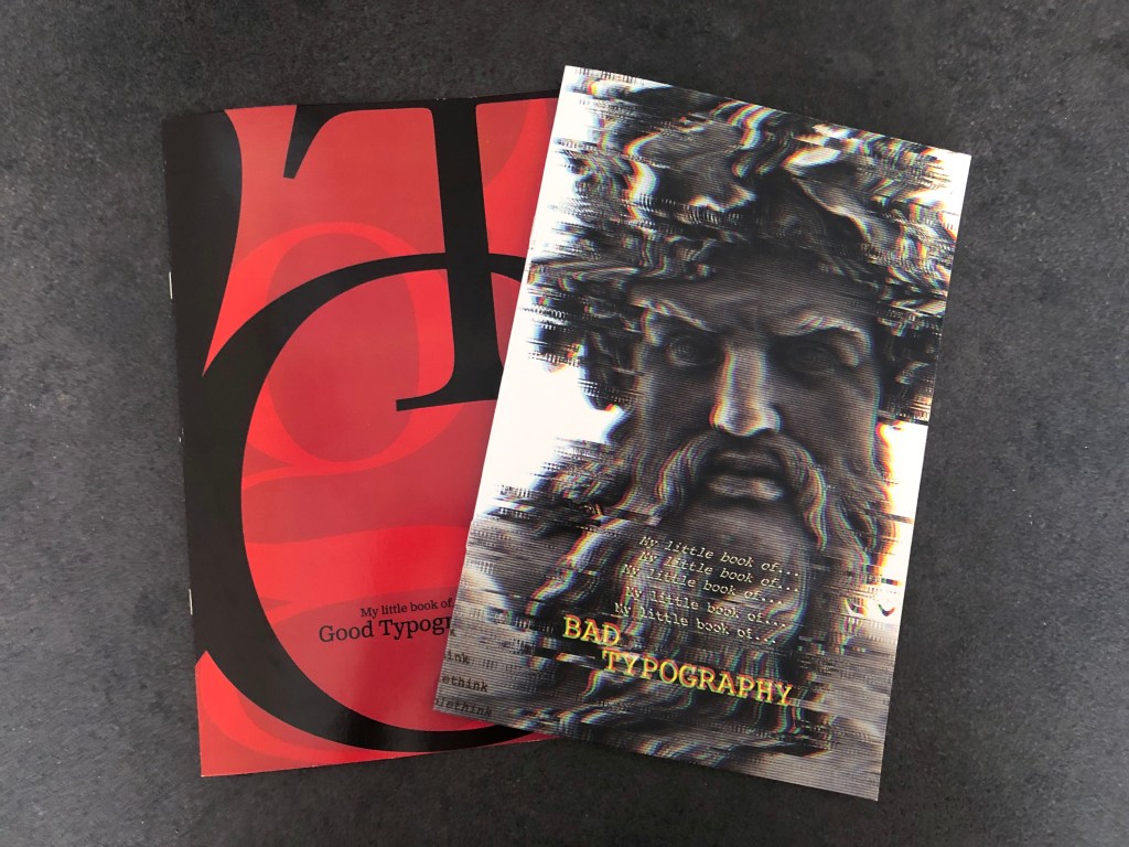
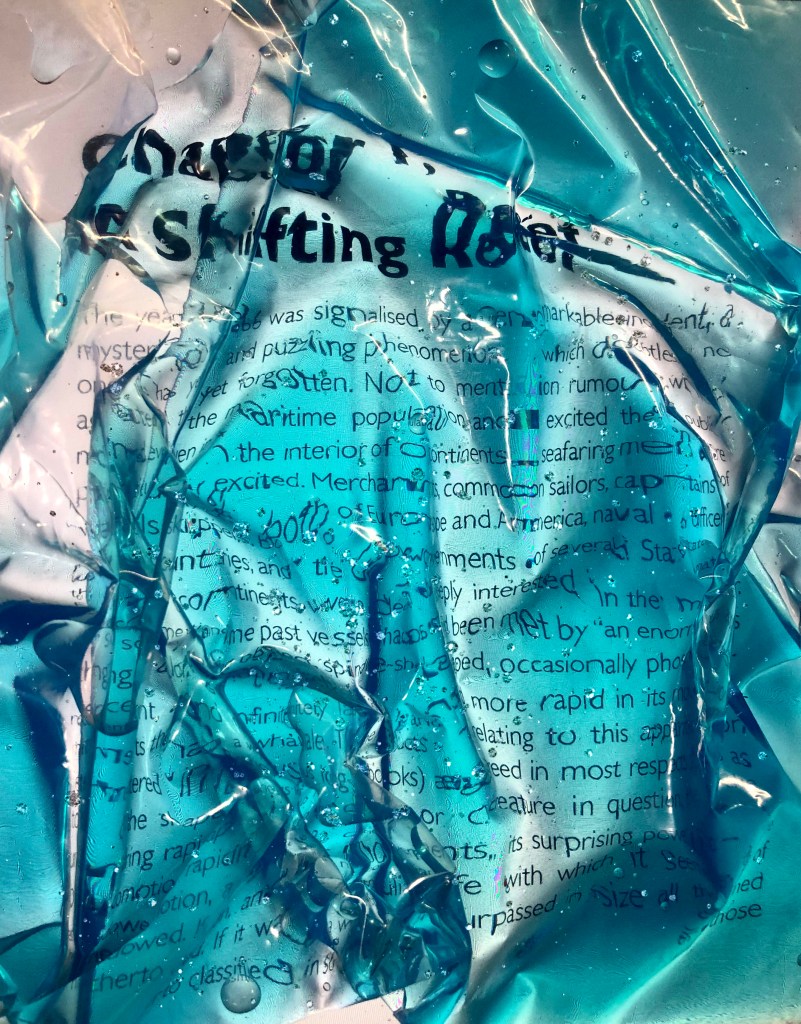


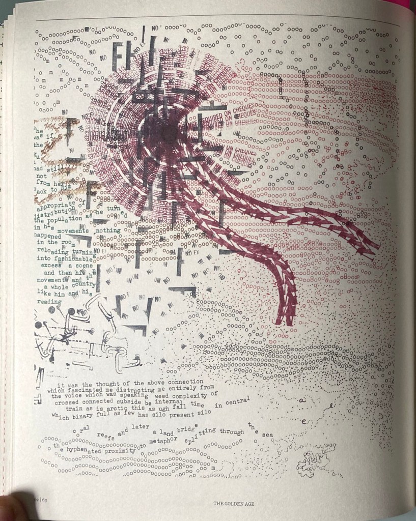
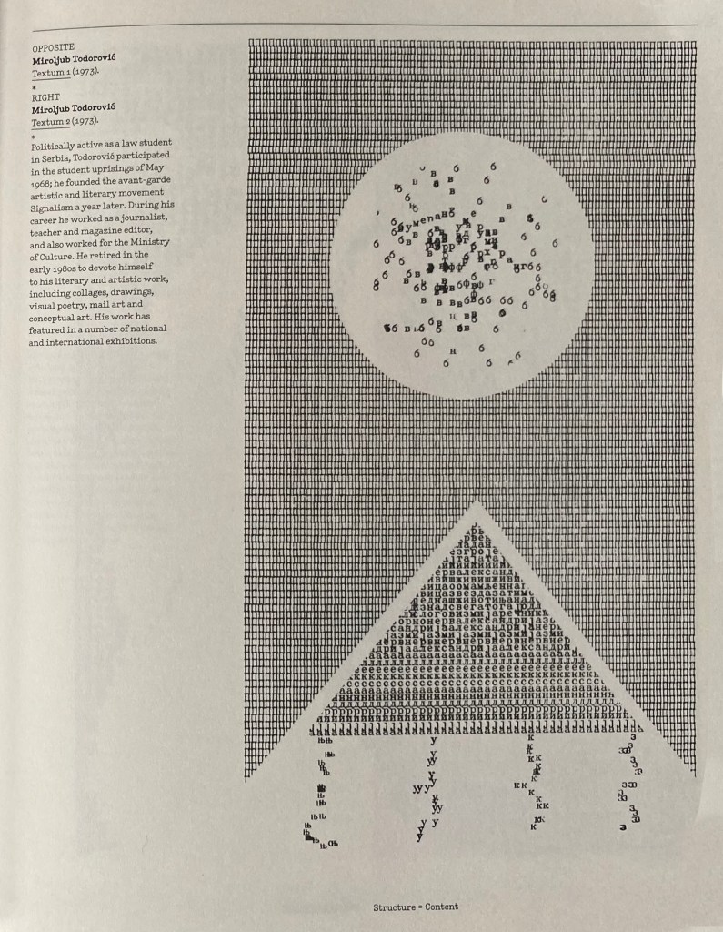
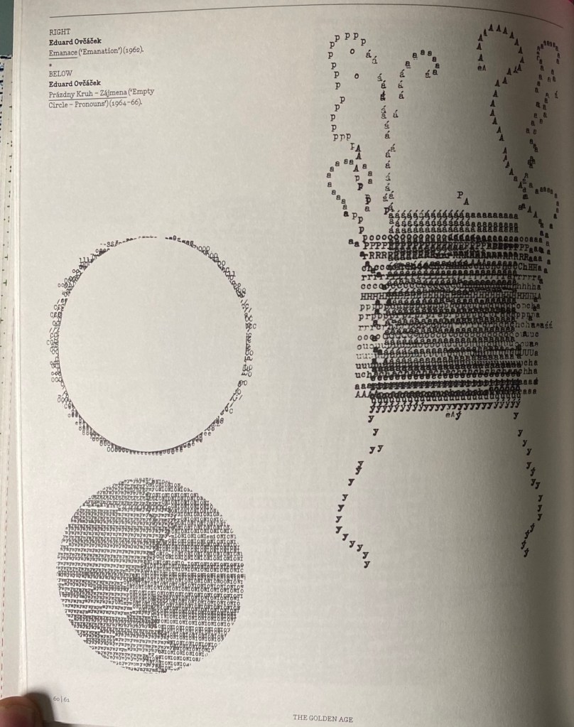
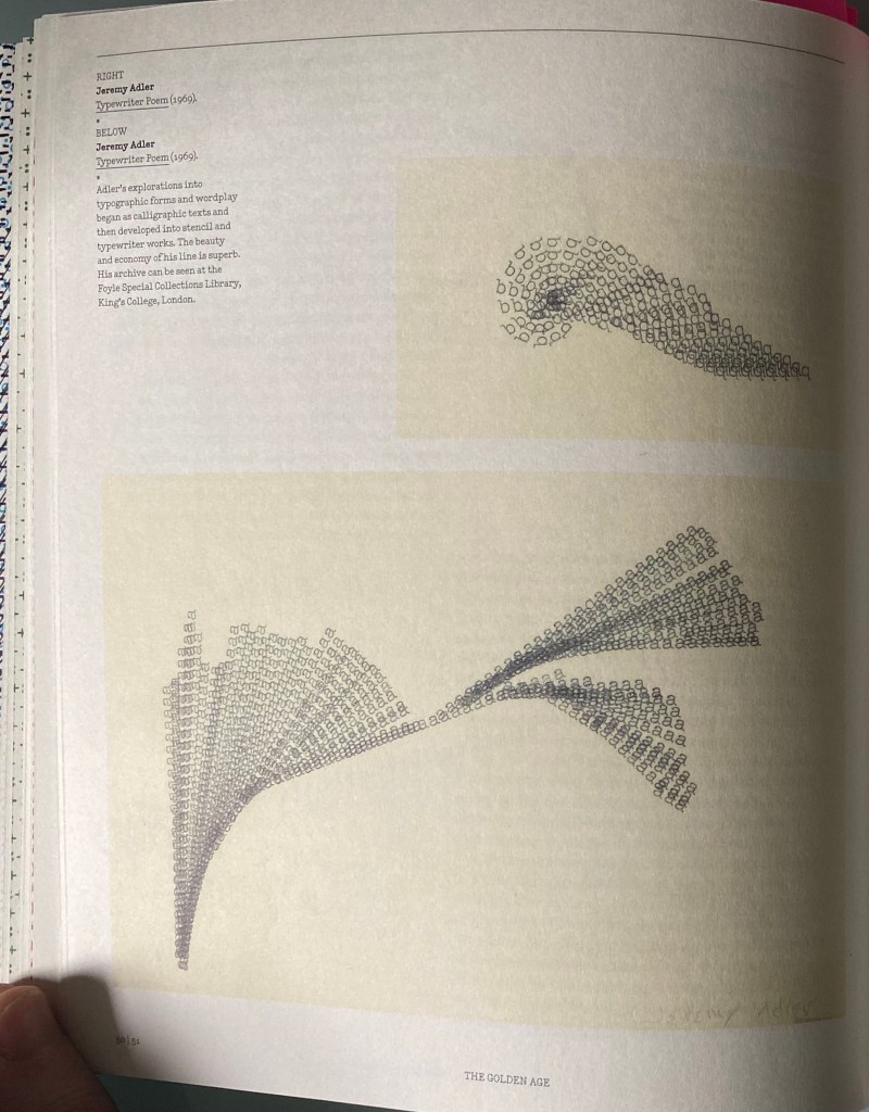
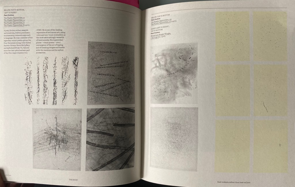


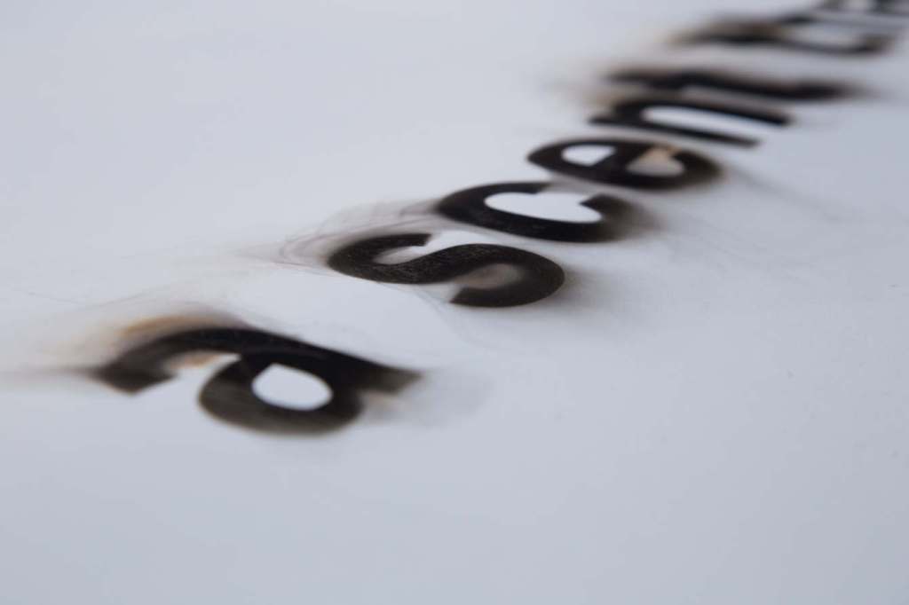


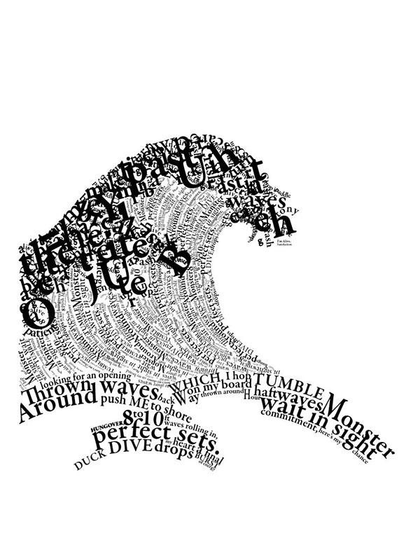

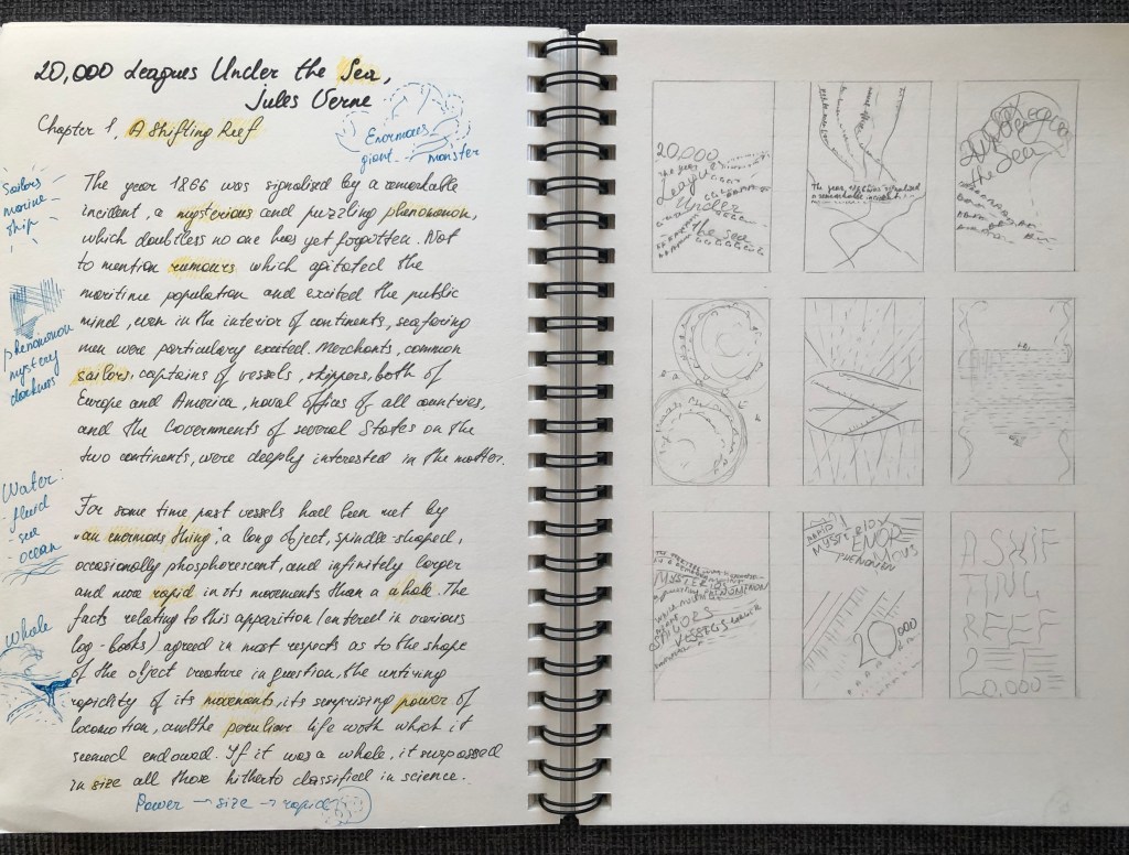

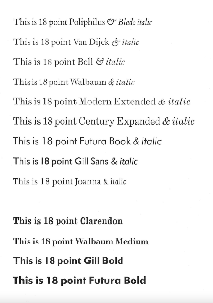
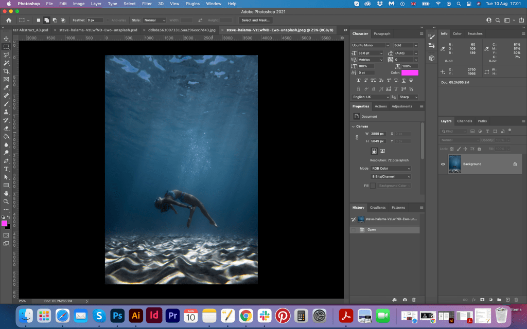
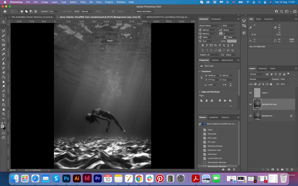
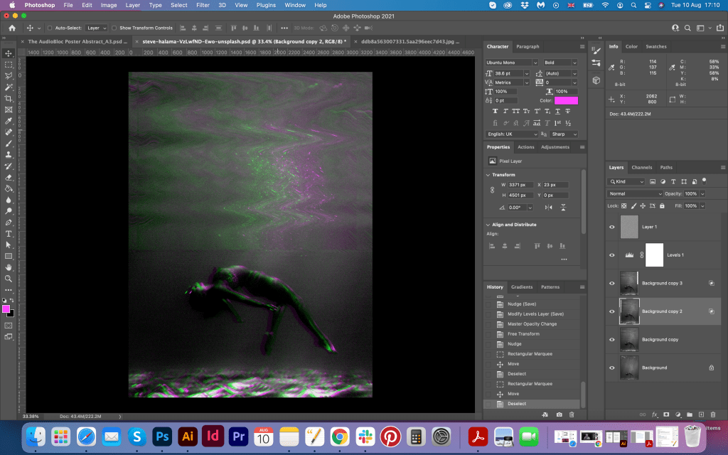
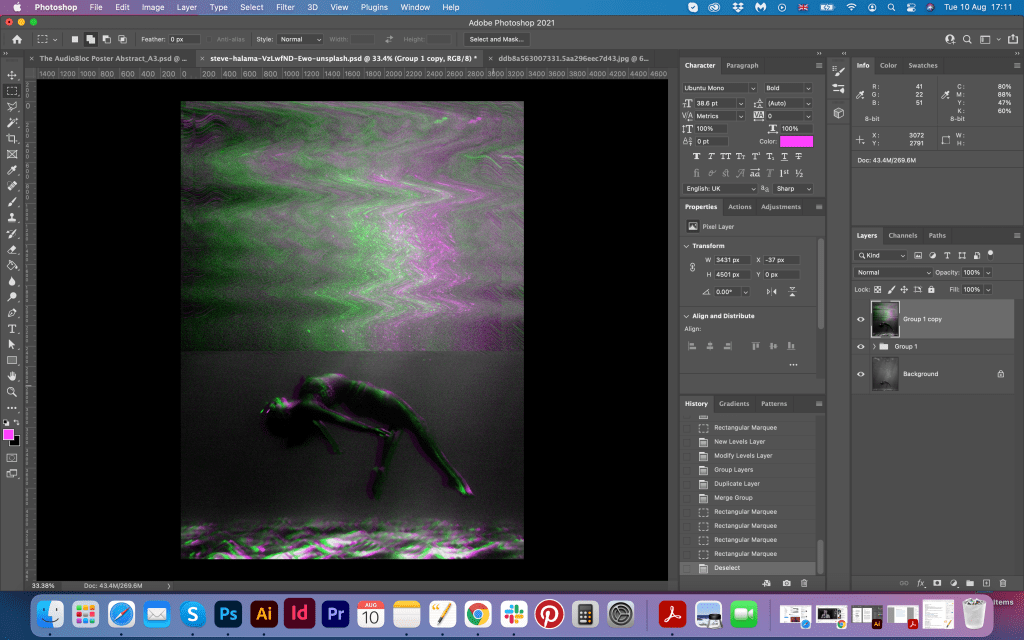
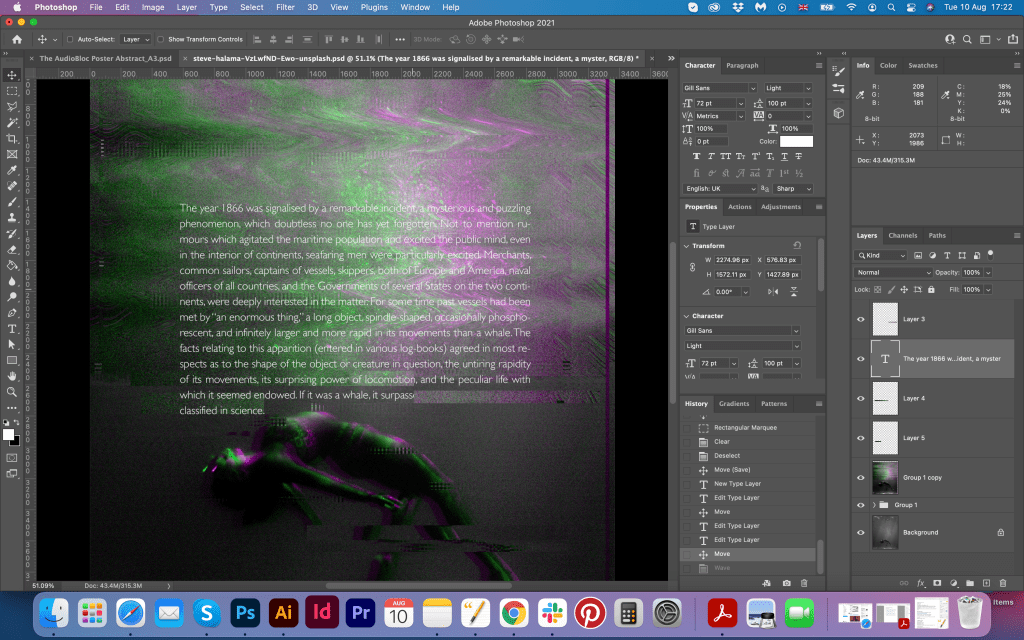
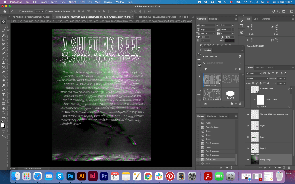

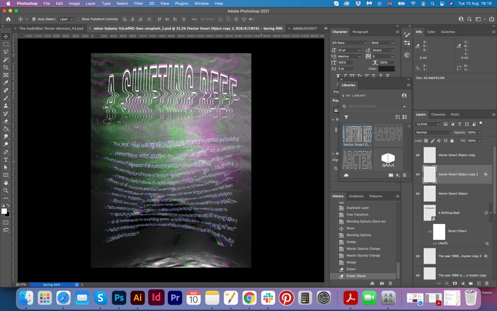
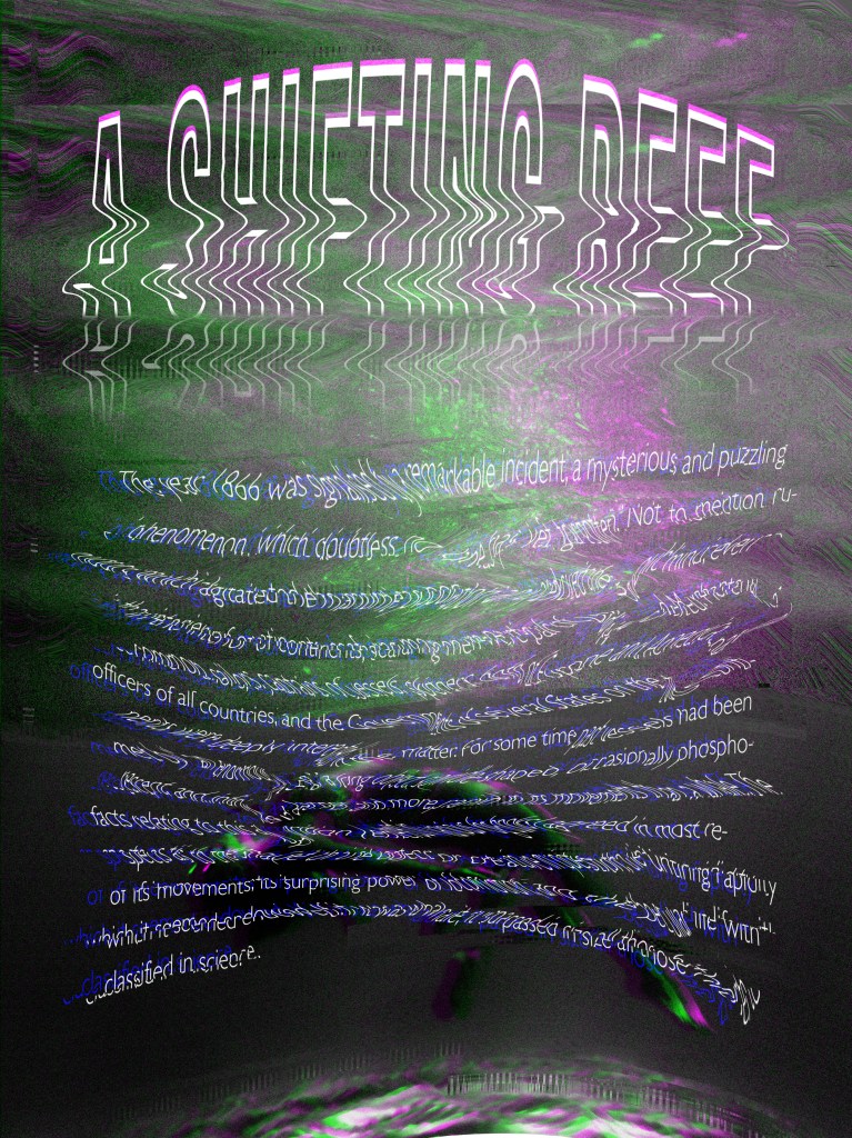

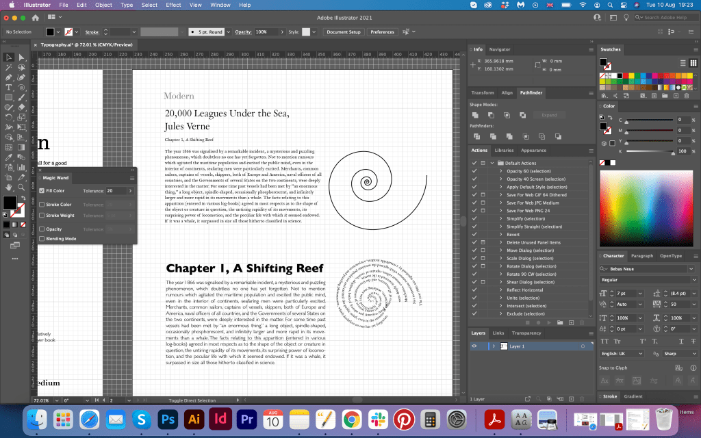
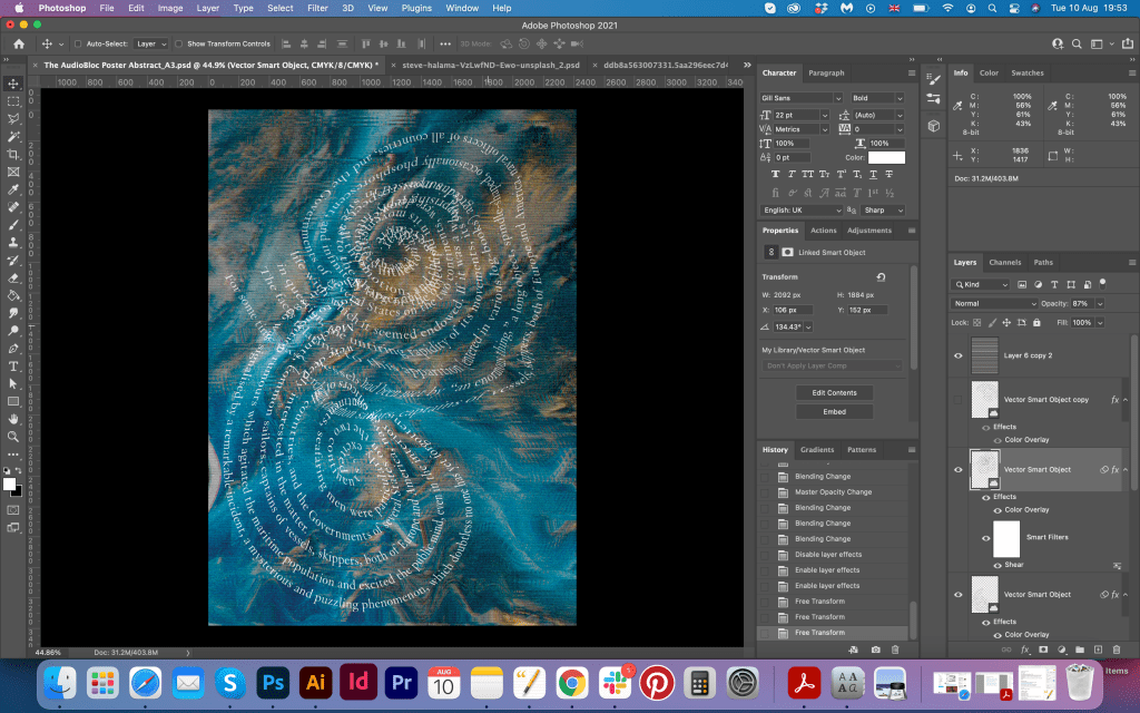
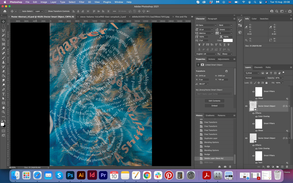
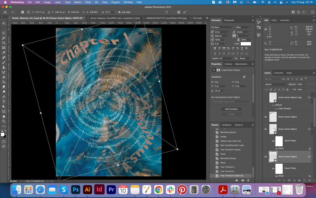
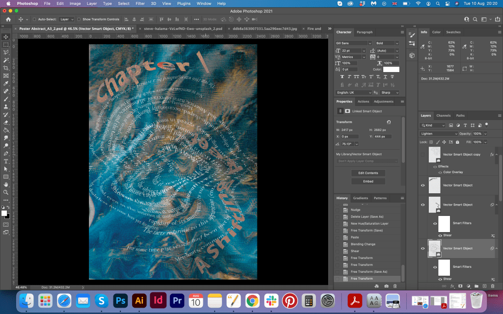
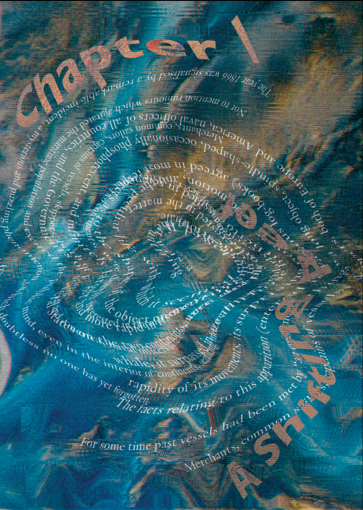
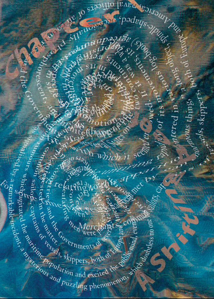
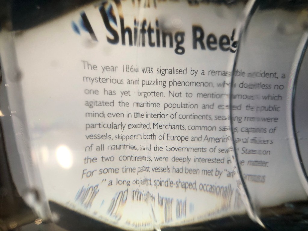
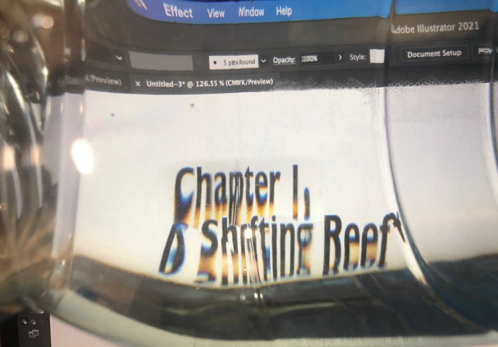

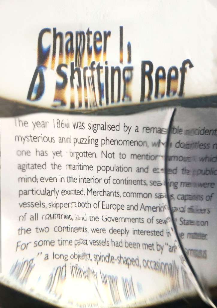
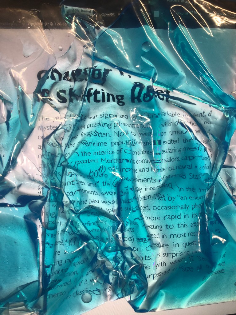
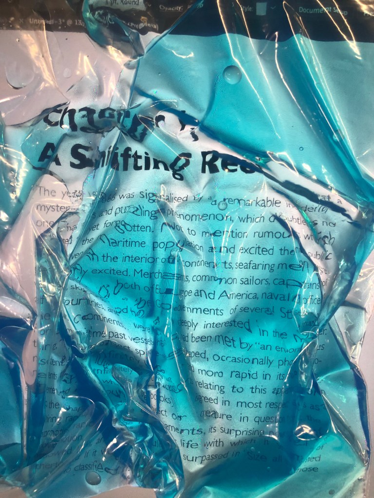
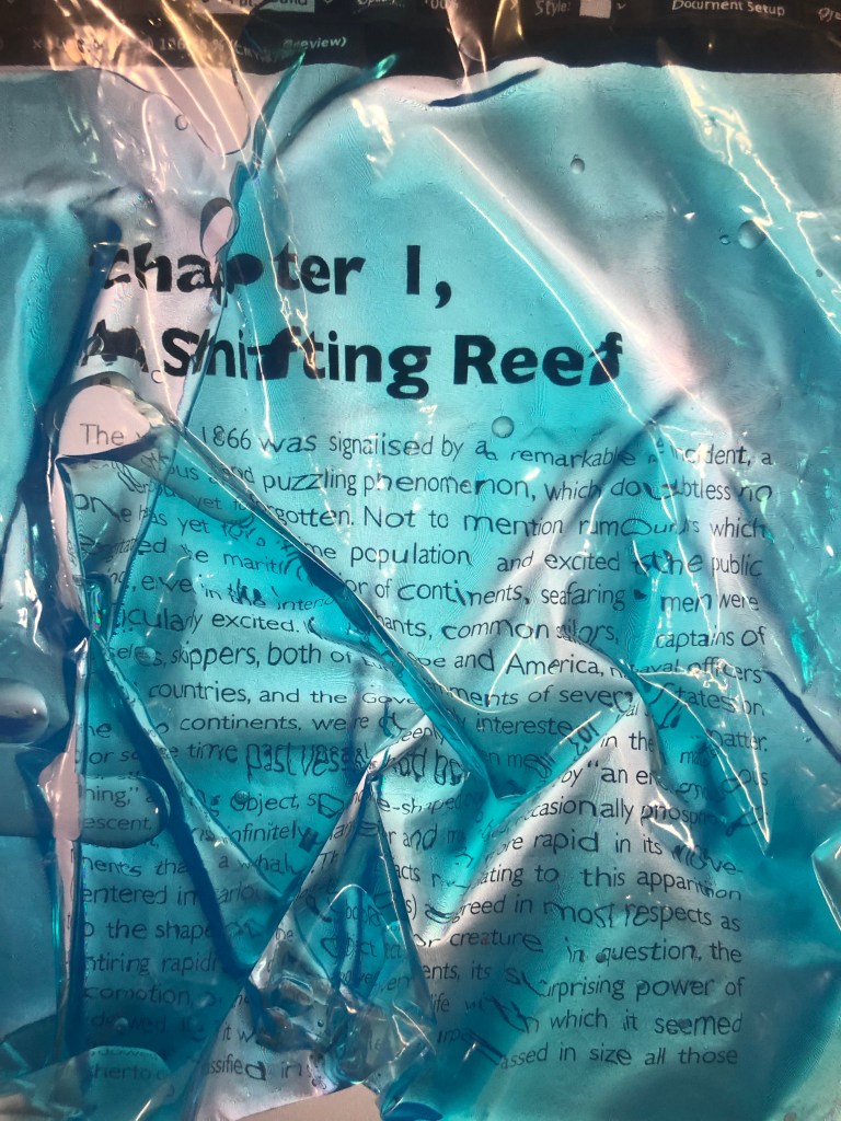
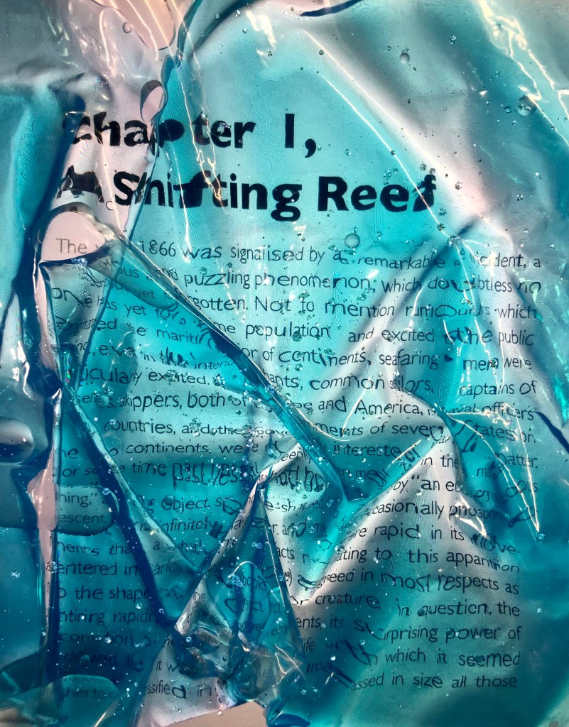
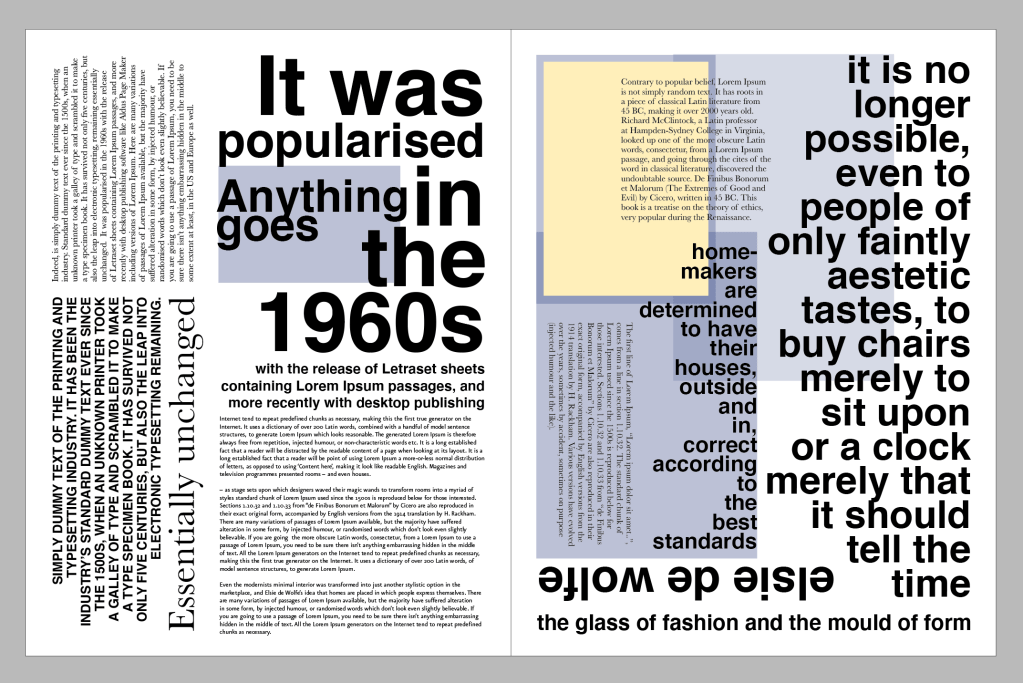
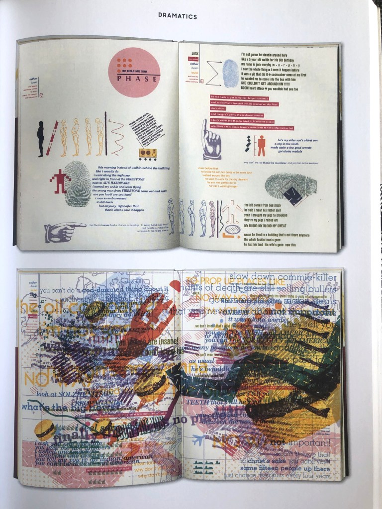
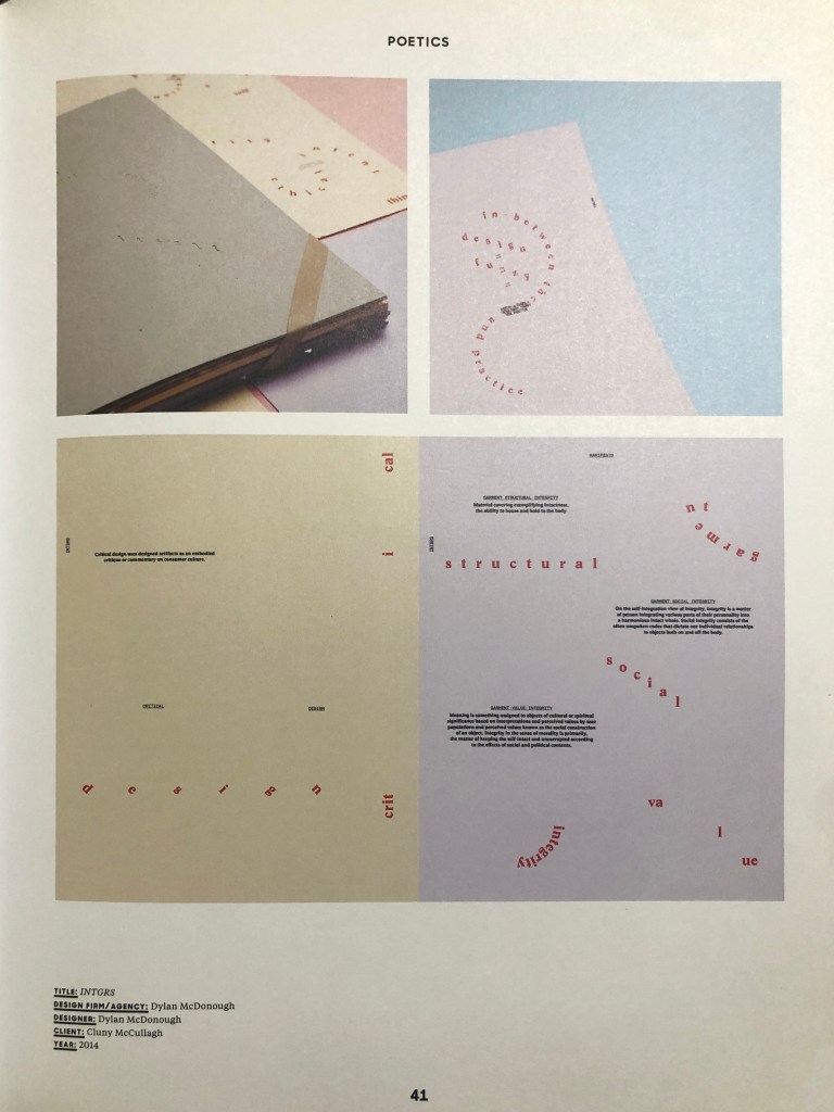
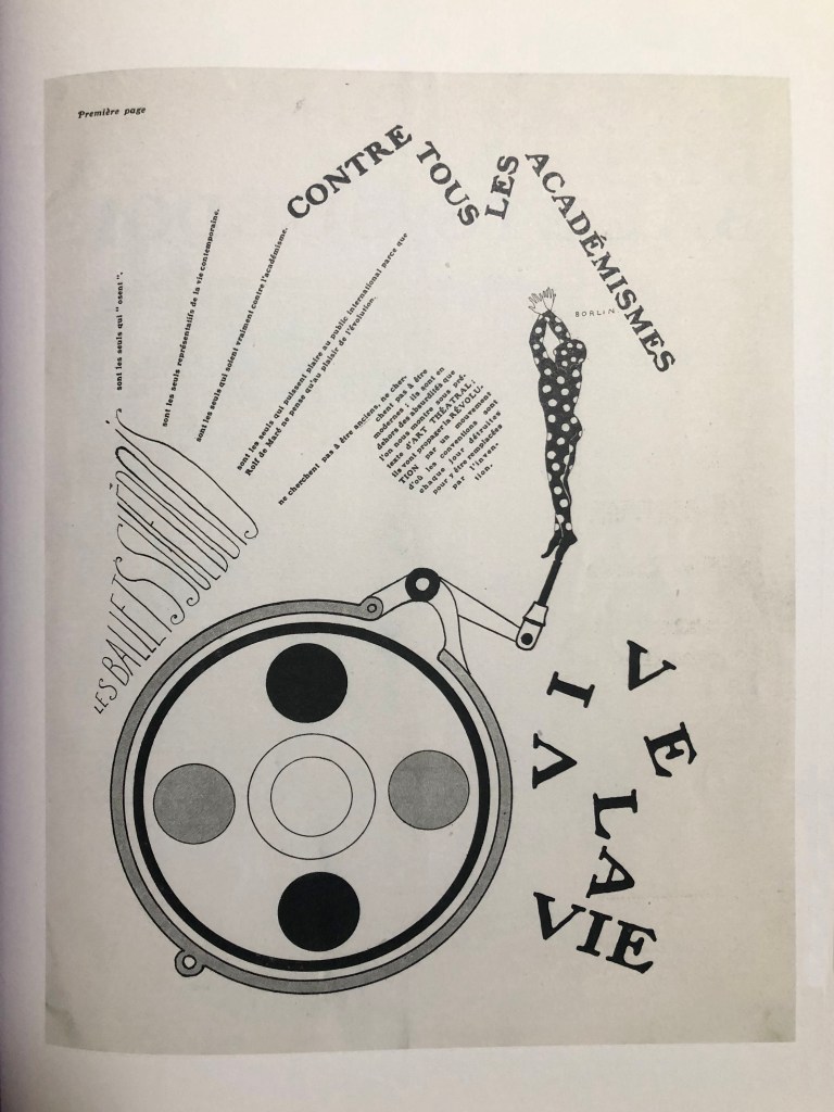
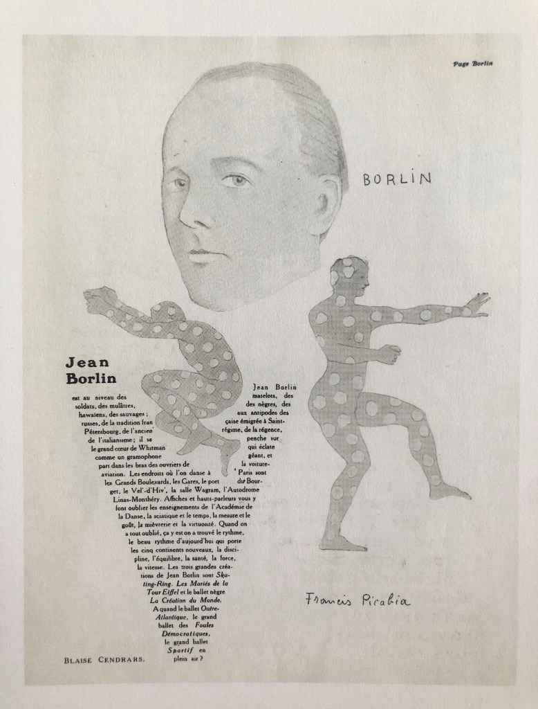
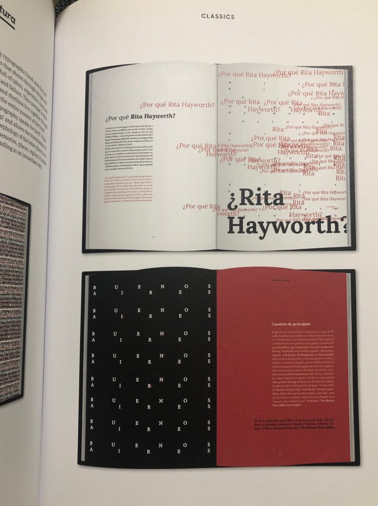
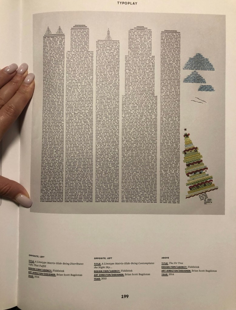
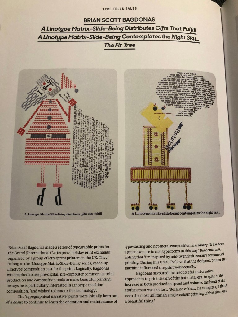
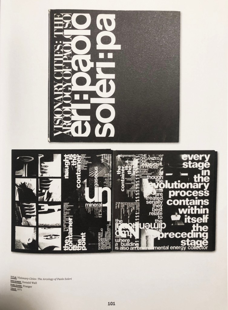

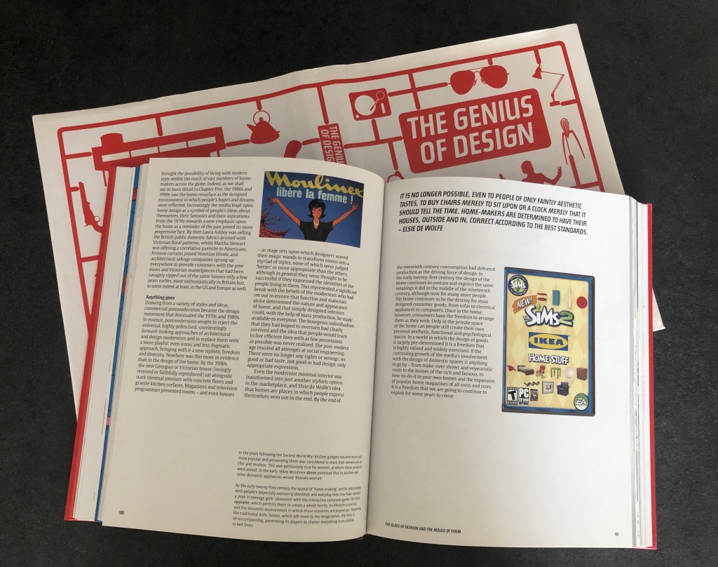
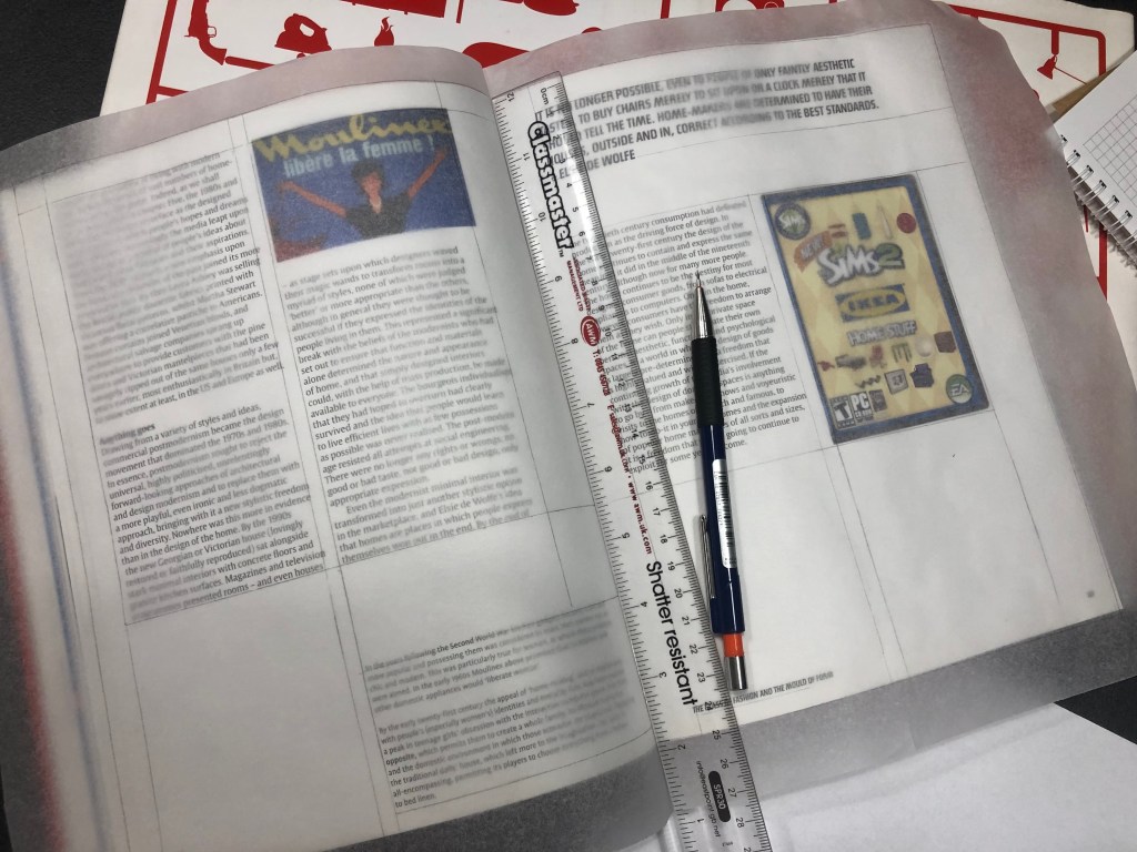
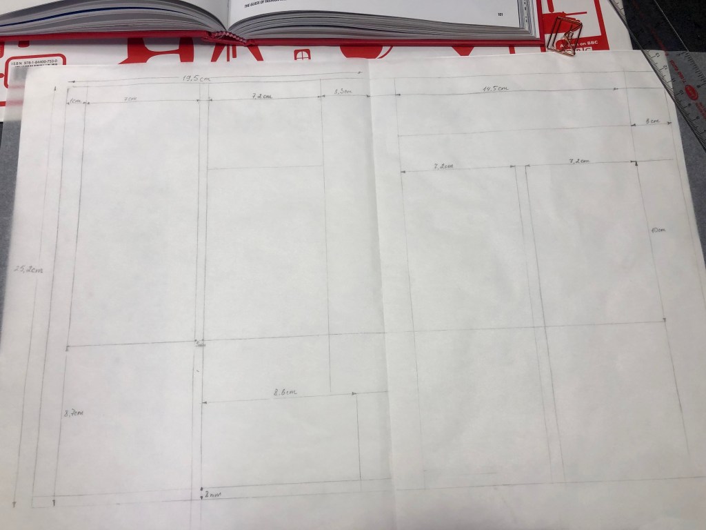
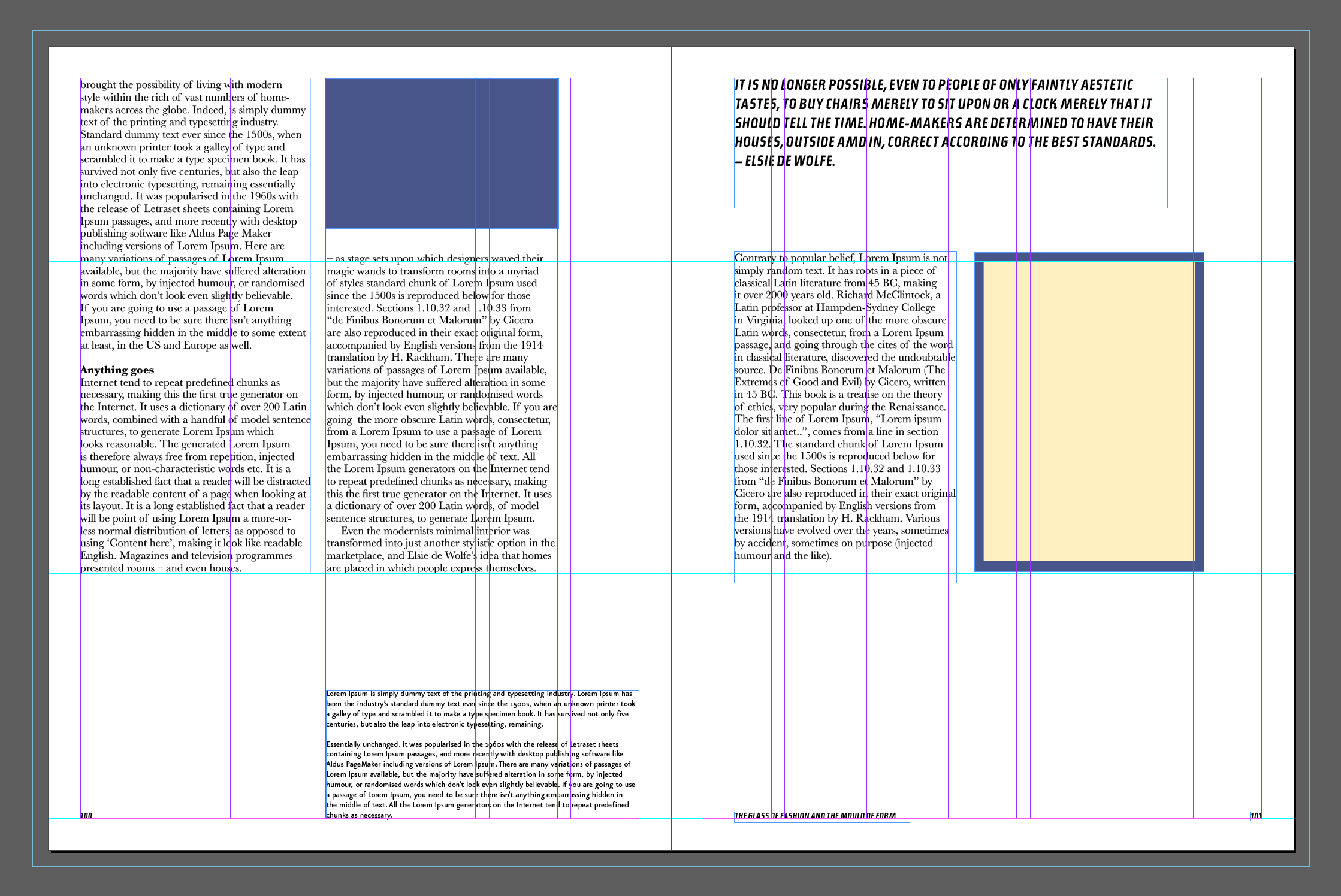
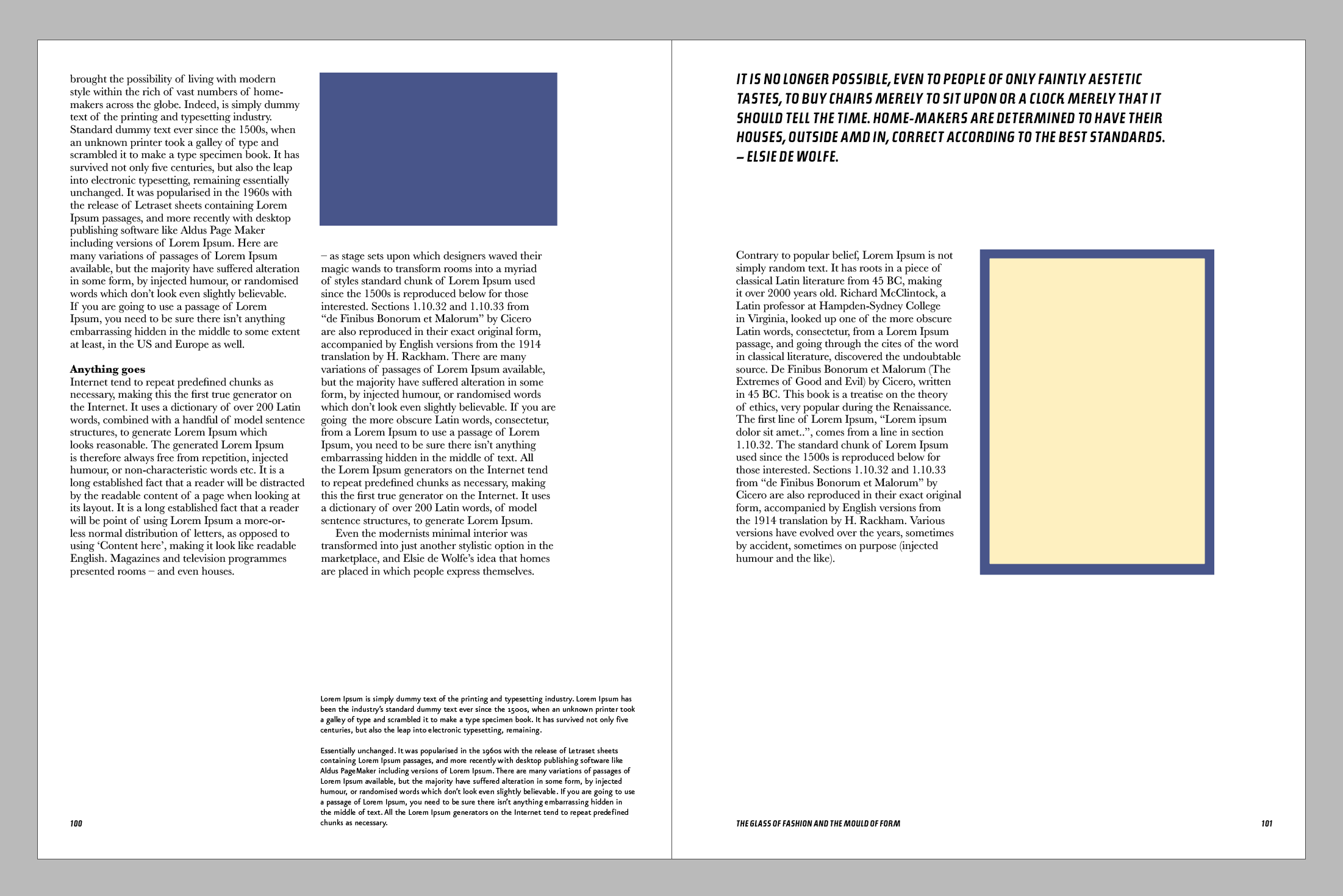
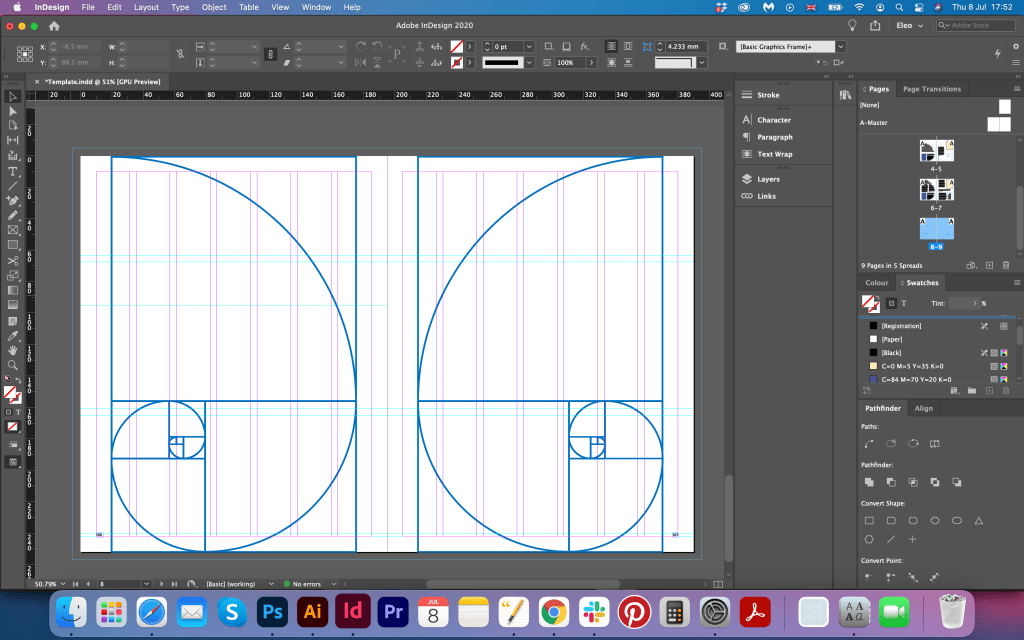
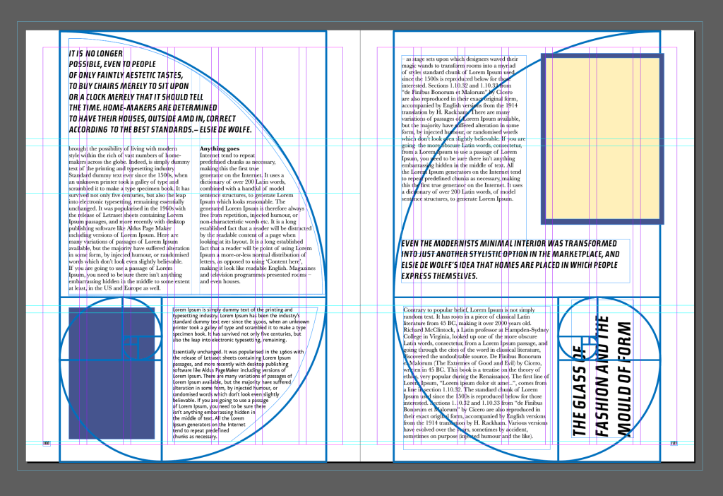
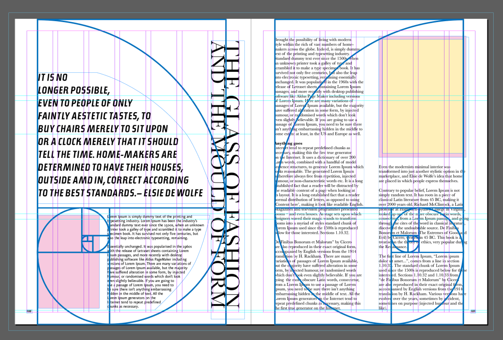
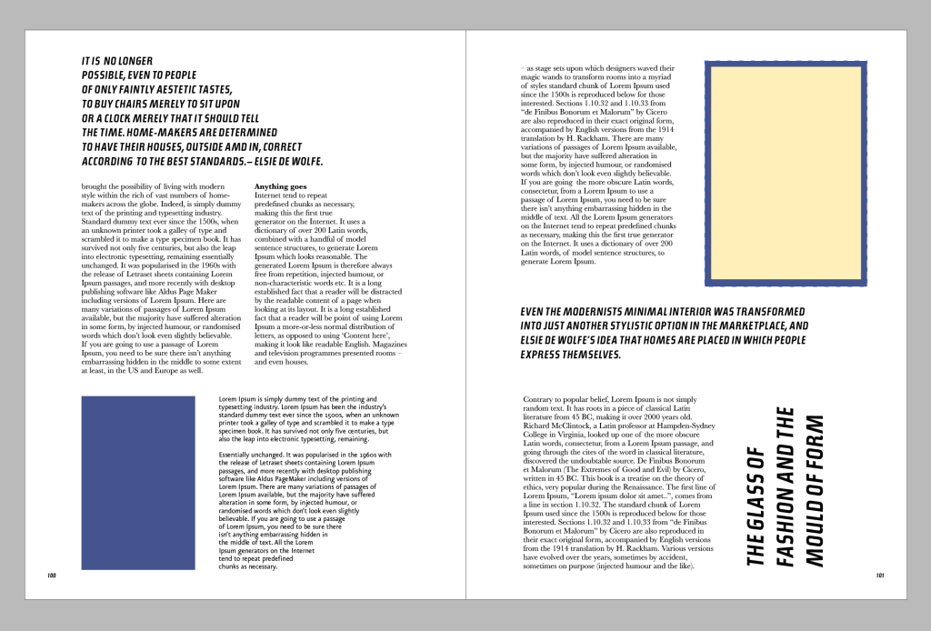

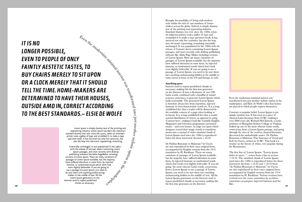
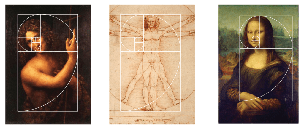
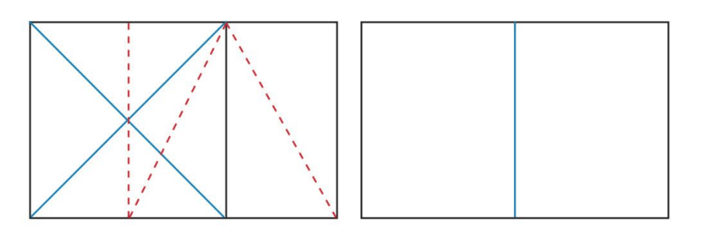
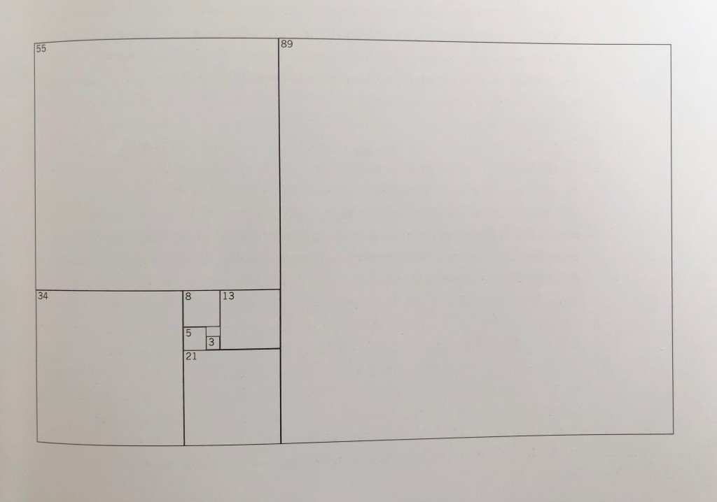
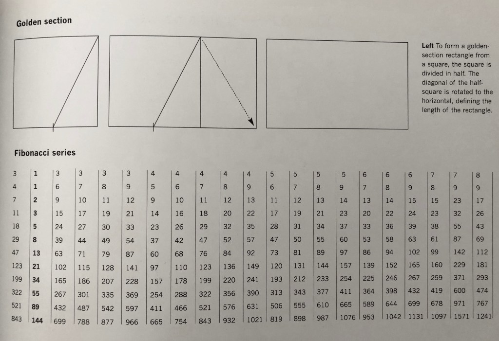
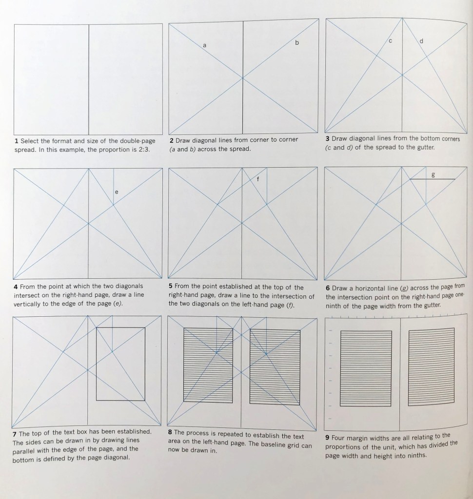


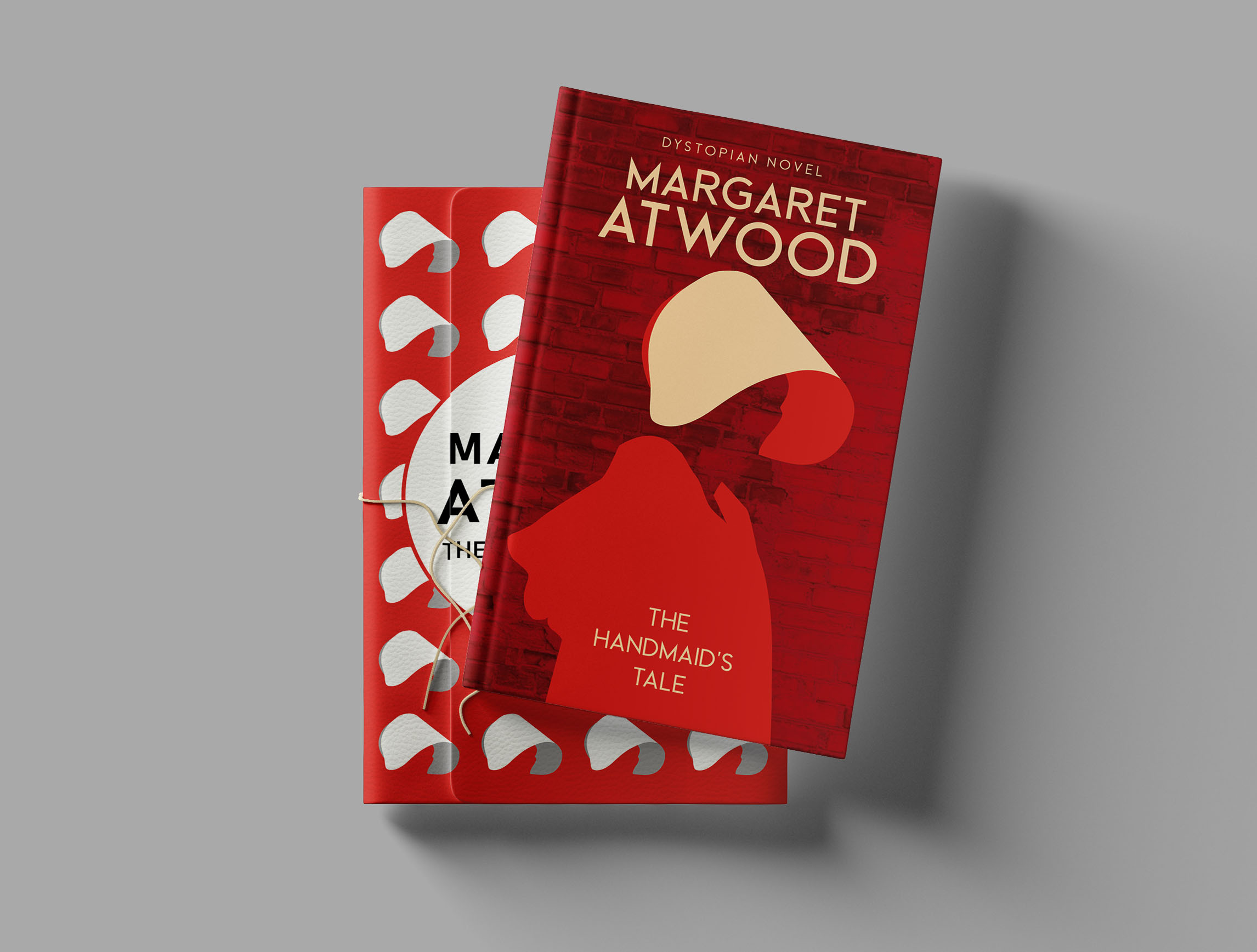
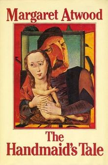
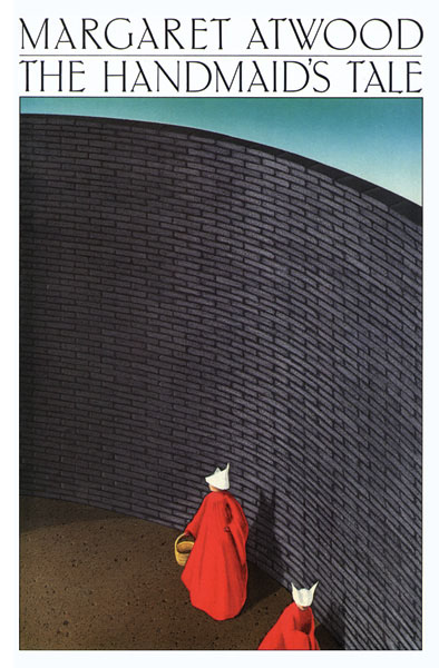

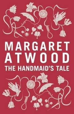
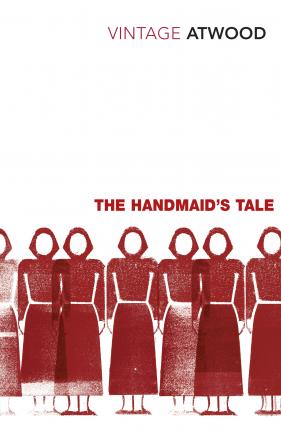
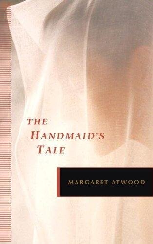


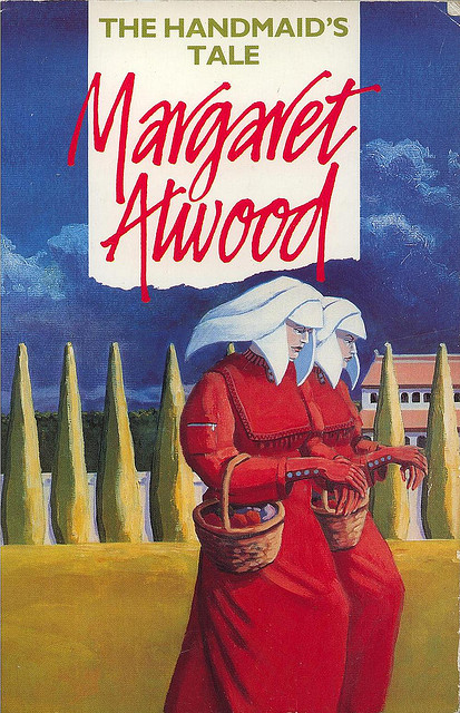
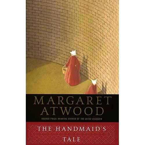

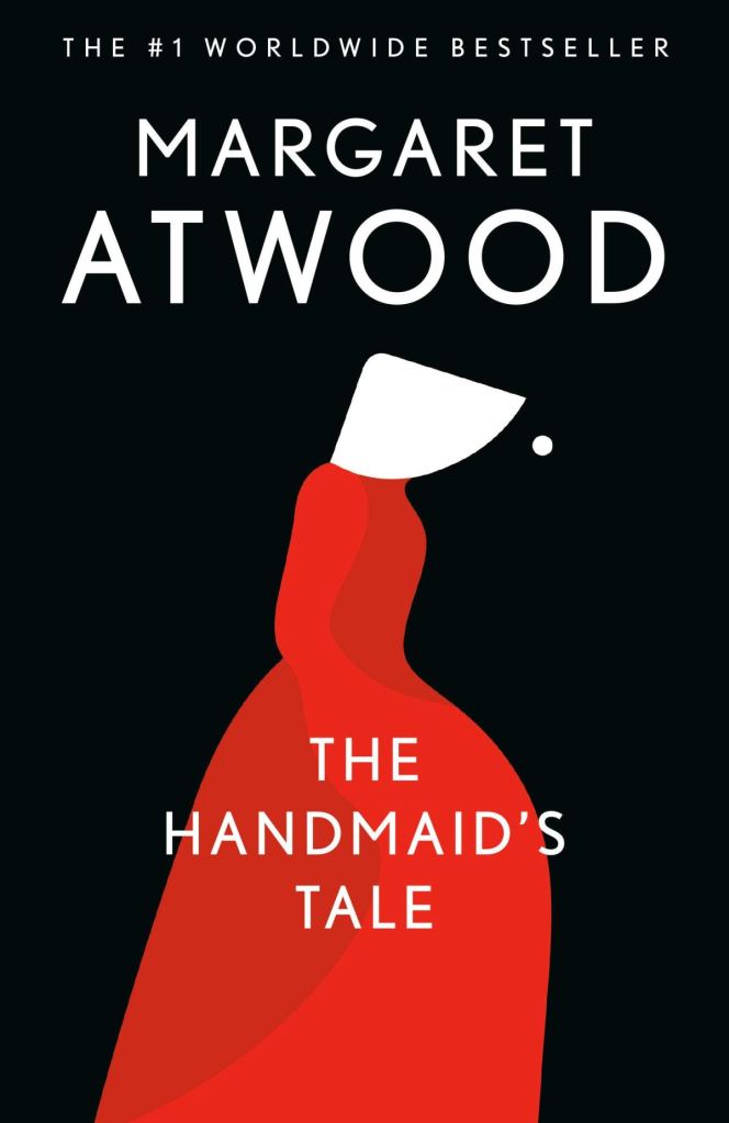
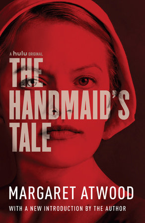
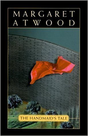
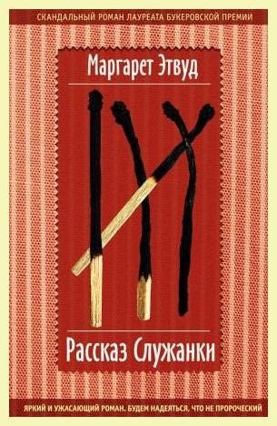

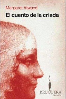
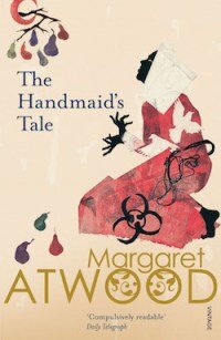
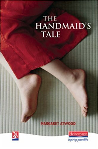

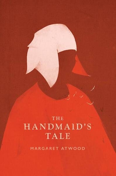
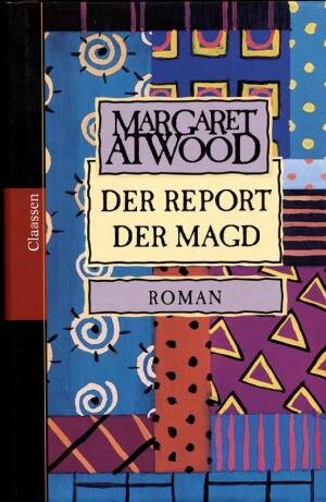
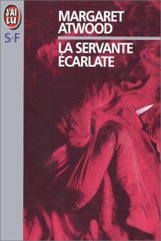
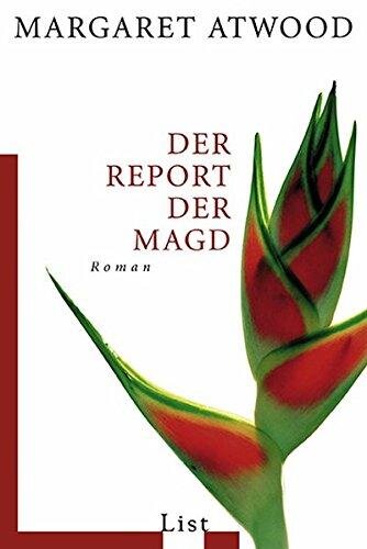
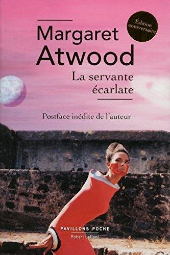

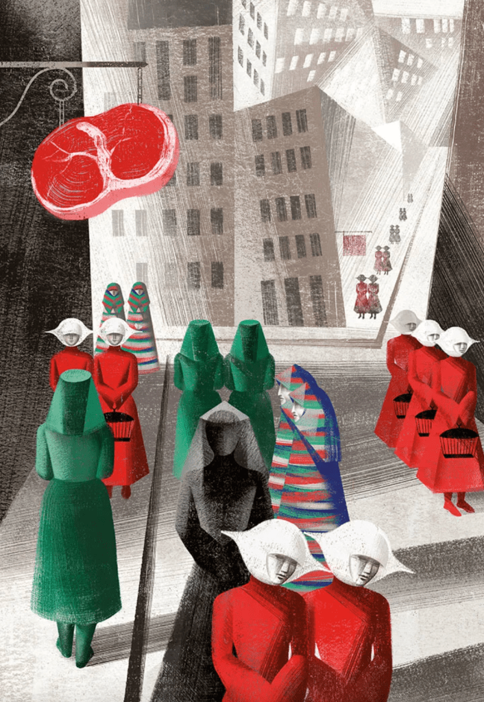
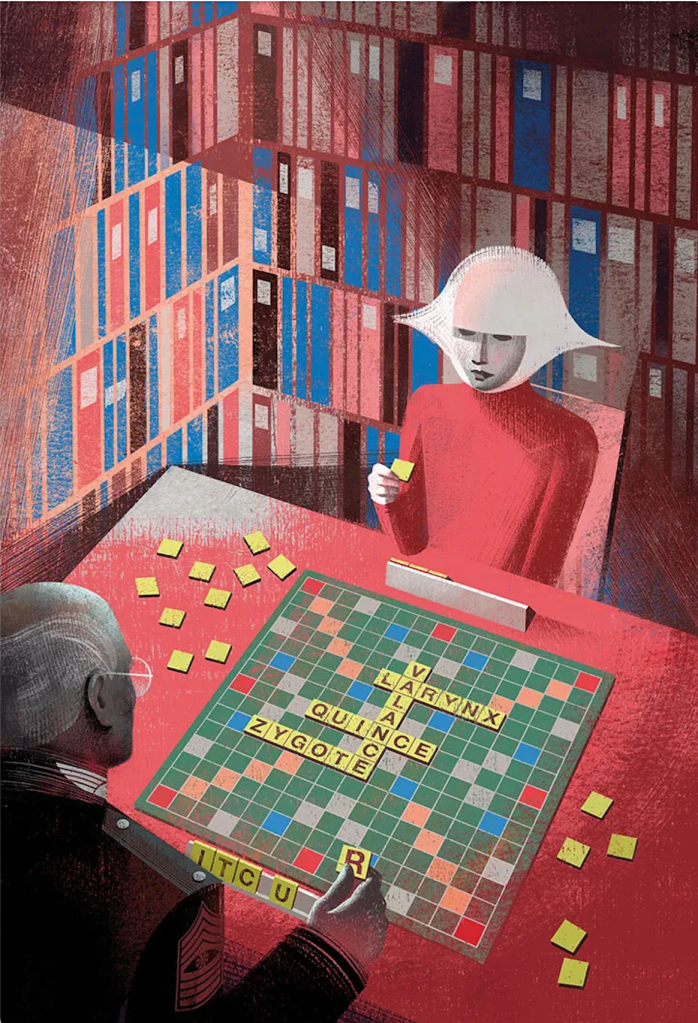
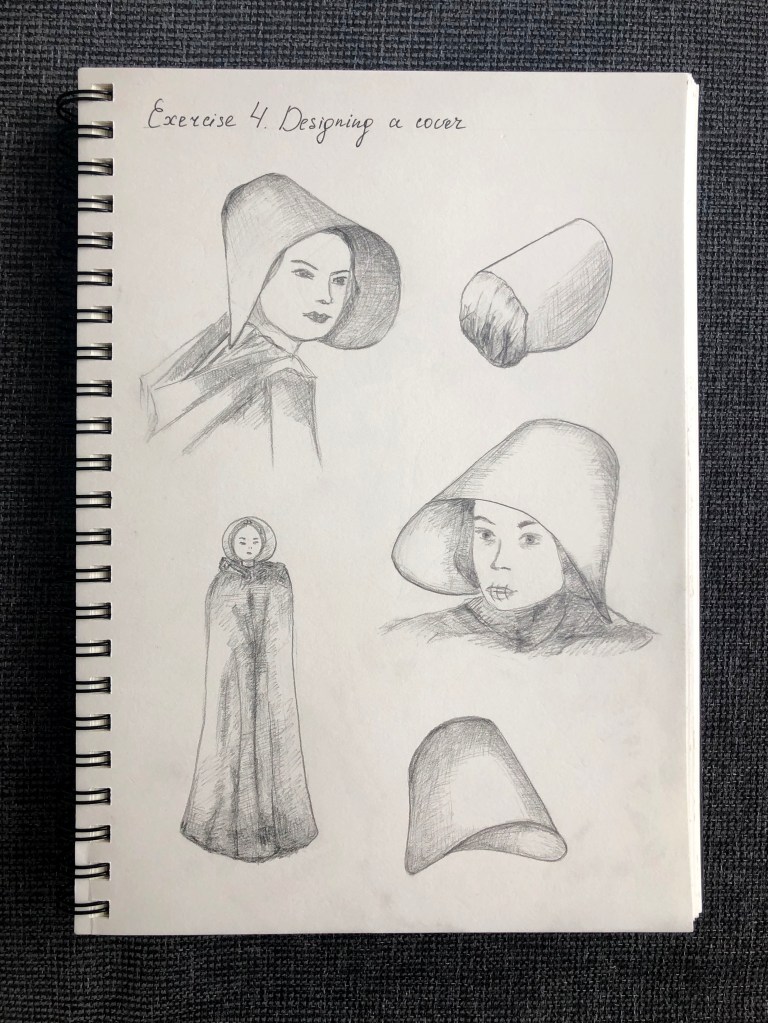
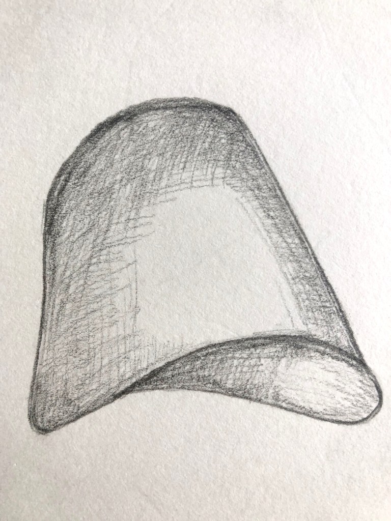
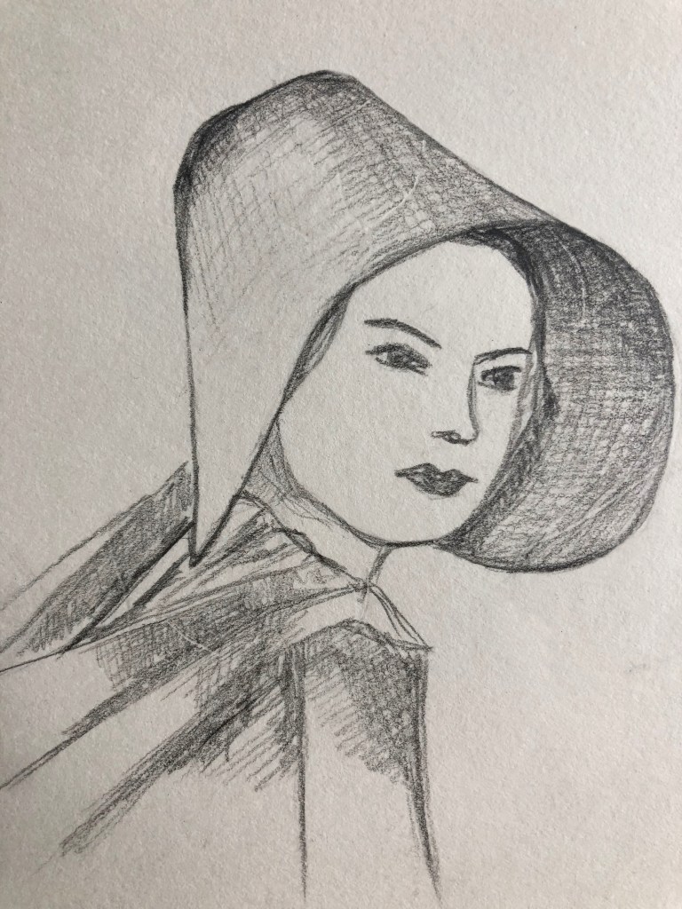
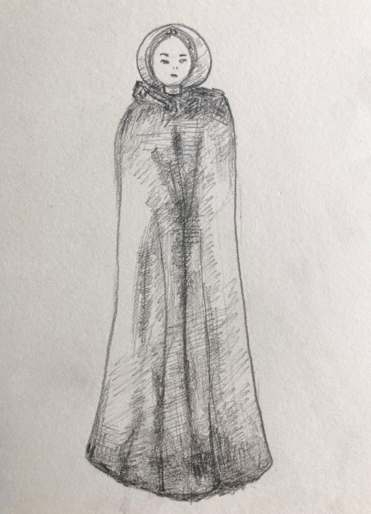
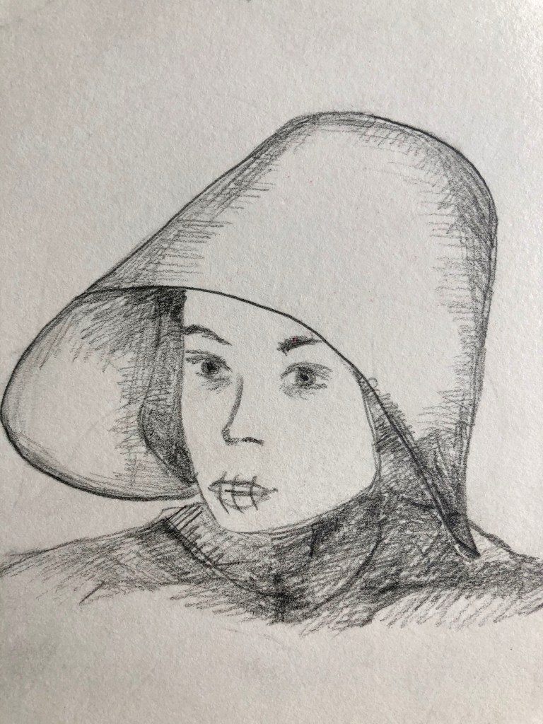

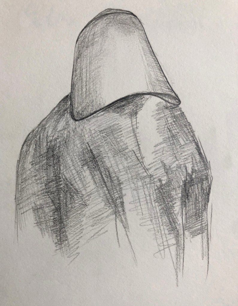
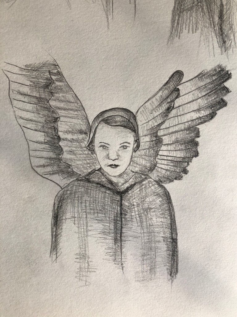
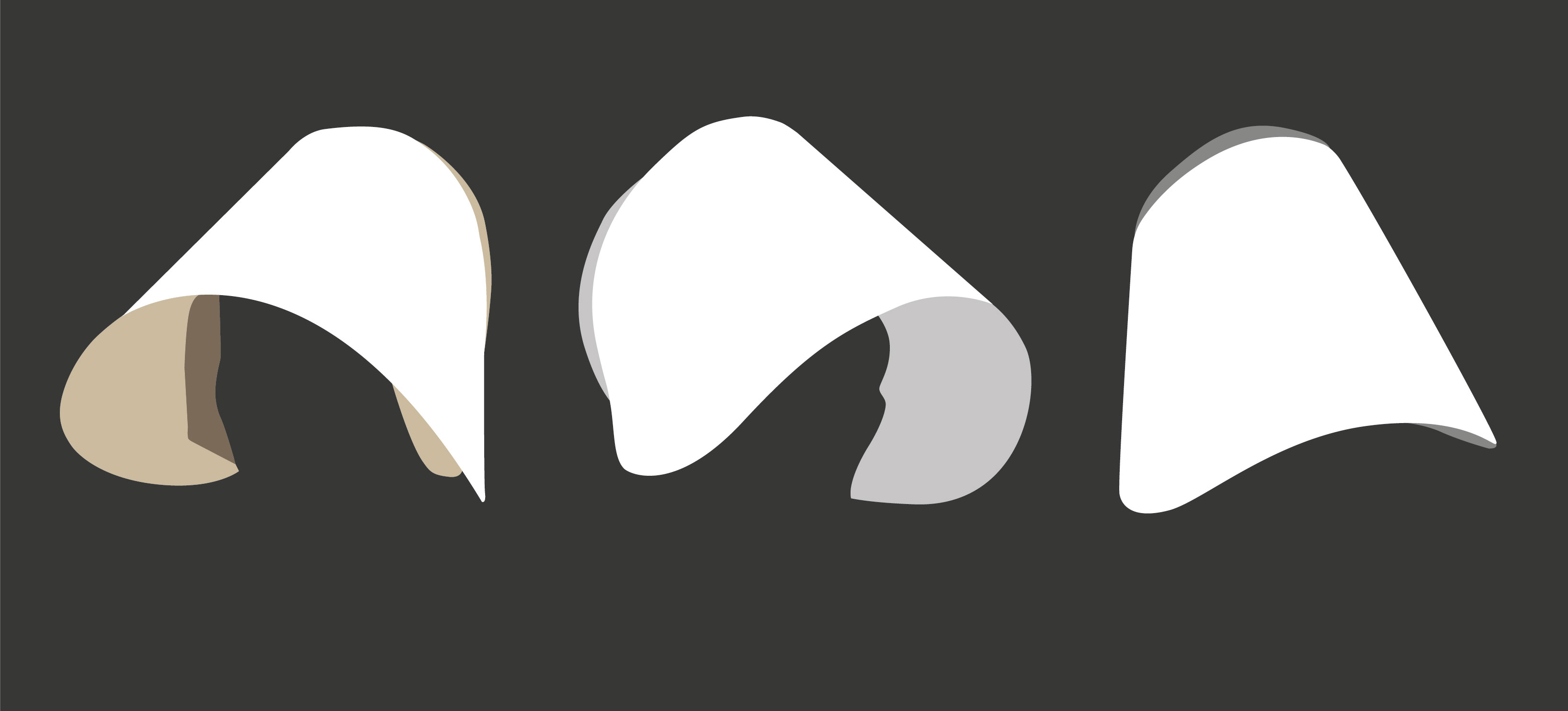
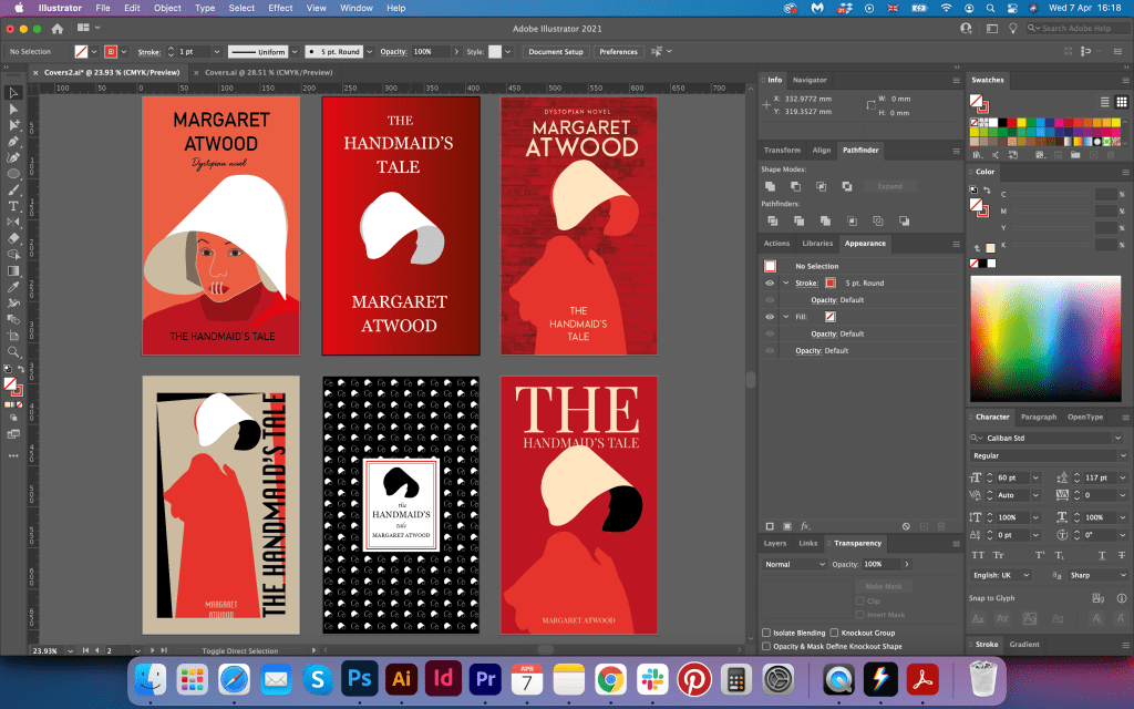
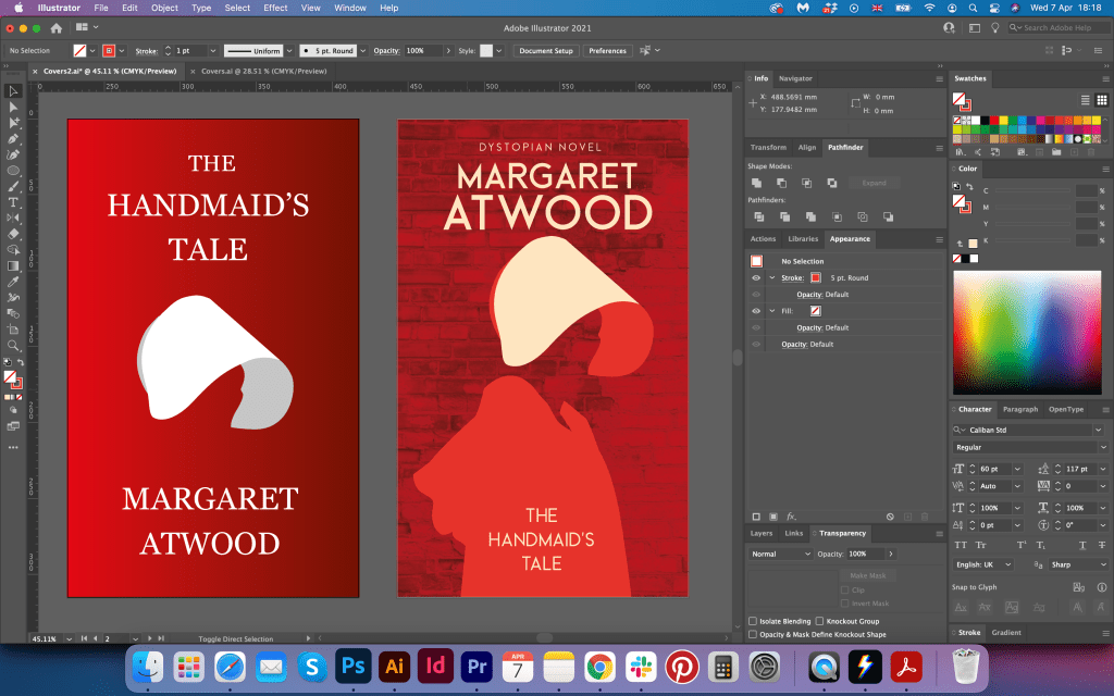
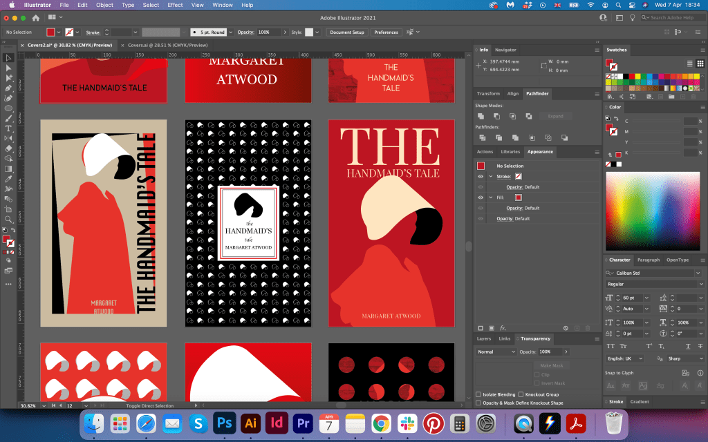


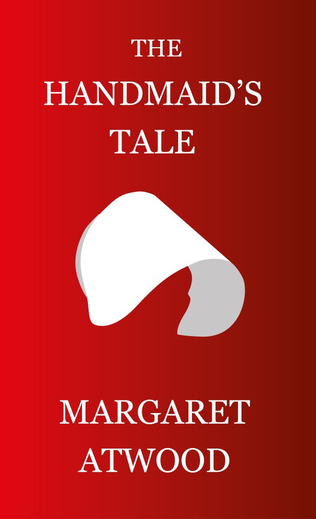
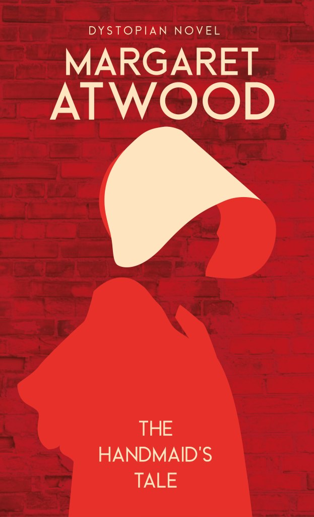
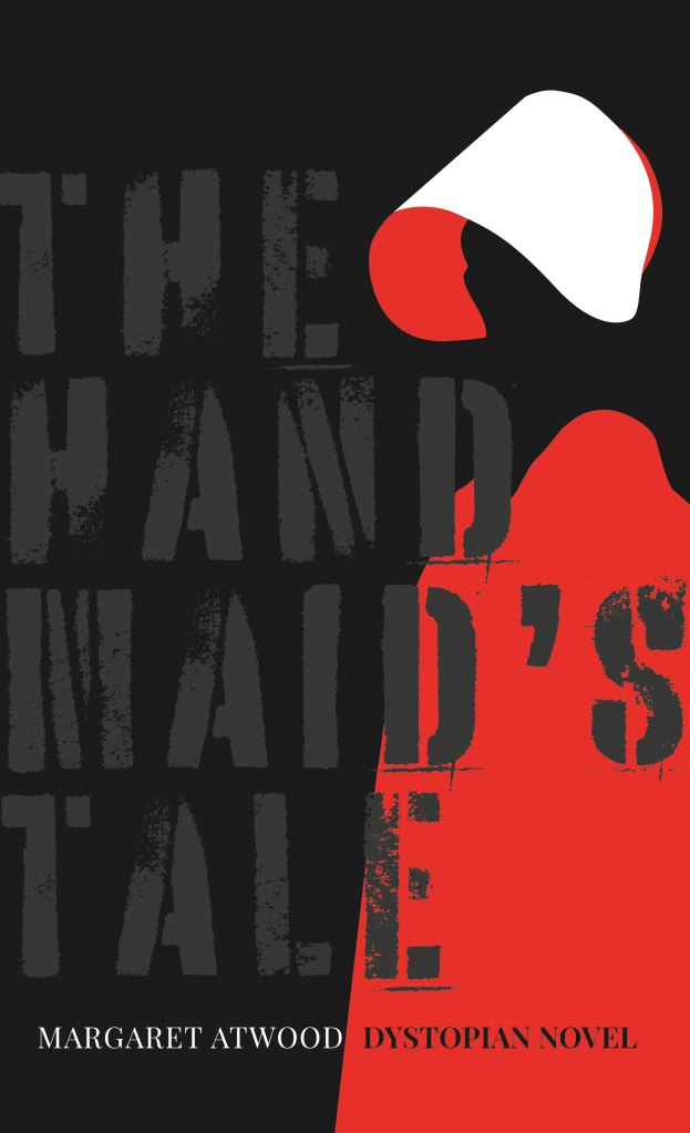

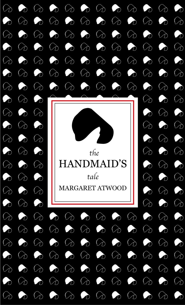

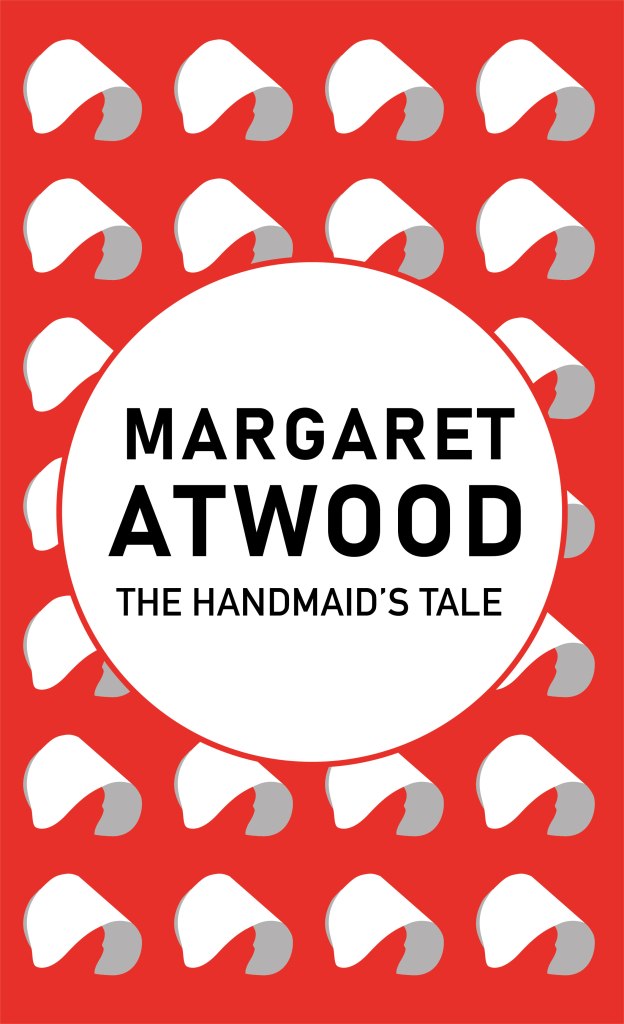
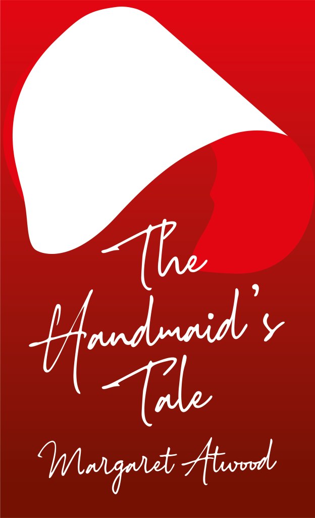
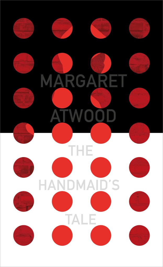
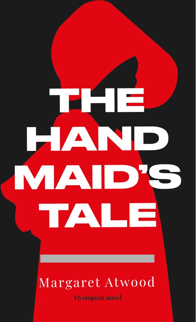
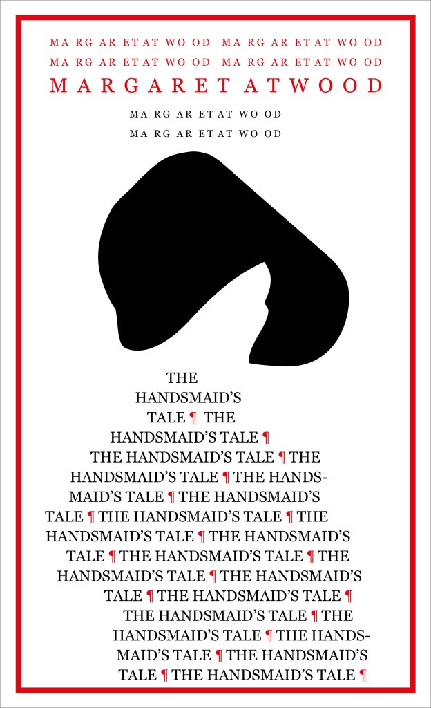
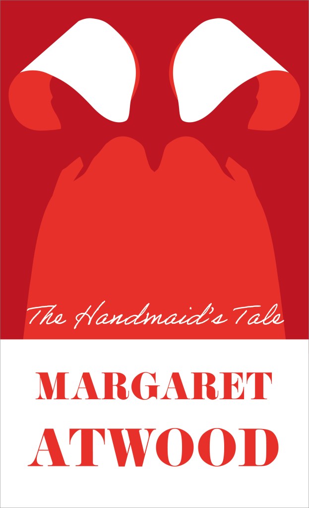

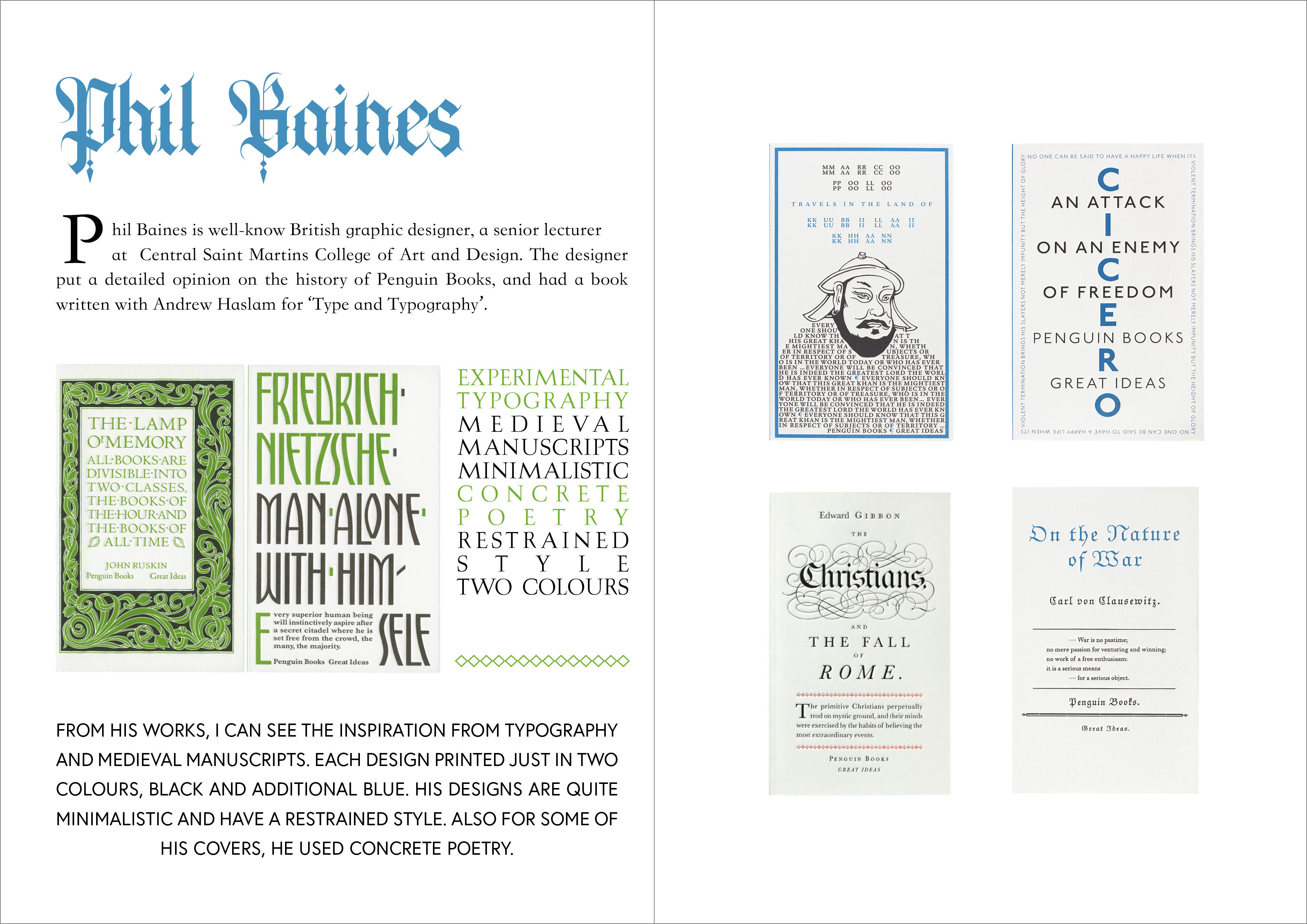
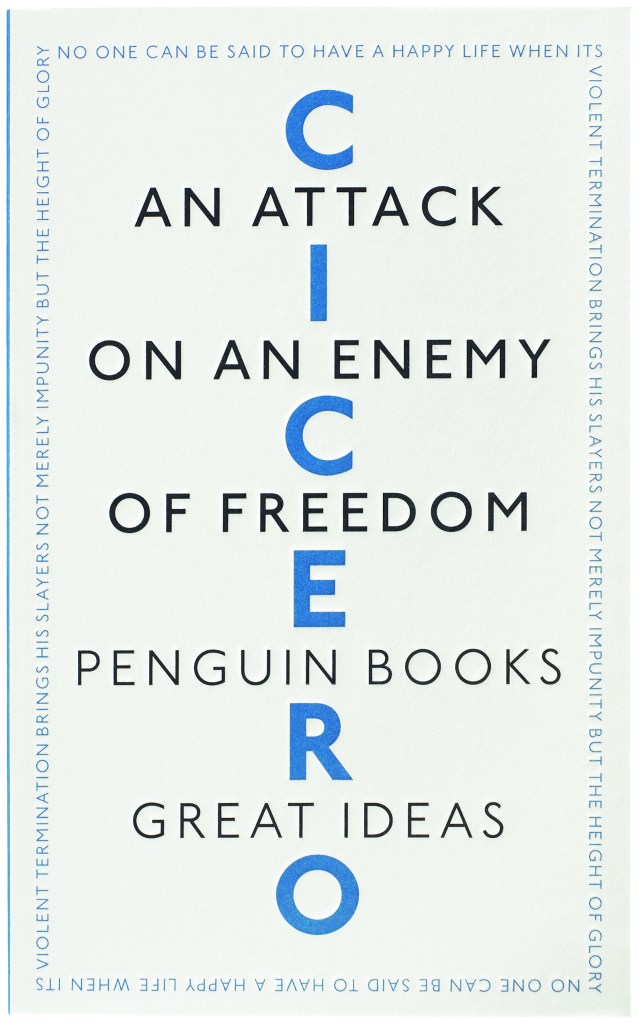

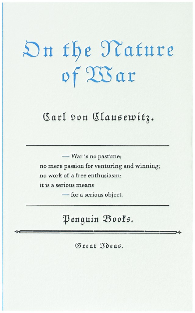
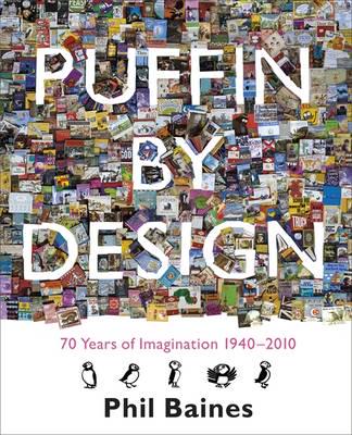


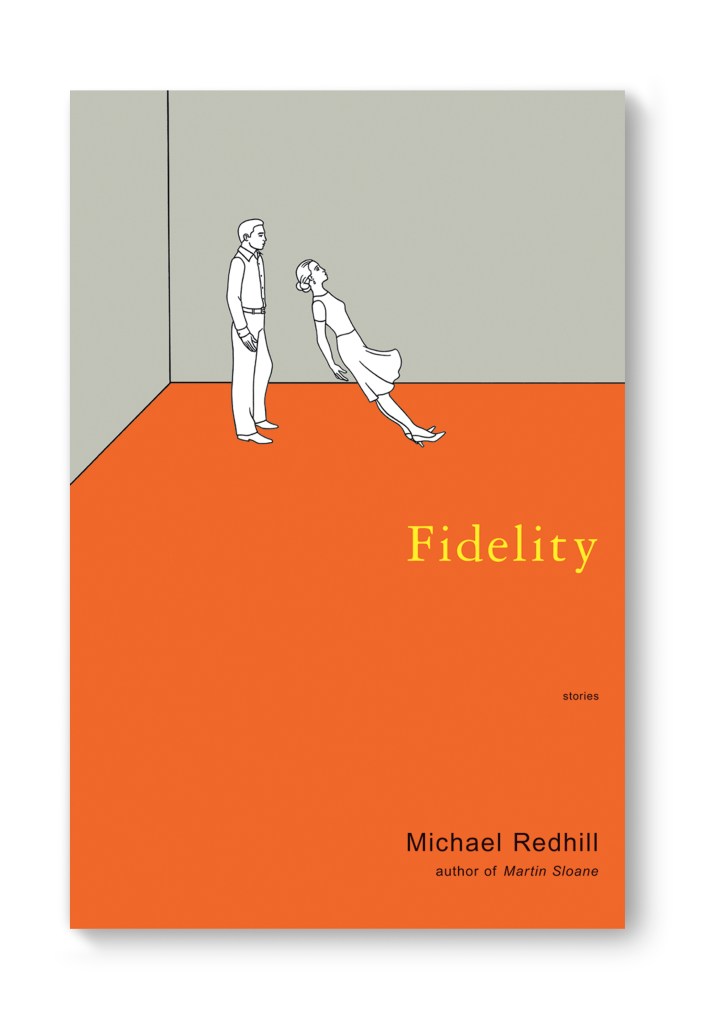
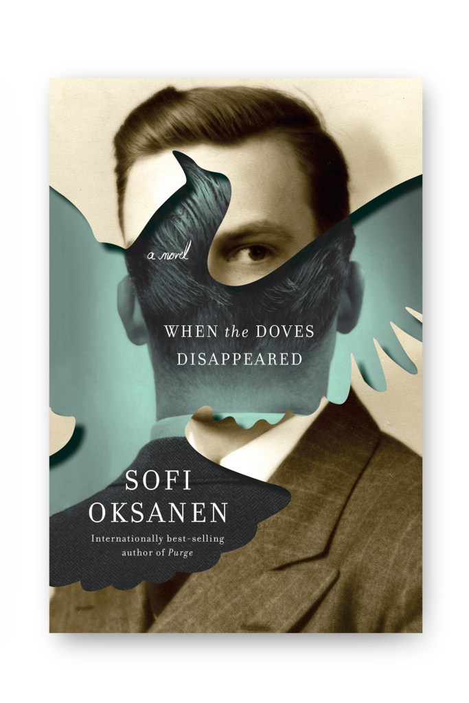


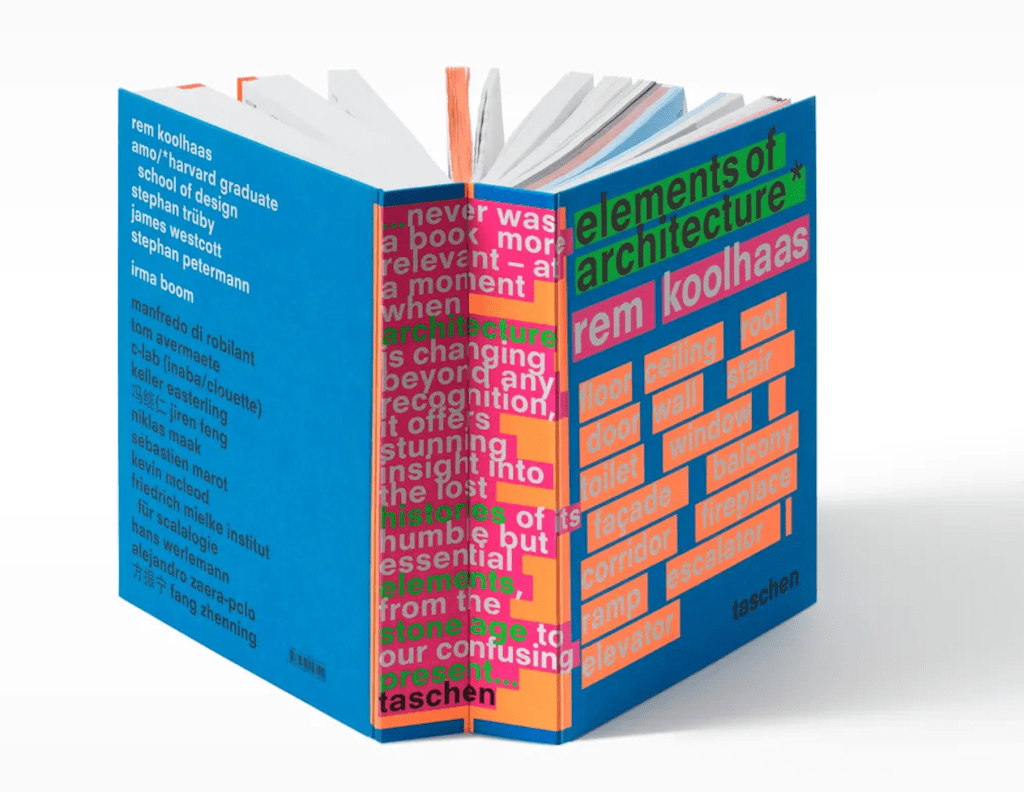


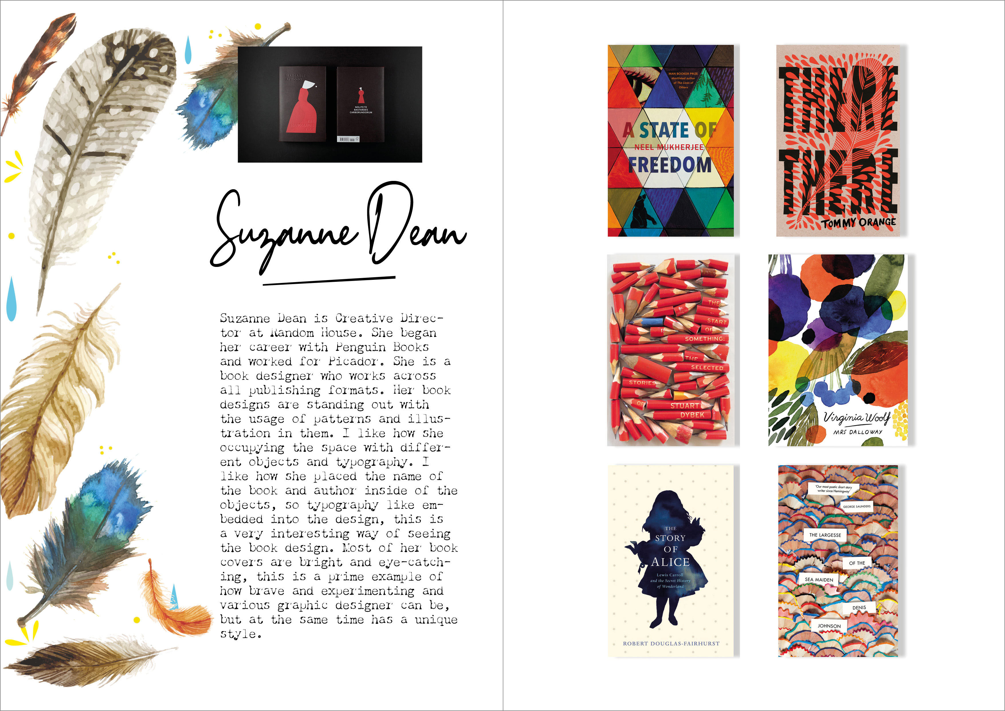


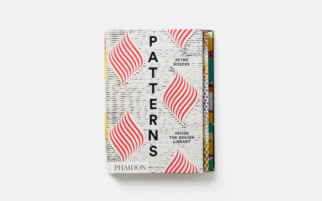
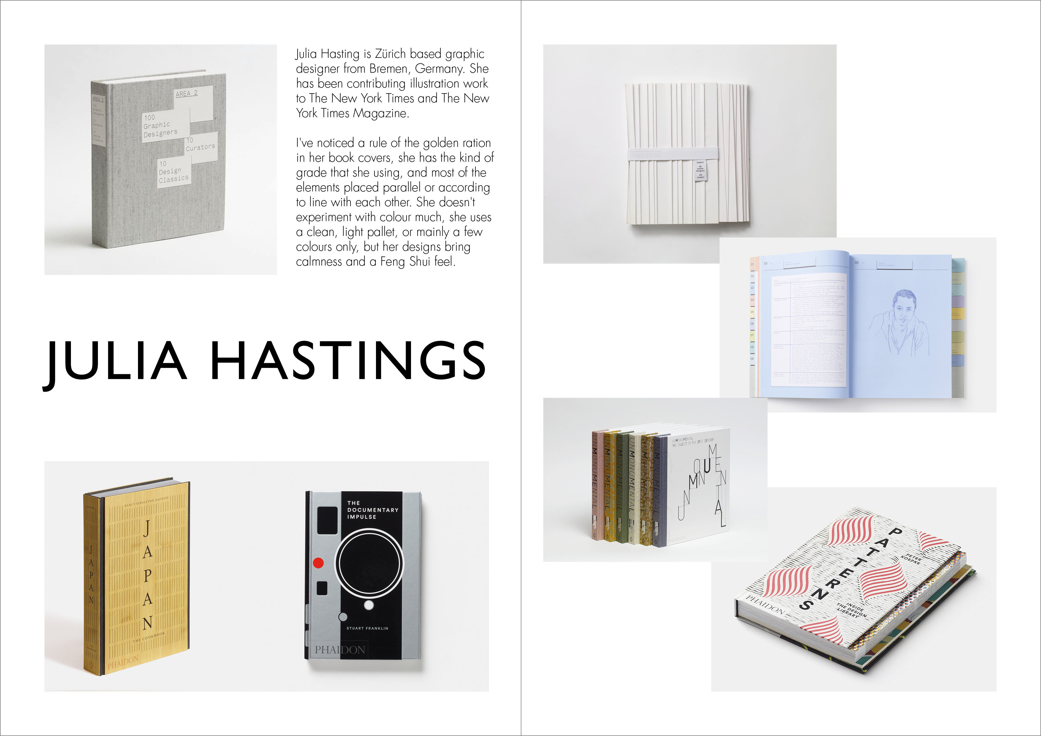


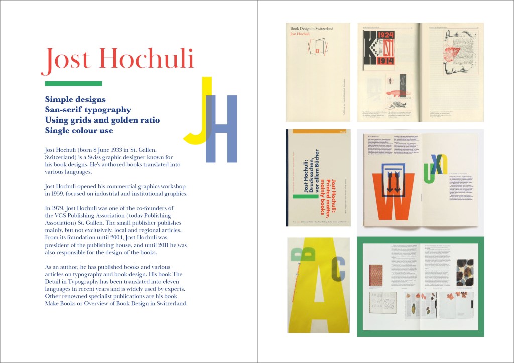
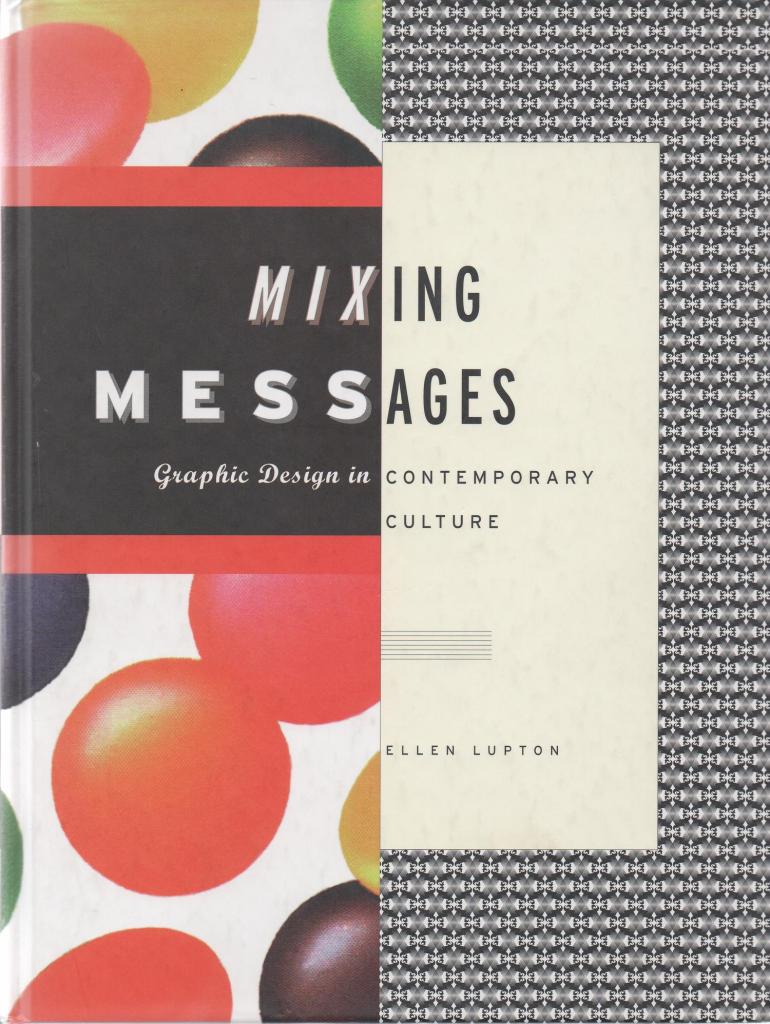

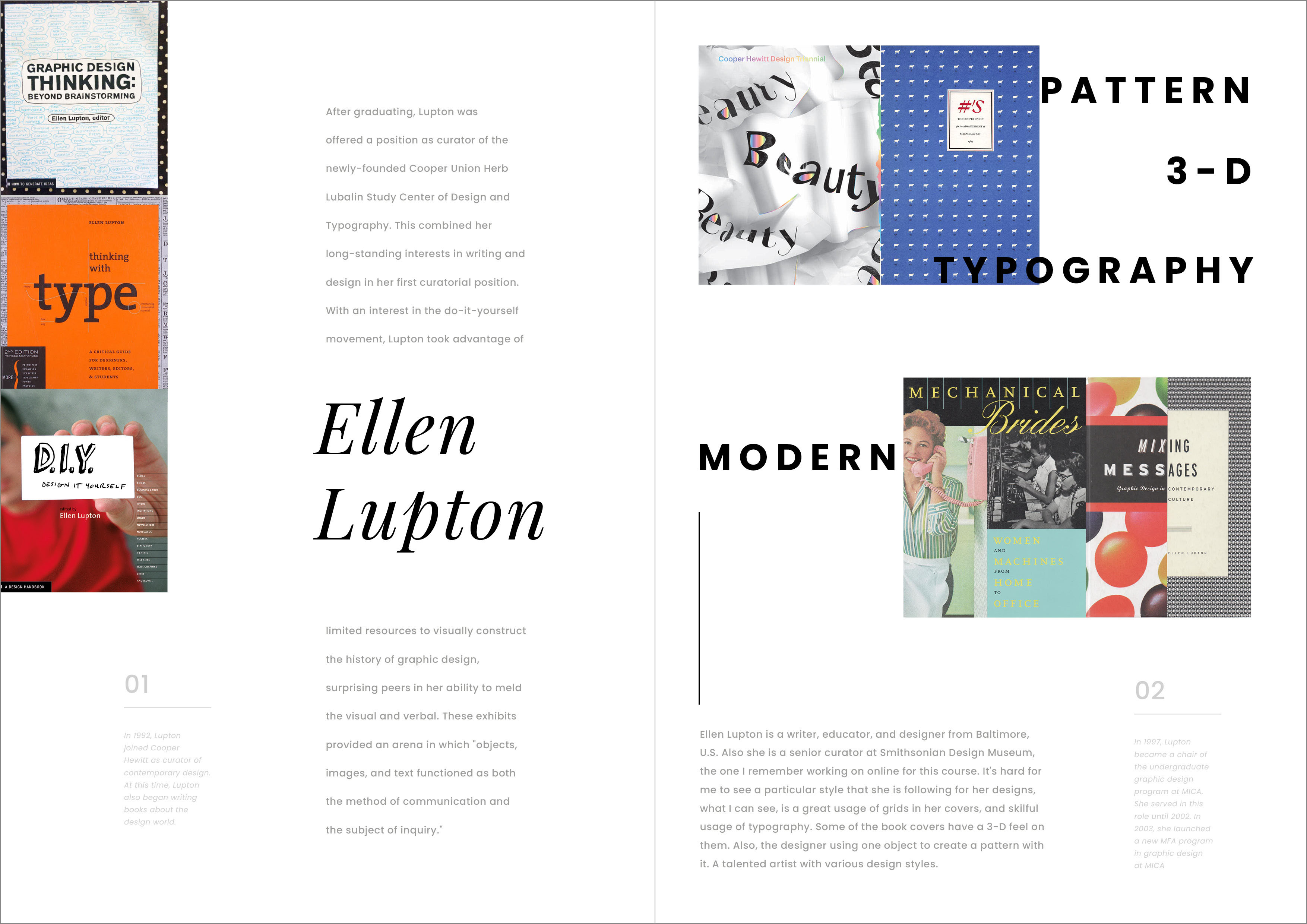


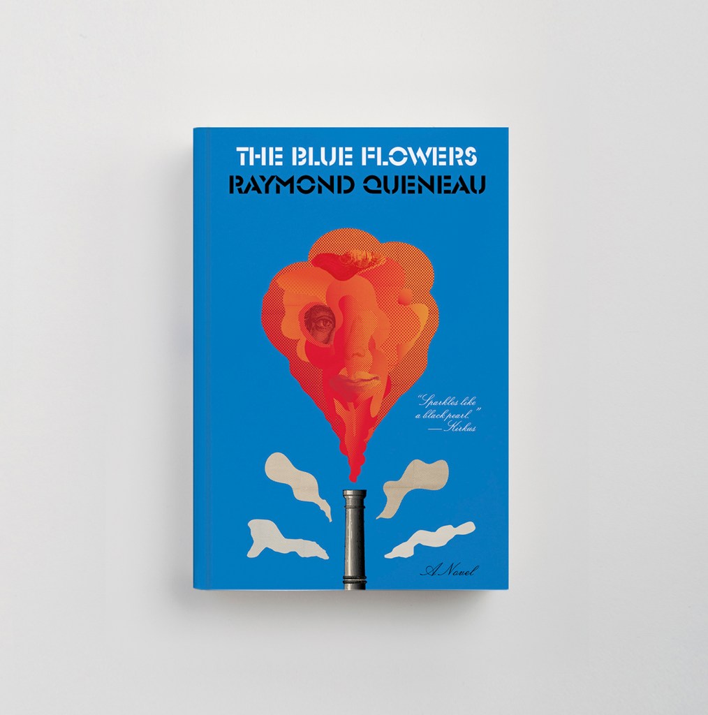
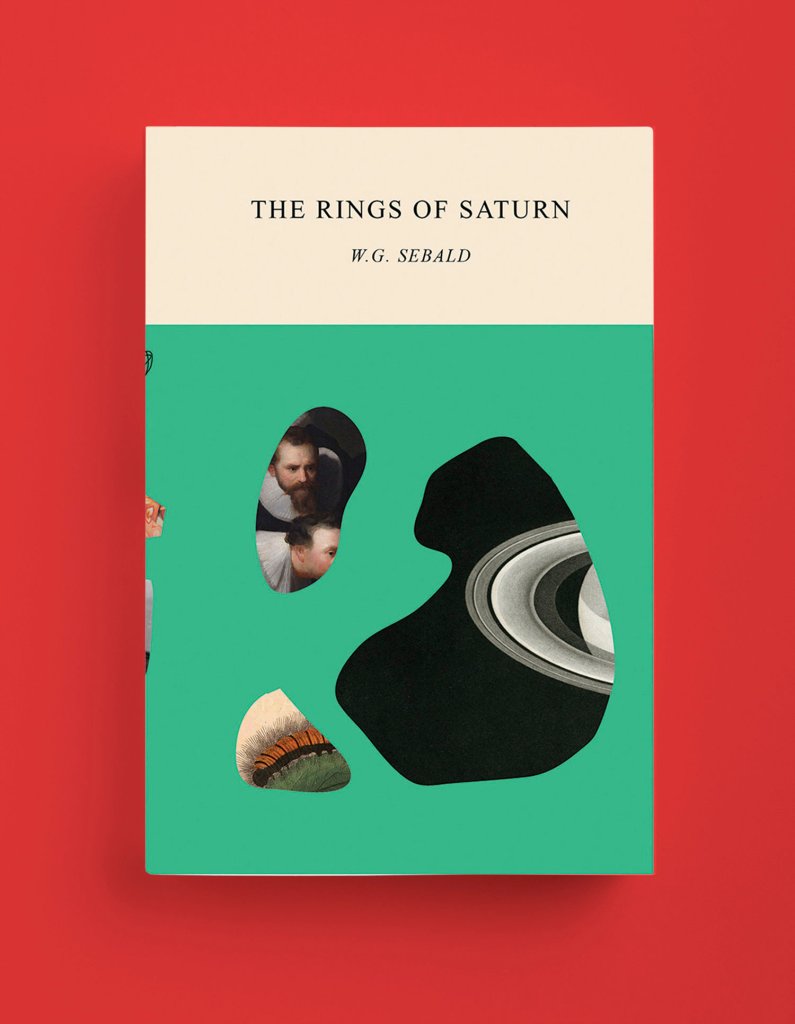


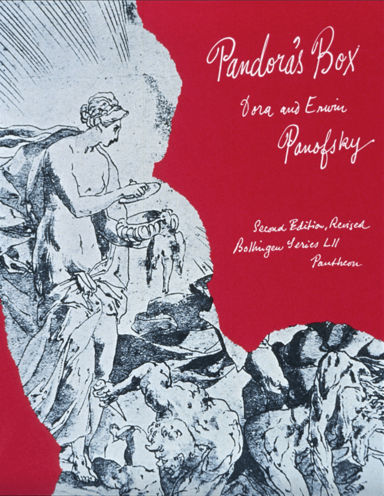
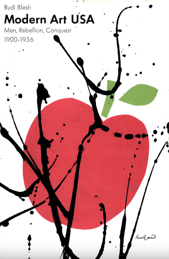
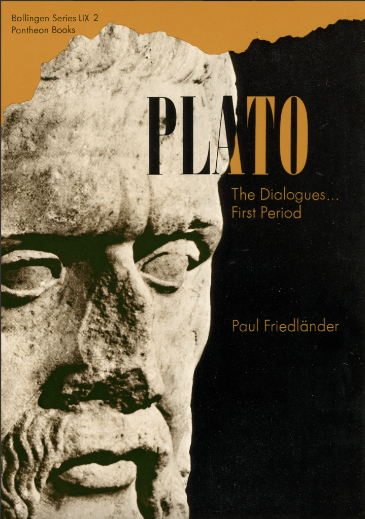
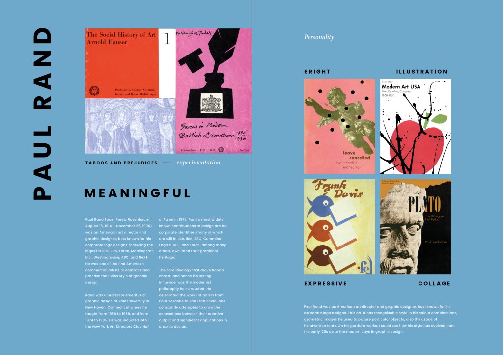
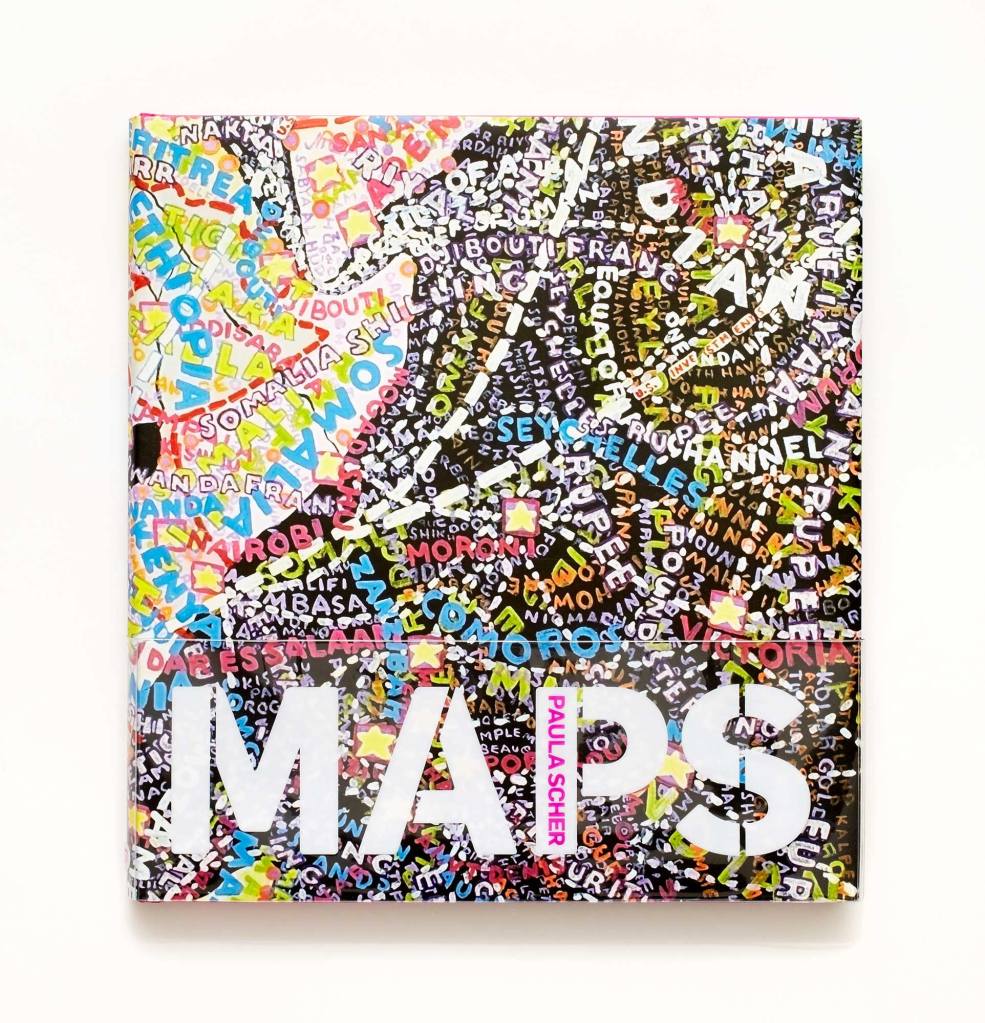


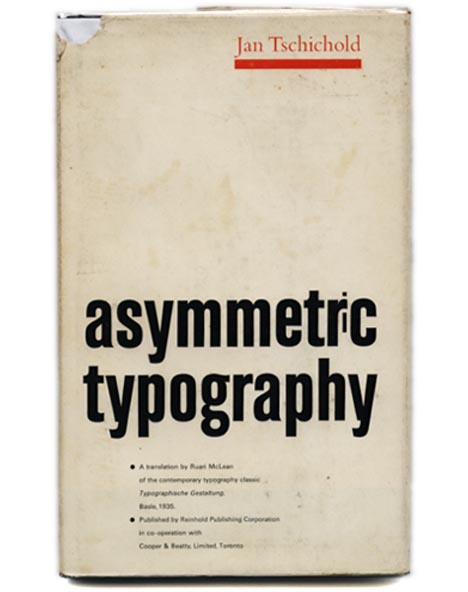

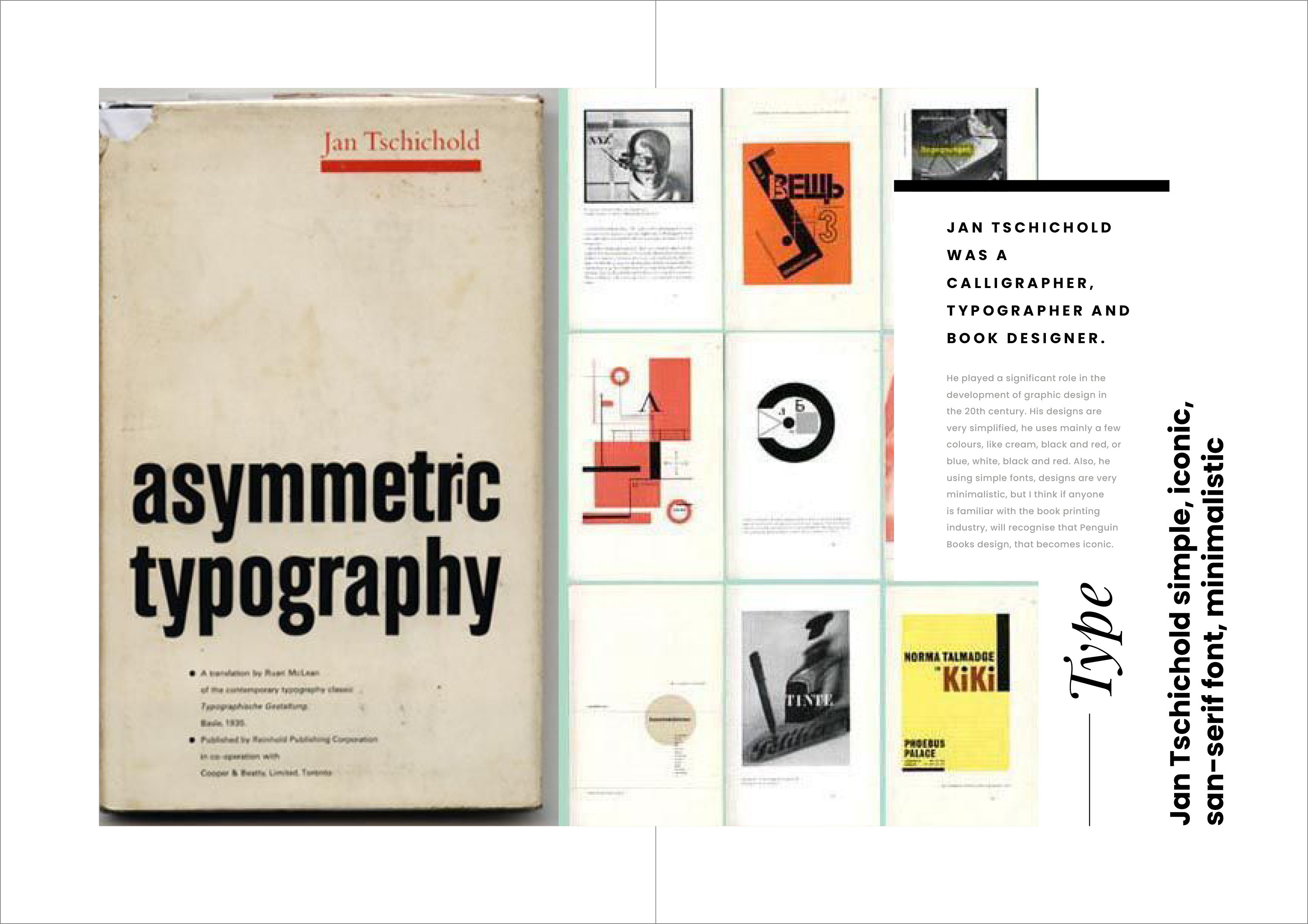

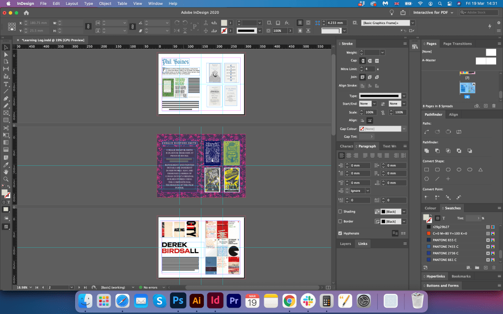
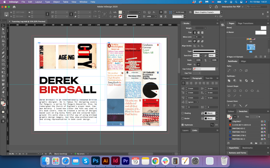
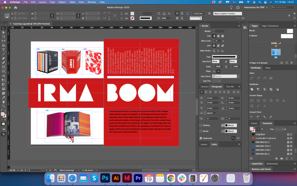
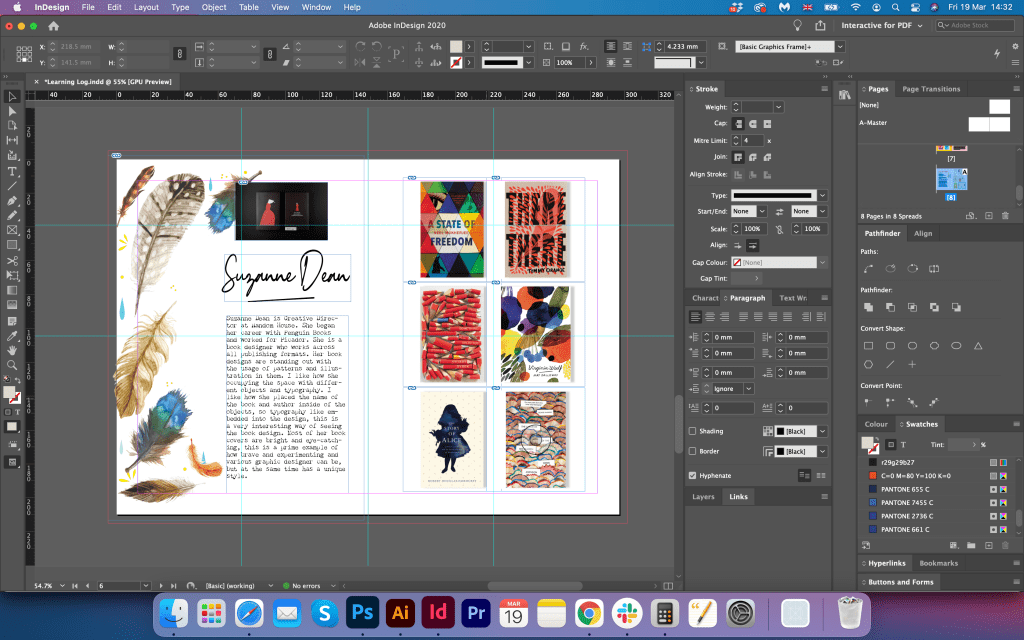

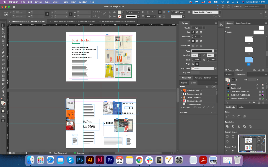
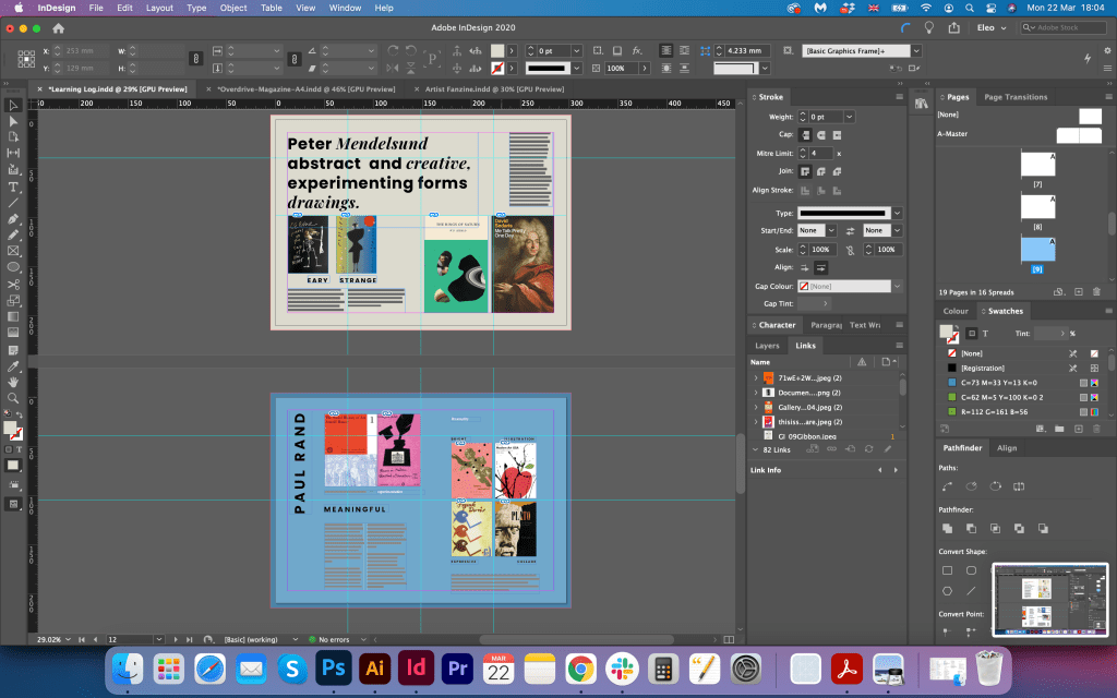

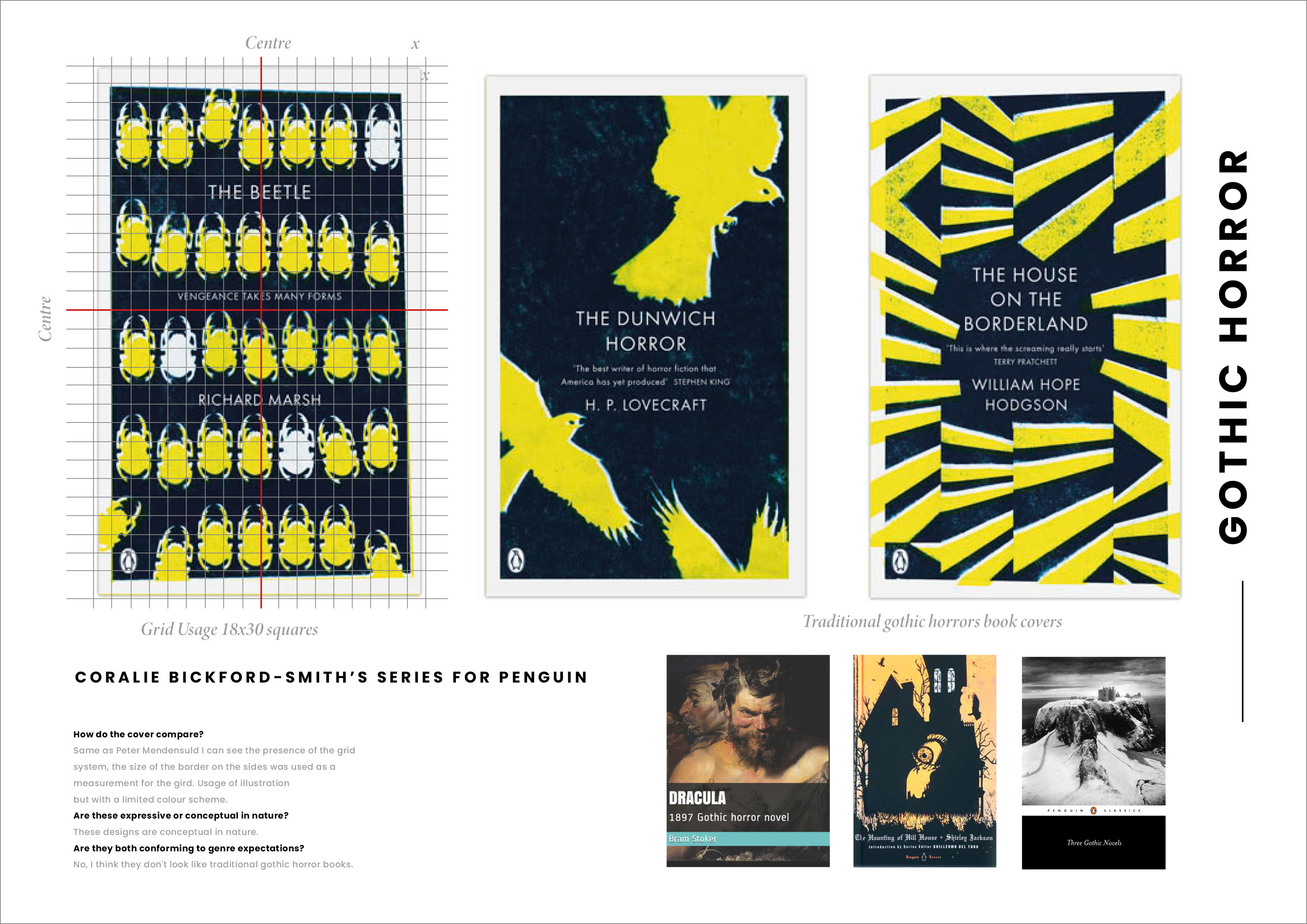

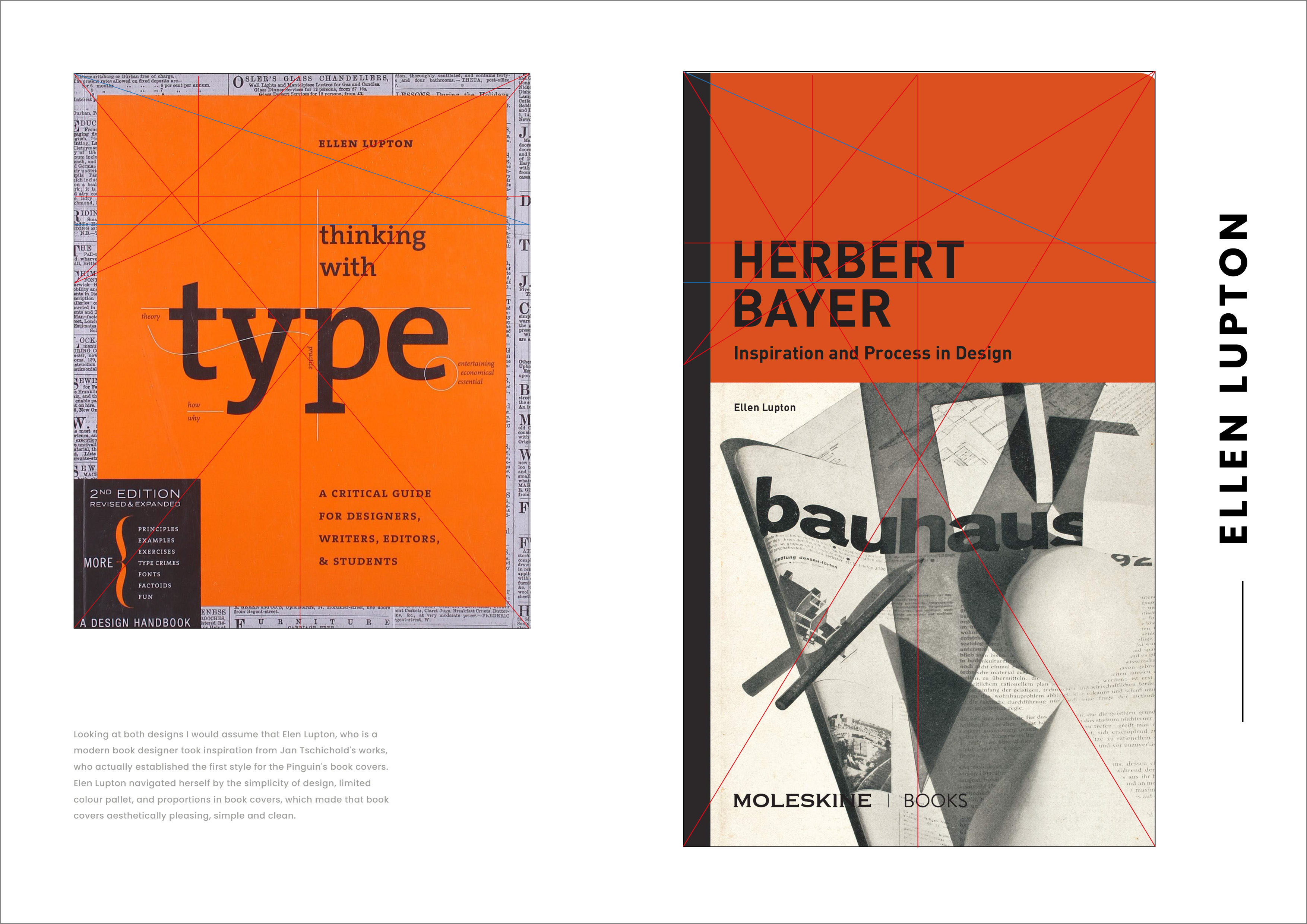
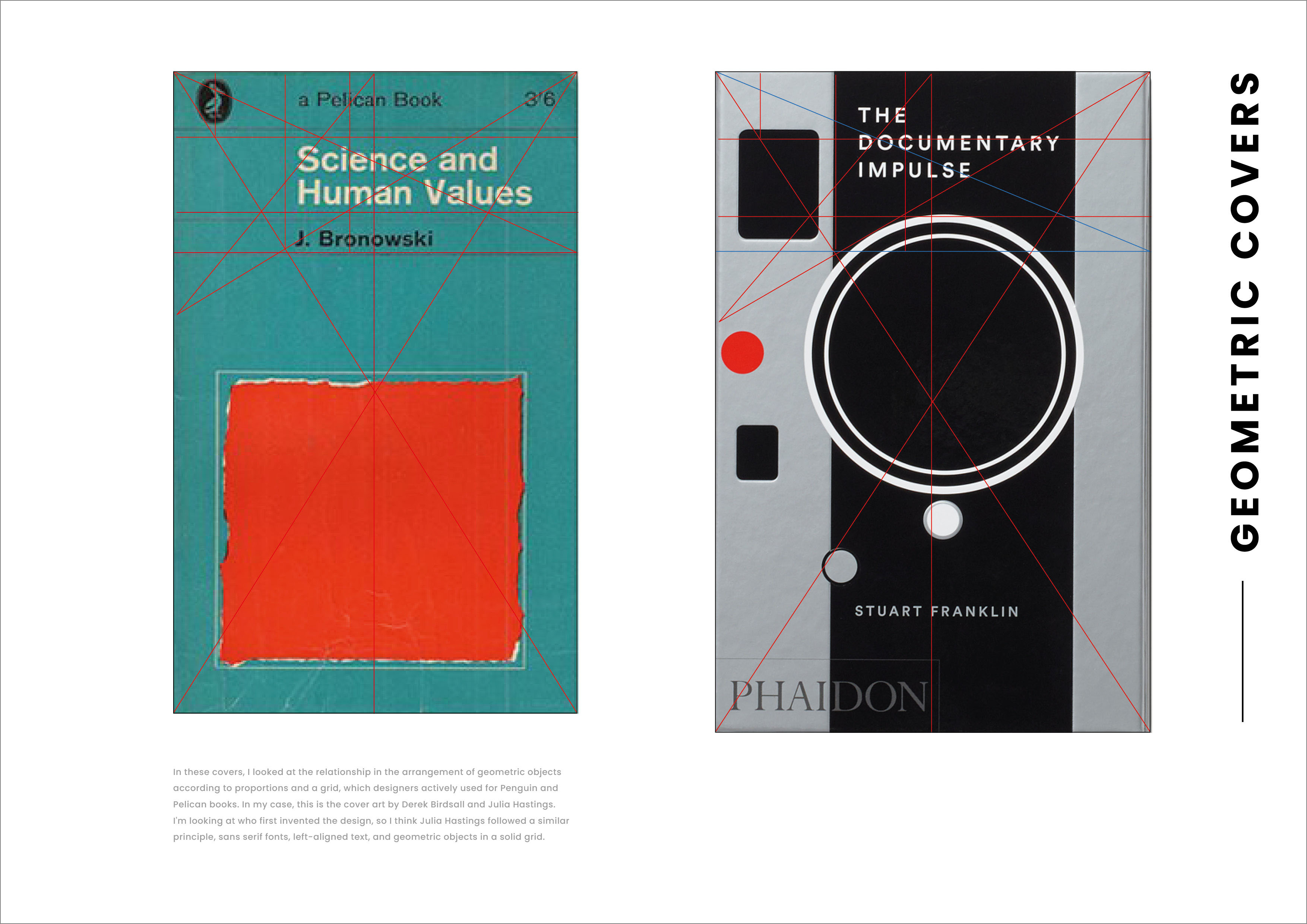

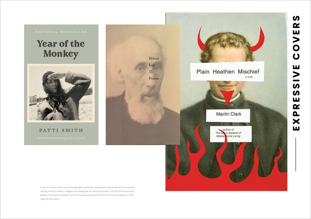

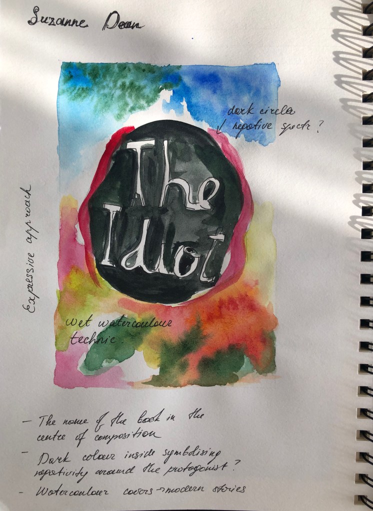
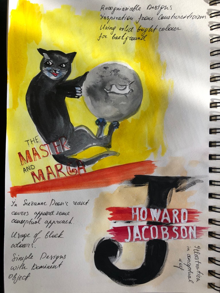
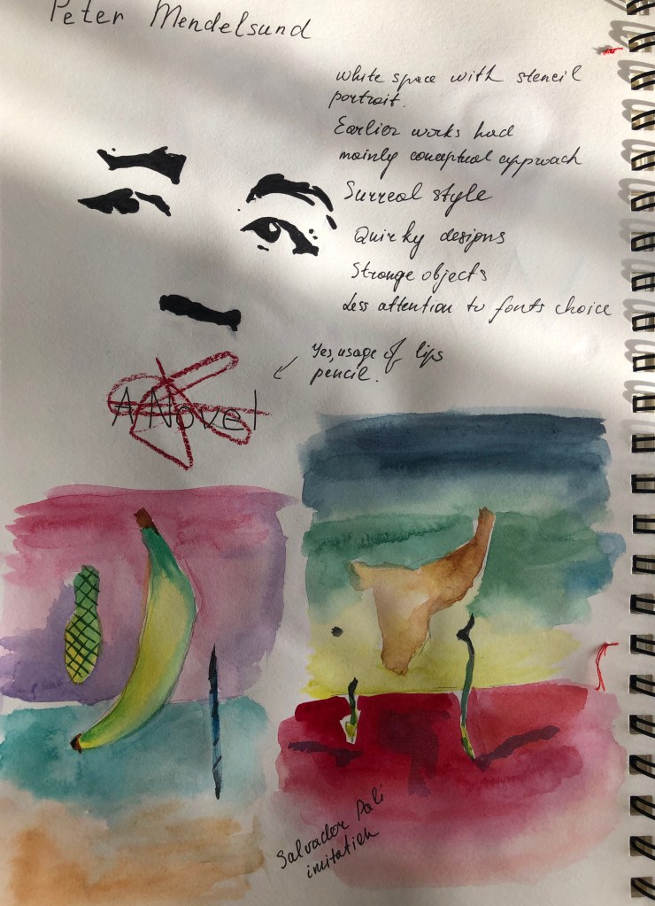

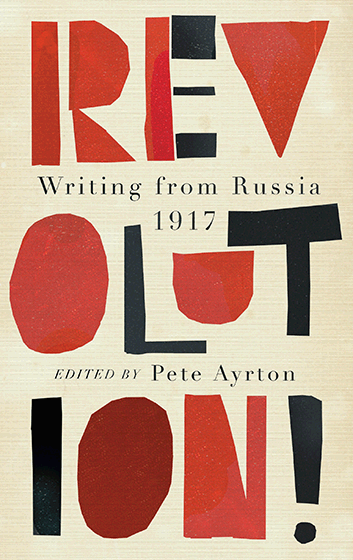
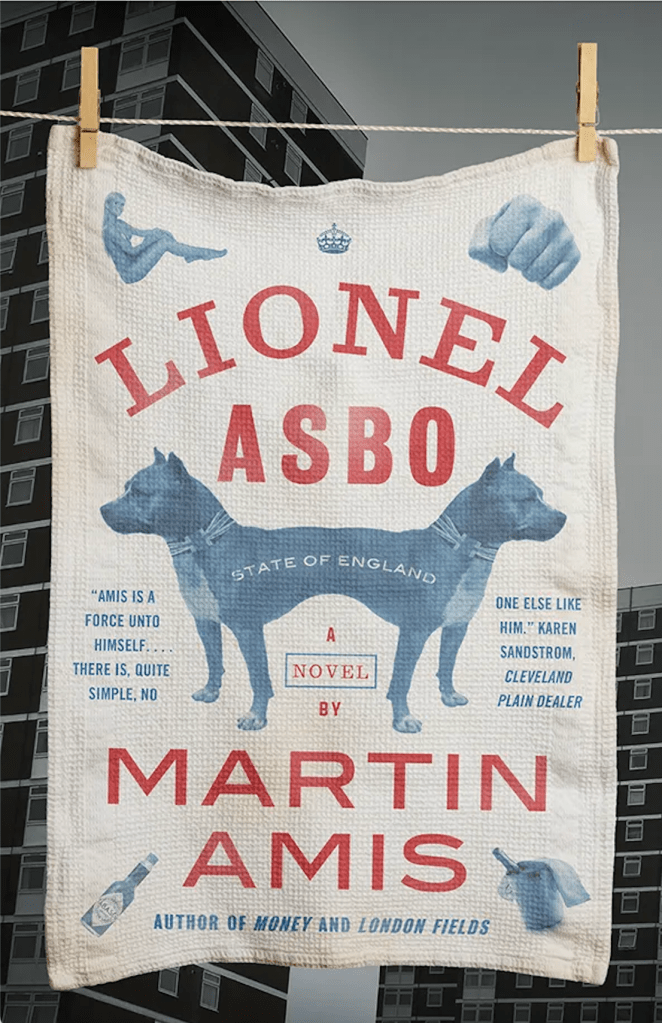

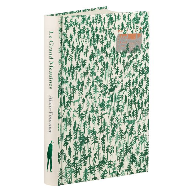


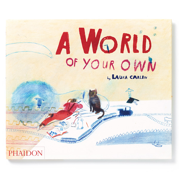


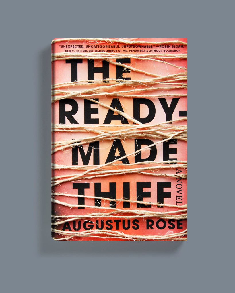

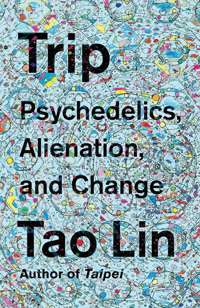
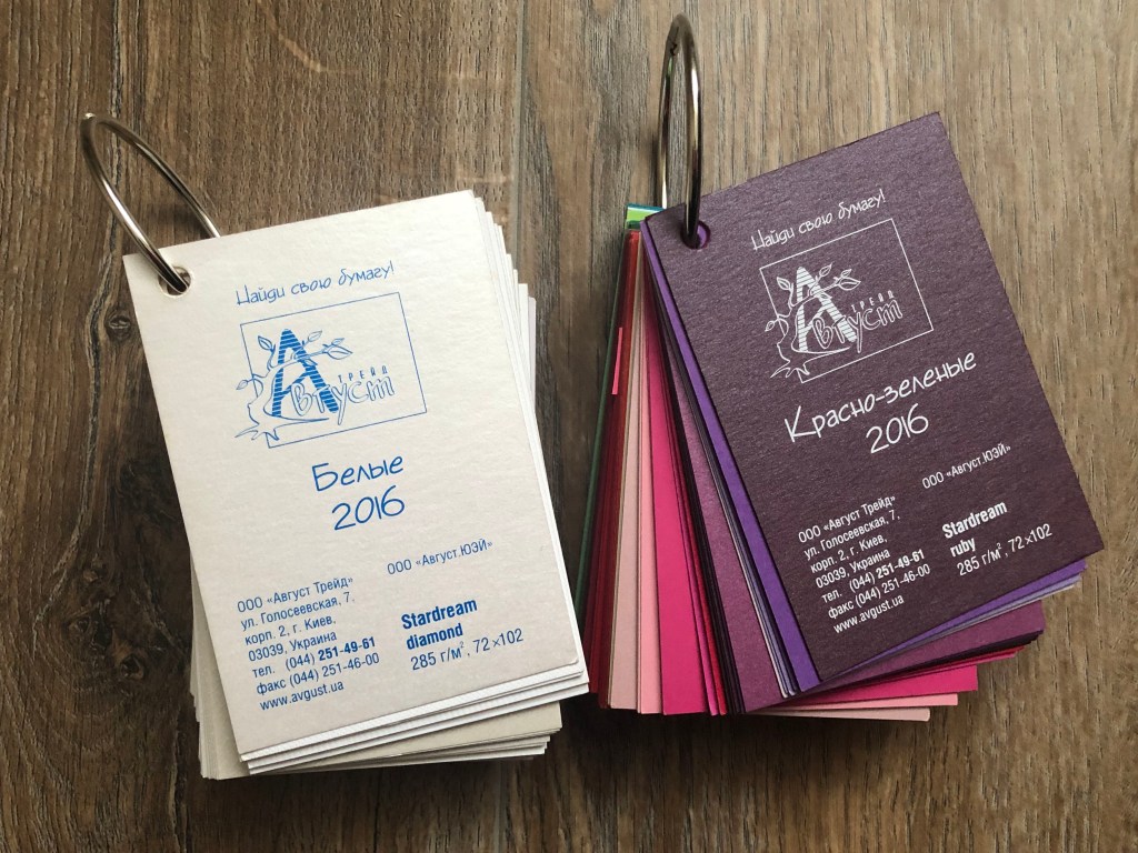
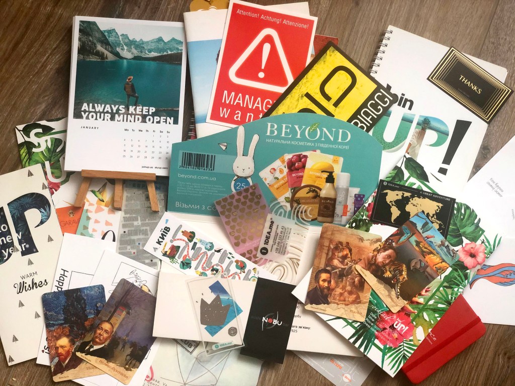
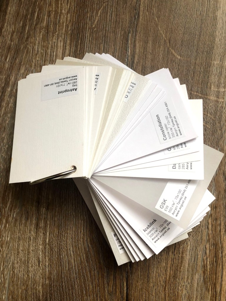
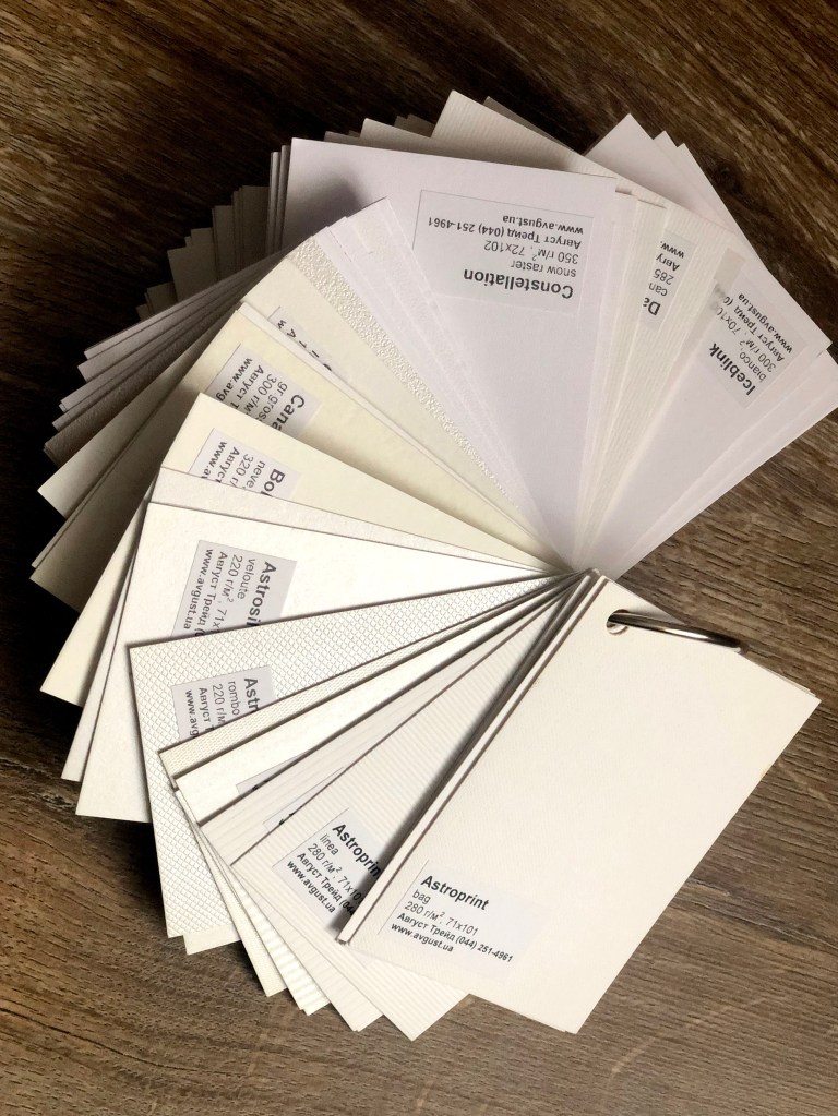
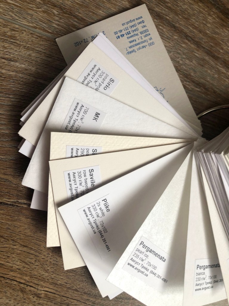
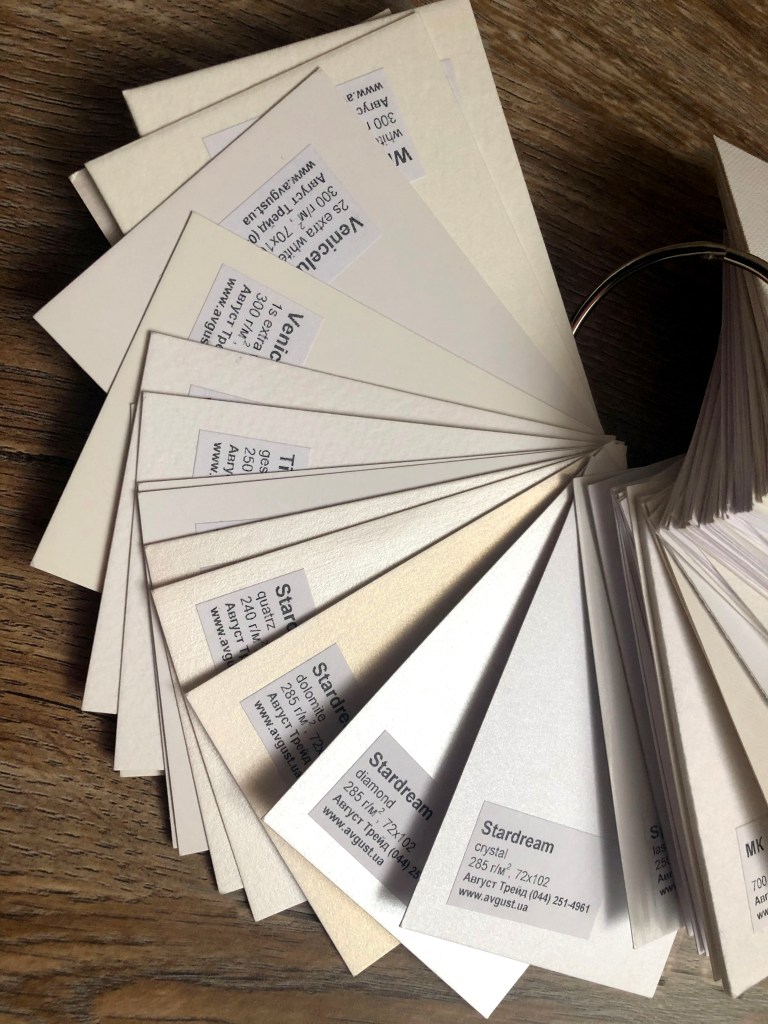
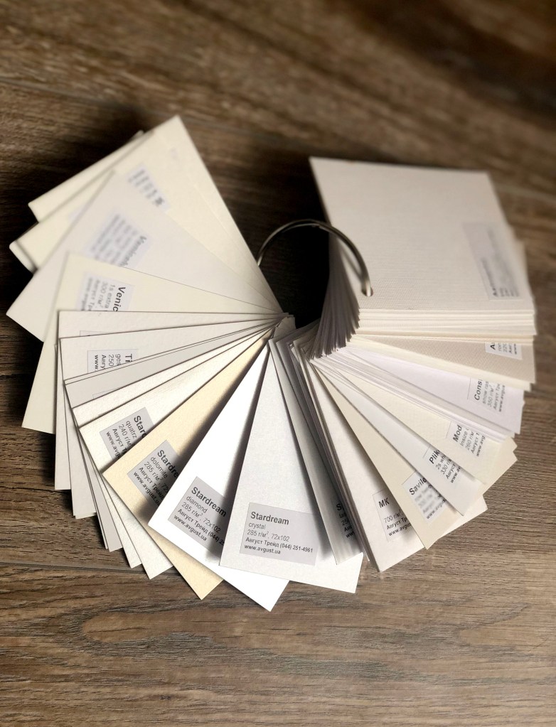
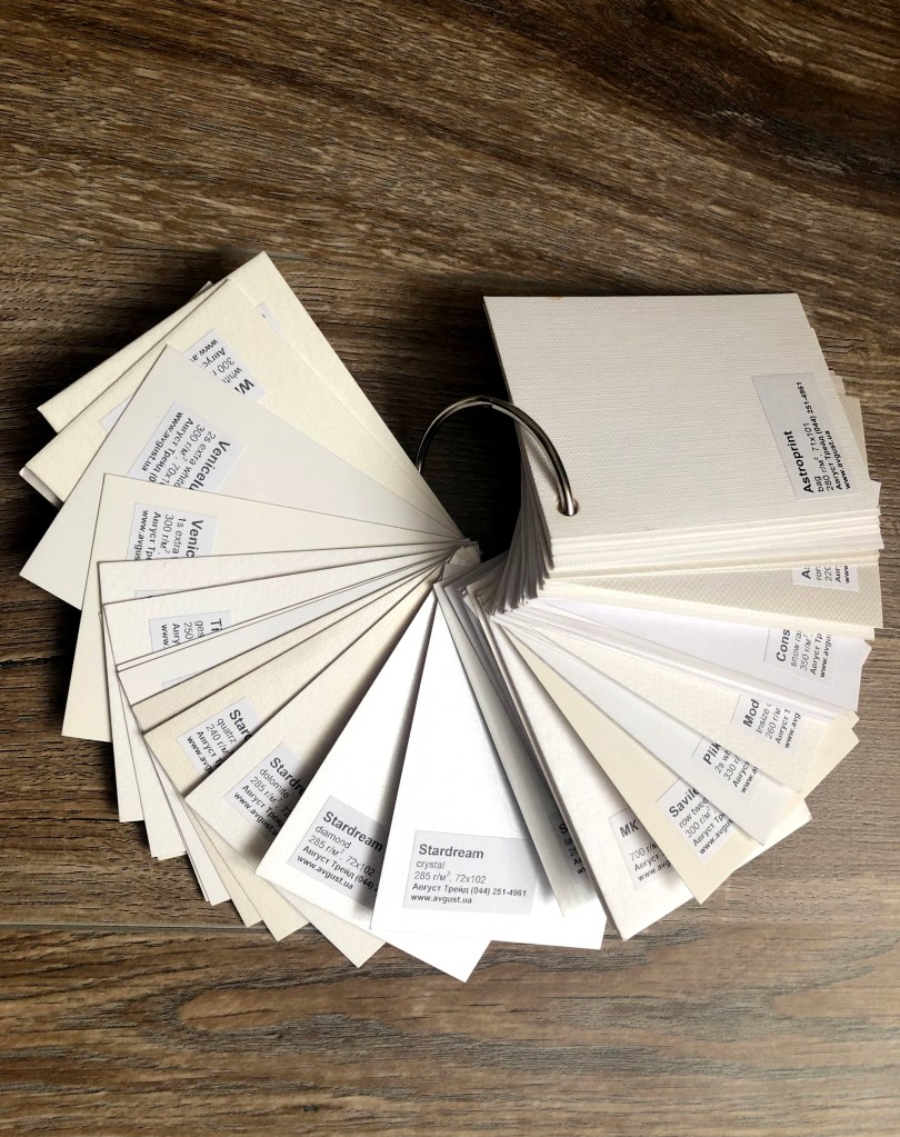
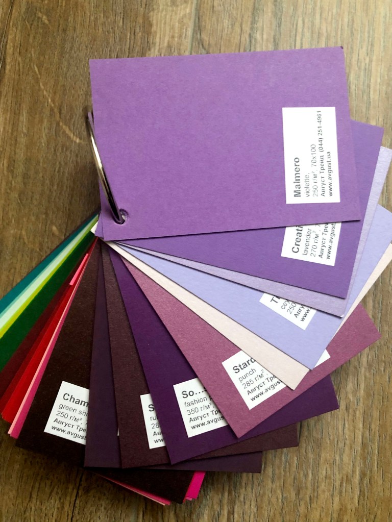
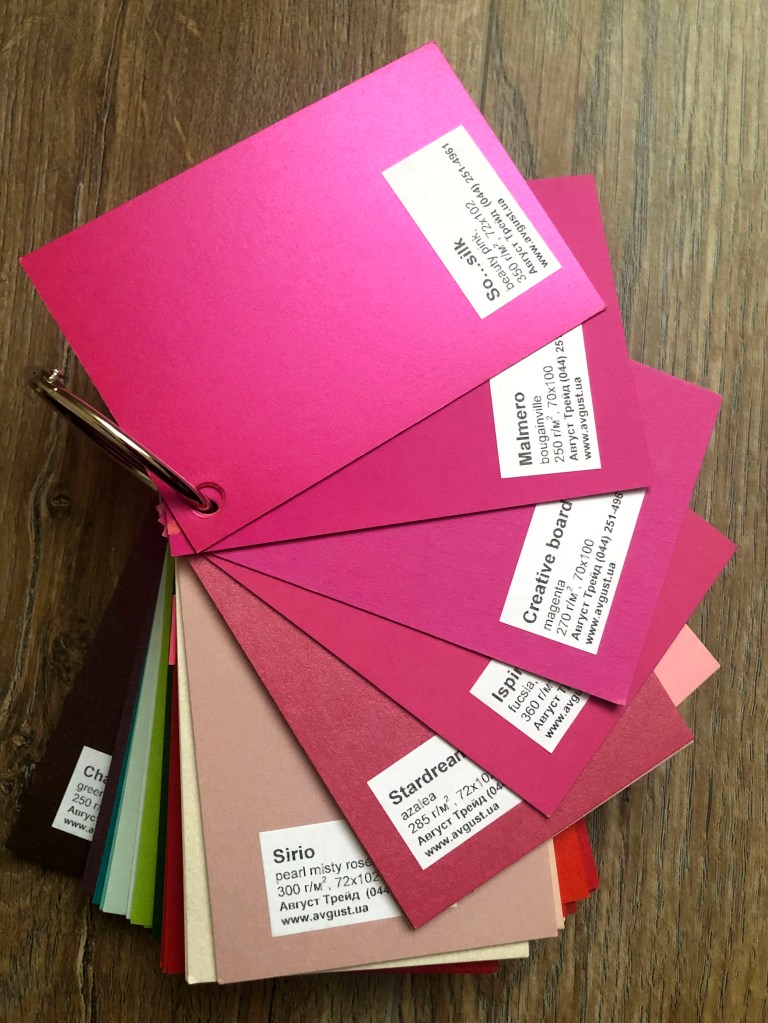
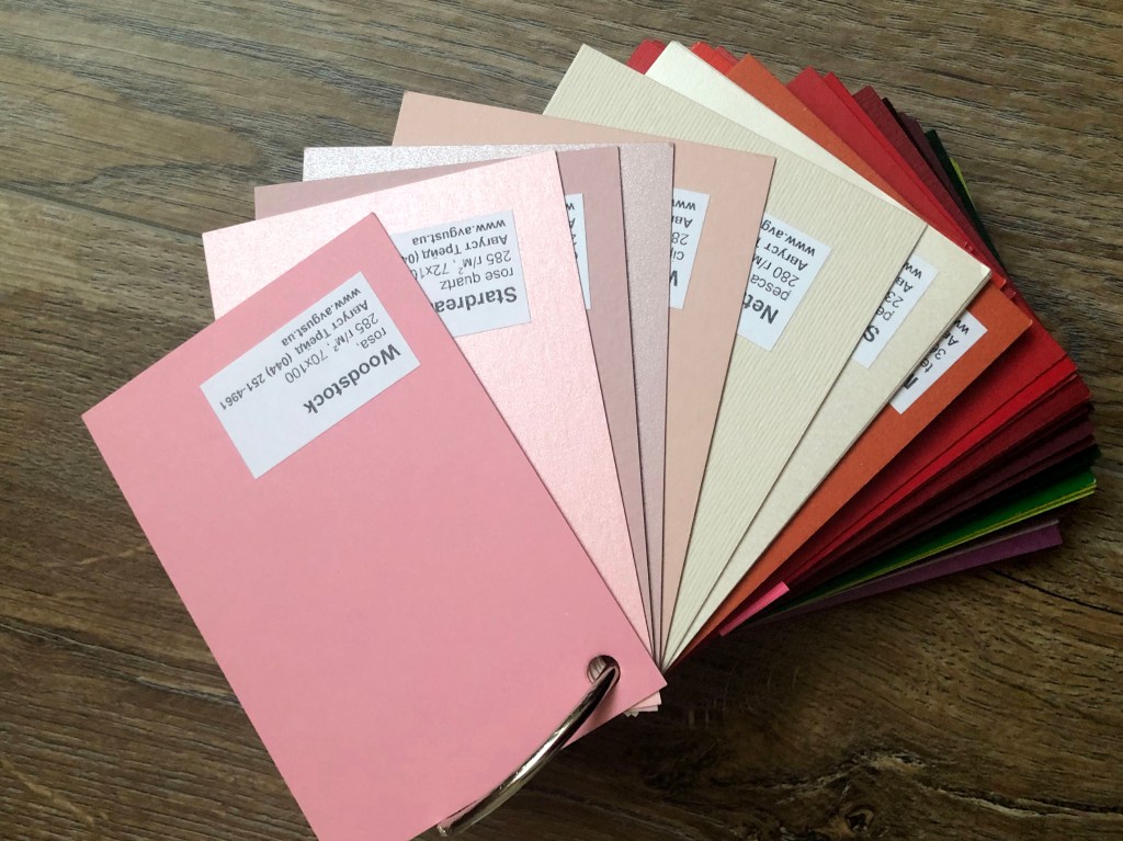
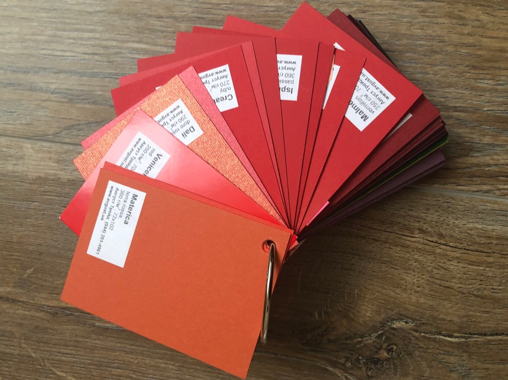
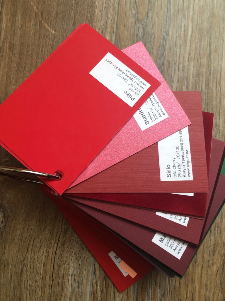
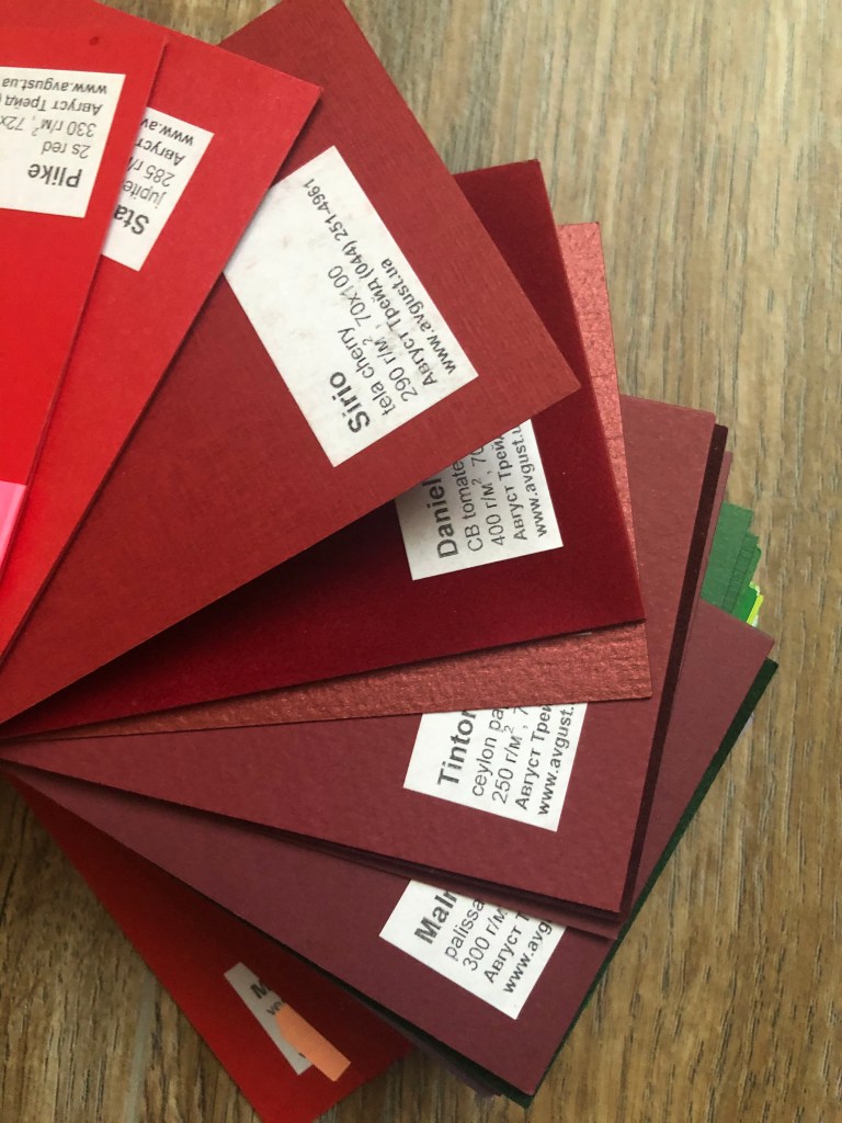
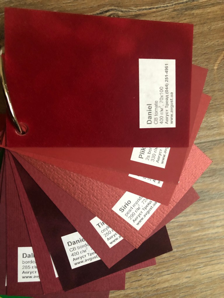
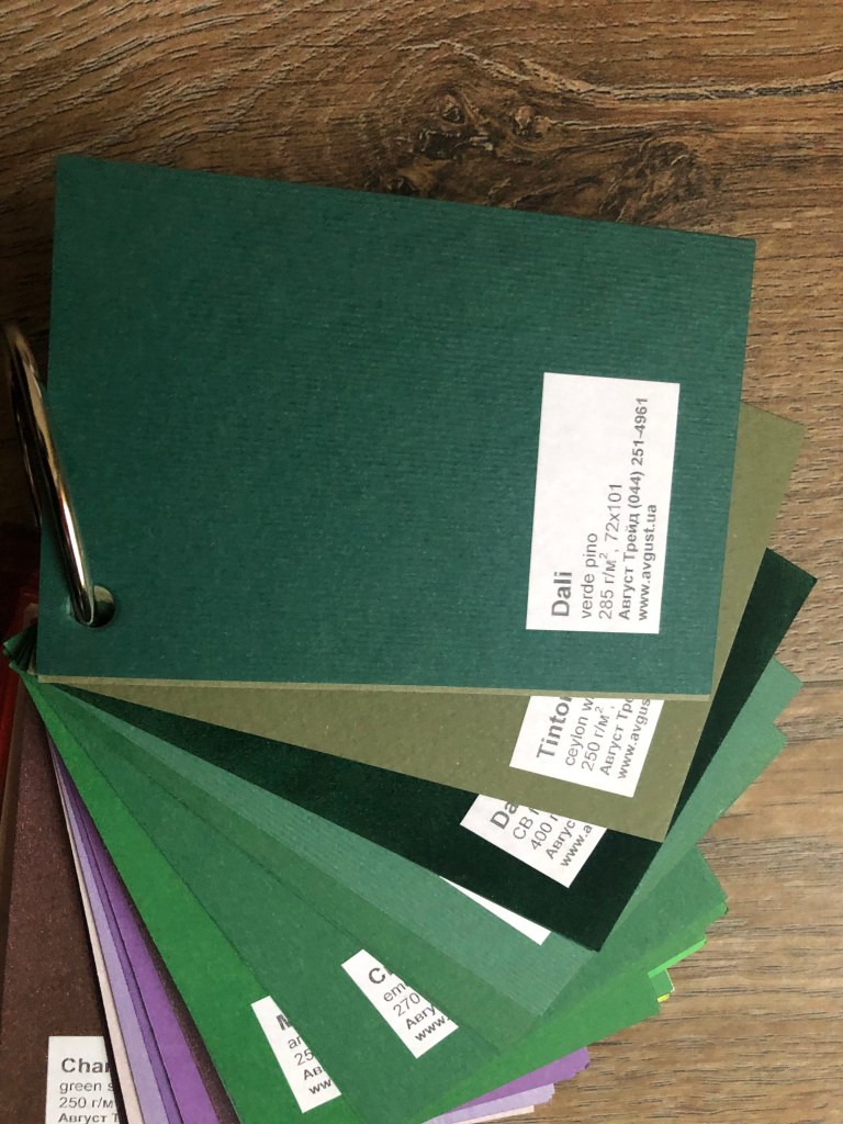
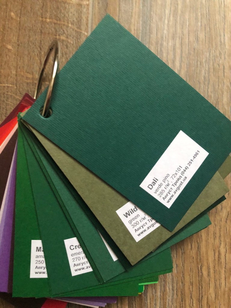
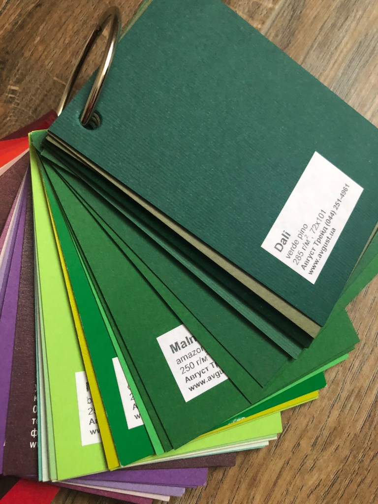
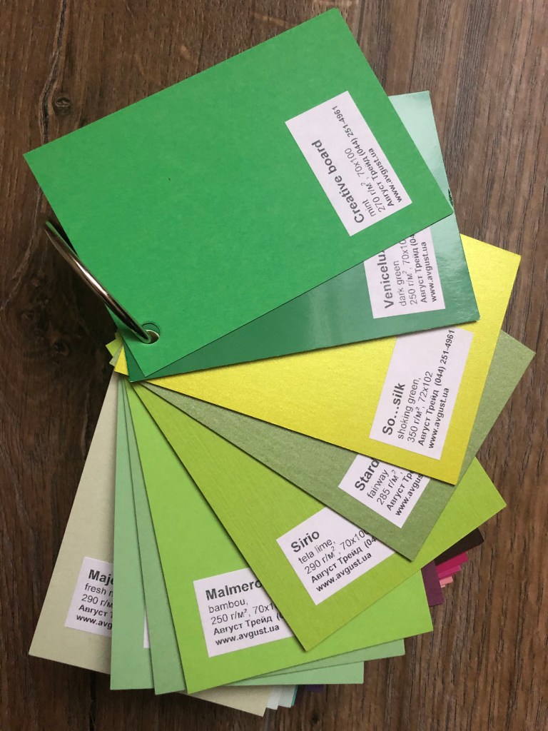
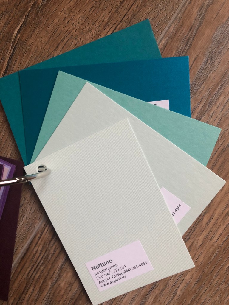

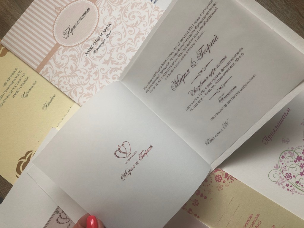
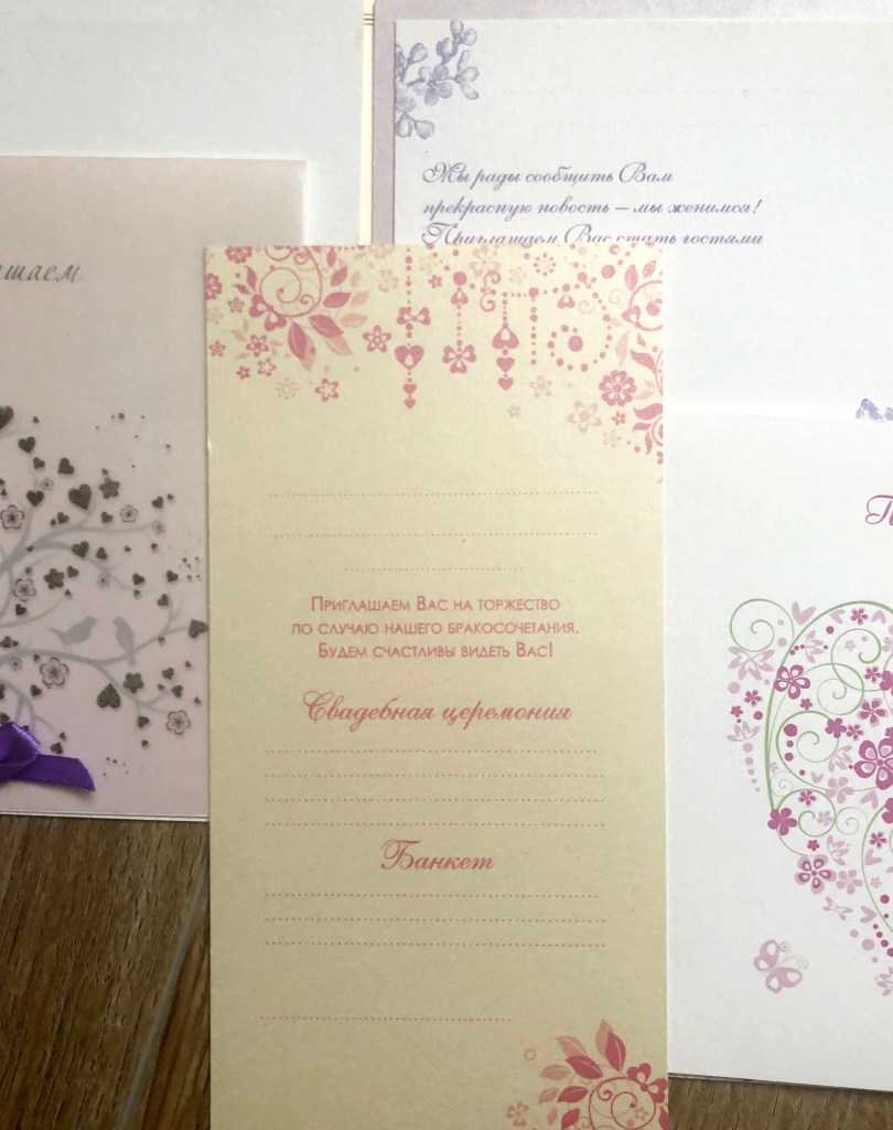
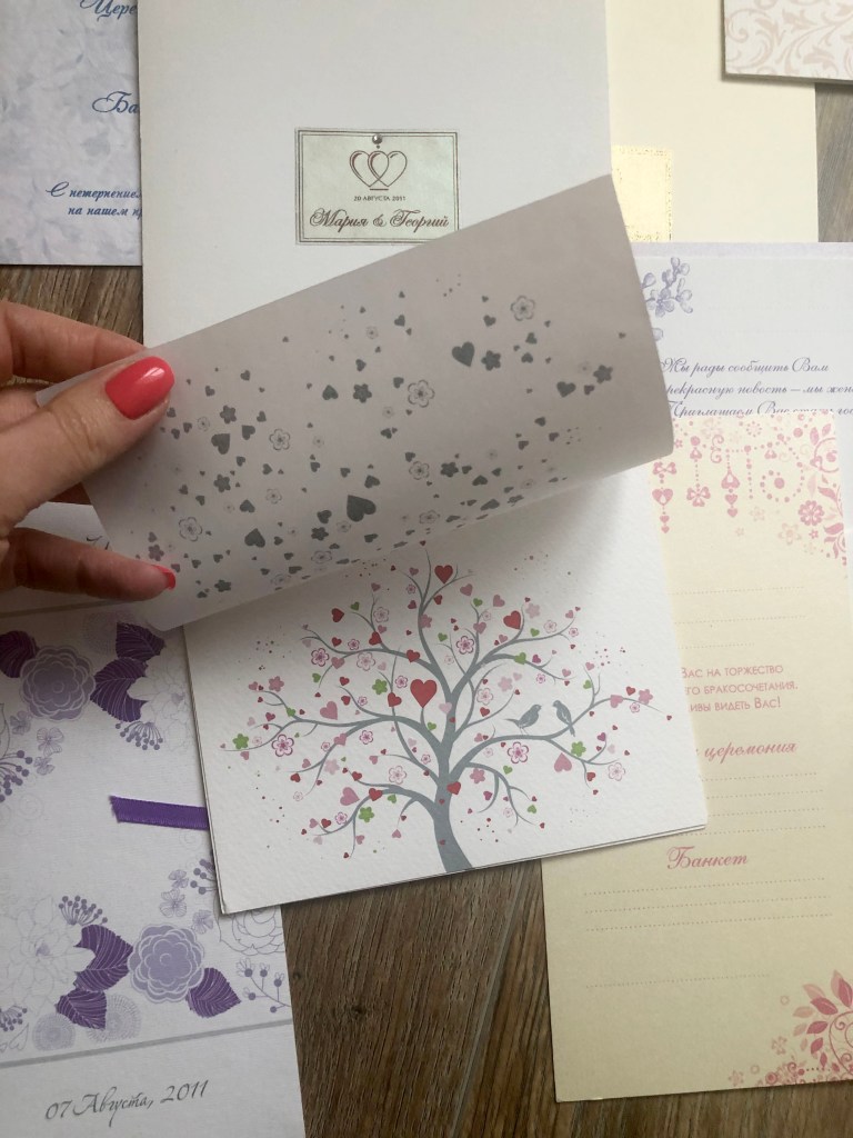
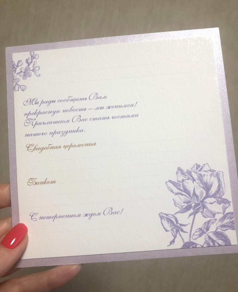

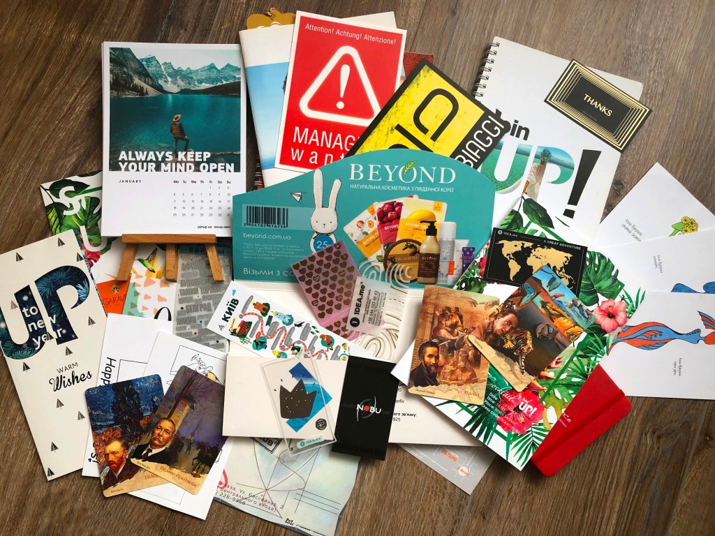
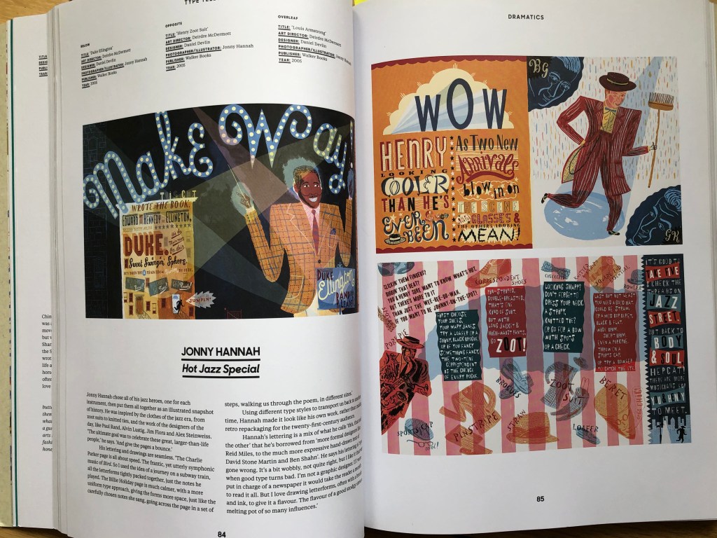

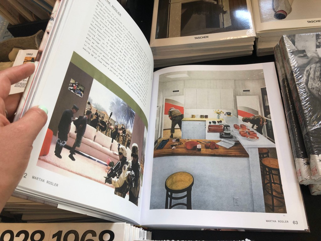
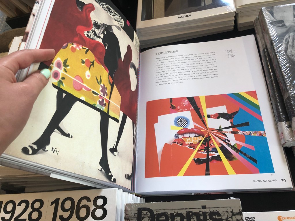

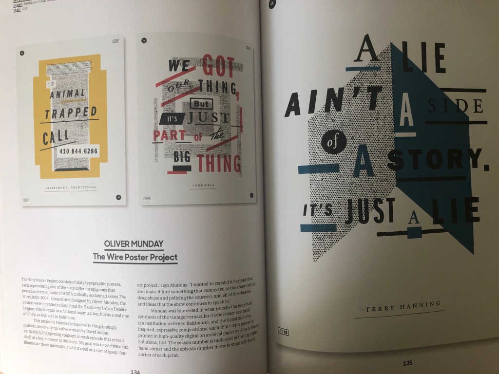
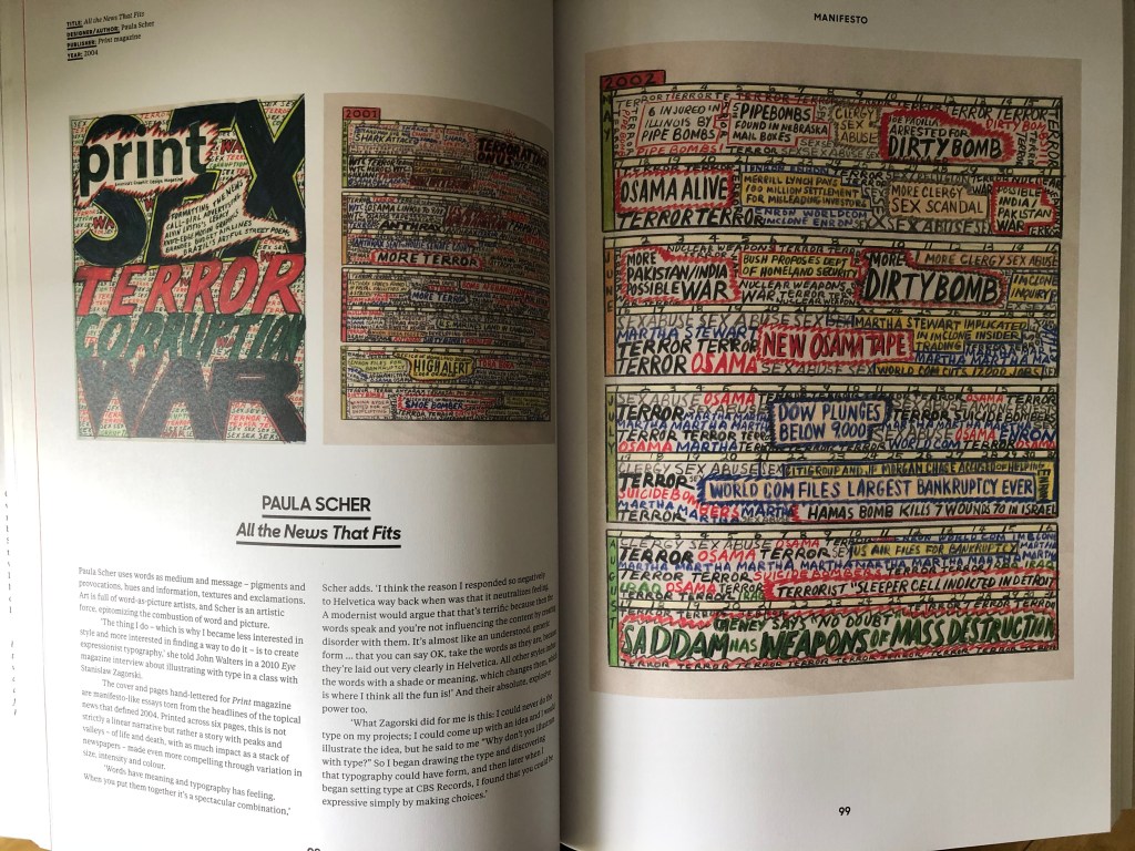
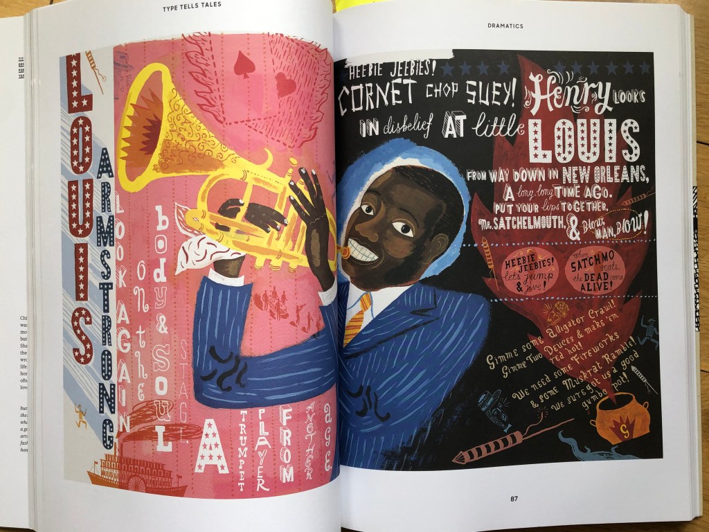
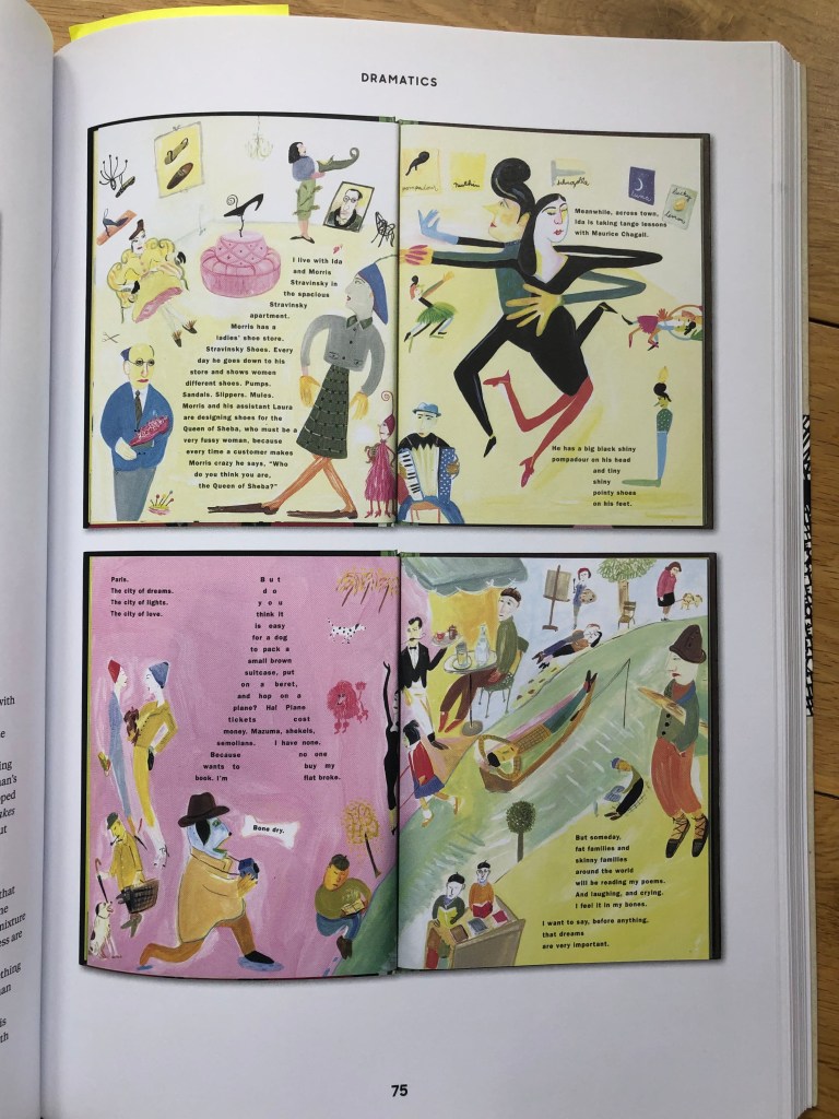
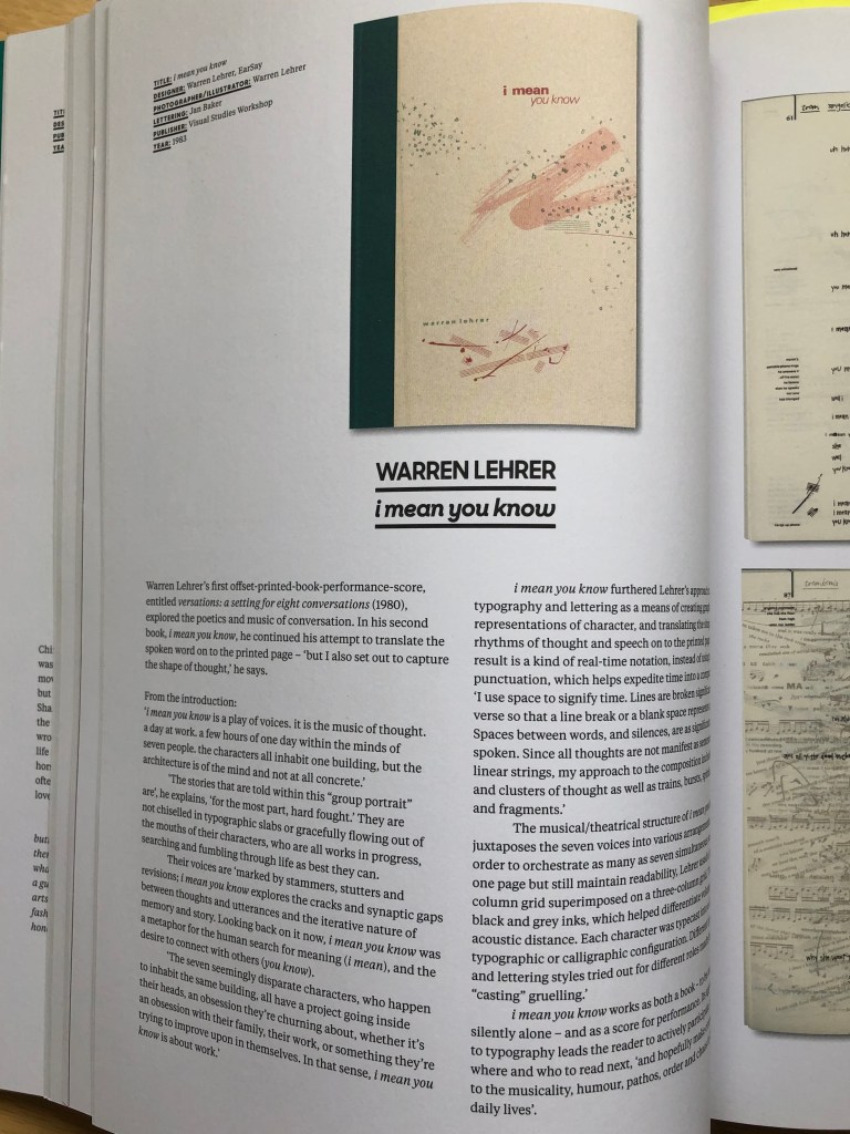
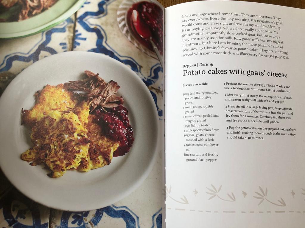
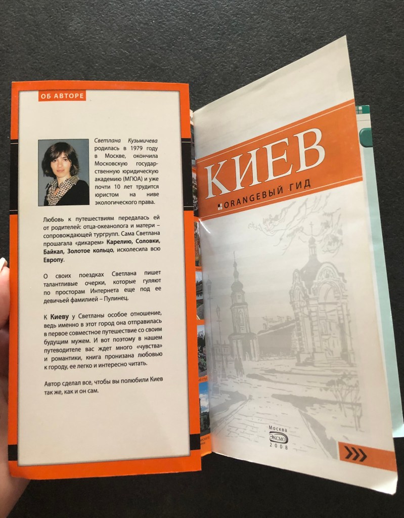
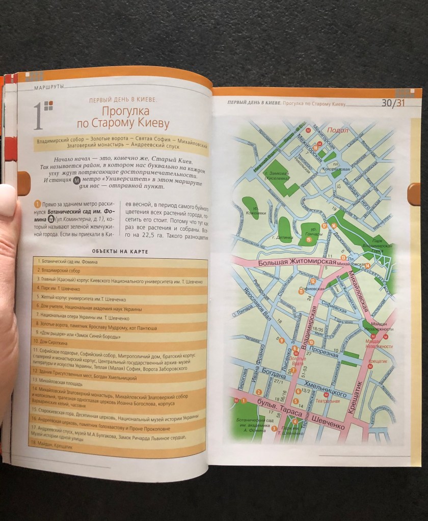
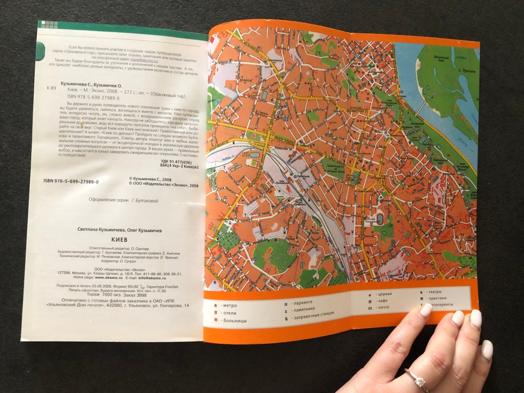
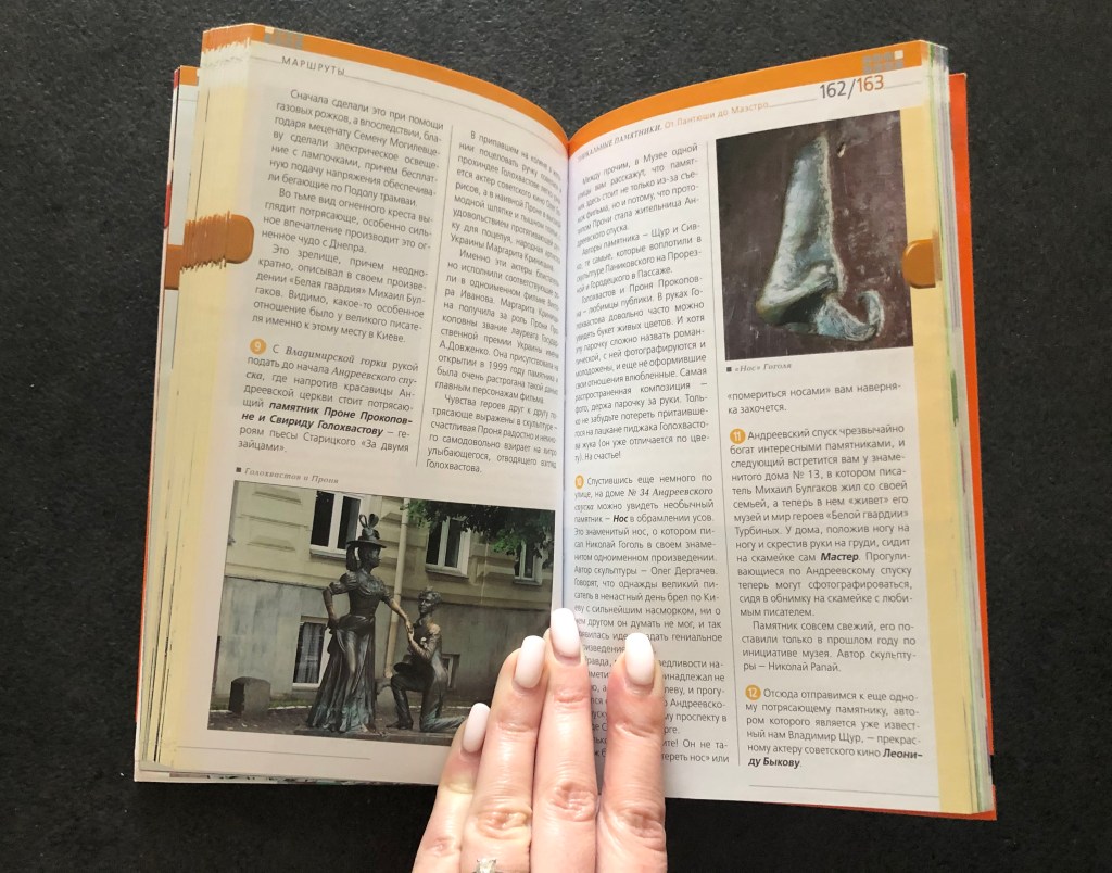
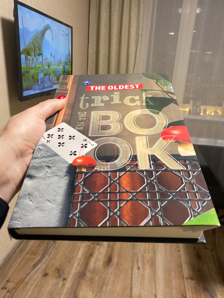
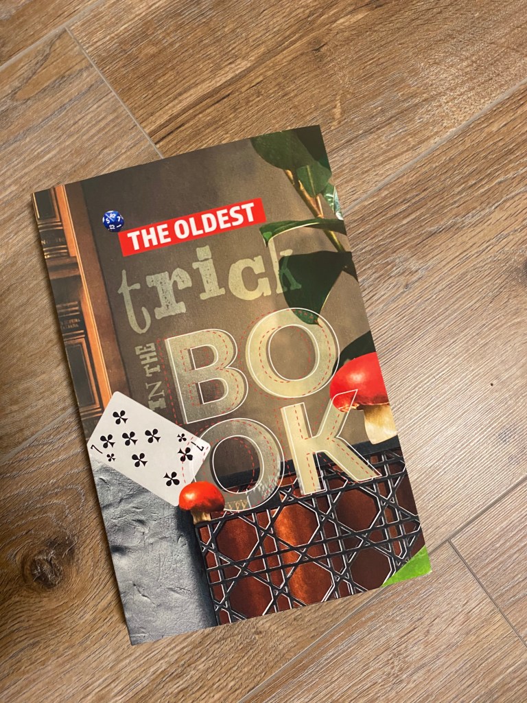
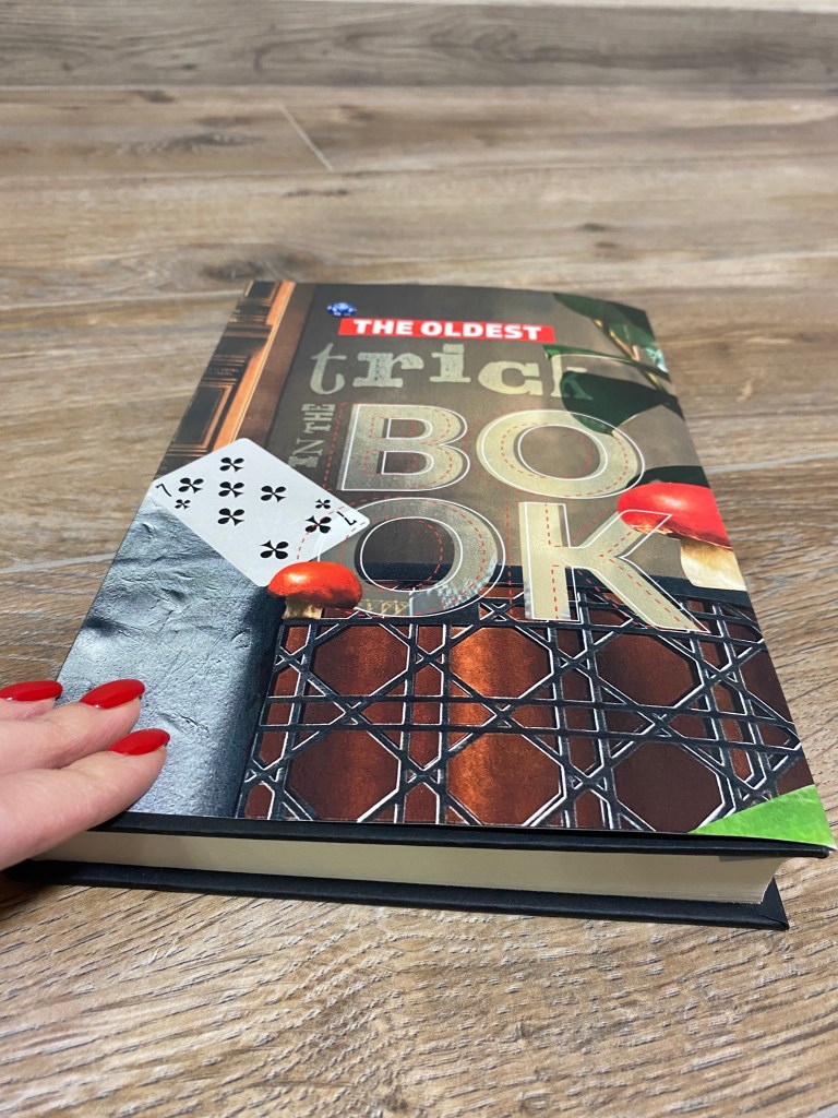
