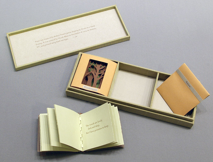
Extend your exploration of typography by continuing to develop creative approaches to how typography, layout and your material choices can help generate meaning. Develop a book that explores one aspect of typography in more detail, or combines a variety of approaches. Just because your project explores typography it doesn’t mean you can’t also include images, colour and narrative.
OCA.
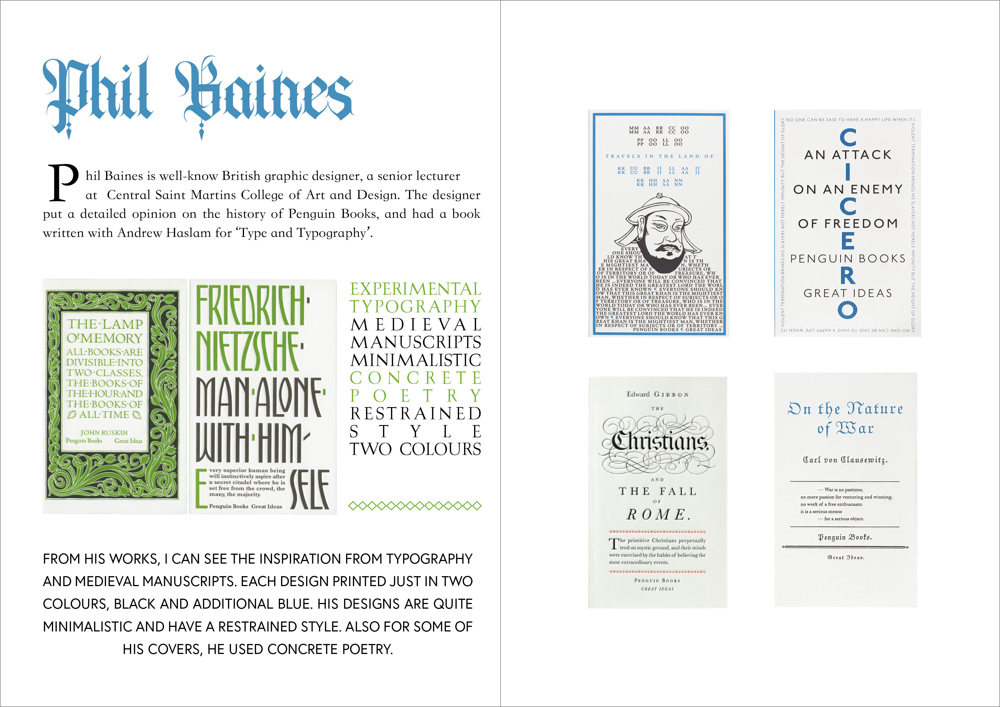
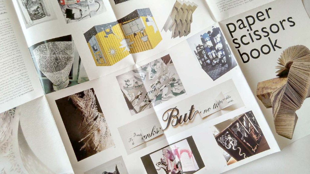
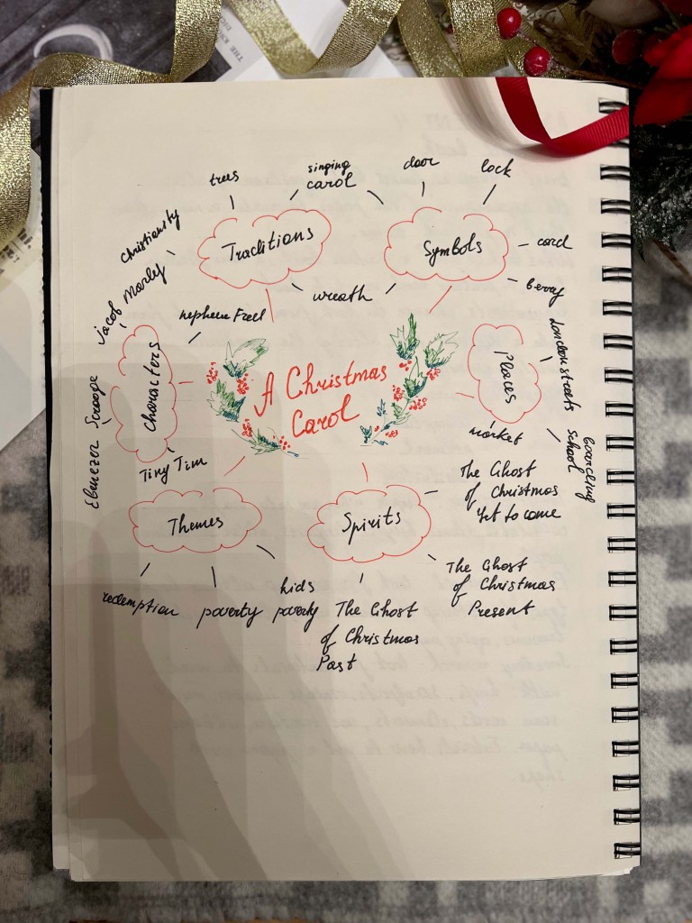
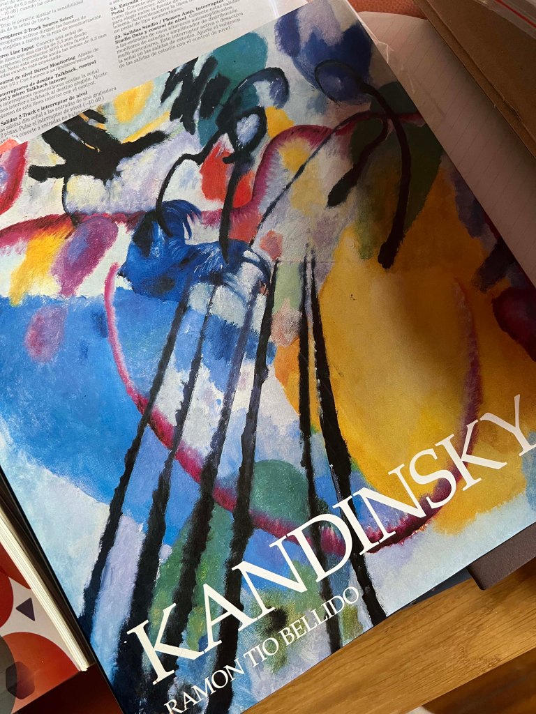
In this brief, I was asked to draw on all the skills, insight and experience I have gained during the course, by designing and producing a book of my choice. The choice for the subjects to explore was great, and I didn’t know which exactly to design till the very last moment. In addition to choosing a particular subject, I was free to choose the author, book or movement I’m inspired by. I was hesitating between two briefs, between exploring the typography and identifying influential book designers to investigate. Both those subjects were close to me, as enjoyed doing the exercises with researches on Book designers in Part 2, and, also, I found fascinating exercises on Experimental Typography and My Little book of… Also, I remembered a valuable experience from my previous unit on Core Concepts, where we explored the structure of the font at A typographic jigsaw puzzle, and designed our own font in the assignment Show Me… I thought that I could gather that knowledge together, and create a book out of them, also, adding some extra research and investigations from my experience on typography. Now, when I’ve decided on a subject, I’m looking forward to tackling it.
Research
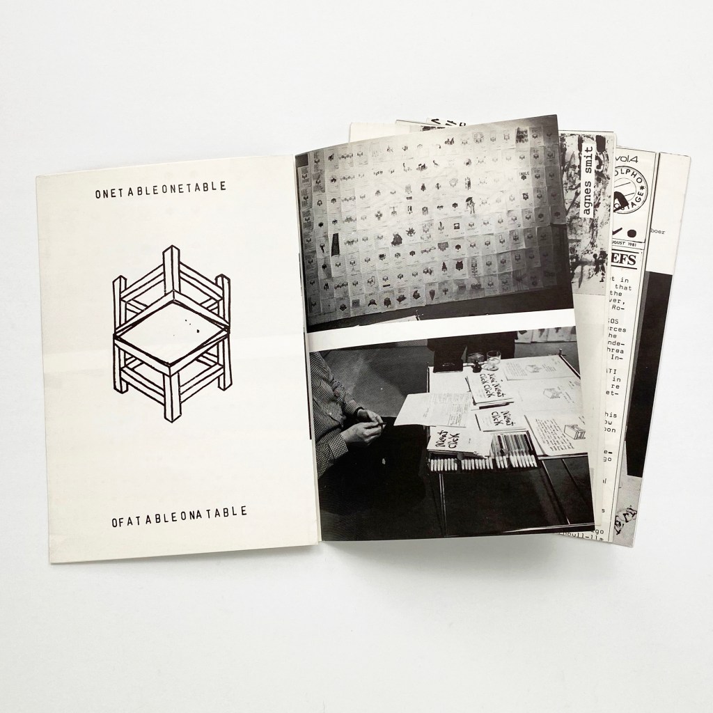
I wanted to start by exploring the fanzine stylebook and remembered about one famous piece of art that I was recommended, and that was a fanzine book. I thought by learning the structure of the book, which I never examined in detail, will help me to understand the future scheme for my own book.
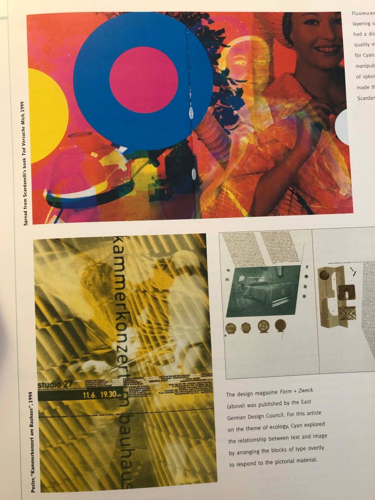
Cyla Costa, ¿Me acompañas? (2008)
¿Me acompañas? is a fanzine created in 2008 by Cyla Costa for the Barcelona School of Design and Engineering. The inspiration was Costa’s own life in Barcelona, and the impressions made on the artist by the city – both good and bad. What’s so fascinating about it, is that it was made completely manually, without computers – just using collage, a Xerox machine, stickers and flyers about Barcelona cultural events. What I particularly like about this book, is the different format and sizing of the page, it’s a special touch that is not easy to recreate in the digital print, only manually. The author implemented several approaches to it, like a fanzine, collages, experimental typography and concrete poetry. The book is a loop that can be read upside down: the end is the beginning and the middle closes the circle. The theme is Barcelona’s huge cultural offering. Cyla Costa used different forms of lettering, and she likes adding collages in her work. I’m keen on the idea of lettering as the best way of communicating.
La carne de niño by Pilar Gonzalez Bergez
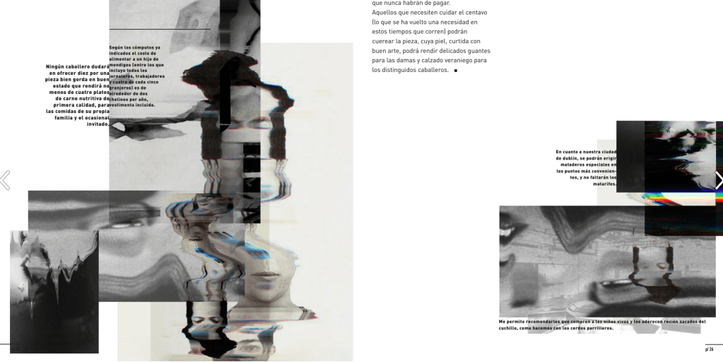
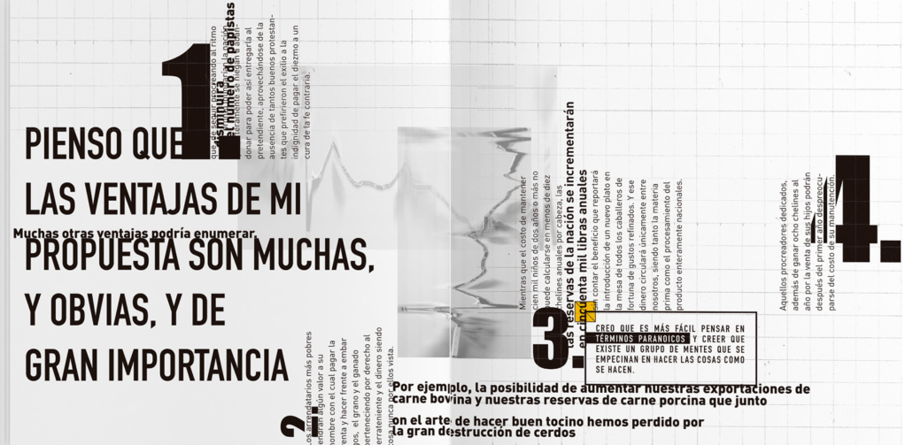
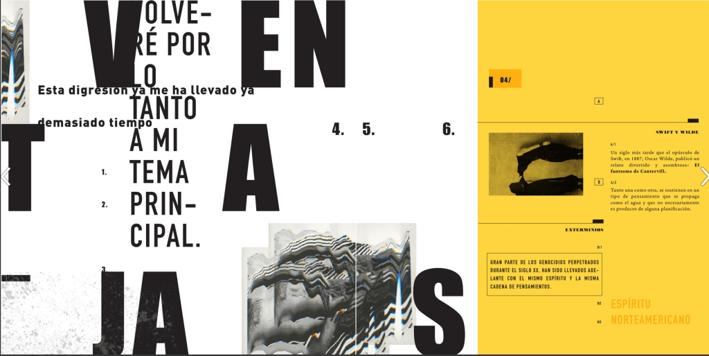
Another intriguing book that I stumbled on was La carne de niño designed by contemporary Argentinian author Pilar Gonzalez Bergez. The original idea was coming from the analysis of the satirical essay ‘A modest proposal’, written by Jonathan Swift in 1792, and re-written by Marcos Bertorello. Throughout the book, these two voices are displayed using the colour and typestyle chosen to represent each author. The first author is presented as a psychopath who proposes
a ridiculous solution to poverty, while the Bertorello text addresses the Swift psychosis. The typography defines the structure of the whole book, did the two voices are present throughout the piece. The reduced palette reveals the difference between the two authors: one is represented by black and grey tones generated by the typographical chaos, and the other author is recognised by the structural order and the use of yellow highlighting – showing his obsessive control. This book is the prime example of strong narrative, structure and design representation, that I was keen to reproduce in my book as well.


Assessed: 05/02/22
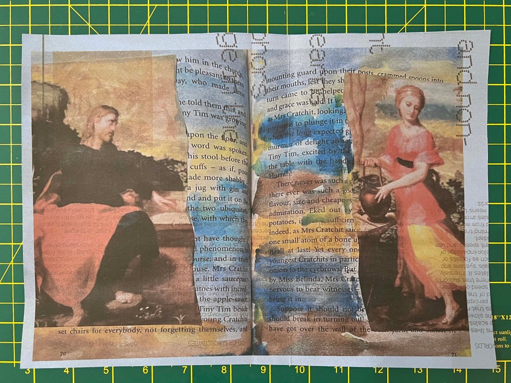
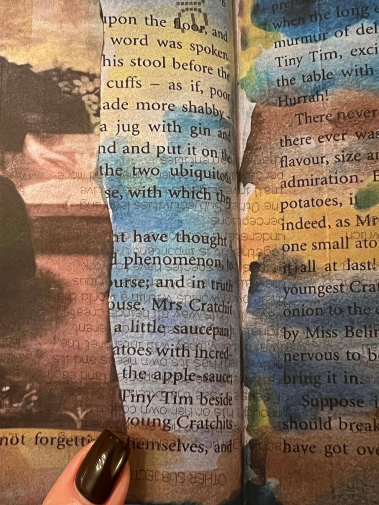
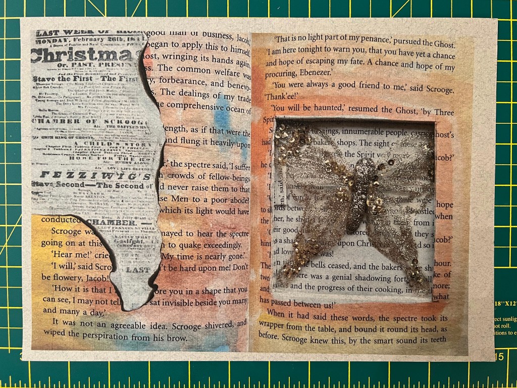
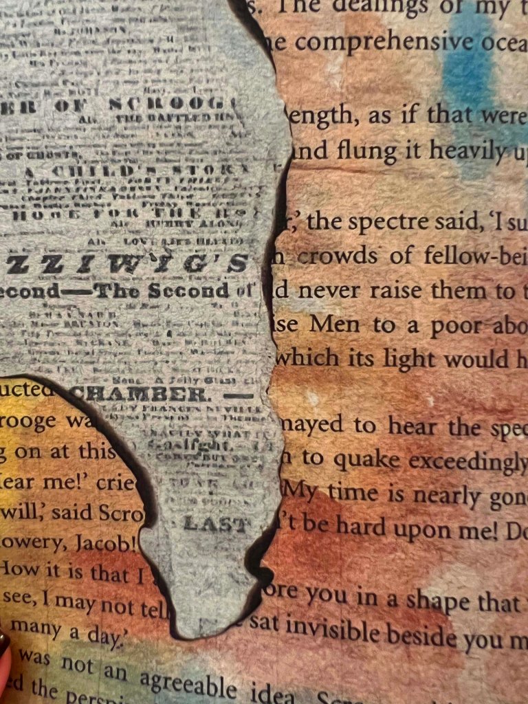
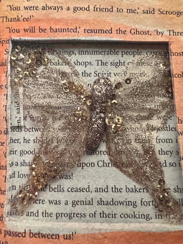
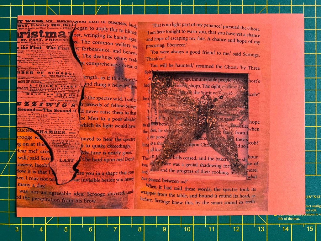
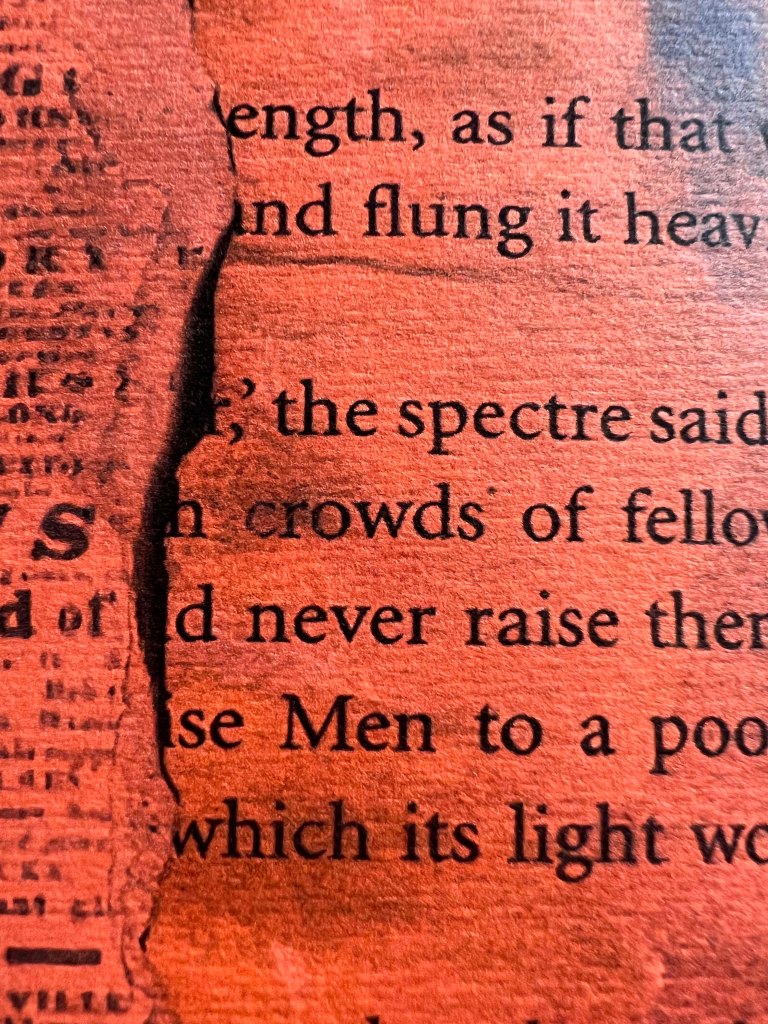
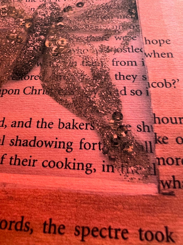
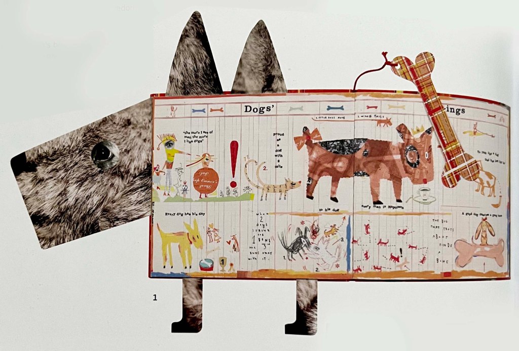
A Dog’s Life by Sara Fanelli
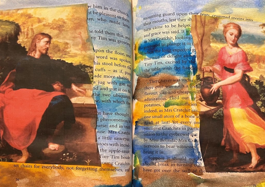
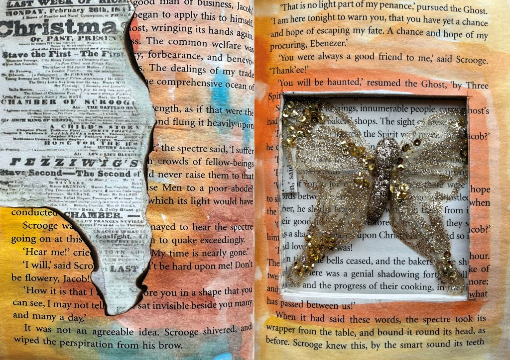
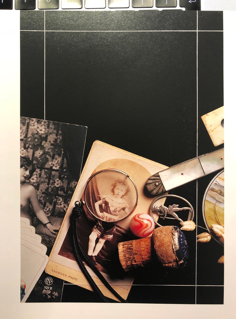
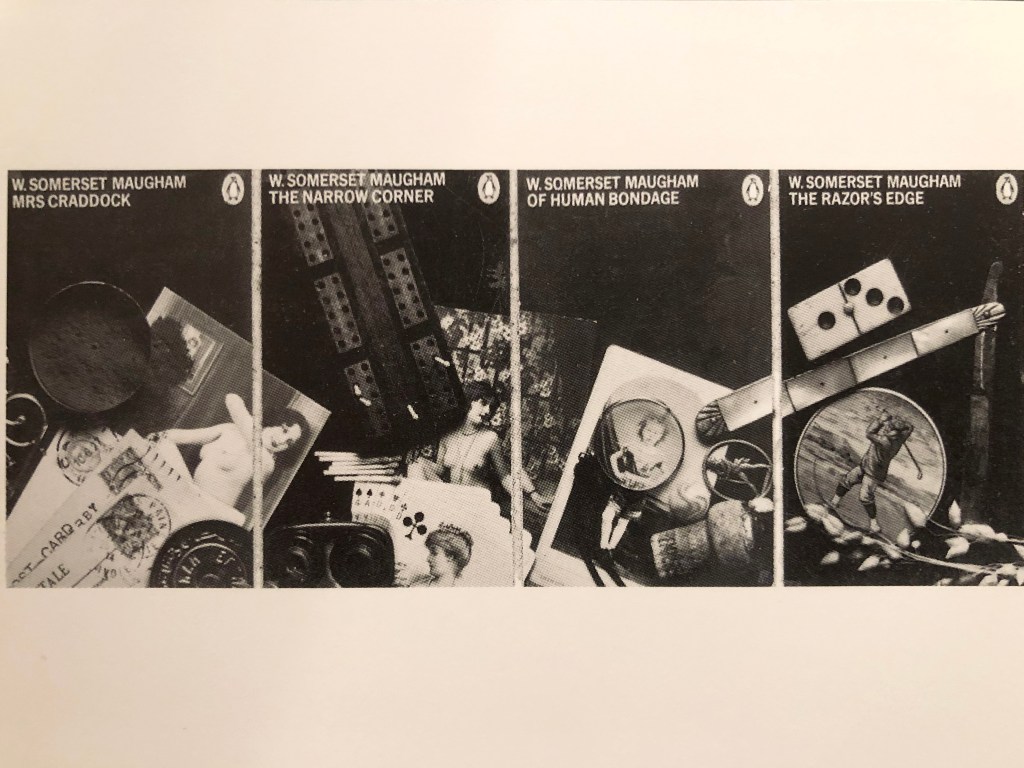
A Dog’s Life by Sara Fanelli is an amusing illustrated book that combines drawn imagery with photographic montage. The text is set in an irrelevant way and combined with some hand-drawn lettering. The front and back endpapers have fold-out elements so that the book becomes a dog. Sara usually works on coloured backgrounds, but in much more subtle colours, such as ochre, misty blue or orangey-red, often using pieces of paper torn from exercise books, graph paper and wallpaper, frequently stained or marked in some way. On these backgrounds she sticks fragments cut from photographs – eyes are a common motif, as are pictures of herself as a child – pieces of fabric, details seemingly randomly cut from prints of old masters, music and snippets of newsprint, often mixing print in several languages including English, Italian, French and even Chinese. She plays with different typefaces, superimposing pieces of print on top of her illustrations, or using them as part of a drawing – the body of a butterfly, for example. The use of historical typefaces, such as pieces giving price tags in old pounds, shillings and pennies, give an old-fashioned look to the work and hint of influences from Duchamp and other Dadaists. She often draws or prints in black ink on top of these collages, using doodle-like scribbles, which pull the focus of the work back from the adult world to the realms of childhood. I liked this example, as it is quite imaginative, and has some odd drawings and little notes around it, altogether creating a weird but unique book.
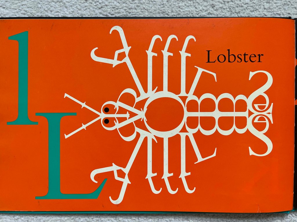
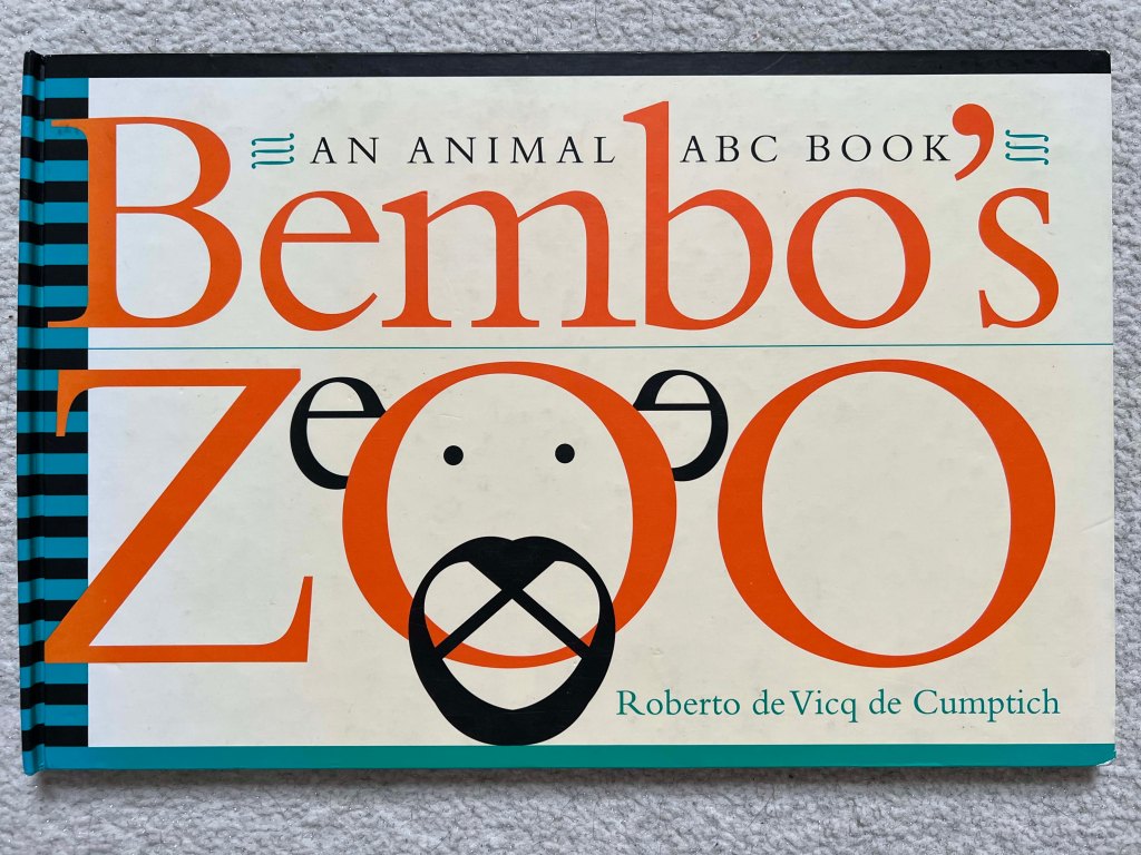
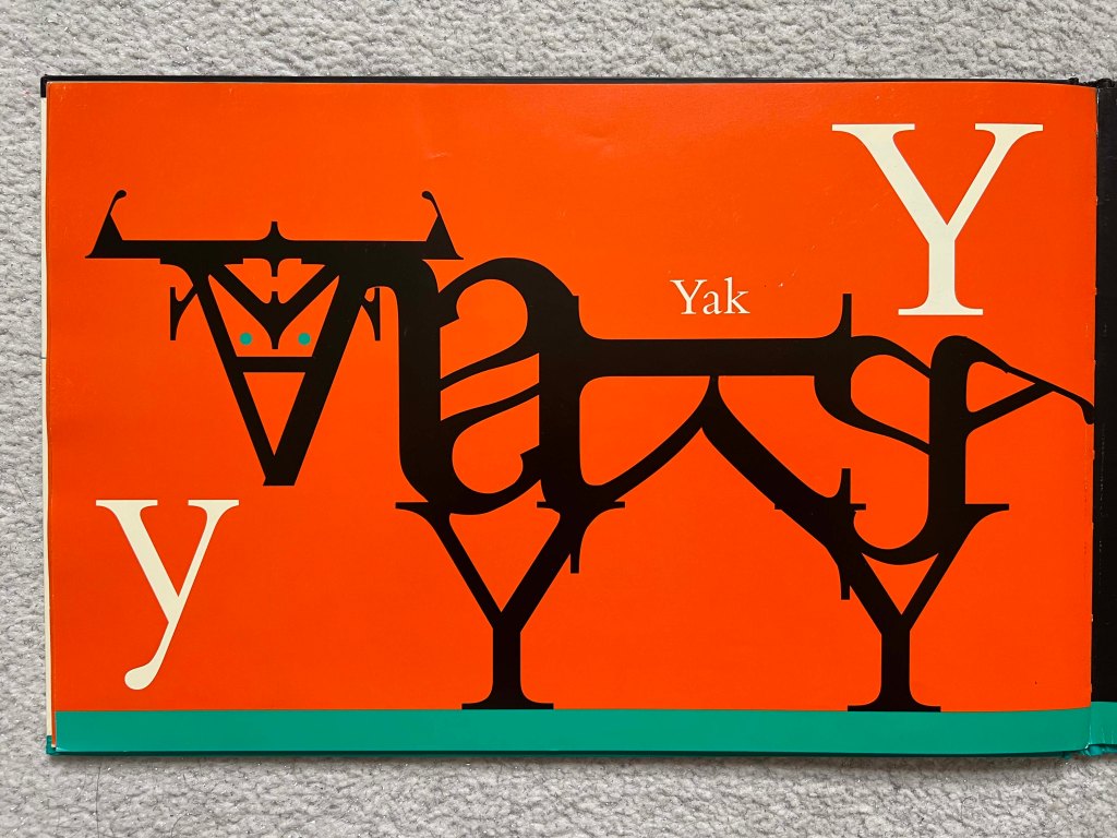
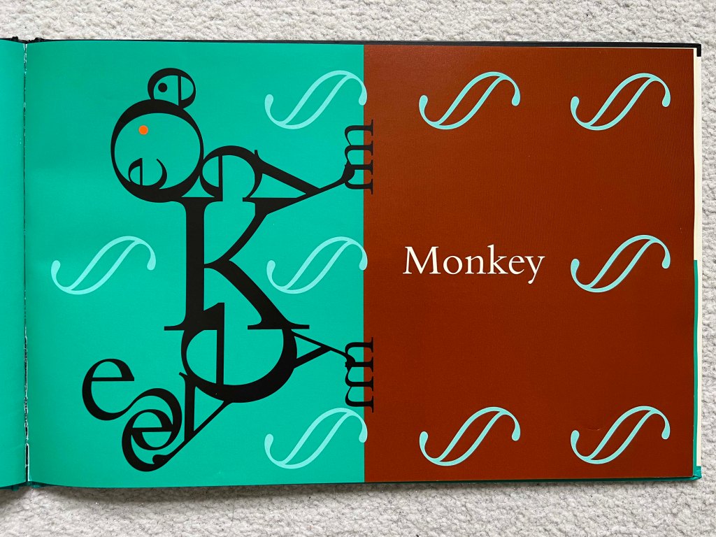
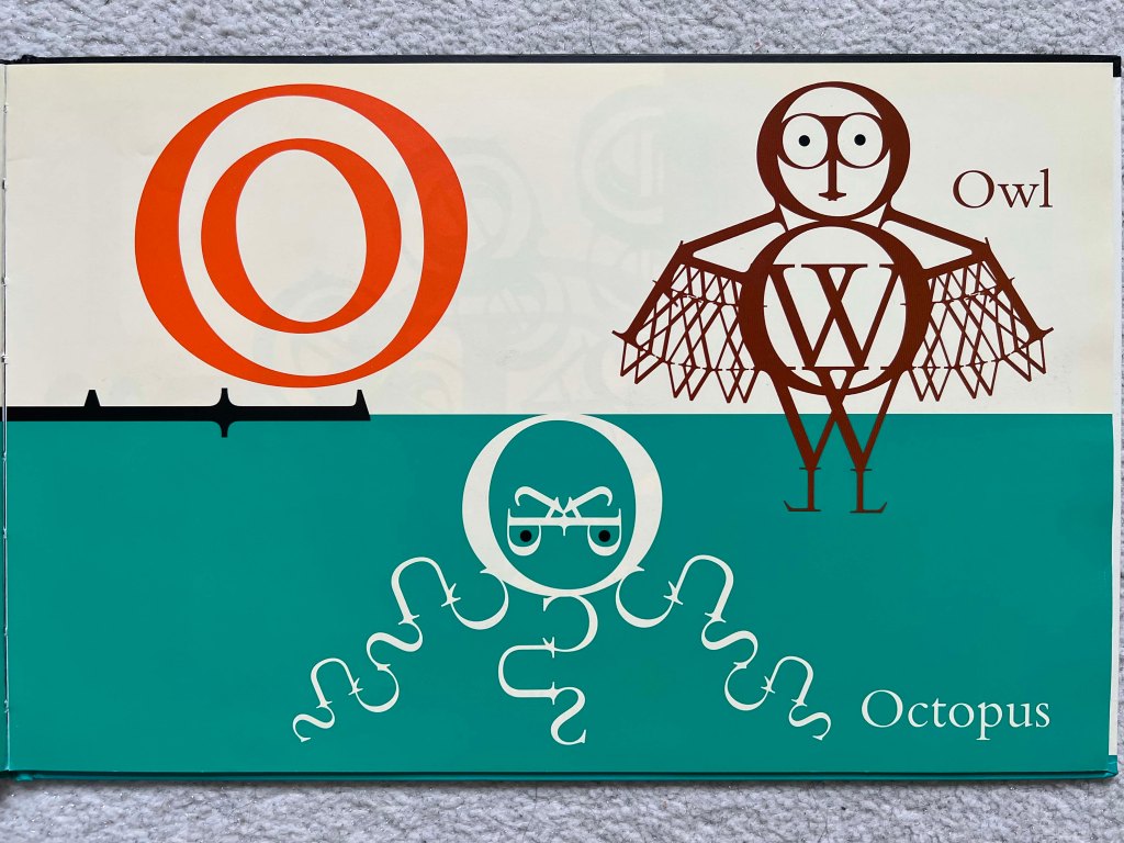
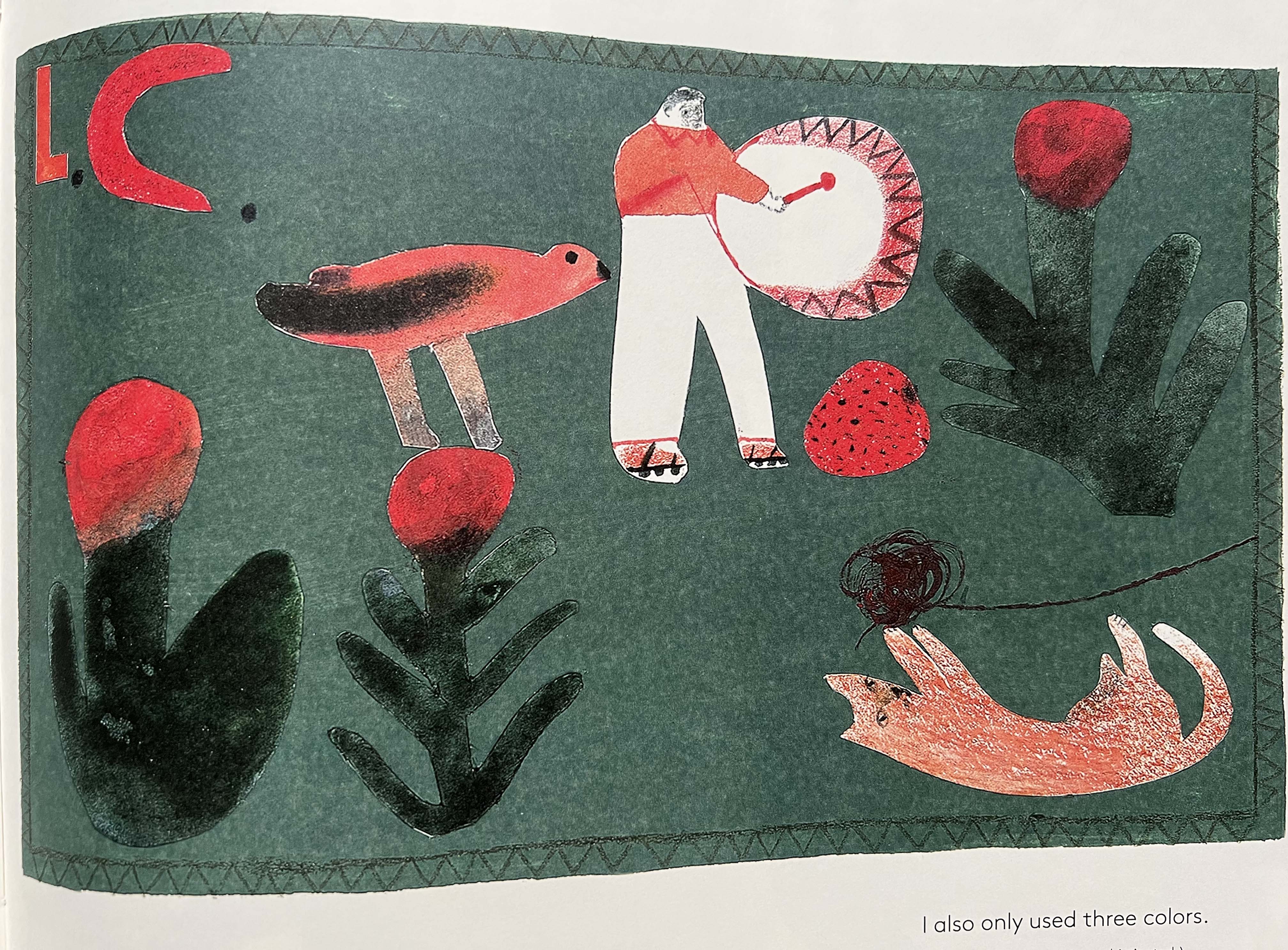
Roberto de Vicq de Cumptich. Bembo’s Zoo: An Animal ABC Book
Here I went a bit away from fanzine and experimental typography. This bold colour and simple yet striking graphics with a unique alphabet. A great example of experiments with typography, which almost makes it look concrete, but in a colourful and bold way. I loved how skilful the author played with the shapes of the letters by creating an alphabet that finds curious not only children but graphic designers as well. The Bembo typeface is one of the most elegant of the classic typefaces, and its clean, graceful lines inspired the artist to use the letters in a wholly new way. I’m admiring the sophisticated art and sleek design of this sumptuous book.

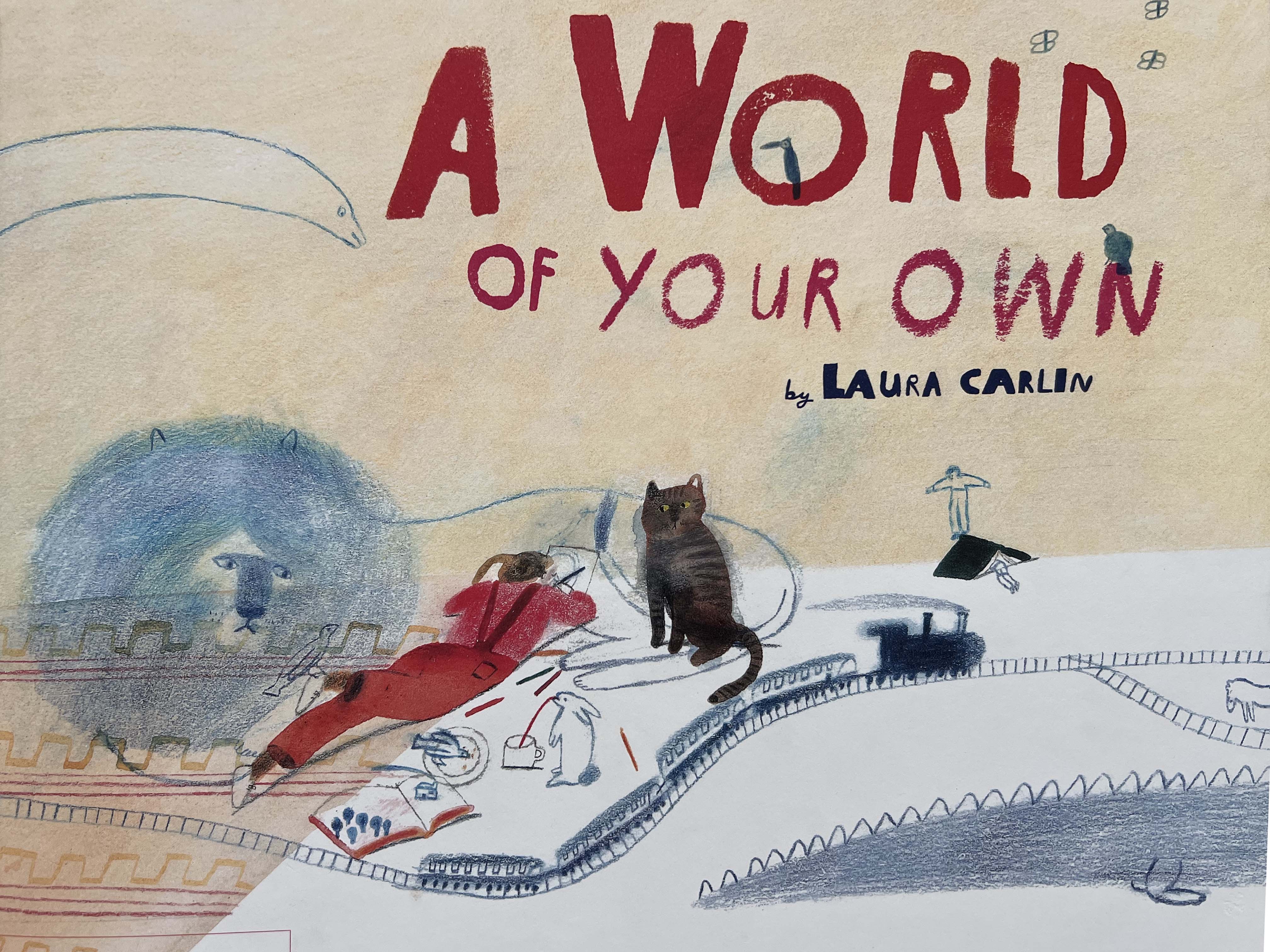
A world of your own by Laura Carlin
Laura Carlin encourages kids to draw and create inventive pictures in her own distinctive way that constantly surprises. I love the playful way how she integrates wording into the illustrations and handmade font for the messages, which smiles and brings happiness. She demonstrates how to create our own version of the world could be by using imagination.


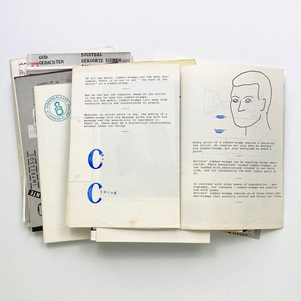
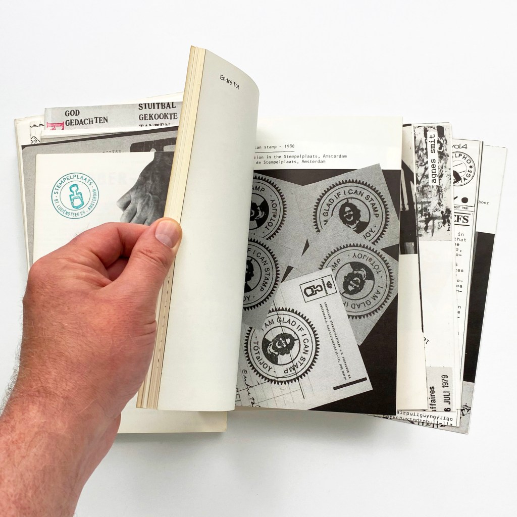
A Monthly Bulletin On the Use of Rubberstamps in the Arts
Another interesting example of a handmade book I stumbled on by accident. This is a unique example of a creative magazine, which is quite a valuable piece of art on the market. Book designed in self-wrappers, printed in minimalistic, colours, mainly black and white and rubber-stamped in various colours.


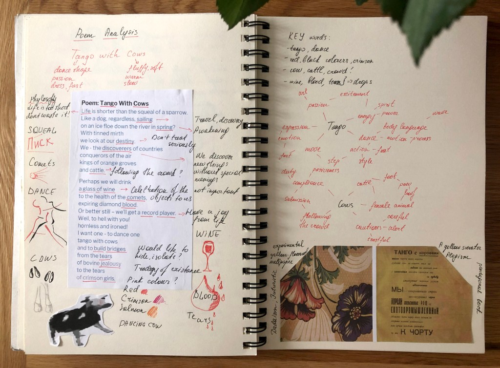
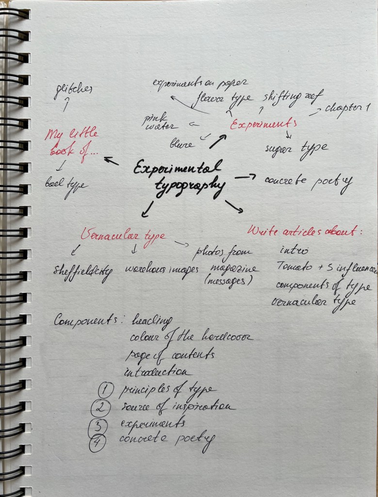
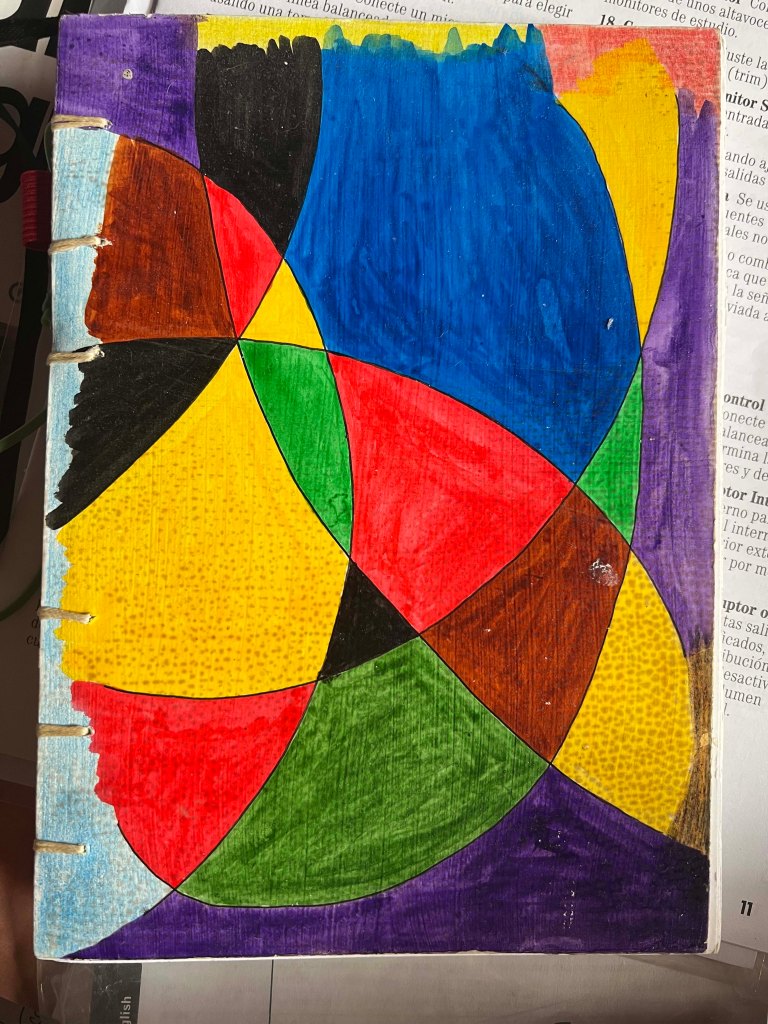
After some research and ideas, I realised that my inspiration came from different sources and was very broad. The book is going to be a collective of experiences and knowledge I gained through these years focusing the subject on experimental typography, visual poetry, some fundamental parts of type, history and influences in design. I knew that my book desperately needs some structure, as there were quite a few points I was going to include, I decided not to concentrate only on a particular point, like only exploring concrete poetry or only fanzines, I wanted to explain the possibilities of typography and its flexibility in graphic design and art.
What is the flow of the content, would you write articles or create imagery or both?
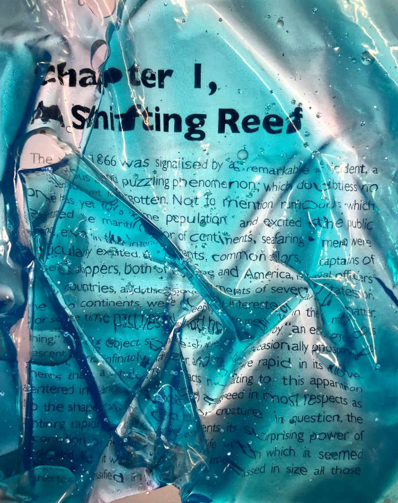
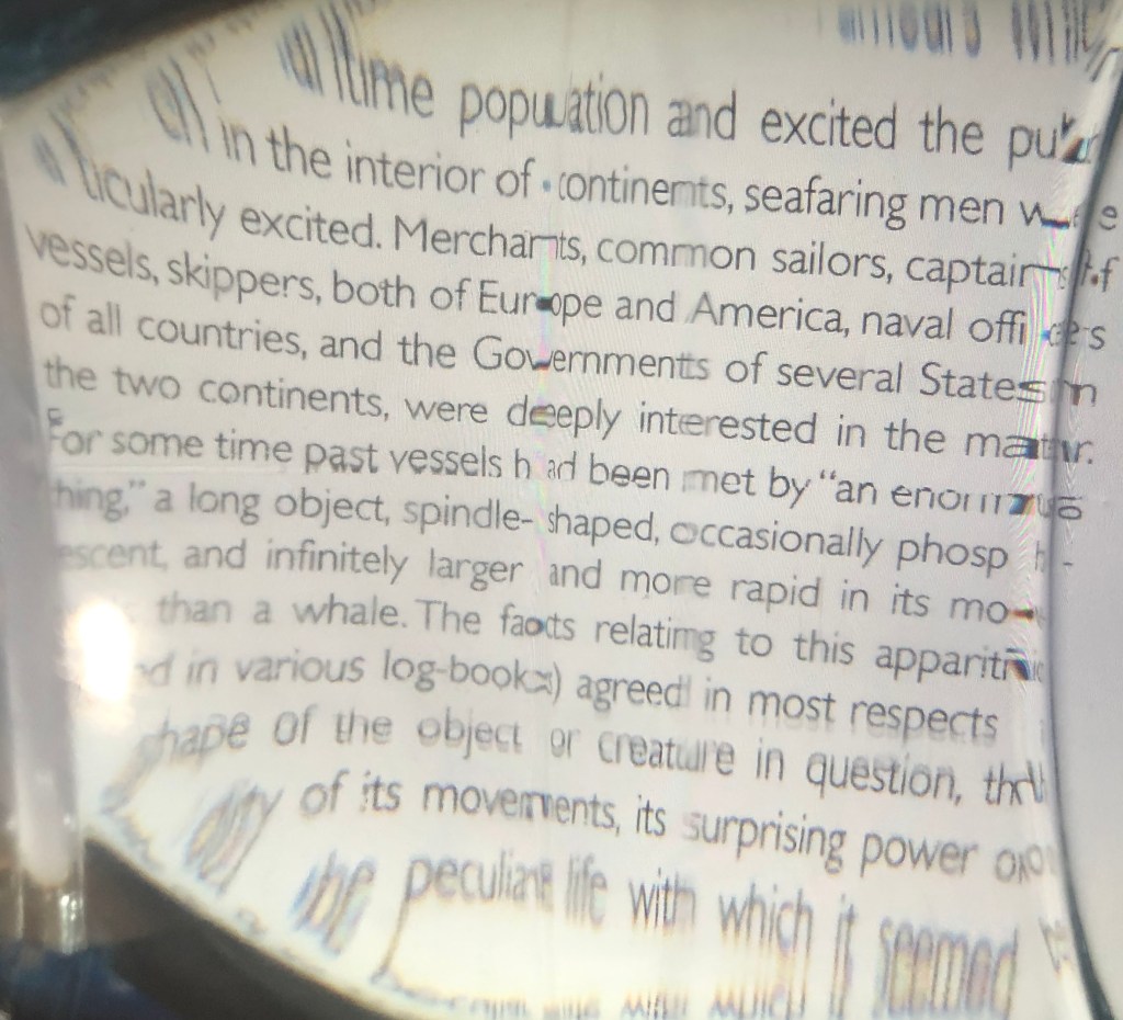
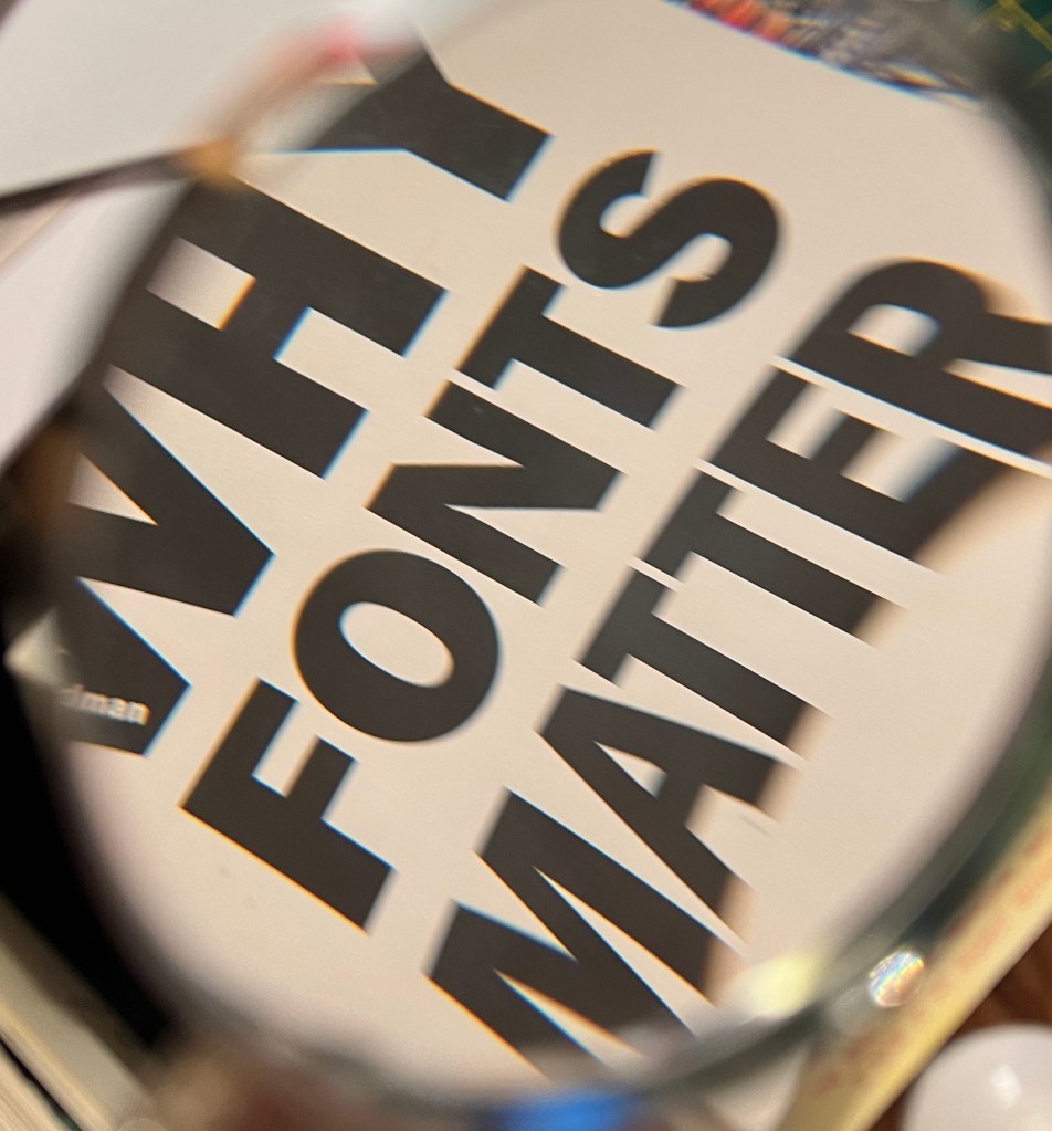
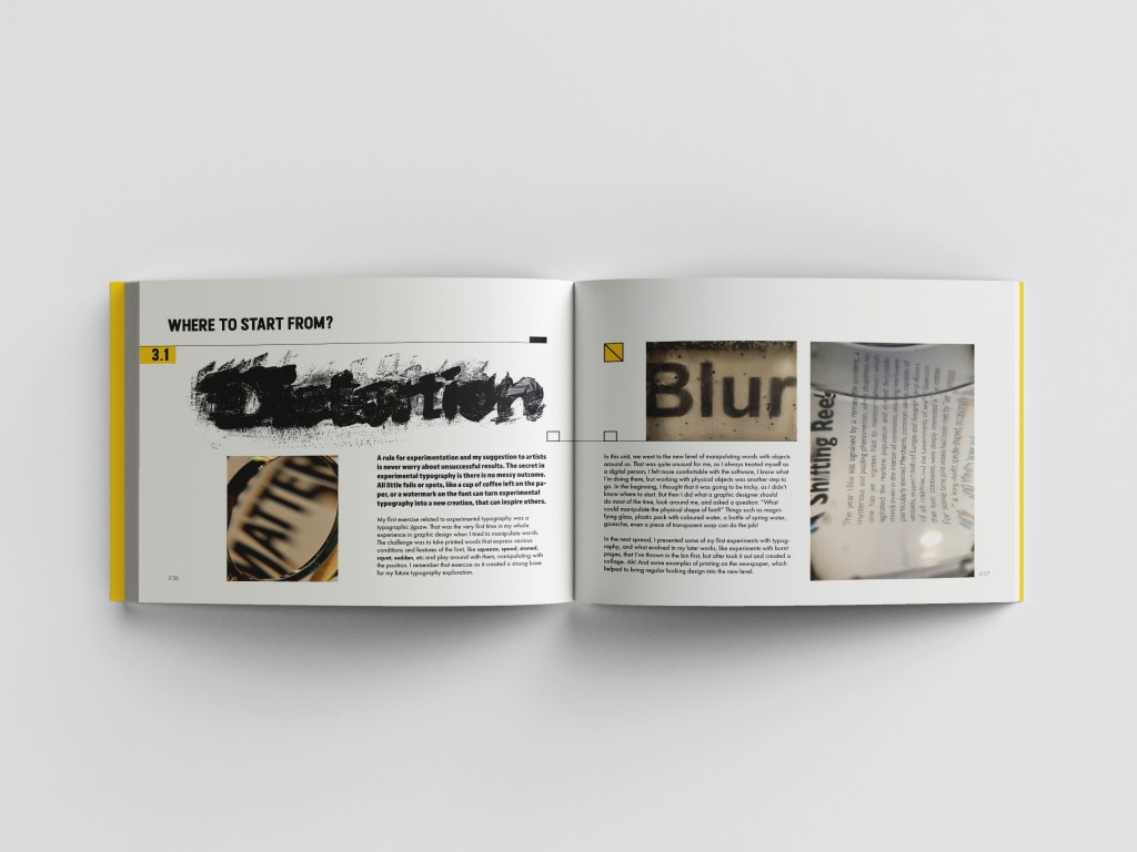
I think that I would like to write a couple of articles on subjects such as the history of typography, vernacular typography, and brief explanations of why fonts matter, and also, include some articles about influential designers, I found the inspiration. I’m thinking to include concrete poetry as well. Also, I wanted to share a couple of spreads on examining fanzines and posters on electronic music, which from my point of view is the centre of experiments in typography and there is a chance that flyers and posters from the ’80s and ’90s became more and more popular nowadays. In addition, I wanted to include some typographical experiments, same as digital and hand-made, such as distortion of typography in Photoshop and creating distorted typography from objects around, such as water battle or magnifying glass.
What do you want to tell about the subject?
My goal — is to share with other designers and artists the learning path I gained through the course, explain the importance of typography in everyday life, and show that typography can be exciting and inspiring subject to explore. I want to create a personal style within the book as well, and present it imaginatively, as example with La Carne de niño by Pilar Gonzalez Bergez and Cyla Costa, ¿Me acompañas? I want to create an informative book and include visuals, such as collages, photographs and typography experiments.
How would you communicate this?
I’m going to use a mixture of typography experiments, hand-made fonts from the objects around, use some information from books I collected, such as terminology, history of the fonts, history of fanzines in electronic music.
Who is your audience?
My audience is people in art and design, possibly other students who just started to learn more about typography, and looking for some ideas to develop in their works. I would say they are young people, in their twenties. I think it’s nice to create a guide for beginner designers, and for someone who just started to establish their taste in graphic design, to learn something new from others to implement in their designs.
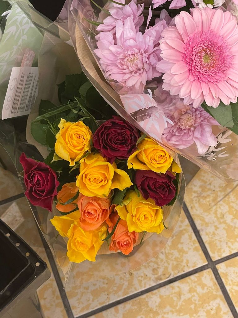
Objects around me
I had so many ideas, that I was not sure where to start. I think I got overwhelmed with the amount of work that had to be done, plus completed work by other students gave me the feeling that I need to make sure I’m keeping up with the same level. There was a lot of pressure on my shoulders as that is the final assignment, the conclusion of the whole learning process in Creative Book Design Unit, and providing a clear and creative response to the brief was quite important in this assignment.
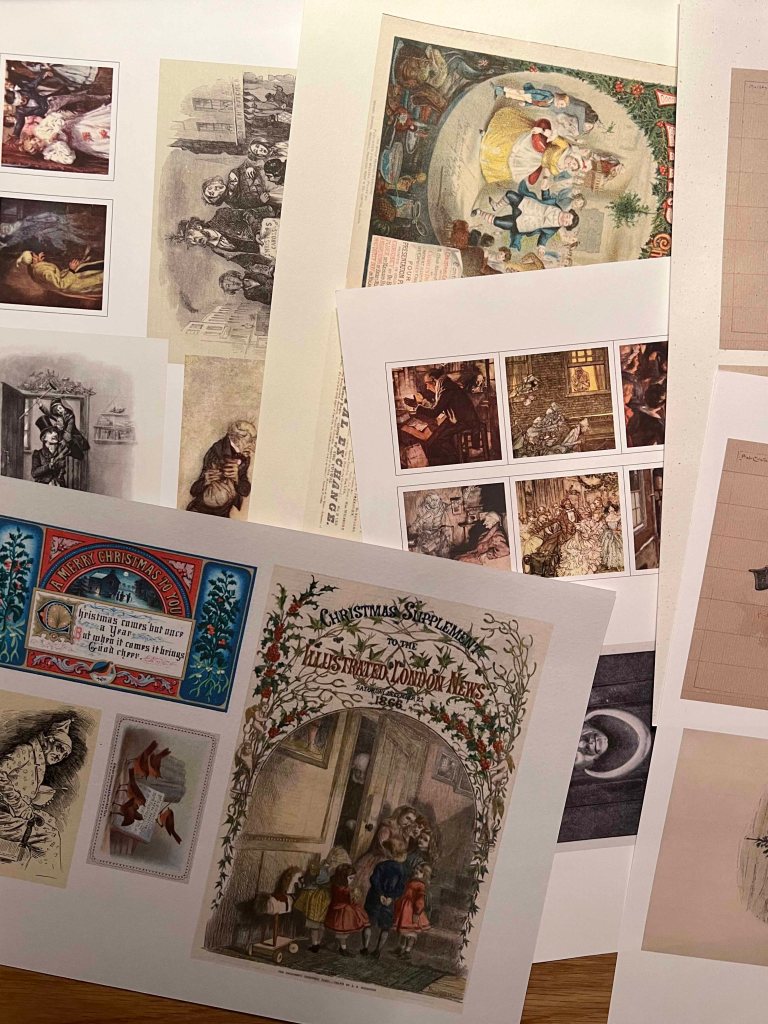
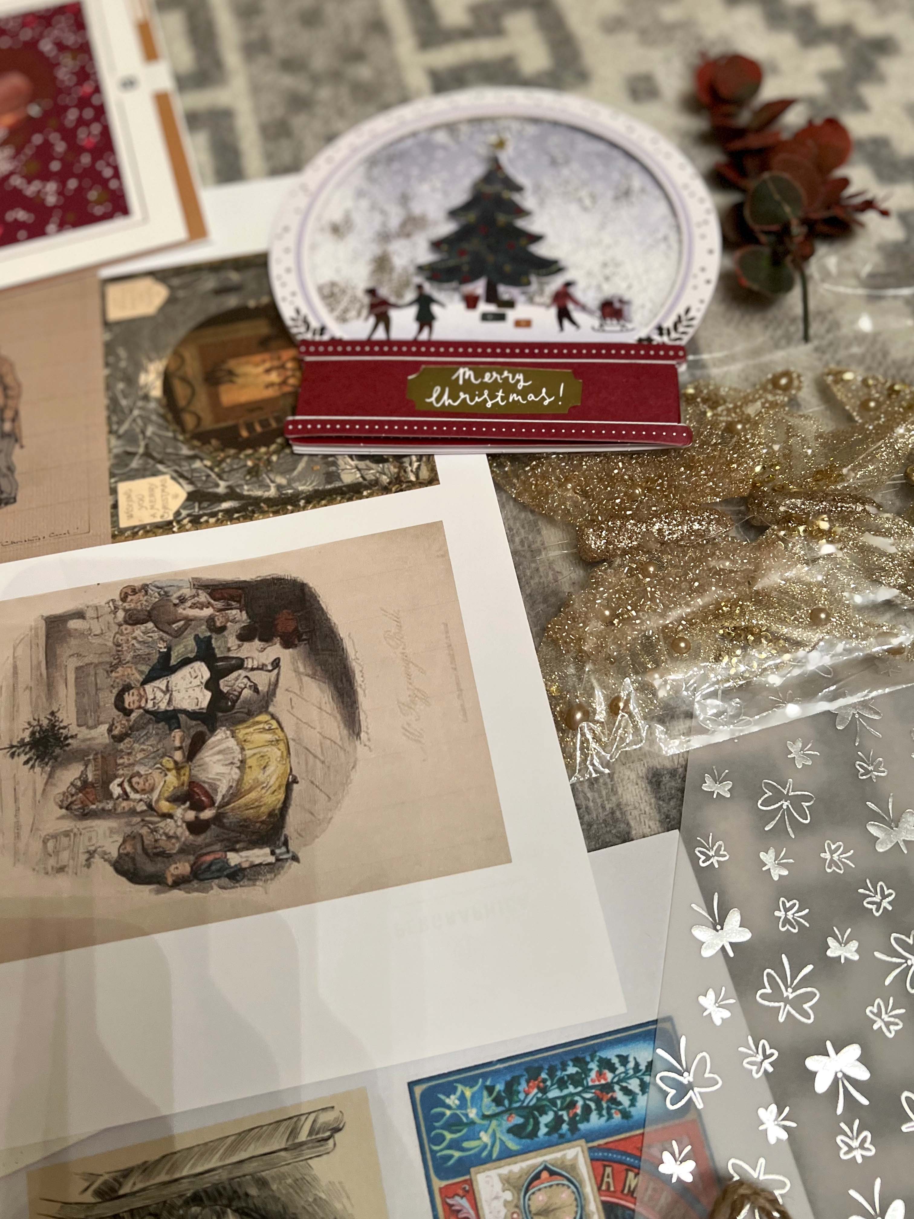
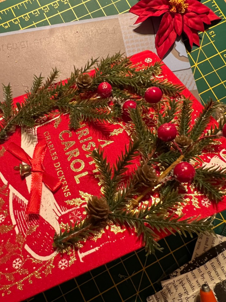
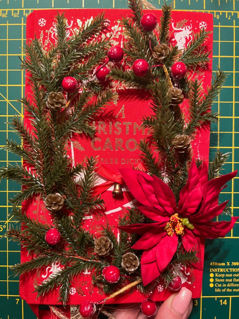
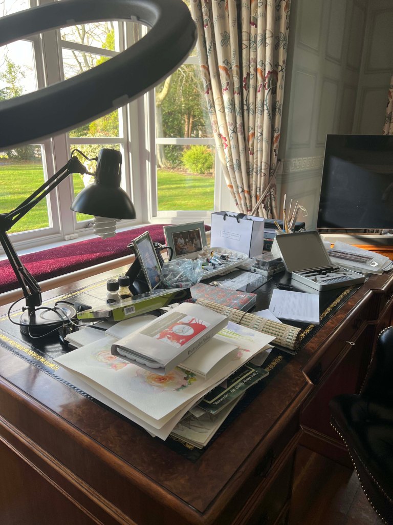
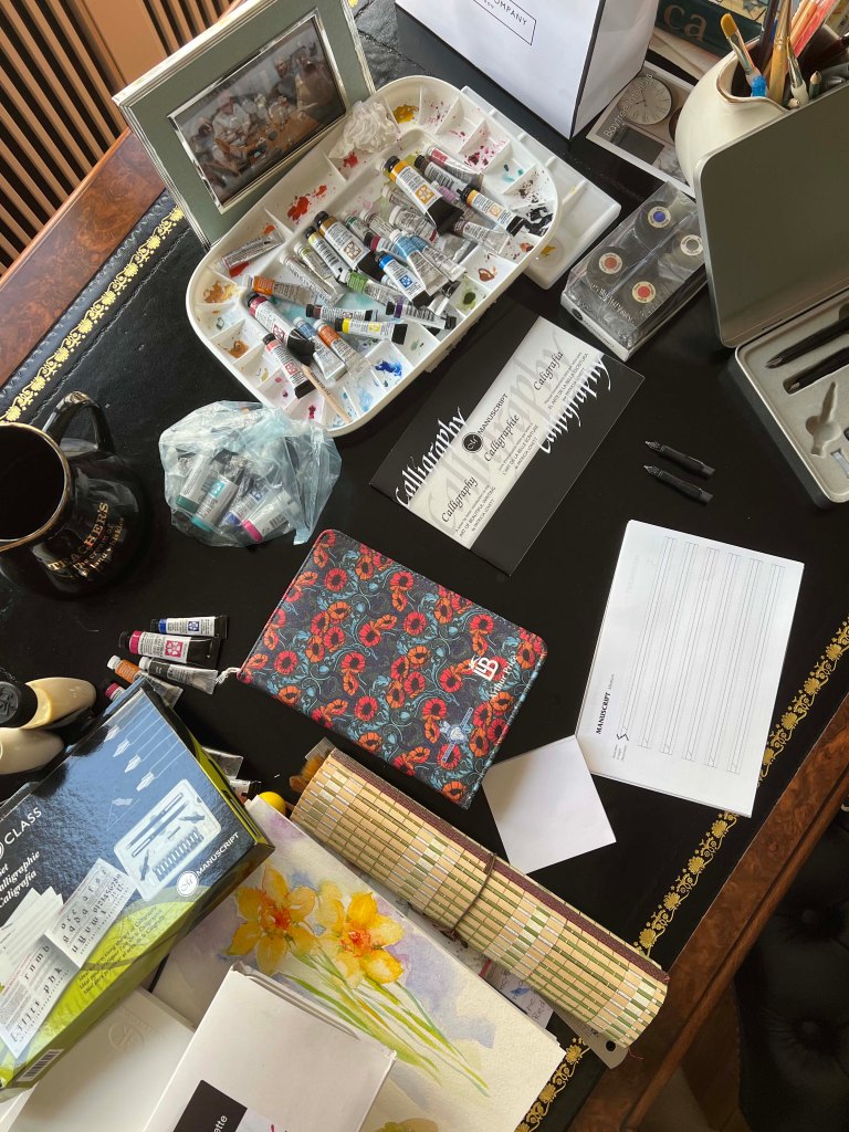
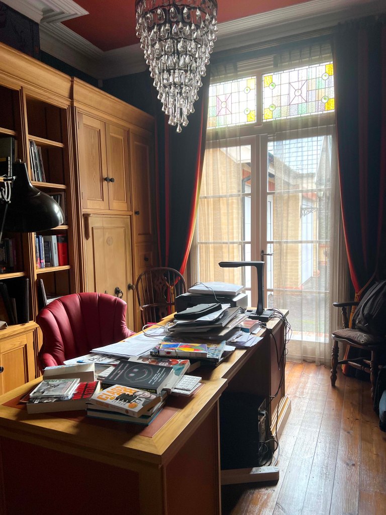
I decided, that the best way to start research would be to go around and look for some objects around me within the house. I took pictures of the working table, I thought I could include some of those photographs within the collage of the book. That’s how I set up for the working mood, by looking around and seeing what my subconscious thinking can bring. There was some typography as a part of vernacular typography, pictures of the poems with the intimate meaning, old records and snaps from the photography magazines. I thought it was a good start and I could move further down with my creative process.
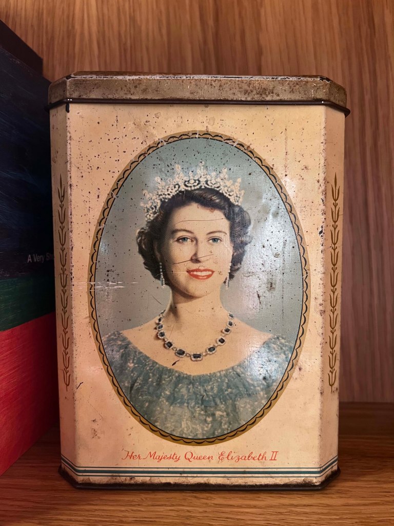
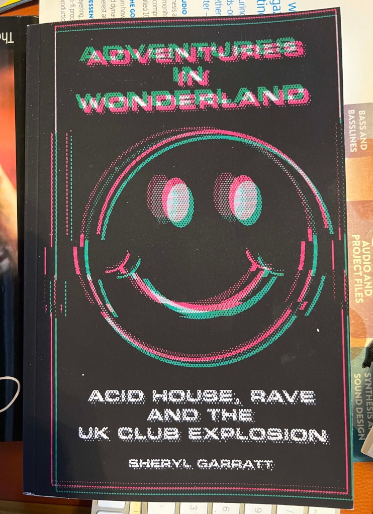
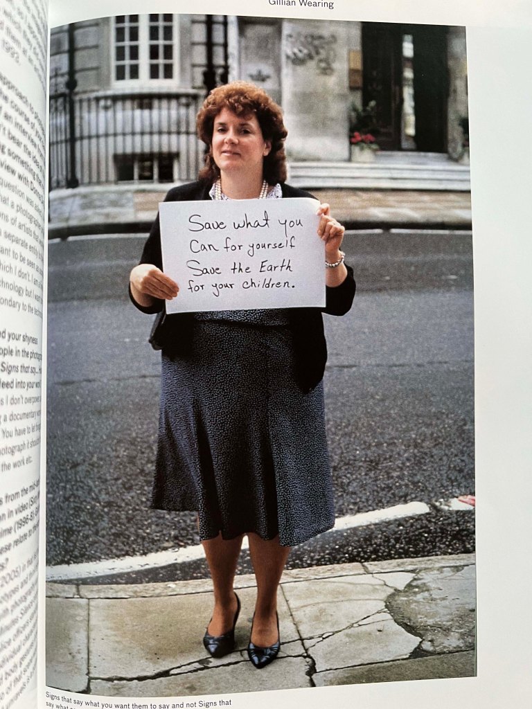
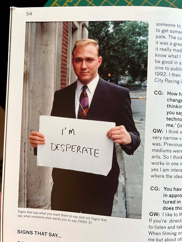
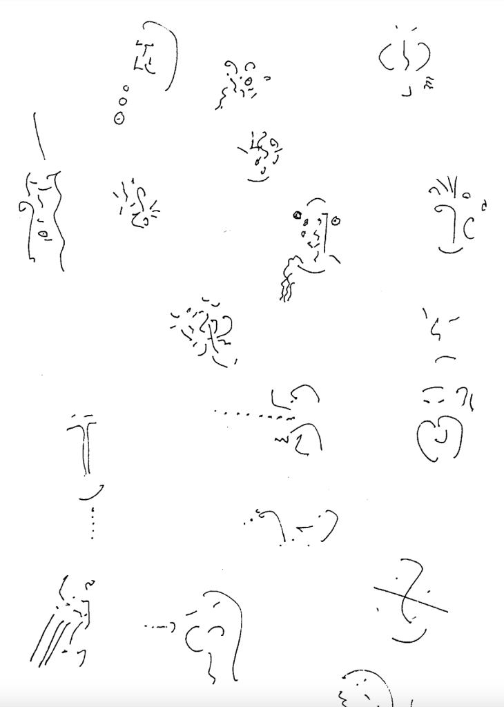
Some images were taken from creative photography magazines, that my stepfather keeps on buying all the time, they had some pictures of people with messages, like: “I’m desperate”, and “It’s okay to be broken”, “Never let go”, and I thought that kind of typography can attract attention and bring emotions for other people, they are close to the vernacular typography, and they are like visuals to demonstrate that handwritten typography can make an impact on the psychological level as well. Also, I found some abstract images of duo colours, I thought I could use them for distorted typography. There were some examples of letters within models by Marian Bantjes, and letterforms within the fashion figures. In addition, I found an old English book for kinds, dated 1991, that has an old stamp on it, probably I could implement it for my concrete poetry page. At the same time, I found a curious book, calls Adventure in the Wonderland, and I remembered, that somewhere I have a great collection of rave art from recent books Clubbed! and Rave Art. Below I created a moldboard of snaps from those books, there are hundreds of valuable posters, but I’ve taken just those most fascinating examples of creativity.
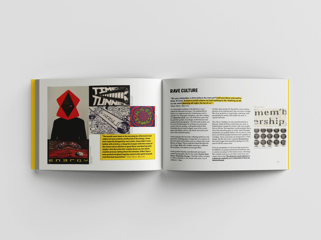
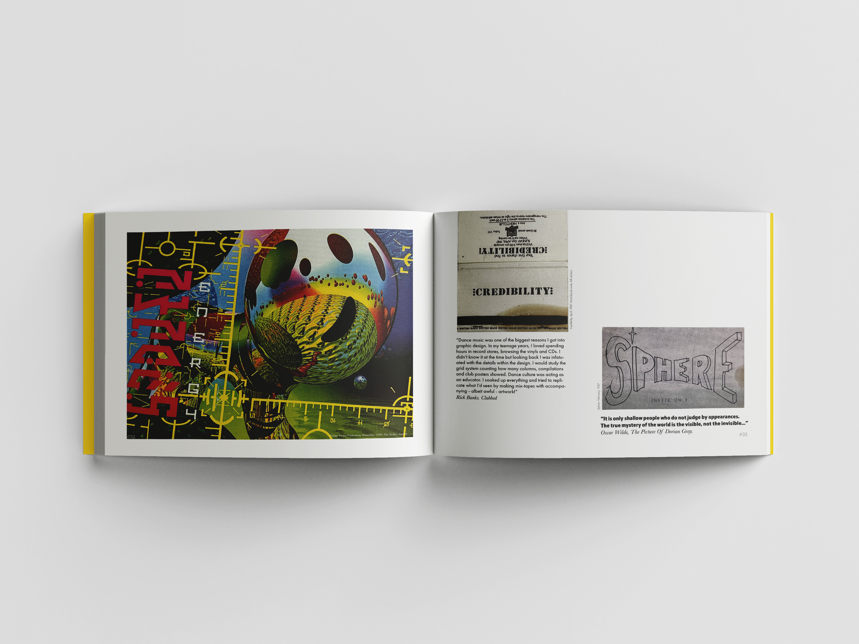
Fanzines and experimental typography in the rave culture
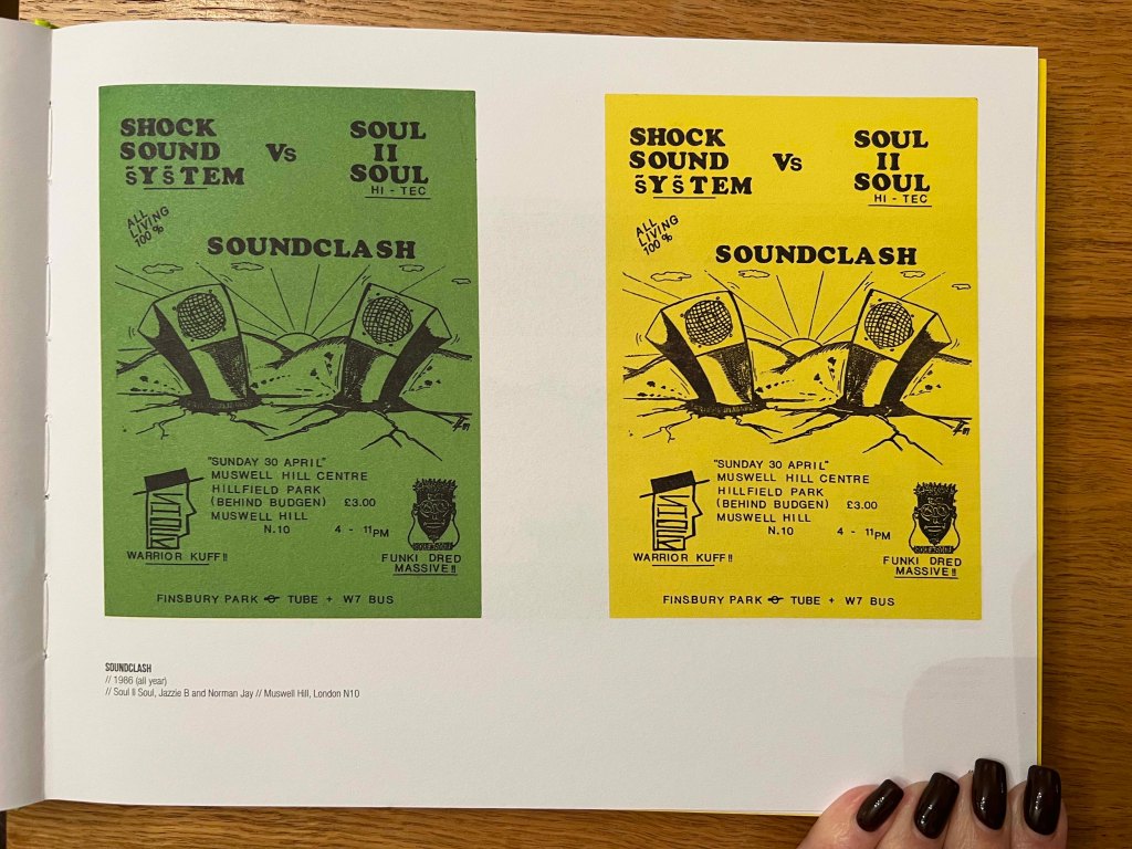
As I have been working in the electronic music culture for the past two years, I’ve realised that its history is a treasure trove for inventiveness and inspiration for all graphic designers, who like creating art. Electronic music was one of the first scenes that based their posters and design on fanzine and experimental typography. From the early posters can be seen that the printing paper was purposely used in the low quality, making that eclectic feel. Probably due to small budgets, most of the visuals kept minimalistic colours, like black and white printed on the colourful paper.
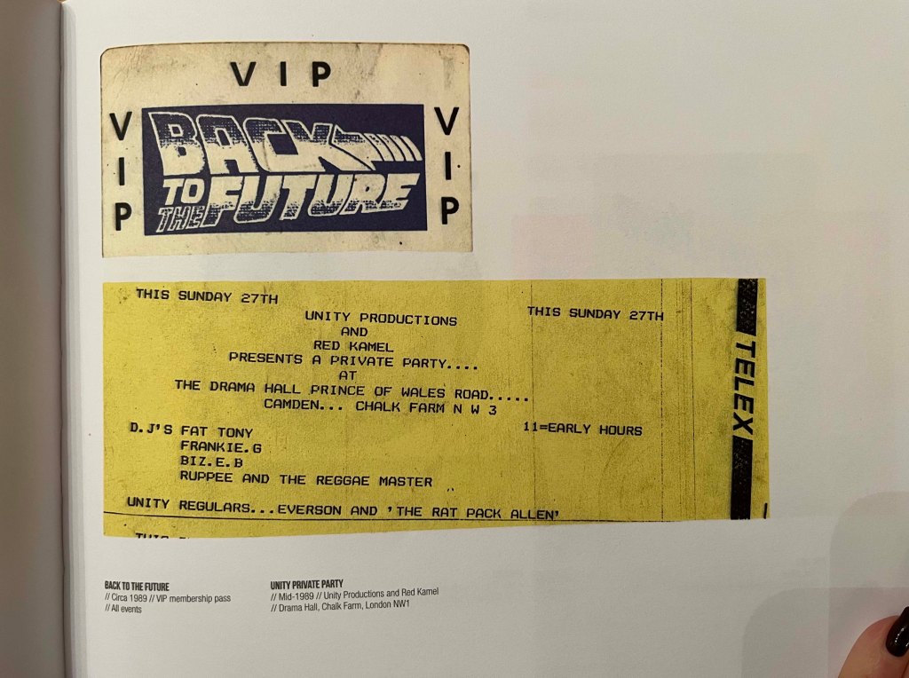
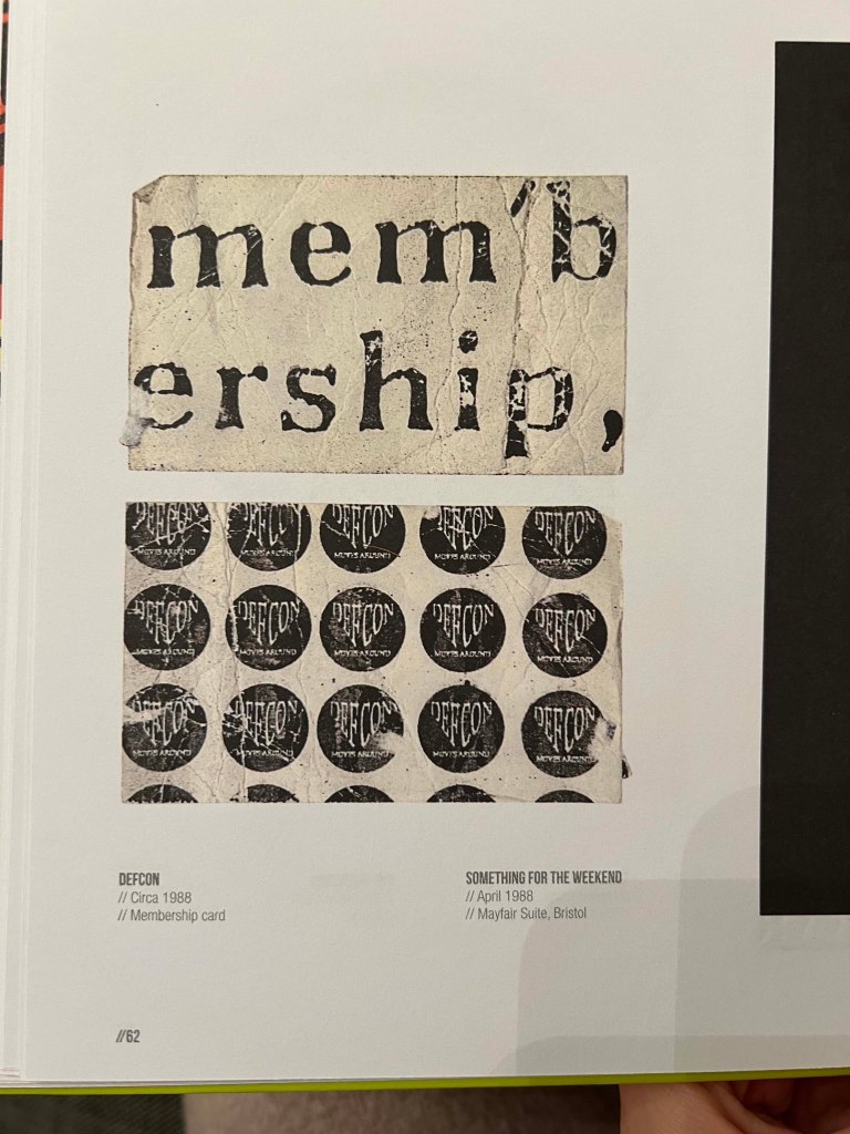
I know people who have been collecting ephemera and items from clubbing days, to keep them as a memory of the rave spirit, and another point as content to the visual library, to keep it. Those materials looked like flight tickets, or tags, likely with a hidden meaning to celebrate the occasion, or to stand out amongst others.
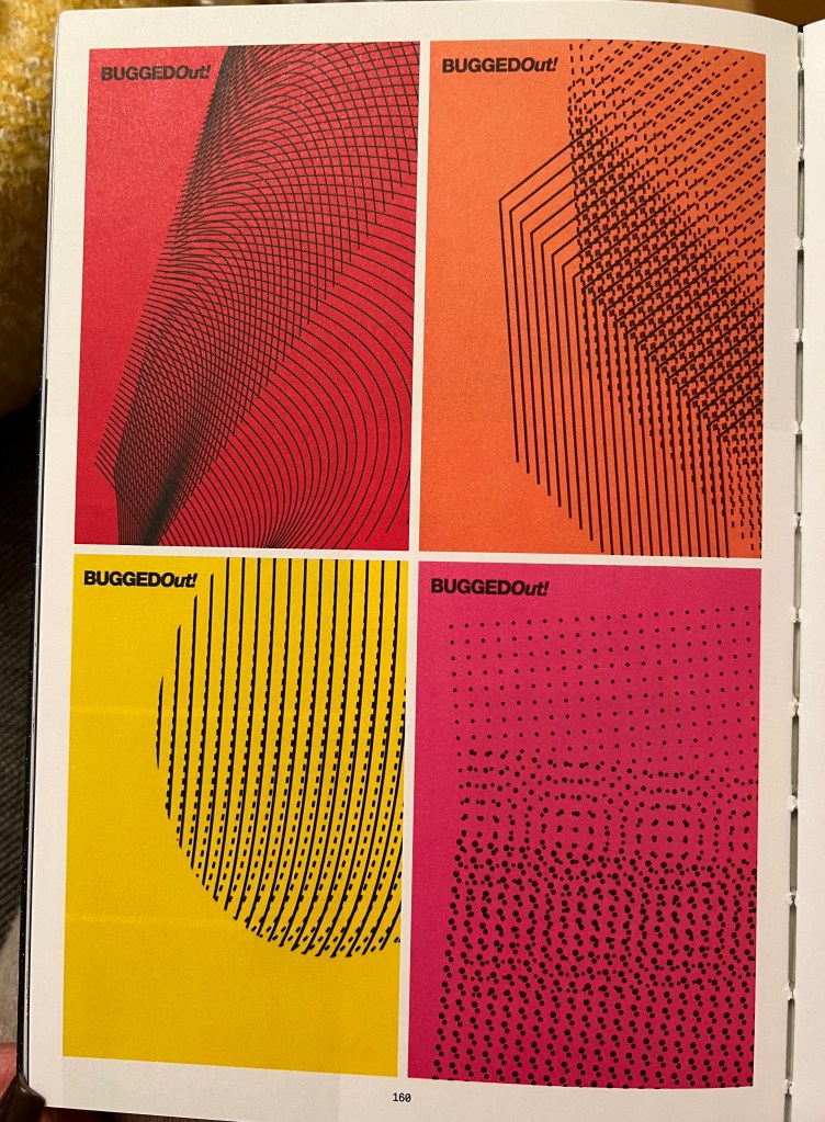
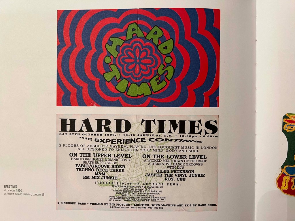
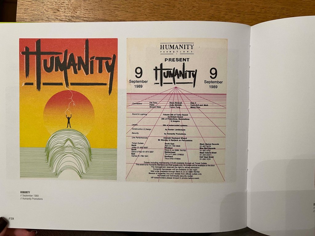
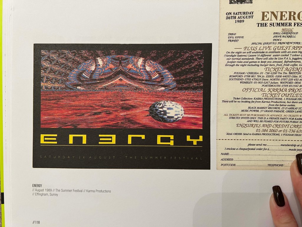
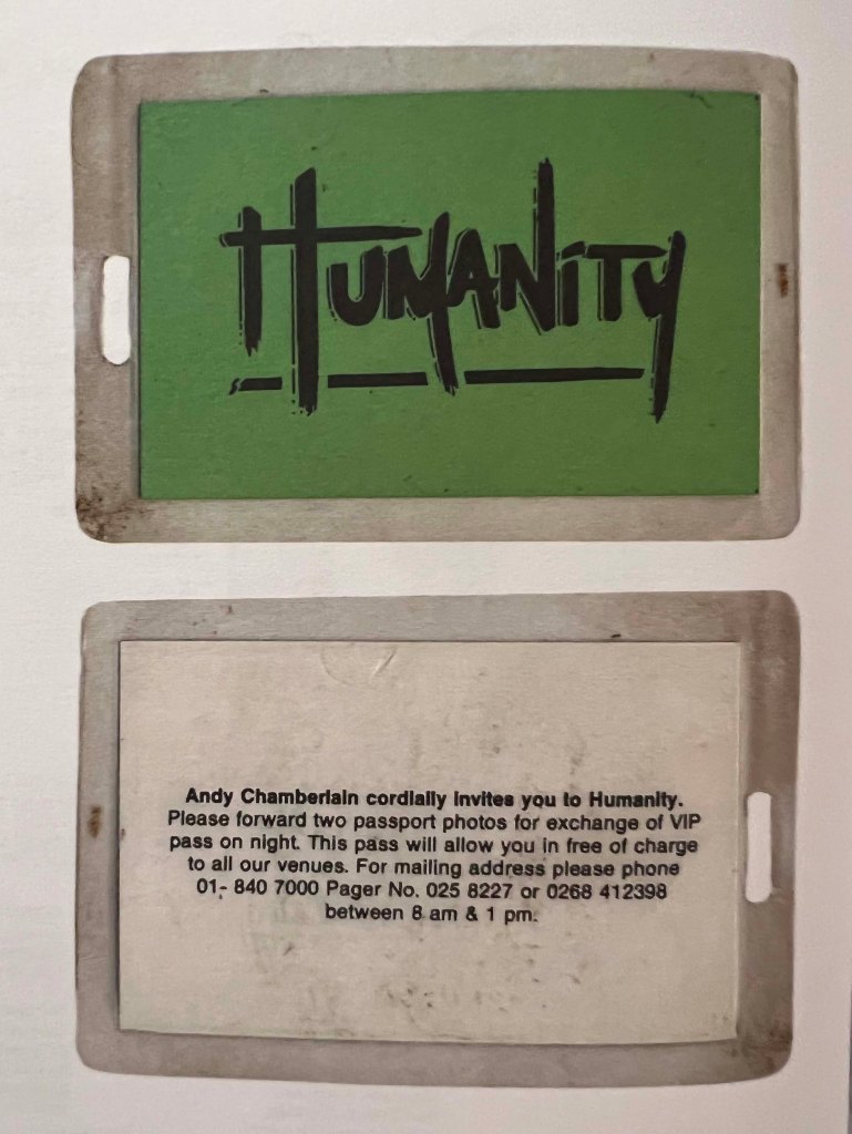
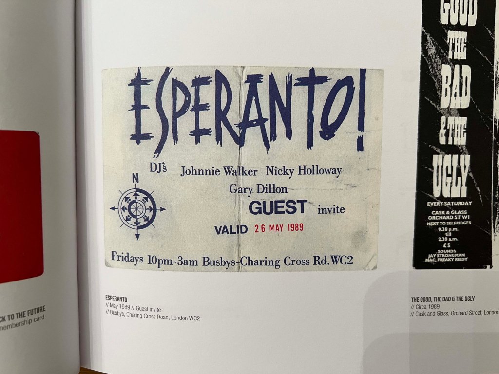
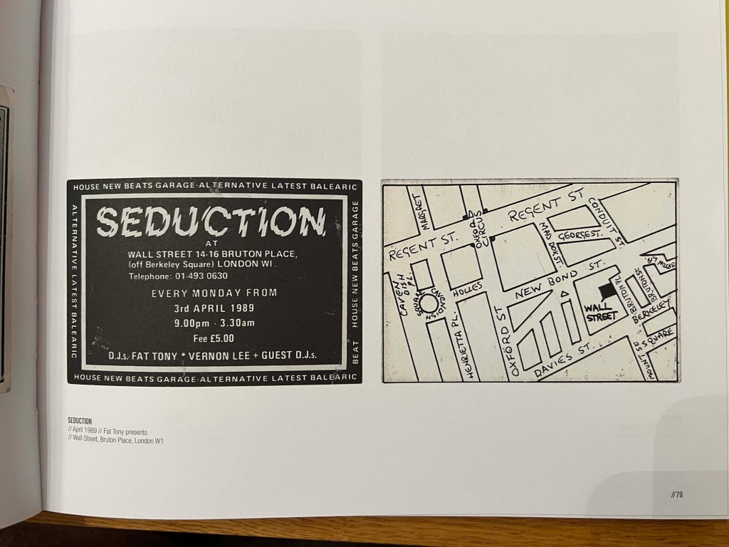
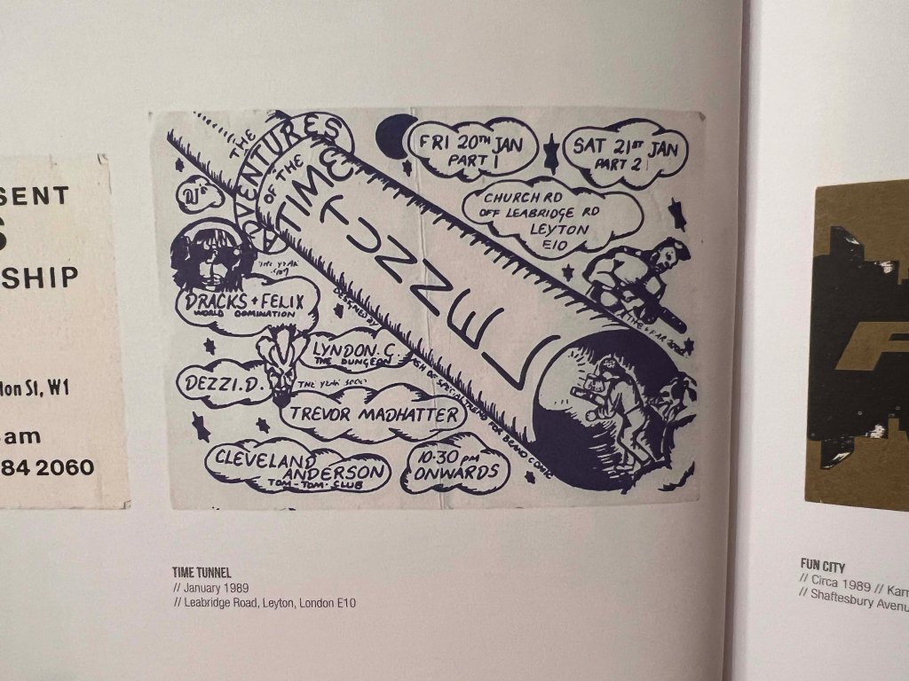
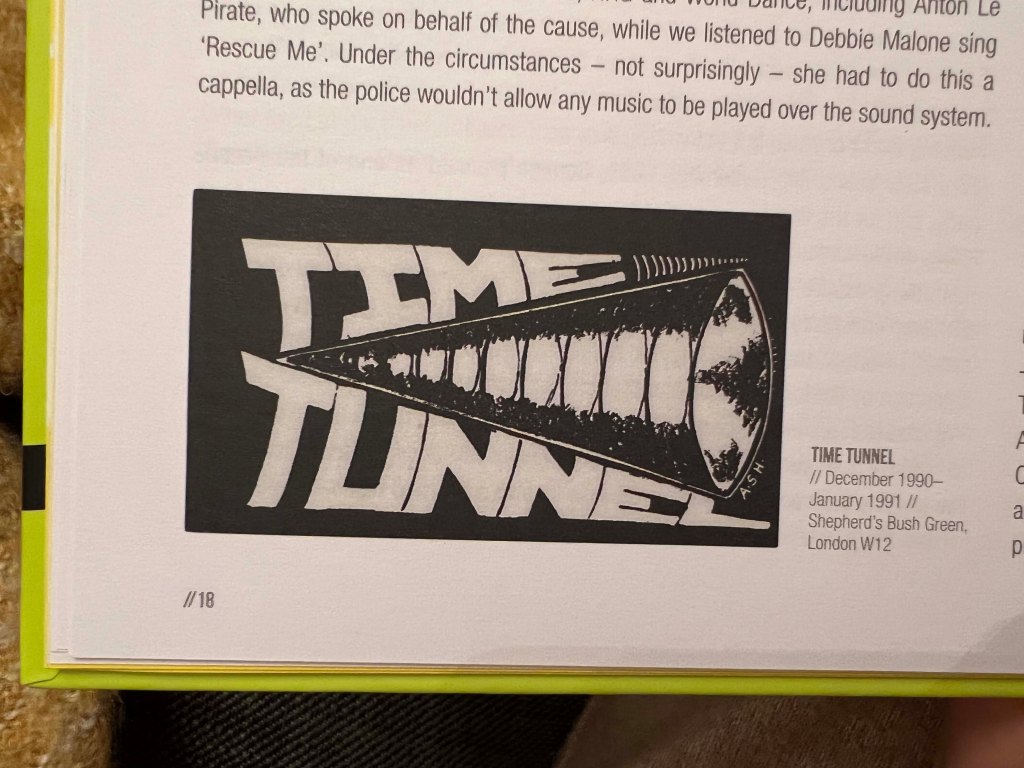
Some posters heavily used distorted and experimental typography, like for the words, Seduction, Tunnel, Hard Times, Humanity, Energy, Esperanto, I think the authors wanted to attract attention to the events with some “out of ordinary” vibes.
Modern days posters for the techno music industry became more sophisticated, they use macro images, like close up leaves or huge drops, and easy read typography for events, like simple san-serif, or square serif fonts.
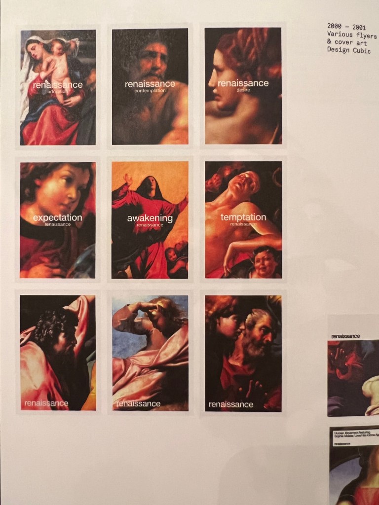
Also, the is a tendency to see some throwback to the past, where all those wacky fonts are used, or hallucinogenic images for posters with some simple font on the top. The organisers would probably like to show that everything goes in circles, and if the acid movement was popular before, now it’s time to come back and refresh individual memories and capitalise on nostalgia. Some companies use juxtaposition in their design, like the club event company Renaissance, which used images from beautiful paintings from the period with the same name.
From my perspective, it all serves the purpose to be different, to express free mind and freshness into a creative movement of techno music, attracting like-minded creatives to join their community and support the brand. The electronic music industry is a space for creativity, so it’s important to have an identical brand.
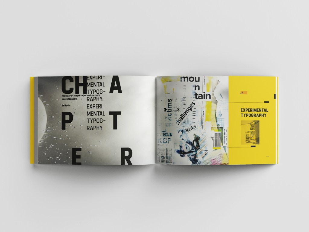
Experimental typography
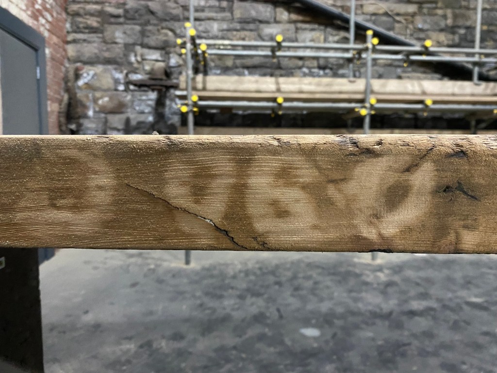
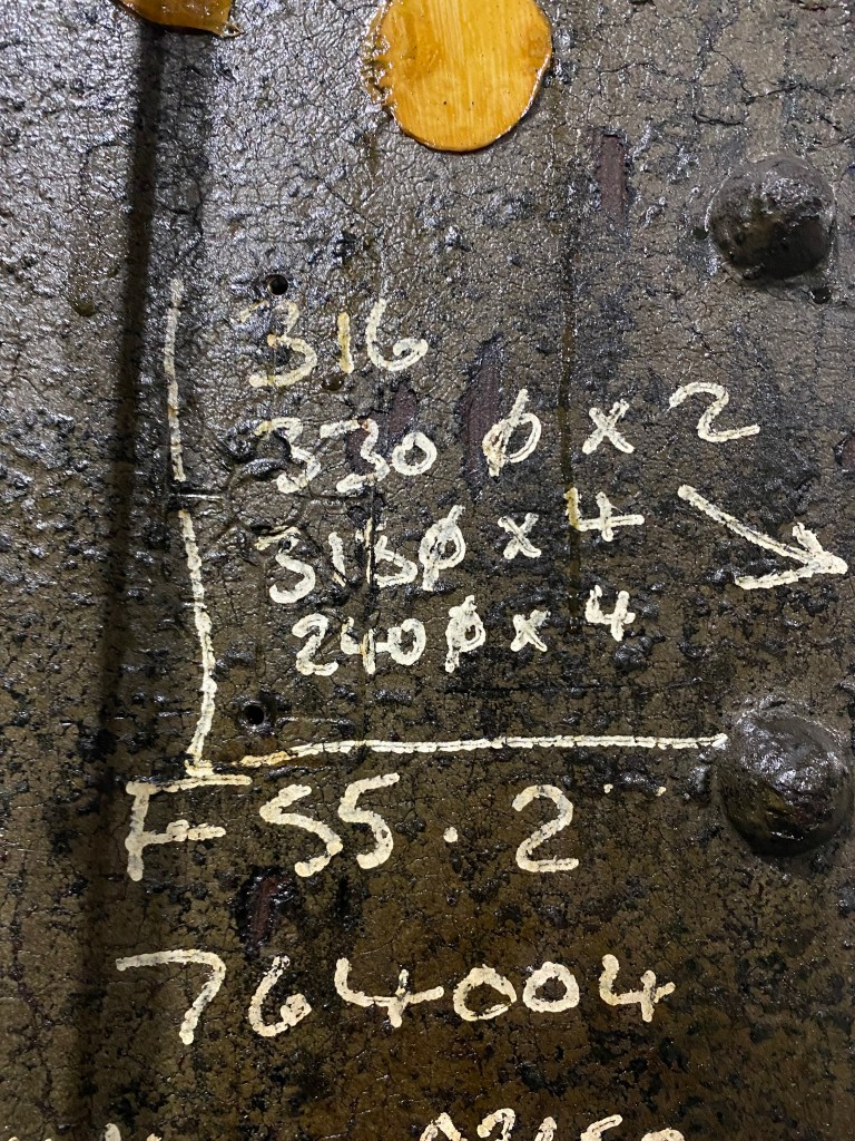
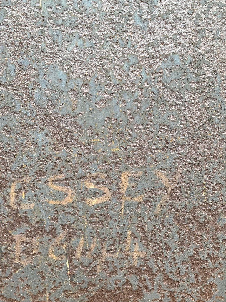
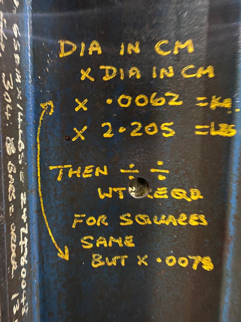
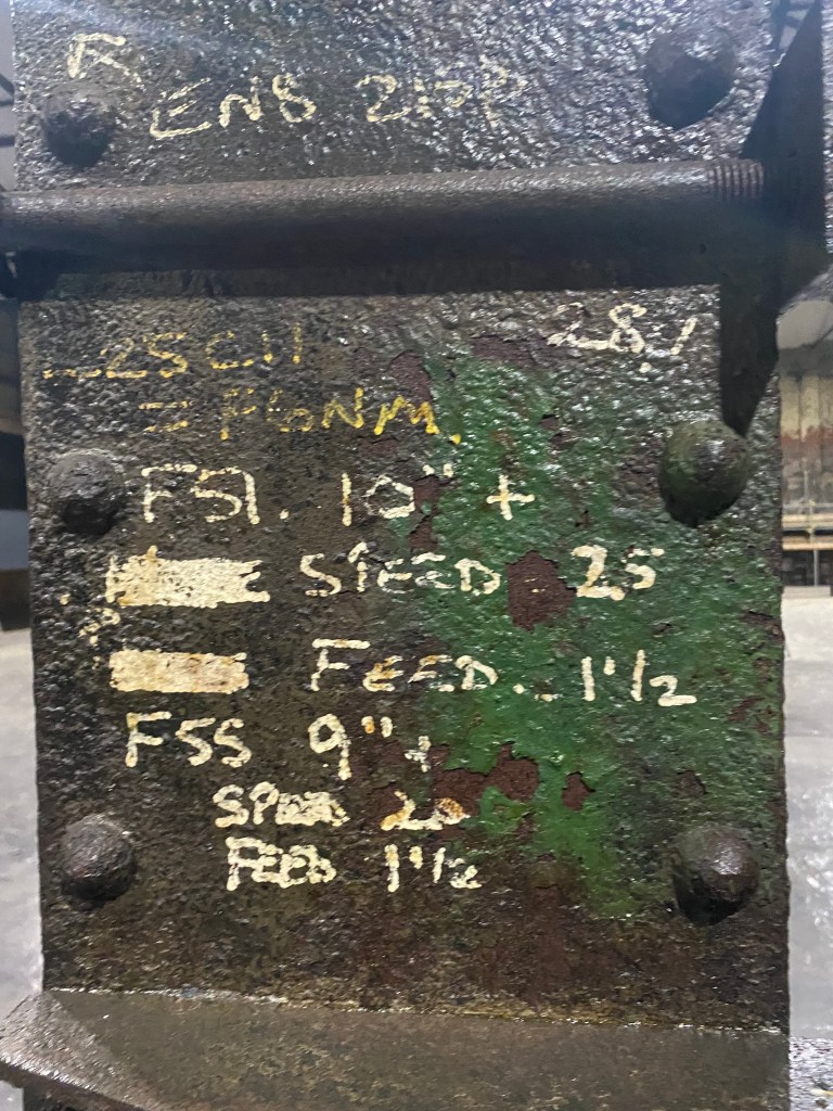
Actually, speaking of rave culture, I remembered about our venue, that my family is reconstructing at the moment, it used to be an old steel forge, and it still has some old notes from the previous workers, that perfectly integrates with the metal or wooden texture. I thought I can consider these writings somewhere in the middle between vernacular and experimental typography.

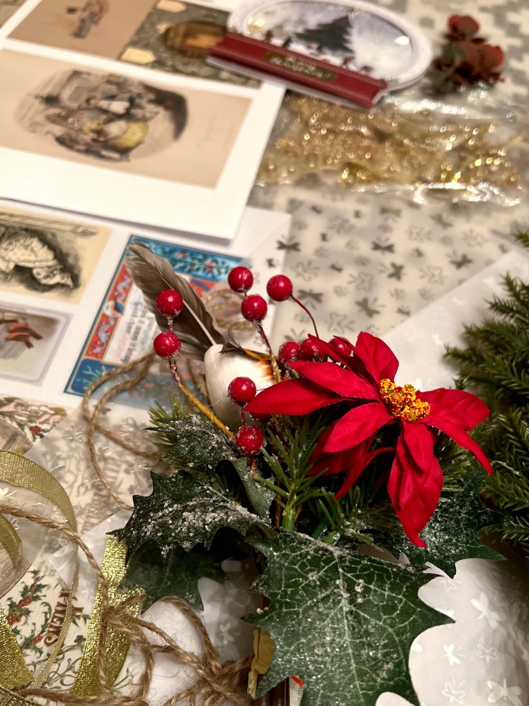
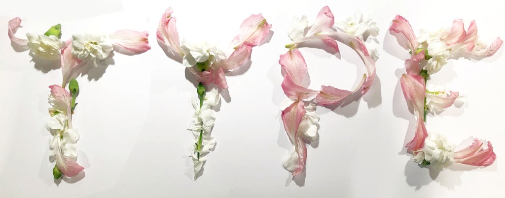
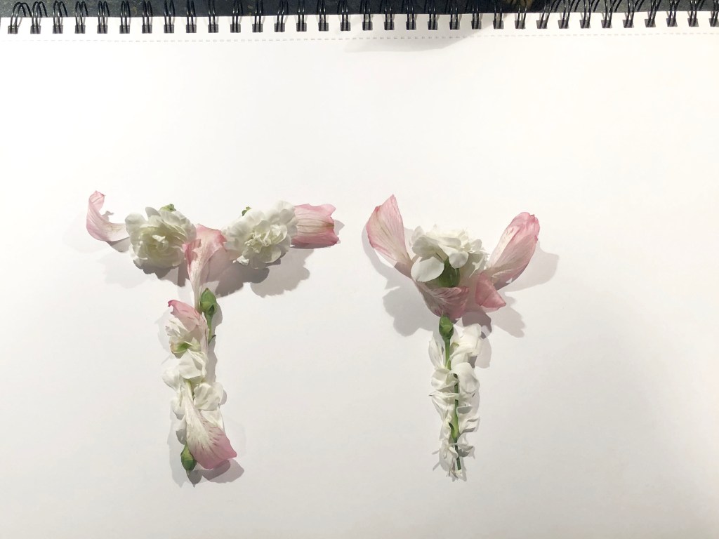
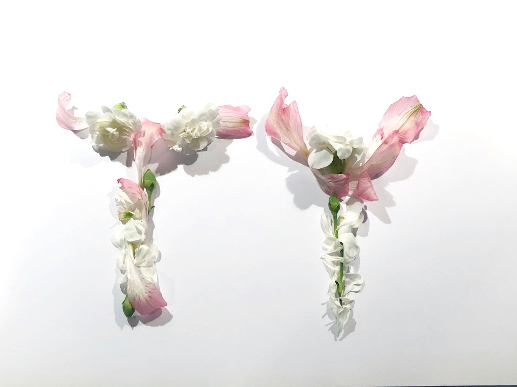
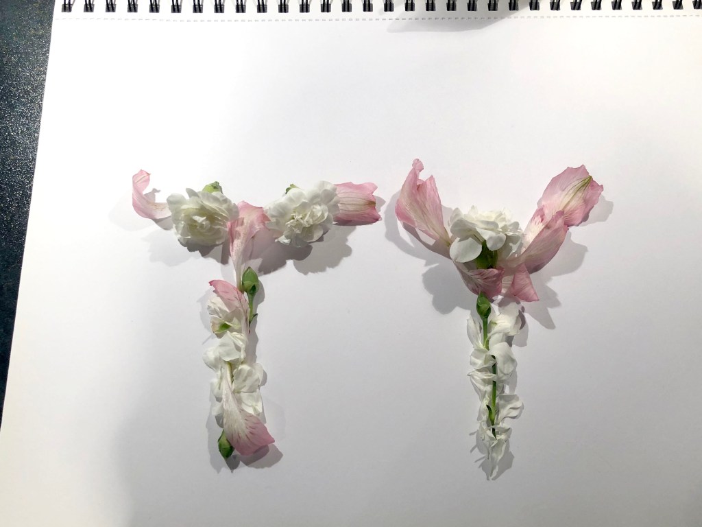
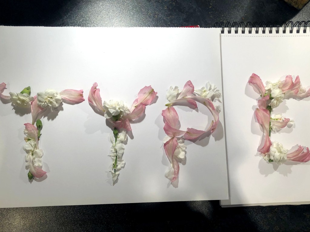
Flower Type
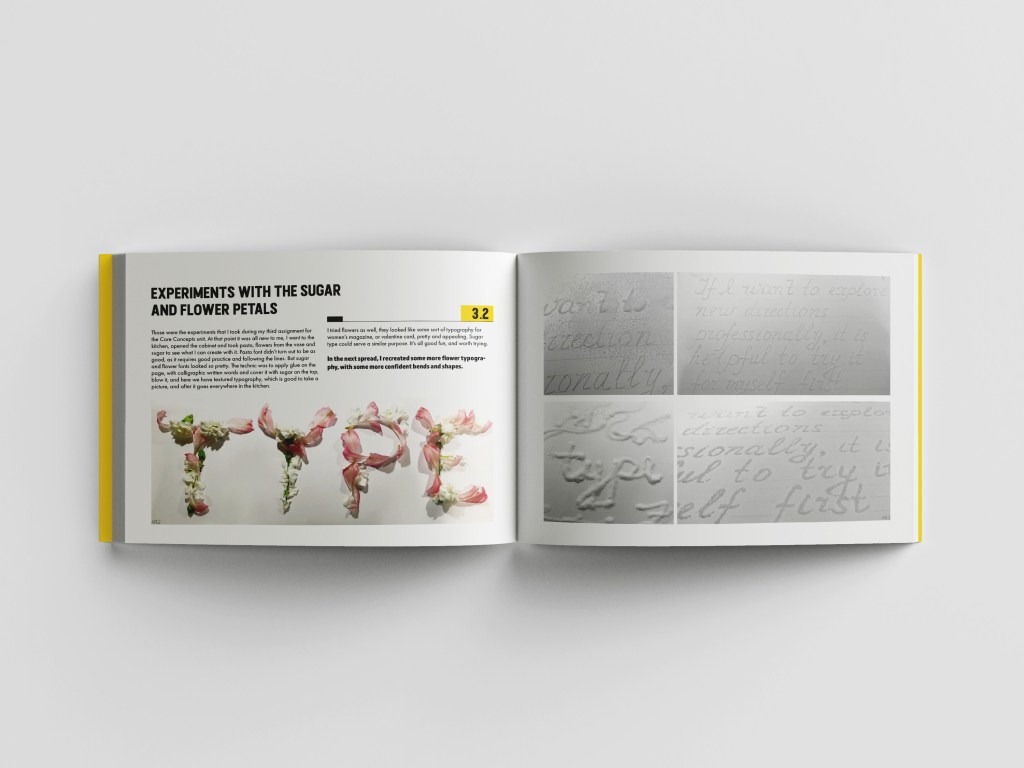
I remembered about those letters I did for the Core Concepts Unit, for my assignment four, where we had to invent type. I bought some flowers to create tender petals. I wrote it without special meaning, just word TYPE. Those experiments were not ideal for professional use, but I like the fact that I was brave enough to start, everyone has this learning process to go through, it’s good to explore, and do more investigations, that to find your perfect design solution. I definitely wanted to include it into the book, as a part of my first discovery of unusual type. I thought it’s great calligraphy for such things as cards, or women’s magazines, as those letters reflect feminity and tenderness.


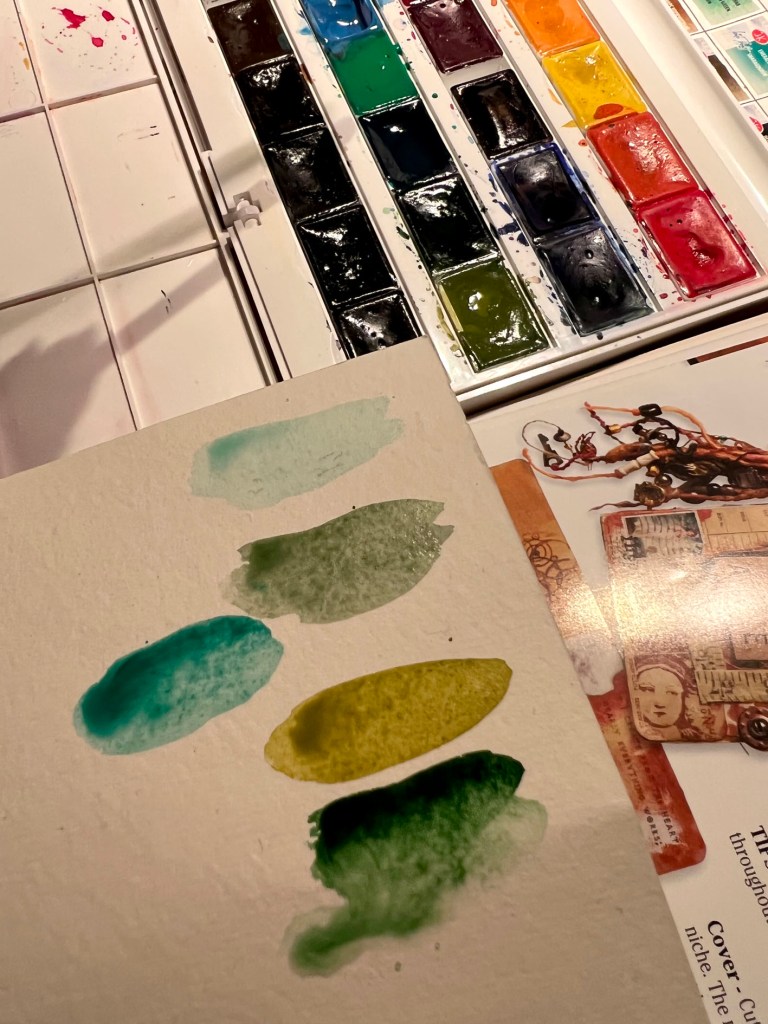
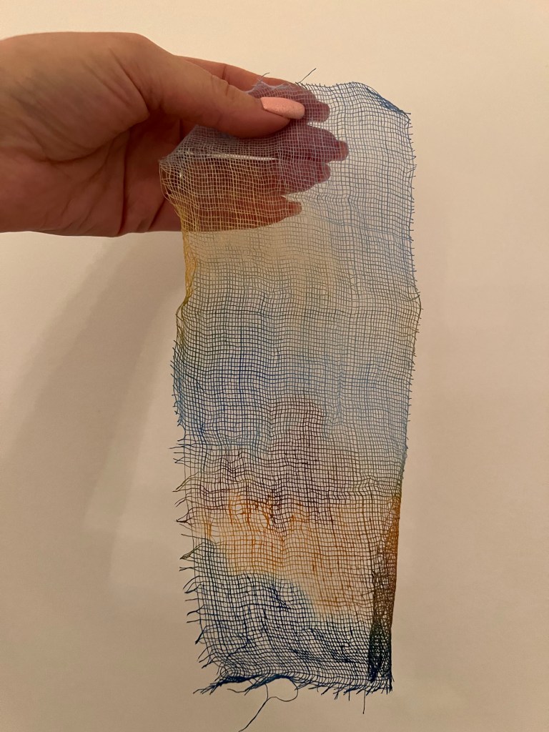
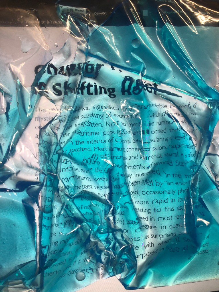
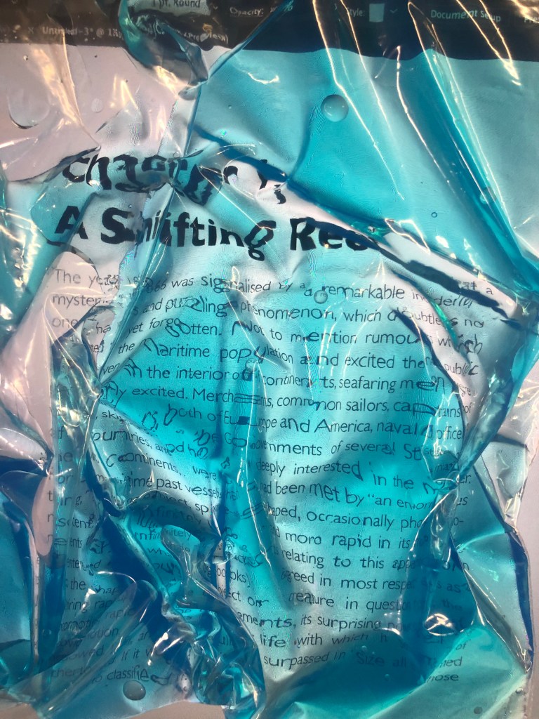
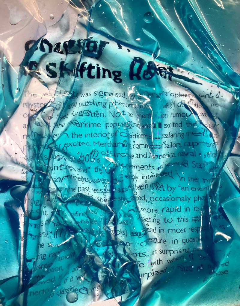
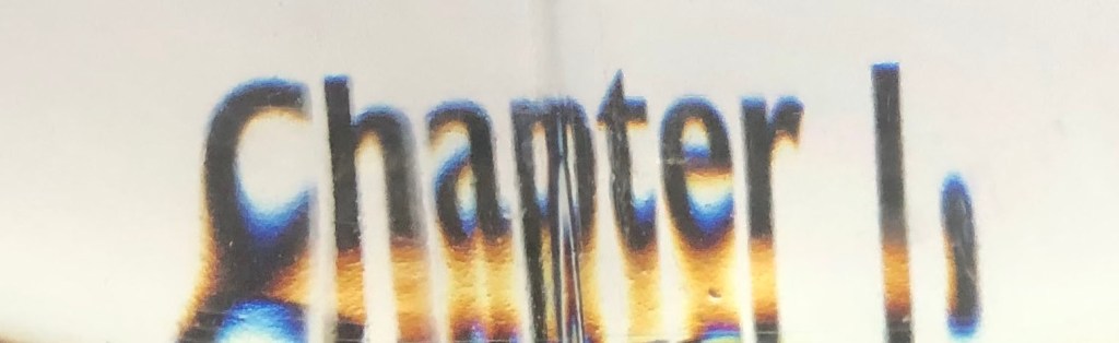
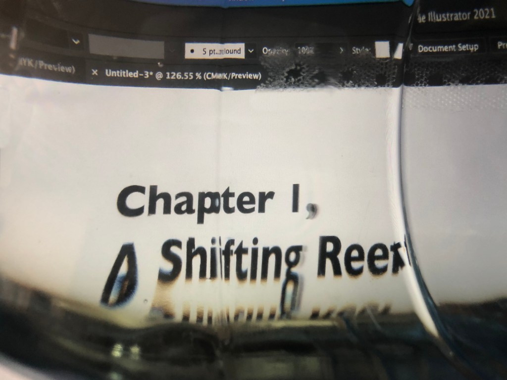
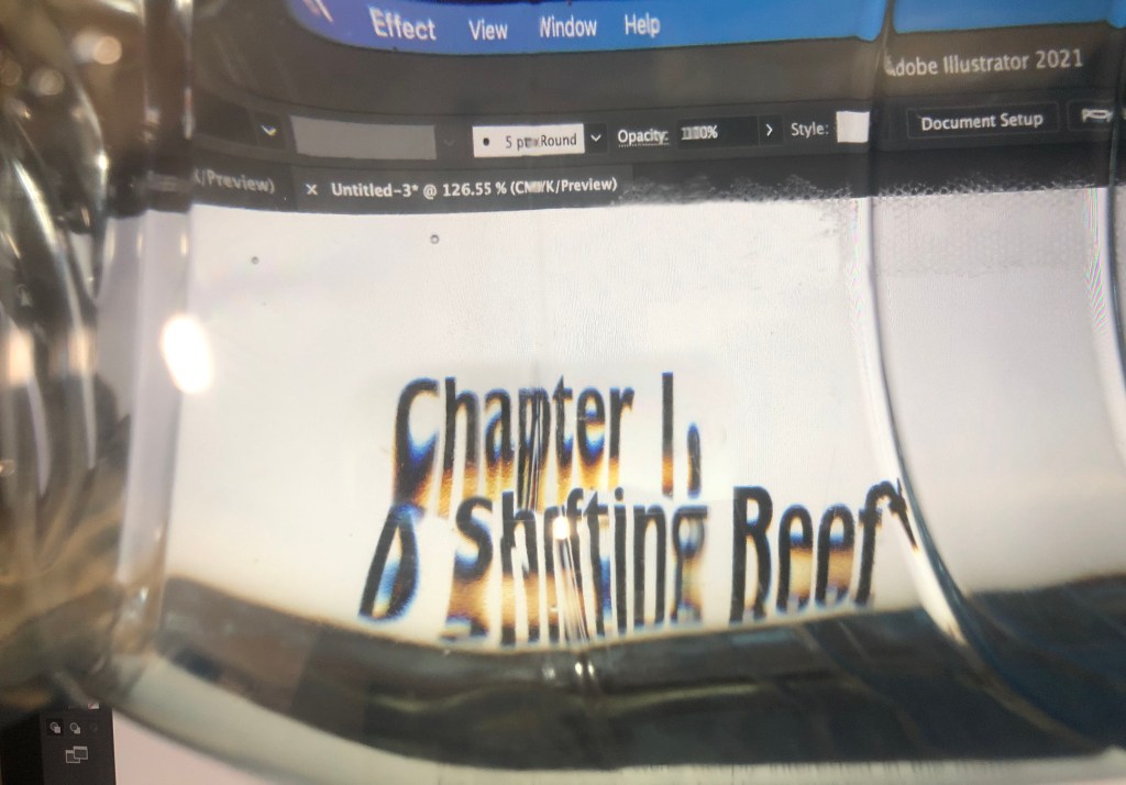
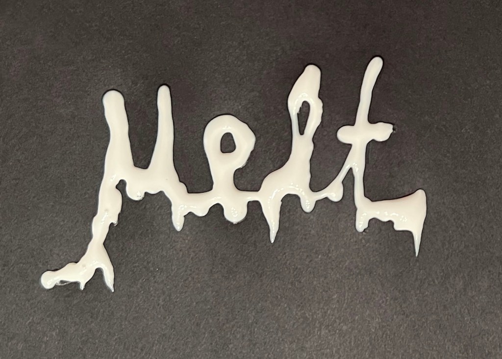
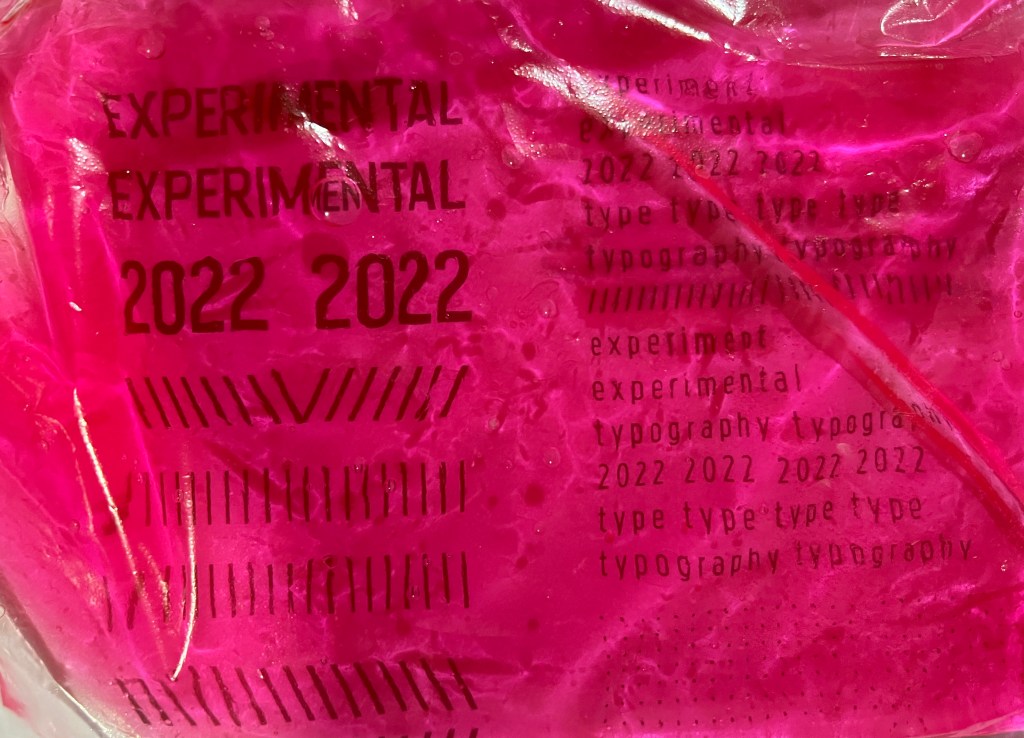
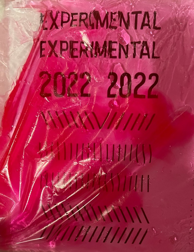
Watercolour bag distorted typography
Those typography experiments from exercise 3 part three of Creative Book design gave me the push to experiment. It came out quite successful. I know that I used those examples in the previous brochure, where I printed on different pieces of paper, but I loved the fact that it was in blue colour, embraced the sea theme, and looked artistic. Definitely has a space in my book. I was going to recreate it again, but with pink water, to have a matching pair in my book.
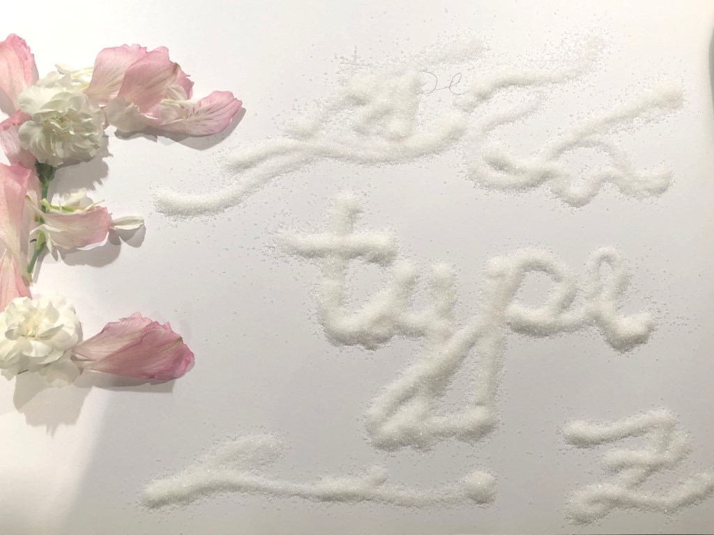
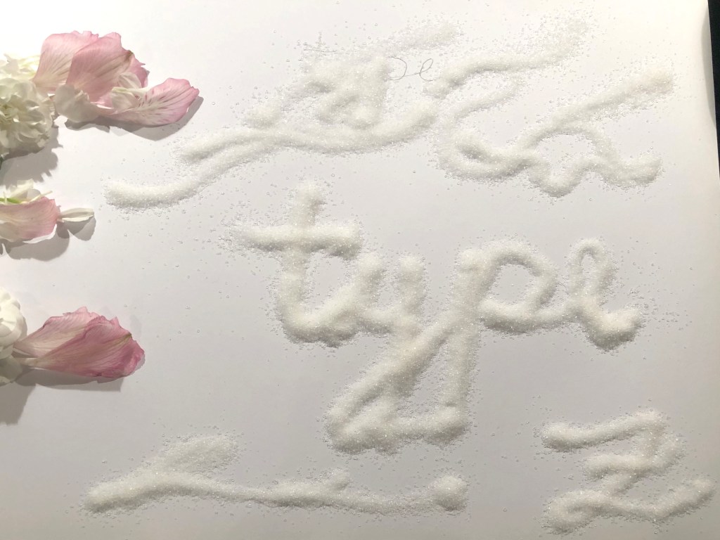
Sugar Type
Another appealing example of experimental typography from my previous research for the Core Concepts Unit. I was following Marian Bantjes as my main inspiration, she is very good in that calligraphy style of writing and design, and I really wanted to learn from her. I loved the texture of that font, which is hard to say whether it’s sugar or salt, but it works so creatively within the magazine projects or for the advertising campaigns. I was going to include it in the book as well, the past experience that I still see the reflection in current projects.

Experiments with type
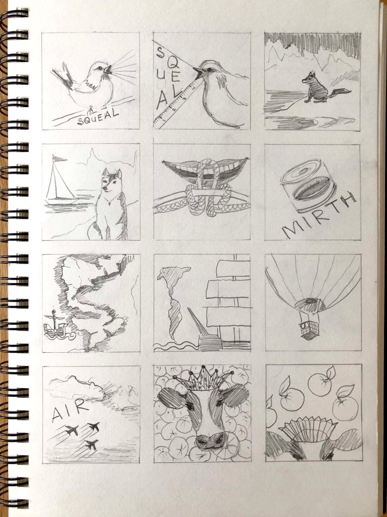
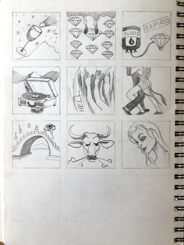
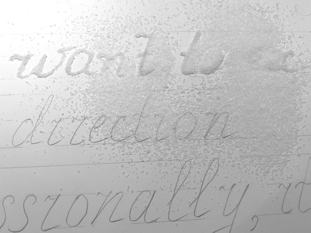
Those were my recent experiments. With all that experience I’ve gained, I still go through that stage: “Right, what am I going to do here now?” I think it’s all coming from the lack of confidence, that’s what I definitely should learn, do not be scared to fail, as that is how success is born, as we never know how many unsuccessful outcomes were prior to the amazing results. Same here, I went around the house with printed letters, trying to find some interesting objects to use for experiments. I printed words on the piece of paper and thought about what I can do, burn words, distort, use a piece of the soup, light bulbs, gouache, and anything else, that can push the boundaries. Some outcomes looked quite good, I thought they need a couple of tweaks in Photoshop, but altogether it was all worth doing.


Experiments with printer
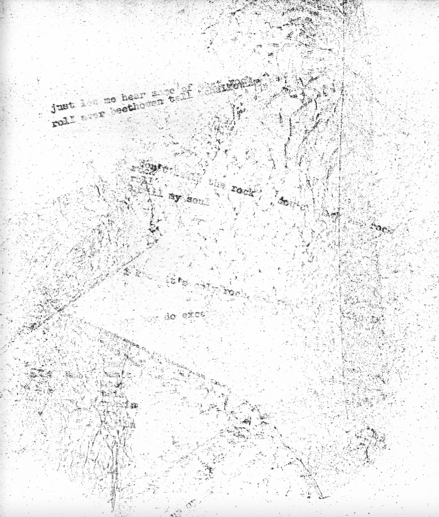
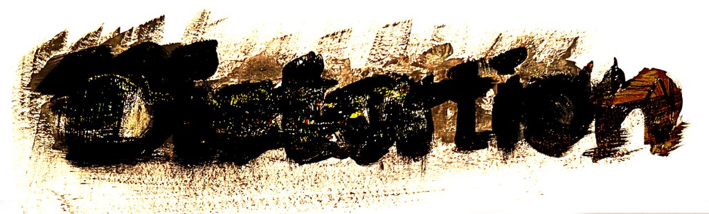
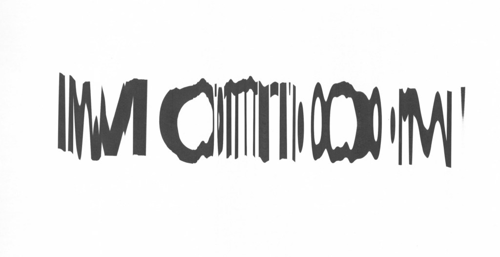
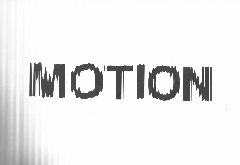
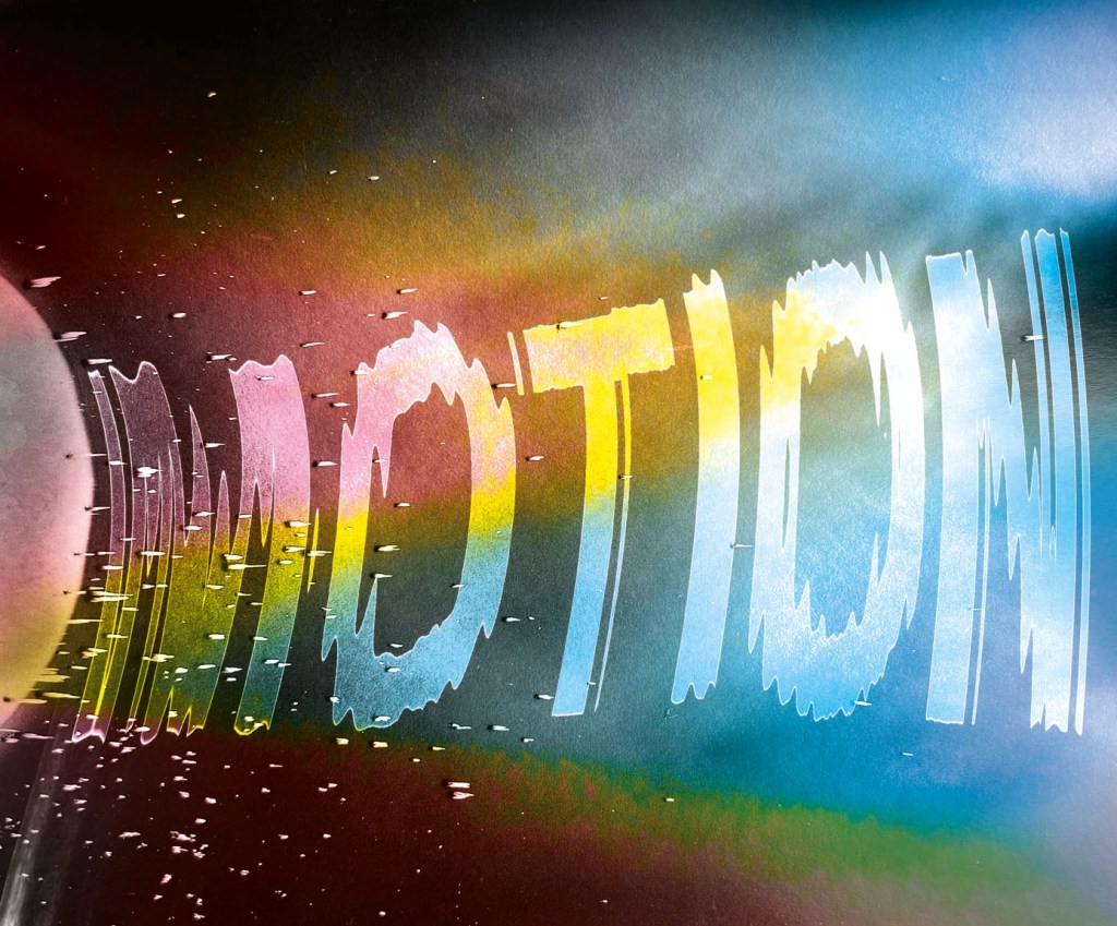
As I needed more materials for the book, it was going to have some pages to go through, I kept on doing the exploring. This time I took a magazine with the printed article and scanned it through the scanner whilst I was fighting the page. I’ve heard before, that there is the way how some creative projects are born, and it reminded me of concrete poetry or typewriter art. How great was that, I thought I can add a creative background, with some colours, and it will help the layout to have remarkable features. those experiments I was going to integrate somewhere within the book, and it’s inspired me that I was in the right pass. In addition, I could word MOTION, which I altered similarly through the scanner. Worth trying in future projects, and posters, I think the creative community are going to love it.
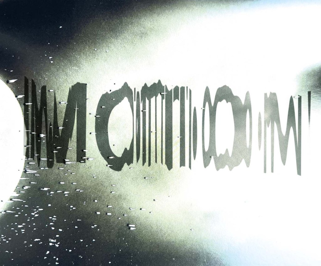


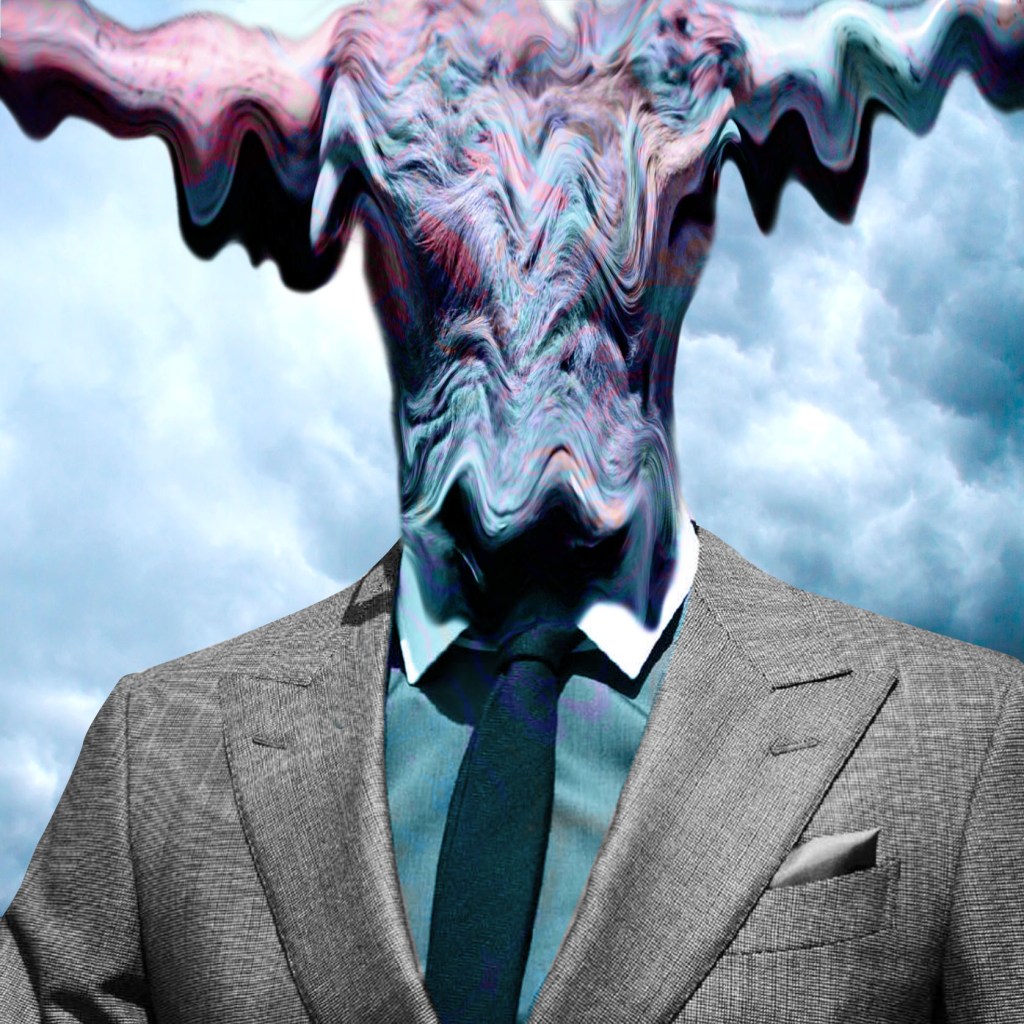
Glitchy Typography
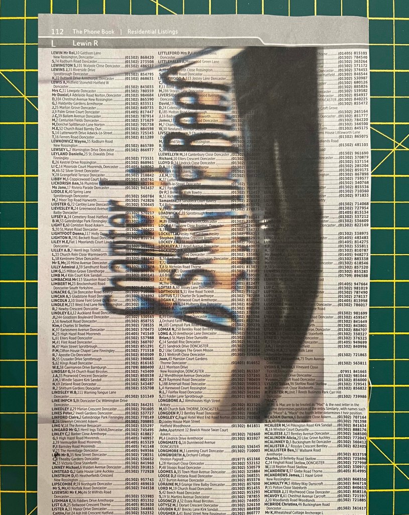
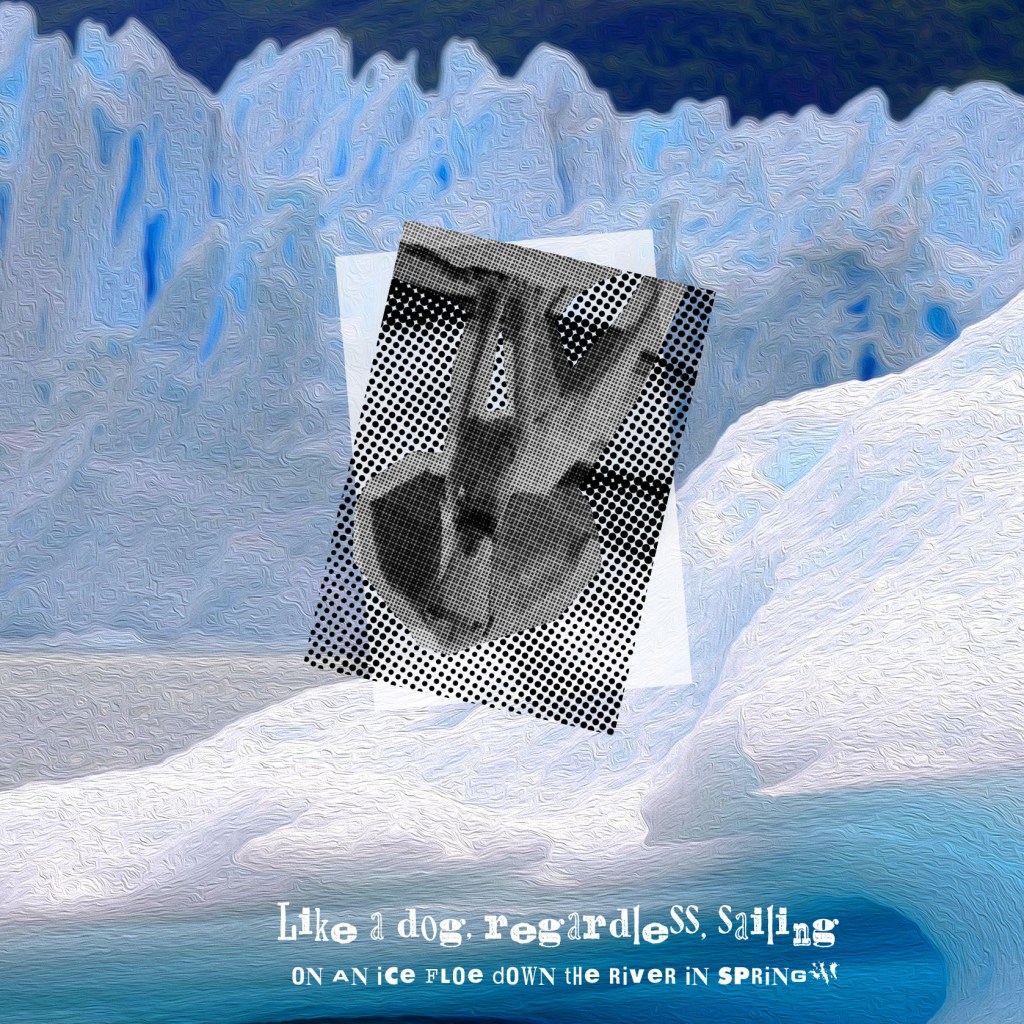
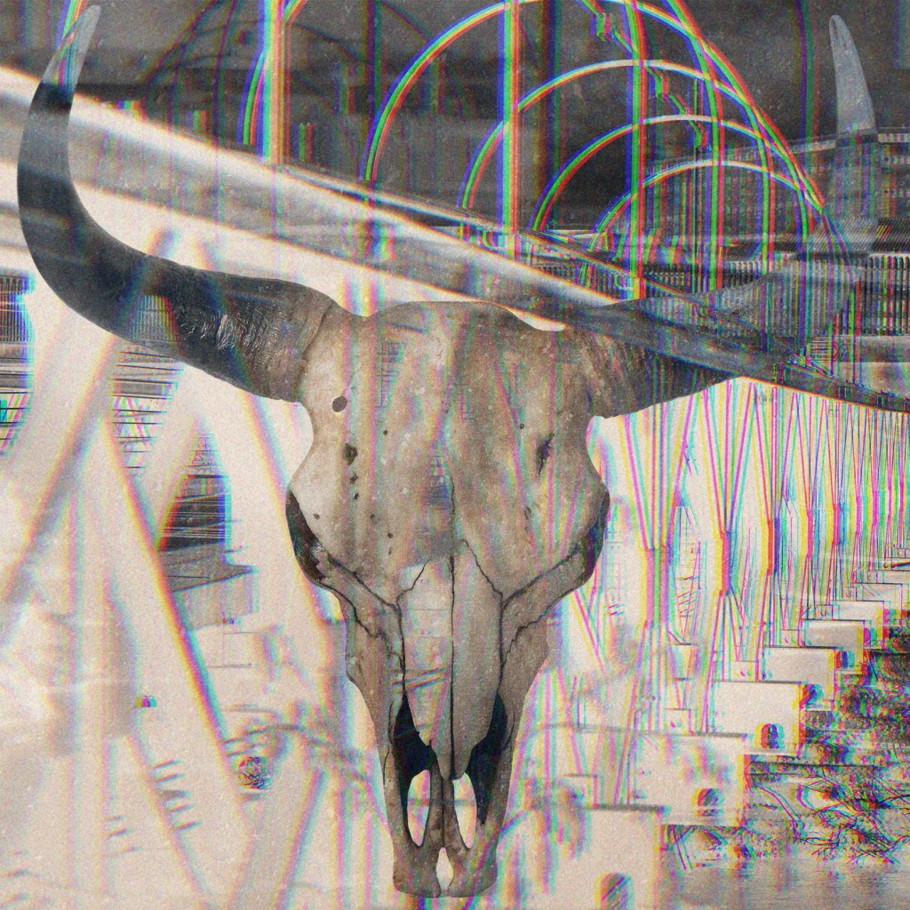
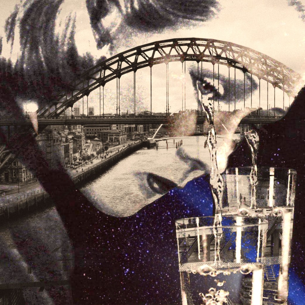
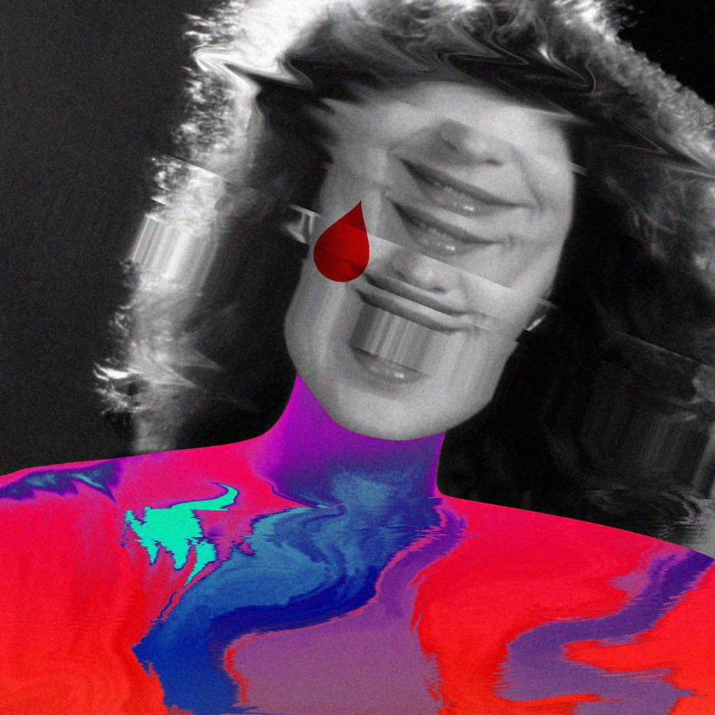
These technics of distorted typography I found somewhere on youtube whiles I try to learn how this glitchy font work. The tool is quite simple, liquify filter does its job for you, but the creative image of the table in balaclava add some extra darkness and mystery to this image. I was going to use it within the context of the book, as an introductory image, maybe that’s who I feel whilst I’m doing all those typography designs and experiments. My face isn’t shown, but the impact and creations are seen in this project.
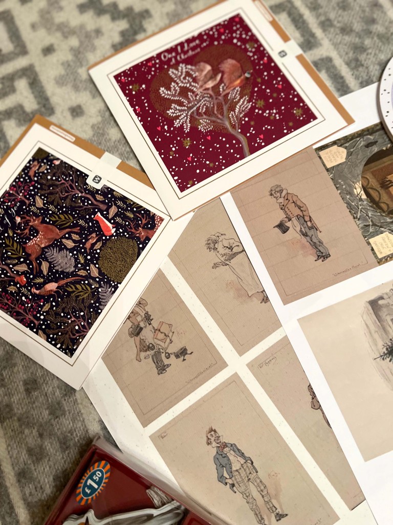
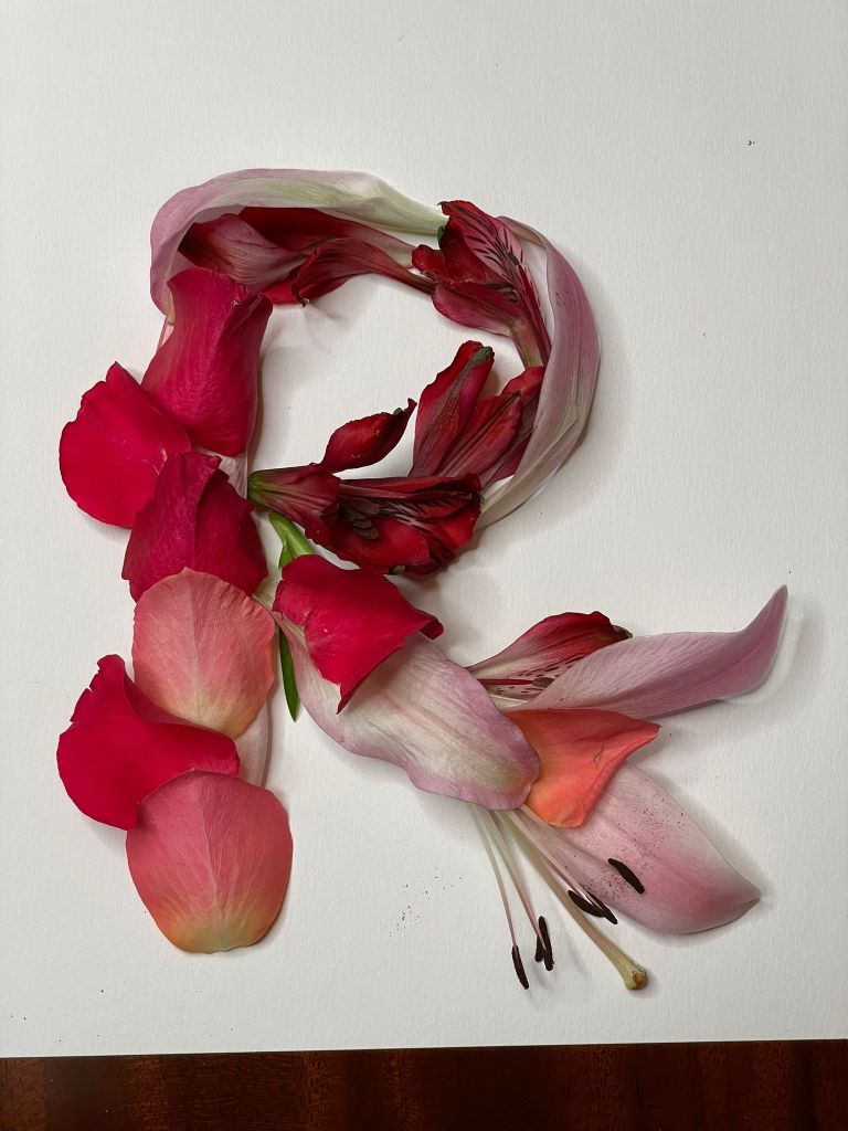
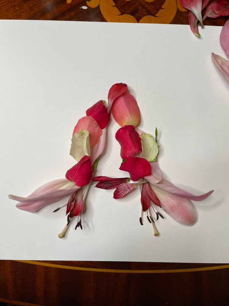
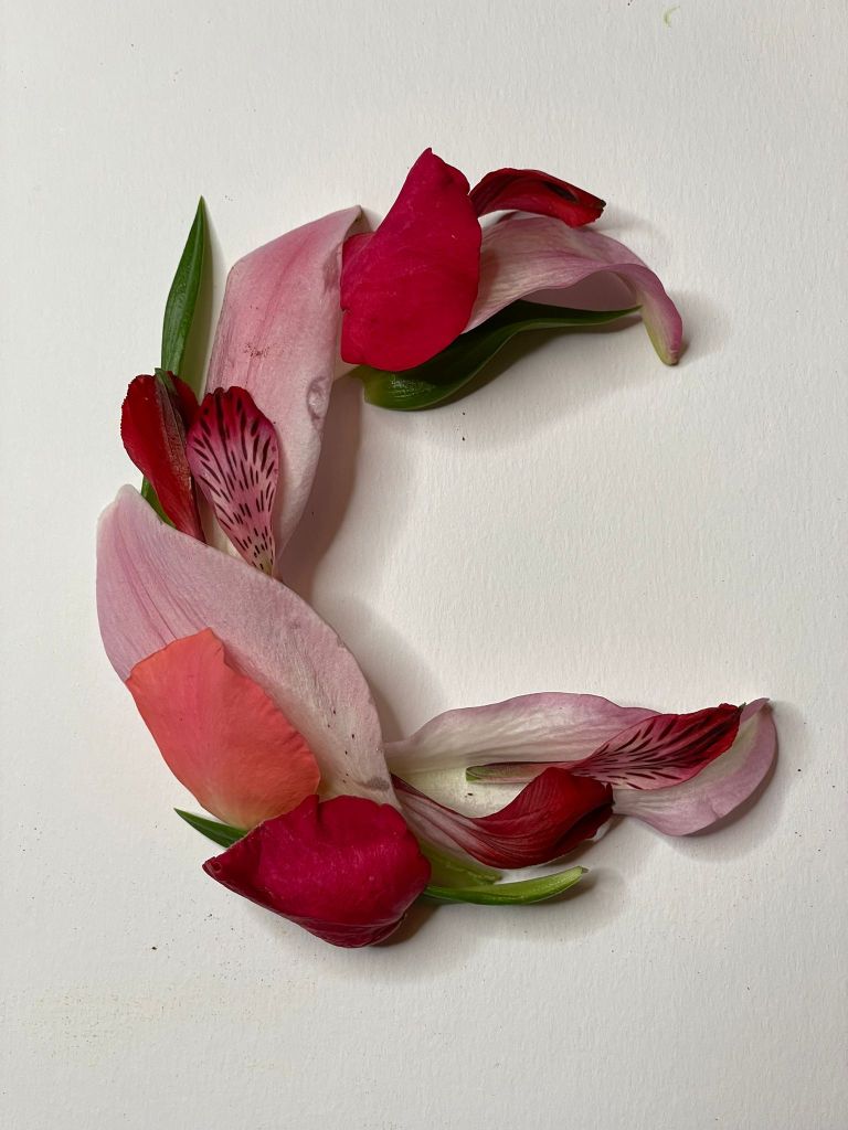
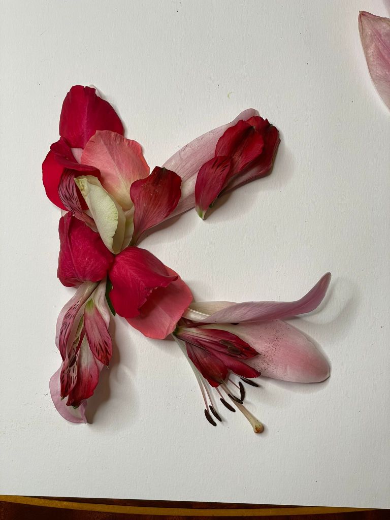
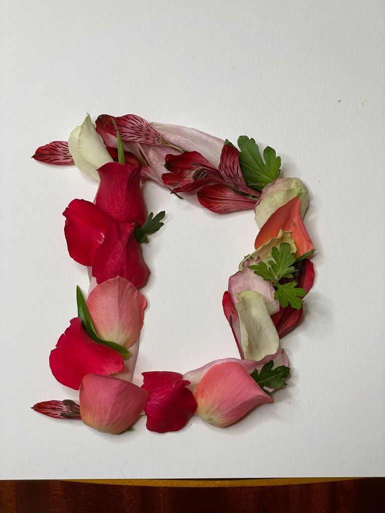
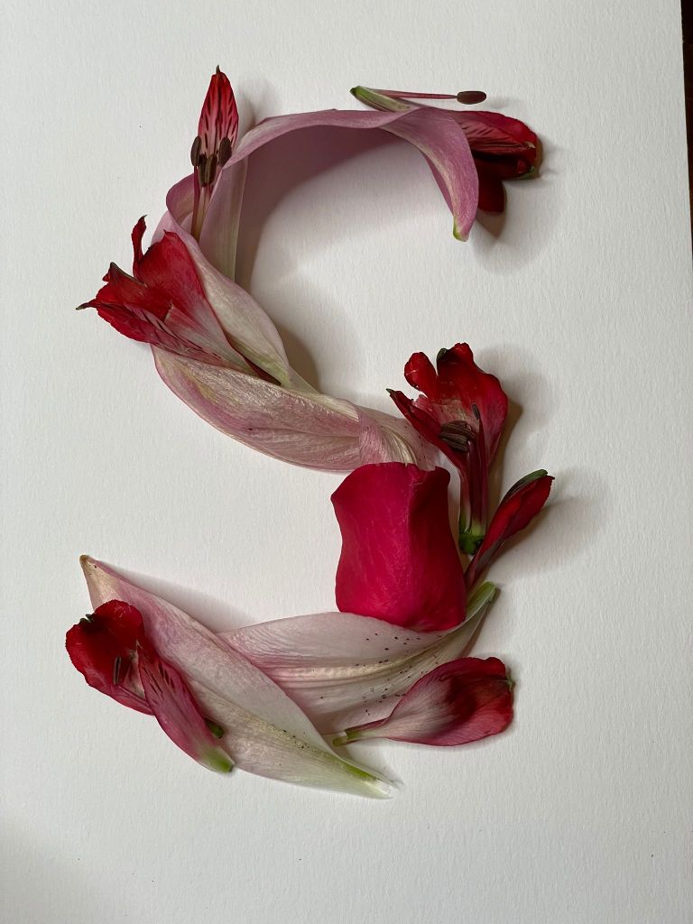
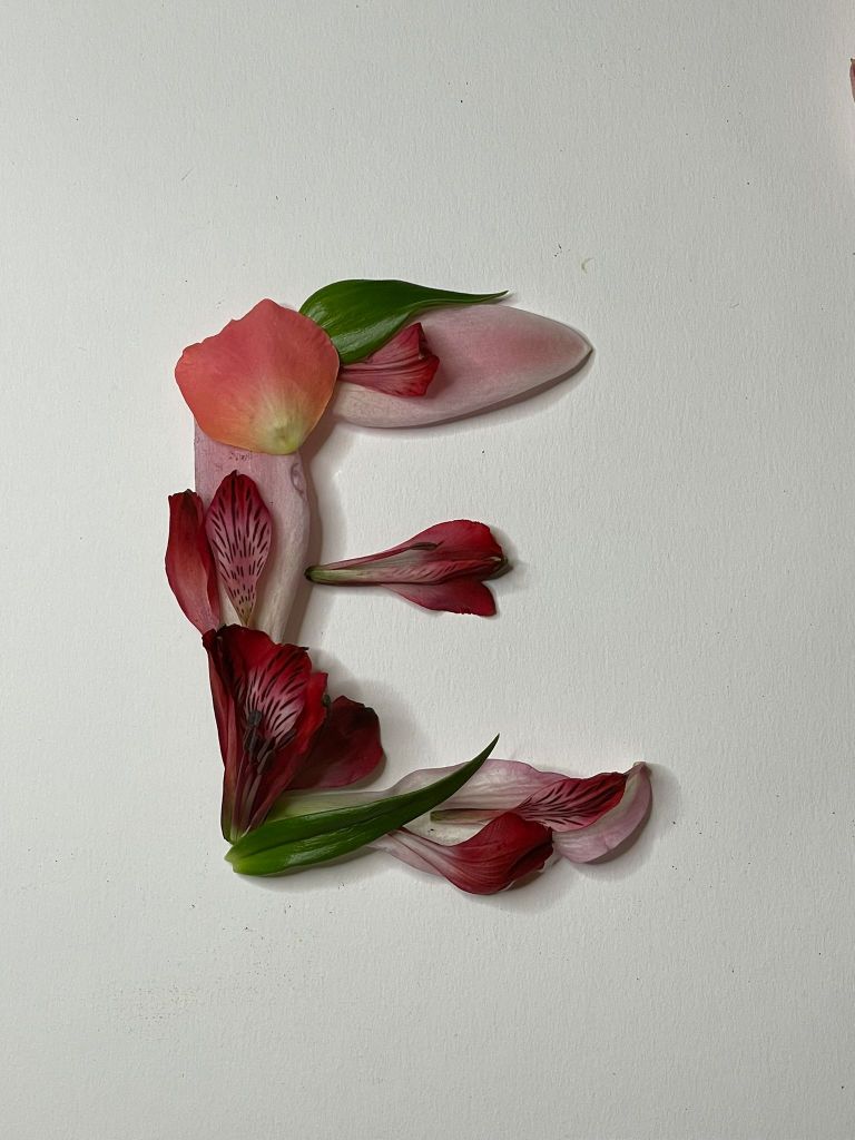
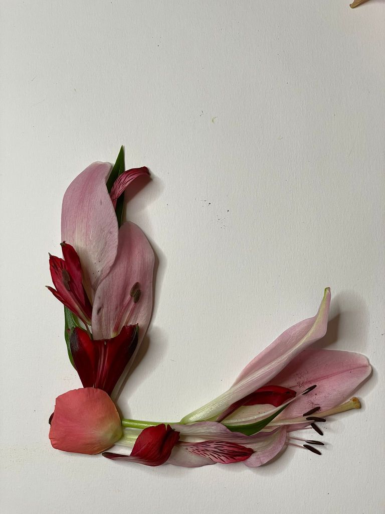
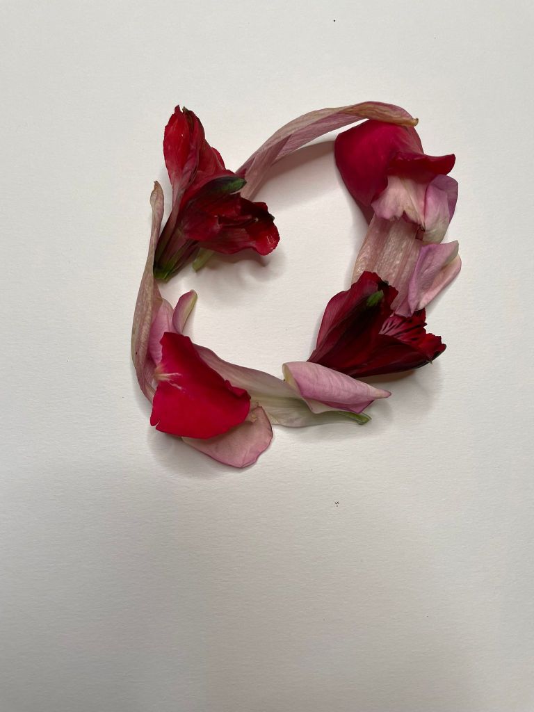
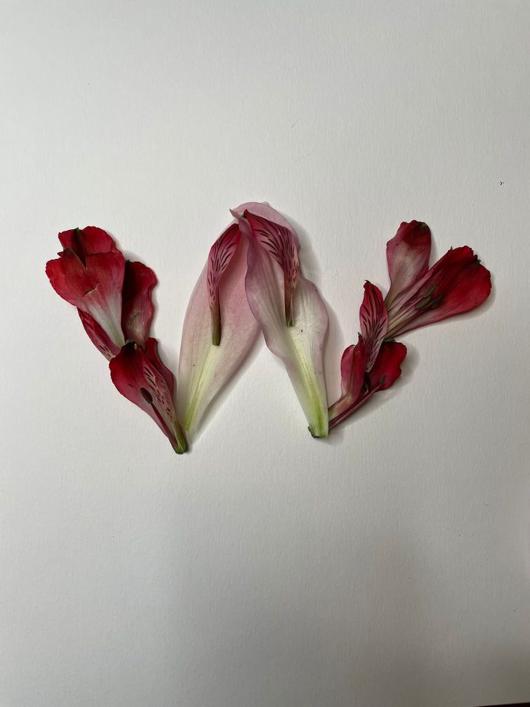
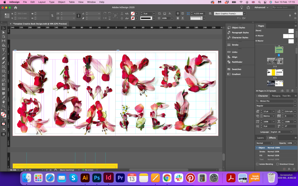
Flower Petals Font
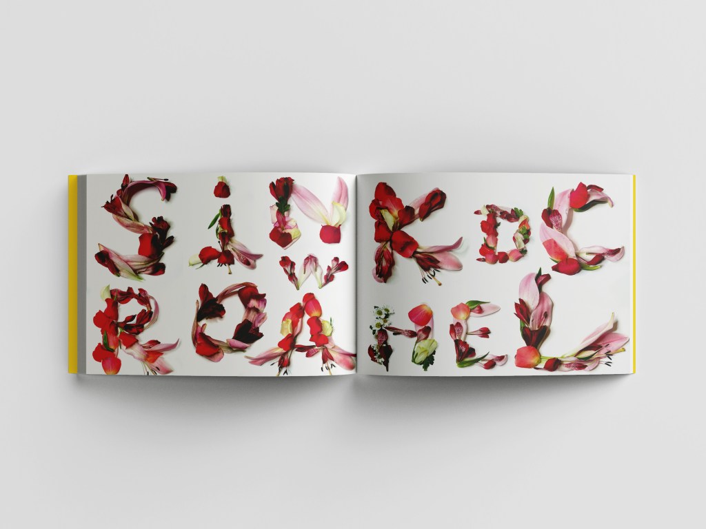
Those roses and lilies font I wanted to recreate again, following the path of my previous experience. I wanted to create a more confident type with brighter colour, and stronger bends around it, so the font is easier to read. I bought bright colours flowers and started organising them around. Those beautiful tender letters from the first look ideal for classical designs and will sit somewhere nicely within feminine designs, but in my book, I wanted to create juxtaposition and go against the rules. I wanted to combine rebel like design, with an unusual magazine layout, bright colours, and tender images. I wanted this book to be an experiment as well, so I thought it worth trying all ideas I have, and seeing the outcome of experiments, as the conclusion will show the final result.


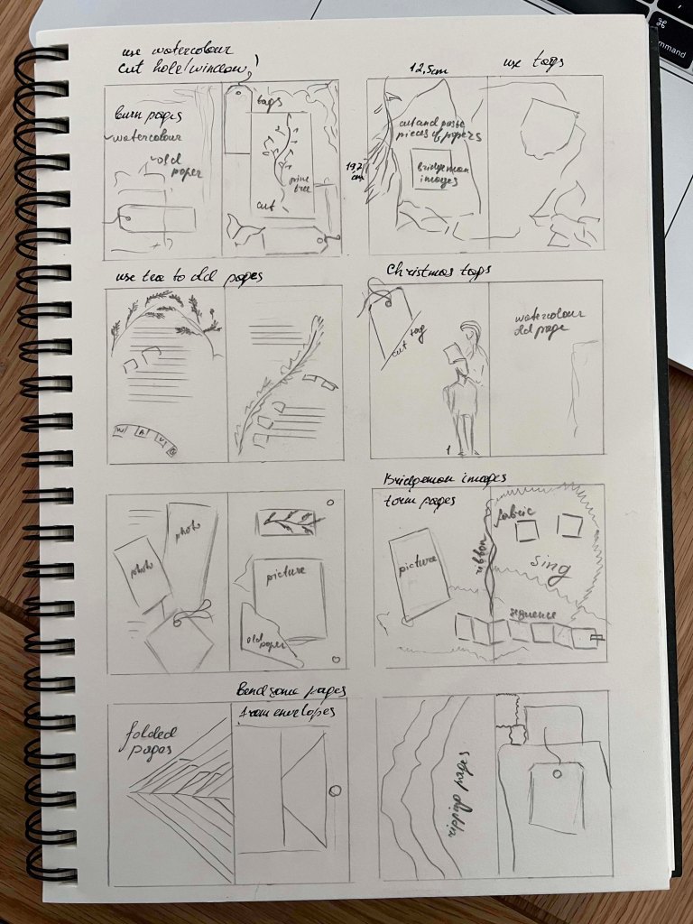
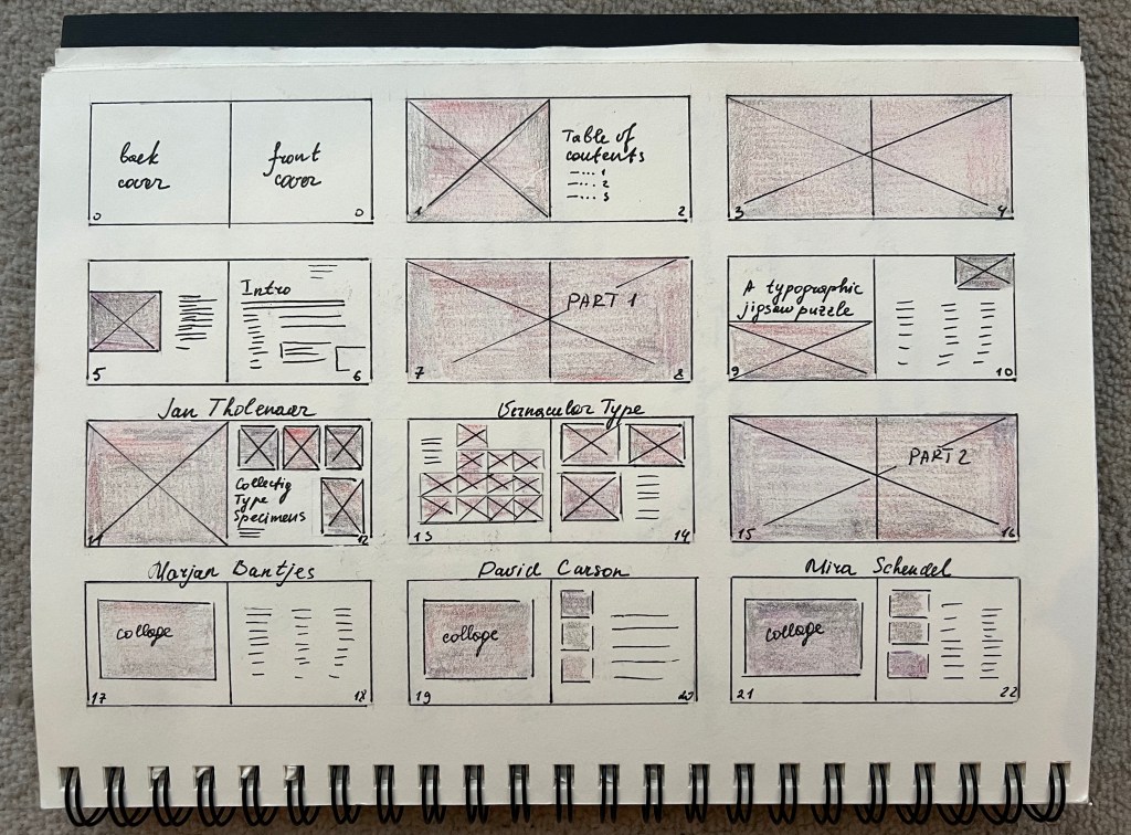
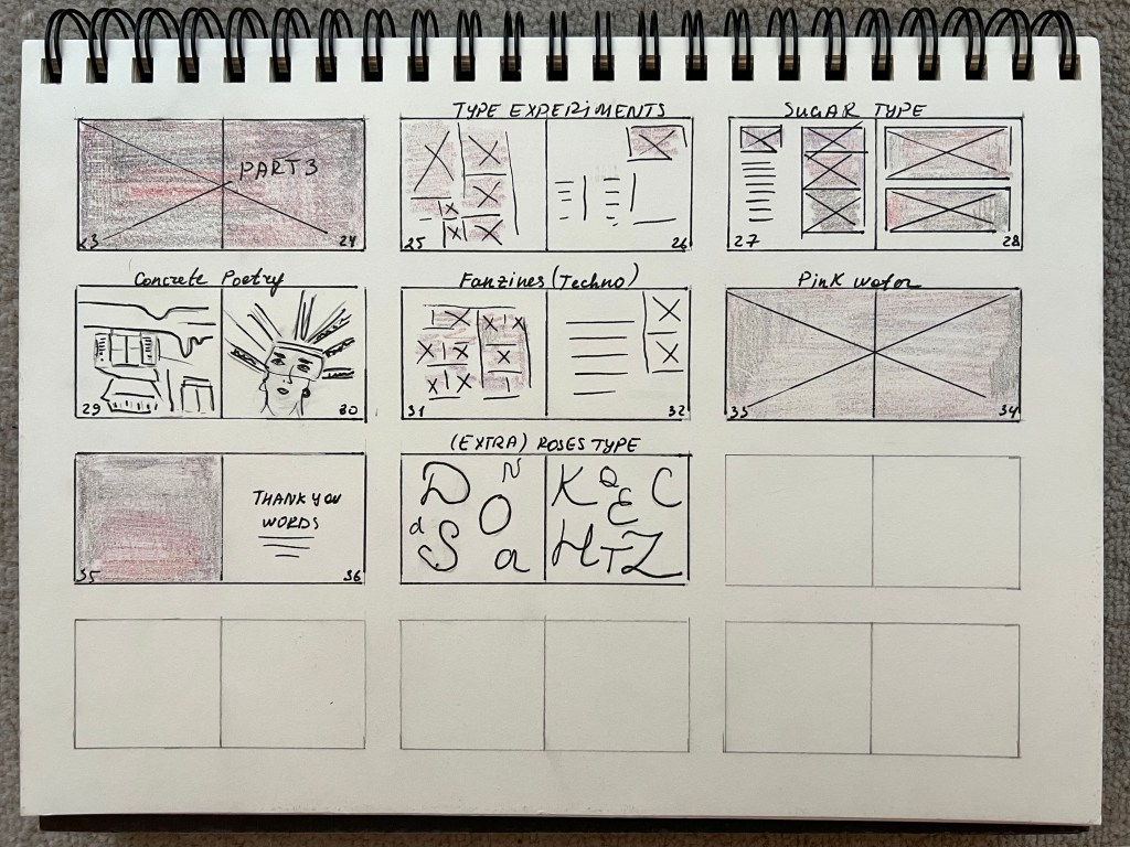
Flatplan
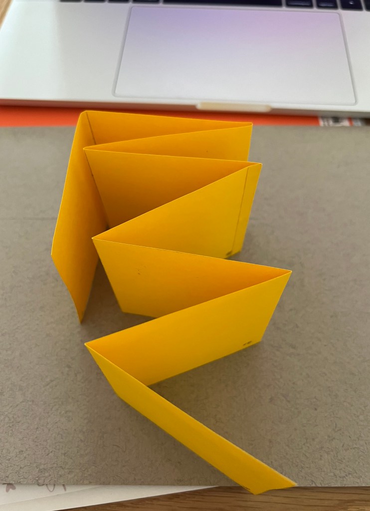
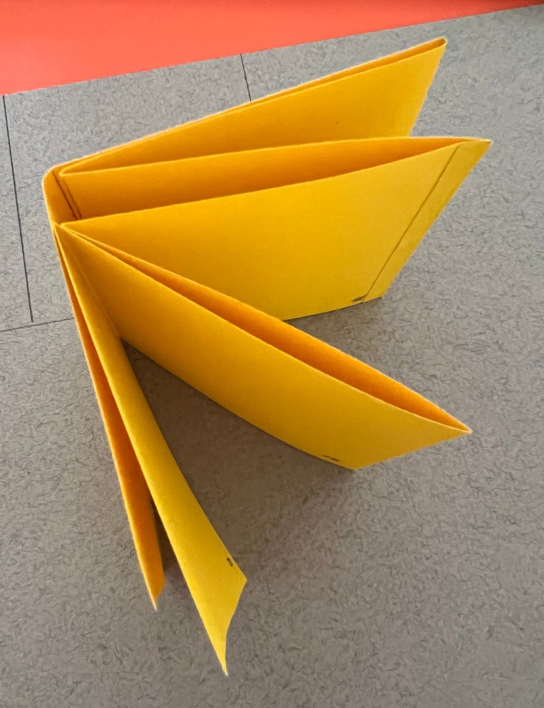
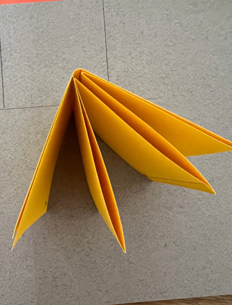
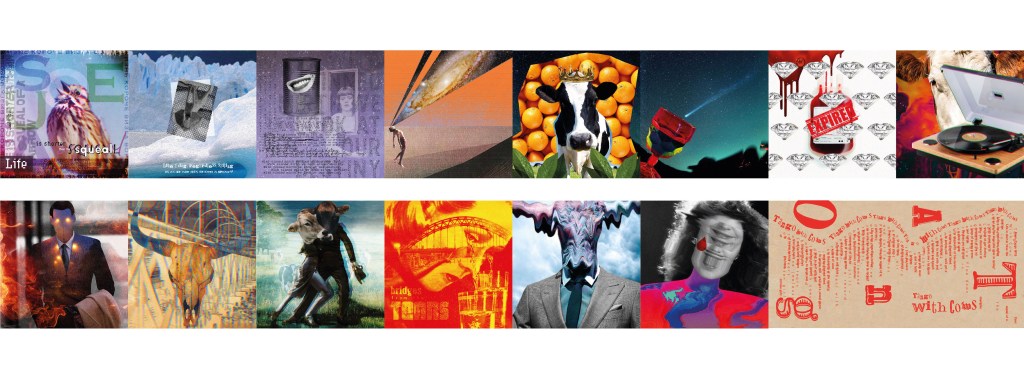
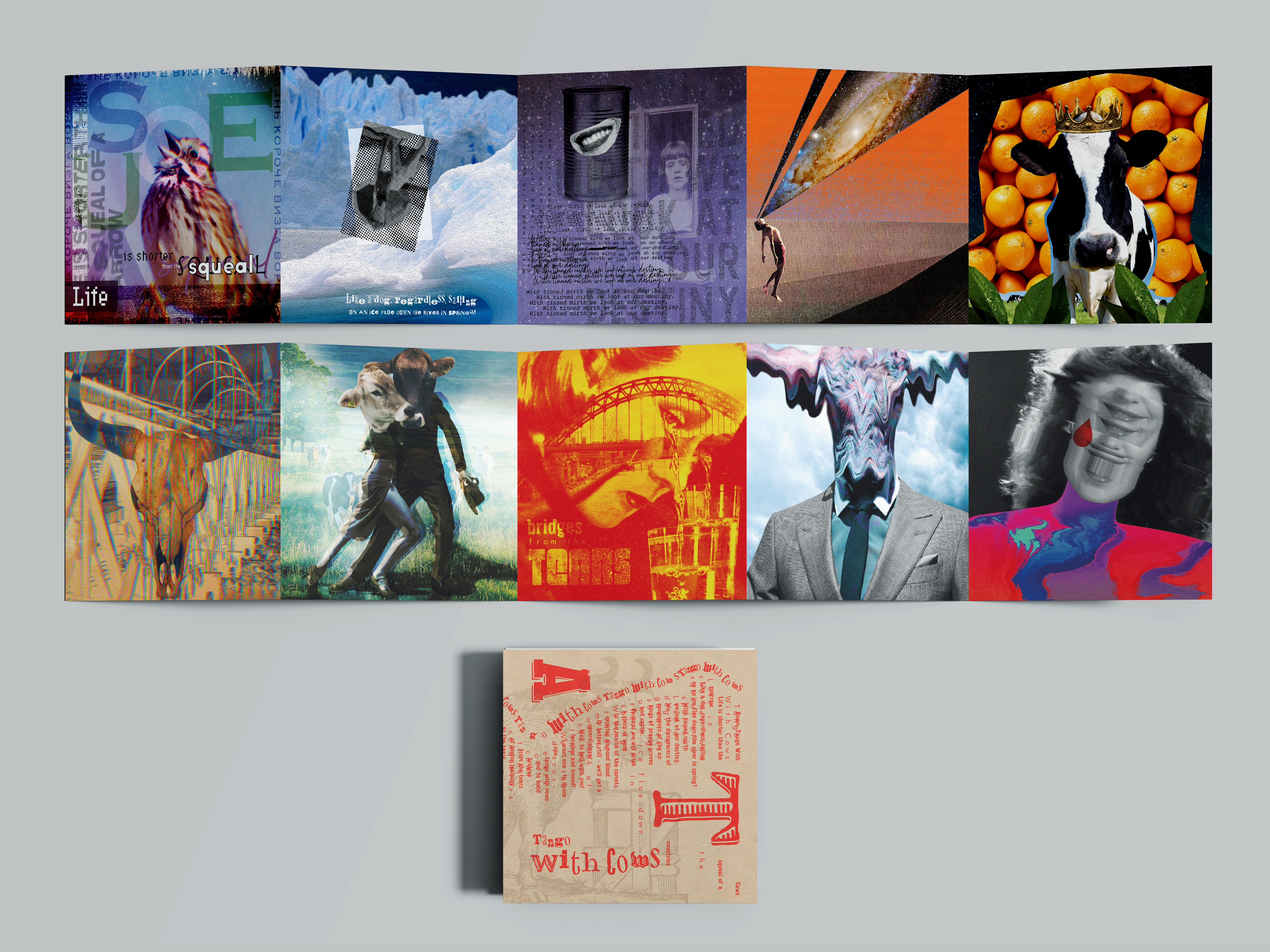
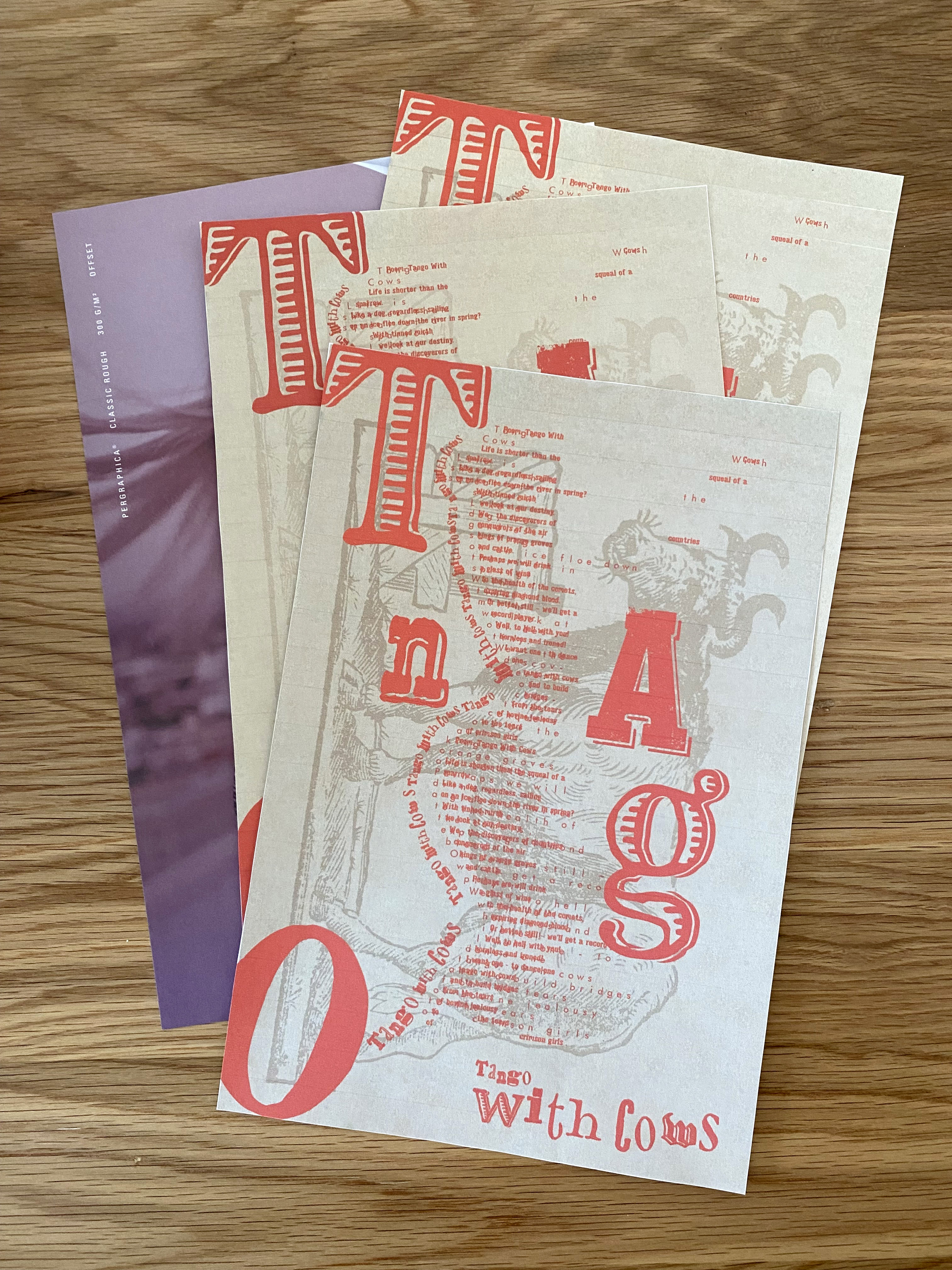
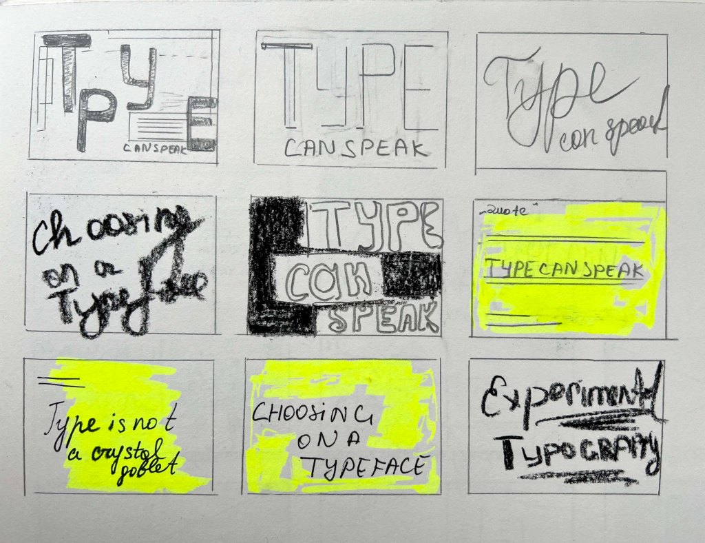
After generous research and inspirational ideas, which I’ve been doing for quite a long time, I proceeded to the next stage, of the flat plan. These sketches finally helped me to put down together all my ideas, and see the full picture of the future book. I can see the use of the habit using the flat plan, as it provides a detailed description before the actual designs. I think during designs I will adjust some layouts slightly, as I will be organising wording and visual material depending on the amount of wording and sizes of images. I decided that the book will be approximately 36-38 pages, I thought that the idea of creating a proper book is great, the only that was worried me that due to the deadlines I didn’t have enough time to produce more pages, with experiments, but I thought the most important is to use each page wisely and provide the full explanation of the chosen subject of the “Experimental Typography”.
Size of the book
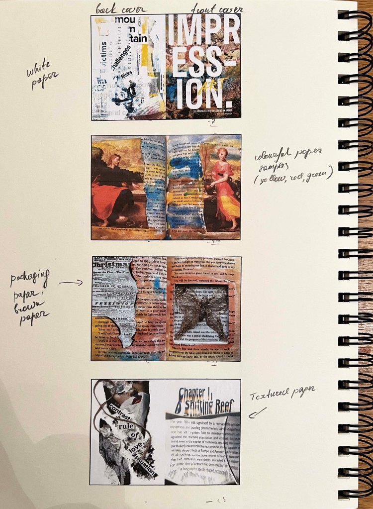
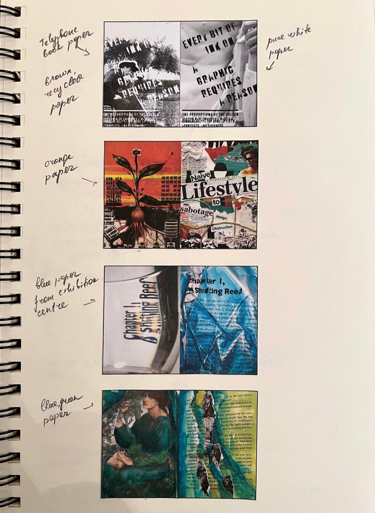
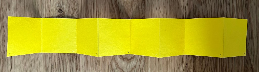
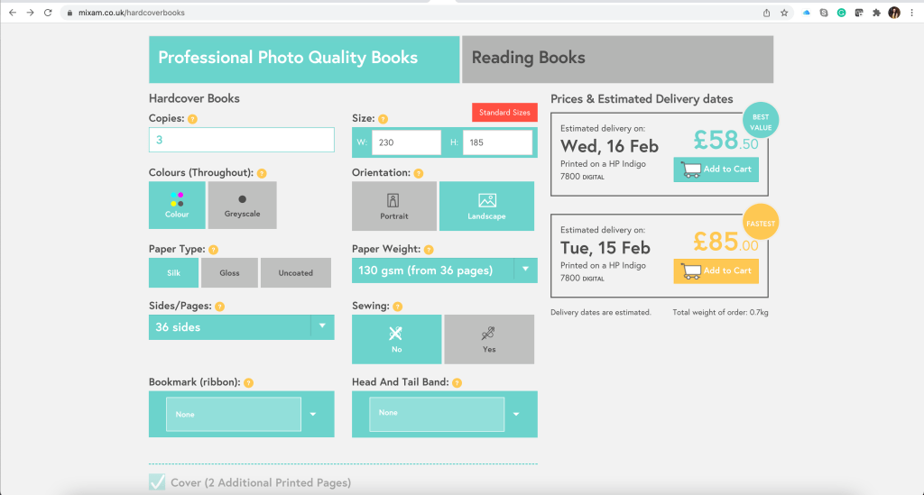
Prior to the designs, I went to the Mixam page for uploading the book, to see what sizes and prices were for the chosen book. I decided on the size 230×185 mm, landscape format book, I wanted the book to be different this time, as previous brochures I made were A5 portrait format, and I didn’t want it to be square, I liked that longer on the width sides look. I wanted to use recommended quality of pages, included in the price, and have a hardcover book. I wanted a book people to keep on the shelf, and relate to it when they look for some inspiration.
Book Creation
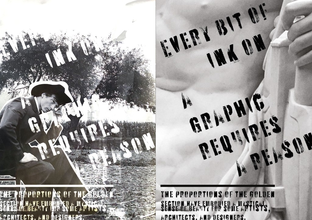
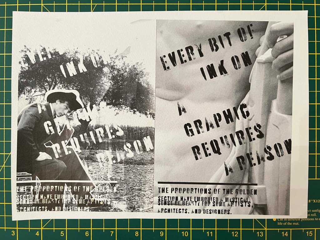
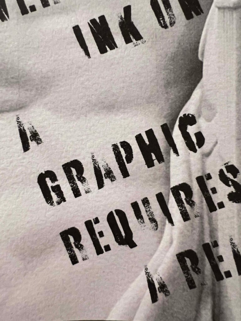
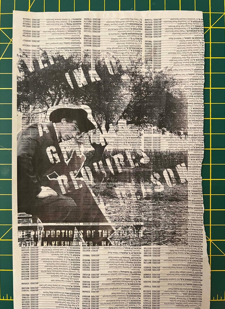
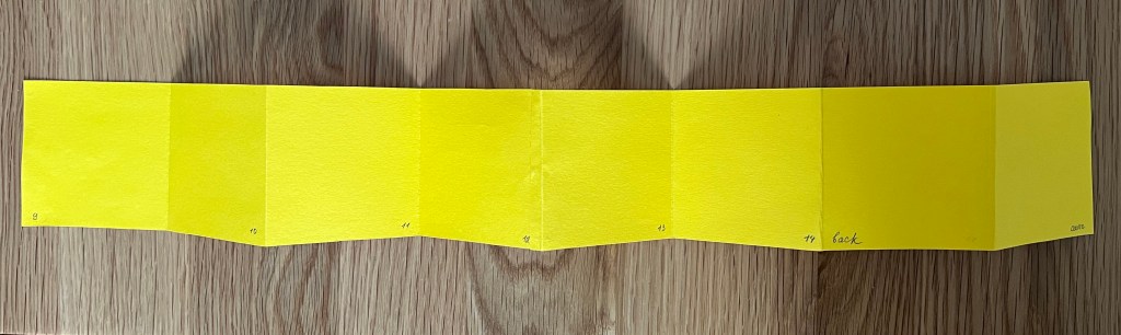
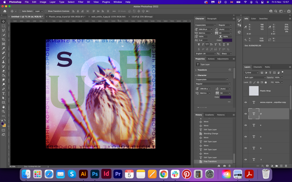
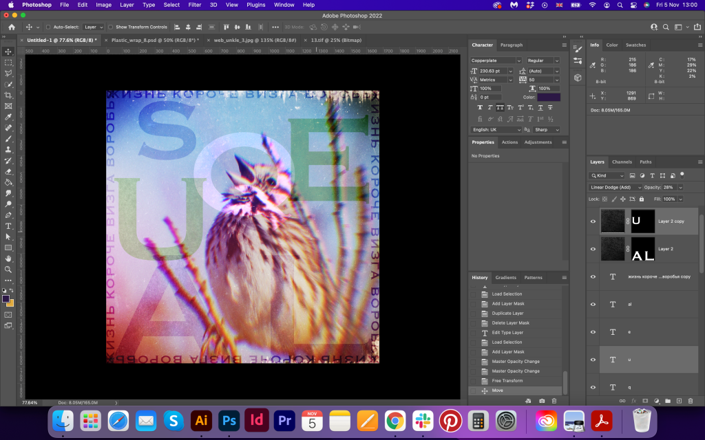
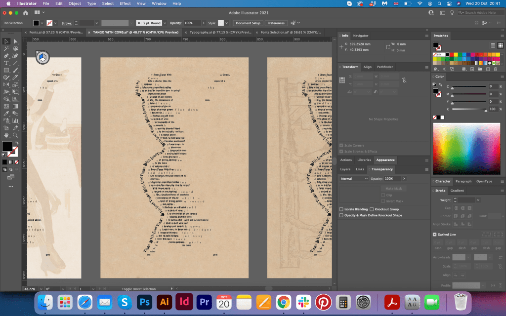
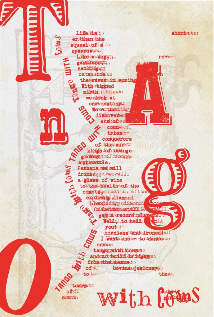
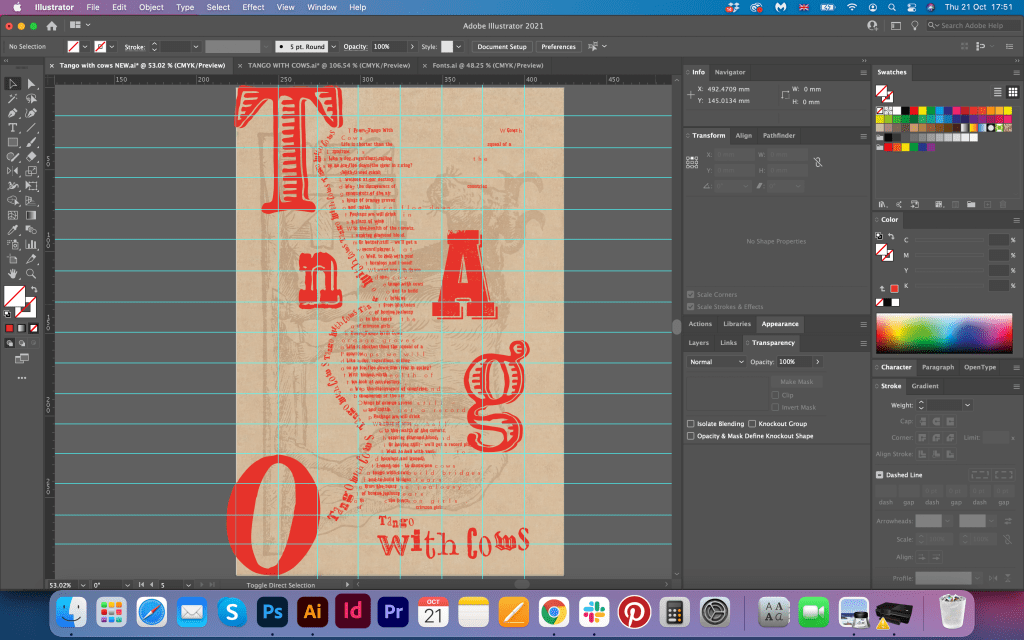
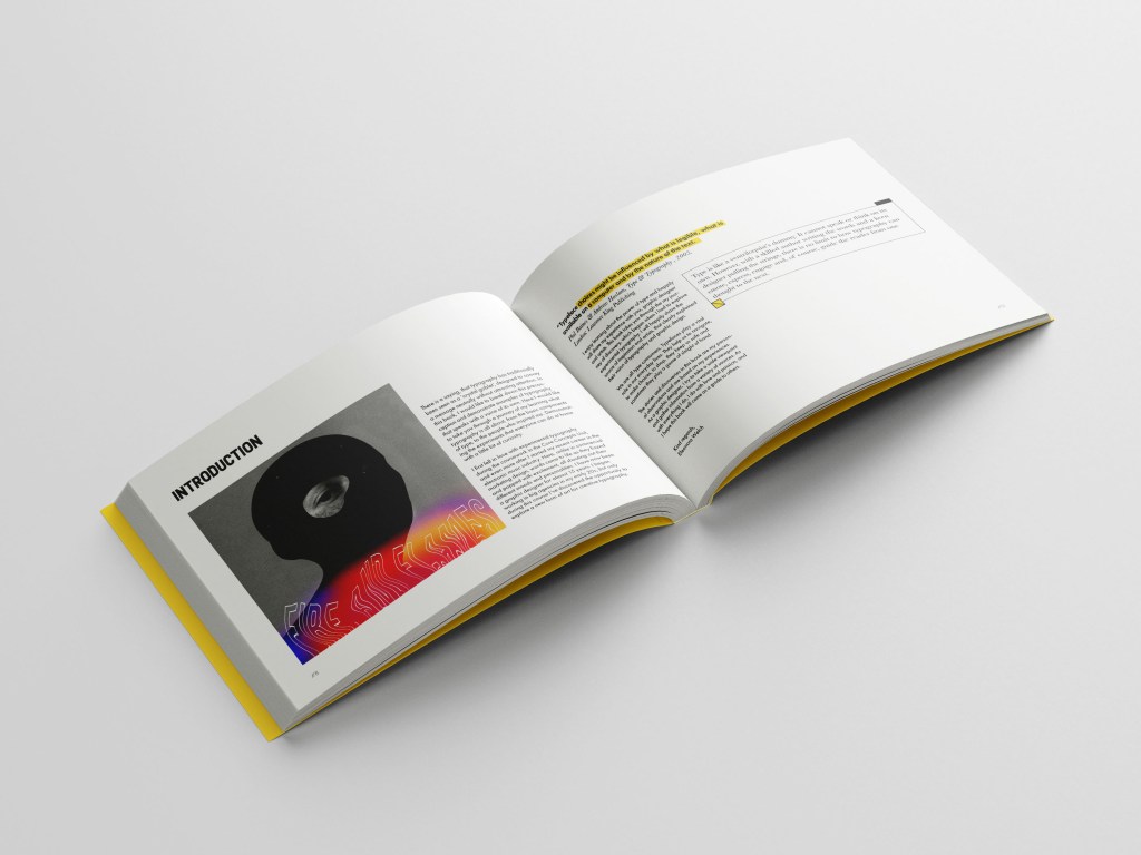
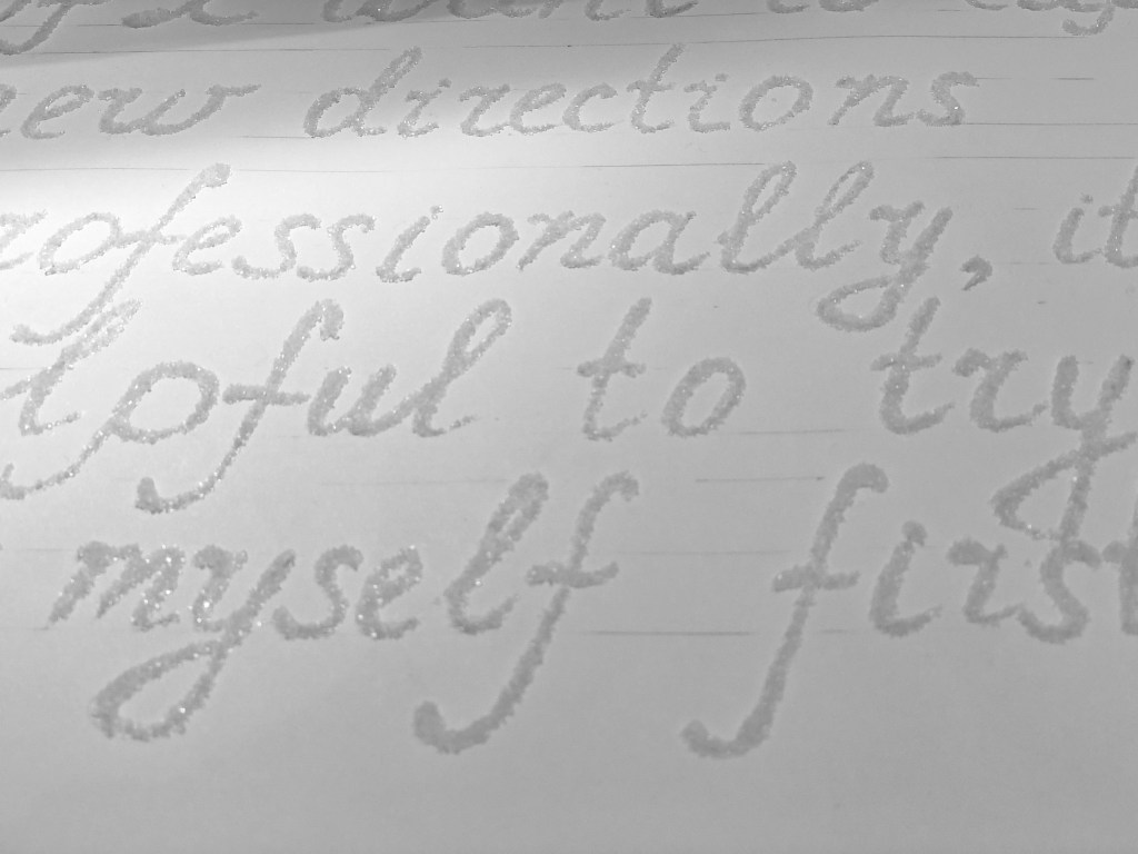
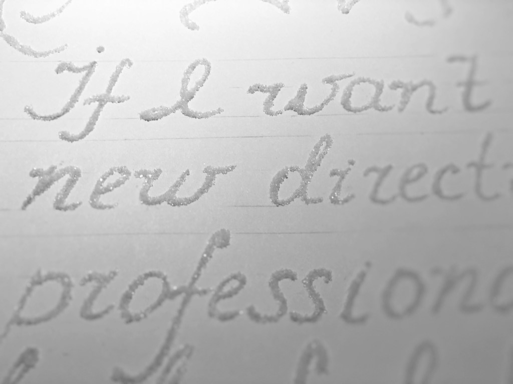
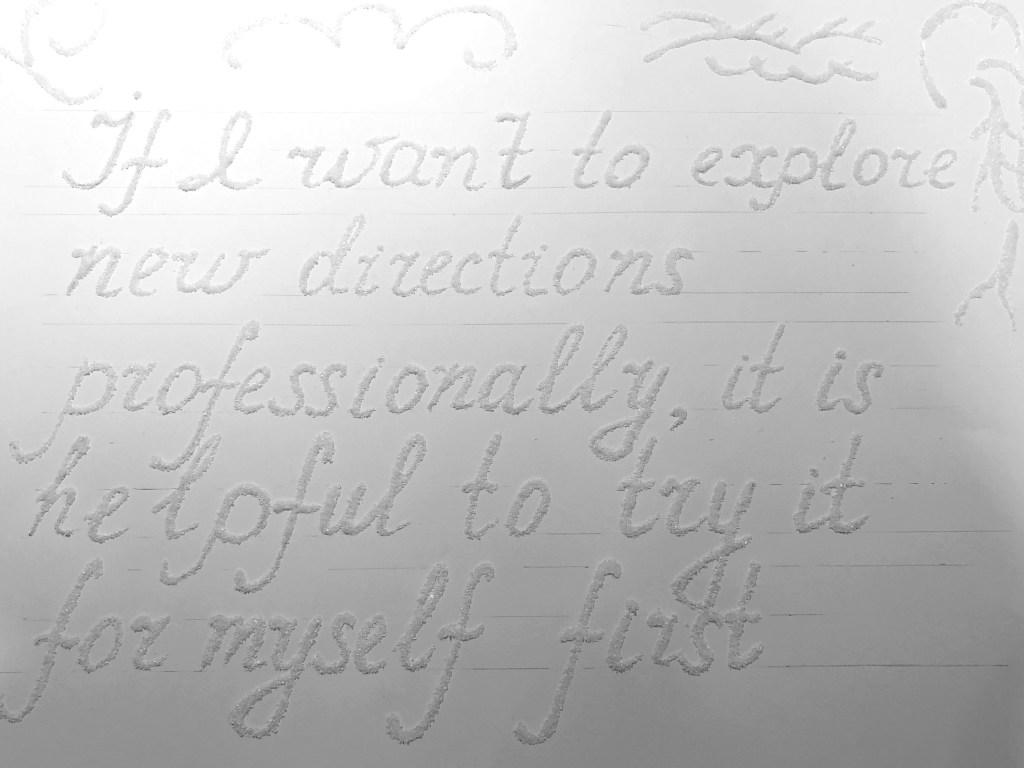
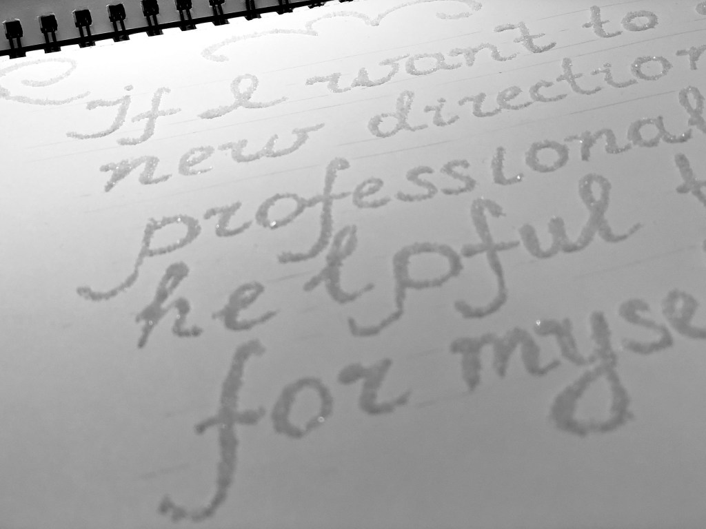
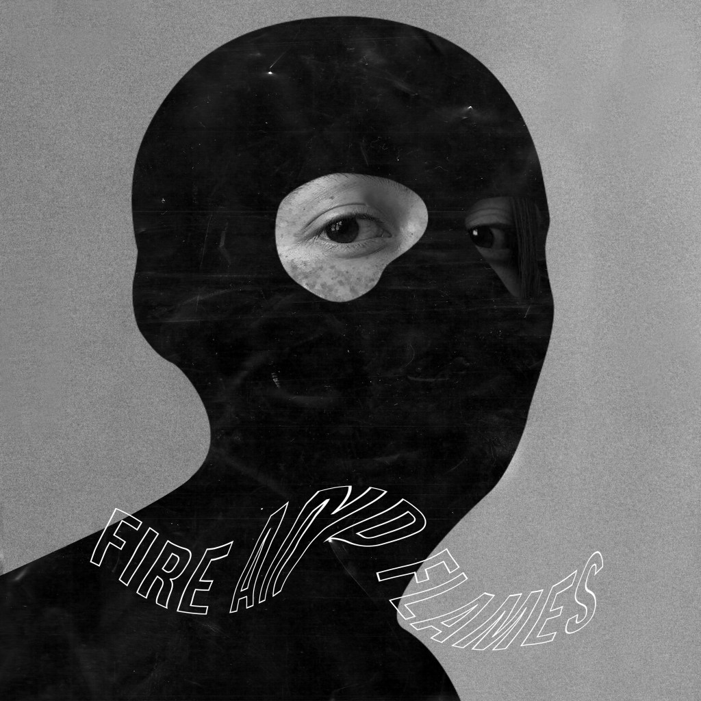
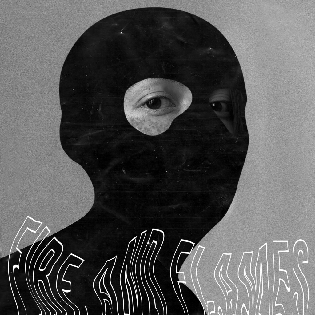
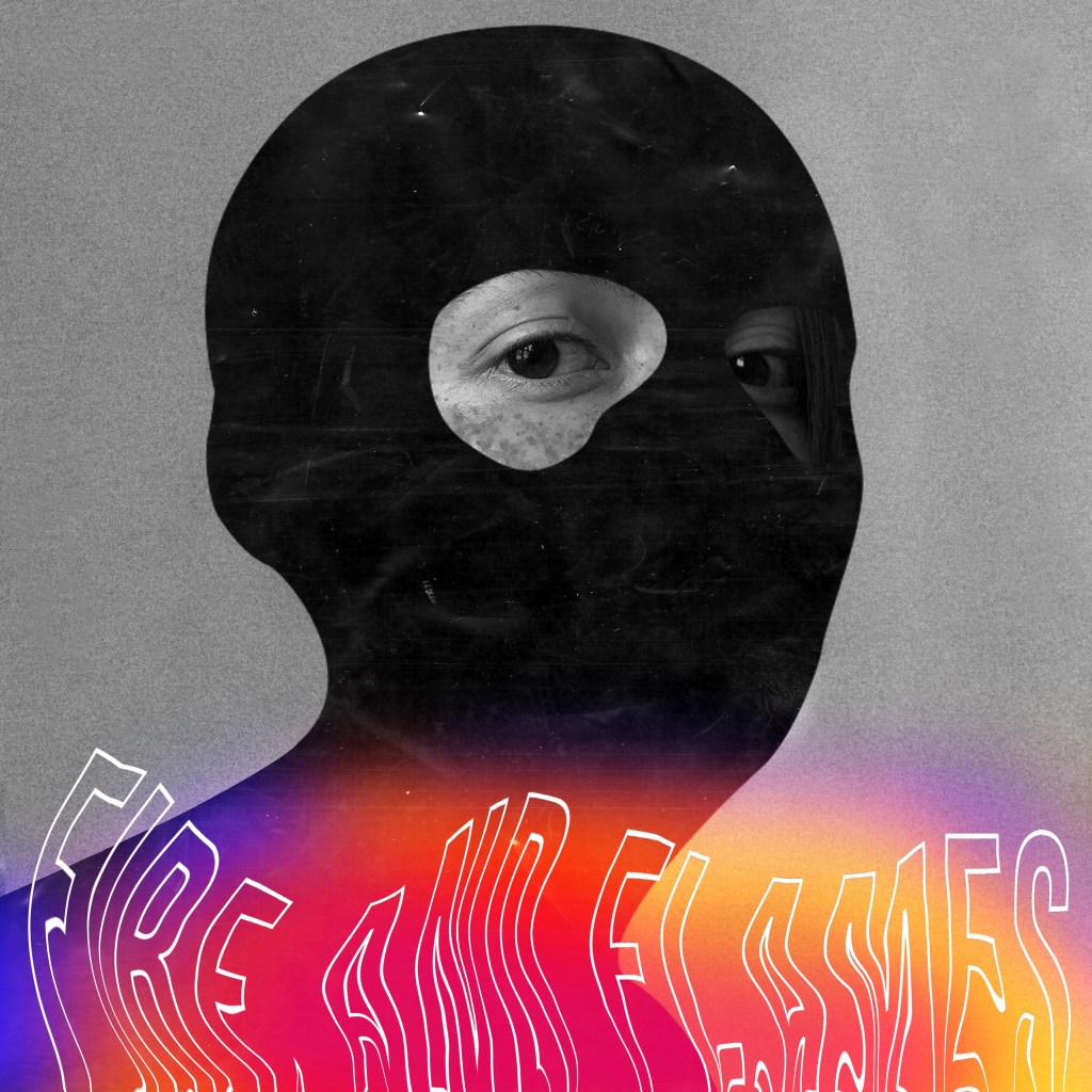
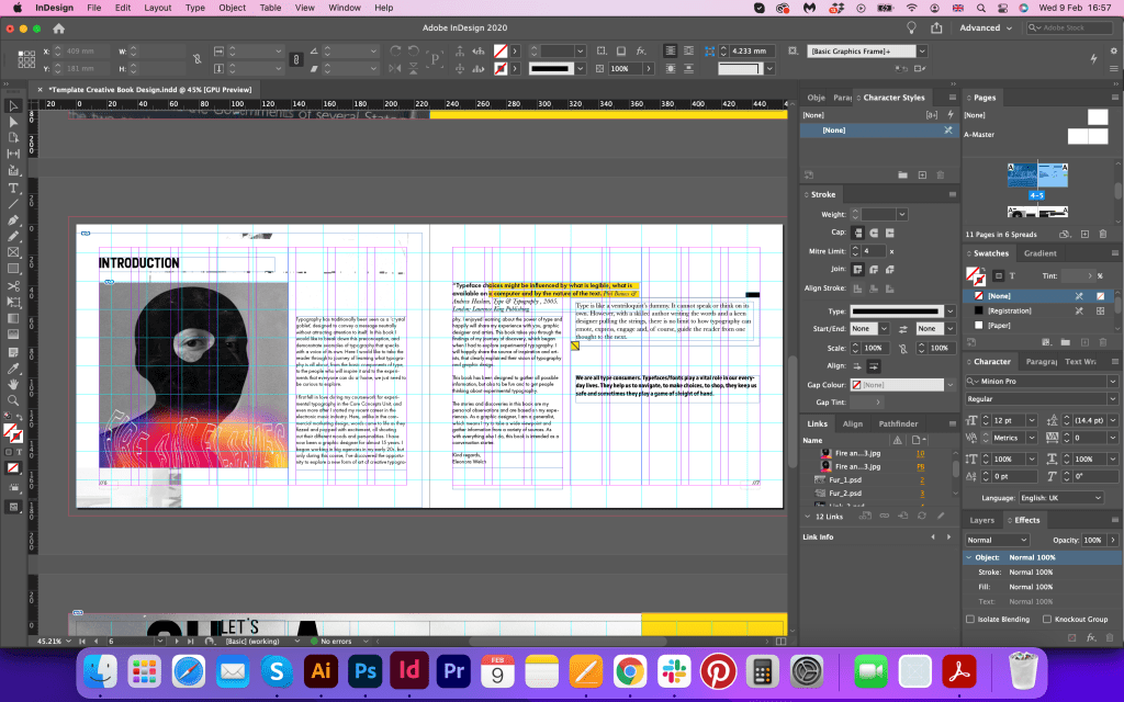
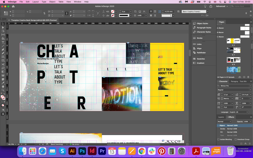
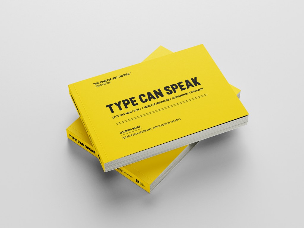
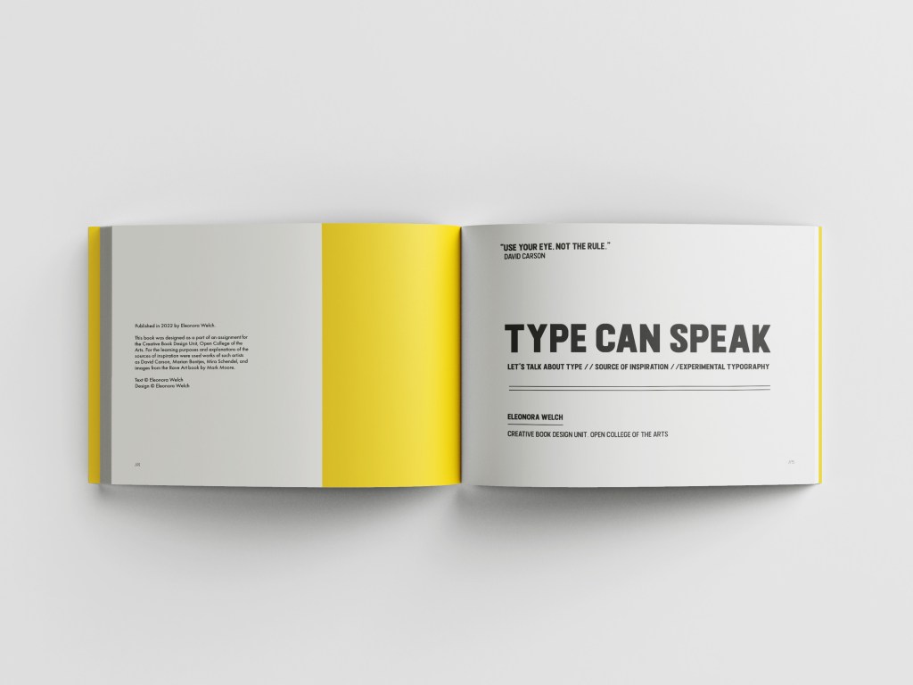
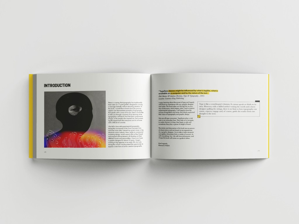
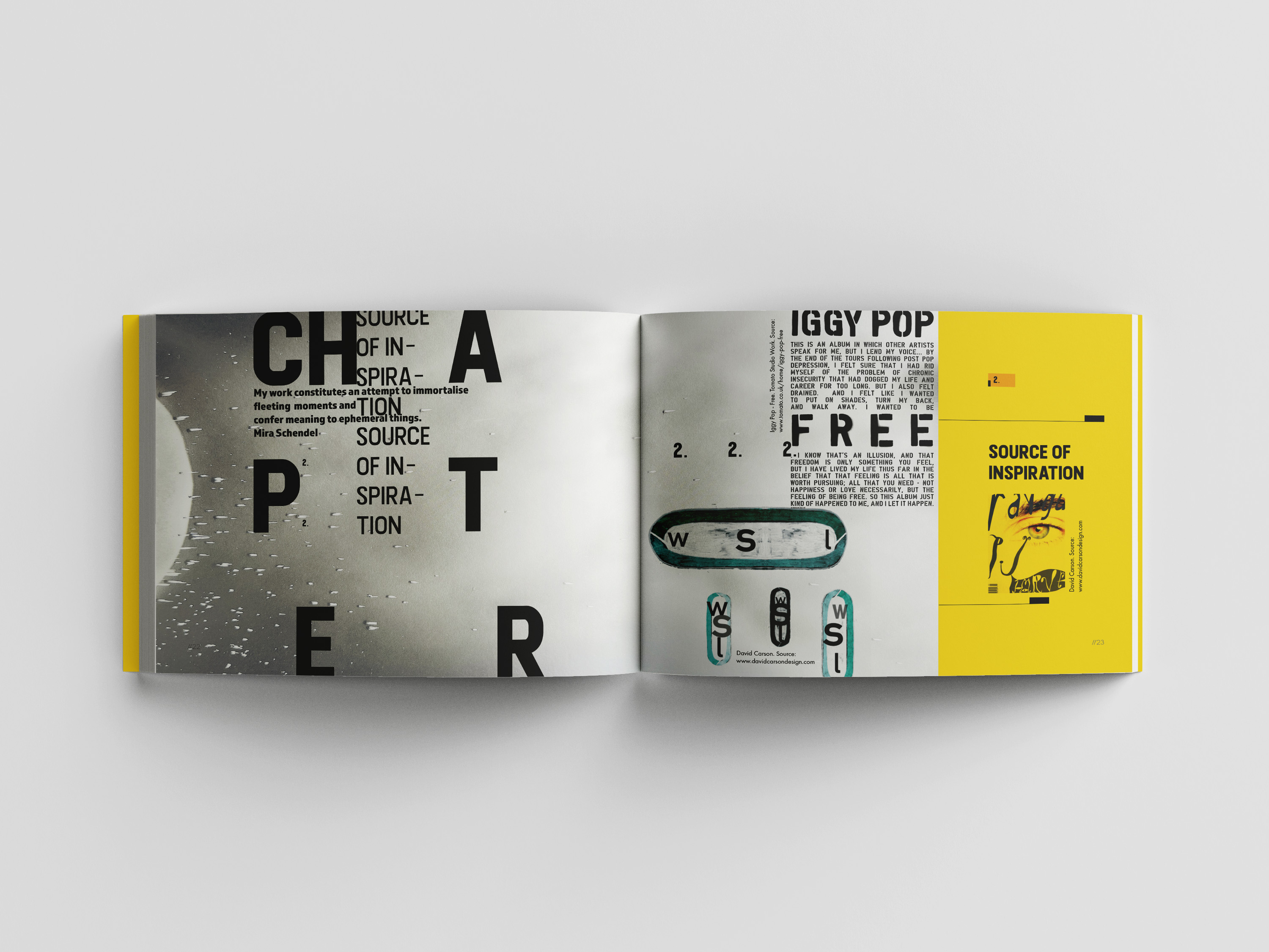
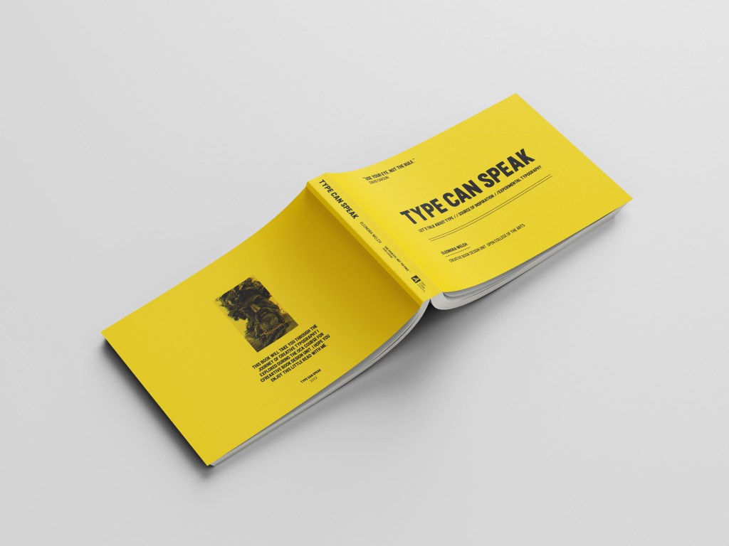
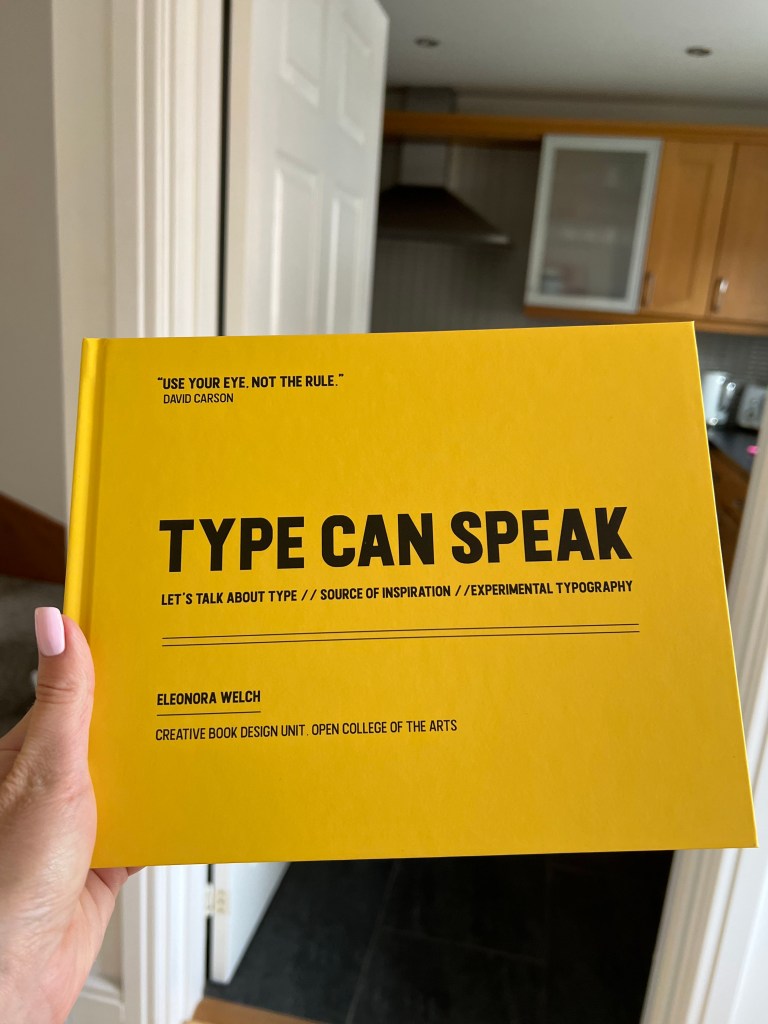
In my first spread for this book, I started with the Introduction page. I create a layout in In Design sizing 230×185 mm with the bleed 5 mm from each size. Within the page I created 8 columns with a 5mm distance between each, I was going to use different size columns for this book, as I wanted to bring the spirit of the Fanzine book. Another point that would make it look out of order, is the selection of typography here. I decided to go for the Futura font, size 9pt for the body text, with a combination of Baskerville font, Regular and Italic. They are both recommended by Derek Birdsall from the Notes on Book Design, those fonts are easy to read and matched the design I was planning to achieve. Also, I added Bold font Almaq, for the quotes, and phrases I wanted to highlight. For the general look of the book, I went for the provocative bright yellow design, with geometric lines and squares in it. I liked the idea of creating an unusual extraordinary looking book, like a hybrid between fanzine, magazine and book, as that is an Experimental Typography book, I wanted to be inventive for the book layout too, bring some yellow boxes for the quotes, little squares to pop up in the corners, all for the look of the playful and experimental book. At the same time, I wanted this book to be a celebration of everything I achieved during this course, and I hope I’m on the correct path.
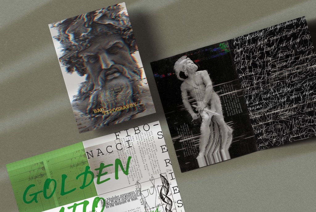
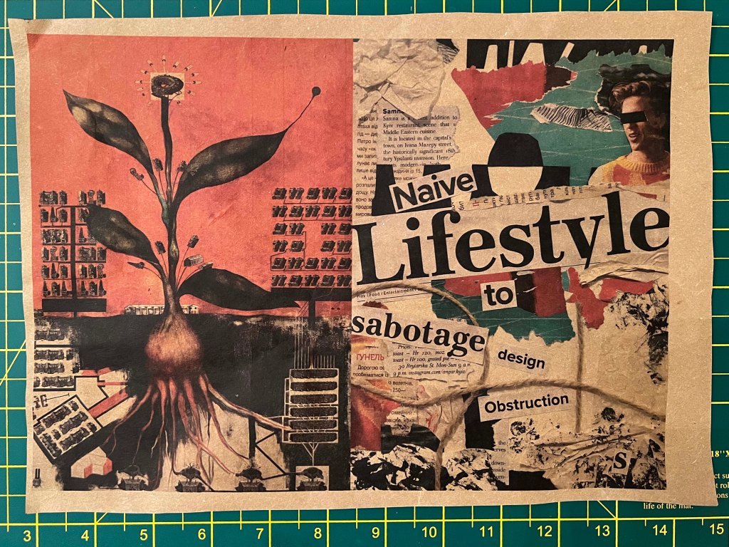
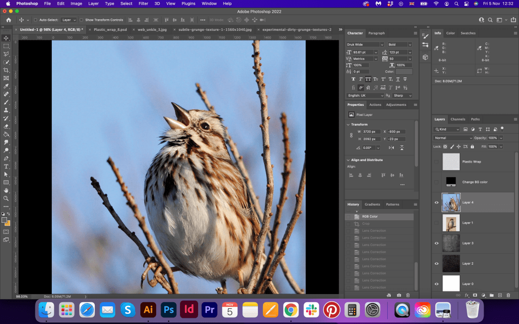
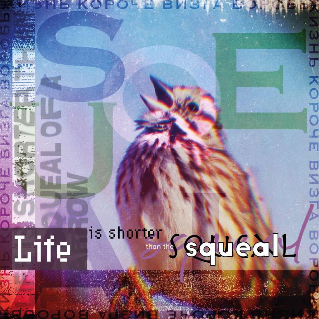
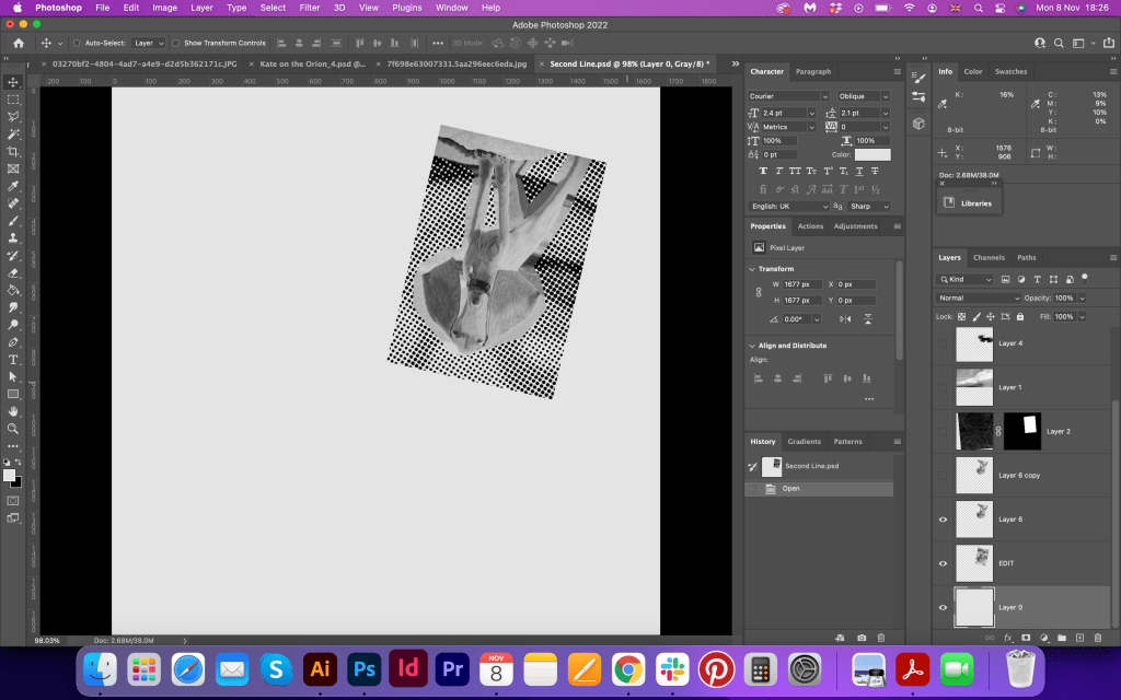
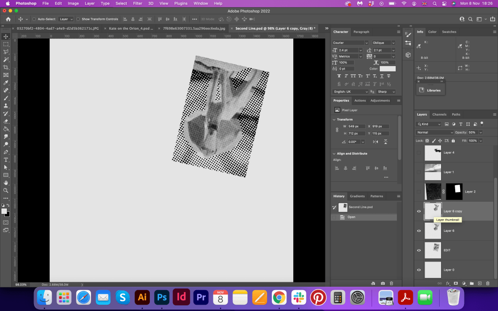
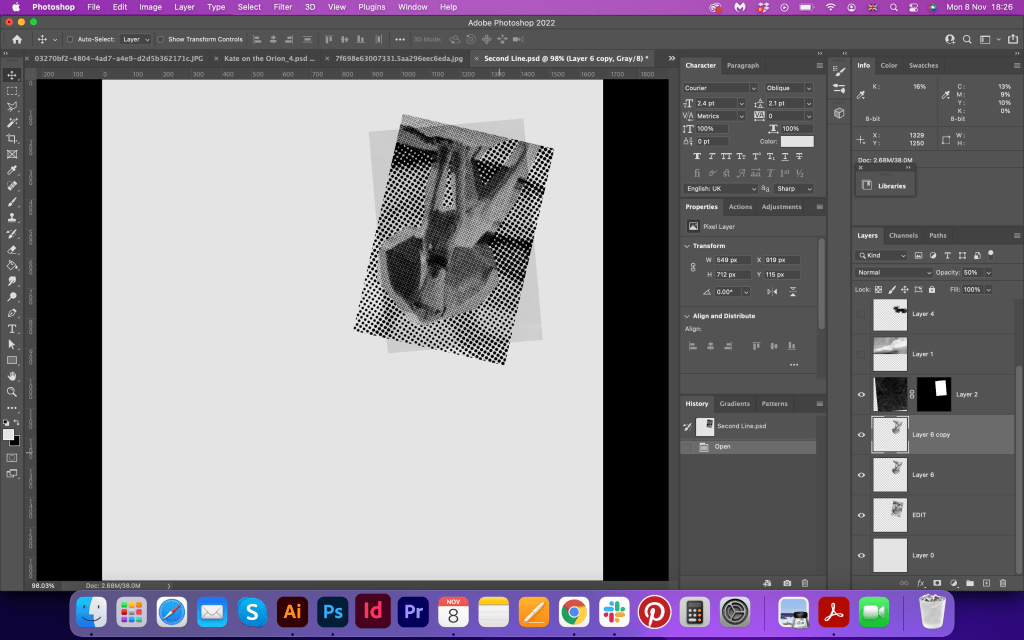
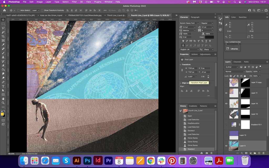
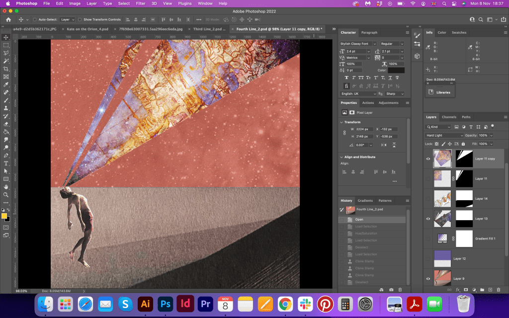
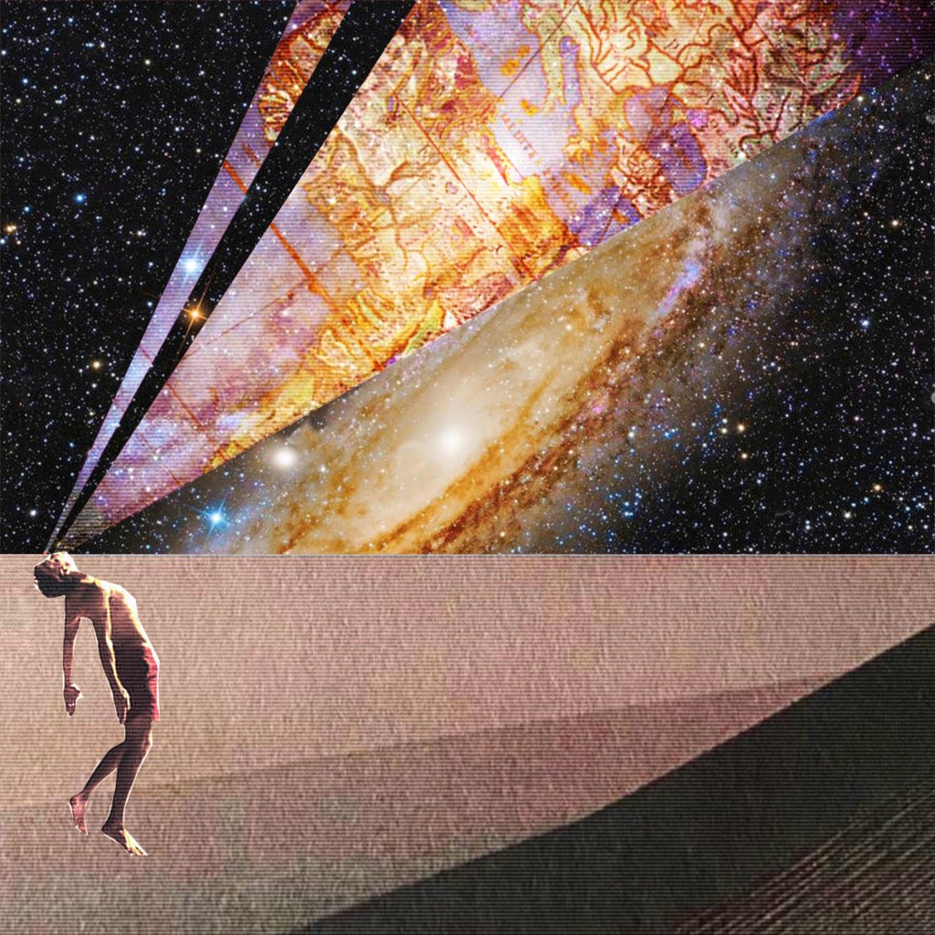
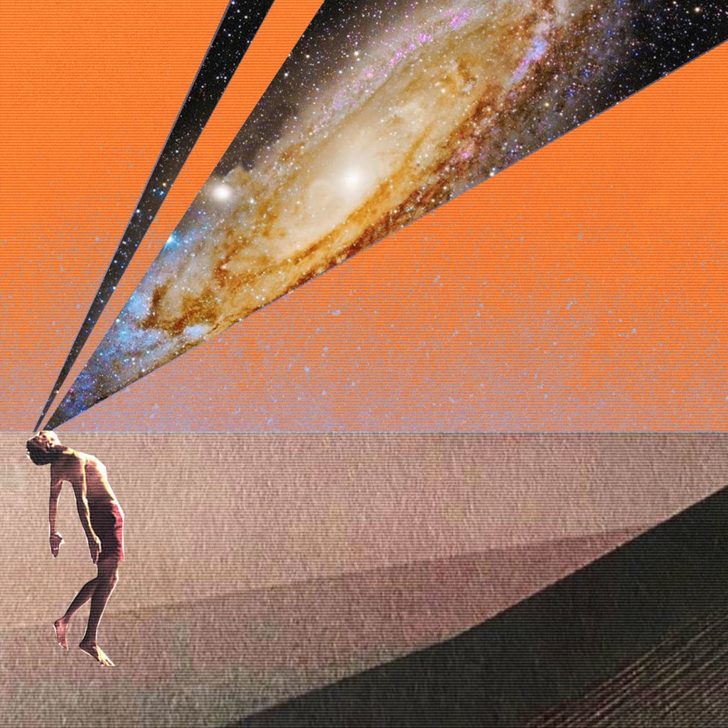
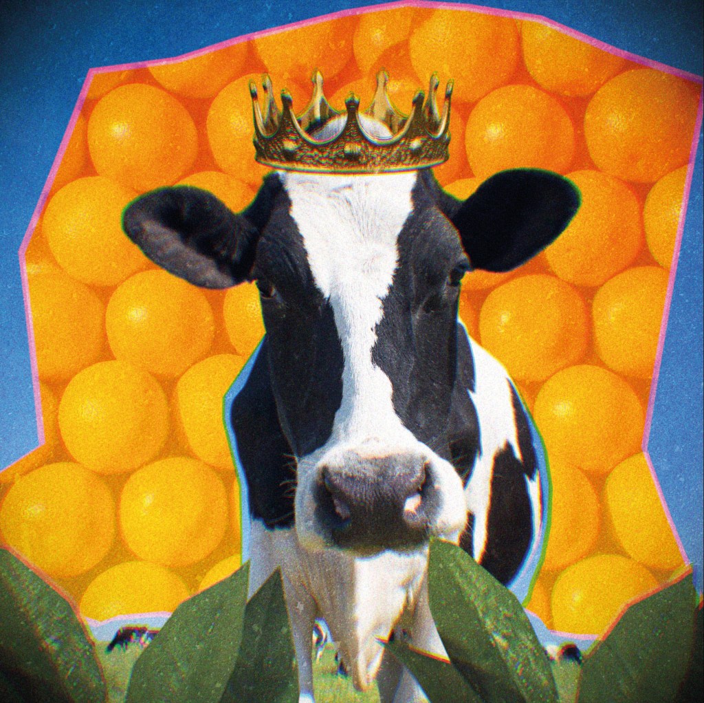
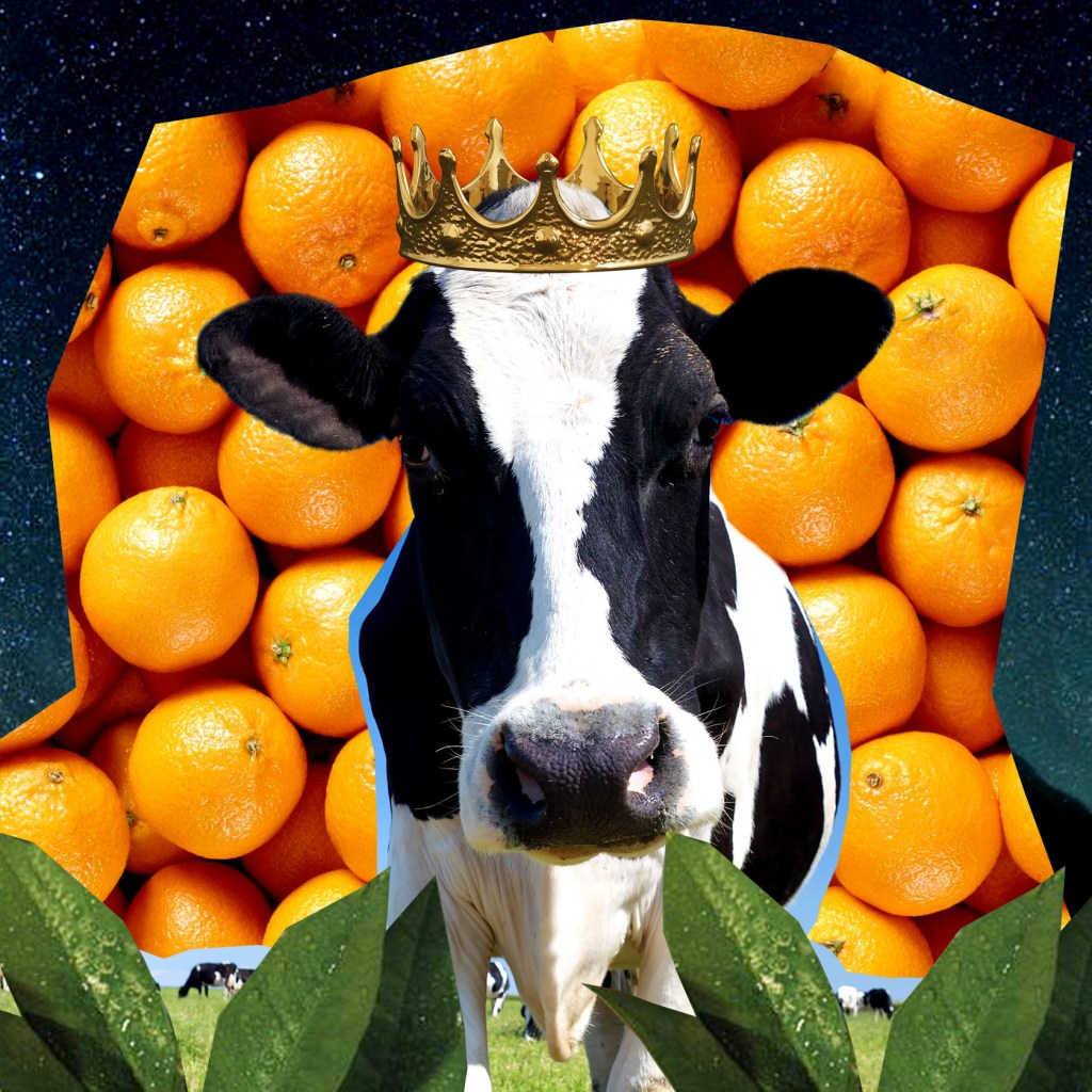
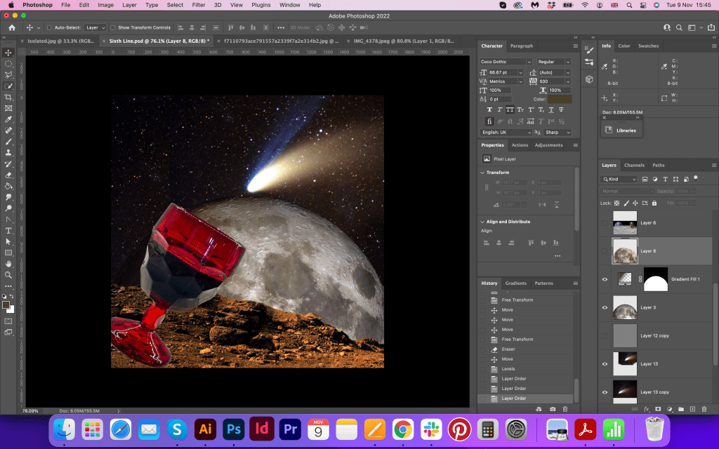
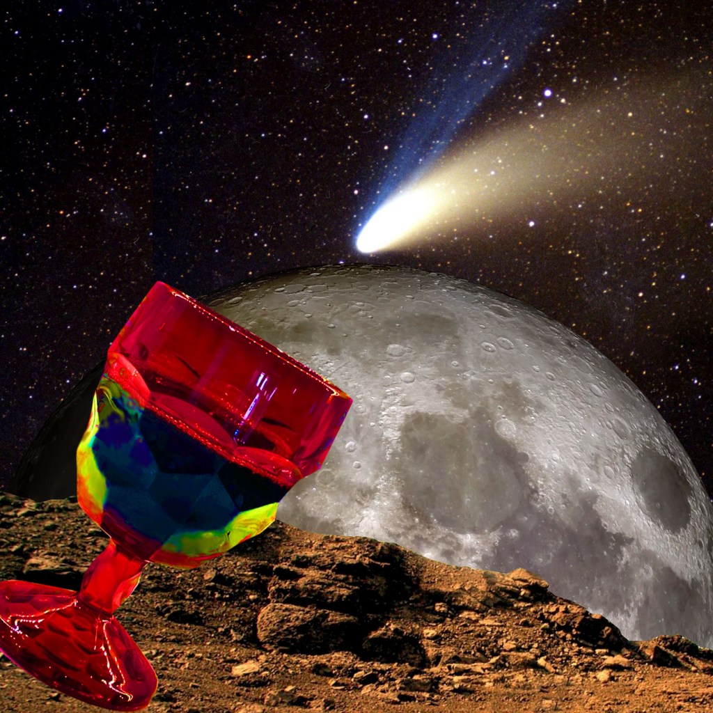
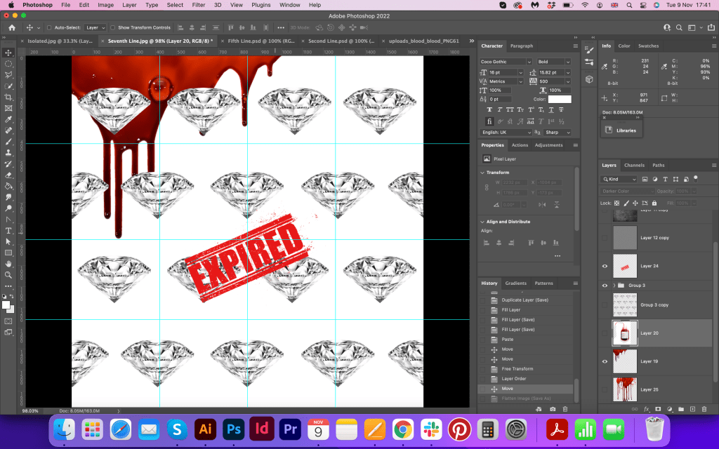
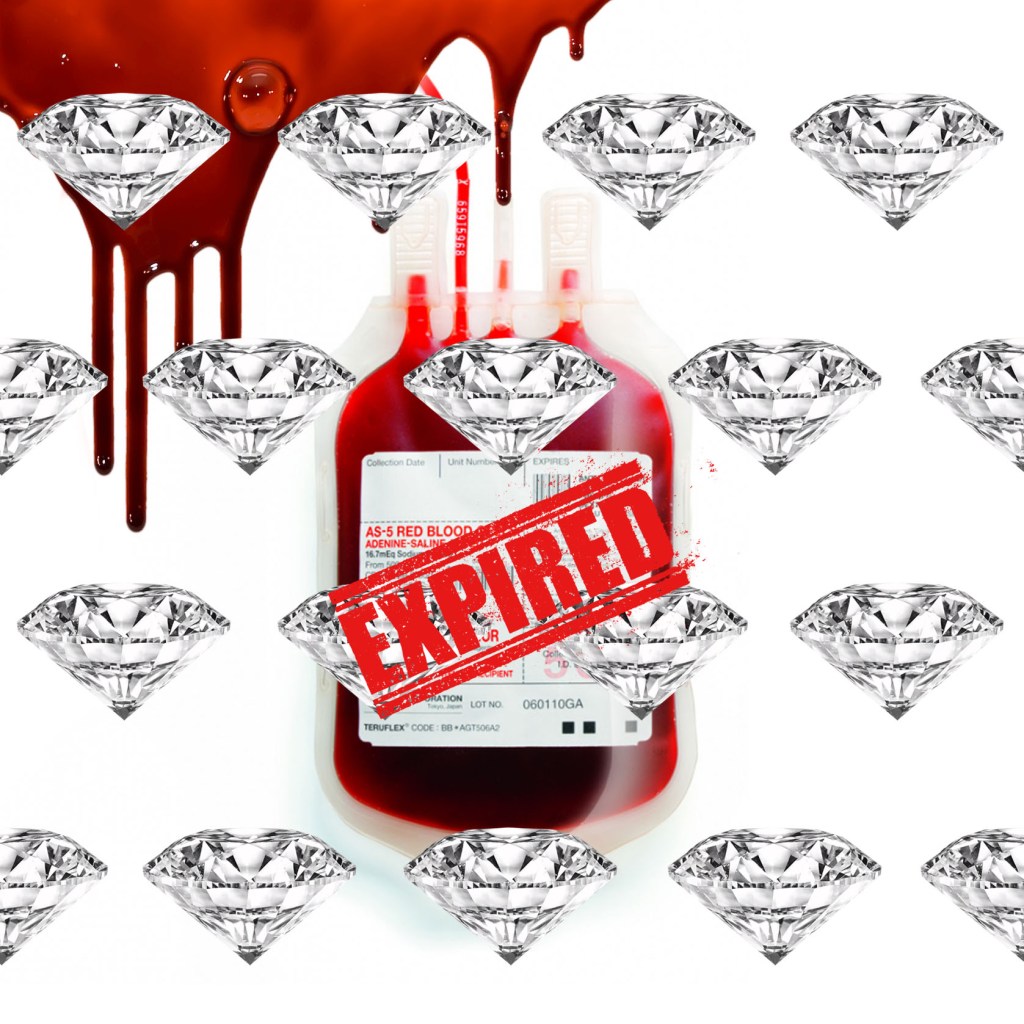
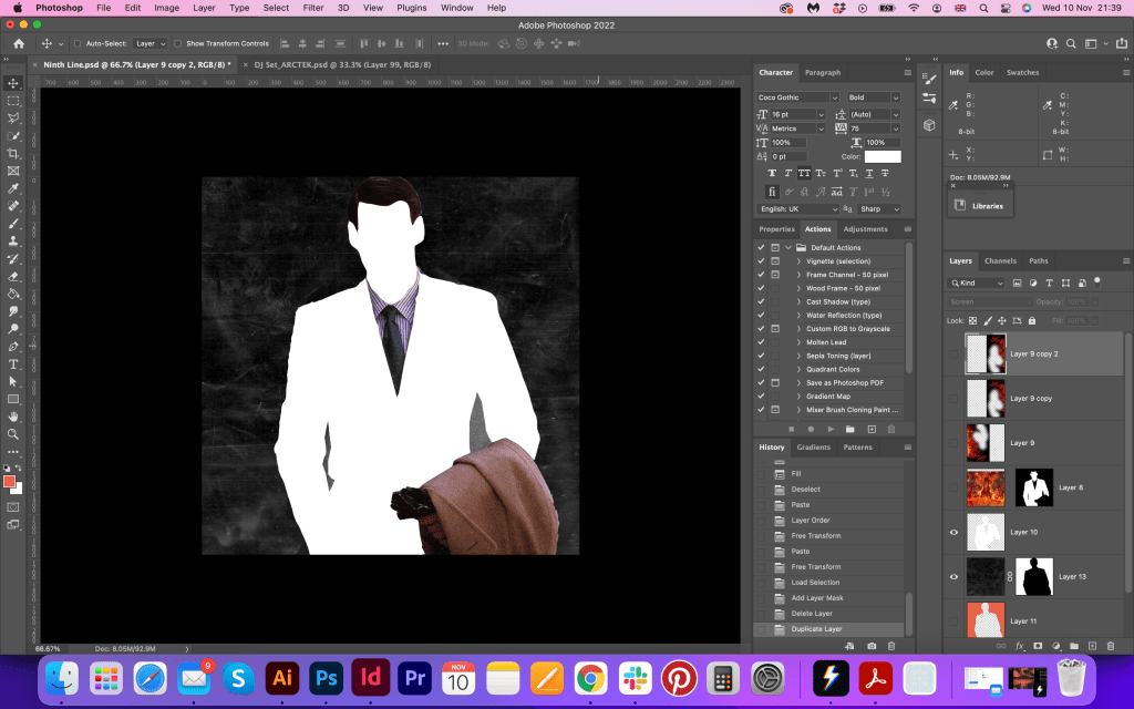
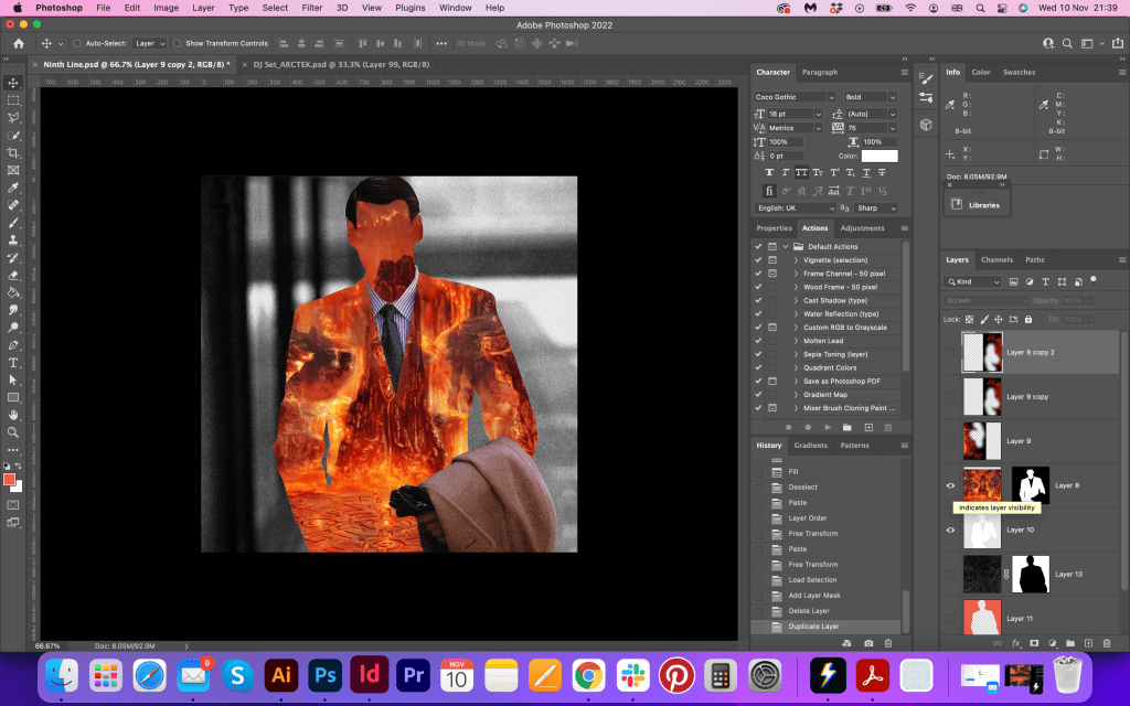
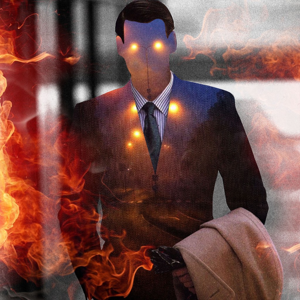
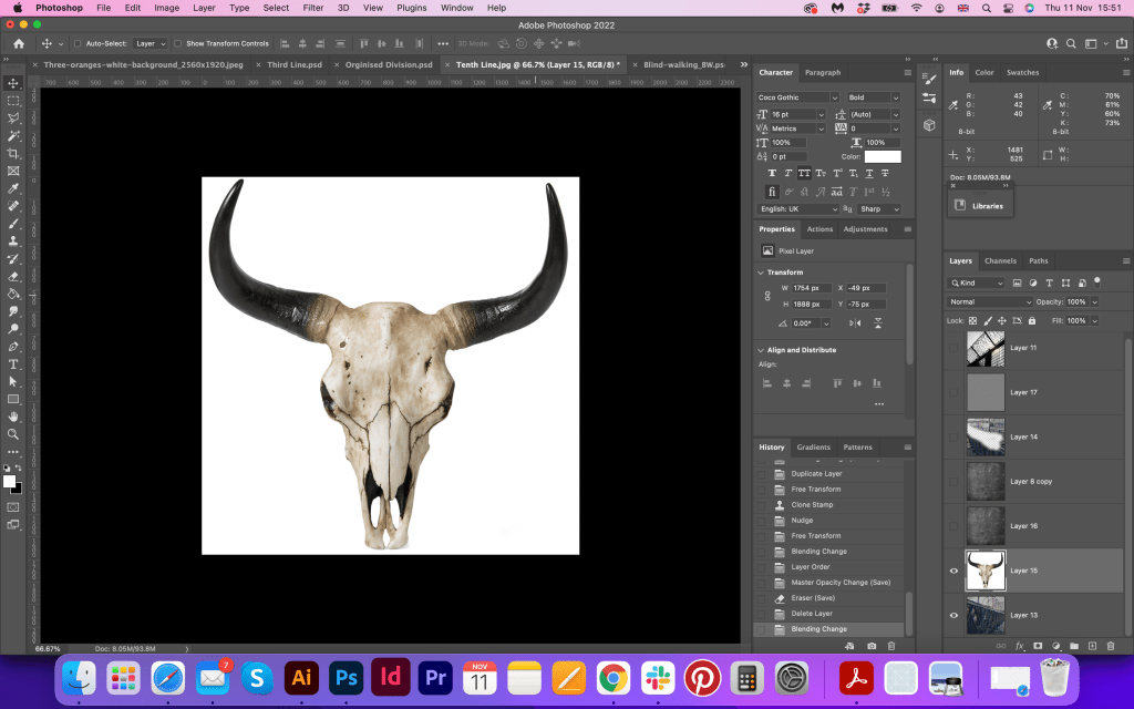
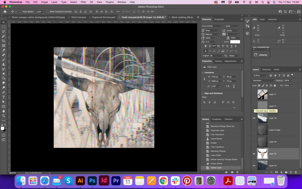
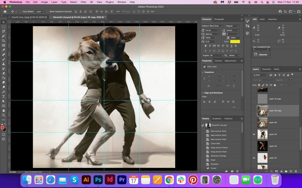
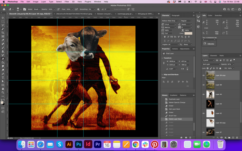
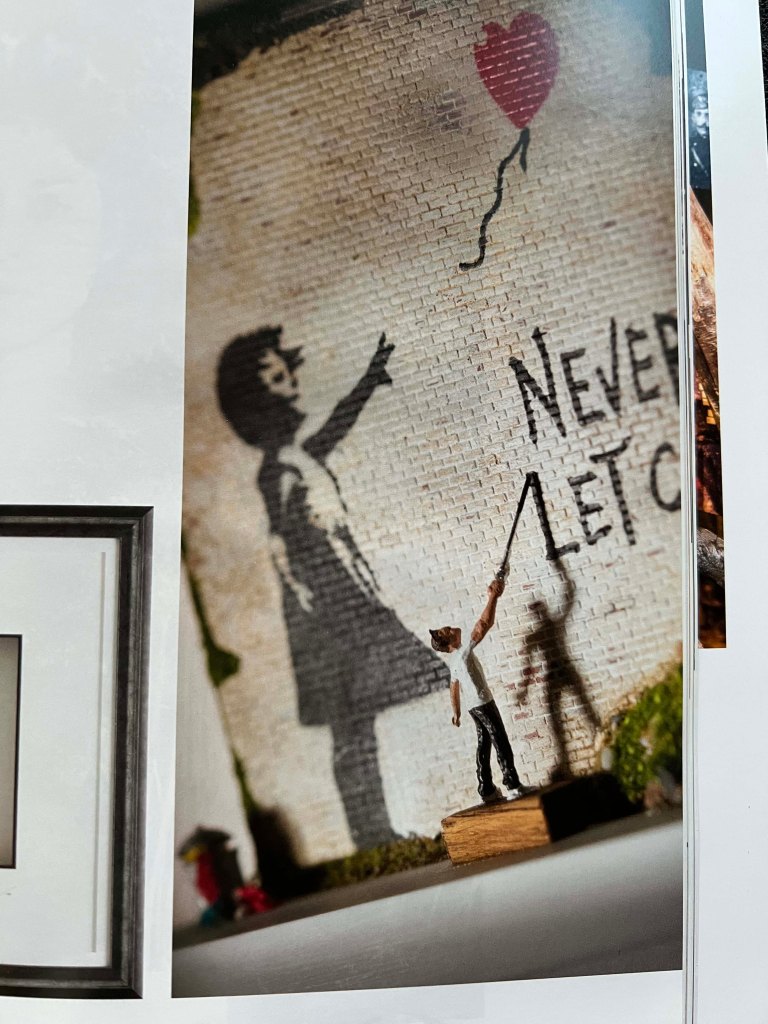
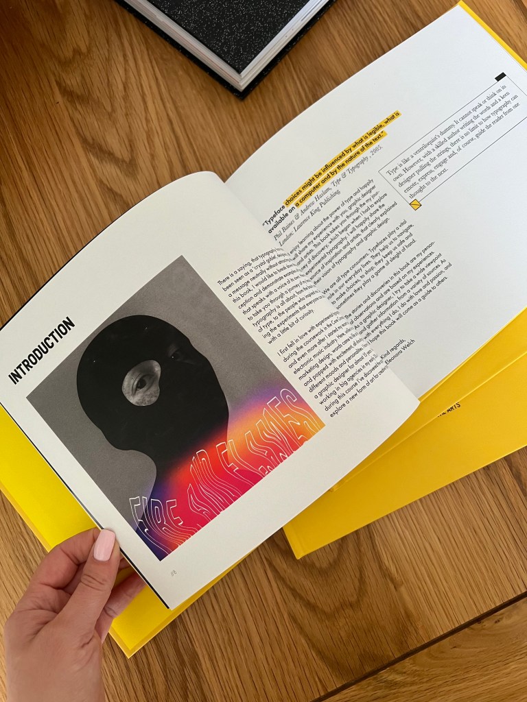
I placed the image of the girl in a balaclava with the experimental typography on top of it, which I created in Photoshop. For this image I got inspired by the rave culture, and its freedom. I think it gave good support for the introduction page and the main concept of the book I was going to achieve.
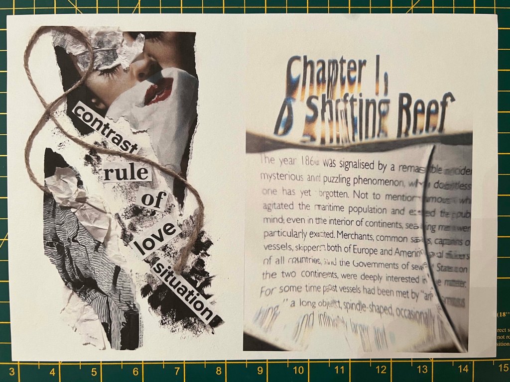
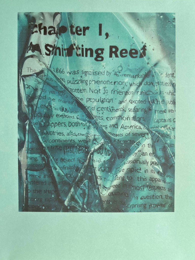
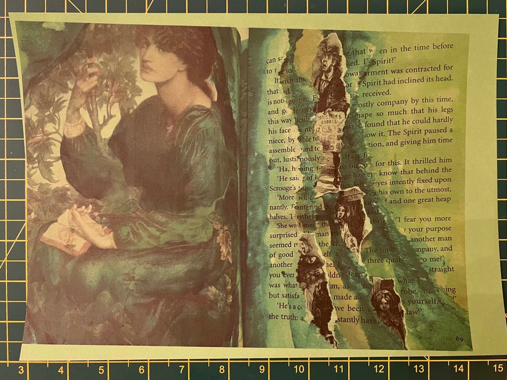
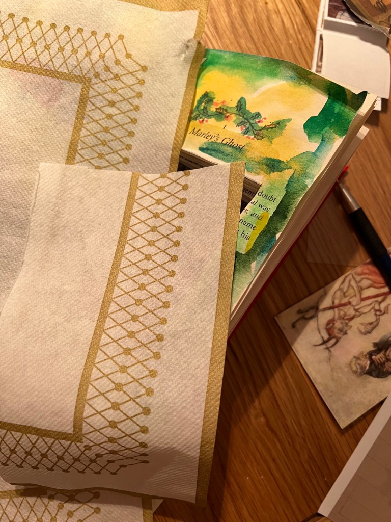
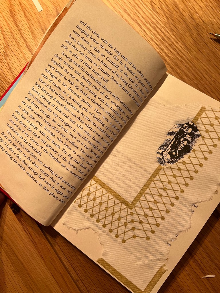
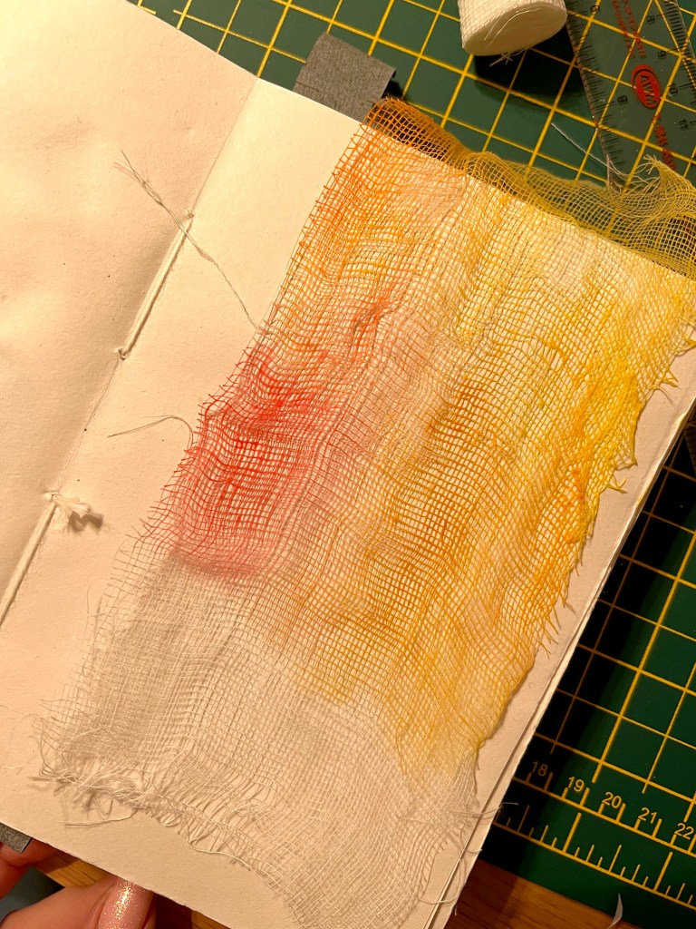
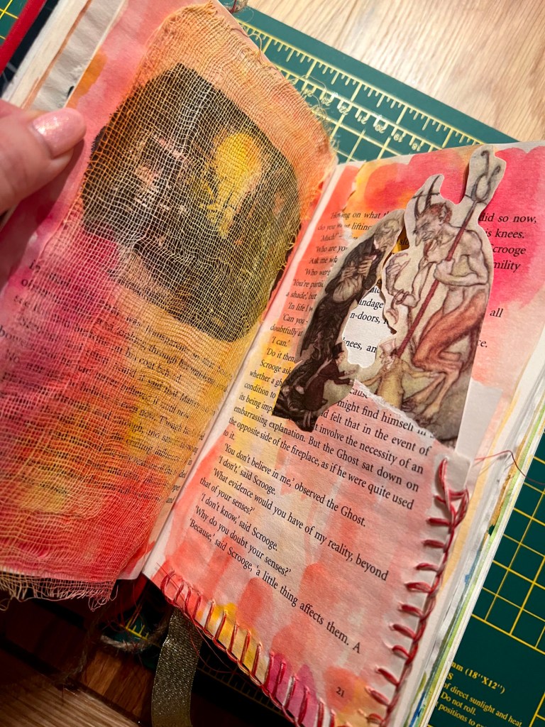
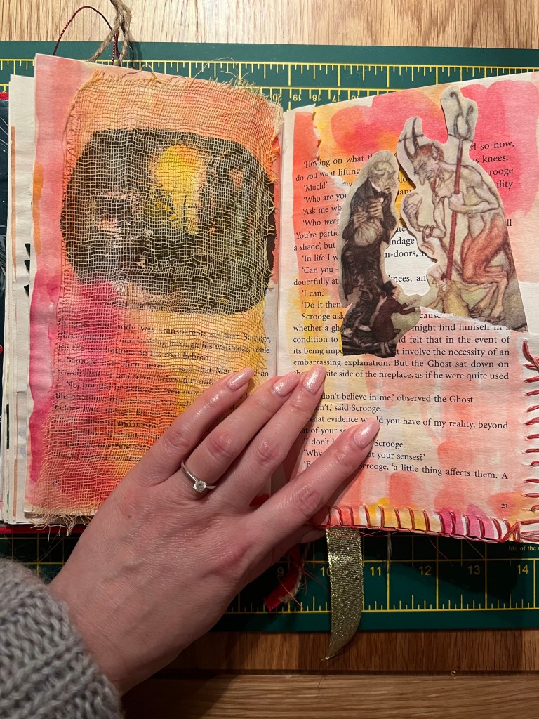
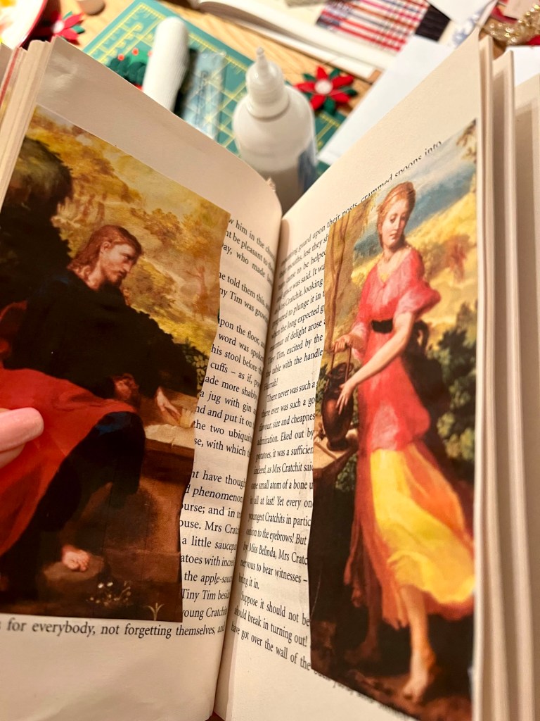
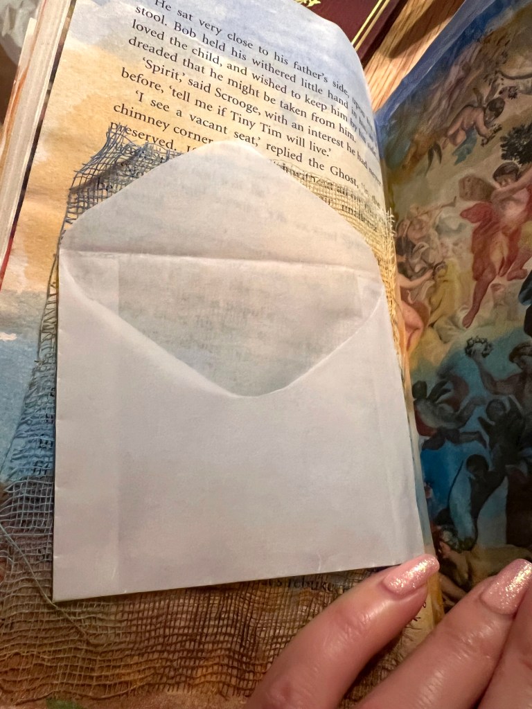
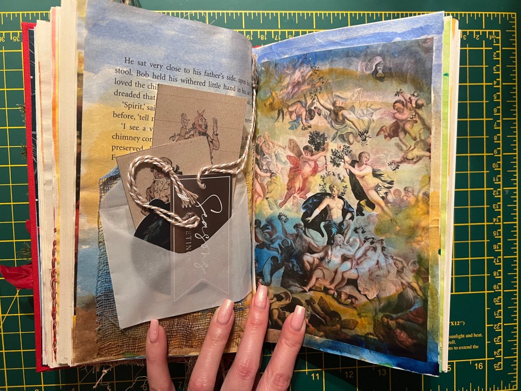
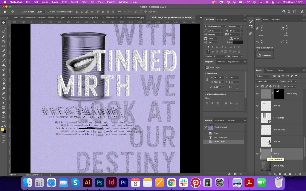
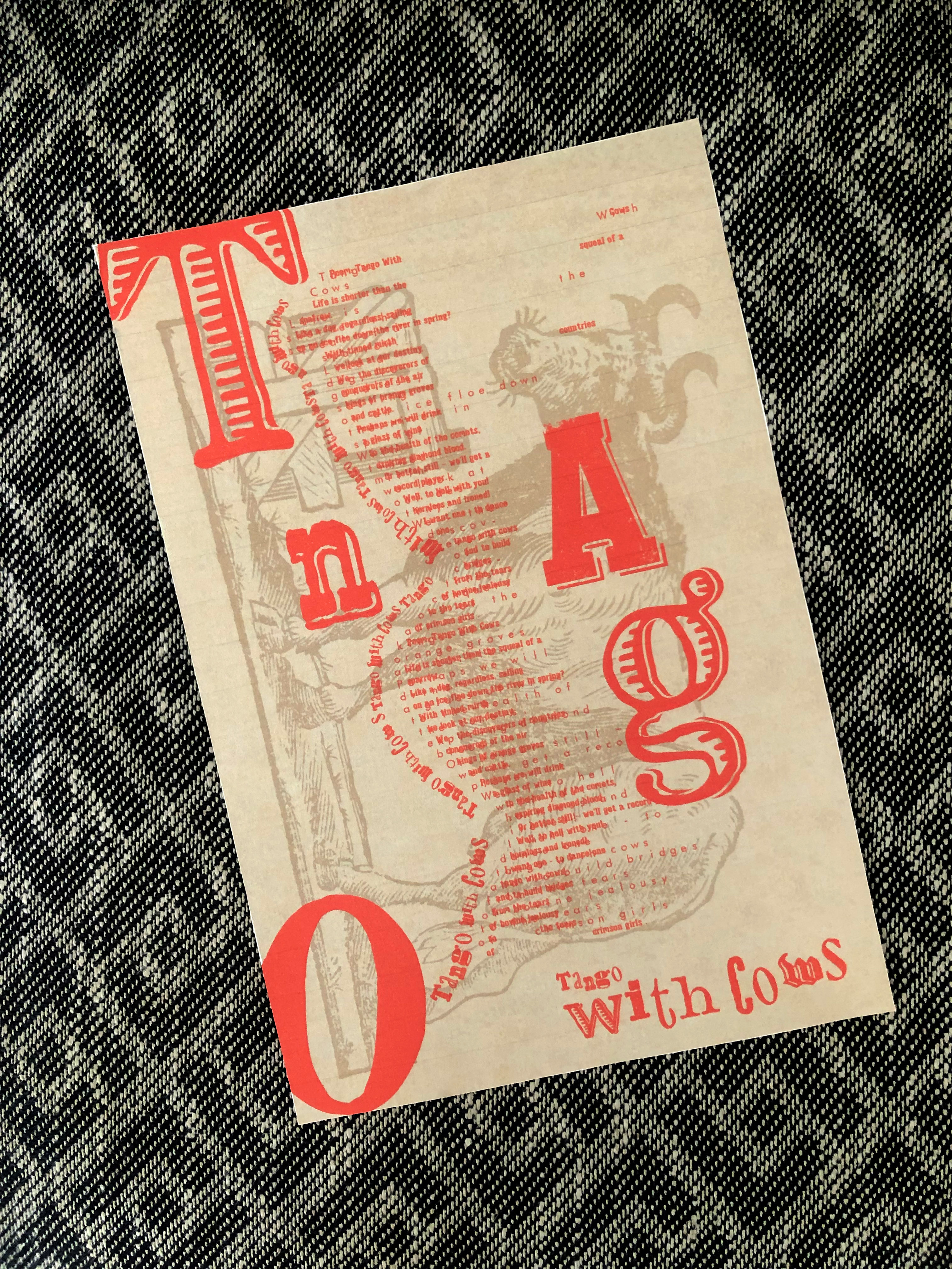
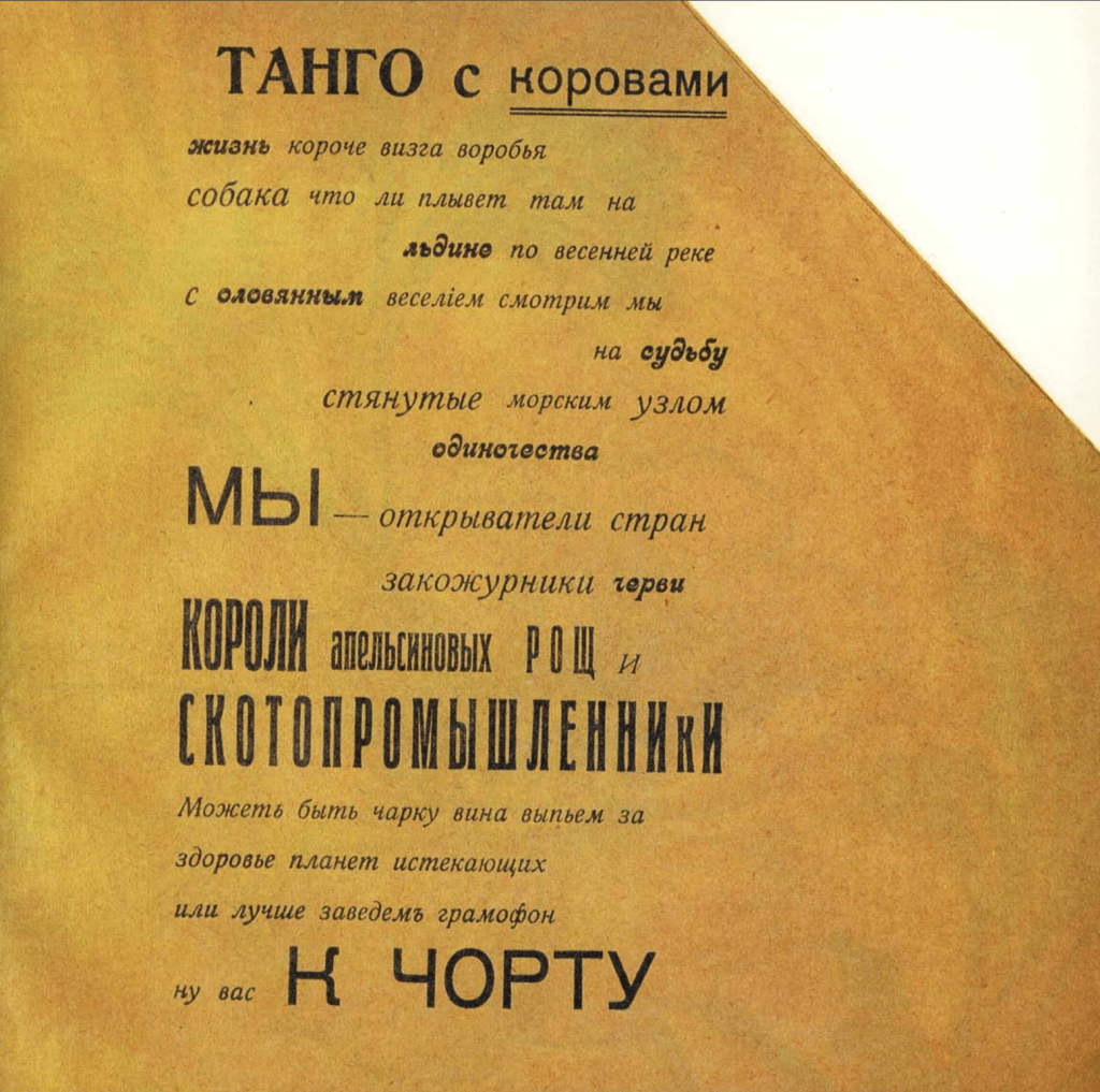
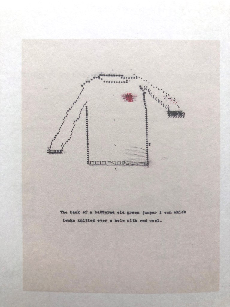
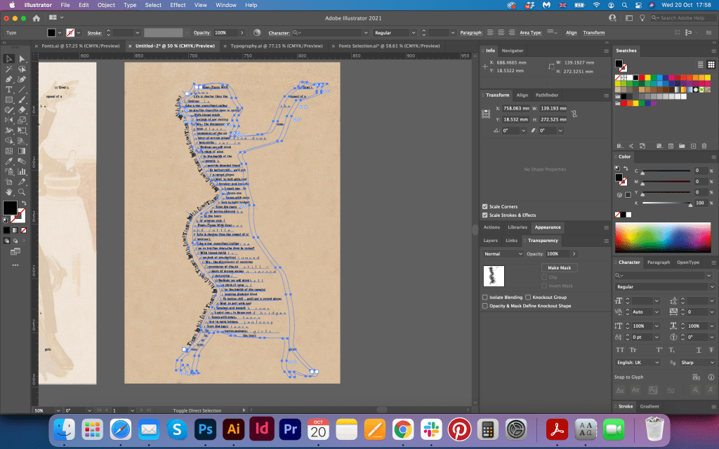
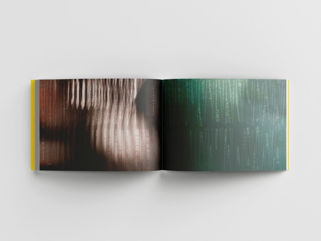
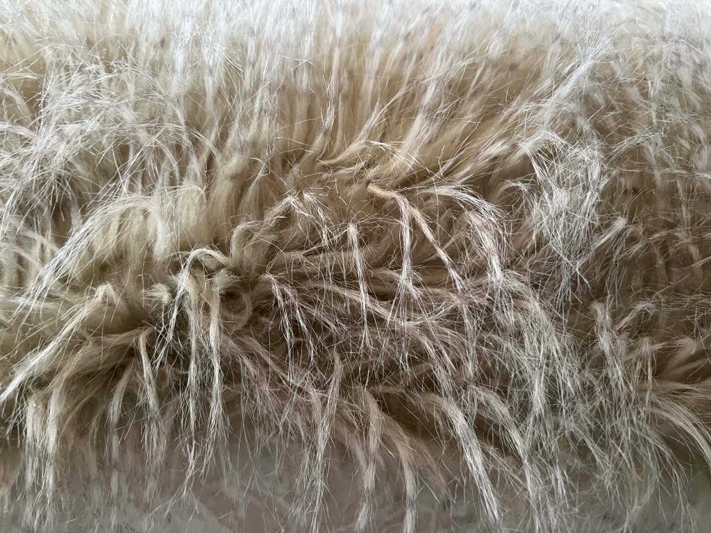
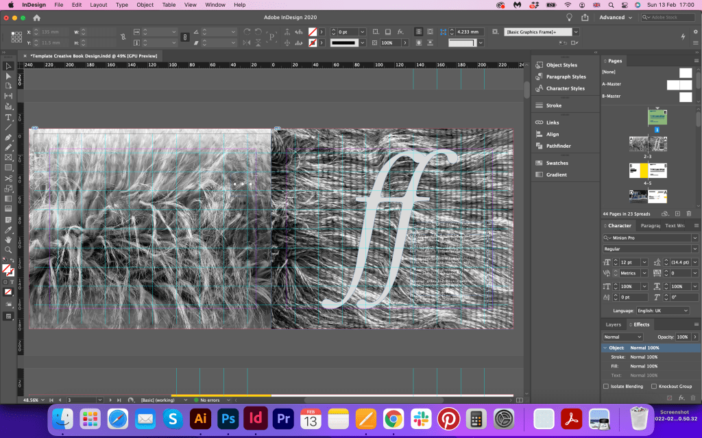
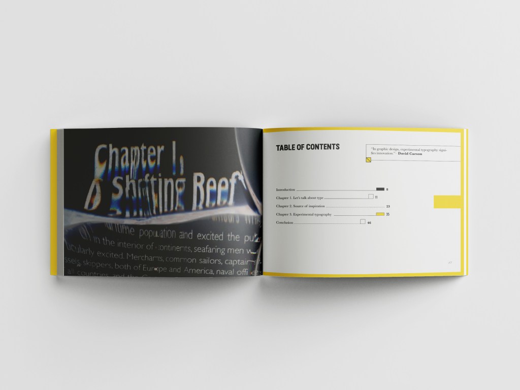
At the beginning of the book, I decided to place the fur texture full size. The reason why I did it, is as I wanted to demonstrate to the reader that this book will take them on the journey of unpredictable decisions and the book is full of volumetric designs. Also, that spread created a juxtaposition, as the heading of the book I was going to mention the typography. On the right side of the spread, I placed concrete poetry called’ A girl’s hair from the book The Map and the Clock, which is purposefully hard to read, I wanted it to disappear in that texture. I was hesitating about that decision, as I was not confident whether it works or not, but when I looked back on the whole picture together, I decided to keep that image, as it worked well with the design concept.
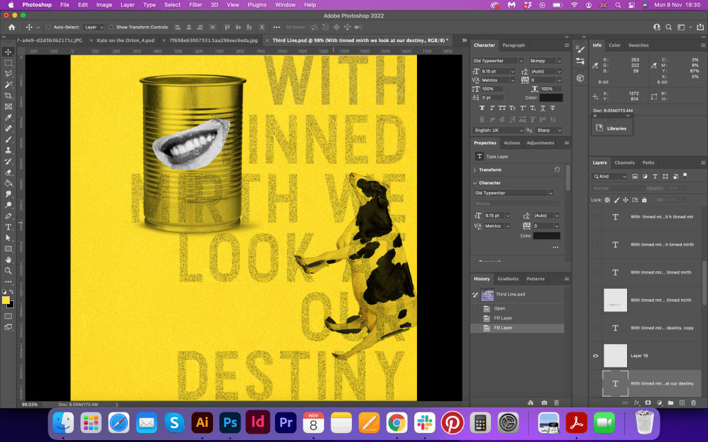
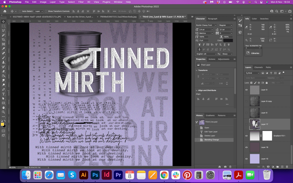
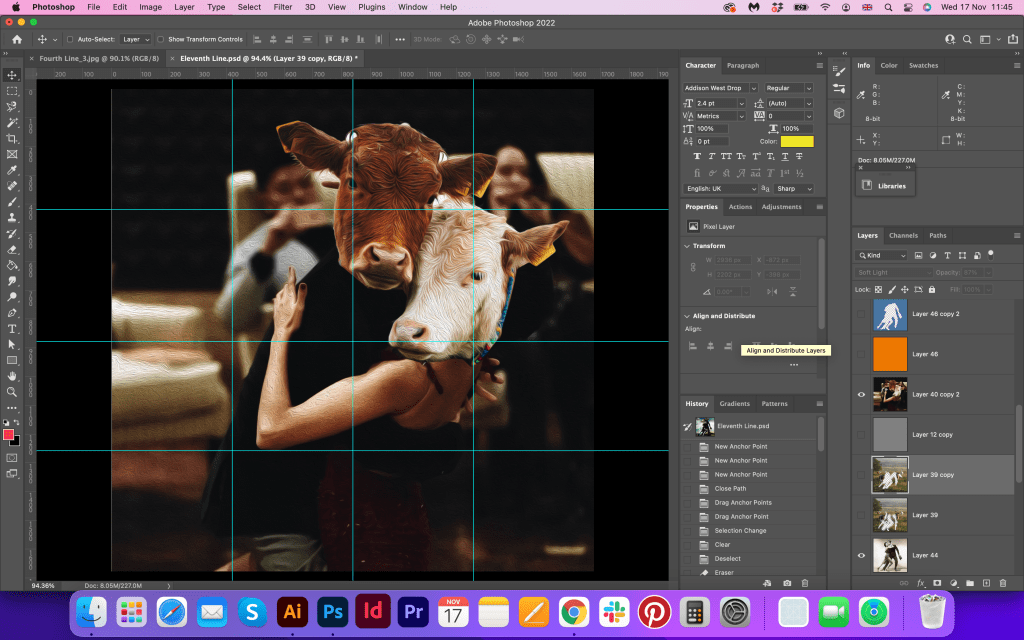
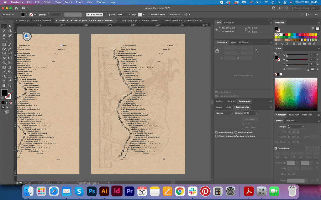
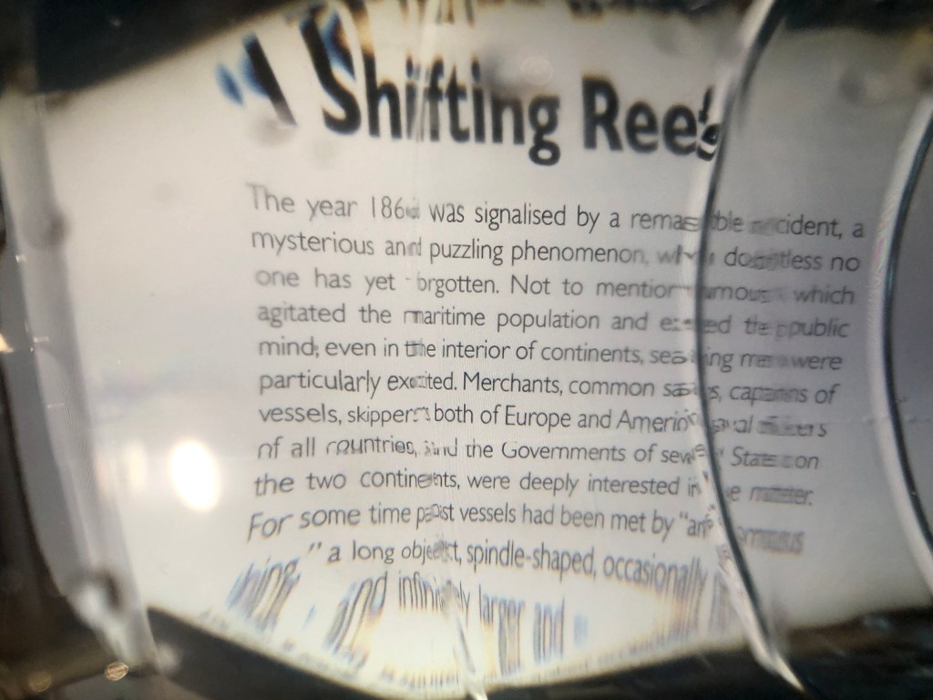
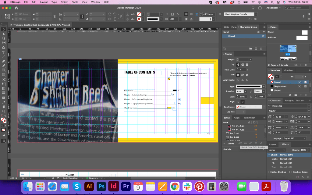
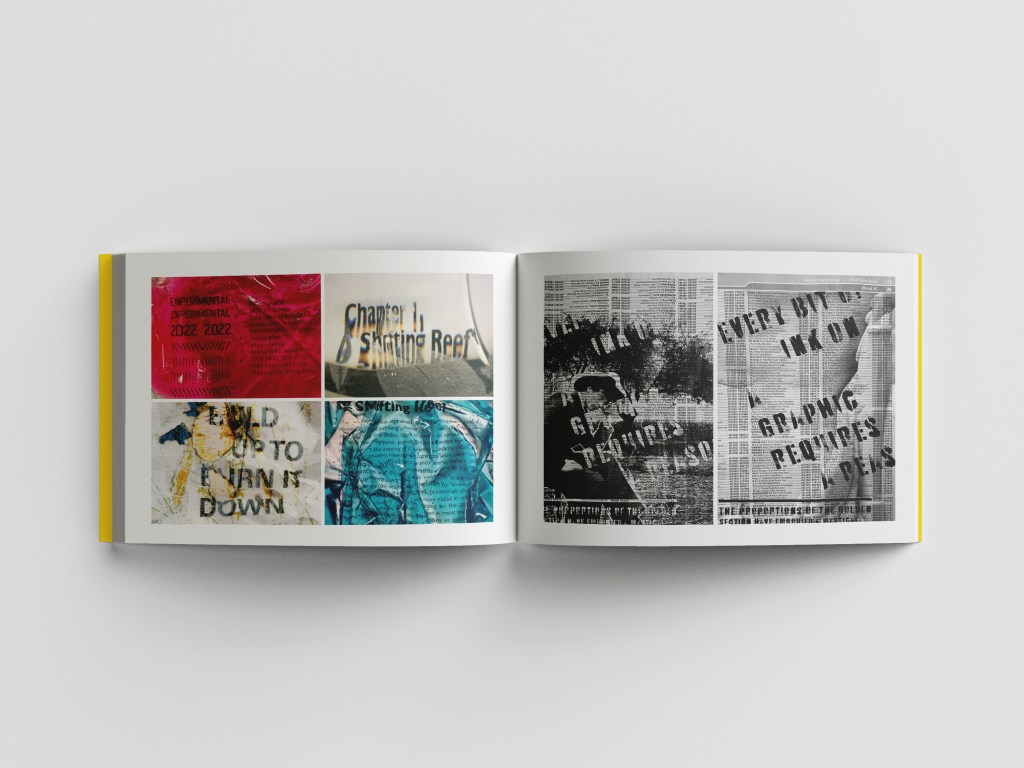
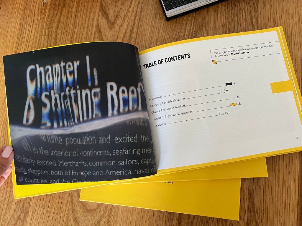
The idea was to create slightly different layouts for each spread, trying not to repeat them completely. I still needed to keep the same running theme, but for each page, I wanted to be individually looking. Like this Table of Contents spread, the only way looks spread, with the yellow frame around it, and different numbers. I knew that was risking to use three fonts, but I thought I should try it, as to how my experience with the Little Book of Bad typography shows, purposely different looking types and sentences can create that eye-catching look. Also, I created a proportional grid for the page, with little rectangular shapes, 10 from each side, as a golden ratio is still something I needed for this book, even though I was looking for the Fanzine style. On the left side of the contents page, I used the big image of distorted typography from the bottle of water experiment. I loved that contrast between pages, and I wanted to keep that black, yellow, and white pattern throughout the book.
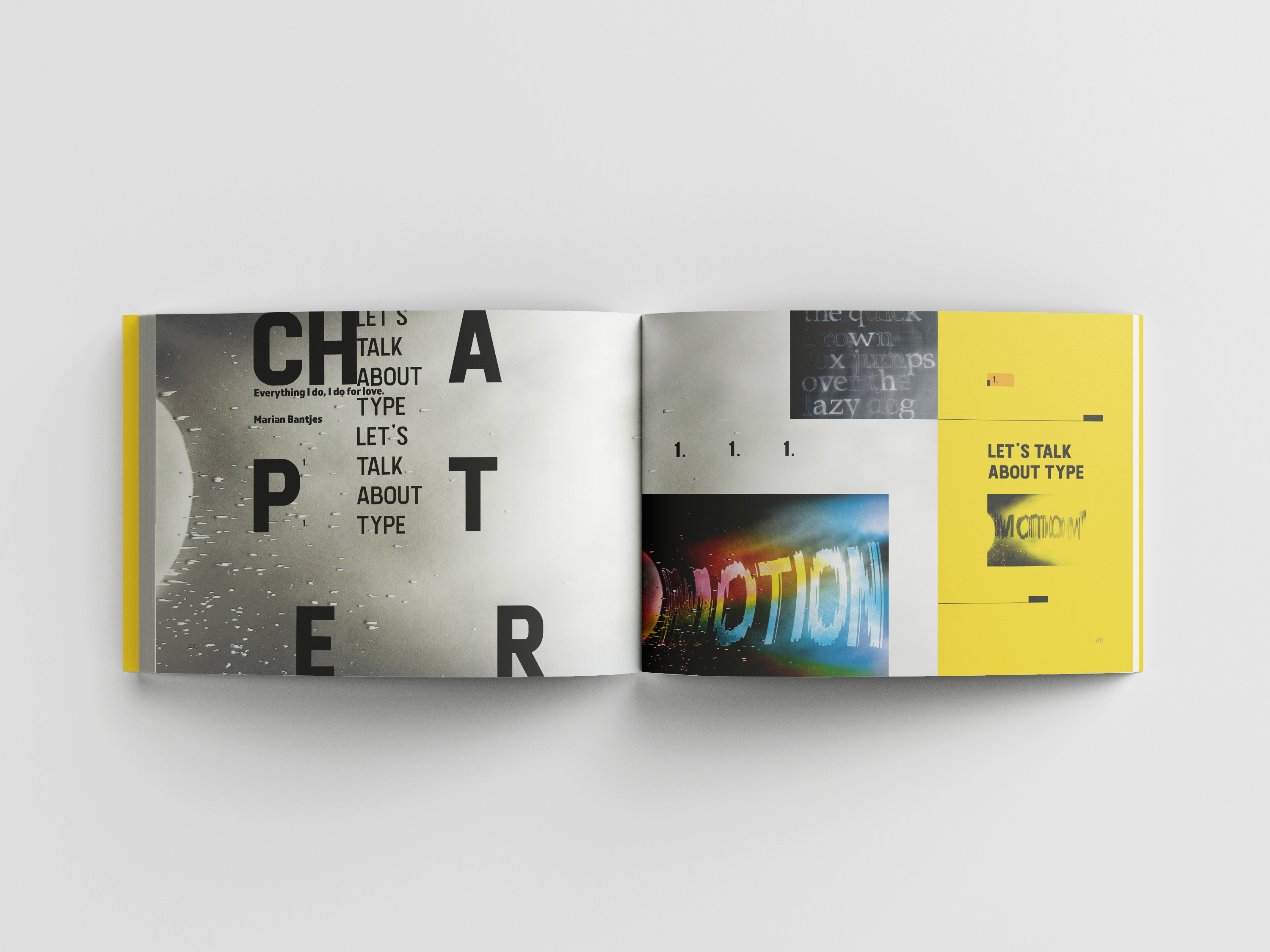
As I was going to use three chapters in this book, I thought I can repeat the spread with the breakdown image between each part. I was going to place some quotes from artists that inspire me, organised in the Fanzine style, and place different images related to the chapter. Earlier I created that experiment with the printer and word Motion, so I used it for this spread, as I was planning to place it for the full spread, but the colours were too heavy, so I used a small version of it, was quite pleased with the look of the spread. In the top I placed one of the first images I create4d related to typography Typographical Jigsaw in black colours.
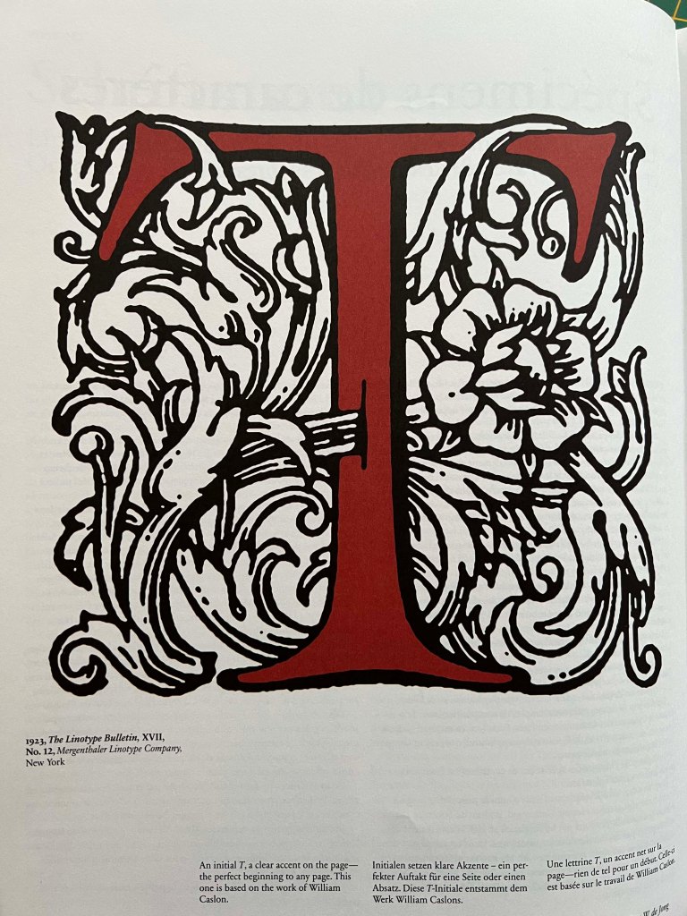
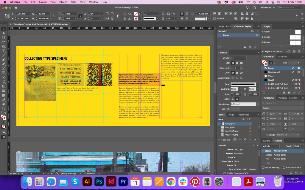
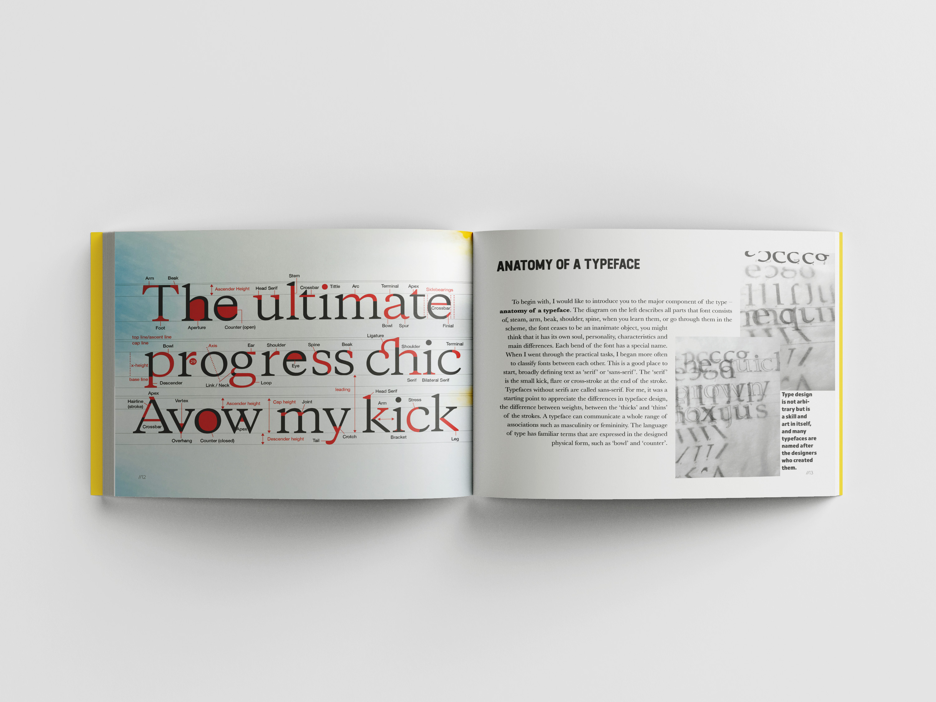
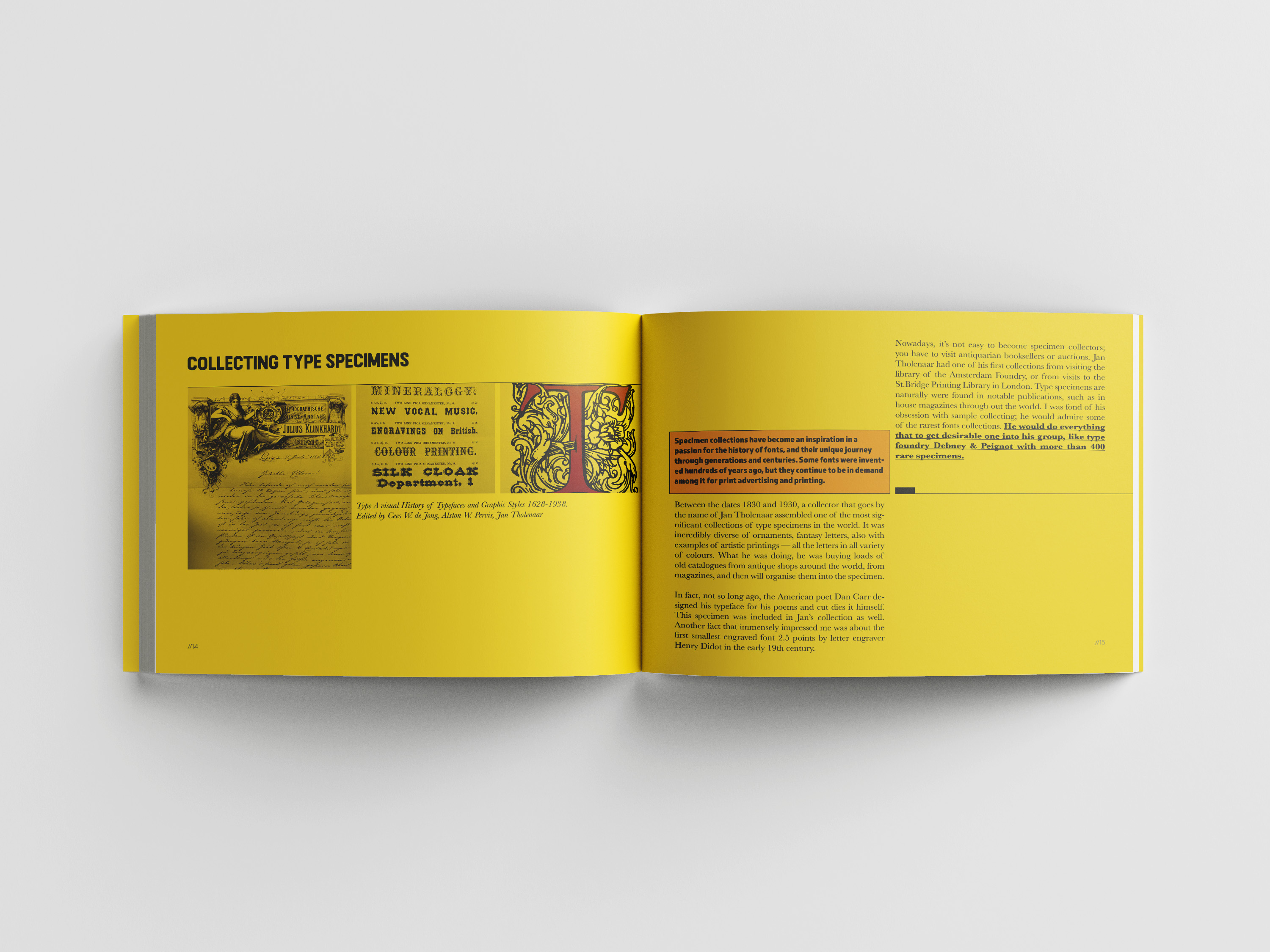
As I was going to recreate in this book the learning path about the typography, I decided to go back to the original sources, that to recreate again how it all started. It’s just from the personal level curious to see how I have grown as a graphic designer, and how important those little stages of learning that to discover something bigger. I included my first sketches of the typographical anatomy and for the next spread specimens from the biggest book, I have in my library. Collecting type specimens is a great example that a lot of passion for the work can create a historical meaning book. Anatomy of a typeface was the only one spread I have a slight doubt in terms of page layout, as it looks too different compared to others. I wanted to bring that freestyle across the whole page look, and drop from the top pictures. It looked a bit odd from the magazine or book layout point of view, but I decided to keep it, as the purpose of this book investigation of layout possibilities.

This spread I made yellow, it’s the only one that bright in the whole book, I liked how it works well with the breakdown pages for spreads, so I kept it too. Here I included my research on the specimen book by Jan Tholenaar, as I wanted to reflect on the foundation of what each designer should learn, the brief history of the specimen collections.
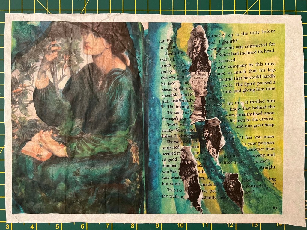
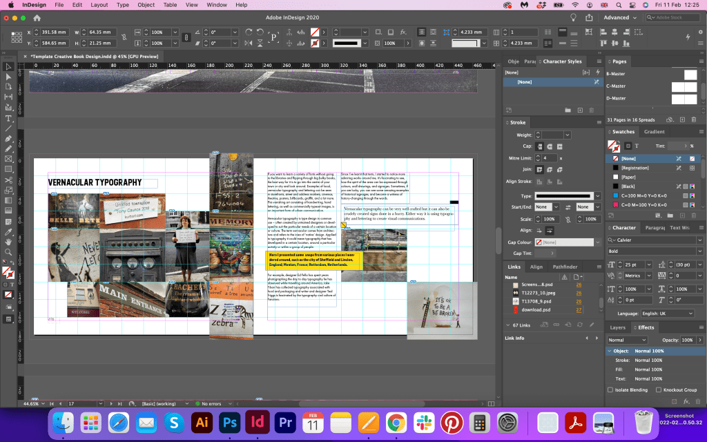
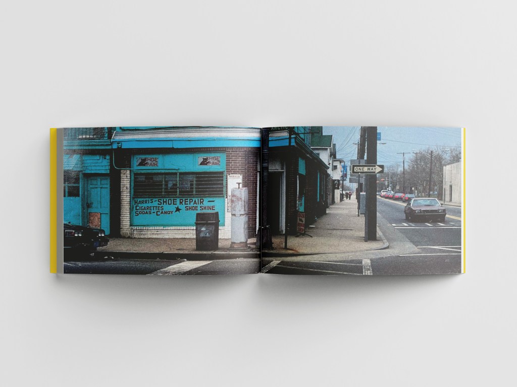
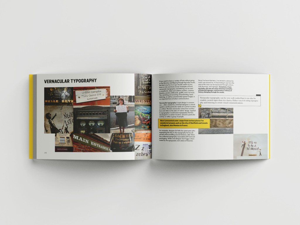
For the next spread, I remembered another important part of the typography learning, it was Vernacular typography from the Core Concepts Unit. At that time I did a quick research on the signage around me when I travelled to different countries, but this time I looked at some marks close to the area where I live. I created a collage from those images I collected, and added some new handwritten signs, that can be considered as a part of native signs. That is the reminder for myself as well, pay attention more to the signs around me, and note the difference between them, depending on the city I am walking around, or area.
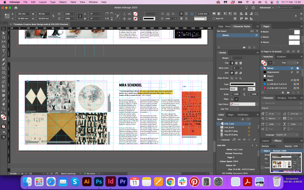
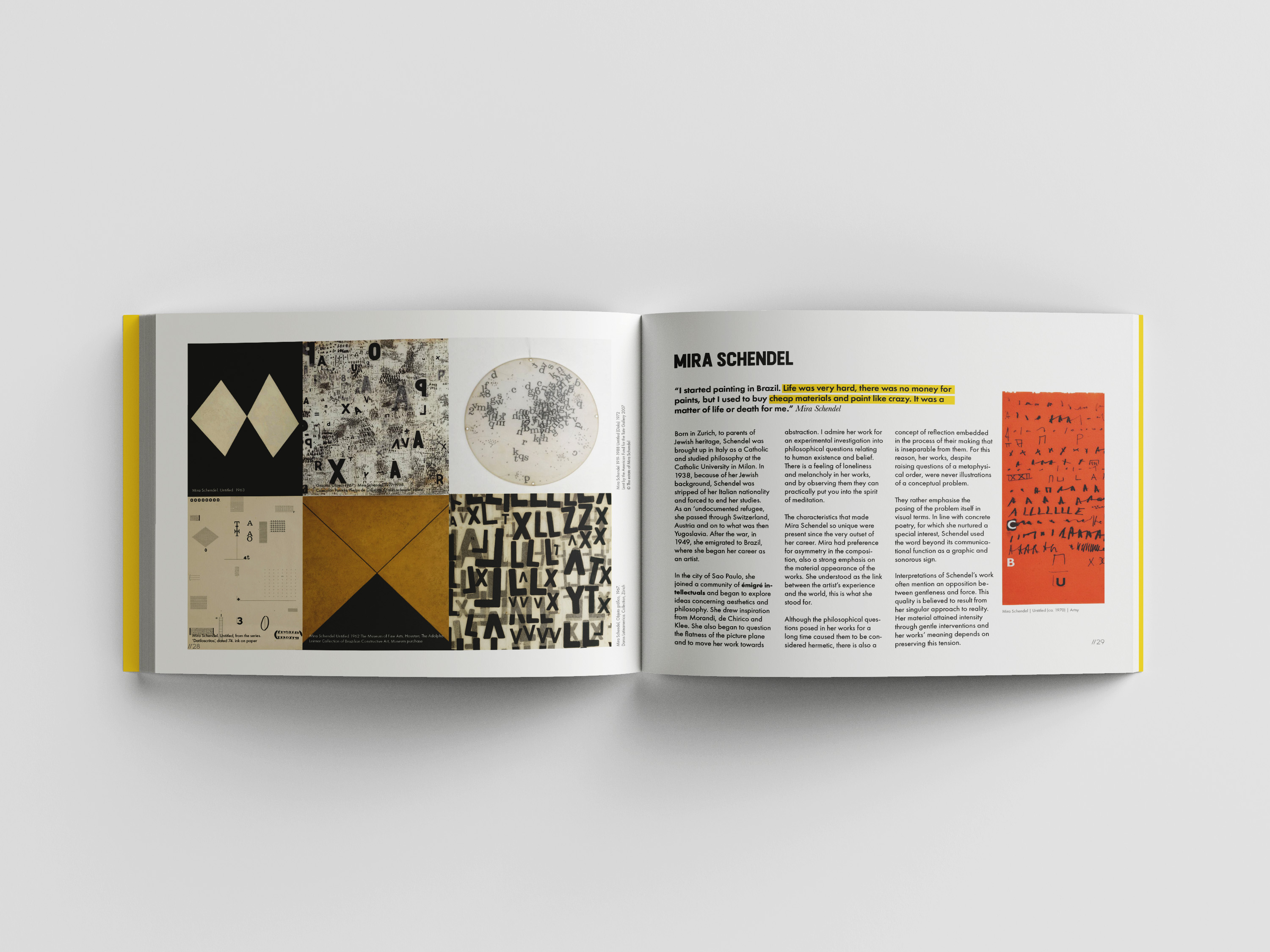
This breakdown image I created in a similar style as the first chapter, by adjusting images around, related to the subject I’m going to talk through. I added an inspirational quote by Mira Schendel, I couldn’t find lots of her quotes, I think she applied lots of philosophy and spiritual meaning into her works, also, they were different times, she is an artist who was born a hundred years ago, but her works still give a level to other modern artists two. I am quite happy with the template I created for those breakdown spreads, in Fanzine style, but still, letters are placed round l according to the grid.

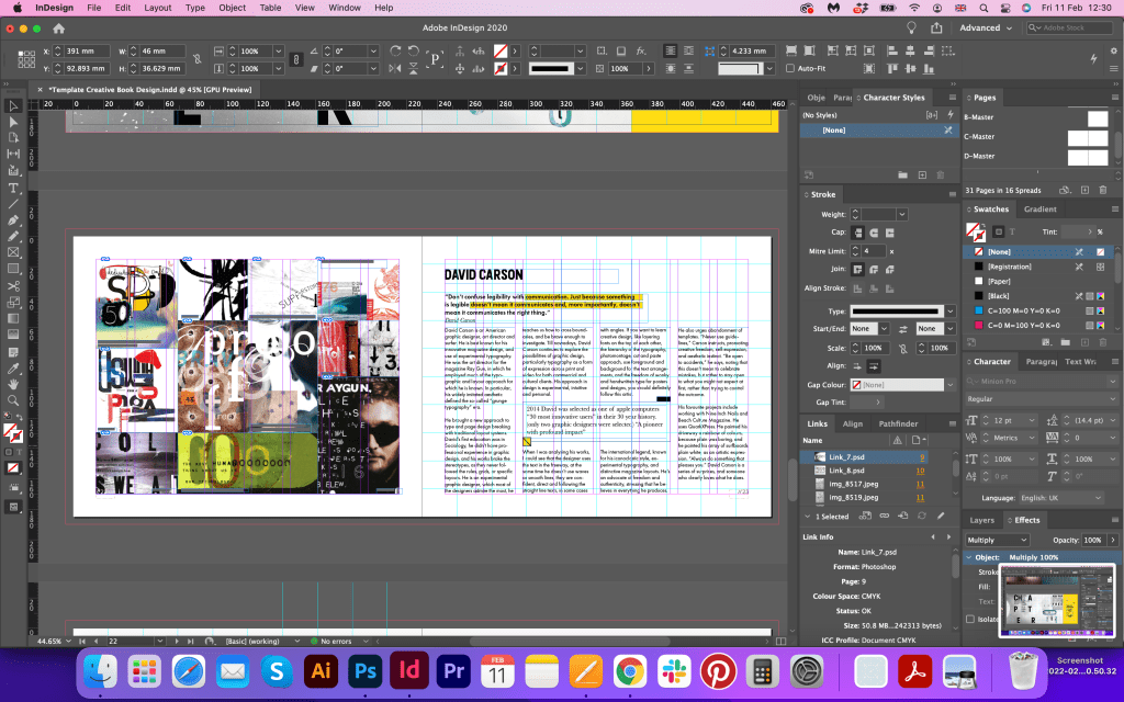
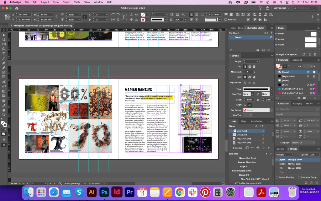
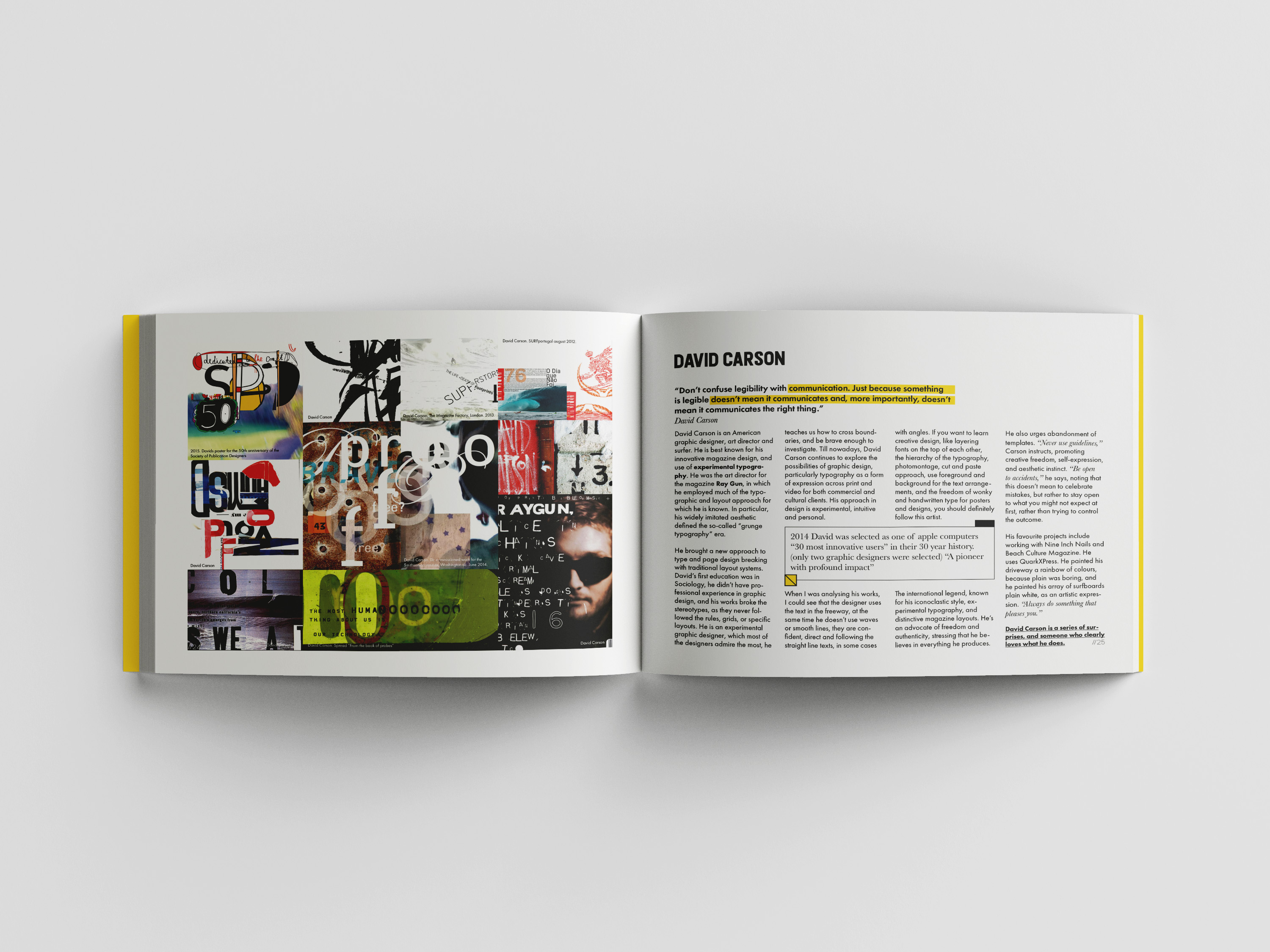
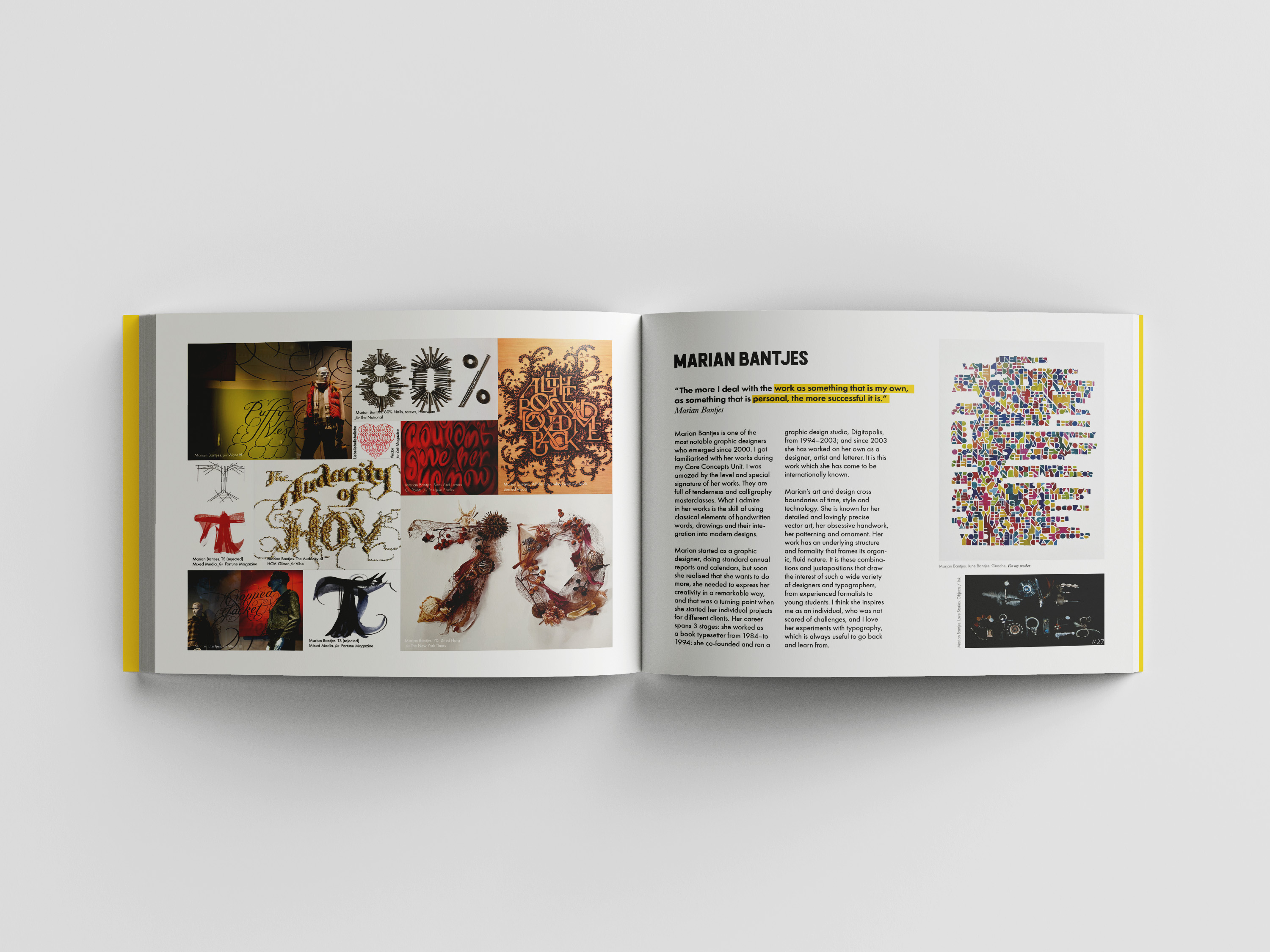
The next three spreads I designed with a similar template, on the left side the collage consist of the various designs of artists, and from the right, I placed short descriptions of each of them. I moved quotes around and changed the size of the columns, still according to the grid. I didn’t want to be repetitive, as the same grid collages can look quite boring, but playing around with them, and adjusting their sizes helped me to create a creative look for those spreads. I followed the short biography of such artists as David Carson, Marian Bantjes and Mira Schendel in those spreads, and also their inspirational quotes. Those styles that artists work on are completely different, but altogether they create a collaborative experience for me.
Also, I didn’t forget about the copyright and name of each work presented in the book, which was quite a job to do.
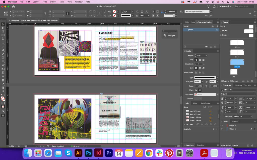
When I placed all those artists, I nearly forget about the electronic music movement I was going to include, good I had a flat plan. For some reason, I was planning to place it into the experimental typography, but then I realised this is the movement that inspires me. I wrote a big paragraph about it earlier. And here I just add in the page layout. I created another collage from works, I wanted that chaotically look layout for it, placed within the grid, with different sizes of posters and tickets. That is the scene that has been my major influence for the past few years, and I hope that it will keep evolving further in my graphic design career. Also, I added inspirational phrases into these spread, which can be related to the rave art industry, which is a bit judgmental, but there is something about it.
“It is only shallow people who do not judge by appearances. The true mystery of the world is the visible, not the invisible…”
Oscar Wilde, The Picture Of Dorian Gray.
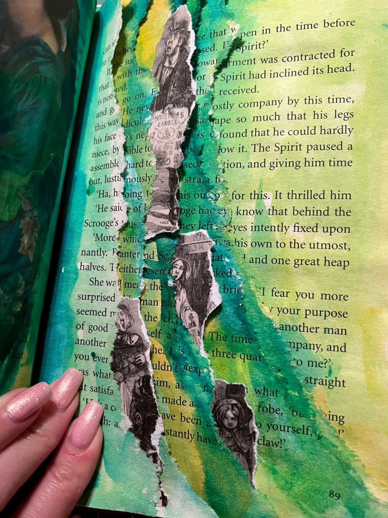
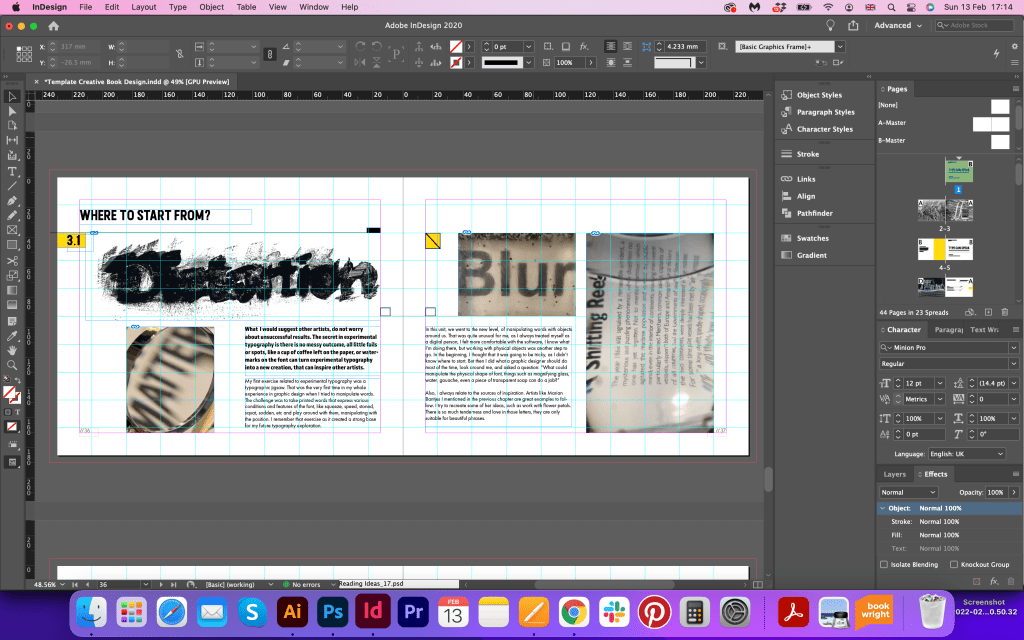
Finally, I’ve got to the part about experimental typography. As my experiments were in different formats and directions, I was thinking of how I can join them all together to create a mood of coherence. I organised those images according to their colour, and the next whole spread was used only for the images of typographical and printing experiments. I could potentially use some of the spreads I created from the fourth exercise where we used different texture printing, but I didn’t want to be repetitive, as I used quite a lot of those images, and already printed them. I filled those pages with new experiments, and some old images I designed ages ago. I loved the juxtaposition feel between them, and the creative look of each image, they are all different, but similar at the same time. And it’s good to see them together in the final work for this unit.

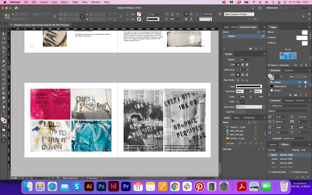
This book had already that distorted modern Fanzine look, but I thought what if I add my first sugar and flower experiments I’ve ever made. They looked amateur, but, at the same time, that is what made them look special. For this spread, I used new placing for images, but the font choice and elements around are all still the same. I showed it to my friends and family, and they said that is a really good one. It’s curious to see, how some older works can have a new life in the current projects.

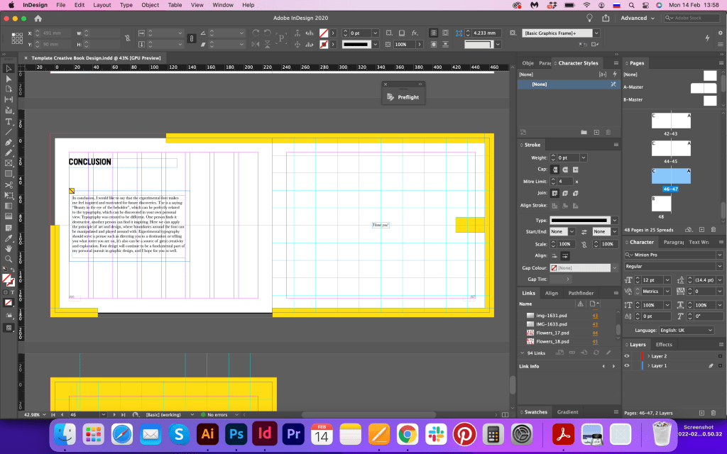
I was going to finish the book with the spread of flower fonts made out of petals, but then I showed the final book to my family and had a comment that I’m missing the conclusion. I couldn’t believe that I had nearly forgotten about the final words for the book. Otherwise, it could look like leaving the house without saying goodbye. So, I created a spread, which looked similar to the introduction spread, but with a slightly adjusted frame. Now the book finally had a missing part restored.
The full version of the book in pdf file can be viewed here
Cover sketches
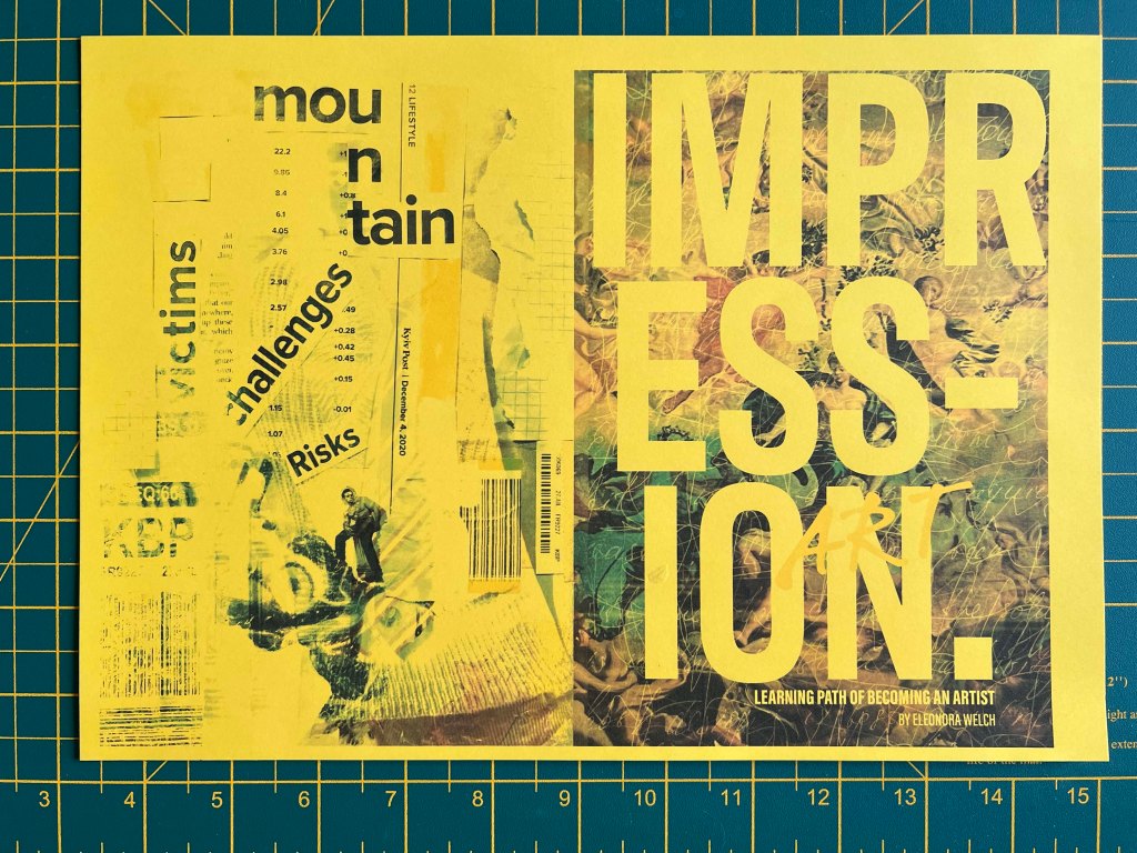
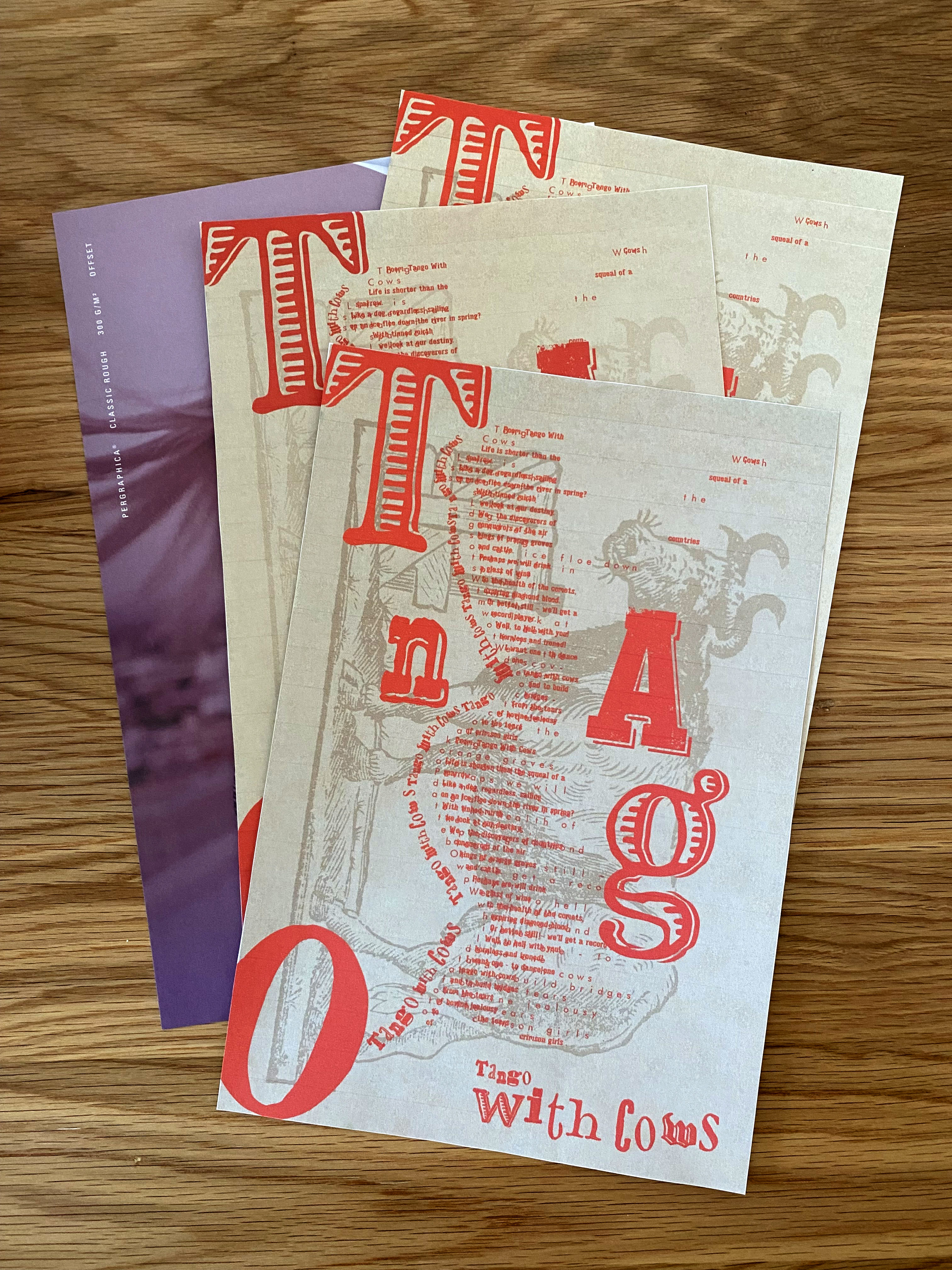
I had a few ideas about what a book cover can look like, I did a quick sketch, with different names for the cover and various writings. I decided to go for the bold looking cover, with the bright yellow background and confident bold font. I thought that it’s not very inventive cover, as it goes directly to the subject of the book, but at the same time it works well with the design concept of the book, so I decided to keep it.
Cover page mockup
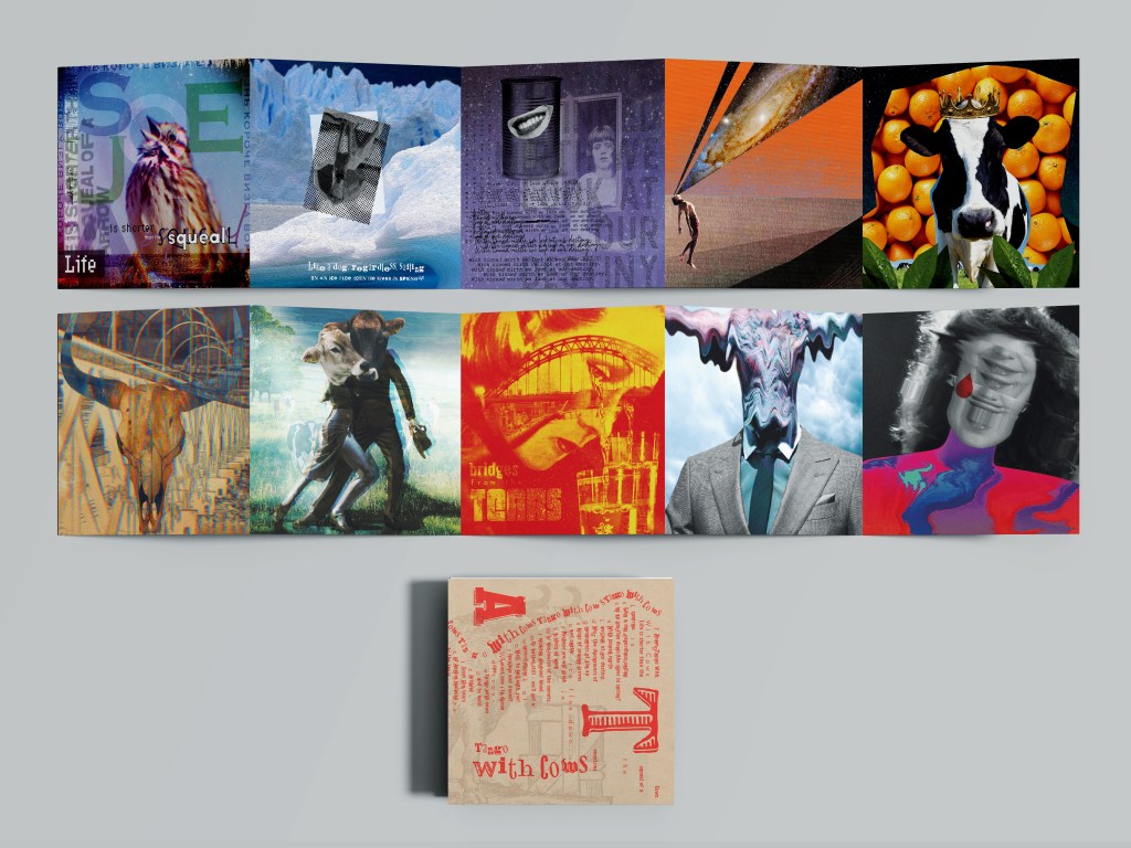
Ready book mockups


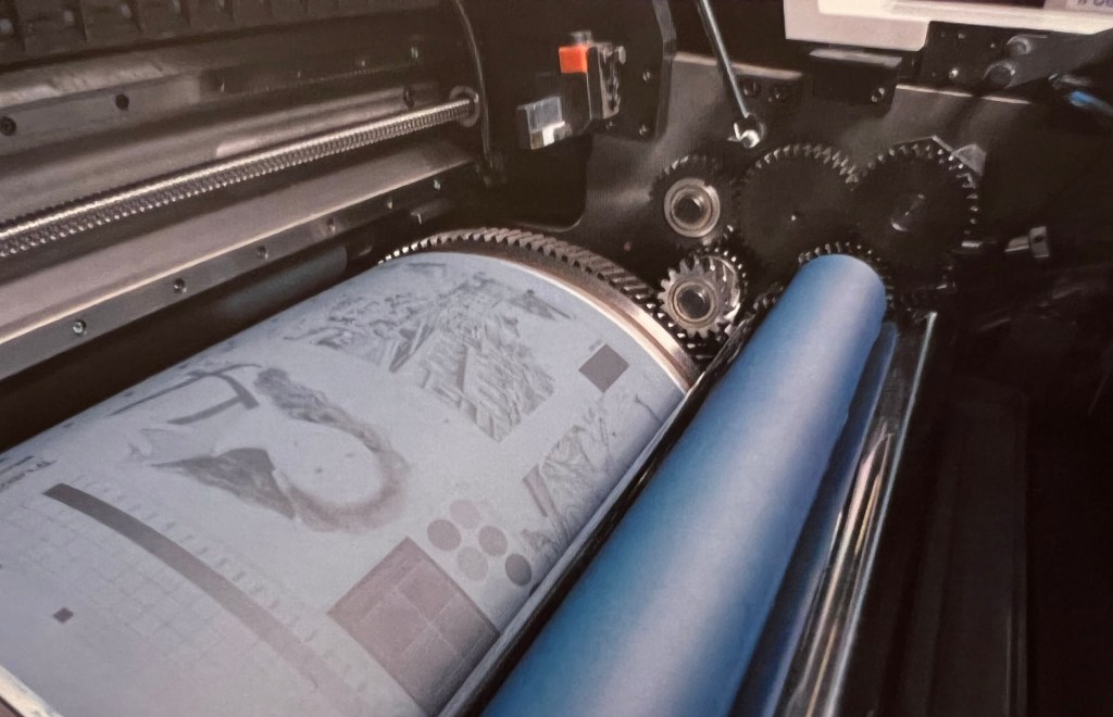
Printed book
For the printed version of the book, I went to the Mixam express print. I was nicely surprised with the quality of the print and the short terms it has been produced. Just within 10 working days, which is quite impressive for the book printing. I had a custom size of the book 230×185 mm, yellow hardcover with matt lamination, and for the endpaper I’ve chosen factory yellow colour as well, which looked bright and juicy. For the sheets I decided to go for the thicker pages, 170 gsm paper uncoated, as I loved that rough feel of the pages, good I had some samples of the paper, so I could decide what suits the best for the preferences of the book.

Conclusion
In conclusion, I would like to say that I really enjoyed this assignment. I’m pleased with how the book turned out in the result, and the direction that I took lived up to the expectations. In the beginning, I was super nervous as I felt a big responsibility, as that is quite important work to show at the end of the unit. I was thinking about what are my strongest points to reflect on, but at the same time what new I can learn during this book design. It’s good to see the progress, and usage of new approaches in design, but at the same time be able to apply the experience of the previous knowledge I gained through the whole course.
I found it quite challenging writing all the content for the book, as English is not my first language, but at the same time that is what I enjoy, being able to write and explain my thoughts. I can see some improvements compared to my first works, and it’s vital to have my own voice in graphic design, that to be able to express my personal thoughts. I wish I could do this book twice as bigger, and fit much more research and typography explorations, but due to the deadlines, I had to keep my head down to produce as informative as possible book.
It was quite important to learn the printing process for that book as well. As that is one of the vital parts of graphic design, do research for production, and search the market for the prices and time-frames for printing. I’m quite happy, that we had that kind of assignment at the end of the course, as I have additional experience in how to prepare book from the start to the end, it’s always good practice to become independent and be aware of all stages not only in design but in production as well. I’m still planning to upload the printed version, which will be ready at the end of this week.
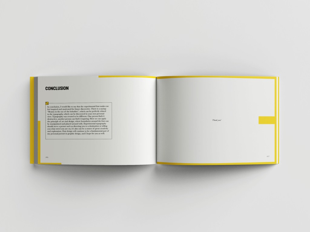
I wrote that wording in the conclusion of the book itself, but here I would like to repeat it again. The is a saying: “Beauty in the eye of the beholder”, which can be perfectly related to the typography, which can be discovered in your own personal view. Typography was created to be different. One person finds it destructive, another person can find it inspiring. Here we can apply the principle of art and design, where boundaries around the font can be manipulated and played around with. Experimental typography should serve a peruse such as directing you to a destination or telling you what street you are on, it also can be a source of great creativity and exploration. Font design will continue to be a fundamental part of my personal pursuit in graphic design, and I hope it will make an impact on the people who will learn something new from this book as well.