Research point

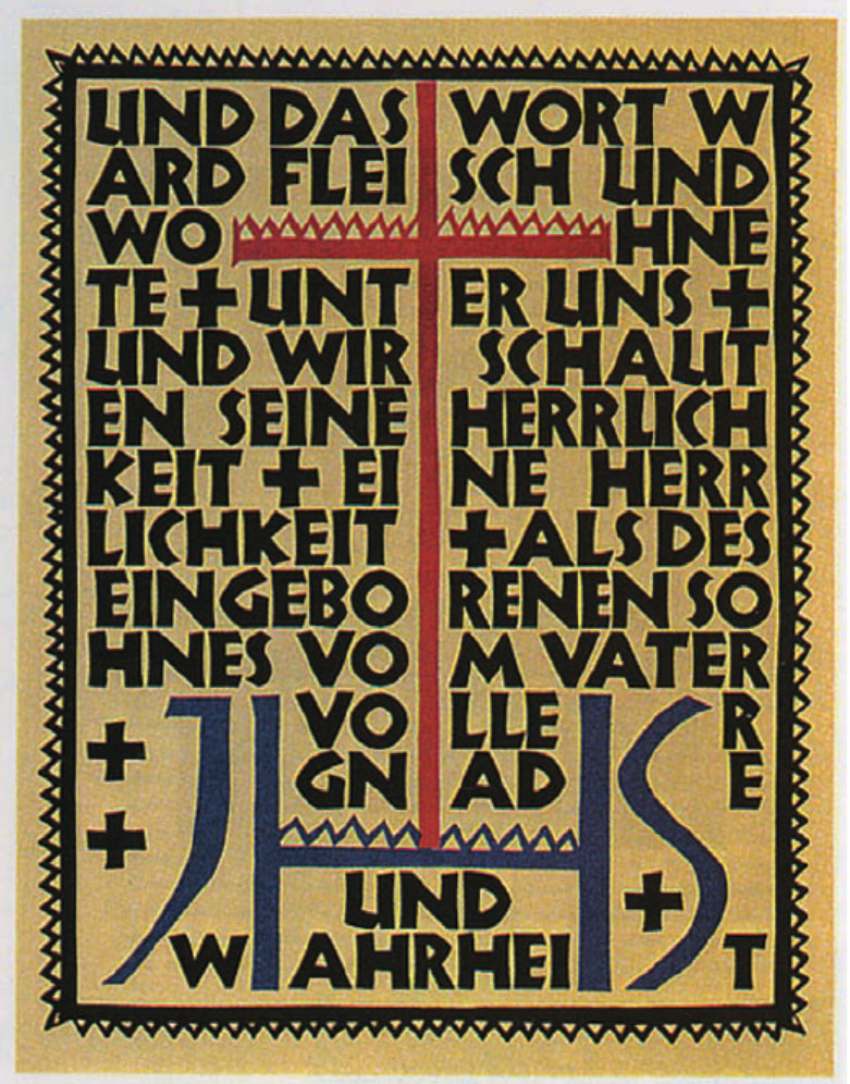
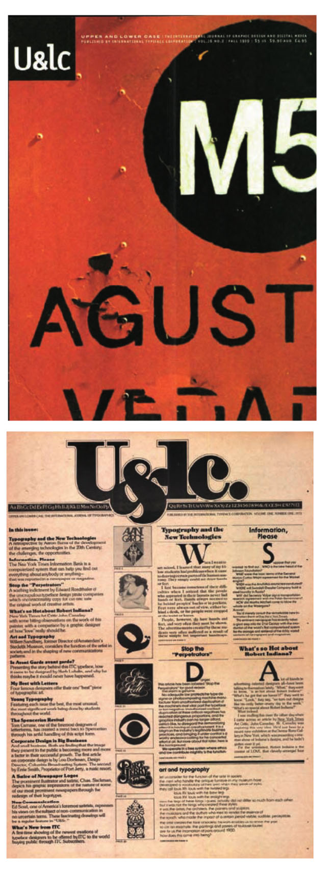
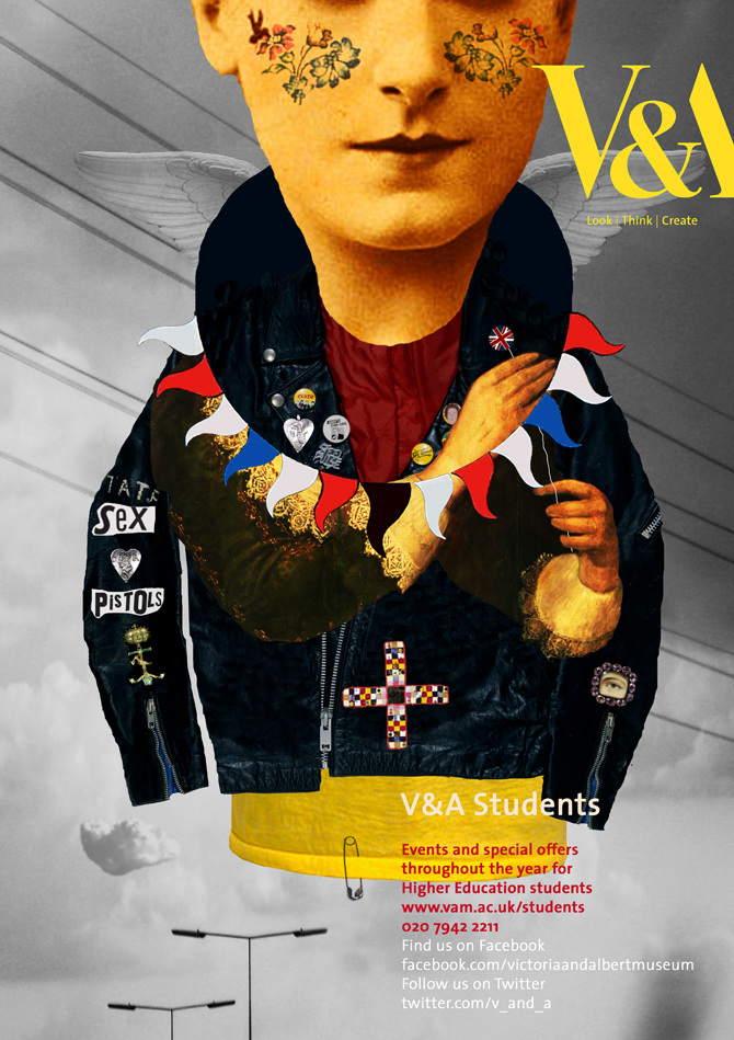
How many logos can you name? Macdonalds? Nike? Apple? All huge multinational corporations with millions to spend on building brand recognition. Have a look at logos and see how they work – pay attention to the colour schemes and simple designs. You will probably also find that, although you couldn’t recall them immediately when you see them you immediately recognise them – banks, shops and products. Can you immediately recall the OCA logo?

If I think about the most recognisable logos, they are companies you are surrounded by every day life. Some of them seen so many times, that they become a part of yourself much more, so services that are provided by some of the business goes straight into association with a logo brand. A logo is like the front door of a business. It’s a first impression. It’s a greeting. It’s got an energy. The world’s most iconic and famous logos have this down. If you think about delivery services, that is Fedex, Amazon, DHL, if you think about fast-food that is KFC, McDonald’s , Starbucks, also most iconic logos for drinks that I remember as long as I remember myself CocaCola and Pepsi, for technologies Samsung, Apple, and Nokia, and so may others more.

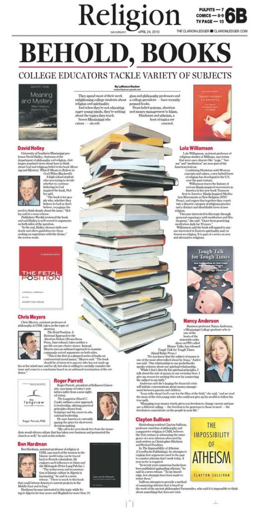
I would like to analyse some of the logos most iconic based on book Logo life: life histories of 100 famous logos.
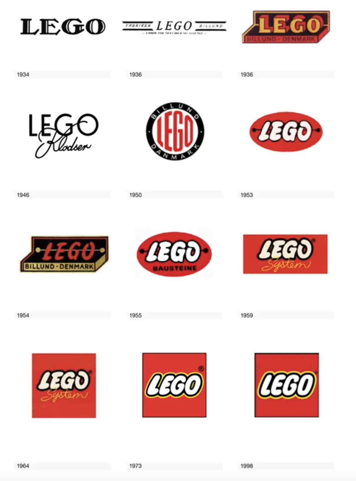
Lego

The red, white, yellow, and black LEGO logo is synonymous with one of the world’s largest toy manufacturers, but it didn’t always look so familiar. The story began in 1932, when the carpenter and joiner Ole Kirk Kristiansen established his business in the village of Billund, Denmark. The word LEGO in translation from Danish “leg godt” means meaning “play well”. From the history of the logo creation could be seen how the logo from Black and white serif font transformed to the decorative and recognisable unique font with extra colour variations such as red, yellow and white with some black outline. The classic dog bone logo from late 1955 was the first time the logo was standardised in design and colour. From the logo transformation still can be seen that if we compare logos of 1973 and present time only minor change has been done, as extra thickness for the black outline.
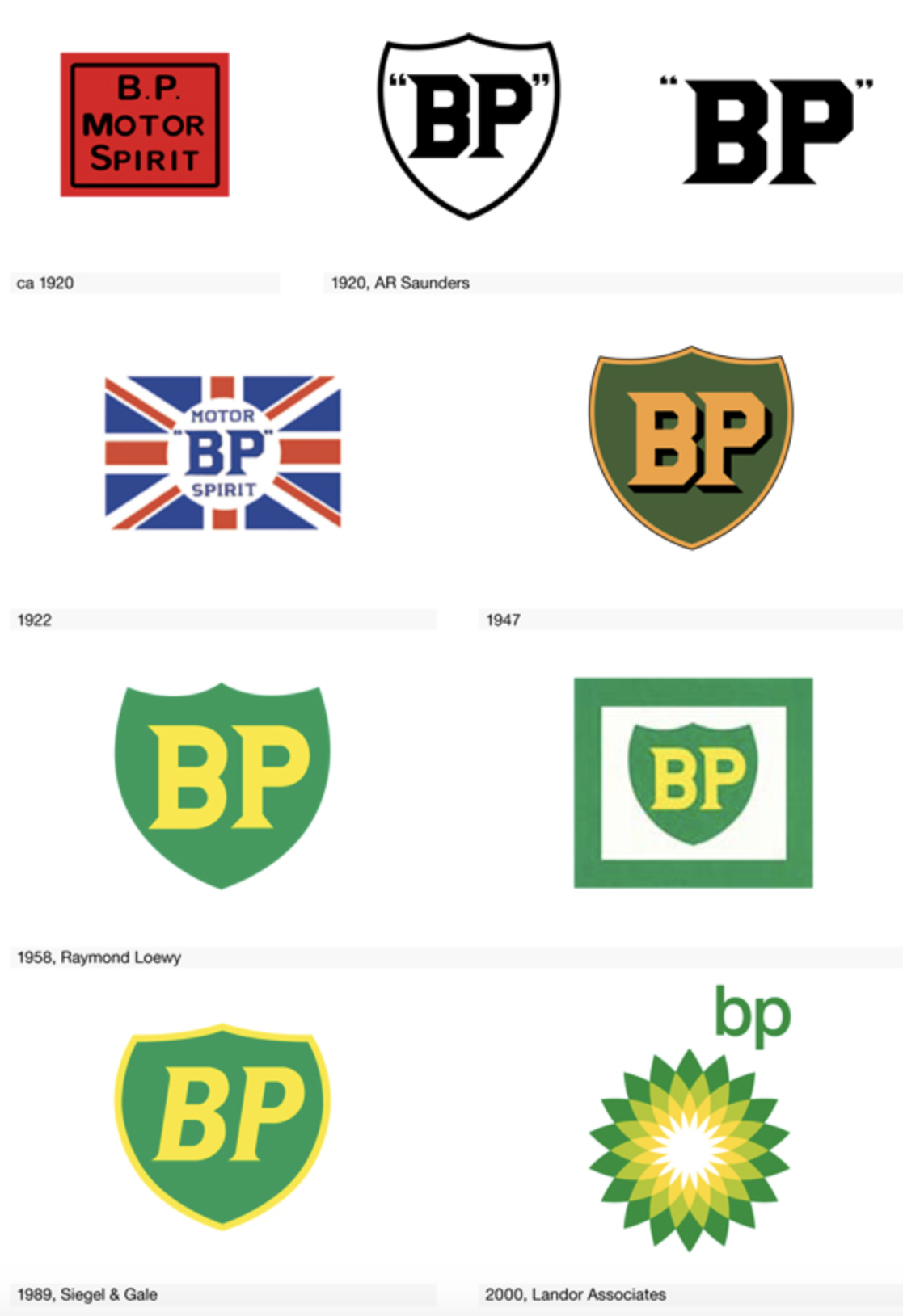
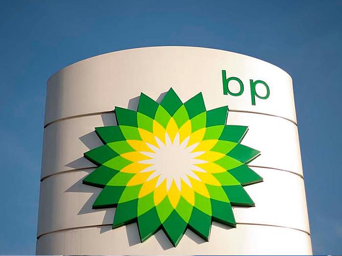
British Petroleum

Another interesting logo example is the logo for the global chains of the petrol station BP, which as far as I know temped to be one of the most expensive logos ever made. A new marketing campaign costed BP a staggering 20 million dollars. BP was named among the most environmentally friendly oil businesses in the industry, that’s why they tend to keep fresh green palette in their logo. As it could be seen from the logo development it went from the very standard logo ideas into the complicated flower with symmetrical lines around it, where was applied the golden ratio. The oil titan cut its name to BP and launched an ad slogan “Beyond petroleum”. On top of that, the company started investing into the development of alternative energy sources. Inspired by Helios, the Greek god of Sun, the new logo supported the company philosophy. 
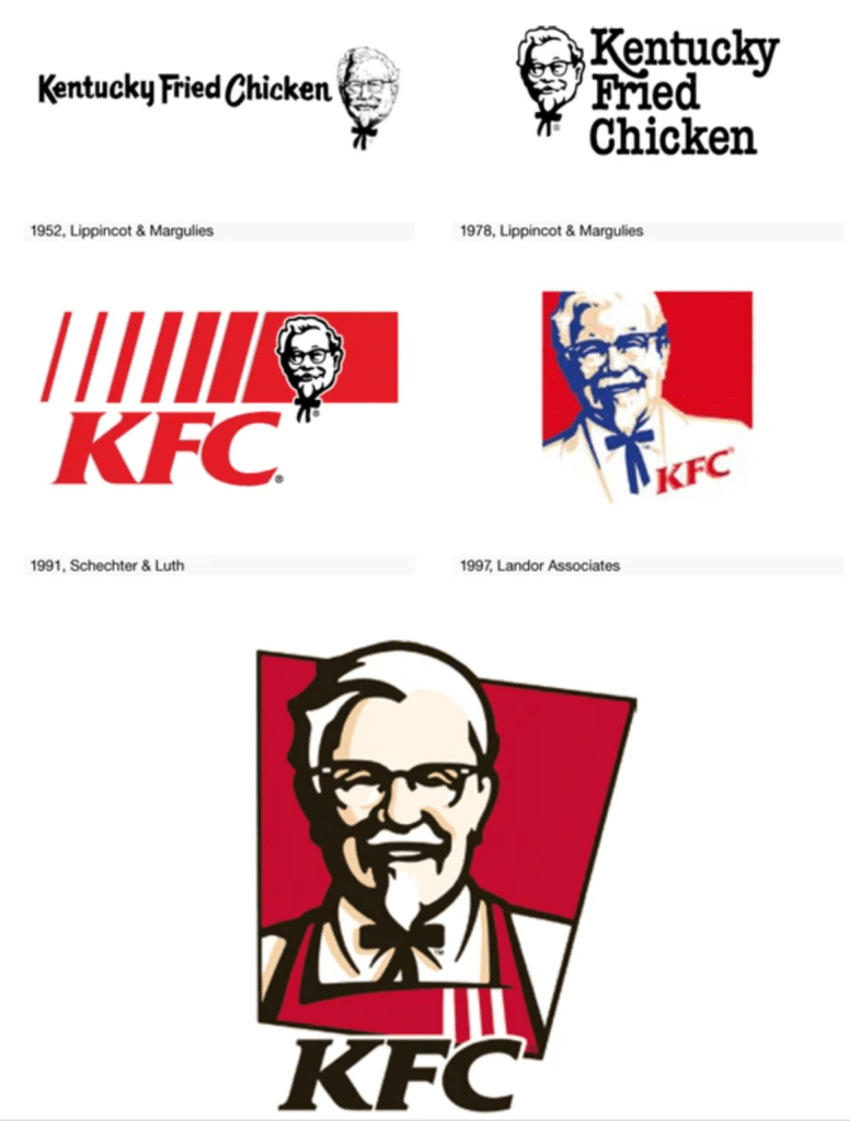
KFC

The company name “Kentucky Fried Chicken” was altered to the abbreviation “KFC” from the early 1990s an  attempt to retreat from the fatty connotation of the word “fried”. The KFC logo signifies the founder of KFC, Colonel Sanders. The company has maintained an outstandingly consistent visual identity by using Colonel’s face on the branding. On the earliest logo can be seen that they made the portrait much bigger and more prominent, with some extra black outline, which helps logo to stand out.

McDonald’s

The McDonald’s logo is symbolic of the arches that were the substance of the newly-constructed architecture of the first franchised restaurant in 1952 McDonald’s uses the Golden and Red as primary colours in its logo design. The Golden colour represents the famous arches of its first franchised restaurant, while the red colour represents the food industry of this company. The synergy of both of these colours creates a great brand identity of McDonald’s. The McDonald’s logo uses the McLawsuit font in its name. It is the simplicity of the fonts that make the name of McDonald’s look appealing to the eyes. I’m not a big fun of the fast-food, but in terms of graphic design whether it is the use of imagery or the colours, everything fits perfect in this emblem without making it look complicated. From my point of view both KFC and McDonald’s logos are one of the most iconic fast-food logos ever made.

Coca Cola

Coca Cola’s logo has changed over time with several historical examples that are nicely dated and frequently the designer or design company is named. Many of the designs run over onto the next spread with graphics of them in use. It’s a lovely jam-packed logo book of company logo history and inspiration. For one year only, the Coke logo gets a dramatic, swirly makeover, then we can see the progress of changing, where the company returned to their 1887 logo idea with calligraphic font. It’s easy recognisable and iconic logo example, however it was quite common scenario when others companies tried to borrow that calligraphic scrip for their logo, and after they could risk of getting the name of Coca Cola’s type of logo.

Google

Another interesting example when not only the logo had been changed but the name of the company as well. The very first name for the Google was “BackRub”, as the engine’s main function was to search through the internet’s back links. Luckily, by 1997 they’d changed the company’s name to the much less creepy “Google”. However the design itself was not the best one, first logo ideas looked like there were made in Microsoft Word text style. Later from 1998 could be see that the font for the logo had improved to the more recognisable one, but the developers still wanted to keep that bright all colours pallet in one logo. The modern version of the Google’s logo went from the serif font to the san serif with bolder writing.
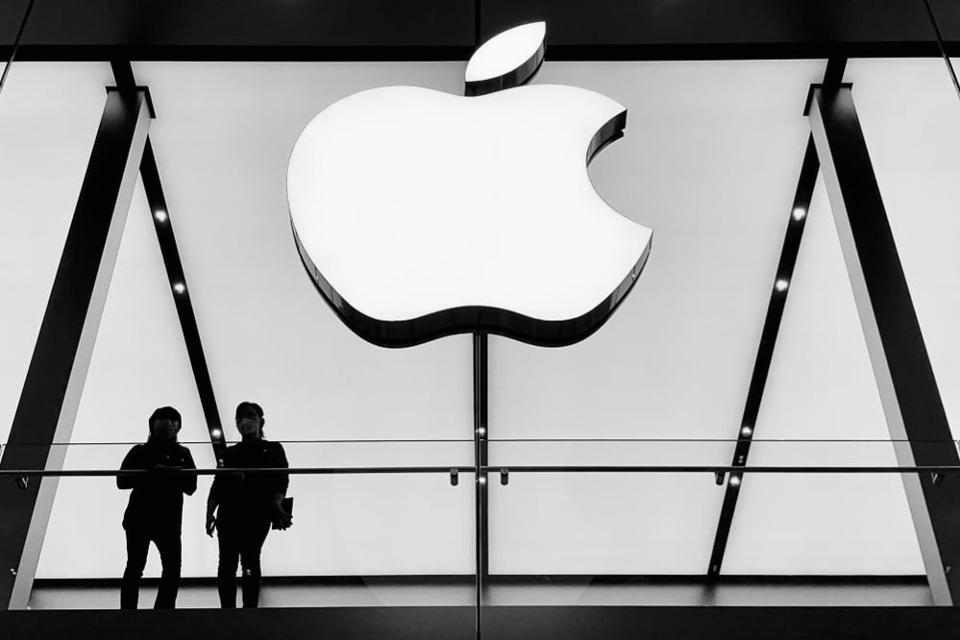
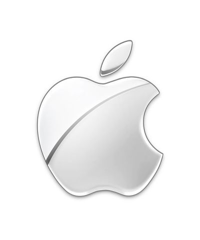
Apple

Another significant logo in the logo’s history is Apple logo. I assume it is an important logo ideas for many designers, as the main purpose of this brand was to push design and modern outbids of the brand forward. So to start with, let’s look at the original apple logo from 1976. It featured a hand drawn image of  Isaac Newton under the tree where the apple fell and was designed by co-founder Ronald Wayne. It also featured the copy: ‘A Mind Forever Voyaging Through Strange Seas of Thought – Alone’. From the progress of the logo can bee seen who the rainbow logo went to the strict dark shades and after to the 3-D type of logos. Now, apple has gone even more minimal with the simplistic mono logo which is usually used. It is sometimes used on other products in various other flat colours as well. It goes to show the importance of simplicity in logo design as the same form has been reinvented with such success over so many years.
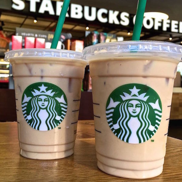
Starbucks Coffee

Starbucks legendary logo design is the brainchild of Terry Heckler, who pored over old marine books until he came up with a logo based on an old 16th-century Norse woodcut: a two-tailed mermaid. What everyone has noticed that the logo has changed with the years of becoming bigger, and coming closer to the edges, which looks like it has been completely stripped from the details. The Starbucks logo is circular in shape. The design also features the brand name in wordmark inside the circles with two stars on either sides. The newest logo design features an enlarged Siren with no stars and wordmark.
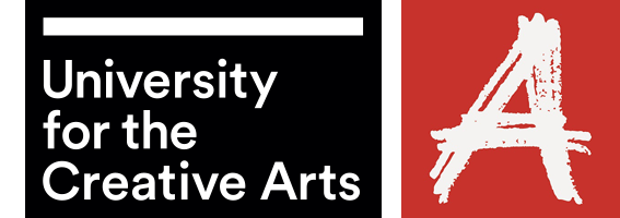
OCA

In regards to the UCA logo I can say that it is made in contrasting colour pallet, with painted letter “A” like by a piece of chalk on the red background, which is quite catching. It’s hard for me to say what is my impression on the additional information placed on the black square, but if I will try to recall the logo, it will be letter “A” coming as a main object.

Sources

  1. https://www.designboom.com/design/logo-life-life-histories-of-100-famous-logos/
  2. Logo life: life histories of 100 famous logos
  3. https://www.logodesignlove.com/lego-logo
  4. https://www.logaster.co.uk/blog/bp-logo/

Research point

In this research point I was asked to make some research about poster design and their tendencies according to the time changes. I thought that is exactly the type of work I’ve been doing recently — making some researches about posters for the techno record label. The main fact that I’ve discovered about electronic music, as there are no rules in creativity. That was such a huge space for the self-impression, probably the biggest one I’ve every seen recently. The variety of styles was myriad, starting from cube angles for posters, black and white shades going to the fluorescent colours. 

Techno posters stands out as they are not scared of experiments. I’ve seen loads of posters wit glitchy effects, and contrast colours combinations, but I was quite attracted to the mood they brought up with them, which was quite obscure and gloomy, which doesn’t make this music genre less popular.

Research point

Many hundreds of paperback books have been produced over the years. Look at as many variations as you can find to see how different publishing houses designed their covers and how the covers fit together as a series. Select a particular publishing house and describe their design style in your learning log.

OCA. Core Concepts

In the 19th century a whole new era in publishing began. A series of technical developments, in the book trade as in other industries, dramatically raised output and lowered costs. Stereotyping, the iron press, the application of steam power, mechanical typecasting and typesetting, new methods of reproducing illustrations—these inventions, developed through the century and often resisted by the printer, amounted to a revolution in book production. Every publishing house has manufacturing, marketing, and accounts departments, but the heart of the business lies in the editorial function. This has changed in its mode of operation through the years and still varies from one country to another and between firms but not in essentials. 

When I went online to make some researches on the biggest Publishers in the world, I found out that together, these institutions dominate the publishing landscape, and many of the most beloved books come from their imprints. The “Big 5” publishers is a nickname given to the five power-houses in trade publishing: Penguin Random House, Hachette Livre, HarperCollins, Macmillan Publishers, and Simon & Schuster.

Penguin Classics

The task of analysing book covers seemed interesting enough to me. Before starting this exercise, I decided to do a little research in this area. I found a list of the most influential major publications in the field of literature. Each publishers website was overflowing with covers and designs that I was eager to arrange in a unique manner. The largest publishing house I needed to visit, Penguin Classics use vector illustrations, and 2/3 of the parts are occupied by a drawing relevant to the story. In the non-linear part the book is split, one part individual designed work coupled with corporate colours in black, orange and white, containing the globally known penguin logo, a rather cute design, but at the same time recognisable. In addition, on a black background, an orange sans-serif font, as well as an uppercase font for the book title. In the case of Penguin classics, the designers made the main emphasis on the design of the illustration itself.

Book Series

I was interested in following the course of designs for a series of books. In terms of Deanna Raybourn, Michelle West, Daniel Silva books here you can see bold decisions, vivid rich illustrations in a similar style and large fonts that cross the cover of the book at an angle. In the books of Michelle West, a triangular symbol is traced around which the illustration itself unfolds. Or in the version with Daniel Silva, having the author occupies almost half of the cover of the book, photographs are selected as images with text showing contrasting fonts are superimposed. It is interesting that by design of the shroud you can determine which direction the book is leading if it is a light classic novel, fiction, a modern novel, mysticism or a detective story.

Hachette Livre

The next publishing giant, Hachette Livre, was the exact opposite of Penguin Classics. I thought that from artistic point of view book covers below are not as interesting as the past company. It is noteworthy that cover designs are fairly standard, in which there is a peculiar set of fonts. For the most part, the names of books and their authors pass through the middle of the cover, or occupy half the area. In my understanding, these kinds of designs are not that attractive but nonetheless, they can also attract their audience.

HarperCollins

I compared several Book houses for myself, and in the end I decided to pay attention to the next publicist, HarperCollins. Here I have collected book collections from a series of women’s novels, fantastic adventures, as well as some examples of children’s publications. Joanna Shupe, what I noted for myself is that in the series they use similar compositions that differ in color. The plot of the pair on the cover for a female audience is in itself a win-win option. I also drew attention to the font solution, a light delicate font, with calligraphic elements, and a phrase in the upper corner, despite the load on the cover, the design itself is quite attractive. Also, a series of books by Maria V. Snyder, the upper part of the cover is occupied by the name of the collection, the lower part is the author’s name, and the illustrations are also repeated in the style, at first glance you involuntarily understand that we are talking about fantastic adventures.

Research Point: Collecting Examples

In this research point I need to anilise different layouts of magazines, publications and newspapers, to see which one is easy to follow, and which don’t. Bellow is collection of newspaper layouts and magazines that were appealing to my eye.

The example below is my favourite. For the header was chosen bold san-serif font all capital letter, and narrow font for the bottom word. Looks quite good together, combining opposite fonts. For the intro my favourite Playfair Display Italic font. The text was shaped nicely, the font is serif. All justified. For the initials Bold Narrow serif letter, good contrast.

Others examples that appealing for my eye. Materials that were being used. https://www.pinterest.co.uk/edavydovska/magazines-newspapers/

During the article’s analysis, I noticed for myself that there are basic keys and methods that professional designers use in layout, but at the same time, perhaps free or cheaper publications are neglected.

Properly organised space, photo layout and font selection play an important role in the readability and perception of the text. All of the examples below are neatly formed into blocks, serif text, a visible caption, large photographs and adjusted text for the long read paragraphs.

Examples that I didn’t like really. Looks quite messy, lot’s of imperfections in font chose, and layout itself. Explanations are blow. All images below from Pinterest Image
https://www.pinterest.co.uk/edavydovska/magazines-newspapers/

The examples below look chaotic and overloaded. Suppose the torn edges of the text look unsuccessful around large objects, such techniques should be avoided. Also striking is the long space at the end of the paragraph. For example, for small paragraphs, the text looks good when it is aligned to the left, but if it is a long text, then it is necessary to justify it on both sides of the column.

Example №1, in my understanding, is an example of a successful and professional layout, especially for a newspaper, where the quality of the paper is different, and coloгr images are duller. However, paragraphs and paragraphs are organiыed correctly. Headings go to the main background, the text is readable.
Example №2, also of interest to the original layout, I was particularly impressed by the form in which the text was framed. Layout №3 with the culinary text, divided into small paragraphs aligned on the left side. Here sans-serif text looks good. And the main heading is large compared to the rest of the text.
Layout №4 is an example of a poorly organised space. Also, the title is lost on the background of randomly scattered images. Despite the fact that the columns are aligned on the left and right edges, spaces are too wide between paragraphs.
Similarly layout №5. The columns of the text are aligned to the left, which complicates the ease and readability of long text. Of the advantages, I would note a good title and location of the photo.
Design No. 6, the text is aligned and revised relatively correctly, but because of the wide columns and the lack of photo images, the layout itself looks boring.

Example №7, it turned out to be noteworthy to me because it has a gigantic headline and plenty of space around. At the same time, on the opposite side is a photograph, which makes this design also catchy for reading.
One last example of a hasty design, where there are extra spaces in each line, breakaway contacts (telephones, web address), has written off the last two designs, № 10 and № 11, as a layout that they didn’t have time to fix and subtract.

Conclusion

In conclusion, I would like to say that this task turned out to be more exciting and important than it seemed to me from the first. I noted for myself that for long readers it is better to use a serif font. I also noted that magazines mainly use two types of alignment, this is left-aligned and justified, should be careful with both choices, as they do not work for some cases. I also noted that if space permits, the layout looks interesting with large headlines, a more defiant and flashy sans-serif font, while a small serif font looks modest but neat. In the future I plan to collect magazines and newspapers, perhaps glancing briefly at the accuracy and correctness of the layout, I think this will affect the formation of my level of text design as well.

Research Point: Vernacular typography

The combinations of type found on signage reveal a great deal about a city, town or specific area. They reflect the social, economic and historical development of the area and create their own, and unique typographic style.

Below are presented a photoshoot of my walks exploring signages in the South of France.

City of Lincoln

Official directional signs are generally easy to recognise, even if you are in unfamiliar surroundings. According to typefaces researches for directional signs there are three types: Clearview, Frutiger and Helvetica, as they are chosen for their clarity and readability.

We are all type consumers: we all interact and with a big variety of typefaces every day. Type influences what we read and what we see affects our choices, because that types communicating to us subconsciously. The main advantages of fonts are: fonts save your time, fonts help you to chose, fonts show you the way…and tell you where you are.

Research Point

The alphabet is only part of a typeface that contains lots of different characters such as numbers, punctuation, mathematical and monetary symbols and ligatures. Ligatures are where two letters are combined together to make printing easier. Explore your computer keyboard to find some of the other characters. You will need to use your shift, alt and ctrl keys.

This was just random pressing of Alt+numcode, lots of funny and foreigh symbols came up. — ˜ ‘ Šٷ ، ኖ ʷ ᇢ،ٰٮ ƽ 뇫 Ӫ. When I work at my work computer, I sometimes use a list of characters from the code in the alt + numpad combination. My main symbols are • ° ²» etc.

I was interested in trying to practice with the keyboard on my Mac, it was more out of curiosity, because we are surrounded by many characters, the meaning of which we do not even suspect, but in the modern world we use a limited set of standard characters that are familiar to business correspondence.

Choose a magazine, for example the Big Issue or Heat, and look at the main typefaces theyuse for the body text and headlines. Go to http://www.identifont.com and use the programme toidentify the fonts. Look at the ranges of typefaces all around you and try to identify theirdistinguishing characteristics. Make notes in your learning log.

I wanted to try experimenting with this site, to find out what its essence is. At hand I had several issues of magazines, one of them was the British Journal of Photography. At first glance, the most common search engine, but when I disassembled this site in more detail, I discovered for myself you can say a new font selection system for professional work. As I often found it difficult to find the right font, when you come across something unusual in an article or poster, I sometimes had to look through all the fonts in my Adobe Illustrator program to find the right one. But here the search for the desired character resembled an exciting game. Frankly, at first I incorrectly selected the fonts, a small error could lead me to a completely different font, but the more precision in the selection of characters, the higher the likelihood that you will find a suitable font.
I also had the release of the September Vogue magazine, I was interested in what elegant font was used in it. It’s easiest to use the Times New Roman Serif font or Baskerville, but why not discover something new.

Conclusion

I found the first part of the task quite interesting for myself, it was interesting to find out where a symbol is hiding. For convenience, I would print myself a cheat sheet of the main signs and symbols that may be useful in design. The second part of the assignment turned out to be even more interesting, because thanks to her, I can now replenish an even more collection of fonts for my subsequent work. I will be happy to use this system in my future works for inspiration.

Research point: The history of Typography

Double page spread including examples of Roman type and profile portrait, from `Mise en Page`, written, designed and produced by Albert Tolmer, pub. by Studio Editions, 1931

The history of type development has seen many exciting eras. The invention of moveable type, for instance, revolutionized our world, allowing the transmittal and sharing of knowledge, raising the level of the world’s literacy, and enabling civilization to progress and prosper.

Type History and Timeline of Typogrphy.

Ancient cave paintings that date back to 20,000 B.C. are perhaps the very first recorded written communication. However, formal writing is said to have been developed by the Sumerians at around 3,500 B.C.

As civilisations advanced, the need to communicate complex concepts grew—hence the development of Egyptian hieroglyphics. By 3100 B.C., the Egyptians began incorporating symbols or ideograms into their art, architecture and writings.

Fifth Century BCE.

Greek lapidary letters, letters carved into hard surfaces, were one of the first formal uses of Western letterforms. The Greeks adopted the Phoenician alphabet for their own needs, and as a result, changed several letters and created the foundation for Western writing. Roman monumental capitals are the foundation for Western type design, as well as the ancestor of all serif typefaces Fourth and Fifth Centuries CE This time period saw square capitals, formal hand-written letters that evolved from Roman monumental capitals.

Fourteenth and Fifteenth Centuries

The Middle Ages were all about hand-written and well-illustrated manuscripts. It led to the evolution of a wide range of writing styles. Unicals and half unicals were prominent features, with rounded, elaborate lettering. The art of Calligraphy along with page layout and lettering forged new ground. Calligraphy masters travelled across the known world to share their knowledge with the educated elite.

Nicolas Jenson (77) (1420– 1480) was one of the first printers to cut and use fonts based on Roman rather than northern European Fraktur letterform.

Another fifteenth-century notable, William Caxton (1421– 1491), a man credited with introducing to England the craft of printing with movable type, was first a successful businessman and government official before beginning his typographic career.

Sixteenth Century

Garamond (74) (1500– 1567) was the most distinguished type designer of his time, perhaps of the entire Renaissance period. A true typographic innovator, he was instrumental in the adoption of Roman typeface designs in France as a replacement for the commonly used Gothic.

Seventeenth and Eighteenth Centuries

During this period, English gunsmith-turned-type-designer William Caslon I (72) (1692– 1766) founded the Caslon Type Foundry. He was one of the few wealthy type designers. His work, based on earlier Dutch designs, does not possess irreproachable perfection like that of Bodoni (156) or Baskerville (154) . Caslon’s strength as a type designer was not in his ability to create flawless letters, but to create a font that when set in a block of text copy appeared perfect in spite of the vagaries and individuality of each letterform.

Early Nineteenth Century

Early in this century, Lord Stanhope invented the first printing press. A few years later, in 1816, William Caslon IV designed the first sans serif font, creating the English serifed design. Many claim that the design for this sans is based on the Greek lapidary letters of the fifth century. Note how close they also look to the caps found in faces such as Futura (174) and ITC Avant Garde Gothic. In 1818, Bodoni’s (71) Manuale (completed by his wife after his death) showed the quintessential modern type.

Rudolf Koch, 1924

Mid Nineteeth Century

For many years, ATF had the greatest offering of typefaces in the world— an offering that Benton essentially built. Outside the United States during this period, Emil Rudolf Weiss, Rudolf Koch , Lucian Bernhard , and Paul Renner began designing type.

Koch was primarily a calligrapher and teacher, but his association with the Klingspor type foundry in Germany provided the opportunity for a number of his designs to become type fonts.

Renner created the first modern, geometric sans serif face: Futura . Although not a member of the Bauhaus, Renner shared its ideals and believed that a modern typeface should express modern models, rather than revivals of previous designs.

Late Ninetheeth

Eric Gill (1882– 1940) was an English sculptor, stonecutter, artist, and type designer. His most important work— and his only sans— is Gill Sans. His other designs include Joanna, Perpetua, and Pilgrim.

By the Industrial Revolution typography was all about communicating with the masses. Through signs, posters, newspapers, periodicals and advertisements, typefaces became larger and catchier, with bolder lettering and shading—as well as experimental serif and sans serif typefaces. Ornamental typography was another major highlight in this era. In the 1800’s, medieval art and hand crafted individual art has become commonplace, and international artistic styles developed considerably.

The year 1970 experienced the release of ITC Avant Garde Gothic and ITC Souvenir. ITC Avant Garde Gothic was ITC’s first typeface, initially drawn by Herb Lubalin (95) as the logo and headline face for Avant Garde magazine.

In 1982, John Warnock and Chuck Gerschke founded Adobe Systems. In 1983, Adobe PostScript was announced, one of the three most important technological advancements in typographic history.

U&lc was ITC’s journal of typography.

1990s

ITC released Tekton in 1990, possibly the ITC Souvenir of this decade. It was designed by David Siegel for Adobe Systems (124) and based on the hand lettering of D. K. Ching, a Seattle architect. The following year, Adobe introduced the Portable Document Format— what’s today commonly called PDF— to aid in the transfer of documents across platforms. Apple introduced its TrueType to compete with Adobe’s PostScript. Stag Family by Christian Schwartz.

2000s

In 2000 and 2001, Agfa purchased the ITC type library and created Agfa Monotype, a merger of Agfa Typographic Systems and Monotype Typography. The Gotham typeface family, by Tobias Frere-Jones (87) , was released. Apple introduced Mac OS X 10.0 code named Cheetah. Harvey R. Ball, who created the cultural and typographic iconic drawing of a smiling face on a yellow background, passed away.

Stag Family by Christian Schwartz
Erin McLaughlin’s Katari typeface combines a strong engagement with the writing of Devanagari, translating a pen-inspired structure into an incised style with both text and display variants.

Source: Tselentis, Jason, et al. Typography, Referenced : A Comprehensive Visual Guide to the Language, History, and Practice of Typography, Quarto Publishing Group USA, 201

Research point: Visual language

For this research point I have to explore a visual language of designer that interest me. To start with I googled the definition of visual language in graphic design.

The visual language is a system of communication using visual elements. Speech as a means of communication cannot strictly be separated from the whole of human communicative activity which includes the visual[1] and the term ‘language’ in relation to vision is an extension of its use to describe the perception, comprehension and production of visible signs. (Source: https://en.wikipedia.org/wiki/Visual_language)

How to develop a visual language?

01. Step away from th screen

I found that recomendation fundamental for graphic design style development.

Don’t just look at work that is being created now: look back in history and look at the real world all around us, our immediate surroundings, people, second hand book shops, found photographs, car booties, your granny’s loft, anything! Resist the urge to just look online for inspiration and influence.

I think that is the first point I can take out from the article, get inspiration from as many sources as possible.

02. Be inventive with materials

We are surrounded by graphic design materials, don’t forget to be crafty. The pile of unneeded stuff would be useful for your design ideas.

03. Use technology to your advantage

To get the balance right, it’s usually best to start your work with real materials away from the computer first, then scan the images in and edit, combine and compose. Be very wary of any brushes and effects that attempt to assimilate spontaneous and hand drawn mark making.

04. Find out who you are

To create your own personal style, you first need to work out what kind of creative you want to be. Ask yourself: what would be your dream job? It’s important to create work that genuinely interests you. As with anything in life, if you know what you want, you stick at it and work hard then you will get there in the end.

05. Be consistent

Finally and most importantly, the golden rule; be consistent (even if inconsistency is your consistent theme!).

Once you’ve found a way of working through months or years of experimentation, research, hard work and focus, always approach your creations with the same visual language. Too many conflicting ways of image making will make your work look indecisive and unclear.

Source: https://www.creativebloq.com/design/how-develop-visual-language-3143194

Matthew Richardson

(Artist, Lecturer / academic)

Matthew Richardson practice and research derive from exploring found imagery and objects and the way changes in context and association provoke questions of ‘believability’ and authenticity. The particular subject focus for illustration has grown from an interest in narrative, vernacular, popular and folk art, and how images become shared, and culturally significant.

In his works he experiments with colour, overlaying images one on another layer, the transformation of objects that are not connected with each other into an organic whole. In his works I clearly trace the basics of composition, proportions, some posters follow the principle of a circle, some of which follow the principle of a rectangular composition.

Using pieces of body parts, lots of experiments with opacity, lines and objects. Texture usage, unique style of design. The strong feeling of parallel reality presence.

Aspects of Matthew Richardson artworks that I could use as a starting point for myself. The clear exploration of how objects and images become significant through recognition or mis-recognition and through changes in context. Interested in alternative histories, social myths and half-hidden stories. Interested in the relationship between fact and fiction (and what might lie between). Often use (and abuse) found imagery, objects and historic and fictional moments. Much of the work is explored across forms – object-book-print-film and often create work in shifting sets or sequences, which fall towards a narrative reading.

Source https://matthew-richardson.co.uk/Prince-Igor-London-Colliseum. Access [12 March 2019]

Books & Exhibitions

Here are links of artists I was inspired that to complete for my first Assignment.
Loved Illustration works of Matthew Richardson, as they are an example of new vision.
Another artist which I like most is John Stezaker. I was enjoying looking through his re-examines the various relationships to the photographic image. In his collages, Stezaker appropriates images found in books, magazines, and postcards and uses them as ‘readymades’. Through his elegant style, Stezaker adopts the content and contexts of the original images to convey his own witty and original meanings.

Robert Rauschenberg art is one of the examples of Abstract Expressionism. https://www.rauschenbergfoundation.org/artist

Helvetica film analysing:

Cult-ure. Book Research

This book is helping to understand the connection between the symbol and the object.
There were examples of the history of art is the archaeology of culture which I’ve attached below.
I like an idea from the book, that everyone’s handwriting is unique, and everyone who can write has designed one typeface: their own handwriting, ‘tone of voice’.
A painting is never finished, – Pablo Picasso
Also what I discovered for myself We are at the very beginning of recorded history, how far we can go into the history following photographs? Probably only grandparents have some, or grand-grandparents, but not further than that. Everything that is happening now, is captured on a camera.
Are you a good idea? The idea is in charge.
  • An idea multiplied through conversation can travel further than you can shout.
  • An idea multiplied through the written word can go further than a conversation.
  • An idea multiplied through the printed book can than the written word.

Red Square

The meaning of Red colour by reference to Nature:
Red=Blood
Red=Heat
Red=Fire
Red=Anger

Reference to Culture:
Red=Stop
Red=Danger
Red=Off

The art of traditional sculpture consists of removing everything that is not the sculpture.

This is a frame.
A frame defines a boundary, a limit.
Inside the frame is the area the artist exercised control over – this is the extent of the work. Outside the area, we have less control – the culture, the rest of the world. The edges of the book, for example, are a frame – they contain the book. Beyond is your room. Outside this frame, there also exist other copies of this book, identical in form, but not location.

Culture is a map.

Culture is a map that makes experience intelligible. It’s a map of who, a whole, we think we are; our values, our art, ur intellectual effort.
How many times can you solve a problem?
As style changes over time, it becomes fashion. Fashion, like the style, can only exist after the practical need, the function has been fulfilled.
Apophenia is the experience of seeing patterns or connections in random or meaningless data.