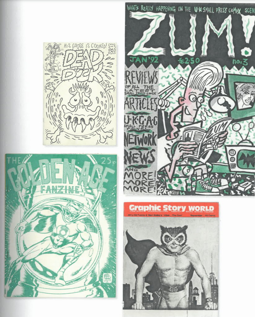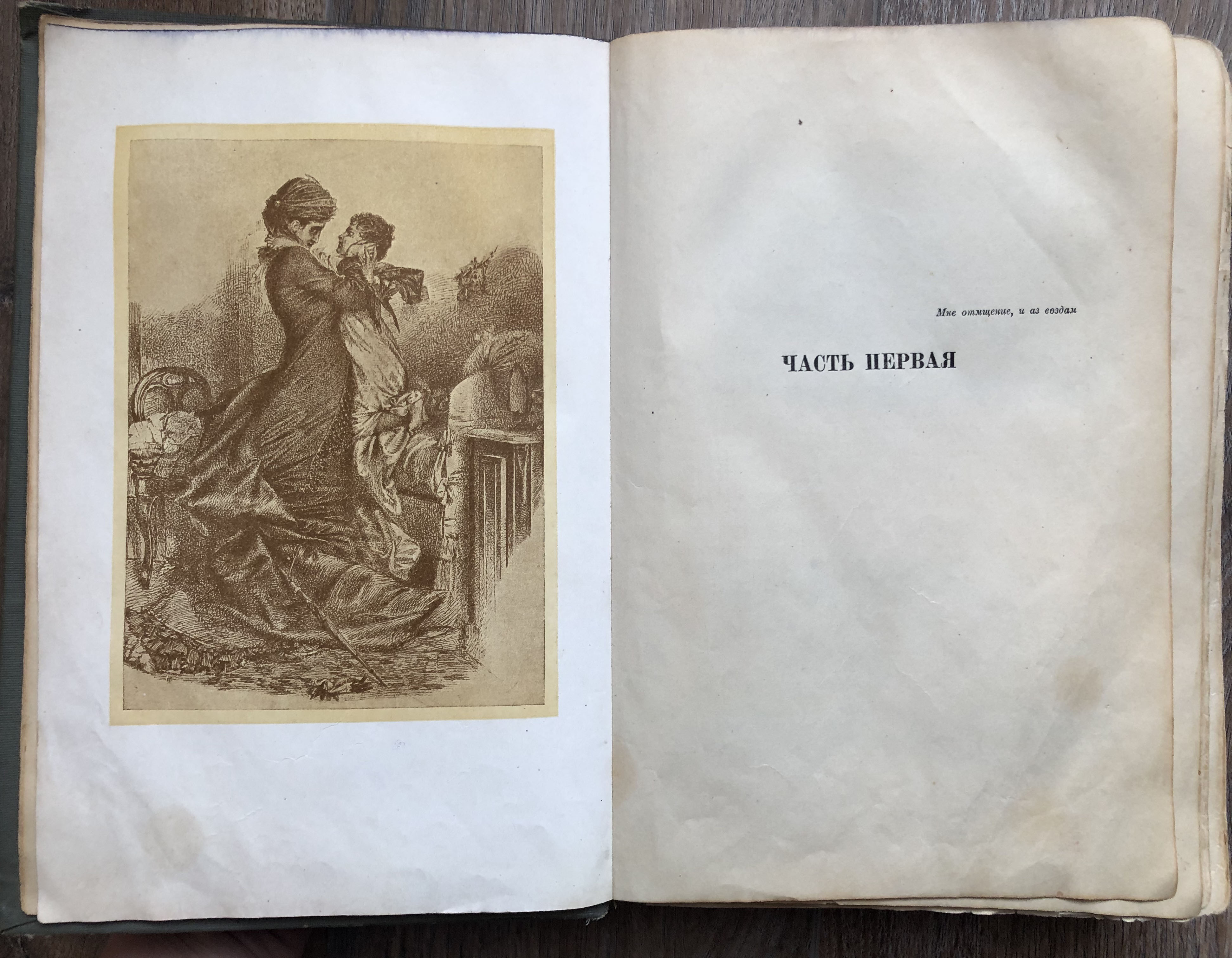
“An intimacy derives from the fact that fanzines remain amateur, ‘handmade’ productions operating outside mainstream publishing conventions and mass-production processes. The hand – the imprint – of the individual producer or maker is readily evident in the fanzine itself. This suggests, then, that the history of the object is bound up not only with the history of fanzines more generally, but also with the history of the individual maker.”
Teal Triggs, Fanzines, 2010. London: Thames & Hudson. Page 206.
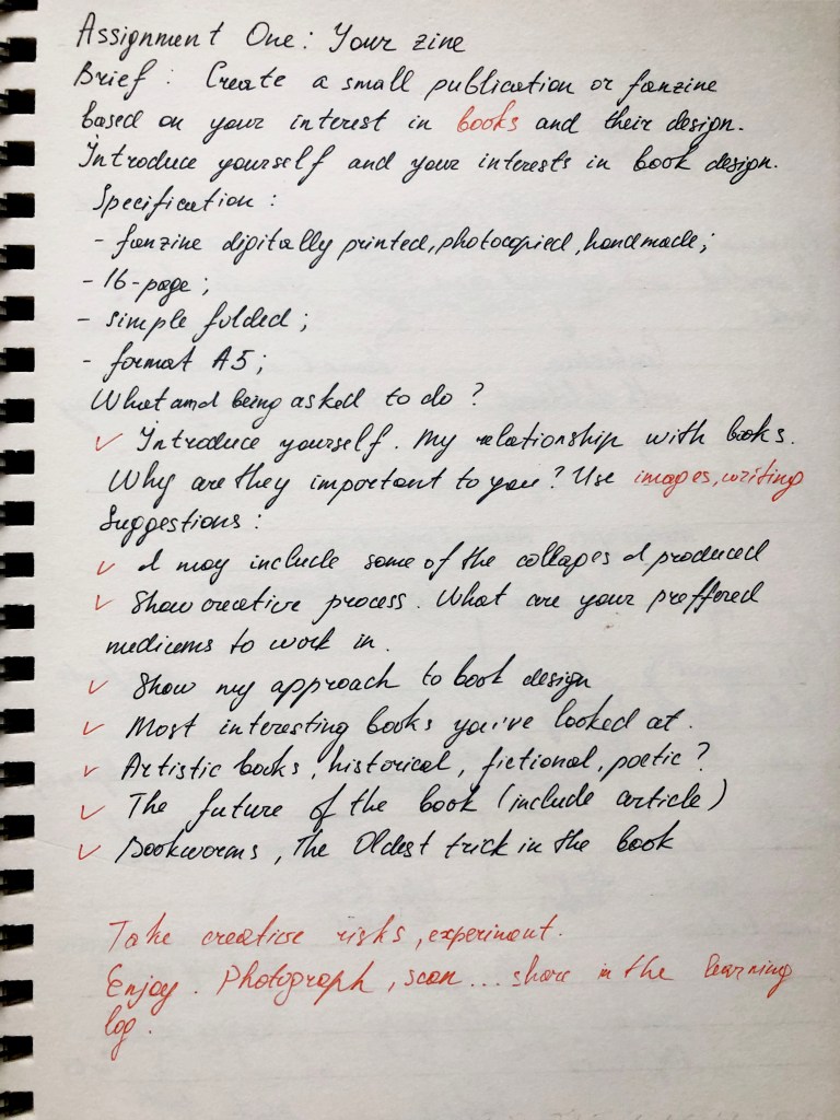
Your first assignment asks you to create a small publication or fanzine based on your interest in books and their design. It allows you to introduce yourself, and your interests in book design, so that your tutor can get to know you and your work better.
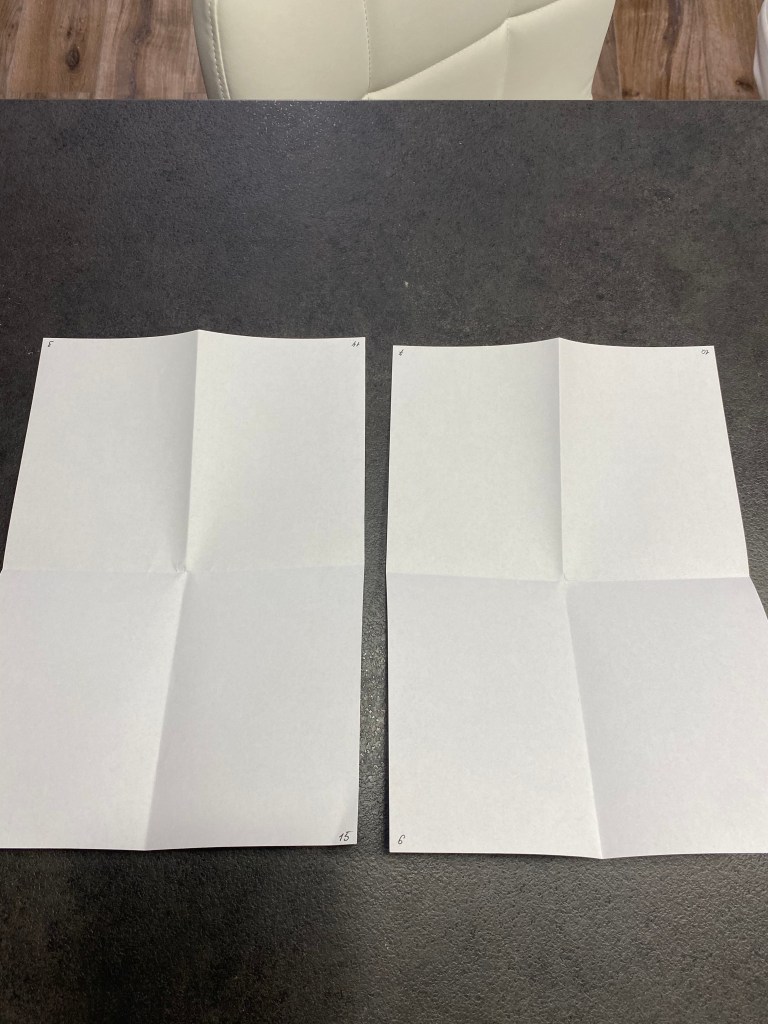
Your fanzine can be digitally printed, photocopied or handmade. Aim to design a sixteen-page simple folded and stapled A5 fanzine, though you can add more pages, or change the scale, if you want to. You can use any medium or materials to generate your artwork and make your publication. You may want to work much larger and reduce your artwork for the fanzine. While visually it doesn’t have to look like a punk fanzine, try and embrace the lo-fi ‘cut and paste’ attitude, so you’re making the work relatively quickly and not too preciously. Be creative with this task both in terms of the content and how you choose to present it, this could extend to challenging some of the assumptions about what a fanzine should look like, or how it’s made.
Use the work you have produced so far, in the earlier exercises, as a starting point for your content. Not all of this material needs to be included in your fanzine. You may want to develop new visual ideas, or add to the work you have already produced.
As a guide, your fanzine should contain the following elements:
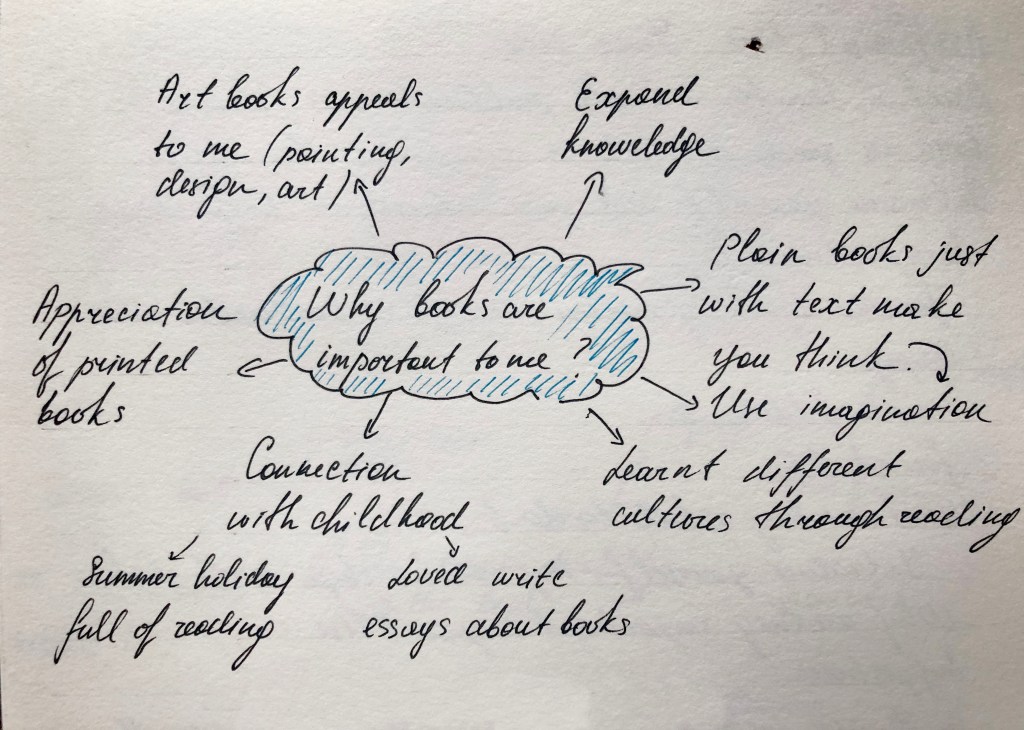
● Introduce yourself – say something about your relationship with books. Why are they important to you? Communicate this through writing and images.
● Your creative process – how do you like to work creatively, what sort of process do you follow to research and generate ideas, and what are your preferred mediums to work in. Say something about you as a creative practitioner and your approach. Show your approach to book design through your design decisions and the hands-on sense of immediacy and energy that is an attribute of fanzine design.
● Looking at books – present the most interesting books you’ve looked at, or those you find influential as a reader, designer or both? Present a selection of books, or focus on one particular example to present in more depth.
Think about how you can present these books, and your reflections, in visually engaging ways.
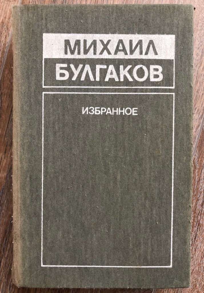
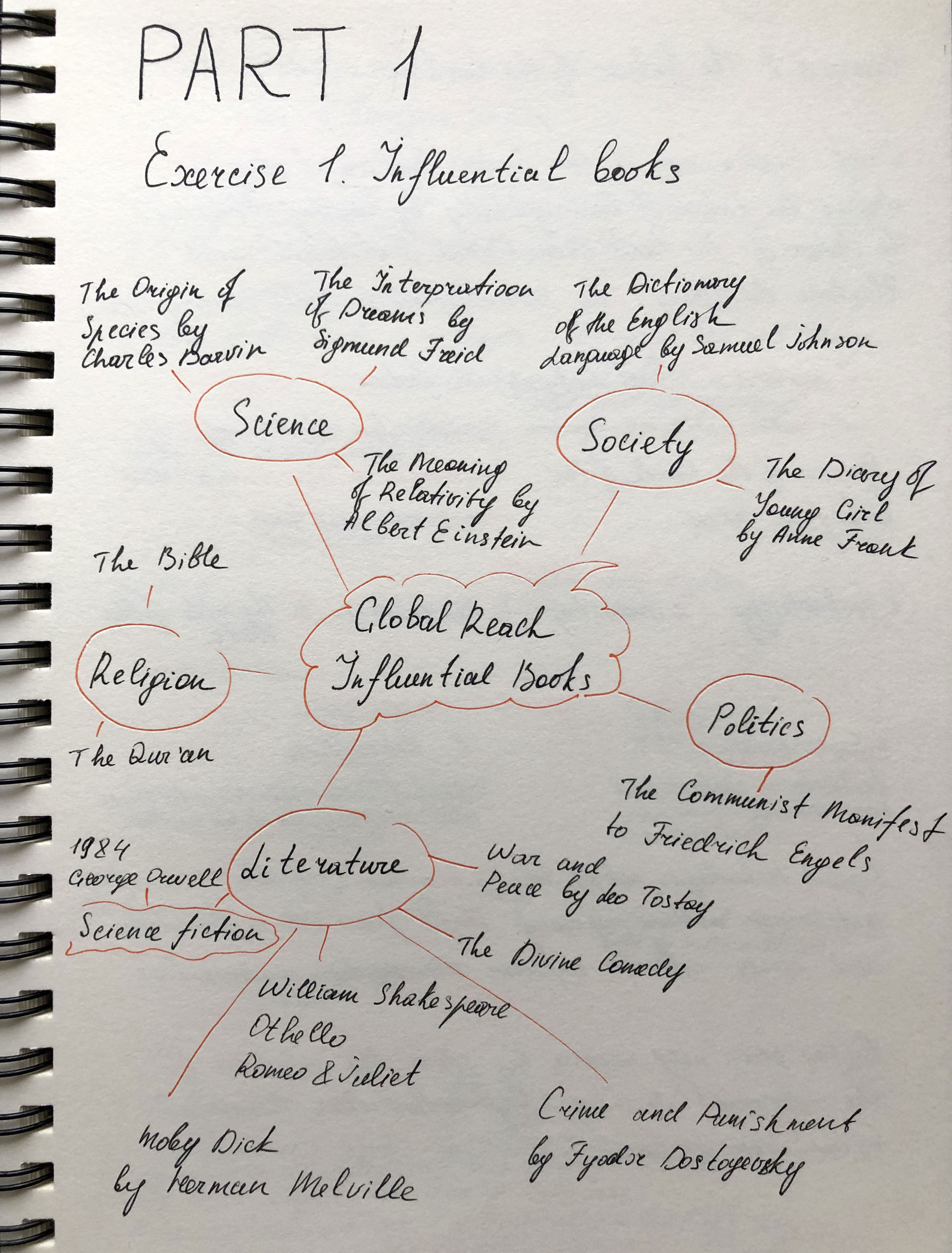
● Global influences – which books with a wide-reaching scientific, artistic, historical, political, geographic, fictional, poetic, religious or other impact have you chosen. Present them along with a brief rationale as to why, or how these books have affected you personally. Again, can your designs echo the ideas in these books in anyway?
● The future of the book – where do you see the book heading? Show and tell. Try and summarise your thinking into a series of short statements, quotations, images or ideas. Be creative in how you approach this.
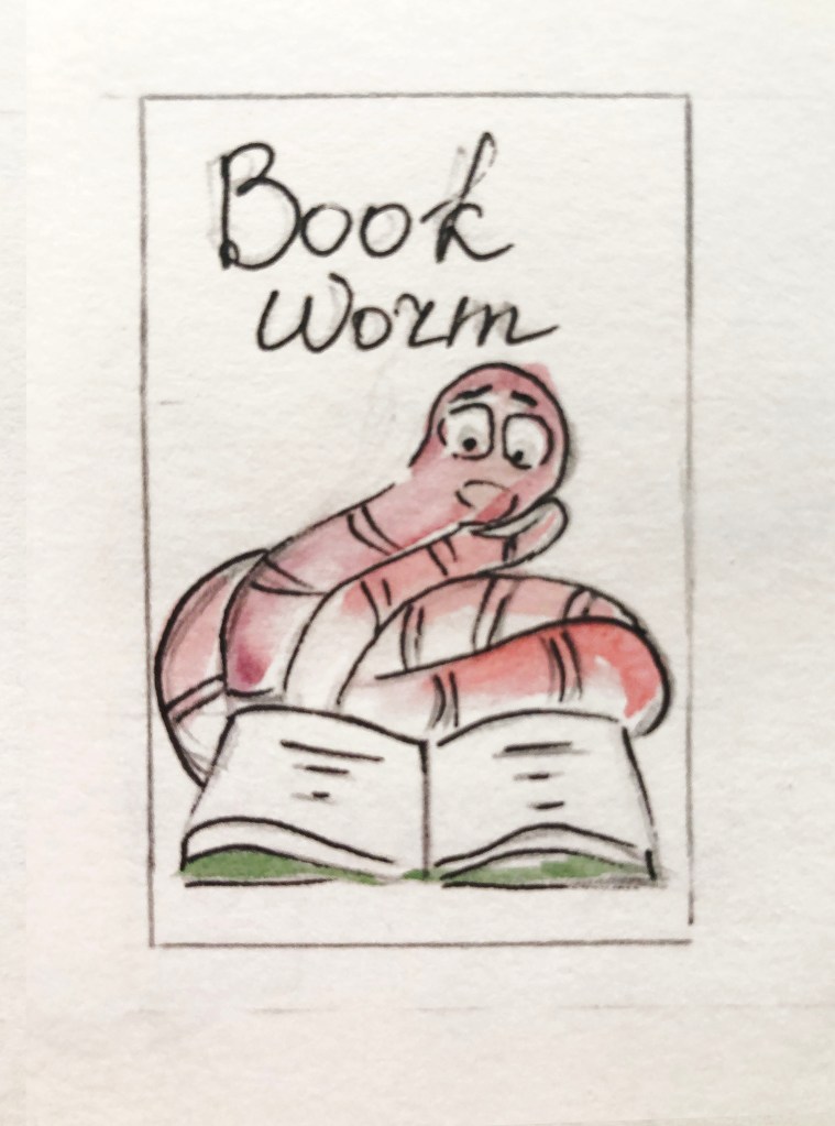
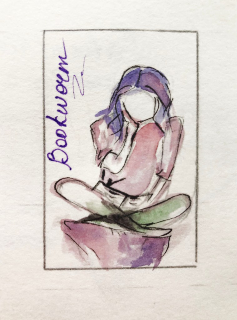
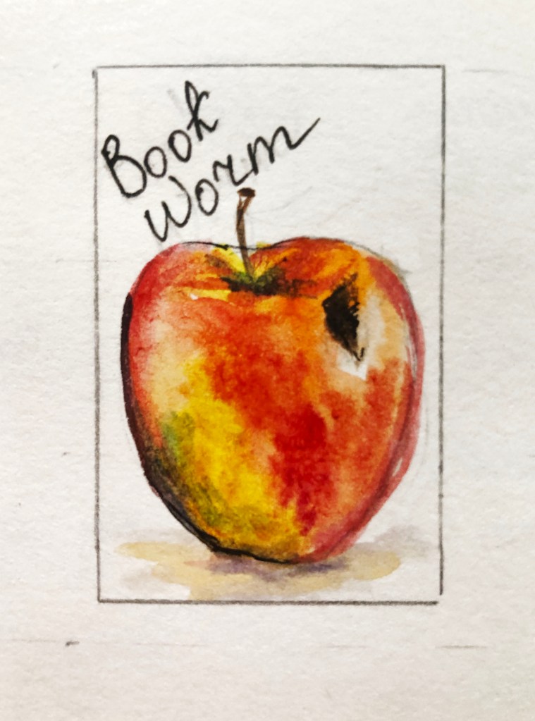
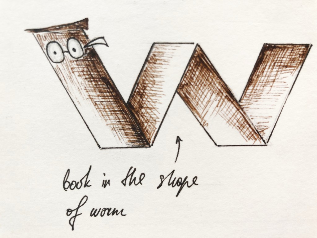
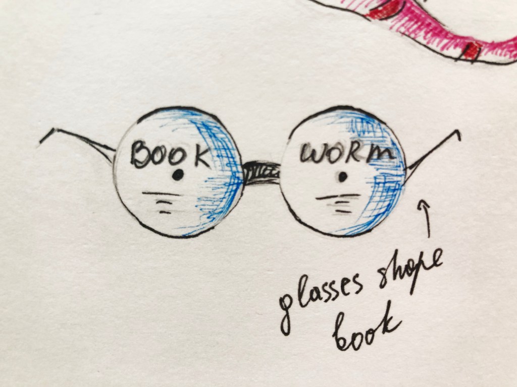
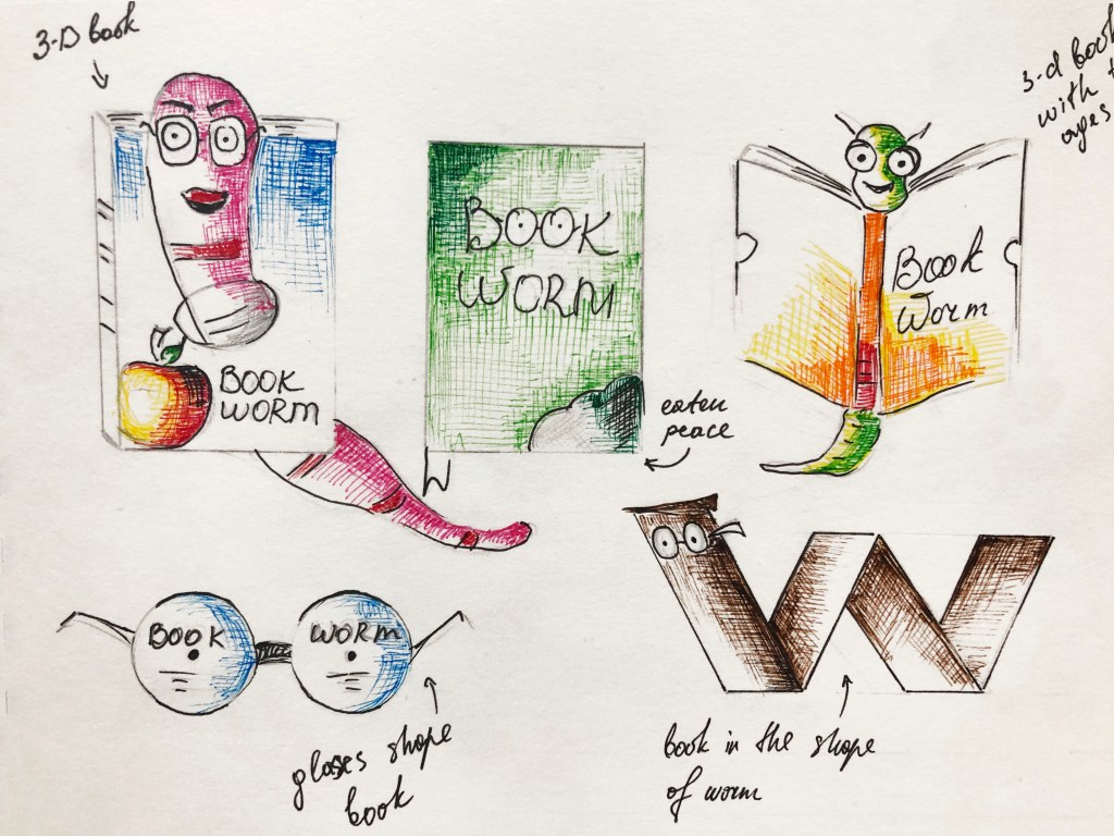
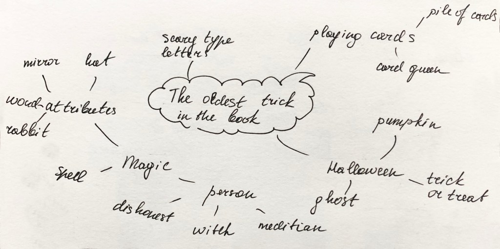
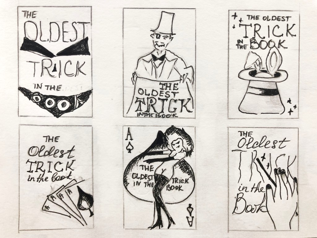
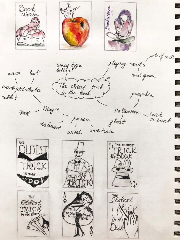
● How can you creatively respond to one or more of following book related sayings – Bookworms, A closed/open book, The oldest trick in the book, You can’t judge a book by its cover, In someone’s good/bad books, or, by the book. Use your fanzine to present your ideas. Can any of your images, text or ideas also feed into your cover designs?
Using your learning log
Keep notes to accompany the making of the publication in your learning log. These notes could cover why you decided to portray what you did, what you included and what you omitted. See it as a way to document and reflect on your creative design process.
Remember that this is an opportunity to experiment with your ideas, so document your creative process, the various stages of your work, and any ideas you rejected along the way. Aim to do this visually by photographing, scanning or taking screenshots of your work in progress and sharing them in your learning log.
As your first book, there’s room to make mistakes, take creative risks and enjoy the creative process, so don’t worry too much about getting it ‘right’. If your visual research takes you away from the above categories, that’s fine, afterall they are just prompts to start the dialogue about your interest in book design.
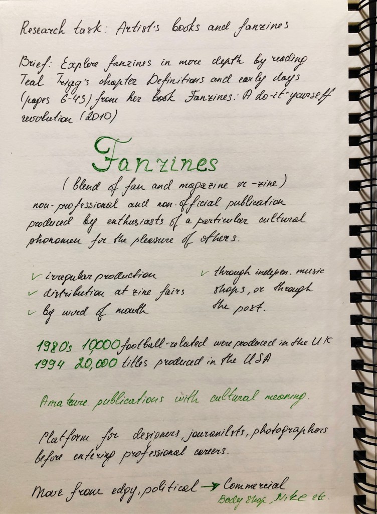
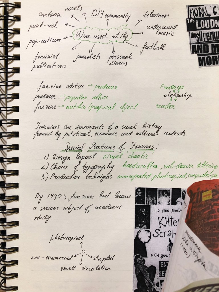
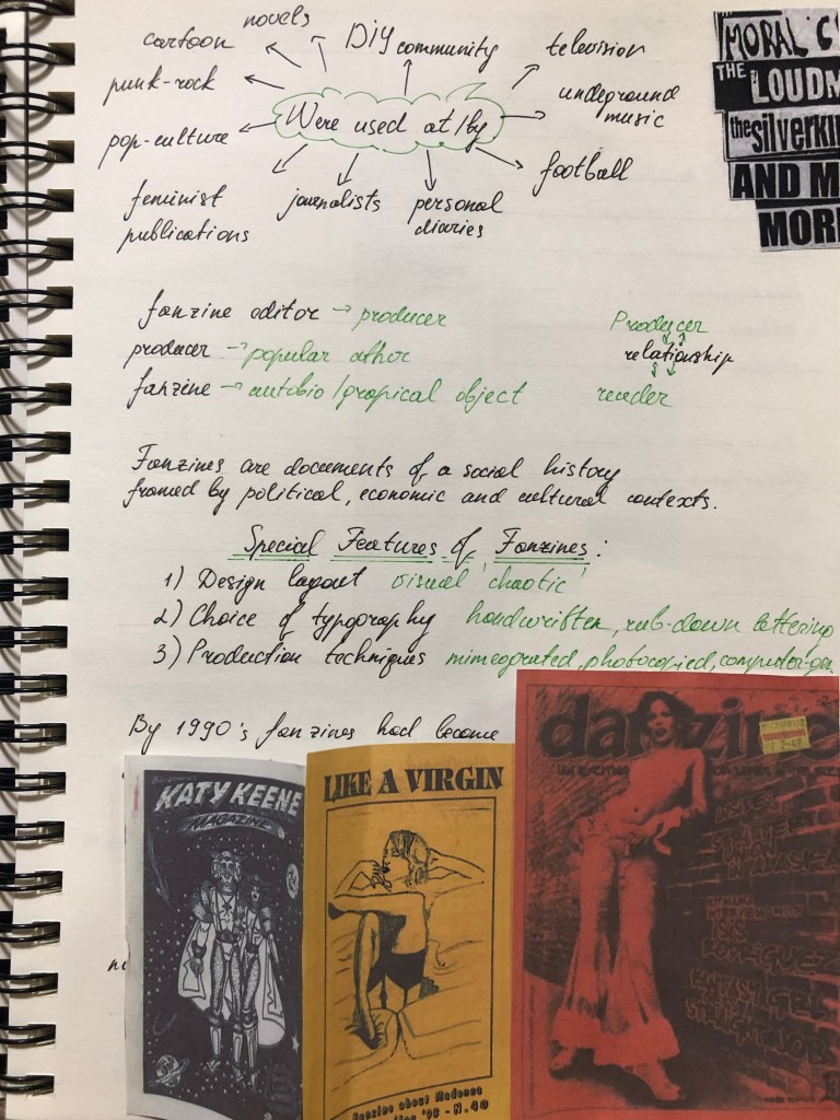
Researches
Finally, I come to the main task of the first introductory part of Creative Book Cover. After running my eyes over the basic requirements of Assignment 1, I was glad that I could apply some of my best practices from the previous exercises and collage, and document the finest works that I’ve done in this part. It seemed to me that I was able to create some remarkable work that can be combined into one material. Since the brief consists of sub-points, I realised that it is vital for me to write essential points in my learning log. Below I have attached notes with a brief and some mind maps.
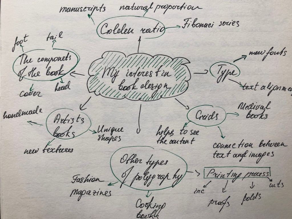
My interest in book design
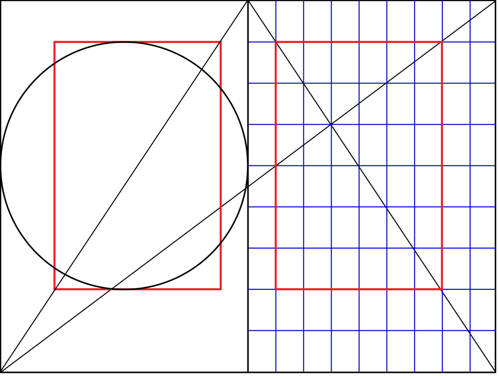
If I ask myself what inspiring and so exceptional about book design, I would confidently say they are golden-section formats that have been used for books, grids and typefaces. I wanted to go through all of those factors with some explanations for why I’ve chosen those points.
Originally the golden ratio principle in books was discovered by Jan Tschichold at the beginning of the XX century. The typographer noticed after some analysis, that many Western books and manuscripts were designed according to the golden-section format. We all know that the natural proportion was embedded in some of the greatest artworks created by artists, architects, designers, and painters. That rule was the main point to express the beauty of nature. I thought, what if all books have been printed according to the special proportions to make them pleasant to read.
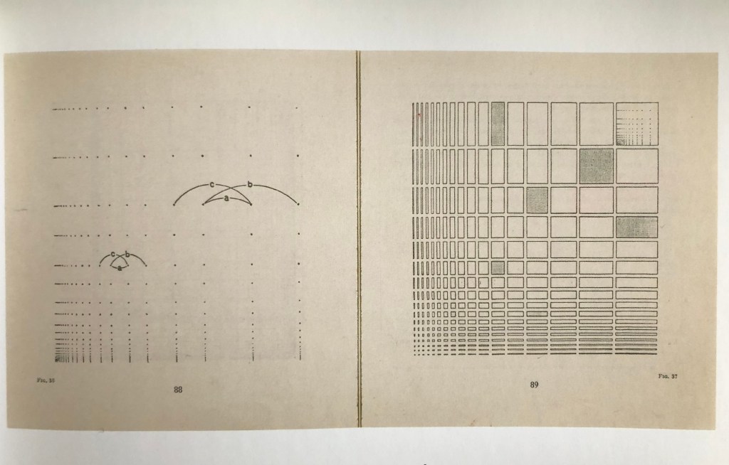
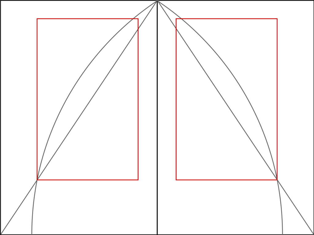
Secondly, I wanted to mention the vital role of grids in the design of the book. If we look at the book which consists of some images and text columns, we don’t realise that the layout was not created randomly. The designer should understand that the visual proportion in the book helps to focus on content rather than the form of the book. I’m fascinated with the importance of the grids, as they create a visual relationship between the text and images.
The Van de Graaf canon is a historical reconstruction of a method that may have been used in book design to divide a page in pleasing proportions. The geometrical solution of the construction of Van de Graaf’s canon works for any page width:height ratio. It enables the book designer to position the type area in a specific area of the page.

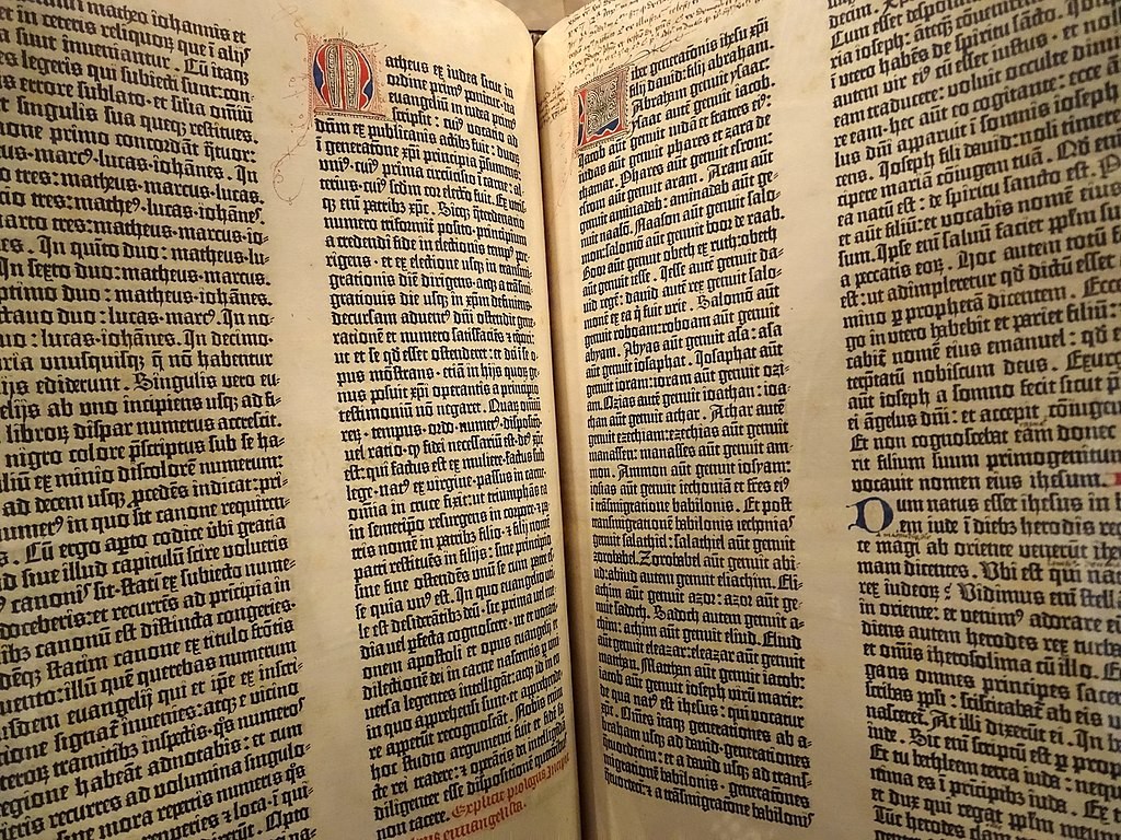
The grids can be symmetrical or asymmetric. Most medieval books have a symmetrical grid, as natural symmetry was the main aspect of art at those times. For example, The Book of Kells, a ninth-century book containing the gospels of the New Testament, shows careful attention to the arrangement of elements on guidelines to create symmetry between hand-written text and visual decoration. Over time, the style for book design has changed, and in the example of the layout of this Gutenberg Bible, we see a new arrangement of the text, split into two columns with wide spacing between them.

https://bit.ly/2YlV2Cb
https://www.flickr.com/photos/adam_jones/24402008394
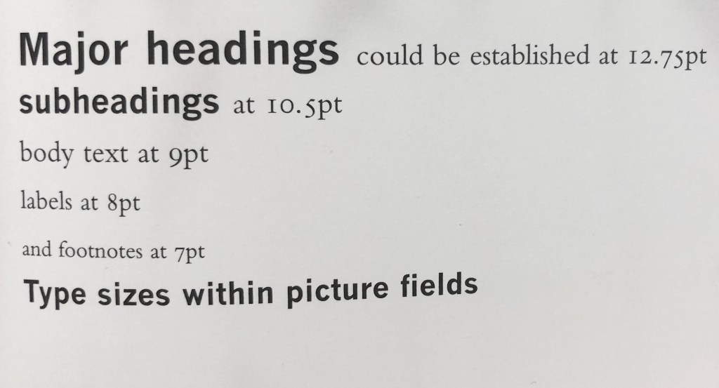
Type is considered the smallest element of a book page design. Widely-used system of measuring the font size calls Didot, which is popular across Europe. Type size is the main point that the designer should deal with, as it has a high influence on the design of the page. Depending on on what type of font the designer uses, with serifs or without serifs, even if the font size is the same, the different spaces on the page could be taken.
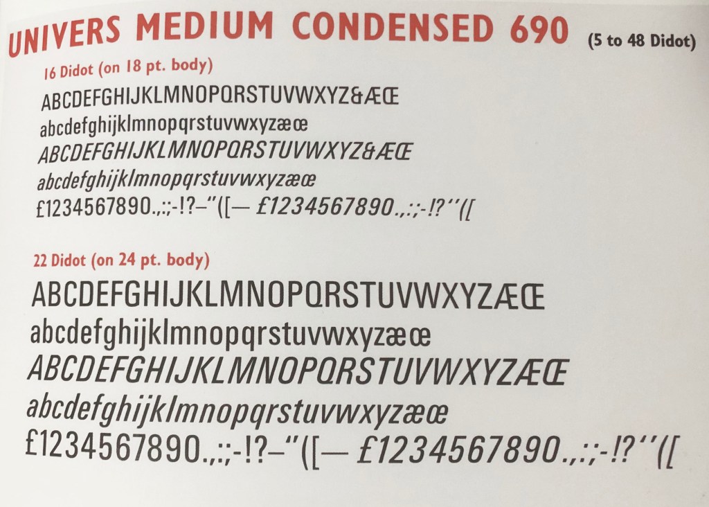
Most book designs consist of several types and sizes. For example, headings, captions, and footnotes can have their own individual font and depending on the font thickness and size, the font hierarchy could be established through the process.
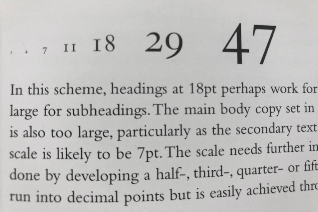
Another fascinating fact about book and magazine design is that the Fibonacci series could be applied for the font size as well. This helps to establish a harmonious and comfortable reading experience. But most of the time designers get used to using an eye that to establish the right proportion for the font size.
Looking at books
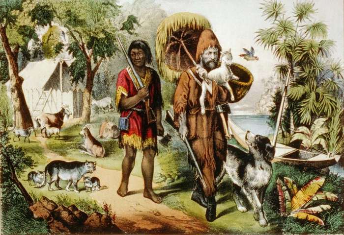
I’ve read lots of books throughout my earlier life and recently. There were lots of books about different cultures from all over the world, also in my selection of books were various times, it could be the fallen in love protagonist at the beginning of XIX century, some modern stories based on the true-life. So, before this course, I was treating a book just like an object to learn something more, but now I see the book as an art masterpiece, that could be shaped and designed uniquely and creatively. I thought if on this part I’m discovering the book like an art object would be a great idea to go through examples of creative books in Smithsonian Libraries.
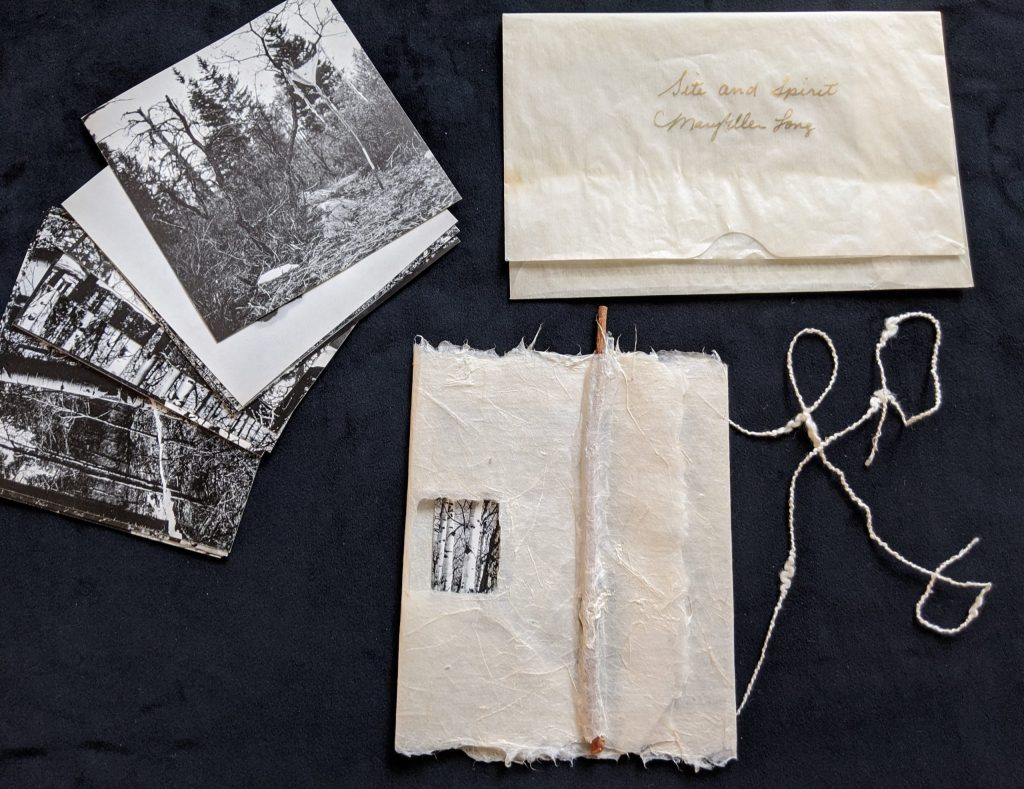
These particular books are not just objected to reading, they are artworks combined with photography, design, printing and poetry. ‘Site and Spirit.’ book attracted me, as it has a strong connection with nature, and used some environment-friendly materials. From that book can be seen that art could be inspired by nature, water and mountains around.
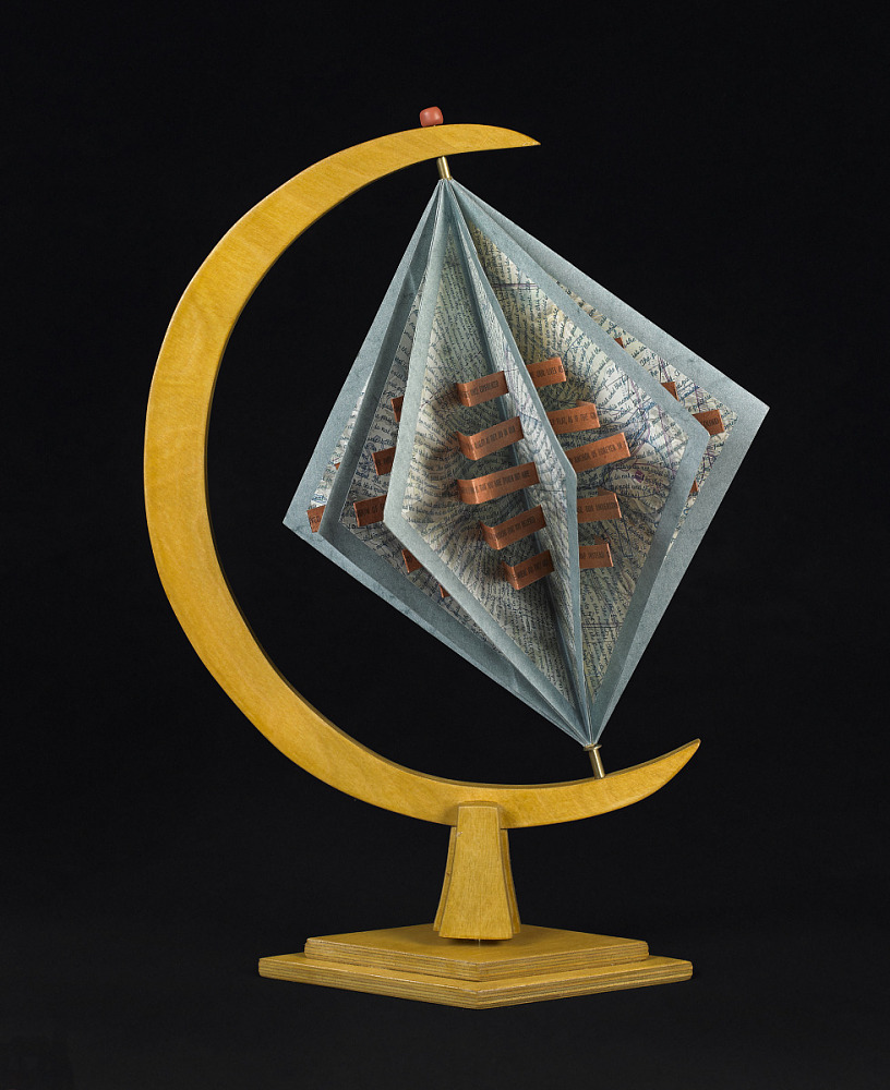
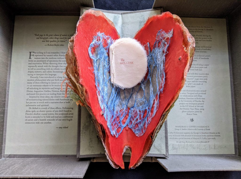
Another example of a book connected with nature is this red textured heart. This artist’s book is a reminder of the fragility of the planet and the challenge to preserve the Earth.
Artist’s Books and Africa
The forms and structures of these artists’ books blend with a stunning range of African themes explored by both African and international artists. This book attracted me as it had a copy-paste approach. In particular, I liked how different styles of sketches, pencil drawings, collages and fanzine liked designs were combined in one edition. I could refer to that style in My Zine design when the main object is in the centre and some words are around it.
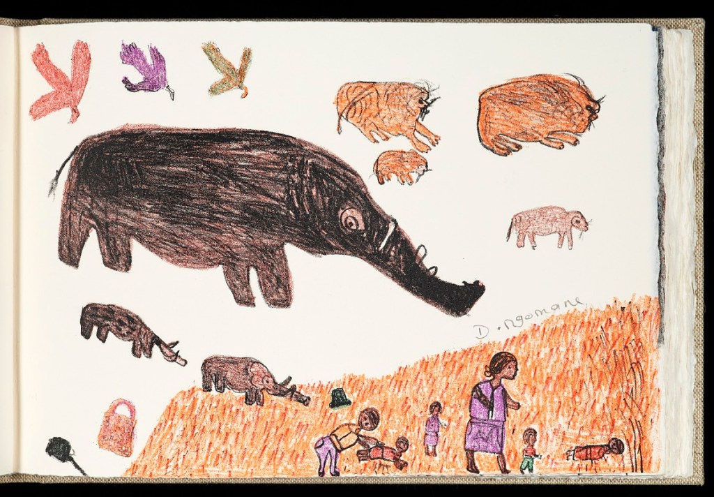


https://library.si.edu/exhibition/artists-books-and-africa (Assessed 28/01/2021)
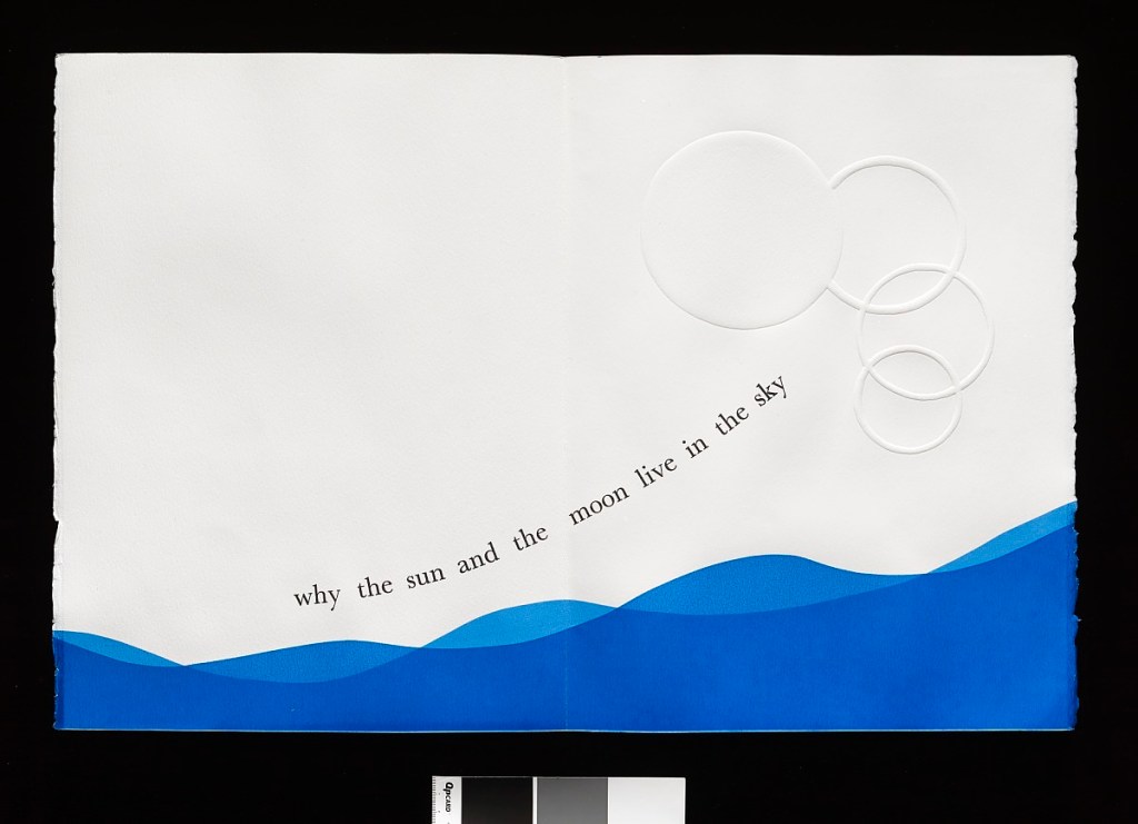
Science and the Artist’s Book
I loved how some of the pages in that Artists Books approached the placing of the text. Some lists were made like little doors that could be opened, so this is not just reading through the book, the tactile connection with this printed material also can be seen. Also, I noticed that calligraphic font was used, which creates an imaginative but unreadable script, drawing elements from the natural world into the artist’s book.
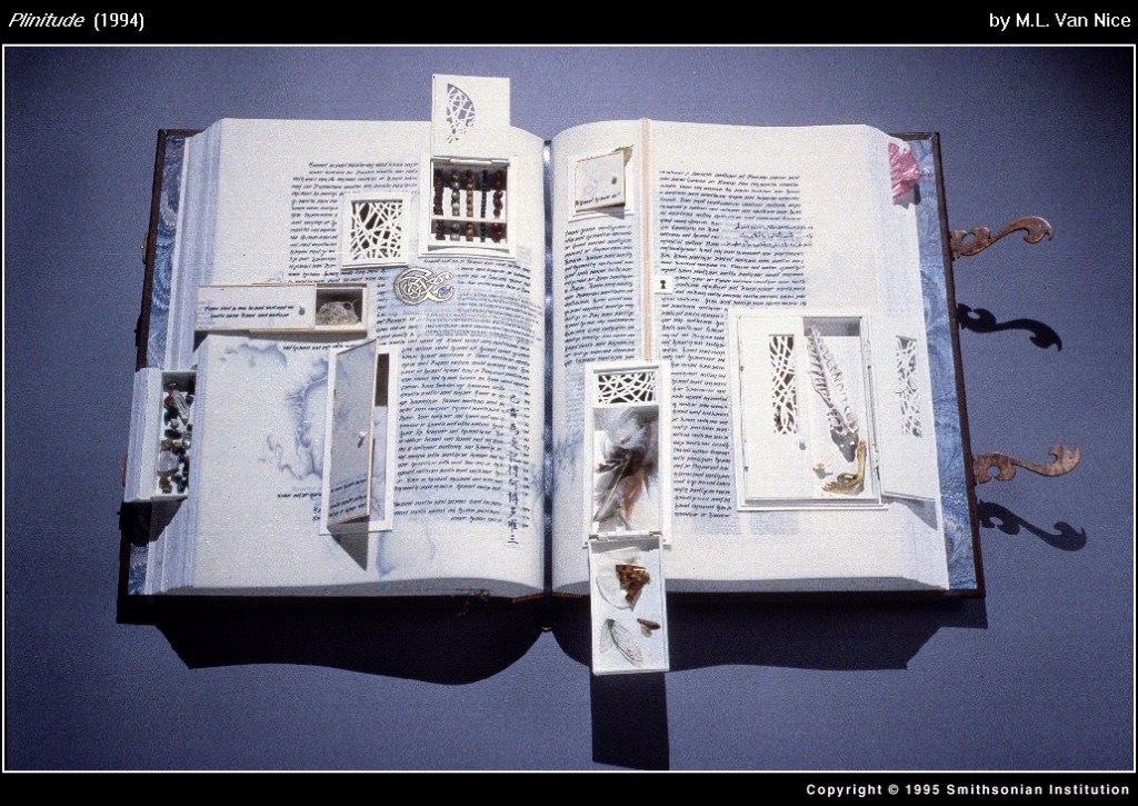
Somerville, Massachusetts, 1994
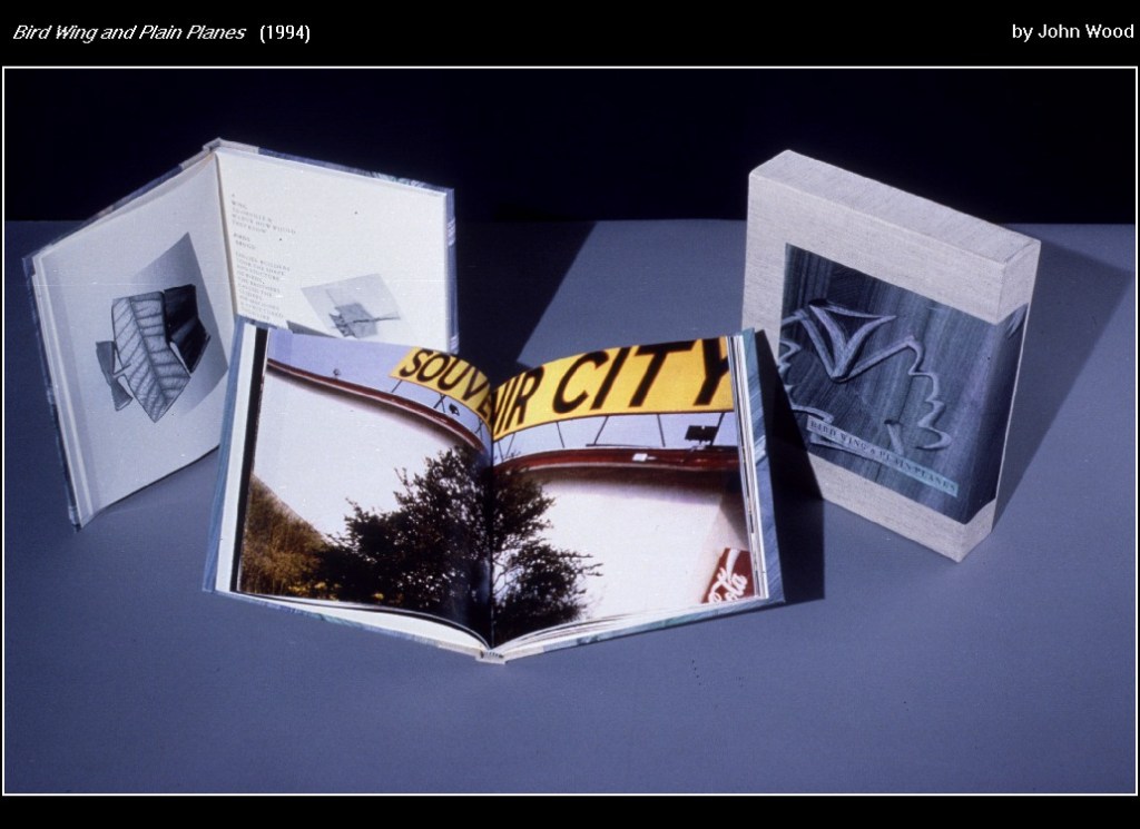
Bird Wing and Plain Planes
Baltimore, Maryland, 1994
The exploring of Artists Books gave me some inspiration and ideas I could implement in My Zine design. I really was looking forward to some experiments with objects, I wanted to use some materials around me, some cut and paste objects, glue them together, try to make objects fly around and be floating, have some unusual paths for the wording and phrases. Let’s tackle My Zine booklet design.
My Zine Design
The first part of the research has been completed. I was quite happy with ideas I could discover, some research about book design and artist’s books gave me a good package and feel for my future booklet. This assignment was quite complicated for me to start with, I had many ideas but I didn’t know how to join them together. I had complete freedom to express myself, which could be tricky as well. Also, I had to write some essays, and implement all images, phrases and wordings into the one piece.
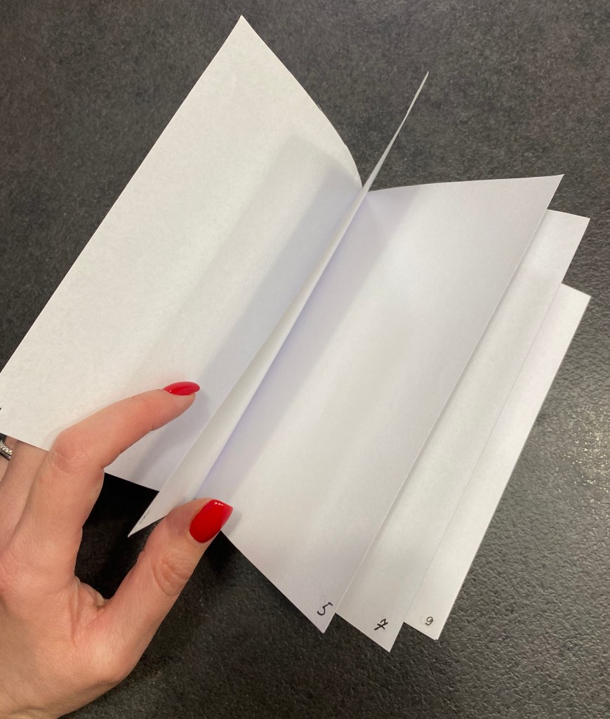
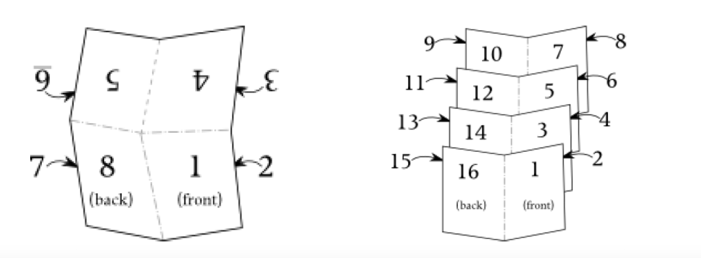
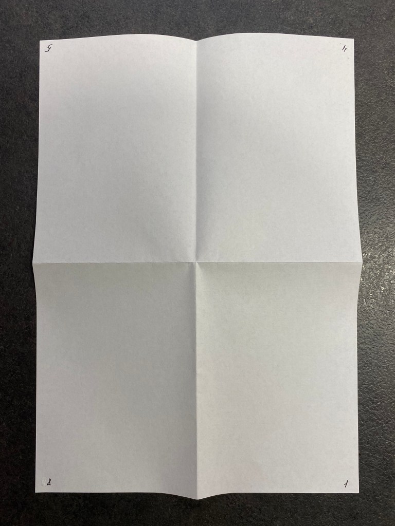
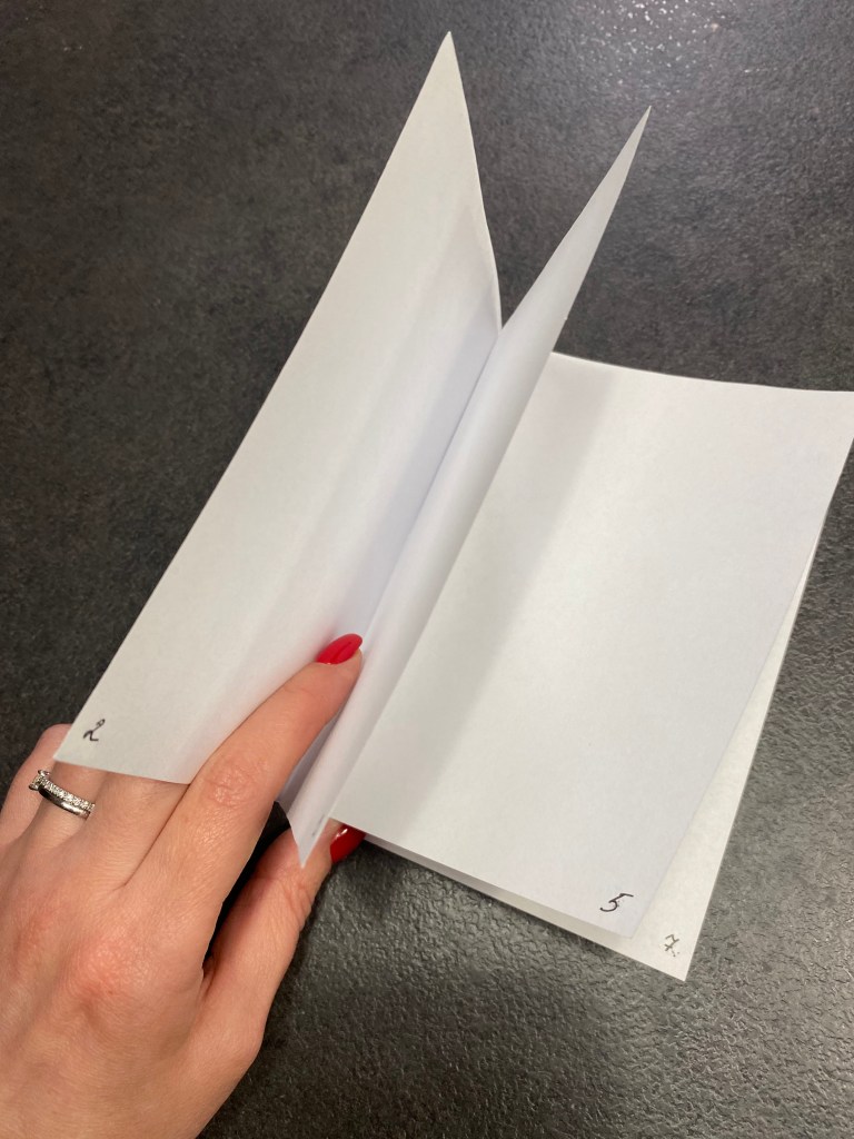
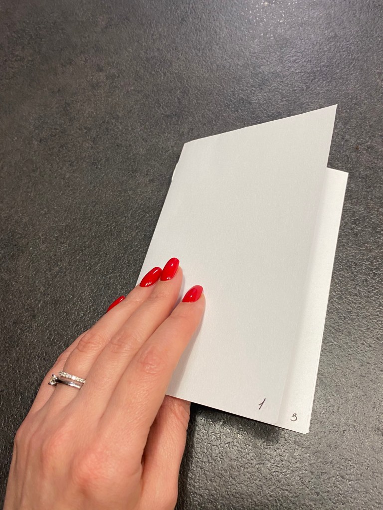
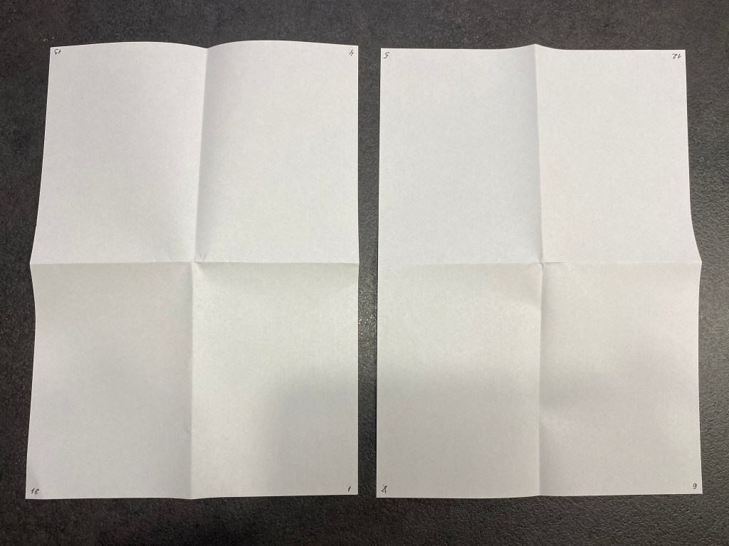
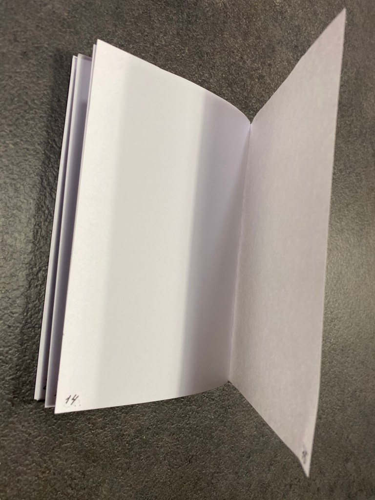
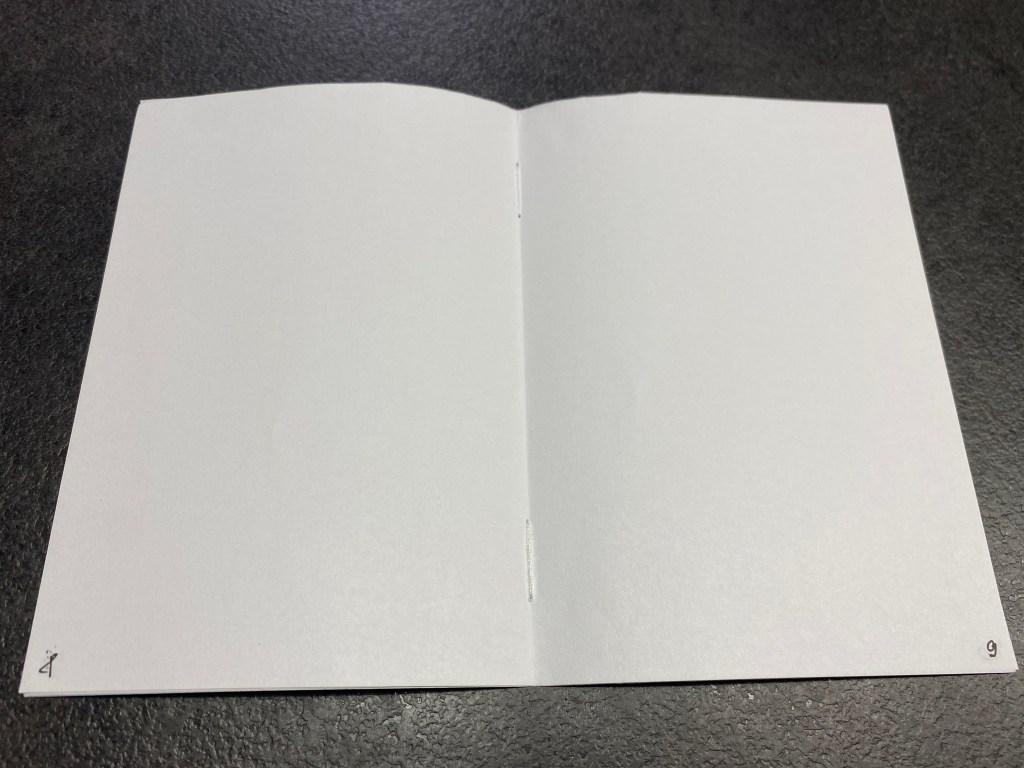
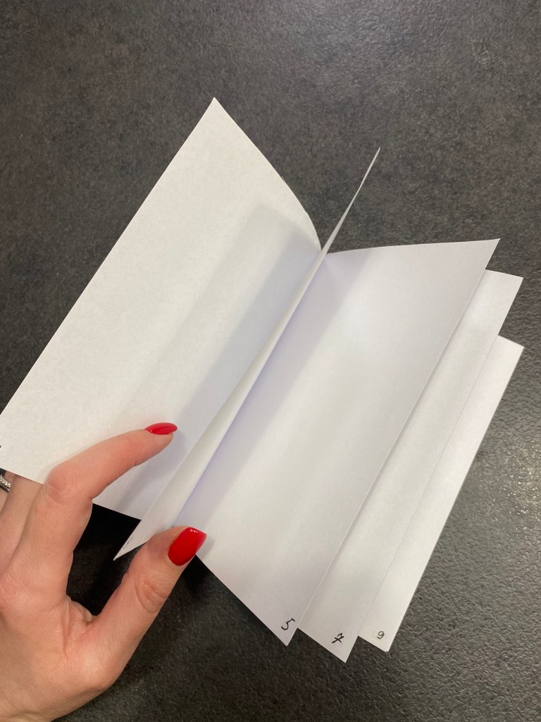
But before the first designs, I needed to create a ‘spine’ of the future booklet. To do so I used technic from the previous exercise by dividing A4 pages into spreads numbering them from 1 to 16 page. Also, I used the guidance from the brief to know what topics I needed to cover inside. For each, I was going to use the spread, so altogether I was going to have 7 topics plus front and back cover, which included:
- Introducing myself. My relationship with books
- Why books are important to me (collage design)
- My creative process (mind maps, steps that I’m taking for each task)
- Global influences (central spread)
- What I like in book design
- The oldest trick in the book (book cover design mockup)
- The future of the book article
I thought that this path I can briefly use for my booklet, by adjusting some of them if they need moving around, but approximately they were the main topics I wanted to describe.

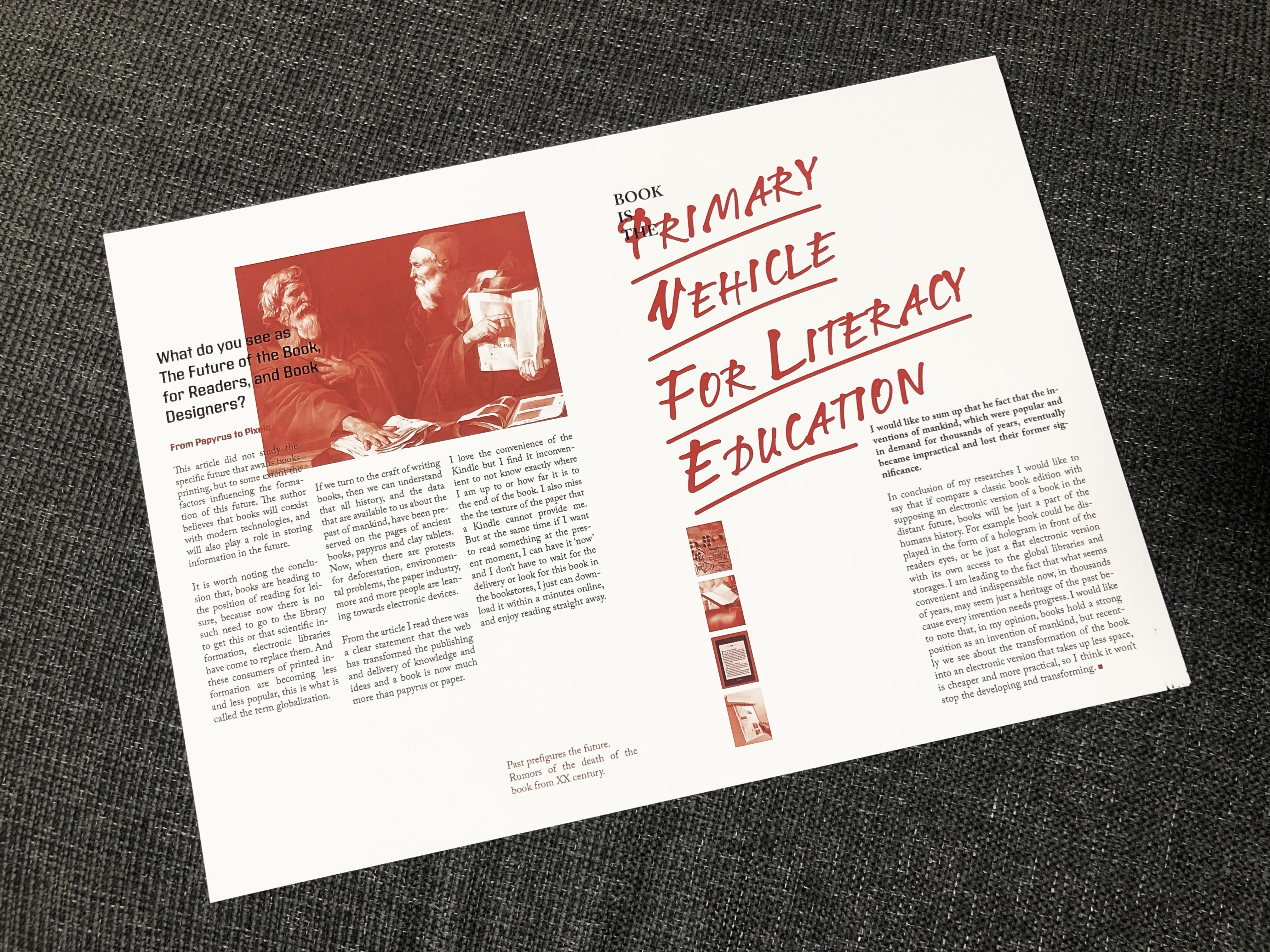
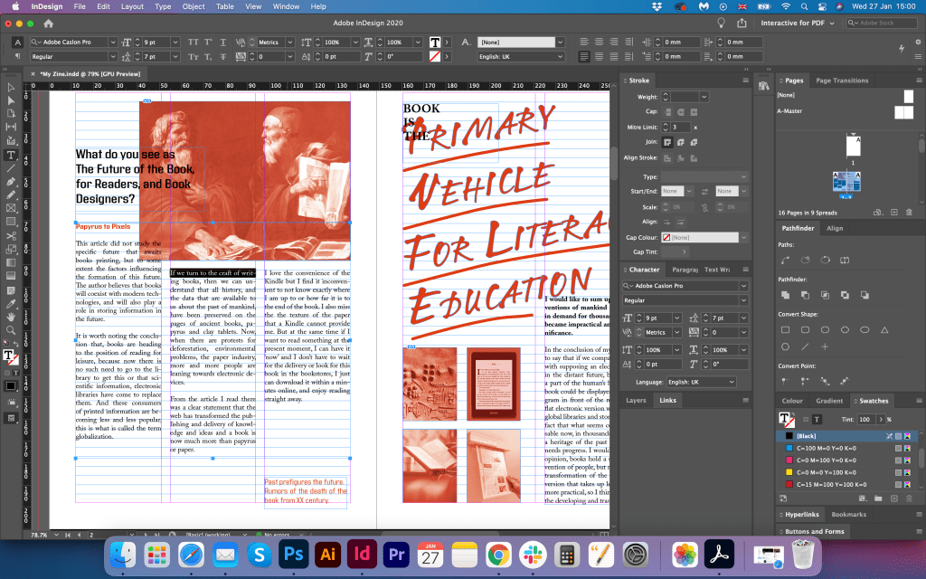
The Future of the book (amended design)
That to establish the direction for My Zine booklet I decided to go from the magazine spread that was designed earlier by me for one of the first exercises. I thought that the idea of that layout could give me some inspiration for fonts, and placement of the wording and images. I loved the combination of red images with handwritten style red headers. It looked creative and neat at the same time. I thought why not try to combine a few styles in this booklet design, experiment with vintage collages, juxtaposition and magazine layout, where text is divided into columns. At the same time, I wanted to have a presence of a cut and paste approach for phrases and quotes. My plan was to combine two different styles in one booklet, to create a union of two styles into a solid piece.
As I printed this spread for my previous exercise, I saw some disadvantages in it, and some improvements that it needed doing. For example, the images on the right side were too small, and they didn’t make much sense to be placed if they were not visible. Also, I corrected slightly the text blocks. For that page, I created a Baseline Grid to attach images and text to it. That helped me to establish the right spacing between texts and images. I knew that that grid will be useful only for the magazine-style layout. I had an idea to implement some freestyle pages, but at the same time keep fonts for the headers, so I have the running theme throughout the booklet.
Test Designs
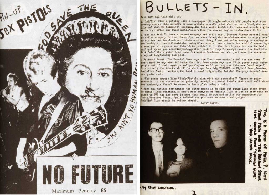
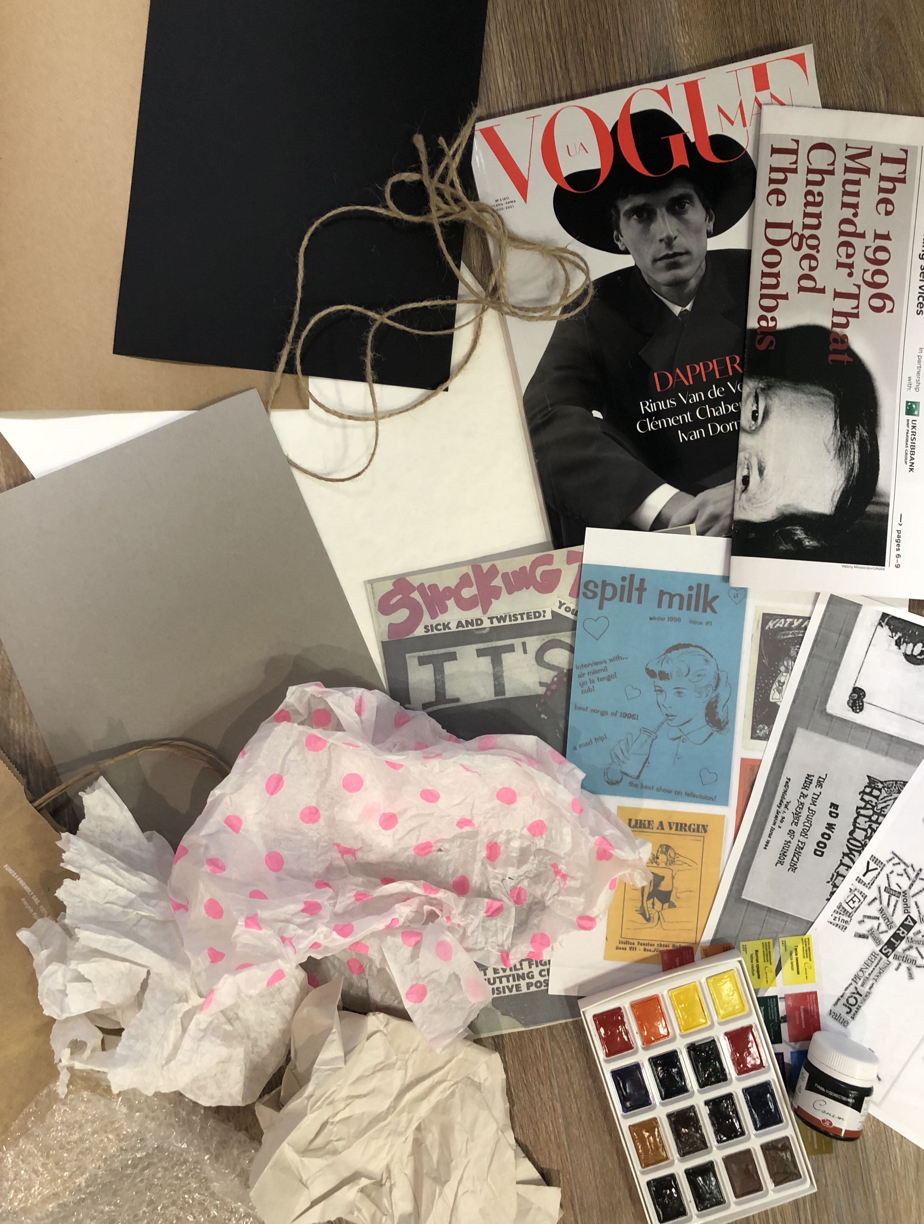
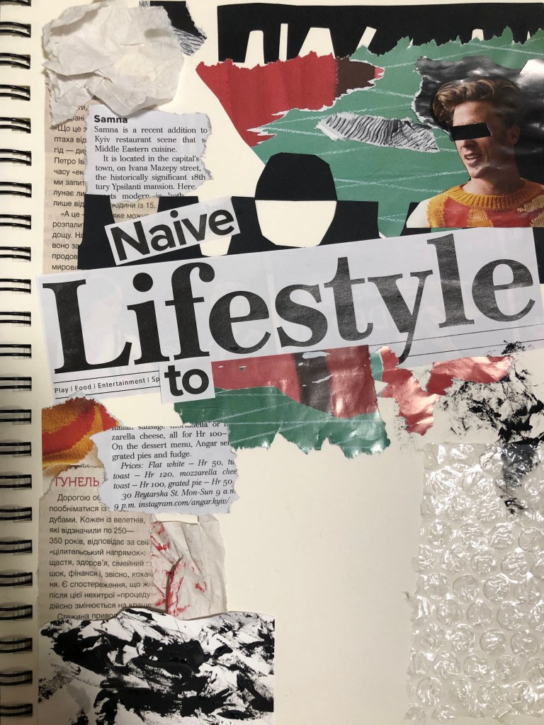
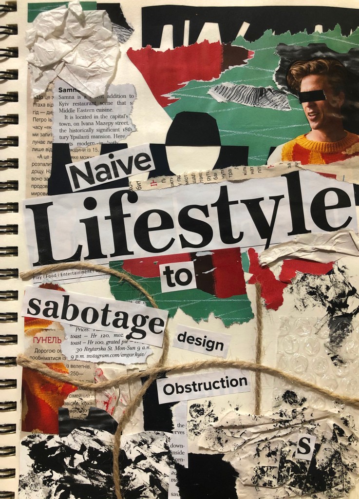
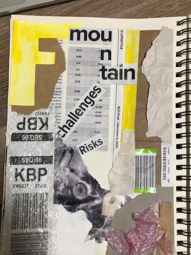
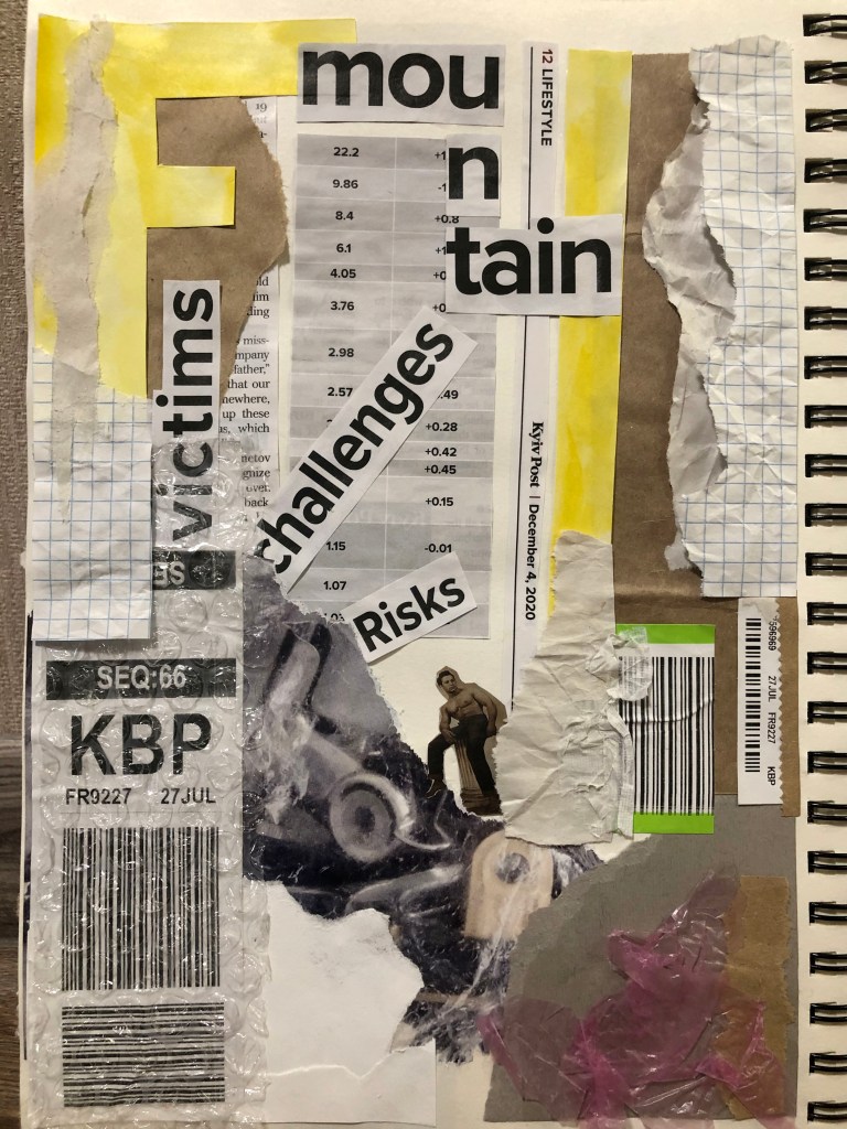
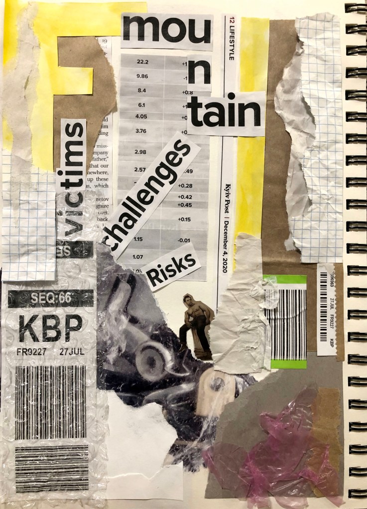
The direction of the booklet I found, but I still was trying to experiment with some collages and casually scattered text blocks around. I was thinking to make use of previously designed fanzine collages, but I thought that some of them looked too messy and punk-like for the style that I was looking for. I liked the idea of collage pages, but they probably needed to be more relatable to the book design, I wanted them to evolve around book, magazine and devotion of reading. Also, sharp ages around blocks didn’t look right. My conclusion was to try to use magazine cuts but look for some more inspiring ideas.
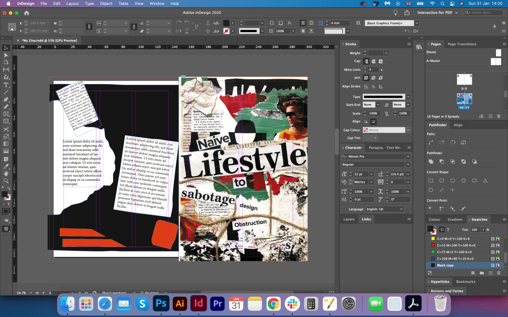
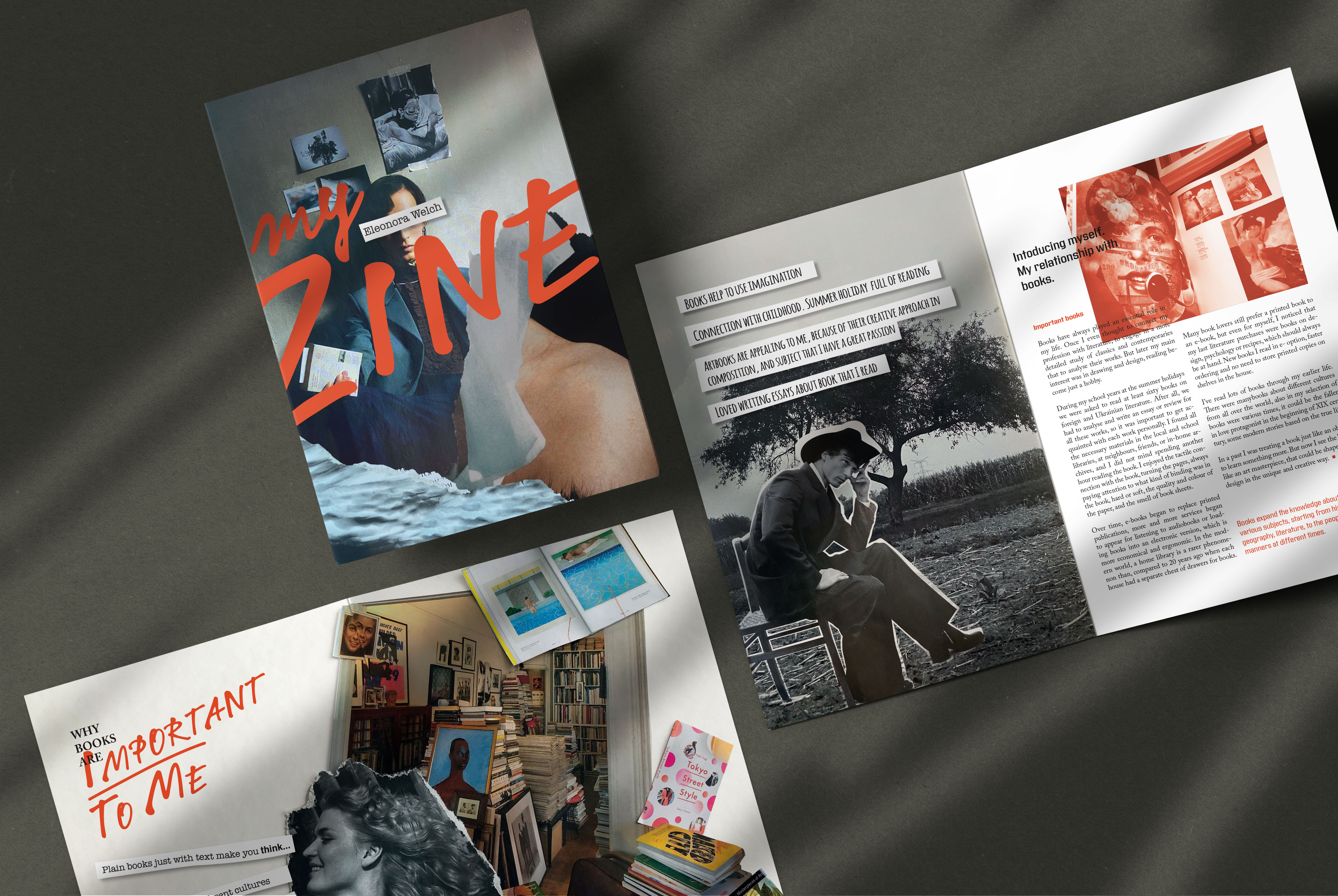
Why books are important to me
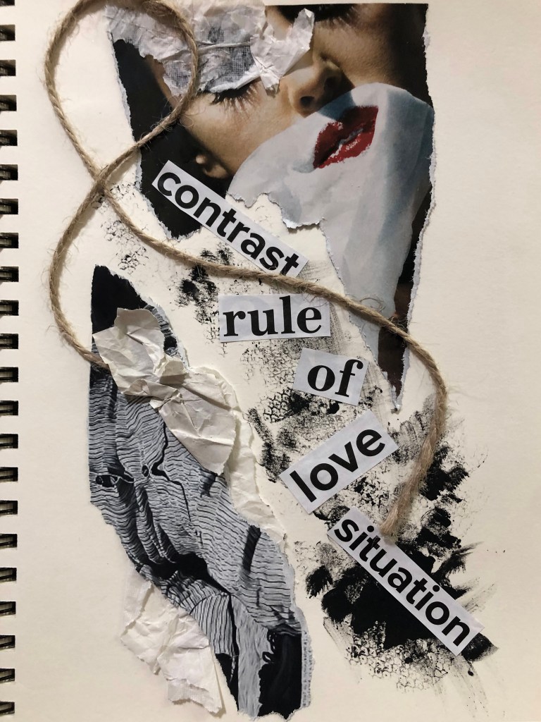
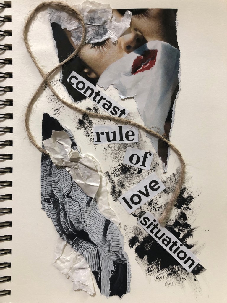
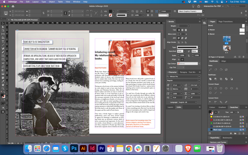
I know that I was not going in the page order, so I decided to go from the path “Where the inspiration is coming from”, as it was quite a creative task, I tried to catch a mood from the objects I had around. I was looking through some magazines I had, like Vogue and Elle, and some of them had articles and images about books, I thought they could be useful for my collages. I found that black and white picture of the smiley and happy girl, so I had an idea to put some books around her like they are flying in a circle around her thoughts. I placed around the cut images of books and library room on the sheet of paper format A3, didn’t glue them, so I could move them for the better placement, and here I received the first outcome.
I really loved that collage. I thought that it could give me another direction for design. It is dynamic, had a fanzine feel, and had some nice spacing around to place a text.
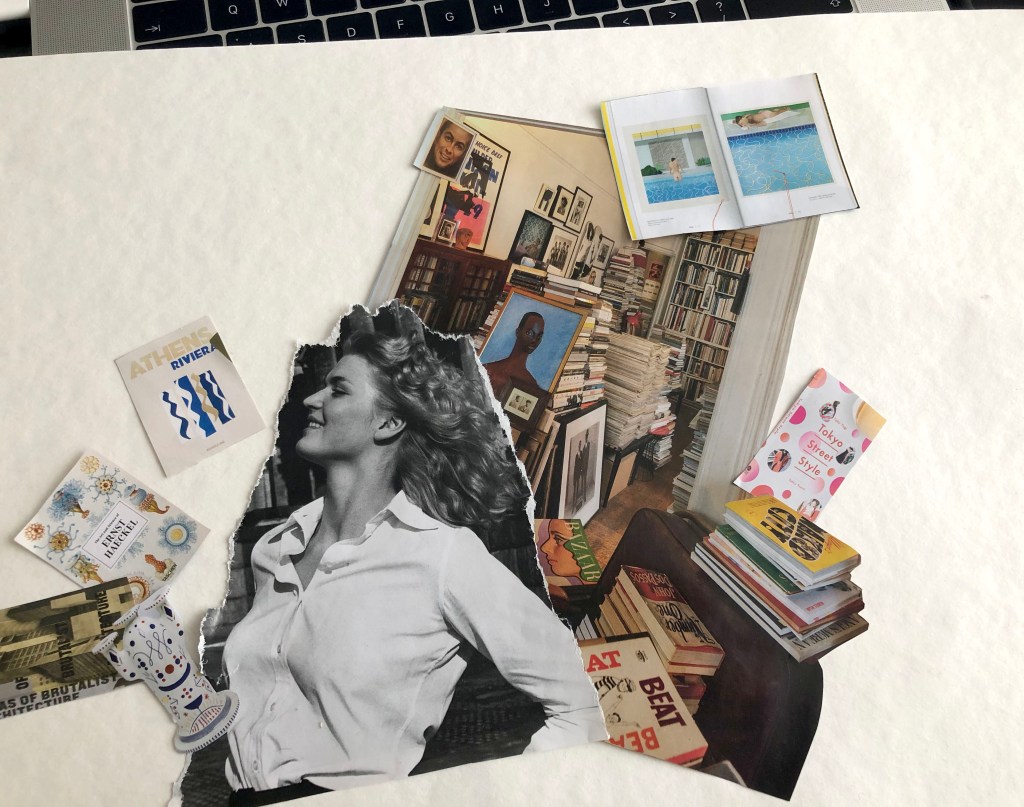
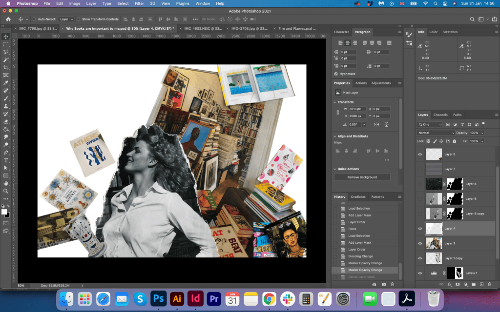
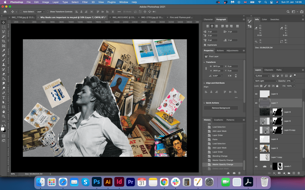
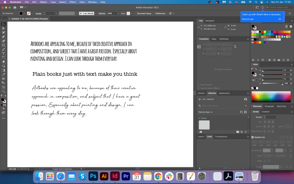
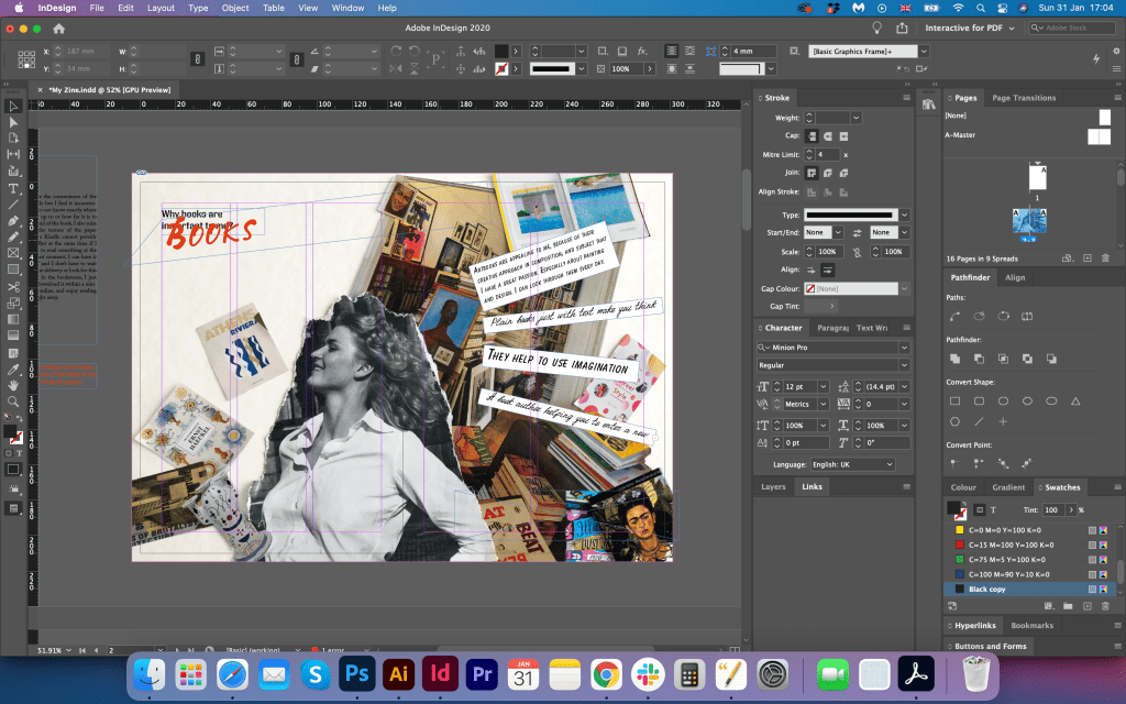
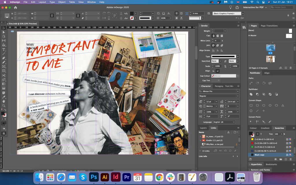
I moved the design into Adobe Photoshop, corrected the paper colour and tried to play around with the background. I decided to leave light space around the girl, as I didn’t want to overload it with dark patterns. The idea was to see the girl as the main point of the composition, then the library and books. In addition, I placed some of my favourite books in the right corner of the spread. I thought that would be great to place some phrases coming from girls head. I prepared some personal through on the separated piece of paper, chose the selection of fonts in Adobe Illustrator, and after played with them in the fanzine layout. For each phrase, I created hand-painted pieces of paper. It was quite tricky to find the right position for the wording, as I didn’t want to make it look too busy and overloaded. But the result that I got made me very happy, I really enjoyed the final piece. I had dynamic, creative, airy, cut and paste collage. All objects were collected from different magazines, but all together they made a good composition, something I was looking forward to achieving.
My relationship with books
Later my thinking path brought me to the idea of creating the page Introducing Myself. I wrote an essay about my relationship with books, how it all began, and where my passion for the book is coming from. That was quite exciting processes for me to write, as I remembered myself in earlier life, and I’m glad I could tie together my experience in graphic design and my enthusiasm for the reading and books. I found the image of the tree in the magazine, and I wanted to place on the top of it the person ‘thinker’, in the cut and paste manner. That image symbolises me in the thinking process. I tried to put some of the mind maps on the top of the image, but they looked slightly messy, so I decided to place some phrases on it, a similar way I used for the “Why books are important to me” page, but with different decorative font Amatic Bold. I tested a few options with a black and white version for the images. For the right page, I used the picture from my collage book with some red effect on the top of it.
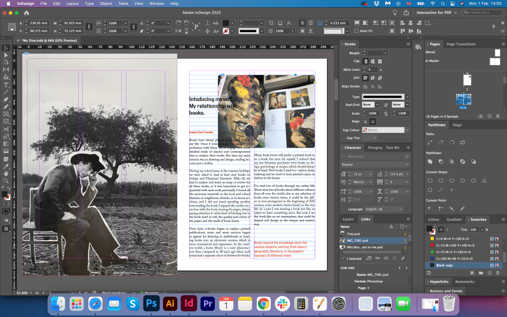
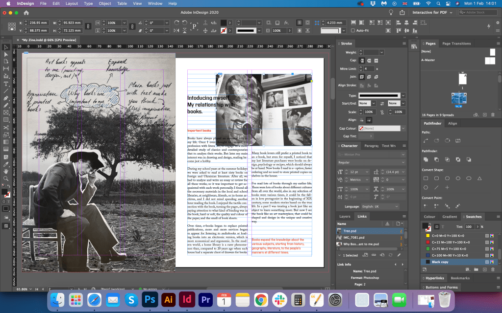

I liked that page I got in the result. It looked something like the melting part between the magazine layout I designed for the “Future of the book page”, and at the same time, it had a feel of “Why Books are important” to me collage type. I was thinking to place this page straight after the cover page, I think this page has a good introductory feel for the booklet.
My Interest in Book Design
The next stage was the creating page about My interest in book design. I have never asked myself what I like in books from the design point of view. Because books attracted me not only from perspective of having illustrations or images on them, I liked books even with just a simple text and vintage paper. I went down the line of a deeper analysis of the book design, as there would be a new world to learn about. I described below my point of view on books from the composition and proportions point. There are some new discoveries for me, and it was important to find the right design for them.
Golden Section
If I ask myself what inspiring and so exceptional about book design, I would confidently say they are golden-section formats that have been used for books, grids and typefaces. I wanted to go through all of those factors with some explanations for why I’ve chosen those points.
Firstly, the golden ratio principle in books was discovered by Jan Tschichold at the beginning of the XX century. The typographer noticed after some analysis, that many Western books and manuscripts were designed according to the golden-section format. Moreover, the natural proportion was embedded in some of the greatest artworks created by artists, architects, designers, and painters. That rule was the main point to express the beauty of nature.
I thought, what if all books that have been printed in terms of the design were kept in the special proportions to make them pleasant to read? That could be the answer to most book designs.
Grids
Secondly, I wanted to mention the vital role of grids in the design of the book. If we look at the book which consists of some images and text columns, we don’t realise that the layout was not created randomly.
The designer should understand that the visual proportion in the book helps to focus on content rather than the form of the book. I’m fascinated with the importance of the grids, as they creating a visual relationship between the text and images.
The geometrical solution of the construction of Van de Graaf’s canon works for any page width: height ratio. It enables the book designer to position the type area in a specific area of the page.
Typeface
Type is considered the smallest element of a book page design. Widely-used system of measuring the font size calls Didot, which is popular across Europe. Type size is the main point that the designer should deal with, as it has a high influence on the design of the page. Depending what type of font designer using, with serifs or without serifs, even if the font size is the same, the different space on the page could be taken.
Most book designs consist of several types and sizes. Headings, captions, and footnotes can have their own individual font, and depending on the font thickness and size, the font hierarchy could be established through the process.
Another fascinating fact about book and magazine design is that the Fibonacci series could be applied for the font size as well. This helps to establish a harmonious and comfortable reading experience. But most of the time designers get used to using an eye to establish the right proportion for the font size.
Design Process

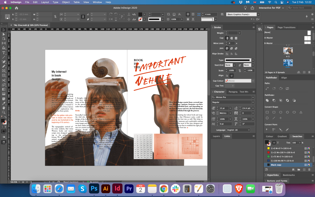

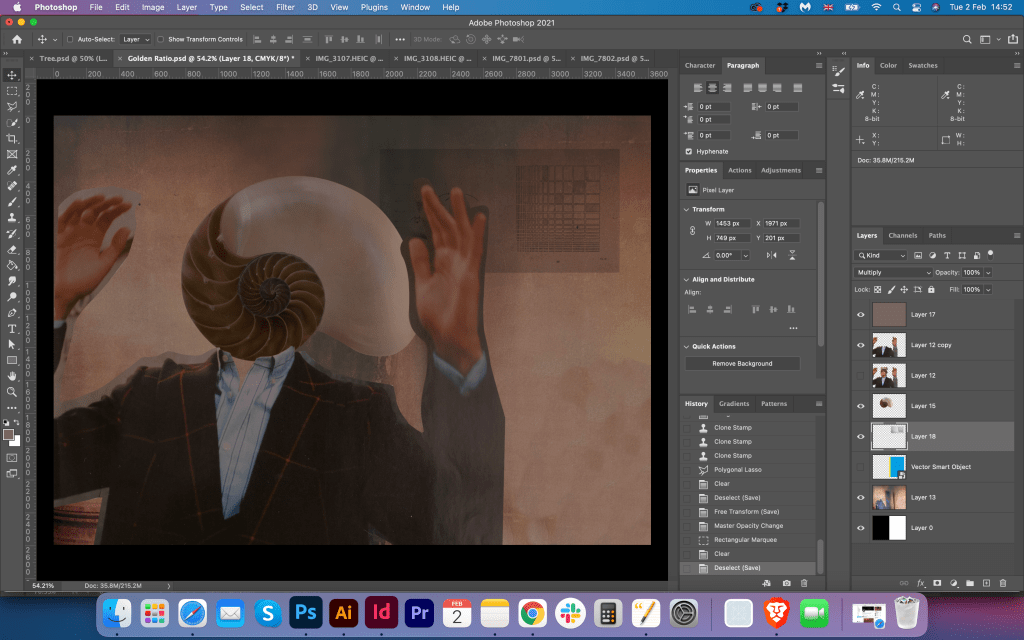
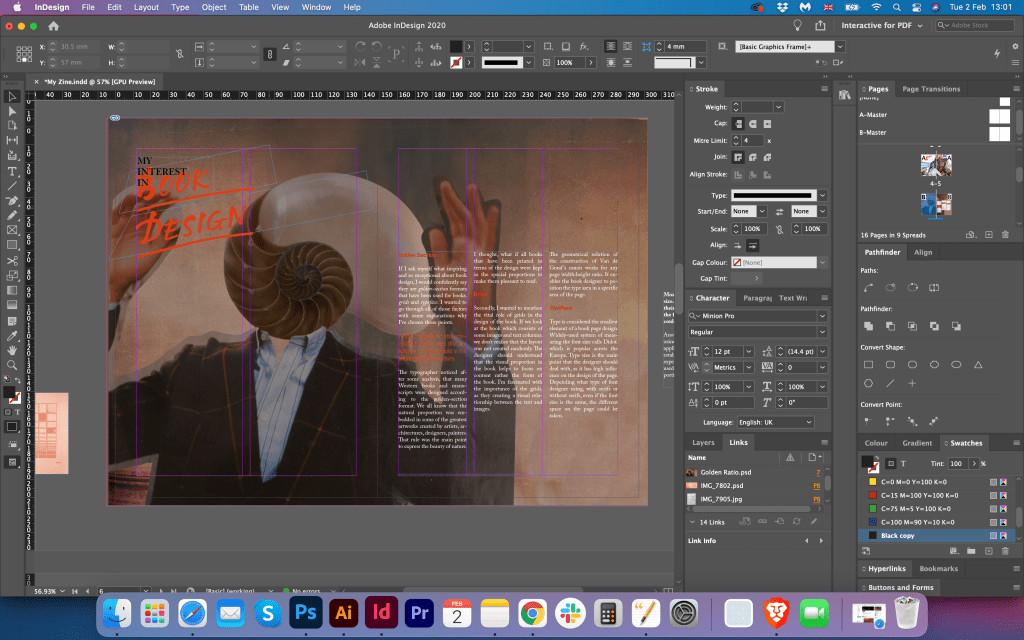
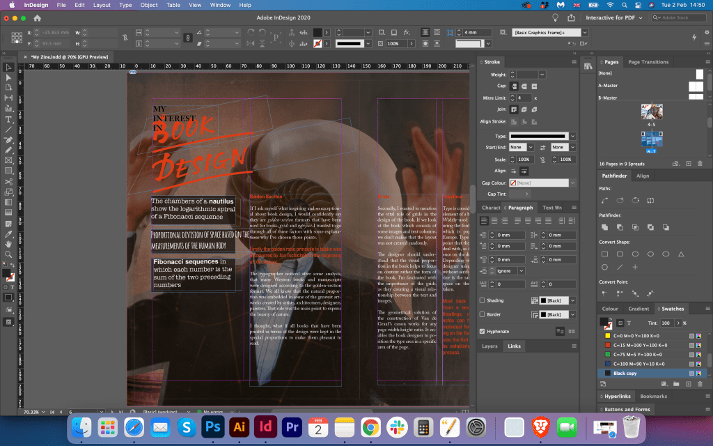
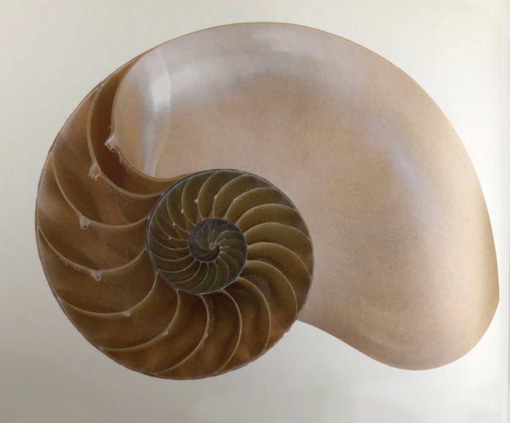
After writing the article I needed to place the wording into the booklet. I was going to use a white background for it with a template I used for the Future of the Book page, as I had some text to make it look like for the magazine spread. I placed the image of the shell, which is the symbol of the golden ratio, also I wanted to place some square images around the layout. But I thought that that page need still to have a feel of collage design, I wanted to bring that juxtaposition mood into it. That’s where the idea with a book headed boy came from. In Adobe Photoshop I made some manipulations with the image, by swapping guys with the shell image, the idea of juxtaposition is seen in that design with some vintage like the background in it. Later I had a little issue with text visibility, so I needed to make sure that the image is contrasting enough for the white or black fonts. I made the page darker and used same grid which I had in my page template. To bring the dynamic into the page I used some phrases about the Fibonacci series and the golden ratio around the shell-head.
I was quite pleased with the result. This cut and paste approach works quite well for my booklet. It has a modern feel and at the same time vintage style. I liked how this spread supported the concept of the magazine, and I was looking forward to design some more pages.
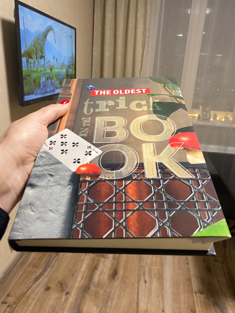
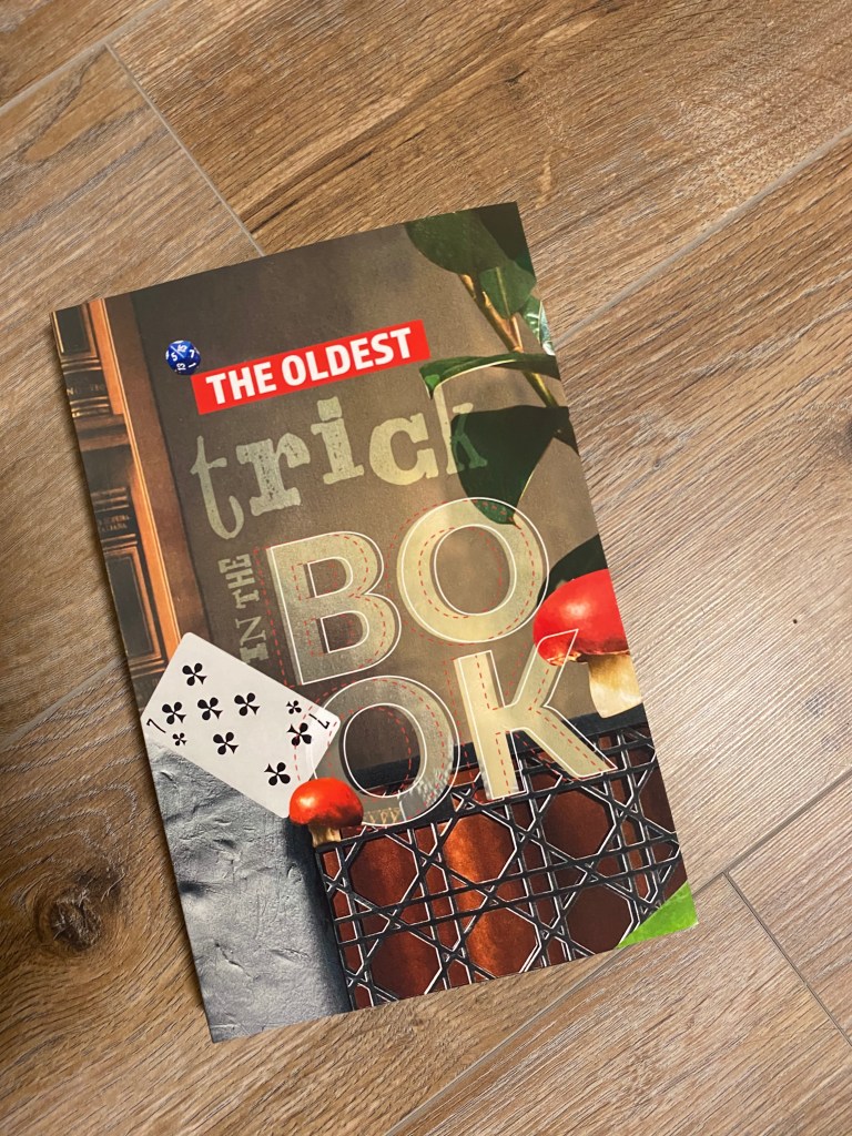
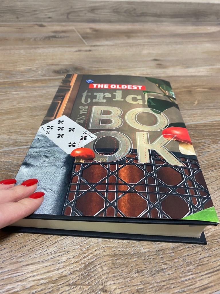
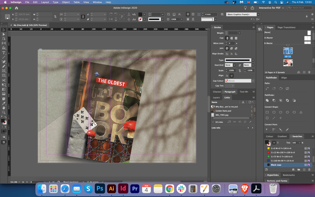
The Oldest Trick in the Book
For this spread I used the cover I designed in earlier exercise. The design of that “Oldest Trick in the Book” cover has the same feel as I implemented into my booklet, like brown shades, juxtaposition, objects around, and some bright elements into it. I downloaded a mockup for the book cover and placed it in the centre of the spread slightly to the left. I tried to place some wordings into it, but it didn’t look right. Also I wanted to keep this page different to other pages, with just book being the main point. But colourwise this page looked in harmony with the booklet concept.
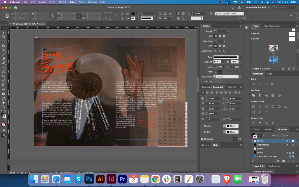
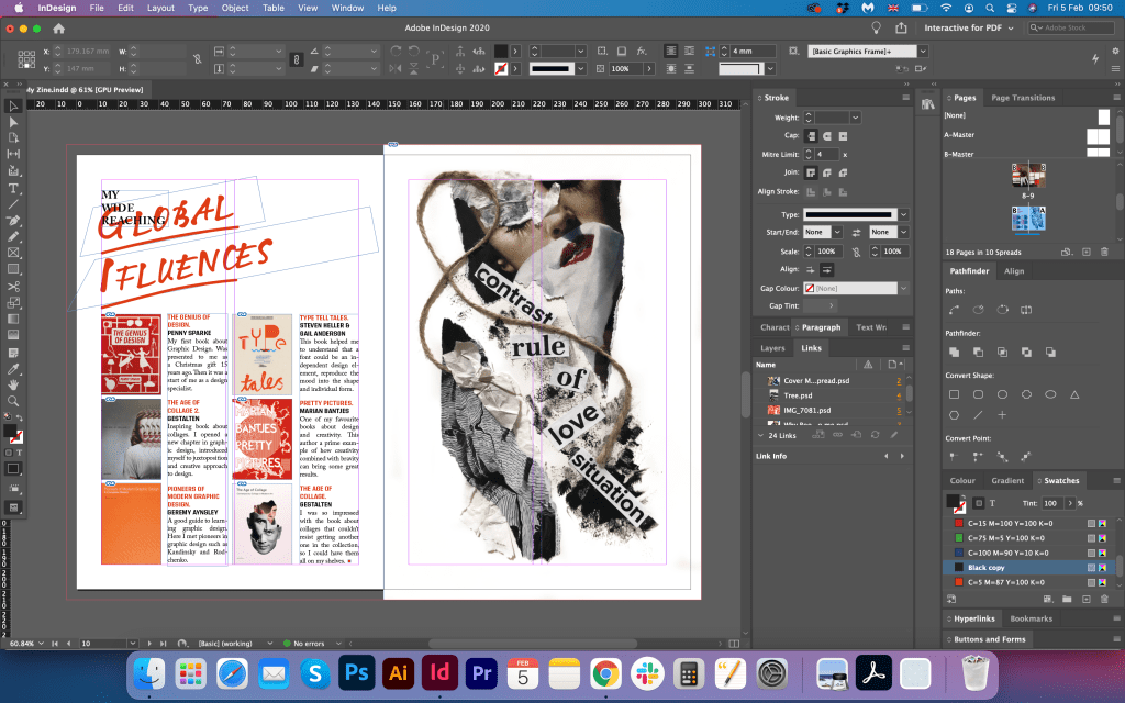
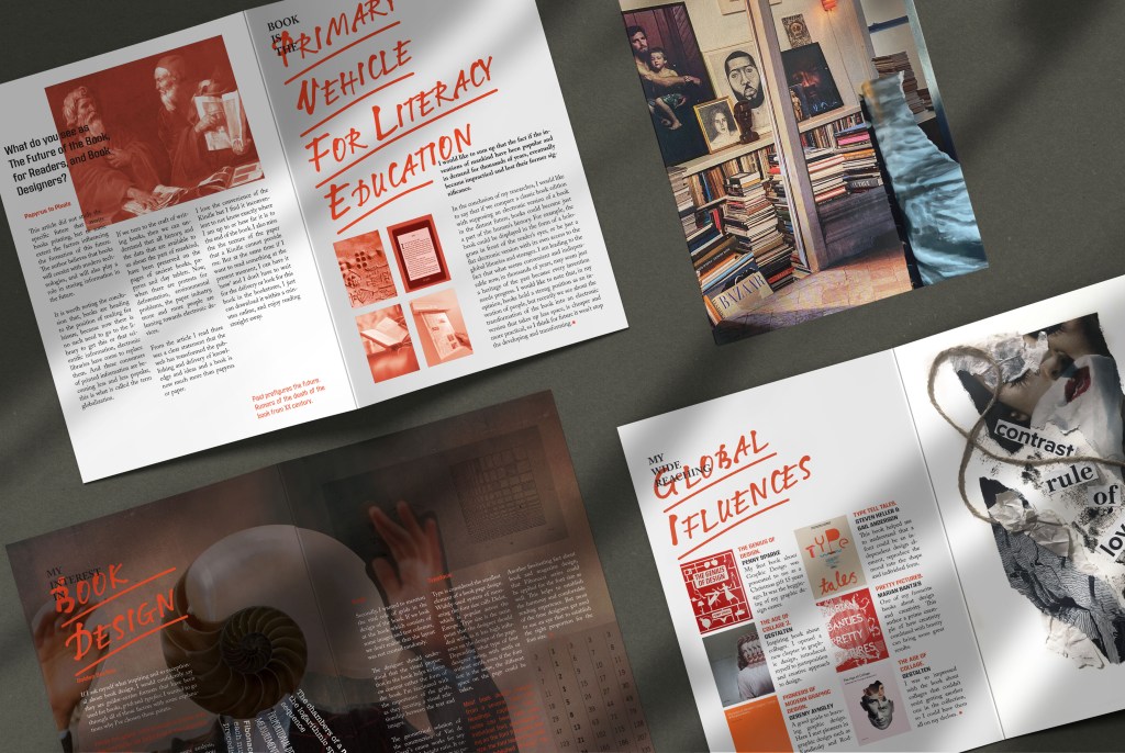
Global Influencers
For the Global Influences page, I decided to make a white clean page, with some books related to design highlighted on it.
When I ask myself which books influenced the formation of me as a person, the works of classics and contemporaries, mostly classical literature, come to my mind. Nevertheless, here I would like to highlight the books that are important to me as a specialist in the field of graphic design. Previously, I always read what I came across, be it a novel or a detective story of the 19th century. But after I started my training in graphic design, I began to pay more attention to books on my professional activities.
My first book on graphic design was a Christmas present from my family, The Genius of Design, which kicked off my passion for design. I had a long lag between buying my first design book and the books I got as I went through college. Each of these books generated more and more interest and helped develop my creative imagination. The Age of Collage series of books became special for me, they were a kind of navigator in my work for a music label, and also helped to form a creative approach to design.
Also, I always wanted to find a clue to how to make a font an independent art object. For many, fonts are an everyday way of conveying information, but for me as a designer, I understood that a font can be an independent design element, convey a person’s mood and have an individual form. Therefore, on this list, I have attached the book Type Tells Tales. Also, I attached the book Marian Bantjes Pretty Pictures, as it has lots of inspiration for me from a creative point of view, she uses lots of different textures and objects for her designs, and I loved her experiments with samples in words with writing pen.
Design-wise I used juxtaposition collage on the right side of the spread, and four columns of text and books on the left side. Another page was created for my booklet, and it has combined styles from the magazine pages and collage, but with lots of white space around.


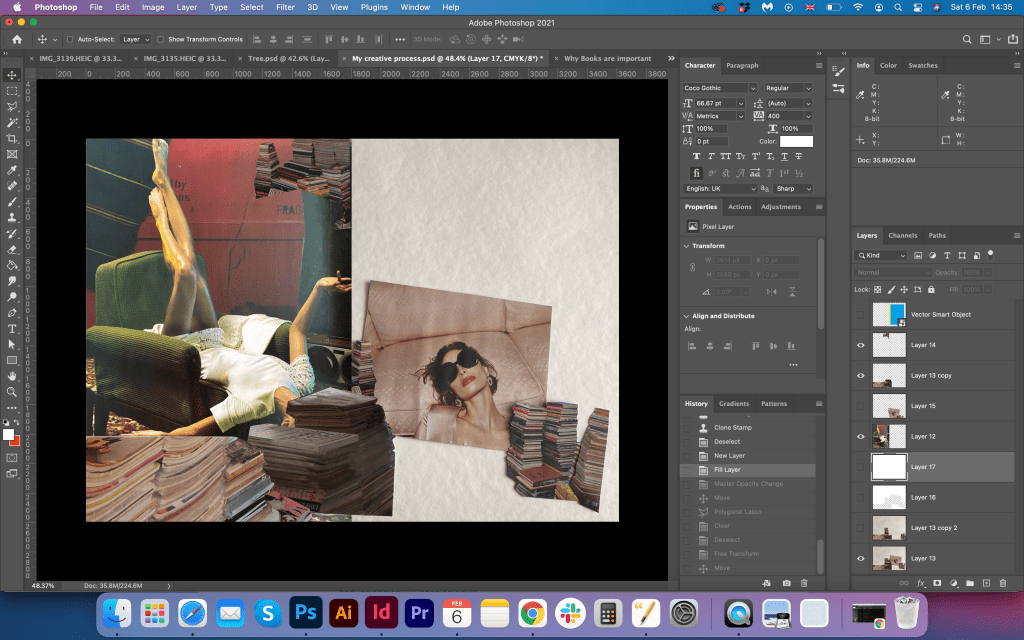
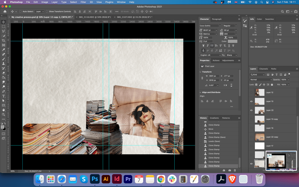
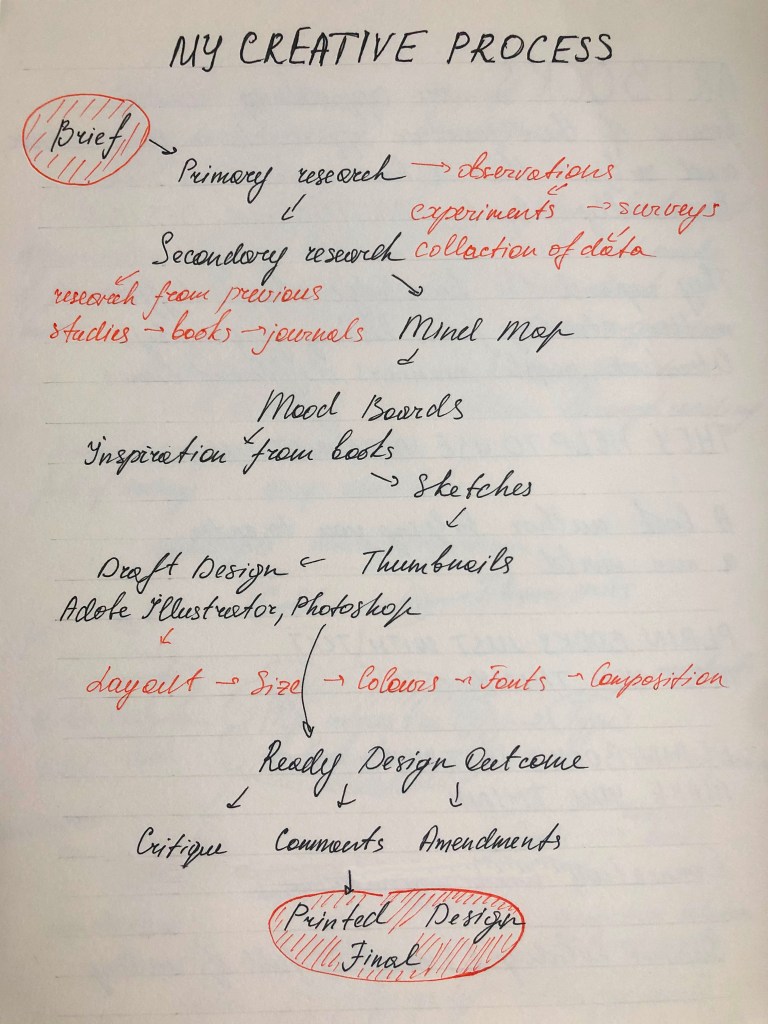
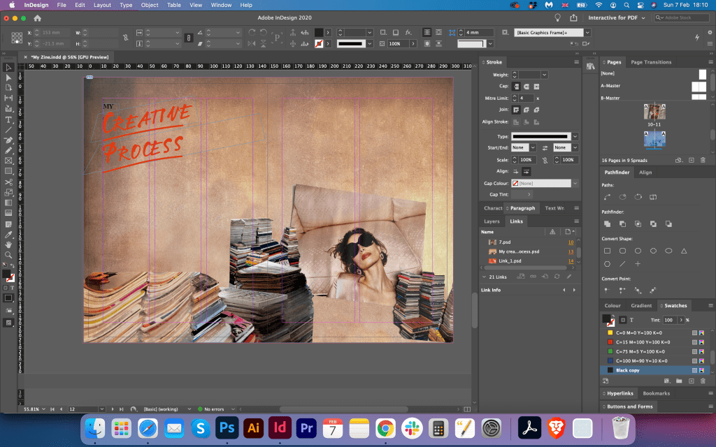
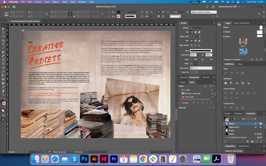
My Creative Process
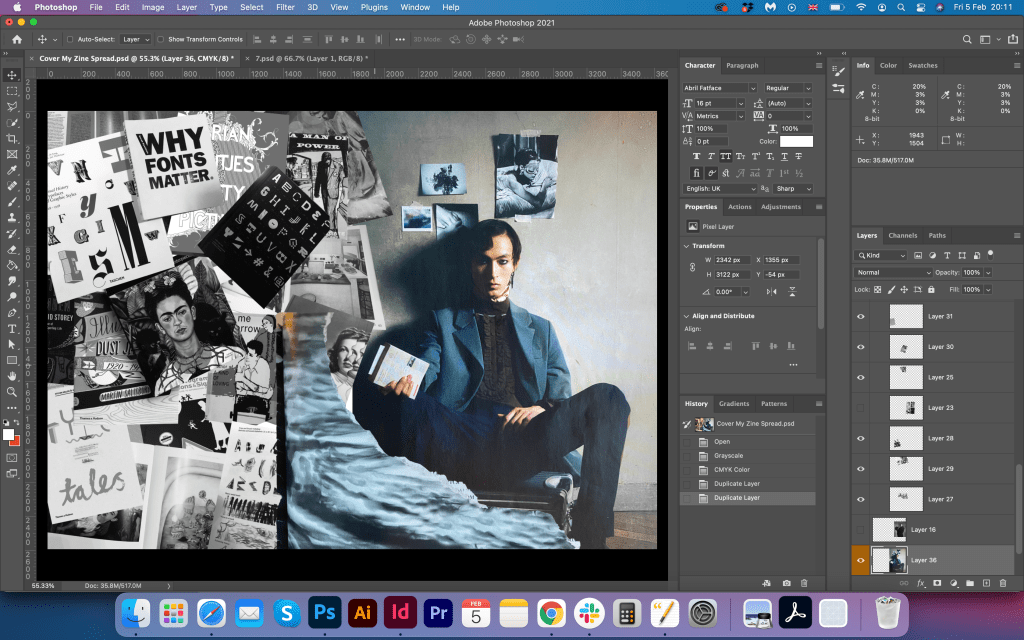
This spread was quite tricky for me to get right. I think I used so many different layouts and at the same time kept a similar theme before, so I wanted to create something in keeping with the general feel. I was thinking of creating the mind map look for this page, but instead, I just used some drafts I made for the creative process from my learning log and based on that notes I wrote a text for this part. This page I decorated with loads of magazines and books and with a picture of a thoughtful girl surrounded by printed materials. For the text, I used a wide column. This page probably is not the leading style for the booklet, but it has a similar feel to the general idea, and I’m glad I could organise my creative process into the path which starts from the brief and finishing in the approved final design.

Cover
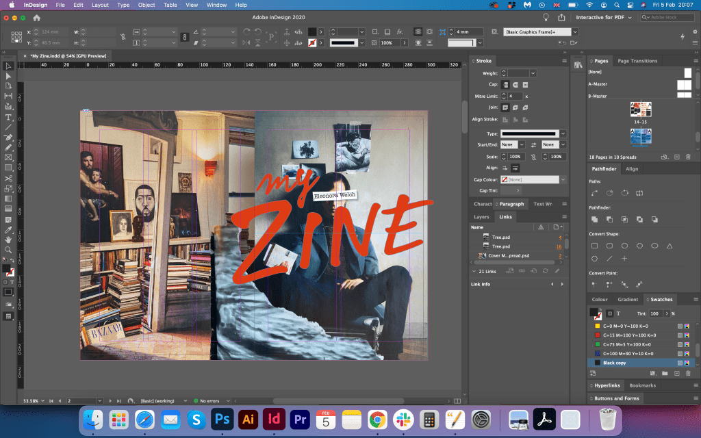
For the cover, I had an idea to create a collage with books on the back page and for the front to create cut and page collage from magazine leftovers pages I had. I placed the image of a guy with a book in his hand, and for the corner, I used the abstract image with some torn edges. This particular page I collected together in Adobe Photoshop, previously took some pictures of the objects I was going to use. Later I got rid of the books collage on the back cover and placed the picture of the library and some arch image from the magazine. For the front cover, I also used the girl’s shoulder, and it helped to bring the mystery to the cover page. For the My Zine writing, I used the same font as I applied for phrases inside of the booklet LTNotec Regular, but I made it extremely big, so it went beyond the ages, I wanted to see that ‘writing on the run’ feel.


My Zine Mockup


Printed Fanzine
When I printed this piece of design it really made me super happy and proud of the work I’ve done. That was the occasion when I enjoyed the designing, loved the process, and during the process experimented with different forms and shapes. It took me a while to design it, and the idea came quite easily into my head, but it took me longer to describe what principles I applied for this booklet, and I did a lot of writings about topics in this booklet. I’m happy that I can be a copyrighter and designer at the same time, but obviously time-wise it was quite time-consuming process. I loved the quality of printing I had, this design had a style, harmony in colour and creative approach. I hope that will be a good direction for my future discoveries and designs.
Sources:
https://en.wikipedia.org/wiki/Canons_of_page_construction
https://library.si.edu/collection/artists-books/about-the-collection