Using about 500 words of Lorum Ipsum (or other dummy text) you are going to design three different pages:
OCA. Core Concepts
• an interview with a TV actor in a listings magazine entitled: Will Sheila tell the naked truth?
• a review of a new piece of hardware or software in a specialist computer magazine
• a book review in a newspaper’s weekend edition.
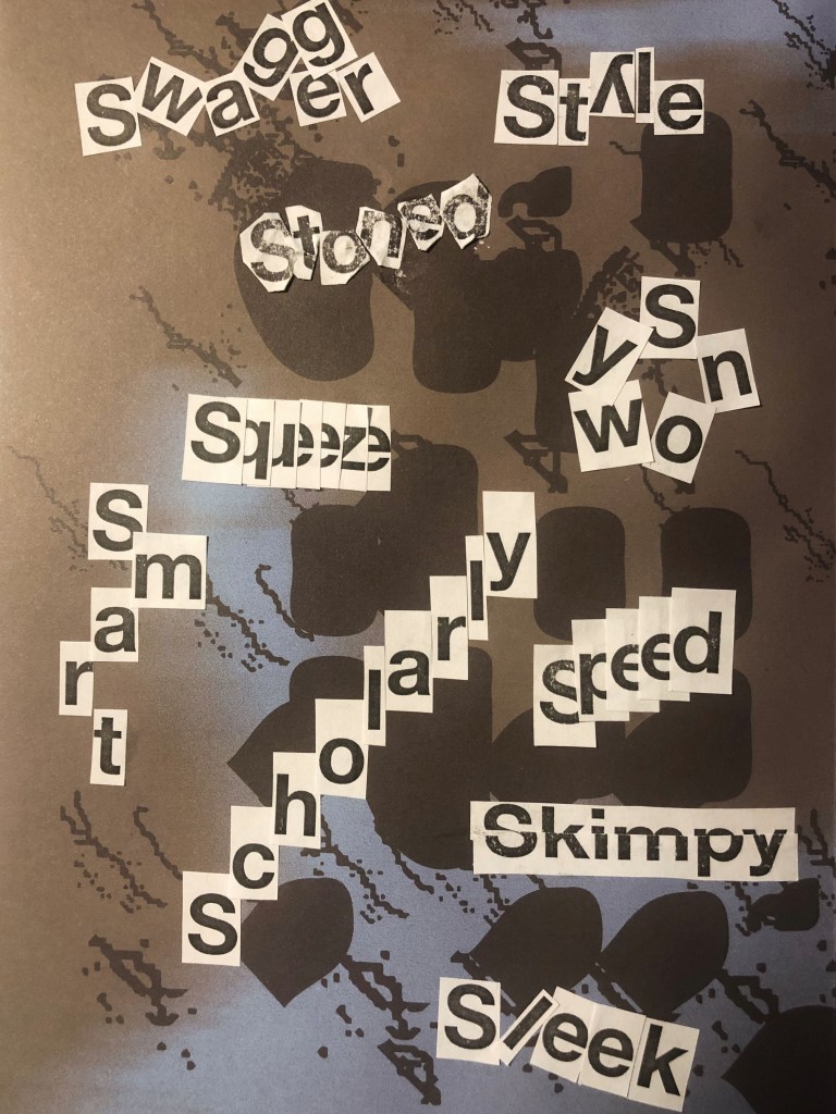
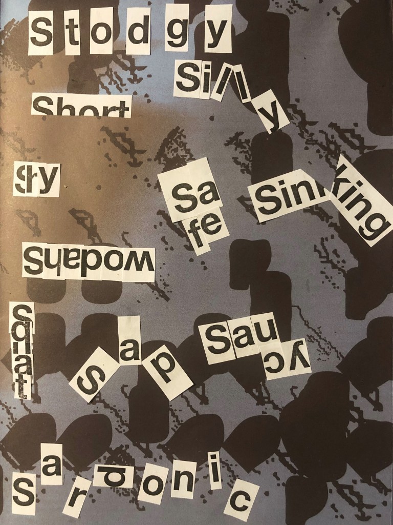
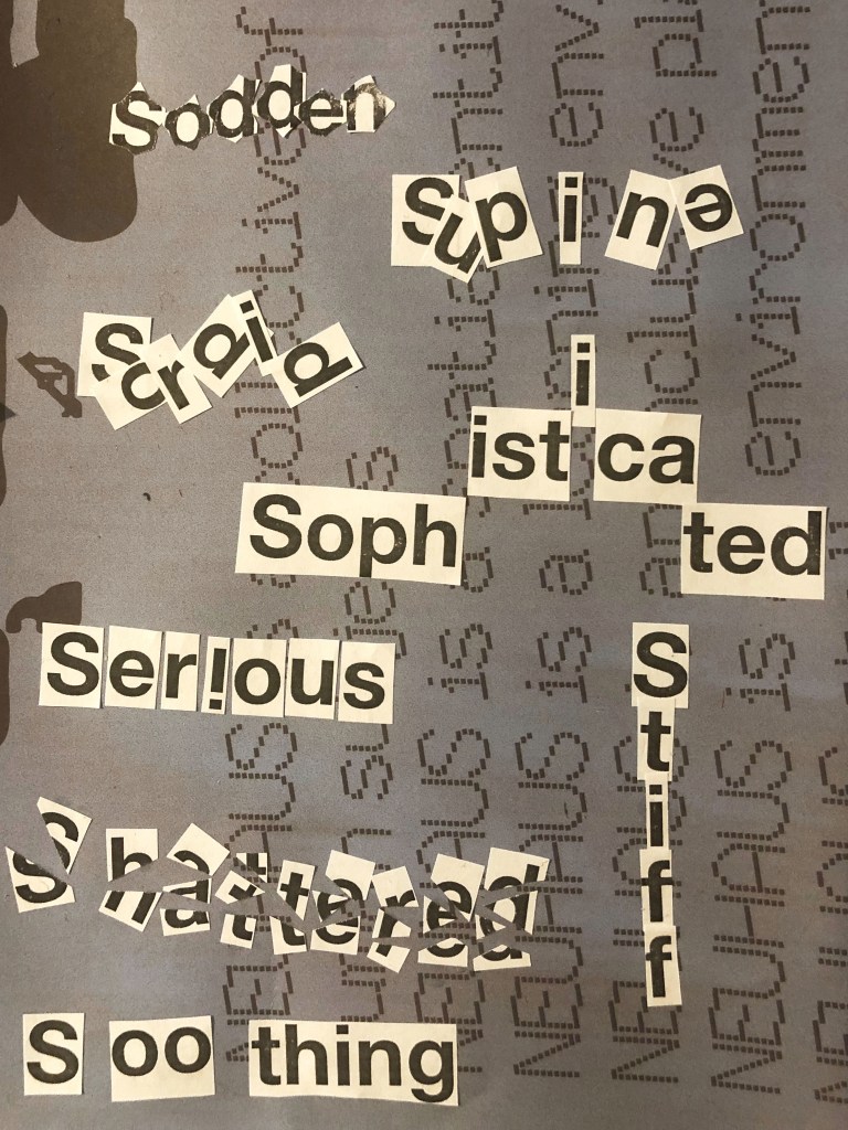
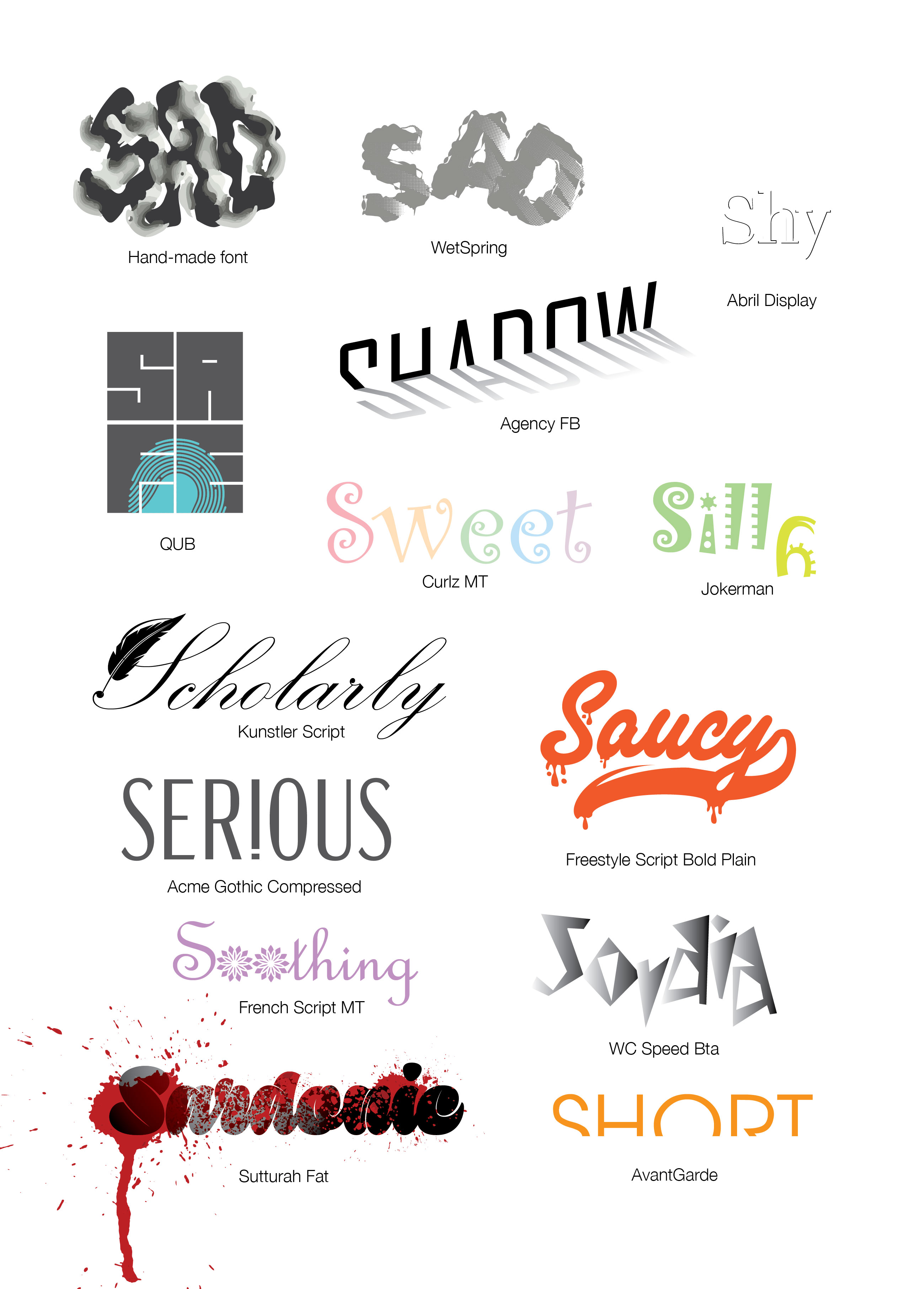
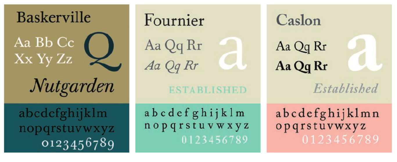
Research these types of publications and identify three different combinations of typefaces appropriate for each publication. Now you need to invent headings and subheadings for your articles. Set these combinations so that your header is above 12pt in size, your body text is 12pt or below and subheadings sit in between in your hierarchy. You will need to create some text to allow you to show your combinations in action. Use your text to describe your decision-making process, why you think the combination works and what your intentions were.
Research
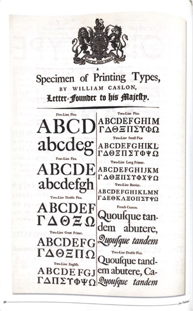
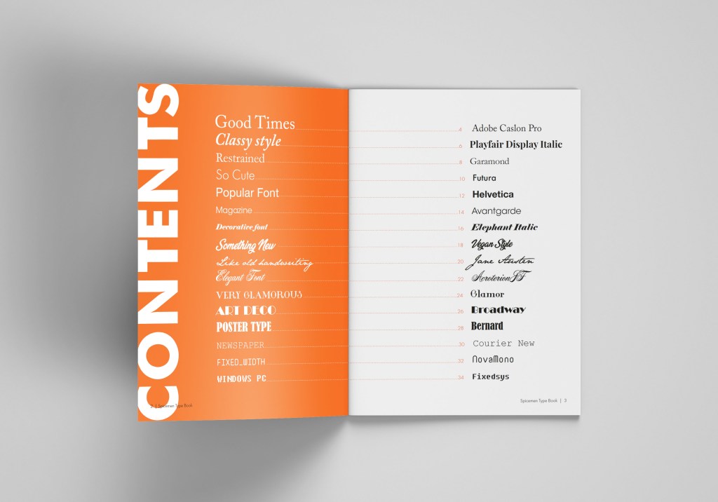
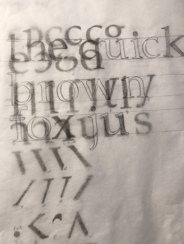
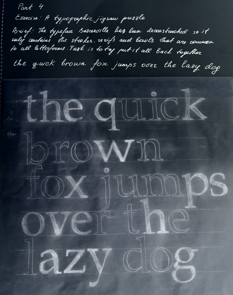
So, the final task in the 4th part – study and analysis of fonts and their use in magazine and newspaper typesetting.
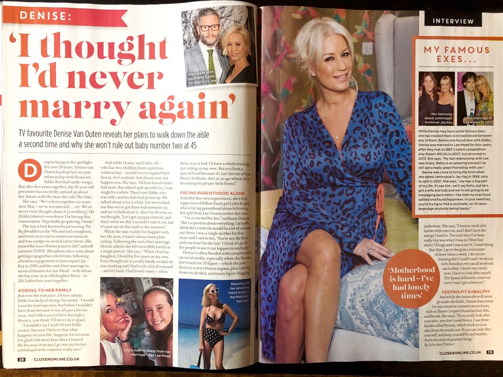
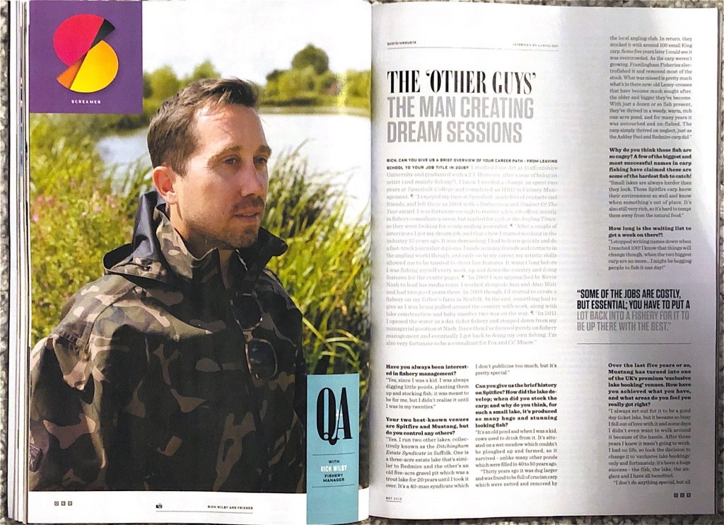
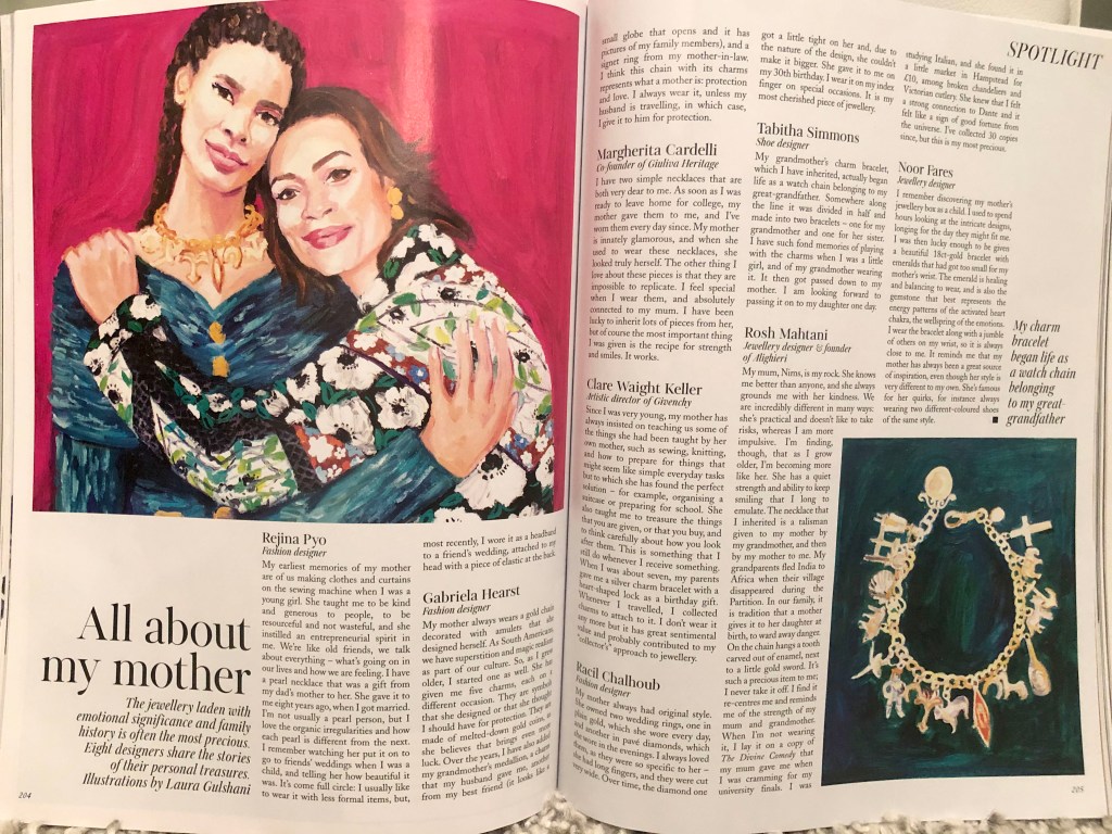
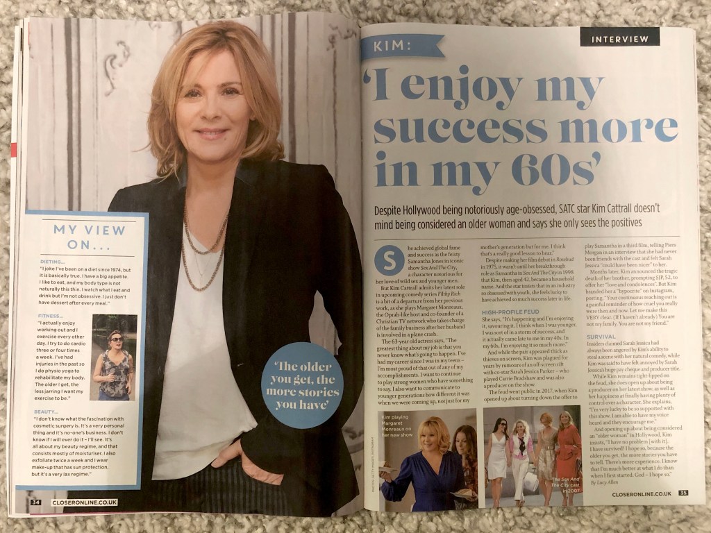
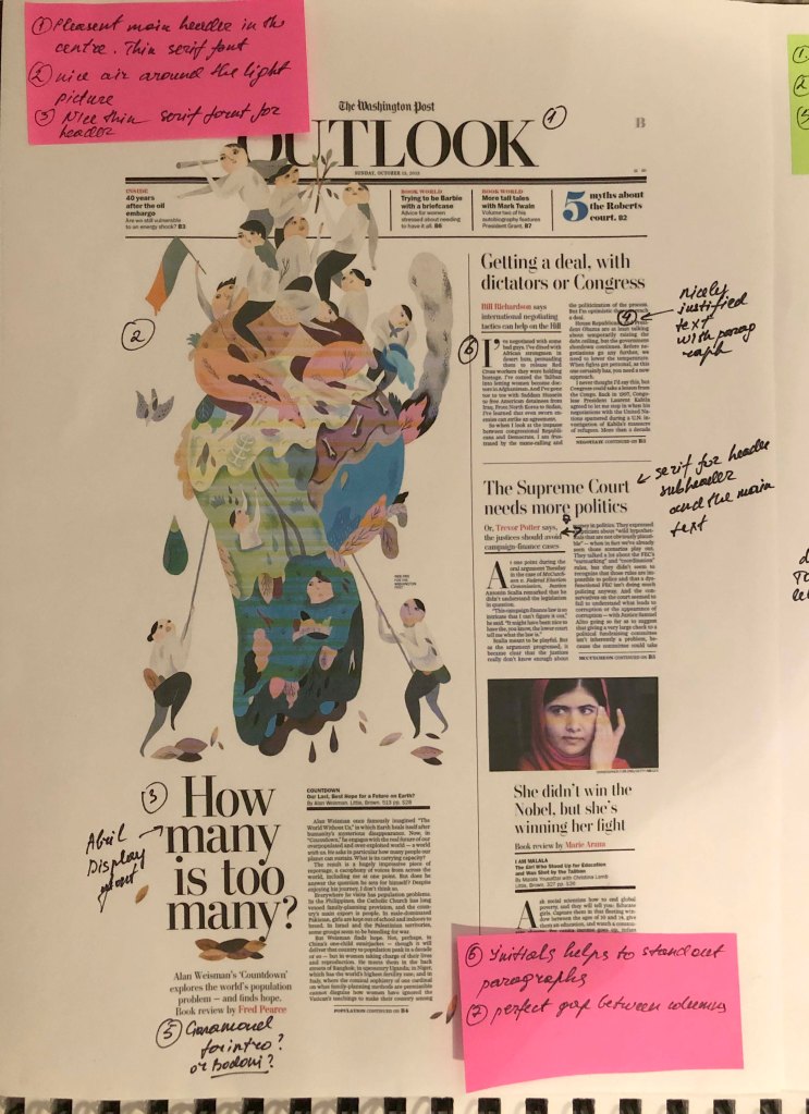
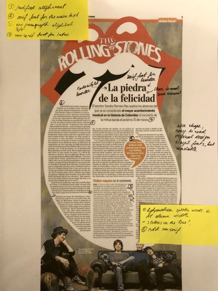
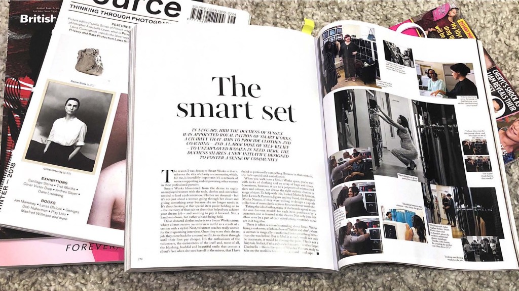
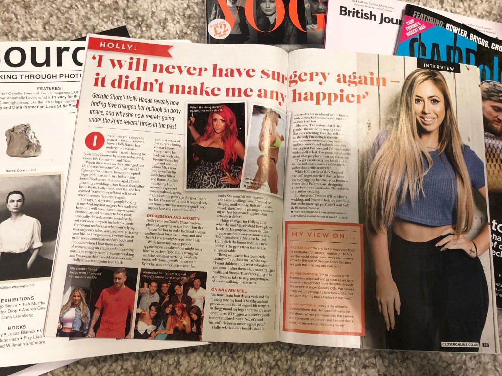
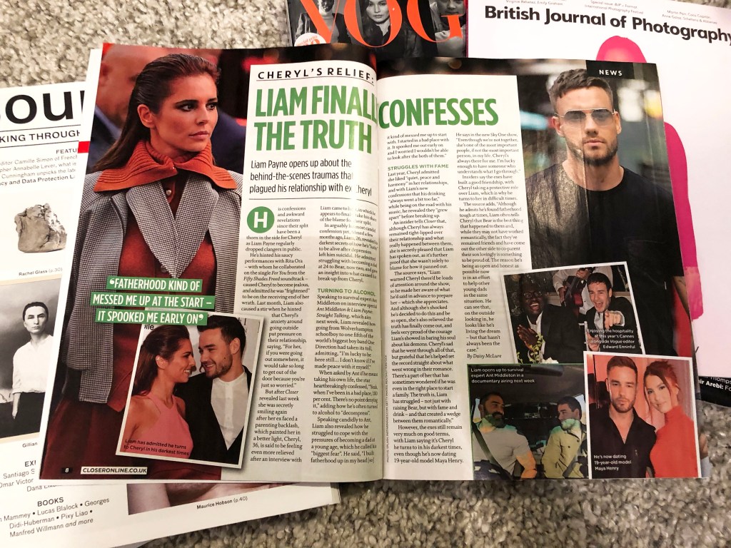
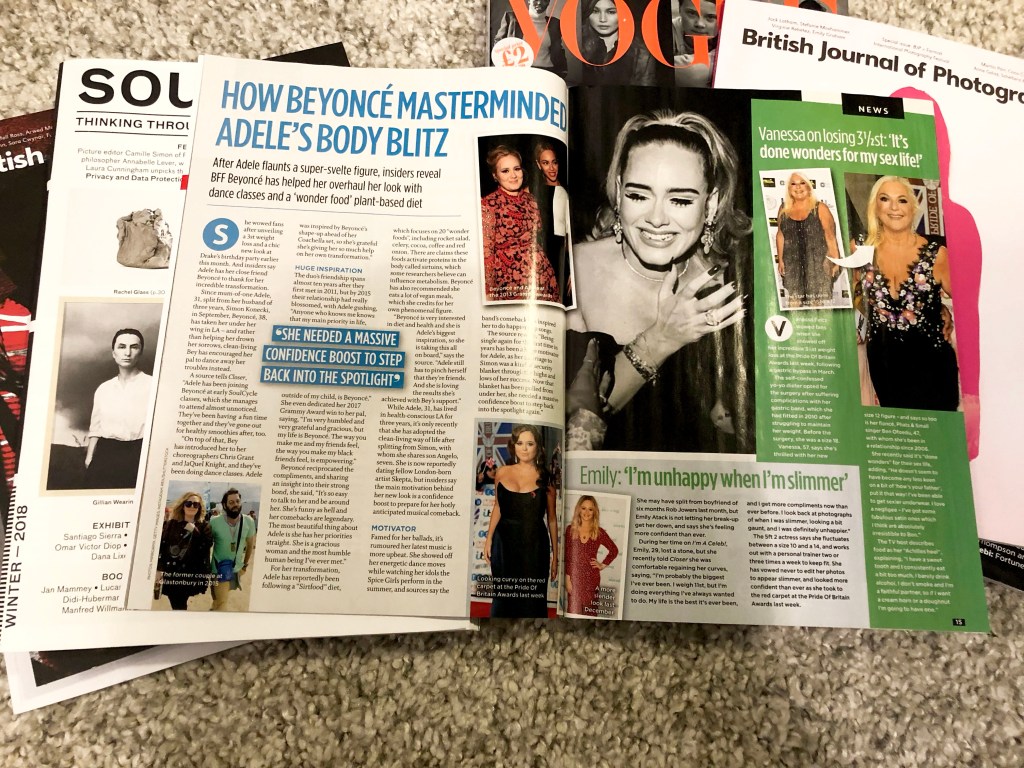
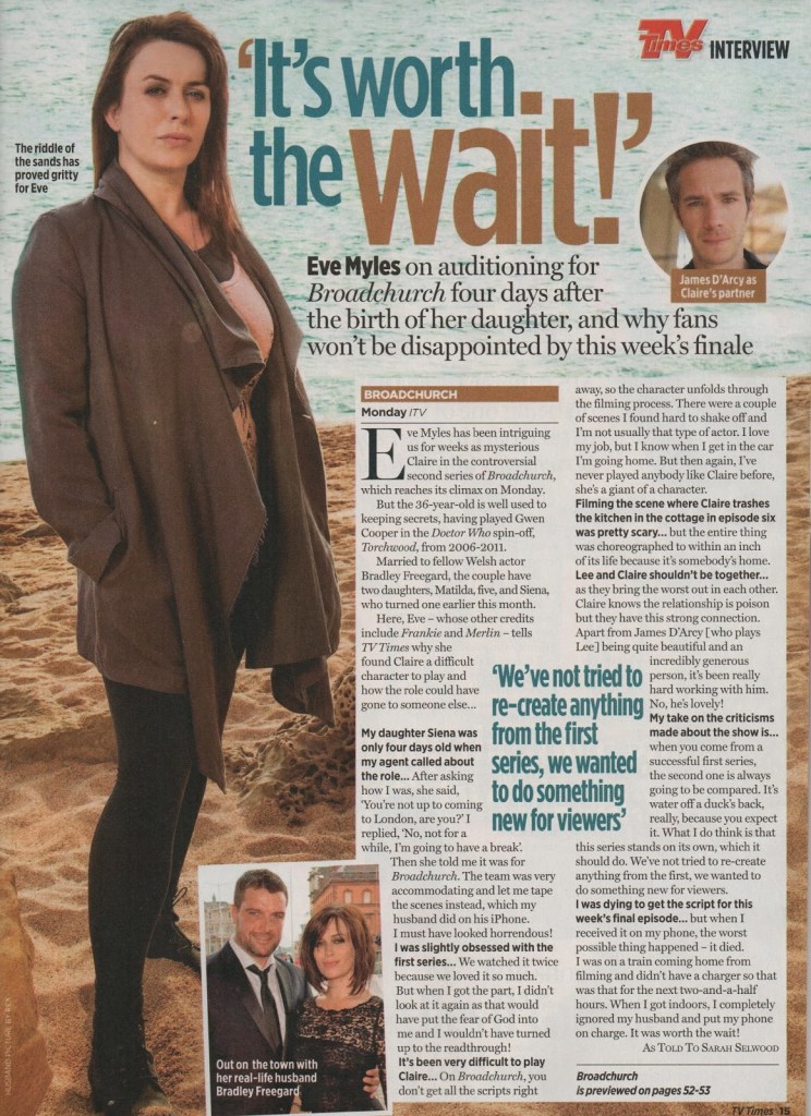
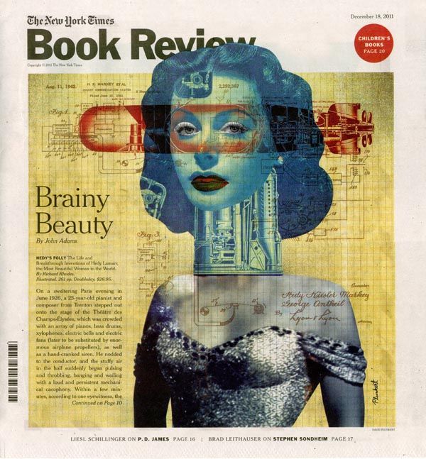
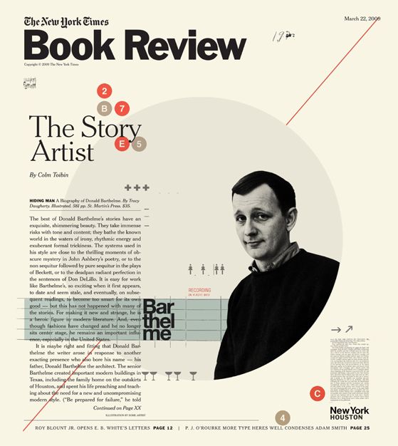
To begin with, I collected layouts by topic, in order to trace the key differences or general similarities. I noticed that depending on the magazine and type of interview, the design and set of fonts changes. For example, version №1 and №2 of an interview with Michelle Obama, and an interview with Meghan Markle in the September edition of Vogue, discreet fonts can be traced here, only black for text and headings, but at the same time a lot of small photos that convey the mood of the interview. At the same time, the version of layout №3, 4, 5 of Closer magazine is more catchy and bright, which is typical example of TV Listening Magazine. This kind of deigns have a kind of challenge, exposure of facts, and frank confessions, the headers used bright colours, blue, green, blue, everything to get attention.
Some designs used large headlines with serif fonts, some without sans serifs, but all headers were bright and contrasting. Fonts for text are mainly serifs, in several columns, aligned on the left side. With the exception of the layout in Vogue magazine, adjusted text columns, and the headings are black in a restrained colour, the font only with serifs.
I noticed that in my last exercise Lorem Ipsum, I performed a similar design, a bright layout with large contrasting headlines and dynamic photographs. Therefore, for me, similar style of design was a re-work in which I should pay more attention to details.

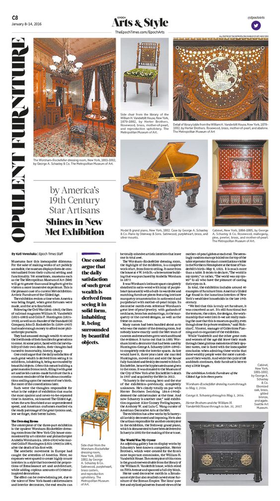
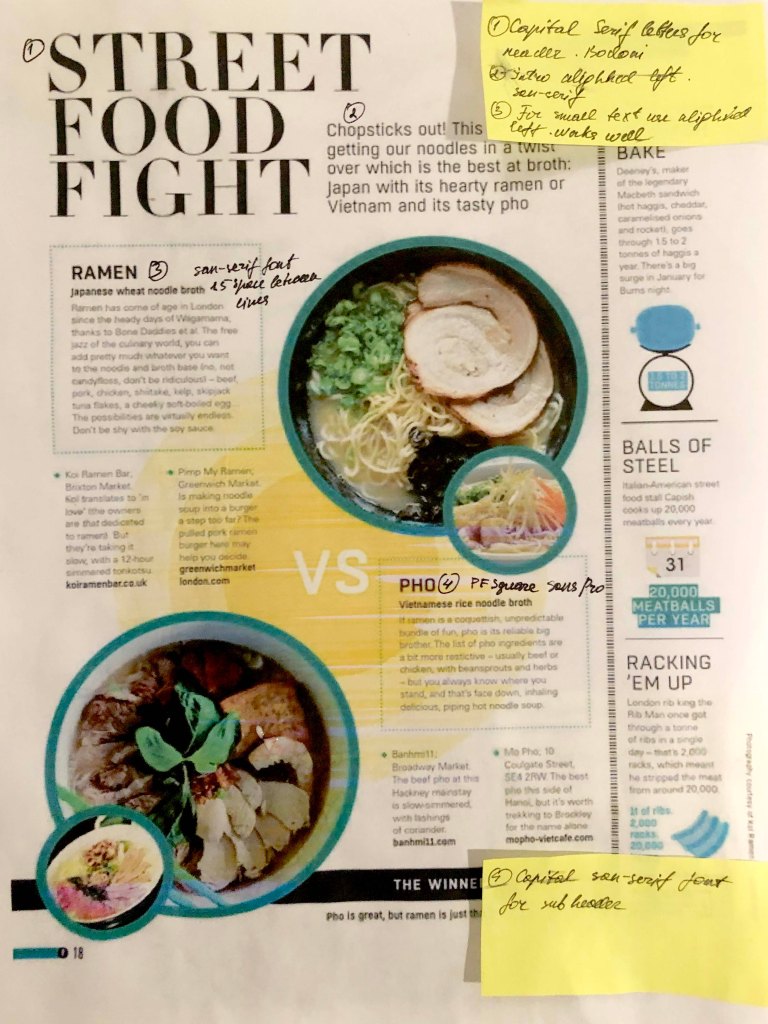
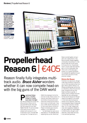
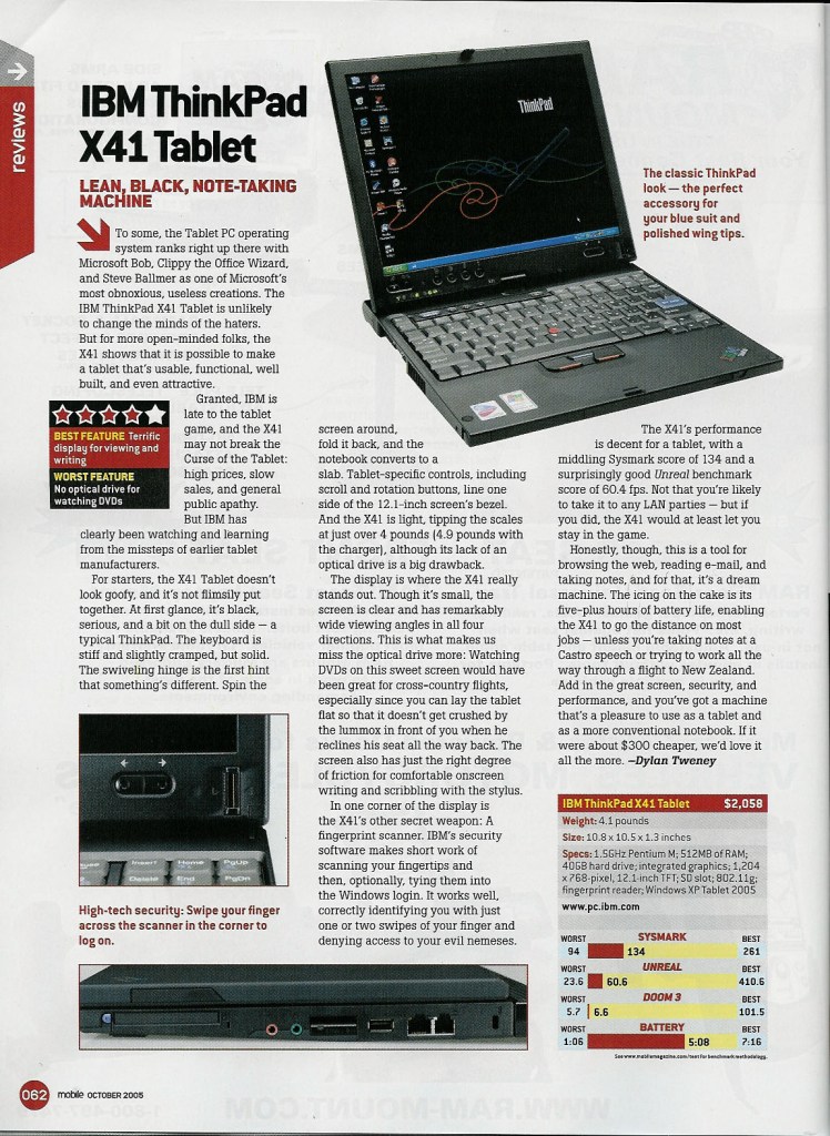
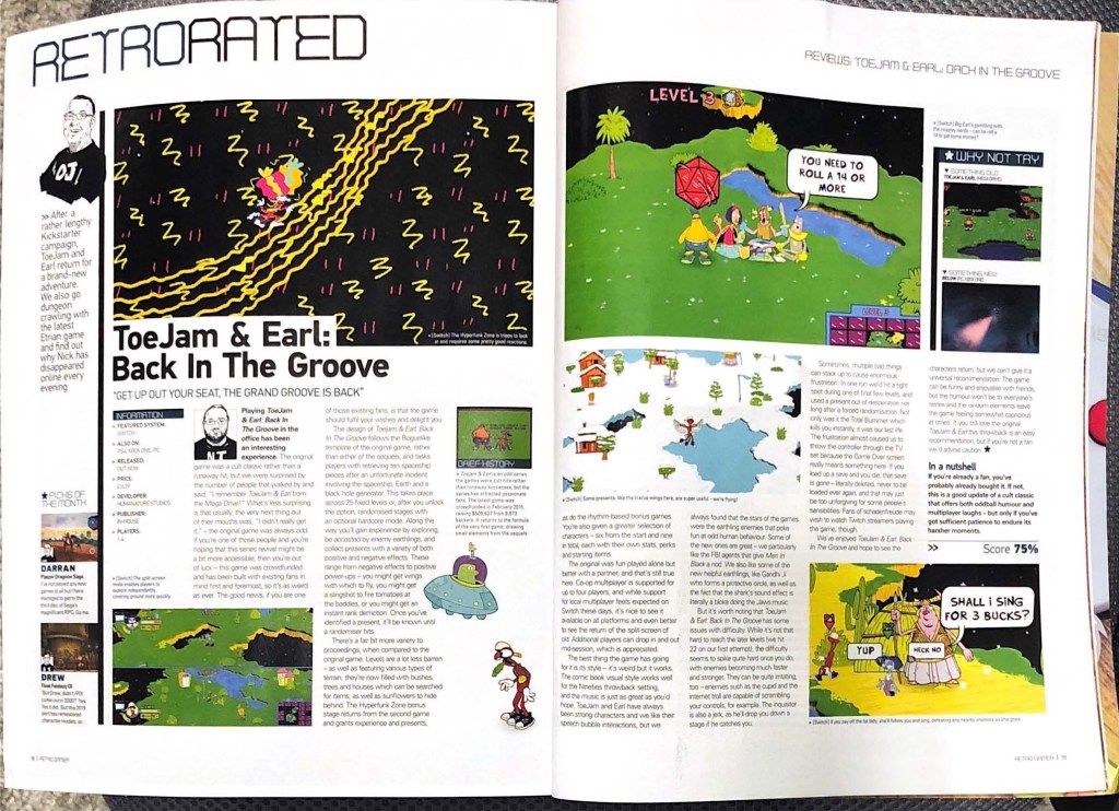
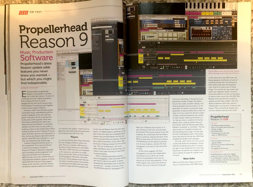
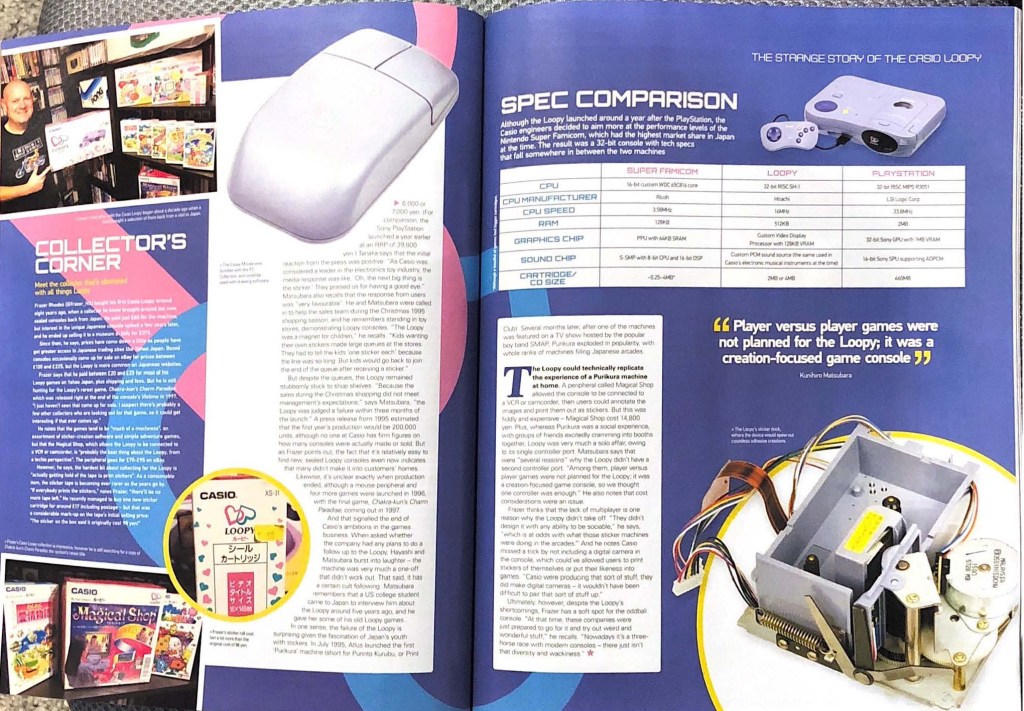
For the second design, I took some pictures of layouts from various magazines, those that were at hand, some of them music creation editions, some of them about retro games. In my collection, there are such designs as typesetting of computer equipment, well-designed software, and for comparison, I have attached examples of typesetting of the computer games magazine Retro Games, which in my opinion is distinguished by its creative approach, an interesting combination of colours and font solution. At the same time, the design options for the software are quite restrained, with a maximum of several colours for the headers and screenshots.
Font for headings without sans serifs or fixed width, aligning the columns to the left, which creates more air and space in the layout, fonts with serifs and sans serifs. The designs are fairly standard, with a maximum of two colours in fonts, red and black, the main thing here is to display a photo of the software and equipment.

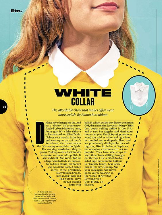
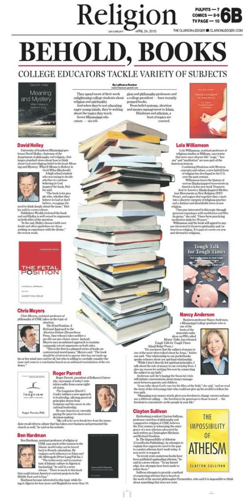
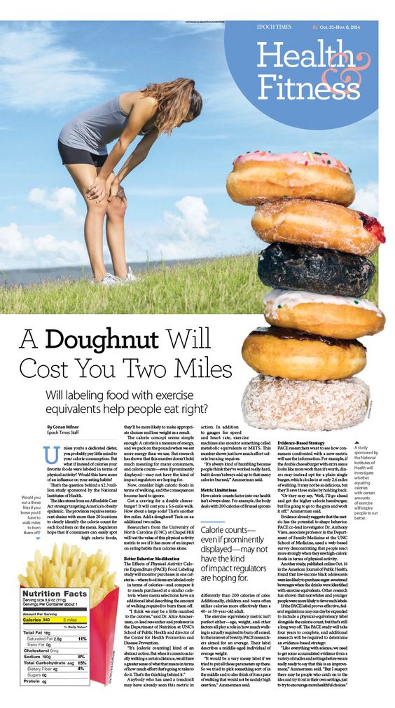
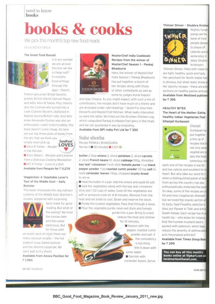
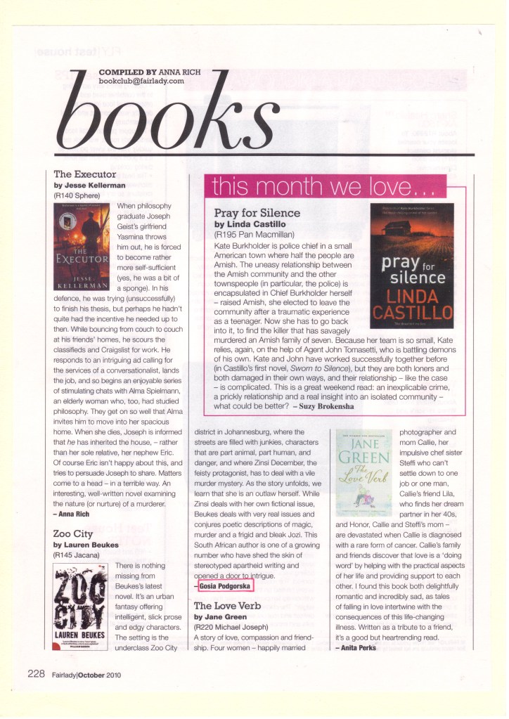
The design for book review turned out to be pretty standard. The main font with serifs 12pt, a large heading Books, book covers were used as graphics. But still, after a long search for Google open spaces, I managed to find several creative layouts, with unusual graphics, which occupies about 80% of the sheet, compared to about 20% of the review itself.
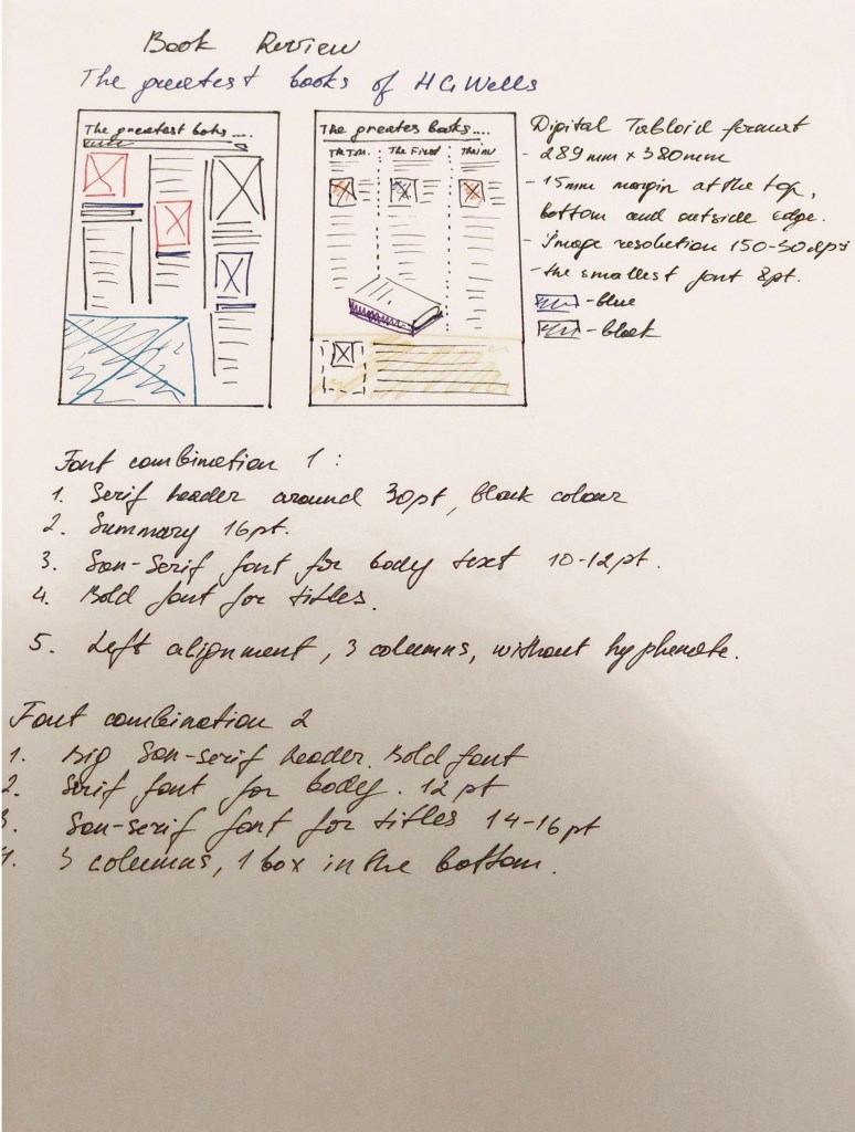
Some columns are left-aligned, some are aligned on both sides, fonts with serifs and sans serifs. The flow around the text around the book is also carried out in several ways, it can go along the left side of the book, along the right, and also go under the book itself. I walked around the size of the newspaper because I had never done a design for a newspaper before, I found several sizes, the size of the newspaper tabloid 289x380mm https://www.newspaperclub.com/choose/tabloid/digital


Overall this designs gave me some ideas how I would like to represent my designs. Now is the time for the next part. Sketches and the structure of each design.
Sketches
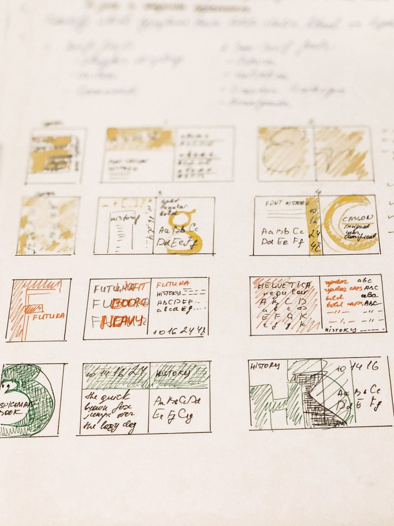
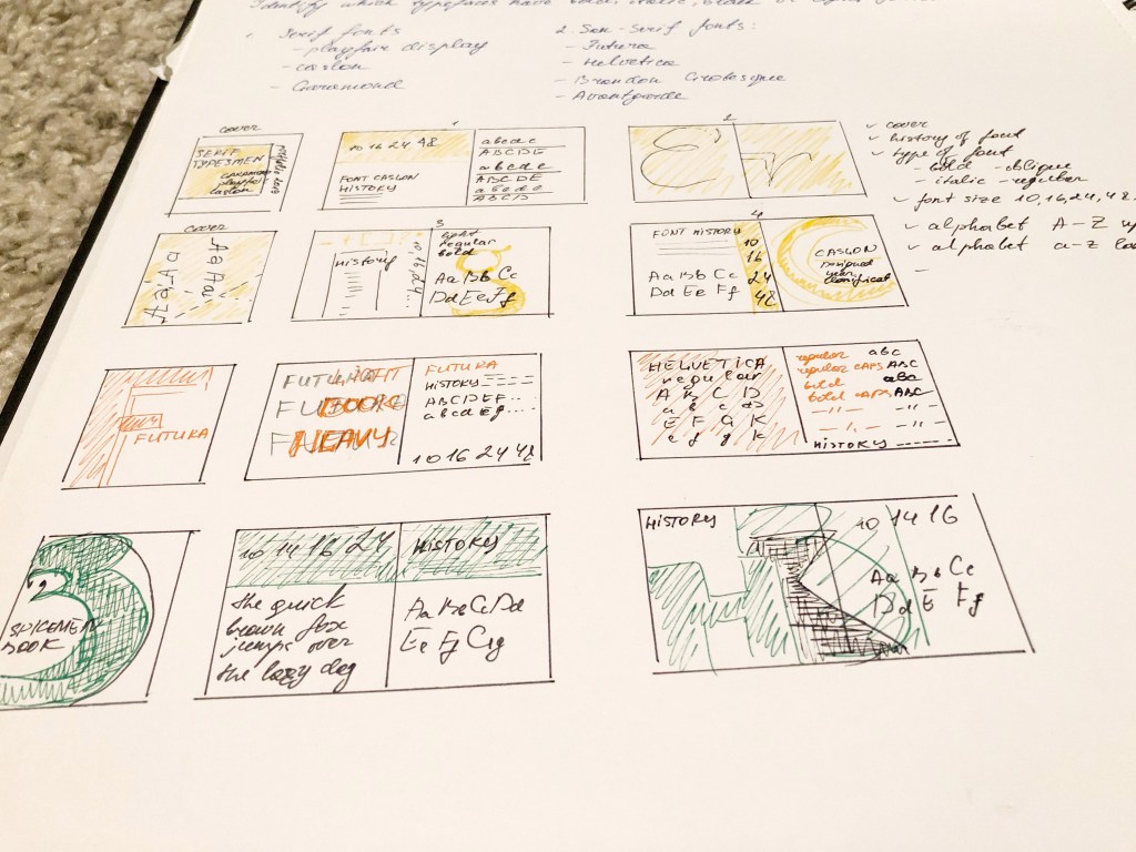
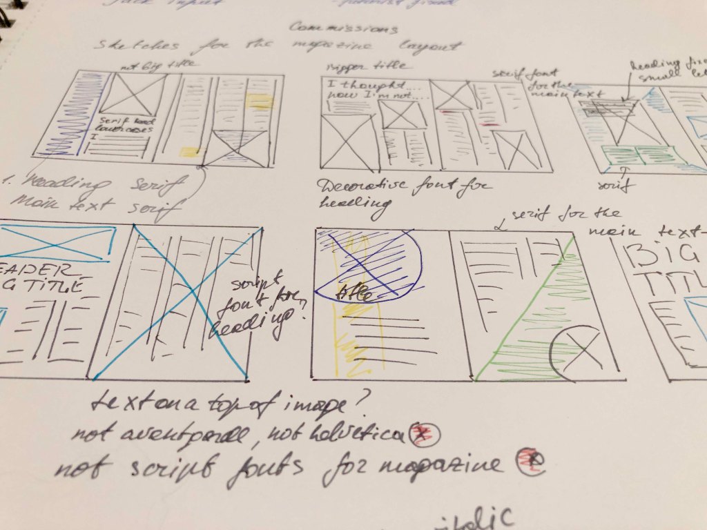
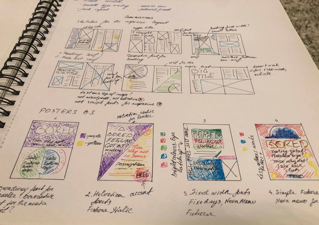
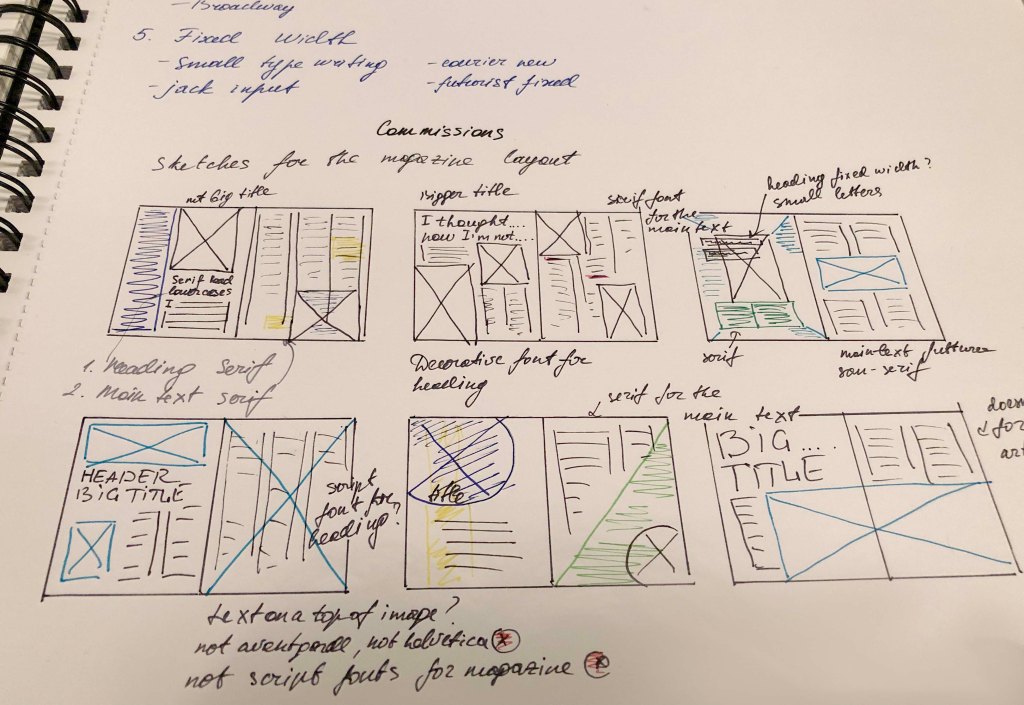
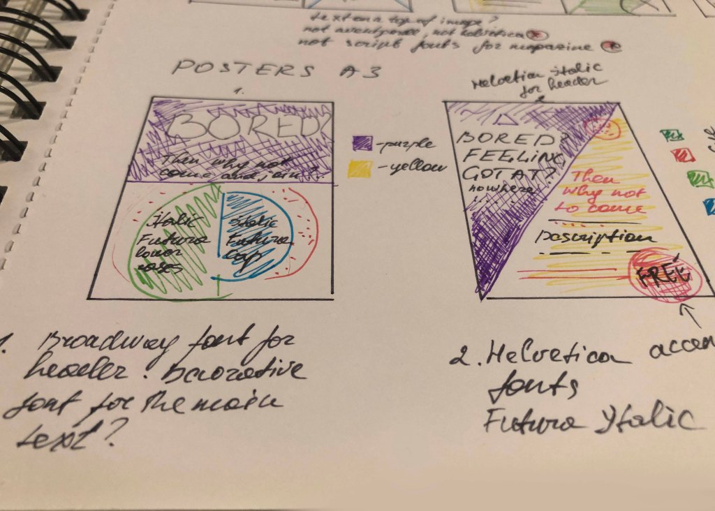
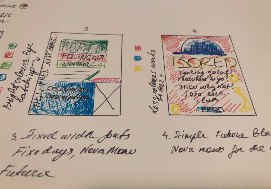
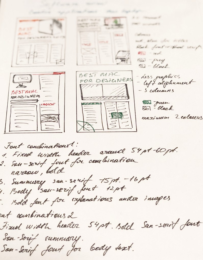
So, the introductory part of the analysis was carried out, now it’s time to start sketching. I decided that before developing designs in the programs, I needed to make drawings according to my future layouts and identify the main points.
- Layout Composition
- Font size for the title, type: serif or sans serif.
- Font for the main text, size 10-12 points
- Font for summary
- Colours in designs.
Bellow all my sketches and notes for designs from my learning log. Small sketches for each design helped me shape the overall vision of the finished works which will be reviewed further down.


Designs
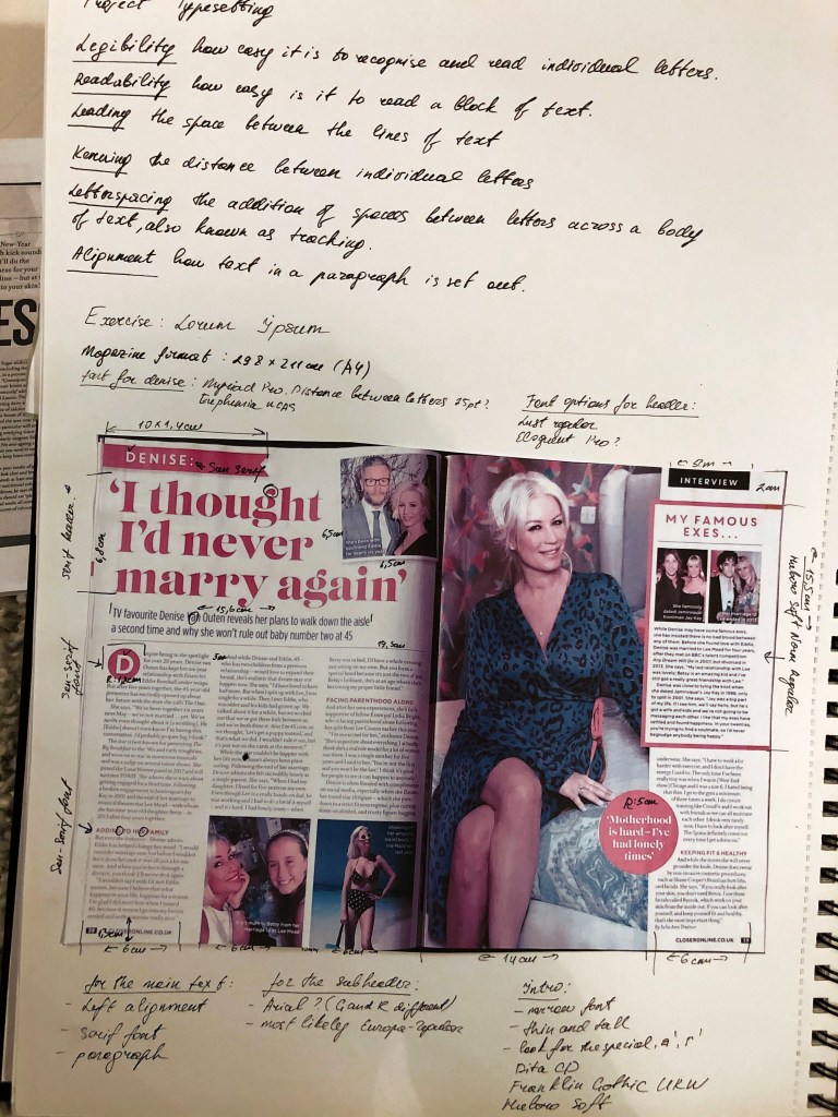
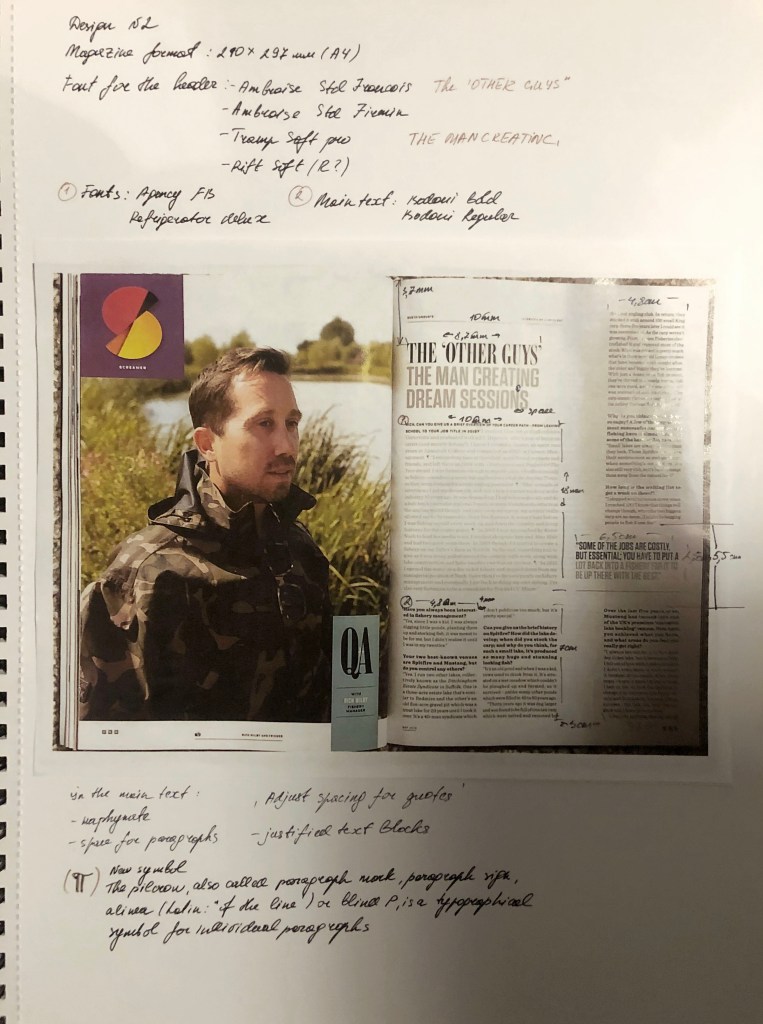
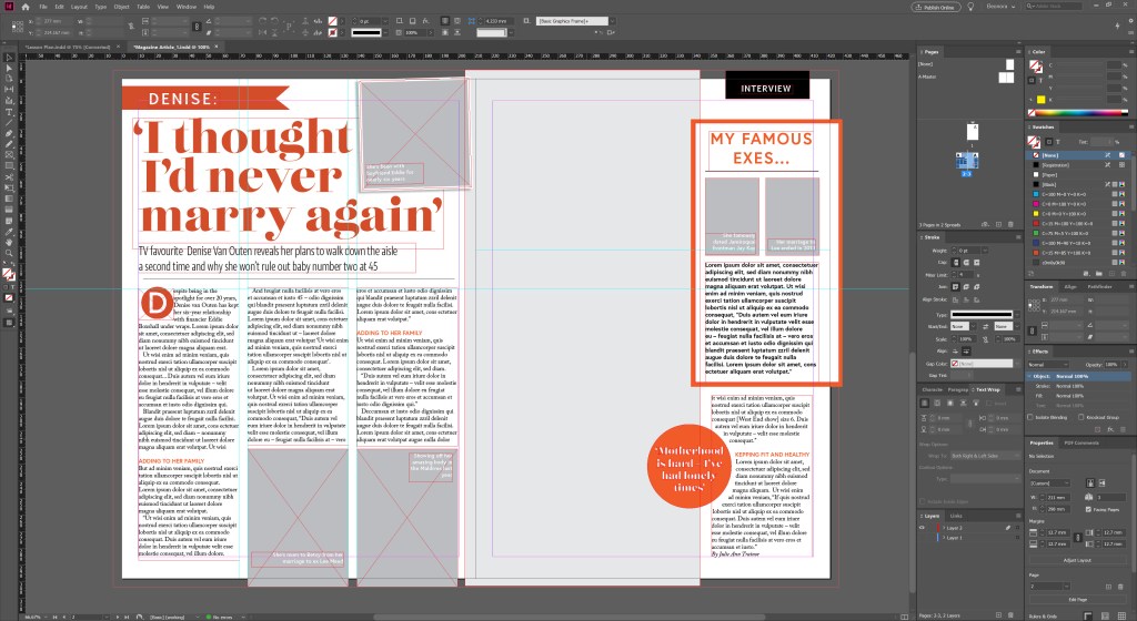
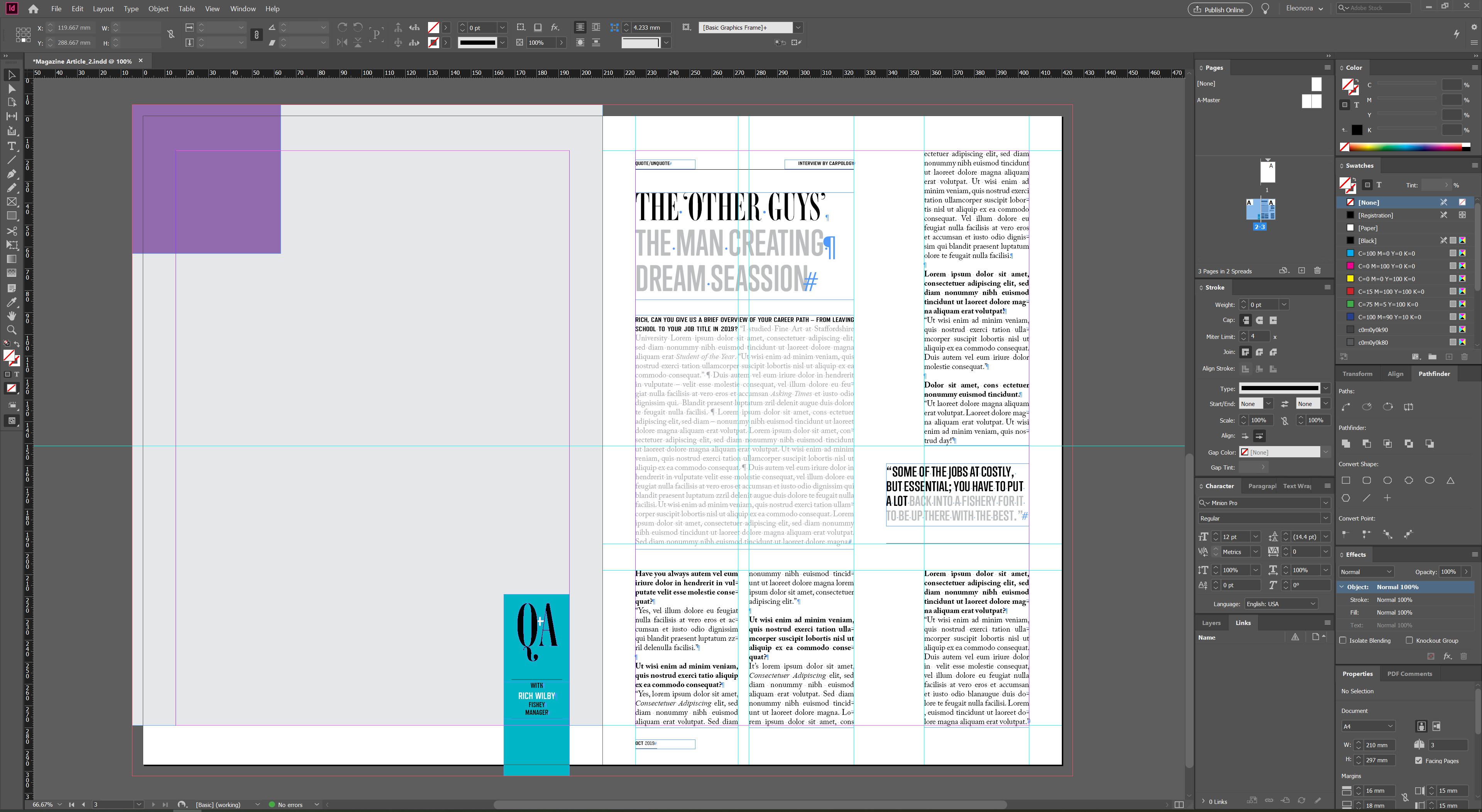
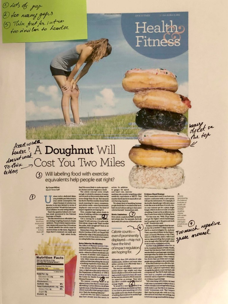
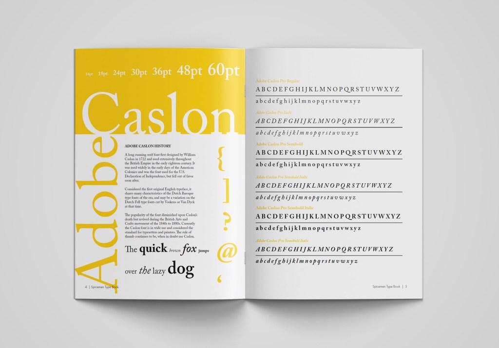
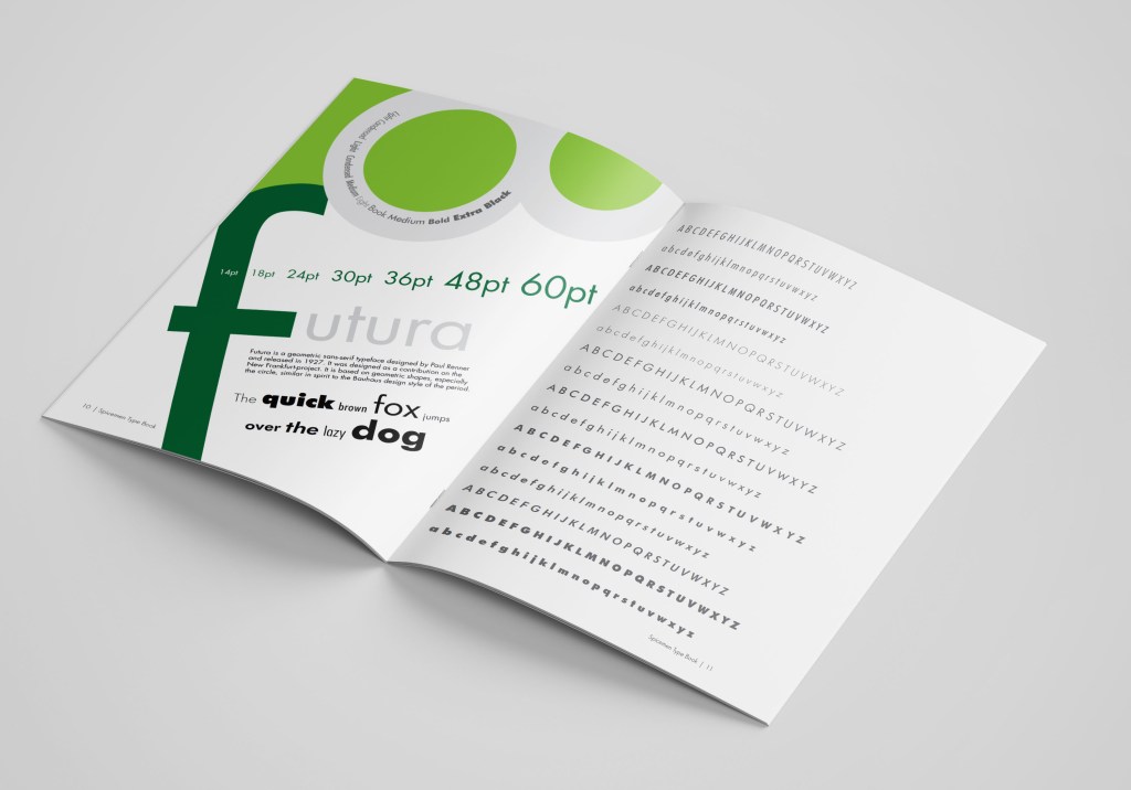
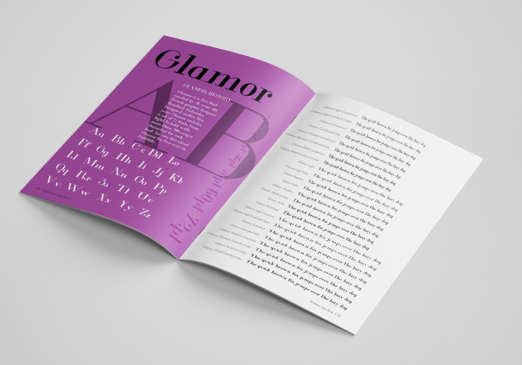
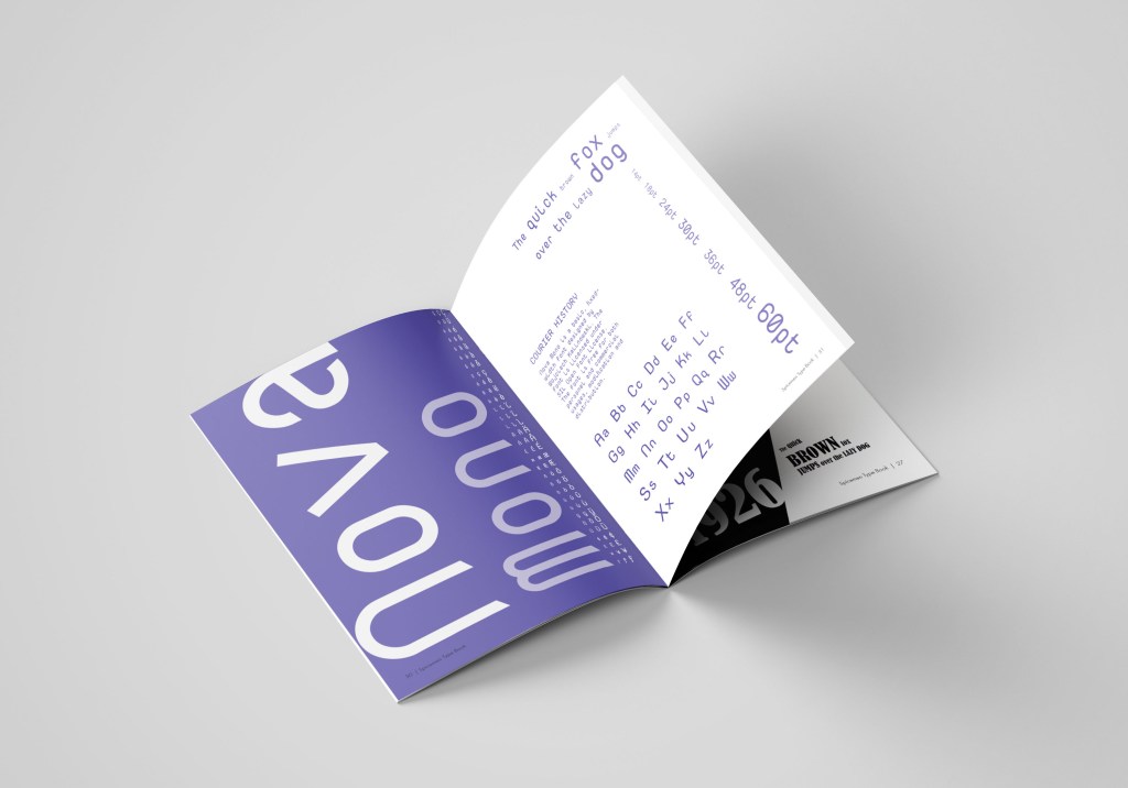
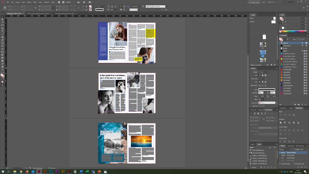
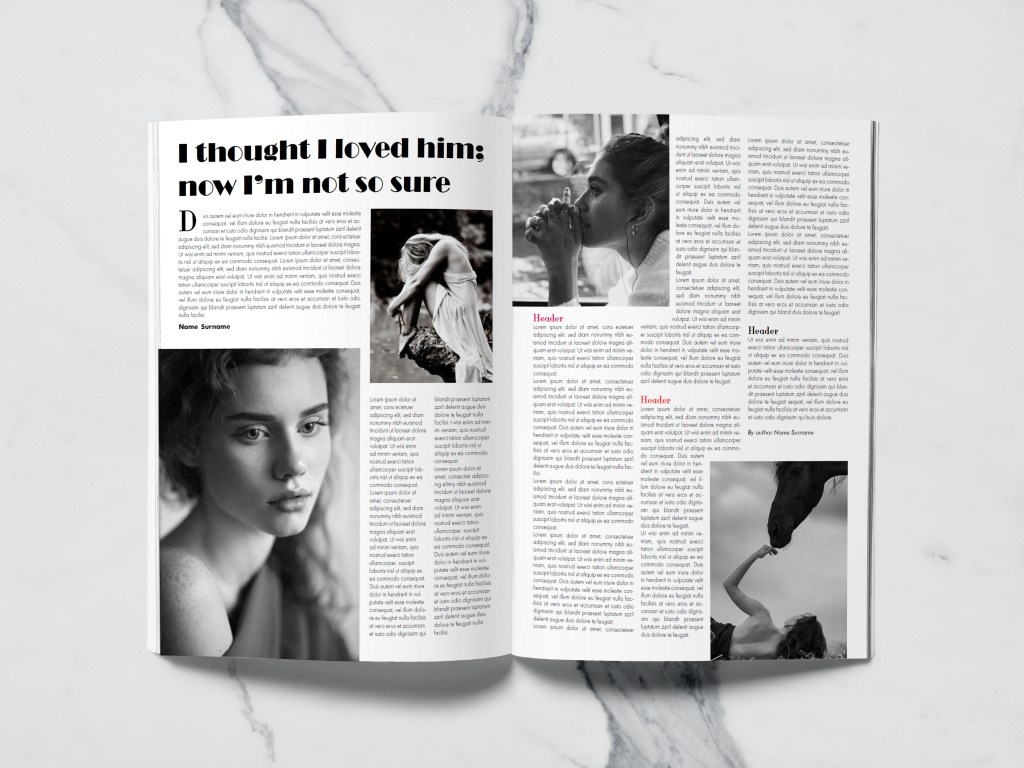
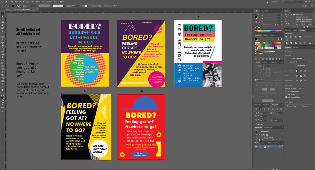
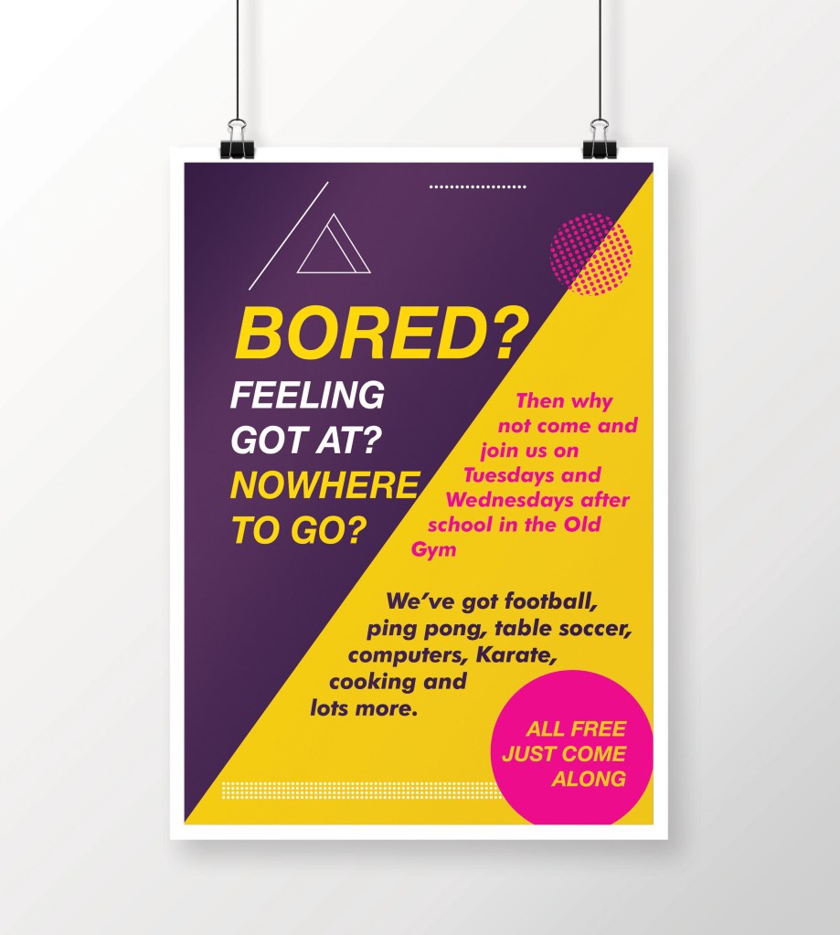
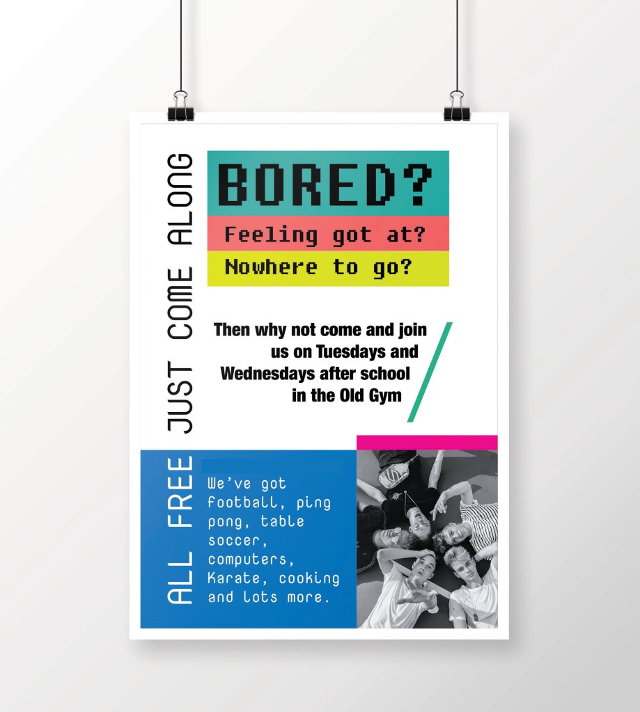
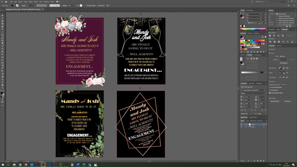
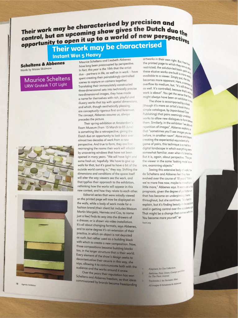
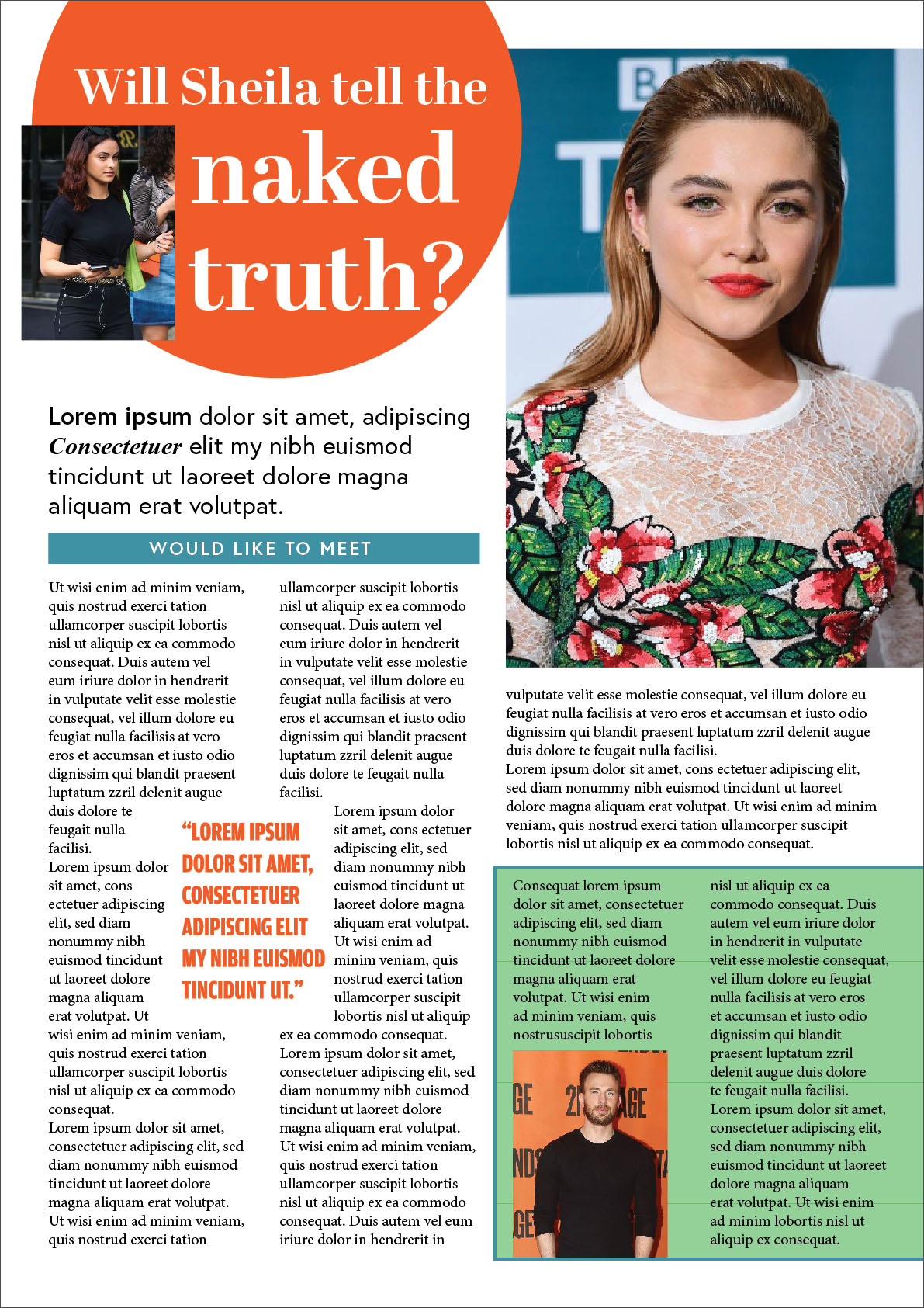
By designing an interview with a celebrity, I outlined several approximate templates, with sufficient number of photos and bright dice. I wanted to experiment with font execution, so I went the same way as I used in the last exercise, where I selected new fonts from Adobe Fonts through Adobe Indesign. The first pin combination consists of a large font of approximately 72 points, sans serif bold narrow font, for summary san-serif font narrow and tall, body text serif font 10-12 pt. I divided space into a few columns, downloaded some celebrities images from https://www.pinterest.co.uk/edavydovska/ to fill the space with some visual emotions. Regarding colours, here I was expected to have a fairly wide colour gamut, where it was possible to combine contrasting colours. The second pin combination is the opposite of the first, here is the font for the serif title, for the summary I just used san-serif font, but I used a narrow bold font for a quote, to create another contrast font, which popping out well on that kind of design. Bellow are presented two ready designs, based on my previous sketches.
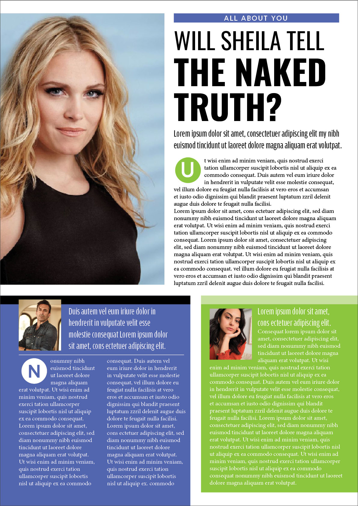
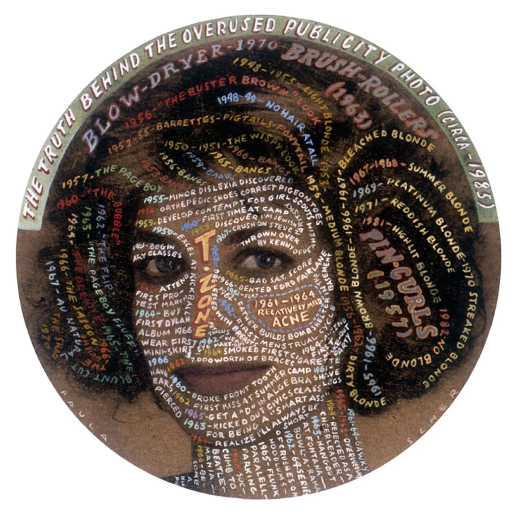
I’ve noticed I used static images, I could probably turn them more around, or apply the image on the whole A4 format, as far as I could see from my sketches they all would work well, but I decided to stop on two options, there are so many options for this kind of designs, I think they both work quite interesting and eye-catching. On the first design, I used a bit of green and blue squares to pop out the text, looked a bit busy, but it helps in dividing text information, the hierarchy for reading is like standing out header, then second paragraph, then one of the blocks like blue first, and then green.
In the second design, I used several fonts for summary, bold and uppercase, several dice, a circle for the title, serif font for the header. In general, I am quite pleased with the result, however I still can see that my designs look a bit too neat and organised, they lack some kind of bold decision and challenge, because this is a kind of recognition article, exposing the truth. Fonts and layout itself are pleasant enough for perception, I think that this is my formed taste, which I adhere to in my works.
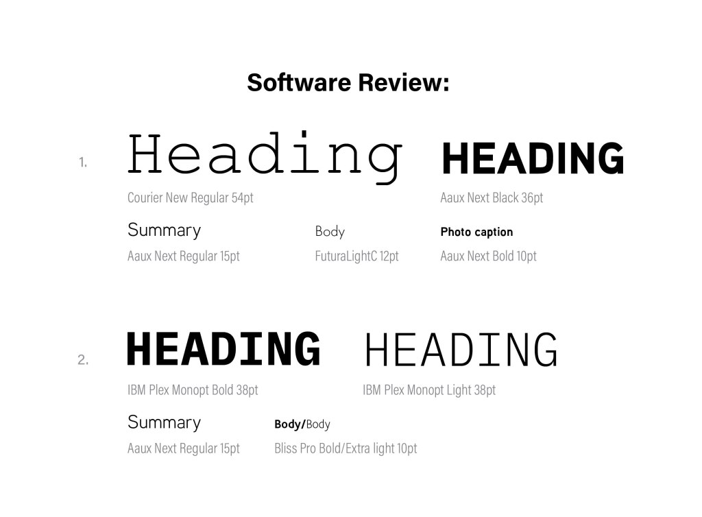
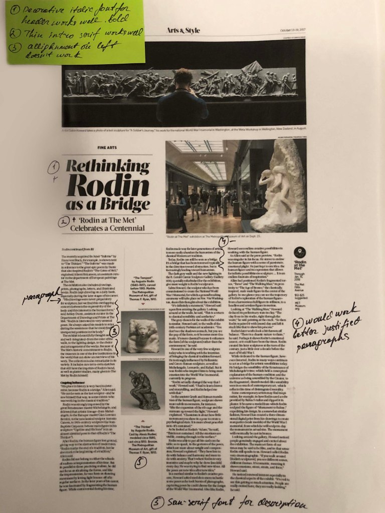
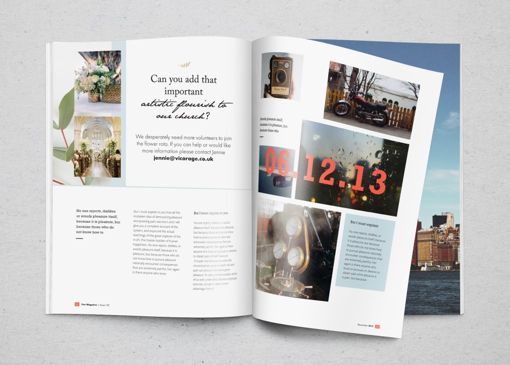
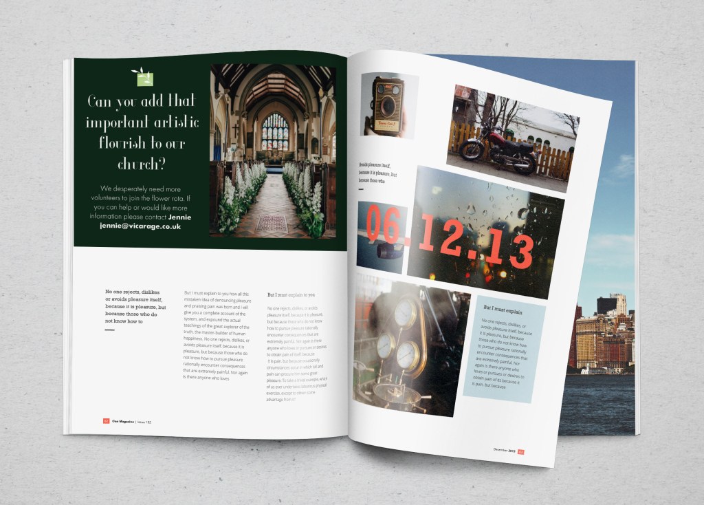
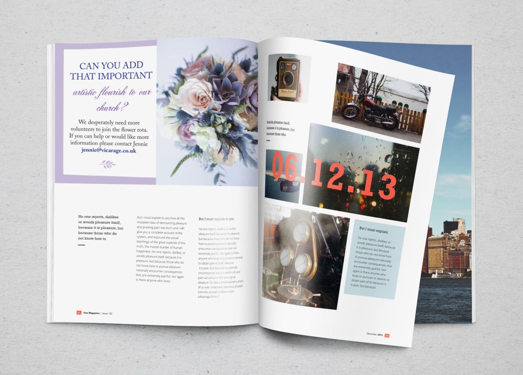
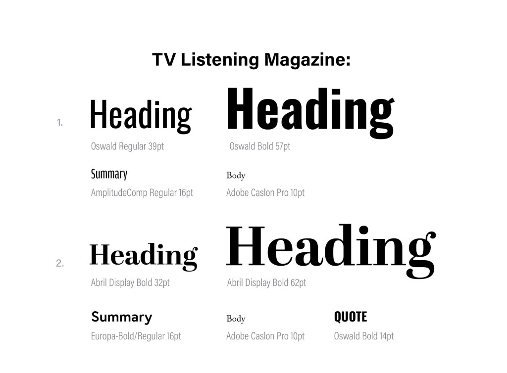
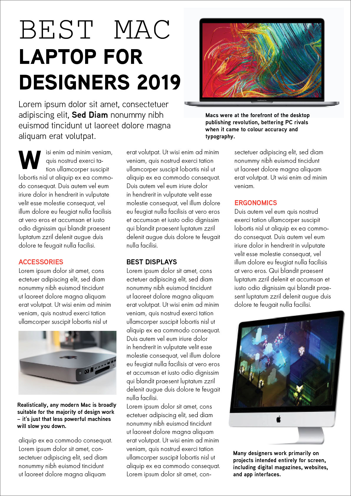
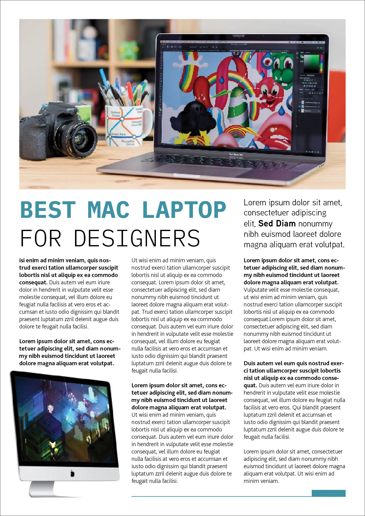
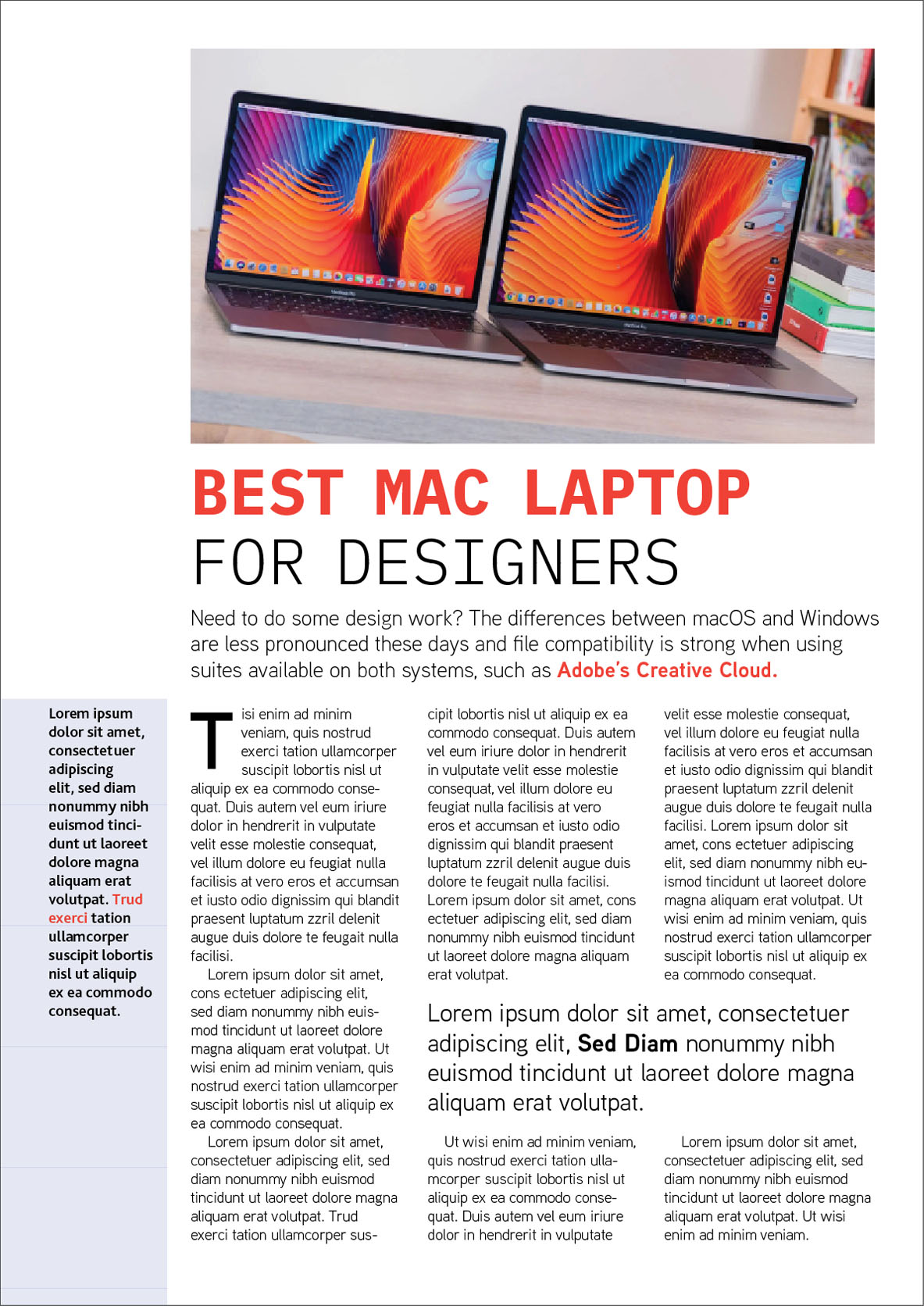
When it came to designing a software review, I chose a theme of Apple computers and laptops for designers, I took the article and photo from this site: https://www.macworld.co.uk/feature/mac/best-mac-designers-3450093/
I noticed that the article should be informative, not overloaded with colour solutions. The combination of fonts in the first version and the second version is identical, with slight differences, these are fonts of the fixed-width category, and San-serif fonts around 50pt. For a summary, I used thin san-serif font, and for body san-serif as well. I divided the text into 3 columns, left alignment, also hyphens are present in the words. Below are 3 layout options, they are adjacent to each other, but while experimenting with the layout of the image and the width of the columns, you can compare how the perception of design changes. In my opinion, the most successful design No. 1, its advantage in a well-organised space, a simple composition, a discreet but eye-catching title, and an easy-to-read layout.
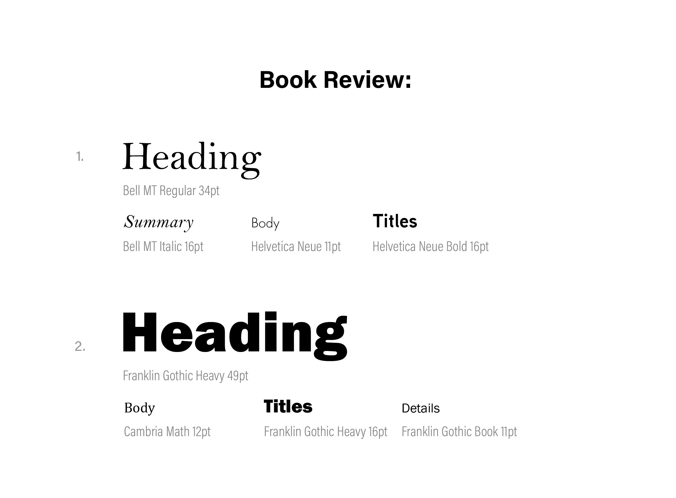
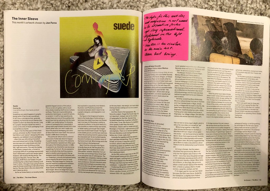
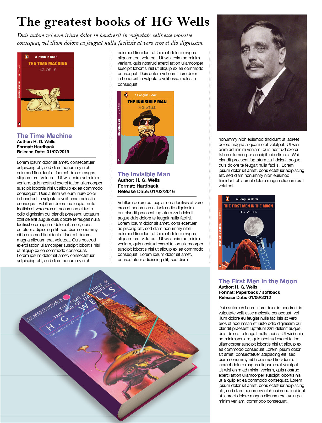
To design an article for the book review, I used cover designs of the writer HG Wells, which I produced in the previous part of the course. I found the size of newspapers on the Internet, I took the size of a Tabloid Newspaper format 289×380 mm, considering that fact that I still had 500 words by Lorum Ipsum, I realised that I would need to use the maximum free space by occupying them with books and a spacious layout. Overall, templates designs of the book review are also quite simple, it is difficult to say that it has some peculiarity, probably the simplicity of layout and a large title the only two noticeable special features of that kind of designs. Fonts are used both with serifs and without serifs, so I decided to use several options to see which one is most successful. I divided the space into three columns, but the text itself is also aligned on the left side, I tried justified text but it looked awful, there were a lot of extra gaps between words. In the first version, I used serif font for header around 40 pt, short summary with italic font, for the body text I used San-serif font Helvetica Light 11 pt. In the first version, I decided to try to align book covers to the left, and place the text and headings of the books from the bottom, thereby I got extra space on the right side, which I was not happy with. In addition, I placed the books in a chaotic manner, so if you look closely at the layout diagonally, you get a staircase of books. I took up free space with a large image of a book model, which look a bit out of the place as well.
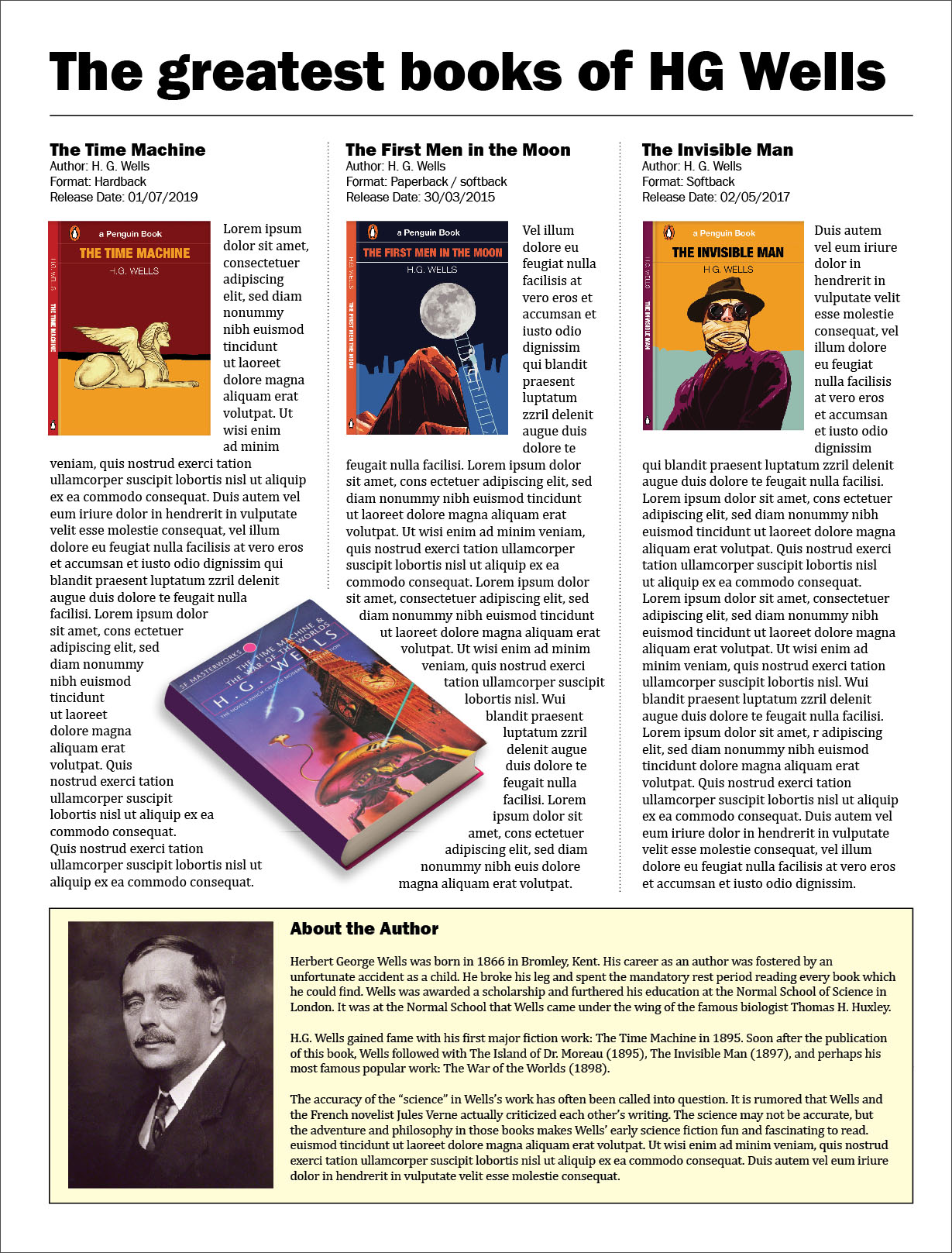
In the next layout, I worked on the errors and aligned all the books on the top of the layout. Book titles above the covers and besides, the text flows around the books on the right side. Thus, I was able to get rid of the negative space. For the heading, I chose a bold sans serif font, but for the body of the text, a serif font. Since I had a lot of space at the bottom of the layout, I occupied it with a short biography of the writer, highlighting it in a pale yellow tone. In this version, the layout is more successful in my opinion, space is relatively competently occupied, and some objects as a model of the book add originality to the layout.
Conclusion
In conclusion, I would like to say that this exercise turned out to be quite extensive, a kind of conclusion and summary of previous tasks. Thanks to this exercise, I learned to analyse different types of typesetting, organising them according to general characteristics, depending on the genre, and the target audience. I also learned to pay attention to details, while giving implications to such a concept as a hierarchy, which teaches us to look from the main messages, such as the headline, to the key ones, the text itself, and to secondary cuts, footnotes, descriptions, clarifications. At the same time, I expanded my font library, despite the fact that many fonts are identical, but it is important to replenish the collection of fonts more often, thanks to them you can create interesting headlines, and a special style in magazine and newspaper typesettings.