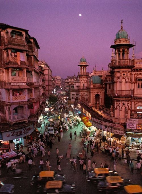
For this exercise you are going to make a montage or collage with a political message. Your subject matter could be a current issue, or something that you feel strongly about such as animal rights, the treatment of elderly people in hospital or images of women in the media. Collect images from newspapers, magazines, your own photographs or images online. Create new meanings out of these extant images by juxtaposing and contrasting them. Be imaginative, playful, provocative or humorous. If you have access to a scanner, then scan in your found images and create collages or photomontages with Photoshop. Try working with layers; exploring a variety of selection tools, such as your magic wand or magnetic lasso; utilising the cutting and pasting options – try and learn the keyboard shortcuts for these; adjusting the contrast, colour and balance of your images; and resizing elements of your photomontages. In your learning log reflect on the original meaning of the images and your subsequent college. Write a short evaluative statement.
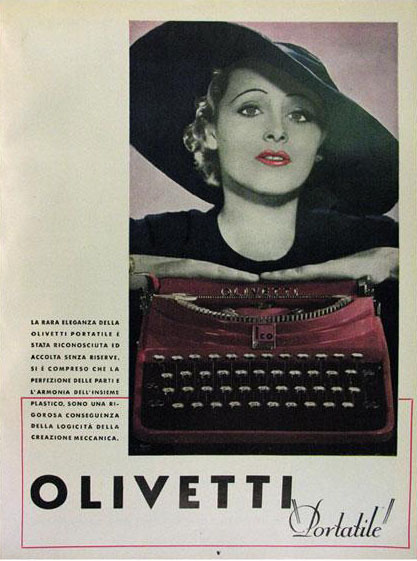
Martha Rosler, House Beautiful: Bringing the War Home,
New Series (2004-2008)
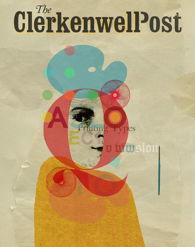
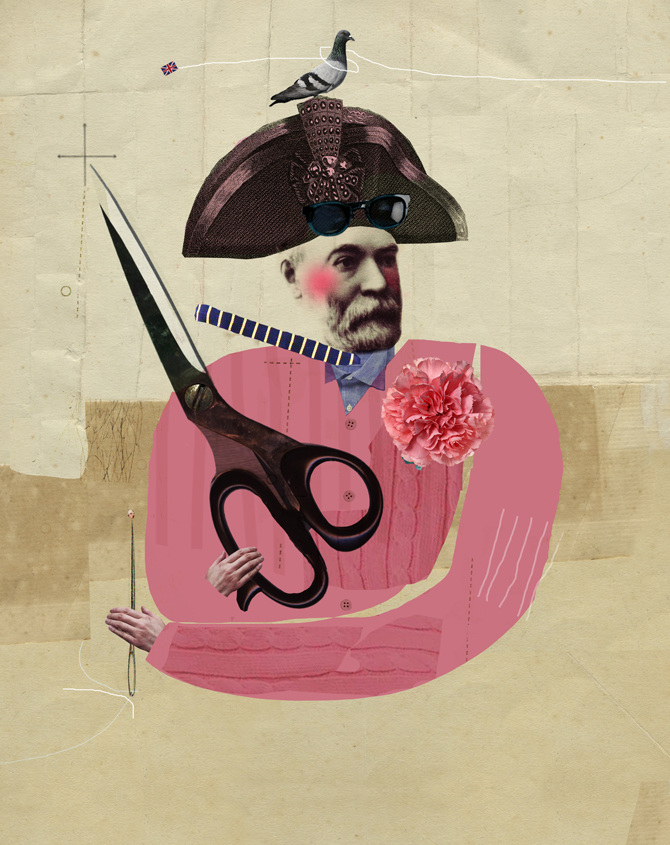
The Poetic Power of Collage
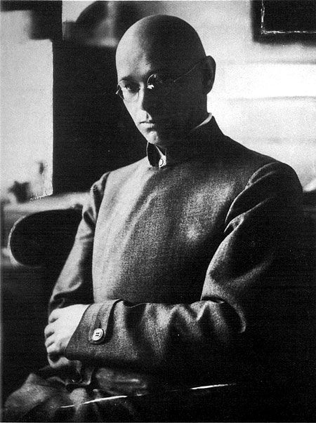
During this exercise, an exciting coincidence awaited me. On one of my walks through the Art Gallery Künstlerräume Grafiken aus der Sammlung in Bielefeld, I came across a book on collages, The age of Collage 2. This edition was the very source on the history of photomontage that I needed for this exercise. First, I got acquainted with the prehistory of collage and juxtaposition. The first thing that was mentioned in this book is that collage is based on Subversion. Photomontage was used by many artists as a rather daring form of protest, expressing their political thoughts. For example, John Hartfield openly ridiculed the Nazi Party and its ideologies in 1930, depicting an X-ray of Hitler’s upper body with a stomach full of gold and a swastika for a heart.
It is true as well of collage works that simply feature fragments from the artist’s everyday surroundings in unexpected arrangements. It was interesting to see how collage gives artists the ability to control the flow of images that we encounter daily while changing, distorting, and even ridiculing their original meaning.
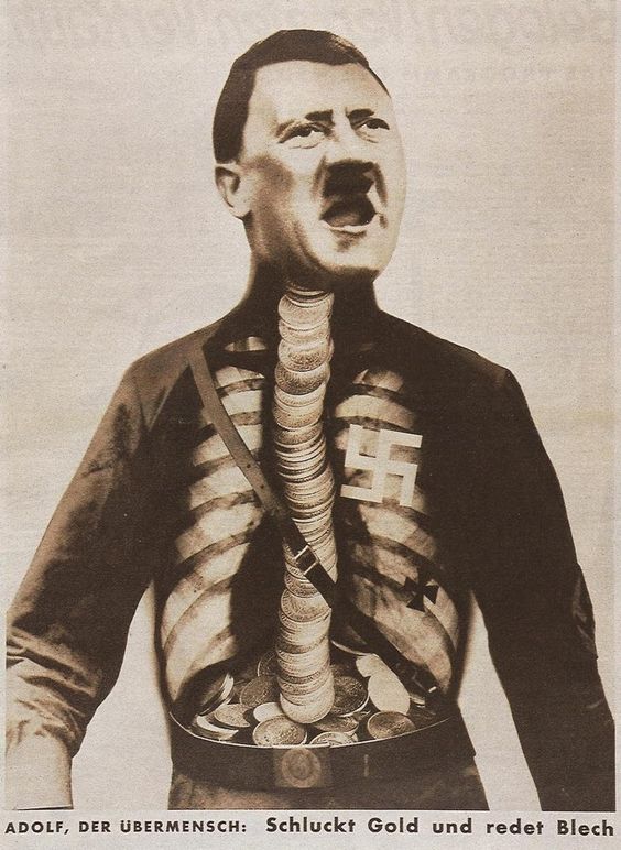
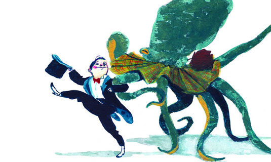
John Heartfield, Adolf, the Superman: Swallows gold and talks tin, 1932
Another example from this book is the Dadaists reaction against the slaughter of the First World War. Their most important contribution to collage was photomontage, whereby printed photographs of their reproductions were sliced and pasted together to create farcical images with scathing political messages. Photomontage has become one of the collage’s most prevalent techniques.
One of the most salient qualities of collage is its distinctive capacity to tread the fine line between the tragic and the humorous like no other medium.

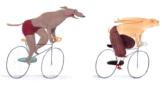
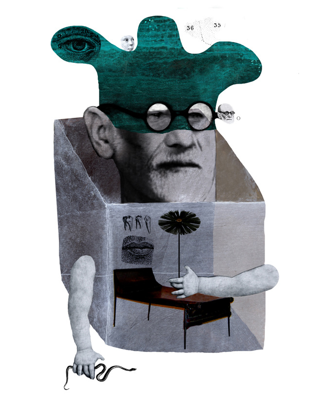
Keiichi Tanaami. Collage Book 7, 06. Japan, 1969
Martha Rosler is a prolific artist whose work spans several decades and various fields including performance art, installations, photography, video, and collage. She had been using the montage form to provide a collision within a frame of things we think about when we unconsciously position women as home appliances and passive objects of desire, and it occurred to make anti-war flyers in the form of montaged tableaux drawn from mass picture magazines.
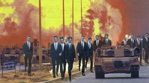
“Invasion” | Martha Rosler, 2013 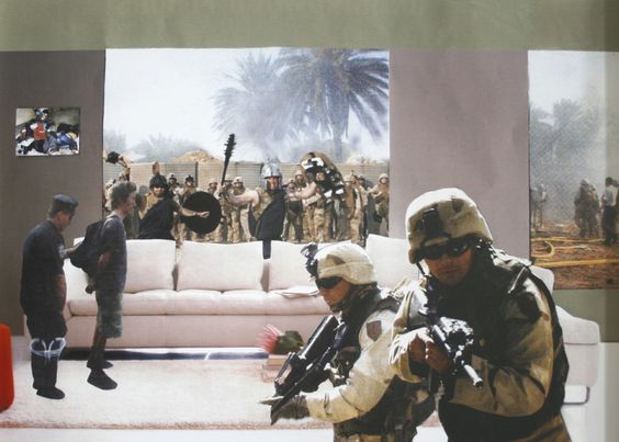
Martha Rosler. “Gladiators from the series Bringing the War Home: House Beautiful”, 2004, Photomontage.
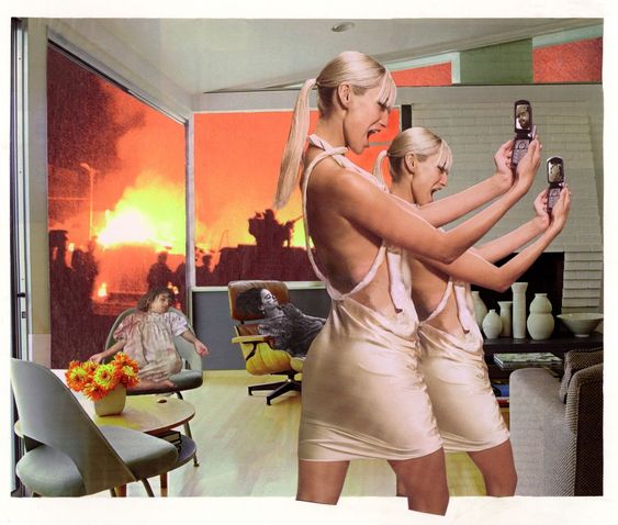
Martha Rosler, Photo Op, 2004.
Memory you work for us but never obey / you mock us when we look at fading photographs / at bereaved women / putting on again colourful dresses
Julia Hartwig, Rebuke.
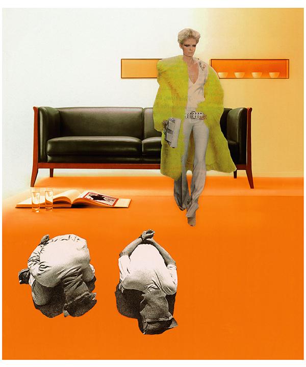
Later I came across for some of the examples of Joe Webb’s collages. They are often simultaneously visually pleasing and politically charged. He sources a lot of imagery from advertising, which is an utterly distorted and unattainable projection of reality designed to leave us feeling inadequate, unattractive, and consuming more. Joe Webb shows the extreme contrasts of the imagery to expose the crazy, messed up way we live, and how we are controlled through methods of dumbing down, distraction, and fear.
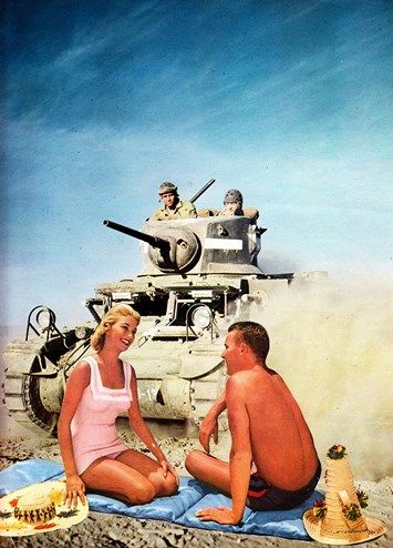
Joe Webb. Life’s A Beach 2014 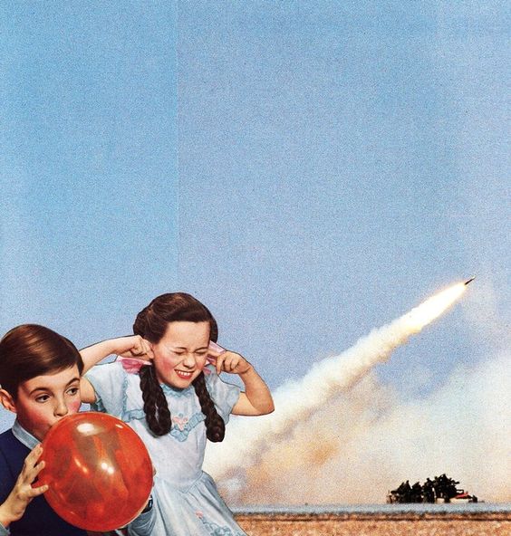
Joe Webb. Bang! 2014
I juxtapose this glossy imagery with real life events: war, extreme weather events, poverty, corruption. In doing so the veneer of these adverts seems to peel away, exposing harshness of reality.
Joe Webb.
Source: The age of Collage 2
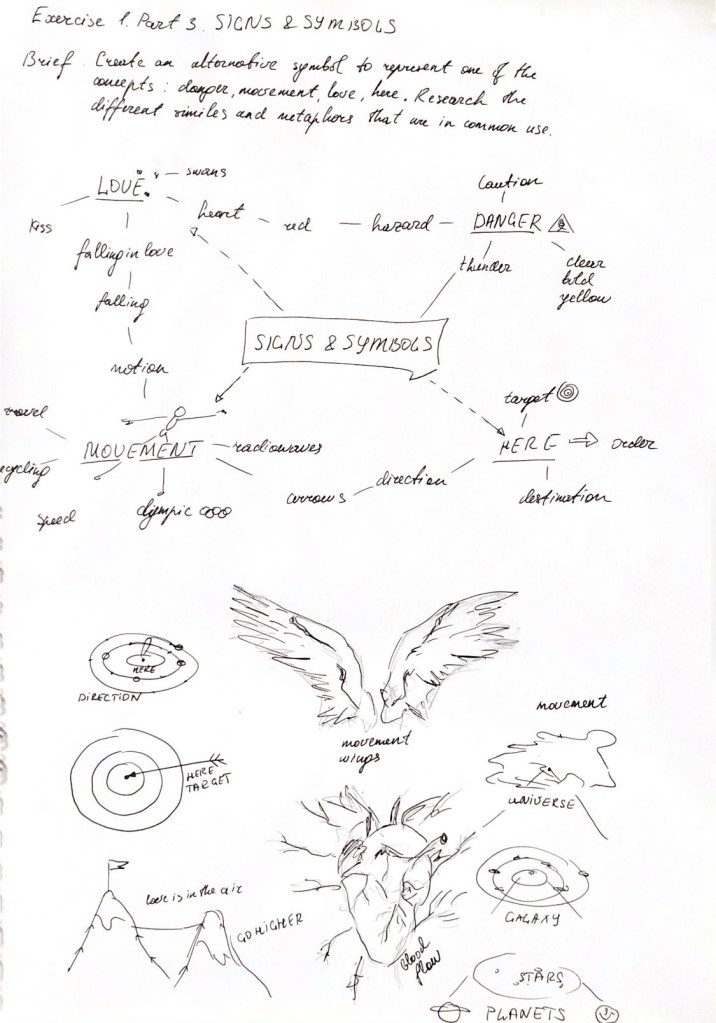
Analysing the brief
After analysing the history of collage development, I got a large portion of inspiration, which I could use in my designs. My thoughts for creating a new collage revolved around critical areas, such as environment, pollution, recycling and fast-developing countries. I wrote them down into my mind up, filling it with some additional points.

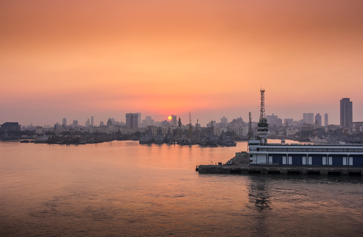
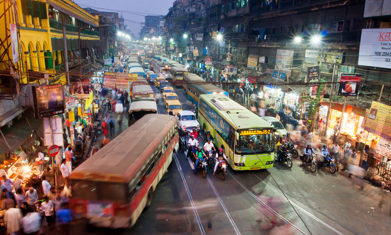
Recently, the issue of environmental protection and the issues of global overpopulation and high consumption are particularly acute in the modern world. Especially acute, along with environmental pollution, is the problem of the Fashion Industry. Fashion Waste, Pollution and the Environment – with each second that passes by, a truck worth of fabric is piled into a landfill burned. The average landfill is .76 cubic metres in diameter. A commercial landfill holds 10-14 cubic yards of dirt. That means, every second you’re reading this article 7.6 to 10 cubic meters of fabric is being dumped/burned, contributing to the 1.2bn in greenhouse gas emissions the fashion industry releases each year during manufacturing.
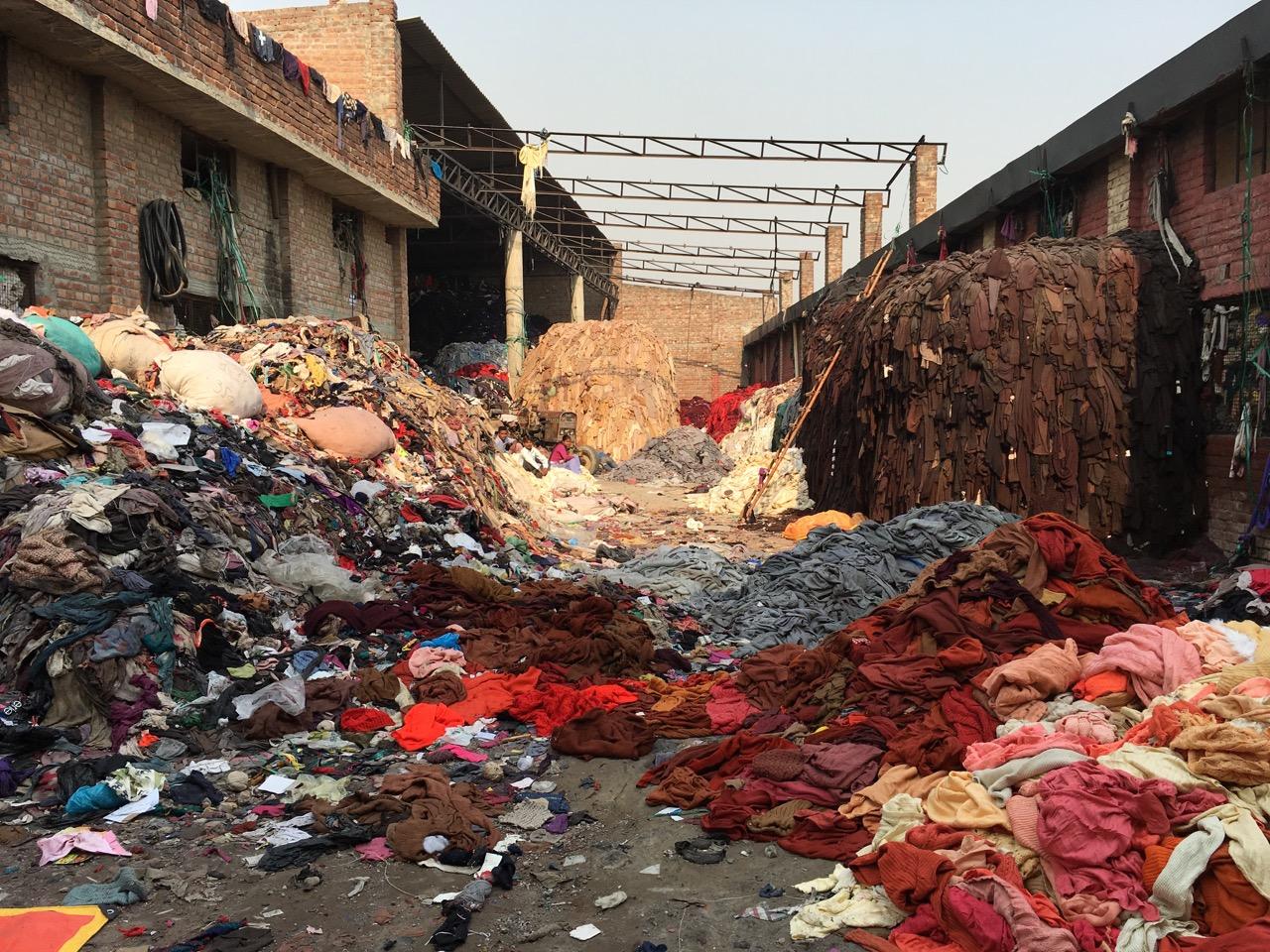
It all sounded quite shocking to me. But the data released about the fashion industry doesn’t get much better upon further reading. Clothing contributes to half a million tonnes of microfibre pollution into the ocean, the equivalent to 50bn plastic bottles.
Fashion isn’t not only impacting the ocean, either. This year, it was reported that Burberry burned £40m worth of merchandise in one of the biggest stories surrounding luxury fashion in 2018. The brand wanted to retain brand exclusivity while keeping stock scarcity high. The problem with this is the negative impact this has had on the brand and environment.
Fast Fashion goes beyond the season. No longer are there January or mid-season sales, but discounts based on influencer, key dates, affiliate marketing and more. You could say the industry has made fashion more agile. But realistically, it’s contributed to creating a monster that needs the latest item of clothing or accessory, and they needed it yesterday.
Source: https://wtvox.com/fashion/fashion-waste/
Source: https://www.fibre2fashion.com/industry-article/8256/fashion-waste-is-rubbish-how-do-we-solve-the-issue
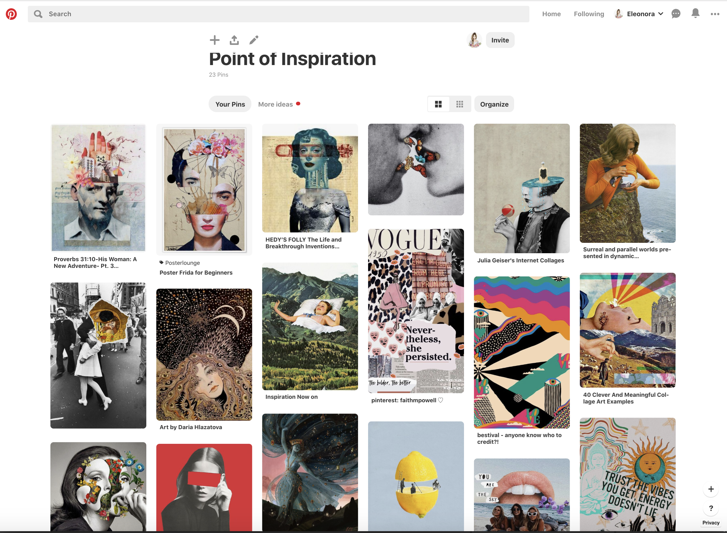
Pinterest Board
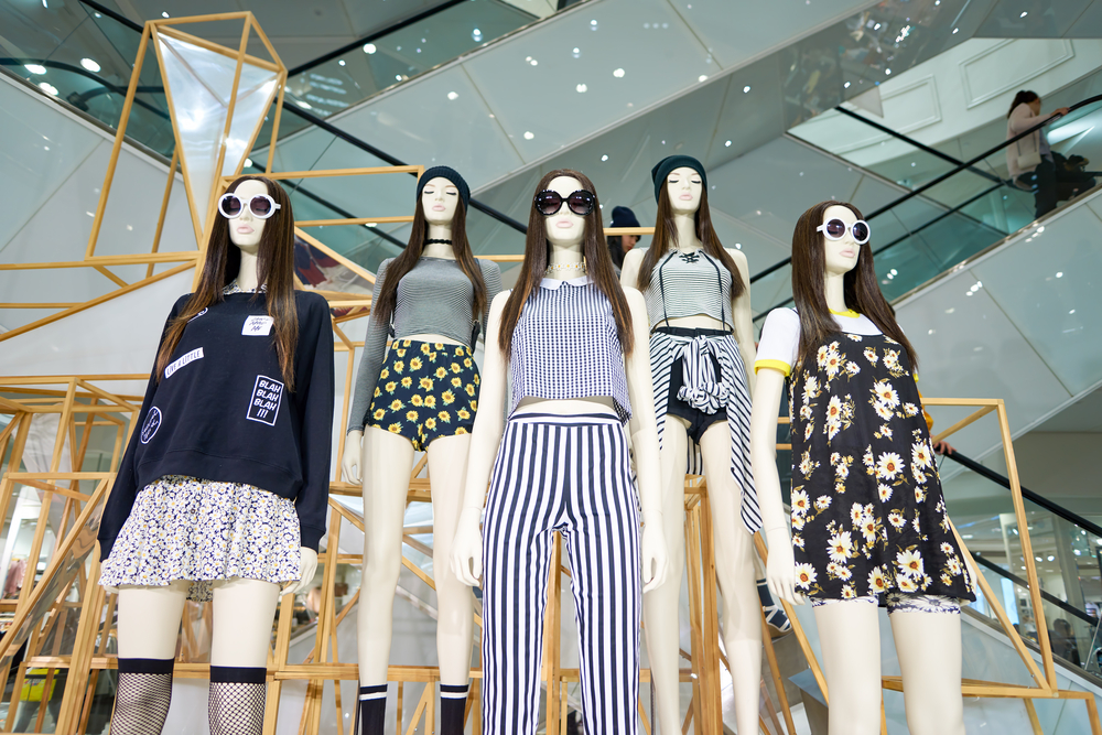
Time to start selecting materials for the design itself. I went through the collections on Pinterest, choosing remarkable images. In my inspiration board, I selected some retro posters from the Bridgman source, on ecology and the environment thematic. I also saved a photo session, which depicts respectable people on the background of rubbish and plastic. But I was also interested in images from the fashion industry. I turned to our home collection of magazines. British Journal of Photography Issue 7881, March 2019 was suitable for my investigation into the environment and its pollution. I was attracted by an image called Dame Vivienne Westwood, London 2012, by Martin Parr. On that photo, she is wearing in a Climate Change shirt. Then I decided to go into the investigation and concluded that it could serve as an interesting object in my collage.
Pinterest Board


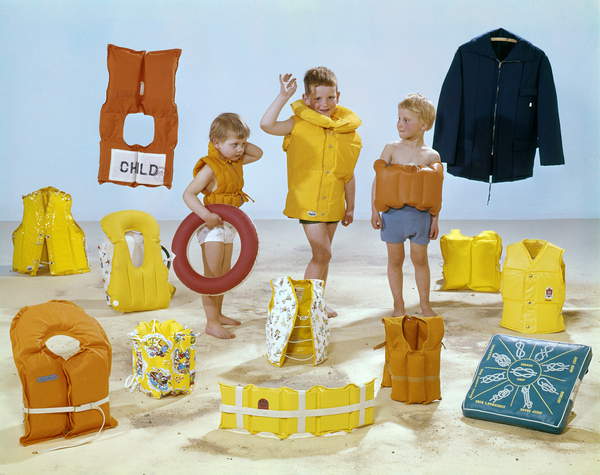
Three children in the midst of all kinds of yellow and orange life jackets, The Netherlands, 1964 (photo) / Bridgeman Images
Sources: Bridgman Images. [Accessed June 2019]
British Journal of Photography Issue 7881, March 2019 [Accessed June 2019]
Westwood, 72, said she did not want to defend the fashion industry, although she regards “true fashion” as an important part of culture.
“Do I feel guilty about all the consumption that the fashion world promotes? Well, I can answer that by saying that I am now trying to make my own business more efficient and self-sustaining. This also means trying to make everybody who works in it happy, if I can.”
Vivienne Westwood
Source: https://www.theguardian.com/lifeandstyle/2014/feb/08/vivienne-westwood-arctic-campaign
Designs
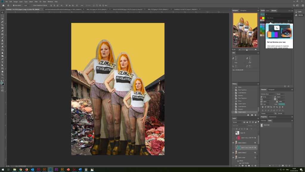
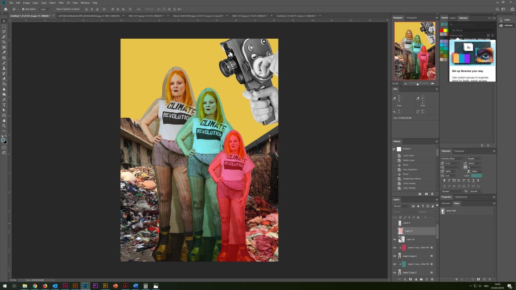
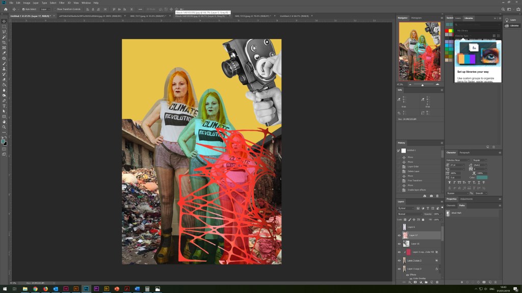
I scanned the photos, and then I started the collage in Adobe Photoshop. For the background, I used pale yellow hues as a symbol of a polluted atmosphere, as well as landfill of used clothes. In the right corner, I placed an image of an old camera with exhaust smoke. I tried to duplicate the image of Vivienne using some textures, with the effect of tied rope, which could identify the environmental problem and the way out of it. As the activist makes efforts to protect the nature, it is also obvious that we are all to some extent responsible for our environment, and it is important to remember that the rational use of clothing and natural fabrics is an important step in protecting the environment.

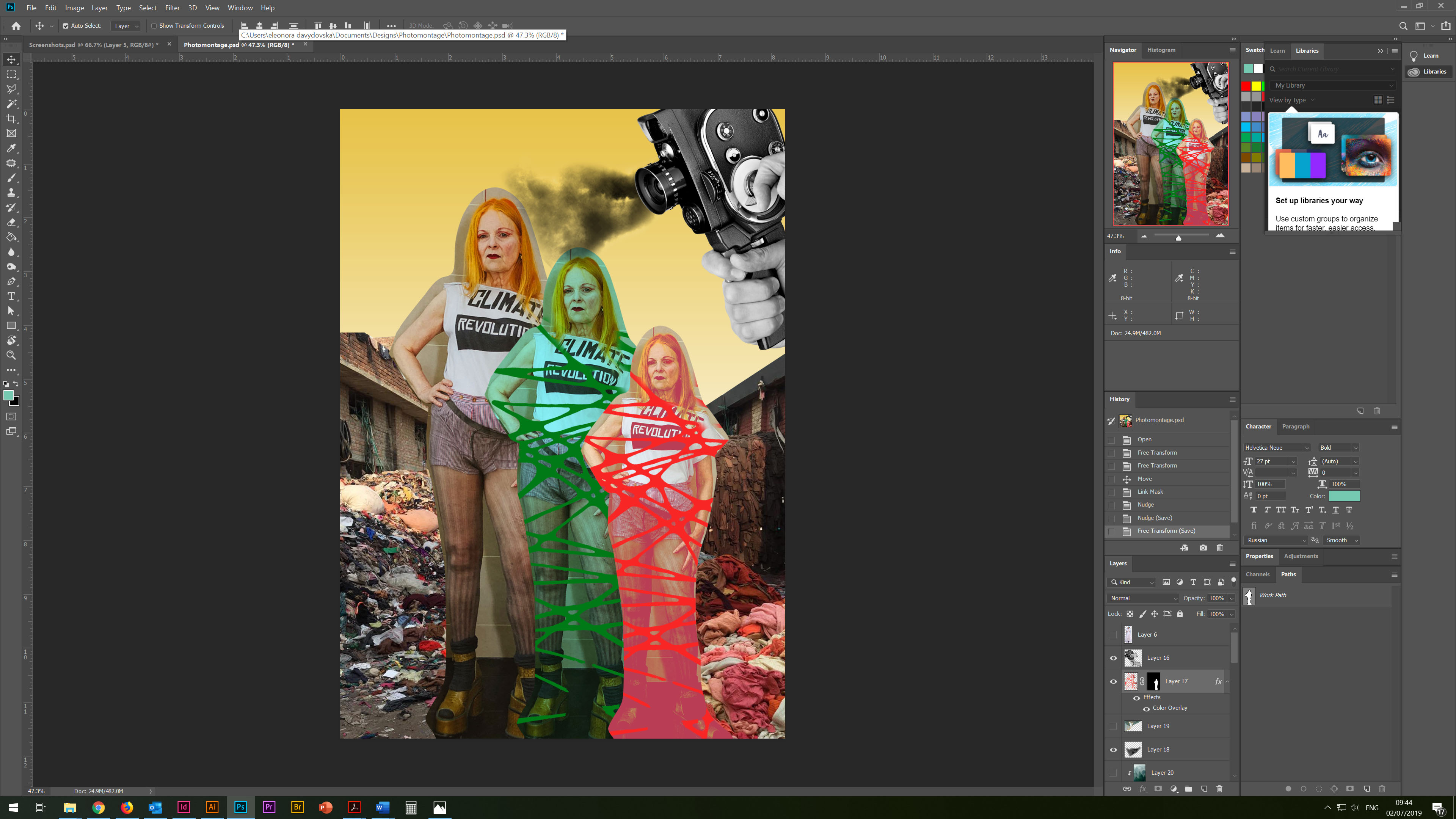
Buy less. Choose well. Make it last. Quality, not quantity. Everybody’s buying far too many clothes. I know I’m lucky, I can just take things and borrow them, I’m o, but I hate having too many clothes. I think that poor people should be even more careful.
Vivienne Westwood

On the next stage, I wanted to continue the experiment with collage and juxtaposing in design. This time I had the idea to create a collage with the selection of photos and their combination. So I had at my disposal a photo of a boy Rodello Coronel, Jr., the second of nine children in his family, spends the morning picking through the trash onshore in Manila looking for recyclable plastic.

A Boy and His Goggles. BY KURT MUTCHLER. National Geographic
Source: https://www.nationalgeographic.com/photography/proof/2013/11/04/a-boy-and-his-goggles/
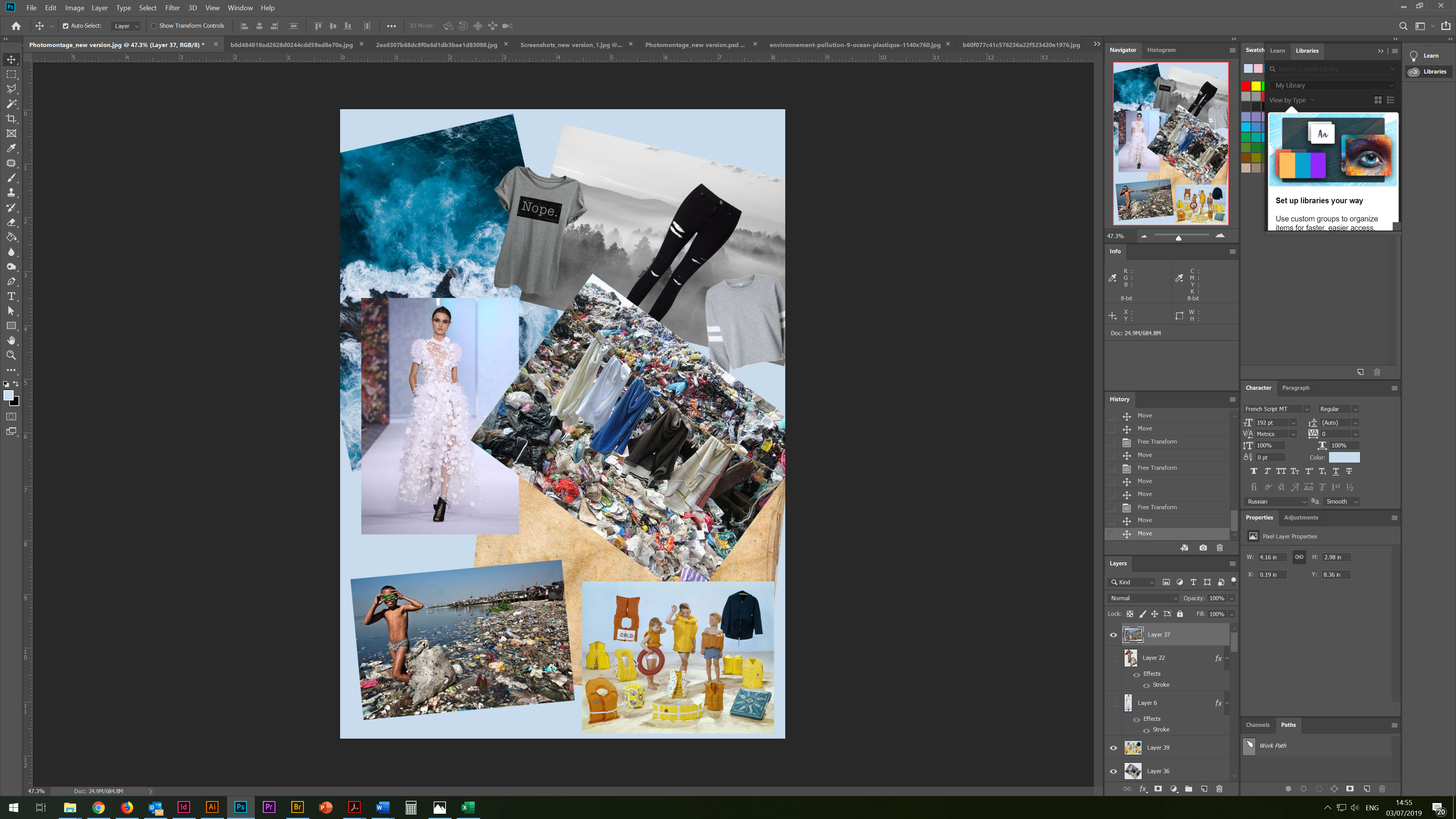

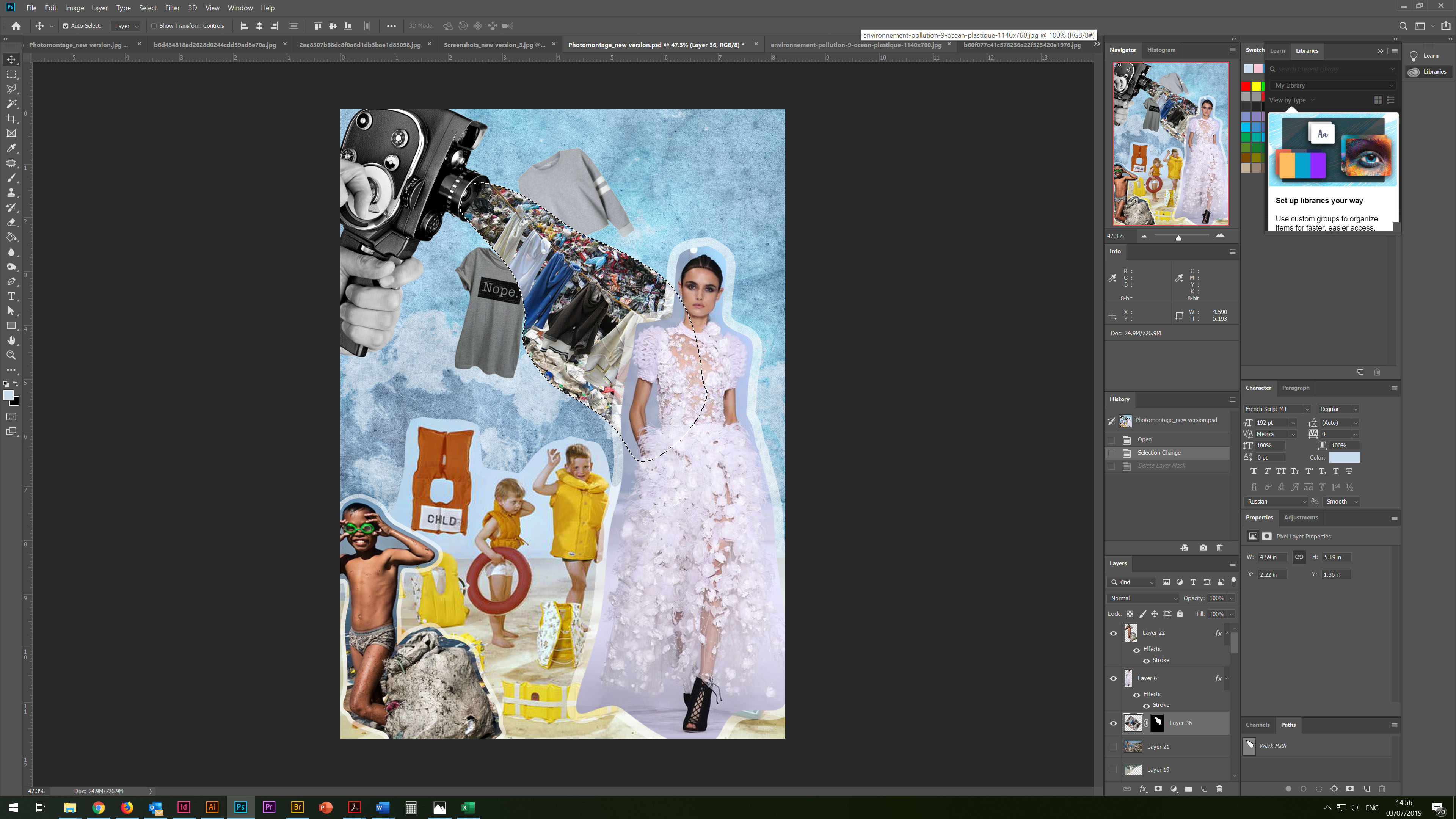
For contrast, I used the image of children on a clean beach, most likely in Europe, as a symbol of the fact that most of the pollution comes from developing countries. Also, I used the image of the glamorous model and small photos of stock clothes around. In the corner, I also placed an image of an old camera with piles of worn clothes streaming. Thus, in this collage, I touched on several topics, the problem of plasticity, pollution of water bodies, an overabundance of clothes, and the effect on the subconscious of the fashion industry intersect here.
For the background image, I used the overlay of several photos: light blue with an old canvas, as well as transparent photos of nature, which added depth to the background image.
In this collage, I liked the experiment with the contrast of colours in which blue and yellow dominate.

Conclusion
In conclusion, I would like to say that this exercise was very interesting and thought-provoking. I was introduced to the new unreal world of juxtaposing and collages, where different images can create a new meaning. However, I realised that I have to follow the prevailing rules about copyrights and licensing. I was enabled to work more with layers and transparency properties which have helped me to develop my understanding in manipulating found images. I have really enjoyed this exercise and feel that it has provided me with the opportunities to explore ideas for future exercises and assignments.