Exercise: Point of Sale Display

For this exercise, I have a task to produce a point of sale display to go above the fruit and vegetable shop for a local greengrocer. They want the display to be seen from the street through the shop window to attract passing shoppers in order to boost their trade. The shop is in a small precinct which also houses a bakery, a newsagent, an independent shoe shop and is on the route to and from a well-respected primary school.

Brief

What: Create illustrations or use a combination to develop two images – one of fruit and one of vegetables. 2 x A1 landscape a point of sale display to go above the fruit and vegetables shop well seen from the street.

Target Audience: Consumers and shoppers from the area nearby, parents, teachers and children from a well-respected primary school.

Where: Local green grocers’ shop is in a small precinct where also locates baker, a newsagent and an independent shoe shop.

How will the client judge a successful outcome to the brief? 

Bright display to be seen from the street through the shop window to attract passing shoppers in order to boost their trade.

Keywords:

  • Green
  • Local shop
  • Fresh
  • Clear and dynamic
  • Well-seen from a distance

Steps of design

  • Generic researches
  • My previous experience explanation
  • Identify the most appropriate software to complete the job
  • Identify wording I might want to use
  • Make notes into a learning log
  • Illustrating food through the software or use my own painting by gauche or watercolour

Generic Researchers

I had some general understanding of point-of-sail-display meaning, but for an additional checkup, I went to Wikipedia.

point-of-sale display (POS display) is a specialized form of sales promotion that is found near, on, or next to a checkout counter (the “point of sale“). They are intended to draw the customers’ attention to products, which may be new products, or on special offer, and are also used to promote special events, e.g. seasonal or holiday-time sales. POS displays can include free standing display units (FSDU)shelf edgingdummy packs, strut cards, standees, hanging signs, counter display units (CDU), display packs, endcapsdisplay standsmobilesposters, and banners.[1] POS can also refer to systems used to record transactions between the customer and the commerce.[2]
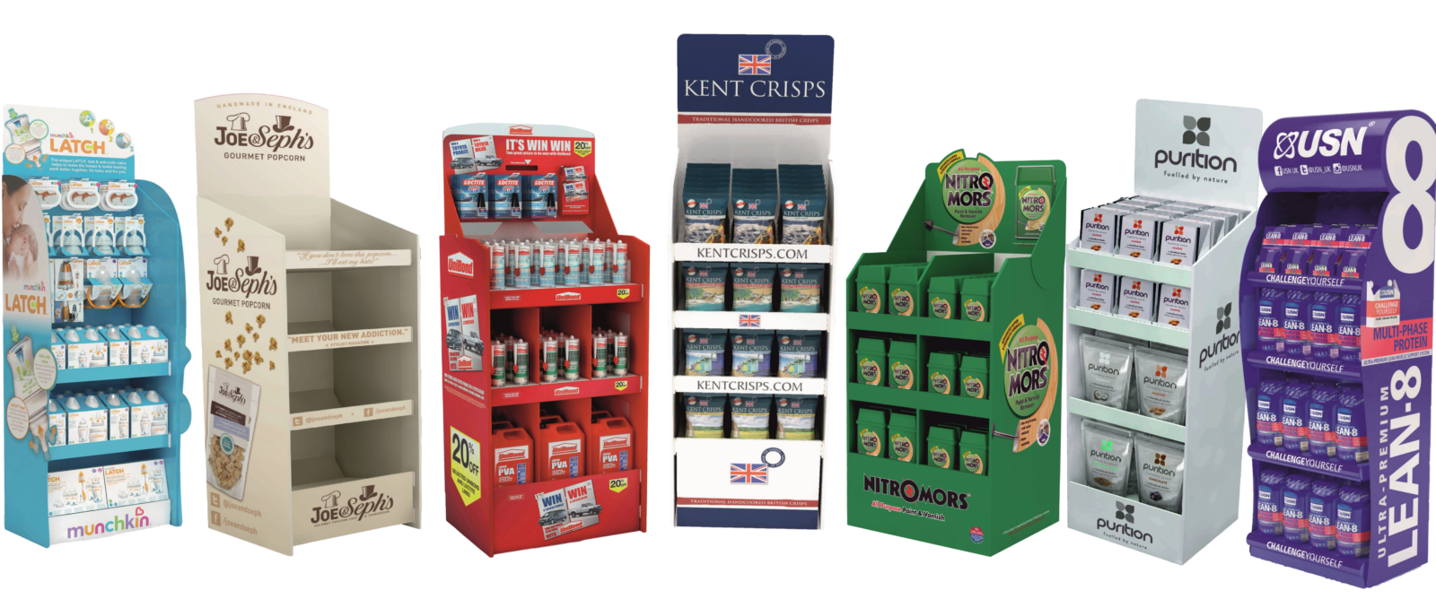
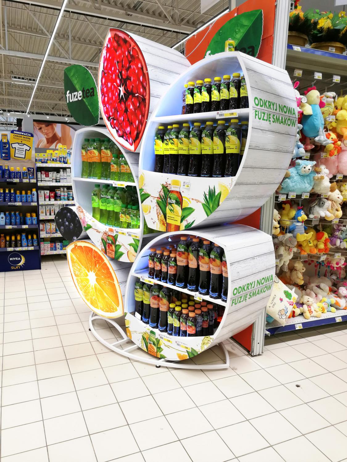
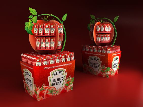
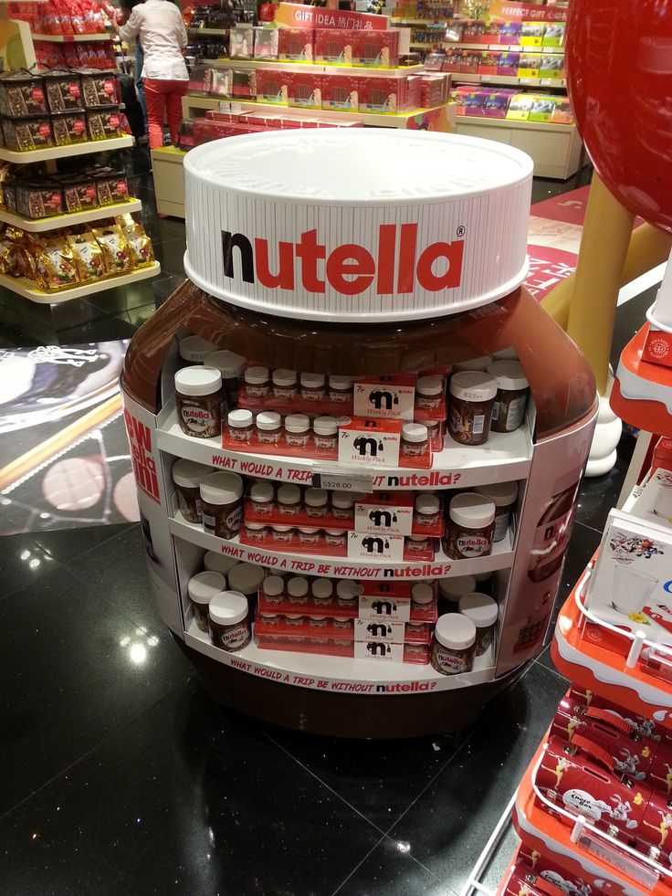
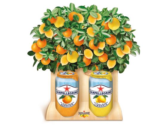
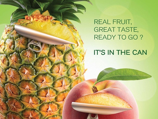
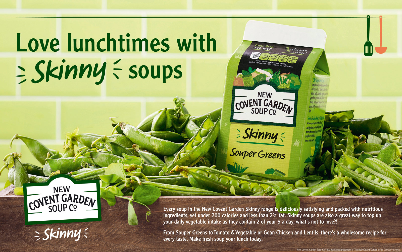
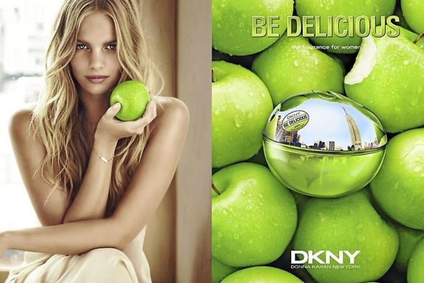
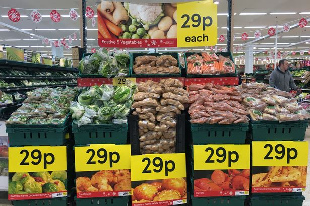
After that, I could confirm for myself that I’m thinking in the right direction. But I still needed some ideas, and sources of inspiration. I made some generic researches, some designs that caught my eye.

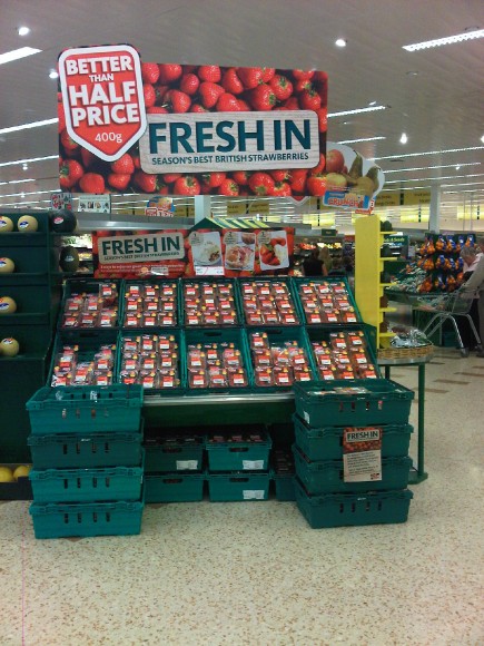
At the same time, I had a look for some posters and sales-of-point display that were oriented on mass-market for such shops as Aldi, Morrison’s and Tesco. From another point of view, as the grocery shop is located near schools and bakery shop, I’ve made an assumption that design should be clear for understanding, with simple but inspiring to purchase message, such as: “Go fresh”, “Fresh In. Season’s best British vegetables/fruits” etc.

My previous experience explanations

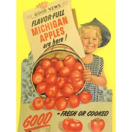
As I had an experience in point-of-sale display, I was thinking about ideas about how I would design my layouts for this customer. One of my costumes was a cafe near the business offices, so the design had to be modern and eye-catching for people who come to the cafe for business meetings for lunches. I designed two light boxes, one for the fresh juices with a big image of fruits on the white background with some text and prices next to it. Another display was under the cooking kitchen, with images of fresh made main meals, starters and salads. Examples are presented below:

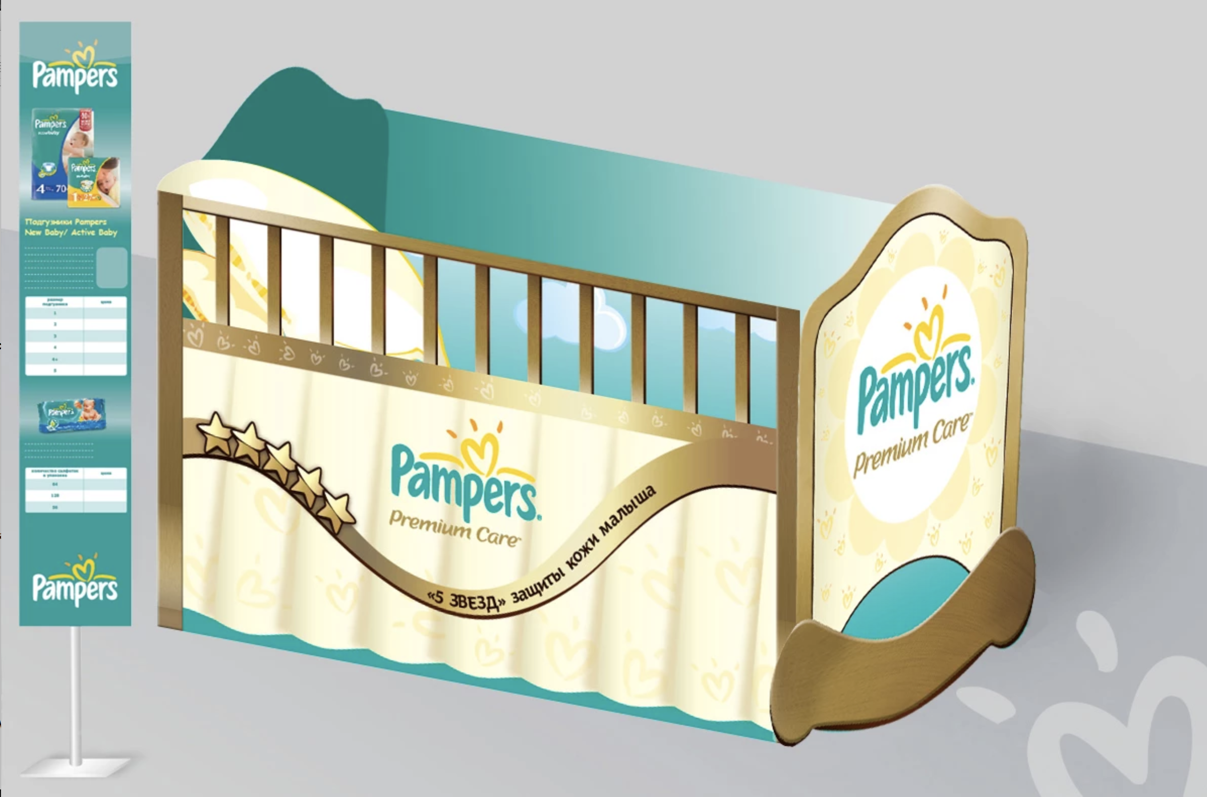
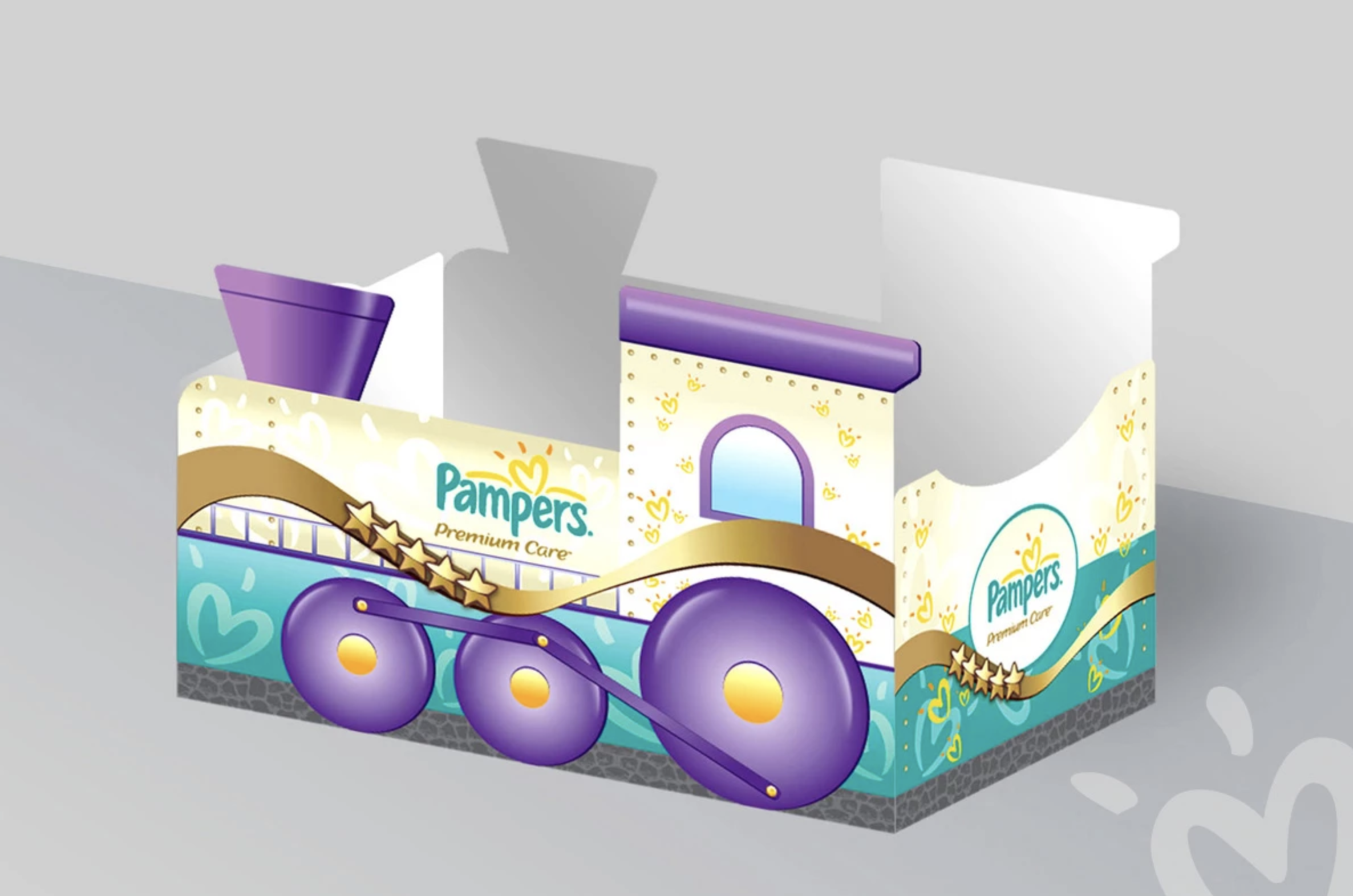
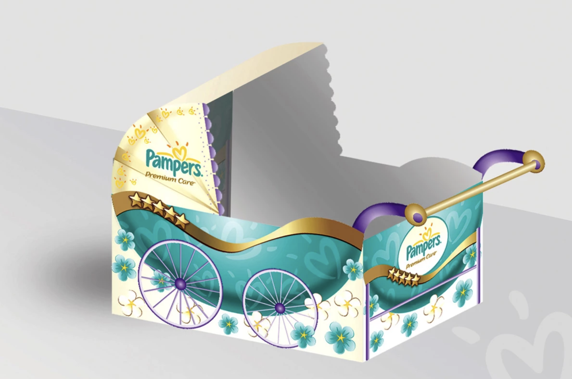
For another customer, I designed point-of-sale-display for Pampers products of Procter & Gamble. The idea was to create recognisable construction to store products inside in the shop such as a cot, steam train, baby carriage.

Based on my previous experience I could try to visualise the image of macro fruit or vegetable, also I was thinking about designing a tree full of fresh oranges, as an idea that the fruits you see just were picked up from the tree and were brought to the store counter.

Producing design

For the software, I decided to use Adobe Photoshop and Adobe Illustrator, to keep a combination of vector and raster images.

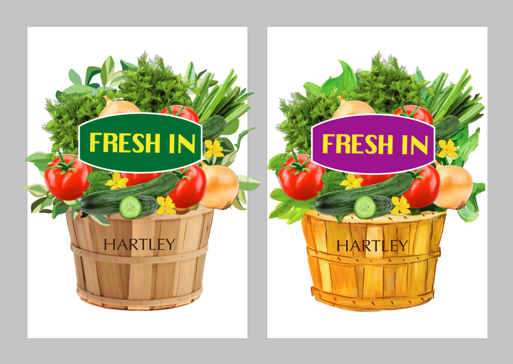
After some brainstorming, I felt like I was ready to make some sketches and drafts. I really liked the idea of shaped point-of-sale-display, I had two options to visualise my design: a basket full of fruits and vegetables, and another idea – a fertile tree. I’ve made a decision to visualise the basket, as it would be a more appropriate design for all types of fruits and vegetables. Firstly I collected some images of fruits from the internet, as I couldn’t find such a big variety of bright and juicy fruits at my house. Also, I found a picture of a wooden basket from in-net, I painted some simple leaves in Adobe Illustrator, as they would go to the background anyway. I’ve decided to put a label with the slogan “Fresh In” in the bright background to go in front of all composition. Below are presented some of my drafts.
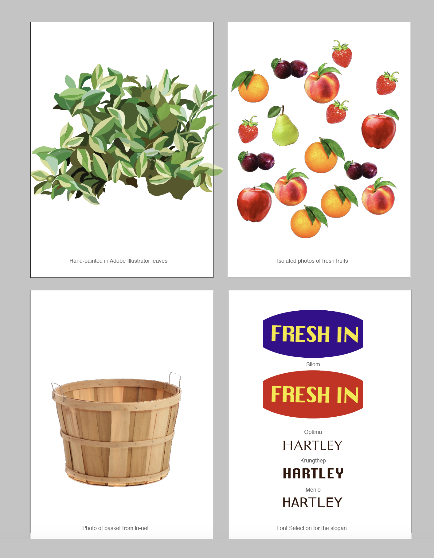

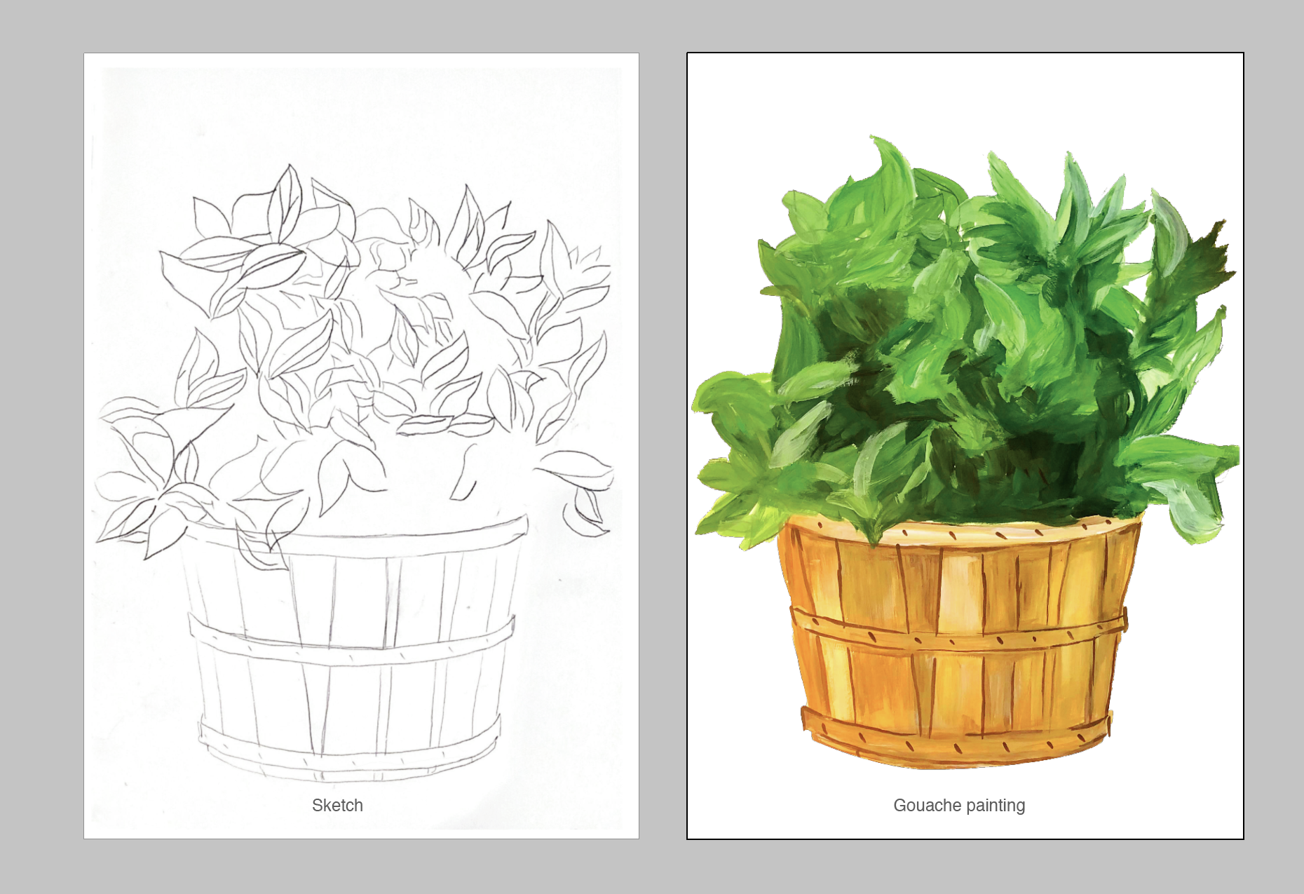
But I still wanted to create something hand-made, so I went for some gouache painting, that I could edit and modify in my Illustrator software afterwards.
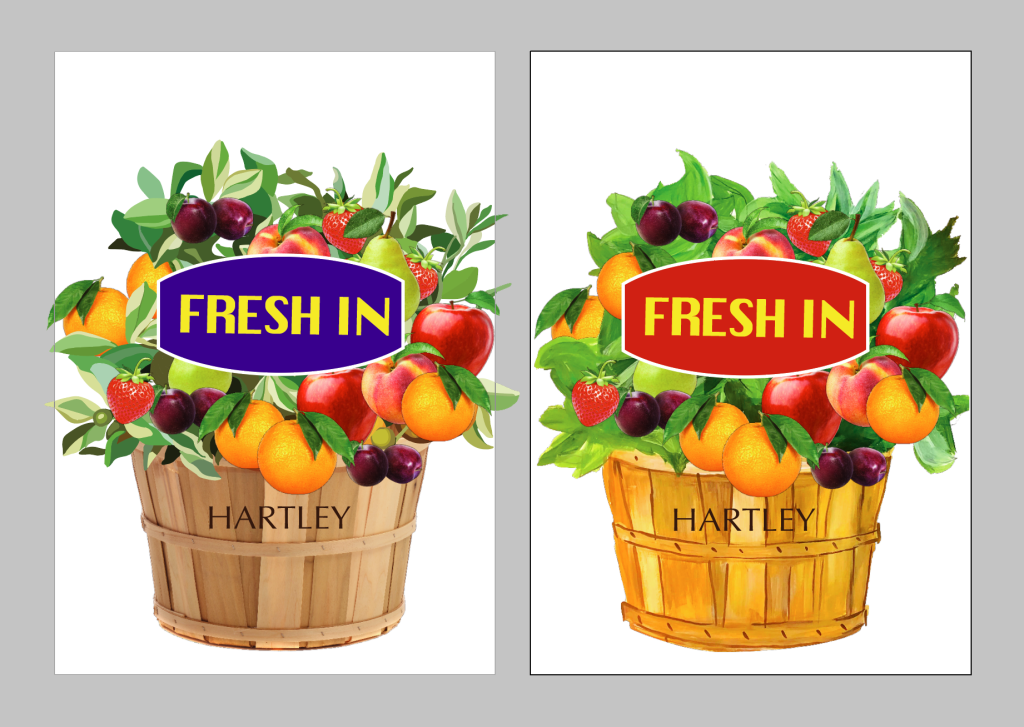
Here is the design I got in the result for the fresh fruits, from the left side example with a photograph of basket plus hand-painted leaves and photos of fruits, from the right side – painting with the same components.
I went for the same principle for the vegetable poster. Below are examples with updated images of vegetables and label colour.

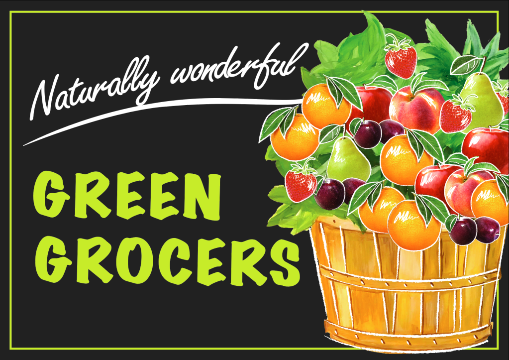
I was pretty satisfied with the hand-painted basket I got as a part of the point-of-sale-display visual, but I still had some concerns about how to finalise it. First one, would it be an appropriate shape for the point-of-sale-display? The second one, I still had to adapt the design to the landscape format.

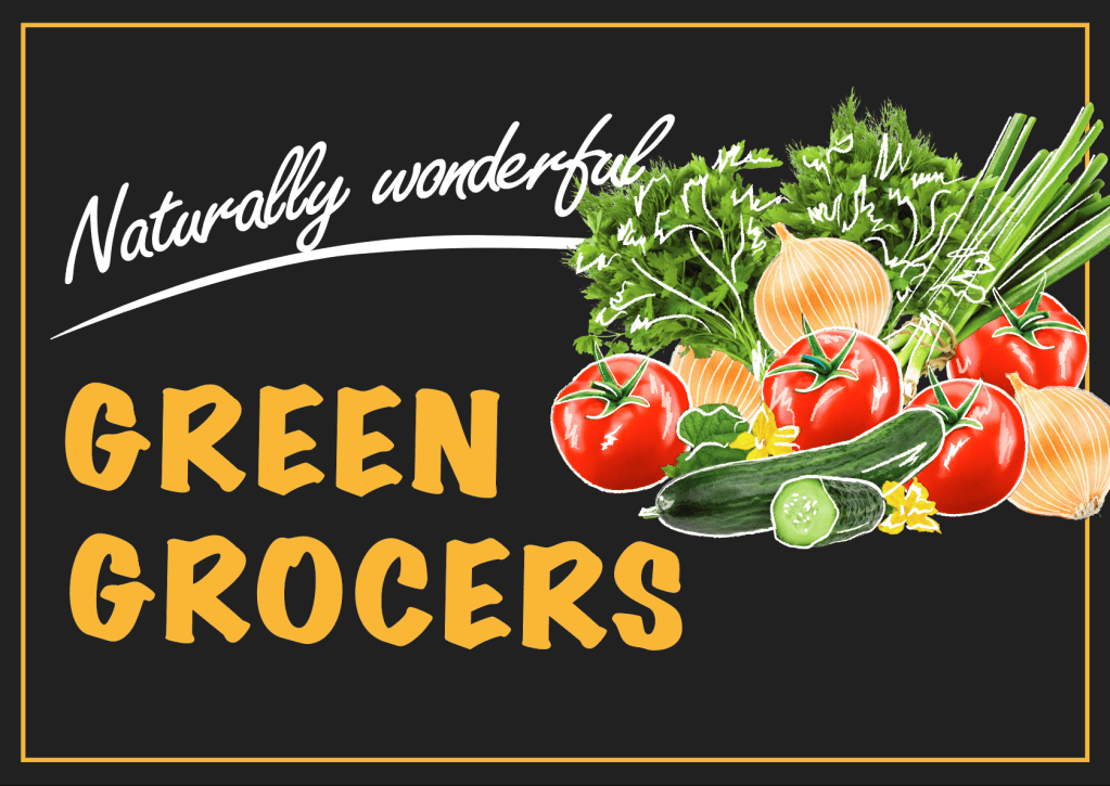
After a couple of trials with different backgrounds: like blurred natural background and basket on the wooden table, I chose to place my basket on the graphite background, as that option made the kind of the contrast I wanted to achieve. But as the label was too heavy on it, and I had a lot of free space from both sides, I changed the slogan to the Green Grocers and choose a Marker Felt (Wide) font for it, as to me that font goes better with basket paint. At the same time, I placed inspiring wording Naturally Wonderful in Freestyle Script font. Also, I made some sketches of white brushes on the top of gouache painting and fruits.
For the vegetable signage, I went for a similar principle but excluded the basket. Instead, I place a pile of fresh products on the same background, on the top of them I’ve painted white brush sketches.
Overall, I would say that I enjoyed this task. I think, in the result, this point of sail display would reach a target audience, as it’s bright, but at the same time discreet design. Basically, I would not include anything more, as that is the kind of message that has to be read for the few seconds, the main message was sent through the visuals of fruits and vegetables.
Exercise: Too much or not enough information

This time I have a task to design 2 posters. The first poster should be full of details and descriptions about the event, when and where it’s taking place, what’s going on, how long it lasts, how much it costs and what to expect, basically including all the details that audience might need. For the second poster, I have to apply Occam’s Razor principle to pare back the information to a bare minimum.

Occam’s razor (or Ockham’s razor) is a principle from philosophy. Suppose there exist two explanations for an occurrence. In this case the one that requires the least speculation is usually better. Another way of saying it is that the more assumptions you have to make, the more unlikely an explanation.

I’ve decided to create two posters for the Bryan Adams Concert, rock band, which is touring around Europe at the moment. As my husband and myself are big fans of his music, I keep following his page of concert photographs. Also, I’ve seen interesting posters for his concerts and song albums loads of times, I thought that is the kind of direction I would like to work with, to give them my vision of design.

Mood Boards

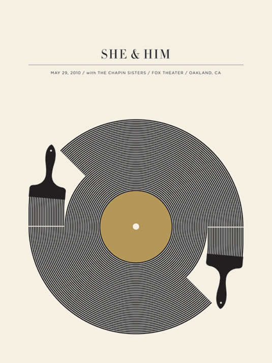
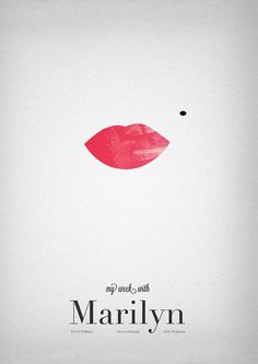
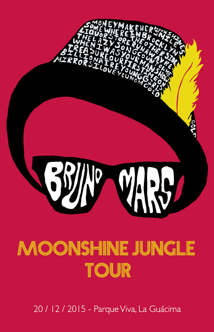
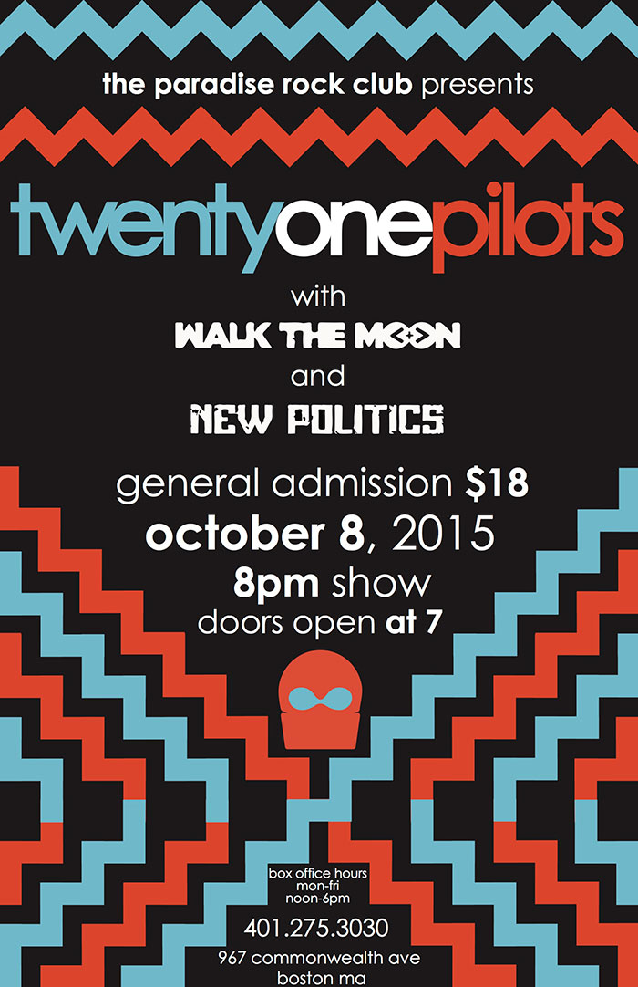
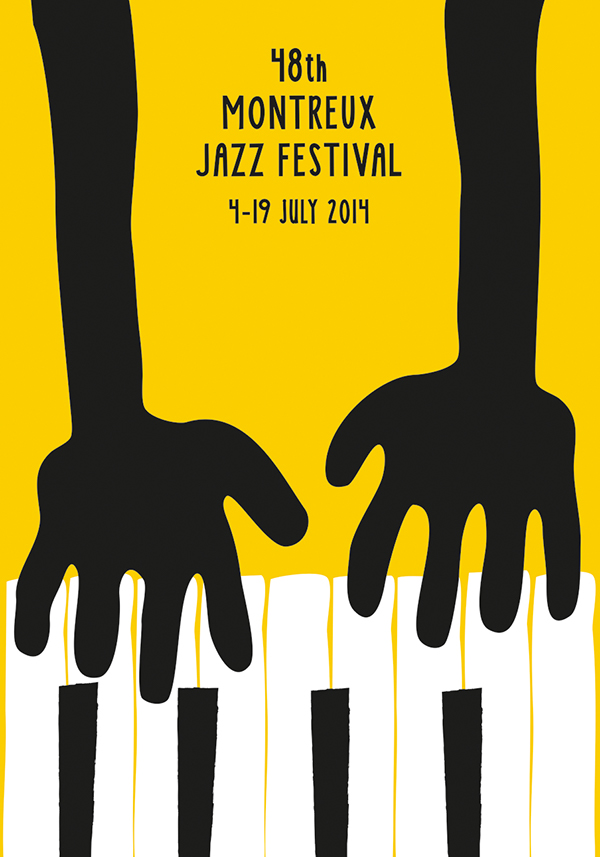
Firstly, I found some designs for inspirations. I had some researches for creative ideas, I had a look through designs that could meet two requirements: minimalistic posters according to the Occam’s Razor principle, and busy designs with lots of information. There are some designs that I could start from.

Explanations of my choice

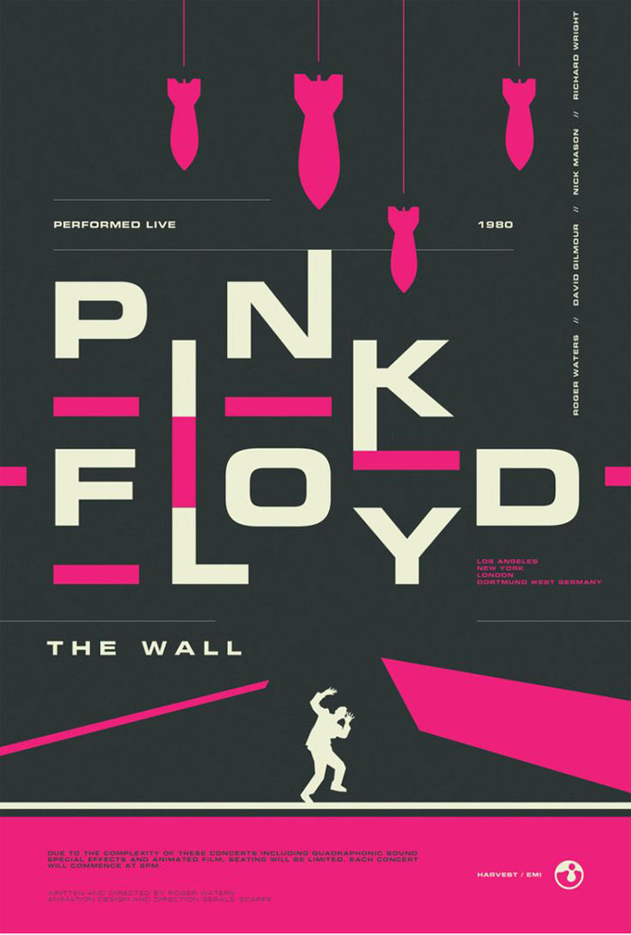
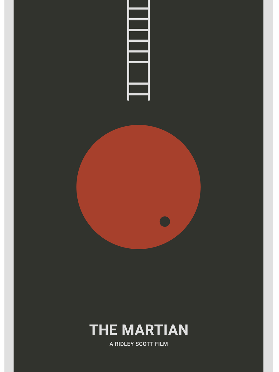
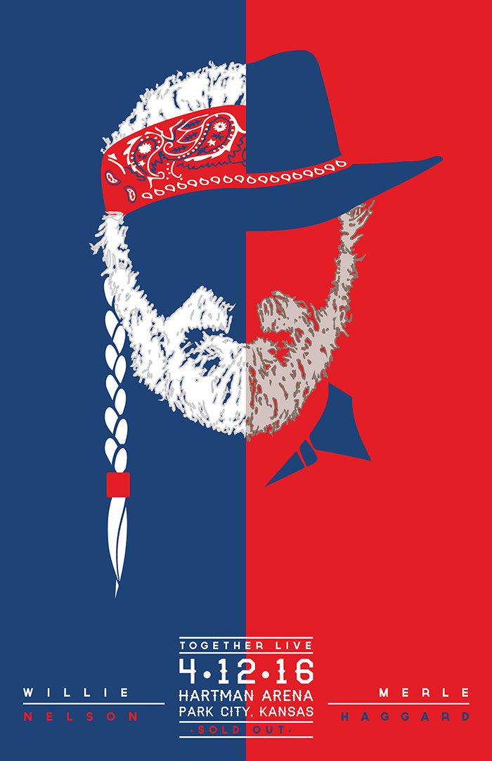
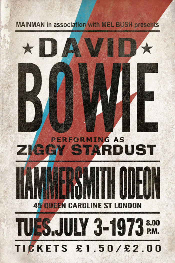
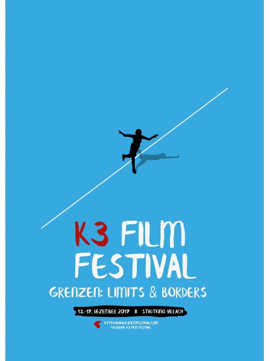
Pink Floyd is the kind of design I would call simple, but heavy, as it has the kind of hard contrast between the colours: dark grey, pink and white. Johnny Cash poster is an ideal example of overloaded design, where all information as possible was fitted in, but, at the same time, the name of the artist is still coming in front, also I like an idea of A letter missing, instead of that was used an image of the artist itself. Same as David Bowie poster, I don’t prefer too many typefaces on the poster, but that is the case where it works very well, as each line is the kind of independent message to the reader, but the name of the artist is still on the first place. Some minimalistic posters as The Martian, Marilyn, K3 Film Festival are examples how positively space could work, as I’m as a reader could have my impression from the message in a couple of seconds, I would call them simple and clever.

Source: https://www.designyourway.net/blog/inspiration/concert-posters-design-ideas/

Bryan Adams Posters

Then I went for some researches that to get a general idea what style of Posters Bryan Adams marketing team using for concert announcement. I’ve noticed that on his posters there is a domination of black and white photographs, orange, and red colour. I think that is the kind of style that singer using that to promote his brand. After that, I have found out that Dirk Rudolph is an artist from Germany who has been creating Bryan Adams promotional materials for the past few years  https://www.dirkrudolph.de/

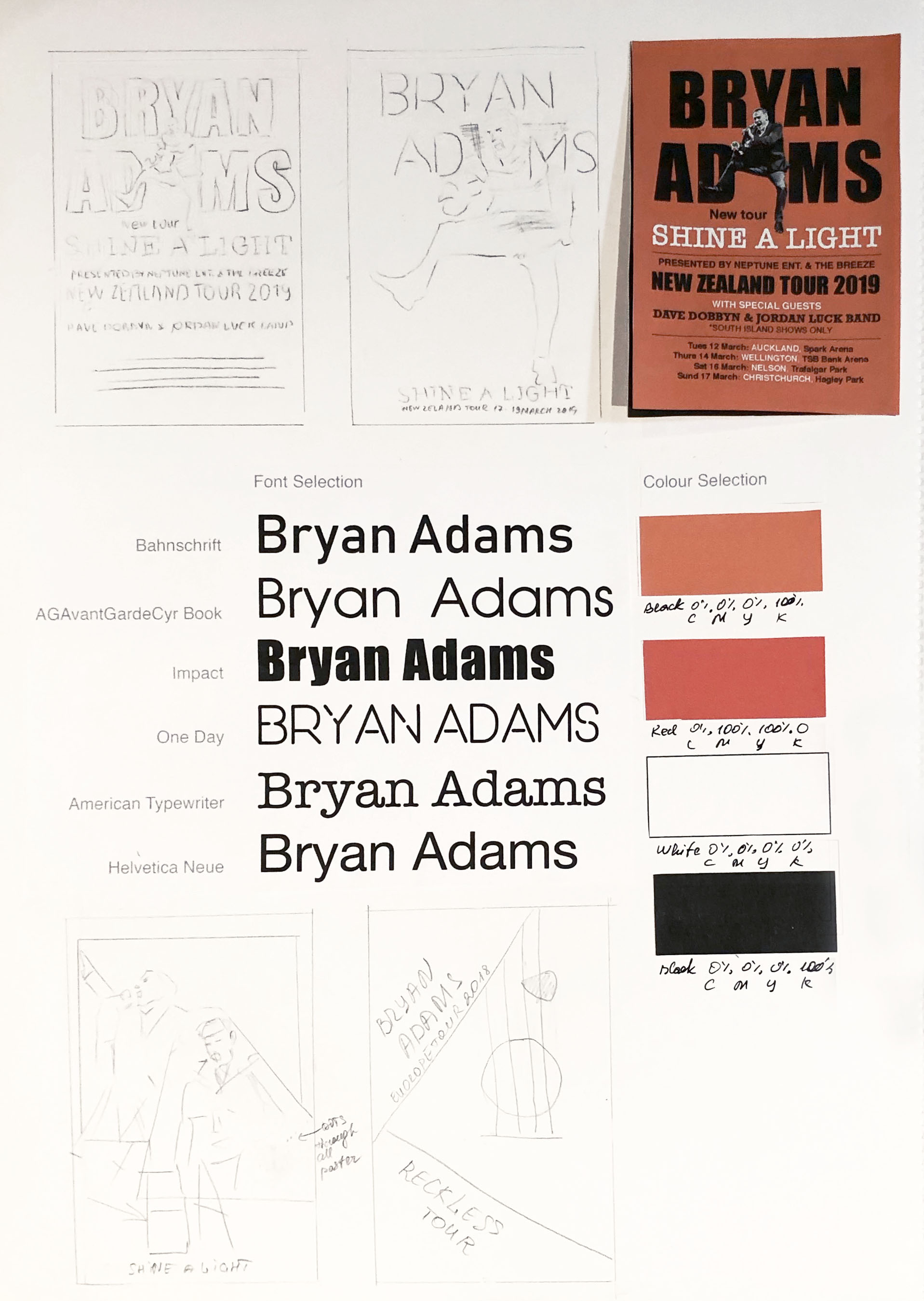
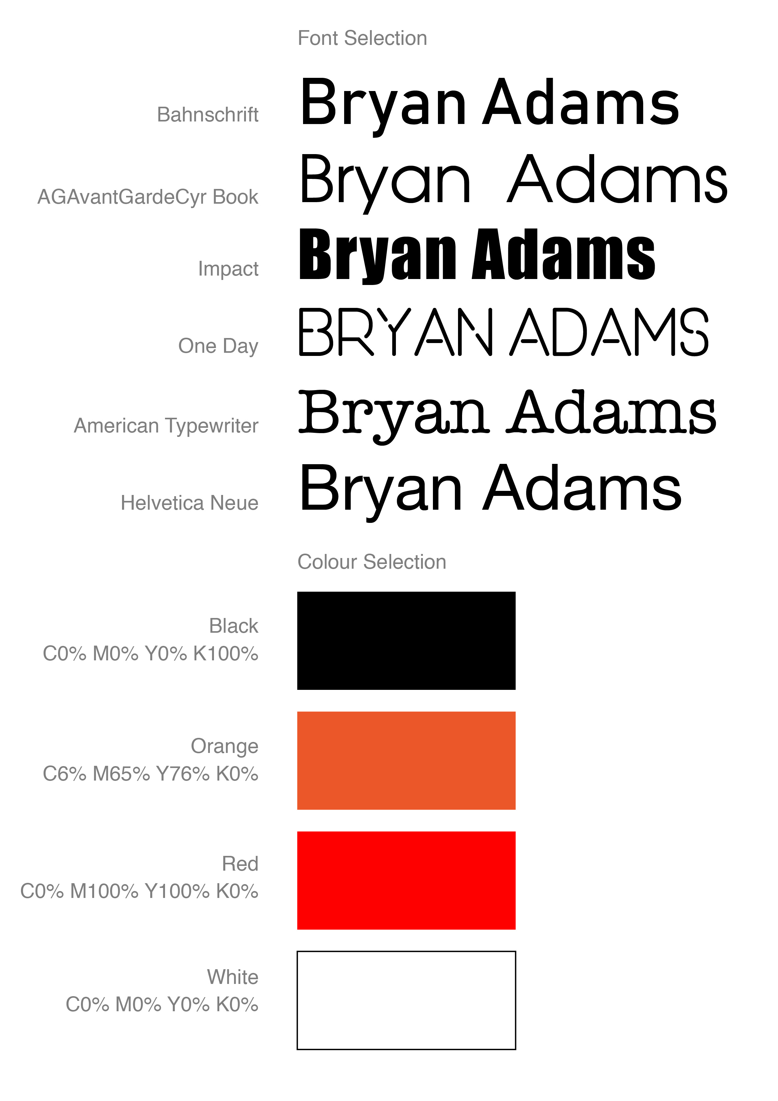
I started with some sketches of the poster. I liked the idea of missing ‘A’ title at the Johnny Cash poster, and different fonts combinations, so I thought I could work out with Bryans Poster in a similar way. I made some table with fonts and colours.

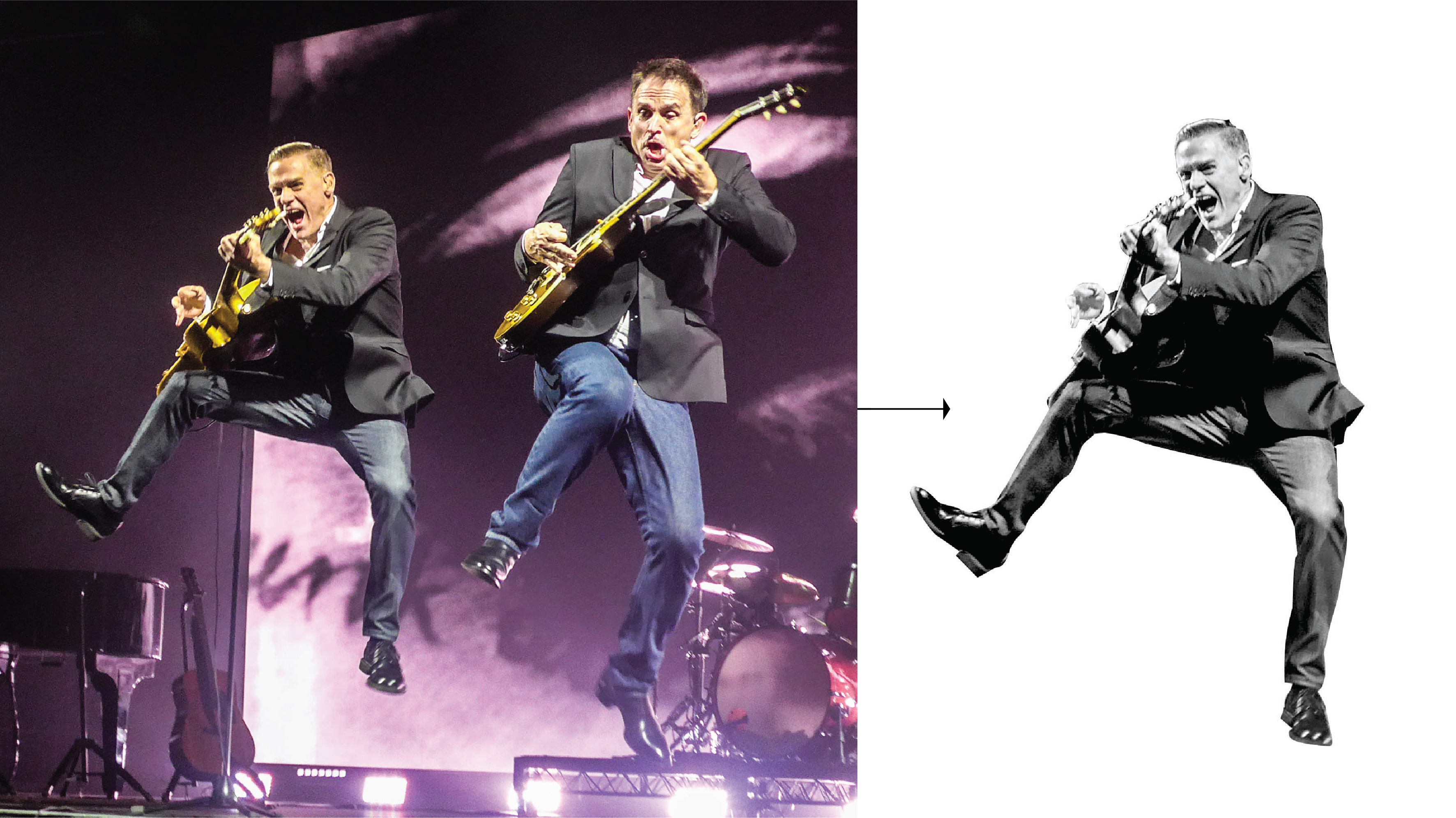
I had on my archive photograph taken by my husband of Bryan Adams from his tour in Vancouver, I liked the energy and spirit from that photograph, it could work well as an independent image at the full poster size, and at the same time as an additional image at the ‘busy’ poster. I went on the Dark Rudolph website for some inspiration, I’ve noticed that for Bryan Adams he using black and white photographs in combination with bright orange and red colours.

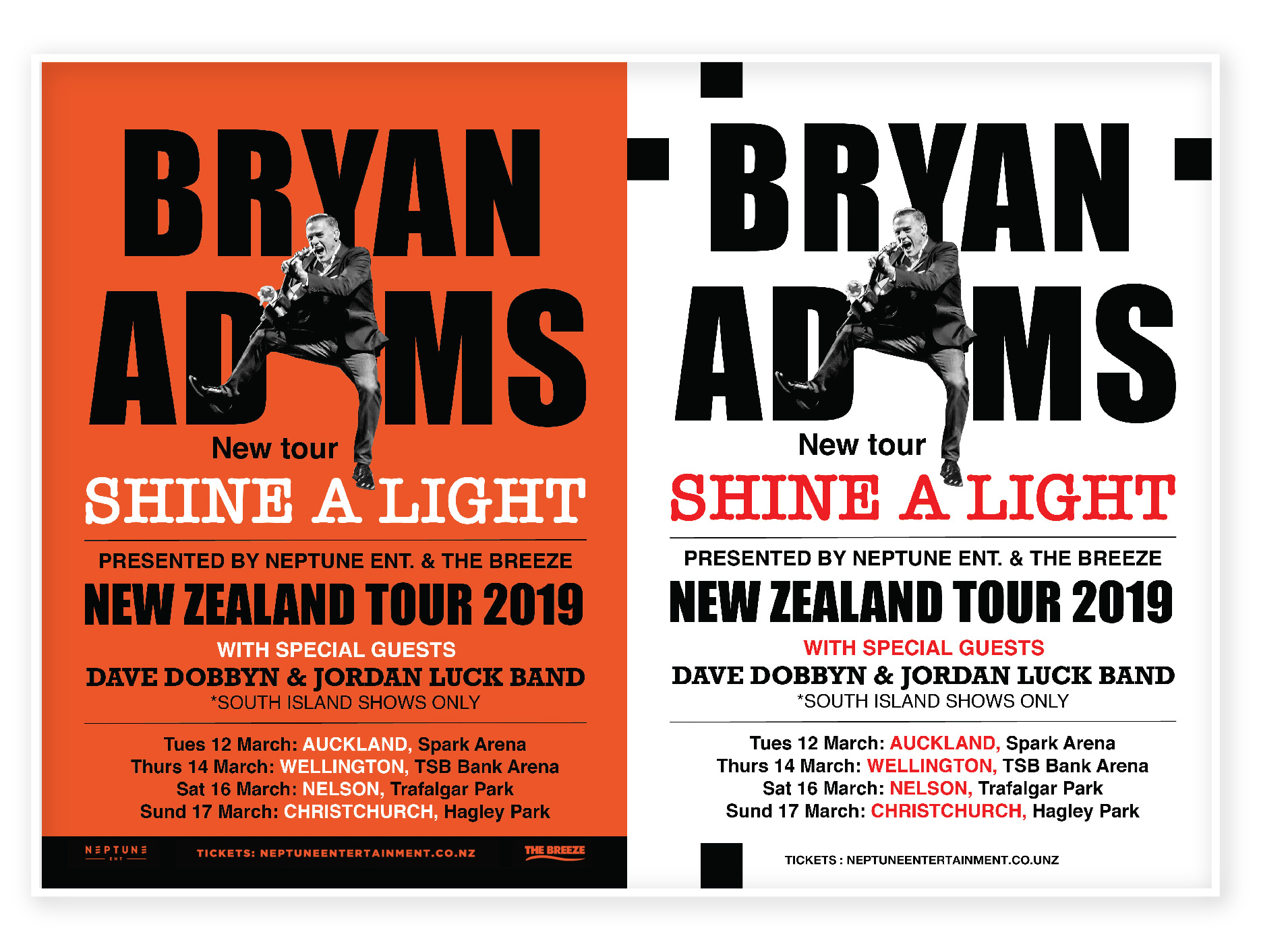
For my first poster, I used a couple of fonts. For Bryan Adams name I used Impact font, to stand out the name,  also were used such fonts as American Typewriter and Helvetica New. For the same design I did reverse version with an orange background, I think it could be an additional option for printing as well.

Another design I tried to figure out how the principle of Occam’s razor could be used. I minimised the number of text lines and used just only a picture of Bryan Adams with the name of a Concert Tour. I thought I would like to use the kind of square that Bryan is jumping out. On the black background for the concert name tour, I used red outer glow, same as on the orange background.

Bryan Adams
font-01
BA-02-02
Bryan Adams Presentation-01-01

After a couple of trails with poster design, I went further down in my researches. Inspired by Dirk Rudolph designs I had an idea of combined images of Bryan’s photos for the poster.
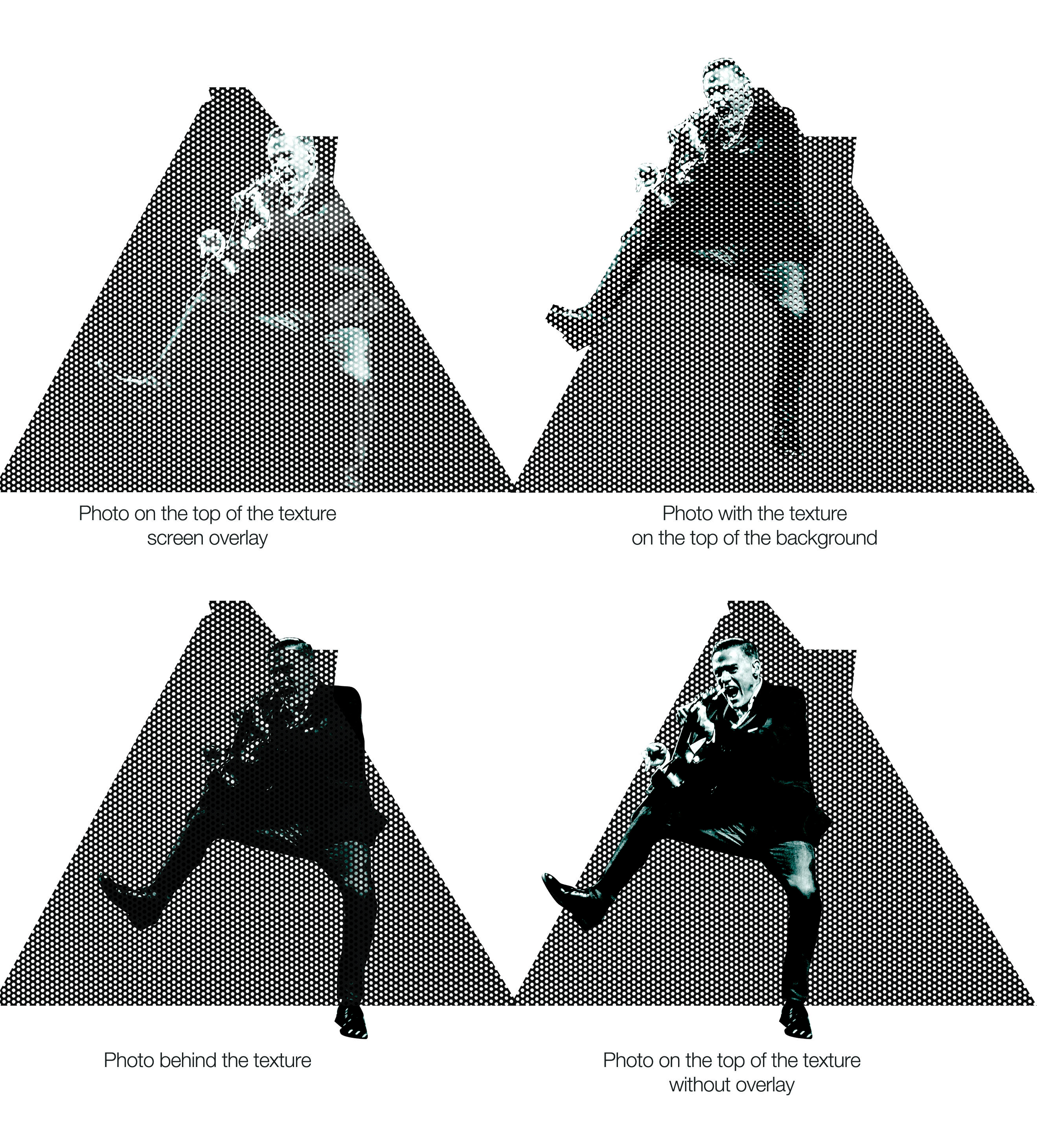
I’ve created dots texture in Adobe Illustrator, which I could use on the top of Bryans photos. I used different shapes on it, applying overly mask. I tried a couple of different options, where the picture was on the top of the mask, and behind of mask as well. In the result, I went for the option where my picture goes on the top of the texture, but Bryan’s photo with the dots texture as well.
Dots texture plus a photo of Bryan combination

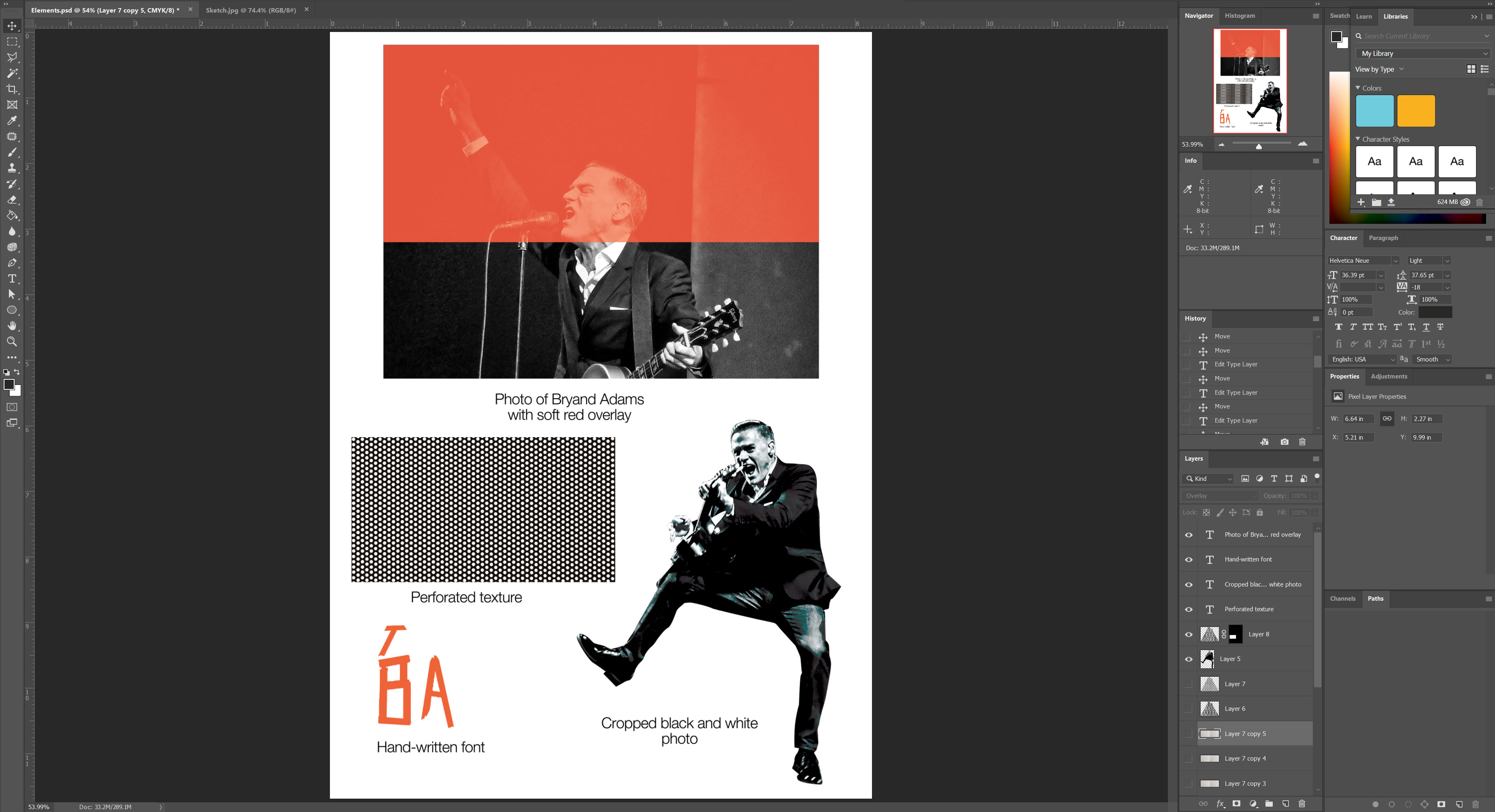
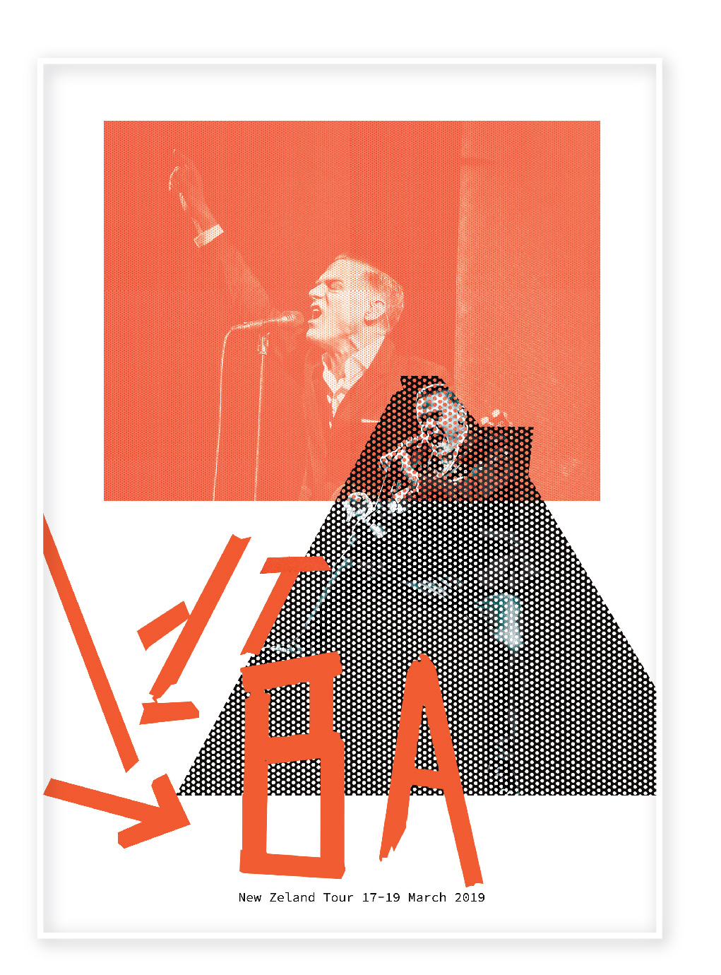
I’ve created circles grid, applied layers mask on the photographs. For the font, I’ve created my own one, painted from pieces of the film two letter BA. I tried to apply the multiply layer on one of the photographs, borrowed the orange colour from the letters. In the result, I had a poster with three plans, which looked like a 3-D effect. I liked the idea of black and white photographs combined with a red background on the top.

In a conclusion, I would like to say, that I could get the best result for a poster design in my last option. I think despite that fact that the image of the singer is hidden behind the dots grid, the visual is still recognizable. It has lots of white space around, and composition by itself is quite eye-catching, I believe, that potential audience will find time to stop near that poster that to read some details, there is not much following information, but I strongly believe that popular brand, doesn’t have to be followed by a load of details and explanations, such as duration, programme and by other andadditional information. If I was a potential client for that band concert, I would see that poster as a reminder that concert is coming, start and end date, and after that, I will definitely go online to google for some tickets and all the details of the tour. Considering the design by itself, looking through the Bryan Adams marketing projects I could see that he prefers non-standard kind of thinking. At the same time, my last design reflecting in the best way his outstanding personality. 

Exercise: Visualising your ideas

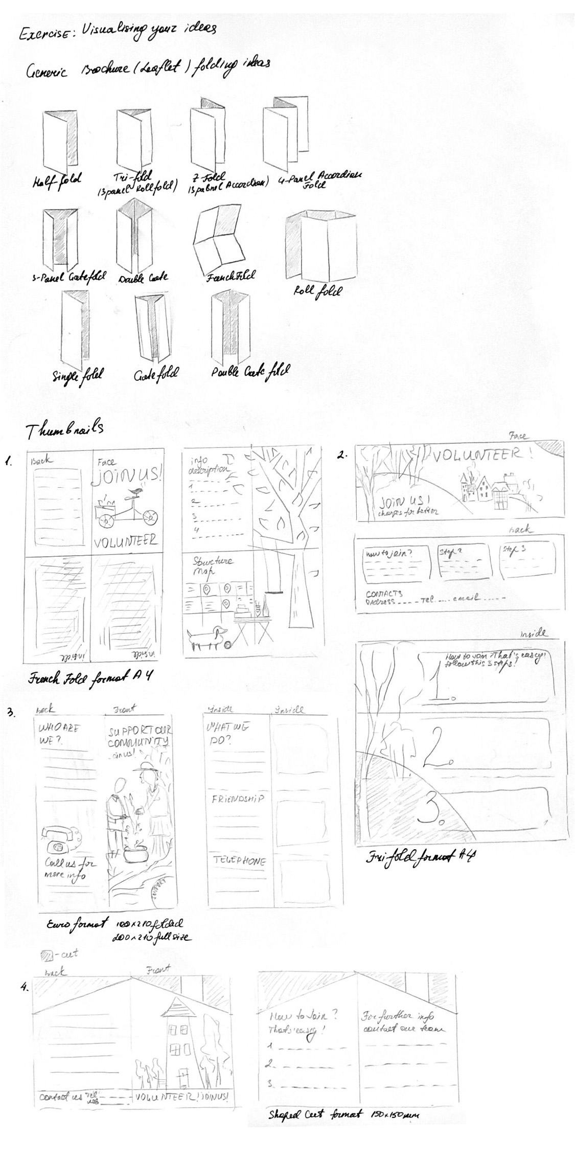
For this exercise, I have a task to explore different ways I can folder a paper to make a leaflet. I have been asked to design a leaflet for the organisation, inviting people to volunteer for a task. I had a look for some ideas and sort of inspirations, that I could probably transform. As I had some experience in leaflet designs, but most of them were made in trifold (letter fold) A4 format, I had a look for designs with a shaped cut. I thought that I would like to experiment with formats.

Keywords

  • Leaflet
  • Volunteer
  • Creative
  • Community

Mood Boards

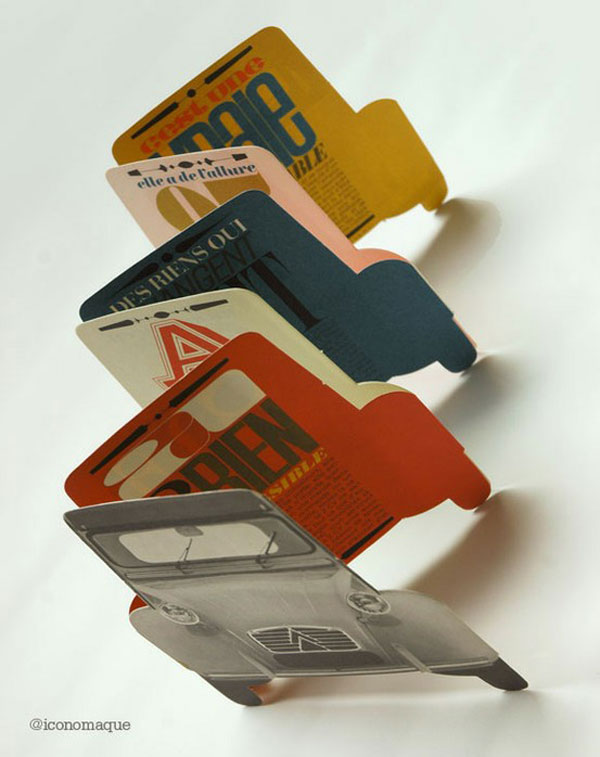
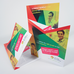
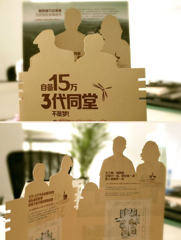
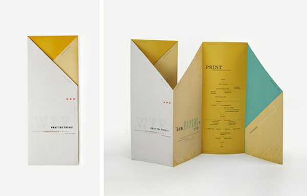
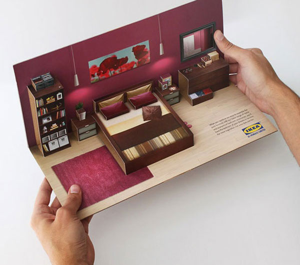
Some original ideas for leaflets design shaped cut, complicated folding, pop up designs. I always liked the idea of creative flyers, when a flyer gives you the first impression, and you are as a customer has a curiosity to learn it, and have a look what is there inside.

Most designs that caught my eye were made with different shapes, and they looked like an individual product, which is the part of the company presenting. If I’ve been asked to do designs in an original way, I would probably suggest creating something unusual, with complicated folding, but minimalistic text information, but at the same time that depends on the clients budget and timing, as that kind of printing is time-consuming.

Thumbnails

After a mood board researches, I went through some generic researches, to find out what kind of leaflets are the most popular for printing. After that, I did some sketches for the leaflets folding for the building of the community garden.

IMG_2824

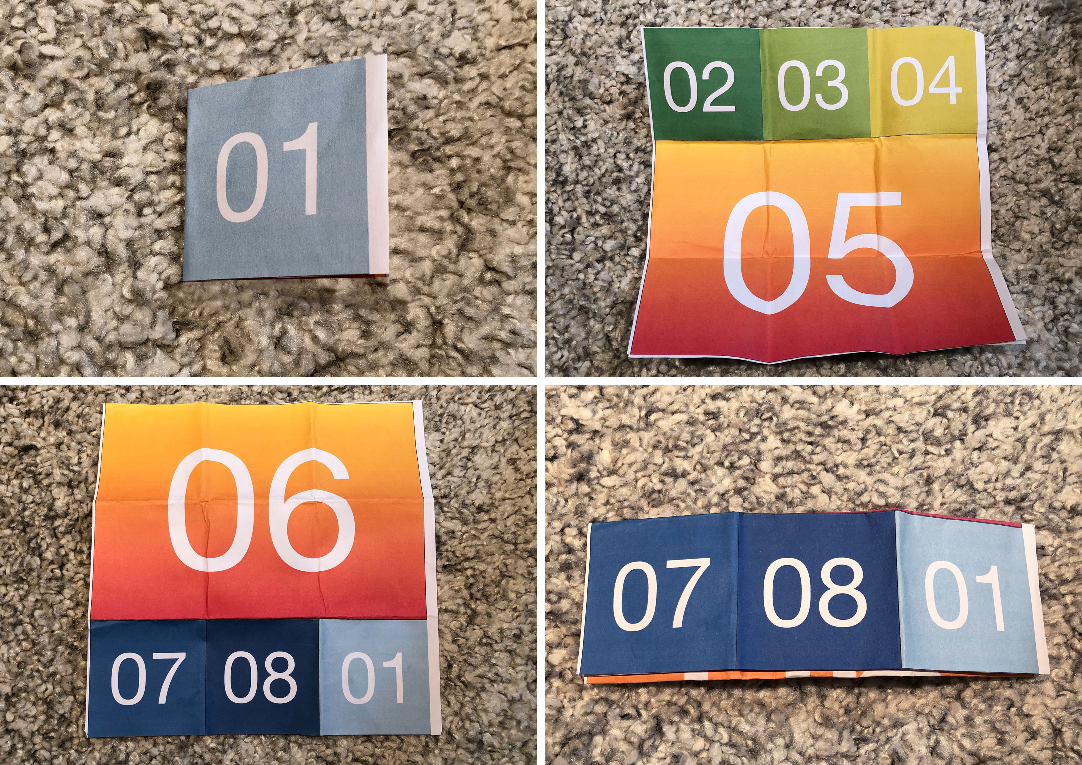
In addition to the leaflet sketches, I tried to reproduce leaflet design with complicated foldings. Where I had 8 sides to fold up. I’ve found some tutorial videos to follow, as it could help me to find out some new ideas of working with a paper. Below are examples of A4 formats leaflets.

Leaflet idea 1

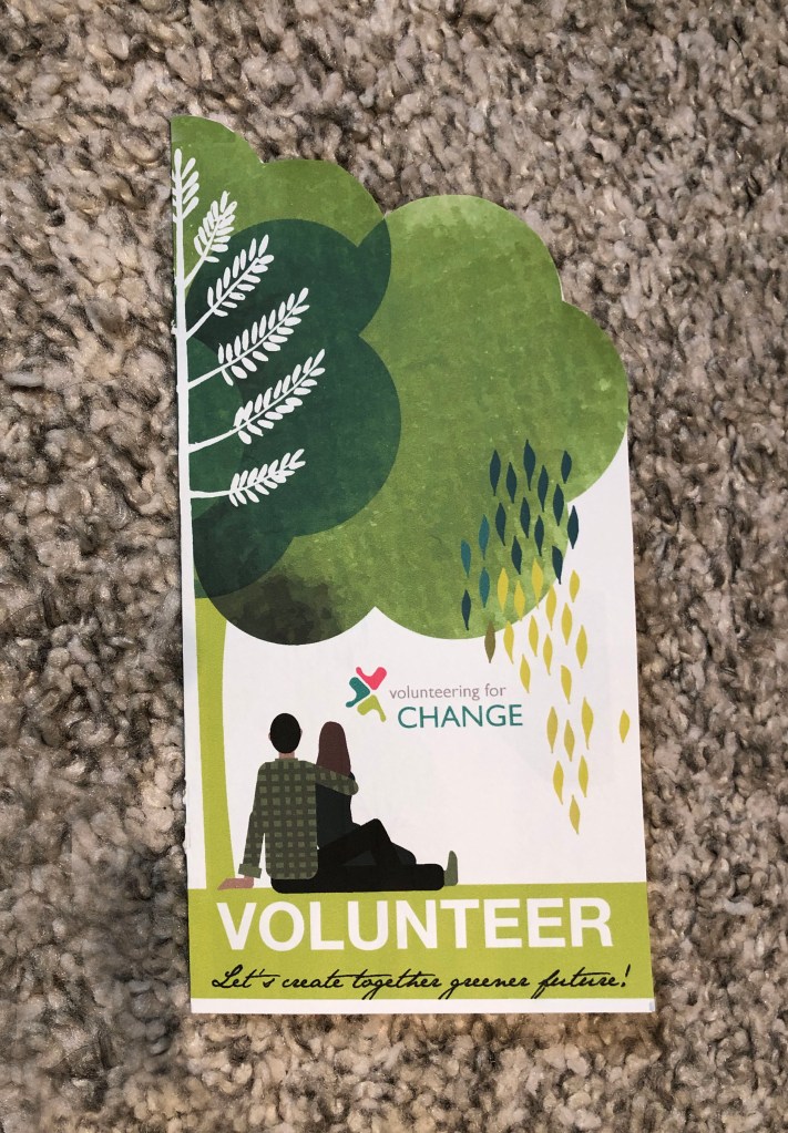
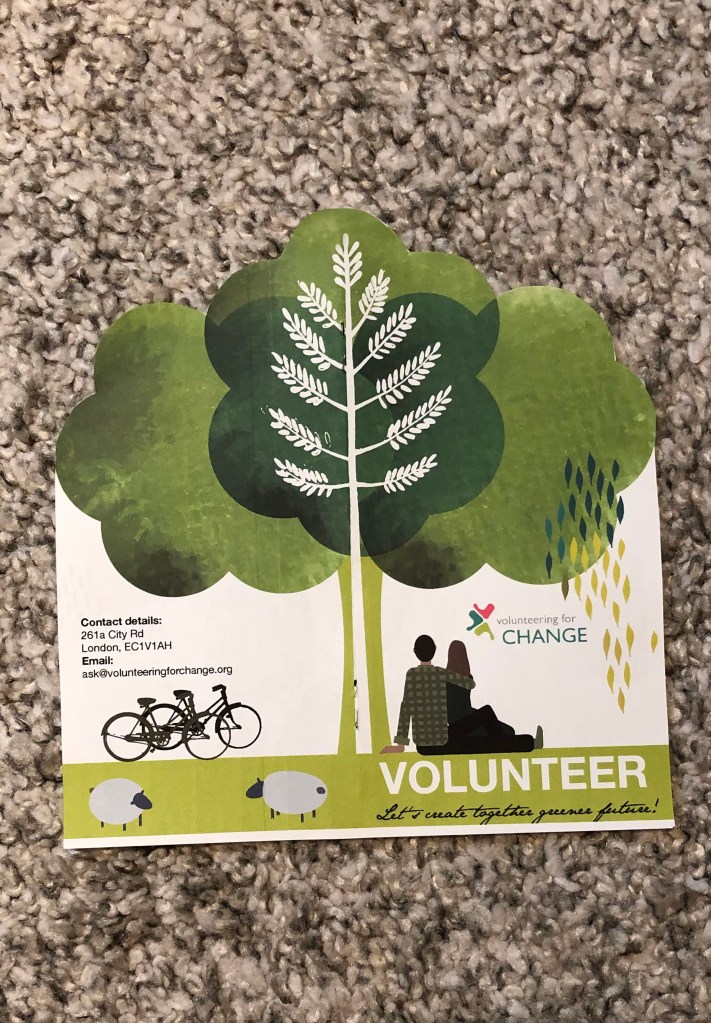
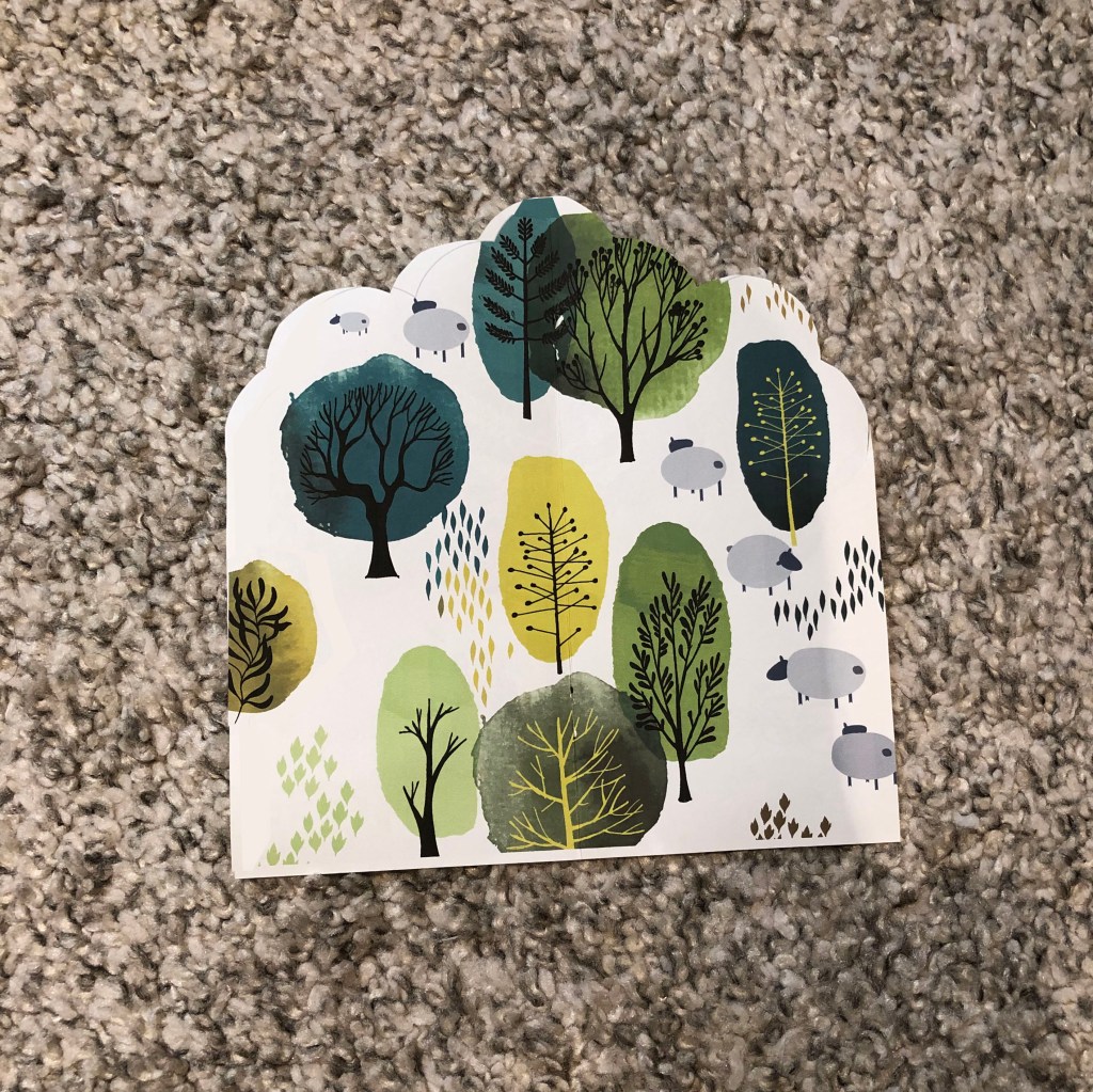
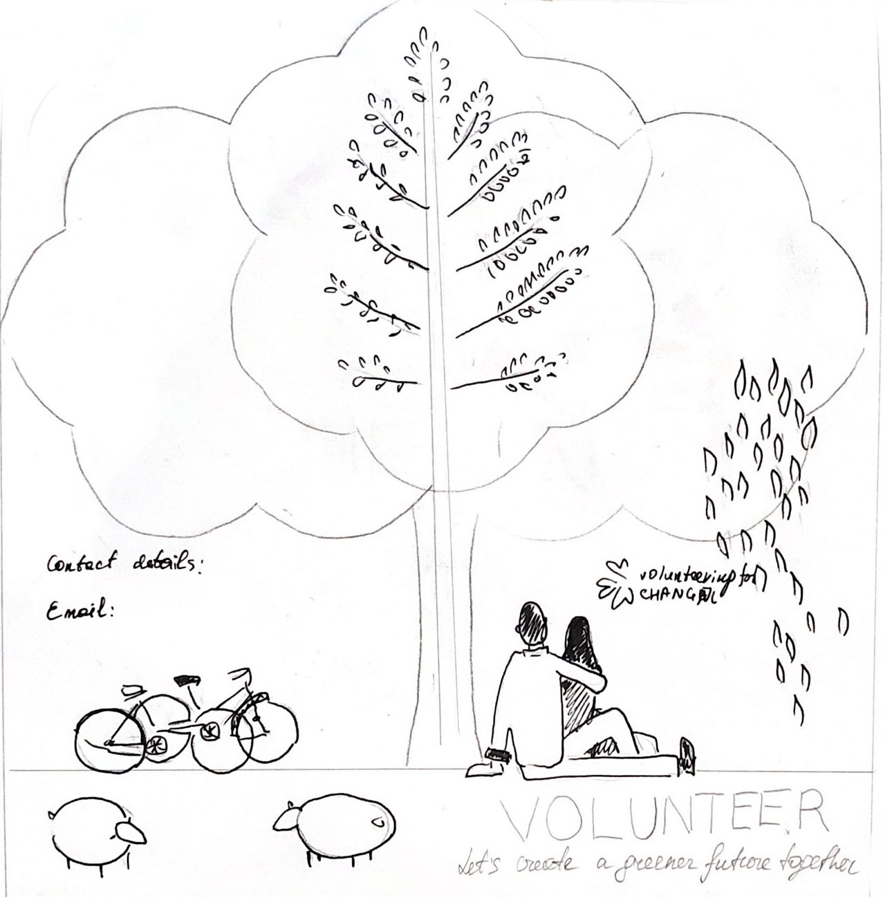
I created some sketches for the leaflet idea with the tree-shaped cut. The idea was to keep the shape of the leaflet like a tree, but later I decided to leave only top with shaped cut, otherwise, it would be too thin to fit any text in. So, my first trial came up in the shape of a tree, euro format 100×210 mm half fold, full-size 200×210 mm, so when you open the leaflet you have the kind of open tree. That was my association of the volunteering to create the communal garden, where people would come to enjoy their time. Inside I’ve made some sketches of the trees, that could be the background to go underneath the text information.

Scanned Documents
Volunteering Leaflet Sketch
Presentation
Final design of the leaflet

Leaflet idea 2

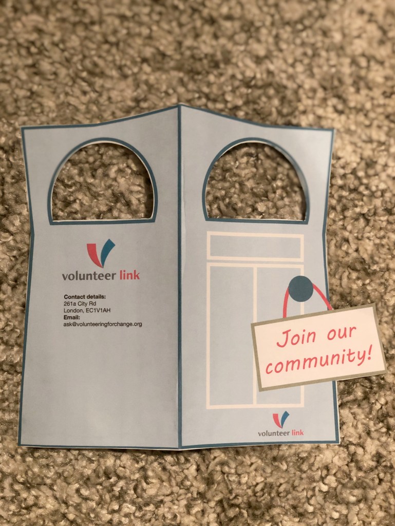
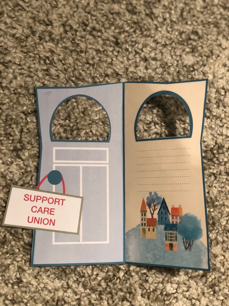
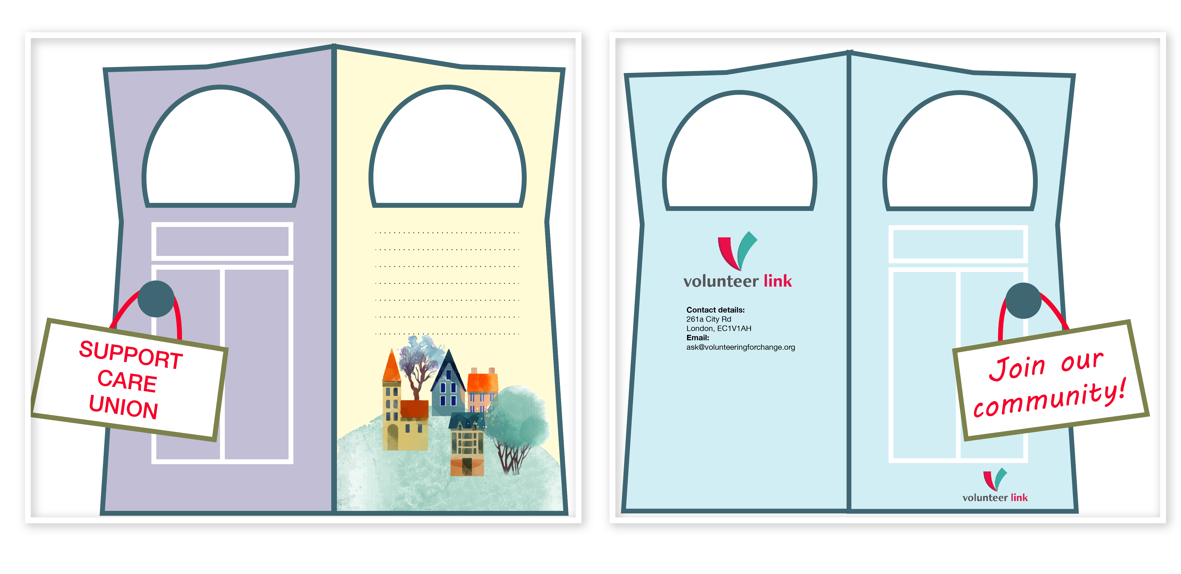
This leaflet idea came from the volunteering to join the building communities. So, I thought I would like to play with a shape of the leaflet. This design works well to hang it on the house’s door. I liked the shape of that leaflet, but it was not according to the complicated folding.

Presentation_door-01
Final Design

Leaflet idea 3

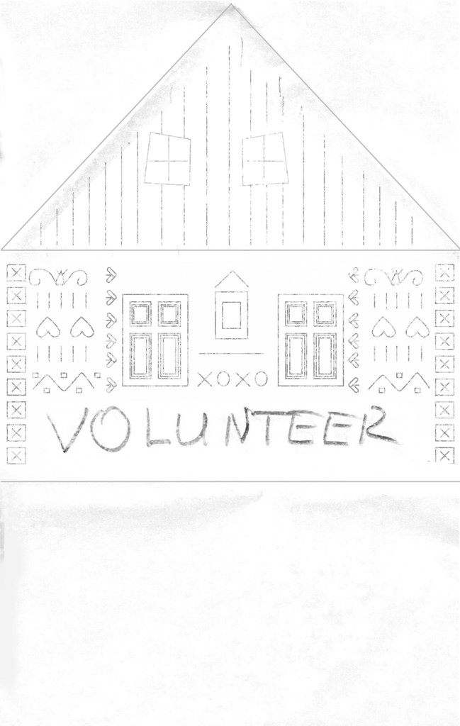
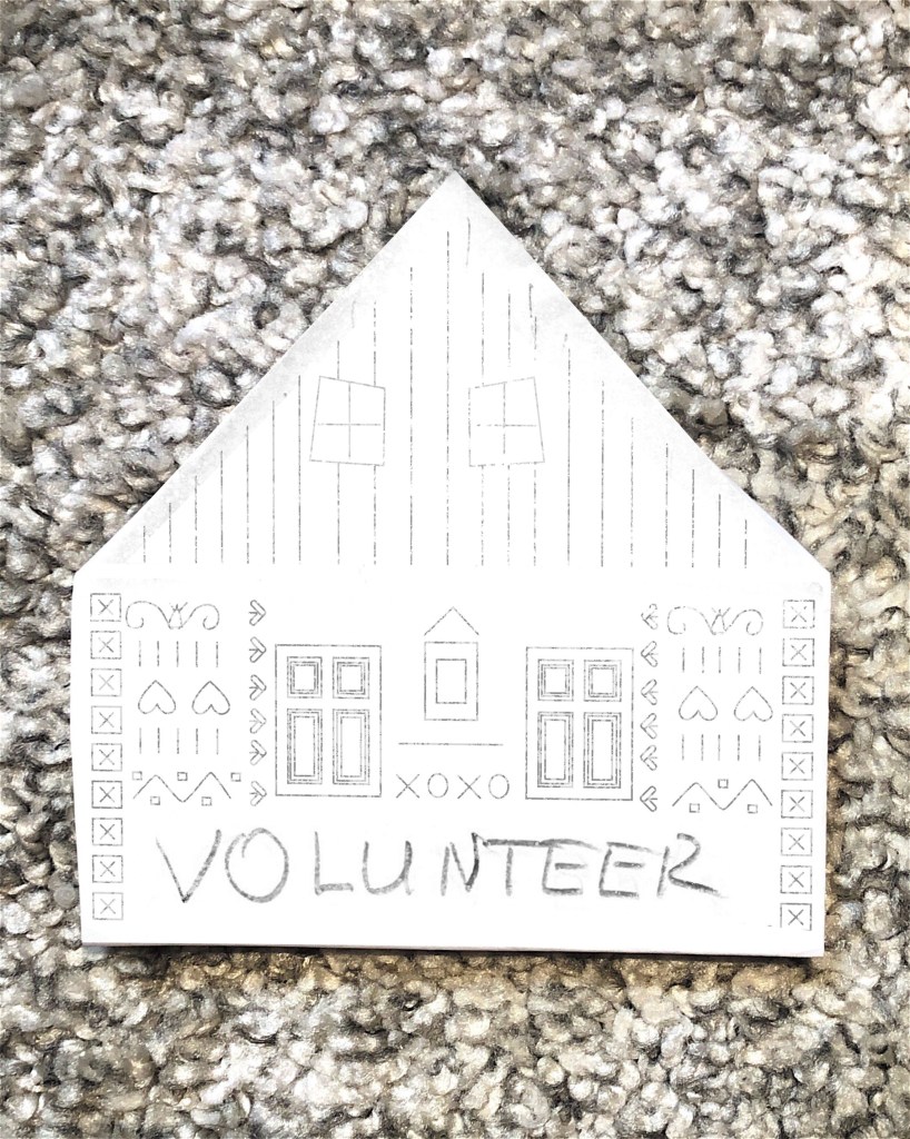
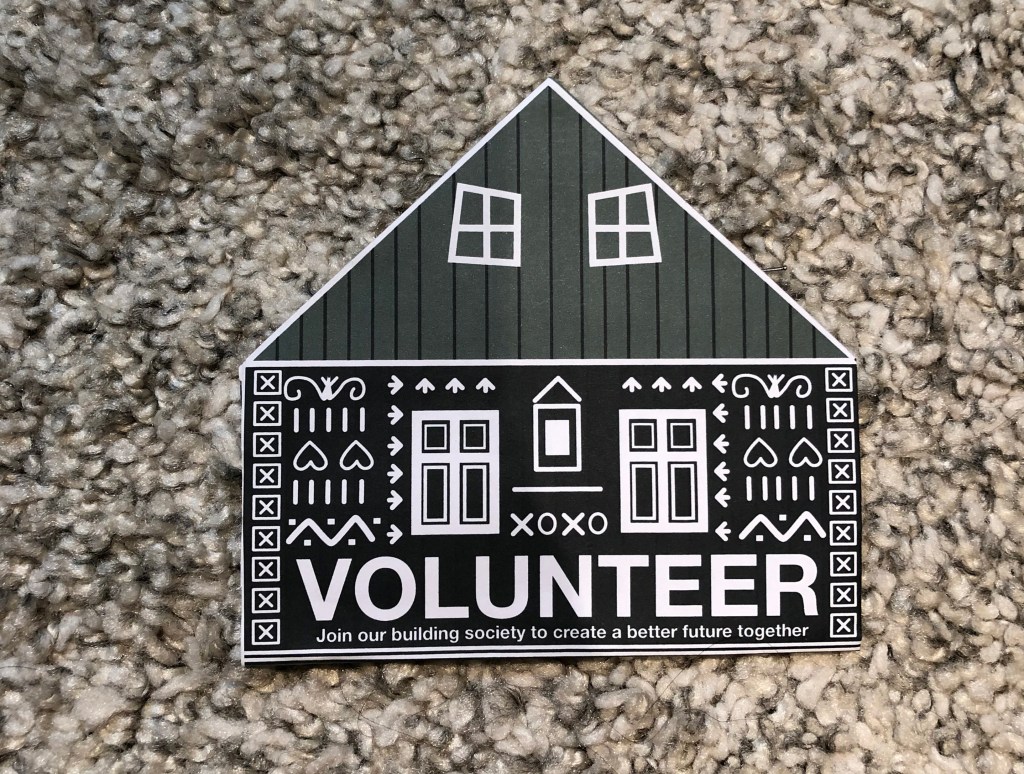
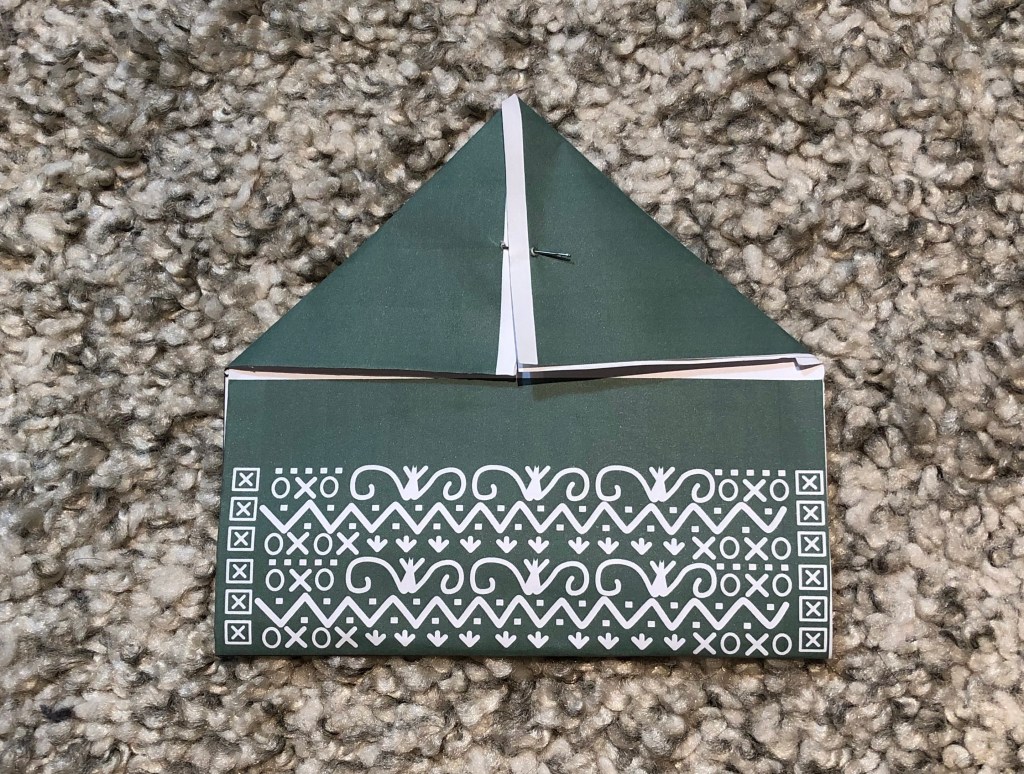
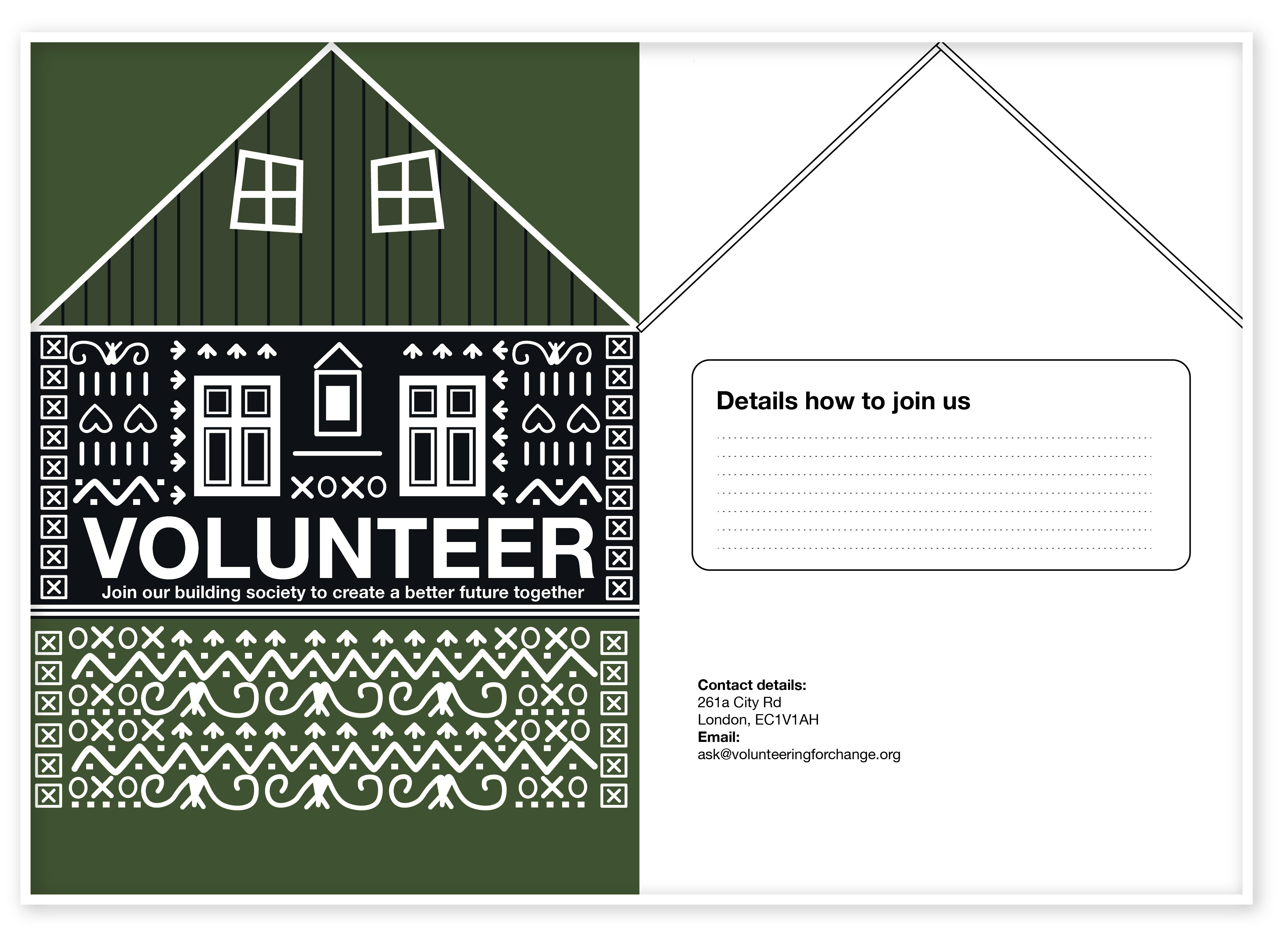
Another my design was related to the shape of the house to volunteer to build community houses. I played around with the leaflet format, trying to fold the paper in a couple of ways. After that, I did some sketches in Adobe Illustrator, as I’ve noticed for me it’s easier to see the result in colours. I think that format could work very well for attracting people attention, as you have a temptation to have a look at what is there inside.

Drafts
Final Design

I think I would recommend giving that leaflet by hand, but with the one exception, that people who sent that promotional material would have a conversation with potential volunteers, that to give them some basic induction into the idea of the campaign.

In a conclusion, I would like to say that making mockups for the brochure is quite an important part of the leaflet design planning. I’ve discovered there is a lot of type of brochures, starting from the half fold and going to the accordion fold. I think the complexity of the design depends firstly from the budget, and secondly, from the customer design preferences. For example, if the customer would like to create a complicated fold, it could be thin paper, if it would be standard euro brochure, we could use decorative paper, or that is always space for photographs of volunteering people, but it would be generic design. There is always a chance to have attractive images to sell services to meet customer expectations.

Exercise: Book cover design

The brief is to design a stunning and contemporary cover for one of the 20th century’s most acclaimed authors, HG Wells. The books will be published in paper format and need to include the titles, author’s name, publishers name and trademark.

methodetimesprodwebbin60d80ce8-d36b-11e6-b721-fbd88801f92d
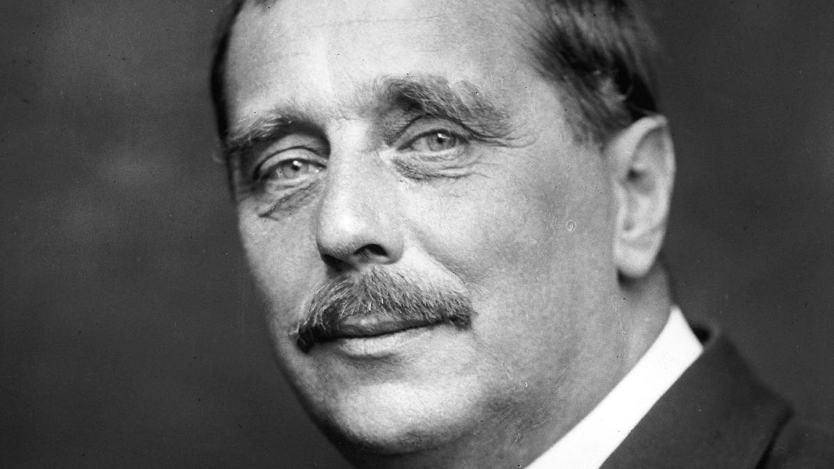
A portrait of H.G.Wells

Keywords for the generic topics of HG Wells books:

  • mid-life crisis
  • class
  • feminism
  • materialism
  • consumerism
  • love

Researches

The first step in my researches was to fill the gaps in my knowledge. I had some worries about starting this task, as I have never read his books before, therefore I looked for the books review that to have some basic ideas regarding the books that would inspire me. I went on Google to read about author more, and at the same time to find some cover designs that were printed for HG Wells, at the same time I that could use them for generating ideas.

Scanned Documents

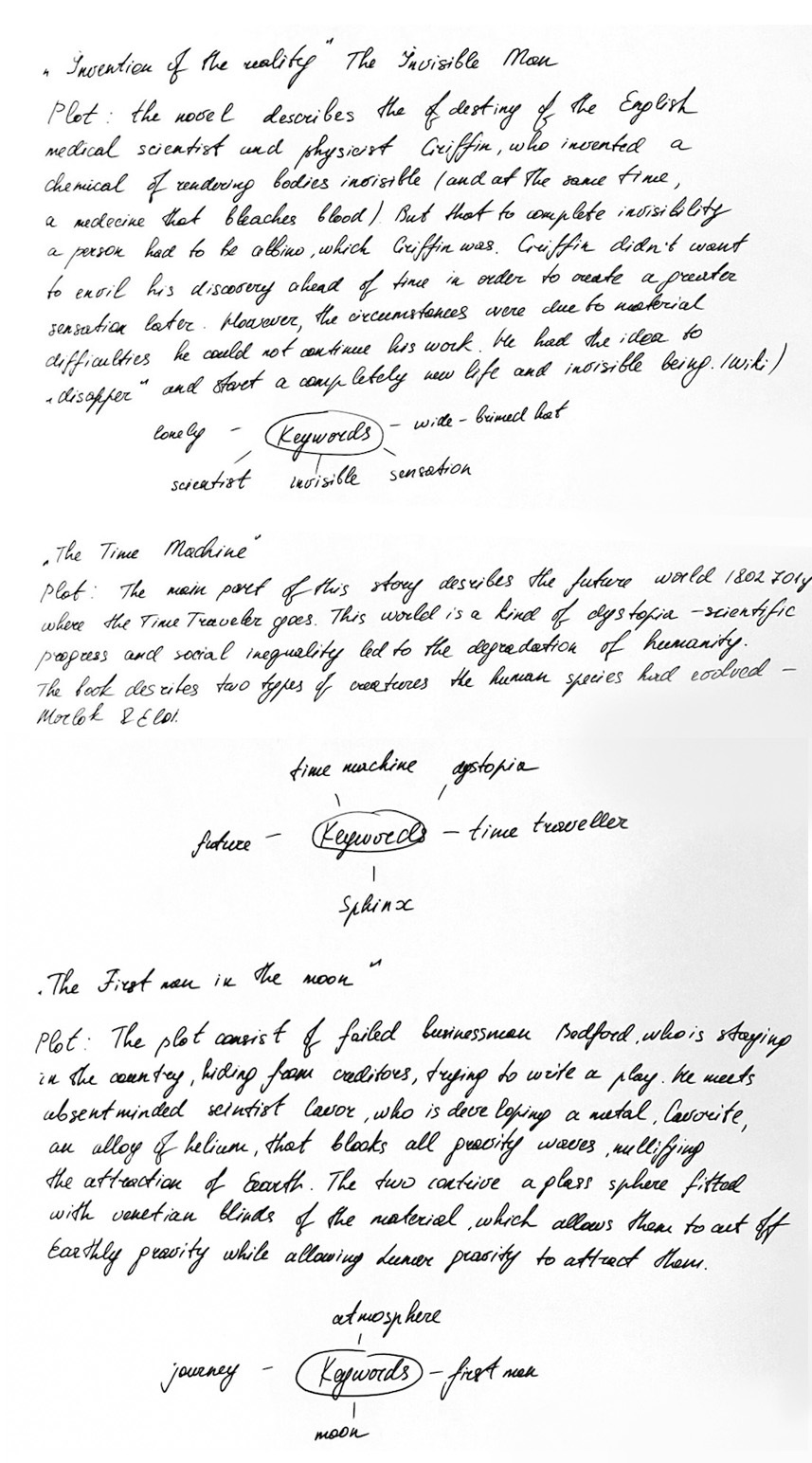
I used mind mapping technique to fill the gaps and identify keywords that could help me to produce my own ideas for sketches and visuals.
I’ve made some researches of the cover designs that were previously published starting from the first publications and leading to the modern covers for HG Wells books. They gave me some tips I could use in my design. From my vision, I would say that cover design I could use for my own ideas is with the fewer elements, the kind of minimalistic designs, like the cover of Invisible Man on the blue background, where I could see mainly only a few elements like hat, suit and the name of the book and author. Another design that I think stands out compare to the other design is a first cover for the Time Machine book, where instead of busy element around I could see the main one object, which is sphynx.

I tried to identify three books that I would work with. Below is mind mapping of some well-known HG Wells timeless fiction and novels. After that, I could have a clear understanding of what books I would like to work with.

  1. The Invisible Man
  2. The Time Machine
  3. The First Men in the Moon
Scanned Documents
Books Review
screenshot_2018-10-30_11.20.13_4x
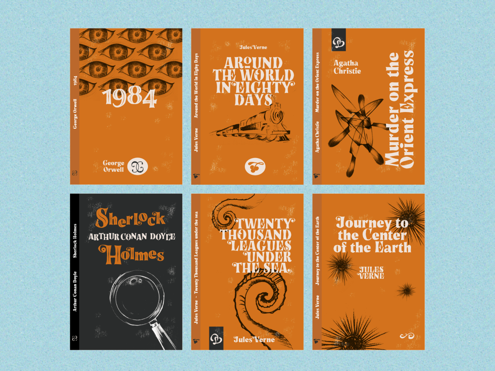
Book Covers with Story Tales Font by Giuseppe Salerno
https://dribbble.com/shots/5471891-Book-Covers-with-Story-Tales-Font
[Accessed November 2018]

As I had a gap in a plot understanding, I read the review for all books, and after that, I decided to create a mind mapping with keywords, and general ideas for each cover.
I found some examples of contemporary book covers that were redesigned from classic novels. I tried to identify for myself how would I imagine modern book cover, I decided that it should be vector illustration, with a bright background and contrast colours. Some examples that I liked below.

After I did my final researches I made the decision that I would like to use vector illustration in my work with some abstract addition.

6a00d83451cbb069e200e54f7db9ec8834-800wi
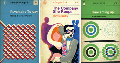
Classic Penguin and Pelican book covers from the 60s and 70s. https://www.retrotogo.com/2006/10/classic_penguin.html [Accessed November 2018]

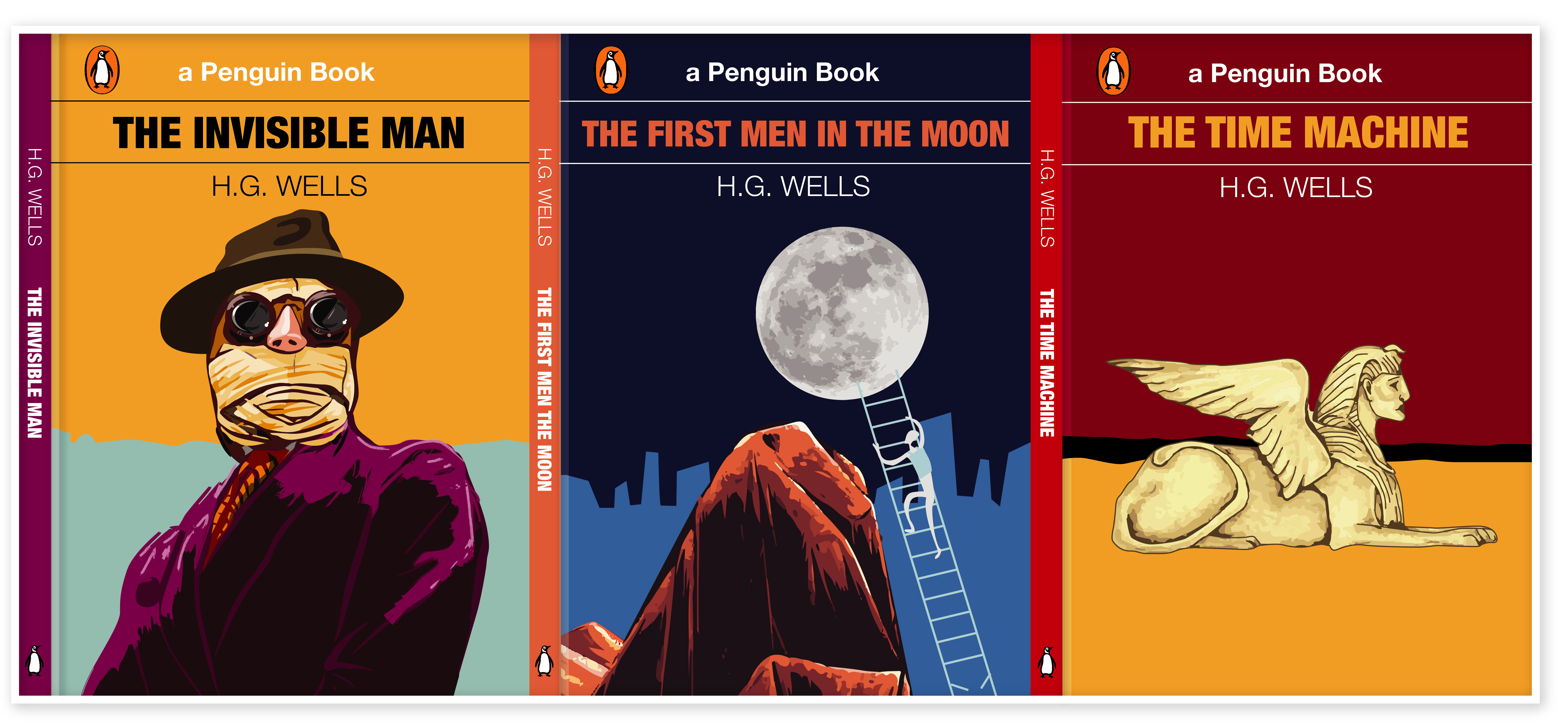
For typeface, I’ve decided to keep it simple. For all book names, I used Helvetica Condensed Bold, for the Author Name I used Helvetica Light, for the Publisher Name I used original typeface Helvetica Regular.

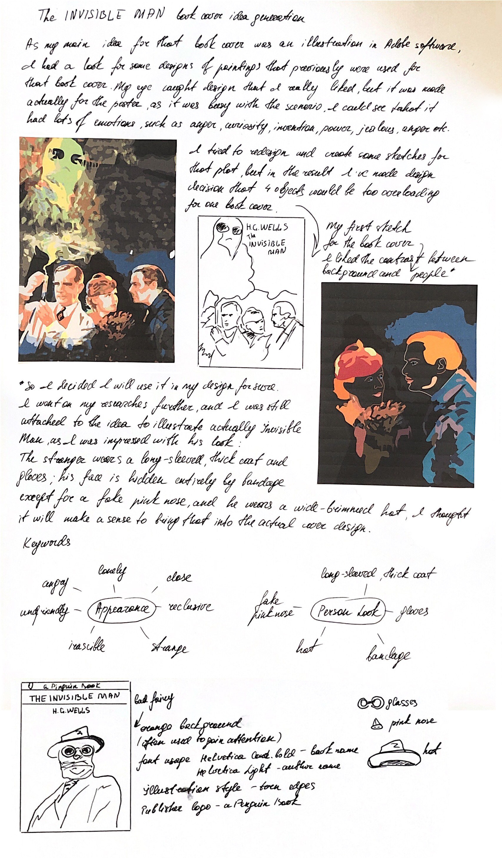
The Invisible Man – Book Cover Idea Generation.

  • Loneliness
  • Scientist
  • Evil Genius
  • Strange appearance
  • Invisible
  • Pink Nose
  • Wide-brimmed hat

Notes from Learning Log.

Scanned Documents

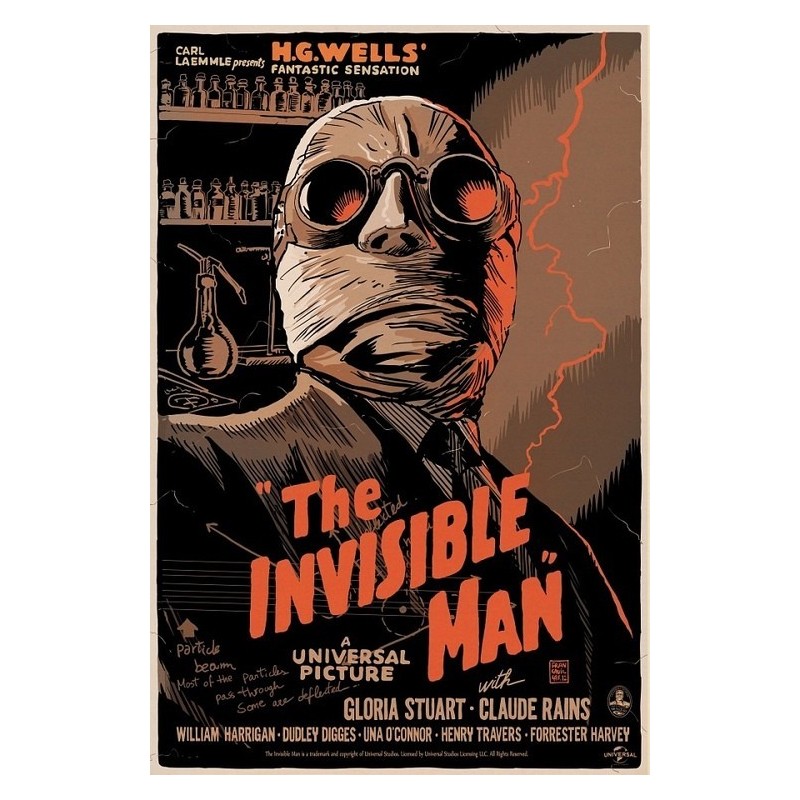
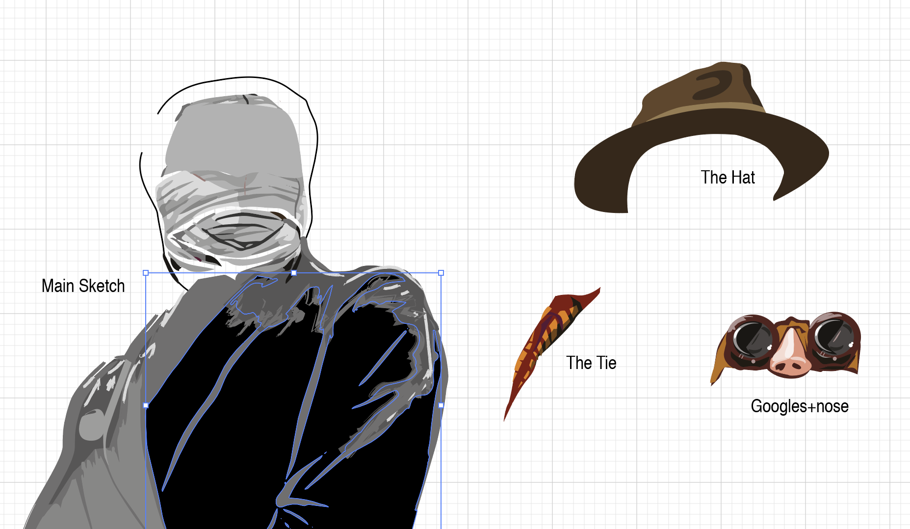
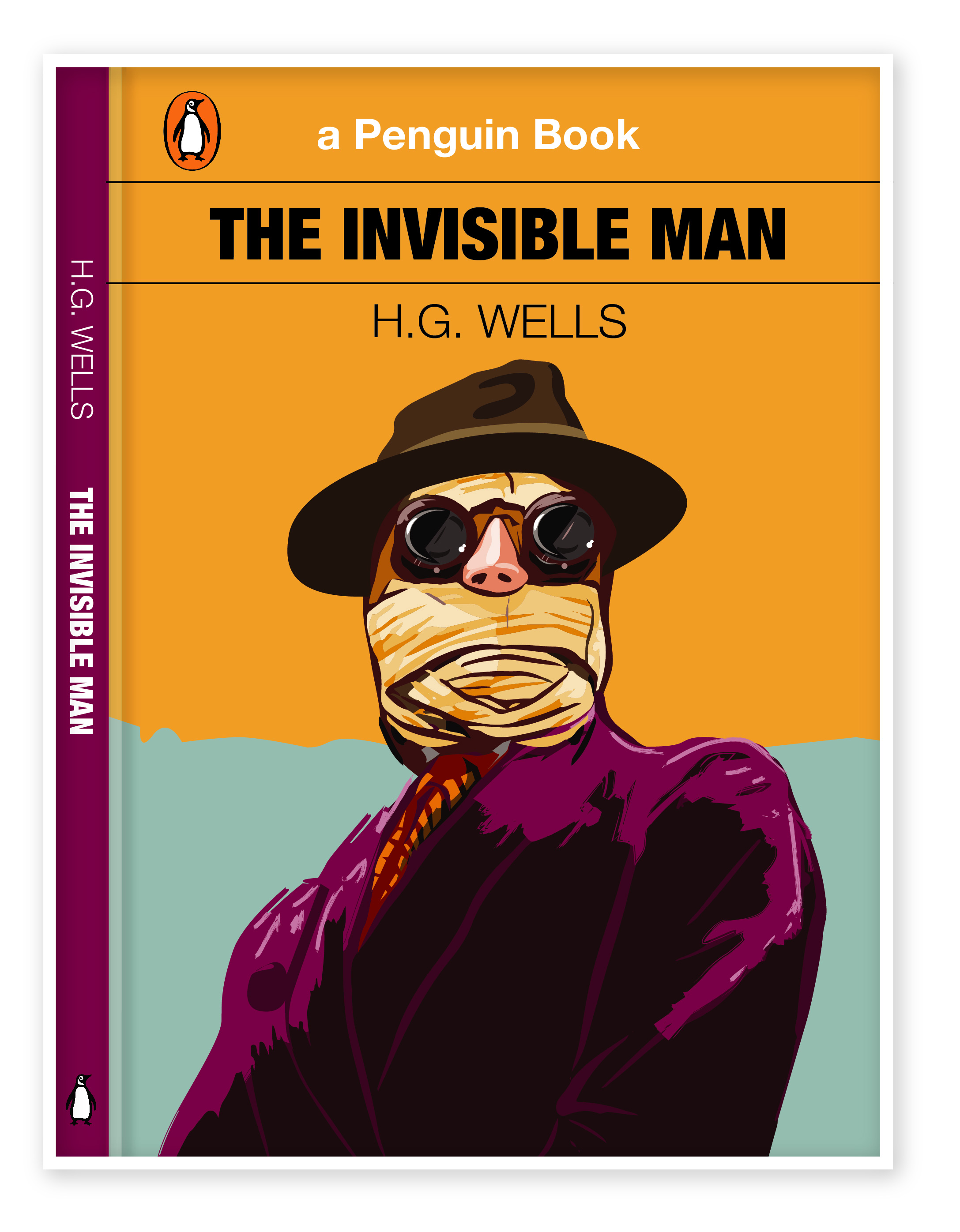
For the source of inspiration, I found that old poster, which perfectly displays my vision of the Invisible Man. I could see there arrogance, power, and the kind of grotty at the same time. I’ve painted my own image of the invisible man relying on the poster, using the Pen Tool and Pain Brush Tool.

original-silkscreened-poster-limited-edition-invisible-man-francesco-francavilla-gallery-mondo
Old Tin Sign The Invisible Man Classic Vintage Movie Poster. Available from:
https://www.amazon.com/Invisible-Classic-Vintage-Movie-Poster/dp/B01F6MMDBU [Accessed November 2018]

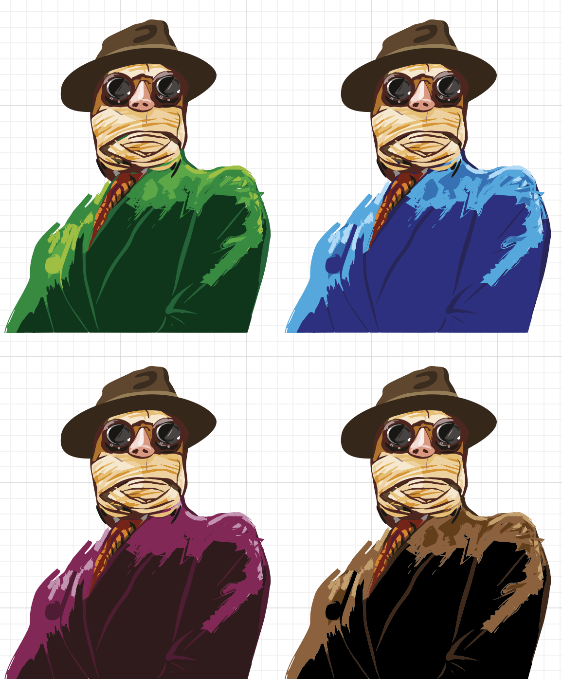
I played around with the colours for his jacket, evenly that his personality was quite miserable, I liked the idea of bright colours for his jacket, I found it eye-catching for the potential buyer.

Book design I’ve got in the result is presented below. On my sketches, I had the plain orange background, but after some additional works, I could see that design missed some sort of deepness, therefore I put in some additional tender blue colour that the image of Protagonist came into the front of the composition.

The Invisible Man-01
Final Design by Eleonora Davydovska

I think I’m quite satisfied with the result that I’ve got. As my illustration presents a spirit of the protagonist personality, as Griffin has become one of the most famous images of “evil genius” in world literature.

The First Men In The Moon – Book Cover Idea Generation.

  • Gravity
  • Space
  • Satellite
  • Revolution
  • Lunar
Scanned Documents

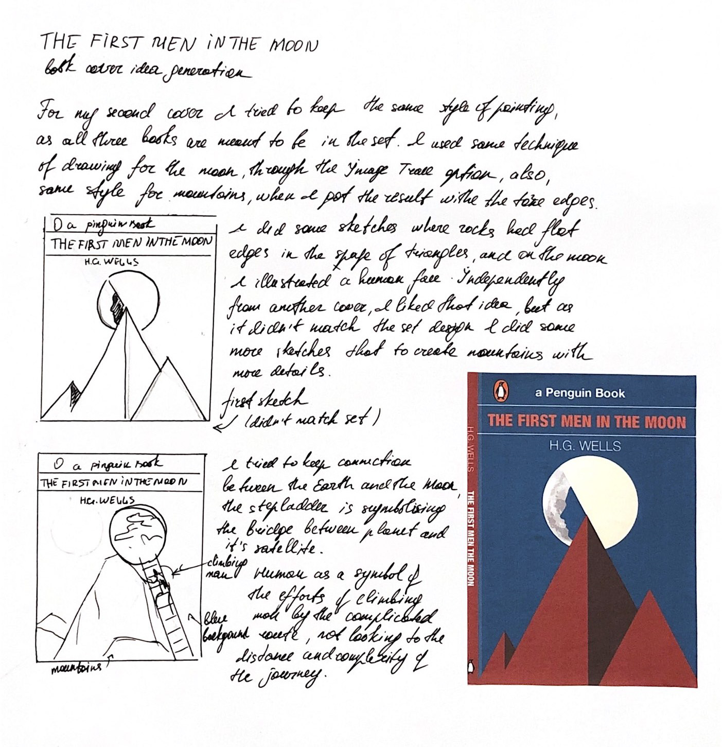
As I had an initial idea to play around with the mountains and the moon, to keep the connection between the planet and its satellite. I tried the first option with the sharp angles, however, for that book cover I still wanted to avoid the straight lines, so I lose this first option. Some of my researches and sketches are presented below.

Image Trace
Moon drawing in Adobe Illustrator

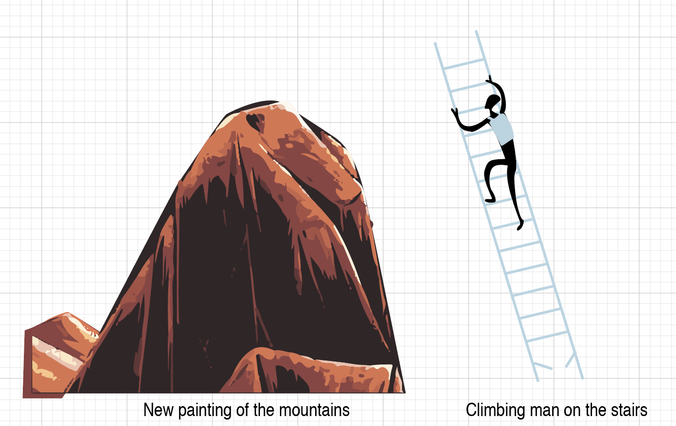
After the first trial I went further in my researches, so this time I was going to paint mountains with soft torn edges. My thoughts were coming from that I was going to keep all book covers in the similar style, in the kind of dynamic painting, avoiding stright smooth forms as much as possible. Below is presented some of my drwaings in Adobe Illustrator.

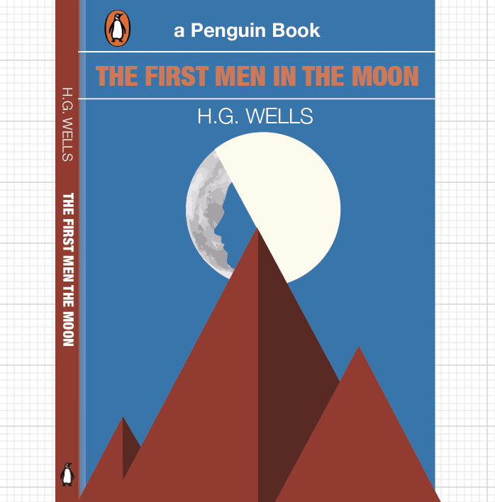
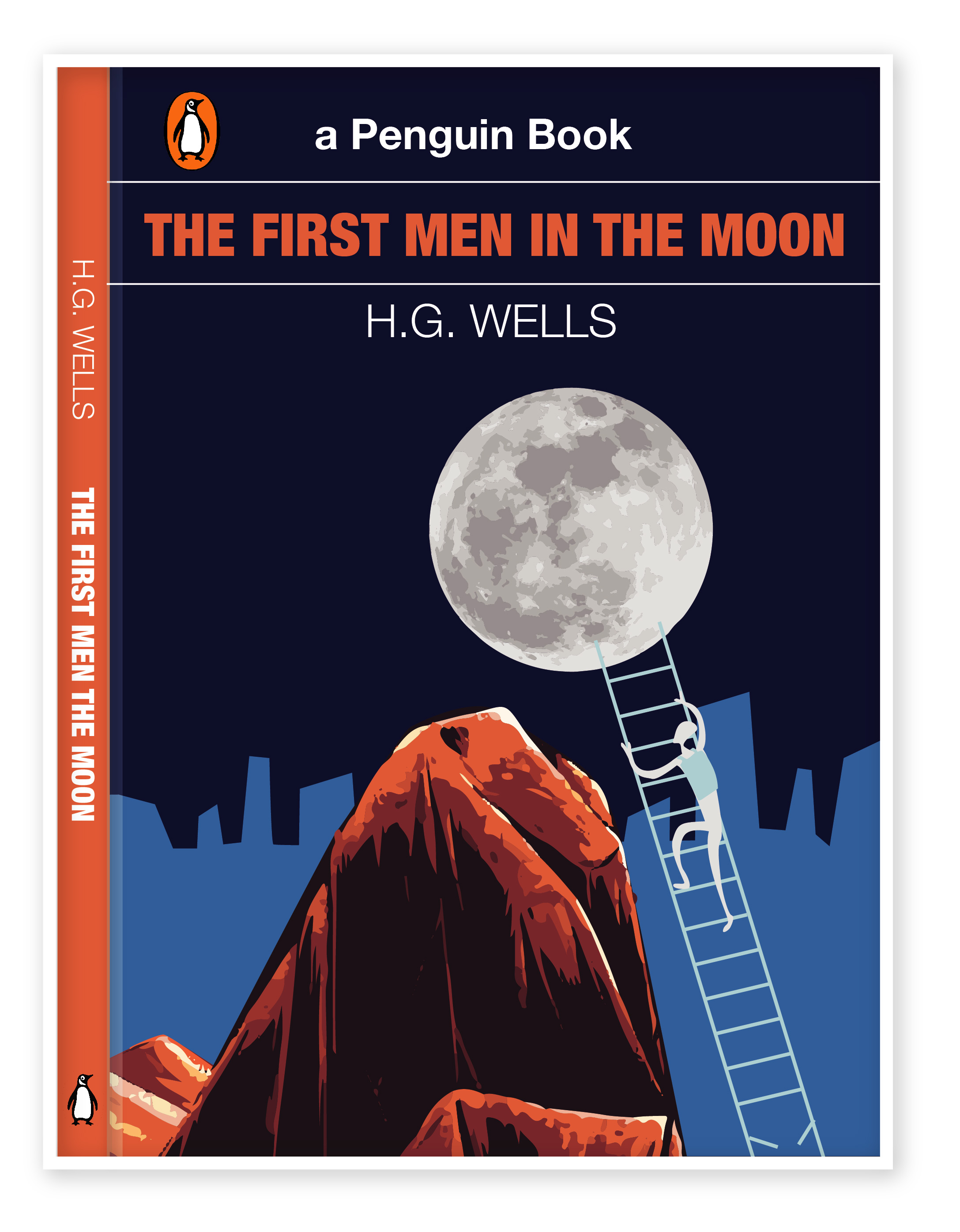
The final design for the book cover.

For the background, I’ve chosen two shades of blue colour, which represents the sky, and is associated with open spaces, freedom, intuition, imagination, inspiration, and sensitivity. Darker blue as a symbol of space and lighter blue is a symbol of human civilisation. I quite liked that drawing, both images Moon and mountains were painted with shades and lights. The last step is broken, as I wanted to show an interrupted connection with Earth, when Cavor’s programs break off in half a word, while he was about to reveal the secret of Cavorite’s production to earthmen. 

The first Men in the Moon-01-01
Cover Option 2. Final Design

The Time Machine – Book Cover Idea Generation.

  • Time Traveller
  • Futuristic
  • White Sphinx
  • Machine

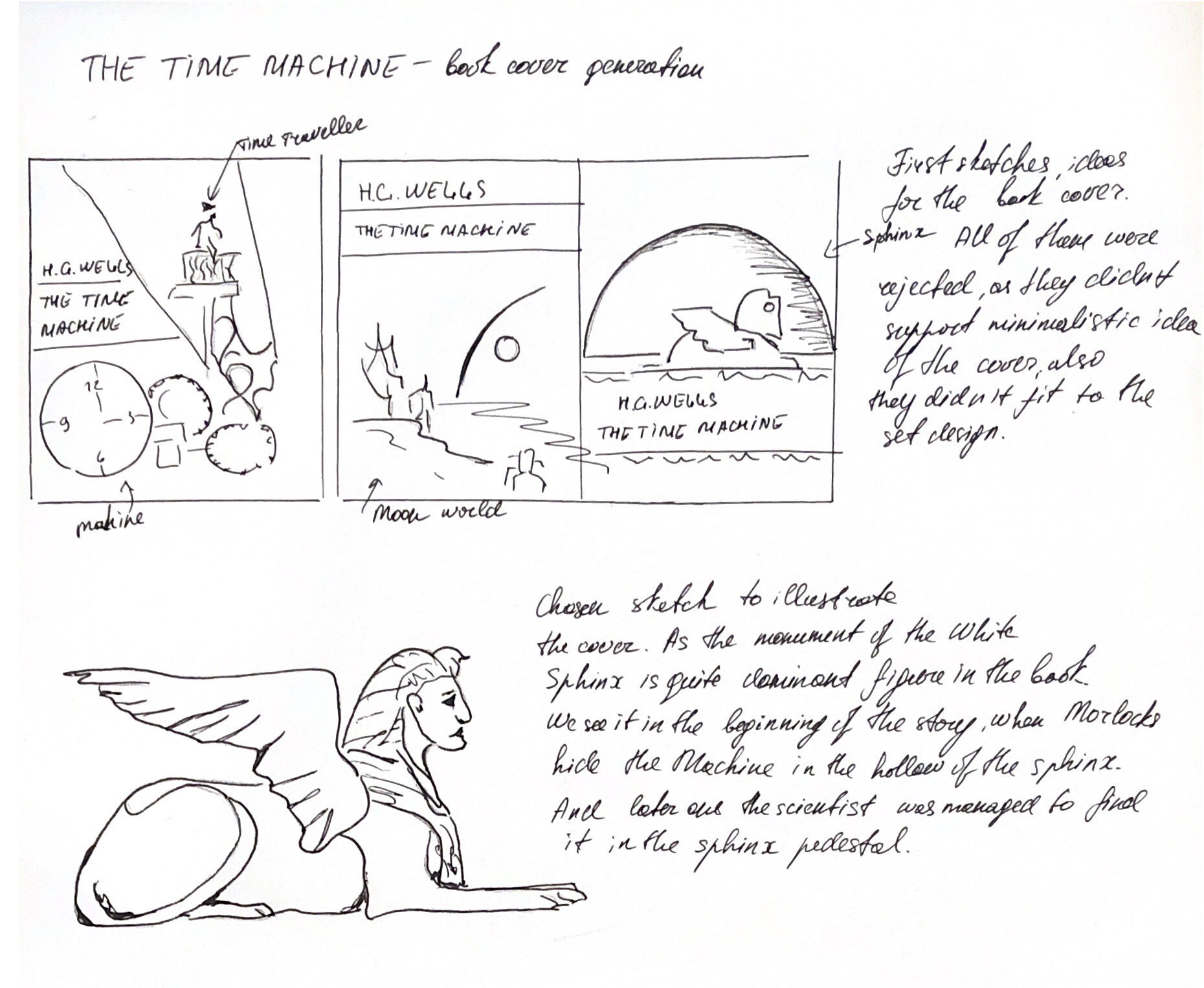
Ideas from my sketchbook:

Scanned Documents

For my third book cover, I went through some researches, as I preferred to keep it simple, so I’ve decided to execute an illustration image of White Sphinx. The idea was taken from that bit:

Meanwhile, the Morlocks, who, despite the loss of intelligence, retained a purely mechanical interest in technology and the ability to serve it, they found the Time Machine and hide it in the hollow pedestal of the White Sphinx. Having discovered the loss, the Traveler almost went mad, but eventually calms down and realised that the Machine could not be disappeared by itself, which means that it can be found. He manages to find traces of carrying the Time Machine leading to the doors in the Sphinx pedestal, but all attempts to learn something from the Eloi run into a wall of complete misunderstanding and rejection.

sphinx
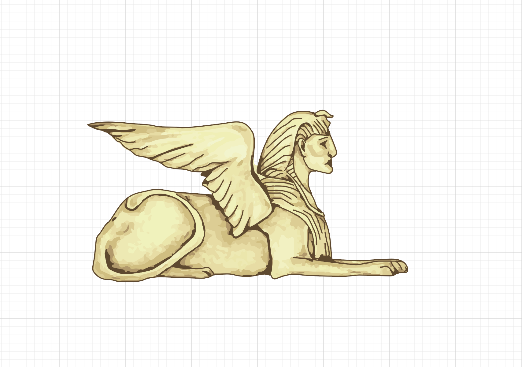
Sphinx Drawing in Adobe Illustrator
The time machine-01
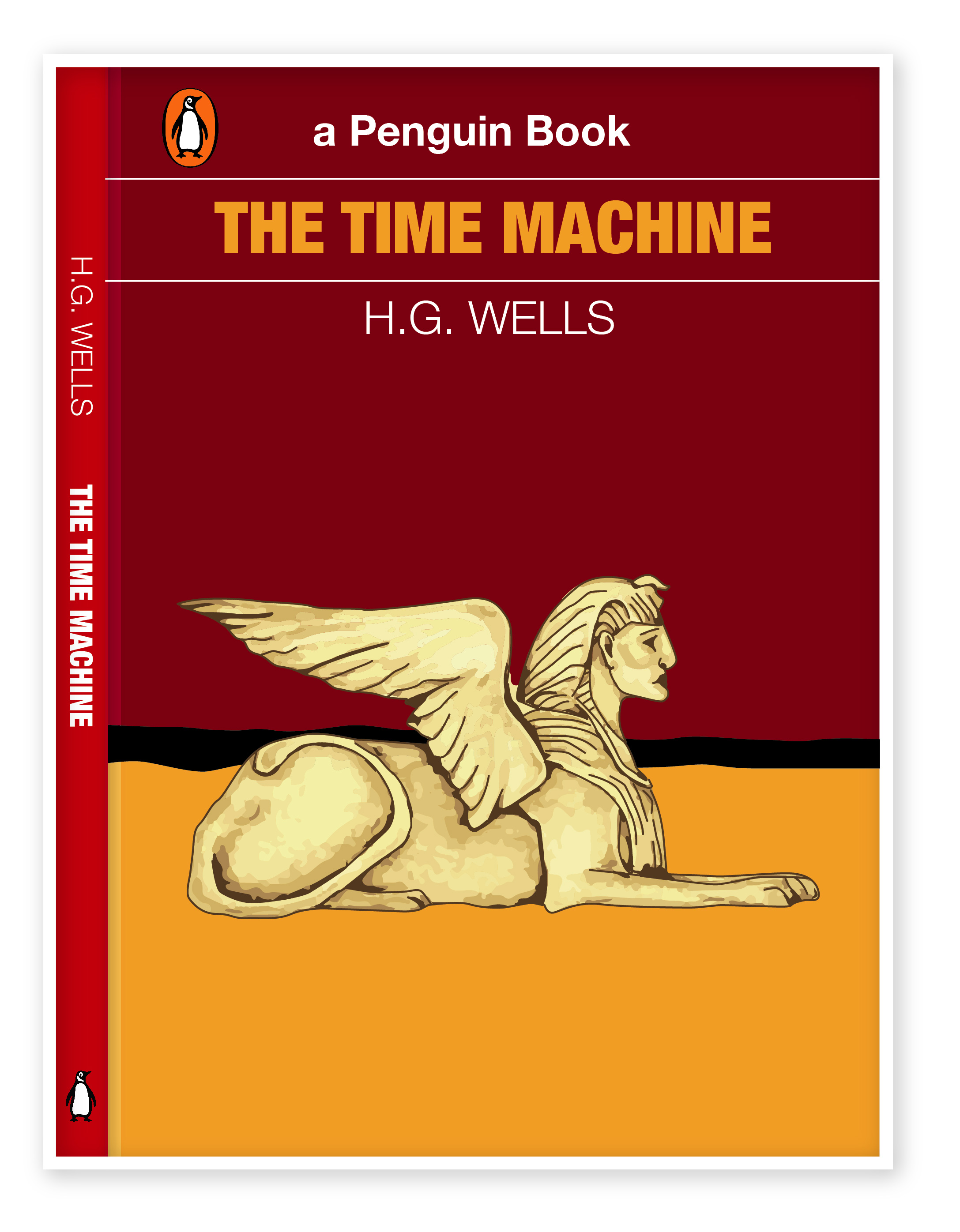
Book Cover Design of The Time Machine by Eleonora Davydovska

I’ve painted in Illustrator picture of Sphinx, adhering to the general style of drawing which I used in the book covers from above. I had trials with the colour for the main background, from light red to the darker shades, after that I went with burgundy background mixing with orange half in the bottom of the cover, and between them, I’ve put a black line, that to keep the horizon in the contrast. 

Overall, I think I’m quite satisfied with book cover design that I got in the result, as they all look in the same style, they are contemporary, eye-catching, and following the plot of each book. Also, all of them made in the same style, and they have some colours in common, like orange, blue, and red. Mind mapping and researches, with describing of each step was some sort of new experience, in the result I could see all job that I went through, with keeping an eye on the progress of the design. I would probably do some more sketches, because sometimes I keep most of the ideas in my head, selecting the best ones and improving them. However, I think I went through quite detailed researchers and in the result my paintings have proved the original ideas of itself.

Final H.G.Wells book covers

Covers-01

Exercise: Working to a brief

For this exercise, I had a task to analyse a brief.  The brief should cover basic questions:

• What are you being asked to do?
• How will the client judge a successful outcome to the brief?
• What are the keywords?

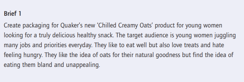
Brief 1

What am I being asked to do?
Create packaging for Quaker’s new ‘Chilled Creamy Oats’ product for young women looking for a truly delicious healthy snack.

How will the client judge a successful outcome to the brief?
If the product will reach the target audience, which is active young females and if the product will be sold well and will have a good profit.

What are the keywords?

  • Active
  • Healthy
  • Modern
  • Nutritious

An additional questions I would like to ask the client
What kind and shape of packaging is it going to be? It’s quite important to understand is it going to be one shape for packaging, or are there are a series of packaging for healthy snacks?

Ideas for packaging
Option 1. Plastic yoghurt cup with a sealed foil coating. Is the plastic or wooden spoon meant to be included? Does it require to be a plastic cup on the top?
Option 2. Plastic bottle shape
Option 3. Paper Packaging

As soon as I get a feedback regards the shape of packaging, I would like to find out some design specifications:

  • What are colours requirements?
  • What is the final size of the packaging?
  • How many millilitres each packaging does contain?
  • Is design is going to be printed on the actual package, or shall it be a separate label?
  • Shall it be used only vector images, or raster images as well?
  • What images should be included in the design?
  • How many types of flavours is it going to be?
  • What is the main slogan? Or it should be invented as well?
  • What font shall I use?

Where and how it will be reproduced?

  • Is it a limited version of snacks for a special occasion or they will be constantly printed?
  • Do you have contacts of printing company?
  • If yes, what is the name of that company?
  • What requirements do the printing company have?

I will need to incorporate illustrations, photographs or diagrams. Who will supply these?

  • Who is the main contact?
  • Who will send me a brand book, logo, font requirements?
  • Is it going to be all photographs made by Quaker’s copyright photography, or should it be paid images from photo stock bank? Or is it mixing of both?

What are the timescales?
When would you like to see the initial ideas, the proofs, when the artwork goes to print and when the finished job is distributed?

What is the budget I need to work to?
I charge the client only for the design, or should the invoice be included in the estimate for printing on the packaging?

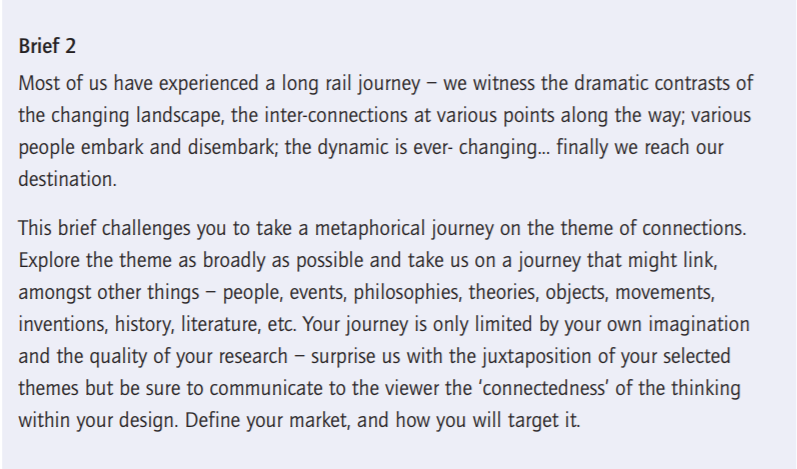
Brief 2

What am I being asked to do?
Give to the client creative ideas of the metaphorical journey on the theme of connections, that might link to the all kind of things – people, events, philosophy, theory, objects, history, literature, etc.

How will the client judge a successful outcome to the brief?

If the client will be satisfied with creative ideas and innovative design that I’m going to produce. If the design is going to meet up with requirements, target audience and marketing plan of the customer?

What are the keywords?

  • Dramatic Contrast
  • Changing Landscape
  • Inter-connections
  • Journey

An additional questions I would like to ask the client

  • Who is the target audience?
  • What are the timescales?
  • What is the budget I need to work to?
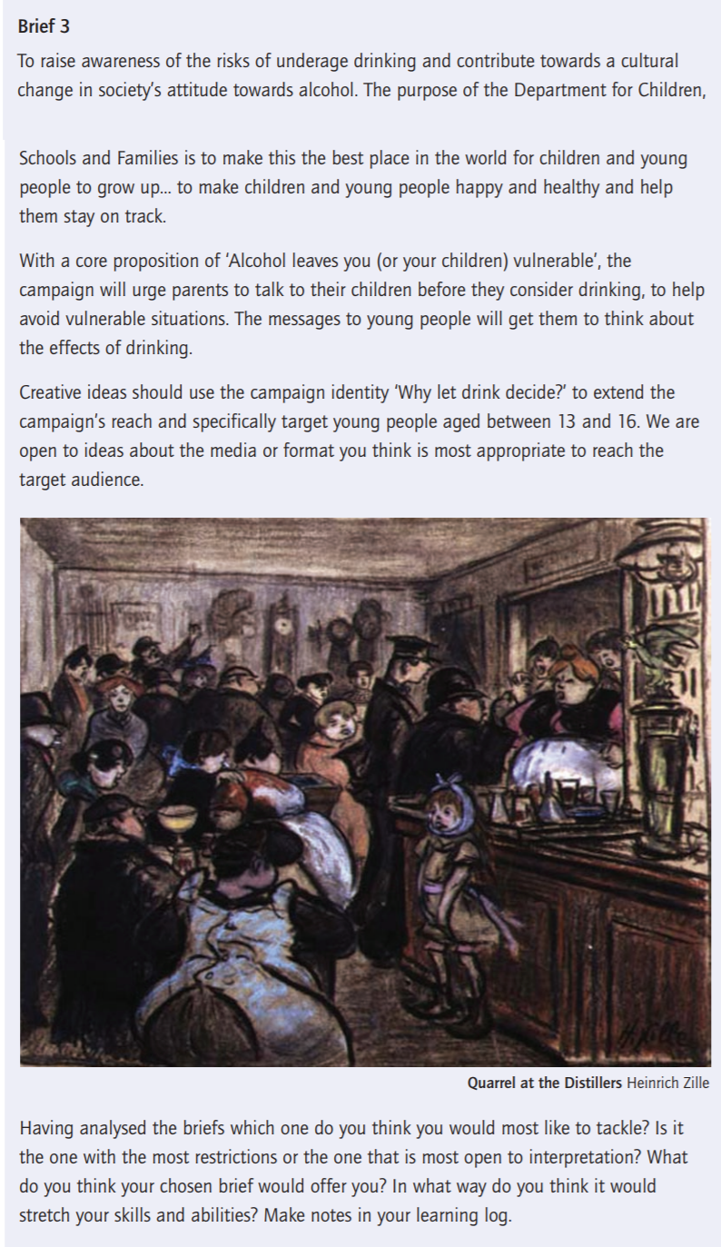
Brief 3

What am I being asked to do?
Create ideas for the campaign ‘Why let drink decide?’ targeting the main audience – young people aged between 13 and 16.

How will the client judge a successful outcome to the brief?
If the product will reach the target audience, which is young people aged between 13 and 16. If the campaign will communicate effectively with the target audience, helping young people avoid drinking and to be less vulnerable.

What are the keywords?

  • Underaged drinking
  • Children
  • Society
  • Awareness
  • Family
  • Health
  • Vulnerable

In conclusion

Having analysed the briefs I think the first one would most like to tackle. As to me, that is the most open to interpretation, while I was reading it I imagined ideas, keywords and design sketches that I will use while creating visuals for the customer. I think the first brief will help me to make some sketches and drawings for the packaging design, analyse the history of the brand and go back to their origins that to provide a new sort of design.