https://www.malikafavre.com/
[Accessed May 2019]
https://www.malikafavre.com/
[Accessed May 2019]
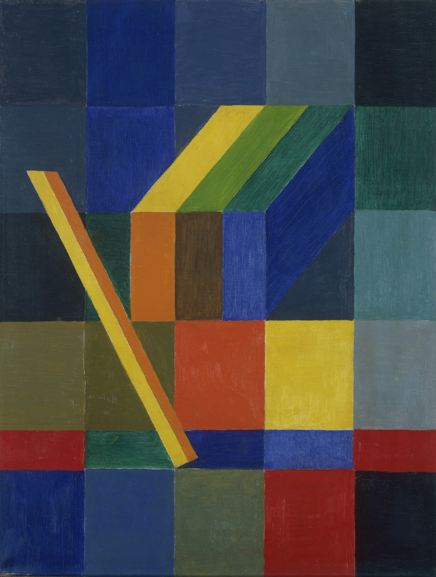
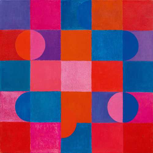
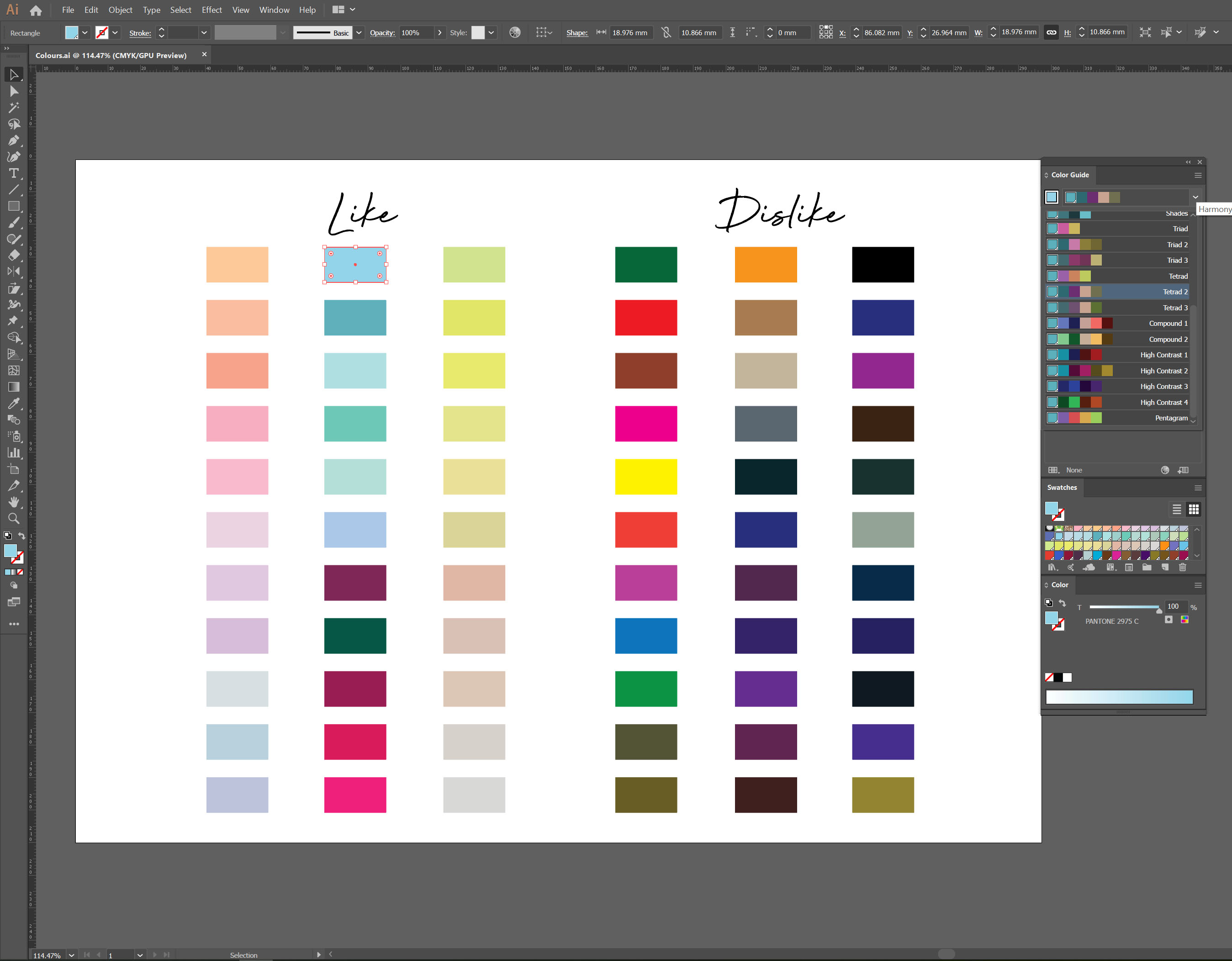
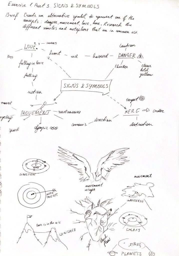
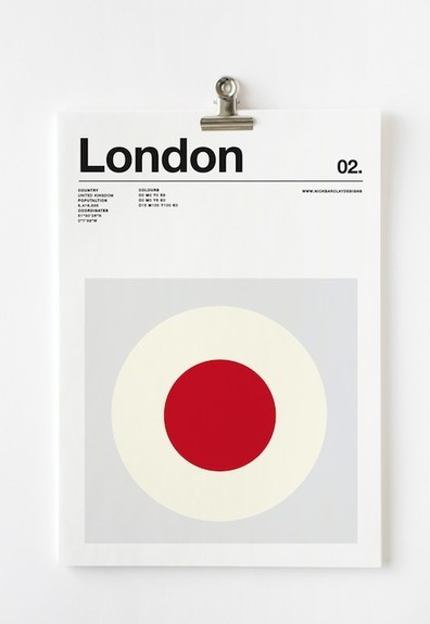
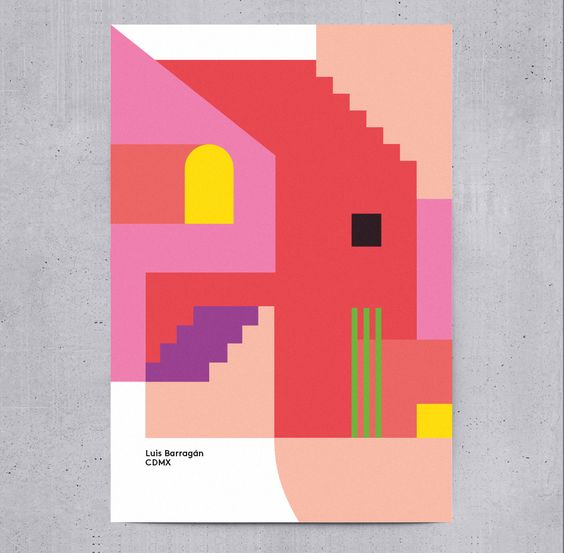
Brief: Create a series of 10 abstract designs in which you balance blocks of subordinate, dominant and accent colours.
These designs are going to be used as covers for guidebooks to the following cities:
- Madrid
- Malmo
- Managua
- Manchester
- Manhattan
- Marrakech
- Marseilles
- Melbourne
- Montreal
- Mumbai
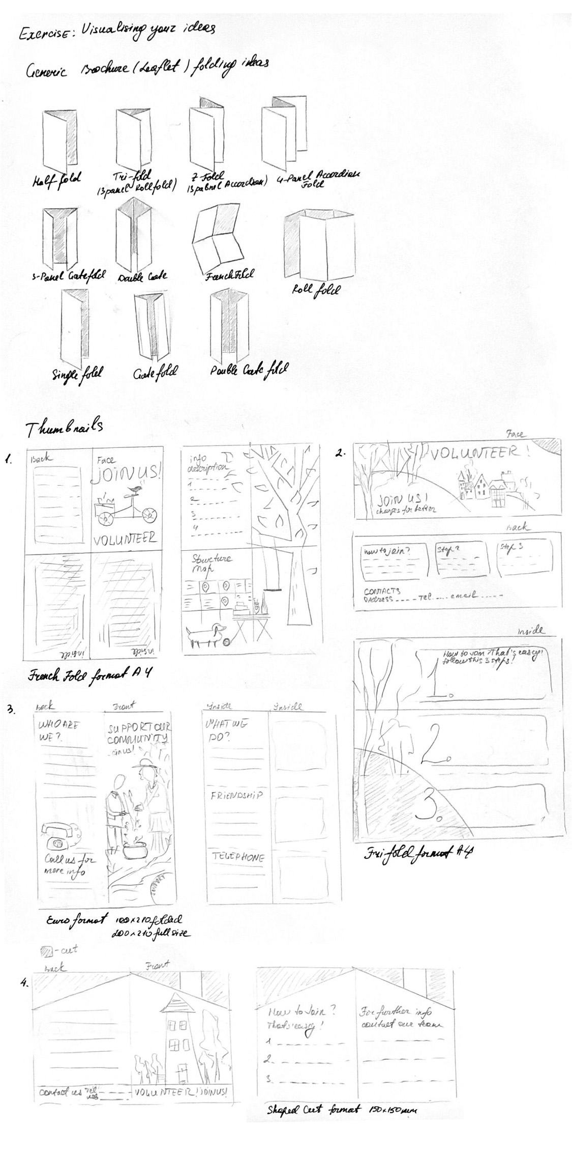
The books are going to be A5 landscape (210mm x148mm) size. You can use as many colours as you like and need to include the name of the city – where you place this and its colour are also important decisions to make. You may want to find out more about each city to help you develop your colour palette and also the size, shape and positioning of the colour blocks. Explore your DTP packages further by creating the artwork in the different software packages you have to experiment with the possibilities and ease of use. You can also do this exercise on paper using coloured blocks that you can cut and move about. Make notes in your learning log as you research and create your designs.
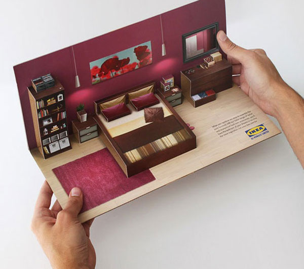
What? A5 landscape (210mm x148mm) size guidebooks
Target Audience: Travellers.
How will the client judge a successful outcome to the brief?
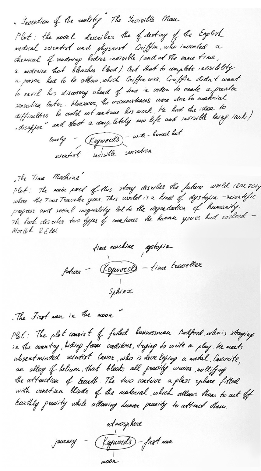
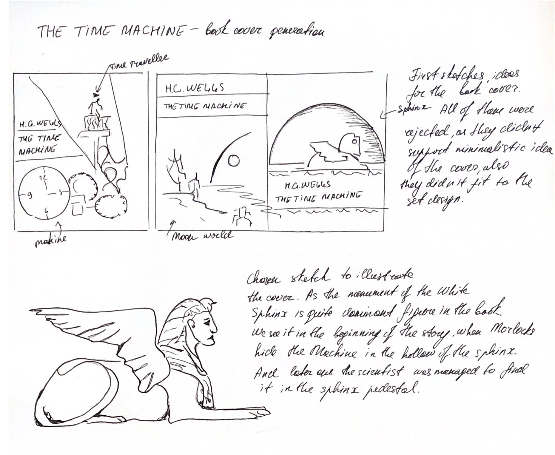
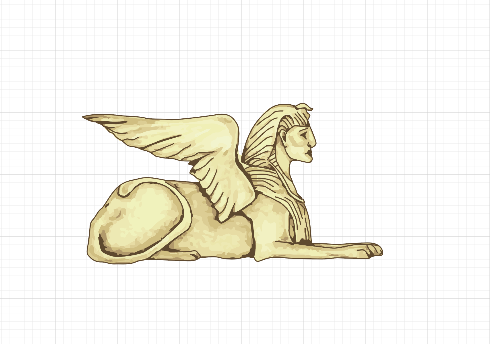
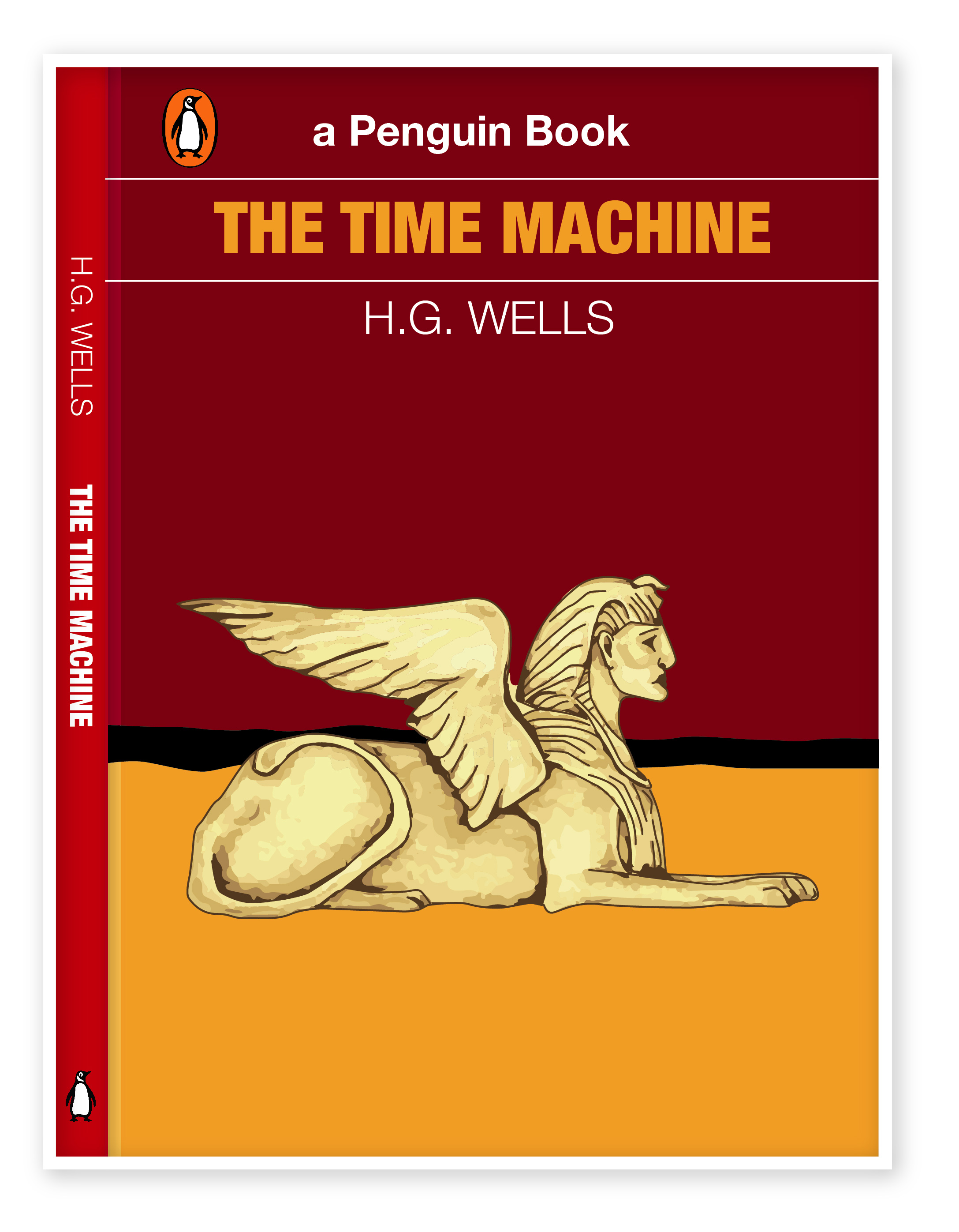
Original colour solution for abstract cities to familiarize tourists with the cultural features of the city.
Keywords:
- Subordinate
- Dominant and accent colours
- Abstract cities
Secondary Research
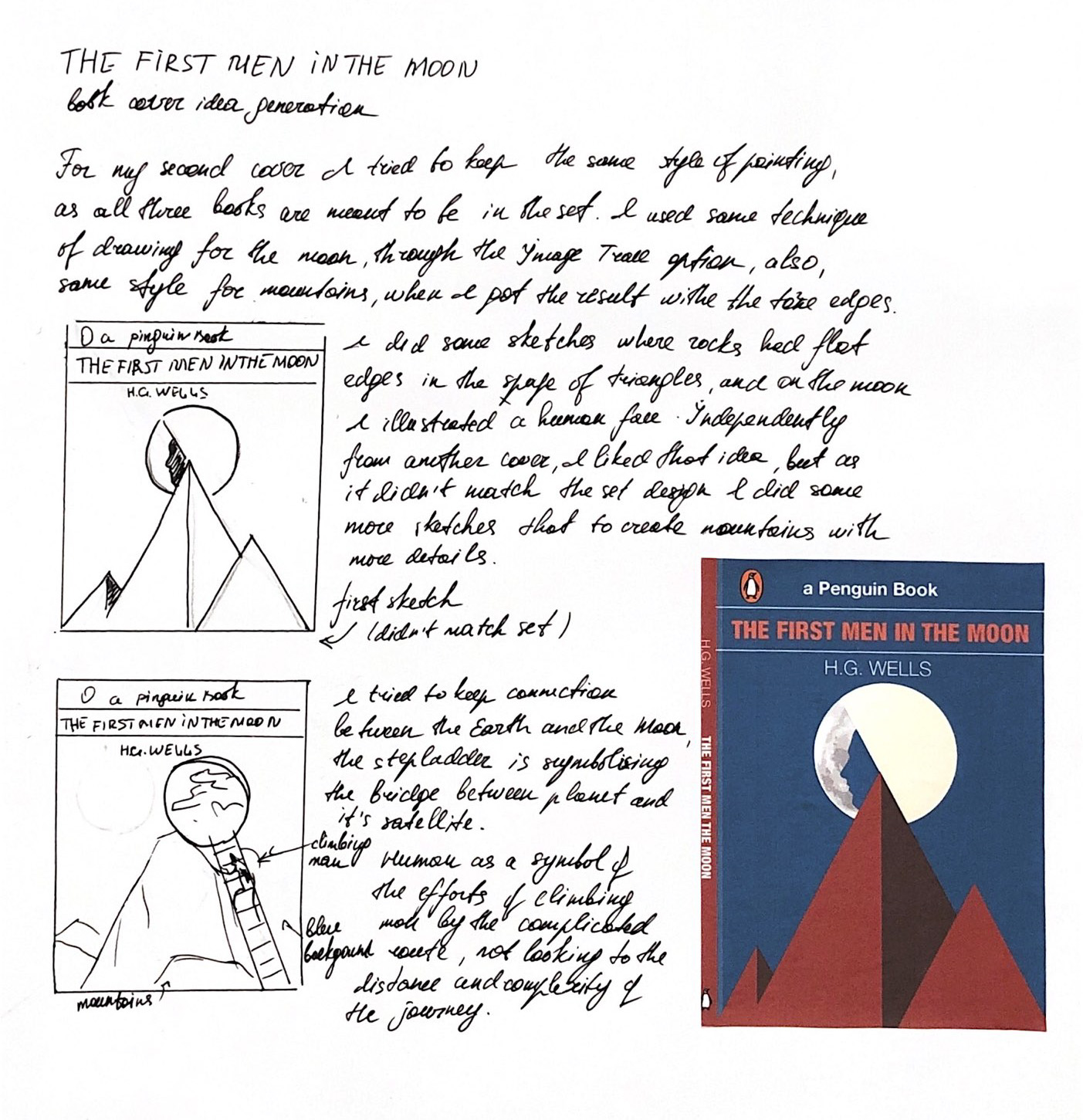
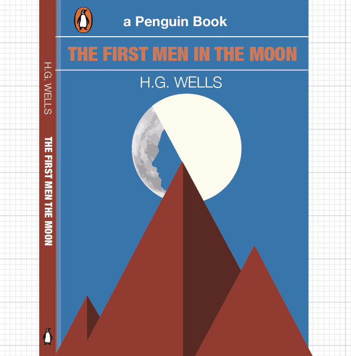
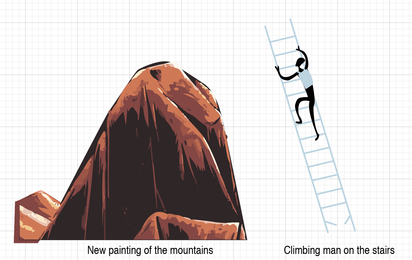
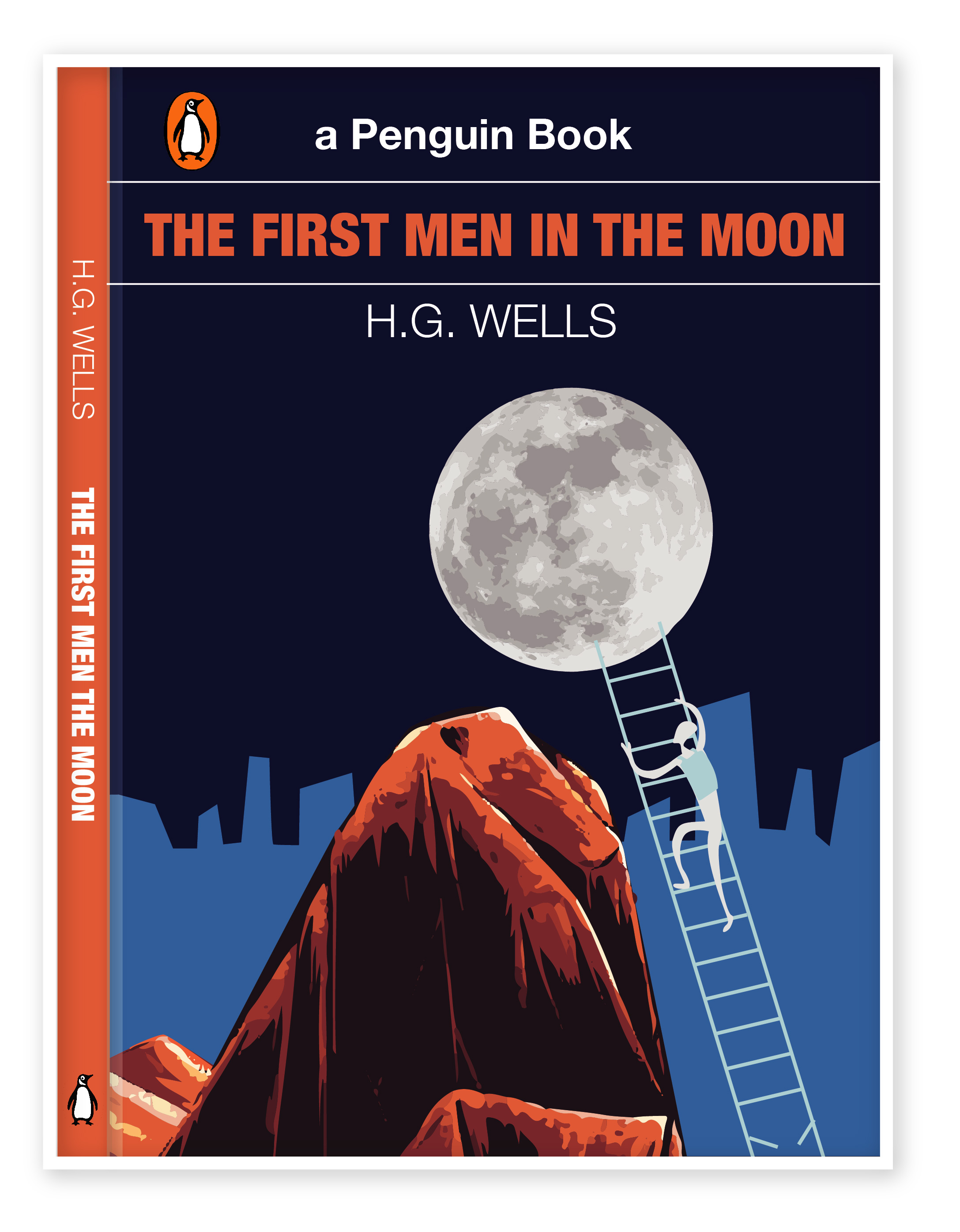
For this task, I was building the idea following the main attractions that would be associated with a particular city. From the list above, I visited only one city, and this is Manchester, but this assignment served as an excellent motivator for me to discover the world’s places based on their colours and their main attractions. The goal of this exercise is to attract the flow of tourists to less popular cities. Because the list of cities was quite complicated, I could not immediately imagine what could be so unique in Madrid, Malmo or in Managua, the last one I had never heard of before. Therefore, to begin with, I needed to collect a series of photographs, where I could build a picture of the features of the city, colour solutions, due to which I could convert into geometric shapes. I e discovered images from Pinterest, stock photos, as well as photos provided by a travel photographer from personal photo archives.
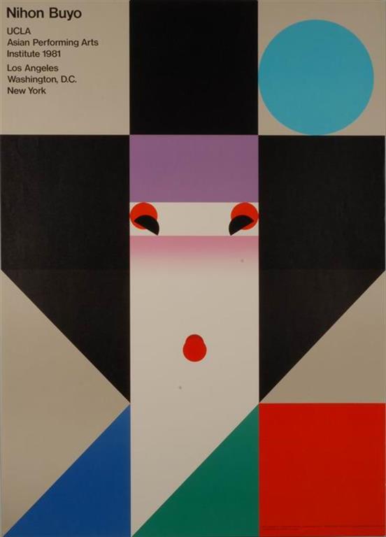
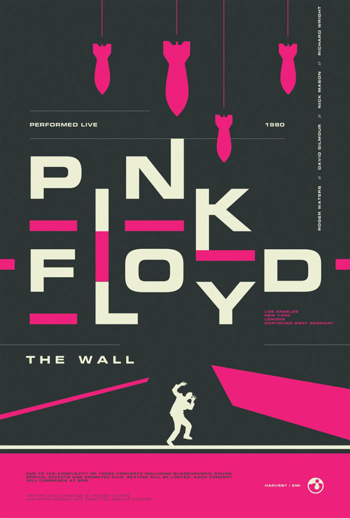
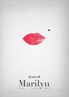
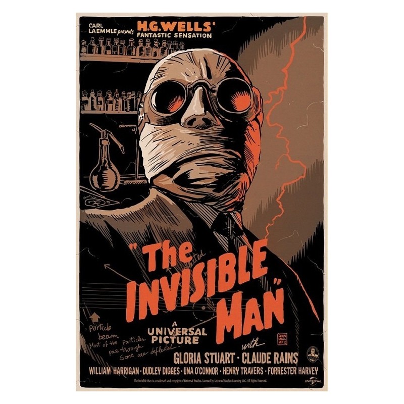
In the process of selecting photos, I came across to posters with illustrations of cities. I decided to keep them on the inspiration board, even though these posters were made in a more artistic style, they looked at a kind of colour solutions that would be useful when analysing my assignment.

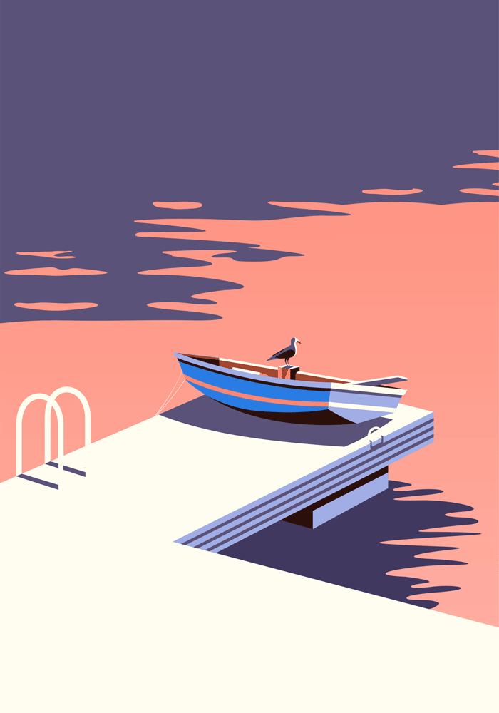
Polzeath poster from Pinterest 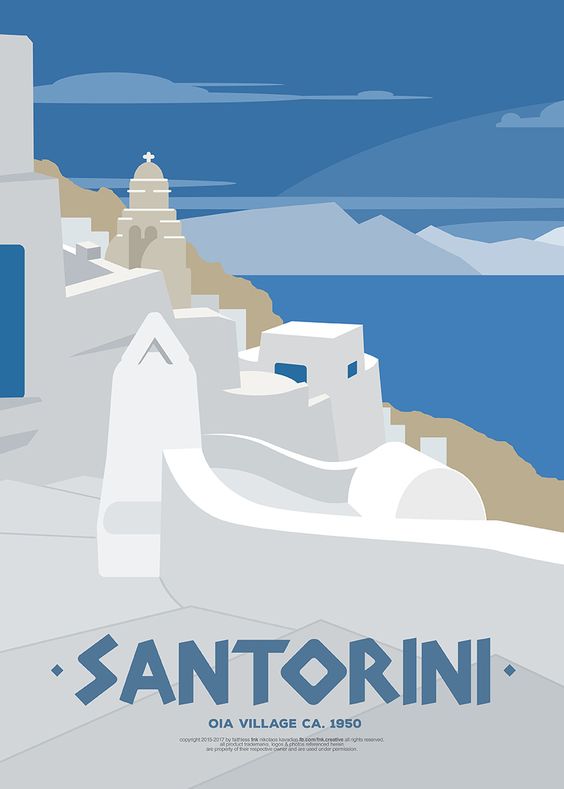
Santorini poster from Pinterest 

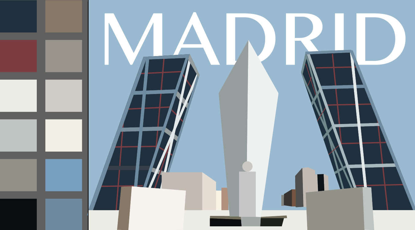
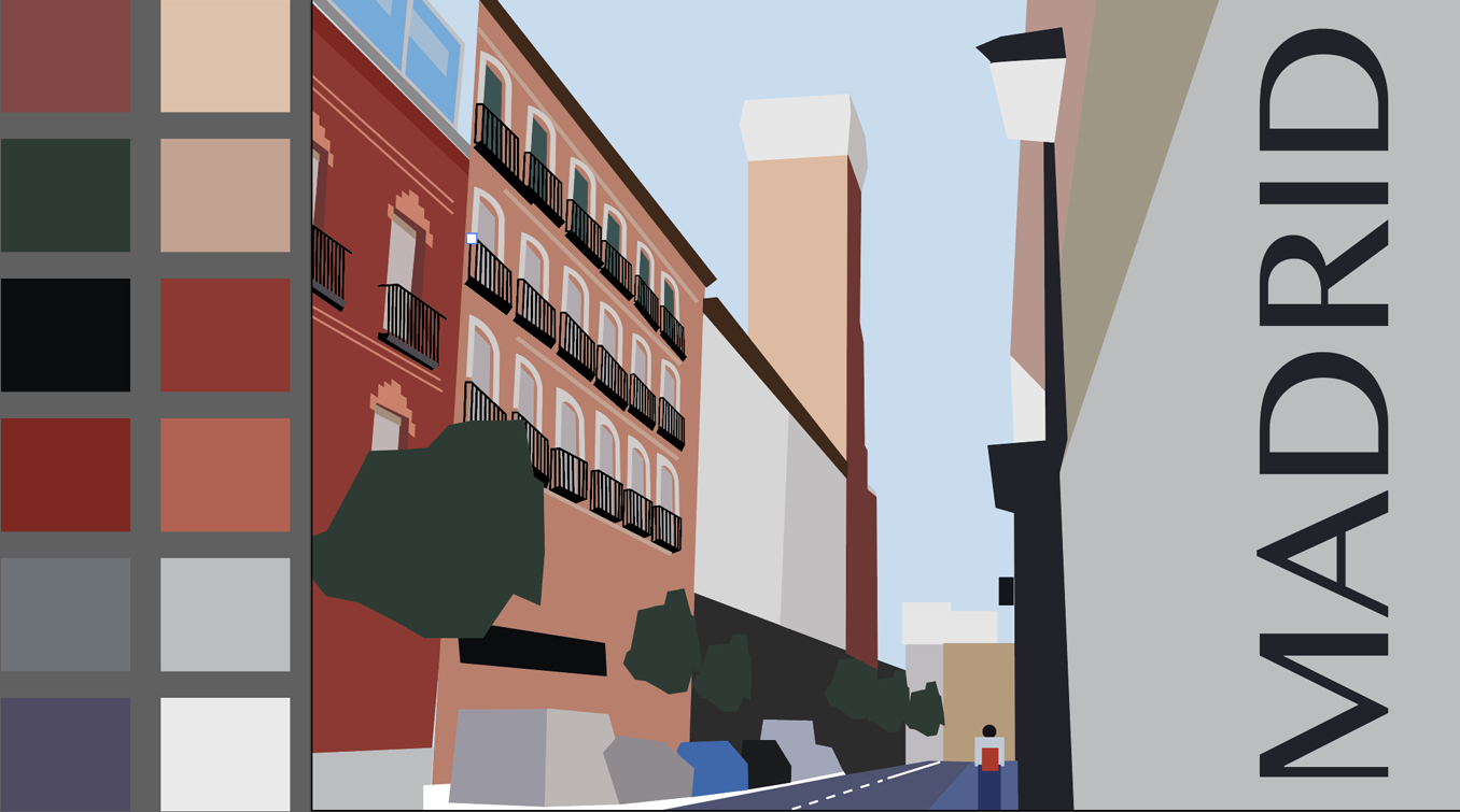
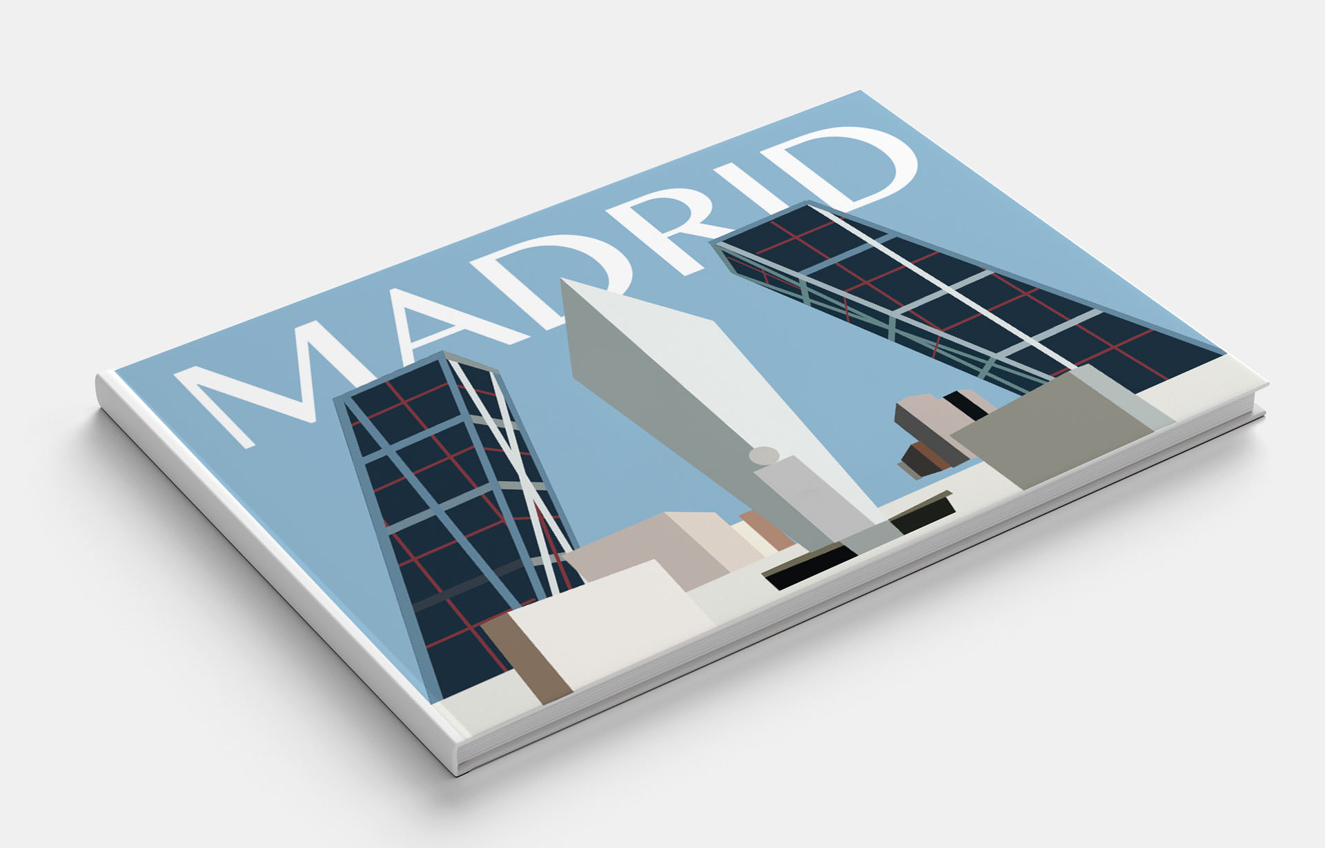
Madrid
Madrid is the cultural capital of fashion and style and shopping. My friends mentioned visiting Madrid city, so I knew there is a square in the centre of the town, the cathedral and the blue-grey colours. But my searches on the internet opened Madrid for me from a new angle. I noticed that architectural solutions are quite impressive in it. Madrid is an influential fashion centre with many international museums, including the Prado Museum, the Reina Sofia Art Center, the Thyssen-Bornemisza Museum and the Madrid Forum, which are among the 100 most visited museums in the world.
iStock Images 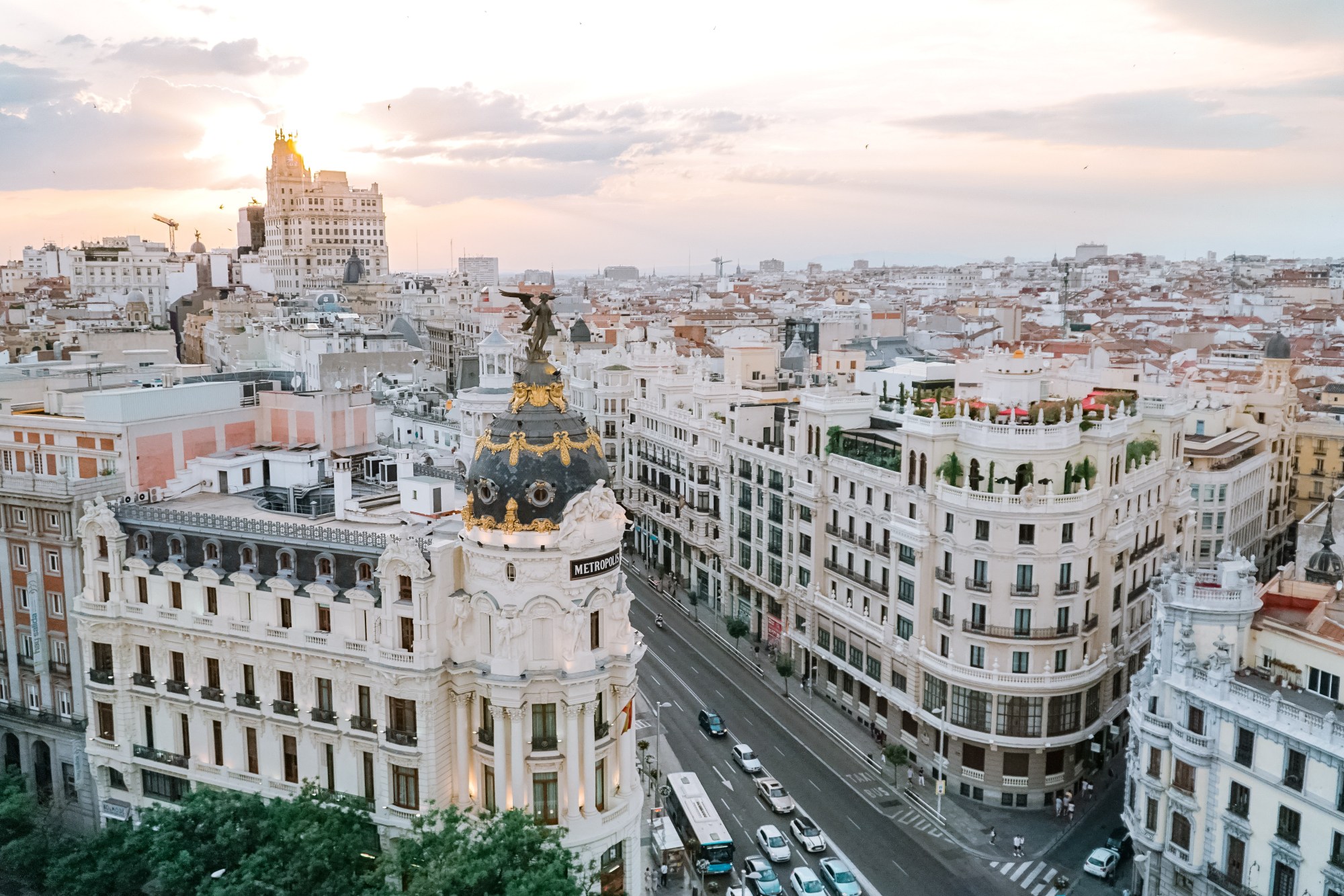
http://tourdelust.com/madrid/
[Accessed May 2019]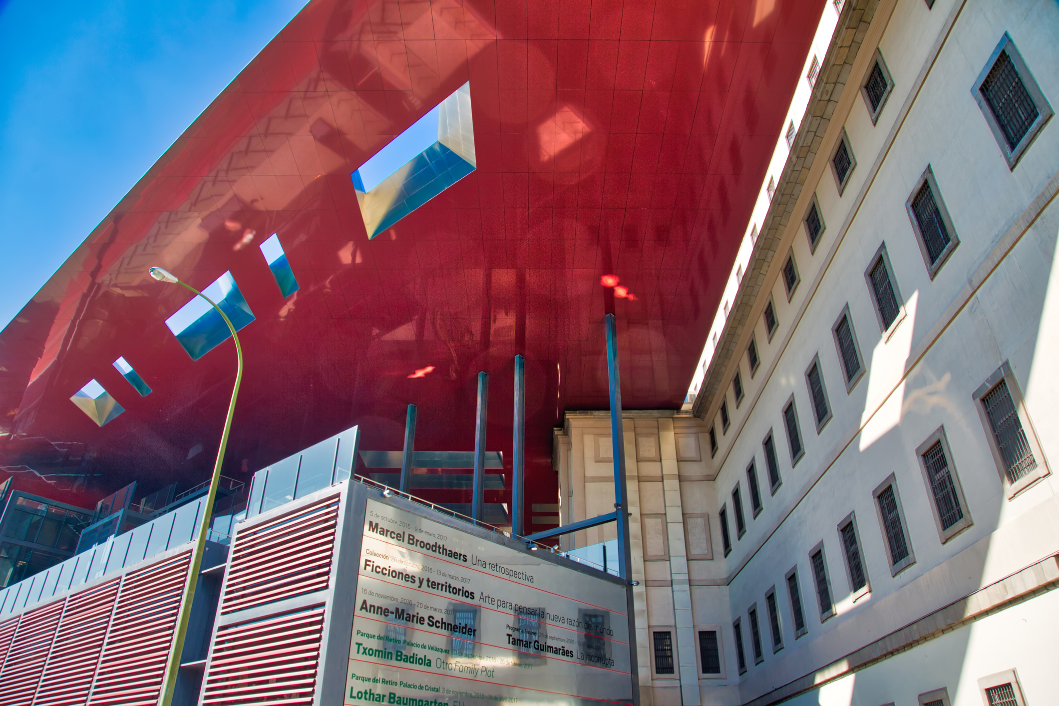
Madrid, Spain-16 October, 2017: Reina Sofia Museum of Art
Istock Images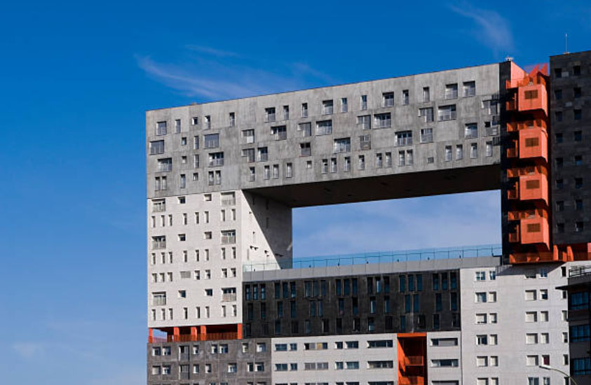
iStock Images 
http://tourdelust.com/madrid/
[Accessed May 2019]
Madrid Fashion Week 2017 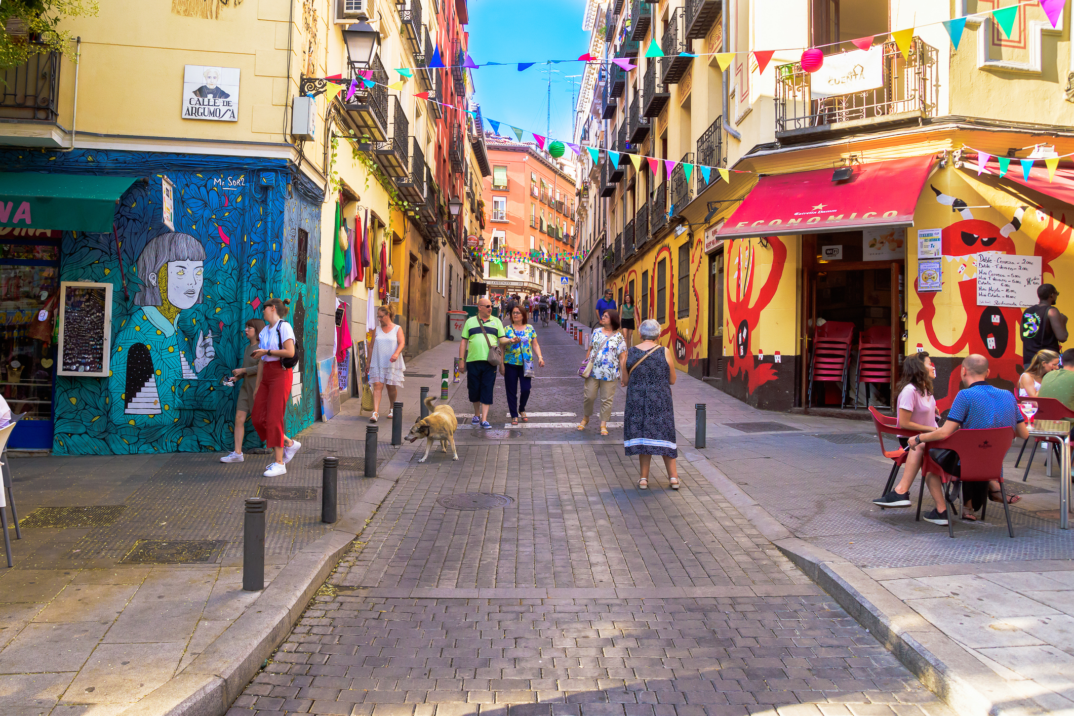
iStock Images 
http://tourdelust.com/madrid/
[Accessed May 2019]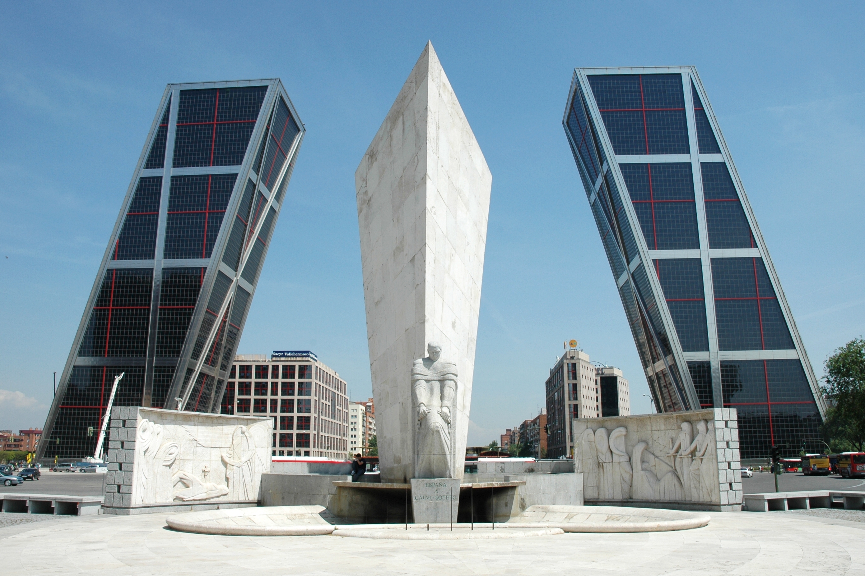
iStock Images 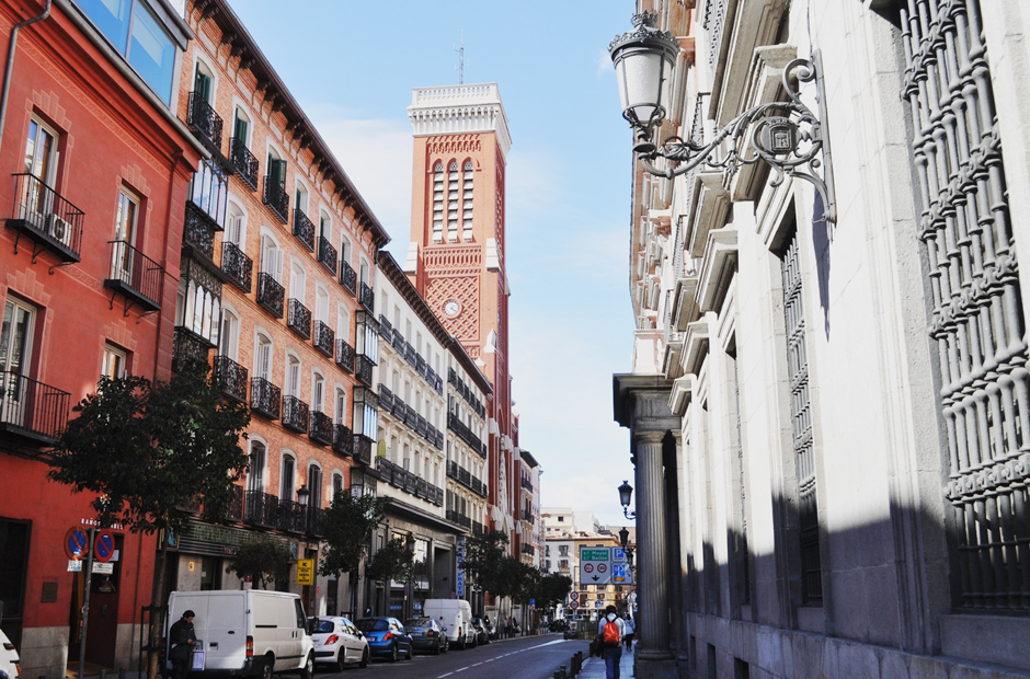
https://34travel.me/post/madrid
[Accessed May 2019]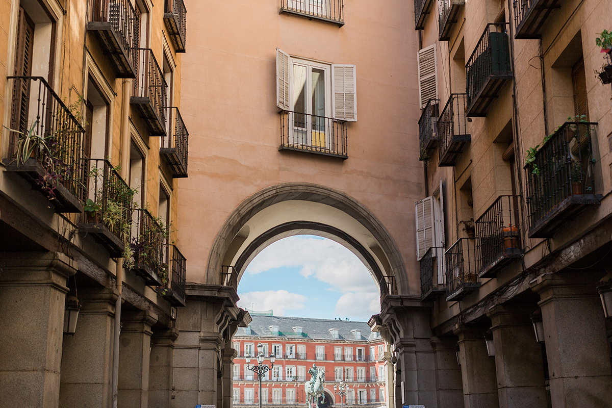
https://34travel.me/post/madrid
[Accessed May 2019]
For the beginning, I analysed images that would describe Madrid in general terms. I was attracted to the modern architecture in Madrid, which could be popularised.
Just as an option, I decided to portray more traditional and recognisable street in Spanish style. I liked the variations of colour in which there were red, warm shades; in this image, the spirit of Spain was present. But still, I would give preference to the first version, made in cold tones, in my opinion, it is more urban and progressive for an abstract task. Options for Madrid picture and book cover are presented below.
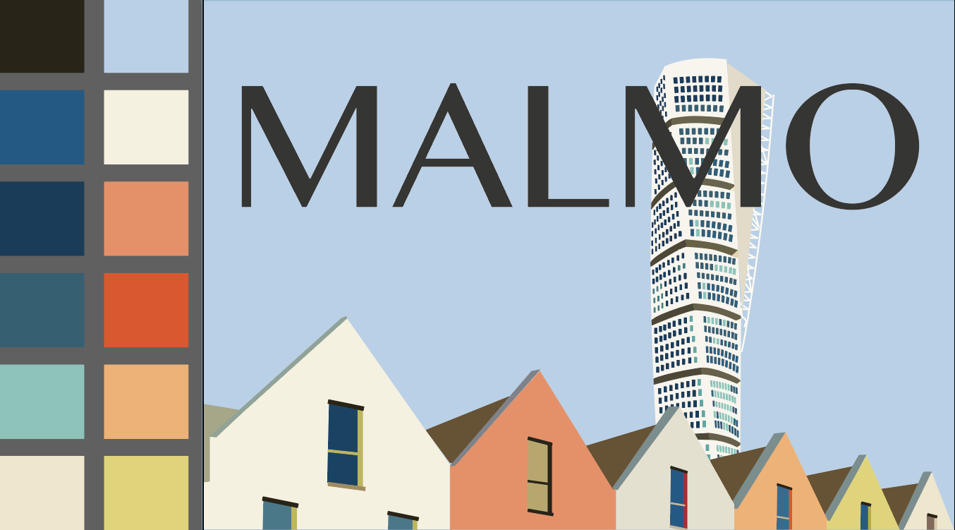
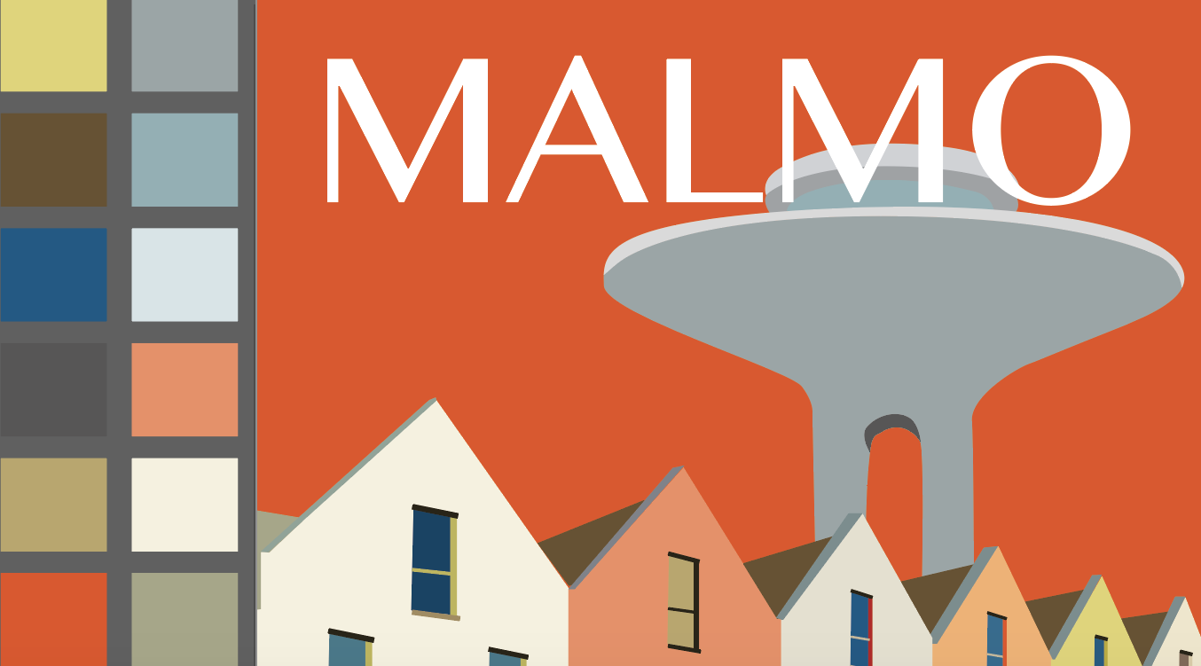
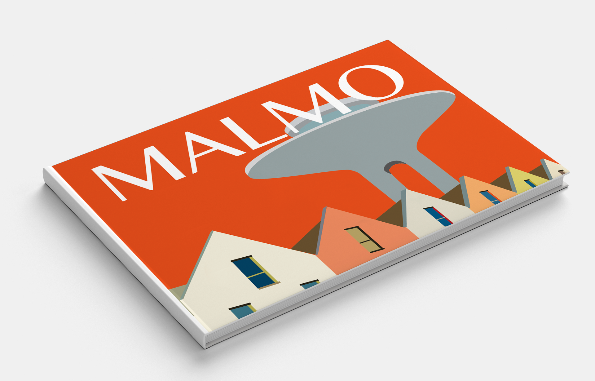
Malmo
When I started choosing photos for the city of Malmo, I discovered the urban, modern, progressive city, which combines traditional architecture with modern buildings. From the beginning, my enthusiasm led me to the image of a tall building. But after analysing, I concluded that the design turned out to be too detailed, so I chose to depict another impressive building Water Tower, which I did in different colours of authentic buildings.

Pinterest Images of Malmo 
Istock Images 
Pinterest Images of Malmo 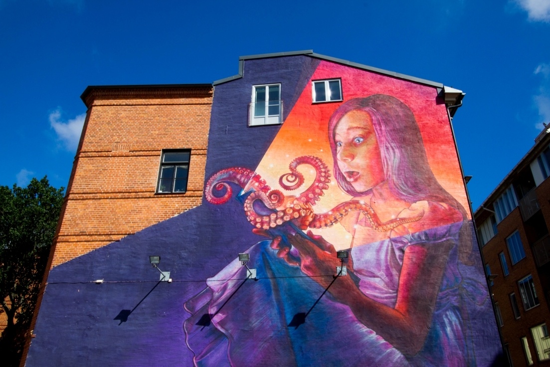
Pinterest Images of Malmo 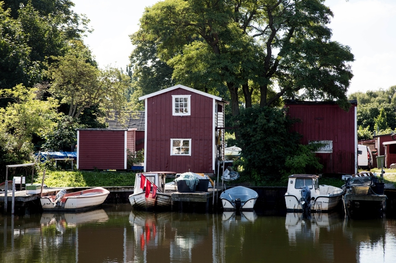
Pinterest Images of Malmo 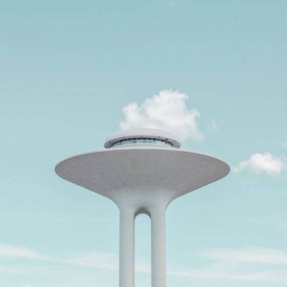
Pinterest Images of Malmo 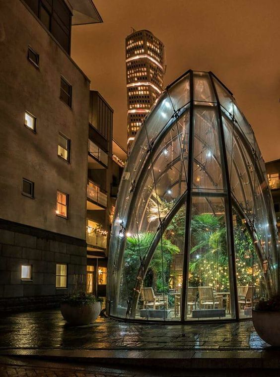
Pinterest Images of Malmo 
Shutterstock Images 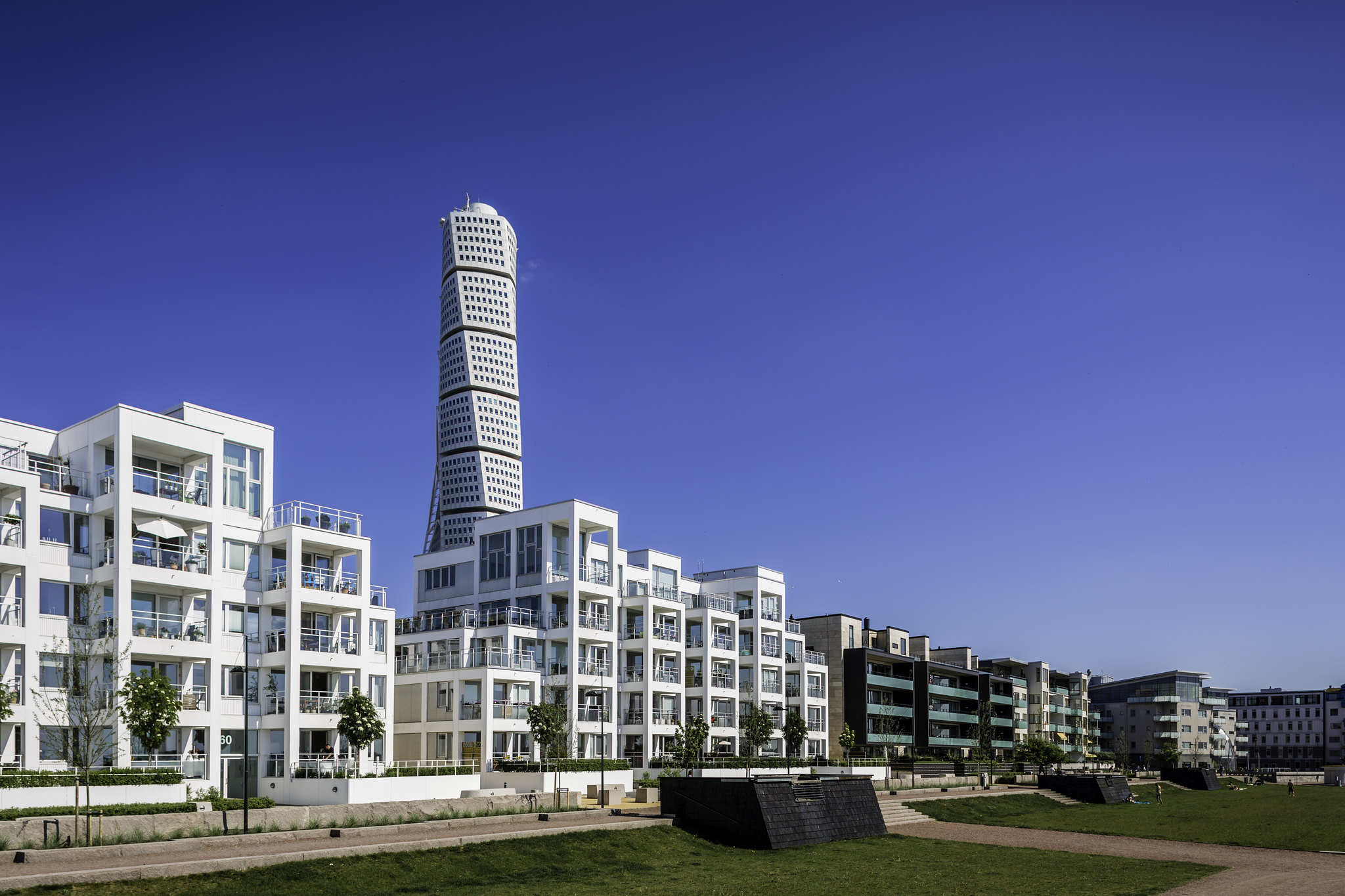
Flickr Images of Malmo 
Flickr Images of Malmo 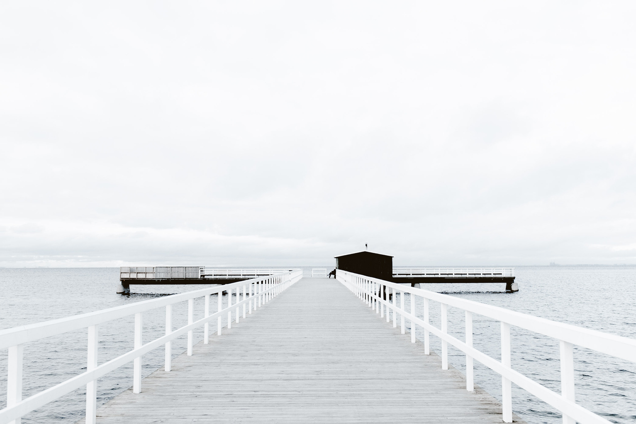
Sauna jetty in Malmö, Sweden
For contrast, I decided to try brighter colours for the background colour; in my opinion, the bright orange colour successfully emphasised the uniqueness of the area. Design variants are presented below.
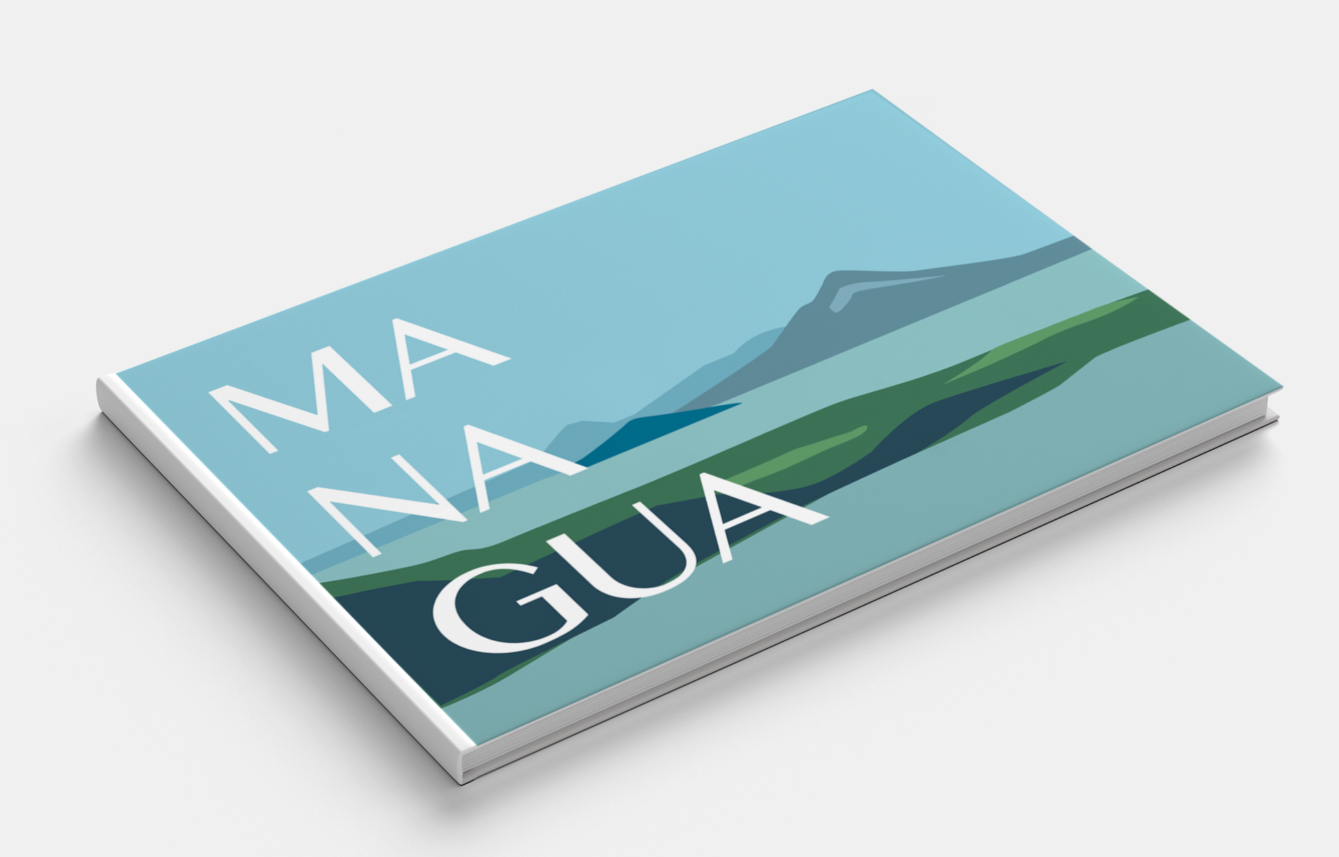
Managua
Managua for me turned out to be another exotic place. Colourful peculiar city, with its culture and features.

Pinterest Images of Managua 
Pinterest Images of Managua 
Pinterest Images of Managua 
Shutterstock Images 
Flickr Images of Managua Streets 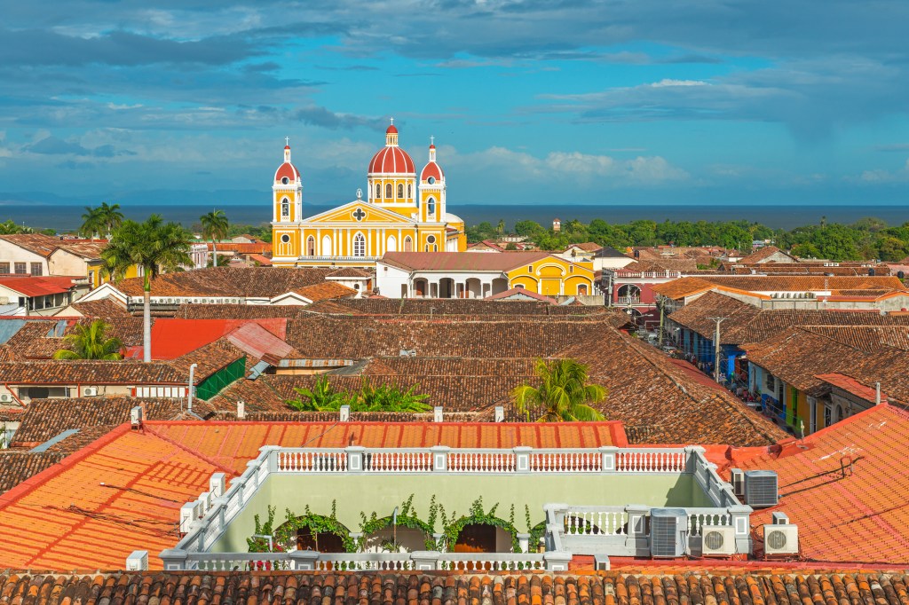
Flickr Images of Managua 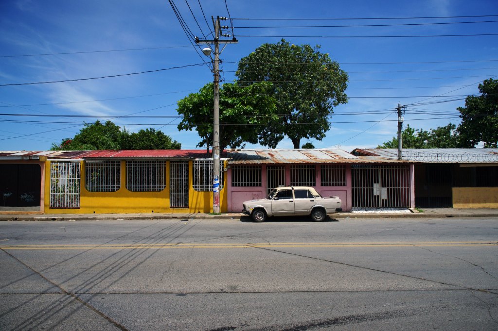
Flickr Images of Managua Streets 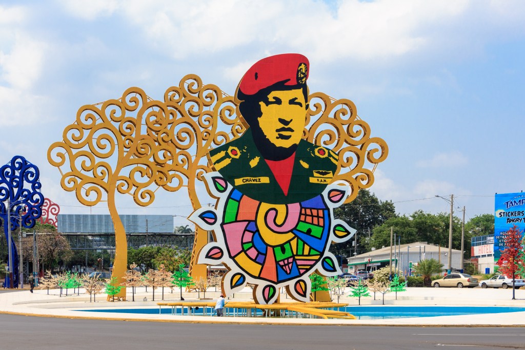
Flickr Images of Managua
I collected a small set of paintings that deserve attention, but as a milking abstraction, I wanted to portray nature outside the city. I liked the combination of green and blue shades; in my opinion, this could serve as an incentive to attract tourists to the original city of Managua.

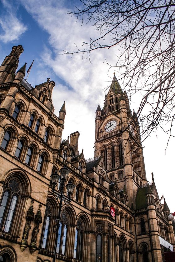
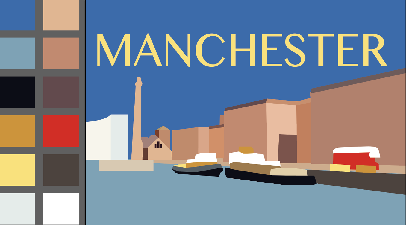
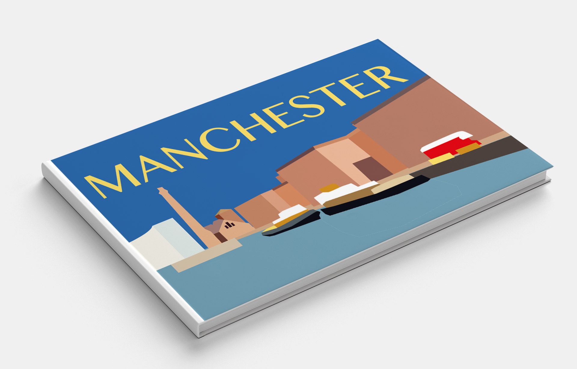
Manchester
Known for its football club and music scene on which such bands as The Smiths and Oasis performed, this centre of sports and the arts is a famous and friendly city. A modern progressive city filled with the spirit of freedom. I wanted to portray Manchester in contrasting colours, with a consistent style of architecture.
Pinterest Images of Manchester 
Pinterest Images of Manchester 
Pinterest Images of Manchester 
Pinterest Images of Manchester 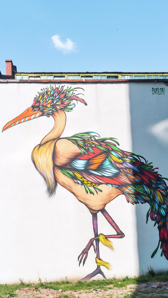
Pinterest Images of Manchester 
Pinterest Images of Manchester 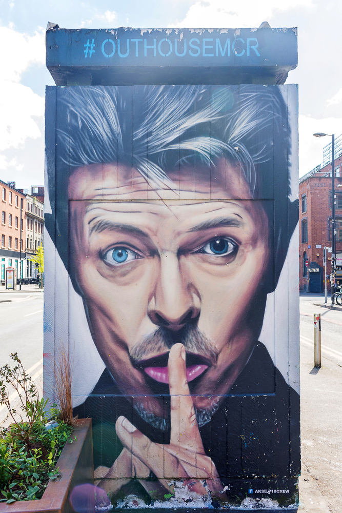
Pinterest Images of Manchester 
Pinterest Images of Manchester 
Pinterest Images of Manchester 
Pinterest Images of Manchester 
iStock Images of Manchester 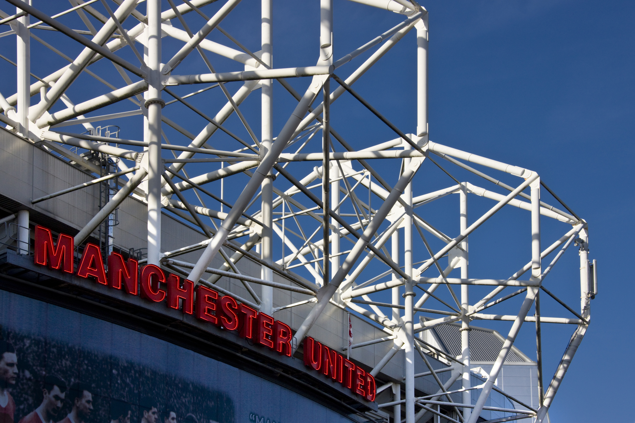
iStock Images of Manchester
For the sky, I chose an unrealistic bright blue colour, which, in my opinion, created a unique colour feeling for this place. I think I was managed to picturise the traditional English city with modern features.
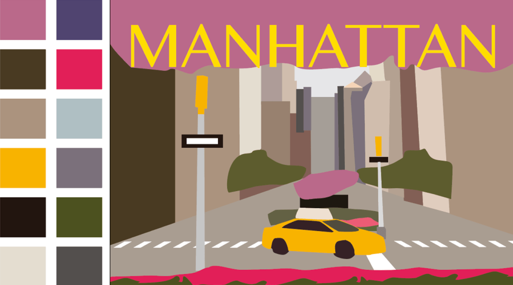
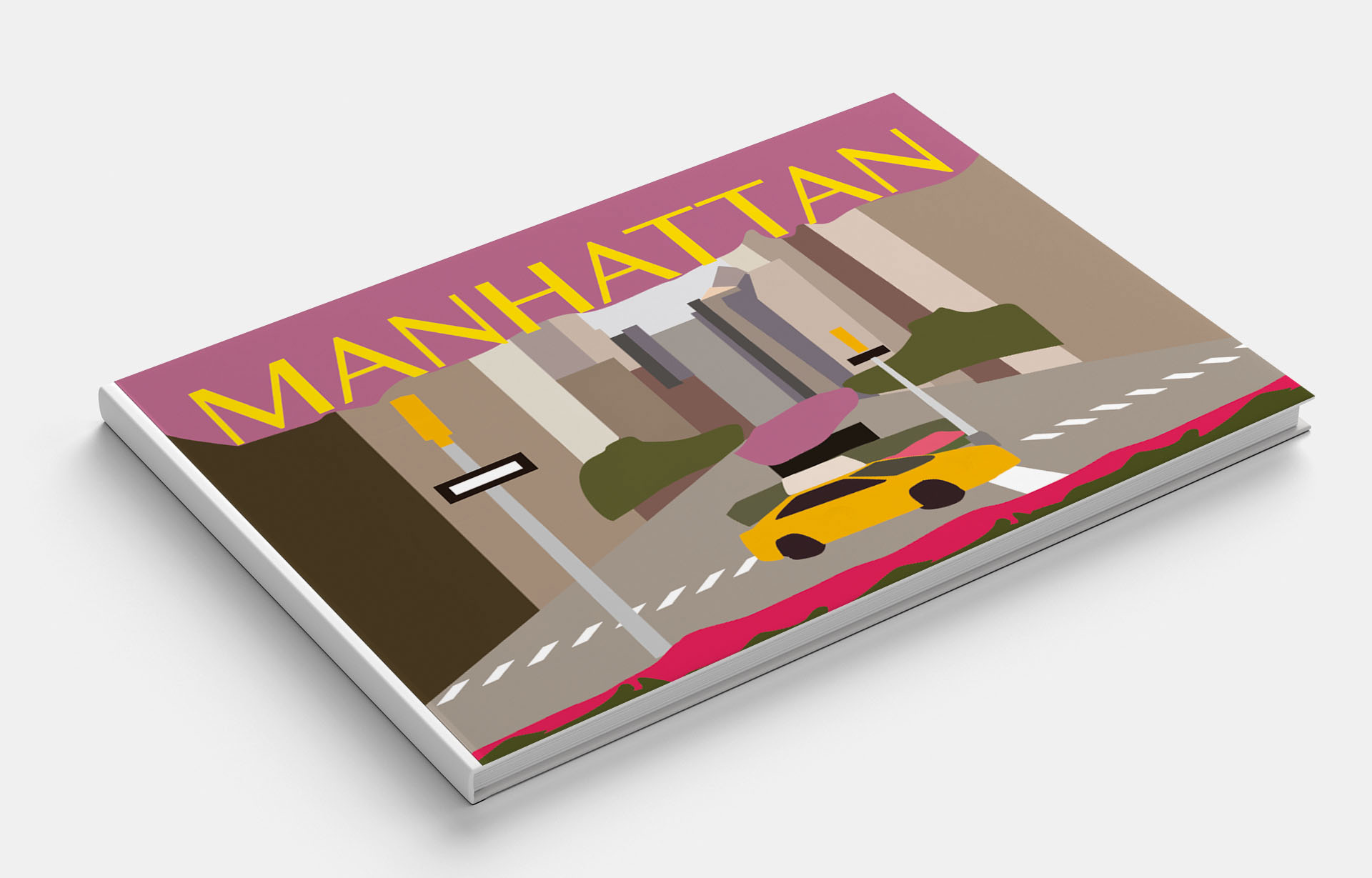
Manhattan
Manhattan is the historical core of the city of New York and one of its five boroughs. The city is primarily associated with tall skyscrapers, shopping centres, bright billboards and Broadway. The attitude towards it cannot be unambiguous, because achievements, history and modernity are intertwined together. To study and understand Manhattan is difficult, it is immense, diverse and unique.

Pinterest Images of Manhattan 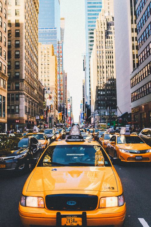
Pinterest Images of Manhattan 
Pinterest Images of Manhattan 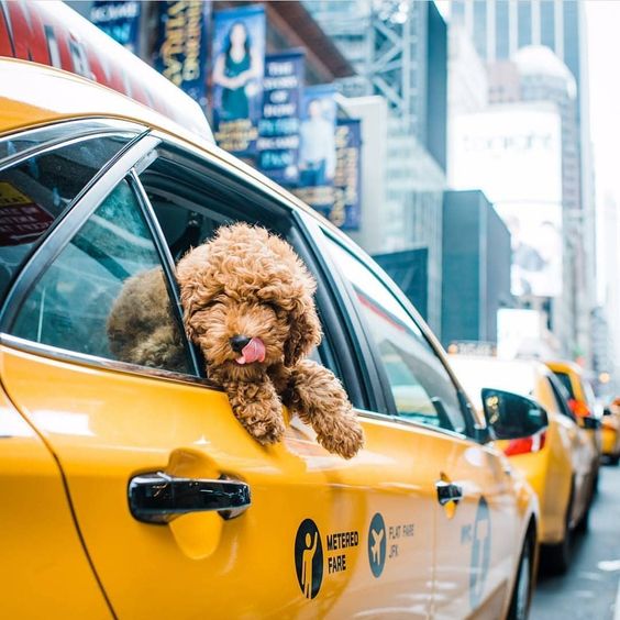
Pinterest Images of Manhattan 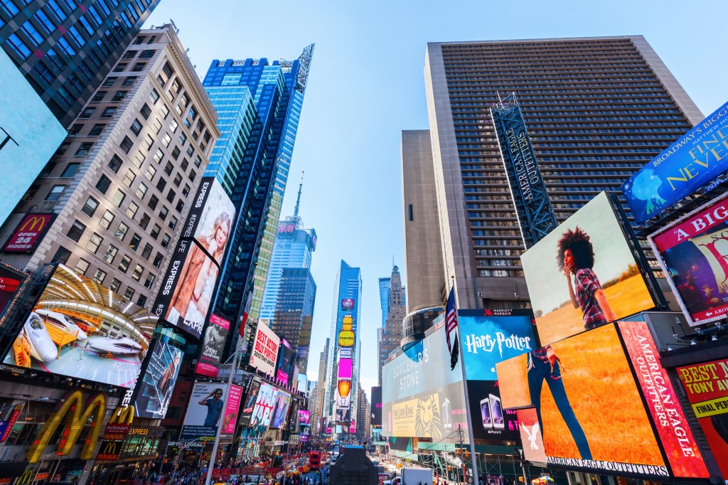
iStock Images New York City 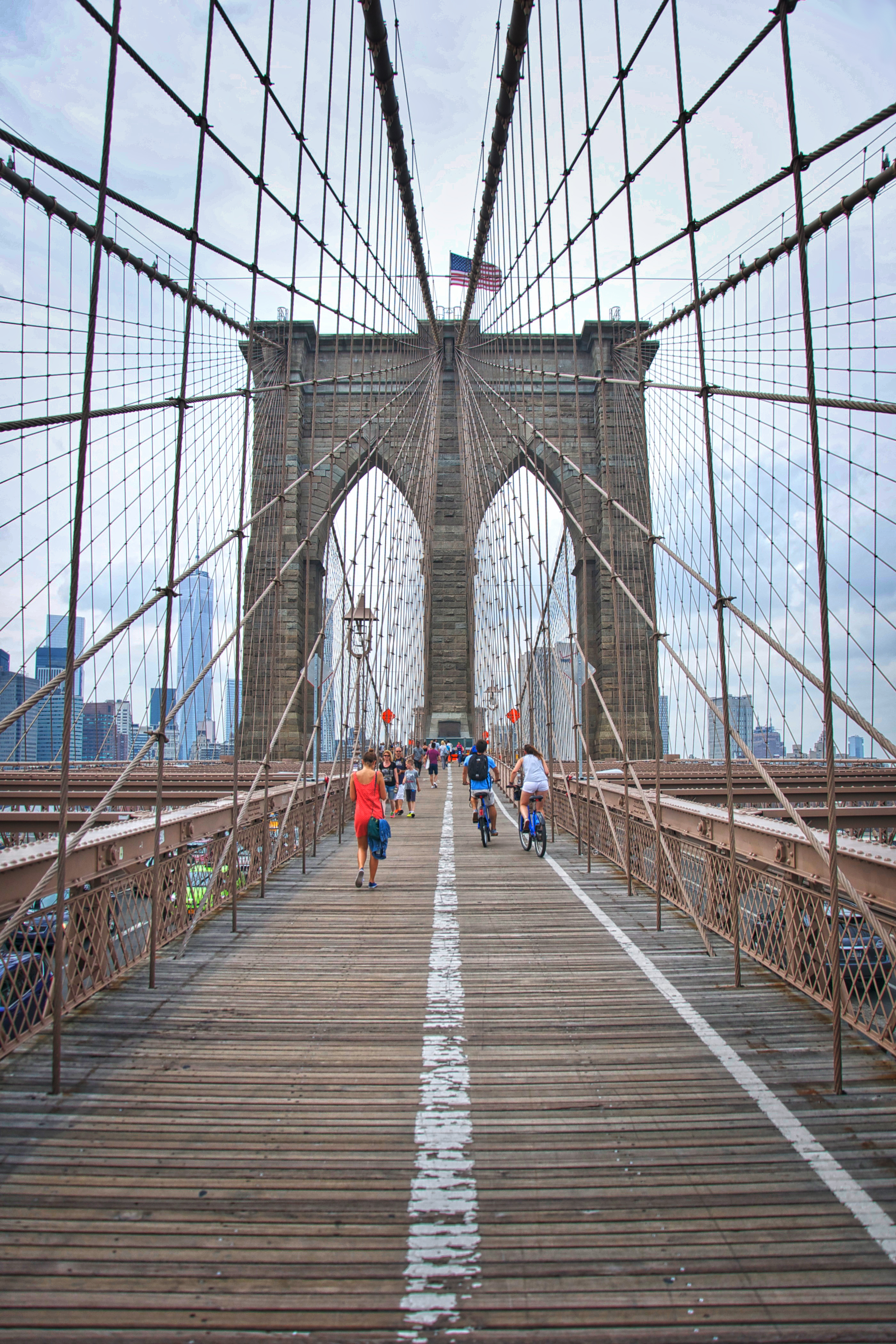
© Steven Stanley Photography
© Steven Stanley Photography
© Steven Stanley Photography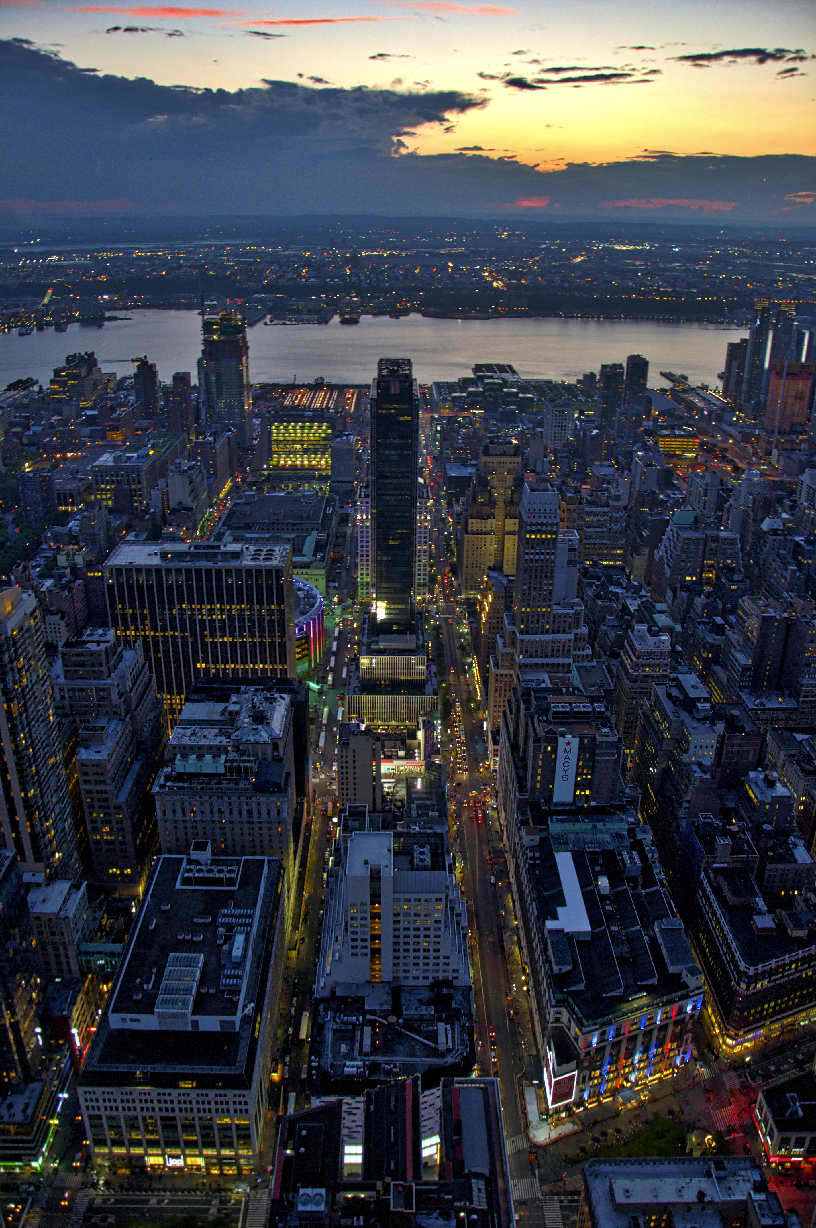
© Steven Stanley Photography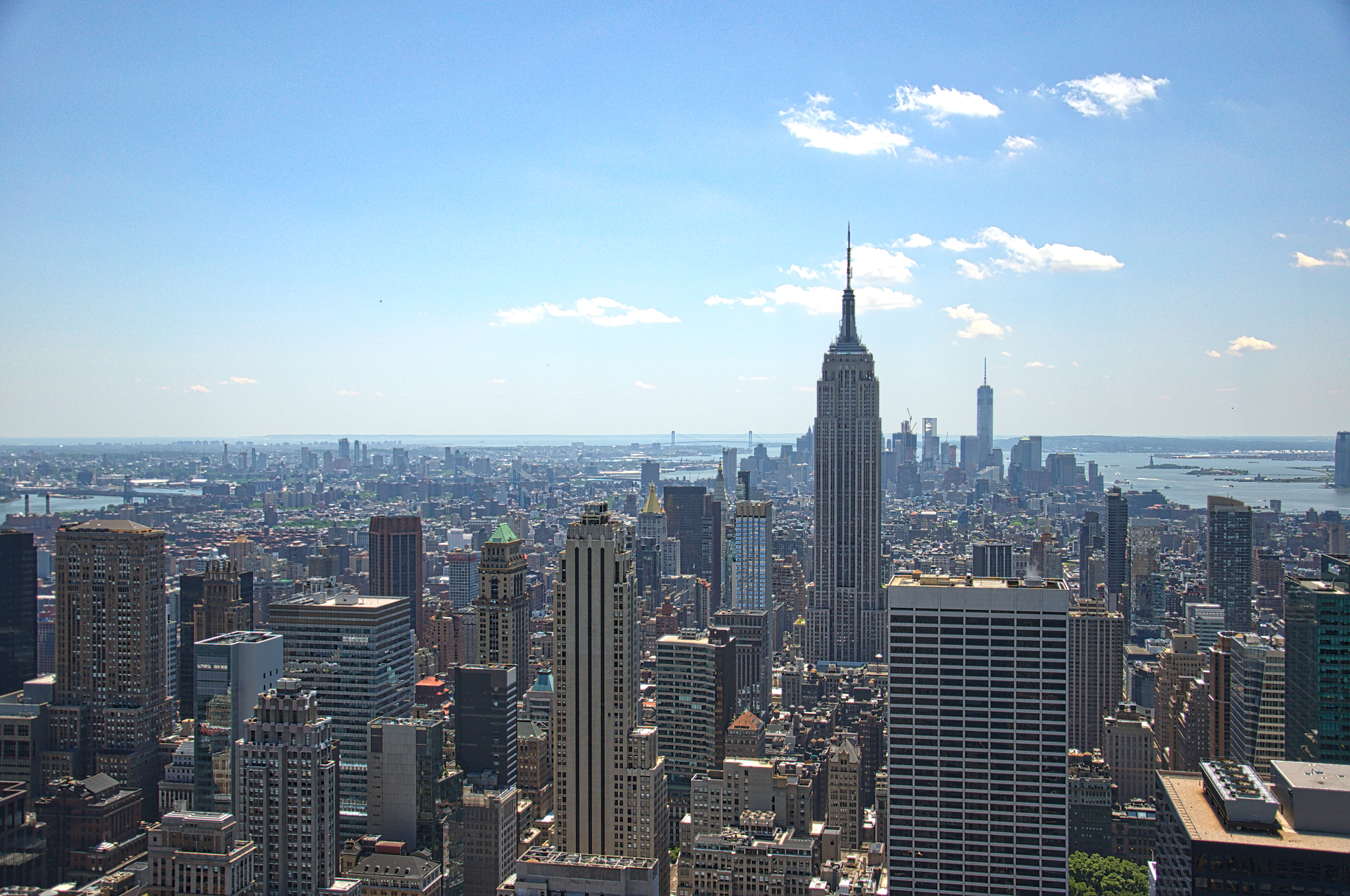
© Steven Stanley Photography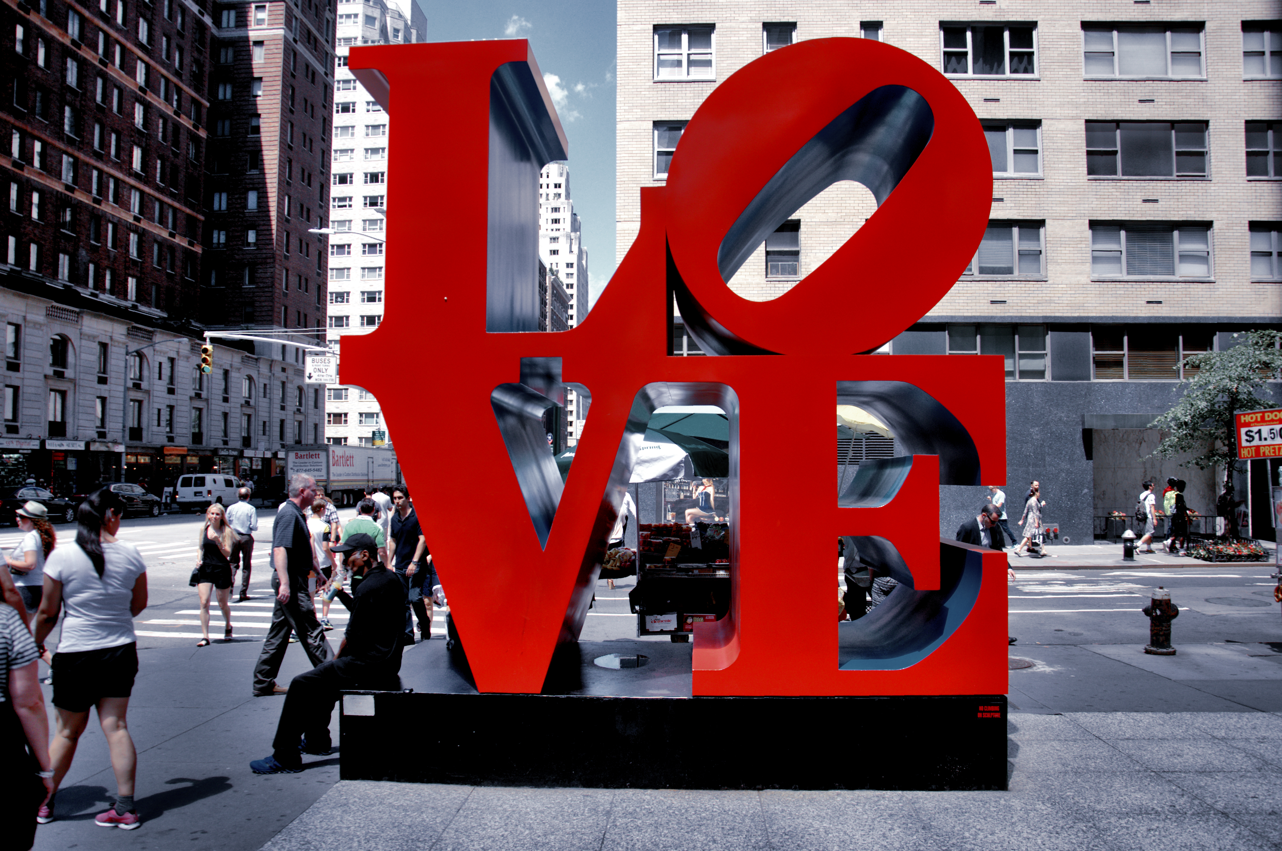
© Steven Stanley Photography
In my collection of photos, there are images from personal archives. I portrayed the first abstraction in violet-grey colours, with high-rises and the main avenue of the city. But then I wanted to explore this city from the opposite side, in warm shades, in the flowering spring city, in the centre of the composition, there is also a bright yellow taxi. I think I prefer the second option, in my view the name of the city is more prominent to read as well.

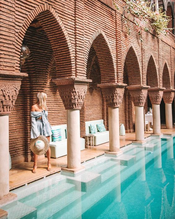
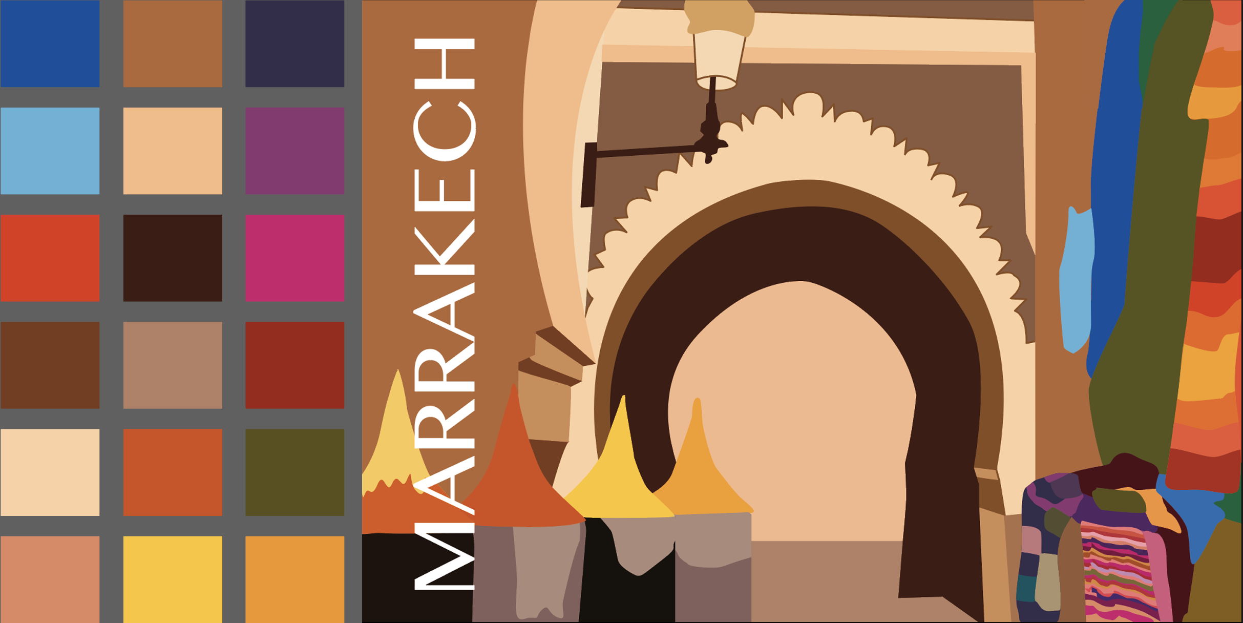
Marrakech
This one of the largest cities of Morocco is rightly called the pearl of North Africa. When I went through all images, I realised that this place is full of different objects that worthing to picture.
Pinterest Images of Marrakech 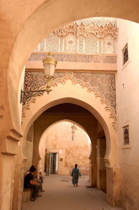
Shutterstock Images 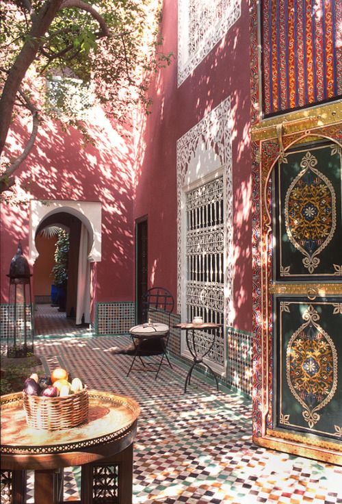
Shutterstock Images 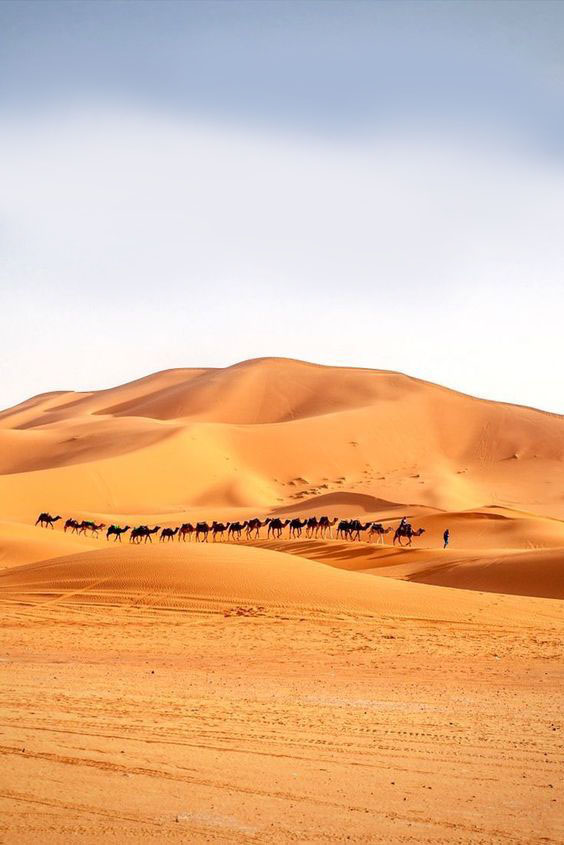
Pinterest Images of Marrakech dessert 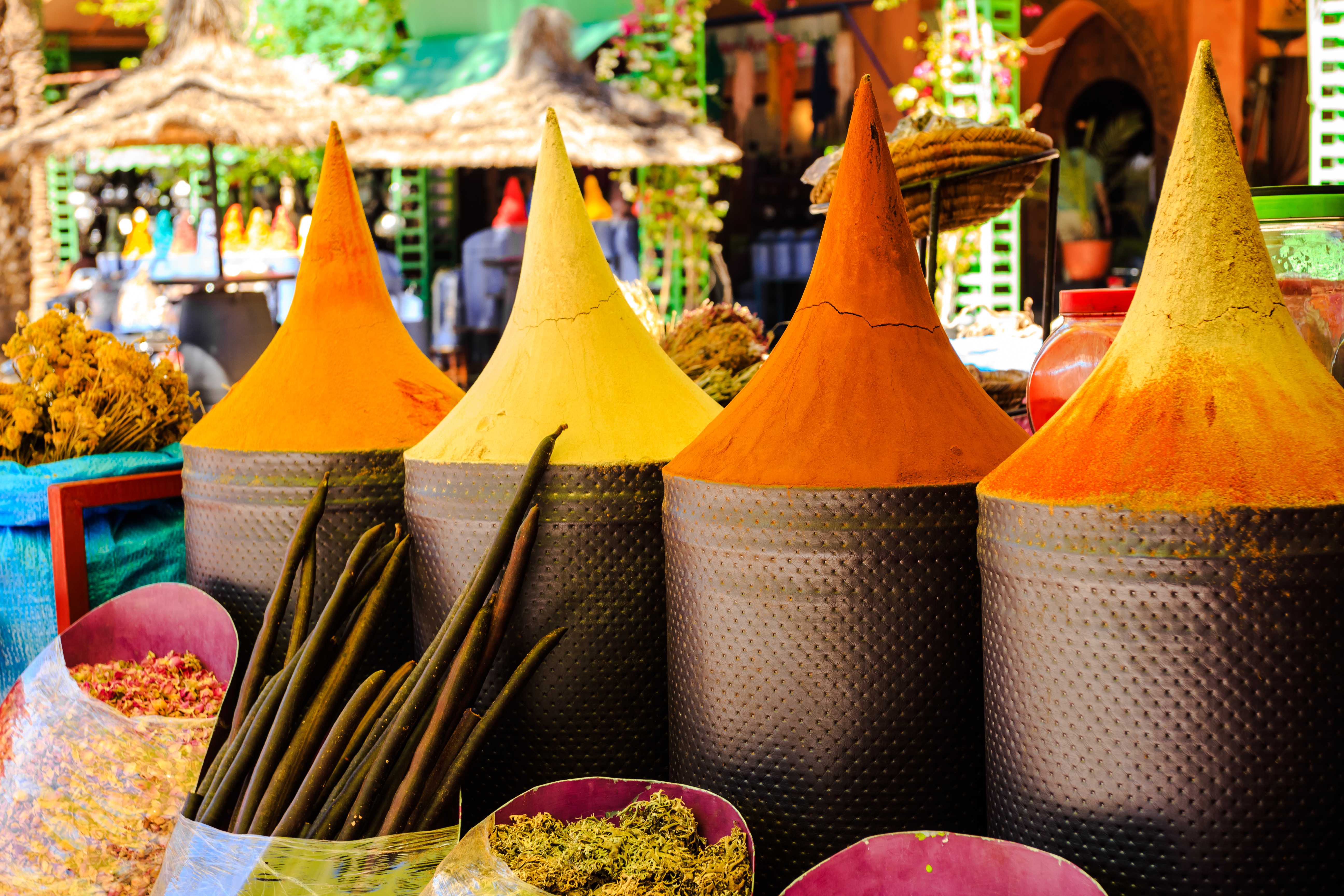
Shutterstock Images 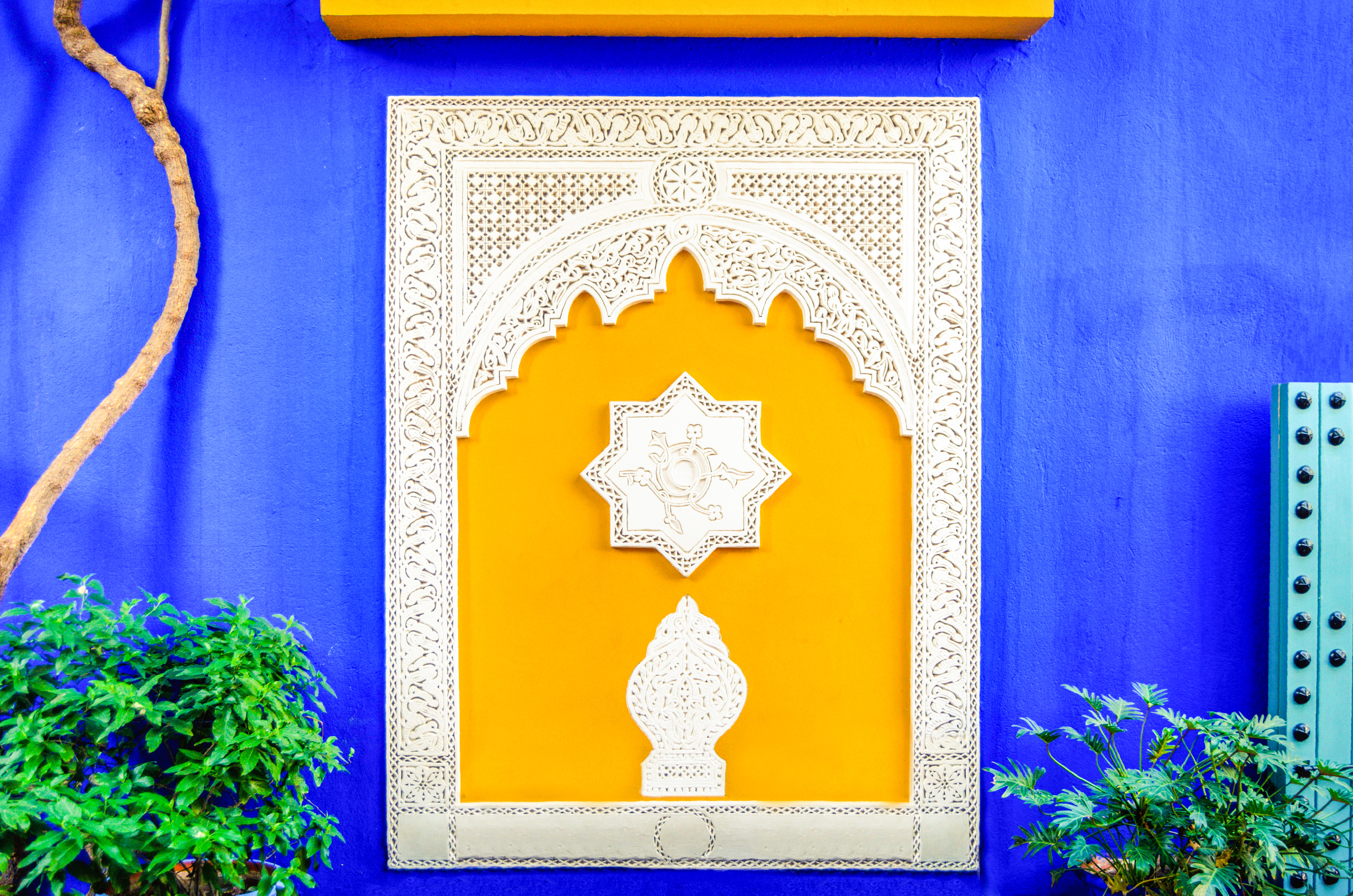
Shutterstock Images 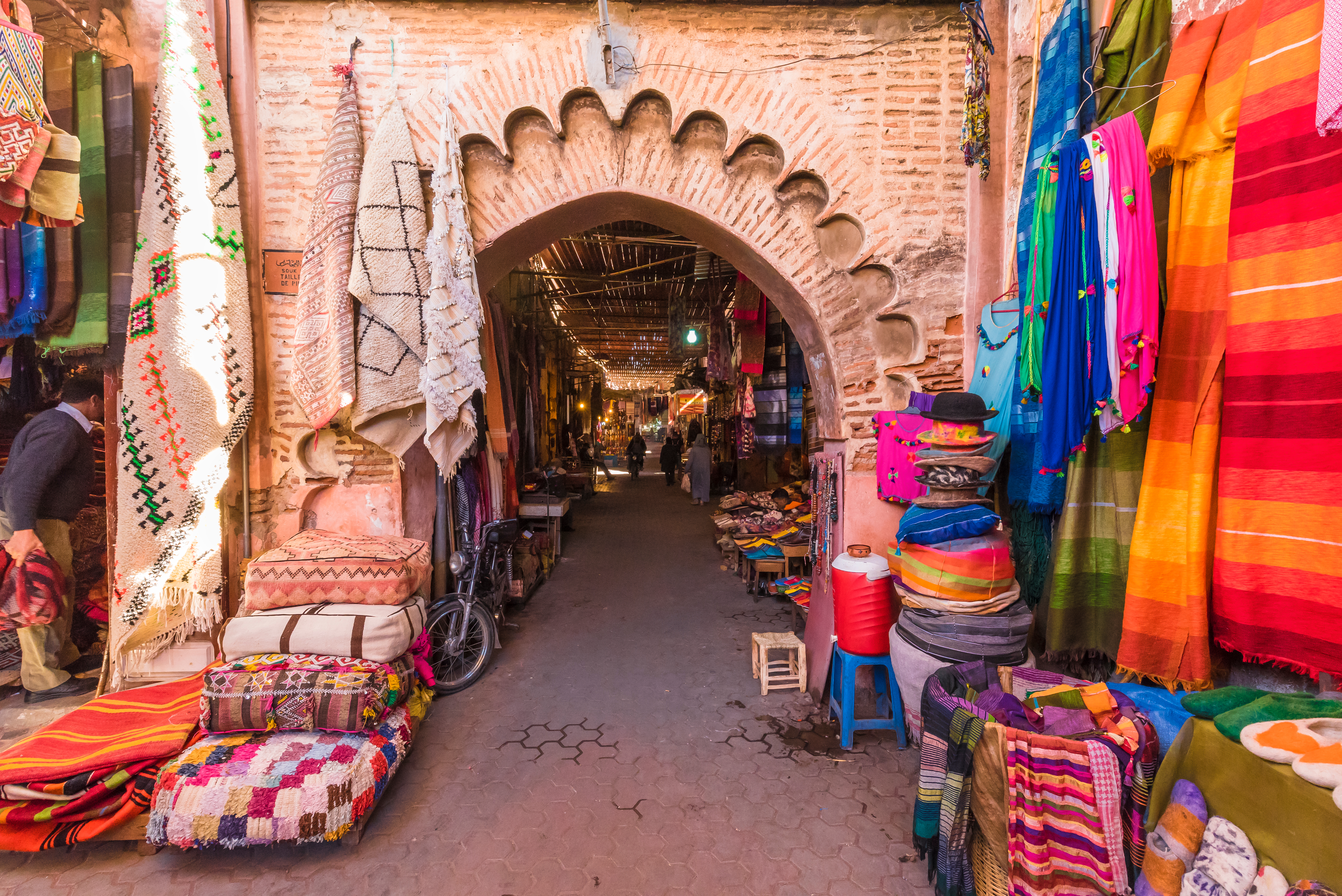
Shutterstock Images 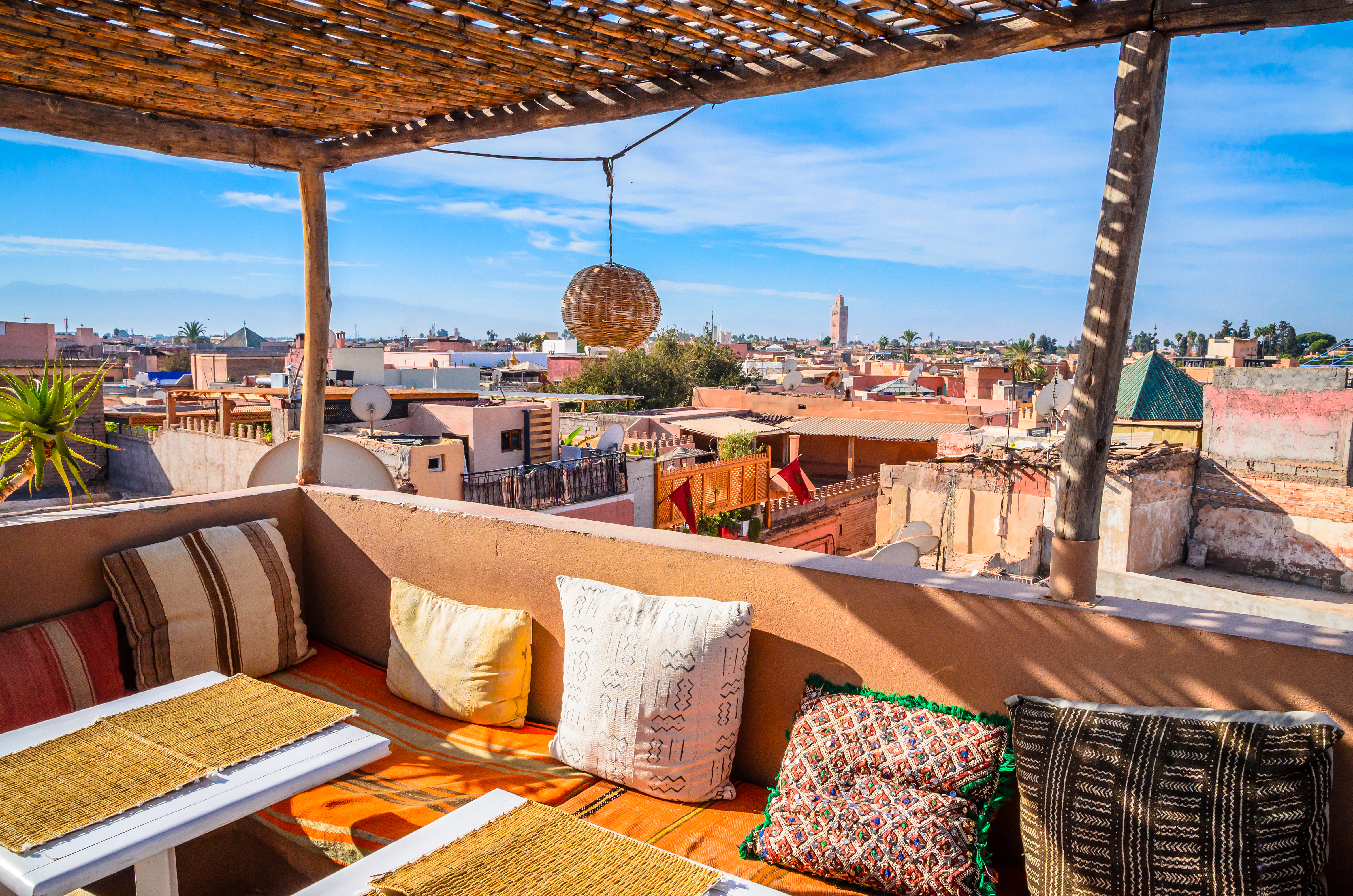
Shutterstock Images 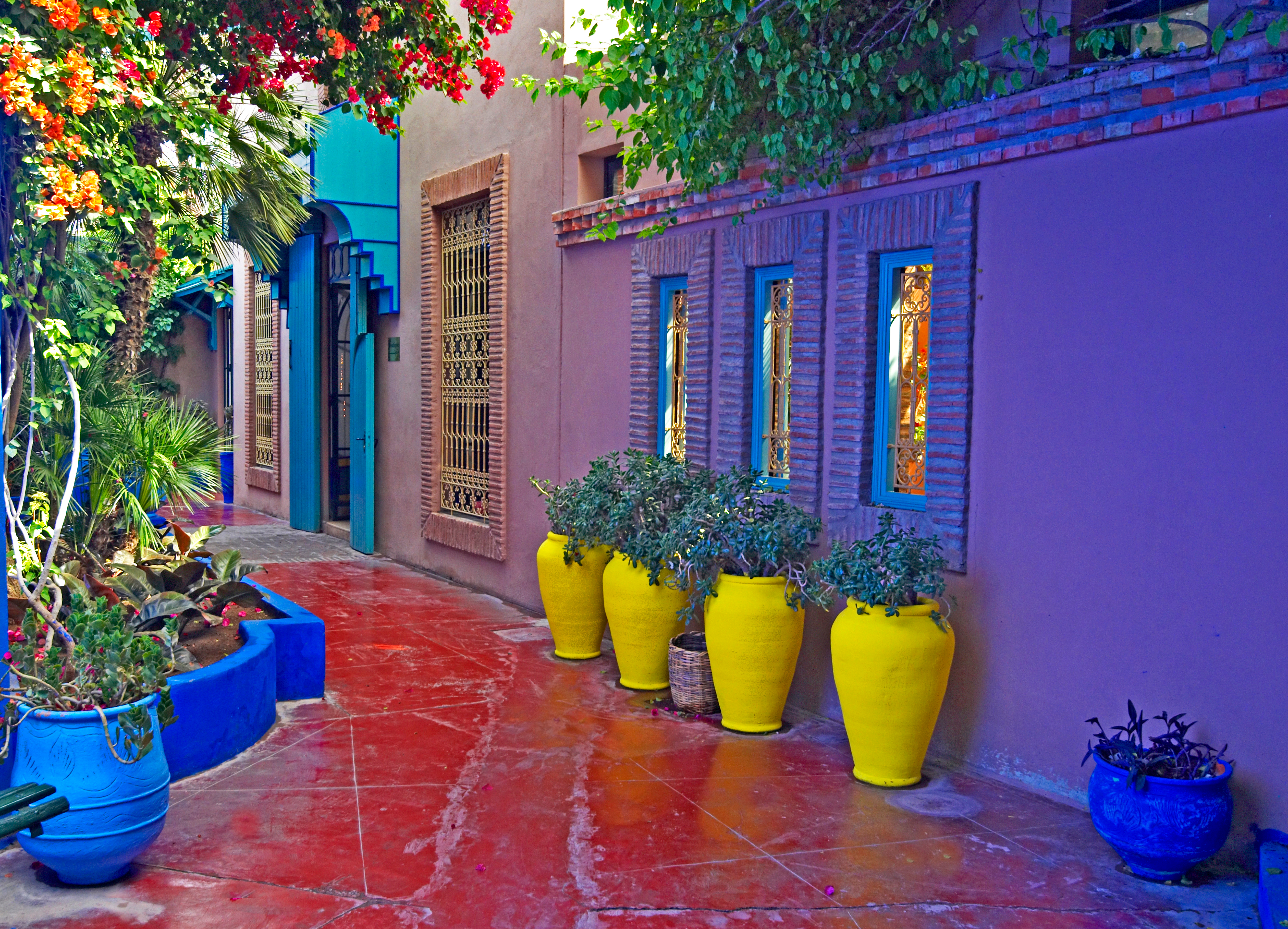
Shutterstock Images 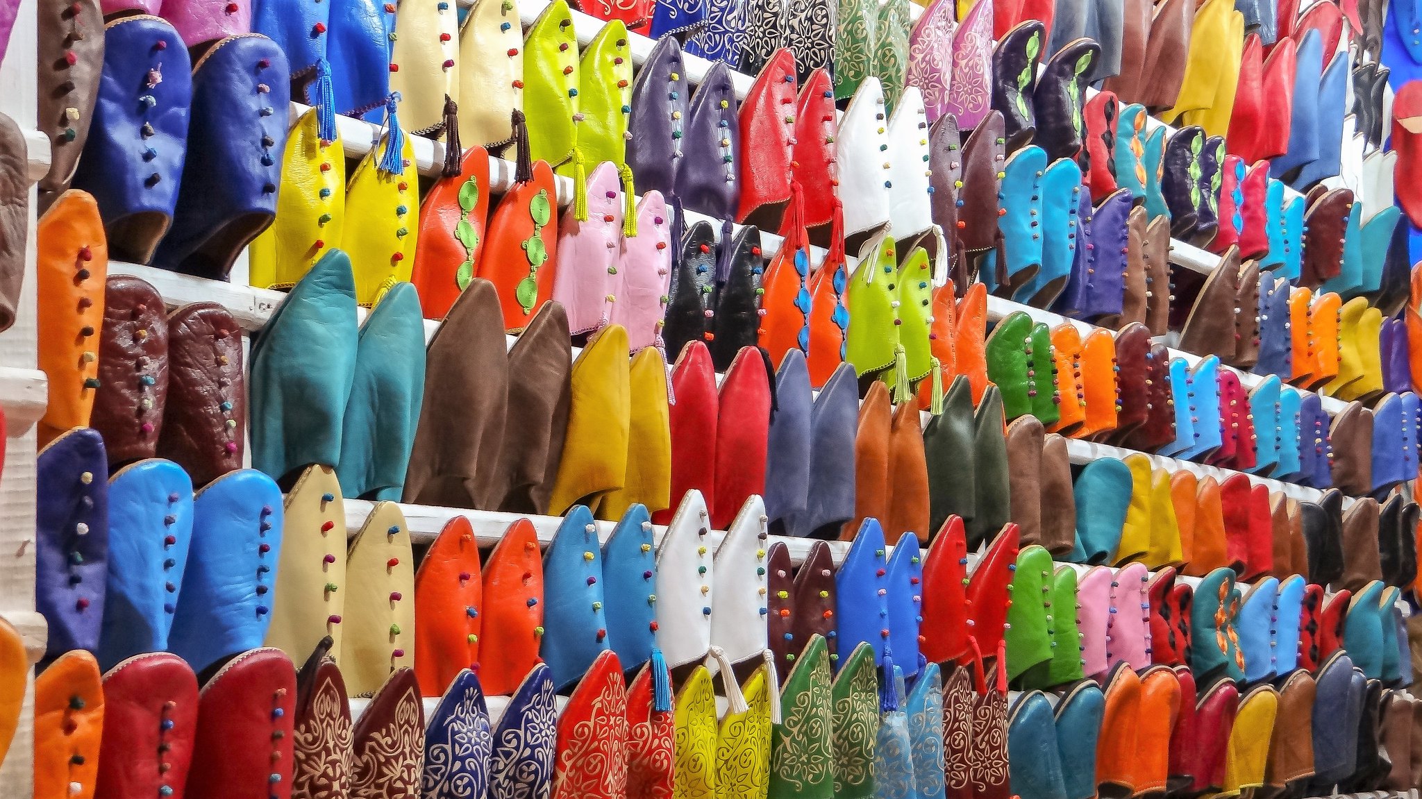
Flickr Images of Marrakech Market 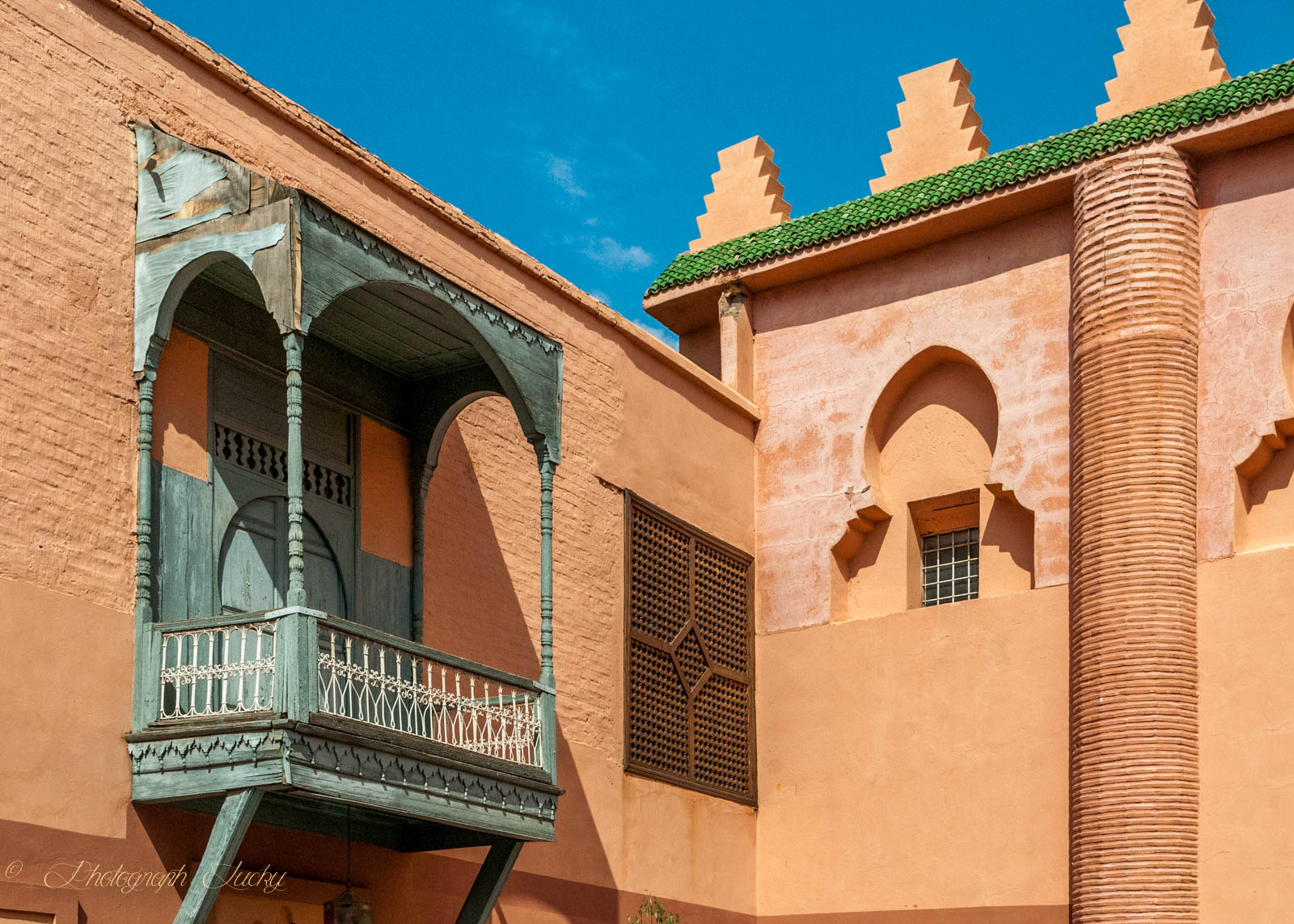
Flickr Images of Marrakech 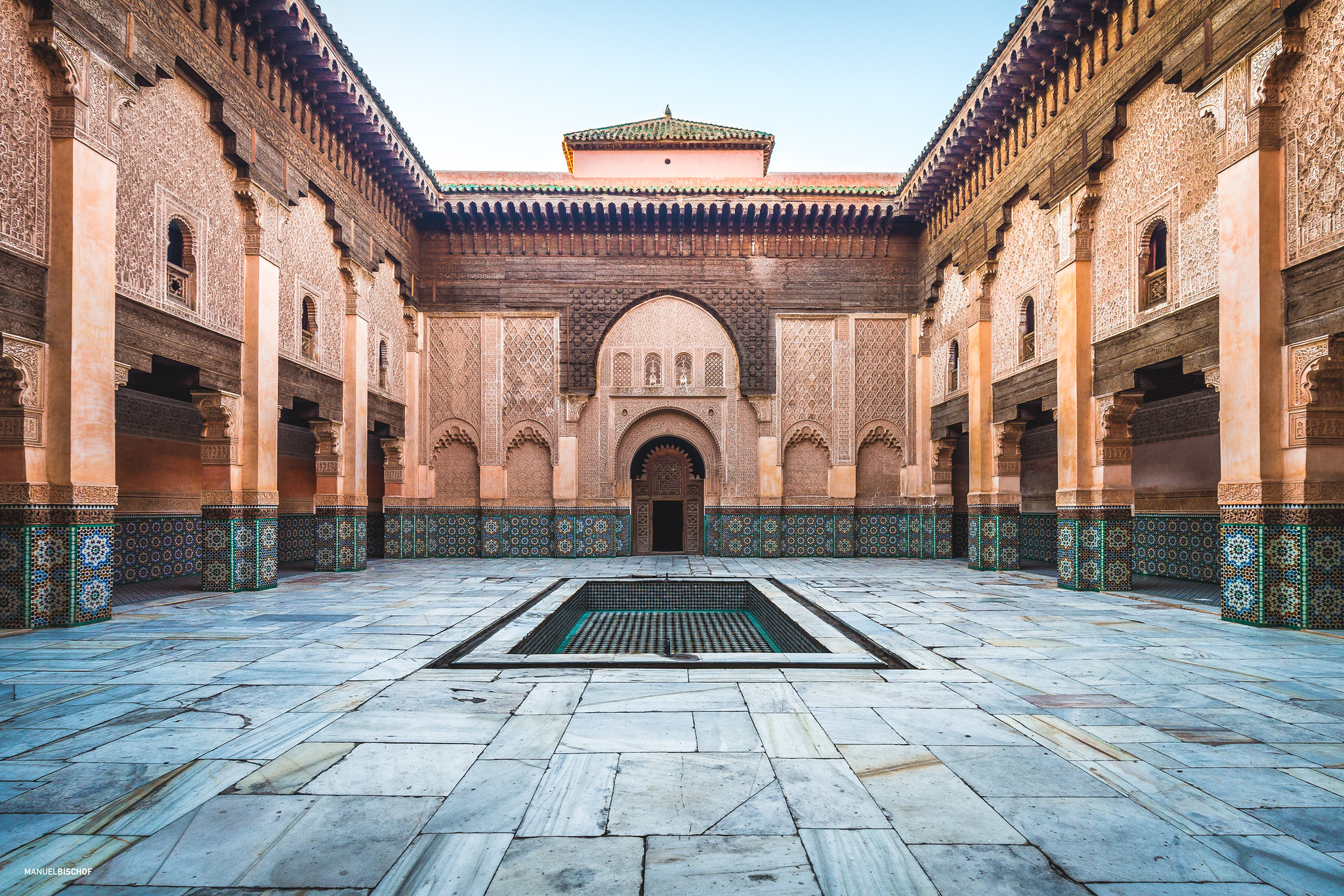
Flickr Images. Such a beautiful building at the Medina in Marrakech
In my abstraction, I wanted to portray the colourful architecture of the city in warm colours in combination with the bright elements of local markets, in which there are spices, clothes, carpets and other products.

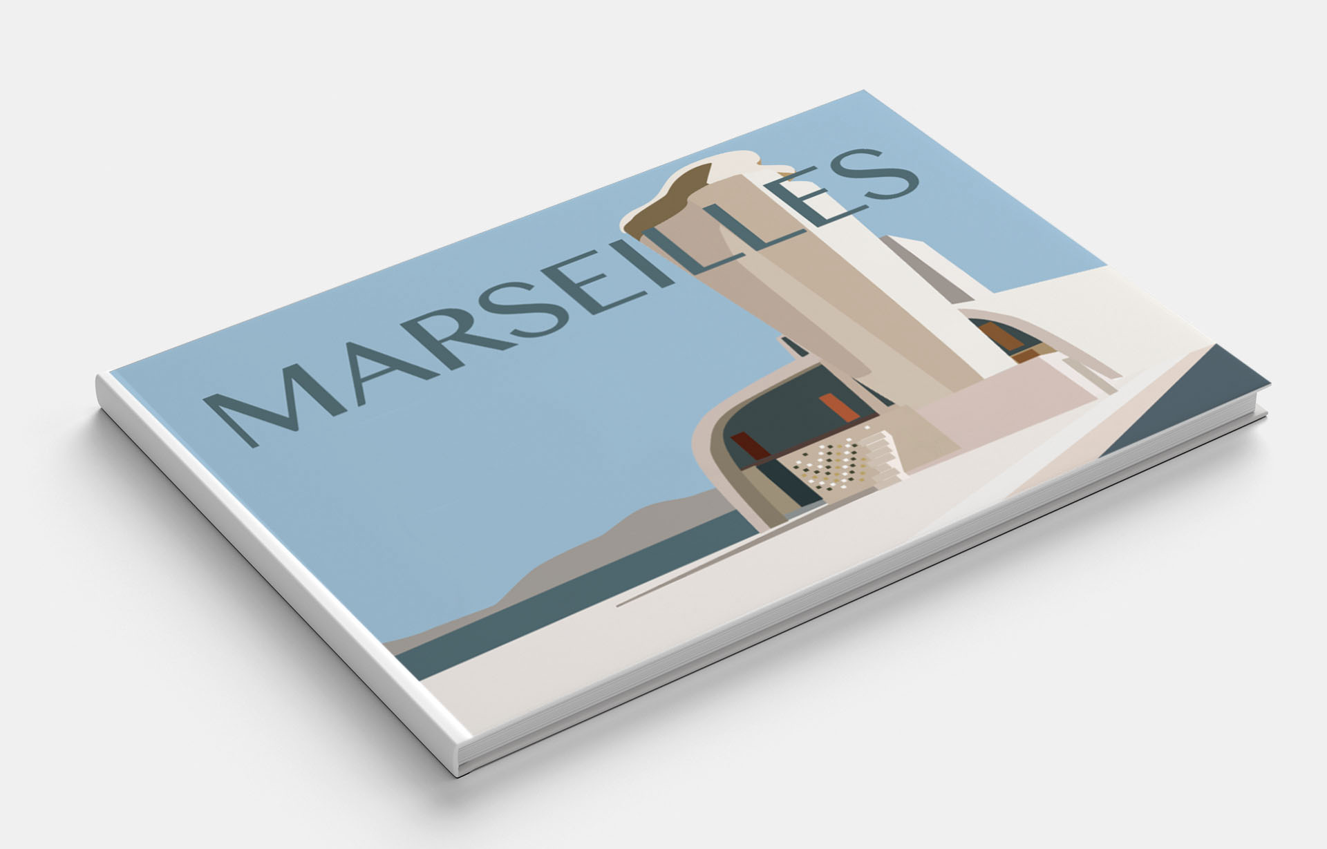
Marseilles
Marseille is the largest city in France after Paris. This city is the true pearl of France. Being a large industrial region, it managed to absorb a huge part of the country’s cultural and historical heritage.
Pinterest Images of Marseilles 
Pinterest Images of Marseilles 
Pinterest Images of Marseilles 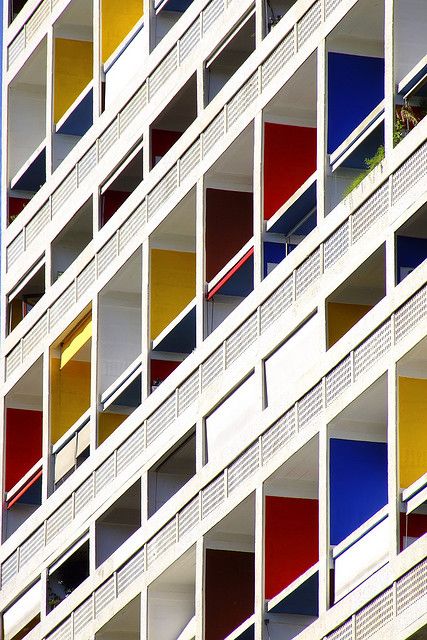
Pinterest Images of Marseilles 
Pinterest Images of Marseilles 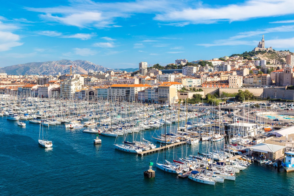
iStock Images 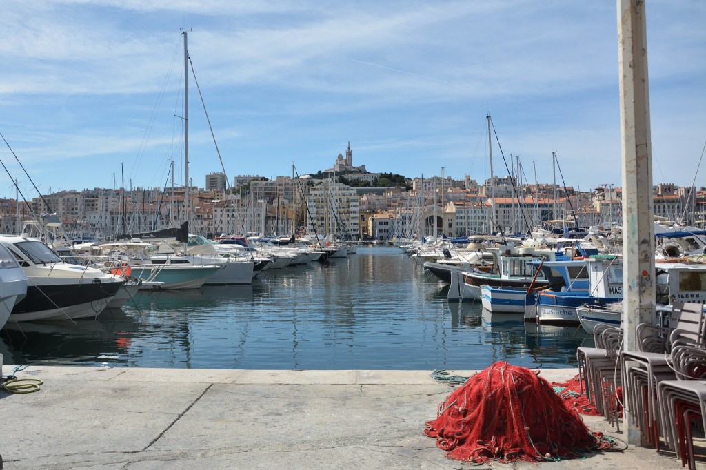
Flickr Images of Marseilles 
Flickr Images of Marseilles 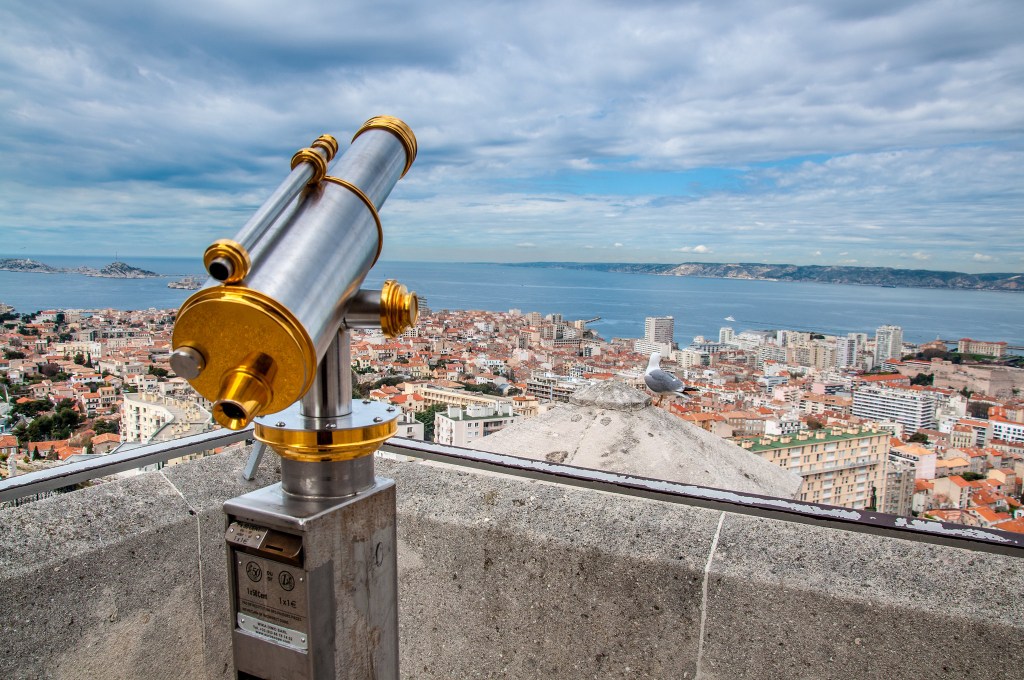
Flickr Images of Marseilles
Marseille has an excellent location on the shores of the Mediterranean. In my illustration, I wanted to portray this feature of the city, the rolling hills in which houses are scattered, on the seashore. But after I realised that, I should go deeper in my studies of the city, and I decided to portray an interesting feature in terms of the architecture of Housing Unit – a modernist residential housing design rule developed by Le Corbusier.
In the design, I used palatal pastel shades of cream colours in combination with the blue sky. Design options are presented below.


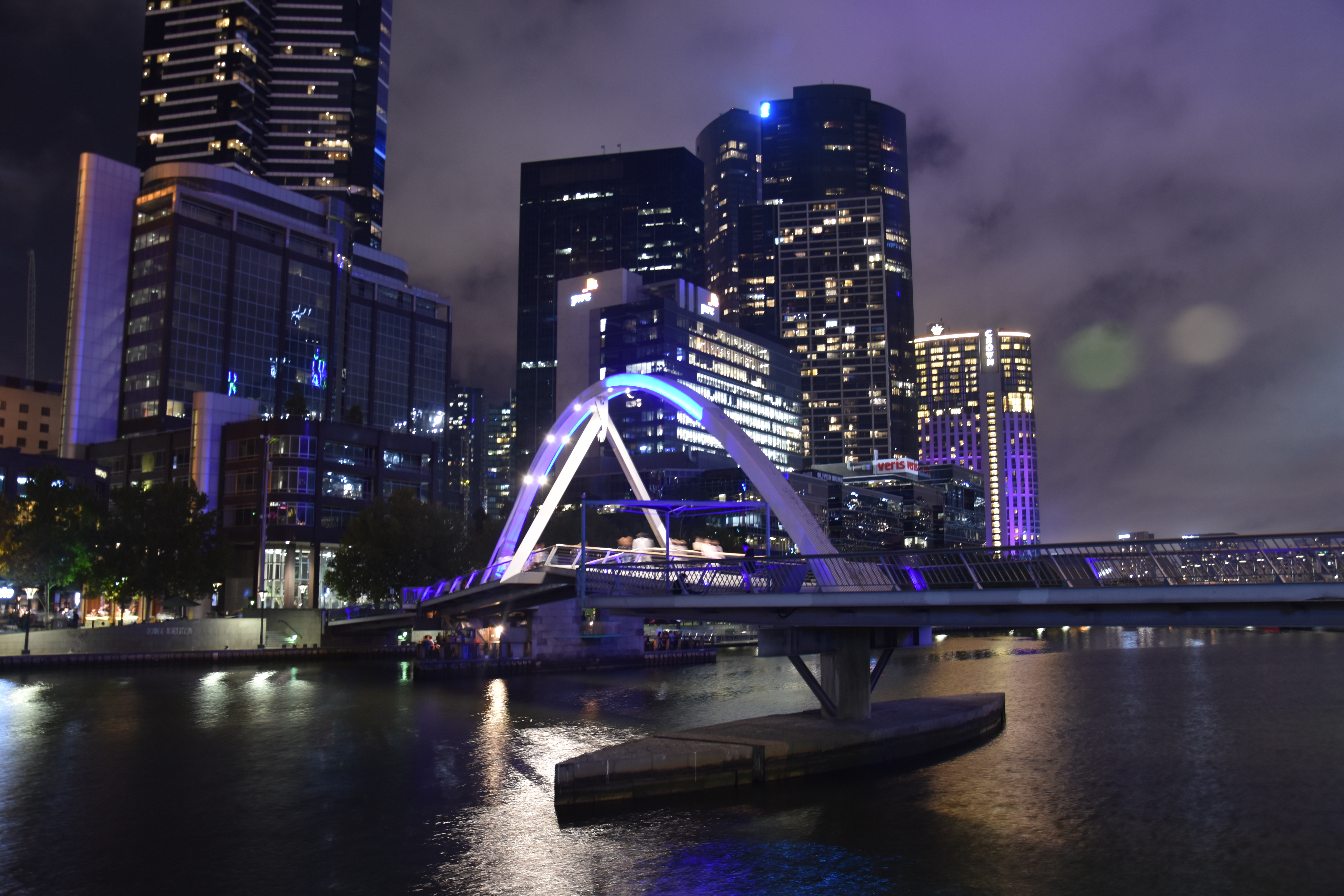
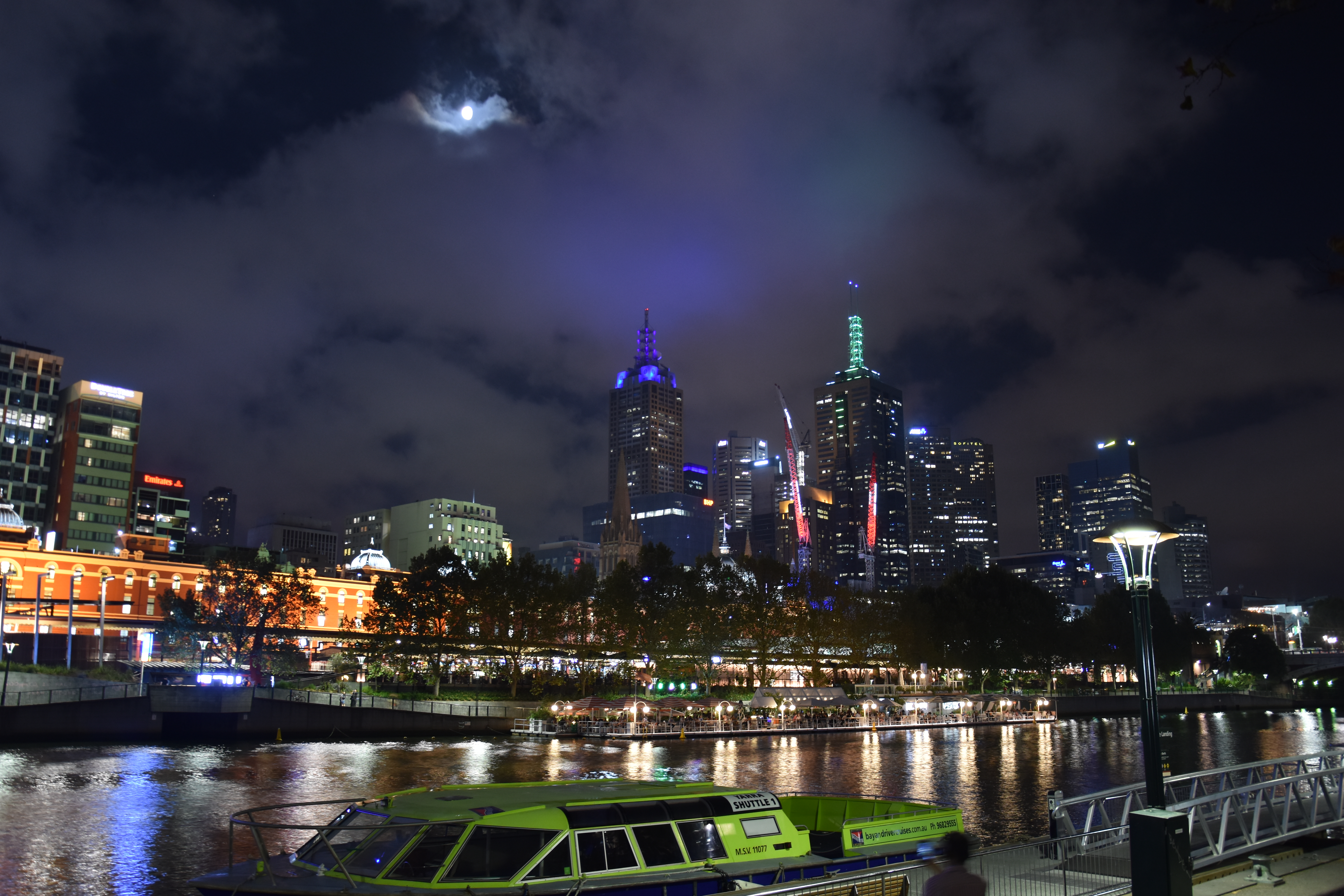
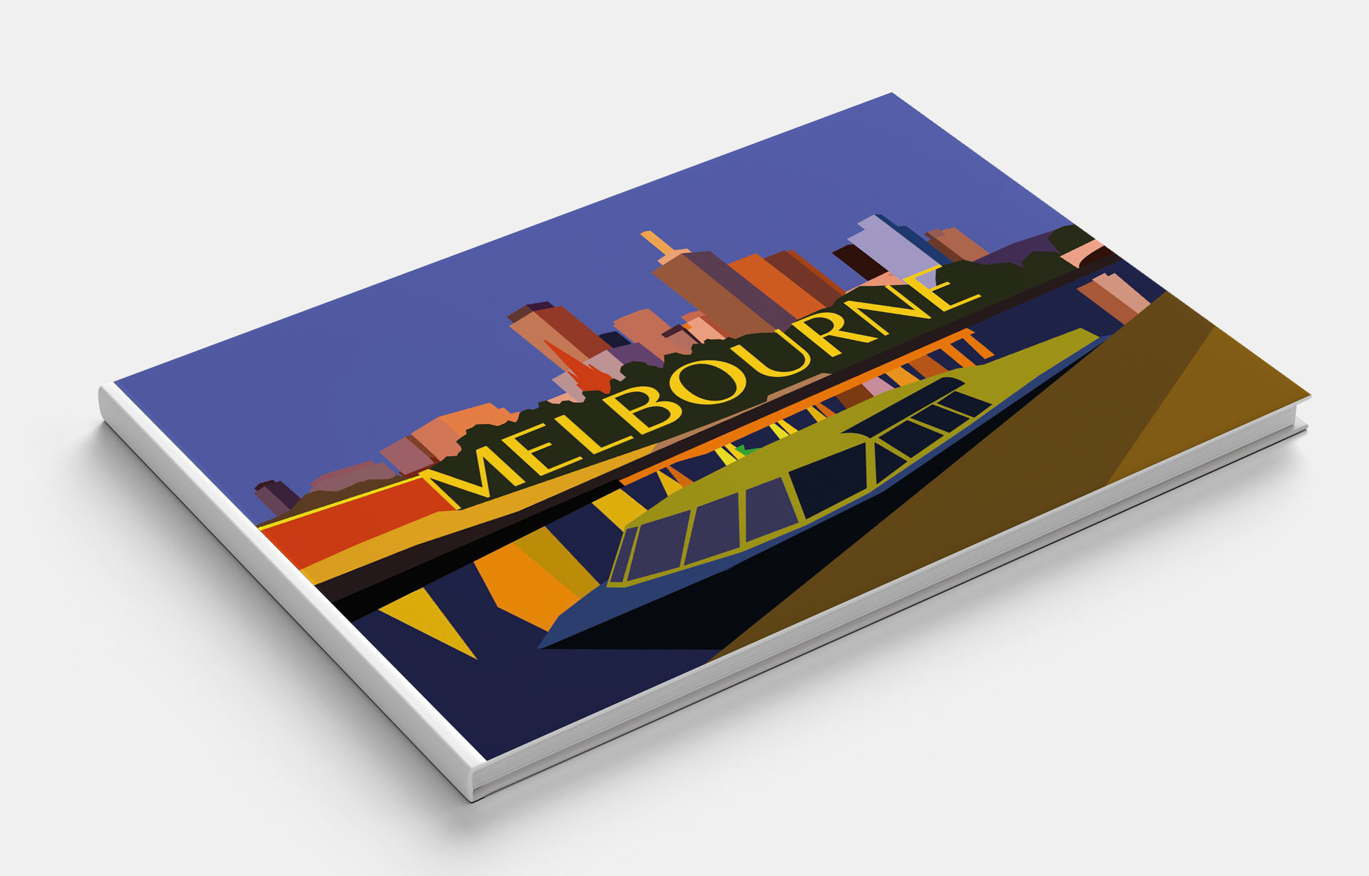
Melbourne
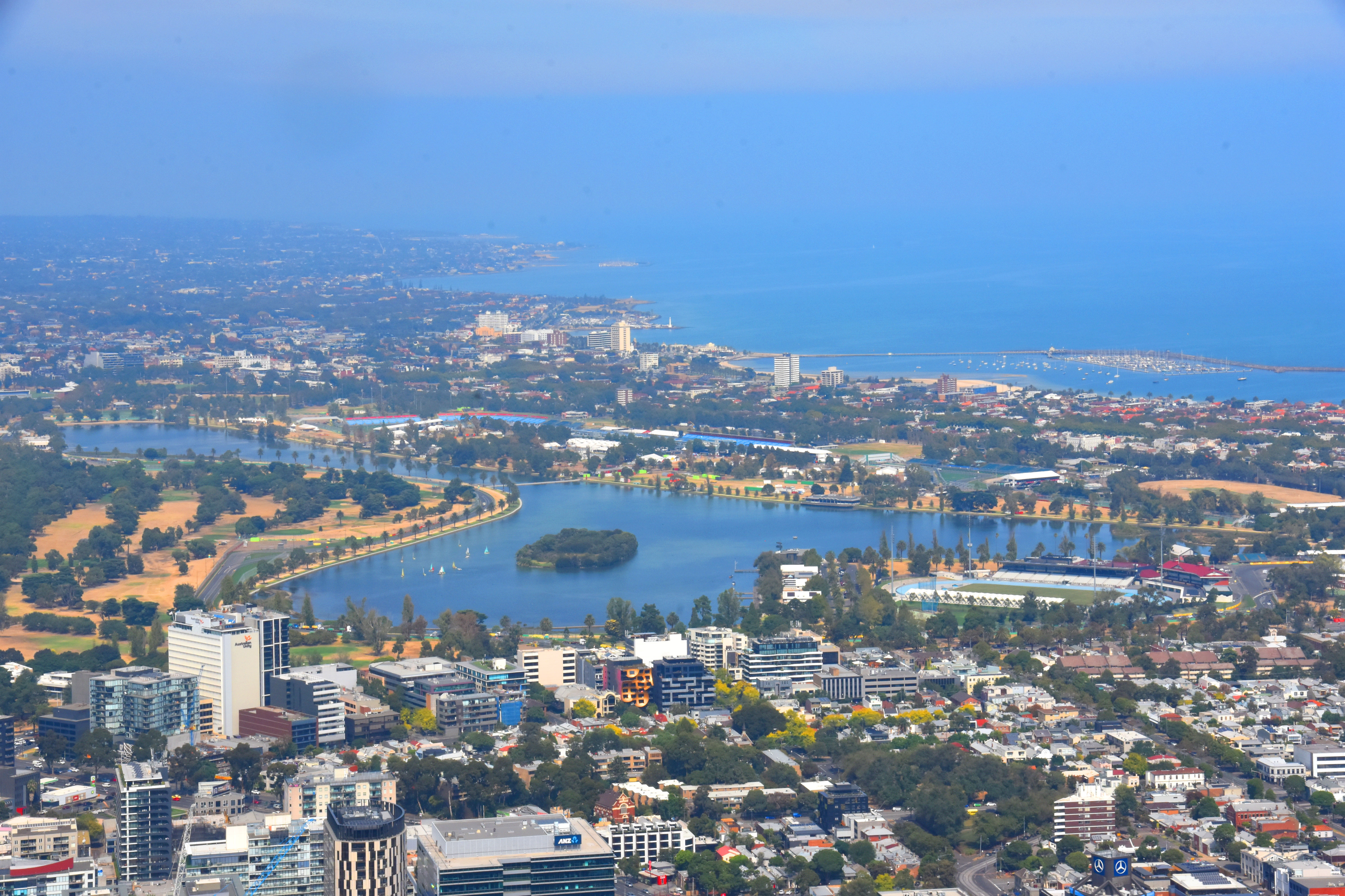
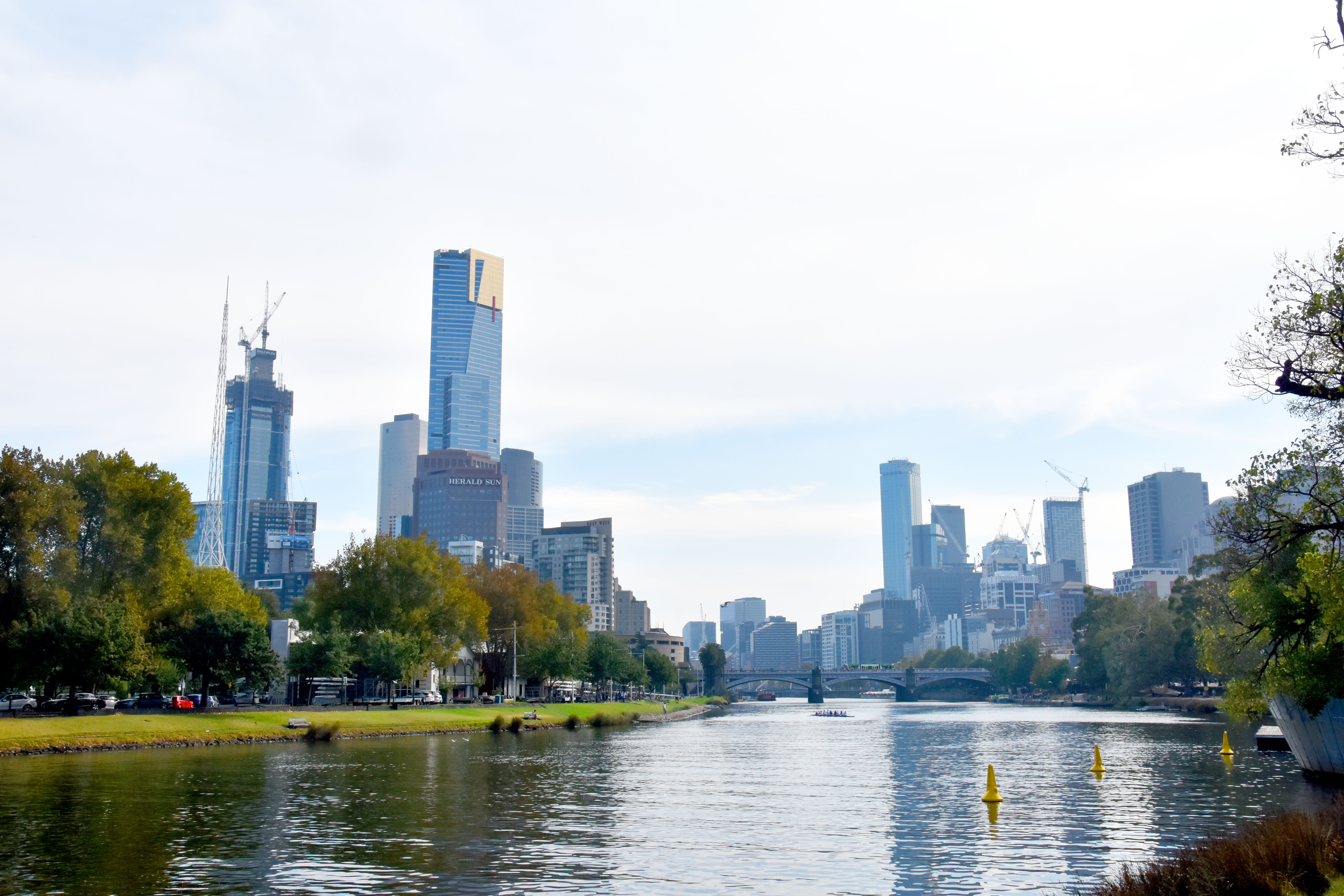
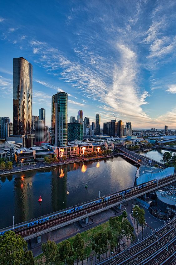
Melbourne is a city that occupies a leading position in the ranking of some of the most favourable cities for life. Melbourne is a large city in southern Australia; its difference lies in the fact that it is unique for its distinctive architecture. This city can rightly be considered the sports capital of Australia. Also not rarely there are lots of holidays, carnivals and festivals.

© Steven Stanley Photography Melbourne 2019
Flickr Images of Melbourne 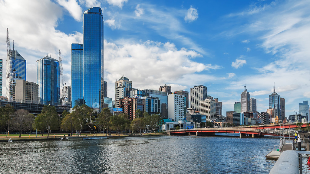
Flickr Images of Melbourne 
Flickr Images of Melbourne 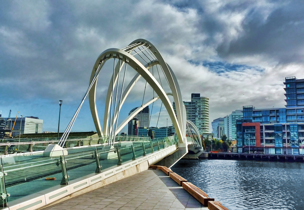
Flickr Images of Melbourne 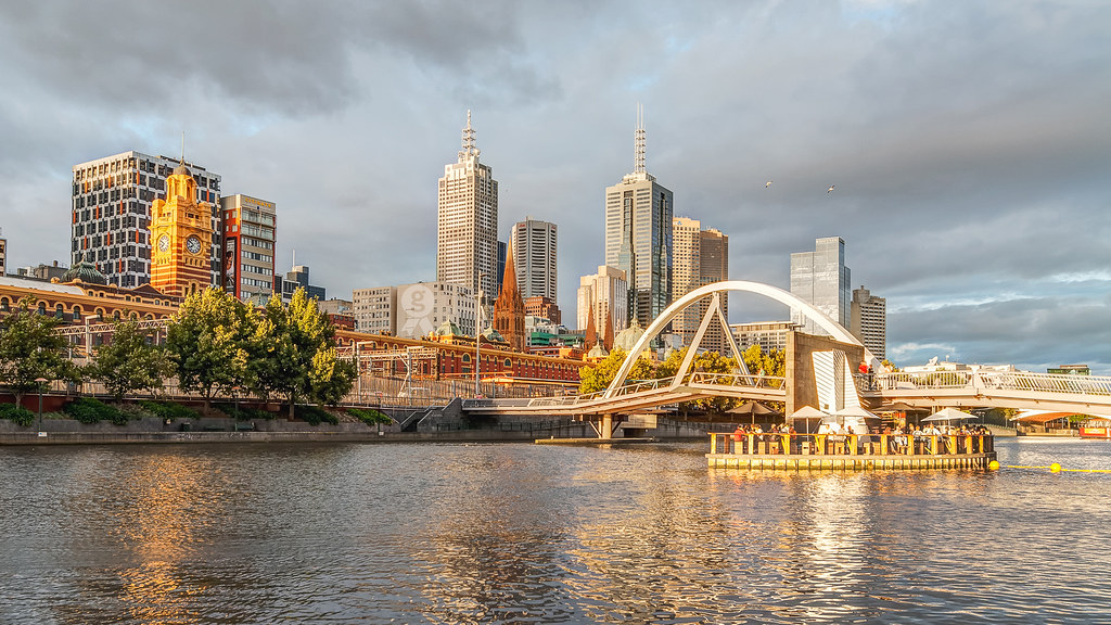
Flickr Images of Melbourne 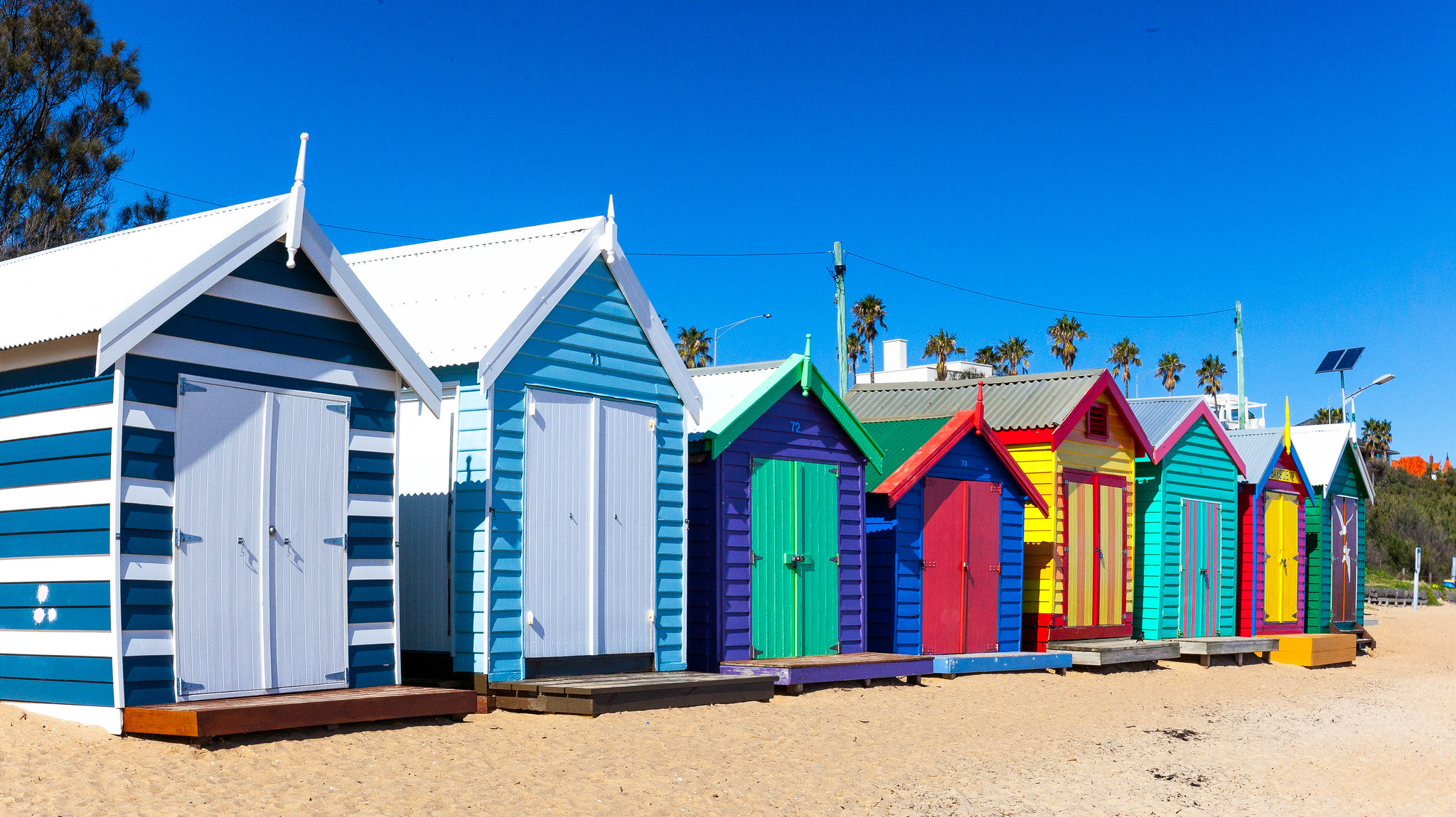
Flickr Images of Melbourne beach 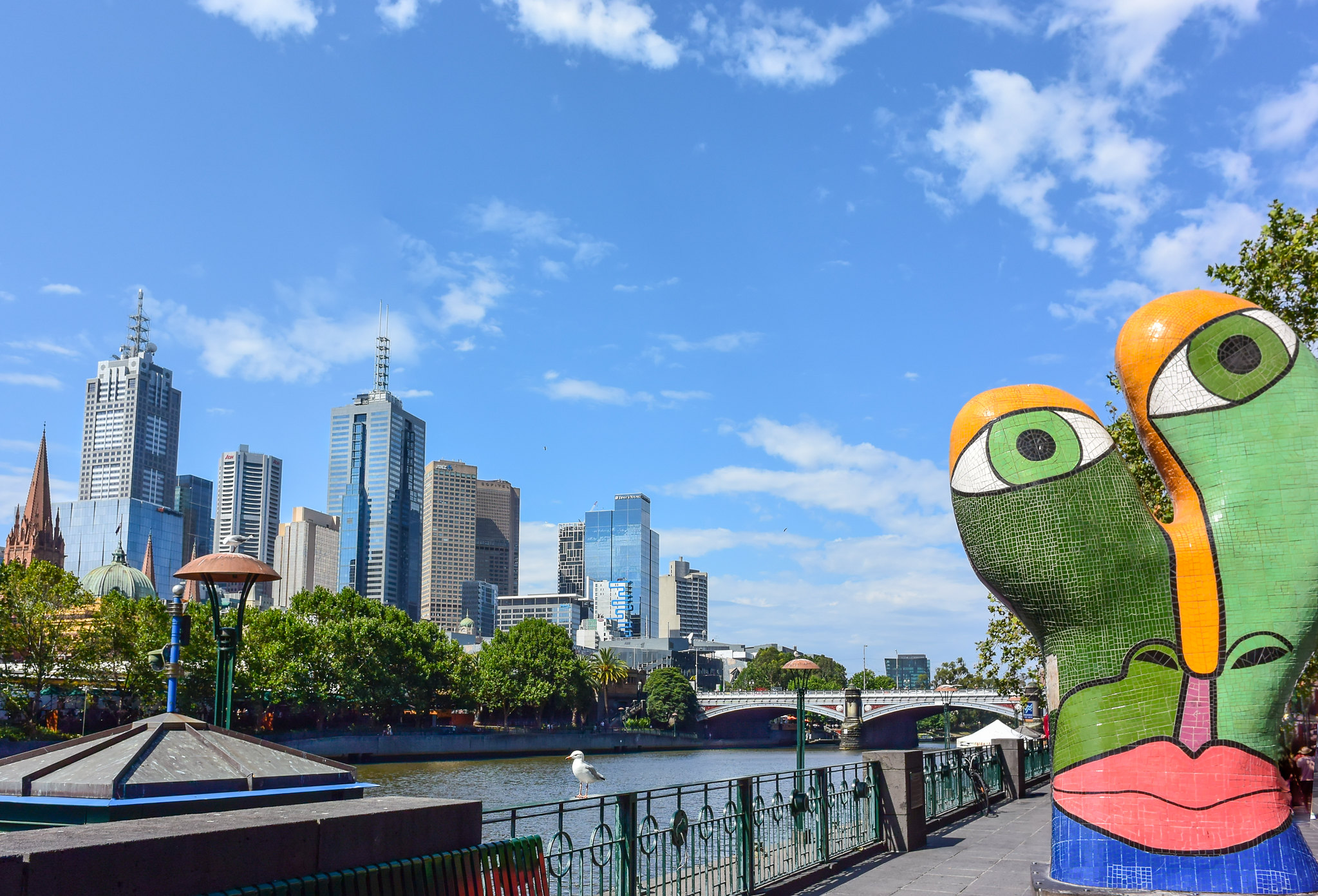
Flickr Images of Melbourne 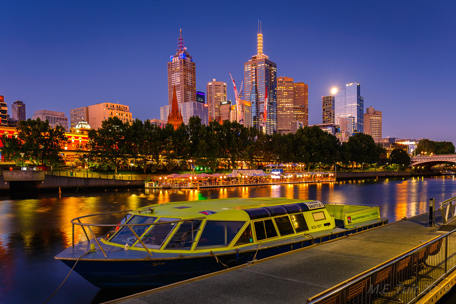
Flickr Images of Melbourne 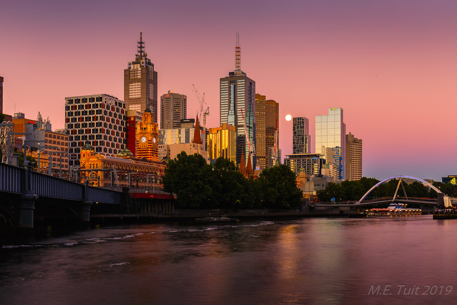
Flickr Images of Melbourne
In my abstraction, I wanted to portray this city from the vibrant night metropolis, in bright purple hues. For contrast, I’ve used bright yellow and orange reflection — the name of the city I placed in the centre on the black shades of bushes.

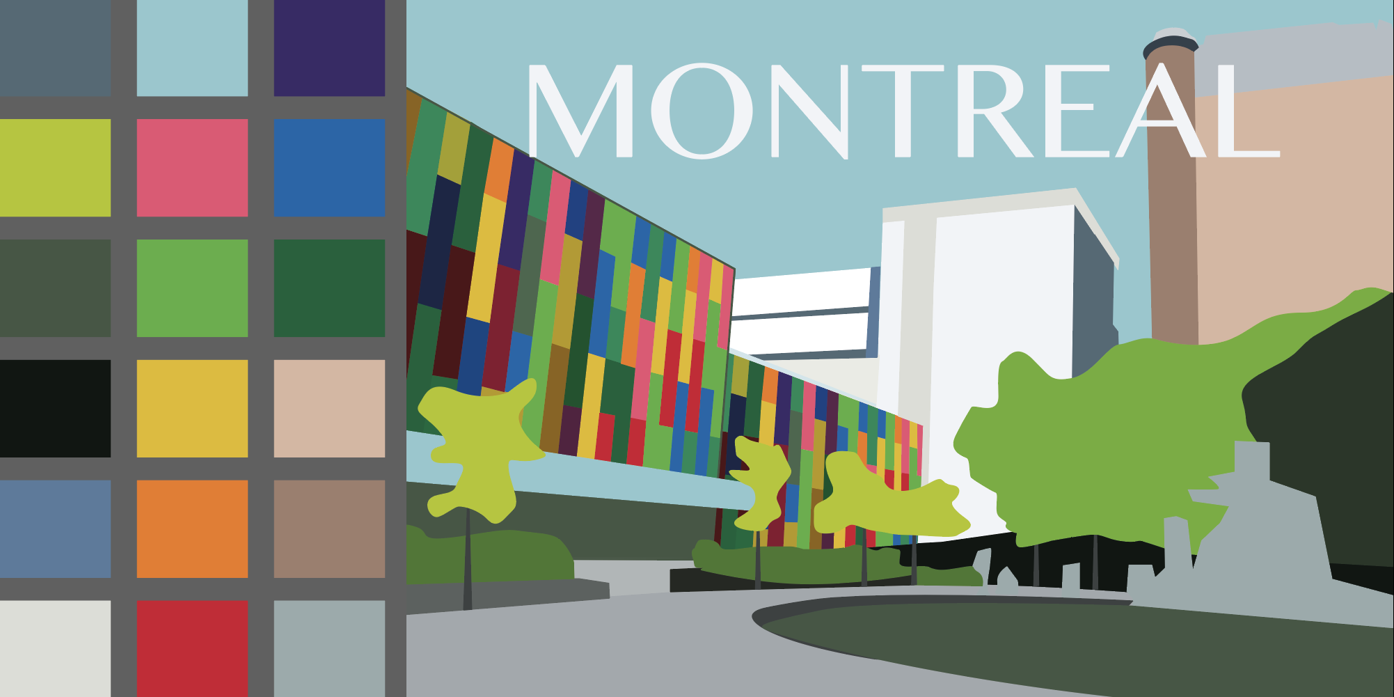
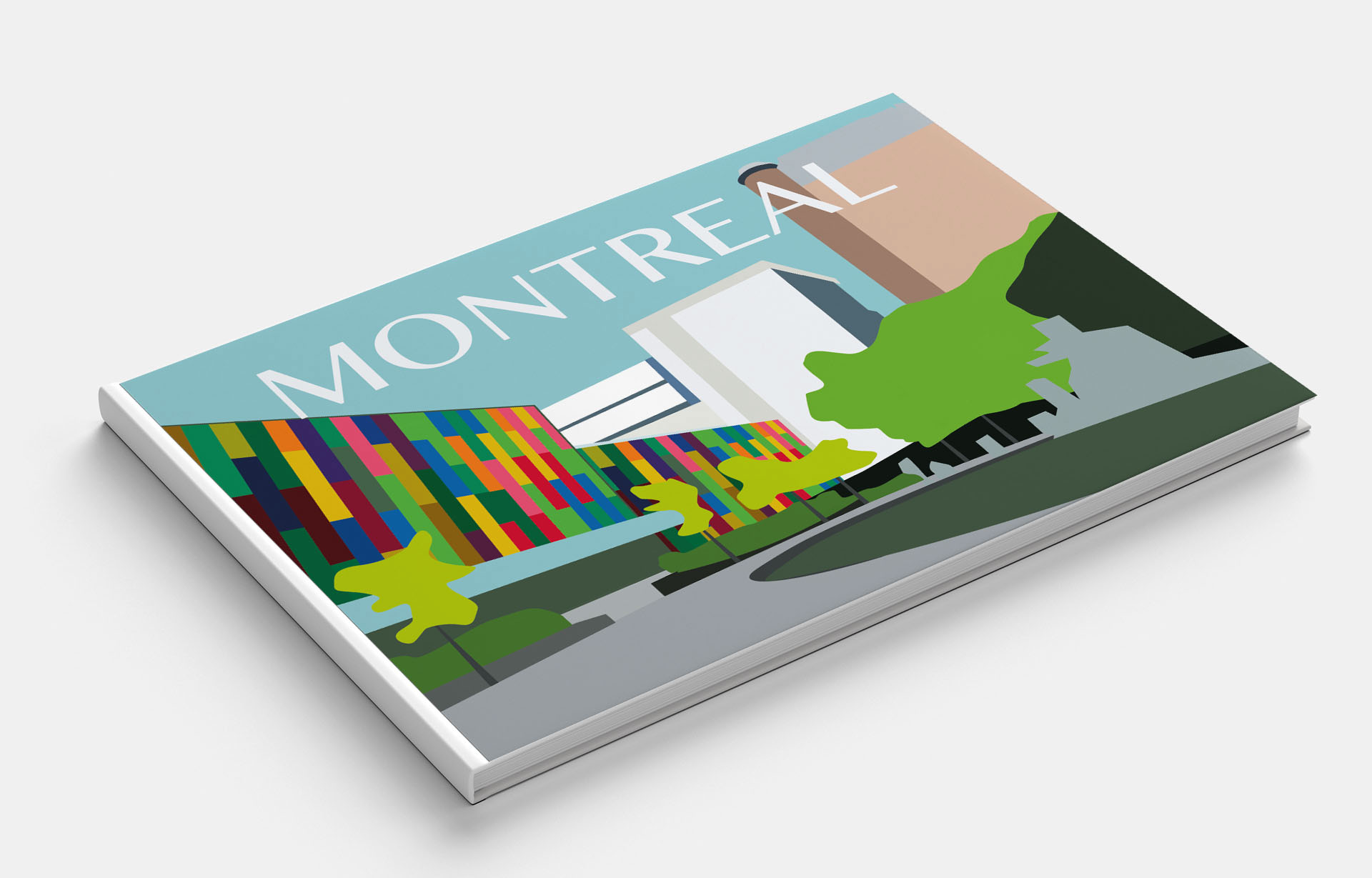
Montreal
Montreal is beautiful, modern and progressive, or as the locals would say: Montreal, c’est si bon! This French-speaking city is considered the cultural capital of Canada and is an example of a Quebec style in a multi-ethnic community.
Pinterest Images 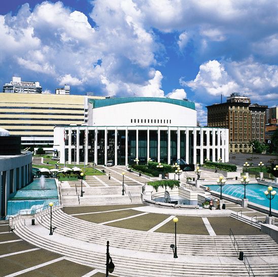
Pinterest Images 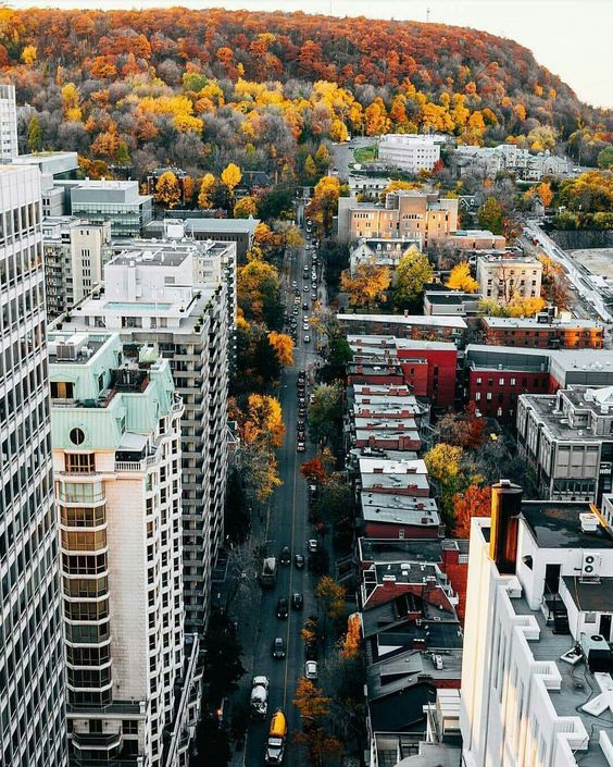
Pinterest Images 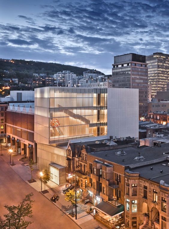
Flickr Images of Montreal 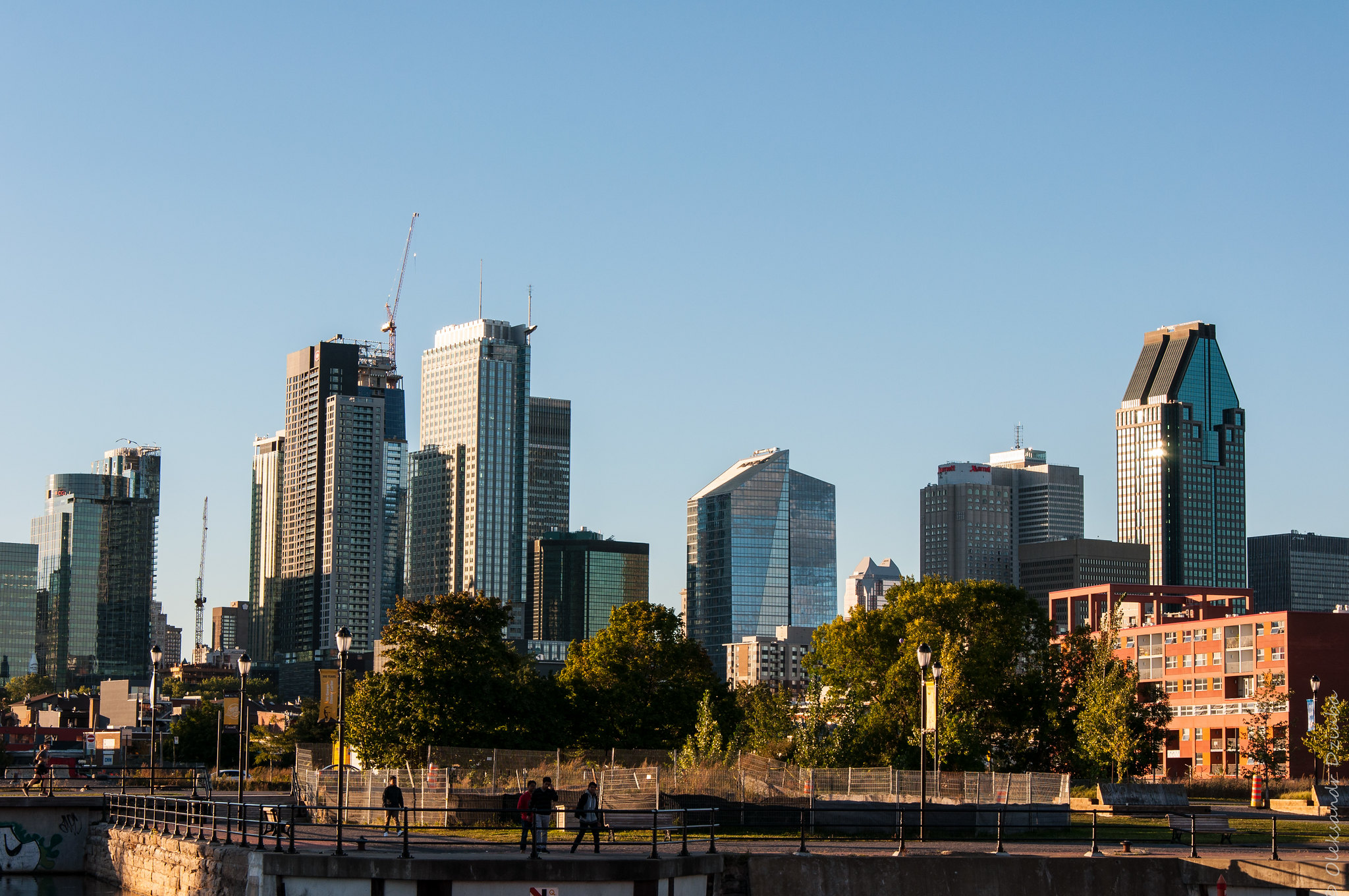
Flickr Images of Montreal 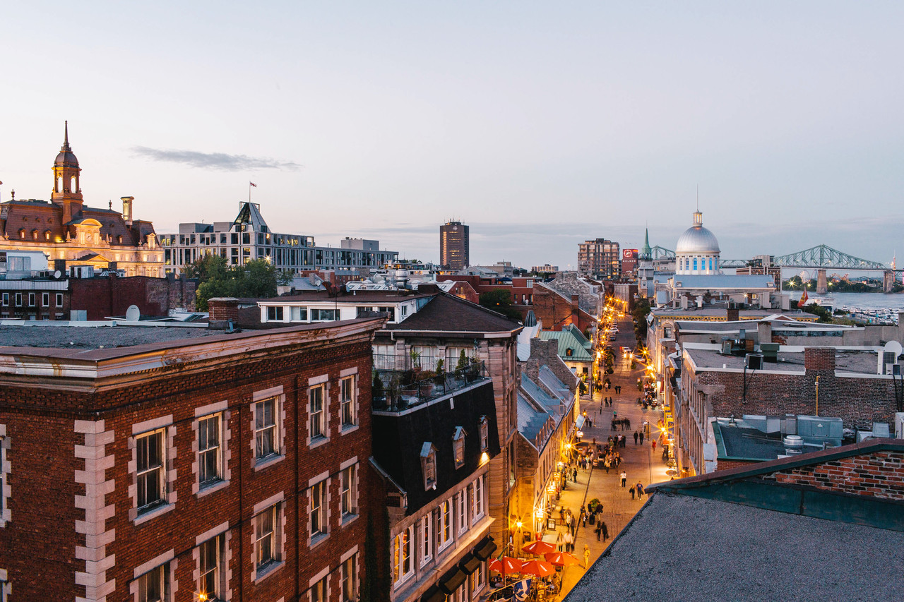
Pinterest Images of Montreal 
Flickr Images of Montreal 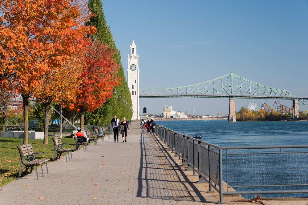
Flickr Images of Montreal 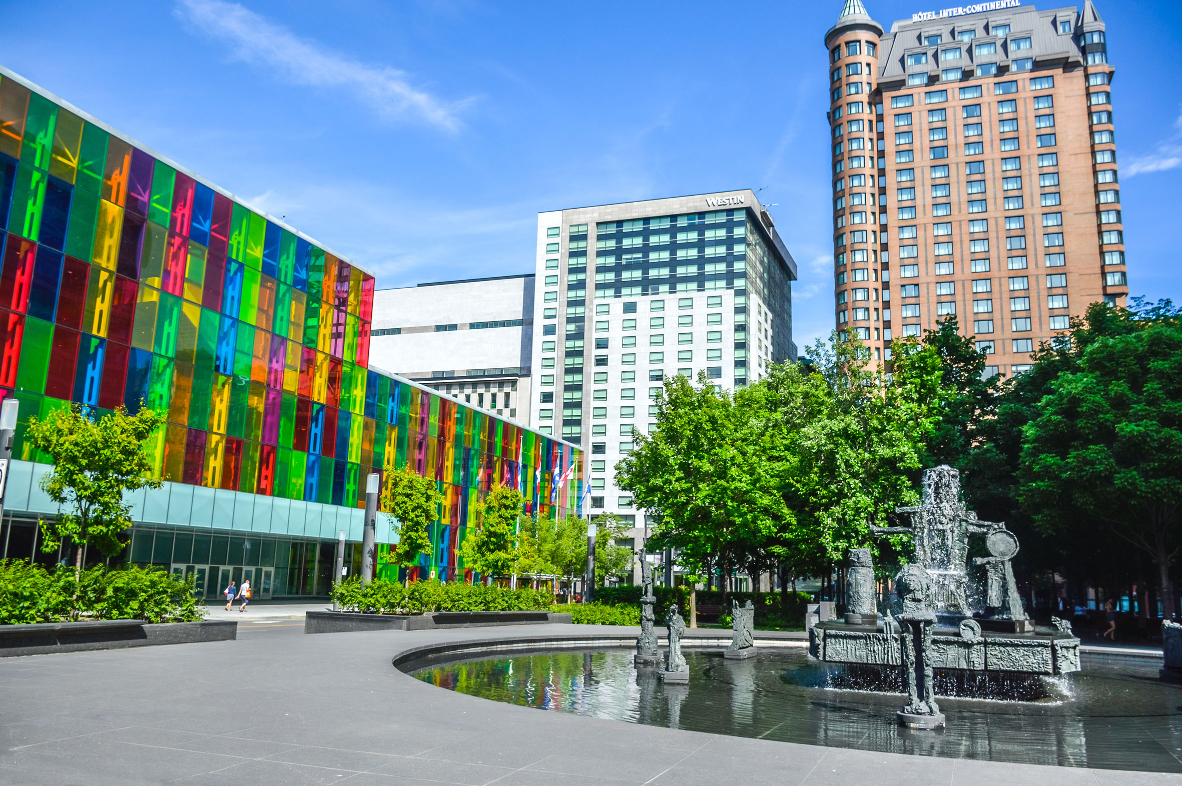
Flickr Images of Montreal 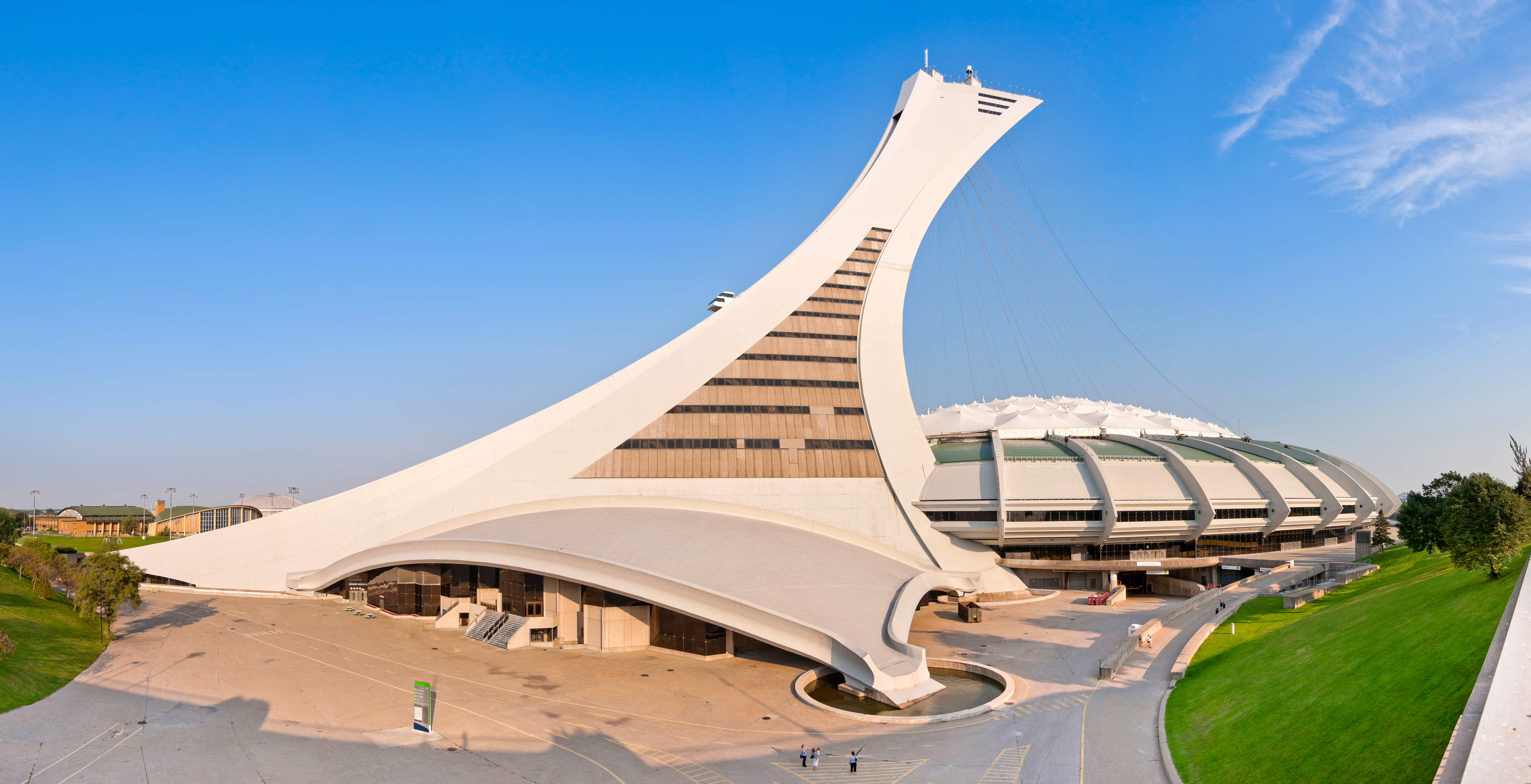
Shutterstock Images 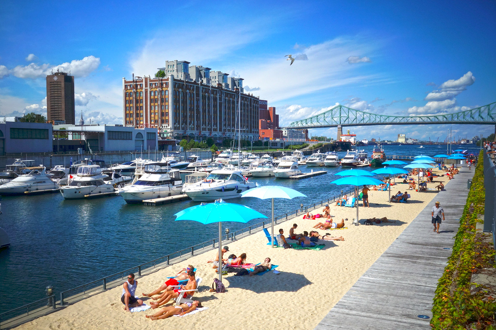
Flickr Images of Montreal
When I looked through a series of photos, I noticed the similarity of this city with Melbourne, but at the same time, I wanted to portray the uniqueness of this city. My eyes were riveted on the image of a colourful building, whose windows were lined up in a specific mosaic. I think that I managed to portray the character of the city in this abstraction.
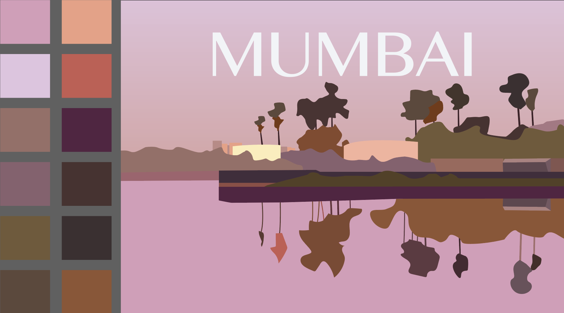
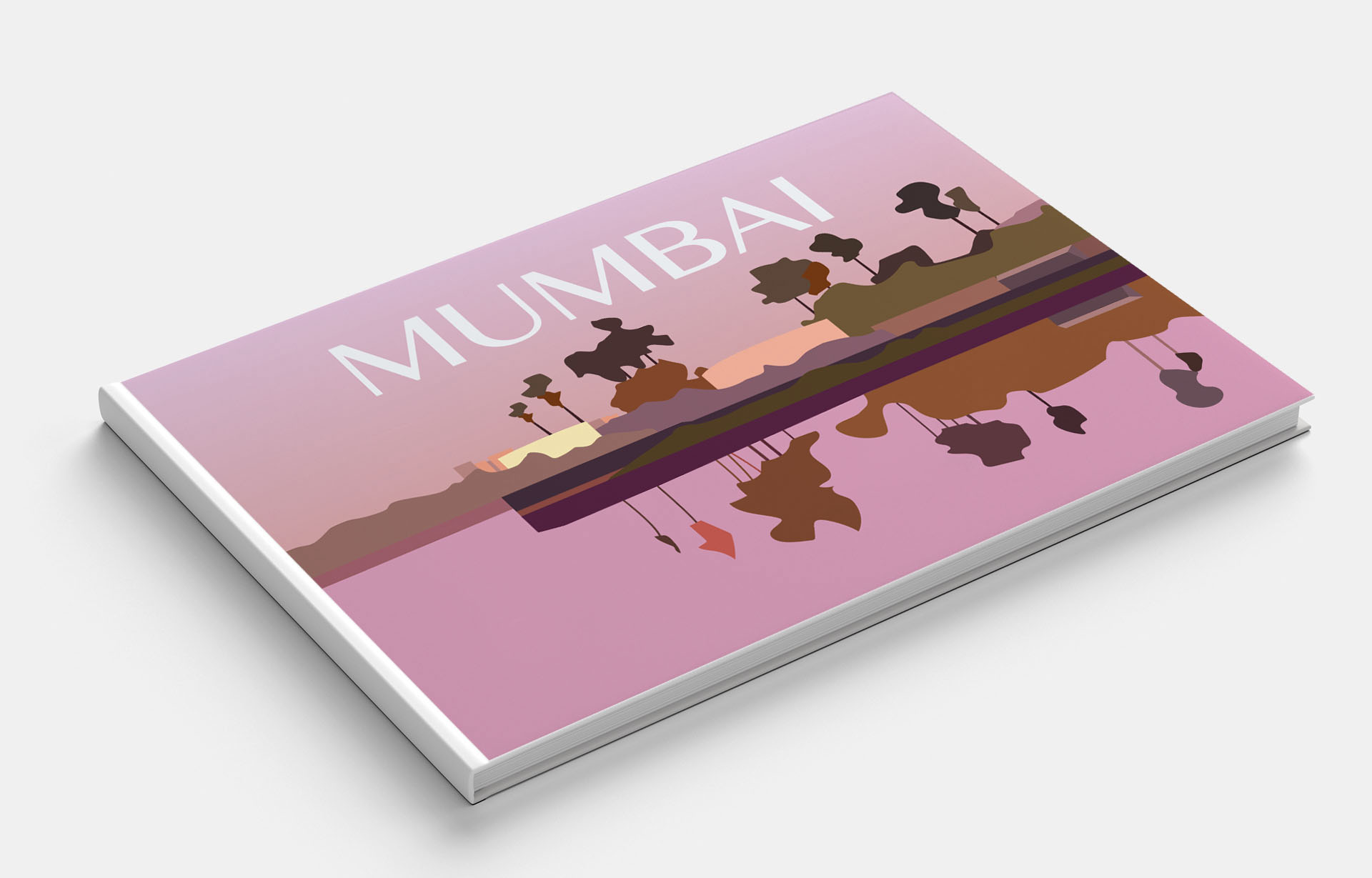
Mumbai
Mumbai is the largest and most prosperous city in India and the most populous in the world. Bom Bahai – these words, according to legend, were pronounced by the Portuguese, disembarking here, and this meant – “Good Harbor”.
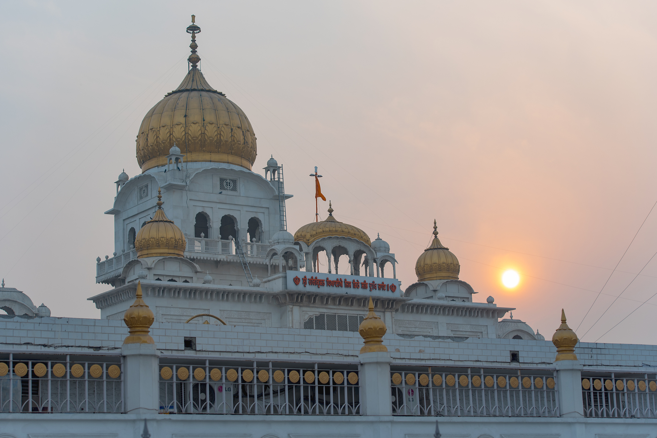
Gurudwara Bangla Sahib Temple in New Delhi on February 24. 2018 in India 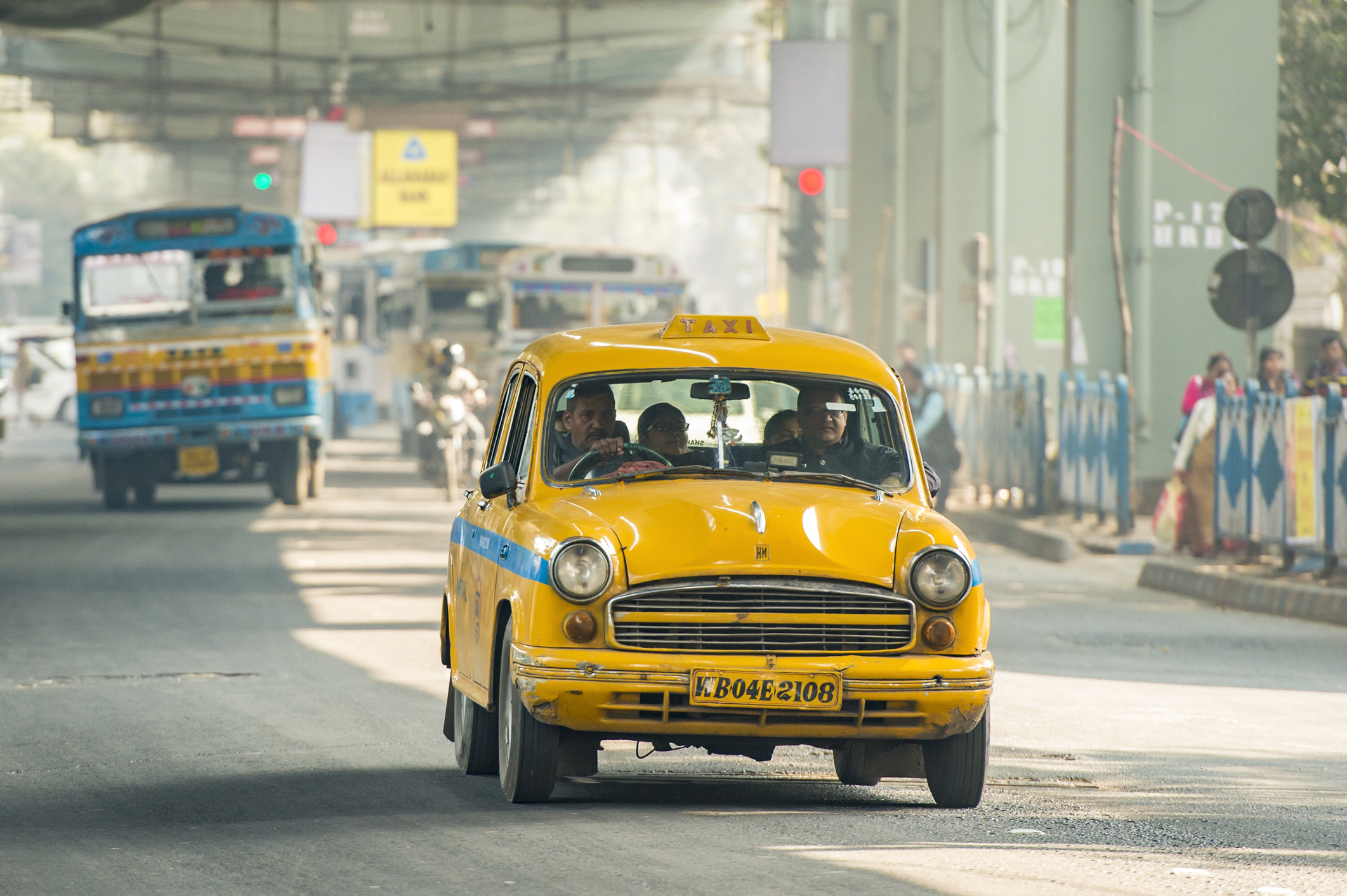
iStock Images.
Kolkata, India – 21 Jan 2018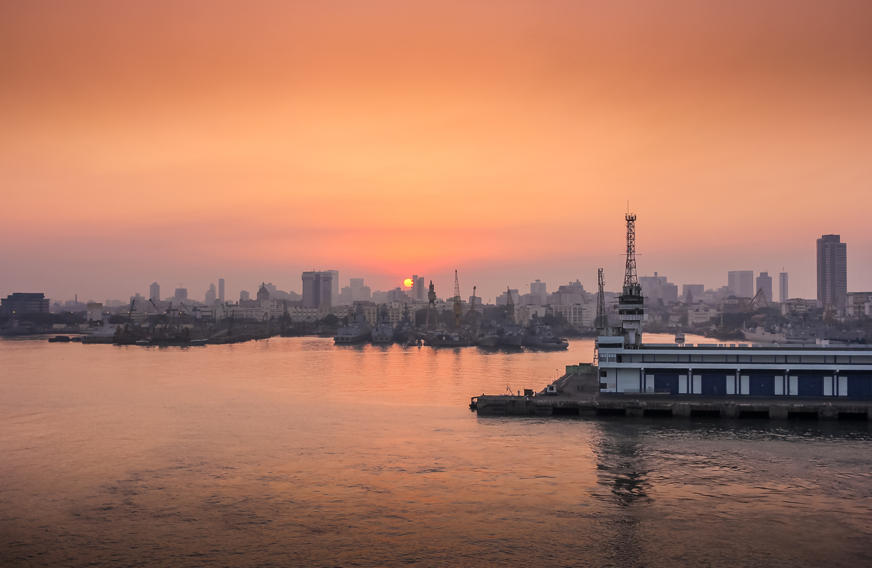
iStock Images. January 2016 – awesome sunset – Mumbai India 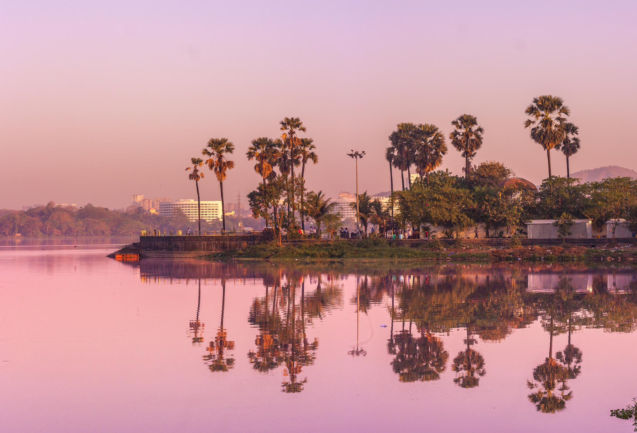
Reflection of Coconut trees at Powai Lake, Mumbai, India 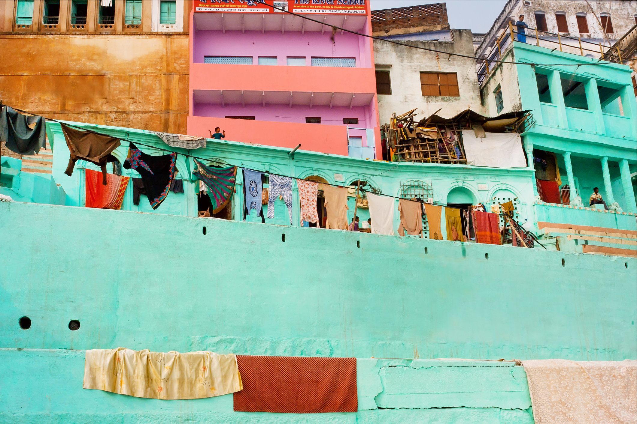
iStock Images.
Varanasi, India – January 1, 2013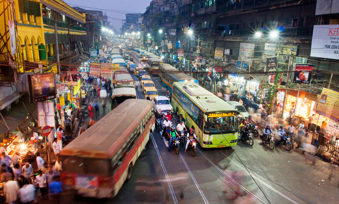
iStock Images.
Kolkata, India – January 17, 2013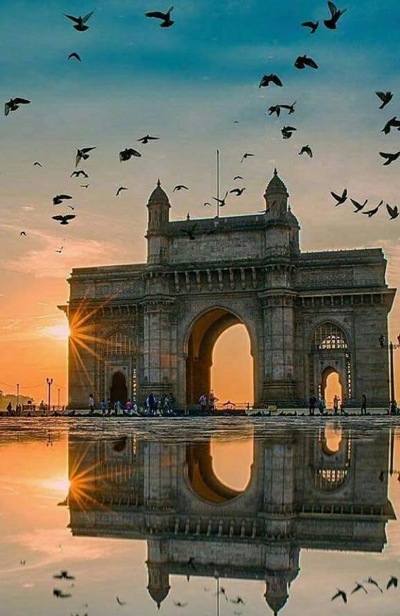
Pinterest Images of Mumbai 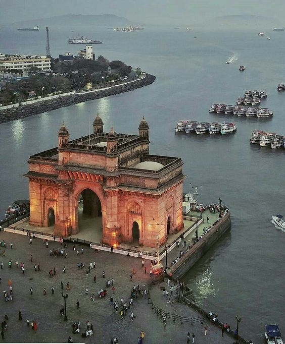
Pinterest Images of Mumbai 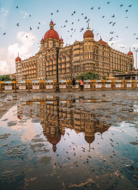
Pinterest Images of Mumbai 
Pinterest Images of Mumbai 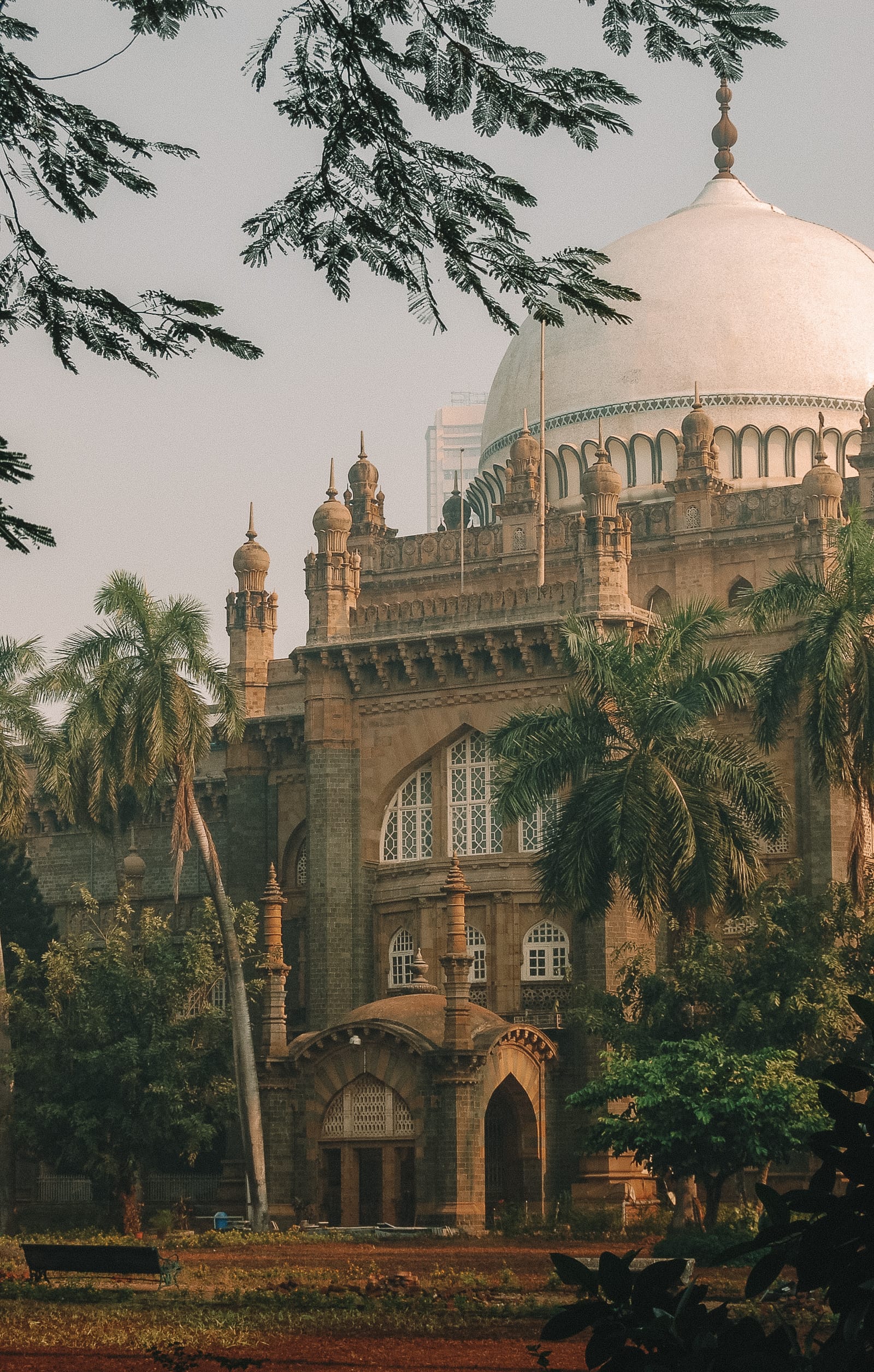
Pinterest Images of Mumbai 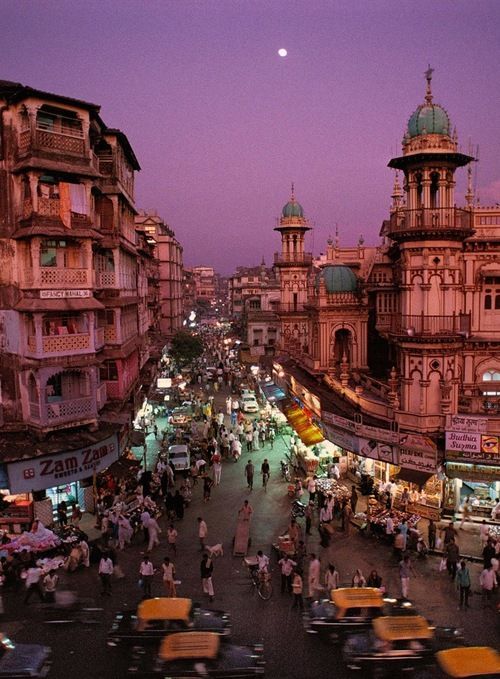
Streets in the late evening, Bombay/Mumbai, India, 1994 Pinterest Images
When I was selecting photos, I traced that the city was full of various colours, but at the same time, brown shades dominated the surrounding elements of the town. I liked the image of the bay near the city, where peace and tranquillity were traced. In my illustration, I used violet and pink shades in combination with trees in the shade.
Conclusion
In conclusion, I would like to say that this exercise took me lots of image looking and researches before I could get the feel of the city. I love that kind of illustrations, made with a simple tool like Adobe Illustrator pen, and adding to each shape the vibrant colour. The only disadvantage that I had, that I really tried to design more detailed pictures, with some recognisable shapes, instead of using just a flat geometric objects, so in the result I have different vector painted images, instead of abstract compositions. I was impressed by the diversity and cultural differences of a single city. Also, I traced the uniqueness of colour combinations in each city, how the mood and peculiarity of cities, forms, and contrast colours are played. In my opinion, I was managed to collect unique designs that, in the future, could serve as a guide in the tourist direction of each city.