
Assignment 4. Cover and Article Design
Context
Typographers and type foundries (the companies that commission and produce typefaces) have always had to promote their latest designs to printers and designers to show off a particular typeface, its different fonts in a variety of sizes and contexts, and the unique features of it. Once Specimen Sheets were the main way of doing this. Nowadays most of that marketing takes place online – research type foundries on the internet.
Brief
Design the font for use on the cover of a magazine called type and write a short article for the magazine using a range of typefaces, with typographic illustrations, drawing on all that you have learned in this section. The article should include sections on:
• what makes a typeface interesting?
• how a typeface is constructed
• question marks.
Requirements
Do a mock up of the magazine cover to show where and how your title font will appear along with other cover elements. Produce a magazine article that is attractive and interesting enough for someone to want to pick it up to read, and which shows off what that you have learnt so far about typography. Add illustrations, photographs and colours as you want.
Introduction

Brief Anaysis 
Mind Map
So, the time has come for Assignment 4, which is like a conclusion on the topic of studying and analysing fonts and typography. I realised that here I would not only have to collect all my knowledge gained in past exercises but also create something new that I have never done before, to reproduce a new unique font, maybe something special. For me, this task is my own kind of challenge. I wonder what decisions I will come to after analysing and sketching some fonts. I’m eager to start this task because this is a new branch in the development of a creative approach to design.
Since I was going to have an extensive work of several components, I decided to start by compiling a complete brief analysis, which included the main sections such as primary research, secondary research, keywords, and designs that I have to complete. Later I created another mind map with a more detailed solution already on the very design of the font, cover and article in the catalogue.
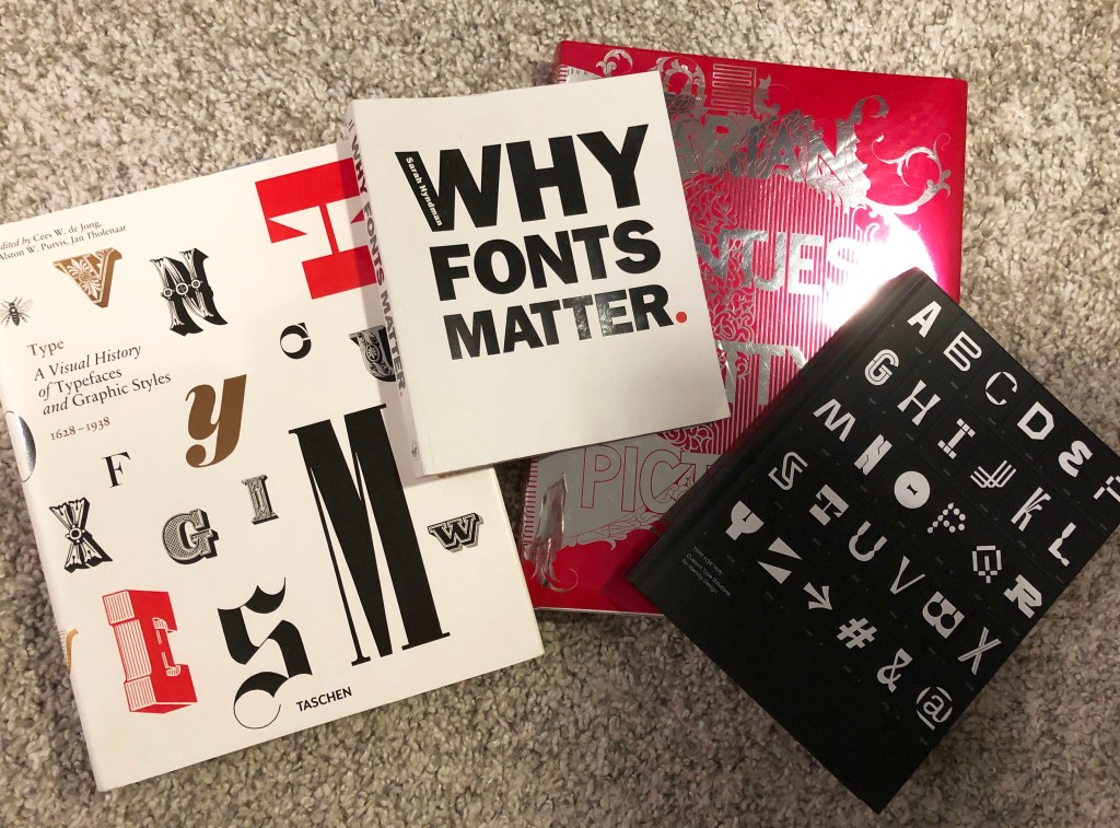
- Research type ideas. Research on type foundries and start collecting more examples of typography magazines, on Pinterest, online or general magazines that use typography in an interesting way. Look at the history of type foundries (I think there would be a help A Visual History of Typefaces and Graphic Styles book) how it has evolved. Find existing type foundries, for example, recommended by my tutor film Helvetica. Have a look for some possible grids, that to transform them into my own font. Make notes on particular type foundries and styles that appeal to me for inspiration for this assignment.
- Design Font. Use this area for experimentation in my sketchbook, create interesting patterns, then transform them into Adobe Illustrator. Try to create my own letters, following examples of Marian Bantjes, look at layouts to distinguish what sort of layout I think would work well for the magazine cover and TYPE header title.
- Mockup magazine cover. Use Photoshop to piece together all elements previously worked on alongside the chosen theme and aim for the overall feel of my cover.
- Write and Designs an article. Based on studies on Part 4 reflect on previous exercises and build upon what was already learnt for each section of the article. Also, build on the magazine examples collected to see what sort of layout would work well for the article. Establish what font size and font article info need to be, play with column layout and think about kerning, tracking, alignment etc.
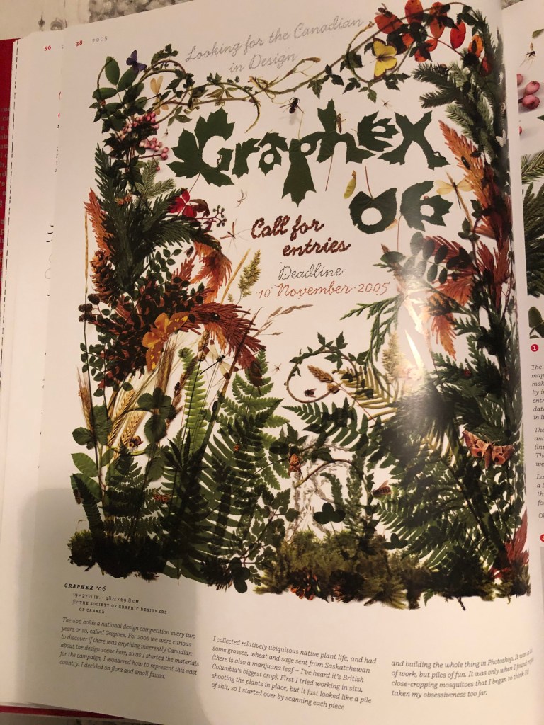
To begin with, I decided to create a mood board for myself from Pinterest. The Pinterest collection has a variety of font options, some digital and 3-D effects, some such as artist Ed Fella are drawn with careless pencil strokes. The more I explored, the more diverse the range of options became with which I could start my own design.
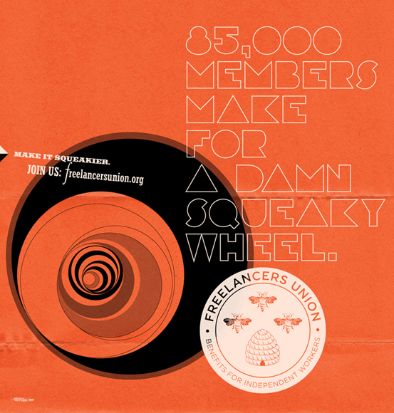
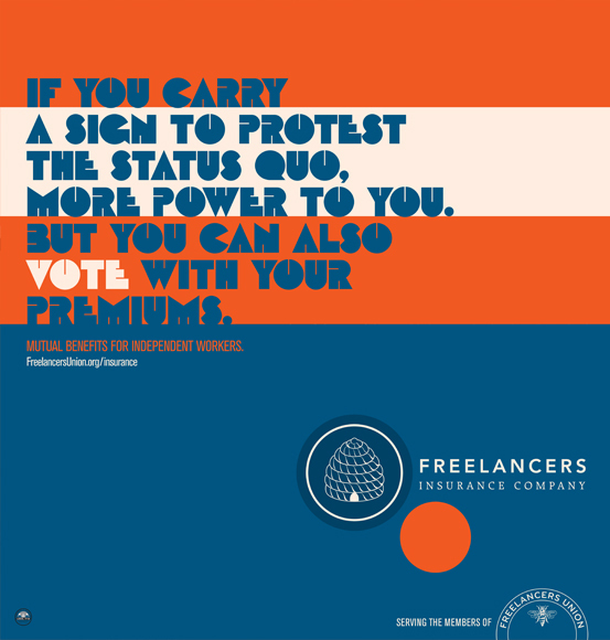
Some examples of font designs and covers from the Google search engine. I liked this images as they consisted some nice font ideas, also I liked that bright colour combinations.


Fonts and typefaces are usually designed by type foundries and designers. In the past, type foundries used to make metal and wood typefaces and later used them on printing machines. Film Helvetica is a documentary about typography, graphic design, and global visual culture. It’s a good way to familiarise yourself how font invention can impact our modern life.
I had several books at my disposal that would help me reproduce my vision of designs. In font design, there is an interesting flow, which calls Type and Sound Workshops. One of the experiments was that participants were played three different sounds, such as heavy metal music, the sound of waves on the beach, a screaming woman from a horror film. As soon as three different sheets had been filled with marks, participants searched the letterforms in each and cut them. In the end, they had alphabet with different styled, which would reflect sounds that inspired them.
Fonts give words a personality
Sarah Hyndman. Why Fonts Matter
There is a saying that typography is storytelling; the font has personality and can reveal the scene independently. I was thinking about what story do I want to tell that to represent a meaning of it? So there was another question as well: what kind of story I would like to say with my font? Is it a romantic story, or is it progressive music kind of font, or is it sketches of the font of the mad scientist while he is making some sketches for his researches?
As a part of my research, I wanted to ask myself the following questions:
a) can I prove that my typeface has a unique personality?
b) is there significant agreement from others on different personality types
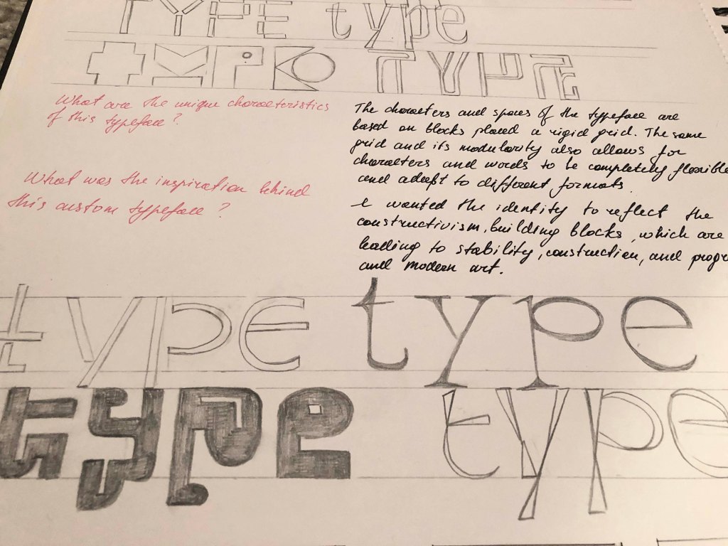
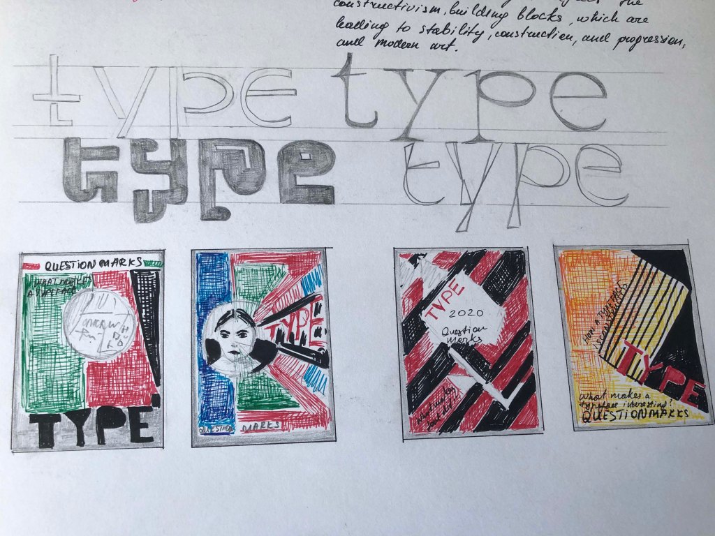
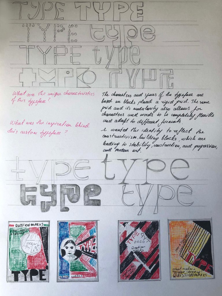
c) what are the unique characteristics of my typeface?
d) what was the inspiration behind this custom typeface?
Experiments with the texture
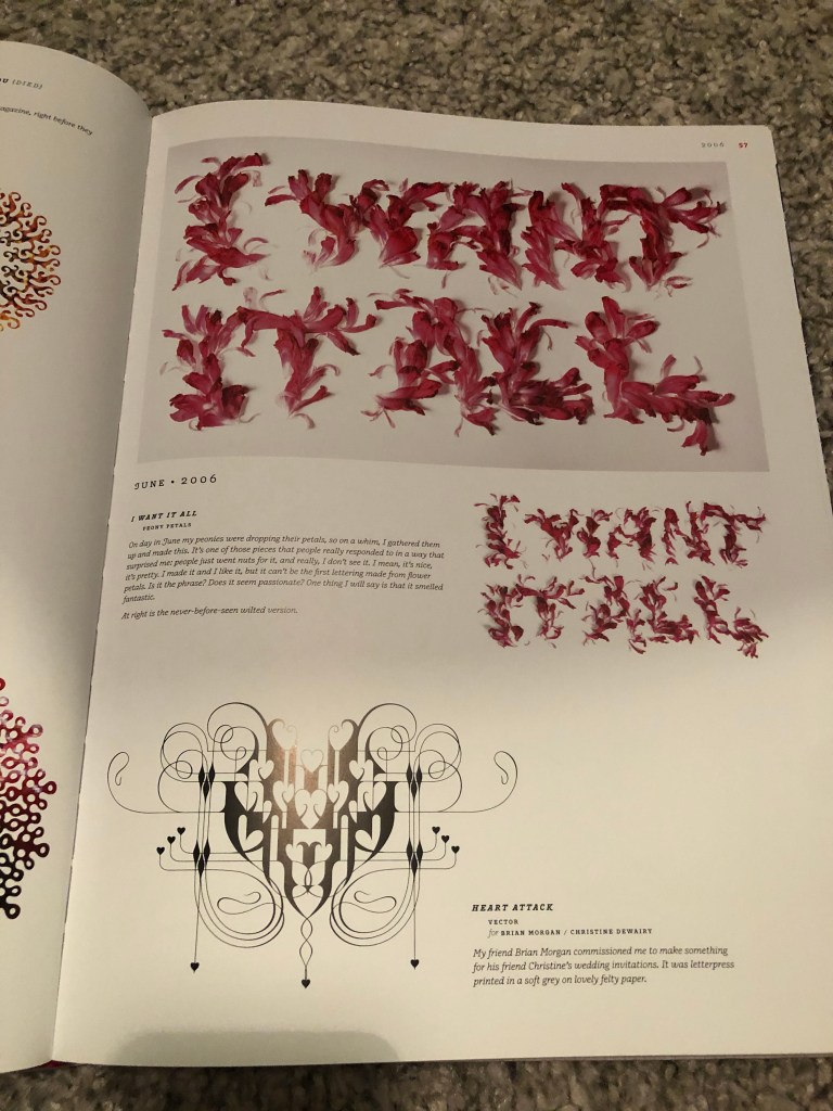
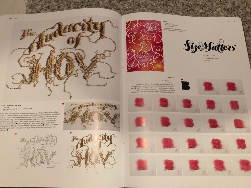
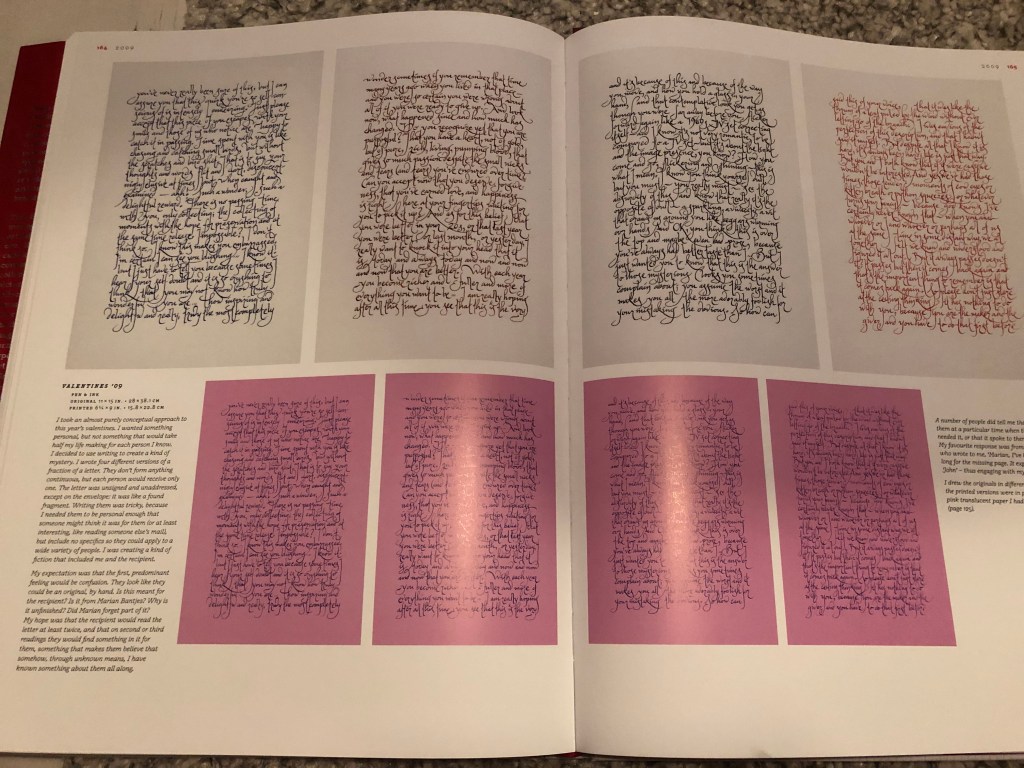
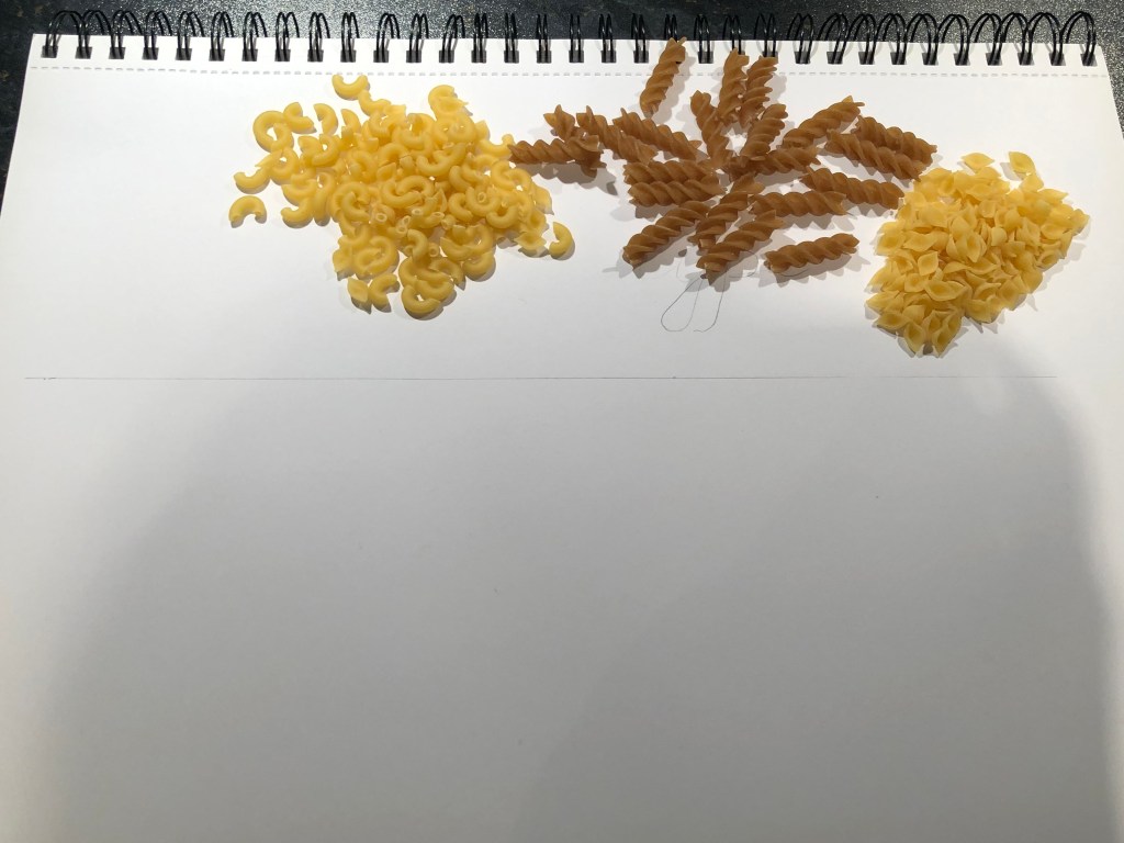
I had one idea for a while about creating my own font from improvised items, and now the moment has come when I am given the opportunity to realise some of my them. I always had at hand the book Marian Bantjes “Pretty Pictures”, which I periodically look through for inspiration. I like her bold experiments and how easily she describes them in her diary. She often draws the font itself, and her layouts are quite strong and professional, she also uses different materials for design, such as fonts on grapes, fonts made from flowers, letters from fur, a font from glitter.
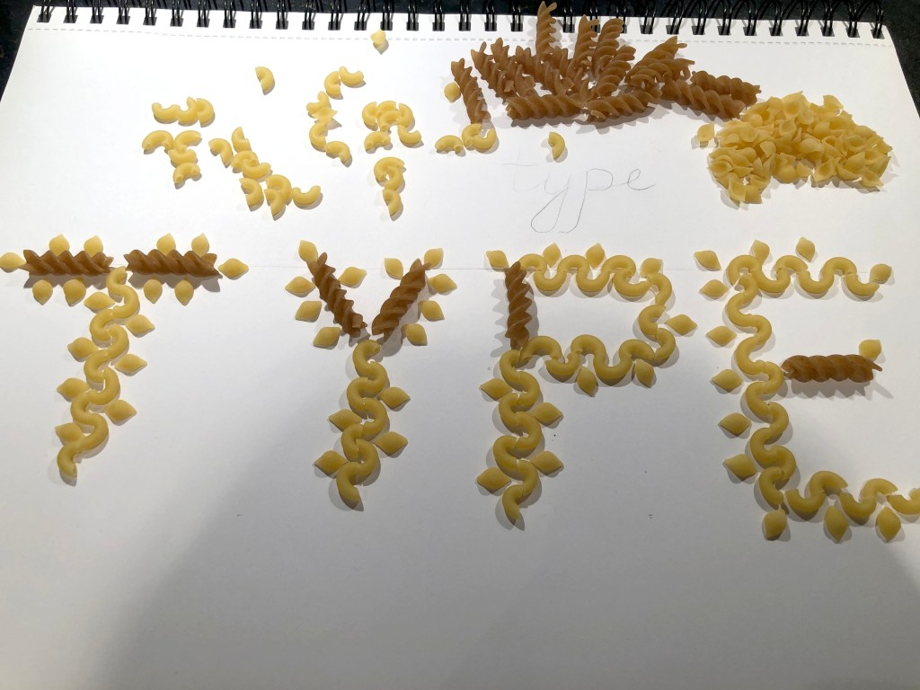
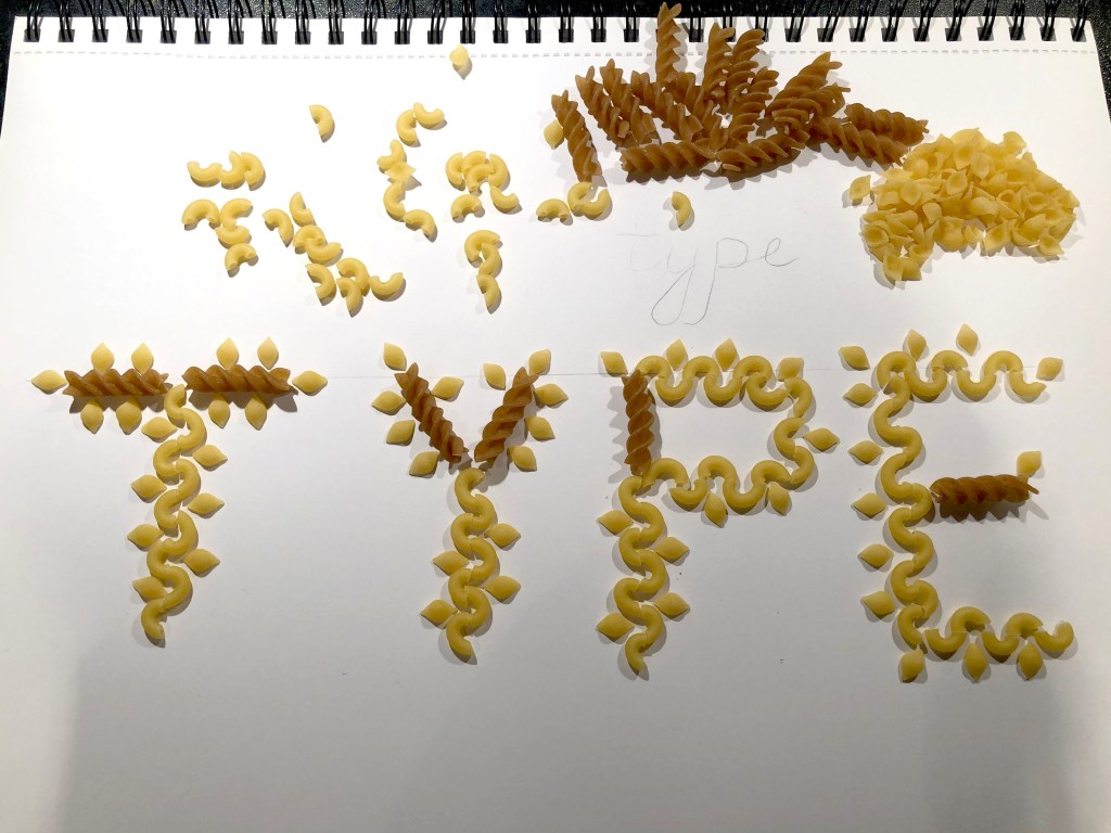
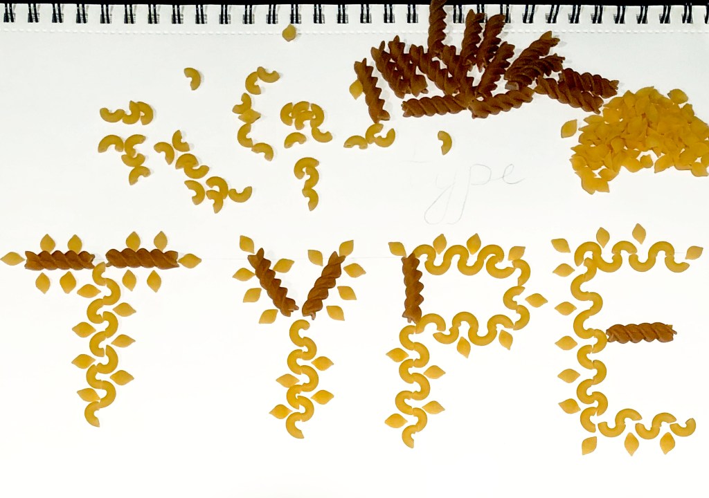
I thought that in this task, by the way, I can also experiment with voluminous fonts made from objects that surround us around. Because I had some deadlines, here I decided to concentrate on the four letters of the word TYPE.
So, materials that I was going to use:
1. Pasta
2. Flowers
3. Loose granules (sugar, salt) in my case is sugar
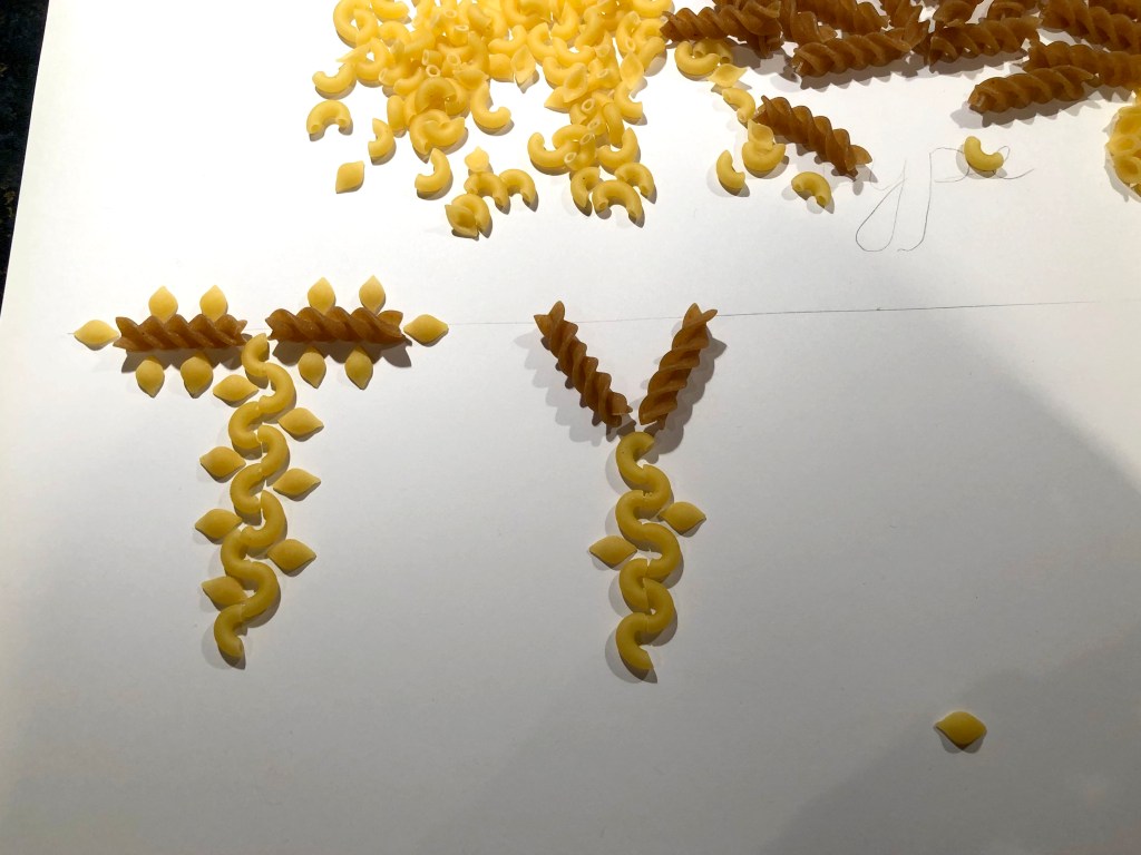
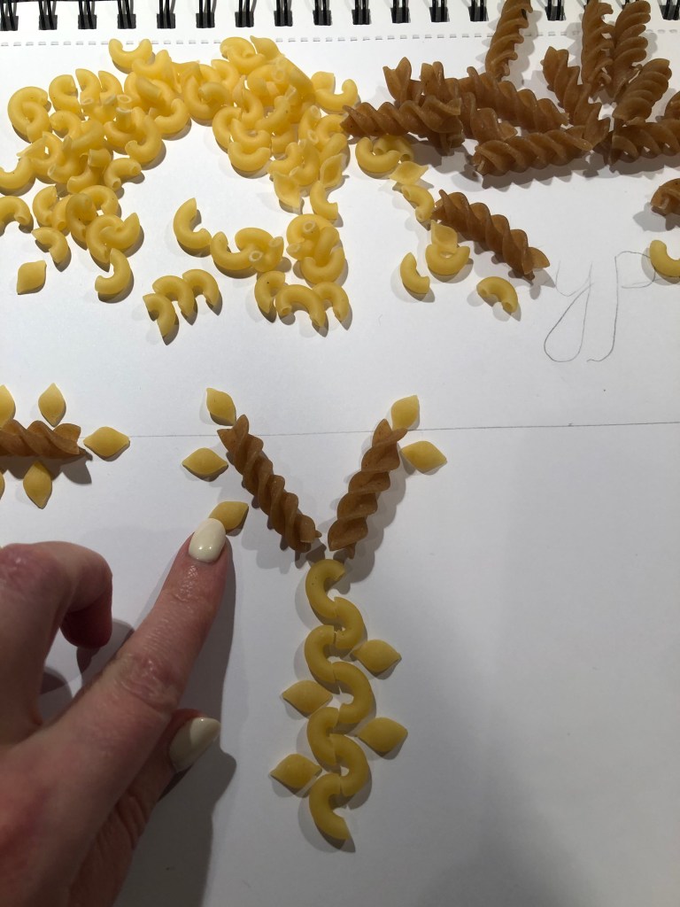
Pasta font
Having rummaged in my kitchen cabinet, I found several types of pasta, which I piled up on a side, I needed a curly paste to design a wavy font. Fusilli of dark wheat varieties I used as an accent for supporting characters. After that, I began to build them in the form I needed. The result was such cute, funny letters that could be used as a decorative font. I think it could be used for some kind of agriculture layouts, something related to flour production etc.

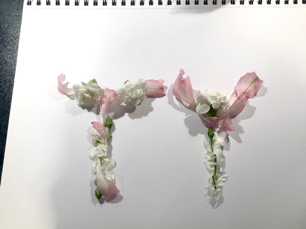
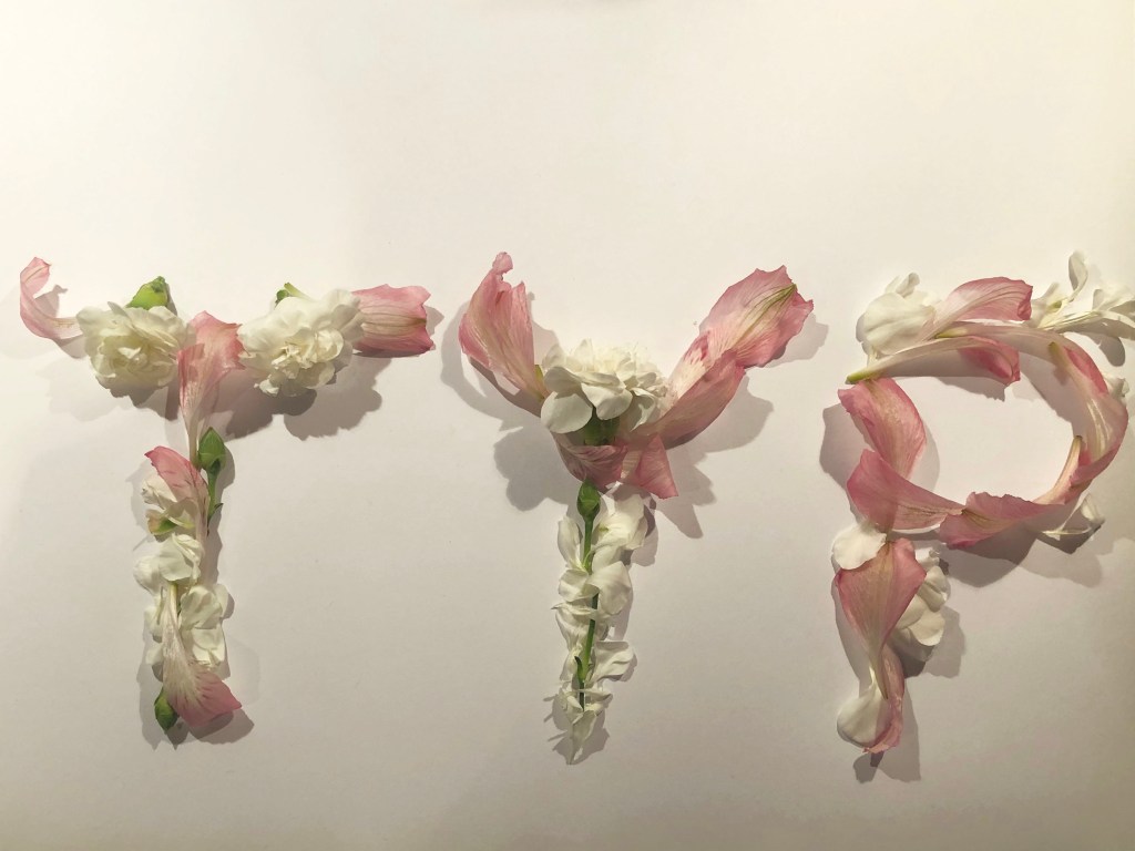
Flower font
After I proceeded to the flower font, I only had white and pale pink flowers in my stock, as I didn’t have brighter shades, I decided to use the colour palette that I had available. At first, the petals did not want to line up in the forms I needed; after several trials, I still managed to achieve the forms I needed. The font turned out to be very tender, airy, it could be used in the design of women’s perfumes, or boxes with floral aromas of gift candles and so other more.


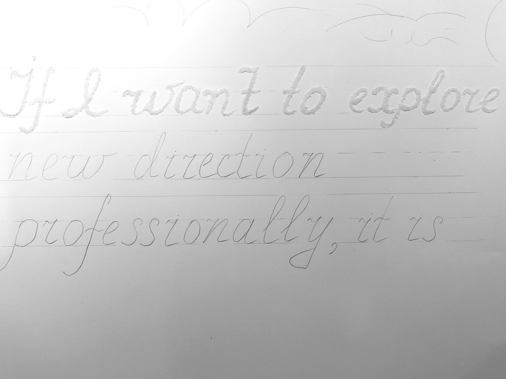
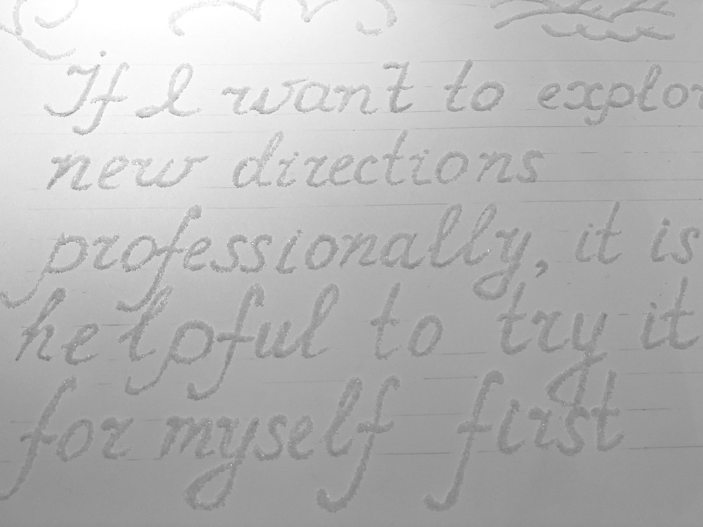
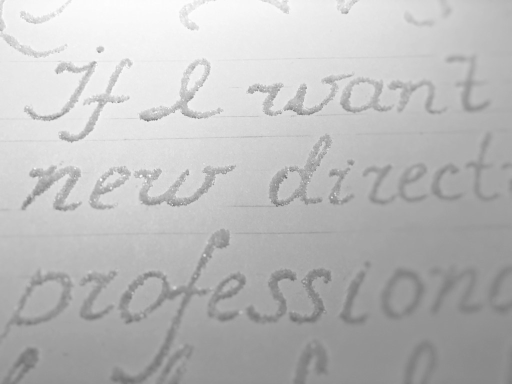
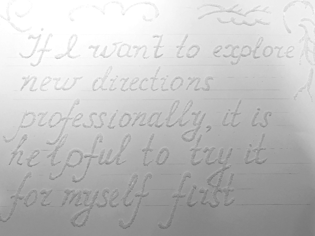
Sugar font
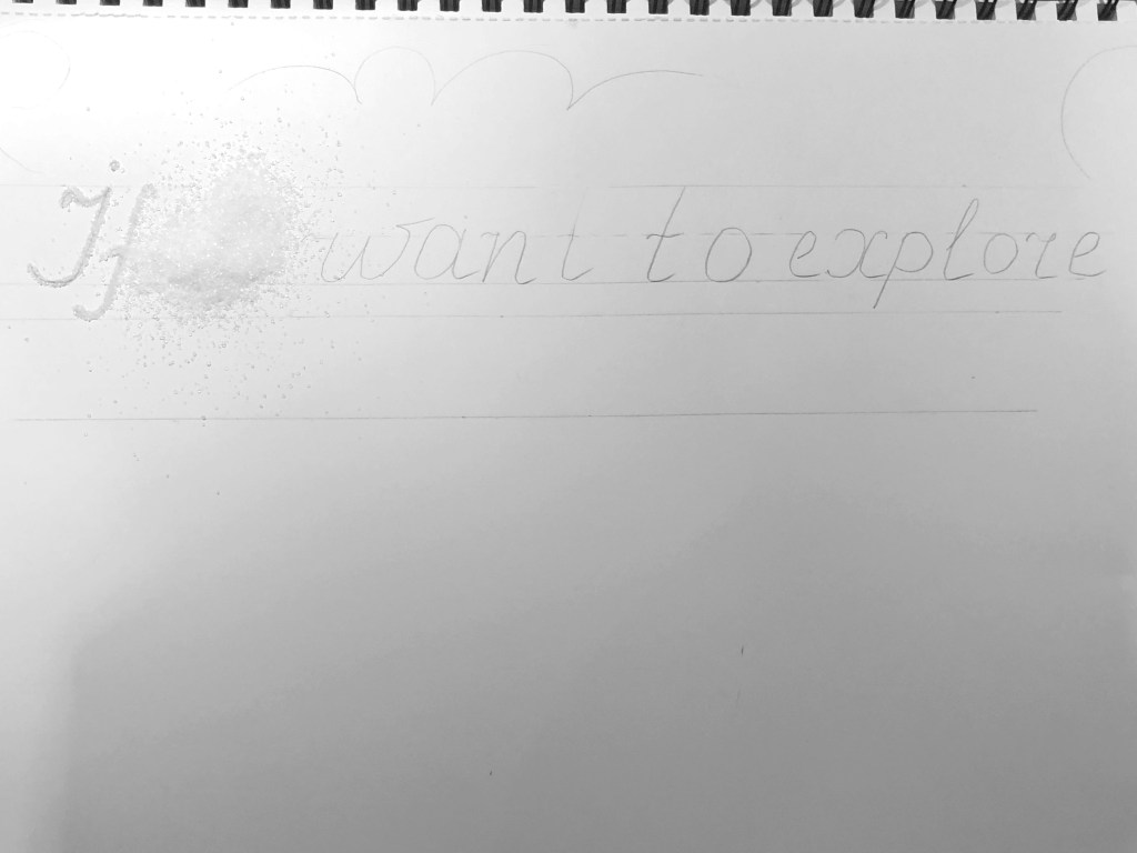
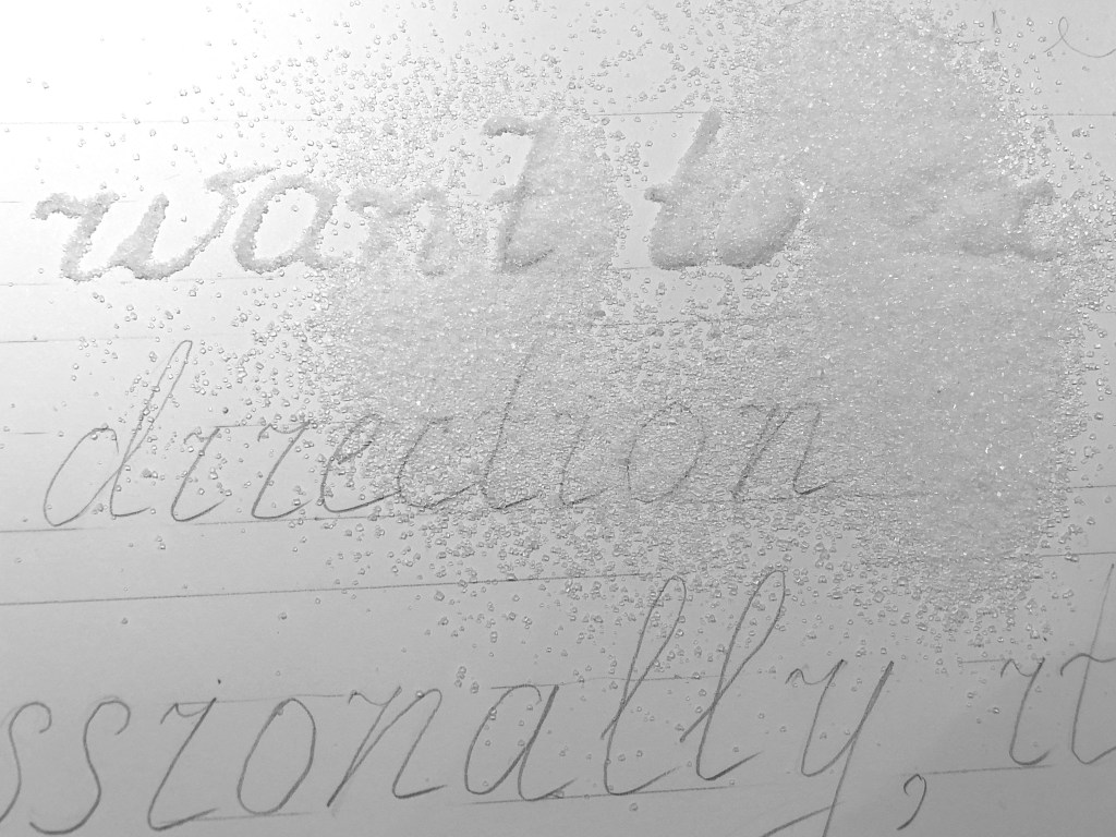
With a sugar type, I had to fantasise a little. I needed a very thin tube through which I could pass this very font. I decided to write the font by the analogy of my own calligraphic emphasis. I wrapped an A4 format in a tube, thereby creating a funnel for sugar, the font was thicker than I planned. My first trial with thick funny looking letters is below.
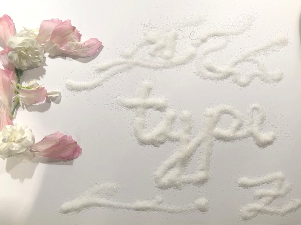
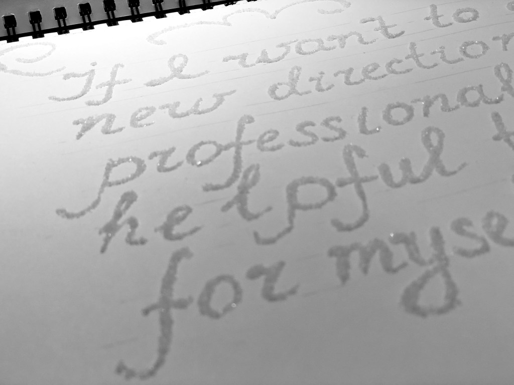
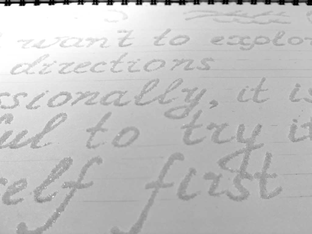
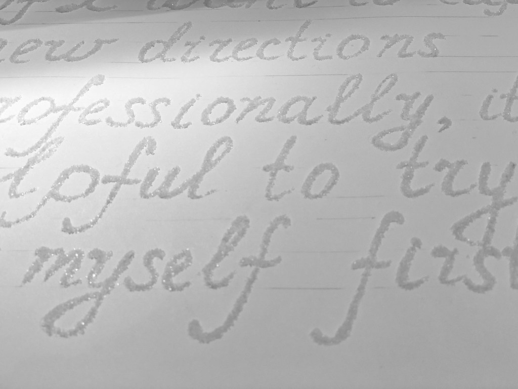
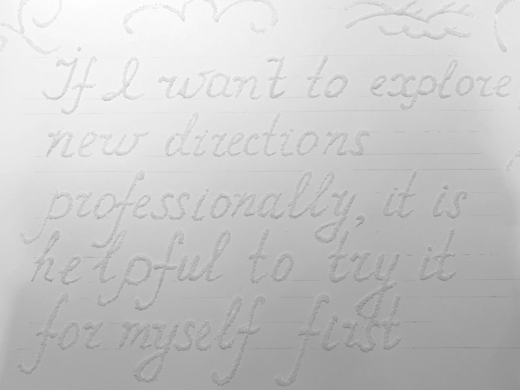
I was thinking about what I did wrong; suddenly, I remembered our lessons from school times, where we used glitter to stick things around. Then I realised what I was missing, and how I can reach a desirable thing font. I needed PVA-glue, thin painting brush and some sugar. I really was inspired by this idea. I could use my own hand-writing and create a unique and fancy font for it. I created the outlined font first, trying to keep my fonts similar to each other in size. I was missing full alphabet there, but I still created some key letters for the word type in small letters. I was thinking about what grains to use, sugar or salt, but then I thought that sugar creates a nice big texture that I needed, plus it gave some sparkles. I liked that effect of practically white font on a white background. I called it Sugar Calligraphy.
Font Sketches
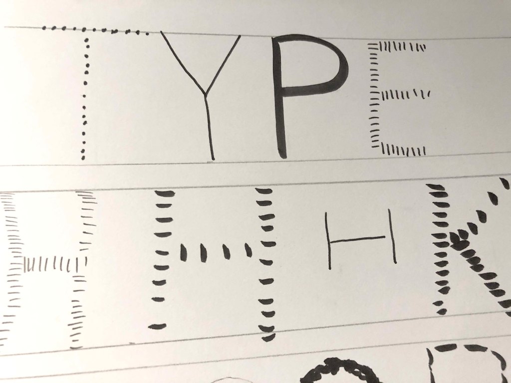
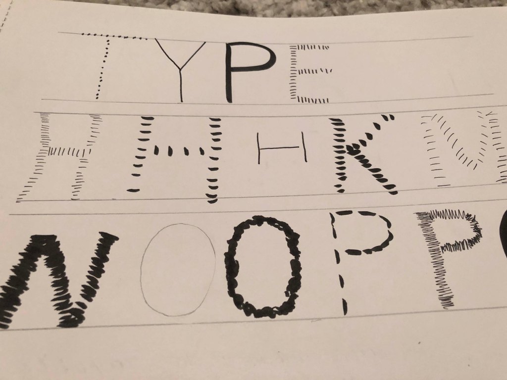
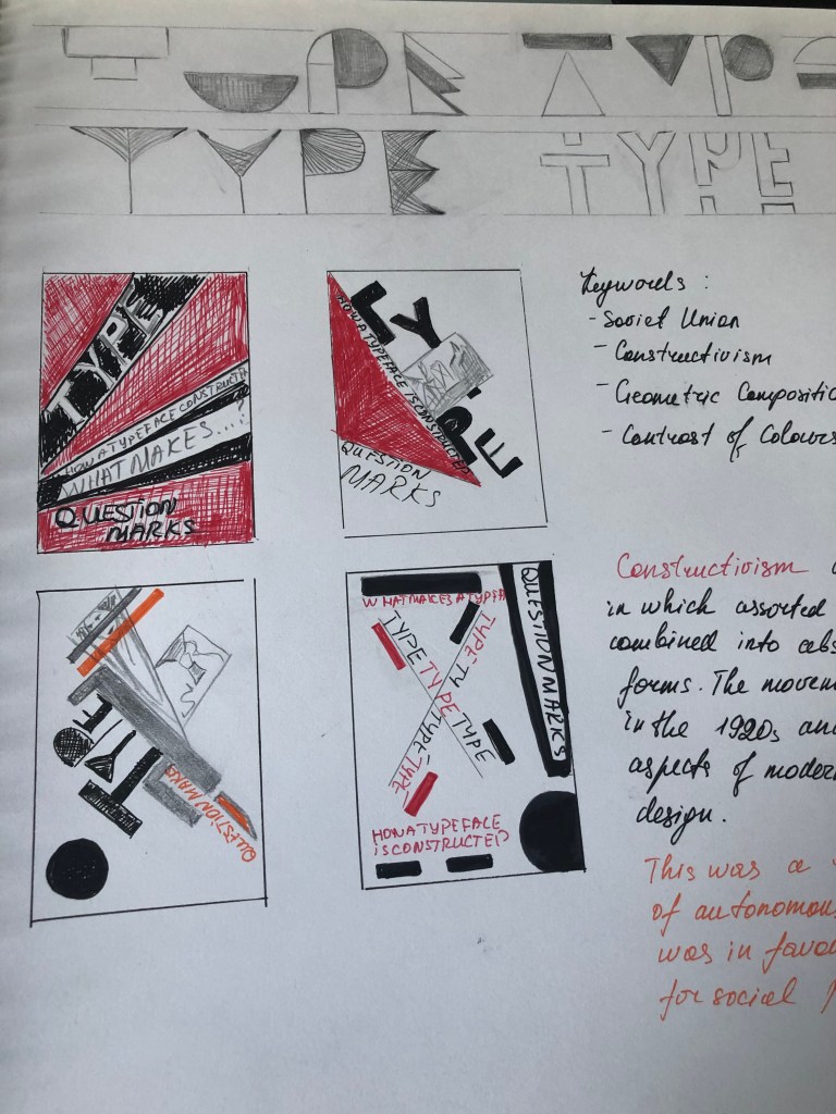
Before starting to draw the font, I knew that I needed an idea, that to explain how my font and designs are evolved. I created some sketches of fonts of different shapes and styles, from patterns with waves and smooth lines, thick decorative sketches, thin font options that would look like a constructor, decorative dot and lines font options, different shapes font, with thin or thick lines. My thoughts led me to the fact that this is the first font that I drew, and I had such associations around this assignment, keywords:
• Construction
• Building
• Block
• Modern
• Constructivism
• Stable, Reliable
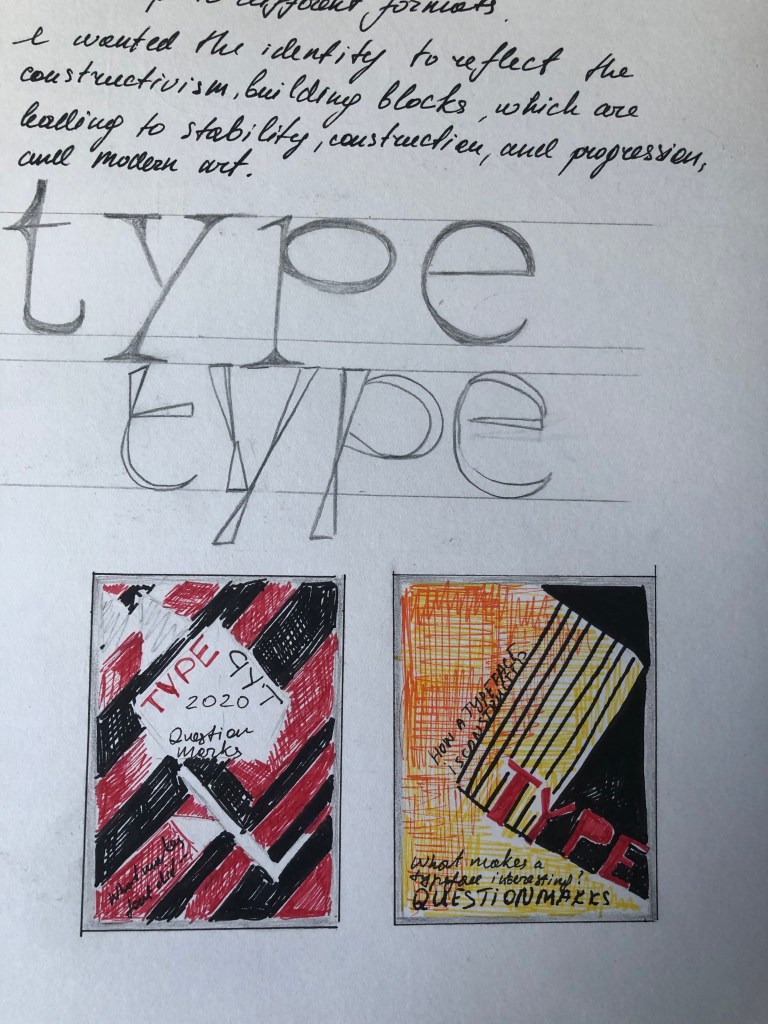
I wanted to draw an analogue with the construction, but at the same time bring in the spirit of the Soviet Union past, here I came for inspiration from several authors like Kandinsky and Rodchenko, in their works, there are confident geometric shapes, and the main colours are red and black, additional colours are green and blue.
Constructivism was an artistic and architectural philosophy that originated in Russia in 1913 by Vladimir Tatlin. This was a rejection of the idea of autonomous art. He wanted ‘to construct’ art. Constructivism had a great effect on modern art movements of the 20th century, influencing major trends such as the Bauhaus and De Stijl movements. Its influence was widespread, with major effects upon architecture, sculpture, graphic design, industrial design, theatre, film, dance, fashion and, to some extent, music. (source: Wikipedia)
I really wanted to experiment with design in the style of Constructivism, and I decided to take this opportunity in this Assignment. The direction was chosen, now I was faced with the task of combining the pieces of the puzzle.
From my examples, it can be seen that I started drawings from standard fonts, at the same time with additional elements, as in the first example, with yellow rectangular blocks. Later I tried a Tetris-style font, but it seemed to me too crude. Then I tried a font with different textures, dotted, linear, thin and thick lines in one alphabet, but here I risked the lack of experience, I realised that my font might be too crooked for future use in design. I tried several font shapes, most of them were decorative and in the style of fixed width. I would like to note that some of my sketches turned out to be quite successful, but due to lack of time, I realised that I needed to focus on one style that would help me put everything together. So I’ve chosen one direct font, which is described in the next section.
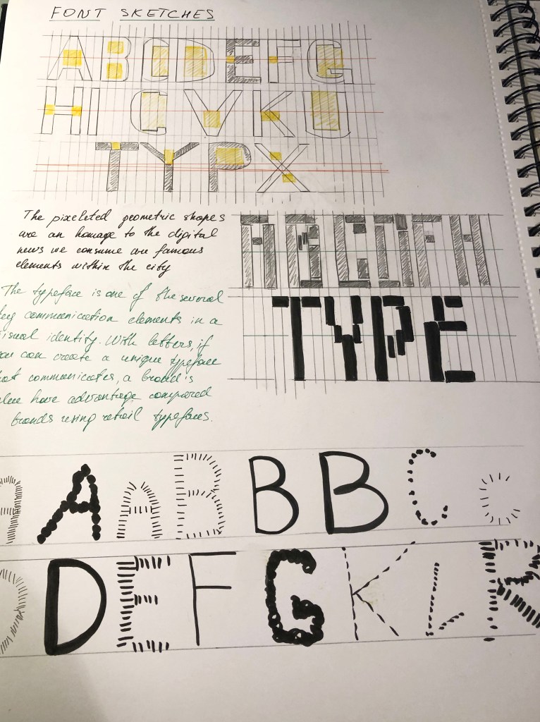
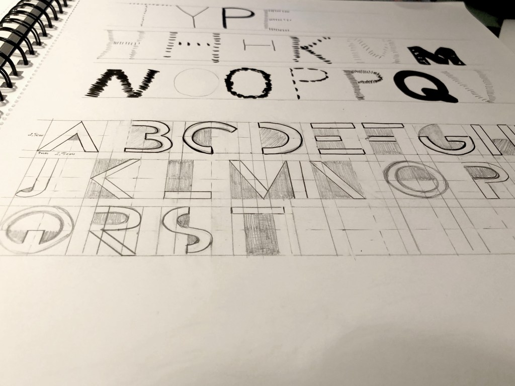


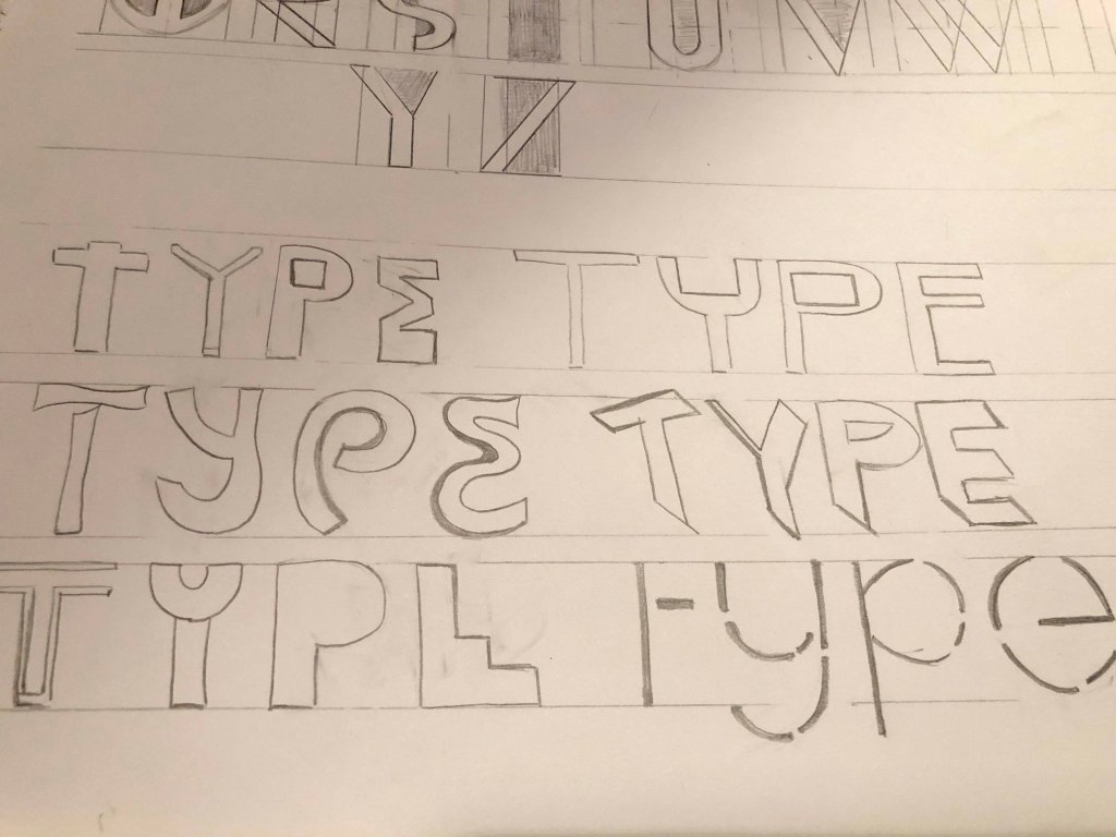
For my first font, I wanted to create something stable and durable, with confident lines, but at the same time, I wanted to add a twist to this font, something unusual so that it looked not just like a sans-serif font, but closer to a decorative font. I collected some more font options on my Pinterest account. And then I started sketching the font.
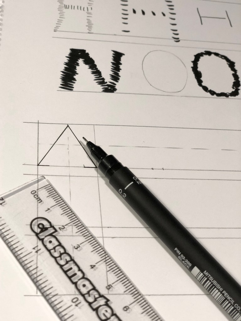
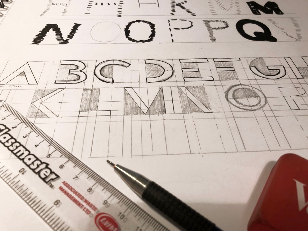
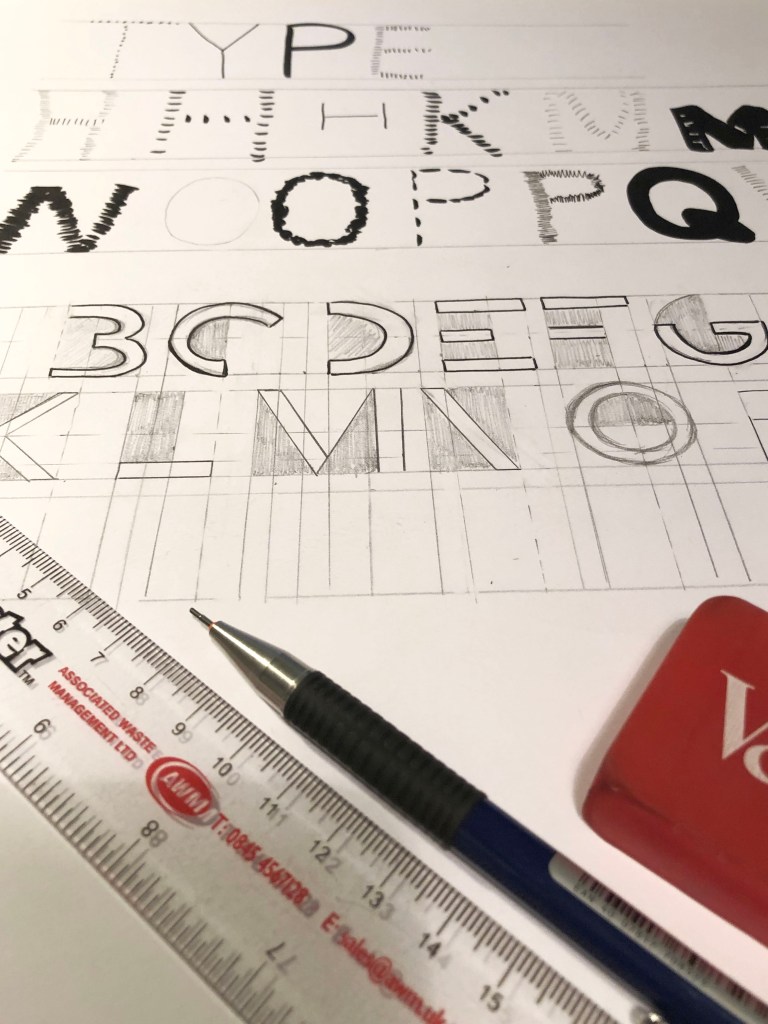
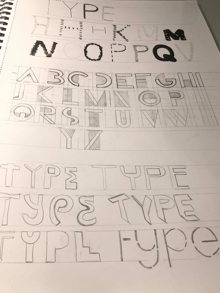
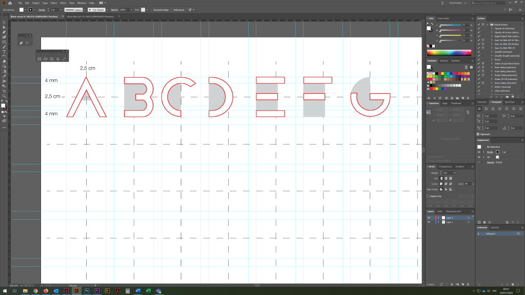
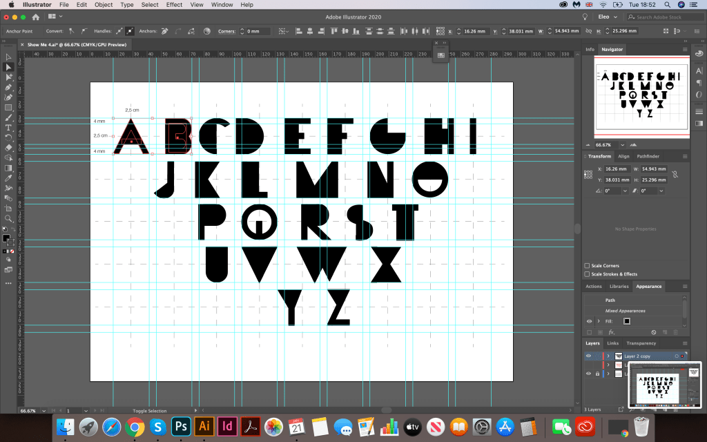
I started with capital letters. I transferred my sketches to the electronic version, created a grid and marked the centre. My main proportions were 2.5×2.5 cm, the width of each block was 4 mm since for the cover I needed to use the word TYPE, my task was to beat these letters in an unusual way, at first I had the letter E with a wide side block, after which I changed it’s on a thin line, similarly for the letters F, M, N, so this font looked more designer, and not like Helvetica or Arial.


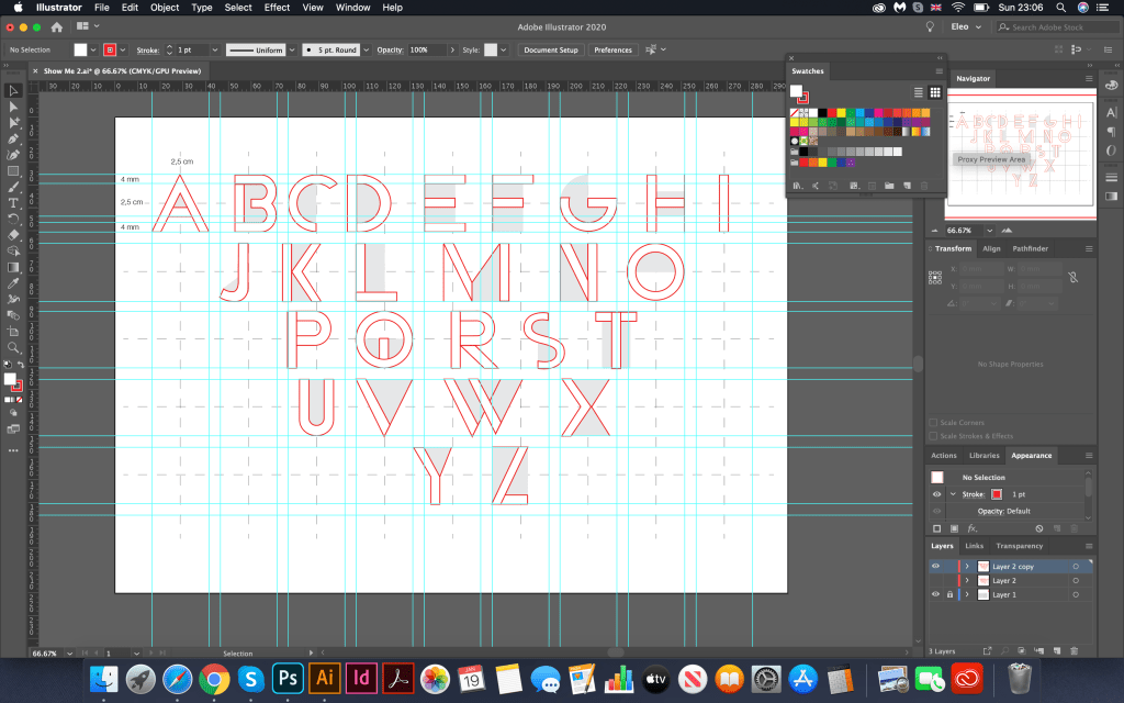
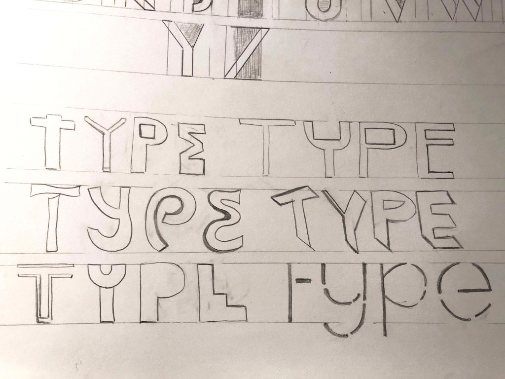
The first font was ready, it was straightforward, confident, and successfully fit into the style I set. Later, I started designing the font for the magazine cover. I tried several options. I used the large letters TYPE in the design number one, inside which I placed photographs of the buildings. All photos were selected from Pinterest. I tried several options for writing the font, with multi-coloured books, plain, but my designs still looked amateurish, however I still could see that I needed to refine the font.
Looking carefully at the font, I realised how I can improve it, then I came up with this idea to paint over the inside of the letters, and also thicken the main lines in the letters E, F, T. The ready-made font was quite interesting, I managed to achieve the desired result!
I experimented with a few structures, trying to avoid copying the styles of famous authors and to bring my vision into the design.
In my works I wanted to introduce a spirit of nostalgia and retro-style, in which there were muted primary colours, a darker shade I achieved due to old paper in the background, and Multiply transparency was applied to each colour.
Keywords:
• Soviet Union
• Constructivism
• Geometric composition
• Contrast of colours
Before I started designing in Adobe Illustrator, I decided to make preliminary sketches for my layouts, so I managed to arrange my ideas on a piece of paper, understand what basic compositions I would like to use in my work, and understand what colours I should focus on.
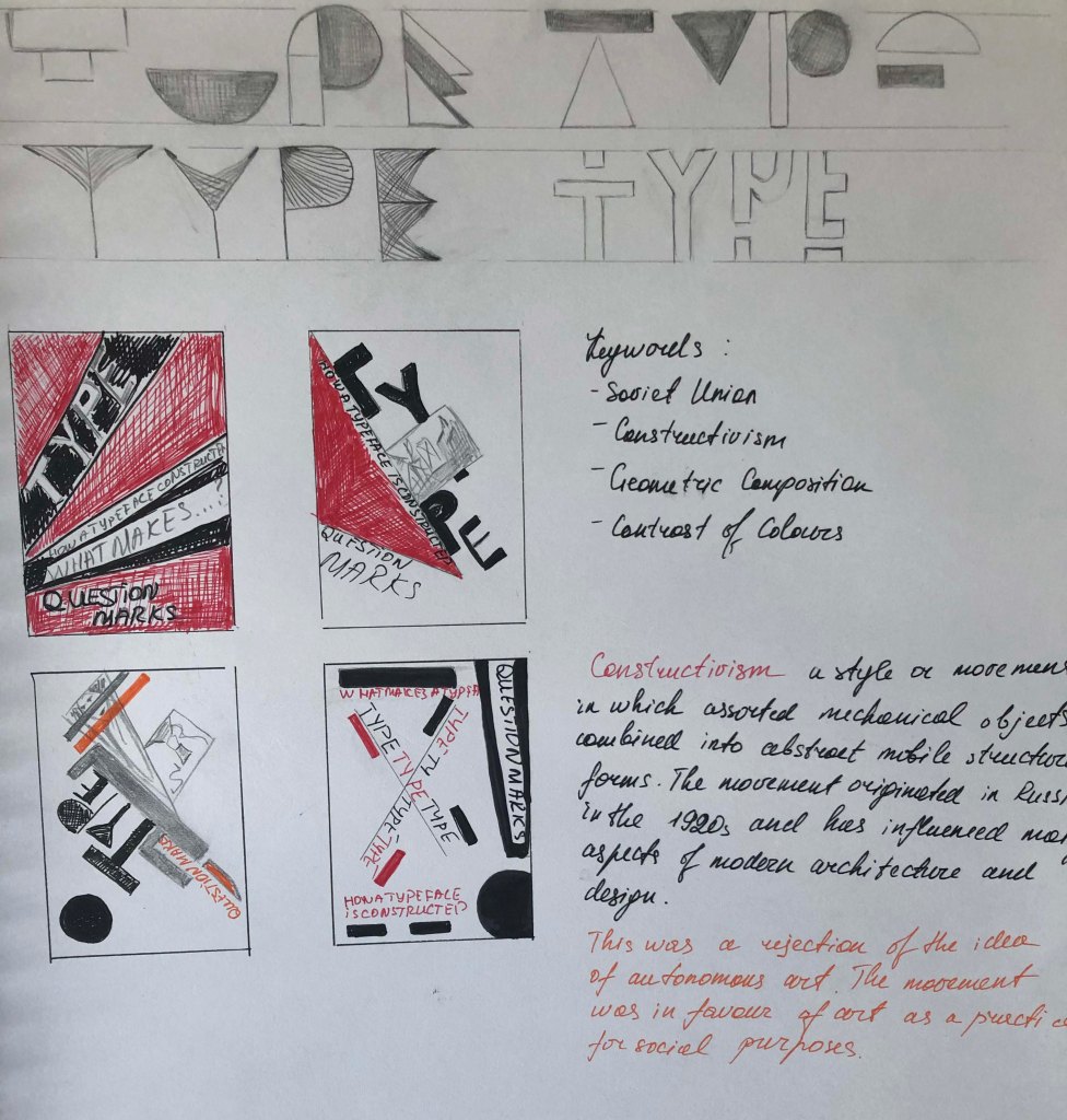
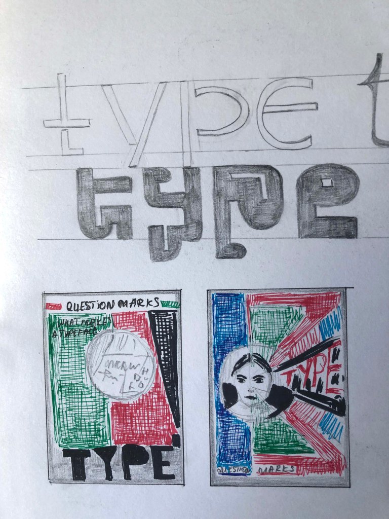
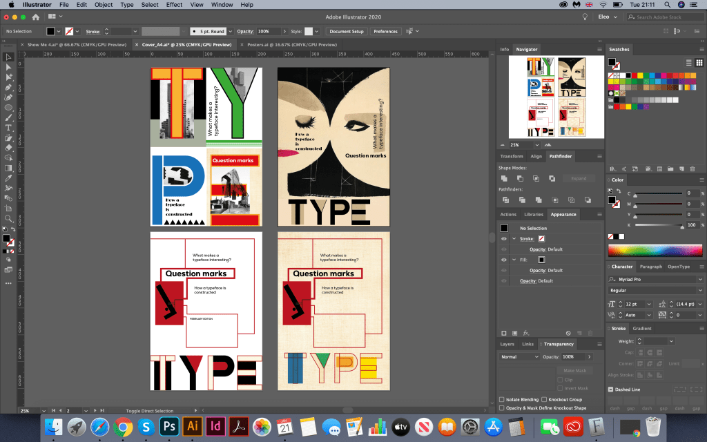
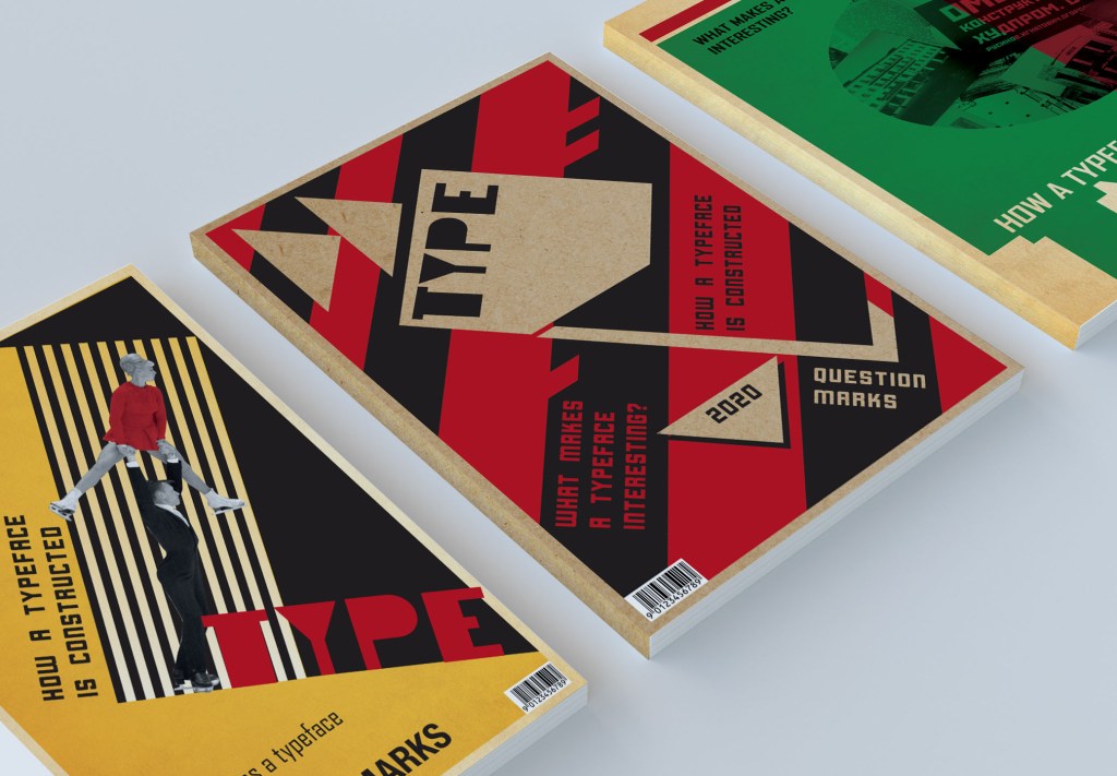
In the first version, I used a fairly confident (communist) combination of colours: red and black, and also old paper in the background. For questions, I chose the Cornerstone Regular direct font. I put the words at an angle. I would like to note that the style of the font turned out to be more modern than the style of the cover, it still kind of worked together, but I still wanted to see some more options.
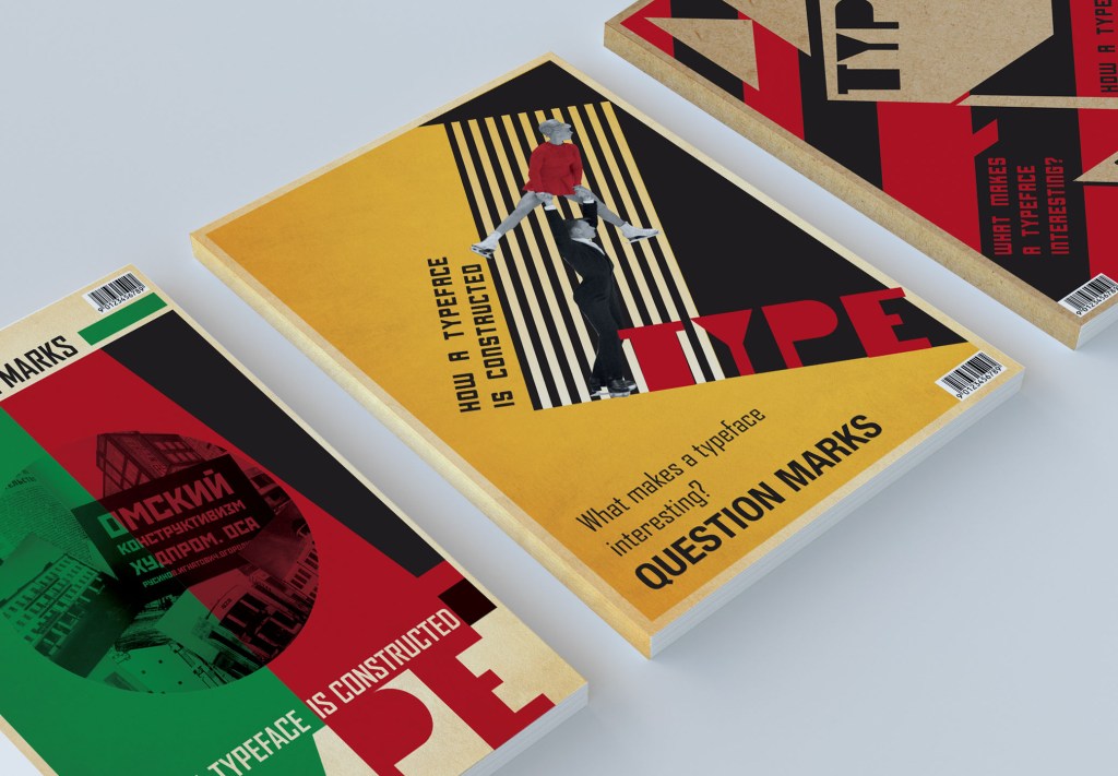
The second design came to me with the idea to add the Olympic achievements of the Soviet Union period, I wanted to add dynamics to the cover, a person in motion. I found an image of skaters on Pinterest through a search for Soviet Union Olympics. Liudmila Belousova https://www.pinterest.co.uk/pin/839358449286748854/ I designed the layout in yellow-black combination, indicating the contrast of the word TYPE and the skater’s outfit in red. In this layout, I used a different font style: Cornerstone Regular, Agency FB, Helvetica Condensed Bold, as I wanted to see a slight contrast between each font. I made the headings of small size because the idea was to save free space. The layout turned out to be quite interesting, but it seemed to me that it was too similar to the design of Rodchenko’s poster, so I don’t see it as the main one.
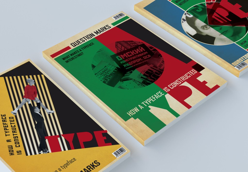
For the third cover, I divided the layout into two parts, in the middle I placed a Soviet poster with propagandizing slogans in Russian. I found images of buildings on the postcard website of the Soviet Union http://www.togdazine.ru/article/925 The letters of the word TYPE I placed at the bottom, as a continuation of the green and red fill. For headlines, I used the font Agency FB. For the background, I also used an old canvas. I think I managed to achieve an interesting effect in this poster, despite the fact that the layout itself was a bit empty, it still had interesting elements. I was not quite sure how to fill it with more element, but as I have some more ideas about design, I proceeded to the next layout.

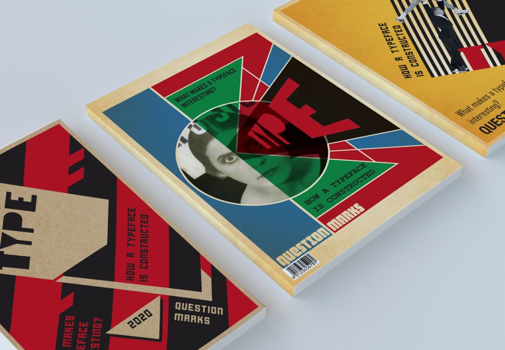
And finally, for the forth cover, I used the image of Mayakovsky’s wife. I used Bridgeman Images for Constructivism. Cover design for the poem ‘About This’ by Vladimir Mayakovsky (litho) bit.ly/2sWGCwl. In this poster, I added more colours, the muted shades of blue, green, red and black created a good contrast between each other. Also, geometric elements around, such as triangles, a circle and rectangles, created an unusual composition. I angled the word TYPE in Photoshop using the same updated font in red, and for questions, I picked up different fonts. I made Question Marks by the type of cut out letters that shine through the bottom layer of old paper, I also used the font fixed width and Agency FB for questions.
Bellow are presented 3-D models for covers. From that perspective you can see if design works well.
Article Design
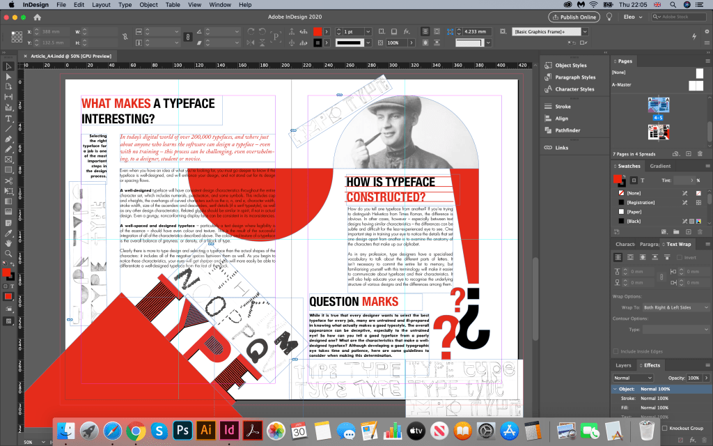
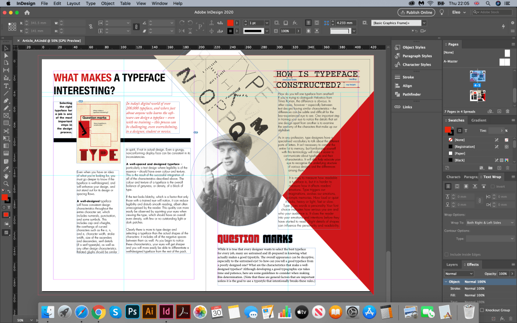
In the final part, I had to make a few sketches for the article, and understand what layout I would like to depict for my design. The main requirement was certainly to comply with the style of the cover of the magazine. Here it was already clear to me in which direction to move, I knew that I had the basic colours (black, red, white, old canvas) the geometric composition, it was only necessary to present all this correctly. I created some sketches from which I realised which layout I would like to depict.
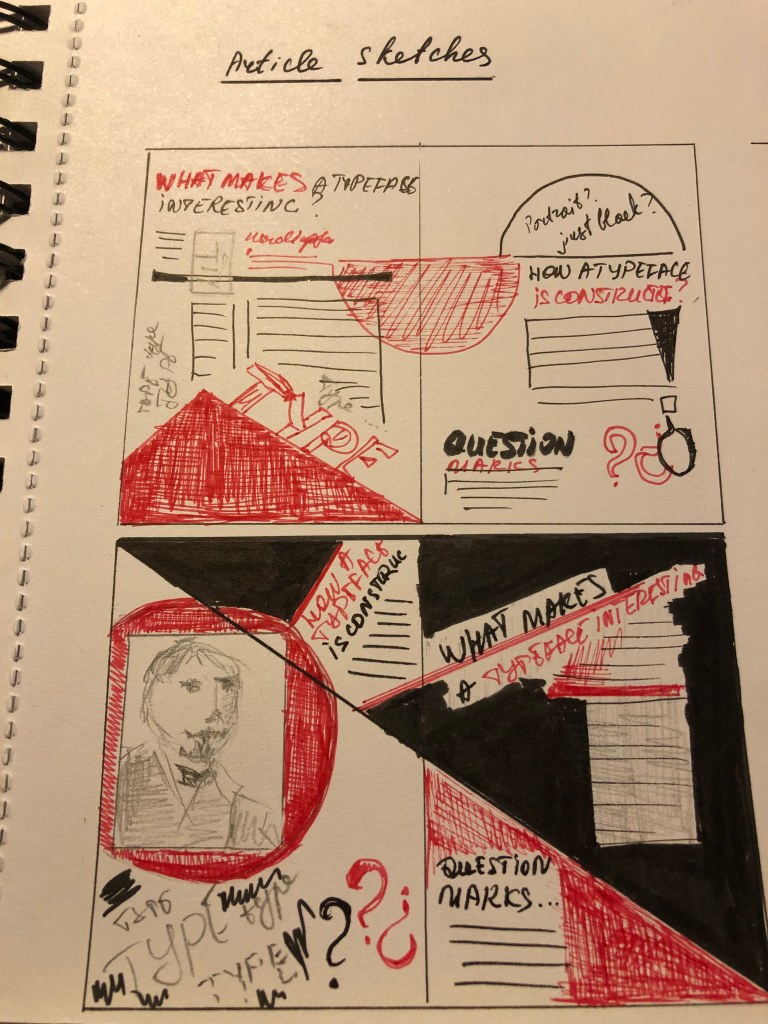

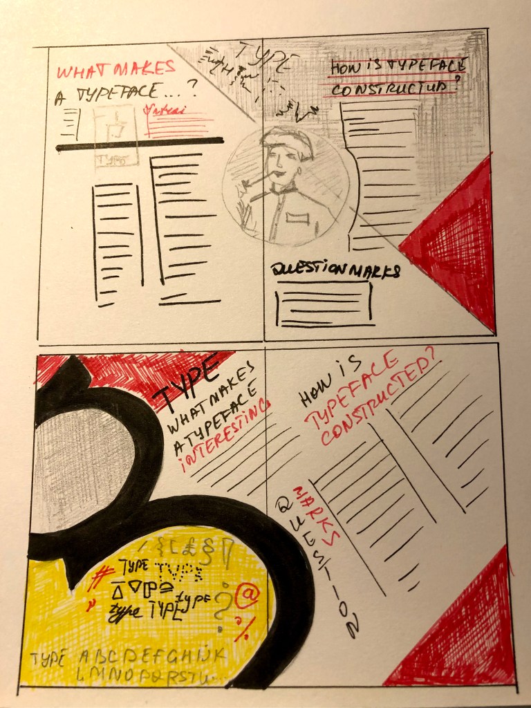
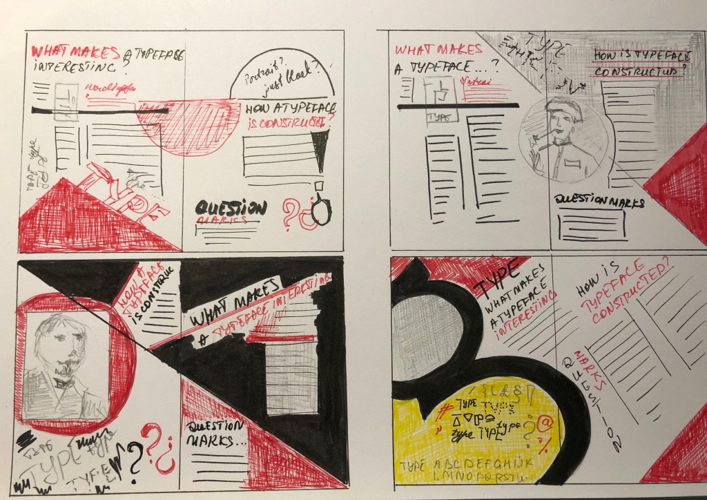
The main elements for the article were such items:
- Three text layouts
- The word TYPE, to which I have given even more depth, by marking the borders with black lines
- Portrait of Alexander Rodchenko. Credit: Portrait of the artist, photographer and graphic designer Alexander Rodchenko (b/w photo). Portrait of the artist, photographer and graphic designer Alexander Rodchenko (b/w photo), Kaufman, Mikhail Abramovich (1897-1980) / Private Collection / Bridgeman Images
- Sketches of fonts from my initial sketches
- The magazine cover I used as a draft from my previous designs.
For headlines, I decided to use several fonts, I took two fonts from the cover of Cornerstone Regular, Agency FB, Helvetica Condensed Bold. I experimented with my sketches of fonts and used them as a substrate at the bottom of the magazine, but it seemed to me that they only distracted attention, so in the end, I decided to abandon them. I used paragraphs of different sizes, thus indicating the dynamics for reading, the article is quite creative, so I used a narrow paragraph, combined with a wide one. I chose the font for the body of the text without sans serif, aligning it to the left without hyphens. As a featured person I used the portrait of Alexander Rodchenko, here he acts as an expert. I also liked the combination of several photos of creative people with the magazine cover and the article itself.


Conclusion
I have really enjoyed the processes behind this assignment as it has helped me summarise the mini modules set within part 4 and has allowed me to cover a lot of the new skills learnt over the last couple of months. I felt that I have made my researches as wide as possible, allowing to discover some new ideas within font creation task. I’ve realised that the theory and creativity within font creation is so wide, that I would keep doing my researches for it, however as I had some deadlines I had to be determined within my ideas, and concentrate on the certain thing, which in the result leaded me to the idea for constructivism. On a positive note, I am happy with the outcome of my designs and feel that I have created a style within my choices which can be seen in both the cover and article. The only one thing I was so carried away by Constructivism style cover designs that the font design on the ready cover itself was on the second plan because it is orchestrated with a lot of graphic elements and colours around, however, I believe that I managed to create a unique interesting font. Part 4 has really boosted my confidence in my abilities to make as many sketches as possible, and do not be scared to experiment with fonts. Now feel that I am ready to take on part 5 to showcase what I have learnt over the past year.
Assignment 4. Show me…
Sources:
- Bridgeman Education Images (Constructivism). Portrait of Alexander Rodchenko. Portrait of Lilya Brik
- A Visual History of Typefaces. Jan Tholenaar
- Marian Bantjes “Pretty Pictures”
- Type for Type. Custom type solutions for design and identity
- Why Fonts Matter? Sarah Hyndman
- What makes a good typeface? https://creativepro.com/what-makes-a-good-typeface/
