We run on purple time
Pinterest Images
The brief
To produce a poster (297mm x 420mm) that celebrates a colour of your choice. Choose a colour that has a meaning that you want to explore and celebrate. Think about what the colour you have chosen means both to you and to other people and create something that celebrates that meaning, for example, you may choose a golden brown because you like real ale, a vivid green because of a particular landscape, green to celebrate Irish identity or the yellow sandstone of Bath’s architecture.
Requirements
Work only with your chosen colour, its complementary colour and black and white. You can include text, collages, illustrations and photographs. Use black and white to help establish a range of tints and shades with your chosen colour. These limitations are to get you to work with colour thinking creatively about how to make a limited palette work for you. This project is as much about visual dynamics and contrast as it is about creating something with meaning. Make full use of it to show off to your tutor all the skills and processes you have learnt so far. You need to submit at least three variations of your poster as well as the finished artwork.
Chosen Colour
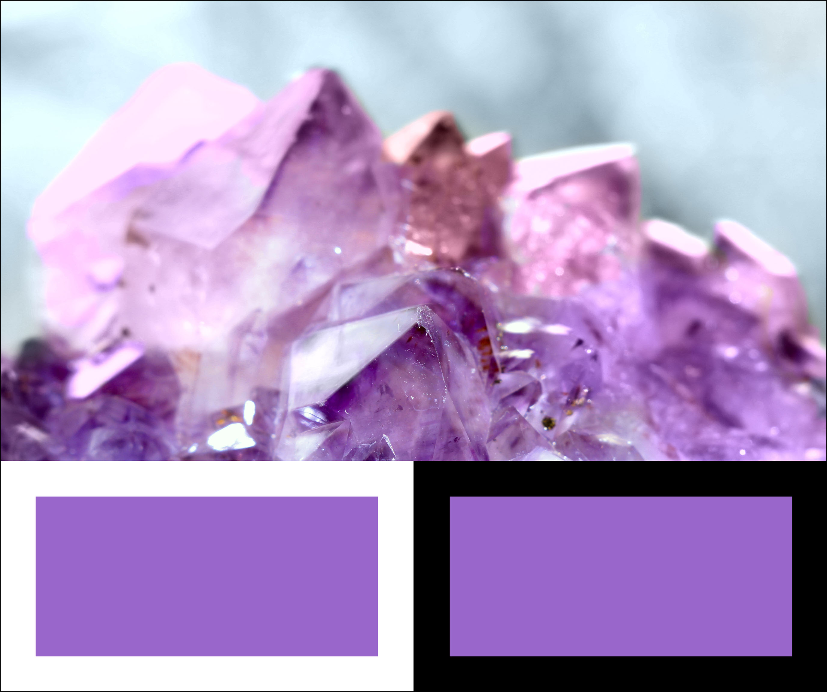
Despite its prevalence, amethyst has been one of the world’s most revered stones for many centuries. The was a belief that the amethyst crystal meaning was synonymous with luxury. As a result, it was widely used as part of their crowns, sceptres and rings. Christian bishops once wore amethyst jewellery in the form of a circle. Its colour was meant to symbolise royalty and allegiance to Christ.
Purple Amethyst has been highly esteemed throughout the ages for its stunning beauty and legendary powers to stimulate, and soothe, the mind and emotions. It always was associated with February, the month the Romans dedicated to Neptune, their water-god, and is the traditional birthstone of that month. It is the stone of St. Valentine and faithful love and signifies ecclesiastical dignity as the Bishop’s Stone. It carries the energy of fire and passion, creativity and spirituality, yet bears the logic of temperance and sobriety.
In RGB colour space, hex #9966cc (also known as Amethyst) is composed of 60% red, 40% green and 80% blue. Whereas in a CMYK colour space, it is composed of 25% cyan, 50% magenta, 0% yellow and 20% black. It has a hue angle of 270 degrees, a saturation of 50% and a lightness of 60%.
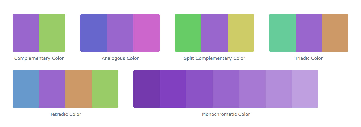
Colour Schemes with Amethyst
Below some colours close to #9966cc. Having a set of related colours can be useful if you need an inspirational alternative to your original colour choice.

Alternative Colours
A shade is achieved by adding black to any pure hue, while a tint is created by mixing white to any pure colour. In this example, #060309 is the darkest colour, while #fbf9fd is the lightest one.

Shades and Tints of Amethyst
Source: https://www.colorhexa.com/9966cc
Primary Research
The Middle Ages and the Renaissance
Violet and purple retained their status as the colour of emperors and princes of the church throughout the long rule of the Byzantine Empire.
While violet was worn less frequently by Medieval and Renaissance kings and princes, it was worn by the professors of many of Europe’s new universities. Their robes were modelled after those of the clergy, and they often wore square violet caps and violet robes, or black robes with violet trim.
Violet also played an essential part in the religious paintings of the Renaissance. Angels and the Virgin Mary were often portrayed wearing violet robes.
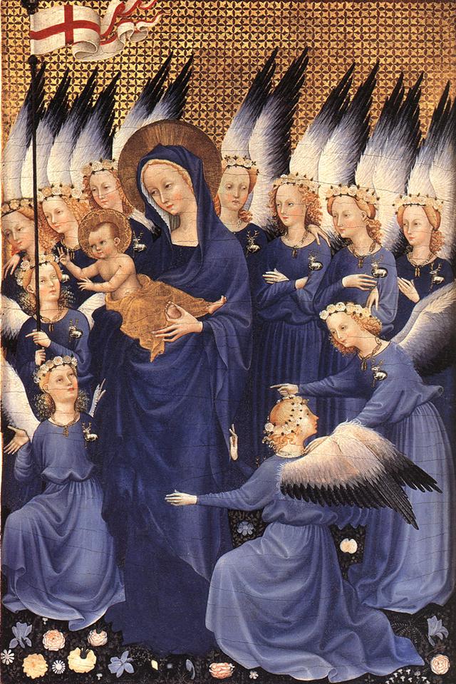
The Wilton Diptych (1395), painted for King Richard II. 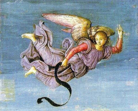
A violet-clad angel from the Resurrection of Christ by Raphael (1483–1520).
18th and 19th centuries
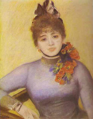
In the 18th century, violet was a colour worn by royalty, aristocrats and the wealthy, and by both men and women. The good-quality violet fabric was expensive, and beyond the reach of ordinary people.
The first cobalt violet, the intensely red-violet cobalt arsenate, was highly toxic. Although it persisted in some paint lines into the twentieth century, it was displaced by less toxic cobalt compounds such as cobalt phosphate. Cobalt violet appeared in the second half of the 19th century, broadening the palette of artists. Cobalt violet was used by Paul Signac (1863–1935), Claude Monet (1840–1926), and Georges Seurat (1859–1891). Today, cobalt ammonium phosphate, cobalt lithium phosphate, and cobalt phosphate are available for use by artists. A colour similar to cobalt ammonium phosphate, cobalt magnesium borate, was introduced in the later twentieth-century but was not deemed sufficiently lightfast for artistic use. Cobalt violet is the only genuinely lightfast violet pigment with relatively strong colour saturation. All other light-stable violet pigments are dull by comparison. However, the high price of the dye and the toxicity of cobalt has limited its use.

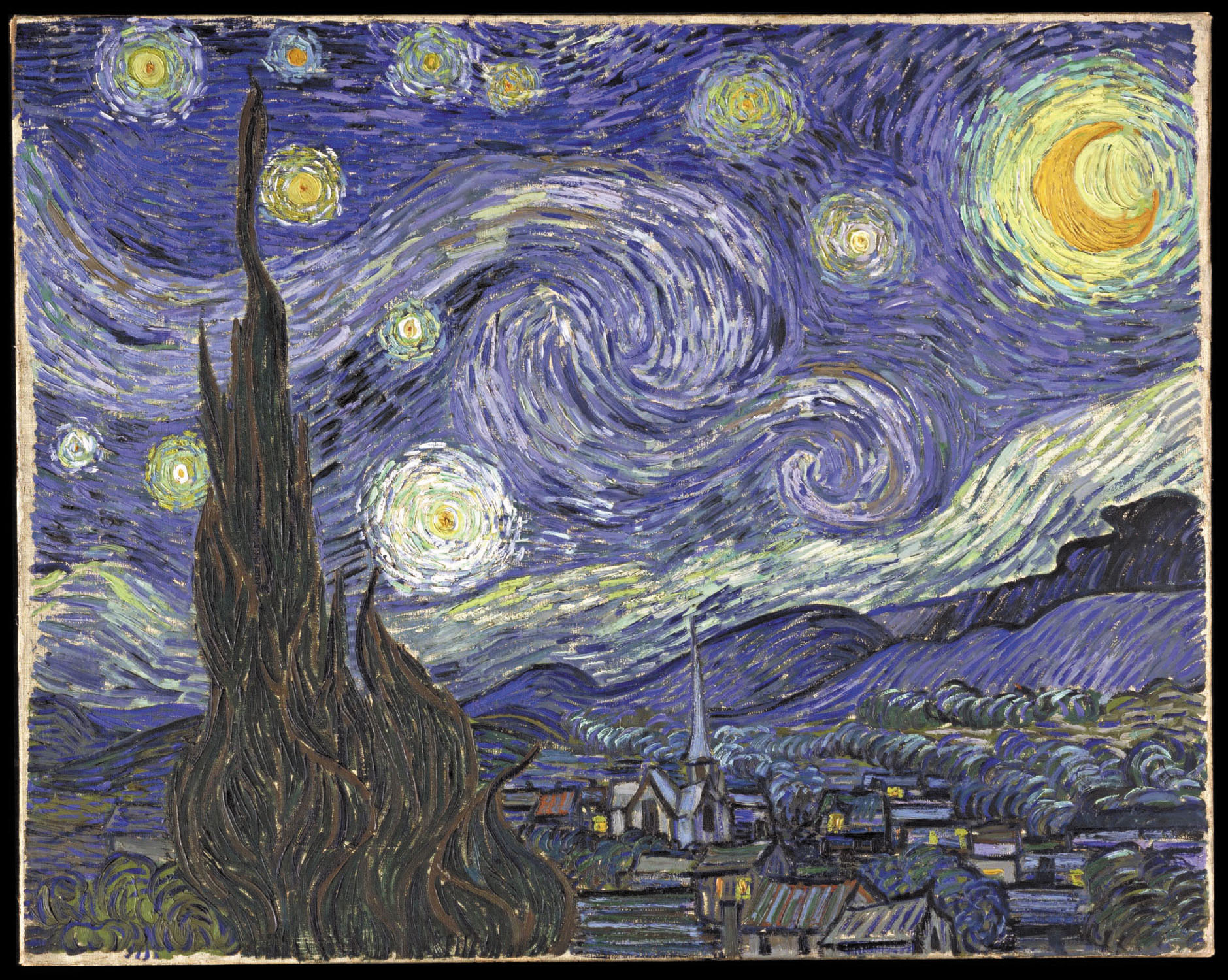
Vincent van Gogh (1853–1890) was an avid student of colour theory. He used violet in many of his paintings of the 1880s, including his portrayals of irises and the swirling and mysterious skies of his starry night paintings, and often combined it with its complementary colour, yellow. In the picture of his bedroom in Arles (1888), he used several sets of complementary hues; violet and yellow, red and green, and orange and blue. In a letter about the painting to his brother Theo, he wrote
“The colour here…should be suggestive of sleep and repose in general…The walls are pale violet. The floor is of red tiles. The wood of the bed and the chairs are fresh butter yellow, the sheet and the pillows light lemon green. The bedspread bright scarlet. The window green. The bed table orange. The bowl blue. The doors lilac….The painting should rest the head or the imagination.
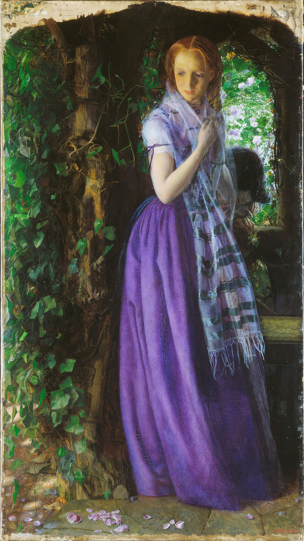
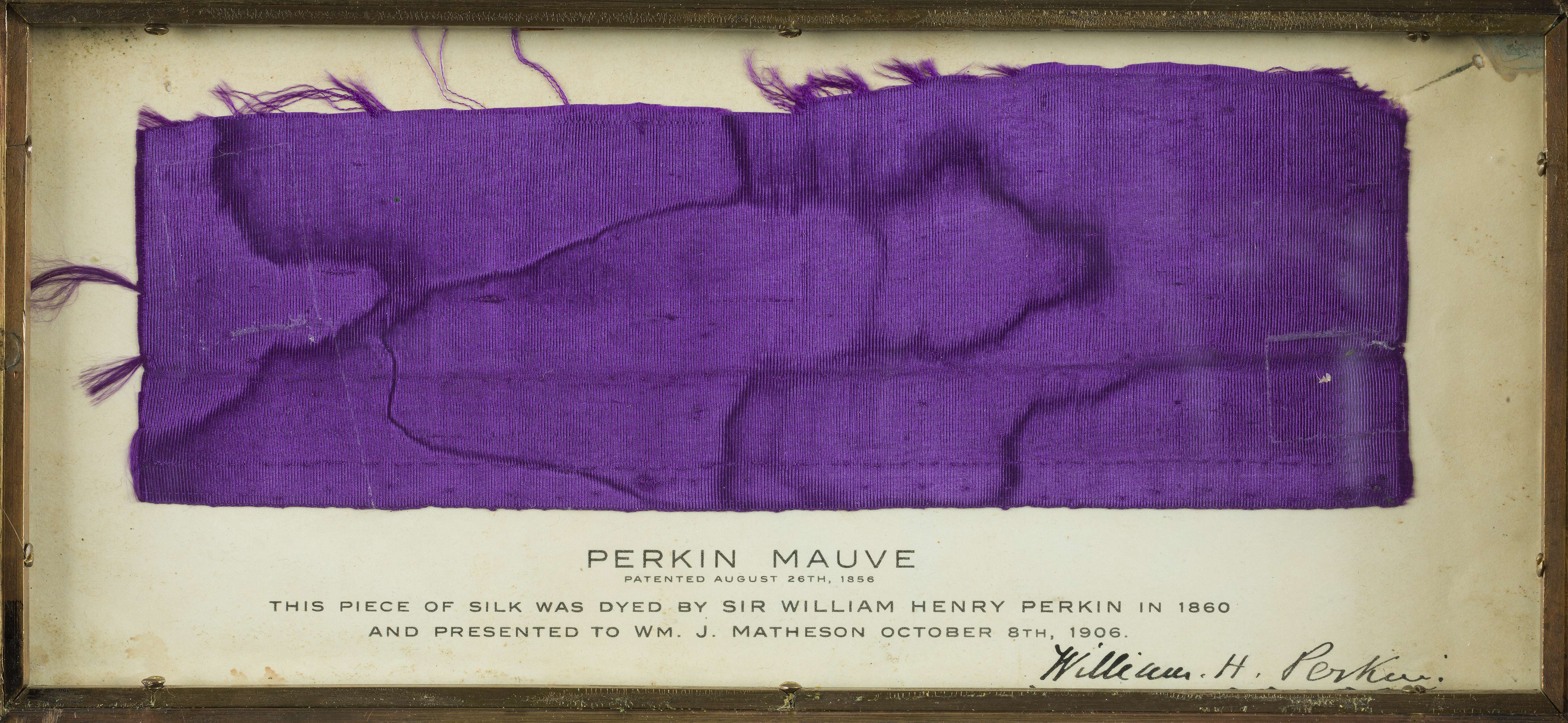
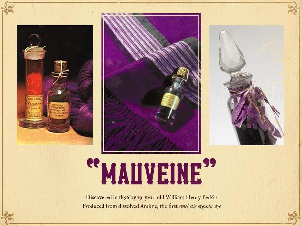
In 1856, a young British chemist named William Henry Perkin was trying to make a synthetic quinine. His experiments produced instead an unexpected residue, which turned out to be the first synthetic aniline dye, a deep violet colour called mauveine or abbreviated simply to mauve. Used to dye clothes, it became extremely fashionable among the nobility, and upper classes in Europe, mainly after Queen Victoria wore a silk gown dyed with mauveine to the Royal Exhibition of 1862. Before Perkin’s discovery, mauve was a colour which only the aristocracy and wealthy could afford to wear. Perkin developed an industrial process, built a factory, and produced the dye by the ton, so almost anyone could wear mauve. It was the first of a series of modern industrial shades which completely transformed both the chemical industry and fashion.
Source: https://en.wikipedia.org/wiki/Violet_(color)
The next step in choosing my colour was the concept where I planned to work on the poster. The course of my thoughts led me in several directions. What if you imagine the space and atmosphere in remote, uncharted solar systems in bright purple or violet colour, or the birth of a new planet, which gives lilac radiation? I wanted to learn more about the existence of purple on our planet Earth; in the end, I came across this video. I liked the idea that the young Earth may have radiated a purple hue, which calls Purple Earth Hypothesis. That means that bacterias didn’t use the chlorophyll at all, instead of a simple molecule (Halobacteria) absorbed all green light and reflected purple colour. But according to research at the moment, scientists could not find a planet in such a non-standard colour in space, because that combination would indicate an early generation stage of life.
https://www.voicetube.com/videos/63525
After analysing the first concept, I decided to move on and came across this video, which describes in detail why the purple colour was so rare and difficult to access? It became a discovery for me that this colour was officially registered only on October 8, 1856, by the English scholar Sir William Henry Perkin (by the way, October 8 is my birthday). The colour that was present in the birth of the planet was the last officially popularised in society. My design series are dedicated to discovering the colour that I wanted to call “The Birth of the Colour Purple“.
Why don’t country flags use the colour purple?
Secondary Research
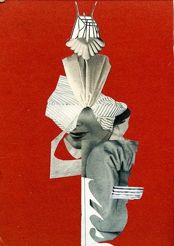
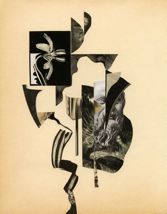
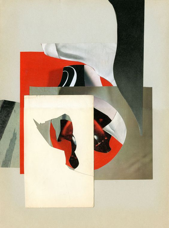
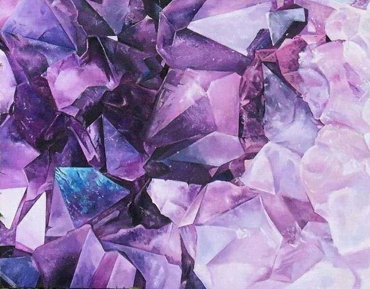
I went on Pinterest to collect some purple images for my mood board. All of those images looked creative, artistic and visually appealing.
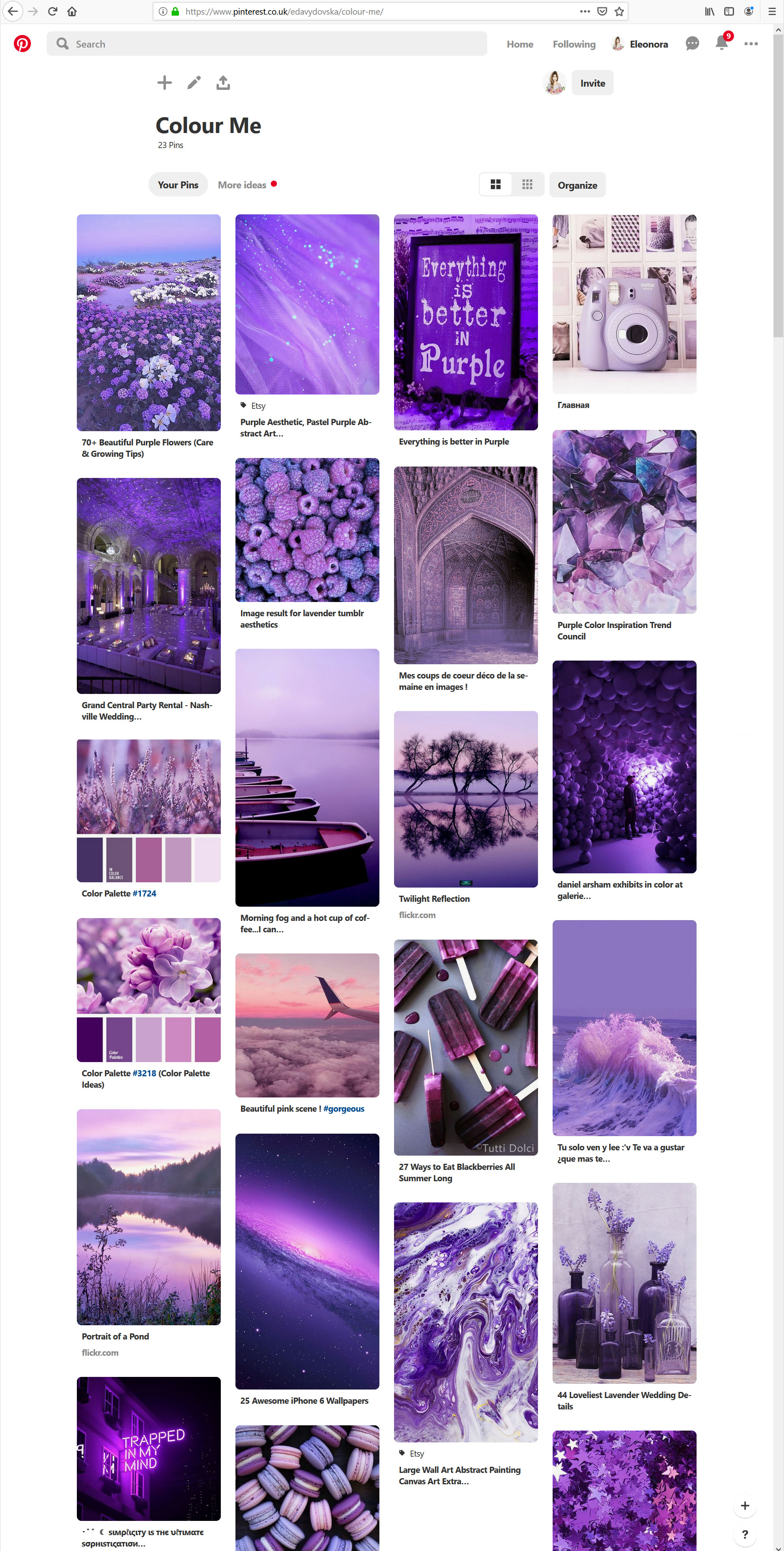
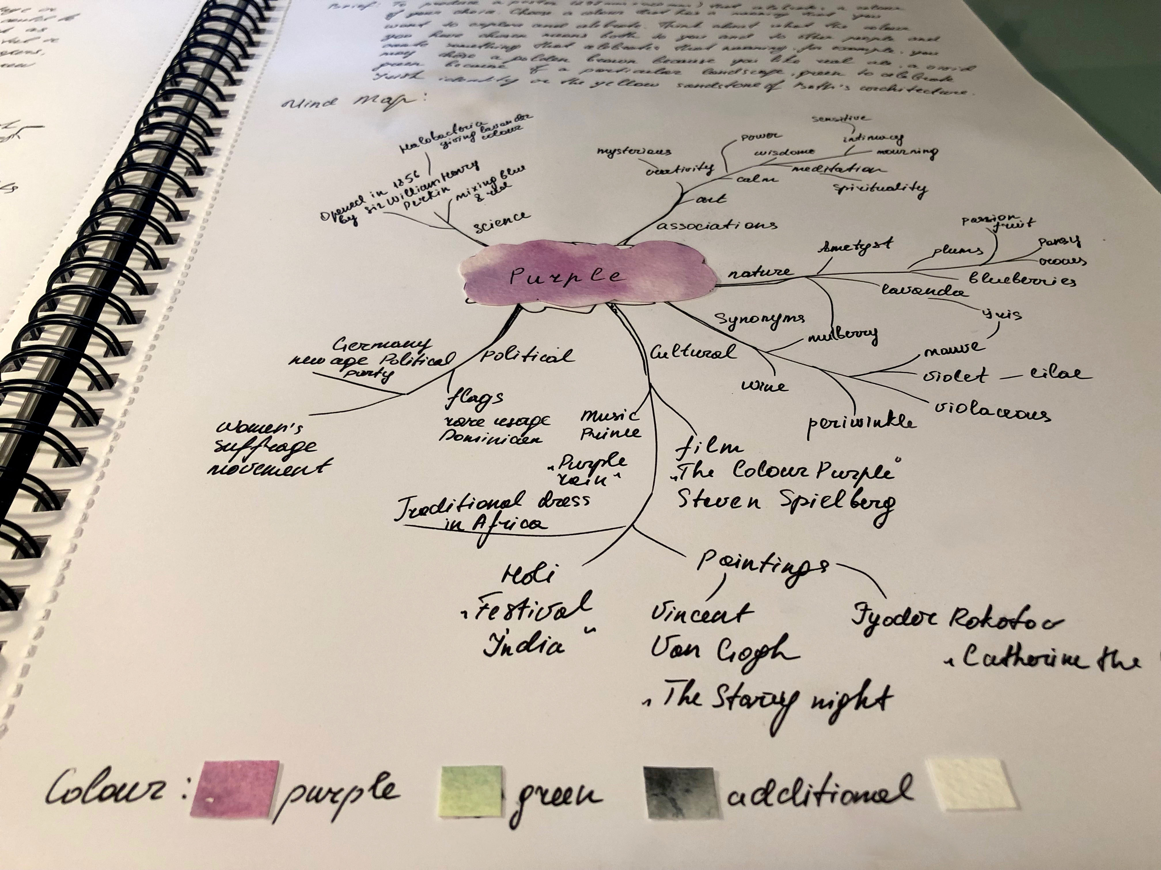
When I was browsing this collection of images, they gave me a feeling of peace and passion at the same time, and I described my researches of the colour properties of purple in my mind map. I made some sketches for the mind map and the collections of words around it, for such main ideas as Science, Associations, Nature, Art, Cultural and Political.
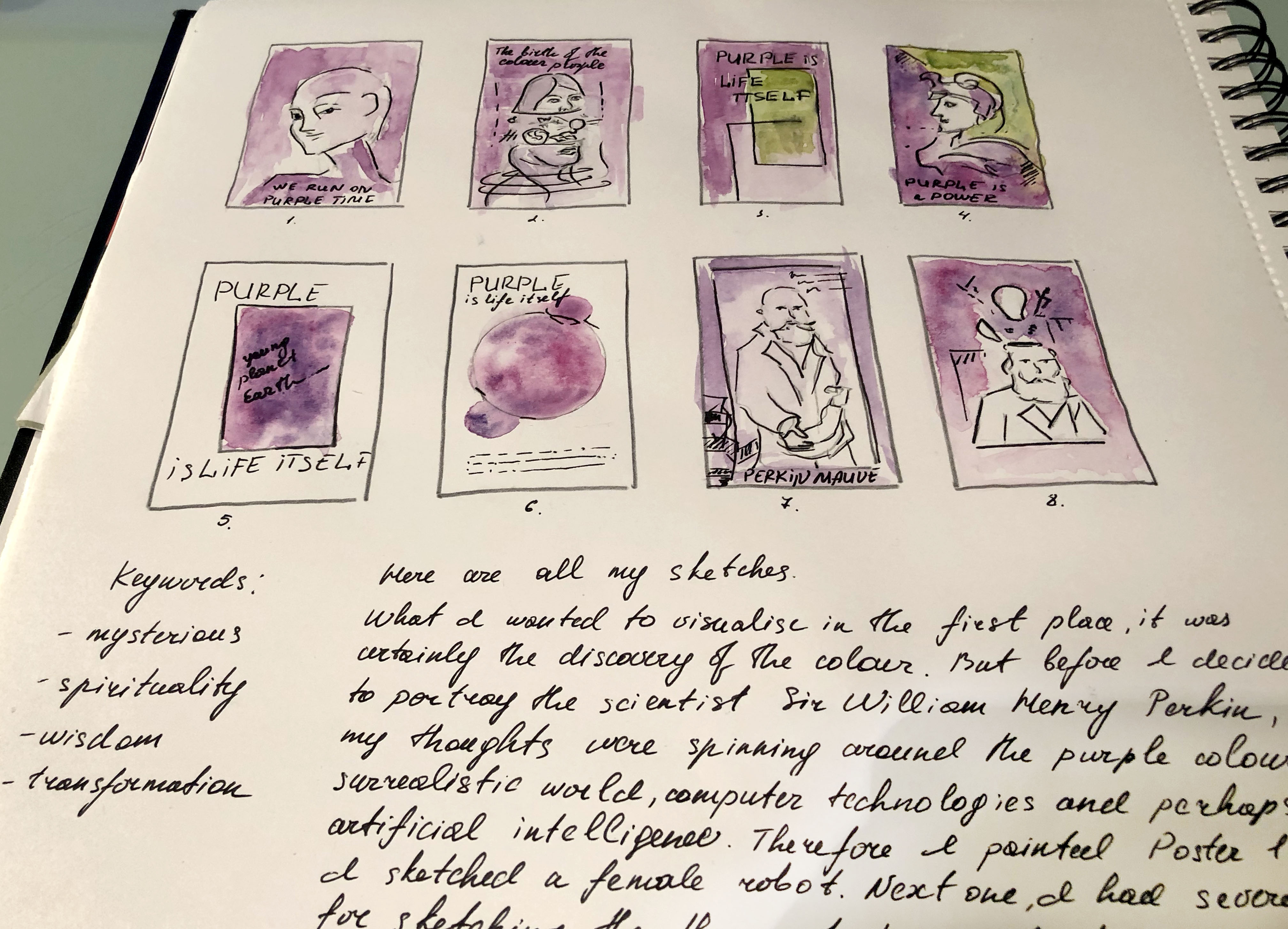
So, it’s time to start sketching. What I wanted to visualise in the first place was undoubtedly the discovery of colour. But before I decided to portray the scientist Sir William Henry Perkin, my thoughts were spinning around the purple colour, its surrealistic world, computer technologies and perhaps artificial intelligence. Therefore, I painted Poster 1, where I sketched a female robot. Next, I had several options for drawing the theory of the Birth of the Colour Purple, which I imagined as a woman with her head divided into several parts (Poster 2) with rotating objects around. I also had an idea to portray a poster in several hues, purple and green, as a theory that on planet Earth the purple colour was accompanied by complimentary green colour, as absolute proof that we live on the planet which continually changing and evolving (Poster 3). For Poster 4, I imagined this purple as a colour of the power, which could potentially be an idea for the collage with the sculpture head of the inflectional leader. Also, I had two main poster options — the discovery of purple by scientist Sir William Henry Perkin. I wanted to capture his achievement in several versions of my design, where the first version of the collage had the imposition of texture and objects of study, and scientist’s brain process (Posters 7 and 8). At the same time, in my sketches, there are geometric sketches, as an idea of how would a planet look like if we captured it from space (Posters 5 and 6).
Poster 1
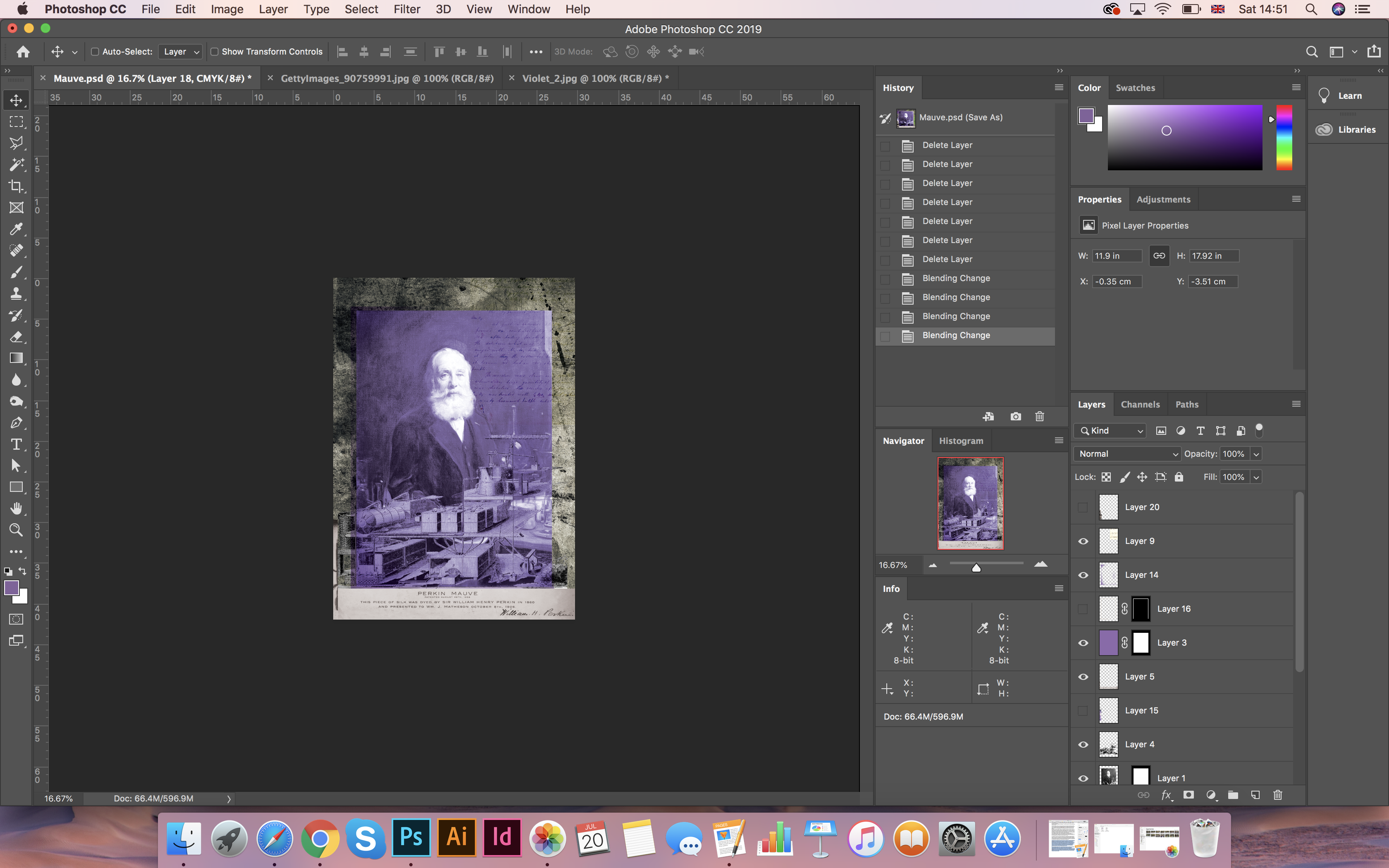
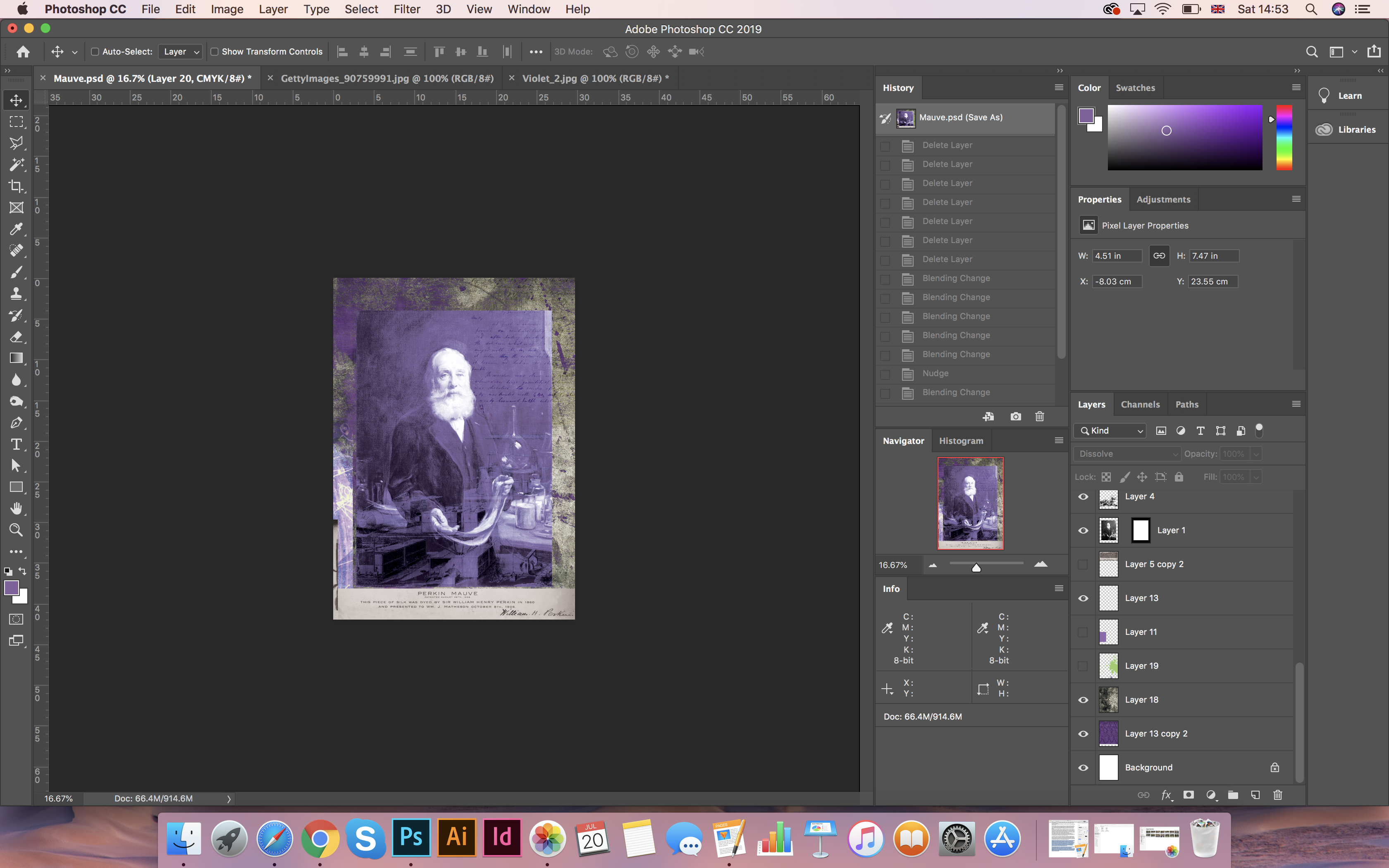
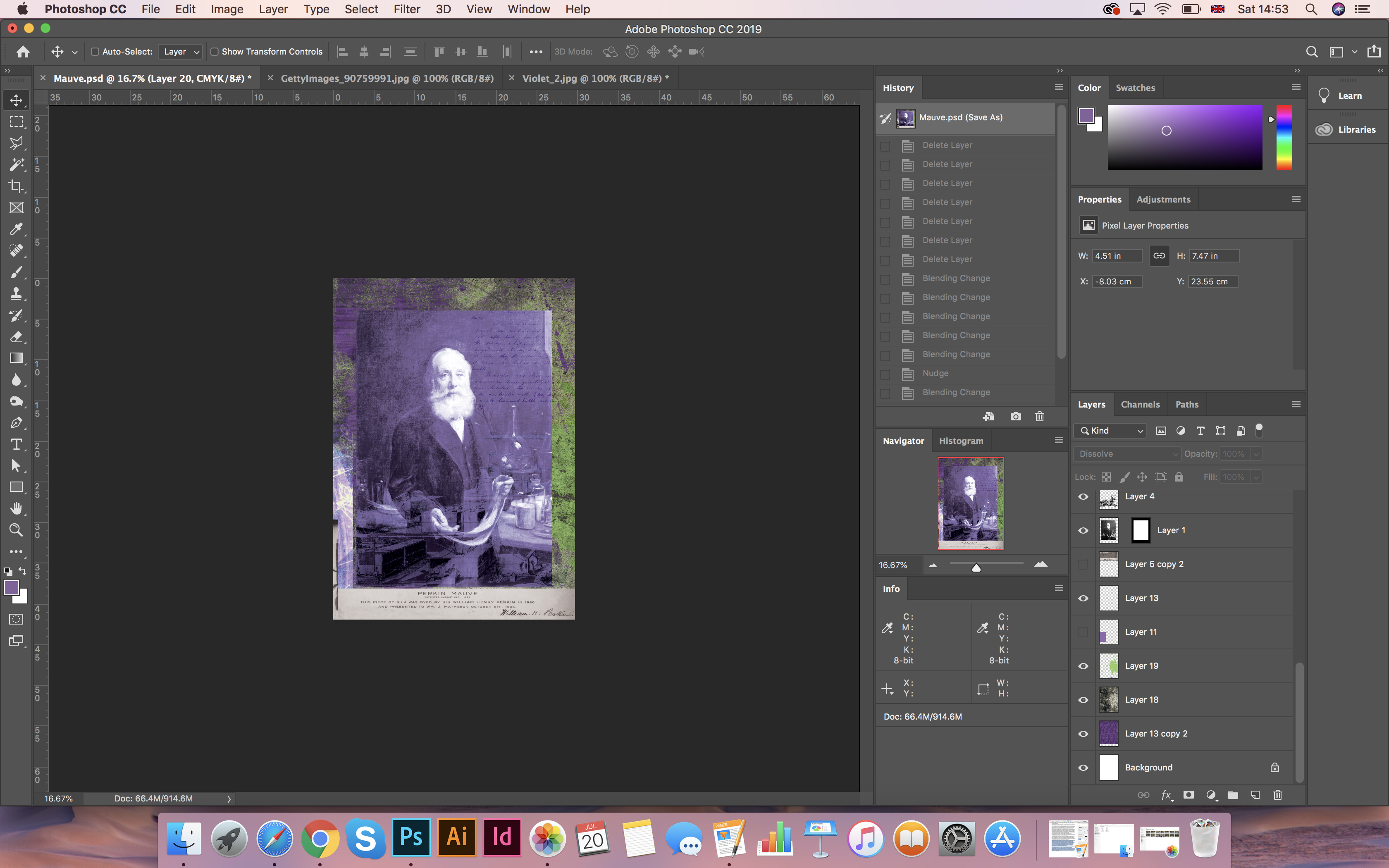
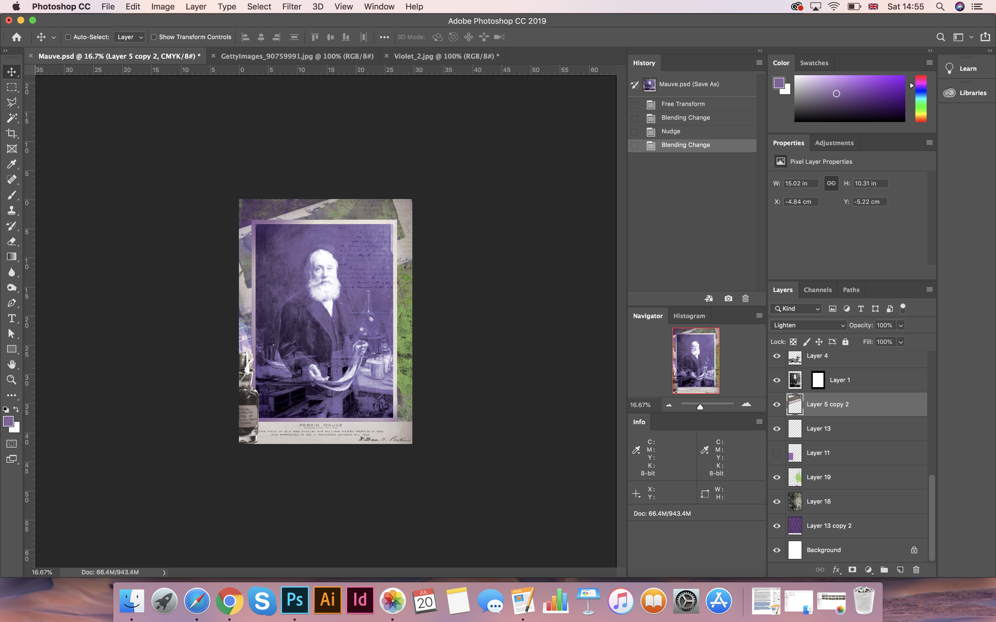
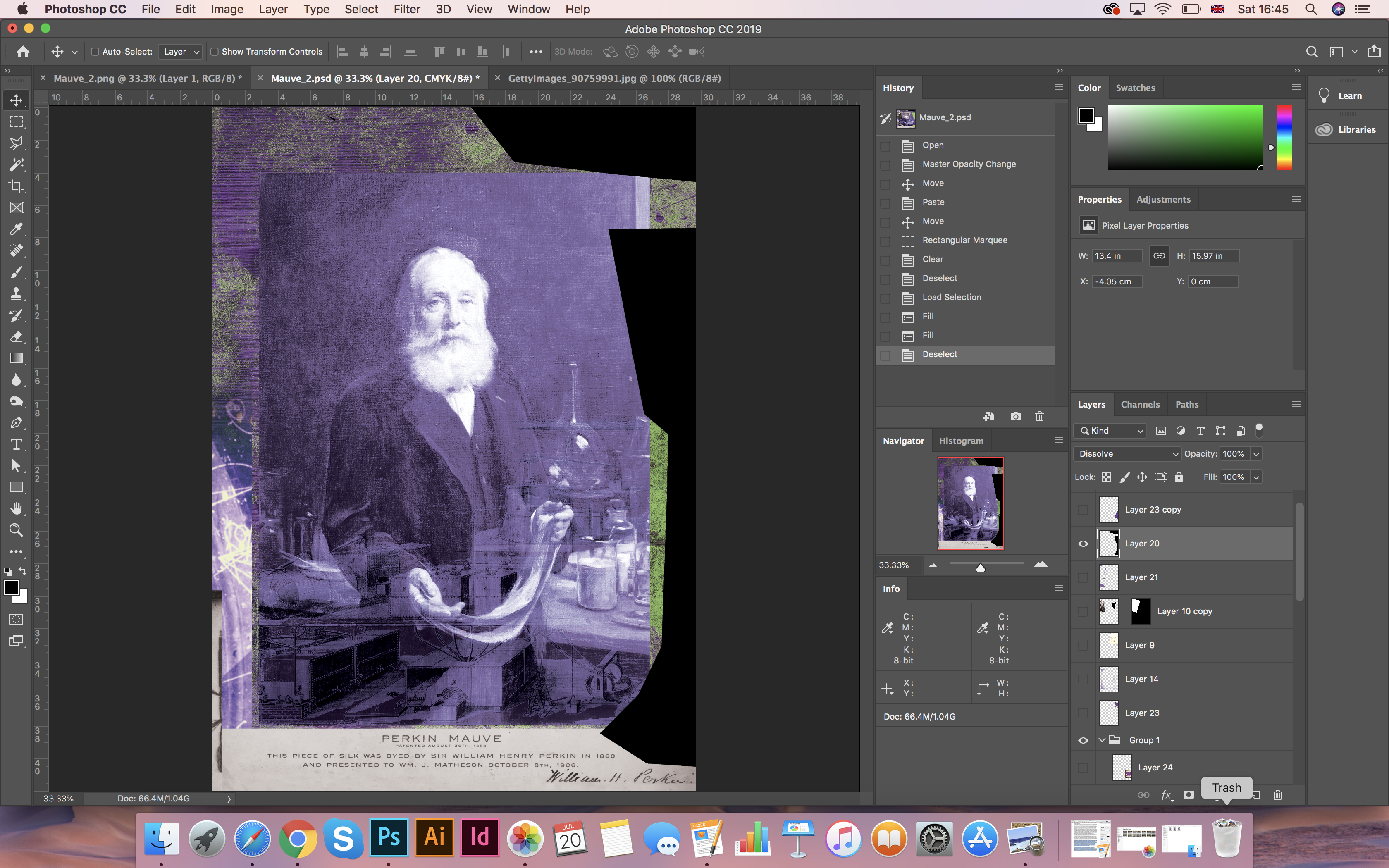
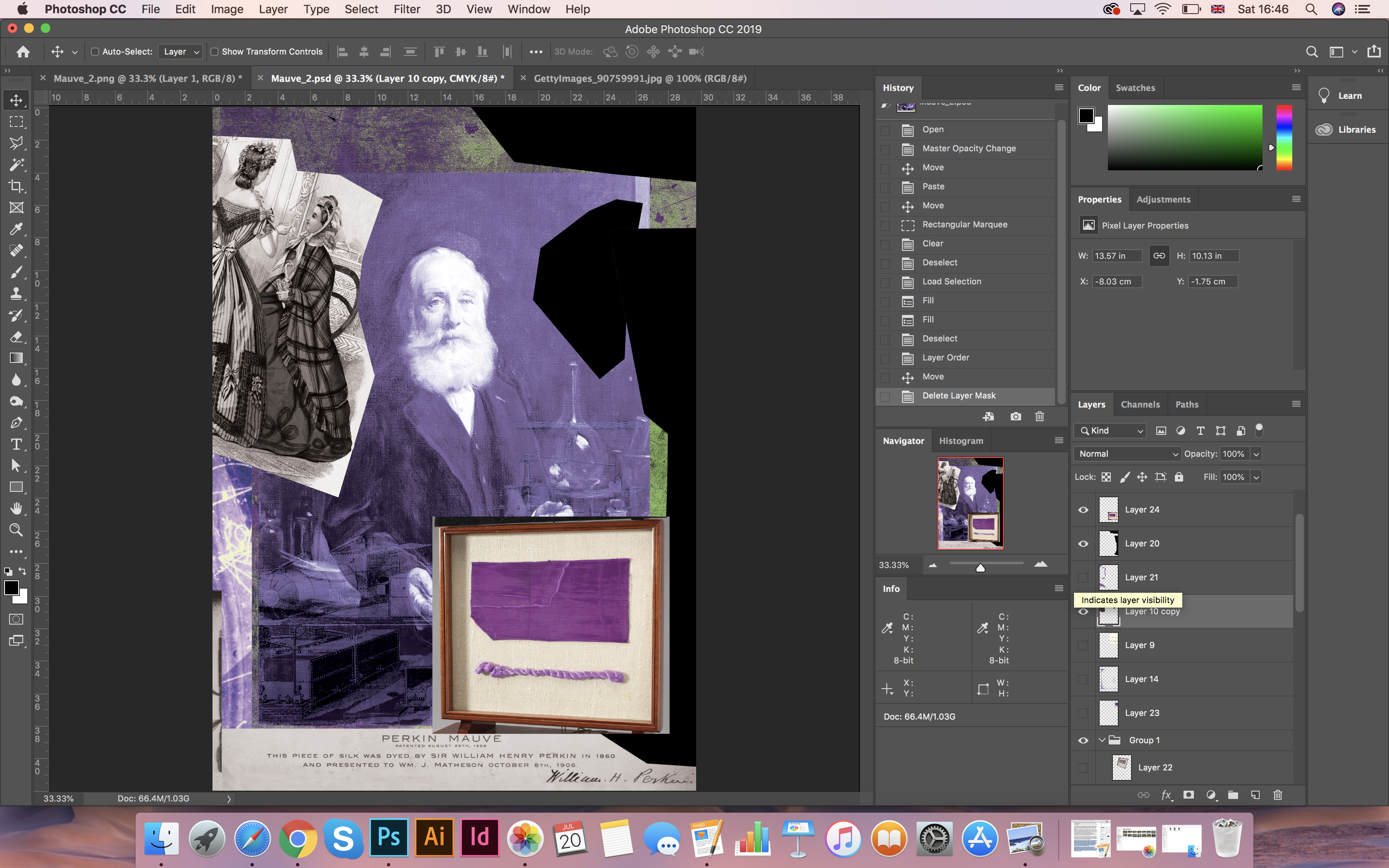
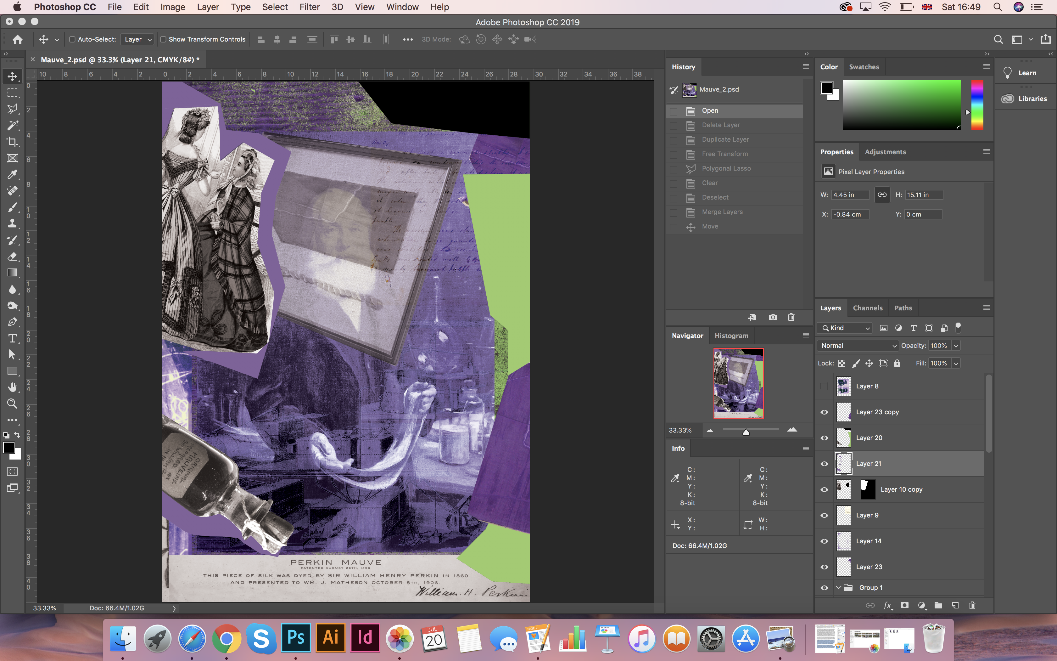
For the first poster based on the composition was made by the inventor of the purple colour Sir William Perkin. For the background image, I chose an enlarged photo of the fabric. Then my collage was consistently supplemented with various ideas that related to the invention, such as the scientist’s notes on the invention, the inventor’s mechanism-device, and also the photos from the bottle of mauveine dye collection. For the depth of the image, I found Grunge background. Also, in the process of work, I realised that in the chosen colour of the decision I was asking for an additional colour, which was made as lime green colour. Using the method of overlaying transparency, I managed to get a design that had at the texture and depth.
Sources for the pictures:

https://www.bridgemaneducation.com/en/search?filter_text=William+Henry+Perkin 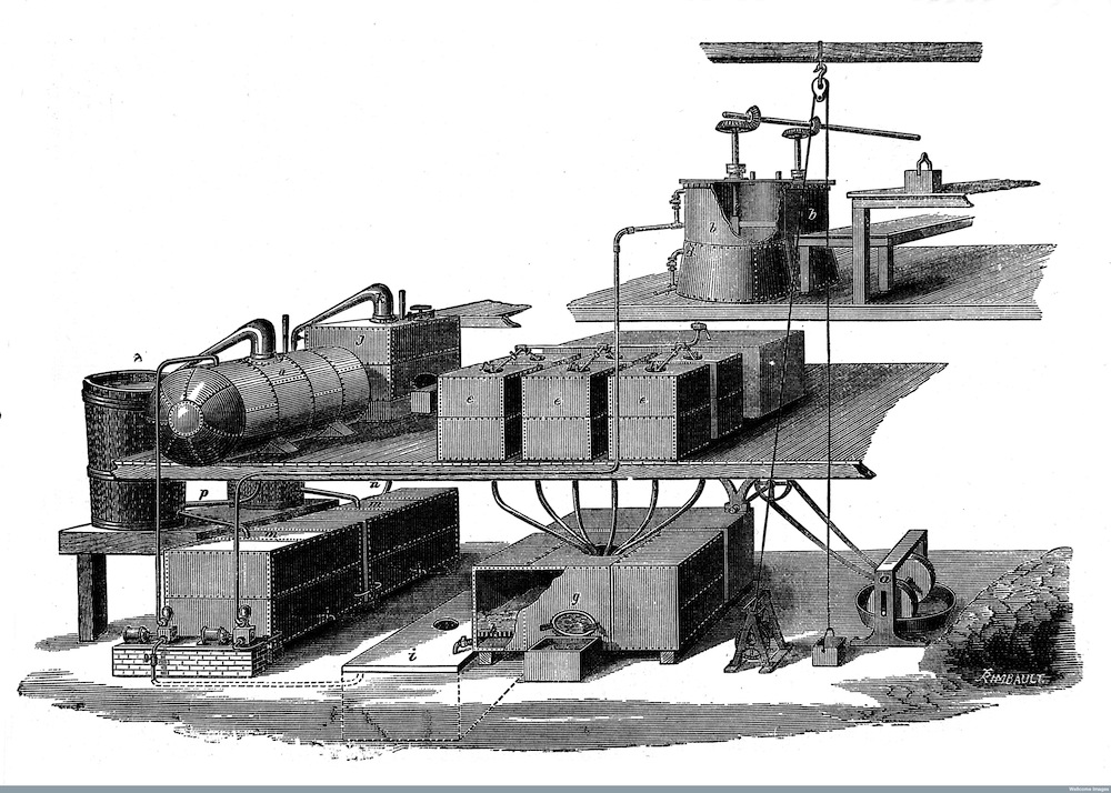
http://wellcomeimages.org Sectio of Coal Tar Colour Works at Greenford in 1858 & 1873. Plant belonging to W. H. Perkin and his brother, T. D. Perkin. 19th Century Journal of the Society of Arts Published: 1877-1879 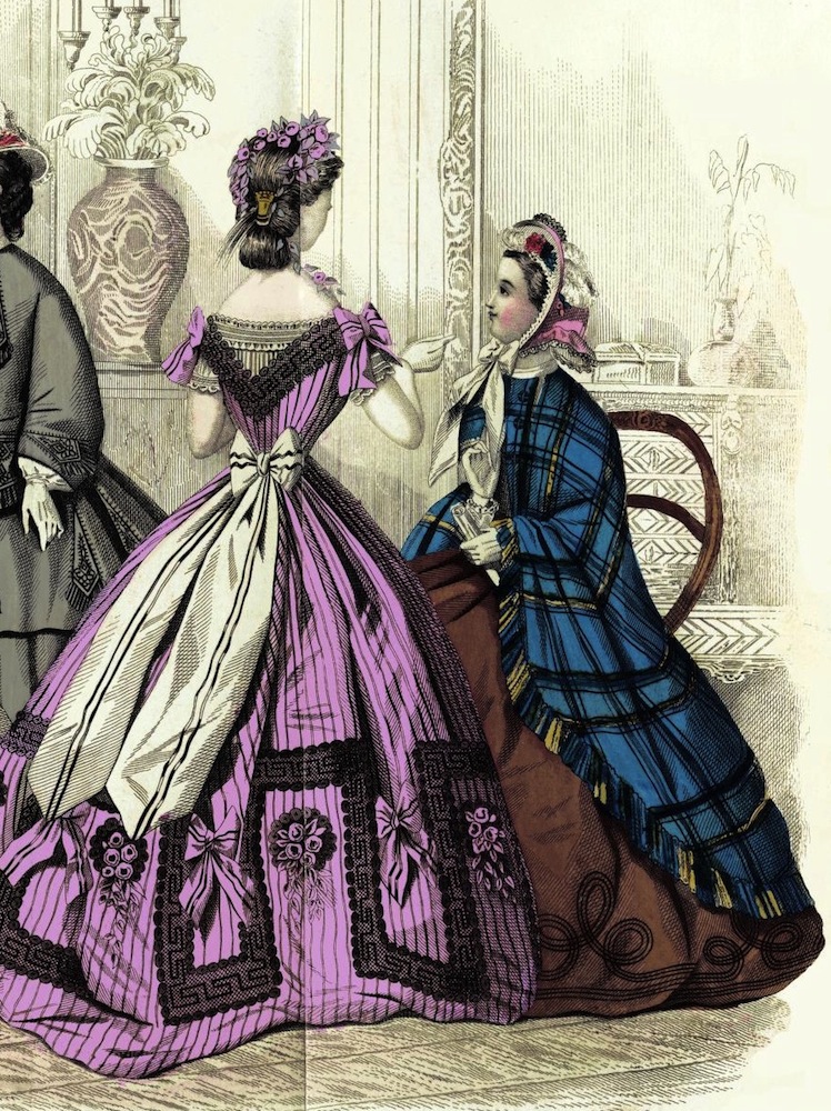
http://www.victorianweb.org/science/perkin.html 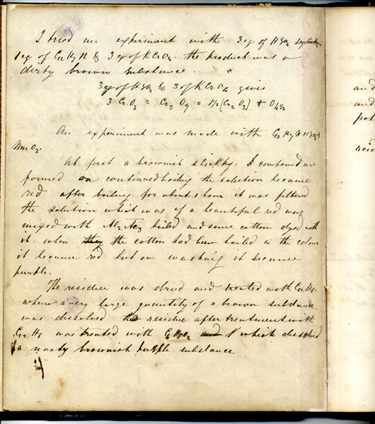
https://www.bridgemaneducation.com/en/search?filter_text=William+Henry+Perkin 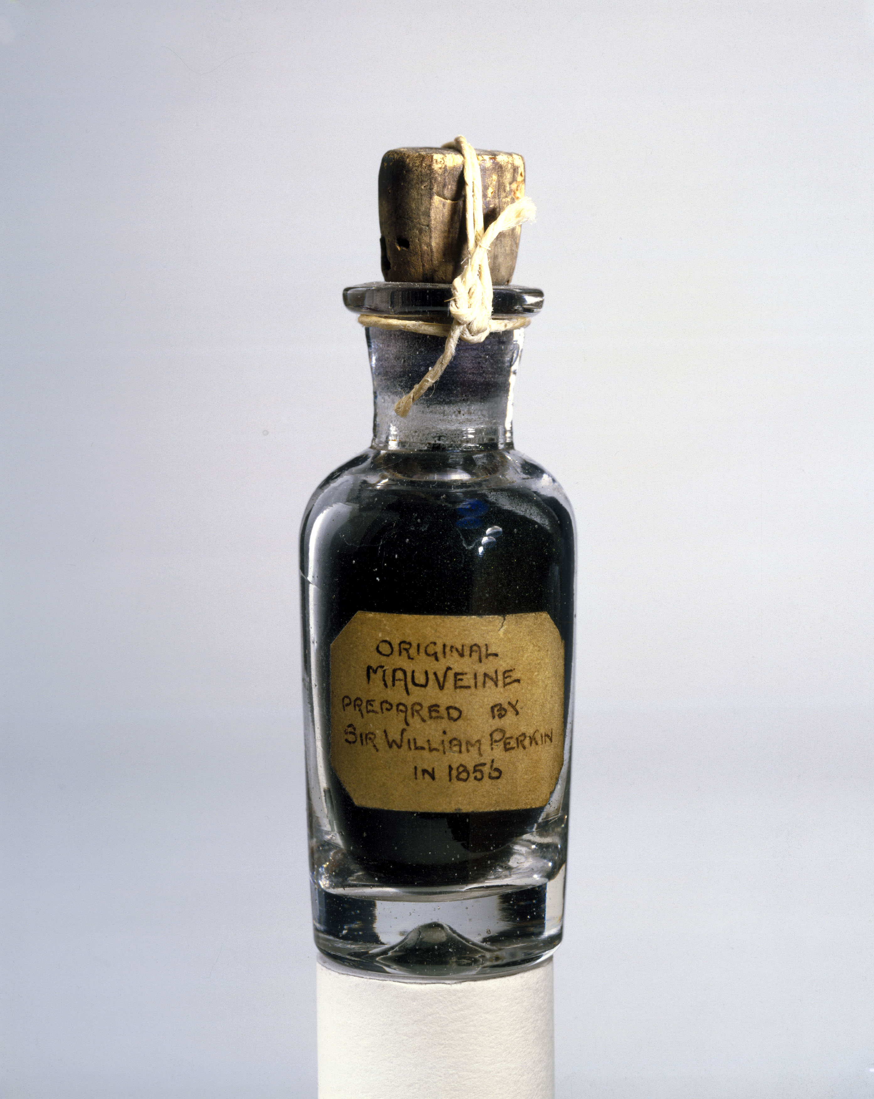
UNITED KINGDOM – SEPTEMBER 23: Sir William Perkin’s (1838-1907) (Photo by SSPL/Getty Images) https://www.vox.com/science-and-health/2018/3/12/17109258/sir-william-henry-perkin-google-doodle-birthday-180-mauveine-purple-dye 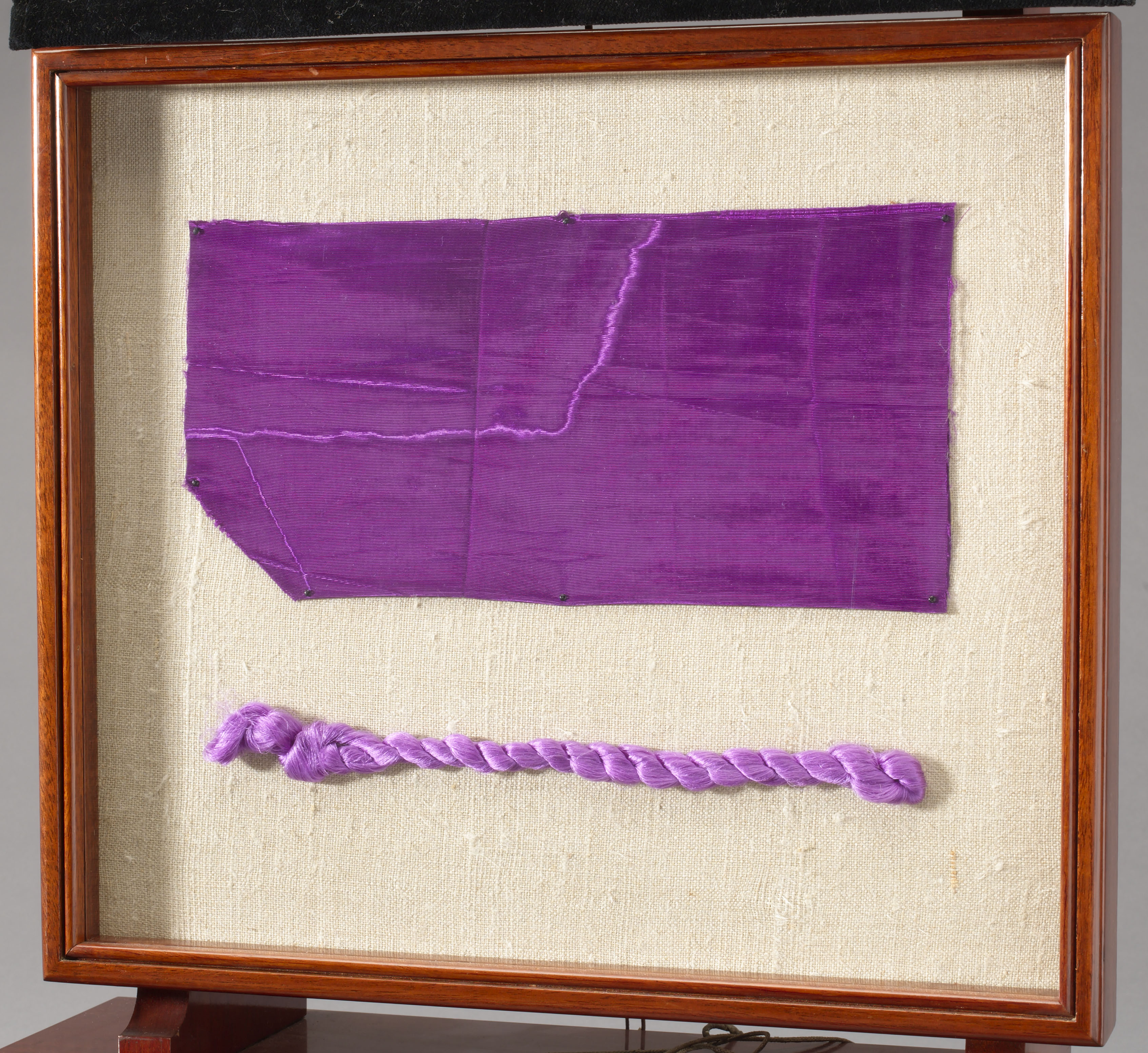
UNITED KINGDOM – JUNE 19: A length of dress fabric and a silk skein both dyed with mauve, (Photo by SSPL/Getty Images) https://www.vox.com/science-and-health/2018/3/12/17109258/sir-william-henry-perkin-google-doodle-birthday-180-mauveine-purple-dye
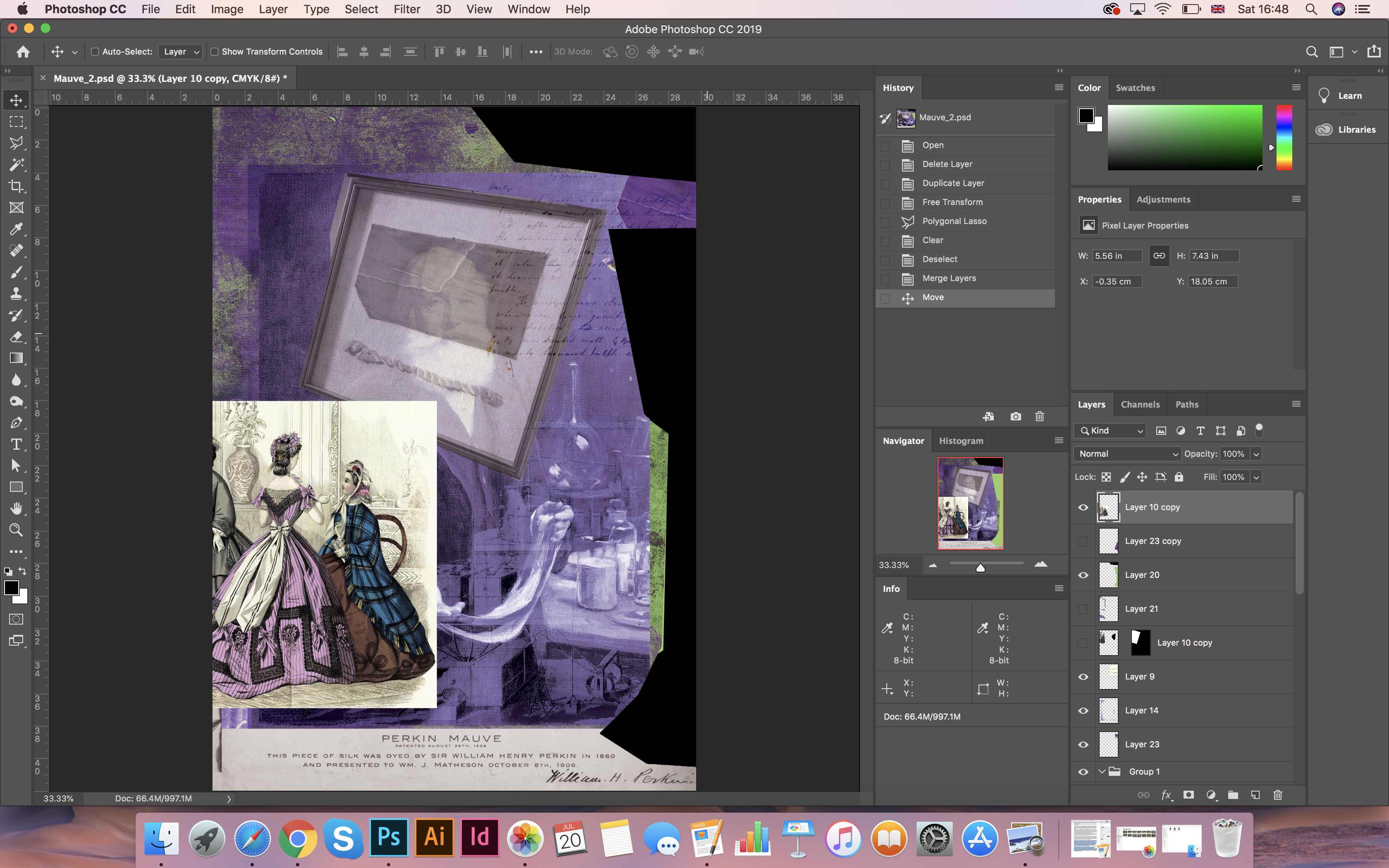
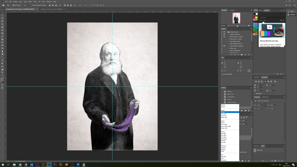
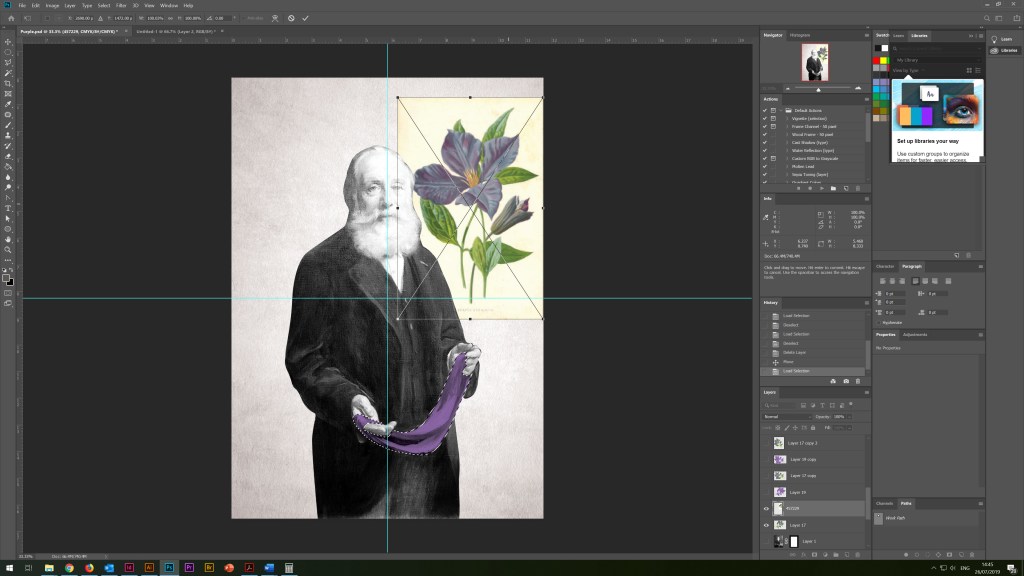
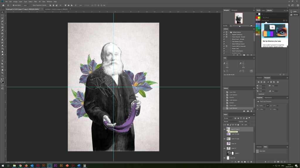
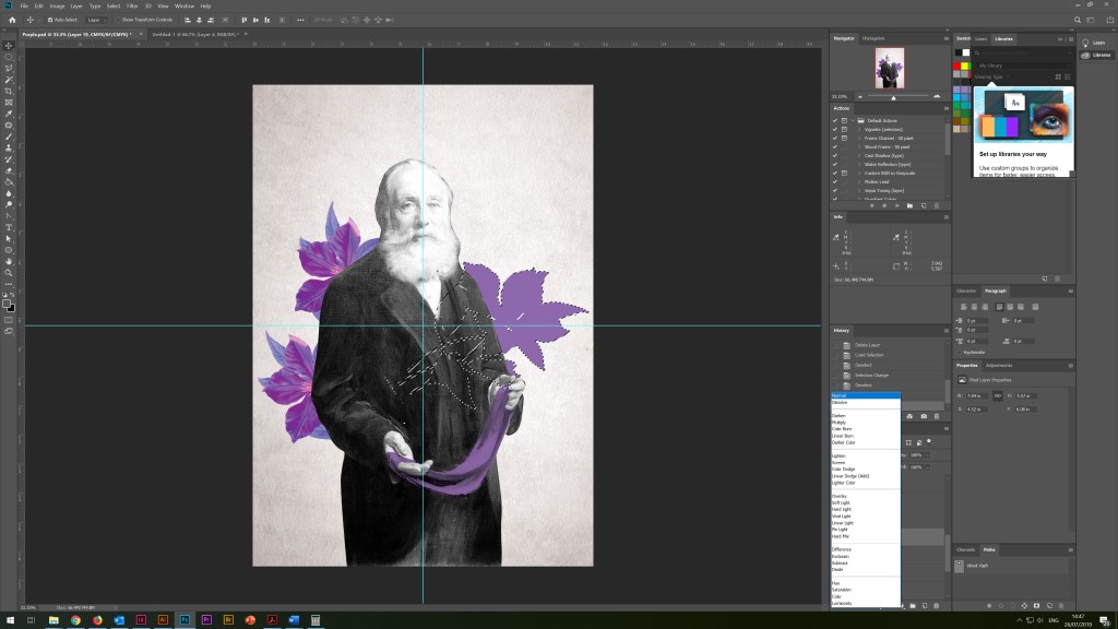
The design that I got in the process of experimenting with transparencies and layers is provided below. Overall, I was pleased with the result in colour, the texture of the poster, and with the idea itself. However, I still had concerns about the static nature of the composition, all objects looked too straight and in too much order to me. This example was lacking the dynamics and chaos in the elements. And I decided to follow further in my experiments, I wanted to add more non-standard objects that would act beyond the frames of the composition, but at the same time were harmonious with each other.
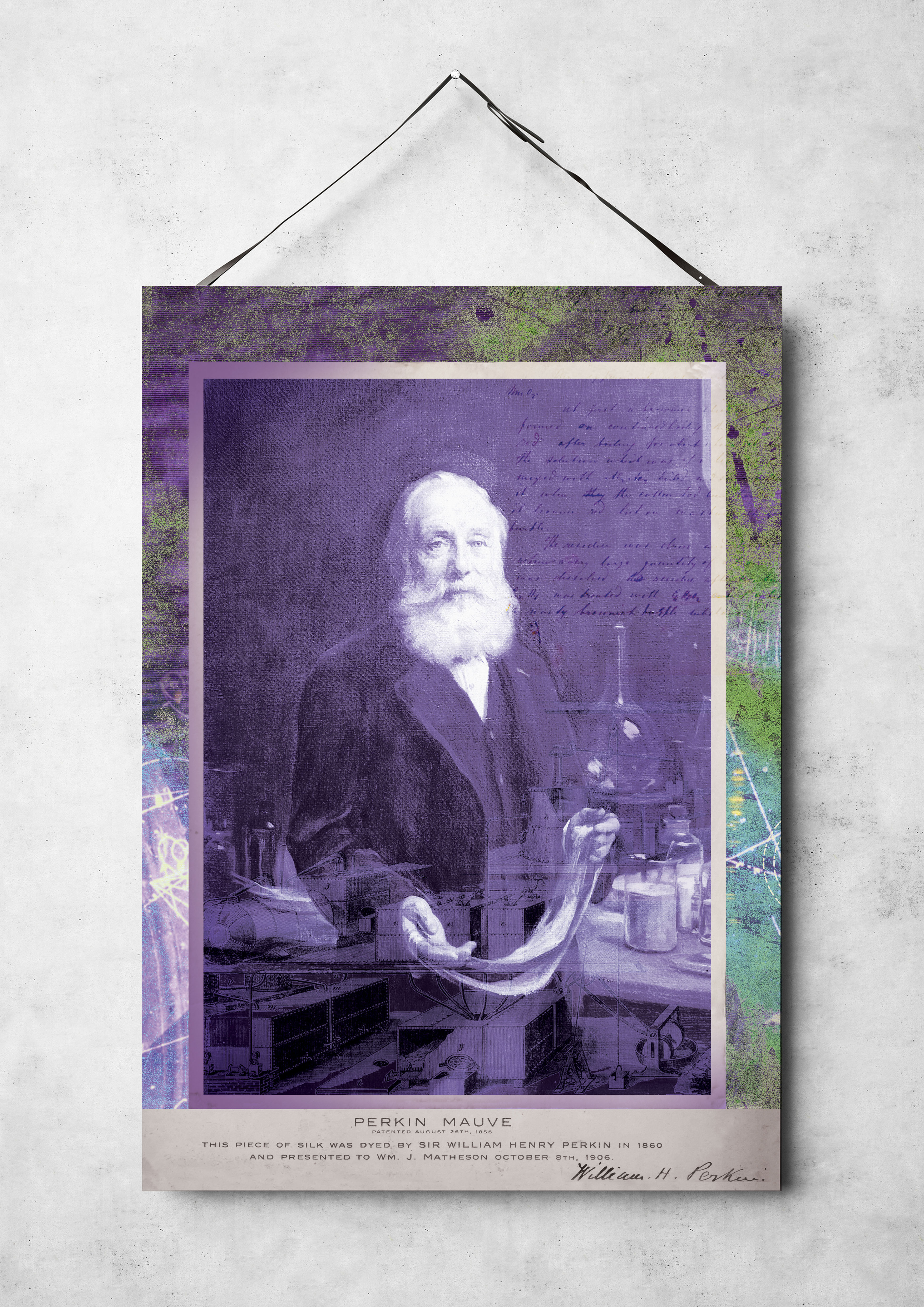
For inspiration, I turned to my early acquisition, a book The Age of Collage 2, which I bought at the Art Gallery in Germany. My attention was attracted by the designer Bill Noir, who struck me with simplicity and at the same time, a feature in the composition.
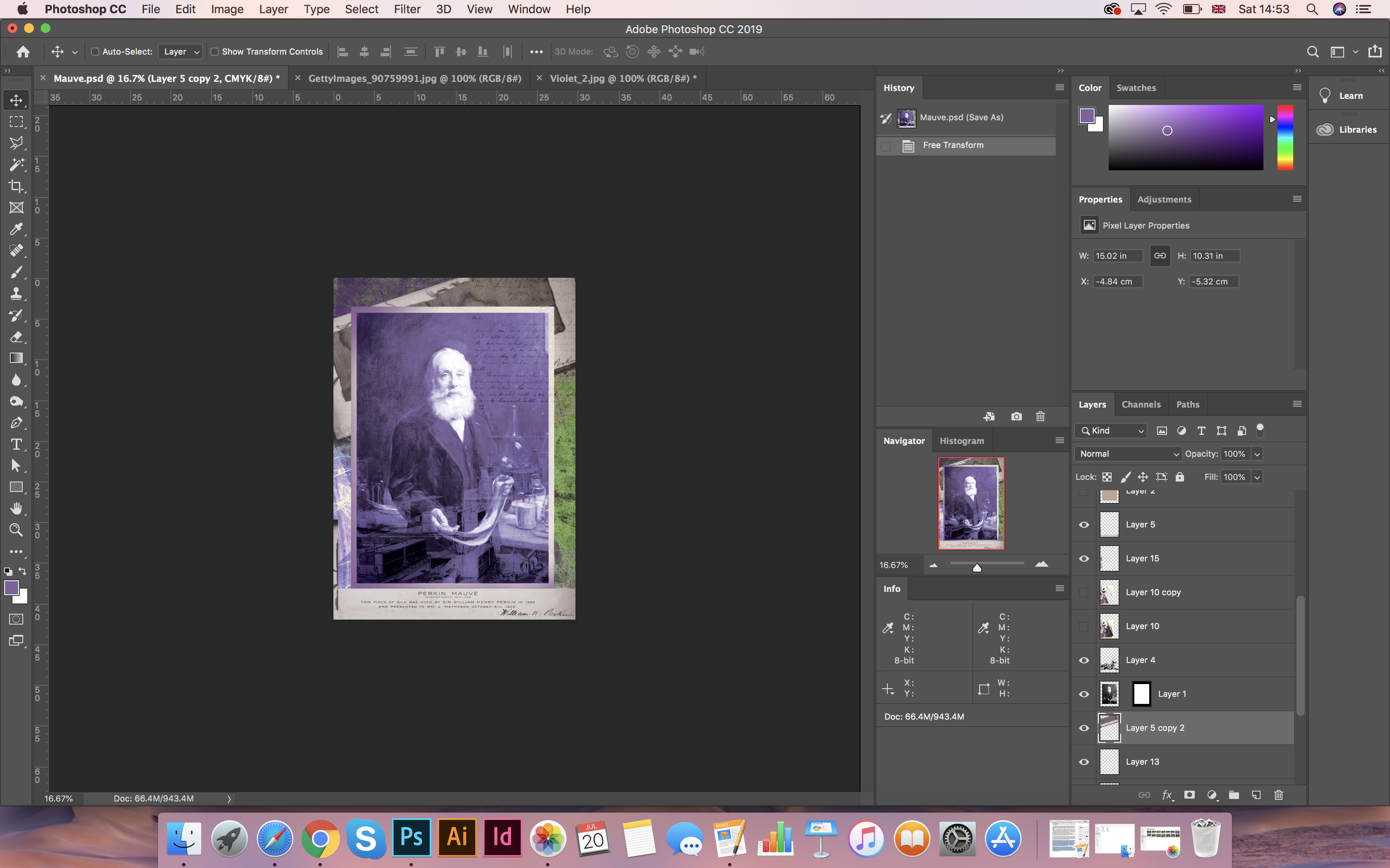
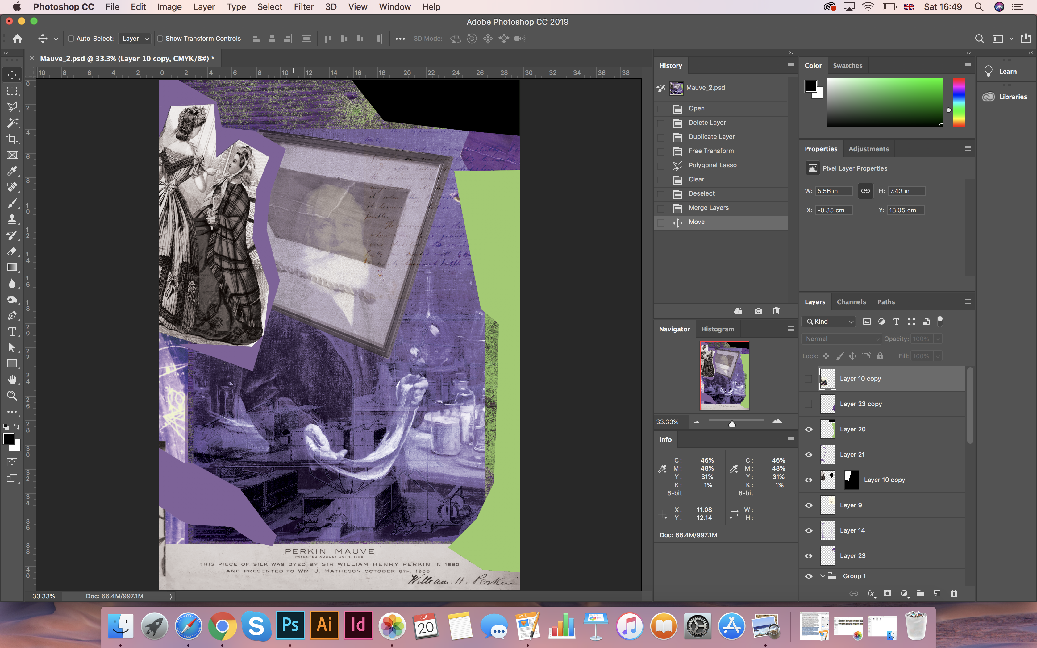
I thought what if I add torn geometric objects in my work in the same contrasting colours of purple and lime green, while, creating the illusion of movement? I scattered objects along with the entire sheet; in the end, I came to this decision. The phase of my new design in the same subject given below.
I liked the process of experimenting with shapes and pieces of different colours. As a result, I got a design upside down, but I had some doubts about the poster composition, I realised that in the end, I had to too busy space that didn’t have enough balance. I thought that such a solution would be more in a winning position if I try to minimise the background, i.e. remove the texture and try to experiment with the portrait of the scientist. More about this process, I will explain in the next poster.
Poster 2
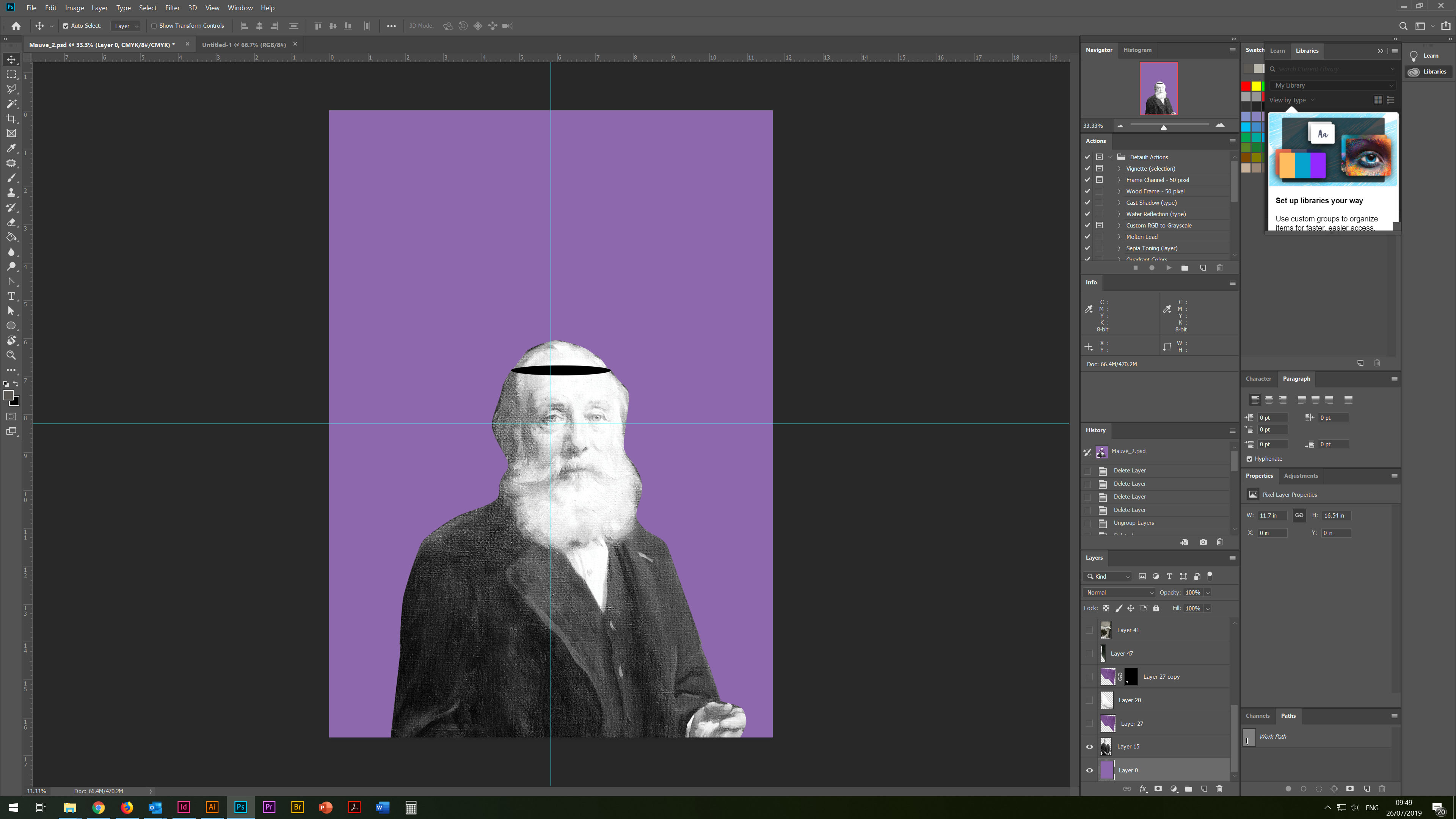
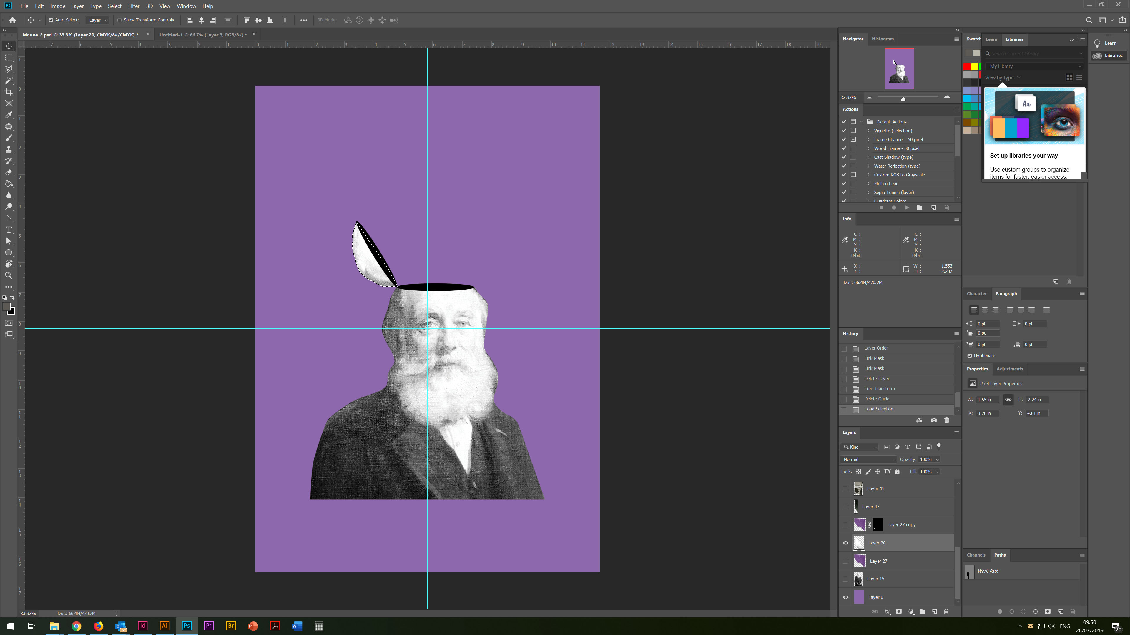
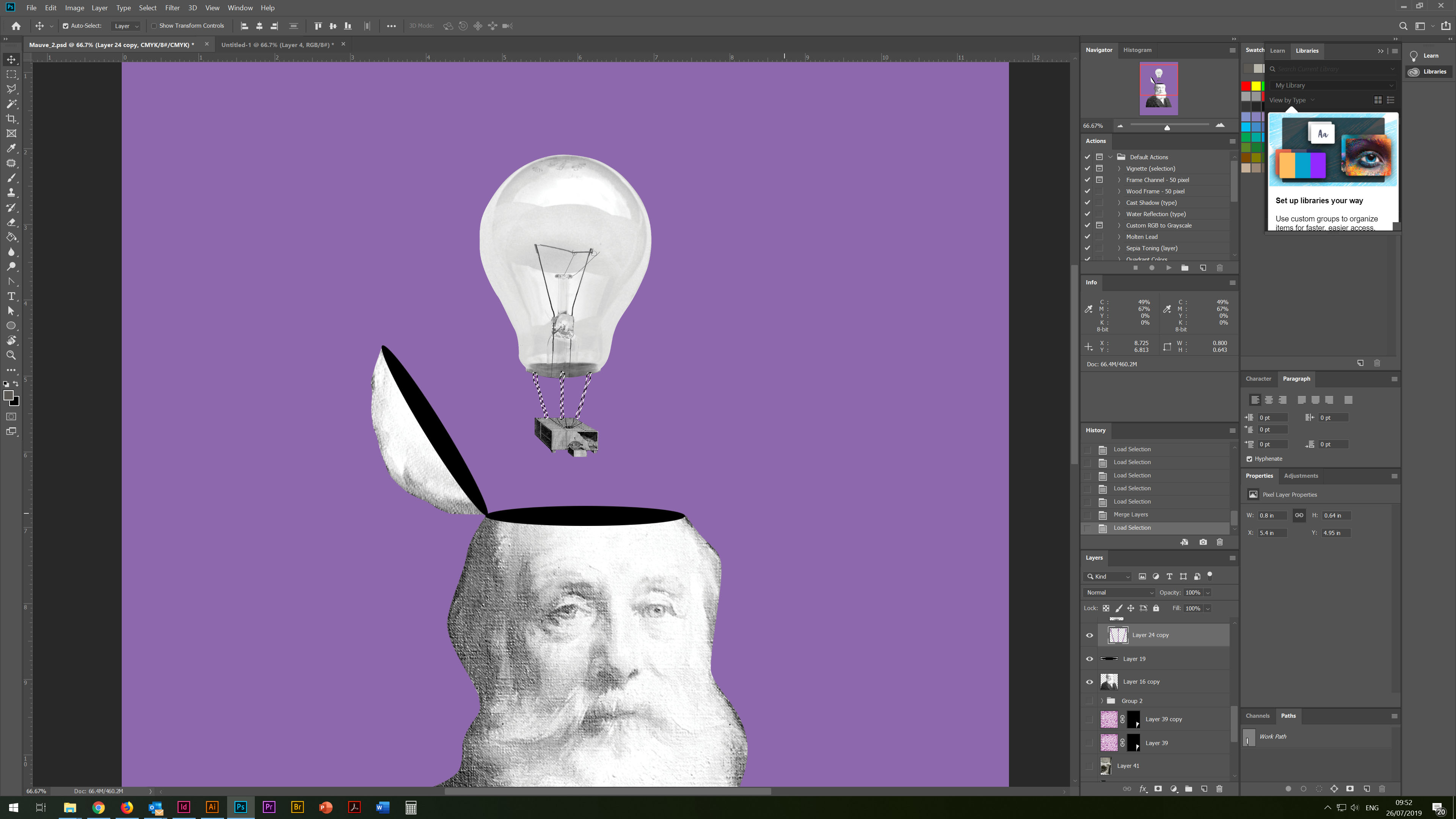
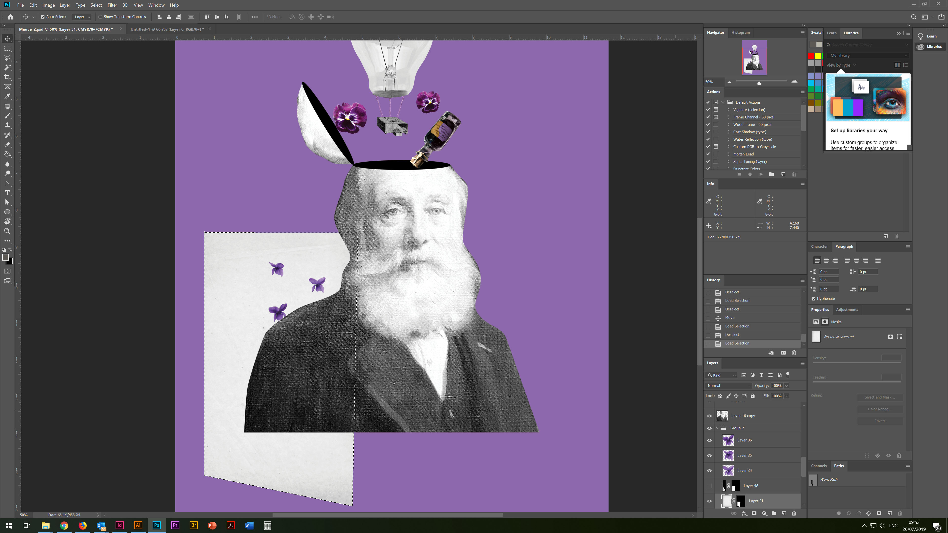
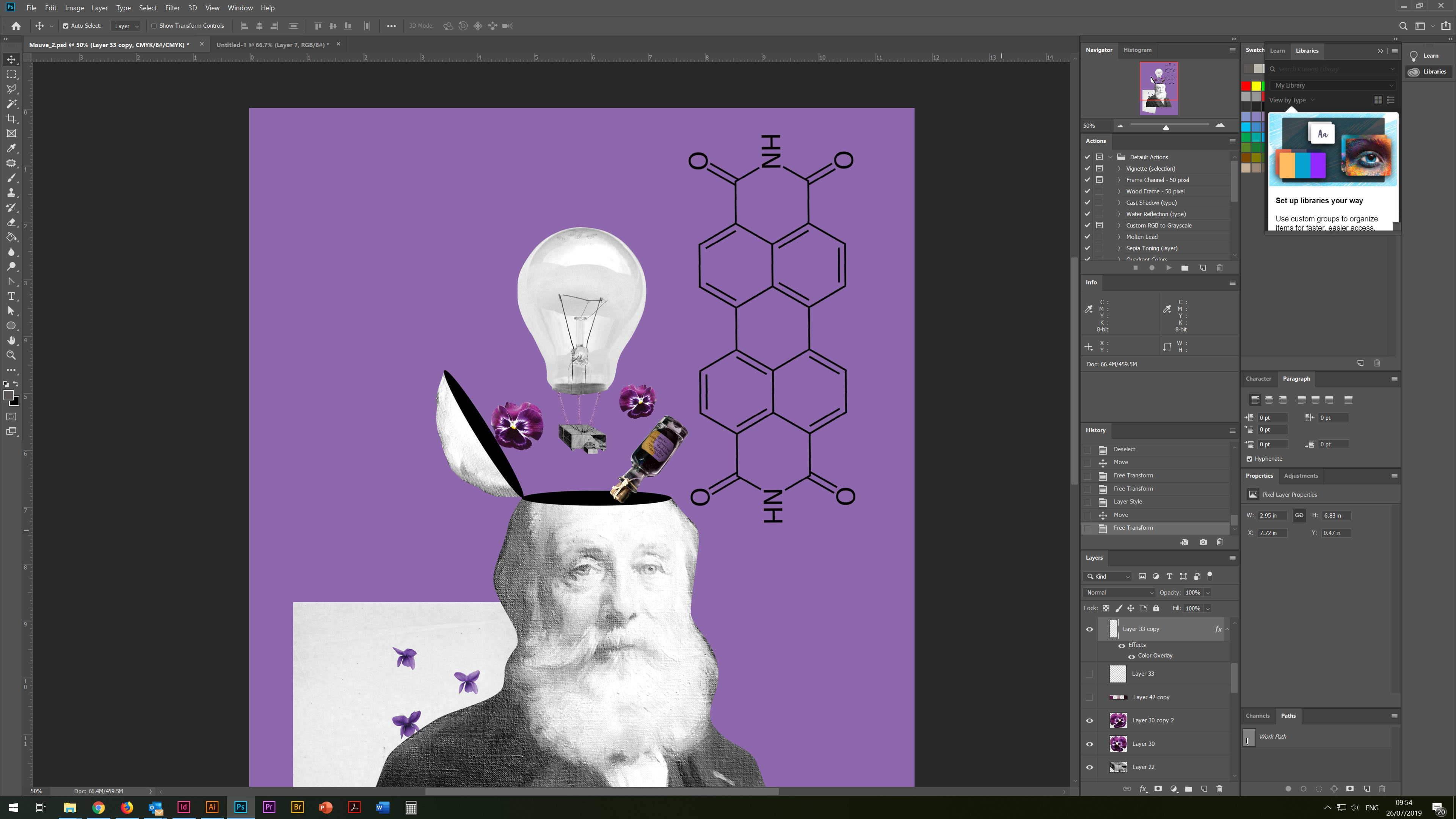
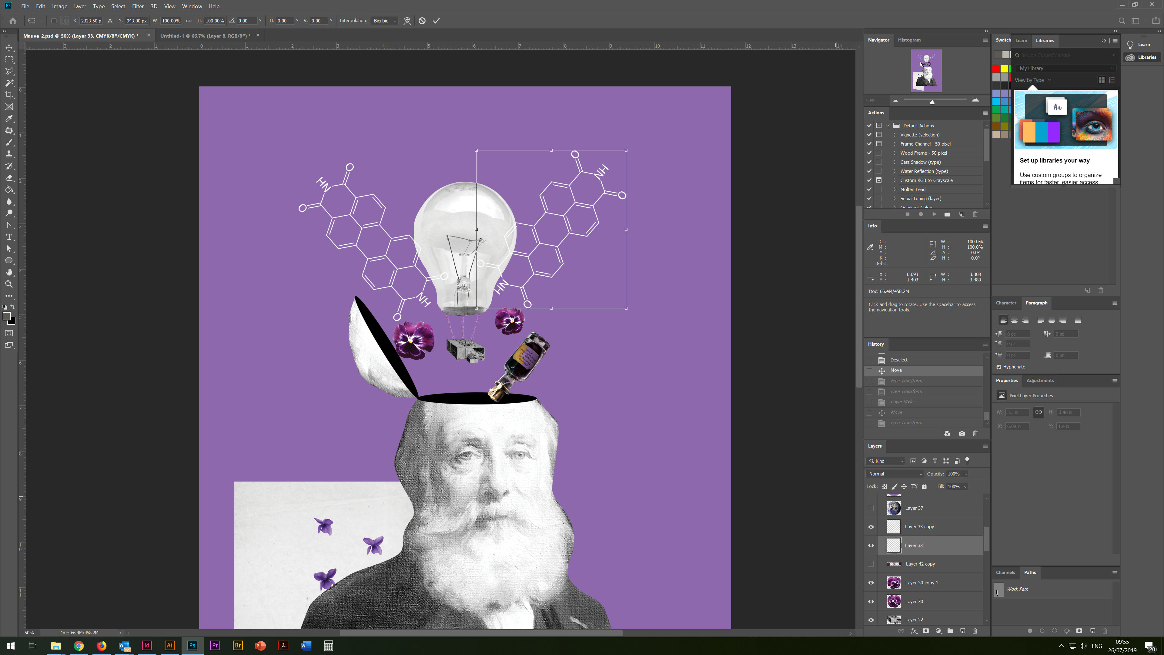
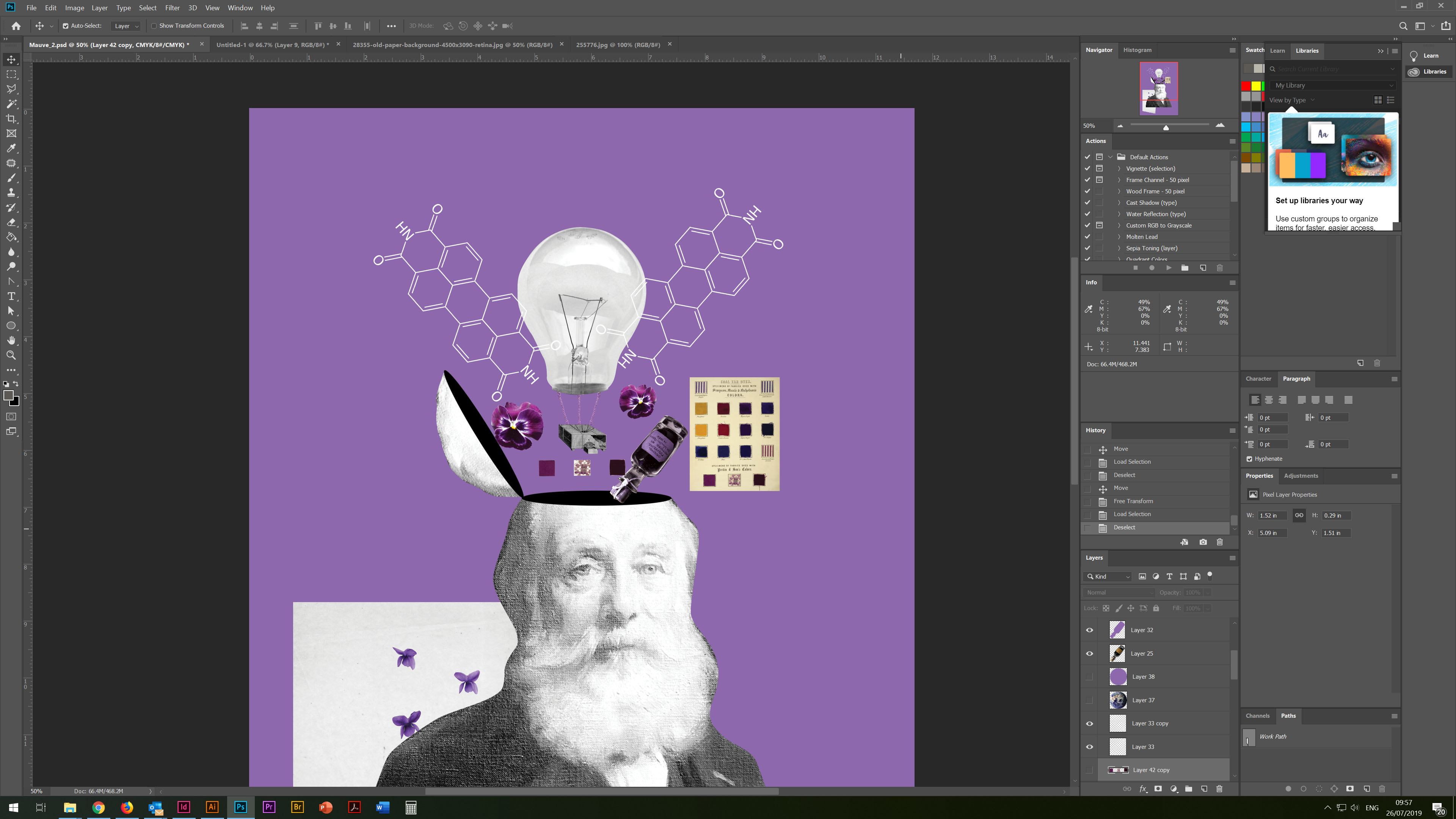
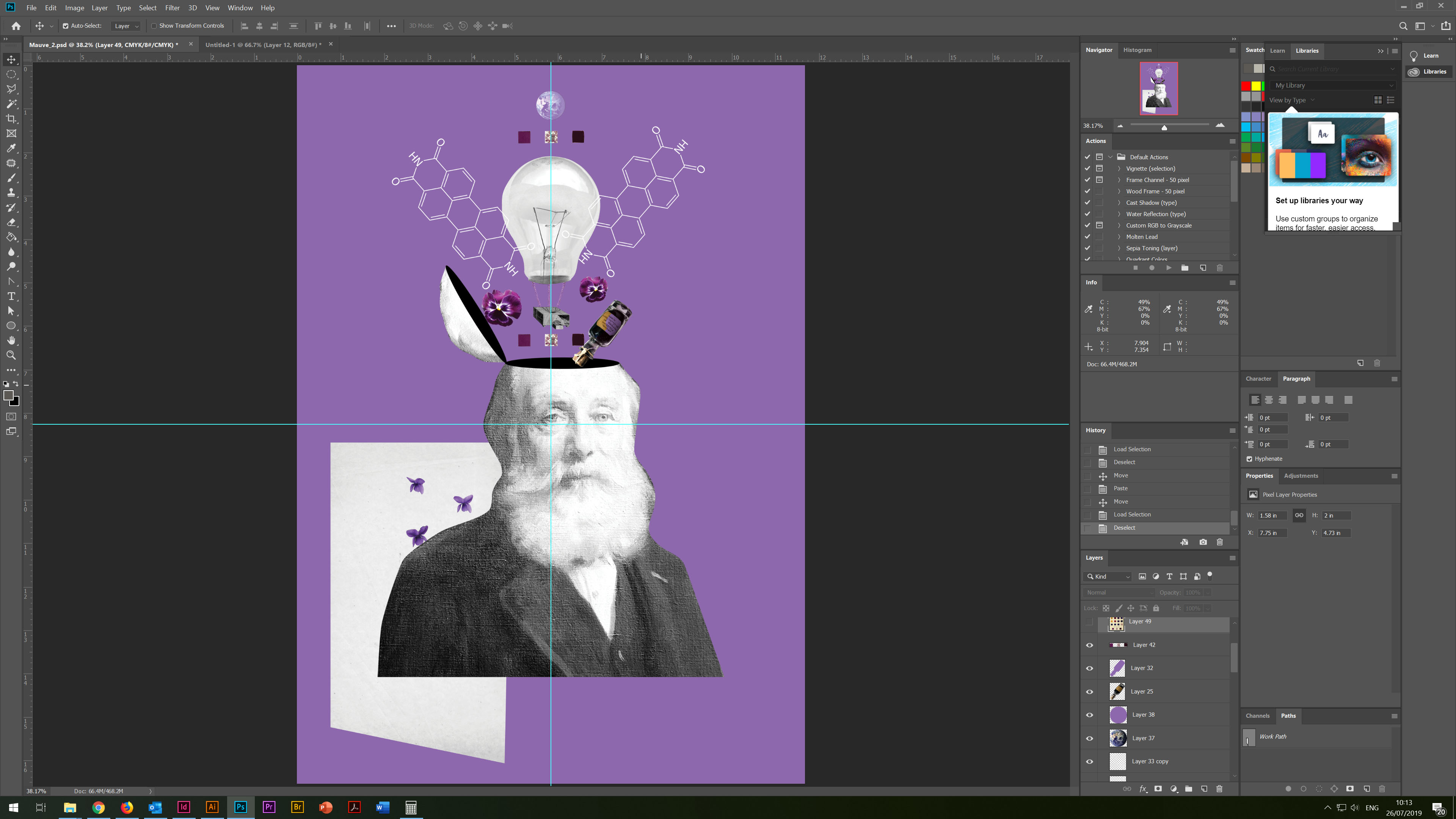
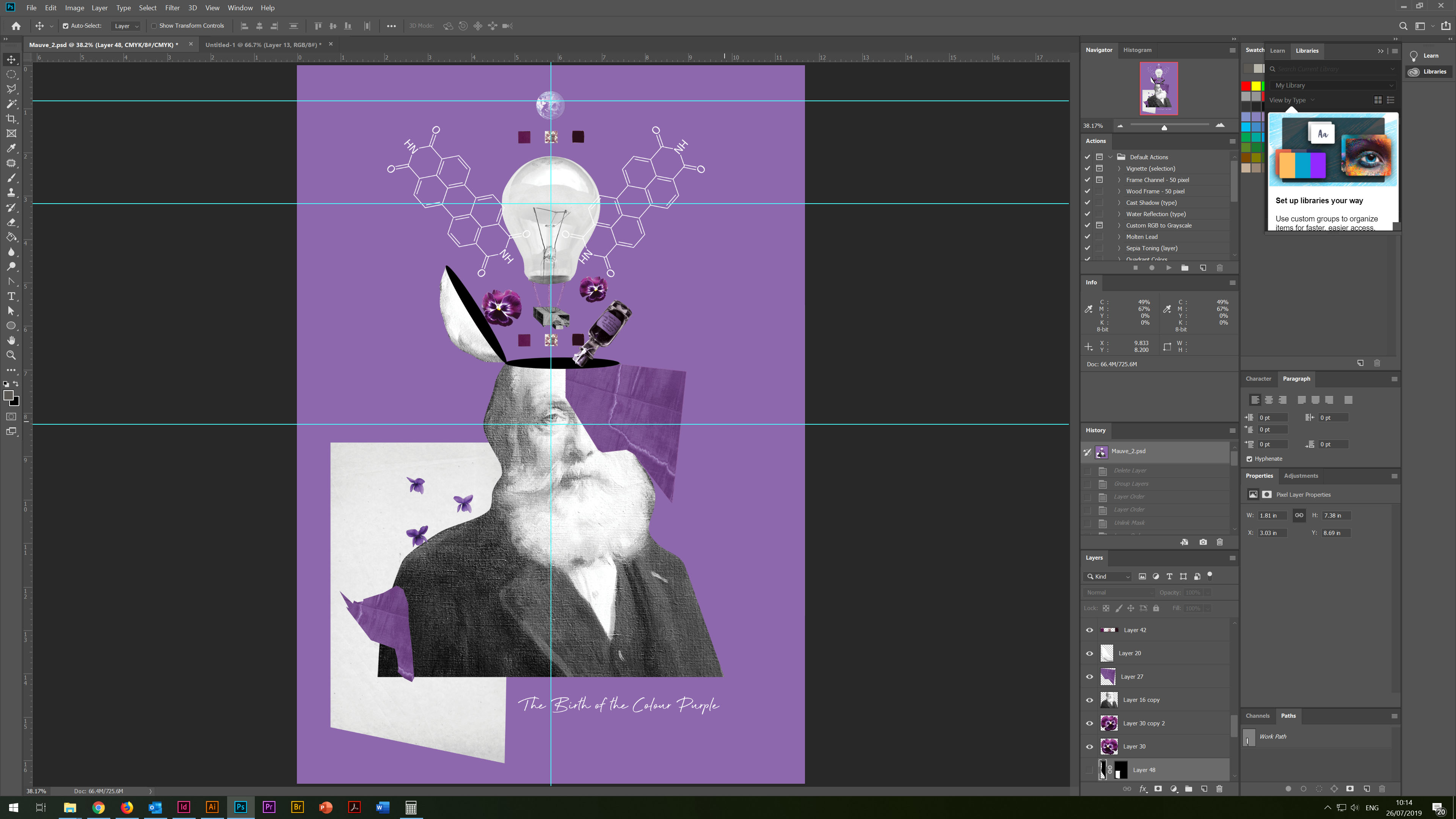
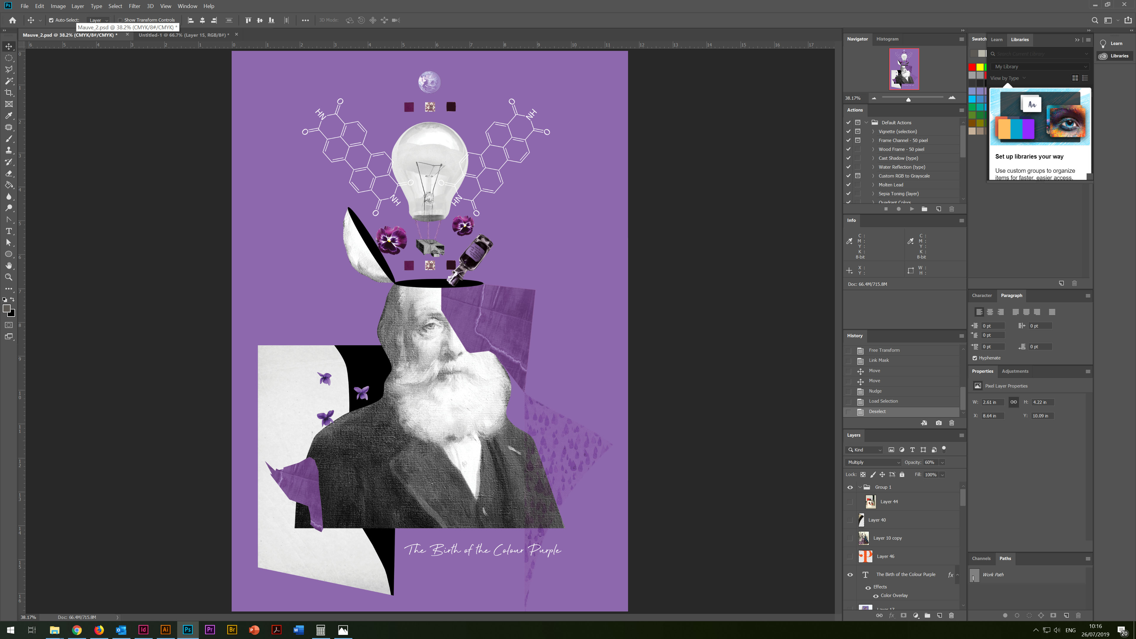
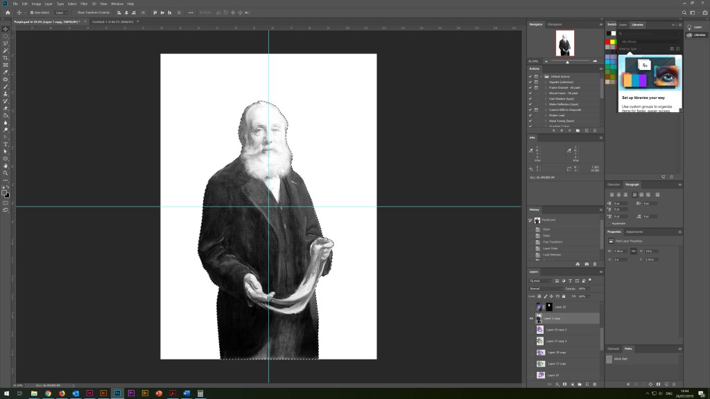
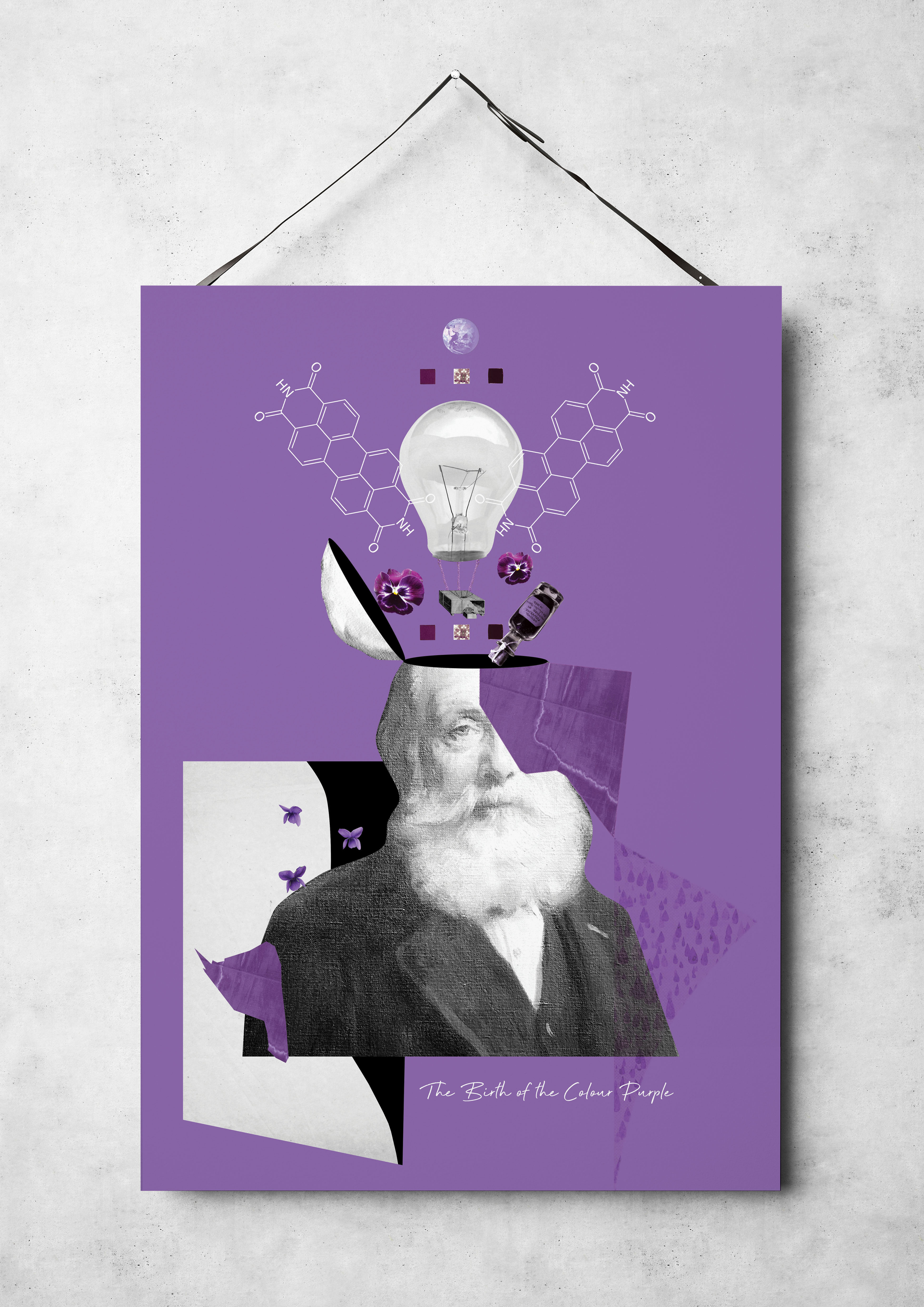
In this chapter, I would like to describe a new design solution for a poster, also based on the discovery of the purple colour by scientists Sir William Perkin. In one of my sketches above, I had a version with a forked head and rotating objects around it, but in this version, I decided to amend the design slightly and depict ideas that fly out of his head. For the background image, I used a solid purple fill and then followed to superimpose the objects on top of each other, arranging them in the composition I needed.
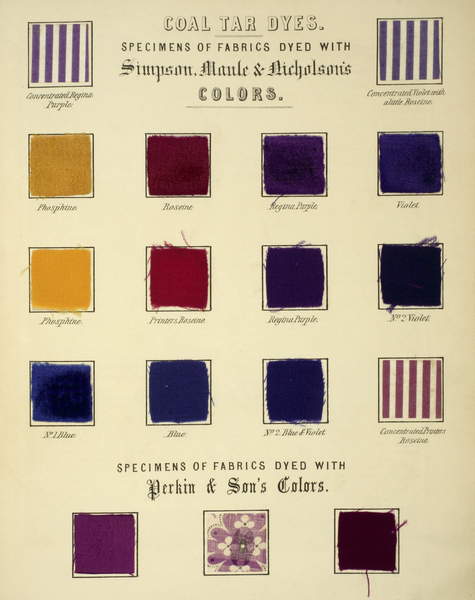
Bridgeman Images 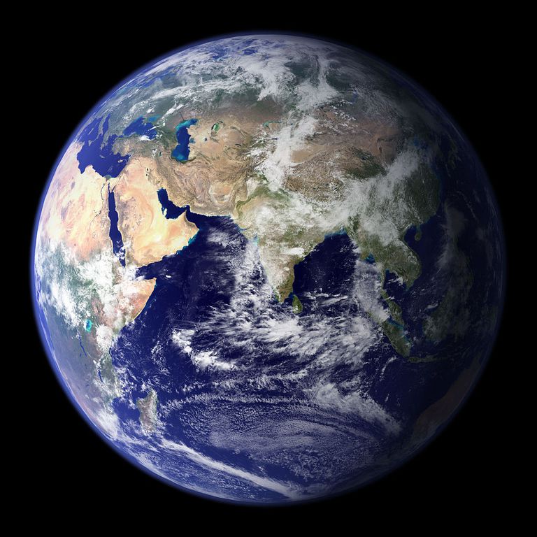
https://www.pexels.com/photo/planet-earth-87651/ 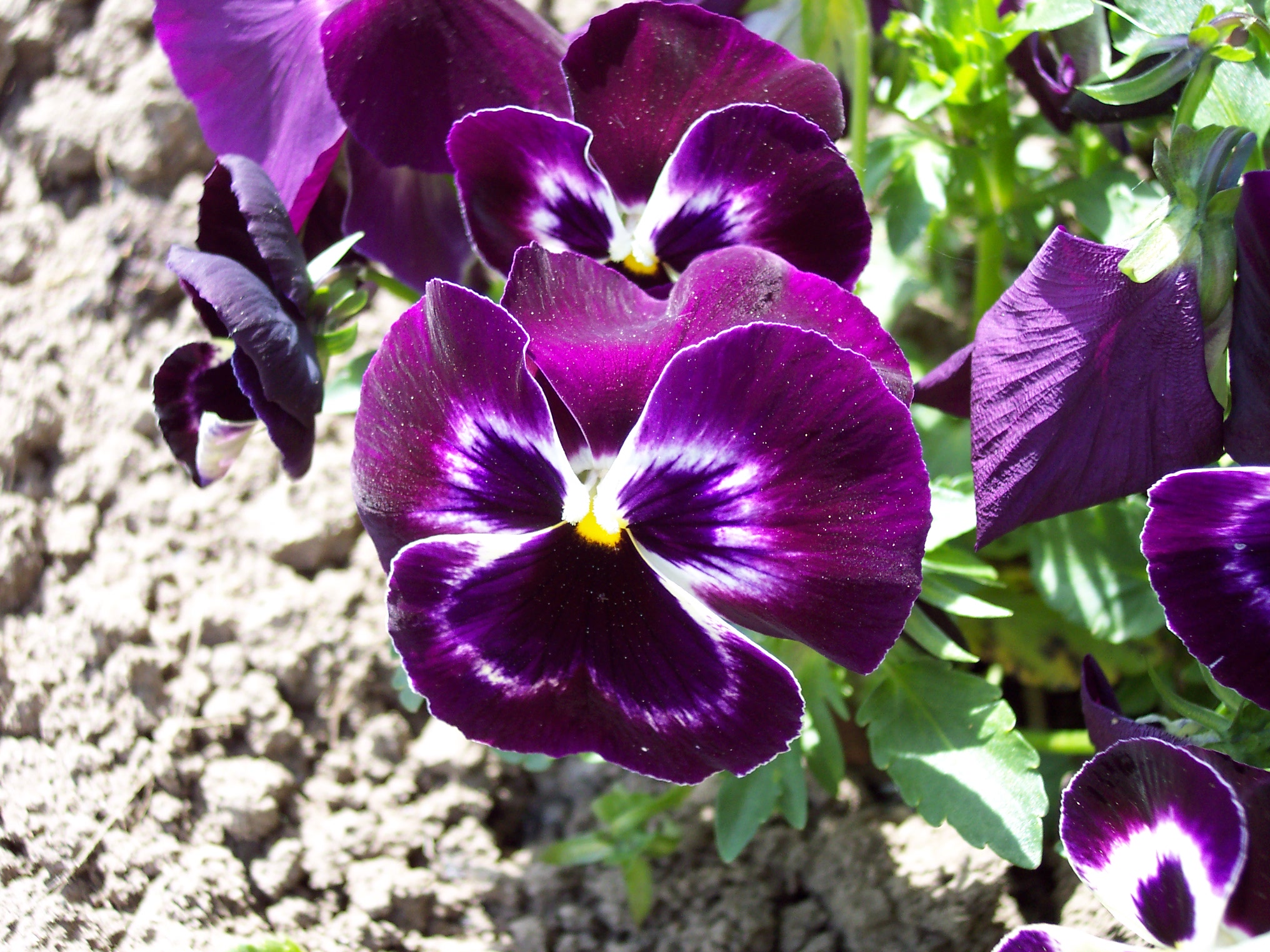
Weekipedia Images
ttps://en.wikipedia.org/wiki/Violet_(color)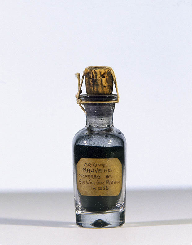
GettyImages
https://www.vox.com/science-and-health/2018/3/12/17109258/sir-william-henry-perkin-google-doodle-birthday-180-mauveine-purple-dye
Weekipedia Images
ttps://en.wikipedia.org/wiki/Violet_(color)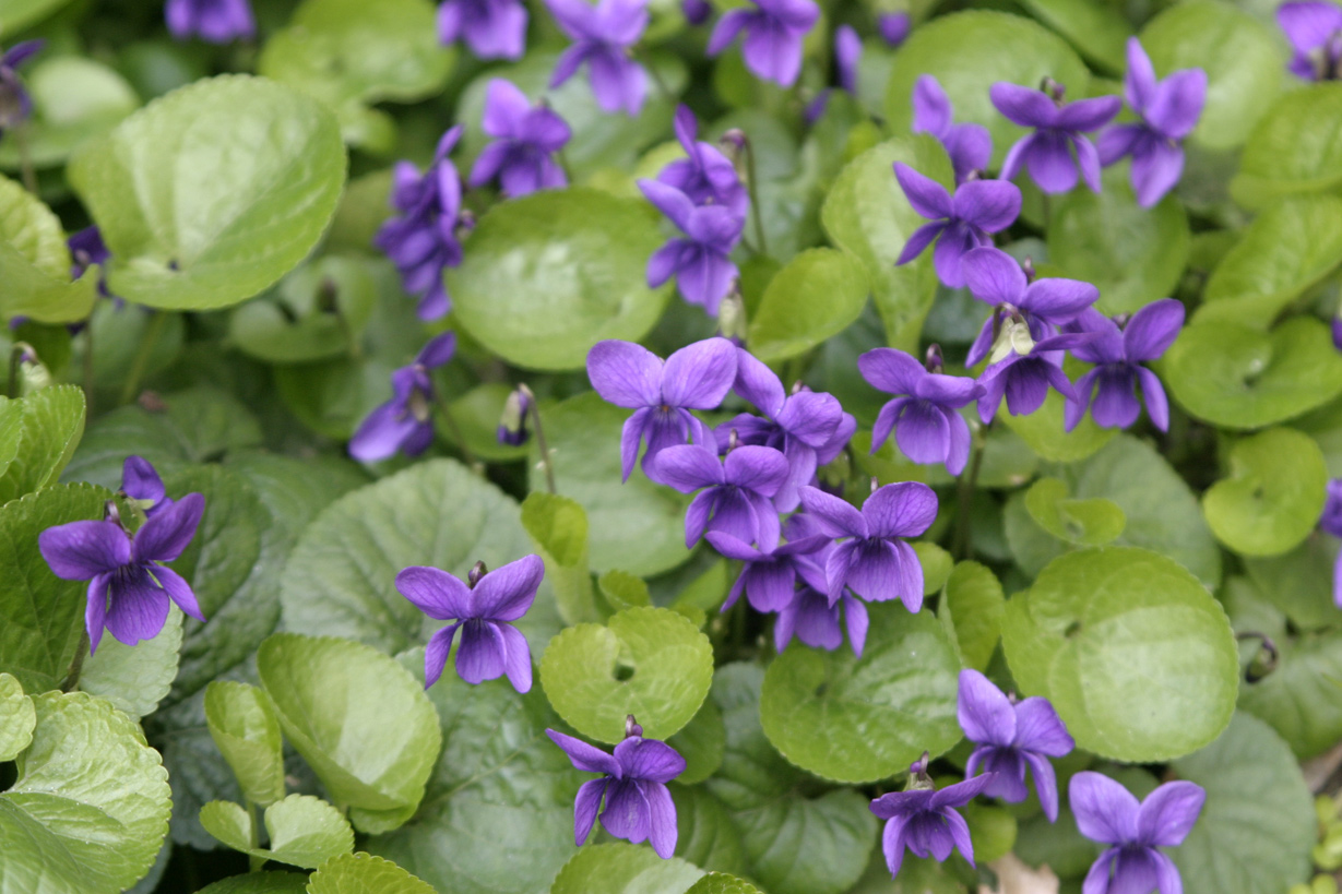
Weekipedia Images
ttps://en.wikipedia.org/wiki/Violet_(color)
As a result, I had a whole collection of images that I found on the Wikipedia site and the Bridgeman Images. As a symbol of an idea, I used a light bulb, which by the way I designed in my previous exercise, I fixed the ropes to it from the collection of the painting called Perkin Mauve, and the scientist’s small box of the plant which reminded flying balloon. I scattered small colours around, added the chemical formula of purple to scientists, a jar of rasters, and tissue samples, and I placed planet Earth on top to show the global significance of the discovery. In the background of the portrait and around, I added pieces of cloth, black, white and purple, as auxiliary elements for the illusion of three-dimensional composition. In the corner for the brevity of the poster, I wrote the name of the poster, choosing a handwritten font Beyond Infinity – Demo.
I was pleased with the final design. I think this is one of my favourite work at the moment, it has an idea and an original composition.
Poster 3
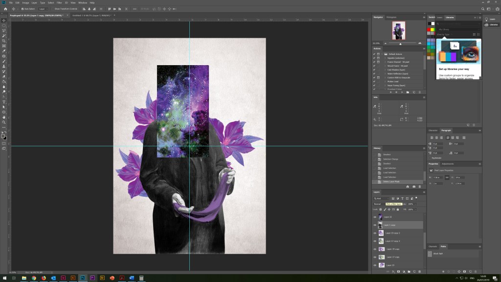
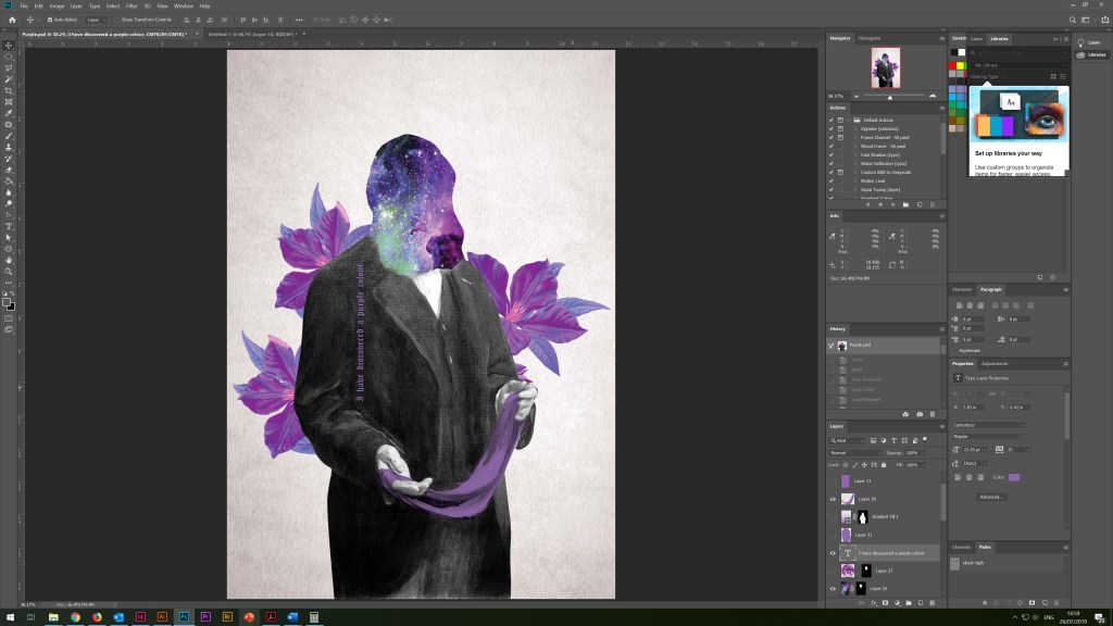
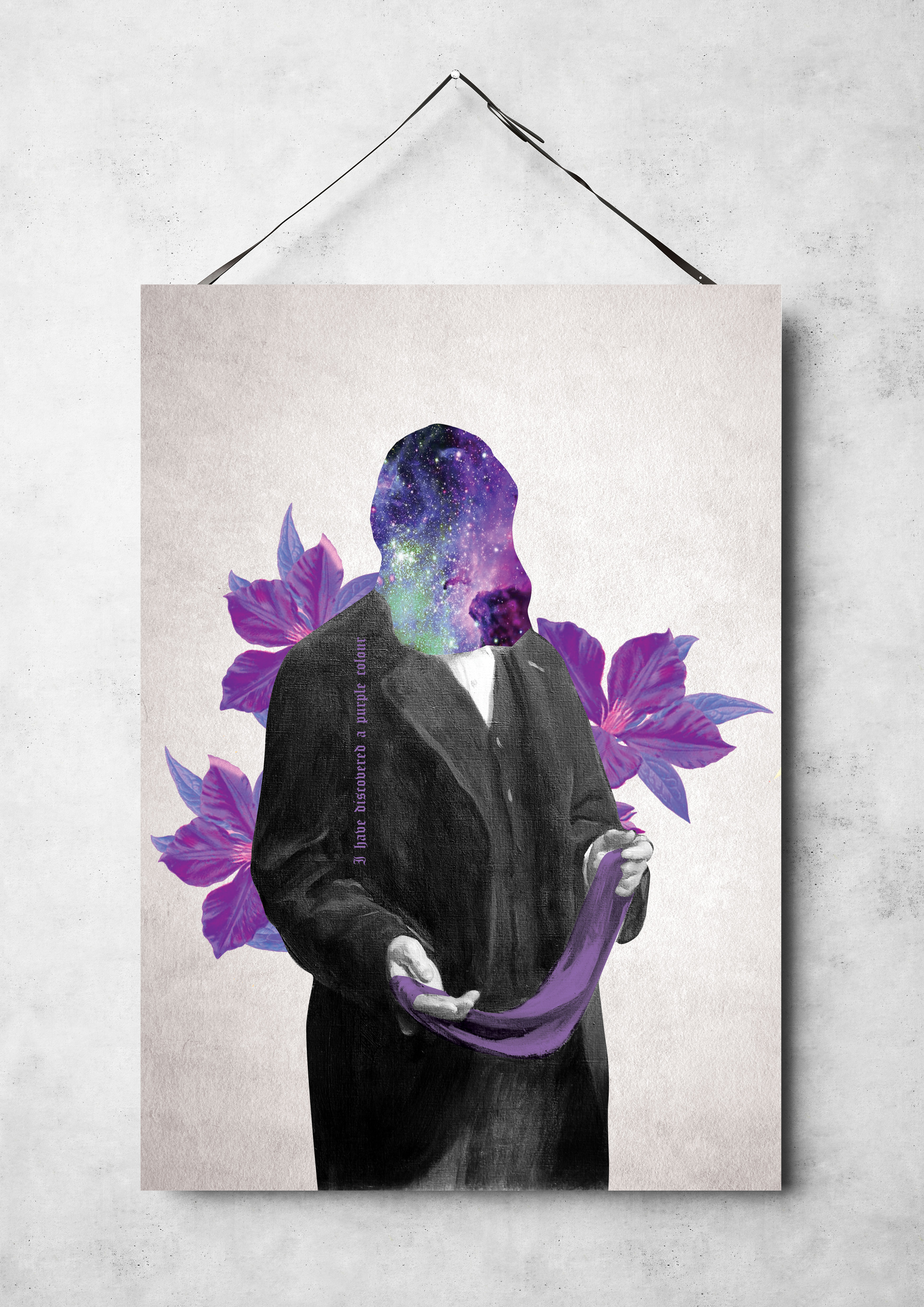
Additional poster idea was born in my design process for poster 3, is the unification of the concept of the presence of the purple colour in the universe and the invention of purple shades on planet Earth. Sir William Perkin, bright purple flowers and a piece of multi-coloured weaving acted as my main character again. But in this design, the main emphasis is on the face of the scientist; here, the main focus is on the space of the universe and bright colours. On the side of the suit, I wrote the phrase “I have discovered a purple colour” in the old Canterbury style. In this poster, I liked the combined idea of purple in space and the discovery of a new formula of colour on Earth.
Old Paper Image 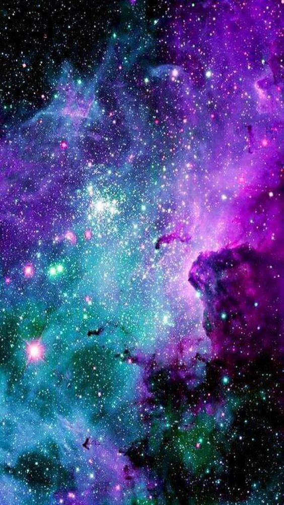
Pinterest Image of the Space 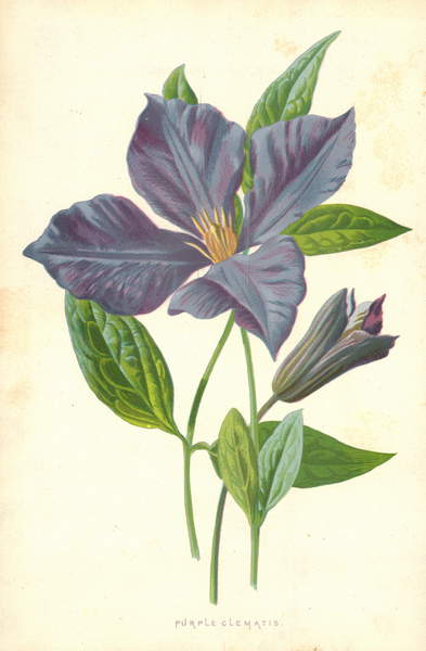
Brigment Images Purple Flower
Poster 4
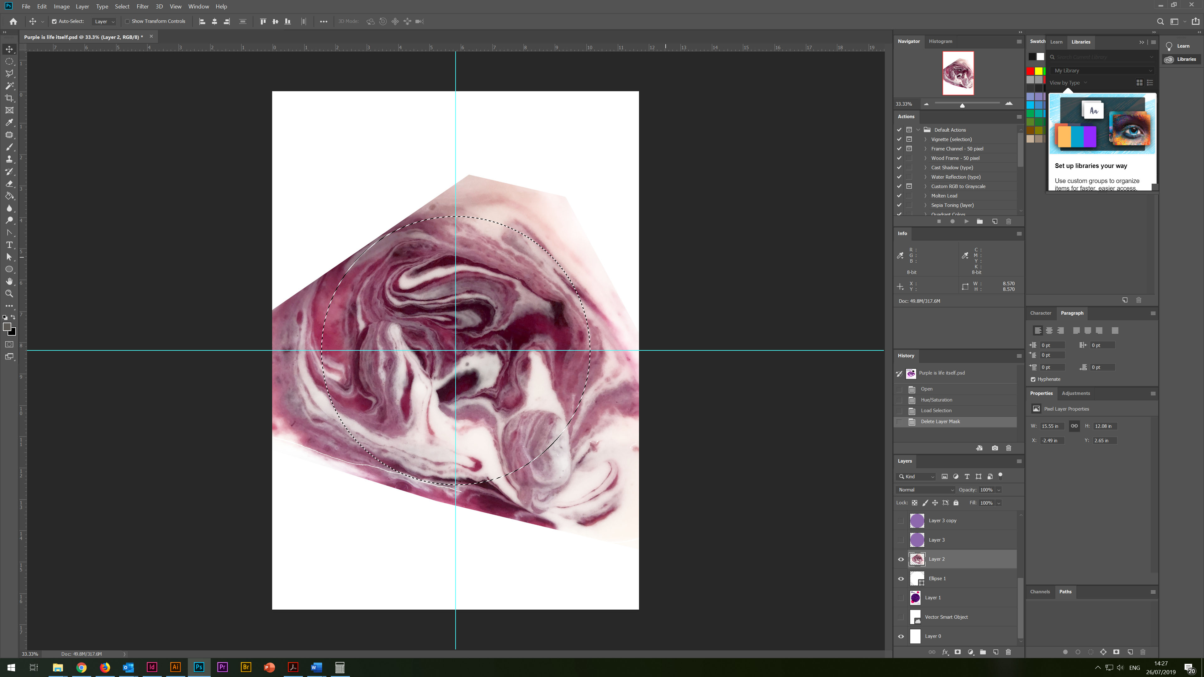
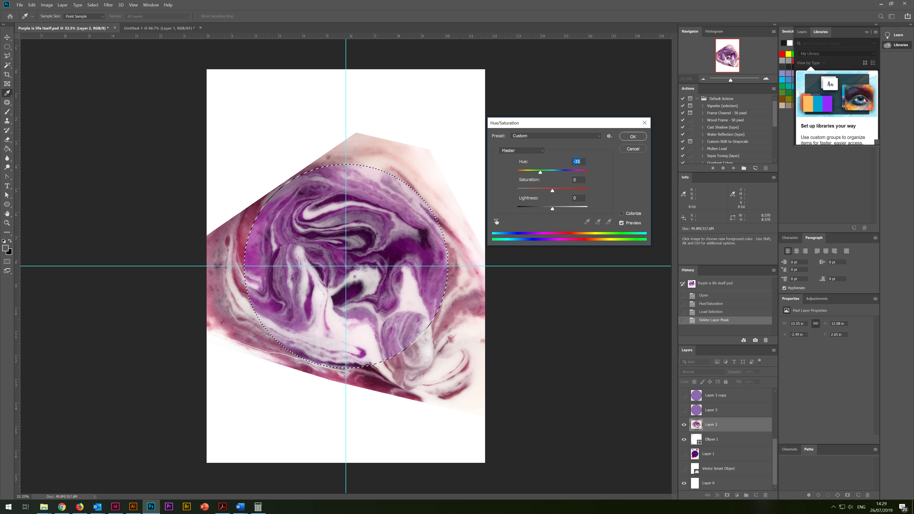
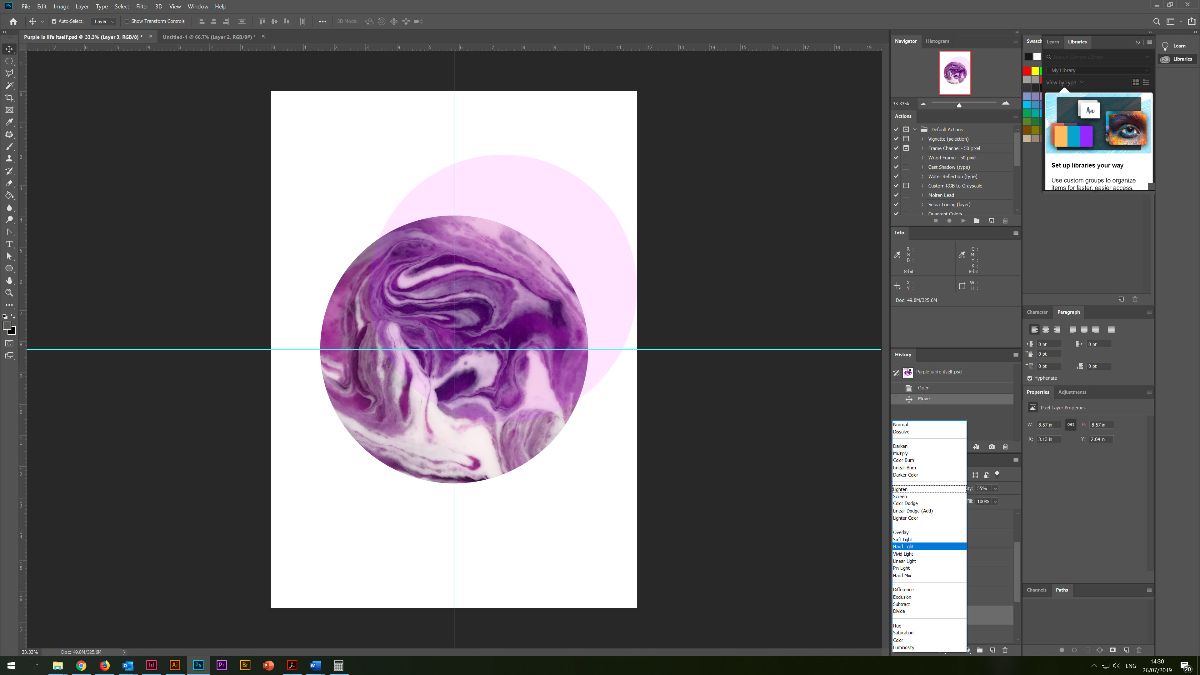
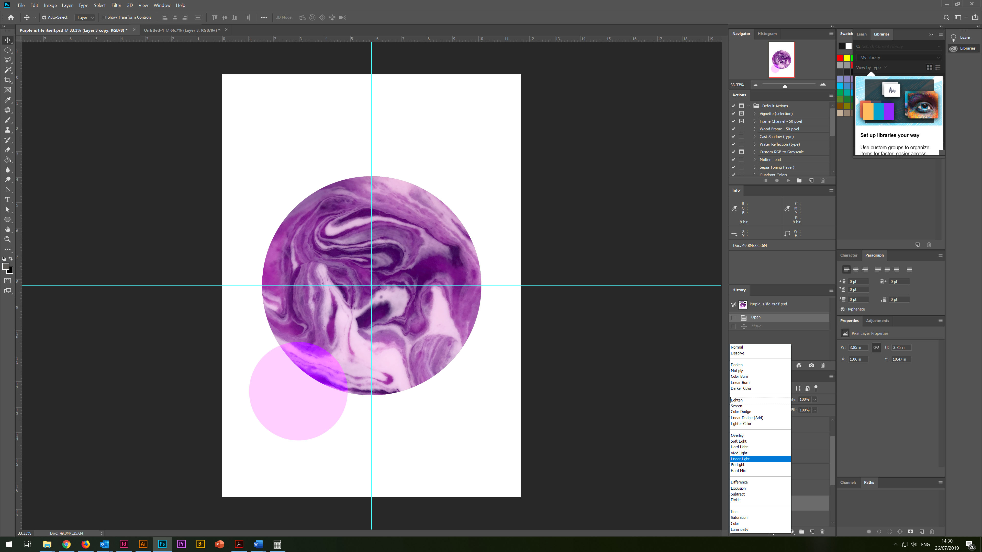
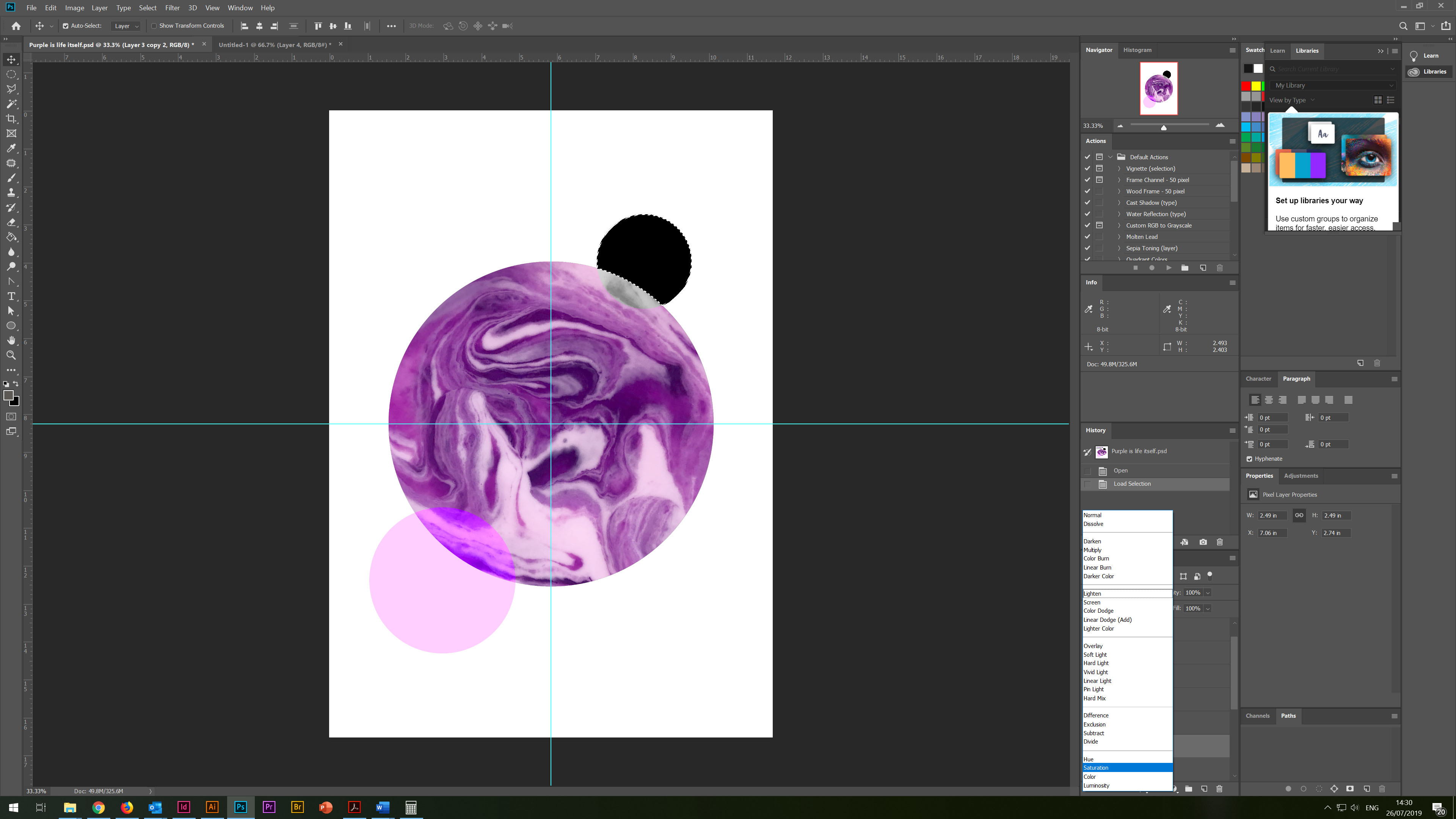
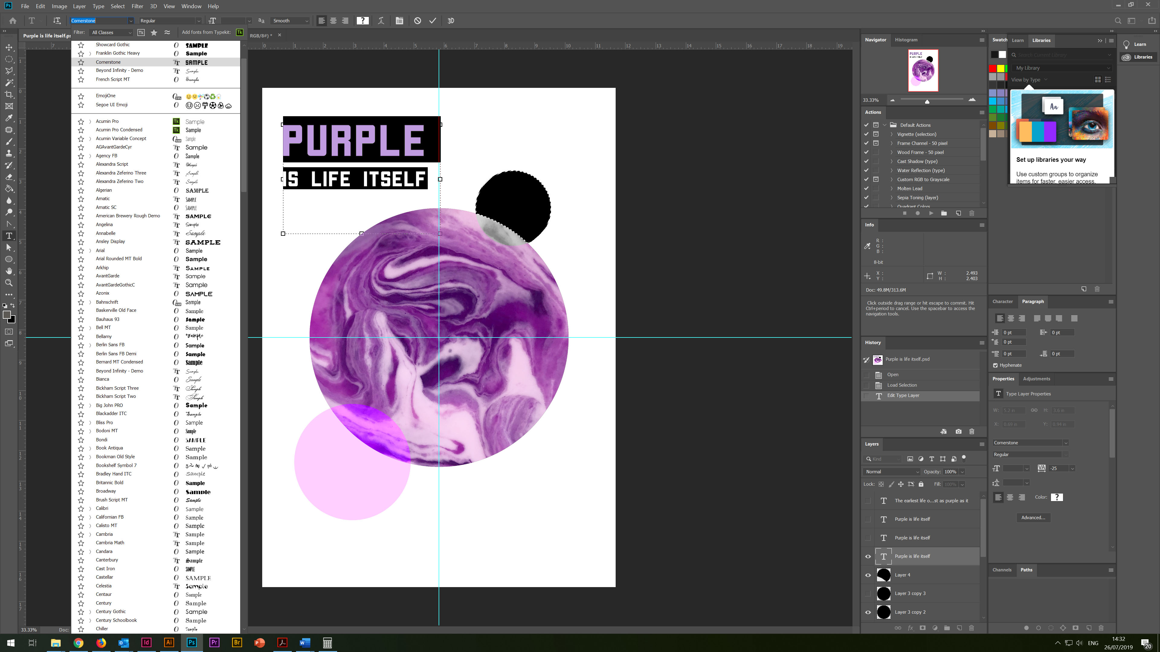
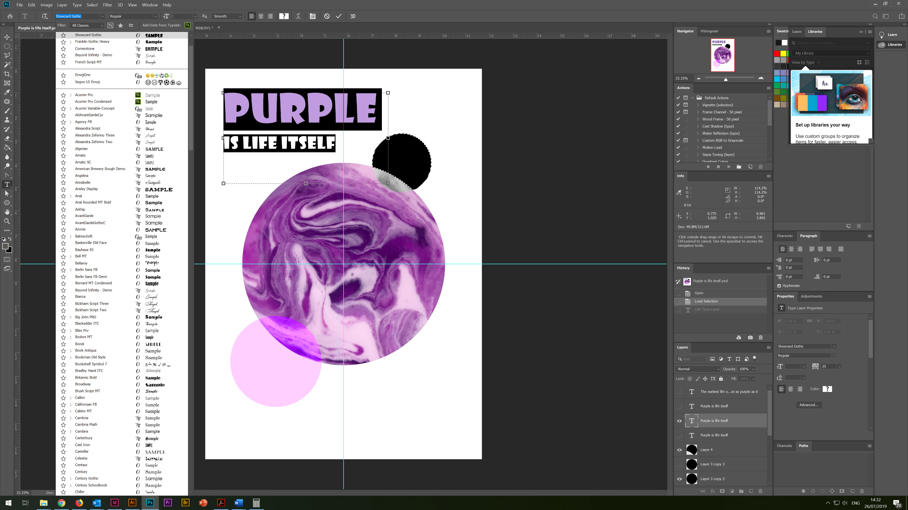
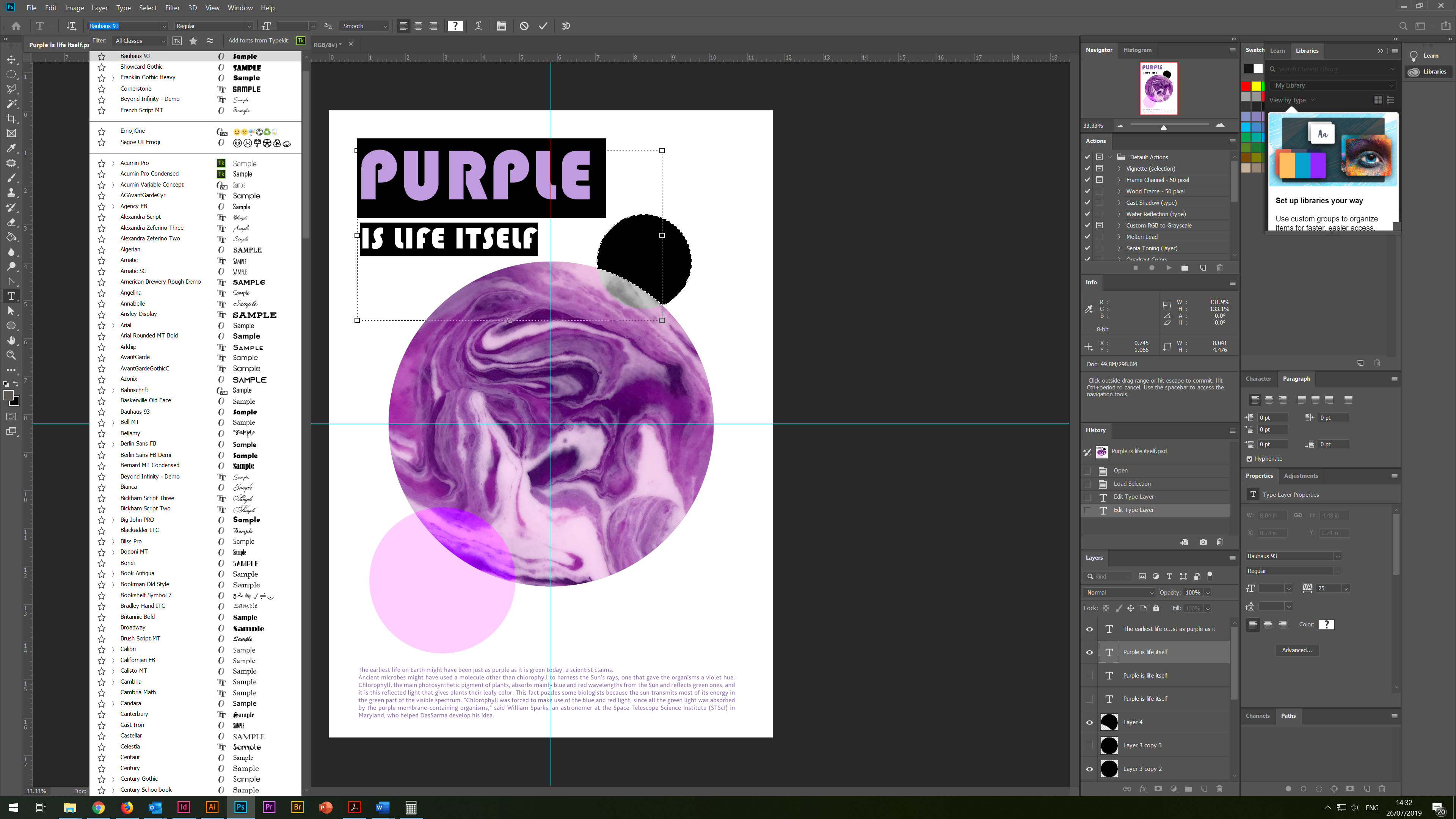
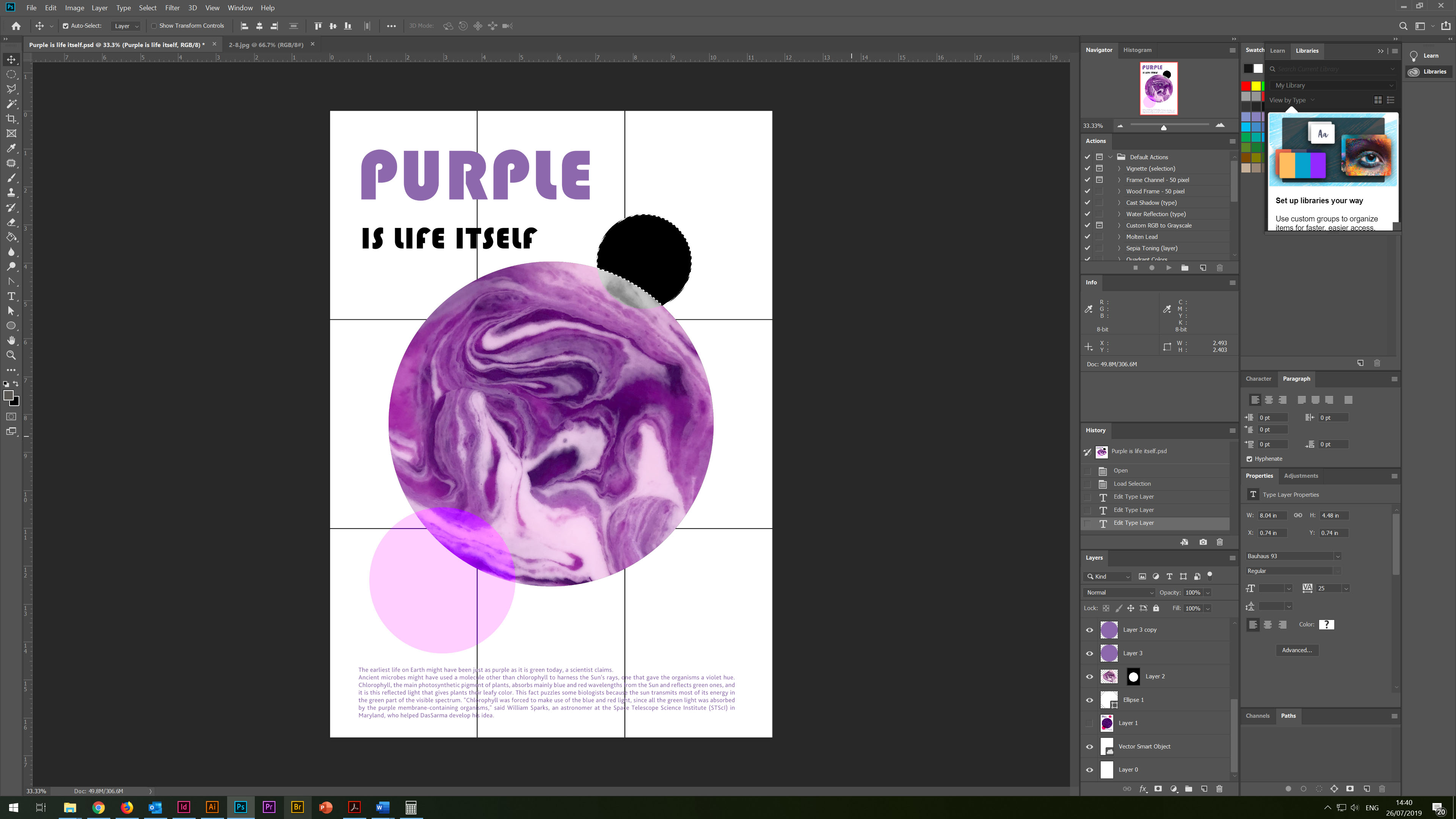
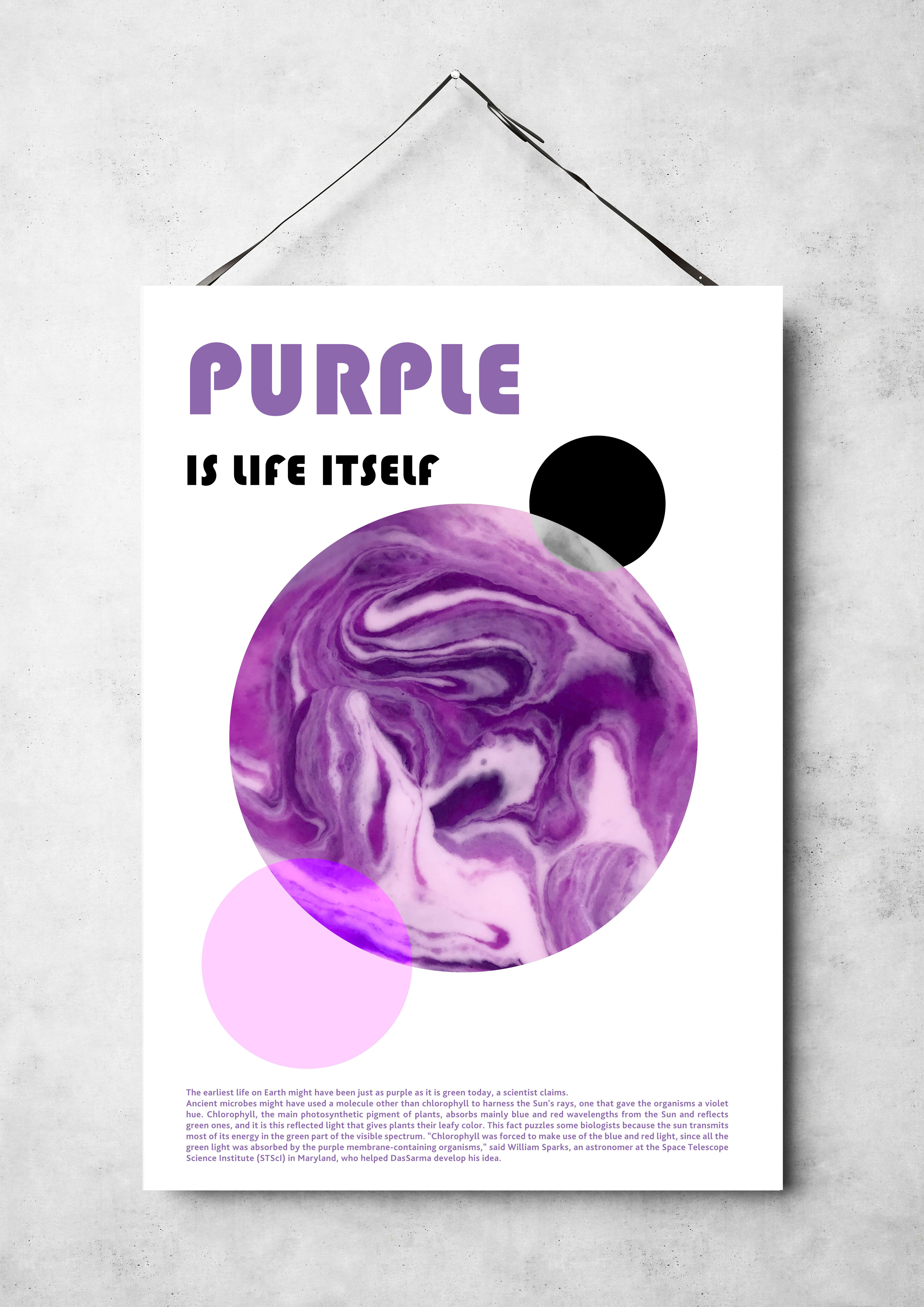
So, at the end of this task, an additional poster design, which was born spontaneously. Even though the style of this poster is different from other methods, I could not include this poster in my list of works. Here, strawberry yoghurt played the leading role. I noticed that when mixing jam and yoghurt, a gradient is formed as when mixing colours of several colours. I tried to impose colours on top of several layers, so I got an abstract image of the Earth, how it would look if we saw it from space, even at the very beginning. I tried several fonts; in the end, I chose a modern round font.
Below to balance the composition, I added the conclusion about the purple hue on the Planet Earth.
The black satellite is the Moon, and the bright purple circle, as an additional element for the balance of the composition.
In conclusion, I would like to say that I was pleased with the work done, and with the results of my research. I enjoyed my journey in the process of studying the purple colour and its properties. I noticed that the more I practice collage style and colour theory, the more new facets and opportunities open up in my studying. However, I still come across a long approach to sketches and drawings, even when I get the idea of design, I can visualise in my mind how I imagine the visual. I want to proceed to the plan immediately, but I still insist on myself you need to practice more drawings, as they are an essential link between the idea and the design itself. I also try to approach carefully to the selecting images from Internet resources, while respecting the rules of copyright.
I think that my favourite design is this one.

I prefer this work when I look at it, it gives me a sense of balance and calmness, and I am impressed by the purity and ease of colour perception in this design. In my opinion, this design has an idea and a composition that is pleasant for perception.
If I criticise this work, perhaps I would add more non-standard elements, maybe more torn edges, going beyond, but for now, I feel that I try to be neat with objects, and act within my feeling of the design.

