First Impression. Memories
For my first Assignment, I have a task to introduce myself. Below the example of the mind map I produced, some generic ideas that came into my mind, how I would describe myself. For me is quite important to reflect graphic design ideas through the colours, so each card was associated with the specific colour that I imagined. In the result I had three main ideas:
- card for the childhood memories and influences of the Eastern Culture
- card for the maturing, hobbies as ballet and painting
- card for the travel, like travelling which always is my passion
After some brainstorming, I started to design them straight away.

For my first postcard, I’ve decided to design it through the cultural influences from the countries that I have lived in. Firstly I would like to picture my native country where I was born and where I lived until I was 6 years old. That country is Uzbekistan — a faraway place in Middle Asia, a country with hot summers and cold winters. Where towns were surrounded by desert, 🐫🌵 where fruits were the sweetest in the world, where fabrics were full with bright and juicy colours, and girls wearing long braids were spinning in dance with a smile on their faces.

From pictures of Uzbekistan I wanted to show a traditional Uzbekistan Dancer, which is always smiling, she has long dark hair, and she loves spinning in dancing. Uzbek dance is characterized by intricate arm and hand movements, a variety of spins and turns, backbends, shoulder isolations and animated facial expressions.
Girls loved wearing wide dark eyebrows, which were joined in the nose bridge. The unibrow is considered a symbol of beauty and purity for women, this little girl reminds me of myself at an early age when I thought I was gorgeous as I imitated adults.

On another image below, is the soul of Uzbekistan — a place called Bukhara, an old traditional city which is one of the older cities in Central Asia.
When I close my eyes, I see spacious Uzbek streets, with no trees, just dry open space with an old mosque, where in the early mornings and evenings we could hear prayer songs. The sketch painting reminds me of my favourite Eastern Fairytale about Princess Budur “Aladdin’s Magic Lamp” from the collection “A Thousand and One Nights.” On the side of the road, you could always find a stream with cold clean water, which you could drink if you felt thirsty under the hot Asian sun.
Also, I’ve pictured traditional pattern Uzbek plates, as we used them to serve traditional fruits and hot naan pieces of bread for family and friend dinners.
“Motherland cradle me
close my eyes
lullaby me to sleep
keep me safe
lie with me
stay beside me
don’t go, don’t you go”―Natalie Merchant


I was pretty happy with the card design, as to me it was a tender and soft card, filled with Eastern elements and personal memories. The font that was used for Ode is handwritten font Katherina, I like it as it is similar to my writing.

In conclusion for the first impression, I would like to say, that the main influence from the country where I was born was:
- appreciation of Eastern Culture
- understanding that each part of ethnic features affect the personality formation
- memories from childhood are given the strongest influence on personality
Second Impression. Maturing
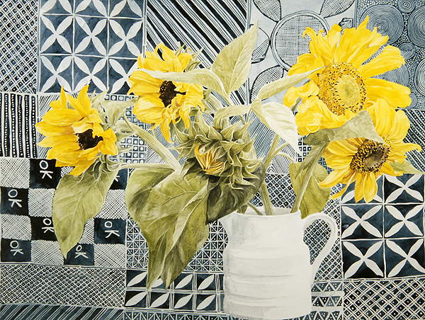
Secondly, after the country where I was growing up, I will go to another part of myself, which is the country where I lived for 25 years until I moved to the UK. That country is Ukraine, a place where summer fields are in blossom of sunflowers, 🌻 where the sky is a dark blue colour, and wheat is bright and yellow, which creates a beautiful combination in contrast. In that card, I would like to picture my country as a collage of main places that inspired me during my life in Ukraine. When I moved to Ukraine for the first time, I was 6 years old. It was the time when I started to learn a new language, which I really enjoyed. At the art lessons at school we had tasks to paint traditional places of Ukraine, so when I see sunflowers, viburnum or ears of corn like on the postmarks below, they remind me that they are all a part of myself.

My native city was Kiev, a place with a huge wide Dnipro river, where on the Volodimir Hill you can have a panoramic view of the big green city. High buildings and hills covered with fluffy bushes and trees. As my first impression of Kiev was from the Soviet Union, I would like to use old photographs to picture my city, as that is firstly what came up into my memories from that place.
One of my hobbies in Kiev was visiting Ballet Performances at the National Theatre of Opera and Ballet of Shevchenko. I loved the theatre by itself, the decoration of the performance, orchestra music and tender classical dances from some of the best dancers in Ukraine. 🇺🇦 I have visited many performances, starting from Swan Lake to the Nutcracker. In the honour of my love of the ballet, I have painted an oil picture of a Balerina.


It’s not about the shoes it’s aboit what you do in them, – Michael Jordan
The postcard design that I a got in the result was a bit flat, also I couldn’t fit there domination of blue and yellow colour, so I decided to go deeper, where I would be able to use my own painting. For inspiration, I went to the website to analyse famous Illustrators ideas. I found some source of inspiration for myself from Darrel Rees design style and the complexity of collages combinations, as I noticed my cards where missing foreground and background. So my updated design had a completely new look. Below are designs that inspired me.


This time I decided to use my own painting. I used a picture of a ballerina, for the background I used a picture of Kiev. In ballerinas hands, I put some sunflowers – symbolic Ukrainian flowers. Visually I divided a space into two colours – yellow and blue, which are traditional Ukrainian colours. In the corner, I used an old photograph of Kiev, place where I had been living for 25 years. A postcard that I got in the result presented below.

In conclusion for the second impression, I would like to say, that the main influence from the country where I lived was:
- the Slavonic culture is open-minded and close to my spirit
- it’s a place I will call home anytime
Third Impression. At the present

During my work career for a travel company, I’ve opened for myself a new world,🌏 with big beautiful oceans, exotic fruits and far away islands. As I worked as a visual graphic designer, most of the time I was looking for photographs to attractive places to visit for tourists, and at the same time, I was looking for places I dream to go too. Since that time I have a wish, travel around, and see the most unseen places in the world. In my third card impression, I would like to visualise journeys and travels as a part of my life.
This young lady on the poster from Santa Margherita is a symbol of happiness and excitement of the new world discover, I love that she is open to the world and with a big smile on her face, also she is wearing yellow, the colour of energy and activities.
“There is a kind of magicness about going far away and then coming back all changed”― Kate Douglas Wiggen
I liked the idea of the presence of yellow colour, and the spirit of happiness that woman brings into, but I thought that my postcards look too similar to each other, as most of them were made in the style of flat collage, therefore I went for inspiration and searches to the famous graphic design and illustration artists.

I found some ideas which were leading me to some new way of thinking, where I could combine not related images to each other, that to create some new sort of image. I loved the idea from illustrator Matthew Richardson of using transparent images and full-colour images, which created a kind of mystery effect. At the same time, my personal expression told me that I more keen on using a bright background, as though the colour we can express our personality as well.


By trying to combine different images, I’ve decided to try to use two pictures of myself, first one a picture from passport, as that is related to travel abroad, another one a picture of myself with open hands, as I’m open to the world and travels. At the same time, I used some images from my journey to the Maldives. Leaves and parrot I used as a decoration for my clothes. I liked the slogan “Travel is always a good idea”, I used Helvetica font for it, that to keep its message clear and simple. In the corner, I put a picture of dancing Maldivian man.

In conclusion for the third impression I would like to say that:
- travelling is what makes a person happier
- travels open up new horizons, changes the live view, gives the opportunity to look at familiar things from a completely different angle.
- this is what fills us, inspires and makes us fall in love even more.
Final Cards Designs.


