
This final assignment is an opportunity to consolidate the understanding you’ve gained so far, reflect on the work you’ve enjoyed and your achievements. It allows you to create certain parts of the brief yourself so that you have the maximum capacity to show off your interests and talents. Choose one of the briefs below. Then work through the design process, researching and visualising a range of ideas before critiquing your work and choosing your selected design to present as print ready artwork.
Brief 1: Book design
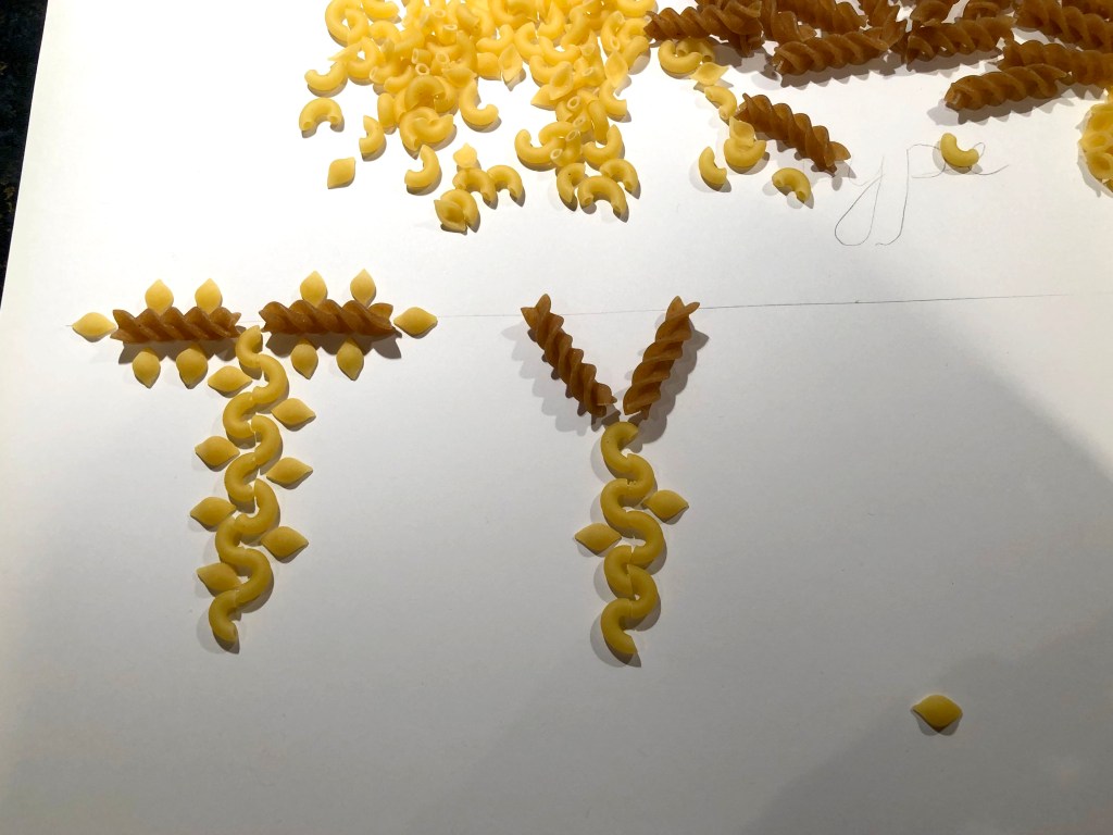
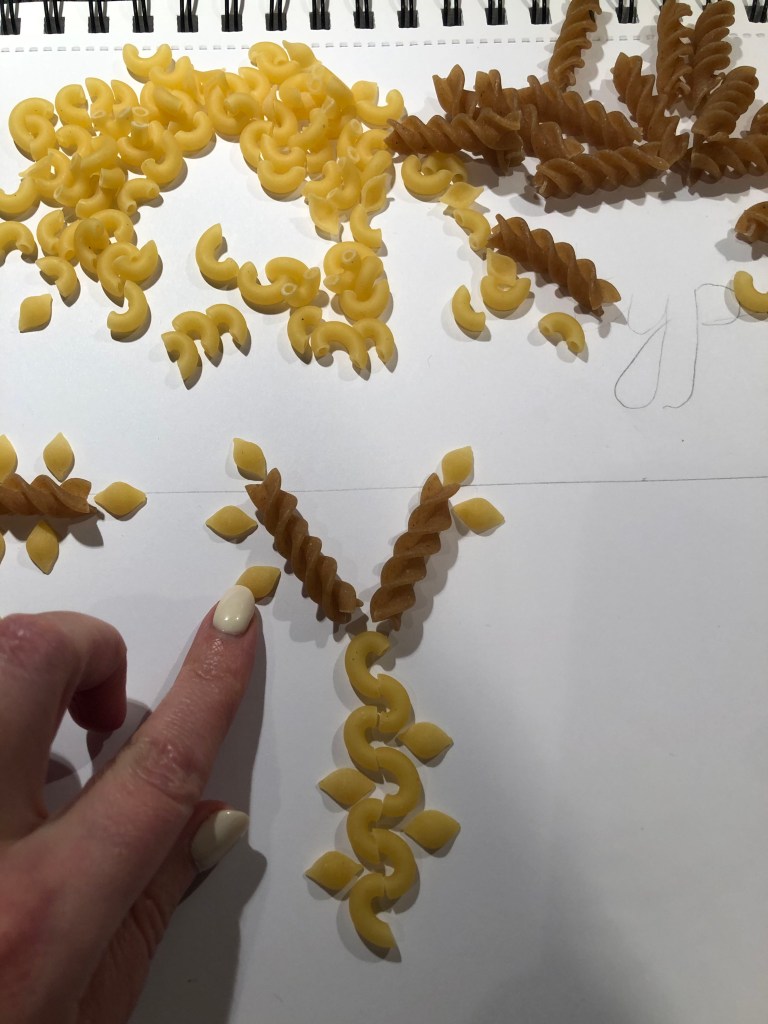
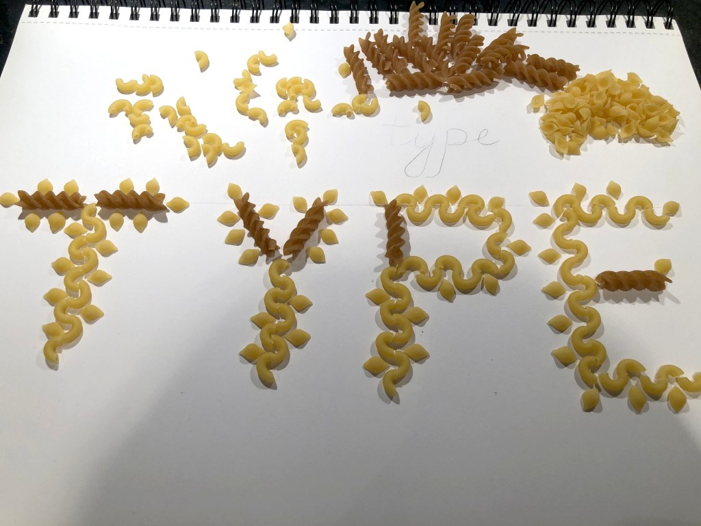
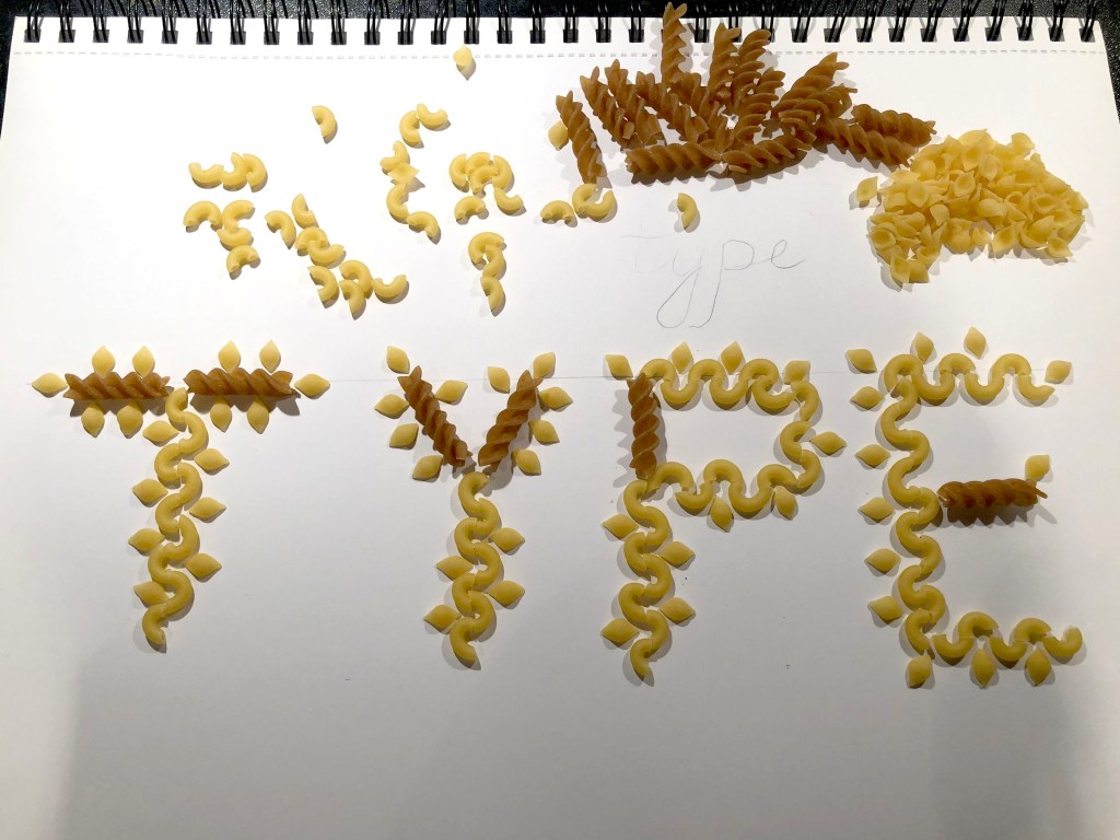
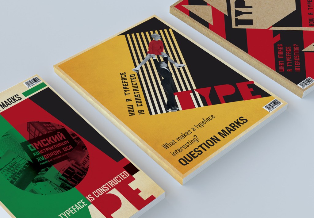
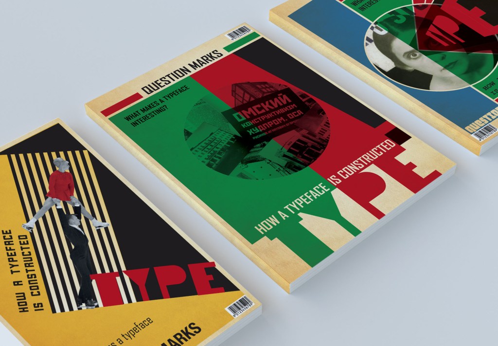
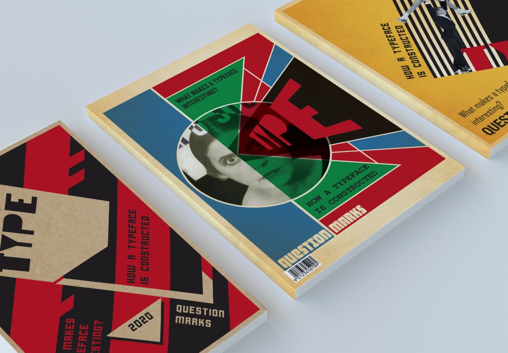
Penguin Books have asked you to design a new house style for a collection of books on design for children and young people. They are starting with three titles: Colour, Typography and Photographs. You will need to produce three covers (front, back and spine). The designs will need to be recognised by readers as a series and at the same time be appreciated on their individual merits. The book dimensions are 190mm wide by 225mm high. In addition they have asked you to produce the one on typography called A is for… It doesn’t have to be a conventional text book. Create an introductory chapter of at least 4 pages that is visually interesting and will entice young people into wanting to buy the book and read more about the fascinating world of typography.Brief 2: Promotional design
OCA Graphic Design Core Concepts
A youth theatre club is performing a production of Abigail’s Party. Mike Leigh’s tale of suburban taste is set in the 1970s and explores middle class aspirations and preoccupations. You will need to acquaint yourself with the play if you don’t know it already, as they are particularly keen for it to have a 70s feel. The play will be touring local theatres for a month, performing every Friday night and Saturday matinee. Produce a poster (A3 portrait), a flyer (A5 landscape, double-sided) and newspaper advert (A6) to promote this event. In addition they would like their A5 programme cover to continue the design theme. For the purposes of this brief you need to invent dates, times, places, names and any other information you think will be required. Use Lorum Ipsum text for areas of body text.
Brief 3: Charity work
The Gerald Anthony Furniture Store is a charity that helps poor and displaced people furnish their homes with the basics. It has been running for over 100 years, staffed mostly by volunteers. They would like you to design a generic business card, letterhead, and paper mock up for the home page of their website. In addition they want you to design their 8 page annual review.
The review will consist of:
• front cover
• inside front with a bit of blurb about their history (90 words)
• the chair’s report (365 words)
• the co-ordinator’s report (300 words)
• the treasurer’s report ((260 words)
• a graph or design to show the breakdown of income and expenditure
Income Expenditure
– local authority grant £48,927 – direct charitable expenditure £113,192
– grants from trusts £66,750 – fundraising costs £6,655
– donations £14,655 – management and administration £10,924
– other £4,032
• a page giving the names of the main grant funders (20 in total with each name about three words long) and a list of the management committee: chair, treasurer, co-ordinator secretary and five
other members,
• the back cover with an advertisement to encourage people to volunteer. Maybe the biggest challenge of this brief is to solve how to break up and lay out the text in the 8 page document. Photographs will need particular care as some people who benefit
from the charity may not want to be identified.
Abigail’s Party Researches
For the final fifth assignment I had a choice to decide which one of the brief is the most attractive to me. I would probably say that I went to the choice of the theatrical poster “Abigail’s Party” with no doubts. The reason why I’ve deiced to design “Abigail’s Party” poster because it has a feel of 70’s that my future design potentially could bring. It has some original themes, colours, and shapes, that I have not discovered before. My original thoughts were that I’ve done book cover design earlier, where I produced some designs for the Michael Bulgakov books, the branding for the charity organisation “Chance” was done recently as well, but in the case of “Abigail’s Party” I had an opportunity to create my own vision of the 70’s theme, something new to try. That style, starting from the colour shades of orange to brown, with some additional colours of pastel green and blue, the feel of theatre, acting and performance, the art-deco style in some design elements, was all that would catch my attention to produce designs straight away. The challenge that I had was based on the fact that I’ve never heard of those BBC series, or have never seen that performance itself, so first of all I need to familiarise myself with the play online.
Abigail’s Party is a play for stage and television, devised and directed in 1977 by Mike Leigh. It is a suburban situation comedy of manners and a satire on the aspirations and tastes of the new middle class that emerged in Britain in the 1970s.
The story itself sounds like as satire, with aspirations and tastes of the emerged middle class families from 1970s.
I had some researches online, and I found that the story about woman calls Beverly Moss who invited her new neighbours, Angela and Tony, who moved into the road just two weeks ago, over for drinks. She has also invited her neighbour Sue, divorced for three years. Sue’s fifteen-year-old daughter Abigail was holding a party at home. The party starts off in a stiff, insensitive, British middle-class way gather. The tension escalates when Beverly and Laurence start sniping at each other, and some issues in their family could be seen. As Beverly serves more drinks and the alcohol takes effect, Beverly flirts more and more overtly with Tony, as Laurence sits impotently by. During the all performance could be see Sue’s anxiety over her daughter’s party. After a tirade about the artwork Wings of Love, Laurence collapses a fatal heart attack.
Source: https://en.wikipedia.org/wiki/Abigail%27s_Party
Pinterest Board
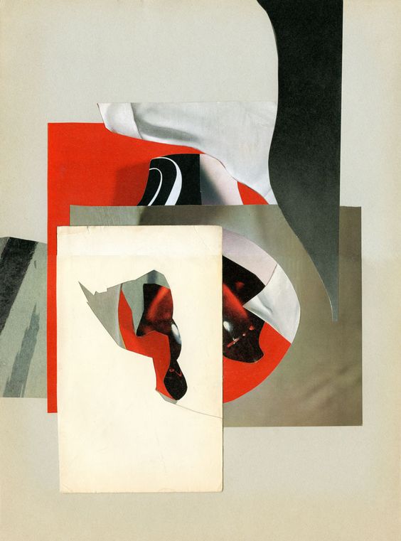
After my primary researches on the scenes, I proceed to the usual Pinterest Mood board creation. I’ve gathered all photos from the play, illustrations for the similar subject posters, also some geometrical parts from the ’70s. It helped me to pick up some inspiration and feel of the art from that decade. I really loved those warm colours that designs could bring, the dominating colour was orange, yellow and brown, with dynamic decorative fonts, in the style of disco. I tried to find some new ideas from the 1970s in general, where I found lots of psychedelic creative posters with unusual compositions and wonky fonts placed in circle composition or in angle. I’ve learnt lots of patterns that I could apply to my designs, and some cartoon style objects.
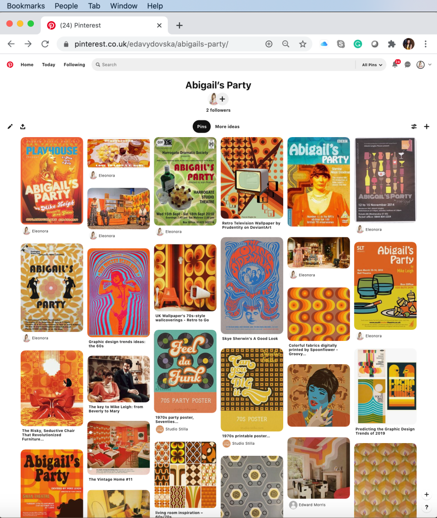
Examples for theatre poster
Further down in my researches I wanted to analyse closely how artists approached similar brief. As far as I could see there were numerous representations of original Mike Leigh’s version from 1977, and the performance was covered by different theatres on modern times.
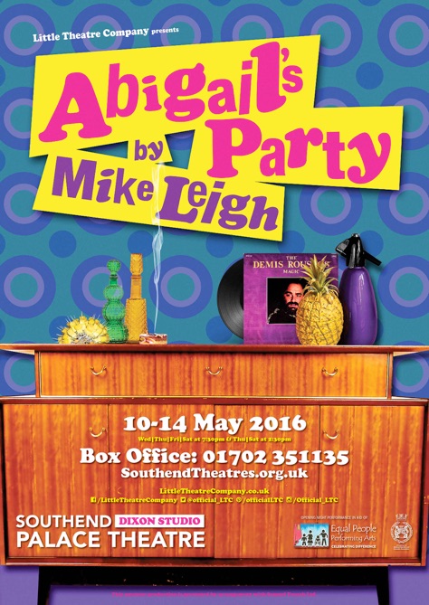
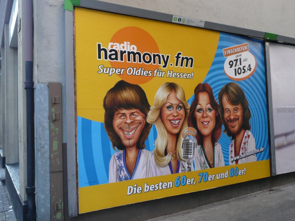
I could see how different designs were, and the way they stand out individually. For example, the feel that Southend Theatre brought was a visualisation of house interior from the ’70s, with some round shapes wallpapers and dynamic different angle font. In this poster, I really loved the brightness of the colours, and their contrast, I think it had a similar approach as magazine’s about gossips would do, to attract potential customer attention. Which was definitely achieved in this poster.
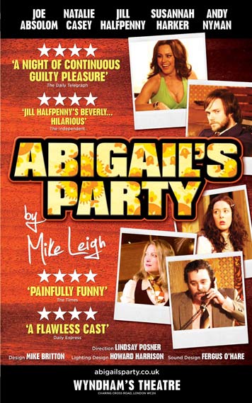
Another design with polaroid photos had the feel of film advertising, it had a more modern feel, the photos themselves looked quite modern, maybe because of the layout that they were placed, and font’s choice was quite modern as well, narrow and san-serif. Advantage of that poster was the clarity of reading the information.
Poster with vector illustration only is one of my favourites in this collection. I was surprised how those minimalistic elements, with an object in black outline, could work for the theatre poster from South London. Space was divided into two parts, and the elements of the still life are quite balanced in here. The name of the play probably as too small in my preference, maybe that composition itself looks too static, but I think that was the idea of design itself. Overall this poster works well from my point of view.

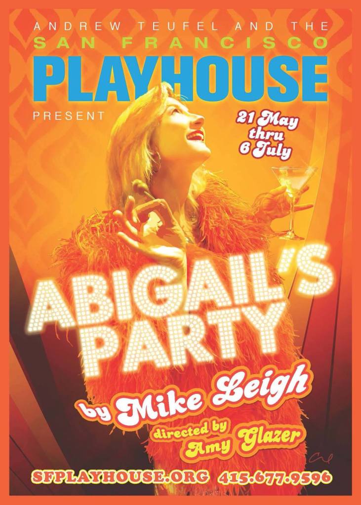
The fourth poster probably was made in the most professional way from my point of view. It has an original font for the name of the play, with some shiny light around it, it has needed background with traditional ‘70s pattern, the main character Beverly is cheerful and enthusiastic. But the main point of that poster is that it has that melting combination of the modern poster with the ‘70s feel, as we don’t want to go to old-fashioned, but we still want to bring the feel of the performance.
1970’s Inspiration
In additional to my researches about theatrical poster style I went to the Bridgman images for some famous art to catch up with original style of artists from the ’70s. I’ve noticed that mainly where used some of the warm brown shades with some original shapes. That image below was created by British artist of his generation Gerald Laing (1936-2011). His paintings of film stars, dragsters, and other icons of popular culture place him as a major figure in both the British and American Pop art movements.
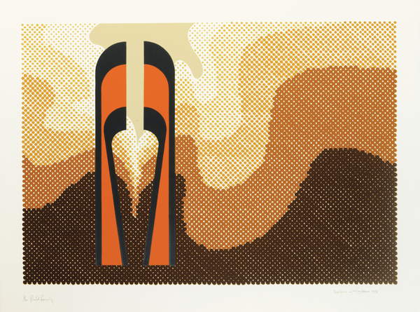
Sculpture in the Landscape, 1973 (colour litho)
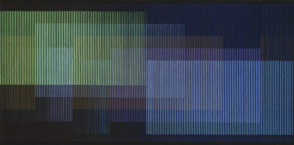
These are another interesting example’s from innovative Venezuela’s artists Carlos Cruz-Diez and Blue-Green by Mexican artist Gunther Gerzso. Carlos Cruz-Diez was an artist and member of the Op Art movement whose work focuses on the kinetic energy of color. I thought they are another examples of art that stands out from 20’s century, where could be seen that artists were experimenting with colours and shapes.
Physichromie No, 1970 (mixed media on board) 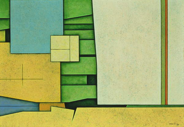
Blue-Green, 1970 (oil on masonite)
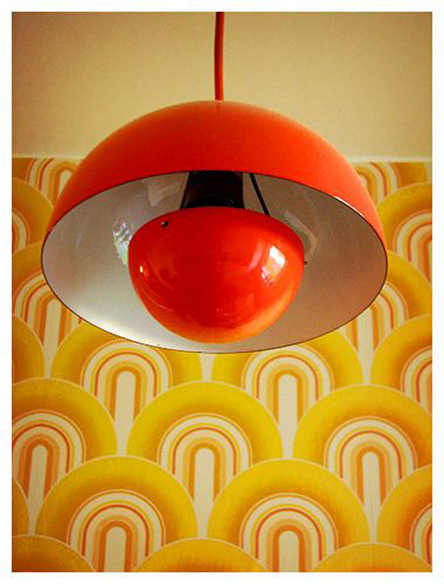
Another example one most influential 20th-century furniture and interior designers Verner Panton. During his career, he created innovative and futuristic designs in a variety of materials, especially plastics, and in vibrant and exotic colours. I love his experiment with vibrant colours and unusual shapes.
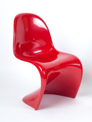
Vintage Red Panton Chair by Verner Panton for Herman Miller
https://www.pamono.eu/vintage-red-panton-chair-by-verner-panton-for-herman-miller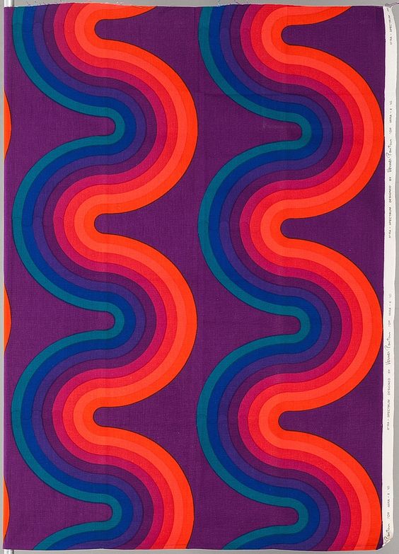
Verner Panton; ‘Wave’ Fabric Design for Mira-X, 1970s.
https://www.pinterest.co.uk/pin/490188740693966418/
These are more recognisable shapes and colours from ’70, those colours and shapes were used mainly in the people’s interiors, like on walls, decorative elements, or sometime even on clothes.


After my researches on the plot of performance, the characters, some examples of artwork that was used by other theatres, and influencers from 1970’s I felt that I’m ready to go to the next stage, creating mind map and some conceptual ideas for my poster.
Analysing the brief
Then I started analysing the brief. Here I followed the standard path, I needed to write out the keywords and tasks for this exercise. In total, I need to prepare materials such as:
- Poster A3 (portrait)
- A flyer A5 (landscape, double-sided)
- Newspaper advert A6 to promote this event
- In addition, the A5 program covers to continue the design theme.


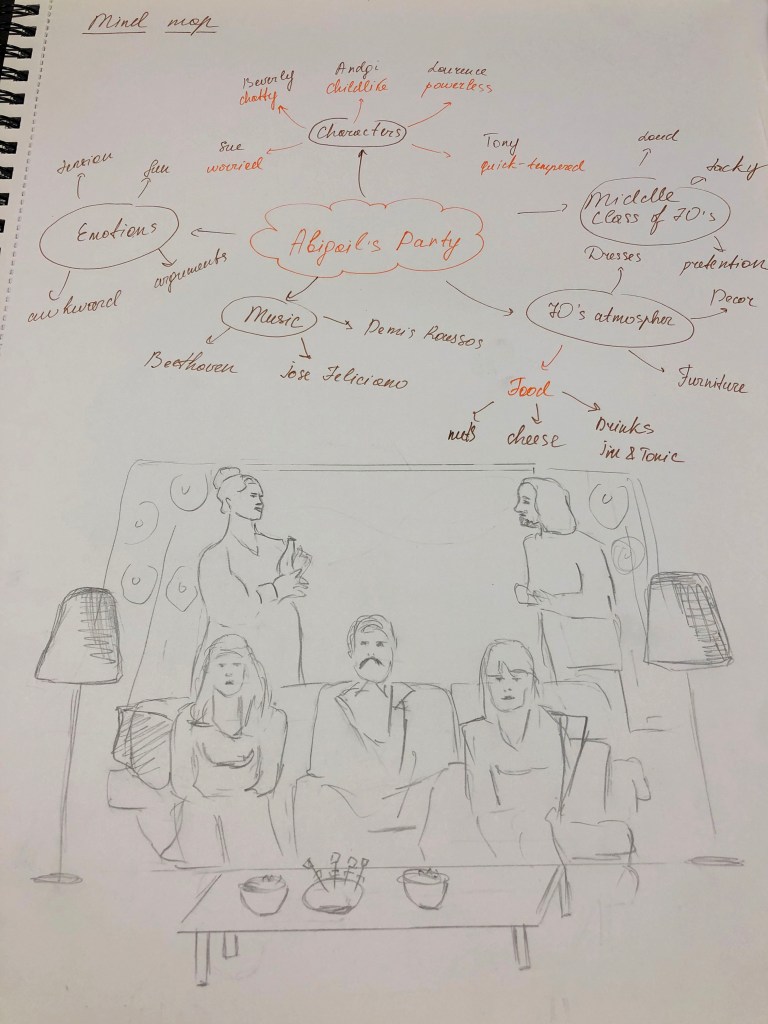

Another important part of the brief was to understand the characters. I felt I needed to get inspiration from the performance, to get the feel and vibes that this play had. I wrote down all characters into my brief, and overall I had a visual portrait for each person. I’m glad I watched the play, as otherwise, I wouldn’t get the right impression from this performance. Logically, the word ‘Party’ would lead you to some kind of fun, relaxed comedy, with some conversations that people would have while they serve drinks and chat, but originally that play had some tension, some hidden personal issues could be seen in the characters. The atmosphere was quite awkward, and other features that could be seen from the performance. I’ve noticed that each actor brought there originality and personality, they were completely different kind of people gathered together. For example, Beverly, chatty, nosy, she used to get what she wants, quite insensitive, she enjoys herself and loves being in the centre of attention. While her neighbour Sue was not feeling comfortable in that environment, felt anxious over her daughter’s party, she can’t say no to something, even when she doesn’t want to do it. Angela is childlike, not confident, listens to her husband’s opinion, who has a sort of influence on her. Angela’s husband Tony is irritable, moody, annoyed with her wife, polite to other people, but quite aggressive to Angela. Laurence, Beverly’s husband have completely different taste on music, art with his wife, which is quite common in the families, but they tend to argue over it, and Laurence lost his temper about it, which affected his heart at the end of the play.
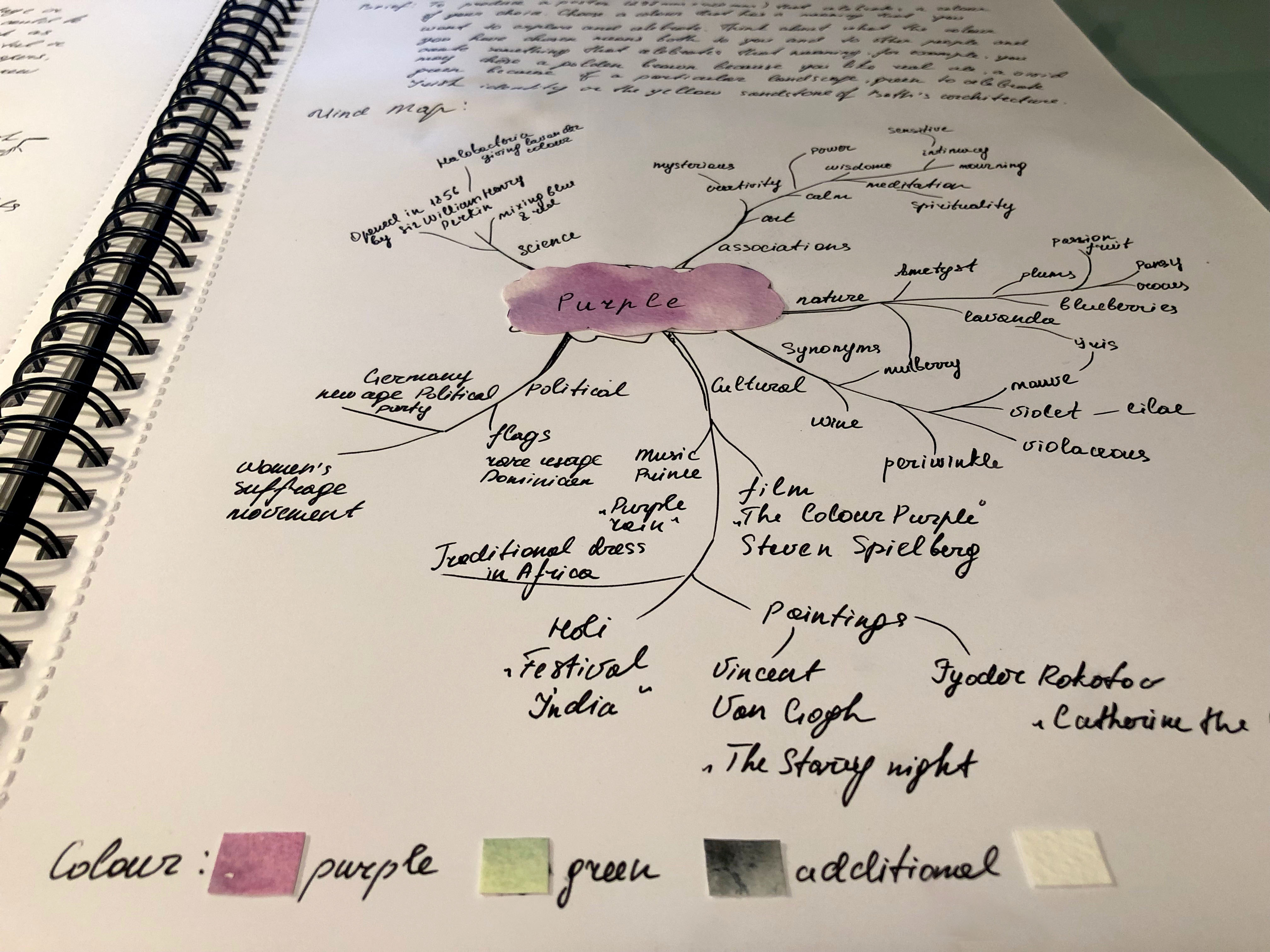
I have created few mind maps, one helped me to understand connections in the play, and some key factors in it, another one was main Mind Map with some ideas I could use in my sketches and future designs. I was thinking about what would I like to picture, wether it was to show some emotion in that poster, how many characters I want to use in design. I asked myself if I want to use some interior elements in my poster? What colours is this poster going to be? In the next part, with producing some sketches I was going to answer this questions.
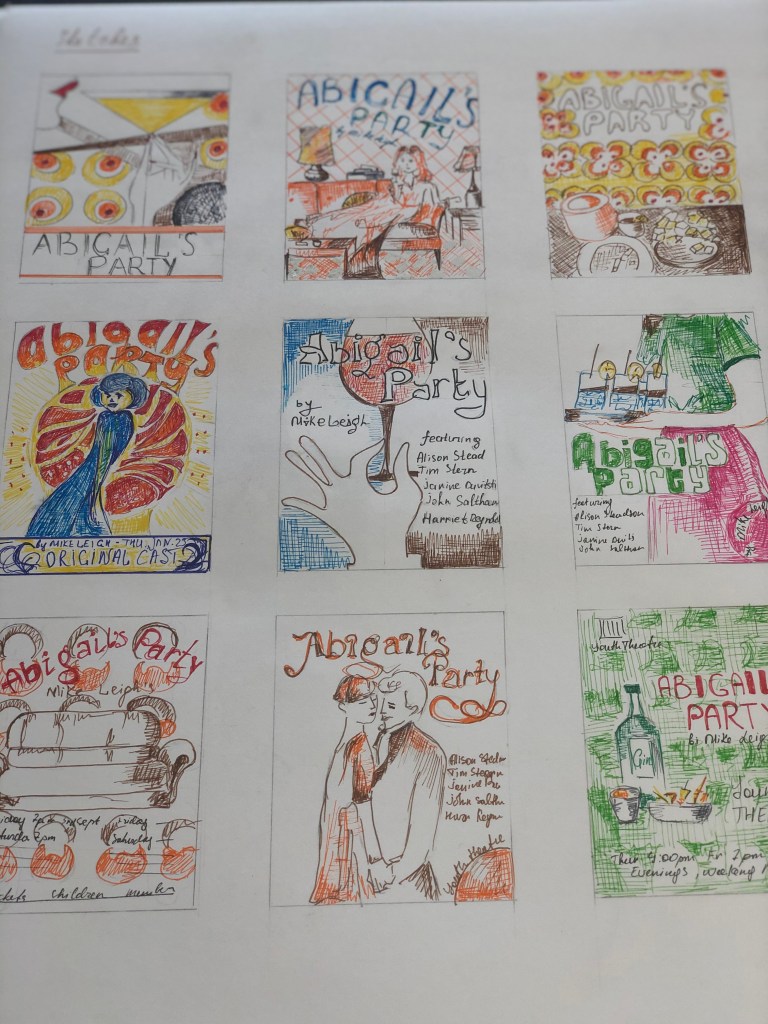
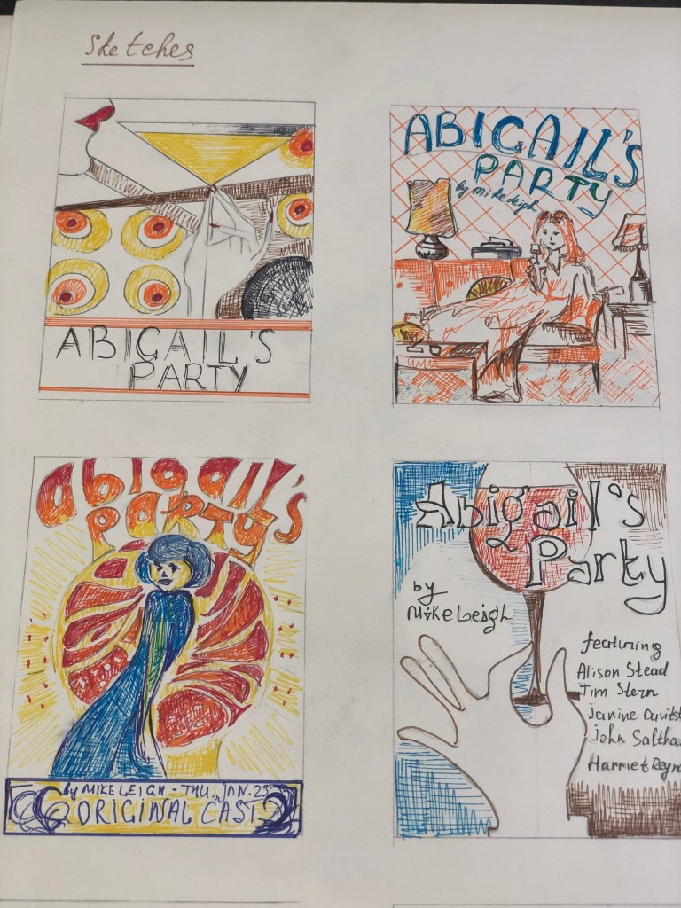
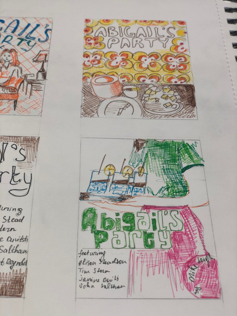
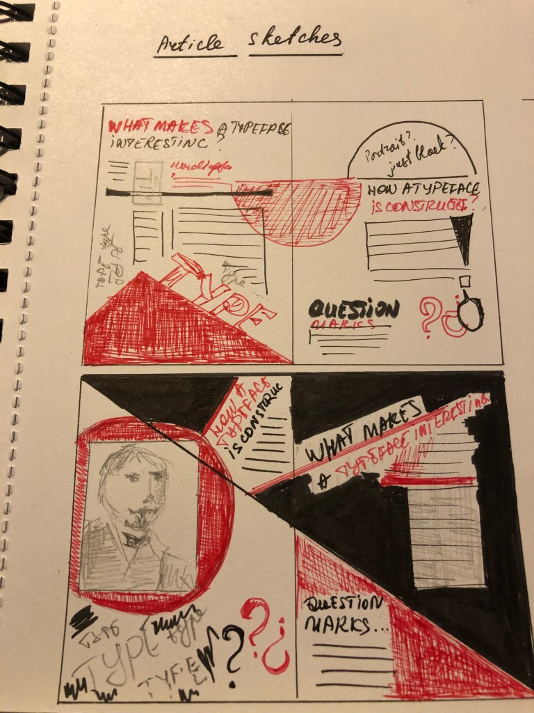
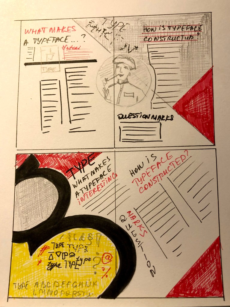
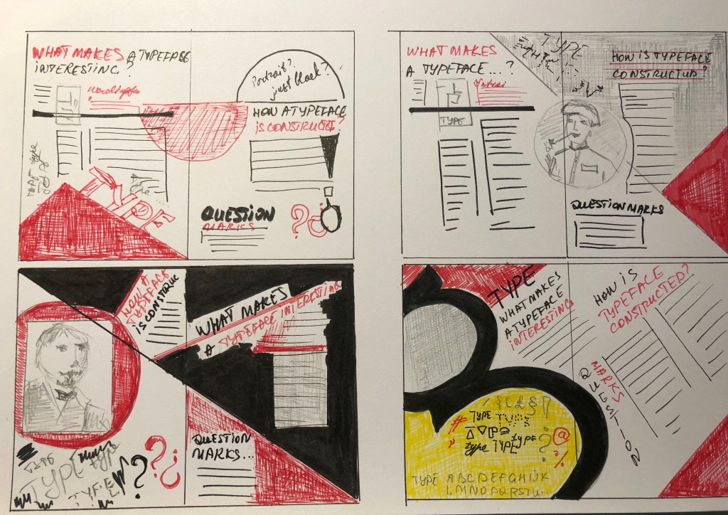
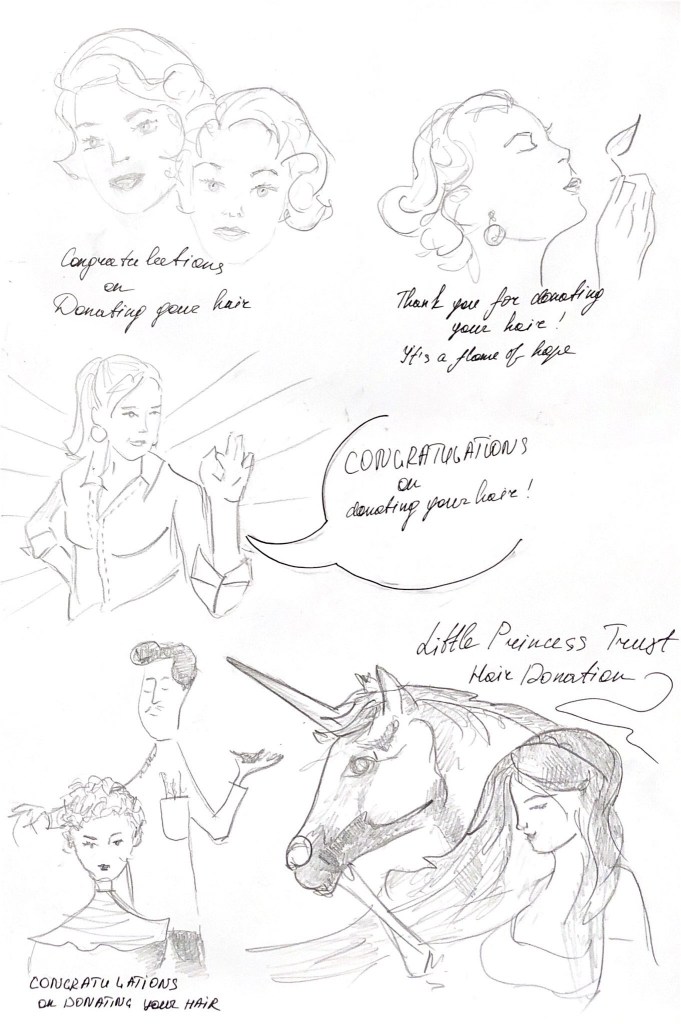
Sketches
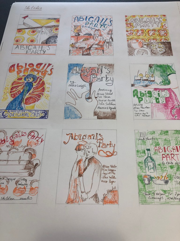
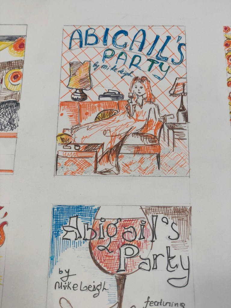
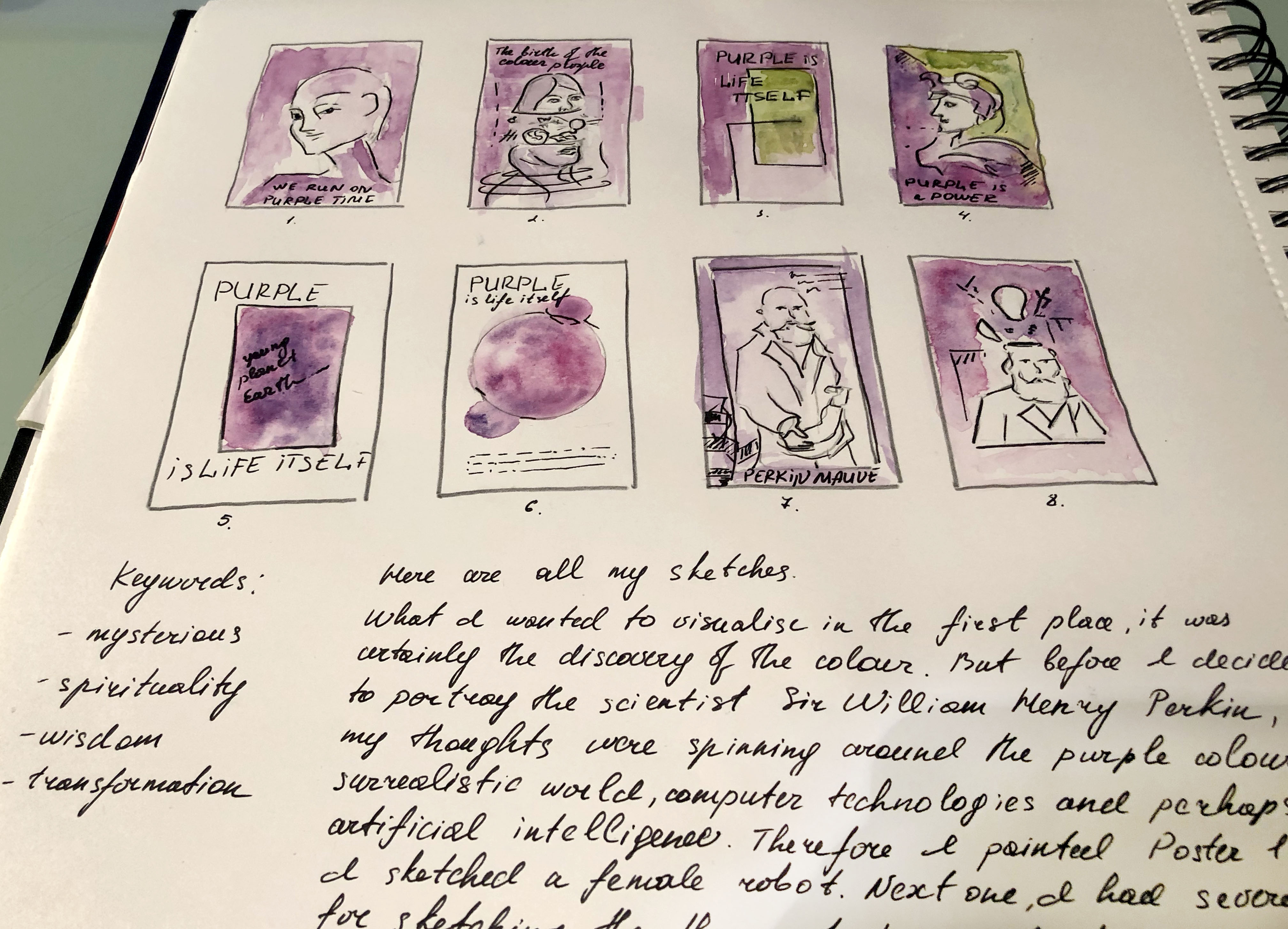
The next stage was to sketch my designs. I understood that they would help me to finally decide on the style of the future layout. I sketched some of my layouts using coloured pens. This technique helps me bring together some of the colour schemes in one layout, like yellow, orange combined with green or blue. I made the first sketch in art deco style, with straight lines and design elements from the ’70s, based on the image of an elegant girl with a glass of Martini. The composition itself is quite interesting, but it seemed to me that it does not reflect the spirit that was required in a brief. My next sketch is based on the image of Beverly sitting proudly on the couch, a full-colour image with a bold blue font for the title. But here I had a challenge if I could find a similar image, with the appropriate style. On the next layout, I depicted a table with appetizers and snacks, because so many details were given in the theatrical production to these appetizers, cheese, nuts, olives and gin and tonic. I also had an idea to portray a merry Beverly against a background of colourful elements in the style of the 70s, but perhaps here I would have needed to draw all parts of the design by hand since the idea was to display the design in vector. Also in my drawings, there was an idea to display a hand with a glass of wine, or an event guest with drinks. Also in this production, all the events took place around the brown leather sofa, which I thought to use in this layout. And lastly, a design with a dancing couple, as this production culminates in flirtation and sympathy between Beverly and Tony. I was not sure in what angle I would find the photograph I needed, but there was such an idea to display two people sitting in front of each other or dancing. I noticed that basically most of the posters from the internet showed only one girl taking in, I thought, what if I display a couple?
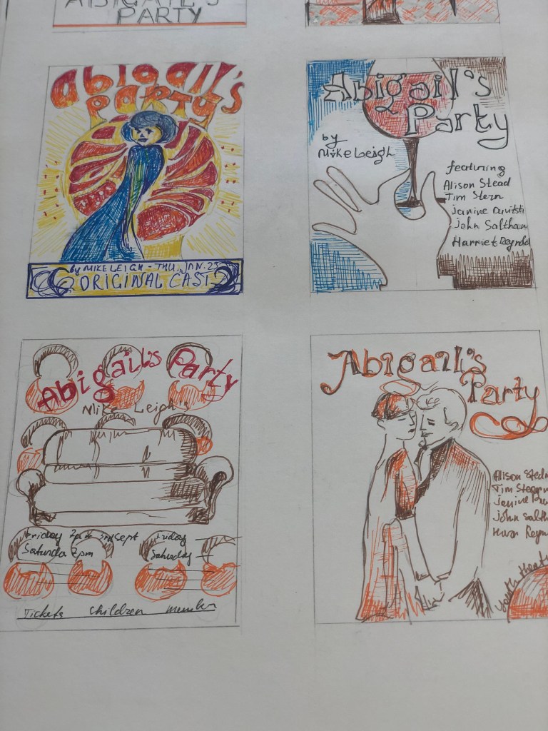
Then I was challenged to find the required photo of the couple. I recently discovered Alamy’s photo resource where you can find retro images. My attention was drawn to the photos of parties from the ’70s, where the girls were dressed in bright outfits, and the men were dressed in business suits and ties. I chose this photo for the future design, I liked the atmosphere in this poster, it is a little playful for this performance, but I planned to play this photo in colour to add more 70s style.
Photo resource: https://bit.ly/2E6MhWh
Steps of Design
Then I was challenged to find the required photo of the couple. I recently discovered Alamy’s photo resource where you can find retro images. My attention was drawn to the photos of parties from the 70s, where the girls were dressed in bright outfits, and the men were dressed in business suits and ties. I chose this photo for the future design, I liked the atmosphere in this poster, it is a little playful for this performance, but I planned to play this photo in colour to add more 70s style.
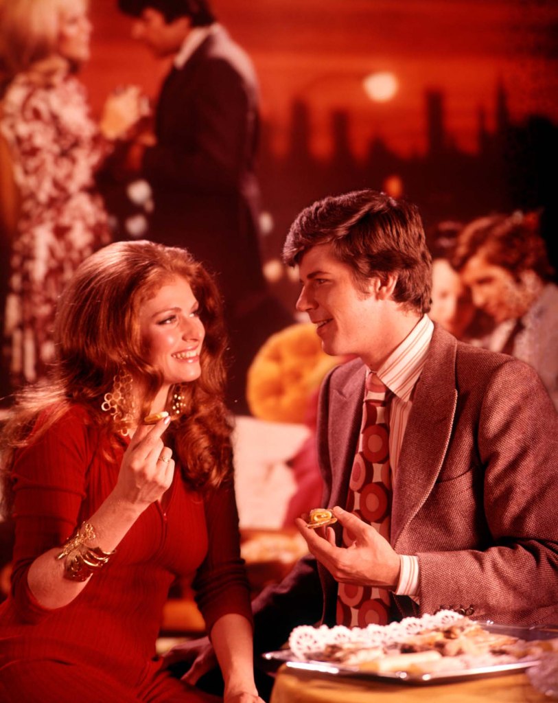
G6A74X 1970s YOUNG COUPLE MAN AND WOMAN EATING FINGER FOOD AT A PARTY
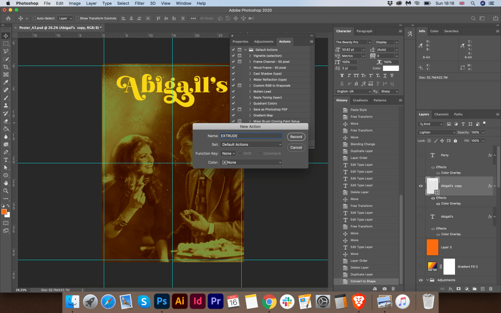
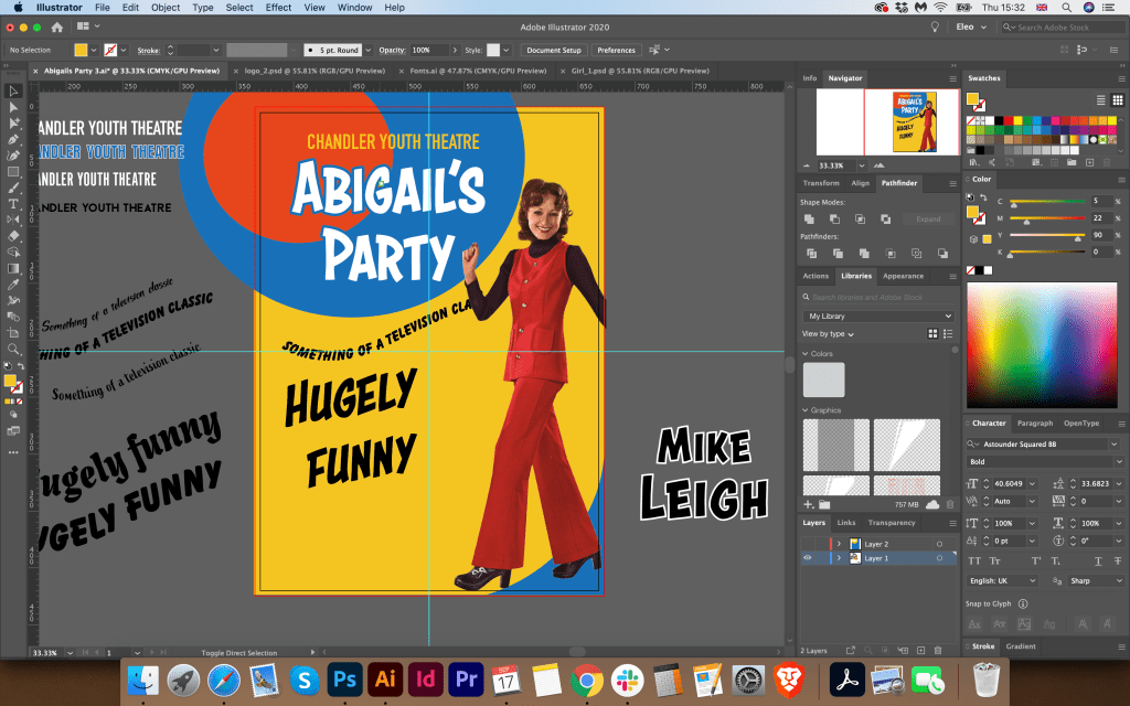
Before starting the poster design, I sketched the fonts that could be used in my design. I also drew a 70s style vector texture that could be used as a background for a poster. In my design, I wanted to focus on the font. I wanted to display such a beautiful ornate decorative font with bright capital letters in a yellow-red hue. I found such interesting fonts that I could not pass by. They seemed to be perfect for this poster. Their advantage is that, in addition to the standard spelling, there are glyphs in their properties, and there I could choose the required format for my poster. The font resource is Creative Market. Link to The Beardy Font:
https://creativemarket.com/Aiyari/2910174-The-Beardy
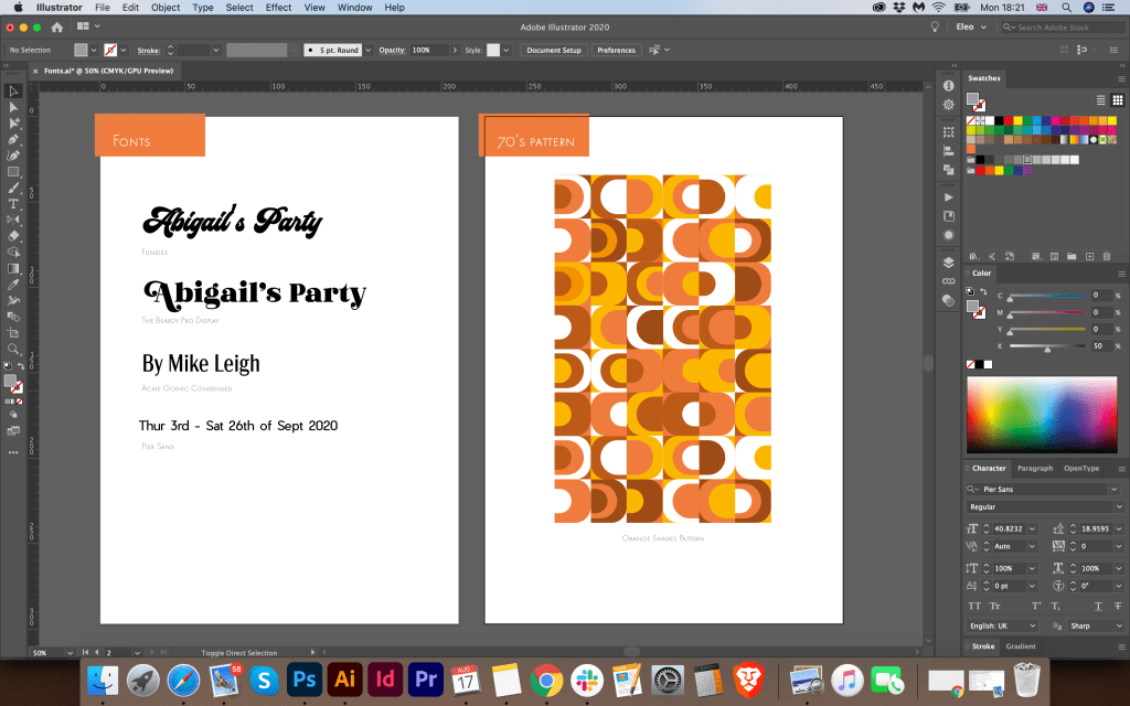

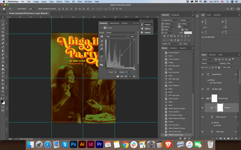
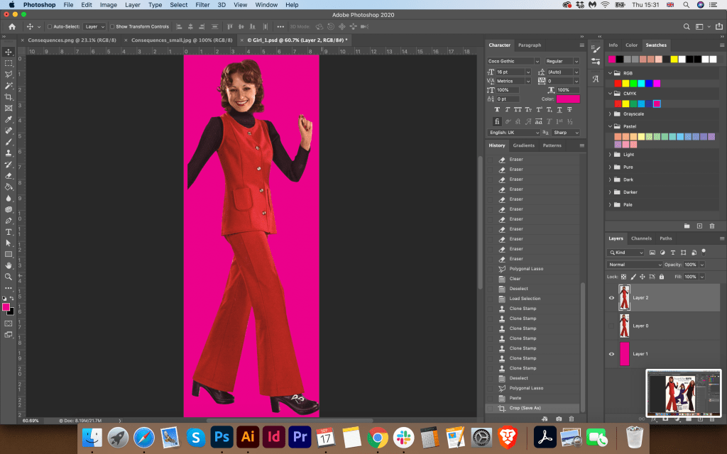
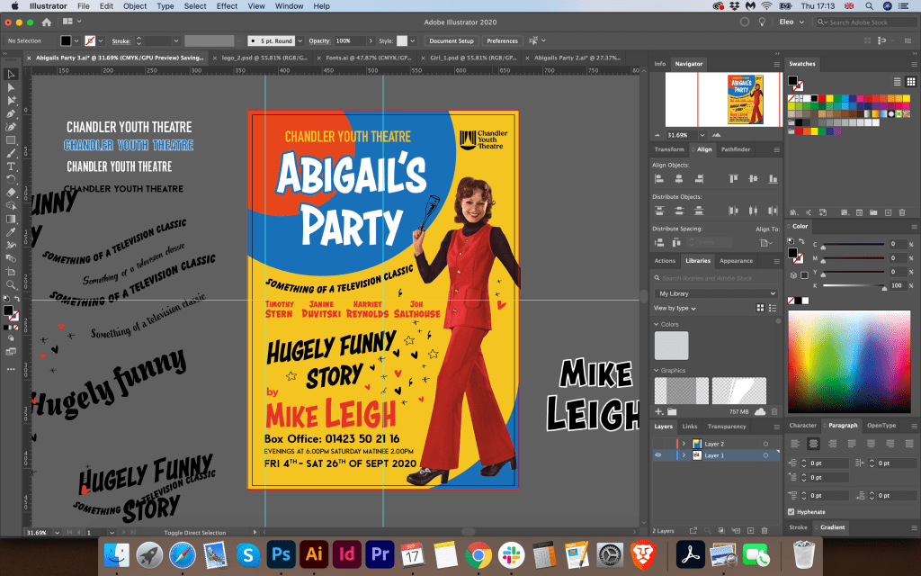
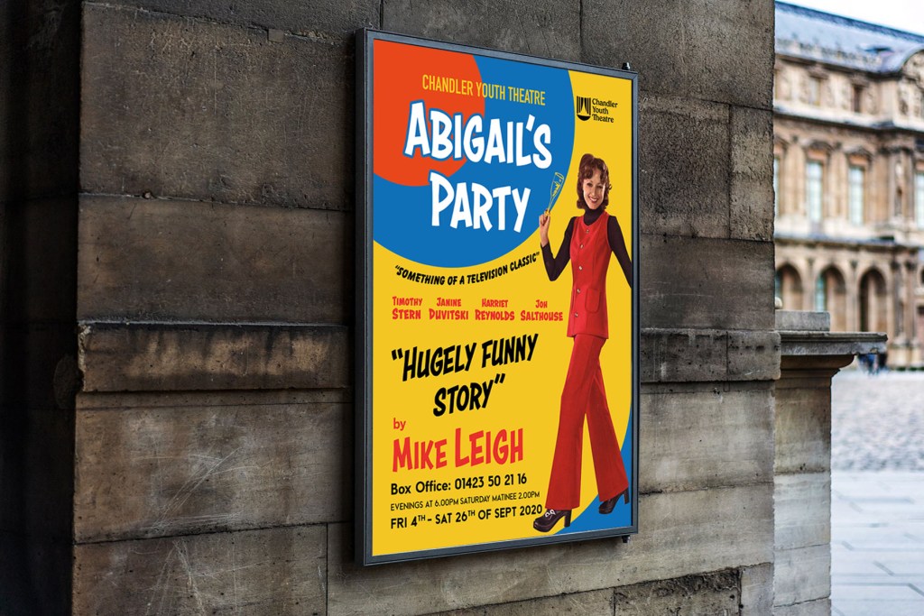
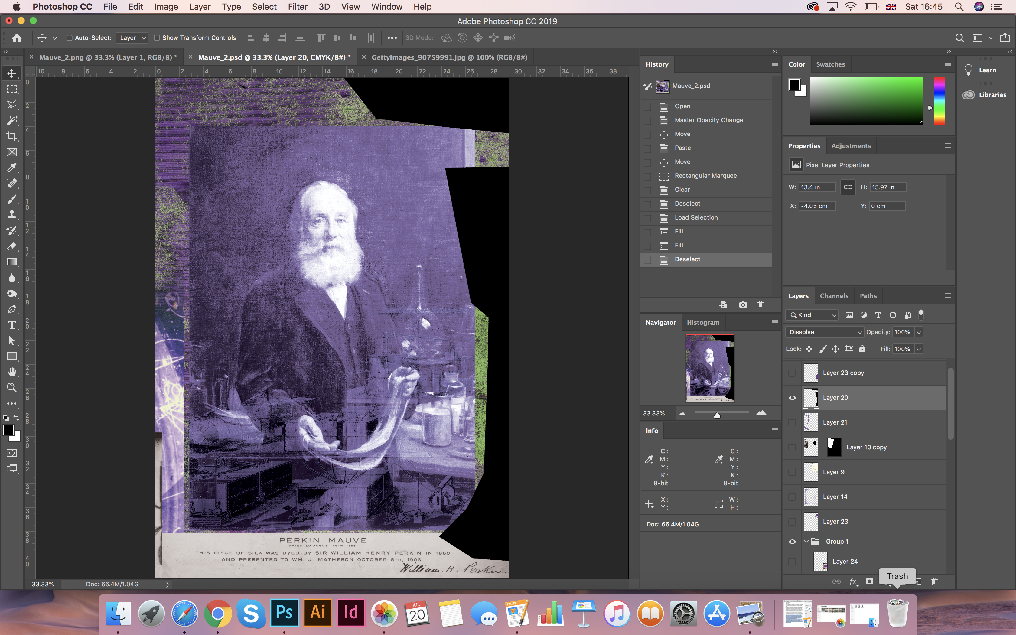
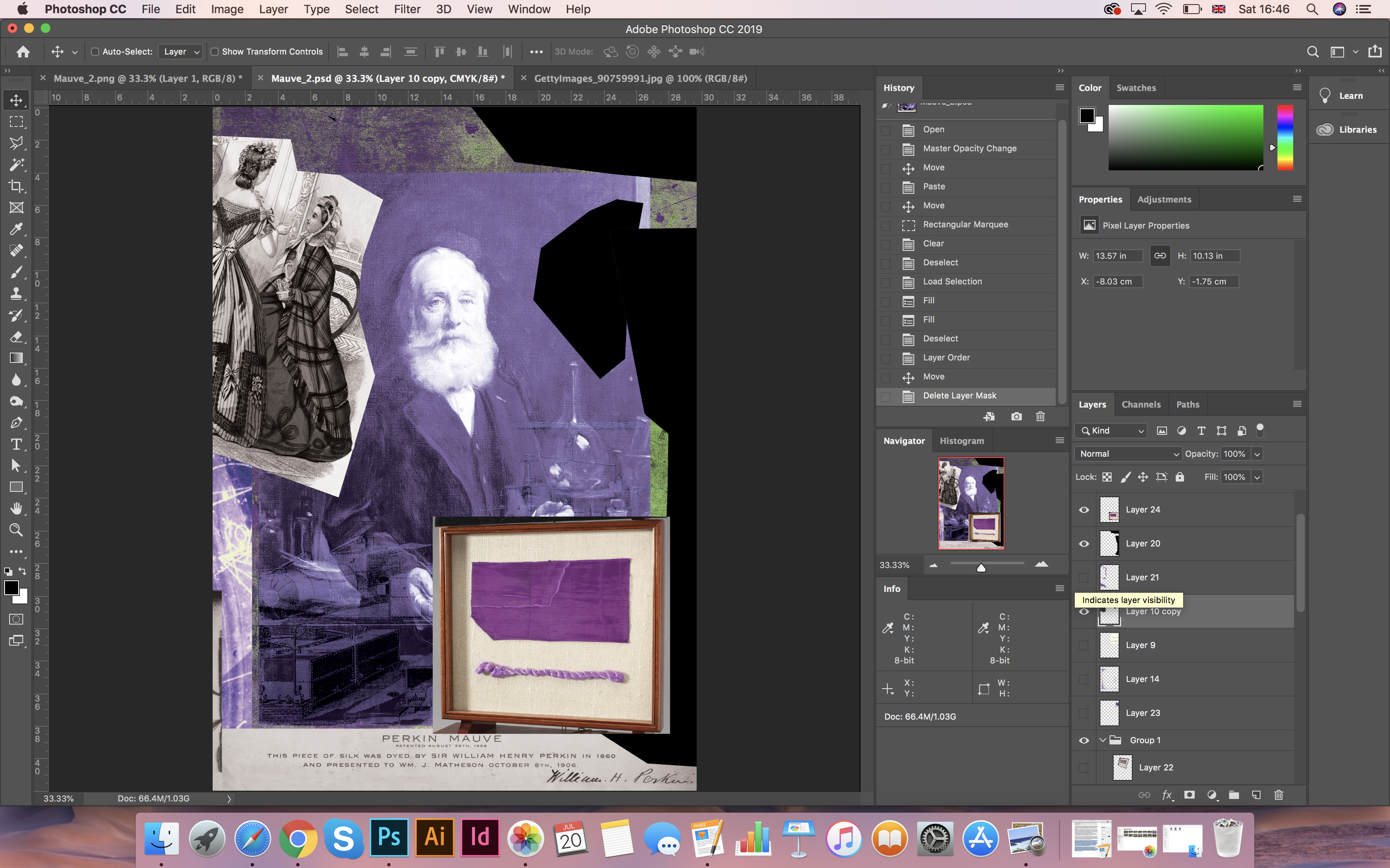
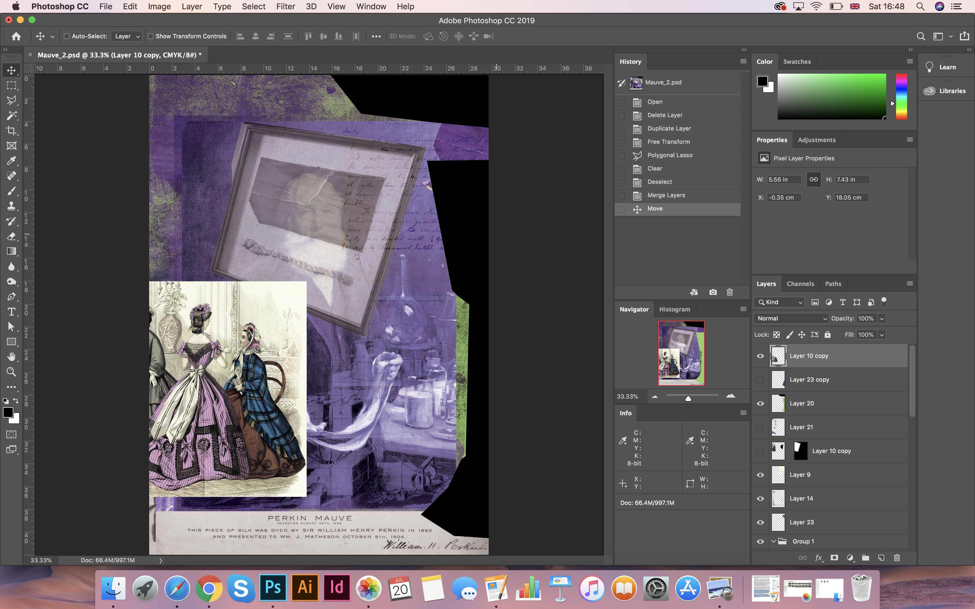
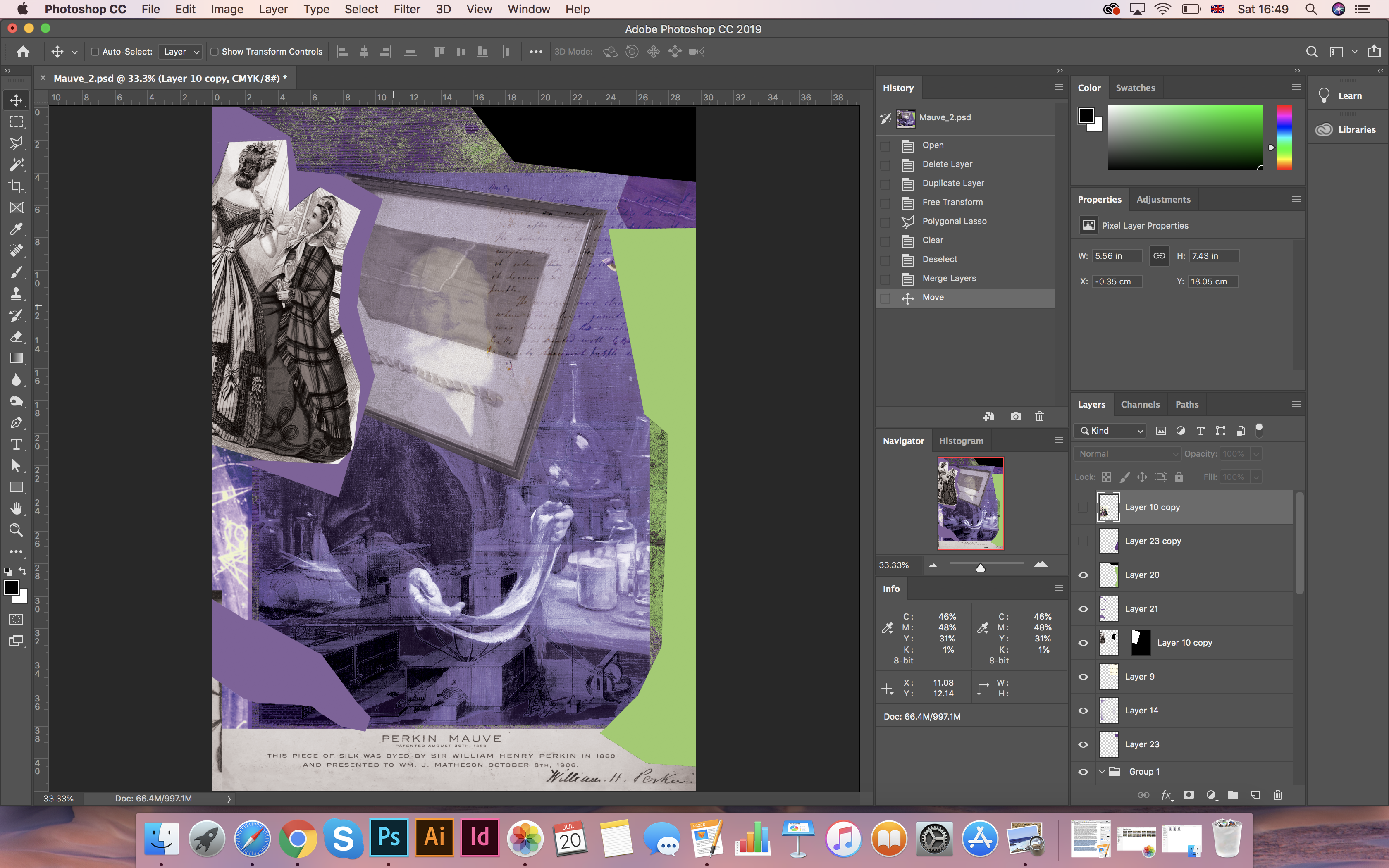
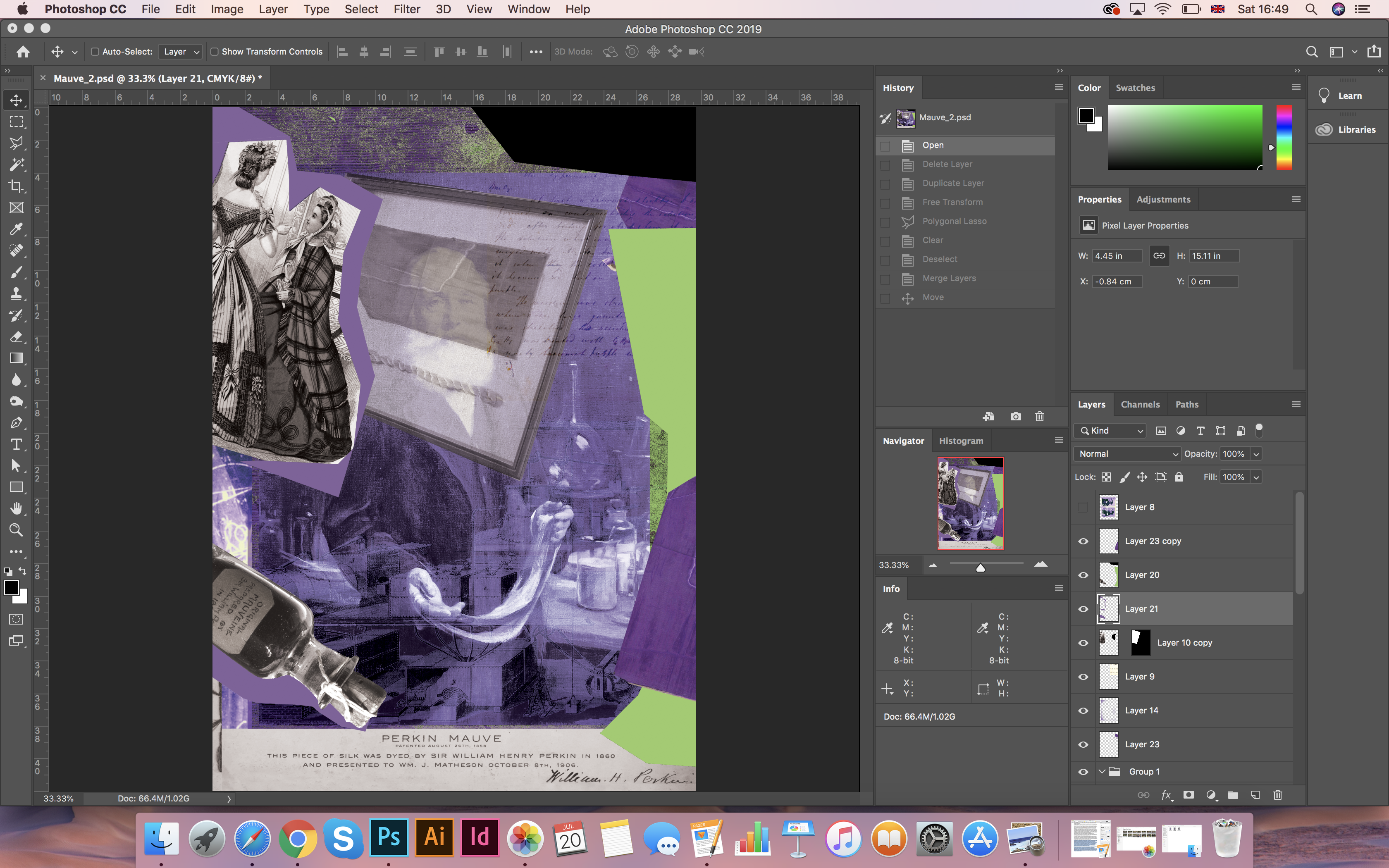
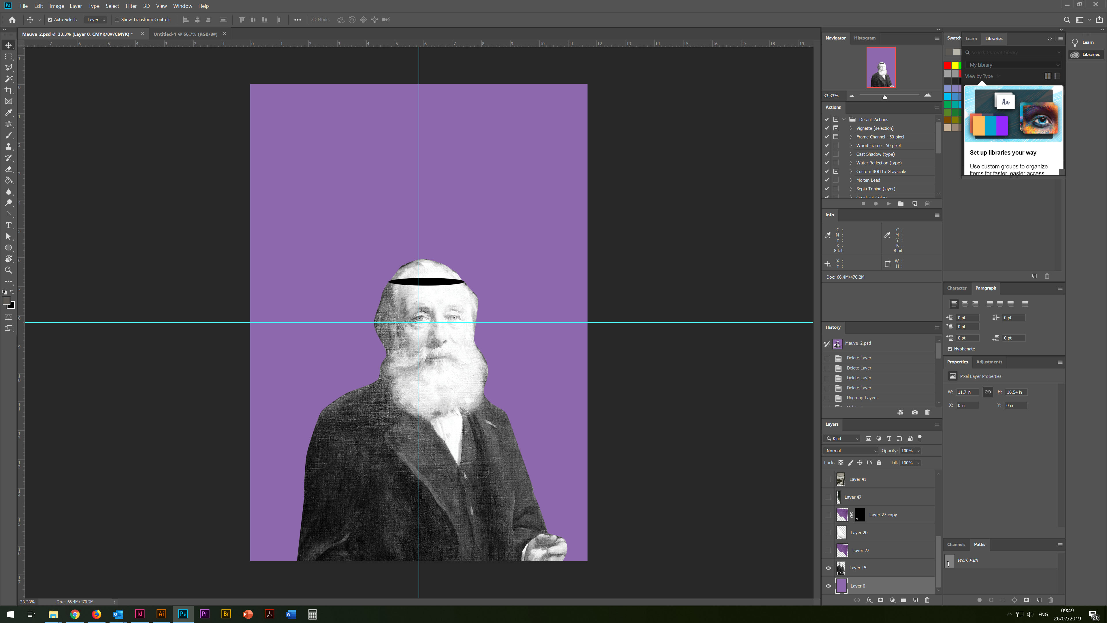
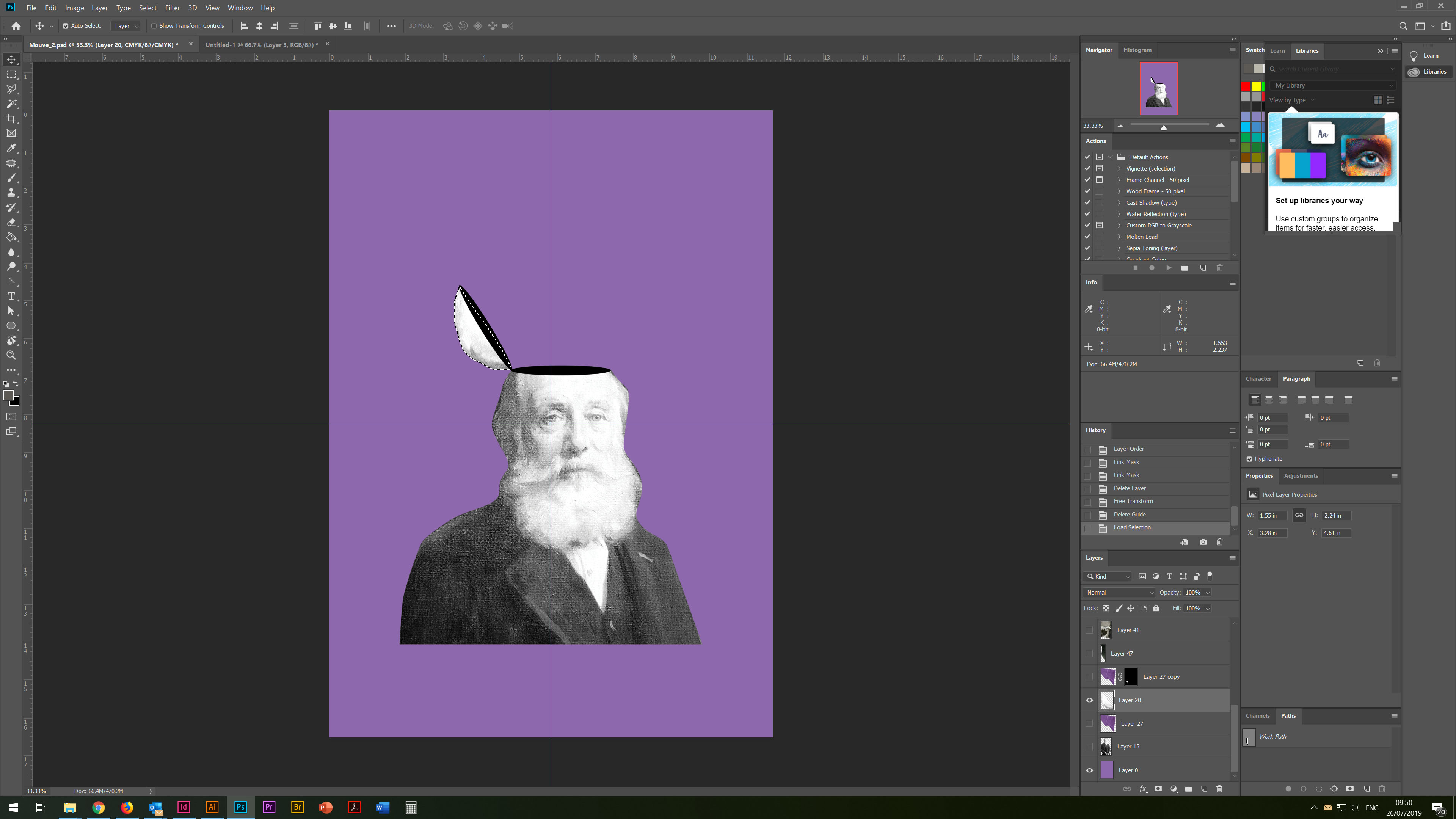
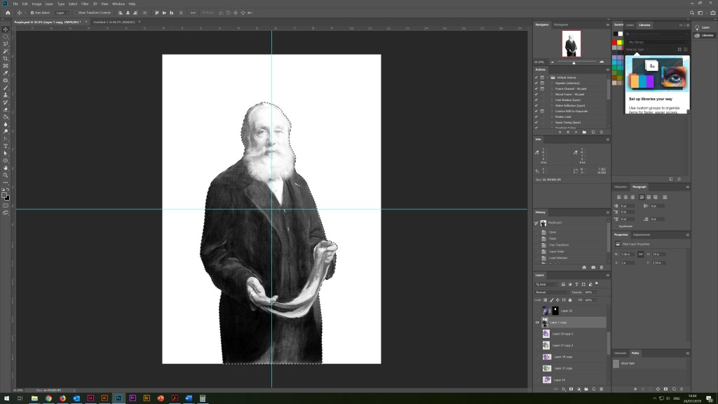
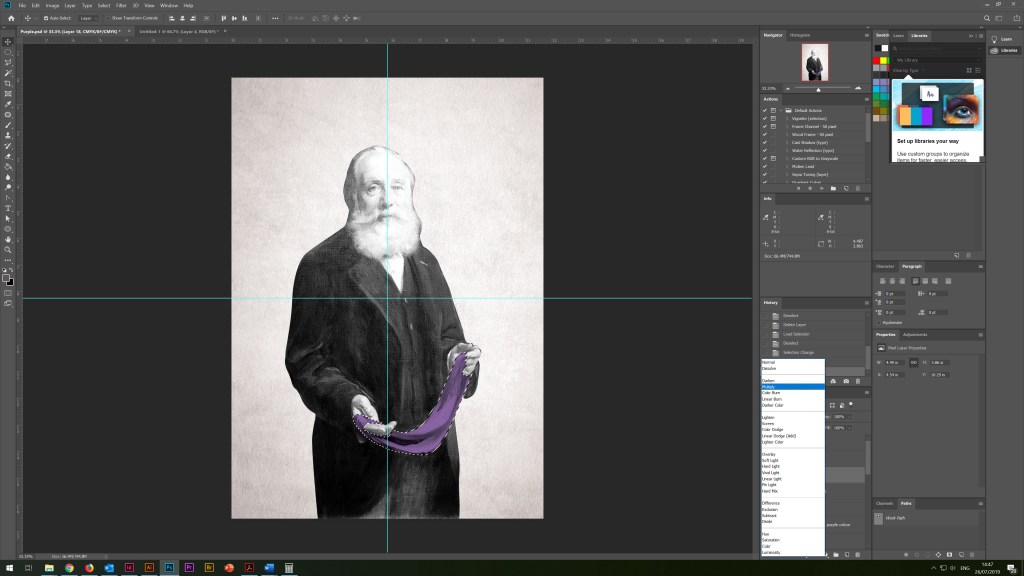
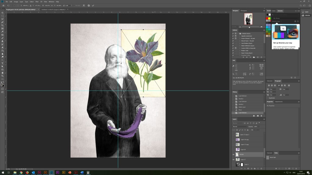
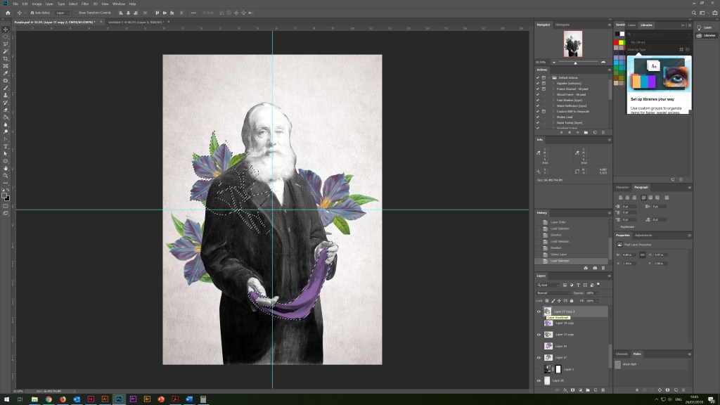
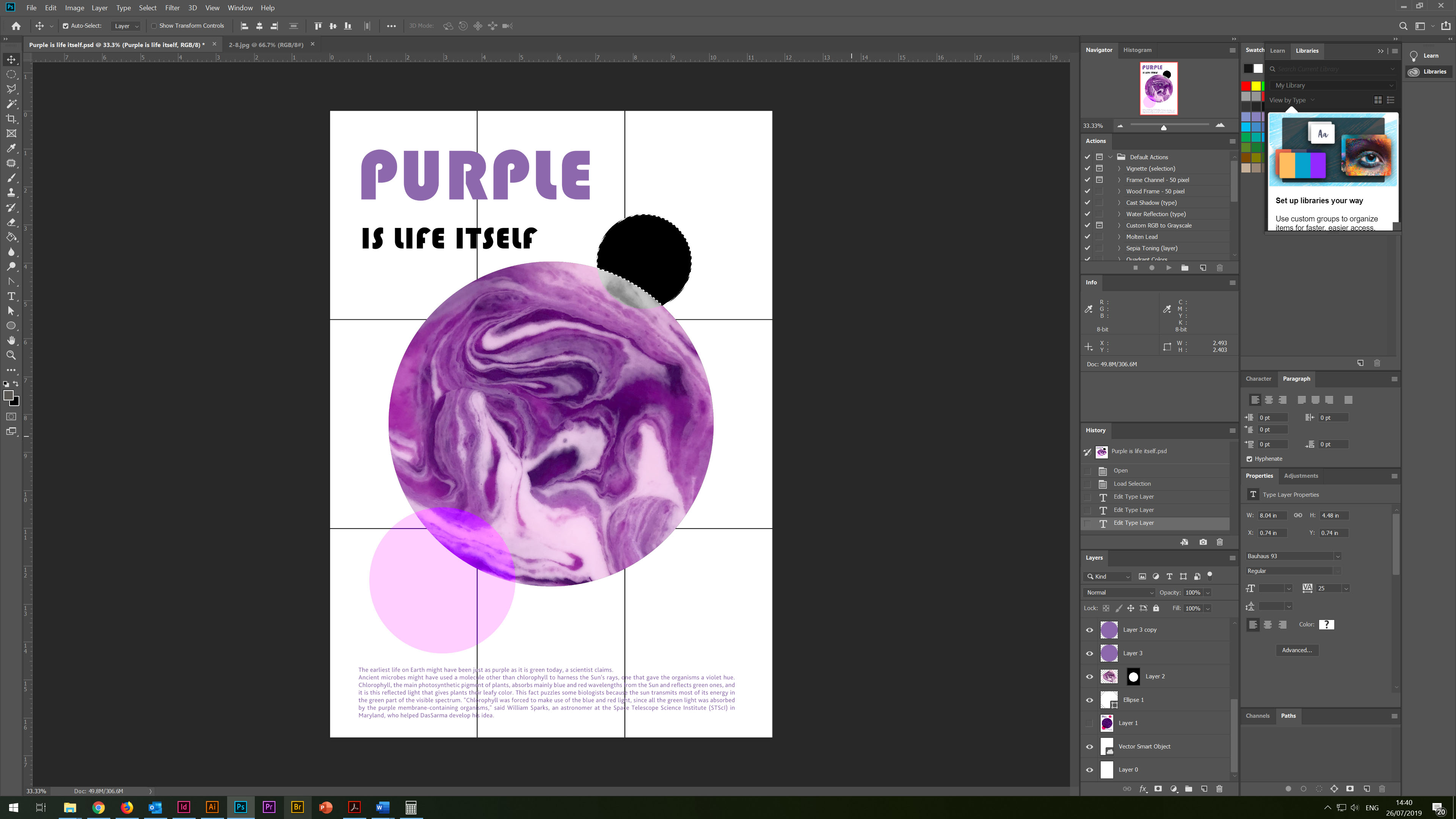
Then I started developing the design in Adobe Photoshop. First of all, I needed to process the photo in colour terms, and give it more muted tones, like sepia. The idea was that the more I dim the photo, the brighter and clearer the text information will be read from the poster. I have attached screenshots of the colour processing technique for a photographic image, with all the stages of applying filters, gradients and masks. In the process, you can see how I brought the photo from black and white photo to muted sepia. I also rendered the font, with a 3-D illusion, overlapping the font under each other.
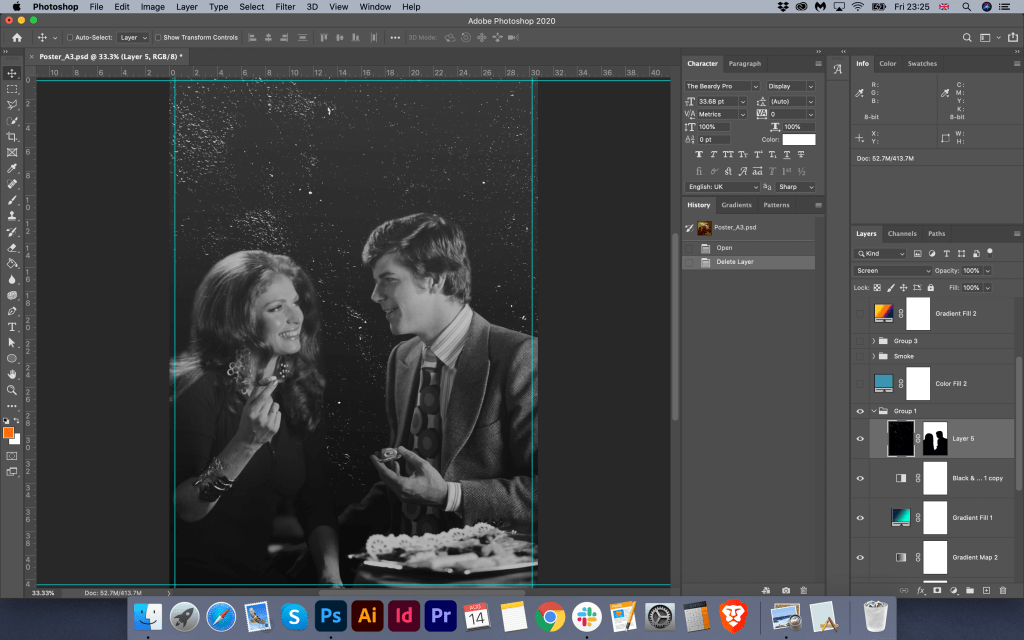
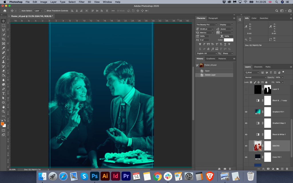
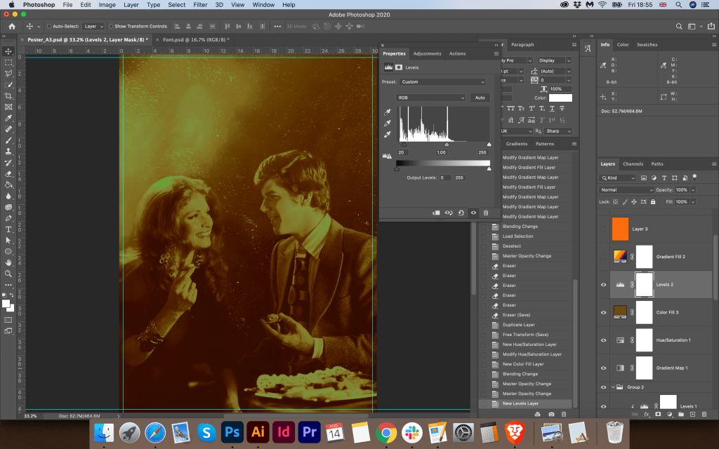
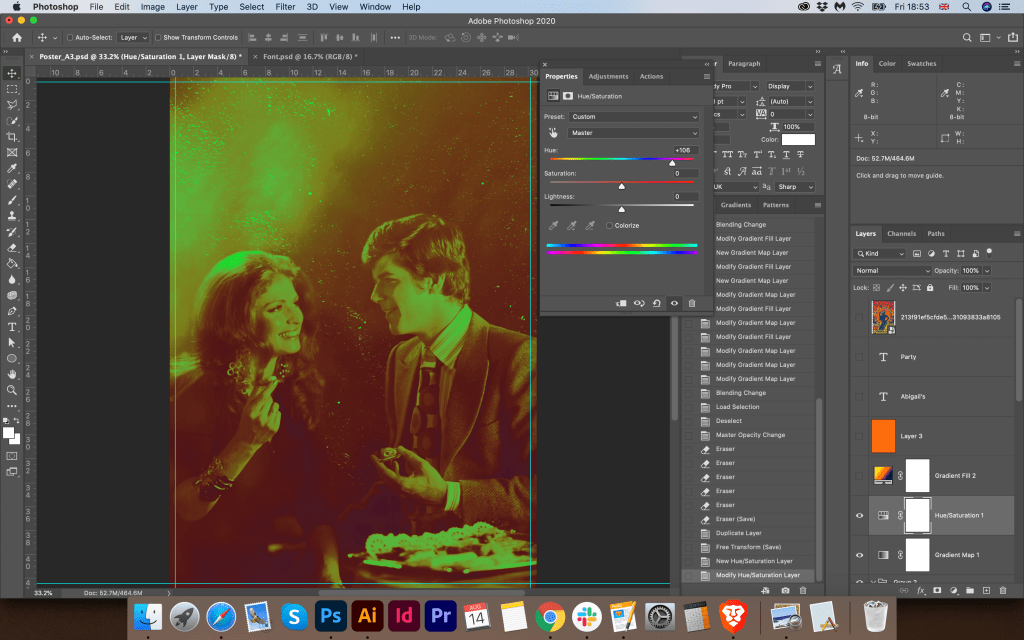
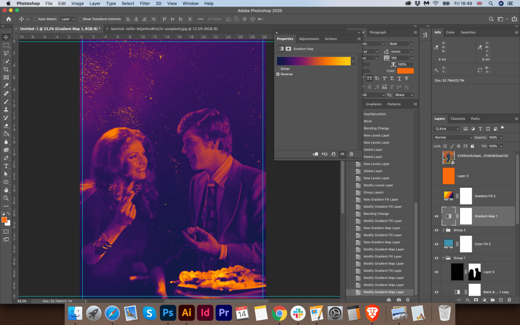
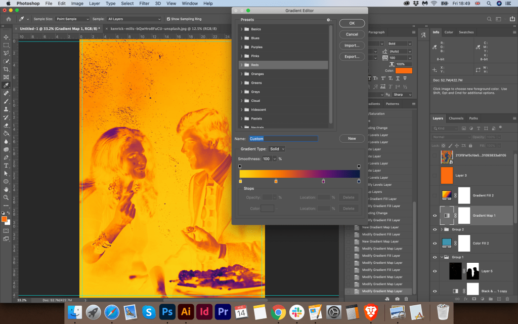
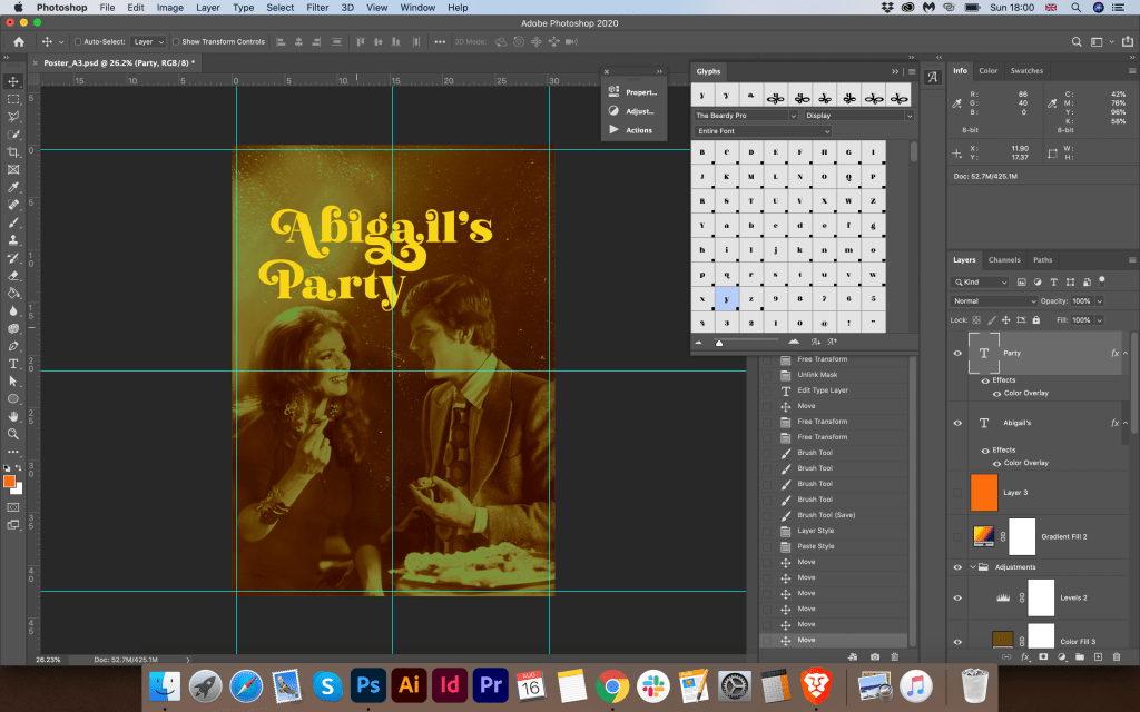
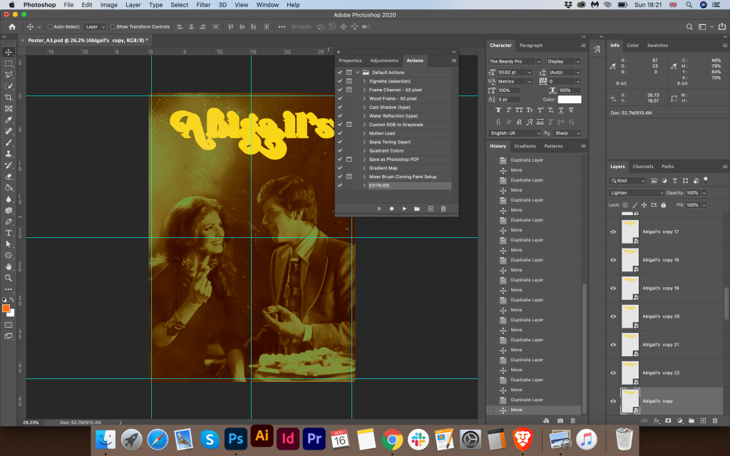
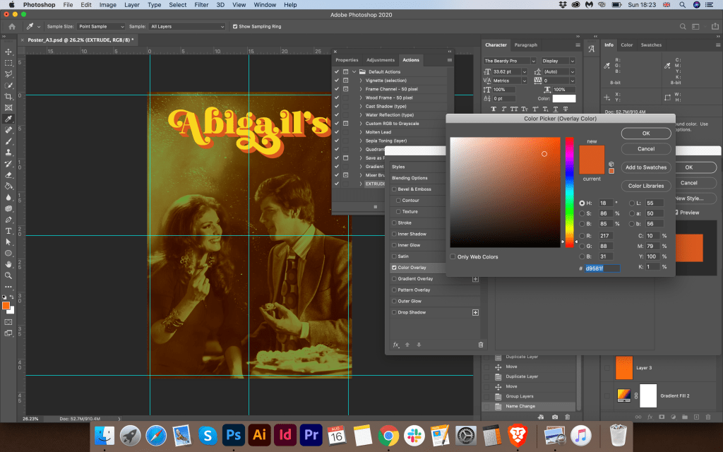
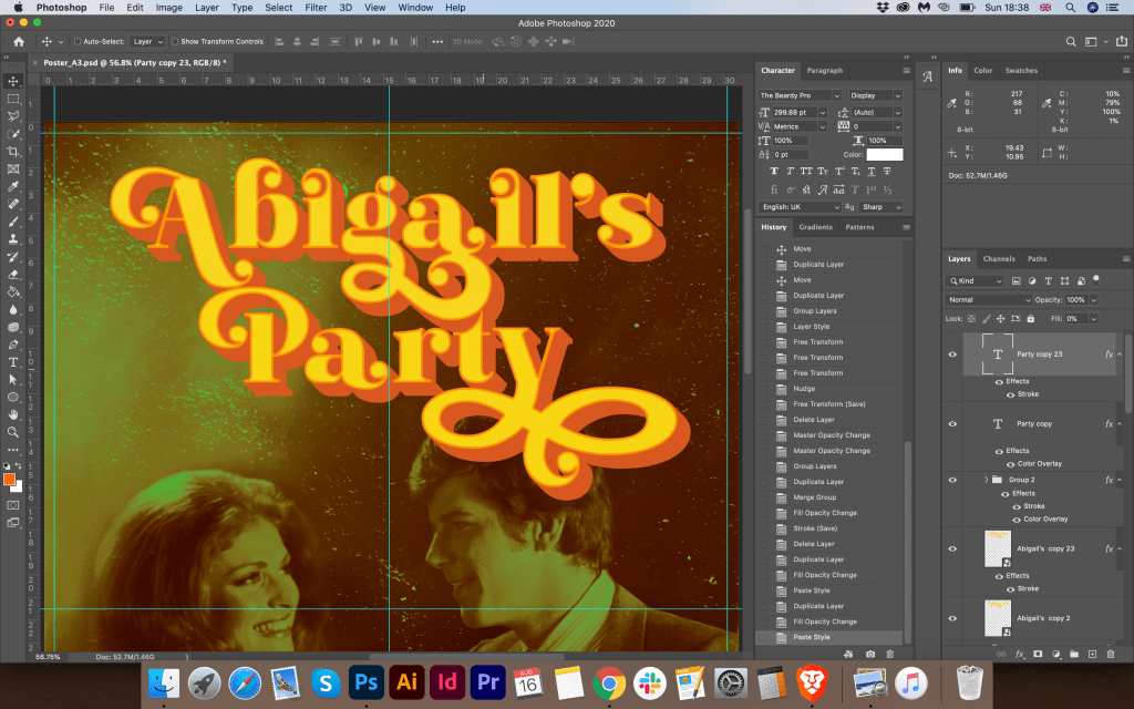
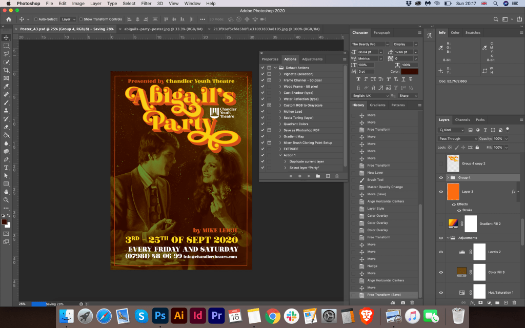
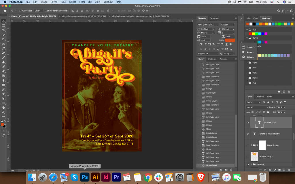
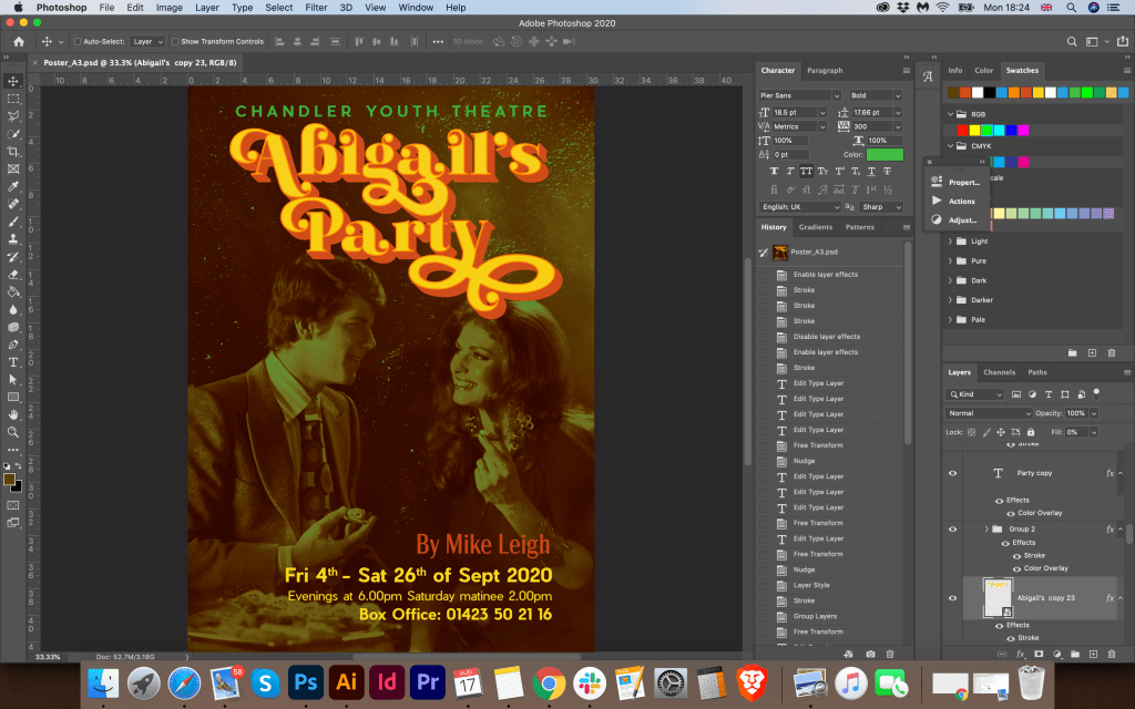
As a result, I got a poster in muted colours and a bright catchy title of the performance. I planned to use the same The Beardy font for the key information about the dates and times for the shows, but the font style seemed to me too heavy for the bottom of the poster. So I decided to use the lighter, more readable Pier Sans sans serif font in a bright yellow colour. For comparison, I decided to check which filter is more suitable for this photo, so I had four options, a poster in a blue tint, a bright gradient from purple to orange, a greenish sepia, and a sepia in red and brown shades. I showed to my family these options, and we all agreed on the last poster in red and brown. I posted the finished version on the Mockup room.
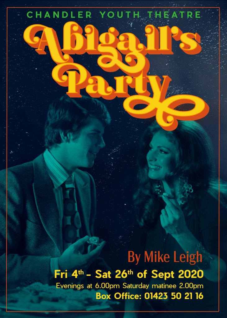
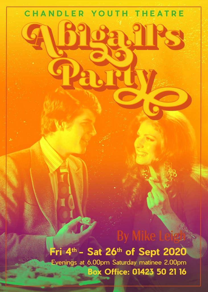


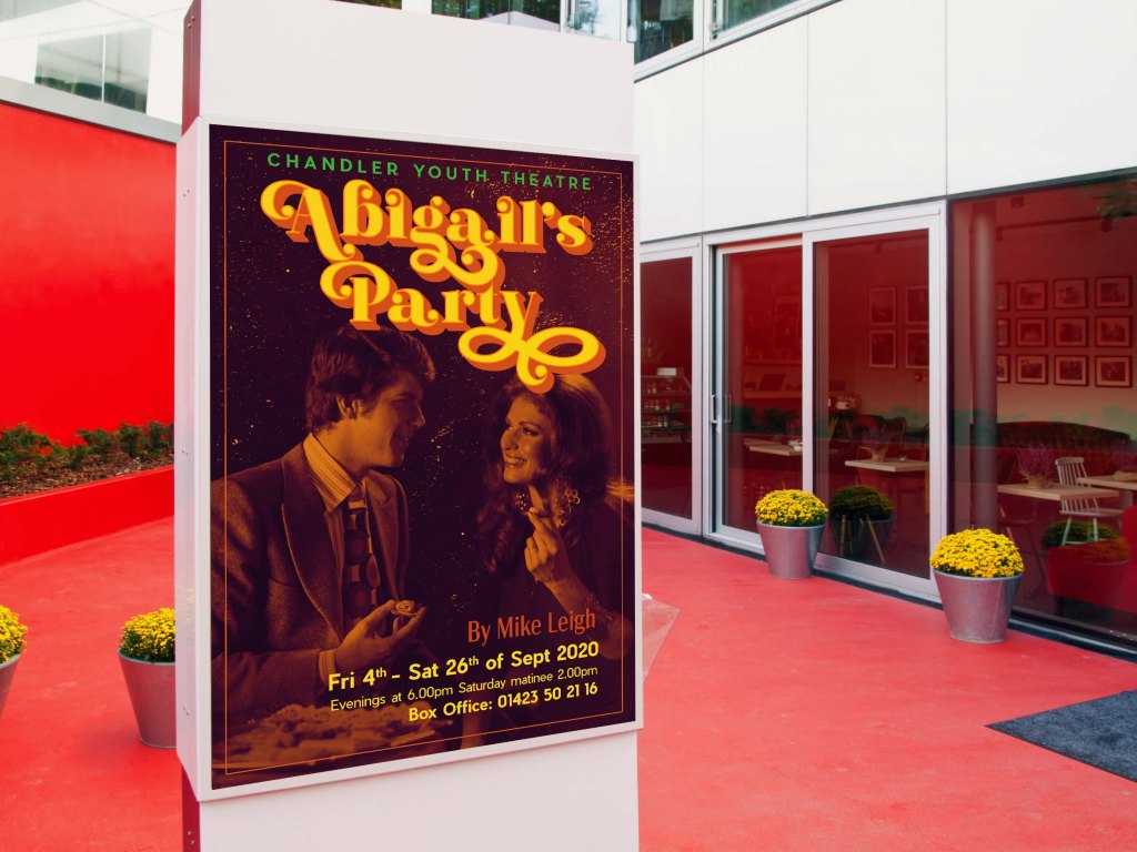
I was pleased with the result, I liked the combination of dark muted tones of the photo with a bright and contrasting font, which in general looked quite unique and bright. I think I managed to convey the atmosphere of the 70s. The only moment is that I could not apply the pattern I outlined in the poster. Combined with a bright font, the curly font completely overwhelmed the effect of the readable name of the performance. So I decided to keep my pattern for flyers, as I had an idea of how I could use it.
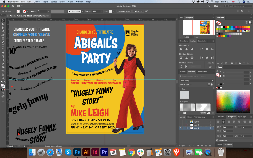
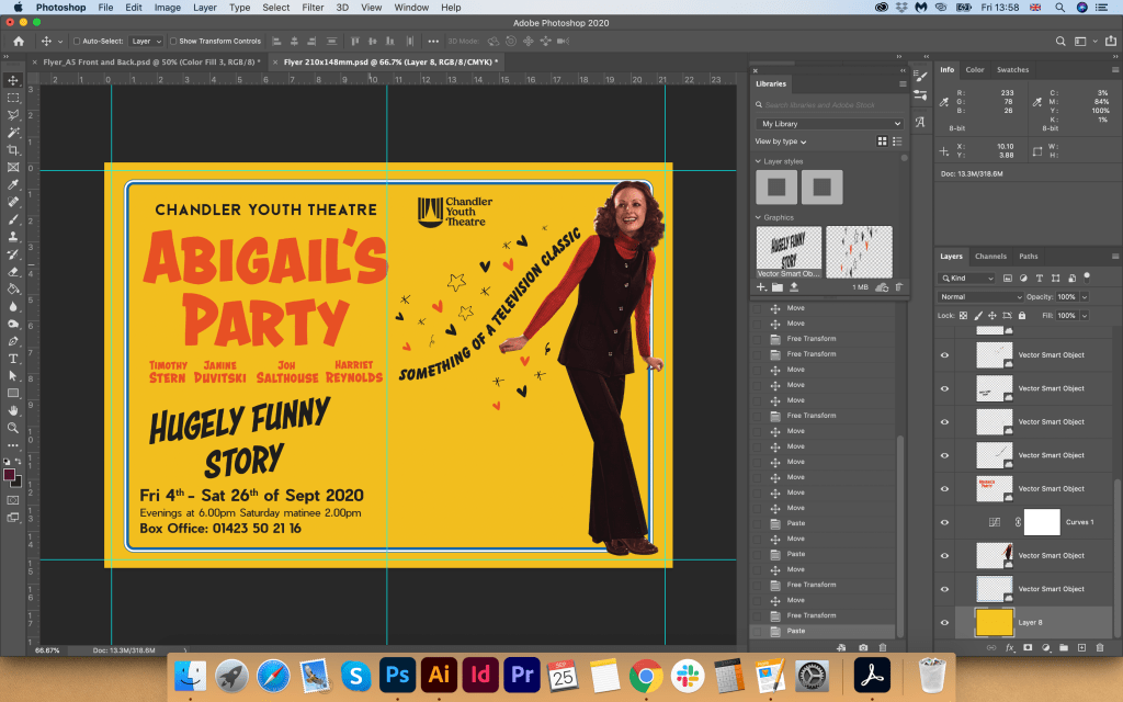
Flyer Design
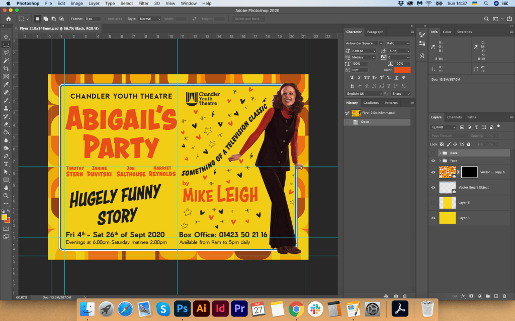
Flyer Design I wanted to display more informational. I added the names of the actors and characters, as well as the logo of the Young Theatre. On the reverse side, I used the pattern I had drawn, but for the readability of the text, I used an orange background. Also on the reverse side, I duplicated the name of the production, and as information texts, I displayed a list of theatres and the dates of the performance. I made the font large and readable. At first, I thought of displaying the title of the presentation on the backside and making the text smaller, but after that, I thought that I could avoid overloading the backside of the flyer and made the main emphasis on text information and a bright pattern.


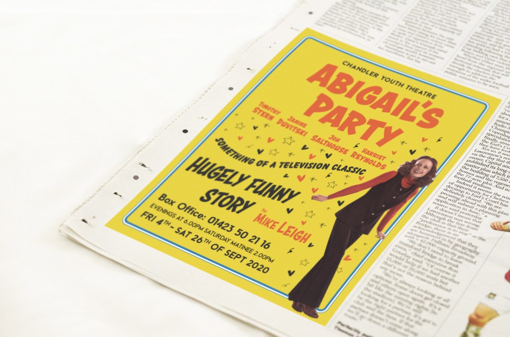
Newspaper Advert
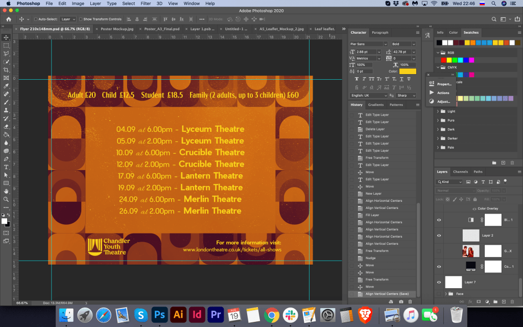
For the newspaper, I decided to use a similar principle as for the poster, where the main focus is on the photo, the title of the performance, and contact details. I tried to list a list of theatres that will host the events, but the layout was overloaded, so I used the poster layout with less text information.

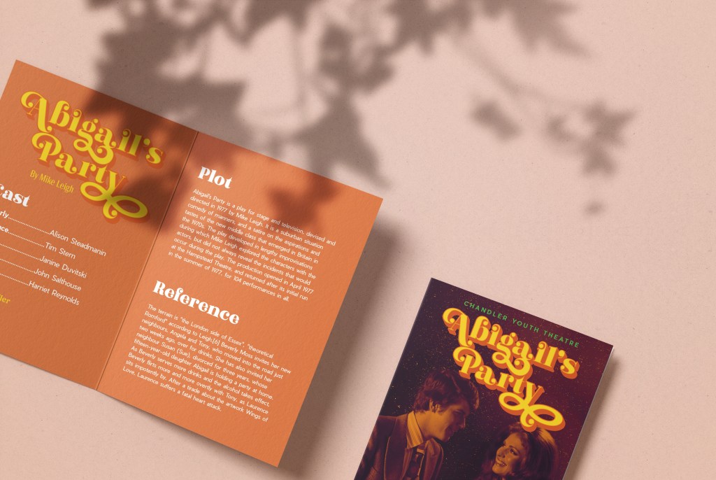
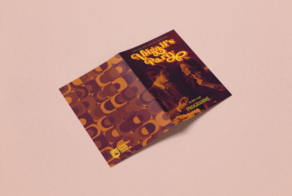
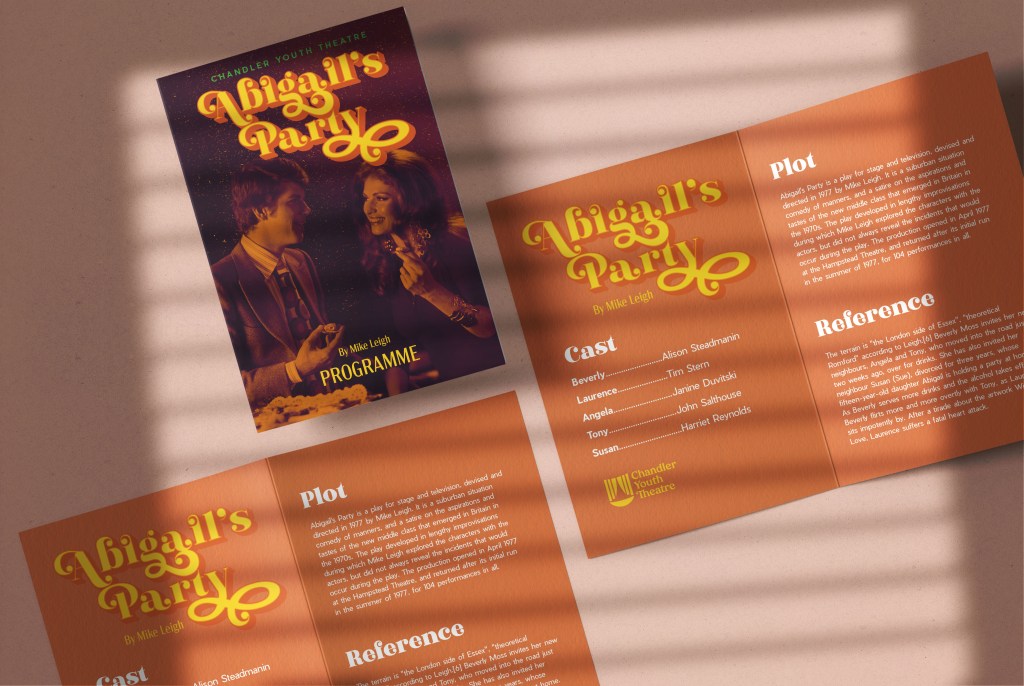
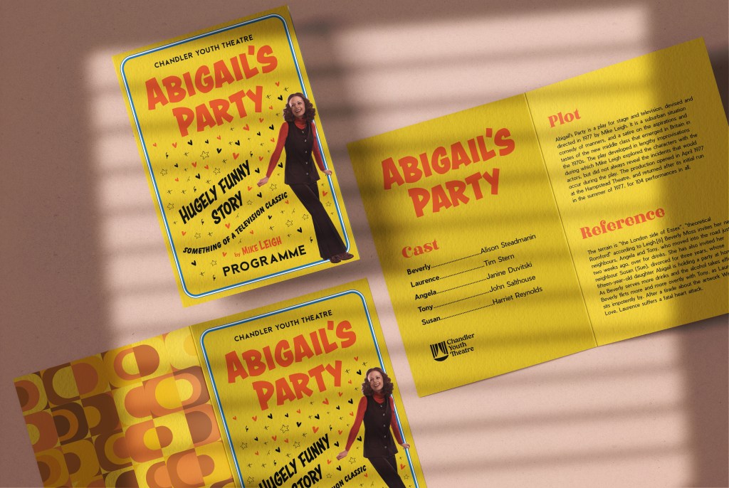
A5 Programme
For the design of the program, I created a new document in Adobe Illustrator A5 format plus a spread. For the inside design, I chose orange colour and put some text information on it. For the cover, I placed previously designed poster format, and for the back side, I chose a vector pattern that looked harmoniously with the front side of the program. I placed the finished designs on Mockup.
Reflection
Well, it has been a long journey for the Graphic Design 1 Core Concepts. I think this fifth brief was a good conclusion for the all work and experiences gained so far. Overall I enjoyed this assignment and I am pleased that I could expose learnt from this course some key design principles such as text hierarchy, typography, layout, colour and visual dynamics.
I liked the experiment with the type that I did on this task, and also the processing of editing the photo giving the layout a taste and style of the 70s. As I did not want to overload the composition of the poster with pattern elements, I am glad that I was able to use the vector drawing on other advertising materials such as A5 flyer and the A5 program. I think that this theme of 70s theatre performance is so vast and creative that there would be no limit to the design and variety of layouts. I settled on one choice, maybe I could go deeper and find more extensive options, but I’m glad I was able to experiment with text information and layouts on the rest of the promotional materials.
Additional Designs. Tutors Feedback
After I did the work for the final assignment “Your Choice”, wrote the conclusions and sent designs to my tutor for estimation, I had a feeling of unfinished business. I had the thought that the design should still be finalised, that I need to try to look for new layouts for the poster. In addition, after I received a response from my tutor that I could produce something more creative solutions, show my individuality and my corporate approach to solving the design layout, I decided that I had to try a few more poster options.
So I got down to business. First, I decided to look for an image of a girl in the style of the 70s. Perhaps it would be a smart girl who is planning a party, or who is dressed in evening dress. Since in the previous layout, I depicted a couple, here I wanted to display only one character. That all the attention was on one main person. I came across this image. I liked the mood of these girls and their dynamics in motion.

EXR7Y0 1970s UK Womens Fashion Catalogue/ Brochure Plate
I already approximately understood how I could beat this layout. I wanted to add some movement to the design, give it dynamism, light flying objects around. My last poster for Abigail’s Party turned out to be very static, and all the attention was paid to the type and contrast photography. Here I wanted to create a bright and memorable design, apply a solid background, add slogans, some additional calls to action, in general, create a mood for attending this performance.
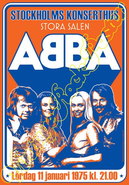
For the inspiration board, I additionally looked for some more images of 70s style posters on google, as an example, I chose posters from Abba’s group. In the layouts that I put together below, I liked the bright background solutions, the solid fill in orange and yellow warm shades, and the circular composition for placing the text, it all prompted me to design a new layout.


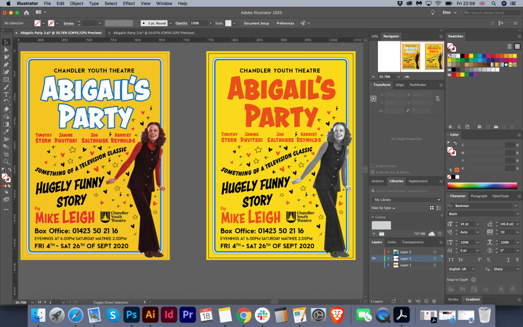
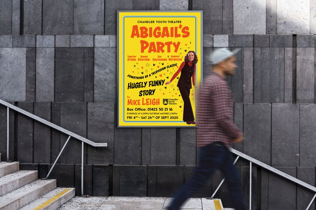
I started to sketch the poster design quickly. I also decided to replace the font for the title, here I liked the font in the retro style. The previous method of the poster had a too ornate and heavy font, but here I wanted to use a more direct type and at the same time playful. I chose Astounder Squared BB Bold for the name of the performance, DIN Condensed Bold for the theatre name and Beckman Black for contact DIN Condensed Bold for the theatre name. In my first screenshots, you can see that I tried to round up my composition, give it a shape. So I decided to try to depict one poster in transitional colours and circular shapes; in another poster, I wanted to play up with dynamic text. I planned to make the first poster in such a contrasting colour combination:
- Warm Yellow
- Intense Blue
- Orange to match the girl’s outfit
Around I wanted to place slogans, these were reviews of the performance from famous publications, due to such phrases I wanted to create a dialogue between the poster and the viewer. I decided to place the phrase: “Something of a television classic”, – in the shape of a circle while choosing an easy-to-read font Balloon D Extra Bold.

Next, I placed a list of characters, and under it another phrase Hugely Funny Story, which I needed to take up the free space between the top of the layout and the bottom where I placed the information block. For a little twist, I decided to add glass to the girl’s hand, vector layout. I was not entirely sure that the glass would be read from a long distance, but for now, I decided to leave it, as it gave some little accent at the mood of the performance. I tried to play around with some extra objects around the poster, like stars and hearts. I tried to fill with them the empty space around the girl, but I decided to keep two options for poster, so one poster I left with more free space around, and another option I made busy with flying objects. Vector image I found at Freepik.
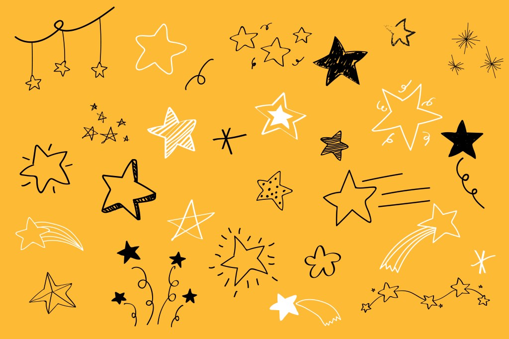
Various stars doodle collection vector.
Source of the vector image: https://www.freepik.com/free-vector/various-stars-doodle-collection-vector_4034260.htm#page=1&query=stars&position=27
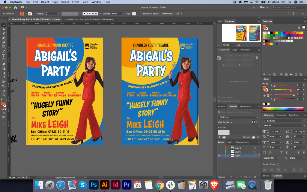
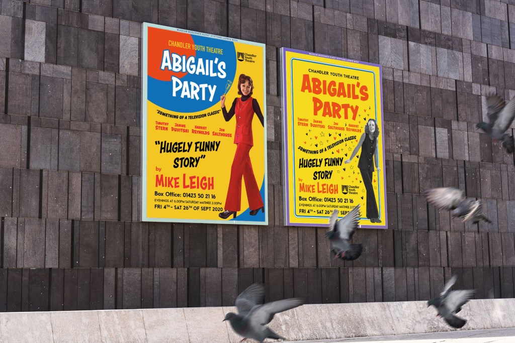
New option for the poster I used in the bright yellow background with a blue frame around it. Mainly I kept the same fonts for the poster, apart from the name of the performance in the bolder version of the Astounder Squared BB font. The idea was similar to the previous design, apart from to some details that I updated in the poster. For example, I used the different image of the igrl in colour and black and white used different colour variations and slightly rearranged the text. I liked both posters, so I couldn’t choose which one works better, so in the end, I’ve decided to go with the designs below.
Final Posters Mockup

Flyer Design
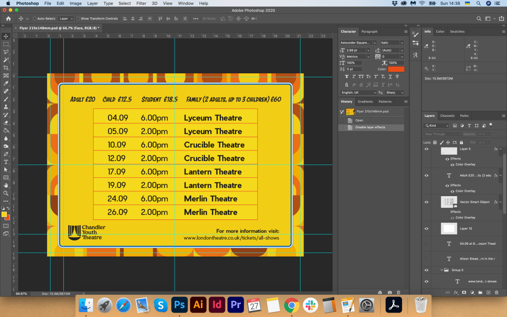
In this format, I had a bit of a challenge. I needed to create a flyer at the landscape format. So I decided to divide the space into two zones, and placed images and text like from the right and left side at the face of the flyer. I decided to add extra details for the brochure, same pattern in 70th as I designed for posters from the first part of this assignment. I used this pattern at the front and back. My tutor respond was to minimise the amount of text at the from of the flyer, so I did it. Performances schedule and prices I placed at the back of the booklet too, but this time I created a readable table for the flyer, which worked quite well in here. I was quite pleased with the result. This flyer was an excellent addition to the poster, and its design idea helped me to create a programme design as well.

A5 Programme
Mainly for the programme, I used the same technique as for the first option of Abigail’s Party designs, with text placement, the pattern at the back of the program, and font choice inside of the programme.

Newspaper Advert
For newspaper advert I used same idea as poster design, but because of the different size I slightly rearranged text placement.
Reflection
In conclusion, I would like to say that I’m glad I could produce different designs for this final assignment. I knew that only one option for this poster wouldn’t be enough, as sometimes it’s hard to make the final decision based only at one design. The first option that I send to my tutor for estimation was not bad, but overall I felt that this assignment missing some depth in producing ideas and had a lack of my personal touch. Through this first unit journey, I created an original style, that I could apply in designs. I loved the experiment with the one colour background, and some dynamic text and objects around it, the image of the person used for this poster reflects the mood of the performance quite well as well. I’ve noticed that the main challenge in this assignment to find that perfect layout with the right composition and be able to arrange text around it, use appropriate fonts for the 70th style, also to make sure that all promotional materials have essential information on it and don’t look overload. I hope that I was managed to rehabilitate and provide more vital pieces of work for the final assignment.


