For this exercise, I had a task to analyse a brief. The brief should cover basic questions:
• What are you being asked to do? • How will the client judge a successful outcome to the brief? • What are the keywords?
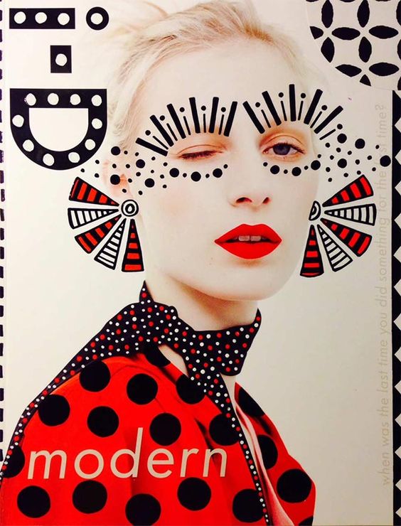
What am I being asked to do? Create packaging for Quaker’s new ‘Chilled Creamy Oats’ product for young women looking for a truly delicious healthy snack.
How will the client judge a successful outcome to the brief? If the product will reach the target audience, which is active young females and if the product will be sold well and will have a good profit.
What are the keywords?
Active
Healthy
Modern
Nutritious
An additional questions I would like to ask the client What kind and shape of packaging is it going to be? It’s quite important to understand is it going to be one shape for packaging, or are there are a series of packaging for healthy snacks?
Ideas for packaging Option 1. Plastic yoghurt cup with a sealed foil coating. Is the plastic or wooden spoon meant to be included? Does it require to be a plastic cup on the top? Option 2. Plastic bottle shape Option 3. Paper Packaging
As soon as I get a feedback regards the shape of packaging, I would like to find out some design specifications:
What are colours requirements?
What is the final size of the packaging?
How many millilitres each packaging does contain?
Is design is going to be printed on the actual package, or shall it be a separate label?
Shall it be used only vector images, or raster images as well?
What images should be included in the design?
How many types of flavours is it going to be?
What is the main slogan? Or it should be invented as well?
What font shall I use?
Where and how it will be reproduced?
Is it a limited version of snacks for a special occasion or they will be constantly printed?
Do you have contacts of printing company?
If yes, what is the name of that company?
What requirements do the printing company have?
I will need to incorporate illustrations, photographs or diagrams. Who will supply these?
Who is the main contact?
Who will send me a brand book, logo, font requirements?
Is it going to be all photographs made by Quaker’s copyright photography, or should it be paid images from photo stock bank? Or is it mixing of both?
What are the timescales? When would you like to see the initial ideas, the proofs, when the artwork goes to print and when the finished job is distributed?
What is the budget I need to work to? I charge the client only for the design, or should the invoice be included in the estimate for printing on the packaging?
What am I being asked to do? Give to the client creative ideas of the metaphorical journey on the theme of connections, that might link to the all kind of things – people, events, philosophy, theory, objects, history, literature, etc.
How will the client judge a successful outcome to the brief?
If the client will be satisfied with creative ideas and innovative design that I’m going to produce. If the design is going to meet up with requirements, target audience and marketing plan of the customer?
What are the keywords?
Dramatic Contrast
Changing Landscape
Inter-connections
Journey
An additional questions I would like to ask the client
Who is the target audience?
What are the timescales?
What is the budget I need to work to?
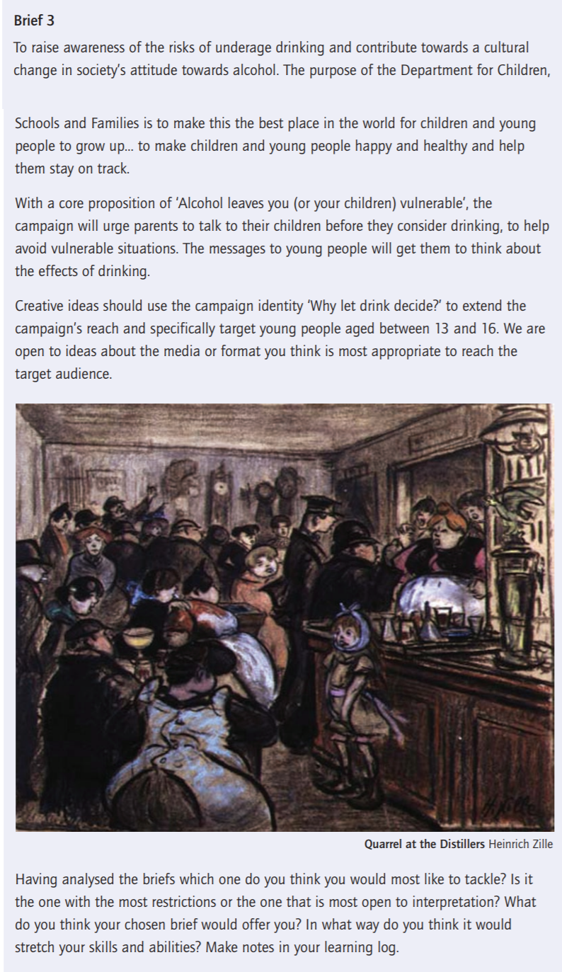
What am I being asked to do? Create ideas for the campaign ‘Why let drink decide?’ targeting the main audience – young people aged between 13 and 16.
How will the client judge a successful outcome to the brief? If the product will reach the target audience, which is young people aged between 13 and 16. If the campaign will communicate effectively with the target audience, helping young people avoid drinking and to be less vulnerable.
What are the keywords?
Underaged drinking
Children
Society
Awareness
Family
Health
Vulnerable
In conclusion
Having analysed the briefs I think the first one would most like to tackle. As to me, that is the most open to interpretation, while I was reading it I imagined ideas, keywords and design sketches that I will use while creating visuals for the customer. I think the first brief will help me to make some sketches and drawings for the packaging design, analyse the history of the brand and go back to their origins that to provide a new sort of design.
For this exercise, I had a task to play a game of charades in which I had a try to communicate through sketches of popular book, film, or program. In my first trial, I painted a clear image of Breakfast at Tiffany, which is presented below.
But further down I’ve diced to try to communicate through the actual drawings. Here are my trials.
Another artist which I like most is John Stezaker. I was enjoying looking through his re-examines the various relationships to the photographic image. In his collages, Stezaker appropriates images found in books, magazines, and postcards and uses them as ‘readymades’. Through his elegant style, Stezaker adopts the content and contexts of the original images to convey his own witty and original meanings.
Robert Rauschenberg art is one of the examples of Abstract Expressionism. https://www.rauschenbergfoundation.org/artist
Helvetica film analysing:
Cult-ure. Book Research
This book is helping to understand the connection between the symbol and the object.
There were examples of the history of art is the archaeology of culture which I’ve attached below.
I like an idea from the book, that everyone’s handwriting is unique, and everyone who can write has designed one typeface: their own handwriting, ‘tone of voice’.
A painting is never finished, – Pablo Picasso
Also what I discovered for myself We are at the very beginning of recorded history, how far we can go into the history following photographs? Probably only grandparents have some, or grand-grandparents, but not further than that. Everything that is happening now, is captured on a camera.
Are you a good idea? The idea is in charge.
An idea multiplied through conversation can travel further than you can shout.
An idea multiplied through the written word can go further than a conversation.
An idea multiplied through the printed book can than the written word.
Red Square
The meaning of Red colour by reference to Nature:
Red=Blood
Red=Heat
Red=Fire
Red=Anger
Reference to Culture:
Red=Stop
Red=Danger
Red=Off
The art of traditional sculpture consists of removing everything that is not the sculpture.
Cave paintings from Cueva de las Manos, Santa Cruz, Argentina
Ghostly shapes left on a pinboard by the action of the sun
This is a frame.
A frame defines a boundary, a limit.
Inside the frame is the area the artist exercised control over – this is the extent of the work. Outside the area, we have less control – the culture, the rest of the world. The edges of the book, for example, are a frame – they contain the book. Beyond is your room. Outside this frame, there also exist other copies of this book, identical in form, but not location.
Culture is a map.
Culture is a map that makes experience intelligible. It’s a map of who, a whole, we think we are; our values, our art, ur intellectual effort.
How many times can you solve a problem?
As style changes over time, it becomes fashion. Fashion, like the style, can only exist after the practical need, the function has been fulfilled.
Apophenia is the experience of seeing patterns or connections in random or meaningless data.
Woodcut map of Jerusalum in relation to the rest of then-known world. Heinrich Bunting, 1545-1606
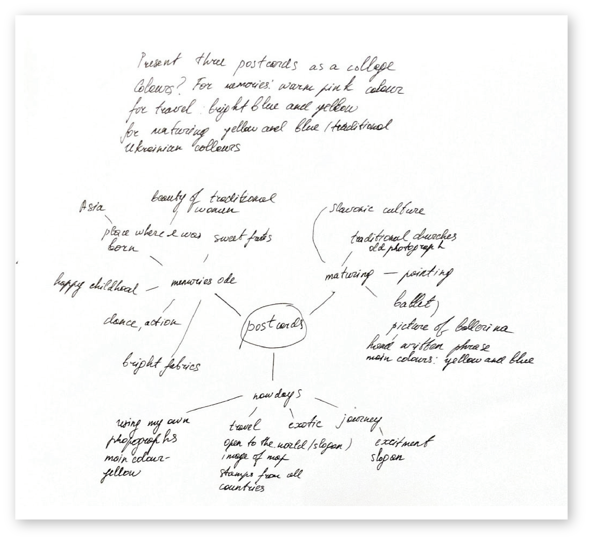
For my first Assignment, I have a task to introduce myself. Below the example of the mind map I produced, some generic ideas that came into my mind, how I would describe myself. For me is quite important to reflect graphic design ideas through the colours, so each card was associated with the specific colour that I imagined. In the result I had three main ideas:
card for the childhood memories and influences of the Eastern Culture
card for the maturing, hobbies as ballet and painting
card for the travel, like travelling which always is my passion
After some brainstorming, I started to design them straight away.
For my first postcard, I’ve decided to design it through the cultural influences from the countries that I have lived in. Firstly I would like to picture my native country where I was born and where I lived until I was 6 years old. That country is Uzbekistan — a faraway place in Middle Asia, a country with hot summers and cold winters. Where towns were surrounded by desert, 🐫🌵 where fruits were the sweetest in the world, where fabrics were full with bright and juicy colours, and girls wearing long braids were spinning in dance with a smile on their faces.
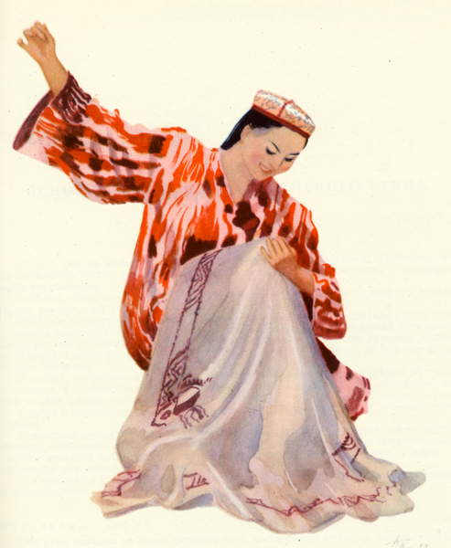
Folk Dancer From Uzbekistan/ Bridgeman Images
From pictures of Uzbekistan I wanted to show a traditional Uzbekistan Dancer, which is always smiling, she has long dark hair, and she loves spinning in dancing. Uzbek dance is characterized by intricate arm and hand movements, a variety of spins and turns, backbends, shoulder isolations and animated facial expressions.
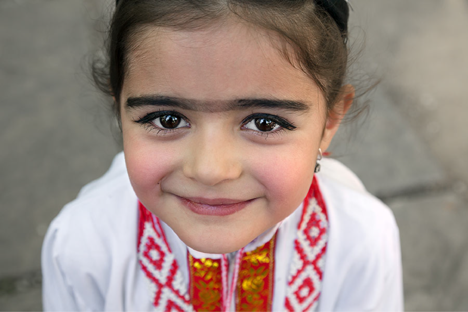
Girls loved wearing wide dark eyebrows, which were joined in the nose bridge. The unibrow is considered a symbol of beauty and purity for women, this little girl reminds me of myself at an early age when I thought I was gorgeous as I imitated adults.
Pascal Mannaerts Photos
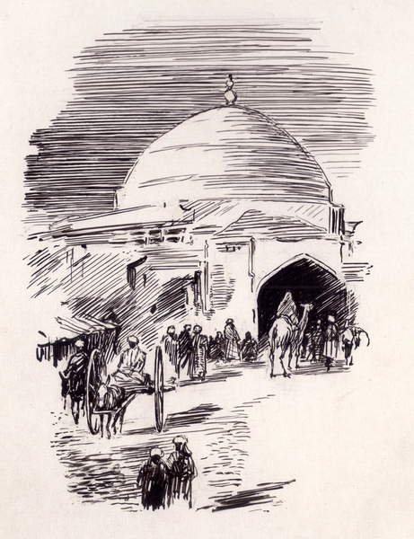
On another image below, is the soul of Uzbekistan — a place called Bukhara, an old traditional city which is one of the older cities in Central Asia.
When I close my eyes, I see spacious Uzbek streets, with no trees, just dry open space with an old mosque, where in the early mornings and evenings we could hear prayer songs. The sketch painting reminds me of my favourite Eastern Fairytale about Princess Budur “Aladdin’s Magic Lamp” from the collection “A Thousand and One Nights.” On the side of the road, you could always find a stream with cold clean water, which you could drink if you felt thirsty under the hot Asian sun.
Also, I’ve pictured traditional pattern Uzbek plates, as we used them to serve traditional fruits and hot naan pieces of bread for family and friend dinners.
“Motherland cradle me
close my eyes
lullaby me to sleep
keep me safe
lie with me
stay beside me
don’t go, don’t you go”―Natalie Merchant
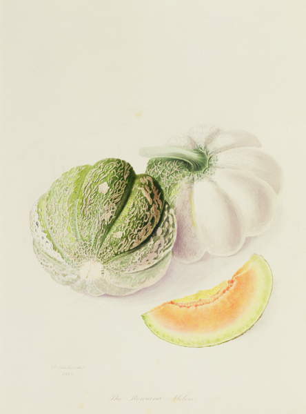
The Romana Melon, 1818 (w/c on paper), Hooker, William (1779-1832) / Lindley Library, London, UK / Bridgeman Images
The Samanid mausoleum, built by the first local Muslim dynasty in Bukhara/ Bridgeman Images
Uzbekistan (Indian ink on paper)/ Bridgeman Images
Ethnic Uzbek ceramic tableware / Shutterstock Image
I was pretty happy with the card design, as to me it was a tender and soft card, filled with Eastern elements and personal memories. The font that was used for Ode is handwritten font Katherina, I like it as it is similar to my writing.
Postcard Ode
In conclusion for the first impression, I would like to say, that the main influence from the country where I was born was:
appreciation of Eastern Culture
understanding that each part of ethnic features affect the personality formation
memories from childhood are given the strongest influence on personality
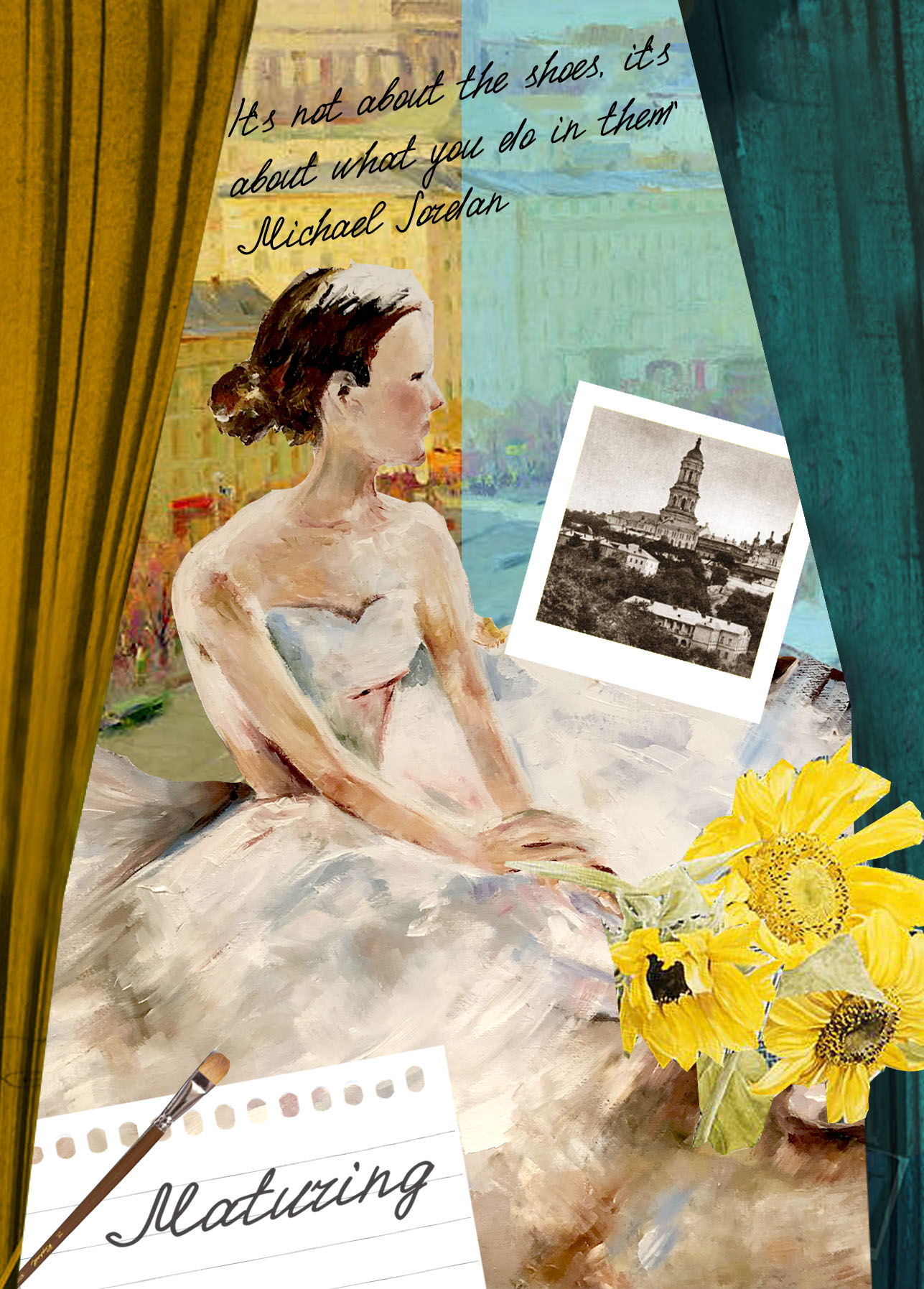
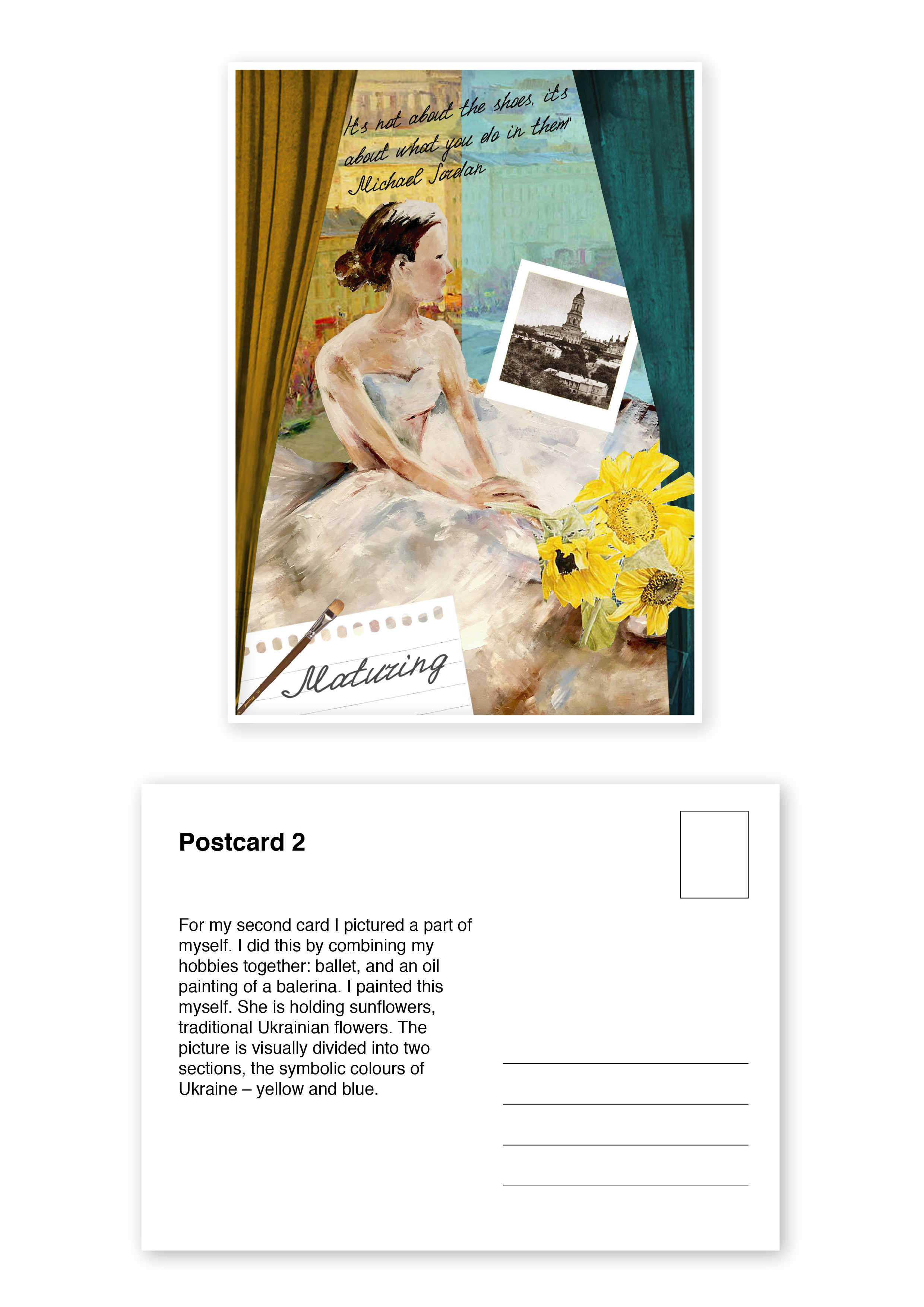
Second Impression. Maturing
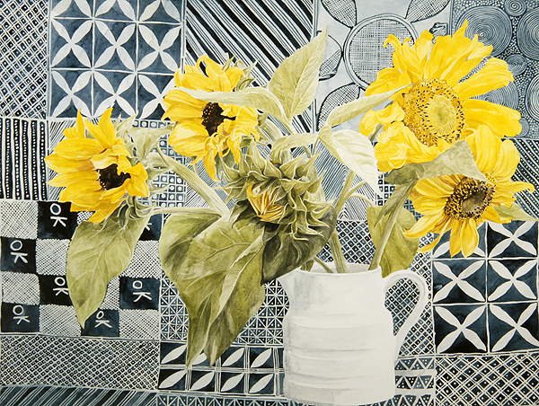
Secondly, after the country where I was growing up, I will go to another part of myself, which is the country where I lived for 25 years until I moved to the UK. That country is Ukraine, a place where summer fields are in blossom of sunflowers, 🌻 where the sky is a dark blue colour, and wheat is bright and yellow, which creates a beautiful combination in contrast. In that card, I would like to picture my country as a collage of main places that inspired me during my life in Ukraine. When I moved to Ukraine for the first time, I was 6 years old. It was the time when I started to learn a new language, which I really enjoyed. At the art lessons at school we had tasks to paint traditional places of Ukraine, so when I see sunflowers, viburnum or ears of corn like on the postmarks below, they remind me that they are all a part of myself.
Traditional Ukrainian Post Stamps/ Wikipedia
My native city was Kiev, a place with a huge wide Dnipro river, where on the Volodimir Hill you can have a panoramic view of the big green city. High buildings and hills covered with fluffy bushes and trees. As my first impression of Kiev was from the Soviet Union, I would like to use old photographs to picture my city, as that is firstly what came up into my memories from that place.
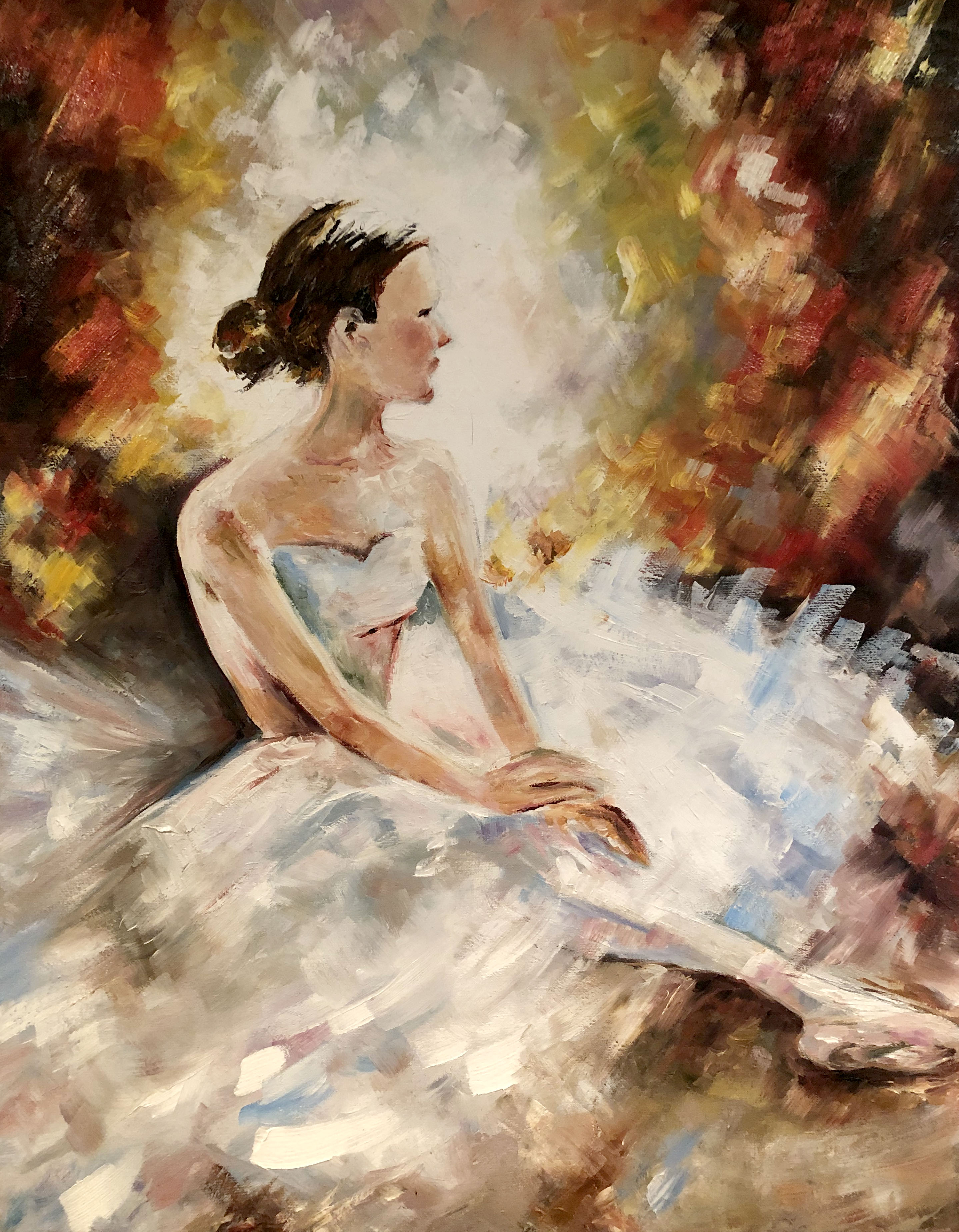
One of my hobbies in Kiev was visiting Ballet Performances at the National Theatre of Opera and Ballet of Shevchenko. I loved the theatre by itself, the decoration of the performance, orchestra music and tender classical dances from some of the best dancers in Ukraine. 🇺🇦 I have visited many performances, starting from Swan Lake to the Nutcracker. In the honour of my love of the ballet, I have painted an oil picture of a Balerina.
Kiev at Kreschatik Street / Bridgeman Images
Ballerina. Oil on Canvas
Sunflowers and batik cloth (w/c on paper) / Bridgeman Images
Postcard 2
It’s not about the shoes it’s aboit what you do in them, – Michael Jordan
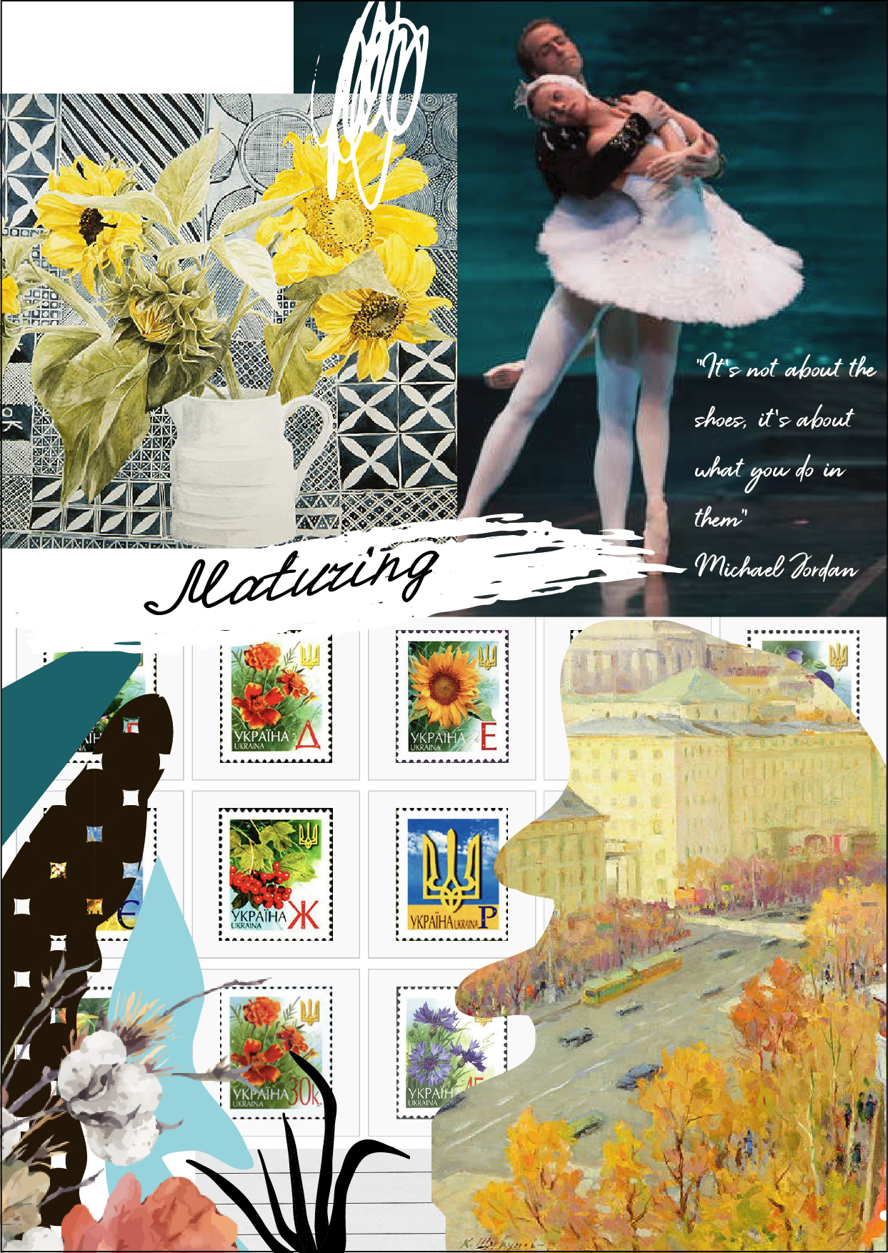
The postcard design that I a got in the result was a bit flat, also I couldn’t fit there domination of blue and yellow colour, so I decided to go deeper, where I would be able to use my own painting. For inspiration, I went to the website to analyse famous Illustrators ideas. I found some source of inspiration for myself from Darrel Rees design style and the complexity of collages combinations, as I noticed my cards where missing foreground and background. So my updated design had a completely new look. Below are designs that inspired me.
This time I decided to use my own painting. I used a picture of a ballerina, for the background I used a picture of Kiev. In ballerinas hands, I put some sunflowers – symbolic Ukrainian flowers. Visually I divided a space into two colours – yellow and blue, which are traditional Ukrainian colours. In the corner, I used an old photograph of Kiev, place where I had been living for 25 years. A postcard that I got in the result presented below.
Postcard Maturing
In conclusion for the second impression, I would like to say, that the main influence from the country where I lived was:
the Slavonic culture is open-minded and close to my spirit
it’s a place I will call home anytime
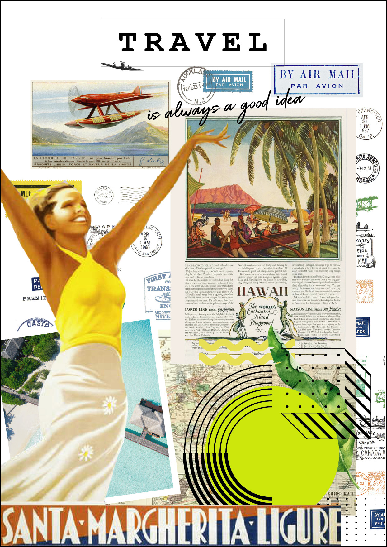
Third Impression. At the present
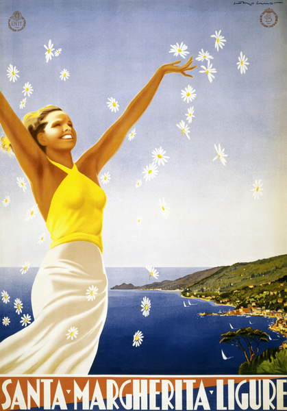
Vintage Travel Poster for Santa Margherita Ligure, c.1950 (colour litho)
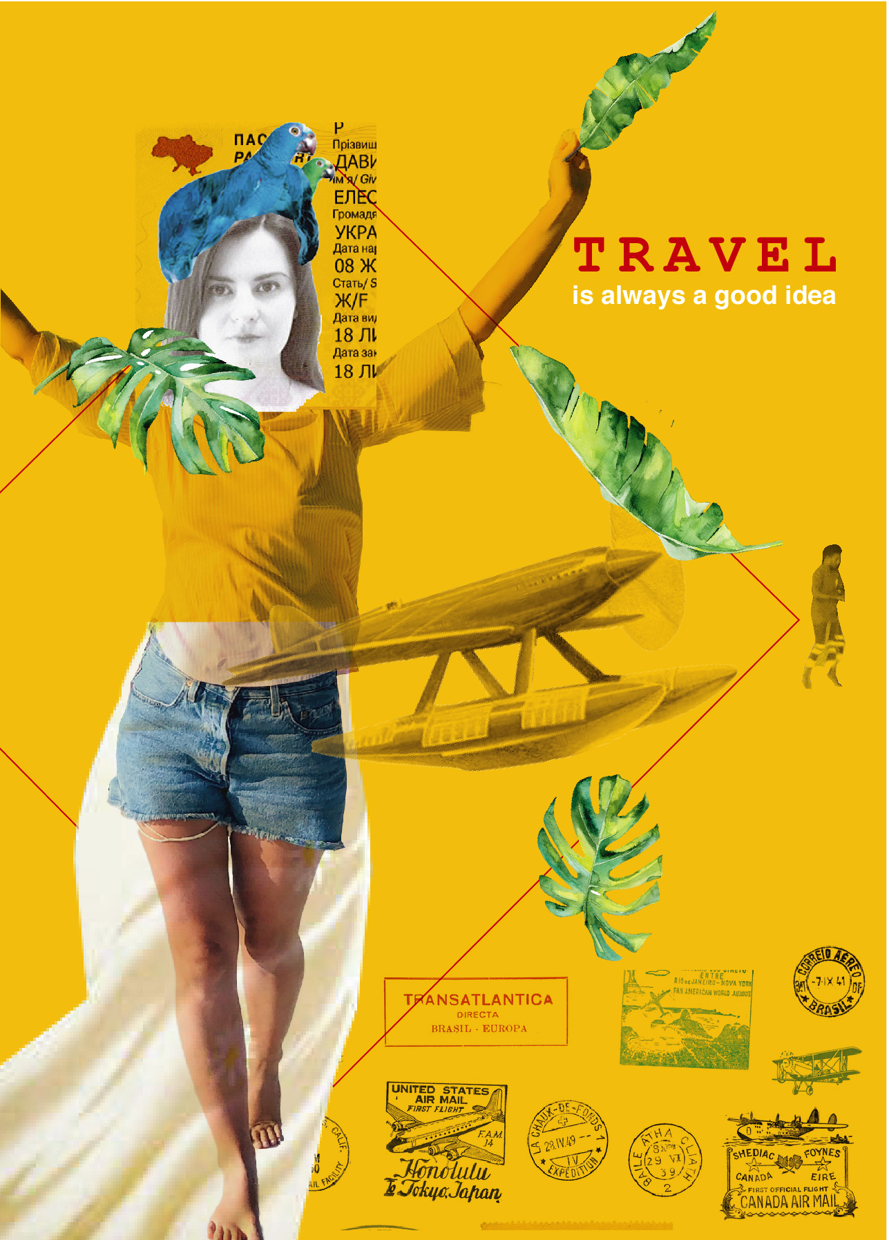
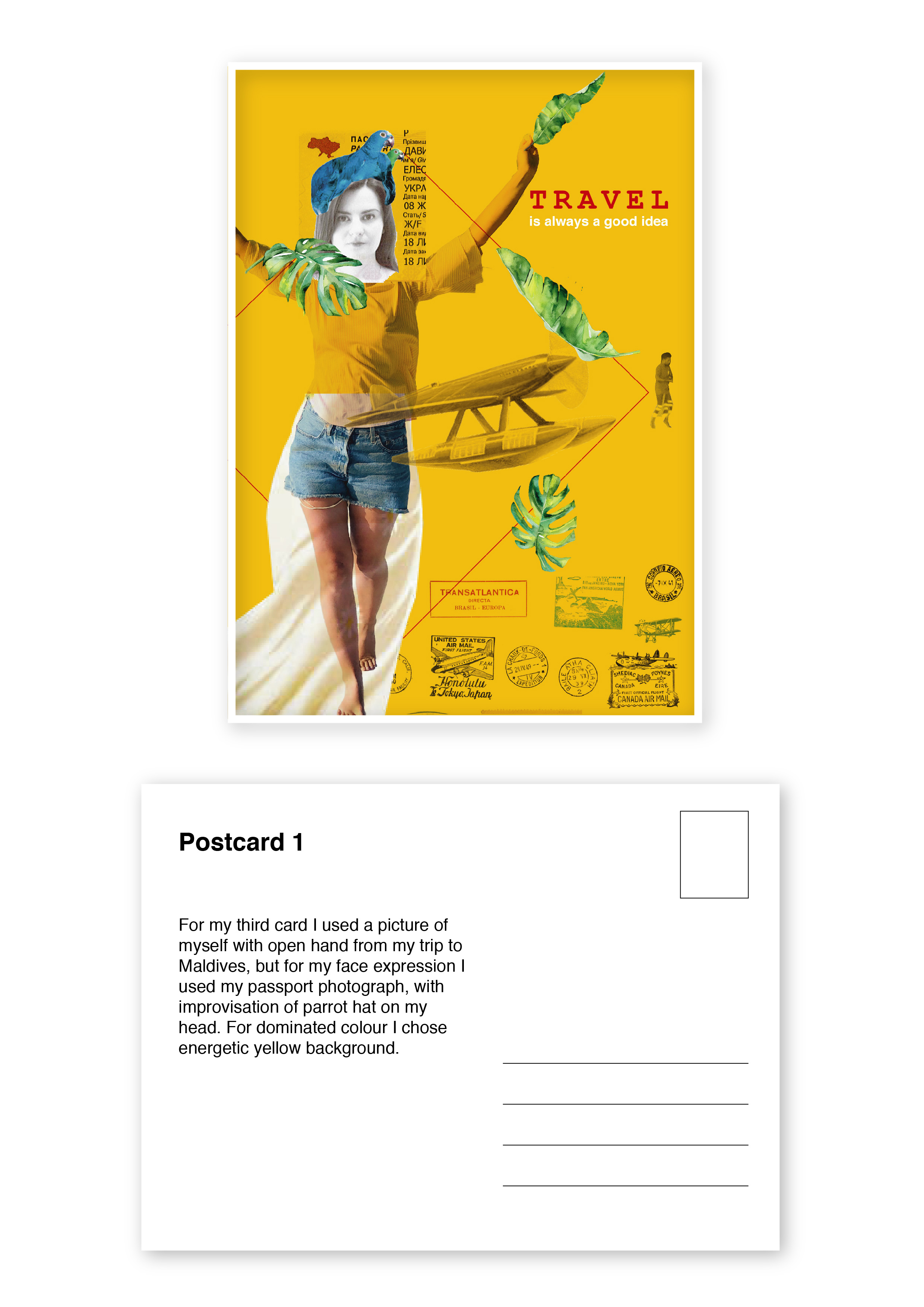
During my work career for a travel company, I’ve opened for myself a new world,🌏 with big beautiful oceans, exotic fruits and far away islands. As I worked as a visual graphic designer, most of the time I was looking for photographs to attractive places to visit for tourists, and at the same time, I was looking for places I dream to go too. Since that time I have a wish, travel around, and see the most unseen places in the world. In my third card impression, I would like to visualise journeys and travels as a part of my life.
This young lady on the poster from Santa Margherita is a symbol of happiness and excitement of the new world discover, I love that she is open to the world and with a big smile on her face, also she is wearing yellow, the colour of energy and activities.
“There is a kind of magicness about going far away and then coming back all changed”― Kate Douglas Wiggen
I liked the idea of the presence of yellow colour, and the spirit of happiness that woman brings into, but I thought that my postcards look too similar to each other, as most of them were made in the style of flat collage, therefore I went for inspiration and searches to the famous graphic design and illustration artists.
I found some ideas which were leading me to some new way of thinking, where I could combine not related images to each other, that to create some new sort of image. I loved the idea from illustrator Matthew Richardson of using transparent images and full-colour images, which created a kind of mystery effect. At the same time, my personal expression told me that I more keen on using a bright background, as though the colour we can express our personality as well.
By trying to combine different images, I’ve decided to try to use two pictures of myself, first one a picture from passport, as that is related to travel abroad, another one a picture of myself with open hands, as I’m open to the world and travels. At the same time, I used some images from my journey to the Maldives. Leaves and parrot I used as a decoration for my clothes. I liked the slogan “Travel is always a good idea”, I used Helvetica font for it, that to keep its message clear and simple. In the corner, I put a picture of dancing Maldivian man.
Postcard Travel
In conclusion for the third impression I would like to say that:
travelling is what makes a person happier
travels open up new horizons, changes the live view, gives the opportunity to look at familiar things from a completely different angle.
this is what fills us, inspires and makes us fall in love even more.
Thanks for joining me! Here is my new graphic design and art blog where I’m going to post my graphic design assignments, inspirations and art ideas. I hope the journey to the world of creative art and graphic design is going to be exciting and full of creative researchers.
“Every artist was first an amateu”. — Ralph Waldo Emerson