For this exercise, I have been asked to produce an illustrated strip of up to five frames for use in schools explaining to young teenagers how to cope with the onset of puberty. Also, I need to provide a single illustration of the character for use on the front cover. The design for the final piece should be easy to read and humorous while conveying the message. Generally, I will have to submit all stages of the development process – thumbnails, visuals and client visuals for the cartoon strip and the stand-alone illustration.
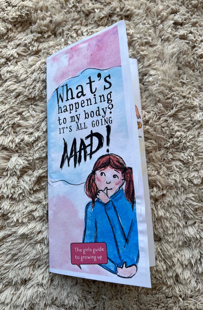
The name of the leaflet What’s happening to my body? It’s all going mad!
That’s quite an interesting exercise for the end of the unit. It contains many parts, outlining some of the other exercises’ achievements, working on character, creating a narrative, and probably making our own font. I started to think about what type of leaflet it would be. Shall it look authentic and purposefully hand-drawn, done by pencil and watercolour? Or, shall it be more digital with bright and bold colours? I thought summarising this part would make sense to create a design that will look hand-worn, with cartoony-like illustrations. In regards to the text, I will think about it further down in the process, as I wanted to try to implement my handwriting as well.
Moreover, the subject can be tailored for both girls and boys or individual preferences. Since there are only five sections in this educational strip, I decided to focus on creating an educational leaflet just for girls, so I could delve a little more into a specific subject. Also, bringing up a little girl I believe I can think of some valuable information for the future.
The brief
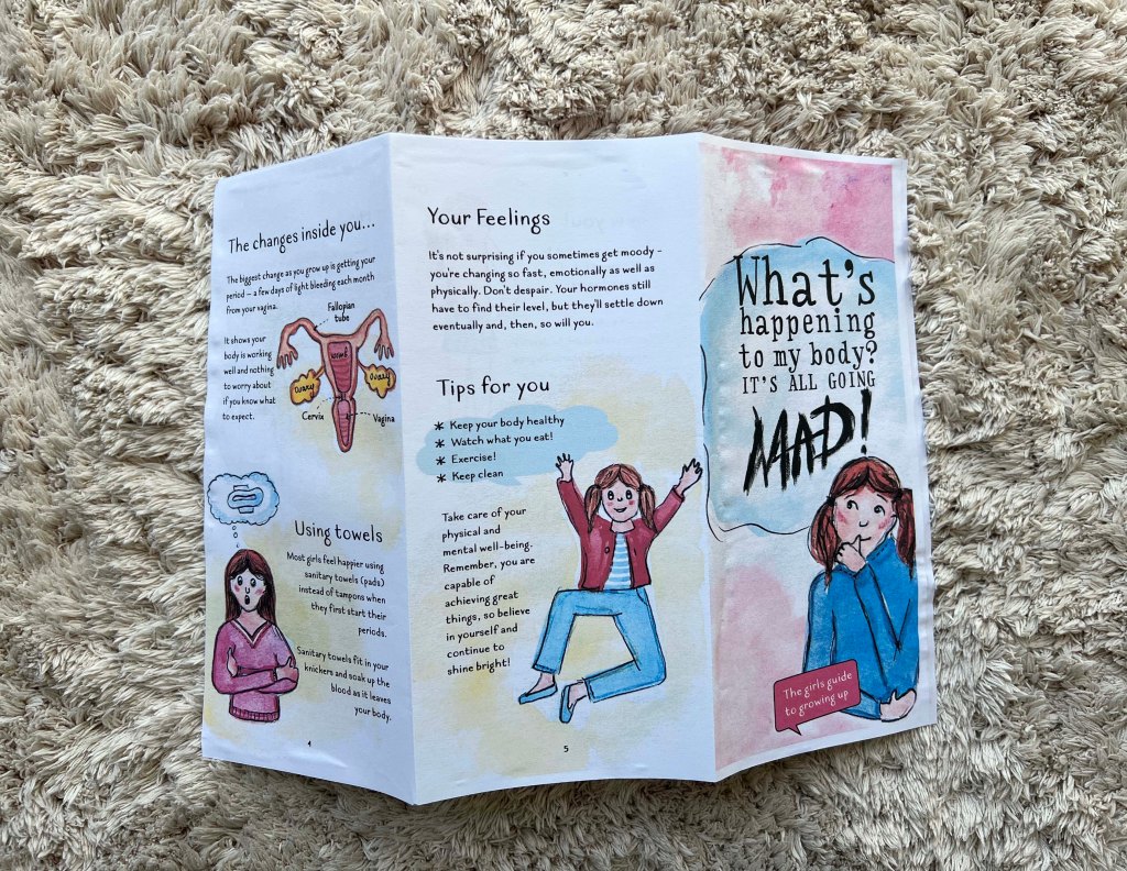
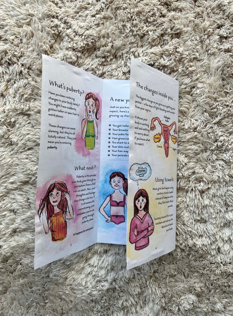
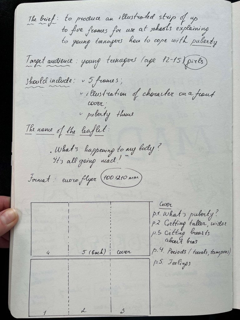
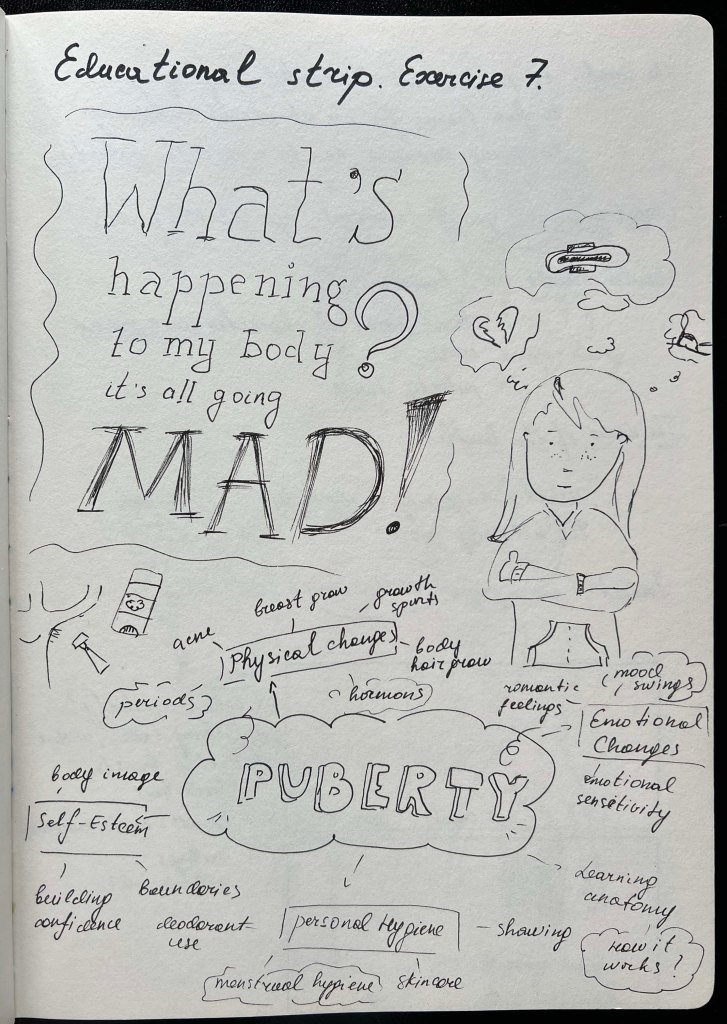
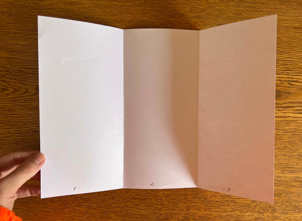
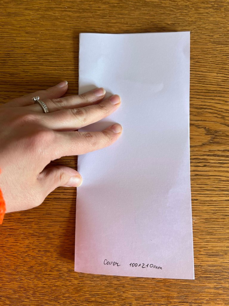
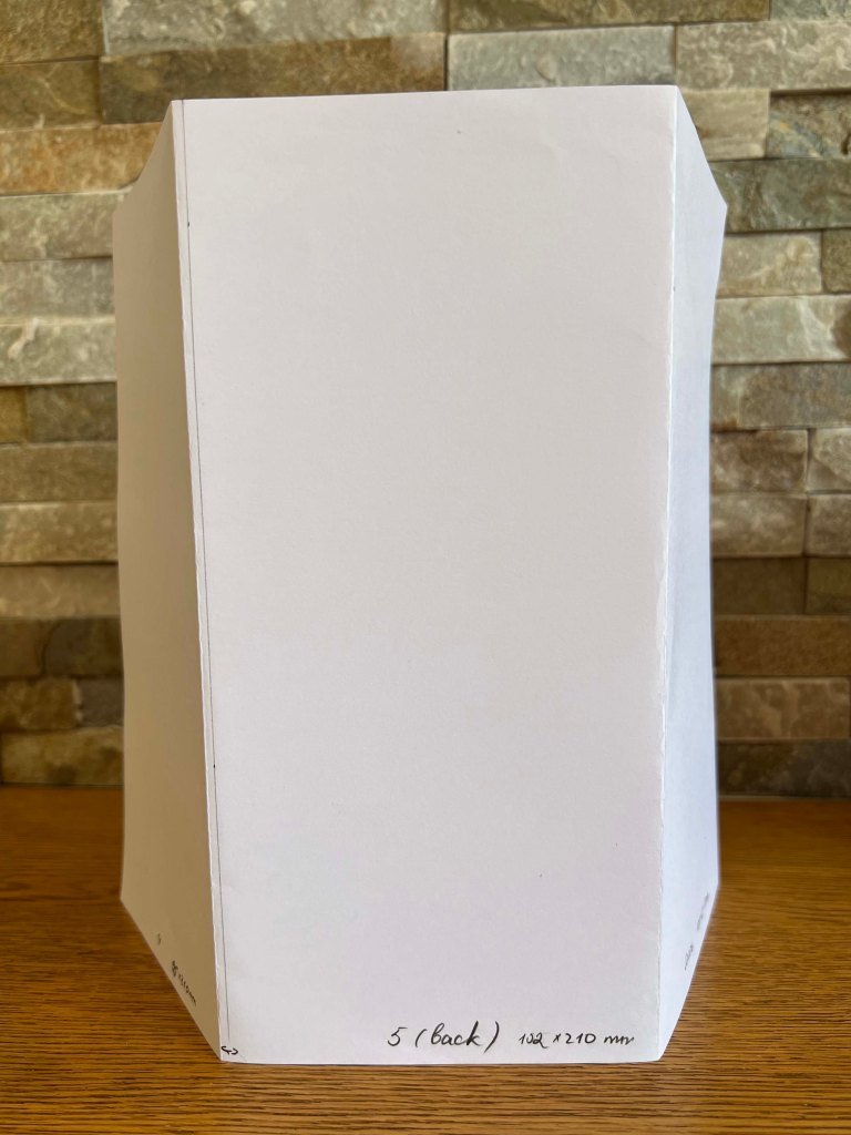
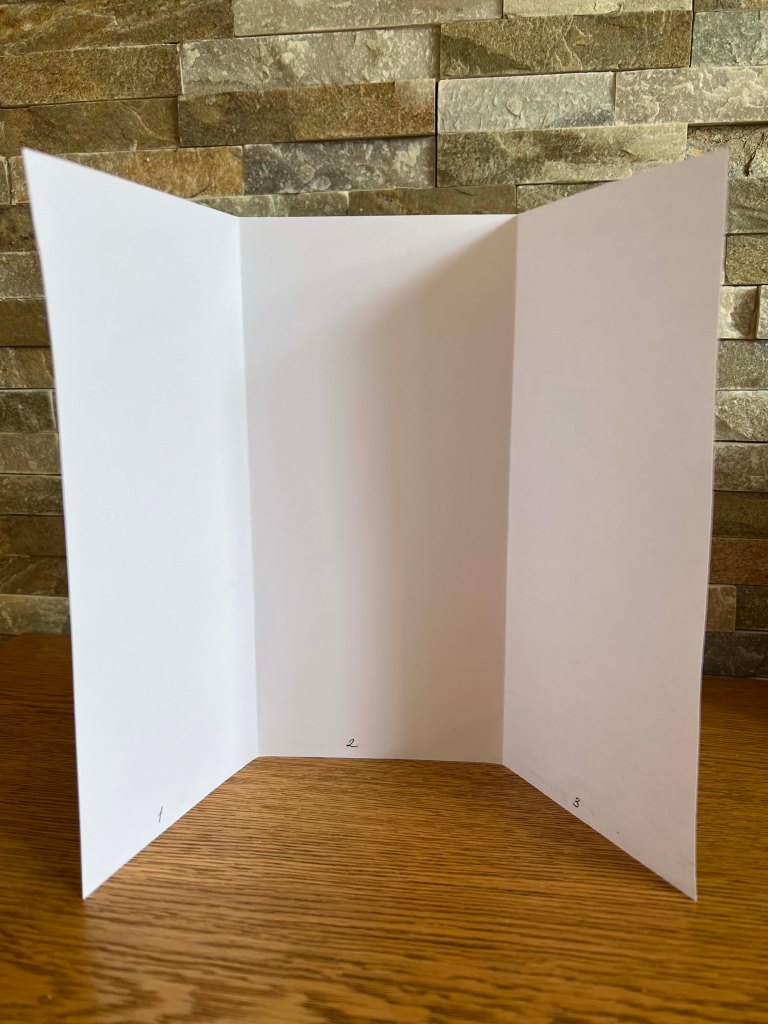
I first analysed the brief, highlighted the main points, selected keywords, and identified the target audience. Also, the mind map helped me to gather ideas together. The goal was to create a Z-fold leaflet, with a folded size of 100×210 mm, containing 5 parts and a cover. This format is practical as it can be printed on A4 paper, making it easy to produce, even at schools.
Also, I considered the structure of the brochure, focusing on an introduction, the main content, and a conclusion. The introductory paragraph would cover puberty in general, followed by addressing puberty changes and providing a brief anatomy of women.
In addition, I researched other pamphlets and brochures targeted at teenagers. To be honest, there aren’t many available. This may be because such materials are often circulated within schools. Consequently, I believe I am creating something quite unique here. The pamphlets I did find share common elements: cartoony illustrations, the depiction of emotions through characters, and a positive approach to addressing issues that may concern children in this sensitive age group.
Sketches
When I researched, I stumbled on a series of books What and Why by Usborne Books publisher. They have released a few different types of books that contain all the important information about puberty. One book that caught my attention was What’s Happening to Me? (Girls Edition) illustrated by Nancy Leschnikoff, a children’s book illustrator and designer. I bought this book from Amazon and explored the “view inside”. I found this edition very useful, as I could see the prime example of illustrations designed purposefully for kids and how the information is written. Since it had been a while since my teenage years, I wanted to study the tone used in similar publications to find a balance between humour and seriousness.
I loved the varied characters the illustrator showcased in the book, along with their expressions and interactions with others and objects. She used watercolour to depict the characters, outlining them with a black pen for detailing. Also, the background surrounding the characters was filled with pale watercoloured shades. I found this style similar to mine, and believe it would be a great fit for the leaflet.
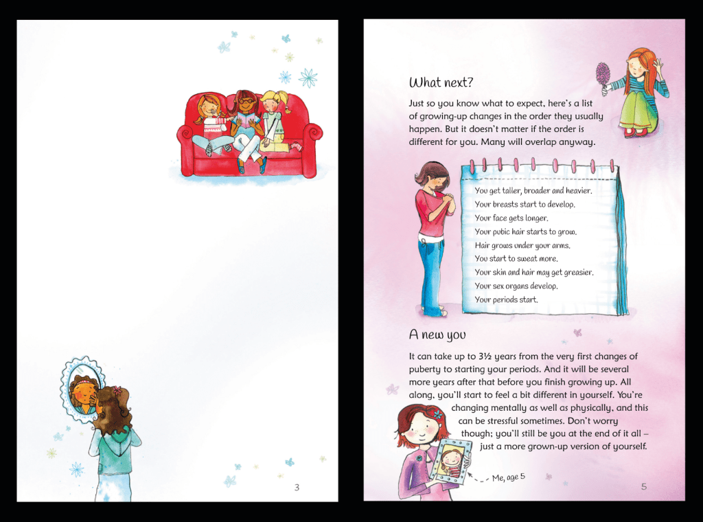
Illustrated by Nancy Leschnikoff. March 2006
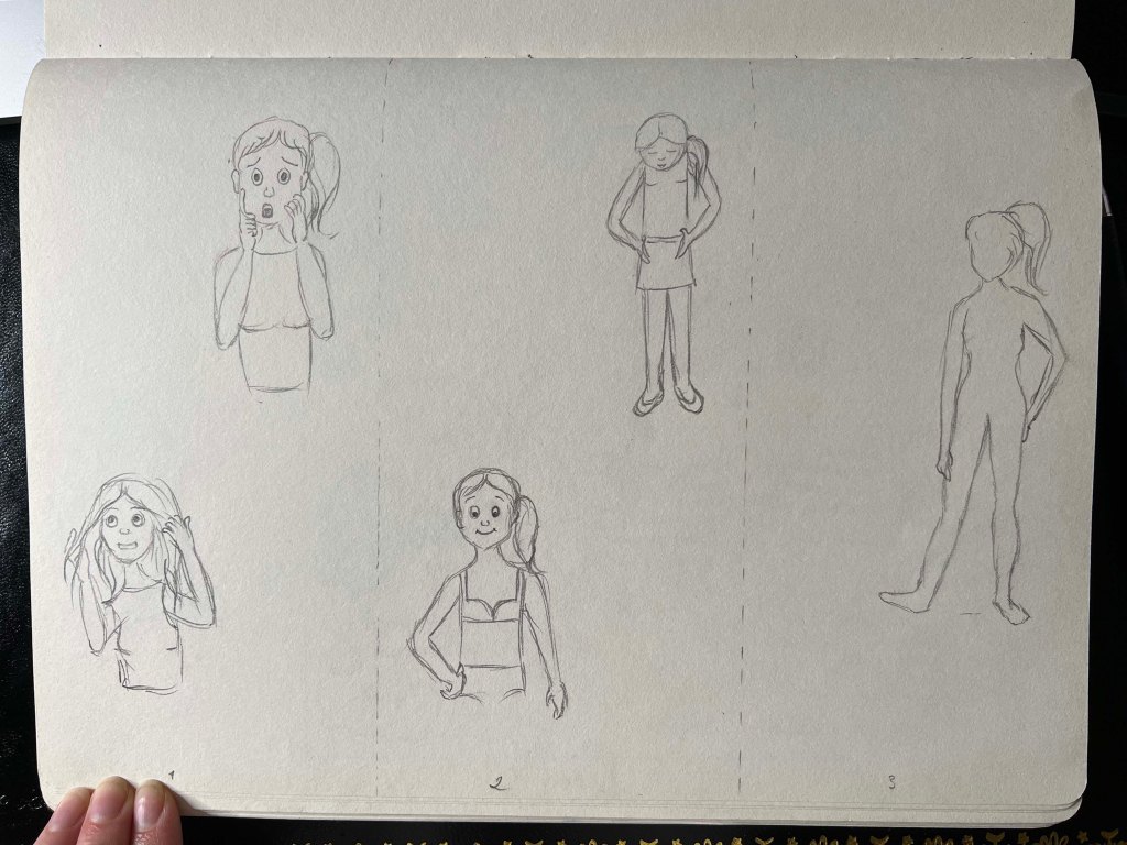
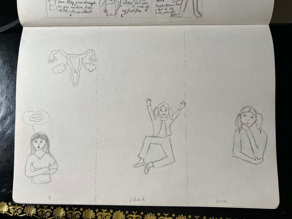
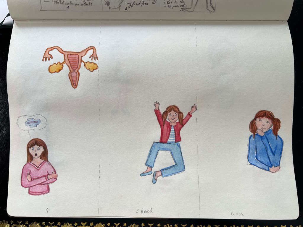
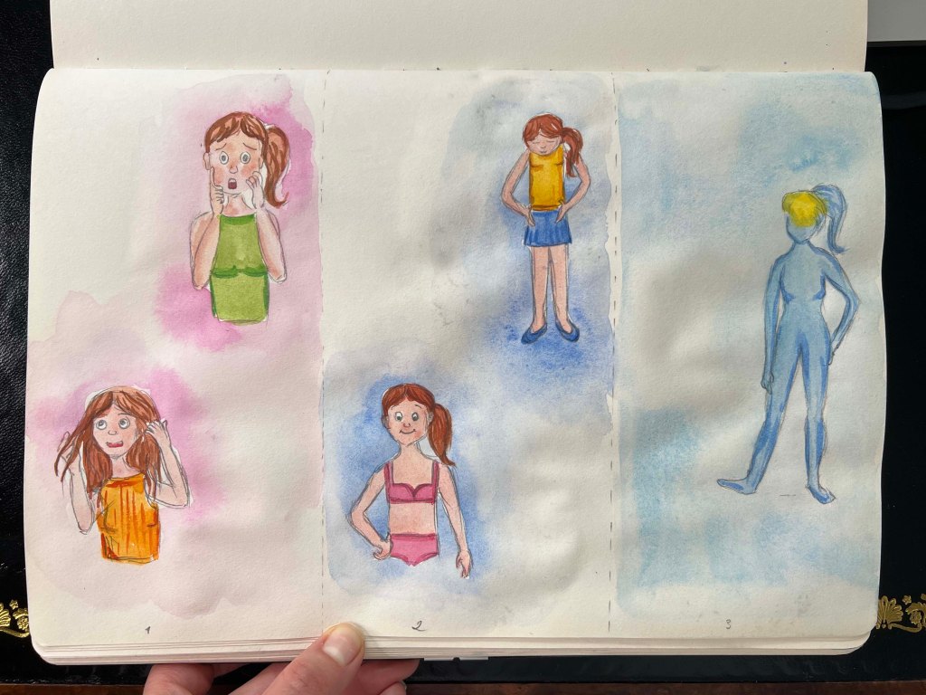
My sketches of girls in various puberty situations are below. I experimented with different characters. Initially, I planned to feature a different girl on each page, but later I chose to focus on one consistent character, the same girl throughout all the pages.
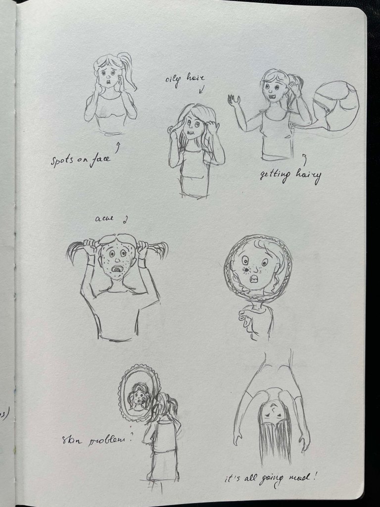

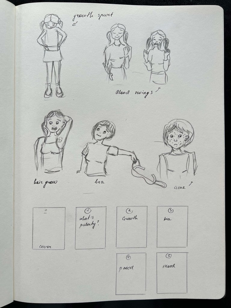
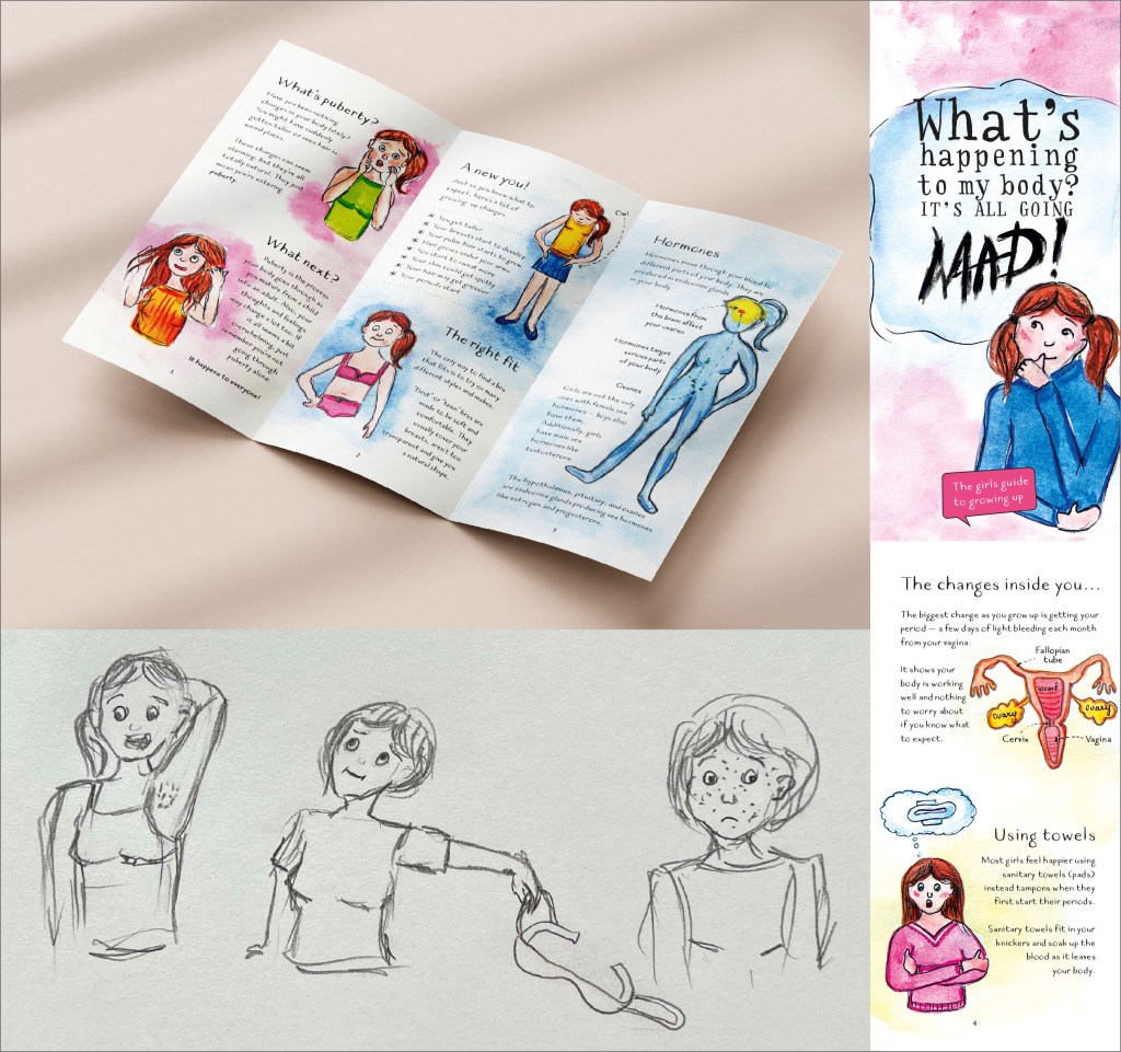
After sketching some ideas, I proceeded to create a mockup for the leaflet to ensure the perfect size for seamless folding. This step also aided in visualising the placement of each illustration on the final sheet.
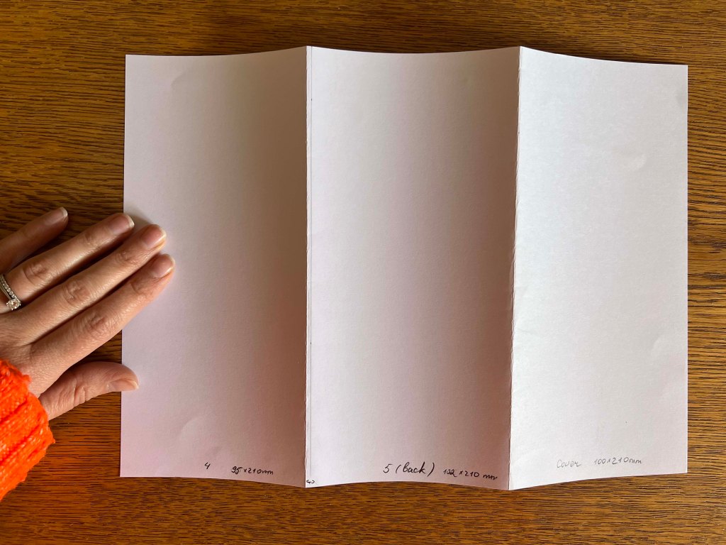
Thumbnails
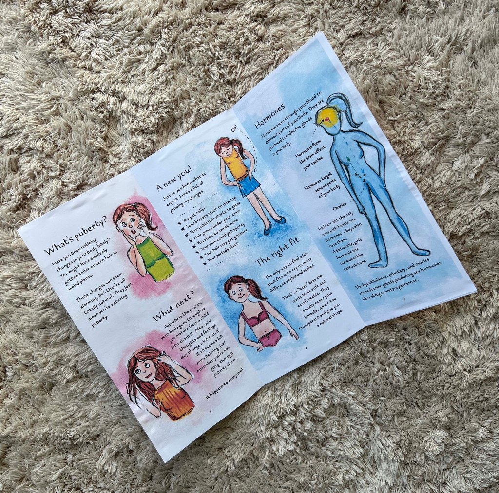
I had ideas for additional pages that I planned to keep in reserve. I was thinking about adding content on extra hair growth or skin issues, but after careful consideration, I decided to focus on a more important subject like hormones, and their role in the reproductive system. While many girls are aware of their upcoming period, the reasons behind its onset are not commonly understood. Structure-wise, I was going to use two illustrations for each page, deciding the space of each sheet in two parts. But for some pages, I was going to adjust by keeping a bigger size illustration with a text explaining the illustration.
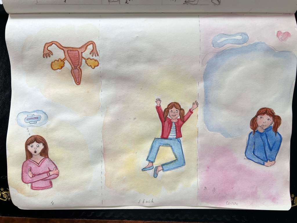
For the cover, I was going to portray the same girl with a curious expression. I aimed to maintain simplicity, as I didn’t want to overload little space with too many details. With the leaflet’s name occupying 50% of one side, and the girl positioned in the corner with a cloud backdrop.
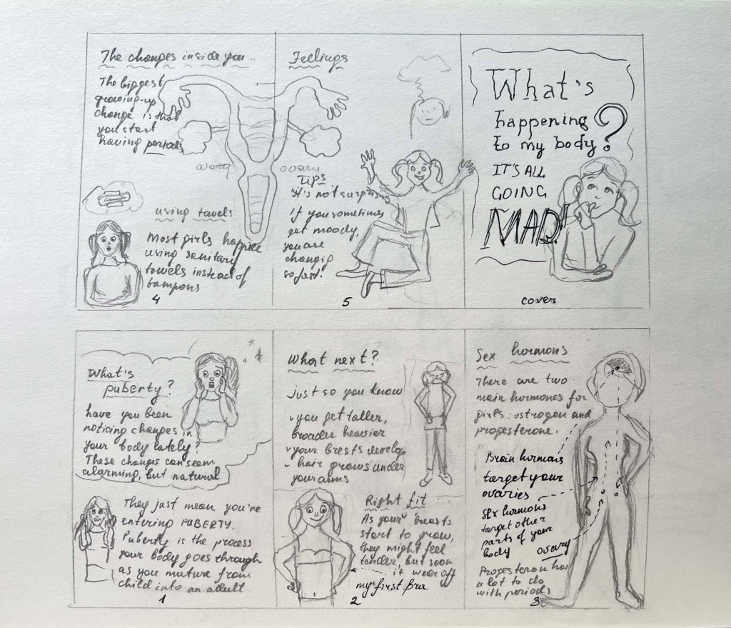
Design
With the structure for the final layout, I moved on to sketching illustrations for the leaflet. I chose to use the Quimbly handwritten font for the text. I thought it would go perfectly with the style of the leaflet, making it look like a diary for girls. I planned to vary the girl’s hairstyle slightly to suggest progression over multiple days in the leaflet while ensuring her features remained consistent for recognition throughout. I wasn’t 100% confident with the proportion of illustration before I placed the text, therefore I was going to adjust the sizing of each illustration in the final stage of design in Adobe Photoshop and Adobe Illustrator.
I considered using colourful pencils for the coloured visuals, but I thought that I could bring a brighter side to illustrations with the use of watercolour and outline them with black pen. It took me some time to arrange the text around the illustrations and convey their meanings effectively. Each paragraph was short and laconic, and I thought it helped me to deliver an essential message to girls.
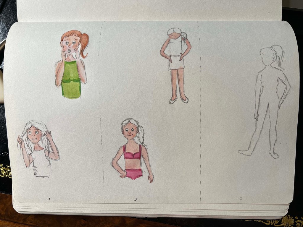
Illustrations turned out gentle and floating, with some bright colours on the girl. It definitely required some colour correction in Photoshop. I was planning to make the page whiter and adjust the proportions to fit the text. I actually enjoyed choosing the content for the leaflet, as it helped to support the illustration and create a narrative. The first two parts of the leaflet are about the first stages of puberty, such as growing, and choosing the right bra, after I moved to explain hormones and periods, and the choice of sanitary towels. In the final part, I wanted to bring the conclusion about the importance of supporting mental health and feelings, with a short message addressed to the girls. I think the design turned out quite well. For the cover, I chose Handwriter-Regular serif font and added an image from the previous exercise Text and Image with the word Mad in it.
Overall, I enjoyed this exercise. I think it’s important to convey valuable information to girls through a simple message and a positive attitude. If I were to create another version of this leaflet, I might focus solely on periods, delving into their details and their impact on mood and skin appearance. However, I chose to describe puberty in general, mentioning factors such as growing and choosing the right bra, which is probably too different information for such a small amount of sections. But it has a structure, I mentioned all the important parts that can concern girls, and I believe I completed the brief successfully.
Overall, I found this exercise enjoyable. I believe it’s crucial to convey valuable information to girls through a simple yet positive message. If I were to create another version of this leaflet, I might focus solely on periods, delving into their details and their impact on mood and skin appearance. However, I decided to address puberty in its entirety, including aspects like growth and selecting the right bra. While this may seem like diverse information for limited sections, I ensured that all essential topics concerning girls were covered. I am confident that I have successfully fulfilled the brief.


Mockup

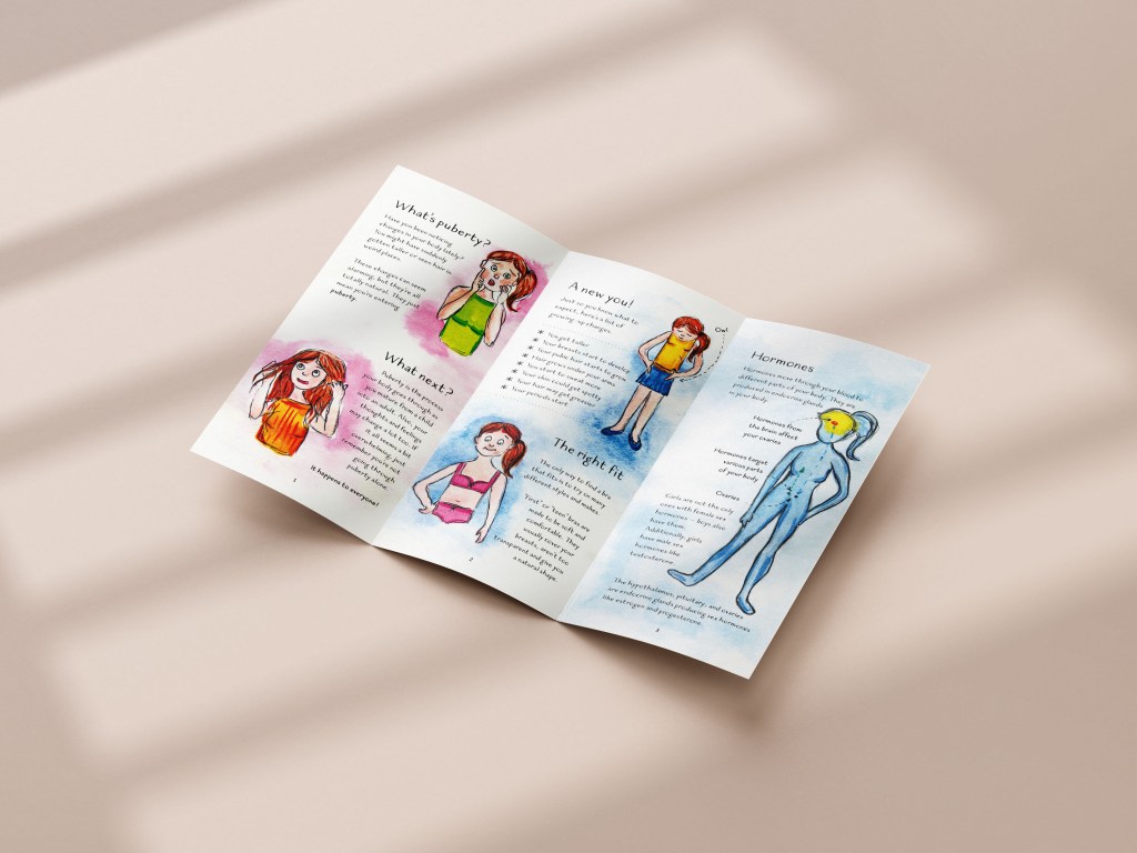
Printed Leaflet
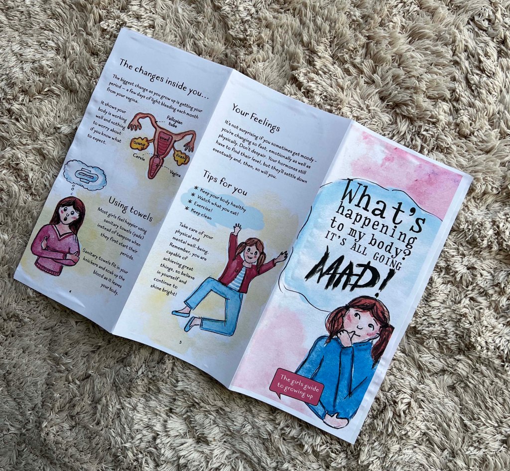
Fortunately, my stepdad has a high-quality printer, allowing me to review printed versions of my designs. Seeing your work in print is beneficial, as it reveals adjustments needed such as colours, illustration proportions, or spelling errors. In my case, I noticed that the girl’s face on the front cover doesn’t portray the required surprise or shock indicated by the word MAD! Especially with the chosen font. I believe the girl’s expression needs adjustment to convey more surprise rather than curiosity, or perhaps using a simpler font for the word Mad. These are my observations. If I decide to submit this work for assessment, I will make these changes. Overall, the design appeared good, the illustrations were vibrant, the font was readable, and the chosen format of Z-fold worked well.
