In this exercise, the brief asked me to produce a series of illustrations for packaging to be used for a new range of organic biscuits for children. There are three varieties in the range Raisin, Choc Chip and Ginger biscuits. The client specifically wants three illustrations featuring extinct animals interacting in some fun way with a biscuit to be used on the boxes. The drawings should be in full colour, and the client would like the colours to reflect the ‘flavour’ of the biscuit.
The brief analysis
To start this exercise, firstly, I analysed the brief in detail, highlighting the keywords and the target audience.
Next step, I went for terminology to the handy book I always had near me for the duration of this unit by Alan Male’s Illustration. A Theoretical & Contextual Respective.
Packaging design involves the skilful use of illustration to distinguish products and create a unique brand identity. Through visual storytelling, illustrators can transform ordinary products into visually appealing creations that resonate with the target audience, as seen in the playful and engaging illustrations on children’s food packaging. Packaging design encompasses a wide range of possibilities, including vehicle branding, shopping bags, cosmetics, household items, and more. Food and beverage products rely heavily on illustration to evoke emotions and highlight their natural qualities.
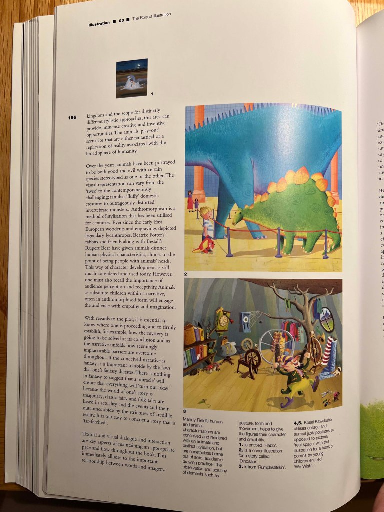
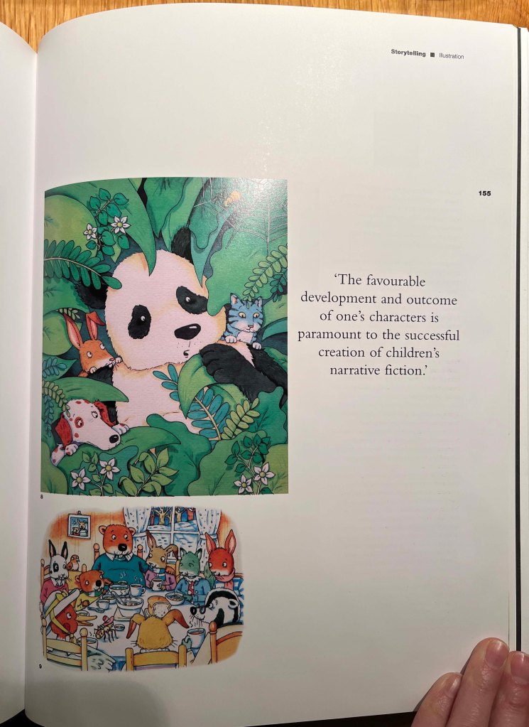
Also, I wanted to explore the subject of depicting animals for the kids-oriented materials. Visual representations of animals range from traditional and charming portrayals to more modern and challenging interpretations, transforming familiar domestic creatures into fantastical beings. Anthropomorphism, a stylistic technique with roots in ancient art, has been prevalent in portraying animals with human attributes for centuries. From ancient depictions of mythical creatures to beloved characters like Beatrix Potter’s rabbits and Rupert Bear, animals have been endowed with human-like qualities, blurring the line between animals and people. This characterisation method remains prevalent today, as it can evoke empathy and spark imagination similar to child characters in storytelling.
Generally speaking, packaging design utilises illustration to create unique brand identities that resonate with consumers, while artistic portrayals of animals throughout history, particularly through anthropomorphism, continue to captivate audiences by blurring the lines between humanity and the natural world.
Food Packaging
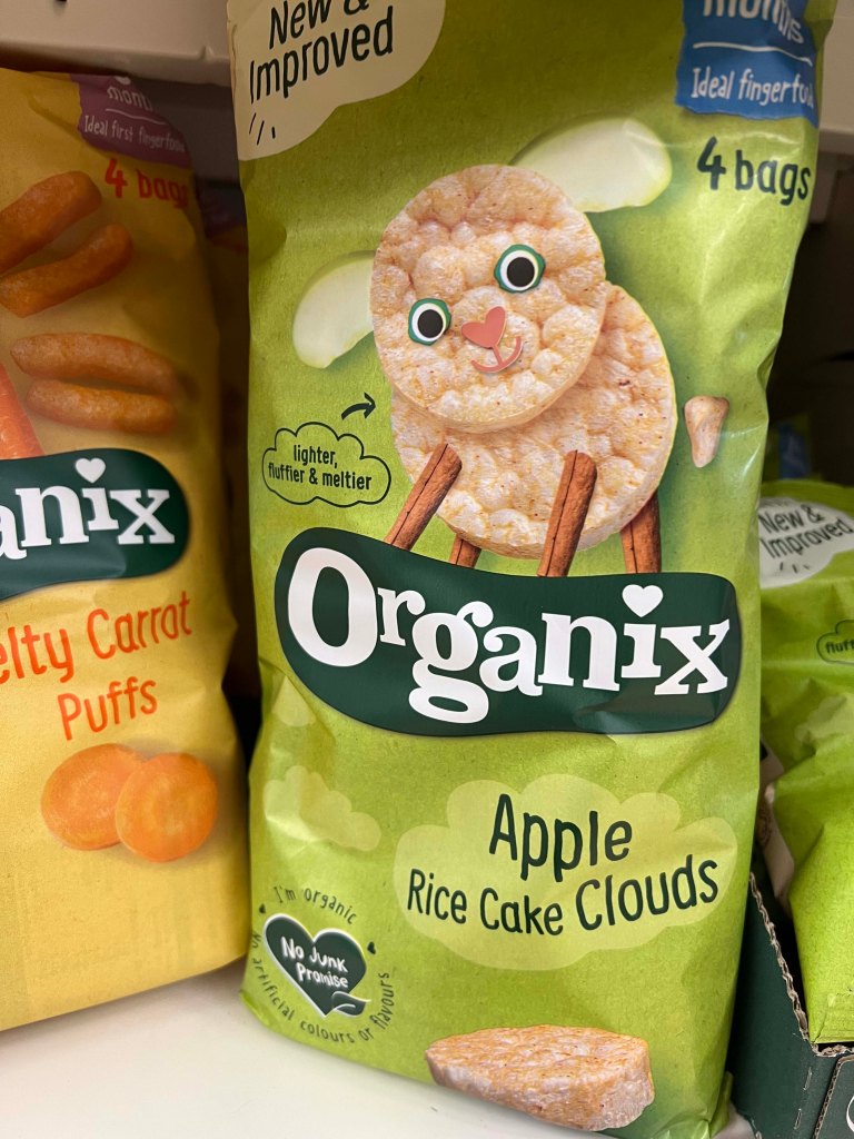
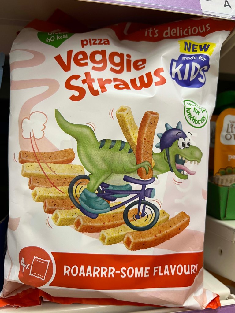
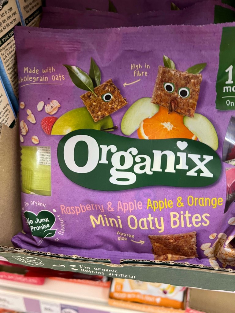
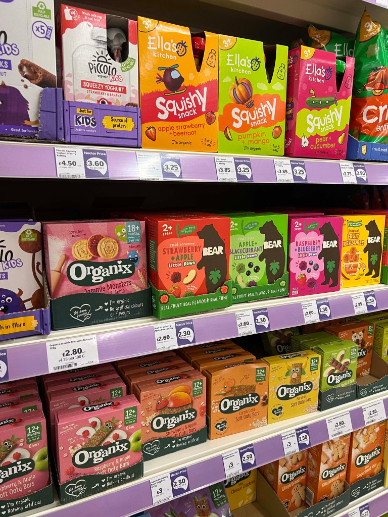
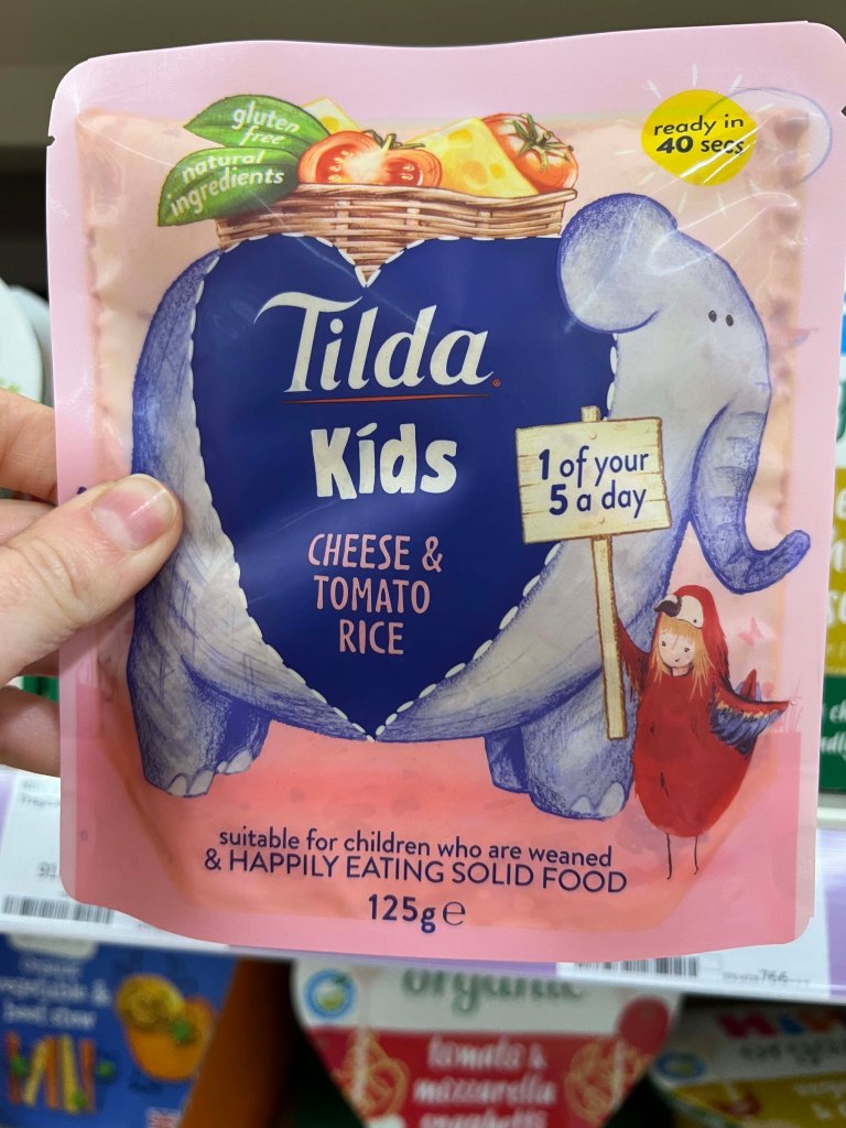
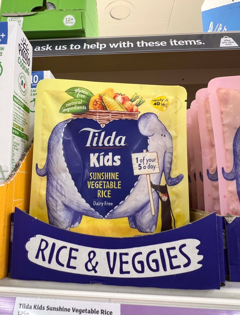
I went to our Sainsbury’s to take pictures of existing snack packages for kids. Having a baby, I started learning about their variety about half a year ago, so I knew where to look. Surprisingly, I even found some snacks with a similar theme where illustrators depicted extinct animals such as dinosaurs, illustrated animals that engage with a snack playfully, and fictional characters that looked like they were made out of snack shapes.
From my research, I could see that the market is saturated with a wide range of snacks featuring characterised animals and creatures targeted at kids. The key objective is to ensure the brand stands out while remaining easily recognisable, creating a distinctive design that appeals to both children and adults alike.
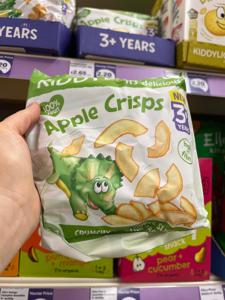
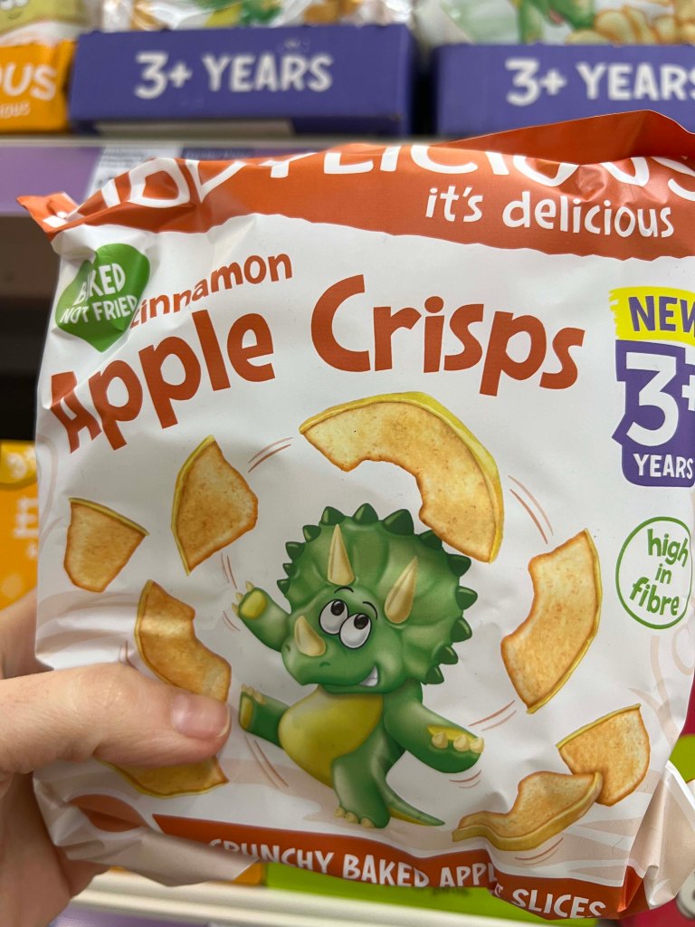
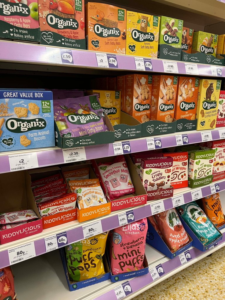
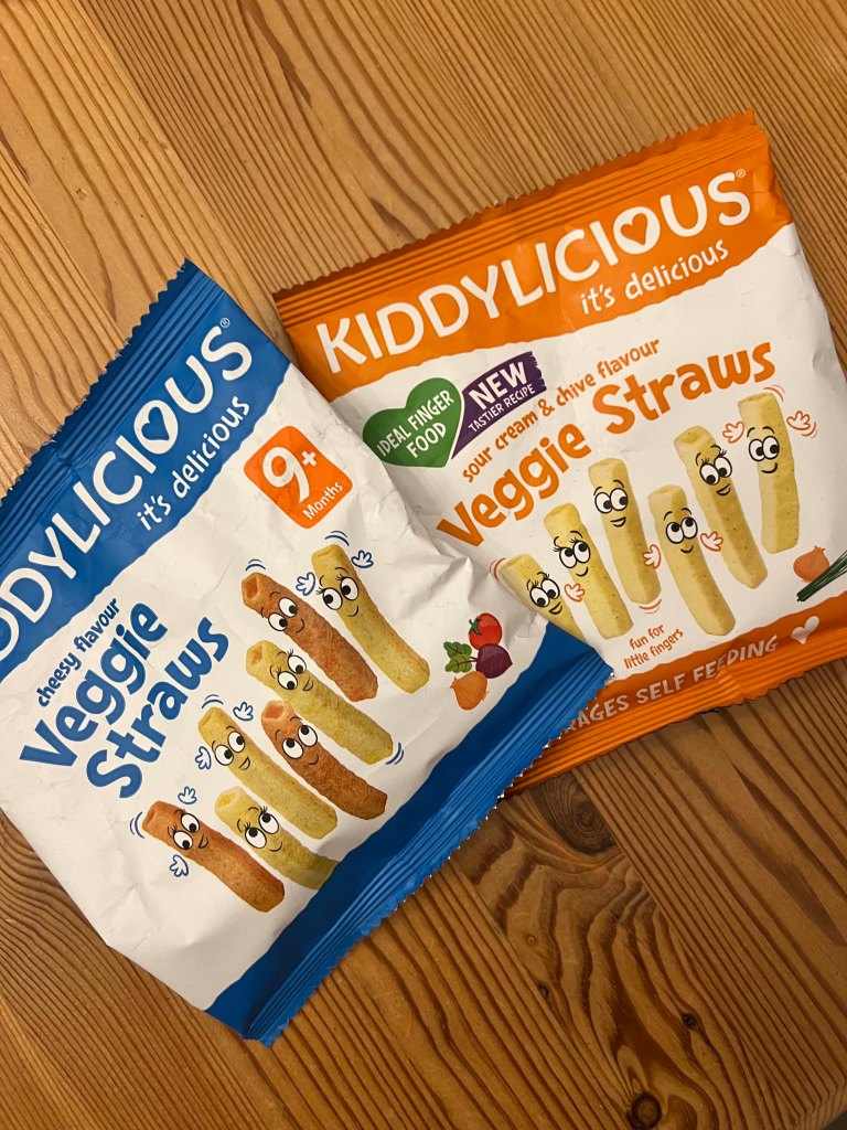

Research on Kiddylicious
I thought that Kiddylicious characters are the closest to my brief, and it would be useful to go for a close-up analysis of their brand for kid’s snack design.
Kiddylicious audience
Kiddylicious brand was built on the strong belief that great taste creates a positive attitude to food in later life. They are a brand that produces various colourful treats that are suitable for children starting from 6 months to 3+ years old. These snacks are not only delicious but also free from artificial additives.
Kiddylicious packaging design
- The Kiddylicious packaging features bright and playful colours that catch the eye, with fun illustrations of fruits and characters that appeal to children.
- The logo is prominent and easily recognisable, usually placed at the centre or top of the packaging.
- Nutritional information and ingredients are displayed clearly, emphasizing the healthy qualities of the snacks.
- The packaging is designed to be user-friendly, with easy-open seals or resealable bags for freshness.
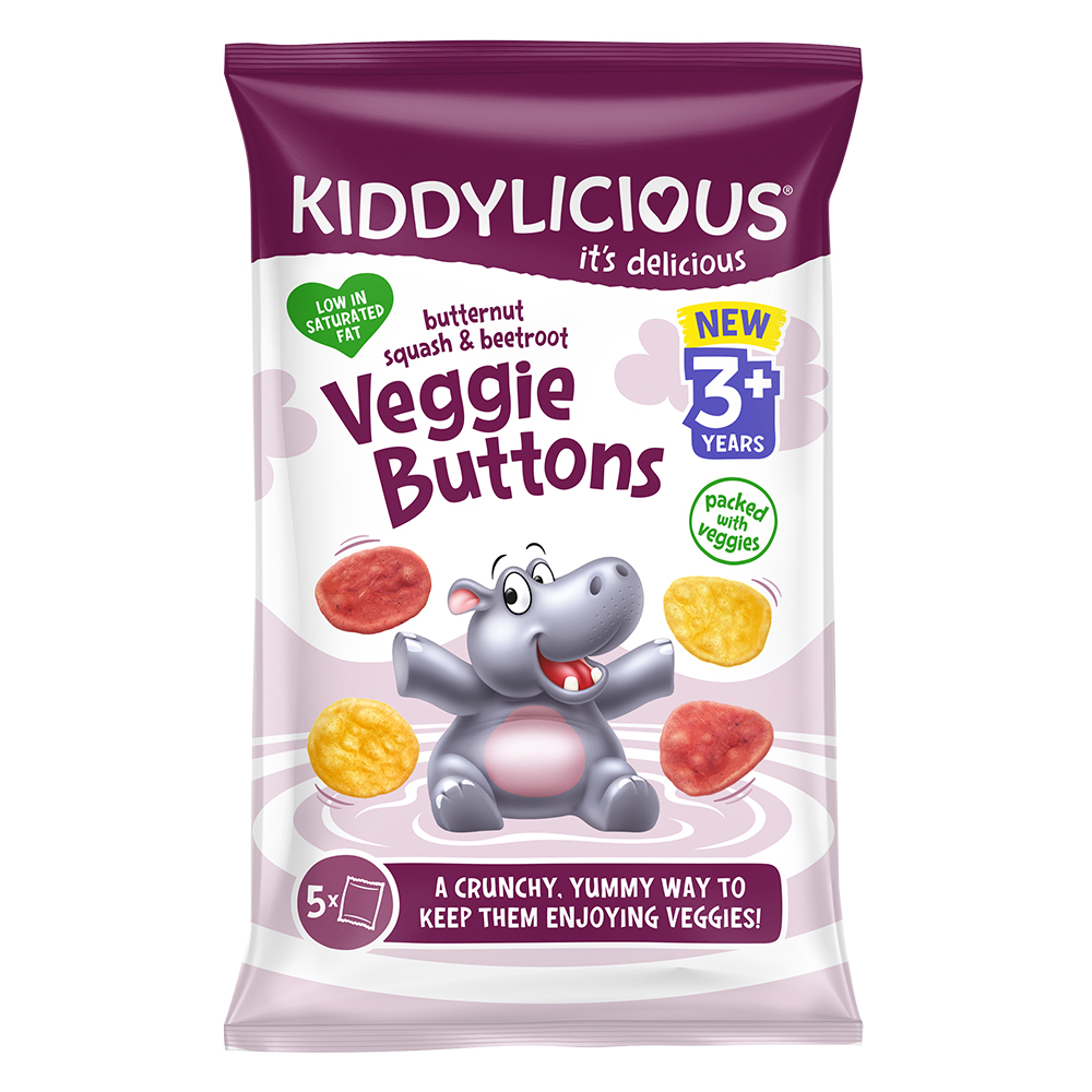
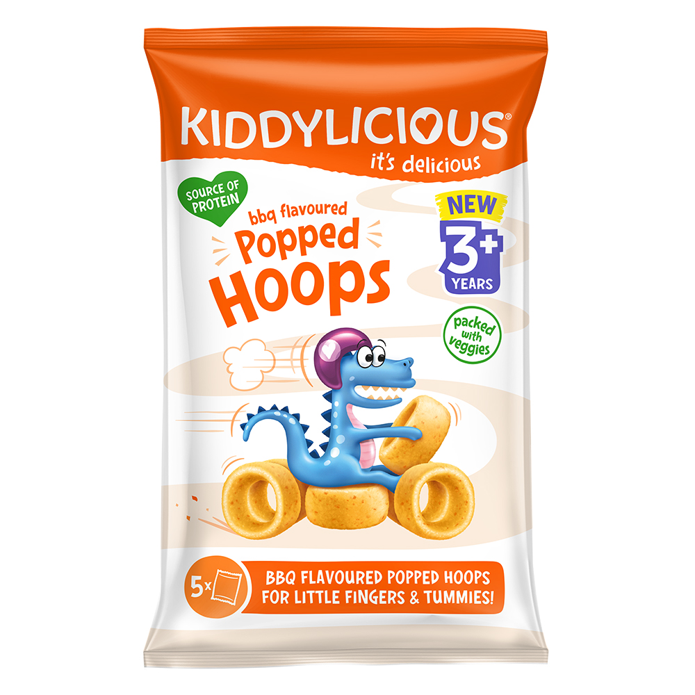
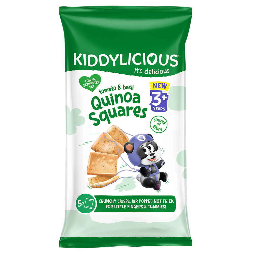
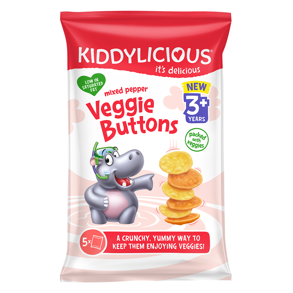
They have that range of 3+, and their brand characters like dinosaurs, pandas, monkeys and hippos are very interactive, dynamic, full of energy and joy, and attractive to parents and kids. Each taste has its recognised colour, like beetroot flavour burgundy colour, BBQ flavour is bright orange, and cheesy taste is done in a vibrant blue package. They are healthy snacks for kids, not only tasty but contain absolutely nothing artificial, are low in saturated fat and are suitable for coeliacs and vegetarians. My little daughter loves them. Also, the packaging is white, with some transparent pale coloured designs on the background, which makes them different on the market, rather than being all colourful packaging.
I loved the way how those characters interact with each snack like they are riding a bike, having a ride on a serving, or using it as a parachute. Some great ideas were integrated into it, maybe I could work around it as well, to make my character interact with a snack in some fun way.


Accessed 12 April 2024, Source: https://kiddylicious.com/global/all-products/
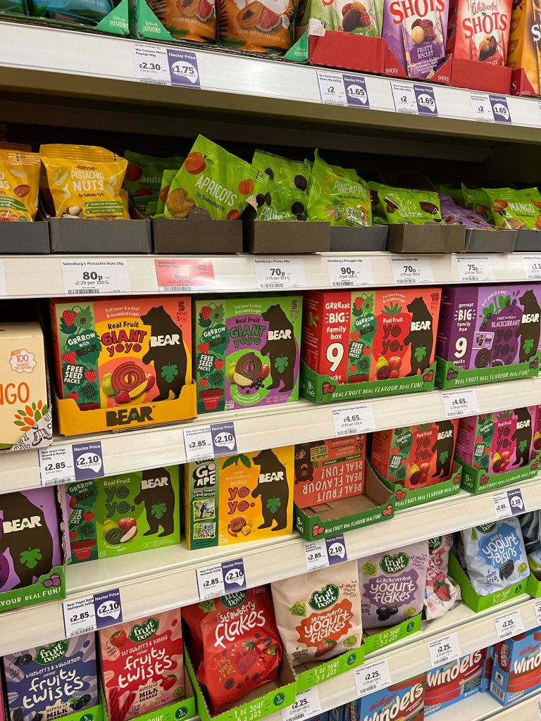
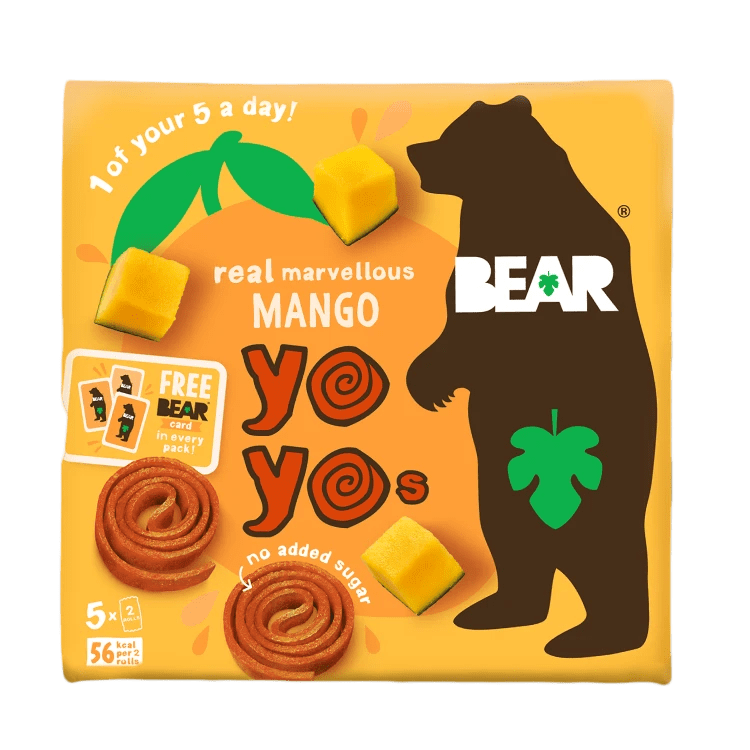
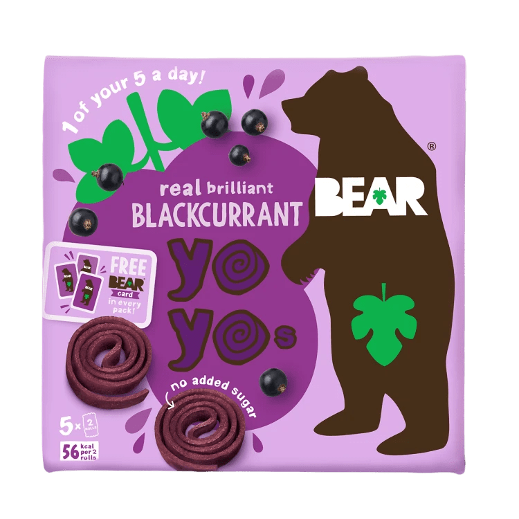
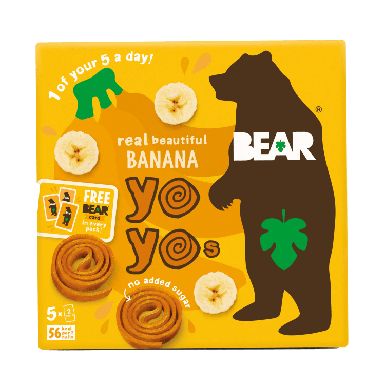
Research on Bear
Another brand, that caught my attention was Bear fruit yoyos, which are made 100% from natural ingredients. They are tasty fruit snacks, have no added sugar and instead, have only natural sugars from fruit and veg.
I chose this brand as it aligns closely with a client’s organic biscuit range, using similar branding with distinct characters and colour schemes for different flavours. Also, it has a bright and eye-catching identity.
Bear audience
The audience for Bear snacks is primarily children, aged from four to ten years old. Also, they target parents looking for wholesome and nutritious snack options for their kids.
Bear packaging design
- Each product from the Bear brand uses a unique, flat, and saturated background colour
- The Bear logo
- Text line: 1 of your 5 a day
- A strapline: No added sugar
- The product title for example: Real scrumptious Strawberry
- Shape of the fruit flavour on the background
The vibrant and colourful bear design catches the eye, featuring a background of fruits positioned at dynamic angles. Fruits fly around the packaging, with a flat illustration of a bear and green leaf in the corner. These engaging designs emphasise the natural and sugar-free aspect of the product.


Accessed 12 April 2024, Source: https://www.bearsnacks.co.uk/
When we talk about both audiences, the animated animal character would be appealing to kids’ attention. On the other hand, the parent will look for the natural ingredients. I personally, have a habit of looking on the back and reading the ingredients. The ideal solution would be to incorporate animal characters, and at the same emphasise the natural essence of the product. For adults inclined towards organic options, factors like a natural colour palette, eco-friendly packaging, and a quirky and endearing character design hold more sway than a cartoonish and vibrant look.
Keeping that all in mind I intended to create packaging that would tick all points, like appealing animated characters, natural ingredients mentioned on the pack and eco-friendly packaging.
Mind map
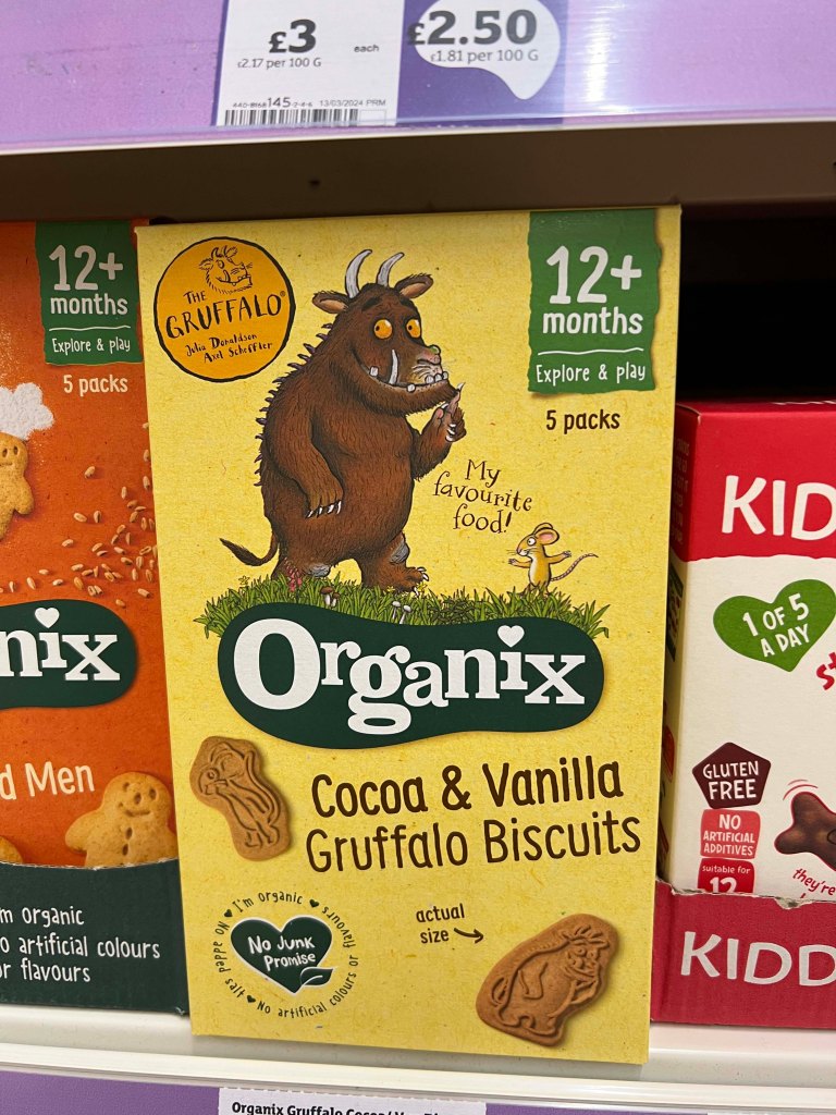
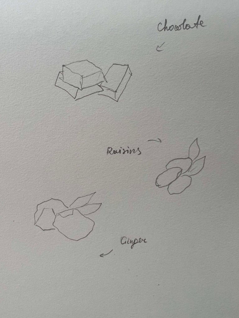
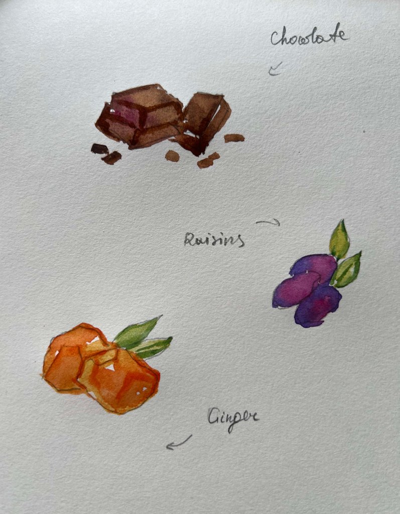
Then I opened my sketchbook to create a mind map with a list of extinct animals. There were so many, that I had to divide them into subgroups, like prehistoric mammals, flightless birds, dinosaurs etc. As there were three packagings I was thinking about what extinct animals I could incorporate to create a coherent theme. I thought if I go down the line of dinosaur snacks, would make sense to use three types of dinosaurs, like T-rex, Triceratops and Brachiosaurus, as they belong to the same era, rather than mixing different era disappeared animals, like for instance dodo bird, that last was seen in 17 century. Also, I thought that I didn’t want to use any big bulky animals like mammoths, or the teeth of sabre tooth tigers were too scary for kids. The more I thought, the more I was inclined toward the version of one chosen animal that would interact with the biscuit in a different way, similar to the Kiddylicious brand, where they have three different flavours for one animated animal.
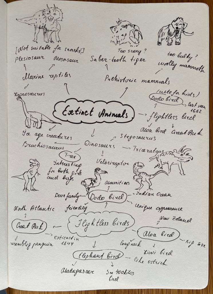
I thought I would leave the task of choosing animals for a little longer, whilst creating a colour palette for each flavour. Choosing actual animals was a bit of a task for me, as I didn’t want to look like I was trying to skip the brief by selecting one type of extinct animal. I wasn’t sure whether I wanted to use dinosaurs for my designs. So I thought for myself, I will go for the dodo bird, as I was quite touched by the way they disappeared, and will do my best to create some variations of the bird for each flavour. My intentions were to create a coherent theme, visually similar, but different in interactions with biscuits and in poses.
Dodo Bird
The dodo was a bird species that went extinct during the mid-17th century. It was originally mistaken as a close relative of several different birds, including the albatross, the vulture, and the ostrich. Scientists later determined that the dodo bird belonged to the same family as pigeons and doves (the Columbidae family).

https://www.worldatlas.com/articles/how-did-the-dodo-bird-go-extinct.html
The dodo bird is often used as a symbol of the lasting damage humans can have on the environment and animal survival rates. Its iconic status as a symbol of species extinction is due to how rapidly this species went extinct after first being discovered by European explorers. In a timespan of only around 100 years, the dodo bird ceased to exist in the wild.
The choice of the dodo bird character for kids’ biscuit snacks carries a whimsical and educational charm that resonates with young audiences. The dodo bird is known for its friendly and quirky appearance. I thought it could be a great character to capture children’s imaginations and spark their curiosity about the natural world and extinct species. This character choice creates a unique and memorable branding approach that entertains kids and fosters a connection to nature and conservation, making snack time fun and informative for young consumers.
Sketches
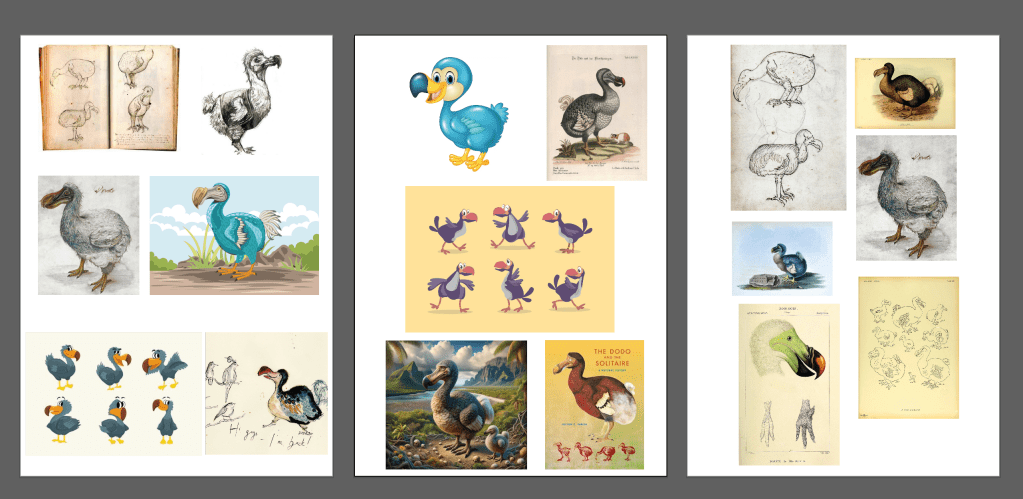
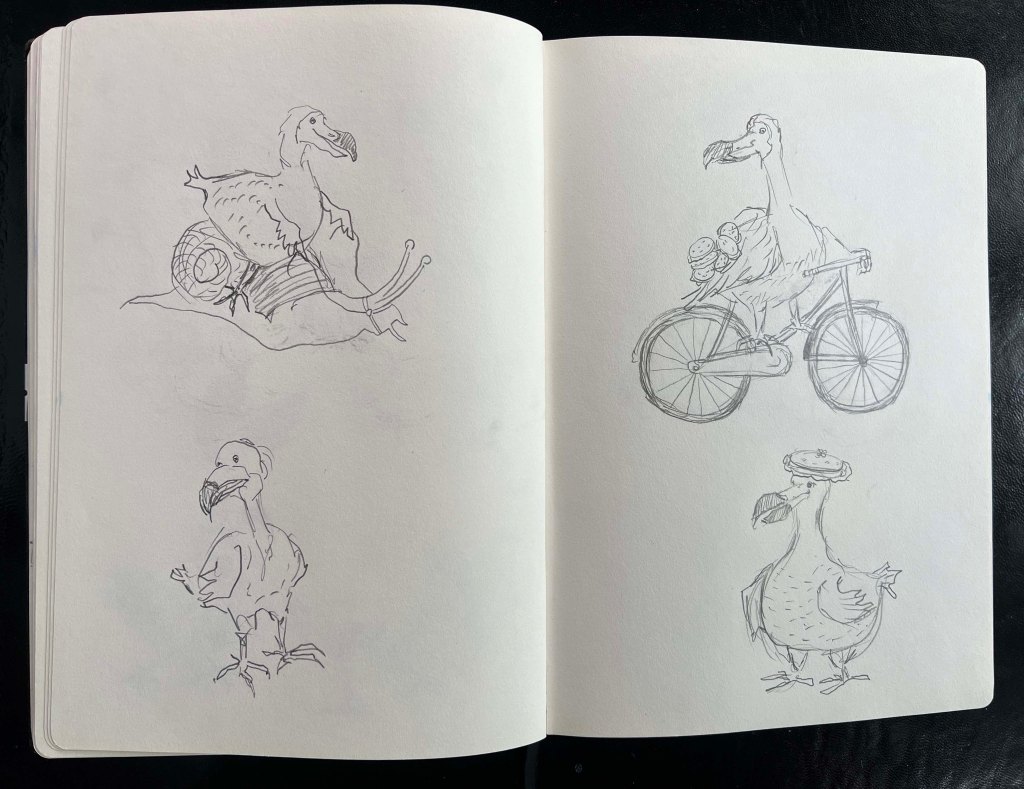
Next stage, I proceeded to sketches. Also, I collected some illustrations and images of the dodo bird for the mood board to see what the actual bird looked like. From my observations, the bird had a round body covered in soft, grey feathers. The feathers of the dodo were likely a mixture of light and dark grey tones, giving it a somewhat monochromatic appearance.
Its wings were small and stubby, rendered useless for flight. The most striking feature of the dodo was its large, hooked beak, which was of a curved shape and had a sharp tip. The bird had small, dark eyes and a noticeable gap between the beak and a prominent forehead. The dodo’s legs were stout and sturdy, adapted for walking and foraging on the forest floor.
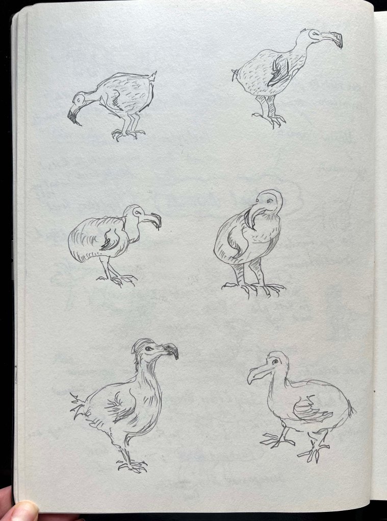
In my sketches, I wanted to reflect a curious and playful side of dodo’s bird personality. I wanted the illustration to be somewhat in the middle between cartoony and realistic style. At the same time, I wanted to keep that natural look of the bird to underscore the organic ethos of the brand, while infusing a playful charm to appeal to children.
From those sketches, it is evident that the bird is depicted walking around, exploring various emotions ranging from feeling intimidated to being curious and playful. I considered incorporating some recreational activities for the bird, such as riding a biscuit bike or simply running around. Alternatively, positioning the biscuit in different locations, like the beak, wings, or feet, could capture a range of movements and expressions of the bird.
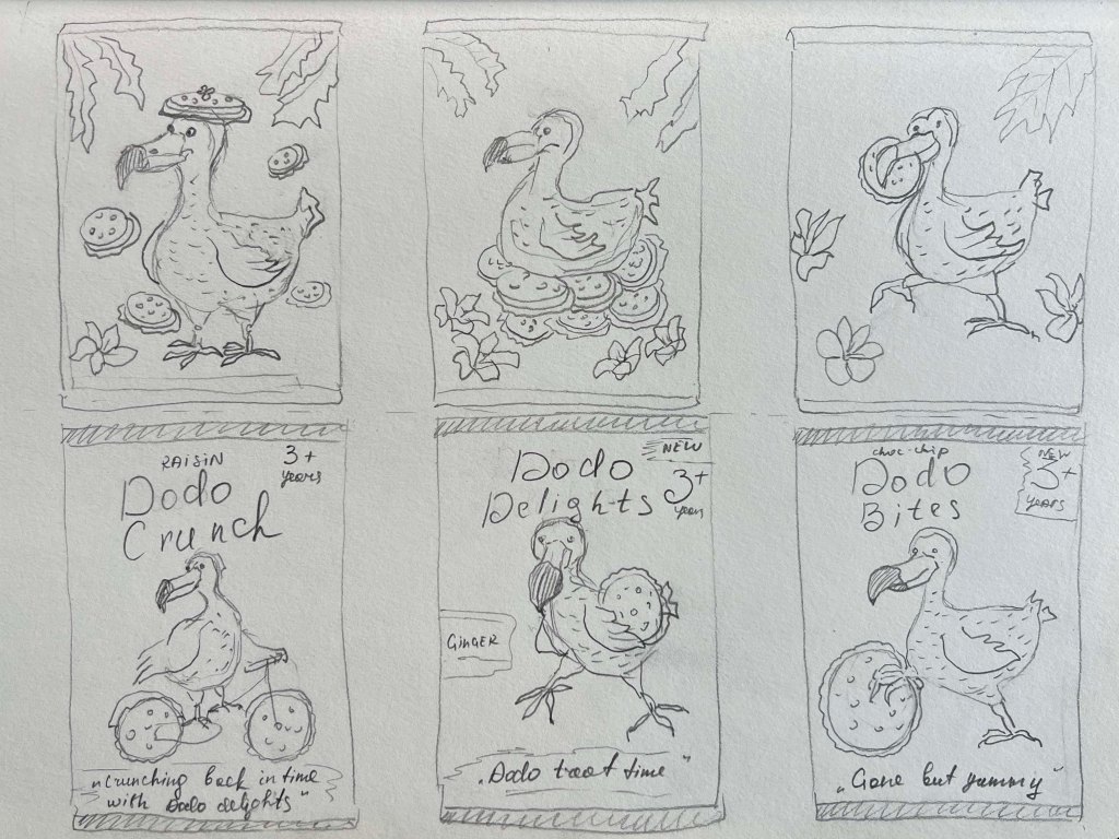
I created quick thumbnails for the packaging to visualise how the bird would appear against different background options. Initially, I considered using a tropical backdrop with exotic flowers and plants, featuring either pale, subtle hues or vibrant, bold colors. Another option was a solid-coloured background without additional elements. I decided that maintaining a clean design was essential to ensure the focus remained on the bird, as adding extra elements might divert attention from the main object.
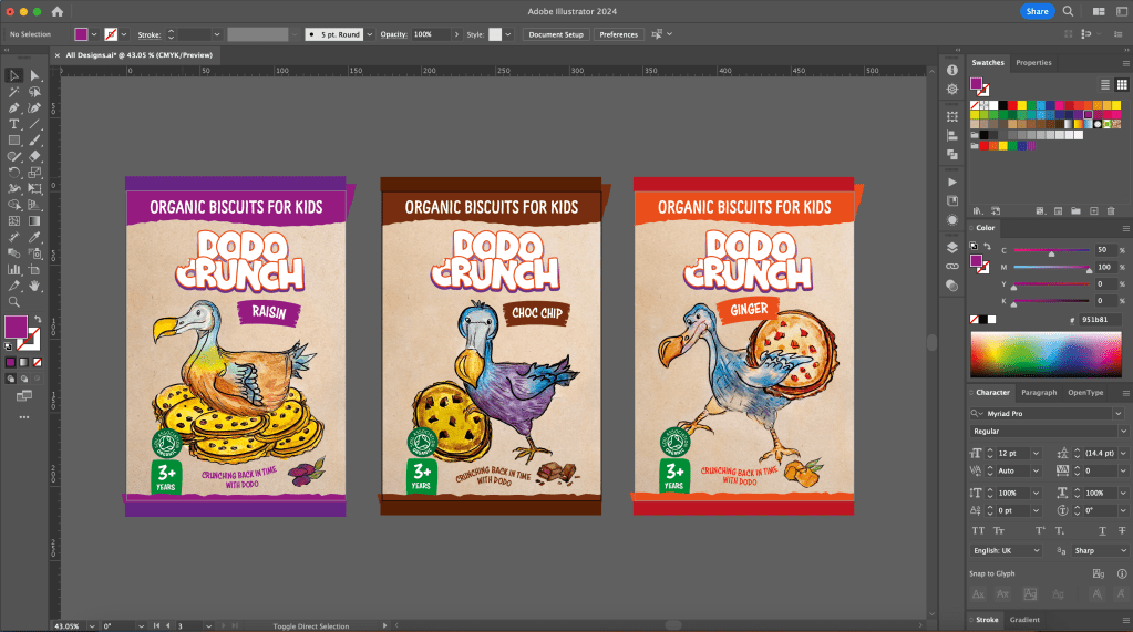
Textwise I was going to place the name of the biscuit in the central top part of the pack and locate the slogan in the bottom. Altogether, I was going to include such information as:
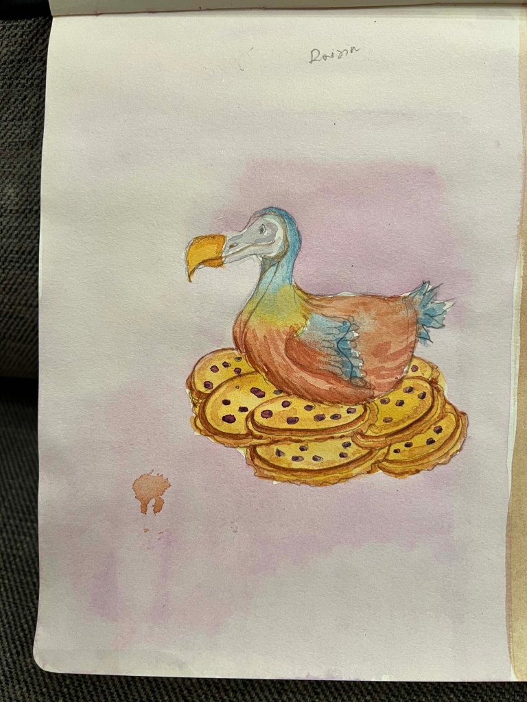
- the name of the biscuit Dodo Crunch;
- slogan ‘Crunching back in time with Dodo’;
- the age group 3+ years;
- the flavour of the biscuit;
- organic association logo;
- organic biscuit line.
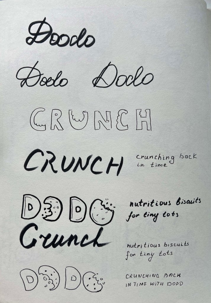
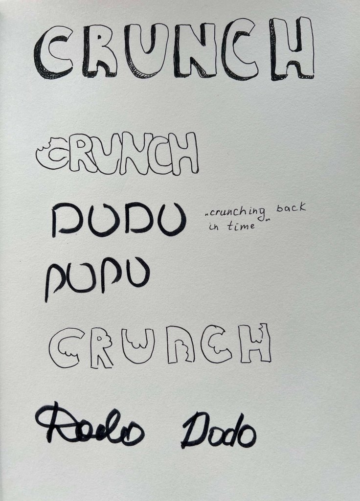
Another task I tackled was selecting typography for the packaging. I aimed to experiment with a handwritten font to showcase the biscuit’s name, ‘Crunch’. This was where the earlier exercise on ‘Text and Image’ proved useful. I envisioned creating a font resembling a biscuit or incorporating a small bite mark on certain letters. I liked some of the options and definitely will try them on the packaging. Also, applying a handmade font could establish a distinctive design identity when combined with the illustration.

Illustrations
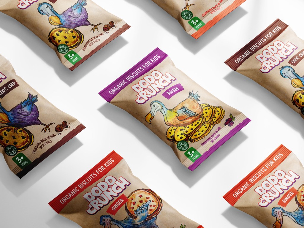
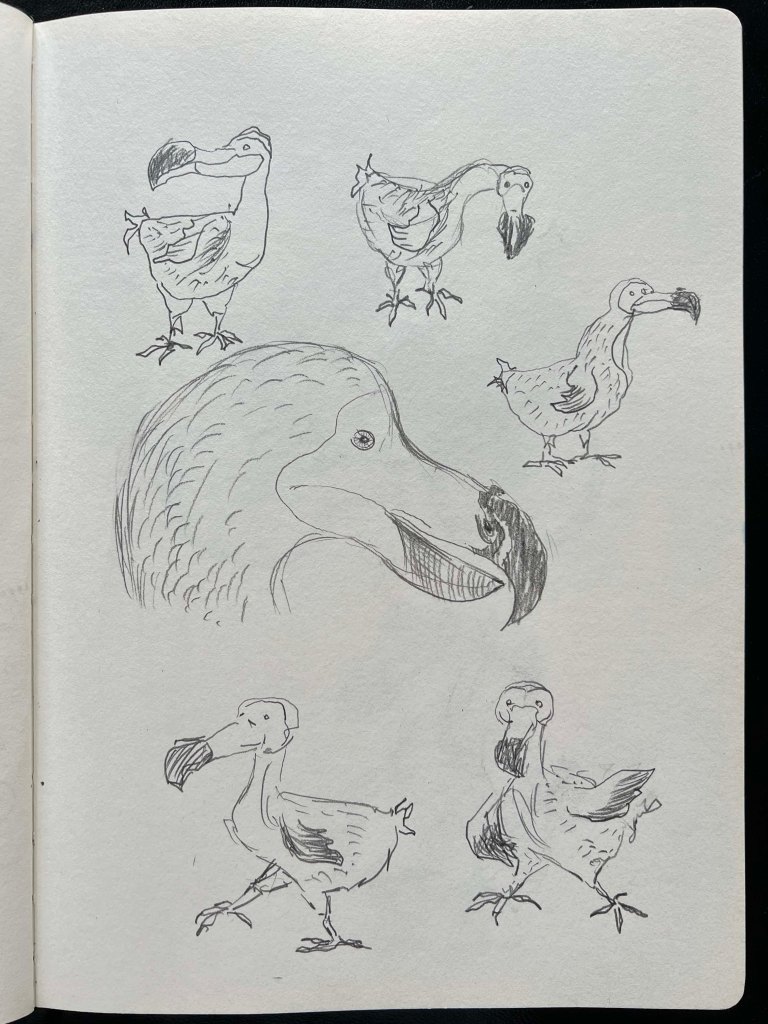
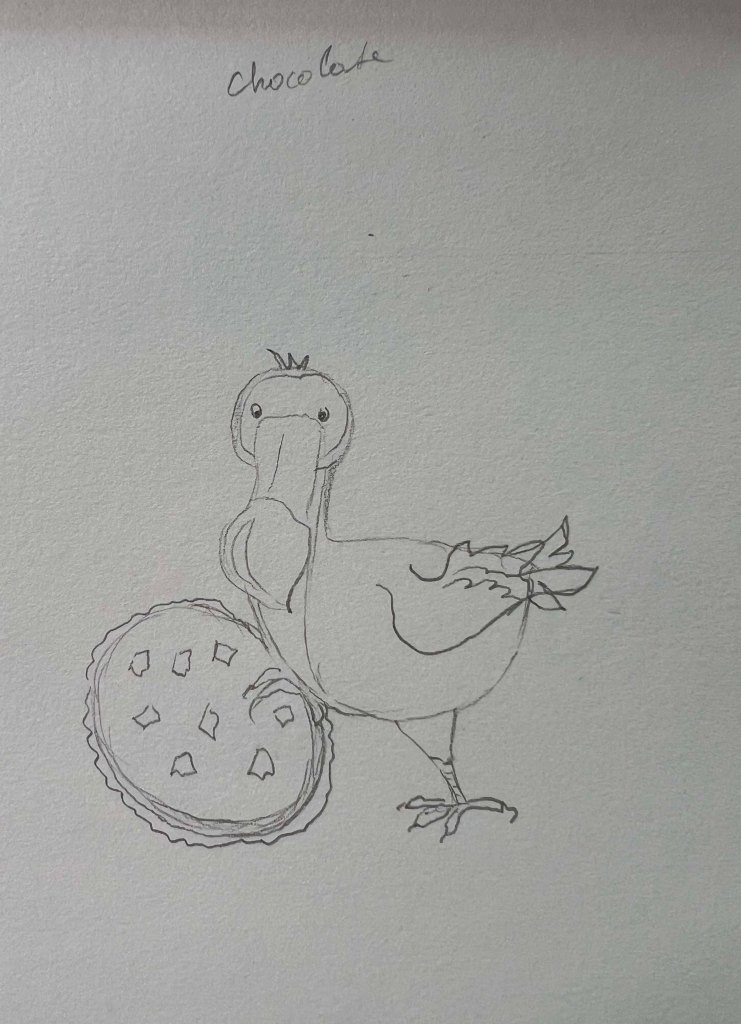
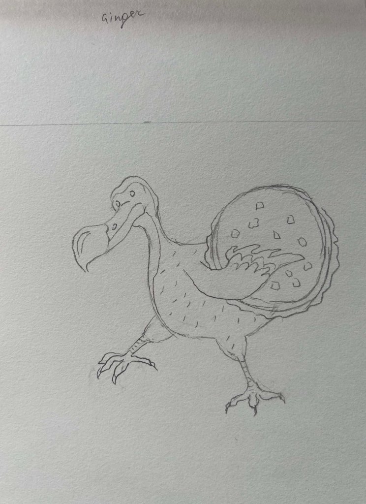
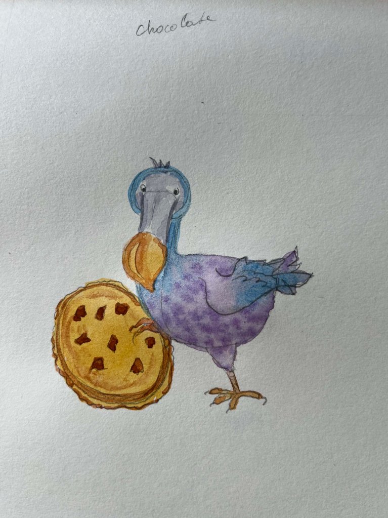
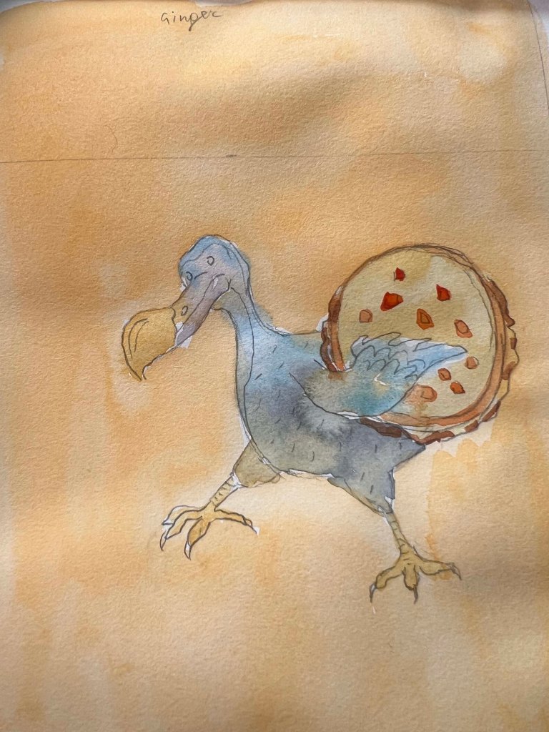
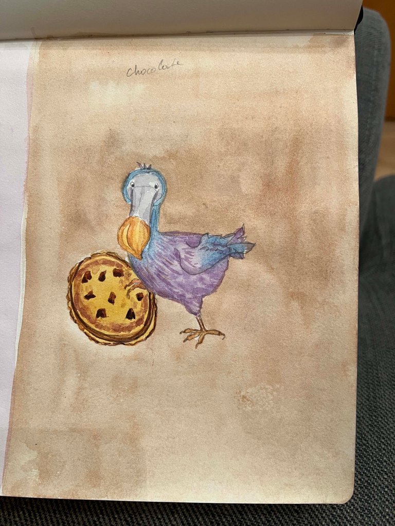
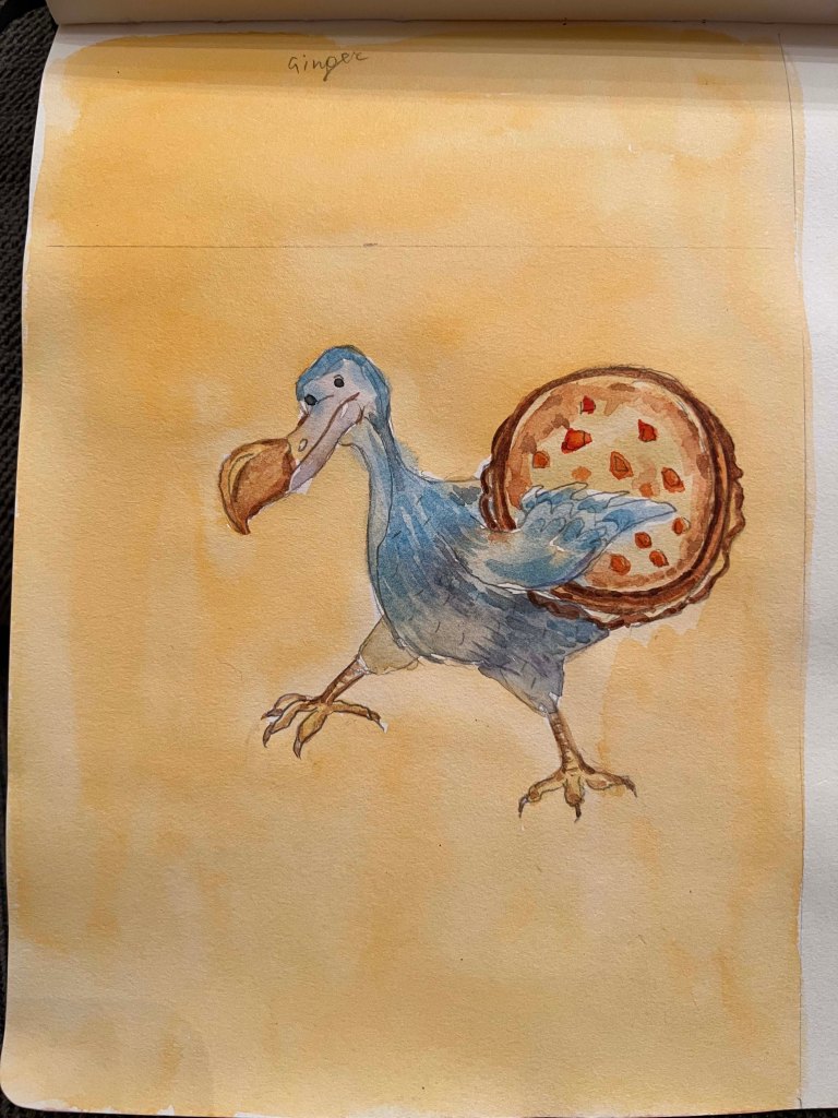
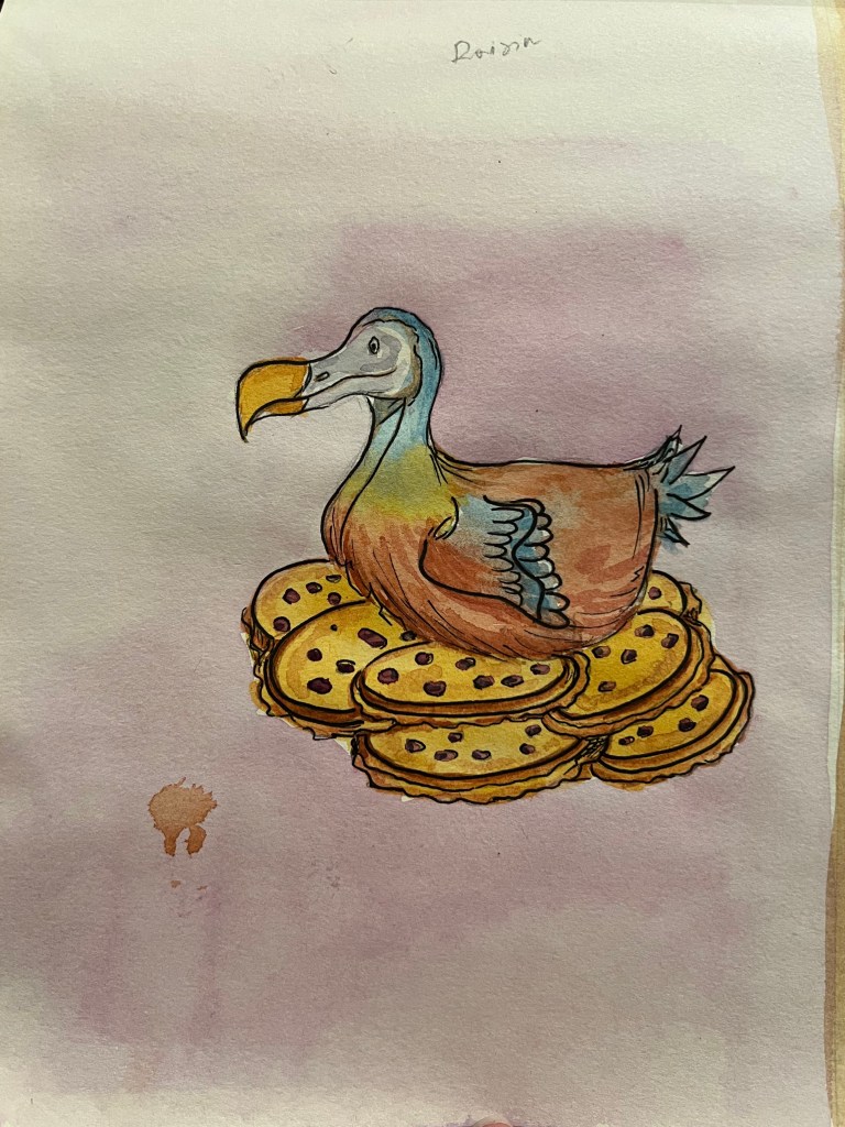
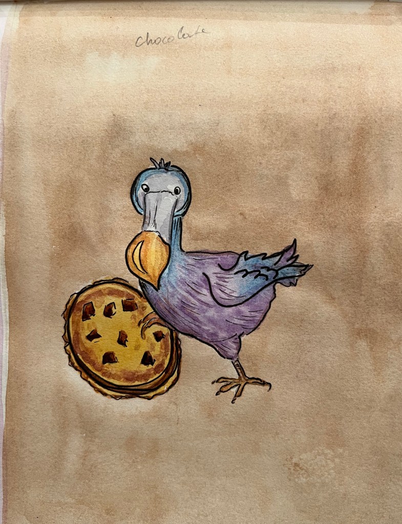
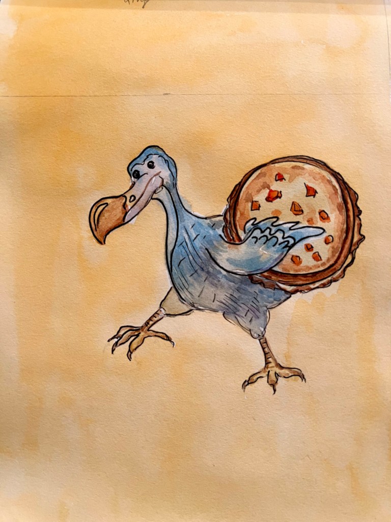
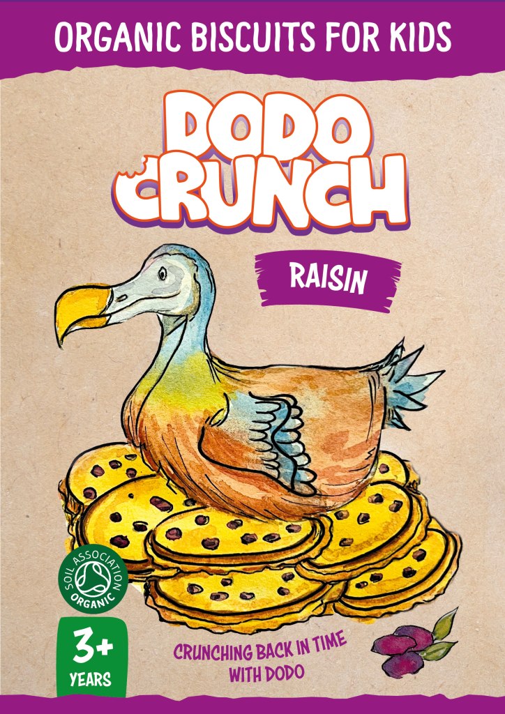
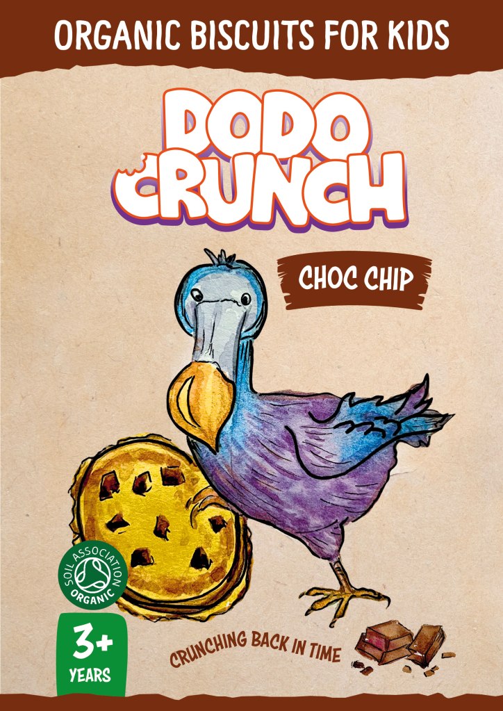
After experimenting with fonts, I had to make a final decision about what activities my dodo birds would do with biscuits. I thought to myself, that for the raisin flavour, the bird is going to sit like on the nest made out of biscuits, for the chocolate the bird holds the biscuit in the leg, and for the ginger flavour the bird with a biscuit in a wing. Also, I wanted to sketch the bird from three different angles, so that some differences between them could be seen.
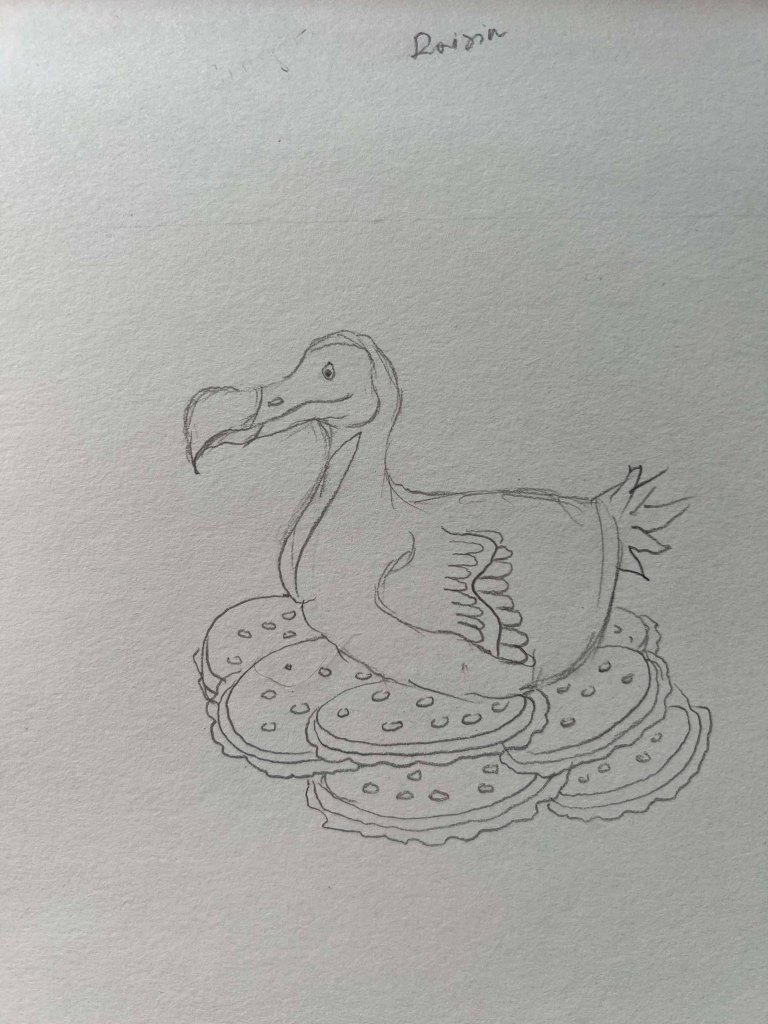
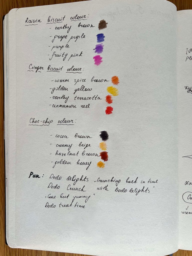
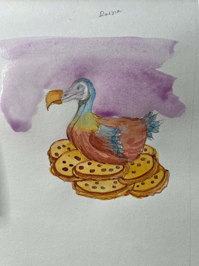
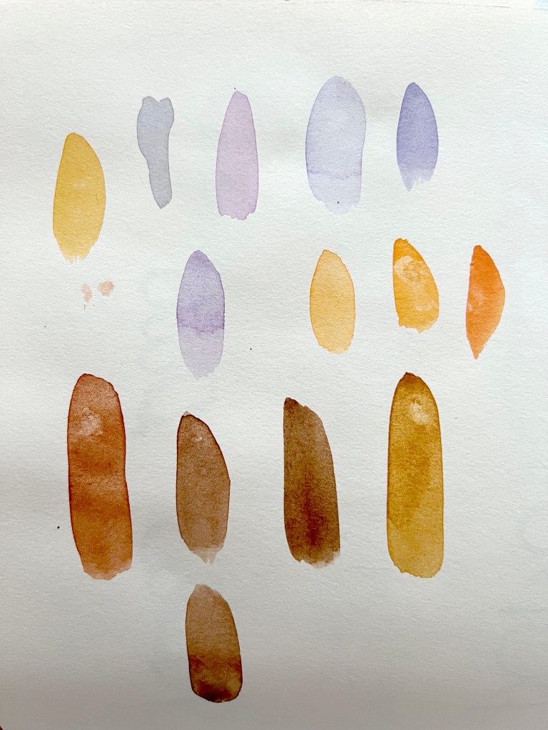
Finally, I moved to the exciting part, colouring my sketches. I chose watercolour as my medium, planning to highlight illustrations with some black pen strokes. However, before that, I needed to select a colour palette for my birds. I aimed to give them an artistic touch with soft, watercoloured hues, ensuring a slight variation in colours between each bird. They looked slightly different in style from each other, I intended to unify them in a cohesive look later in the software, making them resemble a series of themed biscuits.
I painted a lightly coloured background for my birds, intending to connect the colour with the flavour of the biscuit. However, I was unsure if this approach would be effective, as the background was too faint and did not maintain a cohesive feel. Therefore, I planned to cut my illustrations from the background and edit them in Photoshop.
Typography
Choosing typography took a bit of my time, as I thought it was important to choose the right font, as it could play an important role in the overall fill of the design. Initially, I was going to use my own handwriting for the slogan, but then I thought I could find a similar font, or find a playful font that would be readable and oriented for the younger audience. They were a good selection of fonts, and I felt like I was on the right track. For the brand name ‘Dodo Crunch’ I choose Crunch Chips font with some bitten pieces on the top. Also, I thought rather than writing the logo just simple straight, would be useful to place letters closer together, like they overlap each other and make them look like they almost dance.
With the slogan and biscuit flavour, I was going to experiment with the actual packaging, where I could see what works best depending on the colours and design style.

Packaging Design
At this stage, I felt that I was on the right track and approaching the final part of creating the actual design around the bird, selecting the final fonts, and choosing colours for each flavour. My task here was to cut the bird from the background and experiment with fitting it into different backgrounds to determine which one complimented the bird best. Initially, I planned to create watercolour smears in colours similar to the biscuit flavours, such as a purple watercolour smear for the raisin flavour, orange shades for ginger, and brown colours for the chocolate biscuits. However, I found that these designs with watercoloured backgrounds appeared overly complicated and drew attention away from the bird. Returning to the organic packaging theme, I had the idea to use a background that resembled recycled paper. This choice not only elevated the bird in the foreground but also created a focal point for it. Furthermore, the colour scheme could convey the eco-friendly values of the brand.

As I aimed to make the design look like a ready pack, I added some graphic design elements, that resembled illustration, such as waves, and text written on the curved line. They all added final bits to the design and created a playful design. Also, I added a little raisin pile in the right corner of the pack, which helped me to balance the bottom part of the package. Same I did with ginger and chocolate flavours.
I loved how they looked together when I placed those designs next to each other, with the edited backgrounds and birds. There was a coherent feel to them, the birds were bright and vibrant, interacting with a biscuit, and appeared happy and jolly, which is what I wanted to achieve for kids’ biscuits.

Mockups
In conclusion, I thoroughly enjoyed designing these packages. I was pleased with how the designs turned out and believe they have the potential to stand out in the market. The dodo bird looks artistic, the packaging conveys the organic nature of the product, and the additional graphic design elements create an appealing overall design that should catch the attention of both parents and children. I aimed to make each bird unique by varying the feather colours, reflecting their distinct personalities. To me, they resemble a series of biscuits, and I hope they align well with the brief.