
In this exercise, I was asked to produce three illustrations for a series of book jackets, the size of an existing travel guide, for the locations Istanbul, Helsinki and Milan.
One of the client’s requirements is to create illustrations in which many elements are brought together in a diagrammatic way. Also, the type has to be hand-drawn in an appropriate style.
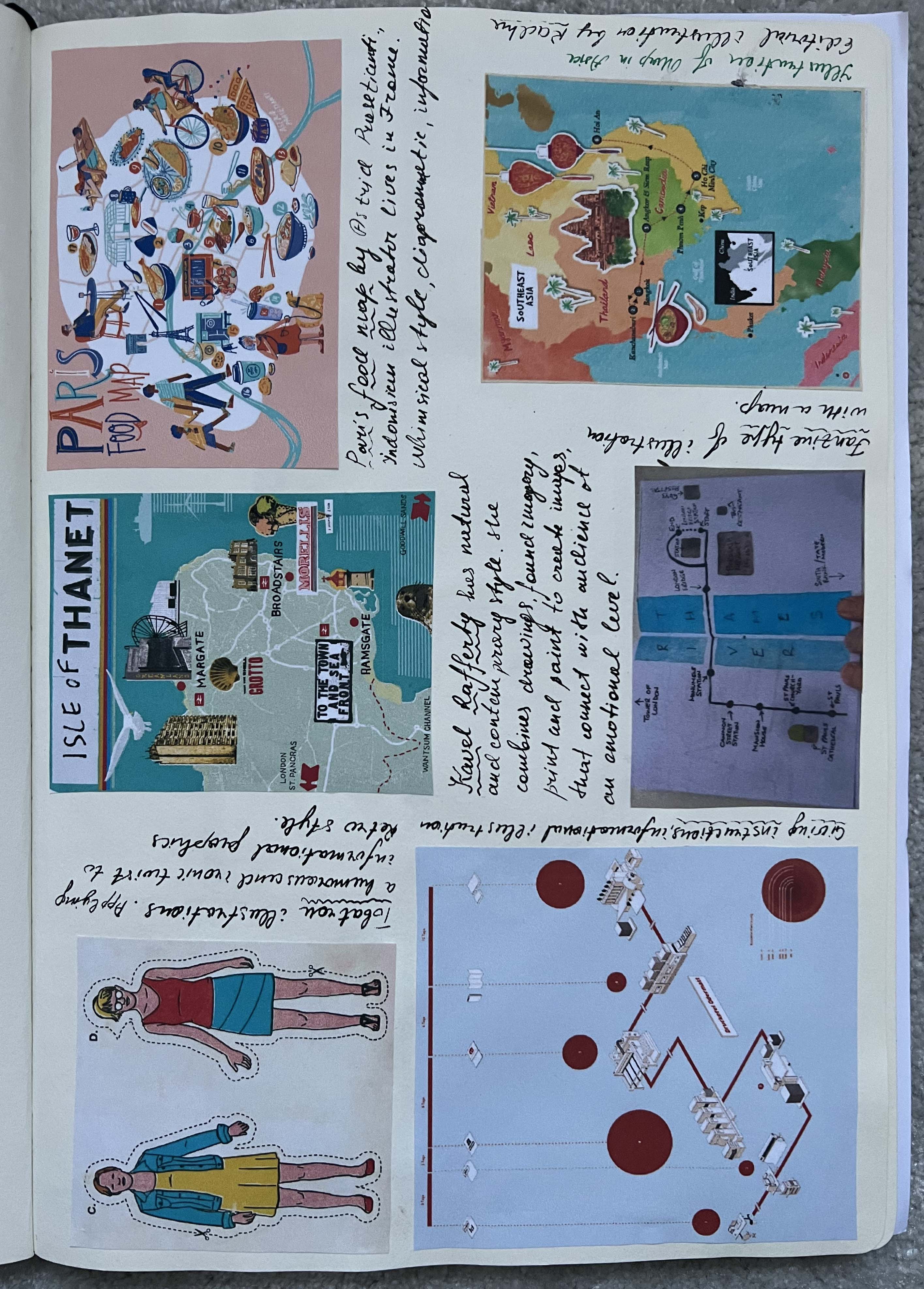
To start with, I wanted to do some research on the term diagrammatic illustrations. Diagrammatic illustrations are visual representations that convey information, processes, or concepts through diagrams, charts, or graphs. These visuals use symbols, shapes, and labels to simplify complex ideas, making them easier to understand and visualise. Diagrammatic illustrations are often used in educational materials, presentations, manuals, and infographics to enhance comprehension and provide a clear, concise portrayal of diverse subjects such as scientific processes, organisational structures, and data comparisons. Through their intuitive design, diagrammatic illustrations efficiently communicate intricate details and promote a better conceptual grasp across various fields.
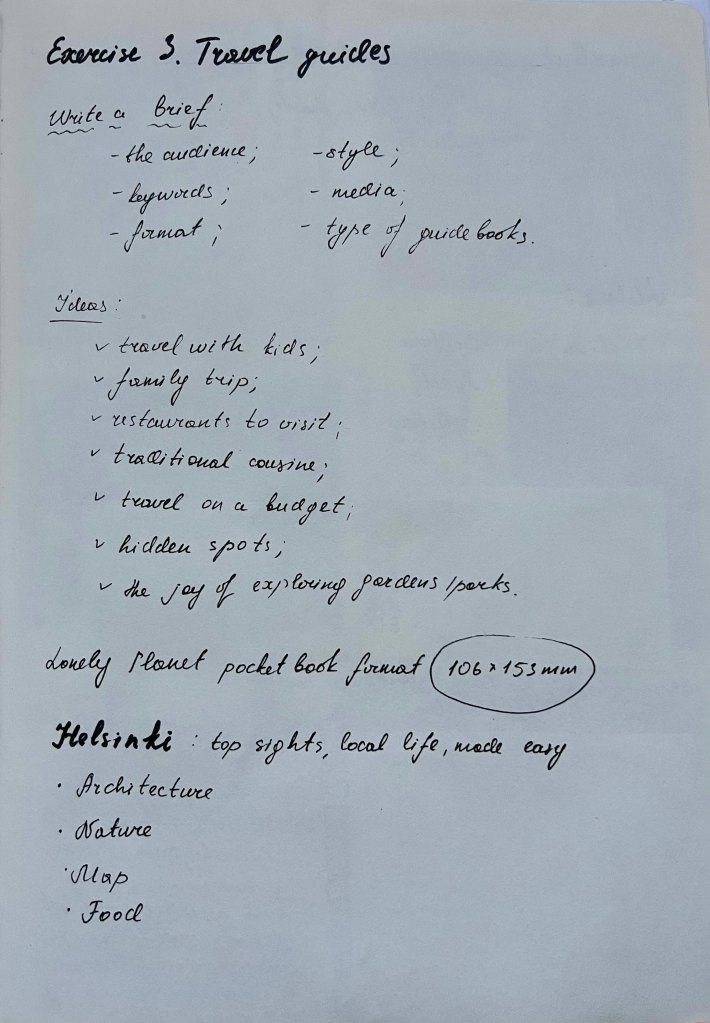
One of the tasks for this exercise was to write my own brief. Points that I have to consider for this exercise are:
- the audience;
- keywords;
- format of the travel guidebooks;
- type of travel guidebooks (restaurants, ultimate travel guide, travel with kids, hidden gems, etc);
- style;
- media.
I thought to myself that the chosen destinations, with their rich cultural offerings and myriad attractions, are ideally suited for the culturally inclined traveller seeking immersive urban experiences. Those particular destinations we were briefed to make a travel guide more suitable for someone who expresses a passion for cultural discovery, culinary delights, and the vibrant essence of evening atmospheres. But, at the same time, having a baby personally, I was more inclined to do some research on a holiday with kids.
By analysing some of the designs from Lonely Planet guides, I opted for a format that reflects their well-received standard, ensuring practicality and familiarity for travellers. As the brief was to create diagrammatic illustrations, I adhered to a non-digital, hand-drawn approach, with a touch of whimsy while remaining true to representational storytelling.
I decided to create a travel guide tailored for families and parents travelling with kids, specifically targeting the mid-20s to early 40s demographic. This will streamline the research process for finding the best kid-friendly locations. As a parent, I’ve always found it challenging to discover places that are engaging for both adults and babies, especially when we are talking about city-type breaks. With this goal in mind, I began the initial phase of researching and creating diagrammatic illustrations as part of the guide.
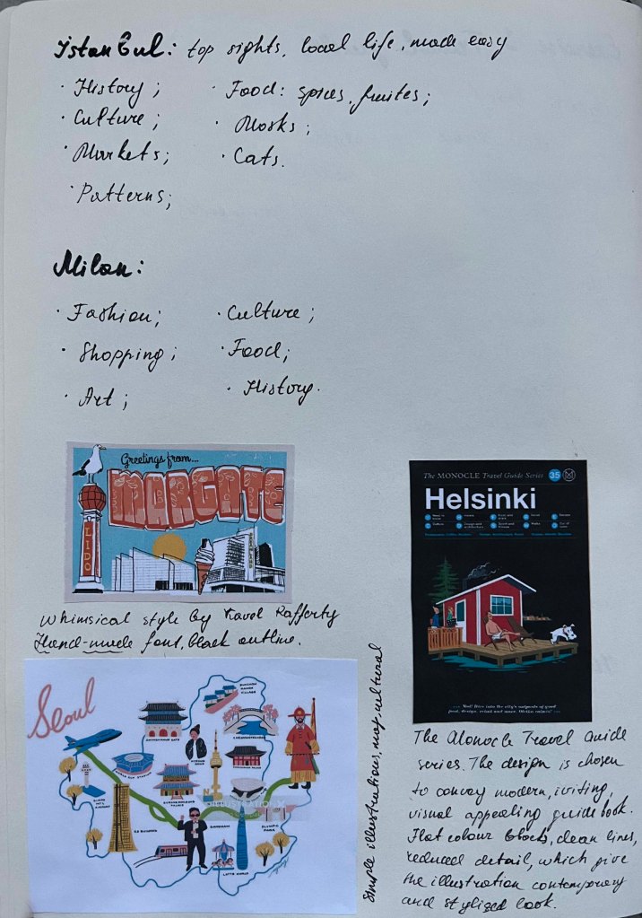
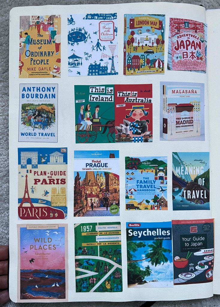
Also, I did some research on the various styles of travel guides, not only diagrammatic but also collective representations of travel guide styles. There are several styles for cover designs for travel guidebooks, each with unique visual appeal and purpose. Classic covers often feature iconic images or illustrations of well-known landmarks or symbols associated with the destination. Photographic covers showcase stunning images of the destination, often featuring landscapes, cityscapes, or cultural scenes that encapsulate the spirit of the place. Vintage-inspired covers evoke nostalgia and charm, using retro design elements, aged textures, and classic travel motifs to create a sense of timeless allure and old-world elegance.
Those ones that I’m interested in are made in an artistic style, that features hand-drawn illustrations or paintings on their covers, capturing the essence of the destination with a creative and whimsical touch. These covers can convey a sense of creativity and individuality.
When considering the design direction for my book covers, I thought that the most logical approach for me would be to incorporate the city’s map, highlighting its most popular landmarks that would be appealing for families with kids to visit. To do so, I was planning to create a list of top destinations from each city to feature on the cover.
The challenge I faced was to depict most of the popular places to visit in one area, such as the central part of the cities. However, the most interesting destinations for kids are often situated in more remote locations, such as islands to explore, aquariums, and animal parks, which are rarely found in the city centre. Therefore, I had to gather landmarks that would be engaging for parents and kids to demonstrate in one location, such as the city centre. I compiled a quick list of activities for kids to enjoy while travelling abroad.
- Explore child-oriented museums;
- Go island-hopping;
- Get close to animals;
- Visit castles;
- Go on an urban adventure;
- Run around historic squares and streets;
- Learn about authentic local food;
- Visit adventure and amusement parks;
- Explore modern and contemporary art.
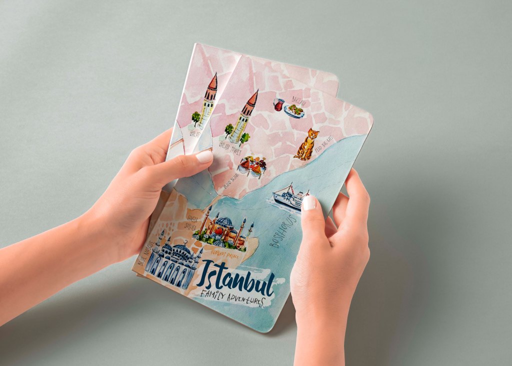
Istanbul
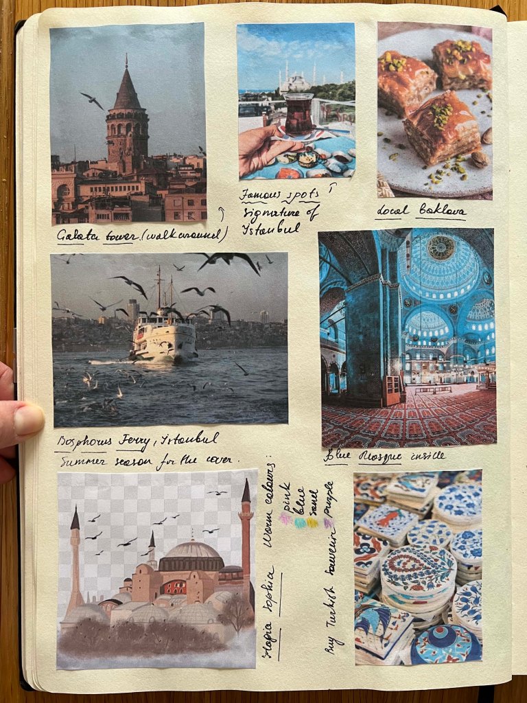
Next step, I developed additional mood boards by gathering photos of pertinent landmarks and began considering keywords and colour schemes.
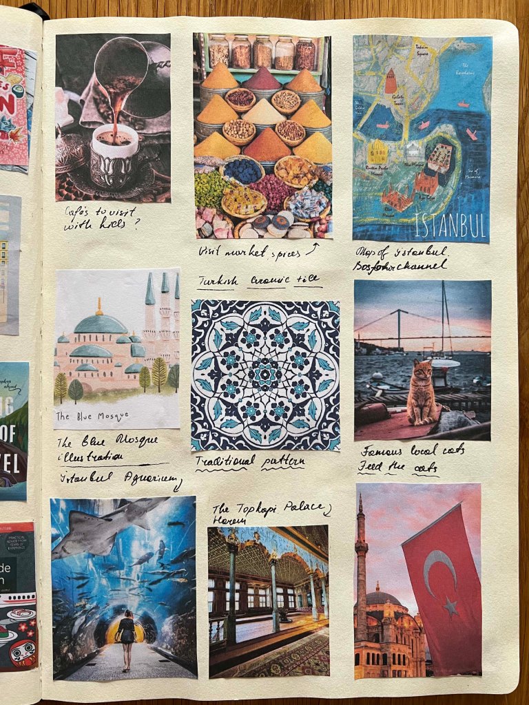
When I worked for a travel company in Ukraine, Turkey was one of the most popular destinations for travelling with kids. It has a mild climate, it is not far to travel, and it offers a rich variety of entertainment for kids. I was quite confident in my choice of theme for a family trip when I was collecting the moodboard for Istanbul. But, at the same time, I thought I would slightly struggle with other cities like Helsinki and Istanbul, as I didn’t know much about them. From my perspective, visiting cultural spots is still very beneficial for kids; it helps them see how diverse the world can be and expands their imagination from an early age. Obviously, to keep kids occupied, parents always have to consider child-friendly locations, as seeing only city sights can be boring. There are definitely myriad things to do with kids in Istanbul, but I couldn’t fit them all into my map. I felt a bit overwhelmed by the choice of places and the variety of locations scattered around the city. Therefore, I created a list of places I was going to include on the map for Istanbul. Unfortunately, I couldn’t include the Aquarium on the map, as it was too far away from the central part.
- Hagia Sophia;
- Blue Mosque;
- Basilica Cistern;
- Topkapi Palace;
- Istanbul Aquarium;
- KidZania;
- Feed the Cats;
- Wander through the Grand Bazaar;
- Walk around the Galata Tower;
- Taste Baklava, Turkish delights.
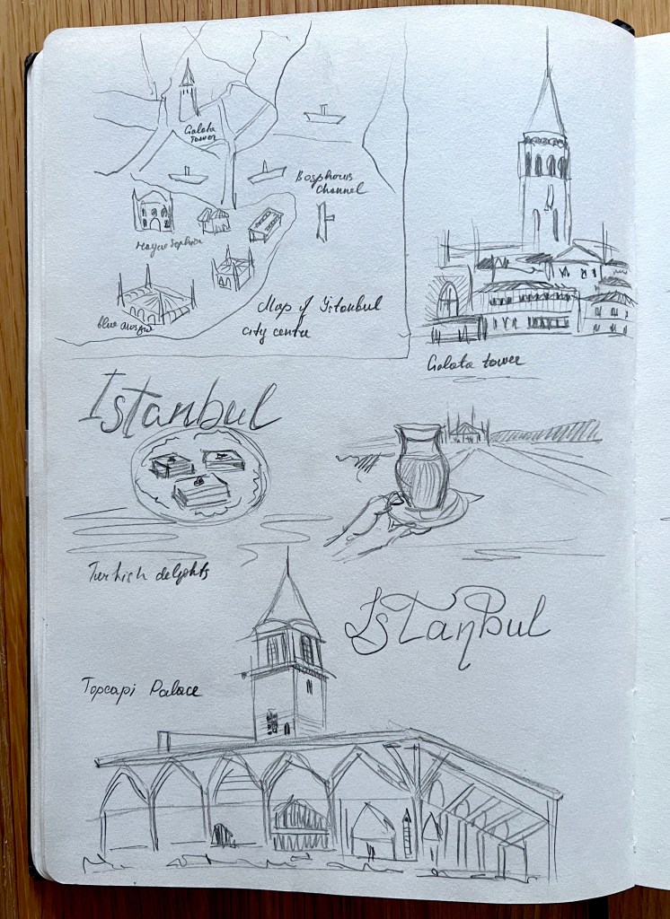

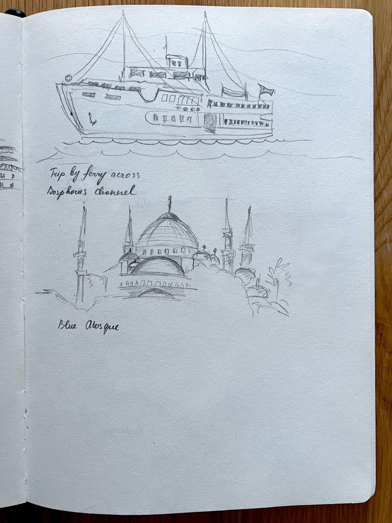
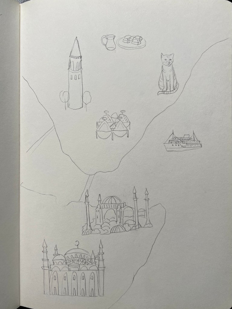
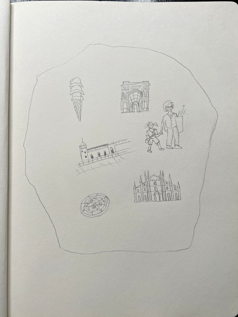
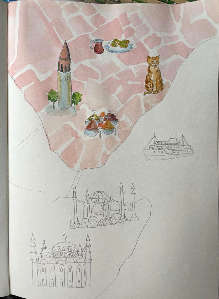
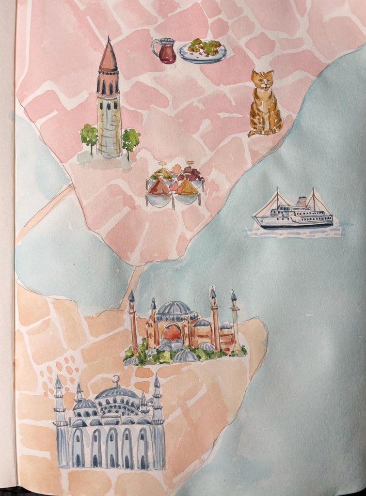
After, I began sketching the landmarks of Istanbul, listing captivating destinations such as the Galata Tower, Hagia Sophia, and Topkapi Palace. I also included cultural activities like visiting markets, tasting Turkish delights, and observing the city’s distinctive street cats. Additionally, I considered the possibility of a delightful ferry trip along the Bosphorus Strait, especially if the child is comfortable with boat excursions, given Istanbul’s proximity to the sea.
Next stage, I created a map of Turkey, following the shape of the city centre provided by Google Maps. The idea was to create a map painted in watercolour with some lightly coloured shapes of the Istanbul streets. For the land colour, I was going to use pinky and orangy shades, and for the see light blue. The landmarks I was going to make were full-coloured with a whimsical touch, slightly off-shaped, avoiding perfection. For the pencil sketch, I was working with my sketchbook format A4, but for the final piece, I was going to adapt the image to the existing pocket travel guide size, which was 106×153 cm.
In the brief, I was instructed to create diagrammatic illustrations. I chose a design based on the map, which seemed quite an obvious choice. However, I also recognised it as a powerful visual that establishes a direct connection between objects and the city depicted in the illustration, creating a narrative. Here are myriad places to visit in this city, it is filled with cultural spots, culinary delights, entertainment, and activities to keep little ones occupied throughout the entire holiday. The map design assisted me in portraying this narrative.
Helsinki
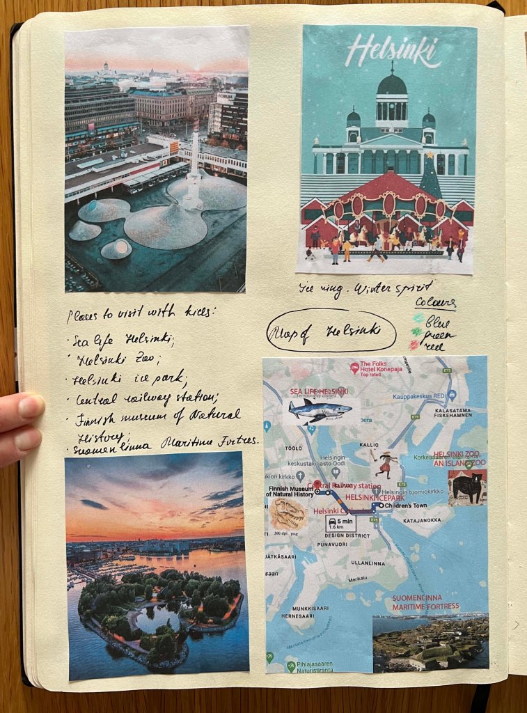
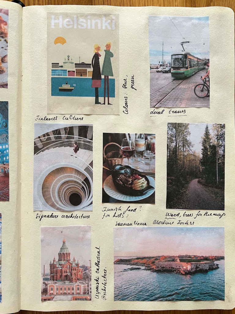
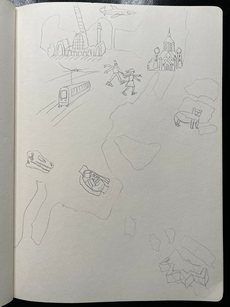
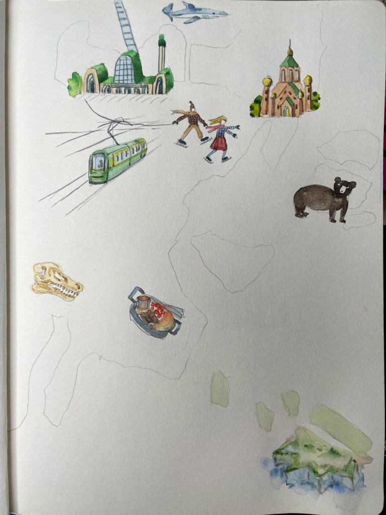
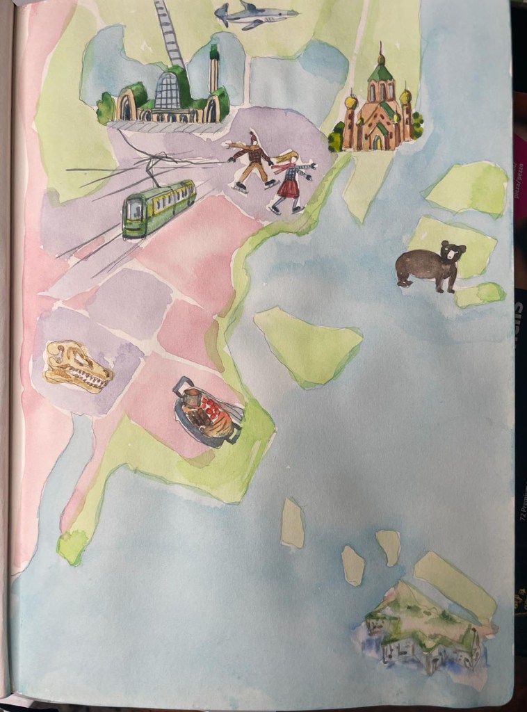
That was the city about which I was most concerned when creating a map, especially for travelling with kids, as I didn’t know much about it. However, when I began gathering information, all my worries started to disappear, as Helsinki seemed like quite an interesting and engaging city to visit, even with a demanding traveller in tow. What I liked about it was that most of the locations were in the centre, including aquariums, ice parks, and other main attractions. Even the distant zoo on the island and the isolated castle seemed to be in close proximity to the centre. The city’s natural environment of coastal beauty and lush greenery gave me the idea to use a green and blue mix for the dominant colours on the map. I felt quite excited about designing this map as it made me want to travel to Helsinki one day. I thought that following the example of Istanbul, I could include places such as churches and cathedrals in my list, along with some kid’s entertainment locations, and some places to eat.
- Helsinki Zoo, an Island Zoo;
- Suomenlinna Maritime Fortress;
- Helsinki Ice Park;
- The Museum of Natural History;
- Sea Life Helsinki;
- Helsinki Cathedral.
Source: https://fiftydegreesnorth.com/uk/article/things-to-see-and-do-in-helsinki-with-kids
https://www.visitfinland.com/en/articles/finnish-food-culture/
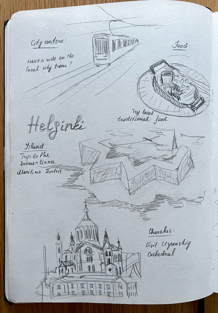
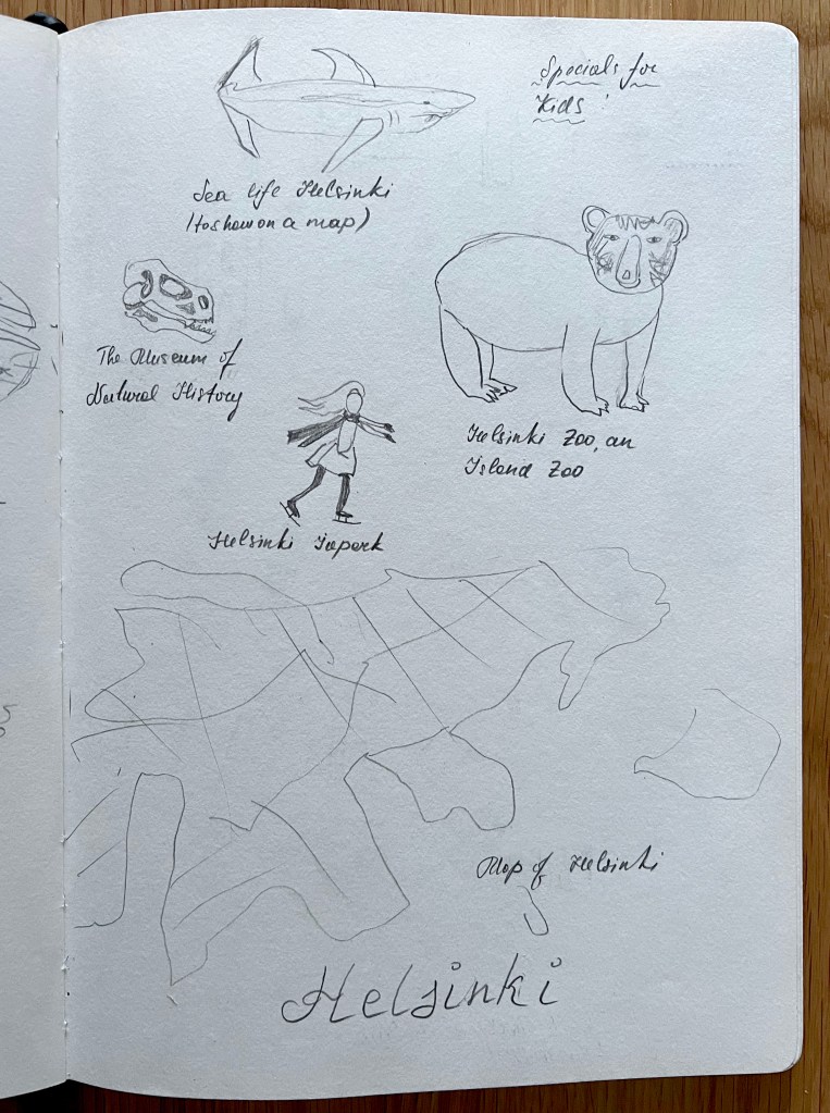
Helsinki is renowned for its fascinating architecture; even seemingly ordinary buildings, such as libraries and churches, are designed in unique ways. However, as I was tasked with making it more kid-friendly, I could not focus on that aspect. Instead, I sketched activities and locations that are likely to be enjoyed by children. I incorporated the Maritime Fortress in the shape of a star, located slightly away from the mainland on an island, boasting its unusual star shape. Furthermore, I included a zoo on the island, an intriguing experiment considering the placement of locations not on the mainland. I appreciated the opportunity to include such spots as the Natural History Museum and ice skating, as I felt I had selected more child-friendly locations. Now, I only needed to match them with the Istanbul maps to create a sense of continuity.
Milan
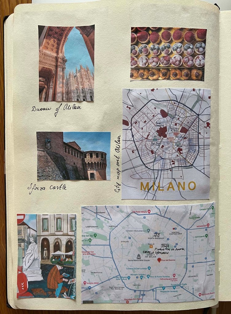
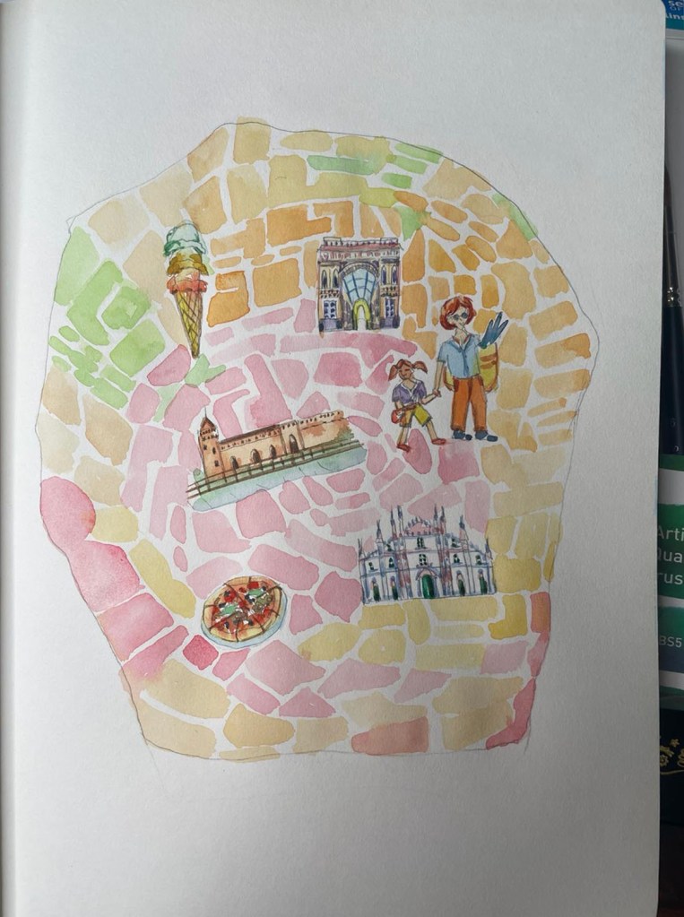
The last city I had to design a map for, was Milan, a completely different story from the first two cities mentioned before. Having visited Rome and Florence before, I found them to be delightful locations for travelling with kids. I thought I could follow a similar approach to when I travelled to Rome, considering the similarities with the Italian fashion capital, Milan.
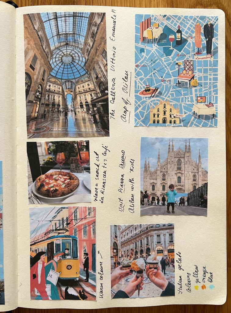
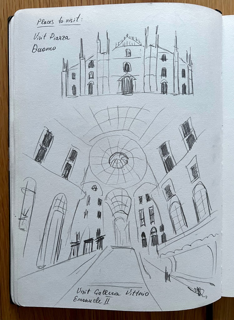
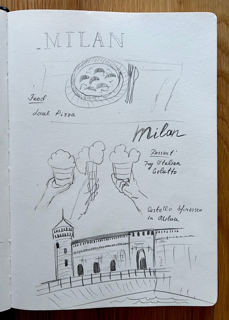
While Milan lacks direct access to the sea, it is a bustling metropolis with a rich cultural heritage. I thought to myself, “This is going to be a challenging city to explore with kids.” However, I reminded myself that I could always follow the route I established for previous maps — cathedrals to visit with kids, foods to taste, and activities to do. I discovered the castle Castello Sforzesco in the centre of Milan, which I should definitely include for family travels. Additionally, the shopping mall is obviously a major tourist spot; when in Milan, you have to visit the well-known Galleria Vittorio Emanuele II.
Sources: https://mamalovesitaly.com/visiting-milan-with-kids/; https://monocle.com/travel
- Visit Piazza del Duomo with kids;
- Have a snack in La Rinascente Cafe;
- Galleria Vittorio Emanuele II;
- Castello Sforzesco.
Lonely Planet Travel Guide:
I chose a couple of locations to sketch, and later I needed to find them on Google Maps to place them on my improvised Milan’s map. Italian city centre looked like a maze of streets that were quite difficult to navigate. I did my best to locate the main features correctly on the map, but I wouldn’t be surprised if they were slightly off-centre.
Coloured Visuals
The next part that was coming was the most exciting, colouring my visuals. As I mentioned before, for the media I was going to use watercolour, in tenter light natural shades. The idea was to make illustrations kids-friendly, playful and colour-pleasing, I wanted the background of the map to be a bit transparent, light coloured, so main features such as architecture and things to do were more visible on the map. To create some kind of foregrand and background.
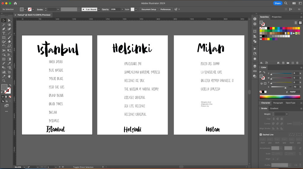
The first map I started to design was Istanbul. I chose tender pink and orange colours for the map, light blue for the sea, and coloured visuals in natural colours for mosques, tower, and markets. Altogether it looked quite cute, this little map. I was going to add it with some writings of locations, as I didn’t want to have those actions unnamed. But that part I left for the software. I was going to select a couple of handwritten fonts and match them together on the map.
As I was colouring Helsinki, I realised the need to consider the potential season for the city depicted on the map. Is it winter or summer? Since I mentioned an ice skating rink, I needed to orient it more toward the colder months. However, I couldn’t make everything blue to indicate snow or cold weather. Therefore, I decided to use green and pink colours to evoke an early spring atmosphere. I aimed to depict the city with lush green hues, highlighting its parks and natural areas. Additionally, I included a railway station as a useful tool for navigating other nearby locations, such as the ice skating rink and aquarium.
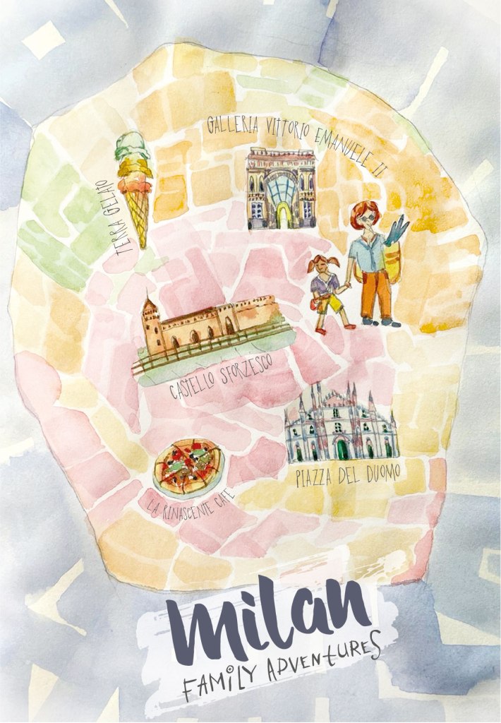
For Milan, I chose the summer to early autumn season as well. I thought this is the kind of place people prefer to travel to in summer, late spring, or early autumn. I chose warm and bright colours for the city, such as pink, orange, and green. For the surrounding area of the city, I was going to use a pale purple-blueish colour. I depicted the streets of Milan with little squares and rectangular shapes, reflecting the busy nature of the city’s streets. Later, I felt it looked a bit too much like a mosaic, so I planned to lighten it up a bit so the background wouldn’t interfere too much with objects in the foreground. I thought about how I could highlight family adventures in Milan, and I decided that I could draw a little girl walking along with her mum, as a subtle indication of the adventures with kids.

The final part of the design was to choose typography for the names of each travel guide and the named locations so that objects such as castles and churches made sense. I created three pages with the name of the city and mentioned locations. I looked for some handwritten and calligraphic fonts and found ones that perfectly matched my map. This is the type of font I would choose if I were writing everything by myself; it looked very authentic and created the whimsical touch I was trying to achieve for the travel guidebook with kids. For the name of the city, I chose the Margins font, and for the locations, I chose the Poison Ivy font. Later on, I added Catnip font for the Family Adventures travel guidebook name.
Adding those names around the objects and locations added a little special touch to the map. I chose to tilt the name of each city at approximately 45º angle, adding dynamic to the name of the book.

The final touch of adding names of locations and subtle lines around the sea in the images enhanced the overall design, making it more immersive and captivating. By including these details, the visual representation became more interactive and evocative, drawing the viewer into the scene and creating a sense of connection to the locations depicted. The addition of location names not only provided context but also added a storytelling element to the design, inviting viewers to explore and connect with the city maps on a deeper level.
Overall, I am pleased with the final design and the coherence I achieved among the three concepts. I am grateful for challenging myself to create travel books for a niche audience like travellers with kids. The research proved to be valuable, allowing me to focus on a less conventional subject compared to traditional travel books. I hope that the visuals effectively convey the concept of travelling with kids. I believe there are numerous untapped possibilities within this theme, and I am eager to continue exploring and generating more ideas in the future.


Mockup Istanbul
Additionally, the final part of the brief mentioned including a mock-up for one of the travel guides. I selected Istanbul because I admired the city sights featured in it, such as the beautiful mosques and towers, and the colour combination used. I opted for a small book to showcase it, highlighting its compact size that is designed to fit in a pocket.
