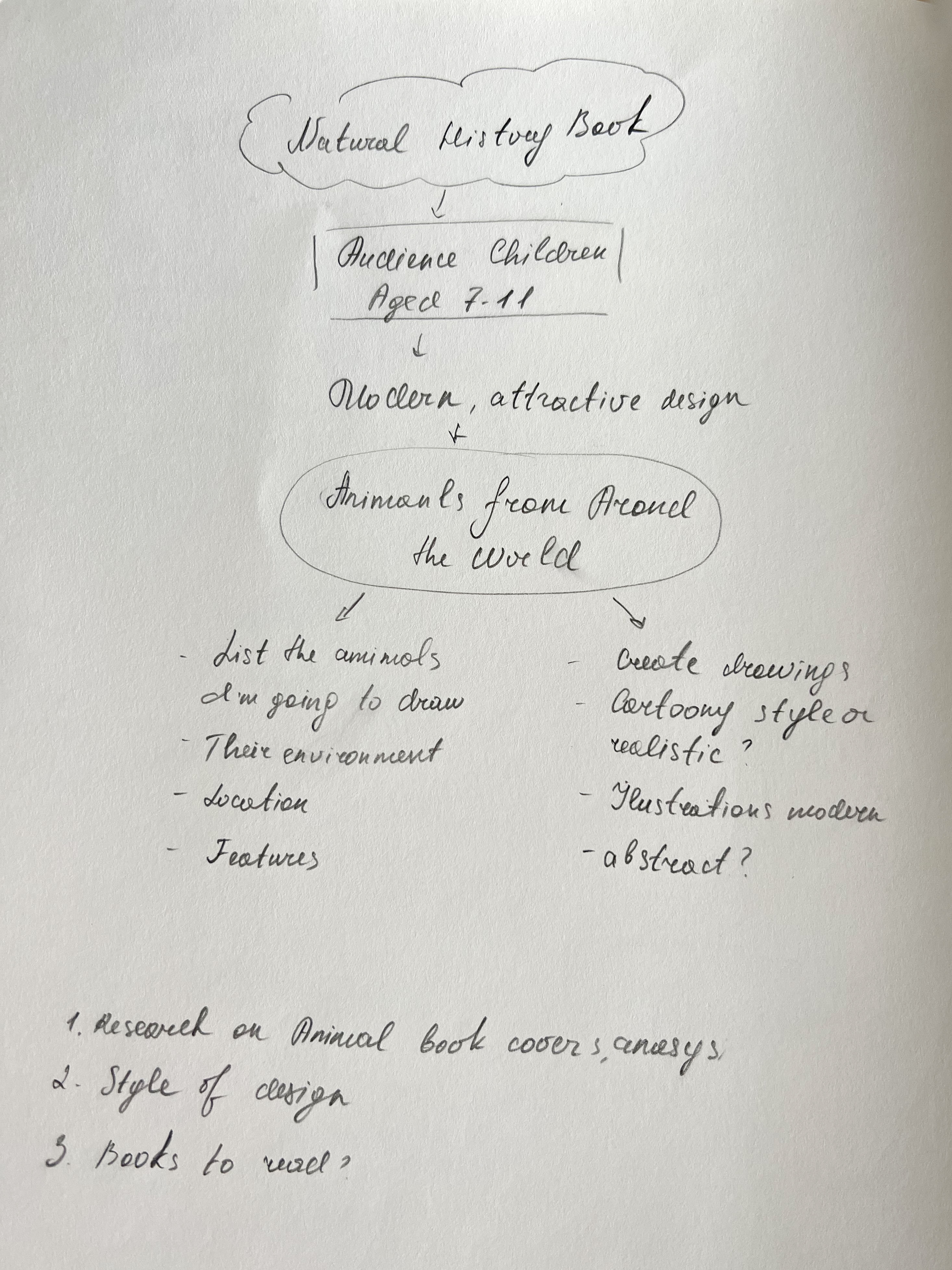
For this exercise, I was asked to produce a cover illustration for a natural history book for children (ages 7–11) entitled Animals from Around the World. The image is to be used as a full-colour front jacket to encourage children to choose this book from the library shelf.
I should draw up at least three ideas as coloured client visuals. The final pieces should include information such as the size of the book cover, format and the name of the book’s position.
I started the exercises with a mindmap and analysis of the significant points for the book cover. As the target audience is children, illustrations should be bright, bold, and eye-catching, also, they can be done both in natural ways and more cartoony style, as soon as they are recognisable animals.
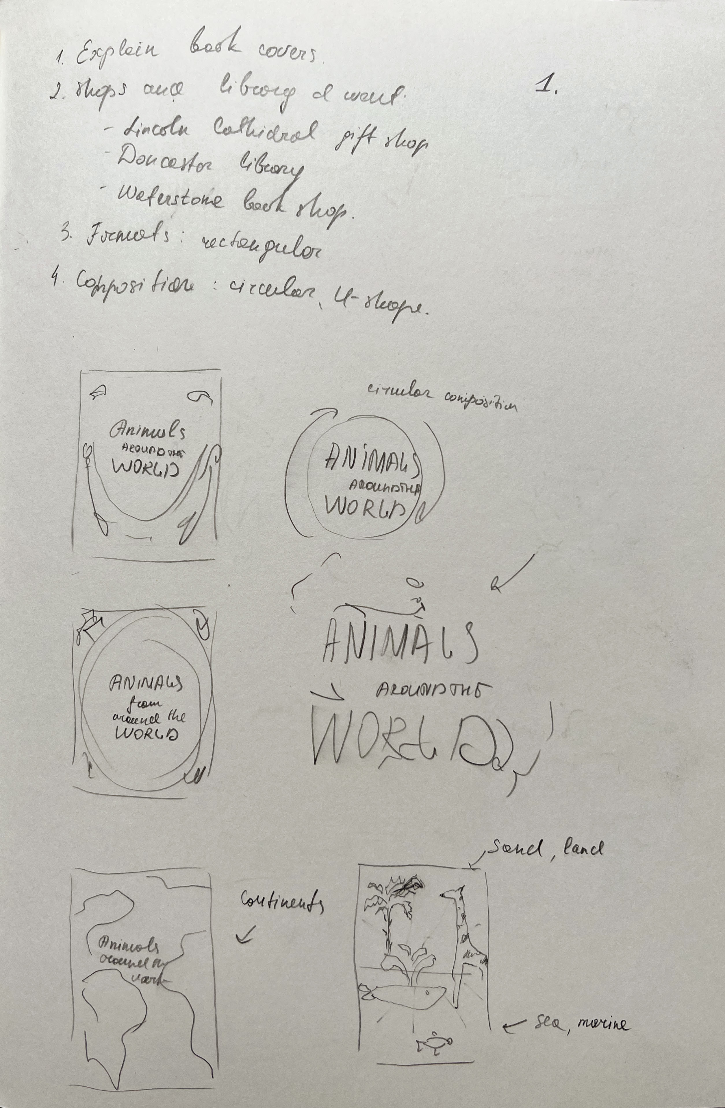
Designing book covers for kids is quite an interesting field to learn about, as they attract both audiences, adults, who actually buy them, and kids, who enjoy reading those books. Throughout time, children’s books evolved in style and design. I was curious to see what the modern tendencies for the book covers, as the brief specifically mentioned to attract the modern audience. My best bet was to go to the bookshops to do some research. I went to a few locations for my research, Doncaster Children’s Library, Lincoln Cathedral gift shop, and Waterstones. I took some pictures of book covers designed to learn about animals, wildlife and their natural environment.
From my research, I could see that most book covers were filled with numerous wildlife representatives, big and little creatures from around the world. Composition wise they were arranged in a circular spectrum, to demonstrate the dynamic and movement of the natural world. Some of the covers had animals placed around the book’s name, similar to the jungle trees, and some covers were divided into land and water, to show the separation between two worlds, maritime and land.
Most modern book covers are bright and eye-catching, they attract the reader with colour combination, and the task is to impress potential buyers with the variety of information that can be found inside the book. I quite like the book Aquatic Life, which looks the most modern to me, it has a dark blue cover and a beautiful golden pattern, which creates that needed contrast. The cover itself does not have many animals around, but the message of the book is clear. The rest of the book covers were busy with animals. I loved the book cover which was divided into yellow and blue colours, as earth and the ocean, and the style of the animals was cartoon, playful, but still recognisable for kids. Quite an important feature of most book covers is the circulation of life, dynamic and circular structure. I thought that I could try to apply this principle as well.
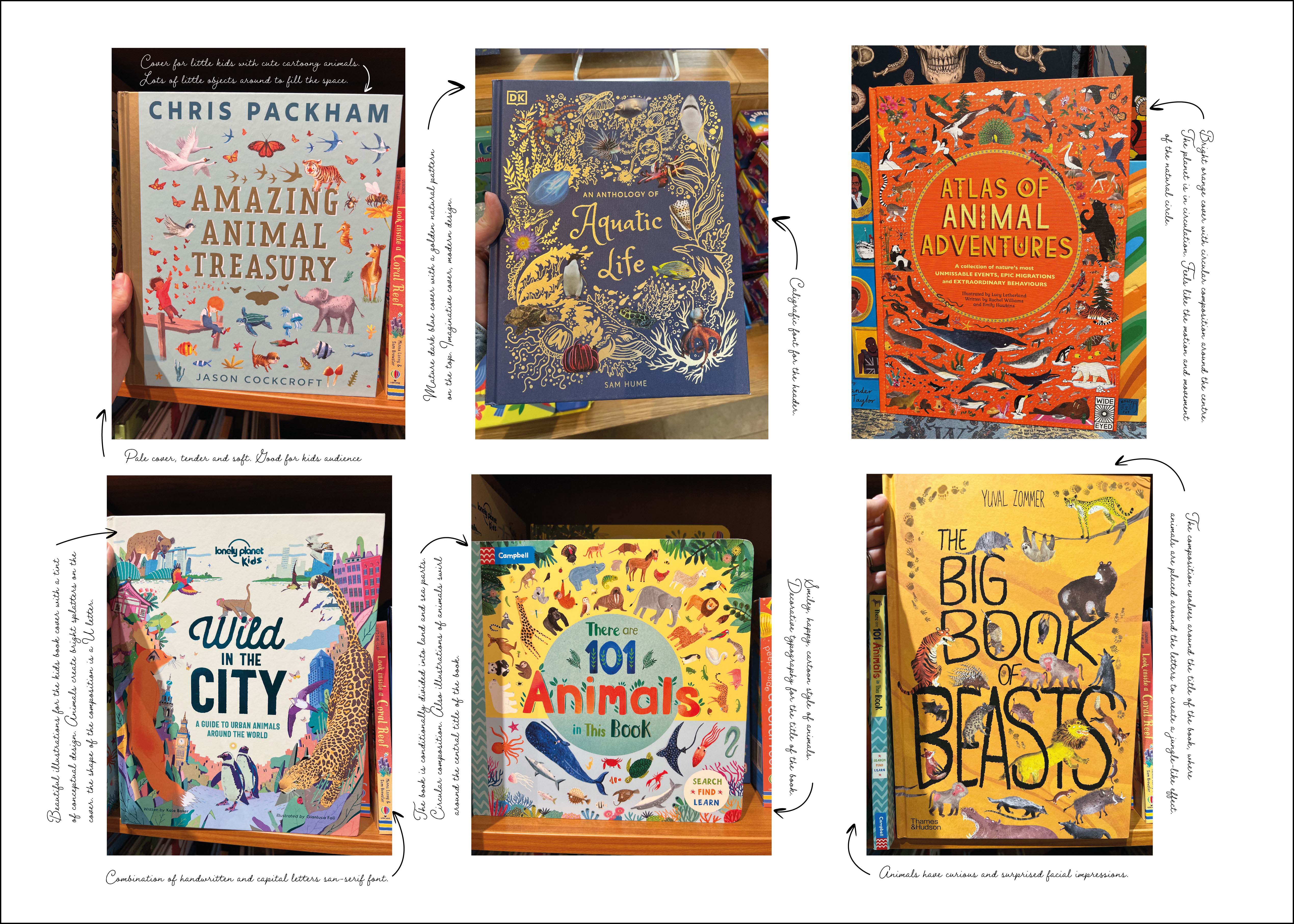
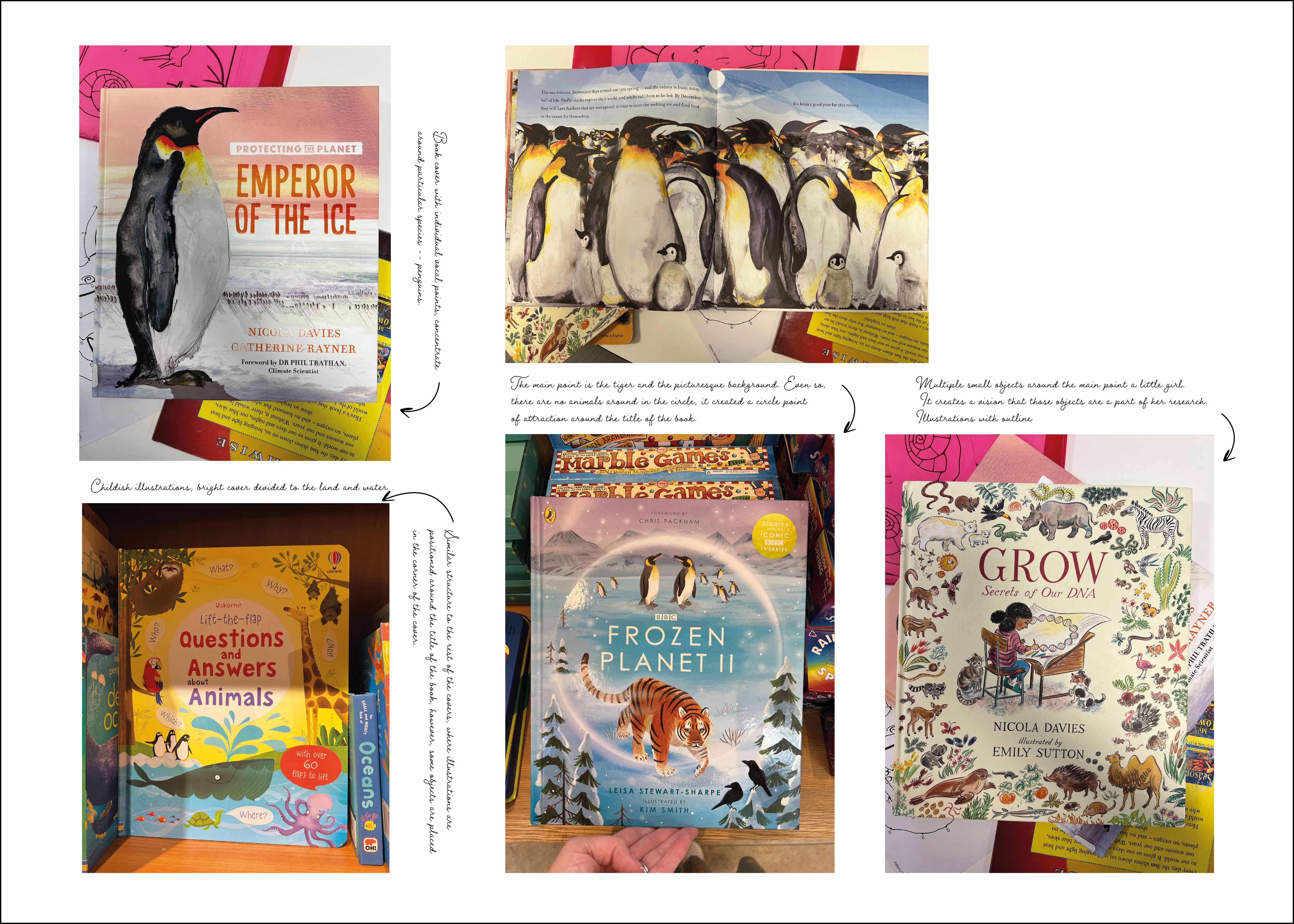
A couple of book covers slightly different to the style I was looking for, Emperor of the Ice, and Frozen Planet, which had only a couple of animals mentioned. It is an excellent example of a modern book cover. The good thing about those covers is the beautiful illustrations and pleasing colour combination. As my task is to create a cover that would evolve around the word world, I can’t illustrate only one animal, otherwise, I will miss the message of animals around the world, so there should be more creatures on my cover, that’s for sure.
Also, I created a Pinterest mood board with some traditional book covers and cartoon-style animals for reference.
I had the idea of evolving the concept of the book to cover all continents, or the theme of animals around the globe, mentioning the most recognisable species presented in our world. For this book cover, I wanted to illustrate the most iconic animals, that could catch an eye, like tigers, monkeys, giraffes, lions, etc. At the same time, I made some quick sketches of wildlife, trying to bring them together, whether animals should be all happy and smiling, or just realistic images and how we see them in nature.
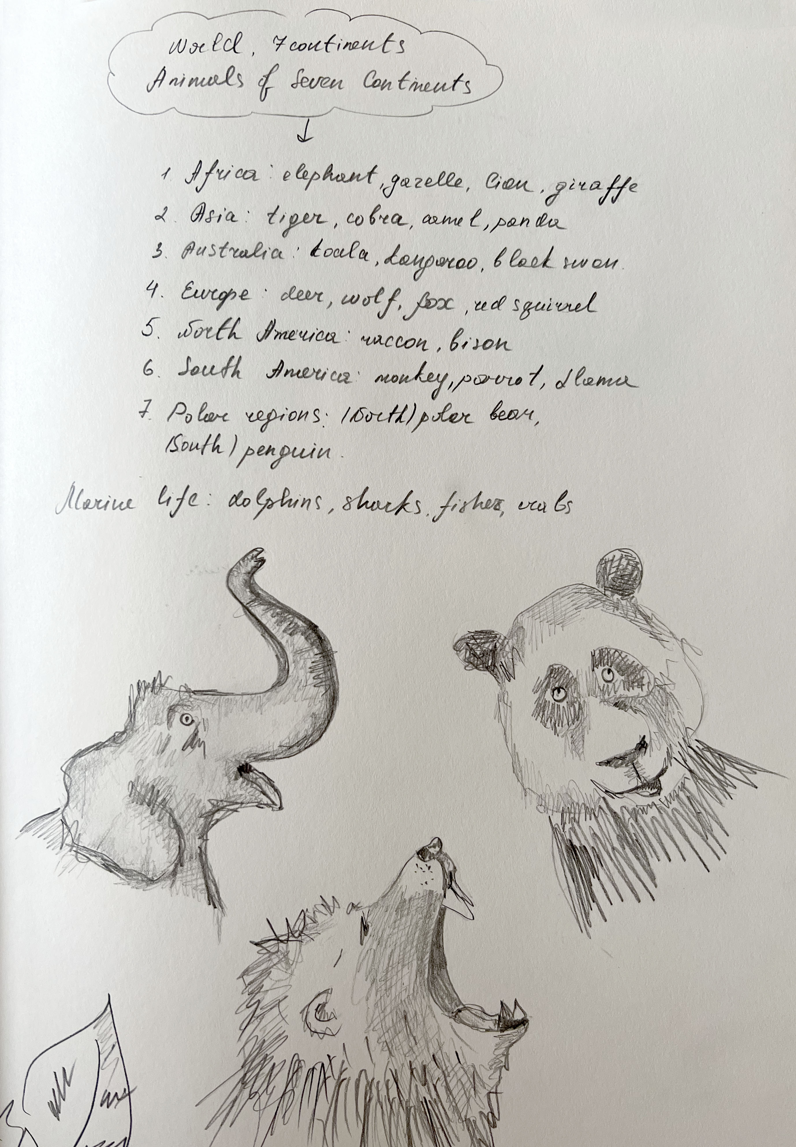
Next, I created some ideas in the sketchbook. They are brief sketches for my book covers with some technical parts that I would include in them. To support the name of the book I could also use globe, or continents for the background. My keywords for this brief are circulation, world, dynamic, globe, land and marine life.
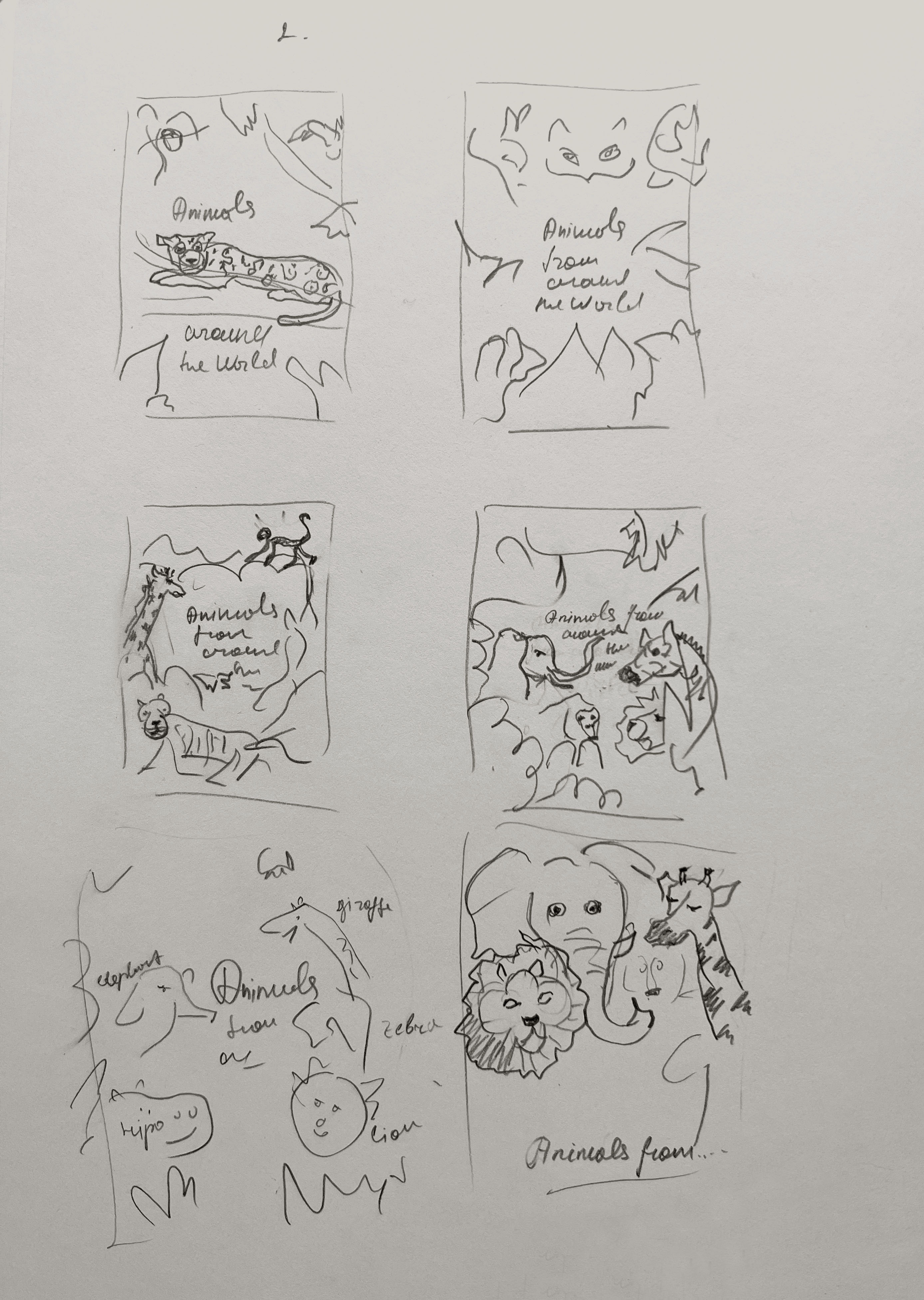
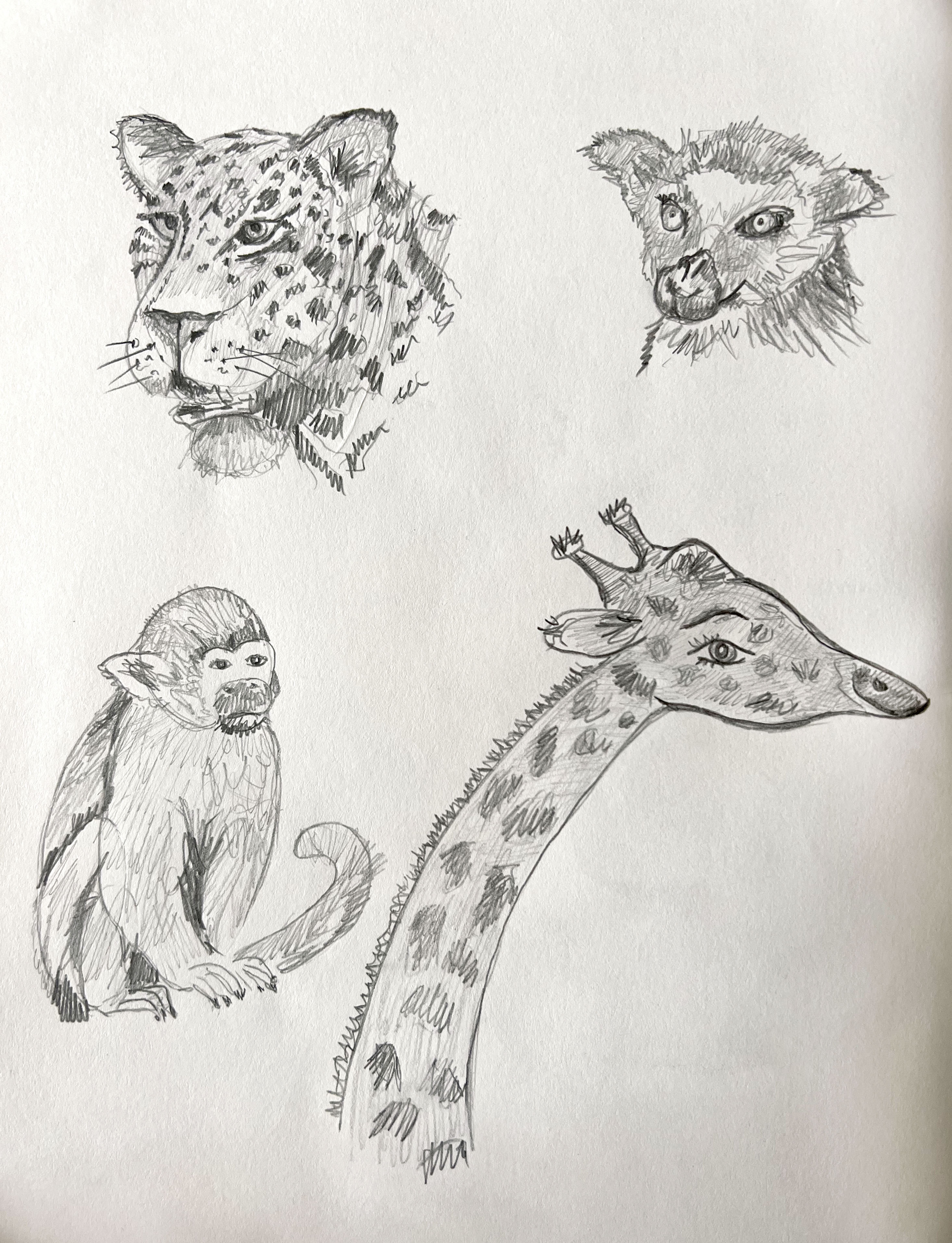
Based on my brief sketches I created some more clear drawings that I could use for the book cover. All the covers that I analysed before had multiple animals in them, mentioning practically every noticeable animal from around the world. For my book cover, I can minimise the selection of animals down to up to ten creatures. I think, here is essential to bring the idea to support the name of the book and be visual with my interpretation.
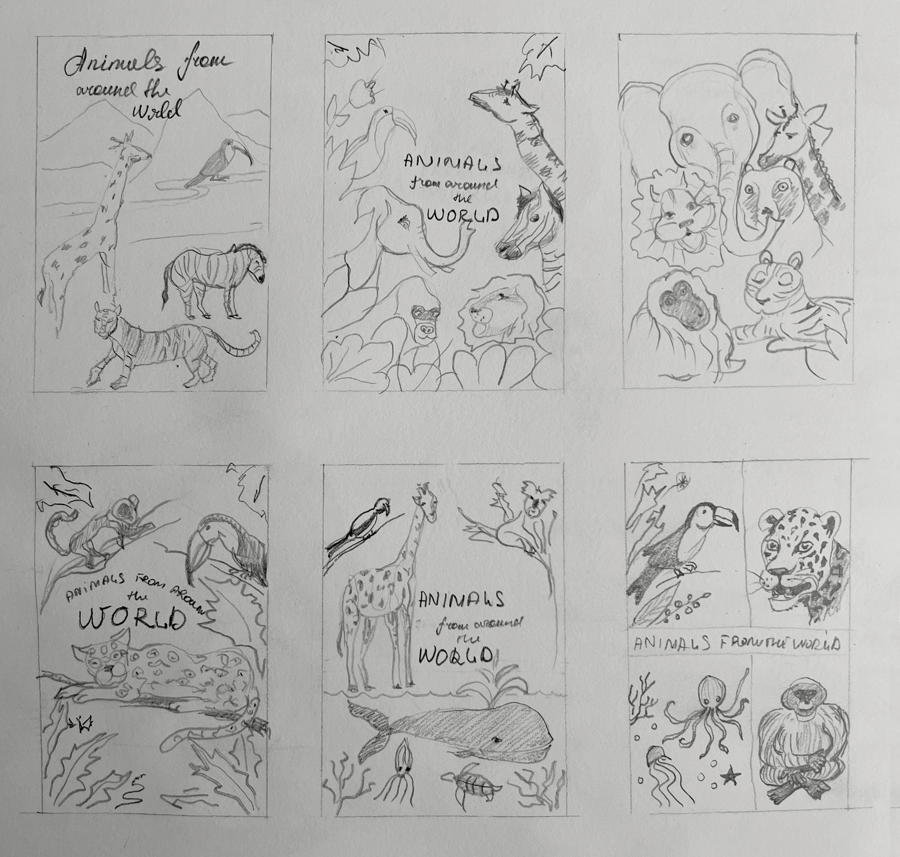
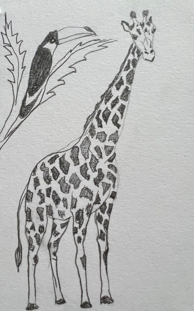
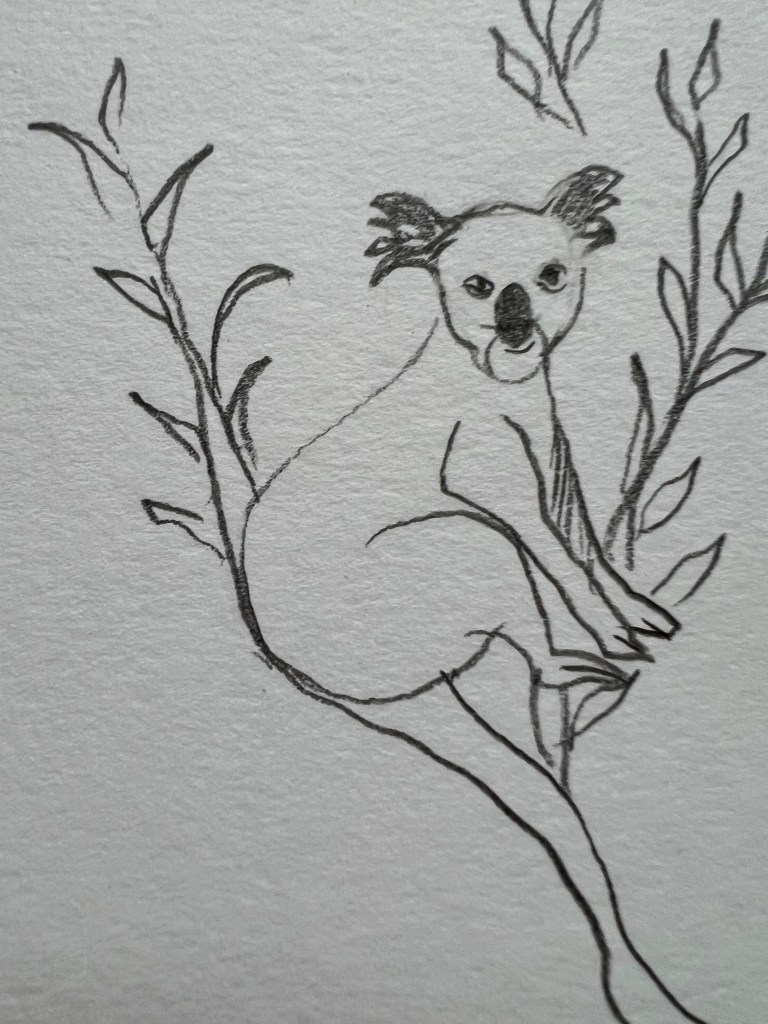
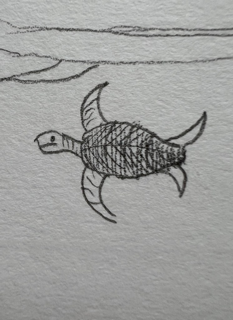
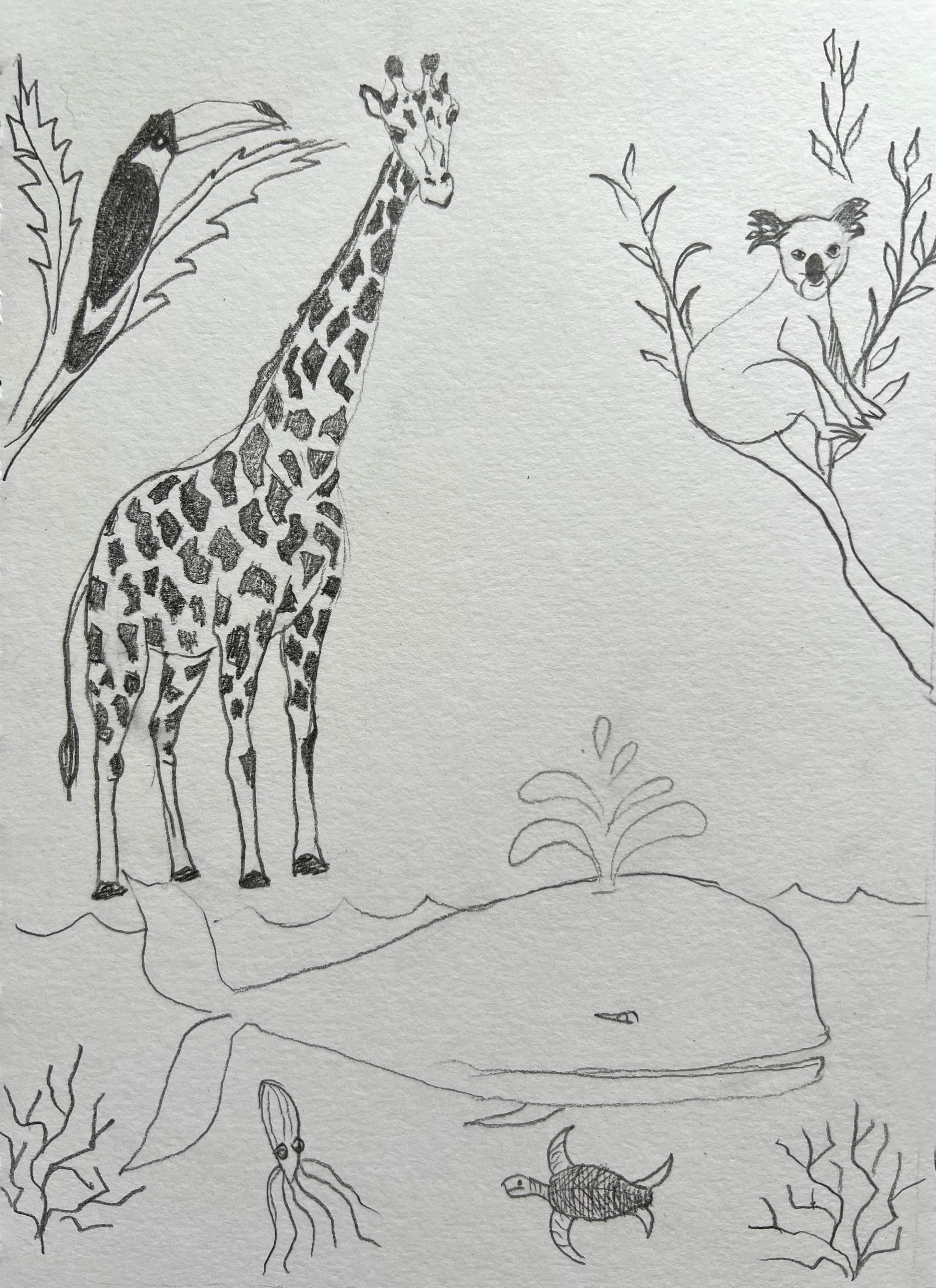
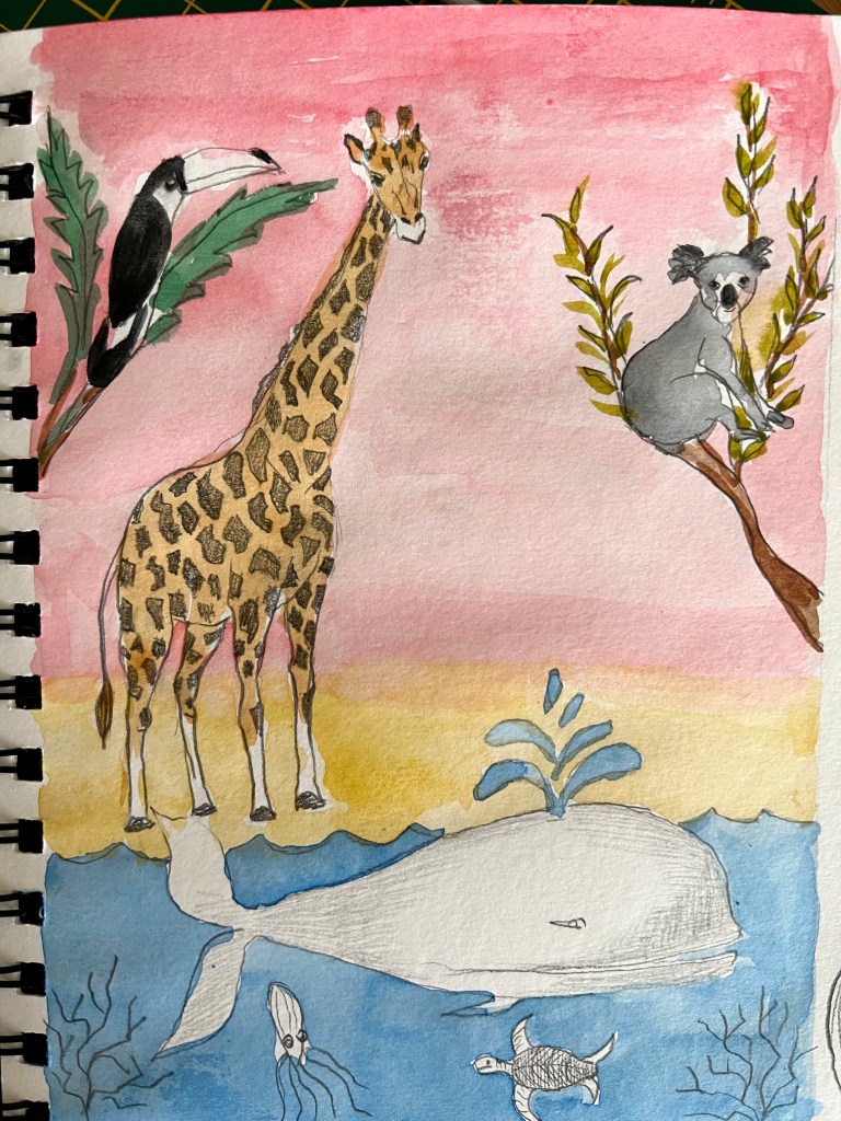
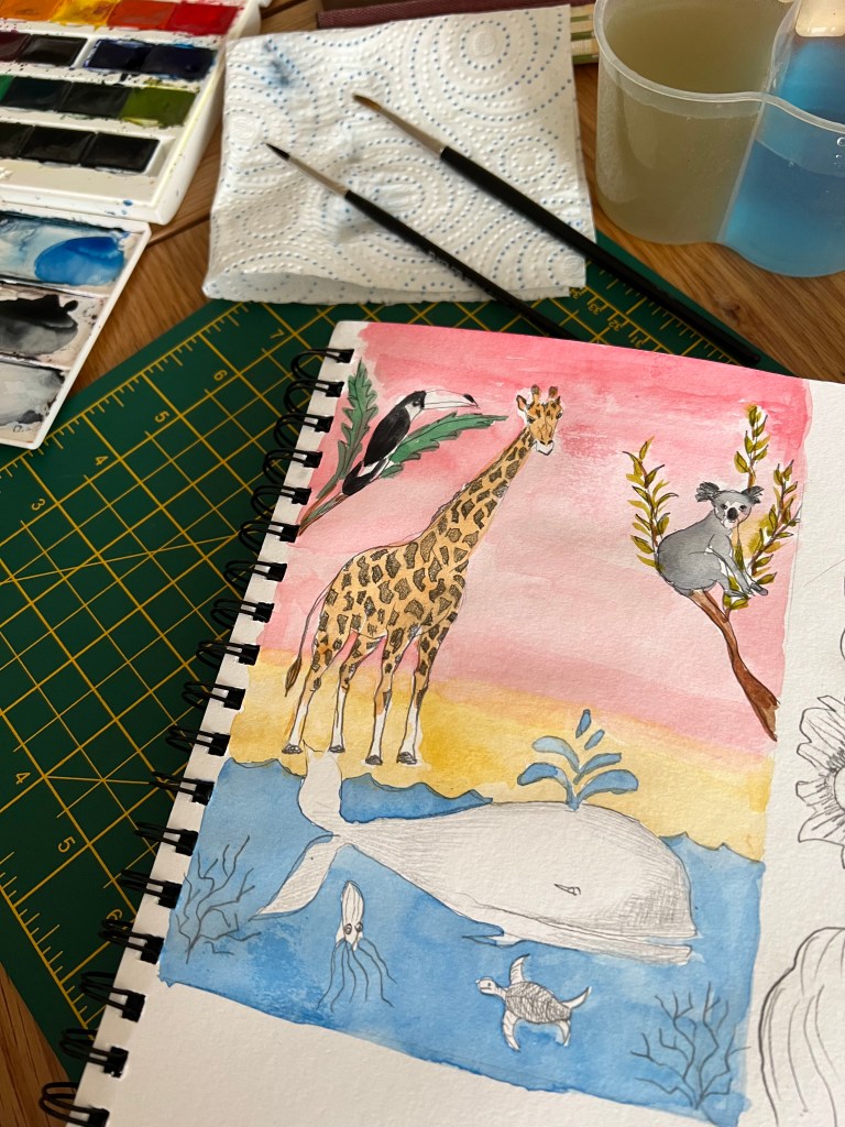
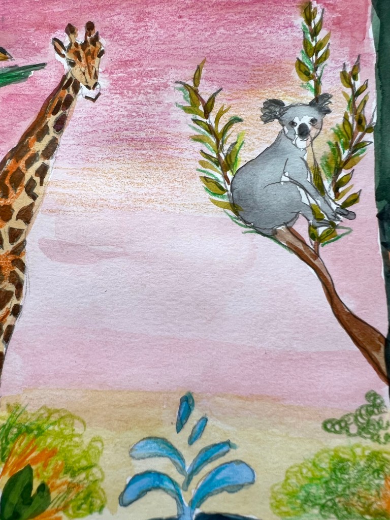
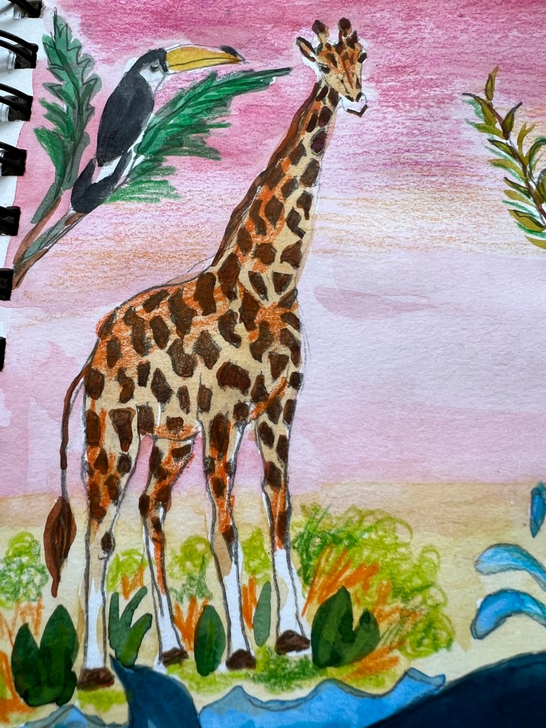
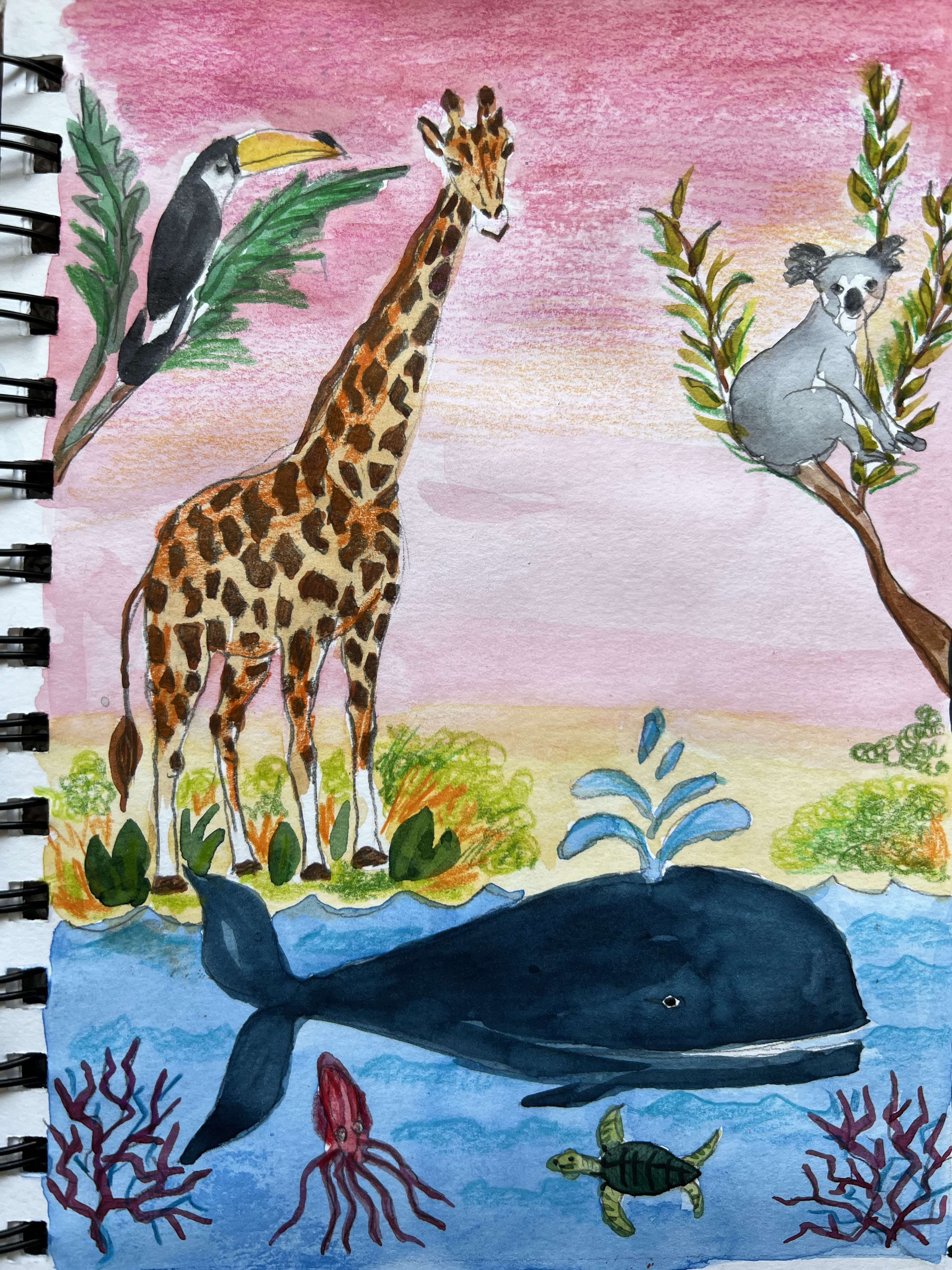
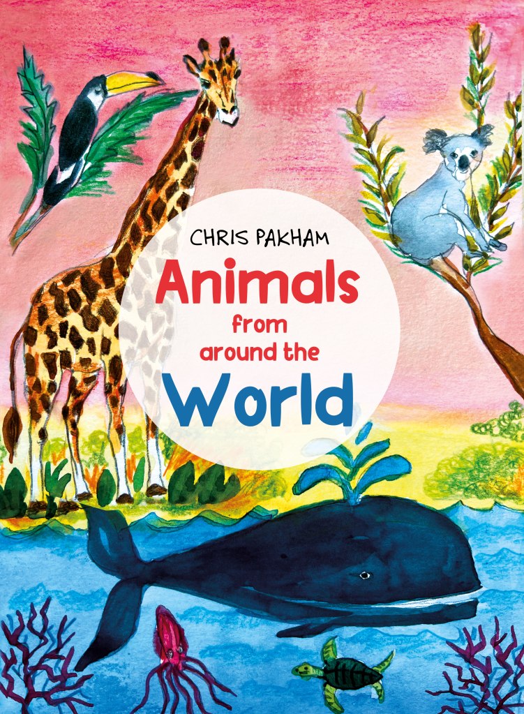
After producing sketches, I selected the three ideas I was going to design for the book cover. I had a vision of designing the book cover with representatives of the air, terrestrial and animal world. So, I placed in the corner a tucan, a bird from South America, a koala bear from Australia, a giraffe from Africa and some marine creatures from the ocean. For my illustrations, I was going to use line drawings with watercolour and crayons. The idea was to make illustrations bright, bold, modern, recognisable and classy. I made compositions around the central part, like animals in the corners and marine creatures in the bottom, but the name of the book would have to be located in the centre. I realised that the giraffe was positioned too much in the middle, so I was going to make those adjustments in Photoshop later.
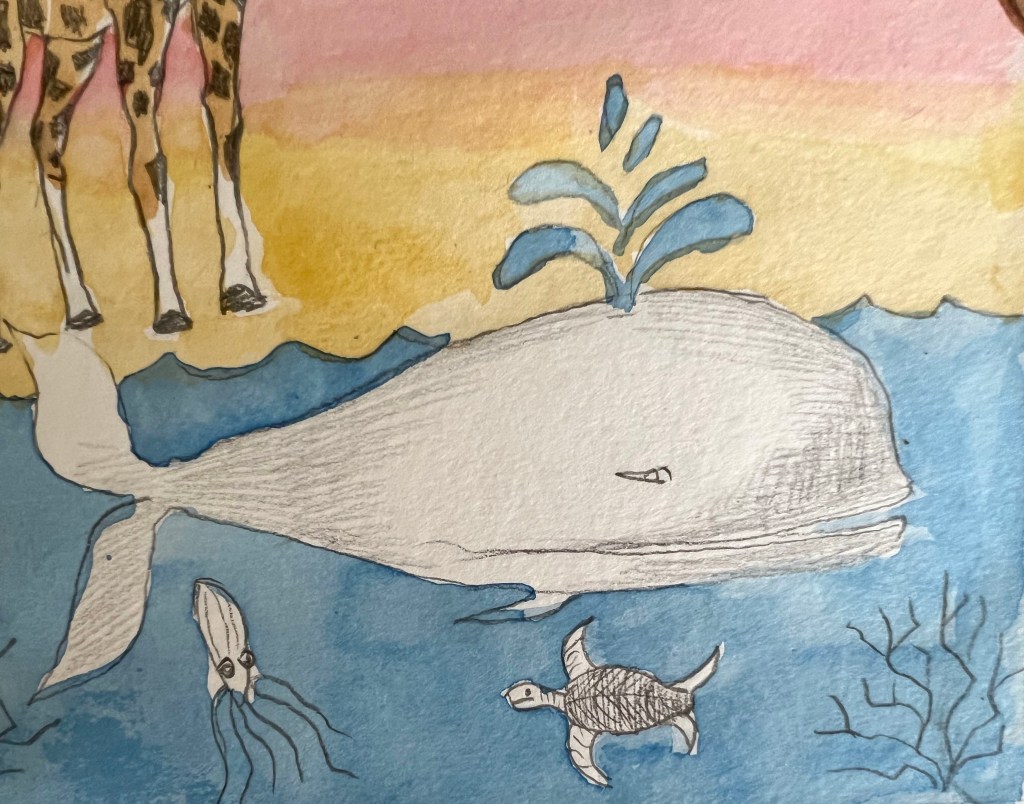
The next part was colouring. During the painting I decided to add a special feature to the cover, the beautiful pink sky, to symbolise the sunset, which also would make a good contrast to the blue ocean at the bottom part of the book cover. After I completed the illustration with the watercolour, I added some crayon curls and added pencil strokes into the sky. I think the illustration came quite well. It has a modern vibe and the illustration has a stable and clear composition.
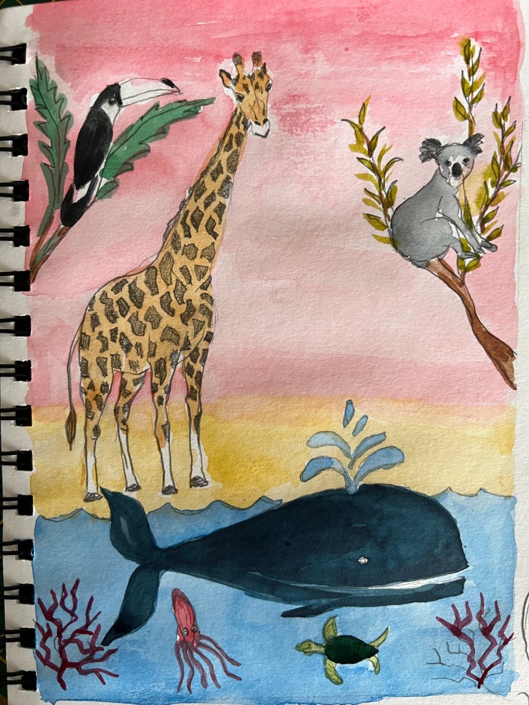
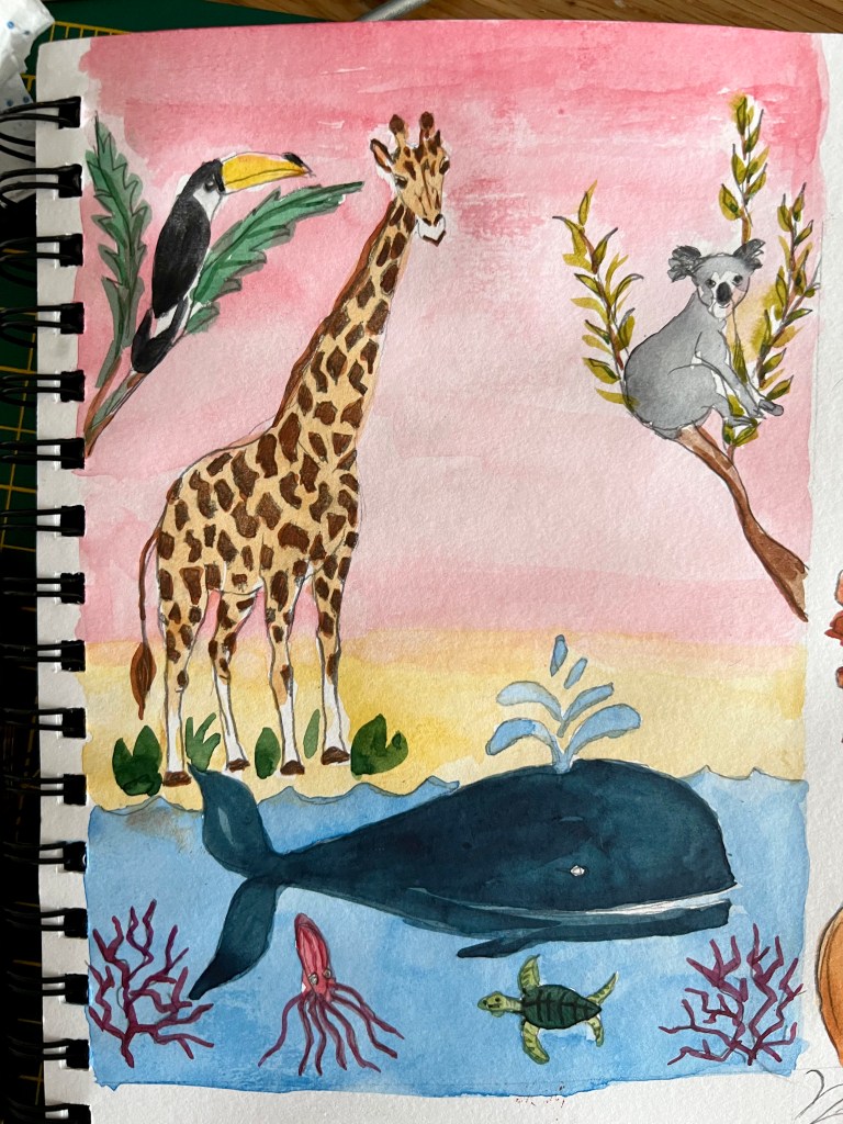
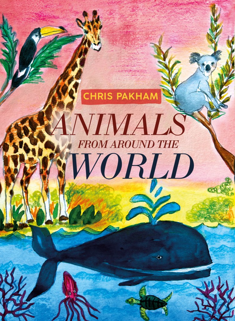
When I moved the design into the digital version, I needed to decide on typography for the name of the book. I created a selection of fonts, that I was going to use, and I started with the classic version of the font with serifs Bodoni Italic. Also, I used the name of Chris Packham for the author’s name, as I’ve noticed there were a few modern books in the library and bookshops written by him. I hope, that’s okay, as I needed a real name for the author, that made the book cover look more like the real deal. For the word Animal, I used brown shades from giraffe tones, and for the term World, I used dark blue from the whale. As a result, I had quite a modern and eye-catching book cover, which I was pleased with. In addition, I did an extra option with bold decorative font Plastic Toys. I placed the font on the white transparent circle, it was the only way to make it stand out. Consequently, that font choice and its arrangement changed the age audience to the younger kids, which is quite fascinating, that same illustration can be slotted into slightly different age groups of kids. From my point of view, the second option with more decorative font for the cover, makes the book look more suitable for smaller kids.
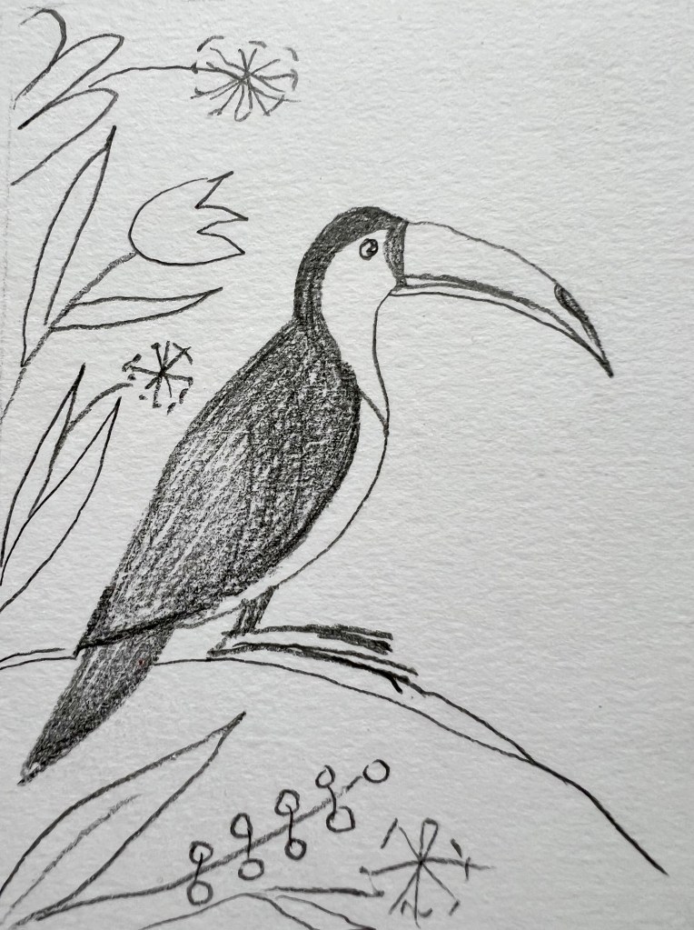
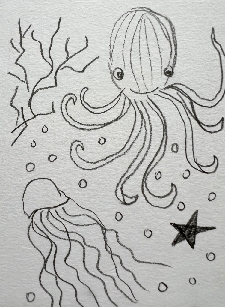
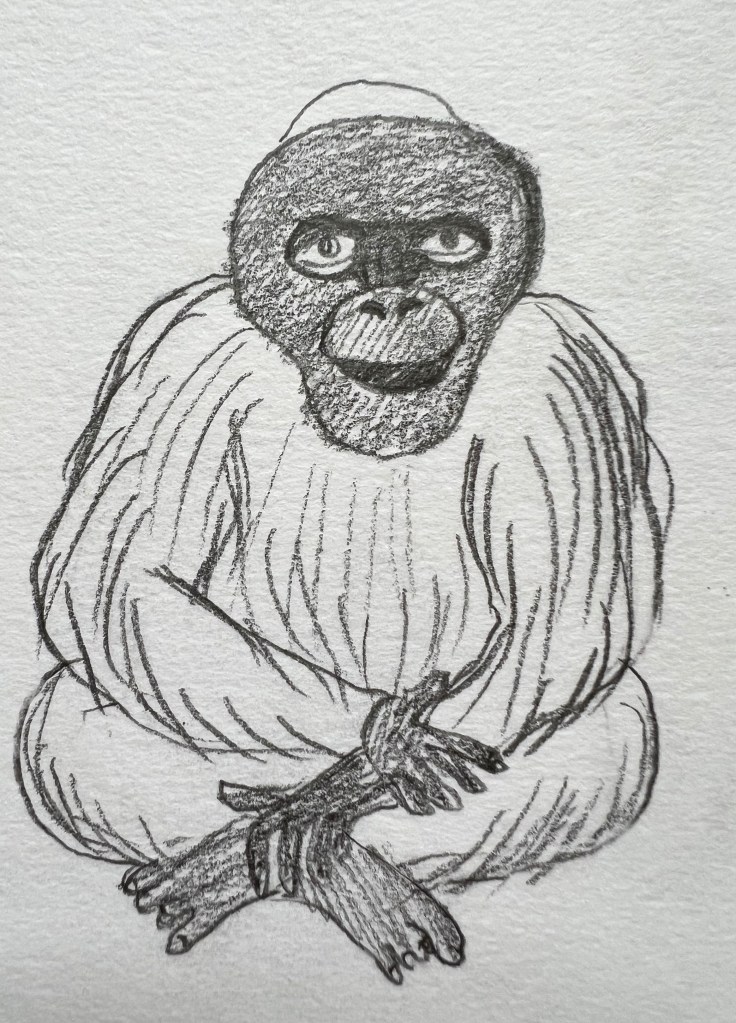
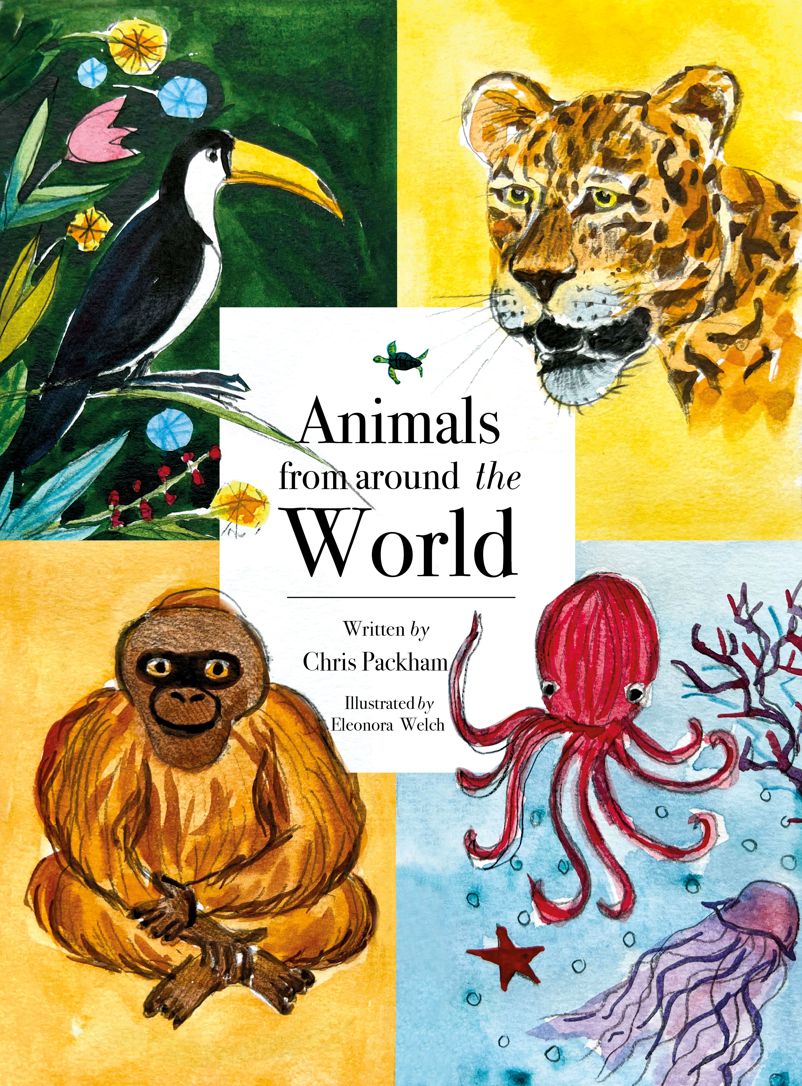
After I designed the first book cover, I moved to the next option, which was based on a different approach, here I was going to use square composition. The idea was to divide the space of the cover into proportional four parts, and in the top two places animal that flies, an animal that fast, a marine life animal, and an additional wildlife animal, that is the most recognisable. Here I used iconic animals, tucan, leopard, monkey and octopus with jellyfish.
What I’ve noticed about my illustrations, is that here I brought little personalities into the faces of the animals. The bird and leopard look serious, the octopus is happy and smiley, and the monkey is inquisitive. It was hard to bring the same mood for those different animals, I was planning to make the look of the leopard a bit kinder, as it could be too contrasting to other animals.

I left the space in the middle free, as I needed a free area to place the name of the book, but later I realised that part would have to get adjusted, as the name of the cover felt quite claustrophobic and tight between those blocks. I thought I could create the area in the centre of the cover and fill it proportionally to the size of the book.
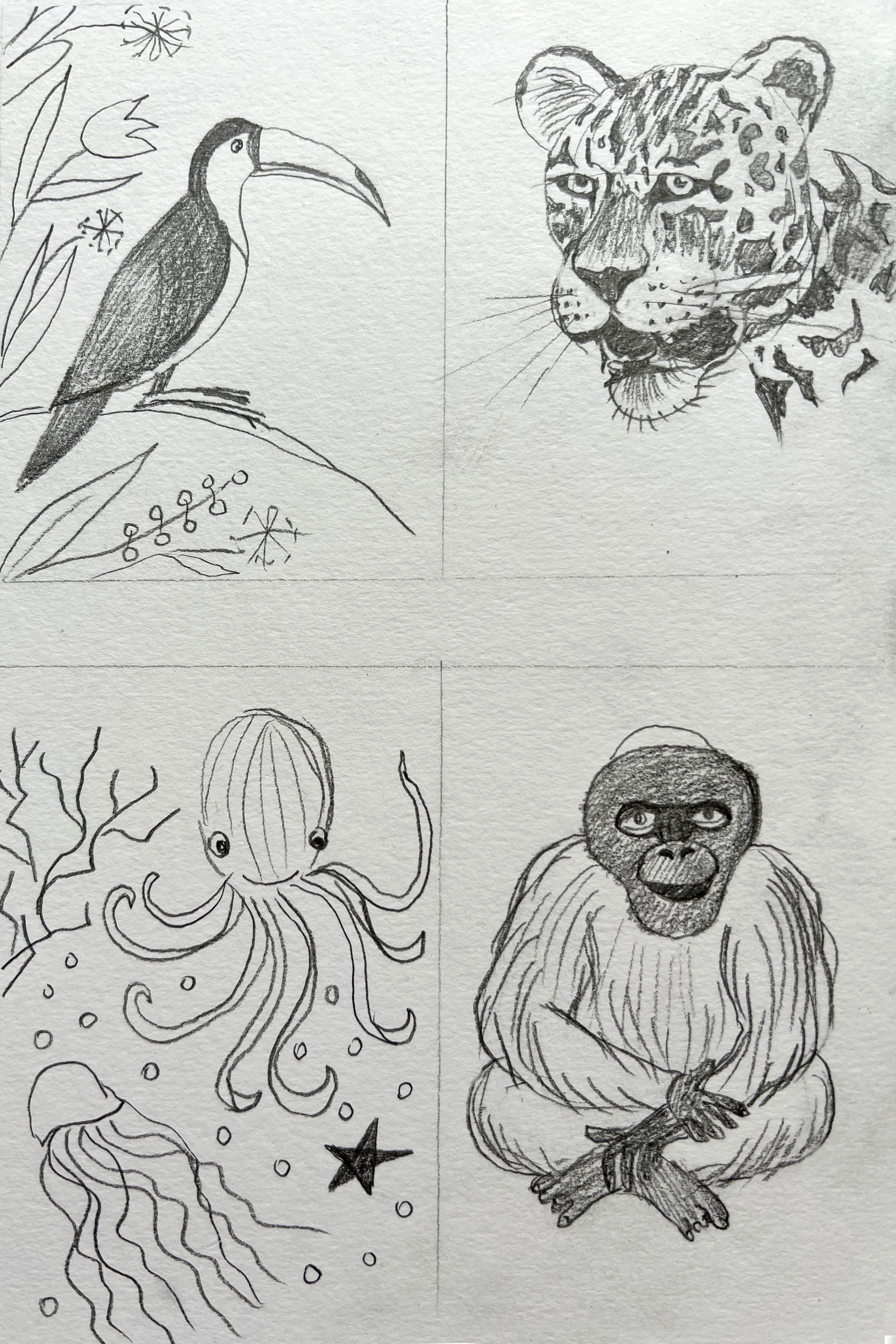
I started slightly adding the colour to the animals. I was thinking, about how I could join them into a coherent theme. Maybe I should leave the background blank, or shall I add a different background colour? I thought that the most logical would be to make the jungle background for the bird, a dark green colour; yellow – the colour of the sand for the leopard; the blue ocean for the octopus; and warm orange for the monkey.
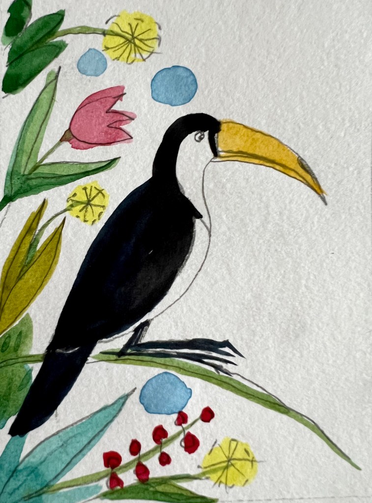
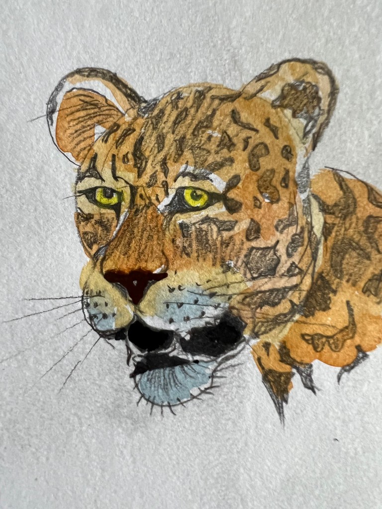
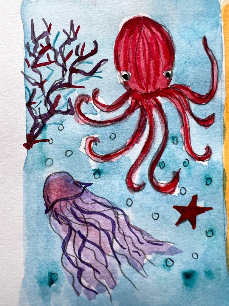

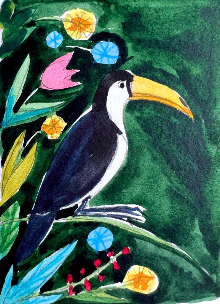
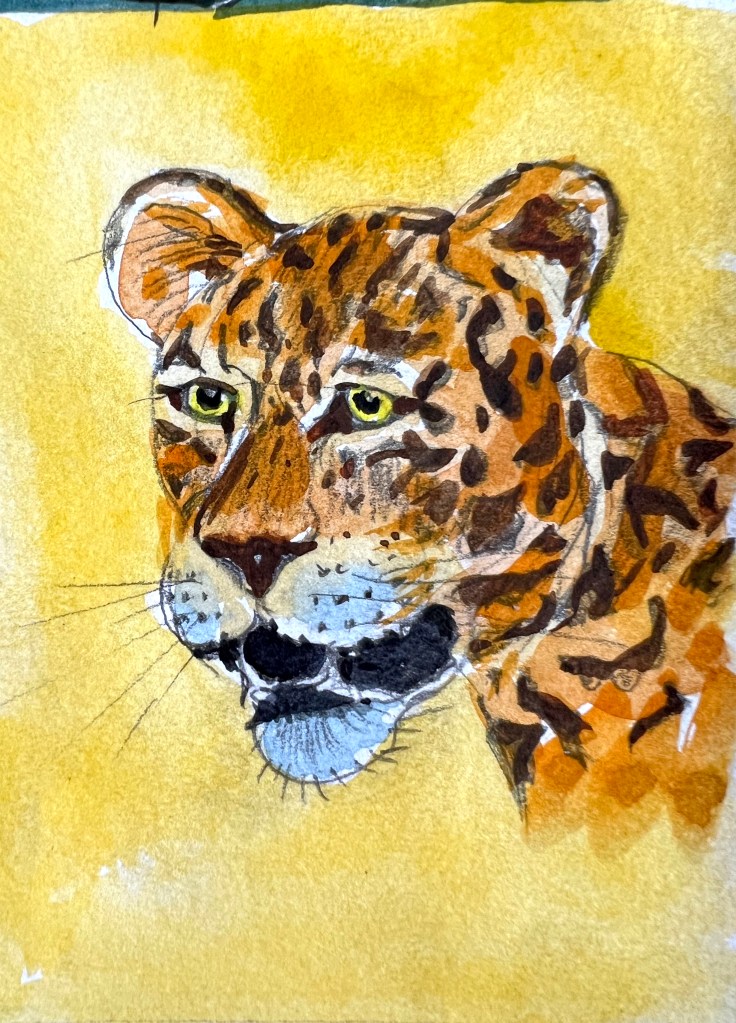
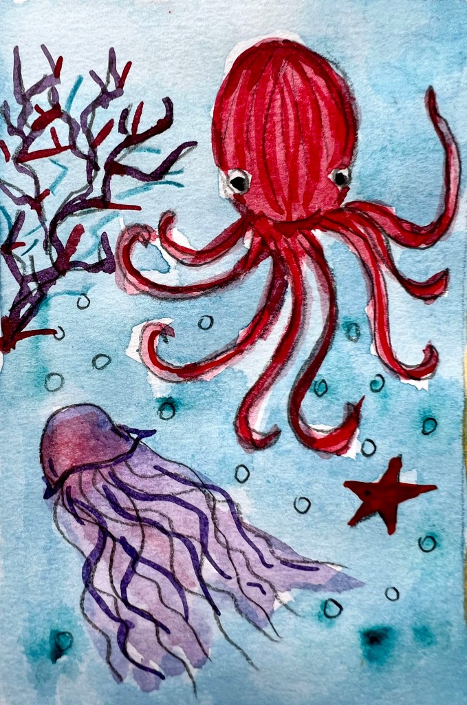

Here are all four blocks of animals altogether done by watercolour, and sketch underneath. I added contrast for the sketch on the top of the illustration as well. I changed the facial expression of the leopards to a kinder way, which helped to create coherence between the animals on the cover. I just needed to adjust this illustration in Adobe Photoshop and Illustrator for the final touches.
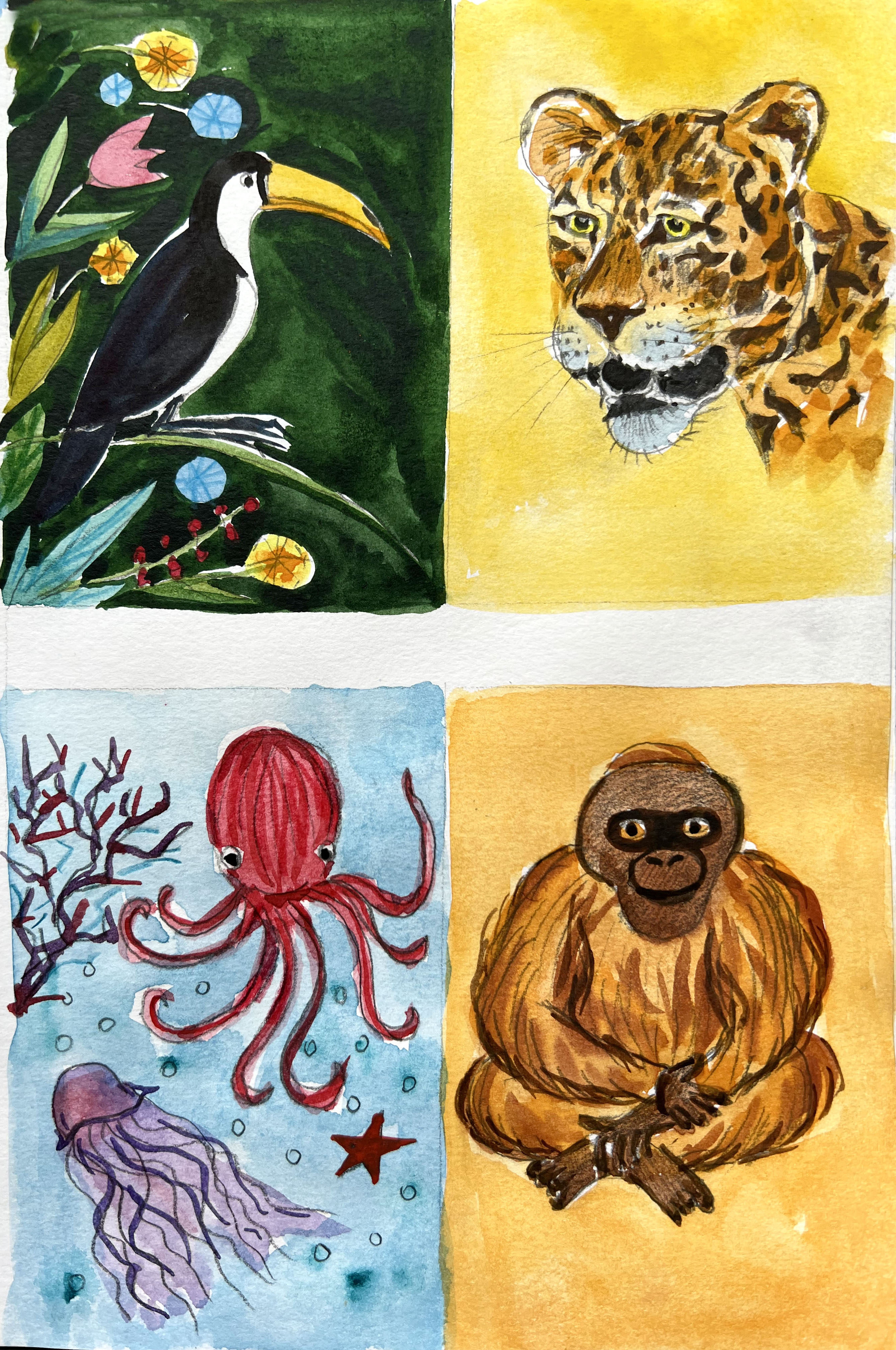
I made all the lines neat and proportional, and in the centre, I placed a white rectangle for the name of the book cover. To make the name of the book more engaging, rather than keeping it on the flat white colour, I placed some elements from each animal in front, that little touch made the cover more engaging. Also, I placed a little turtle in the top, as a little brooch. For the font, I chose the classic Font Bodoni, and Bodoni Italic, and positioned the name of the cover and authors all the way from the top to the bottom, which helped me to create a well-balanced composition between the illustration and the name of the book.
To start with, I was not sure whether this idea was going to work, but I’m glad I tried it, as it turned out quite well. I liked how the illustration supports the name of the book, and how images cooperate with each other. Also, it was good to bring some details to the front, as it creates some deepness in the layers.
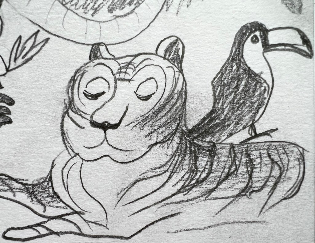
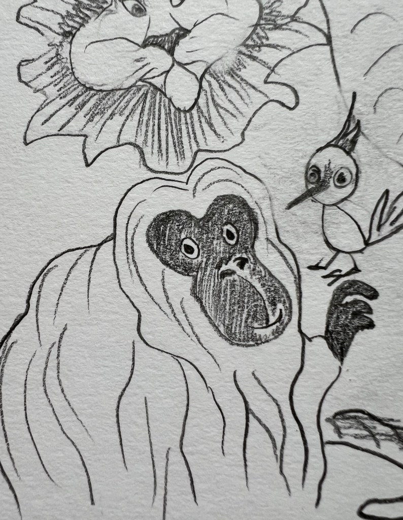
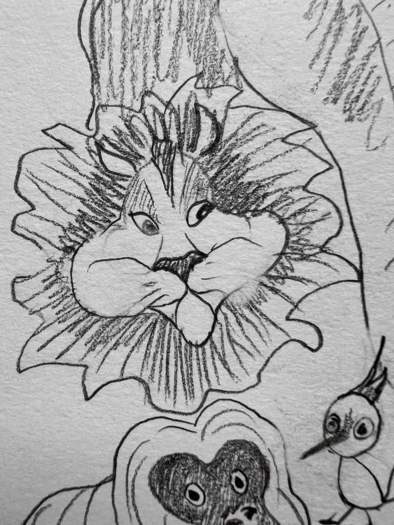
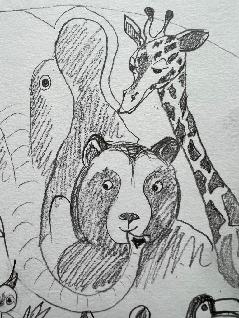
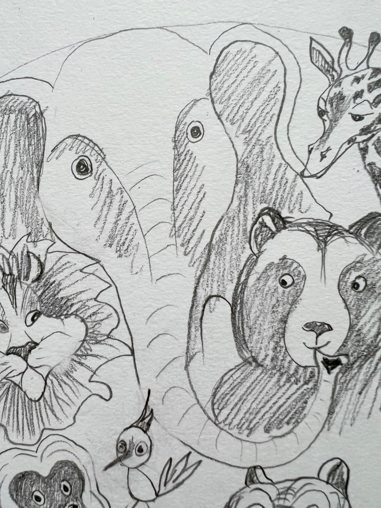
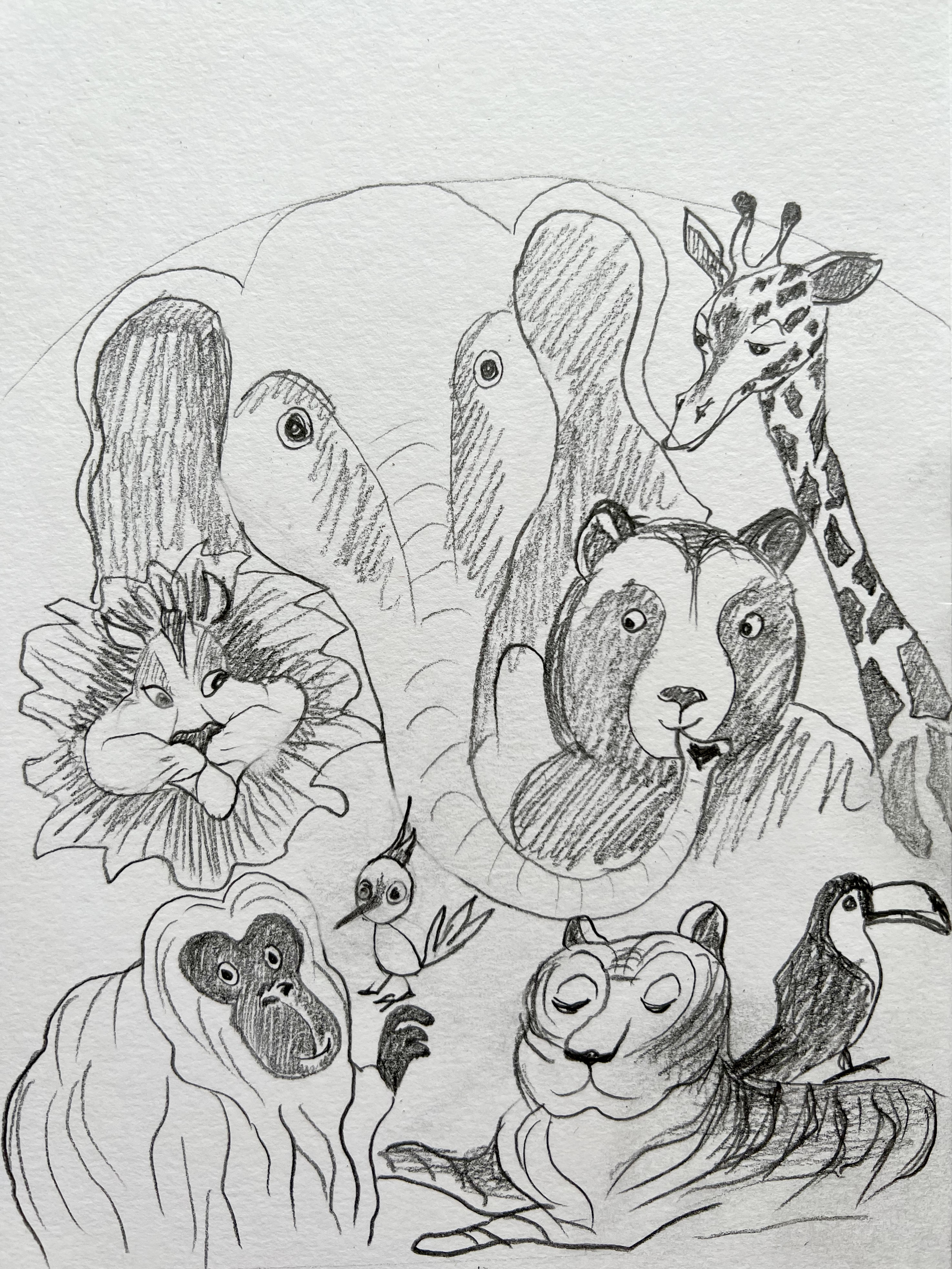
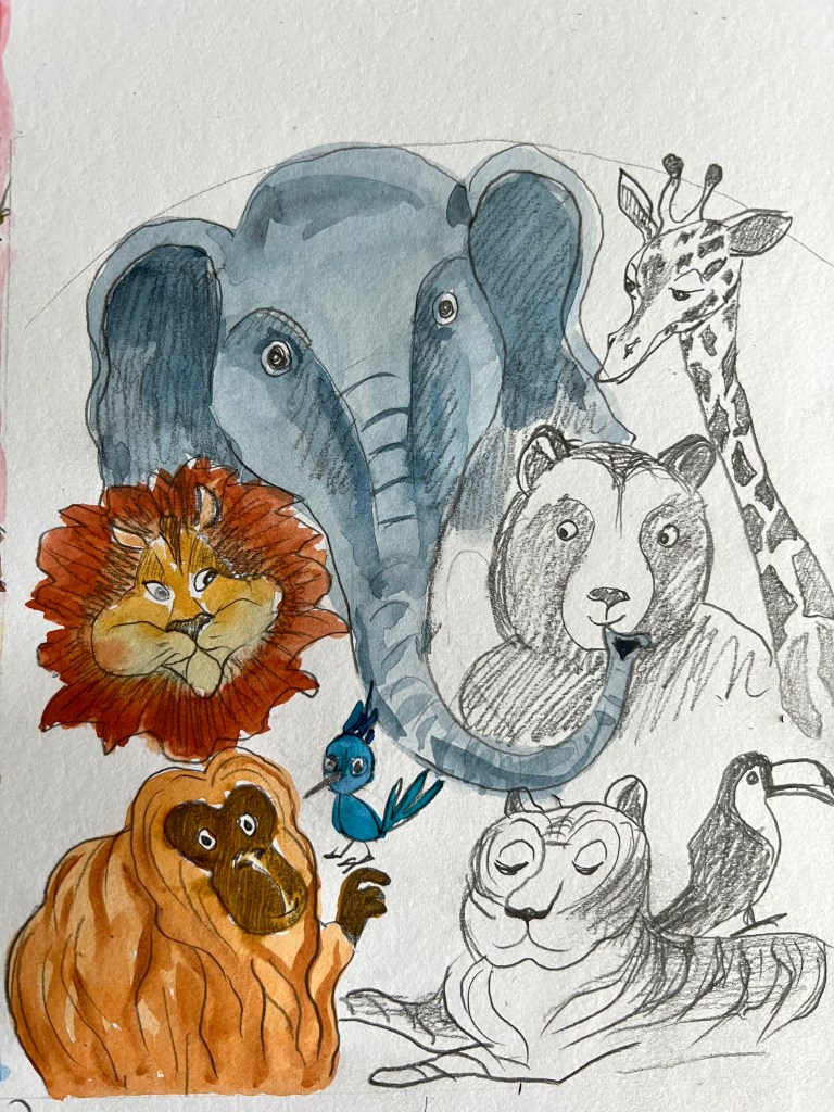
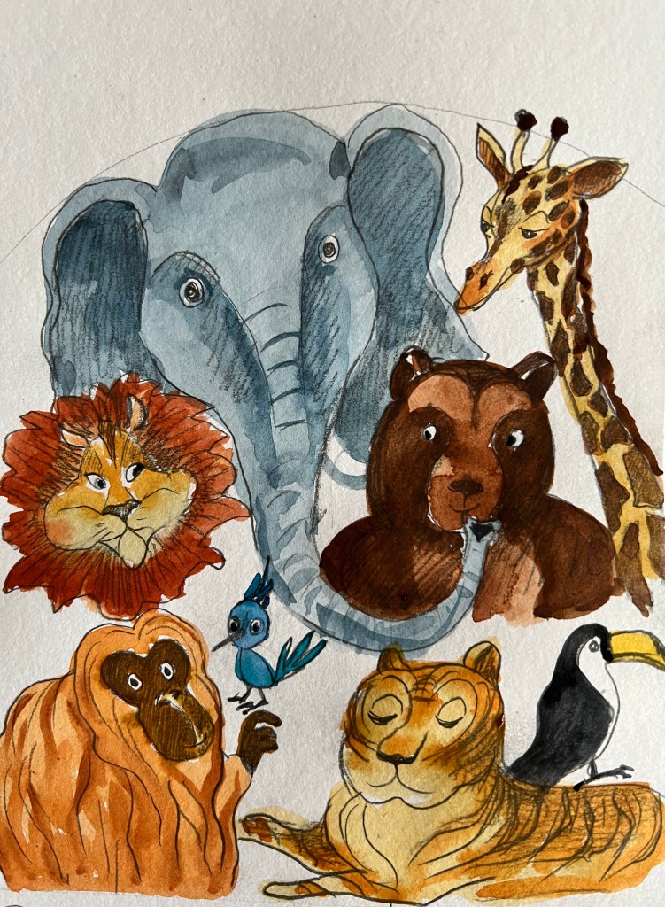
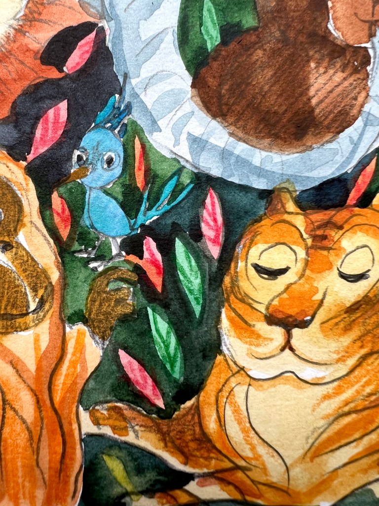
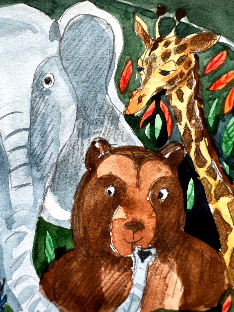
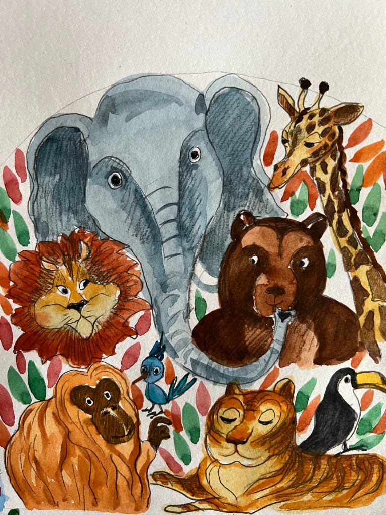
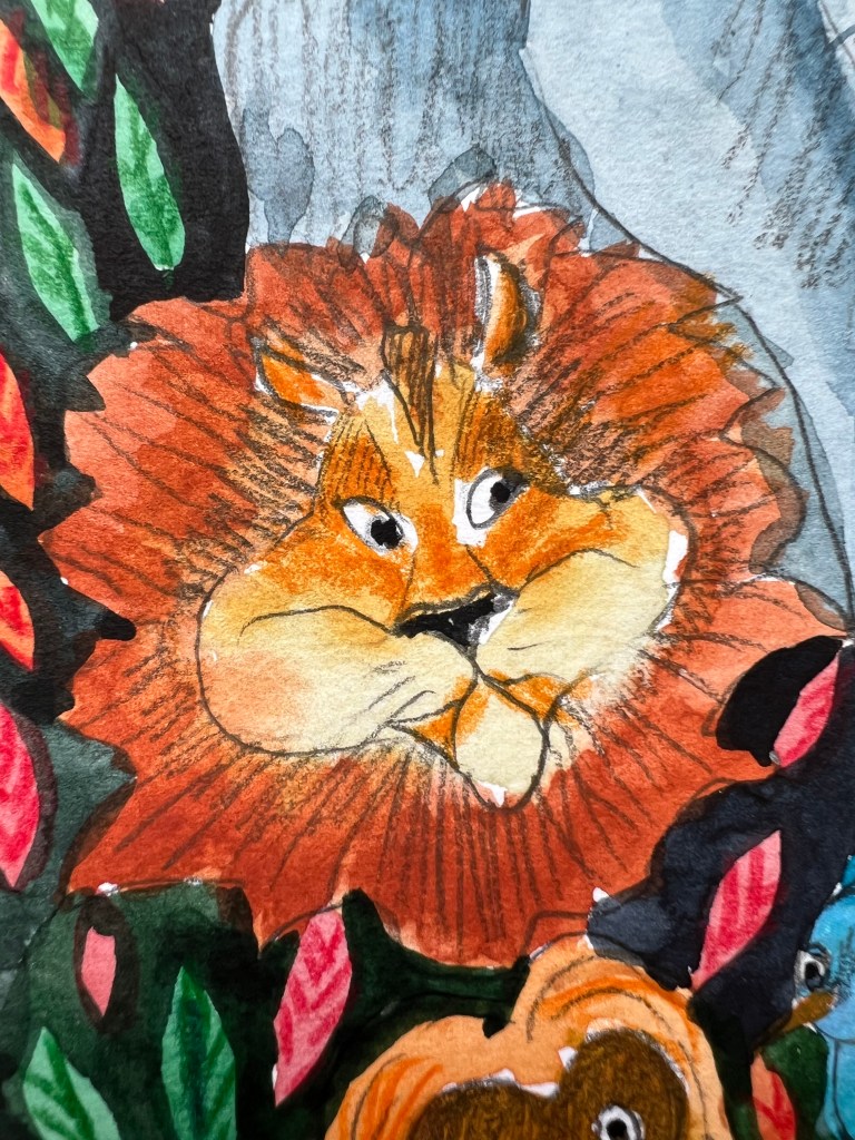
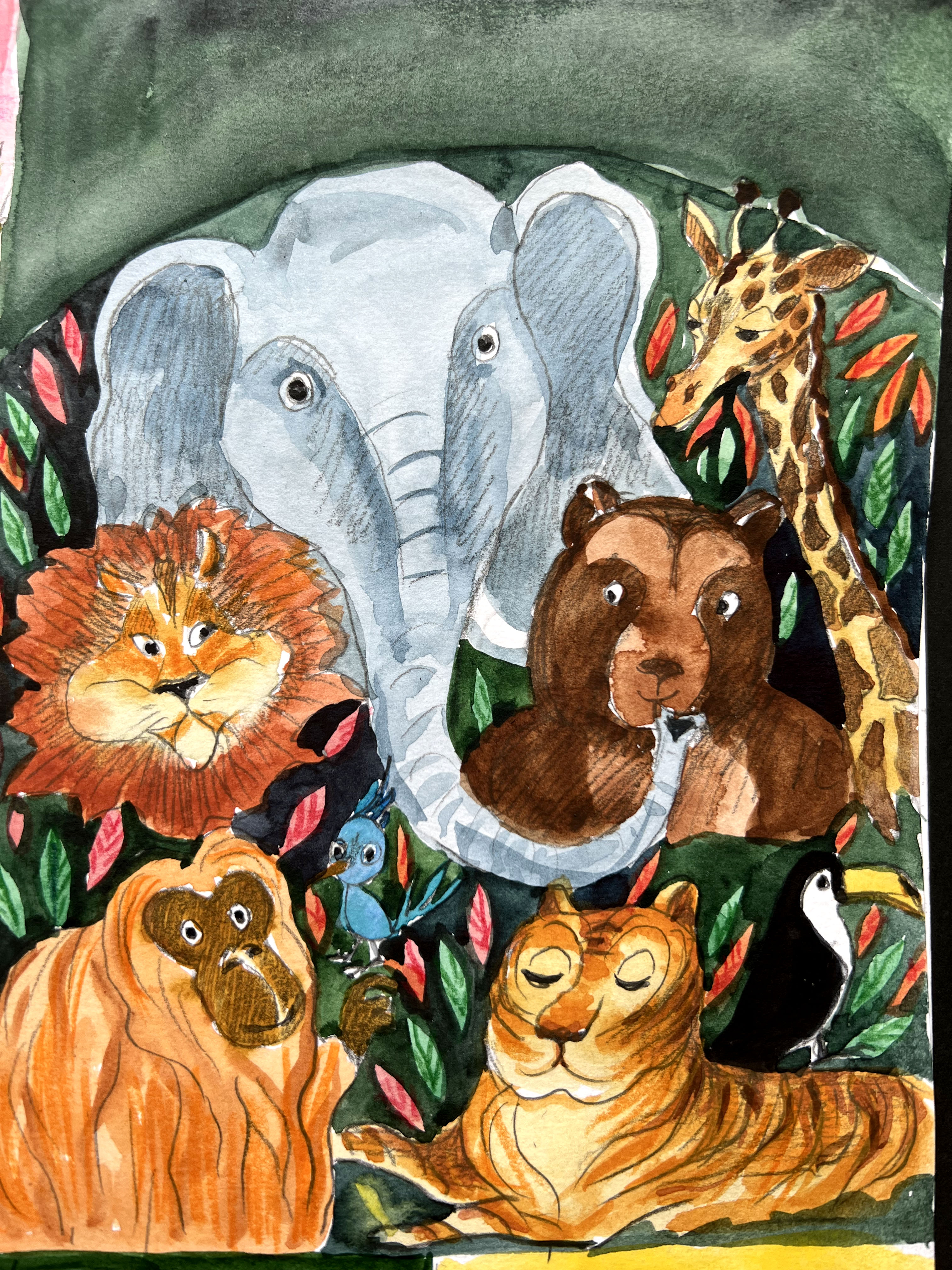
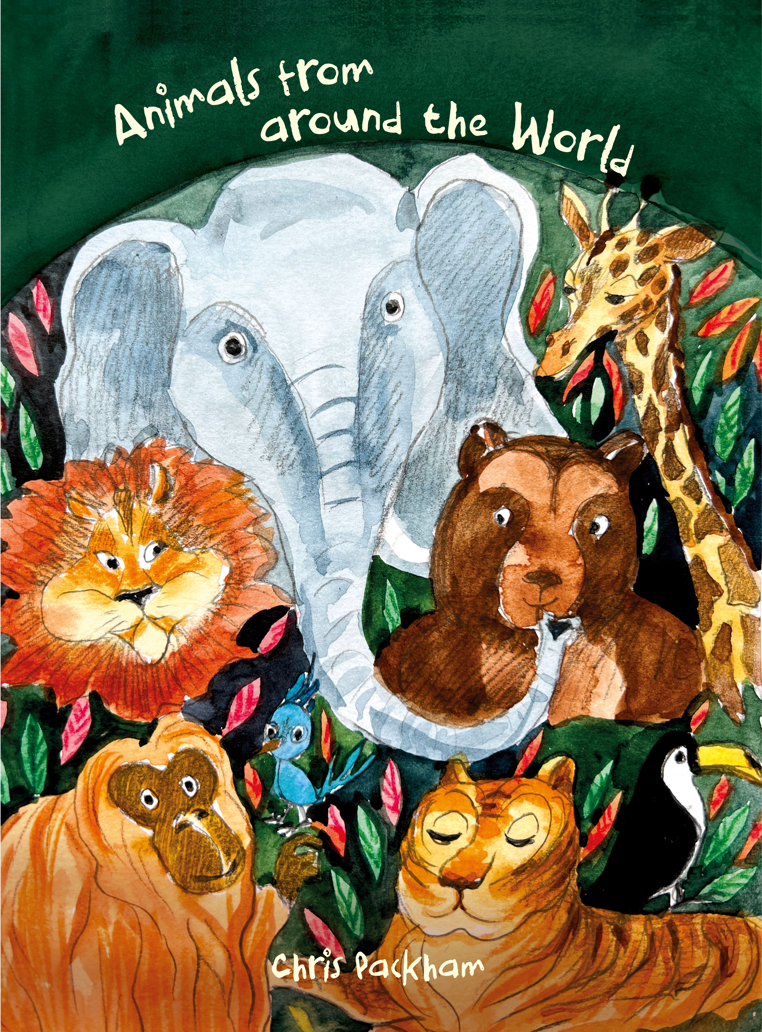
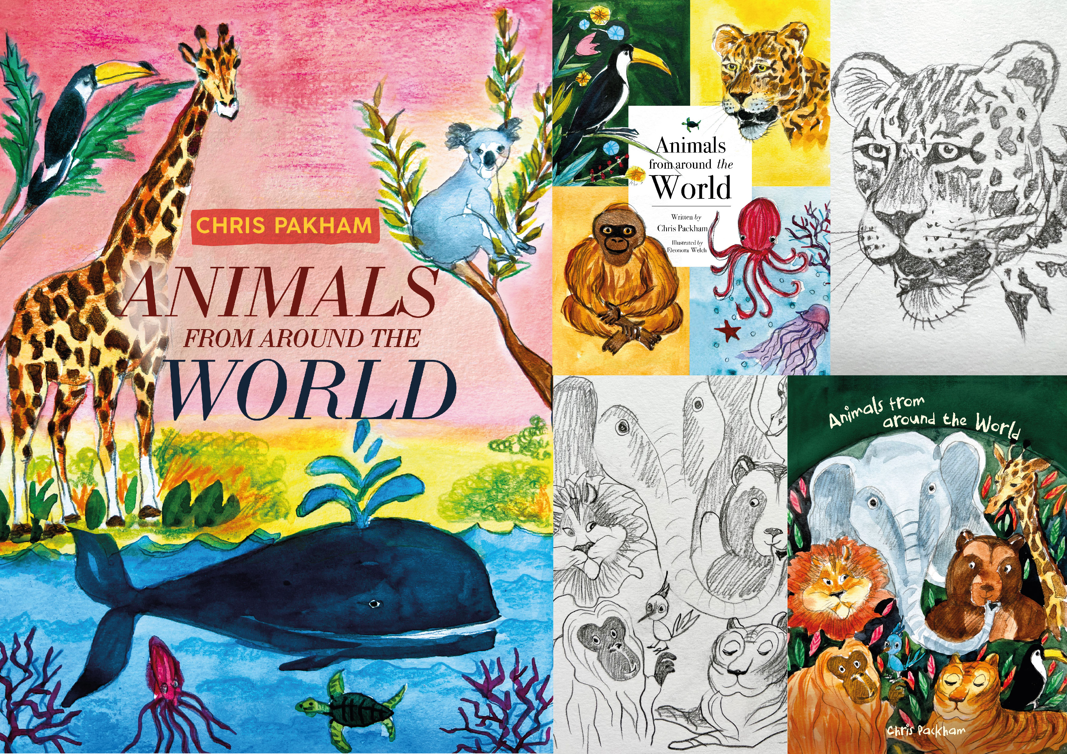
For the third and final book cover, I went for the option with a group of animals, featuring a cheerful and amiable group of animals, which I believed would greatly capture the attention of children. Here the idea was to bring the wildlife together and create the connection between them. The top of the book I made with the arch, as I wanted that writing to bend round. As the style of illustrations is quite cartoony, I thought some handwritten playful font would add some nice touch to the design. I chose Boredom font and placed it on the top, but I had to place the author’s name at the bottom, as it was a tight fit at the top.
I believe that the final cover served as a fitting conclusion to the efforts I put into this exercise. The book cover showcased a diverse range of animal illustration styles and compositions, which proved to be effective. Additionally, I experimented with different typographic choices to complement the illustrations, and I found it to be a valuable exercise in creating educational materials for children.