Having an understanding of the audience is essential for the successful transfer of messages. Fundamental to this is to know exactly what type of response is required of the audience and whether or not they would buy the message being communicated.
In this exercise, I have been asked to produce three illustrations to be as part of a series of A3 posters to publicise the museum to the following audiences:
- Children aged 5–9;
- Teenagers (13–16);
- General adult audience.
In order to do so, I need to select one object for each audience and create an image centred around that object in a way that I think best presents it to the market. I went to our local Doncaster Museum and Art Gallery, which is based within the historic Doncaster Girls High School building. This place is perfect for a family day out, or a solo trip to explore the history of one of England’s oldest towns. It’s quite a small and compact building, but it has so much going on in it, like Central Adult and Children’s Library, Art Gallery and Museum. It even has a presentation of Green Arrow Locomotive at the ground flour.
The walk-through museum will take the visitor through different decades of life in Doncaster, starting from Roman settlement and progressing through its evolution as a market town and industrial hub. Additionally, the museum showcases changes that have occurred within Doncaster’s natural environment over the course of time.
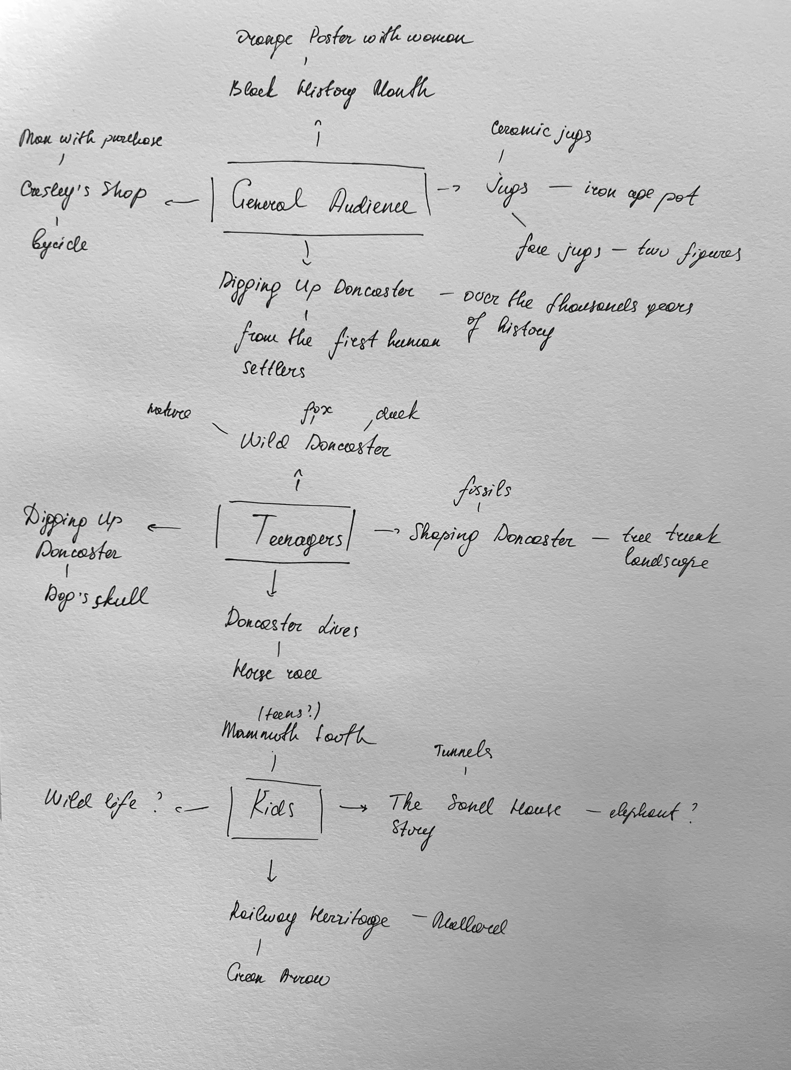
As I strolled through the museum, I captured photographs of the most memorable artworks, which I intended to utilise for the illustrations in the poster. While the museum may not be enormous in size, it houses a wide array of diverse objects that hold potential appeal for our intended audiences. To maintain the order of the creative process, I categorised the museum exhibitions into distinct sections:
- Digging Up Doncaster;
- Doncaster Lives. Gresley’s Shop;
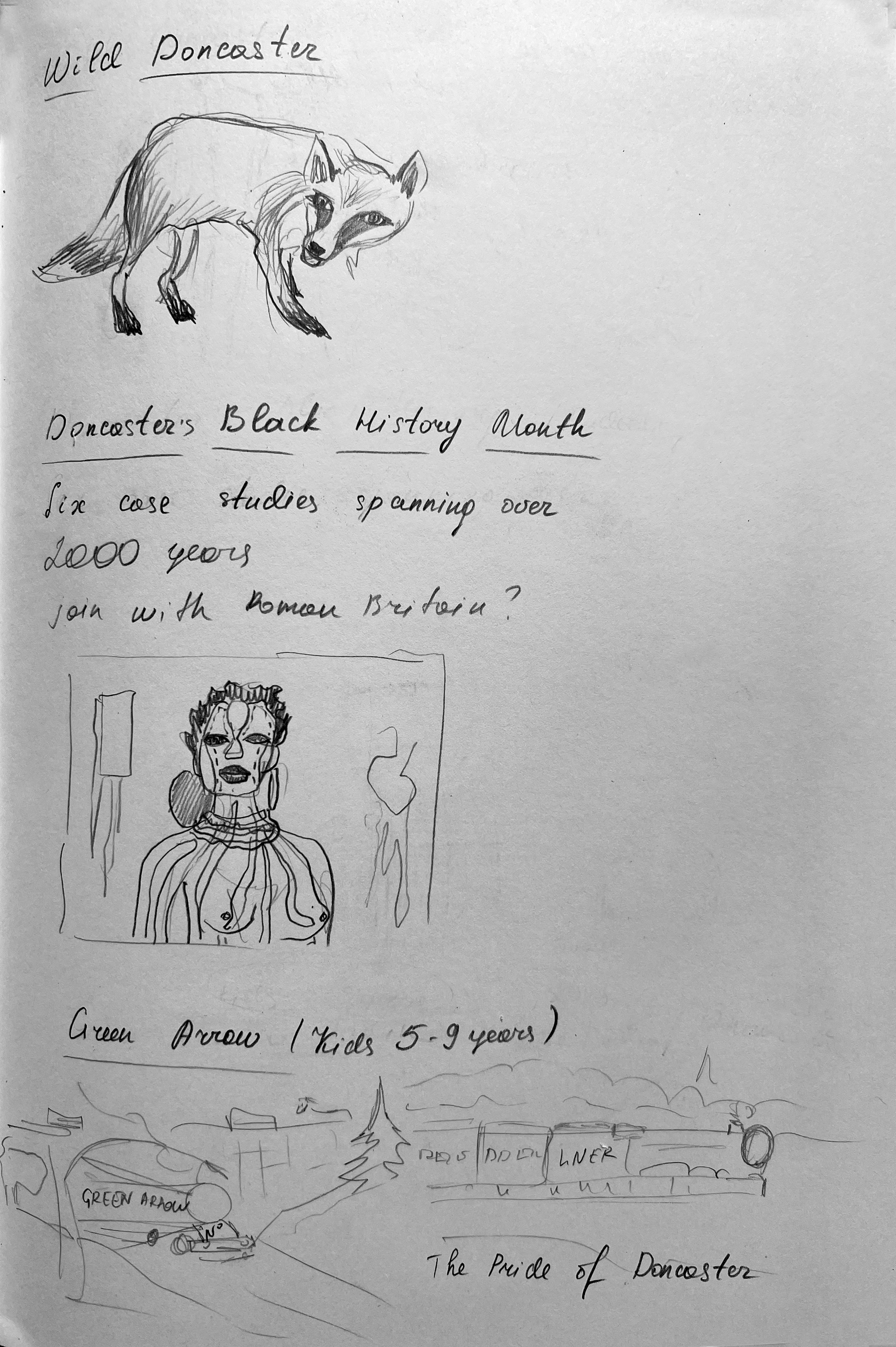
- Wild Doncaster;
- Rail Heritage Centre;
- A Celebration of Doncaster Black History Month.
Digging Up Doncaster
The beginning of the exhibition is laid through the expositions dedicated to the “Diggin Up of Doncaster“. Here is showcased a vast array of vases, ancient artefacts, and accessories belonging to the ancestors who once inhabited this region. Over thousands of years, these objects have helped to shape the borough and reveal secrets of the past.
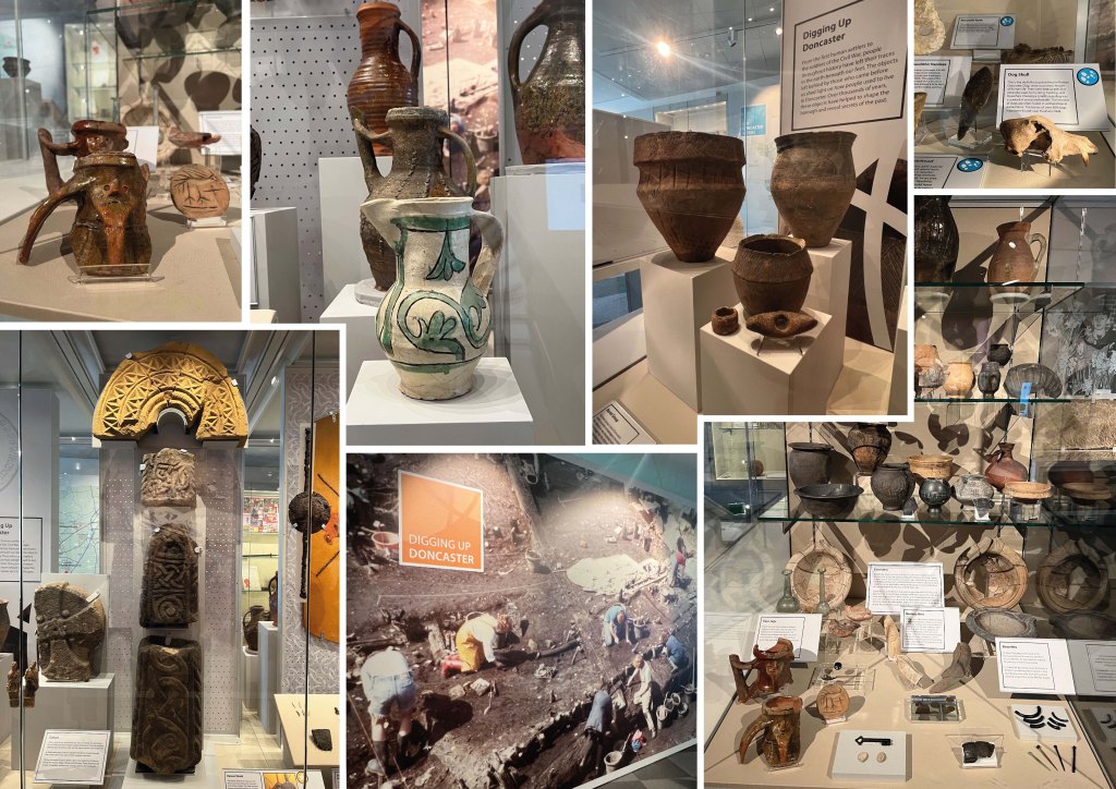
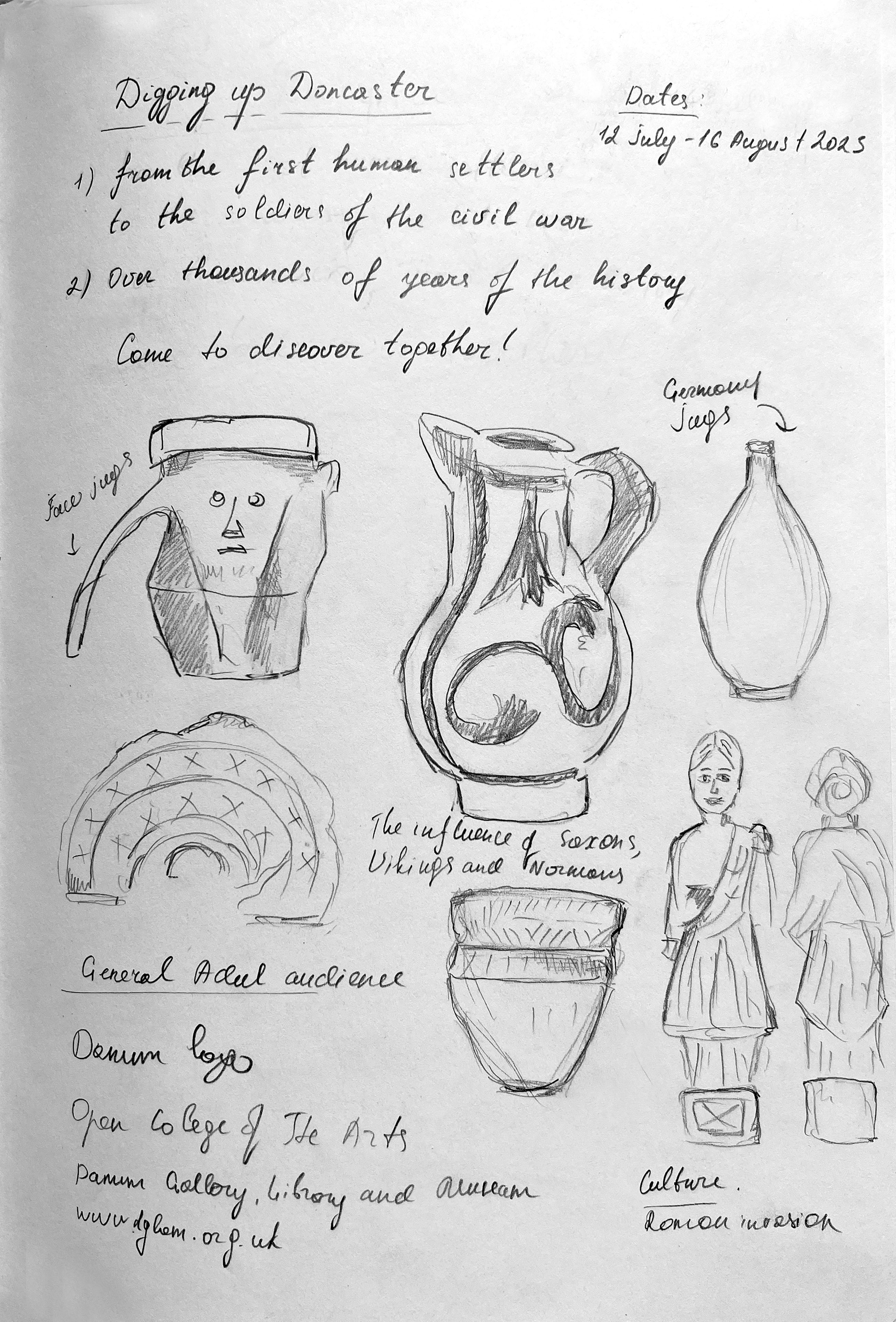
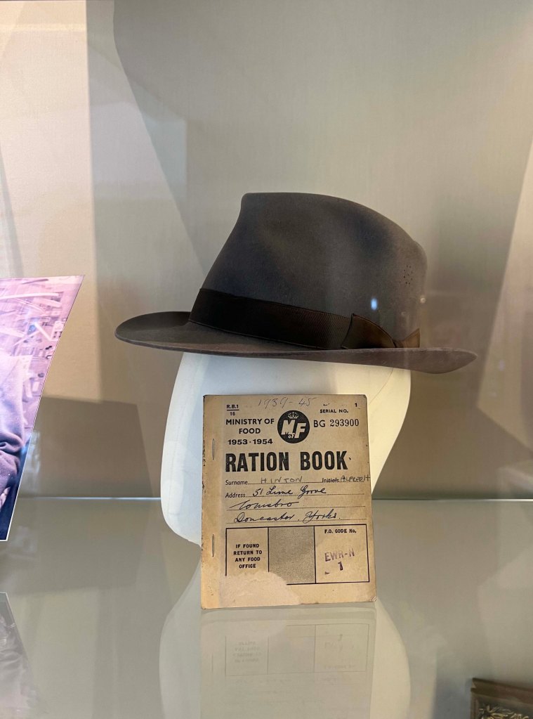
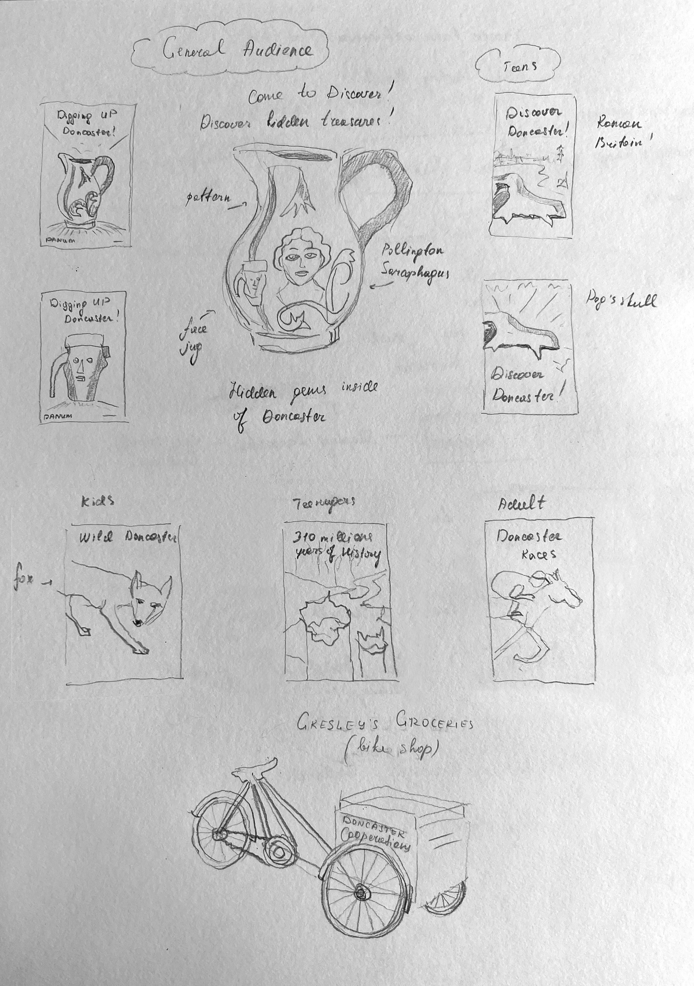
Among these objects, the selected item for poster illustration would be a jar or pot bearing the inscription ‘Digging Up Doncaster! Embark on a journey to unravel centuries-old secrets.‘ This particular section might hold appeal to an adult audience due to its intriguing nature. There were several more similar topics ahead of me, prompting me to mark this section as the starting point for my sketches. Since I had my 4-month-old daughter accompanying me during my visit to the museum, I had no choice but to create rough sketches based on photographs taken from the comfort of my own home. Below I attached sketches I created for this section.
Continuing through the museum, the subsequent rooms are dedicated to the intriguing exploration of sarcophagus excavation, as well as the awe-inspiring display of natural artefacts dating back hundreds of millions of years.
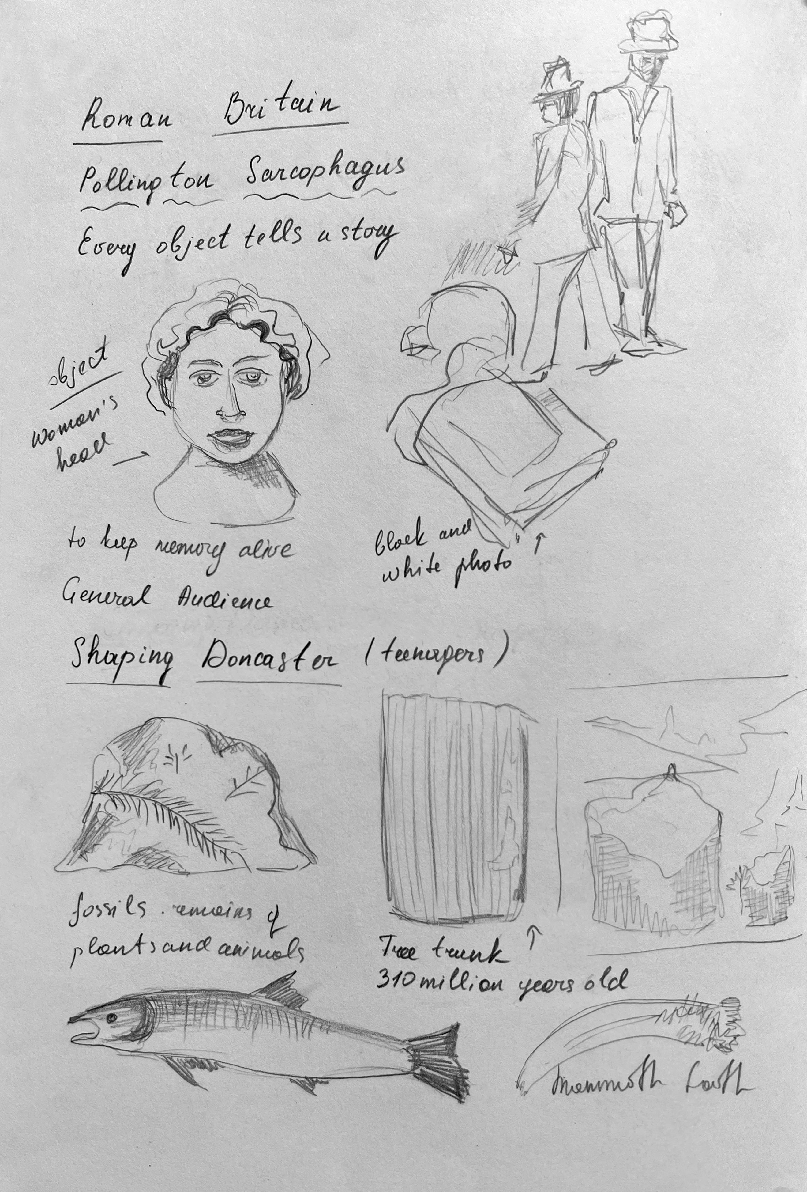
Roman Britain-Pollington Sarcophagus
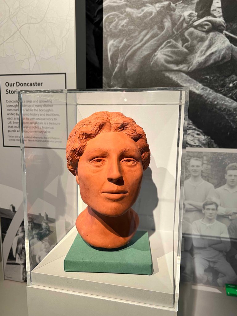
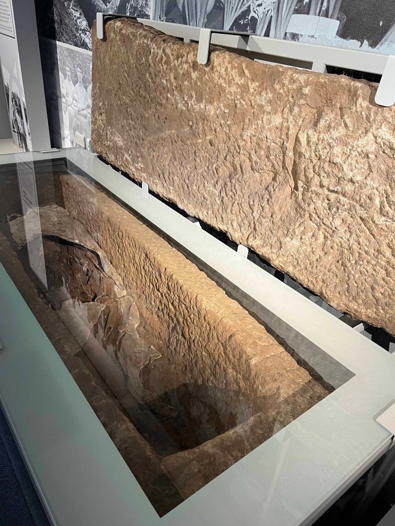
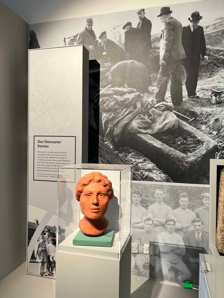
In November 1949, a stone sarcophagus, or coffin, containing the body of a Roman woman was found in a quarry near Pollington Hall. Scientific investigations on the body revealed that she was most likely of North African descent. This demonstrates that Roman Britain was multi-cultural, with people from across the Roman Empire living there. Scientists believe that where the burial was discovered once belonged to a Roman-British villa from 2000 years ago. They identified that the woman would have been around fifty years old when she died. Her expensive style of burial, suggests that she would have been wealthy. The gypsum would have been used to preserve the body, which is not too dissimilar to the burial traditions of the ancient Egyptians.
Shaping Doncaster
Doncaster’s landscape has been shaped by environmental and human factors over millions of years. The tidal River Don provided a freshwater source, a means of transport and access to food in the form of fish. The underlying rock produced fertile soil, peatlands and woods. This varied landscape has allowed humans to build thriving industries in mining, farming and transport.

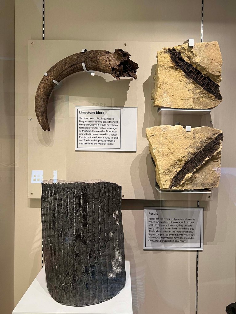
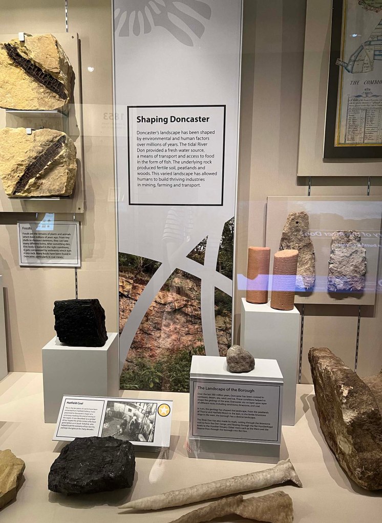
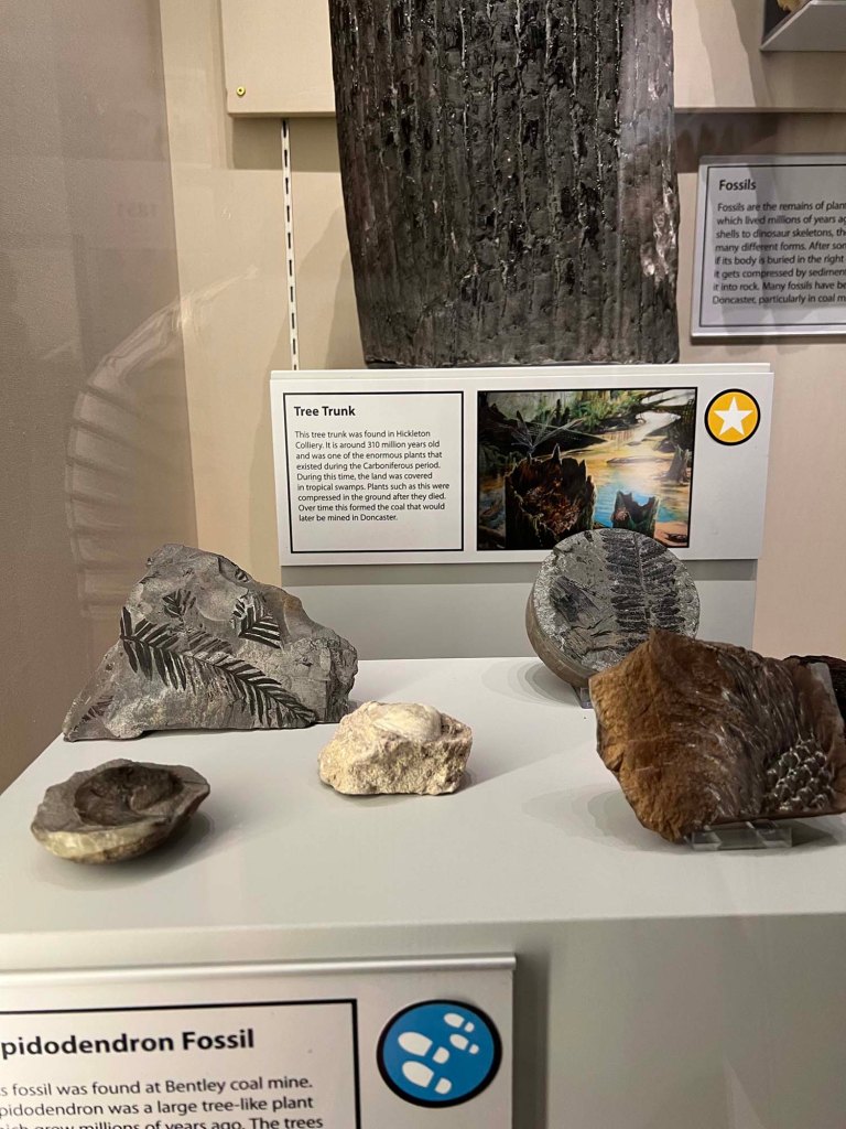
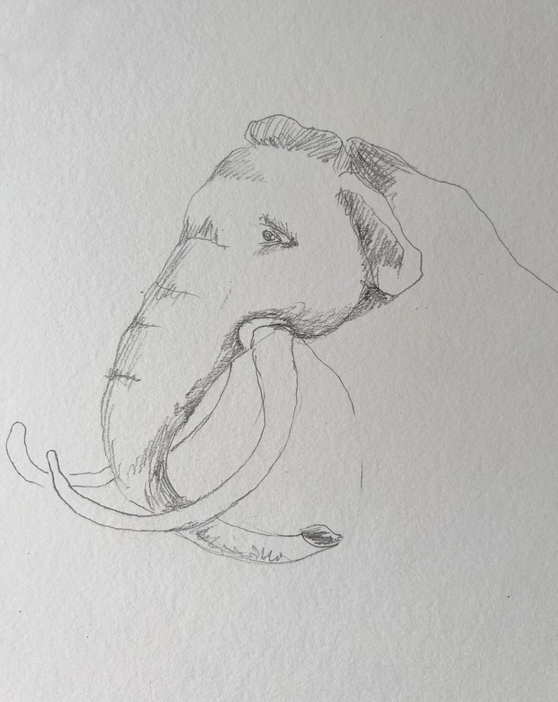
Within these sections, two particular objects capture attention for potential illustrations. In the ‘Roman Britain – Pollington Sarcophagus’ section, a captivating choice for illustration would be the bust of a woman, intricately carved and rich with historical significance. Meanwhile, in the ‘Shaping Doncaster’ section, a compelling option could be an illustration of a tree trunk, a mammoth tooth or a portrayal of the area as it may have appeared countless millions of years in the past. This tree trunk was found in Hickleton Colliery. It is around 310 million years old and was one of the enormous plants that existed during the Carboniferous period. During this time, the land was covered in tropical swamps. Plants such as this were compressed in the ground after they died. Over time this formed the coal that would later be mined in Doncaster.
I think that in the case of the bust poster of a woman, it could be used for an adult audience poster, while the excavation of natural materials was more suitable for a teenage audience.
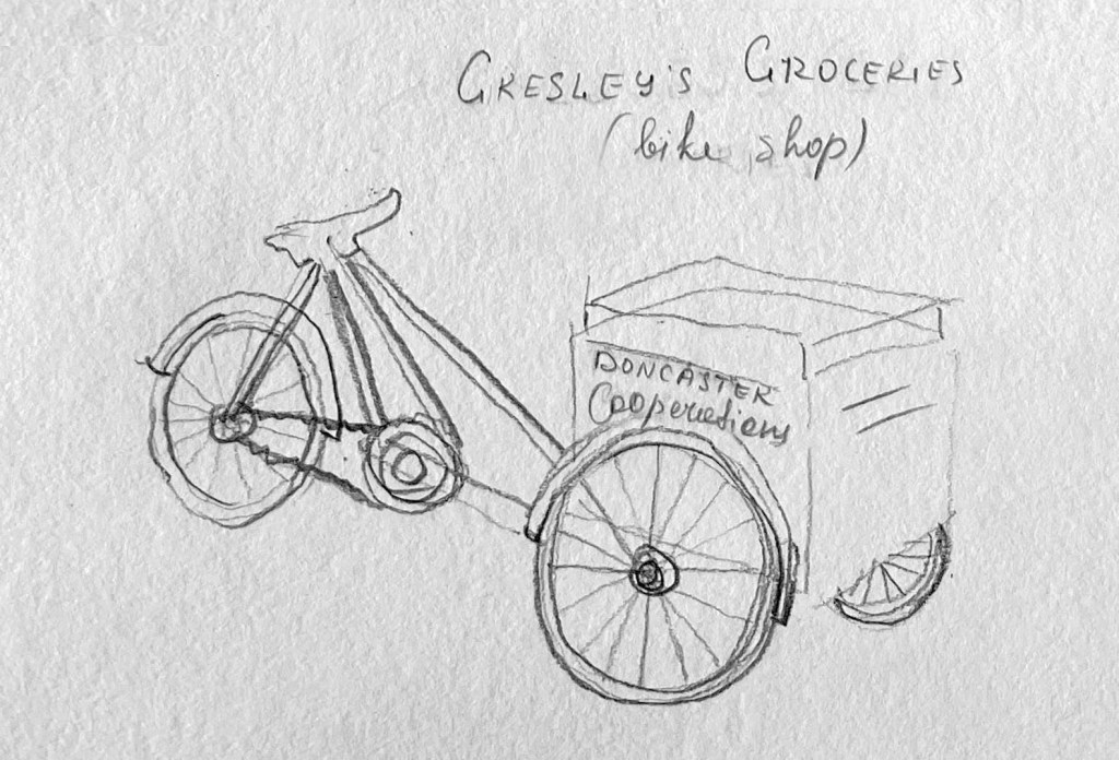
Doncaster Lives. Gresley’s Shop
One of the parts that caught my eye within the museum was Gresley’s Shop. I took some pictures, as the shop looked quite authentic and historical, but I did research on it when I was back home.
In the bustling town of Doncaster, Gresley’s Shop stands as a beloved landmark, holding within its walls the tales of countless lives that have passed through its doors. For generations, this shop has played an integral role in the lives of locals and visitors. Gresley’s Shop has witnessed the flow of time, reflecting the evolving tastes and desires of the community. Its shelves were filled with a colourful array of goods, ranging from artisanal crafts to delectable treats. Stepping into Gresley’s Shop is like stepping back in time, as its rich history intertwines with the present, weaving a tapestry of Doncaster lives that continues to captivate and inspire.

Speaking of Gresley’s Shop, a fascinating subject for sketches would be the distinctive branded bicycle prominently displayed on a pedestal just outside the main entrance. This bicycle, specifically designed for transporting goods, serves as a symbol of the shop’s commitment to convenience and efficiency. Additionally, the shop’s interior showcases an array of shelves filled with an eclectic collection of posters and postcards, featuring captivating illustrations from the 1960s. These displays offer a nostalgic glimpse into the past, evoking the vibrant spirit of the era. Gresley’s Shop truly encapsulates a blend of functionality and artistic flair, making it an enchanting destination for both shoppers and admirers of bygone eras.
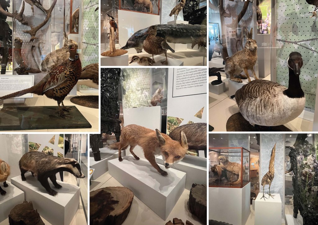
Wild Doncaster
The Doncaster Museum showcases the diverse wildlife that can be found in and around the city. From native birds and mammals to insects, reptiles, and aquatic life, the museum presents a comprehensive overview of the local wildlife. The exhibits not only highlight the beauty and wonder of these creatures but also emphasise the importance of the conservation of the local environment, as well as protecting and preserving these habitats for future generations. The Doncaster Museum serves as an educational and inspiring resource for both locals and tourists, promoting a greater appreciation for the incredible wildlife that thrives in the area.
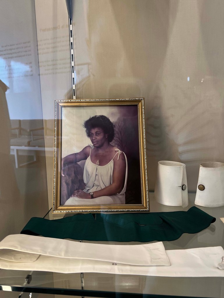
A Celebration of Doncaster Black History Month
The celebration of Doncaster Black History Month is a vibrant and important event that honours the rich heritage and contributions of Black people in the community. Throughout the museum, there are stories and experiences of over 2000 years of black history in Doncaster. The celebration also features vibrant cultural performances, showcasing the diverse talents of Black artists within the community.

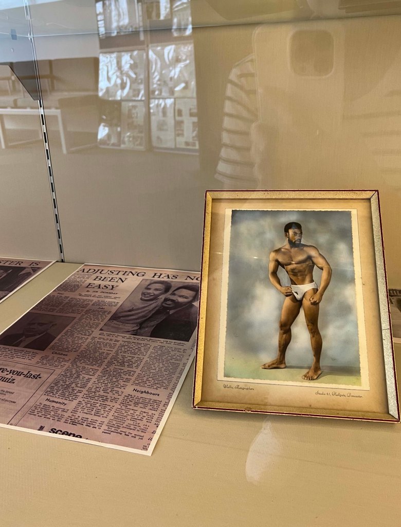
For these three sections, I created sketches that could be incorporated into the chosen object for the posters. I was particularly drawn to the idea of highlighting the preservation of the natural environment and featuring animals as the focal point. This theme may captivate teenagers and kids. Regarding Gresley’s shop theme, it could be an ideal choice for the adult audience, but I needed to determine appropriate directions for both teenagers and children. Also, I was thinking of using the visual of African woman that to present the Black History Month poster.
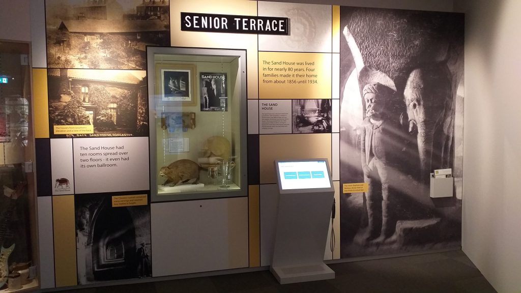
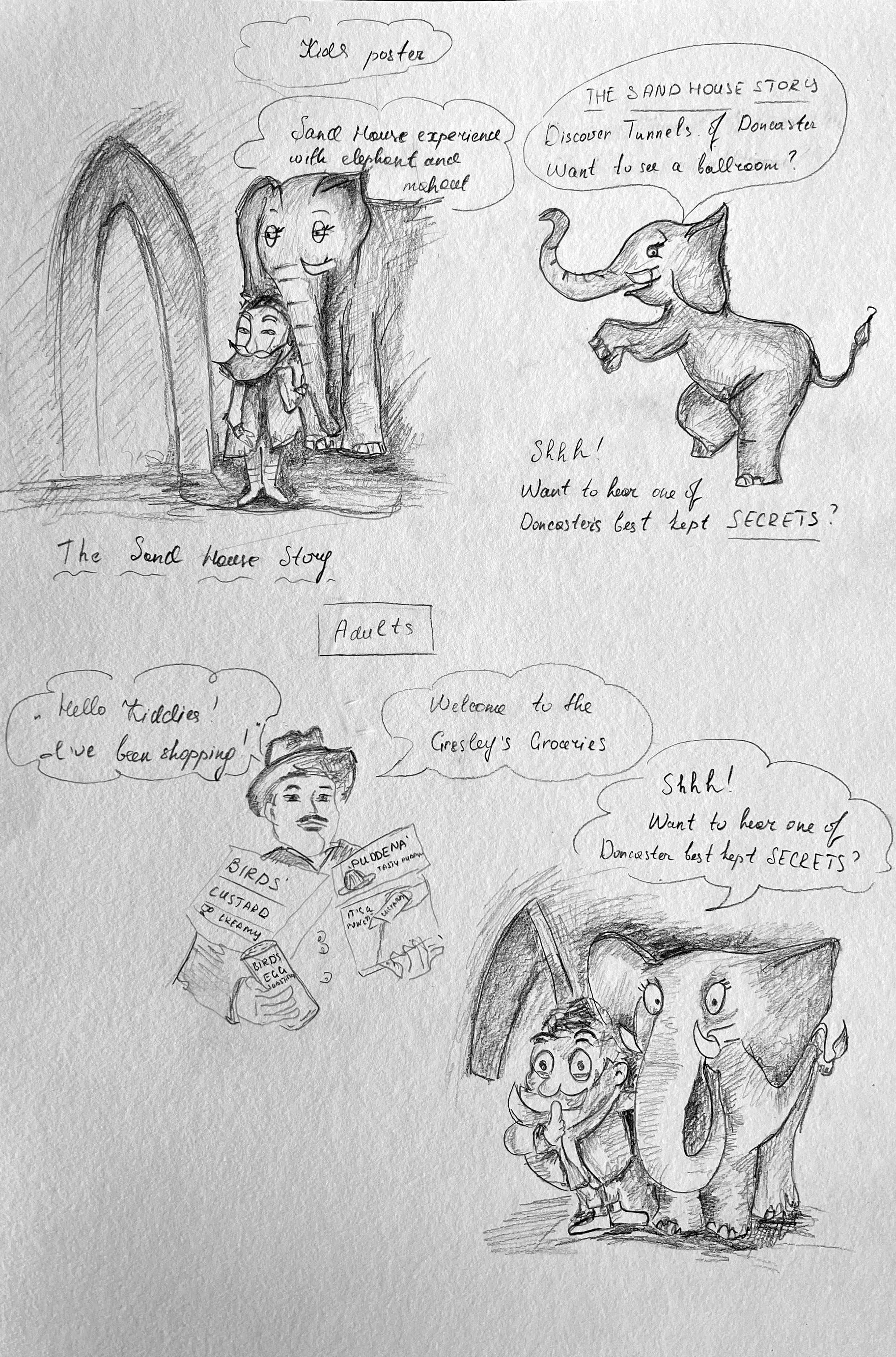
The Sand House
The Sand House story in Doncaster is a fascinating tale that highlights a local figure, Walter Percy Bentley. Located in Doncaster, this structure was crafted from sand, known as the Sand House. Bentley’s passion and talent for sculpting with sand resulted in an extensive underground complex, displaying breathtaking sand artwork and captivating visitors from near and far. Unfortunately, the Sand House was eventually destroyed, leaving behind only photographs and memories of this extraordinary creation. However, the Sand House story continues to inspire and serves as a testament to Bentley’s incredible talent and creativity.
This theme could be one of the subjects to discover for kids. I did a bit of research and found this information about “Elephant in the room”. More information about this movement can be found here: http://www.thesandhouse.org.uk/the-elephant-in-the-room/
Rail Heritage Centre
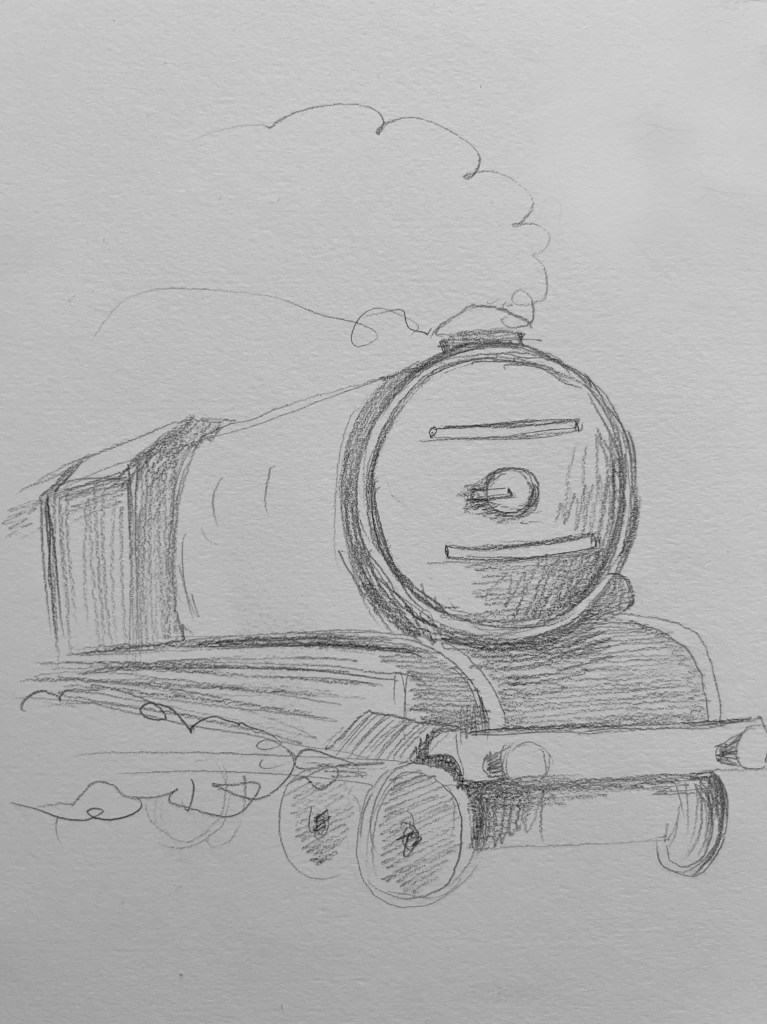
Doncaster Railway Heritage holds a significant place in the history and culture of the town. As a key hub of railway activity, Doncaster played a crucial role in the development and expansion of the railway network during the 19th and 20th centuries. Doncaster is the place where famous locomotives like the Flying Scotsman and Mallard were built and maintained. The Doncaster Railway Heritage celebrates this history through various initiatives, including museums, heritage trails, and preservation projects, offering visitors and locals alike an opportunity to explore and appreciate the town’s deep-rooted railway heritage.
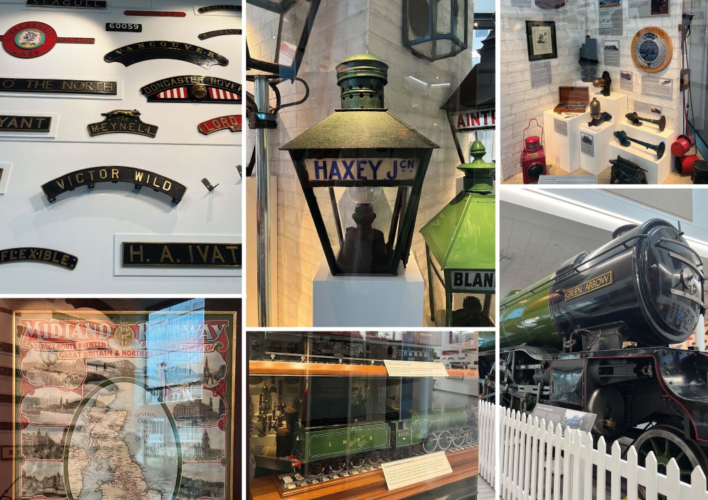
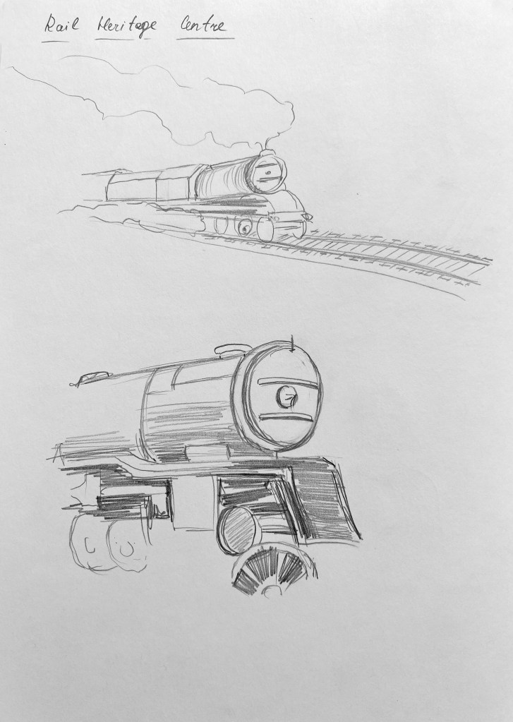
One of the ideas for the kids’ poster was to create an illustration of a locomotive resembling the Green Arrow, accompanied by the slogan “Green Arrow of Doncaster.”
After sketching out several versions of drawings and tags for the posters, I decided to organise them into the mind map. Although the goal was to create three separate posters for different age categories, I wanted to ensure that there was a seamless flow and coherence between all three posters. By doing so, the message and aesthetic would resonate harmoniously throughout, enhancing the overall impact and visual appeal of the final design.
At this stage, I began to develop my ideas for the posters. There were numerous potential objects that I could use for each poster, which initially felt overwhelming. To help visualise the composition, I created sketches of how the objects could be positioned within the poster. One idea that stood out to me was creating a jar filled with objects, like “Hidden Gems,” which would relate to the “Digging Up Doncaster” theme for the adult posters.
Additionally, I sketched out three posters for each target audience, incorporating the Doncaster racecourse theme. Although I hadn’t extensively explored this subject within the museum, apart from Gresley’s shop as a poster card, I wanted to consider all possible options that could be implemented within the brief.
Next, I created sketches to plan the placement of objects on the poster. I had the idea of featuring a jug with a portrait of the Poligton Sarcophagus woman, a face jug, and other objects, creating a collage-like effect. I also sketched different arrangements to determine the positioning of each object, mainly using jugs and vases.
I was inspired by the theme of Sand House Story and created sketches of tunnels, an elephant, and a mahout. My intention was to make it appear as if they were having a conversation and engaging with the reader. This theme would be ideal for a kids’ poster and aligns well with the historical context. However, I also wanted to highlight an important part of Doncaster’s history – its railway heritage, which is prominent in the community. Therefore, I ultimately chose to focus on trains for the kids’ poster.
Conceptual posters
Before designing posters I went online to look for some ideas for inspiration. I was looking for some campaigns that purposefully were done for such topics as museums, history, and nature.
Posters below the advertisement for the Natural History Museum are presented in conceptual style. They have a creative approach, where one image consists of several parts, but altogether creates one solid object. The technique is similar to collage, and juxtaposition.
Those visuals include various elements that illustrate the museum’s emphasis on natural history. It helps potential visitors recognise the museum and its distinct visual identity. Each poster may display several illustrations or photographs of key artefacts or specimens found within the museum. This might include imagery of well-preserved fossils, unique geological formations, or extraordinary specimens of flora and fauna. These images serve to demonstrate the museum’s focus on showcasing the natural wonders of the world.
I quite like the colours that were used within those visuals, especially the creamy background, which helps to concentrate on the central part of the visual. They are nature-themed colours such as earthy tones, greens, or blues that could be chosen to evoke a sense of connection to the natural world and instil curiosity in potential visitors.
Overall, the advertisement aims to showcase the Natural History Museum as a captivating and educational destination that celebrates the wonders of natural history. This is something that I should think about for my posters as well.
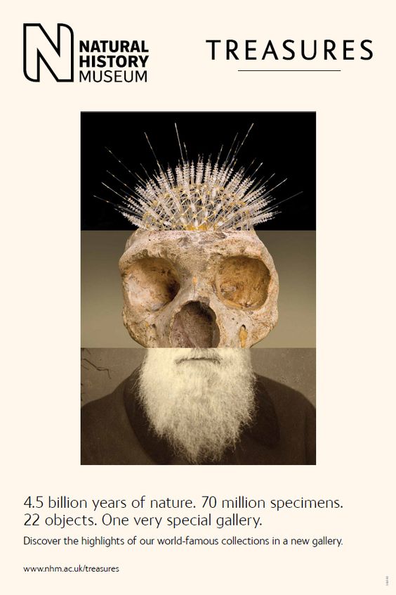
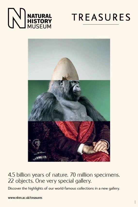

https://kellycomarketing.tumblr.com/post/75602347509/ad-campaign-for-londons-natural-history-museum
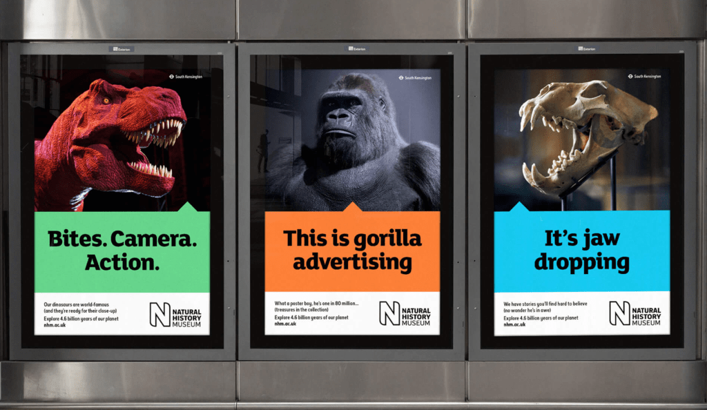
Literal
Another example of posters for Natural History Musem has a literal approach, where animals and objects are presented in a real way. The message of the poster is quite loud and confident, with humorous slogans, also, the central part of the poster is highlighted with a bold colour. The colour of the photograph is dark and moody, different to the previous design campaign, but still has a vocal point on one object. These posters are likely designed to attract attention and create curiosity among potential visitors.
Pinterest moodboard
Furthermore, I have gathered a collection of posters featuring single objects, including nature presentations and artefacts, in order to explore current trends and explore the keys to creating captivating images. Analysing these posters allows me to identify popular styles and techniques that resonate with audiences.
If I pursued a historical and excavation theme for the adult posters, I felt it would be best to maintain that theme throughout all three posters. This led me to envision the following groups of posters: “Digging Up Doncaster” for adults, “Fossils” for teenagers, and “Sand House Story” for kids. Additionally, I considered “Gresley’s Shop” for adults, “Animals” for teens, and “Trains” for kids. Or, “Digging Up Doncaster” for adults, “Mammoth” for teenagers, and “Railway Heritage” for kids.
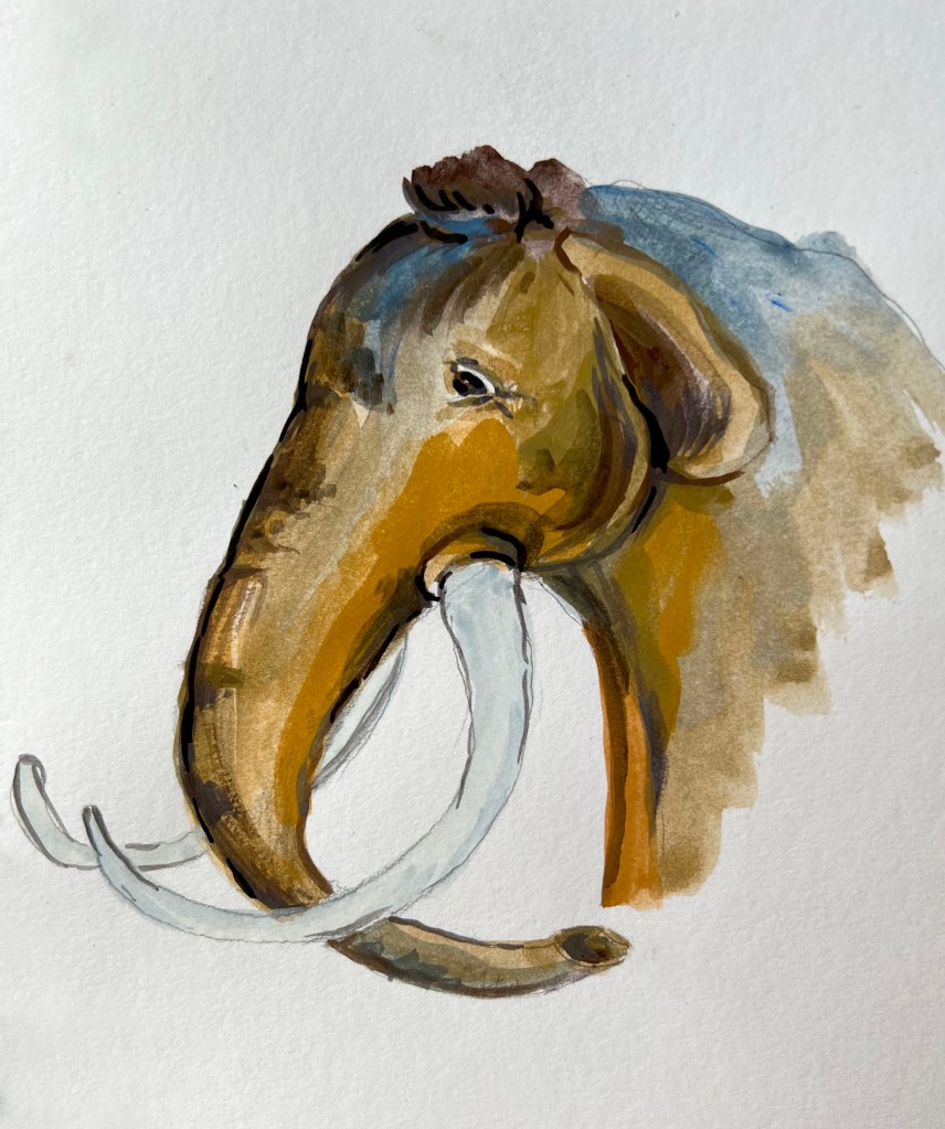
I created an additional mind map to finalise the choices for each poster. I was confident with the chosen theme for the general audience and the kids’ poster. However, the teenager poster was a bit tricky because teenagers already have established interests and may not be frequent museum visitors like adults. I thought that the theme of fossils would pique their curiosity and encourage them to visit the museum and explore. However, due to the small size of our Doncaster museum, it might be challenging to see the spectacular artefacts typically found in larger cities. Therefore, for the teenager poster, I decided to focus on the theme of a Mammoth tooth, fossils, and the desire to discover the historical and archaeological aspects of the local area.

I created a series of visuals with different themes to help me organise and better understand my ideas. This process also allowed me to get a glimpse of what I can expect from these poster concepts. Initially, I planned on placing the object in the centre of the poster, creating a framed effect. I also experimented with an off-centre placement, where the object is positioned towards the right side and occupies only half of the space.
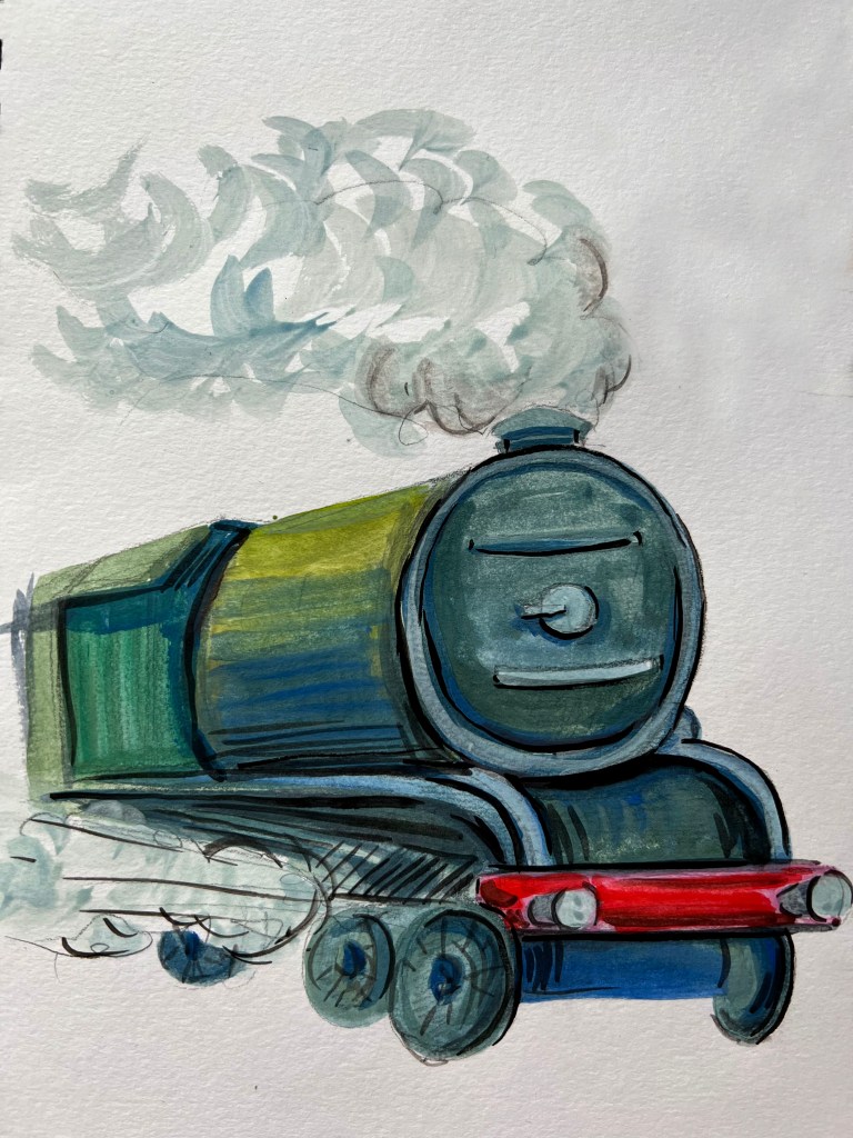
For the kids’ poster, I initially planned to focus on the tunnels and The Sand House story. However, my husband, who was born in Doncaster, insisted that I should create a Railway Heritage poster since that is what Doncaster is famous for and something to be proud of. So, I changed the direction and decided to go with a train theme based on his suggestion.
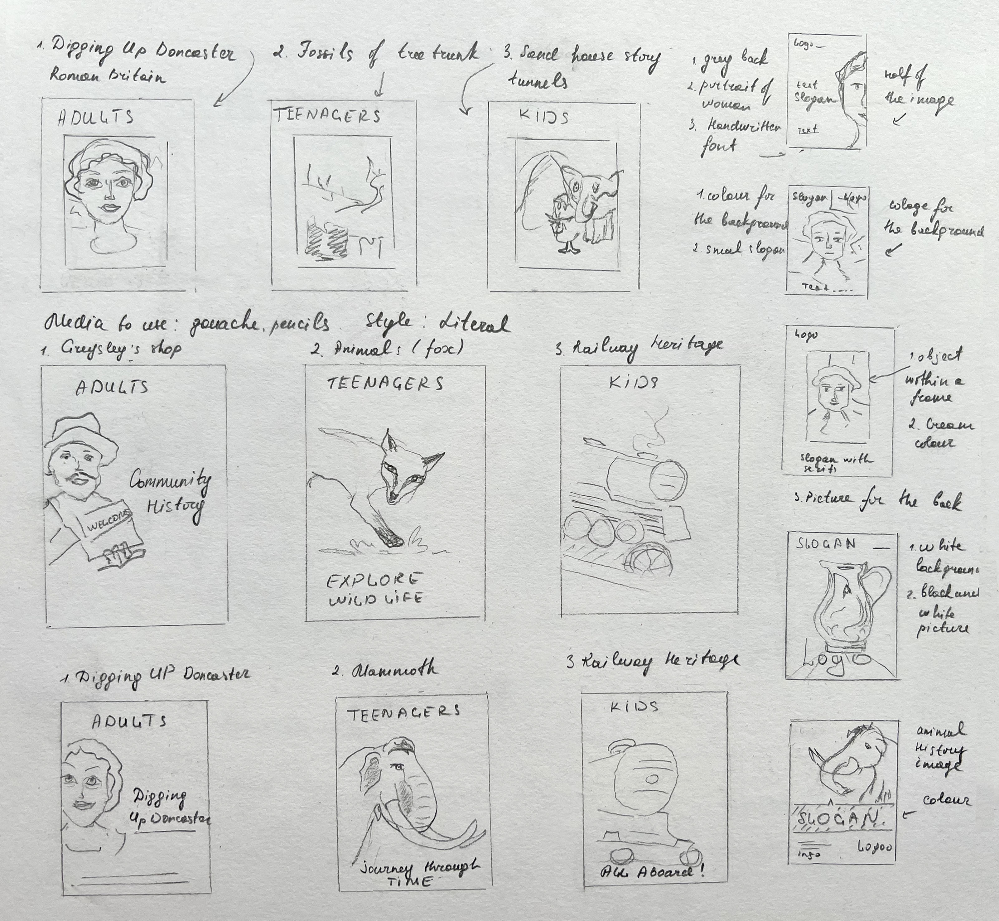
In terms of the background, I am leaning towards using a white or cream colour, but I am also open to the possibility of incorporating darker backgrounds. For the general audience, I have decided to feature the Poligton Sarcophagus woman. For teenagers, I plan on using a mammoth tooth as the focal point. Lastly, for the kids’ poster, I will be highlighting the railway heritage.
The Doncaster Museum is home to an extraordinary artefact — a genuine mammoth tooth. This ancient and enormous tooth serves as a captivating reminder of the prehistoric creatures that once roamed the Earth. The mammoth tooth serves as a tangible connection to a bygone era, igniting curiosity and allowing us to imagine what life was like during the time of these majestic creatures.
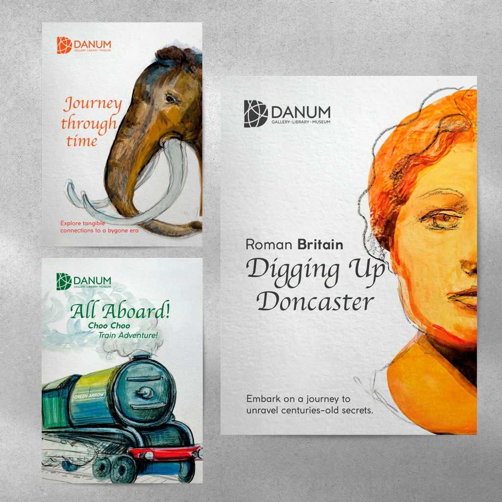
After conducting extensive analysis and research, it has become evident that these are the themes I wish to explore in my posters. I added slogans next to each poster, as I thought the message will be a good support for my designs.
- Children aged 5–9 (Railway Heritage) Slogan: All aboard!;
- Teenagers 13–16 (Mammoth Tooth) Slogan: Journey through time;
- General adult audience (Roman Britain) Slogan: Digging up Doncaster.
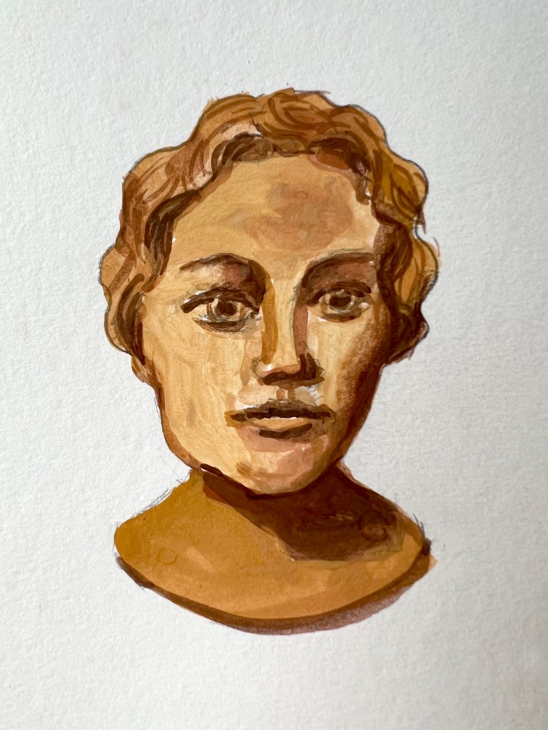
For my drawings, I used gouache to depict a bust of a Pollington Sarcophagus woman, a painting of a mammoth, and a Green Arrow train. Initially, I utilised gouache for my drawings, but later on, I planned to incorporate software to make adjustments and create more effectual illustrations.
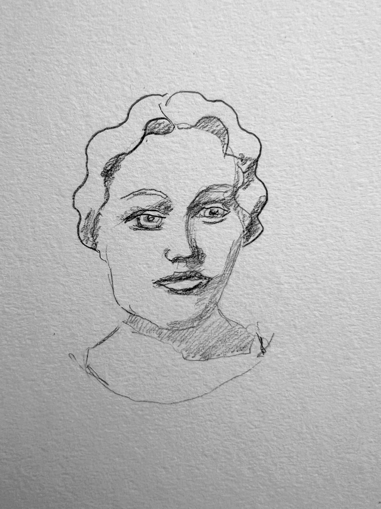
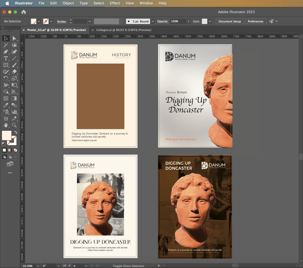
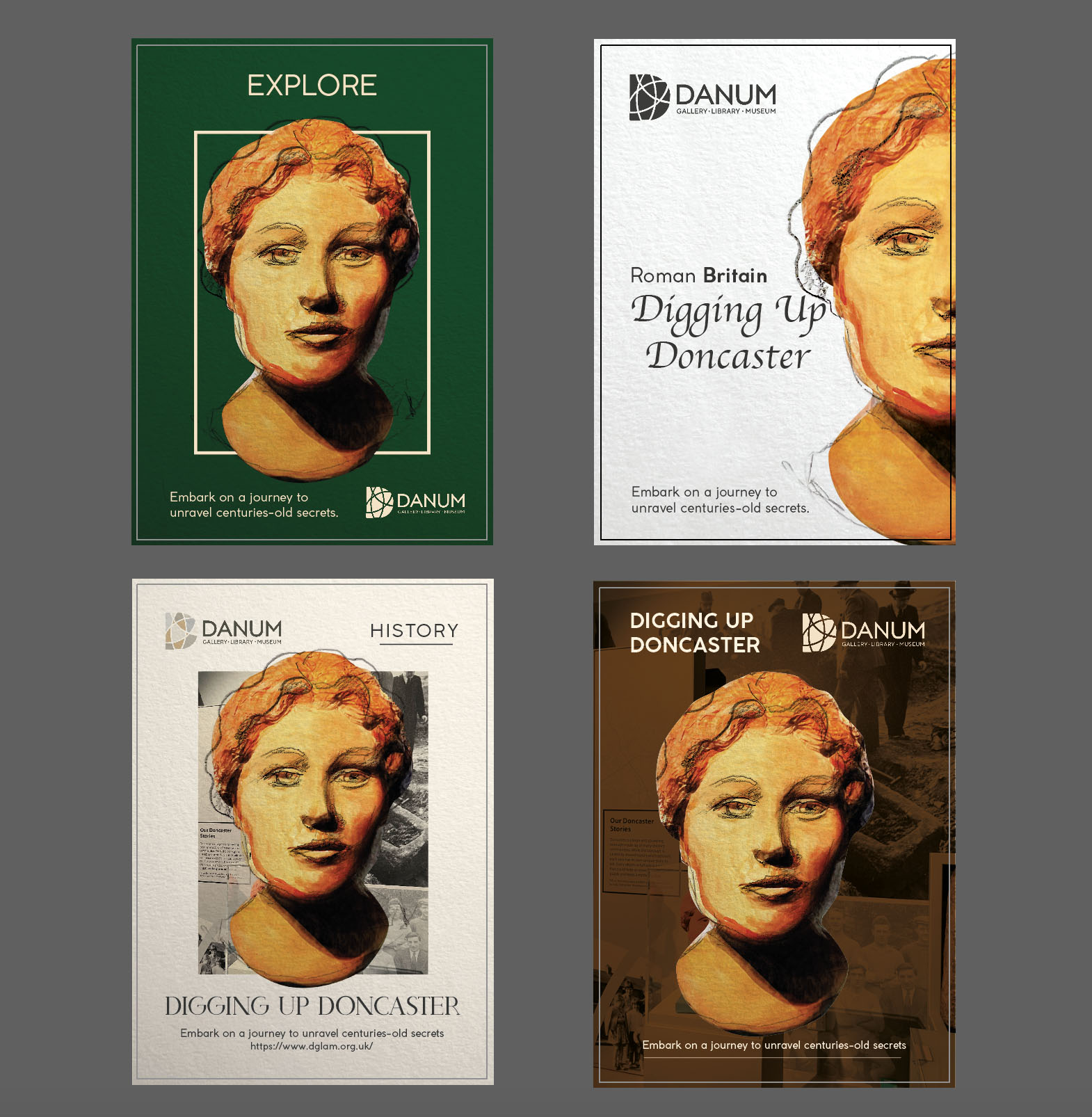
Additionally, I have created various layouts with different options for colour usage and compositions. As the focal point, I incorporated a bust of a Roman Sarcophagus woman and explored different variations of its placement. In these posters, the objective was to experiment with the background colour, typography and the size of the main object.
Initially, a design was chosen with a centrally positioned portrait and a rectangular background formed by photographs which looked like collage (bottom left image). The cream colour surrounding it created a frame-like effect. The cream colour surrounding created a frame-like effect. The choice of a serif font added a decorative touch. However, I had certain doubts regarding this composition. The presence of numerous distracting elements made the design resemble a magazine or book cover, deviating from the intended objective, although I was not sure about the font choice. As a result, a decision was made to shift towards an enlarged placement of the main object (upper right image). I had some concerns about the grey background, which was lacking vibrancy. So, I was planning to brighten it up. At the same time, I chose to create one solid colour for the logo and typography, which was in charcoal colour, and the font for the main slogan in the central left part seemed like worked harmoniously with the composition.
The next step involved creating a high-quality illustration. In my case, the portrait of a woman by gouache paints was just a textured representation of the future character. The sketches were cute, but they lacked the “wow” factor. I wanted to amaze my viewers, not only the adult audience but also young children and teenagers.
Using Photoshop, I cropped out the woman’s bust and applied a Neural Filter to enhance the image. Next, I lay my gouache illustration on top, followed by a pencil sketch. And voila, the illustration came to life and acquired a stunning look. As it was a portrait, I aimed to recreate accuracy, which I achieved by utilising the original photograph that I took in the museum. The textures created by the gouache and pencil sketch added a unique dimension to the bust. This is exactly what I needed to create a standout key object for my design.

At that point, it was essential to get the composition right because I was going to rely on it for two other posters. I created four samples, based on previous research, but this time using updated illustration. I thought that contrasting dark green colours for the background will make an impact on the composition, but it definitely looked too much and didn’t quite work.
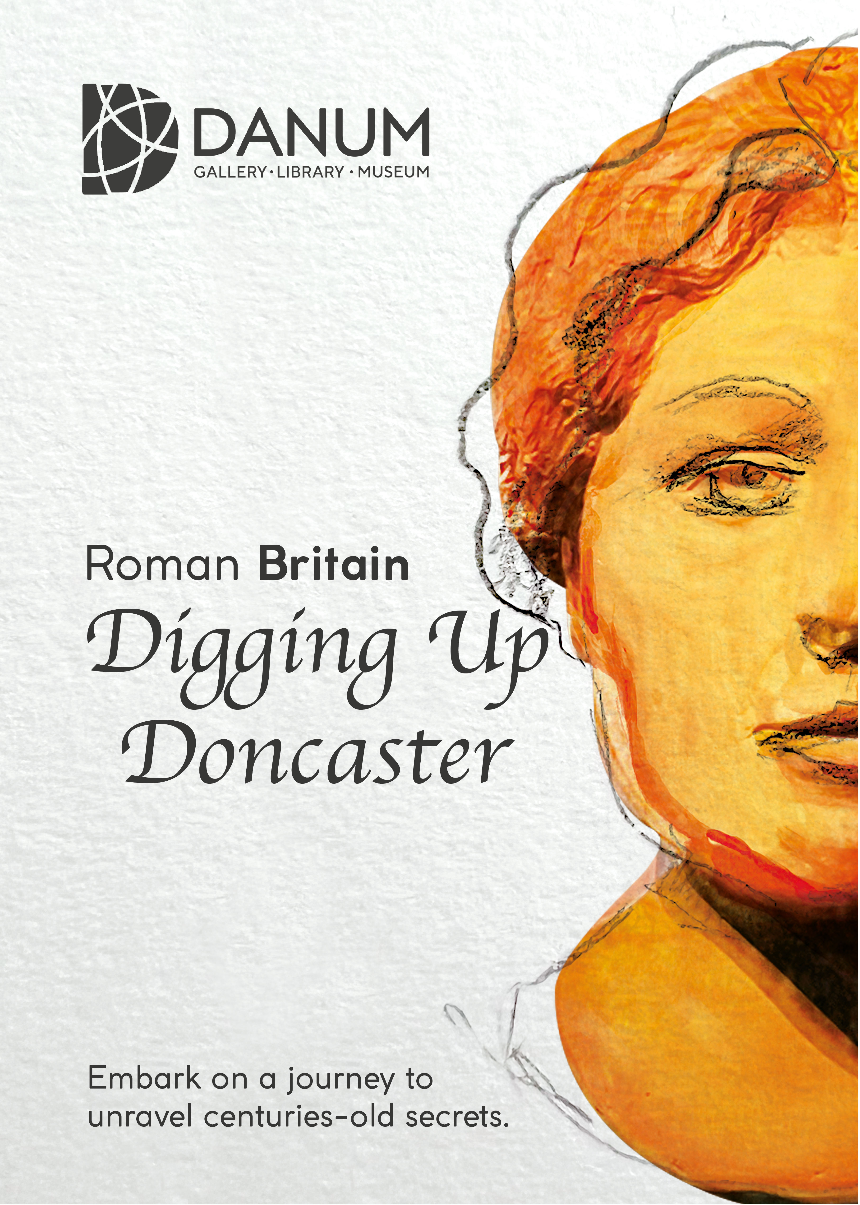
I was hesitating between two options: one with a photo as the background and a cream frame, and an enlarged photo positioned to the right. Ultimately, I decided to choose the more prominent design that I mentioned earlier. This design featured a large portrait of the woman’s half-face with a clear white space on the left, creating a well-balanced poster. It is simple and easy to read, which makes it the perfect choice for a museum poster where clarity is crucial. For the background, I used the paper texture, with a slight grey hint. Additionally, I wanted to incorporate captivating titles into each poster to make them part of the overall design. For the main slogan, I selected the Apple Chancery font, with a brief description in a charcoal grey san-serif font at the bottom.
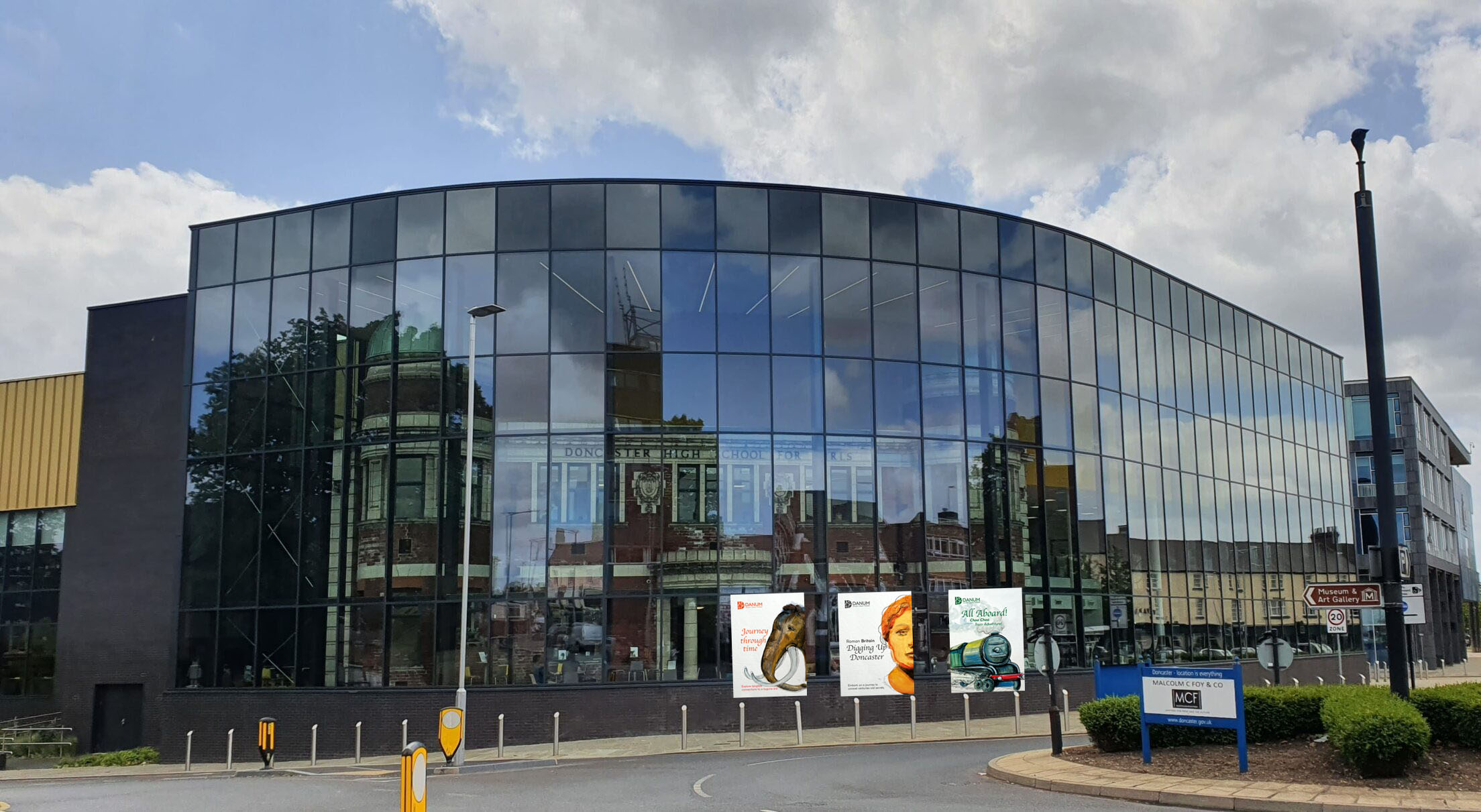
The final design for the general audience turned out quite well. The scrupulous and thorough analysis certainly played a role in ensuring its success. The illustration of the poster comes across as confident and self-sufficient, capturing the essence of the Roman presence in Doncaster.
The poster effectively balances text, imagery, and negative space in its composition, creating a visually appealing layout that draws the viewer’s attention. The use of earthy tones on the portrait effectively conveys a sense of history and antiquity, adding to the overall theme and ambience of the design.
Overall, it seems that the efforts put into the design, including the analysis and selection of elements, have resulted in a successful museum poster that effectively communicates the exhibition’s message to a general audience.
Following the successful design experience for the general audience, I moved on to the next layout, creating a train poster for kids. However, I faced a challenge in fitting the train into the composition correctly, as it was a different shape illustration compared to the bust of the woman. While I initially planned to position the train in the right corner, enlarging it to half the length of the A3 format, this would have resulted in most of the carriage parts being hidden, which was not ideal. Additionally, adding colour to the background didn’t allow the train to stand out, and the white outline didn’t work either.
Fortunately, I found a solution by positioning the Green Arrow in the bottom part of the sheet and using the steam as a background for the text. This placement allowed the train to pop out effectively, and the slogan gained more meaning as it emerged from the train’s steam. Also, highlighting the name of the train, Green arrow, I chose a dark rich green colour for the text and logo.
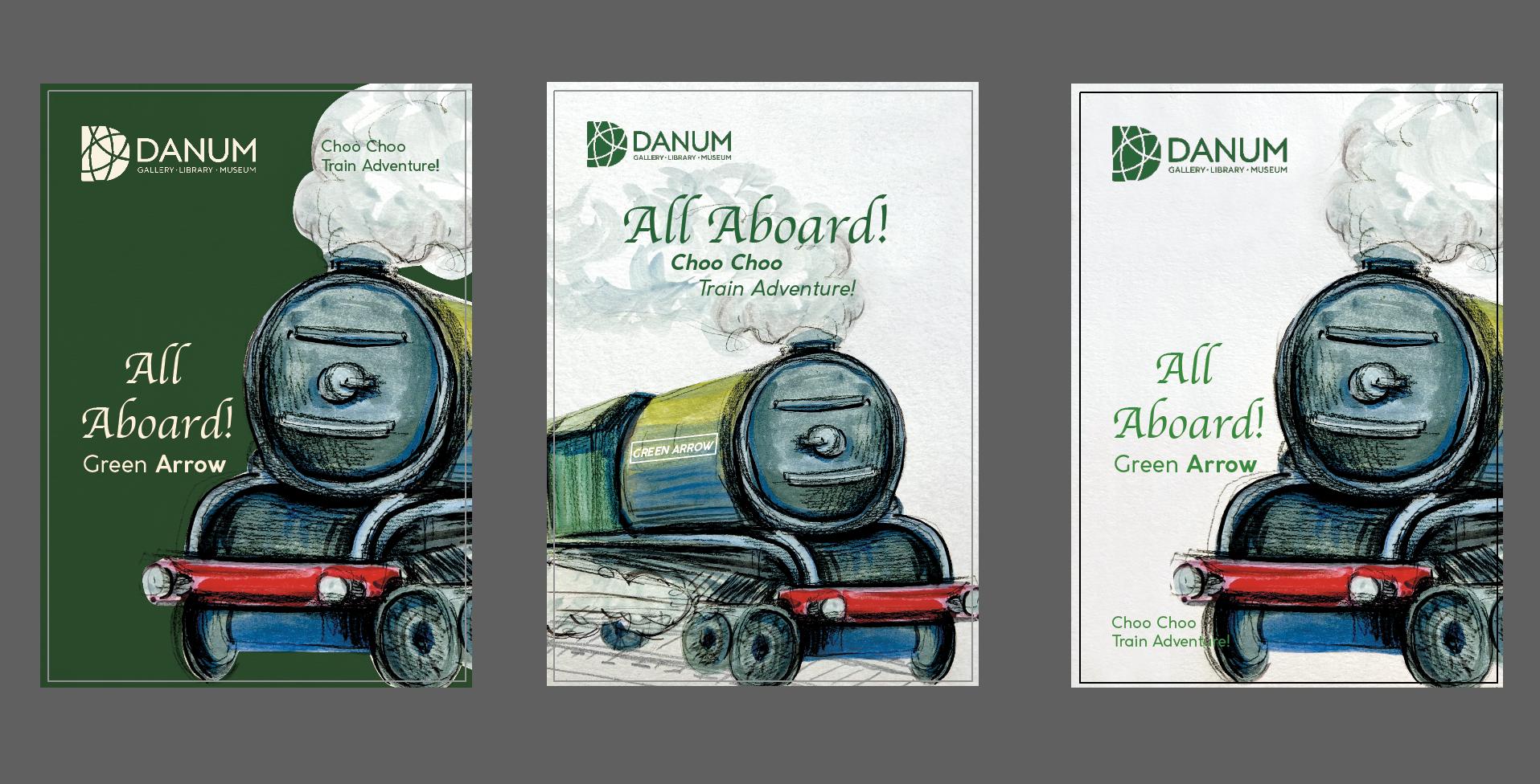
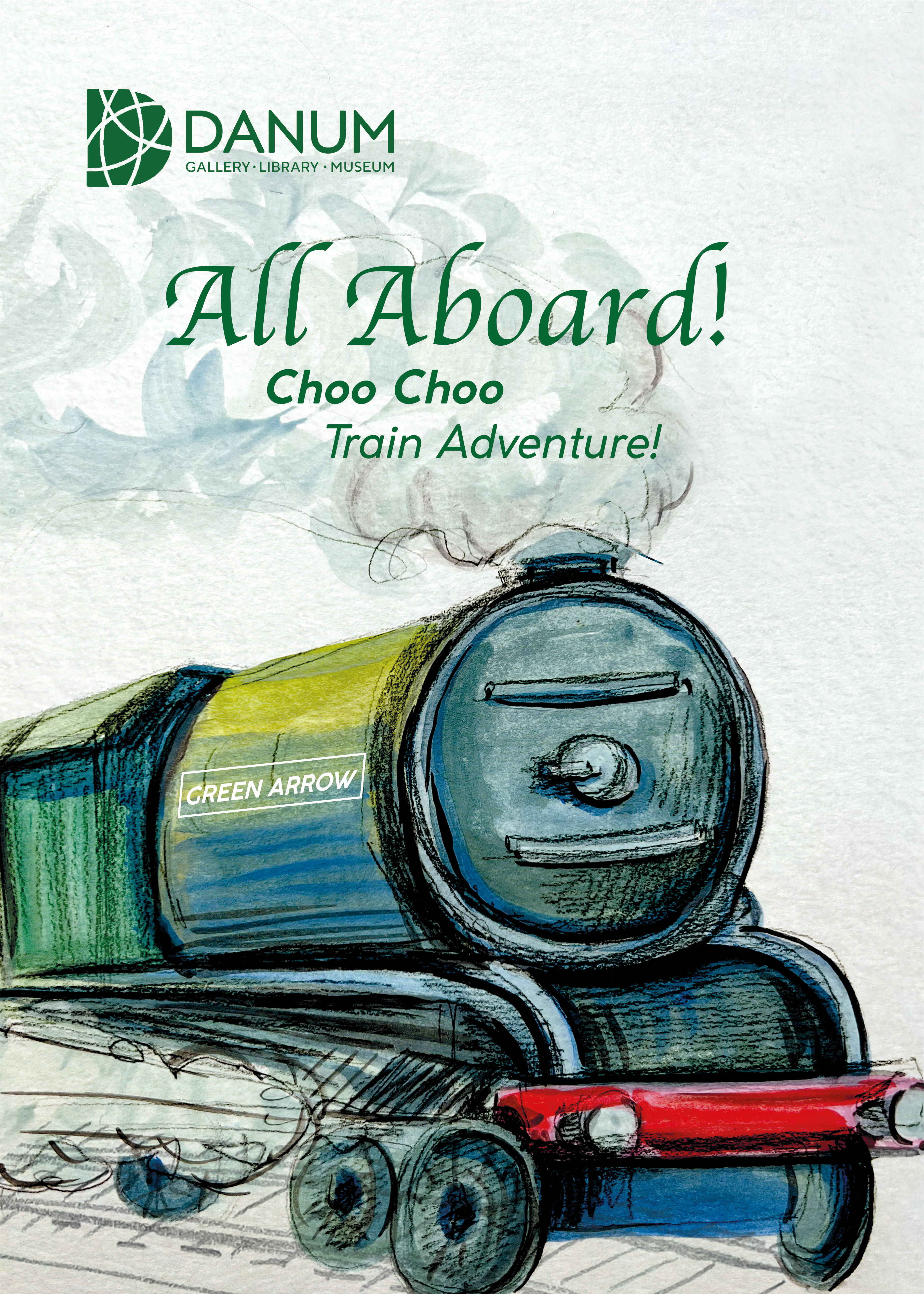
The final poster for the kid’s audience is presented below. I implemented a cartoony and simplistic style, using bold outlines to make it more visually engaging and child-friendly. The colour of the train is bright and vibrant, with the use of green and red, which brings a sense of excitement, playfulness, and whimsy. I hope that the idea to help children relate to the image and spark their imagination was achieved. I kept the background clear, as that was the idea of the poster, using a singular object, steam at the top and railways at the bottom of the page creating a more stable composition for the train, which helps it to look more dynamic as well.
In summary, the poster for kids for the railway heritage combines several graphic design and illustration elements to achieve a captivating and child-friendly result. Through its composition, colour scheme, illustration style, and imaginative details, this poster aims to engage young viewers, spark their curiosity, and encourage them to visit the museum.
The last poster I developed was meant to engage with teenagers audience. I was determined to use the fossils excavation theme, that Doncaster exhibit in the museum, but unfortunately, we don’t have big great dinosaurs bones, which from my perspective would be the most effective for teenagers, but we had a mammoth tooth which would lead to the pre-historic creatures. I was thinking to use the tree trunk for the poster, which is over 310 million years old, that sounds impressive, but I would struggle to use that piece of the black rectangle for the poster. I could paint a tree, but it wouldn’t catch the required attention. The landscape is best for that kind of theme, but that deceives the objective to highlight one object. Therefore I chose to recreate a mammoth portrait. I made the painting in dark brown tones, adding some textures and strokes in Photoshop. Also, I placed the painting in a similar position as the general audience poster. To make the poster brighter, I used orange colours for the logo and text around, and it helped me to brighten up the dark brown mammoth picture.
By choosing that direction for the teenager’s poster I aimed to highlight a mysterious, introspective, or thought-provoking atmosphere, that would encourage the audience to visit. I hope the final design conveys a sense of adventure, exploration, or fascination with the past.

Overall, I am quite satisfied with the outcomes of all three posters. I find them to be bright, eye-catching, with cohesive themes, and likely to be effective for all three target audiences. The decision to use different coloured text and logos for each poster was particularly useful as it created a consistent theme across them, with similar illustration styles and text, albeit with slight variations in positioning and colour.