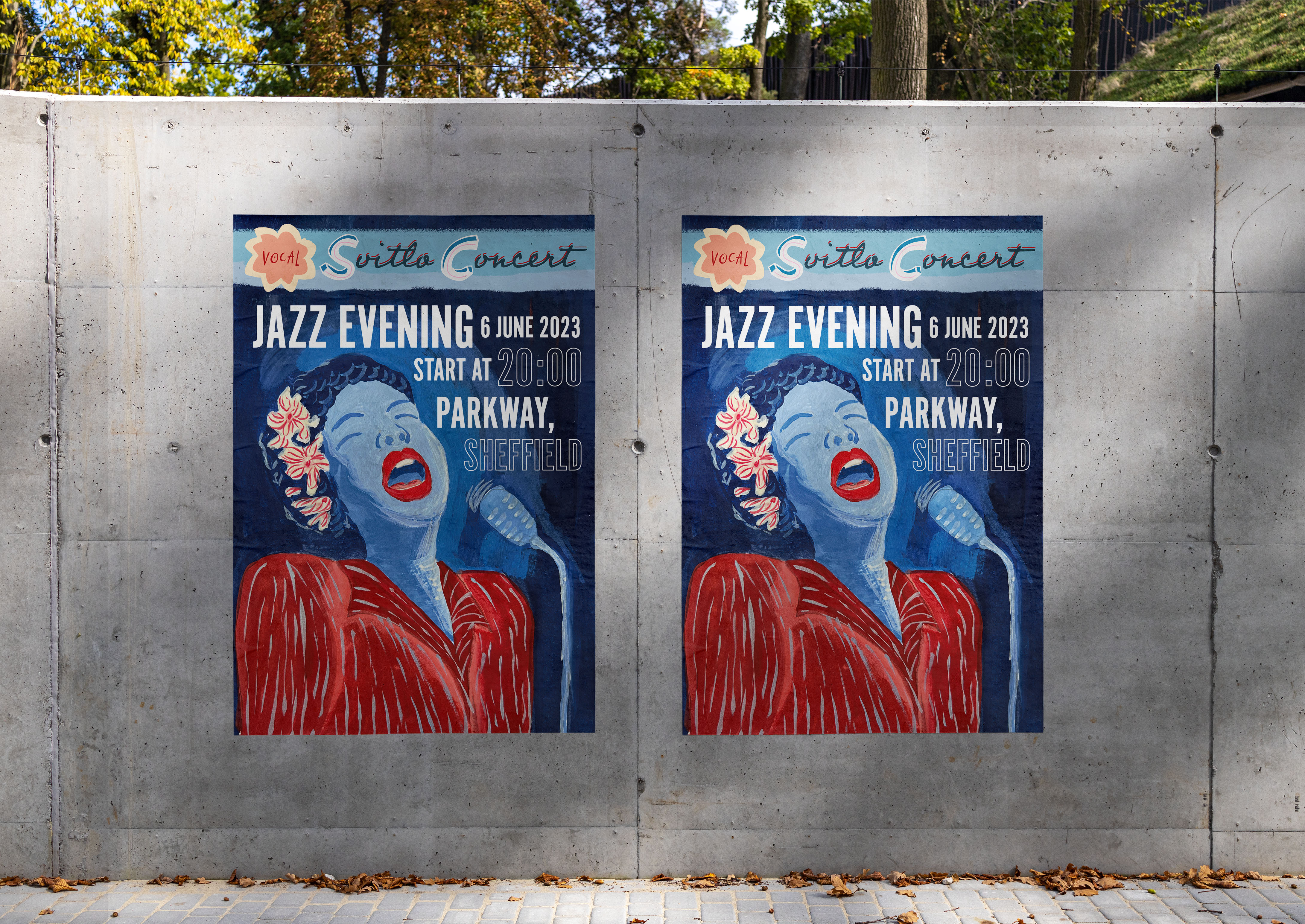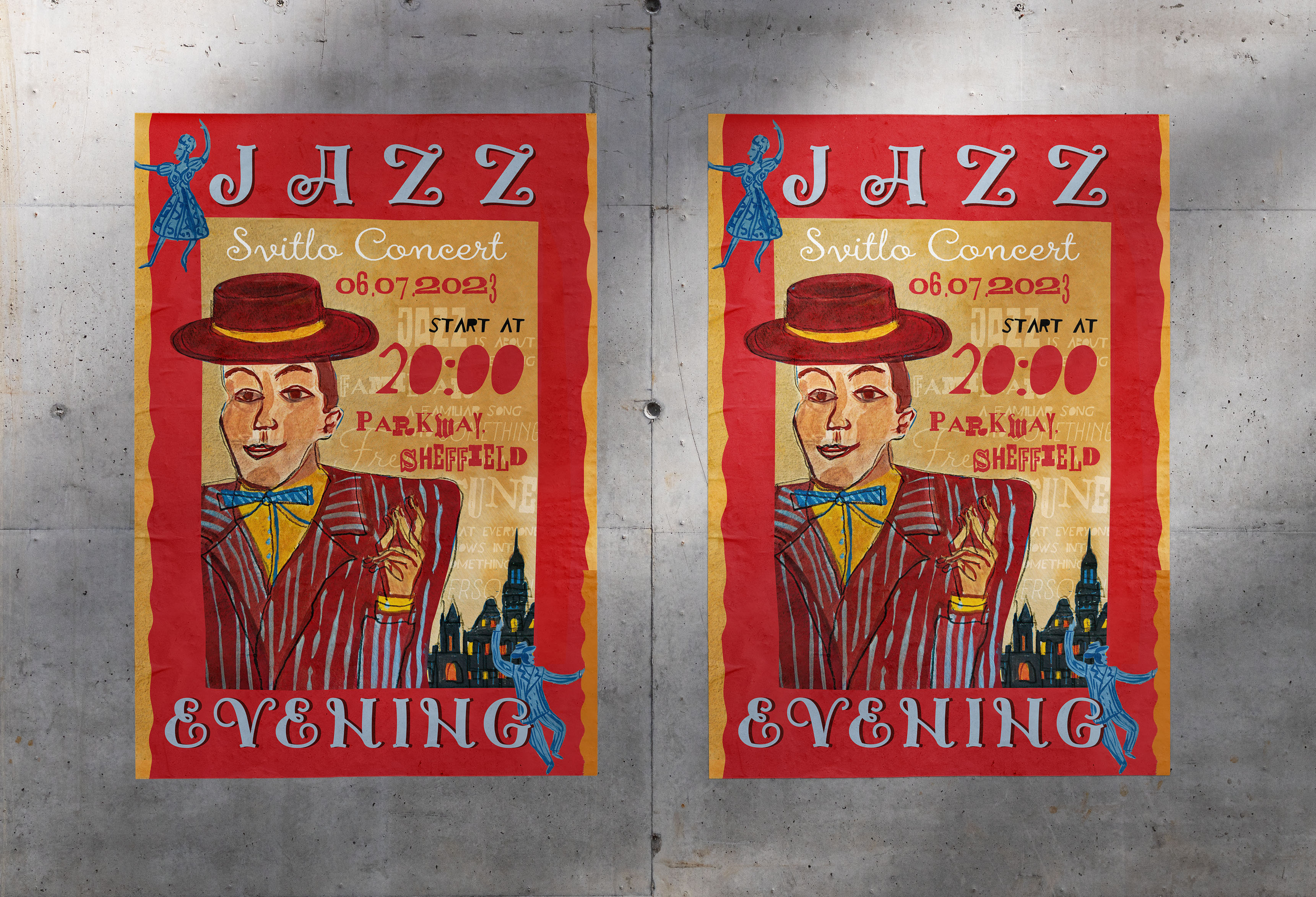
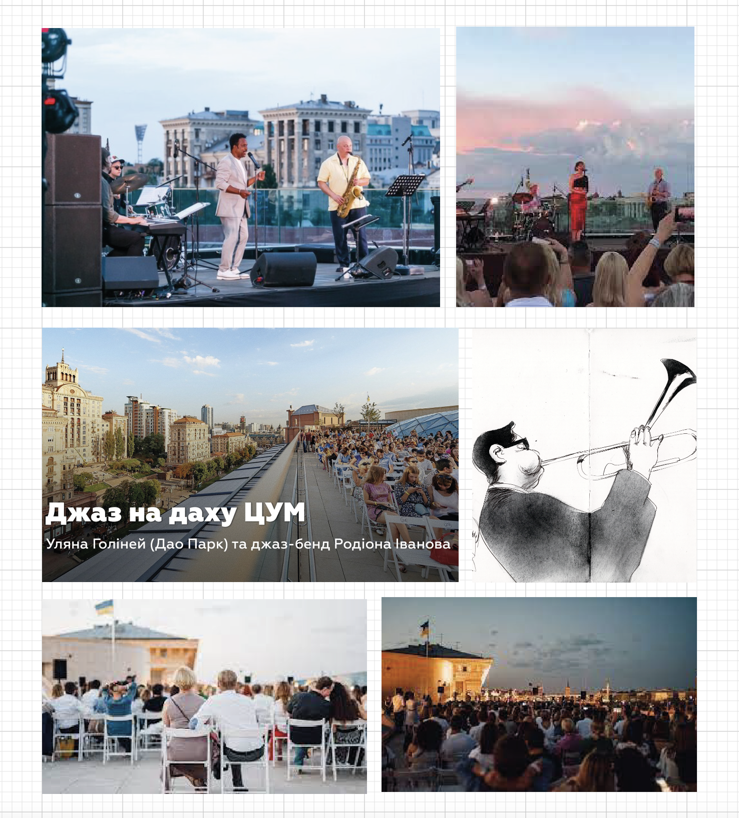
After reading the brief a couple of times, I decided my chosen theme poster will be Jazz Evening. I had a similar exercise earlier in the Graphic Design Core Concepts unit, where I designed a rock band poster, using Occam’s razor principle, and a poster with minimalistic colours for the local singing competition. I found poster design as the most approachable part of graphic design, as it requires only a few significant components, sticking visuals and the right font for the text reading. This time I would like to have a new approach and challenge myself with some new style illustrations. Also, I’m keen on the jazz theme, as it reminded me of jazz evenings we had in Kyiv, Ukraine, on the top of the roof of the central part of the city, where people gathered together after work for a couple of hours relaxing and pleasant atmosphere with a glass of wine.
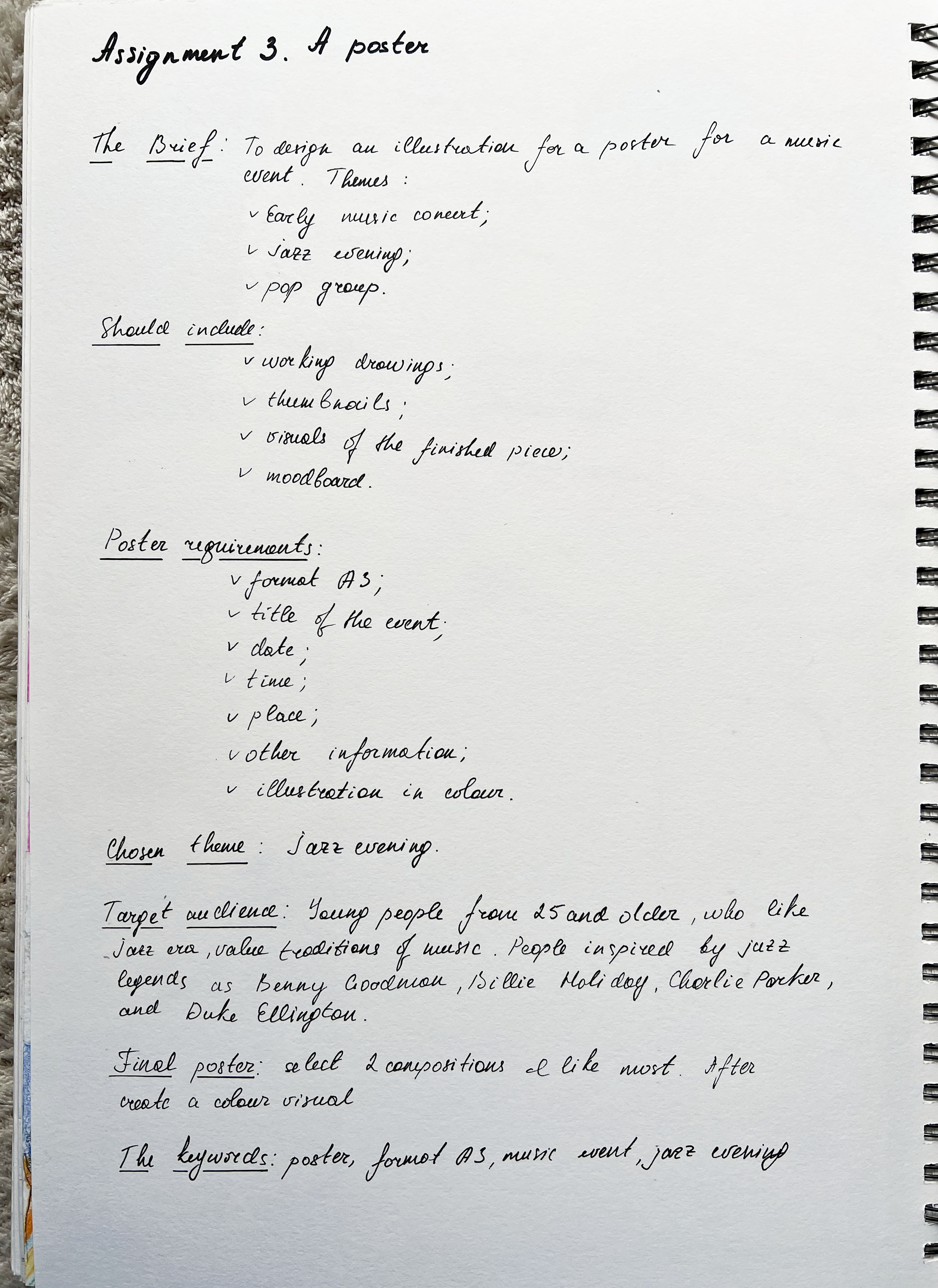
I wrote the brief in my own words, describing specific details of the assignment. The brief is to design an illustration for a poster for a jazz evening music event. The poster should be format A3 and include:
- title of the event
- date
- time
- place
- other information I think appropriate.
As the music style I’ve chosen is quite mature, I think the target audience is people 25+ who are interested in jazz music.
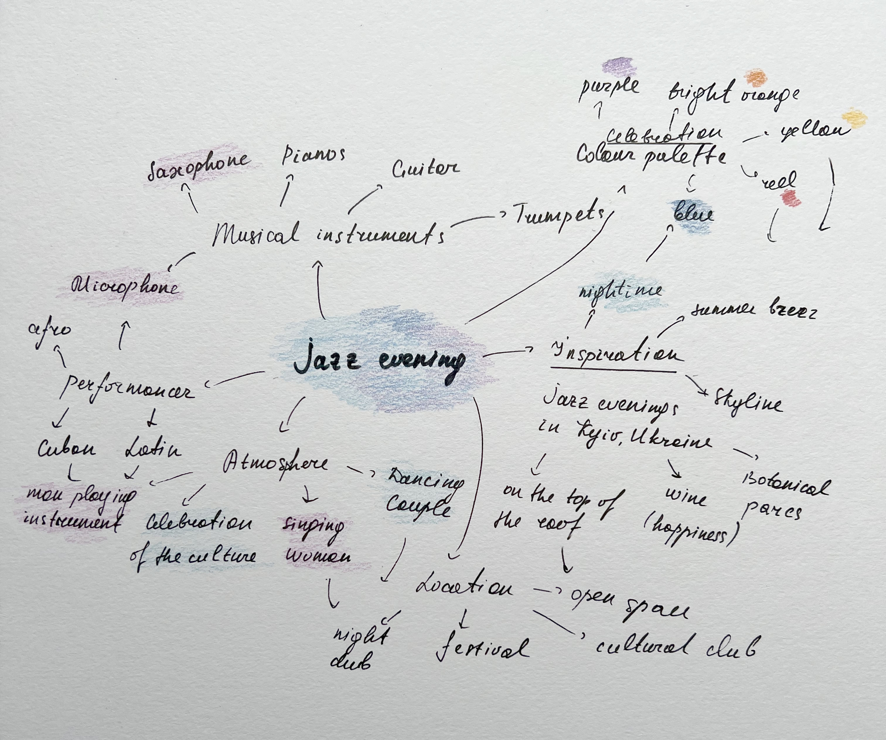
I also created a mind map exploring potential options and inspirations, locations and musical instruments I could include in my illustration.
Moodboard
Next, I created a Pinterest moodboard for inspiration. Mainly it was a mixture of retro jazz photography, posters and illustrations for jazz events that I found eye-catching and could apply to my designs. This collection consists of bold illustrations related to performances, and musical instruments, also, there is a big play on the hand-made typography and retro photographs from jazz bands.
Jonny Hannah
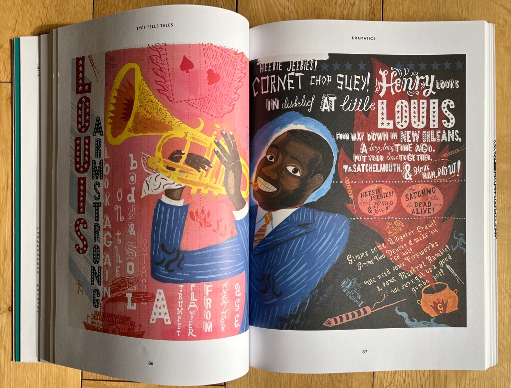
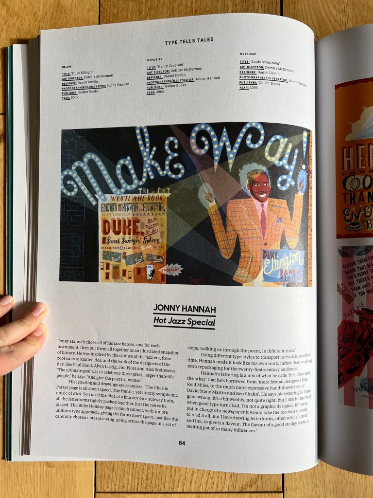
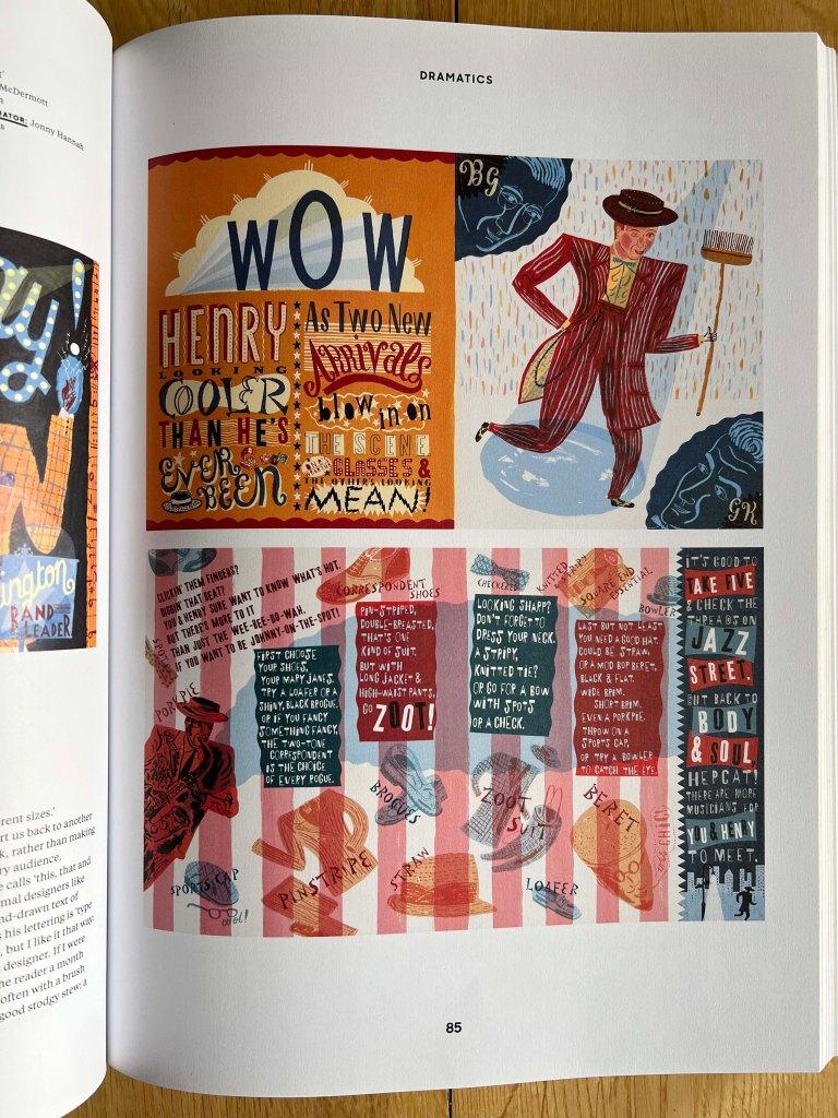
When I was thinking about the design of the jazz poster, one artist that came into my mind from the book ‘Type Tells Tales‘ – Jonny Hannah. He designed remarkable illustrations for the children’s book that evolved around the jazz era. They are vibrant, colourful, and filled with handwritten typography, so that is a perfect example of merging unique illustrations and distinctive writings. These images are emotional, filled with energy and dynamic, which all contribute to the main source of my inspiration.
Brief story shortly, Jonny Hannah wrote and illustrated a children’s book Hot Jazz Special, published by Walker Books and the Candlewick Press. The narrative is written in rhyming couplets and centres around the young protagonist Henry at the Body & Soul Cafe where he encounters the performances of jazz legends such as Benny Goodman, Billie Holiday, Charlie Parker and Duke Ellington. Jonny chose all of his jazz heroes, one for each instrument, then put them all together as an illustrated snapshot of history. He was inspired by the clothes of the jazz era, from zoot suits to knitted ties. I loved how artists joined illustrations together with various fonts. That font variation and colourful images made posters stand out, which is the principle I could use for the poster design.
Sketches
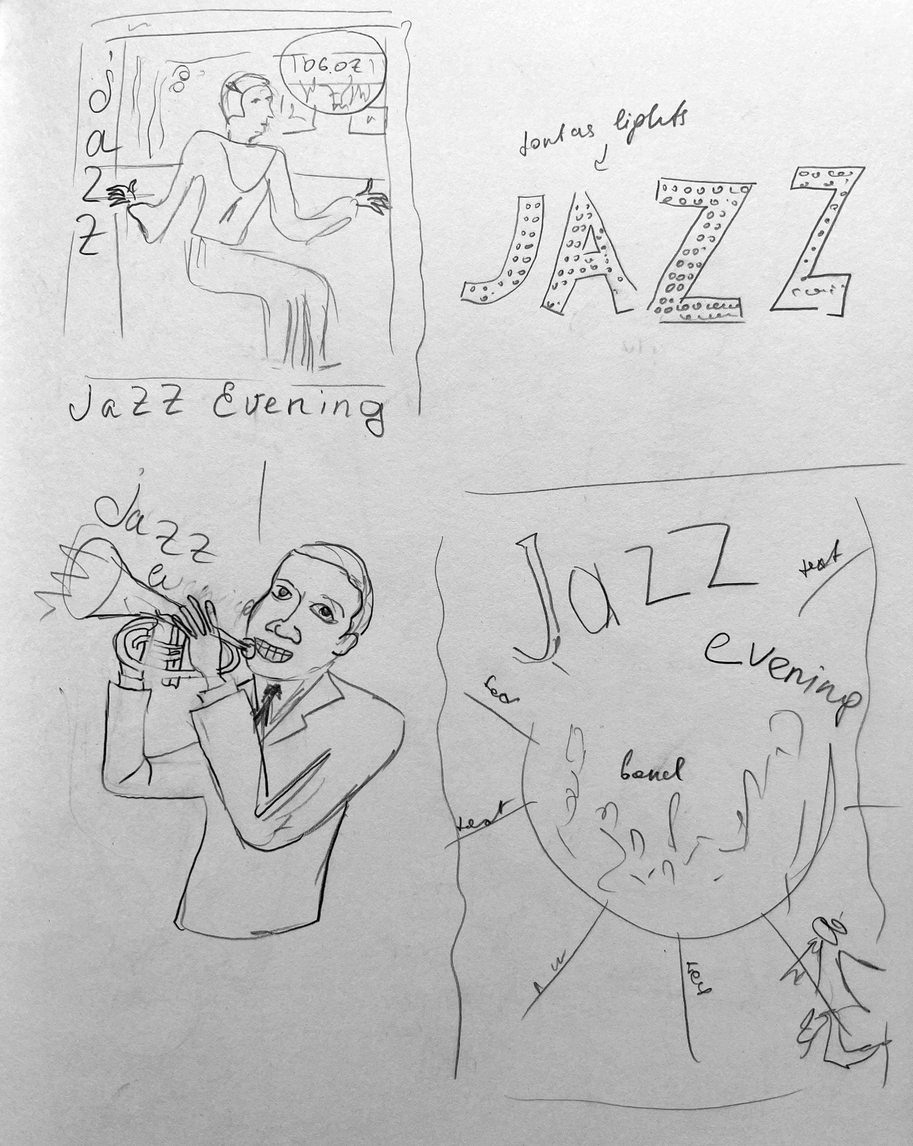
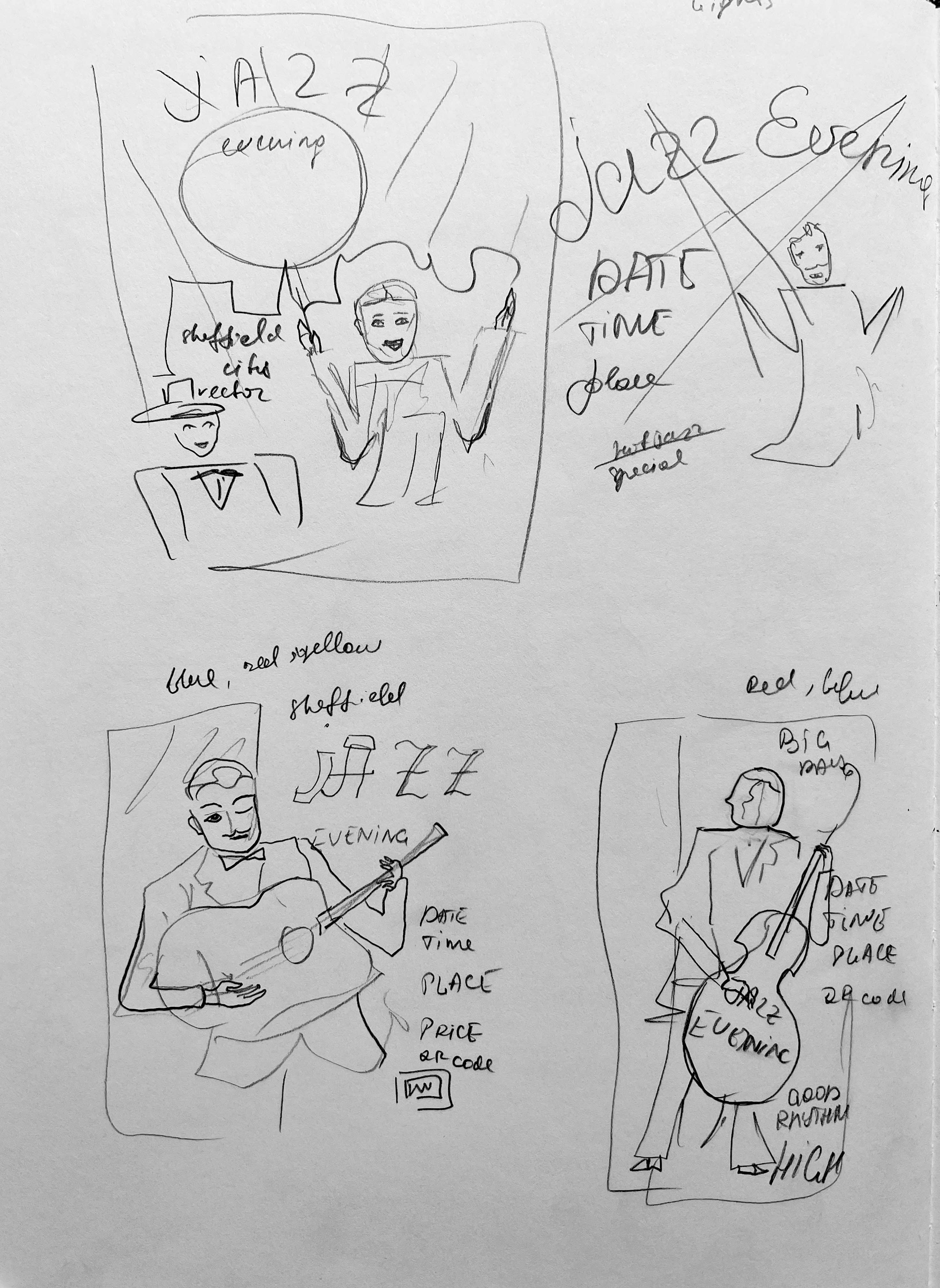
I made a quick sketch for the future posters, whilst I still remembered all ideas. My main thoughts were to make an illustration of the musician, playing such instruments as piano, trumpet, double bass, or guitar. As an alternative, I was going to use also singing artist, or dancing couple. I was planning to make the composition dynamic, so the poster would be practically all singing and dancing to the audience. Also, I thought would be great to create my own designed font, or at least go for the unique one. Sketches are below.
Thumbnails
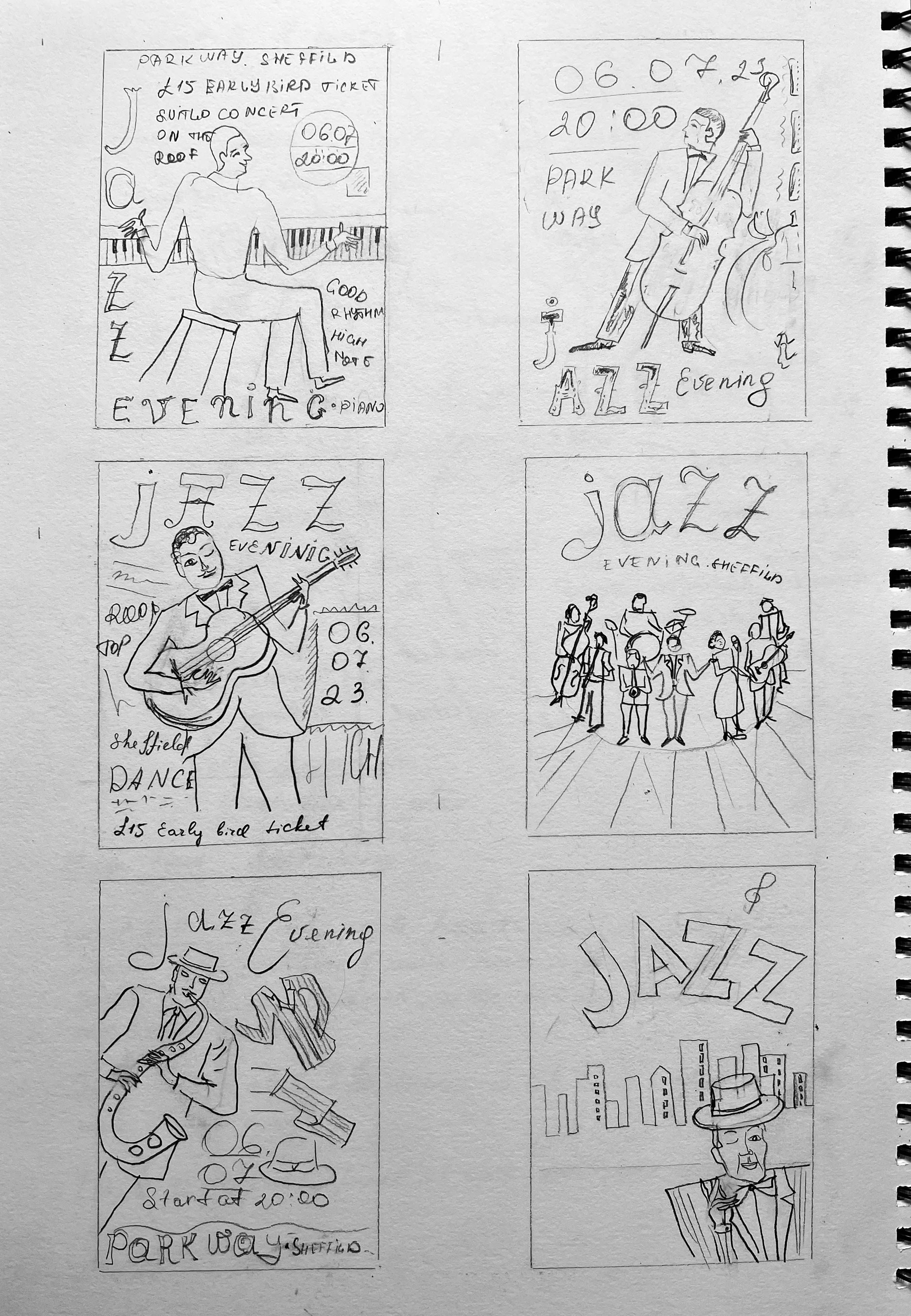
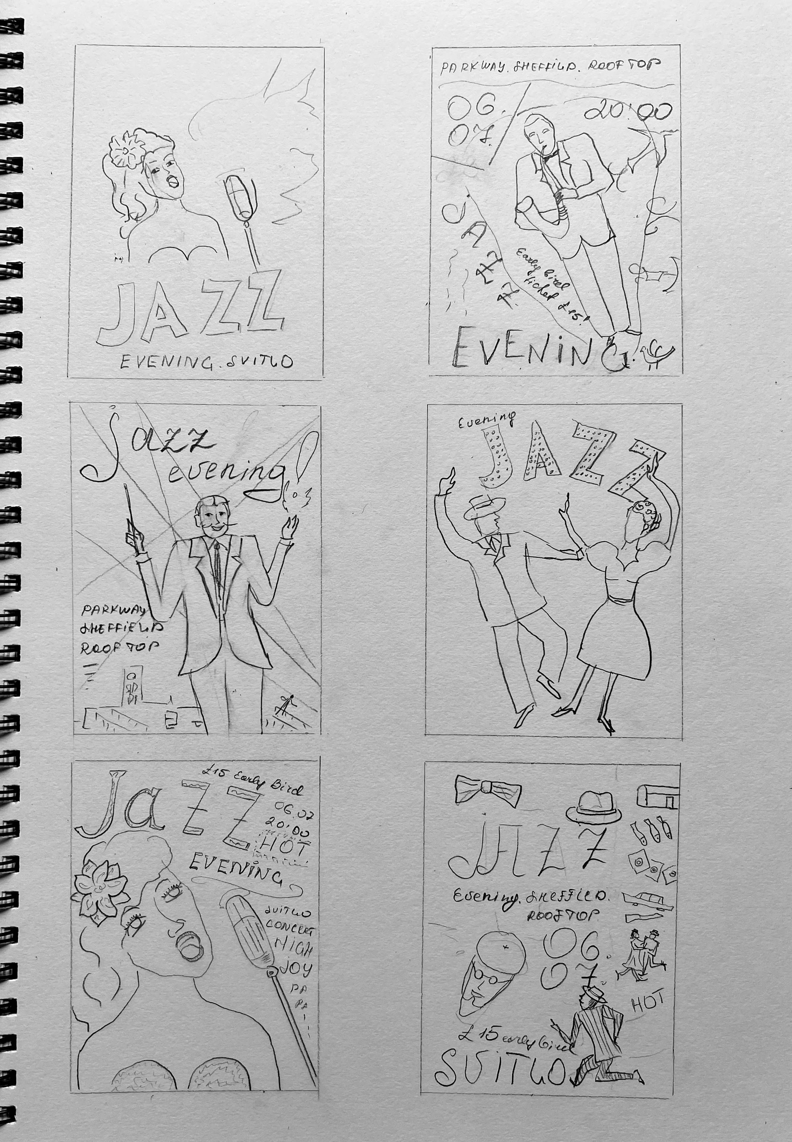
Those sketches helped me to proceed to the thumbnails. I created little frames for future posters, so I played around with composition and some image variations for the poster. I tried on different arrangements of the text and figures, like the central location of the main character; the image coming from the corner, placed on the left or right, leaving another part for the text. Also, I was thinking of using dynamic composition, where elements evolve around the vocal point of the poster.
Illustrations
Those sketches helped me to determine the direction of the future poster. I knew I was going to use the midnight atmosphere, where the background is all dark, like the night sky, contrasting with the performer, lit by the projector lights. My main colours for the poster are going to be bright blue, dark blue, dark red, brown, yellow and orange, kind of warm, mature colours with distinctive depth in them.
I highlighted the main elements of the poster:
- the singing lady, performer, artist;
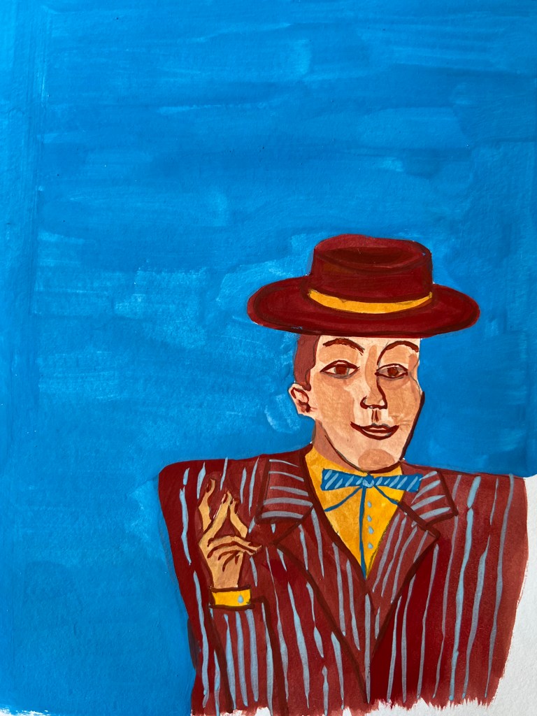
- musician, that found a rhythm;
- dancing couple ;
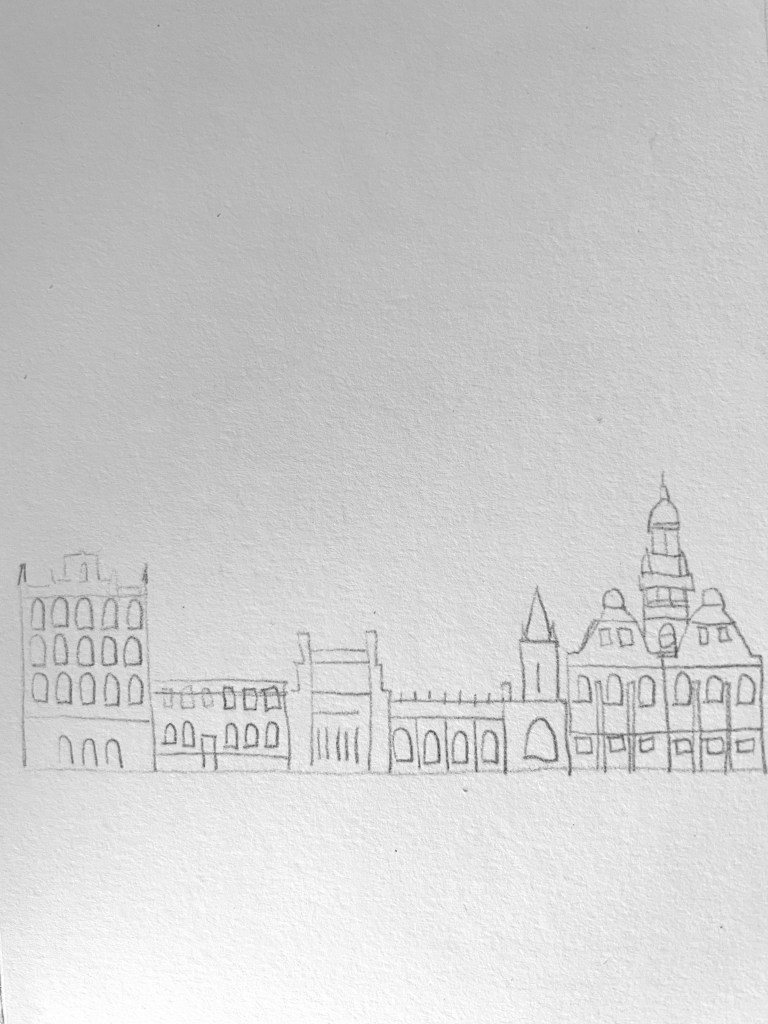
- Sheffield night city.
I wanted to experiment with my posters and try to combine different elements together and see what works in the most harmonious way in terms of visual art and proportion. At the same time, I would like to bring some kind of free hand-drawing style, missing the perfection, but highlighting the spirit of creativity and freedom.
The story of the poster is imaginative, but coming from my experience of visiting those jazz shows back in Ukraine. The performance organiser Svitlo Concert from Kyiv came to Sheffield with their Jazz Evening tour in the steel city. ‘Svitlo’ in translation from Ukrainian means light. The performance will be allocated somewhere in an open area, the perfect season for it is summer, with a warm breeze, night or evening time, and using such locations as roofs or botanical garden area. The details of the tour I highlighted in the poster.
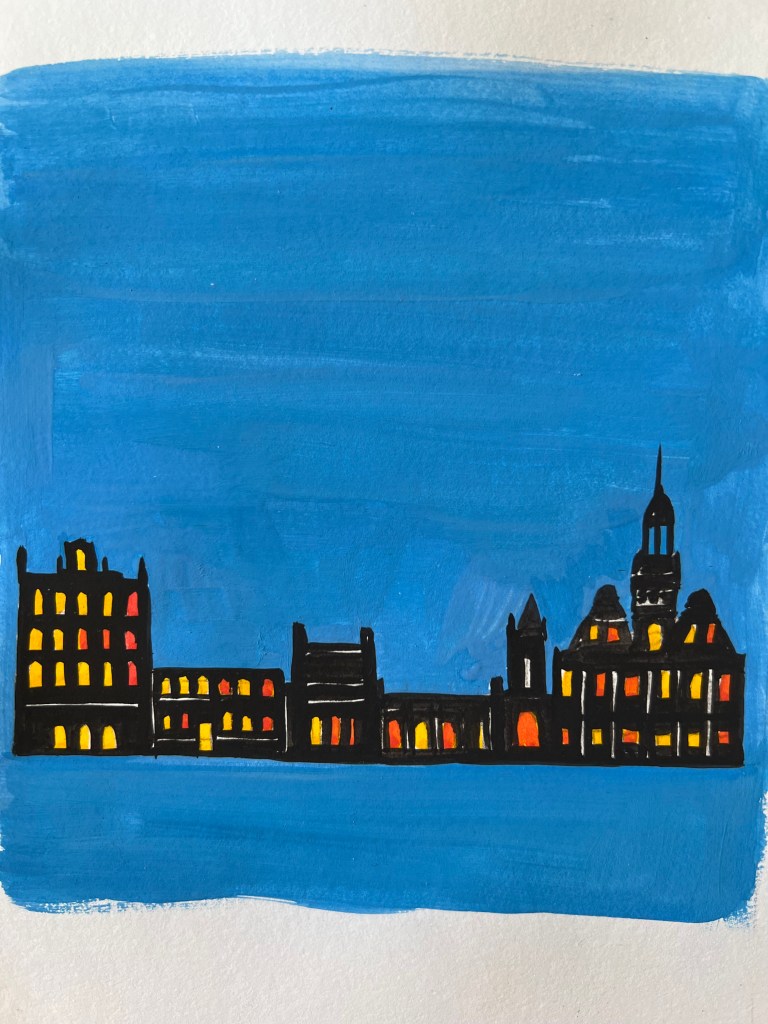
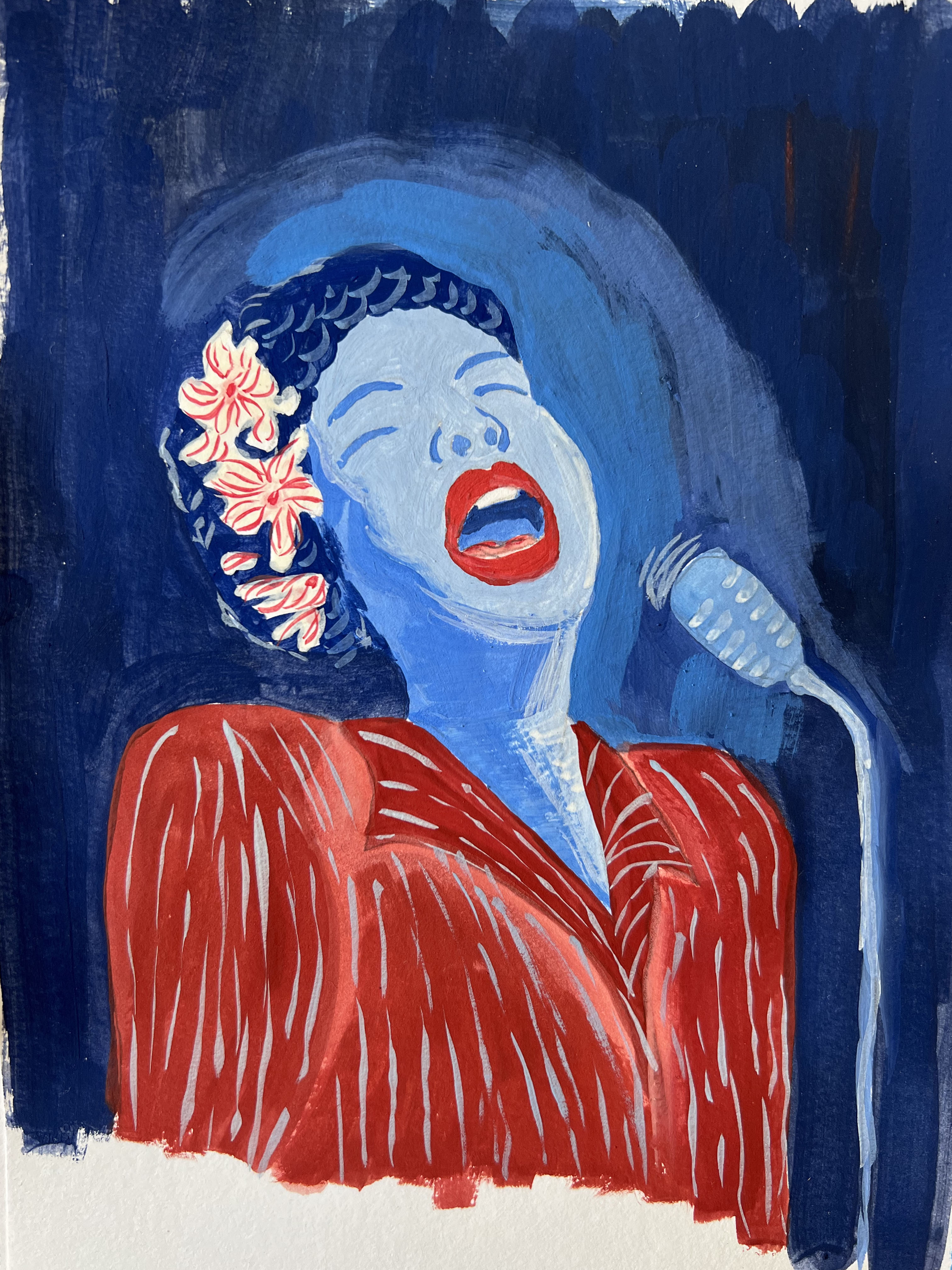
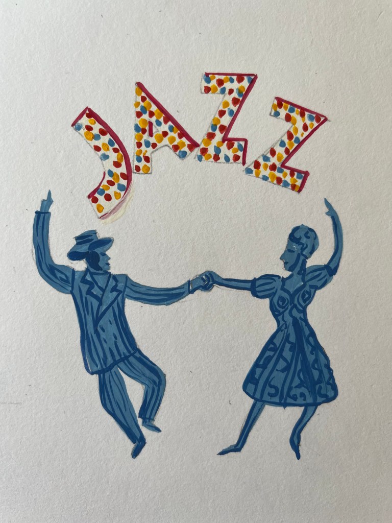
I created the main parts for the poster, I was certain with a few compositions but also I wanted to experiment and mix them together as well. I created a singing lady, performer, dancing couple, and sketch of the Sheffield landmarks in black, with some bright windows inside.
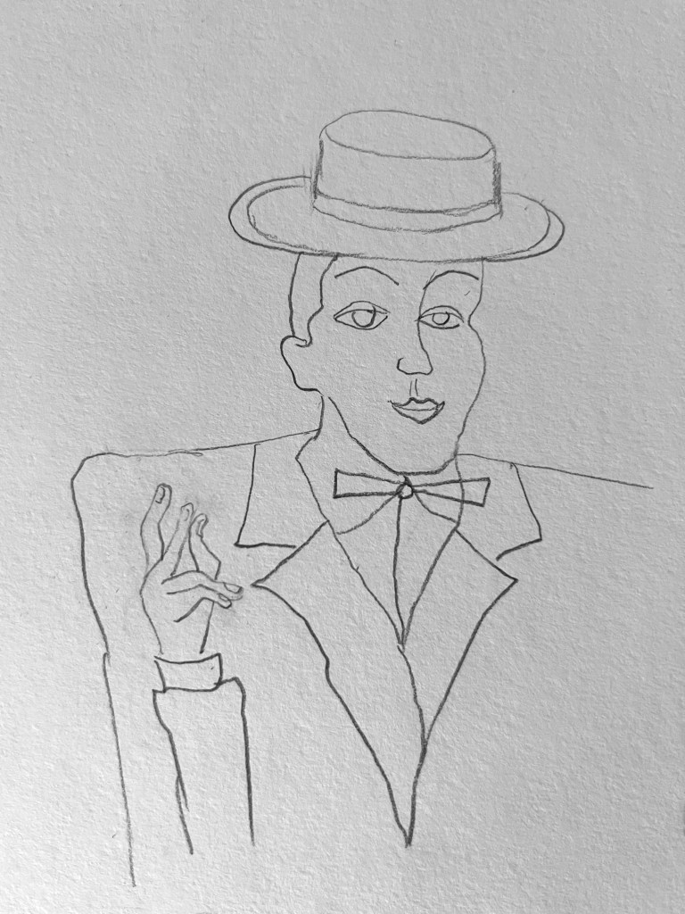
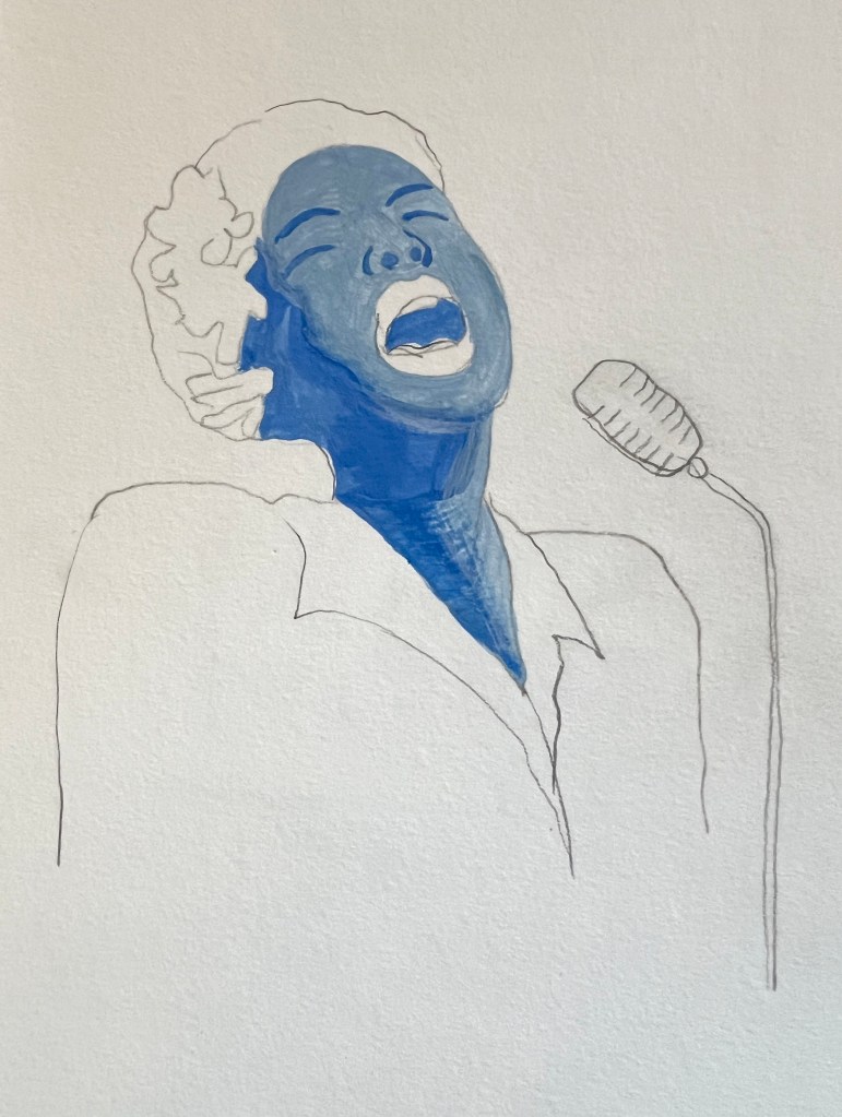
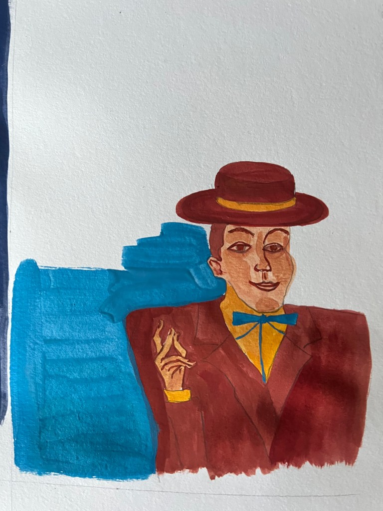
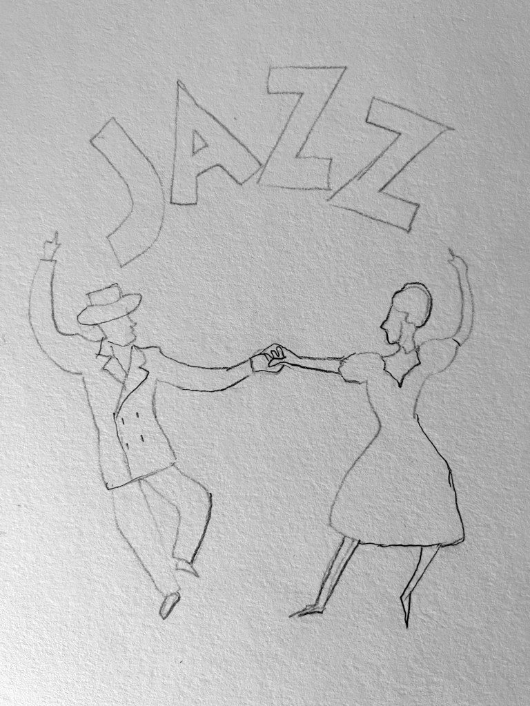
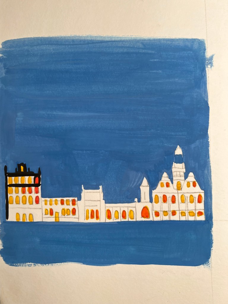
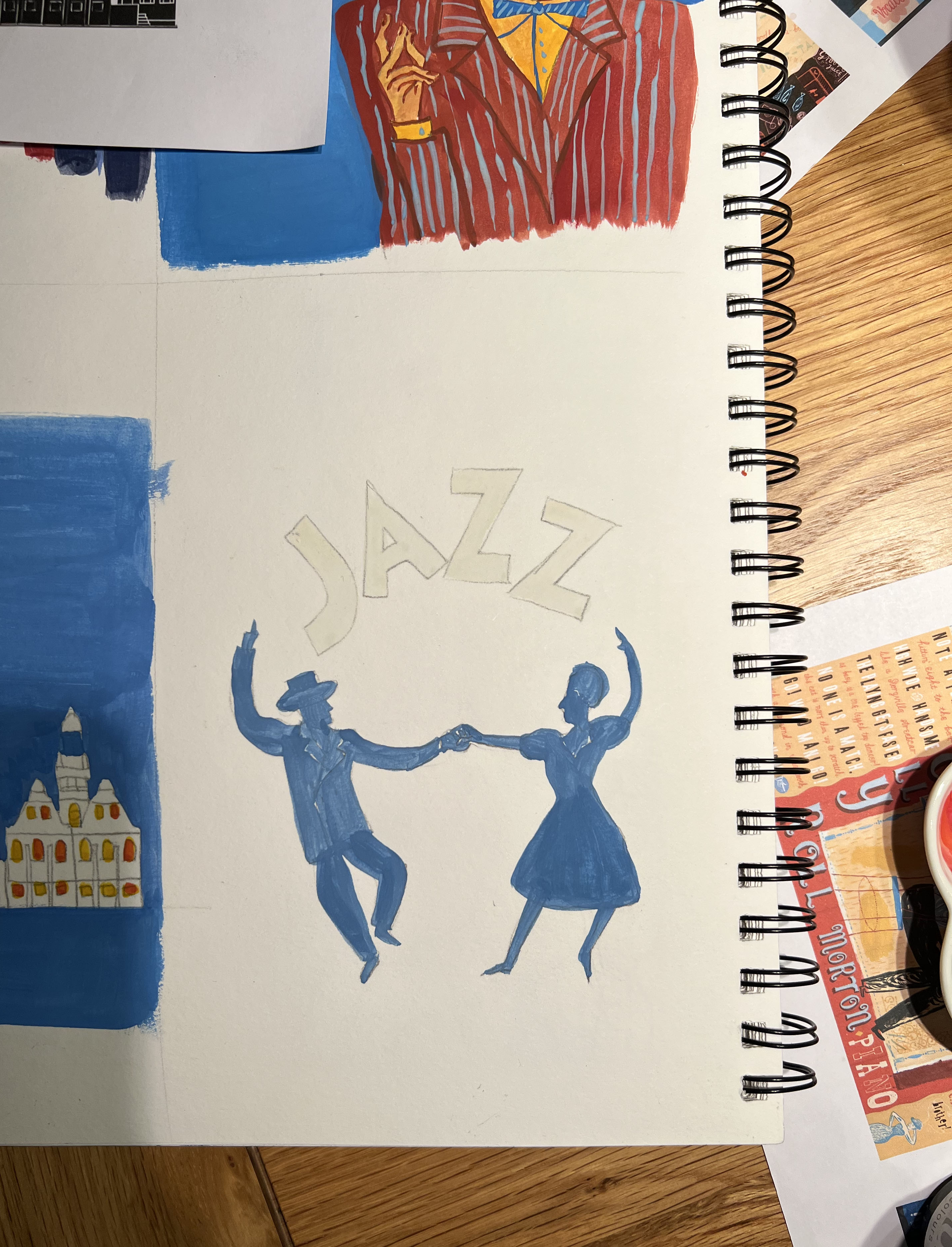
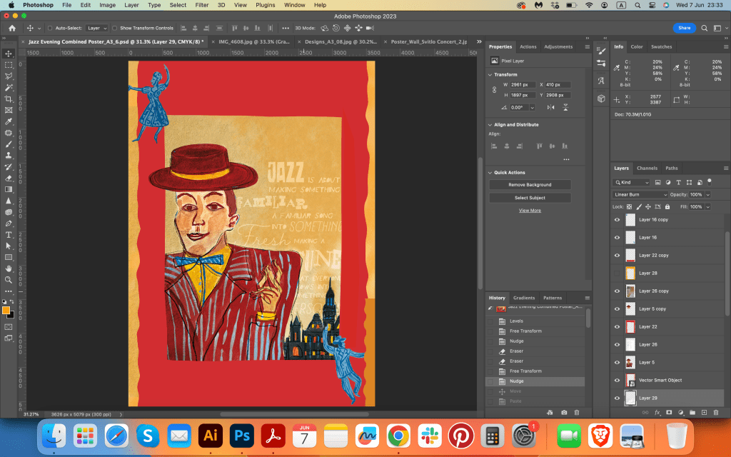
In my previous exercises, I was using mainly watercolours, watercoloured pencils and crayons style for illustrations, but this time I was going to use gouache paints, as they are reacher and deeper in shades, more suitable for the vision I had. I painted two main characters wearing similar outfits, sort of warm red and brown blazers, with some stripy patterns in them. The man wearing a brown hat, and the woman, the singer has a white with a red design flower. Also, I made an illustration for the dancing couple, purposefully missing details in them, as I was going to use them for the background. I was going to create the type for the word Jazz, covered in different colour dots, that would associate with lights, but later I decided to create it in Adobe Illustrator, I thought that type need have more accurate details.
Typography
I selected a few font combinations, with chosen text I was going to place for the poster. I still was going to play around with typography, but that font selection helped me to imagine a couple of type variations for future designs. I wanted to bring into the poster not only a bright and eye-catching illustration of the performer but make the visual special by using unique typography. I planned to try to paint the font myself on the piece of paper but later decided to create one in the software. Also, I was going to use decorative elements in the font, like different coloured dots, and lines, or combine a few types of font in one word which all was a collective part of my future designs.

Design Process
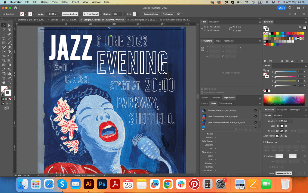
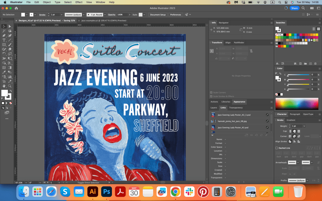
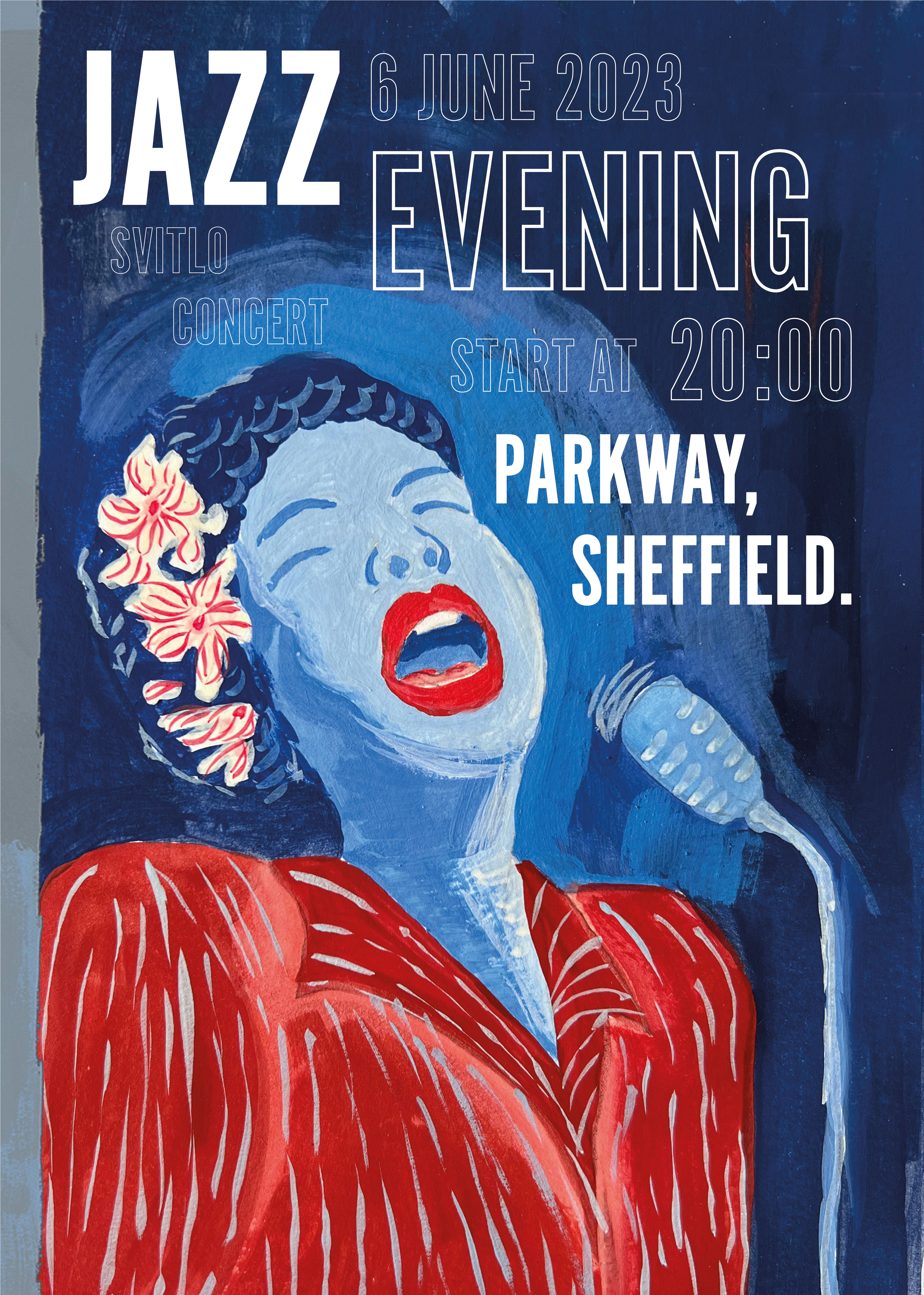
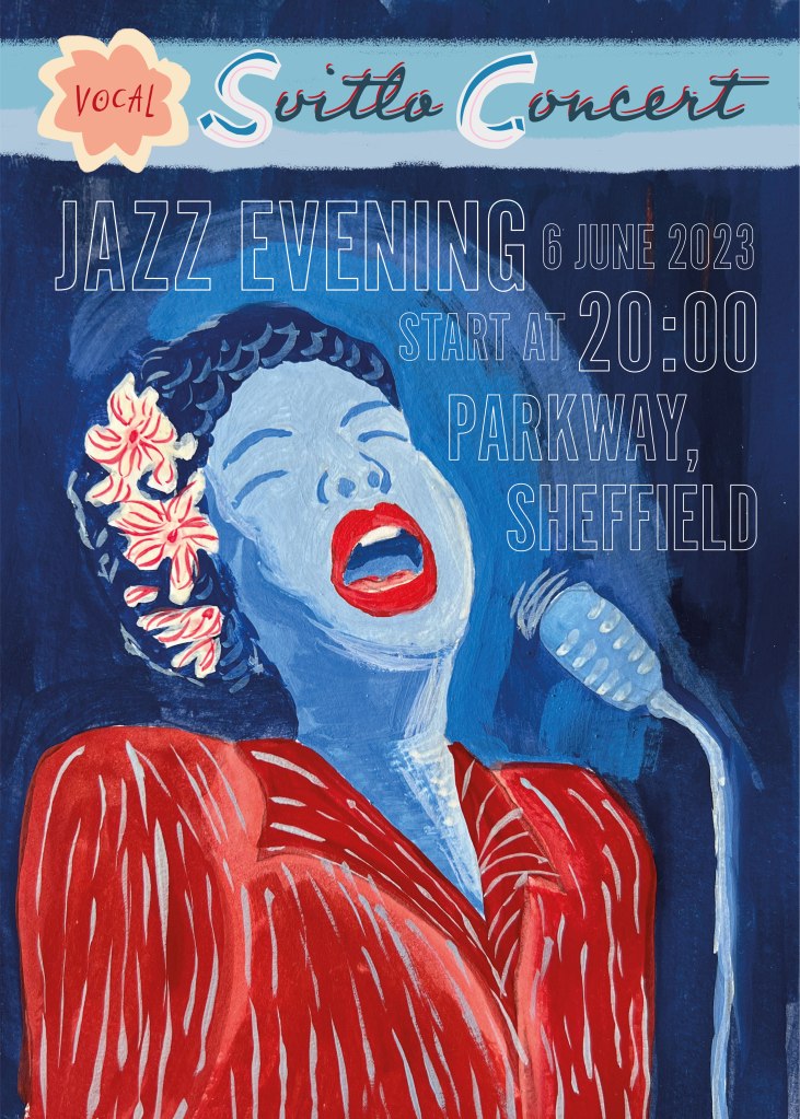
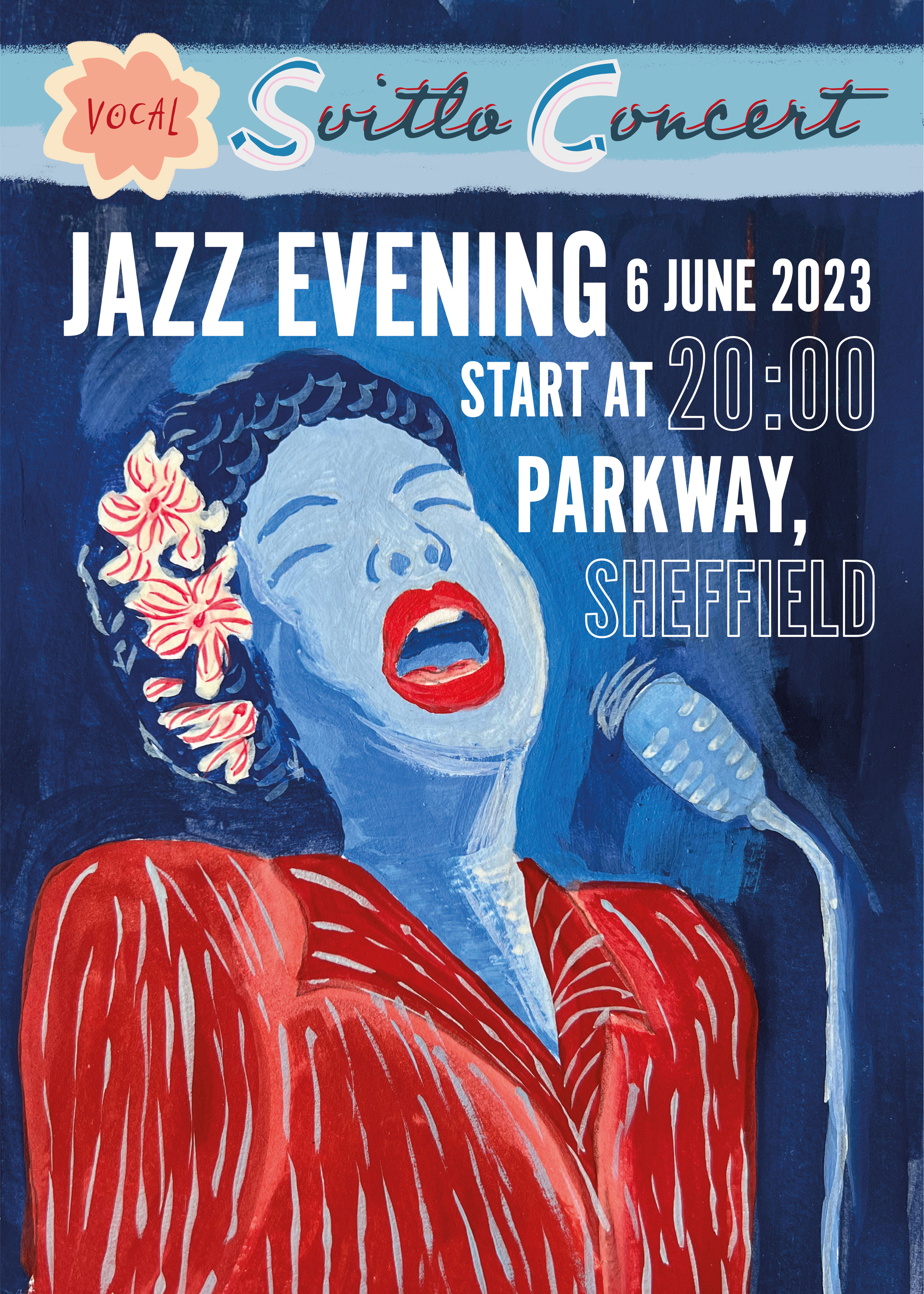
Now I had on hand all the important parts for the poster, the next step would be to organise it into a musical visual. I had a long process ahead of me because you never know what designs can be successful. I could predict the effective outcome of some illustrations, but as usual, I had a couple of surprises when an idea wouldn’t work, and I had to put some effort into re-arranging and working on it. I sort of knew that the singing woman would be the best shot, and the reason for that is bold and clear design from the illustration and design point of view. The elements are quite eye-catchy, and the contrast of the colours was strong, that’s the way of creating a powerful message. As the visual of the singing woman was bright and dominant, I used simple bold and narrow font Alternate Gothic No1 D, instead of decorative and quirky typography. Later I added handwritten font on the top that to dilute the bold and narrow typography of the main text. I placed the name of the organiser Svitlo Concert, written in calligraphic Professor font. I changed the first letters SC into the decorative font, added a flowered logo, matching to the lady’s flower in her hair, and it helped to draw attention to the top part of the poster as well.
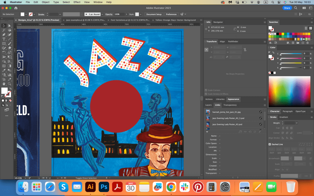
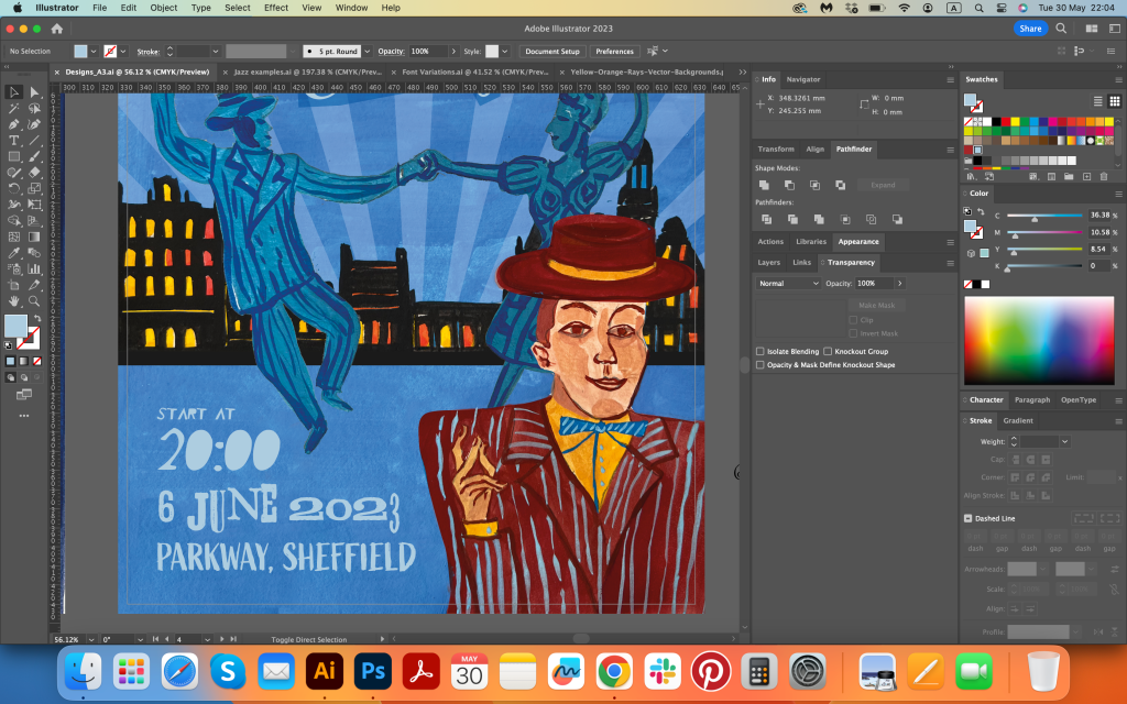

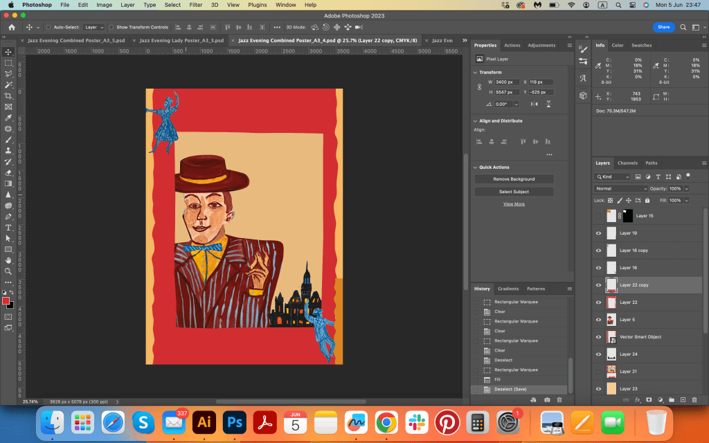
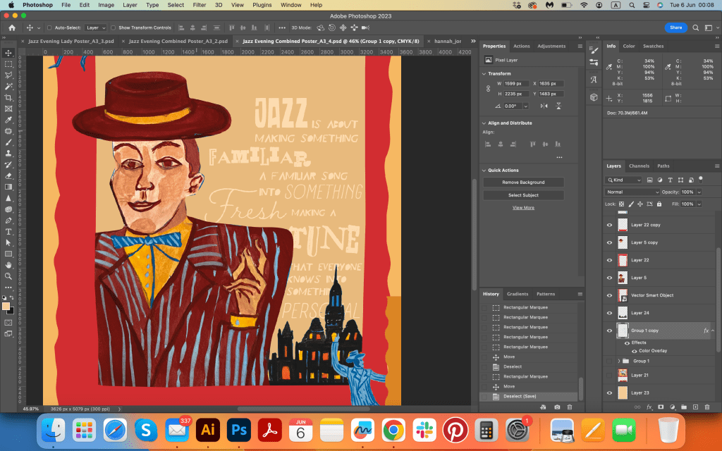
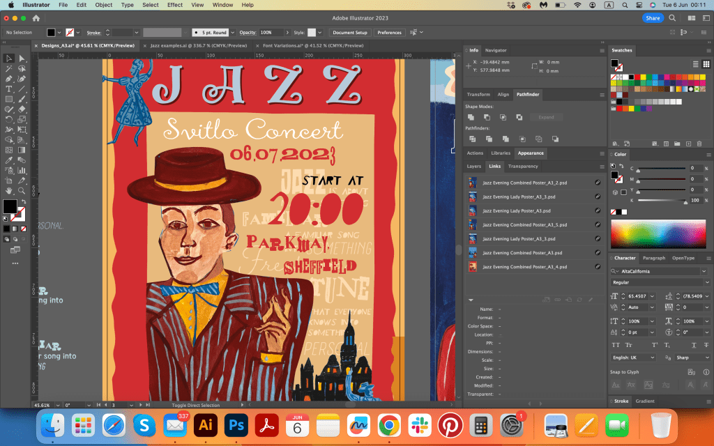
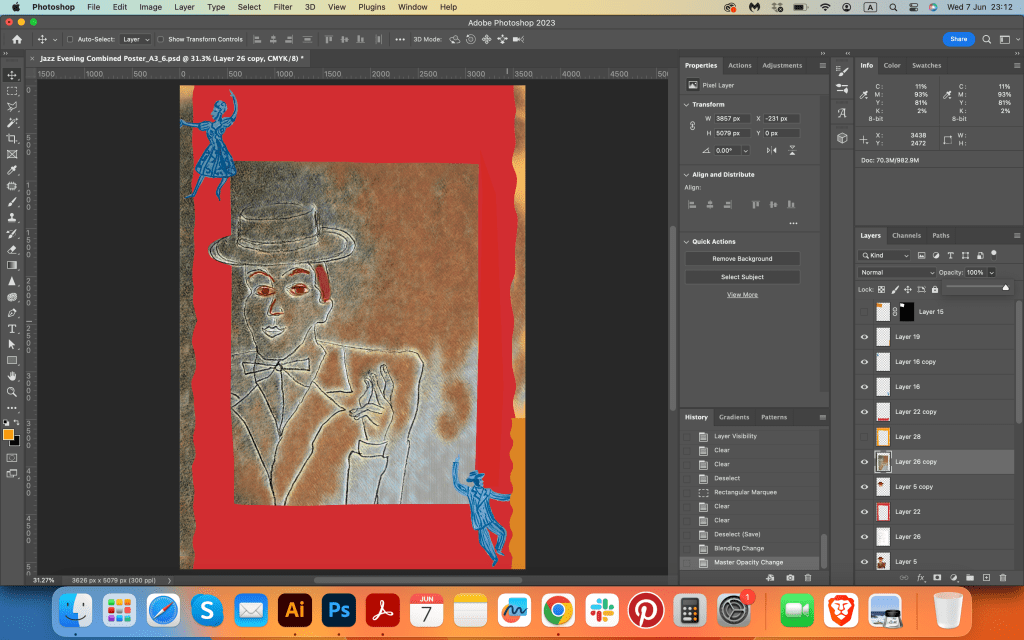
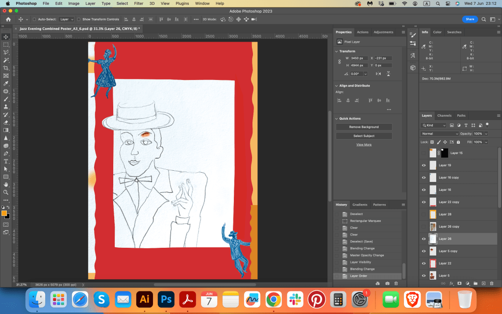
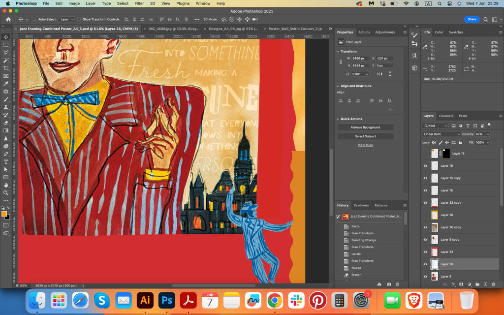
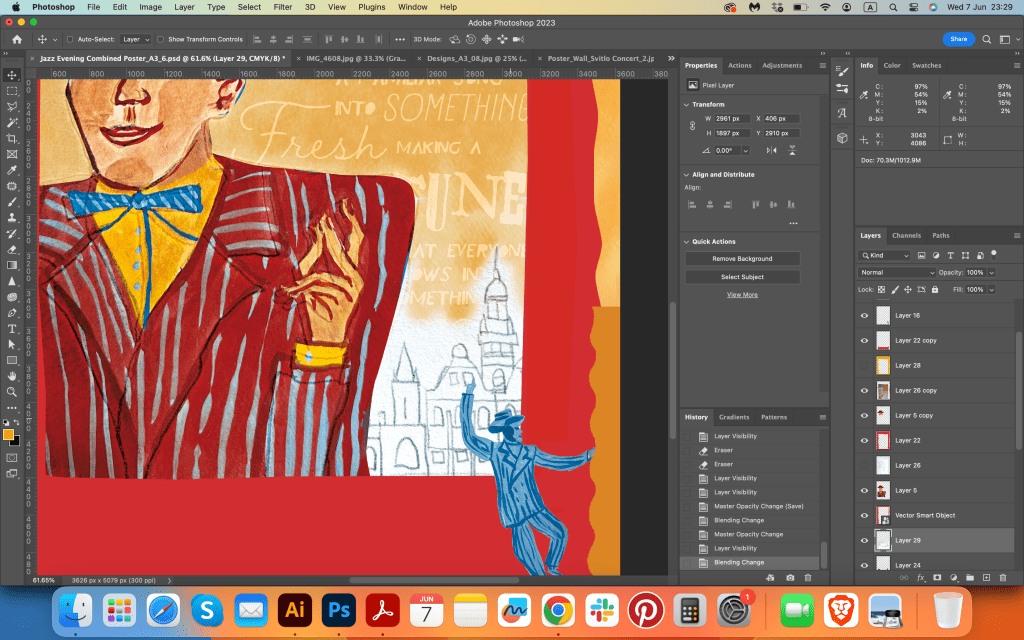
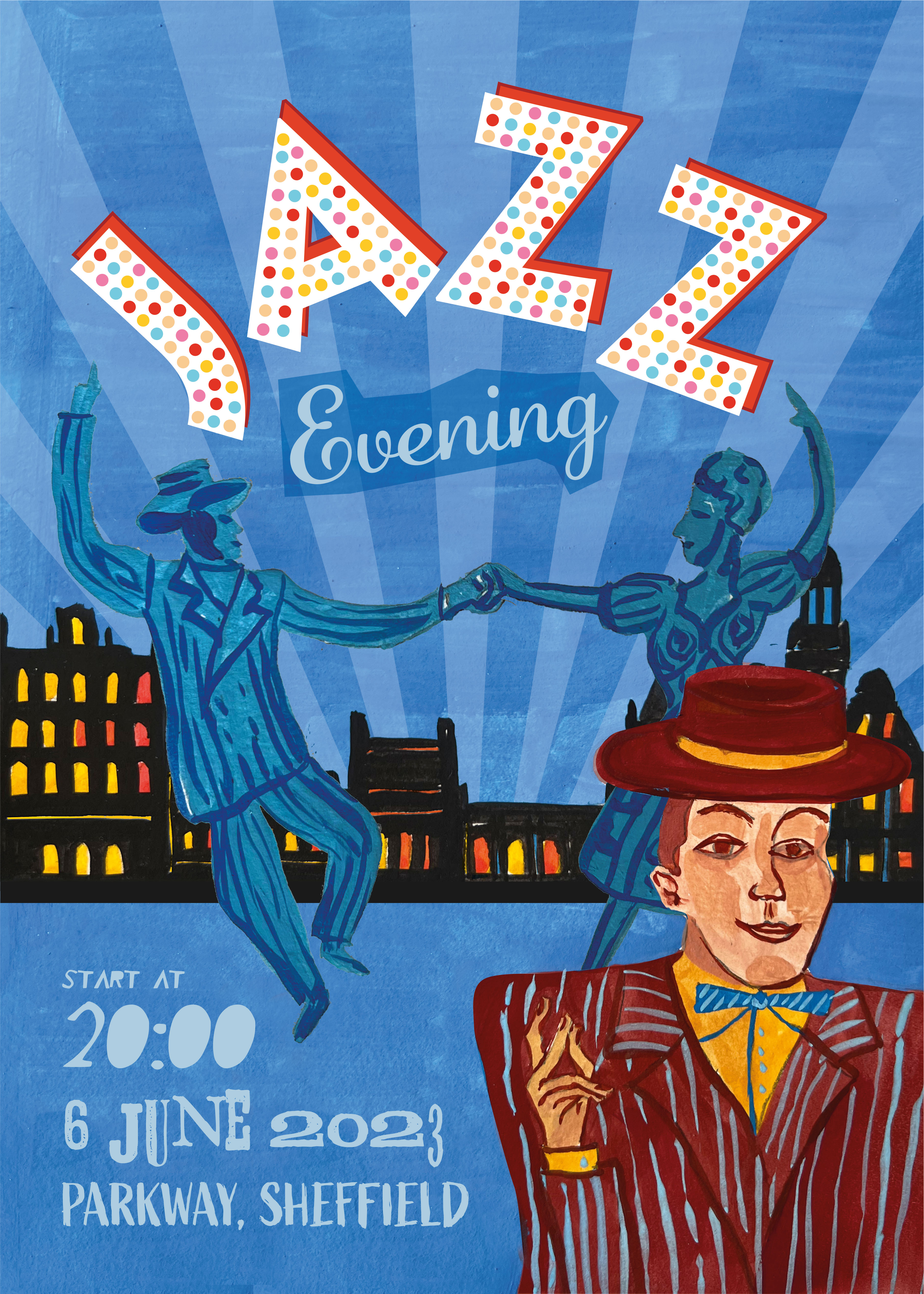
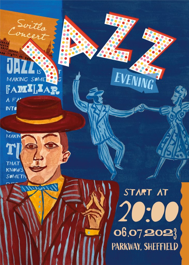
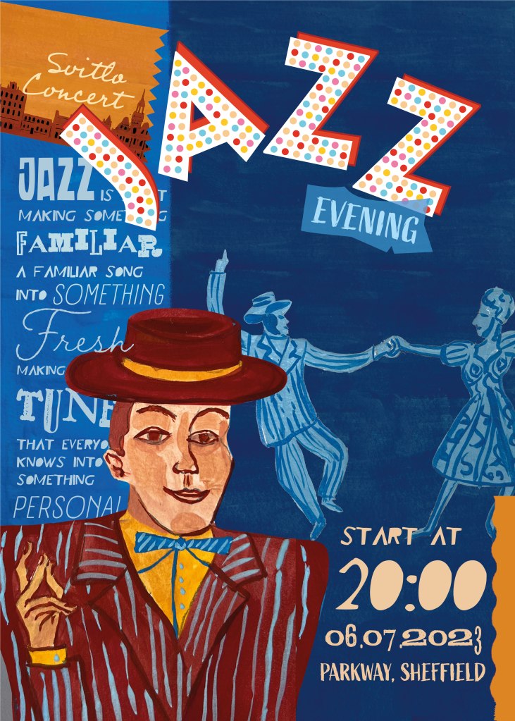
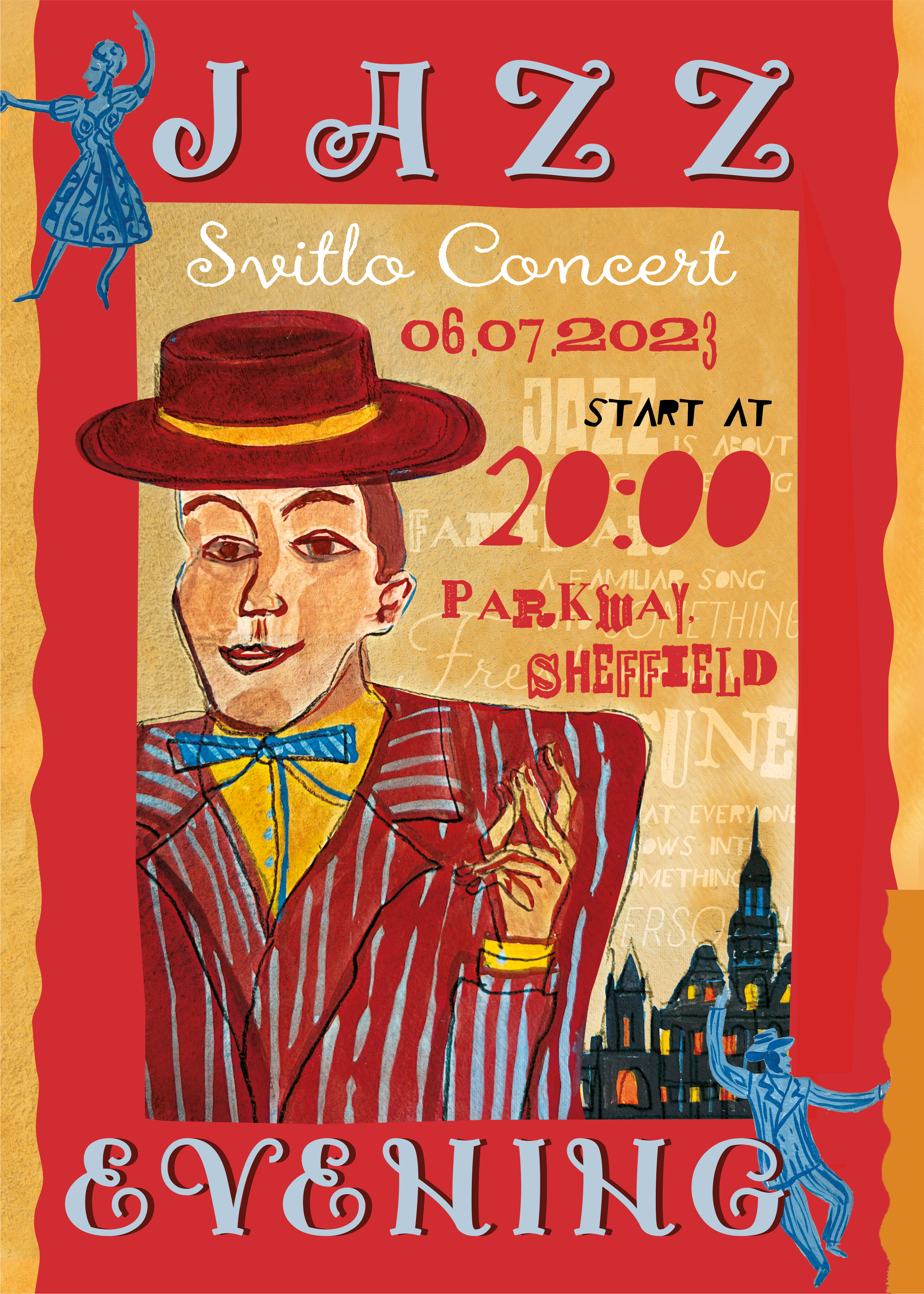
The poster with a musician and dancing couple had a few challenges, as I was not quite sure which direction to take composition-wise. In terms of presence, the illustration was not as strong as the singing woman, so mixing a few illustrations would be the best solution. I tried placing the dancing couple in the centre, arranged the city of Sheffield at the background, and the performer would have to go in the foreground corner. Colourwise, I still was going to use dark blue for the background, and red and brown colours as opposite colour palette to stand out. It worked, but I wanted to try an additional option, so I went for a completely new design, with a sort of creamy background and red border. For the details of the poster I used AltaCalifornia font, which is made from all different shapes of type for each letter, and for the main words Jazz Evening I used the decorative font Jamish Base.
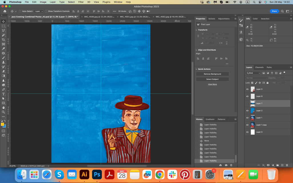


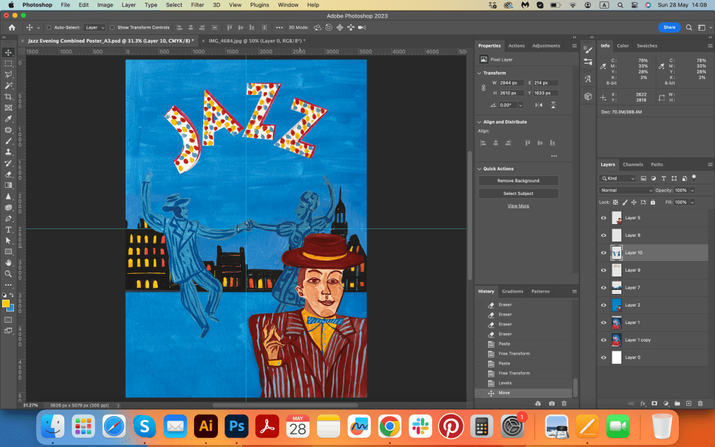
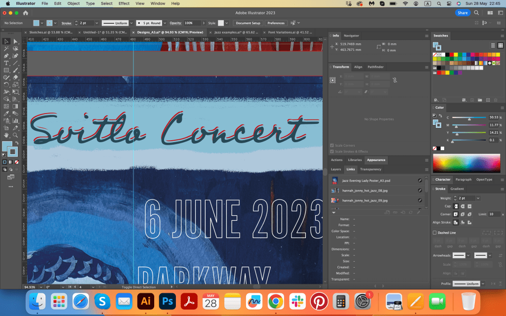
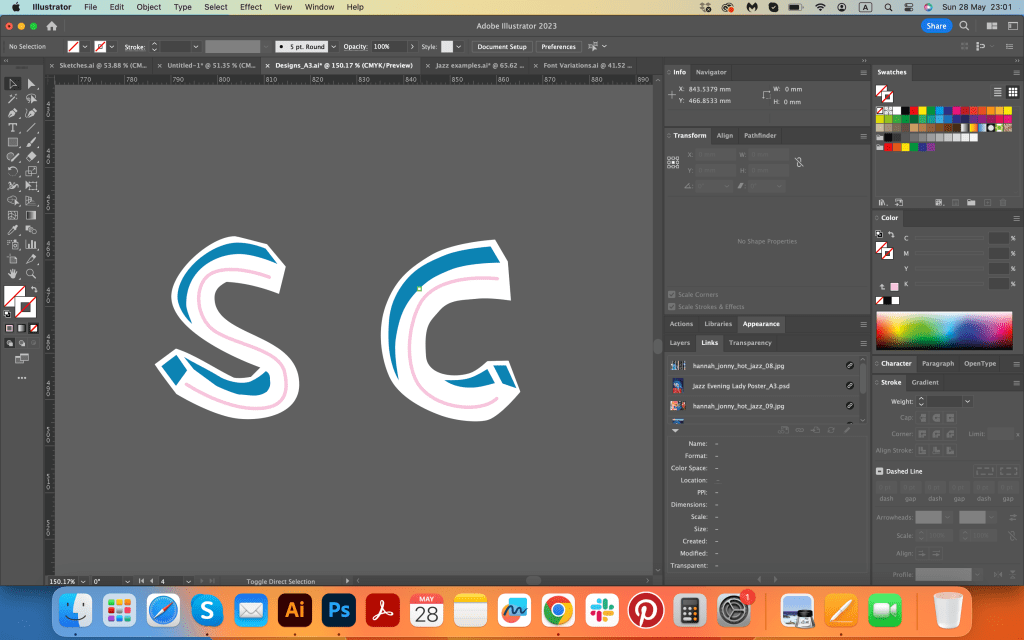
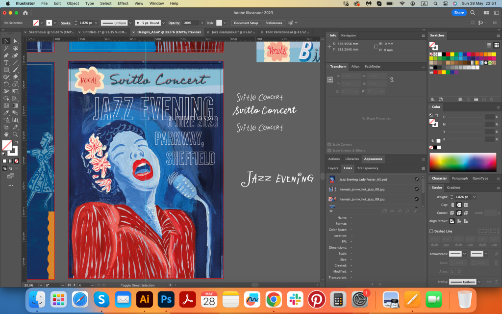
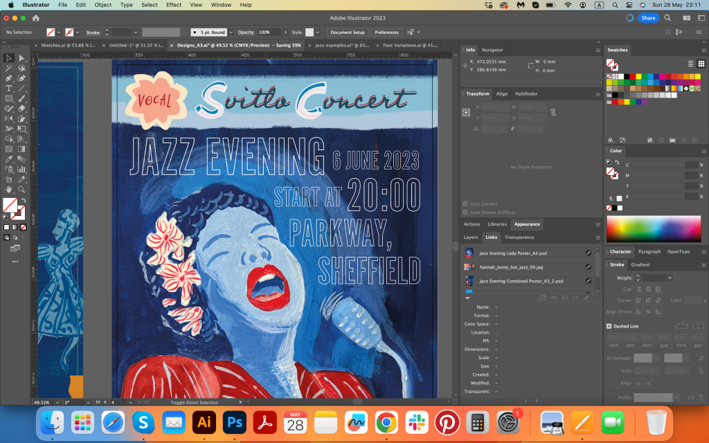
I tried quite a few variations for the poster with the performer and a dancing couple. That’s positive side, keep on looking and experiment with the composition. I remembered some of the previous exercises from the Core Concepts, where we had to use only typography for the book cover, I thought I could use that approach here as well. I quite liked the idea of using different types in one poster, I think, that creates an distinguished layout, where the message communicates through striking visuals and unique typography.




Posters



Final posters
Here are my final designs for the Jazz Evening posters. I came up with two options, I thought they look complimentary to each other, and could be used as running theme in duo. Overall , I’m pretty satisfied with the final posters I came up with. I would still say that the visual with the singing jazz performer woman is my favourite, as it has a bold and clear-to-read illustration, a selection of contrasting colours, and easy-to-read typography. I like the detail on the top of the poster, where I added handwritten typography that consists of a few types in one letter, they are creating a nice tandem with the femininity of the singer, but the bold and clear font is straight to the point and speaks directly to the reader. I worked as a graphic designer for a techno events company, and that approach was always given as a favour when people are in a rush and have only a few seconds to pay attention to the poster. At the same time, the visual with a red border and performer is less likely to be as readable from a distance but could work well somewhere indoors, like a theatre poster behind the glass for a close read. The main focus in this part has been transforming my ideas into a form that best communicates them. I hope my research made sense and it was a success for the conclusion of part three.
Mockup
