A mock-up is a version of an artwork to show how it will function and what it will look like when finished. It often includes the type or indications of where the information will be placed. Also, mock-ups look like finished and complete products.
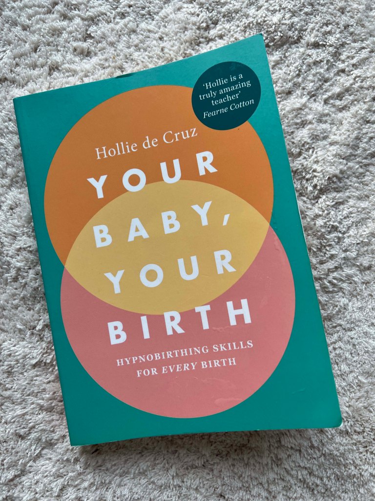
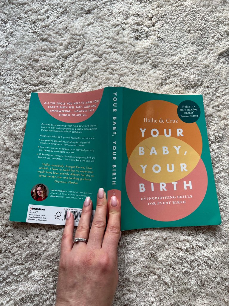
This exercise requires creating a mockup for the chosen book cover. I was thinking about which book shall I pick, I was considering to chose something I’ve read recently, like a book about Universe by Stephen Hawking, or a book about civilisation by Yuval Noah Harari. Then looked through some samples from my bookshelves, and I realise that the most obvious would be to choose a book related to pregnancy, as I had a few new books I enjoyed reading. Being 39 weeks pregnant and approaching my due date, I chose to re-design a book cover by Hollie de Cruz “Your baby Your Birth”. I bought this sample from WHSmith, as I liked the way the cover was designed, simple, bold colours in circles created the cover that stands out among the others. This book is all about positive thinking and believing in the nature of the body, which is very close to my way of living. I thought, it would be great to create my vision of this book cover, which could be something special from my own experience.
Chosen Book
Here is the book cover itself. I took photographs of it and examine it closely. I measured the proportions of it as well, so I could apply the printed version of the book cover I was going to design. That book cover had quite a modern feel, it has a minimalistic set of elements, but it does stand out because of its simplicity and bold colours, which are opposite on the spectrum, like a cold green cover and warm circles in the middle.
Mind map
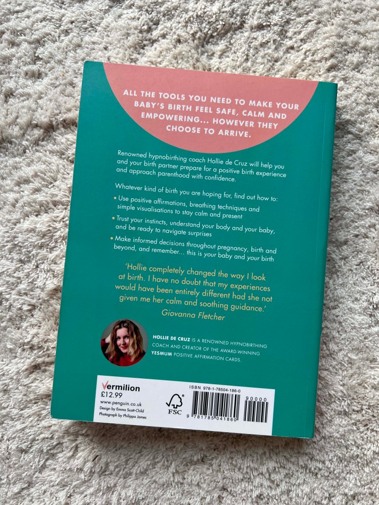
I created a mind map, that helped me to gather my thoughts together. I wanted the design to be feminine and gentle, have a spirit of women’s nature, and physics and embrace the beauty of the pregnant body. When I went through the analysis of the book cover I was going to produce, I was led to such a concept to reflect the pregnancy through mother nature, the feeling of blossom, spring, self-love and not only psychological but subconscious understanding of the birth. Also, I wanted to portray a woman in connection with space and the cosmos, the continuity of life, and the spirit of surrounding that goes through woman into space.
There were a few sets of colours I was going to reflect in my design. My illustrations will be reflections of the Universe, with such colour combinations as blue sky, and yellow stars. Pink and warm colours for the natural colours of spring and blossom. And browny, cream colours to represent the Earth as a warm and comfortable space. These were my main ideas.
Ideas
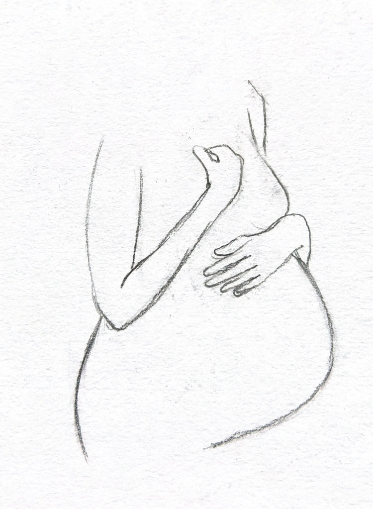
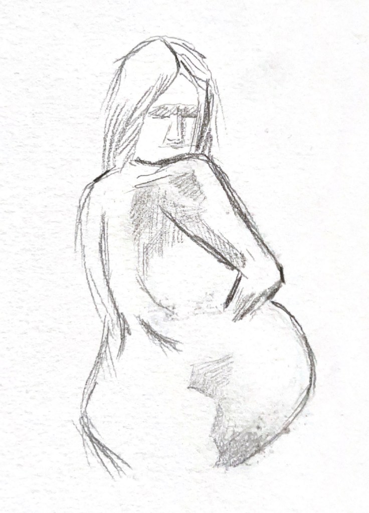
For the book design, I went to get inspiration from Georgia O’Keeffe‘s artworks. I found her painting feminine and mysterious, with intricate details, and beautiful colour combinations. In her works, I love the connection between a women’s body and nature, her paintings communicate to the reader through tender details and smooth curves and shapes. I thought I can borrow that approach from the chosen theme of the book cover I’ve decided to design. So I started sketching a woman’s pregnant body in similar angles but slightly various shapes.

Sketches
I created those illustrations at the beginning of the process. My plan was to use the silhouette of the pregnant woman to be applied or implemented in the design. I wanted it to be a part of the composition, in some cases to dominate and stand out, and in some to be a complimentary part of the design.
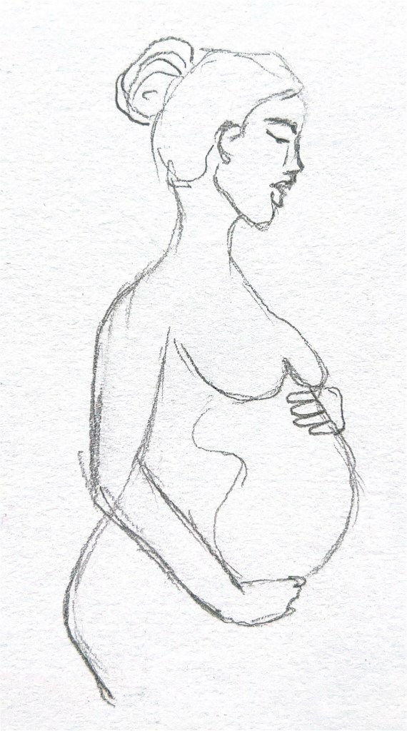
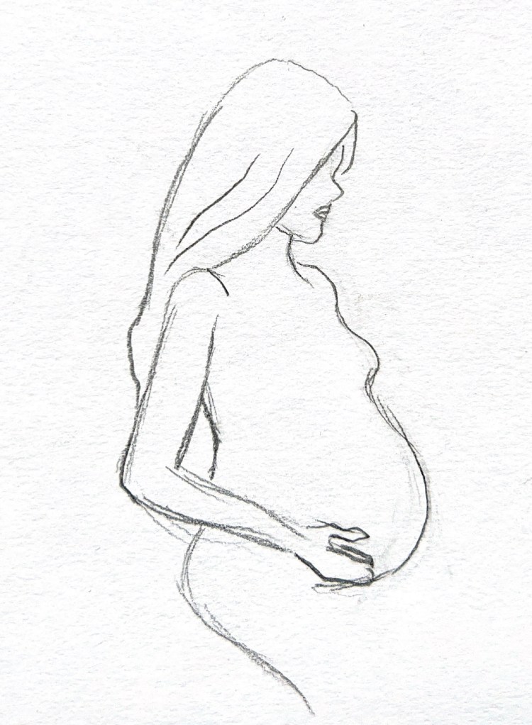
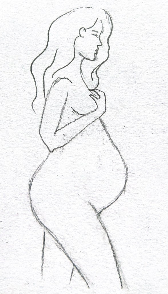
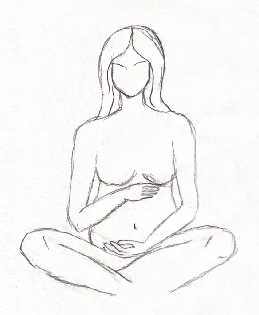
Illustrations
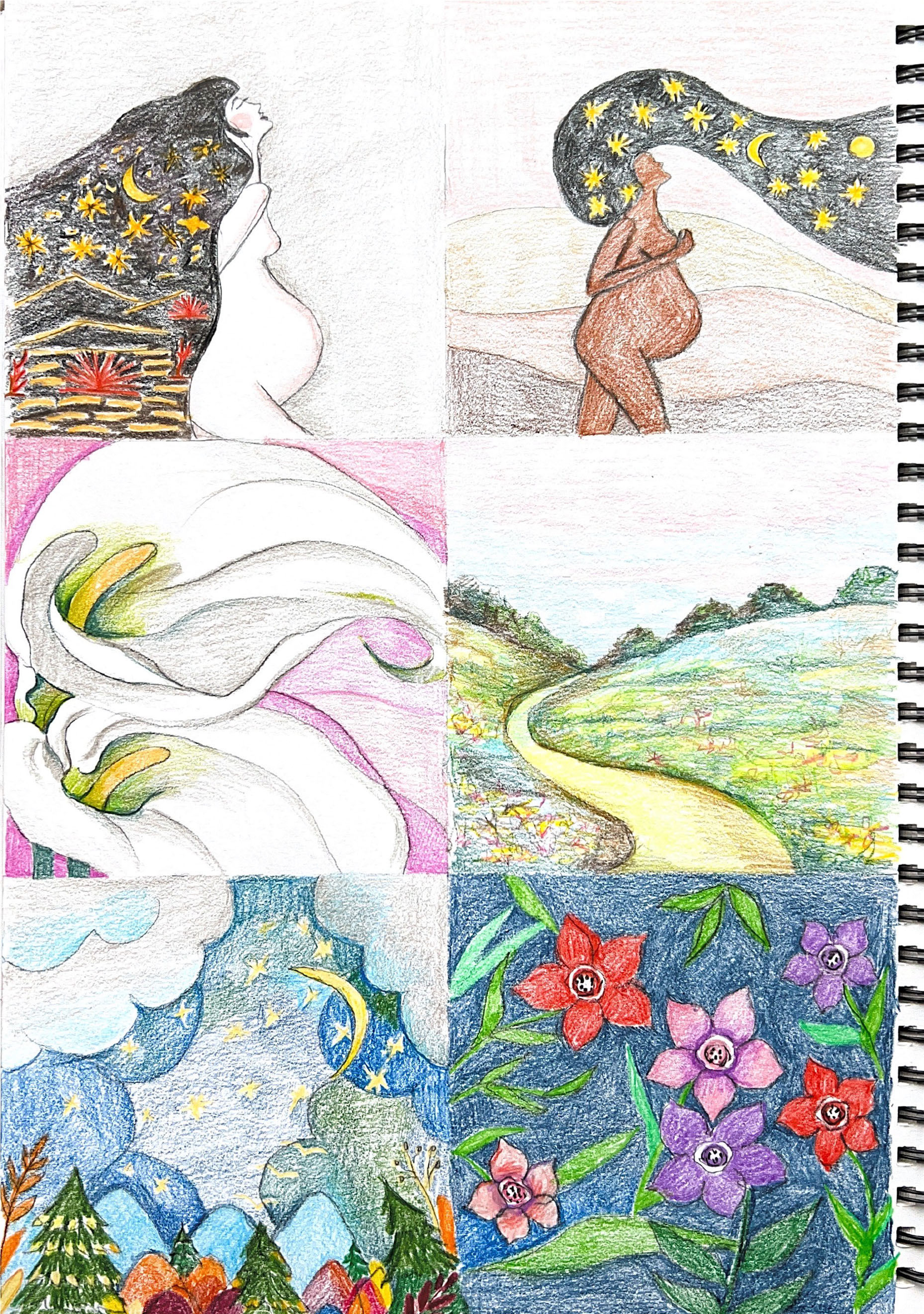
The next step was to create colour sketches of illustrations with watercolour pencils. I created several concepts that were mentioned above. I started with a picture of a woman like mother nature, whose inner state was connected to the Universe. I wanted to create a woman against a backdrop of warm hues, oranges and browns like the colour of sand and gold on planet Earth, and the body’s connection to the cosmos and the stars. So far it was just a sketch that lacked hue and brightness. I planned to process the final design in Adobe Photoshop using brushes and colour tools.
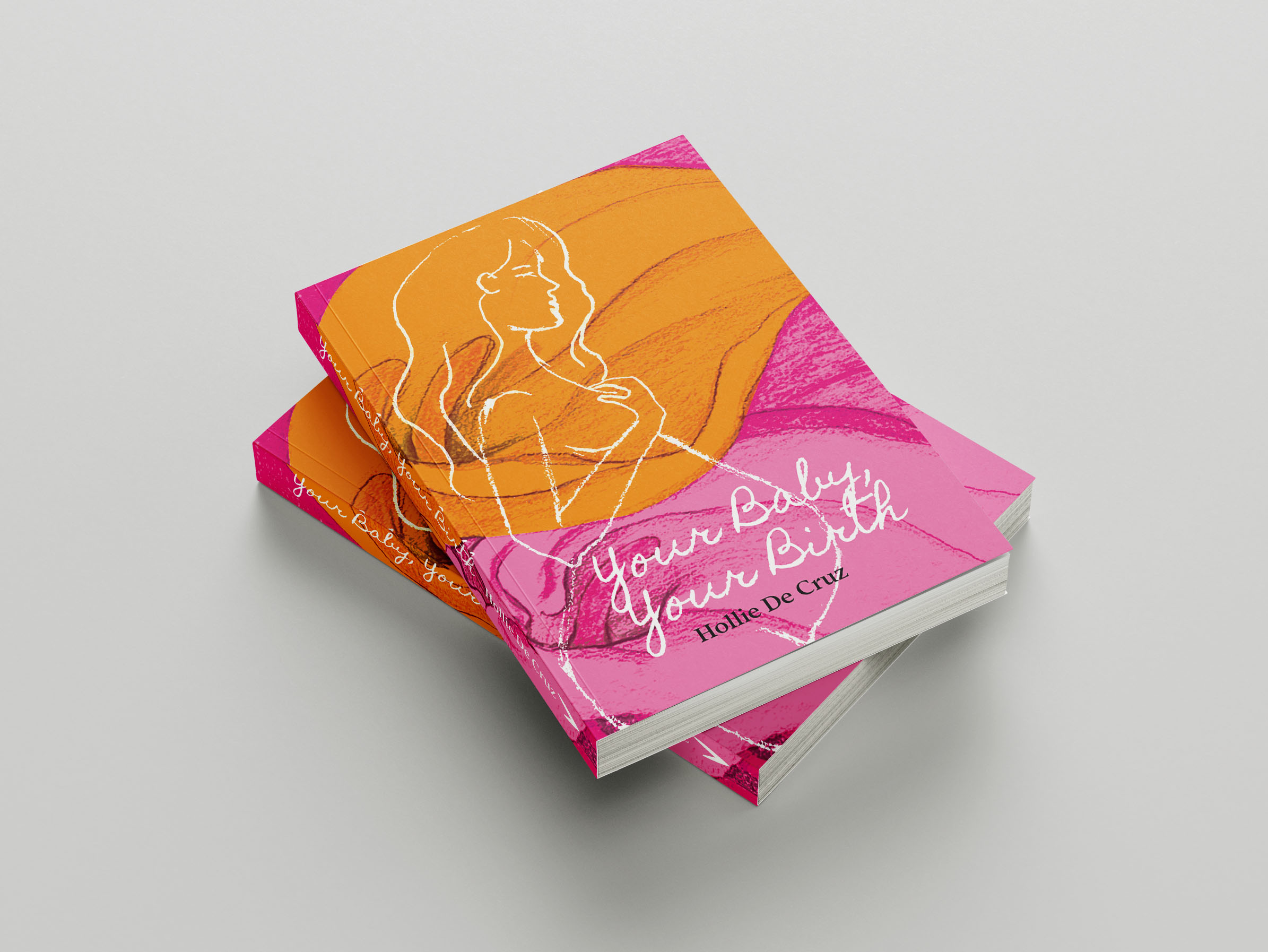
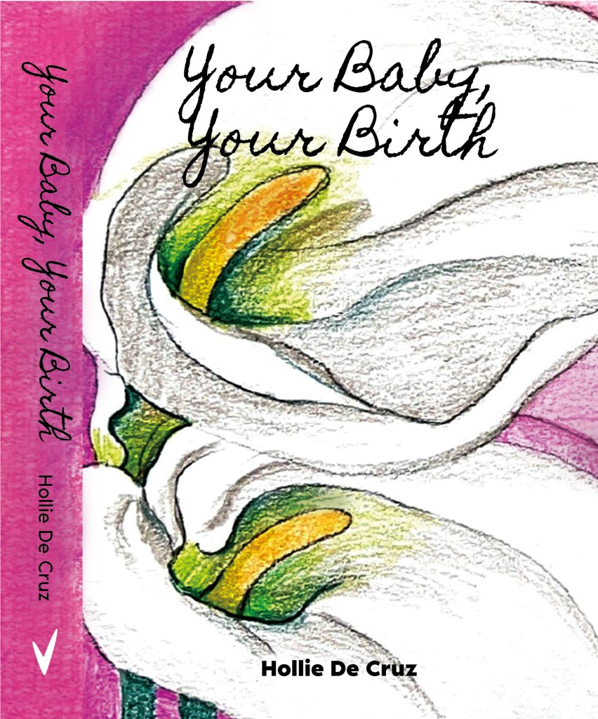
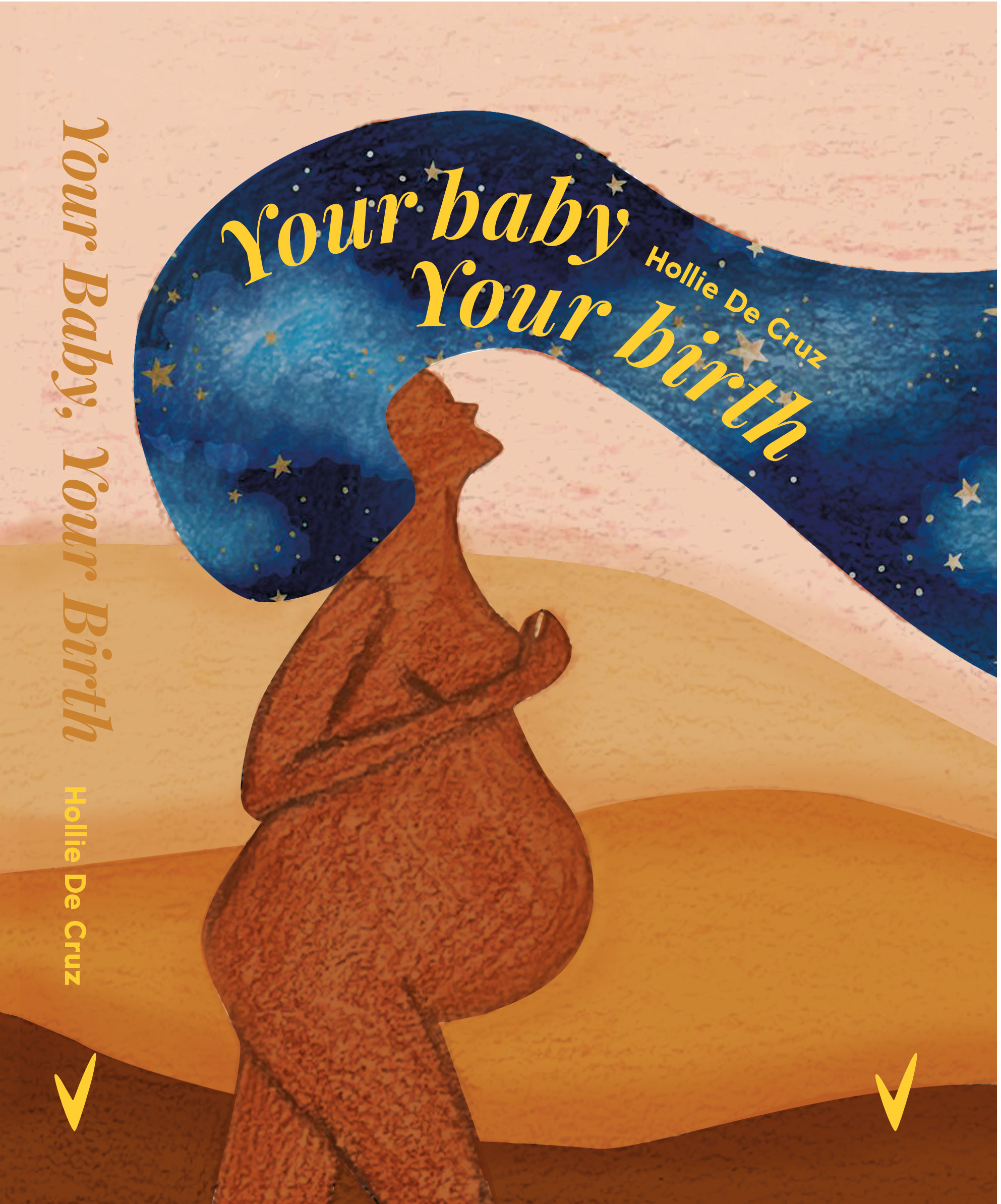
My next concept was inspired by the work of Georgia O’Keeffe, with the image of a delicate and graceful Calla Lily flower. I marked the background for the cover in pink and fuchsia, and I planned to depict the flower itself in white. I also had to think about what colour and font to display the title of the book and the author so that the text was readable and combined with the concept of the cover.
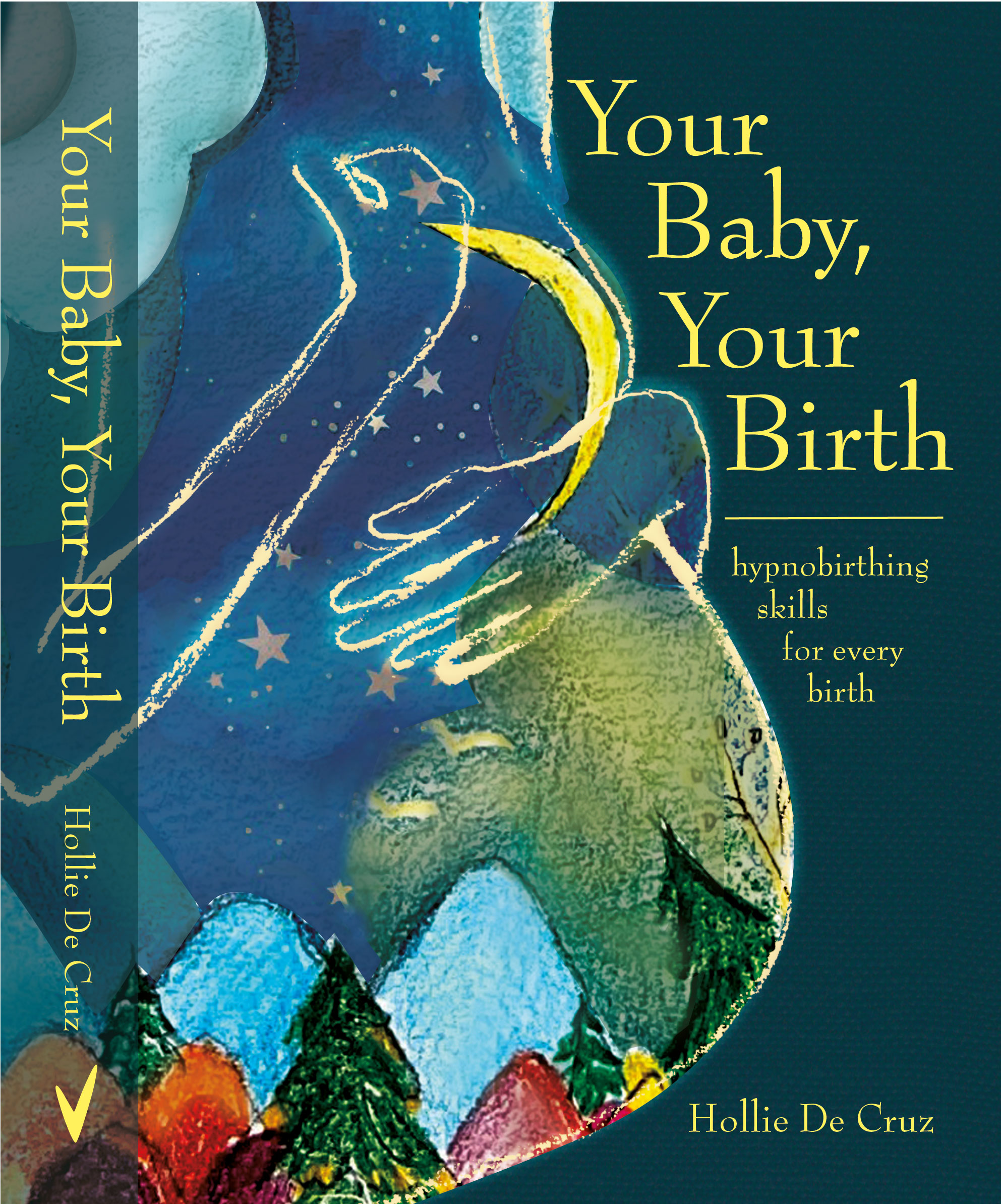
I also created an illustration of the night sky and a fairy forest, I wanted to capture the atmosphere of magic and place this picture inside the silhouette of a female body. The rest illustrations were just sketches of landscape and flowery patterns, as alternative to use a background for the book cover, or implement them inside of the silhouette.
Designs
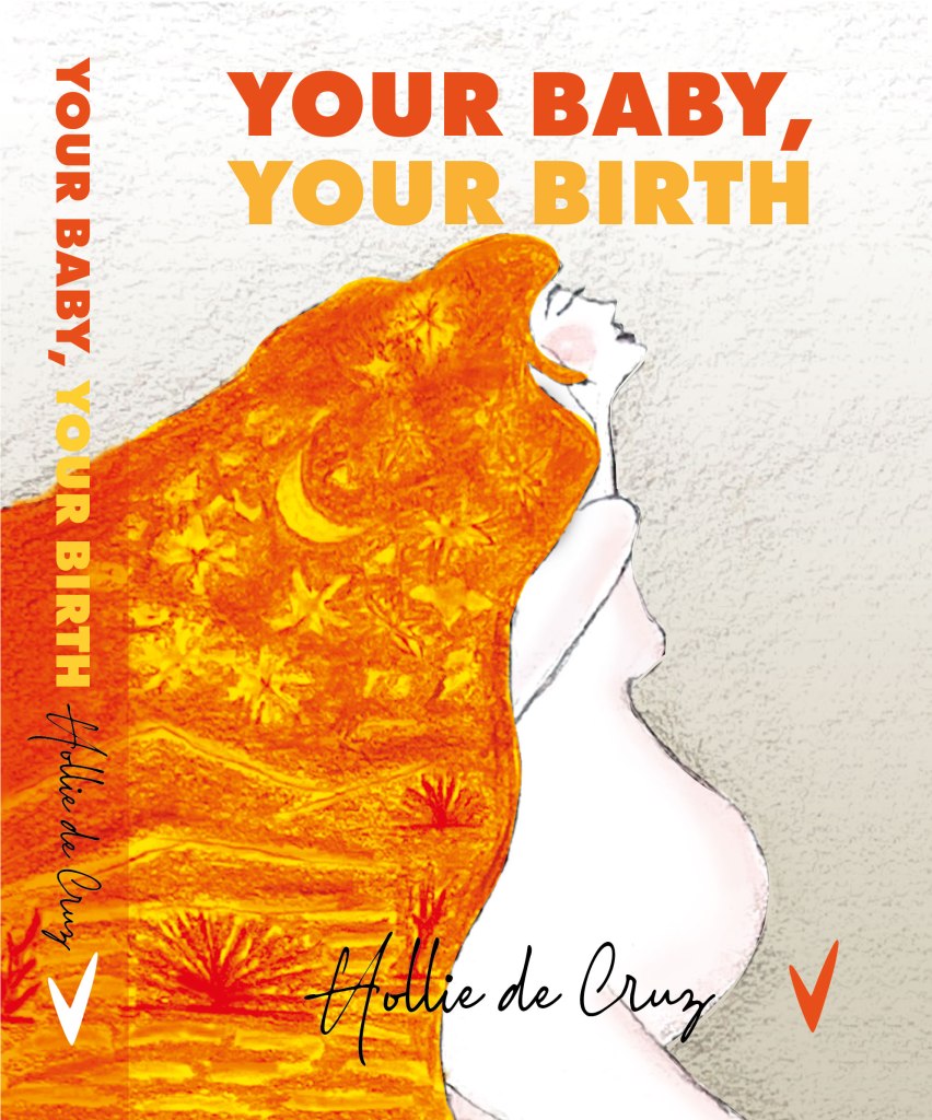
After drawing the illustrations with watercolour pencils, I proceeded to the next step, illustrating and colour correcting the drawings in Adobe Photoshop, and after that selecting fonts and designing the cover in Adobe Illustrator. When I was doing pencil sketches, and physical drawings, I didn’t know for sure what would work and what wouldn’t work for the final cover. When I placed illustrations in the book format, which was 162x196mm, plus 20mm spine, I could see the importance of the image placement and it proportion with the illustration. In the example with the first three sketches, it was clear that there was an imbalance in the connection between the silhouette of a woman and the title of the book, as I couldn’t figure out where the text should be. Also, due to the different colour transitions from white to bright orange, I could not choose the font colour for the bottom of the book cover.
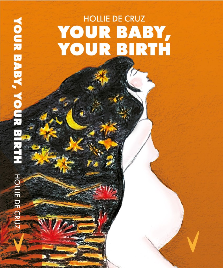
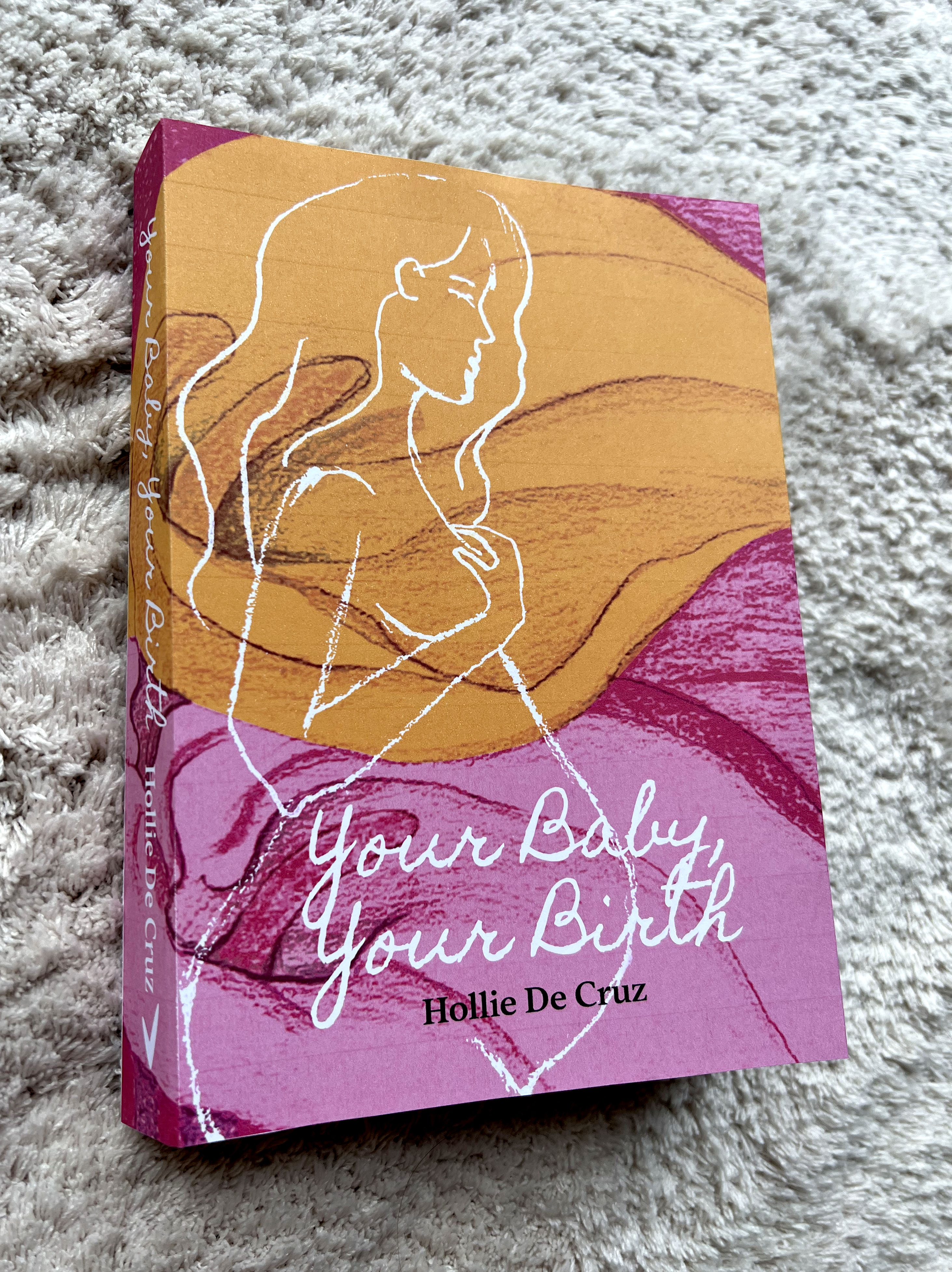
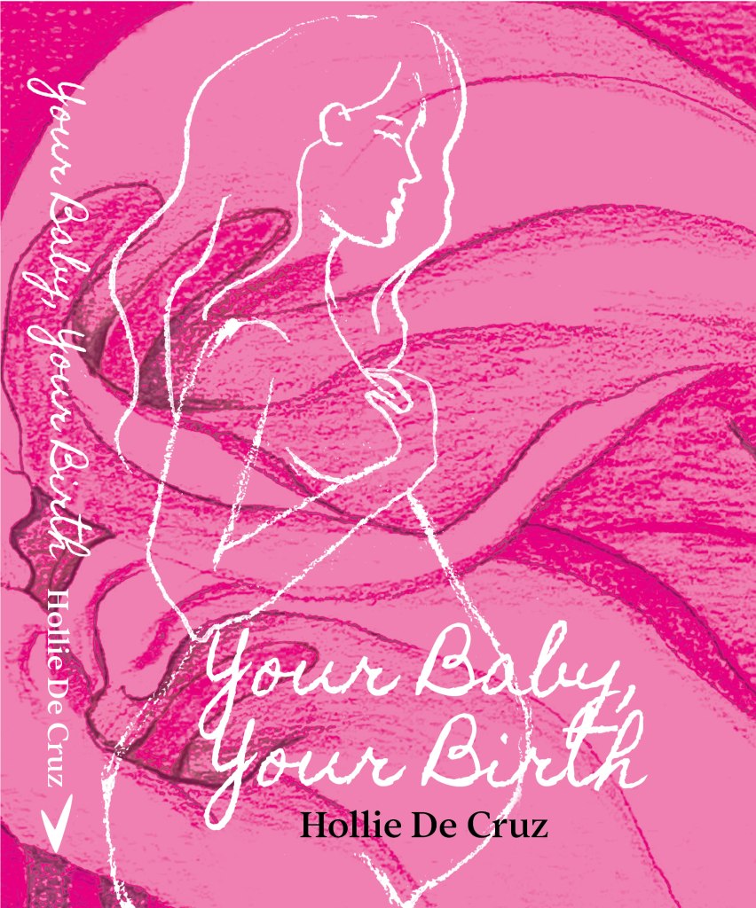
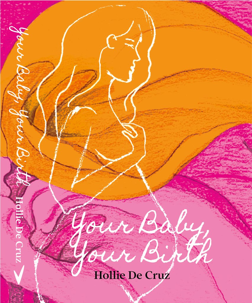
On the next three covers, I corrected the mistakes and applied a more contrasting background for the cover, orange and bright pink, which allowed me to write the title of the book in white. Here I chose the handwritten font Homemade Apple Pro, that in my opinion looked harmonious with the overall design concept.
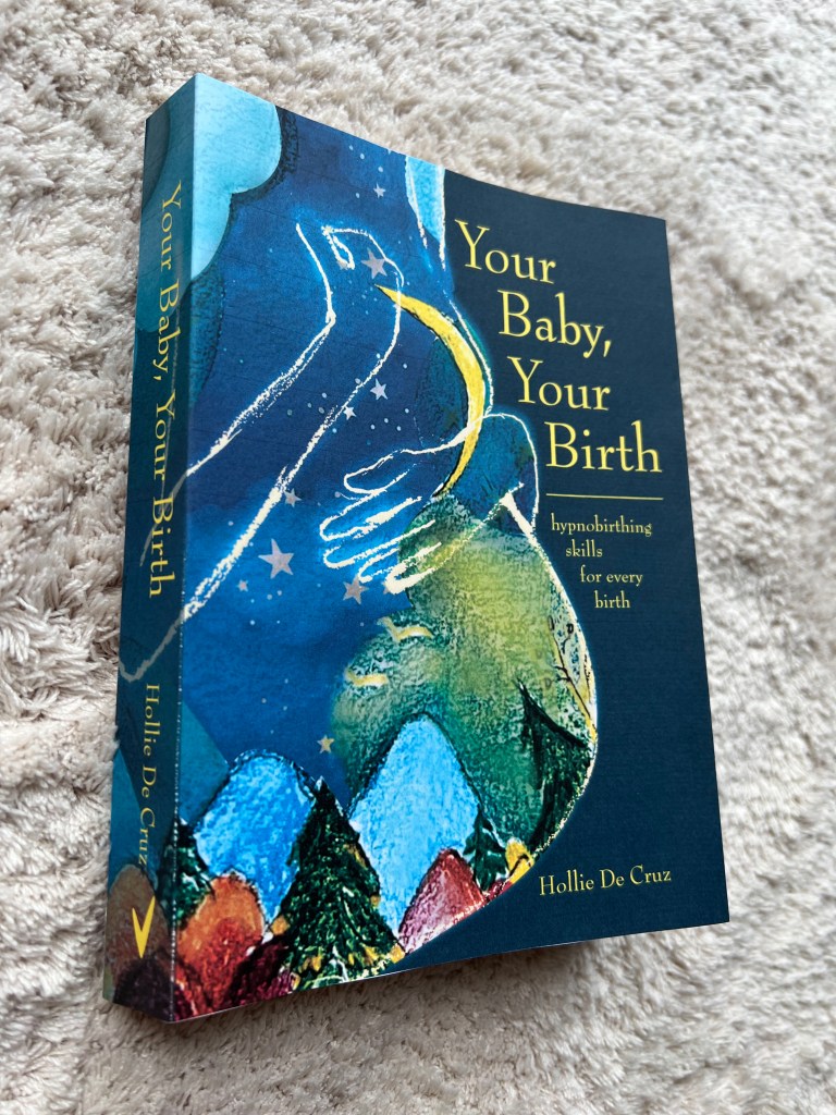
Another design was initiated around the fairytale inside of the woman’s body. It was a night forest with growing moon and stars. I liked the illustration, but the only way i could place it was to locate it on the left side, therefore the name of the book was placed on the right side, and looked like a stepladder, which is not ideal from the typography point of view.
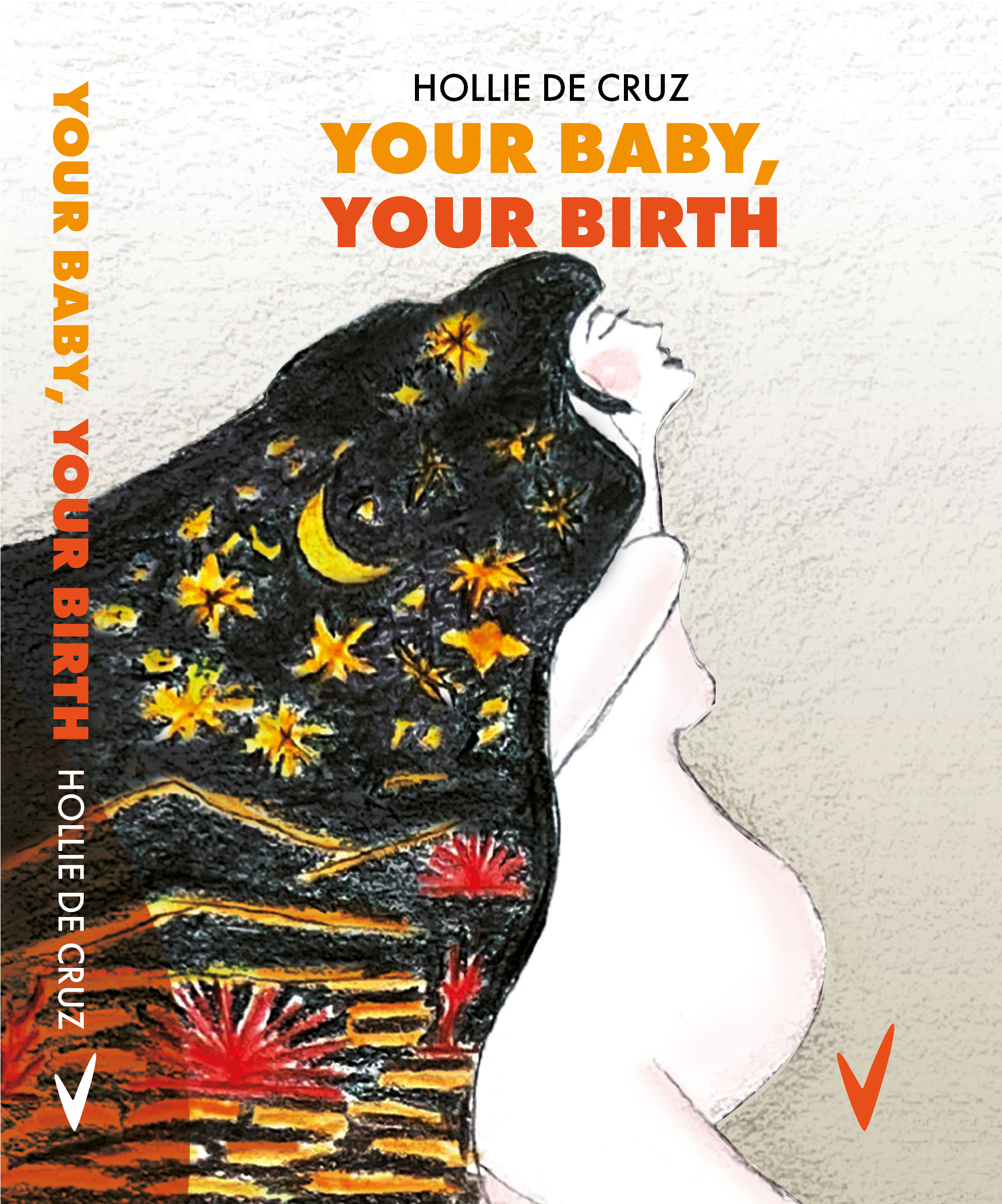
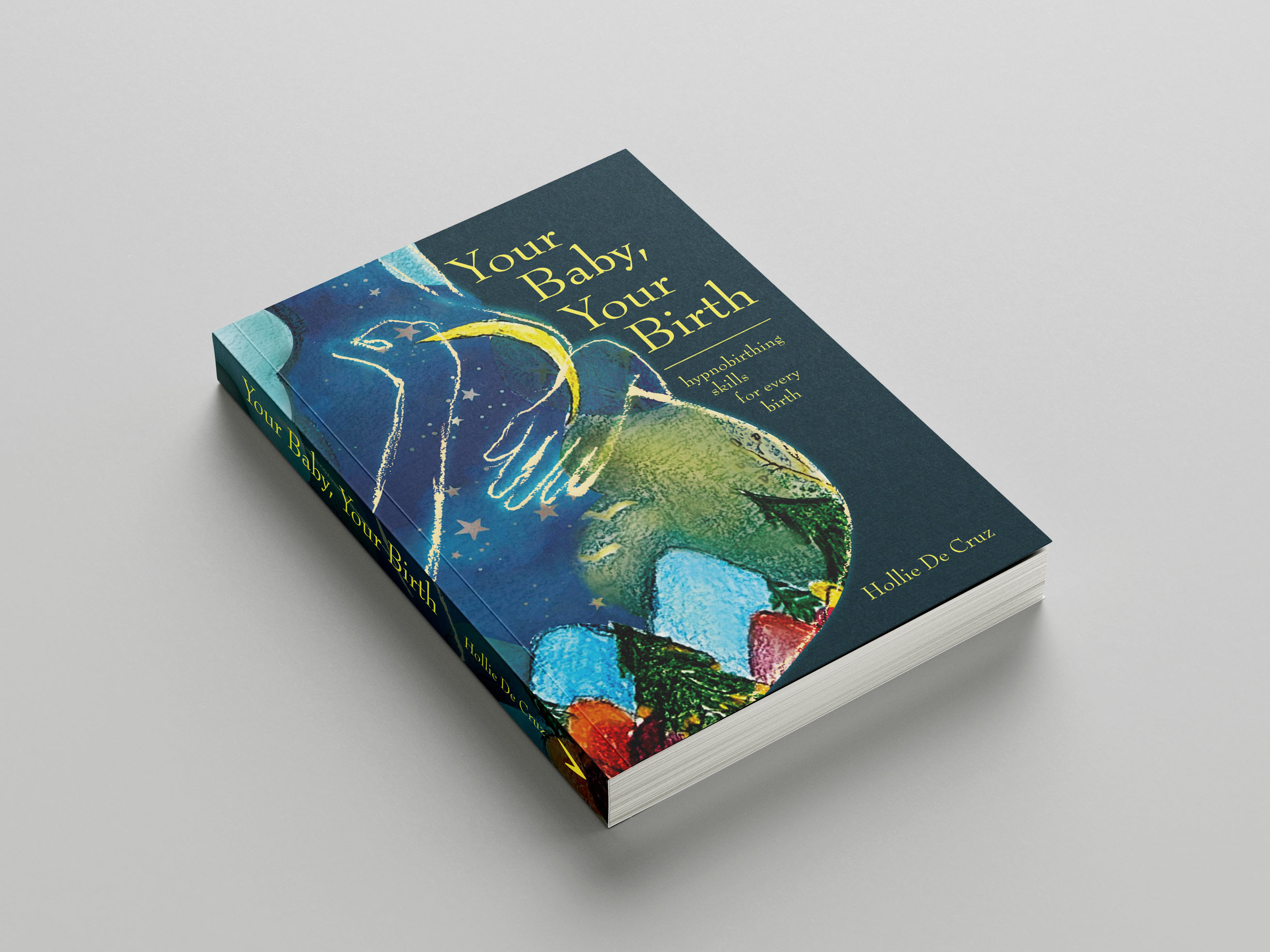
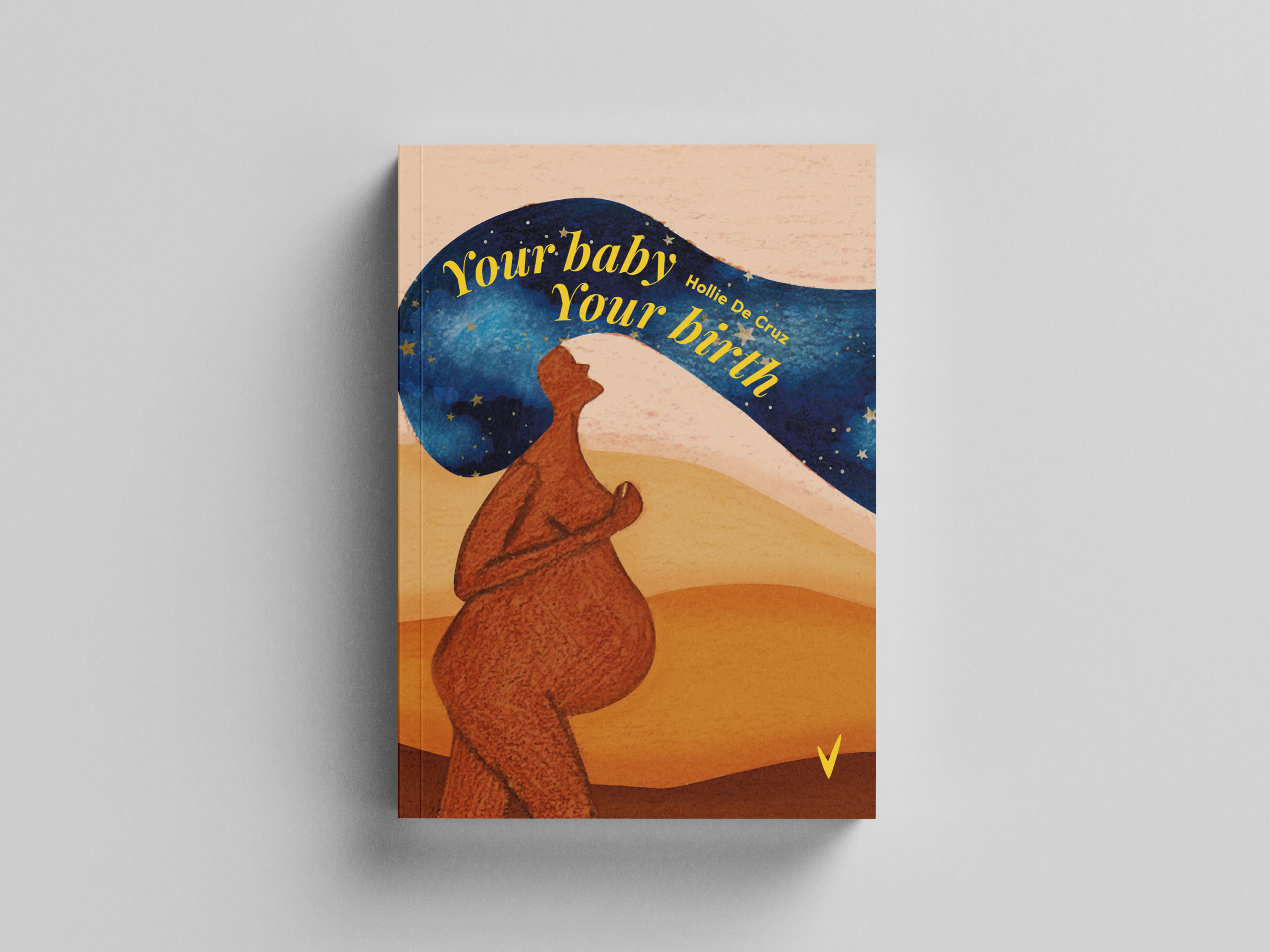
The final book cover I illustrated was the dynamic illustration of the woman, whose hairs look in motion. I placed the night sky, stars and clouds inside of her body, and illustrated around the woman Earth with the warm orange and brow colours. I played around with the name of the book, placing it on a wave curve of the woman’s hair. Probably, if it was a gift car, it would look fine, but for the book cover, it was missing robust composition.

Book Cover Mockups
Those were the final designs I produced before arriving of my baby. They are quite symbolic for me, as I went to bed at 1 am, trying to finish designs before my due date, but a few hours after, at 3:30 am I woke up as my waters broke, so I had to rush into a Hospital. Almost 24 hours later a baby girl Felicity Anna Welch was born, and those designs could be a story for her to tell, how her mum was doing the coursework last minute, just before her birth.
I sent those designs to the student group, and most of the feedback was positive. I think everyone preferred the design with the Calla Lily flower in pink shades cover. As I made a course on Creative Book Design before this exercise, I could see advantages and some critical points to those covers. If I had more time, I would probably play more on the typography and font selection for those covers, as the name of the book and the author are quite valuable points in designing a book.

Printed Book Covers
As a final touch, I printed two chosen covers, matching the size of the actual book. I think I would still prefer orange pink cover with flowers on the background. The dark blue illustration looked great as well, the only concern was the placement of the name of the book, I thought it looked too squashed into the side for the important component of the book cover. I suppose that the exercise was examined detailed enough, so finally I’m ready to move into the next part of this section, the actual assignment.