Mockup Sketch 287.5×428.7 mm
During the creative process, the illustrator will have to present images or ideas to the client at some point. It’s uncommon to produce a finished or complete illustration without prior clients’ approval. Illustrators can take on their responsibilities in the creative process, which includes research and generating ideas, leading to the production of thumbnails, sketches or client roughs. The visual should be straightforward and easy to read for the customer without additional explanations from the illustrator. Generally speaking, the graphic should communicate with a client independently. The wording that relates to the illustration can be added as well, which creates a key to successful communication as well.
In this part, I’m going to explore another important aspect of illustration – scaling, and its role in representing images. When illustrators work with images, the format of the illustrations can be different to the final artwork size, sketches can be smaller or bigger compared to the reproductional size. In this exercise, I need to examine two pieces of artwork from the collection of images I’ve gathered, and create a kind of reversed process of illustration creation. Images can be representational, diagrammatic or metaphorical. I need to measure their size and create a sketch which has to be at least two and a half times bigger than the original size.
I took some pictures of the range of illustrations I have been examining recently. I’ve noticed that I was drawn to Japanese graphic art, including paintings and ceramics, which are famous for their strength, elegance and colour. From those selected images I wanted to create my own version of illustrations, and how it would look in the first stages of designing. Also, I included works by British illustrator Edward Bawden, some of his works have notably sketched style with highlighted colour in it. That gave me the idea that some of his illustrations look like roughs or unfinished images, but that was one of the reasons why those illustrations look attractive, as they communicate not through precise elements, but through quick lines, emotions and contrasting colours.
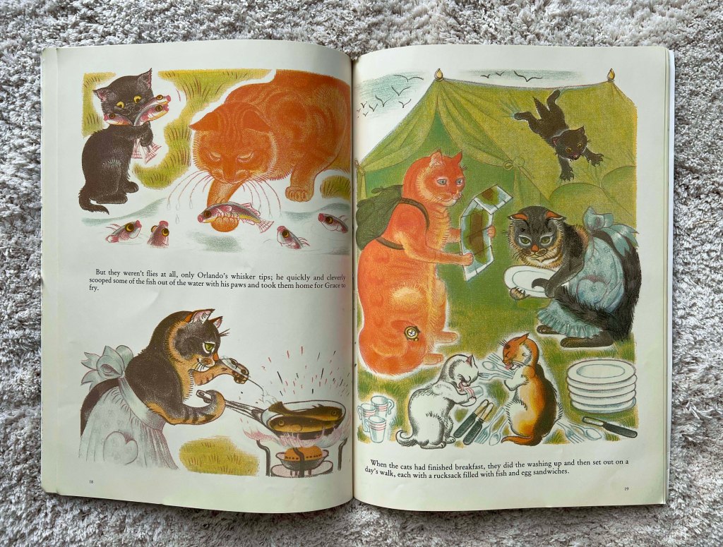
In addition, I want to analyse illustrations by Kathleen Hale and her famous work of Orlando Marmelade Cat. I’m attracted to this traditional illustration, their warmth and respect for the history of art, and its communication that is mainly working with a younger audience, like kids and toddlers, but, at the same time there is so much that illustrators can learn from it. Her works offer a delightful slice of Edwardian imagination today, though most were published after the Second World War in the latter half of her life. At the time, stone lithographic plates were being replaced with zinc, which had to be submerged in acid with layers of vibrating marbles to roughen the surface to emulate the original chalk drawings.
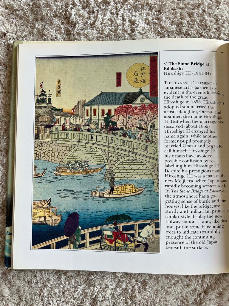
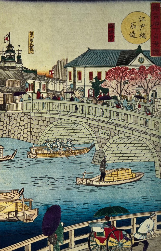
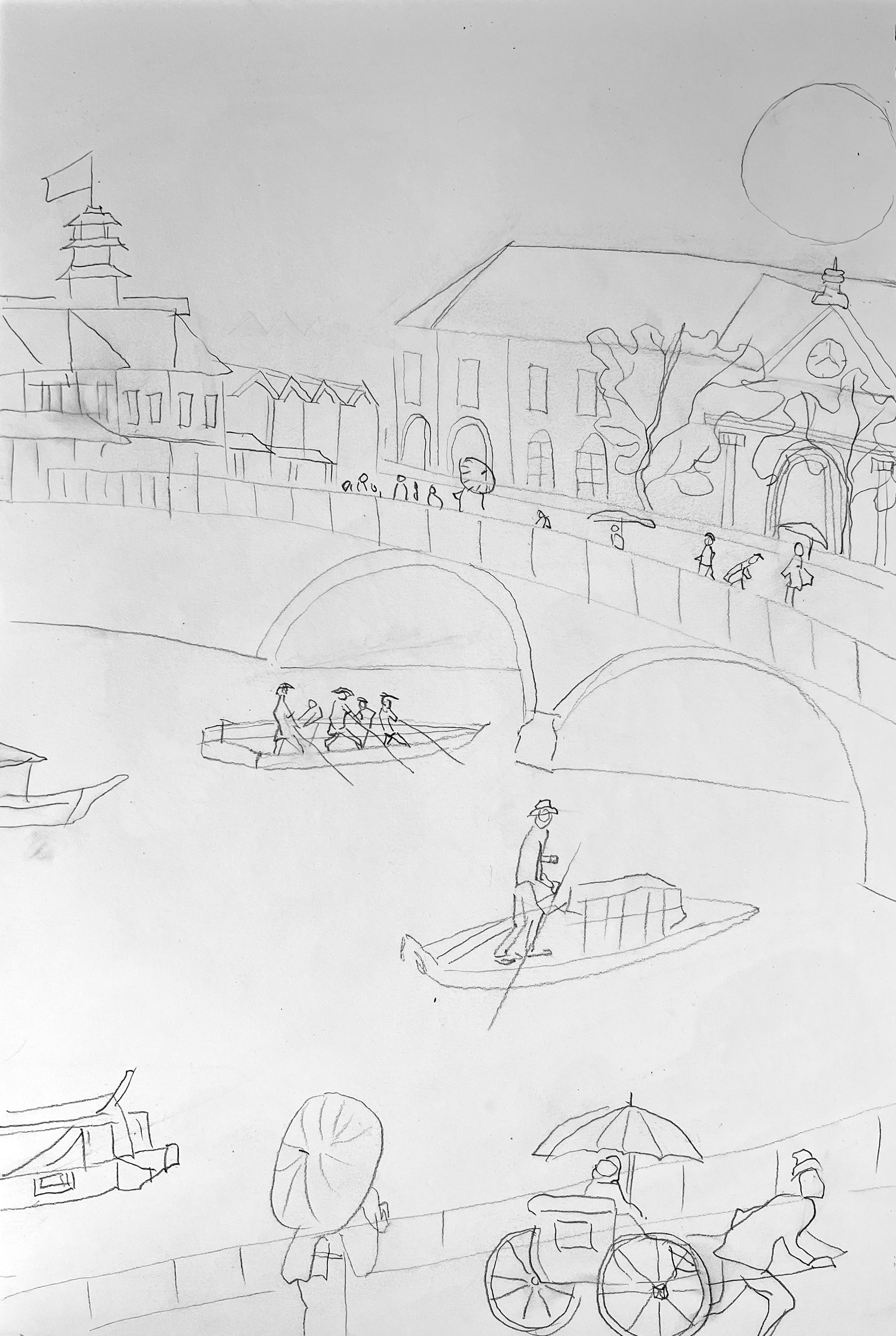
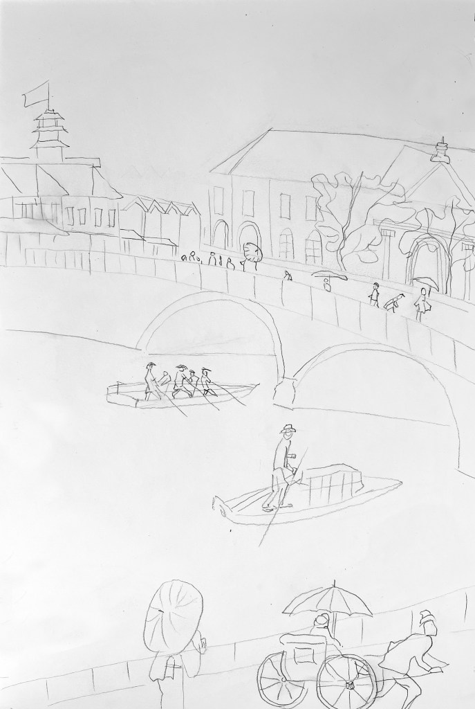
I measured the size of the first illustration I picked The Stone Bridge at Edobashi Hiroshige III (1841-94) from the Japanese Graphic Art book, and it turned out as 115×175 mm, which is 28.75×42.87 cm, closer to the A3 format, similar to my sketchbook format, so I had to use the full page for the illustration in portrait format. The priority of this exercise was to keep the sketch in a minimalistic style, avoiding the details or precision, and highlighting the vocal point of the illustration.
115×175 mm
The first thing that I’ve noticed is that the image I used was quite busy with the details, such as bricks on the wall, wood texture on the buildings, and details of people’s clothes that walk by. Those were the aspects that I could definitely leave out. For the type of sketch I used similar techniques as Edward Bawden, I call it a rushed illustration, I thought that could be useful navigation for understanding the principle of the first sketch, or roughs provided by the illustrator to the customer. I think it was a good start to this task, I managed to show the East Asian vibe in it, such as umbrellas, rickshaws and architecture by the river, but at the same time, I could keep my identity in it, avoiding the pure replication of the original illustration. In terms of removing elements, I could probably delete some of the details, such as boats, located in the corner, and remove the complexity of the building and trees grown around, but I would probably keep the rest.
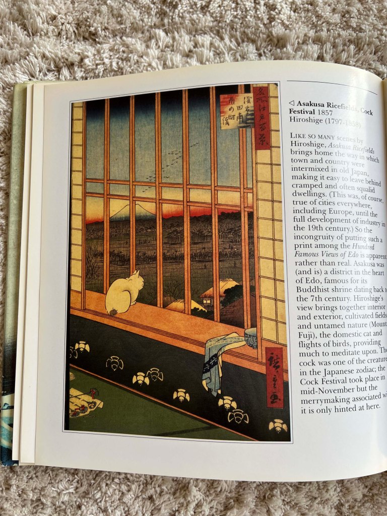
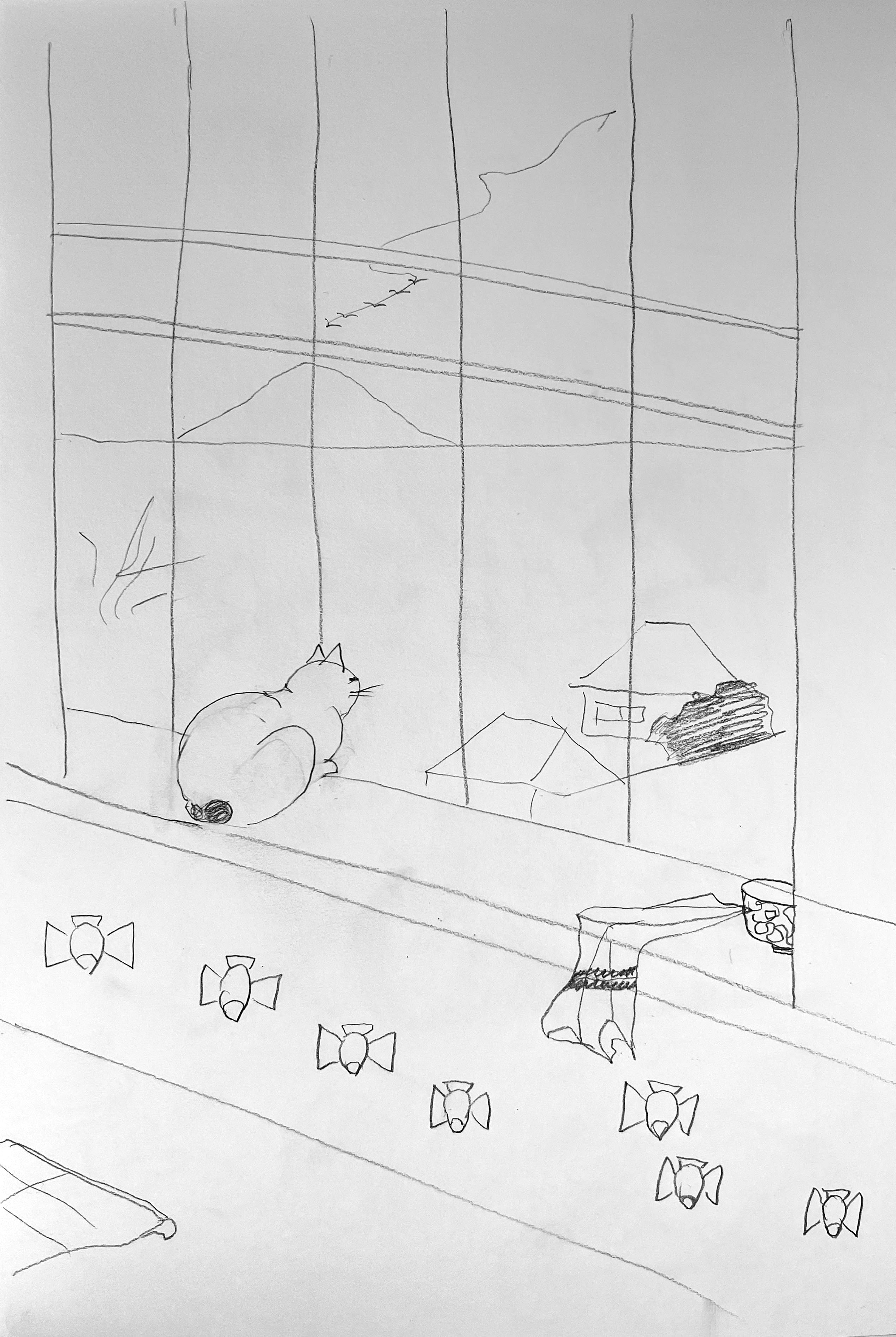
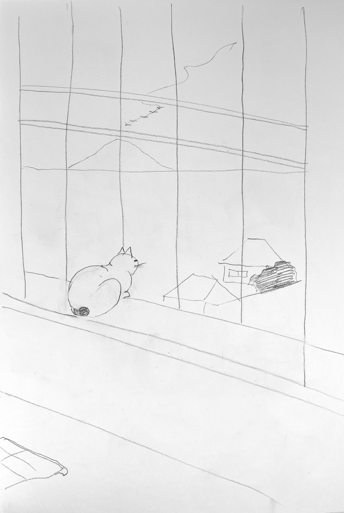
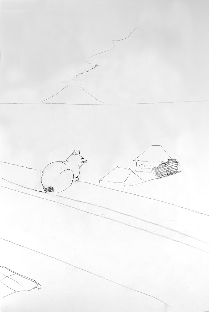
The next image I chose was from the same theme, Japanese Graphic Art, but with fewer details, compared to the previous art. The size of the illustration was identical to the previous one, 115×175 mm original, which is 2,5 times bigger and comes into an approximate A3 format. Here I wanted to highlight the main aspects of the composition, which are the cat, that starring into the massive window, the spacious landscape with the mountain in the distance, a couple of houses isolated from the rest of the village, and some interior details inside of the room. It took me much less time to sketch this illustration, as it had much fewer major points, and I could detect them straight away, completely avoiding the details. Later, I pushed stripping the details of the image even further by removing such elements, as the window, interior design elemnts and fabric with the cup. The content remained still the same, and that is the best result I could achieve so far. As that was the main idea of the brief – explore how many lines I need to use to describe the content. I could see in comparison how much content you can remove so that the image is distilled to an extremely edited form but still makes sense. However, the style of the illustration was similar to the previous design. So I decided to examine additional illustration, which is described below.
115×175 mm
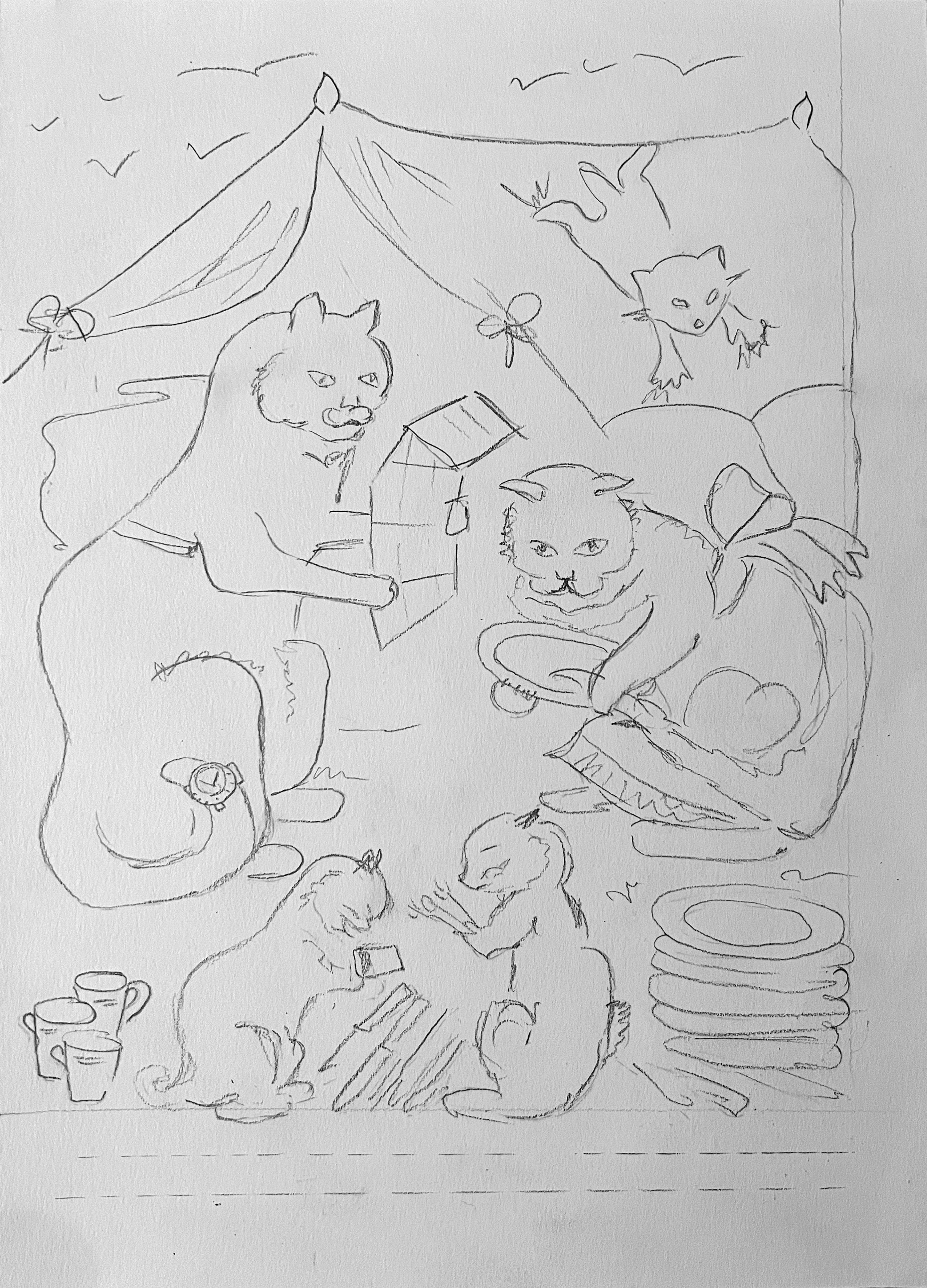
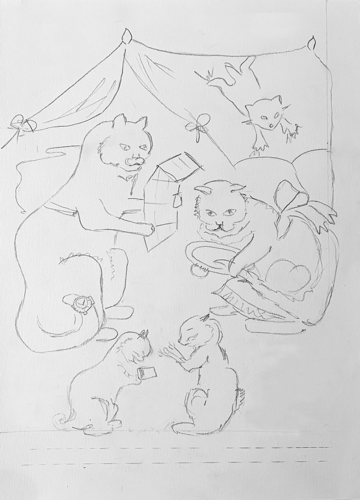
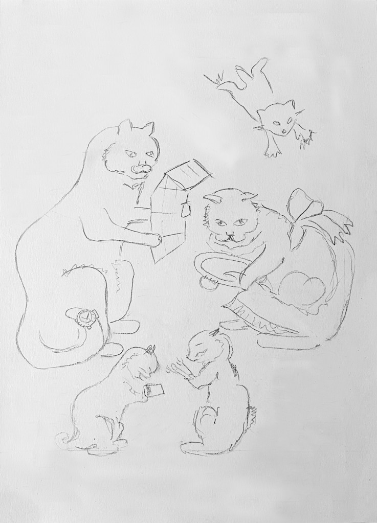
For the third image I chose design from the book Kathleen Hale, Orlando Marmelade Cat, from the series of A Camping Holiday. The original size of the book was format A4, soft cover. So, for the illustration, it had to be quite a massive piece of paper 52.5×74.25 cm, which was quite difficult to find. Here I followed the same route of detailing the main points of the illustration, and gradually removing complementary elements. As this illustration contains five major characters, which brings the sense into the composition, it was quite difficult to consider what could be removed from here, apart from the tent, and some dishes and cutlery around. I found this particular illustration more challenging to play around with, as that is a part of the plot, and by losing some of the elements around it, I could miss the content that the author intended to bring to the reader. I still could strip back some of the little objects around, but, compared to the illustrations I analysed above, this Orlando Cat one looked overcomplicated.
210×297 mm
In conclusion, I would like to say, that this exercise has shown me the way of highlighting the key elements of the illustration, and also learning the straightforward way of creating first sketches, that the final idea would be developed around later. That is one of the tasks I need to keep on working, as I tend to draw precise or completed sketches, but by doing that I’m potentially losing vital time that could be spent on generating ideas, which is one of the important parts of the illustration. That is a quite useful skill to be able to produce quick thumbnails and roughs before the designing final images.
