
This project involves creating an illusion of visual space of images. Depending on the scale and positioning of figures on the sheet, we are also establishing relationships between each component. The best way of doing it is to reduce the content into its simplest shapes and colours. It’s also helpful for an illustrator to examine the success of a composition to clarify the hierarchy, knowing what are the most dominant elements to communicate the idea of the visual.
This exercise requires illustrating the visual space out of each of these images:
A tree A child running or walking A building
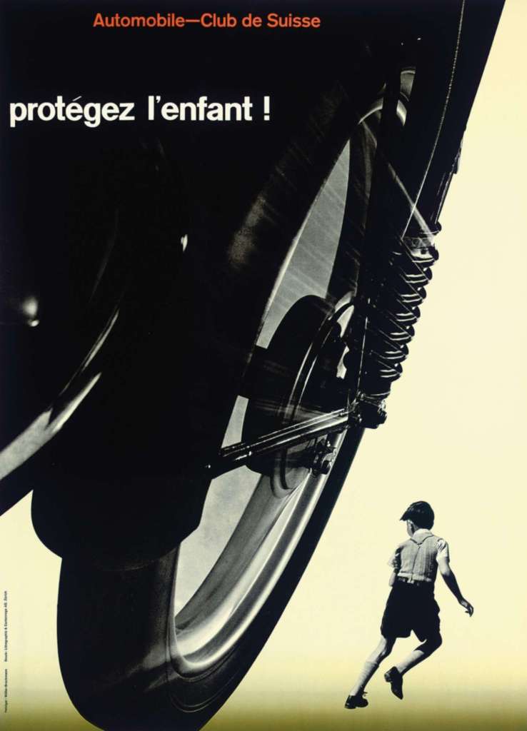
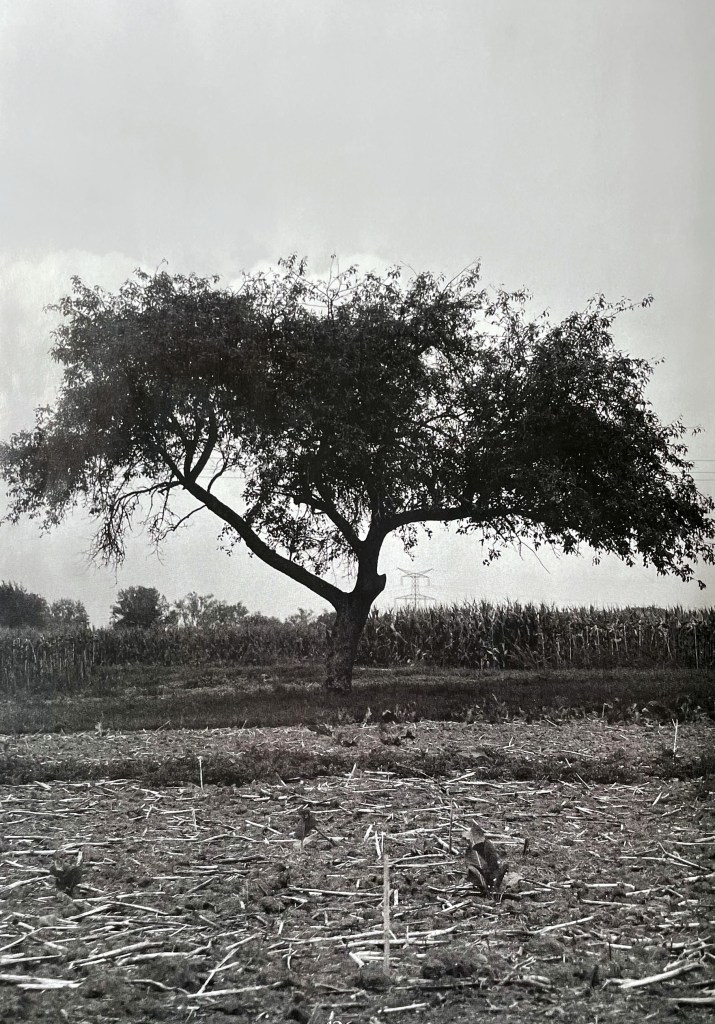
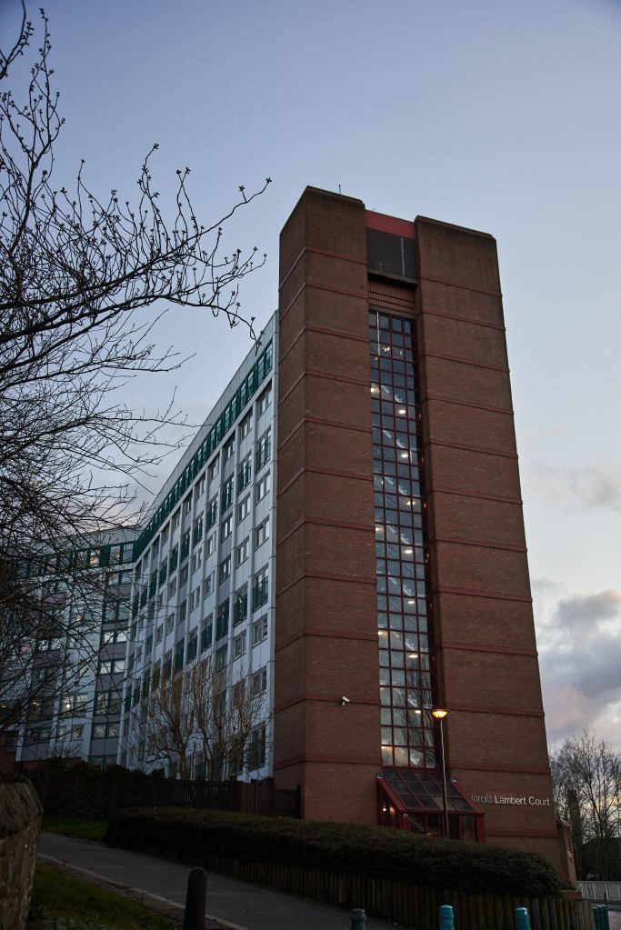
The task is to create a selection of collages, that are visually interesting, experimental, and dynamic, and communicate the idea. My chosen images are my photograph of the Sheffield apartment block, a picture of the tree from Vogue magazine, and a photo of the child from the vintage poster Protect the Child!, 1953.
Collages
I printed different scale images of the boy, tree and building, so I could play around with sizes whilst experimenting with the location of images on the collage. My only worry was, that the building I have chosen is too tall and narrow, whilst the tree is low and wide, I saw the challenge that on the square shape space those images can create some void spaces. But I was hoping that I can create something catchy even with the different shapes of images. It’s useful to challenge ourselves and produce creative solutions.
When I started, I realised that the challenge of this exercise was not so much in the locating of images in different corners, or matching the proportions of figures between each other, here could be numerous variations of objects placement. But first of all to see the sense and logic of doing the specific collage variation, and knowing the reason why the particular collage brings success into the composition. Let’s start, my experiments are below.
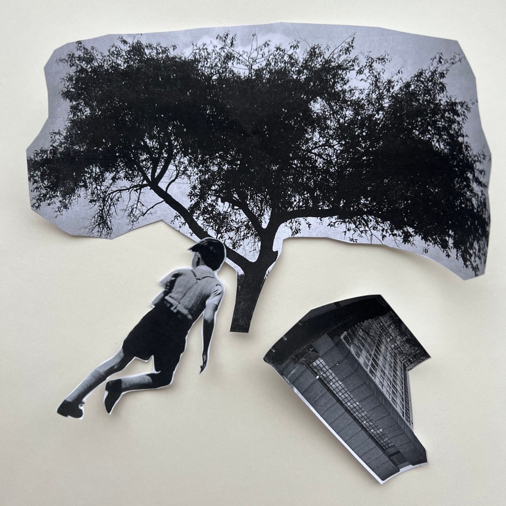
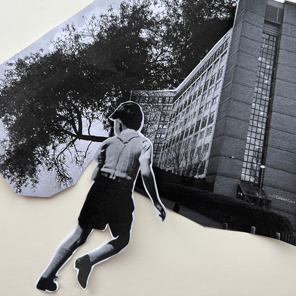
The tree is big and dominant in this composition, it’s covering the space on the top, and creates a shelter over the smaller objects below (allegory to the Hanging Gardens of Babylon). At the same time, the boy is floating towards the protection under the tree, but the building is collapsing and falling down to the right corner.
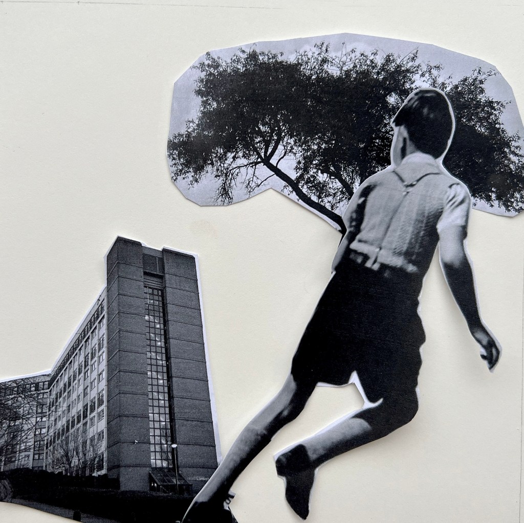
The boy is pushing away from the side of the building, and the dynamic is going from the left to the right side corner, like in a diagonal. Also, the boy is practically a giant in this composition, as he takes almost half of the space, and the bush looks like being held in his hand, as he took it away with him. I can see more balance in that collage, as the images have taken the right proportion.
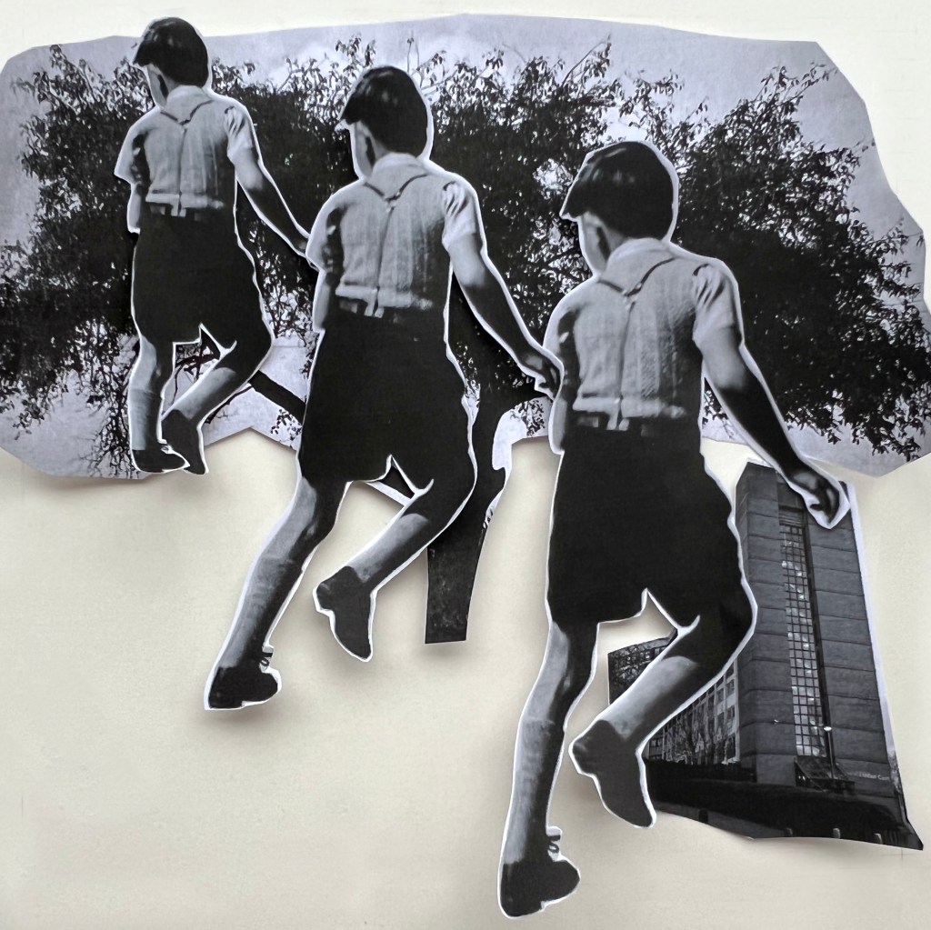
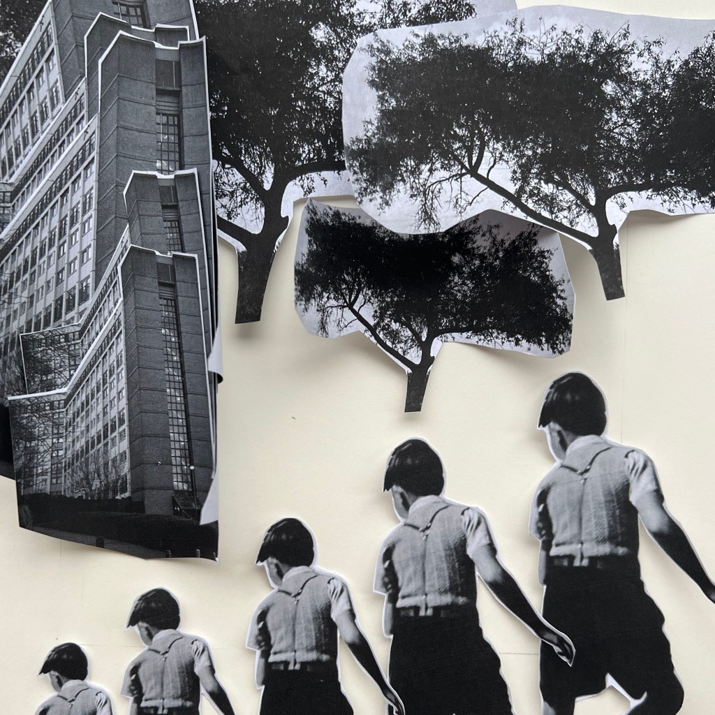
Here is an experiment with multiple-size boys, like going in the dance from the bottom right corner to the left top corner. I wanted to create the illusion of something disappearing on the top, almost going into the sky. The building is smaller and not significant in this composition, but the nature and broad foliage dominate from above. Diagonal composition, the illusion of direction from the right bottom corner to the left top corner.
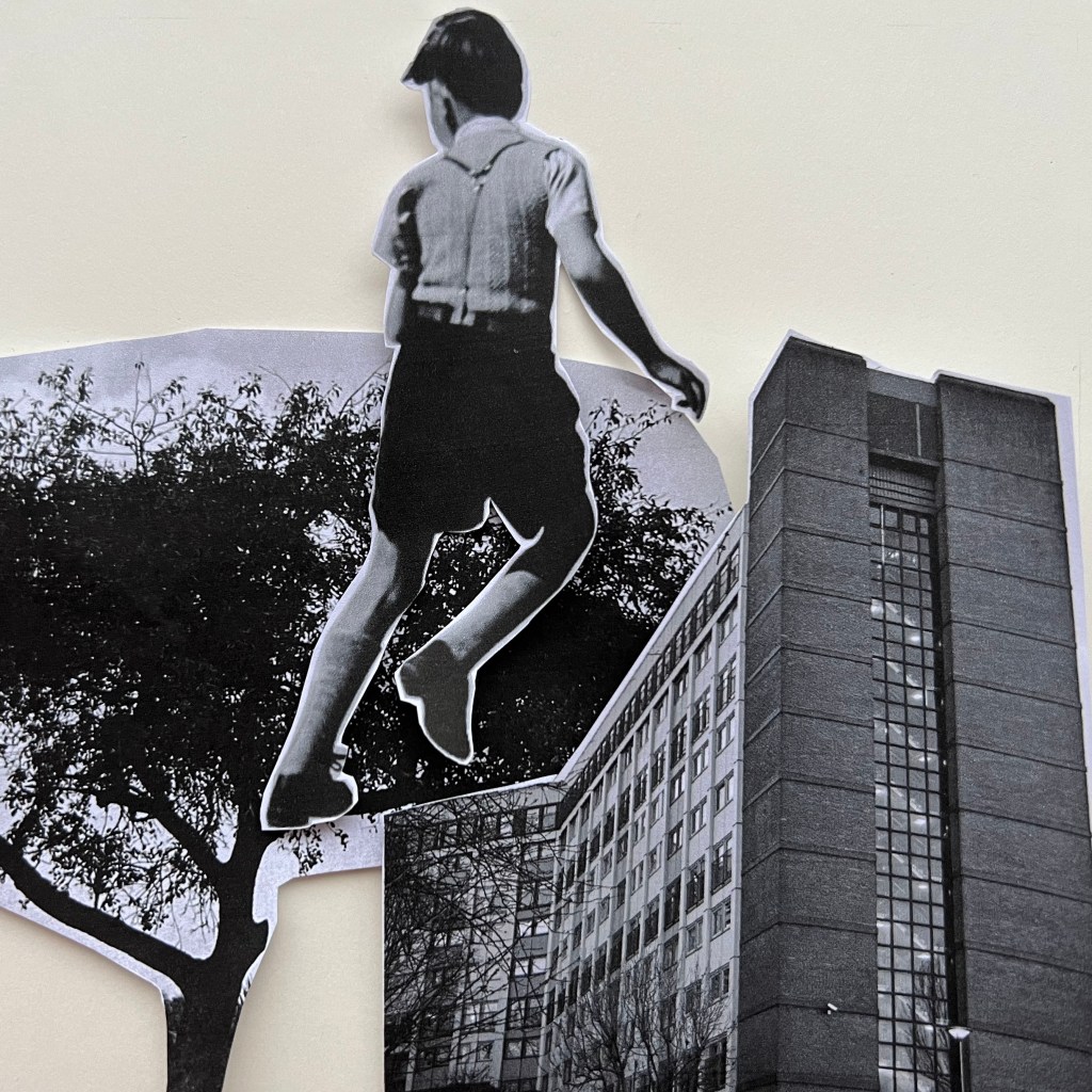
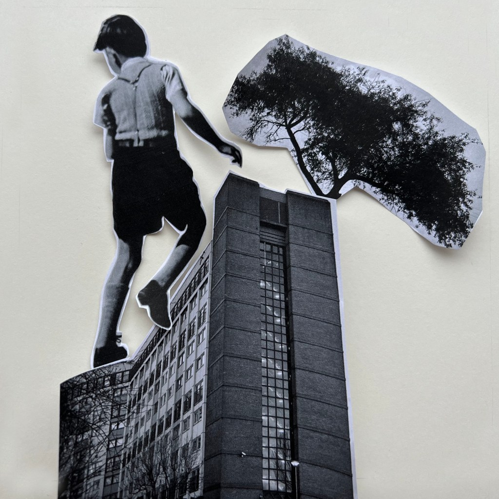
Here is another play on the giant person, like the Gulliver in the Land of the Lilliputians story. The boy is so huge and dominant, he can walk on the walls of the multistorey building, climb to the top and look over the bush to find out what is there, behind the tree? But the building itself is quite heavy and takes a good proportion of the collage as well. The composition is busy in the bottom half, but from the top is quite empty, only the boy’s head is sticking out and creating the vision of curiosity.
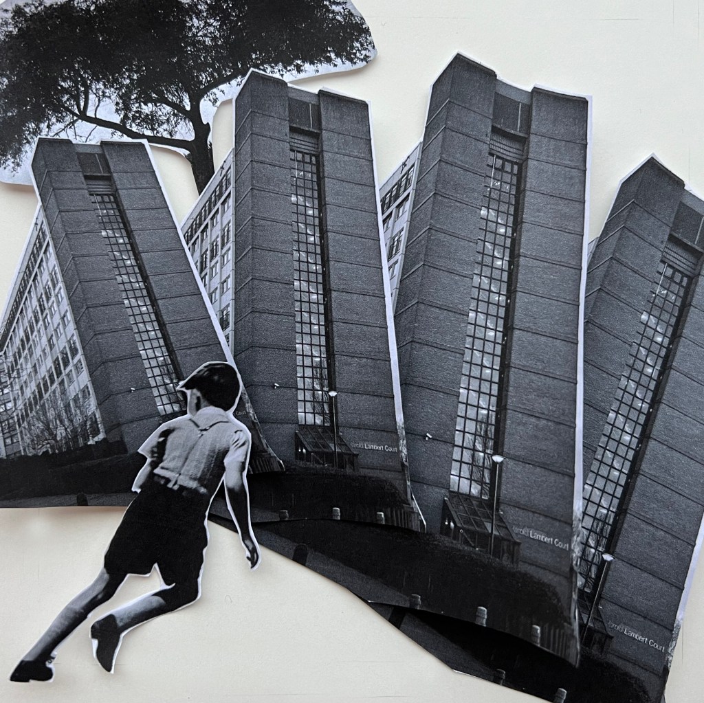
This is quite an interesting experiment with buildings going in a circular arc shape, and a tree sticking out at the top symbolising the dominance of the man’s made constructions in the city. I thought that could be a representation of the urbanistic environment, that buildings and constructions dominate the cities, and there is a lack of nature around it. The boy looks like he is playing some sort of game like running, touch and run or playing football, surrounded by stone jungles around him. Buildings are taking first place in the hierarchy here, the boy has his comfortable space in the bottom, corner, but he is less visible.
This collage is similar to the one I designed with the boy in a diagonal that pushes away from the building, but because the proportion of the boy is smaller compared to the previous one, and his location in the centre makes him look like he is flying away from the building, that is moving towards him, like a heavy train or locomotive. In this proportion, the boy was made to look like he is almost escaping the danger.
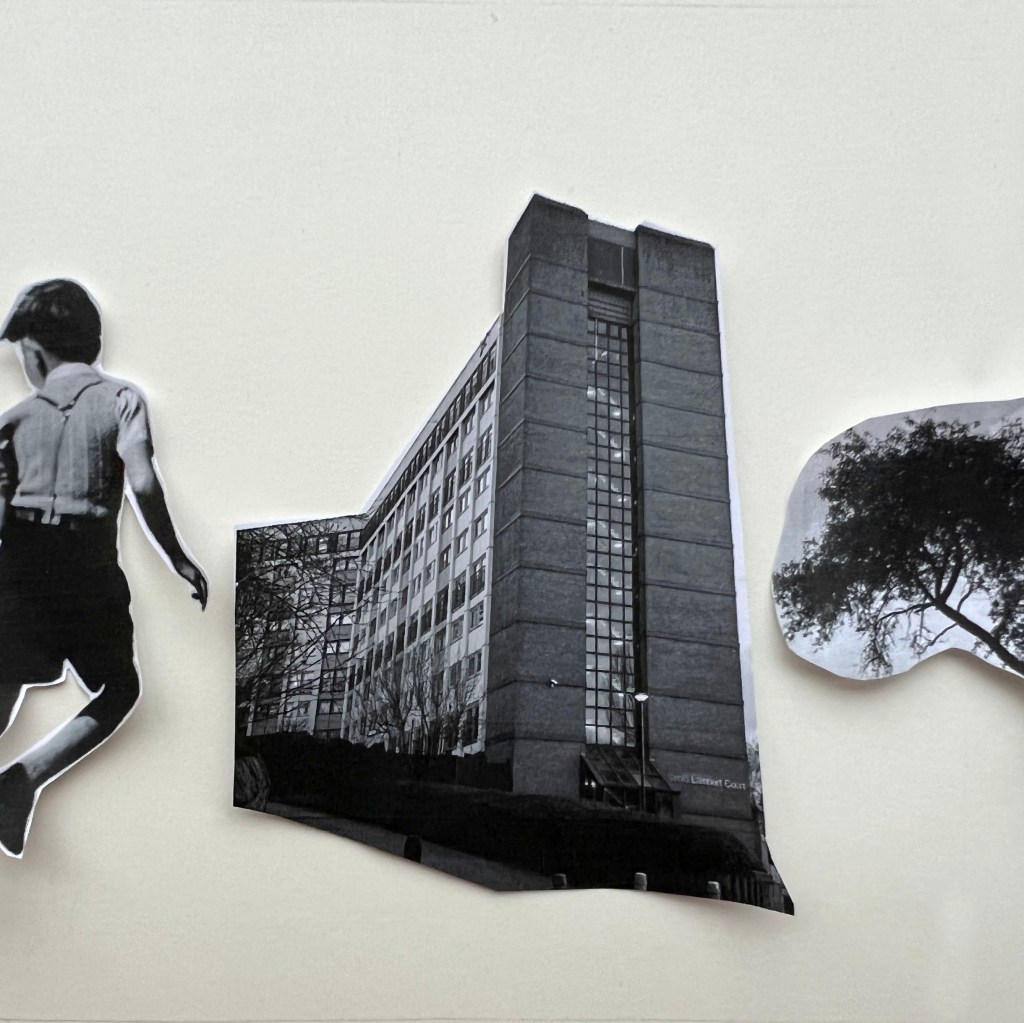
It’s like changing slides in a camera that goes from left to right, which is shown by a spotlight on the wall, at the moment the focus is on the building, but the boy is coming next. Objects are located in the centre and go in a line from left to right. This is lined-up composition and looks static to me, even though it’s not tied to the ground.
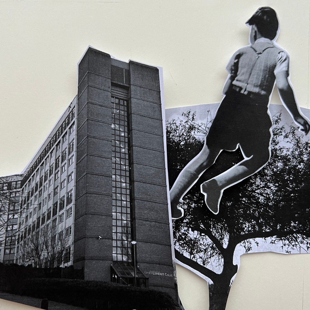
This one looks like a boy is an Olympic champion and jumping over the abstraction, which is the tree and little building in the corner. The boy is floating over the object below, he is dominant in the composition, and looks like he is reaching victory.

Here I wanted to create circular compositions with some parts sticking out from different sides, more similar to the juxtaposition collage. The image altogether looks chaotic and makes you question what’s happening here, it could be happening in another reality, where we don’t have the usual 3-d dimensional world, where rules are different, no certain horizon to rely on, and no identification where is the bottom or the top. Everything was disordered but forces you to follow.
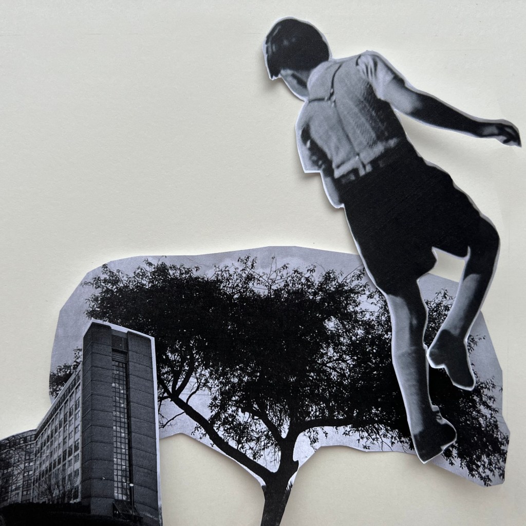
The boy looks down like did I forget something there? He is going to the top, to reach his target, which is the tree, but he keeps on looking backwards. The composition goes to the top, like pointing an arrow from the ground to the sky, with the main things happening closer to the top.
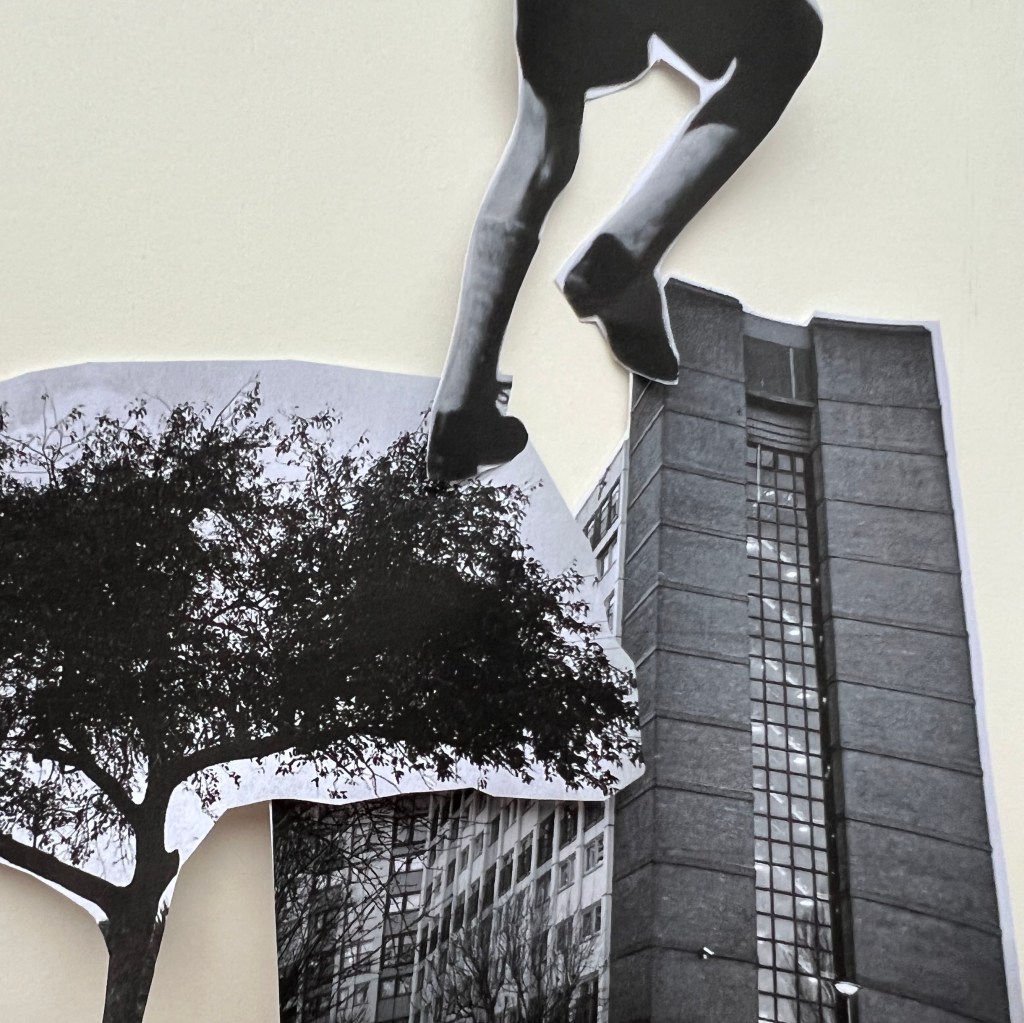
The boy is like a giant in this picture, he walks over the top of the buildings, like from the film Godzilla, he is scary and so huge, that his head can’t be seen, it’s above the vision. Looks like he came to destroy the surroundings and the city. The boy makes a step like a giant leap from the tree to the top of the building to go somewhere higher. Even though the boy has only his legs sticking out, the hierarchy on him, as he that is something extraordinary and out of place, despite the fact that the tree and building are quite big and heavy below, they are located on the ground, and look steady, compared to the “walking legs”.
In this diagonal boy composition, the boy is again at the centre of attention. Looks like he is crossing the sheet and objects below and at the bottom clearing a space for him. My doubts about it, as in terms of space organising it doesn’t look complete, like it’s missing the vocal point, even with the accents on size, like the big image of the boy, and small floating building on the top.
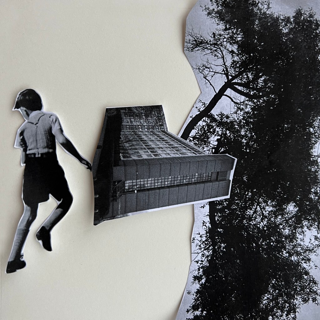
The boy is a superhero here. He is so strong, that he could take the tree and the house to lift them from the bottom and take them straight into the air. One of the not many collages, where the boy is smaller than the tree and the building is attached to the ground. I think these proportions and angles create a visually pleasing composition, with the right balance between images. The boy is in the foreground and the building and the tree are slightly at a distance. I think this is the right dynamic between objects, the angle of the running boy, and the angle for the figures such as the tree and building are working well together.
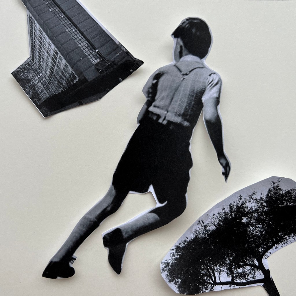
Another example of chaotic composition is when the tree is disproportionally huge, taking half of the spread, the building is too small and tilled on the wrong side, and the boy is located at the edge, facing outside of the space. I’m not sure whether this composition can bring much sense, as it’s hard to see the concept or balance in it.
Questions to answer:
How does your sense of the image and its meaning change when the figure is smaller than the other elements?
Smaller objects create the feel of less importance in the composition, as naturally we are connected to the bigger objects, as they attract more attention. In comparison, when the object is too small, but surrounded by bulky, and heavy objects, that’s the time you can get attracted to the small object, as it stands out compared to others.
If the elements are at differing angles to each other and at an angle to the frame, what dynamic is suggested?
That creates an extra dynamic to the page and also can bring slight chaos to the composition. I think if the composition has its path, even different angles images can create a balanced image, but the messy placement of the objects without the consideration of the composition can create the opposite of the dynamic effect.
If all the elements are entirely horizontal and vertical in relation to the frame what dynamic is suggested? What is your opinion about this image and in what sense does it communicate?
I think it suggests that the aim of the composition was to bring balance and stability, over the dynamic or creativity. Those types of compositions are static, and also could be straightforward, and useful when the artist wants to bring a sense of realism.
Which is your favourite composition? Explain why you feel it is the most successful.
For my favourite image, I hesitated between two collages, where the boy is surrounded by stone jungles and the one where I visualised him as a superhero. The story of the stone jungle boy, where nature is disappearing, the only one tree, and the small, less visible boy in the corner is more realistic and reminds me of the world where people live in big cities and megapolises. Meanwhile, the image of the boy, which is a superhero, lifting a house and massive tree above him, brings an allegory or more fantasy meaning into it. I went with a fiction story collage. I think the proportions of the building, the way it tilted and the wide crown of a tree in the background, create a visually pleasing composition. The boy is in the foreground and the building and the tree are slightly at a distance. I think this is the right dynamic between objects, the angle of the running boy, the angle for the figures such as the tree and building working well together, and the balance between busy areas and void spaces.
