
The brief
To create images which will be used within a campaign for a supermarket, to package and promote a range of seasonal foods. The supermarket is respected for the quality of food they supply. They want to promote this notion of quality in their design and packaging. The finished images will be a ‘point of sale’ display sited in a store near to the fruit and vegetables. The final reproduction size will be 12 x12 inches. Your artwork can be same size or in scale.
OCA Illustration
This assignment serves as a culmination of the skills and knowledge I’ve acquired from various projects and exercises in the second part of the Key Steps in the Illustration unit. Food illustration is one of the most vibrant, exciting, and natural forms of object drawing an illustrator can explore. Nature offers a rich array of colour variations in fruits, berries, vegetables, and all types of plants, ranging from the primary greens present in new growth to the myriad shades of purple, red, and pink. I believe this assignment will provide ample inspiration and be a true source of enjoyment.
To begin, I needed to analyse the brief, identifying key concepts within the exercise.
Artists
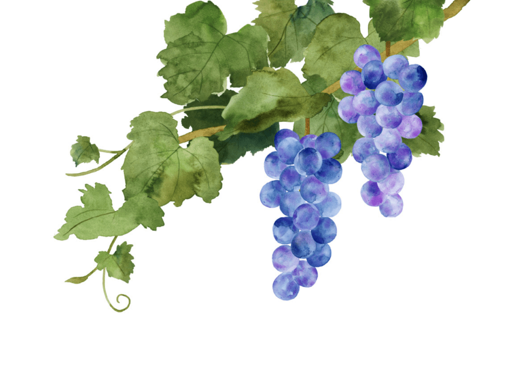
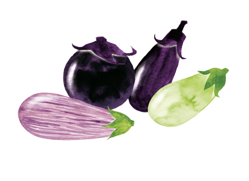
The next stage involved researching other food stylists and illustrators. I noticed that artists in the food illustration generally fall into two categories: those who use watercolours and pencils, and those who prefer drawing software on their iPads. This is something I always wondered about, but as I have never tried it or tested it before, I thought it would be a challenge for me to use new tools, and due to the lack of time I decided to stick to my usual techniques in pencils and watercolours usage and then finalising my artwork in Adobe software.
Miho Matsuno
Miho Matsuno is a Japanese artist known for her beautiful watercolour techniques in food illustrations. Her paintings are vibrant, airy, and inspiring. I admire her naturalistic approach; each object is rendered with precision and tenderness, showcasing a stunning interplay of light and shadow that highlights the most intricate details. Miho’s art is versatile, making it suitable for both modern advertising and classic storytelling literature.


Assessed 03/11/2022. Source: https://matsunomiho.myportfolio.com/work
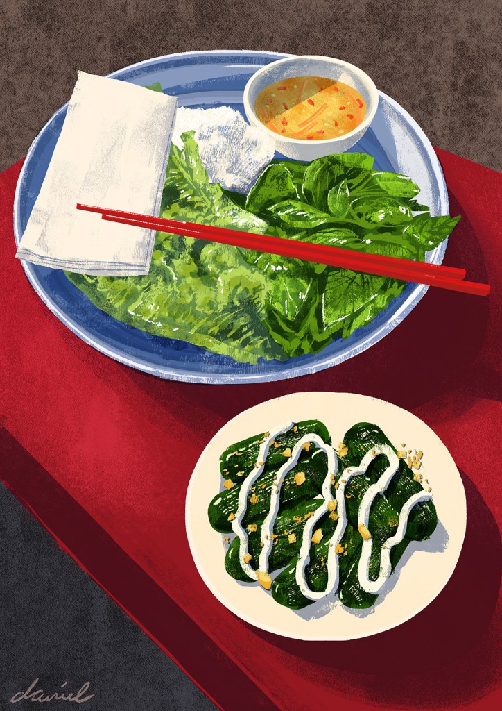
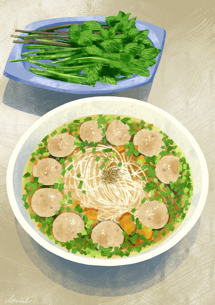
Daniel Tingcungco
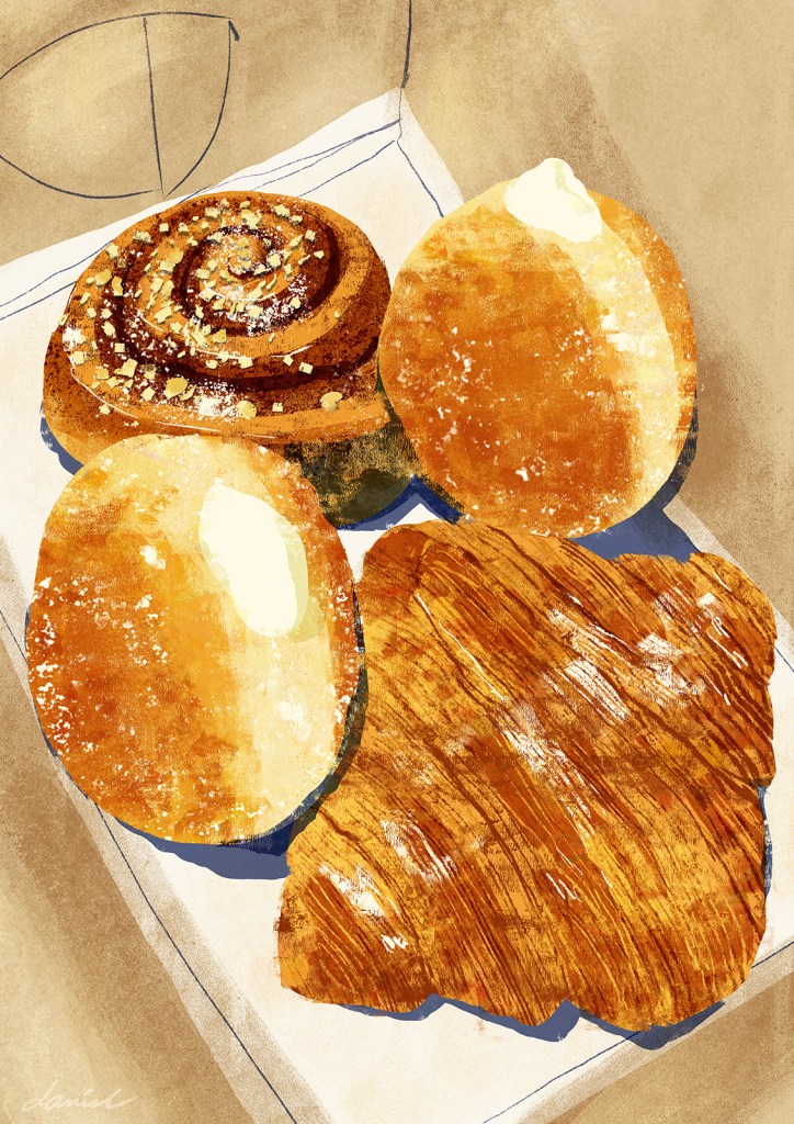
Daniel Tingcungco is an illustrator from Vietnam. I stumbled on his works whilst I was browsing for food illustrators on Behance, and I couldn’t go by. These are tasty, appetising and realistic paintings made on iPad, but also those works still have a feel of crayon usage.


Laura Balcerek
Graphic designer and illustrator Laura Balcerek is based in Glasgow. If I had to choose one word to describe Laura’s work, it would easily be “whimsical.” Whilst she is not so much a food illustrator, each of her works comes filled with playful characteristics, bright colours, and cheeky details. Her illustrations look as though she dreamed them up with crayons and pencils on paper, but often they’re created digitally, which I find charming.
Spider diagram
This assignment requires me to demonstrate quality and create an appealing point-of-sale display. The supermarket caters to a specific audience and aims to maintain its high standards. To begin, I decided to use a spider diagram to consolidate all my ideas into one cohesive concept, allowing me to identify the main theme for the future design.
I divided my brainstorming into two sections: summer and autumn designs. This approach enables me to focus more effectively on each season’s unique characteristics.
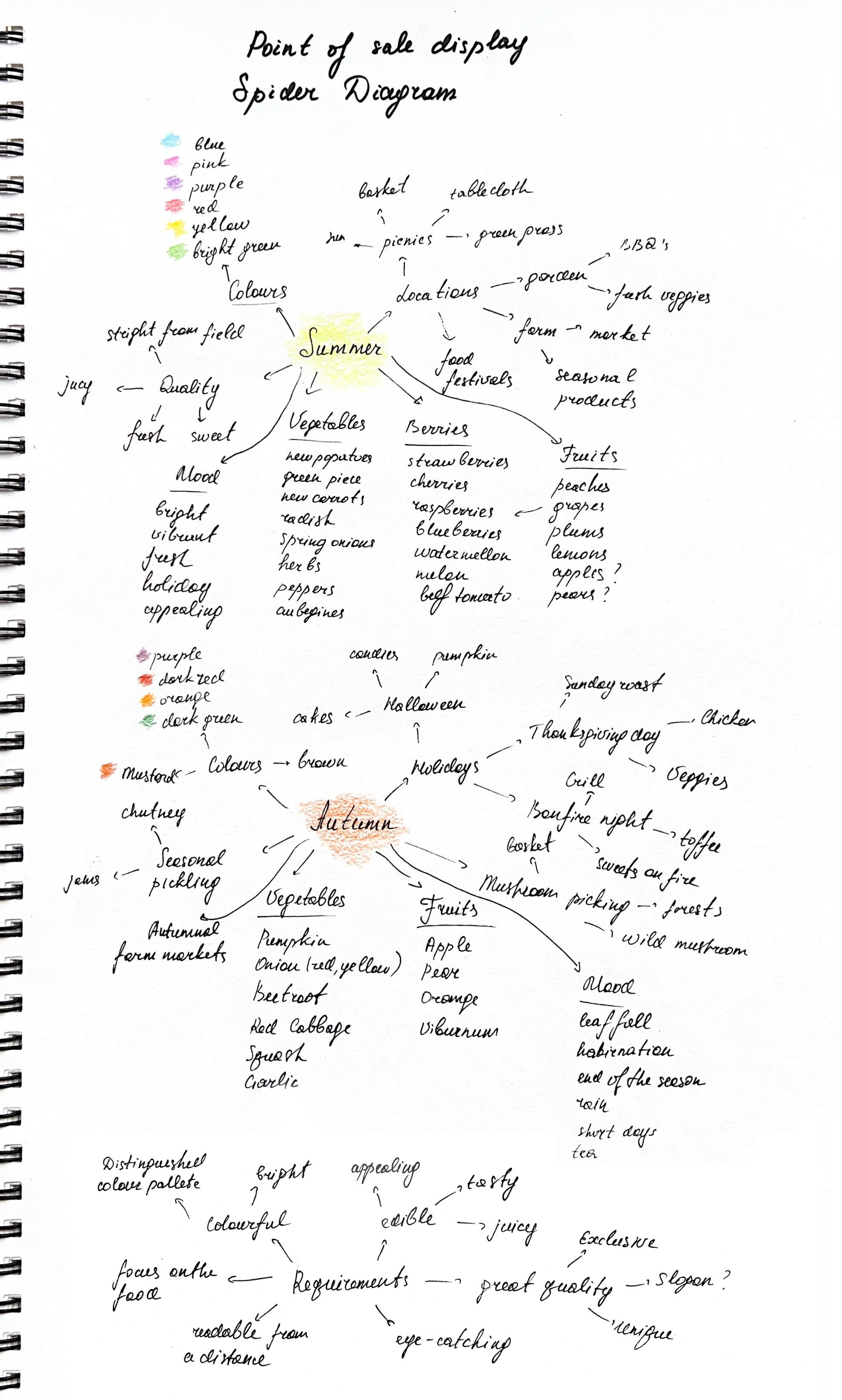
After gathering some ideas together, I thought that I should concentrate on the local product qualities, celebrating the richness and opulence of the natural harvest from local fields, groceries or farmers before it gets into the supermarket, and after to the customer’s hands. My idea was to celebrate the efforts of the communities, when everyone comes together in order to provide high-quality food standards, with such qualities, as fresh, natural, juicy, appealing and healthy. I wanted to demonstrate characteristics of food and vegetables through bright and appealing colours, that would motivate buyers to make their purchase.
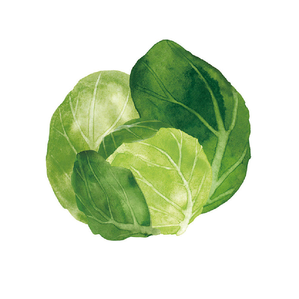
In terms of composition, I was thinking of creating a mixture of food and vegetables for each display, also avoiding the exotic type of products, that are not grown locally, for example, such as pineapples, coconuts, etc, but demonstrate fruits and vegetables such as apples, pears, beetroot, cabbage. In each design, I wanted to create the main point, like a queen or king of vegetable objects, which would stand out in composition with the colour and size, and some complimentary groceries around it.
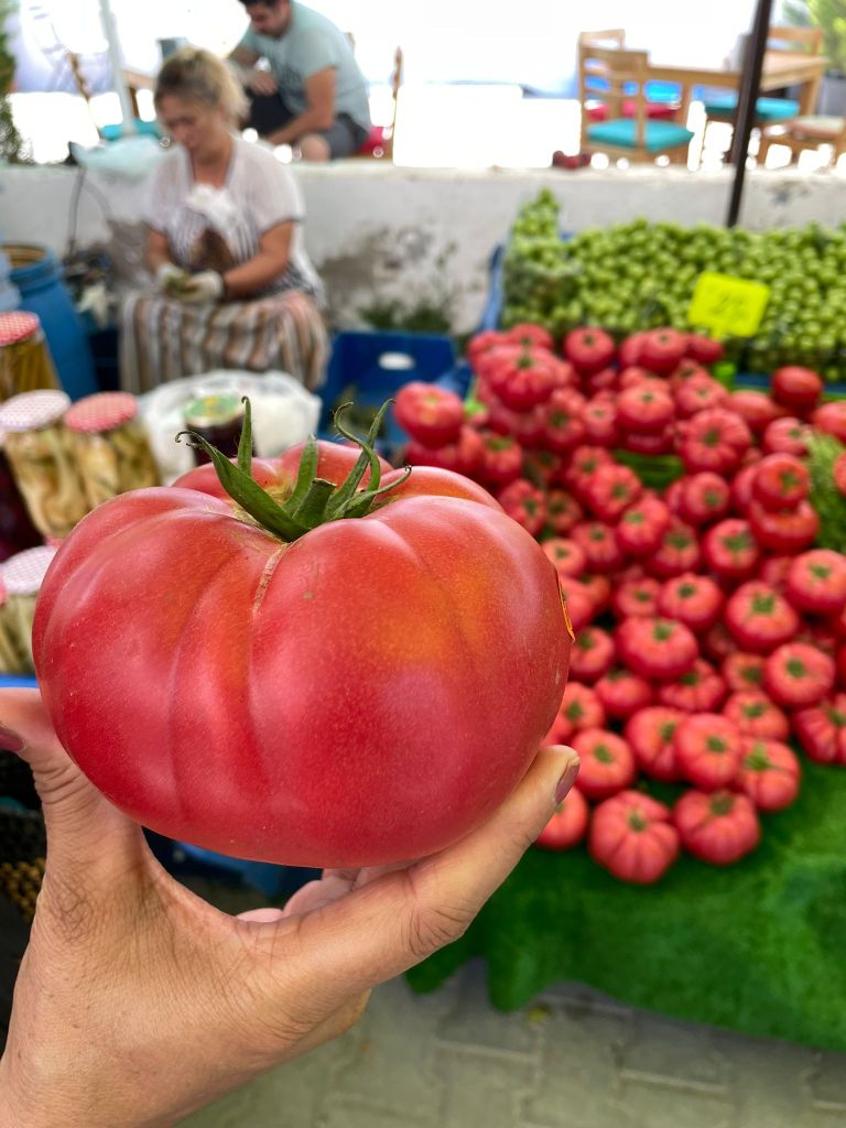
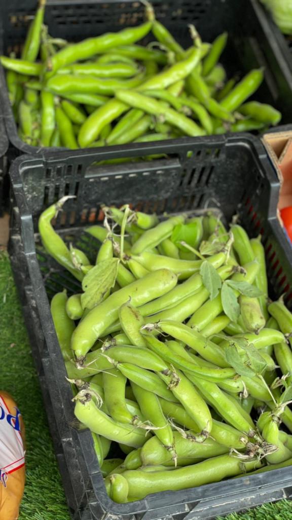
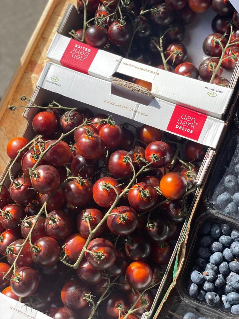
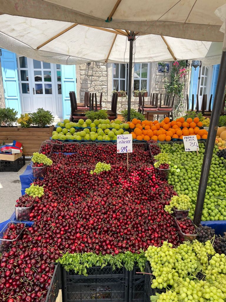
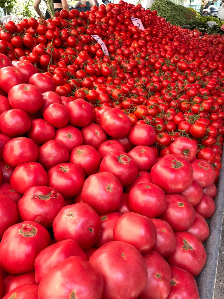
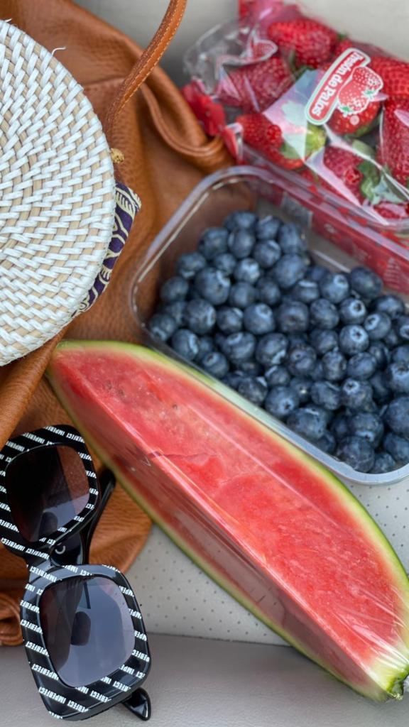
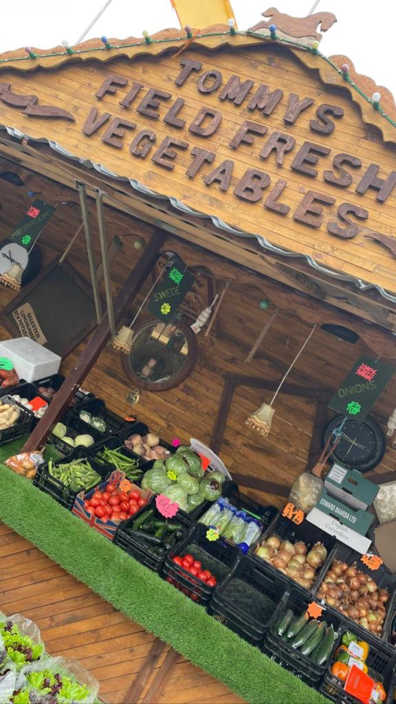
Seasonal farm photography collection
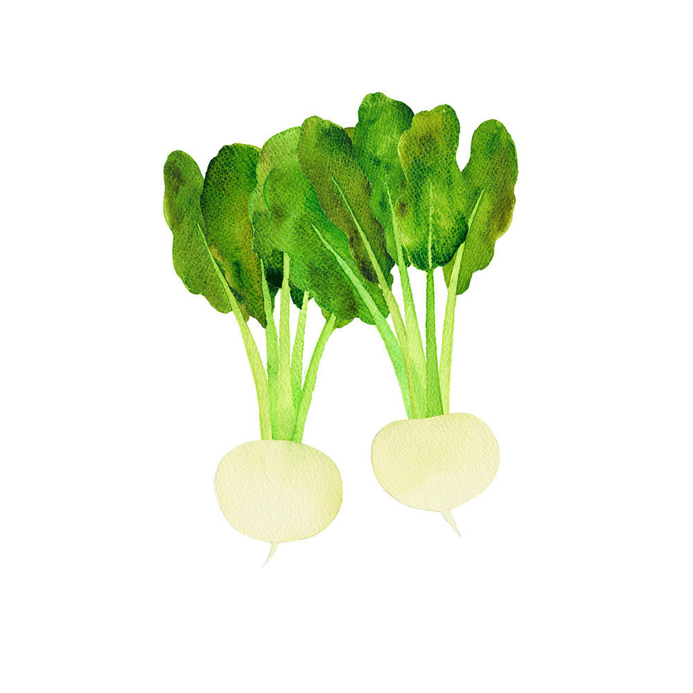
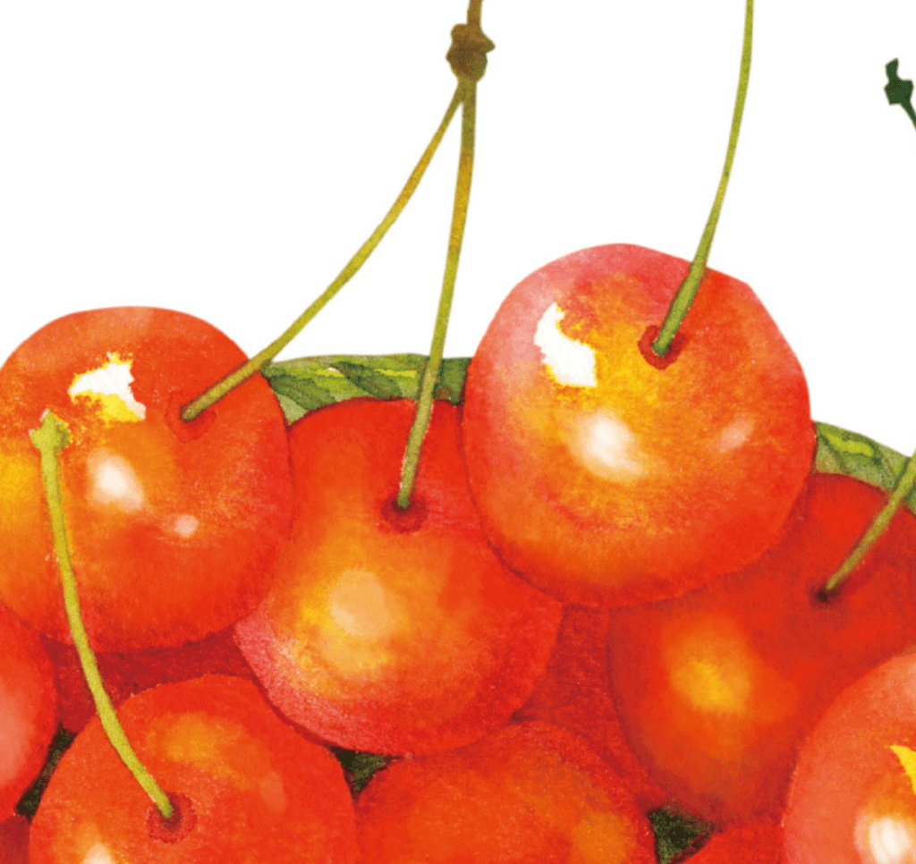
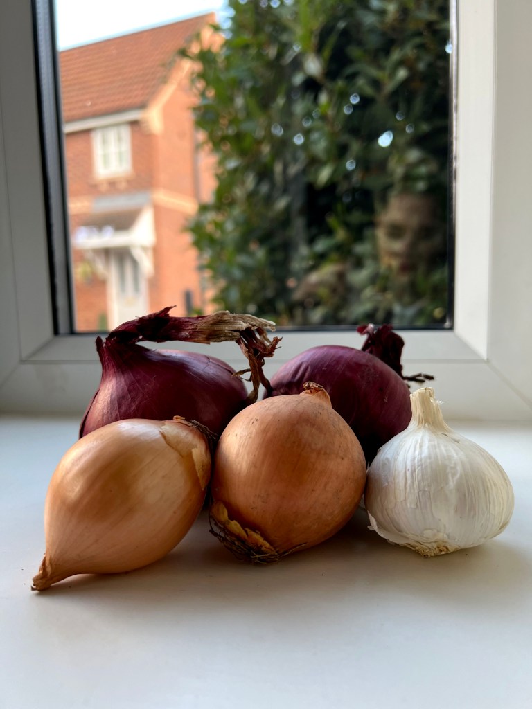
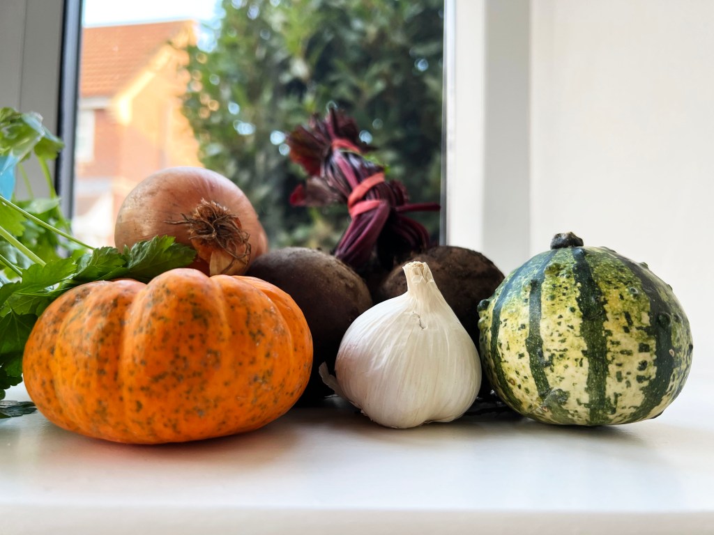
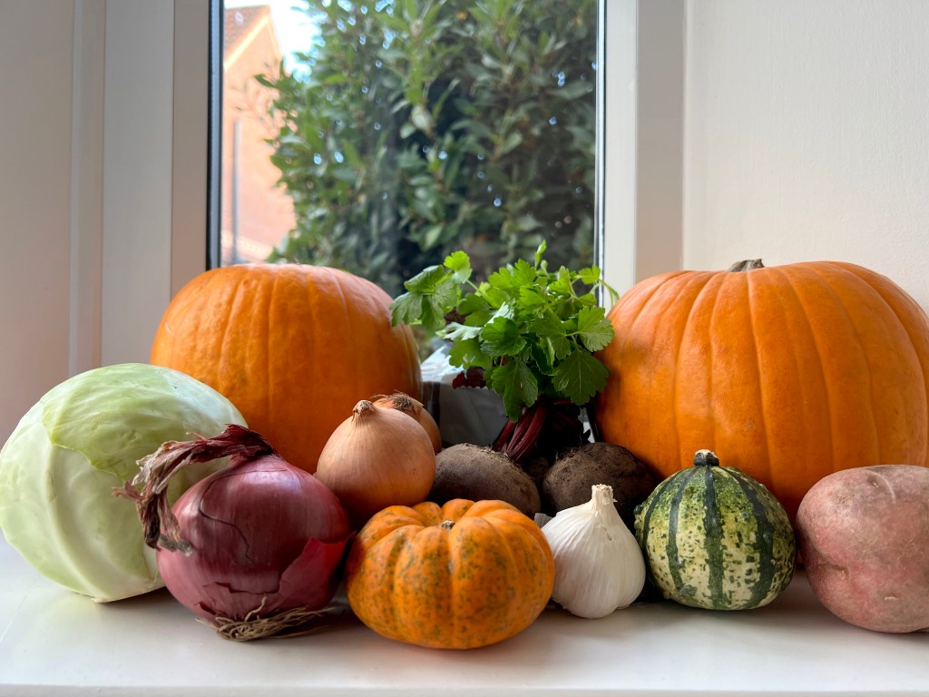
To make my designs unique and exclusive I needed a collection of personalised photographs. I thought would be useful to go through the photographs of groceries I have on my phone, as I tend to photograph some eye-catching food displays, that I go by during the season in the central parts of different cities, markets or farmer’s shops. Also, I have a good friend Sarah, who is an amazing baker, and a regular visitor to the local farms and seasonal festivals. She kindly donated photographs of a variety of different vegetables I could use for my sketches. Those photographs are juicy, bright, full of happiness and healthy eating, I call them natural vitamins. I divided those photos into two groups, for summer and autumn sections, so I could see which vegetables I would use in my compositions for each display, and see colour patterns for both seasons.
Summer


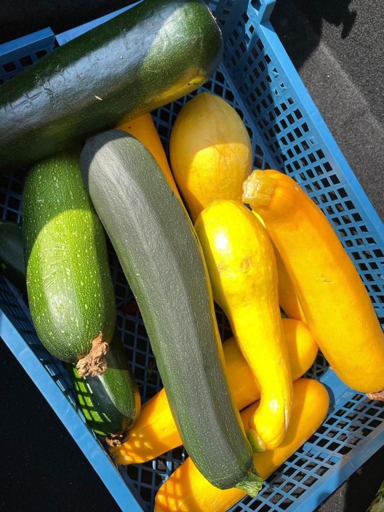
Autumn

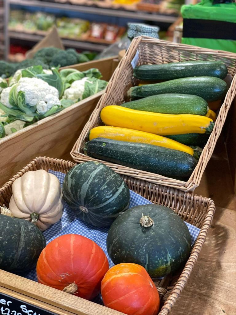
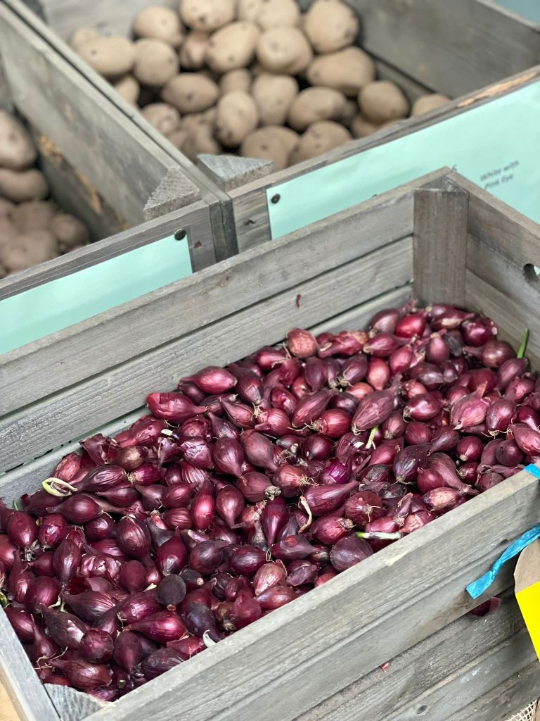


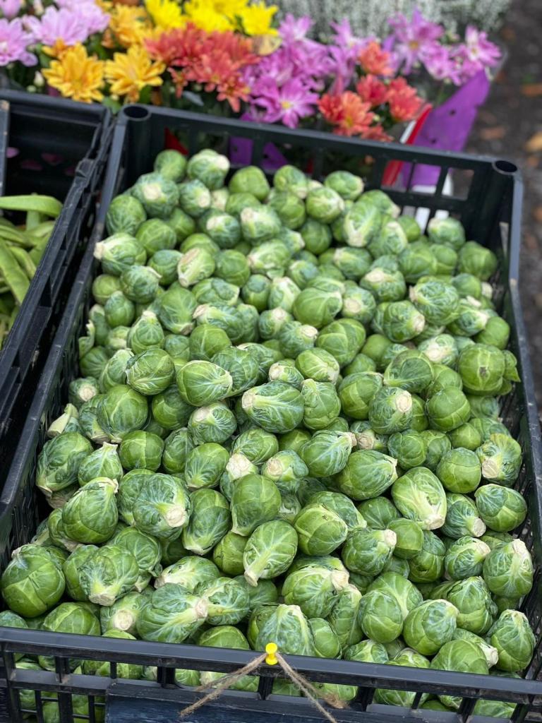


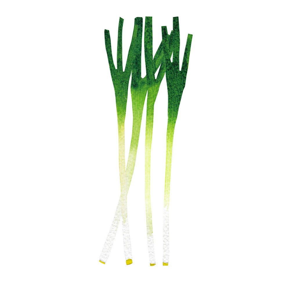
Those collections show that summer fruits and vegetables display mainly dominating bright and fresh colours, such as bright green, red, yellow, and pink. Regarding the selection of vegetables, for summer display could be used such products as red, yellow or green peppers, spring onions, tomatoes, watermelons or melons, peaches or grapes, all those sweet and appealing fruits. At the same time, autumnal vegetables display dominating darker colour palettes, such as orange, brown, purple, mustard and darker green. I wanted to play on those contrasting colours, evolving seasonal fruits and vegetables around them.
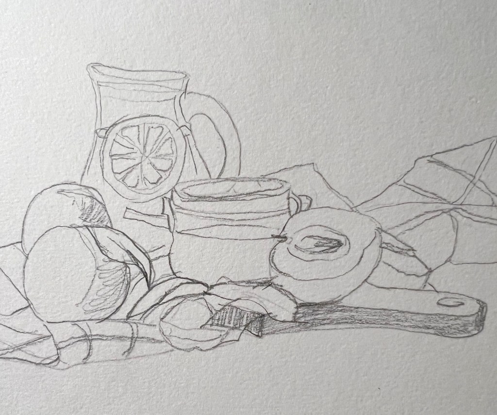
Still life
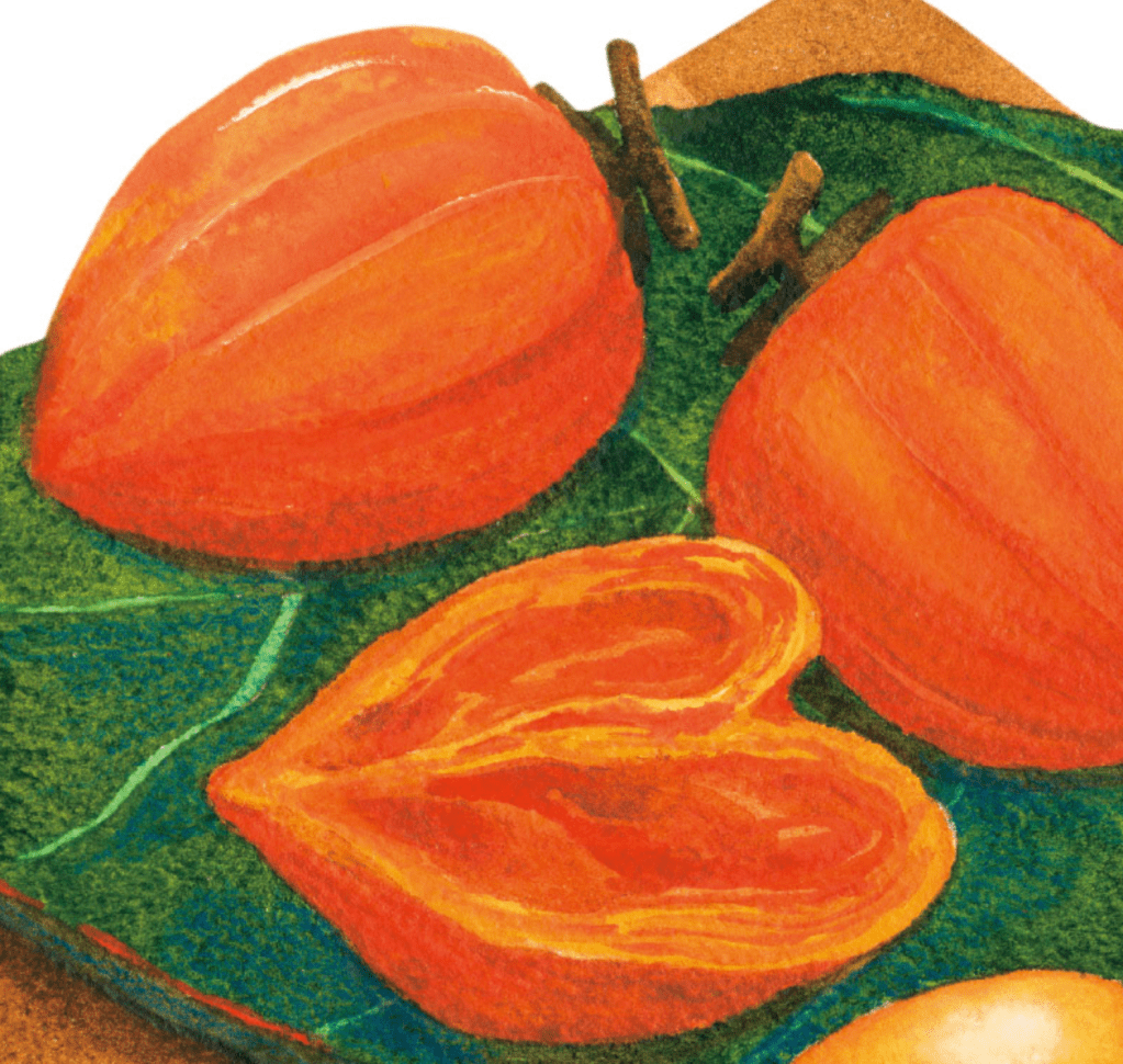
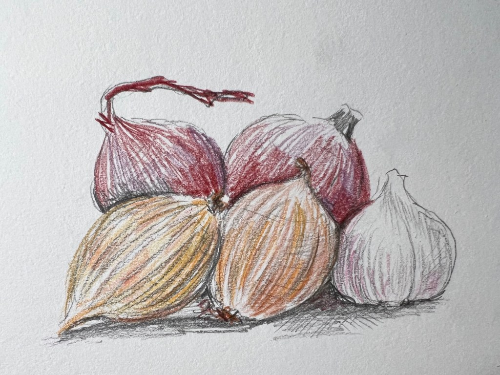
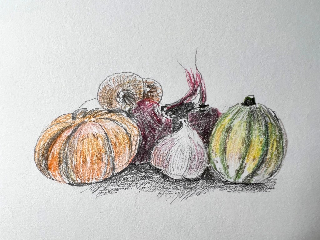
As this assignment has fallen during the autumn season and Halloween celebration time, I had some variety of autumnal veggies in my cupboard, some of them for midweek cooking, such as pumpkins, onions, cabbage, beetroot, potatoes and garlic. So I used this opportunity to create a still-life composition, to visualise the colour combinations, and object arrangements for the autumnal display.
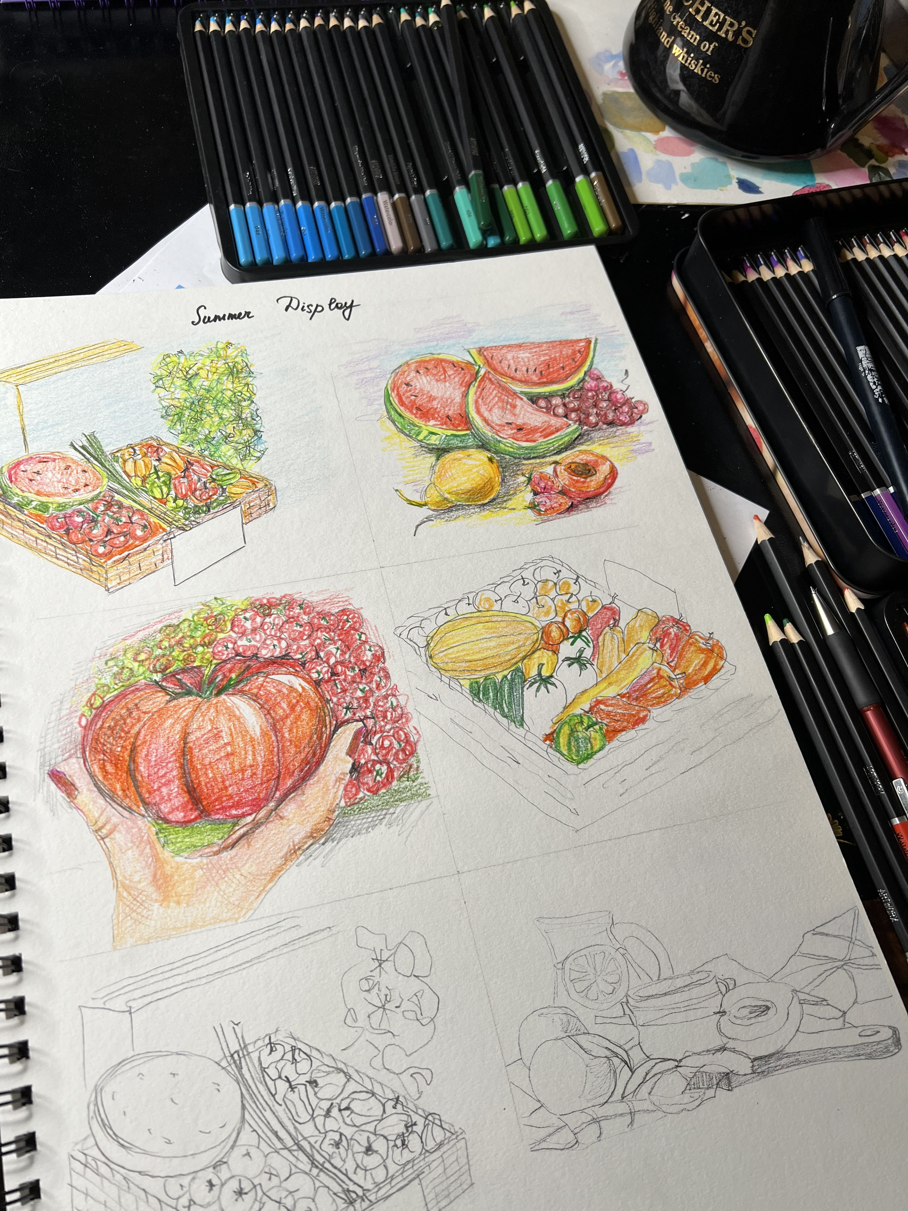
Rough Sketches
I think I was on something, so I needed quickly to write it all down. These are my 5-minute sketches of ideas I had in my head.
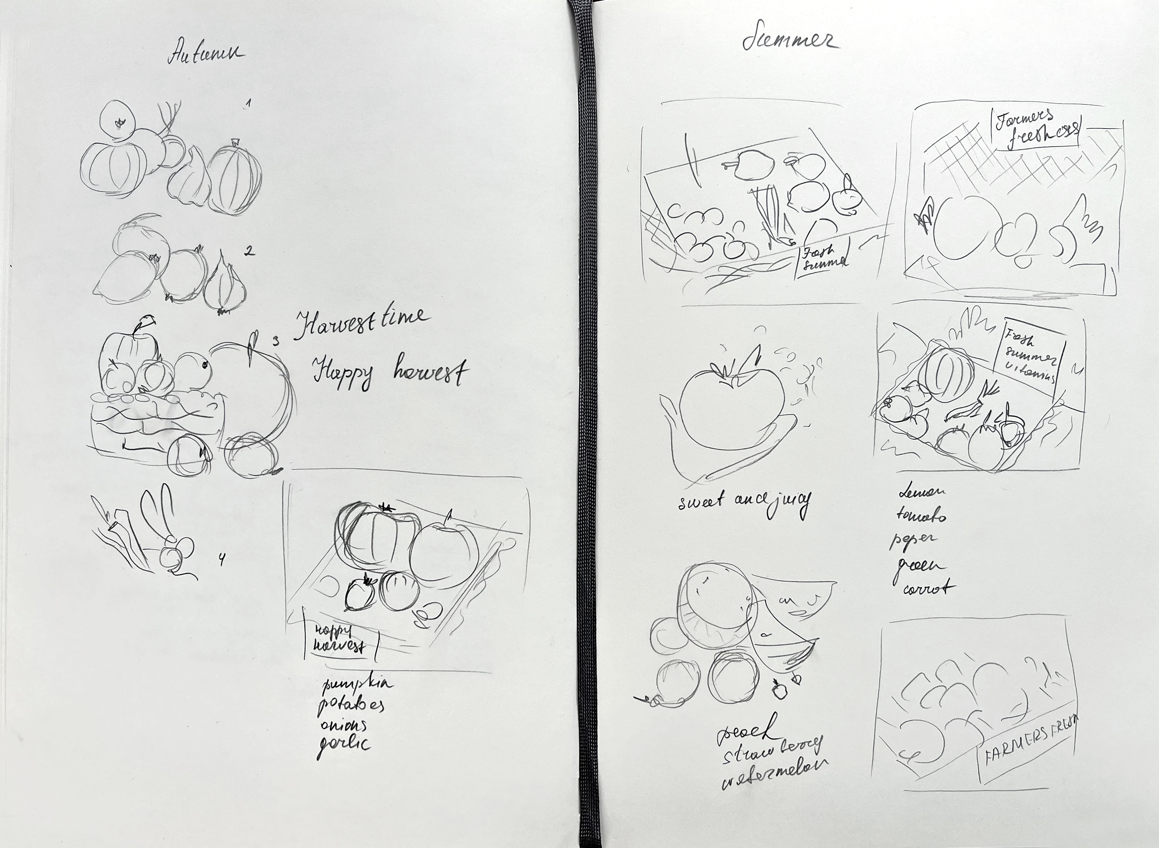
Composition Sketches
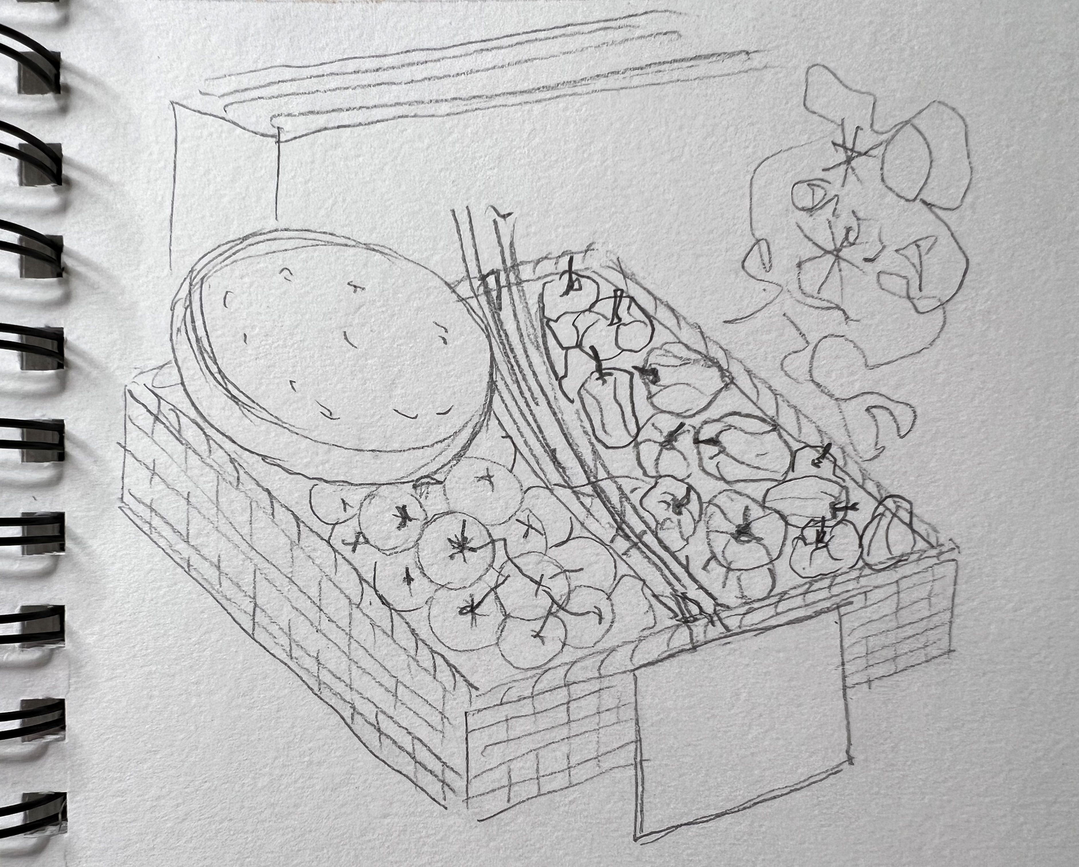
This collective gathering of information navigated me to the idea of creating a food display in a basket, with slogans similar to Kindly gathered for you, Seasonal fruits and vegetables with love, Fresh summer vegetables and fruits, and Autumn harvest. As I mentioned earlier, I intended to generate a visual of the natural origin of local products, their high quality, and good taste. I was thinking of showing fresh air in the background of the food, sunny weather for the summer display, or showing them being outdoors like the farmers demonstrating their products. Another idea was to choose the key object and place it in the foreground creating an appealing food display.
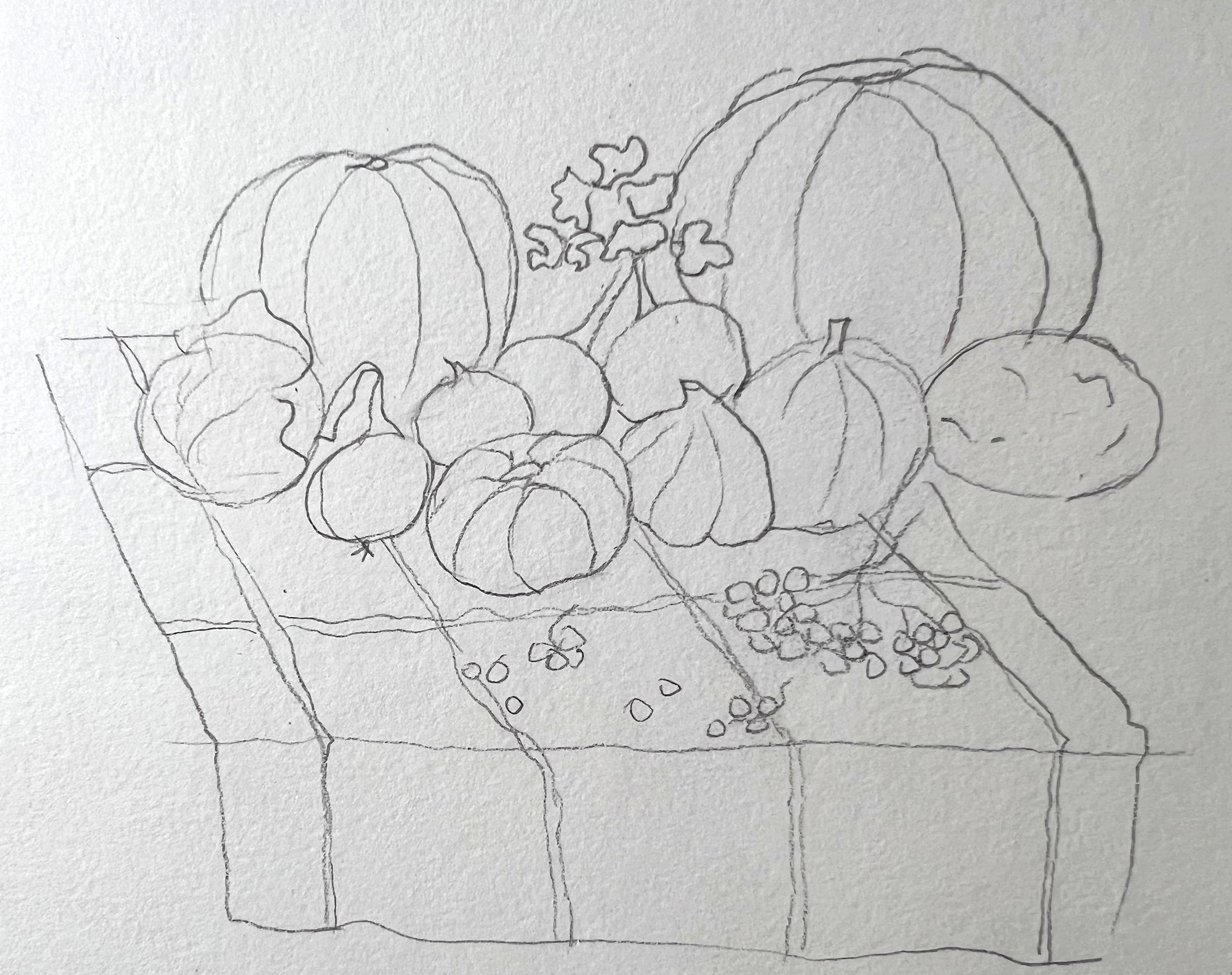
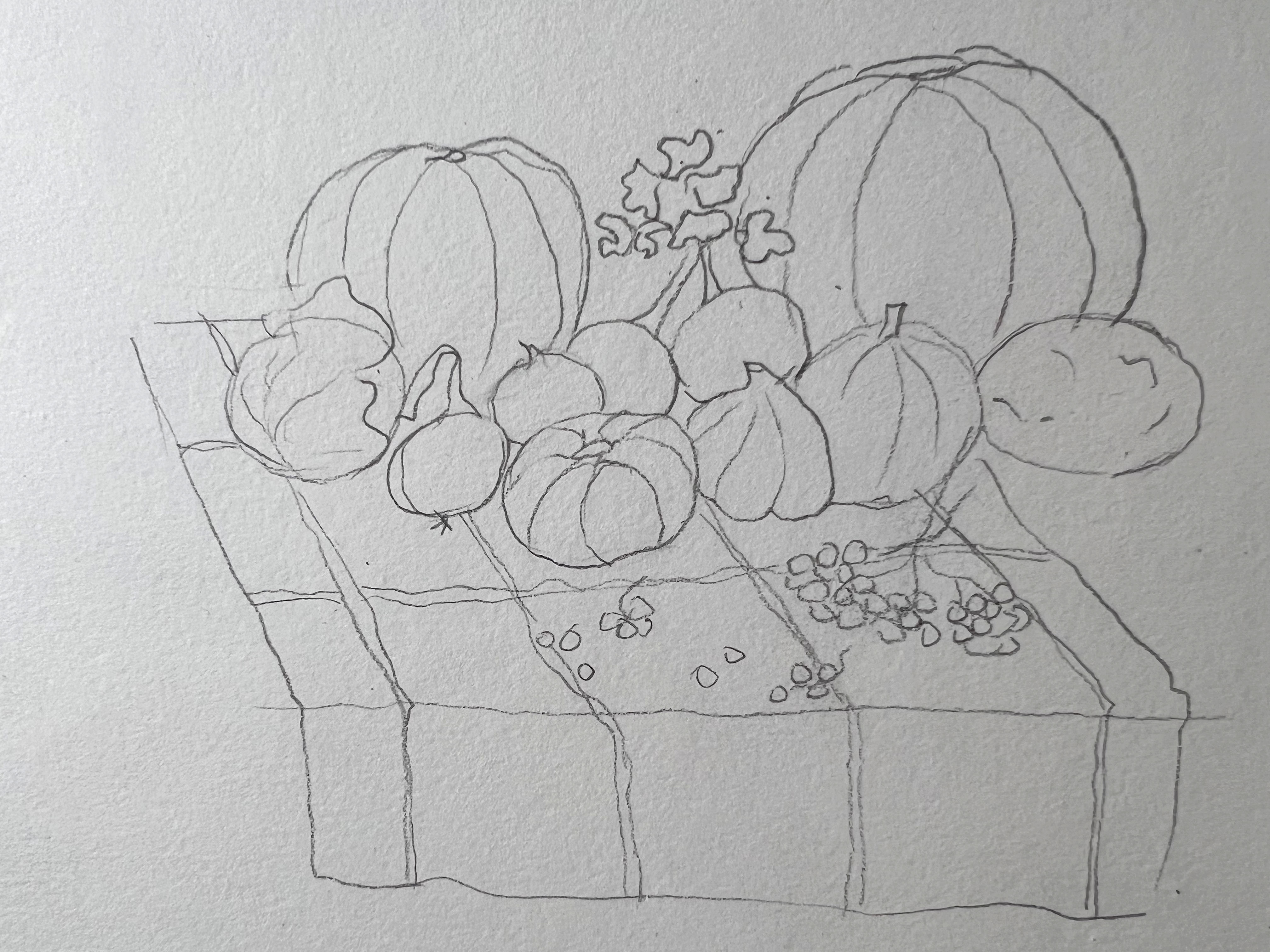
Illustrations Autumn
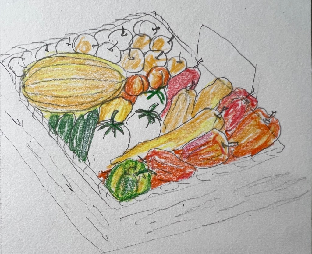
After, I proceeded to the sketches. I thought that would be useful to highlight sketches with some colours, so progressing with illustrations creates the feel of the colour too. Later, I was going to choose the composition that would stand out among others and duplicate that illustration in watercolour. For my sketches, I used watercoloured pencils, and I was surprised at how good they were on those sketches. Something that was meant to be just a sketch, turned out to be a creative solution for the display. I thought, what if I use just watercoloured pencils sketch for the point of sale display, but amend it in Adobe Photoshop for some brightness and contrast?
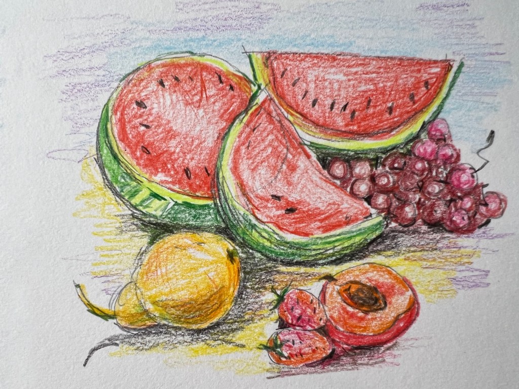
Illustrations Summer
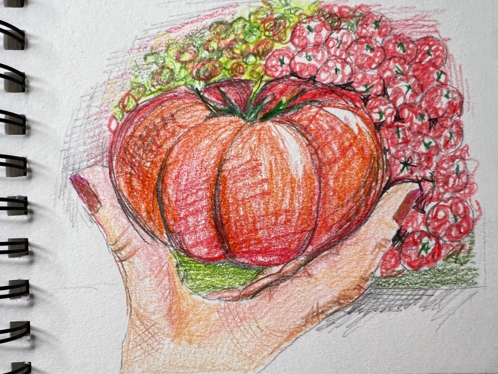
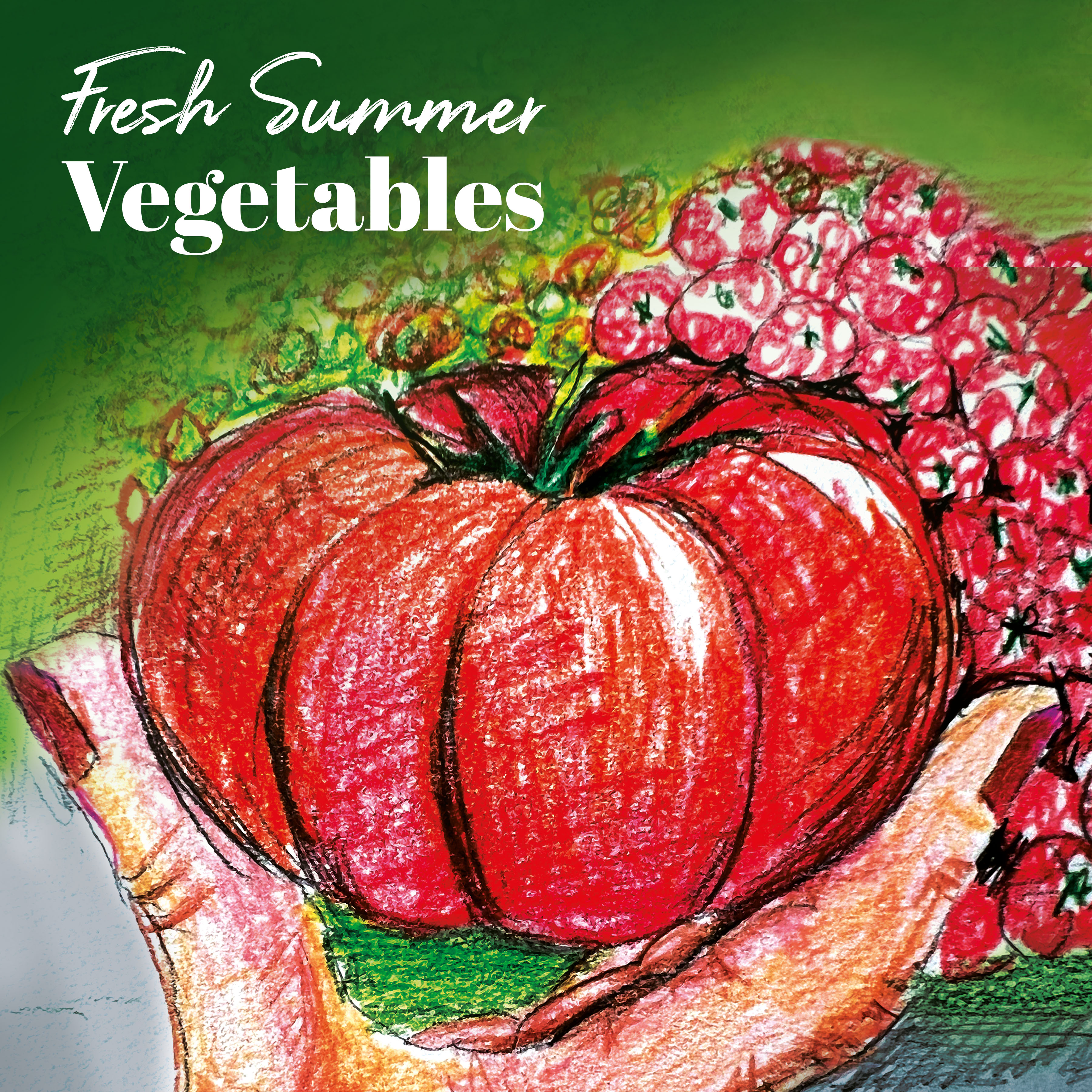
A similar principle for the food display in summer composition. I had a dominating central object and some smaller fruits and vegetables around. The one illustration with beef tomato looked quite appealing, as it was different, and had a valuable object in the foreground to catch an eye-sight. I needed to think about what two main compositions to choose for the sale displays, as I was planning to make summer and autumn visuals to be complimentary and work as a team together. Also, I liked the idea of bringing some backgrounds in my visuals, making those fruits and vegetables outdoors, like at the South food market.
Designs
I thought, that if I used those watercoloured pencils in dry, they just simply look like crayons, which reminded me of John Minton’s works. I liked this artist’s designs for his abstract trend and bold opaque colours for illustrations. Each image is filled with pen sketching and creates a mood of being drawn in a rush. That was something I wanted to learn and borrow for my techniques, and I thought that was the time when I could apply this approach.
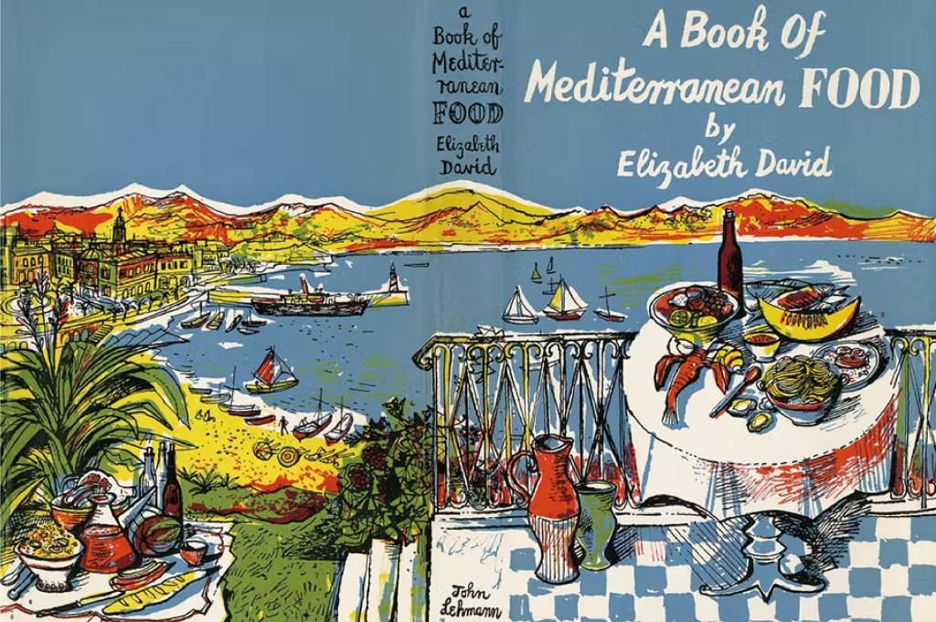
Source: https://www.apollo-magazine.com/john-minton-elizabeth-david-cookery-book-illustrations/
(Assessed 25/05/2022)
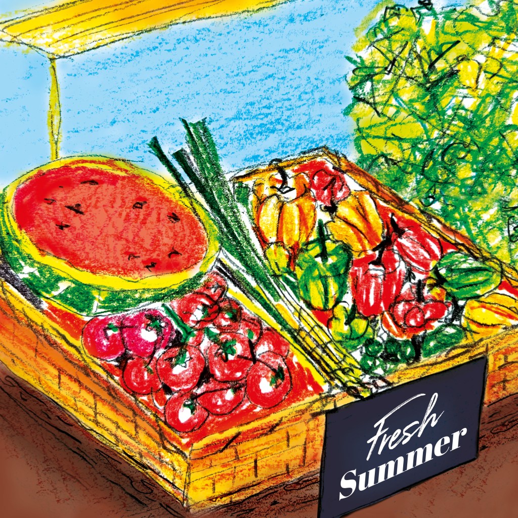
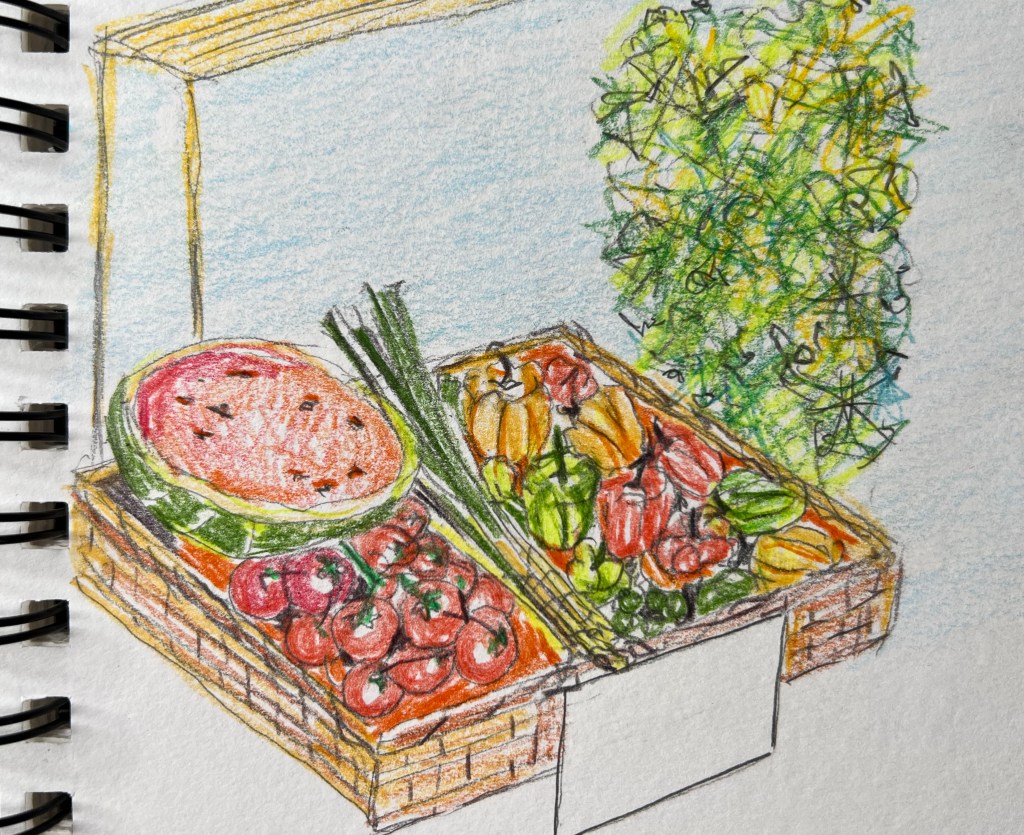
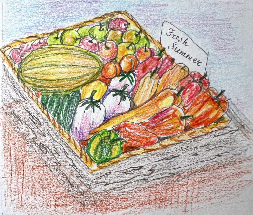
Summer Point of Sale Display
What I did next, I moved all my sketches into Adobe Photoshop, and by working with brightness and contrast, I made illustrations bolder. To bring more colours to designs I used a paintbrush tool with transparency, focusing on the colour palette of each object. I gave the colour to each object intuitively, playing with darker and lighter spots, and I also kept the white colour of the paper in some places to give the illustration a slight negligence, and quick pencil movements.
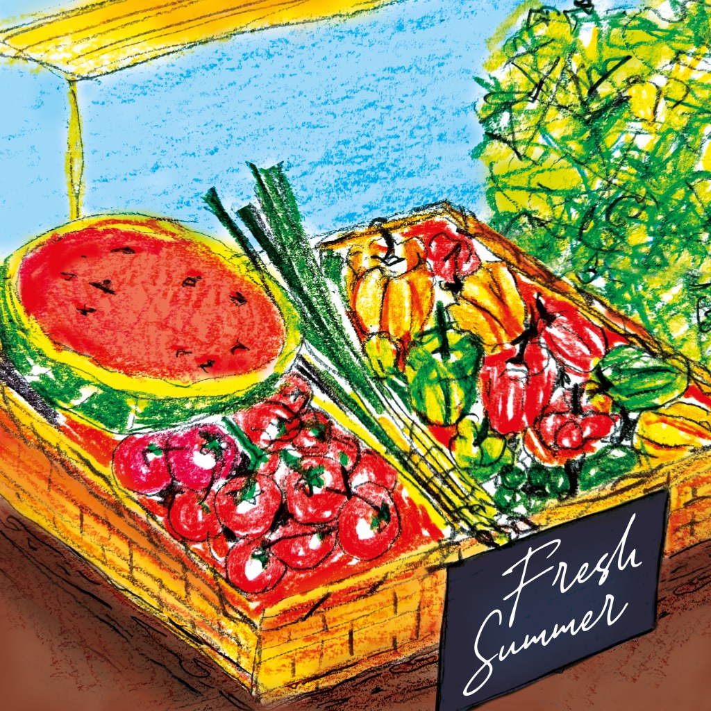
I liked both designs, but I struggled to decide which one would be my final image. I thought creating an autumnal display would help me identify the matching elements and ultimately choose the best pairing.
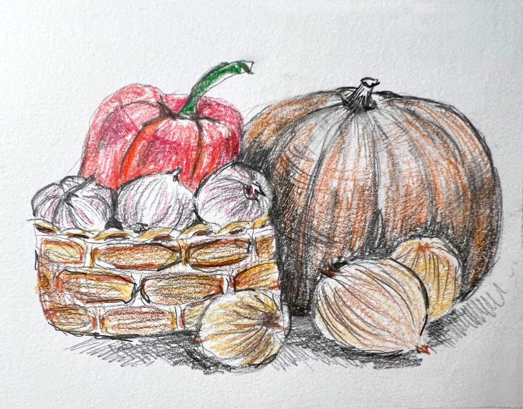
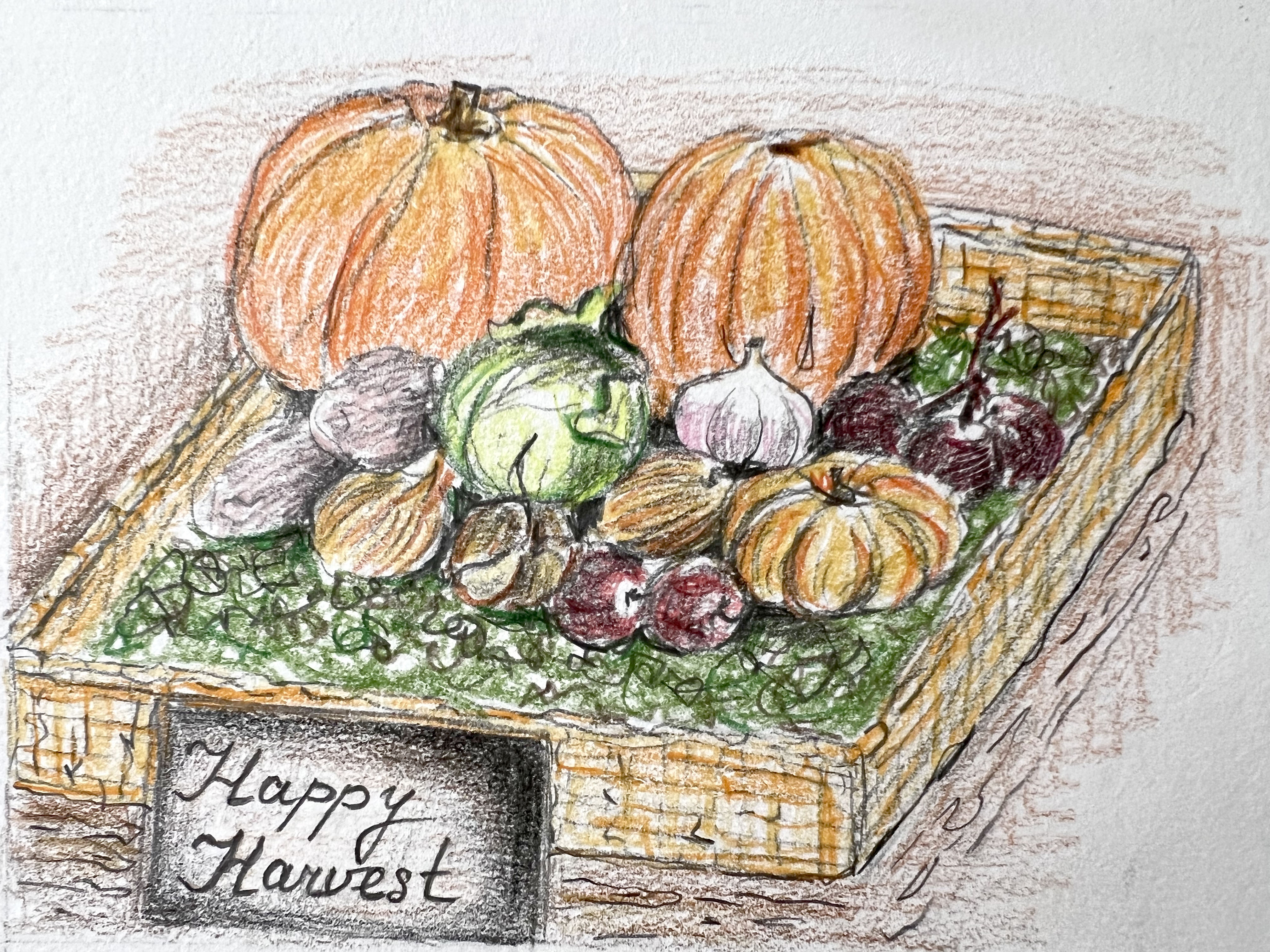
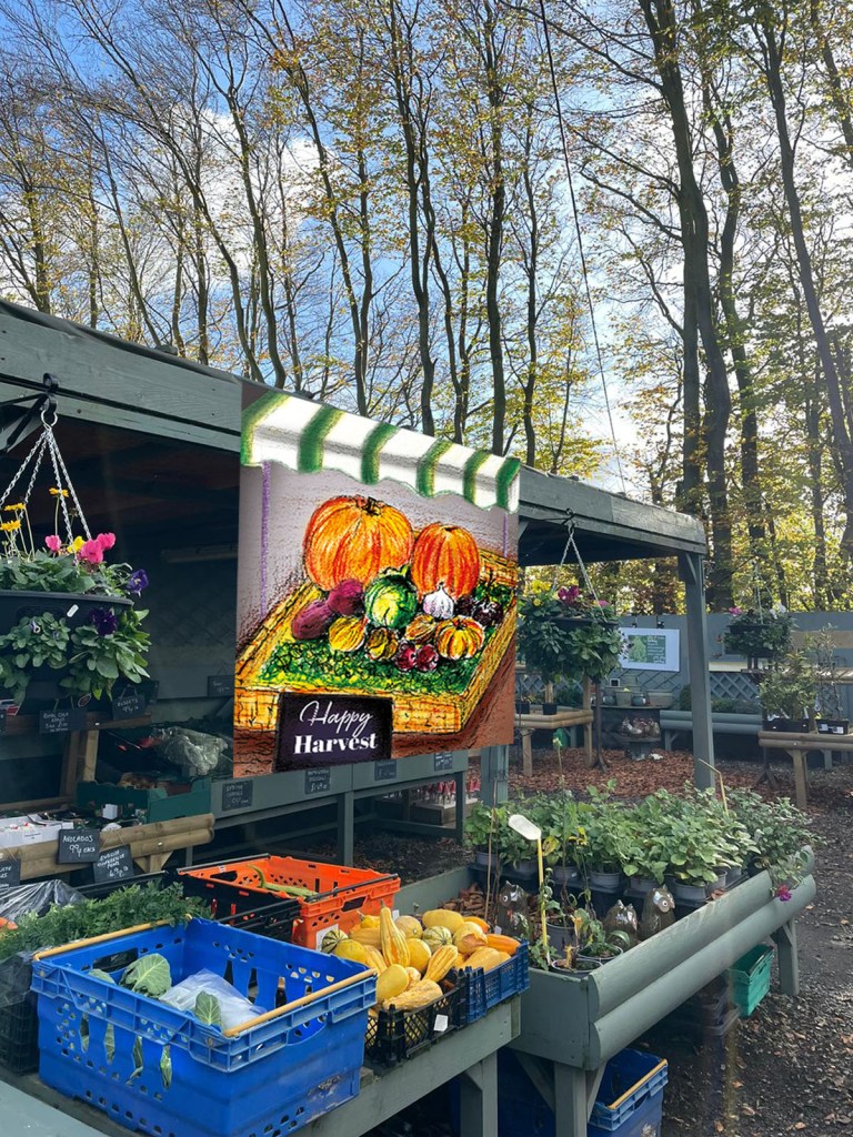
Autumn Point of Sale Display
Here I had a bit of a challenge, as the autumn display was looking too dark, and because of so many small objects around pumpkins, little veggies looked like black outlined circles, where the exact food was difficult to identify. Therefore, I was recommended to make the background lighter, and also, instead of vegetables in the basket use an illustration that was lying on the surface of the table.
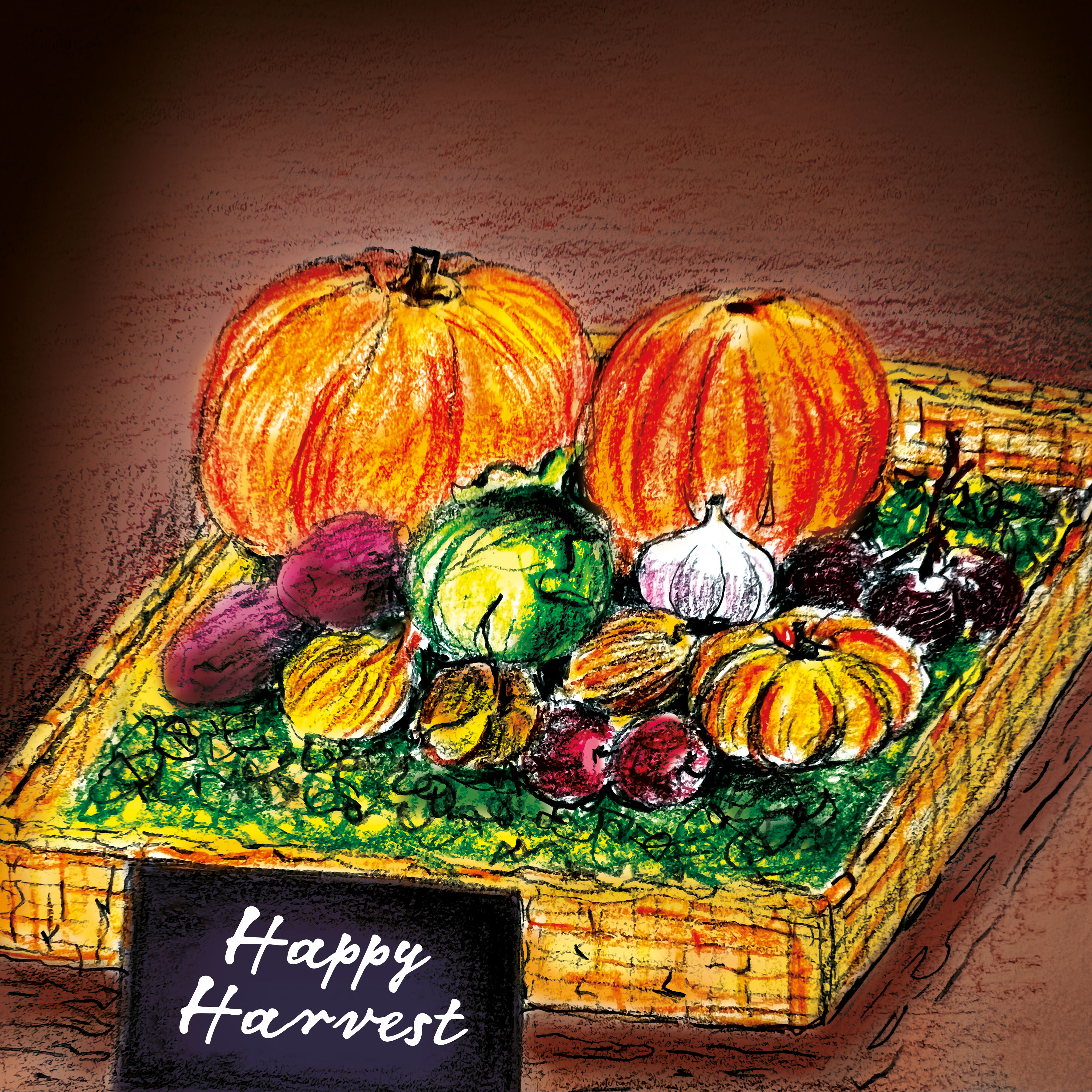
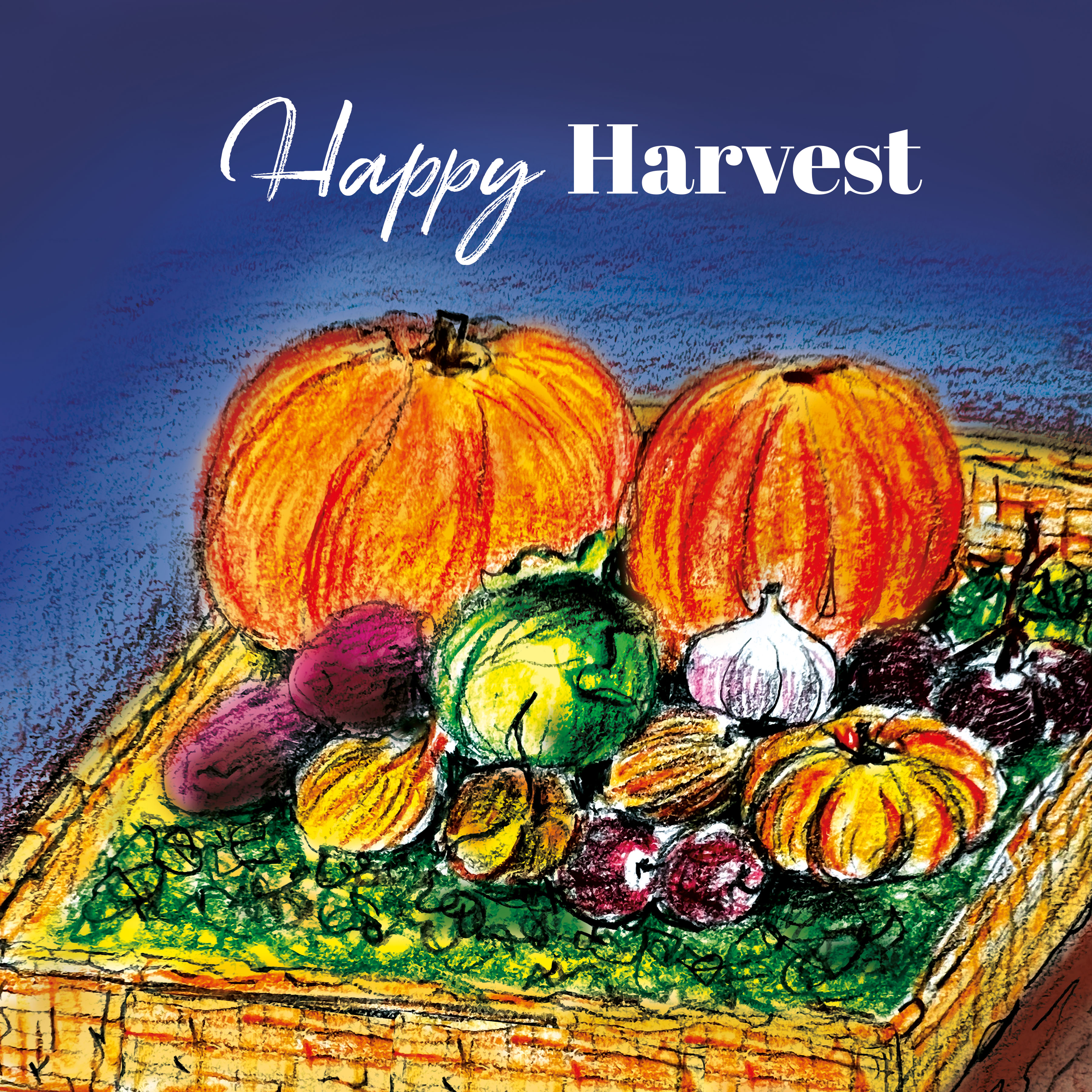
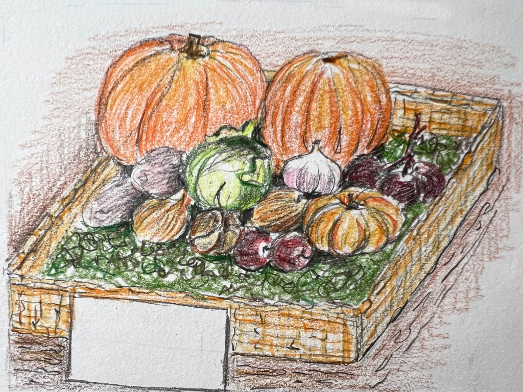
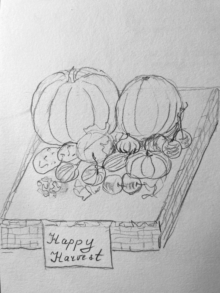
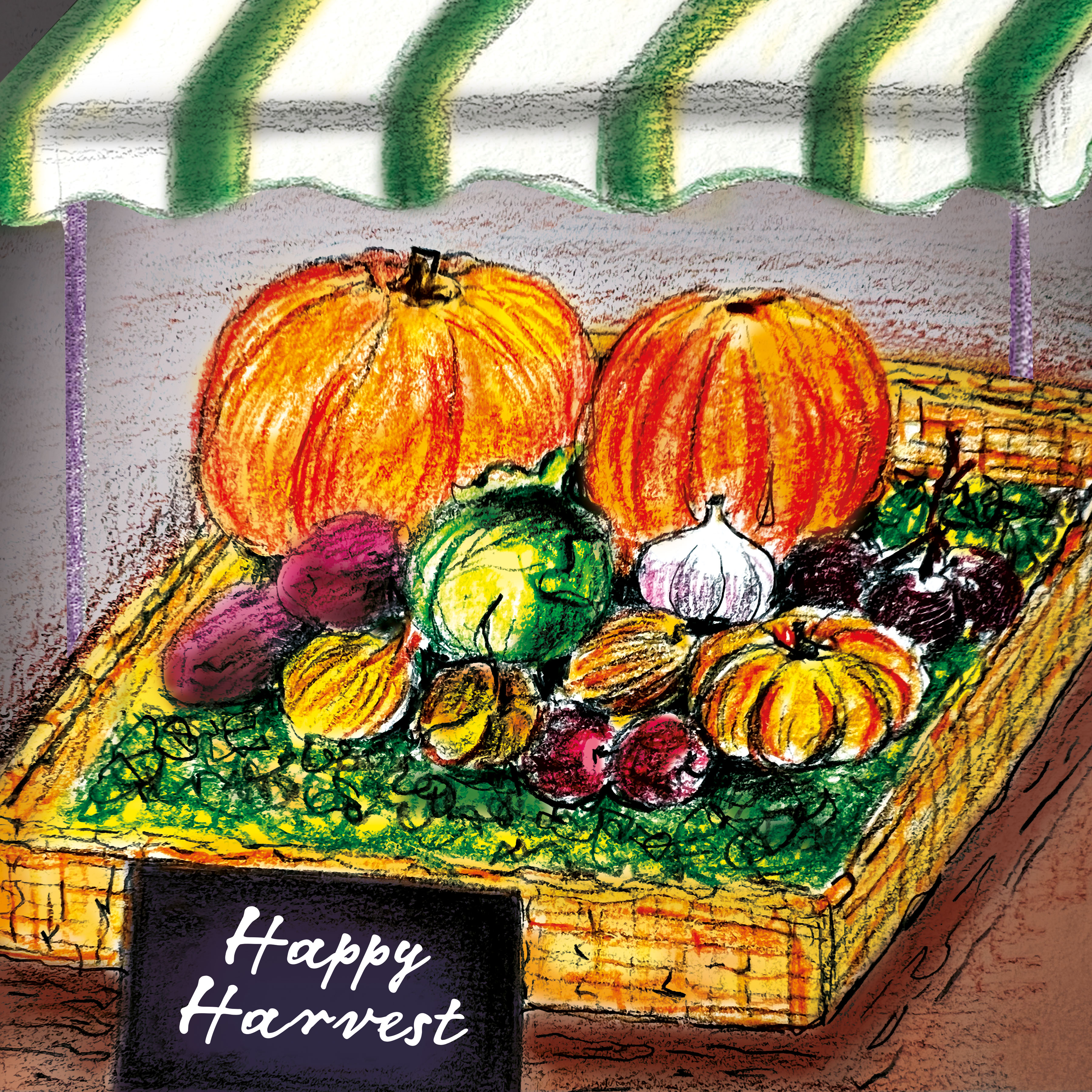
This is my second attempt at creating the autumnal display, and I must say, it looks much better this time. What’s more, I added a strikingly striped roof to the arrangement, which not only finalised the composition but also made everything look more organised and appealing.

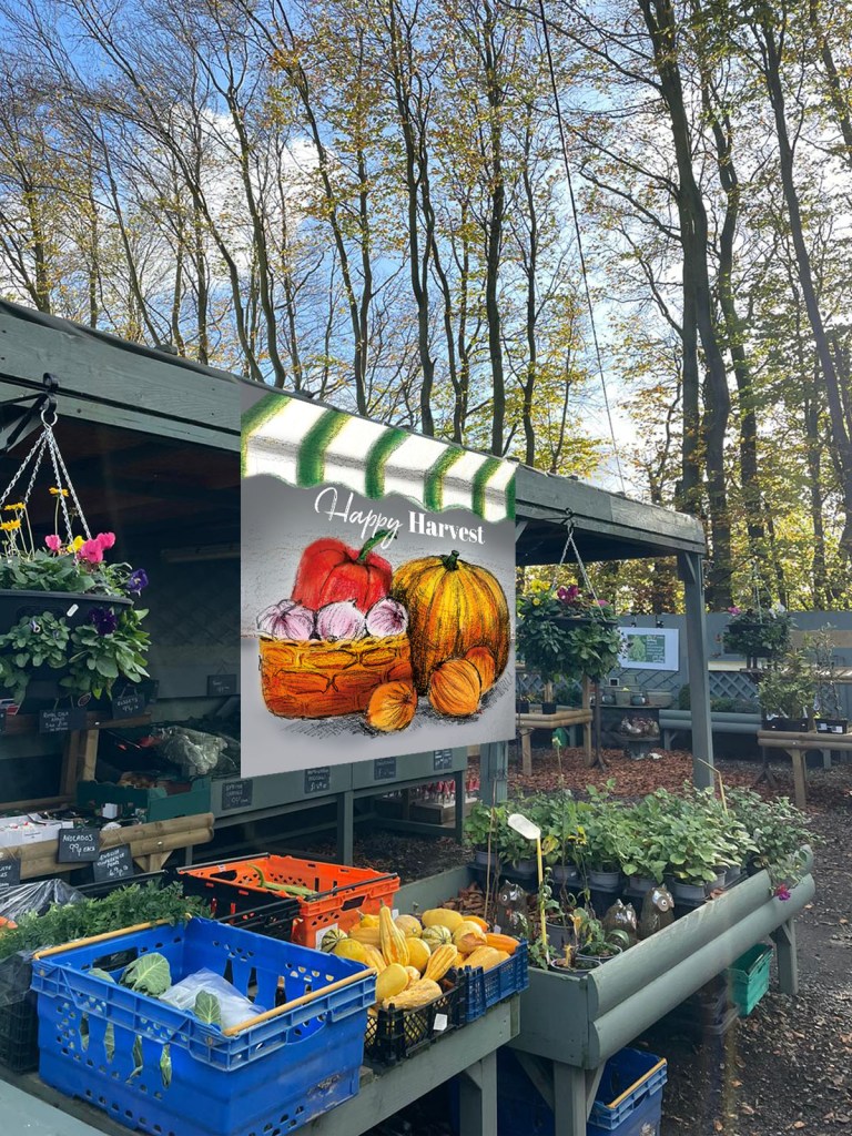
Final pieces together
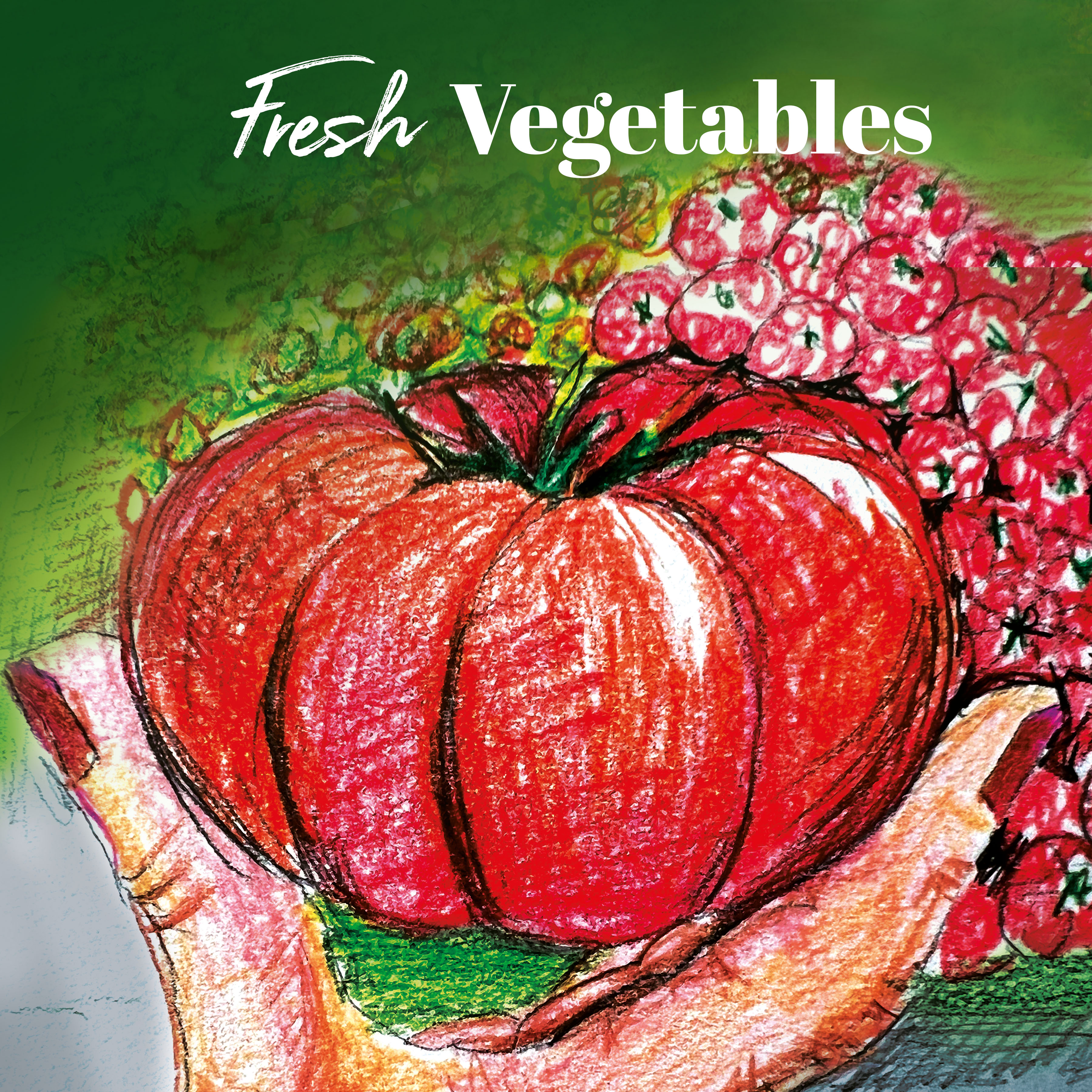
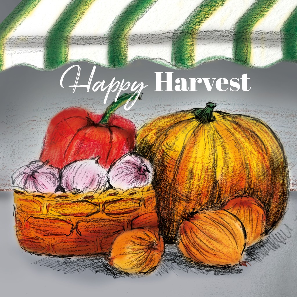
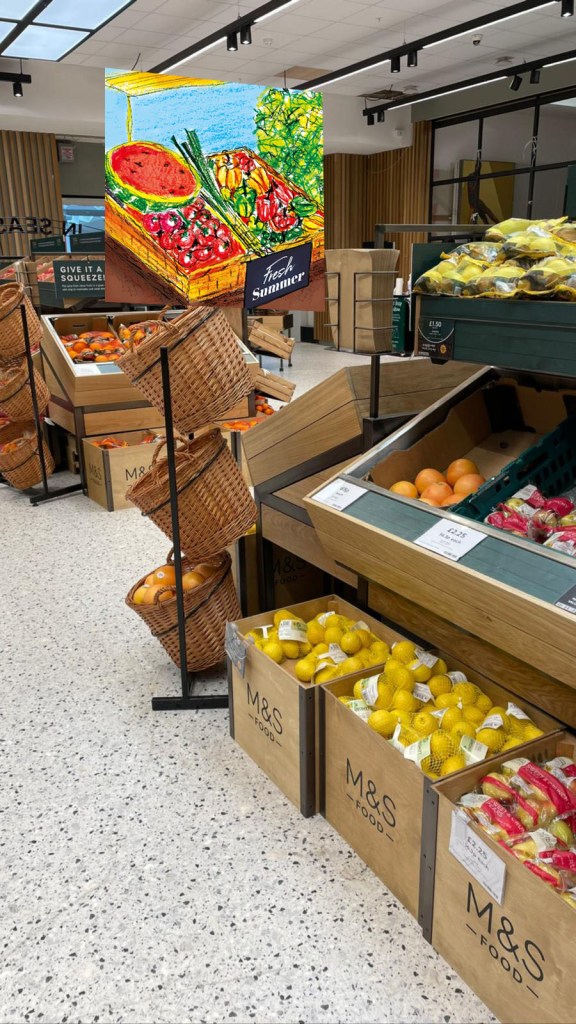
I shared these four pieces with my friends and family, and while everyone thought they looked great, I struggled to decide which two to pair together. For instance, I considered that the watermelon in the “Fresh Summer” basket might work well with the “Happy Harvest” design featuring the striped roof on a grey background, as they hold a bit of contrast. However, the autumnal design in the basket appeared more cohesive, especially with the dark signage accompanying each piece. Similarly, the beef tomato design shares a closer similarity with the top design under the striped roof due to the consistent font usage, yet the “Happy Harvest” design inside the basket offers a more contrasting option.
One challenge I faced was using fewer bright colours in the autumnal display. I attempted to incorporate duller or darker shades, such as a less vibrant orange for the pumpkin and an ochre hue for the onion, but they appeared too bland compared to the summer display—likely due to the cartoonish style of my illustrations. So, I opted to keep both displays bright and cheerful, using a grey background to introduce a sense of calmness to the autumnal display.
These were among the first full-colour illustrations that I painted physically and then integrated into the digital design. I love challenges that lead to unexpected results. Initially, I planned to use watercolour painting with pen strokes but ended up using watercolour pencils, giving a crayon-like effect. I feel like I’m gradually learning new illustration techniques and uncovering a new path in graphic design. I eagerly anticipate my future achievements.


Reflection
My tutor’s feedback was quite positive. She appreciated how my initial experiments with watercolour. She also mentioned a sense of warmth and homeliness in the piece with a roof on top, capturing the essence of the market and showcasing a diverse range of food.
My tutor recommended bringing the fonts together for a more cohesive supermarket sign project and suggested implementing a point-of-sale display in a supermarket setting to enhance the work’s evaluation.

