For this exercise, I need to take another object to examine it in detail and understand its qualities and purpose with more information. For example, is this object shiny, hard, soft, fluffy, delicious or antique? There is no wrong or right in explaining the chosen object, as it is all subjective, and I can interpret it in my own way.
Then I need to choose one word from the mind map list as the basis of the idea. I can make a mood board and include collages and found materials; cut images from magazines based on their visual properties. This exercise tests creative spirit and is based on the full investigation of the subject. I should be exhaustive. As a result, I need to achieve illustration that communicates and is also filled with colours, textures and materials identified during my exploration.
Research
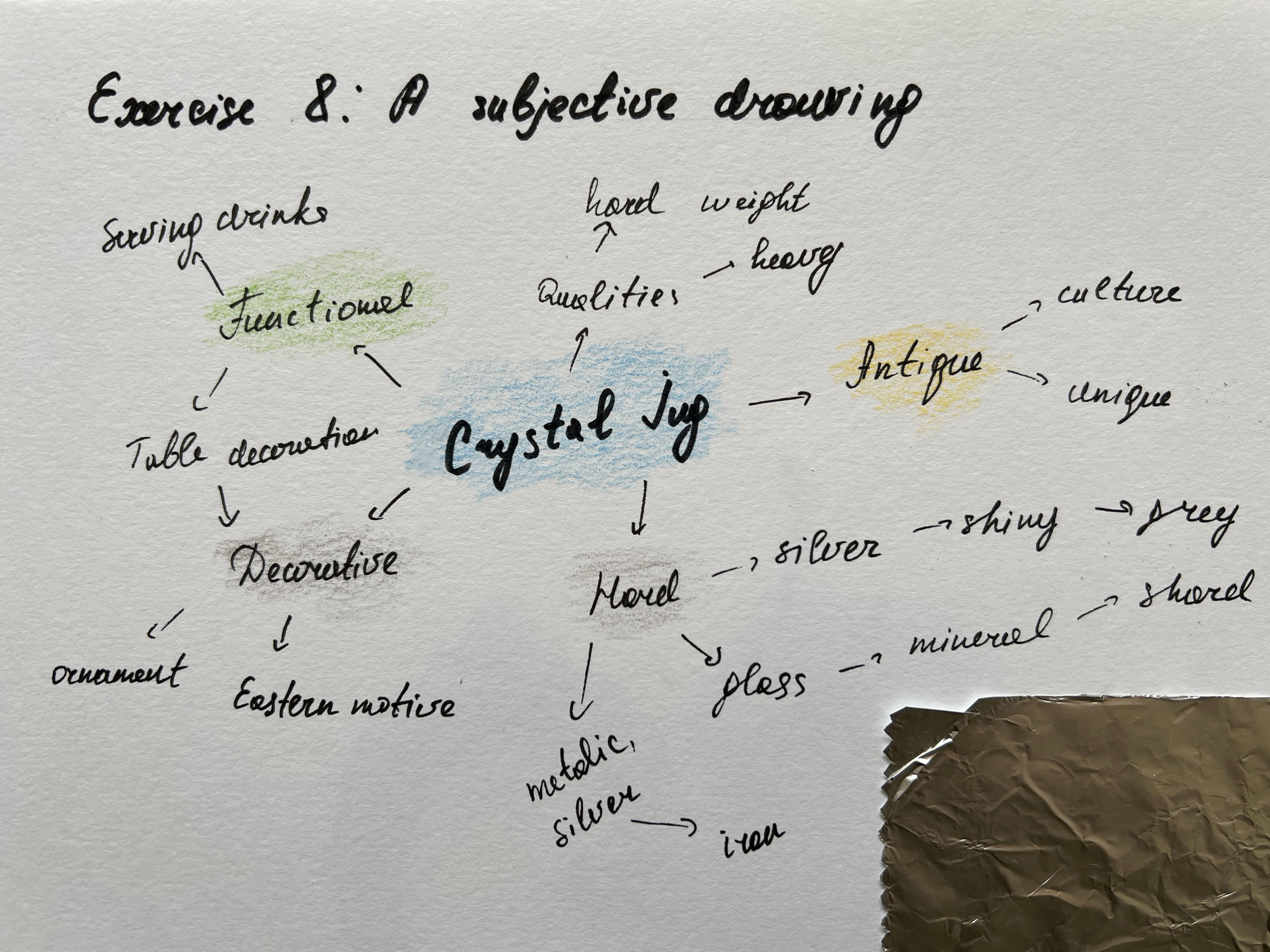
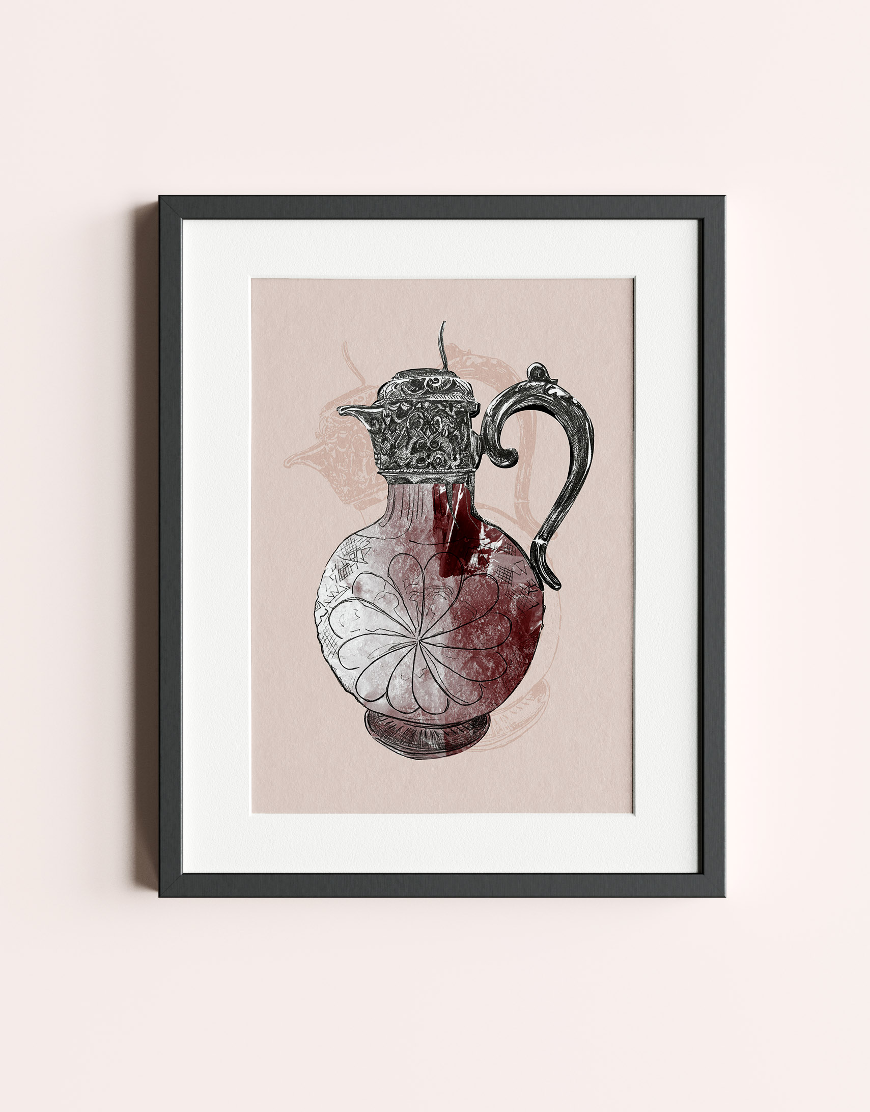
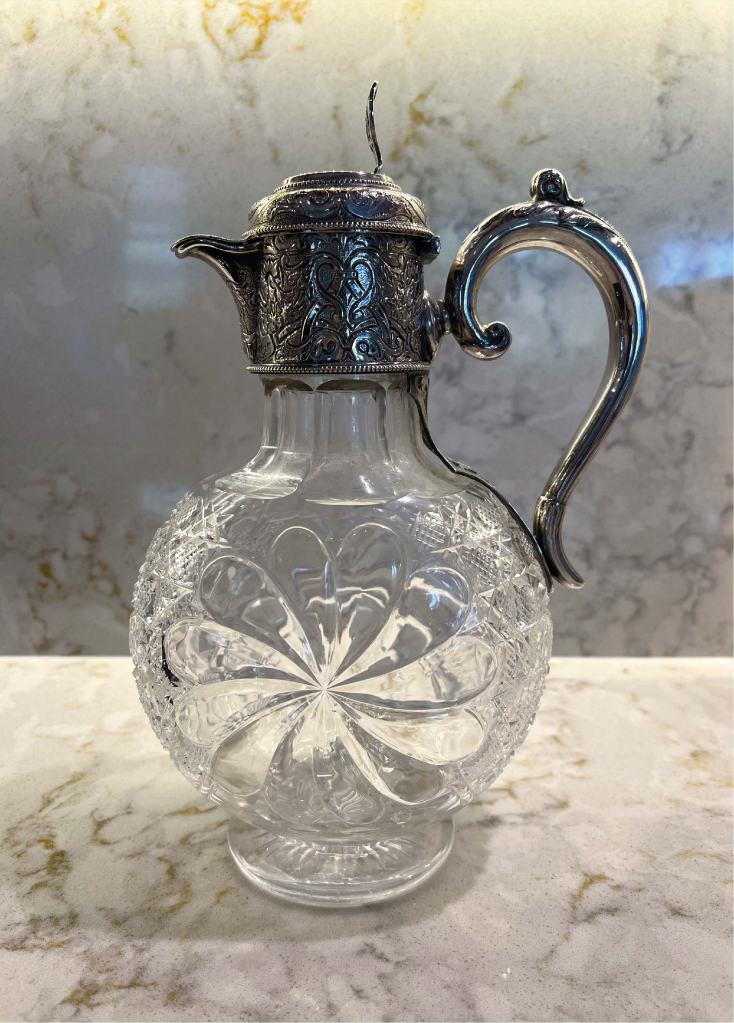
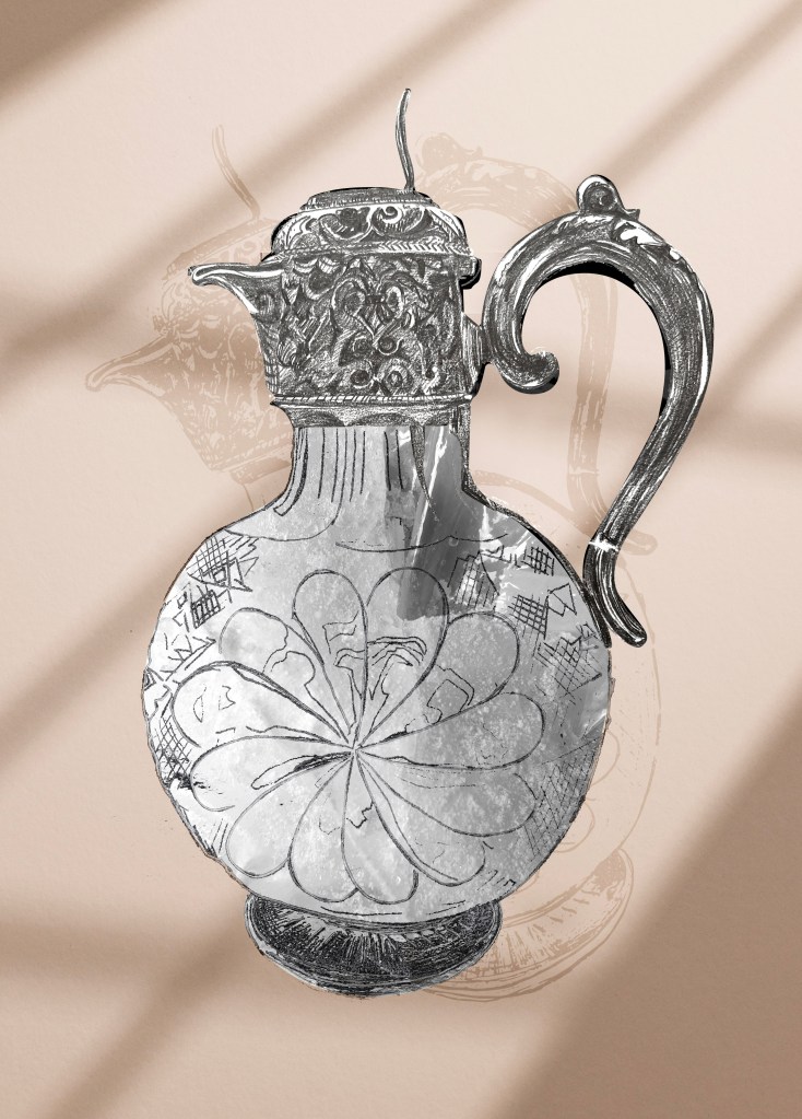
For this exercise, my chosen object is my mum’s crystal jug for water and drinks, which she uses for special occasions, like family celebrations, or holidays. I loved the combination of silver with the patterns and textured glass. It has a beautiful ornament that, probably, has its roots coming from Eastern culture, and that object symbolises the traditions of British families in the past centuries. The jug is antique, so it’s quite a rare example of table decorations. I set my mind to demonstrating some creative work with it but was worried whether the object I have chosen was too complicated; without ornament shown on the silver and glass parts, the illustration could look flat, so I needed to spend a bit of time for the sketches or tracing the object.
As the chosen object consists of two parts, such as glass and silver, I was thinking about where should I concentrate, as there are two elements. But in the end, my chosen word for this jug was crystal, which is associated with glass, and minerals.
Mood board
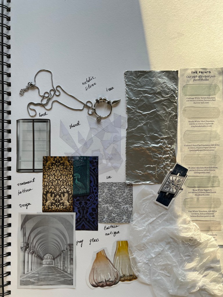
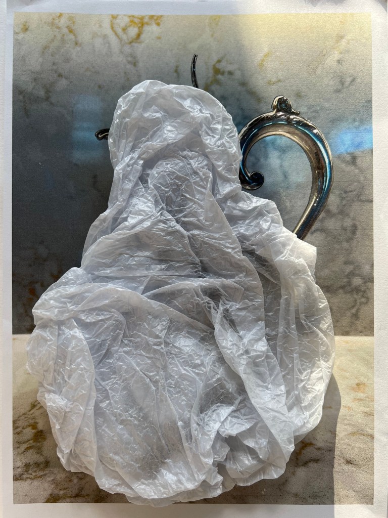
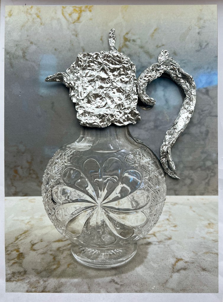
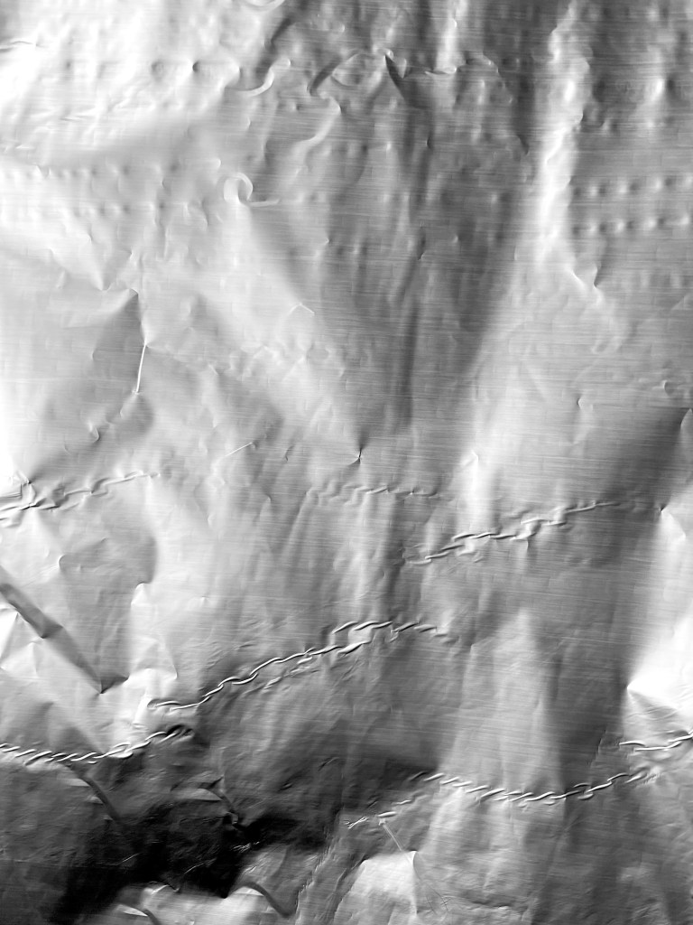
I created a mood board of objects around me, from some fashion and design magazines. In addition, I stuck some textures to experiment with my designs, such as foil, wrapping paper and shard pieces of plastic. Foil could replicate the metal nature of the jug from the top, and shards of plastic and pieces of wrapping paper could be associated with the colour and texture of the glass.
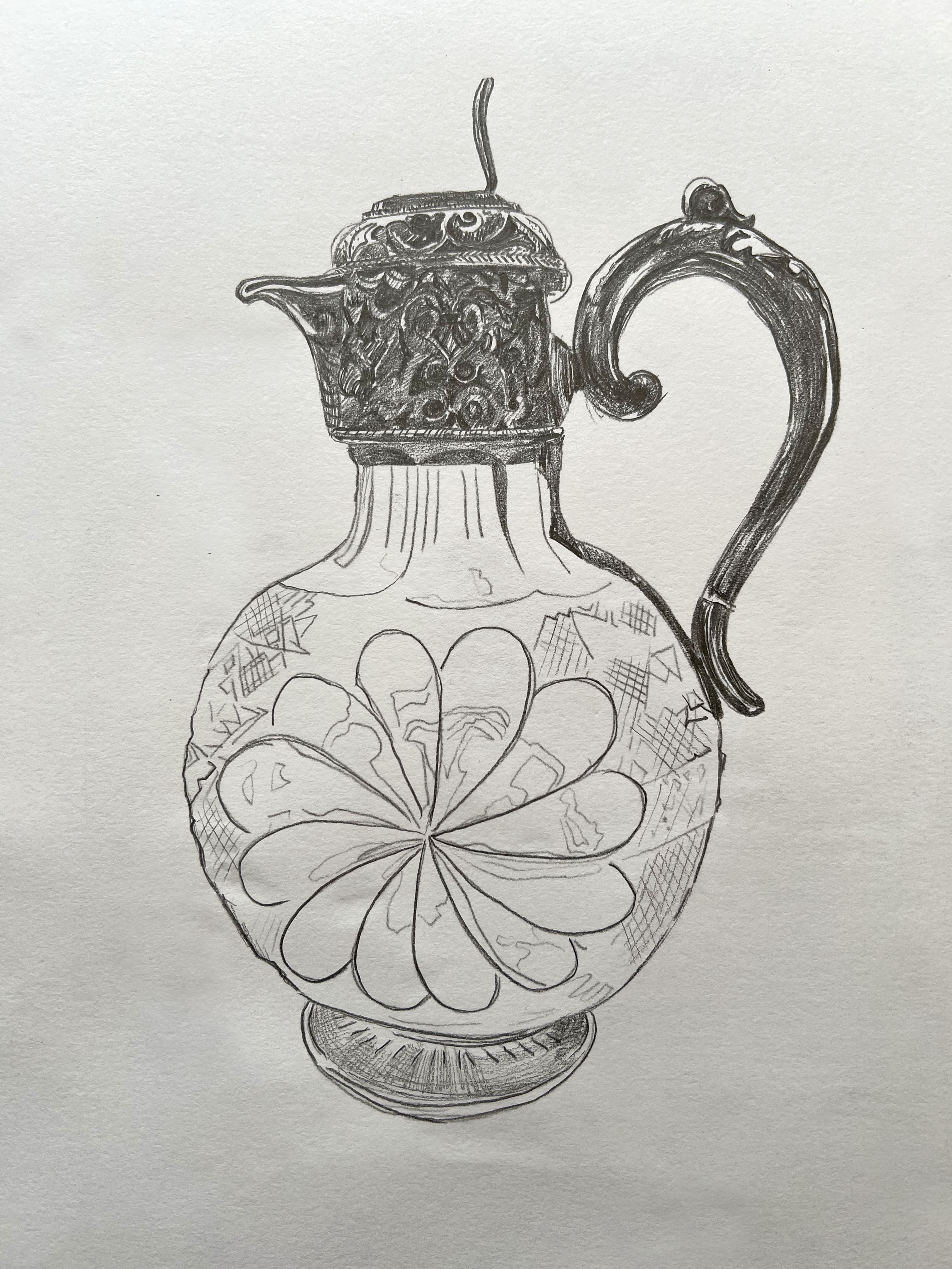
After I proceeded with the sketch of the jug, detailing the pattern on the silver part of the design. For the flowery pattern on the glass part, I just drew an outline.
Experiment with textures
Next, I proceeded to the exciting process – the experimental part of the design. The good thing about it, in creation we can’t be wrong or right, the best way to do it, trust your instincts and not be scared of errors. I was curious to see how the paper will look at the jug, and whether the shaped piece of foil can replicate the texture of the silver part of the jug. For example, I found out that the sketch of the detailed texture of the jug can’t go well with the crumpled foil, it looked a bit messy, but the wrapping paper looked good, it reminded me of the texture of the stone or quartz that can be found inside of the rocks. A small note about quartz, it is the second most abundant mineral in Earth’s crust after feldspar. It occurs in nearly all acid-igneous, metamorphic, and sedimentary rocks. I preferred the pencil drawing for the silver part of the jug, and the paper base. But I still wanted to use all handmade materials, as I thought it will make the illustration more creative.


Speaking of the glass nature of the jug, I thought that would be great to try some more experimental materials, such as ice, natural stone and simple kitchen foul. I went to take some new pictures of the frozen piece of ice, and stone from some of my trips to the Matlock. Also, I wanted to apply the flat foil texture to my painting, as crumpled foil had too many shades and sharpness in it.
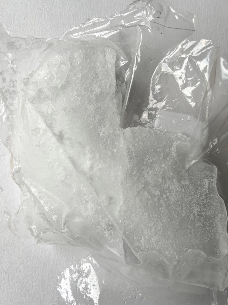
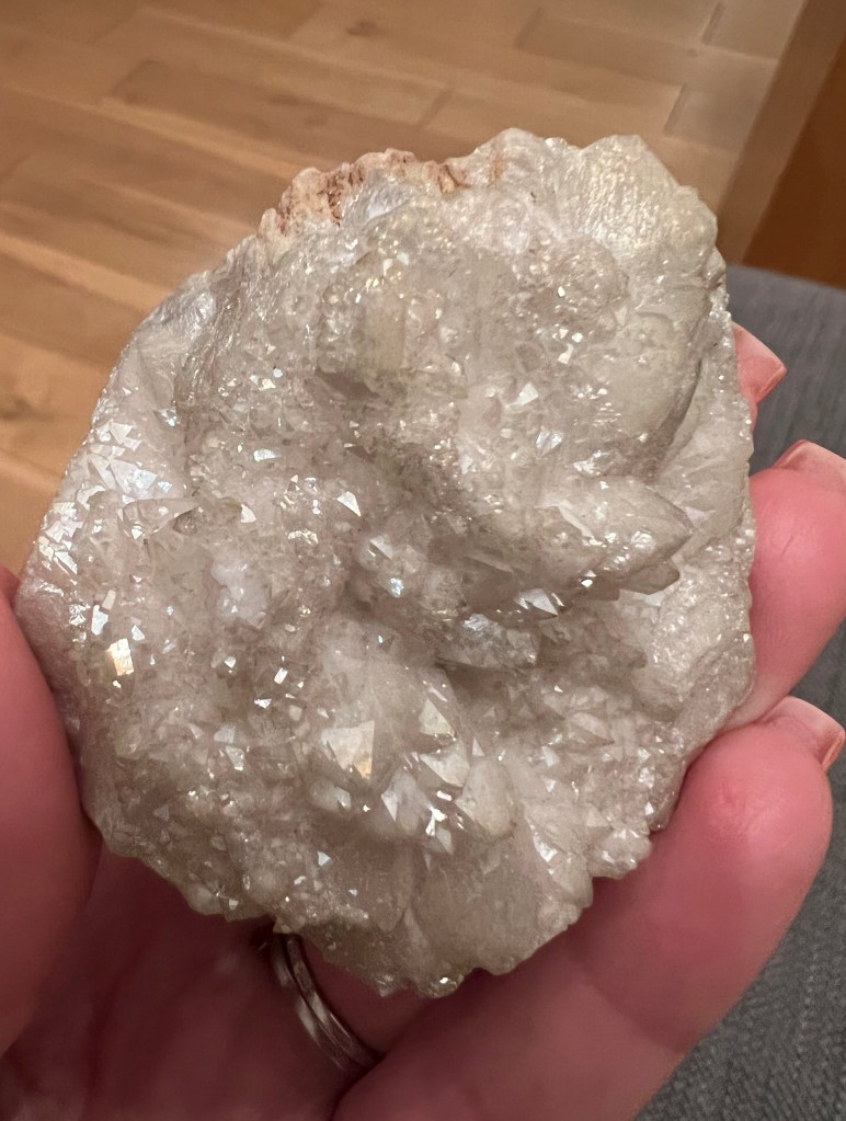
I tried different backgrounds for my illustration, and all textures were placed individually. The foil was hard to see, only in close comparison with a flat pencil sketch, I could see a slight difference. Ice, rock and paper wrapping created quite similar textures, with just minor differences in details. I experimented with the colour of the ice, making it red, and the colour of the rock, making it blue, it brought some juiciness and taste into the image.

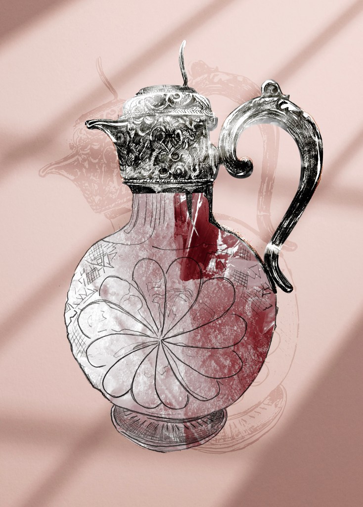
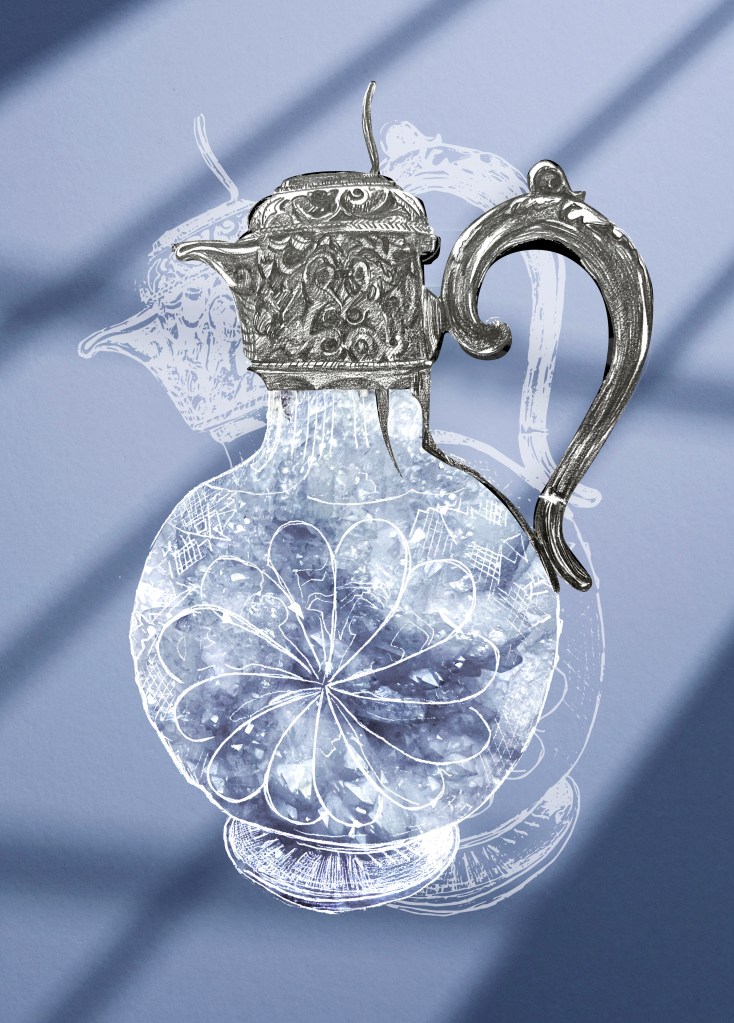
I thought that the pomegranate colours of the ice create quite prominent contrast, the one I was looking for in my illustration. In addition, I wanted to make the illustration less static, so I made a shadow in angle, I thought it would bring a bit of dynamic and movement to my final design.
