
In this exercise, I was asked to collect as many references as possible, that related to the 1950s period. Catalogue the information that I find according to these categories:
- People and costume
- Architecture and interiors
- Art – painting, drawing, sculpture
- Graphic design – posters, books, typography
- Advertising
- Transport
- Film and TV
- Surface pattern and decoration.
I should identify visual qualities within the categories – shapes, textures, colours, style and other features. Based on my notes I need to write a short review of the special features of the 1950s in my learning log. As a final task, I need to make an illustration of someone sitting in a chair surrounded by typical artefacts to give a teenager an idea of the 1950s.
People and costume
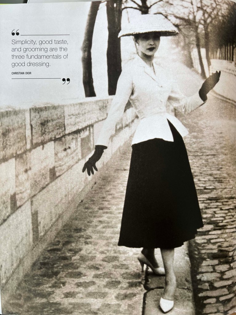
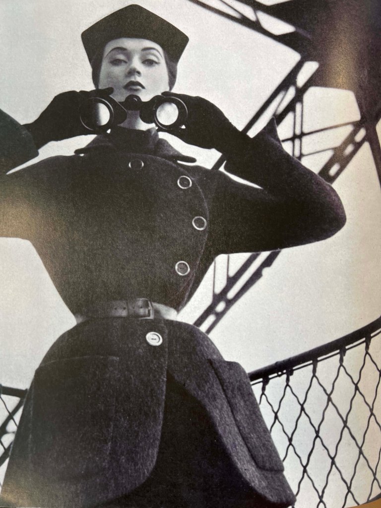
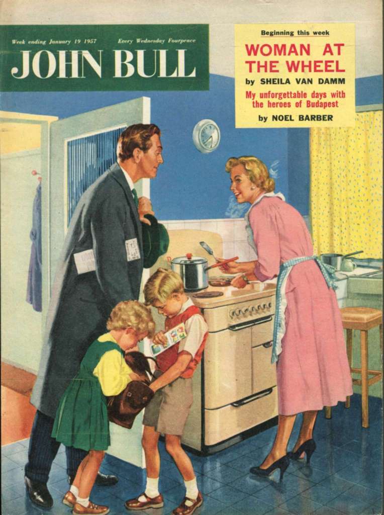
The 1950s were remarkable times, not only in their fashion but also in people, that remain to be recognisable nowadays. Whilst the world still was recovering from World War II, the 1950s saw the birth of teenagers and rock n roll. Previously teenagers would dress up like their parents, but now a new rebellious style was developed. Fashion in the 1950s saw a clear gender divide. While men’s and boys’ fashion moved towards a more casual day-to-day style, women’s and girls’ fashion prioritised elegance, formality, and perfectly matched accessories. The 1950s was not only about spending on luxurious brands but also the idea of being comfortable. The decade was influenced by new designers such as Cristobal Balenciaga, Christian Dior, Coco Chanel, and Hubert de Givenchy.
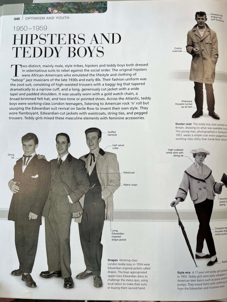

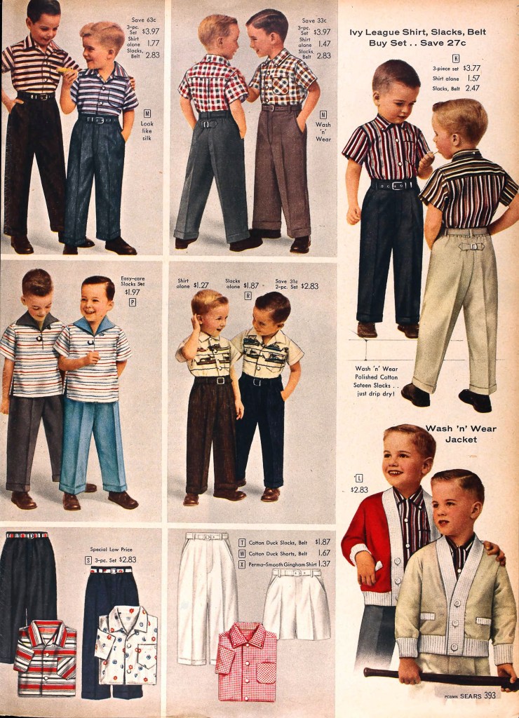
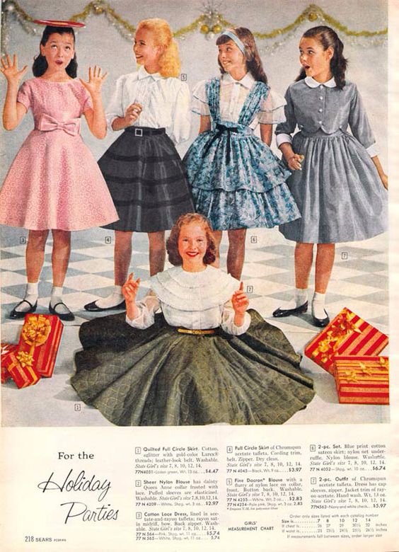
Children’s fashion in the 1950s was inspired by their adult counterparts. Young girls wore dresses with full skirts and perfectly matching accessories while young boys saw their clothing options becoming more casual. New synthetic materials, which were also being used in adult clothing, were increasingly used for children’s clothes as they were easier to launder.
Source: https://www.grayflannelsuit.net/blog/sears-catalog-highlights-springsummer-1958
Accessed: 25/08/2022
Source: https://www.retrowaste.com/1950s/fashion-in-the-1950s/1950s-dresses-skirts-styles-trends-pictures/
Accessed: 25/08/2022
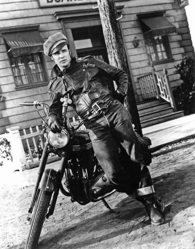
Famous people from the 1950s:
- Marlon Brando
- Elvis Presley
- James Dean
- Marilyn Monroe
- Audrey Hepburn
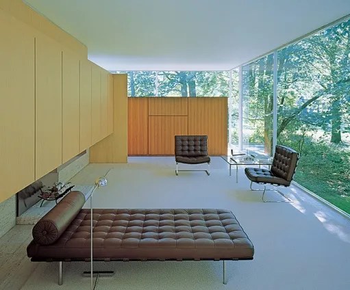
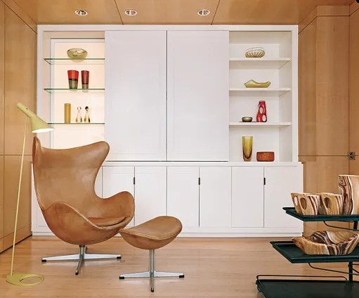
Architecture and interiors
Mid-century modern is an American design movement in interior, product, graphic design, architecture, and urban development that was popular from roughly 1945 to 1969. The Mid-century modern movement was an American reflection of the International and Bauhaus movements. It is typically characterised by clean, simple lines and honest use of materials.

Accessed: 25/09/2022
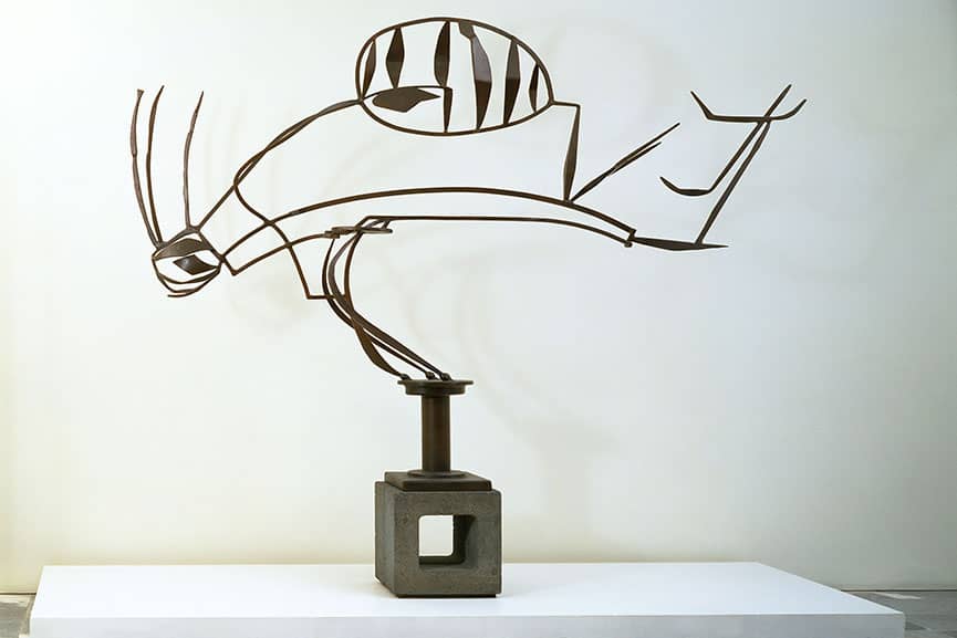
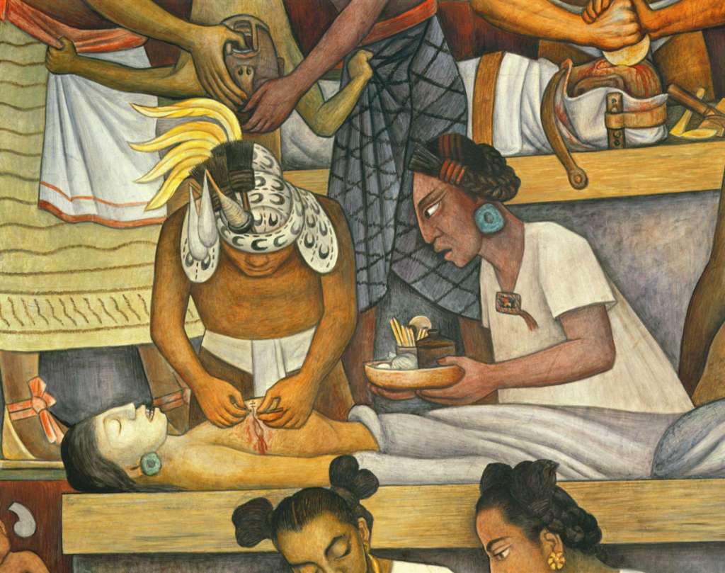
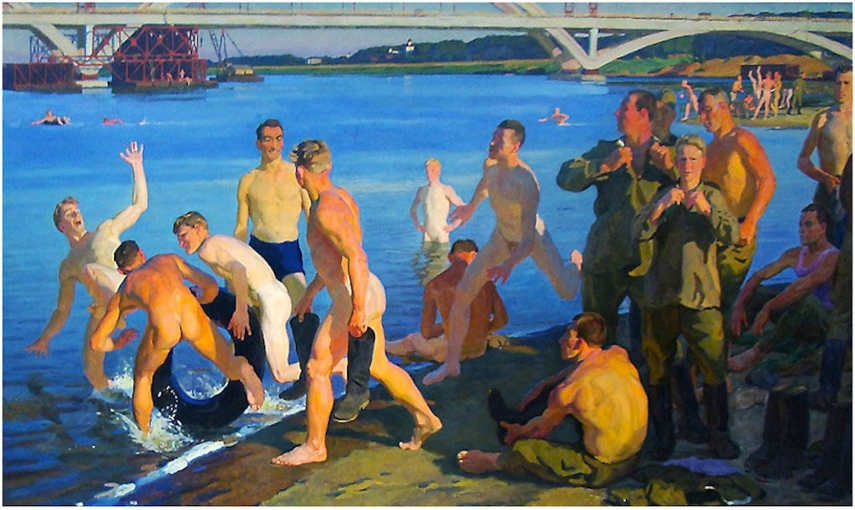
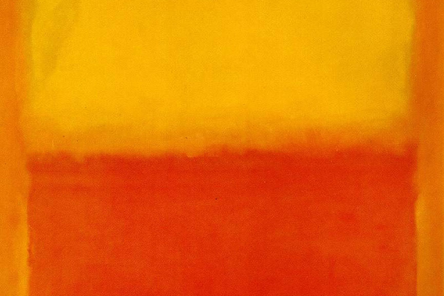
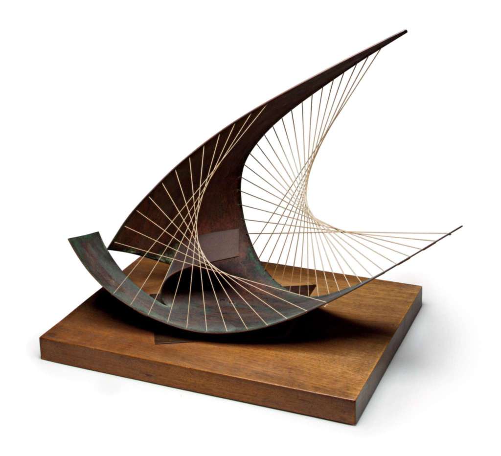
Art – painting, drawing, sculpture
The story of 1950s art begins at the end of World War II. Slowly world started to recover from the war, and new art movements started to appear, inspired by 1920s avant-garde movements, modernism, surrealism and abstract painting.

1950, oil, enamel and aluminum on canvas, Ailsa Mellon Bruce Fund
Source: https://www.nga.gov/features/slideshows/selections-from-the-modern-and-contemporary-collections.html#slide_16
Accessed: 20/08/2022
Source: https://www.widewalls.ch/magazine/1950s-art

Source: https://www.widewalls.ch/magazine/1950s-art
Source: https://www.widewalls.ch/magazine/1950s-art
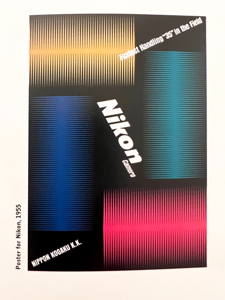
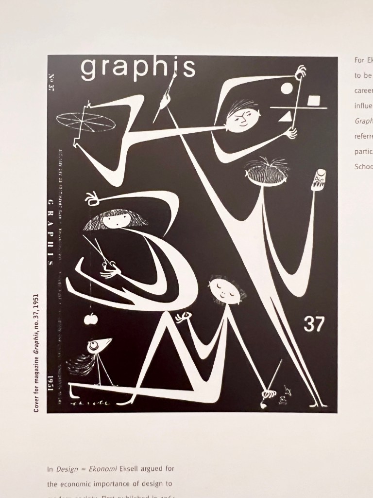
Graphic design – posters, books, typography
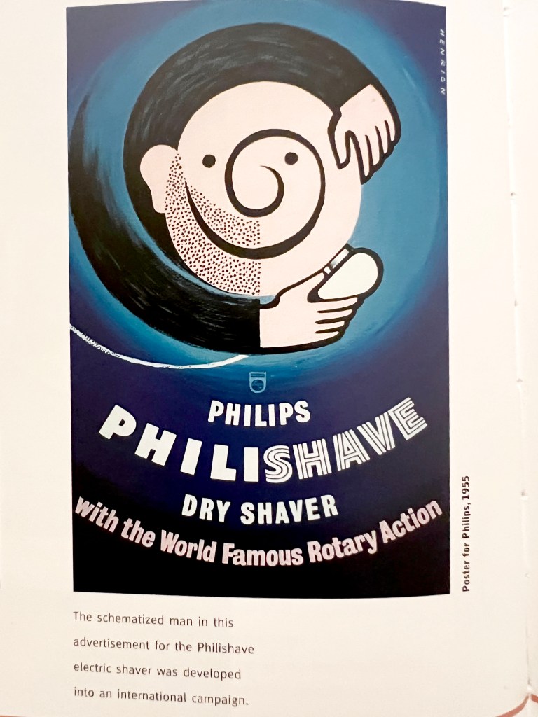
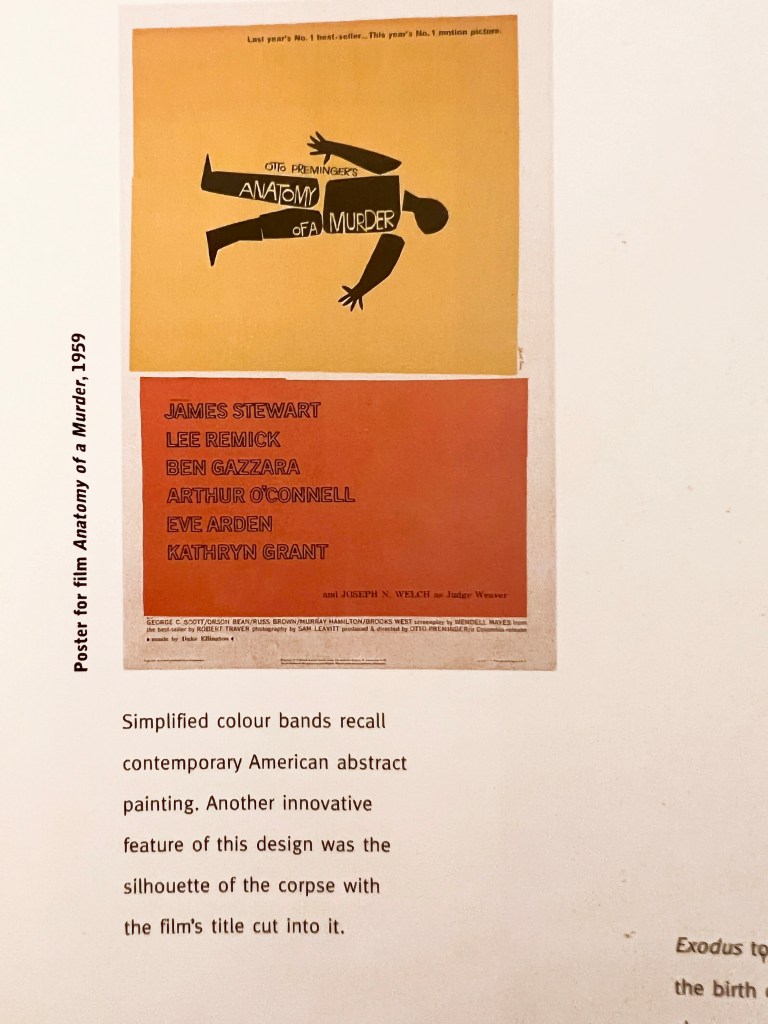
For this part of the research, I looked through my book Peeners of Modern Graphic Design by Jeremy Aynsley. It contains graphic design starting from the 1920s and up to the modern days. The section that I was looking for was called Mid-century modern, and contained design examples between the 1940s to 70s’. Towards the middle of the twentieth-century modern graphic design underwent a significant change of scene, largely brought by the immigration of the key designers. After 1933 it was extremely difficult for graphic designers in Germany, like many others they were forced to immigrate. Switzerland became an important focus for graphic designers from many countries. New York was home to concept-driven graphics, which came in particular from American advertising. Graphic design became a worldwide phenomenon, with an extreme exchange between U.S., Europe and Japan. From the visual point of view graphic design at that time was simple, but straight to the point, focusing the viewer on the key message, colours were basic as well, like black, blue, orange and red, and mainly designers used illustration rather than the photograph, as painting helped them to bring more creativity into the visual. Also, some of the posters were based on the cut-and-paste approach.
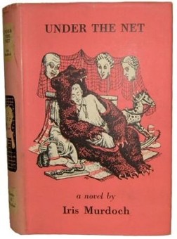
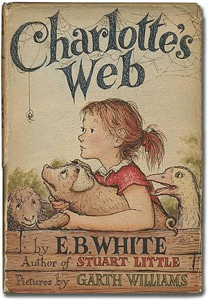
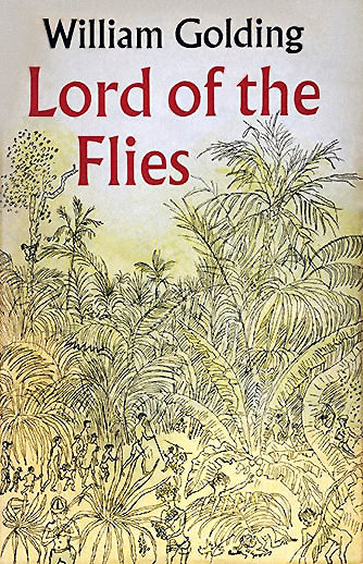
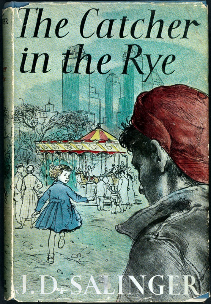
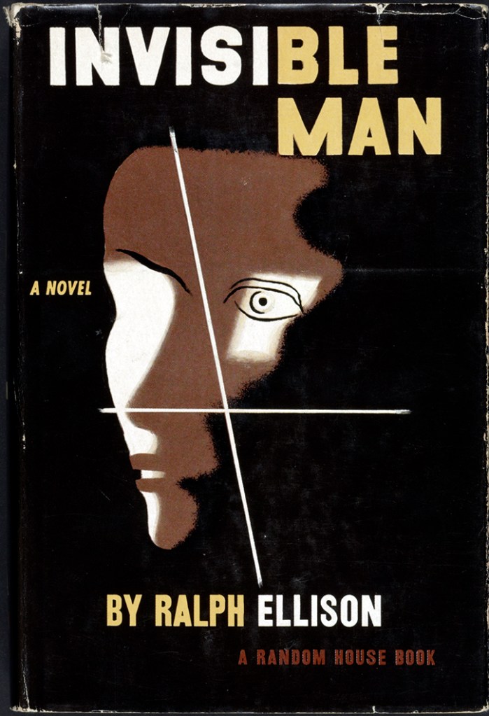
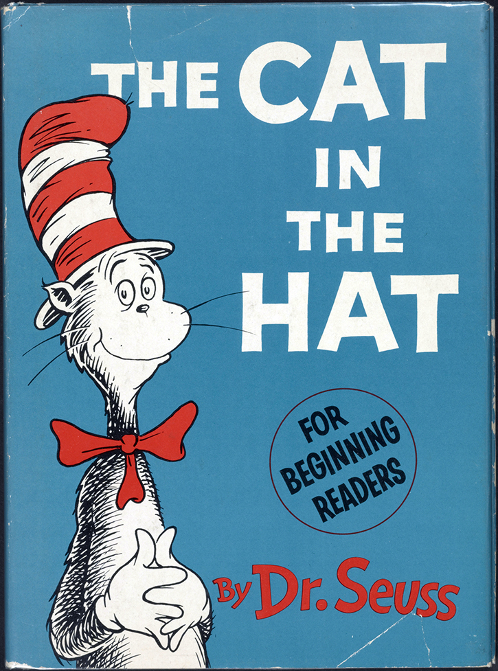
Books
Books, similar to posters and graphic design, were subject to the modern trends of those times. I found a few examples of book covers, with a rather expressive than conceptual approach to design. The colour pallet was straightforward as well, with mainly muter natural colour, the main accent was on the one glance of the image to understand the context of the book.
https://www.loc.gov/exhibits/books-that-shaped-america/1950-to-2000.html
Accessed: 20/08/2022
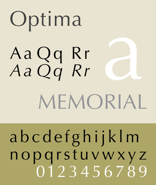
Fonts created in the 1950s
Typography exploded during the 1950s, leading to some of today’s most notable and common typefaces. And as with most exemplary type designs, many fonts from this decade aged particularly well and continue to have a massive impact on design today.
- Helvetica is a classic, incredibly well-designed typeface that was created in 1957 in conjunction with Eduard Hoffmann for the Haas Type Foundry.
- Univers is a realist sans-serif typeface designed by Adrian Frutiger in 1954.
- Optima is a humanist, sans-serif typeface designed by Hermann Zapf between 1952 and 1955 for the D. Stempel AG Foundry, Frankfurt, Germany.


Accessed: 22/08/2022
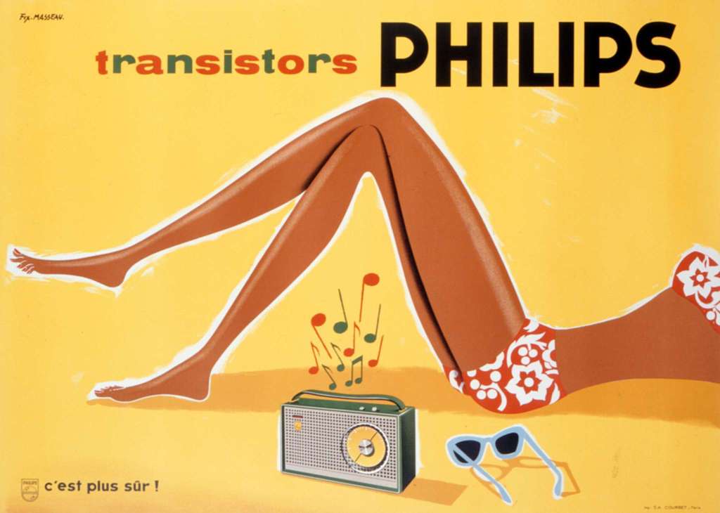
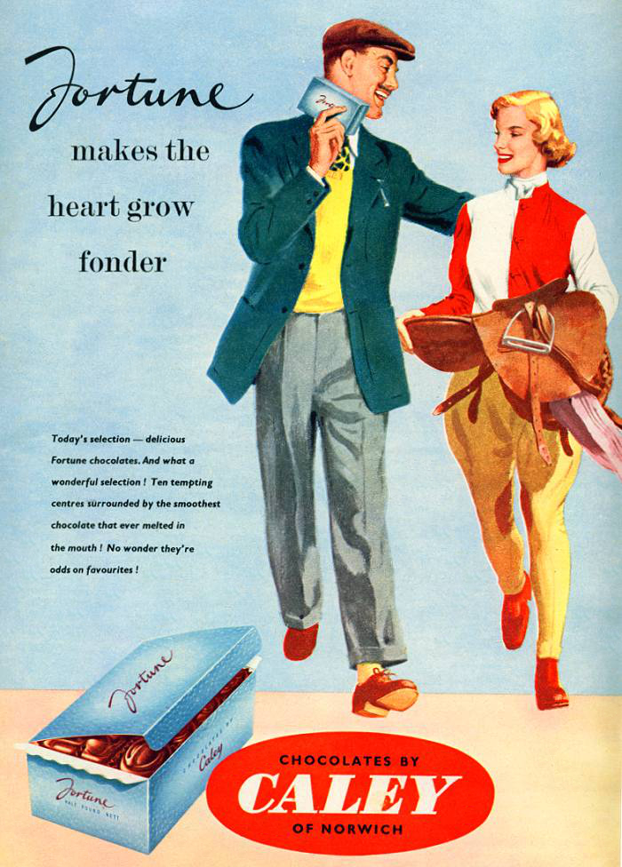
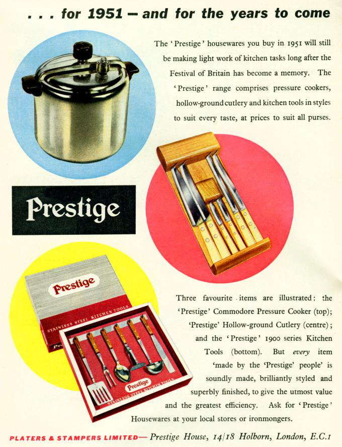
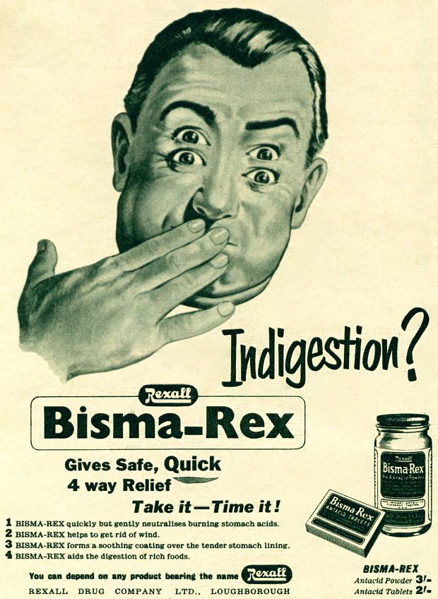
Advertising
When it comes to advertising graphic design in the 1950s, the aesthetic is a rainbow of eye-popping pastels. Posters were filled with positive emotions, and bright colours and the main purpose was to make the viewer react to the product with the thought “This one is desperately needed!” Advertisements idealised the modern lifestyle, there was noticeable gender division in poster designs, where the man had a leading role, drives a car, goes to work to earn money for the family, basically the head of the family, and the woman was serving a purpose like ideal housewife, care about beauty, and children. From my point of view, they are remarkable poster designs, that brought some idyll to the after-war times, to comfort people and make accents on the major aspects of life.

Accessed: 20/08/2022
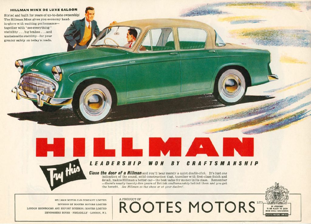
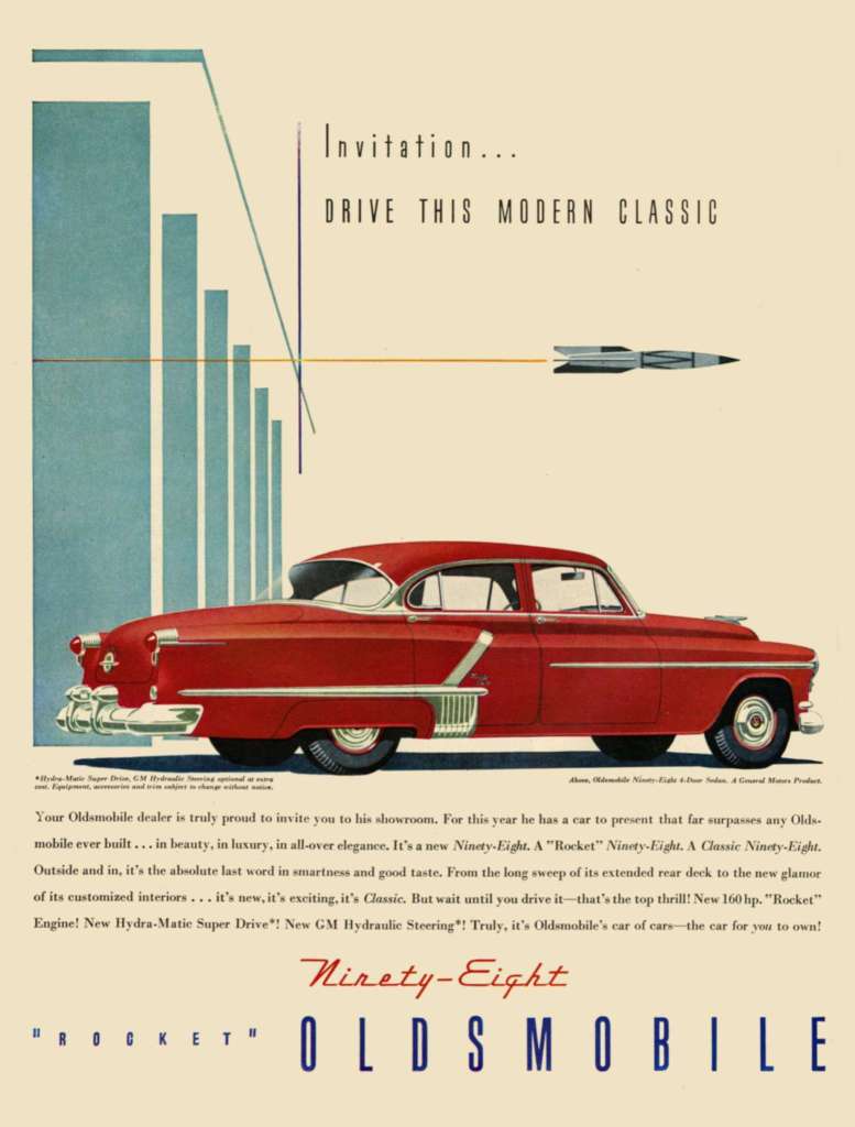
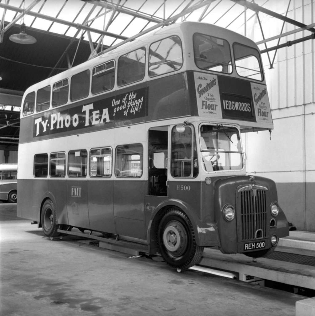
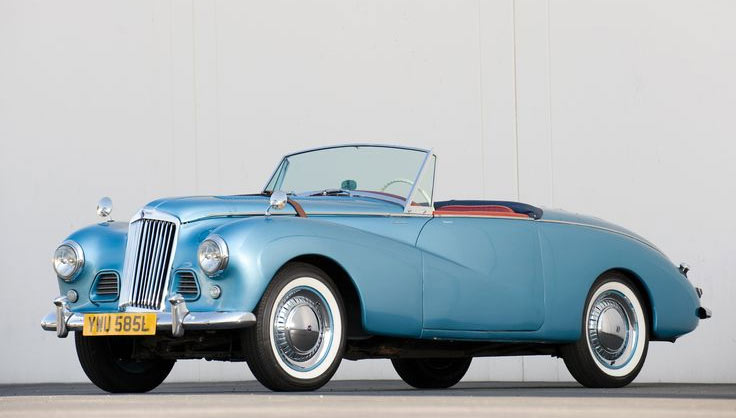
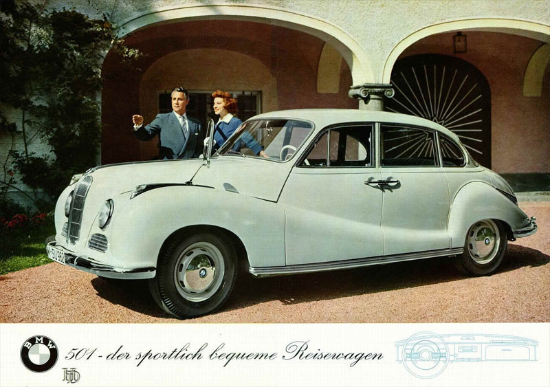
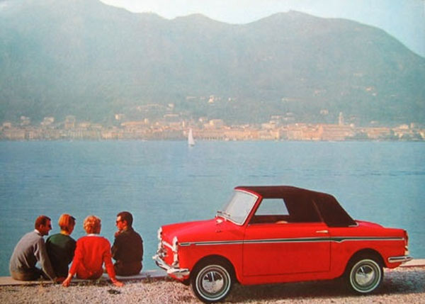
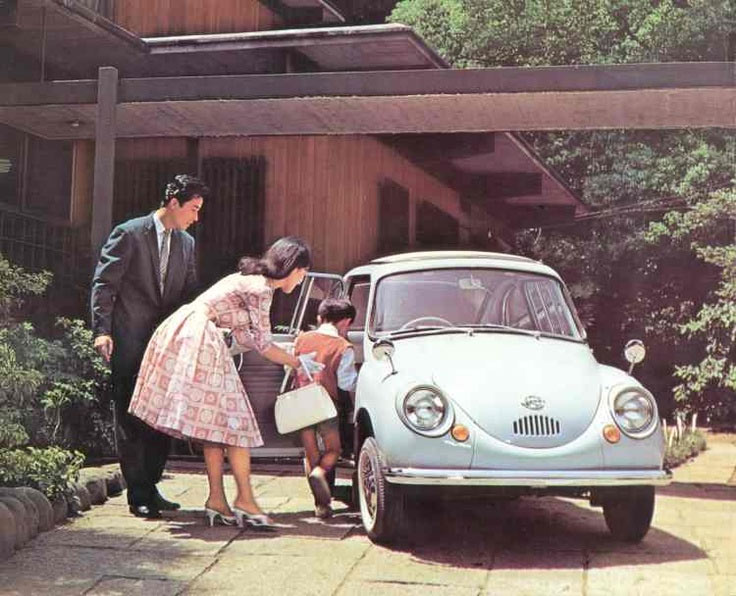
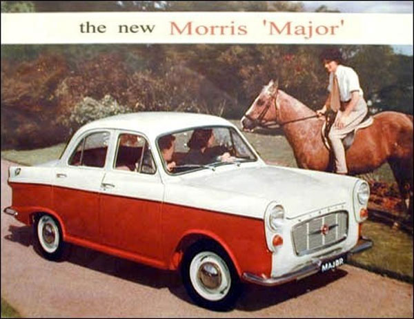
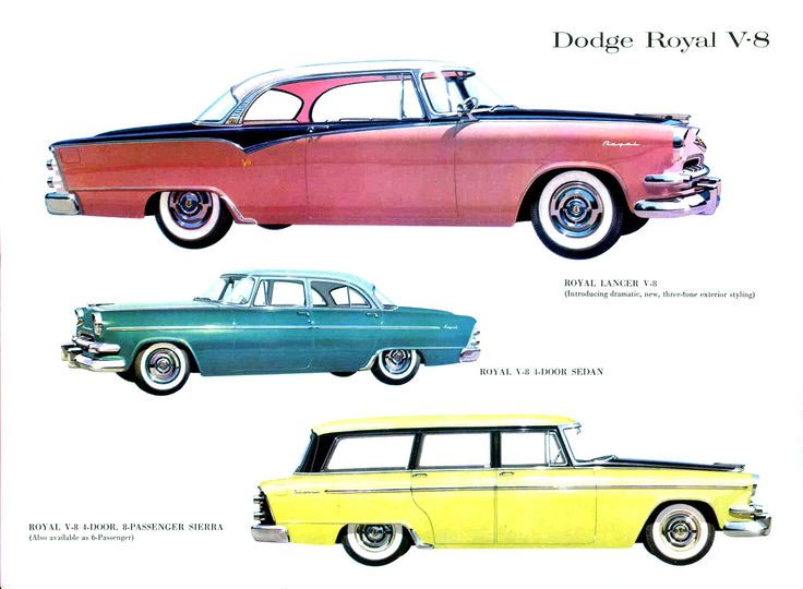
Transport
Similar to other industries, like fashion and design, car manufacturers had significant changes in the 1950s. They were some of the most classic, remarkable and powerful cars ever driven. Research and engineering teams worked hard at making the 1954 models safer, less expensive and easier to drive. The wrap-around window was a nice look though.
Most of the people in the UK used buses, as they were cheap and easy access transport, and they were convenient to travel around the country.
After 1950 the bicycle declined as a mode of transport in the face of competition from motorbikes and the private car.
Accessed: 19/08/2022
Like the postwar American car, the new fashion also fulfilled desires for lavishness, glamour, and certain shapelines. Chevrolet made striking changes to rear-end styling in their car models. Ford offered a full line of a luxury models. Italian carmaker Autobianchi made a supermini called Bianchina that got 40 miles per gallon.


Source: https://www.retrowaste.com/1950s/cars-in-the-1950s/
Accessed: 30/08/2022
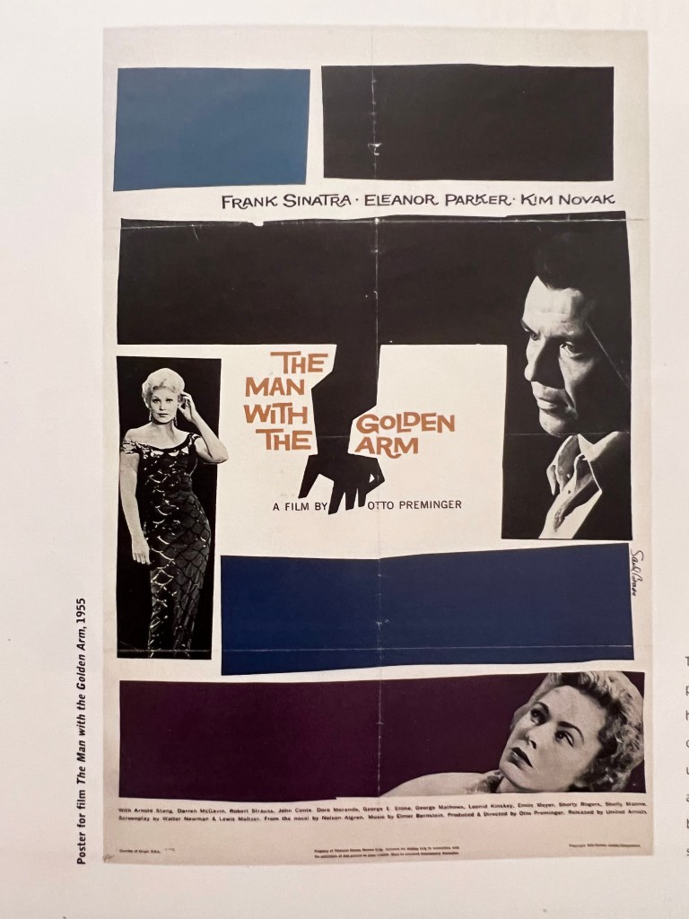
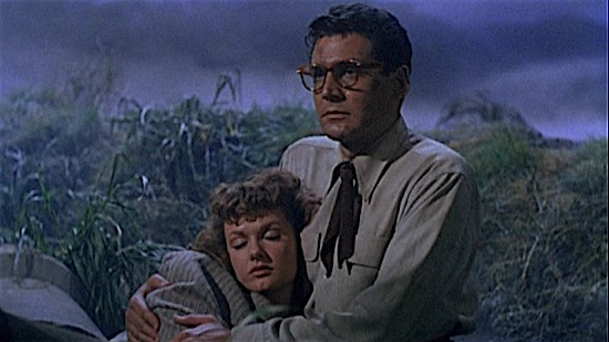
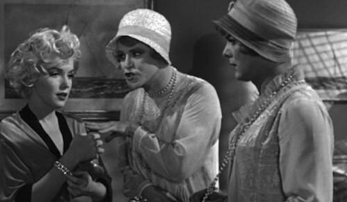
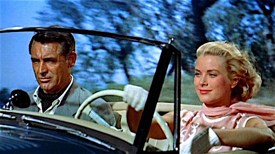
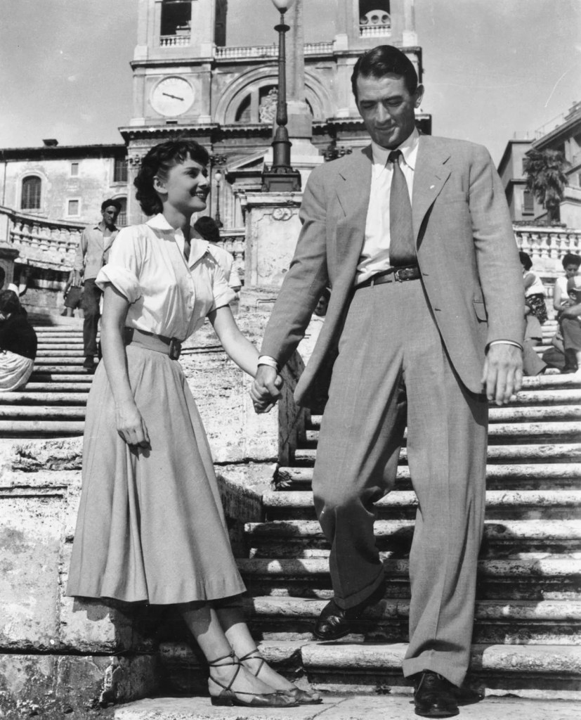
Film and TV
The movie industry in the 1950s was under attack by a new foe: television. Home theatre systems kept people in their homes and the cost of making a blockbuster movie rose sharply in the 1950s. In this case, the era of films from the 1950s is more difficult to pin down than the 1930s or ’40s. Still can be noticeable the influence of WWII. The most remarkable film plots from the 1950s evolved around relationships, and love stories, but at the same time popularised film noir and Westerns and the development of European neorealism.
https://www.filmsfatale.com/blog/2021/1/4/the-best-100-films-of-the-1950s
https://www.britannica.com/topic/Roman-Holiday
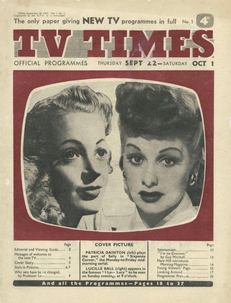
https://www.advertisingarchives.co.uk/detail/43594/1/Magazine-Cover/TV-Times/1950s
Surface pattern and decoration
There were three major colour trends in the 50s; pastel, modern and Scandinavian. Pastel colours that were particularly popular were pink, turquoise, mint green, pale yellow and blue. Modern colours were clean and bright and included vibrant yellow, electric blue, orange, red, black and white.
Bold designs such as stars, stripes, checks and polka dots came into vogue. Fabrics with fruit, flowers and abstract designs were everywhere. Characteristics of 1950s design are clean designs with a Scandinavian influence, space and atomic age-inspired shapes, also known as Mid-Century Modern. This now traditional style continues to be popular but is achieved today with new materials.
Illustration Pencil
After that deep research on culture from the 1950s, I felt like I have a valuable ground to visualise illustrations that would best describe that period. I could see that the 1950s are reflected in contemporary art and design with its modern approach to sculpture, house building, and even graphic design. I think the 1950s gave a decent ground for developing ideas and evolving modern culture around it.
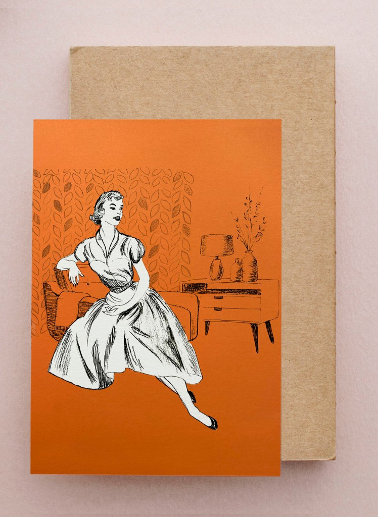
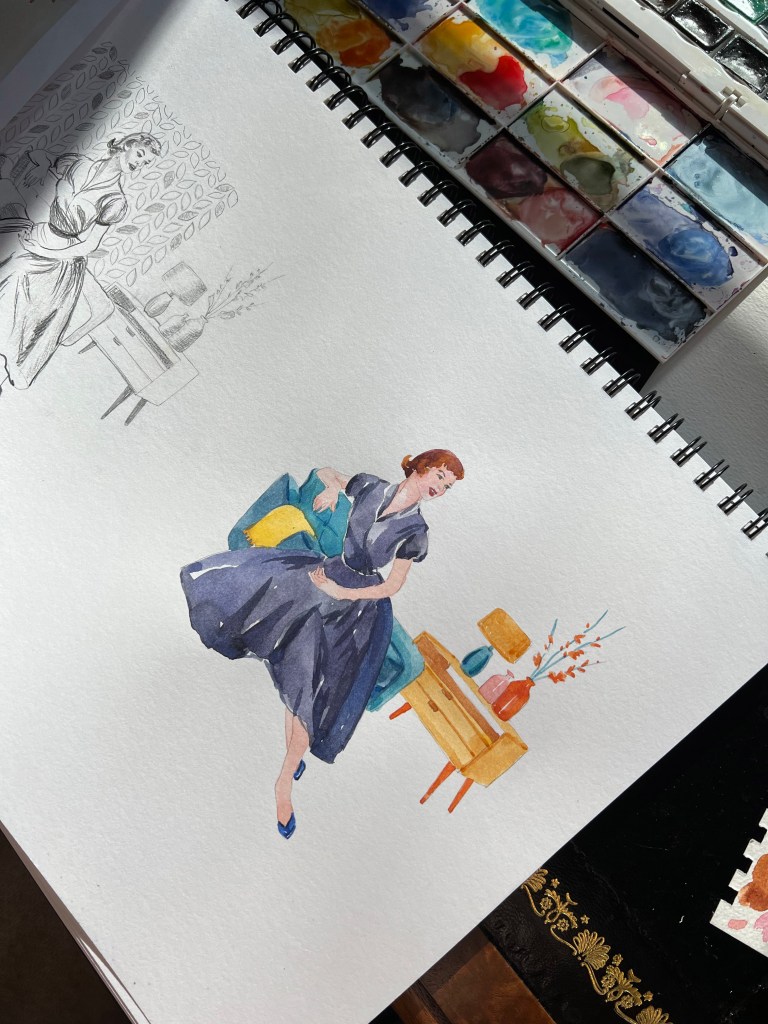
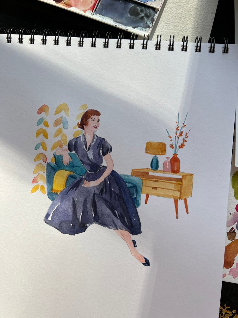
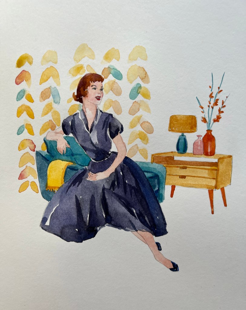
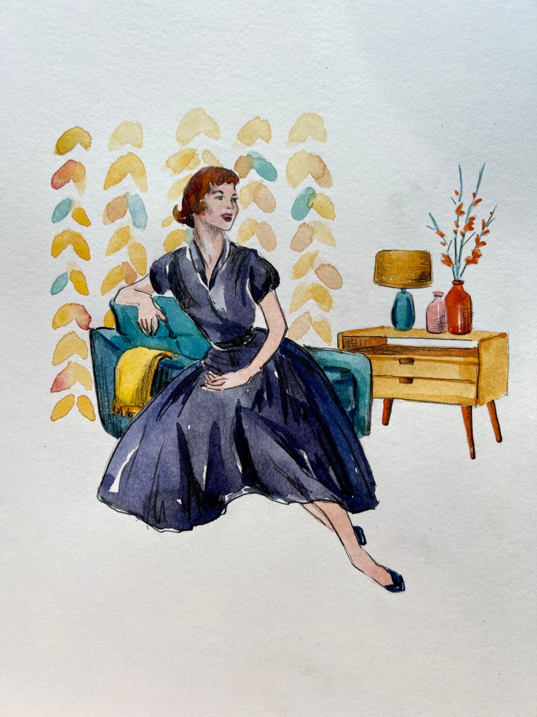
For my illustration, I decided to choose a classic and elegant lady in the traditional 1950s shape of the dress, sitting on a chair with decor from the 1950s around it. For the wallpaper, I chose floral patterning the pale shades.
For my illustration, I decided to choose a classic and elegant lady in the traditional 1950s shape of the dress, sitting on a chair with decor from the 1950s around it. For the wallpaper, I chose floral patterning the pale shades. Quite interesting, that even with all the Midcentury features around that illustration, it still looked quite modern. Probably it’s due to the circulating of fashion when they say it goes the circle and comes back to us again in the furniture, clothes, and sometimes house decoration.
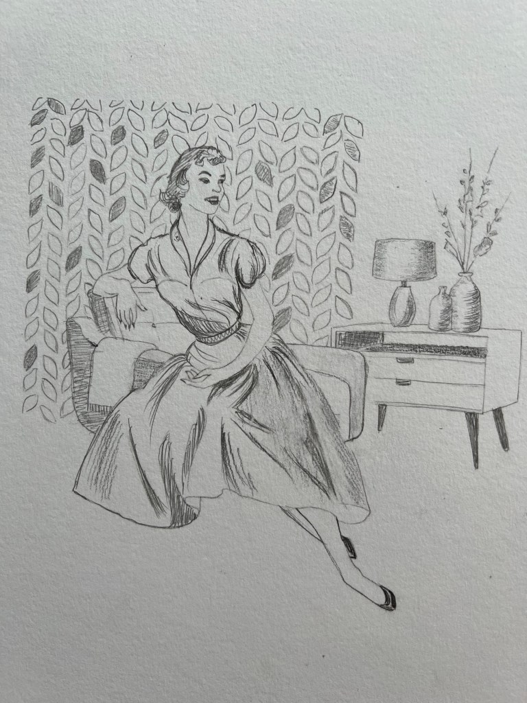


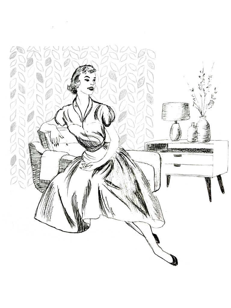
For the first illustration, I wanted to keep that pencil design with some sharp strokes in it. The girl turned out to be very happy and full of energy from the 1950s, she could be a traditional housewife or be a guest at someone’s house. I chose to make the girl with white colouring, so she could stand out from the decoration, and experiment with the colour of the background. I had colourful paper, so I took a picture of it and placed the illustration on top of it in Photoshop, to see which colour suit best to it. I went for the orange background because those were sort of colours that were modern around those days, like mustardy, orangy, and yellow tones.
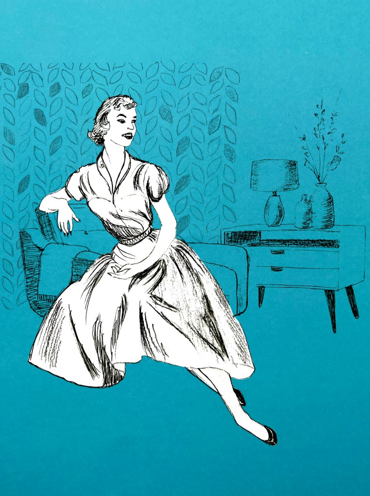
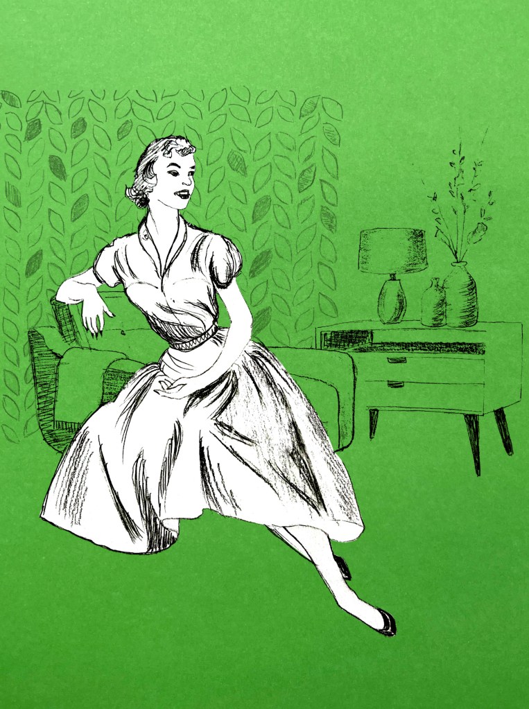

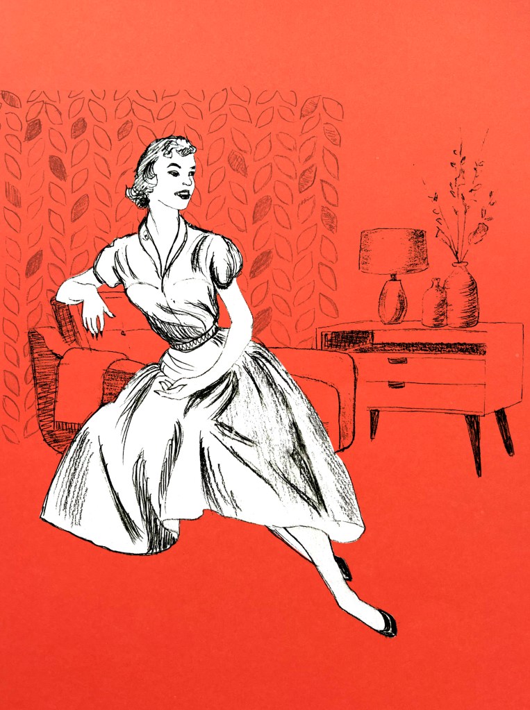
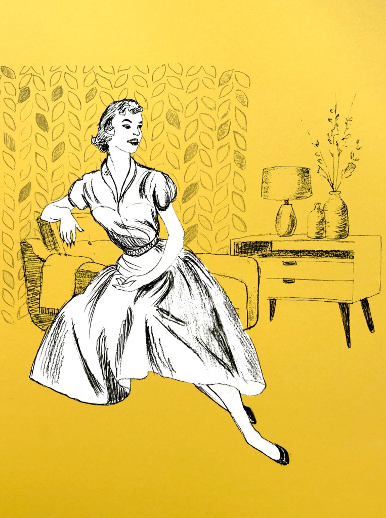
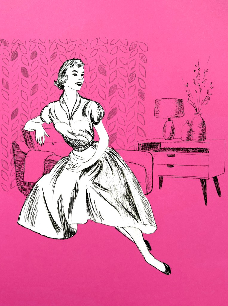
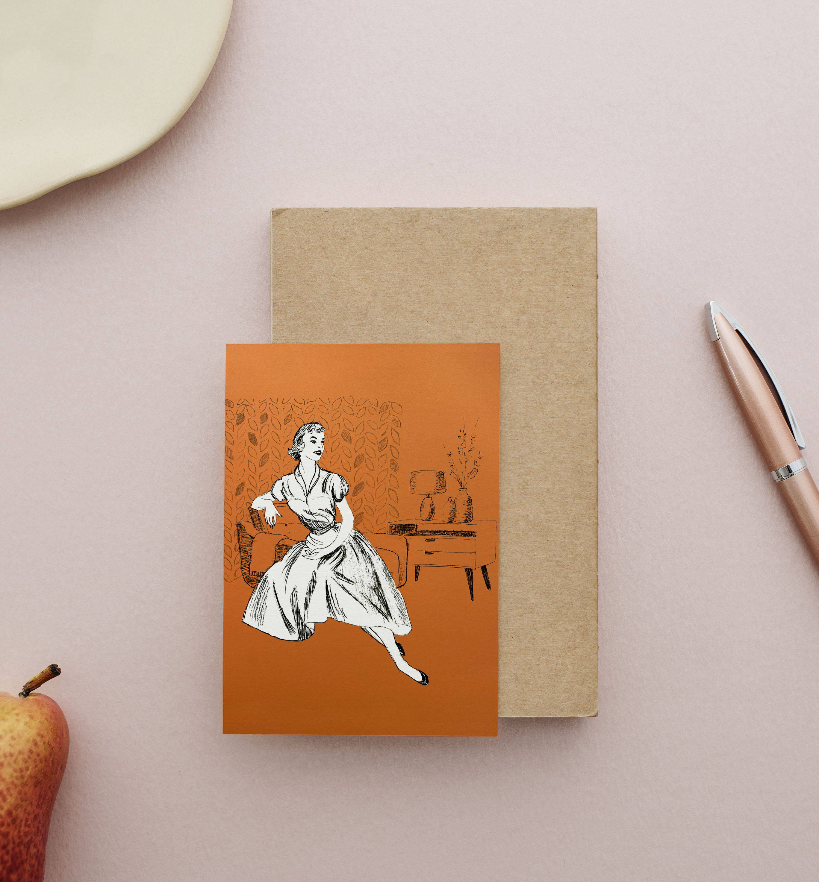
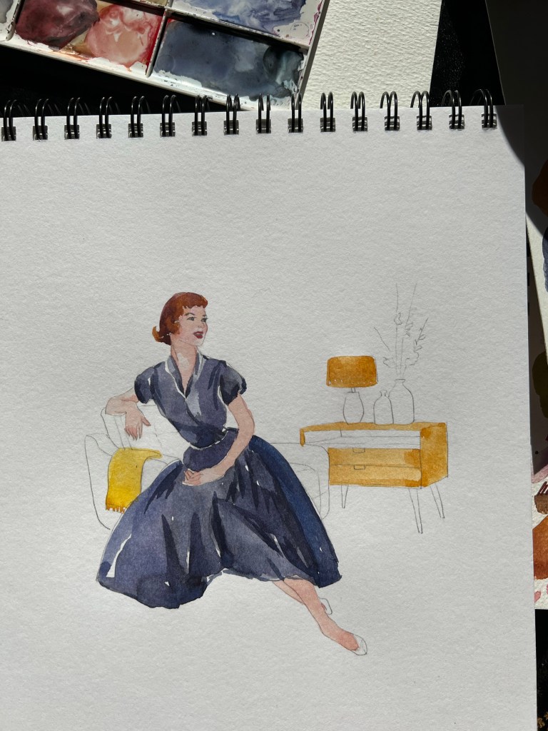
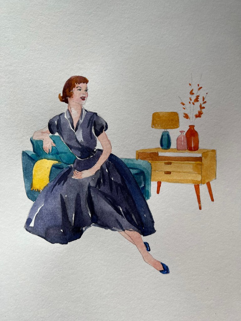
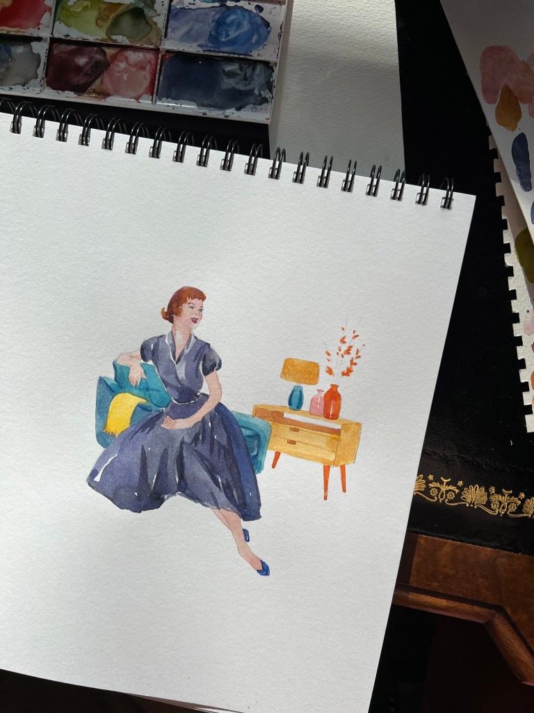
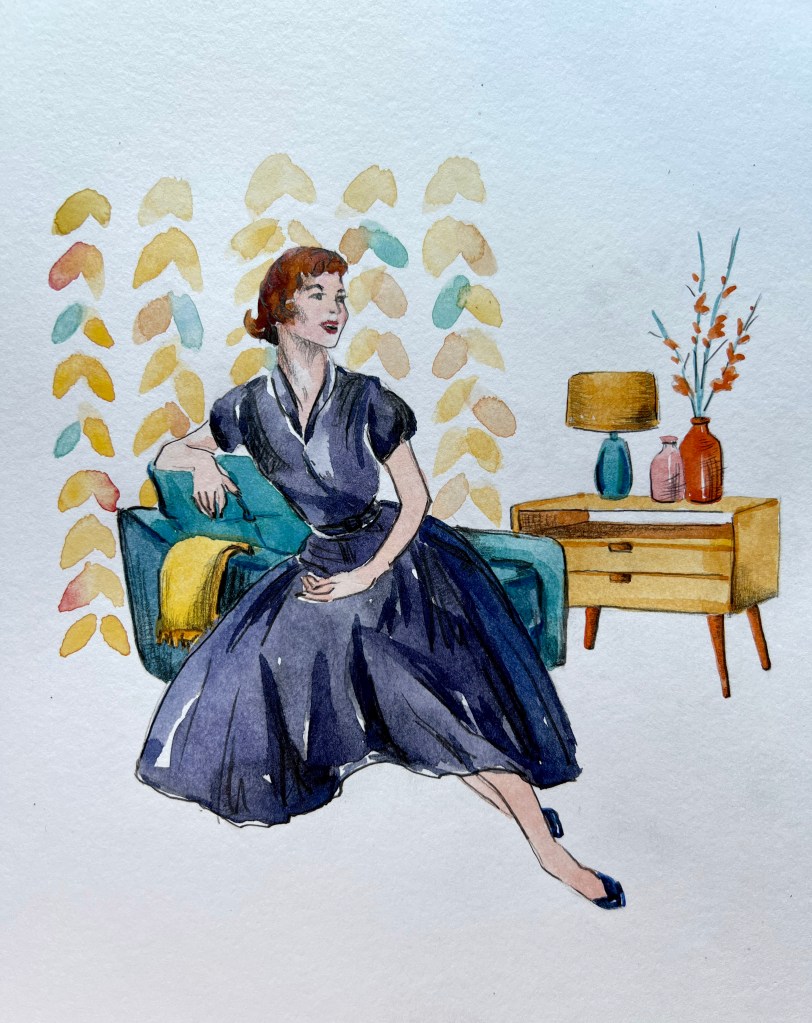
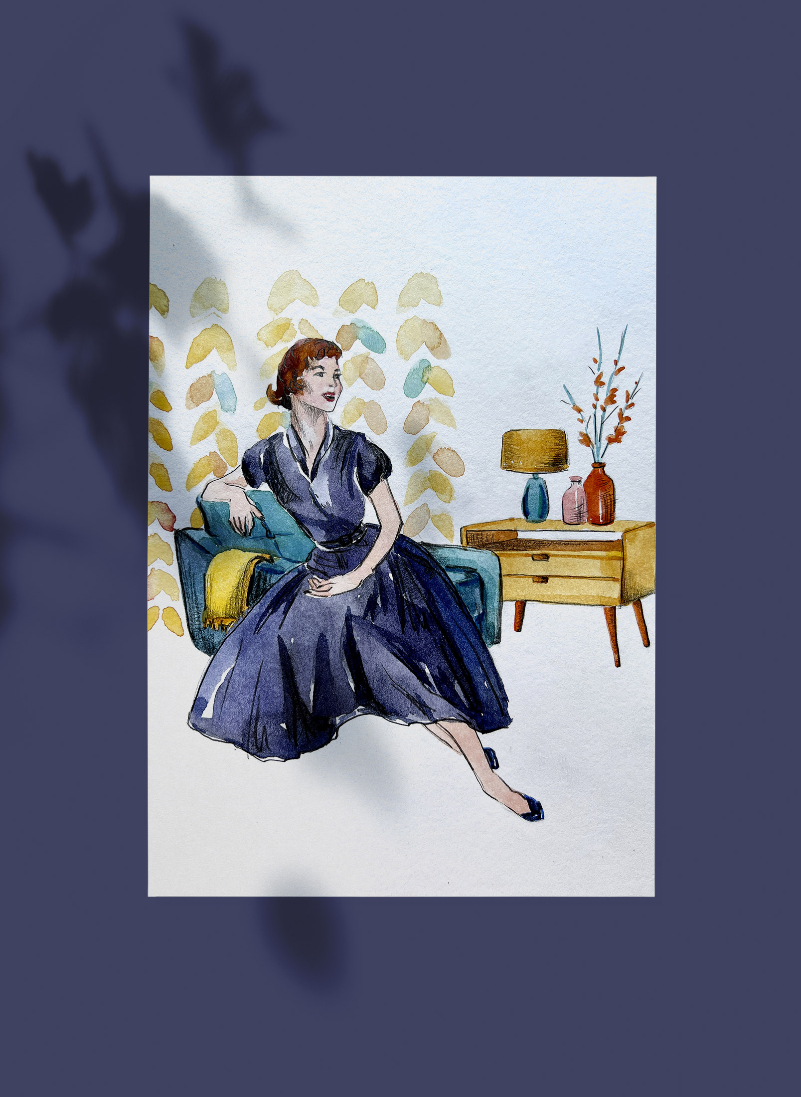
Illustration Watercolour
I was pretty happy with my sketch illustration, but I wanted to experiment with the colour and elevate the mood of the illustration through some bright patterns. I went for the dark blue dress for the girl, warm orange colours for the furniture and blanket, and the turquoise colour of the chair. For the wallpaper I went for similar shades from the furniture, to demonstrate the replicating colours in the decoration. On the top of the watercolour, I used pencil sketching, to highlight the shades of the illustration.
Conclusion
To me, it was quite a useful exercise to complete, as the 1950s were remarkable times, and we can see their reflection in our everyday modern life. I think we are still replicating the interior designs from that century, the approach to graphic design, and the elegant style that always will be in fashion. In terms of illustrations, I think I prefer the colourful version, as it looks more like a completed version, and colours do highlight major components of those times, when it was important a comfortable and welcoming house, with a woman being the hearth keeper. The character has charm and elegance, a classy look and joy about her. It took me a bit longer to complete this exercise than I planned to, as I went into the detailed research for it, but I hope it was all valuable knowledge I’m going to implement in this assignment.
