Choose one of the words from the previous exercise and on a large sheet begin expanding on the themes and ideas that you identified.
OCA Illustration
Collect swatches of colour and texture to or create your own to establish a palette of colours and repertoire of marks. Google some of the words and from the Images link, either print off or draw from some of the images that emerge. Go through other books and magazines and take snippets of images, which have associations with your words and theme. Assemble these elements on your large sheet.
You are not creating a piece that is a designed artefact in its own right. You don’t have to include words but may want to selectively incorporate some words into your moodboards as an aide-memoire. If you organise your content according to visual connections you may find that links and some nice surprises emerge. This should lead to you being able to recognise or establish a hierarchy within your content. There is more on this concept in Part three.
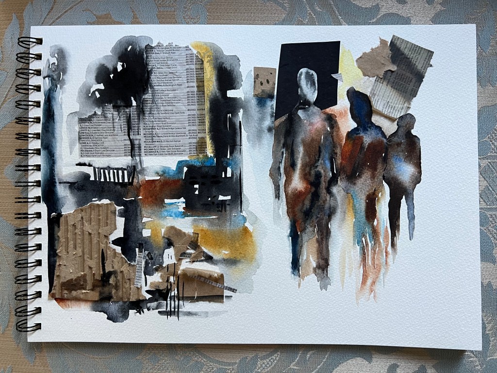
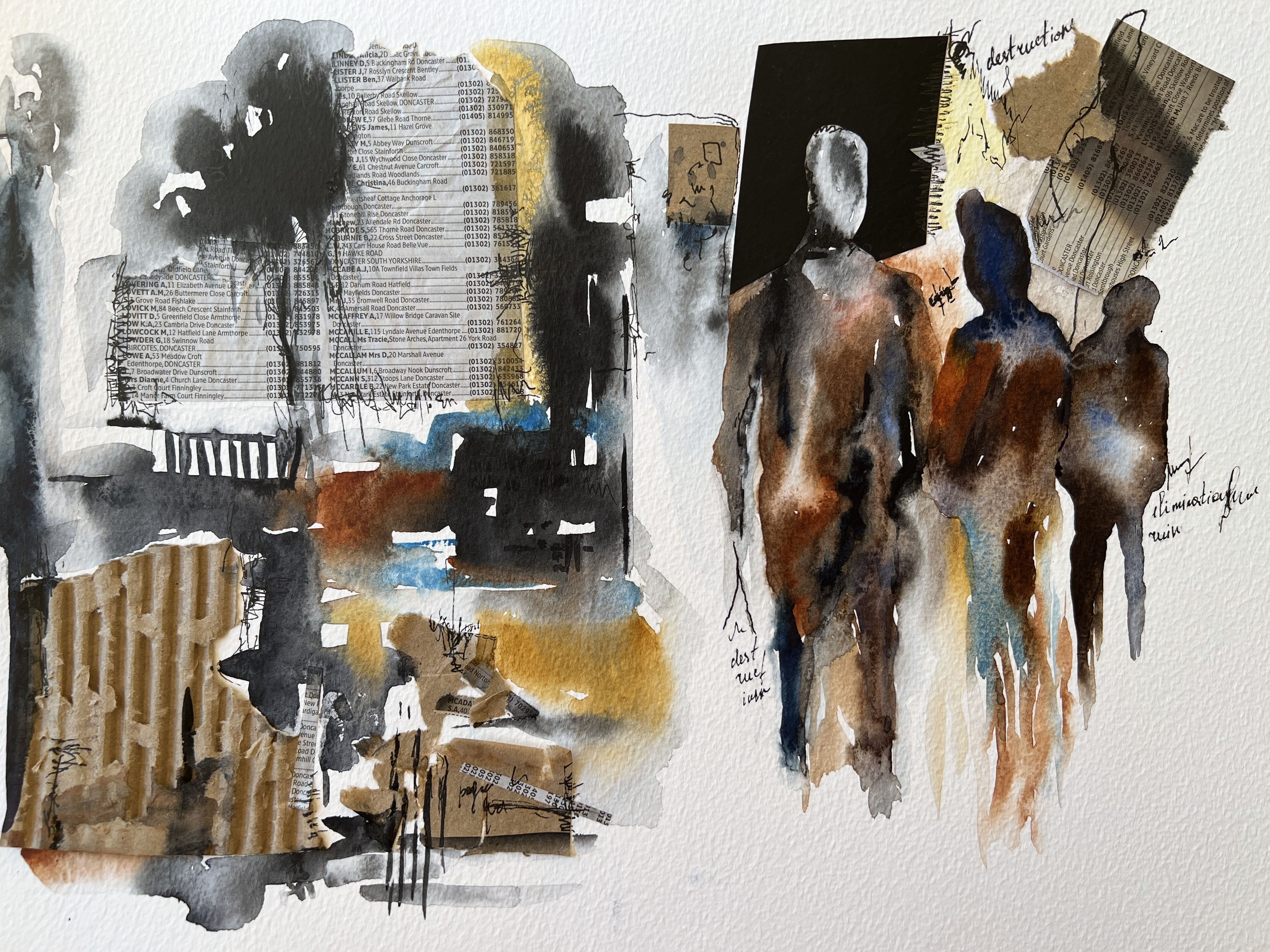
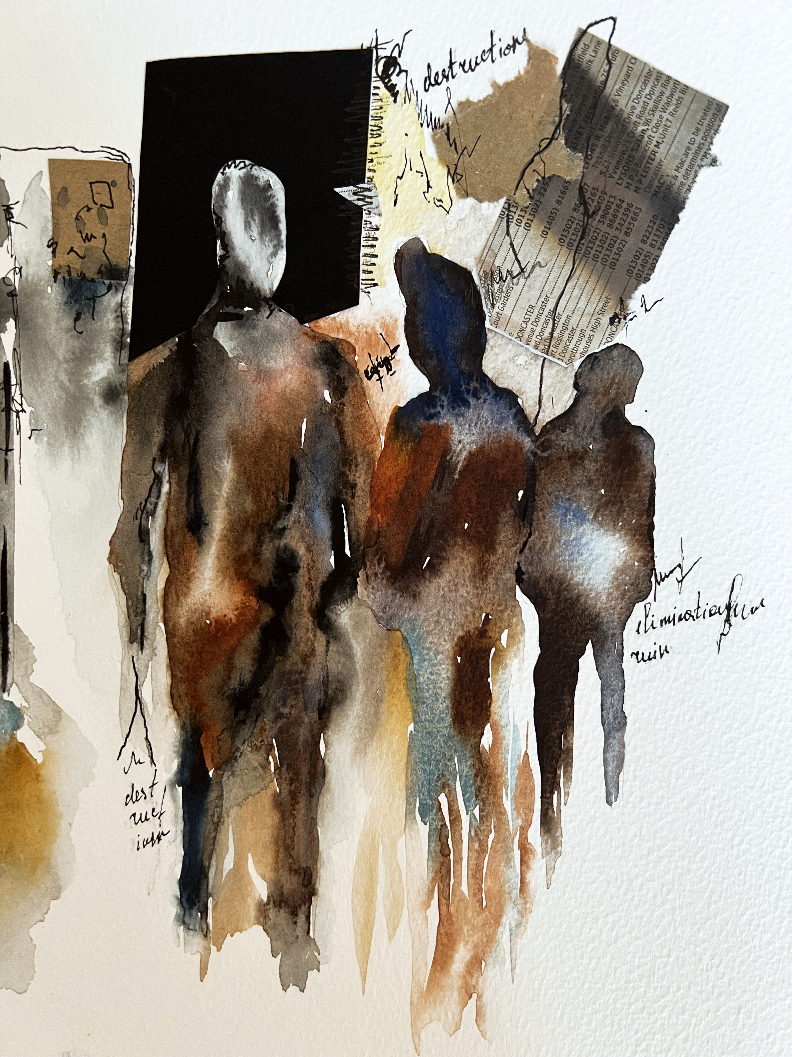
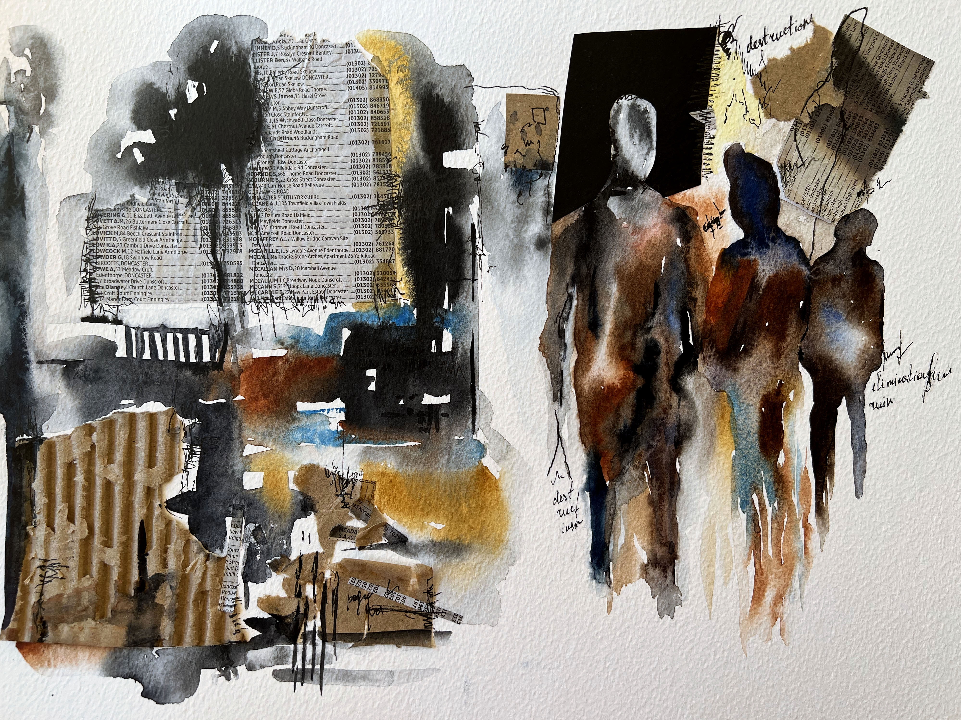
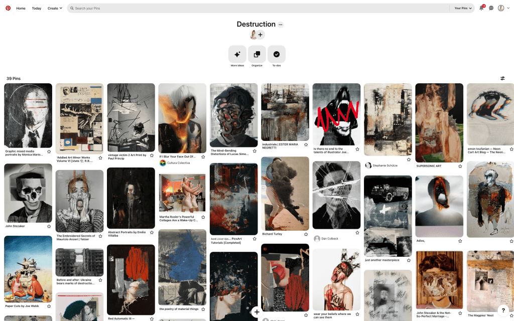
Destruction moodboard
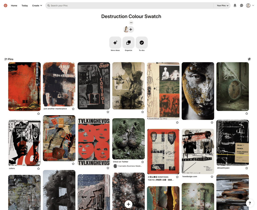
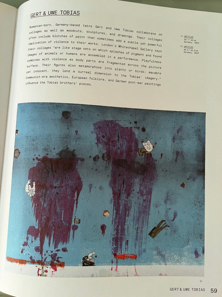
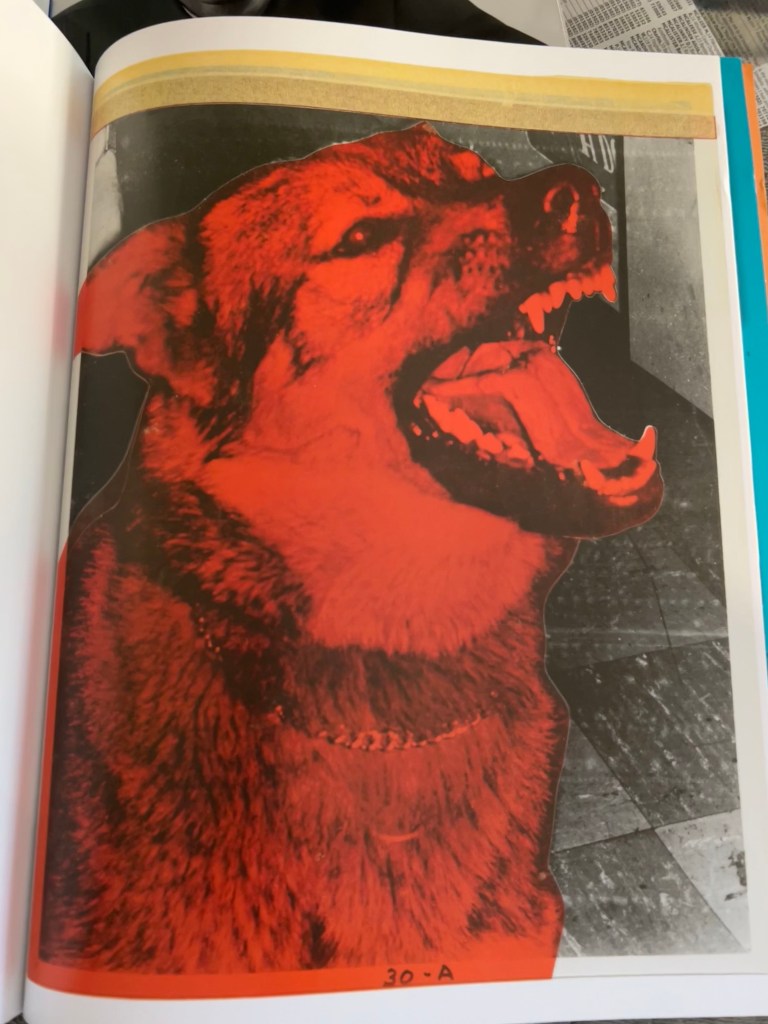
For this exercise, I decided to go with the more abstract and visually creative word – destruction. Going through my previous experience I could recollect several artists and designers that took this word as a central part of creativity, it’s like a keyword for creating a mind map around it. There are great collages, illustrations, juxtapositions and photographs that could be applied to this word and the spectrum of its influence in our modern life are pretty high. To start with, I created a moodboard on Pinterest – a usual source of inspiration. On another board, I collected images with coloura that would associate with the word destruction.
Destruction colour palette
The word itself is quite negative, dark, provoking and hard to absorb, and it can lead to aggression, conflicts, and wars. Still, creative wise it has a great potential for producing the most appealing and intriguing images. With this word I have an association with the shades of black, grey, red, and mouldy colours, it’s a part of our existence and the best way to use it is rather creative, such as art than in everyday life.
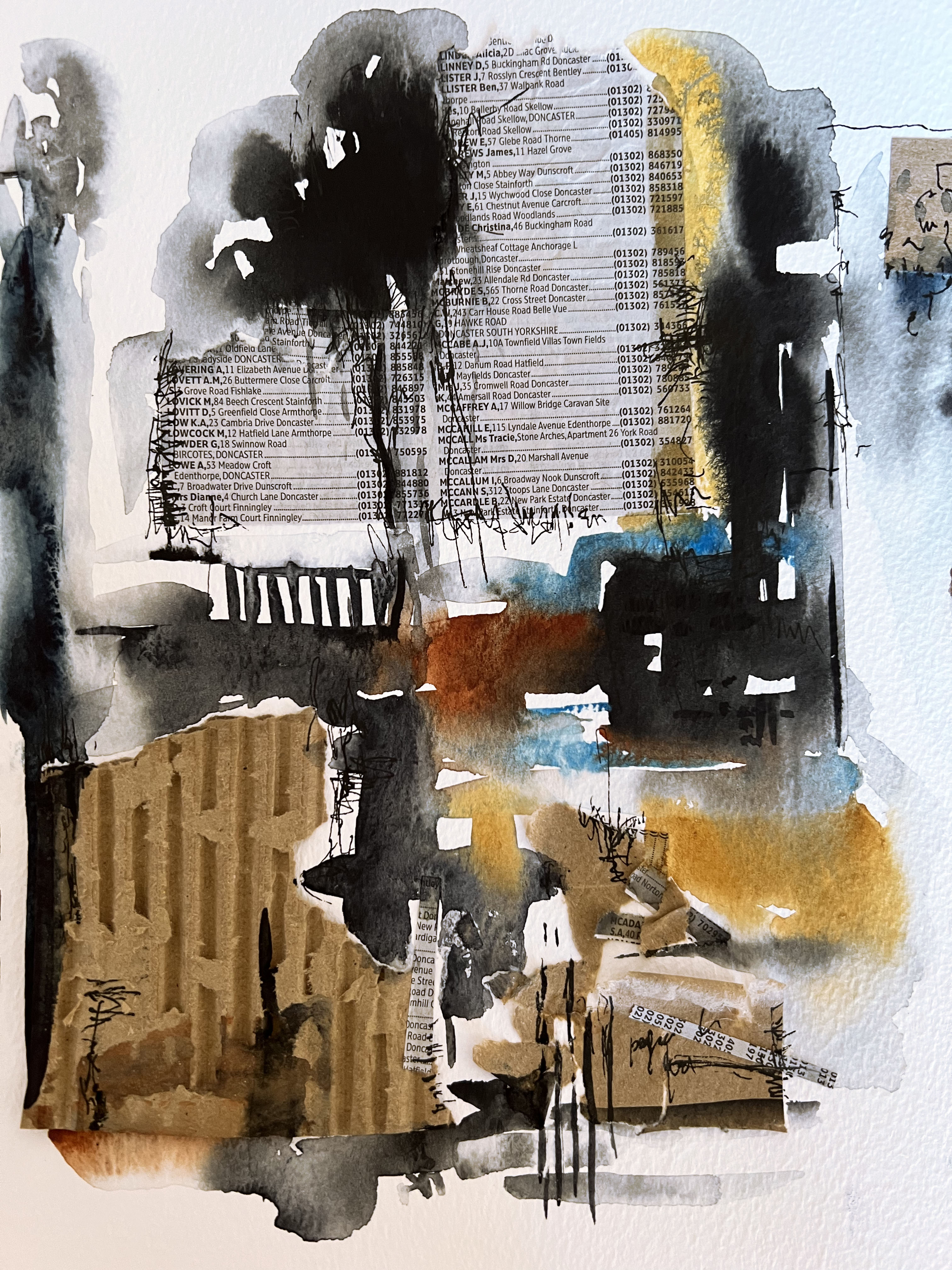
Books and magazines snippets
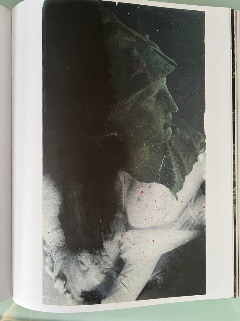
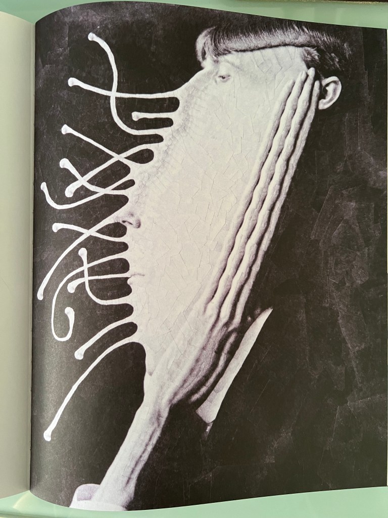
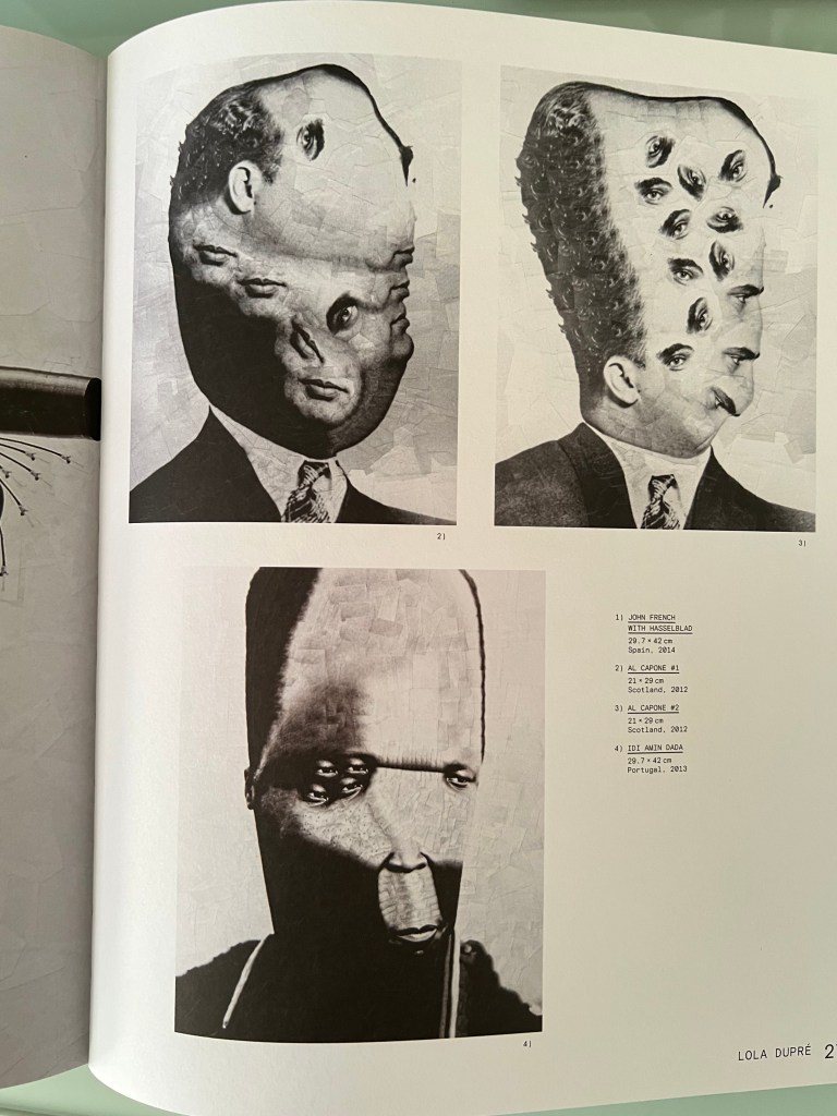
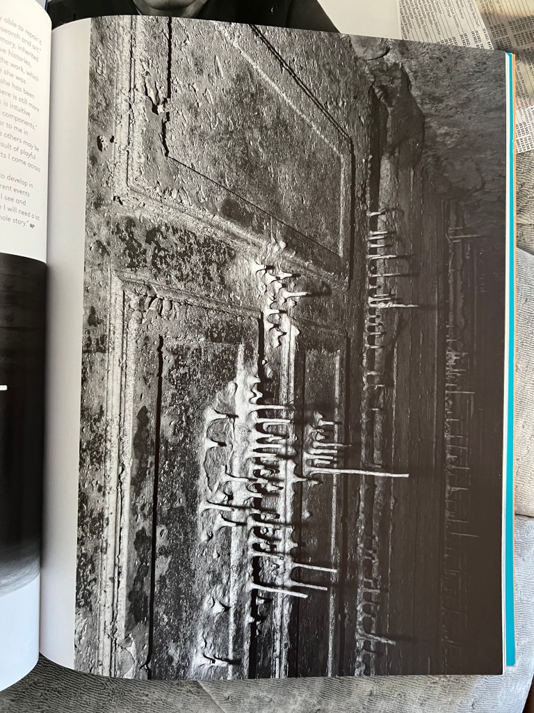
Also, I’ve been collecting some of the books and artworks from the time when I studied juxtaposition and collages. One of the best sources to look for inspiration, as it is filled with unexpected, expressive solutions, that reflect the artist’s visions. From those designs, I can see that artists were experimenting, using old catalogues, splashes of paints, and liquify tools in photoshop, to create some new unusual materials

Creating swatches
In my head, I started to imagine what kind of materials I could implement for the word distortion. I wanted to use little objects around me for using them in my own mood board, like pieces of newspapers, dark shades of watercolour, burned paper, card boxes and a black pen. I tried to place them chaotically, but organise them into the whole image. I think, that the impression from the final design is coming with some little details that are going to be used in its representation, like scratches, erratic movements, and weird shapes, which could be one of the signatures of the final piece.