
In this exercise, I was asked to explore how illustration has evolved over the past 50 years. I should start the exercise by familiarizing myself with one of the following artists:
Edward Bawden, Kathleen Hale, Eric Ravilious
Edward Ardizzone, John Minton, E. H. Shephard
Then using books and the internet, find out about these artists’ work and the cultural context in which they created their most significant works. Also, I need to think about the modern illustrator I am inspired by. The final goal is to explore and identify the differences in style, context, production and imagery between the two illustrators. In the end, I will have to paint an illustration in the style of each artist, by choosing a similar subject and using a similar approach.
Research
To begin my very first exercise for the Key Steps in Illustration, I decided to do a brief research on all of the artists mentioned above. As illustration is a new field for me, I felt that is vital to do as much as possible exploration in the list of remarkable artists. Also, my personal feeling is that it’s vital to get to know the illustration in history, be able to track the significant changes in illustration development, its influence on modern-day art, In addition, to have a feel for the favourite artists, and what makes them distinctive to me. I wanted to go briefly through each artist mentioned above.
Edward Bawden
Edward Bawden was an English painter, illustrator and graphic artist, known for his prints, book covers, posters, and garden metalwork furniture. Bawden taught at the Royal College of Art, where he had been a student, worked as a commercial artist and served as a war artist in World War II. He was a fine watercolour painter but worked in many different media. He illustrated several books and painted murals in both the 1930s and 1960s. He was admired by Edward Gorey, David Gentleman and other graphic artists, and his work and career are often associated with that of his contemporary Eric Ravilious.

(Assessed 25/05/2022)
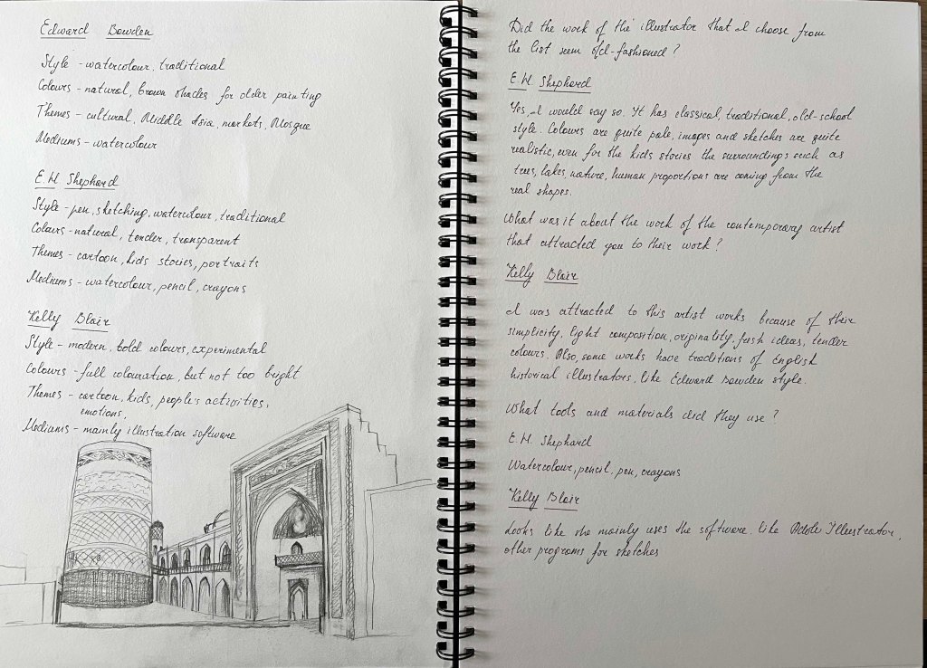
For this artist’s works, I could see traditions of watercolour paintings. Artist used calm, sand shades colours, with a dash of cartoon style. Some of his later works had sharper lines and had features of designing by the modern days’ software. I loved the feeling of this artist’s works, they brought a sense of nostalgia, and they reminded my early ages when I first time learned watercolours and painting.


His notable surviving public works include a tile depicting a foot ferry on the River Lea, commissioned by London Underground and located on the Victoria line platform at Tottenham Hale tube station. Bawden also produced the cameo-like silhouette of Queen Victoria located at Victoria tube station.

Source: https://en.wikipedia.org/wiki/Edward_Bawden
(Assessed 25/05/2022)
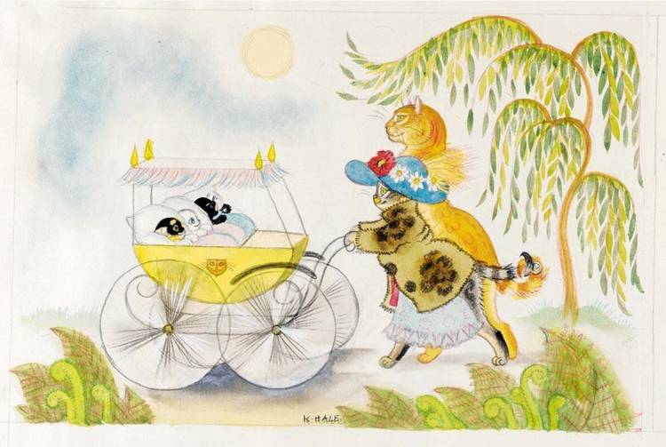
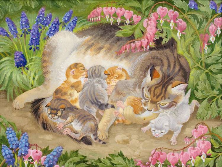
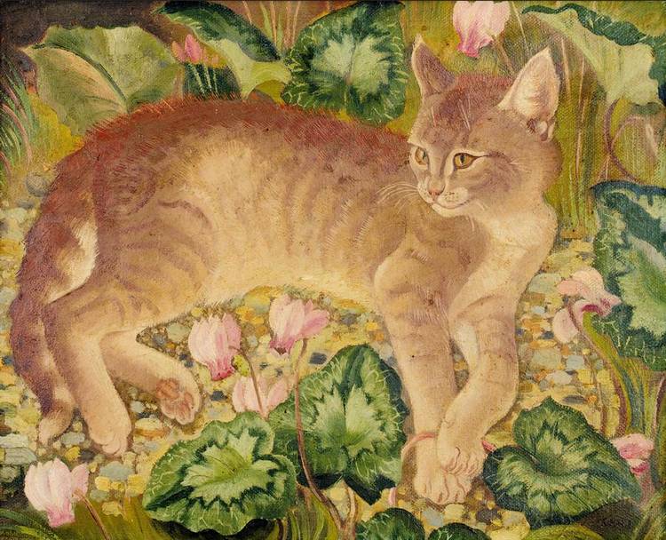
Kathleen Hale
Precocious and versatile, Kathleen Hale established herself as a member of the artistic circle of Fitzrovia while still in her twenties. However, it was marriage and motherhood that engendered her most immortal creation, Orlando the Marmalade Cat, and his adventures – which were first told to her sons as bedtime stories. The artwork and its reproduction for the first published stories set a new standard for children’s illustrated books when they appeared in 1938.
Kathleen Hale was born on 24 May 1898 in Broughton, near Biggar, Lanarkshire, Scotland, where her parents had a holiday home. She was brought up in a select suburb of Manchester until the death of her father, a travelling agent for Chappell pianos when she was five years old. Her mother then took over her husband’s job, settling Hale and her brother with relatives.
From the age of nine, she was educated at Manchester High School for Girls. During her last year there, she was sent twice a week to life drawing classes at the Manchester School of Art. She won a scholarship to study art at Reading University, where she studied under Allen William Seaby (1915-17). The college farm of the university gave her many first-hand experiences of animals, and these influenced her later work as an illustrator.

https://www.invaluable.com/auction-lot/hale-kathleen-338-c-0z1p7mujdr

https://www.invaluable.com/auction-lot/hale-kathleen-321-c-zwdkiczc3u
https://www.invaluable.com/auction-lot/hale-kathleen-337-c-niodmgrqv3

https://www.invaluable.com/auction-lot/hale-kathleen-339-c-pzbac10ljc
https://www.invaluable.com/auction-lot/hale-kathleen-466-c-ptfvzihfk2
(Assessed 25/05/2022)
Kathleen Hales’s works are filled with tenderness and love for nature, especially admiration toward cats. She depicted them beautifully and softly. These are perfect illustrations for the kid’s stories and fairytales, the colours are delicate and aesthetically pleasing to the eye, and they have that distinctive vibe from the past century.
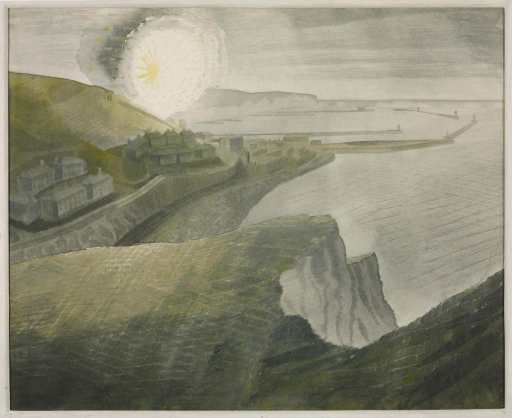
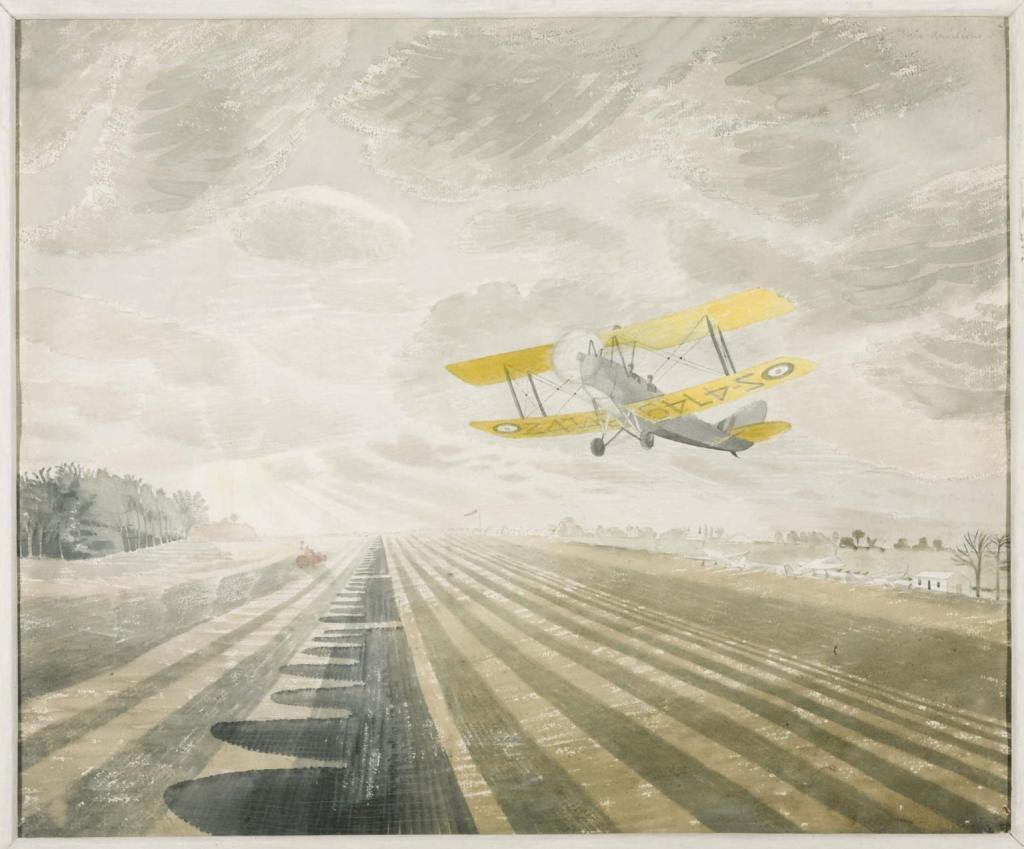
Eric Ravilious
Eric Ravilious was a British painter, designer, book illustrator and wood-engraver. He grew up in Sussex and is particularly known for his watercolours of the South Downs and other English landscapes. In his works, the artist examines English landscape and vernacular art with an off-kilter, modernist sensibility and clarity. He served as a war artist and died when the aircraft he was in was lost off Iceland.
Eric Ravilious‘s paintings reflect a feeling of the war period, the colours are slightly dull and have vintage shades on them, deliberating the disturbing energy from the battle of the country against the nazism.


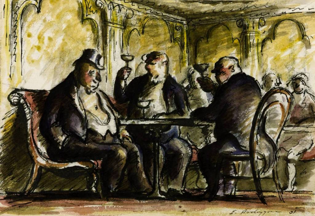
Edward Ardizzone
Edward Ardizzone who sometimes signed his work “DIZ“, was an English painter, print-maker and war artist, and the author and illustrator of books, many of them for children. He became famous for his illustrations for Tim All Alone (Oxford, 1956) children’s book, which he wrote and illustrated.
Ardizzone studied art at Westminster School of Art in 1920-1 under Bernard Meninsky. He was an official war artist during World War II, working widely in Europe and North Africa, and his illustrated diaries are notable records. After the war, he established a strong reputation as a book illustrator and writer. He had a retrospective at the Victoria and Albert Museum in 1974.
I loved these artists’ works in particular, as they are a great combination of soft watercolour shades and sharp pencil/pen sketches on the top, to highlight the line. His first works were predominately dark and dulled coloured, but towards the ’70s I could see the movement towards bright and clear watercolours.

https://pallantbookshop.com/product/bunk-bed-at-sea-print-by-edward-ardizzone/


(Assessed 25/05/2022)
John Minton
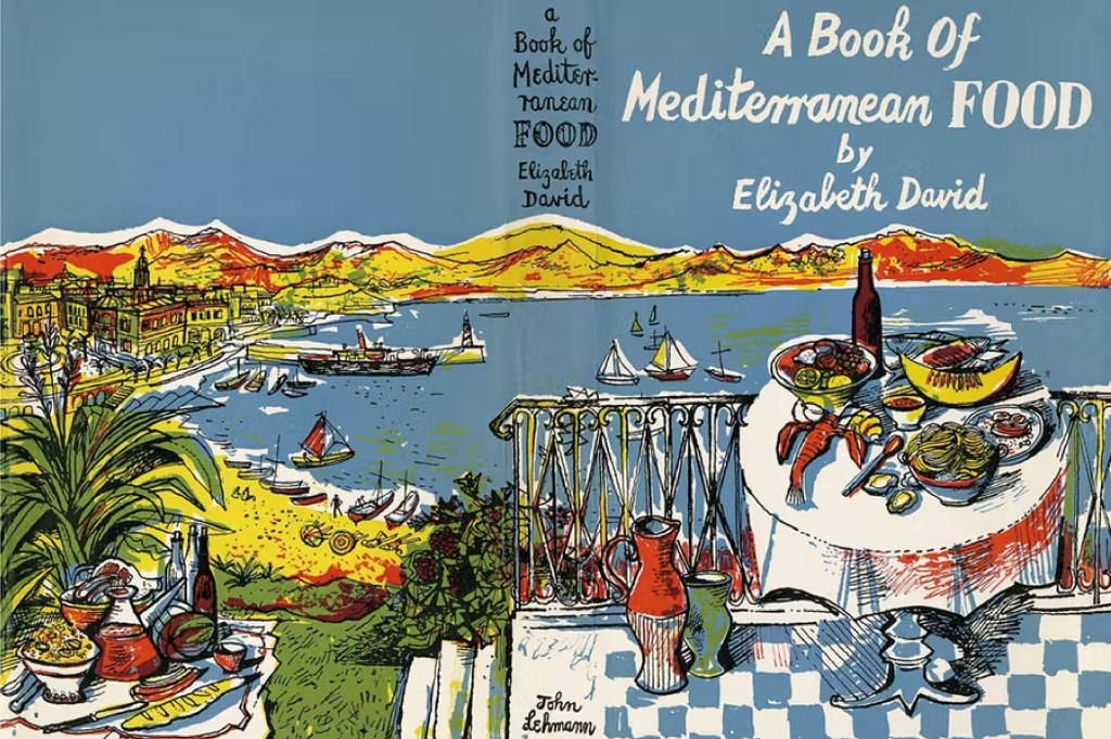
Francis John Minton was an English painter, illustrator, stage designer and teacher. After studying in France, he became a teacher in London, and at the same time maintained a consistently large output of work. In addition to landscapes, portraits and other paintings, some of them on an unusually large scale, he built up a reputation as an illustrator of books.
published by John Lehmann Ltd, 1947, pen and ink on paper © Royal College of Art
(Assessed 25/05/2022)
John Minton was part of a group of British Neo-Romantic artists. He is perhaps best remembered as the illustrator of Elizabeth David’s revolutionary cookery books on French and Mediterranean cuisine.
(Assessed 25/05/2022)
I like this artist’s works for their abstract trend and bold opaque colours for illustrations. Each image is filled with pen sketching on the top and creates a mood of being drawn in a rush. That is something I would like to learn and borrow for my techniques. My previous units still evolved around graphic design software, and my sketches were done briefly, without so much attention to the details of the illustrations. But I’m looking forward to learning some new skills and improving my drawings and sketches.
E. H. Shephard
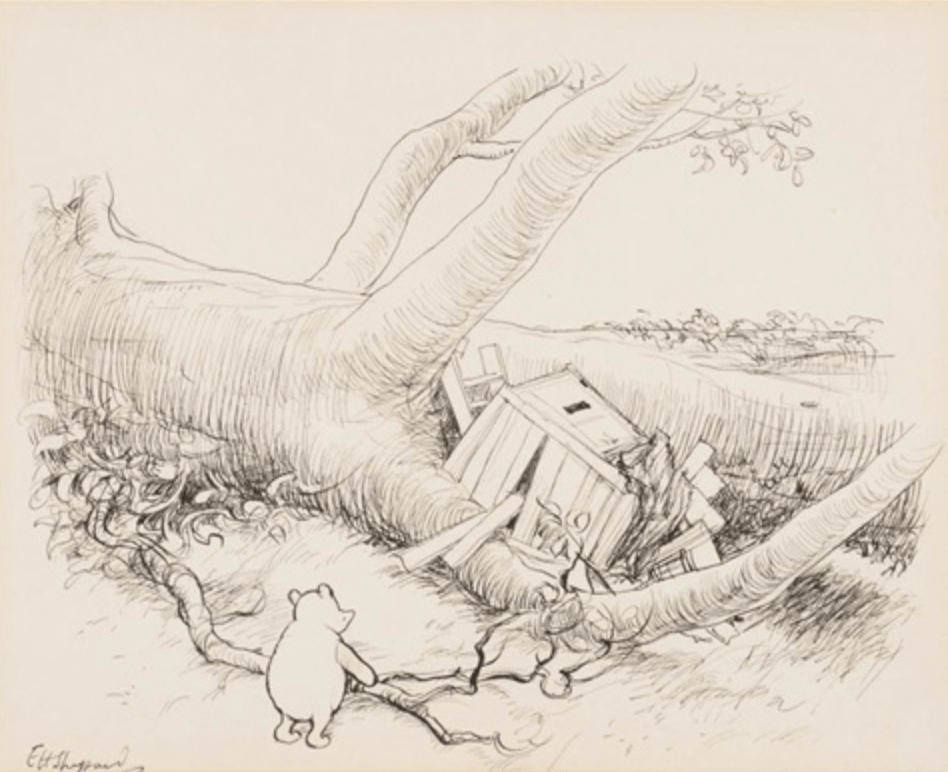
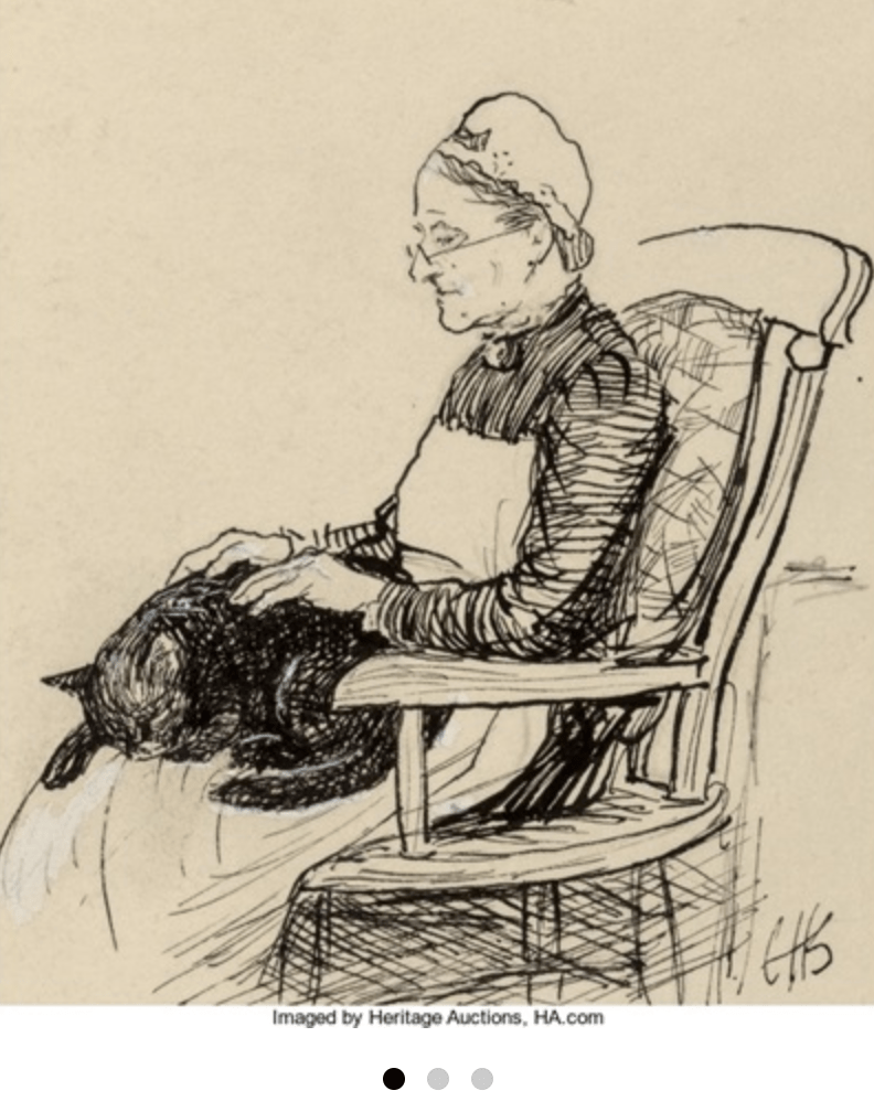
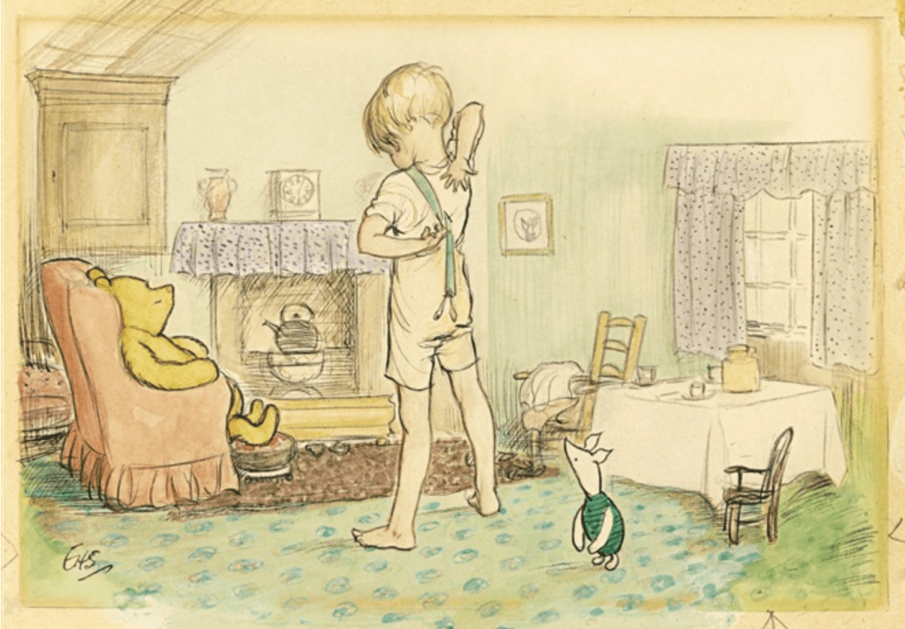
Ernest H. Shepard was a successful British illustrator and painter best known for his illustrations for The Wind in the Willows by Kenneth Grahame and Winnie-the-Pooh by A. A. Milne. His work, often created through a combination of watercolour and pen-and-ink, is characterised by light washes of colours and graphic, black outlines. Born on December 10, 1879’s in London, England to an artistic family. The artist developed an interest in drawing from a young age and went on to receive formal training from the Royal Academy Schools in London. After serving in the Royal Garrison Artillery during World War I, Shepard worked for the popular satirical magazine Punch, where he was later recommended to author A.A. Milne, who was searching for an illustrator for Winnie-the-Pooh. Shepard received national attention for his work on the popular book series and continued in literary illustration for 50 years, designing the covers of popular Victorian novels, including David Copperfield by Charles Dickens and Tom Brown’s Schooldays by Thomas Hughes. Shepard died on March 24, 1976, in Midhurst, United Kingdom.
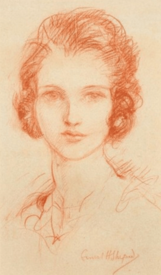
Head of a woman

I say, mater, I do wish you wouldn’t do your running repairs in public
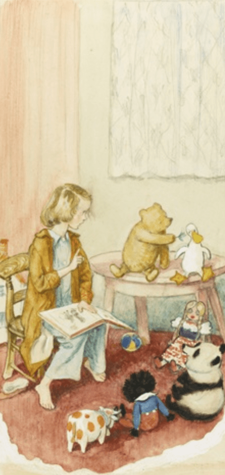

Christopher Robin came down from the forest to the bridge, feeling all sunny and careless
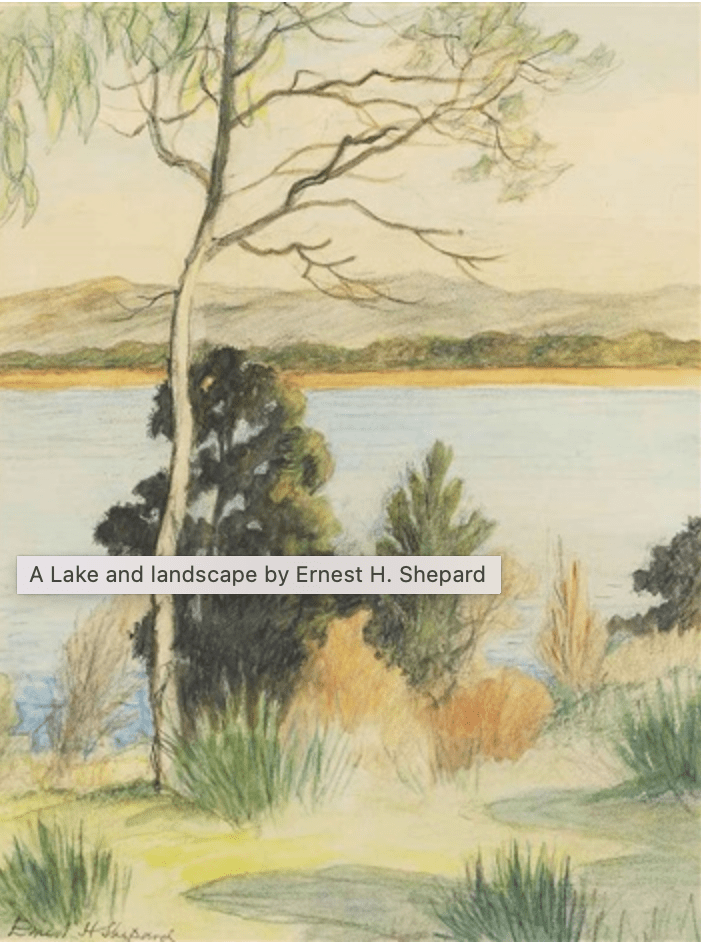
A Lake and landscape
(Assessed 25/05/2022)
Illustrations
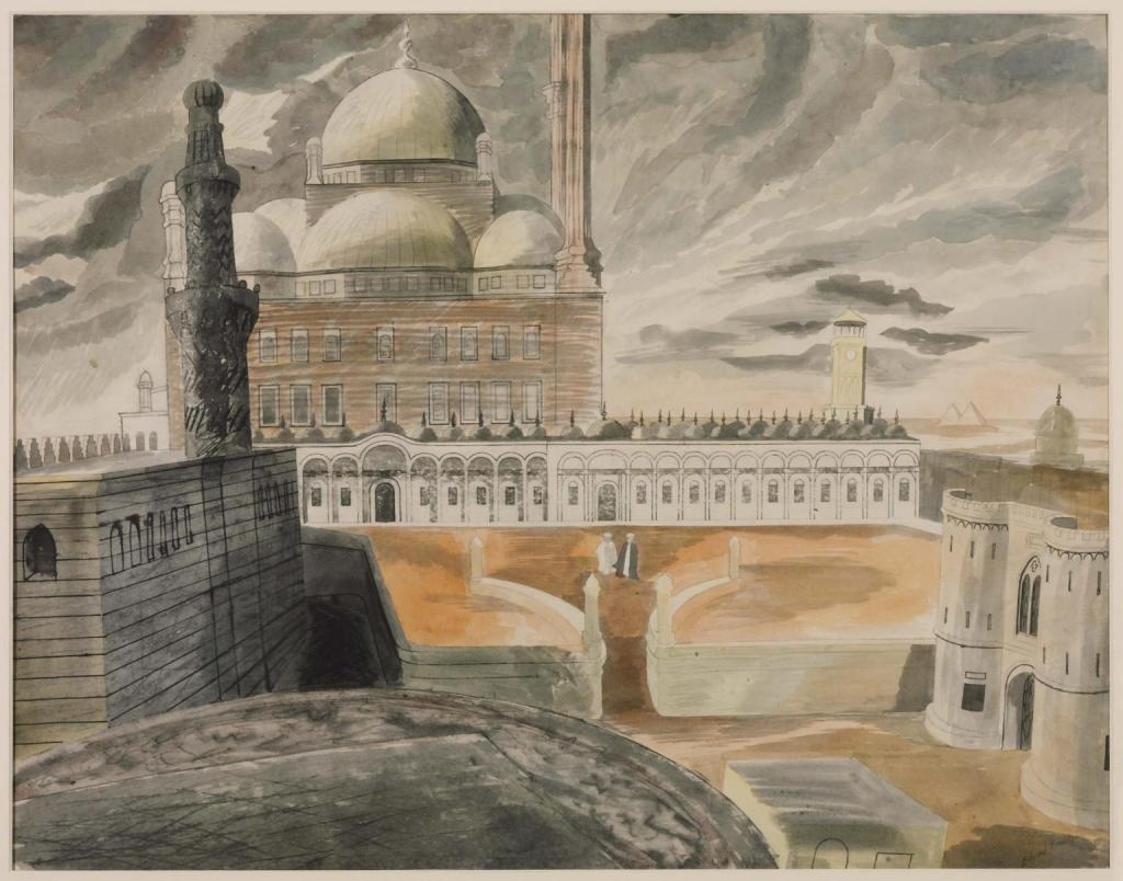
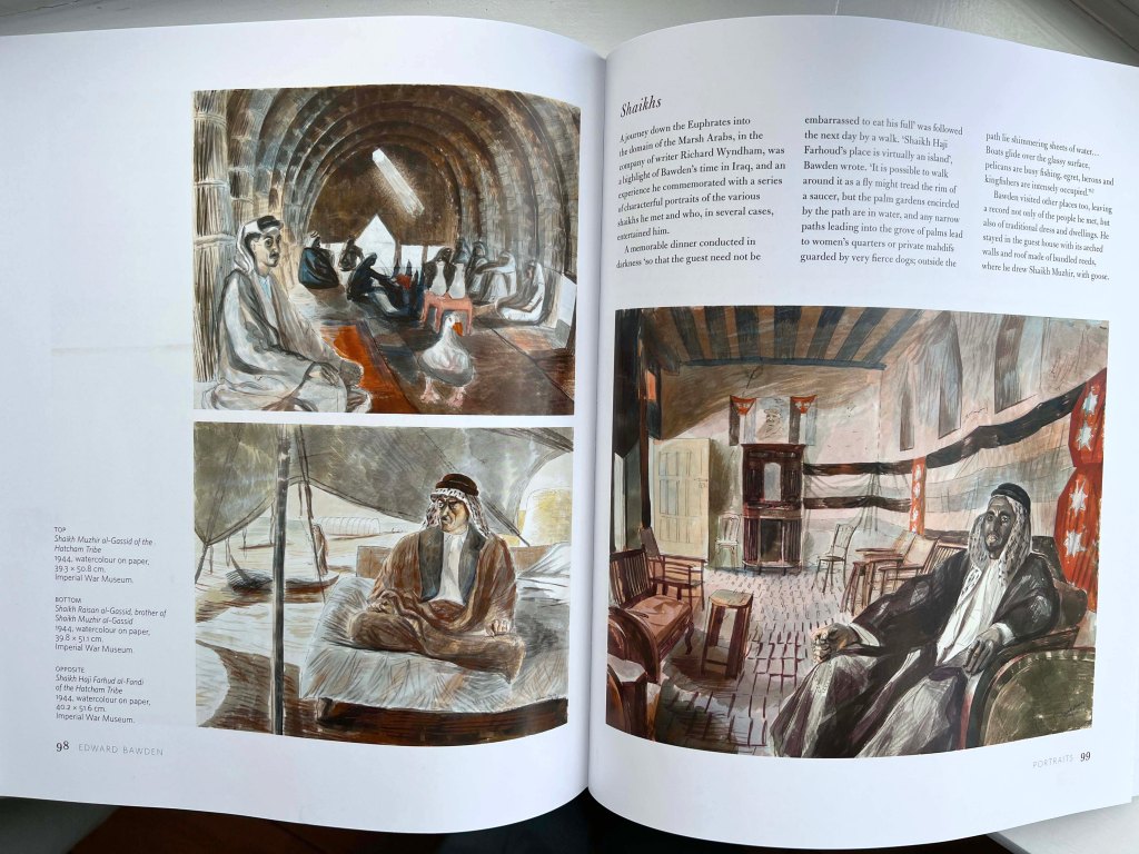
For my sketches, I got inspired by two artists. Edward Bawden’s motives of the Middle East gave me the idea to depict some sceneries from Uzbekistan, the country where I was born and spent the first years of my childhood. I loved the old traditions of watercolour techniques the artist used in his works, with dull shades, mainly sand colours and natural sceneries. Below is presented Edward Bawden’s book with portraits of Shaikhs. That gave me the idea of picturesque traditional people from Uzbekistan, with cultural background and Asia motives. I wanted to show the mood of the painting through colours and details around the central figure.
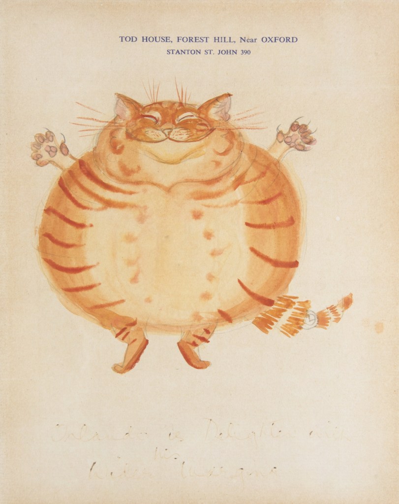
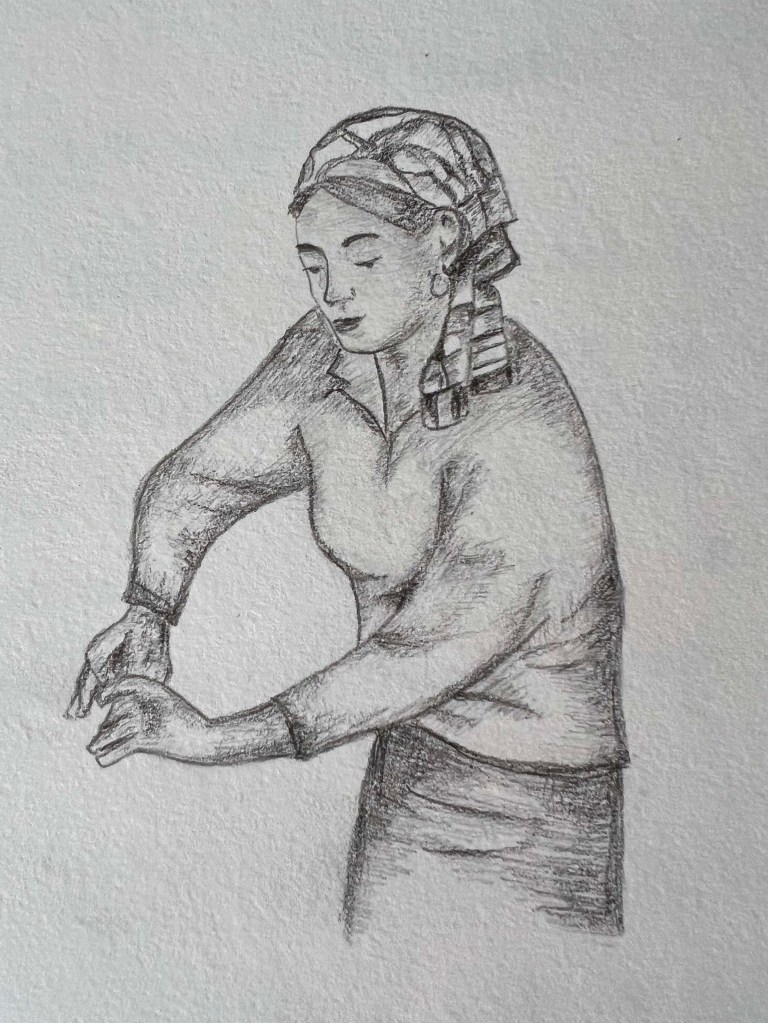
Another artist that I like his way of painting was E. H. Shephard with his great sketching style for cartoon characters such as Christopher Robin and Winnie-the-Pooh. The artist was practising a combination of pencils, watercolours and crayons. I wanted to create an illustration that would merge those two artists, where the image is realistic enough, with the presence of traditional sketching techniques. Below I highlighted some of the key elements I wanted to mention in my first sketches.
Sketches
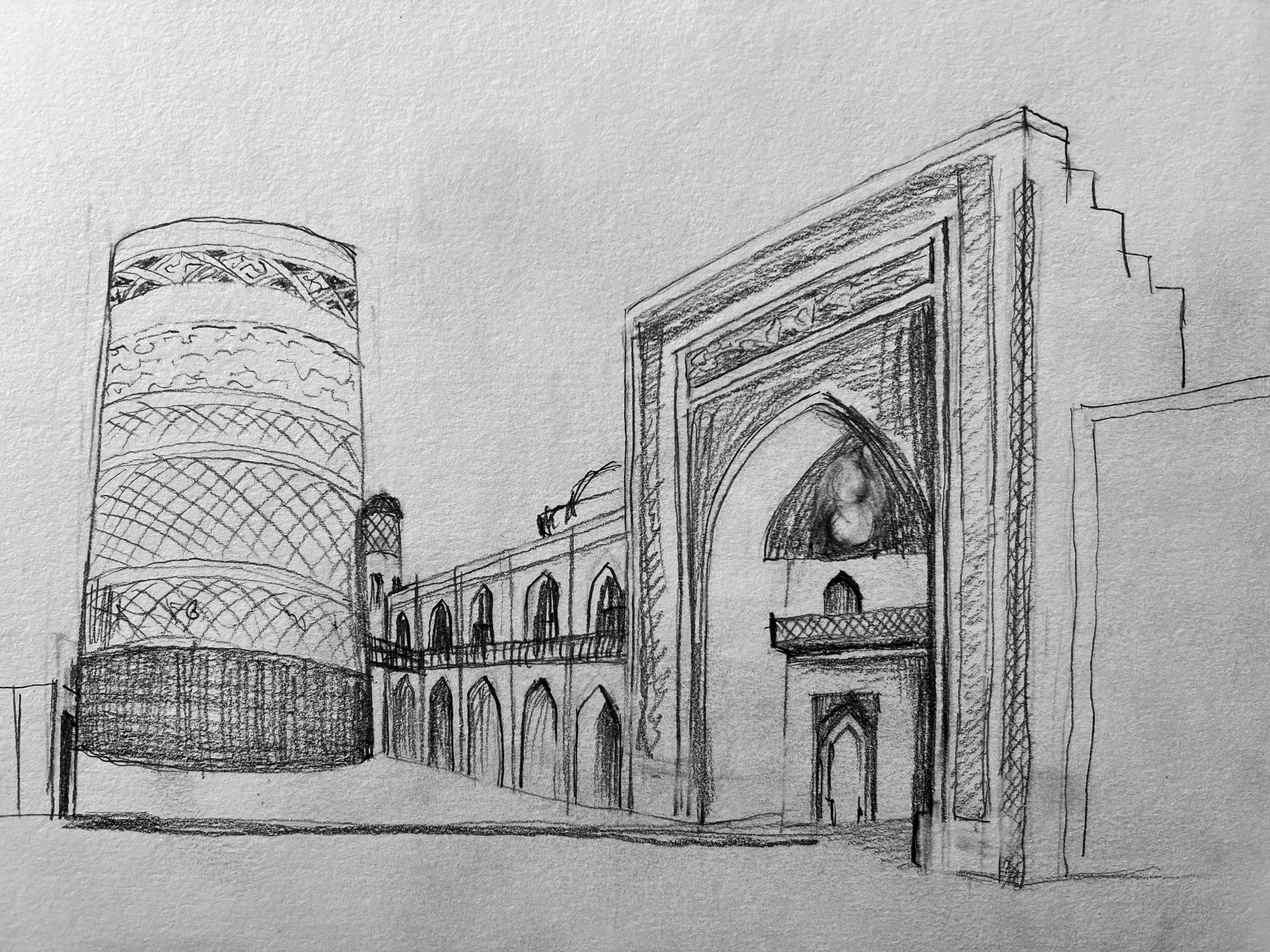
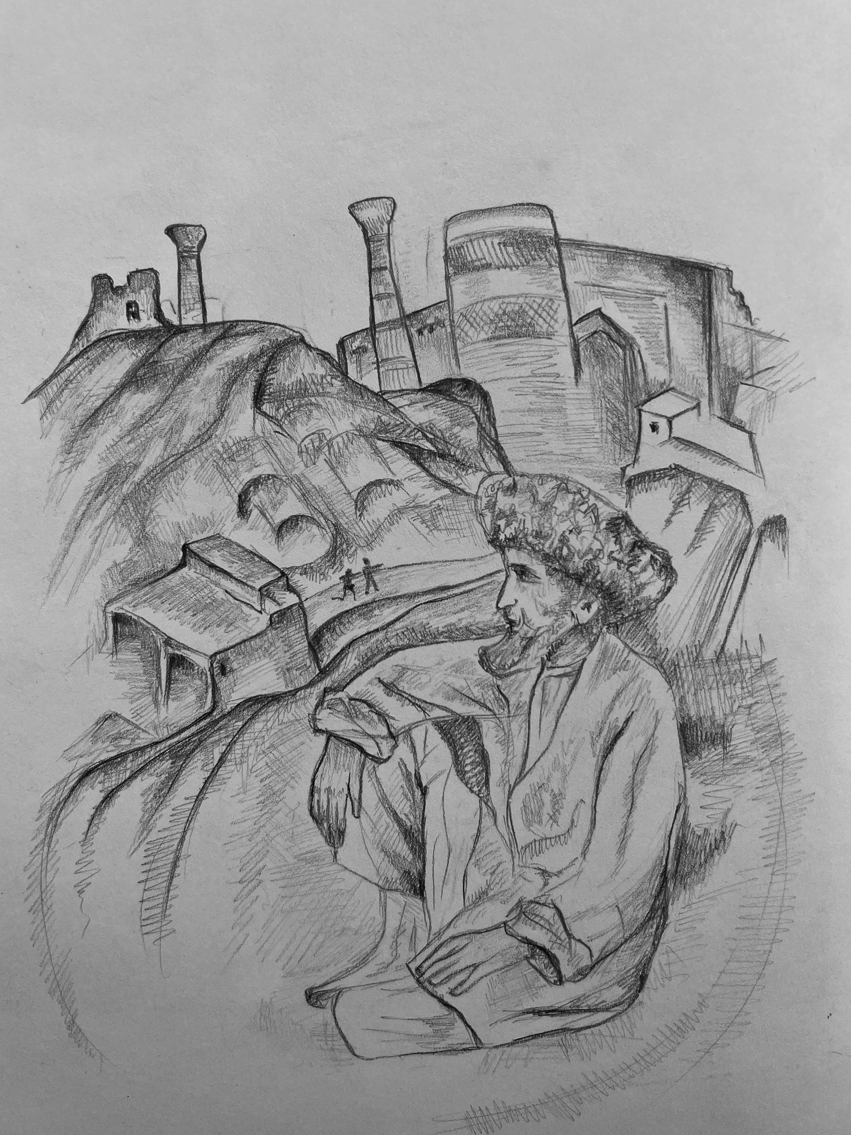
I was thinking about traditional mosques in Uzbekistan. During my research, I found there is one quite authentic Juma Mosque a 10th-18th century mosque in Khiva, Uzbekistan. Buildings could be challenging to sketch from the architectural point of view, so I decided to concentrate on sketching people in a traditional environment.
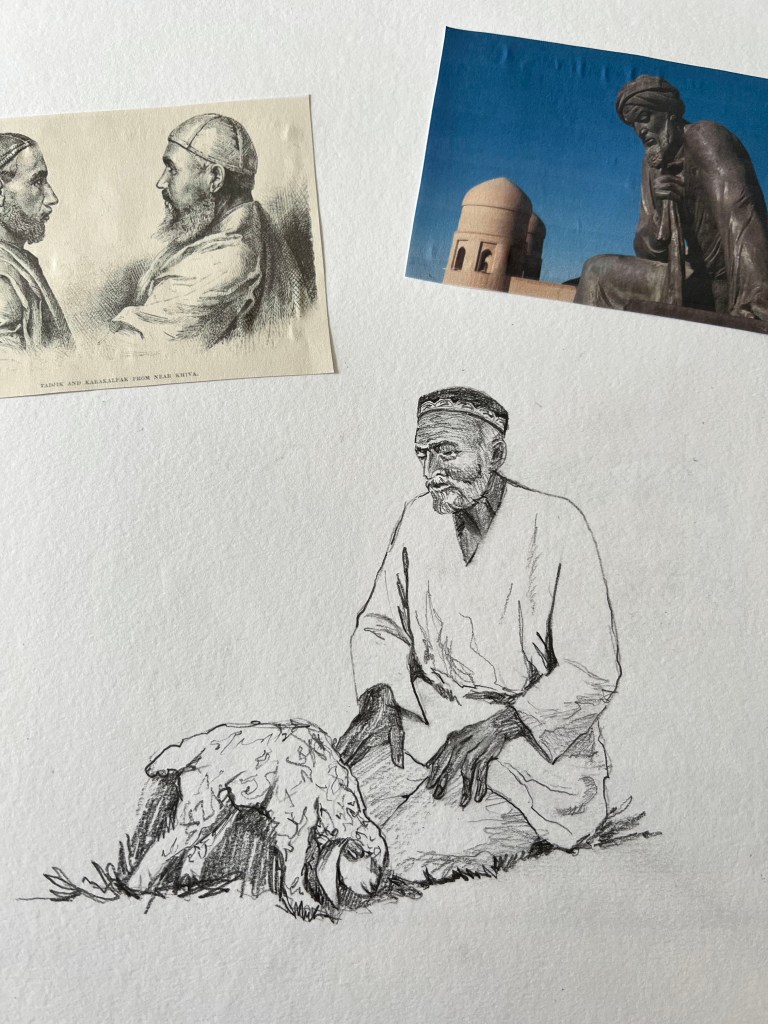
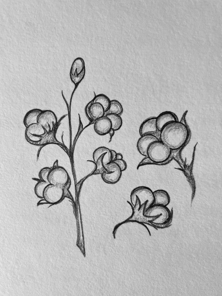
My first sketches with Uzbek shepherd around some key elements that I got inspired. I wanted to show traditional old-style sketching with some sharp lines and fast pencil moves in it. That images are unique and resemble the old times from the traditions of Uzbekistan. I would say that style of sketching could be characteristic of 1960-the 1980s.
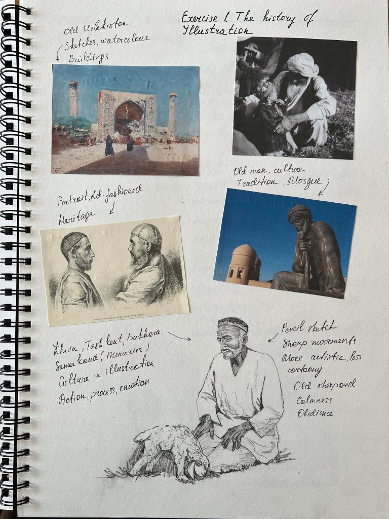
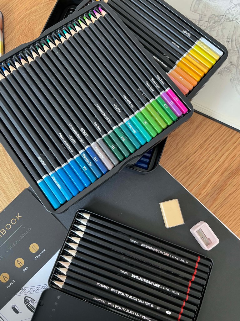
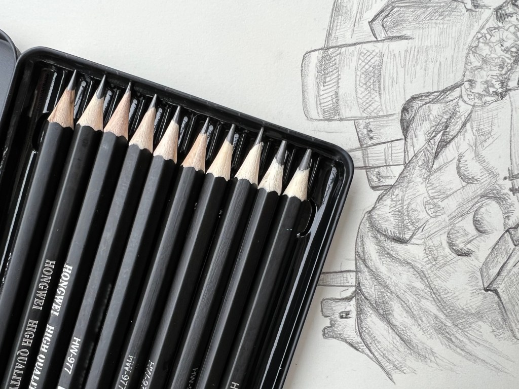
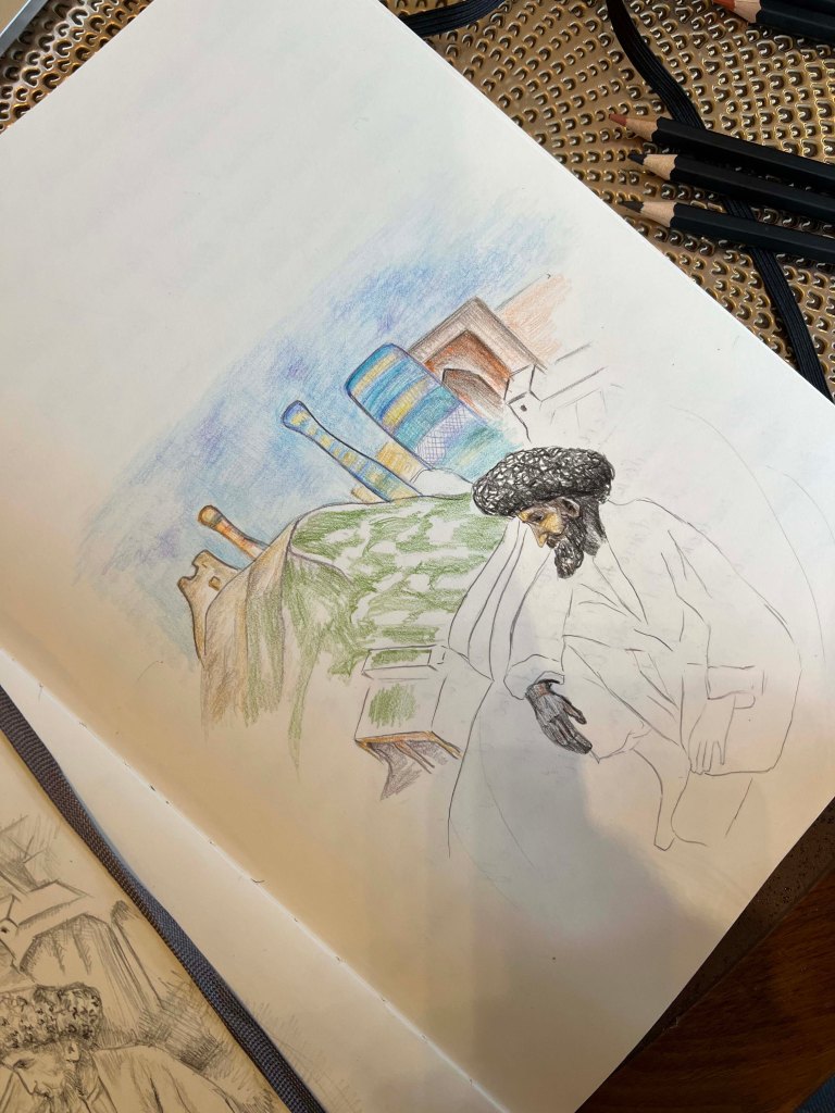
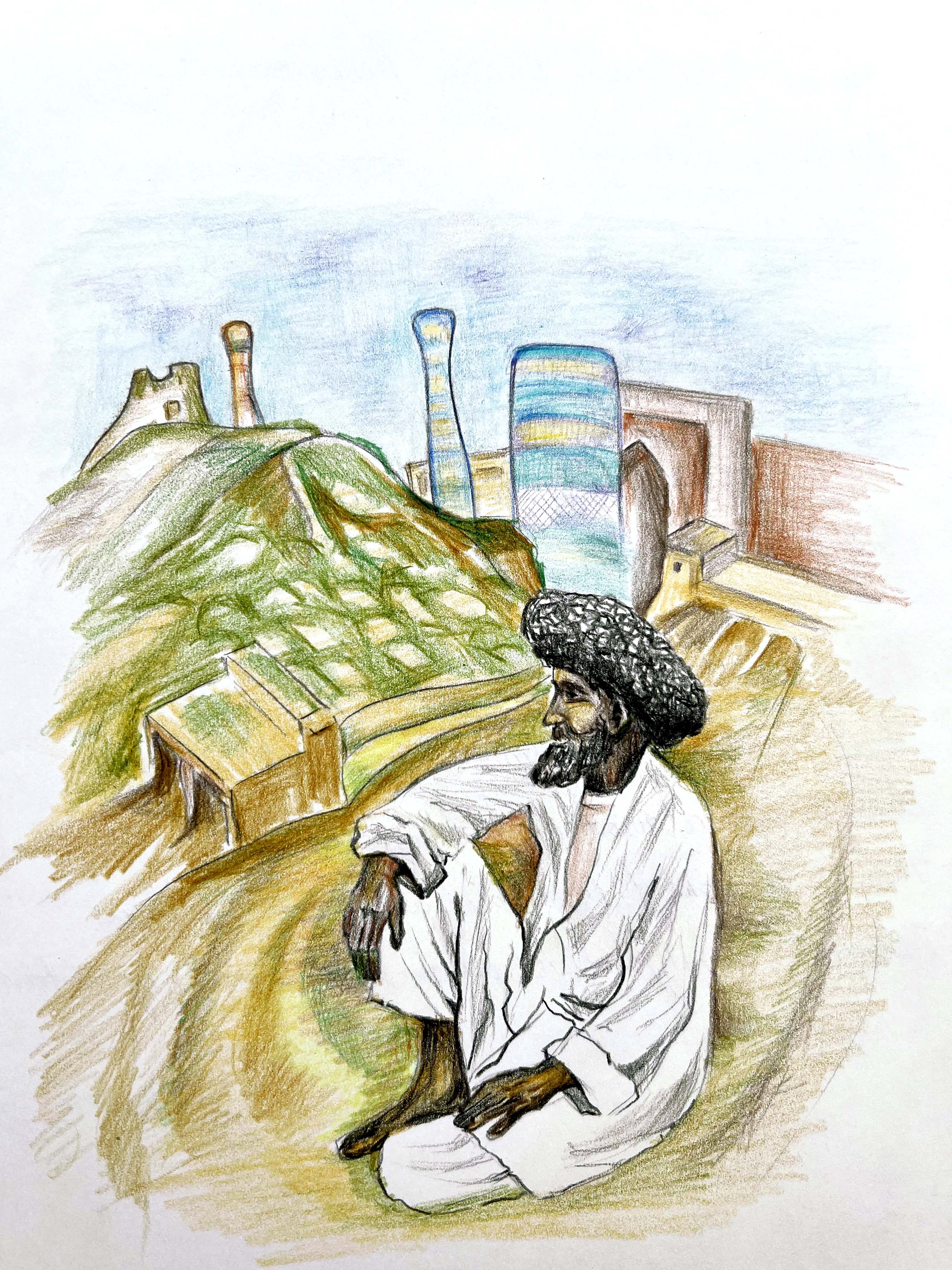
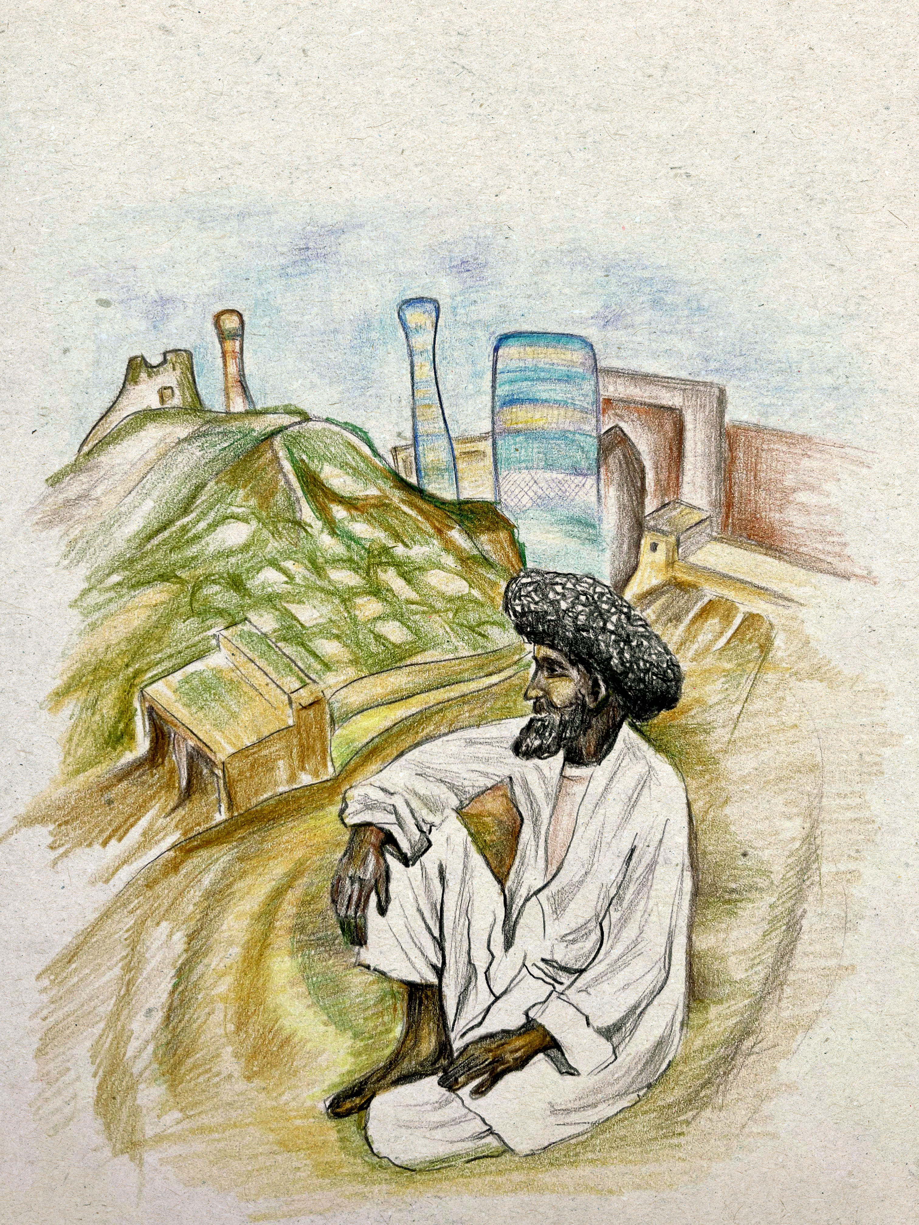
For this course I specially bought a good selection of colourful watercoloured pencils, to practice my drawing skills as well. I thought about showing the old Uzbek man in the background of Khiva, the man who is resting after some labour work, and behind him a beautiful Juma Mosque. I think that design is similar to the style of E. H. Shephard, with his naturalistic sketches of people. Also, drawings made in black and white techniques have some deepness in them and look more like serious works compared to colourful images. But for comparison, I still wanted to practice the image in the full colour.
I made the same sketch but with watercoloured pencils drawing. I was worried as it could look a bit flat with coloured pencils, but surprisingly the image turned out to be quite authentic and similar to the artists’ illustrations I was inspired by.

Kelly Blair
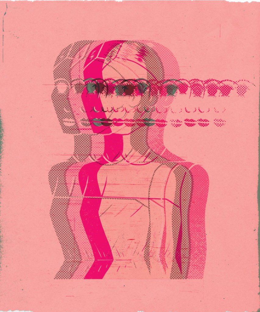
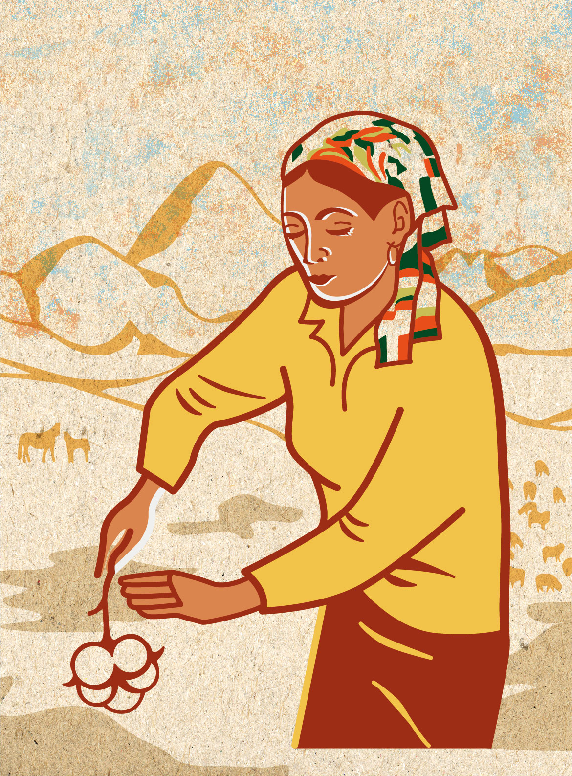
The second part will be evolved around the modern-day illustrator, that I like. As I mentioned before, illustration is a new field for me, but I’m glad we touched on that subject during previous units. Kelly Blair’s illustrations I discovered during the Creative Book Design unit. I analysed her works as a part exercise amongst the other book designers. Kelly Blair is the art director of Pantheon Books and a freelance illustrator from New York. Her designs have a strong feel of covers from the XXI century. She has her techniques, as mainly designs are clean, with the dominant colour in it, and one particular object being highlighted. Recently I discovered a series of illustrations she provided for a number of campaigns. They are distinguished series of illustrations, made in a cartoony way with some unusual body and face proportions, like big eyes, and bold colourful outlines.
The colours for those illustrations are still quite faded, she doesn’t use too garish colours, and most of the images have a strong presence of blue, and warm brown or cream colours.


http://www.blairkellystudio.com/
(Assessed: 26/05/22)
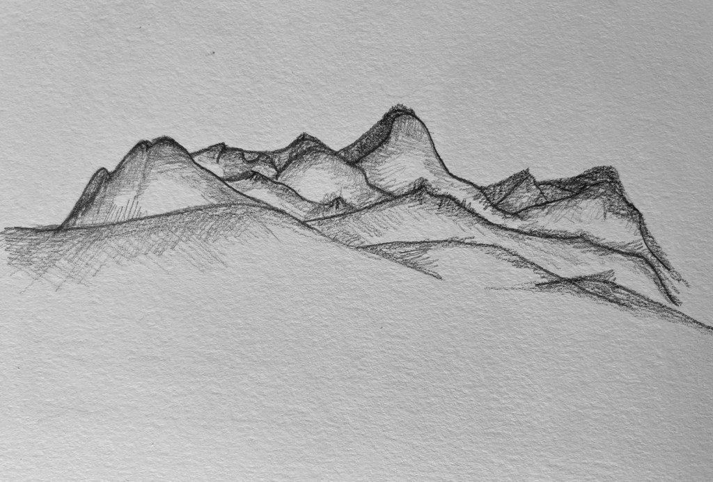
A mind map and some sketches are presented below. I sketched a woman in the process of working, she bend over and concentrated on her work. At first, I thought it will be a woman with embroidery work, but later I changed it to cotton-picking work, which was quite common in Uzbekistan back in the 70s. For the background, I chose mountains as well, as they give that far away Asian county feel.

After some sketches, I transferred these images into Adobe Illustrator, that to transform them into modern illustrations. I used similar bold outlines as Kelly Blair’s works, with some natural colours, like brown, sand, and yellow, some traditional colours that are inherited from that dessert Asian environment. Also, I made a canvas background with some grain in it to create texture for the image.
In conclusion, I would like to say I quite enjoyed this first entry into the Key Steps of Illustration course. I’m glad that during the design process I got in touch with my tutor, and got important tips about remembering to reach the brief and provide a clear idea of the sketch. My studying experience taught me that during my exploration and designs, not to forget the importance of the requirements of each exercise. Visually I like my sketches, and it was pleasing to see historical and cultural explorations in my first sketches. Also, I’m glad that I could represent similar background images but in different styles. I’m hoping it was a good start and I’m looking forward to some more illustration discoveries.
