This brief asked me to reflect upon the sorts of projects, exercises and assignments I have enjoyed most during this creative book design course. In order to do so, I need to go through my learning log and sketchbook to refresh the memory designs I produced during this studying year. When I looked at my works though for the In print exercise, I noticed a similar pattern that joined my works together, and I loved the fact that I could create some signature in my style. I’m fascinated by how much I learnt and what is the most important, the joy from the whole process as well.
What I liked the most from this Unit is the opportunity to work both with digital layouts and experiments with hand-made, and work physically with the texture and papers. I discovered a new role, like a scientist in the field I’m familiar with.
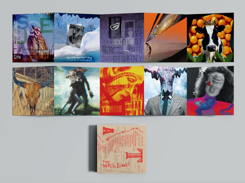
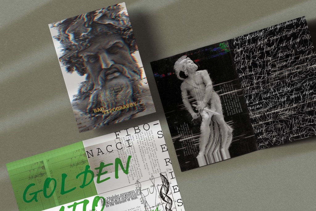
It’s hard to say what exercise or assignment was my favourite, but going from the experience of the Core Concept Unit, closer to the middle or to the end of the course, works are becoming progressively stronger, as they have collaborative experience from the previous knowledge and researches. I would say, that my favourite work was from the third part A little book of good/bad typography. Those works contain my personal taste and contrast of neatness and creativity. I loved the exercise Tango with Cows, where I explored concrete poetry and created sequences images based on the selection of papers from paper manufacturers.
Do you enjoy the creative freedom of working with your own text and images from scratch, or do you prefer working with text and images that are provided to you?
OCA
Here we learnt both ways of creating our own images from scratch, like the Altered Book assignment and designing visuals based on them, and working based on the brief where we had narrative or wording provided by the course. Before this Creative Book Design Unit, I was quite confident that I prefer to work based on a particular brief, a good example is a Tango with Cows, where I was concentrated on designs, and their creativity based on the wording. But, at the same time, exploring assignments from the third part A little book of good/bad typography, and assignment one My Zine taught me that creating my own content could be even more exciting and fascinating than I thought. Of course, it is more time-consuming, requires more research on what subject I need to concentrate on, but at the same time it’s a good learning process, and by doing that I’m investigating new areas of the creative content making process. What I liked the most about this Unit is the opportunity to work both with digital layouts and experiments with hand-made, and work physically with the texture and papers. I discovered a new role, like a scientist in the field I’m familiar with.
Do you prefer working in a ‘hands-on’ way, physically manipulating paper and materials, or do you prefer working digitally, laying out the pages and page elements on-screen?
OCA
As I mentioned before, here we learnt how to get out of the comfort zone, get there and explore. Going from my experience, where I only had an opportunity to use digital materials, all my designs were based on images found online. But here I found new ways of creating personalised designs, by physically manipulating paper and materials, like Altered book assignments, or creating collages like for Exercise 3: Alternative publications. The good thing about it is I could see that those hand-made visuals had a good potential to be used in designs, however, I would possibly say that my strongest point is the digital design, as here I can manipulate images so much, create different textures and juxtaposition, and completely strip back the original image, so I would say it’s practically creating personal touch.
Which of the subjects covered in this unit have interested and engaged you?
OCA
Contextualisation: Researching designs and designers. This part of the unit is predominantly was oriented toward the expansion of the knowledge and learning the theoretical part of the design and art. I could see it through exercises such as My zine, Alternative Publications, Book Terminology and Book designers that they taught us to how to follow the path and experience of artists for the purpose of generating our personal thoughts. I loved the fact, that I did some research about Fibonacci Series, Golden Ration and Modulor theory. As for me, that is time spent with a great purpose, and I already see some positive impact from those studying on the level of my works. I think this is the knowledge that always stays within the career of a graphic designer for the future.
Typography: Principles and experimentation. In my opinion, typography is a fundamental part of graphic designers. I remember, from my experience, the type usually played a secondary role in designs. The rule was to make sure that the font is readable, and the headers are highlighted enough to grab attention, but overall the typography part is considered to be not valued enough amongst designers nowadays. However, in this unit, I learnt that typography can be an individual segment for exploration; as it keeps within itself a great spectrum of researches and experiments, such as handmade font, decorative typography, play with the shape and form of the font. Type can be used as a visual as well, or some posters purely based on typography and fonts. Going back to the previous unit of the Core Concepts I remember the whole assignment dedicated to font development, which was quite successful for me, and in this unit, I would like to pursue again some experiments, and design books based on typography exploration. itself a great spectrum of researches and experiments. Type can be used as a visual as well, or there are posters that are purely based on typography and fonts. Going back to the previous unit of the Core Concepts I remember the whole assignment dedicated to font development, which was quite successful for me, and in this unit, I would like to pursue again some analyses with typography experiments and discover new methods of generating typography visuals.
Colour: Colour management and working with images. In this unit I think we spent less time exploring colours and their properties, there were some exercises like Tango with Cows we explored the connection of the images to the narrative. At the same time, exercise with sequencing images was a good example of colour spread amongst the brochure, I saw how important was to keep colour coherence between those visuals. Also, explores on the Little Book of… gave me some ideas of colour decisions that to bring the message in connection of the text and colour spread, like a green brochure for the bad typography, and a red brochure for the good typography brochure. I think colour choice and creative visuals like collages and juxtaposition will always play important role in my designs.
Paper: Properties and qualities. I loved collecting paper samples from manufacturers companies and learning the individual qualities of each sheet. But I think with the rise of recycling and reuse awareness there were created new movements and era of recycled materials for printing. More and more companies every day go on the side of the digital versions, where all materials are provided in the online form. I would still try to push different textures and coloured papers for the purpose of creating unique designs, as we did with Paper Ephemera tasks, and Tango with Cows exercise where I used different pieces of paper in one brochure, but it’s difficult to say, whether all companies will be ready for additional costs in terms of providing high-quality papers for the simple printing. If it will be luxury brands, I would definitely pursue expensive pieces of paper, but if there will be simple brochures, the designers should go for the option with the most accessible option in terms of expenses.
Printing and bookbinding: Processes – traditional, digital. This is a technical part of graphic design, that is usually discussed with manufacturers and printers. The designer can always do proof print at home or in the office, but the final print is provided by printing houses. It’s good to learn about it and be aware of some specifications for the improvement of skills, but I can’t imagine it could be something I’m interested in.
My Zine
This assignment was an introduction to the Unit, where I explored a new area of creating collages and fanzines from the materials I collected, like magazines, brochures, etc. This exercise was quite a surprise for me, as I could see that collective work from physical prints and Photoshop can create a new product. I think this knowledge I could easily use in real practice and create unique materials according to the brief. Also, I found out for myself that creating the content could be quite an exciting part of the creative process, its obviously more time consuming, but the brochure is me as an individual, and it has some personal thoughts and examines.

Assignment 2: Form and function
These Robinson Crouse jackets were the very first book covers I ever designed. I enjoyed this part of the design process, I analysed lots of other book covers and went into the full history of this book design. However, I’m not sure whether that is the direction I would choose for the future. I think that book covers should be so individual and artistic, that to be able to place the product into the market to compete with other companies, it could be quite challenging for most designers, also it is very unique it creates a very specific niche market.

Part 2. Exercise 3: Book designers
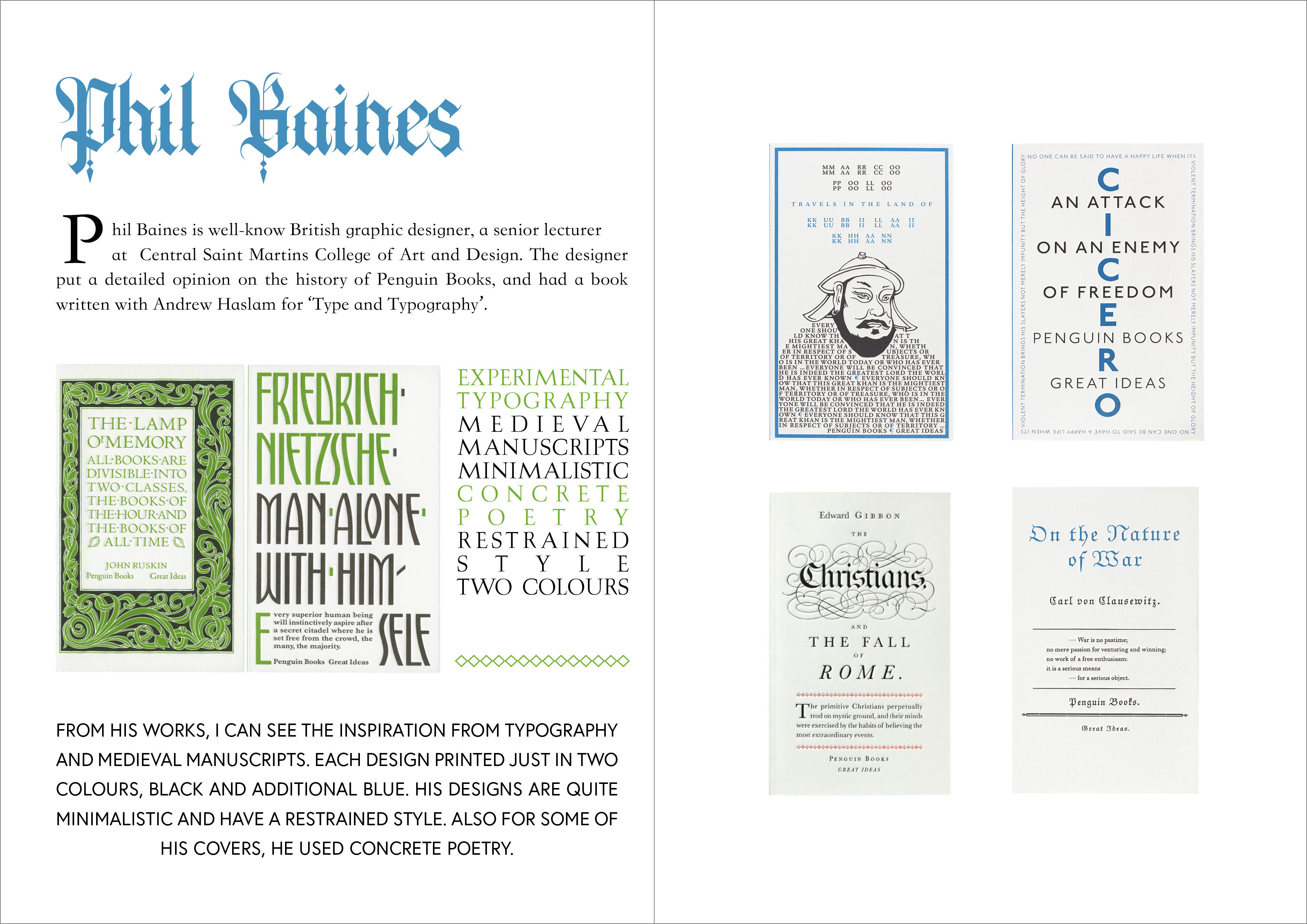
This work on the research of different book designers was the most time-consuming. I treated it purely like the learning process and expanding the knowledge. I think, this exercise is all about contextualisation, and learning some experiences from the experts. This type of work could be a good basement for the final assignment, where we could choose the analysis of book designers.

Exercise 3: Experimental typography
This part of the unit was like a new chapter for the learning of experimental fonts. I’m glad that I could learn about it, as those creative ideas helped me to open boundaries. I wish I could experiment more with magnifying glass and stamps, as there is a very wide field for explorations.
My Little book of…
(Typography: Principles and experimentation) (Colour: Colour management and working with images)

Tango with Cows (Colour: Colour management and working with images) Paper: Properties and qualities (Printing and bookbinding: Processes – traditional, digital)