In this brief I was asked to print images I created earlier in the course on the samples of papers I collected. Here I need to be spontaneous and experimental, without fear to make mistakes, to get to the point of the creative process. I will need to collect images in JPEG or TIFFs format in the high resolution 300 dpi. I need to create a simple flatplan with the way I want to layout those images, and later organise them in the 16 pages document.
This is one of the final exercises at the end of the course, and another reminder to explore visual ideas and processes, by trying out and experimenting with the materials and ideas to discover new ways of working. I’m thinking of a couple of exercises and assignments to implement into this task. I went to the very beginning of the course and noticed a red thread between my first exercises and the last assignment of the Altered book. It’s quite curious to see the approach I developed for this unit and the similarities in the style and feel of the design. I’ve noticed the same direction images that I could join together to create something new out of them. Your Zine, Experimental typography, My little book of… and Altered Book, those visuals I was going to join together. I organised them all in the same folder in .jpg format, naming them according to the part they belong to.
My home print is standard A4 format, so I’m thinking that my booklet is going to be A5 format, so one spread could be printed on one piece of paper. I looked for some papers I have left, as recently I printed so much at the pieces I ordered from various printing companies. I loved experiments I had on those papers, but never tried something different, like wrapping paper or newspaper type of paper, or ECO materials. I might try different papers for the same image. See how it goes. Here are some paper samples I collected.
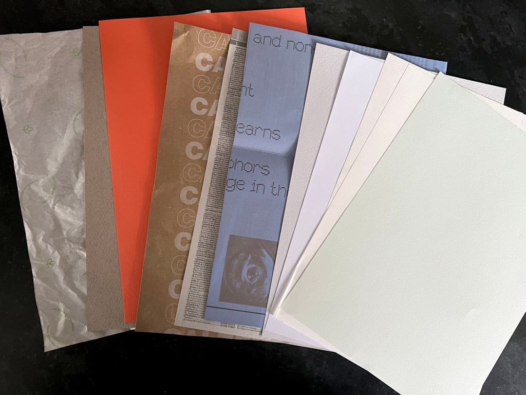
There I had wrapping paper from one of the parcels I ordered recently, some samples of recycled paper, colourful thick orange paper phonebook pages on the very thin transparent paper, violet paper from Exhibition Centre in Rotterdam, and some samples from paper manufacturer companies. Also, in addition, I bought some colourful paper for kids collages. They were not the best quality, as the paper was too thick and a bit glossy for the printer, but I was curious to see what designs will look like on them.
Design
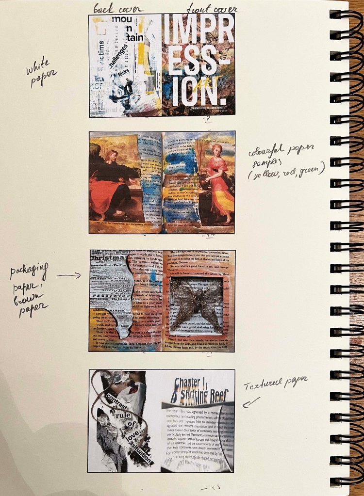
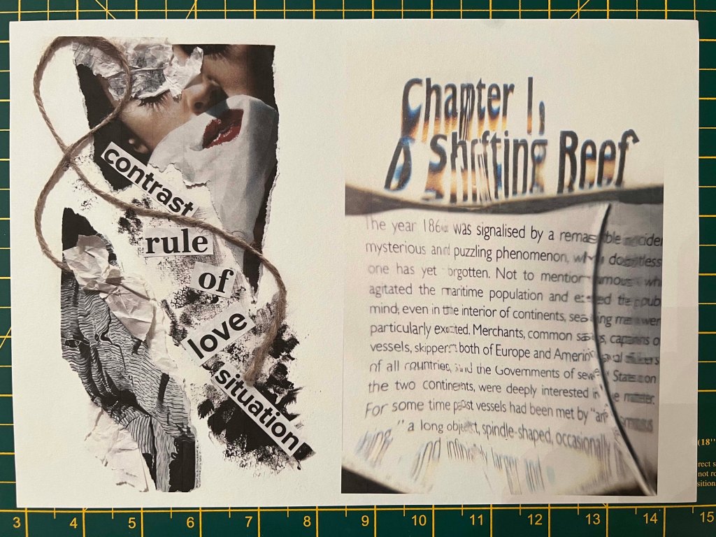
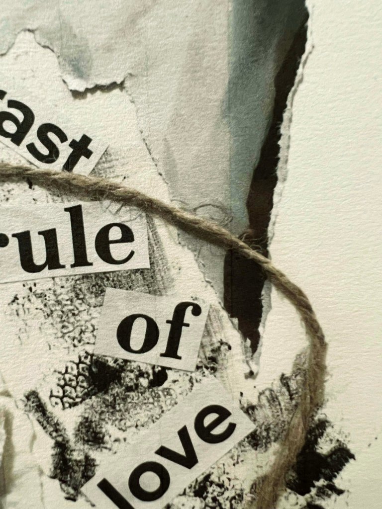
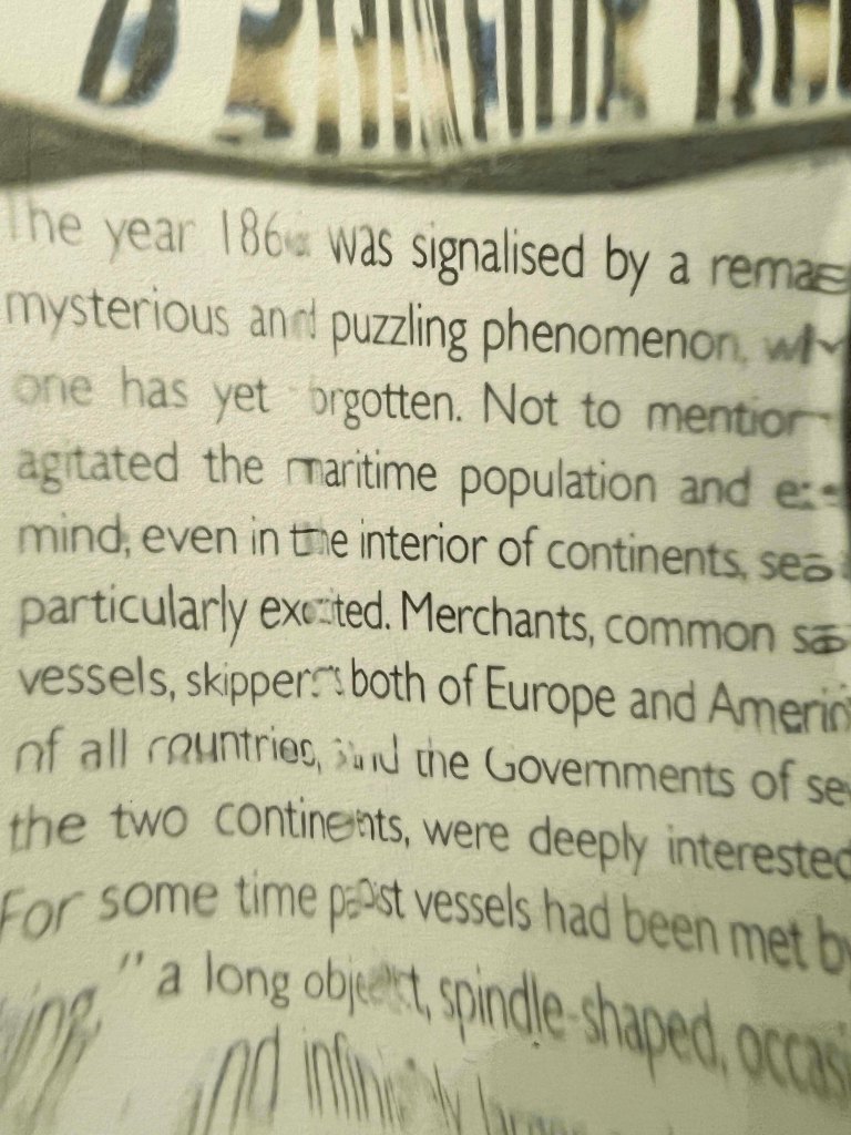
Below I placed the order that I chose for my artworks. I was coming from the idea of my learning process in the Creative Book Design Unit, where I’ve learnt the new direction of artists’ books, experimental typography and fanzines. This combination of art is personal to me, as they reflect new discoveries and observations that I determined during the course. Some of the works I included were hand-made, therefore I thought would be curious to see how they will look when printed at the different paper samples. I didn’t incorporate personalised wordings in the designs, just old messages that were developed according to the individual exercise, but for the front cover, I chose the name of the fanzine ‘Learning path of becoming an artist by Eleonora Welch’, to explain the selection of designs in this brochure. For the first cover, I placed big letters, that to make that page look like the front one, with san-serif letters Impression art I went for the fanzine look brochure and collected all artworks that matched each other visually. Some artworks like from altered books or experimental typography I didn’t see in a printed way, so I thought would be useful to play around with those images on different textured papers, I had some ideas about how to present them. I changed the layout slightly by adding some textures onto them and combining images from different exercises for creating a new one. Below are some of the sketches and full artworks I designed.


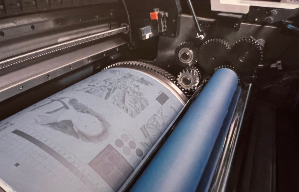
My goal was to be experimental, try some different pieces of paper for the same design. I was going to print one spread on the same piece of paper, but I didn’t think through how to create a booklet from them, therefore I had to improvise in the end, as each spread was different paper, and it was quite tricky to join them for the brochure look product. But I will try, as that is an appealing direction, to create a sample from different designs. Before I was aiming for the full coherence, but here I wanted a bit of miss-match, but with a taste.
Reflection on printed samples
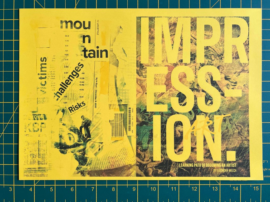
Coloured paper. The front cover page and back cover is printed on a yellow piece of paper. I liked that it was eye-catching and the design worked well on it. I used collages and multiple layers on that design, so they have some fanzine style and are not as straightforward to read, because of the colour of the paper. It looks like the printed failed, but that is the look I was aiming for.
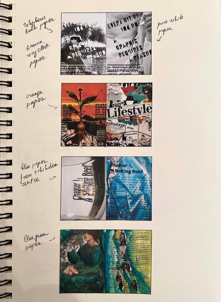
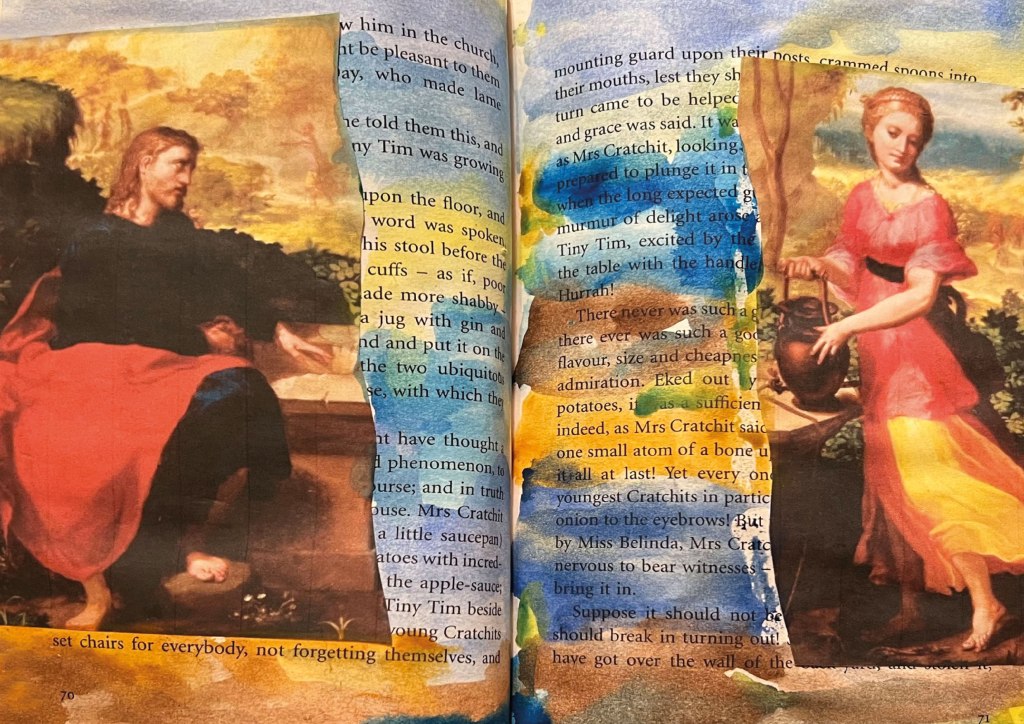
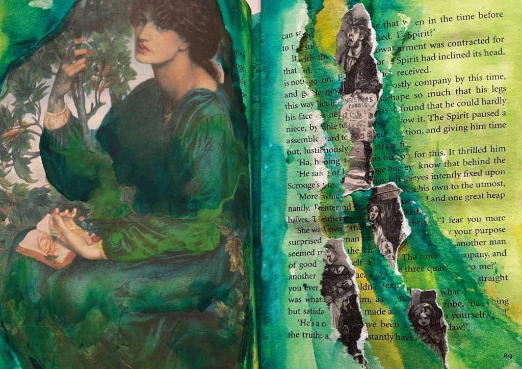
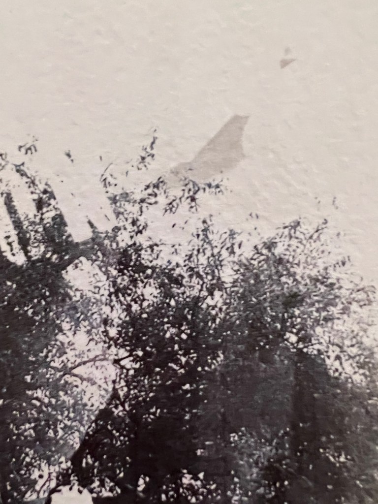
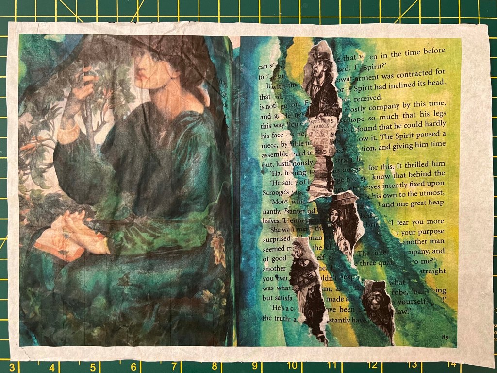
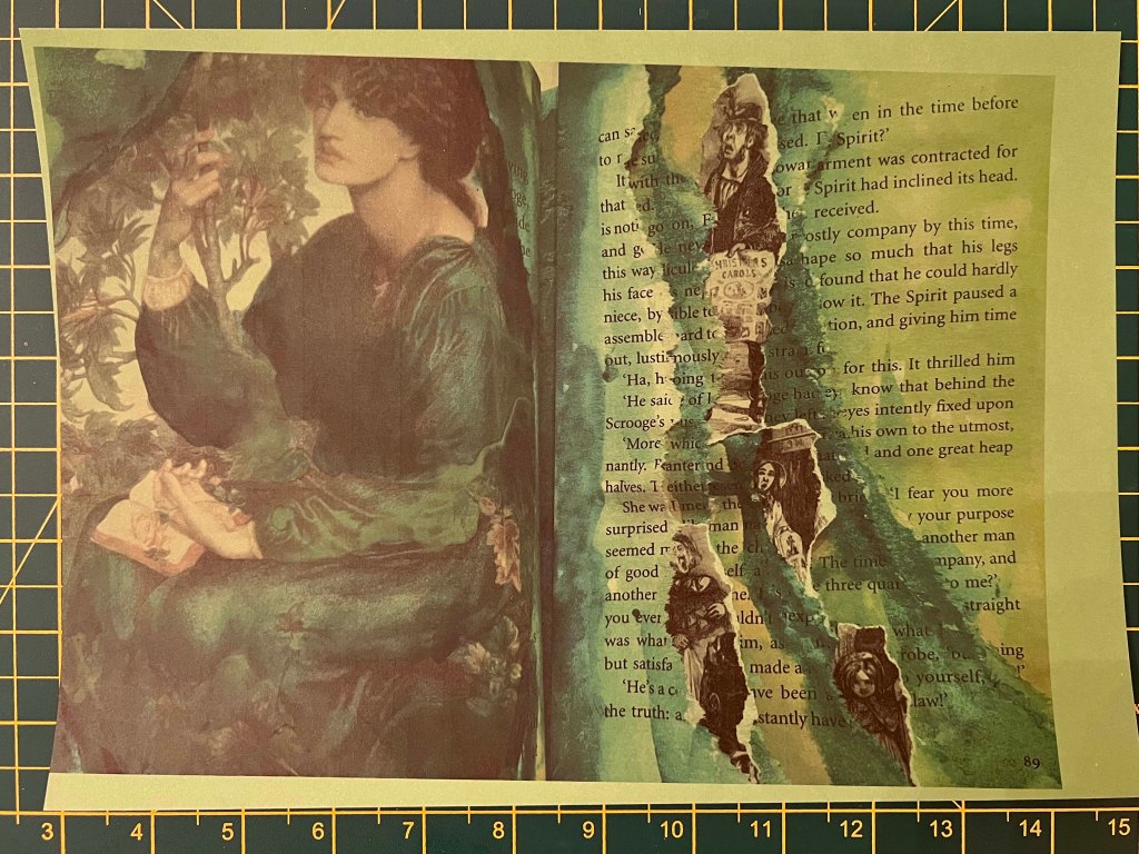
Violet paper from the exhibition centre map. Next spread I printed on the paper violet exhibition centre from Rotterdam. Paper had thin text around, so the printed image overlapped the existing text. I loved the effect, and the colour solution I received in the end. Those digital looking words created juxtaposition with the religious painting, and watercolour had some interesting transparencies on this paper. The paper itself is quite absorbing and have a nice rough feel. I liked the result, I think it was a good starting point. This is the main painting of the exercise, to see for unpredictable solutions.
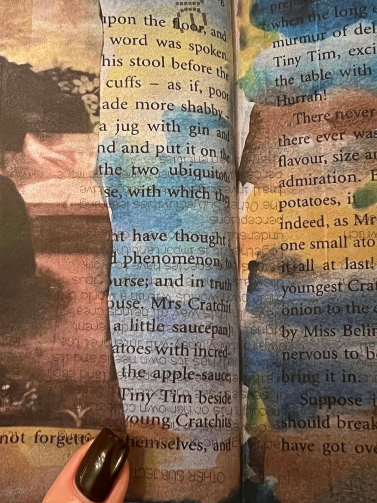

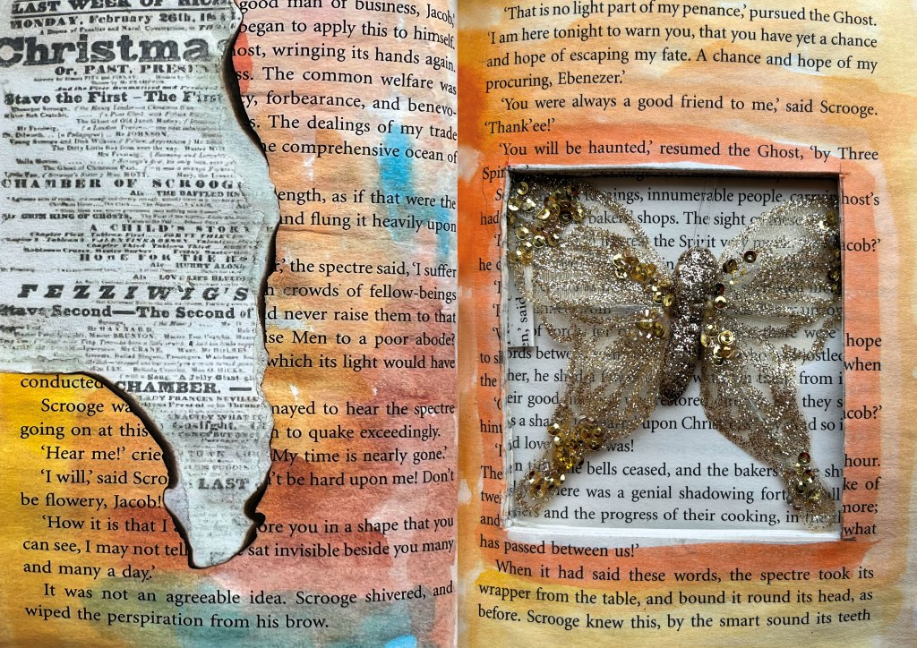
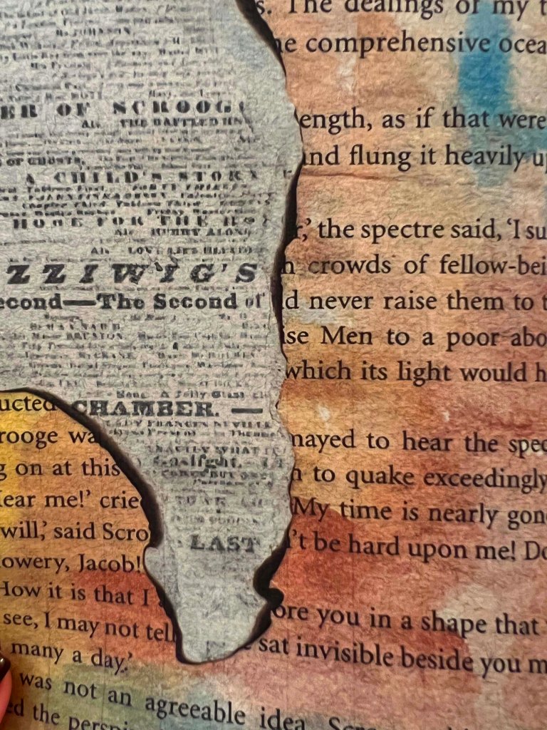
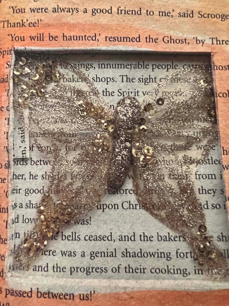
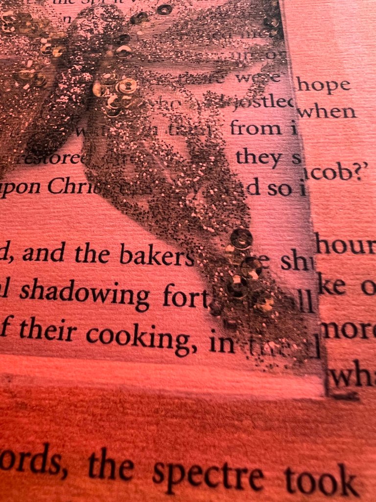
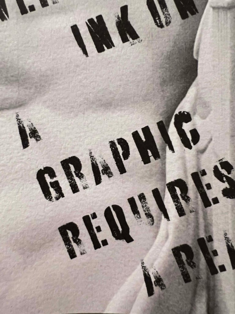
Craft paper. This paper sample I bought from one of the art shops in Kyiv, where they have all kinds of papers for craft and design. This dull-coloured paper brought a vintage feel into the design, also, it has lined texture, which surprisingly was surely printed though. I was astonished at how real the spread looked like I was looking at the actual book with the shadows and butterfly. I think the paper choice and the spread were quite harmonious together, and it was a good paper to work with.
Orange craft paper. This was an alternative paper print, and it didn’t work the way I expected it. That was similar to the previous piece of paper, with a stripy texture in it. But it absorbed all the colours, and even black contoured images are difficult to see. Not sure whether I’m going to use it for the brochure.
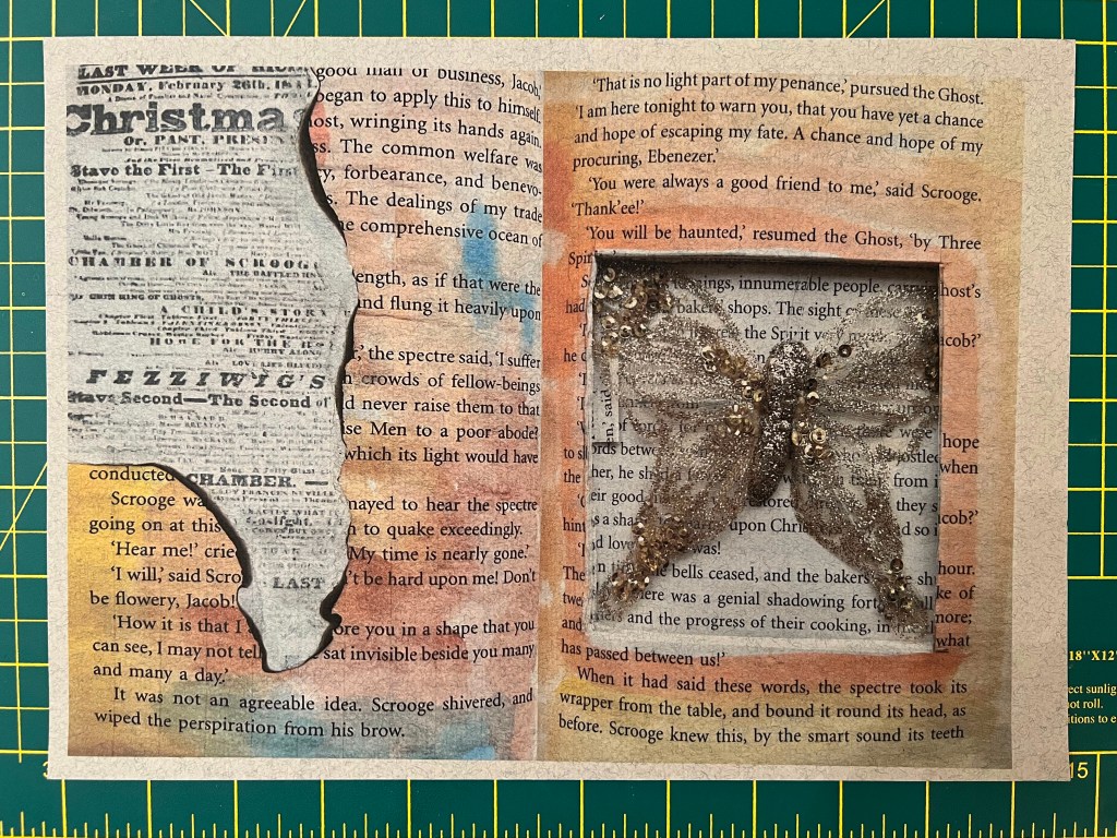
G.F Smith Radiant white paper. This spread I created from two different assignments as well, it was curious to see how they kind of work together and create communication between them. Here I chose textured paper from G.F Smith, it was a safe option to play, as the paper was designed especially for professional prints, but what I liked about it, was those little dents in the texture. The paper had a slightly grey shade, but it didn’t reflect the quality of the design.
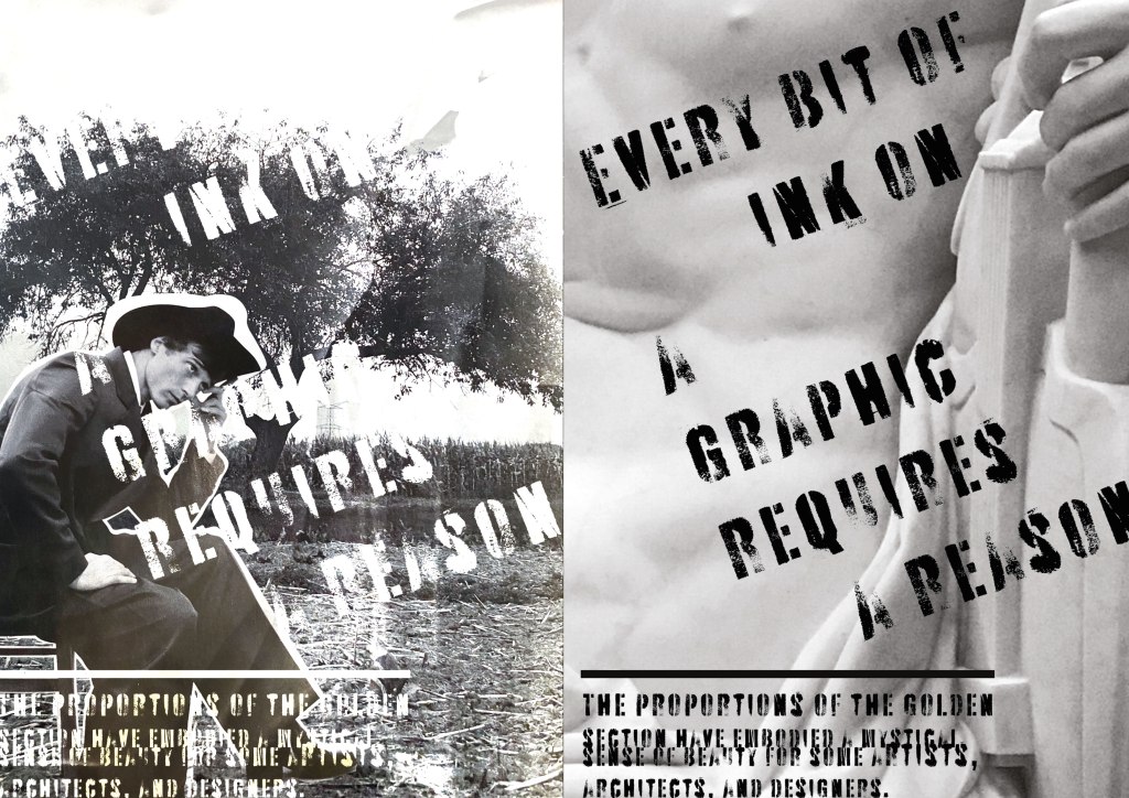
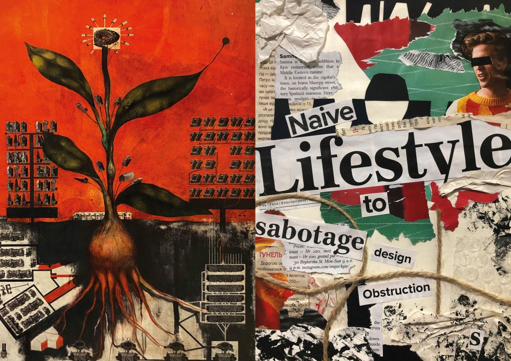
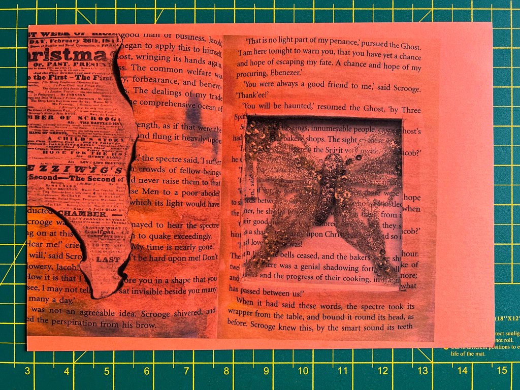
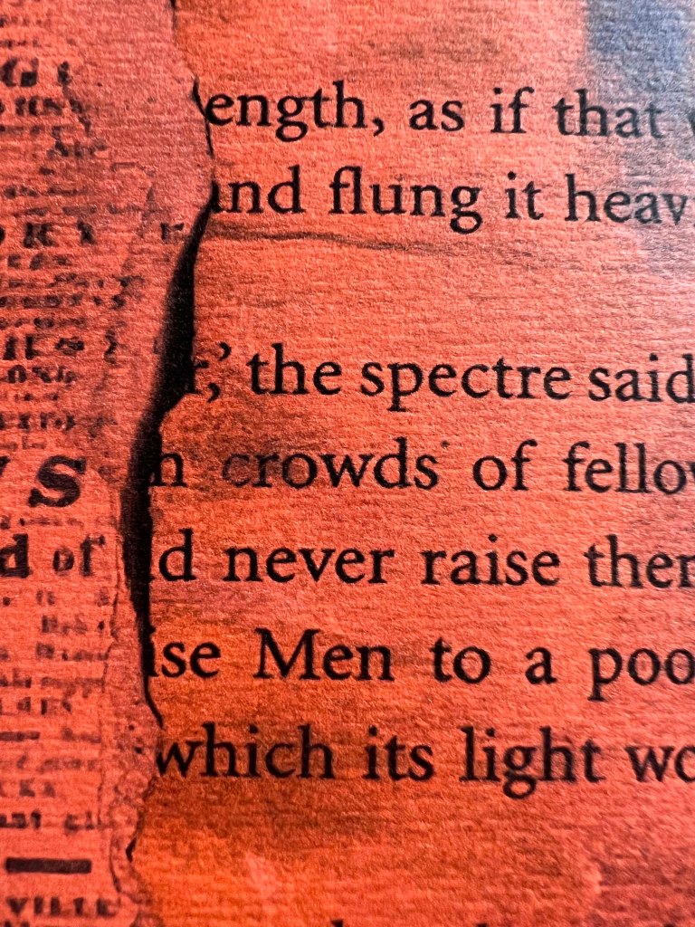
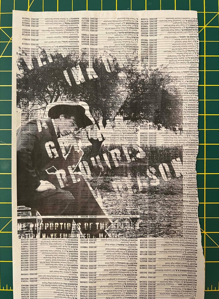
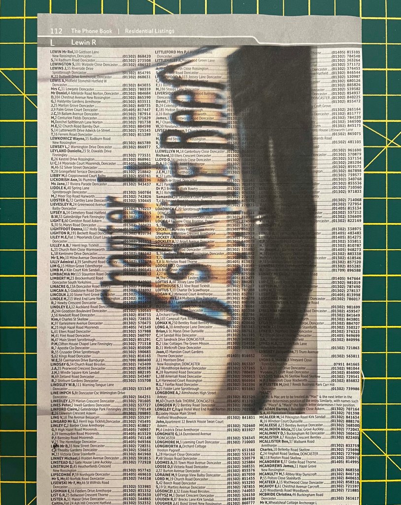
Telephone book newspaper type of paper. But here I went for some experiments with the print on the telephone book paper. I was surprised by the originality of the design. I think, it added some more impressive results, which made the spread look like a fanzine. The image started to have some depth and draws attention to detail. I’m impressed with this outcome, another proof, that experimenting with materials can bring some unpredictable results.

Brown kraft paper. Next spread on the recycling packaging I received my parcel in recently. I loved the result, highlighting the feel I was going for in that collage. The colours are slightly dull, but the vintage feel looked great. Definitely good for the brochure collection
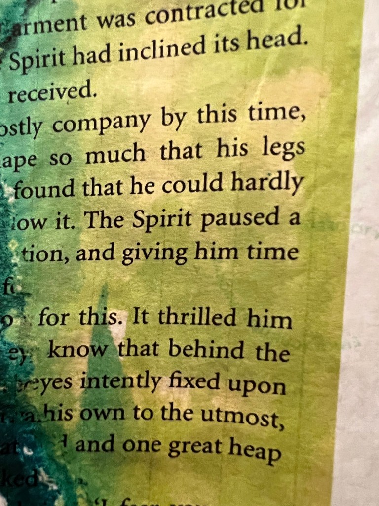
G . F Smith Powder Green. This sample from G.F Smith as well, pale green colour shade paper. The paper is a very nice feel on touch and good quality, what I like about them, for their rough texture, but the ink loves it, it makes colours slightly dull, and not as contrast as a white paper, but for the feel of the brochure, it looks the way I wanted it to look together.
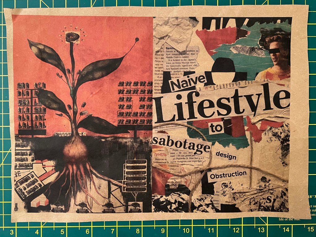
This spread with experimented typography I printed on the different pieces of paper samples. One was with the phone book, which was great, and another was on the blue paper, matching to the blue shades of design. I think they looked fine, but blue paper again, probably too dark, and took all colours of the design. Not sure about this combination, will probably have to print it again.
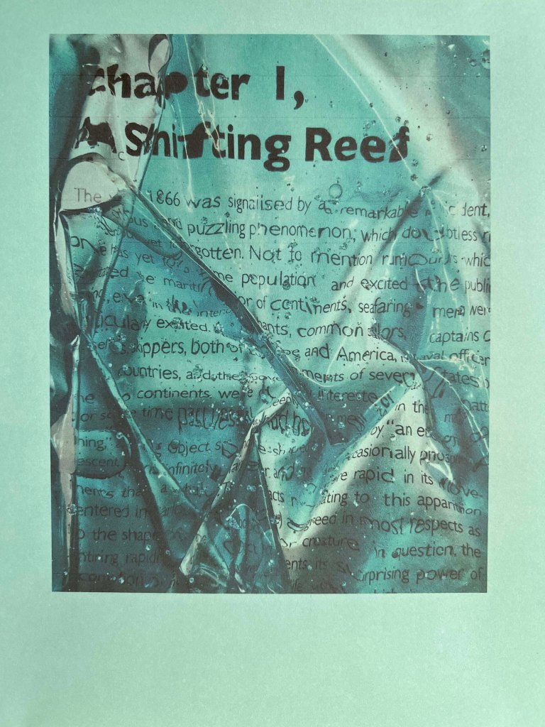
Wrapping tissue paper. Last spread I decided to print on the wrapping tissue paper, one from the parcels as well. I was very nervous about the printer, as during the print it sounded like it was going to chew it, without the possibility to recover, however, I still got my print, with some amazing bright colours.

Coloured paper green. The green design on the green paper, the same outcome, doesn’t look as exciting as I thought it would do. At the moment, from the colourful samples, the yellow paper is my favourite for printing so far.
Conclusion
I really enjoyed this exercise, it was quite playful and packed with different experiments. I loved surprisingly bright and juicy designs that came out from the tracing paper, and nice colour shade on the brown/wrapping paper, something to remember for the future, as not only white smooth paper is suitable for printing, even unsightly from the first look paper can bring some special characteristics and mood into the design.
